Lesson 4
Overview
About Lesson 4
We are now officially beginning Unit 2, which is all about stars.
Astronomers often talk about the transition from “astronomy” to “astrophysics” taking place in the mid-19th and early 20th centuries. In the first two lessons, we discussed the study of the motions in the night sky and models for these motions based on our evolving understanding of the force of gravity and the orbits of celestial bodies. For many centuries, the field of astronomy consisted almost entirely of making observations of the sky and refining models to predict celestial phenomena (eclipses, retrograde loops of Mars, etc.).
In Lesson 3, we studied the Bohr atom and the spectrum of light emitted by a blackbody. These topics required an understanding of atomic structure and quantum mechanics, a field of physics that was booming about a century ago. Advances in quantum mechanics led quickly to an increased understanding of stars. As our physical understanding of stars grew, astronomers began to publish more “astrophysical” papers dealing with, for example, the structure of stars, the generation and emission of starlight, and the evolution of stars. In this lesson, we are going to study the observations of stars, their classification into different types, and the physical differences between types of stars.
What will we learn in Lesson 4?
By the end of Lesson 4, you should be able to:
- Classify stars into spectral types;
- Describe the temperature and luminosity of the stars in a given classification;
- Describe the method of trigonometric parallax for measuring the distance to a star (or any other object);
- Construct a temperature luminosity (HR) diagram for stars;
- Explain the information contained in a temperature luminosity (HR) diagram;
- Use the Doppler effect to measure the velocity of a star moving towards or away from us.
What is due for Lesson 4?
Lesson 4 will take us one week to complete.
Please refer to the Calendar in Canvas for specific time frames and due dates.
There are a number of required activities in this lesson. The chart below provides an overview of those activities that must be submitted for Lesson 4. For assignment details, refer to the lesson page noted.
|
Requirement |
Submitting Your Work |
|---|---|
| Lesson 4 Quiz | Your score on this quiz will count towards your overall quiz average. |
| Lesson 4 Practice Math Problems | There is a second quiz for this lesson in Canvas. This one is all short math problems. You will be graded only on effort on this quiz, that is you will be graded for taking it and working on the problems, but not on your answers. |
Questions?
If you have any questions, please post them to the General Questions and Discussion forum (not email). I will check that discussion forum daily to respond. While you are there, feel free to post your own responses if you, too, are able to help out a classmate.
Colors, Temperatures, and Spectral Types of Stars
Additional reading from www.astronomynotes.com [1]
Stars are not perfect blackbodies. However, the spectrum of a star is close enough to the standard blackbody spectrum that we can use Wien's Law
to get an estimate of its surface temperature. That is, if you observe the spectrum of a star and can determine the wavelength where the emission peaks , you can calculate that star’s temperature. Here is another copy of the plot that we studied in Lesson 3:
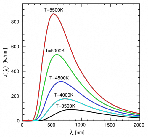
If you study this plot, or one of the interactive blackbody radiation demonstrators we used in the last lesson, you can prove to yourself that the color of a star provides a fairly accurate measurement of its surface temperature. For example, a 4500 K blackbody peaks in the red part of the spectrum, a 6000 K blackbody in the green part of the spectrum, and a 7500 K blackbody in the blue part of the spectrum.
Measuring a star’s spectrum is not always easy, but astronomers can often measure a star’s color reasonably easily. To do this, they put a blue filter (B) on the telescope and observe the star. They then re-observe the same star with a visual (V), or yellow, filter. The B filter measures the star’s brightness in blue light, and the V filter measures the star’s brightness in yellow light. The difference between these two, B-V, is the star’s color. The animation below shows a plot of Frequency vs. Intensity, There is a yellow band showing the frequency range that corresponds to the V filter, and a blue band that illustrates the frequency range for the B filter. When you click the play button, you see an animated curve representing blackbodies of different temperatures, and it marks the B and V measurements through these two filters for the different blackbodies. Note how for the three different objects with three different temperatures, that for the coolest object: its B intensity is smaller than its V intensity, for the warmer object: they are roughly the same, and for the hottest object: its B intensity is larger than its V intensity.
In addition, look at this image: Hubble Space Telescope image of star cluster 47 Tucanae [5]. Astronomers took images through different colored filters (in this case, near-infrared, I, visual, V, and ultraviolet, U), and added the three images together to produce a close approximation of the colors we would see of these stars with our own eyes. You can tell that many of the stars are similar in color; however some stand out as being much redder than the others. These red stars have the coolest temperatures among the stars in the cluster.
Another good example is this color image of Albireo [6] taken by students at the University of California, Berkeley. They adopted the double star system Albireo as the “Cal Star,” because the two stars (one blue and one yellow) match the school’s colors. Once again, we know from the colors of these stars that the blue star is hotter than the yellow star, because its apparent color indicates that the peak of its emission is in the blue, while the other star’s peak is in the yellow part of the spectrum.
Want to learn more?
At Hubblesite, they have an extended tutorial on the "Meaning of Color in Hubble Images. [7]" which includes a discussion of the filters used by astronomers [8] to determine the color of astronomical objects.
Recall from Lesson 3 that the spectrum of a star is not a true blackbody spectrum because of the presence of absorption lines. The absorption lines visible in the spectra of different stars are different, and we can classify stars into different groups based on the appearance of their spectral lines. In the early 1900s, an astronomer named Annie Jump Cannon took photographic spectra of hundreds of thousands of stars and began to classify them based on their spectral lines. Originally, she started out using the letters of the alphabet to designate different classes of stars (A, B, C…). However, some classes were eventually merged with others, and not all letters were used. The original classification scheme used the strength of the lines of hydrogen to order the spectral types. That is, spectral type A had the strongest lines, B slightly weaker than A, C slightly weaker than B, and so on.
Want to learn more?
For more information on her life and work, visit the homepage for Annie Jump Cannon [9] at Wellesley College.
Recall from Lesson 3 that the electrons in a gas are the cause of absorption lines—all the photons with the correct amount of energy to cause an electron to jump from one energy level to a higher energy level get absorbed as they pass through the gas. The absorption lines from hydrogen observed in the visible part of the spectrum are called the Balmer series, and they arise when the electron in a hydrogen atom jumps from level 2 to level 3, level 2 to level 4, level 2 to level 5, and so on. The strength of the Balmer lines (that is, how much absorption they cause) depends on the temperature of the cloud. If the cloud is too hot, the electrons in hydrogen have absorbed so much energy that they can break free from the atom. This is called “ionization,” and ionized hydrogen cannot create absorption lines because it no longer has an electron left to absorb any photons. So, very hot stars will have weak Balmer series hydrogen lines because most of their hydrogen has been ionized. Recall also that it takes energy to raise an electron from a lower level to a higher level. So, if the cloud of gas is too cool, the electrons will all be in the lowest energy level (the ground state, level 1). Since the Balmer series lines require electrons to already be in level 2, if there are no hydrogen electrons in level 2 in the gas, there will not be any Balmer series hydrogen lines created by that gas. So, very cool stars will have weak Balmer series hydrogen lines, too. Thus, the stars with the strongest hydrogen lines must be in the middle of the temperature sequence, since their atmospheres are hot enough that hydrogen will have its electrons in level 2, but not so hot that hydrogen becomes ionized.
This theory for the absorption by hydrogen was not understood until after much of the work on stellar classification had been completed. So, after the origin of the strengths of the lines was understood to have some dependence on temperature, the spectral classes for stars were reordered with the hottest stars at the beginning of the sequence and the coolest stars at the end of the sequence. The current order of spectral types is:
O B A F G K M
For decades, astronomy students have been taught a mnemonic to remember this order: O Be A Fine Girl (or Guy), Kiss Me!
Astronomers divide each class into 10 subclasses—so for example, a G star can be a G0, G1, G2... G9. Our Sun is a G2 star.

In the figure above, spectra of thirteen stars with normal spectral types and three special spectral types observed by the Kitt Peak / WIYN 0.9 meter telescope are presented. You can see two prominent trends in the spectral lines visible in the stars:
- O stars have few lines at all, while M stars have many
- The Hydrogen lines (the four most prominent lines in the A1 star) are strongest in the B6 - F0 stars
One summary comment about this discussion is that stars can be roughly classified by their colors, since the spectral types are arranged by temperature. Also, the apparent color of a star gives you a measurement of its temperature, but more accurate classification usually requires a high quality spectrum.
The Distances to Nearby Stars
Additional reading from www.astronomynotes.com [1]
Historically, the stars in the sky were considered to be simply a background of lights affixed to the celestial sphere. All stars appear to the naked eye as points of light, and their positions relative to each other never seem to change. However, the positions of nearby stars actually do move by tiny amounts, and if we can measure this apparent motion, we can calculate the distance to these stars using some simple trigonometry. This idea was actually well known to the Greeks and was an idea that was used to argue against the heliocentric model for the Solar System. As you will see momentarily, the argument goes that if the Earth orbits the Sun, then we should be able to see the nearest stars shift on the sky. Since this shift was not observed by the Greeks, nor by later astronomers like Brahe, they argued for a stationary Earth as the center of the Solar System. What they did not count on is the immense distance to the stars, which made the shift so small it was not able to be detected until the 1830s. The first scientist to do so was Friedrich Bessel in 1838.
The method that is used to measure distances to nearby stars is called trigonometric parallax, or sometimes, triangulation. This is actually the same technique that your brain uses to judge distances to the objects around you—your so-called “depth perception.” You can demonstrate this technique for judging distances with a simple experiment:
- Hold your arm out in front of you at eye level, and raise your index finger.
- Close your left eye, and note where your finger appears to be with respect to the background (the wall of the room you're in, for example).
- Open your left eye and close your right eye, and now note where your finger appears to be with respect to the background. It appears to have moved! (you can see this effect easily if you quickly alternate which eye is closed—first left, then right, then left, then right).
- Bend your elbow so that your finger is now much closer to your eye than when you held your arm out straight.
- Repeat the process of observing your finger with one eye opened and one eye closed. When your finger is much closer to your eyes, the apparent movement with respect to the background is much larger!
Because your eyes are separated by a few inches, your left eye sees a slightly different view of an object than your right eye. When your brain interprets the two images from your eyes, it allows you to estimate the distance to objects.
Of course, stars are so far away that the separation between our eyes does not make any difference in their appearance. However, we can use Earth’s orbit as a baseline to create separate images of nearby stars. In January, the Earth is on one side of the Sun (consider this the “left eye” position), and 6 months later, in July, the Earth is on the other side of the Sun (the “right eye” position). The distance between the Earth’s position in January and its position in July is twice the Earth/Sun distance, or 2 AU. When you observe a nearby star in January, and then again in July, its position with respect to much more distant, background stars will have changed by a measurable amount, as illustrated in this animation [12].
Using trigonometry, we can calculate the lengths of the sides of a right triangle with some simple equations. We can setup a right triangle if we use half of the measured angle that the star appears to move in 6 months. The distance to the star (d), the angle by which the star appears to have moved (θ), and the length of the baseline (b) are related in the following way:
We call the angle the "parallax," or just p, of the star (some folks use , like the creator of the diagram below, but I'll use just p). The length of the baseline is 1 AU, since we are using half of the angle. The reason we use half of the angle and half of the baseline to form a right triangle for the calculation is illustrated in the diagram below:

I want to emphasize that the parallax angles that we measure are incredibly tiny. If you were to create a right triangle using the diameter of a U.S. dime as one side and a distance of 2.4 km as the other side, the small angle in this triangle is about 1.5 arcseconds (remember, an arcsecond is 1/3600th of a degree). The nearest star to Earth, Proxima Centauri, undergoes a shift of 1.5 arcseconds in apparent position every 6 months. So every other star in the sky has an angular shift smaller than the diameter of a dime seen at a distance of 2.4 km!
The unit of measurement for distance that astronomers use is called the parsec (pc). This comes directly from the measurement of parallax for stars, because 1 parsec is the distance to a star with a parallax angle of 1 arcsecond. Parsec is an abbreviation for parallax arcsecond. Another unit that astronomers use for distance is the light-year, which is the distance a photon of light travels in 1 year. These two measurements are similar, and:
To calculate the parallax of any star, you can use the same trigonometric relationship that we discussed in lesson 3 when we talked about the headlights of a car. In this case:
B = the baseline of 1 AU, so:
Since D is the quantity that we would like to measure, we can rearrange this equation to read:
If you enter your angle for p, your answer for D will come out in AU. If you enter 1 arcsecond for your angle, D will come out to be 206,264.8 AU, the definition of a parsec given above.
You can simplify this equation, though. For sufficiently small angles expressed in radians (and 1 arcsecond is a sufficiently small angle):
, so:
as long as your value for p is a small angle.
to convert from arcseconds to radians, you would use:
or,
If we substitute this into the equation above you get:
, or
but since you have:
since the quantity appears on the top and bottom of the equation, you can cancel it out, and you are left with:
So, for any parallax angle given in arcseconds, the distance to that star in parsecs (abbreviated pc) is simply .
For example, if you have a star with a parallax of 0.5 arcseconds:
Parallax measurements have traditionally been made with photographs taken by refractors at ground-based observatories, such as the United States Naval Observatory, the University of Virginia Leander McCormick Observatory, the Allegheny Observatory of the University of Pittsburgh, Sproul Observatory of Swarthmore College, and the Yale University observatory. However, in recent years the Hipparcos satellite mission has provided parallax measurements for more than 100,000 stars out to distances of approximately 100 parsecs, and the European Space Agency Gaia mission [13] will improve upon those measurements in years to come. Although this topic is always described in exactly this way (that is, you measure the star's position in two precise locations on dates exactly 6 months apart), in practice, you can observe a star continuously and measure its subtle shift over the entire course of that six month time period. The images used to measure stellar parallax look nothing like the images you are used to seeing of the sky. Here is an image of a glass photographic plate from the UVa collection of a star in their parallax program:

On this plate, you can see rows of dark grey dots -- those are stars. In order to save plates (which were a pretty precious commodity), a single star would be observed, then the plate would be shifted, exposed again, shifted, exposed again, shifted, etc., sometimes putting 5 or 6 exposures of the sky on one plate. Then, to get additional use out of the plate, it would be turned 180 degrees and exposed 5 - 6 more times in the reverse orientation. The red marks show the location of stars of interest on the plate exposed in one orientation, and the blue marks mark the location of the same stars in the reverse orientation. This plate would then be measured with a machine able to centroid a star's location to an accuracy of a fraction of a micron. Measuring these plates was one of this course's author's summer jobs as an astronomy student, and if you visit in person [14], they do exhibit some of the measuring machines used for this work.
Luminosity and Apparent Brightness
Additional reading from www.astronomynotes.com [1]
Perhaps the easiest measurement to make of a star is its apparent brightness. I am purposely being careful about my choice of words. When I say apparent brightness, I mean how bright the star appears to a detector here on Earth. The luminosity of a star, on the other hand, is the amount of light it emits from its surface. The difference between luminosity and apparent brightness depends on distance. Another way to look at these quantities is that the luminosity is an intrinsic property of the star, which means that everyone who has some means of measuring the luminosity of a star should find the same value. However, apparent brightness is not an intrinsic property of the star; it depends on your location. So, everyone will measure a different apparent brightness for the same star if they are all different distances away from that star.
For an analogy with which you are familiar, consider again the headlights of a car. When the car is far away, even if its high beams are on, the lights will not appear too bright. However, when the car passes you within 10 feet, its lights may appear blindingly bright. To think of this another way, given two light sources with the same luminosity, the closer light source will appear brighter. However, not all light bulbs are the same luminosity. If you put an automobile headlight 10 feet away and a flashlight 10 feet away, the flashlight will appear fainter because its luminosity is smaller.
Stars have a wide range of apparent brightness measured here on Earth. The variation in their brightness is caused by both variations in their luminosity and variations in their distance. An intrinsically faint, nearby star can appear to be just as bright to us on Earth as an intrinsically luminous, distant star. There is a mathematical relationship that relates these three quantities–apparent brightness, luminosity, and distance for all light sources, including stars.
Why do light sources appear fainter as a function of distance? The reason is that as light travels towards you, it is spreading out and covering a larger area. This idea is illustrated in this figure:

Again, think of the luminosity—the energy emitted per second by the star—as an intrinsic property of the star. As that energy gets emitted, you can picture it passing through spherical shells centered on the star. In the above image, the entire spherical shell isn't illustrated, just a small section. Each shell should receive the same total amount of energy per second from the star, but since each successive sphere is larger, the light hitting an individual section of a more distant sphere will be diluted compared to the amount of light hitting an individual section of a nearby sphere. The amount of dilution is related to the surface area of the spheres, which is given by:
.
How bright will the same light source appear to observers fixed to a spherical shell with a radius twice as large as the first shell? Since the radius of the first sphere is d, and the radius of the second sphere would be , then the surface area of the larger sphere is larger by a factor of . If you triple the radius, the surface area of the larger sphere increases by a factor of . Since the same total amount of light is illuminating each spherical shell, the light has to spread out to cover 4 times as much area for a shell twice as large in radius. The light has to spread out to cover 9 times as much area for a shell three times as large in radius. So, a light source will appear four times fainter if you are twice as far away from it as someone else, and it will appear nine times fainter if you are three times as far away from it as someone else.
Thus, the equation for the apparent brightness of a light source is given by the luminosity divided by the surface area of a sphere with radius equal to your distance from the light source, or
, where d is your distance from the light source.
The apparent brightness is often referred to more generally as the flux, and is abbreviated F (as I did above). In practical terms, flux is given in units of energy per unit time per unit area (e.g., Joules / second / square meter). Since luminosity is defined as the amount of energy emitted by the object, it is given in units of energy per unit time [e.g., ]. The distance between the observer and the light source is d, and should be in distance units, such as meters. You are probably familiar with the luminosity of light bulbs given in Watts (e.g., a 100 W bulb), and so you could, for example, refer to the Sun as having a luminosity of . Given that value for the luminosity of the Sun and adopting the distance from the Sun to the Earth of , you can calculate the Flux received on Earth by the Sun, which is:
This value is usually referred to as the solar constant. However, as you might guess, since the Earth/Sun distance varies and the Sun's luminosity varies during the solar cycle, there is a few percent dispersion around the mean value of the solar "constant" over time.
The Magnitude System
Additional reading from www.astronomynotes.com [1]
- Magnitude system [17]
The flux (or apparent brightness) of a light source is given in units similar to those listed on the previous page (Joules per second per square meter). In this set of units, or in any equivalent set of units, the more light we receive from the object, the larger the measured flux. However, astronomers still use a system of measuring stellar brightness called the magnitude system that was introduced by the ancient Greek scientist Hipparchus. In the magnitude system, Hipparchus grouped the brightest stars and called them first magnitude, slightly fainter stars were second magnitude, and the faintest stars the eye could see were listed as sixth magnitude. If you notice, the magnitude system is therefore backwards–the brighter a star is, the smaller its magnitude.
Our eyes can detect about a factor of 100 difference in brightness among stars, so a 1st magnitude star is about 100 times brighter than a 6th magnitude star. We have preserved this relationship in the modern magnitude scale, so for every 5 magnitudes of difference in the brightness of two objects, the objects differ by a factor of 100 in apparent brightness (flux). If object A is 10 magnitudes fainter than object B, it is (100 x 100) or 10,000 times fainter. If object A is 15 magnitudes fainter than object B, it is (100 x 100 x 100) or 1,000,000 times fainter.
Remember that an object’s apparent brightness depends on its distance from us. So, the magnitude of a star depends on distance. The closer the star is to us, the brighter its magnitude will be. That is, the apparent magnitude of a star is its magnitude measured on Earth. However, astronomers use the system of absolute magnitudes to classify stars based on how they would appear if they were all at the same distance. If we know the distance to that star and calculate what its apparent magnitude would be if it were at a distance of 10 pc, we call that value the absolute magnitude for the star. In this system:
- If a star is precisely 10 pc away from us, its apparent magnitude will be the same as its absolute magnitude.
- If the star is closer to us than 10 pc, it will appear brighter than if it were at 10 pc, so its apparent magnitude will be smaller than its absolute magnitude.
- If the star is more distant than 10 pc, it will appear fainter than if it were at 10 pc, so its apparent magnitude will be larger than its absolute magnitude.
The apparent magnitude of a star has an equivalent flux, or apparent brightness. The absolute magnitude of a star is equivalent to its luminosity, since it gives you a measurement of the brightness at a specified distance, which you can then convert into the amount of energy being emitted at the surface of the star.
Because the magnitude system is backwards (brighter object = smaller magnitude), it can be confusing. For this reason, we will not use magnitudes in this course, and I would even recommend not using it in your own courses. Instead, I will continue to refer to the apparent brightness or flux of an object to mean the measurement we make of its brightness on Earth, and the luminosity of an object to refer to the intrinsic amount of energy it emits. However, you should be aware of the existence of the magnitude system because you are likely to see it used in most astronomy publications you read during this course.
Want to learn more?
If you have a strong desire to learn the magnitude system for your own benefit, I recommend the discussions at the following locations:
- Cornell's "Curious About Astronomy [18]" site
- Windows to the Universe [19]
The Hertzsprung-Russell Diagram
Additional reading from www.astronomynotes.com [1]
Like we did when we looked first at planetary orbits and gravity, and then later at the spectra of objects and atomic physics, we will need to consider some historical context as we move from the study of the properties of stars into an understanding of the true physical nature of stars. So, given what we've covered on the past few pages, you should understand that astronomers have long been able to obtain the following empirical data for stars:
- Apparent brightness
- Color
- Spectrum
- Trigonometric parallax
Using the mathematical relationships we have since presented (and they were uncovering) for parallax, the inverse-square law of light, Wien's Law, the Stefan-Boltzmann Law, and the classification scheme for stellar spectral types, the observables listed above could be used to deduce the following:
- Distance
- Luminosity
- Temperature
- Spectral type
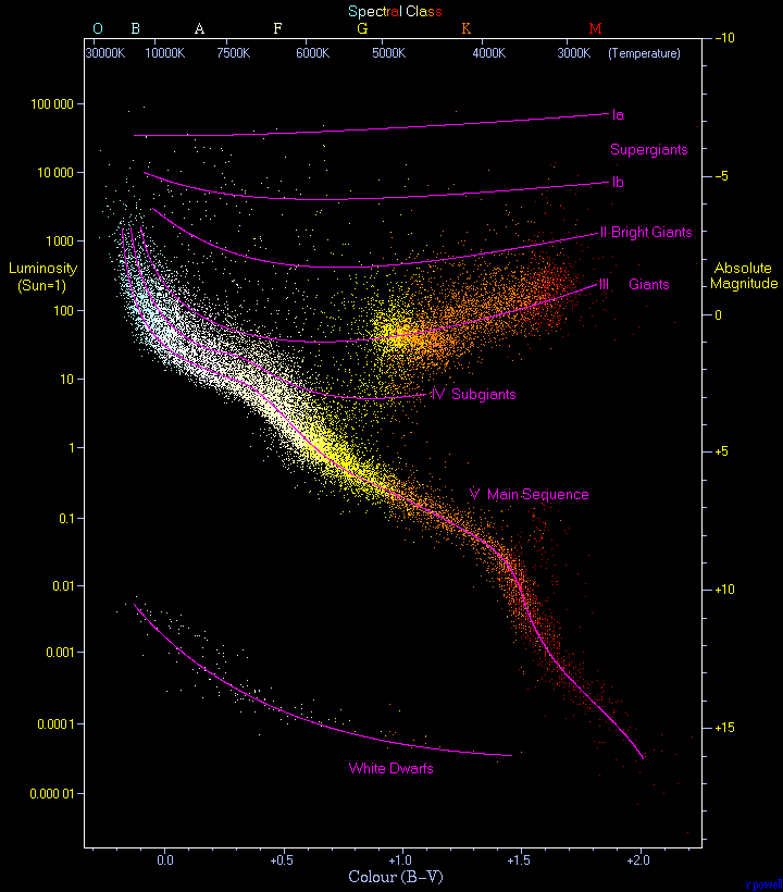
During roughly the same time period, two astronomers created similar plots while investigating the relationships among the properties of stars, and today we refer to these plots as "Hertzsprung [21]-Russell [22] Diagrams," or simply HR diagrams. Even though this is quite a simple two dimensional plot, over the course of the next few lessons, you will see exactly how powerful they are for uncovering a host of information on the nature of stars.
In a true HR diagram, you would plot the effective temperature of a star on the X-axis and the luminosity of a star on the Y-axis. The quantities that are easiest to measure, though, are color and magnitude, so most observers plot color on the X-axis and magnitude on the Y-axis and refer to the diagram as a "Color-Magnitude diagram" or "CMD" rather than an HR diagram.
In practical terms, the range of values for stars is smaller in temperature than it is in luminosity. Most stars have temperatures between about 3000 K (M class stars) and 50,000 K (O stars). The range in luminosities is much larger—the faintest stars may be 10,000 times fainter than the Sun, while the brightest stars may be 10,000 times brighter than the Sun. In order to represent this wide range of values in one diagram, the Y-axis of a CMD or HR diagram is usually plotted on a logarithmic scale. What this means is that instead of each tick mark on the y-axis increasing by 1 unit (1,2,3,4,5…), the y-axis tick marks increase by a factor of 10 (0.001, 0.01, 0.1, 1, 10, 100, 1000…). The X-axis is also logarithmic, although if it is labeled with color or spectral type, this may not be obvious. Another peculiarity of the HR diagram is that the X-axis is backwards from normal conventions–that is, the left hand side of the diagram has the hottest stars and the right hand side has the coolest stars, so the X-axis values decrease from left to right. Here are a few examples:

- From Astronomy Picture of the Day—the CMD for a star cluster called M55 [24]
- From the European Space Agency and Hipparcos Mission—a schematic HR diagram and a real one using Hipparcos data [25]
- From Jim Kaler's excellent website on stars—an HR diagram for many familiar stars [26]
If you look at these diagrams closely, you will see that a lot of the plot region is empty space. That is to say, most of the stars are concentrated in a narrow band that snakes from the upper left to the lower right of the diagram. This band can be explained very simply if you remember the luminosity / temperature relationship for blackbodies (and if you realize that stars behave almost like blackbodies):
If we assume that all stars are roughly the same size—that is, assume that R is approximately a constant, then the equation above tells us that the hotter a star is—the brighter it will be, and since L (luminosity) depends on T4 (temperature), small differences in T will cause large differences in L. We should, therefore, expect that hot, blue stars will be much brighter than cool, red stars. The upper left corner of an HR diagram includes the hot, bright, blue stars. The coolest stars are much fainter than the hot stars, and they lie at the lower right. The band connecting the hot, bright stars at the upper left to the cool, faint stars at the lower right is called the Main Sequence. Most stars on the Main Sequence (like the Sun, which is a G star), are referred to as dwarfs, but the hottest Main Sequence stars (O stars) are sometimes referred to as giants or supergiants.
You should also notice that there are stars found off the Main Sequence in the upper right and the lower left of most of these diagrams. The objects in the upper right have the same temperature as M dwarf stars, but they are much brighter. Again, consider the equation above. If two stars have the same T, the only way that one can be brighter than the other is if one has a larger R. Thus, the stars in the upper right are much larger than those directly below them on the Main Sequence. Since these are red stars, we refer to them as Red Giants. Using this same logic, we can estimate the size of the stars in the lower left of the HR diagram. They have the same temperature as O, B, or A stars, but are much less luminous. Thus, these stars must be much smaller than the stars directly above them on the Main Sequence. The stars in this category are called White Dwarfs.
We will spend much more time investigating the different types of stars and their location in the HR diagram in the next lesson.
Stellar Velocities
Additional reading from www.astronomynotes.com [1]
- Doppler effect [27]
- The Velocities of stars [28]
In the section on parallax, I discussed how the apparent back and forth motion of nearby stars allows us to determine their distances. Besides this apparent motion, can we detect the motion of stars through space? The answer is yes, and we can measure their velocities with different techniques. For any velocity, you can always break it up into components along two perpendicular axes. In astronomical terminology, we do the following: The total velocity of a star includes some motion along our line of sight,—that is, either towards or away from us (called the radial velocity)—and some motion across the sky, perpendicular to the radial velocity. This second component is called the proper motion, and it is actually the more difficult measurement to make.
Watch this!
T [29]here is an animated GIF of the proper motion of Barnard's star at Wikipedia [30]. Barnard's star is known as a high proper motion star because you can see its motion compared to background stars in only a few years. Most stars have much smaller proper motions that are much more difficult to observe.
Starry Night also has a few resources for investigating proper motions. In the "Favorites" menu of Starry Night Enthusiast, if you choose the Barnard's star option under Stars, or the Change Over Time option under Constellations, you will see additional examples of the proper motion of stars over much longer time periods.
If you take several images of a star field over time, most of the stars visible in the frame will be in the same place in each frame down to the limit of your ability to measure their location. However, some nearby stars can move noticeably, similar to Barnard's star in the movie at the link above. Barnard’s star moves by a distance equal to the diameter of the Moon (about half a degree) in 180 years. For most stars, which are more distant from us than Barnard’s star, the proper motion is much smaller. A typical value of the proper motion for a star is only a few thousandths of an arcsecond each year. Thus, it can take a 50-year time difference between photographs for a typical star to move by an easily measurable amount so that its proper motion can be determined with reasonable precision.
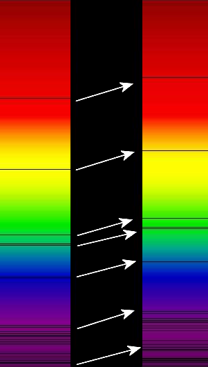
On the other hand, the radial velocity (motion towards or away from us) can be measured from one observation of a star’s spectrum! This is because the absorption lines in the spectrum of a star shift because of the Doppler Effect.

The waves of light in the figure are represented as rings, similar to the waves in a pond. If the source of a wave is stationary, the space between each ring (the wavelength) should be constant, and the rings should appear completely circular. An observer located anywhere around the source will record the wave arriving at her location with a wavelength equal to the wavelength as it was emitted.
If the source of a wave is moving as in the image above, the space between each ring is getting smaller in the direction of motion, because the source is "catching up" to the waves it emitted previously. On the opposite side of the ring, the space between the rings has increased. So an observer in front of the moving source will measure a smaller wavelength than the emitted wavelength, and an observer behind the moving source will measure a larger wavelength than the emitted wavelength. Note, however, that in the example above, the observer located above or below the moving source will still measure the emitted wavelength, because the only change in the wavelength occurs for observers who observe the source’s motion along their line of sight. For an animation of this effect, see:
Because optical light with a short wavelength is blue, and long wavelength light is red, when the wavelength of light gets shortened by the Doppler effect, we refer to the change in the wavelength as a Blueshift. When the wavelength of light gets lengthened by the Doppler shift, we refer to the change as a Redshift.
Two additional notes:
- It doesn't matter if the source is moving or the observer is moving. That is, if the source of the waves is stationary, but you are approaching it, you will see a blueshift.
- The change in the wavelength is proportional to the apparent velocity of the source. That is, the faster the source is moving, the more of a shift you will see.
Want to learn more?
There is an a capella group called "AstroCapella" that writes astronomy-themed songs (yes, I am completely serious). They have background content, songs, and transcripts of their lyrics. They do a great job with the Doppler effect. Check out...
- The AstroCapella background content page [34]
- Listen to their song [35]
- Read the lyrics [36]
Recall that light can be interpreted to behave like a wave. So, if you have a moving source of light, then the light it emits will experience the Doppler effect, too. Here is an example:

In practice, astronomers compare the wavelength of absorption lines in the spectrum of a star to the wavelength measured for the same lines produced in the laboratory (for example, the Balmer series lines of hydrogen). The following formula is then used to derive the radial velocity of the star:
In this equation, is the difference between the measured wavelength of the line in the star’s spectrum and its wavelength in the lab. The rest wavelength is , which is the wavelength of the spectral line as measured in the lab. The radial velocity of the star is , and is the speed of light.
For example, the rest wavelength of the first Balmer line of hydrogen (usually referred to as ) is . If we measure the in a star to have a wavelength of 657.0 nm, then its radial velocity is:
Since the sign of the velocity is positive, this means that the object is moving at 300 km/sec away from the observer.
This is a very common technique used to measure the radial component of the velocity of distant astronomical objects. The steps are to
- take the object's spectrum,
- measure the wavelengths of several of the absorption lines in its spectrum, and
- use the Doppler shift formula above to calculate its velocity.
Note that this requires you to know the rest wavelength of the line as measured in the laboratory, which means you need to be able to identify the line in the spectrum of the object even if it has been shifted far from its rest wavelength. This is one of the difficult tasks of observational astronomy.
Additional Resources
If you are interested in learning more about measuring stellar properties, I recommend:
- The Doppler Effect and Sonic Booms [38]. [39]
- From the "Practical Uses of Math and Science" is a description of an in-class activity on trigonometric parallax [40].
- Jim Kaler's website on STARS and the Star of the Week [41] are an excellent source of information on all aspects of stars, including topics like color, spectral types, the HR diagram, and others.
- At the Sloan Digital Sky Survey SkyServer website, they have a basic [42] and advanced lab exercise on measuring the colors of stars [43]. They also have a basic lab exercise [44] and an advanced lab exercise on classifying stars into spectral types [45].
- TERC has available as a sample activity an excellent HR diagram activity for classroom use. Unfortunately, after years of availability, the website has been taken down. I've posted the files in Canvas if you want to look at it, because I consider it to be one of the absolute best activities for doing HR diagrams with students.
Tell us about it!
Have another website or printed piece on this topic that you have found useful? Share it in our Comment space!
Summary
We often get asked what the difference is between astronomy and astrophysics. There is a story (probably apocryphal) that is attributed to different astronomers that goes something like, "When I'm on a plane, if I'm feeling sociable and want to talk, if the person sitting next to me asks me what I do, I tell them that I'm an astronomer. If I don't want to talk and want to sleep, I tell them I'm an astrophysicist."
A better way to think about the difference is that astronomy is all about the observation of objects and phenomena in space. For example, you could consider mapping all of the bright stars' locations as astronomy. You could also consider measuring the colors, brightnesses, and velocities of those stars astronomy. We are moving into the study of astrophysics, and now that we know how the properties of stars are measured, we can use those properties to reveal the true nature of stars, including their evolution. Stay tuned.
Activity 1 - Lesson 4 Quiz
Directions
First, please take the Web-based Lesson 4 quiz.
- Go to Canvas
- Go to the "Lesson 4 Quiz" and complete the quiz.
Good luck!
Activity 2 - Lesson 4 Practice Problems
Directions
There is a second quiz for this lesson that contains several short math problems. While I expect you to complete the quiz and to give it the same effort you would for a graded assignment, for these problems you will only be graded on completion and not on the accuracy of your answers. Your participation in this quiz will count in lieu of a discussion forum for this lesson.
- Go to Canvas.
- Go to the "Lesson 4 Practice Problems" and complete the quiz.
Reminder - Complete all of the lesson tasks!
You have finished the reading for Lesson 4. Double-check the list of requirements on the Lesson 4 Overview page to make sure you have completed all of the activities listed there before beginning the next lesson.