
Global Warming Did Not Stop Recently
The main text presented some of the evidence that temperature is rising. But, the climate is influenced by the 11-year sunspot cycle, the occasional sun-blocking influence of particles from big volcanic eruptions, and also by the sloshing of water in the tropical Pacific Ocean associated with El Nino and La Nina-when the hot waters spread along the equator in an El Nino event, some heat moves from the ocean to the air, and when the cold waters of La Nina follow, heat flows back into the ocean. An extra El Nino, or an extra-strong one, in a decade can make global warming look very fast, whereas an extra La Nina can temporarily slow the upward march of temperature from the rising CO2. This sort of sloshing cannot ultimately change the warming of the planet, but can make it appear more variable, and control whether the air warms fast and the ocean much slower, or whether faster warming of the ocean slows the atmospheric warming a bit.
Think for a minute about a neighbor taking a very active dog for a walk. Watch the person, and you can see steady progress down the street. Watch the dog, and you may have to study carefully for a while to even know which way they are going. You may find it useful to think of the year-to-year temperature changes as the dog, and the average behavior as the person.
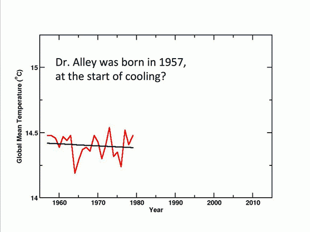
Next, take a look at the figures, which highlight events from Dr. Alley’s career. In each case, the jagged red line connects the temperatures from year to year, using data from NASA’s Goddard Institute for Space Studies, and the smoother black line is the best fit to the data over the interval selected. You will see that in each case, Dr. Alley has carefully picked the end points so that the best-fit line slopes downward, indicating a cooling trend. For the last 20 years, Dr. Alley has met important people in Washington, DC who declared that global warming stopped. It is very easy to do so; be quiet during a year with strong warming, and then the next year go back to claiming that global warming stopped.
Over a century ago, the Guinness brewery in Ireland hired an Oxford mathematician, W.S. Gosset, to develop ways to separate actual trends from short-term variability. The techniques were published with a pseudonym (A. Student), presumably to help people without telling competitors how valuable it was for a business to avoid self-delusion. If you apply techniques derived from that research, global warming has not stopped; all time intervals long enough to show a statistically significant trend do show warming.
By 2016, the temperature had risen enough that it barely fit in the chart above, aided by the ongoing human warming and by a strong El Nino event. This strong El Nino was warmer than the previous one, which was warmer than earlier ones, mostly because of human CO2. But, temperature was dropping a bit in late 2016 as the El Nino faded. And, some inaccurate voices were already, again, declaring that global warming had stopped.