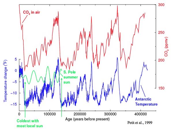
To help you “see” some of the material we just discussed, here are some data from an ice core at a place called Vostok in East Antarctica. It is probably not the coldest place on Earth, but it’s close. There is a Russian base there with good measuring equipment, and it observed the lowest reliably documented natural temperature ever at Earth’s surface: −89.2°C or −128.6°F. Snow accumulates very slowly there, and an ice core contains a long, accurate record of the temperature at Vostok, and of the atmospheric composition, because air bubbles trapped in the ice are little samples of the old atmosphere. Several long ice-core records have been collected in Antarctica, with the longest continuous one about 800,000 years, and older ice found in other places but disturbed by ice-flow processes so that a complete, continuous record beyond 800,000 years is not yet available from ice cores. (Other sedimentary records go much further back in time, but don’t trap bubbles of old air, so estimates of older atmospheric concentrations rely on indirect indicators and are slightly less certain.)
The temperature record, from the isotopic composition of the ice, is what happened in the Vostok region, not the whole world. But, if you take records from elsewhere, and smooth them a good bit, they all look similar to Vostok; the whole world cooled and warmed together through the ice-age cycles. And as explained in the next clip, this is primarily because of changes in CO2.
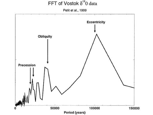
As noted on the previous page, the ice ages were caused by features of Earth’s orbit. The spacing between ice ages actually was predicted decades before it was measured accurately, based on astronomical calculations from the orbits. The prediction and test are explained in the clip just below, and shown in the figure below it. The figure is from a fancy way (called a Fast Fourier Transform, or FFT) to figure out the spacing between wiggles in a curve, such as the climate record—the arrows are the predicted peaks, and you can see that the actual peaks line up beautifully.
The story is wonderfully complicated but can be made fairly simple, again as noted on the previous page. When the summer sun has dropped in the north over thousands of years, ice grew, forming vast ice sheets that have bulldozed across Scandinavia, Boston, New York and Chicago. (Antarctica is already glaciated, and it doesn’t really get cold enough to get ice onto Australia, Africa, or most of South America, so sunshine in the south isn’t so important). The ice sheets were made from water from the ocean, which dropped more than 100 m (about 400 feet). Many other changes occurred as the ice grew, and these shifted some CO2 into the ocean. Then, the whole world cooled, including places getting more sunshine. When sunshine rose in the far north, this reversed. The temperature of the whole world changed together, even though half of the world got less sunshine when the other half got more, and CO2 is the main explanation.
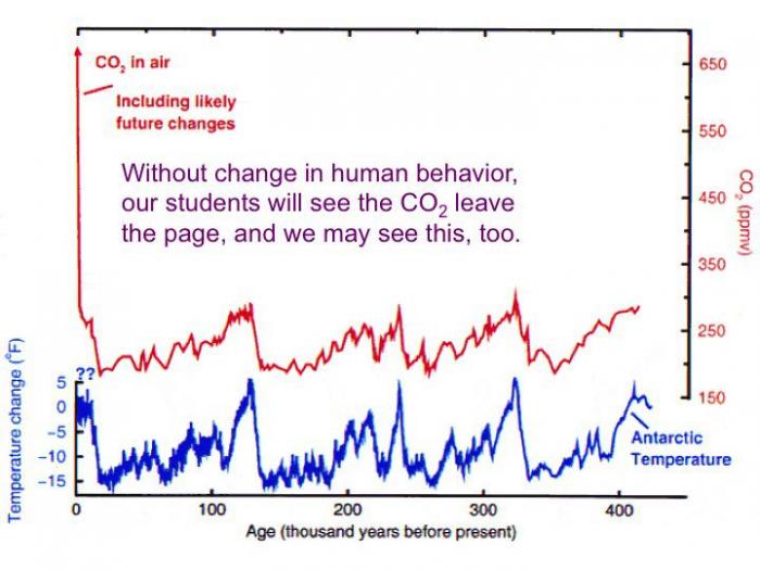
The last figure is then important, showing where CO2 may go this century if we don’t change our energy system.
Video: Data from the Vostok Ice Core (5:45)
PRESENTER: I have to apologize to you for this one. We've done something to you that may be a little bit confusing. Today is over here on your left and this is 400,000 years ago over here on your right. So old is over here on the right and young is over here on the left, and time goes this way.
What's shown here, first of all, is the temperature in Antarctica. That's this blue curve down below here. And what you'll notice is it sort of goes down and up and down and up. This is not temperature on the globe. This is temperature in a place in Antarctica, which is called Vostok. But if you blur your eyes, it is sort of temperature on the globe.
And what you'll notice is that this really, really, really does not look like a random curve. It's sort of warm, cold, warm, cold, warm, cold, warm, cold, warm, cold. And you can see this is going tick, tick, tick, tick, tick, tick, tick. And if you look carefully, you'll see some other faster sort of tick, tick, tick, tick, tick running down below here.
There are techniques that people have worked out for an analysis to tell you what are the wiggles that went into making this curve. If you focus on there, this is what you get. There is a big tick, tick, tick, tick, tick, at about 100,000 years spacing. There's one at 41,000 years and there's a couple at 23 and 19,000 years. And this is a remarkable thing, because these are features of Earth's orbit and they were predicted decades before they were discovered.
Milankovitch and other workers before him said, we know that sunshine on the planet is being varied by these things. And when you climate scientist finally get a good enough record. You will find a peak under each of these arrows, and this one actually is an interaction of these two. So they really predicted that one too. And so when it happened, people actually found that there's really no question that we need to worry about that the ice ages are driven by features of Earth's orbit.
They're not driven by CO2 or the brightness of the sun or continental drift. They're driven by wiggles in Earth's orbit. But these Earth's orbit wiggles have very little effect on the total sun that reaches the planet. All they do primarily is move the sun around. So some places will be getting more sun. Other places will be getting less sun. And what's really strange-- I show you here is sort of midsummer sun at the south pole and when you see here, when it was very cold, midsummer sun was actually high at the south pole.
It turns out that temperatures at the south really do depend on sunshine at the south, but they also follow sunshine in the far north. In fact, the whole world follows sunshine in the far north. When ice was growing in Canada the whole world got colder, including places that were getting more sun. When ice was melting in Canada the whole world warmed up, including places that got less sun. Now that's weird.
Some places listen to their sun, some places ignored their sun. How did that happen? Well, you'll notice the second curve up here, this is CO2 in the atmosphere. When the ice grew in Canada, a huge number of things changed on planet-- dust to the ocean, ocean circulation, wind the sea level, a bunch of things. And it shifted some CO2 from the air into the ocean.
When the ice melted on Canada these things changed back and it shifted CO2 out of the ocean and into the air. If you try to explain why the temperature in Antarctica really wasn't following the sun in Antarctica and the temperature at the equator wasn't following the sun at the equator, if you ignore the CO2, no one has ever explained it successfully. If you include the effects of the CO2, it all makes sense. And so the ice ages are caused by features of Earth's orbit but there globalized by CO2 and that helps us to understand that CO2 really does have an effect.
Now suppose we then look at this future, this is the same plot as you saw before except I've squeezed it down to show you the level that we will go to. People taking this course are likely to see us go off of this page. If we don't change our behavior, some of you are likely to live that long. And this was important to this, but we may be going here. Now it is indeed true that as the CO2 gets higher it takes more to make a big difference, but we are making a very big change to the atmosphere in something that we have very, very high confidence will affect the climate.
 Earth: The Operators' Manual
This three-minute clip visits the US National Ice Core Lab to show a little more about the changes in the CO2and the climate that occurred with the ice ages.
Video: CO2 in the Ice Core Record (3:01)
This frozen library, the National Ice Core Lab in Denver, Colorado, has ice from all over... kept at minus 35 degrees. The oldest core here goes back some 400,000 years. Here really ancient ice from Greenland in the north, and Antarctica in the south, reveals Earth's climate history. Let's see what cores like this can tell us.
First are those layers I mentioned in the New Zealand snow. They've turned to ice, and we can count them, summer, winter, summer, winter. Like tree-rings, we can date the core. Other cores tell other stories. Look at this... it's the ash of an Icelandic volcano that blew up to Greenland 50,000 years ago. Cores hold other and even more important secrets... look at these bubbles. They formed as the snow turned to ice and trapped old air that's still in there.
Scientists now are working with cores from Antarctica that go back even further. They tell us, with a very high degree of accuracy, how much carbon dioxide was in the air that far back. Researchers break chunks of ice in vacuum chambers and carefully analyze the gases that come off. They're able to measure very precisely levels of carbon dioxide in that ancient air. Looking at the cores, we see a pattern that repeats... 280 parts per million of CO2, then 180, 280, 180, 280. By analyzing the chemistry of the oxygen atoms in the ice you can also see the pattern of rising and falling temperature over time. Colder during the ice ages, warmer during the interglacial periods. Now put the two lines together... and you can see how closely temperature and carbon dioxide track each other. They're not exactly alike. At times the orbits caused a little temperature change before the feedback effects of CO2 joined in.
But, just as we saw in New Zealand, we can't explain the large size of the changes in temperature without the effects of CO2. This is the signature of natural variation, the cycle of the ice ages driven by changes in Earth's orbit, with no human involvement. But here's where we are today. In just 250 years, since the Industrial Revolution, we've blown past 380 with no sign of slowing down. It's a level not seen in more than 400,000 years, forty times longer than the oldest human civilization.