
The Potential Wind Energy Resource
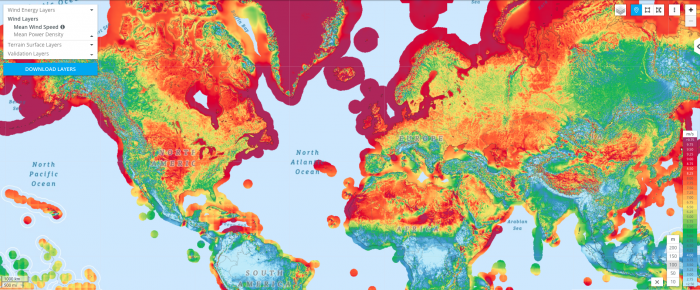
A quick look at an annually-averaged wind map of the world (below) shows the regions of the world that are best suited for the production of wind energy in colors ranging from yellows to red (where the average winds are at least 9.75 m/s or 20 mph). The offshore regions are clearly the best in terms of the energy potential, but not all of these offshore regions are close to where people live. Even for onshore portions of the world, the wind energy potential does not always coincide with where the people are concentrated. This points to the necessity of new transmission lines to deliver this wind energy to major population centers.
So, just how much energy could be produced by the wind? In 2009, a group of scientists makes some calculations to estimate the potential for the world and the US, using wind data and some assumptions about the size and spacing of the turbines. They assumed 2.5 MW turbines on land, and 3.5 MW turbines offshore, which were big for that time. They assumed that you could only place the turbines in unforested, ice-free, nonmountainous areas away from any towns and that the turbines had to be spaced by several hundred meters so they do not interfere with their neighbors. They further assumed that each turbine generated just 20% of its rated capacity to account for mechanical problems and intermittent winds. What they came up with is summarized in the table below, and it is pretty remarkable. The units here are exajoules (EJ = 1 x 10¹⁸ Joules) of energy over the course of a year. For reference, in 2018, the US total energy consumption (not just electrical energy) was 106 EJ and the global consumption was about 600 EJ. So, with just onshore wind energy, the potential is more than twice what we consume in the US, and more than 4 times the global consumption. But getting there is a matter of installing a lot of wind turbines!
| Region |
World |
Contiguous US |
|---|---|---|
| Onshore | 2484 | 223.2 |
| Offshore 0-20m | 151 | 4.32 |
| Offshore 20-50m | 144 | 7.56 |
| Offshore 50-100m | 270 | 7.92 |
| Total | 3024 | 244.8 |
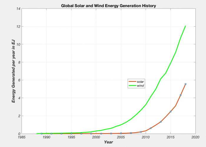
Now let's consider a more practical question — how much wind energy have we managed to produce and can we somehow project the past trends into the future? The figure below shows the global history of wind energy (solar is plotted too just for comparison), and you can see that it is growing fast.
Both of these curves are growing exponentially, and the history so far suggests a growth of about 25% per year on average. If we assume that they continue to grow in the further following this exponential growth, we can project where we'll be at any time in the future. Below, we see where we might be in the year 2030, just eleven years from now. What you see is that we end up with vast amount of wind energy by 2030 — if it grows at the same rate it has been growing at, we end up with almost 300 EJ per year, about half of the current global energy consumption, and if it grows at a smaller rate of 20% per year, we still end up being able to supply about 20% of the total global energy demand.
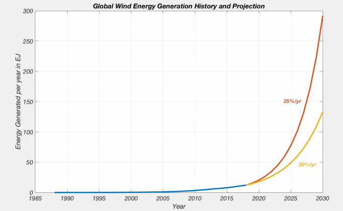
This figure shows the wind energy generation history from 1987 up until 2017 or 2018 in blues, and then the projection into the future at 2 different growth rates. So we know that the history up until now, wind energy generation has grown at about 25% per year, which is a remarkable growth rate. It is a continuous at that and we will follow this red curve and end up by the year 2030, so that’s just another 12 years from now or 10 years from now, we will have 300 exit joules of energy produced through wind. And if it grows at a slower rate of 20%, we will end up with something like 130 exit joules of energy per year. For reference, remember globally all of our energy consumption totals to about 600 exit joules of energy. So if it keeps going in the next 10 years as it has been going, we would be able to get half of our energy from wind alone, which is quit a remarkable thing. The power of exponential growth that we are looking at.