Capstone Project
Capstone - Roadmap to a Sustainable, Prosperous Future
This is where you are given the freedom to put it all together and craft a roadmap for a sustainable, prosperous future. We’ll pretend you have been granted the authority to completely control global carbon emissions and your job is to put together an emissions scenario for the next 200 years that accomplishes 4 things:
- Keeps the global temperature change below 2.0°C (relative to pre-industrial, so about 1°C above the present temperature).
- Meets the energy demands of the world’s population.
- Leaves us in the year 2200 with at least another 100 years worth of fossil fuel carbon.
- Minimizes the per capita costs (combination of climate damages and costs related to shifting to other forms of energy). We’ll assume that the plan that costs the least will leave more money for economic growth and prosperity.
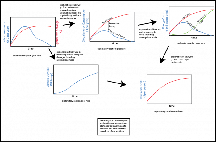
Follow the directions in Steps 1-6 and then cycle through these steps until you find your ideal scenario, then proceed to Step 7 and complete the project by making a poster. The poster will illustrate and explain your plan using a combination of graphs and text — it is the kind of thing that you’d expect a classmate to be able to understand in 10 minutes of study. There is an example of what this might look like in Step 7.
Submitting your Assessment
Submit your assignment in the Capstone Dropbox in Canvas. You can save as a PDF file (this can be done from Powerpoint), a regular PowerPoint file, or as a Google Slides file.
Grading and Rubric
| Description | Possible Points |
|---|---|
| Clarity of graphs and captions for graphs. The captions should explain what is plotted and what the units are. Recall that the goals of this course include developing the ability to interpret plots of data and to explain and understand the different units represented by the data — so you should keep this in mind while writing the captions. | 10 points |
|
Clarity of explanatory text. The graphs should be linked together with some explanatory text that explains how things are calculated, what assumptions you’ve used, and why they are reasonable assumptions. There should also be at least one short paragraph that sums it all up, explaining why this is the best roadmap. This explanatory text is the way that you will demonstrate a range of abilities that align with the goals and objectives of this course, including: the ability to explain scientific concepts in language that a non-scientist can understand; your systems-thinking knowledge, talking about feedbacks and interconnections between different parts of the system — how climate, energy, and economics are intertwined. We expect you to also convey your knowledge of the policy options that would be needed to make your roadmap a reality. |
20 points |
| Overall layout. There should be a clear flow of logic in the way the poster is laid out. Following the steps laid out in the process will help with this. | 10 points |
| Bonus There is a bonus for the roadmap that comes in with the lowest per capita total costs, using assumptions that are clearly justified. | 10 points |
Step 1
Step 1
Instructions
Open the model [1]. Create a carbon emissions history that keeps the temperature below 2.0°C. If you just run the model as is, you'll see that global T change rises to about 4.5°C, so you need to reduce the carbon emissions by clicking on the graphical icon to the right and changing the curve. You'll probably have to try several versions of this until you get the temperature change to stay below 2°C. The video below, Capstone Project Step 1 Instructions, will show you how to do this. Please watch the video before doing anything with the model or answering the questions below.
Video: Capstone Project Step 1 Instructions (4:06)
PRESENTER: The first thing to do in this capstone project is to find a carbon emissions scenario history that keeps the global temperature down below three degrees. So this model comes loaded with this carbon emissions history here, which is the red line here. And you can see that if you look at the plot here the temperature actually rises too high in the center area, 4.5 degrees. So you go in and you change this. Let's lower this emissions history. We'll do something like this. Doesn't matter how, we're just fiddling around here.
OK, and then you run the model like that and see what happens. And so it looks like here we've kept the temperature-- we're getting a little bit closer here so 3.22. Still too high in the emissions. So you have to adjust the emissions history until you get the global temperature down below three degrees warming. And then once you've done that, you want to make sure that this emissions history has left us with enough fossil fuels that we could continue this level of emissions for a specified period of time.
So all you have to do there is to take the total amount of fossil fuels left over, and that would be this pink curve here. It's the second time I ran the model. We were left with 2,400 gigatons of carbon, which is quite a lot. And if we were to look at the final emissions right here at about two, so with this rate of burning, two gigatons of carbon per year, we've got 2,400, we've got about 1,200 years of time. So we definitely have left ourselves plenty of fossil fuels, so we can rely on them to a limited extent for a very, very long time indeed. So this is an OK and acceptable scenario from that standpoint.
So this is step one of this process. Once you've done this, you go on to step two and there will be another video that will explain how to do that.
Step 1 Deliverables
NOTE: Skip these deliverables until you've cycled through Steps 1-6 and found your ideal scenario. Then produce the following:
A copy (screen shot) of the graph showing the carbon emissions and the global temperature change (page 1 of the graph pad). This will get pasted into your summary poster.
A brief statement demonstrating that this emissions history leaves us with enough fossil fuels left to last another 100 years. This too will be included in your summary poster, positioned next to the graph described above.
How do you do this?
Take the ending amount of carbon in the Fossil Fuel reservoir (page 11) and divide it by the ending emissions rate (this will be in Gt C per year) — the result will be in years and is the time past 2200 when we would run out of fossil fuels.
Step 2
Step 2
Instructions
Next, choose the mix of fossil fuels you will use by adjusting the fossil fuel fractions in the pie diagram to the right (move the small white circles around to change the percentages). Recall that each of these three forms of fossil fuel emit different amounts of carbon per unit of energy produced. Coal emits the most carbon per unit of energy, while gas emits the least, which means that if you have allowed yourself a certain amount of carbon emissions, you'd get more energy if you burned natural gas rather than coal. These percentages then determine something called the FF energy intensity (EJ/GT C, shown in the box next to the pie diagram), which is used to calculate the energy we would get from your carbon emissions history. FF energy intensity could be as high as 59 for 100% natural gas or as low as 35 for 100% coal — whatever percentages you use, you should be prepared to explain why you chose them.
These different fossil fuels also have different costs, and so choosing the percentages determines what is called the fossil fuel unit cost (in $Billions/EJ of energy).
Once you make your choice, you have to run the model once to see the calculated FF energy intensity value and the fossil fuel unit cost.
The video below, Capstone Project Step 2 Instructions, will show you how to do this using the controls of the model.
Video: Capstone Project Step 2 Instructions (3:24)
PRESENTER: In Step 2 of the Capstone Project here, we have to make some decisions about the mix of different fossil fuels that we're going to use as our carbon-based energy. And so, the model comes with this little pie diagram, it's showing the present-day distribution of coal, natural gas, and oil. So those are the percentages, or fractions really. And so, you can change this. You can keep this the way it is, or you can reduce it. But if we reduce it, we can maybe get this fossil fuel energy intensity number little bit higher. So, this is the number of exajoules of energy you create per gigaton of carbon emissions. Remember, we've already sort of set, we've determined, in this graphical converter what the carbon emissions are going to be.
And so, the question is, well, how much energy can we get from that, that amount of carbon emissions? That, this is in gigatons of carbon. So, this fossil fuel energy intensity value, the bigger this is, the more energy you get from that. And depending on, because they cost different amounts per unit of energy, we're going to end up with a different fossil fuel unit cost. So, you can see presently it's 18 dollars and 5 cents, not dollars and five cents but it's in, its billions of dollars per exajoule of energy, let’s say. We're going to make some changes here. We’re going to make these changes by sliding these little yellow, or these white circles around, like that. We can, so we can make natural gas a bigger part of this.
Now I'm going to do something radical here and say, I'm gonna just kinda cut coal out entirely. There, I've cut coal to zero. Natural gas I’ve got that at 73. I'm going to bump that up to closer to 80. That's close enough. Now, if I run the model, you will see the unit cost and the fossil fuel energy intensity change. So, we’ll just run the model. You see those values change. So sure enough, I got this up higher, close to the, theoretically this could be as high as 59.
So, I'm quite close here. I've kept some oil here in the mix and it's just because the products of oil, so, gasoline, diesel, kerosene, jet fuel, things like that. Those are, those are pretty useful. They're very portable forms of energy. So, we might want to still have some use of oil, but for most of the other carbon energy, we're going to rely on natural gas, which is cleaner. And sure enough, that brings the cost down quite a bit to $12.91.
We make that change and then that's going to affect how much energy we produce with this amount of carbon emissions. And then we'll look at that a little bit later. But as a product, as a deliverable from this step, you're going to want to take a little screenshot of this pie diagram after you've run the model. You’ve got the new fossil fuel energy intensity and the unit cost here. You can go back to the start here by hitting this little undo button, return button. And there we go, back to the original.
Step 2 Deliverable
NOTE: Skip this deliverable until you've cycled through Steps 1-6 and found your ideal scenario. Then produce the following:
A brief statement saying what value you used for FF energy intensity, and how you chose that value — what does it represent in terms of a mix of coal, gas, and oil? Take a screen shot of the pie diagram and the associated numerical displays of fossil fuel unit cost and FF energy intensity. This statement and picture will be included in your summary report, along with a screen shot of page 2 of your graphs, which shows the total energy demand and how much of that energy comes from fossil fuels and how much comes from renewables. Note that the amount of renewable energy is just the total energy demand minus the energy obtained from fossil fuels.
Step 3
Step 3
Instructions
Next, get the model to calculate how much energy we would need in total. This is easy — all you have to do is choose the global population limit and the history of per capita energy demand and the model combines these. You may choose whatever population limit you like. You may also change the per capita energy demand from the default, but it will cost you money, and you’ll have to keep track of that money (the model will keep track of it for you). The model does this by first calculating the total energy demand without any conservation (called the reference global energy demand in the model), using the default graph of per capita energy demand and the population — then we subtract from that the reduced energy demand (you need to lower the per capita energy demand curve) to give the amount of energy conserved (see page 12 of the graph pad). Next, the model takes this energy conserved and multiplies it by the unit cost of conserved energy, which is 0.5e9$/EJ (McKinsey, 2010) to get the conservation costs. Compare this unit cost of conservation to the unit costs of making energy from different sources by clicking on the Energy Costs button in the upper right of the model window, and you’ll see that conservation is a great deal. There is an upper limit here of 40% reduction from the reference curve, according to estimates from McKinsey (2010), so you can't push this too far. In fact, if you try to conserve an unrealistic amount, the model will override you and keep the actual per capita energy to within the 40% limit. Once you’ve got the total energy demand, the model subtracts the energy production from fossil fuels to get the energy that has to be supplied by renewables (non-fossil fuel sources).
The video below, Capstone Project Step 3 Instructions, will take you through the steps involved in this part of the project.
Video: Capstone Project Step 3 Instructions (4:24)
PRESENTER: In this next step in this project, we're going to calculate the total energy demand. And we're going to do that simply by combining the population part of the model with the per capita energy curve here. So this shows the per capita energy in terms of exajoules of energy per billion people over the history of this model. Runs over about 200 years. And this is a graphical function of time that can be changed, and we'll change that here in just a second.
So if we run this model now, let's go back here to the beginning and run this model in time and see what happens. OK, here's our carbon emissions curve here, here's our global temperatures, so we are getting close to keeping it below three. Now if we go backwards here, here's our graph showing the global energy demand. Also the reference global energy demand. They're one in the same here because I haven't made a change to this curve here.
Also shown on here is zero right now is the energy conserved. So if I go ahead and change this curve here and lower the energy demand, that represents conservation of energy. So let's go ahead and do that. Make a little bit of a change here. Let's say we lower the energy demands through time like this. And on this graph, this line over here at the edge represents the year 2200. This line over here represents the year 2010. Every little increment here represents an additional 48 years, I think. OK, so we can adjust this history.
So I've have made some big steps energy conservation. Let's see what happens and we'll run the model. And sure enough the global energy demand is less than this reference value here. And the difference represents energy conserved. Now this energy conserved isn't free. It comes with a cost. And so later in this model you'll see the costs that are attributed to this conservation of energy.
And you can look at that if you just go back here to page five and you can see this pink line here, conservation costs. It's very, very low here. It looks like a flat line not changing. It's actually changing a little bit, but it still just stays a very, very low. So that's a very modest cost.
The other thing you can do, of course, in adjusting this model is to lower the population limit. So let's lower the population limit from something like 12 to something down near 9. We run the model and you see that everything gets shifted downwards. The reference curve gets shifted downwards, the actual global energy demand gets shifted down, and the energy conserved shifts down as well. So these two controls, population limit and per capita energy, are how you determine what the global energy demand is.
Step 3 Deliverables
NOTE: Skip these deliverables until you've cycled through Steps 1-6 and found your ideal scenario. Then produce the following:
A graph showing the reference global energy demand and actual global energy demand and the energy conserved (page 12 of graph pad), along with the conservation costs.
A graph showing the global energy demand, the carbon-based energy, and the renewable energy (page 2 of graph pad). Both of these graphs should appear in your summary poster.
A brief statement of what you chose for a population limit, and what kinds of challenges (if any) you think might be involved in achieving this population limit. This should be positioned next to the graph above.
Step 4
Step 4
Instructions
Make adjustments to the pie diagram that shows the percentages of different renewable energy sources — think of this as your renewable energy portfolio. The model default shows the current percentages, but you should feel free to change this, with a few restrictions, which you can see by clicking on the button to the upper right of this pie diagram.
- f hydro should not exceed 46% — we just don't have that many more good dams to build;
- f geothermal should not exceed 10% — the really good locations are far from where people live, so we cannot rely too much on this
- f solar, f wind, and f nuclear could each theoretically be 1.0, which is 100%
The percentages you choose also determine the initial unit cost of renewable energy — each form of energy has a different unit cost, and the percentages you choose are combined in the model to give you the overall average, which is shown in the blue box to the upper left of the pie diagram. The estimated costs of each type of energy can be seen by clicking on the Energy Costs button, which shows:
| Wind | 3.6 (drops by 15%/yr) |
|---|---|
| Geothermal | 11.9 |
| Hydro | 5.5 |
| Solar PV | 6 (drops by 20%/year) |
| Nuclear | 31 |
| Oil | 24 |
| Coal | 17 |
| Natural Gas | 10 |
The model assumes that the costs of geothermal, nuclear, and hydro are all constant over time, but the costs of wind and solar decrease over time, following an exponential function that is based on the recent history. These costs are the levelized (life-cycle) costs that we covered in Unit 2.
The key thing for us is the difference in cost between the various renewables and the fossil fuels. For example, if we wanted to switch 500 EJ of energy generation from fossil fuels to nuclear, this would cost us 31-18=12 \$billion per EJ, which is \$6 trillion more. Of course, money spent doing this would reduce the money spent on climate damages, so it might be a good thing -- and you can see if it is good thing by running the model several times with varying use of renewables.
If you study the energy costs, you might notice that many of the renewables are actually cheaper than fossil fuels in terms of energy generation — so why haven’t we already switched? The answer is largely related to the challenges in switching our energy infrastructure around — it will take some bold government leadership and our collective support to take the leap here. In addition, there are significant start-up costs — although with government backing, these costs can be spread out over a long time. We’ll assume that there is a cost to the switch that amounts to \$0.02/kWh, which is \$5.5e9/EJ in 2020. This cost related to switching energy sources is automatically added on to the cost of generating the renewable energy.
See the video, Capstone Step Four Instructions for some guidance on how to do this.
Video: Capstone Project Step 4 Instructions (4:22)
PRESENTER: For Step 4 in the Capstone Project, we're going to focus on the renewable energy sector up here. So, we're going to make some changes here. Or not, you can do it either way. But this is where you determine which of the different renewables, how much the total renewable energy portfolio they make up. So, this is what we currently have, so 45% of our renewable energy is hydro, right now, 28 nuclear, wind is 14, geothermal 7, solar 6. So, the idea is to change these and that mix along with the cost of these different energy sources, which you can see here. That determines the initial renewable energy unit cost. So, it's 12.63 billion dollars per exajoule of energy right now.
So, there are some limits here to these renewable fractions. You can find out about these. F hydro shouldn't exceed 46%. That's because there just aren't that many more big, highly productive dams that we can build. We've already dammed up the rivers in the best places, in general. So, it can grow a little bit, but not much. The geothermal shouldn't exceed 10%. It's geographically so limited that it's not going to be a huge player in the future. But solar, wind, and nuclear could each theoretically supply a 100%. But then, you know, whether or not you want to do that sort of depends on the costs.
So, look at the costs. Do you... nuclear is pretty expensive, 31 billion dollars per exajoule. Do you really want to have that much nuclear energy in your portfolio? Well, there might be some reasons have some, but it is expensive. So, how to make those changes? You just move these little white circles around. So, I'm going to reduce my nuclear here, just to show you this, I'm going to reduce that to maybe 6%. And geothermal, I can't have it be more than ten. But I kind of like geothermal, it is pretty inexpensive, so I'm going to keep that at ten. That's a good sort of constant steady supply. I'm going to keep hydro pretty much where it is. And then I'm going to split the remainder in terms of solar and wind. And I get those kind of close to each other. They're roughly about there. And the reason for doing that is that they complement each other, in general, so that during times of the day when you generate a lot of wind power, you don't generate a lot of solar power, and vice versa. So, it makes sense to have those be kind of balanced.
Now you notice I've made those changes. Here's my new renewable portfolio. This initial cost doesn't change until I hit the Run button and we see what happens. So, I've dropped that way down now. So that's 7.17. And so, then when you run the model and you look at things like the energy costs now, those energy costs are going to reflect this initial renewable energy here. If we're going to go way back here, if I go backwards and look at 15, This shows the energy costs changing over time. Fossil fuel energy up here and this is the renewable energy cost. So, it starts off at seven, but it drops to five billion per exajoule over time, just because the model assumes that the cost of wind and solar energy will continue to decrease following an exponential function. So that this is just matching what's happened in recent history in terms of price declines there. So, that's why that price continues to drop in the early stages of this scenario.
So that's, that's what it is. That's sort of the rundown on Step 4.
Step 4 Deliverables
NOTE: Skip these deliverables until you've cycled through Steps 1-6 and found your ideal scenario. Then produce the following:
A brief statement of what you came up with for a unit cost of renewable energy, including what percentages of the different sources you used to come up with this number. Take a screen shot of the pie diagram of renewable percentages to accompany your statement.
Graphs showing your total energy costs, the renewable energy costs, and the carbon energy costs (page 3 of graph pad), and the unit energy costs (page 15 of graph pad). These graphs and the statement above will be included in your summary poster.
Step 5
Step 5
Instructions
The next thing to do is to add up all of the costs related to your plan. The model will calculate the costs due to climate damages using the scheme from the modified DICE model (module 10 summative assessment) to do this. To get the total costs, we assume an economic growth rate (percent growth of gross economic output per year — the global GDP). It begins at $56 trillion per year grows at a constant annual growth rate of 1.5% for this time period.
The model then adds these climate damage costs to the total energy costs (renewables, plus switching costs, plus carbon-based energy) and the conservation costs to get the overall total costs.
For guidance on how to do this step, see the video below — Capstone Step 5 Instructions.
Video: Capstone Project Step 5 Instructions (2:11)
PRESENTER: Step 5 of the Capstone Project, we're going to focus on the total costs of your plan so far. Remember, your plan at this point will have consisted of a modified carbon emissions curve here, a modified per capita energy curve here, possibly a change in the population limit here, a change in the fossil fuel fractions, and a change in the renewable energy fractions.
And so, all of that leads to total costs here in yellow, this is page five of the graph pad, which is really just the sum of all these other curves. Four is the climate damage costs, which are quite high in this scenario, reaching a value of something like almost \$50 trillion by the end of the time, which is significant. If you look at on page nine, the GDP at the end is about \$600 trillion. So, it's you know, a little bit less than 10% of the GDP. It's pretty sizable chunk going to climate damage costs.
So, you take that value and you add to it, the renewable energy cost here - curve two, the carbon energy cost - curve one, and the conservation cost - curve three, which is zero, in this case. Zero because I haven't right now modified the per capita energy demands at all. So, we're not doing anything in terms of conservation. You're going to take a screenshot of this and include this in your, your poster, your presentation of your project and just comment about the relative magnitudes of these different costs, and then we'll consider some of these costs in a different way when we talk about Step 6 as the next thing.
Step 5 Deliverable
NOTE: Skip this deliverable until you've cycled through Steps 1-6 and found your ideal scenario. Then produce the following:
A graph showing the various costs (page 5 of the graph pad) -- the units here are all in trillions of dollars. This graph, along with some commentary will appear in your summary poster. The comments could draw the reader's attention to important things in the graph.
Step 6
Step 6
Instructions
So far, you have gone through the process of designing a pathway or roadmap for the future and calculating the economic consequences of the set of assumptions/decisions that went into the roadmap. Now, the idea is to fiddle around with it to see if you can lower the costs, and remember that the best thing to compare here is the sum of the total costs per capita (in thousands of dollars per person), which is plotted on page 13 of the graph pad. Your best model from an economic standpoint is the one that generates the lowest value for this parameter.
In other words, you return to the earlier steps in this process, make a change, and then compare the costs with your previous version. As you do this, you will learn what kinds of changes lead to lower costs and you will eventually find the best roadmap (and remember that you also have to be able to justify it). One thing that you should do is to see if you can get a better economic result by keeping the global temperature well below the 2°C limit — in other words, go back to Step 1 and alter the carbon emissions curve to give you a lower temperature and then keep all of the other parts of the model the same, then run it again and see if you can get the sum of total costs per capita lower.
For guidance on how to do this step, see the video below — Capstone Step 6 Instructions.
Video: Capstone Project Step 6 Instructions (3:18)
PRESENTER: Now Step 6 of the project is pretty simple. We just turn to page 13 of the graph pad, and we look at the sum of the energy conservation and climate costs per person.
And so, this is going to be in thousands of dollars per person that's added up over time. So, this is a cumulative amount over this 200 year period, roughly. And you can see in our case here we’ve gotten that up to $600,000 dollars per person. And so, you know, you divide that by roughly 200 years and that averages out to like three thousand dollars per person, per year, in all of these costs, so, energy conservation and climate related costs.
So, that's each person's share. And this is the thing that we're trying to minimize, because if we can keep this as low as possible then that leaves more money for the rest of the economy, or the things the economy would do like, you know, health care, education, research, all these things that would contribute to a higher quality of life. So, this is, our goal is to minimize this. And so, you know you're going to include a screenshot of this page in in your project report, your poster, and talk about it a little bit.
But let me just show you what you're going to do. So, you get to this point Step 6, now what you want to do is to make some changes and then compare this first initial curve with something else. So, I'll change the carbon emissions to do something like this, drop off towards zero here shortly. So, if we run it with that and look at this same graph we see, okay we lower it significantly in that case. So, now we're down to 266, so that's better. And then you might, you know you could change the renewable energy portfolio again. You could change the fossil fuel allocations. You could make all these kinds of changes. You could reduce the per capita energy demand, keep that more or less flat, something like that and run it again and you see you get even better.
So, the idea is to is to kind of cycle through effectively Steps 1 through 5 and look at the result here. And so, once you've done this and you get to what is the lowest cost then you're going to make a screenshot of this. You're going to talk about the kinds of assumptions or changes to the model that you implemented to give you the lowest per capita cost at the end of it.
Step 6 Deliverable
After this step, you should have calculated your best roadmap. Include a copy of the graph on page 13 of the graph pad. This should show the plots from several different versions and should highlight the preferred version. There should be a brief statement summarizing what parts of the model you changed to make the different versions.
Step 7
Step 7
Put it all together.
Once you’ve settled on your optimum roadmap, put it all together, into a kind of poster display — a large graphic with explanatory text that lays out your roadmap for the future (you can also submit it as a slide show in Powerpoint). To make this document, you’ll take screen shots of some of the model results, and add arrows and text that illustrate what choices you’ve made and explain your justification for choosing different values and scenarios. An easy way to do this is to use PowerPoint, where you can load, resize, position the screenshots and then add arrows, text, etc. as needed. You can specify the page size and make it very large, fitting everything onto just one slide (it should all be readable when you zoom in) — or you can put the materials onto a series of regular slides. You could do this in other programs too, such as Keynote or Adobe Illustrator, but whichever program you choose, make sure it can save as a PDF file that you will then submit in the Capstone Dropbox on Canvas.