Modules
This is the course outline.
Unit 1: Energy and Environment
Unit 1 Introduction: How and Why We Use Energy
Welcome to Unit 1. In this first unit, we will present content in text and video showing the immense value we get from energy, where we get most of our energy, why the energy system must change eventually, and why a faster change would help us.
Each module of the course includes links to topic-related video clips taken directly from Earth: The Operators' Manual, a three-hour miniseries funded by the US National Science Foundation and viewed by millions of people nationwide on PBS. The conceptual foundations of this course were built on the principles and materials created for ETOM.
In addition, the course includes integrated video-enhanced graphics—clicking on many of the images and tables will open a short narrated video from Dr. Alley, explaining the key points. We hope that these will greatly enhance your level of understanding of key concepts presented.
- Why Energy Matters (Module 1)
- What is Energy? (Module 2)
- Oil, Coal & Natural Gas | Drilling, Fracking & Reserves (Module 3)
- The Physics of Global Warming (Module 4)
- The History of Global Warming (Module 5)
To get started, please watch the video below. This particular video will give you a glimpse into what the world's energy usage currently is and what it might be in the future.
 Earth: The Operators' Manual
Video: Humans & Energy (4:32)
(Richard Alley) Humans need energy. We always have, and always will. But how we use energy is now critical for our survival. It all began with fire...Today, it's mostly fossil fuels. Now we're closing in on seven billion of us and the planet's population is headed toward 10 billion. Our cities and our civilization depend on vast amounts of energy. Fossil fuels-- coal, oil and natural gas--provide almost 80% of the energy used worldwide. Nuclear is a little less than 5%. Hydro-power a little under 6.
And the other renewables--solar, wind and geothermal about 1% but growing fast. Wood and dung make up the rest. Using energy is helping many of us live better than ever before. Yet well over a billion and a half are lagging behind, without access to electricity or clean fuels.
In recent years, Brazil has brought electricity to ten million, but in rural Ceará, some still live off the grid. No electricity, no running water, and no refrigerators to keep food safe. Life's essentials come from their own hard labor. Education is compulsory, but studying's a challenge when evening arrives. The only light is from kerosene lamps. They're smoky, dim and dangerous. Someday, this mother prays, the electric grid will reach her home. (translator) The first thing I'll do when the electricity arrives in my house will be to say a rosary and give praise to God. (Richard Alley) More than half of China's 1.3 billion citizens live in the countryside. Many rural residents still use wood or coal for cooking and heating, although most of China is already on the grid. China has used energy to fuel the development that has brought more than half a billion out of poverty.
In village homes, there are flat screen TVs and air conditioners. By 2030, it's projected that 350 million Chinese, more than the population of the entire United States, will move from the countryside to cities... a trend that's echoed worldwide. Development in Asia, Africa, and South America will mean three billion people will start using more and more energy as they escape from poverty. Suppose we make the familiar if old-fashioned 100 watt light bulb our unit for comparing energy use. If you're off the grid, your share of your nation's energy will be just a few hundred watts, a few light bulbs. South Americans average about 13 bulbs. For fast-developing China, it's more like 22 bulbs. Europe and Russia, 5,000 watts, 50 bulbs. And North Americans, over ten thousand watts, more than 100 bulbs.
Now let's replace those light bulbs with the actual numbers. Population, shown across the bottom and energy use, displayed vertically, off the grid to the left, North America to the right. If everyone, everywhere, started using energy at the rate North Americans do, the world's energy consumption would more than quadruple, and using fossil fuels, that's clearly unsustainable. No doubt about it, coal, gas, and oil have brought huge benefits. But we're burning through 'em approximately a million times faster than nature saved them for us, and they will run out. What's even worse, the carbon dioxide from our energy system threatens to change the planet in ways that'll make our lives much harder. So why are fossil fuels such a powerful, but ultimately problematic, source of energy?
Unit Goals
Upon completion of Unit 1, students will be able to:
- Recognize the natural and human-driven systems and processes that produce energy and affect the environment
- Explain scientific concepts in language non-scientists can understand
- Find reliable sources of information on the internet
- Use numerical tools and publicly available scientific data to demonstrate important concepts about the Earth, its climate, and resources
Unit Objectives
In order to reach these goals, the instructors have established the following objectives for student learning. In working through the modules within Unit 1, students will:
- Recognize that even really smart people have failed when climate changed
- Explain how machines and trade have helped other people avoid catastrophe
- Describe how we have burned through energy sources in the past
- Show that people can make money and save the world at the same time
- Recall that using energy doesn’t make it go away, it is just converted into a less useful form
- Recognize the many units of energy and power
- Show that the amount of energy used by people around the world is much larger than the 100 watts inside most people converted from food
- Recall that around 85% of the energy we use is derived from fossil fuels
- Analyze energy use and production in a country other than the United States
- Recall that oil, coal and natural gas are produced naturally by well-understood processes
- Evaluate the effects of technology, economics, and population growth on fossil fuel production using computer models
- Demonstrate that our current consumption of fossil fuels is not sustainable by exploring future scenarios with computer models
- Recall that carbon dioxide has a well-understood and physically unavoidable warming influence on Earth’s climate
- Recognize that positive feedbacks amplify changes, and negative feedbacks reduce them
- Recall that multiple independent records from different places using different methods all show that both CO2 and temperature are rising
- Explain that patterns of global warming in the past century can only be reproduced by considering both natural and human influences on climate
- Use a model to show that global climate always finds a steady state, but certain factors may influence how long it takes to get there
- Demonstrate that greenhouse gases are the most significant factor controlling surface temperature
- Summarize how the Earth’s history confirms the warming influence of carbon dioxide
- Recognize that past climate changes have greatly affected plants and animals, usually in unpleasant ways
- Recall that future rise in CO2, and therefore surface temperature is likely to be much worse than what we have experienced in the past 100 years
- Explain how small amounts of climate change are worse for poor people, and larger amounts are bad for everyone
- Assess what you have learned in Unit 1
Assessments
| Module | Assessment | Type |
|---|---|---|
| 1. Why Energy Matters | Get Rich and Save the World | Discussion: Find an Article |
| 2. What is Energy? | Energy Use Around the World | Discussion: Search and Compare |
| 3. Oil and Coal and Natural Gas | Peak Oil Model | Summative - Stella Model |
| 4. Global Warming: Physics | Global Climate Model | Summative - Stella Model |
| 5. Global Warming: History | Learning Outcomes Survey | Self-Assessment |
Module 1: Why Energy Matters
Module 1: Why Energy Matters
Overview
We will get to the facts and figures soon enough, but in Module 1 we will start with stories of our ancestors showing the immense value, but real difficulties of energy use.
When drought strikes, people who can drill wells, pump water and trade for food are much better off than people without diesel pumps and trucks. Drought ended the civilization of the Ancestral Puebloan people of what is now the southwestern United States but was much less damaging to the people of Oklahoma more recently. However, before diesel, gasoline, and other fossil fuels, we often burned whales and trees much faster than they grew back, causing real problems.
Within this module, the focus is to get you thinking about the value of energy, and how difficult getting that energy can be—both historically and currently.
Note that we do not expect you to become experts on ancestral Puebloans or Oklahomans—they serve as examples. We could have told similar stories from China, or Europe, or Guatemala, or many other places with many other people. This is really about all of us.
Goals and Objectives
Goals and Objectives
Goals
- Recognize the natural and human-driven systems and processes that produce energy and affect the environment
- Explain scientific concepts in language non-scientists can understand
- Find reliable sources of information on the internet
Learning Objectives
This unit is mostly about helping you see how much good we get from energy. By the end of this module, you should be able to:
- Recognize that even really smart people have failed when climate changed
- Explain how machines and trade have helped other people avoid catastrophe
- Describe how we have burned through energy sources in the past
- Show that people can make money and save the world at the same time
Roadmap
| To Read | Materials on the course website (Module 1) Get Rich and Save the World [1] |
|
|---|---|---|
| To Do | Module 1 Discussion Post Module 1 Discussion Comments Quiz 1 |
Due Wednesday Due Sunday Due Sunday |
Questions?
If you prefer to use email:
If you have any questions, please email your faculty member through your campus CMS (Canvas/Moodle/myShip). We will check daily to respond. If your question is one that is relevant to the entire class, we may respond to the entire class rather than individually.
If you have any questions, please post them to Help Discussion. We will check that discussion forum daily to respond. While you are there, feel free to post your own responses if you, too, are able to help out a classmate.
Unfriending Fossil Fuels
Unfriending Fossil Fuels
Fossil Fuels have become our best friends—oil, coal, and natural gas power about 85% of the global economy. These energies are absolutely essential today to keep us healthy and happy. Seven billion people inhabit the planet—a planet with whales in the oceans and trees on the land—because we have mostly switched from burning trees and whales for energy to burning fossil trees and fossil algae.
But, we are burning those fossils about a million times faster than nature saved them for us. We cannot continue these practices very far into the future because the resources will no longer be available. If we burn most of our available resources before we make major progress on sustainable alternatives, we risk dangerous shortages of energy in a world that is much harder to live in because of damaging climate change. Given this, we are faced with the difficult task of "un-friending" our best friends—fossil fuels.
According to the “Help” page on a major social networking site, "un-friending" someone is as simple as going to the right website and clicking “Un-friend." Even that simple act has generated a truly amazing number of online discussions that explore the implications, reasons, impacts, options, and ethics of "un-friending." Switching from fossil fuels is far more serious as it involves changing how we spend almost $1 trillion per year just in the U.S., for example.
To begin, let’s take a quick tour of just how valuable fossil fuels are to us. Later, we will look at the dangers of continued reliance on fossil fuels. Looking at the good and the bad of fossil fuels will help us make sense of the issues at hand.
Required Reading
Get Rich and Save the World [1] is an article by Dr. Richard Alley from the Earth: The Operators' Manual website. This will give you more background before moving on to the next section in this module.
At the end of this module, you will be asked to join in an online discussion of the module content with other course participants. You may access the Week 1 Discussion Forum at any time, but we suggest that you work through all of the content first so you are ready to fully engage in the topic-related discussion(s).
Dealing with Drought
Dealing with Drought
Short Version: Drought or other natural disasters can cause even really smart people to fail badly if they don't get enough help. However, with plenty of fossil-fueled tools and trade, the dangers of natural disasters have been reduced greatly. Here, we consider two cases of people responding to severe droughts — one before the age of fossil-fuel energy, the other during the age of fossil-fuel energy.
Friendlier but Longer Version: We could tell many stories about the benefits of fossil fuels. Here is one. The details of this story are not especially important, but the basic idea is greatly important—our ability to use fossil fuels to power our tools makes us much better off.
A few years ago, a great group of Penn State students, faculty, and film professionals toured many of the national parks of the US southwest. We hiked to the bottom of the Grand Canyon, rafted the Colorado below the Glen Canyon dam, slept on the slick rock at Canyonlands, and otherwise had a truly wonderful trip.
Many of us were especially fascinated by Mesa Verde. Ancestral Puebloan (often called Anasazi) people lived at that site for roughly 700 years—much longer than the history of the Americas since Columbus—first on top of the mesa, but then moving to build intricate dwellings in caves down the mesa sides, commuting up ladders and steps carved in the rock to work the fields on top. But, after most of a millennium, the people left.
Archaeological sites are almost always open to interpretation and argument. We know what was left behind, and we can learn much of what was going on around the area, but the record is necessarily incomplete and viewed through the lens of who we are.
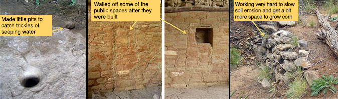
Still, much of the Mesa Verde story is rather clear. The national park rangers showed us the little holes that the people painstakingly carved in the rock in the dwelling caves to capture a trickle of water. We marveled at the carefully constructed check dams, stones set to stop the erosion of the mesa top and catch a little soil and water to grow a little more corn. Food-storage structures were built in places that were very difficult to reach. And, toward the end, windows between different parts of the cliff dwellings were blocked with rocks, dividing people.
Video: Mesa Verde Story (8:29)
PRESENTER: This is a wonderful, but a little bit disturbing, story of some really smart people living in southwestern Colorado, ancestral Puebloans, at a place called Mesa Verde. They lived there for hundreds of years and left shortly before Columbus got to the New World. A lot of their farming was done on top of a mesa, and they lived in caves down the side of the mesa in these wonderful structures made mostly out of stone. Here is a modern ladder with a person for scale.
And what I want you to notice here, in addition to the great buildings, is up here on top. This fairly clearly was a granary-- this is where they kept their food late in their existence there. It's probable, not certain, but it's probable that this is a little bit like a modern person putting the cookies way up on the upper shelf, so they won't eat them before they're ready to. Accept this wasn't the cookies, this was the food. And that might be something you'd do if food was really getting scarce.
Now that structure we just looked at, if you go behind it, you find it's actually built in a cave. And this is sandstone, and there's a little bits of shale and water sort of percolates down through here. And then it hits the shale, and it seeps out. So it's a little bit damp back there, in a generally dry climate.
And if you look around back here on this rock, do you see? You see things like this-- little holes they dug in the rock so that when water came seeping out, it would fall into these holes, drip in, and you could take a cup and get a little bit of water. And that's what you do if you're really thirsty because that doesn't look like the best water for us. But if that's all the water you have, that's what you do.
Now they built these wonderful structures, and some of them had windows between, say, your house and mine, or your room and mine. And late in the occupation, it appears that they walled the windows off. And usually, when you're walling the window off, you're trying to keep something out. And it is possible that they were not getting along with their neighbors quite as well as they might once have if they're walling off the windows within the structure.
Now if you go up on top where they grew the corn, this actually was built by the ancestral Puebloans, hundreds of years ago. And it stops erosion. So there's a little tiny stream comes through here, but this little dam of rocks catches a little bit of soil, where you could grow a little bit of corn. And it traps a little bit of water, and a little bit of soil. And so you're looking at people that really were shepherding what they had, conserving. And apparently, they needed this.
What you see then, is people who were living on the edge. Hard to get enough food, hard to get enough water, life was getting hard. If you look around the structure, it's mostly made of stone, because there weren't many trees. But there's a little bit of wood in the houses there at Mesa Verde.
If you know anything about wood, you know that it has layers. And the layers, when the tree is happy, it grows a thick ring. And when the tree is unhappy, it grows a thinner ring. And you can see different thicknesses of rings in this.
And you can take cores, and you can count the layers, and count how thick the layers are. And in a place like Mesa Verde, where it's very dry, a happy tree is one that has rain. And an unhappy tree doesn't.
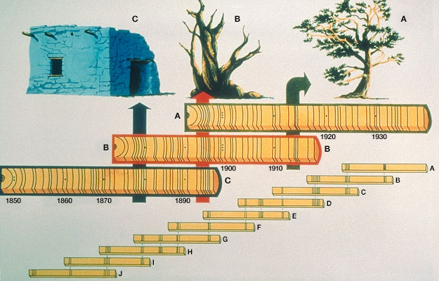
It's also possible, if you have a living tree, you can take a core from it, and you can see the pattern of thick and thin rings in that core. There might be dead trees nearby, and you can see the pattern of thick and thin rings in that, and you can match them up between trees. And you can go back to the wood in the archaeological sites, and you can find the same pattern. And so you can make a tree ring record, which is longer than the life of any given tree, with the thickness of the ring telling you how much it rained.
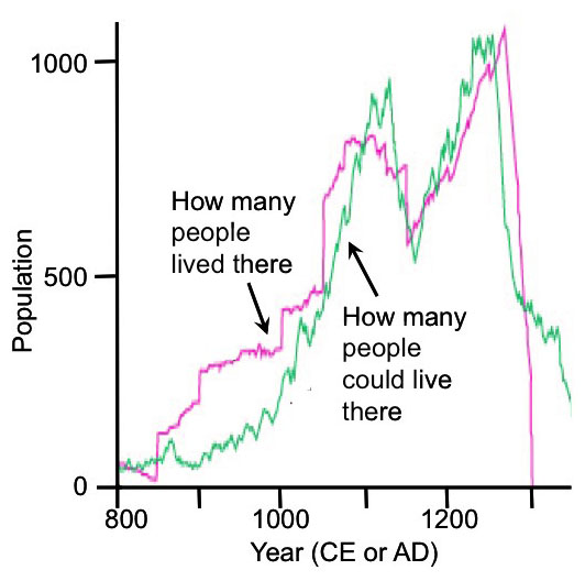
So now what can you do? Archaeologists and tree ring people got together. And they made the plot that you're going to see here. The year 800 is on your left, the year 1200, 1300 there, which is sort of the crash.
And so first of all, you have in green here, a history of how many people could live in the area. And this is actually done just down the road from Mesa Verde, at a place called Long House Valley that had less trade, so it was easier to work on. And what they did is they looked at the trees, and they said how thick a layer is, is how much it rained.
Rain also tells you how much corn could be grown, and corn is how many people could live there. So the green curve is from trees and from knowledge of the people-- how many people could live in this place. Independently, archaeologists went in and they looked at the classical things-- how many people were living there? You know, how many burials, and how many houses, and that sort of thing. And so they looked at how many people were living there, and that's this curve.
And what you'll notice is within the scientific uncertainties of all this, these are the same record. How many people lived there, and how many people could live there, are essentially the same. When it got wet, population went up. When it got dry, we don't know whether they died, or whether they left, or whether they quit having babies. But the population went down.
And the rains came back, and so did the people. And then the rains left. And at some point, the people said, we are out of here. We're going to become environmental refugees, and we're going to go someplace it rains more. And they left.
And so these are very smart people, doing amazing things. But they were controlled by the climate, ultimately. And it got them in the end.
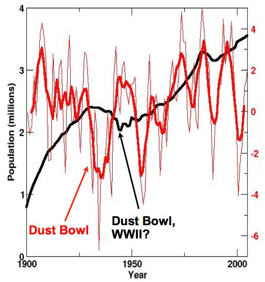
Now, this is more recent. This is Oklahoma from the year 1900 to the year 2000. And the red curve here now is a history of drought.
And down is really dry, and this thing right down here is the Dust Bowl. And that made great literature, but it made lousy living, and you've probably seen the pictures of the Okies headed for California to get away from the dust. But look at the population history of Oklahoma, and you'll see that while the Dust Bowl kicked them-- and then World War II, some probably going off to war-- it's not nearly the disaster it was for the ancestral Puebloans.
Now, these are also smart people, but these are people that when the drought hit, some of them got in gasoline-powered cars and they drove away. But some of them had food delivered in gasoline-powered cars, or in diesel-powered trains. They had diesel-powered well drilling, that they could drill a well, and they could run motors, or run windmills to pump water out. And so they had more tools, and they had more stuff-- and those were fossil-fueled.
And more recently, when other droughts have occurred, it really hasn't affected the population much at all. Little tiny changes, but really not too much. And so what you can see is our having fossil fuels, and having machines, and having trade has greatly insulated us from what otherwise would be disasters for even very smart people.
Some of the evidence we saw at Mesa Verde of people dealing with hard times caused by a drought.
The evidence is very clear that the people were conserving water and soil, working to maintain and improve their ability to grow food. The hard-to-reach food storage might be a truly serious version of someone hiding something on the top shelf so they don’t eat it before they should, and the window-blocking is at least suggestive of increasing social stresses.
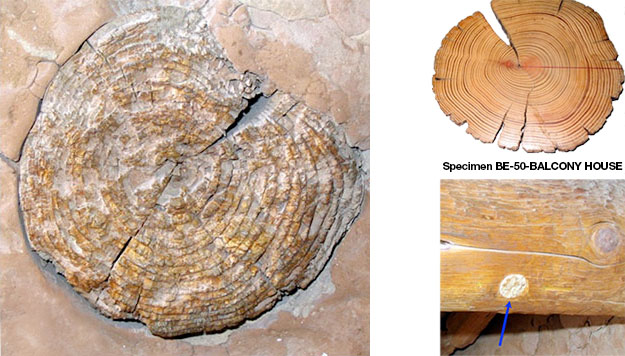
To learn more of this story, scientists went to Long House Valley in Arizona, a simpler place nearby that was occupied by the same people. Recall that the age of a tree can be learned by counting its yearly rings. These rings are easy to see in places where there are pronounced seasons because trees grow rapidly during the spring and early summer, putting on a lot of new wood that appears lighter in color, and then during the fall and winter, the growth slows way down and very little wood is added; this late-season wood is denser and darker. So, one thick light band and a thin darker band make up one year. This is sometimes not the case for trees that grow in the tropics, where there may be little difference between summer and winter, however, if tropical settings with defined wet and dry seasons, trees do develop annual rings. The important thing is that there needs to be a seasonality for trees to develop annual rings. In the dry climate of a place like Long House, trees grow better when it is wetter in the growing season, so a tree will thicker annual rings — the ring thickness is directly correlated to the amount of rainfall. In colder climates, the ring width can be correlated to temperatures during the growing season — warmer temperatures lead to thicker rings.
Thus, tree rings preserve a record of the climate history — rainfall in drier regions and temperature in colder regions. And, living trees overlap in age with trees that were used in construction, or trees that died but haven’t rotted yet. Using the pattern of thick and thin years to match the modern and older wood (a technique called cross-dating), the history of rainfall can be extended beyond the life of a single tree. Cross-dating has enabled us to produce continuous tree ring records that go back about 12,000 years even though the oldest living tree is just a bit over 5,000 years.
Rain and Population
Rain and Population
Rain can grow corn as well as trees, and corn can grow people. Thus, knowing something about trees, corn, and people, a team of scientists can start with tree rings and learn how many Ancestral Puebloan people could have lived in an area. Meanwhile, archaeologists are able to use their techniques of digging and dating to learn how many people actually lived in an area. Teams of archaeologists and tree-ring climatologists did this research at the “end of the road” in the small, remote Long House Valley, which was not a trading center.
What they learned is striking, as shown in the figure.
Next, take a look at a similar history, from Oklahoma over the last century. The Dust Bowl of the 1930s was a major drought, made worse by various economic decisions about land use. Wonderful literature documents the terrible economy and environment, as people suffered and died.
Yet, even today, where the economic resources are not available, as in the African Sahel, droughts have huge consequences and drive widespread starvation or migrations of environmental refugees.
Every person I ever met who studied the ancestral Puebloan people of Mesa Verde and surroundings has come away deeply impressed with the resourcefulness and cleverness of the people. The difference between Puebloan and Oklahoman success during drought is not because one group was smart and the other wasn’t. But the technologies and trade are vastly different (for many reasons!), and the people who could call on more tools and more help were more successful. Some of those tools were wind-powered, but most ran on fossil fuels, and success has increased as the use of fossil fuels increased.
Want to know more?
Take a look at the Enrichment called Burning for Learning
Running Out of Trees
Running Out of Trees
The early European settlers in central Pennsylvania (and many other places) wanted iron, turning rusty soils into pig iron in dozens of different furnaces (including Pennsylvania’s Centre Furnace, just down the hill from Penn State’s University Park Campus, where this is being written), and then turning the hunks of iron into useful things in forges (including Pennsylvania’s Valley Forge).
Video: Days of Iron (2:10)
This is a Centre Furnace. The road runs up the hill to Penn State University Park campus and the town of State College. But State College didn't even exist when the university was founded in 1855. The university was built up the hill from the Iron Furnace, and they've been making iron here since 1791.
This is a glass slag. This is what was left when they melted the ore to get the iron out and drained that away and then this chilled and it froze to make the glass. Melting the ore took energy. And the energy came from charcoal, and the charcoal came from trees. To fire a furnace for a year took more than a half a square mile of trees. But the furnace was served by an independent community and it had people in it who built houses and heated them in the winter and cooked, and that took wood too.
Running a furnace and what was around it, took a square mile of trees a year. And there were lots of furnaces and lots of forages, like Valley Forge, that turned the iron into useful things. Furnace closed in 1858. Production moved west to use better ores and to use coal as a fuel because the trees were gone. It was about the same time as peak whale oil, and just before the first modern oil well up the road here in 1859. Today, we have whales and we have trees because we burn fossil algae and fossil trees, oil and coal, and natural gas.
Pennsylvania by itself had dozens of iron furnaces. The early iron furnaces and forges were fueled by charcoal, which was made from trees. As many as 100 workers would spend fall and winter making the charcoal for just one furnace, which used trees from more than half a square mile (more than a square kilometer) per year. Those people were burning a lot of trees in their fireplaces in winter as well, and the forge that converted the pig iron to useful things required as much charcoal as a furnace. Thus, forests and iron-making didn’t coexist for very long—the Commonwealth of Pennsylvania was rapidly converted from “Penn’s Woods” to the “Pennsylvania desert”, with almost no trees or wildlife remaining. You cn see this deforestation in the US in the form of some maps here [3]. And it wasn’t just Pennsylvania, or just Europeans—the growth of the iron industry in China led to deforestation, too, and many other people around the world have cut trees much faster than they grew back.
Running Out of Whales
Running Out of Whales
The flickering light of a fireplace or wood stove isn’t great for reading in a dark Pennsylvania winter, so people have burned many other things for light. In Pennsylvania and elsewhere in the US, wealthy early European settlers preferred burning whale oil, which didn’t stink like tallow candles (made from animal fat), and didn’t blow up like the alcohol-turpentine mixture known as camphine. At its peak, the Yankee whaling fleet had 10,000 sailors on ships, scouring the far reaches of the ocean for whales to supply oil. Populations of the main species pursued by the Yankee whalers dropped precipitously, and the Yankee production of whale oil followed, with prices rising greatly, from a low that would be about $7/gallon today, to a peak of almost $25/gallon. The total amount of whale oil collected by the Yankee whalers in the 1800s is roughly the same as the total amount of oil (petroleum) imported by the United States in a week—if we hit a shortage of our modern energy sources, we cannot easily go back to our former sources!
Video: Whales Celebrate Oil in Pennsylvania (0:48)
PRESENTER: This is an editorial cartoon that was published in the magazine, the publication, Vanity Fair in the year 1861, just before the US Civil War. And it is the grand ball given by the whales in honor of the discovery of the oil wells in Pennsylvania. And you'll notice the whales in their evening dress being served by frogs. And it's just before the Civil War, so you have the oil wells of our native land, may they never secede. And you have oils well that ends well. And we whale no more for our blubber. We have whales because we burn fossil algae. We don't burn whales to see at night anymore.
As the US got out of the whaling business, others—particularly Norwegians—got into it, using new technologies including faster boats and harpoon cannons to hunt species that had eluded the Yankee whalers. But even the vast resource of fast Antarctic whales proved small compared to the hunger of humans, and soon those whales were depleted as well.
Video: Peak Whale Oil (2:16)
PRESENTER: This is the history of whale oil production from the Yankee fleet from New England in the United States from the year 1800 on your left to the year 1880 on your right. And you'll see that they got better and better at whaling. And then, they went over peak whale oil and down the other side.
A lot of this was things like there's a civil war over here, when some whaling ships were sunk to block Southern harbors. The whaling fleet is crushed in the ice off of Alaska over here, and insurance prices go through the roof. But they were up off of Alaska because they couldn't find whales anywhere else. And that's what was going on.
Now here, there are 10,000 men on ships out of New England looking for whales in the world oceans. And there's lots more people working in New England to process the whale oil and what have you. Because you kill the whale and you boil the whale to make the oil, but then all the pieces of the whale were used for various things.
Now as they get better at whaling, the price went down. And the low point here is about $7 a gallon for whale oil that was used in lamps. As soon as peak whale oil was hit, the price of whale oil went up to $23 a gallon. And this is the equivalent of modern money.
And so what you find is it's not when you run out of the resource that the price goes up. It's as soon as the resource starts to get scarce. Now indeed, the free market worked in some sense. People went up the road from where I'm speaking to you and they drilled the first modern oil well, the Drake Well, in 1859. But you'll notice even that didn't really bring the price back down.
All of this oil-- 100 years of whaling-- 10,000 men at the peak-- collected as much whale oil as about one week of modern US oil imports. So there's really no chance that we can actually go back to the way we used to do things.
Video: Polka Oil (0:47)
PRESENTER: This is actually the cover of a piece of sheet music that was published in 1864 in New York. This is "The American Petroleum Polka," or charge, or gallop, or waltz, or march. And it has a picture of a beautiful Pennsylvania scene, the oil well spouting its oil. Now oil was black back then. Oil is still black. But you couldn't have black oil falling on the lady's pink dress, so they made the oil white. And then bragging, "This oil well threw pure oil a 100 feet high." people understood the value that you get from oil, from petroleum. And they celebrated that.
The first modern oil well was drilled in Pennsylvania along Oil Creek, up the road from where Dr. Alley lives, in 1859, shortly after peak whale oil in the US and the sharp rise in whale-oil prices. The impact was understood even then, with the magazine Vanity Fair in 1861 publishing an editorial cartoon showing the “Grand Ball of the Whales in Honor of the Oil Wells of Pennsylvania”, featuring the sign “Oils well that ends well”. The cover of the 1864 sheet music American Petroleum Polka features a Pennsylvania scene including a lady in a pink dress and an oil well that “…threw pure oil 100 feet high” (30 m).
 Earth: The Operators' Manual
Video: America's Energy Past: A 3-minute clip on "peak whales".
Narrator: But to have a sustainable energy future, we have to do things differently than in the past. Richard Alley explains-- We've been burning whatever was at hand for a long, long time. But as we see repeatedly with energy, you can burn too much of a good thing. And there are patterns in the human use of energy and if we're stupid enough to repeat them, burn all the fossil fuel remaining on the planet and put the CO2 into the air, we will cook our future.
Take what we did to trees in North America, for example. When the first settlers arrived on America's east coast, the forests were so thick, you could barely see the sky. That soon changed. And the forests almost completely disappeared as more and more trees were cut down to meet the heating, cooking and building needs of a growing population. Making iron needed lots of furnaces and the furnaces ran on charcoal made from trees.
You can trace that history in tell-tale place names from my home state of Pennsylvania. So farewell virgin forests, hello Pennsylvania Furnace, Lucy Furnace, Harmony Forge, and Valley Forge of Revolutionary War fame. Large areas of forest were soon depleted, and charcoal making and iron production moved on, to repeat the process elsewhere. Peak Wood, meaning the time of maximum production, came as early as the first decades of the 19th century or even before that for some parts of the east coast. The pattern of using up an energy resource until it was nearly gone was repeated at sea.
As America's population grew, so did their need for a better way to light the night. So whaling crews went to sea, on the hunt for the very best source of illumination... whale oil. At first, large numbers of whales were found nearby. They could just be towed to shore. But by the 1870s, we'd burned so many whales to light our evenings, that all the easy whales were gone. Whale-oil prices roughly doubled. Now ships had to travel close to the poles in search of bowhead whales. Their oil wasn't as good. And conditions were really dangerous. In 1871, up in the Arctic, 33 ships were trapped in the ice and crushed. Just as happened with America's forests, we'd exploited the most easily accessible resources and hadn't stopped until we'd almost used them up. Lucky for us, in 1859 a cheaper and more abundant source of energy had been discovered with Edwin Drake's successful oil well, drilled in Titusville, Pennsylvania. And for 150 years, America ran and grew on oil and coal.
Discussion Assignment
Reminder!
After completing your Discussion Assignment, don't forget to take the Module 1 Quiz. If you didn't answer the Learning Checkpoint questions, take a few minutes to complete them now. They will help your study for the quiz and you may even see a few of those question on the quiz!
Discussion Question
Objective:
Show that people can make money and save the world at the same time. Find an article online about someone who has made money by doing something that conserves energy or generates energy in a new way that is less damaging to the Earth than traditional fossil fuel extraction and burning. Share it with the other students in this course and discuss the various ways entrepreneurs have approached this issue.
Goals:
- Find reliable sources of information on the internet
- Communicate scientific ideas in language non-scientists can understand
Read:
Get Rich and Save the World [1] from Earth the Operator's Manual
Description:
Many of us pessimistically accept the idea that in order to make money and progress, we have no choice but to inflict some amount of damage on the Earth and its environment. But there are those out there who have flipped this axiom on its head by finding ways to make money by doing things that help the Earth. For this activity, search online for an article to share with the class. The article should describe one way in which someone or some company has found a way to make money by saving energy or by developing new alternative means of producing energy.
Start by searching the terms "energy entrepreneurs" or "environmental entrepreneurs". Click around until you find something interesting.
Once you find an article you would like to share, write 2-3 sentences summarizing the content. Then, write an additional 1-2 sentences explaining your thoughts on making money and helping the world. Explain in your own words why you think it is or is not possible or necessary to implement these ideas on a global scale.
Instructions:
Your discussion post should include a link to the article you have chosen, a summary 100-150 words in length, and a personal commentary 75-100 words in length. Your original post must be submitted by midnight on Wednesday. In addition, you are required to comment on at least one of your peers' posts by midnight on Sunday. You can comment on as many posts as you like, but please try to make your first comment to a post that does not have any other comments yet. Once you have an idea of what you want your post to be, go to the course discussion for your campus and create a new post.
Scoring Information and Rubric:
The discussion post is worth a total of 20 points. The comment is worth an additional 5 points.
| Description | Possible Points |
|---|---|
| link to appropriate article posted | 5 |
| summary provides a clear description of the article content (100-150 words) | 10 |
| well-reasoned comment on your own article included in your post (75-100 words) | 5 |
| well-reasoned comment on someone else's article and post (75-100 words) | 5 |
Summary and Final Tasks
Summary and Final Tasks
Summary
Our history is thus quite clear. Life is hard if we have to do everything for ourselves. We rely on arranging for help, getting energy from outside us. As we have learned to hunt, gather and control energy, we have gained the ability to survive droughts, cold, and other problems that might have defeated us before. But, even for resources such as whales and trees that can grow back, we often over-harvest until they become scarce (or disappear entirely, as we have done to many species such as the wooly mammoths of ice-age North America). When we switched to heavy use of fossil fuels, we reduced our reliance on some of the earlier sources—we have whales and trees today because we rely on burning oil, coal and natural gas.
Reminder - Complete all of the Module 1 tasks!
You have reached the end of Module 1! Double-check the Module Roadmap table to make sure you have completed all of the activities listed there before you begin Module 2.
Enrichments
Use the links to go to the enrichments for Module 1. These materials are not required and will not be covered in the assessments, but they are interesting and will add to your understanding.
Burning for Learning
Do you ever empty the lawn-mower bag to get your dinner? Or chew up a handful of wheat or leaves from the maple tree? How about raw meat?
Cows can succeed by eating grass, but they have four stomachs and spend a lot of time “chewing their cud” to help break down the grass to be digested. Caterpillars can eat wheat or maple leaves, but a whole lot of a caterpillar is a digestive tract. And many predators eat raw meat.
But, we don’t do any of these things. We have mastered the art of using fire to cook our food. This kills parasites, but it also starts the process of digestion. We don’t have the type of digestive system that would allow us to get enough energy out of leaves and grass or “raw” wheat and raw meat, to keep us active enough to grow, harvest or catch those foods in the wild. If you are dieting to lose weight, eating raw vegetables is a great idea; if you are trying to survive the winter as a fur trapper in some remote part of the Yukon, you might look for something that supplies a bit more energy.
Fire may be the big difference between humans and other primates. If we didn’t cook, we wouldn’t get enough energy from our food to supply our big brains. Instead, we’d need a bigger or longer digestive system to process leaves and seeds and roots and raw meat, but the extra digestive system would use up a lot of the energy it extracted from such things to keep itself alive, with not enough energy left over to support all the extra gray matter between our ears. We really may have needed to burn to learn!

We’ll probably never know for sure whether fire was really required for us to survive as humans, but there is no question that it makes life easier in many ways. Staying warm in an Arctic winter is much, much easier with a fire than without one. Fire helps in scaring away predators, killing bad things in food, and more. For example, the native people of the eastern US grew corn, beans, and squash in clearings in the forest. Chopping down trees with stone axes is not easy; “girdling” by cutting the bark will kill the trees, and fire can then be used to clear the land and keep it clear. (Slash-and-burn agriculture is not a new invention!)
Burning wood is just one of the ways that we humans use to get someone or something else to do some of our work for us. Rather than being limited by the energy we can get from our metabolism (the food we “burn” inside of us), we get lots of extra energy by burning other things outside of us. We burn coal, natural gas, and petroleum to generate most of our electricity and power our machines. We all use this energy and our share of it is something like 100 times as great as the energy we consume in the form of food! So our external energy use is far greater than our internal energy use from food.
Shortly after the last ice age ended, hunter-gatherers in many parts of the world began settling down and developing agriculture. This switch to growing food may not have been possible during the highly variable climate of the ice age. This switch helped fuel a major growth in population that continues today. But, by many measures, the switch also caused the new farmers to become less healthy, eating a less varied diet and suffering from more diseases-disease organisms and parasites enjoyed it when their human hosts settled down close together, making it easy to cause more sickness! You will find LOTS of ideas about why our ancestors settled down and started growing crops. One big possibility is that the world was nearly full of hunter-gatherers-the good places for finding something to eat were already taken, people died in marginal areas during bad years, people didn’t want their children to die, so they developed a new “technology” to feed themselves.
Very few people today have spent enough time with a shovel or hoe to know how difficult agriculture can be, even with modern tools. Plowing and cultivating are hard work. So, perhaps as early as 8000 years ago, people were figuring out how to get oxen to pull plows. This was NOT an easy undertaking, requiring selective breeding to domesticate wild creatures, then feeding those creatures and protecting them from predators and keeping them from running away, and inventing yokes and plows and convincing the oxen to wear the yokes and pull the plows. Yet all of this effort and more was easier for early agriculturalists than actually doing the digging themselves. Once again, people were getting ahead by getting something else to do their work for them.
Module 2: What is Energy?
Module 2: Overview
Why take a course on energy? With over $1 trillion spent per year on energy in the US alone, the knowledge you gain from this course may help you in your career and your everyday life. And because we currently rely on a completely unsustainable energy system that must change, your knowledge may help the long-term health of civilization. Plus, believe it or not, the subject really is interesting!
In this module, we’ll go over some of the basics—how do we talk about energy, what is it, how much of it do we use, and such. Back in the late 1990s, NASA lost a $125 million Mars orbiter because some members of the mission team were figuring out its location using metric units (e.g., meters, centimeters, liters) also called the International System of Units (SI) [10], others were using English units (e.g., feet, inches, ounces); the different groups didn’t recognize this and convert properly — a very expensive mistake! The situation with energy is actually more confusing than that. So, bear with us, and we’ll try to start off in the right direction.
Goals and Objectives
Module 2 Goals and Objectives
Goals:
- Recognize the natural and human-driven systems and processes that produce energy and affect the environment
- Explain scientific concepts in language non-scientists can understand
- Find reliable sources of information on the internet
By the end of this module, you should be able to:
- Recall that using energy doesn’t make it go away, it is just converted into a less useful form
- Recognize the many units of energy and power
- Show that the amount of energy used by people around the world is much larger than the 100 watts inside most people converted from food
- Recall that around 85% of the energy we use is derived from fossil fuels
- Analyze energy use and production in a country other than the United States
Roadmap
| To Read | Materials on the course website (Module 2) | |
|---|---|---|
| To Do | Module 2 Discussion Post Module 2 Discussion Comments Quiz 2 |
Due Wednesday Due Sunday Due Sunday |
Questions?
If you prefer to use email:
If you have any questions, please email your faculty member through Canvas. We will check daily to respond. If your question is one that is relevant to the entire class, we may respond to the entire class rather than individually.
If you prefer to use the discussion forums:
If you have any questions, please post them to the Help Discussion Form. We will check that discussion forum daily to respond. While you are there, feel free to post your own responses if you, too, are able to help out a classmate.
Three Examples
Energy is Forever, but Useful Energy Is Not
Physicists have found that in our normal lives, energy is neither created nor destroyed — it is conserved. But as energy is used, it is changed from a concentrated, useful form to a spread-out, less-useful form, eventually becoming useless to us. To learn what Einstein has to say, read the Enrichment on the next page. But first, let's look at three examples.
Want to know more?
If you are worried about Einstein and atomic bombs and want to learn more about it, read the Enrichment called Einstein's Special Relativity Theory E=mc2!
Example 1: Potato Chips
Throw a bag of potato chips on the floor, and stomp on it. Keep stomping until all of the chips are reduced to dust. Then, on a really windy day, go to the top of a hill and throw the dust as high as you can.
There are still calories in that potato-chip dust. If you could somehow re-bag your chip dust, you could eat it and then go about your business, fueled by the energy stored in the potato chips. In the real world, bacteria are going to get that energy, because it would take you much more energy to gather up the potato-chip dust than you could ever get by eating it, even if you wanted to.
Energy itself is a little like your potato chips. Energy doesn’t disappear when you use it to do something you want, but the energy is changed to a less useful form until eventually, it is completely useless to you. If yu eat the potato chips, your body will digest them and turn them into fuel that keeps your body going, which in part means generating heat to keep your body temperature at an average of 98.6°F, and then some of that heat is emitted from your body, traveling out in the form of infrared radiation, which is a form of energy. So the energy stored in the chips has been put to use and has changed from chemical energy in the chips to thermal energy that your body emits. And that thermal energy gets dispersed and is not really useful anymore, although it is conserved.
Video: Potato Chip (2:57)
DR. RICHARD ALLEY: These are potato chips-- crisps, in England. The chemicals in here are a concentrated source of energy that my body could store for later, or it could burn now to power me to do things that I think I need to do, like mow the lawn. And this is gasoline. The chemicals in here are a concentrated store of energy that I can use to power my lawnmower, to help me mow the lawn.
So if I were to take my chips, dump them on the driveway, and stomp on them with my big boots, the chemicals, the energy, would still be in there, but it just wouldn't be as useful to me. Especially if I took my lawnmower—
And I spread them all over everything.
So the stuff is there, the energy is there, but I've made it no longer useful. In exactly the same way, there's now less gasoline in the mower than there used to be. I have burned it. The stuff has gone into water vapor and CO2 in the air. And the energy, a little bit of it, made noise to annoy the neighbors. But eventually, that just heated up the surroundings. And a lot of went right into heat, so if you touched the wrong piece on this mower, you would burn yourself now.
So what we see in the real world, normal times, stuff and energy are not lost or made, but they're changed from one type to another. And with energy, we tend to change it from useful types to things that are not as useful, and eventually to heat that spreads out and does no good for us. A lot of the history of humanity has been finding concentrated sources of energy and trying to get useful things out of it as we change it into useless heat that spreads around the world. That may give you an idea that we'll come back to later.
If we were using sun or wind or hydropower to run an electric mower, I'd be making a lot less noise, I'd be making a lot less heat. I'd be using the energy I bought for what I wanted, rather than wasting it.
Example 2: Gas in the Car
The chemical energy in a full gas tank in your car is enough for you to drive 400 miles or so. As you burn the gas, the muffler gets hot, and you warm the air and the tires and the road a little—you are turning the gasoline’s energy into heat. You could put a little thermoelectric device in your tailpipe and generate enough electricity to run your music player, or you could blow some of the hot air through the heater to keep you warm on a cold winter day—the heat can still be useful—but you’re using lots more energy to move the car than you’ll ever get back. After you stop the car and the muffler cools off, the heat energy has been spread out into the air and is being radiated away to space — if you had a thermal camera, you could take a picture of it. A satellite can even see the heat going to space, and make a map of how warm or cold the Earth is, so there is still some use in that energy...but not much. And eventually, the energy will spread uniformly across the universe and be completely useless.
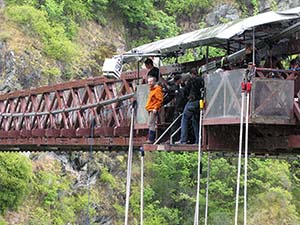
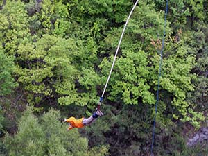
Example 3: Bungee Jumping
While Dr. Alley was in New Zealand filming footage for Earth: The Operators' Manual, he took the opportunity to test another use of energy (his energy) by bungee jumping. He gained potential energy (the ability to fall down fast) by climbing up to the top of the jump. That is turned into kinetic energy (motion, the ability to collide with things) by jumping off. After the thrilling few seconds of the jump, all that energy ends up heating the surroundings a bit and is no longer useful.
The key piece of knowledge to take away from these three examples of how energy is changed from a useful to a non-useful form is: if you want to keep doing things, you need new sources of concentrated energy. That’s what this course is about!
Powering the Big Units
Powering the Big Units
Short Version: Energy is the ability to do something, and is measured in joules or calories or kilowatt-hours or in other ways. Power is how fast you do it, and is measured in watts or horsepower or in other ways. Your 2000-calories-per-day diet is the same as a single 100-watt light bulb burning all day. Let's take a closer look!
Friendlier but Longer Version: Suppose that you are an employee at a Pennsylvania power company. Your customers buy a lot of kilowatt-hours of electricity to run their microwave ovens and music players, but your power plant needs to be turned off for maintenance. Your boss tells you to buy some power from a hydroelectric company in Quebec but they don't have any kilowatt-hours for sale -- all they offer are megajoules. What do you do?
Unit Conversion
Unit Conversions
Mistakes in unit conversions really can cost an immense amount of money. We are NOT going to turn this course into a worksheet on unit conversions, and we won’t require you to memorize unit conversions, but we will explain some of the key points next—enough to let you keep your hypothetical job with the power company...and maybe a real job someday.
Words such as energy, work, and power are tossed around in casual conversation but have very careful definitions in engineering and science, and for the people who buy and sell energy. You can think of energy as the ability to do something. Wind up an old-style alarm clock, and the spring has stored some mechanical energy, which is available to move the clock hands and make the ticking sound. Water above a dam has gravitational potential energy and can flow down under gravity, driving a generator to make electricity, or floating your boat to the sea. The chemical bonds in the gasoline in your car have chemical energy, and if you make the gas hot enough with a spark in your engine in the presence of oxygen, the bonds will change and make the car go.
When you are “using” the energy, it is doing work. Pushing you across the country, or moving the clock hands, or moving your boat down the river, require overcoming friction and wind resistance and such. So does using a plow to break the soil and turn it over so you can grow food and lots of other things. How fast you use energy, or how fast you do work, is power. You do some amount of work in climbing the stairs to the next floor, but doing it in 10 seconds requires more power for a shorter time than doing it in 10 hours.

In terms of units, and how you’ll answer your boss about the Quebec contract, energy can be measured in calories. A Big Mac has just over 500 calories, so 4 sandwiches provide just over the 2000 calories that a typical person would eat in a day. Most of the world measures energy in joules rather than calories, and those 4 Big Macs are just over 8 million joules, which is the same as 8 megajoules.
If you were on a starvation diet, you might make those 4 Big Macs last a month—a low-power diet! But if you eat 2000 calories per day and “burn” them inside you to make you go—normal power for a person—that is the same as 8 million joules per day, or roughly 100 joules per second, which is called 100 watts. Amazing as it may seem, all your skills and brilliance and good looks and charm use energy at the same rate as one old incandescent light bulb! Your energy use—your personal power—is a bit higher than 100 watts when you’re up and doing things, and lower when you’re sleeping, but averages out to 100 watts. We don’t usually define a “people power” unit, but 750 watts, or 7.5 people, is a usual definition of 1 horsepower.
So, energy can be measured in calories or joules and is the ability to do something, while power in calories per day or joules per second is how rapidly you do it, and a watt is a shorthand way of saying joules per second. But, suppose you have 10 old-style light bulbs turned on all the time, so you’re using 1000 watts or 1 kilowatt. Each hour, the computer at the power company says you have spent another hour using 1 kilowatt, so they add the price of 1 kilowatt-hour of electricity to your bill. At the end of 24 hours, you are billed for 24 kilowatt-hours. Kilowatt-hours, like calories and joules, provide a way to measure energy. The Quebec company uses joules, you use kilowatt hours, and you’ll keep your job because you know (maybe with some help from the internet) that 1 kilowatt-hour is 3.6 million joules, so those Québécois are not going to beat you in a deal!
Note:
In case you feel a sudden urge to actually do calculations with these, you might recall that the calorie you eat is sometimes also written as a capital-C Calorie, and is the energy to raise 1 kilogram of water by 1 degree C, distinguished from a calorie that is written with a lower-case c and is the energy to raise 1 gram of water by 1 degree C. So when we read about food calories, we are really talking about kilocalories. This is another reason why most of the world uses joules.
You should also know that there are many more ways to measure these things, which you do not need to learn now, but which you should know exist. People often use British Thermal Units, or BTU's, for energy, and BTU's per hour for power, but occasionally they get sloppy and say “BTU” when they mean “BTU per hour”. Or, they get lazy and say that one quadrillion BTU's is a “quad” and just quit talking about BTU's. People who sell natural gas have figured out how many BTU's, or joules, or calories, can be obtained by burning a particular amount of typical natural gas, and how much space that gas occupies at standard temperature and pressure, so they may measure energy in cubic feet of gas, or cubic meters of gas, even though they know that this depends on temperature and pressure and the particular gas. Barrels of oil can be used the same way. And, it goes on from here—refrigeration workers in the US talk about power in terms of “tons of cooling” linked to the power needed to freeze a ton of water in a day (one ton of cooling is approximately 3510 watts).
Now, we hope it is obvious that unless you are planning to work in cooling, or you have rather strange friends you would like to impress, it is probably not a good idea to clog your brain with the conversion factor between watts and tons of cooling! But you should know that a few fundamental ideas such as energy and power have been made to look very complicated by having a lot of names and units. And you also should know that many jobs you might be hired for will require you to figure out: 1) how things traditionally have been measured; and 2) how to convert to what other people are doing in their jobs. And if you can’t do that reliably, there is a high chance that you will be fired!
Energy and the US Economy
Energy and the US Economy
Short Version: Energy is 10% of the US economy—over $1 trillion per year, or $4000 per year for each person, with roughly $1000 of that leaving the country, to supply the average US resident with more than 100 times more energy than they use internally. About 85% of the energy used is from fossil fuels, which are being burned much faster than nature makes more.
Friendlier but Longer Version: During the course, we’ll take a look at the big sources of energy, the big issues in energy use, the “why you might care” and “what it means to you” questions. For now, a few more-or-less connected numbers and graphs may be useful. This course is not about having you memorize numbers, but you should be aware of magnitudes—which things are really big and matter a lot, versus those that are small and can be safely ignored (unless you’re the wonk on this topic and need to know everything!).
As you just saw, the food you burn inside powers you at the same rate, on average, as a bright old-style light bulb (100 watts) that is turned on. But, the food may have been cooked, after it was shipped to you in a refrigerated truck after it was harvested by a corn-picker or combine from a field that first was plowed by a tractor. The plowing and harvesting and trucking and refrigerating and cooking all required energy. You probably are reading this on an electric-powered computer, in a room that is heated in winter and cooled in summer using energy. If there is glass on the computer screen, it started out as sand, which was melted using energy. Aluminum or iron or other metals were smelted from ores, using energy.
Video: Energy Use (1:09)
PRESENTER: This is US energy use in the year 2010 from the Energy Information Agency of the United States government.
And what you'll notice is that renewables over here make up about 8% of the mix, similar to nuclear-- used for electric power. And then you have all of these different fossil fuels. Coal-- 21%, dropping a little bit. Natural gas-- 26%, and rising a little bit. And the biggest thing has been a reliance on petroleum, what's usually called oil. If you add these together, it's 84%.
For the world, for most other countries, this dominance by fossil fuels also happens in those other countries and for the world as a whole. We really are fossil fueled.
You get the idea. And, if you add up all that energy, there is a lot of it. The total energy use in the US economy, divided by the number of people, comes to a bit over 10,000 watts per person—all together, everything that is going on around you to take care of you involves more than 100 times the energy use inside of you. You don’t really have more than 100 incandescent bulbs burning all the time to take care of you, but all the plowing and harvesting and trucking and refrigerating and cooling and smelting and melting and heating and cooling and … that do take care of you are using energy at the same rate as more than 100 old light bulbs, or 100 of you.
You might imagine that you have 100 energy “serfs” doing your bidding… but if you actually had 100 serfs to do your bidding, they would spend most of their effort taking care of themselves and staying alive rather than doing for you. Plus, there is no way that those serfs could actually pick up your car and run down the highway at 65 miles per hour (100 km per hour)!
This much energy doesn’t come cheaply, though. Energy costs are roughly one-tenth of the entire US economy. That comes to about $1 trillion per year recently, or about $4000 per person per year, with roughly $1000 of that spent outside the US to pay for energy imports. (These numbers bounce around some from year to year; you can get updates at the US Energy Information Administration [11]. So, each year, a US resident is sending ~$1000 to people outside the US, primarily to pay for gasoline. Those people overseas may use those dollars to buy US-made products, or to visit the US, or to buy US companies, or to buy camels or classic paintings, or to buy bullets, or in other ways—once the money is sent over the border, it is theirs….
US Energy Use
US Energy Use
Energy use in the US is dominated by fossil fuels—oil (or more formally, petroleum), gas (or more formally, natural gas), and coal (which is generally just called coal). Recently, fossil fuels have been totaling about 85% of energy sales in the US (and more-or-less 85% worldwide), with the rest of US use split more-or-less equally between nuclear and renewables. (In 2010, the US Energy Information Administration gave US energy supply as Oil 37%; Gas 26%; Coal 21%; Nuclear 8%; Renewables 8%. This was used to move us around (transportation 28%), to build things (industrial use 20%), to heat and cool houses (residential 11%) and to power our plugged-in gizmos (electricity 40%).
Video: U.S. Energy Supply (0:52)
PRESENTER: These are a couple of plots showing some information about human use of energy and economy. Use of energy per person per year is on the bottom-- zero, not using any over to using a huge amount. And this amount is about 100 times more energy used outside the person than inside.
And what you'll notice is this is economic activity-- how big the economy is, how many dollars per person per year. And poor people don't use much energy, and rich people use a lot of energy.
Now, you might first think that that means that rich people are just wasteful. But what you see above is how much energy is needed to generate $1 of economic activity, and there just isn't much relationship there. So it's not that rich people are wasting more energy. They get as much activity out of a barrel of oil as poor people do. They just generate way more economy. And so you use more energy when you're rich, basically.
Source: The figure is modified by Richard Alley from Figure 1.3, US Energy Information Administration, "http://www.eia.gov/totalenergy/data/annual/index.cfm#summary [12]">Annual Energy Review 2010
We’ll revisit these issues later. US usage per person is a little smaller than some countries, but (much) larger than many others. Per person, the world averages roughly 1/4 of US use. Most of the world's economy is dominantly fossil-fueled with people often getting about 85% of their energy from fossil fuels as in the US, and energy is often about 10% of the economy.
Activate Your Learning
In the previous section, we learned that the average person in the US uses ~10,000 watts of energy while producing only 100 watts from the food they eat. If average world energy use is about 1/4 of that in the US, and assuming all people produce about the same amount of energy from the food they eat, do people worldwide create as much energy from eating food as they use in their daily lives?
Click for answer.
For now, though, it should be evident that if we spend 10% of our money on energy, it impacts everything—jobs and security and environment and more. As we saw in last week's Discussion, there are great options for making money and saving money by doing things better in the energy business. But, over the last few decades, we actually have doubled the amount of economic activity squeezed out of each barrel of oil or ton of coal—bright people have been working on this, and making or saving much more money might take a lot of effort or some new inventions.
Perhaps most importantly, the current system is grossly unsustainable. As we will see in upcoming content, the store of fossil fuels in the Earth is limited, and we are removing them much more rapidly than nature makes new ones. With essentially everything we do relying on energy use and 85% of the energy system relying on unsustainable fossil fuels, a lot of things will need to change.
 Earth: The Operators' Manual
Video: China: In with the New - A 4-minute clip on China's movement toward alternative energy use.
Narrator: If the US military is the largest user of energy in America, China is now the largest consumer on the planet. At 1.3 billion, China has a population about 4 times larger than the U.S. So average per person use and CO2 emissions remain about one quarter those of Americans. But, like the U.S. military, China is moving ahead, full speed, on multiple, different sustainable energy options. And it pretty much has to-- Cities are congested. The air is polluted. Continued rapid growth using old technologies seems unsustainable. Photographer: I count to three... Narrator: This meeting in Beijing brought together mayors from all over China, executives from state-owned enterprises, and international representatives. The organizer was a U.S.-Chinese NGO, headed by Peggy Liu.
Peggy Liu: Over 20 years, we're going to have 350 million people moving into cities in China, and we're going to be building 50,000 new skyscrapers, the equivalent of ten Manhattans, 170 new mass transit systems-- I mean it's just an incredible, incredible scale. Narrator: This massive, rapid growth comes with a high environmental cost. Martin Schoenbauer: They're recognizing that they're spending as much as six percent of their gross domestic product on environmental issues. Narrator: In 2009 China committed 35 billion dollars, almost twice as much as the U.S., to energy research and incentives for wind, solar, and other clean energy technologies. It's attracted an American company to set up the world's most advanced solar power research plant. China now makes more solar panels than any other nation. But it's also promoting low-tech, low-cost solutions. Solar water heaters are seen on modest village homes. Some cities have them on almost every roof.
Peggy Liu: China is throwing spaghetti on the wall right now, in terms of over 27 different cities doing L.E.D. street lighting, or over 20, 30 different cities doing electric vehicles.
Narrator: But visit any city and you can see that the coal used to generate more than 70% of China's electricity has serious consequences with visible pollution and adverse health effects. China uses more coal than any other nation on Earth. But it's also trying to find ways to burn coal more cleanly.
Peggy Liu: In three years, 2006 to 2009, while China was building one new coal-fired power plant a week, it also shut down inefficient coal plants. So, you know, it's out with the old, and in with the new. And they're really trying hard to invent new models.
Narrator: This pilot plant, designed for Carbon Capture and Sequestration, was rushed to completion in time for Shanghai's 2010 World Expo. It absorbs and sells carbon dioxide, and will soon scale up to capture three million tons a year that could be pumped back into the ground, keeping it out of the air.
Schoenbauer: Here in China they are bringing many plants on line in a much shorter time span than it takes us in the U.S.
Peggy Liu: China is right now the factory of the world. What we'd like to do is turn it into the clean tech laboratory of the world. Narrator: If nations choose to pay the price, burning coal with carbon capture can offer the world a temporary bridge until renewables come to scale.
Peggy Liu: China is going to come up with clean energy solutions that are cost effective and can be deployed at large scale. In other words, solutions that everybody around the world wants.
Discussion Assignment
Reminder!
After completing your Discussion Assignment, don't forget to log into Canvas and take the Module 2 Quiz. If you didn't answer the Learning Checkpoint questions, take a few minutes to complete them now. They will help your study for the quiz and you may even see a few of those question on the quiz!
Discussion Question
Objective:
Compare energy consumption in the U.S. to that in other countries. Find the total per capita energy use for a country of your choosing. Is it more or less than that in the US? Is it growing at the same rate? Why might this be?
Goals:
- Find reliable sources of information on the internet
- Communicate scientific ideas in language non-scientists can understand
Description:
Throughout this module, most of the facts and figures about energy have been for the United States. Of course, the entire world uses energy in varying capacities. Take a moment to take a look at what is happening outside the US. If you live in another country, or if your family is from another country, what is the energy situation there and how is it different from the US? Perhaps you have visited another country or heard something interesting about energy production or consumption elsewhere in the world.
As a starting point, go to the U.S. Energy Information Administration website [13] and look at per capita energy consumption in the US vs. your country of choice between 1980 and 2015. Use the DATA pull-down menu to select "Primary Energy Consumption" then click on the Time Series icon below the map. Next, click on the Select Data icon and in the window that pops up, select Energy Intensity in item 2 and Population in item 4 and then click on View Data at the bottom of this window. Then click on the Select Countries icon and another window will pop up -- here, click on All Countries and you will see a list of all the countries, then click View at the bottom of this window. Scroll down below the graph and you will see a list of all the countries -- if you click on the graph icon to the right of a country, the data will appear on the graph; click on another country and its data will also appear.
If the above link does not work, try an alternative source, IEA Energy Atlas [14].Make sure that you select TPES/Population (which is tons of oil equivalent per person), then scroll down to the very bottom of the page, where you can make a graph that compares your country with the United States.
How does the per capita use in 2015 compare with the US and your country? How does the change in use from 1980 to 2015 compare? Given what you know about the country, what factors do you think might contribute to differences in energy use?
Next, find one fact about energy consumption or production in the country you have chosen that you think is especially interesting, and tell us why you think your country has this particular feature. For example, oil use may be increasing as industry grows in a developing nation. Or wind energy may be growing rapidly because you have a long and windy coastline. Maybe you live near a volcano and get all your power from geothermal energy.
Instructions
Your discussion post should be 150-200 words and should include the name of the country you have chosen to research as well as numerical data comparing energy consumption in the US to that in your country of choice. Make sure the questions posed above are answered completely. Your original post must be submitted by Wednesday. In addition, you are required to comment on one of your peers' posts by Sunday. You can comment on as many posts as you like, but please make your first comment to a post that does not have any posts yet. Once you have an idea of what you want your post to be, go to the course discussion for your campus and create a new post.
Scoring Information and Rubric
The discussion post is worth a total of 20 points. The comment is worth an additional 5 points.
| Description | Possible Points |
|---|---|
| states name of country and includes numerical data (with units!) for energy consumption in US and chosen country | 5 |
| compares current or recent usage (2010 is close enough) and change in usage (1980-2010) for US and country of choice | 5 |
| identifies at least one reason why energy use in chosen country might differ from that in US | 5 |
| includes one interesting fact about energy use or production that is particular to country of choice | 5 |
| well-reasoned comment on someone else's post | 5 |
Summary and Final Tasks
Module Summary
We love the good things we get from using energy, and we use a lot of it. When we “use” energy, it doesn’t disappear, but it is changed to a form that is less useful, and eventually, it becomes totally useless to us. So, we spend a lot of effort into finding sources of concentrated energy that we can use. How rapidly we use energy is called power. You could use most of the energy in your food to sprint down a racetrack, generate high power, and then rest up afterward with low power, or you could use the same amount of energy in the same amount of time by walking steadily with intermediate power output. We measure energy in joules or calories or kilowatt-hours, and power in watts or calories per day or in other ways. Food burning inside us averages about 100 watts, but in the US the energy use outside is more than 100 times larger, and almost everyone almost everywhere uses far more energy outside than inside—the global average is roughly 25 times more energy use outside than inside. And, for most of the world, the energy used is primarily fossil fuels—85% in the US, and similar for most places. Typically, this is about 10% of the economy. So, we spend a lot of money to get good things from energy.
Reminder - Complete all of the Module 2 tasks!
You have reached the end of Module 2! Double-check the Module Roadmap to make sure you have completed all of the activities listed there before you begin Module 3.
Enrichments
Optional Enrichments
Use the links to go to the enrichments. Please note that these materials are not required and will not be covered in the assessments, but they are interesting and will enrich your overall understanding.
Einstein`s Special Relativity Theory
Einstein`s E=mc2
We normally think that the world contains matter-stuff-and energy (the ability to get the stuff to do something). And we often measure how much stuff we have by its mass. (Weight is the mass multiplied by the acceleration of gravity.) A real physicist would remind you, however, that mass and energy are different aspects of something more fundamental.
Einstein’s famous formula says that the energy content of something, E, is equivalent to its rest mass, m, multiplied by the square of the speed of light in a vacuum, c2. Because c is so large, a reaction that converts a little bit of mass can produce a lot of energy that is radiated away, as in an atomic bomb, for example.
The numbers are really wonderfully large. If you could somehow make an Einstein reactor to convert the matter in the food you eat directly to energy, just 1 gram (one-fifth of a teaspoon of water) would be enough to supply your 2000-calories-per-day diet for 30,000 years!
Laws of Thermodynamics
Suppose you don’t have an “Einstein reactor”, so you’re working in the ordinary world where any changes between rest mass and energy involve too little mass to be measured. Then, as described in the main text, energy is neither created nor destroyed, but it is changed from one form to another. This is often called the First Law of Thermodynamics, and also can be written that the change of the energy in a system is the amount of heat added to it minus the amount of work it does on its surroundings.
The first law of thermodynamics, by itself, might leave you thinking that after you burn the gasoline to move your car to drive to Grandma’s house, heating the surroundings, you could just collect the heat and the carbon dioxide and the water from your tailpipe, put them all back together again, put that gas back in your tank, and drive home. The Second Law of Thermodynamics says that you will fail; it is possible to use the heat to recombine things to make more gasoline, but you’ll never get as much energy back into the gasoline as you started with. “Disorder”, or “entropy”, increases, and the concentrated energy that is useful to us becomes spread out and no longer useful.
Physicists often discuss a zeroth law of thermodynamics, which says that if two things are in thermal equilibrium with each other (not having a net flow of heat from one to the other), they are in equilibrium with a third. This leads to a definition of temperature, and other useful things. And, there is a third law of thermodynamics which says that you can’t actually cool something to absolute zero, the point at which a perfect crystal would have zero entropy. These can be approximated as (this is often attributed to the British thinker C.P. Snow): You must play the game, but you can’t win, you could break even on a really cold day, but it never gets that cold.
Module 3: Oil, Coal & Natural Gas | Drilling, Fracking & Reserves
Module 3 Overview
Each spring, plants grow rapidly on the land and in the ocean. And, each year, enough plants die to approximately balance the new growth. Most of the dead plants are broken down quickly, by bacteria or bison or button mushrooms, or any of the other living things that rely on plants, or by being burned in fires. But, some of the plants are buried without oxygen, and begin the process of being cooked by the Earth to make fossil fuels.
Woody plants eventually may become coal, “slimy” plants may become oil, and both produce natural gas. The fossil fuels now in the Earth accumulated over a few hundred million years. If we keep burning them at modern rates, the fuels will be gone in a few hundred years; if much of the world continues to catch up with the US rate of use, the fossil fuels may become quite scarce late in this century. Nature will make more, but not enough to be helpful until millions of years have passed.
Video: Colyer Lake (4:11)
RICHARD ALLEY: This lake used to be a lot bigger than it is now. People dammed a little stream to make the lake, but the dam is not considered safe anymore. And so they've lowered the water level. It's going to let us see some of the things that happen under a lake. And so we're going to go for a little trip here to find out how fossil fuels are made.
So the rivers wash mud, sand, gravel, silk, clay all sorts of sizes into lakes and the small pieces are washed away wherever there's a strong current, and they settle where there's no current. And in those places, they settle with a lot of dead plants that have lived above them. And those dead plants will start to break down in the mud. And bacteria will use them and those bacteria make methane. And so you already start to see bubbles coming out of the mud here. That actually is the first step in making fossil fuels. This is the bacteria making methane, but later they heat of the Earth will make methane.
So if you take mud like this and you buried it with more mud, and then more mud, and then more mud, and then starts being heated by the heat of the earth, but that organic matter down in there will start making oil to go with the methane, the natural gas that we see coming off of here. Lots of dead plants wash into water and these are woody ones. And so this is a kind of thing that could make coal. In addition, lots more plants live in the water and the slimy plants, algae, cyanobacteria and they eventually give rise to oil, and both give rise to natural gas.
So sometime way back in geologic history, there was a nice ocean-- warm, not a lot of oxygen in the water, because it was warm-- lots of plants growing at the surface, but that oxygen bubbles out to space. And then the dead plants and mud settle to the bottom in layers. And those layers can become thousands of feet thick. Worms try to eat the dead plants that are falling down, but when they run out of oxygen a lot of the dead plants are buried. And then as the heat of the earth cooks them, they make oil and gas.
A lot of oil and gas actually generate high pressure and they make cracks. And they seep out of those cracks from the rock that they're-- which is now called shale-- and then they either bubble up through the water, all the way to the surface to make an oil seep or a gas seep. Or they get caught somewhere on the way in special geologic places that we can drill into to get the oil and gas.
A lot of the organic matter is still left in the rock. This is a sort of black looking rock, because it's still full of organic matter. And what we're learning to do now is to break up the hard rock, like this, to make it more like this loose stuff. And they do so by drilling through it, not with a chisel, but with a real serious drill. Pumping fluid in at very high pressure to break the rock. It's called fracking and then the oil and gas can go all to those little cracks and you can pump them out and use them.
Source: Richard B. Alley
Goals and Objectives
Goals
- Recognize the natural and human-driven systems and processes that produce energy and affect the climate
- Use numerical tools and publicly available scientific data to demonstrate important concepts about the Earth, its climate, and resources
Learning Objectives:
By the end of this module you should be able to:
- Recall that oil, coal and natural gas are produced naturally by well-understood processes
- Evaluate the effects of technology, economics, and population growth on fossil fuel production using computer models
- Demonstrate that our current consumption of fossil fuels is not sustainable by exploring future scenarios with computer models
Roadmap
| To Read | Materials on the course website (Module 3) | |
|---|---|---|
| To Do | Complete Summative Assessment [15] Quiz 3 |
Due Following Tuesday Due Sunday |
Questions?
If you prefer to use email:
If you have any questions, please email your faculty member through your campus CMS (Canvas/Moodle/myShip). We will check daily to respond. If your question is one that is relevant to the entire class, we may respond to the entire class rather than individually.
If you prefer to use the discussion forums:
If you have any questions, please post them to Help Discussion. We will check that discussion forum daily to respond. While you are there, feel free to post your own responses if you, too, are able to help out a classmate.
The Formation and Future of Fossil Fuels
What the Frack? The Formation and Future of Fossil Fuels
Older residents of the US may recall a television comedy that ran during the years 1962-1971, and much longer in reruns, concerned with the energy system. The show, called The Beverly Hillbillies, was the story of a “man named Jed” from the mountains, who became rich when his hunting bullet struck oil.
The idea was already rather unlikely in the 1960s, but not yet absurd. Before our modern oil industry was developed, oil did seep to the surface at many places around the world. For example, the ice-age bones of saber-toothed cats, mammoths and other creatures of the La Brea Tar Pits of southern California are stuck in the sticky left-overs from oil seeps, after the more-liquid parts evaporated or were “eaten” by microbes (see figure below).
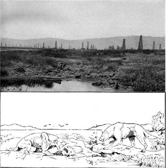
The first modern oil well, the Drake Well in western Pennsylvania, was drilled in 1859 at the site of natural oil seeps. Native people had used the oil, and Europeans were using it in medicine and in lamps.
Note
For more about oil and gas seeps, including dice for games, and weapons, made by native people from “tar” or asphaltum at oil seeps, see USGS [17].
Throughout history, people had relied on springs that produce water, and for millennia had drilled or dug down to get more water. People had even occasionally gotten oil and gas from their water wells, so it is not surprising that someone (Edwin Drake) decided to drill at one of the many natural oil seeps to get more oil (see figure below).

Natural oil seeps still exist, but most are long-gone, except in the most remote places including far down on special parts of the sea floor. Huge numbers of oil and gas wells since the Drake Well—maybe more than a million—have rapidly pumped out the oil that would have seeped slowly to the surface over millennia and longer. The idea of a modern mountaineer hitting a huge new oil field with a stray bullet really is absurd.
Origins of Oil, Coal and Gas
Where do oil, coal and gas come from?
Short version: Growing plants use the sun’s energy and simple chemicals to make more plants, and animals “burn” the plants to get that stored energy from the sun. Almost everything that grows is burned, but in special cases some plants are buried without oxygen, escaping burning. Time and heat turn these buried plants into fossil fuels.
Friendlier but longer version: Recall that energy is the ability to do things. And, living requires doing things—fighting against randomness to put particular chemicals in particular places to make cells and cell walls, to protect oneself and reproduce.
Living things on Earth could tap into many energy sources. Heat flows out of the Earth beneath our feet, for example. But, the energy from the sun reaching the Earth’s surface exceeds that from inside the planet by more than 2000 times, so it is clear that harnessing the sun gives greater opportunities for living things. (This is also why you will never hear a weather forecaster worrying about the effects of the Earth’s heat!)
Video: Photosynthesis and Respiration (:51)
DR. RICHARD ALLEY: This is the simplest version of photosynthesis and respiration that we can come up with. This is a plant. It stands in for all the green plants.
And it takes CO2 from the air, and it takes water, and it puts those together. But that requires energy from the sun to make the chemical bonds which give us plant, shown here as CH2O. They're just sort of the formula of plant. And it releases oxygen to the air.
Now, animals and bacteria and fungi and all these other things take plant, and they take oxygen, and they burn them to get energy so they can run around and do things. And that releases the CO2 and H2O. Fires also do this, but they don't do it in quite so controlled a manner.
Photosynthesis is the process by which plants grow more of themselves, using simple chemicals and the sun’s energy to make more-complex chemicals that store energy. Respiration is the process by which animals, fungi, etc. run photosynthesis backward, “burning” plants to release the stored energy for use by the animals, and releasing simple chemicals, ready to be used by plants again.
You probably have seen the equations for photosynthesis, the process by which plants harness the sun. The simplest statement of the commonest type of photosynthesis goes something like this: water + carbon dioxide + solar energy → plants + oxygen. Or, if you prefer chemical symbols saying the same thing: H20 + CO2 + hν → CH2O + O2
(Don’t worry if you had a class sometime in which this equation was written with 6 waters plus 6 carbon dioxides making 6 oxygens plus the chemical glucose, C6H12O6; that’s the same story simplified in a slightly different way, and either way you write it is close enough for our purposes.)
Almost all of the biological activity on the planet depends on this pathway to capture the sun’s energy. When the sun isn’t shining, plants run this backward, and animals and bacteria and fungi all run it backward, combining oxygen with plants to release water, carbon dioxide, and the sun’s energy that the plants stored chemically. Fires do this, too. Depending on whether it happens in a fox or a fire, you may see this energy release called respiration, or burning, or oxidation, or combustion, or perhaps other words, but all serve to combine oxygen with plant material to release carbon dioxide, water and energy.
Video: Respiration (:39)
PRESENTER: It may not be immediately obvious that this forest fire down below and this moose in Glacier National Park up above are in some sense doing the same thing biochemically, but they are. The moose-- it's called respiration. And down here it's called a fire-- conflagration. But what they're doing is taking plant, adding oxygen. And using that to cause chemical reactions that release energy, which you see is the heat and light here, or you see is the moose able to stand up, and chew, and run around and do moose things.
Averaged around the planet and over a year, roughly 0.1% of the energy from the sun that reaches Earth is stored as chemical energy by plants. (This is called net primary production, if you want the technical term.) Clearly, plants capture more of the sun’s energy in some places and times than in others, and agricultural experts have worked hard to find ways to make plants especially productive for us in our gardens and farms, but plants are still not very efficient. Even so, the world’s plants capture about 10 times as much energy as humans use.
If plants would jump into our fuel tanks and liquefy, we would have far more energy than we needed, but things don’t work that way. And, because everything alive on Earth wants to burn plants for energy, we face large difficulties in harvesting plants and burning them for our use before something else beats us to it. Almost all plant material is burned rather quickly after it grows, sometimes being eaten by caterpillars or cows while still alive, other times by fungi or bacteria after dying.
But, it is a very large and very old world, so even a very small difference between what grows and what is burned will eventually add up to a very large store of energy. And, that is what fossil fuels are.
Earth: The Operators' Manual
Video: Formation of Fossil Fuels: A 2+ minute clip on Fossil Fuels - How they are made and why they are ultimately unsustainable (2:25)
So why are fossil fuels such a powerful, but ultimately problematic, source of energy? Conditions on the waterways of today's Louisiana help us understand how fossil fuels are made and why they're ultimately unsustainable. Oil, coal and natural gas are made from things, mostly plants, that lived and died long ago. It's taken hundreds of millions of years for nature to create enough of the special conditions that save the carbon and energy in plants to form the fossil fuels that we use.
Here's how it works... Plants, like these tiny diatoms encased in silica shells, grow in the upper layers of lakes and oceans, using the sun's energy to turn carbon dioxide and water into more plants. When they die, if they are buried where there's little oxygen to break them down, their chemical bonds retain the energy that began as sunlight. If enough carbon-rich matter is buried deeply enough, for long enough, the Earth's heat and pressure turn it into fossil fuel, concentrating the energy that once fed the growing plants.
Vary what goes into Earth's pressure cooker, and the temperature, and you end up with the different kinds of fossil fuel. Woody plants make coal. Slimy plants, algae, will give you oil, and both of 'em give rise to natural gas. The fossil fuels formed over a few hundred million years, and we're burning them over a few hundred years, and if we keep doing that, sooner or later, they must run out.
But there's a bigger problem with fossil fuels. As we've seen, they're made of carbon, primarily, and when you burn them, add oxygen and that makes CO2 that goes in the air. We're reversing the process by which they formed. And if we keep doing this, it must change the composition of Earth's atmosphere. (jet engine roaring)
Oxygen in Water
Oxygen in Water
Water doesn’t hold much oxygen, so lakes and the oceans are relatively low in oxygen, especially if the water is warm. Oxygen made in the water by growing plants tends to form bubbles that rise and escape to the air above. Aquariums often need “bubblers” to add air to the water and give the fish enough oxygen to breathe. Running water, or fast currents in the ocean, do this job in nature, picking up a little oxygen at the surface and taking it down to fish and worms and other creatures. But if the currents are slow and a lot of dead plants are sinking, the bottom of the ocean or a swamp or lake may have more plants to be “burned” than oxygen to burn them.
Sometimes “dead zones” form in ocean water above the bottom, where the decay of sinking plants uses up almost all the oxygen so that fish and other large creatures cannot live. Such dead zones are especially associated with places where runoff of human fertilizer from fields on land causes huge blooms of algae.
Video: Gulf of Mexico Dead Zones (1:33)
PRESENTER: Burning plants to release the energy in them takes oxygen. Now, when plants grow in water, the oxygen often bubbles out, rises, and goes up into the air. And so the plant is down there with less oxygen than it originally produced. And when the plant is burned, it may use up all the oxygen that's available, unless currents pick up oxygen from the air and bring it down.
Now, what we're looking at here, the Mississippi River comes flowing down, and it feeds the great Mississippi Delta, which is a huge pile of mud that's been carried down by the Mississippi. Out here is the Gulf of Mexico, clear water. And you can see the mud being washed off of the continent and carried into the ocean by the Mississippi.
But mixed in with the mud, all the green you see here are plants. They're algae growing. And the algae give off their oxygen. It goes to the air. And then when the algae die, they tend to sink a little bit, and then they get burned. And that may use up all the oxygen.
And especially because fertilizer from human waste and from farms goes in the water, and that fertilizes these blooms. There are often dead zones out here in the summer, when there's no oxygen in the water. And that's the sort of situation that contributes to the formation of fossil fuel, but it also kills fish and makes poisonous gas and all sorts of other things that we don't really like.
More commonly, though, oxygen is present in the water but scarce in the sediments beneath. Almost everywhere in lakes and the ocean, sediment is piling up at the bottom. This may include large pieces of rock—sand and gravel—washed into the water by rivers, or carried across by melting icebergs and dropped. Smaller pieces are more common—silt and clay, sometimes just called mud—with most of the small pieces washing into the water in streams, but some blowing in, and even a tiny bit sifting down from meteorites. This sediment also includes organic matter (dead plants and animals).
Strong currents carrying plenty of oxygen tend to carry away the small pieces of mud and the dead plants, leaving sand and gravel without much organic material, and with big spaces between the big grains that oxygen-bearing water can move through. Where currents are slow, mud and dead plants accumulate, and the tiny spaces make it hard for water to move through, carrying oxygen. As worms and bacteria start to burn the dead plants, the oxygen is exhausted and the burning stops. So, where lots of plants grow in still, warm water, dead ones tend to pile up in the mud at the bottom without being burned.
Want to know more?
Read the Enrichment called More on Oxygen in Water at the end of the module!
How Nature Makes Coal, Oil and Gas
How Picky Eaters and Earth's Cooks Make Coal, Oil and Gas
We humans eat apples and eggplants, but we don’t eat their stems or leaves or roots. Bacteria in water are similarly picky. Even before a plant sinks all the way to the bottom of the ocean, bacteria and other living things are picking off the chemicals they like, either because those chemicals are easier to get or more useful to the bacteria, leaving other chemicals behind. This continues as the plants are buried. Some bacteria in low-oxygen but organic-rich mud make methane, CH4, the main ingredient in natural gas, as described in the Enrichment section More on Oxygen in Water. As more mud accumulates on top, deeper sediments are warmed by the heat of the Earth, “cooking” the dead plants. The result depends on how much cooking occurs, and what the plants were at the beginning.
“Woody” land plants—tree trunks, but also leaves, twigs, roots, etc.—become coal, which is mostly carbon. During the transformation from leaves and twigs to hard, shiny black coal, we change the name, first to peat, and then to coal of different types, lignite, then bituminous, then anthracite. You’ll generally find that as time, heat, and pressure change the organic materials, they also change the rest of the sediment around the coal. Peat occurs in sediments that are not yet hard enough to be called rock, lignite in soft sedimentary rocks, bituminous in harder ones, and anthracite in metamorphic rocks.
Oil is formed from “slimy” water plants (algae, plus things such as cyanobacteria that probably shouldn’t really be called plants, but we’re simplifying a little here). Because oil is primarily made of carbon (C) and hydrogen (H), we sometimes refer to it as a hydrocarbon. Methane is the simplest hydrocarbon, CH4, but oil contains a great range of larger hydrocarbon molecules, such as octane (C8H18). With too much heat, the oil breaks down to make methane. This gas is also produced as coal forms.
Coal, as a solid, mostly sits where it was formed. Eventually, if the rocks above it are eroded so that it is exposed at the Earth’s surface, the coal itself may be eroded away, and either “eaten” by bacteria, or buried in new rocks. And, occasionally, a natural forest fire or a lightning strike may set coal on fire. This burning usually isn’t really fast, because after the coal nearest the surface burns away, oxygen doesn’t get to deeper coal very easily. But, a lot of coal has avoided being eroded or burned, and is sitting in the rocks where it formed.
(Humans have also set coal on fire, releasing mercury and other toxic materials, and burning up a valuable resource. A few percent of China’s annual coal production may be burned in such fires, the town of Centralia in Pennsylvania was abandoned because of one such fire (see the figure below), and other impacts occur.)
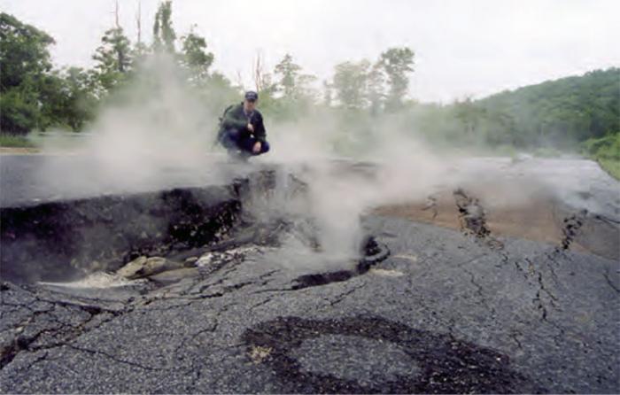
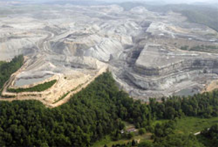
Mining coal involves either removing the rocks on top, or tunneling into the Earth along the coal layer. Removing the rocks on top of the coal, called “surface mining” or “strip mining”, requires putting those rocks on top of something else, breaking the coal loose with machines or explosives, hauling the coal away to be burned, and then either putting the rocks back on top or just leaving them. (We’ll revisit some of the implications of this later in the semester.) Digging along the coal is often called “deep mining”, and puts miners in a potentially dangerous place. For more information about mountain removal mining, visit the U.S. Environmental Protection Agency [23] for some good resources, and watch the video at NASA's page on Moutaintop Removal [24].
When mud rocks (shale layers) are heated, the buried dead plants break down into the smaller molecules that make up oil and gas. Initially, these are trapped in the shale. However, because many small molecules take up more space than a few big ones, heating and cooking the rocks raises the pressure inside until the oil and gas seep out, often by cracking the rock. After some oil and gas escape, the pressure drops and the cracks close under the weight of rocks above. This may happen multiple times as more cooking occurs.
After oil and gas have escaped from the shale into sandstone or other rocks with bigger spaces, the oil and gas can move through those spaces. Most sediments are deposited under water, or the spaces in them fill up with water later. Natural gas is gaseous (no surprise there!), oil is liquid and floats on water, and so both tend to move upward through the water-filled spaces. The great majority of oil and gas eventually reach the Earth’s surface as oil or gas seeps. Before the industrial revolution, the amount of fossil fuel being formed, and the amount leaking out of seeps, were probably very similar (we’ll give some numbers soon).
However, recall that fluids have more difficulty moving through smaller spaces. If oil and gas are rising through spaces in rock, their motion may be blocked by another shale layer. Especially if the shale has been bent by movements in the Earth associated with mountain-building, so that the oil and gas rise into a “trap”, the fossil fuels may sit there for a long time (see the figure below).
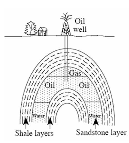
Exploration for Oil and Gas
Oil and Gas Exploration
For over a century, exploration for oil and gas—finding the next big field full of valuable fossil fuels—has involved locating oil and gas traps and drilling into them. Most commonly, this has involved “seismic” exploration (see the figure and explanation below). Nature figured out how to use this technique long before humans did. For example, a bat flying around in the dark “looking” for a moth to eat will make a noise, and listen to the echo off the moth, using the time and direction to locate the flying dinner. Dolphins can find their food the same way.
Video: Air Gun Vessel to find Oil (:55)
PRESENTER: If you're a bat, a nocturnal mammal looking for flying bugs, you make a noise, and you listen to the echo that comes back off of the bug. And then you know it's out there and where it is.
Humans have adapted similar sorts of technologies to look for oil. So in this case, being done in the ocean-- this is ocean water along here. And we have a ship going along, and it makes a noise. It uses an air gun. They used to use dynamite.
And the noise is bounced off of various layers down below and then is listened to back here. And by looking at how bright and how long and other things about the arrival, you can learn a lot about the rocks that are down underneath.
And people do this both on land and in the ocean. And they're looking for those special places where oil has accumulated, and we can go in and drill into it and get it.
Oil explorers make noises, and listen to the reflections from layers in the Earth, using the time and direction to locate the oil-and-gas-filled traps. Then, drillers drill into the traps, and pump the oil and gas out. (Sometimes, the pressure is so high in the trap at the start that the oil comes out of the hole without being pumped, as a “gusher,” see figures below.)
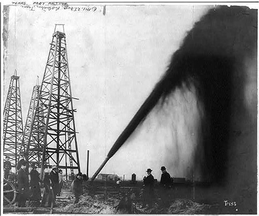
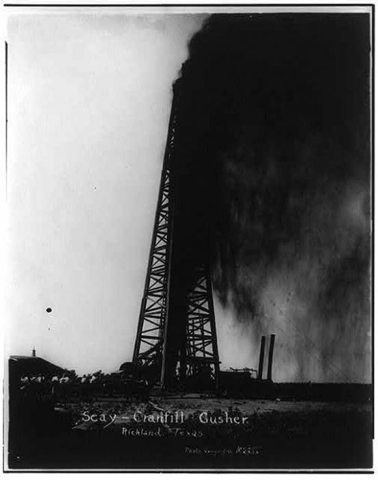
But, soon, the pressure down there is reduced, and a pump is needed. Occasionally, a gusher catches on fire, with sometimes disastrous consequences, see the figure below.
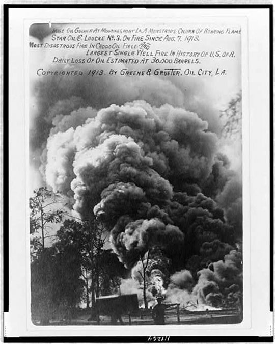
Increasingly, a new technique is being used to recover oil and gas. Shale layers often have a lot of hydrocarbon left in them that did not escape in the past. Drillers have learned how to bore down to a shale layer, then turn the drill and bore along in the layer. When the hole is long enough, the drillers pump fluids at high pressure into the hole, breaking the shale in a process called “fracking” (from “fracturing”) that mimics the natural process by which oil and gas escaped the shale. Human use of this process was apparently first invented by a veteran of the US Civil War, Col. Edward Roberts, who saw the fractures in the ground caused by an exploding Confederate shell, and went on to patent the technique of using explosives to fracture rocks and allow more flow into wells. The technique has been improved in many ways since.
In many ways, fracking is not revolutionary but evolutionary from older techniques for recovering oil and gas. Under best practices, fracking probably isn’t inherently more risky or dangerous than those other methods. The biggest difference is that fracking is used to recover oil and gas that are spread out over large areas rather than having a large quantity concentrated in one place. So, fracking takes lots more drilling and pumping and installing pipelines in more places. Fracking is more likely to be in someone’s backyard, or near it, so there are more people seeing it and hearing it and complaining about it.
The more drilling there is, the more chances there are for mistakes to be made, contaminating groundwater or otherwise causing problems for neighbors. The drilling can also bring other problems, including lots of traffic. For example, back on Sept. 23, 2011, an article by Cliff White in the Centre Daily Times, State College, PA noted “A review of inspections performed by state police on commercial motor vehicles used in support of Marcellus Shale gas drilling operations in 2010 revealed 56 percent resulted in either the vehicle or driver being placed out of service for serious safety violations” but that “Thanks to heavy enforcement, the noncompliance rate has dropped to about 45 percent in the most recent study.” And, in the same article, “…a trooper in gas-rich Bradford County, said during the initial ramp-up of activity in that area a few years ago, almost all of the vehicles used for gas drilling-related purposes that he stopped had “some degree” of noncompliance.”)
Fracking is done with high-pressure fluids to which certain chemicals have been added, as noted above, and some of those chemicals may be dangerous to humans. The fracking fluids plus salty brines from the rocks “flow back” out of the wells, and these flowback fluids must be disposed of in some way. Much of that disposal recently has involved injecting the flowback fluids into the Earth in special deep wells. This has caused numerous earthquakes, some of them damaging. (See, for example, USGS: Induced Earthquakes [29].) Fluid injection for other reasons also has caused earthquakes; fracking is especially important in this only because it generates so much fluid that is being injected. Note that while fracking has probably triggered a few small earthquakes directly, the main cause of earthquakes is this injection of flowback fluids.
Fracking is likely to be with us for a long time. And, it is likely to remain at least somewhat controversial.
Video: Process of Fracking (1:01)
PRESENTER: If you're a bat, a nocturnal mammal looking for flying bugs, you make a noise, and you listen to the echo that comes back off of the bug. And then you know it's out there and where it is.
Humans have adapted similar sorts of technologies to look for oil. So in this case, being done in the ocean-- this is ocean water along here. And we have a ship going along, and it makes a noise. It uses an air gun. They used to use dynamite.
And the noise is bounced off of various layers down below and then is listened to back here. And by looking at how bright and how long and other things about the arrival, you can learn a lot about the rocks that are down underneath.
And people do this both on land and in the ocean. And they're looking for those special places where oil has accumulated, and we can go in and drill into it and get it.
Earth: The Operators' Manual
Fort Worth: Gas, Waste & Water (9:08)
If you want to see a little more on fracking, much of the clip is relevant, but the first 3 minutes and 40 seconds especially fit here.
Narrator: Today, in some ways,we're in danger of repeating the past. As the easy oil was all used up, we're drilling in challenging conditions up in the Arctic. We're considering an increasing reliance on tar sands, which are plentiful in our northern neighbor, Canada, but which are dirtier to process. But once more, America has been fortunate to find a new, abundant, domestic and potentially cleaner source of energy. Several regions from North Dakota to the mid-atlantic and northeastern states have large amounts of natural gas deep underground in shale rock formations. And the city of Fort Worth sits literally on top of the Barnett Shale. For the first time, a new source of energy is emerging when there's an awareness of the urgent need for sustainability. Can Fort Worth and America figure out how to make shale gas a significant part of our energy future, without repeating the mistakes of our energy past? Folks used to call this cowtown. Today, there are more than 2,000 gas wells right under the city of Fort Worth. This city's grown by 200,000 people in 10 years and estimate it will gain another 200,000...
Narrator: Rapid growth has brought congestion on the roads and pressure on fresh water resources at a time of record drought all across Texas. That has motivated the city to be part of the sustainability roundtable, bringing together developers and planners, energy executives, university researchers and even the commander of the local naval air station.
Mayor Price: We have to begin to develop a master vision for how do we be sustainable? It has to be a concentrated effort on every department's to think about their water use, their electric use.
Narrator: Roundtable members realize their push for sustainability is happening against the backdrop of the natural gas boom. It's quite remarkable how rapidly shale gas has developed from being basically zero percent of our production to being more than a third of our total natural gas production and going up.
Narrator: Depending on how quickly we use it, experts say America could have enough gas for several decades. To some, this is a huge bonanza.
Larry Broaden: We've found so much gas here and in other areas, that the price has been driven down.
Narrator: To others, shale gas is an environmental disaster waiting to happen. There has to be a more robust discussion with the public about risk and risk benefit. Very few discussions start that way. Most of them start with, "here's a source we must use." or "here's a source of energy we must not use." The real issue is, what is our desired end state?
Narrator: Geologists have known about shale gas for more than 20 years. But that didn't mean the gas was easy or economical to extract. In this industry video, you can see that hydraulic fracturing or fracking uses a mixture of water, sand and chemicals. This is injected deep underground to break up the rock and let the gas flow up to the surface more easily.
Mayor Price: We say we've been punching holes in the ground in Texas for 100 years.
Narrator: What was new was drilling down and then out horizontally, and the locations of the pad sites.
Mayor Price: We've been fracking wells for 50, but we've not done it in your backyard.
Narrator: Larry Brogdon is an oil and gas man who made money by acquiring and selling drilling rights. Now he teaches a course that touches on energy, economics, and environment at Texas Christian University. The economic benefit to this area in the last 10 years has been about over $65 billion.
Narrator: And when natural gas is used to generate electricity, some estimates are that it's 50% cleaner than coal. The advantage that natural gas has is that it's much lower carbon in terms of its footprint.
Narrator: Industry insiders say Americans need to recognize that the power we all use has to come from somewhere. Somebody goes over there and they flip on that light switch and they think they're just using electricity, well, natural gas is generating a whole lot of that electricity.
Narrator: However, public concern, here in Fort Worth and nationally, has focused on worries that the entire cycle of drilling, fracking, production and fluid disposal can contaminate drinking water, trigger earthquakes, and leak methane. It is an industrial activity, and that means the management of water. That means air quality. And the third thing is just the community impact, that suddenly areas that were not being developed for natural gas, now have this development coming in.
Narrator: Daniel Yergin was a member of a special committee tasked by the U.S. Secretary of Energy to study the potential environmental impacts of natural gas drilling. The committee came up with 20 recommendations of best practices, with number one being better sharing of information with the public. Number 14, disclosure of fracking fluids, and number 11, studies about possible methane contamination of water supplies. One has to do the full life cycle analysis, kind of cradle to grave kind of thing, to really understand where the points of vulnerability are including full environmental costs and to then weigh the risks and the benefits. And that will help us lay out what the panoply of sources would look like.
Narrator: Only if safeguards are in place can this fossil fuel really serve as a bridge to a more sustainable future. Right now best practices would focus on things like how do you handle the water that is produced out of the well as the result of hydraulic fracturing and making sure that it's disposed of in a very environmentally sound way. Narrator: As the name, hydraulic fracturing, implies, massive amounts of water are required for fracking and in Texas where water is a precious resource, this is a major concern. Water is huge, facing the city. And I think that water is one of those things that most people don't think long term about.
Narrator: Although mayor price says local breweries use more water than the drillers, with sustainability in mind, there's no reason why fracking has to use potable water. So now we're able to use reclaimed water to frack these wells and thereby use less of our potable water and it can take 3 million gallons of water to frack one well.
Narrator: Once thought of as a sewage treatment plant, Village Creek is now the water reclamation facility. Until recently, 50% of Fort Worth's potable water was used for irrigation. Now the city's distributing treated grey water in distinctive purple pipes to irrigate golf courses and playing fields and for industrial uses at the giant Dallas-Fort Worth Airport. Every day in the city of Fort Worth, about a million people put water down the drain. This is where it ends up.
Narrator: The water treatment process itself is becoming more sustainable and less energy-intensive. And in a twist, this new approach relies on a truly natural gas. Methane is the primary component of natural gas but it's also a by-product of our daily lives, found in human waste. One of the first steps in the process is to remove solids from the waste and put it into digesters where methane gas is generated. Under normal circumstances, you may consider methane to be a greenhouse gas which would be bad for the environment, but here we're using it as a renewable resource to power our engines, possibly getting up to as much as 90-95%, of the energy required for the operation of this facility.
Narrator: Fort Worth is aiming for sustainable growth and an energy boom without a following bust. But the energy we all surely need will more easily be found by tapping another resource that's found in Fort Worth, and every community. When we talk about energy, we talk about the various major energy sources. You talk about oil, natural gas, coal, nuclear. Increasingly also, of course, the renewables, wind and solar. But there's one fuel that gets left out of the discussion and yet it's one that has enormous impact on the future. That's the fifth fuel, energy efficiency, conservation.
No Discussion Assignment for Module 3
Unconventional Oil
What is unconventional Oil?
You may also hear about oil shales and tar sands (see image below). These are sometimes called unconventional petroleum or unconventional oil, or something similar, and represent opposite ends of a spectrum: oil shales haven’t been cooked enough to make oil yet, and tar sands are the leftovers after cooking and dining.
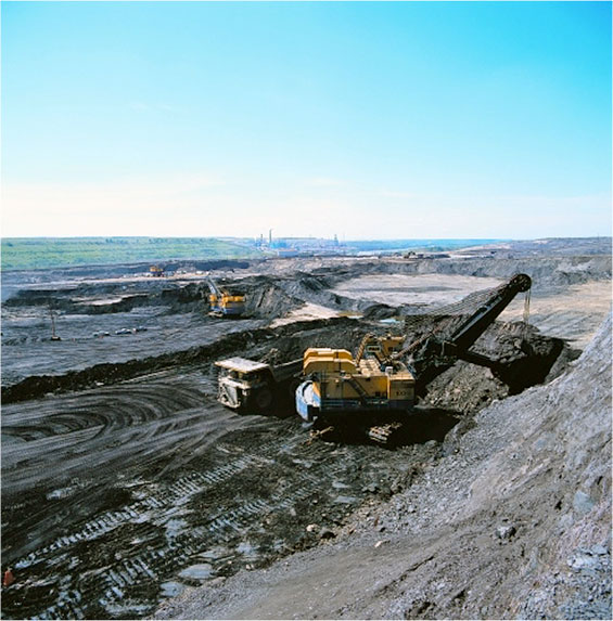
Tar sands, such as the huge deposits of Alberta, Canada (see images above), are like the much smaller tar deposits in the pits at La Brea, mentioned earlier. Oil contains many different types of molecules. When oil seeps to the surface, the smaller ones tend to evaporate, or to be used preferentially by bacteria, leaving the larger molecules behind. These larger ones don’t flow as easily, so the result is a thick, almost solid mass of “tar” (technically called “bitumen”). Native Americans were waterproofing their birch-bark canoes with Alberta’s bitumen when the first Europeans arrived, probably with no knowledge that early peoples of the Fertile Crescent of Mesopotamia also used bitumen to waterproof boats.
Because the bitumen is so “thick” (viscous), normal drill-and-pump techniques don’t work well. Many techniques are in use or being tested to separate oil from the sand or gravel in which it occurs. For shallow deposits, the tar-soaked sands can be surface-mined and then heated or mixed with appropriate chemicals to free the oil from the sand. For deeper deposits, injection of steam or hot air or other hot fluids can warm the bitumen enough that it will flow. Oil companies are even experimenting with setting small fires in wells, to make heat and gases that drive liquid hydrocarbon to other wells. All of these techniques have associated costs, including water and energy use. For now, much more energy is obtained from the oil recovered than is used in recovery, but the ratio is not as good as for “normal” oil, and is likely to get worse as the easier-to-recover tar sands are used up.
In contrast to the tar-sand “leftovers” from normal oil after bacteria have eaten a lot, oil shales are undercooked not-yet-oil. In many places, dead plants and mud accumulated, but without being buried deeply enough to get hot enough to break down the dead plants and make oil. The dead plants have typically been changed enough to get a new name (“kerogen”), but not to make oil that can be pumped out easily. This sort of deposit is called oil shale (Figures 13-15). (The names are NOT the easiest to deal with. Oil pumped out of shale may be called shale oil, but the shale from which that oil is pumped is generally not called oil shale. Instead, that shale is an oil source rock. The name “oil shale” is saved for those shales that haven’t been heated enough to make oil, but that could be in the future. Given our choice, most of us who work in these areas would pick clearer names, but no one asked us!)
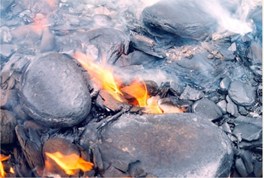
Oil shale can be burned as-is, but the organic matter is diluted by the clay in the shale, so just burning doesn’t work really well. Most plans for future use involve speeding up the natural process, heating the rock to “pyrolyze” the organic matter, releasing oil and gas while leaving some organic material behind in the rock. This may be done in the ground, or after mining the shale. Because energy is needed to heat the rock, costs tend to be higher, and energy recovered lower, than for conventional oil in which the heat of the Earth acting over millions of years did the cooking for us.
Reserves and Resources
What the difference between reserves and resources?
Short version: If we work hard at recovering fossil fuels, huge amounts remain. We are probably at least decades and perhaps longer from real scarcity of fossil fuels, although with notable uncertainty. But, we may be close to the point at which fossil fuels are scarce enough to start causing problems.
Friendlier but longer version: Experts in the field generally separate fossil-fuel “reserves” from “resources” (and, they have additional technical terms that subdivide these big types). You might say that “reserves” are what you are (almost) sure you can use in the modern economy with modern technology, whereas “resources” are what you think you can have in the future.
For example, the US Energy Information Agency, in defining “proved reserves” for oil (also known as “proven reserves”; similar definitions apply for gas and coal), says that this includes “the estimated quantities of all liquids defined as crude oil, which geological and engineering data demonstrate with reasonable certainty to be recoverable in future years from known reservoirs under existing economic and operating conditions.
Their data indicate that, as of 2011 (the last year for which full data were available at the time this was being written; a partial update in 2016 didn’t change these numbers much), the world had 46 years of proved reserves at current rates of use. These numbers were higher for gas (150 years) and coal (120 years). With oil slightly more important than the others in the world economy, these would give most of a century of fossil fuels before we run out. However, use has been rising rapidly. If everyone in the world used fossil fuels at the same rate as in the US, total use would be more than 4 times faster, reducing the life of the proved reserves to perhaps 20-30 years.
The resource is likely much bigger. If you spend a little while looking at the figure "Where is the Carbon?” just below, you’ll see first that the authors from the US NOAA are discussing how much fossil fuel we have, and how much we’re burning, in units of gigatons of carbon. (1 gigaton of carbon = 1 Gt C. A gigaton is a billion tons. Fossil fuels contain some hydrogen and a little bit of other things, but focusing on the carbon is a useful way to calculate.) The authors estimate that we have already burned fossil fuels containing about 244 Gt C, from an original 3700 Gt C, leaving 3456 Gt C to be burned. The figure is a few years old, and the use rate of 6.4 Gt C per year that they show has increased to perhaps 9 Gt C per year. That would leave almost 400 years of fossil fuels at current use rate, or less than a century if everyone reached the US rate (and even less if population continues growing). Some estimates of the resource are even bigger, in the range of 4000 to 6000 Gt C, and even more if we figure out how to use clathrate hydrates, which might have about as much carbon as the other fossil fuels although probably notably less.
Video: Where is Carbon? (2:10)
PRESENTER: This wonderful plot from NOAA and the IPCC is about where carbon is in the Earth's system and where it's going. The numbers of how much is in a place are in gigatons of carbon-- billions of tons. And how fast it's going is in billions of tons per year of gigatons of carbon per year.
The black numbers are before humans started messing with it. And a number like this one up here is how much carbon was in the atmosphere before human influence. The red number up here is how much humans have added to the atmosphere. The numbers with arrows are how much was going naturally in a particular direction before humans were in, and then how much the human change has been. And so you can see fluxes of carbon and you can see reservoirs of carbon.
Perhaps the key one, they have estimated that before humans got into the game, there were about 3,700 gigatons of carbon as fossil fuels of which we've burned only 244. So there's lots more carbon that can be burned in the system. They show a flux here of 6.4. That's probably about 9 now.
But you'll notice that at that rate, there's actually something like 400 years of fossil fuels remaining. Now if everyone burned it at the same rate as we do in the United States, that would drop it down to 100 or less. And if population continues growing, it would be even less than that.
And if we start to get into trouble when half of it is burned, then most of you students actually will live to see the time when we're getting into economic difficulties because fossil fuels are starting to get scarce. Nonetheless, it's pretty clear that there is much more fossil fuel in the earth than we've burned so far, and so we can make a lot bigger change than we've done so far.
Proven Reserves
Proven Reserves Explained
But, because of the heating needed to get oil from tar sands and oil shales, and the extra effort to drill deeper and frack rocks, some of the resources will be used up recovering the rest of it, increasing the rate of use. And, we don’t really know very well what the resource is; serious investors and regulators tend to rely on the proved reserves for good reasons.
You may also recall from earlier in the course that peak whale oil production from the US fleet was followed almost immediately by a tripling of the cost, even though oil production continued at fairly high levels during the following decades—impacts of scarcity are felt long before the resource is exhausted. People often assume that production of a resource follows a sort of bell curve, starting slow, then rising rapidly, peaking, declining and tailing off to almost nothing. If that model is accurate, then the peak—peak oil, or peak coal, or peak-whatever, occurs when half of the resource has been used. The whale-oil experience suggests that scarcity shows up and starts to restrain the economy just about then. If so, then we now may be much closer to problems from fossil-fuel shortages than we realize.
Another point worth considering is that some countries have a lot of fossil fuel, and others not much (see the "World's Proven Reserves" figure just below). And, who has fossil fuel and who uses it are not always the same. For oil, for example, for most recent years including 2016, the US was the third-largest producer, although the US was #1 by a small margin in 2015, based on data from the International Energy Agency. But, because the US is the largest user, being third in production isn’t enough, and the US is the largest importer.
Video: Where is Oil, Coal, and Gas? (1:28)
PRESENTER: This shows where we know that there are oil, and coal, and gas. So the oil in each case is the black one, and then the coal is this little sort of purple-y one, and the gas is blue one. This happens to be the Middle East right here, and the Middle East has more than half of the proven reserves of oil in the world. It's not the place you go for coal, but there's a whole lot of gas there.
The US uses a lot more oil than most places. We have lots of oil in the US, but it's only 14% of the proven reserves. There's a huge amount of gas that's been found, but it still only gives 6%, and then the coal is fairly high in the US. And you can sort of walk around here. Europe uses a lot of energy, and they are very poor in basically everything. They've got more of the coal than anything else, but they really don't have all that much. There's a whole lot of some of these up in Russia, and so on. So you can run down. And Asia here, and there's a whole lot of coal, Australia especially.
But you can notice that because the way this is distributed, some people use more than they have, and some people have more than they use. There's a lot of trade that goes in various directions, and this makes the international economy and the international politics fairly interesting.
Notice that the sorts of numbers here can be “spun” in many, many ways in the public discussion. Estimates of how much we have already discovered in the ground are at least somewhat uncertain; estimates of how much is in the ground that we haven’t discovered yet, or haven’t learned how to recover, are much more uncertain. Businesses and companies might have reason to report optimistic numbers, or pessimistic ones, depending on what they want to accomplish or sell or buy just now. How long the resource will last depends on how fast we burn. Should we estimate using modern rates of burning, or future ones, and if future, what will they be?
The rise of gas and oil fracking in the US has led to a rapid increase in reserves. You may hear people talking about a century of gas, although others use numbers as small as 25 years for the US reserve. But, at the start of fracking, gas was only about ¼ of the US energy use, so relying on gas as our main fuel could bump the low-end estimates down to only about 6 years. You could find some justification for bragging about a century or more of gas or warning that we may run out in a decade or less, by carefully choosing which estimates to adopt and how to use them. The module is to be very careful about the first numbers you hear, and think and compare before using a number to make decisions on, say, where to invest your retirement fund! (This applies to what you see in this class, too; no one can give you the absolute truth on this topic!)
Future of Fossil Fuels
Will Nature Make More Fossil Fuels?
You can be quite confident that as we use the fossil fuels, nature will produce more, and that this new natural production will be grossly inadequate to help us over the next decades to centuries.
Let's go back to the Where Is the Carbon diagram, which is repeated for your convenience. You’ll see that it shows 0.2 Gt C per year going into “surface sediment” at the bottom of the ocean. Other estimates vary somewhat; one well-known textbook used 0.05 Gt C for this flux. With the figure showing a burn rate of 6.4 Gt C per year, a number that has risen close to 9 Gt C per year, 0.2 is not especially big, but it isn’t completely zero, either. But, you’ll also notice a return flux labeled “weathering” that is also 0.2 Gt C per year. In the natural setting, the amount of dead plants being buried, and the amount of fossil fuel seeping out or otherwise returning to the surface were very similar.
Video: Where is Carbon Going? (1:50)
PRESENTER: So we're back at this figure from NOAA and from the IPCC, and the figure is showing us how much carbon is in places in billions of tons-- gigatons of carbon-- and how much carbon is moving between places in gigatons of carbon per year both for the natural situation-- either how much was there or how much was moving-- and for what humans have caused-- how much is there and how much is moving. You might ask the question-- if we burn all the fossil fuel or a lot of the fossil fuel, won't nature make more of it? And the answer is, well, yes, but not fast enough to matter.
And so you'll note that what we're burning now, in this figure, we are burning 6.4 gigatons of carbon per year. That number is now probably up around nine or even a little bit more. And nature does indeed bury carbon in sediments that can become fossil fuels, but you'll notice that the number down here is only 0.2. That's not very big compared to that nine we're burning up above.
And you'll also note that, in the natural system, that burial is offset by what they have labeled as "weathering" over here, which is about the same amount coming out. Nature will make more fossil fuels. Nature will not make more fossil fuels fast enough that it counts in human economies. You have to think of hundreds of thousands and millions and more years to make enough fossil fuels to matter.
NOTE: Please realize that while you saw this figure on the previous page, the video discussion here focuses on different aspects of this figure.
The black pre-industrial carbon values show the carbon cycle and the balance that existed without human emissions. The red values indicate the effects that the human emissions have had on the carbon cycle. Increased emissions have increased levels of carbon in the atmosphere, pressuring the ocean and land biosphere to accept more carbon and limiting their future effectiveness as carbon dioxide sinks.
The total amount of buried organic carbon, former dead plants, may be 10,000,000 Gt C, but that accumulated over 4.6 billion years, so the rate has averaged only 0.002 Gt C per year, tiny compared to our use. And, almost all of that buried organic carbon is too widely distributed to be used as fossil fuel; we would expend more energy getting it than it would yield when burned. The available resource is shown in the figure as 3500 Gt C, and other estimates are a little higher. Most of the resource accumulated in the last 500 million years, at a rate of roughly 0.00001 Gt C per year.
Thus, we are burning the fossil fuels roughly a million times faster than nature saved them for us. Nature will make more fossil fuels over geologic time, but what we burn is gone forever on the timescale of human economies. We have been given a “bank account” of fossil fuels, but when we spend it, it’s gone, with no significant deposits being made.
Summative Assessment
Reminder!
After completing your Summative Assessment, don't forget to take the Module 3 Quiz. If you didn't answer the Learning Checkpoint questions, take a few minutes to complete them now. They will help your study for the quiz and you may even see a few of those question on the quiz!Peak Oil Activity
You have, by now, learned some things about “peak oil”, the notion that the production of oil is at or near a peak and will decline in the future, forcing us to conserve more and shift to other sources for our energy needs in the future. The goal of this activity is to explore this notion of peak oil in a bit more depth, to understand how it is a natural consequence of supplies, demands, prices.
In this activity, we’ll be using computer models created in a program called STELLA. STELLA models are simple computer models that are perfect for learning about the dynamics of systems — how systems change over time. Systems, in this case are sets of related processes that are involved in the transfer and storage of some quantity. For example, the global water cycle is a system that involves processes like evaporation, precipitation, surface water runoff, groundwater flow, moving water from one place to another. Earth’s climate system is set of related processes involved in the absorption, storage, and radiation of thermal energy. In fact, you can think of the whole Earth as one big, complex system. Through the use of computer models, we can learn some important things about how they work, how they react to changes; this understanding can then help us make smart decisions about how respond and adapt to a changing world.
What is a STELLA model?
A STELLA model is a computer program containing numbers, equations, and rules that together form a description of how we think a system works — it is a kind of simplified mathematical representation of a part of the real world. Systems, in the world of STELLA, are composed of a few basic parts that can be seen in the diagram below:
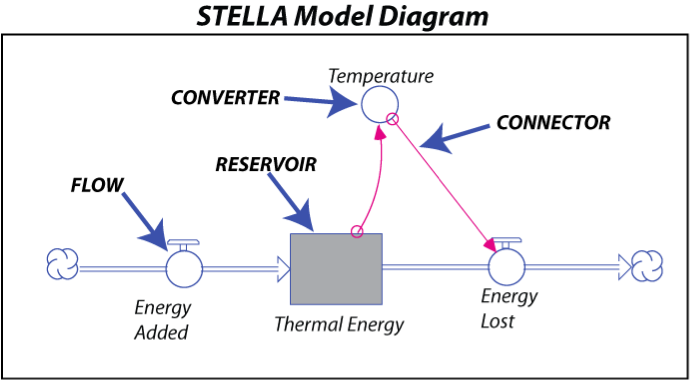
Terminology
A Reservoir is a model component that stores some quantity — thermal energy in this case.
A Flow adds to or subtracts from a Reservoir — it can be thought of as a pipe with a valve attached to it that controls how much material is added or removed in a given period of time. In the above example, the Energy Added flow might be a constant value, while Energy Lost would be an equation that involves Temperature. The cloud symbols at the ends of the flows signify that the material or quantity has a limitless source, or sink.
A Connector is an arrow that establishes a link between different model components — it shows how different parts of the model influence each other. The labeled connector, for instance, tells us that the Energy Lost flow is dependent on the Temperature of the planet.
A Converter is something that does a conversion or adds information to some other part of the model. In this case, the Temperature converter takes the thermal energy stored in the Thermal Energy reservoir and converts it into a temperature using an equation.
To construct a STELLA model, you first draw the model components and then link them together. Equations and starting conditions are then added (these are hidden from view in the model) and then the timing is set — telling the computer how long to run the model and how frequently to do the calculations needed to figure out the flow and accumulation of quantities the model is keeping track of. When the system is fully constructed, you can essentially press the ‘on’ button, sit back, and watch what happens.
In this course, the models have all been made; you will interact with the models by changing variables with a user interface that has knobs and dials and then running the models to see how they change over time.
We will start with the simplest model we can imagine that represents the consumption of oil and gas and then we will work with progressively more complex versions of the model.
Instructions
This assessment is broken into five sub-parts with questions related to each part. Separate web pages have been provided for each part to reduce scrolling. We have also provided the activity as a worksheet that you can download and even print if you prefer. You may find downloading or printing the complete worksheet easier to work with as you prepare your answers to submit to the Mod 3 Summative Assessment (Graded) quiz.
Files to Download
Download the worksheet [36]. Completing the 'Practice' and 'Graded' versions of the exercise, in the following pages or on the attached worksheet, is required before submitting your assignment.
Submitting Your Assessment
Once you have answered all of the questions on the worksheet, go to the Module 3 Summative Assessment (Graded) quiz, in which you will see the worksheet link again and the Graded Assessment. The worksheet has practice questions with answers provided and then graded versions of similar questions. Use the practice questions to make sure you are running the model correctly and reading the graphs properly, then do the graded questions, writing down your answers. The questions listed in the worksheet are repeated in the Canvas Assessment, so all you will have to do is read the question and select the answer that you have on your worksheet. You should not need much time to submit your answers since all of the work should be done prior to logging into clicking the assessment quiz.
Grading
This assignment is worth a total of 19 points -- the questions are all multiple choice.
Oil and Gas Reserves
Introduction
Oil and gas form at extremely slow rates — 10’s of millions of years — so we can consider the oil and gas present now to be all that is available. We can wait around all we want and there will be no significant increase in the oil and gas. The total amount of oil and gas in existence on Earth is sometimes called the oil in place. We can only guess at this (somewhere around 6 trillion barrels of oil equivalent), but regardless of its size, we can probably only get about 50% of it out of the ground (this recovery factor ranges from 10% to 80% for individual oil fields). The recoverable oil and gas can be divided into two types of reserves — proven and unproven. Proven reserves are the oil and gas that we know about (which means we have a 90% confidence level about them), while unproven reserves are the oil and gas that we are less certain of, but we have some indication of their existence. These reserves are usually expressed in terms of barrels of oil equivalent and includes both oil and natural gas.
It is estimated that our proven reserves are on the order of 1.5 trillion barrels of oil, and unproven reserves are thought to be in the range of 3 trillion barrels. Last year, we consumed 31 billion barrels of oil, and at this rate of consumption, we’ve got less than 50 years worth of oil in the proven reserves, and about 97 years worth in the unproven reserves. Now, move onto the first part of this assessment 1. The Simplest Case.
1. The Simplest Case
In this first case, we’ll just consider the proven reserves, and we’ll assume that the oil produced is a constant percentage of how much remains in the proven reserves. The logic here is very simple — if there is more oil, you can produce more in a period of time, while if there is less oil, you produce less in the same time period — but the percentage remains the same.
Here is what the system looks like as a STELLA model:
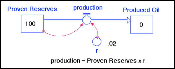
Since this model is simply meant to illustrate the general pattern of oil/gas production resulting from an assumption of how production works, we’re not going to worry about the actual values, but you can think of the starting amount of Proven Reserves as 100% of what we have. Every year, we produce oil/gas at the rate of 2% of however much remains in the Proven Reserves reservoir. The production flow transfers oil/gas into the Produced Oil reservoir, so we can keep track of the total amount of oil/gas produced over time.
Let’s see if we can predict what will happen by doing a few simple calculations. When the model first begins:
Proven Reserves = 100
production = 100 x 0.02 = 2;
This will reduce the Proven Reserves by 2, so it becomes 100-2=98. Then, in the next year:
Proven Reserves = 98
production = 98 x 0.02 = 1.96
This will reduce the Proven Reserves by 1.96, so it becomes 98-1.96=96.04. So, in the next year:
Proven Reserves = 96.04
production = 96.04 x 0.02 = 1.92
Notice that the production is declining as time goes on, and the amount of decline is getting smaller. If this pattern continues, the production will follow an exponential decline curve — like this:
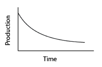
Take a few minutes to watch the following video and learn about the browser-hosted STELLA model interface, before running the model.
Video: Peak Oil Model 1 (2:13)
PRESENTER: This is actually the cover of a piece of sheet music that was published in 1864 in New York. This is "The American Petroleum Polka," or charge, or gallop, or waltz, or march. And it has a picture of a beautiful Pennsylvania scene, the oil well spouting its oil. Now oil was black back then. Oil is still black. But you couldn't have black oil falling on the lady's pink dress, so they made the oil white.
And then bragging, "This oil well threw pure oil a 100 feet high." people understood the value that you get from oil, from petroleum. And they celebrated that.
Now, let’s run the model and see what happens. Follow this link to the Peak Oil Model [37] which should be set up exactly the same as the diagram above. Answer the questions either on the worksheet you downloaded or on a piece of paper to be submitted later to the Module 3 Summative Assessment (Graded) quiz. If you didn't download the worksheet on the main page of this assessment, do it now.
Question
1A. Does the production history agree with our simple calculations (position the cursor on the graph and it will show you the values at different times)?
a) yes
b) no
2. Oil Production with Improving Technology
Oil and gas companies have certainly become better at what they do over time. Originally, they drilled near natural oil seeps and hoped for the best, but now, a good team of geoscientists can “see” exactly where the oil/gas is, and engineers can drill with great precision and then “stimulate” the oil/gas-bearing rock formations to squeeze as much oil/gas as possible out of the rocks.
One way to incorporate this into the model is to change the rate of oil/gas production, r, so that it increases as time goes on. To do this, we make a simple equation that says r = 0.0005 x TIME, so then when TIME is 10 years, r will be 0.005 and when TIME is 100 years, r will be 0.05. Other than this change, the model is the same as in experiment 1. The value 0.0005 is called tech rate in the model, and we’ll see what happens if we change it.
Let’s see how this change affects the history of oil/gas production. Click this link to run the model [38] and then answer the following questions on your worksheet or on a sheet of paper to be submitted to a Canvas Assessment later. As you can see, the production of oil peaks in this case. It rises because r is increasing, but as r increases, the Proven Reserves is decreasing and eventually a point is reached where the product of these two numbers (the production) starts to decline.
| Practice | Graded | |
|---|---|---|
| Tech Rate | 0.0002 | 0.0004 |
Questions
2A. When does the production reach its maximum (peak) value?
2B. What is the magnitude of the peak in production?
3. Including Price in the Production Flow
In addition to technology, economics also plays a role in the production of oil/gas in the sense that higher prices will motivate greater production. Let’s assume that the as the supply of proven reserves drops, the price will rise. As long as there is a demand for oil and gas, as it becomes more scarce, it will become more valuable. This is a pretty simplistic view of what determines the price of oil and gas — reality is much more complex, which is why prices fluctuate quite a bit over time. But it is hard to escape the basic reality that as a desirable commodity becomes scarce, its value goes up.
To make this change in the model, we need to add something that will calculate the price. This new model looks like this:
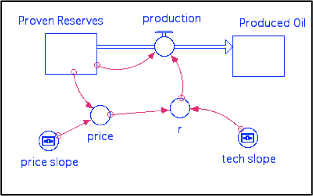
As before, production is defined as Proven Reserves x r, and r in this case is defined as price x tech_slope x TIME, so it once again has the increase over time that our previous model had, but it also increases as the price goes up. The tech_slope is just the slope of the increase in technology over time and the default value is 0.0002. Price here is defined as 0.01 + price_slope x (100 – Proven Reserves); price_slope is the slope of price increase relative to change in Proven Reserves, and is originally set to 0.05. At the beginning, Proven Reserves is 100, so this gives a price of 0.01 — very small. But, when Proven Reserves has declined to 50, we get a price of 2.51. This equation is not meant to be anything more than a way to make the price increase as the Proven Reserves get smaller. The value 0.01 at the front end of this equation is just there so that the price is not 0 at the beginning, which would then make r be 0 and no oil would ever get produced.
What we have created here is a system with a feedback mechanism. Here is how it works:
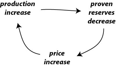
If the production increases, then the proven reserves must decrease; this triggers an increase in price, which in turns triggers an increase in production. Notice that the starting point (production increase) and the ending point (production increase) are the same. In other words, the change at the beginning of the mechanism promotes more of the same — this is what is known as a positive feedback mechanism. Positive feedback mechanisms tend to cause an acceleration of change, sometimes resulting in runaway behavior. In contrast, the are other feedback mechanisms that tend to counteract change, encouraging stability; these are known as negative feedback mechanisms. Note that in this context, positive is not necessarily good, and negative is not necessarily bad.
Take a few minutes to watch the video below to learn more about the positive feedback mechanism the oil production model before running the next model.
Video: Peak Oil Positive Feedback (1:19)
This simple diagram is meant to represent the positive feedback mechanism that we've put into the model. So if you imagine that we begin with a production increase. That's the initial change. Let's say something happens and we increase production. That is going to cause the proven reserves to decrease, right, because production drains that reservoir. So as that goes down, the commodity becomes more scarce and because of that, the price goes up. So that's another effect here that's triggered by the production increase. And as the price is increased, that will then encourage us to do even more to try to produce more of the oil that's out there. It's an incentive to produce more oil.
So that leads to an increase in production again. So the initial change that began this was the production increase and that has end up triggering a series of responses in the model that lead to a further increase in price, and so when that happens, this is called a positive feedback mechanism. It's kind of like a cause and effect loop, right. So here's a cause, it makes in effect, it makes an effect, makes another effect that comes back on that cause and enhances it. So that's going to really change the way that this model behaves.
Open the model here, and run it [39].
This model has two pages of graphs to look at; the first one shows the Proven Reserves, Produced Oil, price, and production, and r (which combines price and tech slope), while the second one shows just the production. The second graph retains the results from previous model runs, allowing you to make comparisons as you make changes to some of the adjustable model parameters. If you want to clear this graph, hit the Restore Graphs button.
| Practice | Graded | |
|---|---|---|
| Tech slope | 0.0001 | 0.0002 |
| Price slope | .05 | .07 |
Questions
3A. First, run the model as it is, with the price slope set to 0.05 and the tech slope set to 0.0002. Note the time and magnitude of the peak in production. Then alter the tech slope or price slope as prescribed, using the new values provided. Run the model and compare the peak time and magnitude with the original case (use page 2 of the graph pad). Use “sooner” or “later” and “greater” or “smaller” to describe how your alterations changed the timing and magnitude of the peak in production.
Change in time of peak =
Change in magnitude of peak =
a) Yes — there are just a few cases in which a peak occurs
b) No — it is impossible; the best you can do is a broad, low peak that takes a long time to develop.
4. Production Driven by Demand From a Growing Population
For our next experiment, we’ll try a different assumption about what drives oil/gas production — demand. The demand for oil and gas has risen over time due to an increase in the global population and an increase in the per capita energy consumption. Here is what this modified version of the model looks like:
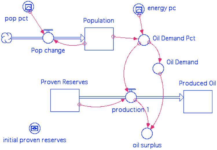
Here, the population increases according to pop pct, which is the net growth percentage per year derived from historical data and then extrapolated into the future — so it is a graphical function that changes over time. The population starts at the 1800 level of 1 billion; the net growth % drops to 0 in 2100, and at that point, the population will stabilize.
The demand for oil/gas is represented here by per capita demand, which is essentially a percentage of the proven reserves per billion people. The per capita demand is another graphical function of time, patterned after actual history up until 2010 and then extrapolated to 2100 — optimistically assuming that the per capita energy demands will level off at about 2100. Multiplying the population times the per capita demand gives us r, the fraction of the proven reserves produced in a given year, and then r multiplied by the Proven Reserves gives us the production. The fraction r will increase as the population grows and as the per capita demand grows, and if population and per capita demand level off, so will r. Recall from experiment 2 that if r is increasing over time, a peak in production is inevitable.
Because we are using real population values and real values for the per capita demand, it makes sense to use real numbers for the Proven Reserves. At the present time, the best estimates are that there are 1.5 trillion barrels of oil as proven reserves (this number includes natural gas too), and we have consumed about 1.2 trillion barrels from about 1900 to the present. This means that at the beginning of time, our Proven Reserves will be 2.7 trillion barrels.
This model also includes a component called per capita oil that keeps track of how much oil is actually available per person, by taking the production and dividing it by the population. As per capita oil increases, we can use more and more oil for our energy needs, but as it decreases, we will have to either reduce our energy consumption or turn to other sources to meet our energy demands.
Questions
4A. Can you guess what will happen? Remember that r here is just like r in the earlier models, and you’ve seen what happens to the production history when r increases over time. Which of the following represents your approximate prediction?
a) Production will increase throughout the model run
b) Production will decrease throughout the model run
c) Production will peak sometime during the model run
Now run the model by clicking this link [40], and and see what happens. We will consider this as the “control” for the next experiment.
| Practice | Graded | |
| Initial proven reserves | 2.0 | 3.5 |
(above numbers refer to trillions of barrels of oil)
4B. How will changing the initial size of the Proven Reserves reservoir affect the history of production? Set the initial Proven Reserves to 2.0 for the Practice Assessment (3.5 for the Graded Assessment) and then run the model and see what happens; choose the response below that best represents how your altered model compares with the control. Page 2 of the graph pad will be useful in making this comparison.
a) It peaks at the same time, with a larger peak
b) It peaks at the same time, with a smaller peak
c) It peaks later, with a smaller peak
d) It peaks later, with a larger peak
e) It peaks earlier, with a larger peak
f) It peaks earlier with a smaller peak
g) It does not peak at all
Oil per capita in 2100 = _______ (within 0.1 barrels/person)
Previous time in history with same oil per capita = _______ (within 10 years)
As you can see, this model suggests that our future use of oil will be a little like traveling back in time.
5. Adding Unproven Reserves
For our last experiment, we’ll see what happens when we add two more reservoirs, Unproven Reserves (the oil and gas that we think is likely to be discovered in the future) and Unknown Oil (the oil and gas we don’t know about, but might be there). Discovery adds Unproven Reserves to the Proven Reserves reservoir, and another flow called discovery adds Unknown Oil to the Unproven reservoir. An example from the Arctic Ocean region helps us get a grasp of these unknown reserves. In this frontier region, less than half of the offshore sedimentary basins have been explored, but based on what is known from more serious exploration off the coast of Alaska, the USGS estimates that there might be ~130 billion barrels of oil and gas — so this is a resource that we think might exist, but not enough is known about it yet to put it into the unproven reserves category, which applies to oil reserves that we know exist, but we don’t know enough about them to put them into the proven reserves. For perspective, this Arctic Ocean oil might represent 10-15% of all the unknown oil/gas that remains, and it would be enough to last for 4 years at the current rate of global use.
The discovery of these new resources is a function of a rate constant that increases over time, dictated by something called the exploration slope. The discovery flow that leads from Unknown to Unproven Reserves is set to be 1/5 the rate of the other discovery flow, reflecting the fact that it is much harder to discover something we know little about. Both of the discovery flows are controlled by switches (they can be turned on or off) and they begin (if the switch is on) at a time that can be set using the explor start time control knob. Here is what this new model looks like:
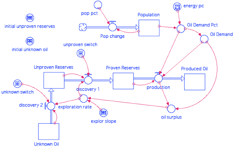
Question
5A. How will these new sources of oil/gas change the production history? The total amount of produced oil obviously must be greater than in our model from experiment 4, but how about the shape of that production curve? Will there be a peak, as before? If so, what will that peak look like?
a) Yes, it will still peak, but the peak will be broader than before
b) No, it will not peak — the production will rise and then remain steady
c) Yes, it will peak, but the peak will be delayed and it will be bigger
Video: Peak Oil Intro (2:44)
Before launching the model and experimenting with it, take a few minutes and watch the video that explains how to operate the switches that can turn the discovery flows on and off.
PRESENTER: This last model has some new features added to it. And so I want to explain these before you play with this model. It includes two new reservoirs, unproven reserves, and unknown oil here. And these can be tapped into through a process of discovery and eventually flow into the proven reserves, here.
These two discovery flows here are controlled by switches. And I'll show you those switches in a second. You can turn them on or off. And they're also controlled by a timer, here, that controls when we really tap into these other potential sources of oil. Other than that, it's quite similar to the other model.
Here's what it looks like when you interact with the model. You open the model, you'll see this. You can turn on these switches here, there's the unproven switch, and here's the unknown switch. Now, we're set to tap into those two new sources of oil.
And then down here, we control the time when we would start to produce that oil. So let me turn these things off first, the switches. There's one switch turned off. There's another one off.
I'm just going to go ahead and run this model. It's running now from 1800 to the year 2600, and here it shows the production peaking here at about the year 2000, then dropping off. Here's the population leveling off at-- I got it leveling off at 11.7 billion here, in this case almost 12 billion.
Now, watch this, if I turn on this unproven switch here, and run the model, you can see the production curve changes. See that? Gets bumped out. Basically, because of the addition of this oil here produced by discovery.
So then if we put this one on here, turn that on, then we can even make a more gradual decline in this production curve. So we're tapping into these new sources, and it makes that decline from the peak here, much more gradual.
Now, there are lots of things you can change here. You can change how much is in the unproven reserves and how much is in the unknown oil reservoir. You can control the rate at which those new sources are tapped into. You can control the timing of when we really aggressively start this exploration to tap into these new resources.
So this is just a little bit more optimistic model.
Open the model here by clicking the link [41], and first make sure the switches are in the off position (down), disabling the two discovery flows. Run the model and you should see exactly the same thing you saw in experiment 4B, with the difference that it runs for a longer period of time. If you study the graphs #3 and #7 show comparative plots of the production (in billions of barrels per year) and oil per capita (in barrels). Make sure you watch the video above to get a general sense of what happens when you turn on the switches.
You will be presented with one of the following 4 sets of initial conditions. Your answers to the following 3 questions will depend on which case you are presented.
| Practice | Graded | |
|---|---|---|
| Initial unproven reserves | 1.5 | 3.5 |
| Initial unknown reserves | 2.0 | 2.5 |
| Explor start time | 1980 ± 1 | 2000 ± 1 |
Questions
5B-D. Set the model up using the initial values provided. Use the slider bars at the top to set the initial unproven reserves and the initial unknown oil, and use the dial near the lower right to set the explore start time (the time when we begin to develop and produce the unproven reserves and unknown oil. This dial is a bit hard to adjust precisely, but if you are within a year or two of the specified date, it will be fine. Then run the model with both switches off, then run it again with the unproven switch turned on and then one more time with both switches turned on. Evaluate the differences between these three model runs in terms of the production (graph #3) and the oil per capita (#7). There are many ways to evaluate the effects of adding these new sources of oil, but we’ll focus on the size and timing of the production peak, and the oil per capita in the year 2100.
5B. Oil per capita in 2100 with Unproven Reserve switch on (± 0.1)
5C. Oil per capita in 2100 with both switches on (± 0.1)
5D. Peak in production with both switches on compared to control (with no switches on).
a) About the same time (within 10 yrs) and size (within 2 billion barrels/yr)
b) About the same time (within 10 yrs), but slightly larger (2-5 billion barrels/yr)
c) Slightly later (10-20 yrs), and slightly larger (2-5 billion barrels/yr)
d) Slightly later (10-20 yrs), and much larger (>5 billion barrels/yr)
e) Much later (>20 yrs), and much larger (>5 billion barrels/yr)
5F. Can a peak in oil production be avoided? In other words, is it possible to find some combination of model parameters that results in more of a plateau in oil production? To figure this out, try changing the exploration slope (this will control that rate that the discovery flows increase), and the exploration start time. We’ll leave the unproven and unknown reserves at 3.0 because this is already a very optimistic outlook.
a) Yes, a peak can be avoided
b) No, a peak cannot be avoided, and no plateau greater than 10 yrs is possible
c) No, a peak cannot be avoided, but a ~50 yr plateau is possible
6. In your own words, summarize the effects of 1) improving technology (of oil production); 2) the price-production feedback; and 3) growing population on the history of oil production.
Summary
We’ve just completed quite a few experiments, so it is a good idea to try to summarize a few important points.
- When we talk about “peak oil”, we’re talking about the rate of oil production — how much oil/gas is brought to market in a given year — not the total amount of oil/gas on Earth (which peaked as soon as we started to pump it out of the ground!).
- Improvements in our ability to extract oil/gas (i.e., improving technology) lead to a distinct peak in oil production.
- If we assume that production is motivated by price, and the price goes up as the oil becomes more scarce, this also leads to a peak in oil production.
- If the demand for oil is related to population, and population increases, this also leads to a peak in oil production. This effect is enhanced if the per capita demand for energy increases, as it has during the last 100 years.
- If we include unproven oil reserves and unknown reserves into the system, we can make the decline in oil production more gradual, but there is still a tendency for it to peak.
- At the end of the day, there is a finite amount of oil and gas available to us. This fact, combined with improvements in technology, an increase in demand for production related to price, increasing population, and increased standard of living makes a peak in oil production inevitable — we cannot have a sustainable supply of oil and gas to fuel our economy. Facing up to this reality is important because it leads us to be more serious about making plans for a future where our energy needs are met without relying on fossil fuels.
Summary and Final Tasks
Module 3 Summary
The sun sends out energy continuously. Plants have figured out how to store that energy for later use, by combining water and carbon dioxide to make more plants. Almost all the other living things on Earth survive by “burning” these plants to get the stored energy.
Usually, plants are burned soon after they die, but occasionally some plants are buried without oxygen and survive for much longer. Time and the Earth’s heat combine to “cook” these old, buried plants, making fossil fuels. We rely on oil—primarily from “slimy” plants (algae, and similar water plants), coal—primarily from “woody” plants, and gas from both.
Most of the coal is found in the rocks where it formed, but most of the oil and gas we are using had migrated upward through spaces in the rock and then been trapped in geologically special places before reaching the surface. Recently, we have begun “fracking” to get oil and gas still trapped in the rocks where they formed. We are also using bitumen from “tar sands”, the leftovers from where oil seeped all the way to the surface and the more-fluid parts were burned by bacteria or else evaporated. We’re trying to learn how to use “oil shale” containing dead plants that would make oil if they were cooked more. And we’re thinking about the possibility of using natural gas that has formed clathrate ice in cold places beneath the sea floor.
The known reserves of these fossil fuels—the ones we’re sure we can use—will be gone in a few decades at the current rate of use. The total resource—including the fuels we think we’ll discover as we search harder, and we think we’ll learn how to use as we invent new ways—would last a few centuries at the current rate of use, but that might drop to less than a century if population and use per person continue to rise. And, sharp increases in price and other problems are likely to start well before the fossil fuels become really scarce.
Nature will make new fossil fuels, but not nearly fast enough to help us. We are burning our way through a “bank account” of fossil fuels supplied by nature, with no income to replace what we use. And, as we will see in the next lessons, our fossil-fuel burning is releasing carbon dioxide that is accumulating in the air and changing the climate.
Reminder - Complete all of the Module 3 tasks!
You have reached the end of Module 3! Double-check the Module Roadmap to make sure you have completed all of the activities listed there before you begin Module 4.
References and Further Reading
Alley, R.B., Earth: The Operators’ Manual, 2011
Organic Origins of Petroleum, United States Geological Survey Energy Resources Program [42]
Enrichments
More on Oxygen in Water
Oxygen in Water Enrichment
We oversimplified slightly in the text above. Even after oxygen is used up burning dead plants in mud beneath an ocean or lake, a little more burning may occur as bacteria use other chemicals in place of oxygen. For example, bacteria may use the sulfate in sea water. The reaction can be written this way:
Sulfuric acid + plant → hydrogen sulfide + carbon dioxide + water + energy
H2SO4+ 2CH2O → H2S + 2CO2 + 2H2O + energy
In reality, the sulfate (SO4-2) will also be reacting with other things in the ocean, but this isn't too far off. Hydrogen sulfide (H2S) is the source of “rotten egg smell”. It also readily reacts with iron in mud to make iron sulfide minerals, which initially appear black in the mud but which later may recrystallize to beautiful fools-gold pyrite if they have enough time and a bit of heat and other help. You might have seen this if you have visited a salt marsh. The mud in the shallowest parts of salt marshes is often black just below the surface, and releases rotten-egg smell if stirred up, because the marsh is growing lots of plants, the mud has little oxygen, and bacteria are using sulfate to burn the organic matter.
As mud is deposited at the bottom of lakes, the sea floor and elsewhere, it buries older mud with its organic matter. If you dig a hole, the material farther down was deposited longer ago, and has had more time to run out of oxygen and the other chemicals that are used to burn dead plants. One often sees a sequence going down in the mud in which, at the top, oxygen is used to burn organic matter, and then nitrate, manganese oxides, iron oxides, and then sulfate. If organic matter still remains, the next step is for bacteria to produce methane, CH4, which is the main component of natural gas.
Something really interesting may happen next. At the pressures and temperatures we commonly see under water, methane is usually a gas, although at high pressure it can be liquefied for storage or shipping. But, if the pressure is high enough, the temperature low enough, and there is lots of water around, instead of making bubbles, the gas will combine with the water to make a special kind of ice. This ice is often called methane hydrate or methane clathrate. When samples are brought to the surface, are brought to the surface, they actually will burn (see figures below).
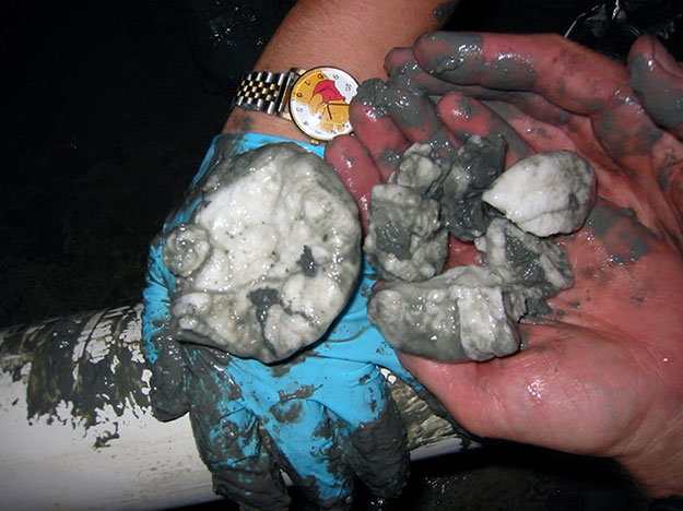
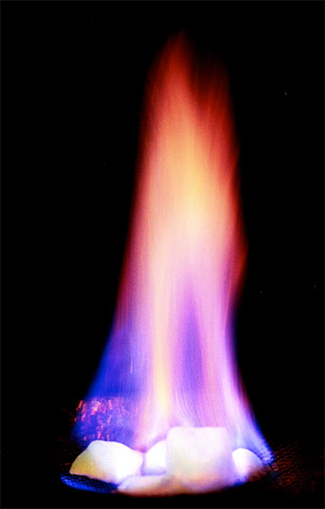
There is a lot of clathrate under the sea floor in many places, and more in the Arctic in permafrost. (Yes, we know that we told you that warmer conditions favor burial of plants without burning, but this burial can happen in cold places as well, and freezing may actually help it happen by keeping worms and other creatures from eating dead plants before they are buried in mud. The frozen soils of the Arctic are rich in dead plants, and much methane is produced from them where thawing occurs without much oxygen.)
As mud is buried deeper and deeper by more sediment, the Earth's heat warms it up. At some depth, the ice melts to release bubbles of methane. When this process was first discovered, some scientists were worried that undersea landslides or other accidents might release giant methane belches that would sink ships (if a huge bubble rose right where a ship was, the ship could fall into the bubble), and change the climate, and cause other problems.
Additional research has reduced these worries, although they haven't gone away entirely. It is still just possible that a bubble might endanger a boat in certain special conditions, but we are fairly confident that huge amounts of gas can't come out really rapidly. As the clathrate is buried by more sediment, trapping the Earth's heat, the deepest ice melts to make bubbles. But, making those bubbles requires pushing water out of the way, which requires that the gas have high pressure. Pushing more water away needs higher pressure. At some high enough pressure, the gas will fracture the icy layer above and bubble out gradually, before enough gas can build up to make a climate-changing belch. Also, as clathrate forms, it uses the water but not the salt in sea water, and that salt may build up in water remaining in mud nearby, lowering the melting point so that some water doesn't freeze even if a lot of methane is supplied, allowing gas to move up through unfrozen regions to leak out at the sea floor.
As we will discuss about climate change next chapter, methane in the sea floor may be very important for amplifying warming over decades and centuries, as warmer conditions melt the ice and let methane escape to increase the greenhouse warming. But, conduction of heat through the sediments to cause melting is rather slow, so we don't think that giant methane belches will change the climate even faster than that.
Module 4: Global Warming - Physics
Module 4 Overview
Video: Physics, Not Politics (2:06)
I was down in Washington, not that long ago, talking to the staff of an important congressional committee. Which committee? Which party? Doesn’t matter. The bright young lawyer looked at me and said, “I didn’t take science in college. I don’t know science. I don’t like science, but I know that you’re wrong about your science, because Global Warming is based on a hockey stick and it’s broken." The hockey stick she referred to is a history of climate change showing recent rapid warming that’s been confirmed multiple times, and really isn’t broken, nor is it the basis of global warming.
And so my answer to her was, “No, actually global warming is based on physics.” It’s physics that’s been known for more than a century. It’s physics that’s confirmed everyday. And, it’s physics that was really worked out by the Air Force right after World War 2, not for climate, but for things such as sensors on heat seeking missiles. And in some real sense, if you deny the warming influence of the CO2 from our fossil fuels, you’re claiming that the Air Force doesn’t know what kind sensor to put on a heat seeking missile. The discussion we had after that was absolutely fascinating.
Now it’s certainly true that no all aspects of the global warming story are as solid as those physics of radiation in the atmosphere. So let’s go look at the parts that are solid, and see where they start to get speculative or where they start to get arguable.
The science of global warming involves a lot of physics, plus chemistry, biology, climatology, geology, glaciology, ... The science is not that difficult, but the whole story is fairly long. We look at some of this story in Modules 4 and 5.
Not too many years ago, a staff member of an important government committee told Dr. Alley, in approximately these words, “I didn’t study science in college. I don’t know science. I don’t like science. But, I know you’re wrong about your science, because global warming is based on a broken hockey stick.” To which Dr. Alley replied, more or less in these words “No, global warming is based on physics known for over a century, and really refined by the US Air Force after World War II when they were working on issues such as sensors for heat-seeking missiles. If you deny global warming, in some sense you’re denying that the Air Force knows what type of sensor to put on a missile.” The conversation that followed was fascinating.“ (The “hockey stick” that the staff member referred to is the history of temperature over the most recent centuries, based on tree-ring and other records as well as thermometer measurements, and actually has proven to be surprisingly accurate as more data have been collected.)
Public discussion of climate and energy in much of the world, including the US, often involves the question of whether someone or some group “believes in global warming”. Usually, “global warming” is understood to mean that humans are primarily responsible for an ongoing increase in the average temperature of the atmosphere near the Earth’s surface. But, to a scientist working in the field, asking whether they “believe” in global warming from the CO2 from fossil-fuel burning, is a little like asking whether they “believe” that gravity will pull a dropped pencil downward; both are unavoidable consequences of well-understood physics.
You might note that if you dropped your pencil just at the moment a tornado blew the roof off the building, the pencil might go upward; it also might go upward if you dropped it just at the moment that someone turned on a giant and properly aligned electromagnet and the pencil contained enough metal, or if an earthquake suddenly accelerated you just as you were dropping the pencil. We can never be absolutely positive what the future holds.
But, most people accept the tendency for a dropped pencil to fall downward, without asking whether you “believe” in gravity. If they could see in the infrared, they would probably hold similar beliefs about global warming. Within this module, we will explore the Physics of Global Warming.
Goals and Objectives
Goals
- Recognize the natural and human-driven systems and processes that produce energy and affect the climate
- Explain scientific concepts in language non-scientists can understand
- Use numerical tools and publicly available scientific data to demonstrate important concepts about the Earth, its climate, and resources
Learning Objectives
The global-warming story is huge. In this module, we will look at the physics, and the next module covers the history and the impacts. Don't let it get you down; the basics are not nearly as hard as they might seem at first.
After completing this module, students will be able to:
- Recall that carbon dioxide has a well-understood and physically unavoidable warming influence on Earth’s climate
- Recognize that positive feedbacks amplify changes, and negative feedbacks reduce them
- Recall that multiple independent records from different places using different methods all show that both CO2 and temperature are rising
- Explain that patterns of global warming in the past century can only be reproduced by considering both natural and human influences on climate
- Use a model to show that global climate always finds a steady state, but certain factors may influence how long it takes to get there
- Demonstrate that greenhouse gases are the most significant factor controlling surface temperature
Roadmap
| To Read | Materials on the course website (Module 4) | |
|---|---|---|
| To Do | Complete Summative Assessment [46] Quiz 4 |
Due Following Tuesday Due Sunday |
Questions?
If you prefer to use email:
If you have any questions, please email your faculty member through your campus CMS (Canvas/Moodle/myShip). We will check daily to respond. If your question is one that is relevant to the entire class, we may respond to the entire class rather than individually.
If you prefer to use the discussion forums:
If you have any questions, please post them to the Help Discussion. We will check that discussion forum daily to respond. While you are there, feel free to post your own responses if you, too, are able to help out a classmate.
The Unavoidable Warmness of Burning
The Unavoidable Warmness of Burning
Short version: The Earth adjusts its temperature to send back to space as much energy as is received from the Sun. But, the Sun’s shortwave energy passes easily through the air while some of the Earth’s longwave energy is intercepted by carbon dioxide and other “greenhouse” gases, making the Earth warmer than it otherwise would be, with more warming when more greenhouse gas is added to the air. This warmer air picks up water vapor and melts reflective snow and ice, making the total warming even larger.
Friendlier, but longer version: Think about a factory making cars. Many small parts go in, and a few big cars come out. But, the total amount of stuff going in is very nearly the same as the total amount coming out. If they were very different for very long, the factory would either fill up with parts or run out of them. The factory may need to adjust its rate of making cars to match the rate at which parts arrive, speeding up by hiring more workers when the parts arrive rapidly, and slowing down by sending workers home or out for coffee when parts arrive slowly. Keep reading for the longer version!
Tuning the Temperature
You can think of energy in the Earth’s climate in a way that is similar to the materials entering and leaving the car factory. Almost all the energy for the Earth system comes from the Sun. About 30% of this is reflected from clouds and the land surface and the other 70% is absorbed and heats the Earth. (The reflected fraction is called the “albedo”, so we say that the Earth’s albedo is about 30%. We don’t worry much about the heat coming up from the deep Earth because it is almost 4000 times smaller than the absorbed heat from the sun.)energy
You know that when the sun rises in the morning, the temperature in the air can go up a lot, quickly. If all of the Sun’s energy stayed on Earth, everyone would be dead from overheating in much less than a year.
But, warmer things lose energy to colder things. Suppose you turn on an electric stove. As the temperature of the heating element (the “burner”) rises, it begins to heat the pot of water on top to boil the water for your spaghetti. If there isn’t a pot of water on top, you can see the burner begin to glow, radiating energy.
The burner is “glowing” even before you can see the glow, as you could prove to yourself if you watched it while wearing special glasses that can “see” in the infrared, which is a longer wavelength of energy than visible light. As the burner gets hotter, it radiates more energy. And, while it continues to radiate long wavelengths such as the infrared you can’t see, a hotter burner shifts more of its energy to shorter wavelengths you can see, going to red and then orange and yellow as it warms up.
If you keep giving the burner the same amount of energy, its temperature will increase until the outgoing and incoming energy are equal, and then the temperature will stabilize. If you then supply energy more rapidly, the burner will warm to a new level that radiates the extra energy. Always, the burner tends to that temperature at which incoming and outgoing energy are equal, a balance like the stuff going into and out of the factory. But, electricity comes in and electromagnetic radiation goes out, much the way car parts go in and cars come out of the factory.
For the Earth, energy from the very hot Sun comes in, mostly in the short wavelengths of light we can see, and we send back infrared radiation at longer wavelengths. But on average, the total amount of energy going out is just about the same as the total coming in. At the present time, this incoming and outgoing energy is not exactly equal — a bit less is leaving, which means that the Earth is warming.
Potholes
Potholes?
When a car drives out of the factory, there may be tiny cracks in the pavement that the tires roll over easily. And, the road may go down into a small valley and up the other side, again causing no trouble for the car tires. But, if there is a pothole of the wrong size in the way, the tire may drop in, bending the rim, blowing the tire and getting the car stuck. Going really slowly might allow the car to ease through the pothole without damage, and going really fast might jump the pothole, but a car at the wrong speed in the wrong place can fall into the pothole and get into trouble.
We are all familiar with such situations, in which interactions happen when the size or energy is “right”, but otherwise there is almost no interaction. This is very common in the air. The shortwave radiation from the sun does interact with clouds, and the very shortwave (ultraviolet) interacts with ozone (which helps protect us from skin cancer caused by the high-energy radiation), but otherwise most of the light from the sun passes easily through the air. However, the infrared radiation going back up from the Earth does interact with certain gases in the air, which are often called greenhouse gases. Radiation tends to be absorbed if it is at or near those wavelengths with the right energy to make a particular molecule wiggle or spin in a particular way.
A molecule that is wiggling or spinning because it absorbed radiation has extra energy—it is hotter than it was. It usually will quit wiggling or spinning by colliding with a neighboring molecule and passing the extra energy along; occasionally, the extra energy will be sent out as radiation instead. Most of the energy absorbed by molecules in the air was going up from the surface, and if they “re-radiate” the energy it goes in a random direction, which has the effect of reducing the radiation going to space and sending some back to Earth. In the more common case of collisions, even a rare greenhouse gas can heat the atmosphere by repeatedly absorbing energy and then colliding with non-greenhouse molecules.
Without greenhouse gases, the Earth's average surface temperature would be well below freezing —about 18°C or -0.4°F.
Want to learn more?
Read over Enrichment titled The Simplest Climate Model to learn more about this.
Greenhouse Gases
Greenhouse Gases
The greenhouse gases now in the air do keep the Earth’s surface warmer than it otherwise would be, and adding more greenhouse gases will cause more warming. There is nothing new, surprising, or honestly controversial in any of this. With a calculation something like the one in The Simplest Climate Model (read more about it in the enrichments), the French scientist Jean Fourier discovered in 1824 that something was keeping the Earth’s surface anomalously warm, and among the hypotheses he considered was that the atmosphere is acting something like glass holding heat in a container (perhaps the origin of the comparison to a greenhouse; see The Discovery of Global Warming [47]). The British physicist John Tyndall showed in 1859 that gases in the air, including water vapor and carbon dioxide, were contributing to the greenhouse effect. And, in 1896, the Swedish physical chemist and Nobel Prize winner Svante Arrhenius did a fairly good job of calculating the global warming from the carbon dioxide released by the human burning of fossil fuels. (Through history, scientists have actually been better at calculating the effects of greenhouse gases than at realizing just how incredibly skillful fossil-fuel companies would become at supplying large quantities.)
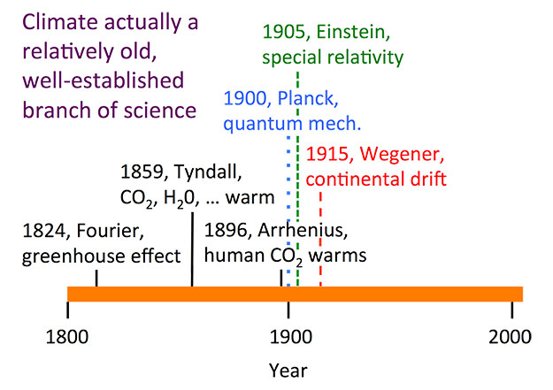
The science of the greenhouse effect thus is not some new discovery but has a long history compared to such “recent” science as relativity (Albert Einstein, 1905) or quantum mechanics (Max Planck, 1900). The pioneers who explored radiation in climate science were giants of physics, chemistry, and mathematics, who saw the strong interactions between laboratory studies and application to the atmosphere.
Much of the work on the details of the interaction between radiation and gases in the air was done by the US Air Force just after World War II and applied to topics such as sensors on heat-seeking missiles, as told in the introduction to this chapter. A missile uses a sensor to “see” the infrared radiation from a hot engine, but greenhouse gases such as carbon dioxide and water vapor block the view in some wavelengths by absorbing that radiation. Because the gases interact with radiation traveling in any direction, and there is much more energy in those wavelengths going up from the sun-warmed Earth than coming down from military bombers, the warming influence of the greenhouse gases is unavoidable.

Earth: The Operators' Manual
Video: CO2 and the Atmosphere (9:03)
This 9-minute clip will appear three times within modules 4 and 5 this week. To see a short clip on the Air Force's role in understanding the physics of the atmosphere and the warming effect of CO2, watch the first 1 minute and 20 seconds. The material that follows this 1 minute and 20 seconds will be covered later in this module as well as in Module 5.
What CO2 does was confirmed by basic research that had absolutely nothing to do with climate change. (newsreel announcer) A continuance of the upper air program will provide scientific data concerning the physics of the upper atmosphere. (Richard Alley) World War II was over, but the Cold War had begun. The U.S. Air Force needed to understand the atmosphere for communications and to design heat-seeking missiles.
At certain wavelengths carbon dioxide and water vapor block radiation. So the new missiles couldn't see very far if they used a wavelength that CO2 absorbs. Research at the Air Force Geophysics Laboratory in Hanscom, Massachusetts produced an immense database with careful measurements of atmospheric gases. Further research by others applied and extended those discoveries, clearly showing the heat-trapping influence of CO2. The Air Force hadn't set out to study global warming, they just wanted their missiles to work. But physics is physics. The atmosphere doesn't care if you're studying it for warring or warming. Adding CO2 turns up the planet's thermostat. It works the other way as well. Remove CO2, and things cool down. These are the Southern Alps of New Zealand, and their climate history shows that the physicists really got it right. These deep, thick piles of frozen water are glaciers, slow-moving rivers of ice, sitting on land... But once, when temperatures were warmer, they were liquid water, stored in the sea. We're going to follow this one, the Franz Josef, from summit to ocean to see the real-world impact of changing levels of CO2.
It's beautiful up here on the highest snowfield, but dangers lurk beneath the surface. I've spent a lot of time on the ice. It's standard practice up here to travel in pairs, roped up for safety. The glacier is fed by something like six meters of water a year... maybe 20 meters, 60 feet of snowfall... it's a really seriously high snowfall. The snow and ice spread under their own weight and is headed downhill at something like a kilometer a year. When ice is speeding up a lot as it flows towards the coast it can crack and open great crevasses that give you a view into the guts of the glacier. Man, this is a big one... Ten... Twenty... Thirty meters more... a hundred feet or more heading down in here, and we can see a whole lot of the structure of the glacier right here.
(man) So, what we're going to do is just gonna sit on the edge and then walk backward, and I'll lower you. Tell me when. Okay, rolling around, and down we go. Snowfall arrives in layers, each storm putting one down... Summer sun heats the snow and makes it look a little bit different than the winter snow, and so you build up a history. In these layers, there are indications of climate, how much it snowed, what the temperature was. And all of this is being buried by more snow and the weight of that snow squeezes what's beneath it, and turns it to ice. And in doing that, it can trap bubbles. And in those bubbles are samples of old air, a record of the composition of the Earth's atmosphere, including how much CO2 was in it, a record of the temperature on the ice sheets, and how much it snowed. As we'll see, we can open those icy bottles of ancient air, and study the history of Earth's atmosphere.
This landscape also tells the story of the Ice Ages. And the forces that have shaped Earth's climate. Over the last millions of years, the brightness of the sun doesn't seem to have changed much, but the Earth's orbit and the tilt of its axis have shifted in regular patterns over tens and hundreds of thousands of years. The orbit changes shape... varying how close and far the Earth gets as it orbits the sun each year.
Over 41,000 years, the tilt of Earth's axis gets larger and smaller, shifting some of the sunshine from the equator to the poles and back. And our planet has a slight wobble, like a child's top, altering which hemisphere is most directly pointed toward the sun when Earth is closest to it. Over tens of thousands of years, these natural variations shift sunlight around on the planet, and that influences climate. More than 20,000 years ago, decreasing amounts of sunshine in the Arctic allowed great ice sheets to grow across North America and Eurasia, reaching the modern sites of New York and Chicago. Sea level fell as water was locked up on land. Changing currents let the oceans absorb CO2 from the air. That cooled the southern hemisphere and unleashed the immense power of glaciers such as the Franz Josef, which advanced down this wide valley, filling it with deep, thick ice. Now we're flying over today's coastline, where giant boulders are leftovers from that last ice age.
A glacier is a great earthmoving machine. It's a dump truck that carries rocks that fall on top of it. It's a bulldozer that pushes rocks in front of it. And it outlines itself with those rocks making a deposit that we call a moraine that tells us where the glacier has been. We're 20 kilometers, 12 miles, from the front of the Franz Josef glacier today, but about 20,000 years ago, the ice was depositing these rocks as it flowed past us and out to sea. The rocks we can still see today confirm where the glacier once was. Now, in a computer-generated time-lapse, condensing thousands of years of Earth's history, we're seeing what happened. Lower CO2, colder temperatures, more snow and ice, and the Franz Josef advanced.
Twenty thousand years ago, 30% of today's land area was covered by great ice sheets, which locked up so much water that the global sea level was almost 400 feet lower than today. Then, as Earth's orbit changed, temperatures and CO2 rose, and the glacier melted back. The orbits set the stage, but by themselves, they weren't enough. We need the warming and cooling effects of rising and falling CO2 to explain the changes we know happened.
Today, atmospheric CO2 is increasing still more, temperatures are rising, and glaciers and ice sheets are melting. You can see this clearly on the lake formed by the shrinking Tasman Glacier, across the range from the Franz Josef. This is what the end of an ice age looks like. Glaciers falling apart, new lakes, new land, icebergs coming off the front of the ice. In the early 1980s, we would have been inside New Zealand's Tasman Glacier right here. Now we're passing icebergs in a new lake from a glacier that has mostly fallen apart and ends over six kilometers, four miles away.
One glacier doesn't tell us what the world is doing, but while the Tasman has been retreating, the great majority of glaciers on the planet have gotten smaller. This is the Columbia Glacier in Alaska. It's a type of glacier that makes the effects of warming easy to see. It's been retreating so fast that the Extreme Ice Survey had to reposition their time-lapse cameras to follow its motion. In Iceland, warming air temperatures have made this glacier simply melt away, leaving streams and small lakes behind. Thermometers in the air show warming, thermometers in the air far from cities, show warming.
Put your thermometer in the ground, in the ocean, look down from satellites, they show warming. The evidence is clear. The earth's climate is warming.
Credit: Earth: The Operators' Manual
Adding More Greenhouse Gases Increases Temperature
More Greenhouse Gases Increases Temperature
Adding more greenhouse gases does increase the temperature more. Put on more blankets on a cold night, and heat leaves you more slowly, making you feel warmer. But, if you put a really good stopper in the drain of your sink to keep the water in, adding more plugs doesn’t slow down the drainage still more. We thus know situations in which the job is only partly done so that adding more workers or blankets or plugs will do more, but we know other situations in which the job is completely or almost completely done and adding more help doesn’t make a difference.
For carbon dioxide and other greenhouse gases, the job is not done, and adding more does turn up the temperature. This is mostly because the greenhouse gases are very good at absorbing energy of certain wavelengths, but only somewhat good at absorbing slightly different wavelengths. So, while the outgoing radiation in the lower part of the atmosphere is completely blocked for the just-right wavelengths, that outgoing radiation is only partially blocked for the almost-right wavelengths; adding more greenhouse gas increases blockage of the almost-right radiation.
Furthermore, if you go up in the atmosphere, the air gets thinner, and at some height there is so little greenhouse gas that the just-right wavelengths are only partially blocked. Adding more of greenhouse gases such as carbon dioxide increases this height. The temperature at this height adjusts to radiate to space as much energy as is received from the Sun, and, the physics of the atmosphere cause the temperature to increase downward (squeezing air under higher pressure does work on the air that increases its temperature), so raising the height from which radiation escapes warms the surface.
Activate Your Learning
A molecule of a greenhouse gas has more of a warming influence when the gas is rarer; very roughly, each doubling of atmospheric carbon dioxide has the same effect on surface temperature. Going from the level of carbon dioxide in the air before the industrial revolution, 280 parts per million by volume (280 ppm) to twice that, 560 ppm, and letting the climate come into balance will warm the surface by about 3 C. How much more carbon dioxide must be added to the atmosphere to warm the surface by another 3 C?
Click for answer.
Amplifiers
Amplifiers
Because warmer things begin to radiate more energy very quickly, the Earth’s climate is very strongly stabilized, as noted in The Simplest Climate Model. Other processes may stabilize the Earth system by reducing changes or destabilize by amplifying changes.
Some stabilizers can be very important but tend to be very slow. We saw in the last chapter that warming reduces oxygen in the ocean, which makes the burial of organic matter easier. And, because the organic matter grew from carbon dioxide in the air, burying rather than burning the dead bugs lowers atmospheric carbon dioxide. Thus, if something such as a brighter Sun causes warming, fossil-fuel formation reduces the size of the warming. However, we also saw that fossil-fuel formation is a slow process because most plants are still “burned” by bacteria or living things; fossil-fuel formation can be very important over a few hundred thousand years or longer, but not over a few thousand years.
Some carbon dioxide is also picked up from the air by rain, forming a weak acid that breaks down rocks in a process called “weathering”, because the weather is involved. The chemicals released from the rocks are used to make shells, some of which contain carbon dioxide. (A coral reef or a clamshell is calcium carbonate, usually written as CaCO3, but sometimes written as CaO•CO2, showing more clearly that it contains carbon dioxide.) Chemists use Bunsen burners in their labs for good reasons; warming almost always makes chemical reactions go faster. So, if the temperature goes up, chemistry removes carbon dioxide from the atmosphere more rapidly. If something such as a brighter sun raises the Earth’s temperature, this “rock weathering feedback” can remove enough carbon dioxide to cool the climate back close to the starting temperature in approximately ½ million years.
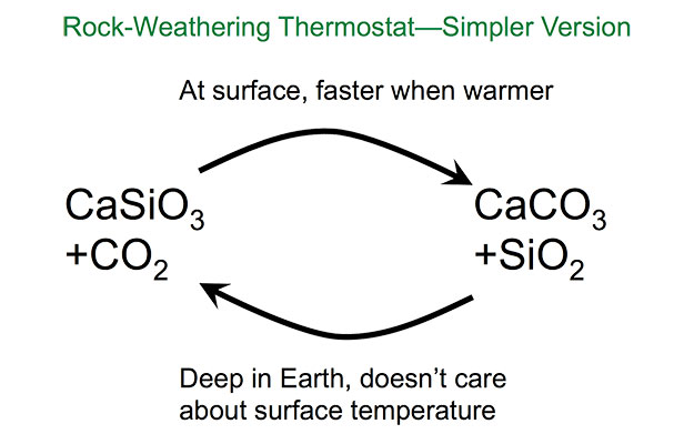
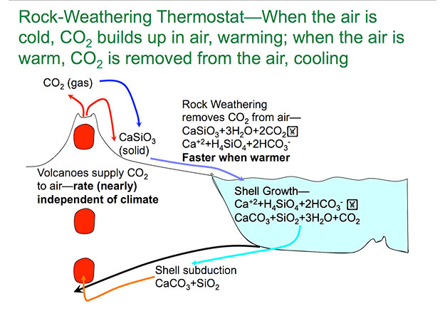
Rock-weathering Thermostat-When the air is cold, CO2 builds up in the air, warming; when the air is warm, CO2 is removed from the air, cooling. Volcanoes supply CO2 to air—rate is (nearly) independent of climate, and solid CaSiO3. Rock weathering remove CO2 from air— CaSiO3 + 3H2O+ 2 CO2 becomes Ca2+ +H4SiO4 +2HCO3- . This process works faster when it’s warmer. The products from the previous reaction fall into a body of water where shell growth occurs. The equation for this is Ca2+ +H4SiO4 + 2HCO3- becomes CaCO3 + SiO2 + 3H2O + CO2 . CaCO3 and SiO2 undergo shell subduction, which feeds back into the volcano. Other products are released into the ground
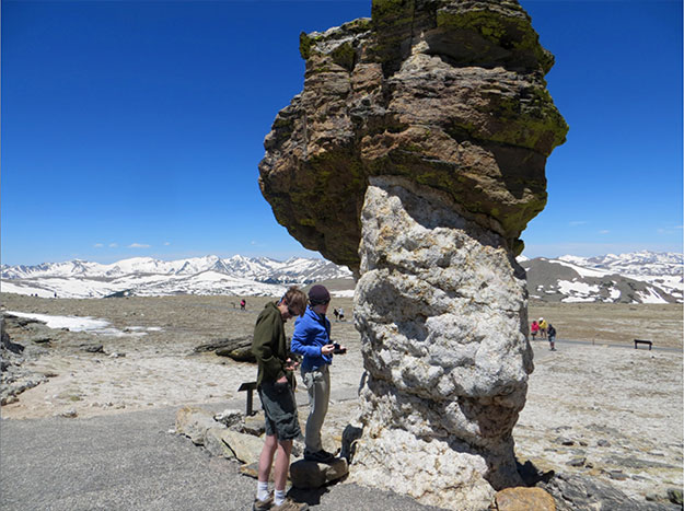
The Earth's climate is a complex system, and like most other complex systems, it is, partially controlled by many feedbacks. Feedbacks can affect many things. If we think about temperature, if a warming or cooling affects other processes that in turn change the temperature, those other processes are called feedbacks. A feedback that works against the initial temperature change to reduce its size is said to be stabilizing or negative; a feedback that increases the size of the initial change is amplifying or positive. The most important stabilizing feedbacks for Earth’s temperature are the almost instantaneous increase in radiation leaving the planet when the temperature rises, and the faster removal of carbon dioxide from warmer air to form shells and fossil fuels over hundreds of thousands of years.
At the in-between times, however, the most important feedbacks are positive. As a result, climate changes over years to millennia can be almost as large as changes over much longer times.
The most important of these positive feedbacks is warmer air picking up more water vapor from the ocean and plants, and carrying that vapor along, thus strengthening the greenhouse effect (or, colder air picking up less water vapor…).
Want to learn more?
Read the Enrichment titled Carbon Dioxide is more Important than Water Vapor as a Greenhouse Gas.
The air doesn’t know why it is warm, so anything that warms the air—brighter sun, or more greenhouse gas, or alien ray guns—will increase evaporation from the ocean, amplifying the warming.
Note that this does NOT mean that the warming “runs away” and the Earth burns up, but just that the total warming is made larger by the feedback. Suppose the sun becomes enough brighter to warm the planet by 1 degree, based on the simplest climate model in the Enrichment, which doesn’t include the water-vapor feedback. Including the effects of the extra water vapor would increase warming to almost 2 degrees.
Another important feedback is linked to snow and ice. Most surfaces (forests, grasslands, cities, oceans, even deserts) absorb most of the sunshine that reaches them, but snow and ice reflect most of the sunshine reaching them. Warming melts snow and ice, causing the Earth to absorb more sunshine, which causes more warming. This ice-albedo feedback is not nearly as strong as the water vapor feedback under modern Earth conditions, because most of the snow and ice occur in places and at times without a lot of sunshine (mostly in the winter, near the poles, and often under clouds that already are reflecting the sunshine; note that this feedback would be much more important if the temperature were cold enough for the ice to extend near the equator).
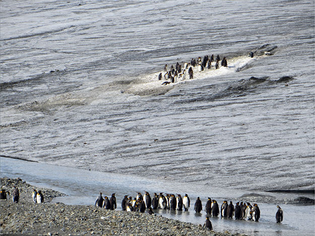
But, the water-vapor and ice-albedo feedbacks interact with each other. If the sun becomes brighter or carbon dioxide is increased by fossil-fuel burning, the resulting warming melts snow and ice and picks up more water vapor. Each of these causes more warming. But, the warming from the extra water vapor also melts some snow and ice, and the warming from loss of snow causes more water vapor to be picked up. Under modern Earth conditions, this still doesn’t “run away”, but it amplifies the warming still more. (The warming did “run away” on Venus, evaporating the oceans and causing the surface today to be hot enough to melt the metal lead; and such a fate awaits Earth most of a billion years in the future as the sun slowly brightens, although if we hang around and keep learning, we could “geoengineer” our way out of the problem, perhaps using techniques that will be discussed later in the course.)
The best current estimate is that, including changes in vegetation and clouds as well as snow and water vapor, doubling the concentration of carbon dioxide in the air and letting the climate come into balance will cause a warming of roughly 3°C, with fairly high confidence that the number is not less than 1.5°C or more than 4.5°C (or, a most-likely warming of 5.4°F, with the range of possibilities primarily between 2.7°F to 8.1°F). This number is usually called climate sensitivity and is widely discussed in climate science. Of the roughly 3°C warming from doubled CO2, the direct effect of the carbon dioxide on Earth’s radiation is just over 1°C (roughly 2°F), with the rest coming from the positive feedbacks. The stabilizing effect of warmer bodies radiating more energy is included here. Some additional amplifiers are omitted (melting of seasonal snow and sea ice are included, but not melting of the Greenland and Antarctic ice sheets, for example), so over many centuries or millennia, the warming may be somewhat larger than 3°C. The very slow stabilizers are also omitted, but they do not become important until even further into the future. Despite hopes that the climate sensitivity might be low, the most recent studies have made it less and less likely that sensitivity is as low as 1.5-2oC (2.7-3.6oF), with a value close to 3oC (5.4oF) looking fairly likely.
The Warming from the So-Far-Unavoidable Burning
The Warming from the So-Far-Unavoidable Burning
Short version: The Earth is warming, as shown by an interconnected web of evidence. The pattern of this warming, in space and time, matches that expected from the human-caused rise of greenhouse gases together with the other, less-important causes of climate change.
Friendlier, but longer version: We will follow the presentation of the United Nations Intergovernmental Panel on Climate Change (IPCC) here. The IPCC is the world’s effort to assess the available science. Researchers act for the public good, in the public eye, without being paid to do so, to tell policymakers and other people what is scientifically solid, speculative, or just silly by summarizing and assessing the relevant science.
If for some reason you don’t like the IPCC, you could check out other authoritative assessments, such as those done by the US National Academy of Sciences or the US Climate Change Science Program, or resources from the British Royal Society and others. But, for the world, the IPCC is an outstanding starting point. Dr. Alley did almost nothing for the Fifth Assessment Report or the IPCC released in 2013, but worked extensively on the Fourth Assessment Report in 2007, and contributed to the Third (2001) and Second (1995) Assessment Reports. The IPCC shared the Nobel Peace Prize after the Fourth Assessment Report.
Video: IPCC SPM1 (1:45)
History of the Most Important Greenhouse Gases (launch image in a new window) [48]
PRESENTER: This fascinating figure comes from the IPCC. It shows 10,000 years of history-- 10,000 years ago on your left, up to today in the big panels and then just since 1750 in the little panels in each case. And it shows it for carbon dioxide on the top, for methane in the middle, and for nitrous oxide on the bottom. These are the main greenhouse gases.
They're shown on the left in concentrations. This would be parts per million for CO2 and parts per billion for the methane and the nitrous oxide. And over on the other side, it shows radiative forcing. So this is a measure of how much the sun would have to get brighter to have as much warming affect as the greenhouse gases having. And you'll find that the radiative forcing is biggest for the CO2. That's a one up there-- one watt per square meter versus 240 from the sun-- smaller values for the other two.
These plots show ice core data from many different ice cores measured in different places by different labs and drilled in different places and so on, and then overlapping with the measurements that had been made in the atmosphere by modern instruments. You'll see, because there's so much agreement among the different cores and different labs and so much agreement with the instrumental record these are highly reliable. And what they show with very, very high confidence is that the greenhouse gas forcing, the greenhouse gases are rising. Other information shows that that rises very clearly from us.&
Official IPCC Caption: IPCC Figure SPM.1 Atmospheric concentrations of carbon dioxide, methane and nitrous oxide over the last 10,000 years (large panels) and since 1750 (inset panels). Measurements are shown from ice cores (symbols with different colours for different studies) and atmospheric samples (red lines). The corresponding radiative forcings are shown on the right hand axes of the large panels.
History of Carbon Dioxide
History of Carbon Dioxide
First, let’s start with Figure SPM-1 from the Fourth Assessment of the IPCC, showing the history of carbon dioxide and some other greenhouse gases over the last 10,000 years. Ice-core data from multiple cores and labs cover most of the history shown, and overlap with the recent instrumental record, all with very close agreement. The recent rise is unprecedented in the 10,000 years shown. Based on additional ice-core records not shown, the greenhouse-gas levels are now above anything seen in the last 800,000 years. And, data from other sources indicate that carbon dioxide has not been this high for millions of years. (Note that much further back in history, nature did cause higher CO2 levels, a topic to which we will return later.)
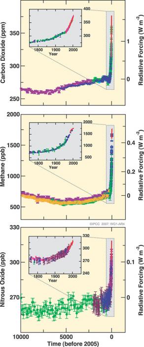
The figure shows “radiative forcing” as well as atmospheric concentration. The Earth absorbs 240 W/m2 from the sun. The extra warming from rising CO2 is somewhat similar, although not identical, to the warming from a brighter sun, so the effect of the CO2 can be discussed in W/m2. CBy January of 2017, atmospheric CO2 was at a concentration of 405 ppm, up from 280 ppm before the industrial revolution, with the extra CO2 giving a radiative forcing of roughly 2 W/m2, equivalent to the sun getting almost 1% brighter. The contributions from methane (from rice paddies, cow guts, and other sources) and nitrous oxide (especially produced by processes in soil stimulated by nitrogen fertilizers and animal waste) are significant but smaller.
The amount of extra CO2 now in the air, and moving into the ocean to make it more acidic, closely matches the CO2 we know has been produced from fossil-fuel burning. The human source is roughly 100 times as large as the natural volcanic source, and volcanoes have not done anything bizarre recently, so cannot be blamed for the recent rise. CO2 is moving into the ocean rather than coming out, so oceans cannot be responsible for the rise.
Furthermore, the atmosphere confirms that humans are responsible, as discussed in the ETOM film clip below and the Enrichment linked below.
Want to learn more?
Read the Enrichment titles Humans are Primarily Responsible for the Rise in CO2..
Earth: The Operators' Manual
Watch the short video below on how we know that the rise in CO2 is primarily from our fossil-fuel burning, filmed at the Rotorua Thermal area of New Zealand.
Video: It's Us (2:41)
So physics and chemistry tell us that adding carbon dioxide to the atmosphere warms things up. And Earth's climate history shows us there will be impacts, from melting ice sheets, to rising sea level. But how do we know, with equal certainty, that it's not just more natural variation, that humans are the source of the increasing CO2? When we look at a landscape like this one we know immediately that volcanoes put out all sorts of interesting things. And that includes CO2.
So how do we know that the rise of CO2 in the atmosphere that we see, comes from our burning of fossil fuels, and not from something that the volcanoes have done? Well, the first step in the problem is just bookkeeping. We measure how much CO2 comes out of the volcanoes. We measure how much CO2 comes out of our smokestacks and tail-pipes. The natural source is small. Humans are putting out 50 to a 100 times more CO2 than the natural volcanic source. We can then ask the air whether our bookkeeping is right, and the air says that it is. Volcanoes make CO2 by melting rocks to release the CO2. They don't burn and they don't use oxygen. But burning fossil fuels does use oxygen when it makes CO2. We see that the rise in CO2 goes with a fall of oxygen, which says that the rising CO2 comes from burning something.
We can then ask the carbon in the rising CO2 where it came from. Carbon comes in 3 flavors: the lightweight carbon 12, which is especially common in plants. The medium-weight carbon 13, which is a little more common in the gases coming out of volcanoes. And the heavyweight carbon 14. It's radioactive and decays almost entirely after about 50,000 years, which is why you won't find it in very old things like dinosaur bones or fossil fuels. We see a rise in carbon 12, which comes from plants. We don't see a rise of carbon 13, so the CO2 isn't coming from the volcanoes. And we don't see a rise in carbon 14, so the CO2 can't be coming from recently-living plants. And so the atmosphere says that the rising CO2 comes from burning of plants that have been dead a long time... That is fossil fuels. The CO2 is coming from our fossil fuels. It's us.
So, yes, humans are increasing the greenhouse effect, primarily by producing CO2 by burning fossil fuels, with very little uncertainty.
Natural and Anthropogenic Warming
Natural and Anthropogenic Warming
VIdeo: SPM2 (2:20)
Natural and Anthropogenic Warming (launch image in a new window [49])
PRESENTER: This fascinating figure is from the IPCC. There's a lot of information on here. It includes the things that are changing-- radiative forcing-- or changing the climate, how much they're doing so, including the uncertainties, whether they expect the whole globe or just part of it, and the level of scientific understanding.
If we do a lot more research-- the low it probably will reduce the size of the uncertainties-- because we can learn more. But how much we understand is included in the uncertainty already. And it includes both the things that humans have done and the things the nature has done. And this goes from the year 1750 up to the year 2005.
The Biggie is our C02, together, with the other greenhouse gases that we put up, as well as the ozone that comes from human activities from pollution. So these all have a warming influence and they are pushing very strongly towards warming. Clearly, there's a couple of other little warming influences, especially us putting soot on top of snow. But there's also these cooling influences.
We've put up a lot of particles, aerosols that block the sun, and they make clouds last longer and make clouds more reflective. And together, those have a lot of cooling. And we've cut dark forests and replaced them by more reflective grasslands.
In addition, since 1750 the sun has brightened a little bit. Over the last 30 years or so, it's actually dimmed, but there's a little bit of that. Add all of these together and there's very clearly a warming influence. And the total warming influences is very similar in size to the CO2 that we've put up.
Taken together, we are pushing the world in a lot of different ways. But because of these cooling influences, if you ask how much of the warming has been caused by our greenhouse gases, the answer is more than all of it. Because it is warm despite these cooling influences.
Official IPCC Caption: IPCC Figure SPM.2 Global average radiative forcing (RF) estimates and ranges in 2005 for anthropogenic carbon dioxide (CO2 ), methane (CH4 ), nitrous oxide (N2O) and other important agents and mechanisms, together with the typical geographical extent (spatial scale) of the forcing and the assessed level of scientific understanding (LOSU). The net anthropogenic radiative forcing and its range are also shown. These require summing asymmetric uncertainty estimates from the component terms, and cannot be obtained by simple addition. Additional forcing factors not included here are considered to have a very low LOSU. Volcanic aerosols contribute an additional natural forcing but are not included in this figure due to their episodic nature. The range for linear contrails does not include other possible effects of aviation on cloudiness.
Greenhouse gases are not the only things that affect climate. But, climate changes have causes; there are no magical “cycles” that somehow change the climate without letting us know why. (There are cycles that affect climate, but they have causes, such as features of Earth’s orbit, that we understand; they are NOT magical!) So, we can assess what things are affecting the climate.
More than a century ago, the Earth was a little on the cold side in what is sometimes called the “Little Ice Age”, because the sun was a bit dim and volcanic eruptions were putting up dust that blocked the sun. The sun brightened early in the 20th century, contributing to warming, as shown by the little red bar extending to the right for natural solar irradiance down near the bottom of the figure. But, over the last 30 years when satellites have given us the best data, the sun seems to have dimmed just a bit. We humans have cut dark forests and replaced them with more-reflective grasslands, cooling the Earth a little, and we have put up a lot of particles to block the sun, with notable cooling influence (you can find blue bars for these, extending to the left, in the figure).
You may meet someone who agrees that the Earth is warming, but argues that much of the change is natural. This is wrong; over the last few decades, warming has occurred despite nature pushing a little toward cooling, and human particles and land-use changes pushing more strongly toward cooling. The most likely answer for how much of the warming has been caused by our greenhouse gases is “More than all of it”, because of warming despite these other cooling influences.
Video: SPM 3 (1:07)
Temperatures, Sea Level and Snow Cover (launch image in a new window [50])
PRESENTER: This figure from the IPCC starts back in 1850 and then runs up to just pass 2000 up here on the right. And it shows indications of warming happening in the climate system. You can see on top here the thermometer record of global average temperature showing not much happening and then recent warming, very clearly.
Sea level, which is given here, rises because ocean water expands as it warms and because warming tends to melt glaciers that are holding water out of the ocean. And so we see a warming influence that shows up in the rising global sea level.
And we also look, if you go to bring time snow cover, you can see that not much was happening. And then you can see it dropping, and that's happening because of warming and the spring is melting the snow. And so these are among many indicators that are showing that yes, the climate system is warming.
Official IPCC Caption: IPCC Figure SPM.3 Observed changes in (a) global average surface temperature, (b) global average sea level from tide gauge (blue) and satellite (red) data and (c) Northern Hemisphere snow cover for March-April. All changes are relative to corresponding averages for the period 1961–1990. Smoothed curves represent decadal average values, while circles show yearly values. The shaded areas are the uncertainty intervals estimated from a comprehensive analysis of known uncertainties (a and b) and from the time series (c).
The temperature is going up. The figure shows a few of the indicators, but many more are known. Consider the next figure, for example.
Video: Surface Temperatures (1:38)
Decadal Land-Surface Average Temperature (launch image in a new window [51])
PRESENTER: This figure is from the Berkeley Earth Project. It was run primarily by physicists who did not start out as climate scientists-- with an interesting mix of funding from public sources. But also some of it came from private sources, including those with ties to the fossil fuel industry.
It's looking at the thermometer record of temperature, and just looking at the land. Now if you go back to 1750 up through about 1850, you could see that the uncertainties are really huge. So we're mostly going to focus since 1850.
Many groups have been estimating the temperature, including NASA-- the Goddard Institute for Space Studies, NOAA-- the National Climate Data Center, the British Group, the Hadley Centre, and the Climate Research Unit. And what you can see is those, plus the Berkeley Earth estimates up here on top. And what you'll notice is that the uncertainties in the Berkeley Earth are similar to the differences between the others, which also have their own uncertainties. But you'll see very clearly that there is a strong warming going on.
The different groups have used different techniques. Although, ultimately, they're all using thermometers. Whether they use them all or not this is different for the different ones. But when you have different groups with different funding, different motivations, perhaps, and some working in different places, they all give the same answer. Which is, it's getting warmer. We have very high confidence that it is warming.
The Berkeley Earth project is an interesting attempt by a group involving a lot of physicists who were not primarily climate scientists through much of their careers, to use private as well as public funding to re-calculate the temperature record from thermometers. The Berkeley work follows efforts by NOAA and by NASA in the US, and by a British group at the Hadley Center and the University of East Anglia, and other efforts by others, to calculate global temperature changes from thermometer records. You can see clearly in the figure that over recent decades when the data are best, the different groups get the same answer despite having different funding sources and different techniques. The temperature is going up.
Furthermore, if you throw away the records from thermometers in and near the cities and just look in the country, you see warming. Thermometers in boreholes in the ground show warming. Thermometers taken aloft by balloons (radiosondes), and thermometers looking down from satellites and analyzed in different ways, show warming. So do thermometers in the ocean.
The temperature-sensitive snow and ice also show warming. You would not go searching for this effect in the coldest places; if you start off at -40 and warm by a couple of degrees, the snow and ice won’t melt yet. But, the effects of warming are seen in loss around the edges, in space and time, of seasonal snow cover, river, and lake ice, seasonally and perennially frozen ground, mountain glaciers and more. The melting of land ice and the expansion of ocean water as it warms are driving the rise in global sea level. And, the great majority of significant changes in where plants and animals live, and when they do things during the year, are in the direction of warming. So, warming is occurring, despite natural and human pushes toward cooling over recent decades.
Want to learn more?
Read the Enrichment titled Global Warming Did Not Stop Recently.
We are once again taking a look at the CO2 and the Atmosphere clip. To see a little on the melting of ice, watch 7:22 - 9:04.
Earth: The Operator's Manual
Video: CO2 and the Atmosphere (9:04)
What CO2 does was confirmed by basic research that had absolutely nothing to do with climate change. (newsreel announcer) A continuance of the upper air program will provide scientific data concerning the physics of the upper atmosphere. (Richard Alley) World War II was over, but the Cold War had begun. The U.S. Air Force needed to understand the atmosphere for communications and to design heat-seeking missiles.
At certain wavelengths carbon dioxide and water vapor block radiation. So the new missiles couldn't see very far if they used a wavelength that CO2 absorbs. Research at the Air Force Geophysics Laboratory in Hanscom, Massachusetts produced an immense database with careful measurements of atmospheric gases. Further research by others applied and extended those discoveries, clearly showing the heat-trapping influence of CO2. The Air Force hadn't set out to study global warming, they just wanted their missiles to work. But physics is physics. The atmosphere doesn't care if you're studying it for warring or warming. Adding CO2 turns up the planet's thermostat. It works the other way as well. Remove CO2 and things cool down. These are the Southern Alps of New Zealand, and their climate history shows that the physicists really got it right. These deep, thick piles of frozen water are glaciers, slow-moving rivers of ice, sitting on land... But once, when temperatures were warmer, they were liquid water, stored in the sea. We're going to follow this one, the Franz Josef, from the summit to the ocean to see the real-world impact of changing levels of CO2.
It's beautiful up here on the highest snowfield, but dangers lurk beneath the surface. I've spent a lot of time on the ice. It's standard practice up here to travel in pairs, roped up for safety. The glacier is fed by something like six meters of water a year... maybe 20 meters, 60 feet of snowfall... it's a really seriously high snowfall. The snow and ice spread under their own weight and is headed downhill at something like a kilometer a year. When ice is speeding up a lot as it flows towards the coast it can crack and open great crevasses that give you a view into the guts of the glacier. Man, this is a big one... Ten... Twenty... Thirty meters more... a hundred feet or more heading down in here, and we can see a whole lot of the structure of the glacier right here.
(man) So, what we're going to do is just gonna sit on the edge and then walk backwards, and I'll lower you. Tell me when. Okay, rolling around, and down we go. Snowfall arrives in layers, each storm putting one down... Summer sun heats the snow, and makes it look a little bit different than the winter snow, and so you build up a history. In these layers there's indications of climate, how much it snowed, what the temperature was. And all of this is being buried by more snow and the weight of that snow squeezes what's beneath it, and turns it to ice. And in doing that, it can trap bubbles. And in those bubbles are samples of old air, a record of the composition of the Earth's atmosphere, including how much CO2 was in it, a record of the temperature on the ice sheets, and how much it snowed. As we'll see, we can open those icy bottles of ancient air, and study the history of Earth's atmosphere.
This landscape also tells the story of the Ice Ages. And the forces that have shaped Earth's climate. Over the last millions of years the brightness of the sun doesn't seem to have changed much, but the Earth's orbit and the tilt of its axis have shifted in regular patterns over tens and hundreds of thousands of years. The orbit changes shape... varying how close and far the Earth gets as it orbits the sun each year.
Over 41,000 years, the tilt of Earth's axis gets larger and smaller, shifting some of the sunshine from the equator to the poles and back. And our planet has a slight wobble, like a child's top, altering which hemisphere is most directly pointed toward the sun when Earth is closest to it. Over tens of thousands of years, these natural variations shift sunlight around on the planet, and that influences climate. More than 20,000 years ago, decreasing amounts of sunshine in the Arctic allowed great ice sheets to grow across North America and Eurasia, reaching the modern sites of New York and Chicago. Sea level fell as water was locked up on land. Changing currents let the oceans absorb CO2 from the air. That cooled the southern hemisphere, and unleashed the immense power of glaciers such as the Franz Josef, which advanced down this wide valley, filling it with deep, thick ice. Now we're flying over today's coastline, where giant boulders are leftovers from that last ice age.
A glacier is a great earthmoving machine. It's a dump truck that carries rocks that fall on top of it. It's a bulldozer that pushes rocks in front of it. And it outlines itself with those rocks making a deposit that we call a moraine, that tells us where the glacier has been. We're 20 kilometers, 12 miles, from the front of the Franz Josef glacier today, but about 20,000 years ago, the ice was depositing these rocks as it flowed past us and out to sea. The rocks we can still see today confirm where the glacier once was. Now, in a computer-generated time-lapse condensing thousands of years of Earth's history... we're seeing what happened. Lower CO2, colder temperatures, more snow and ice, and the Franz Josef advanced.
Twenty thousand years ago, 30% of today's land area was covered by great ice sheets, which locked up so much water that the global sea level was almost 400 feet lower than today. Then, as Earth's orbit changed, temperatures and CO2 rose, and the glacier melted back. The orbits set the stage, but by themselves they weren't enough. We need the warming and cooling effects of rising and falling CO2 to explain the changes we know happened.
Today, atmospheric CO2 is increasing still more, temperatures are rising, and glaciers and ice sheets are melting. You can see this clearly on the lake formed by the shrinking Tasman Glacier, across the range from the Franz Josef. This is what the end of an ice age looks like. Glaciers falling apart, new lakes, new land, icebergs coming off the front of the ice. In the early 1980s, we would have been inside New Zealand's Tasman Glacier right here. Now we're passing icebergs in a new lake from a glacier that has mostly fallen apart and ends over six kilometers, four miles away.
One glacier doesn't tell us what the world is doing, but while the Tasman has been retreating, the great majority of glaciers on the planet have gotten smaller. This is the Columbia Glacier in Alaska. It's a type of glacier that makes the effects of warming easy to see. It's been retreating so fast that the Extreme Ice Survey had to reposition their time-lapse cameras to follow its motion. In Iceland, warming air temperatures have made this glacier simply melt away, leaving streams and small lakes behind. Thermometers in the air show warming, thermometers in the air far from cities, show warming.
Put your thermometer in the ground, in the ocean, look down from satellites, they show warming. The evidence is clear. The earth's climate is warming.
For recent updates on temperature, see NASA’s Goddard Institute for Space Studies (GISTEMP). [55]
Models Using Natural and Anthropogenic Forcings
Models Using Natural and Anthropogenic Forcings
Nature surely has changed the climate in the past, is contributing to climate change now, and will contribute to climate change in the future. In the figure below, models have been used to see what nature has done, compared to what humans have done. In each case, the black line shows the actual history of temperature. The blue bands, which end up below the black line recently on each plot, show the influence of changing sun and volcanoes; a band is plotted, rather than a line, to show the uncertainties in estimating the sun's and volcanic influences and turning them into temperature changes using models. The pink bands, which so nicely match the black lines showing what really happened, were calculated including the effects of natural changes plus the human causes, including both warming and cooling influences.
Video: SPM 4 (2:09)
Models Using Natural and Anthropogenic Forcings (launch image in a new window [56])
PRESENTER: This wonderful figure from the IPCC is looking at the fingerprint of climate change. All of the different plots go from just more recently than 1900 up to 2000. That was the time that they could do best for this.
And in each plot, the black line is the history of temperature. This is for the globe, this would the globe's land, the globe's ocean, and then continent by continent up here, like Asia and Europe, and so on. So in each case, the black is what happened.
The blue models have been taken, and they've been told what nature did. What the sun was doing, what the volcanoes were doing. And the models then said this is the climate change that nature has caused.
In the pink, in each case, the model has been told what nature did, and what humans did. And what you will see, if you start down here, for example, with the global land, is that the warming back here is possibly caused by nature. The sun got a little bit brighter, and coincidentally, the volcanoes quit blocking the sun quite as much as they had done earlier. But recently, the dimming of the sun and some big volcanoes have tried to cool it off. Yet the temperature went up.
And so what you can see in every one of these panels is that you can explain the climate changes that were happening early in the 20th century by natural causes because the human causes were not terribly large. But by the time you get to the later 20th century, if anything, nature tried to cool it off a little bit, yet the temperature went up. And so what we see across the globe, from Australia to North America, is that the fingerprint of climate change is now that of humans, not that of nature. Other fingerprinting exercises give the same answer, which is that we have taken over from nature in controlling climate change.
Official IPCC Caption: IPCC Figure SPM.4 Comparison of observed continental- and global-scale changes in surface temperature with results simulated by climate models using natural and anthropogenic forcings. Decadal averages of observations are shown for the period 1906 to 2005 (black line) plotted against the center of the decade and relative to the corresponding average for 1901–1950. Lines are dashed where spatial coverage is less than 50%. Blue shaded bands show the 5–95% range for 19 simulations from five climate models using only the natural forcings due to solar activity and volcanoes. Red shaded bands show the 5–95% range for 58 simulations from 14 climate models using both natural and anthropogenic forcings.
Activate Your Learning
According to the model data shown in the IPCC figure above (SPM-4), can recent warming trends be explained by natural variability in factors beyond our control, such as solar activity and volcanoes? Imagine you are talking to a friend or relative who is not familiar with these models or is unclear on how to interpret them. Try your best to explain what the models show about recent climate change in your own words.
Click for answer.
Note that there are other lines of evidence confirming the relative significance of human influence suggested in the figure above. Suppose for a moment that you decide the satellite data are wrong, and the sun is really getting brighter. (This is not a sensible thing to do, but just suppose…) If this were correct, we know that more energy from the sun will warm the air near the Earth’s surface, but also will warm the air high in the stratosphere. Rising CO2 also warms the air near the surface, but rising CO2 cools the upper stratosphere. (Ultraviolet radiation heats the ozone there, which transfers energy to CO2 in collisions, and the CO2 then radiates the energy to space, so in the presence of much ozone high in the atmosphere where infrared radiation to space is easy, extra CO2 acts as a radiator and causes cooling of the adjacent air.) The observed pattern of changes—warming near the surface but cooling in the upper stratosphere—has the fingerprints of CO2, not the sun or other possible causes of climate change. Other fingerprinting exercises reach the same conclusion.
Taking all of this together, we now have very high scientific confidence that we humans are changing the composition of the atmosphere, primarily through the burning of fossil fuels, and that the rising concentration of important gases is causing warming. Feedbacks in the Earth system modify the initial warming and are acting to amplify the direct effects of our CO2 and increase the warming. The Earth is warming, based on a great range of independent data sets. This warming is occurring despite natural and human-caused cooling influences, and this warming has the pattern in space and time expected from our greenhouse gases plus the other influences on climate. The close agreement between what is happening, and what we expect to happen from our understanding of the climate system, confirms the science. And, because we are fairly confident that much more fossil fuel remains to be burned than we have burned already, the well-confirmed scientific understanding says that coming climate changes will be much bigger than those we have caused so far if we continue on the path we are now following. What that means is coming in the next module.
Summative Assessment
Reminder!
After completing your Summative Assessment, don't forget to take the Module 4 Quiz. If you didn't answer the Learning Checkpoint questions, take a few minutes to complete them now. They will help your study for the quiz and you may even see a few of those question on the quiz!Climate Modeling Activity
In this activity, we’ll explore some relatively simple aspects of Earth’s climate system, through the use of several STELLA models — you’ve seen some of these in the Module 3 activity. STELLA models are simple computer models that are ideal for learning about the dynamics of systems — how systems change over time. The question of how Earth’s climate system changes over time is of huge importance to all of us, and we’ll make progress towards understanding the dynamics of this system through experimentation with these models. In a sense you could say that we are playing with these models, and watching how they react to changes; these observations will form the basis of a growing understanding of system dynamics that will then help us understand the dynamics of Earth’s real climate system.
If you pause for just a moment and think about what we are doing in these activities, it is really just an application of the scientific method. We start with a question, develop a hypothesis, devise and carry out an experiment to test the hypothesis or answer the question, and then study the results to see if they provide an answer to our original question. So, we are learning through experimentation. In this Summative Assessment, we will work through a series of four experiments designed to test the influence of various forcings on climate.
Instructions
This assessment is broken into four experiments with questions related to each one. Separate web pages have been provided for each experiment to reduce scrolling. We have also provided the activity as a worksheet that you can download and even print if you prefer. You may find downloading or printing the complete worksheet easier to work with as you prepare your answers to submit them. As before, there is a practice version, and then a graded version — each version has its own set of model values that are provided in the worksheet.
Files to Download
Download the worksheet [57]. Completing the 'Practice' and 'Graded' versions of the exercise, in the following pages or on the attached worksheet, is required before submitting your assignment.
Submitting Your Assessment
Work through the practice version first, then write down your answers for the graded version on the worksheet. Once you have answered all of the questions on the worksheet, go to Module 4 Summative Assessment: Graded. The questions listed in the worksheet will be repeated as an Canvas Assessment. So all you will have to do is read the question and select the answer that you have on your worksheet. You should not need much time to submit your answers since all of the work should be done prior to launching the assessment quiz.
Grading and Rubric
This assignment is worth a total of 17 points. The grading of the questions and problems is below:
| Item | Possible Points |
|---|---|
| Questions 1-14 | 1 point each |
| Question 15 | 3 points |
Introduction to a Simple Planetary Climate Model
Introduction to a Simple Planetary Climate Model
Our first climate model calculates how much energy is received and emitted (given off) by our planet, and how the average temperature relates to the amount of thermal energy stored. The complete model is shown below, with three different sectors of the model highlighted in color:

First, let’s define a few terms that you might not be familiar with.
Insolation —stands for Incoming Solar Radiation, which is a fancy way of saying sunlight or solar energy.
Albedo — the fraction of light reflected from some material; 0 would be a perfectly black object (no reflected light) and 1 would be a perfectly white object (no light absorbed).
Heat capacity — this is the amount of energy (units are Joules) needed to raise 1 kilogram of some material 1°C.
Ocean Depth — this is the depth of the part of the ocean that is involved in climate over short time scales of decades, the part of the ocean exchanges energy with the atmosphere. While the whole ocean has an average depth of ~4000 m, the part we worry about here has a depth of less than 500 m.
LW Int and LW slope — these are parameters used to describe the relationship between the average planetary temperature and the amount of long-wavelength (infrared, or thermal) energy emitted by the planet; more details are provided below.
The Energy In Sector
The Energy In Sector
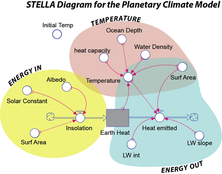
The Energy In sector (yellow in Fig. 1 above) controls the amount of insolation absorbed by the planet. The Solar Constant is not really a constant, but it does tend to stay close to a value of 343 Watts/m2 (think of about six 60 Watt light bulbs shining down on a patch of ground 1 meter on a side — this is what we get from the Sun). This is then multiplied by (1 – albedo) and then the surface area of the Earth giving a result in Watts (which is a measure of energy flow and is equal to Joules per second). In the form of an equation, this is:
S is the Solar Constant (343 W/m2), A is surface area, and α is the albedo (0.3 for Earth as a whole).
This is the equation Ein=S×A×(1-α)
The Energy Out Sector
The Energy Out Sector
The Energy Out sector (blue above) of the model controls the amount of energy emitted by the Earth in the form of infrared (thermal) radiation, which is a form of electromagnetic radiation with a wavelength longer than visible light, but shorter than microwaves. You saw earlier that this is often described using the Stefan-Boltzmann Law which says that the energy emitted is equal to the surface area times the emissivity times the Stefan-Boltzmann constant times the temperature raised to the fourth power:
A is the whole surface area of the Earth (units are m2), ε is the emissivity (a number between 0 and 1 with no units), σ is the Stefan-Boltzmann constant (units are W/m2 per °K4), and T is the temperature of the Earth (in °K). The problem with this approach is that it ignores the greenhouse effect, which is a very important part of our climate system. We could represent the greenhouse effect by choosing the right value for the emissivity in the Stefan-Boltzman law, but here, we will use a different approach, one in which Eout is based on actual observations. With a satellite above the atmosphere, we can measure the amount of energy emitted in different places on Earth and figure out how it relates to the surface temperature. As it turns out, this is a pretty simple relationship, described by a line:
Eout=(〖LW〗_int+〖LW〗_s×T)×A
The part inside the parentheses is just the equation for a line, with an intercept (LWint with units of W/m2) and a slope (LWs with units of W/m2 per °C). This new way of describing Eout is shown as the red line in the figure below:
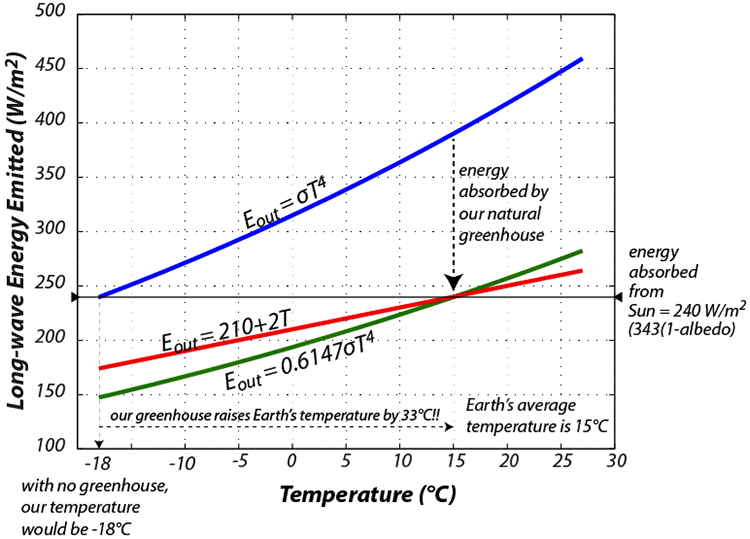
The key thing here is that the hotter something is, the more energy it gives off, which tends to cool it and it will continue to cool until the energy it gives off is equal to the energy it receives — this represents a negative feedback mechanism that tends to lead to a steady temperature, where Ein = Eout.
The Temperature Sector
The Temperature Sector
The Temperature sector (brown in Fig. 1) of the model establishes the temperature of the Earth’s surface based on the amount of thermal energy stored in the Earth’s surface. In order to figure out the temperature of something given the amount of thermal energy contained in that object, we have to divide that thermal energy by the product of the mass of the object times the heat capacity of the object. Here is how it looks in the form of an equation: (see directions for how view images in a larger format [58])
Let’s look at it with just the units, to make sure that things cancel out:
This can be simplified by combining, rearranging, and canceling to give:
Here, E is the thermal energy stored in Earth’s surface [Joules], A is the surface area of the Earth [m2], d is the depth of the oceans involved in short-term climate change [m], ρ is the density of seawater [kg/m3] and Cp is the heat capacity of water [Joules/kg°K]. We assume water to be the main material absorbing, storing, and giving off energy in the climate system since most of Earth’s surface is covered by the oceans. The terms in the denominator of the above fraction will all remain constant during the model’s run through time — they are set at the beginning of the model and can be altered from one run to the next. This means that the only reason the temperature changes is because the energy stored changes.
Other parts of the model
Other Parts of the Model
The model has a few other parts to it, including the initial temperature of the Earth, which determines how much thermal energy is stored in the earth at the beginning of the model run. It also includes some other features that allow you to change the solar input and the part of the greenhouse effect due to CO2. We use the standard assumption (which is itself based on some physics calculations) that for each doubling of the CO2 concentration, there is an increase of 4 W/m2 in the greenhouse effect. This is often called the greenhouse forcing due to CO2. In terms of our Eout curve shown in Figure 2 above, this shifts the red curve downwards — so less energy is emitted, and thus more is retained by the Earth. Let’s consider how this works — if we start with 200 ppm of CO2 and increase it to 800 ppm, that represents 2 doublings (from 200 to 400 and then from 400 to 800), so we would get 8 W/m2 of greenhouse forcing.
One unit of time in this model is equal to a year, but the program will actually calculate the energy flows and the temperature every 0.1 years.
Now that you have seen how the model is constructed, let’s explore it by doing some experiments. Here is the link to the model [59].
Experiment 1: Steady State
Experiment 1: Steady State
One of the most important components of this climate system is the relationship between temperature and the energy emitted by the planet (Fig. 2), which constitutes a negative feedback mechanism. Negative feedback mechanisms are like thermostats that act to control the temperature and maintain a steady state. In this experiment, we see if that expectation is met by our model.
What happens if we start out with an Earth that is not in a steady state so that Ein≠Eout? Use the slider controls at the top to set the initial conditions specified in the assessment.
| Practice | Graded | |
|---|---|---|
| Albedo | 0.3 | 0.31 |
| CO2 Mult | 1.0 | 1.0 |
| Solar Mult | 1.0 | 1.0 |
| Initial T | 20°C for #1,2, (10°C for #3) | 5°C for #1,2, (25°C for #3) |
Questions
1. What will happen? How will the temperature change over time? Think about how the Ein and Eout will compare at the beginning.
- Eout > Ein — this will cause warming
- Eout > Ein — this will cause cooling
- Eout < Ein — this will cause warming
- Eout < Ein — this will cause cooling
- Eout = Ein — temperature will remain constant
2. Now, run the model and see what happens. What is the temperature at the end of the model run (to the nearest 0.1 °C)?
Ending Temperature =
3. Now change the initial temperature to second value as prescribed above, run the model and see what happens. Compared to the answer to #2, is the ending temperature the same (within 0.1 °C) or different (varies by more than 0.1°C)?
- Same
- Warmer
- Cooler
4. Steady state for a system is the condition in which the system components are not changing in value over time even though time is running and things are moving through the system. What is the steady state temperature of your system?
Steady State Temperature =
Be sure to reset everything in the model before going to the next problem.
Hit the refresh button on your browser or the rest button on the model.
Experiment 2: A Fluctuating Sun
Experiment 2: A Fluctuating Sun
The Solar Constant is not really constant over any length of time. For instance, it was only 70% as bright early in Earth’s history, and it undergoes much more rapid fluctuations (and much smaller) in association with the 11-year sunspot cycle. During a sunspot cycle, the solar constant may vary by as much as 0.3 W/m2. Let’s see what this would do to the temperature of the planet. The model has a small switch called the Solar Cycle Switch that we can use to turn on or off the effects of the solar cycle. Set the model up with the following parameters:
| Practice | Graded | |
|---|---|---|
| Albedo | 0.30 | 0.30 |
| CO2 Mult | 1.0 | 1.0 |
| Solar Mult | 1.0 | 1.0 |
| Initial T | +15 | +15 |
| Ocean depth | 100 for #5,6, (200 for #7) | 150 for #5,6, (50 for #7) |
Questions
5. Run the model and see what happens. How much does the planetary temperature change over the solar cycle (the difference between peak and trough — measure this after the third peak)?
Change in temperature in one cycle =
6. Notice that the temperature peaks after the Solar Input peaks. This time delay is called lag time. What is the lag time here in years?
Lag Time =
7. Predict how the model will change if you increase the ocean depth to the second specified depth (table above). How do you think the lag time and the magnitude of temperature will change relative to the first solar cycle model (#5,6)? In other words, make a prediction. It might help to think about what heats up faster — a pot with a little water in it, or the same pot with a lot of water in it?
- Lag time shorter, magnitude smaller
- Lag time shorter, magnitude greater
- Lag time longer, magnitude smaller
- Lag time longer, magnitude greater
Be sure to reset everything in the model before going to the next problem.
Experiment 3: Changing CO2
Experiment 3: Changing CO2
Let’s see what happens when we change the concentration of CO2 in the atmosphere.
| Practice | Graded | |
|---|---|---|
| Albedo | 0.3 | 0.30 |
| CO2 Mult | 0.5 | 2.0 |
| Solar Mult | 1.0 | 1.0 |
| Initial T | 15°C | 15°C |
| Ocean Depth | 100 | 50 |
First, try to predict what will happen. How much warming or cooling will occur? Will the temperature level off, or rise/fall forever? Then run the model.
Questions
8. You’ve changed the atmospheric CO2 concentration from its original value of 380 ppm by multiplying it by a specified value (table above). What is the resulting atmospheric CO2 concentration in your model?
New CO2 concentration =
9. What is the resulting temperature change at the end (50 yrs)? (±0.1 °C)
Change in temperature =
11. Notice that the temperature levels off at the end — it finds a new steady state. How long does it take to level off? Let’s find the response time, which is defined as the time required to accomplish 2/3 of the total temperature change. For example, if the temperature change was 1°C and it started at 15°, then we would find the time when the temperature reached 15.67°C — this would be the response time.
Find the response time for this case. (±.5 yrs)
Response Time =
Experiment 4. Causes of Climate Change
Experiment 4 - Causes of Climate Change
Things that can cause the climate to change are sometimes called climate forcings, and we’ve just tinkered with two of these — the Sun, and CO2. It is generally agreed upon that on relatively short timescales like the last 1000 years, there are 4 main forcings — solar variability, volcanic eruptions (whose erupted particles and gases block sunlight), aerosols (tiny particles suspended in the air) from pollution, and greenhouse gases (CO2 is the main one). Solar variability and volcanic eruptions are obviously natural climate forcings, while aerosols and greenhouse gases are anthropogenic, meaning they are related to human activities. The history of these forcings is shown in the figure below.
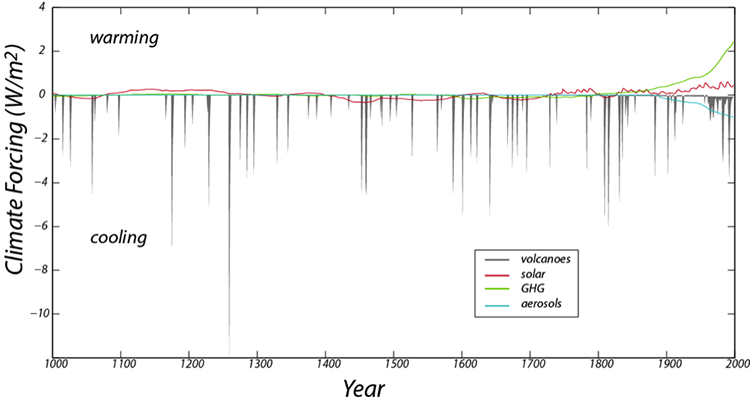
Volcanoes, by spewing ash and sulfate particles into the atmosphere block sunlight and thus have a cooling effect. This history is based on the human records of eruptions in recent times and ash deposits preserved in ice cores and sediment cores for older times; it is best during the historical period. Note that although the volcanoes have a strong cooling effect, the history consists of very brief events. The solar variability comes from actual measurements in recent times and further back in time, on the abundance of an isotope of Beryllium, whose production in the atmosphere is a function of solar intensity. The greenhouse gas forcing record is based on actual measurements in recent times and ice core records further in the past (the ice contains tiny bubbles that trap samples of the atmosphere from the time the snow fell). The aerosol record is based entirely on historical observations and is 0 earlier in time, before we began to burn wood and coal on a large scale.
In this experiment, we will add the history of these forcings over the last 1000 years and see how our climate system responds, comparing the model temperature with the best estimates for what the temperature actually was over that time period. Solar variability, volcanic eruptions, and aerosols all change the Ein or Insolation part of the model, while the greenhouse gas forcing change the Eout part of the model. We can turn the forcings on and off by flicking some switches, and thus get a clear sense of what each of them does and which of them is the most important at various points in time.
We can compare the model temperature history with the reconstructed temperature history for this time period, which comes from a combination of thermometer measurements in recent times and temperature proxy data for the earlier part of the history (these are data from tree rings, corals, stalactites, and ice cores, all of which provide an indirect measure of temperature).
First, open the model [60] with the forcings built in, and study the Model Diagram to get a sense of how the forcings are applied to the model. If you run the model with all of the switches in the off position, you will see our familiar steady state model temperature of 15°C over the whole length of time. The model time goes from 0 to 998 years, but in reality, this is meant to be the year 1000 to 1998 (it ends in 1998, because the forcings are from a paper published in 2000).
| Practice | Graded | |
|---|---|---|
| Ocean Depth | 100 | 300 |
Questions
11. Use the switches to examine the effect of each of the 4 forcings separately (only 1 switch on at a time), and observe how well the model temperature matches the reconstructed (observed) temperature by looking at graph #1 only. Of the 4 forcings, which gives a better fit to the general (smoothed) shape of the observed temperature? (In other words, don’t pay attention to the detailed, squiggly part of the graph).
Best fit from:
- Solar
- Volcanoes
- Aerosols
- GHG (greenhouse gases) [correct answer for the practice version]
12. Now, find the forcing that does the best job of matching the detailed ups and downs (ignoring the longer term trends).
Best fit from:
- Solar
- Volcanoes [correct answer for the practice version]
- Aerosols
- GHG (greenhouse gases)
13. Now try the combinations of the forcings listed below and choose the one that gives the best fit in a numerical sense over the whole length of the model period (years 1000 to 1998).
- All forcings on
- Volcanoes + GHG
- Solar + volcanoes
- Solar + volcanoes + GHG
- GHG + aerosols + volcanoes [correct answer for the practice version]
- GHG + solar
- Volcanoes + aerosols
14. Of all the forcings, which does the best job in terms of matching the strong increase in temperature over the last 100 years? This is the upward-pointing blade of the “hockey stick” pattern. Base your answer on a visual inspection of graph #1.
- Solar
- Aerosols
- Volcanoes
- GHG (greenhouse gases) [correct answer for the practice version]
15. Look back at what was said about the scientific method as a way of learning at the beginning of this activity, and then give an example of something new you’ve learned in this activity, and how experimentation played a role in your learning process.
Summary
Assessment Summary
As before, let’s try to recap some of the main points from this activity.
- Earth’s climate system is an energy balance system in which the energy absorbed from the Sun is equal to the energy emitted (in the form of infrared radiation) by the Earth.
- The simple fact that the energy emitted is directly related to the temperature provides a powerful negative feedback mechanism that drives the system to a steady state (where the energy in is equal to the energy out).
- Although the system has a tendency to find a steady state, changes in the solar input, the albedo, and the greenhouse effect can change the steady state and the system takes a while to adjust and get into the new steady state.
- The influence of CO2 on Earth’s climate is a logarithmic one, meaning that for each doubling, the amount of extra heat retained in our system increases by 4 W/m2 — so changing the concentration from 200 ppm to 400 ppm has more of an effect than changing it from 400 ppm to 600 ppm.
- We hypothesize that over the past 1000 years, there are four main forcings that cause our climate to change — solar variability, volcanic eruptions, aerosols (or pollutants), and greenhouse gases. By applying these forcings to our simple climate model, we can see that combined, they provide a fairly good match with the observed temperature record (supporting our hypothesis). Of these forcings, the greenhouse gases are by far the most important in terms of matching the observed temperatures over the past 100 years. Thus, we conclude that the increase in CO2 over this time period is the primary cause of the warming. None of the other forcings are capable of explaining this warming.
Summary and Final Tasks
Summary
Science does not claim perfect knowledge, but a huge body of successful climate science gives us high scientific confidence that:
- Our fossil-fuel burning, aided by deforestation and cement-making, are raising the CO2 concentration of the atmosphere.
- This has a warming influence.
- This warming influence causes feedbacks in the Earth system, some of which reduce the warming, others that amplify the warming, but over human lifetimes, the amplifiers are more important, causing the warming to be larger than that caused by the effects of the CO2 alone.
- This successful science projects that if we continue burning fossil fuels rapidly, future warming and other changes will be large compared to those experienced so far.
Reminder - Complete all of the Module 4 tasks!
You have reached the end of Module 4! Double-check the Module Roadmap table to make sure you have completed all of the activities listed there before you begin Module 5.
Enrichments
The Simplest Climate Model
The Simplest Climate Model, Better Climate Models, and Weather Forecasts End, but Climate Forecasts Continue
The energy from the sun that reaches the top of Earth’s atmosphere is sometimes labeled S, in units such as Watts per square meter (W/m2), and is approximately S=1370 W/m2. Most of the energy leaving the sun misses the Earth and goes streaming off into space, but we intercept a little of it. This total energy reaching the whole Earth is just the Earth’s cross-sectional area multiplied by S, or πr2S, where r is the radius of the Earth.
But, because the Earth is a sphere rotating under the Sun, this energy must be spread around the whole surface area of the planet, including the side facing away from the Sun, with a total area of 4πr2. Hence, the energy available per square meter of Earth’s surface is πr2S/4πr2=S/4.
However, recall that some of this energy is reflected back to space without warming the planet. We call the reflected part the albedo, and for the whole Earth it is roughly 30%, or A=0.3. The absorbed energy is 1-A=0.7. The average energy going to warm the planet is then S(1-A)/4.
The Earth radiates energy back to space, and this can be approximated by “black-body” physics. In this approximation, the outgoing radiation increases with the fourth power of the absolute temperature T (which is how many degrees you are above absolute zero), so outgoing radiation is σT4, where the constant σ, which is often called the Stefan-Boltzmann constant, has a particular numerical value = 5.67* 10-8 W/ m2 /K4 (that is, 5.67 times 10 to the negative eighth power), with temperature in Kelvins (K).(Some people like to write “degrees Kelvin” or “oK”, and the same for “degrees Fahrenheit or oF” or “degrees Celsius or oC”, but it is OK to just use K, F or C.)
Incoming and outgoing energy come into balance, so we have the equation S(1-A)/4=σT4. You can substitute the numbers given just above for S, A, and σ, and then calculate T, the average surface temperature of the Earth. This will give you about 255 K, or -18 C or 0 F, which is well below freezing; the actual average surface temperature is close to 288 K, or 15 C, or 59 F. Our very simple model omitted the greenhouse effect, which keeps the Earth’s average surface temperature above freezing.
Because radiation increases as the fourth power of absolute temperature, the climate is very strongly stabilized. A 1% increase in average temperature causes approximately a 4% increase in radiated power, which means that even a relatively large change in the brightness of the sun, or in other factors affecting the climate, will have a moderately small effect on the temperature. Without this strongly stabilizing effect giving us the climate we have, we might not even be here!
Better Climate Models
Climate models may be the part of the science that most people know the least about. Be very clear-scientists do not tell their computers to produce global warming, and then get excited when global warming comes out of the computer!
The simplest climate model we just discussed shows you a tiny bit of what goes into a real climate model. The starting point is physics. This includes the rules that mass and energy are not created or destroyed but just changed around. The physics also includes interactions between mass and energy-how much energy is needed to evaporate an inch of water per week, for example, or to warm the atmosphere by a degree. Interactions of radiation and greenhouse gases are specified from the fundamental physics worked out by the US Air Force after World War II, and other such studies.
The model also must “know” about the Earth-how much sunshine we get, how big the planet is and how fast it rotates, where the land and oceans are, how much air we have and what it is made of. (Climate models are applied to other planets, and very clearly give different answers because of the differences between the planets.)
All of this information is written down in equations, translated into computer language, and then the computer is turned on. What happens next is remarkable-the computer simulates a climate that looks like the real one. Air rises and rains in the tropics, then sinks and dries over the Sahara and Kalahari. Storms scream out of the west riding the jet stream, and snow grows and shrinks with the seasons across the high-latitude lands.
The model will not be perfect, of course. Suppose you are interested in wind speed. You know from personal experience that you can hide behind a windbreak for relief on a windy day. A forest can serve as a windbreak, giving weaker winds than on a prairie. So, the model must be “told” about the distribution of forests and grasslands (or else must calculate where they grow), and about the “roughness” of the forest and the grass. Scientists have conducted studies on the effects of forests and grasslands on winds, but all studies include some uncertainty. So, the modelers know that the surface roughness in this region must be about this much, but could be a little less or a little more within the range allowed by the data.
The modeler (or more typically, the modeling team) can now “tune” the model. If the winds in the model are a little stronger in some places than in the real world, the modeler may increase the roughness a little, although without going outside the uncertainties. To avoid any biases, different groups in different countries with different funding sources build different models, and tune them in different ways; when all of them agree closely, it is evident that the tuning hasn’t controlled the answer.
Some of the models are used for weather forecasting and for climate studies, and work fine for both. There are differences between weather and climate (see Weather Forecasts End, But Climate Forecasts Continue) - many climate models are simulating changes in vegetation, for example, but if you’re worried about the weather for next week, you don’t really care whether global warming endangers the Amazonian rainforest over the coming decades.
As a general rule, in talking to the public or policymakers, climate modelers rely especially on those results that:
- are exhibited by a range of models from simple to complex run by different scientific groups;
- are understood based on the physics;
- are observed in the history of climate; and
- are confirmed by recent instrumental observations.
Weather Forecasts End, But Climate Forecasts Continue
Weather Forecasts End, But Climate Forecasts Continue
No one has succeeded in forecasting the weather more than a week or two into the future, and we’re confident that such forecasts are impossible because of “chaos”. But, this difficulty does not interfere with the ability to project climate changes much, much further into the future.
For weather forecasting, you need to start with the current state of the atmosphere. If there is a cold front sweeping eastward across North Dakota in the US, areas just to the east in Minnesota are likely to experience the effects of that cold front soon. However, if the cold front has already passed across Minnesota, a different forecast will be more accurate.
This difficulty arises from the fact that no one can ever perfectly know the current state of the atmosphere everywhere (nor can we calculate perfectly, but let’s focus on the data here). If you give a good forecasting model the best available data, the model will produce a forecast that is demonstrably skillful for the next week or two, but the further you look into the future, the lower the skill, until the model is not able to predict the details of the weather. The model still produces “reasonable” forecasts—for summer in North Dakota, it will produce summertime conditions, not wintertime ones—but there is no skill for forecasting whether a cold front is coming in 26 days, or 27.
Suppose you now take your best data, and “tweak” them within the known uncertainties in the original measurements and the interpolations between the measurement stations. If the temperature in Fargo at noon on June 23, 2012 was 87.1 F, you don’t really know whether that was 87.100 or 87.102 or 87.009, nor do you know the exact temperature in all of the suburbs of Fargo that lack thermometers. So, take the 87.1 and try replacing it with the possible value 87.102, fully consistent with the available data. Make similar tweaks to other stations. Then, run the model again. What happens?
For the first few days, the forecast is almost unaffected. But, as you look further into the future, the forecast becomes more and more different from the original one. If you do this again, with different tweaks to the data (say, 87.009 rather than 87.100), you again will get almost the same forecast for a few days, but further out the forecast will differ from both of the prior ones. Do this a lot of times, and the odds are good that one of the runs will end up being close to what happens in the future, and that the average of the runs will be similar to the average behavior of the weather over a few decades (unless climate is changing rapidly!). But, you won’t know which individual run is the right one. This “sensitivity to initial conditions” is often called “chaos” in public discussions, and it means that weather forecasts can’t be accurate too far into the future. In the same way, you cannot predict the outcome of the roll of dice in a game until the dice have almost stopped moving.
Note that you can predict the average outcome of many rolls of dice, and you can predict the average behavior of weather over many years, which is climate. You may have met someone who argued that failure of a weather forecast casts doubt on climate-change projections, but that is like using one roll of dice to argue that if you keep gambling you’ll beat the casino. People who make that mistake at casinos are usually known as “poor” or “broke”.
Video: Chaos and Phil the Groundhog (PSUrockvideo) (3:50)
PRESENTER: (SINGING) As the Wheel-of-Fortune is spinning, slowing down, you can predict that just before it stops, where it's going to end. Whether a smile or frown, but for more than a few seconds, tops.
But you know before the spin, the million dollar pie, is skinnier than all the rest. You can predict it will be rare as a few weeks go by, confident you'll pass the test.
The game is chaotic, so you cannot know too far in the future just how it will go. But the wheels deterministic, as the averages show through the years.
The weather follows rules that we now know quite well. The physics cannot go away. But too far in the future and you cannot tell what will happen on a single day.
Because no data can be perfect, we can never know everything exactly, everywhere. Tomorrow's forecast is quite good, but the uncertainties grows 'til we can't tell what will occur then, there
But this chaos doesn't mean anything goes. Brazil's hot rainforest won't get Antarctic snows. The climatic averages show how the wind blows, in your ear.
If they widened the million wedge, the chances would rise, that any spin would hit it square. You still could not predict one, but no surprise, more millions would be spun up there.
If the sun brightens up, or less reflects back out, or there's an increase in greenhouse gas, that turns up the thermostat, there is no doubt. And climate change will come to pass.
And history, physics, data, models show our CO2 warms the surface here below. So, we're eating the climate as our emissions grow through the years.
But climate averages the weather, you still have to spin, and see just where the pointer stops. Sometimes you lose and other times you win. Some lovely days, and yes, some flops.
On February 2nd of another year, the faithful sun will surely rise. But will it bring shadows on a morning clear, or diffuse light under cloudy skies?
Phil, please tell us, what will March 1st bring? Sleet, snow, tornadoes, a warm day in spring? You're just as good for that as the computer thing, and you're cuter.
Phil, please tell us, what will my March 1st bring? Sleep, snow, tornadoes, a warm day in spring? You're just as good for that as the computer thing, and you're cuter.
Carbon Dioxide is more Important than Water Vapor as a Greenhouse Gas
Carbon Dioxide is more Important than Water Vapor as a Greenhouse Gas
This may seem strange. If you track what happens to the radiation leaving the Earth's surface, some is absorbed on the way, and some goes straight out to space. Water vapor, carbon dioxide, and clouds dominate the absorption, with all the others (methane, ozone, chlorofluorocarbons, nitrous oxide, etc.) also enough to be important if taken together. (Clouds also have a slightly more important role in blocking the sun, with the net effect of clouds being slight cooling under modern conditions.) Because some radiation is blocked almost entirely by only one gas type, but other wavelengths may interact with both water vapor and carbon dioxide, there is a bit of uncertainty in the bookkeeping of the exact importance of a single type of greenhouse gas. Overall, though, it is fairly accurate to say that water vapor supplies close to half of the total greenhouse effect, clouds and carbon dioxide each a little under a quarter, and all others just under a tenth.
But, the amount of water vapor in the air is equal to the amount of rain that falls on the Earth in just over a week. As water vapor rains out very rapidly, it is replaced by evaporation of more water. Any extra water vapor we put in the air from burning of fossil fuels or irrigating crops just doesn't stay up there very long. And, because the natural source of water vapor is so huge (evaporation from a giant ocean and a lot of plants that together cover almost the entire Earth), the human source is actually tiny in comparison. The only practical way we know of to greatly change water vapor in the air is to change the temperature. A hair dryer has a heater for good reasons, and warming the air will allow it to pick up and carry along more water vapor, whether the warming is caused by carbon dioxide, or a brighter sun, or some sort of heat ray from space aliens, or anything else.
Some research has looked at what would happen if carbon dioxide were removed from the atmosphere. Loss of the carbon dioxide cools the planet, but that condenses some of the water vapor, which cools the planet more, and the Earth turns into an ice-covered snowball. If water vapor is removed, a lot more evaporates quickly before the Earth can freeze.
So, yes, water vapor is blocking more energy than carbon dioxide today. But, carbon dioxide is much more important for changing the climate than is water vapor. Carbon dioxide can be a forcing—add it to the air, and you force the climate to change. Carbon dioxide also can be a feedback—change something else (such as reducing oxygen in the ocean to allow more fossil-fuel formation), and that changes carbon dioxide in the air, which in turn changes the temperature. But, water vapor is almost entirely a feedback, because there aren't any natural or human processes other than changing the temperature that can put water vapor up fast enough to make a big difference to climate.
Humans are Primarily Responsible for the Rise in CO2
Humans are primarily responsible for the rise in CO2
Bookkeeping by itself shows that humans are responsible. We produce roughly 100 times more CO2 than volcanoes do (maybe only 50 times, maybe closer to 200 times, if you include the uncertainties, but something like 100). Nature was producing its CO2 for a long time, but humans have increased from being a very small source to being much more important than volcanoes.
Furthermore, several tracers in the atmosphere confirm the bookkeeping. These include:
- Dropping oxygen. The level of oxygen in the air is dropping as CO2 rises. You'll still be able to breathe with no trouble, but this shows that the rise in CO2 is caused by fire, which uses oxygen, and not by melting beneath a volcano or CO2 coming out of the ocean, which don't use oxygen.
- Falling carbon-13. Plants preferentially use CO2 containing the lighter and faster-diffusing carbon-12 rather than the heavier carbon-13, so CO2 formed by burning living plants or fossil fuels is more enriched in carbon-12 than is CO2 emitted by volcanoes or coming from chemicals dissolved in the ocean. The CO2 in the air is becoming more enriched in carbon-12 and less enriched in carbon-13, which shows that the extra CO2 comes from living or dead plants.
- Falling carbon-14. Carbon-14 is made in the atmosphere by cosmic rays, then taken quickly into living plants, but decays radioactively over about 50,000 years. (Half of the carbon-14 decays in just about 5730 years, half of the remainder in the next 5730 years, and by 50,000 years or so almost none remains.) Thus, living plants contain carbon-14 but fossil fuels don't. Carbon-14 is becoming less common in the atmospheric CO2, much more rapidly than can be explained by radioactive decay, showing that the extra CO2 in the air is coming from plants that have been dead a long time.
Taken together, bookkeeping says that the rise in atmospheric CO2 is coming from human burning of fossil fuels. And, the atmosphere says that the rise in CO2 is coming from burning of plants that have been dead a long time. The agreement is beautiful, confirming that we are responsible for what is occurring.
There is a bit more complexity to this, linked to our burning of forests, but also letting some forests grow back and fertilizing others, and linked to us releasing some CO2 while making cement. But overall, the biggest source of CO2 is our fossil fuels, and this will become more and more important in the future if we continue on our present path.
Global Warming Did Not Stop Recently
Global Warming Did Not Stop Recently
The main text presented some of the evidence that temperature is rising. But, the climate is influenced by the 11-year sunspot cycle, the occasional sun-blocking influence of particles from big volcanic eruptions, and also by the sloshing of water in the tropical Pacific Ocean associated with El Nino and La Nina-when the hot waters spread along the equator in an El Nino event, some heat moves from the ocean to the air, and when the cold waters of La Nina follow, heat flows back into the ocean. An extra El Nino, or an extra-strong one, in a decade can make global warming look very fast, whereas an extra La Nina can temporarily slow the upward march of temperature from the rising CO2. This sort of sloshing cannot ultimately change the warming of the planet, but can make it appear more variable, and control whether the air warms fast and the ocean much slower, or whether faster warming of the ocean slows the atmospheric warming a bit.
Think for a minute about a neighbor taking a very active dog for a walk. Watch the person, and you can see steady progress down the street. Watch the dog, and you may have to study carefully for a while to even know which way they are going. You may find it useful to think of the year-to-year temperature changes as the dog, and the average behavior as the person.
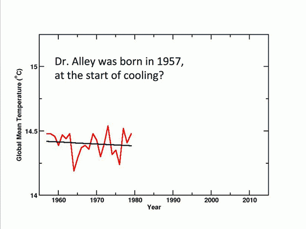
Next, take a look at the figures, which highlight events from Dr. Alley’s career. In each case, the jagged red line connects the temperatures from year to year, using data from NASA’s Goddard Institute for Space Studies, and the smoother black line is the best fit to the data over the interval selected. You will see that in each case, Dr. Alley has carefully picked the end points so that the best-fit line slopes downward, indicating a cooling trend. For the last 20 years, Dr. Alley has met important people in Washington, DC who declared that global warming stopped. It is very easy to do so; be quiet during a year with strong warming, and then the next year go back to claiming that global warming stopped.
Over a century ago, the Guinness brewery in Ireland hired an Oxford mathematician, W.S. Gosset, to develop ways to separate actual trends from short-term variability. The techniques were published with a pseudonym (A. Student), presumably to help people without telling competitors how valuable it was for a business to avoid self-delusion. If you apply techniques derived from that research, global warming has not stopped; all time intervals long enough to show a statistically significant trend do show warming.
By 2016, the temperature had risen enough that it barely fit in the chart above, aided by the ongoing human warming and by a strong El Nino event. This strong El Nino was warmer than the previous one, which was warmer than earlier ones, mostly because of human CO2. But, temperature was dropping a bit in late 2016 as the El Nino faded. And, some inaccurate voices were already, again, declaring that global warming had stopped.
Better Climate Models
Some Better Climate Models
Climate models may be the part of the science that most people know the least about. Be very clear — scientists do not tell their computers to produce global warming, and then get excited when global warming comes out of the computer!
The simplest climate model we just discussed shows you a tiny bit of what goes into a real climate model. The starting point is physics. This includes the rules that mass and energy are not created or destroyed but just changed around. The physics also includes interactions between mass and energy — how much energy is needed to evaporate an inch of water per week, for example, or to warm the atmosphere by a degree. Interactions of radiation and greenhouse gases are specified from the fundamental physics worked out by the US Air Force after World War II, and other such studies.
The model also must “know” about the Earth-how much sunshine we get, how big the planet is and how fast it rotates, where the land and oceans are, how much air we have and what it is made of. (Climate models are applied to other planets, and very clearly give different answers because of the differences between the planets.)
All of this information is written down in equations, translated into computer language, and then the computer is turned on. What happens next is remarkable — the computer simulates a climate that looks like the real one. Air rises and rains in the tropics, then sinks and dries over the Sahara and Kalahari. Storms scream out of the west riding the jet stream, and snow grows and shrinks with the seasons across the high-latitude lands.
The model will not be perfect, of course. Suppose you are interested in wind speed. You know from personal experience that you can hide behind a windbreak for relief on a windy day. A forest can serve as a windbreak, giving weaker winds than on a prairie. So, the model must be “told” about the distribution of forests and grasslands (or else must calculate where they grow), and about the “roughness” of the forest and the grass. Scientists have conducted studies on the effects of forests and grasslands on winds, but all studies include some uncertainty. So, the modelers know that the surface roughness in this region must be about this much, but could be a little less or a little more within the range allowed by the data.
The modeler (or more typically, the modeling team) can now “tune” the model. If the winds in the model are a little stronger in some places than in the real world, the modeler may increase the roughness a little, although without going outside the uncertainties. To avoid any biases, different groups in different countries with different funding sources build different models, and tune them in different ways; when all of them agree closely, it is evident that the tuning hasn’t controlled the answer.
Some of the models are used for weather forecasting and for climate studies, and work fine for both. There are differences between weather and climate (see Weather Forecasts End, But Climate Forecasts Continue) - many climate models are simulating changes in vegetation, for example, but if you’re worried about the weather for next week, you don’t really care whether global warming endangers the Amazonian rainforest over the coming decades.
As a general rule, in talking to the public or policymakers, climate modelers rely especially on those results that:
- are exhibited by a range of models from simple to complex run by different scientific groups;
- are understood based on the physics;
- are observed in the history of climate; and
- are confirmed by recent instrumental observations.
Module 5: Global Warming - History
Module 5 Overview
You just read over a lot of information that is not controversial in the scientific community, but is controversial in some public and political discussions. For a little perspective, watch the short video below that we shot for you in Rocky Mountain National Park. Dr. Alley and others teach a class on Geology of National Parks, and we talk about earthquakes and volcanoes, and how rocks such as these, that were almost melted deep in the Earth, came to be sitting up here in Rocky Mountain. In class we note that earthquakes and volcanoes affect us, and they depend on convection currents deep in the Earth’s mantle, something like the currents in a pot of spaghetti cooking on the stove, and such currents help explain the rocks here. And the people say “Great, let’s get to the earthquakes and volcanoes.”
But, with the same people, suppose we say “Climate affects us, and carbon dioxide from our fossil fuels is turning up the thermostat.” Many of them say “How do we know that fossil fuels make carbon dioxide? How do we know carbon dioxide is rising? How do we know our fossil fuels are responsible? How do we know carbon dioxide affects climate? How do we know temperatures are rising? How do we know the rising temperatures are from the carbon dioxide? How do we…”
Now, the science of what’s convecting beneath our feet is based on hundreds, thousands of scientists working over decades, collecting and analyzing rocks and seismic records, hypothesizing and testing, arguing and agreeing. The science is not done, but it’s very good.
The science of what’s above us in the climate is actually older. Climate science is more successfully predictive, and better tested. But, because it matters more to money, we argue about climate science more.
Burning fossil fuels doesn’t make the “stuff” in them just go away; it makes carbon dioxide. In the US, we’re putting up about 20 tons per person per year. The warming effect is physics, known for over a century and really refined by the US Air Force after WWII for purposes such as sensors on heat-seeking missiles. There isn’t an alternative, there isn’t another side, there is just the reality that we are raising carbon dioxide, that is raising the planet’s thermostat, and climate affects us. Some people think we scientists are being overly dramatic, others think we’re being too conservative.
What really matters to most people is not radiation interacting with atmospheric gases, but home and food and friends. So, let's look at what climate change might mean to them.
Video: How do we Know? Rocky Mountain National Park (4:41)
RICHARD ALLEY: It's beautiful here in Rocky Mountain National Park. I teach a class in the Geology of the National Parks. And we talk about questions like, why are those huge mountains there? And why are they made of rocks that were deep in the earth not that long ago where it was really hot and they were sitting under some volcano? And then we talk about volcanoes, and earthquakes, and things that matter to people. And we talk about these grade convection cells deep in the mantle that drive the drifting continents and the tectonic plates and that are ultimately responsible for the volcanoes and earthquakes that people worry about it.
We talk about the sun heating that mountain and later in the afternoon that heat will cause the air to rise. It will be causing big, poofy white clouds and those clouds may lead to hailstorms, and tornadoes, and things that matter to people. And when we talk about these circulations in the earth or the circulations in the air, most people say, yeah, yeah, yeah, get on to the exciting stuff-- the volcanoes or the tornadoes that we're really interested in.
We also talk about the fact that the sun shines through the air and heats the mountain, but the mountain is radiating longer waves infrared back to space. And because there's CO2 and water vapor in the air, we are warmer than we otherwise would be, because they are blocking some of that heat that the mountain is sending back to space.
That CO2 in the air we are raising because we're burning fossil fuels. And at that point a whole lot of people were very happy with convection currents in the mantle or in the atmosphere start to say, wait a minute, how do we know there's CO2 in the air? How do we know that CO2 is blocking heat? How do we know that humans are raising the CO2? Does that matter to us at all? And we get off on a discussion of technical points of science that people are very happy to accept similar things when it doesn't matter to them as much.
Now the physics of the atmosphere are in many ways easier then the physics of what's underneath our feet. What's under our feet, our understanding of these convection currents in the mountain building is based on work by 100,000 of scientists working over decades proposing new ideas, making predictions that differ from predictions of other ideas and seeing which ones work. Throwing away what doesn't work, keeping what's left as a provisional estimators of the truth and moving forward in that science.
The physics of the atmosphere is based on work probably by more scientists working longer. The greenhouse effect of our CO2 has been understood for more than a century and it's really based on physics. It was refined by the Air Force right after World War II. Now the Air Force wasn't doing global warming. They were doing things such as heat seeking missiles. You can see the infrared coming from the hot engine of an enemy bomber. And if you have the right sensor on your missile, you can follow that and shoot down the enemy. But if you have the wrong sensor, CO2 blocks that radiation.
There's a little bit of radiation comes down from enemy bombers. There's much more comes up from the sun warmed earth. The CO2 in the air doesn't care what made the radiation, it interacts with it. And so the physics of how greenhouse gases warm the earth, of how our of CO2 warms the earth is really, really solid. And it's been known for a very long time. And that, plus the fact that we in the US are putting up something like 20 tons of CO2 per person, per year is really all you need to know to realize this matters. So let's go and take a look at the really solid physics and what it means.
Goals and Objectives
Goals
- Recognize the natural and human-driven systems and processes that produce energy and affect the environment
- Explain scientific concepts in language non-scientists can understand
Learning Objectives
The basic physics of global warming are very well understood, but by themselves don’t mean much to most people. More interesting is how the physics leads to things that do matter to people. After completing this module, student will be able to:
- Summarize how the Earth’s history confirms the warming influence of carbon dioxide
- Recognize that past climate changes have greatly affected plants and animals, usually in unpleasant ways
- Recall that future rise in CO2, and therefore surface temperature, is likely to be much worse than what we have experienced in the past 100 years
- Explain how small amounts of climate change are worse for poor people, and larger amounts are bad for everyone
- Assess what you have learned in Unit 1
Roadmap
| To Read | Materials on the course website (Module 5) | |
|---|---|---|
| To Do | Quiz 5 Unit 1 Self-Assessment |
Due Sunday Due Sunday |
Questions?
If you prefer to use email:
If you have any questions, please email your faculty member through your campus CMS (Canvas/Moodle/myShip). We will check daily to respond. If your question is one that is relevant to the entire class, we may respond to the entire class rather than individually.
If you prefer to use the discussion forums:
If you have any questions, please post them to Help Discussion. We will check that discussion forum daily to respond. While you are there, feel free to post your own responses if you, too, are able to help out a classmate.
Who Did Start the Fire?
Who did start the fire?
Nature has set fires for a very long time. Lightning is a common cause, but volcanoes, meteorites, or other natural phenomena also can start fires.
Humans also set fires, usually to cook food, to provide heat, or do other things that we want. But, rarely, humans set fires for bad reasons such as to hurt someone or to collect insurance money. This is the crime of arson. Police departments and insurance companies often have arson investigators, who must understand natural fires to be able to tell whether humans or nature were responsible when something burned down.
How does arson relate to climate change? You may know one of the many people who argue that we shouldn’t worry about human-caused climate change because nature has changed climate in the past. Some of these people seem to think that the existence of natural climate change means that we couldn’t be causing the changes going on now or that may come in the future—equivalent to arguing that a fire couldn’t be arson because nature lit fires in the past. Other people seem to think that living things survived past climate changes, so ongoing and future climate changes won’t matter—equivalent to arguing that arson might happen, but it doesn’t matter because it doesn’t really hurt anyone. But while many people make such arguments about climate change, very few people make the same arguments about arson.
Those who study the history of climate, like those who study the history of fires, generally come away with a clear understanding that both nature and humans can cause changes, and that big changes caused by nature or by humans matter a lot to people and other living things. For climate, studying the history of the Earth provides strong evidence that humans can make changes that match or exceed almost anything nature has done, with huge impacts.
Heeding Heated History
Heeding Heated History
Short version: Increasingly strong evidence shows that natural changes in carbon dioxide have been the main control on Earth's climate history and that the climate changes have greatly affected living things.
Friendlier but longer version: During the late 1700s and early 1800s, scientists were building the geologic time scale, drawing “lines” to separate history into blocks of time that could be given names. Fossils showed the species that lived at different times, and the lines were usually drawn when many species became extinct before new species evolved to take over the “jobs” left vacant by the extinctions. Those early geologists didn’t know why the species went extinct, but they knew that something big happened.
Since then, an immense amount of effort has gone into learning what happened. In one case about 65 million years ago, a giant meteorite impact killed the dinosaurs and ended the Mesozoic Era, to start the Cenozoic Era. Changing climate was responsible in other cases, and climate changes may prove to have been the main drivers in most of the big extinctions. Climate change was probably very important in how the meteorite killed the dinosaurs, too; for most of them, it didn’t fall on their heads but instead blocked the sun with dust it kicked up, causing great cooling for a few years, among many changes.
We’ll look briefly at three big changes, and then see what they say when viewed with the rest of climate history. Don’t worry about memorizing names and dates we’ve already given or the ones coming unless you’re really into that; just get the sense of the story.
Video: Continental Glaciation (3:27)
(launch image in a new window [61])
PRESENTER: This wonderful plot is from the IPCC and other places. This is a different scale. Today is over here on your right, and the 400 over here is 400 million years-- not 400 years, 400 million years. So this is really deep time.
And what you have plotted on here are two different things. At the top, hanging down in blue is the extent of glaciers at a time. And so there were no ice on the planet, basically at sea level. And then there was a little blip of glaciers, and they went away. And then the glaciers went way down towards the equator-- not all the way by any means-- but they got more than halfway there. And then they melted away into a time with no ice near sea level. And then the glaciers have come back, and we have ice in Antarctica and Greenland today.
So there's the history, and you can think of this as a history is temperature. There was no because it was warm. There was ice because it was cold. There was no ice because it was warm. There was ice because it was cold. OK.
Shown below is the history of CO2. And what you'll notice is when there was no ice, CO2 was high, and this is estimated in various ways. But what you have here is this high CO2 back here in a no ice time. And then when CO2 got low, the ice had grown. And when CO2 went back up to being high, the ice had melted away. And when CO2 got low again, the ice had grown back. And it turns out there's actually a little dip in CO2 right here that goes with this little blip of ice.
And so what we see is a very nice relationship-- high CO2, little or no ice; low CO2, lots of ice. Furthermore, we understand from processes that you can read about in our course and elsewhere, that it is the CO2 causing the changes in ice and not, primarily, the ice causing the changes in the CO2. And this is something you just can't see from this correlation, but we get it from other sources.
Now, try to walk you through a few events in climate history. We're going to start with this one back here, The Great Dying-- a time when volcanic CO2 raises the temperature and seems to have made it so hot near the equator that large creatures couldn't live there. We then will walk you into the Paleocene-Eocene Thermal Maximum-- a time when some formerly living carbon came out of C4 methane or other sources, belched out fairly rapidly and made it warm. And we'll finish up with the Ice Ages. This is a time when features of Earth's orbit have driven temperature changes, but those temperature changes have been amplified and made global by CO2.
Activate Your Learning
What information is plotted on the figure above? What does this data tell us about the relationship between CO2 in the atmosphere and surface temperature over the past 400,000,000 years of Earth history?
Click for answer.
The Great Dying
The Great Dying
At the end of the Permian Period, which also is the end of the Paleozoic Era about 252 million years ago, approximately 95% of the species known from fossils went extinct. This is the same time, with very little uncertainty, as the greatest volcanic outpouring on Earth in the last 500 million years.
The rise in CO2 from the volcanic eruptions caused warming. (Volcanoes generally cause cooling over short times, such as their role in causing the Little Ice Age of a couple centuries ago, but volcanoes raise temperatures over longer times, such as their role in warming the end of the Permian.
Do you want to learn more?
Read the Enrichment titled Volcanoes Cool and Warm, without Doubletalk.
The volcanic eruptions are estimated to have raised CO2 much more slowly than humans are doing, but the volcanoes didn't run out of CO2 as rapidly as we will run out of fossil fuels, so the event back then lasted longer. Our understanding indicates that the extra warmth from the CO2 accelerated rock weathering, providing extra fertilizer reaching the ocean. This would have helped make extensive “dead zones” as parts of the ocean ran out of oxygen, aided by the lower oxygen level in the water caused by the higher temperature. Sediments from that time contain special “biomarker” molecules made by green sulfur bacteria that photosynthesize with the poisonous-to-us gas hydrogen sulfide, indicating loss of oxygen and rise of hydrogen sulfide in the ocean. New data also suggest the Earth became so hot that the few remaining large creatures could not live in the tropics immediately after the extinction, but only closer to the poles.
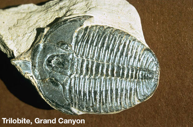
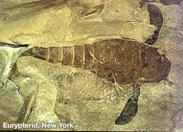
We do not expect the warming in our near future to produce anything nearly so bad, but fertilizer runoff from our fields and warming from our CO2 can contribute to oceanic “dead zones”. And, we cannot rule out the possibility that beginning or near the end of this century, we could make the Earth so hot that living unprotected in the tropics becomes difficult or even impossible for us and some other large creatures.
The Paleocene-Eocene Thermal Maximum (PETM)
PETM
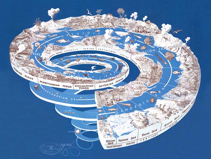
Video: Paleoclimate Concepts (1:31)
PRESENTER: This was taken from work by a variety of people, and especially by Jim Zachos. And it was used in a report of the US government, the CCSP, that I helped with a little bit. And so we'll draw you a dinosaur over here.
Poor dinosaur, because right here, 65 million years ago, this big meteorite came zinging in, and the poor dinosaur was wiped out. And what we have is time since then, from 65 million years ago on your left, running up to today on your right.
And this is sort of no ice on the planet down here right after the dinosaurs. And then you start to get ice in East Antarctica and then West Antarctica. So over here, it is icy.
And what you can see down here are estimates of temperature. In the no-ice world, it was pretty hot. And then it cooled off, as we went to ice. And this was primarily because of dropping CO2.
And right here, there's this little blip. It was already hot. And then in a reasonably short time of sort of 10,000 years, the temperature went way up. And then over 100,000 or 200,000 years, the temperature came back down.
And that had all sorts of implications for living things. It changed the rain. It changed who lived where.
It drove evolution. It drove a whole bunch of things. And it was caused rather clearly by CO2 being belched out of the Earth's system in various places.
During the Cenozoic, about 55 million years ago, an extinction event wiped out many sea-floor foraminifera, small shelly critters, at the time dividing the Paleocene and Eocene Epochs. Starting with an already-warm world, the temperature went up several degrees in roughly 10,000-20,000 years (with some uncertainty) as CO2 rose and then cooled over the next 100,000-200,000 years as CO2 fell. The Arctic was ice-free during the event. Plants and animals migrated rapidly. Many large animals became “dwarfed” during peak warmth, possibly because high temperatures cause greater trouble for larger animals. (We generate heat over the volume of our bodies and lose heat from the surface, and the ratio of surface area to volume is generally smaller in larger animals, making heat loss harder.) Insect damage to leaves spiked and patterns of rainfall and drought shifted. The ocean became more acidic, and that extra acidity was then neutralized in part by dissolving shells.
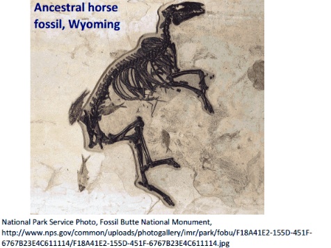
The source of the CO2 remains somewhat uncertain but most likely was volcanic eruptions linked to rifting of the North Atlantic cooking organic material including oil in rocks, amplified by the loss of carbon from soils and sea-floor methane clathrates. The event is unique over tens of millions of years in its size and speed, so may have involved a coincidence of some sort, or else more such events would have occurred.
Wherever the CO2 came from in detail, it warmed the climate as much or more than models generally calculate and had very large impacts on living things. And, the effects lasted a long time. For example, although corals did not go extinct, coral reefs disappeared as functioning ecosystems and did not come back for millions of year.
The Ice Ages
The Ice Ages
Over the last million years or so, ice has grown and shrunk on the Earth’s surface, with a main spacing of 100,000 years, and lesser wiggles at about 41,000- and 23,000-year spacing. Early geologists identified and named many of the times of large and small ice, and eventually developed tools that allow quite precise estimates of when events occurred.
Earth: The Operators' Manual
If you want to see a short animation of the orbital cycles, and how they affected the Franz Josef Glacier in New Zealand, revisit this clip for the last time (1:20 to 7:22). Dr. Alley had a lot of fun in the helicopter.
Video: CO2 and the Atmosphere (9:03)
What CO2 does was confirmed by basic research that had absolutely nothing to do with climate change. (newsreel announcer) A continuance of the upper air program will provide scientific data concerning the physics of the upper atmosphere. (Richard Alley) World War II was over, but the Cold War had begun. The U.S. Air Force needed to understand the atmosphere for communications and to design heat-seeking missiles.
At certain wavelengths carbon dioxide and water vapor block radiation. So the new missiles couldn't see very far if they used a wavelength that CO2 absorbs. Research at the Air Force Geophysics Laboratory in Hanscom, Massachusetts produced an immense database with careful measurements of atmospheric gases. Further research by others applied and extended those discoveries, clearly showing the heat-trapping influence of CO2. The Air Force hadn't set out to study global warming, they just wanted their missiles to work. But physics is physics. The atmosphere doesn't care if you're studying it for warring or warming. Adding CO2 turns up the planet's thermostat. It works the other way as well. Remove CO2, and things cool down. These are the Southern Alps of New Zealand, and their climate history shows that the physicists really got it right. These deep, thick piles of frozen water are glaciers, slow moving rivers of ice, sitting on land... But once, when temperatures were warmer, they were liquid water, stored in the sea. We're going to follow this one, the Franz Josef, from summit to ocean to see the real-world impact of changing levels of CO2.
It's beautiful up here on the highest snowfield, but dangers lurk beneath the surface. I've spent a lot of time on the ice. It's standard practice up here to travel in pairs, roped up for safety. The glacier is fed by something like six meters of water a year... maybe 20 meters, 60 feet of snowfall... it's a really seriously high snowfall. The snow and ice spread under their own weight and is headed downhill at something like a kilometer a year. When ice is speeding up a lot as it flows towards the coast it can crack and open great crevasses that give you a view into the guts of the glacier. Man, this is a big one... Ten... Twenty... Thirty meters more... a hundred feet or more heading down in here, and we can see a whole lot of the structure of the glacier right here.
(man) So, what we're going to do is just gonna sit on the edge and then walk backwards, and I'll lower you. Tell me when. Okay, rolling around, and down we go. Snowfall arrives in layers, each storm putting one down... Summer sun heats the snow, and makes it look a little bit different than the winter snow, and so you build up a history. In these layers there's indications of climate, how much it snowed, what the temperature was. And all of this is being buried by more snow and the weight of that snow squeezes what's beneath it, and turns it to ice. And in doing that, it can trap bubbles. And in those bubbles are samples of old air, a record of the composition of the Earth's atmosphere, including how much CO2 was in it, a record of the temperature on the ice sheets, and how much it snowed. As we'll see, we can open those icy bottles of ancient air, and study the history of Earth's atmosphere.
This landscape also tells the story of the Ice Ages. And the forces that have shaped Earth's climate. Over the last millions of years the brightness of the sun doesn't seem to have changed much, but the Earth's orbit and the tilt of its axis have shifted in regular patterns over tens and hundreds of thousands of years. The orbit changes shape... varying how close and far the Earth gets as it orbits the sun each year.
Over 41,000 years, the tilt of Earth's axis gets larger and smaller, shifting some of the sunshine from the equator to the poles and back. And our planet has a slight wobble, like a child's top, altering which hemisphere is most directly pointed toward the sun when Earth is closest to it. Over tens of thousands of years, these natural variations shift sunlight around on the planet, and that influences climate. More than 20,000 years ago, decreasing amounts of sunshine in the Arctic allowed great ice sheets to grow across North America and Eurasia, reaching the modern sites of New York and Chicago. Sea level fell as water was locked up on land. Changing currents let the oceans absorb CO2 from the air . That cooled the southern hemisphere, and unleashed the immense power of glaciers such as the Franz Josef, which advanced down this wide valley, filling it with deep, thick ice. Now we're flying over today's coastline, where giant boulders are leftovers from that last ice age.
A glacier is a great earthmoving machine. It's a dump truck that carries rocks that fall on top of it. It's a bulldozer that pushes rocks in front of it. And it outlines itself with those rocks making a deposit that we call a moraine, that tells us where the glacier has been. We're 20 kilometers, 12 miles, from the front of the Franz Josef glacier today, but about 20,000 years ago, the ice was depositing these rocks as it flowed past us and out to sea. The rocks we can still see today confirm where the glacier once was. Now, in a computer-generated time-lapse condensing thousands of years of Earth's history... we're seeing what happened. Lower CO2, colder temperatures, more snow and ice, and the Franz Josef advanced.
Twenty thousand years ago, 30% of today's land area was covered by great ice sheets, which locked up so much water that the global sea level was almost 400 feet lower than today. Then, as Earth's orbit changed, temperatures and CO2 rose, and the glacier melted back. The orbits set the stage, but by themselves they weren't enough. We need the warming and cooling effects of rising and falling CO2 to explain the changes we know happened.
Today, atmospheric CO2 is increasing still more, temperatures are rising, and glaciers and ice sheets are melting. You can see this clearly on the lake formed by the shrinking Tasman Glacier, across the range from the Franz Josef. This is what the end of an ice age looks like. Glaciers falling apart, new lakes, new land, icebergs coming off the front of the ice. In the early 1980s, we would have been inside New Zealand's Tasman Glacier right here. Now we're passing icebergs in a new lake from a glacier that has mostly fallen apart and ends over six kilometers, four miles away.
One glacier doesn't tell us what the world is doing, but while the Tasman has been retreating, the great majority of glaciers on the planet have gotten smaller. This is the Columbia Glacier in Alaska. It's a type of glacier that makes the effects of warming easy to see. It's been retreating so fast that the Extreme Ice Survey had to reposition their time-lapse cameras to follow its motion. In Iceland, warming air temperatures have made this glacier simply melt away, leaving streams and small lakes behind. Thermometers in the air show warming, thermometers in the air far from cities, show warming.
Put your thermometer in the ground, in the ocean, look down from satellites, they show warming. The evidence is clear. The earth's climate is warming.
Remarkably, astronomers had predicted the measured timings decades before they were observed because they arise from cycles in Earth’s orbit. These cycles have very little effect on the total amount of sunshine reaching the whole Earth, but they move sunshine around on the planet, with large effects (more than 10%) on the sunshine reaching a particular latitude during a particular season.
Even more remarkably, when sunshine has dropped in the far north especially in summer, the whole world has cooled, including places getting more sunshine. And, when sunshine has risen in the far north especially in summer, the whole world has warmed, including places getting less sunshine. The explanation is that when northern sunshine dropped, a whole lot of ice grew on the lands of the north (enough to lower sea level about 400 feet), many other things in the Earth system changed, and some of these changes caused some CO2 to move out of the air into the oceans; when ice melted in the far north, those other changes reversed and moved the CO2 from the oceans back into the air. Several processes may have contributed, including northern ice changes shifting winds that shifted ocean currents that controlled how rapidly deep ocean waters came back to the surface, bringing CO2 released by ecosystems living on the sinking organic matter from the surface.
Want to learn more?
Read the Enrichment titled The History of the World.
Ice growth lowered CO2, which cooled the regions getting more sunshine; ice melting raised CO2, which warmed the regions getting more sunshine. The known physics of CO2 explain what happened, and nothing else has succeeded in doing so.
The Big Picture 2
The Big Picture 2
Let's return to the figure showing the broad histories of atmospheric CO2 (with estimates from different techniques shown by different lines plus the shaded band at the bottom), and of ice on the planet (glaciers extending farther toward the equator are shown by longer bars hanging down from the top). Clearly, CO2 and ice moved in opposite directions, with rising CO2 occurring with melting ice. The figure has been “smoothed”, and so doesn’t show the details of the shorter-lived events discussed just above.
By themselves, the correlations just discussed between CO2 and temperature do not prove that CO2 caused the warmth. But, straightforward physics shows the warming effect of CO2. And, although warming can raise CO2 over short times, as at the start of the PETM or the ends of the ice ages, over long times warming lowers CO2 by causing faster rock weathering and fossil-fuel formation. Thus, the prolonged high levels of CO2 during warm times were not caused by the hot climate; instead, such high levels were caused by faster volcanism, or thicker soils slowing access of CO2 to react with rocks, or other geological reasons.
The physics, and the lack of other plausible causes despite major efforts to find something, show that the warmth was caused by the CO2. Testing our understanding by “retrodicting” what happened—starting with the causes and simulating the effects of the climate changes—shows that our models work well. If there is a problem, the world has changed a little more in response to CO2 than expected from the models.
More than Just Temperature
More than Just Temperature
The past confirms much more about our understanding. The major events in Earth’s history were identified first by their influence on living things, including extinctions. A huge amount of additional research was required to learn that changing climate was responsible for many of those events, and perhaps for almost all of them. This long history of climatically caused extinctions supports our scientific expectation that continuing climate change risks extinctions in the future. We also expect that the CO2 we put up will continue to affect the climate for a long time, based on models and understanding that are well-confirmed by the geologic history.
The biggest of the climate changes of the past were much larger than the changes humans have caused so far. But, if we continue to burn the available fossil-fuel resource, we can cause a change that is as more-or-less as large as, and much faster than, the biggest natural events (except for the meteorite that killed the dinosaurs, which caused large changes very very rapidly).
The geologic record highlights another major issue. Science always involves uncertainty. All measurements have some “plus and minus”—Dr. Alley is within an inch of 5’7” and weighs within a few pounds of 145, for example, but he surely is not known to be exactly those measurements. And, when measurements are used to drive models that project climate changes that are used to estimate economic impacts, many sources of uncertainty are involved, and we cannot in any way be exactly certain what the future holds.
In assessing those uncertainties, though, we find evidence of an asymmetry that you probably could have figured out from common sense. In ordinary life, breaking things is almost always easier than building them. If you want to build a new house, you will need a lot of different materials and tools and know-how. But, if you want to tear down a house, you can do it with just a wrecking ball or an exploding stick of dynamite.
When we survey the history of climate, we see something similar. We don’t find evidence of Eden, a time when changing CO2 and climate had turned the whole Earth into paradise. Deserts and ice have grown and shrunk, so some times may have been “nicer” than others, with no guarantee that we now live in the best of all possible worlds. But, hazards existed at all times.
We do find evidence of occasions that were much closer to Hell, with up to 95% of the known species becoming extinct. A species might survive from just a single pregnant female or a few eggs or seeds even if all other individuals are killed, so the extinction times were very bad indeed.
If we continue to rapidly change the atmospheric concentration of CO2, we have a best estimate of likely impacts, which will be discussed further just below and in additional material later in the course. Uncertainties are real, and the future may be somewhat better than expected, or somewhat worse. But, we don’t see any reasonable chance that the changes will be much better than expected—cranking up CO2 is very, very unlikely to make Eden. And, the history of climate suggest the possibility that things will be much worse than expected—cranking up CO2 might break things we really care about.
If you drive somewhere, you face a similar situation. What you expect is very far on the "good" side of what is possible, as shown in this short piece...
Video: Possibilities (5:10)
PRESENTER: So I'm this really lucky person. I get to ride my bicycle when I go places. And that's a great thing. But suppose you have to drive a car.
You may run into problems. And you might have very few problems at really low. And you might have bad problems way over here on the right. So this is problems getting worse.
And this is how likely-- this is highly likely you're really going to get this. And this is rare down here. So what we're going to look at is, what does a commuter encounter if you go out in your car in the real world.
Well, the most likely thing that happens-- and so we show way up here because it's likely. It's that you get caught in traffic. And you kill some time.
And you turn on the radio, and it's just sort of boring. It's not something that you really wanted to listen to. That's really what most of us experience when we have to drive somewhere.
Be perfectly honest. It is possible that you will get to a situation that nobody's in your way. And you turn on the radio and they're playing the Beach Boys festival. And you're just grooving as you run down the road. It's a wonderful thing, and you're having a ball.
It is also possible that you get stuck in lots of traffic. You're sitting there for an hour. You turn on the radio, and they're testing the Emergency Broadcast System. And they're screaming out of the radio. And this is no fun at all.
But recognize that there's a slight possibility that you're sitting there stuck in traffic listening to the Emergency Broadcast System. And a drunk driver comes running over the top of you. And you know, you get-- I'm sorry. You could be seriously damaged, or you could end up dead. And that is indeed possible. It's not very likely, but it's possible.
Well, what do we do about that? We buy cars that have airbags in them, that have crumple zones. We put on our seat belts. If we have kids, we put them in a kid's seat.
We take out catastrophic insurance. We pay Mothers Against Drunk Driving to try to reduce drunks. We pay engineers to make the roads safer. We put a fair chunk of our transportation budget into something that we do not expect to happen, because it's so devastating if it happens.
Now, when we start talking to Congress, or to what have to you, about the cost of global warming, we have a best estimate. What is the most likely thing? And when we take those problems that go with that best estimate and you put them in an economic model, we are better off if we deal with it than if we pretend it doesn't exist.
Now, be very clear. This is science. It is not revealed truth.
It is indeed possible that we will see smaller or slower changes. Absolutely correct, that could happen. It's also possibly we could see larger or faster changes.
We simply do not see any way that simply adding CO2 to the air will turn the earth into the greatest place to live that could possibly be imagined. You can't make Eden with just one thing, because building paradise would take getting a lot of things right.
So there's no really not much chance that we get wonderful, no problems, great benefits, just from cranking up CO2. But there's a slight chance that we actually make the tropics too hot to live in for unprotected people, that we could have dead zones belching out poison gas, that we could shut down the North Atlantic and dry out the monsoon belts, that we could dump and ice sheet in the ocean and flood the coasts in a hurry.
These are all considered to be very unlikely at this point. But we can't rule them out. And CO2 might, by itself, do that. And so if you look at the picture, yes, it could be a little better. It could be a little worse. It could be a lot worse. But we don't see any way to make it a lot better.
Now, this is an opinion. But the last times that I have sort of talked to high policymakers about this, that I've testified to Congress or what have you, my impression is that we've spent a lot of time having this argument.
I present what we know best from the science. And someone says, it could be better. This is our best estimate. It could be better. This is our best estimate, this could be better.
Yes, that is not both sides. Be very clear, the best scientific evidence versus don't worry is not showing you both sides. And if we scientists are wrong, it's more likely to be on the bad side than it is on the good side.
The Projection Project
The Projection Project
Short version: With high confidence, warming from rising carbon dioxide will bring more very hot days and fewer very cold ones, more sea-level rise, stress for endangered species, plant fertilization but heat stress, more-intense peak rains but drying in many times and places, and many other impacts. Small changes will bring winners and losers, but losers will grow to far outnumber winners if we continue on our current path and cause very large changes.
Friendlier but longer version: For the next decade or two, the biggest uncertainties about future climate are linked to things we cannot know—will there be a big volcanic eruption in the next decade, or an extra El Nino or La Nina? The expected warming over a decade or two for any of the choices we are likely to make is more-or-less the same size as the cooling effects of a big volcano or La Nina. For a small number of decades after that, the biggest uncertainties are probably linked to things we don’t fully understand about the climate. Recall that the equilibrium warming from doubled CO2 is estimated to be between 1.5 and 4.5°C. The big difference between the high and low estimates might be reduced by better climate science, although the interactions among feedbacks mean that greatly reducing the uncertainty is quite difficult. But, by late in the century, the uncertainties related to volcanoes or climate sensitivity are smaller than the uncertainties related to what we humans choose to do. And remember at least the younger students in this class are likely to live longer than that!
Because our choices are so important, climate scientists normally don’t discuss predictions, choosing instead to provide projections: “If people decide to do xxxx, then the climate will do yyyy, with an uncertainty of zzzz.” By replacing the “xxxx” with different things we might do, the science shows policymakers and other people the changes yyyy±zzzz that their decisions would cause.
Video: Past and Future CO2 Atmospheric Concentrations (1:58)
PRESENTER: This is another figure from the IPCC from 2007, their fourth assessment report. The year 1000 is over here. So this is year, and it comes up to the year 2000 and then into the future going that way.
This is how much CO2 was in the air. And so what we're looking at here is a long period of stability. These are ice core data from breaking bubbles in various cores in Antarctica with different levels of impurities, different snowfall, different temperature but the same record.
As we come in here, what we see is that the ice cores and the instrumental record, what's measured in the air today, actually agree just beautifully and that we really, really have raised CO2. And these are various possible futures running off here to the right. And depending on sort of how the economy grows and so on, none of these include a strong effort to reduce CO2. So far we've been tracking very near the highest of these or above it a little bit, but we haven't gone very far and so it's a little hard to tell which way we're going.
The things to notice are that the rise so far from human CO2 is unequivocal. It's beautifully clear scientifically, but it's not very big compared to what's coming in all the future's envisioned. We see a much larger change in the future than in the past.
And all of these curves are still headed up as they get to the point where students today are getting old but are still not passed away. And our children and our grandchildren very clearly will live off of this. So if we don't do something about our CO2, the changes coming are very, very much bigger than the changes that have happened so far.
The graph just above shows the history of atmospheric CO2 over the last millennium as measured in bubbles from ice cores, including the very close agreement between ice-core and atmospheric data during the decades of overlap, and then shows various possible futures. These future “scenarios” were prepared to bracket likely paths we may follow, and provide enough curves so that one of them may prove to be fairly close. So far, we’re running near the highest of the projections, but close to the others because the different scenarios don’t diverge a lot until further in the future. None of these paths assumes that we take major efforts to reduce greenhouse-gas emissions, which could lower any of them.
Notice that in all of these scenarios the projected changes are much larger than those to date, with CO2 still rising beyond 2100. (The world does NOT end in 2100!) With notable uncertainties, fossil fuels may become rare by the time CO2 reaches the top of the chart around 1000 ppm, or may be common enough to drive CO2 more than twice that high, giving us two or three doublings from the relatively stable level of approximately 280 ppm before the industrial revolution.
We could estimate future temperature by taking the climate sensitivity of around 3°C for doubled CO2 (or between 1.5 and 4.5°C), and the two or three doublings, calculating a warming, and reducing that a bit because the warming lags the CO2 a little and the CO2 will start down before peak warming is reached. We get much more information by taking our best models, run by different groups in different ways, forcing them with the scenarios, and studying the results.
Warming to the Future
Warming to the Future
Video: Global Surface Warming (2:23)
PRESENTER: This is a plot from the IPCC from 2007, their fourth assessment. Down here, this is basically going to more CO2 as we go in the future.
And so these different things are scenarios for how much CO2 we face. This is the history of temperature going from 1900 up through 2000 and then the future of temperature as we look into the future.
The warming, to date, is sort of one degree. That's not terribly big. The uncertainty is somewhere between one degree Fahrenheit and one degree Celsius. And so the warming is sort of one degree.
If in the year 2000, we had stabilized the composition of the atmosphere, so no more changes happened in the air, we actually would have expected a little more warming, as shown on this orange curve down here, because the ocean has to catch up.
Right now, a lot of the heat is going from the air into the ocean. And as the ocean warms, the air will catch up. But not a lot more warming.
These others show various paths in the future, depending on how much CO2 we emit. So far, we're tracking very near or just above the uppermost of these. But we haven't gone very far yet.
Things to notice-- first of all, is it in all futures in which we don't do a lot to reduce CO2, the warming that is coming is very big compared to the warming which has happened?
Now, the world does not end in 2100. And you'll notice that all of these curves are still heading up, at least slowly and possibly rapidly, as we go into the future. Some students are going to live off of this graph.
You'll also notice over on the side that the uncertainties, as so often happens in this, are mostly on the bad side. So there's a most likely value. And it could be somewhat less or there's more room on the high side.
If it's more, it could be even more. And so what you see is that, if we don't do a lot to head off CO2 emissions, the warming, so far, is very small compared to the warming that comes, with the uncertainties mostly on the bad side.
The figure shows the past warming, which is just under 1°C or roughly 1°F, together with the future warmings for the different scenarios. The lowermost future line assumes that the atmospheric composition had been stabilized in the year 2000, with no further rise of CO2. Warming continues in that scenario because some heat is now going into the ocean, keeping the air cooler than it will be as ocean warming catches up. Note that it is already too late for us to follow that path because we have raised CO2 since 2000. Also, we are committed to some additional warming if we choose to stabilize the atmospheric concentrations at any point in any of the scenarios, again because of the slow warming of the ocean.
In all the other scenarios, if we don’t make major efforts to reduce future CO2 emissions, the future warming is projected to be quite large compared to the past warming, and the temperature is still going up as the next century starts. Also notice the uncertainty bars on the right, showing that warming may be a little less than the most-likely estimate, or a little more, or somewhat more than that.
Warming around the Globe
Warming around the Globe
Video: Projected Surface Temperature Changes (2:55)
PRESENTER: This is a moderately complicated plot that comes from the IPCC, and we're going to look at a few things here. This is not much CO2 in the future relative to what's possible. And so you see how much warming might occur for the global average out to 2020 to '29, that decade, and how much warming might occur out at 2090 to 2099 in degrees Celsius, which are listed along the bottom here.
And then these maps correspond here on the right to the warming from 2020 to 2029, the average of that decade, and what you expect late in the century that we're in now for this low emissions. And then here's the same thing for somewhat higher emissions of CO2. More warming. And here's one where we really keep burning like crazy. I'm just going to walk you through that when all of them show about the same thing, but we'll start down there.
First thing to notice is that these are how much warming is possible by late in the century here, and they show probabilities. The highest point is the most likely, and then there's a slight chance of having low values like this or low values like this. What I hope you notice is that the warming could be a little bit less or it could be a little bit more. Very, very unlikely to be a lot less, but it is possible to be a lot more.
And so there's a lop-sidedness in this. And if the scientists are wrong about what's most likely, then it's more likely that we'll get more warming. More likely more warming than what people have been telling you. OK. That's important first.
Second thing. The average warming here is just over 3 degrees Celsius, which is sort of this color, which is what you'd get out here in the ocean. Most of the world is ocean. The global average is not what happens on land where we live. It's what happens primarily in the ocean.
What you will notice is that all of the colors over here tend to be darker in red colors than what's in the ocean when you go up on land. Almost everyone on the planet gets above average warming because the land warms more than the ocean, and almost everyone lives on the land rather than in the ocean. So when people tell you the global average warming they expect, in some sense, that's very optimistic because it's the low end of what's possible and it's mostly telling you what's happening where people don't live rather than where people do live.
The figures here show the projected warming, and uncertainties. The maps are the projected warming for the next decade (2020-2029, center) and the last decade in this century (2090-2099, right), for different possible emissions scenarios, with more CO2 emitted as you go down through the maps. The estimates were made with Atmosphere-Ocean General Circulation Models (AOGCMs), the big climate models of the world. And, the maps here are the averages of the projections from all of the models participating in this effort—tests in the past have shown that this average across all the models generally does better than any single model (the “wisdom of the crowd” in models).
Warming is projected to be especially slow in those places where ocean water sinks into the deep ocean, and especially fast in the Arctic. Projected warming is generally larger over land than over ocean. Because the Earth is mostly ocean, the numbers usually given for “global warming” are closer to ocean than to land values. But, almost everyone lives on land, so the great majority of people are expected to experience above-average warming!
The panels on the left show the uncertainties in the projected warming. Notice for the 2090-2099 projections (the larger warmings, in red), that the most-likely warming tends to be towards the low end of the possible warmings. We have already seen that the most-likely impacts of a specified warming are on the low-damage side of the possible impacts, and now we see that the most-likely warming is on the low side of the possible warmings. Both of these have the same effect: the less you trust climate scientists to get the most-likely estimate correct, the more worried you probably should be about climate change, because the numbers most frequently quoted by scientists are on the optimistic side of the possibilities.
Precipitating a Change
Precipitating a Change
Video: Relative Changes in Precipitation (1:21)
This figure is from the IPCC. And it's showing precipitation, rainfall, in the future for a moderate warming scenario. And on the left here is December, January, February. This is winter. And on the right here is maybe of more interest, this is summer.
And so this is showing how much water will come out of the sky. Things will look drier than this in a warmer world because evaporation will go up. In general, what you'll notice-- let's just look at the one on the right here, from summer. And sort of these redder or oranger areas down in here are going to be drier in the summer. And these bluer areas in the middle, then, are going to be wetter in the summers, as up in here at the poles as well.
And so what you generally tend to find is that the wet areas get wetter and the dry areas get drier. But in the modern world, we grow a lot of food in these places that are going to get drier. If you add in the rain will evaporate faster and that when it comes, it will fall really fast and tend to run off more, there's real worries about drought in the future.
This slightly complex figure shows projections of future precipitation. In general, the models project that wet places will get wetter, dry places dryer, and the dry subtropics will expand somewhat into currently wetter regions toward the poles. Evaporation is also expected to go up with warming, and many of the models find summertime drying in places we grow much of our food, so agriculture may be reduced more than you might think from looking at this, as we discuss after a quick look at sea level.
LOTS of other issues come up, because climate affects so many things that we care about. A few of the larger issues include sea level rise, more floods and droughts, agriculture impacts, and impacts on people.
Sea Level Rise
Sea Level Rise
Warming causes ocean water to expand and melts mountain glaciers. (Despite a few outliers or oddities, the great majority of mountain glaciers are melting.) The big ice sheets of Greenland and Antarctica are also losing mass. With continuing warming, we expect more sea-level rise. The recent rise has been about 3 millimeters per year, or just over an inch per decade, and sea level has risen almost a foot (just under 1/3 m) over the last century or so. We expect sea-level rise to continue and probably accelerate moderately, with at least a slight chance of a large acceleration if the big ice sheets change rapidly. A foot of sea-level rise might not seem like a lot when the biggest hurricanes can have storm surges of 10 or rarely even 20 feet (3 to 6 m). But, the last foot may be the one that goes over the levee or into the subway tunnels, so even a relatively small change in sea level can have large consequences for cities and other human-built structures.
Video: Sea Level Rise (1:17)
PRESENTER: This figure comes from the US government from NOAA, National Oceanographic and Atmospheric Administration. And all it does is show regions that will go underwater-- shown by the reddish color, such as here-- for various levels of sea level rise. And this is one meter of sea level rise over here on the left.
And you see certain places that are starting to get a little bit damp. This is two meters of sea level rise, and you see big areas where a whole lot of people live are in trouble, then. And this is four meters of sea level rise. And this one over here is eight meters of sea level rise. And you see really big areas getting wet.
The worst case scenario that we can dream of is actually a good bit bigger than eight meters. Clearly, people could build walls to hold back the sea. The Netherlands has done it. It's been done around New Orleans with dikes, although though sometimes fail. But it gets expensive if you're trying to wall off that much of the coast. So one suspects that if we head towards the worst case somewhere well out in the future, that it could become very expensive or we lose a lot of land.
More Floods and Droughts
More Floods and Droughts
As noted above, there is a tendency for wet places to get wetter and dry places to get drier, with the subtropical dry zones expanding somewhat. When conditions are right to rain, warmer air holds more water (by roughly 7% per degree C or 4% per degree F), so all else equal, a warmer climate can deliver more rain in a hurry. But, evaporation speeds up with warming, too. All winter, Dr. Alley’s tomato patch is damp or frozen; in the summer, just a week or two after a downpour he needs to water the plants again. A more summer-like world is likely to have more variability in the water cycle, with more floods and more droughts.
Video: Potential for Drought by the End of this Century (1:01)
PRESENTER: This figure comes from the US government, from the Environmental Protection Agency, EPA, and it's based on just a fascinating study that was published in 2011 that takes into account the changes in temperature, evaporation. It takes into account changes in the rainfall that are expected if we keep emitting a lot of CO2 when we look out late in the century. What you see is low risk of drought is expected, so something like over here, in places up near the pole, for example, where not a huge number of people live at this time.
But what you'll notice is the high risk of drought in very big areas where actually a whole lot of people live now. And so this is one of those plots that is maybe a little bit worrisome if you look out to the future and we don't decide to change their behavior. Because there are projections that we make drought more likely in a whole lot of places where a whole lot of people now live.
Agricultural Impacts
Agricultural Impacts
Plants need CO2 to grow, and higher CO2 levels will give faster plant growth. But, plants need many other things, too; in experiments with extra CO2 added to natural ecosystems, an initial growth spurt lasts a few years before settling down to only slightly faster growth than before the CO2 addition, because the plants need more of those other things to sustain fast growth. If CO2 is added to farm plants that also are supplied those other things, faster growth can continue, but the gain is still not huge.
Working against this fertilization effect of CO2, the projected increase in floods and droughts would make farming more difficult. Farmers have learned to handle the bugs and weeds that now annoy them, but changing climate allows new ones to invade.
Perhaps the biggest concern is heat stress on crops. At present, anomalously hot weather reduces crop growth in many agricultural regions even if the plants have enough water, fertilizer and protection from bugs and weeds. For much of the world, continuing our present path until late in this century is projected to give average summer conditions hotter than the hottest summer up to 2006 (the last data available for an influential study). Record highs are rising with average temperatures, and expected to continue doing so. Thus, unless crop breeders become highly successful at developing heat-resistant varieties, heat stress may become quite damaging if we cause large warming.
Video: Net Photosynthesis (1:19)
PRESENTER: This is from the site of the United States Department of Agriculture. Maize, which is what's shown here, is corn. And we eat a lot of corn and a lot of animals eat a lot of corn. Net photosynthesis is good. This is turning sun's energy into something we can eat. And so, up here, is eat and down here is starve. We don't eat if nothing is growing. And this is temperature, going from fairly warm to really hot up here, and in degrees Fahrenheit, there's 100 right there.
And what you'll notice is for this particular one, if you look at the rate of photosynthesis, what grows as it's affected by leaf temperature, when the leaf gets hot, growth slows a lot. This is something that's worrisome. In the modern world, a lot of places where we grow corn and other crops, on the hottest day of summer they don't grow very well because it's actually too hot for them. And we face some possibility that by late in the century, the hottest summer that we've ever seen until recently will be considered cool. And given this trend, that is something that a lot of people worry about.
Note also that the tropics are the big belt around the middle of the Earth, the polar regions are the small caps on the ends, and mountain ranges taper to points at the top, so simply moving poleward or up the mountains to follow cooler conditions involves losing ground. In addition, we now grow mid-latitude crops in soil that was transported by glaciers from higher latitudes or altitudes, so moving poleward in at least some places leaves most of the soil behind. Greenlanders are doing a little farming in special places such as on raised beaches from the ice age, but much of Greenland is too rocky for good farming, as shown below. So if Greenland's ice melts, raising sea level about 7.3 m (24 feet) averaged around the globe, and flooding valuable coastal property, the land revealed beneath the former ice sheet is not likely to be a wonderfully fertile replacement.
Video: South Greenland (1:15)
PRESENTER: This is a small farm in Greenland. The ocean is out here where the big O is. And in here there are some grass-- there's some alfalfa that's being grown to feed a few sheep. When the glacier was here-- you know 20,000 years ago-- the weight of the ice had pushed the land down. And when the ice melted, the ocean actually had succeeded in flooding this area for a little while before the land came back up. And it put in a little bit of sediment, which the crops now grow on.
However, all of this stuff up here is just one rock sticking out, because the glacier cleaned off all the soil there. And you can't grow anything there and you'll see why there is there's no crops up there, because it's just hard rock. A whole lot of Greenland the looks that way.
So you know here's a person for scale, you are not going to grow crops on this. The glacier took the soil away. And so in case you hear anyone say, oh, when it gets too hot in the tropics, we'll just move towards the poles and we'll grow crops where the ice used to be in Greenland-- no.
Overall, the effects of the rising CO2 and the changing climate are expected to be mildly positive for farms for the near term, switching to negative and becoming increasingly worse beyond a few decades. One study found losses for US corn and soybeans of 30% to 82% by late in this century, depending on the scenario used and other factors.
Impacts on People
Impacts on People
Too hot or too cold cause problems for people. But, we have largely mastered the art of putting on coats, boots, hats and gloves, whereas personal air conditioning is not well-advanced. Thus, in too-hot places we tend to stay inside air conditioned places or be unhappy, whereas in cold places we go skiing or snowmobiling. As warming reduces the snowy season in some places, fewer automobile accidents and airports closed by blizzards will be beneficial. But, the arrival of unexpected heat can be dangerous—the highly anomalous European heat wave of 2003 is estimated to have killed 70,000 people. Adaptations such as expansion of air-conditioning tend to reduce the health impacts when heat continues.
Still, humans and other animals risk damage or death when conditions are too hot. How hot is too hot depends on humidity (we can take higher temperatures when it is drier), and on exercise level. A recent study found that, averaged across the world’s human population, heat already here reduces the ability for people to work outside in the hottest months by about 10%. If we continue to release CO2 rapidly, this is projected to rise to a 20% reduction in work by 2050, 40% by 2100 and perhaps 60% by the end of the next century. These losses are concentrated in the warmer parts of the world, where they can be very large.
Lots of Other Issues
Lots of Other Issues
Climate affects almost everything somehow, so a great number of other issues can be raised, from huge to tiny. Vines seem to like carbon dioxide, for example, so poison ivy is expected to grow well, and vines may out-compete large trees in tropical rain forests.
More broadly, almost all ecosystems will be perturbed, often in major ways. Rare and endangered species may have difficulty migrating, especially if they are persisting in a park or preserve surrounded by human-controlled landscapes, or if they are migrating up a mountain and eventually having nowhere further to climb. Acidification of the oceans, and loss of oxygen with warming, will affect marine species and those of us who eat them. Loss of wintertime cold doesn’t mean that everyone in the high latitudes is about to get malaria, but one line of defense will go away. Changes in hurricane frequency are still highly uncertain, but the strongest storms seem likely to get stronger, and so much of the damage is done by the strongest storms. Cooling towers for power plants expect enough, and cold enough, water, and may experience troubles. And on, and on.
More Big Picture
More Big Picture
Very generally, we are adapted to the climate we have. In the short term, almost any change has associated costs. If two regions with different climates simply swapped their climates, for example, both would have wrong-sized air conditioners and heaters, too many or too few snow plows and swimming pools, less-than-optimal seeds for crops, etc. All of these can be fixed, but not for free.
If changes remain small, there are likely to be winners and losers. Warming may make beach resorts happier, but ski areas less happy. Rare and endangered species, and people trying to live traditional lifestyles, may be pushed to the edge by even small changes. For most people, if you have winter that interferes with travel and other activities, air conditioners so you can work in the summer, and bulldozers to build walls against the rising sea, a little warming is not especially costly; if you lack winter, air conditioners and bulldozers, even a little warming is likely to make your life at least a little harder.
But, if the temperature continues to rise, and the big hotter-than-we-like belt around the equator expands towards the poles, life is projected to get harder for most people in most places.
There are real uncertainties, so things really may end up better than this. But recall that, because breaking is easier than building, we don’t see how raising CO2 greatly and rapidly will create Eden, but we do see at least a slight chance of huge and damaging changes.
Video: Reducing Risks of Climate Change Damage (2:59)
PRESENTER: This is a fascinating figure from the IPCC. This is actually from the 2001 report. So this one goes back a little farther.
This part is CO2. And, actually, it's more CO2 as you move towards the left here. And that gives you more warming.
So this is how much warming you get for various possible futures. So far we're tracking on the high end. But we're really not sure where we'll end up in the long term.
And each of these over here, as we release more CO2, by late in the century, we get more warming. And so you can take the warming that you think we'll find and you can draw a line across. Maybe you think we're going to get three Celsius, because we're on the high end of the emissions. And so you draw the line across there.
Then what you see are various columns over here. So example one here is unique and threatened systems such as species extinction. If you are a rare and endangered species living in a little national park and now you need to migrate and there's cornfields in the way, even a little bit of warming is pretty bad for you.
And so you'll notice, this is going from orange up to red or into a more saturated color very, very quickly. Because even a little bit of warming causes a lot of trouble for unique and threatened systems.
If you're worried about when do we get more floods and more droughts, it doesn't take a lot of warming before you start getting to more floods and more droughts. And we'll be well into that before the end of the century. We're already seeing some of that now.
In some areas, poor people in hot places are already hurting now. Rich people in cold places-- it'll take more warming before they really get into trouble.
And because so much of the Earth's economy is in the rich people in cold places, you don't really worry about them until you get a good bit of warming. And this sort of, we killed the north Atlantic or dump the antarctic ice sheet, it takes a lot of warming until we get there.
And so in terms of the question, how much warming before we get into trouble, that bothers a lot of people, it depends what you're talking about. And for unique and threatened systems, for rare and endangered species, we're already pushing them hard, as well as for poor people in hot places.
The world's economy is not yet suffering hugely. But as the warming increases, it will tend to suffer more.
And the basic picture-- each degree of warming costs more than the previous degree and that the first degree didn't hurt a huge amount, because it's really only hurting the rare things and it's not hurting the economy. At some point, it starts to hurt the economy, too.
One way to look at the future is shown in the figure. Different things you might care about are shown by the different columns, and the risks from warming are shown by the increasingly orange-red (saturated) color going up in the columns. Another way to look at the issue is that damages are projected to go up faster than temperature; the first degree of warming is nearly free, but each degree beyond that costs more than the previous one did. The first degree has allowed us to test our models and learn that they are doing well; the next degrees really matter.
Please recognize that these projections do not include major human efforts to reduce emissions of CO2 and other greenhouse gases. And, we are certainly capable of making such reductions, or of adopting other approaches that might reduce the warming while supplying plenty of energy.
So, in the next Unit, we’ll look at some of the options. Then, we’ll return to Economics, Ethics and Policies that might address the paired issues of getting valuable energy for many people while reducing damages from climate change.
Activate Your Learning
The costs or benefits of changing climate depend on how much the climate changes. If the amount of change remains small, say 1˚C or so, who is likely to be most negatively impacted?
Click for answer.
Self-Assessment
Reminder!
After completing your Self-Assessment, don't forget to take the Module 5 Quiz. If you didn't answer the Learning Checkpoint questions, take a few minutes to complete them now. They will help you study for the quiz and you may even see a few of those question on the quiz!Learning Outcomes Survey
We have now come to the end of Unit 1. The purpose of this exercise is to encourage you to think a little bit about what you have learned well, and just as importantly, about what you feel you have not learned so well. Think about the learning objectives presented at the beginning of the Unit, and repeated below. What did you find difficult or challenging about the things you feel you should have learned better than you did? What do you think would have helped you learn these things better?
For each Module in Unit 1, rank the learning outcomes in order of how well you believe you have mastered them. A rank of 1 means you are most confident in your mastery of that objective. Use each rank only once - so if there are four objectives for a given module, you should mark one with a 1, one with a 2, one with a 3, and one with a 4. All items must be ranked. For each Module, indicate what was difficult about the objective you have marked at the lowest confidence level.
Module 1
___Recognize that even really smart people have failed when climate changed in the past.
___Explain how machines and trade have helped other people avoid catastrophe.
___Describe how we have burned through energy sources in the past.
___Show that people can make money and save the world at the same time.
What did you find most challenging about the objective you ranked the lowest?
Module 2
___Recall that using energy doesn’t make it go away, it is just converted into a less useful form.
___Recognize the many units of energy and power.
___Show that the amount of energy used by people around the world is much larger than the 100 watts inside most people converted from food.
___Recall that around 85% of the energy we use is derived from fossil fuels.
___Analyze energy use and production in a country other than the United States.
What did you find most challenging about the objective you ranked the lowest?
Module 3
___Recall that oil, coal and natural gas are produced naturally by well-understood processes.
___Evaluate the effects of technology, economics, and population growth on fossil fuel production using computer models.
___Demonstrate that our current consumption of fossil fuels is not sustainable by exploring future scenarios with computer models.
What did you find most challenging about the objective you ranked the lowest?
Module 4
___Recall that carbon dioxide has a well-understood and physically unavoidable warming influence on Earth’s climate.
___Recognize that positive feedbacks amplify changes, and negative feedbacks reduce them.
___Recall that multiple independent records from different places using different methods all show that both CO2 and temperature are rising.
___Explain that patterns of global warming in the past century can only be reproduced by considering both natural and human influences on climate.
___Use a model to show that global climate always finds a steady state, but certain factors may influence how long it takes to get there.
___Demonstrate that greenhouse gases are the most significant factor controlling surface temperature.
What did you find most challenging about the objective you ranked the lowest?
Module 5
___Summarize how the Earth’s history confirms the warming influence of carbon dioxide.
___Recognize that past climate changes have greatly affected plants and animals, usually in unpleasant ways.
___Recall that future rise in CO2, and therefore surface temperature, is likely to be much worse than what we have experienced in the past 100 years.
___Explain how small amounts of climate change are worse for poor people, and larger amounts are bad for everyone.
___Assess what you have learned in Unit 1.
What did you find most challenging about the objective you ranked the lowest?
Scoring Information and Rubric
The self-assessment is worth a total of 25 points.
| Description | Possible Points |
|---|---|
| All options are ranked | 10 |
| Questions are answered thoughtfully and completely | 15 |
Module Summary
In Module 4, we discussed the very strong scientific evidence that our burning of fossil fuels is raising atmospheric CO2, with an unavoidable warming influence on the climate. Temperatures are in fact rising, despite the cooling effect of recent slight dimming of the sun, blocking of the sun by particles from our smokestacks, and our actions in cutting dark forests to replace them with grasslands that reflect more sunshine. The success of climate models in explaining what has happened, “retrodicting” history by starting in the past and running toward the present, and the very clear evidence that climate is doing what earlier climate scientists projected, give us high confidence that our scientific understanding is correct. And, considering how much fossil fuel remains in the ground, we have high confidence that if we continue to burn rapidly, the coming changes will be large compared to those that have happened so far.
People typically are most interested in how climate will affect them—global mean surface temperature is rarely as interesting as dinner, and whether or not dinner will be available. Looking at a great range of scholarship, small climate changes tend to cause winners and losers. Generally, poor people in hot places are hurt by a little warming, whereas wealthier people in colder places are not impacted as much and may even benefit slightly. But, as the climate changes become larger, the losers grow to far outnumber winners.
The biggest concern may be that many of our crops are already damaged by excessive heat, but by late in this century if we continue burning fossil fuels rapidly, much of the world’s cropland is likely to see average temperatures hotter than the hottest ever experienced so far. If the climate is favorable, plants grow better with more CO2 in the air, but the damages from higher temperatures are expected to grow to greatly exceed the benefits of this CO2 fertilization, made worse by increasing floods and droughts, and by invasive pests. Other impacts of climate change are also expected to hurt more than help for humans and most other species.
This is real science, so there are real uncertainties. But, this is not reassuring to most people who look carefully. The uncertainties are generally on the “bad” side—things may be a little better or a little worse, but with almost no chance of being a lot better but some chance of being a lot worse. Building almost anything requires getting many things right, but breaking can be done with a big hammer or a stick of dynamite. By analogy, adding CO2 to the air is very unlikely to create paradise, but might greatly damage many things that we care about.
In case you find this scary or depressing, please stay with us. The next Unit of the course covers the amazing resources that are available to us, with the potential to power everyone on the planet almost forever. And in the third Unit, we discuss how the use of this knowledge can make us better off, with a bigger economy, more jobs, greater national security, and a cleaner environment where we treat each other more fairly. Fossil fuels have given us another step on the ladder to a better future, and while they cannot get us to the top, other sources of energy really can.
Reminder - Complete all of the Module 5 tasks!
You have reached the end of Module 5! Double-check the Module Roadmap to make sure you have completed all of the activities listed there before you begin Module 3.
References and further reading
You can find the key results for this, and other modules in the reports of the IPCC, and of the US National Academy of Sciences, and in Dr. Alley’s book Earth: The Operators’ Manual (it isn’t free, though); a quick look by Dr. Alley indicates that most of the Wikipedia pages are pretty good, too. A few of the numbers in Modules 4 and 5 may be harder to find though and those references are given here.
- Estimates of food stress for future summers hotter than any seen up to 2006 are from Battisti, D.S. and R.L. Naylor, 2009, Historical warnings of future food insecurity with unprecedented seasonal heat, Science 323, 240-244.
- Estimated losses of US corn and soybean production with warming are from Schlenker, W. and M.J. Roberts, 2009, Nonlinear temperature effects indicate severe damages to U.S. crop yields under climate change, Proceedings of the National Academy of Sciences of the United States of America 106, 15994-15998.
- The death toll from the 2003 Europe heat wave is estimated in Robine, Jean-Marie; Siu Lan K. Cheung, Sophie Le Roy, Herman Van Oyen, Clare Griffiths, Jean-Pierre Michel, François Richard Herrmann, 2008, Death toll exceeded 70,000 in Europe during the summer of 2003, Comptes Rendus Biologies 331, 171-178.
- The reductions in work outside were estimated by Dunne, J.P., R.J. Stouffer and J.G. John, 2013, Reductions in labour capacity from heat stress under climate warming, Nature Climate Change 3, 563-566.
- IPCC, 2007: Summary for Policymakers. In: Climate Change 2007: The Physical Science Basis. Contribution of Working
Group I to the Fourth Assessment Report of the Intergovernmental Panel on Climate Change [Solomon, S., D. Qin, M. Manning,
Z. Chen, M. Marquis, K.B. Averyt, M.Tignor and H.L. Miller (eds.)]. Cambridge University Press, Cambridge, United Kingdom and New York, NY, USA. Note: Dr. Alley was one of the Drafting Authors for this report. - Schmidt, G.A., R. Ruedy, R.L. Miller, and A.A. Lacis, 2010: The attribution of the present-day total greenhouse effect. J. Geophys. Res., 115, D20106, doi:10.1029/2010JD014287.
- For more from the IPCC, including all of the 2013 report, see IPCC [69]. Especially look at Climate Change 2013: Physical Science [70]Basis [70] , and start with Summary for Policymakers [71](SPM) [71] , focusing in on IPCC, 2013: Summary for Policymakers. In: Climate Change 2013: The Physical Science Basis. Contribution of Working Group I to the Fifth Assessment Report of the Intergovernmental Panel on Climate Change [Stocker, T.F., D. Qin, G.-K. Plattner, M. Tignor, S.K. Allen, J. Boschung, A. Nauels, Y. Xia, V. Bex and P.M. Midgley (eds.)]. Cambridge University Press, Cambridge, United Kingdom and New York, NY. The basic information here was mostly in place in the Fourth Assessment from 2007, and really was fairly well know in the decades before that, but the science continues to get better, and the IPCC has continued to update to give you the latest and greatest.
Enrichments
Volcanoes Cool and Warm, without Doubletalk
Right after World War II, when industry powered up in peacetime and started cranking out consumer goods, emissions increased rapidly for both CO2 and particles from smokestacks. If emissions are suddenly ramped up like that, and then held constant, the number of sun-blocking particles in the air increases for a week or so and then stabilizes, because particles are falling out of the air as rapidly as they are added. But, for a given rate of emission, the CO2 concentration of the air will rise for a few hundred thousand years, until the rate of rock weathering balances the new, raised rate of emission. (Human emissions did not remain constant, but this may help you think about things.) For industry after the war, the particles emitted in the first week had a cooling effect that was much larger than the warming effect of the CO2 emitted during that week. But, as years became decades, the particles fell down, much of the CO2 stayed up, and the warming grew to outweigh the cooling.
Volcanic eruptions have essentially the same story. Over short times, the sun-blocking cooling from particles exceeds the warming of the CO2. The volcanic particles typically get thrown into the stratosphere, above most rainfall, and so stay up a year or two rather than a week or so, but then fall out. So if extra volcanism continues long enough, the particles fall down, the CO2 builds up, and warming results. Exactly how long you have to wait for “short time” to become “long time” depends on the types of volcanoes and many other issues. In general, an increase in volcanic activity (typically involving many volcanoes, or huge volcanic provinces) will cause cooling over times of years to centuries that most economists worry about, but with warming over longer, geologic time.
The Vostok Ice Core
To help you “see” some of the material we just discussed, here are some data from an ice core at a place called Vostok in East Antarctica. It is probably not the coldest place on Earth, but it’s close. There is a Russian base there with good measuring equipment, and it observed the lowest reliably documented natural temperature ever at Earth’s surface: −89.2°C or −128.6°F. Snow accumulates very slowly there, and an ice core contains a long, accurate record of the temperature at Vostok, and of the atmospheric composition, because air bubbles trapped in the ice are little samples of the old atmosphere. Several long ice-core records have been collected in Antarctica, with the longest continuous one about 800,000 years, and older ice found in other places but disturbed by ice-flow processes so that a complete, continuous record beyond 800,000 years is not yet available from ice cores. (Other sedimentary records go much further back in time, but don’t trap bubbles of old air, so estimates of older atmospheric concentrations rely on indirect indicators and are slightly less certain.)
The temperature record, from the isotopic composition of the ice, is what happened in the Vostok region, not the whole world. But, if you take records from elsewhere, and smooth them a good bit, they all look similar to Vostok; the whole world cooled and warmed together through the ice-age cycles. And as explained in the next clip, this is primarily because of changes in CO2.
As noted on the previous page, the ice ages were caused by features of Earth’s orbit. The spacing between ice ages actually was predicted decades before it was measured accurately, based on astronomical calculations from the orbits. The prediction and test are explained in the clip just below, and shown in the figure below it. The figure is from a fancy way (called a Fast Fourier Transform, or FFT) to figure out the spacing between wiggles in a curve, such as the climate record—the arrows are the predicted peaks, and you can see that the actual peaks line up beautifully.
The story is wonderfully complicated but can be made fairly simple, again as noted on the previous page. When the summer sun has dropped in the north over thousands of years, ice grew, forming vast ice sheets that have bulldozed across Scandinavia, Boston, New York and Chicago. (Antarctica is already glaciated, and it doesn’t really get cold enough to get ice onto Australia, Africa, or most of South America, so sunshine in the south isn’t so important). The ice sheets were made from water from the ocean, which dropped more than 100 m (about 400 feet). Many other changes occurred as the ice grew, and these shifted some CO2 into the ocean. Then, the whole world cooled, including places getting more sunshine. When sunshine rose in the far north, this reversed. The temperature of the whole world changed together, even though half of the world got less sunshine when the other half got more, and CO2 is the main explanation.
The last figure is then important, showing where CO2 may go this century if we don’t change our energy system.
Video: Data from the Vostok Ice Core (5:45)
PRESENTER: I have to apologize to you for this one. We've done something to you that may be a little bit confusing. Today is over here on your left and this is 400,000 years ago over here on your right. So old is over here on the right and young is over here on the left, and time goes this way.
What's shown here, first of all, is the temperature in Antarctica. That's this blue curve down below here. And what you'll notice is it sort of goes down and up and down and up. This is not temperature on the globe. This is temperature in a place in Antarctica, which is called Vostok. But if you blur your eyes, it is sort of temperature on the globe.
And what you'll notice is that this really, really, really does not look like a random curve. It's sort of warm, cold, warm, cold, warm, cold, warm, cold, warm, cold. And you can see this is going tick, tick, tick, tick, tick, tick, tick. And if you look carefully, you'll see some other faster sort of tick, tick, tick, tick, tick running down below here.
There are techniques that people have worked out for an analysis to tell you what are the wiggles that went into making this curve. If you focus on there, this is what you get. There is a big tick, tick, tick, tick, tick, at about 100,000 years spacing. There's one at 41,000 years and there's a couple at 23 and 19,000 years. And this is a remarkable thing, because these are features of Earth's orbit and they were predicted decades before they were discovered.
Milankovitch and other workers before him said, we know that sunshine on the planet is being varied by these things. And when you climate scientist finally get a good enough record. You will find a peak under each of these arrows, and this one actually is an interaction of these two. So they really predicted that one too. And so when it happened, people actually found that there's really no question that we need to worry about that the ice ages are driven by features of Earth's orbit.
They're not driven by CO2 or the brightness of the sun or continental drift. They're driven by wiggles in Earth's orbit. But these Earth's orbit wiggles have very little effect on the total sun that reaches the planet. All they do primarily is move the sun around. So some places will be getting more sun. Other places will be getting less sun. And what's really strange-- I show you here is sort of midsummer sun at the south pole and when you see here, when it was very cold, midsummer sun was actually high at the south pole.
It turns out that temperatures at the south really do depend on sunshine at the south, but they also follow sunshine in the far north. In fact, the whole world follows sunshine in the far north. When ice was growing in Canada the whole world got colder, including places that were getting more sun. When ice was melting in Canada the whole world warmed up, including places that got less sun. Now that's weird.
Some places listen to their sun, some places ignored their sun. How did that happen? Well, you'll notice the second curve up here, this is CO2 in the atmosphere. When the ice grew in Canada, a huge number of things changed on planet-- dust to the ocean, ocean circulation, wind the sea level, a bunch of things. And it shifted some CO2 from the air into the ocean.
When the ice melted on Canada these things changed back and it shifted CO2 out of the ocean and into the air. If you try to explain why the temperature in Antarctica really wasn't following the sun in Antarctica and the temperature at the equator wasn't following the sun at the equator, if you ignore the CO2, no one has ever explained it successfully. If you include the effects of the CO2, it all makes sense. And so the ice ages are caused by features of Earth's orbit but there globalized by CO2 and that helps us to understand that CO2 really does have an effect.
Now suppose we then look at this future, this is the same plot as you saw before except I've squeezed it down to show you the level that we will go to. People taking this course are likely to see us go off of this page. If we don't change our behavior, some of you are likely to live that long. And this was important to this, but we may be going here. Now it is indeed true that as the CO2 gets higher it takes more to make a big difference, but we are making a very big change to the atmosphere in something that we have very, very high confidence will affect the climate.
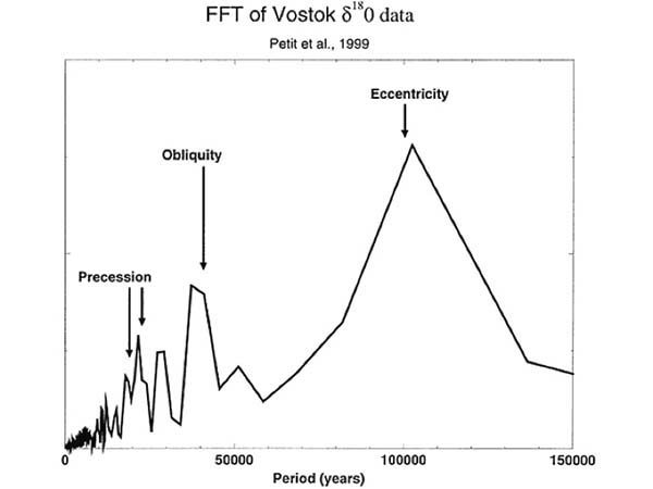
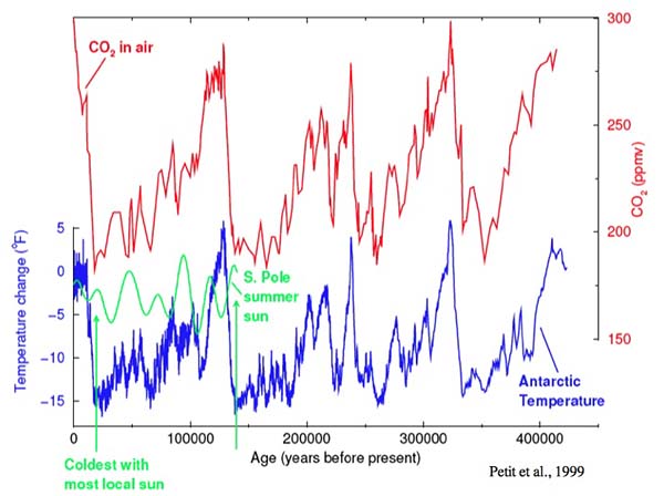
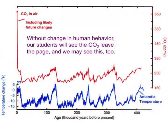
Earth: The Operators' Manual
This three-minute clip visits the US National Ice Core Lab to show a little more about the changes in the CO2and the climate that occurred with the ice ages.
Video: CO2 in the Ice Core Record (3:01)
This frozen library, the National Ice Core Lab in Denver, Colorado, has ice from all over... kept at minus 35 degrees. The oldest core here goes back some 400,000 years. Here really ancient ice from Greenland in the north, and Antarctica in the south, reveals Earth's climate history. Let's see what cores like this can tell us.
First are those layers I mentioned in the New Zealand snow. They've turned to ice, and we can count them, summer, winter, summer, winter. Like tree-rings, we can date the core. Other cores tell other stories. Look at this... it's the ash of an Icelandic volcano that blew up to Greenland 50,000 years ago. Cores hold other and even more important secrets... look at these bubbles. They formed as the snow turned to ice and trapped old air that's still in there.
Scientists now are working with cores from Antarctica that go back even further. They tell us, with a very high degree of accuracy, how much carbon dioxide was in the air that far back. Researchers break chunks of ice in vacuum chambers and carefully analyze the gases that come off. They're able to measure very precisely levels of carbon dioxide in that ancient air. Looking at the cores, we see a pattern that repeats... 280 parts per million of CO2, then 180, 280, 180, 280. By analyzing the chemistry of the oxygen atoms in the ice you can also see the pattern of rising and falling temperature over time. Colder during the ice ages, warmer during the interglacial periods. Now put the two lines together... and you can see how closely temperature and carbon dioxide track each other. They're not exactly alike. At times the orbits caused a little temperature change before the feedback effects of CO2 joined in.
But, just as we saw in New Zealand, we can't explain the large size of the changes in temperature without the effects of CO2. This is the signature of natural variation, the cycle of the ice ages driven by changes in Earth's orbit, with no human involvement. But here's where we are today. In just 250 years, since the Industrial Revolution, we've blown past 380 with no sign of slowing down. It's a level not seen in more than 400,000 years, forty times longer than the oldest human civilization.
The History of the World
This is a “minitext” that was originally written by Dr. Richard Alley for Geosciences 320, Geology of Climate Change, at Penn State. It provides a short history of the world’s climate over the last 4.6 billion years. It assumes a little more background knowledge than is expected in the rest of the class, but may be useful.
Deep Time
This is a “minitext” that was originally written by Dr. Richard Alley for Geosciences 320, Geology of Climate Change, at Penn State. It provides a short history of the world’s climate over the last 4.6 billion years. It assumes a little more background knowledge than is expected in the rest of the class but may be useful.
“Deep time” is sometimes difficult to understand. The planet is 4.6 billion years old. If you substitute distance for time, and let the 100-yard length of a US football field (just under 100 m, and roughly the length of a full-sized soccer pitch) be all of the Earth’s history, start at one goal line and drive toward the other, then:
- Trilobites and other shelly critters show up after you have gone 88 yards, just 12 yards from scoring;
- The end-Permian extinction is reached after 95 yards, just 5 yards from the goal;
- The dinosaurs died out less than 1.5 yards from the goal;
- The warming from the coldest part of the last ice age started about 0.02 inches from the goal;
- Humans have been writing down our history for something like 0.005 inches, the thickness of one or two sheets of paper;
- The average college student, approximately 20 years old, has been alive for roughly 1/300th of the thickness of a sheet of paper.
Studying Earth’s history, and the physics, chemistry, biology, geology, and other “ics” and “istries” and “ologies”, provides many insights to the planet. A few of these include:
Earth shows long-term stability. The physics of radiation provide a powerful protector for the planet. Geologists generally can tell with high confidence whether sediments were deposited in liquid water. Such water-laid sediments dominate the geologic record. Furthermore, there are indications of life through most of geologic time. Together, liquid water and life show that the climate of the planet must have one or more stabilizing feedbacks (as noted below, without such feedbacks, bad things would have happened). One of these stabilizing feedbacks is easy-simple radiative balance. Because the radiation emitted by a black body is proportional to the fourth power of the absolute temperature, a 1% rise in temperature of the planet causes a 4% rise in the energy emitted to space by the planet (or a 1% drop in temperature causes a 4% drop in emitted energy — the Earth is not really a black-body, but close enough that you can work with that for now). This means that the hotter something is, the more energy you must supply to increase its temperature another degree. That is a powerful stabilizer.
But black-body physics does not provide enough stabilization alone — the “faint young sun” paradox shows the importance of the greenhouse effect. Solar physicists are confident that the aging of the sun, as it burns hydrogen to helium, has caused the sun’s energy output to increase smoothly over time, starting from about 70% of the modern solar output at the time when the Earth formed. (Hydrogen fuses to helium, packing almost as much mass into a much smaller space in the center of the sun. This increases the sun’s gravitational pull on its outer layers, pulling the surrounding hydrogen more tightly towards the sun’s center. The fusion that powers the sun and converts hydrogen to helium requires that the hydrogen be packed tightly together, so the rising gravity makes fusion run faster, producing more energy.)
This result from solar physics yields the “faint young sun” paradox — assuming modern albedo and greenhouse effect, most of the Earth’s surface water should have been frozen for most of its history, but the available evidence shows that this did not happen. With an active hydrological cycle (as shown by the sedimentary record), hence clouds, there is no known way to lower the albedo enough to solve this problem, so the early Earth must have had a stronger greenhouse effect. (To offset solar output only 70% as large as today with the same greenhouse effect would require a perfectly black planet, not physically possible.) (The distance of the Earth from the Sun has changed a tiny bit over time, but not enough to really matter; collision with a Mars-sized body, such as the one believed to have blasted out material to form the moon, might have moved the planet a couple of percent of its distance from the sun; the meteorite that killed the dinosaurs would have moved the planet less than an inch.)
Rock-weathering stabilizes, too. Many things may have contributed to the stronger early greenhouse. A wide range of evidence indicates that the early atmosphere lacked abundant oxygen. (For example, pieces of minerals that break down rapidly in the presence of oxygen are found, not broken down, in old sedimentary deposits. The huge banded iron formations that we mine in places such as Minnesota have precipitated from ocean water long ago, but getting a whole lot of iron to the ocean in a dissolved form rather than as chunks of rust requires that the water carrying the iron lacks oxygen or rust would have formed. Also, “red beds” — rusty soils and other rusty sedimentary layers deposited above sea level — have formed commonly in “recent” geologic history but are very rare or entirely absent from the early Earth. And, there are still other indications that the early atmosphere lacked abundant free oxygen.) Carbon dioxide is a greenhouse gas, but per molecule and at concentrations vaguely similar to modern, methane is a more potent greenhouse gas than is carbon dioxide. (Raise the methane concentration a lot, and adding still more methane causes the new molecules to partly duplicate the job of existing molecules, just as for CO2 , so the importance per molecule of methane drops as the abundance rises, just as for CO2 and other greenhouse gases.) In the modern atmosphere, oxygen combines with methane over a decade or so to form carbon dioxide; for the early Earth, there may have been more methane and other reduced greenhouse gases because the oxygen wasn’t there to break them down.
The best-understood stabilizer, and the one most likely to have been important, was discovered by Penn State’s Jim Kasting and coworkers. This is the silicate weathering feedback. Volcanoes release carbon dioxide and volcanic rock, which is mostly silicate with a lot of calcium. Chemical processes (many involving biology, and generally lumped together as “rock weathering”) then recombine the carbon dioxide and rock to make dissolved materials that are washed to the ocean, turned into shell by living things (or deposited inorganically if there are no living things around to do the job, with inorganic deposition requiring somewhat higher concentrations in the water than organic deposition), deposited, then (eventually, over time scales of order 100 million years) taken down subduction zones or squeezed in obduction zones, where heating produces carbon dioxide and volcanic rock. (Metamorphic rock also may be formed, releasing carbon dioxide. For this broad-brush approach, metamorphic and volcanic rock are interchangeable.)
The formula is often oversimplified to:
CaSiO3 + CO2 → CaCO3 + SiO2
which shows the volcanic rock and carbon dioxide being changed to shells (calcium carbonate is found in coral reefs, many foraminifera, clams and snails and others; silicon dioxide or silica is found especially in diatom and radiolarian shells and sponge spicules).
The transformation of these shells back to rock and carbon dioxide (draw the arrow the other way) doesn’t much care about the temperature at the surface of the Earth, but the recombination of volcanic rock and carbon dioxide goes faster in a warmer climate (almost all chemistry goes faster when it is warmer, and in this case the chemical kinetics are accelerated further by there being more rainfall on a warmer world, because the reactions typically happen in water). Thus, if the temperature at the Earth’s surface increases, chemistry happens faster, removing carbon dioxide from the atmosphere and lowering the temperature back toward the original value. If the temperature falls, the removal of carbon dioxide from the air slows, the release of carbon dioxide from volcanoes continues unaffected, so the concentration of carbon dioxide in the air rises, increasing the greenhouse effect, and the planet warms back toward the original value. The time scale for this to work is something like 0.5 million years (more or less the residence time of carbon in the combined atmosphere-ocean system). This time scale may have changed over geologic history, but probably by no more than a factor of a few, not orders of magnitude.
Notice that the stabilizer of black-body radiation is almost instantaneous. The stabilizer of rock weathering takes hundreds of thousands of years to matter much. In between, we will see that amplifiers are more important.
Snowball Earth
Probably a few times, especially around 700 million years ago, the Earth seems to have come close to freezing over for a few million years at a time. Deposits of glaciers are found interbedded with marine sediments near the equator. (The Earth’s magnetic field is nearly horizontal near the equator and nearly vertical near the poles. When lava flows cool or sediments settle, the magnetization is aligned with the field and then “frozen in”. Because lava flows and sediment layers tend to be nearly horizontal, the angle between the layering and the magnetization tells the latitude when the rock formed. Near-equatorial sites of deposition for ice-related deposits have been found many times.)
We don’t think that the Earth rolled over on its side, so the planet must have been very cold. One intriguing hypothesis is that the snowball intervals represent rises in oxygen, which oxidized and thus removed chemically-reduced greenhouse gases, thus lowering the greenhouse effect (methane plus oxygen makes carbon dioxide plus water, the water rains out rapidly, and per molecule, the carbon dioxide is less effective as a greenhouse gas than the methane was, so rise of oxygen means fall of greenhouse effect—the greenhouse is still there, but just weaker!). A snowball could develop even with the rock-weathering feedback if the cooling was fast compared to 0.5 million years—a slow stabilizer can’t stop a fast cooling. Indeed, knowing what we do about the faint young sun and the slow rock-weathering feedback, we might even have predicted the occurrence of snowball-Earth events; if we make an analogy to sports, it is likely that the powerful but slow “defense” of the rock-weathering feedback would sometimes “lose” to a “fast-break” offense of climate change.
A snowball planet would have a very high albedo, and a few million years of volcanic carbon dioxide would be required to warm enough over a snowy surface to cause melting. The isotopic composition of carbon deposited during snowball events indicates that the biosphere was greatly reduced during the snowballs. (Today, plants use light carbon preferentially, so shells and the carbonate sedimentary rocks from shells end up with the heavy carbon that is left after the plants get what they want from the in-between carbon coming out of volcanoes. If the biosphere nearly stopped producing more plants, then essentially all of the carbon would be heading for carbonate rocks, probably the inorganic equivalents of shells, and so the rocks would have intermediate carbon isotopes, getting some of the light carbon that normally would go to plants, and this is observed with snowballs.)
Huge layers of odd carbonate deposited on top of the snowball layers seem to be formed from the immense amounts of carbon dioxide released during the snowball intervals. Once the snowball melted from millions of years of volcanic carbon dioxide, the warm temperatures and high carbon dioxide would have caused very rapid, extensive rock weathering, supplying immense quantities of materials to the ocean to make carbonate rocks. Thus, the snowballs show that the rock-weathering feedback works, but slowly. And, the rock-weathering feedback relies on the warming effect of carbon dioxide.
Note also that we don’t see any way that the modern Earth is heading soon for either a snowball or a Venusian runaway greenhouse, although if you look forward hundreds of millions to billions of years, a runaway Venusian greenhouse becomes likely as the sun continues to brighten. (Oddly enough, if you removed all the carbon dioxide from the air today, you probably would get a snowball. Removing the carbon dioxide would cause cooling, which would remove much of the water vapor, causing more cooling. If you removed all the water vapor, the oceans would put more up before the Earth could freeze over. So, while the water vapor contributes more of the greenhouse effect today than does carbon dioxide, the carbon dioxide is arguably the most important greenhouse gas because it controls a lot of the water vapor.) (Note also that the study of snowball-Earth events is very difficult, with only rare records of relatively short-lived but old events. The science is evolving rapidly, and some of what you read just above may be modified fairly quickly.)
Nature Has Changed Carbon Dioxide a Lot
Nature has changed carbon dioxide a lot, but slowly, and climate has responded rapidly. Younger than the snowballs, over the last half-billion years or so, we have had an atmosphere recognizably similar to the modern one in having oxygen. (You need a lot of oxygen to allow big critters, and there is a rich fossil record of big critters over the last 500 million years. Too much oxygen and everything burns rapidly, but there is a rich fossil record of unburned things.) The rate at which geology recycles shells to make carbon dioxide and sends that carbon dioxide out to make volcanic rocks can change — big belches of hot rock from deep in the mantle can occur, for example (there is carbon dioxide down there, and if a hot-spot plume head hits the surface to feed giant flood basalts, a lot of carbon dioxide can come out), and the collisions between continents that make a lot of metamorphic rocks happen only occasionally. (If North America and Asia continue moving towards each other as rapidly as your fingernails grow, another big collision may occur in a couple-hundred million years!) If there are no big mountains, soil builds up and the carbon dioxide in the air may have trouble getting all the way down to attack rocks and cause weathering. If the mountains are high, much of the soil can wash or slide off, exposing rocks to faster weathering. And, the mere accidents of geology might matter — shales at the surface don’t weather very rapidly, carbonates weather to produce carbonate shells in the ocean with no net change, but weathering of many volcanic rocks can be fast and remove carbon dioxide from the air, so the geologic accidents that control what rocks are at the surface may affect the setting of the rock-weathering “thermostat”.
And, evolution can affect how rapidly carbon is stored to make fossil fuels (which naturally release their carbon back to the atmosphere when erosion brings them to the surface and living things “eat” them.) There is a fascinating hypothesis that the great coal beds of Pennsylvania and many other places, which formed during the “Carboniferous” — the Mississippian and Pennsylvanian Periods — record the evolution of successful plants containing really hard-to-eat woody structures, and that coal formation was rapid but then slowed greatly tens of millions of years later as termites and fungi and other things evolved to break down those woody structures. When fossil fuels are being formed, carbon is being transferred from atmospheric carbon dioxide to oil or coal or natural gas in the ground, and when fossil fuels are being burned, the carbon dioxide is going back into the air. The time scale for lots of evolution to occur, or for lots of rearrangement of continents to occur, is sort of 100 million years, so it is not surprising that changes between high-carbon-dioxide and low-carbon-dioxide times have typically taken about 100 million years. There is no evidence for true cycles (no tick-tick-tick of a clock, such as we see with day-night or summer-winter), but lots of evidence that the changes in carbon dioxide occurred over the time scales one would expect given knowledge of the causes — the world does make sense.
Carbon dioxide has been the main driver of climate change on this hundred-million-year time scale. A statement such as this involves pretty much all of climatology and paleoclimatology. The general path is:
Reconstruct the history of past temperatures, which requires reading the temperature history in sediments, and knowing the time when the sediments were deposited. This can be done with considerable confidence; old crocodile-like critters on Ellesmere Island very close to the North Pole are a pretty good indication that it wasn’t too cold there then.
Reconstruct the history of past carbon-dioxide concentration in the atmosphere, again requiring ages as well as indicators of the atmospheric composition. Before ice cores (and the oldest ice core is less than 1 million years), the indicators of carbon dioxide in the atmosphere are not as clear as we’d like, but considerable agreement from several lines of evidence allows us to tell in general when carbon dioxide was high or low, and to make some quantitative estimates. (For example, plants “prefer” the lighter carbon-12, which diffuses and reacts more rapidly, so when carbon dioxide is common, plants are especially enriched in carbon-12; when carbon dioxide is rare, plants have to use more of the carbon-13. Special cell-wall molecules in the ocean, and soil carbonates, and remains of some water plants from lakes, are used to learn the carbon-12:carbon-13 ratio and hence the carbon dioxide level. Leaves grow fewer “breathing holes” — stomata — when there is more carbon dioxide in the environment, because stomata lose water while gaining carbon dioxide, so when carbon dioxide is high, plants can save water. Rising carbon dioxide shifts the ocean toward greater acidity, and this affects whether the little bit of boron in the ocean is as B(OH)3 or B(OH)4-1. The charged form substitutes more easily into carbonates, so the ratio of boron to calcium in a shell increases as the carbon dioxide drops. In addition, the charged ion of boron preferentially holds the light isotope boron-10 in comparison to the heavy boron-11. The residence time of boron in the ocean is many millions of years. Over shorter times, a drop in carbon dioxide will shift most of the boron in the ocean to the charged form, so its isotopic composition must become heavier as it comes to match the whole-ocean value, and the charged form is included in carbonates. There are other ways to get paleo-carbon-dioxide as well.)
Assess the correlation. The simple answer is that the correlation is not perfect, but is pretty darned good. There is a broad and shallow “skeptic” literature that plays with the estimates and dates to get fairly poor correlations, but the reputable sources (e.g., the IPCC Working Group I Fourth Assessment Report, chapter 6, at IPCC [74]) show a rather tight coupling.
Attribute the correlation. Does the correlation match expectation from physical understanding? And, is there any other plausible explanation for the correlation, such that the correlation is a fluke, or the correlation arises because something else is controlling both temperature and carbon dioxide? This is the hardest one, and is never complete, because there always might be a new explanation that we haven’t thought of. But, we have known for more than a century that more carbon dioxide should make it warmer, based on fundamental physics that just won’t go away. The reconstructed warmings of the past actually are just about the size expected from our understanding of the effects of carbon dioxide (if there is a problem, the world changed a bit more than we might have expected). And no plausible hypothesis has been proposed that explains what happened without including the carbon dioxide. Moving continents around on the planet, opening and closing “gateways” to affect oceanic circulation, changing land albedo with plants, and other possibilities appear to be “fine-tuning” knobs on the climate, all mattering, but not mattering enough to explain the history by themselves or combined but ignoring carbon dioxide. Whether calculated on the back of an envelope or in a full Earth-system model, these non-carbon-dioxide effects do not suffice to explain the changes reconstructed from the features of the rock record, nor do other possible causes correlate well in time with the changes that happened in the climate.
Changes in carbon dioxide and other things can matter a lot to life. The early geologists named time intervals in geologic history, and the rocks deposited during those time intervals. Name changes were chosen at key times. The end of the Mesozoic, for example, is now known to have been caused by a huge meteorite impact that killed the dinosaurs. The end of the Paleozoic killed even more living things, and seems to have been linked to carbon dioxide. The last Period of the Paleozoic Era is the Permian, and the end-Permian extinction was the biggest mass extinction. Some uncertainty remains, but the leading hypothesis now is that a “plume head”, the mushroom-shaped top of a new hot spot bringing heat and mass from deep in the mantle, produced the Siberian traps, a vast basaltic lava-flow province, the biggest known. Carbon dioxide released by this volcanism increased the Earth’s temperature. The new rocks were easily weathered, fertilizing the ocean. Sulfur released by this affected chemistry. The warming from the carbon dioxide reduced the oxygen content of the ocean, and the warming caused the surface waters to “float” more strongly, reducing the ocean circulation taking oxygen to the deep ocean. Large areas became anoxic and euxinic, producing hydrogen sulfide, which is poisonous to many, many things. Certain bacteria, called Chlorobiaceae, or green sulfur bacteria, use hydrogen sulfide instead of water in photosynthesis, and make distinctive organic molecules. These molecules are found in sediments from shallow oceans at the end of the Permian, indicating that poisonous hydrogen sulfide was widespread. (No serious science yet suggests that human carbon dioxide could cause such a disaster, but our actions can contribute to spread of “dead zones” in the ocean that are in some ways analogous. And, note that we are releasing carbon dioxide faster than we believe the volcanoes released it at that time.)
Perhaps without going all the way to poisonous hydrogen sulfide, other times have produced low-oxygen marine environments that allowed deposition of organic-rich material that would have been eaten and burned if oxygen had been higher. The sediments are often black shales, and the “fracking” for natural gas now going on is exploiting the carbon in these deposits. Warm temperatures favor such anoxic events, including the oceanic anoxic events (OAEs) of the saurian sauna of the Cretaceous Period. Note that such deposition tends to lower the carbon dioxide in the air, leading to subsequent cooling. Coal formation also will tend to lower carbon dioxide in the air and favor cooling.
Faster changes in carbon dioxide have occurred, again with higher carbon dioxide causing warming. The best-documented of these is the Paleocene-Eocene Thermal Maximum (PETM). Temperature indicators show warming over a few thousand years, with warmth persisting for 200,000 years or so. Carbon dioxide shows the same history. Isotopic indicators suggest that the carbon dioxide came from volcanic and biological sources. The rapid warming and carbon-dioxide increase came with an acidification of the ocean (carbon dioxide and water make a weak acid), and with a major extinction event for bottom-dwelling types; extinction appears to have been in response to the climate change, with no plausible way that the extinction could have somehow caused the climate change. The most-likely source of the carbon was a large amount of volcanic activity, linked to the “unzipping” of the North Atlantic especially between Greenland and Europe, with melted rock squirting into sediments loaded with organic material (oil, coal and gas). And, the warming then seems to have released more carbon that was stored in plants, or soils, or sea-bed methane deposits. (At present, plants hold about as much carbon as does the atmosphere, soils somewhat more, and seabed methane more. Anything that caused a notable transfer of carbon from one of those other reservoirs to the atmosphere is in principle capable of explaining the event, including permafrost in Antarctica at the time. Note that the PETM is the biggest and fastest such event over very long times, so a coincidence may have been involved — if causing the PETM was easy, more PETMs would have happened over the vast span of Earth’s history.) The PETM and other abrupt events of the past point to the importance of carbon dioxide in temperature (they were far too fast for continental drift to have mattered, for example), and provide time scales for possible feedbacks in the carbon cycle (not fast enough to control the atmosphere on the time scales of decades to centuries over which human societies operate, but fast enough to matter on those time scales).
Greenhouse to Icehouse
The planet slid from greenhouse to icehouse over the last hundred million years as carbon dioxide fell. The dinosaurs lived on a high-carbon-dioxide, hot world. We have long known that the poles were ice-free in dinosaur times. Early studies indicated that the equator then was not much hotter than today, but those early studies came with the warning that the main indicator used (isotopic composition of planktonic foraminifera) was subject to alteration after deposition that might have turned an indication of “hot” into an indication of “warm”. Recent studies, using other indicators and using very careful searches for unaltered foraminifera shells, are now indicating “hot” in the tropics during dinosaur times. The work is ongoing and a full consensus is not in, but tropical temperatures so hot that un-air-conditioned humans would have found it uncomfortable or even fatal to live on much of the planet now seem possible or even likely. Carbon dioxide remains the best explanation of the warmth, although current models, when given best-estimate carbon-dioxide loadings then, tend to simulate worlds a bit cooler than data indicate; whether this indicates shortcomings in data or models is unknown.
The planet saw widespread ice appearing at the poles about 35 million years ago, and generally carbon dioxide dropped and ice spread until recently. Details of that correlation remain unclear, with some central-estimate reconstructions indicating that some climate features are difficult to explain based on carbon-dioxide changes alone, but with the error bars including a carbon-dioxide explanation. (And the overall trend from greenhouse to icehouse is quite clearly a carbon-dioxide story. Furthermore, as more data have been collected, and better data, the mismatches between estimated carbon-dioxide level and estimated temperature have gotten smaller.)
Regionally, large and interesting changes occurred for reasons unrelated to carbon dioxide. The modern “conveyor belt” circulation in the Atlantic, for example, with surface flow directed northward from the Southern Ocean to near Norway, sinking, and return deep, does not seem to have existed more than a few million years ago when a seaway connected the Atlantic and Pacific Oceans across what is now Central America. (Now, the atmospheric transport of water vapor in the Trade Winds across Central America is not balanced by a return flow in the ocean beneath, so the Atlantic is saltier than the Pacific, and the “conveyor” circulation re-establishes the oceanic balance. With an open seaway across Panama, a much more direct route was possible. And, without the conveyor circulation, oceanic currents and coastal climates would have been quite different, although without a large globally averaged temperature change from the different currents.) In the ice-house world of the last few million years, Milankovitch cyclicity has driven ice-age cycling. The Earth’s orbit has many interesting features. These come from a few sources. First off, there are lots of planets out there, and some big ones. And all the planets run around the sun at different speeds. If you think of the solar system as a horse race, we keep passing Jupiter on the inside, and every time we pass, its gravity tugs on us a bit. The sum of all the tugs changes the Earth’s orbit a bit, giving the eccentricity changes described below. In addition, the rotation of the Earth causes the equator to bulge a bit. The planets, the sun and the moon (mostly the sun and moon) tug on this bulge, and that gives us the changes in obliquity and precession, just like a spinning top. As you might guess now, the important orbital features for this discussion are:
Obliquity
Think of an air-hockey table. Put the sun in the middle, nailed down, tie the Earth to it with a string, and hit the Earth. The Earth will zing around the sun. Put a little pin in the top of the Earth to be the North Pole. If you put the pin sticking straight up, you’re not there yet. The pin is inclined 21 degrees to 24 degrees from straight up, depending on when you look, going from 24 degrees to 21 and back over about 41,000 years. The larger the angle, the more the sun can shine on the North Pole (and on the South Pole, when the Earth is on the other side of the sun on the orbit!), and the less sun hitting the equator. This 41,000-year obliquity cycle moves some of the sun’s energy from equator to poles and back.
Eccentricity
The air-hockey orbit in the previous section isn’t right; the orbit is eccentric (non-circular elliptical; think of a NASCAR track, although with a little curve even on the “straightaways”). A non-circular ellipse has two foci; think of two towers in the infield, both halfway between the straightaways, one a bit right and one a bit left when viewed from the main grandstand. The sun will sit at one of those tower positions (and the sun does not jump back and forth between the towers; it stays put). But, this is a weird NASCAR track; come back later, and the shape is changed a bit, going from almost circular to more squashed and back to almost circular over 100,000 years. (There actually is a 400,000-year modulation, so almost circular-slightly squashed-almost circular-more squashed-almost circular really squashed-almost circular-some squashed....) This change in eccentricity changes the total amount of sun reaching the planet a tiny bit; if you were in one of the towers, and the track were really squashed, the cars would spend a lot of time at the end far away from you where you had trouble seeing them, and only a little time at the near end, and if the cars are counting on being warmed by the “sun” from you, the extra time they spend far away reduces the total sun they receive. For the tiny changes in the Earth orbit, this is only a tenth of a percent or so in total sun received.
Precession
You may remember from the description of obliquity that the North Pole is inclined a bit. In addition to this angle changing, the North Pole also wobbles. Imagine putting your feet against a metal stake in the ground, grabbing the stake with your hands, leaning out until your arms are straight, and then having a friend push you in circles around the stake. Imagine a North Pole sticking up out of your head, extending your spine. The metal stake is “straight up”. If you bend your elbow and pull yourself toward the metal stake, your North Pole will point more nearly in the same direction as the metal stake, because you have changed your obliquity. But if you hold your obliquity the same (don’t bend your arm any more), and your friend pushes you around the metal stake, you are precessing.
Now, suppose you were doing this (metal stake, friend and all) on top of a NASCAR racer, with the sun in one of the towers in the infield. Your friend would have to push you really slowly the drivers would make about 10,000 laps before you got halfway around the metal stake! But notice that you would slowly switch from being on the infield-side of the metal stake when the car was at the end of the track closest to the sun tower (summertime for your North Pole, and wintertime for your South Pole), to being on the outside of the metal stake at that closest approach and on the near side of the metal stake at the farthest distance from the sun tower. This is precession. Notice that if you are close in northern summer, you are far in northern winter, giving a big difference between seasons in the north, but that close in northern summer is close in southern winter, and far in northern winter is close in southern summer, so when the winter-summer difference is large in the north, the winter-summer difference is small in the south, and when the winter-summer difference is small in the north, it is large in the south. Also, your friend is not pushing you with perfect consistency (and, bizarrely enough, the whole track is actually turning slowly, so that the straightaways switch slowly from being mostly north- south to being mostly east-west and on around to north-south again), so that rather than making a full circle of your metal stake every 20,000 laps or so, you typically make a full circle after either 19,000 laps or 23,000 laps. Also notice that, if the orbit/NASCAR track were a perfect circle, the two towers would be exactly in the center, the distance of the car from the tower sun would never change, so that this precession would not matter at all. Thus, precession matters a lot when the orbit is very eccentric, and precession matters little when the orbit is nearly round.
As scientists came to understand the Earth’s orbit and spin, calculation of the effects of these orbital features on the distribution of sunshine on the planet became possible. The most complete pre-computer treatment came from Milutin Milankovitch, so these are usually called Milankovitch cycles. Milankovitch predicted that, when ice-age cycles were understood, it would be found that the climate had varied with periods of 19,000 years, 23,000 years, 41,000 years and 100,000 years. Several decades later, when isotopic records of oceanic foraminifera were developed, these very periodicities were discovered — Milankovitch was right! And, because the different cycles affect north and south, and poles and equator, differently, it is possible to tell where the main controls reside.
The leading interpretation now is that poles are more important than equator, and north more important than south. When Canada and Eurasia received little summer sun, ice grew and the world cooled globally; when the sun increased in the high latitudes of the north, the world warmed and the ice shrank. The changes have been large — roughly 5 C to 6 C globally averaged — and switching from the modern level of about 10% of the land under ice (Greenland and Antarctica, primarily) to about 30% of the modern land area under ice (with glaciers over Erie and the Poconos in Pennsylvania, among many other places — note that when the ice spread, sea level fell, revealing land that is now under ocean, such that the total non-ice-covered land area was about the same then as now).
Oddly enough, northern sun has been more important than southern sun, with cooling in the south during some times when sunshine was increasing there. Many people have tried to explain this odd behavior in many ways, but so far the only successful explanations involve carbon dioxide. (The high albedo of the expanded ice contributed to the cooling, as did the sun-blocking effect of extra dust, plus shifts from trees to grasslands or tundra with higher albedo, but these together don’t explain the whole signal; the carbon dioxide, and a bit of methane and nitrous oxide change, were important.) Whenever the ice sheets have grown in the north in response to reduced sunshine there, carbon dioxide has dropped, and the carbon dioxide provides a successful explanation of the changes in the south. The path is: changing sunshine to changing things in the Earth system (temperature, ice volume, sea level, dust, etc.) to changing carbon dioxide to more changes in temperature in response, so the carbon dioxide is a positive feedback, not a cause.
The processes by which changing ice volume affects carbon dioxide are rather complex, involve many different pieces of the Earth system, and are a bit beyond our course. One, for example, is that ice-sheet growth in the north increases dust supply to the ocean (the glaciers grind up rocks, change winds, etc., increasing dust delivery especially in the north where there is a lot of land to make dust), which fertilizes plankton that turn carbon dioxide into plant, the plankton are eaten, the eaters poop, the poop sinks, and so carbon dioxide is moved into the deep ocean and away from the atmosphere, lowering atmospheric carbon dioxide. There exist many other mechanisms — covering 20% of the land with two-mile-thick ice sheets, lowering the sea level by several hundred feet, changing winds and currents, spreading sea ice in the cold, and other things constitute large perturbations to the Earth system, and it responded in a way that amplified those changes. The most important changes probably relate to shifts in southern winds — now, the winds howl around Antarctica, moving water to their left, hence north because of the Coriolis effect on our eastward-rotating Earth, and driving upwelling that brings CO2 back from the deep ocean, but during ice-age times the winds shifted up on South America and so left more CO2 in the deep ocean, lowering the atmospheric level.
The “skeptics” of climate change are fond of pointing out that temperature change probably started slightly before carbon dioxide change, and then concluding that carbon dioxide cannot be responsible for any of the warming. This is faulty logic, but of the sort that seems sensible to people who know nothing about the subject. (Suppose you run up a big debt on your credit card, and then you end up paying lots of interest on the debt until you go bankrupt. By the skeptic logic, you went into debt before you started paying interest, so the interest cannot have contributed further to your debt because the interest payments lag the debt in time. Wrong.)
A lot of very interesting questions are not fully answered with regard to the ice ages. But, the big picture is clear. The ultimate cause is tied to Milankovitch orbital features, which change the total amount of sunshine reaching a place during a season by 10-20% or even more (although with tiny globally-averaged effect). Many things happen in response to this cause, and carbon-dioxide response is especially important in the global signal. (Growing ice on Canada doesn’t directly make it much colder in Antarctica, but changing carbon dioxide does.) The changes have been large but slow. The 5 C to 6 C warming (10 F warming) from the last ice age, globally averaged, took over 10,000 years, or less than 0.1 F/century; the warming of the last century, tied especially to human activities, has been ten times faster, and the warming in the next century if we don't change our energy system is expected to be faster yet. Similarly, the carbon-dioxide changes of the ice ages were much, much slower than what humans are now doing. The ice ages provide further evidence of the warming effect of carbon dioxide, they allow us to test our models (which work pretty well), but they don’t provide any alternate explanation of recent temperature changes.
Abrupt Changes Have Punctuated Climate History
Abrupt changes have punctuated climate history. An abrupt climate change is one that occurs faster than its cause, or comes so rapidly that ecosystems or economies have trouble adapting. Abrupt climate changes can involve sudden onset of droughts, collapse of ice sheets, or other features of the climate. Studies have especially focused on the north Atlantic events that punctuated the last ice-age cycle (and, probably, earlier cycles).
In the modern world, the relatively salty Atlantic waters become dense enough in the winter to sink in the far northern Atlantic, and then flow south, while warmer surface waters flow north in replacement. Because of this, the North Atlantic Ocean does not freeze in the wintertime even at high latitudes, so the surroundings remain relatively warm all winter. While the “frozen tundra” of Lambeau Field in Green Bay becomes almost too cold for even American football at 45 N latitude in a Wisconsin winter, the Manchester United football/soccer team runs around in shorts at 53 N latitude in England through the winter. The differences in climate between England and Wisconsin arise from several processes, but it is a safe bet that if the North Atlantic Ocean froze in the winter, Manchester United would not be playing a wintertime season.
There is widespread agreement across a range of climate models, from the simplest to the most complex, that a sufficiently large freshening of the north Atlantic under modern or lower carbon-dioxide concentrations would allow wintertime freezing, changing the oceanic and atmospheric circulation. Furthermore, many models find that the climate undergoes jumps — a gradual freshening can lead to a sudden onset of freezing, which will persist through many winters and then terminate suddenly (in as little as a single year, to a few decades). (In many models, the onset of wintertime freezing occurs with loss of the conveyor-belt circulation, but the continuing Trade Winds across Panama increase saltiness in the Atlantic until the conveyor-belt turns on again.)
The data agree with the models. In the past, large floods from ice-dammed lakes, or surges of the ice sheet in Canada, or slower melting of Canadian ice, have delivered extra fresh water to the north Atlantic and led to loss of the conveyor-belt circulation, allowing wintertime freezing in the north Atlantic, and bringing widespread climate changes. These include very strong cooling in wintertime around the north Atlantic, slight cooling around most of the northern hemisphere, slight warming in the southern hemisphere (the conveyor-belt takes sun-warmed water from the south Atlantic to cool in the north- Atlantic winter, so shutting down the flow gives cooling in the north but warming in the south), a southward shift of the tropical circulation pattern, hence strong drying in the places left behind by the intertropical convergence zone (the ITCZ) and strong wetting in the places to which it moves, and general loss of rain in the monsoonal regions of Africa and Asia. Small northern glacier readvance was observed in such events during the termination of the last ice age, but with no ability to return to the ice age (glaciers mostly care about summertime temperatures, but loss of the conveyor primarily cools northern wintertime). Global-average effects of a conveyor shutdown were small-a bit more cooling in north than warming in south, with ice-albedo feedbacks important.
There has been much discussion of whether such an event could occur in the future. A shutdown would affect ocean currents, fisheries, etc., no matter when it occurred. If a shutdown waited too long into the future, the carbon-dioxide warming would largely block wintertime freezing, and with it the big amplifier of climate change. Model results generally show that a shutdown is more likely in a colder climate, and is more likely when a big ice sheet sits on Canada, steering winds towards Spain rather than Norway. Most models of the future agree that melting of Greenland’s ice and other processes will weaken but not shut down the conveyor-belt circulation, and the Intergovernmental Panel on Climate Change (IPCC) in 2007 assessed a <10% chance (but not zero) of an abrupt change over the next century. The movie The Day after Tomorrow surely was not accurate. (But, if your heroes are larger than life, maybe your problems must be larger than life to make an entertaining movie.)
The Holocene shows stability when carbon dioxide was not changing. After the last ice age ended (with the warming beginning about 24,000 years ago and most of the warming completed by 11,500 years ago), we entered what is called the Holocene. Temperature- wise, fluctuations have been small, except for one brief blip about 8200 years ago corresponding to the last of the outburst floods from a lake dammed by the dying ice sheet in Canada.
Not much happened to greenhouse-gas concentrations during most of the Holocene. The Holocene temperature record is well-explained through the influence of changing orbits (more midsummer sunshine in the north a few thousand years ago than more recently), volcanic eruptions (a degree or so cooling for a couple of years from a big eruption that loads the stratosphere with sun-blocking particles; a few eruptions close together can make enough cooling to matter) and solar fluctuations (reconstructed from sunspot observations, using the recent correlation between satellite-measured solar output and sunspot numbers, or reconstructed from beryllium-10 or carbon-14 using the relation between sunspots, the solar wind, and the penetration of cosmic rays that form those isotopes). Some evidence points to a role for changes in the conveyor-belt circulation, which may act to amplify the other causes by slowing slightly in colder times. Searches for influences from changes in the Earth’s magnetic field, from cosmic dust or cosmic rays, or other causes have come up empty; the paleoclimatic record continues to point to a sensible, understandable climate system. (Farther back, about 40,000 years ago, the magnetic field dropped to near zero for a millennium or so, cosmic rays streamed in to create a large spike in beryllium-10, but the climate ignored it, which argues against any serious role for cosmic rays or the magnetic field.)
The Last Century - Humanity Takes Over
Since 2007, every report from the UN IPCC has concluded that warming of the climate system is “unequivocal”. Thermometers show warming, including thermometers far from cities (so it is not just an urban-heat-island effect), thermometers in the ground, in oceans, on balloons, and looking down from satellites. Most of the world’s ice is shrinking, including in places getting more snowfall. Most of the changes in where different things live, and when they do things during a year, are moving in the direction expected with warming. Models forced with the known natural causes match changes in the late 1800s and early 1900s, but not since. Adding human forcings gives a very good match to what happened all the way along. This match includes not merely global-mean surface temperature, but also many aspects of the “fingerprint” — regional temperature changes, vertical temperature changes, oceanic temperature changes, etc. Note that the whole forcing must be included; particles from smokestacks do the volcano job of blocking the sun, but don’t stay up very long, whereas greenhouse gases warm the climate and stay up longer. (The cooling after World War II was forced by human-produced aerosols, based on available information. And the idea that scientists were warning about global cooling in the 1970s, so beloved of the “skeptics”, is a misrepresentation. Newsweek ran an article on this, and some interesting science was being done on ice-age cycling, and on cooling by particulates, and the possibility of a “nuclear winter”, but the scientific community was already primarily focused on warming at that time, and never released any consensus documents pointing to cooling. And while Newsweek may be a respected general-information source, it is NOT a respected scientific source.)
Suppose, for a moment, that you believe the sun has caused the recent warming. There is no support for this in the data; almost 30 years worth of satellite data show no trend in solar output, or a very slight drop, while temperatures on Earth were going up. But suppose you believe that the satellite data are wrong, that the sun has been getting brighter, and that the temperature changes on the planet are solar-caused. A clear prediction of this solar model is warming in the stratosphere as well as in the troposphere, as more energy is added to both. But a greenhouse-gas hypothesis points to tropospheric warming coupled to stratospheric cooling, as the greenhouse gases hold the energy closer to the surface and radiate from high elevation. So, what do the data show? Tropospheric warming-and stratospheric cooling. The “fingerprint” is human, not solar.
The future looks warmer, unless we change our behavior. Everywhere and everywhen we look, more carbon dioxide makes it warmer. This is a fundamental result of physics — there is no serious suggestion that this could be wrong, and extraordinarily strong evidence that it is right. The data agree; warmth and high carbon dioxide have gone together, the warmth is explainable through the known effects of carbon dioxide, and the warmth is not explainable if the effects of carbon dioxide are omitted. When carbon dioxide has been fairly constant, small effects from sun, volcanoes, and perhaps other things have been evident, but these have acted more as fine-tuning knobs than as coarse adjustments.
The planet’s climate is stabilized strongly by the black-body radiative feedback over very short times, and by the feedbacks involving rock weathering and carbon dioxide over very long times. Between, the feedbacks are largely amplifying.
The biggest amplifier is linked to water vapor. At higher temperature, the saturation vapor pressure is higher, and the “kinetics” (evaporation if dry air is over water) are faster. Over the ocean (which is most of the planet), relative humidity is more-or-less constant (the wind mixes dry air down from above into the wet air below, so the air holds most but not all of the water for saturation), and warmer places thus have more water vapor. Warming is increasing water vapor. And water vapor is a powerful greenhouse gas. Humans cannot change water vapor very much directly — the residence time is barely over a week, so the water vapor we put up comes down quickly — but by changing the temperature through other greenhouse gases, we can change atmospheric water vapor because there is an immense ocean out there to respond to the warming by putting more water in the air.
The ice-albedo feedback is straightforward. With warming, snow and ice melt, and that increases absorption of sunlight in the Earth system, warming the planet. Vegetative feedbacks also can matter — we may have cooled the planet a bit by replacing dark forests by more-reflective croplands — but vegetative feedbacks can’t be really huge (they are limited to land, and that particular trees-to-crops switch is limited to croplands). Clouds bring the biggest uncertainties, but the main circulation pattern of the Earth is highly stable, hence the upward and downward motions of air fairly well fixed, hence one cannot make immense changes in cloud easily.
Comparing various models indicates that, if we start from a stable climate similar to that of the Holocene, and then double carbon dioxide with no other forcings, and let water vapor, snow, cloud, etc. respond, the planet will average about 3 C warmer. The direct effect of the carbon dioxide is just over 1 C with the rest from feedbacks. The uncertainty is usually given as 1.5 C, although increasingly it appears that the lower end of that (warming from doubled carbon dioxide being less than 2 C) is more likely to be wishful thinking than science. Efforts to match the history of the last century, of the ice-age cycling, and of longer times, generally agree with the models, strongly reject lower values, but typically include a small possibility of a larger or much larger sensitivity (so things could be a little better than the central estimate, a little worse, or much worse). With enough fossil fuels still in the ground that we could quadruple atmospheric carbon dioxide, and perhaps octuple, and with each doubling of atmospheric carbon dioxide having a roughly equivalent effect on temperature, a central estimate of warming in a burn-it-all future may approach 10 C or more than 15 F; if we burn it all, and the climate is really insensitive, we may get only half of that warming, or we may get twice that much. (And, remember that the difference between the ice-age world and the recent one was about 10 F. Note that we won’t get the full equilibrium warming, because the ocean takes a while to warm up, but carbon dioxide stays up long enough that we are likely to get most of the equilibrium warming.)
The “so what” part of this takes a lot more discussion, which won’t all fit here. In general, warmer temperatures are likely to bring less winter, more summer, sea-level rise, more droughts and more floods (fewer precipitation events with more water in them), drying in grain belts in summer, potential spread of tropical diseases, loss of ecosystems and species. Initially, there is not likely to be too much economic impact in the cold places where vigorous economies are driving the change, but negative impacts in the warm places where great numbers of people live. Eventually, harm is expected to spread to almost everyone almost everywhere.
Economic analysis of these issues is much cruder than physical-scientific analysis (in part because the uncertainties in the physical science are magnified in the economics). Typically, analyses show that an optimal response (considering only the economy, and not ethical issues) involves at least some investment to reduce greenhouse-gas emissions now. A complete fix is often priced at around 1% of the world economy, after a few decades of serious effort.
Of course, this is science, not revealed truth, and is subject to errors. The distribution of possible outcomes is “interesting” — things could be a little better than sketched here, or a little worse, or a lot worse. North Atlantic shutdowns, hundred-year droughts, ice-sheet collapses, and climate sensitivity of 4 or 5 C rather than 3 C for doubled carbon dioxide are clearly within the range of outcomes consistent with current knowledge, whereas no- change or tiny-change worlds are not.
A Parting Thought
A parting thought (remember that this History-of-the-World Enrichment is from Dr. Alley’s more-advanced class, and some of the policies and other issues are covered later in our class): Humans have almost always succeeded in solving problems by being smart. We have a problem with energy-supply and global-warming issues. Our understanding of the problem is very good — much better than the basis underlying many laws and budgets that are passed by our elected officials. Humans have occasionally failed spectacularly by not solving problems, by not being smart enough. These observations may have implications for wise paths forward.
A few sources:
Broecker, W.S. 2002. The Glacial World According to Wally, Third Revised Edition, Eldigio Press, Lamont-Doherty Earth Observatory of Columbia University, Palisades, NY.
Intergovernmental Panel on Climate Change Reports, IPCC [74].
National Research Council, US National Academy of Sciences Reports. In particular, see Abrupt Climate Change: Inevitable Surprises, 2002; and Climate Change Science: An Analysis of Some Key Questions, 2001, available online at The National Academies of Science, Engineering, Medicine [75].
Royer, D.L., R.A. Berner, I.P. Montanez, N.J. Tabor and D.J. Beerling. 2004. CO2 as a primary driver of Phanerozoic climate change. GSA Today, 14(3), 4-10.
Alley, R.B. The Two-Mile Time Machine. Princeton University Press. 2000.
Alley, R.B. The Biggest Control Knob [76]. 2009 Lecture, American Geophysical Union.
Unit 2: Comparing Energy Choices
Overview
At this point in the course, we are going to take a break from thinking about how our patterns of energy utilization are affecting the planet’s climate and think about some more cheerful news – there are plenty of technological options for meeting our planet’s energy needs without the use of fossil fuels. That may seem like a bold statement – after all, our energy systems have been dominated by fossil fuels for a long long time; are currently dominated by fossil fuels; and will likely be dominated by fossil fuels for years to come (until they simply get too expensive relative to other energy sources, perhaps helped along by public policy). Over the next couple of weeks we are going to meet a number of these technologies; learn about how they work, where they are currently being used, and where there is potential to use them even more. Our discussion is not going to focus on whether any particular technology is “good” or “bad” – what you’ll find is that these technologies may be relatively advantageous in some parts of the world and disadvantageous in other parts of the world. We are going to focus on technologies that can be used to generate electricity. Transportation and industry are also important sectors when it comes to energy utilization, but in theory transitioning the electricity sector off of fossil fuels should be a simple first step – after all, there are several thousand power plants in the United States, versus hundreds of millions of cars.
But if we have the technological means to get ourselves off of fossil fuels, then why haven’t we done so already? Is someone keeping a big secret from the rest of us?
As usual, things are not all that simple. As part of our discussions over the next couple of weeks, we’ll learn about some factors that have limited the adoption of specific low-carbon technological options. One of the things that makes comparison of technologies difficult is that there are lots and lots of dimensions to compare across. If cost were the only important factor, then there would be no problem with continuing to use fossil fuels at the rate we are currently. But it isn’t, and even “cost” is not as simple as it sounds.
This second unit covers lessons 6-9. Dr. Seth Blumsack, Associate Professor in the Department of Energy and Mineral Engineering at Penn State, shares his deep knowledge of the many energy options available for our future use. You will learn more about solar, wind, geothermal, hydroelectric and nuclear energy, and about other options including conservation, that together can provide more than enough energy to power humanity sustainably.
- Solar and Wind (Module 6)
- Geothermal, Hydroelectric & Nuclear (Module 7)
- Conservation (Module 8)
- Geoengineering (Module 9)
Unit Goals
Upon completion of Unit 2 students will be able to:
- Recognize the great diversity of energy options currently available to us
- Explain scientific concepts in language non-scientists can understand
- Find reliable sources of information on the internet
- Use numerical tools and publicly available scientific data to demonstrate important concepts about the Earth, its climate, and resources
Unit Objectives
In order to reach these goals, the instructors have established the following objectives for student learning. In working through the modules within Unit 2 students will:
- Recognize the advantages and limitations of solar, wind, geothermal, hydroelectric, and nuclear energy
- Recall the basic science behind solar, wind, geothermal, hydroelectric, and nuclear power generation
- Evaluate who is responsible for maintaining "the grid" as home generation grows in popularity
- Analyze why even people who rely heavily on energy resources tend to want those resources to be exploited far from their own homes
- Recognize that all energy technologies are inefficient
- Compare wealth and energy intensity in developed countries
- Identify options for improving energy efficiency in developed countries
- Analyze why we don't always conserve as much as we should, despite the double benefits for the climate and our wallets
- Use a model to calculate the effects of various strategies such as use of renewable energy sources, conservation, and population control on reducing emissions
- Recall the various geoengineering strategies that have been suggested to mitigate climate change
- Recognize that geoengineering alone is unlikely to be sufficient to mitigate climate change
- Assess what you have learned in Unit 2
Assessments
| Module | Assessment | Type |
|---|---|---|
| 6. Solar and Wind Power | Who Pays for Home Generation? | Discussion - Express Your Opinion |
| 7. Geothermal, Hydroelectric, & Nuclear | The NIMBY Syndrome | Discussion- Find an Article |
| 8. Conservation | Emissions Scenarios | Summative - Stella Model |
| 9. Geoengineering | Learning Outcomes Survey | Self-Assessment |
Module 6: Solar and Wind Power
Overview
We are burning fossil fuels about a million times faster than nature saved them for us. We might continue on this path for another century or more, or we might face an “energy crisis” within a few decades as we begin to run out of fossil fuels. But, we cannot choose to rely on fossil fuels for the long-term, because they simply will not be there.
Fortunately, there are vast resources of renewable energy available. If we could collect just 0.01% of the sun’s energy reaching the top of our atmosphere, we would have more energy than is now used by all humans together. With modern technologies, a solar farm in a sunny region near the equator only a few hundred kilometers (or miles) on a side would supply more energy than we are now using. Building such a solar farm would be a huge task, but we have completed huge tasks before.
Roughly 1% of the sun’s energy goes to power the wind, so we could energize all of humanity using the wind, too. Building a wind farm on just the windy parts of the plains and deserts of the world would provide much more energy than we now use. Again, there are huge challenges in actually building that many wind turbines, getting the energy where we want it, and smoothing out the effects of night and day, storm and still weather. But, no “breakthroughs” are needed, just building and improving what we already know how to do.
Using renewable energy is not a new idea. Abraham Lincoln advocated wind power, for example, and Thomas Alva Edison promoted the use of solar energy. So, let’s go see what they were thinking of, and how modern scientists and engineers have risen to their challenge.
Goals and Objectives
Goals
- Recognize the great diversity of energy options currently available to us
- Explain scientific concepts in language non-scientists can understand
Objectives
By the end of this module, you should be able to:
- Recognize the advantages and limitations of solar and wind energy
- Recall the basic science behind solar and wind power generation
- Evaluate who is responsible for maintaining "the grid" as home generation grows in popularity
Roadmap
| To Read | Materials on the course website (Module 6) | |
|---|---|---|
| To Do | Discussion Post [77] Discussion Comments [77] Quiz 6 |
Due Wednesday Due Sunday Due Sunday |
Questions?
If you prefer to use email:
If you have any questions, please email your faculty member through your campus CMS (Canvas/Moodle/myShip). We will check daily to respond. If your question is one that is relevant to the entire class, we may respond to the entire class rather than individually.
If you prefer to use the discussion forums:
If you have any questions, please post them to Help Discussion. We will check that discussion forum daily to respond. While you are there, feel free to post your own responses if you, too, are able to help out a classmate.
Solar Energy
Solar Energy
The sun is far and away the largest potential source of energy to power things on our planet. Humans have been using the sun as an energy source for thousands of years – just think about agriculture and how that would work without sunlight – but the industry of using solar energy to create electricity is in its relative infancy. Growth is fast – in percentage terms, solar is the fastest-growing energy source on the planet. And the cost of solar power, one of its most formidable barriers, is coming down quickly as well. In this module, we’ll take a look at some of the most common technologies used to convert solar energy to electricity.

Solar Photovoltaics
Solar Photovoltaics
When most people think of “solar power,” they think about one of two things – vast arrays of solar collectors laid out in hot deserts (the left-hand panel below) or smaller arrays on rooftops or highways (the right-hand panel below). This is perhaps the most ubiquitous method of converting solar energy into electricity, but it is not the only method. These arrays of solar collectors are known as “solar photovoltaic” installations or Solar PV for short.
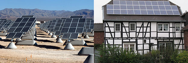
Solar PV installations consist of individual collectors called cells, which are packaged together in bundled modules. An individual cell does not generate enough electricity to power much of anything, which is why they must be bundled together. A single module might be enough to provide electricity for a single parking meter or roadside telephone. A number of modules can be further bundled together to form an array (see below). Multiple arrays might be needed to provide electricity for a building or a house.
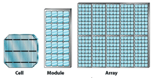
There are many different kinds of solar PV cells in existence (and even more being developed in research laboratories), but they all work in more or less the same way. Unlike virtually any other type of power plant (be it coal, natural gas or wind), there is no turbine in a Solar PV cell. In fact, there are basically no moving parts at all. .
Solar PV cells harvest solar energy through a phenomenon called the photovoltaic effect, discovered in 1839 by the French physicist Bequerel. Photons of solar energy interact with electrons to “excite” them, causing them to move through conductors, thus producing an electric current. The first solar PV module was made at Bell Labs in the 1950s, but was too expensive to be more than a curiosity; in the 1960’s NASA started to use PV modules in spacecraft and by the 1970s, people started to explore their use in a wider range of terrestrial applications.
This following video explains a bit more about how Solar PV cells work and describes the different Solar PV technologies in use today. One of the potentially most important evolutions in Solar PV technology is the use of semiconducting materials other than silicon in Solar PV cells. These materials are of interest because they could, in concept, allow more of the sun’s energy to be captured on a single array. But they face barriers in the form of high costs and, in some cases, questions about the availability of raw materials.
Video: Photovoltics, a Diverse Technology (4:26)
PRESENTER: 30 years ago, the first solar cells were made of silicon. And today, silicon makes up more than 3/4 of the rapidly growing worldwide photovoltaic market. But photovoltaic, or PV cells, are also made with other semiconductor materials. Why so many types of solar cells? This diversity is due to innovation. PV materials are improving. Manufacturing costs are dropping. And PV applications are expanding. Balancing these three factors can meet demands for clean, green power, while creating more American jobs.
Innovation means improving photovoltaic materials. Every PV material absorbs sunlight differently, depending on bandgap, which is a unique electronic property of the material. Some cells absorb sunlight within the first micron of material. Others need 100 times more material to absorb the same amount of energy from the sun.
The sun's energy arrives as a combined spectrum of different wavelengths. Each color carries a different amount of energy. This make solar cell design more complex.
If the energy of the absorbed photon matches the PV materials bandgap, then an electron-hole pair is created. If the photon has more energy, it still creates only one electron-hole pair, but the additional energy is lost as heat. If the photon has less energy than the bandgap, it is not absorbed.
Low bandgap materials absorb most of the solar spectrum, creating many electron-hole pairs, producing a high current. However, PV cells with low bandgap materials have a low voltage. High bandgap materials absorb only higher energy photons, creating fewer electron-hole pairs, producing a lower current with a higher voltage.
A solar cell's efficiency is the percentage of the solar energy shining on the cell, that is converted into electrical energy. One way to increase efficiency is to use multiple layers, to capture power from multiple wavelengths of light. Understanding the properties of each PV material, allows scientists to improve designs that maximize the power of the cell.
Innovation in PV also means lowering the cost of manufacturing. Crystalline silicon cells have high efficiency, because they used very pure single-crystalline silicon, which is expensive to manufacture. Multi-crystalline silicon cells have lower efficiency, but they can be cheaper to manufacture, because they use lower quality silicon, less energy, and simpler manufacturing equipment.
Thin-film solar cells can be made for material such as-- cadmium telluride, copper indium diselenide, or amorphous silicon. These materials absorb light more readily than crystalline silicon, so they can be used in very thin layers that are less expensive to produce. Thin-film solar cells are generally less efficient than crystalline silicon cells, but they can be cheaper to manufacture because they use less semiconductor materials, which are grown on glass or flexible foil.
Finally, innovation means meeting different applications best suited by different types of solar cells. Today, PV devices produce power to meet the needs of utilities, businesses, homes, and consumer products.
Large-scale installations can use a range of highly reliable PV technologies. Solar powered satellites are more sensitive to power per pound. These high-efficiency solar devices can accept higher material and manufacturing costs to get more electricity from less material. Flexible thin-film devices are being installed in innovative ways, including incorporation into structures with complex shapes.
Photovoltaics are here now. And the diversity of PV devices is advancing as scientists improve PV materials and develop new manufacturing methods. More solar applications are emerging, as these innovations make PV more affordable.
Most modern Solar PV technologies are relatively inefficient compared to other forms of electricity generation. Remember here that “efficiency” refers to how much of the fuel that is injected into an electricity generation system is actually converted into useful electricity, versus being rejected as waste heat or otherwise escaping from the generation system. While modern coal-fired and gas-fired power plants can have efficiencies as high as 60% (or sometimes even higher), most Solar PV cells convert sunlight to electricity with an efficiency of 20% or less (see below), though this number has been rising over time.
Whether the efficiency of Solar PV cells is all that important is a matter of some debate. On the one hand, higher-efficiency cells would require less land or space to produce a given amount of electricity. Land use (or the number of rooftops) can be a significant limiting factor in the deployment of Solar PV. On the other hand, fuel from the sun is free and there is no scarcity of sunlight, so whether Solar PV cells can achieve 30% efficiency versus 20% efficiency may not be such a big deal, and may not be worth the extra economic cost to produce such high-efficiency cells.
Concentrating Solar Power
Concentrated Solar Power
If you have ever left a cold drink out in the sun during the summertime (or if you have children, if you have ever left water in the kiddie pool out in the sun for a long time), you would notice that the formerly cold water gets warm – maybe even hot. If it happens to be summertime where you are living right now, try it! Whether you realize it or not, this little science experiment is the basis for a second way of harnessing the sun’s energy to produce electricity, called “concentrated solar power” or CSP. (This technology is also sometimes called “solar thermal.”)
The following video explains how CSP works. The basic idea is that a collection of mirrors reflects the sun’s light (and heat) onto a large vessel of water or some other fluid in a metal container. With enough mirrors reflecting all of that sunlight, the fluid in the metal container will get hot enough to turn water into steam. The steam is then used to power a turbine just like in almost any other power plant technology
Earth: The Operators' Manual
To get started, please watch the video below. This particular video will discuss the history of the idea of concentrated solar power.
Video: Lightbulbs in the Desert (Powering the Planet) (5:55)
Narrator: Planet Earth is awash in renewable energy. The oceans store heat and offer wave and tidal power. Plants harvest sunlight and store its energy. The Sun warms the atmosphere and sets air in motion, and we're getting better at tapping wind power. But the biggest and most promising energy source is the nearby star that lights our days and warms our world. Sunlight reaching the Earth's surface offers about 120,000 terawatts. If the Sun's energy were spread around the world, it would average around 240 watts per square meter. Richard Alley brings that huge number down to earth.
Alley: If I walk out into this little patch of this great desert, and I hold out my arms about like this-- And then another of me does the same thing-- And each of me is holding two 60 watt incandescent light bulbs, or 10 compact fluorescents, that's 240 watts per square meter that I'm marking out here. That's a lot of energy. And averaged across the globe, day and night, summer and winter, that's how much sunlight is available to power the planet. Let's see what it takes to turn that vast potential into energy we can use. It doesn't take a genius to know that a mirror reflects the Sun, but it does take an inventor and engineer to make the next step. Use the mirror to focus the Sun's rays on a tank filled with liquid to make steam, to drive a turbine, to make electricity, and you have concentrated solar power. That's not a new idea, but one that a little-known American inventor, Frank Shuman, pursued around 1910.
Narrator: In his Philadelphia workshop, Shuman invented safety glass for skylights and automobiles. He also came up with designs that could concentrate sunlight on metal tubes, heat liquid, and drive a steam turbine. But in Pennsylvania, back then, it was all about coal. Shuman had difficulty finding local backers. So in 1912, he set off for Egypt. His prototype solar farm used parabolic troughs to concentrate sunlight and boil water. The steam ran a 75 horsepower engine that pumped water from the Nile to irrigate cotton fields. The idea was right, but ahead of its time. Hobbled by both a lack of government support and adequate private capital, the experiment ended with the outbreak of World War One. These parabolic troughs look very similar to Shumans' designs, though they didn't come online until a century later.
This is Solnova 3, at one of the world's first commercial solar power plants. Just as in Shuman's experimental station, the troughs concentrate solar radiation on a pipe that contains a heat-bearing fluid. When completed there'll be three almost identical plants, each with an output of 50 megawatts, large enough to support about 26,000 households. While the Sun powers the Solucar platform, it was the Spanish government that helped develop solar power. The central government set a specific target of 500 megawatts of concentrated solar power and committed to price supports for 25 years. That, in turn, unleashed inventors and industry to prototype plants like this one. The technology works, though changing government policies and the budget crisis have impacted the industry. But, Abengoa, the company building Solucar, is a part of a consortium planning the world's largest solar power project. Formed by a group of European and North African companies and the DESERTEC Foundation, this consortium has energy ambitions that are revolutionary for both Europe and the Middle East.
Unlike some of its neighbors, Morocco has little oil or other fossil fuels. But it does have sun, sand, and empty spaces. The Moroccan government has encouraged the use of distributed solar power by small businesses and individuals. Already, out on the edge of the Sahara, you can see photovoltaic panels on top of tents. But the Desertec vision goes beyond this by including concentrated solar power plants, photovoltaic installations, and wind turbines, linked with low-loss, high-efficiency transmission cables back to Europe. The Desertec project estimates that solar power from the Sahara could provide more than 80% of North Africa's needs, and 15% of Europe's electricity, by 2050. In a single generation, Morocco's young and growing population could go from energy poverty to energy independence. The energy created by this proven technology could generate both electricity and income for some of the world's poorest nations. And updated versions of Shuman's century-old designs and a smart grid could go a very long way toward meeting our species' need for energy. Collecting just 10% of the Sun's energy from a 600-mile-square of low-latitude desert would supply roughly twice today's human consumption of energy.
Recently, more advanced CSP systems have begun to replace the water or synthetic oil with molten salt as the fluid that is heated molten salt can remain as a liquid from 290 to 550°C. Once it is heated in the tower at the center of the array of mirrors, the hot liquid salt is stored in a highly insulated tank and when there is a demand for electricity, it is sent to a heat exchanger where it turns water into steam, driving the turbine to generate electricity. When the molten salt passes through the heat exchanger, it gives up heat, so it cools off. It is then recirculated to the tower at the center of the mirrors, where the concentrated sunlight heats it back up. These systems have enough liquid salt so that it can act as a thermal battery, storing the solar energy for more than a week before it cools off to the point where it cannot make steam. These kinds of power plants are expensive at the moment, but the technology is still quite new and so we expect prices to drop quickly, as they have for other renewable energy technologies. In fact, a CSP system in Spain using molten salt is now capable of producing energy on demand, 24 hrs a day rather than being limited to times of peak sunlight. The ability to schedule power production versus having to take the electricity when it comes is of great value to the folks that operate electricity systems. Nevertheless, there are still a few obstacles for CSP:
- CSP is difficult to make work on a small scale. A lot of land, usually in sunny deserts, is typically needed. So CSP does not scale up and down to large and small installations like Solar PV can.
- CSP is currently quite expensive — roughly twice as much per unit of energy as Solar PV. However, this is a very new technology and prices are expected to go down in the future.
Solar Energy Potential and Utilization
Solar Energy Potential and Utilization
In addition to being free as a source of energy (it does cost money to harness it and turn it into electricity), energy from the sun is practically limitless. The surface of the Earth receives solar energy at an average of 343 W/m2. If we multiply this times the surface area of the Earth, about 5x10¹⁴ m2, we get 1715x1014 W. But, 30% of this is reflected, and only 30% of the Earth is above sea level, so the usable solar energy we receive on the land surface is about 360x1014 W. We need to reduce this further because not all of the land surface is suited to installation of solar PV panels — we don't want to cut down forests, and ice-covered areas are not suitable, so we reduce the area by about one half. Over the course of a year, this amount of solar energy adds up to 66x1022 Joules. In 2018, we used about 600x1018 Joules of energy, which is just a shade less than 0.1% of the harvestable solar energy we receive on the land. This means that even if we got all of our energy from the Sun, we would not make a dent in the total! The potential is vast — 10,000 times what we need!
Let’s consider what it would mean for us to get all of our energy from Solar PV — how much of the Earth’s surface would we need to cover with panels? The black dots (radii of 100 km) in the figure below represent areas that could generate enough energy from sunlight to completely power the planet for an entire year. Practically, there are barriers to running the planet entirely on sunlight (everything would need to be electrified, we would need very large quantities of battery energy storage, and so forth), but the dots are useful as a demonstration of just how vast the energy production potential from solar is.
Optional: If you are interested in a more detailed view of solar energy resources in your area, a company called Vaisala 3Tier [86] produces maps that you can download for your own personal (non-commercial) use.
ADD TRANSCRIPT
One of the important differences between Solar PV and CSP is that CSP requires more intense sunlight, and as such, it is not a viable option in many places. In contrast, Solar PV works just about everywhere — it is more versatile. Another important difference is in scale — CSP is really suited to utility-scale power plants, whereas Solar PV works at both the utility-scale and the very small scale.
The map below shows the PV potential for the world. The variability in the map is mainly a function of cloudiness and latitude. Many of the big, utility-scale solar PV plants are located in the red areas, but there is a surprising amount of Solar PV energy being harvested in places like Germany and Japan, both of which are fairly cloudy. But, even in a fairly cloudy place like Pennsylvania, you can see from the map that we could expect about 1460 kWh per year from a 1 kW PV array. From this, you can calculate how many square meters of PV panels you’d need to provide the electricity for a house that uses the typical 10,800 kWh per year. If you divide 10,800 kWh by 1460, you see that you’d need about 7kW of solar panels, which would fit on a typical house roof. The main point here is that Solar PV is a viable energy source in most parts of the world where people are living. In contrast to Solar PV, energy from CSP is only viable in places where the daily totals in the map above are higher than 6 kWh/day. Nevertheless, there are many regions where CSP viability and human population coincide, so it too can be an important energy resource in the future.
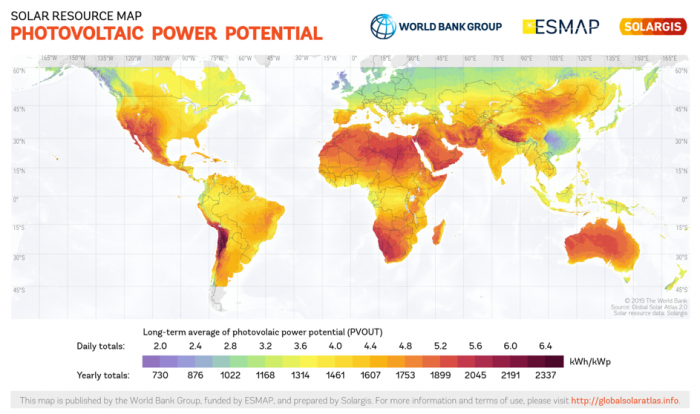
Activate Your Learning
For students living in the United States: According to the map above, do you live in an area that can support PV generation? What about CSP? Do you know anyone who generates solar power at home?
Click for the answer.
The Changing Economics of Solar Energy
The Changing Economics of Solar Energy
The generation of solar energy – primarily through Solar PV – is a story of exponential growth. Since 2000, the global Solar PV industry has grown by around 25% per year on average, so installed capacity has been doubling every 2.7 years (see below). Even so, solar represents a very small sliver of total global power generation — for now.
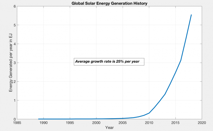
The nice thing about exponential growth is that it is easy to project it into the future. Over the time period shown in the graph above, solar energy generation has grown by 25% per year; if we continue that into the future, we find that before long, we would have enough solar energy to make up a substantial portion of the global energy needs by 2030 (see figure below). By the year 2040, this growth would rise to 1360 EJ, more than twice the global energy consumption of the present. Of course, that makes no sense — we would not produce more energy than we need, and this reminds us of an important fact, which is that exponential growth cannot continue forever.
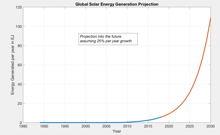
One reason to trust this projected future growth is that the price of solar energy has fallen dramatically over time as can be seen in the graph below. In fact, if the generation of solar PV energy has been growing exponentially, the price has been dropping exponentially.
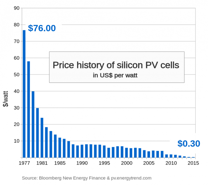
The price decrease is following a pattern that has been given a name: Swanson’s Law, which states that the price drops by about 20% for each doubling in the number of PV cells produced. This law suggests that the prices of solar PV energy will continue to decline in the future.
This brings us to an important question — how does the cost of solar energy compare to other sources of energy? Energy economists have come up with a good way of comparing these costs by adding up all of the costs related to producing energy at some utility-scale power plant (a big wind farm, a big solar PV array, a CSP plant, a nuclear plant, a gas or coal-burning power plant). This is called the levelized cost of energy and you get it by taking the sum of construction costs, operation and maintenance costs, and fuel costs over the lifetime of a plant and then dividing that by the sum of all the energy produced by the plant over its lifetime. This cost provides us with a way of comparing the energy from different sources. Since the boom in natural gas production due to fracking, natural gas has been the lowest cost form of energy (which is why coal is being used less and less), but energy from solar and wind have been decreasing rapidly, as can be seen in the following graph. When a renewable electrical energy resource such as solar or wind becomes equal in cost to the cheapest fossil fuel source of electricity, we say that the renewable resource has reached "grid parity". Once grid parity is achieved, the renewable resource makes sense from a purely economic standpoint, and as it drops below the grid parity point, it is the smartest electrical energy resource.
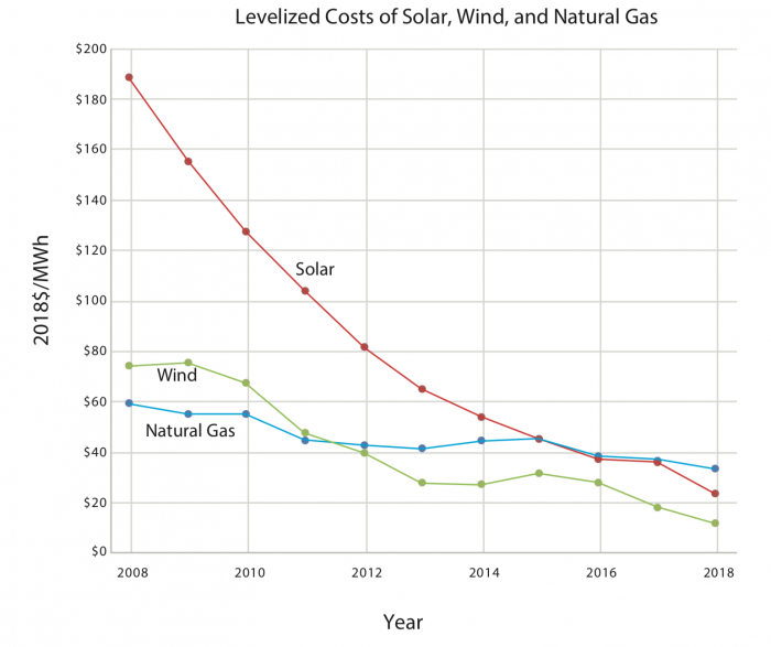
Part of the reason that solar and wind have expanded in recent years has to do with government policies — a number of countries have instituted subsidy and incentive programs that offset a large portion of the construction/installation costs of solar and wind technologies or devise rules that otherwise give advantages to electricity generation from renewables. Subsidies enacted in various countries have included feed-in tariffs (which guarantee an above-market sales price for solar power); rebates (which directly offset capital and installation costs); and favorable tax treatment (which is like an indirect feed-in tariff). Germany has one of the world’s largest Solar PV markets not because it has the best solar resource on earth but because it has been willing to support a generous feed-in tariff on solar power. (For many years the tariff was over 30 cents per kilowatt-hour, or more than five times the average power price in the United States; in recent years the tariff has been reduced.) These government policies have effectively stimulated the growth of these renewable energy resources, which has, in turn, resulted in lower prices.
Wind Energy
Wind Energy
By this point in the course, you have been told repeatedly that our energy and electric power systems are dominated by fossil fuels. And this is true. But you may be surprised to know that in the United States and many other countries, wind is among the fastest-growing sources of new power plant investment, as measured by megawatts of new capacity. In several areas, including Texas and the Mid-Atlantic (where a boom in fossil fuel production is currently underway), wind power is the largest source of new electrical generation capacity, making up a majority of new plants. That’s right – in oily Texas, more than 50% of new electrical generation in recent years has been from wind. In fact, Texas is the US leader in wind energy generation – much more than even California, which has somewhat greener political leanings.
In this section of the course we’ll take a look at what’s going on in all those tall towers sprouting up along ridgetops and plains – and out in the middle of the ocean, in some places. Humans have been harnessing the wind to do useful work in one fashion or another for many thousands of years – the first “wind energy” systems were actually sailboats. Humans have also been smart enough to realize that wind is a very useful cooling mechanism on hot days. So in some sense, the windows in our houses are a form of wind energy. Windmills (the precursor to today’s wind turbines) appear to have first been used in Greece around two thousand years ago.
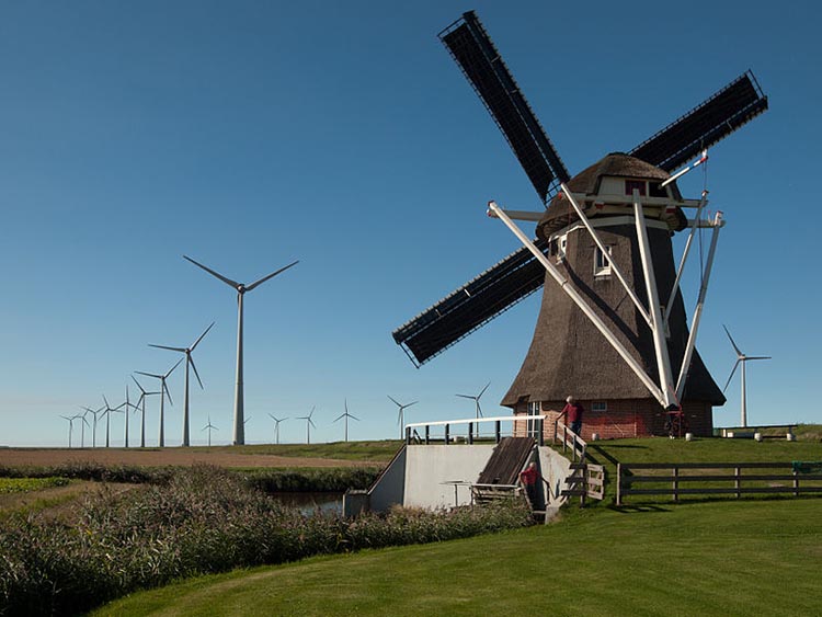
How Wind Turbines Work
 How Wind Turbines Work
In a conventional power plant (fueled by coal or natural gas), combustion heats water to steam and the steam pressure is used to spin the blades of a turbine. The turbine is then connected to a generator, which is a giant coil of wire turning in a magnetic field. This action induces electric current to flow in the wire. The workings of a wind turbine are much different, except that instead of using a fossil fuel heat to boil water and generate steam, the wind is used to directly spin the turbine blades to get the generator turning and to get electricity produced.
The inner workings of a wind turbine consist of three basic parts, seen in the figure below. The tower is the tall pole on which the wind turbine sits. The nacelle is the box at the top of the tower that contains the important mechanical pieces – the gearbox and generator. The blades are what actually capture the power of the wind and get the gears turning, delivering power to the generator. The direction that the blades are facing can be rotated so that the turbine always faces into the wind, and the pitch of the blades (the angle at which the blades face into the wind) can also be adjusted. Pitch control is important especially in very windy conditions, to keep the gearbox from getting overloaded.
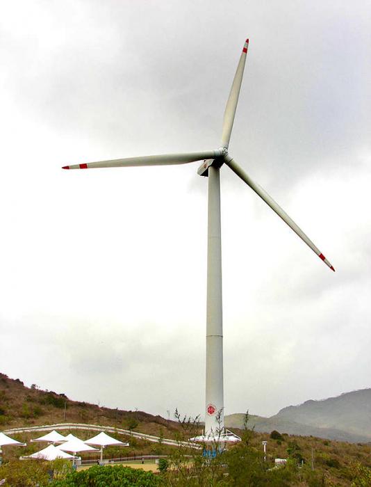
The amount of power (in Watts) collected by a wind turbine is explained in the following equations:
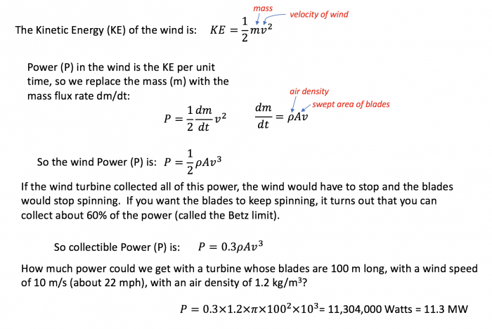
This figure explains the physics of wind power. So we begin with this notion of the moving wind having some kinetic energy which is 1/2 m v2 . So that is kinetic energy. Power is related to energy in the following way: It is energy per unit of time. So if we want the power that we can get from that moving wind, we have to take the kinetic energy, and then the mass flux rate instead of just the mass. Mass flux rate is how much mass is moving per unit of time. That is dm over dt, change in mass over change in time. And that is equal to the air density times the area swept out by the windmill blades times the velocity, so that velocity and area multiplied together gives you something with the units of measure are cubic meters per second, and then you multiply that by the density and that gives you kilograms per second and that’s the mass flux rate. If you put all that together you see the wind power is equal to one half times the air density times the area swept by the blade times the velocity cubed. So you see the velocity is super important in this. Now then it turns out that there is an efficiency limit, something called the “ Betts Limit” that means that the power you can actually collect is 0.3 times the air density times the velocity cubed.
This is clearly a lot of power! But, mechanical inefficiencies related to the gears and the generator mean that we might only get 30% of this figure, but that is still a lot of power from one turbine.
All wind turbines have a minimum wind speed that differs depending on the size but is typically about 4-5 m/s (10 mph) and maximum wind speed above which they shut down to avoid damage, usually around 20-25 m/s (about 50 mph). Most wind turbines have a maximum spinning rate, reached a bit above the minimum velocity, and when the wind speeds up, the pitch of the blades is adjusted so that the rate of spinning remains more or less constant. The figure below shows a typical "power curve" for a small wind turbine.
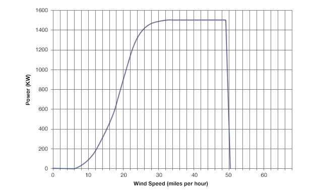
This figure shows the power curve for a 1.5 megawatt wind turbine. So on the Y-axis is the power and the X-axis is the wind speed in miles per hour. And what you can see is that there is sort of a threshold speed that is something like 6 miles per hour wind speed you start to get some power. And as the wind speed increases, the power output rises rapidly until you get to about 30 miles per hour. At that point the power sort of saturates and flattens out and with more wind you don’t get any more power. So it reaches its capacity at 1.5 megawatts and it generates that up until 50 miles per hour and above that the power drops off rapidly because the wind turbine has a shut off mechanism will turn off if the wind gets going to fast because of the turbulence that can cause damage to the wind turbine. So they just shut down if the winds get to great.
The wind, as you may have noticed, is highly variable in any given place, but as a general rule, it is stronger and steadier as you rise up above the ground. This is because friction between the wind and the land surface slows the wind. But there is also a lot of regional variation in the wind velocity. Both of these factors (elevation above the ground and location) can be seen in the maps below, showing the average wind speed in the US at two different heights.
The graphs above show annual average wind speeds in the US at 2 different heights above the ground surface. For reference, 10 m/s is 22.3 mph. You can see that the wind speeds at 100 m are far greater than at 30 m — this is the friction effect of the land surface (which is minimal above large water bodies). As you can see, the Great Plains have great wind potential, as do the Great Lakes and offshore areas on both coasts.
The area covered by the turbine’s blades is another important factor in determining power output. While wind turbines are available in a wide variety of capacities, from a few kilowatts to many thousands of kilowatts, it’s the larger turbine sizes that are being deployed most rapidly in wind farms. Several years ago the image on the right side of the figure below of a Boeing 747 superimposed on a wind turbine gave an astonishing representation for the scale of the state of the art wind technology. Now turbine rotor diameters are approaching the size of the Washington Monument!
Activate Your Learning
Given that the area of wind captured by the turbine is proportional to the square of the radius (essentially the length of the blade), if you were to double the length of a wind turbine's blade, how much more power would that turbine generate? Assume that wind speed and all other variables remain the same.
Click for the answer.
Market Deployment of Wind Energy
 Market Deployment of Wind Energy
Over the last 20 years, growth in the total installed capacity of wind energy generation across the globe has been growing rapidly. Germany was the first country to lead the development of wind power, but the US and China have dominated the growth since 2010. China is especially impressive in terms of its recent growth.
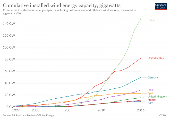
Part of the reason for this growth is the steady decline in the cost of wind energy, as discussed in the previous section on solar energy. But government policies are another important factor. The United States has one of the most volatile markets for wind energy in the world, while those in Europe and China have been among the most stable. This is due in part to differences in how governments in these countries treat wind energy. In many parts of Europe, wind energy (and other renewable generation technologies) enjoy subsidies and incentives known as feed-in tariffs. The feed-in tariff is essentially a long-term guarantee of the ability to sell output from a specific power generation resource to the grid at a specified price (typically higher than the prices received in the market by other generation resources). The United States, on the other hand, has favored a system of tax incentives called the “Production Tax Credit” (PTC) to encourage renewable energy deployment. In theory, a tax incentive should not work much differently than a feed-in tariff (both are just payments based on how many kilowatt-hours are generated). But the PTC has historically needed to be re-authorized frequently by the US Congress – this “on-off” policy strategy has been a major factor in the volatility of wind energy investment in the US as shown in the figure below. It is worth noting that the PTC was recently renewed for 2013, but will lapse again at the end of 2019, so it is difficult to say what impact it will have on wind investment going forward.
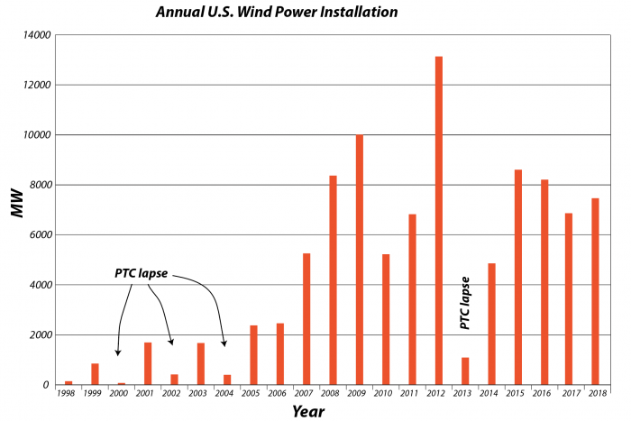
This bar graph shows the history of the annual US wind power installation. The heights of the bars represent the amount of new wind energy installed each year. So this goes from 1998 until 2019. And there are a couple of interesting things: One is there is very unsteady growth pattern over time, and the second is that there are four periods here, four years where there are very little in the way of new wind energy installation. And that’s because there was a lapse in this policy device we us in the US that encourages using wind energy called the Production Tax Credit ( PPC). This has to be renewed by Congress on a regular basis and they can’t get their act together all the time to renew this. So if that lapses then there are no incentives for wind power companies to install new turbines to generate more electricity. So what we see here is this kind of erratic history of production because the incentives are not reliable.
The above makes it clear that government policies are important to the growth of renewable energy production (both wind and solar). In a very real way, you can think about these policies (feed-in tariffs or tax credits) as a form of investment. Governments can also provide investments in the form of funding for basic research related to these technologies. In general, these investments do not add up to a huge amount when seen in the context of a country's gross domestic product (GDP), which is a measure of the size of the economy, as seen in the figure below.
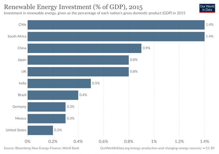
The Potential Wind Energy Resource
The Potential Wind Energy Resource
A quick look at an annually-averaged wind map of the world (below) shows the regions of the world that are best suited for the production of wind energy in colors ranging from yellows to red (where the average winds are at least 9.75 m/s or 20 mph). The offshore regions are clearly the best in terms of the energy potential, but not all of these offshore regions are close to where people live. Even for onshore portions of the world, the wind energy potential does not always coincide with where the people are concentrated. This points to the necessity of new transmission lines to deliver this wind energy to major population centers.
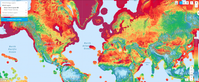
So, just how much energy could be produced by the wind? In 2009, a group of scientists makes some calculations to estimate the potential for the world and the US, using wind data and some assumptions about the size and spacing of the turbines. They assumed 2.5 MW turbines on land, and 3.5 MW turbines offshore, which were big for that time. They assumed that you could only place the turbines in unforested, ice-free, nonmountainous areas away from any towns and that the turbines had to be spaced by several hundred meters so they do not interfere with their neighbors. They further assumed that each turbine generated just 20% of its rated capacity to account for mechanical problems and intermittent winds. What they came up with is summarized in the table below, and it is pretty remarkable. The units here are exajoules (EJ = 1 x 10¹⁸ Joules) of energy over the course of a year. For reference, in 2018, the US total energy consumption (not just electrical energy) was 106 EJ and the global consumption was about 600 EJ. So, with just onshore wind energy, the potential is more than twice what we consume in the US, and more than 4 times the global consumption. But getting there is a matter of installing a lot of wind turbines!
| Region |
World |
Contiguous US |
|---|---|---|
| Onshore | 2484 | 223.2 |
| Offshore 0-20m | 151 | 4.32 |
| Offshore 20-50m | 144 | 7.56 |
| Offshore 50-100m | 270 | 7.92 |
| Total | 3024 | 244.8 |
Now let's consider a more practical question — how much wind energy have we managed to produce and can we somehow project the past trends into the future? The figure below shows the global history of wind energy (solar is plotted too just for comparison), and you can see that it is growing fast.
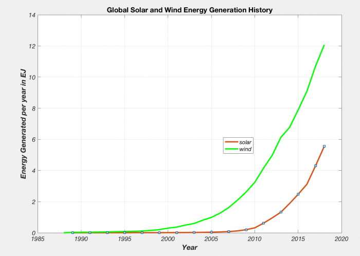
Both of these curves are growing exponentially, and the history so far suggests a growth of about 25% per year on average. If we assume that they continue to grow in the further following this exponential growth, we can project where we'll be at any time in the future. Below, we see where we might be in the year 2030, just eleven years from now. What you see is that we end up with vast amount of wind energy by 2030 — if it grows at the same rate it has been growing at, we end up with almost 300 EJ per year, about half of the current global energy consumption, and if it grows at a smaller rate of 20% per year, we still end up being able to supply about 20% of the total global energy demand.
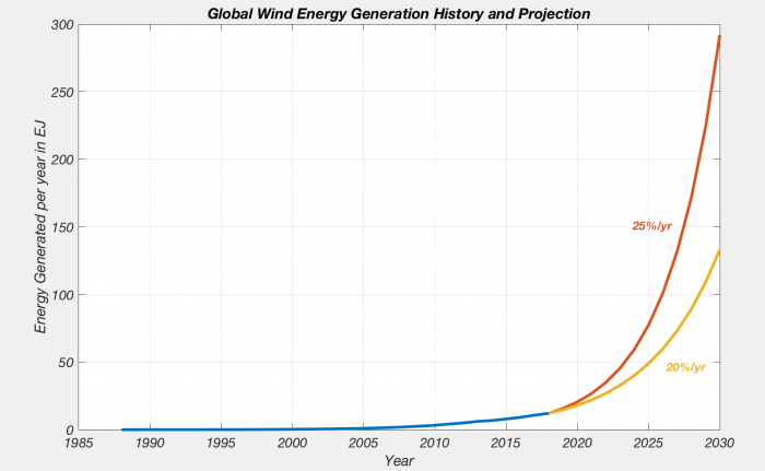
This figure shows the wind energy generation history from 1987 up until 2017 or 2018 in blues, and then the projection into the future at 2 different growth rates. So we know that the history up until now, wind energy generation has grown at about 25% per year, which is a remarkable growth rate. It is a continuous at that and we will follow this red curve and end up by the year 2030, so that’s just another 12 years from now or 10 years from now, we will have 300 exit joules of energy produced through wind. And if it grows at a slower rate of 20%, we will end up with something like 130 exit joules of energy per year. For reference, remember globally all of our energy consumption totals to about 600 exit joules of energy. So if it keeps going in the next 10 years as it has been going, we would be able to get half of our energy from wind alone, which is quit a remarkable thing. The power of exponential growth that we are looking at.
Barriers to Additional Wind Energy Development
Barriers to Additional Wind Energy Development
It is worth noting that, as with solar, wind investments are not always happening in the windiest areas. The reality is that there are a large number of factors that influence the development of wind energy globally. As the technology for wind energy has improved, other factors have also come together to create market drivers for wind power. These drivers include:
- Declining Wind Costs
- Fuel Price Uncertainty
- Federal and State Policies
- Economic Development
- Public Support
- Green Power
- Energy Security
- Carbon Risk
Earth: The Operator's Manual
Despite all of these barriers to wind energy deployment, wind is, in fact, one of the fastest-growing sources of power generation in the world. Wind energy is being embraced in areas that have traditionally favored low-carbon energy development as well as in areas that have a long history of fossil fuel extraction and use. The following video explains how two very different regions - Denmark and Texas - have embraced wind energy.
Video: Yes, in My Backyard (aka YIMBY!): (9:08)
Narrator: Are there other examples of communities and nations that have begun the transition away from fossil fuels? What does it take to welcome the turbines and solar farms of the new energy system, and say, "Yes, In My Backyard." This is the story of two communities that at first look very different. Samso is a small island off the Danish mainland. West Texas is a vast, dry expanse in America's South. What both have is abundant wind. At times, Samso produces more electricity than it uses, exporting surplus power to the Danish mainland. And Texas wind now generates as much power as the next three U.S. states combined. Samso and West Texas both solved the NIMBY, not in my backyard challenge that has stymied so many renewable energy projects. It's not easy, but with patience, and persistence, and the efforts of the right people, it can be done.
Soren: Okay-- My name is Soren Hermansen, and I am the Director of the Samso Energy Academy. Samso means, in Danish, means the Meeting Island-- when you make a circle around all of Denmark, then Samso is right in the center of the circle.
Narrator: But it wasn't geography that brought Lykke Friis, then Denmark's Minister of Climate and Energy, here in mid-2011. It was why and how this community had turned NIMBY into "Yes, in my backyard."
Lykke Friis: Well, Samso is a pioneering project, in the sense that Samso, way back, decided that Samso should become independent of fossil fuels. Narrator: Before its transformation, people thought of Samso as just a cute tourist community, busy in summer, empty and desolate in winter. Now people come here not just to see the turbines, but to understand the process that got the community to welcome wind energy. After a national competition, Samso was selected by the Danish government to be a proof of concept for how to transition from fossil fuels. But it was up to individuals like Soren Hermansen, with the passion and skills to effect change, to figure out just how. Soren: So when we won, the normal reaction from most people was, "Yeah, you can do this project, that's OK, but just leave me out of it."
Narrator: Samso has a deep attachment to its past and values its traditional way of life.
Soren: But gradually we won their confidence in establishing easy projects to understand, and also easy projects to finance. Because basically, it's all about, "What's in it for me?" Because it's not convinced idealists or green environmental hippies who lives here.
Narrator: Soren, a native of the island, convinced some of his neighbors to become early adopters. They found success and spread the word. Jorgen Tranberg operated a large and profitable herd of milk cows. After initial reservations, he invested in a turbine on his own land. When that went well, Jorgen became part owner of one of the offshore turbines.
Soren: Farmers, they have to invent new things and be ready for changes. So when they see a potential, they look at it, no matter what it is. They look at it, say, "Could I do this?" And if they see fellow farmers do the same thing, they are quick to respond to that. So even being very traditional and conservative in their heads I think they have this ability of making moves and do things because they have this independency in them. A farmer is a free man-- maybe he owes a lot of money to the bank, but he's still a free man in his thinking.
Narrator: It was seeing what was in it for them and for their community, that won over landowners in West Texas. And it took one of their own, a man whose family had deep roots in Roscoe's cotton fields, to educate them about wind farming. Cliff Etheredge: Well, I'm really a farmer-farmer, you see. I farmed for almost over 40 years. We're in-- right in the middle of the Roscoe Wind Farm. And we've got about 780 megawatts of production, that's per hour, enough electricity for about 265,000 average homes. Narrator: Roscoe had no oil and faced hard times in the early '90s, but it did have wind.
Cliff: When this land was acquired there was absolutely no value to the wind. Fact is, it was a severe detriment, because of the evaporation of the moisture.
Narrator: Cliff, like Soren, had to work with his neighbors to get them ready to accept wind turbines.
Cliff: The first thing farmers want to know is, "Well, how much is it going to cost me?" It costs them nothing. "What's it going to hurt?" Three to five percent of your farmland is all it's going to take up. You can do what you want to with the rest of it. Then it came down to, "Well, how much money is this going to make me?"
Narrator: Cliff did his research and checked his numbers with wind experts and the Farm Bureau.
Cliff: Then I was able to go to our Landowners' Association and show them, where they had been receiving 35 to 40 dollars an acre, then the landowners could expect somewhere in the neighborhood of three times that.
Narrator: In fact, farmers stand to make 10 to 15 thousand dollars a year, per turbine, just from leasing the wind rights.
Cliff: There was no guarantee in it from the very beginning, but sure enough we've got, I think, in the neighborhood of 95 or more percent of our area that accepted the wind farm.
Narrator: In both Samso and West Texas, individuals saw economic benefits. But the whole community, beyond the investors and land-owners, benefited too.
Cliff: Because of the wind farm, now, and the people working in the wind industry, now we've got jobs available and opportunities for young people to come back from college or from technical school or from whatever. It's just been a Godsend.
Narrator: For Kim Alexander, superintendent of the Roscoe school district, that godsend translates into dollars.
Kim Alexander: In 2007, prior to the wind values coming on our tax roll, our property values were at about 65 million dollars. And then, that wind development, they jumped to approximately 400 million dollars, to 465 million dollars.
Narrator: The school district will get more than 10 million dollars over a decade. That guaranteed revenue stream unlocked additional funding. School buildings, some dating from the 1930s, could be updated, and computer labs added.
Cliff: This is an indication to me of what can be done for rural areas, and will be done, all the way to Canada-- bringing life and prosperity back to these rural communities that are suffering just like we have.
Narrator: The same oil shock that got Brazil started on ethanol, got Denmark started on manufacturing wind turbines, just in time to compensate for a decline in its shipbuilding industry.
Lykke: And it's also good for the economy, in terms of export. I mean, 10 percent of Danish exports comes from the cleantech area.
Narrator: Energy and environment always require tradeoffs, such as clear vistas versus clean energy. It's something that communities have to make time to work through. Cliff, for one, believes it's worth it.
Cliff: Everything, the schools, the churches, the civic organizations, all the businesses will benefit from this. It will increase, hopefully, our town's populations, and our economics.
Kim Alexander: My granddad used to say, not realizing he was prophetic, but "If we could sell the wind, we'd be wealthy." Well, who would have ever thought we'd be able to sell the wind?
Narrator: For Samso, Denmark, and Texas, clean energy brought economic benefits and energy security. But replacing fossil fuel emissions with wind power has other advantages.
Lykke: And let's not forget, also good for climate and health, and such, and that's a very important argument.
Cliff: We've got a constant wind resource here, that's tremendously valuable, and as opposed to oil and gas, it'll last forever, and it doesn't pollute anything.
We have already mentioned the US Production Tax Credit, which is responsible for a good amount of the trend in US wind energy investment – both up and down! A decline in wind investment in 2010 and 2011 was due in part to the global financial crisis. A drop in natural gas/wholesale electricity prices has made some planned projects less competitive than originally expected and halted development. There has also been a slump in the overall demand for energy. Another factor that limits the growth of wind power capacity is the constraint on the transmission infrastructure. As can be seen in the wind capacity map on the previous page, many of the locations that experience the windiest conditions are not close to coastal population centers. The cost of upgrading this infrastructure is significant — perhaps $30 to $90 billion in the US by the year 2030 according to some estimates. This seems like a huge amount, but consider that our government spends about $20 billion each year in direct subsidies to the fossil fuel industry, which would sum up to $200 billion by the year 2030. In light of that, the upgrade cost for better transmission lines is a bargain!
Note
A great resource for information on the current state of the US wind market and the wind industry, in general, is the US Wind Technologies Market Report [105]which is annually published by the Mark Bolinger and Ryan Wiser of the Lawrence Berkeley National Laboratory.
Discussion Assignment
Reminder!
After completing your Discussion Assignment, don't forget to take the Module 6 Quiz. If you didn't answer the Learning Checkpoint questions, take a few minutes to complete them now. They will help your study for the quiz and you may even see a few of those question on the quiz!Discussion Question
Objective:
Evaluate who you think is responsible for maintaining infrastructure (power lines, meters, emergency repairs) when people generate their own renewable energy at home. Is it fair for those who can't afford new technology to shoulder the burden? Does charging a fee discourage people who could be installing solar and wind technology at home from doing so?
Goals:
- Find reliable sources of information on the internet
- Communicate scientific ideas in language non-scientists can understand
Read:
Arizona's New Fee Puts a Dent in Rooftop Solar Economics [106]
Salt River Project: Changes to Solar Pricing for New Rooftop Solar Customers [107]
SolarCity Lawsuit Alleges Arizona Utility's Fee Hurts Solar [108]
Description:
Perhaps you’ve heard a story about a person or family who installed solar panels or a wind turbine at their home, and during certain times of day when conditions are right, they can sit and watch their power meter run backward, feeding power back onto the grid. Sounds like a win-win situation, right? Those people are lowering their own dependence on fossil-fuel derived energy, and even supplying power derived from renewable resources to the big power companies to redistribute to other customers. So what’s the catch?
The problem is, as more customers in certain markets (for example, sunny desert areas like New Mexico and Arizona) install home solar and reduce their bills to almost nothing, the power companies are pulling in less profit. Which may not seem like a big deal – times change, new markets emerge and old ones die out. Newspapers have felt the pinch, and the postal service, and cable television. Companies have to keep up or make way. Except solar and wind can’t provide power 100% of the time. People who power their homes with these renewable resources still rely on the grid to provide power at night, or on cloudy or windless days. Maybe they give as much power back to the grid as they take from it over the course of a month, keeping the meter near zero. Now who is paying for the maintenance of the power lines that shuttle that power to and from these homes?
The power companies are paying, of course. But in a more pessimistic (or realistic) sense, the customers who can’t afford solar or wind technology will be the ones who will pay in the long run as power companies raise their prices to cover the loss of revenue. So in a sense, poorer people will be forced to subsidize the power grid while the wealthy sit back and smugly watch their meters run backwards.
Power companies in several states, including Arizona and Oklahoma, are beginning to charge fees of as much as $50-100 per month for customers who create their own solar or wind energy. This is a drastic turnaround from government tax breaks designed to encourage people to install their own renewable power technology. Proponents of renewable energy argue that such high fees will only serve to discourage more people from installing solar panels and wind turbines at home, proliferating our dependence on fossil fuels.
What do you think? Should the power company charge individuals a monthly fee to generate their own power? Who will determine what a reasonable charge would be?
Instructions
Summarize your thoughts on home power generation and responsibility for maintaining infrastructure in a 200-250 word discussion post. Give specific examples of why you think individuals should or should not be responsible for maintaining utilities. Your original post must be submitted by Wednesday. In addition, you are required to comment on one of your peers' posts by Sunday. You can comment on as many posts as you like, but please try to make your first comment to a post that does not have any other comments yet. Once you have an idea of what you want your post to be, go to the course discussion for your campus and create a new post.
Scoring Information and Rubric
The discussion post is worth a total of 20 points. The comment is worth an additional 5 points.
| Description | Possible Points |
|---|---|
| well-reasoned analysis in your own original post (200-250 words) | 20 |
| well-reasoned comment on someone else's post (75-100 words) | 5 |
Summary and Final Tasks
Summary
Humans have been harnessing wind energy in various forms for thousands of years, although the types of wind turbines that you may see sprouting up in various places (if you happen to live in a windy area) have been used widely for only the last few decades. Wind is one of the fastest-growing energy sources on the planet; in many areas, the amount of new electric generation capacity from wind turbines is outpacing the amount of new capacity from natural gas, coal or other fossil fuels. While European countries have embraced wind energy with larger financial incentives (and in some cases, generate a larger percentage of their electricity from wind energy than just about anywhere else in the world), China and the United States are still the world’s biggest wind markets. Despite falling costs and progressive designs that are friendlier to birds and bats, wind energy growth is still hampered in many areas by high costs, unpredictable incentives and ironically enough, a bad environmental rap.
Reminder - Complete all of the Module 6 tasks!
You have reached the end of Module 6! Double-check the [109]Module Roadmap to make sure you have completed all of the activities listed there before you begin Module 7.
Module 7: Geothermal, Hydroelectric & Nuclear
Overview
Old Faithful Geyser in Yellowstone is a famous tourist attraction, blasting hot water and steam more than 100 feet into the air on a sufficiently regular schedule to keep spectators happy. If you run the hot water through a turbine, you wouldn't get enough energy to supply the Old Faithful Lodge. But, that idea on a larger scale can provide valuable geothermal energy, which is being used in California, Iceland, New Zealand, Italy, and elsewhere. Most of our geothermal energy comes from anomalously "hot" places near volcanoes, and there aren't enough of those to power all of humanity. But, if we were to use "hot, dry rock", pumping waterway down, heating it, and bringing it out artificial geysers to drive turbines, an immense amount of energy is available.
Moving water carries power even if it isn't coming out of a geyser. We get reliable power from hydroelectric dams on rivers, and we can extract more energy from waves and currents. There isn't enough of either one to give us all of our energy, but in some places, they are greatly valuable, and we can develop new ways to make them more valuable—if you're building a breakwater to protect a city from the rising sea, why not install generators to convert the punishing power of storm waves into valuable electricity for the city?
The heat driving geothermal energy is mostly from radioactive decay in rocks. We have figured out how to generate more radioactive decay, where and when we want, in nuclear fission reactors, which are supplying much of our electricity in many countries. Nuclear energy could generate more electricity, too, although it also generates much debate among those who enjoy its reliable electricity, and those worried about contamination now or far into the future, and about the possible use of nuclear programs to generate material for bombs.
These three forms of energy — hydropower, geothermal, and nuclear — have been with us for quite a while (especially hydropower), so it is not surprising to see that they make up a significant portion of the global "renewable" energy portfolio. The quotes around renewable are because hydro, geothermal, and nuclear are not entirely renewable — it is probably better to call them low-carbon sources of energy — but in the literature, they are often labelled as "renewable". As with wind and solar, hydropower, geothermal, and nuclear have extremely low carbon emissions per unit of energy produced. The figure below, showing the history of (mostly) renewable energy production for the world, reveals some interesting trends.
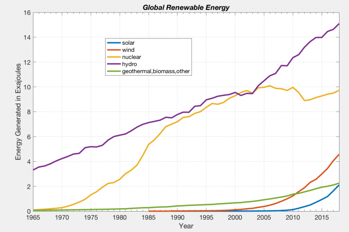
We see here that hydropower was already contributing a significant amount of energy in 1965 and has seen more or less steady growth since then. Nuclear energy emerged on the scene about 1970 and grew rapidly at first, but has since leveled off, while geothermal has been growing at a relatively slow pace. These three are all in contrast to wind and solar, which are characterized by exponential growth starting in just the past two decades.
How about costs? Most energy economists like to compare the energy costs from different sources using the "levelized cost" or "life-cycle costs" that we discussed earlier with wind and solar power. The table below provides a comparison of a wide range of energy sources.
| Energy Source | $/MWh | XXX |
|---|---|---|
| Natural Gas | 35 | XXX |
| Coal | 60 | XXX |
| Wind Utility Scale | 14 | XXX |
| Solar PV Utility Scale | 25 | XXX |
| Hydroelectric | 50 | XXX |
| Geothermal | 42 | |
| Nuclear | 96 | |
| Biomass | 85 |
As you can see, hydroelectric, geothermal, and nuclear are all more expensive than solar PV and wind, but they do have the advantage of being able to supply energy on demand without any kind of battery storage systems.
Let's go look at these interesting power providers — hydro, geothermal, and nuclear. We'll save some of the economic and ethical issues for later.
Goals and Objectives
Goals:
- Recognize the great diversity of energy options currently available to us
- Explain scientific concepts in language non-scientists can understand
- Find reliable sources of information on the internet
Learning Objectives
By the end of this module, you should be able to:
- Recognize the advantages and limitations of geothermal, hydroelectric, and nuclear energy
- Recall the basic science behind geothermal, hydroelectric, and nuclear power generation
- Analyze why even people who rely heavily on energy resources tend to want those resources to be exploited far from their own homes
Roadmap
| To Read | Materials on the course website (Module 7) and: Global view of nuclear reactors (2009) [110] Is the solution to the U.S. nuclear waste problem in France? [111] Nuclear energy 101: Inside the "black box" of power plant [112] |
All on the Web. Click the title of the reading to link to the material. |
|---|---|---|
| To Do | Discussion Post [113] Discussion Comment [113] Quiz 7 |
Due Wednesday Due Sunday Due Sunday |
Questions?
If you prefer to use email:
If you have any questions, please email your faculty member through the CMS. We will check daily to respond. If your question is one that is relevant to the entire class, we may respond to the entire class rather than individually.
If you prefer to use the discussion forums:
If you have any questions, please post them to Help Discussion. We will check that discussion forum daily to respond. While you are there, feel free to post your own responses if you, too, are able to help out a classmate.
Geothermal
Geothermal Energy
In Yellowstone National Park in Wyoming, one of the most popular tourist attractions is a geyser known as Old Faithful." The neat thing about Old Faithful is that it spurts hot steaming water out of the ground at pretty predictable intervals – predictable enough that you can probably time your trip to Yellowstone to see Old Faithful erupt several times a day. If you don't happen to live nearby, you can always use the miracle of technology and check out the Old Faithful webcam [114].
Video: Old Faithful Geyser Eruption (1:28)
PRESENTER: Old faithful here in Yellowstone National Park in July, getting ready for the eruption here.
[CHEERING]
Old Faithful here.
When you watch Old Faithful erupt, what you are seeing is geothermal energy in action. If we could just place a nice shiny turbine on top of the geyser's cone, whenever Old Faithful erupts (about every hour and a half or so), the force of the steam would spin the turbine, generating a nice flood of low-carbon electricity.
No one seriously talks about generating power from Old Faithful, but the heat beneath the surface of the earth could provide a gigantic store of energy – if only we could get at it at some reasonable cost. There are a few places, like California, Alaska, and Iceland, where geothermal energy is used to generate a lot of electricity (in Iceland's case, basically enough for the whole country). There are a lot more places where engineers are hoping that we could generate even more electricity from geothermal energy, using techniques collectively known as "enhanced geothermal."
In this section, we'll talk about how geothermal energy works and where it is currently used. We'll also talk about the potential, and some possible pitfalls, from enhanced geothermal. One really intriguing idea that we won't talk about in this section is using heat in the very shallow surface (maybe as little as fifteen feet below ground) to heat and cool your home. This idea, called "ground-source heat pumps" or "ground source heat exchange" is growing in popularity for new home construction and has the potential to save a lot of energy in buildings. But we'll wait for that until we talk about energy conservation. Here we'll stick to producing electricity directly from the heat deep within the earth's surface.
Generating Electricity from Geothermal Energy
Generating Electricity from Geothermal Energy
Remember how your basic steam turbine works in a power plant that uses fossil fuels: Fuel is burned to heat water in a boiler, to create steam. The steam is used to drive a turbine, which generates electricity. What if you could get all that steam without burning a single ounce of coal, oil or natural gas? That is the appeal of geothermal electricity production. In certain locations (primarily near active or recently active volcanoes) there are very hot rocks deep under the earth’s surface. In these "geothermal" regions, the temperature may rise by 40-50°C every kilometer of depth, so just 3 km, the temperature could be 120 to 150°C, well above the boiling point for water. The rocks in these regions will typically have pore spaces filled with water, and the water may still be in the form of liquid water since the pressure is so high down there (in some very hot areas, the water is actually in the form of steam trapped in the rocks). If you drill a deep well into one of these "geothermal reservoirs", the water will rise up and as it approaches the surface, the pressure decreases and it turns to steam. This steam can then be used to drive a turbine that is attached to a generator to make electricity. In some regards, this is very much like a coal or natural gas electrical plant, except that with geothermal, no fossil fuels are burned, which means no carbon emissions.
There are three basic types of geothermal power plants, depending on the type of hydrothermal reservoir:
- Dry steam plants, which draw steam directly from deep underground (a la Old Faithful);
- Flash steam plants, which draw hot water under high pressure up towards the surface. As the pressure decreases, the water boils, which generates steam to power the turbine;
- Binary steam plants, which utilize hot water (perhaps around 150 degrees Celsius) to vaporize another fluid (one with a lower boiling point). This hot vapor then drives the turbine, generating electricity.
The oldest geothermal plant (1904) in the world is Lardarello, in Italy, which is a dry steam plant. The Geysers, in California, is the largest geothermal installation in the world and the only accessible dry-steam area in the United States (other than Old Faithful and the rest of Yellowstone, which is off-limits). Most modern geothermal plants are “closed-loop” systems, which means that the water (or steam) brought up from the surface is re-injected back into the earth, as shown in the figure below. If the water is not replaced, then eventually, the geothermal reservoir will dry up and cease function.
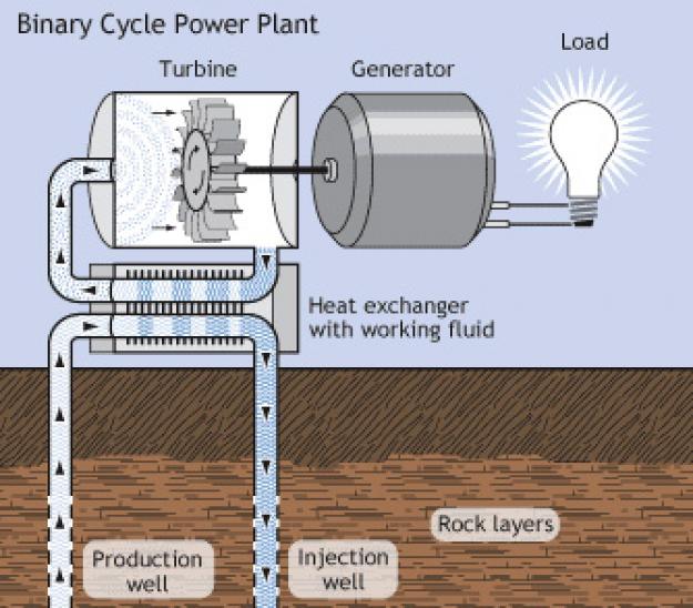
Geothermal Potential
Geothermal Potential
On a global scale, the potential for geothermal energy is quite large. The IPCC estimates that even though just a fraction of the total heat within the Earth can be used to generate geothermal power, we could nevertheless generate about 90 EJ of energy per year, and this is energy that is constantly renewed from within the Earth. Keep in mind that at present, we generate just over 2 EJ per year, so this energy source can definitely expand, but by itself it cannot meet the total global energy demand of 600 EJ.
To harness geothermal energy to generate electricity using any conventional technology (dry steam, flash steam or binary steam), you’ve got to be in the right place, where there is just the right amount of hot fluid or steam in an accessible reservoir. Unfortunately, those places are few and far between. The figure below shows a map of geothermal resources in the U.S., with identified conventional sites marked with dots on the map. All are located in just a handful of western states, plus Alaska.
Earth: The Operators' Manual
The state of Alaska is known more for oil and gas than for renewable energy resources, but the remote nature of many Alaskan communities calls for different energy solutions that we might use in a more connected part of the world. This video shows how some remote areas of Alaska are using locally-sourced renewable energy to power their communities, rather than relying so much on crude oil that makes up much of the state's economic bounty.
Video: Alaska: America's Renewable State? (10:53)
Narrator: Sometimes when Americans hear energy, the next word that comes to mind is crisis. It really doesn't have to be that way. Shirley Jackson, former head of the Nuclear Regulatory Commission, and now president of one of America's leading technical universities, thinks the United States is actually well-placed. Well, the U.S. is lucky because we have such a diversity of climates and diversity of geologies and in the end, diversity of actual energy sources. And that, in fact, makes us very fortunate compared to other parts of the world. They may have a given source of energy, but they don't have the multiple sources.
Narrator: Alaska, like the rest of America, has been addicted to oil. Now, can abundant sustainable options make it America's renewable state? Kodiak Island, Alaska at 3,600 square miles is about half the size of New Jersey. Getting around almost always involves a boat, or a plane, or a float-plane that's a bit of both. Kodiak's population is less than 14,000, leaving most of the island undeveloped and natural. That beauty is one of Kodiak's economic assets, bringing tourists to watch bears raising cubs and catching fish. Kodiak's human population also catches salmon, with fish exports providing another key source of jobs and income. The island wants to limit imports of dirty and expensive fossil fuels, and tap natural resources to supply as much clean and locally generated energy as possible. Fuel prices, because we live on an island, are very expensive. You know, you learn pretty quickly that you need an alternative.
Narrator: Kodiak was the first place in Alaska to make wind power a substantial part of the energy mix, with its three 1.5 megawatt turbines on Pillar Mountain. So getting good quality, low-cost sustainable power is really necessary for the long-term viability of the economy of Alaska.
Narrator: Upgrades at the Terror Lake hydroelectric plant, plus plans for three more turbines leave the KEA co-op confident they can hit 95% renewables by 2020. Though Kodiak uses diesel as a backup and during repairs, the wind turbines save the island 800,000 gallons of expensive, imported fuel each year. And this matters to the local business community. This morning, we're offloading pink salmon and red salmon, chum salmon and coho that came from the west side of Kodiak-- it keeps us busy, the plants work 24 hours a day, and it's a very, very big industry for Kodiak.
Narrator: This processing plant runs 100% on renewable energy, so Kodiak's wind power provides a clean, green marketing hook. The package says sustainable seafood, produced in Kodiak, Alaska, with wind-generated renewable energy. You got some folks in the community that are really concerned about price. You know, they just want the lowest cost power at their house or at their business. The wind does that. It's less than 50% of the cost of power versus diesel. Then you got folks in the town that are very just, environmentally concerned. And they are incredibly excited because it's a whole lot cleaner than diesel is. And then you've got the majority of folks who want both, which is great as well.
Narrator: Kodiak is a genuine island, surrounded by ocean, but vast areas of interior Alaska are also islands of habitation, small communities surrounded by open country and dense forests. Many have no road access, and the only way to transport heavy fuel is via rivers like the Yukon. Bear Ketzler is city manager of Tanana, a remote and mainly native Alaskan village at the confluence of the Yukon and Tanana Rivers. 90% of our bulk freight that comes in, comes by the barge.
Narrator: That includes diesel for the power plant and heating oil for homes. Diesel prices increased 83% between 2000 and 2005, and utility costs can sometimes be more than 1/3 of a household's income. The increase of energy costs, it jeopardizes everything. It jeopardizes our school, it really jeopardizes the ability for the city to function effectively.
Narrator: Communities like Tanana rely on the river for the fish protein that's a large part of a subsistence diet. And the river also provides a cheap and local source of energy. We have abundant resources of wood, biomass. Wood that floats down the river, in the spring and the fall time.
Narrator: Timber is increasingly replacing oil and diesel in Tanana's communal buildings, like the washeteria, a combination laundromat, public showers and water treatment plant. Right now, we don't even need oil, we're just running the whole place off this one wood boiler, which is just amazing.
Narrator: Using biomass and solar, the washeteria now uses only one quarter as much heating oil. Instead, the city pays residents to gather sustainable timber, keeping dollars in the local community. And using biomass at the washeteria has proven so cost effective that the city is planning to install boilers in other public buildings.
Bear: We're going to be one of the first communities on Yukon River that is installing a biomass systems on the school. In October of this year we're hoping to have that wood system on line, so instead of burning 15,000 gallons of oil throughout this winter, we're hoping to burn about 60 cords of wood. And keep that money local and create a little bit of an economy here.
Narrator: The bottom line for Tanana-- savings for the city. Biomass is cheaper, local, cleaner and more sustainable.
Bear: Even though we are a very rich state, very blessed to have the oil development that we do have, those days are diminishing. If we're going to make it in rural Alaska, we have to move towards renewable resources. I think we have, you know, less than 10 years to move in that area.
Narrator: Winter in Alaska presents extreme challenges. On this January day it was close to minus 50. Gwen Holdmann is an engineer with the University of Alaska's Center for Energy and Power. She and her husband also raise sled dogs and both are mushers who have raced in the Iditarod. Today's run takes her past the Alaska pipeline, which has transported more than 16 billion barrels of oil since it opened in 1977. Despite the fact that Alaska is rich in fossil fuels, Gwen knows they're limited and expensive. She wants to take advantage of every opportunity to tap renewable energy.
Gwen: We are an isolated part of the world, and we are still dependent very much on imports, and so becoming more self-reliant on energy is still a real goal here.
Narrator: Gwen was part of the team that built the first geothermal power plant in Alaska at Chena hot springs. Bernie Karl runs the Chena Resort and came up with the idea of creating an ice museum from the heat energy of the springs.
Bernie: Now you've heard of the great wall of China. This is the great wall of Chena. There's 800 tons of ice here.
Narrator: Bernie is a real American pioneer-- a showman, an entrepreneur, a tinkerer and enthusiast for recycling old machinery because it's cheaper. He and Gwen successfully transformed the hot springs into a geothermal resource that now generates power from lower temperature water than anywhere else on earth. What you're looking at is something that's impossible. I went to the world's best manufacturer of geothermal equipment and they said, "can't be done, the word can't is not in my vocabulary." It wasn't obvious at first that it could be done because these are low, really moderate temperatures for geothermal. The water that we're talking about here is about the same as a good hot cup of coffee and generating power from that isn't a trivial thing.
Narrator: Normal conditions for mid-winter Chena are 3-4 feet of snow, subzero temperatures, and only a few hours of daylight. Heating and lighting costs were staggeringly high. But now the resort runs year-round with over 90% of its electricity coming from the hot springs. Bernie's latest impossible idea is to use geothermal power to make the resort self-sufficient in food even when it's minus 50 outside.
Bernie: We have 85kw of lights in here, high-pressure sodium. We're changing it to 8.5 kw of L.E.D.s. Now, this takes 1/10th the electricity.
Narrator: For the past 6 years Chena has hosted a renewable energy fair. One keynote speaker was U.S. Senator Lisa Murkowski.
Lisa Murkowski: I'm a Republican. Republicans by definition are seemingly more conservative. What is more conservative than harnessing what is available and around us in a long-term sustainable way? We have more renewable opportunities here in Alaska than any other place in the world. We've got incredible river systems. We have 33,000 miles of coastline, the power of the tides, the power of the currents. We have biomass potential that is just beyond belief. As diverse and as big and remote and as costly as things are in Alaska, if we can demonstrate that it can be done here, think about the hope that it provides. They'll look at us and say, "Wow, if Alaska can do it, we can do this. We can take control of our energy future."
Enhanced Geothermal
Enhanced Geothermal
Most places do not have that right combination of an accessible large reservoir of underground heat. Instead, reservoirs are more dispersed, in geologic formations with less permeability (this naturally inhibits the flow of hot fluid towards the surface). Engineers have discovered how to alter the subsurface to create man-made reservoirs of hot water that could be tapped to produce electricity, in either a flash steam or (with higher potential) a binary steam technology configuration. The process of engineering a geothermal reservoir underground is known as “enhanced geothermal systems” or EGS. As the resource map in Figure 2 shows, EGS could be done in a lot more places than conventional geothermal. Hundreds of thousands of gigawatts of power, basically enough to run the United States several times over, could potentially be harnessed through EGS.
Required Video/Reading:
The US Department of Energy has a nice animation outlining how EGS works: How an Enhanced Geothermal System Works [117]. Also, check out the interactive image of the EGS on the same page to gain a deeper understanding. Note: This animation requires Flash. If you don't have Flash installed, click the link to the Text Version of the animation.
The basic idea behind EGS is to fracture hot rocks deep within the earth to create channels or networks through which water could flow. When water is injected into these networks, the heat from the rocks boils the water directly, or the now-hot water is transported to the surface where it is used to boil a working fluid, much like a binary steam plant. Fracturing of the rock occurs via “hydraulic fracturing,” under which water is injected into the rock formation at high pressures, causing the rock to fracture. This is actually very similar to the way that natural gas and oil is being extracted from shale. So we can “frack” for geothermal in much the same way that we frack for oil and gas.
Barriers to Adoption of Geothermal Power Generation
Barriers to Adoption of Geothermal Power Generation
Only a few countries use geothermal resources as a major source of electricity production –Iceland, El Salvador, and the Philippines all use geothermal for more than 25% of total electricity generation within those countries. New Zealand is the next (but distant) largest at 10%. Where hydrothermal resources are easy to access they have often been utilized. Trouble is, there just aren’t that many Old Faithfuls in the world.
EGS represents the most significant potential for geothermal electricity production, but other than a few small military or pilot projects, the systems have not really caught on commercially. One of the big reasons is cost – like many low-carbon electricity technologies, EGS is inexpensive to run but very costly to build. Drilling geothermal wells is much more expensive than drilling conventional oil or gas wells, so electricity prices would probably need to increase by 25% or more (relative to current averages) to make EGS a financially viable technology.
Perhaps a more serious challenge for EGS is “induced seismicity,” which is a fancy term for causing earthquakes. EGS wells that were drilled below Basel, Switzerland caused over 10,000 small tremors (less than 3.5 on the Richter scale) within just a few days following the start of the hydraulic fracturing process. In Oregon, a test EGS well is being monitored for induced seismic activity – you can see some neat real-time earthquake data at Induced Seismicity [118] (U.S. Department of Energy: Energy Efficiency and Renewable Energy.
Induced seismicity occurs whenever hydraulic fracturing (related to EGS or developing a natural gas well) takes place, but in most cases, the earthquakes are so small they are not felt. However, if the hydraulic fracturing occurs near pre-existing faults (which are often not visible at the surface), then larger earthquakes can and do occur, and some of these are strong enough to cause minor damage to buildings nearby.
Hydroelectricity (Waves & Tides)
Hydroelectricity - Dams, Waves, & Tides
Fossil fuels dominate the electricity generation mix of the US as a whole and the global energy mix more generally. But in some areas of the US (like the Pacific Northwest) and in some countries, including several in South America and Europe, the 800-pound gorilla of electric power generation isn’t coal, oil or even natural gas – it’s hydro-power, generated from immense dams placed along the world’s major rivers. In both the US and globally, hydro-power is the largest renewable resource in the energy mix, and certainly the largest source of renewably-generated electricity. While growth in the use of hydroelectricity (at least the traditional type – generated by very large dams) has slowed to near zero in the U.S., many other countries in both the developed and developing world are pushing ahead with major projects to dam rivers and generate immense amounts of electricity.
This is a good thing, right? After all, the more power that is generated from hydroelectricity, the less that we might have to generate using fossil fuels, and the fewer greenhouse gases that the global energy sector will release. While it is certainly true that there are no direct greenhouse-gas emissions from hydroelectricity, broadening the use of hydro-power, particularly in heavily forested areas of the world, introduces other complex environmental and social impacts. In fact, the reservoirs behind dams are major sources of methane (a potent greenhouse gas), so hydro is not exactly a carbon-free source of energy.
In this section, we’ll take a look at the processes for harnessing water for electric power generation – and these processes are not limited to damming rivers (though dams are certainly the predominant method for harnessing water energy). Like wind energy, humans have been using water for “energy” purposes (i.e., to do useful work) for thousands of years, making river systems one of the world’s oldest energy resources. For the first couple of thousand years of hydro-energy’s existence, the energy in flowing water was used to turn water wheels not for power generation, but for grinding or milling things like wheat, to make flour. It was not until the 1880s that hydroelectricity was born, with small hydropower dams in Michigan and Niagara Falls providing electricity to those places.
How do we turn water into electricity?
There are three basic technologies for using flowing water to generate electricity:
- Hydroelectric dams generate power by allowing water from behind the dam (from a reservoir or impoundment) to flow through a turbine. The turbine spins, generating electricity. This is not unlike a steam turbine (which utilizes coal, gas or oil as a fuel) or wind energy (which utilizes the wind as a fuel to get the turbine to spin).
- Wave and tidal energy projects use the kinetic energy in ocean waters, again to get a turbine to spin, producing electricity.
- In-stream hydro-kinetics is an emerging set of technologies that are similar in design to wave and tidal energy projects but are meant to be placed in streams.
Conventional Hydroelectric Dams
Conventional Hydroelectric Dams
There are three main types of conventional hydropower technologies: impoundment (dam), diversion, and pumped storage.
Impoundment is the most common type of hydroelectric power plant. An impoundment facility, typically a large hydro-power system, uses a dam to store river water in a reservoir. Water released from the reservoir flows through a turbine, spinning it, which in turn activates a generator to produce electricity. Generation may be used fairly flexibly to meet baseload as well as peak load demands. The water may also be released either to meet changing electricity needs or to maintain a constant reservoir level. The layout of a typical impoundment hydropower facility is shown below in the first figure. One of the world’s most famous impoundment Dams, the Hoover Dam, is shown in the second figure (although it’s worth noting that on a global scale, the Hoover Dam is more famous than it is large).
A diversion, sometimes called run-of-river, facility channels a portion of a river through a canal or penstock. It may not require the use of a dam but also has limited flexibility to follow peak variation in power demand. Thus, it will mainly be useful for baseload capacity. This scenario results in limited flooding and changes to river flow. In the United States, many of the dams in the Pacific Northwest (on the Columbia and Snake Rivers) are diversion or run-of-river dams, with limited or no storage reservoir behind the dam. The figure below shows a picture of a diversion hydro-power facility. Compare what that facility looks like with the picture of Hoover Dam, the impoundment facility shown above.
A “pumped storage” hydro dam combines a small storage reservoir with a system for cycling water back into the reservoir after it has been released through the turbine, thus “re-using” the same water to generate electricity at a later time. When the demand for electricity is low (typically at night), a pumped storage facility stores energy by pumping water from a lower reservoir to an upper reservoir. During periods of high electrical demand (typically during the day), the water is released back to the lower reservoir to generate electricity. The figure below shows a schematic of a pumped storage hydro facility. Pumped storage facilities are typically smaller in terms of generation capacity than their impoundment or diversion counterparts, but are sometimes combined with impoundment or diversion facilities to increase peak power output or flexibility.
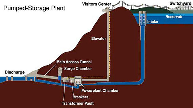
Wave and Tidal Energy
Wave and Tidal Energy
Water in the oceans is constantly in motion due to waves and tides, and energy can be harvested from these kinds of motions. Waves, driven by the winds, make the water oscillate in roughly circular orbits extending to a depth of one half of the wavelength of the wave (distance between peaks). Tides, related to the gravitational pull of the Moon and Sun on the oceans, are like very long-wavelength waves that can produce very strong currents in some coastal areas due to the geometry of the shoreline. In terms of power generation technologies, wave and tidal power have both similarities and differences. Both refer to the extraction of kinetic energy from the ocean to generate electricity (again, by spinning a turbine just as hydroelectric dams or wind farms do), but the locations of each and the mechanisms that they use for generating power are slightly different.
Wave energy projects extract energy from waves on the surface of the water, or from wave motion a bit deeper (a few 10s of meters) in the ocean. Surface wave energy technologies capture the kinetic energy in breaking waves – these provide periodic impulses that spin a turbine. The US Department of Energy [119] has a nice description of different types of surface wave projects as follows:
- Oscillating Water Columns: Oscillating water columns consist of a partially submerged concrete or steel structure that has an opening to the sea below the waterline. It encloses a column of air above a column of water. As waves enter the air column, they cause the water column to rise and fall. This alternately compresses and depressurizes the air column. As the wave retreats, the air is drawn back through the turbine as a result of the reduced air pressure on the ocean side of the turbine.
- Tapchans: Tapchans, or tapered channel systems, consist of a tapered channel that feeds into a reservoir constructed on cliffs above sea level. The narrowing of the channel causes the waves to increase in height as they move toward the cliff face. The waves spill over the walls of the channel into the reservoir, and the stored water is then fed through a turbine.
- Pendular Devices: Pendular wave-power devices consist of a rectangular box that is open to the sea at one end. A flap is hinged over the opening, and the action of the waves causes the flap to swing back and forth. The motion powers a hydraulic pump and a generator.
Offshore wave energy systems are typically placed deeper in the ocean, though not too deep – perhaps a few hundred feet below the ocean’s surface. The periodic wave activity at this depth is typically used to power a pump that feeds into a turbine, generating electricity.
Tidal energy projects typically work by forcing water through a turbine or a “tidal fence” that looks like a set of subway turnstiles. The systems depend on regular tidal activity to generate power. Because this tidal activity is predictable (each coast sees at least one tidal cycle per day – high tide and low tide – and some areas actually see two tidal cycles on a daily basis), tidal energy projects have the advantage of being able to provide a fairly predictable source of electricity. The use of tidal power, globally, has been quite limited because there are only a few sites in the world that see sufficiently large variations in tides to produce enough power, as shown in the table below.
| Country | Site | Tidal Range (m) |
|---|---|---|
| Canada | Bay of Fundy | 16.2 |
| England | Severn Estuary | 14.5 |
| France | Port of Granville | 14.7 |
| France | La Rance | 13.5 |
| Argentina | Puerto Rio Gallegos | 13.3 |
| Russia | Bay of Mezen | 10.0 |
| Russia | Penzhinskaya Guba | 13.4 |
| U.S. (Alaska) | Turnagain Arm | 9.2 |
| U.S. (Alaska) | Cook Inlet | 7.6 |
In-River Hydro-kinetics
In-River Hydro-kinetics
When rivers are utilized to produce electricity, that is usually accomplished by building some sort of hydroelectric dam, like the three we discussed earlier. It doesn’t have to be that way, however. Many of the technologies used to extract energy from the tides (or similar technologies) could be deployed in freshwater river systems rather than the saltwater ocean, effectively acting as very small run-of-river facilities. These “hydrokinetic” power generation systems are typically individually small (each generating about 100 kilowatts or less of power) and could be situated in two ways. First, a propeller-like or turnstile-like turbine could be deployed directly into the riverway, operating much like a small-scale tidal power system. Second, a “micro-hydro” type of system could be employed, where river water is channeled to a turbine housing via a channel or pipeline, as shown in the figure below.
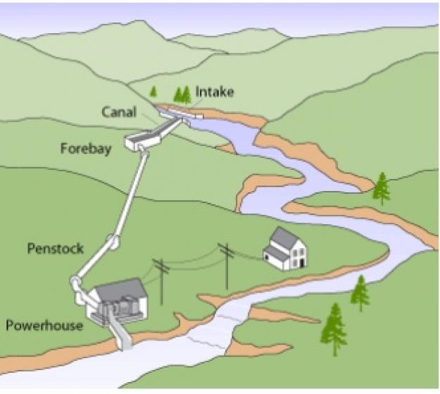
Global Use of Hydroelectricity
Global Use of Hydroelectricity
Globally, hydroelectricity is a major electricity resource, accounting for more than 16% of all electricity produced on the planet. More electricity is produced globally using hydro-power than from plants fueled by nuclear fission or petroleum (natural gas and coal do produce more electricity globally than hydro-power does). More than 150 countries produce some hydroelectricity, although around 50% of all hydro-power is produced by just four countries: China, Brazil, Canada, and the United States. China is by far the largest hydro-power producer on the planet, as shown in the figure below. Hydroelectricity production in China has tripled over the past decade, with the completion of some of the world’s largest dam projects, in particular, the Three Gorges Dam (the world’s largest), which could produce nearly enough electricity to power all of New England during a typical summer and left an area roughly the size of San Francisco flooded underwater.
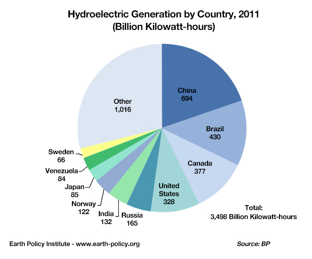
Click the link to expand for a text description of the Hydroelectric Generation by Country, 2011 Pie Chart
In (Billion Kilowatt-hours):
China-694, Brazil-430, Canada-377, United States-328, Russia-165, India-132, Norway-122, Japan-85, Venezuela-84, Sweden-66, Other-1016Once hydroelectric dams are built, they run very cheaply and generally provide reliable supplies of electricity except during times of extreme drought. Developed countries that have substantial hydro resources have, by and large, already utilized those resources to produce electricity. In these countries, hydro-power dominates the electricity supply system as shown in the chart below. Norway leads the pack here – the amount of hydro-power that it produces is not large in an absolute sense (it is the world’s seventh-largest producer) but nearly all electricity generated in Norway comes from hydro-power. Brazil and Canada are also highly dependent on hydro-power. Other large hydro producers, such as China and the United States, produce much less hydro electricity relative to the size of their overall power sectors.
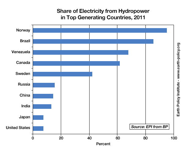
Click link to expand for a text description of Hydro-power graph
Approximate Percentages
United States, 8%
Japan, 8%
India, 12%
China, 15%
Russia, 16%
Sweden, 42%
Canada, 62%
Venezuela, 68%
Brazil, 88%
Norway, 95%
Hydroelectric Potential
Hydroelectric Potential
It is often said that developed countries like the United States have little potential for growth in hydroelectric power generation – the US, in particular, has dammed so many rivers, that what could possibly be left? In some areas of the Pacific Northwest, the US is removing some dams that produce electricity due to environmental concerns. It is certainly the case that there is relatively little potential for new hydro mega-projects in the US. This does not mean, however, that there is nowhere left to build new hydroelectric projects. There are, in fact, several hundred megawatts of planned hydroelectric generation in the Mid-Atlantic US alone (see the map at PJM [120]) [121], though most of the projects would be small pumped storage facilities) We’ll walk briefly through a few examples of the hydro resource potential in the United States before taking a more global look.
First, not all dams in the US are equipped with turbines to generate electricity. There are, actually, quite a few that aren’t (see the interactive map at Energy.gov [122] – potentially enough power generation to supply more than ten million homes. Many of these are located along major shipping routes, like the Ohio and Mississippi Rivers. Others are located in areas where development might not make economic sense because the power would need to be shipped across large and expensive transmission lines. Another unconventional technology – hydro-kinetics – could potentially supply enough electricity to power the state of Virginia, although these resources are highly concentrated in the Lower Mississippi River and in more remote areas such as Alaska.
Globally, the picture is very different. Developing nations with abundant hydro resources, like China, Brazil, and other South American countries, are rushing headlong into planning and building new dams. So globally, hydroelectricity is alive and well, and growing rapidly (no pun intended) – although this growth comes in fits and starts since new dams each represent a big chunk of capacity and take a long time from project start to finish. Nearly half of the world’s fifteen largest dams were built since the year 2000, with only one of those in a country other than China or Brazil (the Sayano Shuskenskaya dam in Russia was recently upgraded although the original went into place in the 1980s).
Energy from hydropower has been growing at a steady annual rate of 0.3 EJ per year since the year 2000, faster than the previous decades, but overall, hydro still accounts for just 16 EJ of the total 580 EJ we used in 2018. Some estimates suggest that if we really developed all of the economically viable hydroelectric sites, we might be able to generate as much as 50 EJ of hydroelectric energy — still a far cry from the +600 we will need in the near future. But even though hydro cannot solve all of our energy problems, it is nevertheless very important in that it supplies a relatively low-emissions, dispatchable (on-demand) energy source that can help smooth out the variability in wind and solar energy production.
Challenges to Further Hydroelectric Deployment
Challenges to Further Hydroelectric Deployment
While hydro development is still growing in several regions of the world, many countries, including the United States, will not likely pursue larger hydro projects due to two main factors — first, we have already built hydroelectric dams in most of the best places, and secondly, there are concerns over the environmental and societal impacts of building more dams. These environmental impacts have even been used to justify dam removal in some cases, though weighing those environmental impacts against the societal benefits (such as irrigation, flood control, recreation, and so forth…not just electricity) has always been controversial. Some of these specific environmental and societal impacts include:
- Impacts on fish migration – fish migrating up or downstream may find passages blocked by dams or may get killed going through turbines.
- Reduced water quality – changes in natural stream-flow may, in some cases, muddy waters. This affects the river ecosystems that aquatic plants and animals utilize.
- Land inundation – reservoirs behind dams can flood large areas. There is not necessarily a relationship between the size of the dam and the amount of area flooded behind the dam. Two impacts can arise here. First, building large hydro projects often involves the displacement of many people who used to live in the area surrounding the river. The Three Gorges Dam in China involved the relocation of more than one million people.
- Methane release to the atmosphere — plant life can decay in flooded areas, which over time releases large quantities of methane into the atmosphere – enough that it can potentially offset the avoided CO2 emissions from many years worth of fossil fuel use. A recent estimate places the global emissions of methane high enough to make hydropower be just a little bit less than natural gas in terms of CO2 (equivalent) per unit of energy generated.
Nuclear Energy
Nuclear Energy
For those who care a lot about climate change and reducing the carbon intensity of our energy systems, nuclear seems like a bit of a Faustian bargain. On the one hand, nuclear power plants have all of the advantages of fossil fuel plants – they offer controllable and (in the hands of skilled operators) highly reliable electricity supplies; can be built at very large scales (and increasingly smaller scales), and cost very little to operate once they are built – but have basically none of the greenhouse gas emissions. On the other hand, there are serious challenges that come with having an electrical system that depends a lot on nuclear. Plants are very expensive to build, which is why the cost of nuclear energy is so high (more than 6 times as much as wind power). Managing waste products has been difficult, particularly in the United States, where most of our waste is stored at the power plants in a "temporary" mode. Finland is about to begin storing their waste in a safe, long-term facility deep within the Earth, but a similar solution in the US, at Yucca Mountain in Nevada has stalled due to politics. And when nuclear power plants fail – as happened at Three Mile Island in Pennsylvania; Chernobyl in what is now the Ukraine; and most recently Fukushima Daichi in Japan – the results can range from striking terror into the hearts of thousands of people (as was the case with Three Mile Island, which as far as we can tell did not actually kill anyone outside of the plant) to utterly catastrophic (Chernobyl and Fukushima). As bad as these accidents are, it is important to understand that nuclear power plants cannot explode like a nuclear weapon — a fact that not everyone is aware of.
Part of the reason that nuclear energy can become an emotional topic is that nuclear power plants are extremely complex, despite their basic similarity to any other power plant that uses a steam turbine design. While it’s easy to understand how burning coal or natural gas can produce steam (and greenhouse gas emissions) to run a power plant, how nuclear reactions manage to create steam is a bit more complex. When you add in the thorny problem of how to manage a waste product that could potentially pose environmental and human health risks for thousands of years, it’s easy to see why a number of countries are deciding that the potential social costs are not worth the benefits. On the other hand, the global nuclear power industry actually has one of the best safety records of any energy source. Because nuclear power plants can be operated relatively safely in the right hands and because producing electricity from nuclear plants releases virtually no air pollution, some countries are actually seeking to rapidly increase their nuclear energy production. But, as we saw in the introduction to this module, on a global scale, nuclear energy production has not been growing over the past 20 years.
Is nuclear power truly renewable? The supplies of uranium ore that we know about today, given our current rate of consumption, will last for more than 150 years; increased exploration could increase that by a bit, but the fact remains that it is a finite resource. So, nuclear energy, as it is mainly produced today, using the isotope U-235, is not truly renewable. But, there are other types of nuclear reactors called "breeder" reactors, which use the far more abundant stable isotope of uranium, U-238, as the primary fuel. Because there is so much U-238, nuclear energy generated with these breeder reactors is virtually limitless.
How Nuclear Energy Works
How Nuclear Energy Works
Maggie Koerth-Baker has a really great article on how nuclear power plants work, with a focus on the nuclear fission reaction and what mechanisms in a nuclear power plant keep the reaction from spinning out of control. It was written right after the incident at Fukushima Daichi. Before continuing on, please have a look at the article, and pay some attention not only to how plants work, but how the nuclear reactions inside the plants are controlled. The article also has a really nice description of how reactions at nuclear power plants can keep cascading even after the plant has been “shut down,” which is basically what causes meltdowns like those that happened in the Three Mile Island and Chernobyl power plants.
Required Reading:
Nuclear Energy 101: Inside the "black box" of Power Plants [112]
Activate Your Learning
As described in the article linked above, when a reactor core shuts down, it doesn't go all the way to zero immediately. It takes several days for the reactor to stop producing heat, which is typically what leads to meltdowns when they happen. Why isn't shutting down a reactor core like flipping a switch?
Click for the answer.
The basics of a nuclear power plant aren’t actually all that complicated. In fact, there is a remarkable similarity to fossil fuel plants, in that what ultimately happens in a nuclear power plant is that steam is produced, to drive a turbine inside a generator, which produces electricity. But unlike fossil fuel plants, which heat water by burning fuel, the water in nuclear power plants is heated through an atomic reaction.
There are two basic types of atomic reactions. The first is nuclear fusion, with which we are all intimately familiar, whether we know it or not. It is nuclear fusion that keeps the sun hot. In nuclear fusion, atoms are joined together. The word “joined” here is a bit of scientific jargon. In reality, the energy is released when atoms collide together at really high speeds. If you have ever seen two cars collide at high speed, you have some idea of how energy could be released when things hit each other. Despite years of research into nuclear fusion, scientists have never been able to engineer a controllable reaction in a laboratory environment. If they could, most of the world’s energy problems would basically be solved overnight, since the amount of energy released through a fusion reaction would be massive. But for now, fusion goes in the “maybe someday” pile.
The second type of nuclear reaction is fission, which is the opposite of fusion – atoms are broken apart, which also releases energy. U-235 is naturally radioactive, meaning that the nucleus is unstable, and it will eventually give off some energy and parts of its nucleus to get to a stable atom, but this takes a long time — the half-life is 700 million years. The figure below illustrates roughly how this works. An atom (in the case of a nuclear power plant, a uranium-235 atom) is bombarded with neutrons, some of which are absorbed by the nucleus, so the U-235 becomes U-236 — this makes it even more unstable, so the atom splits apart into two lighter atoms called the daughter products. U-236 splits into krypton (Kr-92) and barium (Ba-141), and it also releases energy in the form of heat, gamma radiation (bad for us) and 3 neutrons. (Note that if you add up the weight of the daughter products and the neutrons, 92+141+3, you get 236, the weight of the U-236 that split apart). These neutrons come hurtling out of the original atom and smash into other uranium-235 atoms, triggering 3 more U-235 fission reactions, each of which generates 3 more neutrons. As you can see, before long, there are a lot of neutrons and thus a lot of reactions and thus a lot of heat, which heat the water surrounding the fuel rods, creating steam, spinning the turbine — just like many of the other systems for making electricity.
The nuclear fission reaction described above is an example of a positive feedback mechanism that will naturally tend to speed up until all of the fuel (the U-235) is used up. This means that it has a tendency to create more and more heat, and if left unchecked, this would cause the water in the reactor vessel to get too hot and build up too much pressure for the reactor to contain — then you would have a big steam explosion, such as happened at Chernobyl. To control this reaction, the reactor core has a series of control rods, made of materials that absorb the neutrons emitted during a fission reaction. So the control rods allow the operators to adjust the rate of the reaction and thus the rate of heat production.
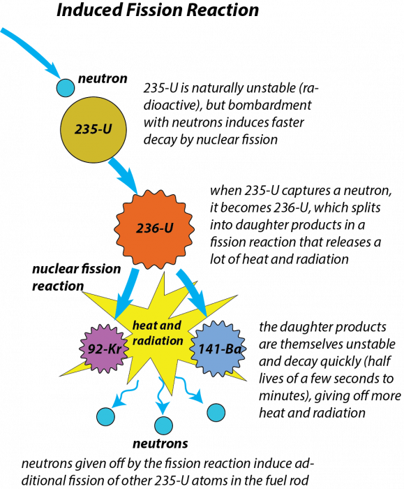
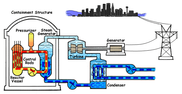
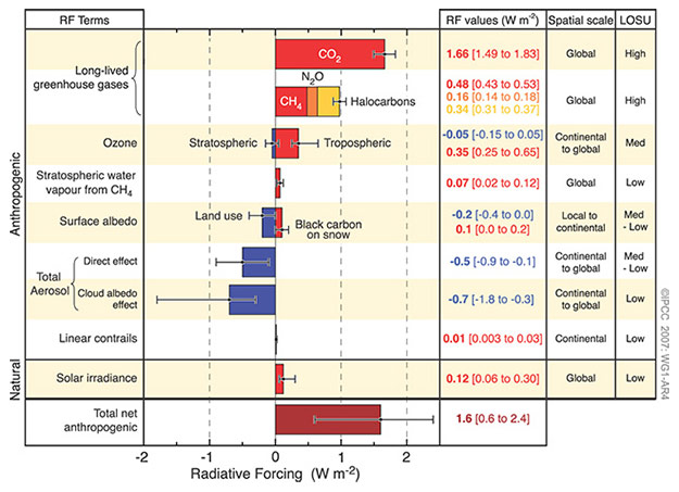
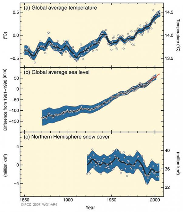
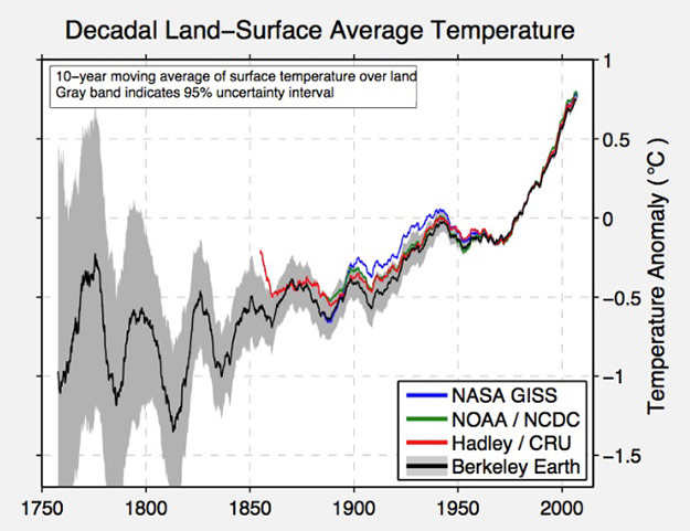
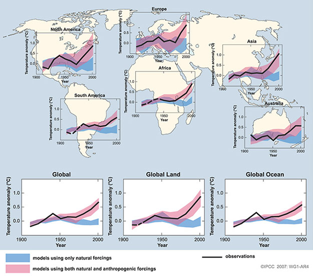
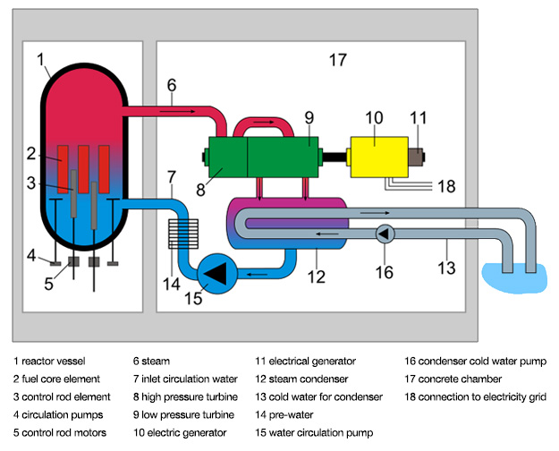
There are two basic types of nuclear power plants that are in operation today. The first, and most common, is the Pressurized Water Reactor (PWR), which is illustrated in the animation below. In a PWR, hot water passes through the reactor core (where it absorbs the heat from the nuclear fission reactions) and is then pumped through a heat exchanger, where it heats another fluid that produces steam, powering the turbine. The primary advantage to this type of design is that the water in the primary loop (which passes through the core) does not actually come into contact with the fluid in the steam generator, so unless pipes or valves break there is no risk of contamination or radioactive water leaking from the plant. The Boiling Water Reactor (BWR), illustrated in the next figure, utilizes a somewhat simpler design, where the water that runs through the core is allowed to vaporize to steam, thus powering the turbine to generate electricity. While the design is simpler, it does mean that the steam entering the turbine can be radioactive.
Whether one design is inherently more advantageous than another is difficult to say. Both types have been involved in major nuclear power plant incidents. The reactor at Three Mile Island was a PWR while the reactor at Fukushima was a BWR, so the potential exists for problems at either type of plant. It is perhaps worth mentioning that the Three Mile Island incident was likely due as much to human error and poor design of the reactor’s control system at least as much as to the reactor design itself. The reactor at Chernobyl was an unusual Soviet design called a “light water graphite reactor” that was not really designed for use as a commercial nuclear power plant but was adapted for that use anyway. The World Nuclear Association [126] has a nice description of the Chernobyl plant technology with a description of what went wrong (here too, human error played a central role).
Advanced PWRs have been developed that use more passive designs to keep the reactor from overheating, without any pumps or offsite power required. Westinghouse has developed one such design, the AP1000, which is currently being deployed in China. For those who are interested, more information on passive PWR designs can be found at Westinghouse Nuclear [127].
The Nuclear Fuel Cycle
The Nuclear Fuel Cycle
Nuclear fuel rods typically last for 3-5 years, and when a rod is "spent" it still contains some fissionable 235-U along with a host of other radioactive elements. So, what do we do with these spent rods? Many people would argue that recycling is a good thing. In the nuclear energy industry, recycling of spent nuclear fuel is a somewhat contentious topic. Many countries, including those European countries that still use nuclear energy, recycle spent fuel into new fuel for re-use. The United States does not do this, preferring a "once-through" fuel cycle for reasons of security as well as economics. Understanding the pros and cons of recycling nuclear fuel requires some understanding of how fuel for nuclear power plants is mined and fabricated.
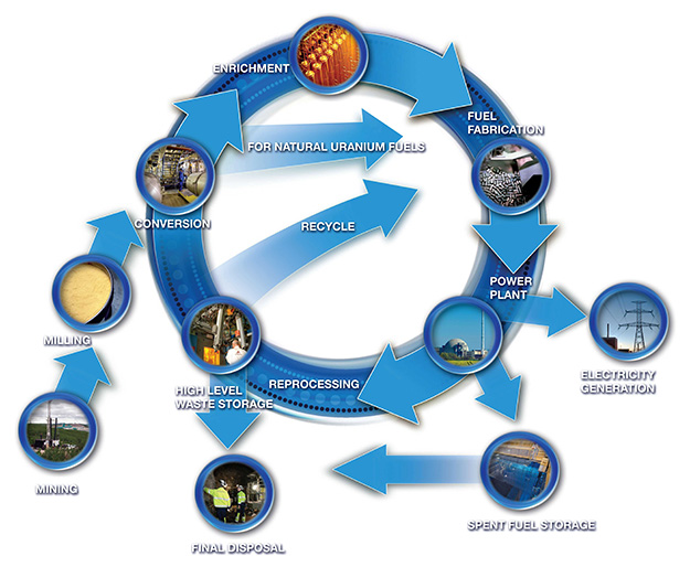
The figure above outlines the many steps necessary to get uranium out of the ground and into a nuclear power plant. After extraction and processing (“milling”), uranium ore is transported to conversion facilities to remove impurities. The next step in the nuclear fuel cycle is enrichment. Owing to security concerns, all enrichment for the US commercial nuclear industry takes place at one government-owned gas diffusion facility in Paducah, Kentucky. Enriched uranium is then transported to one of several commercial fuel fabrication facilities where the fuel rods are manufactured. In the U.S., fuel fabrication is a competitive industry; private firms compete to provide finished fuel to nuclear power plants. Nuclear fuel rods are generally not purchased directly from the government. Nuclear fission and disposal of spent fuel rods constitute the final steps of the nuclear fuel cycle in the US
The US is heavily dependent on the global market for uranium and nuclear fuel. n 2017, 90% of uranium oxide supplies used to develop nuclear fuel in the US come from outside of the country. The main suppliers for the US are Canada (24%), Kazahkstan (20%), Australia (18%), and Russia (13%). Proposals to open new uranium mines in both the western and eastern United States have been met with resistance, primarily on environmental grounds.
Current US policy prohibits the reprocessing of spent nuclear fuel, for two primary reasons. First is economics – the fuel costs for nuclear power plants are already among the lowest of any non-renewable power generation resource. Once nuclear power plants are built, if they are well-run they cost very little to operate. While the recycling of spent nuclear fuel would eliminate the need for virgin uranium ore to be mined or for additional fuel to be purchased on the world market, it is not at all clear whether the benefits of doing so outweigh the costs of reprocessing. The other reason is nuclear security. The process of recycling nuclear fuel involves the separation of uranium and plutonium from the spent fuel rods. There have been concerns regarding plutonium falling into the wrong hands and contributing to the proliferation of nuclear weapons.
One very serious concern with nuclear power has to do with the highly radioactive waste from the process. Much of the waste needs to be isolated for at least 10,000 years. All civilian nuclear waste was intended to be stored permanently at a repository in Yucca Mountain, Nevada. Yucca Mountain was chosen as a waste repository site back in 1987 and we have spent over $15 billion investigating the site and developing 65 km of tunnels deep underground to store the waste. Currently, it could hold 65,000 tons of waste, but we have 94,000 tons of radioactive waste in temporary storage at nuclear plants. The Yucca Mountain facility is not currently operational and significant uncertainties exist as to whether it will ever be used. In the interim, spent nuclear waste will continue to be stored on-site at the power plants.
Required Reading:
Climatewire and the New York Times [111] recently published a nice piece that looks at both sides of the reprocessing debate.
Global Use of Nuclear Energy
Global Use of Nuclear Energy
There are currently several hundred operating nuclear power plants in the world, spread over a few dozen countries, with over a hundred more “proposed” nuclear power plants (these may or may not get built, depending on economic and political factors in the relevant countries). The US still has the largest number of plants, with about 100 currently operating. France’s economy is the most dependent on nuclear energy, with more than 75% of electricity in that country coming from nuclear power plants. Countries with fleets of nuclear power are primarily wealthier nations, such as the US and European countries, but developing nations are really the biggest growth area, particularly China. Prior to the Fukushima incident, other Asian nations besides China had plans to grow their nuclear fleets, but whether that growth will materialize is highly uncertain. In response to concerns regarding the safety of nuclear power plants and waste disposal/management issues, some European countries have enacted various policies mandating the phase-out of nuclear energy, including Austria, Sweden, Germany, Italy, and Belgium. Other countries, including Spain and Switzerland, have imposed a moratorium on the construction of new nuclear power plants. Of the countries that have decided to phase out nuclear energy, Germany has been among the most aggressive following the Fukushima incident. Because of concerns over electricity supply and costs, however, some countries have delayed or back-stepped on plans to phase out nuclear energy.
Required Reading:
Discussion Assignment
Reminder!
After completing your Discussion Assignment, don't forget to take the Module 7 Quiz. If you didn't answer the Learning Checkpoint questions, take a few minutes to complete them now. They will help you study for the quiz and you may even see a few of those questions on the quiz!Discussion Question
Objective:
Analyze the Not In My Back Yard ("NIMBY") mentality by finding an recent example (something from the last 3 years) online and sharing it with the class. Why is it easier for many people to accept an abstract idea of resource extraction or power generation somewhere in the world than it is to see it happening in their own communities? Is it reasonable to imagine that all of our power needs can be met without venturing into anyone's backyard?
Goals:
- Find reliable sources of information on the internet
- Communicate scientific ideas in language non-scientists can understand
Description:
Many of us understand that our own progress, prosperity, security, and comfort are all built upon access to energy. We also know that no means of producing energy is entirely without side effects. Burning fossil fuels dumps CO2 into the atmosphere, fracking produces toxic brine, wind turbines disrupt bird migration patterns and ruin the view, nuclear generates radioactive waste and is vulnerable to meltdowns. How do we rationalize our reliance on energy with our desire to live in clean, scenic, non-toxic communities? It isn't easy, and for some of us, this results in what is sometimes referred to as NIMBY syndrome - the idea that ugly things like resource exploitation and waste management have to happen somewhere in the world, but we would prefer for that somewhere to be far away from us.
Find a recent example of the NIMBY mentality in an article online. If possible, try to find something that is happening near you - a proposed nuclear power plant, natural gas fracking, offshore oil drilling, wind farms. If you can't find something near you, find a NIMBY controversy you are interested in or have heard something about.
Once you find an article (remember — it should be a recent one) you would like to share, write 3-4 sentences summarizing the content. Why are people opposed? What are the alternatives? Then write an additional 2-3 sentences expressing your thoughts on the NIMBY mentality. Explain in your own words why you think it is or is not possible to maintain our current standard of living without venturing into someone's backyard.
Instructions
Your discussion post should include a link to the article you have chosen, a summary 100-150 words in length, and a personal commentary 75-100 words in length. Your original post must be submitted by Wednesday. In addition, you are required to comment on one of your peers' posts by Sunday. You can comment on as many posts as you like, but please try to make your first comment to a post that does not have any other comments yet. Once you have an idea of what you want your post to be, go to the course discussion for your campus and create a new post.
Scoring Information and Rubric
The discussion post is worth a total of 20 points. The comment is worth an additional 5 points.
| Description | Possible Points |
|---|---|
| link to appropriate article posted | 5 |
| summary provides a clear description of the article content (100-150 words) | 10 |
| well-reasoned comment on the NIMBY mentality (75-100 words) | 5 |
| well-reasoned comment on someone else's article and post (75-100 words) | 5 |
Summary and Final Tasks
Summary
Hydropower, geothermal and nuclear energy are not growing as fast as wind and solar (and don’t get as much good press) but all three are technically and economically viable options for producing carbon-free electricity at a large scale. Moreover, unlike wind and solar, electricity output from these sources is more easily controlled and is less subject to the vagaries of wind speed or cloud cover. Still, each of these resources has its own set of issues. Many countries have basically tapped their rivers for hydroelectricity already and building large dams is environmentally destructive in its own way. Geothermal resources are great where you’ve got them…but not very many places have them. Nuclear energy represents a serious social dilemma: the promise of producing massive amounts of low-carbon energy alongside a host of economic, environmental and safety risks.
Reminder - Complete all of the Module 7 tasks!
You have reached the end of Module 7! Double-check the Module Roadmap to make sure you have completed all of the activities listed there before you begin Module 8.
References and Further Reading
Is the solution to the U.S. nuclear waste problem in France? [111]
Nuclear energy 101: Inside the "black box" of power plant [112]
Module 8: Conservation
Module 8 Overview
Some people fear that “energy conservation” means giving up our worldly wealth and going back to living on dirt floors and eating by candlelight. Nothing could be further from the truth! There are lots of ways that we could reduce our energy consumption (and thus reduce our impacts on the planet) without sacrificing our standard of living. And, at least some conservation saves us money—the cost of installing insulation for houses, better windows, and other changes is less than the savings they provide. Conservation also has roots deep in history—Ben Franklin’s stove heated a room while burning fewer logs than were needed in an open fireplace, and he urged people to buy his stove to conserve the trees of Pennsylvania.
In this module, we’ll see just how vast the potential for energy conservation can be, and that countries can be highly energy-efficient without making people poorer. We’ll also look at a few real-life examples of conservation. Finally, we’ll think about a sticky problem that has puzzled social scientists for decades – if energy conservation is such a good idea, and can save people money without making them worse off –why are some people so hesitant to embrace it?
Goals and Objectives
Goals:
- Recognize the great diversity of energy options currently available to us
- Use numerical tools and publicly available scientific data to demonstrate important concepts about the Earth, its climate, and resources
Learning Objectives:
By the end of this module, you will:
- Recognize that all energy technologies are inefficient
- Compare wealth and energy intensity in developed countries
- Identify options for improving energy efficiency in developed countries
- Analyze why we don't always conserve as much as we should, despite the double benefits for the climate and our wallets
- Use a model to calculate the effects of various strategies such as use of renewable energy sources, conservation, and population control on reducing emissions
Roadmap
| To Read | Materials on course website (Module 8) | |
|---|---|---|
| To Do | Complete Summative Assessment [130] Quiz 8 |
Due Following Tuesday Due Sunday |
Questions?
If you prefer to use email:
If you have any questions, please email your faculty member through your campus CMS (Canvas/Moodle/myShip). We will check daily to respond. If your question is one that is relevant to the entire class, we may respond to the entire class rather than individually.
If you prefer to use the discussion forums:
If you have any questions, please post them to Help Discussion. We will check that discussion forum daily to respond. While you are there, feel free to post your own responses if you, too, are able to help out a classmate.
Global Conservation Potential
Energy Conservation Potential
To understand why energy conservation is even an option (let alone a necessary one), we have to go back to a simple fact about energy conversion: You want some, you waste some. Burning coal in a power plant or gasoline in a car; or heating water using solar energy – all of these things are “energy conversion processes.” We are taking energy that is in one form (like lumps of coal) and going through chemical, mechanical or other conversions to turn that energy into things that we want (like lighting and transportation). While these conversion processes have done great things for people and society, they aren’t perfect. The energy that goes into a conversion process is always greater than the energy that comes out of a conversion process. This is basically a consequence of the second law of thermodynamics, which says that it’s impossible to harness all energy in one form (like a lump of coal) to do useful work in another form (like light a room or make toast).
Technically, the second law of thermodynamics applies only to conversion processes involving heat – which basically describes the vast majority of the world’s energy technologies. These technologies burn fossil fuels in a generic process called a “heat engine.” Internal combustion engines in cars, industrial boilers, and power plants are all examples of the “heat engine” principle. In the 1800s a physicist named Sadi Carnot figured out that there was a theoretical limit to how efficient a heat engine could get, depending on the type of work it was asked to do and the conditions under which the heat engine operated.
Required Reading:
Read this a short but nice article on Carnot below.
What Carnot figured out, in today’s terms, is that a heat engine dependent on steam (like a power plant) could not get much more efficient than about 50%. A heat engine that is driven directly by combustion gases, like a car or truck engine, cannot get much more than 25% efficient. This means that in the most perfect of all circumstances, it’s impossible for a simple power plant to waste less than about 50% of all the fuel that’s put into it. Cars are even worse – they are set to waste about 75% of all the fuel that we pump into them.
Of course, there are some clever ways that we can push the efficiency of energy conversion processes. Combined cycle power plants, for example, are able to capture some of the waste heat from combustion and use that heat to drive a second turbine for power generation. But even these types of plants generally don’t achieve efficiencies of more than about 65%. Wind and solar are “inefficient” as well – a wind turbine might capture about 50% of the potential energy in the wind that hits the turbine, and solar photovoltaic cells are generally able to capture only about 20% of the solar energy that hits their surfaces. (On the other hand, energy from the wind and the sun are free once the equipment is built and installed, so maybe the “efficiency” is not as important in the case of wind and solar.)
Watch the following video about Sankey Diagrams (6:23)
The tales of inefficiencies in modern energy systems are almost too numerous to count, and we haven’t even talked about the ways in which people choose to use energy. The graphic below provides a nice summary of how much energy is wasted in the United States. The figure is called a “Sankey diagram” and it traces the flows of energy (from left to right) through all sectors of a country’s economy. (The example in the graphic below was produced by a US government laboratory so it naturally focuses on the United States.) The left-hand side of the Sankey diagram shows all of the energy inputs to a nation’s economy and how much of each is used. The box for “petroleum” is larger than the box for “solar” because the US economy uses a lot more petroleum than it does solar energy. From each individual resource, you can trace the various paths showing how much of that energy resource is used in different sectors of the economy. For example, coal is used for power generation and is used directly in industrial and commercial boilers as well. As indicated by the width of the path, the vast majority of coal in the US economy is used for power generation. The quantities of coal used for industrial and commercial boilers are much smaller. All the way over at the right you can see two boxes – one is labeled “Energy services” and the other is labeled “Rejected Energy.” The Energy Services box tallies up all of the coal, oil, gas, solar and other resources that we actually harness for doing useful things. The Rejected Energy box measures how much of those resources is lost due to inefficiencies in our energy conversion systems. As you can see, the US is now 32% efficient, and if we switched to an all-electric economic system with the highest efficiency generators, we could approach something closer to 50% efficiency.
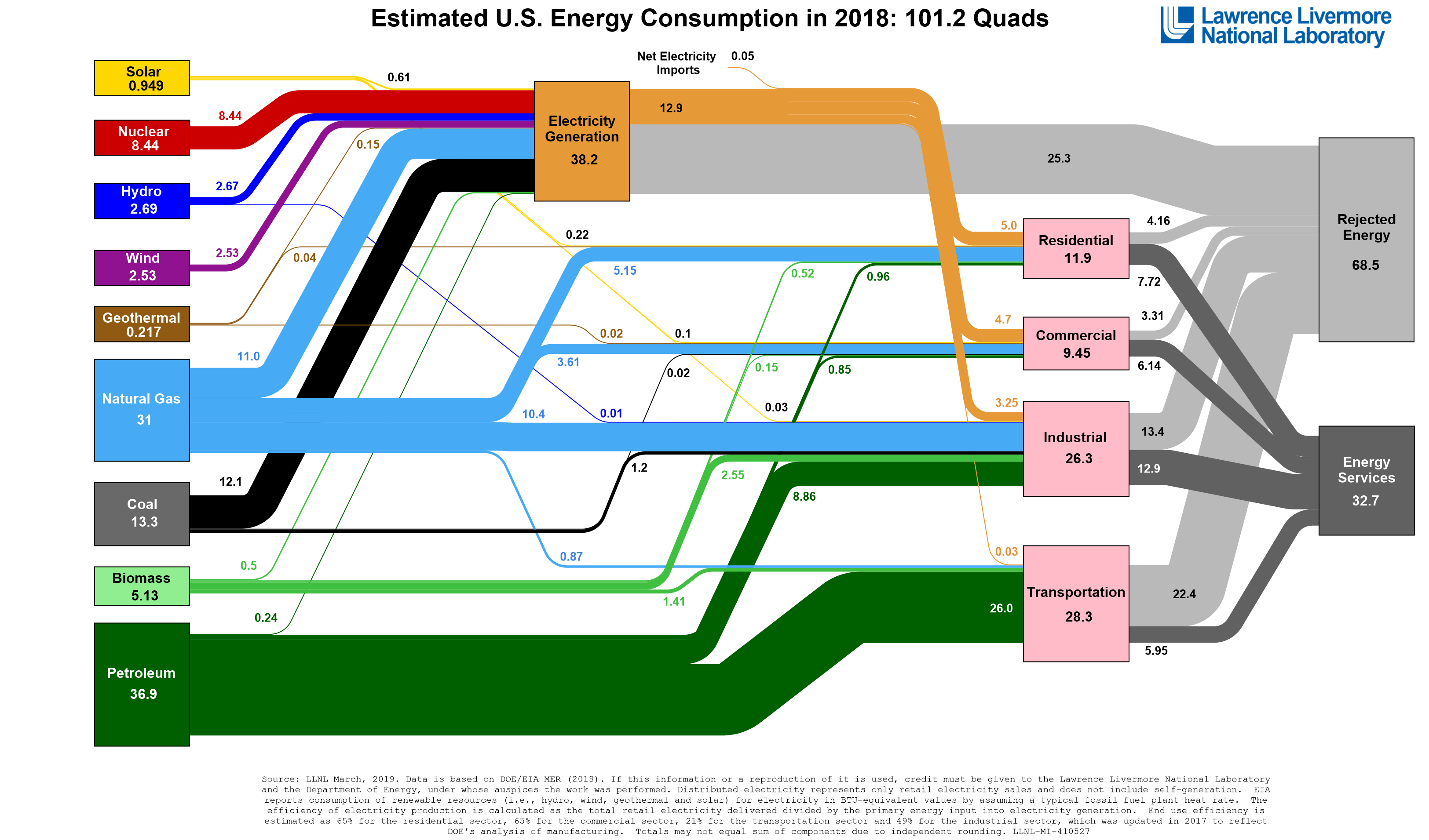
Activate Your Learning
According to the Sankey diagram above, what are the two biggest sources of wasted energy in the U.S. economy?
Inefficient Use of Energy
Inefficient Use of Energy
So a country like the United States does not convert energy into useful work all that efficiently — the Sankey diagram from the last section shows that we are about 30% efficient (energy services divided by total energy — 32.7/101.2). But it is also true that we do not make the best use of the energy that goes into services — we could get those same services accomplished with less energy. As an example, transporting yourself from New York to Philadelphia is a service, and if you drove by yourself in a gas guzzler, then a lot of energy is going into that service. But, if you take the bus, then the energy used for that same service is the amount of fuel used divided by the number of passengers — so this would be a more efficient means of achieving that service. So, energy efficiency is all about getting services done with the least amount of energy. Another side to this is cutting back on the services themselves — traveling less, keeping our homes a bit cooler in the winter and a bit warmer in the summer.
First, let's consider how much energy people use in different countries. As you might expect, it turns out that richer countries (with a higher per capita GDP, or gross domestic product per person) use more energy per capita than poorer countries, as can be seen in the figure below.
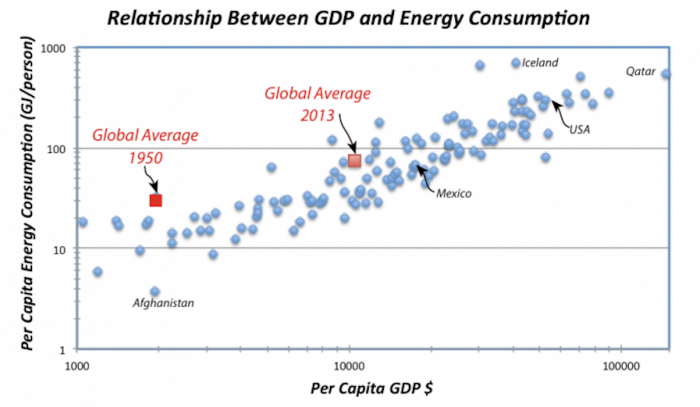
One important point from this graph is that between 1950 and 2013, the per capita GDP has increased by almost a factor of 10, and the per capita energy consumption has also increased, but only by a factor of 4.
Another important question is: How efficient are these economies in their use of energy? We can look at this using data on the "energy intensity" of different economies. The energy intensity of an economy is given by the total primary energy consumption divided by the total GDP for the country (you'd get the same thing by dividing the per capita energy consumption by the per capita GDP). A useful way to think of this energy intensity is that it represents how much energy a country uses to produce a dollar of economic output — so lower values are better. A low value means a country uses less energy to make a buck.
Since most energy use globally comes from burning fossil fuels, it is no big surprise that energy use on a national basis is closely related to carbon emissions on a national basis. (There are some exceptions, like the Nordic countries, which rely primarily on hydroelectricity.) The following short video from the Gapminder Foundation [134] (4:06) has a nice animation showing these trends over time for a number of different countries.
Video: Carbon Dioxide (4:06)
HANS ROSLING: All humans emit carbon dioxide and contribute to the climate crisis. But some humans emit much more carbon dioxide than others. Look at the statistics, where each bubble here represents a country. This axis shows the emission of carbon dioxide per person per year in tons, from less than one tone per person a year, to 10 and to 20. And the size of the bubbles, the size of this bubble up here, which is the United States, it shows the emission of carbon dioxide from the whole country, the total amount of carbon dioxide.
And this bubble down here is China. And the size of it shows how much China is emitting. The axis down here shows the income per person, $1,000, $10,000, and more. And the color of the bubbles shows the continent. The green ones are Americas, the brown one is the European bubbles, and the red one, are the Asian bubbles. And what you clearly can see is in 1975, because this data is from 1975, countries with low income have low emissions. And when their income increases, they get very high emission.
And what has happened over time? We fast forward the world here. And you can see that as countries grow richer, they emit more. And here comes China with its economic growth, it grows very fast. In the '90s, it moves this and they start to emit more and more. Whereas the United States continues to hover around about 20 tons per person. And in 2003, it's actually almost the same amount of emission as it was in 1975, 20 tons per person in the United States and in China down here, about three tons per person.
The bubbles are now about the same size. And it's because China has four times as big a population as the United States. So even if the United States emits much more per person, China will get quite a big bubble, because they are so many. But most of the countries actually are somewhere in between here in the world. They are somewhere in between China and the United States. China does not emit very much carbon dioxide per person.
Where does the carbon dioxide come from? Well, large parts of it come from coal. And why do they burn coal? To make electricity. I'll show you the statistics on that. This shows the production of electricity, the percentage that comes from burning coal. 10%, 20%, 40%, 60%. In China in 1975, they made 60% of their electricity out of coal, and the United States was a little less, about 45%. And over time, the change has been as you can see here, 75%, 80%; and China is producing more and more energy, and a higher and higher proportion of that electricity, which they produce, is from coal. And it's increasing to reach by the end of the century and the last year. Now China is producing about 80%, 70% to 80% of its electricity is made from coal. In the United States, it's about 50%.
So if we should stop the emission of carbon dioxide from burning coal, we must understand that this is the cheapest way of making electricity. And the people in China want electricity in their homes. There are still hundreds of millions of Chinese that don't have electricity in their homes. So what China needs is a technology that can produce electricity from renewable sources in a way that is cheaper than making it from coal.
Activate Your Learning
Check out the Gapminder World Website below. If you click “Play” in the lower left-hand corner, you can watch a time progression of GDP per-capita vs. total energy consumption per-capita, for a number of different countries from the 1960s and 1970s to the present. The United States and Denmark are highlighted as an interesting comparison. The animation is customizable, so if you want to highlight other countries you can go to the checklist on the right-hand side of the page.
Options and Opportunities for Energy Conservation
Options and Opportunities for Energy Conservation
Whether you think about the supply side of energy systems (the technologies and conservation processes that we utilize to convert fuels of various sorts into useful activities) or the demand side (relative energy consumption), wasting energy hurts the environment and costs society a tremendous amount of money. Several good reports on this topic have been released in recent years. While all are specific to the US (which isn’t surprising if you look back at the figure or at the Gapminder animation on the previous page), all of these reports identify avenues for increased energy conservation that would be relevant to just about any country with an industrialized economy.
Required Reading:
Have a look at the executive summaries for the three reports listed below. You must have Adobe Reader installed on your computer to view the ones listed as PDF files. If you do not have Adobe Reader installed on your computer, go to the Adobe website [136] to get it for free.
- Real Prospects for Energy Efficiency in the United States, [137] (PDF) Commissioned by the US National Academy of Science, this report focuses separately on energy use in the buildings sector; transportation; and industry. The full report is available freely at National Academy Press [138].
- Unlocking energy efficiency in the US economy [139] (PDF) This report from McKinsey, a consultancy, argues that sufficient energy efficiency potential exists in the US alone to reduce greenhouse gas emissions from that country by approximately one-third, all while saving consumers and businesses more than one trillion dollars (by comparison, the size of the US economy as a whole is about 15 trillion dollars).
- Assessment of Achievable Potential from Energy Efficiency and Demand Response Programs in the US [140] (PDF). This report, from the Electric Power Research Institute (EPRI), an industry group funded by US electric utilities, focuses primarily on efficiency gains in the production and utilization of electric power. EPRI concludes that conservation possibilities in the US are smaller than does the McKinsey report, but EPRI does not dismiss conservation in any way.
The potential for increased energy conservation spreads across several sectors:
- Residential energy conservation through the adoption of energy-efficient appliances, lighting, etc.; or the adoption of technologies and practices that can yield less energy use in existing appliances (examples might include programmable thermostats). Lighting (LEDs and compact fluorescent bulbs) and cooling are particularly singled out in the reports as favorable technological options for conservation, as well as the energy-efficient design of new buildings. Where conditions permit, ground-source heat pumps, which take advantage of constant warm temperatures in the shallow earth to provide heating and cooling, are particularly attractive for single-family new construction. Energy-efficient retrofits of existing buildings are a particularly difficult challenge, due to high costs for older buildings in particular.
- Commercial and industrial energy conservation through building efficiency measures similar to those mentioned for the residential sector, and the adoption of highly-efficient heating and cooling systems. One of the best options for heating and cooling efficiency is so-called “combined cooling, heating and power” (CCHP) or “tri-generation.” CCHP technologies work by using fuel in a combustion turbine to generate electricity and then capturing the waste heat to use in some industrial process. The heat can also be diverted to an absorption chiller to provide cooling for buildings (see figure below). When the cooling cycle is removed from the system, this is referred to as “combined heat and power” or “co-generation.” While cogeneration or CCHP systems are typically fueled by natural gas, they do offer efficiencies of over 90%. Gasified biomass can be used as fuel in place of natural gas, but is typically more expensive unless the cogeneration unit is located close to a large supply of biomass fuel. One example of a biomass cogeneration facility is in Gussing, Austria [141] (PDF). The waste heat produced in the Austrian system is distributed to local households and business through a set of steam distribution pipes, a process known as “district heating.”
- Transportation energy conservation, largely through improvements in gas mileage for passenger vehicles. The reports conclude that improving efficiencies of existing technologies (internal combustion gasoline engines; diesel engines; and hybrid gas-electric vehicles) would have a much larger impact on decreasing energy use in the transportation sector than would the introduction of new automotive technologies such as all-electric, biomass-fueled, or compressed natural gas vehicles. Trucking and air transportation have lower conservation potential than does the passenger vehicle market.
Achieving the Potential of Conservation
We have already mentioned investments like the biomass cogeneration plant in Austria as examples of conservation in action. The following two videos focus on two very different places in the United States that have undertaken aggressive conservation plans.
How the "Take Charge! Challenge" saved billions of BTUs... and four communities won $100,000 in the process.
Earth: The Operators'Manual
Video: Kansas: Conservation, the "5th Fuel" (ENERGY QUEST USA) (7:52)
Narrator: Kansas, a land of wheat, and corn, and cattle. In the heart of the country, it's number 48 out of all 50 states in energy efficiency. So this is a place where energy conservation can really make a difference. Come on, girls. Our region is a region of farmers. We are famously conservative, and we have talked from the beginning about putting the conserve back in conservative.
Narrator: According to a study by the Natural Resources Defense Council, improvements in energy efficiency have the potential to deliver more than $700 billion in cost savings in the U.S. alone. But, they say motivating consumers to take action is the key to unlocking this potential and that was the aim of Nancy Jackson's Climate and Energy project, with its Take Charge! Challenge. Kansans are patriotic, Kansans are hardworking, Kansans are humble.
Narrator: And Kansans are competitive. You all are competing against Ottawa, Baldwin City, and Paola, so really, you gotta beat those guys, yes? Do you want to help us beat Manhattan?
Narrator: 2011 was the second year for the Take Charge! Challenge, a friendly competition among 16 communities arranged in four regional groups aiming to reduce their local energy use. Some of the lowest cost, most effective ways that you can take ownership of your energy future is taking ownership of the efficiency and the conservation of your house or your business.
Narrator: Ray Hammarlund's office used federal stimulus dollars to fund four prizes of $100,000 for each of the four regions in the competition. Just as important as the grand prize, $25,000 went to each community to fund local coordinators who took the lead in galvanizing grassroots efforts. Here's how the challenge worked in Iola. The challenge started in January of this year and ends October 1st. You're required to have three community events. We're going to have a lot more than that. Today, we are at the Fight The Energy Hog Festival.
Becky Nilges: I love the hog. He was just so ugly that he is cute. He represents energy hogs in your home. You would probably let him in, but you don't know the damage he's going to do.
Narrator: Competing towns scored points by counting how many CFL bulbs and programmable thermostats were installed and how many professional home energy audits were done. Our job as energy auditors, both for commercial buildings, as well as residential buildings, is, we're essentially detectives. What's happening here? Is there a great deal of air leakage? And we're finding that the majority of the houses that we're dealing with actually use a lot more energy than they need to.
Narrator: In Lawrence, a house of worship did an energy audit, made changes, and got a pretty nice donation in its collection plate.
David Owen: One part of the audit was to contact the power company. Well, during that process, we discovered they had been overcharging us. And so we got a check, a rebate check from them for $4,456.
Narrator: Other changes start small, but add up. We were a little bit worried at one point that the congregation would not accept the very bright, white type lights. So as an experiment, we took one of these chandeliers and changed all the bulbs in it to the CFLs. And then we took the priest over here, and we said, "Which one did we do?" and he could not tell us. So that told us it was ok to do them all.
Narrator: Changing lights, adding insulation, and upgrading windows paid off. Even though it's an old building, we saved 64% on the consumption of energy in this room.
Narrator: Lighting makes up about 15% of a typical home's electricity bill, and lighting all of our residential and commercial buildings uses about 13% of the nation's total electricity. But changing out old bulbs is a lot easier than paying for audits and the energy enhancements they recommend. Here's where the 2011 Take Charge! Challenge promised material assistance using stimulus funds.
Ken Wagner: It's a $500 audit that costs you $100. The rest of that $500 is covered under the Take Charge Challenge program through the Kansas Energy Office. We really love the competitive spirit of the program and I think it's really raised a whole awareness of energy efficiency and the importance of energy efficiency to a lot of segments in our community here.
Narrator: Even Baldwin City bankers were grateful for financial assistance from state and federal governments.
Dave Hill: Nine months ago, we installed a 14 KW solar power system. I believe the initial cost of the system was basically 65,000 dollars, and then we got a substantial grant from USDA, I believe it was $20,000. We have about $18,000 of our own money invested in the system, after all the deductions. We think it will pay out in about 7-8 years.
Narrator: David Crane of NRG Energy thinks that kind of approach makes good business sense.
Crane: What I say to every businessman who has a customer-facing business, think of a solar panel not only as a source of electricity, think of it as a billboard. You don't even have to write your name on it. Just put it on the top of your store and it will be sending a message to your customers that you're doing the right thing when it comes to sustainable energy.
Narrator: Surveys of why conservation is hard to achieve have found that people want one-stop shopping, a place where they can find out what to do and get practical recommendations about who to hire and what it all might cost, just what this new facility was to offer. Now it's mid-October, time for the results of the 2011 Take Charge! Challenge.
MC: Fort Scott. MC: And the winner is Baldwin City.
Nancy Jackson: Over 100 billion BTUs were saved as a result of this Challenge, and millions and millions of dollars in each community. Those savings come from measures that have been installed that will guarantee those savings for years to come. So the savings are enormous over time. $100,000 has a nice ring to it, and it's a nice cash award for a community of our size. Our challenge now is to continue on with energy efficiency and encourage our community to save.
Nancy: One of our real goals was to help people to stop thinking about energy efficiency as the things they shouldn't do, as what not to do, and think about it instead as a tremendous opportunity to both save money in the near term, and to make our electric system more resilient in the long term. So it's about what we can do, both individually and together, and for us, that feels like the real win. The United States today is twice as energy efficient as it was in the 1970s. And I think we have the capability in the decades ahead to become twice as energy efficient again. We believe this is something that can be done really anywhere with great success.
Credit: Earth: The Operators' Manual [53]. "Kansas: Conservation, the "5th Fuel" (ENERGY QUEST USA) [144]." YouTube. April 22, 2012.
Baltimore: City government, utilities, and "Energy Captains" reach out to neighbors, with economically stressed communities saving most.
Earth: The Operators' Manual
Video: Baltimore: Conservation in a Big City (6:25)
Narrator: Baltimore, Maryland. According to one study, the air in Maryland is the 5th dirtiest in the nation. Are there ways for America's 21st largest city to cut emissions and save energy and money? Baltimore is unique in that it has over 225 neighborhoods within the city limits.
Narrator: Like Kansas, it's been using competition to jump-start the process of sustainability.
Narrator: BNEC, the Baltimore Neighborhood Energy Challenge used existing events like this anti-crime rally in the Park Heights neighborhood to let city residents know about opportunities to save energy and to share the top ten things to do. You signing people up? We are willing to go and talk to anybody, anywhere, where we can get some face time with people to talk about energy savings and conservation. And if it means going to an event talking about crime, we will go to an event talking about crime. If it's about a neighborhood block party, we will go to a neighborhood block party. We find people where we can get them. And the toilet tank bank and draft stopper gaskets as well. You're welcome.
Narrator: In addition to sharing information, the Baltimore Challenge enlisted energy captains to canvass their own neighborhoods taking the conservation message directly to homeowners. Ok, on this side as well, right?
Narrator: That's something the challenge's utility partners knew they couldn't do. I'm on the BNEC challenge pledge.
Ruth Kiselewich: If somebody just comes to your door and asks you to sign a petition to help the environment, to reduce your energy use, or if you see a message even from the local utility about all these great things you can do, it's not enough. My sister Tracy, Alice Kennedy from the Baltimore City Sustainability Commission.
Thomas Stosur: Unique thing about BNEC is the fact that it builds on this neighbor-to-neighbor advocacy and communication for energy conservation. It goes right down to the household level, you know, neighbors talking to each other across the yard. What do you guys do to save energy at home? Leave the lights off. During the day we turn the lights off. When we're not looking at TV, we turn the TV off. So the TV cannot watch itself. That's basically what we do.
Narrator: To jump-start energy savings, the challenge has a bag of free stuff including indoor/outdoor CFLs, just right for the porch lights so characteristic of Baltimore. Would you be interested in trying that? You can get up there-- He will! Everyone's household budgets are shrinking right now too, so I think that if we all just can be wise about what we're doing, we're all going save a little bit of money.
Robbyn: So, you're all signed up? I think I have to give you my account number.
Narrator: The challenge found that neighbor-to-neighbor sharing could be even more effective when the energy captains went inside homes to demonstrate quick and effective steps in a simplified peer-to-peer energy audit. Then when you're not here or you're not using it, turn the power strip off.
Narrator: For Baltimore residents, saving water also saves substantial dollars and this simple bladder reduces the amount used in each and every flush. What impressed the organizers of the first year's challenge was that Park Heights, home to the Pimlico racetrack and one of the most underserved neighborhoods saved the most energy, nearly 13%. The organizers said the main reason was the energy and enthusiasm of the Park Heights energy captains. They actually saw those residents who participated there, the largest benefit of any of the neighborhoods. To see this very grassroots effort take off and outperform any other neighborhood was really impressive.
Narrator: The Park Heights captains were also successful in applying for follow-on funding to continue their conservation efforts. The announcement of the 2011 community energy saving grants brought out U.S. Senator Ben Cardin and Baltimore mayor, Stephanie Rawlings-Blake.
Mayor Blake: Saving energy means lower utility costs and after the heat wave we've had, I'm sure everyone is interested in lower utility costs and the knowledge about energy savings is contagious.
Narrator: Baltimore city itself took lessons from the challenge and started pitting city departments against each other in a competition to catch energy vampires around city buildings. Using their new grant, the Park Heights captains started planning a new outreach campaign, using junior energy ambassadors to reach out to schools and others. With homeowners' permission, challenge staff could access utility bills and so track energy savings, neighborhood by neighborhood. So, we actually are able to show that we have proven savings by looking at utility usage data and showing that some of these little actions in the home can help save money and save energy.
Narrator: Bottom line, thanks in part to the challenge, Baltimore is on track to meet its goal of reducing carbon emissions and energy use 15% by 2015 and the utilities can cut back too. As we reduce energy use and energy demand what we're doing is we're eliminating the need for a new medium-size power plant. Particularly in hard economic times, this challenge helps build a sense of, "I can accomplish something individually. I can impact my life in a very positive way." Saving energy means a reduced strain on our power grid, lower utility costs as well as reduced greenhouse gas emissions, which means, for generations to come, we will have better air quality and a cleaner and more sustainable Baltimore.
Credit: Earth: The Operators' Manual [53]. "Portland: "The Trip Not Taken [145]." YouTube. April 22, 2012.
After you watch the videos, go back to the executive summary of the McKinsey report on energy efficiency, Unlocking Energy Efficiency in the U.S. Economy [146], and scroll down to look at Exhibit G on page 16 of the report. What strategies employed in Kansas and Baltimore can you find on this chart? Remember that a lot of the emphasis in Kansas and Baltimore was on building energy efficiency, which means things like improving lighting and so-called “shell improvements” (like new windows, weatherproofing and so forth). Can you find these strategies on the graph in Exhibit G? What do you notice about the cost of reducing CO2 emissions using these strategies? If you look hard enough you’ll see that the costs are negative, meaning that the residents of Kansas and Baltimore were saving money and doing something good for the planet.
That’s nice, but it raises an important question for energy conservation. If there really is so much money waiting to be saved through energy conservation, why aren’t people taking advantage? We don’t like to pay more than we have to for food, for clothes, or almost anything, nor do we like to drop hundred-dollar bills on the ground. But people systematically behave like they want to waste money paying for energy. This “energy efficiency paradox” has been noticed by economists for more than thirty years, and we still don’t really know why it happens. There are a few ideas, though:
- Tenancy: Many people do not own the places in which they live, yet are responsible for energy bills. This creates a problem known as the “split incentive,” where a building owner has no incentive to invest in conservation measures because he or she doesn’t pay the energy bills. The tenant has some incentive but does not have the right (since the tenant does not own the property in the case of rentals) to make major energy-efficient renovations. (Tenants can still buy efficient light bulbs and, in some cases, appliances, however.)
- Mobility: People in modern economies move fairly often – about every seven or eight years on average. This is about the typical payback period for a good energy conservation investment. The market does not always price conservation very well (i.e., a conservation investment in a house that you plan to sell soon may not be reflected in the market price of the house), so this makes conservation investments look risky.
- Liquidity: Some types of conservation investments, such as for weatherproofing or new appliances, can be expensive. Not everyone has enough cash lying around to make these investments, and charging expensive items to credit cards involves high-interest payments.
- Myopia or Loss Aversion: The way that people’s brains process difficult decisions may explain part of the energy efficiency paradox. The fact that many people do not make energy conservation investments (whether those are investments in appliances or “investments” in behavioral changes), even though those investments will pay for themselves relatively quickly, suggests some level of myopia (near-sightedness). People may not care about the future as much as we think they should. Another explanation from behavioral economics is that people tend to fear large losses more than they enjoy large gains. (So the bad feeling you get if I take $100 away from you is stronger than the good feeling that you get if I give you $100.) People also tend to fear things that they don’t understand or that represent deviations from historical behavior. So instead of a lack of far-sightedness, the reluctance to engage in conservation measures may reflect a perception among people that those measures will not really save them money; may involve uncomfortable behavioral changes, or will result in the replacement of functional appliances with things that don’t work so well.
Activate Your Learning
Most of us are not doing everything we could to conserve energy. Do you ever leave your computer on overnight? Drive when you could walk? Do you turn off the lights whenever you leave a public restroom unoccupied? Take a moment to write down what you think might be preventing you from saving in all the ways you could.
All of these factors suggest that there is some role for policy initiatives to play in encouraging conservation. Examples of policy initiatives include efficiency standards for transportation, housing or appliances; financial incentives; and improving information flow to people. Refrigerators in the United States are a simple but good example of how standards can be used to improve energy efficiency without degrading utility. Starting in the 1970s, the US federal government imposed energy efficiency standards on residential refrigerators. The result was, over the course of more than 20 years, the energy usage by individual refrigerators in the US went down by 80% while the size of the average refrigerator went up by nearly 20%.
Planners in some cities have also been able to encourage conservation by making energy-intensive activities more difficult or more expensive. We’ll finish off this module with the following video, which focuses on transportation, shows how Portland, Oregon became the bicycle capital of the US:
Earth: The Operators'Manual
Decisions made 30 years ago are now paying off in fewer car trips, and a more livable city.
Video: Portland: "The Trip Not Taken" (7:55)
Narrator: Can what cities do locally really move the dial toward national sustainability? Portland, Oregon, shows what's possible. 70 percent of all the oil consumed in America is used for transportation. But congestion wastes a huge amount, perhaps 16 percent of all the oil imported from the Persian Gulf. Despite our best efforts, we are still taking 10 percent of the world's petroleum supply just to get back and forth to work every day.
Narrator: Congressman Earl Blumenauer represents Oregon's third district, including Portland. He heads up the Congressional bike caucus. And his city started finding solutions some 30 years back. You know, one of the things we did was, we have an urban growth boundary, and what that is, is a ring around the city of Portland and its surrounding suburbs so that we cannot kind of sprawl out and we can't become Los Angeles.
Narrator: Between 1950 and 1990, America's urban population grew by 90%. But cities' land area grew more than 250%. Remarkably, Portland bucked that trend of urban sprawl. Key decisions made include a move from investment in freeways into transit and also to integrate transit planning with land use planning.
Narrator: Along with region-wide thinking, Portland now has an infrastructure that emphasizes mass transit, along with something this city pioneered in the 19th century... bicycles. It may be easy to parody Portland's love affair with all things green including the cycling community. But putting bikes to work has practical advantages if they can be made into something used for more than pure recreation. That's the purpose of what's called the Oregon Manifest, a design challenge to come up with clever and practical ways to transport packages as well as people. A decade ago, it was hard to find a bike that was not a racing bike or a mountain bike or a touring bike. Now any bike shop that you walk into, in the city of Portland anyway, you'll find city bikes, bikes that are really made for commuting to and from work, from riding to the park to the grocery store.
Narrator: Half of U.S. car trips cover less than 10 miles, and short trips where engines make a cold start are the most gasoline intensive and polluting. So if city bikes like these became mass-produced and popular and if every one of the nation's more than 100,000,000 households substituted one 5-mile trip each day, the nation would save $36.5 billion on gasoline. Already, one young entrepreneur has put Portland's non-polluting pedal power to work and made a business of it. We use these large tricycle trucks to deliver products into a two-mile radius of the urban core for Portland. We deliver everything from bread and produce to office products to water to cycle parts. Each trike can carry about 800 pounds. They're all electric-assisted. So it's a hybrid human and electric power. The less congestion we have, our goods and services move faster. We're an international global city. We have to be scrappy, so bicyclists are about reducing congestion. Over the past 2 1/2 years, we've helped displace over 25,000 truck or van-based deliveries. And when you start to look at the overall greenhouse gas reduction and avoidance, day by day it's not very much, but cumulatively it really starts to stack up.
Narrator: Cycling may be an outward and very visible sign of a transition away from cars, but the region's mass transit network also has serious numbers. We have been electrifying our transportation for 30 years here. And today there's literally about 150,000 boardings per day. And that means that people who otherwise might be traveling around in cars are traveling around in electrons. As a result of how we put the pieces together in Portland over the last 1/3 of a century, Portlanders voluntarily drive 20% less than the national average. This translates into a dollar savings for the typical household of more than $2,500 a year. And that's money that stays in our community. It is not going to Houston or Saudi Arabia, Japan or Germany.
Narrator: Portland's leaders talk about the trip not taken as something that saves money and benefits the environment. Currently, more than a quarter of Portland's workforce commutes by bike, carpool or mass transit. But planners are working on the next giant step in low carbon transportation, electric vehicles. I think we get to the point where electric vehicles will be able to do, you know, 98% of the personal transportation needs, and of course, that's mainly in the cities and the suburbs.
Narrator: An average Portlander's daily commute of 20 miles could easily be powered by a single battery charge. So Electric Avenue is a test site to get ground truth on how people might use e-vehicles. We think the next 10 to 30 years is going to be focusing on individual passenger vehicles like the ones behind me and also on urban freight and service vehicles, those parcel delivery trucks, the post office.
Narrator: Those vehicles also make lots of short trips with starts and stops, producing emissions and using up a lot of fuel. Nationally, companies like Frito-Lay are competing with others like Federal Express to see who can deploy the most low emission delivery vehicles. Tailpipe emissions are the single greatest source of emissions in our major cities. So I think probably every mayor, everywhere, supports the idea of getting more vehicles on their local roads that don't have tailpipes.
Narrator: Portland's original plans concentrated on land use and transportation. The focus for the future is the neighborhood. The goal is what's called a 20-minute neighborhood with most everything a family needs in easy walking or biking distance, where kids can learn how to ride safely to and from school.
Earl: This effort of integrating the pedestrian, streetcar, bike, along with mixed-use development, it is enriching the experience of going to the store, going to visit a neighbor and makes us a more sustainable, cost-effective community.
Narrator: Portland's transportation innovations have direct economic benefits. By actually doing the right things here, we've built this base of great export. We've got solar firms, wind firms. We have firms focused on energy efficiency with hundreds and hundreds of employees. And they're locating here, or they grew up here because we were trying to do something, and we built demand here. We're one of the cheapest cities on the West Coast because we offer options other than having to own a car to live and work and have a good life. I think just like anything you're trying to do, whether it's a business or a government or a city, good things don't happen by accident. You need to have some good plans. We can reduce that carbon footprint while we provide economic opportunities for our citizens and others.
Credit: Earth: The Operators' Manual [53]. "CO2 & the Atmosphere. [54]" YouTube. April 9, 2012.
In summary, there are ways that communities and other organizations are trying to get beyond the energy efficiency paradox. What the examples from Kansas, Baltimore and Portland (along with stories like the refrigerator standards) show us is that there are different ways to motivate individuals to act (ironically) more in their self-interest, saving money while reducing their environmental footprint at the same time. Good government policy is certainly one way of doing this, although a community-driven organization can be just as effective.
Summative Assessment
Reminder!
After completing your Summative Assessment, don't forget to take the Module 8 Quiz. If you didn't answer the Learning Checkpoint questions, take a few minutes to complete them now. They will help your study for the quiz and you may even see a few of those question on the quiz!
Global Energy Consumption, Carbon Emissions, and Climate Activity
In this activity, we will explore the relationships between global population, energy consumption, carbon emissions, and the future of climate. The primary goal is to understand what it will take to get us to a sustainable future. We will see that there is a chain of causality here — the future of climate depends on the future of carbon emissions, which depends on the global demand for energy, which in turn depends on the global population. Obviously, controlling global population is one way to limit carbon emissions and thus avoid dangerous climate change, but there are other options too — we can affect the carbon emissions by limiting the per capita (per person) demand for energy through improved efficiencies and by producing more of our energy from “greener” sources. By exploring these relationships in a computer model, we can learn what kinds of changes are needed to limit the amount of global warming in the next few centuries.
Instructions
Read the activity text and then run the experiments using the directions given on the downloadable worksheet below (also repeated here in the following pages). We recommend that you download the worksheet and follow it, writing down your answers as you go through the exercise. But first, view the video at the top of the "Experimenting With The Model" page, linked to below. You will then need enter your answers in the summative assessment.
Files to Download
Download worksheet [147]to use when submitting your assignment
Submitting Your Assessment
Once you have answered all of the questions on the worksheet, go Module 8 Summative Assessment (Graded). The questions listed in the worksheet will be repeated as a Canvas Assessment. So all you will have to do is read the question and select the answer that you have on your worksheet. You should not need much time to submit your answers since all of the work should be done prior to clicking the assessment quiz.
Grading and Rubric
This assignment is worth a total of 19 points. The grading of the questions and problems is below:
| Item | Possible Points |
|---|---|
| Questions 1-9 | 1 point |
| Questions 10-14 | 2 points |
Review of Energy Units
Review of Energy Units
Before going ahead, we need to make sure we all have a clear picture of the various units we use to measure energy.
Joule — the joule (J) is the basic unit of energy, work done, or heat in the SI system of units; it is defined as the amount of energy, or work done, in applying a force of one Newton over a distance of one meter. One way to think of this is as the energy needed to lift a small apple (about 100 g) one meter. An average person gives off about 60 J per second in the form of heat. We are going to be talking about very large amounts of energy, so we need to know about some terms that are used to describe larger sums of energy:
| Exponential notation | Scientific Notation | Abbreviation | Unit name |
|---|---|---|---|
| 103J | 1e3 J | kJ | kilojoule |
| 106J | 1e6 J | MJ | megajoule |
| 109J | 1e9 J | GJ | gigajoule |
| 1012J | 1e12 J | TJ | terajoule |
| 1015J | 1e15 J | PJ | petajoule |
| 1018J | 1e18 J | EJ | exajoule |
| 1021J | 1e21 J | ZJ | zettajoule |
| 1024J | 1e24 J | YJ | yottajoule |
In recent years, we humans have consumed about 518 EJ of energy per year, which is something like 74 GJ per person per year.
British Thermal Unit— the btu is another unit of energy that you might run into. One btu is the amount of energy needed to warm one pound of water one °F. One btu is equal to about 1055 joules of energy. Oddly, some branches of our government still use the btu as a measure of energy.
Watt— the watt (W) is a measure of power and is closely related to the Joule; it is the rate of energy flow, or joules/second. For instance, a 40 W light bulb uses 40 joules of energy per second, and the average sunlight on the surface of Earth delivers 343 W over every square meter of the surface.
Kilowatt hours— when you (or you parents maybe for now) pay the electric bill each month, you get charged according to how much energy you used, and they express this in the form of kilowatt hours — kWh. If you use 1000 Watts for one hour, then you have used one kWh. This is really a unit of energy, not power:
In other words, one kilowatt hour is 1000 joules per second (kW) summed up over one hour (3600 seconds), which is the same as 3.6 MJ or 3.6 x 10⁶J or 3.6e6 J.
Global Energy Sources
Global Energy Sources
The energy we use to support the whole range of human activities comes from a variety of sources, but as you all know, fossil fuels (coal, oil, and natural gas) currently provide the majority of our energy on a global basis, supplying about 81% of the energy we use:
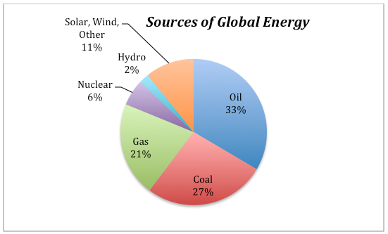
The non-fossil fuel sources include nuclear, hydro (dams with electrical turbines attached to the outflow), solar (both photovoltaic and solar thermal), and a variety of other sources. These non-fossil fuel sources currently supply about 19% of the total energy.
The percentages of our energy provided by these different sources have clearly changed over time and will certainly change in the future as well. The graph below gives us some sense of how dramatically things have changed over the past 210 years:
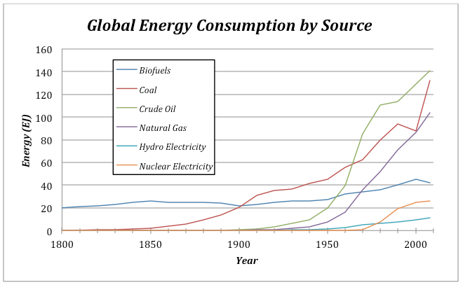
There are a couple of interesting features to point out about this graph. For one, note that the total amount of energy consumed has risen dramatically over time — this is undoubtedly related to both population growth and the industrial revolution. The second point is that shifting from one energy source to another takes a long time. Oil was being pumped out of the ground in 1860, and even though it has a greater energy density and is more versatile than coal, it did not really make its mark as an energy source until about 1920, and it did not surpass coal as an energy source until about 1940. Of course, you might argue that the world changed more slowly back then, but it is probably hard to avoid the conclusion that our energy supply system has a lot of inertia, resulting in sluggish change.
Global Energy Uses
Global Energy Uses
We are all aware of some of the ways we use energy — heating and cooling our homes, transporting ourselves via car, bus, train, or plane — but there are many other uses of energy that we tend not to think about. For instance, growing food and getting it onto your plate uses energy — think of the farming equipment, the food processing plant, the transportation to your local store. Or, think of manufactured items — to make something like a car requires energy to extract the raw materials from the earth and then assembling them requires a great deal of energy. So, when you consider all of the different uses of energy, we see a dominance of industrial uses:
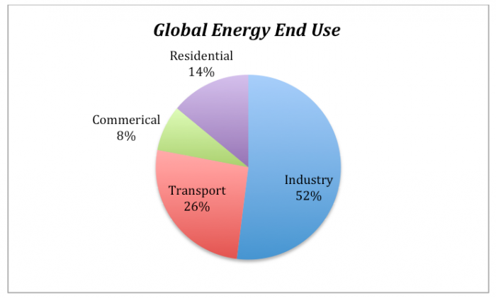
Global Energy Consumption
Global Energy Consumption
Since we are going to be modeling the future of global energy consumption, we should first familiarize ourselves with the recent history of energy consumption.
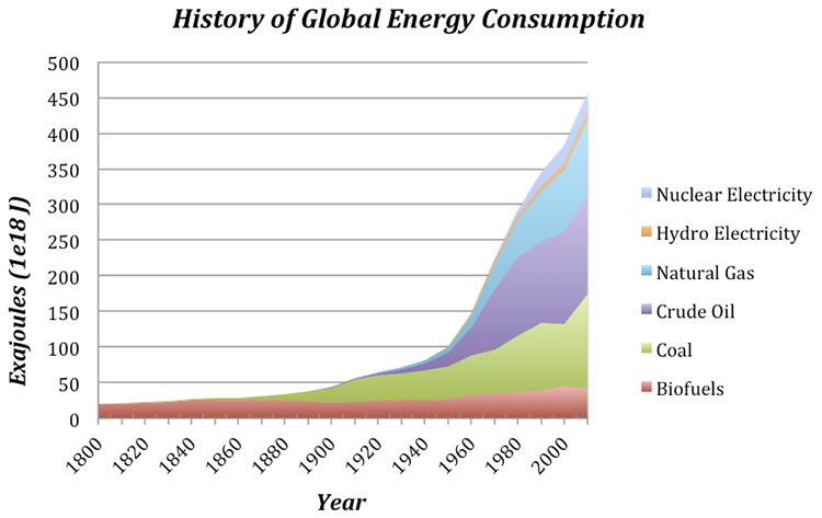
Question: Why has our energy consumption increased over this time period?
Here, we will explore a few possibilities, the first of which is global population increase — more people on the planet leads to a greater total energy consumption. To evaluate this, we need to plot the global population and the total energy consumption on the same graph to see if the rise in population matches the rise in energy consumption.
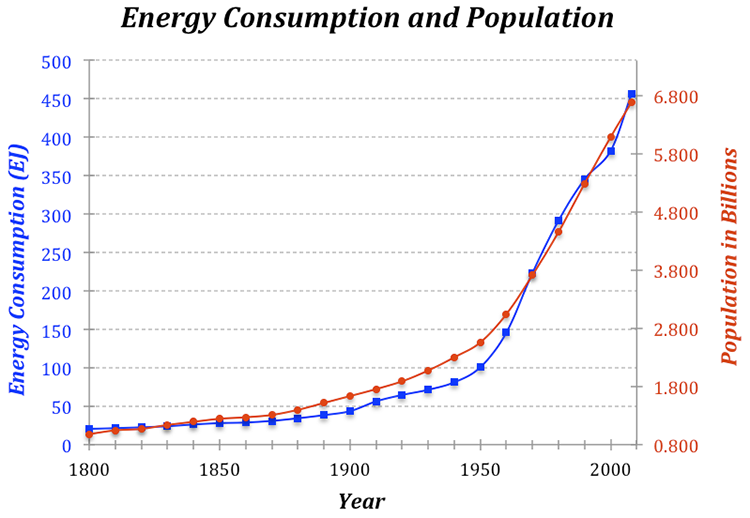
The two curves match very closely, suggesting that population increase is certainly one of the main reasons for the rise in energy consumption. But is it as simple as that — more people equals more energy consumption?
If the rise in global energy consumption is due entirely to population increase, then there should be a constant amount of energy consumed per person — this is called the per capita energy consumption. To get the per capita energy consumption, we just need to divide the total energy by the population (in billions) — so we’ll end up with Exajoules of energy per billion people.
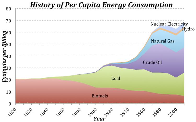
Today, we use about 3 times as much energy per person than in 1900, which is not such a surprise if you consider that we have many more sources of energy available to us now compared to 1900. Note that at the same time that the population really takes off (see Fig. 5), the per capita energy consumption also begins to rise. This means that the total global energy consumption rises due to both the population and the demand per person for more energy.
Let’s try to understand this per capita energy consumption a bit better. We know that the global average is 74 EJ per billion people, but how does this value change from place to place? There are some huge variations across the globe — Afghans use about 4 GJ per person per year, while Icelanders use 709 GJ per person. Why does it vary so much? Is it due to the level of economic development, or the availability of energy, or the culture, or the climate? You can come up with reasons why each of these factors (and others) might be important, but let’s examine one in more detail — the economic development expressed as the GDP (the gross domestic product, which reflects the size of the economy) per capita.
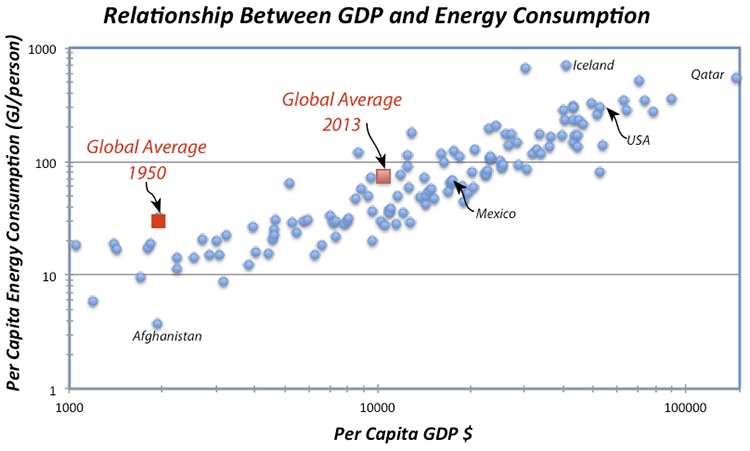
The obvious linear trend to these data suggests that per capita energy consumption is a function of GDP, while the fact that it is not a tight line tells us that GDP is not the whole story in terms of explaining the differences in energy consumption. Not surprisingly, we are near the upper right of this plot, consuming more than 300 GJ per person per year. Iceland’s economy is not as big per person as ours and yet they consume vast amounts of energy per person, partly because it is cold and they have big heating demands, but also because they have abundant, inexpensive geothermal energy thanks to the fact that they live on a huge volcano. Many European countries with strong economies (e.g., Germany) use far less energy per person than we do (168 GJ compared to our 301 GJ), in part because they are more efficient than us and in part because they are smaller, which cuts down on their transportation. A big part of the reason they are more efficient than us is that energy costs more over there — for instance, a gallon of gas in Italy is about $8. Our neighbor, Mexico, has a per capita energy consumption that is just about the global average.
Pay attention to the two red squares in Fig. 7 — these show the global averages in terms of GDP and energy consumption per person for two points in time. The trend is most definitely towards increasing GDP (meaning increasing economic development) and increasing energy consumption per person. Economic development is definitely a good thing because it is tied to all sorts of indicators of a higher quality of life — better education, better health care, better diet, increased life expectancy, and lower birth rates. But, economic growth has historically come with higher energy consumption, and that means higher carbon emissions.
Now that we’ve seen what some of the patterns and trends are, we are ready to think about the future.
Creating an Emissions Scenario
Creating an Emissions Scenario
There are many ways to meet our energy demands for the future, and each way could include different choices about how much of each energy source we will need. We’re going to refer to these “ways” as scenarios — hypothetical descriptions of our energy future. Each scenario could also include assumptions about how the population will change, how the economy will grow, how much effort we put into developing new technologies and conservation strategies. Each scenario can be used to generate a history of emissions of CO2, and then we can plug that into a climate model to see the consequences of each scenario.
Emissions per unit energy for different sources
The global emission of carbon into the atmosphere due to human activities is dominated by the combustion of fossil fuels in the generation of energy, but the various energy sources — coal, oil, and gas — emit different amounts of CO2 per unit of energy generated. Coal releases the most CO2 per unit of energy generated during combustion — about 103.7 g CO2 per MJ (106 J) of energy. Oil follows with 65.7 g CO2/MJ, and gas is the “cleanest” or most efficient of these, releasing about 62.2 g CO2/MJ.
At first, you might think that renewable or non-fossil fuel sources of energy will not generate any carbon emissions, but in reality, there are some emissions related to obtaining our energy from these means. For example, a nuclear power plant requires huge quantities of cement, the production of which releases CO2 into the atmosphere. The manufacture of solar panels requires energy as well and so there are emissions related to that process because our current industrial world gets most of its energy from fossil fuels. For these energy sources, the emissions per unit of energy are generally estimated using a lifetime approach — if you emitted 1000 g of CO2 to make a solar panel and over its lifetime, it generated 500 MJ, then it’s emission rate is 2 g CO2/MJ. If we average these non-fossil fuel sources together, they release about 5 g CO2/MJ — far cleaner than the other energy sources, but not perfectly clean.
So, to sum it up, here is a ranking of the emissions related to different energy sources:
| Energy Source | g CO2 per MJ |
|---|---|
| Coal | 103.7 |
| Oil | 65.7 |
| Gas | 62.2 |
| Non-Fossil Fuel* | 6.2** |
*Hydro, Nuclear, Wind, Solar
**This will decrease as the non-fossil fuel fraction increases
Calculating global emissions of carbon
Calculating global emissions of carbon
Our recent energy consumption is about 518 EJ (1018 J). Let’s calculate the emissions of CO2 caused by this energy consumption, given the values for CO2/MJ given above and the current proportions of energy sources — 33% oil, 27% coal, 21% gas, and 19% other non-fossil fuel sources. The way to do this is to first figure out how many grams of CO2 are emitted per MJ given this mix of fuel sources and then scale up from 1 MJ to 518 EJ. Let’s look at an example of how to do the math here — let r1-4 in the equation below be the rates of CO2 emission per MJ given above, and let f1-4 be the fractions of different fuels given above. So r1 could be the rate for oil (65.7) and f1 would be the fraction of oil (.33). You can get the composite rate from:
Plugging in the numbers, we get:
What is the total amount of CO2 emitted? We want the answer to be in Gigatons — that’s a billion tons, and in the metric system, one ton is 1000 kg (1e6 g or 106 g), which means that 1Gt = 1015 g (1e15 g).
So, the result is 31.8 Gt of CO2, which is very close to recent estimates for global emissions.
It is more common to see the emissions expressed as Gt of just C, not CO2, and we can easily convert the above by multiplying it by the atomic weight of carbon divided by the molecular weight of CO2, as follows:
And remember that this is the annual rate of emission.
Let’s quickly review what went into this calculation. We started with the annual global energy consumption at the present, which we can think of as being the product of the global population times the per capita energy consumption. Then we calculated the amount of CO2 emitted per MJ of energy, based on different fractions of coal, oil, gas, and non-fossil energy sources — this is the emissions rate. Multiplying the emissions rate times the total energy consumed then gives us the global emissions of either CO2 or just C.
We now see what is required to create an emissions scenario:
- A projection of global population
- A projection of the per capita energy demand
- A projection of the fractions of our energy provided by different sources
- Emissions rates for the various energy sources
In this list, the first three are variables — the 4th is just a matter of chemistry. So, the first three constitute the three principal controls on carbon emissions.
Here is a diagram of a simple model that will allow us to set up emissions scenarios for the future:
In this model [148], the per capita energy (a graph that you can change) is multiplied by the Population to give the global energy consumption, which is then multiplied by RC (the composite emissions rate) to give Total Emissions. Just as we saw in the sample calculation above, RC is a function of the fractions and emissions rates for the various sources. Note that the non-fossil fuel energy sources (nuclear, solar, wind, hydro, geothermal, etc.) are all lumped into a category called renew, because they are mostly renewable. The model includes a set of additional converters (circles) that allow you to change the proportional contributions from the different energy sources during the model run.
This emissions model is actually part of a much larger model that includes a global carbon cycle model and a climate model. Here is how it works — the Total Emissions transfers carbon from a reservoir called Fossil Fuels that represents all the Gigatons of carbon stored in oil, gas, and coal (they add up to 5000 Gt) into the atmosphere. Some of the carbon stays in the atmosphere, but the majority of it goes into plants, soil, and the oceans, cycling around between the reservoirs indicated below. The amount of carbon that stays in the atmosphere then determines the greenhouse forcing that affects the global temperature — you’ve already seen the climate model part of this. The carbon cycle part of the model is complicated, but it is a good one in the sense that if we plug in the known historical record of carbon emissions, it gives us the known historical CO2 concentrations of the atmosphere. Here is a highly schematic version of the model:
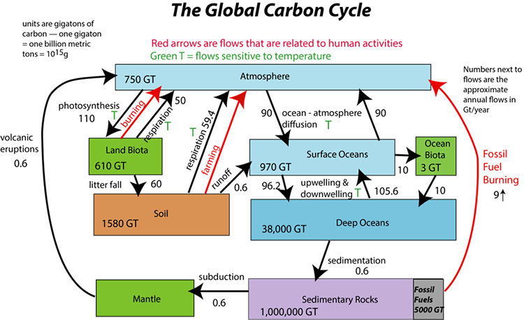
Experiments with the Model
Experiments with the Model
Video: Energy Emissions Activity (5:32)
Here's the control panel for the model that we will be working with in this exercise, which combines global energy and emissions along with the global carbon cycle model and a global climate model. It's a big, complicated thing but there are just a few controls here you need to know about. They are in kind of different colors here, sectors to kind of control, coal, and oil, and natural gas down in here. This is where we can control the per capita energy history over time, and this is where we can control the population limit that's eventually reached, and this up here, this slider, is the starting time, when some change to reduce the amount of coal oil or gas we use is implemented.
So let me show you how this works. If you just run this the way it comes, without making any changes, you see this. It tells us the total emissions. This is in Gigatons of carbon per year globally, and it shows that going up like this over time, right. Now if I click on the next page, you'll see that in in reality, at this time here, about 2164, we would actually run out of fossil fuels. Here's the fossil fuel reservoir. It's dropping, dropping dropping, gets to zero. At that point, we can't put any more carbon in the air because we don't have any more of these fossil fuels. But this graph here, page 1, shows what we would emit if we could, if we could actually tap into that amount. Anyway, we'll be looking at both of these graphs a little bit.
Let me show you how this works. If we want to say, let's try to reduce the amount of our energy that's supplied by coal. So we switch to that. And this is the coal reduction time. So beginning in the year 2020, and for the next 30 years, we're gonna reduce coal by let's say, let's reduce it by 10%. So currently coal, if you look at this, it's making up 27% of our mix of energy sources. So if we reduce it by 10, then it'll be making up 17. Now the 10 that we reduced coal by is going to add to the renewables down in here, which is currently 0.19. So this is a whole bunch of things, hydro, solar, wind, nuclear, biomass, all lumped together. So if we take from one of these fossil fuel sources, we're going to add it to the renewables here.
So let's implement this change, see what happens. There we go. See we've brought the emissions down quite a bit, and in this case let's see, we don't run out of fossil fuels for a little bit later here. So let's see if we get it so we don't run out of fossil fuels. Let’s reduce the amount of oil we use by 10 percent. See if that does it, And yeah, we just run out at the very, very end here. Ok, so you see what happens there.
Now this is this is connected to a global carbon cycle model. The fossil fuels is part of that. It's also connected to a climate model, so if we were to click through all these different pages in the graph pad, you can see all these little parameters plotted here. Here's the global temperature change and we see that we have increased the temperature by about six and a half degrees by the year 2020, out in here. So 2100 is in here. 2010 is our starting time here. So if we turn these switches off, then we are not going to restrict our use of fossil fuels for an energy source, and we'll just continue with this this mix that's indicated here, the initial fractions. Now there are a couple of other things that you can change here. You can change the population limit by moving this dial around, more or less people, 12 is sort of the default value. You can also change the per capita energy graph here. So if you look at that, this actually is a little funny, it goes from the year 2010 right here. Let's call it the present. And this line over here, this vertical line is the year 2200. So there are 5 divisions in there for about 190 years. So each one those is 38 years. So this vertical line here is the year 2048 and and so on. You just keep adding 38 years to figure out which time each of those vertical lines corresponds to.
You can change this graph. It starts off at 74, and what we're assuming is that it’s going up, at its kind of current pace, but then it levels off up here eventually, by the end of this. But you could take a more optimistic view and say, well we're going to become more conservative in our use of energy and more efficient, and we'll reduce it to a lower level and we can follow a trajectory like that. And you hit okay, and then that will be implemented and you'll see what effect that does. You can undo that change by clicking on this U down here. And let's say you've made a lot of changes and you've made a lot of graphs, you can reset the graphs, or you can restore all the devices to their kind of default values here. All right, so that's it. Have fun with it.
Important Instructions
- In this exercise, we will work with a model of a system that has many parts — carbon cycle, climate model, population model, and energy model. We'll explore how making changes to one part of this system alter the behavior of other parts of the system. This illustrates an important part of what we call Systems Thinking, which is that in complex, connected systems, a change in one part may have consequences that spread throughout the system.
- After watching the movie above, run the model [149]without making any changes to establish what we will call the “control” case for these experiments. You can return to this control case by hitting the Restore All Devices button.
- Write down the Total Emissions at the year 2100 — this will be our comparison point in time for later experiments.Look at page 2 of the graph pad, which shows human emissions, which is essentially the same as Total Emissions except that it is limited by the total amount of fossil fuel carbon we have; if we burn through all that carbon, human emissions will drop to 0, and in fact, you’ll see that it drops off to zero about the year 2165 — this is when we run out of fossil fuels. So if we haven’t solved our energy problems by then, we’re in deep trouble!
| Practice | Graded | |
|---|---|---|
| switch to turn on | coal | oil |
| f reduction | 0.24 | 0.30 |
| f reduction time | 20 | 20 |
The table above gives you a set of instructions related to the practice and graded versions of the summative assessment, including which switch to turn on, the fractional reduction, and the time over which this reduction takes place. As one of the fossil fuel sources is reduced, the model increases the renewable fraction so that the total of all the fractions stays at 1.0.
1. How much does switching from one of the fossil fuel sources to renewables decrease the emissions in the year 2100? First, run the model as is when you open it (all switches are in the off position) and take note of the total emissions for the year 2100 on graph #1 (this is our control case), then make the changes prescribed in the table above and find the new emissions in the year 2100 and then calculate the difference from the control case.
Difference = (±2 Gt)
Practice Answer = 11.3
Video: Module 8 Question 1 (1:39)
For the first problem, we are going to see what happens if we completely eliminate our use of oil. And, so to do this problem, first, we just run the control version. So we hit run and it shows us those results, that's with all the switches in the off position. Now we are going to turn the oil switch on. We are going to turn f oil new to zero. That means oil, after the adjustment, will represent zero of our energy, so that completely eliminates it. And remember the renewable fraction will rise as a result of that. We have to make sure that the start time is at 2020, the adjust time is at two. We don't change the per capita energy or the population limit and we run the model again now. And we see a different result here. Now we are going to look at page two. This shows the total emissions and this is what we are interested in. We want to find the total emissions in 2100 and how they differ. So I slide the cursor along back and forth here until I get to 2100 and that is right there. And I see that in run one, that's our control, it was 29.57 of gigatons of carbon emitted. And then in run two, it is down to 19.78, and so it's a difference of 9.79. And that is the answer that we are looking for, the difference, the reduction, basically the distance between the blue curve and this dotted red one here.
2. Does this change lead to a leveling off of emissions, or do they continue to climb?
a) Levels off
b) Continues to climb [correct answer for practice version]
3. Which has a bigger impact in reducing emissions — limiting population growth to 10 billion, or reducing your fossil fuel fractions as prescribed? Here, make sure all the switches are turned off, and then set the Pop Limit to 10.
a) Population limitation
b) Fossil fuel reduction [correct answer for practice version]
Video: Module 8 Question 3 (1:10)
For question 3, we are going to see whether or not reducing oil entirely, or reducing the population, has a bigger effect on the total emissions by the year 2100. So we have already done the case where we reduced oil. Completely cut it out. So now we are going to look at the alternative. So we turn that switch off and get the population down to 10, that's the population limit. Then we run the model again and we see in this kind of pink dashed line here, that's the emissions that pertains to this case, where the population limit is 10. You can see that right away the distance between the dashed pink curve here and the blue one is less than the difference between the blue and the dashed red. So, cutting out oil entirely has a bigger effect in reducing emissions than limiting the population growth to 10 billion.
Reset the Pop Limit to 12 when you are done with this one.
4. How much does reducing all of the fossil fuel sources to a fraction of 0.05 decrease the emissions in the year 2100 compared to the control case (set all switches to the off position for the control)? Set the start time to 2020, then turn on all the switches, and set the f reductions so that each fossil fuel source ends up at 0.05 after 30 years. You can check to make sure you’ve done this correctly by looking at the fractions on page 4 of the graph pad.
Set all of the reduction times to 20 years. For the graded version, lower the fossil fuel sources to a fraction of 0.1; leave everything else the same as the practice version.
Difference = (±2 Gt)
Practice Answer = 23.8
Follow these steps:
- Run the control case (don’t make any changes to the model)
- Turn on all the switches
- Set all the reduction times to 20
- Set f coal reduction to 0.22; f oil reduction to 0.28; f gas reduction to 0.16
- Run the model again — you should now see a blue curve from the control run and a pink curve from the modified run (looking at graph #1)
- Run the cursor along the control case curve until you get to the year 2100 and write down the total emissions at that point — it should be 29.57 (the units are Gt C/yr).
- Run the cursor along the modified case curve (pink one) until you get to the year 2100 and write down the total emissions at that point — it should be 5.74.
- The question is asking for the difference in emissions, so subtract 5.74 from 29.57 and you get 23.83 Gt C/yr — this is the reduction in emissions we would achieve if we lowered all of the fossil fuels to just 5% of our total energy consumption.
Video: Module 8 Question 4 (1:33)
For question number 4 we're going to look at what happens if we drastically reduce all of the different fossil fuel energy sources. So we're going to turn on, well first we'll do the control run, so we run that and see what the emissions are now. We are going to follow the instructions here and turn on all the coal, oil, and gas switches and were going to reduce them all to a new fraction of .05, that's 5%. So each one of them will make up 5% of our total energy sources. Then we're not going to change per capita energy, population limit at 12, start time for reduction at 2020, and adjust time is two years. So we do that, and run the model, and we see results here greatly reduced emissions. So that in 2100, we've got 5.74 gigatons of carbon removed. And so you just subtract 5.74 from 29.57 to get the answer. Which is going to be 23 point something. So that is the answer for that.
5. Which has the bigger impact in reducing emissions — halting the rise in per capita energy use, or reducing our fossil fuel fractions? For this one, you’ll use your answer to the above question (#4) and compare to one in which you turn off all the switches, and then change the per capita energy graph so that it is more or less a straight line all the way across. You can check to see how well you’ve done this by looking at page 8 of the graph pad after you run the model. So, which has a bigger impact in reducing emissions?
a) Fossil fuel reduction [correct answer for practice version]
b) Per capita energy change (i.e., conservation + efficiency)
Video: Module 8 Question 5 (1:50)
For question number 5 we are going to see how the emissions reductions that we get from reducing the reliance on fossil fuels dramatically compares to reducing the per capita energy demand instead. So, this shows results from question 4. So, this was when we set all the fractions to 5% or 0.05 for coal, oil, and gas. But we kept the per capita energy graph, in its starting form, here. Now, what we are going to do is just to turn off those switches. So, we are not going do anything in terms of reducing fossil fuels, but we are going to become more efficient in terms of our energy use. And so, we want to have basically a straight line across here. So, I am just going to try to approximate. You do not have to be to precise about this but there, that is more or less a straight line all the way across. So per capita energy will not increase, it will stay the same per person as we go thru time. So, you hit okay and then run the model again. We see the resulting emissions curve, and you can see that it is higher than what we got for reducing fossil fuels. This particular reduction, or at least no growth per capita energy demand, didn’t give us as big of a result in terms of emission reductions in the year 2100 as the fossil fuel reduction scenario. So that is the answer to this question.
Note: These are pretty drastic changes that we’ve just imposed — they would require nearly miraculous social, political, and technological feats. But, it is good to get a sense of what the limits are.
This table refers to the question below — it provides a set of model settings that lead to stabilization of emissions.
| Practice | Graded | |
|---|---|---|
| switches on | coal, oil | all |
| start time | 2020 | 2050 |
| f reduction coal | 0.12 | 0.10 |
| f reduction time coal | 200 | 200 |
| f reduction oil | 0.10 | 0.07 |
| f reduction time oil | 100 | 200 |
| f reduction gas | 0 | 0.05 |
| f reduction time gas | 20 | 200 |
| Pop Limit | 12 | 11 |
| Per capita energy limit | 75 for the whole time | 100@2048, then steady at 100 for the rest of the time |
Refer to the worksheet to see what your per capita energy graphs should look like for the practice and graded versions.
6. One of the main goals people mention in the context of future global warming is halting the growth of our emissions of CO2. As you have seen so far, there are a variety of ways to reduce that growth. Now, let’s see what happens when we stabilize emissions. Modify the original model to create the emissions scenario defined by the parameters supplied in the table above — this should result in an emissions history that more or less stabilizes. Then find the emissions in the year 2100.
Total Emissions in 2100 = ±2.0 Gt C/yr
Practice version — 11.3 Gt C/yr
7. Now that you have an emissions scenario that stabilizes (the human emissions of carbon remain more or less constant over most of the time), let’s look at temperature (page 9 of the graph pad). Remember that global temperature change in this model is the warming relative to the pre-industrial world, which is already about 1°C in 2010, the starting time for our model. What is the global temperature change in the year 2100?
Global temperature change = ±0.5 °C
Practice version — 2.6°C
8. Now study the temperature change (graph#9) and the pCO2 atm (the atmospheric concentration of CO2 in ppm or parts per million — page 10 of the graph pad) for the time period following the stabilization of emissions. Does the stabilization of emissions lead to a stabilization of temperature or atmospheric CO2 concentration?
a) both stabilize
b) neither stabilizes — both increase [correct answer for practice]
c) neither stabilizes — both decrease
d) CO2 goes up; temperature goes down
e) CO2 goes down; temperature goes up
Video: Module 8 Questions 6 through 8 (4:13)
Questions 6, 7, and 8 all have to do with a model scenario in which we get the total emissions of carbon to more or less stabilize for a good part of the model run. So, to do this experiment we will first run the basic model control version, so just hit the run button. Then we follow the instructions in the question to set it up to get a scenario where the emissions more or less stabilize. So, to do that we turn on all the switches. We are going to set the new fraction to 0.15, that would be15% for each of these, so that is a decent reduction to our reliance on fossil fuels. We are going to make the transition to be a little slower, so we will move the adjust time to ten. And then we're going to change the per capita energy history. Normally when you open this, you just see this graph. If you click on the table here, you see individual entries. And we are going to alter this as follows: 74 there, 72, and this is 70. This is going to be 67, and 64, and 61. This is just another way to alter that graph. So hit OK. And you see that the graph is declining slightly over time. Keep the population limit at 10. Ok. That’s 11, we’ll make it 10. There we go. Now, we’ll run the model and you see that give us this emissions history that more or less stable. So that is staying the same, and you can see what the emissions are in the year 2100. Gets us down to 6.14 gigatons of carbon in the year 2100. Now what kind of a temperature change can that cause? That is question number 7. So, we look on page 3of the graph pad here, so the temperature change in the year 2100 is1.91 degrees, as opposed to3.92 for the control version. So that is your answer to number 7.
Then number 8 asks this question. So, we stabilize the emissions, does the temperature stabilize and the CO2 concentration in the atmosphere? Well you can see right away that the temperature does not stabilize, it continues to rise, it is just not rising as fast as this control case here. So, to look at the pCO2, we go to page 9 of the graph pad here. There you see the CO2 concentration in the atmosphere starts off at about 400, or a little bit less than that in 2010, and by the time you get to 2100, we have a CO2 concentration in the atmosphere, in this altered version of 484, and that is parts per million, as opposed to 851 in the control version. But look even the CO2 concentration, that does not stabilize either, that continues to go up. So, it is not enough to just stabilize carbon emissions, clearly we need to actually get them to reduce if we want to bring the CO2 concentration down to a lower level and kind of keep it sable. And if we do that, CO2 concentration and temperature are very closely linked together in this model, so they’ll generally do more or less the same thing.
Reset the model before going to the next question.
9. Now, let’s say we want to keep the warming to less than 2°C, which the IPCC recently decided was a good target — warming more than that will result in damages that would be difficult to manage (we would survive, but it might not be pretty). We have seen by now that it is simply not enough to stabilize emissions at a level similar to or greater than today’s — that leads to continued warming. So we need to reduce emissions relative to our present level, which will be hard with a growing population and economy (and thus a growing per capita energy demand).
So, let’s see what is necessary to stay under that 2° limit, given some constraints. In all cases, we’ll assume that we can get our oil and gas fractions down to 0.1 (i.e., 10% each) over a time period of 30 years with a start time of 2020. We’ll leave population out of it (keep the limit at 12 billion), and for the practice version, we’ll make the assumption that per capita energy demand remains constant at a level of 75 for the whole time period (modify the graph so that it is a horizontal line at a level of 75 on the y-axis). This leaves f coal reduction as our main variable. The time period for reducing coal will be 30 years. You can change four scenarios for coal reduction as follows:
A: Keep the coal fraction unchanged (switch off)
B: Reduce the coal fraction to 10% (so f coal reduction would be .17)
C: Reduce the coal fraction to 5% (set f coal reduction to .22)
D: Reduce the coal fraction to 0% (set f coal reduction to .27)
For the graded version, we will change the per capita energy demand graph so that it drops to 50 by the year 2086 (see worksheet for a picture of what the graph should look like).
Find the coal fraction that keeps the temperature closest to 2°C by the year 2200.
Coal reduction scenario (A,B,C, or D):
Practice version: D is the correct answer
Video: Module 8 Question 9 (1:53)
For question 9, we are going to see what needs to be done in terms of reducing the coal fraction to keep the temperature below a two-degree limit by the year 2200. So initially I am just going to restore everything to the starting conditions here. Then we will run it once and see what happens, there we have got the very high temperature change. Now we are going to follow the instructions for setting up the model. We are going to set the start time to 2030. Where going to set the adjust time to 10. We are going to turn on the oil switch and the gas switch. And we are going to keep the per capita energy at 74 the whole way across. So, we do it like this, the same thing we have done before. Hit okay. So, there we have that set. We are going to set the f oil new (new oil fraction) to 0.1 and do the same with gas. So, we reduced those two to 10%, .10. Then we have the population limit set at 12, so that is good. Now we are going to explore 4 different scenarios and in each scenario we are going to do something different with the coal. The first one we are going to keep the coal fraction unchanged, so we have the switch off, and we run it. We see what the temperature is, and by the end we are at 3.59 degrees is the temperature change. So that is not acceptable. So that one does not do it so we will try scenario B. So, we turn the coal switch on and we then reduce the f coal new to .1 and run it. So lower temperature, we are using less coal, but we are still at 2.66 so that is too high. Now we will change f coal new to .05 and run it again. And we see we are still up here at 2.36. So, we are still above two. Now let’s see what happens if we eliminate coal entirely, move it to zero and run it again. And here we are, and at that point we have still a temperature of 2.05, so that one is very close, but it still does not get us quite below that 2 degree limit. I So, in this case, none of those case scenarios works right and that is one of the choices in the question is that none of these above scenarios keeps the temperature below 2 degrees. The last one comes close but it still does not quit get there.
We’re done with this model for now, but you will be coming back to something similar to this later on when you do your capstone projects. You’ll use the model to design an emissions and energy consumption scenario for the future for which you’ll also explore the environmental and economic consequences.
The following questions encourage you to step back and think about what you’ve learned here. Short answers will suffice here.
10. What are the three principal variables that determine how much carbon is emitted from our production of energy? (Hint: look at page 11 of this worksheet)
11. What is the relationship between economic development (growth) and per capita energy consumption? (Hint: look at figure 7 of this worksheet)
12. Among the various sources of our energy, which has the highest rate of CO2 emitted per unit of energy? (Hint: look at table on page 10 of this worksheet)
13. What happens to the atmospheric concentration of CO2, and thus the global temperature, if we stabilize (hold constant) the emissions rate? (refer to question #8 above)
14. Can we stay under the 2°C warming limit in the year 2200 by completely eliminating our reliance on fossil fuel energy sources alone (reducing coal, oil, and gas to 0% of our energy supply), or do we also need to reduce our energy consumption per capita? (make appropriate changes and then run the model to figure this out)
Summary and Final Tasks
Summary
Energy conservation – making investments or changing behaviors to reduce energy consumption without lifestyle sacrifices – is a critically important energy option, regardless of whether you support broader use of fossil fuels or you support a transition to a low-carbon energy portfolio. Everyone should agree that more conservation is a good thing, and the potential conservation options are vast both in number and in their possible impacts on the environment and climate. Nonetheless, energy conservation presents a difficult paradox. On the one hand, the majority of energy conservation options have a double dividend, saving money and helping the environment all at the same time. On the other hand, convincing individuals and businesses to spend time and money undertaking conservation investments has proven remarkably difficult. (At the very least, you would think that people like to save money.) People make seemingly irrational decisions for all sorts of reasons, and some centralized coordination can help to overcome the energy efficiency paradox. Three examples from the United States have shown how monetary incentives, community outreach, and deliberate planning have all contributed to some form of effective energy conservation.
Reminder - Complete all of the Module 8 tasks!
You have reached the end of Module 8! Double-check the Module Roadmap to make sure you have completed all of the activities listed there before you begin Module 9.
Module 9: Geoengineering
Module 9: Geoengineering
In one sense, humans have been altering or “engineering” different aspects of the Earth since the earliest civilizations — but this has mainly been on a small scale. Now, the threats presented by climate change are leading to the development of a whole new set of schemes that seek to alter the global climate — a fairly ambitious task. Geoengineering is the term used to describe these schemes to intentionally modify or control Earth’s climate system, in order to reduce global warming. There are two general categories of geoengineering schemes — CO2 removal and insolation (sunlight) reduction.
Goals and Objectives
Goals and Objectives
Goals
- Recognize the great diversity of energy options currently available to us
- Explain scientific concepts in language non-scientists can understand
Learning Objectives
By the end of this module, you should be able to:
- Recall the various geoengineering strategies that have been suggested to mitigate climate change
- Recognize that geoengineering alone is unlikely to be sufficient to mitigate climate change
- Assess what you have learned in Unit 2
Roadmap
Roadmap
| To Read | Materials on the course website (Module 9) | |
|---|---|---|
| To Do | Quiz 9 Unit Self-Assessment |
Due Sunday Due Sunday |
Questions?
If you prefer to use email:
If you have any questions, please email your faculty member through your campus CMS (Canvas/Moodle/myShip). We will check daily to respond. If your question is one that is relevant to the entire class, we may respond to the entire class rather than individually.
If you prefer to use the discussion forums:
If you have any questions, please post them to Help Discussion. We will check that discussion forum daily to respond. While you are there, feel free to post your own responses if you, too, are able to help out a classmate.
Insolation Reduction
Insolation Reduction
These projects seek to reduce the insolation (incoming solar radiation) — the energy input for our climate — absorbed by the Earth. They do not reduce greenhouse gas concentrations in the atmosphere, and thus do not address problems such as ocean acidification caused by the excess CO2. Insolation management projects appear to have the advantage of speed, and in some cases, costs. There are a variety of ways that we might achieve a reduction in insolation and thus cool the planet.
Note:
Ocean acidification is one of the more serious consequences of emitting carbon dioxide into the atmosphere. The atmosphere and the oceans exchange gases like oxygen and carbon dioxide to achieve a kind of equilibrium or balance in terms of concentration. So, if we put more CO2 into the atmosphere, the oceans will try to absorb a lot of that CO2. Indeed, we now know that the oceans absorb something like 25% of the CO2 we have emitted through the burning of fossil fuels. This is a good thing in terms of moderating the greenhouse gas forcing of our climate, but it has the result that the oceans become more acidic — just as carbonated water is more acidic than tap water. The problem with this is that the phytoplankton that make up the base of the food chain in the oceans cannot tolerate acidic conditions. The oceans are in fact becoming more acidic, and while we humans would never sense this change, the far more sensitive phytoplankton definitely feel it. If further acidification occurs, the phytoplankton will decline and because they are the base of the food chain, most other life in the oceans will also decline, putting the whole ocean ecosystem in peril. This is yet another reason why we need to stop emitting CO2 and even reduce the amount of CO2 in the atmosphere. If we pull CO2 out of the atmosphere, the oceans will release some of its CO2 into the atmosphere, reducing the acidity of the oceans.
Changing the Surface Albedo
Directly changing the albedo of the surface through the use of light colored or reflective materials on buildings, glaciers, etc. For buildings, this has the added benefit of reducing the cooling costs, but it is not likely to be as effective on a global scale as some of the other schemes. Buildings in cities represent something like 0.1% of the Earth’s surface, so by changing the albedo of the building tops, we cannot make much of a change in the global albedo and thus the global temperature. To calculate this, we need to do some very simple math. As a whole, our planet has an albedo of 0.3, so if we change the albedo of 0.1% (which, as a fraction, is 0.001) of the whole planet to an albedo of 0.9 (very reflective), then we get the new albedo by adding 0.3*0.999 + 0.9*0.001 — this give us the new albedo of 0.3006. This would lower the temperature by 0.06°C, which is clearly not going to be enough! However, this approach does hold promise for individual cities, which suffer from a phenomenon called the “urban heat island effect” — they are hotter than the surrounding countryside where there are more plants. Plants cool an environment by releasing water in the form of vapor — this is called transpiration, and just like evaporation, it cools the surface. So, it is a good idea to whiten up building tops, but this is not going to solve our global warming problem. There are few, if any, risks associated with these kinds of operations. But, the cost of doing this could be as high as \$300 billion per year based on a study by the Royal Society — a lot of money for a small reduction in temperature!
Increasing Atmospheric Albedo
Increasing Atmospheric Albedo
There are a couple of ideas for making the atmosphere reflect more sunlight, including brightening clouds and adding aerosols (tiny particles, either solids or liquids, that stay suspended in the atmosphere for a relatively long period of time).
Cloud Albedo Enhancement
The basic idea here is to make clouds brighter by increasing the concentration of tiny droplets of water that make up the clouds. It has long been recognized that in parts of the world that are dustier, the clouds tend to be brighter because of a higher concentration of water droplets. The tiny water droplets in clouds form around even tinier particles called Cloud Condensation Nuclei (CCN) — the more CCNs you have, the more water droplets form, the brighter the clouds are, the more sun they reflect. It has been suggested that spraying tiny salt crystals derived from the oceans would serve this purpose, and this, along with the fact that the oceans cover 75% of the Earth, means that this would be done over the oceans. The troposphere (lower part of the atmosphere where clouds form) is a dynamic place, which makes the effectiveness of this approach somewhat difficult to predict, but in theory, it could provide enough of an albedo increase to accomplish the cooling we might want (a couple of degrees C). It is estimated that something like 1500 ships equipped to extract the salt particles and inject them into the atmosphere would be needed — these ships do not exist at present, and they would have to be custom-made. The cost of this approach is a bit uncertain, but is probably not excessive. The main drawbacks of doing something like this include the uncertainty about how this would affect weather in cities near the oceans and the fact that this would not address the problem of ocean acidification.
Stratospheric Aerosols
We could reduce the amount of solar energy reaching the surface and thus cool the planet by making the atmosphere more reflective through the injection of sulfur aerosols into the stratosphere (above the troposphere). We know that this works because of the cooling that follows large, explosive volcanic eruptions that inject tiny aerosols (particles) of sulfate (SO4) into the stratosphere. Based on the volcanic eruptions, we can estimate how much sulfur is needed to counteract a doubling of CO2 — about 5 Tg of S per year (one Tg or teragram is 1012 g), which is about half the amount that injected into the atmosphere by the eruption of Mt. Pinatubo in the Philippines in 1991.
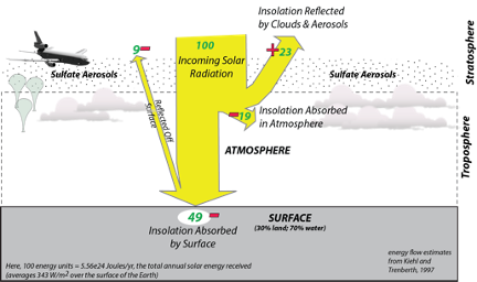
The estimated cost of this would be on the order of \$50 billion per year (consider that the US military expenditures are about \$750 billion per year). These particles have a limited residence time (1-2 years) in the stratosphere, so this would require continual injection via airplanes or balloons. The costs of doing this are surprisingly small (as low as \$50 billion per year), but it would have to be maintained — if we were to start down this path and then suddenly realize that it was a mistake and stop, we would face a truly shocking period of rapid warming. This is because we would probably continue to burn fossil fuels and emit more CO2 into the atmosphere.
This scenario is illustrated in the figure below, from a simple climate model like the one we used in Module 4, modified to include a sulfate aerosol geoengineering scheme.
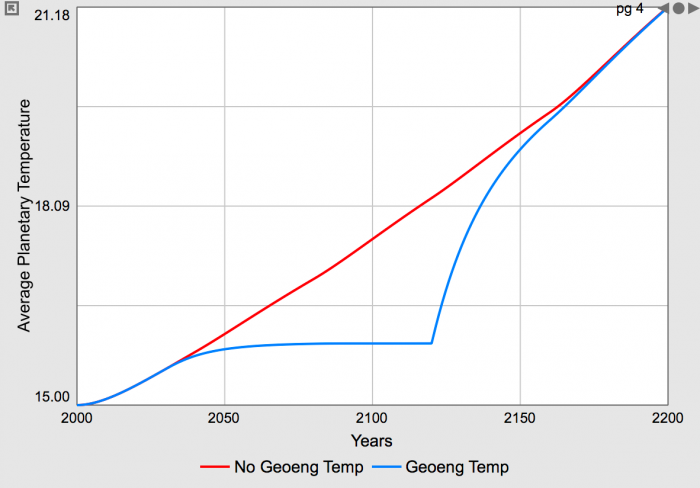
Reasons Against Geoengineering
Reasons Against Geoengineering
Alan Robock, a volcanologist and climatologist from Rutgers University has made a list of reasons to not embark on this kind of geoengineering. Here is the list of some of the major ones:
- Effects on regional climates. Following large volcanic eruptions like Mt. Pinatubo, climate scientists noted changes in precipitation leading to droughts and problems in food production. Most climate modelers studying this problem agree that these kinds of regional changes would be impossible to avoid and impossible to control.
- Continued ocean acidification. Blocking sunlight in this way may limit the rise in temperature, but it would not address the problem of ocean acidification. A large fraction of the excess CO2 added to the atmosphere by burning fossil fuels is absorbed by the oceans, and this increases the acidity of the oceans, endangering the entire marine ecosystem. This problem would continue if we only blocked the sunlight.
- Ozone depletion. The sulfate additions to the stratosphere would promote the kinds of chemical reactions that destroy ozone, and ozone is a critically important part of our atmosphere in the sense that it blocks harmful UV radiation from reaching the Earth’s surface.
- Effects on plants. The scattering of light caused by the aerosols may create more diffuse light that is beneficial to plants, but the reduced total amount of sunlight could be detrimental — the balance of these effects is not well understood.
- More acid rain. The sulfate aerosols combine with atmospheric water vapor to form tiny droplets of sulfuric acid, which eventually fall out of the sky and land on the Earth’s surface. The global average increase in acid precipitation may not be alarming, but it is likely that there will be some regions that are noticeably impacted.
- Effects on cirrus clouds. The injected aerosols are likely to affect the formation of high cirrus clouds, which can impact the energy balance and thus temperature of the Earth, but this is not well-understood at present — we don’t know whether this would increase or decrease cirrus clouds.
- Whitening of the sky. The sulfate aerosols would make our sky more white than blue, which we might get used to after a while, but it would be unsettling to most people in the short term. We would, however, get much more vibrant sunsets.
- Less sun for solar power. Reducing the amount of sunlight reaching the surface will necessarily reduce the amount of solar energy we can harvest — not a good thing.
- Rapid warming if stopped. If we were to decide that this was a bad idea and stopped, a dramatic, potentially catastrophic warming would ensue (as shown in the model results above). This assumes that we continued to raise CO2 concentrations in the atmosphere.
- Human error. This is always a reality in any human endeavor, and an error in a system such as this could have serious consequences for billions of people.
- Undermining sustainability efforts. Any geoengineering scheme is problematic in the sense that it lets us off the hook and just delays the inevitable transition to a more sustainable energy system. We will definitely run out of fossil fuels and the longer we wait to transition to a system based on renewable energy, the harder it will be.
- Who is in control? Who has the power over the global temperature? This is a huge problem — it cannot be left to one nation, or one group of nations to make the decisions that will affect all of the people on Earth. Altering the climate this way will clearly create some winners and some losers. Island nations threatened with complete submergence in the future will want as much cooling as possible. The US and China and much of Europe will also want a lot of cooling to combat the rising sea levels that will force the relocation of major cities. But the Russians may want even more warming. So, who decides?
- Unintended consequences. Even instance in which humans have undertaken to modify the environment, a whole host of unintended consequences arise. Our world is complex enough, with so many interconnections, that it is impossible for us to foresee all of the consequences of our actions, even with the best of intentions. As just one example of this, the first people to discover the usefulness of fossil fuels did not foresee the potential for global environmental harm.
Nevertheless, the fact remains that this mode of geoengineering would work — we could cool the planet, and the cost would be relatively small. So, perhaps it is something we should carefully study and consider in the event of unexpectedly severe climate damages — a parachute to be deployed only when the plane is going down!
Space Mirrors
Space Mirrors
Reducing insolation could also be accomplished with space-based mirrors or other structures. One proposal here involves the placement of roughly 16 trillion small disks at a stable position 1.5 million km above the Earth. Each disk would have a diameter of 60 cm and would weigh just one gram. They would not be true mirrors, but would scatter enough sunlight to reduce the insolation by 2%, which be sufficient to cool the planet by 2°C. Getting these disks into place and then keeping them there would be a challenge, and it is estimated that it would take 10 years to put them into place using a special type of gun that could transport up to 10 million of them at a time. The total cost could be 5 trillion dollars every 50 years (the lifetime of the disks). This sounds a bit like science fiction, but it has been developed by a group of prominent astronomers and physicists, so we should assume it is viable, but nevertheless very costly and not something we could easily control. As with all of the insolation reduction schemes, this would do nothing to deal with the problem of ocean acidification.
Carbon Dioxide Removal
Carbon Dioxide Removal
Carbon dioxide removal projects address the root cause of warming by removing greenhouse gases from the atmosphere. These kinds of geoengineering schemes have the added benefit that by lowering the CO2 concentration in the atmosphere, they also prevent (and can reverse) ocean acidification. CO2 removal projects are generally slower, more expensive, and less developed than some of the insolation reduction schemes. There are a variety of ways that this could be done, including:
Carbon Capture and Sequestration
You may have heard of this in the context of “clean coal”, which refers to technologies that would allow us to burn coal without emitting CO2 into the atmosphere. Carbon capture and sequestration from power plants that burn fossil fuels involves the chemical removal (sometimes called “scrubbing”) of CO2 from the emissions of power plants, and then the injection of the concentrated CO2 into deep aquifers. In the best case, the sequestered CO2 interacts with minerals in the aquifer to lock the CO2 into a mineral form such as CaCO3 (calcite) which would prevent its release back into the atmosphere. A number of pilot projects of this type have already begun, and it does seem to be technically feasible, but it is not cheap. This would more than double the cost of fossil fuel-generated electricity, making this an expensive proposition, but that in itself would encourage developing clean, renewable energy sources like wind and solar that are also cheaper. Note that this would reduce emissions of CO2, but it would not lower the CO2 concentration in the atmosphere — just prevent it from further increases.
Enhanced Rock Weathering
Other means of carbon capture have been proposed, including the promotion of natural chemical weathering reactions of some rocks in which atmospheric CO2 is consumed. These natural rock weathering reactions could be accelerated by crushing up the rock, which would increase the surface area of the minerals. This would have minimal environmental side effects, but it would also be quite slow and is limited by the availability of the right kinds of rocks. As such, this is not considered as a viable solution to our climate problems.
Ocean Fertilization
The surface waters in the southern oceans are depleted in iron, which is an important micronutrient for photosynthesizing plankton, so the plankton in this part of the oceans are under-performing. Adding powdered iron promotes an increase in plankton growth, thus drawing more CO2 from the surface oceans, which in turn enables the oceans to absorb more CO2 from the atmosphere. A few small-scale experiments have been conducted and they appear to work in the short-term, but scaling this up would be challenging and the iron would have to be continuously applied, just as fertilizer is continuously applied to crops. This would be a very expensive solution, and as such, is not considered as a realistic option.
Direct Air Capture and Carbon Sequestration (DACCS)
Direct Air Capture and Carbon Sequestration (DACCS)
Carbon dioxide can be chemically extracted from the atmosphere, and a couple of projects led by universities and private companies have developed systems to do this. These systems involve using natural winds or fans to pass air through filters that are coated with chemicals — either amines (organic molecules derived from ammonium), or a sodium hydroxide solution — that react with CO2, causing it to attach to the filter material. When the filters are full, they are closed off and subjected to either high humidity or temperatures of 100°C, which releases the CO2 — it is then drawn off and eventually concentrated into nearly pure CO2. Once the CO2 has been concentrated, there are several options:
- It can be pumped into a greenhouse to be used by plants. The plants will use this CO2, but when the plants are harvested, that CO2 will be returned to the atmosphere, so the CO2 is not sequestered for long.
- It can be bottled and used to carbonate beverages, but as soon as the beverages are consumed, the CO2 returns to the atmosphere, so this does not really sequester the CO2.
- It can be combined with hydrogen to make a synthetic fuel similar to gasoline or jet fuel, but when the fuel is burned, it releases the CO2 back to the atmosphere. So again, this does not really sequester the CO2.
- It can be mixed with water and injected underground into a geologic material that will undergo a chemical reaction with the carbonated water to precipitate carbonate minerals that effectively lock up or sequester the carbon. This is sometimes called direct air capture and carbon sequestration (DACCS). DACCS leads to negative emissions of CO2, which would lead to lowering the concentration of CO2 in the atmosphere, cooling the planet.
The general scheme of a DACCS system is illustrated in the figure below.
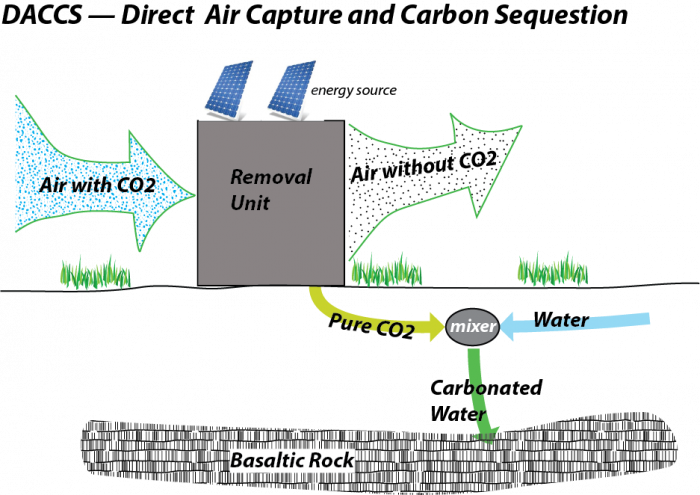
These DACCS systems can be relatively small, and they can be deployed anywhere near a site where the CO2 can be injected into a suitable underground geologic storage site. Climeworks [151], a Swiss company, has already deployed several of these units; one is located in Iceland where they use waste heat from a geothermal power plant to provide energy to run the system and then inject the carbonated water into basaltic rock, which is an ideal geologic storage unit. A Canadian company, Carbon Engineering [152], has even gotten some of the major oil companies to invest heavily in this new technology, which is meant to be deployed in larger facilities.
At the moment, these systems are quite expensive. Climeworks is removing carbon for about \$600 per ton of CO2, and they are confident that they can quickly get down to \$200 per ton, and, if they greatly expand their manufacturing process, they might get it down below \$100 per ton. Carbon Engineering says that they will be able to do it for less than \$100 per ton. The lesson we take away from wind and solar energy is that the prices for these technologies are likely to continue to decrease as more units are produced. But, if we use \$100 per ton as a good near-term estimate, it would cost \$1 trillion to remove 10 Gt of CO2 (remember that our current global emissions are in the range of 37 Gt CO2 in 2018). This sounds like a lot of money, but it is only 1% of the global GDP and just a shade more than what we spend in the US on our military. Deploying this on a large scale also requires a lot of energy, but if that energy came from solar or wind power, there would still be a net removal of CO2 from the atmosphere.
One of the attractive features of DACCS technologies is that they could help solve the problem of ocean acidification at the same time as lowering the temperature (or preventing it from getting too high).
If we wanted to use DACCS to get to zero carbon emissions, we would have to remove as much as we emit from burning fossil fuels. Doing this would allow the carbon cycle to begin to return to normal; the temperature would decrease slightly, and ocean acidification would be reversed.
Direct Air Capture and Carbon Sequestration (DACCS) Continued
Direct Air Capture and Carbon Sequestration (DACCS) Continued
The figure below shows the results of a little experiment where a DACCS system is added to a global carbon cycle model to show what would happen if, starting in 2020, we began to remove carbon through DACCS to match the carbon emissions from burning fossils. The model begins in 1880 and runs up to 2014 using the actual human emissions of carbon, and then switches to a projection made by the IPCC for future carbon emissions.
The upper panel shows the gigatons of C from human emissions and the gigatons of C removed by DACCS, which begins in the year 2020. The lower panel shows how this change affects the global temperature change (green, in °C relative to the start), the atmospheric CO2 concentration (red, in parts per million), and the ocean pH, which is inversely related to the acidity).
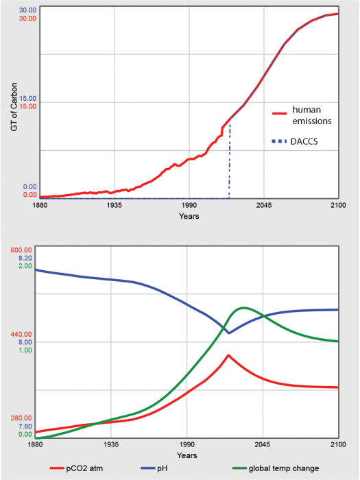
If we continue to burn fossil fuels as we have been (the scenario shown in the figure above), the cost of using DACCS to negate the emissions would be immense — a total of perhaps \$600 trillion by the end of the century. But if we also make drastic reductions in our carbon emissions, the cost of DACCS would be more manageable. This raises an important point — the cheapest thing to do is to switch to renewable energy (mainly wind and solar) and thus dramatically reduce our emissions. And, as we will see later, less money spent on geoengineering means more money to be spent on things like education, healthcare, and other things that improve our quality of life.
Bio-Energy with Carbon Capture and Sequestration (BECCS)
Bio-Energy with Carbon Capture and Sequestration (BECCS)
BECCS encompasses a wide range of different plans, but what they all share in common is the utilization of plants to draw CO2 from the atmosphere (which they have perfected over millions of years) and then using the biomass to generate power. In one version, the plant material is fermented to yield biofuels like ethanol, but when the ethanol is burned, it releases the CO2 back into the atmosphere — this is not going to result in negative carbon emissions. But in another form, a BECCS scheme combusts the biomass to electrical energy in a power plant equipped with CO2 scrubbers on their emissions.
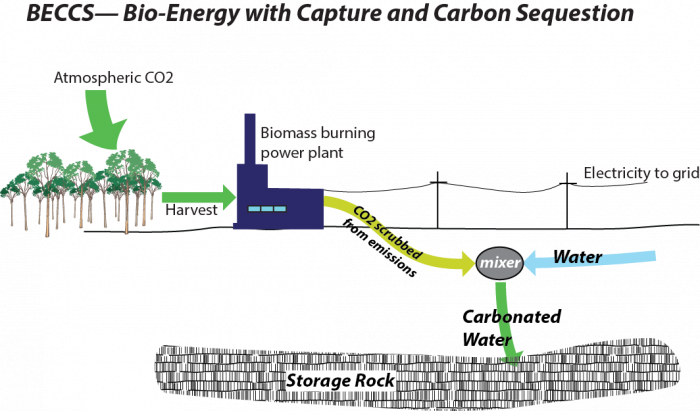
The captured CO2 from these power plants is then injected into a deeply buried geologic layer where it is sequestered — just as with the DACCS approach. A BECCS system will reduce the amount of CO2 in the atmosphere while at the same time producing energy, the sale of which helps offset the costs. Some estimates suggest that a system such as this could remove carbon at a net cost of \$15 per ton of CO2 — significantly cheaper that the DACCS systems (which might get to \$100/ton in the near future).
Deploying BECCS on a large enough scale to make a serious reduction in CO2 would require a lot of land and water to grow the biofuels, and this imposes a limit since we will also need the land and water resources to grow food crops for a growing population. One estimate suggests that in order to remove 12 GT of CO2 from the atmosphere each year, we would need to commit an area equal to one third of the present cropland area to BECCS and we would need perhaps one half of the water currently used by agriculture. These are some pretty serious environmental constraints!
Nevertheless, BECCS holds great promise for being an important part of a negative emissions strategy that we will need to dramatically lower our net carbon emissions.
Self-Assessment
Self-Assessment
Reminder!
After completing your Discussion Assignment, don't forget to take the Module 9 Quiz. If you didn't answer the Learning Checkpoint questions, take a few minutes to complete them now. They will help you study for the quiz and you may even see a few of those questions on the quiz!
Learning Outcomes Survey
We have now come to the end of Unit 2. The purpose of this exercise is to encourage you to think a little bit about what you have learned well, and just as importantly, about what you feel you have not learned so well. Think about the learning objectives presented at the beginning of the Unit, and repeated below. What did you find difficult or challenging about the things you feel you should have learned better than you did? What do you think would have helped you learn these things better?
For each Module in Unit 2, rank the learning outcomes in order of how well you believe you have mastered them. A rank of 1 means you are most confident in your mastery of that objective. Use each rank only once - so if there are four objectives for a given module, you should mark one with a 1, one with a 2, one with a 3, and one with a 4. All items must be ranked. For each Module, indicate what was difficult about the objective you have marked at the lowest confidence level.
Module 6
- Recognize the advantages and limitations of solar and wind energy.
- Recall the basic science behind solar and wind power generation.
- Evaluate who is responsible for maintaining "the grid" as home generation grows in popularity.
- What did you find most challenging about the objective you ranked the lowest?
Module 7
- Recognize the advantages and limitations of geothermal, hydroelectric, and nuclear energy.
- Recall the basic science behind geothermal, hydroelectric, and nuclear power generation.
- Analyze why even people who rely heavily on energy resources tend to want those resources to be exploited far from their own homes.
- What did you find most challenging about the objective you ranked the lowest?
Module 8
- Recognize that all energy technologies are inefficient.
- Compare wealth and energy intensity in developed countries.
- Identify options for improving energy efficiency in developed countries.
- Analyze why we don't always conserve as much as we should, despite the double benefits for the climate and our wallets.
- Use a model to calculate the effects of various strategies such as the use of renewable energy sources, conservation, and population control on reducing emissions
- What did you find most challenging about the objective you ranked the lowest?
Module 9
- Recall the various geoengineering strategies that have been suggested to mitigate climate change.
- Recognize that geoengineering alone is unlikely to be sufficient to mitigate climate change.
- Assess what you have learned in Unit 2.
- What did you find most challenging about the objective you ranked the lowest?
Scoring Information and Rubric
The self-assessment is worth a total of 25 points.
| Description | Possible Points |
|---|---|
| All options are ranked | 10 |
| Questions are answered thoughtfully and completely | 15 |
Summary and Final Tasks
Summary
Geoengineering is the deliberate manipulation of the earth’s atmosphere, with the objective of controlling the rate of warming or otherwise mitigating the rate of climatic change. Geoengineering options that would directly reduce the amount of radiation trapped within the atmosphere range from controlling emissions through the capture and long-term storage of greenhouse gasses in geologic formations to the deployment of satellites or other devices aimed at reflecting sunlight back into space. Geoengineering options that would affect the climate through modification of land and sea include reforestation and deploying chemicals in the ocean that would cause oceans to absorb greater amounts of radiation. Geoengineering is a controversial proposition, and geoengineering activities are not currently regulated by any major international agreements. There are two primary reasons for the controversy. First, with few exceptions, most geoengineering options exist only in theory or in the realm of science fiction. The exceptions (options with which we have some real-world experience) include cloud seeding and the injection of carbon dioxide into oil and gas wells to get even more oil and gas out. None of these applications of geoengineering technologies are related to climate change – they have been employed for short-term weather modification or to make fossil fuel production activities even more productive. Second, geoengineering is often perceived as a fix to the climate problem that can (might?) work when all other options have been exhausted. The “bathtub” analogy of the greenhouse effect tells us that most geoengineering options alone will not be sufficient to reverse or mitigate any ill effects from climate change.
Reminder - Complete all of the Module 9 tasks!
You have reached the end of Module 9! Double-check the Module Roadmap to make sure you have completed all of the activities listed there before you begin Module 10.
Unit 3: A Path Forward
Help in Picking Our Energy Path
We have already seen in Unit 1 that energy is hugely valuable to us, that our current energy system is unsustainable and that burning most of the fossil fuels before we switch to a sustainable energy system would cause climate changes that make life much harder. In Unit 2, we saw that vast renewable resources exist, as well as other ways such as blocking the sun to deal with warming. Here in Unit 3, we will address whether we can afford to make the change, and how and why we might do so, by looking at the next three units listed below.
The unit consists of three modules:
- Economics (Module 10)
- Policy Options (Module 11)
- Ethical Issues (Module 12)
Video: Cell Phones and Science (4:14)
PRESENTER: What is a smartphone really? It's a little bit of oil for the plastic, a little bit of sand for the glass, and a little bit of the right rock, some red ones and some blue ones to make the various metals in here, and a huge amount of science and engineering wrapped up with some networking and some marketing and what have you. I've had people use their smartphones to send me messages saying that we scientists don't know what we're talking playing about with climate change. I've even had people use smartphones to send messages saying that scientists have no more insight to how the world works than any other group.
I suspect those people were trying to make a point and they might not fully have believed that. If you can imagine taking the sand and the oil and the red and blue rocks and giving them to various groups, the US House of Representatives, the church women's knitting society, the football team, and asking them to turn them into a smartphone, I think you'd wait a long time. But scientists and engineers really have done that.
In this phone, there's a GPS. It started as a US Air Force project. It knows where I am, in part, because it has relativistic calculations that date all the way back to Einstein. And without relativity, it would get lost in less than a day. It wouldn't work.
In here, there's a computer. It connects to the internet, which started also as a US military project to get researchers to talk to each other. And the computer is designed with the principles of quantum mechanics that date back the Planck and Einstein and Bohr and others. And the quantum mechanics also underlies our understanding of how radiation interacts with gases in the atmosphere that gives us such a very high confidence that our CO2 is changing the Earth's radiation balance and that affects the climate.
The physics of the quantum in the computer, the physics of the quantum in the air overlap. They're done sometimes by similar or overlapping communities. They're done by people studying in the same schools, using many of the same techniques. This works. And so does the physics of the atmosphere. And we can validate that and it really does.
There's another important point here. The fact that this works doesn't tell you who to call or what web sites to visit. It gives you options that you must choose from. The science of the atmosphere and energy and climate doesn't tell you what laws to pass. It doesn't tell you who you have to vote for. It gives you options that you can choose from.
So in this third section of the class, we're going to visit some of these options and decisions. We'll start with economics. Can we really afford to address climate and energy? Can we really afford not to address climate and energy?
Then we'll look at some of the policies we might adopt and we'll tiptoe our way into ethics. What's the right thing to do? But I suspect you already sort of have a clear picture. The science doesn't tell you what to do. It tells you what you can do. And from that, you can make wise decisions.
Unit Goals
- Recognize the role of human actions in determining the future of our climate
- Explain scientific concepts in language non-scientists can understand
- Find reliable sources of information on the internet
- Use numerical tools and publicly available scientific data to demonstrate important concepts about the Earth, its climate, and resources
Unit Objectives
In order to reach these goals, the instructors have established the following objectives for student learning. In working through the modules within unit 3 students will be able to:
- Recognize that there is a cost to future society of emitting CO2 to the air today.
- Describe how one might balance immediate needs against protection from future losses.
- Explain why growth cannot be infinite in a world of finite resources.
- Use an Integrated Assessment Model to determine the most economically beneficial approach to dealing with emissions and climate change.
- Recognize the multitude of policy options available for our energy system and economy.
- Explain how the effectiveness of emissions treaties and carbon taxes can be verified internationally using remote data collection.
- Recognize that shifting gradually to renewable energy is likely to have little overall impact on employment rates.
- Recall that energy policies and subsidies have been in use for decades, and some of these have promoted fossil fuels over renewable resources.
- Research and evaluate an example of an energy subsidy reported by the IMF.
- Explain that decisions about energy and environment have important but very complicated ethical implications.
- Recognize that relying more on natural resources does not always correlate with greater wealth or higher quality of life.
- Recall that if we value our grandchildren's quality of life as much as we value our own, then it is worthwhile to do more now to avoid climate change.
- Assess what you have learned in Unit 3.
Assessments
| Module | Assessment | Type |
|---|---|---|
| 10. Economics | DICE Model | Summative - Stella Model |
| 11. Policy Options | Government Subsidies | Discussion: Research and Report |
| 12. Ethical Issues | Learning Outcomes Survey | Self-Assessment |
Module 10: Economics
Module 10 Overview
Don’t even think about going to the bathroom in your neighbor’s driveway—you may not do so legally. The government has passed rules and regulations that outlaw such actions. But, this is not the only way to handle pollution. Another approach is to find out how much damage would be done to your neighbor, or to all of your neighbors if you went to the bathroom in one of their driveways, and then allow you to do so if you paid for the damages. But, how would you estimate the damages, and who would be paid?
The value to society of burning fossil fuels is much greater than the value to you of going to the bathroom in someone else’s driveway. So, little consideration is given to immediate rules to outlaw emission of fossil-fuel CO2 (although some rules to reduce CO2 are being enacted). Much consideration is being given to ways to estimate the damages caused by the CO2, and raise the cost of fossil fuels to reflect those damages.
This module looks at the economic side of estimating those damages. Most of the damages will happen in the future, because the costs of climate change go up exponentially as the temperature rises, and the temperature will remain elevated for a long time if we don’t take actions. So, some way is needed to estimate the present value of those future damages.
Economists typically do this with integrated assessment models, which allow for the use of money to reduce the damages of warming now or in the future, and all of the other uses of money, such as investing to help future generations be wealthy and have the resources to deal with the damages of climate change.
These analyses show that emitting CO2 to the air does have costs for society. Following usual economic assumptions about getting the most good for people from the things they consume, a response to reduce CO2 emissions is economically justified. But, because other uses of money are also valuable, the optimal response starts slowly, doing a little about climate change now and doing more later, while still allowing much climate change to occur. Many uncertainties are associated with these calculations, and it appears that most point to doing more now to reduce warming than this economically efficient path.
Goals and Objectives
Goals
- Recognize the role of human actions in determining the future of our climate
- Explain scientific concepts in language non-scientists can understand
- Find reliable sources of information on the internet
- Use numerical tools and publicly available scientific data to demonstrate important concepts about the Earth, its climate, and resources
Learning Outcomes
By the end of this module, you should be able to:
- Recognize that there is a cost to future society of emitting CO2 to the air today.
- Describe how one might balance immediate needs against protection from future losses.
- Explain why growth cannot be infinite in a world of finite resources.
- Use an Integrated Assessment Model to determine the most economically beneficial approach to dealing with emissions and climate change.
Roadmap
| To Read | Materials on the course website (Module 10) | |
|---|---|---|
| To Do | Complete Summative Assessment [153] Quiz 10 |
Due Following Tuesday Due Sunday |
Questions?
If you prefer to use email:
If you have any questions, please email your faculty member through your campus CMS (Canvas/Moodle/myShip). We will check daily to respond. If your question is one that is relevant to the entire class, we may respond to the entire class rather than individually
If you prefer to use the discussion forums:
If you have any questions, please post them to Help Discussion. We will check that discussion forum daily to respond. While you are there, feel free to post your own responses if you, too, are able to help out a classmate.
Paying the Piper
Paying the Piper
Earth: The Operators' Manual
In case you want to remind yourself of where we might be going with renewables, here is a 7-minute roundup.
Video: Renewables Roundup (7:24)
(Richard Alley) Can low-carbon solutions really give us enough energy to power the planet and a growing population? Let's put some numbers on how much energy we can get from non-fossil fuel renewables... Today, all humans, everywhere on earth, use about 15.7 terawatts of energy. That's a big number. In watts, that's 157 followed by 11 zeroes, or one hundred fifty-seven billion of those 100 watt light bulbs we used as a reference. To show what's possible let's see if we can get to 15.7 terawatts, using only renewable energy. I'm here in the Algodones Dunes near Yuma, Arizona. The "Guinness Book of Records" says it's the sunniest place in the world. There's barely a cloud in the daytime sky for roughly 90% of the year. Zero point zero one percent... one one-hundredth of one percent. If we could collect that much of the sun's energy reaching the Earth, it would be more than all human of use today.
Today's technologies have made a start... This was the world's first commercial power station to use a tower to harvest concentrated solar energy. Near Seville, Spain, 624 mirrors stretch over an area of more than 135 acres... beaming back sunlight to a tower nearly 400 feet high. Intense heat produces steam that drives a turbine, which generates electricity. When completed, this one facility will be able to power 200,000 homes, enough to supply the entire nearby city of Seville. Remember our target of 15.7 terawatts? Well, the sun delivers 173,000 terawatts to the top of Earth's atmosphere... eleven thousand times current human use. No way we can capture all of that potential energy at Earth's surface, but the deserts of America's southwest, with today's technology, have enough suitable land to supply 80% of the entire planet's current use. Of course, there's one big problem with solar power... night.
But with more efficient transmission lines, and as part of a balanced renewable energy portfolio that includes storage, the sun's potential is vast. In tropical nations like Brazil, the sun heats water, makes clouds and unleashes rainfall that feeds some of the planet's largest rivers. Iguacu Falls is a tourist attraction, one of the most spectacular waterfalls on earth, where you can feel the immense power of falling water. The nearby Itaipu Dam, on the border of Brazil and Paraguay, produces the most hydroelectric power of any generating station in the world. This one dam supplies most of the electricity used in Sao Paulo, a city of more than 11 million. Sao Paulo is 600 miles away, but Brazil made the decision to build innovative high voltage direct current transmission lines to minimize energy loss. The Itaipu to Sao Paulo electrical grid has been in operation since 1984, and shows that renewable energy can go the distance. Dams can't be the answer for every nation... they flood landscapes, disrupt ecosystems, and displace people. But hydropower gives Brazil, a nation larger than the continental United States, 80% of its electricity. And world-wide, hydro-power could contribute 12% of human energy use... ready at a moment's notice, in case the sun goes behind a cloud.
Brazil is also using its unique natural environment in another way. Its tropical climate provides ideal conditions for sugarcane, one of the earth's most efficient plants in its ability to collect the energy of sunlight. Plantations like this one, harvest the cane for the production of sugar and the biofuel called ethanol. The U.S. is actually the number one producer of ethanol in the world, mostly using corn instead of cane. But ethanol made from sugarcane is several times more efficient at replacing fossil fuel than corn-based ethanol. Modern facilities like this one pipe back wet waste to fertilize the fields and burn the dry waste, called bagasse, to generate electricity to run the factory. For Brazil, at least, ethanol works. Today, almost all cars sold in Brazil can use flex fuels. Drivers choose gasoline blended with 25% ethanol, or pure ethanol, depending on price and how far they plan to drive. Local researchers say that if all the gasoline in the world suddenly disappeared, Brazil is the only nation that could go it alone and keep its cars running.
Using food for fuel raises big questions in a hungry world. As of now, sugarcane ethanol hasn't affected food prices much, but there are concerns with corn. So here in the U.S., government labs like NREL, the National Renewable Energy Lab, have launched programs to see if biofuels can be made from agricultural waste. It does work, and researchers are trying to bring the cost down. So with plants capturing roughly eleven times human energy use, they're a growing opportunity.
New Zealand takes advantage of another kind of energy. These are the geysers and hot springs at Rotorua on the North Island. Once they were used by the native Maori people for cooking and bathing. Now geothermal power plants harvest heat and turn it into as much as 10% of all New Zealand's electricity. Many power projects are partnerships with the Maori, benefiting local people and avoiding the "not in my backyard" problems that often complicate energy developments. Globally, geothermal energy offers three times our current use. But we can mine geothermal, extracting the energy faster than nature supplies it, cooling the rocks deep beneath us to make power for people. This energy exists even where you don't see geysers and mud pots, so it can be extracted without harming these natural wonders. A study by MIT showed that the accessible hot rocks beneath the United States contain enough energy to run the country for 130,000 years. And like hydroelectric, geothermal can provide peaking power, ready to go at a moment's notice if the sun doesn't shine and the wind doesn't blow.
Investments typically grow over time. But, if you don’t solve them, problems often grow too. And solving problems takes money, which could be invested now to solve problems later. Solve? Invest? Solve a little and invest the rest? Throw a party and worry about it later? What is a poor confused society to do? Call an economist!
Short version:
Using a calculation called discounting that is similar to interest-rate calculations, it is possible to estimate the present value or cost of future events. The discount rate, which is the real return you could get if you invested your money, is a function of the growth rate of the economy, as well as our preference for having things now rather than later (and thus us behaving as if our generation is more important than future generations). Actions to reduce CO2 emissions have costs now but benefits in the future. Thus, discounting is an important part of the economic models, called "integrated assessment models," used to compare possible paths to the future. The path that optimizes the tradeoff between these costs and benefits calls for beginning now to slow global warming, but in a measured rather than panicked way.
Friendlier but longer version:
We all face choices between today and tomorrow. Should I buy an apple now, or invest the money and have enough to buy two apples in a few years? Should I throw a party, or save the money to help support future generations of my family? Should I pay off the dangerous person who has suggested that if I don’t pay him he will punch my teeth out, or put the money into the hot new investment that will make me so wealthy that false teeth will seem cheap?


Economists have built a powerful intellectual framework for dealing with questions of this sort. The topic is usually discussed as discounting.
You can think of discounting as a tool to estimate the value or cost today of various future events. This allows you, or society, to compare the future results of possible decisions you could make today, and so choose the path that is least expensive or most beneficial overall.
Starting on the next page, we explain discounting with a little math. Note that we do not require that you master the math, or use it to calculate anything, but we owe it to you to show you how it goes. (And, we have found that knowing the math often helps, in many ways.) We then will apply the results to climate change.
Enrichment
Want to learn more?
Read the enrichment titled Discount Rate.
We can choose to spend money now to head off future climate change. Or, we can ignore climate change and just go about our business, spending money on things we consume now, but also spending some money on investments for the future. Then, our descendants can use their great wealth from those investments to deal with the problems caused by climate change. We will find that the economically optimal path takes a middle road, spending some money to reduce climate change but investing some money to make our descendants wealthy and letting them deal with the problems of climate change. This raises many other questions, some of which we will address. But, hard-nosed economics recommends some actions now to head off climate change.
Interesting Discounts
Interesting Discounts
Suppose you go to a bank and deposit one thousand dollars (or euros, or yuan, or whatever currency you prefer), which the bank promises to return to you at some time in the future. You will expect the bank to return more than you deposited. Say they promise to give you $1040 in a year. The difference, 1040-1000=40, is your interest. To get the interest rate, you need to divide the interest you received by the amount you put in the bank at the start, 40/1000=0.04. Most people dislike talking about an interest rate of 0.04, so they multiply by 100 and say the interest rate is 4%. Your bank probably had a big sign out front advertising “4% interest rate on savings!” Clearly, if you had deposited more, you would have gotten more interest at the same interest rate—put in 1,000,000, get back 1,040,000, the interest is 1,040,000-1,000,000=40,000, and the interest rate is 40,000/1,000,000=0.04 or 4%, just as before.
But, there is no requirement that you compare the interest to the amount you started with. Suppose instead that you divided by the amount you finished with. Go back to your original investment of 1000 that becomes 1040 in a year, with interest of 40, and calculate 40/1040=0.038 or 3.8%. That is the discount rate. (In the ENRICHMENT linked below we show that we could have set up the example so that the discount rate came out to be a nice easy number, with the interest rate harder to remember—a 4.17% interest rate gives a 4% discount rate, for example.)
Enrichment
Want to learn more?
Read the enrichment titled Interesting Discounts.
Next, suppose you see a problem. Say, the roof on your house is leaking. Fixing the roof today will cost you the $1000 that you happen to have in your wallet. If you don’t fix the roof, then in 20 years the roof will still cost $1000 to fix. (We have ignored inflation because economists can correct for it before making the calculation, as described in the ENRICHMENT. And, you could spend the $1000 on many other things, including a party or a vacation, a point to which we’ll return soon. Just go along with us for now.) But, if you wait 20 years to fix the leak, the dripping water will cause another $1000 in damage to your house, so the total repair will cost $2000 in 20 years. Should you spend the money from your wallet to fix the leak now, or invest the money and fix the leak in 20 years?
To answer this question, you can calculate how much money you would need to invest now so that you have $2000 in 20 years to fix the roof—this is often called the present value of the future cost. If this present value is less than the $1000 needed to fix the roof now, then you could invest the present value in a “fix the roof in 20 years” fund, and have the rest of your $1000 to spend on other things; however, if the present value is more than $1000, you would be better off economically to fix the roof now.
In our example, with a 4%=0.04 discount rate and a future cost of $2000 in 20 years, the present value is 2000/(1+.04)20=913. Hence, you can invest $913 in your “fix the roof in 20 years” fund, and use the rest of your $1000 for other things now. (If you prefer an equation with symbols, let the present value be P, the future cost F, the discount rate be D%, the number of years be t, and the equation is P=F/(1+D/100)t; D/100 turns the 4% into .04, add that to 1, raise the resulting 1.04 to the t th power, and divide F by all of that.)
The issue is similar for society dealing with fossil fuels. Fossil-fuel CO2 emissions cause damages that are costly to us and to other people in the future, and those damages increase as more CO2 is emitted. So, just as for your leaky roof, we could avoid future costs by spending money now to reduce CO2 emissions. But, money spent reducing CO2 emissions is money that is not used for other purposes, such as investing in growing the economy so that our grandchildren and their grandchildren are much wealthier than we are and can afford to solve the problems caused by the CO2. The decision whether to fix the roof now or later is similar to the decision whether to reduce fossil-fuel emissions now or pay to fix the damages later.
If the discount rate is high, then the troubles our CO2 causes for future generations of people have very little present value; then, if we behave in an economically optimal manner, we should spend only a little money trying to reduce our CO2 emissions. If the discount rate is low, then optimal behavior now involves spending more to reduce CO2 emissions.
We’ll discuss how this calculation is made later. But first, let’s take a closer look at what sets the numerical value of the discount rate—1% or 4% or 7%—because it is the most important control on what behavior is economically optimal if we look at the problem in this way.
Forever, and Ever
Forever, and Ever
The discount rate is usually taken to be equal to the real rate of return you can get from investments. And this is based on three parts: growth of the economy, how quickly more stuff satisfies our desire for still more stuff, and our preference for having stuff now rather than later. For a slightly more technical discussion, see the ENRICHMENT.
Enrichment
Want to learn more?
Read the Enrichment titled Discount Rate.
Economists know that sometimes recessions or depressions happen, the Dark Ages really did engulf Europe, and civilizations have fallen in many places. But, with a sufficiently broad view, the economy has always regrown even stronger from these setbacks, as people produced more and more goods and services. Some of this growth is linked to population growth—we have more workers—but some of the growth is the increase in economic productivity per person.
Video: World GDP Per Capita (1:17)
PRESENTER: This figure from Qwfp at Wikipedia.org-- the source is down here on the lower left-- shows the history of the size of the world economy per person. So more dollars or more economic activity goes up against time starting in the year 1500 on the left and running up to 2,000. And then growth has continued.
And what you'll notice is that the economy per person as grown fairly steadily even with all the wars. Even with all the plagues and everything else, we've seen growth. This growth looks like what we call an exponential. Except, what we know is that an exponential goes to infinity and we are confident that you can't make something infinite.
The really interesting questions are whether the future eventually flattens out or whether the future might flatten out and then come down gradually, or whether the future might go way up and then crash into something horrible. And this is a subject that has to interest a lot of people in a lot of ways
In mainstream economics, the assumption is often made that this growth per person will continue for a long time, so that we are so far from any limits on growth that they do not have a meaningful effect on economic activity now. If you expect the economy to grow rapidly, then the discount rate is high—your grandchildren will have the resources to address problems from climate change even if you don’t invest much to help them. (Some economists have explored alternatives to this; we’ll visit such issues soon.)
Next, a single apple is more valuable to a starving person than to an overfed billionaire; the apple may be as valuable to the poor person as a yacht is to the billionaire. If you believe that economic growth per person can continue for a long time, then investing now to help future generations means that you’re taking apples from you, a poor person, and giving apples or yachts or dollars to your incredibly wealthy grandchildren. If this transfer of money to wealthier future generations doesn’t bother us very much, then the discount rate is low and we try to help them; if we object to giving money to rich people, then the discount rate is high and we tend to spend more on us now.
Finally, we tend to behave as if now is more valuable than later, and our generation is more valuable than future generations. We won’t give the bank a dollar unless they promise to give us more than a dollar back, and we demand a greater extra payment than can be explained by the expected growth of the economy and our objections to giving money to the wealthy, even if the “wealthy” person is just us getting our money back from the bank a year later. This extra demand is just us saying that we matter most. The more we are focused on us, the higher the discount rate, and the less we invest to help the future. This is sometimes called the “pure rate of time preference”. For a person, preferring a reward now to the same reward sometime in the future is well-known. But when we choose the reward rather than giving it to future generations, some people harrumph and refer to it as “selfishness”.
Economists do NOT tell us that this is good or bad; they tell us that they have watched people buying and saving in the real world, and this is how we behave. Rather clearly, this raises large ethical issues, which we will consider later in the course—regardless of whether you call it “pure rate of time preference” or “selfishness”, some people don’t like it. For now, please don’t worry about the ethics, or the limits to growth. Because, perhaps surprisingly, even if we assume that the economy can grow forever, and we don’t want to help the future generations very much because they will be so wealthy, and we are more important than they are anyway, we still should be spending money to head off global warming if we wish to be economically efficient!
All Together Now... Integrated Assessment
All Together Now... Integrated Assessment
So, we have a framework to help us choose today the path that gets the most economic value (the utility of consumption) by estimating the current value of various future events. With the appropriate numerical model, a skilled economist can test various possibilities to find the optimal path, the one that gives the most good from the things we use.
The modeling is normally done with integrated assessment models. We enjoy consumption today, but investing rather than consuming now gives more consumption in the future. Writing the equations for this, as they work through the whole economic system, is a well-developed branch of economics. The integrated assessment models add a representation of the climate system, its response to the CO2 generated by the greenhouse gases that now power most of the economy, and how those climate changes, in turn, affect the economy.
Video: Earth System (1:29)
PRESENTER: This complicated figure comes to us from the US Global Change Research Program-- USGCRP-- in 2006. And this is a diagram showing an integrated assessment model. And we talk a good bit in the course about what integrated assessment models are and what they do.
This is a cartoon of one of them. And what it does is to take natural causes of climate change-- but also human causes of climate change, such as CO2 and other things-- and ask, how do these interact with the ocean, with the land, with the living things, with the atmosphere, with air pollution, and with the things that we grow to eat, the logging we do, and other things to make economic activity that in turn affects so many of these other things? What you end up with out of this are estimates of what is happening to living things, what is happening to the world's climate, and what is happening to the economy as they interact with each other?
You should not try to memorize all the pieces of this. But you should see what goes into providing us the knowledge base to make wise decisions about these things.
For example, if we decide to ignore climate change, then the economy will hum along making greenhouse gases, we will initially consume a lot (good, in the model). But, the damages from the CO2 will cause economic losses that rise rapidly, so as the model is run into the future it projects greatly reduced consumption (bad, in the model). Hence, ignoring climate change is not an optimal path.
However, if we outlawed fossil fuels today, thus avoiding much future climate change and its associated costs, we would greatly reduce economic growth. (Actually, we would have an economic crash.) This would lower consumption (bad, in the model). So, the optimum must be somewhere between do-nothing and do-everything to stop climate change from our greenhouse gases. (We’ll return in Module 11 to the possibility that modern policies are actually serving to accelerate global warming by promoting fossil fuels, and thus are further from the optimum than simply doing nothing.)
Looking at all the possible choices (or at least a representative sample, using sophisticated techniques to narrow the search) between consuming, investing in actions that will slow climate change, and investing in other ways, the integrated assessment models can be used to find the best path. In the great majority of published cases, and including cases that explore the uncertainties in our knowledge, the models find that a measured response to reduce global warming is best. The result from William Nordhaus’ DICE model is probably the best known and is quite representative: put a small price on emitting carbon dioxide into the atmosphere now, and increase it at a specified rate per year (2-3% in recent work). In his book A Question of Balance (Yale University Press, 2008), this spends $2 trillion to avoid $5 trillion in damages but allows $17 trillion in damages to occur. (We will revisit these issues! Bear with us. And, all of this is in present value.)
Please note that because the model attempts to simulate the whole economy, other possible uses of that $2 trillion (curing malaria, or feeding starving children) are implicitly included in the assessment. If curing malaria is an investment (it would greatly increase the economy, for example), it is part of the investment portfolio; if we want to spend more on curing malaria than would be justified on purely economic grounds, that is a choice we make and so is a type of consumption. Any use of money, whether it is curing malaria or heading off climate change, can be treated in the same way, as long as the use is not a large fraction of the whole economy. Thus, use of the $2 trillion to head off climate change over the coming decades is appropriate because other money is available from the whole huge economy to do other things.
Activate Your Learning
You may hear arguments that we should not invest in efforts to reduce climate change because curing malaria is more important. Have you ever had to choose between taking care of an immediate need and investing against bigger losses in the future? How did you decide what to do in that situation?
Click for answer.
Whether or not to invest $2 trillion to reduce climate change more or less depends on the discount rate used. Let’s go back to your house, as a simpler case, and suppose instead of 20 years, we think about 100 years, a time-scale that matters in climate change. Suppose that there is a problem in your house that in 100 years will cost $1000 to fix. Our equation for calculating present value, from above, is P=F/(1+D/100)t. With t=100 years, and F=$1000, if the discount rate is D=4%, then the present value is $19.80. Bizarre as it may seem, spending $20 now to fix a problem that will cost $1000 is not a wise investment; better to invest the money and let future generations solve the problem with the wealth you give them. Raise the discount rate to 7%, and the current value is down to $1.15; if you have a pocket full of change, you would be economically inefficient if you spent it to head off a $1000 problem. But, drop the discount rate to 1% and you should spend as much as $370 to head off the problem. Changing the discount rate from 1% to 7% changes the current value more than 300-fold. And, you can find reasons why either value might be used.
This highlights the reality that in these integrated-assessment economic-optimization exercises, the discount rate is typically the most important issue. We will look at that soon, including the perhaps surprising result that our uncertainty about the discount rate translates into a lower discount rate over longer times. But first, a word about costs of emitting carbon.
Fees to Flush
Fees to Flush
In most of the world, it is absolutely illegal to go to the bathroom in your neighbor’s yard. Instead, people are legally required to do such things in special places (bathrooms, loos, water closets, toilets, or whatever you want to call them), and pay for sewer or septic services to assure safe disposal. Similarly, most people are required to pay someone to haul away household trash (just under 1000 pounds or 500 kilos per person per year in the US), and businesses are required to pay to dispose of their wastes. Dumping your waste in your neighbor’s yard is strictly forbidden.
If your wind turbines or solar cells break and you can’t fix them, you must pay to recycle or dispose of them. But, the roughly 20 tons of CO2 per person per year from the US economy are dumped into the air with no cost at all to the people or businesses that produce CO2. The same is true for much of the world, although some places have used policy actions to place taxes or fees on CO2 emissions, but still generally less than the damages caused (see below). And, we have high confidence that the CO2 does hurt other people.
The ability to use discounting to estimate the present value of future events means that the costs or benefits associated with emitting CO2 can be estimated. CO2 does fertilize plants, and in especially cold places warming may be economically beneficial, but the costs come to dominate. The cost today of the damages caused by emitting CO2 is called the social cost of carbon.
The 2007 IPCC (Working Group 2, ch. 20 and Summary for Policymakers) reported on more than 100 estimates of this social cost of carbon, running from $-2 per ton of CO2 (very slight benefit) to $86 per ton of CO2 (moderately large cost). For comparison, burning just over 100 gallons of gasoline will release 1 ton of CO2. Recently in the US, this has been about $300-$400 in gasoline. A car getting 25 miles per gallon and driven 10,000 miles per year would make 4 tons of CO2 per year, costing the driver about $1500 for gasoline and costing society perhaps 10% of that, if you take the average of the high and low values just above. (The numbers here are all in 2000-pound short tons of CO2. You will see different numbers if you go look at the IPCC report because they were quoted in 1000-kg metric tons, and were for tons of carbon instead of tons of CO2; we have made the conversions for you.)
Additional estimates noted by the IPCC were as high as almost $400/ton for the social cost of releasing CO2. Many factors contributed to this large range; again, the discount rate is often the most important control. In 2013, the US government reevaluated the cost of carbon used in calculations, and found that the cost of emissions in 2020 (not that far in the future) would be $12/ton for a 5% discount rate, $43 for 3%, and $65 for 2.5% (in 2007 dollars) and rising for emissions further in the future. The government also checked what would happen if the parameters in the calculation are near their most-expensive end rather than in the middle of the possible range, and found with the 3% discount rate a cost of $129 per ton.
Video: Social Cost of Carbon Graph (1:44)
PRESENTER: This figure from the US Government in 2013 shows the estimates of the social cost of carbon, how much damage is caused to society by emitting a ton of CO2 to the atmosphere. It's done with various uncertain parameters, and so they did a range of simulations of possible outcomes. And so you get a distribution in the number of simulations, they give a different number as shown here.
If we start out with the blue one, which is the discount rate of 5%, which is the future doesn't matter much, so you're basically just concerned about now, then what you end up with is a very low social cost of carbon, which you might actually be zero, but probably is a little bit above zero. However, as you go through the green into the red, which is, essentially, that the future matters a lot, what do you end up with is a much higher social cost of carbon. You estimate that when you emit carbon to the air, it costs society a whole lot.
There's a very slight chance that it's low, but there's also a larger chance that it's actually really high. And it could be very, very high. This sort of distribution-- there's a best estimate it could be a little less, a little more, or a lot more-- is very common in these. But it's clear that when we emit carbon to the atmosphere, we are causing damage to society. And allowing that carbon to be emitted to the atmosphere without paying for it is a sort of subsidy for fossil fuels.
The IPCC also noted that it is likely that all of these estimates of the cost of carbon are too low (which would probably shift the slight benefit estimates to being costly as well), because many of the damages of CO2 are not “monetized”. Suppose, for example, that climate change from rising CO2 causes the extinction of species that are not being used commercially. Some of those species may have had economic value that had not yet been realized, and many people may have valued those species for other reasons. But, if those species are not contributing to the economy now, their loss is not a cost of global warming in these studies. Other issues, such as the possibility of long-term catastrophic events (making the tropics uninhabitable for unprotected large animals, for example) are also not included in the costs of global warming. The IPCC notes that the calculated costs are based on only “a subset of impacts for which complete estimates might be calculated” (ch. 20, WGII, p. 823, 2007).
Video: 10 Pikas (3:22)
RICHARD ALLEY: (VOICEOVER) American Pika's live in though Western US and Canada, and except in very special circumstances, they have to live in cold places. They're related to other pikas, and to rabbits and hares. They're lagomorphs.
Pikas don't hibernate despite living in cold places. They spend the summer making hay. They run around gathering up flowers and leaves, grasses, and what they can, and they stow them in a space under a rock. And then they can hide in this hay and stay warm during the winter and eat it, and they're having a very good time there.
Many people think pikas are really cute. On one of our early family vacations, finding a pica was a goal, and we went out of our way looking for pikas, and we found them and we had a ball doing it.
Because pikas like cold climates, many populations are being placed in danger by a warming climate. This figure shows in the bluish areas the suitable habitat for pikas recently in the US. And then the little red areas in the centers there show the habitats that are expected to remain around the year 2090-- one human lifetime from now-- if we follow a high CO2 emissions path.
Some populations of pikas out in the Great Basin are already endangered or have disappeared. We looked at the economic analyses of global warming, which compare cost of reducing climate change to the cost of the damages if we allow change to continue. And which show that we will be better off if we take some actions now to reduce warming.
But in general, such economic analyses do not include pikas. Loss of populations of pikas, even extinction of the pika has little or no economic value. We personally spent money on tourism that involved pikas. But we probably would have gone to see something else if pikas hadn't been there.
Pikas aren't really monetized. They haven't been turned into their monetary value. And so the loss of pikas isn't monetized either in these calculations, nor would be loss of polar bears or many, many other species.
If you believe that pikas are valued, that if you pay a little money to save pikas, or if you believe we have an ethical or religious obligation to preserve creation, including pikas, then the optimum path for you would involve doing more now to slow global warming.
If you don't believe pikas are a value, the economic still says that we should do something to slow global warming if we want to be better.
The social cost of carbon, if it is not offset by a tax or other fee on emitting the carbon, is essentially a subsidy from society for fossil-fuel use. We will return to this topic when we consider policy options in the next module.
Dithering with the Discount Rate
Dithering with the Discount Rate
Recall that the discount rate is often taken as being large if the economy is expected to grow rapidly, or if we behave as if we don’t like giving money to future generations because they will be so much richer than we are, or if we prefer things now rather than later (so, essentially, we behave as if we are more important than future generations). The last of these is often the starting point for ethical critiques of such modeling and will come up again in Module 12. We won’t say too much here about our willingness to transfer money to wealthier people in future generations; but, that willingness won’t matter if future generations aren’t wealthier than we are. So, let’s take a look at the assumption of continuing economic growth.
Economists are surely correct—if you take a sufficiently broad and long view, the economy always has grown, as we have become better and better at providing goods and services for each other. Local reversals occurred, but the broadest trend has been upward.
The mere existence of this trend does not prove it will continue—when Dr. Alley was 20, he had been getting stronger and faster his whole life, and merely extrapolating those trends to today would make him a world-record holder in numerous athletic events, which did NOT occur.
But, economists not only see the trend, but they understand how new scientific discoveries and commercial innovations make economic progress possible as we invent and build, and pass on to future generations the roads and buildings, and the knowledge. Think of a smartphone, which is nothing but a little sand, a little oil, and a few appropriate rocks, plus an immense amount of accumulated know-how. Even with the recent shortage of rare-earth elements, there is little doubt that the world can produce far more smartphones than have been made to date, with more apps, contributing to economic growth in many ways.
However, some parts of the economy, such as fishing and forestry and farming and fossil fuels, are supported by much larger parts of the Earth. We have already seen that our energy system is grossly unsustainable—if we keep doing what we’ve been doing, the highly concentrated fuels that yield more energy than needed to extract them will run out as practical resources, possibly in decades, almost certainly before many centuries pass. Economists will rightly point out that resources don’t really run out; as prices rise, substitutes are found. But, an energy system that looks a lot like our current one is almost guaranteed to become impractical within a time frame that is short compared to the written history of humanity.
Many other human activities are unsustainable as well. We rely heavily on phosphorus for fertilizer (as well as nitrate; see below). The Earth has huge amounts of phosphorus, but almost all of it is very widely scattered and not even vaguely commercial at modern prices. We are using the concentrated deposits very rapidly. With enough energy, we could re-concentrate phosphorus we have scattered, or that nature has scattered, but that takes us back to the unsustainable energy system.
Many scholars have attempted to calculate the “ecological footprint” of our lifestyle—how much land and ocean is required to grow the food we use or the fish we catch, process our wastes and provide the other things we rely on. Typically, these estimates find that with our current practices and technologies, the Earth cannot support the population already here with the lifestyle we are living. And, with expectations of improved lifestyle, and the population growing, many people expect this imbalance to increase.
Video: Rabbits - Exponential Growth (2:50)
PRESENTER: This is one cute Eastern Cottontail rabbit. Young ones often have a little white mark on their forehead. If you have one cute rabbit, you have one cute rabbit.
But if you have two rabbits, before you know it, you may have four rabbits. And then you may have eight rabbits. And then you may have 16 rabbits. And then 32 rabbits. And then 64 rabbits, and more rabbits.
This is an example of what is often called exponential growth. The more you have, the faster the growth, and it clearly can't go on forever or the whole world would be rabbits. Now, this is a picture of something that looks like exponential growth, but this happens to be the growth of the size of the world economy per person over time from the year 1500, on your left, up to the year 2000, on your right.
So this is something like dollars per person per year or euros per person per year. And you can see it cranking up very rapidly. The economy has grown, and that's what economists normally assume is going to happen. But exponential growth is exponential growth, and it can't go on to infinity. You can't actually just keep running up forever and ever and ever. No, because ultimately there are limits. You run out of things. Infinity can't be reached.
The very interesting question then is what does the future hold. Will the growth roll over to some sort of stable economy? Will growth spike up and then crash down before stabilizing or before crashing completely? And those are very interesting questions that drive a lot of people to ask very big things.
But the sort of will grow forever is built into some models, or at least that we aren't close enough to rolling over that we have to worry about it. If we are close to rolling over, and that starts to show up, then our future generations won't be as wealthy as we think they are. And they won't have as easy a time dealing with climate change as we think it is, and it would be wiser for us now to do more to head off climate change.
Activate Your Learning
Why can't the Gross Domestic Product - the wealth of the people - truly grow exponentially?
Click for answer.
Technology is surely improving, as it always has, helping us deal with such challenges. But, as we bumped up against limits in the past, we used improved technologies, but we also used unoccupied space. Thus, when a shortage of natural sodium nitrate made fertilizing crops difficult, Fritz Haber figured out a new technology, using energy to convert the nitrogen from the air into nitrogen fertilizer. But, when the Yankee whalers could no longer find right whales in the Atlantic, the fleet moved to the Pacific and then into the Arctic. And for whales, when the whole ocean was utilized, that option was no longer available. True, we might have some huge breakthrough and start mining asteroids, or we might get nuclear fusion working to provide power. But without major jumps in technology, we are increasingly finding that wherever we go, someone is already there and using the resources.
Suppose we ask the question “Are there practical limits to growth, that will cause economic expansion to slow down, soon enough to affect the present value of events considered in the integrated assessment models?” You could probably find well-respected scholars making convincing but conflicting arguments that would give different answers to this question. The correct answer might be “No, there aren’t”, or “Yes, there are very strong limits that cannot be breached and that will be reached soon.” Or, the correct answer may be somewhere in-between, with the limits making growth more difficult in some areas.
Economists are well aware of these issues, and many informative discussions are available. You may be interested in the essay by R.M. Solow, 1991, Sustainability: An Economist’s Perspective, presented as the Eighteenth J. Seward Johnson Lecture to the Marine Policy Center, Woods Hole Oceanographic Institution, and available at many libraries and at sites on the web when we checked. Also see Nordhaus, W.D., 1994, Reflections on the Concept of Sustainable Economic Growth, in Economic Growth and the Structure of Long-Term Development, L.L. Pasinetti and R.M. Solow, eds., Oxford University Press, p. 309-325.
Some integrated assessment models, such as the DICE Model mentioned earlier (which you will work with in the summative assessment for this module), do consider the influence of limits to growth on economic expansion. Indeed, the version of the DICE model we will use has the global GDP growing at increasingly slower rates as we move through the next century. Uncertainty about how GDP will grow means that such models may overestimate or underestimate the present value of future damages from emitting CO2. However, other models have worked with the assumption that there are no practical limits to growth that will affect us soon enough to be included, using a constant discount rate over a century, for example. If we do hit limits to growth before then, such studies are underestimating the optimal effort to reduce warming now.
An extreme application of discounting can lead to absurd results. For example, with a constant discount rate, you could show that investing a penny now to stop the destruction of civilization 10,000 years from now would not be economically efficient. Such apparent silliness again is recognized in the research community, and motivates interesting scholarship, including the work by R.G. Newell and W.A. Pizer, 2003, Discounting the distant future: how much do uncertain rates increase valuations, Journal of Environmental Economics and Management 46, 52-71. They found that uncertainty about future discount rates translates into a lower discount rate over longer times. Importantly, this in turn almost doubles the estimated value of taking actions now to reduce global warming from fossil-fuel CO2. See the Enrichment linked below.
Enrichment
Want to learn more?
Read the Enrichment titled Uncertainty Lowers the Discount Rate.
Getting What You Measure
Getting What You Measure
As discussed earlier, the economic studies in this field often seek to identify the optimum path to maximize the utility of consumption. Consumption is often estimated by subtracting investment (in the economy or in avoiding climate change) from the Gross Domestic Product (GDP), the sum of the goods and services in the economy.
But, total consumption as estimated through GDP is a very imperfect measure of the good, or enjoyment, we get from the economy. Consider an odd example. If family A has children and raises them, and family B has children and raises them, then no economic activity has occurred. But if family A pays family B to raise the A kids, and family B pays family A to raise the B kids, then raising kids is part of the GDP. Many economic studies would find that people are better off in the second case because GDP has risen, but few people would agree, especially if taxes were extracted from the payments in the second case.
Perhaps more relevant, after a hurricane destroys a city, economic activity is lost because people are not working their usual jobs for a while, but economic activity is gained because people must clean up and rebuild. Very few people would agree that money spent fixing hurricane damage is good, but such money appears in the GDP. On the other side, if technological progress means you get a better computer for the same cost, GDP misses the improvement.
Video: Hurricane GDP (1:38)
PRESENTER: Many economic analyses say that sort of the gross domestic product-- the GDP-- is good. And a bigger GDP, spending more money in the economy is a good thing. Well, there's a lot of useful information to this, but it's not completely accurate.
These pictures from the United States Geological Survey are showing the affect of Hurricane Katrina on the coast of Mississippi near Biloxi in the USA. What you see here is a picture on top from September 19, 1998, which is well before the hurricane-- and one on the bottom from August 31, 2005 after the hurricane.
You will notice things such as there was a pier house and then it was gone. And there was a pier and then it was gone. And there was this beautiful pre-civil war mansion, and well, try to find it down below and you know it's not there anymore. Now, if they spend money to fix these things that money spent fixing these will show up in the GDP. And people will say, oh, look the economy grew, but that might not be a good thing.
If we see more disasters in the future, those disasters break things that we have to fix. Those will show up as a growing economy, but that doesn't mean that people are better off. And in that case, we probably need better measures of what we're seeing.
Various alternatives to the GDP have been developed by economists, such as the Measure of Economic Welfare (MEW; Nordhaus, W. and J. Tobin, 1972, Is growth obsolete? Columbia University Press, New York), or the Genuine Progress Indicator (e.g., Lawn, P. and M. Clarke, 2010, The end of economic growth? A contracting threshold hypothesis, Ecological Economics 69, 2213-2223). These alternatives seek to more accurately characterize real growth, or sustainable growth, in some fashion. There is much interesting and important scholarship, and much more than we can cover here.
But, if a general conclusion can be drawn from this work, it is that the recent growth of well-being probably has been slower than indicated by the recent growth of GDP. And, if this general summary is correct, then economically optimal behavior now involves greater actions to reduce climate change than indicated, because our descendants will not gain wealth and thus the ability to solve the problems from global warming as rapidly as indicated above.
One also might ask whether it is really accurate that wealth allows the solution of all problems. What if global warming generates crises that wealthy future generations cannot solve? The optimizations now generally assume that this will not happen, but if problems that resist money can arise, more action now to head off climate change may be economically justified.
Even bigger questions of whether economic growth is even desirable, or whether our future goals should be very different from our past, are beyond the scope of the instructional materials of this class. However, such questions are not beyond the scope of interest of the class participants—you might wish to think about it.
Summative Assessment
Reminder!
After completing your Summative Assessment, don't forget to take the Module 10 Quiz. If you didn't answer the Learning Checkpoint questions, take a few minutes to complete them now. They will help your study for the quiz and you may even see a few of those questions on the quiz!
Modeling the Economics of Climate Change Activity
The global climate system and the global economic system are intertwined — warming will entail costs that will burden the economy, there are costs associated with reducing carbon emissions, and policy decisions about regulating emissions will affect the climate. In the language of systems thinking, this means that there are important feedback mechanisms in this system — a change in the economics realm will affect the climate realm, which will then influence the economics realm. These interconnections make for a complicated system — one that is difficult to predict and understand — thus the need for a model to help us make sense of how these interconnections might work out. In this activity, we’ll do some experiments with a model (a modified version of Nordhaus' DICE model mentioned earlier in this module) that will help us do a kind of informal cost-benefit analysis of emissions reductions and climate change. As with the other STELLA-based exercises you've done, this one will help you develop your abilities as a systems thinker.
Instructions
Read the following pages for an introduction to this model (this introductory material is also on the worksheet you download below) and then run the experiment using the directions given on the worksheet. As before, there is a practice version, with answers on the worksheet, and a graded version. Once you have completed the graded version and entered your answers on the worksheet, go to Module 10 Summative Assessment: Graded to enter your answers.
Files to Download
Download worksheet [157] to use when submitting your assignment
Submitting Your Assessment
Once you have answered all of the questions on the worksheet, go to Module 10 Summative Assessment: Graded. The questions listed in the worksheet will be repeated in this Canvas Assessment quiz. So all you will have to do is read the question and select the answer that you have on your worksheet. You should not need much time to submit your answers since all of the work should be done prior to starting the Assessment. The assessment is timed. You will have 40 minutes to complete it.
Grading and Rubric
| Item | Possible Points |
|---|---|
| Questions 1-8 | 1 point |
| Questions 9-10 | 3 points |
Activity: Modeling the Economics of Climate Change
Activity: Modeling the Economics of Climate Change
Video: Model Introduction(2:24)
For the module ten summative assessment, we're going to be working with this very large and complicated model, that consists of a number of different parts. You can see down in here this is the global carbon cycle and then that includes the percent or the concentration of CO2 in the atmosphere. That concentration of CO2 in the atmosphere then feeds into a climate model that tells us the temperature. And that temperature then goes into determining the sort of climate damages caused by a global temperature, global warming. Those climate damage costs then affect the amount of money that we have leftover to invest in the economy. So here's global capital - this is the whole kind of the heart of the economic model up in here. So climate damages come into play here. Another important cost that comes into play are the abatement costs. These are the costs related to reducing carbon emissions. And so there's something down here called the emissions control rate that we'll fiddle around with. It represents, essentially, different choices we make about how much we're going to try to limit carbon emissions. That limits how much goes in the atmosphere, it limits the temperature, and so on. But it costs money, so there's a certain abatement cost per gigaton of carbon that you are not emitting into the atmosphere. There are a whole bunch of other parts of this global climate and climate and economic model, including something that keeps track of what Nordhaus calls social utility. The global population here is sort of fixed and these are a bunch of things that just sort of sum up some of these economic components of the model. So this is the big model that's behind the scenes. When you look at the actual model, you'll be seeing something like this - an interface where you're just going to change a few basic things. And& for this summative assessment, we're really just going to change the emissions control rate here, which is a graphical function of time.
The global climate system and the global economic system are intertwined — warming will entail costs that will burden the economy, there are costs associated with reducing carbon emissions, and policy decisions about regulating emissions will affect the climate. These interconnections make for a complicated system — one that is difficult to predict and understand — thus the need for a model to help us make sense of how these interconnections might work out. In this activity, we’ll do some experiments with a model that will help us do a kind of informal cost-benefit analysis of emissions reductions and climate change.
The economic part of the model we will explore here is based on work by William Nordhaus of Yale University, who is considered by many to be the leading authority on the economics of climate change. His model is called DICE, for Dynamic, Integrated Climate, and Economics model. It consists of many different parts and to fully understand the model and all of the logic within it is well beyond the scope of this class, but with a bit of background we can carry out some experiments with this model to explore the consequences of different policy options regarding the reduction of carbon emissions.
Nordhaus’ economic model has been connected to the global carbon cycle model we used in Module 8, connected to a simple climate model like the one we used in Module 4.
The economic components are shown in a highly simplified version of a STELLA model below:
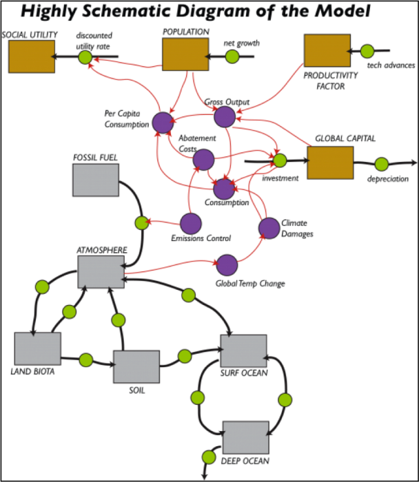
In this diagram, the gray boxes are reservoirs of carbon that represent in a very simple fashion the global carbon cycle model from Module 8; the black arrows with green circles in the middle are the flows between the reservoirs. The brown boxes are the reservoir components of the economic model, which include Global Capital, Productivity, Population, and something called Social Utility. The economic sector and the carbon sector are intertwined — the emission of fossil fuel carbon into the atmosphere is governed by the Emissions Control part of the economics model, and the global temperature change part of the carbon cycle model affects the economic sector via the Climate Damage costs. Let’s now have a look at the economic portions of the model. You should view this video about the DICE Economic Model [158] first, and then study the text that follows.
The Global Capital Reservoir
The Global Capital Reservoir
In this model, Global Capital is a reservoir that represents all the goods and services of the global economic system; so this is much more than just money in the bank. This reservoir increases as a function of investments and decreases due to depreciation. Depreciation means that value is lost as things age and the model assumes a 10% depreciation per year; the 10% value comes from observations of rates of depreciation across the global economy in the past. The investment part is calculated as follows:
Investment = Savings Rate x (GDP - Abatement Costs – Climate Damages)
The savings rate is 18.5% per year (again based on observations). The GDP is the total economic output for each year, which depends on the global population, a productivity factor, and Global Capital.
Abatement Costs
The Abatement Costs are the costs of reducing carbon emissions and are directly related to the amount by which we reduce carbon emissions. If we take steps to reduce our carbon emissions either by switching to renewable energy or improving efficiency or by direct removal of CO2 from the atmosphere, then there are costs associated with these steps. The model includes something called the abatement cost per GT C — this is the cost in trillions of dollars for each gigaton of carbon removed, and it can be changed over time. The default value is $3 trillion/GT C, which is a lot because it also includes the costs of large battery systems and new electrical transmission lines. But, the good thing about these costs is that once you pay for a GT of C removed, you don’t keep paying for it. If we were to completely cut all carbon emissions (currently around 10 GT C/yr) and do it in one year, it would cost $30 trillion or about 1/3 of the global GDP.
The diagram below shows how the abatement costs each year are figured out.
Climate Damages
Climate Damages are the costs associated with rising global temperatures, including the costs of dealing with sea level change along coasts, extreme weather events (hurricanes, flooding, droughts, wildfires, etc.), labor (reduced productivity at higher temps), and increased human mortality (loss of workers hurts the economy). In the model, the climate damages are calculated as a fraction (think of this as a percentage) of the GDP. The fraction is a quadratic equation that looks like this:
damage fraction = slope × ΔT + coefficient × ΔTexponent
The ΔT is the global temperature change in °C. Both the slope and exponent can be adjusted in the model; the coefficient is set at 0.003. The default slope is 0.025 and the exponent is 2, which means that if we have a global temperature change of 4°C, damages equal to 15% of GDP; this rises to a devastating 55% for a temperature increase of 10°C. The diagram below shows what this damage fraction equation looks like, plotted as a function of temperature change in °C.
Relative Climate Costs
It will be useful to have a way of comparing the climate costs — the sum of the Abatement Costs and the Climate Damages — in a relative sense so that we see what the percentage of these costs is relative to the GDP of the economy. The model includes this relative measure of the climate costs (in trillions of dollars) as follows:
Relative Climate Costs = (Abatement Costs + Climate Damages) x GDP/initial GDP
Consumption
Consumption
Also related to the Global Capital reservoir is a converter called Consumption. A central premise of most economic models is that consumption is good and more consumption is great. This sounds shallow, but it makes more sense if you realize that consumption can mean more than just using things it up; in this context, it can mean spending money on goods and services, and since services include things like education, health care, infrastructure development, and basic research, you can see how more consumption of this kind can be equated with a better quality of life. So, perhaps it helps to think of consumption, or better, consumption per capita, as being one way to measure quality of life in the economic model, which provides a measure for the total value of consumed goods and services (in trillions of dollars), which is defined as follows:
Consumption = Gross Output – Climate Damages – Abatement Costs – Investment
This is essentially what remains of the GDP after accounting for the damages related to climate change, abatement costs, and investment.
The model also calculates the per capita consumption by just dividing the Consumption by the Population, and it also includes a converter called relative per capita consumption, which is just the per capita consumption divided by the GDP. In the model, this is in thousands of dollars per person.
Population & Productivity Factor
Population & Productivity Factor
Population
The population in this model is highly constrained — it is not free to vary according to other parameters in the model. Instead, it starts at 6.5 billion people in the year 2000 and grows according to a net growth rate that steadily declines until it reaches 12 billion, at which point the population stabilizes. The declining rate of growth means that as time goes on, the rate of growth decreases, so we approach 12 billion very gradually.
Productivity Factor
The model assumes that our economic productivity will increase due to technological improvements, but the rate of increase will decrease (but will not go negative), just like the rate of population growth. So the productivity keeps increasing, but it does not accelerate, which would lead to exponential growth in productivity. This decline in the rate of technological advances is once again something that is based on observations from the past.
Emissions
Emissions
The model calculates the carbon emissions as a function of the GDP of the global economy and two adjustable parameters, one of which (carbon intensity) sets the emissions per dollar value of the GDP (units are in gigatons of carbon per trillion dollars of GDP) and something called the Emissions Control Rate (ECR). The equation is simply:
Emissions = carbon intensity*(1 -ECR)*GDP ;
Currently, carbon intensity has a value of about 0.118, and the model assumes that this will decrease as time goes on due to improvements in the efficiency of our economy — we will use less carbon to generate a dollar’s worth of goods and services in the future, reflecting what has happened in the recent past. The ECR can vary from 0 to 1, with 0 reflecting a policy of doing nothing with respect to reducing emissions, and 1 reflecting a policy where we do the maximum possible. Note that when ECR = 1, then the whole Emissions equation above gives a result of 0 — that is, no human emissions of carbon to the atmosphere from the burning of fossil fuels. In our model, the ECR is initially set to 0.005, but it can be altered as a graphical function of time to represent different policy scenarios. In other words, by changing this graph, we are effectively making a policy — and everyone follows this policy in our model world!
Making Comparisons — the Discount Rate
Making Comparisons — the Discount Rate
We would like to be able to see whether one policy for reducing emissions of carbon is economically better than another. Different policies will call for different histories of reductions, and to compare them, we need to find a way to compare the expected future damages associated with each policy. A problem comes when we try to compare 200 million in damages at some time in the future vs. 20 million in damages today. Economists use something called a discount rate to do this. Here is an example to help you see how this idea works: imagine you have a pig farm with 100 pigs, and the pigs increase at 5% per year by natural means. If you do nothing but sit back and watch the pigs do their thing, you’d have 105 pigs next year. So 105 pigs next year can be equated to 100 pigs in the present, with a 5% discount rate. Thus, the discount rate is kind of like the return on investment. Now think about climate damages. If we assume that there is a 4% discount rate, then $1092 million in damages 100 years from now is $20 million in present-day terms. Here is how this works in an equation:This is a standard exponential growth equation is called Euler’s number and has a value of about 2.7. Now, let’s say we calculate some cost in the future — 8 million dollars 200 years from now — we can apply a discount rate to this future cost in order to put it into today’s context. Here is how that would look:
It is important to remember that this assumes our global economy will grow at a 4% annual rate for the next 200 years. The 4% figure is the estimated long-term market return on capital, but this may very well grow smaller in the future, as it does in our model. Although we’re not going to dwell on the discount rate any more in this exercise, it is good to understand the basic concept.
A simpler way of comparing future costs or benefits with respect to the present is to express these costs and benefits relative to the size of the economy at any one time — which our model will calculate. This gets around the kind of shaky assumption that the economy is going to grow at some fixed rate. These relative economic measures are easy to do — just divide some parameter from the model, like the per capita consumption, by the GDP. Below is a list of the model parameters that we will keep an eye on in the following experiments:
Below is a list of the model parameters that we will keep an eye on in the following experiments:
Global capital — the size of the global economy in trillions of dollars;
GDP — the yearly global economic production in trillions of dollars
Per capita consumption — consumption/population; this is a good indicator of the quality of life — the higher it is, the better off we all are; units are in thousands of dollars per person
Relative per capita consumption — annual per capita consumption x (GDP/initial GDP); again, a good indicator of the quality of life, in a form that enables comparison across different times; units are in thousands of starting time dollars per person
Sum of relative pc consumption — the sum of the above— kind of like the final grade on quality of life. If you take the ending sum and divide by 200 yrs, it gives the average per capita consumption for the whole period of the model run.
Relative climate costs — an annual measure of (abatement costs + climate damages) x (GDP/initial GDP); this combines the costs of reducing emissions with the climate damages, in a form that can be compared across different times; the units are trillions of dollars.
Sum of relative climate costs — sum of the relative climate costs — the final grade on costs related to dealing with emissions reductions (abatement) and climate; this is the sum of a bunch of fractions, so it is still dimensionless.
Global temp change — in °C, from the climate model
Experiment 1
Experiment 1 - Changing the Emissions Control Rate (ECR)
In the model [159], the ECR can vary from 0 to 1, and it expresses the degree to which we take steps to curb emissions; a value of 0 means we do nothing, while a value of 1 means that we essentially bring carbon emissions to a halt. According to Nordhaus, the most efficient way of implementing this control is through some kind of carbon tax, in which case a value close to 1 represents a very hefty carbon tax that would provide strong incentives to develop other forms of energy. In this experiment, we’ll explore 3 scenarios — in A, we’ll keep ECR at a very low level — this is the “do nothing” policy scenario, in B we'll ramp it up steadily through time — this is the “slow and steady” policy scenario, and in C, we’ll ramp it much more quickly, eventually reaching a value of 1.0 — this is the “get serious” policy scenario. You can make these changes in the ECR by altering the graphical converter.
The three different scenarios consist of 5 numbers that are the ECR values for 5 points in time (corresponding to the five vertical lines in the graph); these times are the years 2000, 2050, 2100, 2150, and 2200. There are 2 videos to watch in Module 10 Summative Assessment— the Model Introduction, which gives you an overview of the model and ECR Scenarios which explains how to modify the model to do these problems.
| 1. Do nothing | 2. Slow and Steady | 3. Get Serious | |
|---|---|---|---|
| Practice | Use defaults values (no need to change anything) | 0.005; 0.15; 0.3; 0.45; 0.6 (see video about adjusting these) |
0.005; 0.33; .66; 1.0; 1.0 |
| Graded | Use defaults values (no need to change anything) | 0.005; 0.2; 0.4; 0.6; 0.8 | 0.005; 0.5; 1.0; 1.0;1.0 |
For each scenario, run the model, study the model results, and record the results indicated in the table below and then refer to your results in answering the questions below.
This short video below explains how to make changes to the model. Please take a few minutes to watch the ECR Scenarios video. You will be happy you did later!
Video: ECR Scenarios (5:45)
For this summative assessment, we're basically going to do three different runs with this model. Each one will have a different history of the emissions control rate. So when you open the model up, just reset everything first. The reset button clears everything. Then we're gonna run it with the default values. So for the practice version we use the default values, we're not gonna change anything, we're just gonna run it. We run it and see what happens. Here you can see in red the temperature rising and it gets up to about six point eight degrees Celsius warming. In blue is the carbon emissions that rises and it reaches a peak of about thirty-one gigatonnes of carbon. And then it starts to decrease and then it just sort of ;falls off a cliff right here. It falls off a cliff right there because we actually would run out of fossil fuels at that point. And if you click ahead a few graphs, you can see...there's the emissions. Sorry, go back one. This graph shows the fossil fuels remaining. That drops to zero at this point, so we've totally run out of fossil fuels at that point. So that's a scenario number one. That's they do-nothing scenario.
The next scenario B is called the slow and steady one. And if you look over here in this table, there are some numbers that tell us the values of this emissions control rate at different points in time. So here's what you do. You click on the emissions control right here. You click on table and then these Y values here, ;the numbers that are reflected over here. So .005 point is already there. Now we're gonna put in 0.15, and then 0.3, and then 0.45, and then finally 0.60, and hit okay. And now we see we have a nice slow steady increase in the emissions control rate. That means as time goes on we're gonna kind of slowly do more and more in terms of reducing carbon emissions. That's all we have to change and then we run the model and you see that that results in a somewhat lower global temperature change. Still rises to 5.45 degrees C which is a pretty serious warming by the year 2200.
Now, will it will do one more scenario. This is the get-serious scenario and the values here according to the table are .33, .66, and then 1.0. Now when this has a value one, that effectively means we're going all out, we're going to do whatever it takes to eliminate all carbon emissions. And so we set that up and you can see here it tops out and stays at one there. We run that scenario and sure enough the temperature changes quite a bit less. We have 2.8 degrees of temperature change by the end of time. And you know if you look at the carbon emissions, let's see if you go to this one here, this is all three runs carbon emissions. So the third one would get serious. The carbon emissions they actually drop to zero by the time we get to the year 2152. And they stay at zero at that point.
So then, you've done these three runs. On a number of these graphs, the different curves are presented...run one, run two, run three. So run one would be the do-nothing scenario, run two would be the slow and steady scenario, and run three would be the get-serious scenario. And so there are a whole bunch of different graphs here. Everything is plotted. Here, by the way, these are the total abatement costs. And you can see in the first run the abatement costs are essentially zero all the way along. And then the abatement costs get very big once we've run out of fossil fuels. We have to make up for that with renewable energy and so that's going to be associated with some significant cost. The abatement costs rise up dramatically there and then level off as time goes on.
So then, in this worksheet, you see there are a whole bunch of questions to answer. What is the global temperature change at the year 2200 for a scenario A, ;B, and C? And these are the answers that you could get off of these graphs. Graph number 2, graph number 15, 17, 18, 7, 9, and so on. from doing these three scenarios and then toggling back and forth between these graphs, running your cursor along here until you get to the year 2200, and then recording the values, and filling them in in this table. So, if you fill in this part of the table with those values, then you can use these numbers to help you answer the various questions that go along with this experiment.
If you haven't already run the model for this experiment, run the Model now! [160]
For each scenario, study the model results, and record the results indicated in the table below and then refer to your results in answering the questions below.
| Items | Do nothing | Slow and Steady | Get Serious |
|---|---|---|---|
| 1. Global temp change @ 2200 | |||
| 2. Global capital @ 2200 | |||
| 3. Per capita consumption @ 2200 | |||
| 4. Relative per capita consumption @ 2200 | |||
| 5. Sum of relative per capita consumption @ 2200 | |||
| 6. Relative climate costs @ 2200 | |||
| 7. Sum of relative climate costs @ 2200 |
Questions
1. Which of these 3 scenarios leads to the lowest global temperature change?
- Do nothing
- Slow and steady
- Get serious
2. For answer to #1, global temp change @2200 = ____________ (±0.5°C)
3. Which of these 3 scenarios leads to the highest global capital?
- Do nothing
- Slow and steady
- Get serious
4. For answer to #2, global capital @2200 = ____________ (trillion$ ±50)
5. Which of these 3 scenarios leads to the lowest relative climate costs?
- Do nothing
- Slow and steady
- Get serious
6. For answer to #5, relative climate costs @2200 = _______________ (±0.5)
7. Which of these 3 scenarios leads to the greatest relative per capita consumption?
- Do nothing
- Slow and steady
- Get serious
8. In terms of both economic costs (lowest relative climate costs) and benefits (highest relative per capita consumption), which scenario is the best?
- Do nothing — best in both costs and benefits
- Slow and steady — best in both costs and benefits
- Get serious — best in both costs and benefits
- Do nothing — best in benefits; Get serious — best in costs
- Slow and steady — best in benefits; Do nothing — best in costs
Now we step back and consider what we’ve done and learned by responding to the following questions.
9. You have probably heard people (mainly from the realms of business and politics) say that we should not do anything about global climate change because it is too expensive and will hurt our economy. After experimenting with this model, do you agree with them, or do you think they are missing something (and if so, what is it they are missing)?
10. Remember that each ECR history reflects a different economic/political policy. Briefly explain how you came to figure out which policy was the best. In answering this, you have to think about what “best” means — the least environmental damage; the greatest economic gain per person; the easiest policy to implement; or some combination of these?
Summary and Final Tasks
Summary
The part of economics dealing with climate change goes much deeper than we have covered here. If you are interested, check out some of the references in this module. But, you should now have a working sketch of many of the main results.
Because the climate changes driven by the CO2 from our fossil fuels will make life harder for people in the future, as well as for at least some people now, there is a social cost of emitting carbon dioxide to the atmosphere. This cost can be understood by first discounting the future damages to their present value. But, if we spend money to reduce CO2 emissions and thus lower the damages from climate change, we are not spending money on consumption today, or on other investments for the future.
By using integrated assessment models, economists can compare the economic costs and benefits of different possible divisions of money among consumption, investment in the broad economy, and investment in reducing climate change. The optimal path is almost always found to involve doing some of all of those. Thus, rather surprisingly to some people, hard-nosed economics motivates serious responses to climate change, beginning as soon as possible. Typically, this response involves small actions now, increasing over the next decades, and relying on consistency in policies.
Because some of the damages of climate change are not yet accounted for quantitatively in these studies, they probably underestimate the size and speed of the optimal response. Similarly, if future economic growth is going to be more limited by the finite nature of the planet than assumed in the models, or by other issues, or if current calculations are overestimating the good that comes from increasing economic activity, then it is likely that more action to limit climate change would be recommended now. On the other hand, if future economic growth is faster than expected, or if we are underestimating the good from increasing economic activity, less action would be recommended now to reduce climate change. However, the balance of the literature seems to suggest overall that following the optimal path from the models or doing a little more now to reduce climate change is the economically best path.
Reminder - Complete all of the Module 10 tasks!
You have reached the end of Module 10! Double-check the to-do list in the Module Roadmap to make sure you have completed all of the activities listed there before you begin Module 11.
References and Further Reading
Enrichments
Discount Rate
Discount Rate
The discount rate is often approximated as the real rate of return on capital, R, along an optimal path. This is given by the Ramsey equation, which in turn is made up of three parts.
The first is the growth rate of consumption per person in the economy, Ġ.
The second is the elasticity of the marginal utility of consumption, S. The marginal utility of consumption is how much good you get from consuming something, and its elasticity here is taken as how this good changes as you consume more. Wealthy people get less good from the next dollar than poor people do, but how much less? If we think that the good decreases rapidly as people get richer, and we don't want to help rich people in the future who won't appreciate the help, then we have a large discount rate and tend to help ourselves rather than them by spending on us rather than investing for them.
The third part of the discount rate is the pure rate of time preference, E. This is related to our observed tendency to choose to have something, such as an apple, or an Apple, now rather than in the future.
The Ramsey equation puts these together to give the real rate of return on capital as R=E+ĠS. And, economists often set this as being equal to the discount rate.
Interesting Discounts
Interesting Discounts
In the example in the text, 1000 dollars this year becomes 1040 dollars next year after the bank adds the interest. You can say that the present value is P, the future value F, the interest i=F-P, and the interest rate r=i/P=(F-P)/P. The discount rate is d=(F-P)/F. A little algebra will show you that d=r/(1+r) and r=d/(1-d). Here r and d are in the decimal forms (0.04, not 4%). In the main text, we will use D=100d for the discount rate in percent. The economic models eventually assume a discount rate, such as 4%, but often you will see calculations made with 3% and 5%, and sometimes 1% and 7%, because the discount rate is quite uncertain. This uncertainty in the discount rate is much larger than the difference between the interest and discount rates, so using either one will get you close.
The example in the text used an interest rate of 0.04, which gives d=0.04/(1+0.04)=0.03846. . . , which looks messy. But, we could have taken d=0.04, which would have given r=0.04/(1-0.04)=0.041666. . ., which makes the interest rate look messy. Your bank may indeed advertise interest rates such as '4.17%!!!'
Inflation is the tendency for all prices and wages to rise in an economy. Measuring inflation is not a trivial task, but useful estimates are available for the inflation rate at different times in different places. Mathematically, it is not difficult to remove the effects of inflation - if everything goes up together, we can correct everything together, reducing the values back to what they would have been at some chosen time (or inflating them to what they will be at some other chosen time). When effects of inflation have been removed from a calculation, you may see costs and benefits referred to in 'constant dollars' or '2005 dollars' or '(some other specific year) dollars' in a government report on decision-making about energy.
Uncertainty Lowers the Discount Rate
Uncertainty Lowers the Discount Rate
This module has covered the techniques for calculating the present value of future events. But, how uncertainty shows up in this is possibly surprising.
Suppose you estimate that damages of $1000 will occur in 100 years, and you want to estimate their present value as properly as possible. But, you aren’t sure whether the discount rate is D=1% or D=7%—you think that 1% and 7% are equally likely to be correct. You decide to split the difference, by assuming that the average of the present values of these cases is your best estimate of the present value.
You recall that earlier in this module we found that P=F/(1+d)t, allowing you to calculate the present value P from the future value F=1000 for time t=100 using the discount rate d=D/100.
You might be tempted to assume that the answer can be obtained by averaging 1% and 7% to get 4% and then calculating P for this discount rate of 4%. You would be wrong.
If you got out your calculator, you would find
For D=7%, P=1.15
For D=4%, P=19.80
For D=1%, P=369.71
You want the average of the present values for the 1% and 7% cases, which is (369.71+1.15)/2=185.43. That is almost 10 times larger than the value P=19.80 you get for a 4% discount rate.
What happened? For sufficiently high discount rate and sufficiently long time, the present value of any future event is very small, and you can’t lower a small value very much more by using a higher discount rate or longer time. Under those conditions, the average of the present values with an uncertain discount rate is not too far from being half of the present value, with the lower discount rate.
You could put the average present value, 185.43, into the equation above and solve for the discount rate that would give it. The result is D=1.7%, far below the 4% you would get by averaging 1% and 7%.
If you then decided to look at the present value of damages of 1000 occurring 200 years in the future rather than 100 years, you would find
D=7%, P=0.001 (that’s one-tenth of a cent)
D=4%, P=0.39 (that’s 39 cents)
D=1%, P=137.69
The average of 137.69 and 0.001 is 68.85, almost exactly half of the low-discount case. And if you calculate the one discount rate that would give this, it is 1.3%, even lower than the 1.7% for 100 years.
So, if you want to use a single number for the discount rate, but you know that there really is uncertainty about what that number should be, the single number is lower than the average of the possible discount rates, and the single number gets smaller as you look further into the future. In turn, our lack of knowledge about the future means that an economically efficient response involves more actions now to prevent global warming than you would calculate by simply taking a discount rate in the middle of the possible values.
For additional insights on why the discount rate should be made smaller when looking further into the future, motivating more action now to reduce global warming, see K. Arrow et al., 2013, Determining benefits and costs for future generations, Science 341, 349-350. (Note that in the Newell and Pizer paper referenced in the main text, and in this Arrow paper, time is made continuous and discounting is exponential; their equation looks different from ours, but the numerical difference from what we did here with annual values is very small—for example, Newell and Pizer get 34 cents rather than 39 cents for the present value of 4% discounting of 1000 in damages 200 years in the future.)
Module 11: Policy Options
Overview
Strong science and economics give us high confidence that reducing greenhouse gases can be a sound investment. If we use the knowledge efficiently as we make decisions, we will be economically better off. But, we’re a little like a worker with an illness related to their job—the job brings great good as well as bad, and the same is true of fossil fuels.
If you go to a doctor with an illness, the doctor has lots of options. She may give you medicines that cure the disease, or others that lessen the symptoms. She may help you learn coping strategies to reduce the problems, and other actions to prevent additional illnesses or treat other difficulties that are making this illness worse.
In the same way, we can think about “curing” the global-warming problem by switching to other fuels that don’t raise the Earth’s temperature, or by putting CO2 back in the ground; such actions to reduce or eliminate the warming are often called mitigation. Or, we can look for ways to cope with the coming climate changes, by breeding heat-resistant crops, building walls against the rising sea or moving out of the way, and otherwise engaging in adaptation as the changes happen. We even can try to cover up the symptoms, using geoengineering to block the sun. And, we can encourage research, education and innovation to help make the transition.
How do we really do any of these? What decisions need to be made? What other issues are involved? Let’s go policy-wonking!
Goals and Objectives
Goals:
- Recognize the role of human actions in determining the future of our climate, except that by avoiding climate change, the shift will make the economy better and thus increase employment
- Explain scientific concepts in language non-scientists can understand
- Find reliable sources of information on the internet
Learning Outcomes
By the end of this module, you should be able to:
- Recognize the multitude of policy options available for our energy system and economy
- Explain how the effectiveness of emissions treaties and carbon taxes can be verified internationally using remote data collection
- Recognize that shifting gradually to renewable energy is likely to have little overall impact on employment rates
- Recall that energy policies and subsidies have been in use for decades, and some of these have promoted fossil fuels over renewable resources
- Research and evaluate an example of an energy subsidy reported by the IMF
Roadmap
| To Read | Materials on the course website (Module 11). | |
|---|---|---|
| To Do | DiscussionPost [161] Discussion Comment [161] Quiz 11 |
Due Wednesday Due Sunday Due Sunday |
Questions?
If you prefer to use email:
If you have any questions, please email your faculty member through your campus CMS (Canvas/Moodle/myShip). We will check daily to respond. If your question is one that is relevant to the entire class, we may respond to the entire class rather than individually.
If you have any questions, please post them to Help Discussion. We will check that discussion forum daily to respond. While you are there, feel free to post your own responses if you, too, are able to help out a classmate.
Policy Options and Regulations
Policy Options and Regulations
Short Version:
A huge range of policy options is available, and many regulations likely would be required to implement some of them. Or, a price on carbon, such as a carbon tax, could be used to get the whole economy working on the problem. If paired with a tax swap to reduce more-intrusive taxes, this would have little impact on the economy and might cause growth, even if the benefits of avoiding global warming are ignored. International harmonization of carbon taxes could be used, with econometric and geophysical verification. Such an approach is likely to have collateral benefits through avoiding negative externalities of some fossil-fuel use, improving national security through avoided environmental problems, reducing rapid changes in energy prices, and possibly increasing employment. Current policy positions probably are serving to accelerate global warming, so a neutral stance or reduction in global warming would require policy actions. Clearly, effective responses require well-designed and implemented policies; it is possible to mess things up with poor policies.
Longer, but friendlier version:
On June 25, 2013, US President Barack Obama made a major speech introducing his administration’s Climate Action Plan [162].
The 21-page document that accompanied the speech sketched a series of policy actions proposed for the remaining years of the president’s term in office. By the time you read this, that speech will be old news. But, it is instructive even as it becomes history because despite the sheer number of proposals, and their great breadth and depth, this plan did not even mention the most commonly discussed policy option.
Consider some of the proposals. (Many of the words that follow are directly from the Plan, but some are paraphrased.) Don’t try to learn or memorize these; just notice how many there are:
Cut Carbon Pollution in America by:
- Completing carbon-pollution standards for new and existing power plants;
- Promoting renewable energy, including accelerating clean energy permitting, developing hydroelectric power at existing dams, deploying renewable energy through the Department of Defense, increasing federally installed renewable energy, and expanding and modernizing the electric grid, including streamlining transmission projects;
- Unlocking long-term investment in clean energy innovation, including increasing funding for areas ranging from advanced biofuels to emerging nuclear technologies such as modular reactors to clean coal, guaranteeing loans for projects to avoid, reduce or sequester human-produced greenhouse gases, and instituting a Federal Quadrennial Energy Review to assess and guide actions;
- Advancing transportation, including fuel-economy standards for heavy-duty trucks, buses, and vans, improving biofuels, and leveraging public-private partnerships to deploy cleaner fuels such as advanced batteries and fuel cell technologies;
- Reducing energy bills by increasing energy efficiency standards, reducing barriers to investment in energy efficiency by financing efficiency investments in rural America, and developing a new fund to allow testing of novel approaches to cost-effective residential electricity, and expanding programs for better buildings;
- Reducing emissions of other greenhouse gases, including various programs to curb emissions of hydrofluorocarbons and methane, and preserving forests;
- Providing federal leadership, including consumption of clean energy and energy efficiency, with initiatives such as (quoting from the bottom of p. 11 in the plan)
In the report, these proposals to cut carbon pollution were followed by proposals to Prepare the United States for the Impacts of Climate Change, and to Lead International Efforts to Address Global Climate Change, with similar detail.
Many people provided opinions about the plan in the days after it was released, but among those experts who favored policy actions to address climate change, there was widespread acceptance that these proposals were serious and moving in a useful direction. Standard contracts, synchronized building codes, and access to capital markets for investments are indeed important, as are many more policy options.
But recognize that 21 pages of this sort of text were needed just to sketch a suite of policy responses—the rules and regulations were not in the document, just statements committing the administration to working on those rules and regulations. And, this is just one level of government in just one country in a very big world. Furthermore, a price on carbon emissions was not even discussed (see below).
So, if you expect a truly comprehensive discussion of policy options in this chapter, you will be disappointed. The energy system is so huge and pervasive in our lives, and so strongly linked to release of CO2, that almost everything we do, publicly or in private, can be changed to influence global warming.
Instead, we’ll look at a few of the most frequently discussed options. We’ll also look at additional motivations, and effects of policy actions.
Dr. Alley, your tour guide here, is a geologist by training, and a recognized expert on some aspects of glaciers and ice sheets. This does NOT make him a policy expert. Furthermore, a lot of what follows could be misinterpreted as an endorsement of some particular policy or policies. So, let’s get it out in the open right now: We are NOT endorsing any particular policy here. It is up to you to make up your own mind. We do hope that the evidence and reasoning presented here will help you with this. We are NOT telling you how to vote about issues such as synchronized building codes to reduce carbon pollution. But, we are trying to show you what the best understanding says about motivations and options for this often-contentious and very important topic. And again, because the topic is so vast, we will hit only a few of the high points.
Tax and What?
Tax and What?

Outlaw Dumping of Carbon Dioxide
Outlaw Dumping of Carbon Dioxide
One possible policy approach to global warming is to outlaw dumping of CO2 into the air where it affects neighbors, just as we outlaw dumping human waste onto a neighbor’s lawn. This is not a favored policy approach for now; Dr. Alley knows of no serious proposals to outlaw most CO2 emissions in the short term. However, some of the proposals in President Obama’s plan involve laws or regulations that reduce emissions, through actions such as requiring that trucks travel more miles per gallon of diesel fuel, or that power plants emit less CO2 per kilowatt-hour of electric generation. In some sense, this is outlawing a small fraction of CO2 emissions.
Economists generally recognize the utility of at least some regulations, such as those prohibiting dumping of human waste on a neighbor’s lawn. (Although, the British publication The Economist editorialized against sewers in 1848, as reported by S. Halliday in The Great Stink of London, 1999.) But, there is fairly broad support among economists for using “price signals” instead of regulations where practicable.
Cap and Trade
For example, instead of outlawing CO2 emissions, governments could set a limit on how much CO2 could be emitted, and sell or give away permits to emit that much CO2. Then, the people holding those permits could actually emit that CO2, or sell (trade) those permits to other people who wanted to emit the CO2. This process is often called cap and trade. By reducing the permitted emissions over time, or raising the price of the permits, total emissions could be reduced.
At any time, the trading of permits allows the economy to reduce emissions at the lowest possible price. If CO2 is reduced by regulations rather than price signals, those regulations might be written with an eye toward political expediency rather than economic optimization, and so might end up cutting emissions in rather expensive ways. By letting markets achieve the reductions, more-efficient ways are likely to be found. At the time of this writing, cap and trade was being used in Europe to address CO2, in the US to reduce acid rain, and in other ways around the globe. Some danger typically exists that political considerations will cause caps to be set so high that there is little practical effect of the policies. However, with appropriately set caps and sufficiently well-regulated and monitored markets and emissions, this approach can work, and has done so in some cases.
In the broadest sense, cap-and-trade with permits sold by the government is a complex way to levy a tax on CO2 emissions. In part because of the complexity, many economists argue that it would be much more efficient to just tax CO2 emissions directly.
A Highly Relevant Detour
A Highly Relevant Detour
Now, a bit of a highly relevant detour. Governments levy taxes to raise funds so the governments can function, but those taxes always have impacts in addition to the fund-raising. In the United States, governments tax tobacco to raise money and reduce smoking. Governments tax alcohol to raise money and reduce drinking. And, governments tax the wages of workers to raise money… and reduce working?
Reducing the value of work does reduce working. For example, suppose Dr. Alley has $100 to get help with some task. Compare two options: he offers some students $100 to help, or, he offers the students $50 to help, and the government gets the other $50. Which is more likely to convince the students to change their plans and go help Dr. Alley? The answer should be clear.
Just as taxing tobacco, alcohol and wages tends to reduce smoking, drinking and working, respectively, taxing our fossil fuels would reduce their use, as well as promoting substitutes that now are more expensive than the fossil fuels. And, because energy use powers the economy, this would reduce economic activity unless certain other actions were taken.
If a tax (or a cap-and-trade program) were developed to reduce CO2 emissions, the economic impacts would depend hugely on what was done with the money raised. Some political campaigns in the US recently featured advertisements using numbers assuming that money collected from a cap-and-trade system was then run through a shredder, disappearing completely from the economy. This makes the cap-and-trade program sound very expensive, which may be politically useful. But, in our experience, governments that get money tend to spend it rather than shredding it.
Tax Swap
Tax Swap
Probably the most frequently discussed policy option is to place a tax on carbon emissions, and use the money in a “tax swap” to reduce the tax on wages, or to reduce other taxes that especially reduce economic growth. (Other options include giving the money back to people directly, or using the money to stimulate research—the funds would be available for anything that money can be spent on.) In 2013, the US Congressional Budget Office summarized available research showing that if we ignore all of the benefits of reducing fossil-fuel emissions and avoiding global warming, a properly designed tax swap would have little impact on the economy as a whole—it might slow growth a little, or speed growth a little, but without too much change (Effects of a Carbon Tax on the Economy and the Environment, 2013 [163]). Earlier, the US EPA had conducted a similar study and found a slightly overall increase in household consumption over the next 30 years in response to a price on carbon—a stronger economy from putting a price on carbon emissions and using the money to reduce the tax on work. (U.S. Environmental Protection Agency, Office of Atmospheric Programs, 2009, Revenue recycling to reduce labor taxes, in Supplemental EPA Analysis of the American Clean Energy and Security Act of 2009 [164]H.R. 2454 in the 111th Congress, p. 23, scenario 16.) You might think of this as arising from the fact that replacing fossil fuels is difficult, and taxing fossil fuels causes inefficiency in the economy, but replacing workers is about as difficult and perhaps even more difficult, and taxing their wages causes about as much and may be even more inefficiency in the economy.
Such studies also show that it is possible for governments to raise taxes on carbon and then use the resulting money in ways that are not as helpful to the economy so that the carbon tax really does reduce economic growth significantly. (The worst example of this might be taking the money and shredding it!) But, used appropriately, there is little economic cost and possibly economic gain from a carbon tax even if you ignore the benefits of reducing CO2 emissions. And, as noted in the previous chapter, a cost on carbon emissions is strongly justified if the costs of global warming are included.
One objection to a carbon tax, even if implemented efficiently with a tax swap, is that it takes relatively more money from poor people than from the wealthy; such a policy is often called regressive. In contrast, income taxes tend to be designed in a progressive manner, so that wealthier people pay relatively more. However, other policies can be designed to address such issues if they are deemed important.
In his 2008 book, A Question of Balance, the Yale economist William Nordhaus (we met him in Module 10) devoted a whole chapter to “The many advantages of carbon taxes”. Three days after the Obama administration’s 21-page sketch of policy actions, economist Henry Jacoby of MIT told National Public Radio’s David Kestenbaum (Morning Edition, June 28, 2013) that economists could solve the problem with a one-page bill. Kestenbaum’s analysis in the interview says “This is why economists love a carbon tax: One change to the tax code and the entire economy shifts to reduce carbon emissions. If you do it right, a carbon tax can be nearly painless for the economy as a whole.” (And, again, this ignores the benefits of reducing global warming, which make the carbon tax more favorable.)
Impact on Coal Miners
Impact on Coal Miners
A carbon tax (or cap and trade, or regulations, or any other serious attempt to reduce CO2 emissions, probably including carbon capture and sequestration) is likely to have unfavorable impacts on some groups, and favorable impacts on others. In particular, coal miners are likely to lose. One of the short-term responses to reductions in greenhouse gases is likely to be a switch to natural gas for generating electricity—gas emits about half as much CO2 as coal for a given amount of electric generation, and the greater ability of gas turbines than coal-fired boilers to change their output quickly means that more renewables can be used easily in an energy system that has more gas-fired and less coal-fired generation.
Video: Coal Miner (1:33)
PRESENTER: This photograph, from the US Library of Congress, shows a coal miner from 1942 from the Pittsburgh, Pennsylvania area, the Montour Number 4 mine of the Pittsburgh Coal Company. We don't even know the miner's name. We do know that a lot of miners have done very difficult jobs to help their families, to help their communities, to help their countries. No one likes going around firing coal miners.
Coal, right now, is under a lot of pressure. Some of it does come from government regulations. Probably, more of it is coming from natural gas being cheaper, although you'll find an argument on that.
The economically optimal path for dealing with CO2 involves starting very slowly to deal with the problem, and making changes over decades, with the idea, in part, that coal miners, who made honest decisions to be coal miners, will retire in their jobs, coal investors will get their money back, but future generations will do something else. If we ignore the science and the economics, for now, we let another generation coal miners get started, then the economically optimal path will involve much faster changes, with a greater likelihood of firing coal miners. So in some sense, if you really hate the idea of firing coal miners, you want to put our knowledge into the decision-making now.
There is a fascinating issue here, which overlaps with ethics in the next module. The economically efficient path puts a small price on carbon now, and then raises that price slowly but steadily, by perhaps 2-4% per year, so that in a few decades the price becomes high. A person who already decided to be a coal miner, obtaining the education, mortgage, and other things that go with that choice, has a good chance on the economically optimal path to retire as a coal miner, with future generations doing something else (or else with future generations mining coal and then capturing and sequestering the carbon). If someone invested in a coal-fired power plant, they likely will get their investment back on the optimal path.
But, the social cost of carbon is projected to climb rapidly as temperatures and damages rise. If we notably delay starting our response, so that a new generation of people become coal miners or coal-plant investors, the higher social cost of carbon in the future will mean that an optimal path starting in the future involves faster changes, which will make it much harder for those new “coal” people to complete their careers or recoup their investments. If you really are ethically opposed to the general act of firing coal miners or hurting the investors in coal plants, starting now to deal with climate change is probably better than delaying, because of the likelihood that delay now will lead to more coal miners being fired later. (The biggest danger to coal-mine jobs and investors in the US now may be the recent drop in gas prices as fracking has increased gas supply; the free market does not adopt 30-year plans to minimize impacts on coal miners. And, as noted below, the fracking boom involves commercialization of research that in significant part was paid for by the US government, so in that sense government policies have caused trouble for coal miners. Notice, though, as described in the Enrichment linked below, that even if the main danger to coal-mine jobs comes from the free-market influence of gas, the public communications may paint a very different picture.)
Want to learn more?
Read the Enrichment titled Coal Mining Jobs.
Harmonious Taxes
Harmonious Taxes
Emitting carbon dioxide has a social cost, as we saw in the previous module, so any actions to reduce emissions give some benefit. But, making a measurably significant difference in the future of global climate will require major reductions in CO2 emissions across large parts of the whole world’s economy, and really solving the problem will involve almost all of us. International cooperation thus is almost surely required to address global warming seriously.
Treaties
One possible approach is to use treaties or other agreements to limit the quantity of CO2 that can be emitted. The Kyoto Protocol to the United Nations Framework Convention on Climate Change (UNFCCC) takes this approach, setting limits on allowable emissions from many, primarily industrialized countries. The UNFCCC commits signatories (essentially the whole world) to “…stabilization of greenhouse gas concentrations in the atmosphere at a level that would prevent dangerous anthropogenic interference with the climate system” (Article 2), and Kyoto attempted to start a strategy to achieve that objective (United Nations Framework Convention on Climate Change, Background on the UNFCCC. [166])
Kyoto can claim some successes among countries in reducing greenhouse-gas emissions. Overall, however, emissions have risen since the protocol was enacted. One could argue that the task is so difficult that we should not expect immediate success, but one could also argue that this approach is not working as well as it should.
Internationally Harmonized Carbon Taxes
Another possible approach is through internationally harmonized carbon taxes. (Again, we are leaning on the work of W. Nordhaus, among many others.) As this was being written, carbon taxes were functioning in many places including British Columbia and several European countries, and discussions were ongoing in additional countries including China. Suppose that the international community broadened this participation by negotiating use of a carbon tax in all countries. The tax rate might be targeted at the economically efficient level, possibly with variations in when it became fully active based on the status of economic development or other issues. Monitoring and enforcement would involve some discussions, as would issues of what in detail to include. For example, deforestation does contribute to global warming, so are trees included? Where Dr. Alley lives, in Pennsylvania in the USA, trees were cut down in previous centuries, and many trees have been growing back—is it right for Pennsylvania to get credit for regrowing trees when other countries are penalized for cutting down their trees?
But, start with the simplest possible model: a tax on the extraction of fossil fuels, set at an initially small level for everyone and then raised at a rate such as 2% per year. Suppose that more than half of the world’s economy initially agreed to this. They could then, perhaps through the UN, offer a deal to countries not yet participating—participate, tax your own carbon, and keep the money for any purpose except stimulating fossil-fuel use; or, refuse to participate, and the participating countries will keep the funds raised from tariffs they will levy on all trade into and out of the nonparticipating countries, and set at a level equal to that for harmonized carbon taxes. (This probably would require changes to international trade rules, but changing such rules is not impossible.) Such an arrangement might turn out to be much simpler than extending the Kyoto Protocol to greatly reduce fossil-fuel emissions of CO2. Many people will have many questions about such a plan, but it is an interesting alternative that is receiving serious if cautious support.
Problems with Treaties and International Carbon Taxes
Any international treaty runs into the issue of verification—how can a nation tell whether other nations are cheating? The US National Research Council looked into that question in 2010 (Verifying Greenhouse Gas Emissions: Methods to Support International Climate Agreements), and found that verification of compliance is practicable. This would include a combination of national inventories (econometric data; who is buying what), and geophysical techniques (satellite, airborne and surface-based monitoring of atmospheric concentrations and isotopic ratios). The small variations in concentration of CO2 around the planet reveal sources and sinks of the gas, and the isotopic composition can separate biological (higher carbon-12 to carbon-13 ratio; either recently living plants or long-dead fossil fuels) from abiological (volcanic, for example) carbon, and modern-biosphere (lower carbon-12 to carbon-14 ratio) from fossil-fuel carbon. Combining the geophysical and economic data can provide a clearer picture than is available from either source by itself.
A carbon tax rising by 2% or 4% per year cannot be a solution for government funding forever because as decades become centuries, the cost per gallon would pass the cost of the car and continue onto huge values. Clearly, policies are reexamined before decades become centuries. The goal of ultimately reaching a sustainable energy system means that taxing fossil fuels cannot continue forever. But, for decades at least, harmonized carbon taxes could supply much government revenue while reducing global warming, having little direct effect on the economy, and improving the economy if the value of avoiding the global warming is considered.
Activate Your Learning
Video: CO2 Map (1:52)
PRESENTER: This figure from NASA-- from the AIRS team-- shows the concentration of CO2 in the atmosphere in May of 2013. This is after a winter of lots of fossil fuel burning in the north and lots of decaying plants and just before the plants really start growing in the spring and taking out CO2 from the air. What you see in this broad band up here is a relatively high CO2 from the fossil fuel burning and the plant decay. Whereas down here, where plants have been growing really rapidly, the CO2 is a little on the low side.
If you were to come back a few months later, these would have reversed a little bit. Now these variations are very small. 402 was the highest, 391 is the lowest. It's barely more than plus or minus 1% about the mean because there's a lot of mixing around the planet.
CO2 goes up and down with winter and summer, and CO2 goes up and with fossil fuel burning. What's useful here is that these images, plus measurements that are made on the ground, plus economic data, tell us who is burning fossil fuels and adding it to the atmosphere, as well as what's going on naturally. If we were to have a treaty that limited fossil fuel burning, it could be verified by using available data. You can't cheat on fossil fuel burning and releasing the CO2 because the CO2 is measurable in the air.
Explain how the data shown in the figure above would allow us to determine if countries are obeying emissions regulations.
Click for answer.
Policy Pile-On
Policy Pile-On
In the previous module, we looked at the basic economic analysis showing that the world’s people will be better off if the solid scholarship on energy and environment is used efficiently. And, we mentioned that if we are close to being influenced by limits to growth, then the motivation to use the scholarship is stronger. Earlier in this module, we looked at some of the ways that policies can be used to address these issues. Next, we will briefly consider a number of issues that influence policy choices, including national security and price stability.
Extinguishing Externalities:
Any energy source that supplies a significant fraction of human use is almost guaranteed to have “externalities”—unintended consequences for people and other living things. Solar farms in the desertmay shade the habitat of cacti and tortoises, wind turbines kill some birds and interrupt views, nuclear plants require long-term storage of potentially poisonous waste, fracking produces “flow-back” fluids containing possibly harmful chemicals that must be disposed of, and so on. Realistically, we have no practical hope of an energy system that doesn’t involve unintended costs and “Not in My Back Yard” (NIMBY) issues.
But, several studies have found that wind turbines are not nearly as deadly to birds as cables on radio towers, skyscrapers, cats, or the climate changes from fossil fuels that will be avoided by use of wind turbines (see Enrichment on the next page).
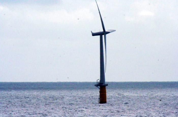
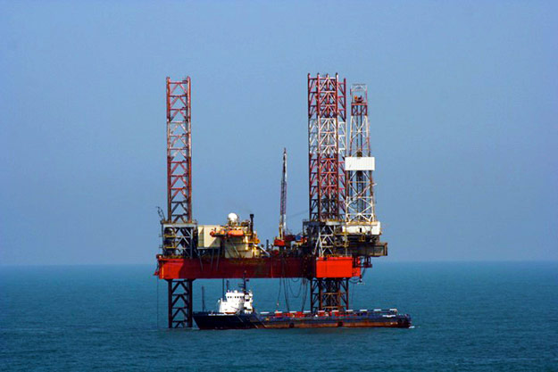
Want to learn more?
Read the Enrichment titled Living with Wind Turbines and Coal Exhaust.
In general, the externalities of renewable energy are quite low—covering thedesert with solar cells does not use the most productive landscape, and covering roofs with solar cells replaces one human-made surface with another that has essentially the same effect on neighbors, except it generates electricity.
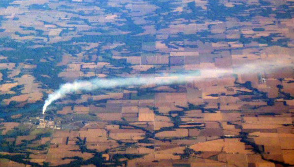
In contrast, recent scholarship shows that coal-fired electricity as currently practiced in the US and some other places (parts of China, for example) has very high negative externalities, from issues such as particles and mercury causing health problems. Some studies for the US (see Enrichment) have indicated that for each dollar spent by consumers on coal-fired electricity, society spends a similar amount, or more, in lost health and environmental quality. Hence, these studies indicate that there would be economic gains from additional regulations or other policy actions to clean up or reduce coal burning, even if the effects on climate change are ignored.
Earth: The Operators' Manual
Video: Yes in My Backyard (aka YIMBY!) (9:08)
To see how people in Denmark and Texas came to welcome the wind into their backyard, you can watch this clip. Beauty really may be in the eye of the beholder, and things that pay the beholder good money may look just a little more beautiful.
Narrator: Are there other examples of communities and nations that have begun the transition away from fossil fuels? What does it take to welcome the turbines and solar farms of the new energy system, and say, "Yes, In My Backyard." This is the story of two communities that at first look very different. Samso is a small island off the Danish mainland. West Texas is a vast, dry expanse in America's South. What both have is abundant wind. At times, Samso produces more electricity than it uses, exporting surplus power to the Danish mainland. And Texas wind now generates as much power as the next three U.S. states combined. Samso and West Texas both solved the NIMBY, not in my backyard challenge that has stymied so many renewable energy projects. It's not easy, but with patience, and persistence, and the efforts of the right people, it can be done.
Soren: Okay-- My name is Soren Hermansen, and I am the Director of the Samso Energy Academy. Samso means, in Danish, means the Meeting Island-- when you make a circle around all of Denmark, then Samso is right in the center of the circle.
Narrator: But it wasn't geography that brought Lykke Friis, then Denmark's Minister of Climate and Energy, here in mid-2011. It was why and how this community had turned NIMBY into "Yes, in my backyard."
Lykke Friis: Well, Samso is a pioneering project, in the sense that Samso, way back, decided that Samso should become independent of fossil fuels.
Narrator: Before its transformation, people thought of Samso as just a cute tourist community, busy in summer, empty and desolate in winter. Now people come here not just to see the turbines, but to understand the process that got the community to welcome wind energy. After a national competition, Samso was selected by the Danish government to be a proof of concept for how to transition from fossil fuels. But it was up to individuals like Soren Hermansen, with the passion and skills to effect change, to figure out just how.
Soren: So when we won, the normal reaction from most people was, "Yeah, you can do this project, that's OK, but just leave me out of it."
Narrator: Samso has a deep attachment to its past and values its traditional way of life.
Soren: But gradually we won their confidence in establishing easy projects to understand, and also easy projects to finance. Because basically it's all about, "What's in it for me?" Because it's not convinced idealists or green environmental hippies who lives here.
Narrator: Soren, a native of the island, convinced some of his neighbors to become early adopters. They found success, and spread the word. Jorgen Tranberg operated a large and profitable herd of milk cows. After initial reservations, he invested in a turbine on his own land. When that went well, Jorgen became part owner of one of the offshore turbines.
Soren: Farmers, they have to invent new things and be ready for changes. So when they see a potential, they look at it, no matter what it is. They look at it, say, "Could I do this?" And if they see fellow farmers do the same thing, they are quick to respond to that. So even being very traditional and conservative in their heads I think they have this ability of making moves and do things, because they have this independency in them. A farmer is a free man-- maybe he owes a lot of money to the bank, but he's still a free man in his thinking.
Narrator: It was seeing what was in it for them and for their community, that won over landowners in West Texas. And it took one of their own, a man whose family had deep roots in Roscoe's cotton fields, to educate them about wind farming. Cliff Etheredge: Well, I'm really a farmer-farmer, you see. I farmed for almost over 40 years. We're in-- right in the middle of the Roscoe Wind Farm. And we've got about 780 megawatts of production, that's per hour, enough electricity for about 265,000 average homes.
Narrator: Roscoe had no oil and faced hard times in the early 90's, but it did have wind.
Cliff: When this land was acquired there was absolutely no value to the wind. Fact is, it was a severe detriment, because of the evaporation of the moisture.
Narrator: Cliff, like Soren, had to work with his neighbors to get them ready to accept wind turbines.
Cliff: The first thing farmers want to know is, "Well, how much is it going to cost me?" It costs them nothing. "What's it going to hurt?" Three to five percent of your farmland is all it's going to take up. You can do what you want to with the rest of it. Then it came down to, "Well, how much money is this going to make me?"
Narrator: Cliff did his research and checked his numbers with wind experts and the Farm Bureau.
Cliff: Then I was able to go to our Landowners' Association and show them, where they had been receiving 35 to 40 dollars an acre, then the landowners could expect somewhere in the neighborhood of three times that.
Narrator: In fact, farmers stand to make 10 to 15 thousand dollars a year, per turbine, just from leasing the wind rights.
Cliff: There was no guarantees in it from the very beginning, but sure enough we've got, I think, in the neighborhood of 95 or more percent of our area that accepted the wind farm.
Narrator: In both Samso and West Texas, individuals saw economic benefits. But the whole community, beyond the investors and land-owners, benefited too.
Cliff: Because of the wind farm, now, and the people working in the wind industry, now we've got jobs available and opportunities for young people to come back from college or from technical school or from whatever. It's just been a Godsend.
Narrator: For Kim Alexander, superintendent of the Roscoe school district, that godsend translates into dollars.
Kim Alexander: In 2007, prior to the wind values coming on our tax roll, our property values were at about $65 million. And then, that wind development, they jumped to approximately $400 million, to $465 million.
Narrator: The school district will get more than $10 million dollars over a decade. That guaranteed revenue stream unlocked additional funding. School buildings, some dating from the 1930's, could be updated, and computer labs added.
Cliff: This is an indication to me of what can be done for rural areas, and will be done, all the way to Canada-- bringing life and prosperity back to these rural communities that are suffering just like we have.
Narrator: The same oil shock that got Brazil started on ethanol, got Denmark started on manufacturing wind turbines, just in time to compensate for a decline in its ship-building industry.
Lykke: And it's also good for the economy, in terms of export. I mean, 10% of Danish exports comes from the cleantech area.
Narrator: Energy and environment always require tradeoffs, such as clear vistas versus clean energy. It's something that communities have to make time to work through. Cliff, for one, believes it's worth it.
Cliff: Everything, the schools, the churches, the civic organizations, all the businesses will benefit from this. It will increase, hopefully, our town's populations, and our economics.
Kim Alexander: My granddad used to say, not realizing he was prophetic, but "If we could sell the wind, we'd be wealthy." Well, who would have ever thought we'd be able to sell the wind?
Narrator: For Samso, Denmark and Texas, clean energy brought economic benefits and energy security. But replacing fossil fuel emissions with wind power has other advantages.
Lykke: And let's not forget, also good for climate and health, and such, and that's a very important argument.
Cliff: We've got a constant wind resource here, that's tremendously valuable, and as opposed to oil and gas, it'll last forever, and it doesn't pollute anything.
Credit: Earth: The Operators' Manual [53]. "Yes, In My BackYard" (aka YIMBY!). [168]" YouTube. April 22, 2012.
Calming Commerce
Calming Commerce
Businesses routinely pay more for long-term, guaranteed supplies than the lowest short-term price available on the spot market. Unexpected, large price increases ("shocks") have real costs. There is, for example, a rather close relation between oil-price shocks and major economic recessions. One fairly recent study, from members of the Research Department of the US Federal Reserve Bank of Philadelphia, concluded that even with optimal policies, central banks cannot completely offset the “recessionary consequences of oil shocks” (Leduc, S. and K. Sill, 2004, A quantitative analysis of oil-price shocks, systematic monetary policy, and economic downturns, Journal of Monetary Economics 51, 781-808). Reducing reliance on oil may help offset such shocks, however, and the analogy to common business practices suggests that at least some extra cost is justified to smooth such fluctuations.
Until recently, countries with local resources of coal or gas might have relied on them; the greater difficulty of transporting coal and gas long distances for international trade has insulated them from some of the spikes in oil prices arising from the effects of Mideast political unrest or other issues. However, huge investments are being made to increase the shipping of coal and gas. This may reduce (but not eliminate) variability in oil prices, by broadening the total supply of easily traded fossil fuels, but likely by increasing variability in coal and gas prices.
Renewables and nuclear power typically have high construction costs but low operating costs compared to fossil fuels; once built, the price of power from renewables and nuclear tends to be more predictable than from oil. Ironically, the fluctuations of renewable energy sources over times from seconds to seasons (wind dies, sun sets) are highly challenging for engineers, complicating construction of an energy system based on these sources; however, at longer times the fluctuations of fossil fuels are larger, with renewables offering stability and predictability for the financial side of the industry. The US Pentagon has stated that it is increasing its use of renewables and its conservation efforts in part to provide protection from energy price fluctuations (U.S. Department of Defense, 2010, Quadrennial Defense Review Report [169], p. 87,).
Providing for the Common Defense
Providing for the Common Defense
Militaries around the world face the difficulty of defending their countries, and contributing to peacekeeping or humanitarian efforts. Changing conditions make this mission more challenging.
The US military, in its Quadrennial Defense Review (2010), made the often-quoted statement “. . . climate change, energy security, and economic stability are inextricably linked. Climate change will contribute to food and water scarcity, will increase the spread of disease, and may spur or exacerbate mass migration.”
The importance of climate change for security was echoed by US Navy Admiral Samuel J. Locklear III, whose duties include relations with North Korea and many other Pacific nations. When asked about the biggest threat to stability in the region, he stated that climate change “…is probably the most likely thing that is going to happen… that will cripple the security environment” over the long-term (Bryan Bender, Boston Globe, March 9, 2013).
Slowing down climate change thus may improve issues that the military considers important for national security, in the US and many other countries. If national security merits investments above those for an economically optimal path, this would tend to motivate more action now to address the coupled problems of energy and environment.
Earth: The Operators' Manual
For a little more about what the US military thinks about climate change, and what why are doing, take a look at these two short clips.
Video: The Pentagon & Climate Change (4:19)
So physics and chemistry show us carbon dioxide is at levels never seen in human history. And the evidence says it's all of us burning fossil fuels that's driving the increase. But what about climate change and global warming... are they for real? Here's what those who have looked at all the data say about the future. (3rd party voice) "Climate change, energy security "and economic stability are inextricably linked... "Climate change will contribute "to food and water scarcity, "will increase the spread of disease, "and may spur or exacerbate mass migration..." Who do you suppose said that? Not a pundit, not a politician... the Pentagon.
(machine gun fire) These war games at Fort Irwin, California, provide realistic training to keep our soldiers safe. The purpose of the Pentagon's Quadrennial Defense Review, the Q.D.R. is to keep the nation safe. The review covers military strategies for an uncertain world. The Pentagon has to think long-term, and be ready for all contingencies. The 2010 Q.D.R. was the first time that those contingencies included climate change. Rear Admiral David Titley is Oceanographer of the Navy, and contributed to the Defense Review. I think the Q.D.R. really talks about climate change in terms that really isn't for debate. And you take a look at the global temperatures... you take a look at sea level rise, you take a look at what the glaciers are doing, not just one or two glaciers but really glaciers worldwide, and you add all of those up together, and that's one of the reasons we really believe that the climate is changing.
So the observations tell us that. Physics tells us this as well. (Richard Alley) What climate change means for key global hot spots is less clear. (Rear Admiral Titley) We understand the Earth is getting warmer, we understand the oceans are getting warmer. What we do not understand is exactly how that will affect things like strong storms, uh, rainfall rates, rainfall distribution. So yes, climate change is a certainty, but what is it going to be like in specific regions of the world and when? (Richard Alley) One area of particular concern to the Navy is sea level rise... Sea level rise is going to be a long-term and very, very significant issue for the 21st Century. (Richard Alley) The Q.D.R. included an "infrastructure vulnerability assessment" that found that 153 naval installations are at significant risk from climatic stresses. From Pearl Harbor, Hawaii, to Norfolk, Virginia, the bases and their nearby communities will have to adapt. (Rear Admiral Titley) Even with one to two meters of sea level rise, which is very, very substantial... we have time. This is not a crisis, but it is certainly going to be a strategic challenge.
(Richard Alley) Globally, climate change is expected to mean more fires, floods and famine. Nations may be destabilized. For the Pentagon, climate change is a threat multiplier. But with sound climate science, Titley believes, forewarned is forearmed. The good thing is, science has advanced enough in oceanography, glaciology, meteorology, that we have some skill at some timeframes of predicting this. And if we choose to use those projections, we can in fact, by our behavior, alter the future in our favor. (Richard Alley) Titley and the Pentagon think the facts are in. Climate change is happening, and there is very, very strong evidence that a large part of this is, in fact, man-made. (indistinct talking) (Richard Alley) The military is America's single largest user of energy, and it recognizes that its use of fossil fuels has to change.
Credit: Earth: The Operators' Manual [53]. "The Pentagon & Climate Change [170]." YouTube. April 16, 2012.
Earth: The Operators' Manual
Video: Toward a Sustainable Future: "Khaki Goes Green" (4:33)
(Richard Alley) The military is America's single largest user of energy, and it recognizes that its use of fossil fuels has to change. The Pentagon uses 300,000 barrels of oil each day. That's more than 12 million gallons. An armored Humvee gets four miles to the gallon. At full speed, an Abrams battle tank uses four gallons to the mile. And it can cost as much as $400 a gallon to get gas to some remote bases in Afghanistan. Fort Irwin is a test-bed to see if the army can operate just as effectively while using less fossil fuel and more renewables.
And it's not just Fort Irwin and the Army. (Marine Corps cadence) Mama, mama, can't you see... (Richard Alley) At Camp Pendleton, Marines were trained on an energy saving Experimental Forward Operating Base that deployed with them to Afghanistan. Before any equipment goes into theater, we want marines to get trained on it. So what are some of the things that we could take hold of right away and make sure that we can make a difference for the war-fighter down range? (Richard Alley) They test out different kinds of portable solar power units. They also practice how to purify stagnant water and make it drinkable. It's good. (Richard Alley) The Army and Marines both want to minimize the number of convoys trucking in fuel and water. A report for the Army found that in five years, more than 3,000 service-members had been killed or wounded in supply convoys. And if you've got Marines guarding that convoy, and if, God forbid, it get hit by an IED, then what are the wounded, and what are the deaths involved in that, and really, are we really utilizing those Marines and that capability, uh, the way we should. (Richard Alley) Generators used to keep accommodations livable and computers running are also major gas-guzzlers. (Capt. Adorjan Ferenczy) Right now what we are doing is putting up a power shade. It has flexible solar panels on the top, and gives us enough power to run small electronics such as lighting systems and laptop computers. It also provides shade over the tent structure.
Experimenting with this equipment in Africa proved that it could reduce the internal temperature of the tent seven to ten degrees. (Richard Alley) All the LED lights in the entire tent use just 91 watts, less than one single, old-fashioned incandescent bulb. It's a no-brainer when it comes to efficiency. (Richard Alley) Light emitting diodes don't weigh much, but they're still rugged enough to survive a typical Marine's gentle touch. (Zach Lyman) When we put something into a military application, and they beat it up, it's ruggedized. It's ready for the worst that the world can take. And so, one thing that people say is, if, you know, if the military has used this thing, and they trust it, then maybe it's okay for my backyard.
(Richard Alley) Renewable energy will also play an important role at sea and in the air. The Navy's Makin Island is an amphibious assault ship with jump jets, helicopters and landing craft. It's the first vessel to have both gas turbines and a hybrid electric drive, which it can use for 75% of its time at sea. This "Prius of the ocean" cut fuel costs by two million dollars on its maiden voyage. By 2016, the Navy plans to have what it calls a "Great Green Fleet", a complete carrier group running on renewable fuels, with nuclear ships, hybrid-electric surface vessels, and aircraft flying only biofuels. By 2020, the goal is to cut usage of fossil fuels by 50%. Once deployed to Afghanistan, the Ex-FOB cut down on gas used in generators by over 80%. In the past, the Pentagon's innovations in computers, GPS and radar have spun-off into civilian life. In the future, the military's use of renewable energy can reduce dependence on foreign oil, increase operational security, and save lives and money. (Col. Jim Chevallier) A lot of the times it is a culture change more than anything else. And the Department of Defense over the years has proved, time and time again, that it can lead the way in that culture change.
Credit: Earth: The Operators' Manual [53]. "Toward a Sustainable Future: "Khaki Goes Green [171]."" YouTube. April 9, 2012.
Working on a Solution
Working on a Solution
Employment is an important and often contentious issue in most countries, with concerns about providing enough good jobs for everyone who wants one. Fossil-fuel companies unequivocally provide many jobs, and good ones. Recently, natural-gas fracking in Pennsylvania, where Dr. Alley lives, has generated many jobs (although some of them have come at the expense of coal jobs). How many? Do you count only the jobs in the industry? Or the jobs in supply industries? Or the jobs that are supported by the salaries of people in the industry and the supply industries through the money they spend? Different groups promote different numbers, which can vary greatly. Real issues underlie some of the choices—you could argue that if Pennsylvania did not produce gas, it would produce coal, or wind energy, or something, so the jobs would exist. Or, you could argue that if Pennsylvania did not produce gas, the jobs would all go to Texas or Saudi Arabia, and then you need to decide whether Pennsylvania should count jobs there or not.

With a sufficiently broad view, the most accurate assessment probably is that, if we ignore the economic good from avoided climate change, switching from fossil fuels to alternatives will have relatively little influence on employment overall, if the switch is done so as to minimize impacts or maximize gains in the economy, as described above. A small but notable body of literature points to gains in employment with a switch. And, if the advantages of an economically optimal course as opposed to a business-as-usual course are considered, gains in employment become likely. A few relevant references are given in the Enrichment. Note that although the literature on employment effects of energy choices is growing rapidly, it has not reached the level of reliability that applies to, say, the radiative effects of CO2.
Pulling a few things together
Pulling a few things together
The preceding sections are not a complete list of policy-relevant issues. And, as noted earlier, politics, psychology, and other issues are important. Policy choices that shift employment from one profession to another have costs for people who located, trained, and otherwise prepared for the lost jobs. And, those losing jobs have faces and names, whereas the people who will get the new jobs generally don’t know who they are, and often are still in school somewhere, so policy choices that have no effect on total employment nonetheless have real economic costs and often much larger political costs.
Nonetheless, the available scholarship shows clearly that an efficient response to climate change is economically beneficial if the costs of climate change are included. Even ignoring the benefits of avoiding climate change, the response can be made at a cost that is small compared to the whole economy (say, 1% or less, rather than 10% or more), with the possibility of the most efficient response having no effect or even yielding economic and employment benefits, while the response clearly can have benefits for national security and avoidance of negative externalities of the energy system.
The Present Policy Position
The Present Policy Position
If you find yourself in a hole, stop digging.
- Often attributed to Will Rogers, U.S. humorist
We hope it is clear to everyone that inappropriate policy response can make this problem, or any other problem, worse—the discussion above assumes efficient policy responses. But, this raises the question of the current policy response—how much are we doing now to stop global warming?
Subsidies:
One measure might be to look at subsidies, because their cost is probably much easier to estimate than the impact of regulations. The International Energy Agency (IEA), an intergovernmental organization established through the Organisation for Economic Co-operation and Development (OECD), estimated subsidies for their World Energy Outlook 2012. They found world-wide subsidies for renewable energy in 2011 of $88 billion, or just over 0.1% of the world economy. (International Energy Agency World Energy Outlook 2012 [172], chapter 7,). However, IEA also found that direct fossil-fuel subsidies worldwide totaled $523 billion, almost six times more, and just over 0.7% of the world economy (World Energy Outlook, Executive Summary, 2012). [173]
The International Monetary Fund (IMF) provided a more comprehensive estimate of subsidies for fossil-fuel energy (Energy Subsidy Reform: Lessons and Implications, 2013 [174]). The IMF considered pre-tax and post-tax subsidies. Pre-tax subsidies are primarily payments or other ways that allow consumers to spend less than the market rate for fossil fuels, and are mostly found in the developing world. Post-tax subsidies include lower tax rates on sales of fossil fuels than on sales of other goods and services, and failure of tax rates to recover the externality damages from fossil-fuel use to health, environment, etc.; this includes climate change, which was calculated at the social cost of $25 per ton of CO2, perhaps on the low end but within the range typically seen in such studies.
The IMF estimated global pre-tax subsidies in 2011 as $480 billion, similar to the IEA estimate; this is about 0.7% of global Gross Domestic Product (GDP, which is roughly, the size of the whole global economy), or 2% of total government revenues. Total subsidies, including lower tax rates and externalities, were much larger, globally $1.9 trillion in 2011, about 2 ½ % of world GDP, or 8% of total government revenue. Post-tax subsidies were more concentrated in the developed world, with the US the single largest subsidizer ($502 billion, to China’s $279 billion).
Worldwide, these reports indicate that direct subsidies for renewables and fossil fuels per kilowatt-hour are very roughly equal, with subsidies relatively larger for renewables in the developed economies and smaller in the developing countries. Including the full subsidies with externalities, the data suggest fossil fuels are much more subsidized than renewables per kilowatt-hour in developing and developed economies, including the US.
Research:
Public support for research is also relevant, because it helps produce the technologies that enter the market. For example, the fracking boom was commercialized by private companies, but development received notable support from funding of the US Department of Energy and other sources (see, for example, Begos, K., Decades of federal dollars helped fuel gas boom [175], Sept. 23, 2012, Associated Press).
Estimates of research funding are available from the IEA. As of 2010, IEA member nations (most of the big players in worldwide research) had increased funding for Energy RD&D (Research, Development and Demonstration projects) to about 4% of their total research portfolio, still a very small fraction (research on topics such as health and medicine tends to be much bigger) (IEA, Global Gaps in Clean Energy RD&D 2010 [176], International Energy Agency). Over decades, the energy research portfolio has been dominated by fission, fusion and fossil fuels, with fossil-fuel research exceeding research on all renewables combined. By 2010, increasing research on renewables had almost caught up with fossil fuels if stimulus funds during the recent widespread recession were omitted, although fossil fuels benefitted more from stimulus funds than did renewables. Thus, over the time during which much of the research was done that is now contributing to economic activity, fossil fuels have been favored over renewables in publicly funded research (Figure 1, p. 6 in Global Gaps, IEA, 2010).
You can be confident that many people, on many sides, would argue about the discussion here. Where the IMF has identified subsidies because fossil fuels are taxed at a lower rate than, say, computers, the fossil-fuel industry is likely to view any tax above zero as a subsidy for non-fossil-fuel energy sources. In the US, money is collected from fuel sales for cars and trucks, and used to build and maintain roads. Is this a tax, serving to reduce fossil fuel use? Or, a user fee, with no net effect on fossil-fuel use? Or, a subsidy, enhancing fossil-fuel use? (By having the government build new roads, “eminent domain” can be used to force private landowners to sell property for roadways, allowing more roads at lower cost and thus more car and truck transport than would be possible under private funding with “normal” landowner rights. Similarly, when the interstate highway system was started under the administration of President Eisenhower, it was authorized by the National Interstate and Defense Highways Act of 1956, with an explicit tie to national defense; this likely made funding easier, and the roads served to greatly increase truck and automobile traffic, and “suburban sprawl”, at the expense of trains.
Video: Road Subsidy (1:06)
PRESENTER: This road is headed north into Canada just east of the Great Glacier Waterton Lakes International Peace Park that straddles the Canada, Alberta, border. The road has been built, and then you'll see that the road has been maintained. And in many countries, roads are built and maintained with small taxes on gasoline petrol, motor fuel.
When economists, policymakers talk about using taxes to reduce fossil fuel use, that would assume that the money raised is not used for purposes, such as building and maintaining roads, that actually serve to promote more use of fossil fuels. It is quite possible that the sort of tax that is used to fix the roads is actually a sort of subsidy for fossil fuel use because it encourages more use. And if you want to use a tax to reduce fossil fuel use, the money has to go to something other than promoting more fossil fuels.
Past Policies
Past Policies
Policy decisions made in the past are relevant as well, because business-as-usual assumes that we continue doing what we have done in the recent past, which in turn is based on policies that were adopted further in the past. Consider the case of rural electrification and wind.
As told below (click on link below) before his election as US president, Abraham Lincoln gave a speech highlighting the value of learning and inventing, and in particular pointing out the potential for wind power in places such as his home state of Illinois. Rapid development followed, with the wind power initially used primarily for pumping water, but increasingly with generators and batteries to provide electricity for remote farms.
Many people are surprised that Lincoln was a promoter of wind energy, but he believed deeply in education and the good that science and engineering could do for people. He was an inventor, the only US president with a patent to his name, as described in this clip from the Earth: The Operators’ Manual team. And, in signing the bill founding the US National Academy of Sciences, he gave the US and the world a highly respected source of unbiased information on science. Take a look at this slightly longer than 5-minute clip to learn more.
Earth: The Operators' Manual
Video: Abraham Lincoln and the Founding of the National Academy of Sciences (5:11)
We've been in this situation before a time of war a nation divided and science called upon to deal with matters of national security that's why we're here at the Lincoln Memorial most of us know Abraham Lincoln was a great president you may not know he's the only u.s. president to hold a patent for an invention he came up with an ingenious way to use inflatable pontoons to get river boats over shallows there's no evidence it was ever made but it shows his interest in science and engineering and the challenges he faced his commander in chief during the Civil War also had to do his ships in 1862 the Confederate ship Virginia sides have been armored with iron plates the origin of the name ironclad sank two wooden ships from the Union Navy and threatened their the arrival of the u.s. ironclad monitor saved the third ship as the two vessels fought to a draw it was clear that a new era of naval warfare had dawned and everyone would need to adjust.
There were two serious problems one is that iron rusts really rapidly in salt water and the other you can see here this is a civil war-era compass you don't have to be an expert to know that iron interferes with it if you're trying to navigate in battle and you're not sure whether your compass needle points north you really are lost at sea Lincoln and his advisors came up with a new idea on March the third 1863 the Senate and House passed an act to incorporate the National Academy of Sciences two months later the Department of the Navy asked the new Academy to figure out how to deal with the problem of compasses onboard ironclads some of the nation's leading scientists took part always volunteers and for no pay something that's still the tradition for all National Academy panels the solution was to use an array of small magnets to offset the effects of the iron plates and the invention was good enough to keep the ships on course.
Some 50 years later when Woodrow Wilson wanted advice about military preparedness. It was once again the Academy he turned to and when president George W Bush wanted impartial advice on the reality of climate change it was the academy he asked to do a new assessment their report included a prominent skeptic but still it concluded greenhouse gases are accumulating in Earth's atmosphere as a result of human activities causing surface air temperatures and subsurface ocean temperatures to rise we cannot rule out that some significant part of these changes is also a reflection natural variability but the committee generally agrees the assessment of human-caused climate change presented in the IPCC report when you need a compass to steer by us we do now in matters of energy and climate you can't do better than to rely on an assessment by the National Academy of Sciences.
In 2007 the National Academy began to study how to reach America's energy future their report found that energy efficiency can provide the most immediate step forward reducing projected usage by about one-third by 2030. They said America needs an improved electricity grid to support smart meters and integrate large amounts of wind and solar energy renewables could be one-quarter of us energy supply by 2035 as China's doing the Academy supports aggressive research and development on carbon sequestration to see if coal can realistically contribute energy without pollution and co2 emissions in transportation they see a continuing role for gasoline cars with better miles per gallon but also liquid fuel from non-food biomass plus electric vehicles.
They say next generation nuclear should be explored if cost and safety can be handled but overall they find that the US will benefit from long-term solutions and consistent sustained action America has to make hard choices and soon fewer than a billion and a half people were alive on earth to mourn Lincoln's death more than seven billion of us now wonder how long the oil and coal will last and whether their exhaust will click our future but with a little help from wind water Sun and atoms and a lot of brain power we can make a blinkin proud greet the new century with 10 billion smiling people for Earth the operator's manual this is Richard alley.
Credit: Earth: The Operators' Manual [53]. "Abraham Lincoln and the Founding of the National Academy of Sciences [177]." YouTube. October 6, 2012.
However, beginning in 1935, the US Government supported a program of rural electrification, providing loans and in other ways promoting centrally sourced electricity for remote farms, often with coal-fired generation systems. The advent of such centralized, subsidized power made off-the-grid systems less competitive. Many other forces were at work as well, but the government actions on topics including rural electrification and interstate highways have contributed to increased fossil-fuel use.
Video: Rural Electrification (1:07)
PRESENTER: This picture from the US National Archives shows the TVA, the Tennessee Valley Authority, during the 1930s, engaged in rural electrification, bringing power to the people. They built dams to make hydroelectric power, but they also used coal, and the government helped bring the wires that brought the electricity to people.
This government decision had a lot of winners that included the people they got the power, it included people who were building coal fired power plants, and people building dams. It also had losers, including people who made windmills, because with the government supporting this centralized power coming in through the wire, getting your own distributed power from your own windmill was less favorable.And so when governments make decisions, they really do have winners and losers. And the situation we have now, with more coal than wind, in part comes from decisions that were made in the past by the government.
Activate Your Learning
You may hear people say that it is not the government's business to regulate energy or subsidize renewable energy research and infrastructure. What examples could you provide to show that the government has been supporting energy projects for a long time, and many of these projects have favored fossil fuels?
Click for answer.
So, recognize that there are more reasons for disagreement on the nature of a fossil-fuel subsidies than on the radiative effects of the CO2 from burning the fossil fuel. And, Dr. Alley would be happier reporting the current state of policies if the relevant literature were broader and deeper, with more impartial assessments.
Still, the sources cited here are reliable, and together present a clear picture. Suppose we ask where we are on a spectrum of possible policies, extending from “work really hard now to reduce future global warming” through “neutral” to “work really hard now to accelerate future global warming.” Based on the sources cited here, the best estimate of the net effect of past and ongoing government policies and government-funded research is still on the “accelerate global warming” side of neutral for the world and for the US. Policies probably are moving toward neutral, with renewables gaining in research and subsidies, but with more to do to reach a balanced approach, and even more to reach an economically efficient position. And, considering the inertia of the current system, moving well past neutral may be required to really overcome the history of fossil-fuel promotion.
For a little more Enrichment on policies, have a look at this short clip. This is a very U.S.-centered piece, and while we in this course have tried to avoid telling you what to do, some of the people interviewed in this clip were happy to offer their opinions.
Earth: The Operators' Manual
Video: Avoid the Energy Abyss (4:18)
Narrator: Old energy technologies can be cleaned up. New ones can come online. Other nations are moving ahead. What will it take to keep the lights on in the United States, and Avoid The Energy Abyss. There's no question that transitioning to clean and renewable energy is going to be a huge task. But America has done similar things before. Take the Hoover Dam, and the electrification program of the 1930s. Or the building of the Interstate highway system.
Hofmeister: Well, I am optimistic. John Hofmeister is a former oil man, based in Texas. He headed up Shell in the United States. He also wrote a book entitled Why We Hate The Oil Companies, and he's worried that today America isn't making the right decisions about energy.
Hofmeister: You need to think of energy in a 50-year time frame. And our elected officials are thinking of energy in two-year election cycles. That's ridiculous! And it is going to take us, as a nation, to an energy abyss, because you can't design an energy system to replace the 20th century, which is growing old, and running out in some cases, you can't replace that with two year cycles of decision making.
Narrator: Other nations have changed. Look around Copenhagen and you see pedestrian walkways and bikes as a major form of transportation. In response to the Oil Shocks of the 1970s, Denmark turned away from fossil fuel and toward sustainable energy.
Soren: In Denmark we had car-free Sundays where nobody was allowed to drive their cars on Sundays. And there was a rationing of fuel and gas.
Lykke: These are sort of things that people remember, "Well, we need to change."
Narrator: The U.S. also experienced the Oil Shocks, with gas lines and angry citizens. And for a while, America got serious about exploring alternatives to imported gasoline and fossil fuel. Here's the energy share of all Federal, non-defense Research and Development investment from 1957 through 2011. Investment ramped up in the Oil Shock, but then went down, down, down. And without serious new commitments, the 2009 stimulus funds for energy, will just have been a temporary upward blip.
Hofmeister: We're not making the decisions at the national level that need to be made, in terms of the next decade, and the next several decades after that.
Narrator: Hofmeister and other experts look around the world and see other countries moving ahead to defend their nation's energy security.
Hofmeister: Places like China have a clear plan, and they are driving forward. And they are building an energy infrastructure for the 21st century, which will perhaps one day supply energy to the world's largest economy-- China, not the U.S.
Narrator: In America, energy policies change with each new Administration, if not sooner. Since our interview, Denmark's government has changed parties, but now former Minister of Climate and Energy, Lykke Friis, doesn't expect energy policy to change that much.
Lykke: Even if we are kicked out of office, this will not lead to a huge change in our energy policy. Hofmeister: We need decisions that go beyond a single term of a President, that go beyond a single Congress, with a Republican or a Democratic majority. And we're not doing it. Other parts of the world are.
Lykke: All countries have to embark upon this transformation. And the lesson is, it can be done, because Denmark, we've had also growth rate by 80% since the 80s. But our energy consumption and CO2 emissions have been more or less stable.
Hofmeister: We're going to find ourselves as a nation, entering third world status when it comes to the reliability of our energy system, within a decade, if we don't get with a different program. And I don't see any inclination now to make hard decisions. I see divisiveness, I see partisan paralysis, I see short-term political time thinking, and I see dysfunctional government.
Credit: Earth: The Operators' Manual [53]. "Avoid the Energy Abyss" (Powering the Planet) [178]." YouTube. April 22, 2012.
Discussion Assignment
Reminder!
After completing your Discussion Assignment, don't forget to take the Module 11 Quiz. If you didn't answer the Learning Checkpoint questions, take a few minutes to complete them now. They will help your study for the quiz and you may even see a few of those question on the quiz!
Discussion Question
Objective:
Learn about energy subsidies using information provided by IMF. Explore the International Monetary Fund (IMF) website's information on reforming energy subsidies and find something interesting to share.
Goals:
- Find reliable sources of information on the internet
- Communicate scientific ideas in language non-scientists can understand
Description:
The International Monetary Fund has many resources on energy subsidies. We would like you to explore them and share what you found most interesting.
First, surf on over there and have a look around the website, International Monetary Fund [179].
A lot of useful information is available in the left-hand column. Click to download the paper Case Studies on Energy Subsidy Reform—Lessons and Implications [180]. Read about subsidies in one of the countries described there, and give us a brief synopsis. Be sure to describe the country you read about, what subsidies were used, how the subsidies were reformed, and what lessons were learned from making these reformations. At the end, include your own opinion on whether or not these subsidies (in their reformed versions) are a good idea, and explain your thinking.
Instructions
Your discussion post should be 150-200 words and should answer the question completely. In addition, you are required to comment on one of your peers' posts. You can comment on as many posts as you like, but please make your first comment to a post that does not have any comments yet. Once you have an idea of what you want your post to be, go to the course discussion for your campus and create a new post, including the name of the country in the title of your post.
Scoring Information and Rubric
The discussion post is worth a total of 20 points. The comment is worth an additional 5 points.
| Description | Possible Points |
|---|---|
| Summary of case study or other article read | 15 |
| Comment on whether energy subsidies are practical in the U.S. | 5 |
| Comment on someone else's post | 5 |
Summary and Final Tasks
Summary
If we decide to take action to reduce climate change by altering our energy system, many options exist for policies. As with any issue, it is possible to pass laws that fail to reach their goals on climate and energy. However, much scholarship shows that the policy actions available on this topic include efficient options that will improve the economy.
Governments could enact regulations reducing or outlawing some fossil-fuel emissions. Or, governments could choose to send a “price signal”, making it more expensive for people to do things that change the climate.
The most commonly discussed price-signal policies involve cap and trade, or carbon taxes. Under cap and trade, a government legally limits the amount of CO2 or other greenhouse gases that can be emitted, selling (or giving away) permits for such emissions; the permits then can be traded or sold, allowing the market to reduce greenhouse-gas emissions as efficiently as possible. The most commonly discussed form of a carbon tax would simply tax the amount of carbon in a fossil fuel when it is extracted from the ground or imported to a country.
You can find a wide diversity of opinions on all aspects of this. Overall, economists seem to prefer the efficiency of price signals over regulations, and prefer the simplicity of a carbon tax over cap and trade, although in the broadest sense cap and trade can be viewed as a sort of carbon tax.
If a price signal is used, the effect on the economy depends very strongly on how the money raised is then spent. A tax swap that reduces taxes on things we like (wages, for example) would cause the impact of a carbon tax on the economy to be small, with the possibility that the tax would actually accelerate economic growth a little, even if you ignore the benefits of avoiding climate change; including those benefits in the calculation makes a carbon tax with tax swap more beneficial to the economy.
Carbon taxes can be harmonized across countries to gain international cooperation. The trade system might be used. For example, suppose that some countries decided not to tax their carbon. Other countries might convince these nonparticipants to change their minds and cooperate by offering the nonparticipants a choice: Tax your own carbon and keep the money in your own country to do good things, or have the participating countries keep the money from a tax on all trade with the nonparticipants.
If we go to the effort of developing and implementing efficient policies to deal with climate change, there are likely to be many related benefits, including greater national security, reduction in economic recessions caused by oil price swings, reduction in unintended damages from the energy system, and perhaps increased employment.
However, the available scholarship suggests that the current policy position for the world as a whole, and for many or most countries, is serving to accelerate rather than to reduce climate change and that this has been true over the previous decades. “Business as usual” then is not neutral on this topic, but serves to accelerate fossil fuel use and climate change.
Reminder - Complete all of the Module 11 tasks!
You have reached the end of Module 11! Double-check the to-do list in the Module Roadmap to make sure you have completed all of the activities listed there before you begin Module 12.
Enrichments
Coal Mining Jobs
Coal Mining Jobs
Suppose that we consider the fates of two people, a coal miner from a mid-latitude place such as Poland or Pennsylvania, and a subsistence farmer from a low-latitude place such as the Sahel. Suppose further that because of resource depletion and technological change including cheap fracked gas, the coal-miner's job is ultimately unsustainable; in contrast, the farmer's job was sustainable if very difficult in the face of natural weather events, but is being made ultimately unsustainable by the additional stress from climate change. (Yes, we just made several suppositions, and the individual case here may not be accurate, but the broader issues are relevant.)
In the coal miner's case, even though the job is ultimately going to be lost for economic reasons, some triggering event is likely to control the exact timing, and that event may be the start of a new government regulation to limit climate change. In the farmer's case, even though the farm is ultimately going to be lost because of climate change, some triggering event such as a weather-related drought is likely to control the exact timing. The short-term story that is easiest for news media to cover is that weather hurt the farmer and efforts to combat climate change hurt the miner; the long-term story is that the evolving economy hurt the miner and climate change hurt the farmer.
The slow nature of global warming, and the fact that so much of the damage comes from weather events that were made more likely or worse but were not completely caused by the changing climate, poses a large communications challenge. The story that is easiest to tell is largely wrong, with actions that help people getting bad press.
This example was carefully constructed, and there likely will be coal-mine jobs lost because of any serious effort to limit climate change. But, the issues raised are real.
Living with Wind Turbines and Coal Exhaust
Living with Wind Turbines and Coal Exhaust
We can't look at all of the externalities of all of the different energy sources. But, here are a few observations on wind, and then on coal.
Wind
The National Research Council (US) in 2007 looked at Environmental Impacts of Wind-Energy Projects (Washington, DC). Summarizing other research on p. 51 of the report, for the U.S.:
Collisions with buildings kill 97 to 976 million birds annually; collisions with high-tension lines kill at least 130 million birds, perhaps more than one billion; collisions with communications towers kill between 4 and 5 million based on 'conservative estimates,' but could be as high as 50 million; cars may kill 80 million birds per year; and collisions with wind turbines killed an estimated at 20,000 to 37,000 birds per year in 2003, with all but 9,200 of those deaths occurring in California. Toxic chemicals, including pesticides, kill more than 72 million birds each year, while domestic cats are estimated to kill hundreds of millions of songbirds and other species each year.
A recent study for Canada (Calvert, A.M., and 6 others, 2013, A synthesis of human-related avian mortality in Canada, Avian Conservation and Ecology 8(2), article 11) found the following rates of bird deaths from the listed causes (the mid-range estimates are shown here, with some ''lumping'' - for example, the study separates feral cats from domestic cats, but we added them together here as "cats," and made some other similar combinations; note that 'buildings' involves birds flying into buildings, not buildings falling on birds):
- Cats: 196 million
- Power lines: 28 million
- Transportation (cars and trucks): 14 million
- Hunting: 5 million
- Pesticides: 3 million
- Buildings: 2.5 million
- Hay cutting: 2.2 million
- Forestry: 1.4 million
- Communications towers: 0.2 million
- Mining: 0.2 million
- Hydroelectric reservoirs: 0.15 million
- Oil and gas: 0.025 million
- Fisheries: 0.023 million
- Wind energy: 0.017 million
Power lines might carry electricity from wind energy, but also might carry electricity made with oil and gas, or other sources.
Even increasing wind to generate 100% of our energy (something that is not envisioned) probably would leave wind turbines less dangerous to birds than some other human-caused conditions. And, again, considering the dangers of climate change to wildlife, and the potential to avoid climate change through construction of wind turbines, it is likely each wind-turbine built saves more birds than it kills (e.g., Sovacool, B.K., 2012, The avian and wildlife costs of fossil fuels and nuclear power, Journal of Integrative Environmental Sciences 9, 255-278).
Wind farms certainly make some noise, and block some views. So do many other things. Recently, much discussion has focused on 'infrasound', low-frequency noise from wind turbines. Astudy for the Environmental Protection Agency in South Australia (Evans, T., J. Cooper and V. Lenchine, 2013, (Infrasound levels near windfarms and in other environments [181]) found similar infrasound levels at rural sites close to and far from wind farms, and generally higher levels in urban areas far removed from wind farms.
A fascinating psychological study also looked at this issue (Crichton, F., G. Dodd, G. Schmid, G. Gamble and K.J. Petrie, Can expectations produce symptoms from infrasound associated with wind turbines? Health Psychology, March 11, 2013, doi: 10.1037/a0031760). The people in the study ('subjects') expected to be exposed to infrasound, but then some were exposed to infrasound and some weren't. The subjects were shown either materials quoting scientists that infrasound at such levels is not a health issue, or first-person accounts of people claiming health impacts from wind-farm infrasound. Subjects exposed to the stories of wind-farm health impacts reported that the infrasound gave them similar symptoms, whereas subjects exposed to the scientists did not report such symptoms, with no differences related to whether the subjects were or were not exposed to infrasound. Thus, this study found that infrasound did not cause people to report health problems, but stories about the dangers of infrasound did.
There clearly is much more literature on this topic than these few examples. But, we believe that these examples tell representative stories; there are externalities of wind, but they are far smaller than for most alternatives.
Here is one more possibly relevant story on externalities of wind. As described in his book Earth: The Operators' Manual, when Dr. Alley spent a few months on Cape Cod in the autumn of 2009, wind power was in the news extensively. Dr. Alley did not conduct any formal studies, but he read the local newspaper every day, listened to local radio and TV, and talked to people. Anecdotally, wind power being used to clean up polluted local groundwater, or to lower local taxes, was primarily viewed as being highly beneficial, with few dissenting voices. However, wind power that was planned to be built offshore of the Cape, in the view of the people living there, for the primary purpose of shipping energy off-Cape, and with the people expecting little or no direct benefits, was primarily viewed negatively. When the people expected to benefit from the wind power, most of them were not worried about the externalities; when the people did not expect to benefit, many more worries were expressed about externalities.
Coal
The relevant scholarship on coal tends to show much greater externalities than for wind or other renewables. Some people who rely heavily on coal are still quite willing to experience the externalities, but overall the economic impacts of the illnesses caused by the coal can be quite large. The studies discussed below are all for the USA. Note, however, that because the regulatory situation has been changing, and natural gas has been replacing some older coal plants, the situation may be somewhat better now than when the studies cited below were conducted.
One study (Epstein, P.R. and 11 others, 2011, Full cost accounting for the life cycle of coal, Annals of the New York Academy of Sciences 1219, 73-98) estimated that a subset of the externalities from coal, such as illnesses from airborne particles and mercury, costs society at least as much as the coal-fired electricity costs customers, and probably at least twice as much (climate-change costs were estimated as less than 20% of this total). Thus, this study found that for each dollar spent on coal-fired electricity by a customer, causing the power company to mine the coal and generate the electricity, society loses more than another dollar because of health impacts and other problems.
This result is supported by the study of Muller et al. (Muller, N.Z., R. Mendelsohn and W. Nordhaus, 2011, Environmental accounting for pollution in the United States economy, American Economic Review 101, 1649-1675), who found that for the economy as a whole, '. . .coal-fired power plants have air pollution damages larger than their value added. . . damages range from 0.8 to 5.6 times value added.' Again, climate-change costs are small compared to other costs of coal, and again, this study did not assess all of the negative externalities of coal-fired electricity.
Levy et al. (Levy, J.I., L.K. Baxter and J. Schwartz, 2009, Uncertainty and variability in health-related damages from coal-fired power plants in the United States, Risk Analysis 29, 1000-1014) looked at damages from particulate air pollution (including particles formed in the atmosphere from sulfur dioxide and nitrogen oxide emissions), for 407 coal-fired power plants in 1999, considering both emissions from each plant and how many people were exposed because they lived close by. This study found that the health impacts from just the particulates exceeded the cost of the electricity for most of the plants. With a typical retail cost of electricity of about $0.09 per kilowatt-hour, the negative externalities were estimated as ranging from $0.02 to $1.57 per kilowatt-hour for the different plants. Clearly, it is possible to build coal-fired power plants with much lower impacts than from some operating plants, and the very high costs from some plants do not prove that all coal-fired power is 'bad'. But, if actions are taken to reduce power generated from such plants and replace it with almost any other source, there are likely to be large benefits to society. And, while cleaner coal plants would cause lower externalities than the older, dirtier ones, most other alternatives would lower externalities even more.
You can probably find literature with smaller estimates of damages. However, the weight of the literature does indicate that fossil-fuel externalities are notable, and especially in the case of coal are quite high compared to other energy sources, including traditional oil and natural gas. (Tar sands are being developed now, and in some ways may turn out to have certain similarities to coal. This will be an interesting story to follow to get clearer answers.)
Module 12: Ethical Issues
Module 12 Overview
We have seen that an economically efficient path for humanity involves starting now to reduce future warming from greenhouse gas emissions of fossil fuels, and that there are many policy paths that would achieve this goal, while increasing national security, reducing damaging price shocks, reducing unintended consequences of the energy system, and perhaps increasing employment. But, many more issues arise for most people.
Climate change especially hurts future generations, and poor people living in hot places now, whereas relatively wealthy people living now in colder places are using the most fossil fuels per person and thus driving climate change. This is clearly an ethical issue. However, if everyone today were to hugely and very rapidly reduce fossil-fuel use, the economic damages would be high across the world, so the ethical discussion is more complex than simply telling people to quit burning fossil fuels.
Many people argue that actions to counter global change will cause government intrusions into people’s lives that are ethically unacceptable to libertarians. However, additional consideration shows that some possible policies are not especially intrusive. Furthermore, the history that governments often become especially active during hard times and natural disasters, and the clear scholarship that failure to act will promote hard times and natural disasters, suggests that libertarians may instead favor appropriate government actions now.
Response to climate change can also reduce extinctions and take out insurance against disasters, and may avoid some bad societal conditions.
Goals and Objectives
Goals
- Recognize the role of human actions in determining the future of our climate
- Explain scientific concepts in language non-scientists can understand
- Find reliable sources of information on the internet
Learning Outcomes
By the end of this module, you should be able to:
- explain that decisions about energy and environment have important but very complicated ethical implications.
- recognize that relying more on natural resources does not always correlate with greater wealth or higher quality of life.
- recall that if we value our grandchildren's quality of life as much as we value our own, then it is worthwhile to do more now to avoid climate change.
- assess what you have learned in Unit 3.
Roadmap
| To Read | Materials on the course website (Module 12) | |
|---|---|---|
| To Do | Quiz 12 Unit 3 Self-Assessment Capstone Project [182] |
Due Friday Due Friday Due Finals week -- see Syllabus link for precise date. |
Questions?
If you prefer to use email:
If you have any questions, please email your faculty member through your campus CMS (Canvas/Moodle/myShip). We will check daily to respond. If your question is one that is relevant to the entire class, we may respond to the entire class rather than individually.
If you prefer to use the discussion forums:
If you have any questions, please post them to Help Discussion. We will check that discussion forum daily to respond. While you are there, feel free to post your own responses if you, too, are able to help out a classmate.
Wanting What We Do
Wanting What We Do
Billions of people follow religions with strong statements on right and wrong, addressing what we should do as well as what we can do. Billions more people have moral codes developed in other ways. Maximizing the utility of consumption is probably not the only motivation, and arguably not the main motivation, for many people. We want to stay alive and have some fun, raise our children, help other people, and do the right things for the right reasons.
How do we do deal with problems as big as energy and environment, when there is so much good on many sides? Let’s look at a few more issues. This is not a complete list, and we cannot tell you what to do, but some of the “obvious” arguments may not be quite as clear as they first seem, and other arguments provide useful guidance.
Short version:
Perhaps the greatest challenge in energy and environment is to help people now and in the future, and no single action can be best at doing both. Business-as-usual is highly likely to bring an inefficient economy and natural disasters that motivate government intervention, so many libertarians may wish to support some intervention now to avoid that greater future intervention. Even many ardent environmentalists deeply dedicated to helping future generations recognize our dependence on fossil fuels and the dangers of changing too rapidly. But wise policy action will help people now and in the future, while helping preserve endangered species, and taking out insurance against possible if unlikely extreme disasters.
Friendlier but longer version:
As an Earth scientist, Dr. Alley suspects that he took the easy way out, leaving the hard problems for economists, political scientists, and ethicists. Consider the two short discussions below, only slightly tongue-in-cheek, “Libertarians for Government Intervention?” and “Environmentalists for Economic Growth?”
Libertarians for Government Intervention?
Libertarians for Government Intervention?
Perhaps the most common argument about the philosophy of global warming and fossil fuels comes from those who favor libertarian principles and the free market. Many individuals and groups argue that “solutions” to the climate-change problem will cause government growth, but “that government is best that governs least” (Thoreau, Civil Disobedience, 1849), and that the government should not be in the business of picking winners and losers.
Reading the 21-page document from US President Obama’s administration outlining policy responses to CO2 and climate change, as introduced in the previous module, may suggest how many regulations could be written to deal with this issue. And, more regulations generally bring more government.
Despite such a clear example, however, this argument really is more nuanced. A libertarian's desire for less government may actually recommend response now to fossil-fuel CO2.
Enrichment: To learn more about how government intervention was implemented in our pioneering past, see the Enrichment titled Scarcity and Government Intervention in Colonial Massachusetts.
First, as described in the previous module, there is no requirement for complex regulations to respond to climate change. Indeed, a carbon tax on fossil fuels, at the point where they are extracted from the ground or imported into a country, could be simpler than some of the taxes it might replace. Most fossil fuels currently have some tax or impact fee levied on them, so many of the mechanisms to implement a carbon tax already exist. And there are far fewer producers of fossil fuels than there are people earning wages, so replacing wage taxes with carbon taxes could make many things easier.
An additional issue is that, in times of shortage or crisis, governments often become more active or intrusive—the recent recession led to “stimulus” activities in many countries, as did the depression of the 1930s, and natural disasters frequently motivate government efforts. Thus, careful actions to avoid shortages and natural disasters may limit government rather than promote it.
The strong scholarship showing that ignoring climate change leads to a suboptimal economic path, and that rising CO2 is likely to increase natural disasters of many types, is surely relevant. The statements from the US military that global warming is expected to make more work for them also suggest that ignoring climate change may increase government intervention.
Hence, free-market proponents or libertarians might argue that their goals are better served by guiding simple and transparent policy responses to climate change rather than by opposing all responses.
An argument often coupled to limiting government is that responses to climate change should be avoided because governments should not be in the business of picking winners and losers. This argument might be applied to favor government actions that are general rather than specific. For example, people who do not want the government to specifically promote certain groups might favor a carbon tax rather than loan guarantees to start-up companies.
More generally, a little careful reflection will show that any significant government action gives arelative advantage to some people or groups over others. And, deciding to continue with current policies is a significant government action, which also gives arelative advantage to some people or groups over others. Thus, governments cannot avoid “picking winners and losers” at some level.
A silly and extreme example of government actions benefiting some people more than others may be a useful starting point. Suppose government-supported doctors stop an epidemic and save the lives of millions of people. In the short-term, the government has caused money loss for gravediggers, undertakers, shop owners selling sympathy cards and flower arrangements, the real estate agents and auctioneers who would have disposed of the property of the deceased, lawyers who would have handled the estates, and many others.
Perhaps more seriously, consider the history of the construction of modern storm and sanitary sewers, and clean water supply in London in the latter 1800s and in many other cities. This massive effort ended cholera outbreaks that had brought huge death tolls, and otherwise greatly improved public health and well-being. But, modern sanitation also ended whole professions such as “night-soil hauler” (those who gathered human waste and sold it to farmers as fertilizers), while making new professions—the government actions unequivocally created winners and losers. Furthermore, the transition to modern sanitation was greeted with many of the same arguments about government intervention, individual liberty, and natural processes that now address climate-change issues, including The Economist editorializing against aspects of the transition, as mentioned earlier.
Earth: The Operators' Manual
Video: Toilets and the SMART GRID (4:00)
A fascinating case study on the transition from "night-soil haulers" to sanitary sewers is dramatized in this clip.
Richard Alley: So, the Earth provides lots of choices for clean, low carbon energy. And Brazil, China and Texas show there are ways forward. But can we afford it? Can society make the kinds of changes needed? Well, we've done it before. (Bagpipes play) Let's take a walk through history in Edinburgh, Scotland, but it could be many other big cities a couple of centuries ago. Here's what a visitor from London wrote in 1754--
[Man with English accent] "When I first came into the High Street of that city, I thought I had not seen anything of the kind more magnificent-- the extreme height of the houses, which are, for the most part, built with stone, and well sashed..."
Alley: It's evening, time for a wee bite! Scottish taverns, then as now, were noisy places, buzzing with good conversation and high spirits. The visitor from London dined well and drank a few glasses of fine French claret, but then his new friends did something that was second nature to them in the 18th Century, but seems very strange to us today.
[English accent] "The clock struck ten, then the company began to light pieces of paper, and throw them upon the table to smoke the room..."
Alley: Lighting those pieces of paper was meant to mix one bad smell with another. Chambermaid: "Gardyloo!"
Alley: You see, ten o'clock was when you could empty brimming chamber pots down into the streets. Chambermaid: "Gardyloo!" Man: "Hud your haunde"/ Hold your hand!
Alley: The London visitor safely dodged the terrible shower, but then he was forced to hide between his bed sheets to avoid the smell pouring into his room from the filth. And yet the people had gotten used to this, to the inconvenience and disease, and some people made a living hauling away the human waste. The English visitor thought all this simply had no remedy.
[English accent] "Anything so expensive as a conveyance for the waste down from the uppermost floor could never be agreed on. Nor could there be made, within the building, any receiver suitable to such numbers of people."
Alley: So, what do chamber pots have to do with carbon dioxide and sustainable energy? Not to mince words, we're pouring CO2, another form of human waste, into the public space, and we'll have to deal with the consequences if we don't clean it up. Today, of course, most of us have conveyances down from bathrooms, and sinks to wash in, and receivers for our waste. What happened?
Look around your house. How much did the porcelain throne in your bathroom really cost? It took a considerable investment for all those pipes bringing water to wash with, and to take the waste away. The revolution in hygiene involved an extensive infrastructure of toilets in homes, sewers underneath our cities, water treatment plants. Today we might call it the Sanitation Smart Grid. So, how much did all this cost? Not that much, if you consider the millions of lives saved with clean water, prevention of diseases like cholera and typhoid-- something like 1% of the economy, in very round numbers. And that's more or less the estimated cost of switching the world to a sustainable energy system that doesn't dump fossil fuel CO2 into the public space. Cleaning up the cities took decades and even centuries, and we're trying to do things a little faster, but the revolution in waste management shows that we can do big things to get benefits that none of us would ever walk away from.
Credit: Earth: The Operators' Manual [53]. "Toilets and the SMART GRID (Powering the Planet) [183]" YouTube. April 22, 2012.
Pushing this analogy a little further, suppose that after scientific arguments were brought forward linking poor sanitation to death from cholera, the lawmakers of London had decided to do nothing to improve the sewers, and a huge cholera epidemic had then engulfed the city. (One additional and somewhat outlying epidemic did occur before the cleanup was completed, but no more epidemics occurred after the full system was in place.) It seems highly likely that the families of the deceased would have viewed the decision, which favored business-as-usual rather than cleanup, as a policy decision with very clear losers. And, it seems highly likely that the families of the deceased would not have been happy with that decision.
The analogy to the modern situation with CO2 is not exact. When London was deciding about sewers, the scientific knowledge showing that human waste in drinking water spread cholera was not nearly so strong as the scientific knowledge we now have showing that CO2 from fossil fuels in the air changes the climate; the Londoners did not have knowledge of the mechanism causing the illness, for example. But, “clean this up or you might die next week” tends to provide a stronger motivation than “clean this up or risk a suboptimal economy over the next decades”. The issues of attribution of extremes are very relevant here, though; people now are dying in disasters that cannot be said to have been caused by climate change, but that are being made more likely or worse by climate change.
Enrichment: For more on the history of winners and loses from interactions with governments, see the Enrichment titled Public-Private Partnerships in Oklahoma.
Environmentalists for Economic Growth?
Environmentalists for Economic Growth?
Grossly oversimplified, considering the use of fossil fuels and the damages from the resulting climate changes, the big winners today are wealthy people living in places with winter, air conditioners and bulldozers who are changing the climate a lot, and the big losers today are poor people living in places without winter, air conditioners and bulldozers who are not changing the climate much.
With winter, the warming may hurt ski areas, but warming up the uncomfortably cold times may have relatively little cost or even overall benefits. Air conditioning allows people to work during hot summers and saves them from heat-related illness, thus greatly reducing the damages from excess heat. And bulldozers (and all the other machines) allow building walls against the rising seas or otherwise dealing with problems arising. People lacking winter, air conditioners and bulldozers are endangered by rising heat stress and sea level without the means to deal these problems.
The main religions and traditions of the world all include some principle or law functionally equivalent to the “Golden Rule”, which is often stated as “Do unto others as you would have others do unto you”.
The Wikipedia entry, Golden Rule [185], is fascinating to read for the remarkable universality of this “ethic of reciprocity”. You also might look at Vogel, G., 2004, The evolution of the Golden Rule, Science 303, 1128-1131 for a bit on the science of this, and how it extends beyond humans.
And, it is very clear that if the people causing the most climate change are suffering the least from it, and the people causing the least climate change are suffering the most from it, the Golden Rule is not being followed. No one can legally dump their human waste in your yard, but people can dump their fossil-fuel waste into the atmosphere you live in and change the climate where you live.
This is an important ethical argument that concerns many people. However, the answer may not be as simple as stopping the waste-dumping. Because the winter air conditioner-bulldozer people can help the have-nots get air conditioners and bulldozers to deal with the changing climate.
Activate Your Learning
Strong scholarship shows that wealthier people in colder places are using fossil fuels faster per person than the rest of the world, and this is causing climate changes that primarily are hurting poorer people in warmer places, and future generations. Does this mean that wealthy people should stop using fossil fuels now and let the rest of the world catch up?
Click for answer.
Suppose, as a thought experiment, that by continuing with business as usual, climate change will increase the economy by 2.5% in a high-latitude industrial country, and reduce the economy by 25% in a low-latitude agricultural country of similar size and similar population, but that today the economy is 20 times bigger in the high-latitude country. Or, the high-latitude country could spend 2.5% of their economy to stop climate change. If you poke around with those numbers, allowing the climate change to occur gains the high-latitude country more money than the low-latitude country loses, whereas working to stop the climate change prevents the relatively large loss from the low-latitude country but leaves the countries combined with a smaller economy. Allowing the climate to change, and taking some of the extra money from the high-latitude country and giving it to the low-latitude country, could leave both countries better off than working to stop the climate change.
Lots of questions arise. Maybe the biggest one is whether the high-latitude country will really transfer that money. And, can the transfer be efficient, and will the low-latitude country be happy with charity rather than their traditional lifestyle, and more. But, the economically optimal path allows much climate change to occur because the use of fossil fuels is so valuable to people now. The tendency for many low-latitude poor countries to subsidize fossil fuels for their people may be viewed as showing how much those people want the energy from the fossil fuels.
Perhaps the most direct interpretation of this these two brief studies is to provide support for the idea that wise response involves both helping people now, and heading off future changes, and that these may occasionally work at cross purposes.
Many other issues are ethical or include ethical elements. Some are quite complex, but others much simpler. Let's take a look at a few more as we move forward in this module.
Sharing the Jump Ramp Fairly?
Sharing the Jump Ramp Fairly?
The world’s governments have agreed, through the United Nations Framework Convention on Climate Change (UNFCCC), to avoid dangerous anthropogenic influence on the climate system. What exactly that means was not spelled out in the Convention, but many people have tried to interpret it.
Perhaps the easiest interpretation is that, as global average temperature rises, damages rise faster, so temperature change must be limited to some chosen value. Some groups have advocated for 2°C above the average for some specified time before the bulk of human-caused global warming. As discussed in Unit 1, stopping the warming at 2°C would require considering many human-caused changes, including the warming effects of methane, nitrous oxide, and other gases, such as chlorofluorocarbons, the effect of soot on the reflectivity of snow, and more, although CO2 is still the biggest issue. If we go too far beyond 2°C, we are fairly confident that CO2 dominates, because it has the biggest source and stays around long enough to really accumulate in the atmosphere. And, in that case, it doesn’t matter where the CO2 was emitted, and it doesn’t matter very much when the CO2 was emitted because it mixes around the globe and accumulates in the air. Thus, if we were to accept a number such as 2°C warming, or 3°C, or 4°C, then we have essentially specified the total amount of fossil-fuel CO2 we can emit to the atmosphere.
But, who gets to emit that CO2? The people who got started first? The people with the biggest economy? The people who pay the most for the right to do so?
If you looked at the Enrichment earlier in this module about Eastham, Massachusetts, you saw a tiny bit of the long history of people negotiating over rights and responsibilities of “commons”, those parts of the Earth that we control together rather than individually. The atmosphere and ocean are the greatest commons of all, spreading whatever we do around the globe and thus linking all of us.
Per nation, China is now the biggest emitter of CO2 per year. But, per person, China still falls far behind many other countries including the United States. And, if you include emissions in the past, China is not even close to much of the developed world. But, is a modern Briton really responsible for the industrial revolution?
We might decide to divide the allowable emissions by country, or by person and might use future emissions only, or include past emissions back some time to be determined. (R.T. Pierrehumbert, 2013, Cumulative carbon and just allocation of the global carbon commons, Chicago Journal of International Law 13, 527-548.) This is a quite different approach than the economic optimizations, and strikes many people as being inherently fairer—each person (or perhaps each country) gets a share. One could even set up a program of trading the shares, in a cap-and-trade system.
Additional issues arise, however, and, history may matter in additional ways. A sustainable future seems likely to involve solar cells and a smart grid with a lot of computer power. The solar cells and transistors for the computers were invented at Bell Labs, in the USA. One might make a case that some fossil-fuel burners have used the energy to contribute to the valuable intellectual commons. Indeed, it is almost impossible for a person to live without having some negative impact on the carrying capacity of the planet, so one might balance the negative against the positive—did someone, or some country, contribute more than they took?
This issue can become rather personal. Dr. Alley travels a lot to do research and communicate about energy and environment. Personally, he has taken actions such as bicycling rather than driving to his office, and his family works in other ways to reduce emissions. But, those efforts don’t fully offset the effects of his travels. He tries hard to “phone in” talks and meetings rather than traveling, but he still travels. Is he wrong to travel to do the research and communicate the results? You might argue that he is.
But, if all of the scholars who understand the problem were to sit down and shut up the moment they understand, would the rest of the world ever gain the knowledge needed to reach a sustainable future? A stunt biker trying to jump over an obstacle will accelerate to hit the ramp hard, and many people believe that in studying and communicating about the Earth, scholars are doing the same thing, accelerating towards a possible problem so that we can jump over it.
Indeed, most people, if they see a person in danger, will provide warning and try to help, and will disapprove strongly of someone who fails to warn an endangered person. (In certain circumstances, failure to warn or failure to report can be a crime.) So, are scientists and engineers morally obligated to travel and communicate and invent and build to warn and help fellow humans? A firefighter battling a dangerous blaze may set a small fire to control a big one; are the CO2 emissions of some travelers fully analogous? And, does such CO2 count against the “fair share” that started this section?
We won’t answer any of these questions for you. But, we suspect that in thinking about them and discussing them with others, you will gain interesting insights that might help many other people. Instead, we’ll move on to some topics that may prove a little easier.
Pure Rate of Time Preference
Pure Rate of Time Preference
Whether or not the limits on growth and measures of growth (from Module 10) are treated properly in economic models, the other part of the discount rate is easier to discuss ethically. The economically efficient path typically allows much global warming to occur in part by treating people today as being more important than people in the future—the pure rate of time preference. In the extreme, if you could spend a penny now to stop a problem that would cause the end of civilization ten thousand years in the future, it would not be economically justified under the simplest application of the optimizations. (Economists do understand such issues, as discussed briefly in Module 10, but reducing them to absurdity is sometimes useful to start a discussion, just as long as everyone remembers what was done.)
We do often behave as if we are more important than future generations, as observed by economists. But when we are discussing what policies we should adopt, is that an ethically justifiable stance? Especially when considering future generations, rather than just ourselves in a few decades, many people are very uneasy assuming that we matter more than they do. And, if this pure rate of time preference does not apply to future generations, or applies at a lower level, then more action is justified now to avoid climate change than is calculated in the economic optimizations.
For more on the ethics of the Pure Rate of Time Preference, and how using a lower value motivates much more effort now to reduce global warming, see the Stern Review (Stern Review on the Economics of Climate Change, 2006 [186], Her Majesty’s Treasury, United Kingdom,).
Extinction Is Forever
Extinction Is Forever
Many scientists have speculated on the possibility that we can use genetic engineering to bring back extinct species. But, so far, we can’t. And, we don’t know whether we will be able to. Furthermore, a lot of rare species in remote rain forests or deep in the sea are very unlikely to ever leave us samples that we could use to bring them back, and extinction may come before we even discover many of those species. Some of those species may have genetic diversity that would improve our food crops, or in other ways help us—the mere fact of their existence means that they are unique in some way, and do some thing(s) well. Others may offer no commercial prospects, but they raise the question of whether it is right for us to cause extinction. Many people and many religions have rather strong views about being stewards of the Earth and the creatures on it, and causing widespread extinctions is often not viewed as good stewardship.
If we value the other species on the Earth, climate change is a real challenge that risks widespread extinction. Simply switching back to burning trees rather than fossil fuels is not a good answer. Finding ways to sustainably generate power while not changing the atmosphere is a better answer. So, greater efforts to reduce global warming than the economically efficient path would be justified if we value biodiversity, or traditional lifestyles, or natural ecosystems, more than they are currently reflected in measures such as GDP.
Video: 10 Pikas and Climate Change (3:22)
If you already watched the pika video back in Module 10, you don’t need to watch it again. But, if you didn’t, or you want to review, here it is because it is relevant in both Modules.
RICHARD ALLEY: (VOICEOVER) American pika's live in though Western US and Canada, and except in very special circumstances, they have to live in cold places. They're related to other pikas, and to rabbits and hares. They're lagomorphs.
Pikas don't hibernate despite living in cold places. They spend the summer making hay. They run around gathering up flowers and leaves, grasses, and what they can, and they stow them in a space under a rock. And then they can hide in this hay and stay warm during the winter and eat it, and they're having a very good time there.
Many people think pikas are really cute. On one of our early family vacations, finding a pica was a goal, and we went out of our way looking for pikas, and we found them and we had a ball doing it.
Because pikas like cold climates, many populations are being placed in danger by a warming climate. This figure shows in the bluish areas the suitable habitat for pikas recently in the US. And then the little red areas in the centers there show the habitats that are expected to remain around the year 2090-- one human lifetime from now-- if we follow a high CO2 emissions path.
Some populations of pikas out in the Great Basin are already endangered or have disappeared. We looked at the economic analyses of global warming, which compare cost of reducing climate change to the cost of the damages if we allow change to continue. And which show that we will be better off if we take some actions now to reduce warming.
But in general, such economic analyses do not include pikas. Loss of populations of pikas, even extinction of the pika has little or no economic value. We personally spent money on tourism that involved pikas. But we probably would have gone to see something else if pikas hadn't been there.
Pikas aren't really monetized. They haven't been turned into their monetary value. And so the loss of pikas isn't monetized either in these calculations, nor would be loss of polar bears or many, many other species.
If you believe that pikas are valued, that if you pay a little money to save pikas, or if you believe we have an ethical or religious obligation to preserve creation, including pikas, then the optimum path for you would involve doing more now to slow global warming.
If you don't believe pikas are a value, the economic still says that we should do something to slow global warming if we want to be better.
Resource Curse
Resource Curse
“As mining, oil, and gas profits have soared, living standards and overall economic growth in many resource-rich developing countries have remained flat or have even declined. This ‘resource curse’…” (United States Agency for International Development, 2010, Alliance Industry Guide: Extractives Sector, p. 4)
Video: Earth 104 Module 12 Resource Curse (1:41).
PRESENTER: This is a redrawn figure from Saxon Warner a famous paper from back in 2001. Each dot here is a country. And what we have at the bottom is how much of the economy of that country was exports of natural resources in the year 1970. So the countries that exported a lot of natural resources are out here. The countries with very little natural resources as a fraction of the total economy are down there. And then what's shown here is how much did that economy grow over the next 20 years.
What you' l notice is that all of the countries that really relied on exporting natural resources in 1970 had very slow or actually negative growth over the next 20 years. Some countries that did not have many natural resources also had slow growth, but all of the countries with fast growth did not rely on natural resources.Now a correlation does not tell you what caused it, but there are enough reasons to believe that when you rely really heavily on unnatural resources there may be a tendency to work hard to control the natural resource rather than to building a wonderful place for everyone to live. And if that's true then there may be some relationship in here that is meaningful and reliance on the natural resources may not be a good thing for having a big healthy economy.
Video: Earth 104 Module 12 Resource Curse Math (1:56).
PRESENTER: This plot from the OECD is actually fairly similar to the resource curse plot that we showed in the previous figure. High share of rents from natural resources and the national income, these countries out here on the far right, have a lot of oil or, otherwise, are relying on natural resources. So this is not that different from the previous plot.
But shown here, rather than economic growth, is how their students performed on an international test of mathematics competence. And what you'll notice is that for the countries that relied very heavily on natural resources, including the oil, you don't have those countries doing really, really well in this international comparison. Some countries that don't have natural resources also didn't perform well. But the countries that performed really well are fairly low in reliance on their natural resources. They're using something else to make their economy work.
Just like the previous figure, there is no proof in this one, that relying on oil gives you poor students. You could argue about who representative the test is. You can argue about history, whether people are taking it seriously. But in general, we like to see our students do well.
And in general, seeing this sort of behavior in the data makes some people nervous and makes them ask whether there really is a sort of resource curse, that relying very heavily on resources leads to poor societal outcomes. And if there's a chance of that, then some people wonder whether it might be wise long term to try to move your country more in this direction.
The two graphs here don’t answer questions but ask them. The first, from the well-known 2001 paper by Sachs and Warner (Sachs, J.D. and A.M. Warner, 2001, Natural resources and economic development, European Economic Review 45, 827-838), shows, for a wide range of countries, how much they depended on exporting natural resources (oil, coal, gas, diamonds, iron, etc.) in 1970, and how much their economies grew in the next 20 years. You will see a lot of variability, but no fast-growing countries that relied heavily on natural-resource exports, and many fast-growing countries that exported few natural resources. The second figure, from the Organization for Economic Co-operation and Development, 14 March 2012), compares student performance on a standardized test to their country’s reliance on “rents”; in economic-speak, the money that goes to a property owner for the oil pumped out from under their land is rent, so the horizontal axis in this plot is actually quite similar to the horizontal axis in the previous plot. You will again see much variability, but with the countries that rely most heavily on rents having poor student performance, and the countries with the best student performance having little reliance on rents.
The mere fact that we showed these plots and brought up this topic will make some people mad. A few people may argue that the data are somehow not representative. Many more will argue that correlation is not causation, and that some additional factor that correlates with reliance on natural resources is controlling economic growth and student performance. The extra factor might be a history of colonial oppression, or extreme initial poverty, or something else.
But, consider the possibility that reliance on selling oil or other natural resources does lead to economic difficulties. Turning oil, or diamonds, into money, requires controlling the resource and access to a trade route, and some knowledge and ability to get the valuable thing out of the ground and into the trade system. Extraction of a hard-to-get resource may be expensive and high-tech, requiring many people and great cooperation. However, for the most efficient producers of the easiest oil, the costs of production may be as low as $5 for a barrel of oil that sells for $100. That translates into a need for few people with few jobs, with huge profit (“rent”) available for controlling the resource.
Contrast that with the task of turning sand and red rocks into cell phones, which requires a complex web of technical, economic, social and political interactions, and a vigorous educational system. Selling a readily available, concentrated natural resource is a quicker and easier way to make money than is generating an integrated economy capable of doing a variety of high-tech, artistic, educational and other things. But, the integrated economy might just make a better place to live. And, the effort to control a scarce resource might just lead to the people in control taking actions that don’t make everyone happy.
Suppose that there is at least a little reality in this “resource curse”. A slow, predictable reduction in the concentrated high value of the fossil-fuel resource over a few decades in the regions relying heavily on it just might be the way to shift toward development of integrated economies, with greater economic growth and educational achievement. People looking at the two plots shown above often get a little nervous about betting the future on oil, or gas, or any other single, concentrated natural resource, which would move their region to the right on these plots—that doesn’t prove that their economy or their students will trend downward, but it does raise questions. And with the evidence, that for now, fossil fuels are more subsidized than a diverse portfolio of renewables, that nervousness may motivate more effort now to move away from fossil fuels than in the economically efficient path.
Risking It
Risking It
We all know that building things is more difficult than breaking them. No one could construct a college classroom or a computer or cell phone with just a hammer, but any of them can be broken with a hammer (a big hammer—a wrecking ball—for the classroom).
By analogy, we see no plausible way that simply raising CO2 in the atmosphere can turn the Earth into Eden, a paradise for all of us. But, the worst possibilities from global warming are rather scary—tropics too hot for unprotected large animals including us, farm fields too hot for our crops to grow, all of the ice sheets melting and raising sea level roughly 200 feet, poison gases belching out of anoxic oceans. We don’t think that any of these are likely, and they would be well into the future if they happened, but even a slight possibility of such outcomes is not balanced by a similar possibility of highly beneficial outcomes.
Taking Extensive Precautions
When faced with similar situations in everyday life, we take extensive precautions. Driving a car includes the slight chance of being killed by a drunk driver, so we use seat belts and put kids in especially safe child seats, buy cars with air bags and crumple zones, pay for road improvements and police surveillance, and support Mothers Against Drunk Driving. If we think that it is unethical to risk hugely damaging events in the future and that instead we should treat climate change like many other aspects of our lives and take out insurance, then more action would be justified now to slow the changes.
The extensive precautions we take in many ways to avoid possible large disasters are consistent with the Precautionary Principle. This is a generalization of the old medical principle “First, do no harm”.
The United Nations Rio Conference put it this way: "In order to protect the environment, the precautionary approach shall be widely applied by States according to their capabilities. Where there are threats of serious or irreversible damage, lack of full scientific certainty shall not be used as a reason for postponing cost-effective measures to prevent environmental degradation.” (United Nations Environment Programme Rio Declaration on Environment and Development [190], 1992, Principle #15, DocumentID=78&ArticleID=1163).
We discussed earlier how actions have “winners” and “losers”, or at least help one group more than another. Some people have argued that the precautionary principle means that we should slow our changes to the environment until we understand better. But, other people have argued that moving away from fossil fuels might harm the economy, so we should continue with business as usual until we understand better.
In such a situation, one way forward is to assess our experience with similar changes in the past, both environmentally and economically. And, such a comparison suggests that we have successfully negotiated larger economic changes, but have no experience with changes so large in the atmosphere, as discussed next.
Moving Toward the Optimal Path
Looking first at the economics, moving towards the optimal path is often estimated to cost a few months of economic growth over a few decades if you ignore the value of the climate changes avoided, and to improve the economy if you count those changes. Suppose for a moment that all of the climate science proves to be wrong. (Yes, this is a crazy supposition, but just suppose.) If so, then shifting away from fossil fuels is not needed for climatic reasons.
Eventually, the shift still will be needed for supply reasons, so starting to shift now would be an exercise in getting to a sustainable energy system while there is still a fossil-fuel safety net. The fossil fuels not burned would still be there, and could be burned if desired. The economy would have slowed slightly. Some people would have lost jobs, and others gained them. But the big-picture costs of experimenting with a sustainable energy system for a few decades are projected to be small relative to the size of the whole economy.
Governments frequently change their portfolio of taxes and subsidies, so a policy response such as a partial switch from wage taxes to carbon taxes over a few decades would not be far outside of experience. Moving away from fossil fuels would not even lose the technical know-how in the industry, both because serious plans do not envision a complete end to fossil-fuel use releasing CO2 for at least decades, and because most of the skills likely would be needed for geothermal energy or carbon-capture-and-sequestration uses.
The extra costs of running a fully sustainable energy system, with its larger changes than for the economically optimal path, are often estimated as roughly 1% of the economy.
Energy is now about 10% of the economy, so this is an increase in energy costs, but less than some of the oil-price shocks that the economy has experienced in the past. And, this ignores the benefits of slowing and then stopping the warming and other changes from the CO2.
The extra cost of the optimal path, and even of a fully sustainable system, is similar to the extra cost of the modern water-and-sewer sanitary system, as opposed to a minimal system such as existed in London in the days of cholera. Humanity has surely done bigger things, both bad (think of a world war) and good, including building the current energy system. We probably have never agreed to do something this big, but we have muddled through larger changes.
In contrast, atmospheric CO2 is now higher than ever experienced before by modern humans and may be heading for levels not seen in tens or possibly even hundreds of millions of years. Thus, if one subscribes to the precautionary principle, striving first to do no harm, the economic effects of response are well within experience, whereas the climatic effects of failure to respond are well outside of experience. Thus, if you think that the precautionary principle is useful, you probably would recommend more action now to slow fossil-fuel emissions of CO2.
Earth: The Operators' Manual
Video: Look before you Leap (5:03)
To see a little more on why you might want to take out insurance against disasters, go bungy-jumping with Dr. Alley in New Zealand in this clip.
Narrator: Burning fossil fuel emits black soot and other pollutants that fall out of the atmosphere quite quickly. But it also releases carbon dioxide, which remains in the air much longer, to influence Earth's climate. Richard Alley's ice core research shows that sometimes the Earth experiences abrupt climate changes, known as tipping points. And if we keep on burning fossil fuels without capturing CO2 emissions, we may increase the risk of pushing Earth's climate over the edge. It might be wise to Look Before You Leap.
Richard Alley: The Earth's climate system is usually well-behaved-- a little more Sun, a little more CO2, and we get a predictable amount of warming. This is the pattern of natural variability of the climate our planet has experienced over the past 400 thousand years, as recorded in the physics and chemistry of ice cores. The regular ups and downs in temperature are the result of changes in Earth's orbit around the Sun, and their subsequent effects on levels of carbon dioxide and other heat-trapping gases. You can think of this natural variation as the Ice Age roller coaster. As a geologist, I'm at home in the vast expanses of time. So let's take a ride, cresting hills and rolling through valleys, following the more-or-less regular pattern of changing climate, over hundreds of thousands of years. Here we're down at 180 parts per million of CO2 and in an Ice Age. Now we're climbing to 280 parts per million, a warmer interglacial period. Then down to a cold 180 and up again, to a warmer 280. Then repeating 180-280, the natural cycling of the climate roller coaster. But if we look in greater detail at 100,000 years of Earth history, and specifically at the ice core record from Greenland, it's obvious our planet's climate hasn't always had smooth ups and downs. Occasionally, we cross some sort of a tipping point, and the Earth evolves really rapidly to a new state which is very different.
Over the last 100,000 years of the Ice Age cycling, we've had a couple of dozen of these large, abrupt, widespread climate shifts, almost as if the Earth was bungy-jumping off the climate roller coaster. Of course, you'd have to be a little nuts to bungy off a roller coaster, which is why I'm leaving this to my computer avatar. But these abrupt climate changes are real. Here's one of the largest and most recent. About 13,000 years ago, as the Earth was climbing out of the last Ice Age, the North passed a tipping point and rapidly slid back into a cold millennium-- drying monsoon regions of Asia where huge populations now rely on rain and warming the South. There were weather and climate disruptions worldwide. But then, another tipping point was reached, and in ten years or so, temperatures in Greenland rose by about 10 degrees Centigrade, 18 Fahrenheit-- numbers we know with high confidence from the ice core record. Today, whatever climate model we use to project the impact of rising levels of CO2, you see a relatively smooth curve, heading upward, but in principle a change we could adapt to. But Earth's history shows us that Earth's climate doesn't always work this way. Sometimes it really does get as crazy and unpredictable as bungy jumping off the climate roller coaster.
An abrupt climate change could be really bad for people. We're optimistic that we won't have one, but we're not certain. And the science suggests that the harder and faster we turn the CO2 knob, the more likely we are to cross a tipping point and trigger one. Yet here we are today, racing up a hill to who knows where. As burning fossil fuels means we've blown past 390 parts per million, without slowing down. Will our ascent be smooth and manageable? Or will our ride come off the rails? If we wanted to take out insurance against the possibility of such a change, we could look at slowing down now before we tip over the edge.
Credit: Earth: The Operators' Manual [53]. "Look Before You Leap" (Powering the Planet) [191]." YouTube. April 22, 2012.
Self-Assessment
Reminder!
After completing your Self-Assessment, don't forget to take the Module 12 Quiz. If you didn't answer the Learning Checkpoint questions, take a few minutes to complete them now. They will help you study for the quiz and you may even see a few of those question on the quiz!
Learning Outcomes Survey
We have now come to the end of Unit 3. The purpose of this exercise is to encourage you to think a little bit about what you have learned well, and just as importantly, about what you feel you have not learned so well. Think about the learning objectives presented at the beginning of the Unit, and repeated below. What did you find difficult or challenging about the things you feel you should have learned better than you did? What do you think would have helped you learn these things better?
For each Module in Unit 3, rank the learning outcomes in order of how well you believe you have mastered them. A rank of 1 means you are most confident in your mastery of that objective. Use each rank only once - so if there are four objectives for a given module, you should mark one with a 1, one with a 2, one with a 3, and one with a 4. All items must be ranked. For each Module, indicate what was difficult about the objective you have marked at the lowest confidence level.
Module 10
___Recognize that there is a cost to future society of emitting CO2 to the air today.
___Describe how one might balance immediate needs against protection from future losses.
___Explain why growth cannot be infinite in a world of finite resources.
___Use an Integrated Assessment Model to determine the most economically beneficial approach to dealing with emissions and climate change.
What did you find most challenging about the objective you ranked the lowest?
Module 11
___Recognize the multitude of policy options available for our energy system and economy.
___Explain how the effectiveness of emissions treaties and carbon taxes can be verified internationally using remote data collection.
___Recognize that shifting gradually to renewable energy is likely to have little overall impact on employment rates.
___Recall that energy policies and subsidies have been in use for decades, and some of these have promoted fossil fuels over renewable resources.
___Research and evaluate an example of an energy subsidy reported by the IMF.
What did you find most challenging about the objective you ranked the lowest?
Module 12
___Explain that decisions about energy and environment have important but very complicated ethical implications.
___Recognize that relying more on natural resources does not always correlate with greater wealth or higher quality of life.
___Recall that if we value our grandchildren's quality of life as much as we value our own, then it is worthwhile to do more now to avoid climate change.
___Assess what you have learned in Unit 3.
What did you find most challenging about the objective you ranked the lowest?
Scoring Information and Rubric
The self-assessment is worth a total of 25 points.
| Description | Possible Points |
|---|---|
| All options are ranked | 10 |
| Questions are answered thoughtfully and completely | 15 |
Summary and Final Tasks
Summary
Unchecked, climate change is highly likely to bring widespread extinctions and ecosystem disruptions, which will make traditional human lifestyles difficult or impossible, with at least a slight danger of hugely damaging disasters. Ethical concern about such issues, and about the well-being of future generations, motivates more response now than the response that is already economically justified. Although responses can involve intrusive government actions, they do not need to, and a wise response may actually reduce government intrusions.
Video: America: The Operators Manual (4:35)
PRESENTER 1: Richard Alley agrees, science and sustainability both come together in an operator's manual for America.
RICHARD ALLEY: Like thousands of Portlanders, I commute by bike. Like many in Fort Worth, I've worked for an energy company. My university runs a herd of cows, so I connect with Kansans.
I've spent time in some pretty cold places, so I know some of the challenges Alaska faces. And I appreciate the importance of affordable energy to everyone, including the citizens of Baltimore.
So as we look around our planet with eyes informed by climate science and with an appreciation of the vast potential for clean, low-carbon sources of energy, I think we can be optimistic about our prospects while being realistic about how humans are affecting the planet.
Our world is complex, like a giant jigsaw puzzle. But earth science gives us an operator's manual to help us see where most of the pieces go. Some things we know with really high confidence.
Carbon dioxide levels are increasing in Earth's atmosphere and basic physics and objective research show that CO2 warms things up. Analyzing the chemistry of the CO2 shows that most of the carbon is coming from our use of fossil fuel.
Satellites looking down from space show that the atmosphere is warming down here but cooling up here, high in the stratosphere, showing that the warmth isn't from the sun. We've got lots more solid knowledge that just about every climate scientist agrees on.
Of course, there are some things we still don't know. We'd like to know more about clouds. On balance, do they work to make climate changes bigger or smaller? And we'd like to know how weather extremes will change and how fast.
Some things we simply can't know. When will the next big volcanic eruption spread cooling clouds of ash around the planet for a year or two? But even with these uncertainties, the big picture is pretty clear.
In a very real sense, the most important questions aren't about science and engineering but society and policies. What do we want to do? And on that, surprisingly, there's a growing consensus across political parties, businesses, and community groups who are listening to the science and looking to the future.
PRESENTER 2: Obviously, in some ways, there is a diversity of opinion about the degree to which man-made activities affect the climate. Now, I happen to be on the side of those who believe there is an affect.
But suppose one were not. Whether one's focus is on national security, a geopolitical effect, or the environment, in the end all of these things track in the same direction.
PRESENTER 3: Everyone's always talking about the exceptionalism of the United States in global leadership and the clear thought leadership culturally, socially, and I believe in all that.
But if you believe in all that, you then can't turn around and say, well, we're helpless and we're just a little bit of the problem and no matter what we do, China and India will go their own way.
There's just no evidence that that's the case. If the United States leads in this way, others will follow. I mean, that's what leadership's about.
PRESENTER 4: At the end of the day, the atmosphere doesn't care one whit what people think. The atmosphere cares what people do. We can reduce emissions in real time. Why people do it as long as they do it doesn't matter to us.
RICHARD ALLEY: For all we know about the climate, for all the promise of renewables, perhaps even more important is figuring out how to unleash people power to energize our nation.
PRESENTER 5: We got barbecue, we got drinks over here.
RICHARD ALLEY: That's what an operator's manual is all about. It tells us how something works and how to get the very best performance out of it. I also have faith in how America's democracy works.
We can make positive changes if we think clearly and move forward together. That's my hope, that's my faith. For Earth: The Operators' Manual, I'm Richard Alley.
PRESENTER 6: Energy Quest USA. Earth: The Operators' Manual is made possible by NSF, the National Science Foundation, where discoveries begin.
Credit: Earth: The Operators' Manual [53]. "America: the Operators' Manual [192]." YouTube. April 22, 2012.
Reminder - Complete all of the Module 12 tasks!
You have reached the end of Module 12! Double-check the to-do list on the Module Roadmap to make sure you have completed all of the activities listed there.
Enrichments
Public-Private Partnerships in Oklahoma
Public-Private Partnerships in Oklahoma
The United States government bought the Louisiana Purchase from France in 1803, acquiring all or parts of what are now 15 states as well as land that extended into what are now the Canadian provinces of Alberta and Saskatchewan. This solved some problems for the US but created others, including a debate about whether the action was allowed under the US Constitution. What to do with all of this land became a long-term issue for the young country. Issues about the expansion of slavery were prominent in discussions.
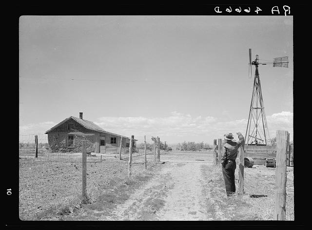
The original title and other information for this picture from the Dust Bowl during the Great Depression of the 1930s are:
Title: A sod homestead built in 1900. Pennington County, South Dakota. Since 1900 this sod house has been standing to mark a farmer's effort to reap wealth from the Great Plains. At the time of its construction, there must have been skirmish after skirmish with the cattlemen as the fence of the homesteader narrowed down the range. Then wartime prosperity, with the price of wheat booming. Then the years of intermittent drought, up to the present, and instead of wealth, a bitter battle to achieve mere subsistence on the parched earth Creator(s): Rothstein, Arthur, 1915-1985, photographer Date Created/Published: 1936 May-June. Medium: 1 negative: nitrate; 3 1/4 x 4 1/4 inches or smaller. Reproduction Number: LC-USF34-004666-D (b&w film nitrate neg.) Rights Advisory: No known restrictions. For information, see U.S. Farm Security Administration/Office of War Information Black & White Photographs [194]. Call Number: LC-USF34- 004666-D [P&P] Other Number: G 154 Repository: Library of Congress Prints and Photographs Division Washington, DC 20540 USA [195].
The idea of making relatively small plots of land available to settlers at low or zero cost ('homesteading') was favored by many. But, opposition came from southerners who feared that this would work against plantation-style slave-holding agriculture, and from factory owners in the northeast who believed that cheap or free western lands would raise labor costs by giving more favorable opportunities to many low-cost workers. The secession of the southern states at the start of the US Civil War reduced opposition notably, and the Homestead Act of 1862 was passed soon thereafter. The Morrill Act allowed the creation of land-grant universities, which have provided so much valuable advice to homesteaders and others, and the act establishing the US National Academy of Sciences, which also has contributed greatly to the well-being of so many of these settlers, also passed about this time.
The Homestead Act offered 160 acres free to anyone who met certain requirements of living on and improving the land. Land was often distributed in a "land rush", in which a particular region was opened for settlement beginning at a certain time. 'Sooners' or 'moonlighters' (those who got in 'sooner' by the light of the moon) included some people, such as certain employees of the railroads or the government, who were legally allowed to go in sooner, but others who did so illegally. Complex and long-lasting court cases arose about land claimed by illegal Sooners. (Oklahoma is often called the 'Sooner State', a term that was viewed negatively a century ago because of the implication of cheating, but now is generally viewed positively.)
The homesteaders and their barbed-wire fences often came into conflict with ranchers or cowboys who used large tracts of land for cattle. In drier regions, 160 acres was really too small to make a productive and profitable farm, so in some sense, the government actions may have contributed to the great difficulties that arose when major droughts hit, as during the 'Dust Bowl' of the 1930s. Still, the settlement led to well-established, productive states where millions of people now live happily.
This history can be viewed, or 'spun', in many ways. An opponent of government actions might point to the unfairness of government and railroad employees having access to lands before others, and might point out that government meddling in the free market helped cause the economic and human tragedy of the Dust Bowl. A proponent of government actions might counter that 15 states and millions of people owe their existence to proactive government policies. The story is very different if viewed from the perspective of native Americans, cowboys, plantation owners, factory owners, homesteaders in relatively rainy places or near water sources, homesteaders in relatively dry places far from water sources, and many other groups.
A few points relevant to this chapter are very clear, however. The main events were not controlled by the public, nor by private interests, but by diverse public and private groups and individuals interacting in various ways. The many different interacting groups were impacted by the main policy decisions in distinct ways, with greater or lesser benefit or harm. And, each policy decision built on a long history of earlier decisions that themselves had winners and losers; thus, changing paths is a policy choice with winners and losers, but keeping the same rules is also a policy choice with winners and losers. Because society tends to adapt to existing policies, a change always has short-term costs of switching these adaptations, no matter how beneficial the long-term outcome and this plus the political effort needed to make a change tend to favor continuation of existing policies. But, the choice to continue existing policies is still a policy choice with winners and losers.
A few of the many resources on this topic include:
- US National Archives, Teaching with Documents: The Homestead Act of 1862 [184] (This site includes this image: Homesteading Family [196])
- The Oklahoma State Nickname as the 'Sooner State' [197]
- Oklahoma Historical Society's Encyclopedia of Oklahoma History and Culture [198], entry for Sooner
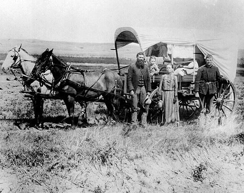
Scarcity and Government Intervention in Colonial Massachusetts
Scarcity and Government Intervention in Colonial Massachusetts
Serious European settlement of Cape Cod in Massachusetts, USA began with the arrival of the Pilgrims in 1620. The land was almost totally tree-covered, but logging for fuel and building material, and to clear fields for cultivation, quickly became widespread. Wood was burned in great amounts, boiling sea water to obtain salt for packing cod for shipping and to 'try' whale meat to extract the valuable oil. The consequences of deforestation, including soil drying and erosion, as well as the scarcity of fuel, became so severe that government actions were quickly taken.
In Eastham, the freedom-loving pioneers banned cutting of wood on the common lands in 1690 except to supply wood for sales out of town. In 1694, this prohibition was extended beyond the common lands to any source of wood. In 1695, cutting wood on the common was prohibited even for outside cash sales. Similarly, in 1711-12, Truro on the Cape was requiring Court-granted permission before people could cut wood for certain uses. (Rubertone, P. E., 1985, 'Ecological Transformations,' in Part II: Changes in the Coastal Wilderness: Historical Land Use Patterns on Outer Cape Cod, 17th - 19th Centuries, in McManamon, F.P. (ed.), Chapters in the Archaeology of Cape Cod, III: The Historic Period and Historic Period Archaeology, Cultural Resources Management Study Number 13 (Division of Cultural Resources, North Atlantic Regional Office, National Park Service, U.S. Department of the Interior, Washington, DC), p. 78.)
Interestingly, the scarcity was overcome, in part by the reliance of 'renewable' resources. With windmills to pump seawater into solar drying troughs, the Cape Codders secured large quantities of inexpensive salt, without cutting trees.
Estimates
Estimates
Dr. Alley summarized many estimates of the costs of dealing with climate change in his book Earth: The Operators' Manual. Some of those are repeated here.
The Intergovernmental Panel on Climate Change (IPCC) from 2007 found costs of between slight growth (0.6%) and somewhat larger magnitude shrinkage (3.0%) of global GDP in 2030, versus business-as-usual, for different paths toward stabilizing the atmospheric concentration of CO2 at between 1.6 and 2.5 times the level before the industrial revolution.
IPCC, 2007, Summary for Policymakers, in Metz, B., O. R. Davidson, P. R. Bosch, R. Dave and L. A. Meyer (eds.), Climate Change 2007: Mitigation. Contribution of Working Group III to the Fourth Assessment Report of the Intergovernmental Panel on Climate Change (Cambridge University Press, New York).
Much relevant work has been done in Germany. The German Advisory Council on Global Change also considered various rates and levels of stabilization, finding costs centered on about 0.7% of the world economy.
German Advisory Council on Global Change (WBGU [199]) (Grassl, H., J. Kokott, M. Kulessa, J. Luther, F. Nuscheler, R. Sauerborn, H.-J. Schellnhuber, R. Schubert and E.-D. Schulze), 2003, Climate Protection Strategies for the 21st Century: Kyoto and Beyond.
Comparable estimates - average about 1% cost, as low as 1% benefit and as high as 4% costs - were summarized in Hasselmann, K., 2009, 'What to do? Does science have a role?' European Physical Journal Special Topics 176: 37 - 51.)
Course Summary
Course Summary
Video: Earth 104 Course Wrap Up (3:02)
DR. RICHARD ALLEY: It's a cold day in Pennsylvania and a cold winter in a warming world. Some days this winter, most of Alaska has been hotter than Pennsylvania. Some days, the North Pole was hotter.
And my colleagues working in Antarctica had warmer temperatures than we had here. The global warming is only about a degree so far, and that's small enough that we do have record lows. But it's enough to validate our scientific understanding, which shows, with high confidence, that if we keep burning fossil fuels and releasing the CO2, we face much larger climate changes than what has happened so far.
A little warming, winners and losers. A lot of warming, more and more losers. It gets harder and harder for us. The snow, we knew it was coming because we had a good weather forecast. We know when the hurricanes or typhoons or tornadoes, when floods and heat waves and cold snaps are coming because weather forecasts are good. They're not perfect, but they give us information we can use.
Weather is one roll of the dice. Climate is the average of a bunch of roles, but otherwise, they're often done by the same companies, the same government agencies, people in the same departments and universities, people trained in the same ways using similar or the same tools, and climate projections are skillful, too. They don't tell you what to do, but they do tell you what you can do. And we have very high confidence that, if we use the climate projections together with what we care about and where we want to go, that we can make a brighter future. If we release the CO2 from all our fossil fuels to the air-- burn before we learn-- we face a terrible energy crisis in a world that's much harder to live in. If we used the scholarship, the knowledge of sustainable alternatives, we face a world that can affordably power everyone almost forever.
Since our ancestors first started burning trees faster than they grew back, we have not been able to make a sustainable energy system and now we can. Speaking for the instructional team, we hope you've learned a lot from this course. We hope you've enjoyed what you've learned and that it's useful to you, and we hope that you see the remarkably bright future that awaits all of us. Thanks for coming.
Twelve modules later, we come to the end of the course. We hope that you are energized by our journey together.
Energy is hugely important to us. Quite literally, without external energy sources, most of us would be dead.
We have a long history of relying on an energy source, using it much more rapidly than nature supplies more, suffering as the resource becomes scarce, and then figuring out a new source.
We now rely on fossil fuels for roughly 85% of our use, mainly oil, natural gas, and coal, and some people are working hard to expand fracking to retrieve more oil and gas, and to expand to tar sands, oil shales, and clathrate resources. If we succeed, the total amount of fossil fuel that we can burn is much larger than the amount already burned, but fossil fuel still is likely to become scarce, perhaps late in this century, or perhaps another century or so in the future.
Physics, known for more than a century and really refined by the US Air Force after WWII, gives us very high confidence that the CO2 from fossil-fuel burning is having a warming influence on Earth’s climate. The warmer air picks up and carries along more water vapor from the vast ocean, and melts reflective snow and ice, both amplifying the warming. The ongoing warming we observe, and the history of Earth’s climate and CO2, confirm the physics.
If we burn much of the remaining resource of fossil fuels, we have high confidence that we will cause much larger climate changes than those that humans have caused thus far. Small changes bring winners and losers, but as the changes move well outside experience, losers are projected to grow to greatly outnumber winners. And the uncertainties are mostly on the “bad” side—we don’t see how turning up CO2 can bring paradise, because building something good takes getting many things right, but we can see how too much warming could kill the crops that feed us or even kill unprotected people in the tropics, or in other ways cause huge problems.
Fortunately, we have vast renewable resources available with wind and sun, especially able to supply far more energy than people use, almost forever. The extra costs of such a system are estimated as being a small fraction of what we spend on energy now, perhaps 10%, or 1% of the world economy, with the possibility that additional discoveries will make the renewable sources even cheaper.
Economic analyses show that starting now to reduce fossil-fuel use is economically beneficial. The optimal path involves small actions now that increase slowly but steadily into the future.
Many policy options exist to achieve this. Economists are especially interested in taxing things we don’t like, such as climate-changing greenhouse gases, instead of things we do like, such as our paychecks. Such a “tax swap” may grow the economy a little faster than “business as usual”, even if the benefits of avoiding climate change are ignored.
Actions to reduce climate change, if taken in an economically efficient way, are also expected to improve national security, maintain or increase employment, clean the environment, save endangered species, reduce external damages of our energy system, reduce economic costs of energy-price fluctuations, and allow behavior more consistent with the golden rule.
A shift from fossil fuels to renewable energy sources will undoubtedly shift money around the economy, benefit some people more than others, hurt some people more than others, and otherwise cause many stresses and disruptions. Some of the people who fear that they will “lose” during the changes are vocal in opposing change and are likely to continue to be. This discussion probably will continue through our whole lives and through future generations.
Even if we start to shift away from fossil fuels now, the world is likely to need petroleum engineers and seismologists for a long time in the future. The economically efficient path is slow in part to reduce the damage of firing workers or throwing away valuable investments.
We can see the way to a sustainable energy system, powering everyone on the planet almost forever. And that is a powerful vision of a bright future. We hope you have enjoyed exploring the scholarship of energy and environment, and that it helps you in your future.
Capstone Project
Capstone - Roadmap to a Sustainable, Prosperous Future
This is where you are given the freedom to put it all together and craft a roadmap for a sustainable, prosperous future. We’ll pretend you have been granted the authority to completely control global carbon emissions and your job is to put together an emissions scenario for the next 200 years that accomplishes 4 things:
- Keeps the global temperature change below 2.0°C (relative to pre-industrial, so about 1°C above the present temperature).
- Meets the energy demands of the world’s population.
- Leaves us in the year 2200 with at least another 100 years worth of fossil fuel carbon.
- Minimizes the per capita costs (combination of climate damages and costs related to shifting to other forms of energy). We’ll assume that the plan that costs the least will leave more money for economic growth and prosperity.
Follow the directions in Steps 1-6 and then cycle through these steps until you find your ideal scenario, then proceed to Step 7 and complete the project by making a poster. The poster will illustrate and explain your plan using a combination of graphs and text — it is the kind of thing that you’d expect a classmate to be able to understand in 10 minutes of study. There is an example of what this might look like in Step 7.
Submitting your Assessment
Submit your assignment in the Capstone Dropbox in Canvas. You can save as a PDF file (this can be done from Powerpoint), a regular PowerPoint file, or as a Google Slides file.
Grading and Rubric
| Description | Possible Points |
|---|---|
| Clarity of graphs and captions for graphs. The captions should explain what is plotted and what the units are. Recall that the goals of this course include developing the ability to interpret plots of data and to explain and understand the different units represented by the data — so you should keep this in mind while writing the captions. | 10 points |
|
Clarity of explanatory text. The graphs should be linked together with some explanatory text that explains how things are calculated, what assumptions you’ve used, and why they are reasonable assumptions. There should also be at least one short paragraph that sums it all up, explaining why this is the best roadmap. This explanatory text is the way that you will demonstrate a range of abilities that align with the goals and objectives of this course, including: the ability to explain scientific concepts in language that a non-scientist can understand; your systems-thinking knowledge, talking about feedbacks and interconnections between different parts of the system — how climate, energy, and economics are intertwined. We expect you to also convey your knowledge of the policy options that would be needed to make your roadmap a reality. |
20 points |
| Overall layout. There should be a clear flow of logic in the way the poster is laid out. Following the steps laid out in the process will help with this. | 10 points |
| Bonus There is a bonus for the roadmap that comes in with the lowest per capita total costs, using assumptions that are clearly justified. | 10 points |
Step 1
Step 1
Instructions
Open the model [200]. Create a carbon emissions history that keeps the temperature below 2.0°C. If you just run the model as is, you'll see that global T change rises to about 4.5°C, so you need to reduce the carbon emissions by clicking on the graphical icon to the right and changing the curve. You'll probably have to try several versions of this until you get the temperature change to stay below 2°C. The video below, Capstone Project Step 1 Instructions, will show you how to do this. Please watch the video before doing anything with the model or answering the questions below.
Video: Capstone Project Step 1 Instructions (4:06)
PRESENTER: The first thing to do in this capstone project is to find a carbon emissions scenario history that keeps the global temperature down below three degrees. So this model comes loaded with this carbon emissions history here, which is the red line here. And you can see that if you look at the plot here the temperature actually rises too high in the center area, 4.5 degrees. So you go in and you change this. Let's lower this emissions history. We'll do something like this. Doesn't matter how, we're just fiddling around here.
OK, and then you run the model like that and see what happens. And so it looks like here we've kept the temperature-- we're getting a little bit closer here so 3.22. Still too high in the emissions. So you have to adjust the emissions history until you get the global temperature down below three degrees warming. And then once you've done that, you want to make sure that this emissions history has left us with enough fossil fuels that we could continue this level of emissions for a specified period of time.
So all you have to do there is to take the total amount of fossil fuels left over, and that would be this pink curve here. It's the second time I ran the model. We were left with 2,400 gigatons of carbon, which is quite a lot. And if we were to look at the final emissions right here at about two, so with this rate of burning, two gigatons of carbon per year, we've got 2,400, we've got about 1,200 years of time. So we definitely have left ourselves plenty of fossil fuels, so we can rely on them to a limited extent for a very, very long time indeed. So this is an OK and acceptable scenario from that standpoint.
So this is step one of this process. Once you've done this, you go on to step two and there will be another video that will explain how to do that.
Step 1 Deliverables
NOTE: Skip these deliverables until you've cycled through Steps 1-6 and found your ideal scenario. Then produce the following:
A copy (screen shot) of the graph showing the carbon emissions and the global temperature change (page 1 of the graph pad). This will get pasted into your summary poster.
A brief statement demonstrating that this emissions history leaves us with enough fossil fuels left to last another 100 years. This too will be included in your summary poster, positioned next to the graph described above.
How do you do this?
Take the ending amount of carbon in the Fossil Fuel reservoir (page 11) and divide it by the ending emissions rate (this will be in Gt C per year) — the result will be in years and is the time past 2200 when we would run out of fossil fuels.
Step 2
Step 2
Instructions
Next, choose the mix of fossil fuels you will use by adjusting the fossil fuel fractions in the pie diagram to the right (move the small white circles around to change the percentages). Recall that each of these three forms of fossil fuel emit different amounts of carbon per unit of energy produced. Coal emits the most carbon per unit of energy, while gas emits the least, which means that if you have allowed yourself a certain amount of carbon emissions, you'd get more energy if you burned natural gas rather than coal. These percentages then determine something called the FF energy intensity (EJ/GT C, shown in the box next to the pie diagram), which is used to calculate the energy we would get from your carbon emissions history. FF energy intensity could be as high as 59 for 100% natural gas or as low as 35 for 100% coal — whatever percentages you use, you should be prepared to explain why you chose them.
These different fossil fuels also have different costs, and so choosing the percentages determines what is called the fossil fuel unit cost (in $Billions/EJ of energy).
Once you make your choice, you have to run the model once to see the calculated FF energy intensity value and the fossil fuel unit cost.
The video below, Capstone Project Step 2 Instructions, will show you how to do this using the controls of the model.
Video: Capstone Project Step 2 Instructions (3:24)
PRESENTER: In Step 2 of the Capstone Project here, we have to make some decisions about the mix of different fossil fuels that we're going to use as our carbon-based energy. And so, the model comes with this little pie diagram, it's showing the present-day distribution of coal, natural gas, and oil. So those are the percentages, or fractions really. And so, you can change this. You can keep this the way it is, or you can reduce it. But if we reduce it, we can maybe get this fossil fuel energy intensity number little bit higher. So, this is the number of exajoules of energy you create per gigaton of carbon emissions. Remember, we've already sort of set, we've determined, in this graphical converter what the carbon emissions are going to be.
And so, the question is, well, how much energy can we get from that, that amount of carbon emissions? That, this is in gigatons of carbon. So, this fossil fuel energy intensity value, the bigger this is, the more energy you get from that. And depending on, because they cost different amounts per unit of energy, we're going to end up with a different fossil fuel unit cost. So, you can see presently it's 18 dollars and 5 cents, not dollars and five cents but it's in, its billions of dollars per exajoule of energy, let’s say. We're going to make some changes here. We’re going to make these changes by sliding these little yellow, or these white circles around, like that. We can, so we can make natural gas a bigger part of this.
Now I'm going to do something radical here and say, I'm gonna just kinda cut coal out entirely. There, I've cut coal to zero. Natural gas I’ve got that at 73. I'm going to bump that up to closer to 80. That's close enough. Now, if I run the model, you will see the unit cost and the fossil fuel energy intensity change. So, we’ll just run the model. You see those values change. So sure enough, I got this up higher, close to the, theoretically this could be as high as 59.
So, I'm quite close here. I've kept some oil here in the mix and it's just because the products of oil, so, gasoline, diesel, kerosene, jet fuel, things like that. Those are, those are pretty useful. They're very portable forms of energy. So, we might want to still have some use of oil, but for most of the other carbon energy, we're going to rely on natural gas, which is cleaner. And sure enough, that brings the cost down quite a bit to $12.91.
We make that change and then that's going to affect how much energy we produce with this amount of carbon emissions. And then we'll look at that a little bit later. But as a product, as a deliverable from this step, you're going to want to take a little screenshot of this pie diagram after you've run the model. You’ve got the new fossil fuel energy intensity and the unit cost here. You can go back to the start here by hitting this little undo button, return button. And there we go, back to the original.
Step 2 Deliverable
NOTE: Skip this deliverable until you've cycled through Steps 1-6 and found your ideal scenario. Then produce the following:
A brief statement saying what value you used for FF energy intensity, and how you chose that value — what does it represent in terms of a mix of coal, gas, and oil? Take a screen shot of the pie diagram and the associated numerical displays of fossil fuel unit cost and FF energy intensity. This statement and picture will be included in your summary report, along with a screen shot of page 2 of your graphs, which shows the total energy demand and how much of that energy comes from fossil fuels and how much comes from renewables. Note that the amount of renewable energy is just the total energy demand minus the energy obtained from fossil fuels.
Step 3
Step 3
Instructions
Next, get the model to calculate how much energy we would need in total. This is easy — all you have to do is choose the global population limit and the history of per capita energy demand and the model combines these. You may choose whatever population limit you like. You may also change the per capita energy demand from the default, but it will cost you money, and you’ll have to keep track of that money (the model will keep track of it for you). The model does this by first calculating the total energy demand without any conservation (called the reference global energy demand in the model), using the default graph of per capita energy demand and the population — then we subtract from that the reduced energy demand (you need to lower the per capita energy demand curve) to give the amount of energy conserved (see page 12 of the graph pad). Next, the model takes this energy conserved and multiplies it by the unit cost of conserved energy, which is 0.5e9$/EJ (McKinsey, 2010) to get the conservation costs. Compare this unit cost of conservation to the unit costs of making energy from different sources by clicking on the Energy Costs button in the upper right of the model window, and you’ll see that conservation is a great deal. There is an upper limit here of 40% reduction from the reference curve, according to estimates from McKinsey (2010), so you can't push this too far. In fact, if you try to conserve an unrealistic amount, the model will override you and keep the actual per capita energy to within the 40% limit. Once you’ve got the total energy demand, the model subtracts the energy production from fossil fuels to get the energy that has to be supplied by renewables (non-fossil fuel sources).
The video below, Capstone Project Step 3 Instructions, will take you through the steps involved in this part of the project.
Video: Capstone Project Step 3 Instructions (4:24)
PRESENTER: In this next step in this project, we're going to calculate the total energy demand. And we're going to do that simply by combining the population part of the model with the per capita energy curve here. So this shows the per capita energy in terms of exajoules of energy per billion people over the history of this model. Runs over about 200 years. And this is a graphical function of time that can be changed, and we'll change that here in just a second.
So if we run this model now, let's go back here to the beginning and run this model in time and see what happens. OK, here's our carbon emissions curve here, here's our global temperatures, so we are getting close to keeping it below three. Now if we go backwards here, here's our graph showing the global energy demand. Also the reference global energy demand. They're one in the same here because I haven't made a change to this curve here.
Also shown on here is zero right now is the energy conserved. So if I go ahead and change this curve here and lower the energy demand, that represents conservation of energy. So let's go ahead and do that. Make a little bit of a change here. Let's say we lower the energy demands through time like this. And on this graph, this line over here at the edge represents the year 2200. This line over here represents the year 2010. Every little increment here represents an additional 48 years, I think. OK, so we can adjust this history.
So I've have made some big steps energy conservation. Let's see what happens and we'll run the model. And sure enough the global energy demand is less than this reference value here. And the difference represents energy conserved. Now this energy conserved isn't free. It comes with a cost. And so later in this model you'll see the costs that are attributed to this conservation of energy.
And you can look at that if you just go back here to page five and you can see this pink line here, conservation costs. It's very, very low here. It looks like a flat line not changing. It's actually changing a little bit, but it still just stays a very, very low. So that's a very modest cost.
The other thing you can do, of course, in adjusting this model is to lower the population limit. So let's lower the population limit from something like 12 to something down near 9. We run the model and you see that everything gets shifted downwards. The reference curve gets shifted downwards, the actual global energy demand gets shifted down, and the energy conserved shifts down as well. So these two controls, population limit and per capita energy, are how you determine what the global energy demand is.
Step 3 Deliverables
NOTE: Skip these deliverables until you've cycled through Steps 1-6 and found your ideal scenario. Then produce the following:
A graph showing the reference global energy demand and actual global energy demand and the energy conserved (page 12 of graph pad), along with the conservation costs.
A graph showing the global energy demand, the carbon-based energy, and the renewable energy (page 2 of graph pad). Both of these graphs should appear in your summary poster.
A brief statement of what you chose for a population limit, and what kinds of challenges (if any) you think might be involved in achieving this population limit. This should be positioned next to the graph above.
Step 4
Step 4
Instructions
Make adjustments to the pie diagram that shows the percentages of different renewable energy sources — think of this as your renewable energy portfolio. The model default shows the current percentages, but you should feel free to change this, with a few restrictions, which you can see by clicking on the button to the upper right of this pie diagram.
- f hydro should not exceed 46% — we just don't have that many more good dams to build;
- f geothermal should not exceed 10% — the really good locations are far from where people live, so we cannot rely too much on this
- f solar, f wind, and f nuclear could each theoretically be 1.0, which is 100%
The percentages you choose also determine the initial unit cost of renewable energy — each form of energy has a different unit cost, and the percentages you choose are combined in the model to give you the overall average, which is shown in the blue box to the upper left of the pie diagram. The estimated costs of each type of energy can be seen by clicking on the Energy Costs button, which shows:
| Wind | 3.6 (drops by 15%/yr) |
|---|---|
| Geothermal | 11.9 |
| Hydro | 5.5 |
| Solar PV | 6 (drops by 20%/year) |
| Nuclear | 31 |
| Oil | 24 |
| Coal | 17 |
| Natural Gas | 10 |
The model assumes that the costs of geothermal, nuclear, and hydro are all constant over time, but the costs of wind and solar decrease over time, following an exponential function that is based on the recent history. These costs are the levelized (life-cycle) costs that we covered in Unit 2.
The key thing for us is the difference in cost between the various renewables and the fossil fuels. For example, if we wanted to switch 500 EJ of energy generation from fossil fuels to nuclear, this would cost us 31-18=12 \$billion per EJ, which is \$6 trillion more. Of course, money spent doing this would reduce the money spent on climate damages, so it might be a good thing -- and you can see if it is good thing by running the model several times with varying use of renewables.
If you study the energy costs, you might notice that many of the renewables are actually cheaper than fossil fuels in terms of energy generation — so why haven’t we already switched? The answer is largely related to the challenges in switching our energy infrastructure around — it will take some bold government leadership and our collective support to take the leap here. In addition, there are significant start-up costs — although with government backing, these costs can be spread out over a long time. We’ll assume that there is a cost to the switch that amounts to \$0.02/kWh, which is \$5.5e9/EJ in 2020. This cost related to switching energy sources is automatically added on to the cost of generating the renewable energy.
See the video, Capstone Step Four Instructions for some guidance on how to do this.
Video: Capstone Project Step 4 Instructions (4:22)
PRESENTER: For Step 4 in the Capstone Project, we're going to focus on the renewable energy sector up here. So, we're going to make some changes here. Or not, you can do it either way. But this is where you determine which of the different renewables, how much the total renewable energy portfolio they make up. So, this is what we currently have, so 45% of our renewable energy is hydro, right now, 28 nuclear, wind is 14, geothermal 7, solar 6. So, the idea is to change these and that mix along with the cost of these different energy sources, which you can see here. That determines the initial renewable energy unit cost. So, it's 12.63 billion dollars per exajoule of energy right now.
So, there are some limits here to these renewable fractions. You can find out about these. F hydro shouldn't exceed 46%. That's because there just aren't that many more big, highly productive dams that we can build. We've already dammed up the rivers in the best places, in general. So, it can grow a little bit, but not much. The geothermal shouldn't exceed 10%. It's geographically so limited that it's not going to be a huge player in the future. But solar, wind, and nuclear could each theoretically supply a 100%. But then, you know, whether or not you want to do that sort of depends on the costs.
So, look at the costs. Do you... nuclear is pretty expensive, 31 billion dollars per exajoule. Do you really want to have that much nuclear energy in your portfolio? Well, there might be some reasons have some, but it is expensive. So, how to make those changes? You just move these little white circles around. So, I'm going to reduce my nuclear here, just to show you this, I'm going to reduce that to maybe 6%. And geothermal, I can't have it be more than ten. But I kind of like geothermal, it is pretty inexpensive, so I'm going to keep that at ten. That's a good sort of constant steady supply. I'm going to keep hydro pretty much where it is. And then I'm going to split the remainder in terms of solar and wind. And I get those kind of close to each other. They're roughly about there. And the reason for doing that is that they complement each other, in general, so that during times of the day when you generate a lot of wind power, you don't generate a lot of solar power, and vice versa. So, it makes sense to have those be kind of balanced.
Now you notice I've made those changes. Here's my new renewable portfolio. This initial cost doesn't change until I hit the Run button and we see what happens. So, I've dropped that way down now. So that's 7.17. And so, then when you run the model and you look at things like the energy costs now, those energy costs are going to reflect this initial renewable energy here. If we're going to go way back here, if I go backwards and look at 15, This shows the energy costs changing over time. Fossil fuel energy up here and this is the renewable energy cost. So, it starts off at seven, but it drops to five billion per exajoule over time, just because the model assumes that the cost of wind and solar energy will continue to decrease following an exponential function. So that this is just matching what's happened in recent history in terms of price declines there. So, that's why that price continues to drop in the early stages of this scenario.
So that's, that's what it is. That's sort of the rundown on Step 4.
Step 4 Deliverables
NOTE: Skip these deliverables until you've cycled through Steps 1-6 and found your ideal scenario. Then produce the following:
A brief statement of what you came up with for a unit cost of renewable energy, including what percentages of the different sources you used to come up with this number. Take a screen shot of the pie diagram of renewable percentages to accompany your statement.
Graphs showing your total energy costs, the renewable energy costs, and the carbon energy costs (page 3 of graph pad), and the unit energy costs (page 15 of graph pad). These graphs and the statement above will be included in your summary poster.
Step 5
Step 5
Instructions
The next thing to do is to add up all of the costs related to your plan. The model will calculate the costs due to climate damages using the scheme from the modified DICE model (module 10 summative assessment) to do this. To get the total costs, we assume an economic growth rate (percent growth of gross economic output per year — the global GDP). It begins at $56 trillion per year grows at a constant annual growth rate of 1.5% for this time period.
The model then adds these climate damage costs to the total energy costs (renewables, plus switching costs, plus carbon-based energy) and the conservation costs to get the overall total costs.
For guidance on how to do this step, see the video below — Capstone Step 5 Instructions.
Video: Capstone Project Step 5 Instructions (2:11)
PRESENTER: Step 5 of the Capstone Project, we're going to focus on the total costs of your plan so far. Remember, your plan at this point will have consisted of a modified carbon emissions curve here, a modified per capita energy curve here, possibly a change in the population limit here, a change in the fossil fuel fractions, and a change in the renewable energy fractions.
And so, all of that leads to total costs here in yellow, this is page five of the graph pad, which is really just the sum of all these other curves. Four is the climate damage costs, which are quite high in this scenario, reaching a value of something like almost \$50 trillion by the end of the time, which is significant. If you look at on page nine, the GDP at the end is about \$600 trillion. So, it's you know, a little bit less than 10% of the GDP. It's pretty sizable chunk going to climate damage costs.
So, you take that value and you add to it, the renewable energy cost here - curve two, the carbon energy cost - curve one, and the conservation cost - curve three, which is zero, in this case. Zero because I haven't right now modified the per capita energy demands at all. So, we're not doing anything in terms of conservation. You're going to take a screenshot of this and include this in your, your poster, your presentation of your project and just comment about the relative magnitudes of these different costs, and then we'll consider some of these costs in a different way when we talk about Step 6 as the next thing.
Step 5 Deliverable
NOTE: Skip this deliverable until you've cycled through Steps 1-6 and found your ideal scenario. Then produce the following:
A graph showing the various costs (page 5 of the graph pad) -- the units here are all in trillions of dollars. This graph, along with some commentary will appear in your summary poster. The comments could draw the reader's attention to important things in the graph.
Step 6
Step 6
Instructions
So far, you have gone through the process of designing a pathway or roadmap for the future and calculating the economic consequences of the set of assumptions/decisions that went into the roadmap. Now, the idea is to fiddle around with it to see if you can lower the costs, and remember that the best thing to compare here is the sum of the total costs per capita (in thousands of dollars per person), which is plotted on page 13 of the graph pad. Your best model from an economic standpoint is the one that generates the lowest value for this parameter.
In other words, you return to the earlier steps in this process, make a change, and then compare the costs with your previous version. As you do this, you will learn what kinds of changes lead to lower costs and you will eventually find the best roadmap (and remember that you also have to be able to justify it). One thing that you should do is to see if you can get a better economic result by keeping the global temperature well below the 2°C limit — in other words, go back to Step 1 and alter the carbon emissions curve to give you a lower temperature and then keep all of the other parts of the model the same, then run it again and see if you can get the sum of total costs per capita lower.
For guidance on how to do this step, see the video below — Capstone Step 6 Instructions.
Video: Capstone Project Step 6 Instructions (3:18)
PRESENTER: Now Step 6 of the project is pretty simple. We just turn to page 13 of the graph pad, and we look at the sum of the energy conservation and climate costs per person.
And so, this is going to be in thousands of dollars per person that's added up over time. So, this is a cumulative amount over this 200 year period, roughly. And you can see in our case here we’ve gotten that up to $600,000 dollars per person. And so, you know, you divide that by roughly 200 years and that averages out to like three thousand dollars per person, per year, in all of these costs, so, energy conservation and climate related costs.
So, that's each person's share. And this is the thing that we're trying to minimize, because if we can keep this as low as possible then that leaves more money for the rest of the economy, or the things the economy would do like, you know, health care, education, research, all these things that would contribute to a higher quality of life. So, this is, our goal is to minimize this. And so, you know you're going to include a screenshot of this page in in your project report, your poster, and talk about it a little bit.
But let me just show you what you're going to do. So, you get to this point Step 6, now what you want to do is to make some changes and then compare this first initial curve with something else. So, I'll change the carbon emissions to do something like this, drop off towards zero here shortly. So, if we run it with that and look at this same graph we see, okay we lower it significantly in that case. So, now we're down to 266, so that's better. And then you might, you know you could change the renewable energy portfolio again. You could change the fossil fuel allocations. You could make all these kinds of changes. You could reduce the per capita energy demand, keep that more or less flat, something like that and run it again and you see you get even better.
So, the idea is to is to kind of cycle through effectively Steps 1 through 5 and look at the result here. And so, once you've done this and you get to what is the lowest cost then you're going to make a screenshot of this. You're going to talk about the kinds of assumptions or changes to the model that you implemented to give you the lowest per capita cost at the end of it.
Step 6 Deliverable
After this step, you should have calculated your best roadmap. Include a copy of the graph on page 13 of the graph pad. This should show the plots from several different versions and should highlight the preferred version. There should be a brief statement summarizing what parts of the model you changed to make the different versions.
Step 7
Step 7
Put it all together.
Once you’ve settled on your optimum roadmap, put it all together, into a kind of poster display — a large graphic with explanatory text that lays out your roadmap for the future (you can also submit it as a slide show in Powerpoint). To make this document, you’ll take screen shots of some of the model results, and add arrows and text that illustrate what choices you’ve made and explain your justification for choosing different values and scenarios. An easy way to do this is to use PowerPoint, where you can load, resize, position the screenshots and then add arrows, text, etc. as needed. You can specify the page size and make it very large, fitting everything onto just one slide (it should all be readable when you zoom in) — or you can put the materials onto a series of regular slides. You could do this in other programs too, such as Keynote or Adobe Illustrator, but whichever program you choose, make sure it can save as a PDF file that you will then submit in the Capstone Dropbox on Canvas.