Lessons
Lesson 1: Preinstructional Activities
Overview
Did you complete the Course Orientation?
Before you begin this course, make sure you skim through the Course Orientation (see the "Orientation" menu).
About Lesson 1
My training is in research science, not education. One of my objectives in this lesson is to find out what your opinions are about teaching science and the state of science education in general. I also want you to practice reading articles, discussing them with the class, and making plots. These are all skills that you'll need later on in the course and in the other courses in this program.
What will we learn in Lesson 1?
By the end of Lesson 1, you should be able to:
- Read a scientific article and discuss it with the class using our discussion boards
- Map yourself using Google maps
- Take a quiz in Canvas
- Make an acceptable-looking plot of a dataset using a plotting program of your choice
What is due for Lesson 1?
Lesson 1 will take us one week to complete. 26 Aug - 3 Sep 2019.
| Requirement | Submitted for grading? | due date |
|---|---|---|
| Read articles and discuss them with the class | Yes—Your discussion board participation counts toward your Lesson 1 grade | regular participation spanning 26 Aug - 3 Sep |
| Map yourself | No-Optional but fun! Place yourself on a map of current and former M.Ed. in Earth Sciences students and faculty | |
| Create plots of data sets | Yes—This exercise will be submitted to a Canvas assignment and will count toward your Lesson 1 grade | 3 Sep |
| Pre-instructional quiz | Yes—Taking this Canvas-based quiz will count toward your Lesson 1 grade (you will not be graded on the correctness of your responses, only on whether you answered all the questions) | 3 Sep |
Questions?
If you have any questions, please post them to our Questions? discussion forum in Canvas (not e-mail). I will check that discussion forum daily to respond. While you are there, feel free to post your own responses if you, too, are able to help out a classmate.
Learning Science
To begin, I would like you to read two articles and discuss their merits with the rest of the class in a discussion forum. This discussion will last throughout the week, so be sure to read the articles early and check in to the discussion forum often. See the Lesson 1 Overview page for specific dates.
Learning Science Reading Discussion
Required Reading
Read the following articles, which are linked directly from the Lesson 1 Paper Discussion board in Canvas.
- Bloom, P., & Weisberg, D. S. (2007). Childhood Origins of Adult Resistance to Science. Science, 316, 996-997. doi: 10.1126/science.1133398.
- Kastens, K. A., et al. (2009). How Geoscientists Think and Learn. Eos, 90, 265-266.
Submitting your work

Once you have finished the readings, engage in a class discussion as described below. This discussion will take place over the entire week devoted to Lesson 1 and will require you to participate multiple times over that period.
- Find the "Learning Science" reading discussion forum, accessed from "One: Preinstructional Activities" module in Canvas.
- You will see the four questions below already there:
- What common scientific misconceptions do your students or other acquaintances have? How do you try to teach these concepts or correct the misconceptions?
- Do you agree with the statement made by Bloom & Weisberg that people evaluate the trustworthiness of the source when it comes to scientific concepts they've never heard of before?
- What are some examples from your own teaching and learning experiences of the "cascade of inscriptions" idea mentioned by Kastens et al.?
- Kastens et al. identify feedback loops, deep time, and spatial thinking as important for success in geosciences. Does this ring true for you? Are there any concepts/skills/habits of mind you'd add to this list?
- A separate thread for each question has been created. Respond to each thread with a meaningful response. If you feel that your response has already been "said" by another student, then post a response to someone else's remarks that expands on what has already been said, asks for clarification, asks a follow-up question, or in some other way furthers the discussion. By the end of the activity, I would like you to post at least one original thought/opinion/question and at least one thoughtful response to somebody else's post. These discussion questions are aimed at people who are practicing teachers, but if you are not one, never fear! You can still further the discussion in an intelligent way, or just think hypothetically, or recall your own school experience.
Grading criteria
You will be graded on the quality of your participation. Please see the rubric for teaching/learning discussions. [1]
Map of M.Ed Earth Sciences Program Students
Please follow the instructions below to place a pin on the map indicating where you live.
- Use the following link to access the Penn State M.Ed. Earth Sciences Program - Student Map. [2]
- In order to place a pin on the map, you need to be logged into your Google account.
- If you are not logged into a google account, you should see a window similar to the image below:
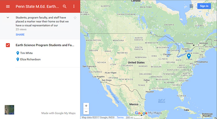 Figure 1.1 - Student Map when not logged into Google.Source: Google Maps
You can sign in by clicking on the "Sign in" link in the upper right-hand corner of the map window.
- If you are logged into a Google account, you should see a window similar to the image below:
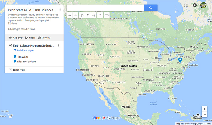 Figure 1.2 - Student Map when logged into Google.Source: Google Maps
- If you are not logged into a google account, you should see a window similar to the image below:
- To add a pin to the map, click on the "Add marker" icon in the toolbar just below the search field.
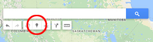 Figure 1.3 - The "Add Marker" tool in the Google Maps windowSource: Google Maps
 - Zoom into the map to locate where you live and then click on the map where you want to place the pin.
- When you click on the map, a window will open up where you can edit the name of the marker. Please change the "Point #" to your name and include a brief message about yourself in the text field below.
- Click on the "Save" button when you are finished.
Plotting, Part I
When you have your students make plots of data in your classes, what medium do they use? Do they use a computer program, a graphing calculator, or pencil and paper? Something else? I actually find pencil and paper to be extremely instructive. When I use a pencil and paper, it means I have to think about how to draw my axes and what the plot will probably look like before I begin. However, I think we all expect our own students to be a little savvier about computer use than we were at their age (even though they might not be -- they just think they are!). When I make plots for my research I use Processing, MATLAB or sometimes Numbers. I expect many of you have access to or regularly use Microsoft Excel. (I find that most plots produced in Excel look ugly or have incomprehensible labels, or both. However, if you can make a good plot with Excel, go for it! If you don't know what I mean by good, then don't use Excel.)
On the next page of this lesson, you will complete an activity that involves reproducing three plots using the graphing program of your choice. For this course, it does not matter to me what program you choose to use. What does matter to me is that you are able to generate a dataset and make a plot of it that looks adequate for a 500-level college class. So first, you need to figure out which program you would like to use! If you already have a program you like to use, by all means, use it. If you don't, or you want to check out some other possibilities, here are some links to other programs.
It is also okay with me if you like to make your plots by hand, but you do have to have some way to submit them electronically. Also, later on in the course you will have to make plots of large datasets and in that case, the tedium of setting 100+ points by hand outweighs the instructiveness of that method, I think. So why not bite the bullet and check out some of the programs below.
Freely available programs
- SoftIntegration [3]
- Chartpart [4]
- NCES create-a-graph [5] This one is pitched at kids but it got good reviews from former students
- GCalc: Java mathematical graphing system [6]
Open OfficeThe program you want here is called "calc" [7] - Matlab [8] available via PSU WebApps to registered students, so not a solution for your classroom
- Mathematica [8] available via PSU WebApps to registered students, so not a solution for your classroom
- Google docs [9] has a spreadsheet program that can make plots, free and intuitive but still a spreadsheet
Programs with a free demo available
- Kaleidagraph [10]
- Deltagraph [11]
Plotting, Part II
Now that you have identified the software you want to use to create plots of datasets, I want you to reproduce three plots and submit these to me for review.
This activity will be graded based on participation only (either you made three plots or you didn't). I will provide constructive feedback to you about the way your plots look. Even though I will not grade this particular exercise for accuracy, the rest of the lessons in this course (as well many lessons in other courses in the program) will require you to make some plots. Your grades on those activities will in part depend on your ability to produce a clear and satisfactory plot, so consider this exercise free practice.
Reproduce 3 Plots
Directions
-
Below is the first plot you have to reproduce. Graph the functions y = x2 and y = 2x on the same set of axes. The satisfactory plot will include a title, labeled axes, axes' tick marks and labels, two different line styles (doesn't have to be color) to differentiate the functions, and a correct legend identifying the two functions. All fonts should be large enough to be legible. You may choose the range of your axes, the aspect ratio of your plot, and the line style of each function.
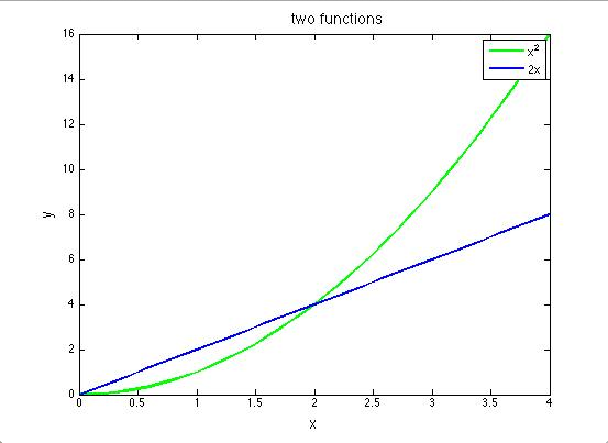 Figure 1.4 - Line plot of the functions y=2x (blue) and y=x2(green)E. Richardson, created with MATLAB
 - Next shown is the second plot you have to reproduce. Penn State's Beaver Stadium is second only to Michigan Stadium in Ann Arbor ("The Big House") in terms of attendance capacity. The official capacity of Michigan Stadium, after recent renovations, is 109,901. The plot below shows a scenario in which Michigan Stadium is filled to capacity at the start of a hypothetical football game between PSU and Michigan, but each time PSU scores a touchdown, half the fans leave. You must envision PSU scoring touchdowns until only one fan is left in the stadium. Generate such a dataset (a table of x and y values) and make a plot from it showing the number of touchdowns vs. the number of fans at Michigan Stadium. Remember, no fractional people! Always round down to the nearest whole number for your y values. I have made a sample table of values and filled in the first few for you. Continue your own table until there is just one fan left.
Table of values for Exercise 2 Number of PSU touchdowns Number of fans at the Big House 0 109,901 1 54,950 2 27,475 3 ? 4 ? 5 ? This plot should be made on linear axes. The satisfactory plot will include a title, labeled axes, axes' tick marks, and labels. Since you are plotting discrete data points that are part of a time series, please plot them with a symbol and connect the symbols with a line. All fonts should be large enough to be legible. You may choose the aspect ratio of your plot and what kind of symbol and line style to use.
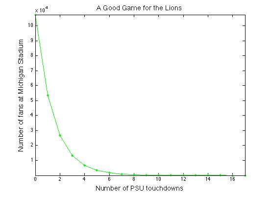 Figure 1.5 - Example linear line plot of the table of values in Exercise 2E. Richardson, created with MATLAB
 - For your third plot, use the table of values you generated in Exercise 2 to make the same plot, but using a logarithmic y-axis. The satisfactory plot will include a title, labeled axes, axes' tick marks, and labels. Since you are plotting discrete data points that are part of a time series, please plot them with a symbol and connect the symbols with a line. All fonts should be large enough to be legible. You may choose the aspect ratio of your plot and what kind of symbol and line style to use. *Alternative: If you have trouble making log axes, you may instead take the log (base 10) of each y-value in your table and plot the resulting dataset instead. Your plot should still look like the plot below, but if you choose this option, you must label your y-axis accordingly.
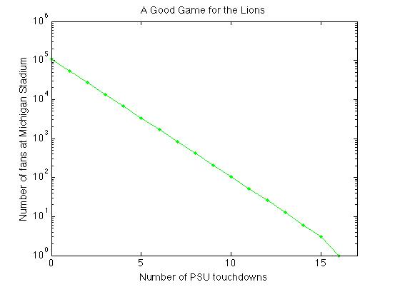 Figure 1.6 - Example log-linear plot of the table of values from Exercise 2E. Richardson, created with MATLAB
Submitting your work
You may choose to submit these plots one of two ways: you may save them as graphics files (.jpg, .pdf or .tiff) or, if you use a web plotting program that allows you to save your plot as a link, then you may submit the links to the plots.
Save your three plots in the following format:
L1_plot1_AccessAccountID_LastName.jpg (or .png or .pdf or .tiff).
For example, Cardinals outfielder Marcell Ozuna's file would be named "L1_plot1_mio13_ozuna.jpg"
Submit your three plots to the Canvas assignment in Preinstructional Activities called "Three Plots." Try to get this done by the due date listed on the first page of this lesson.
Grading criteria
As I mentioned at the top of the page, this activity will be graded based on participation only (either you made three plots or you didn't). However, I will provide constructive feedback to you about your plots.
What is Your Earth Science Background?
Background knowledge quiz
Go to Canvas and take the "Pre-instructional background quiz," which you can find in the Pre-instructional Activities module.
Submitting your work
The quiz is entirely self-contained in Canvas. When you submit your quiz, it will be shared with me.
Grading criteria
This quiz is NOT graded for accuracy, only for participation. I just want to get a sense of your Earth science background, relevant to the lessons we'll cover in this course. You should get feedback right away, but don't worry if Canvas gives you a bad grade. I will go to the gradebook and override it. Just read the feedback and you'll be fine. Try to get it done by the due date listed on the first page of this lesson.
Summary and Final Tasks
Okay, enough with the background stuff, let's move on to Lesson 2 and do some science!
Reminder - Complete all of the lesson tasks!
You have finished Lesson 1. Double-check the list of requirements on the Lesson 1 Overview page to make sure you have completed all of the activities listed there before beginning the next lesson.
Lesson 2: Does the Atlantic Ocean Require a Tsunami Warning System?
Overview
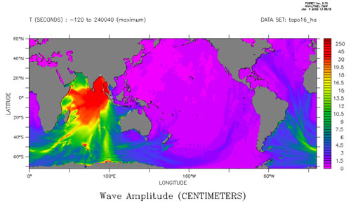
The figure below, from NOAA's Pacific Marine Environmental Laboratory, shows global maximum wave amplitudes from the tsunami caused by the great 26 December 2004 Sumatra-Andaman earthquake. In Lesson 2 we will analyze tide gauge records from this event and from the 2011 Tohoku-Oki tsunami.
The results of this analysis will inform our subsequent discussion of the potential for tsunami risk in the Atlantic Ocean. Finally, we will determine the advantages and disadvantages of developing a tsunami warning system in the Atlantic Ocean.
About Lesson 2
I first found out that the 26 December 2004 Sumatra-Andaman earthquake had happened while watching the news at my brother-in-law's house where we were visiting for Christmas. Several scientists from universities on the East Coast of the U.S. were interviewed, and more than one of them wanted to highlight the fact that the Atlantic Ocean doesn't have a dedicated tsunami warning system. They were pretty sure the Atlantic Ocean should have one. What do you think? By the end of this lesson, I want you to present your informed opinion about this. In order to make sure your opinion is an informed one, we'll examine tsunami generation, look at some data from the Sumatra-Andaman tsunami and the Tohoku-Oki tsunami and become conversant with the risks associated with tsunamis and how tsunami warning systems work.
Note:
All of the tsunami warning sign icons you will see in this lesson are from the Pacific Tsunami Museum [13]
What will we learn in Lesson 2?
By the end of Lesson 2, you should be able to:
- Describe the three types of plate boundaries, including what type of motion and stress accompanies each
- List ways tsunamis can be generated
- Calculate distance using a great circle path
- Identify high and low tides on a tide gauge record
- Identify a tsunami arrival on a tide gauge record
- Know what pieces of information are necessary in order to calculate the velocity of a tsunami from its origin to another location
- Use tide gauge data to calculate the velocity of a tsunami generated by an earthquake of known origin
- Estimate tsunami risk at a given location
What is due for Lesson 2?
As you work your way through Lesson 2, you will encounter reading assignments and hands-on exercises using authentic data. The chart below provides an overview of the requirements for Lesson 2.
Lesson 2 will take us two weeks to complete: 4 -17 Sep 2019. You should complete the reading assignments by the end of the first week to give you time for thoughtful participation in the discussions. The problem set is due at the end of the first week of the lesson, and you will submit it to a Canvas assignment. This will give you the entire second week of the lesson to participate in the discussion forum and to pull together what you've learned so you can write the paper that is the culminating assignment for this lesson.
| Requirement | Submitted for grading? | Due Date |
|---|---|---|
| Read two articles: "N.E. is not immune, scientists warn", "Cumbre Vieja Volcano -- Potential collapse and tsunami at La Palma, Canary Islands" | No | 10 Sep |
| Exercise: "Where are tsunamigenic danger zones located? | No | 10 Sep |
| Read two articles: "Learning from Natural Disasters", "Global Seismographic Network Records the Great Sumatra-Andaman Earthquake" | No | 10 Sep |
| Tsunami data problem set | Yes—Submitted to the "Tsunami data problem set" assignment in Canvas | 10 Sep (end of week 1) |
| Paper assignment | Yes—Submitted to the "Tsunami Warning System Paper" assignment in Canvas | 17 Sep (end of week 2) |
| Discussion: "Teaching and learning about tsunamis" | Yes—Posted to the "Teaching and Learning About Tsunamis" discussion in Canvas |
participation spanning 11 - 17 Sep (week 2) |
If you have any questions, please post them to our Questions? discussion (not e-mail). I will check that discussion daily to respond. While you are there, feel free to post your own responses if you, too, are able to help out a classmate.
Risk for an Atlantic Tsunami?
First, I would like you to read an article that appeared in The Boston Globe following the Sumatra-Andaman earthquake. Then, please read a short scientific paper detailing the tsunami threat from a source in the Canary Islands.
Reading Assignment: Two Articles
Daley, B. (2007, December 28). N.E. is not immune, scientists warn [14]. The Boston Globe. Retrieved April 22, 2008, from http://www.boston.com/news/world/articles/2004/12/28/ne_is_not_immune_scientists_warn/.
Ward, S., & Day, S. (2001). Cumbre Vieja Volcano -- Potential collapse and tsunami at La Palma, Canary Islands [15]. Geophysical Research Letters, 28, 397-400. (See also a press release from The Independent [16] that accompanies the scientific article.)
The first article nicely introduces the topic for this lesson, which is whether or not you think a dedicated tsunami warning system should be developed for the Atlantic Ocean. The main reason I want you to read this article is that it brings up some topics that we will want to delve into further as this lesson goes along.
When you read the first article, keep in mind the following:
- Has the Atlantic coast ever experienced a damaging tsunami?
- If so, what was the source (e.g., earthquake, volcano, landslide)?
- Do scientists have any estimates for the future risk of an Atlantic Ocean tsunami?
- Can you compare this to the risk of other natural disasters?
- The Pacific Ocean does have a tsunami warning system. What's the difference between the Atlantic and Pacific Oceans?
- How are tsunamis produced in the first place?
- How do tsunami warning systems work?
The second article is a scientific paper published in a journal. When you read this paper, keep in mind the following:
- Does it answer any technical questions you had after reading the newspaper article?
- Do you understand all the terminology? Keep a list of terms you don't know so we can discuss them.
- Who is the intended audience for this paper, compared to the first article?
- Can you give a summary of the scenario and tsunami that would result from a volcanic flank collapse such as the one detailed in this paper?
Tell us about it!
These articles do not answer all these questions, but these are the questions that I would ask if I read them without knowing anything else. What other questions do you have after reading these articles? Please post any questions to the Questions? discussion board in Canvas.
How are Tsunamis Generated?

If we are going to attempt to assess the risk of a tsunami at some particular place on the planet, we must first understand how to make a tsunami. Earthquakes and volcanoes generate the great majority of tsunamis, and the theory of plate tectonics explains the cause of earthquakes and volcanoes. So, we'll start with the world's briefest review of plate tectonics. Plate tectonics is the Grand Unifying Theory of geosciences, but it's actually not that old. In fact, my freshman advisor in college wrote the benchmark paper that outlined the mathematical model of plate tectonics, so in a sense, I'm only one "generation" removed from the pre-plate tectonics era. **Shameless plug alert**: For an in-depth look at the history of the theory of plate tectonics, take EARTH 520.
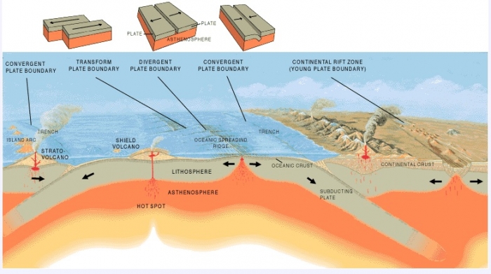
The Earth's lithosphere is broken up into a bunch of discrete pieces, called plates, that move around the surface of the planet. This motion is driven by the flow of the mantle rock beneath the plates and by the forces plates exert at their boundaries where they touch each other. There are three distinct types of plate boundaries, shown illustrated by the drawing below both as separate block diagrams as well as situated within their appropriate geologic environment.
- At transform boundaries, two plates slide past each other. The San Andreas fault in California occurs at this type of plate boundary.
- At divergent boundaries, plates move away from each other. The Mid-Atlantic Ridge is a divergent boundary.
- At convergent boundaries, plates move toward each other. The Cascadia subduction zone in the US Pacific Northwest is a convergent boundary.
Earthquakes and tsunami generation
Earthquakes happen when plates move with respect to each other because the friction and stress at the edges of plates prevent them from slipping smoothly at their boundaries. For an earthquake to generate a tsunami you need:
- Water
- Vertical motion
If an earthquake happens far away from a body of water, it probably won't disturb the water too much. Therefore, no tsunami is expected. Next, you need a vertical disturbance. Picture this: You have a bathtub full of water and a hard-backed book. If you dip the book into the bathwater spine-first and move the book back and forth longways, what do you observe? Not much, except you've ruined your book. Now if you hold the book with its flat side on the surface of the water and move the book up and down in the water, you should generate some big waves as the vertical motion you've imposed on the water column is transferred to horizontal motion as the wave travels away from the source. This is basically how a tsunami is generated.
Quiz yourself!
If "The Big One" happens on the San Andreas Fault, do we expect a large tsunami? Do we expect California to "fall into the ocean" as in the cartoon I drew? Think about why or why not based on the material you just read
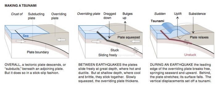
- OVERALL, a tectonic plate descends, or "subducts," beneath an adjoining plate. But it does so in a stick-slip fashion.
- BETWEEN EARTHQUAKES the plates slide freely at great depth, where hot and ductile. But at shallow depth, where cool and brittle, they stick together. Slowly squeezed, the overriding plate thickens.
- DURING AN EARTHQUAKE the leading edge of the overriding plate breaks free, springing seaward and upward. Behind, the plate stretches; its surface falls. The vertical displacements set off a tsunami.
Volcanoes and tsunami generation
Volcanic eruptions can also produce tsunamis. The rules are similar to the rules for earthquakes. In order for a volcano to produce a tsunami you need:
1. A volcano near the coast
2. An eruption that sends a large enough volume of material into the water to displace a significant volume of water.
If a large eruption sends a great volume of material into the water, it creates the vertical disturbance necessary to make a tsunami. This is one of the reasons the Cumbre Vieja volcano is worrisome: either an eruption or a landslide from a flank collapse could produce a tsunami.
Check this out!
Want to learn more about volcanoes and tsunamis? One of the earliest modern records of a devastating tsunami comes from the eruption of Krakatoa in August 1883. Read about that tsunami on the BBC News site - Krakatoa: The first modern tsunami. [18]
Where are Tsunamigenic Danger Zones Located?

Now that we know earthquakes and volcanoes are the biggest sources of tsunamis, let's find on a map of the world where these tsunamigenic danger zones are located.
Activity
Note:
You do NOT need to submit the following activity, but doing it will help you visualize where the greatest potential tsunamigenic areas are on the globe. This will aid your thinking about your culminating assignment for this lesson.
Directions
- Print out the world map below by clicking on it and printing the resulting window. This map has the three types of plate boundaries marked on it.
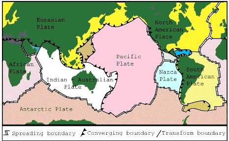 Figure 2.4 - Based on a map prepared by the U.S. Geological Survey.Credit: Oregon State University [19]
 - Remembering that water and vertical motion are the essential ingredients for tsunamis, find the convergent plate boundaries adjacent to oceans and you've found the most likely sources for tsunamigenic earthquakes. Mark these plate boundaries on your map.
- Now, look at the world map below. It has plate boundaries (black lines) and active volcanoes (red dots) plotted on it. On your map that you have printed out, mark the locations of active volcanoes near oceans. I hope you observe that these potentially tsunamigenic locations we have just found are NOT randomly distributed across the globe. In fact, the potential earthquakes and volcanoes are likely to occur near each other. This is not a coincidence. At convergent margins, one plate is forced to subduct below the other. This process is accompanied by both earthquakes and volcanism. The sticking and slipping as one plate dives into the mantle generates earthquakes. Partial melting of the lithosphere of the subducting plate and overriding plate produces a line of volcanoes inboard and roughly parallel to the subduction plate boundary.
- Observe your map and think about the following:
.gif)
- Which of the world's coastlines are most at risk for tsunamis? Does this shed light on where today's tsunami warning systems exist already?
- What tsunamigenic sources would affect the Atlantic coastlines? Where are they located?
Submitting your work
There is nothing to submit for this assignment. However, feel free to post any questions or thoughts you may have about this activity to the Questions? Discussion Board in Canvas.
A Tale of Two Tsunamis
26 December 2004 Sumatra-Andaman and 11 March 2011 Tohoku-Oki tsunamigenic earthquakes
We are going to work with some tsunami data from the 26 December 2004 Sumatra-Andaman earthquake and from the 11 March Tohoku-Oki earthquake. Before we do so, I want you to get a sense about the scientific community's study of those earthquakes, so I've picked a couple of articles that describe the techniques used to record the earthquakes and what we have learned so far.
Reading assignment
The following articles are all linked from Lesson 2 in Canvas or through the links provided.
- Hanson, B. (2005). Learning from Natural Disasters [21]. Science, 308(5725), 1125. doi: 10.1126/science.308.5725.1125.
- Park, J., Anderson, K., Aster, R., Butler, R., Lay, T., & Simpson, D. (2005). Global Seismographic Network Records the Great Sumatra-Andaman Earthquake [22]. Eos, 86(6), 57.
- Balcerak, E. (2011) Studies Provide New Insights Into Japan's March 2011 Tsunami [23], Eos, 92 (50), 467.
- Richardson, E. (2018) Lessons from the Tohoku-Oki earthquake [24], From the Prow, AGU 2018.
- Where did these earthquakes happen? What was similar and different about the tectonic setting of each one?
- How big were each of them in terms of length, area ruptured, and magnitude? In the time between these two earthquakes, were there any other earthquakes in the world about the same magnitude? Were there any other ones as destructive?
- Why did these earthquakes produce such deadly tsunamis?
- Where else on the globe are subduction zones like these two?
Check this out!
Interested in learning more? "Anatomy of a Tsunami" [25] is an interactive flash movie from Teachers' Domain and Nova Online about the Sumatra-Andaman tsunami.
Note:
"Teacher's Domain" is a free resource, but you must register with them in order to view more than 7 resources. If you like their stuff you may want to take a moment to go ahead and register with them now.
Problem Set Part 1: Analyzing Tide Gauge Records and DART Data
Tide gauge records from 2004 and DART data from 2011
In the following analysis, you'll work with tide gauge records from stations around the world that recorded the tsunami generated by the 26 December 2004 Sumatra-Andaman earthquake. Then you will work with data recorded by Pacific Ocean DART stations from the 2011 Tohoku-Oki earthquake. It is fine with me to complete this analysis in whatever way works best for you. You may all work together to do this activity or you may want to work in groups or by yourselves. No matter how you choose to go about it, please write up and submit your analyses individually and in your own words. This activity is due at the end of the first week of this lesson.
Tsunami Data Problem Set
Part 1: Checking out four tide gauges from 2004
Save the Tide Gauges Problem Set Worksheet [26] to your computer by right-clicking (control-click on a Mac) on the link above and selecting "Save link as..."
TIP!!
You should use the worksheet for writing down your answers but you should leave this web page open while you work on the problem set. WHY? Because I explain how to do most of the analysis right here. The worksheet is just so you don't have to retype the questions yourself.
Below are four record sections. These data come from tide gauges maintained by the University of Hawaii with support from NOAA. Review each record section, then answer the associated questions on your worksheet.
Record 1: Salalah, Oman
Before you begin, let's look at Salalah's record together [27]:
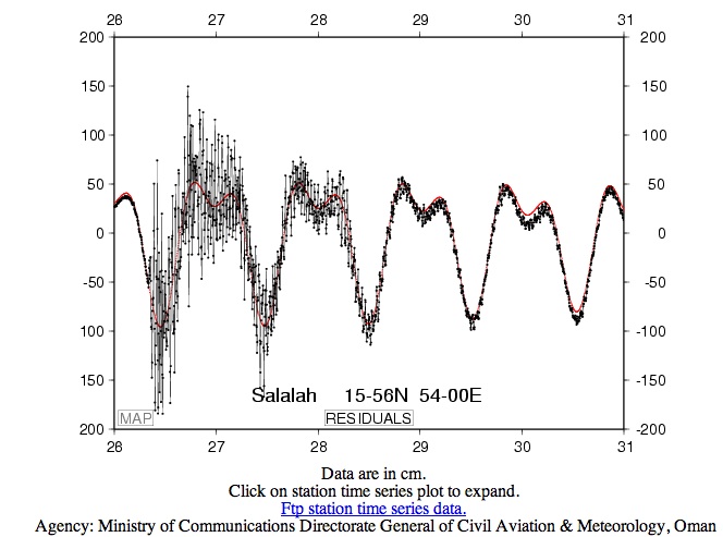
1.1 The latitude and longitude of this station are given in degrees and minutes. (i.e. 15-56 N means 15° 56' North latitude and 54-00 E means 54° 00' East longitude). Each degree contains 60 minutes. For later calculations, we will want to use decimal degrees instead of minutes. Convert the latitude and longitude of this station to decimal degrees. HINT for getting started: If the latitude were 12-13 N, meaning 12° 13' N, this would equal 12.22° because 13/60 = 0.22.
1.2 Let’s look at the axes and data now. The X-axis is showing time and the Y-axis is showing water height. The X-axis ranges from 26 to 31. These are days of December 2004. The Y-axis ranges from -200 to +200 cm. Now let's look at what is being plotted here. The black line connects data measurements shown by small black dots. The red line is a prediction of the tidal signature at this station. Okay, what are the obvious things to see here? You should be able to discern the approximate arrival time of the tsunami. When is it? Where on this record is the prediction of wave height doing a good job and where is it failing? Why does the prediction fail where it does? For about how long does the tsunami have a significant impact on the wave height at this station?
1.3 Look at the background tidal signature. Describe the tidal cycle for one 24-hour period.
1.4 What is the normal tidal amplitude? Compare this with the amplitude of the tsunami. Keep in mind that the tsunami amplitude is superimposed on top of the tidal signature.
Record 2: Ranong, Thailand
This record looks a lot different from the record at the Salalah station. This is an analog recording made with a pen connected to a cylindrical paper drum that turns continuously at a set pace. It doesn't take much perusing to see why digital data is preferred for most scientific measurements. For one thing, if somebody doesn't come along and change the paper every 24 hours, the record of each successive day prints over the record of the previous day as the tidal cycles repeat. On the other hand, I think this record looks really cool. There's something about analog records that just seem more lifelike. They aren't totally useless, either. What can we find out from inspecting this record? First, let's look at it together [28], then you can answer the questions.
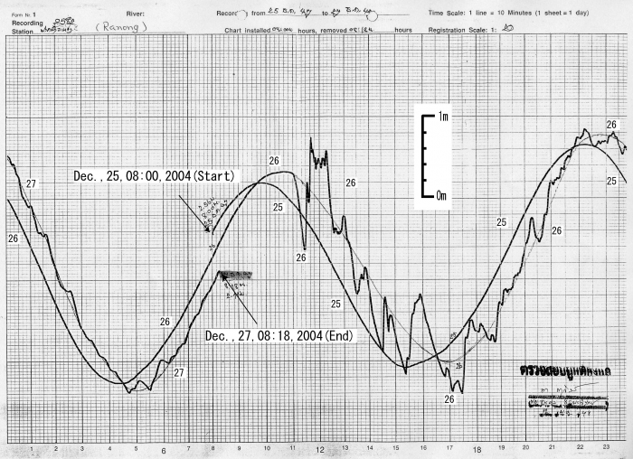
1.5 The time scale on the X-axis is given up in the right-hand corner of the record. It says "Time scale: 1 line = 10 minutes (1 sheet = 1 day)". Okay, so take a look at the grid. What do the numbers on the X-axis refer to? How many days are shown in this record?
1.6 The vertical scale is given. (It's floating in the middle of the record.) What is the normal tidal amplitude at this station?
1.7 Comment on the differences you note between the tidal cycle at this station and at the Salalah station. Comment on the differences you note between the normal tidal amplitude here and at Salalah and the differences between the tsunami amplitude at this station compared to the Salalah station. Why are there differences?
1.8 Notice that because of the fact that more than one day is shown on this record, you can see that the tidal peaks and troughs are offset slightly as the days go by. Tides do not have a period that fits exactly into one day. That is, the peak-to-peak time is not exactly 12 hours. Approximately what is the period? (If you live near the coast, or have spent any time near the ocean, you already knew that the time of the high and low tides change predictably as the days go by. Isn't it reassuring when recorded data confirms what an observant person already knows! Science works!)
1.9 When does the tsunami arrive at Ranong? What is the amplitude of the tsunami compared to the background tidal amplitude? For about how long does the tsunami affect sea level height at Ranong? Compare these answers with your observations of the records from Salalah station.
Record 3: Syowa, Antarctica
I think you should now be able to interpret this plot on your own. Try it!
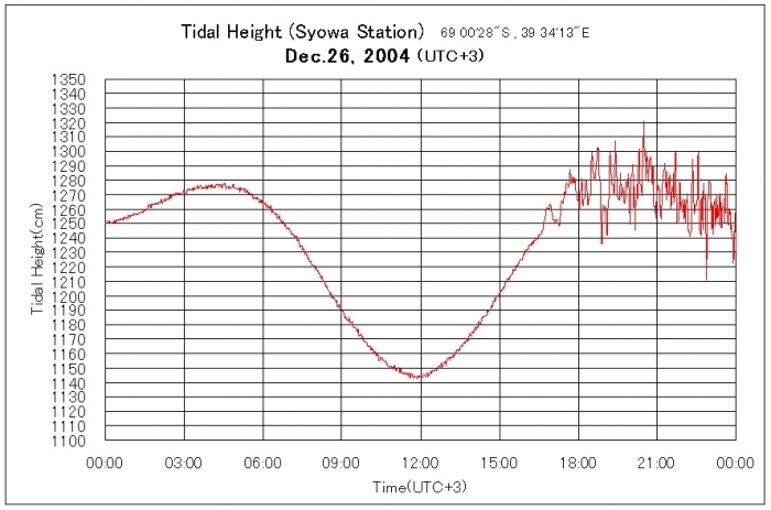
1.10 The coordinates of this station are given in degrees, minutes, and seconds. There are 60 minutes in each degree and 60 seconds in each minute. Convert the station coordinates to decimal degrees.
1.11 The local time at this station is "UTC +3". This means that this station is three hours ahead of "Universal time", which is set for historical reasons at Greenwich, England, where the longitude is zero. Find out the difference between UTC and the time in your hometown. (Your computer probably knows. Otherwise, a quick web search should accomplish this task.) Remember to cite the place where you found the answer.
1.12 What are the units of the X and Y axis on this record?
1.13 When does the tsunami arrive?
1.14 What is the tsunami amplitude compared to the normal tidal amplitude? Compare this to your observations at the previous stations.
Record 4: Rodrigues Island
HMM! What is going on at this station? The red line shows the tidal prediction and the black and blue lines show data.
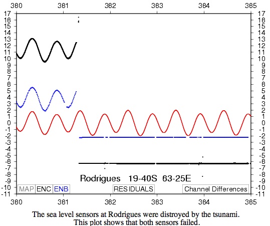
1.15 The latitude and longitude are given for this station in degrees and minutes. Convert to decimal degrees.
1.16 The X-axis is given in "Julian days" of 2004. Julian days are numbered consecutively from 1 to 365 (or 366 in leap years). So January 1 is Julian day 001, February 1 is Julian day 032. What is the Julian day of your birthday? Convert the values of the X-axis from Julian days to normal dates. (To get this answer, you have to recall whether 2004 was a leap year or not.)
1.17 Read the text given by the spelling-challenged station operator as part of this record section. Now, look at the data records. When does the tsunami arrive? What happens to the data at this point? Why does the red line continue uninterrupted?
Part 1 Summary
This is probably a good time to point out that data isn't always perfect. Sometimes hardware fails, as in this case. Sometimes errors and uncertainties are introduced in other ways. We will discuss measurement error and uncertainty more fully in the next part of the problem set.
You have finished Part 1 of this problem set! Proceed to Part 2 on the next page.
Problem Set Part 2: Analyzing Tide Gauge Records and DART Data
Part 2: Calculating the speed of a tsunami using DART data from 2011
On 2011/3/11 near Honshu Island, Japan (38.322°N, 142.369°E) at 5:46:23 (UTC), a magnitude 9 earthquake occurred. You will inspect the records of 13 DART stations that recorded the tsunami, use them to calculate the speed of the tsunami, plot the stations and the earthquake on a world map, and then answer a set of questions about the data and your observations. For this part of the problem set, I downloaded the freely available data and made the plots for you. Later in this class, you'll have to do the data processing yourself, but not this time. If you want to check the raw data out and see a nice map, this is where to go: 2011 Tohoku Japan DART Data [29]
Use "Part 2" of your problem set worksheet to record your work. View the DART station records for this activity [30]. You can also click on the thumbnails in the table below to see each station's data separately.
In general, you don't have to write a whole page of calculations for each station like I do in my examples, I just wanted to be thorough so you can see my procedure. On the other hand, if you don't show any work it is harder for me to give you partial credit if you make a mistake (see my grading rubric, below).
2.0 Using Google Maps, make a map of the location of both earthquakes, the tide gauge stations from Part 1, and the DART stations from Part 2. When you are done with your map, save it, make a link to it, and paste the link into your worksheet. Or you can take a screenshot of your map and insert that into your worksheet.
Video: How to Make a Map with Google Maps (3:18)
PRESENTER: So when you first get to Google Maps, it'll probably present you with a map of the place where you are, if it knows where you are. Then, if you click this little hamburger over here, and you get a menu. And one of the things you can click on is My Maps. If you've never made a map before, then you'll just get a welcome screen. If you've got something you've already made, then you will be shown a menu with those. But anyway, you can create a new map. And the easiest thing I think to do-- is to just type in the latitude and longitude of the place marker that you want to set. So why don't we put in the location of the Japanese earthquake? There. And it drops the place marker in the ocean. That's fine. So click this little plus here. And then, you want to edit this. So let's call this earthquake. We can also edit what kind of an icon it looks like. Here. And I don't know, gee, this crisis menu is a lot of fun. You can have everything from infestation, geckos, to a ninja with a throwing star, or something like that. Ooh, look, here's one that looks like a tsunami. Maybe that's going to work for us. [INAUDIBLE]. Now you're all set. Let's add another. So here we go with that close by station that we were using for all of our other examples. Drops a placemark there. And why don't we edit that? We'll call it station 21418. Great. We'll add another one just for fun. But I-- my guess is that you've figured it out now. Here is a station that is far away. And that's going to drop another place marker there. We're going to add this one. Station 32412. Save it. OK, now at the end, once you've got everything there, you might want to just zoom out and verify these things are where you think they're supposed to be. Yep, you've got an earthquake off the coast of Japan. A couple of stations. One is close by. One is not close by. At the end, you want to give your map a title. And then, click the Share button. If you forgot to give your map a title, it's going to remind you that it wants you to do that. It's just [INAUDIBLE]. And you can also get a link. And if you want me to be able to see your link without having to log into Google, you can change this so that it's public with anyone who has the link. And you can share it with grandma, too. All right. That's all.
2.1 You already worked with Julian days in Part 1. Now we are going to work with time as expressed in fractions of a day. The earthquake happened on 2011/3/11 at 5:46:23. What is the Julian day of this time, exactly, as expressed in decimal form?
Video: Julian Day (2:22)
PRESENTER: All right, so we're going to convert January 16, 2016, at nine hours, 54 minutes, and 31 seconds into Julian day. So the Julian day is 16 because we're in January. That's pretty easy. In order to convert the time, we need to know how many seconds there are in each of these parts, and then we're going to divide by the total number of seconds in the day. So what we know is that there are 60 seconds in one minute. There are 60 minutes in an hour, and there are 24 hours in a day. And that means if you multiply 60 by 60 by 24, then you can find out that there are 86,400 seconds in one day. I feel like I'm singing that song from rent. Anyway, OK, so here's what we do. We start with nine hours. And we say, all right, nine hours is nine times 3,600, which is the number of seconds in one hour, is going to give us 32,400 seconds. Then we need to convert the minutes. 54 minutes, multiply that by 60 because there are 60 seconds in a minute. And we get 3,240 seconds. And then the 31 seconds, we don't have to convert, because that's already in seconds. All right, and we're going to add up these numbers. And you get this number, 35,671 seconds. We're going to divide that by 86,400 because that's the total number of seconds in a day. All right, so divide by 86,400. And we get 0.4129. Let's do a little reality check because I like to do that when I do math. Is it possible that about nearly 10:00 in the morning, we've gone through about 40% of a 24 hour day? Yeah, that makes sense to me, because noon would be 50%, right? And we're not quite at noon yet, so this looks good. OK, so the answer here finally is that the actual day precisely is 16.4129. That's how you'd express the Julian day with decimals of this date up here.
2.2 Look at each station record and pick the arrival time of the tsunami. I have done the first one for you. Make sure you pick the arrival time of the tsunami and not the arrival time of the seismic waves. Fill in your answers in the table.
Video: Tsunami Arrival Pick (1:56)
PRESENTER: All right, can I just say, before we even start, that this is just such cool data. First of all, this station was really close to the earthquake. And it's sitting at the bottom of the ocean, and you can tell that because the y-axis here is water column height. So this thing is a pressure sensor sitting in five and a half kilometers of water-- which is pretty amazing that we can even build something that will work at five and a half kilometers down, don't you think? Anyway, so in part one, you were looking at tide gauges. And those are really cool, but they're just at the surface, so all they can do is record the height of the water. Whereas this thing, since it's a pressure sensor on the ocean floor, it can record the seismic waves themselves and the tsunami, which is really neat. So here-- the x-axis here is Julian day of 2011, and it's in these fractional parts. So that's helpful since we already know how to do that and work with those numbers. And let's look at the data itself, this wiggly line. All right, so right here is the first big excursion from nothing happening. And that is actually the seismic waves from the earthquake, not the tsunami itself, which is awesome. So the tsunami itself actually comes in right here. And I would mark it down as 70.26 as the arrival time. What's really neat is that when you look at stations that are farther and farther away in the rest of this problem set, you're going to see that the time between the earthquake arrival and the tsunami gets bigger and bigger and bigger. And that's because the seismic waves are just faster. The tsunami is pretty fast, but not as fast as seismic waves. So I don't know. I feel like if I were like a high school physics teacher and I wanted students to do those boring problems, like two trains leave the station and one is traveling at this speed and the other one's traveling at some other speed, and how far apart will they be at time x, y, and z-- well, this is that exact problem. It's just cool because it's real data. It's a real thing that happens in the Earth, you know? So check it out. You'll see it when you look at this data. It's just so neat. It's awesome.
2.3 Calculate the tsunami travel time to each station by subtracting the origin time from the arrival time. (Now aren’t you glad you converted the origin time to decimals!!). I’ve done the first one for you. Your answers will be in fractions of a day, so convert to hours. Fill in your answers in the table.
Video: Tsunami Travel Time (0:58)
PRESENTER: All right. This is how you calculate the travel time to one of your stations. We'll stick with station 21418. That's our example station. So we picked the arrival time at 70.26, so we just need to subtract the origin time of the earthquake, which we've already calculated. And here is the answer we get when we subtract these numbers, 0.0195. And remember, this is in days. But we want to convert this to hours because later, we're going to calculate the velocity of the tsunami. And we want that to be in kilometers per hour. So if we multiply by 24 hours in the day, then we can make this number be hours. And when we do that, we get 0.468. So that is the number of hours it took the tsunami to get from the earthquake to where the station is-- a little less than half an hour.
2.4 Calculate the epicenter-to-station distance along the great circle path between the two locations. We use the great circle path formula because we are calculating distance on the surface of a sphere. Here is the formula for great circle distance: cos(d) = sin(a)sin(b) + cos(a)cos(b)cos|c| in which d is the distance in degrees, a and b are the latitudes of the two points and c is the difference between the longitudes of the two points. Multiply the answer by 111.32 to get from degrees to kilometers. Jean-Paul Rodrigue, at Hofstra University, gives an excellent explanation and tutorial of how to calculate the distance along a great circle path [32]. I’ve done the first one for you. Fill in your answers in the table.
Video: Great Circle Distance (2:42)
PRESENTER: We need to calculate the distance between our earthquake and each station that recorded the tsunami. So the way to do that is to use the great circle path formula. And here is the formula. The cosine of the distance equals the following. OK. So in this formula, A is the latitude of one of our stations we'll call the latitude of the earthquake. B is the latitude of the other point here. A latitude, B latitude. And C is the difference between their longitudes. Take the absolute value of that. So you're going to take the sine of this number, the sine of this number. And then you're going to take the cosine of this number, and the cosine of this number. And you're going to subtract the longitudes from each other. It doesn't matter which, because you're going take the absolute value of that. And take the cosine of that. Multiply all the cosines together. Multiply the sines together. Add those two. And then you have to take the inverse cosine of the answer. And you look at the distance in degrees. Then you multiply by 111.32, and you'll get the distance in kilometers. Now, here are the things that I want to point out that are important. It is important that you know that when you calculate the distance between two points on the surface of a sphere, you need to use the great circle path formula. And I think it's important that you know what that formula is. And I wrote it down right here. But this class is not really meant to be about calculator skills. So if you can automate this in a spreadsheet program or whatever, or you know of a website that will calculate it for you, then that's what you should use, because it will actually minimize the errors of you typing stuff in. I've found a good website that works. And this is it. I've given you the link to this in the course web pages. But you need to be smart about using websites, just like you would if you were looking up information on a website. And that is, you should do a couple of problems yourself, and trust your own math, and then check if the website gives you the same answer or not. And I have checked with this one. So here, I've entered the latitude and longitude of the earthquake, and the latitude and longitude of our station, and it gives me the distance. It is important, when you use a website like this one, that if you have points that are in west longitude, or south latitude, that you enter them in here as negative numbers, or else you won't get the right answer. But I wrote all those down correctly for you in your table of values, so hopefully, that won't trip you up. All right, that's all there is to it.
A nice website that will calculate great circle distance for you [33].
2.5 Calculate the tsunami speed. To get the speed, you use the formula speed = distance/time. I’ve done the first one for you. Fill in your answers in the table.
Video: Tsunami Speed (2:03)
PRESENTER: All right, we are going to calculate the velocity of a tsunami now. So all we need is to know the formula distance equals rate times time. We just rearranged it, so that rate is over here by itself. Which means we are going to divide distance by time. Well, that's fine, because we already know those, right? We know that the distance is 551.9 kilometers, and we know that the time is 0.468 hours. So this gives us a velocity of 1,179 kilometers per hour. Wow, now I don't know if you have any intuition about how fast a tsunami goes in the open ocean. It's really fast, but it's not quite as fast as this. Wow, so where did we go wrong? Nothing about our method is wrong, but this is a good time to talk about uncertainty. This station is really close to the earthquake, and let's just imagine a thought experiment here where you've got a station that takes a data sample every 15 minutes, OK? But let's say that the tsunami only takes 45 minutes to get to that station. Well, being uncertain plus or minus 15 minutes out of 45 minutes is huge. It's a big uncertainty compared to the measurement you're making, right? Let's say that you've got a station that takes it every 15 minutes, and the tsunami takes eight hours to get there. Well, 15 minutes out of eight hours is not nearly as big of a deal, right? So the absolute value of your uncertainty can matter a lot more, depending on its relationship to the real size of the measurement you're making. And that is a really, really important concept in any branch of science, so just think about that, OK? But anyway, look, this is real data. This is real life. It has uncertainties, and that's OK. It doesn't fit neatly into multiple-choice tests designed by bureaucrats, but that's OK. That's the way it is.
| station | station lat (ºN) | station lon (ºE) | tsunami arrival time (Jday) | tsunami travel time (hr) | earthquake to station distance (km) | tsunami velocity (km/hr) |
|---|---|---|---|---|---|---|
21418 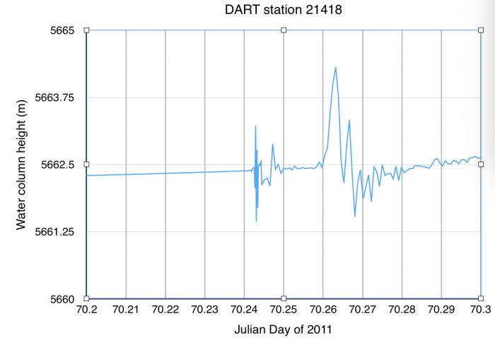 [34] [34] |
38.7110 |
148.6940 |
70.26 | 0.468 | 551.9 | 1179 |
21413  [35] [35] |
30.5150 |
152.1170 |
||||
21415 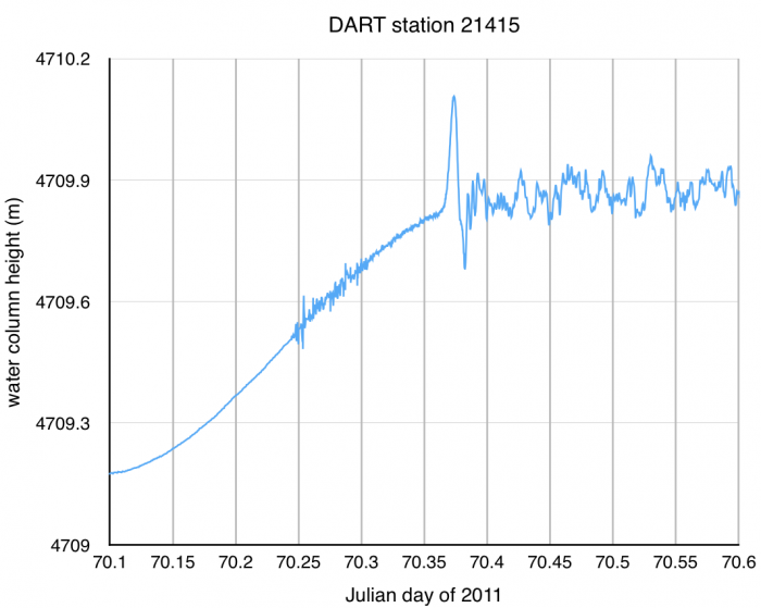 [36] [36] |
50.1762 |
171.8486 |
||||
52402 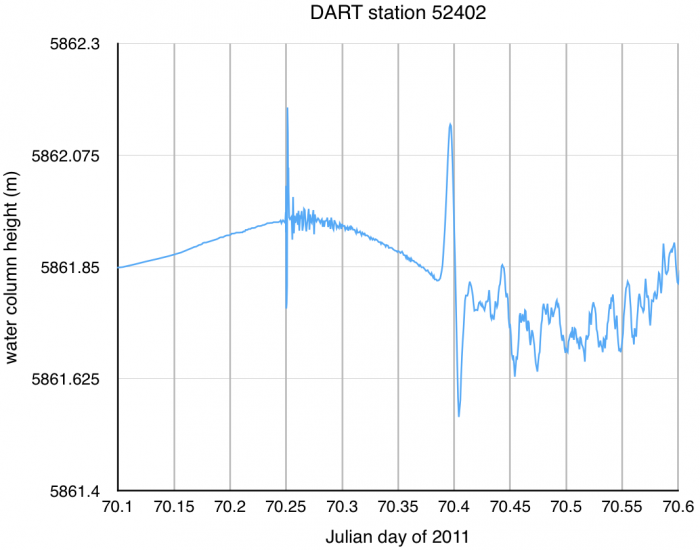 [37] [37] |
11.8830 |
154.1100 |
||||
46402 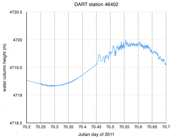 [38] [38] |
51.0683 |
-164.0053 |
||||
51407 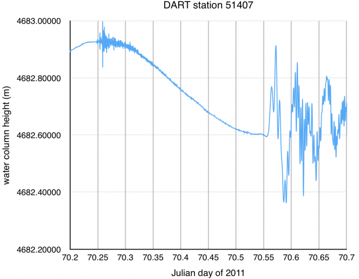 [39] [39] |
19.6169 |
-156.5106 |
||||
51425  [40] [40] |
-9.5044 |
-176.2297 |
||||
46411 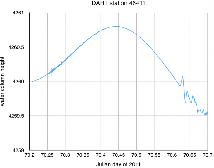 [41] [41] |
39.3238 |
-126.9910 |
||||
51426 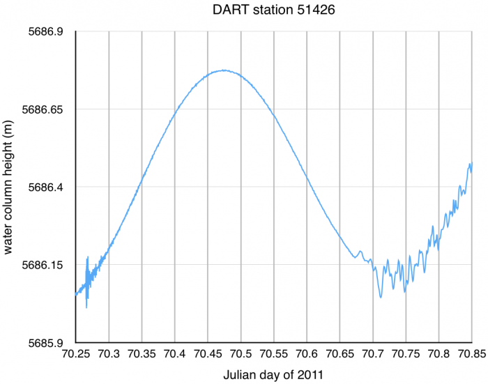 [42] [42] |
-22.9911 |
-168.1031 |
||||
51406  [43] [43] |
-8.4800 |
-125.0270 |
||||
43413 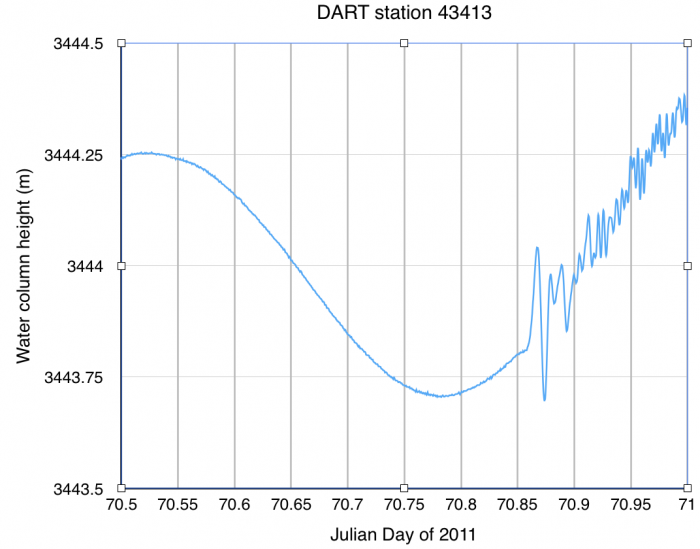 [44] [44] |
10.8372 |
-100.0842 |
||||
32413 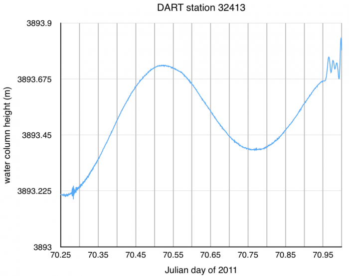 [45] [45] |
7.4003 |
-93.4989 |
||||
32412 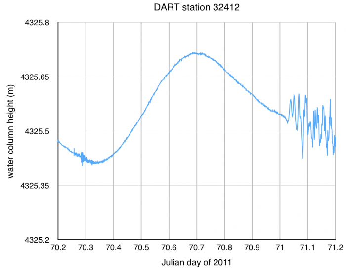 [46] [46] |
-17.9865 |
-86.3887 |
2.6 I want you to think about the uncertainties in the calculations you performed in determining tsunami velocity. One obvious source of uncertainty is measurement precision at each tide gauge station. For example, let’s say that you are working with a DART station that takes a measurement every 15 minutes. This means that picking the arrival time of the tsunami can't be more precise than this. Go back and change the arrival time pick for Station 21418 and for Station 32412 each by 15 minutes. Now recalculate the speed of the tsunami for each of those two stations. How much has your answer changed for each one? Which one is affected more by the uncertainty in arrival time and why?
2.7 What are some other sources of uncertainty in these calculations?
2.8 Calculate the mean speed for the tsunami. Are you surprised by this speed? How does this speed compare to a jet airplane? an Indy car? a bullet fired from a gun? an earthquake P wave? a major league fastball? Pick several items that interest you (they don't have to be any of the examples above if you don't like those) and compare them to the speed of the tsunami.
2.9 Tsunami speed is controlled by water depth. In fact tsunami speed equals the square root of the product of water depth and g, the gravitational constant (9.8 m/s2). Calculate the mean water depth of the Pacific Ocean. To do this, use the mean speed of the tsunami that you calculated in 2.8, convert it from km/hr to m/s, then plug into the equation speed=sqrt(depth*g).
2.10 I want you to think about approaching the question of tsunami speed from a different perspective. What if you wanted to determine how fast a hypothetical tsunami could get from point A to point B? List what would you need to know to make this calculation.
2.11 Now try it! Let's say a large earthquake happens in the Pacific Northwest, approximately at the location of Seattle, generating a tsunami. Determine how long it would take the tsunami to arrive in Hilo, Hawaii.
2.12 What are the sources of uncertainty in the calculation you just did in the previous question?
2.13 There are definitely tide gauge stations on the west coast of Japan and they recorded the tsunami as well. However, we did not use any data from those stations to calculate the speed of the tsunami or to calculate the mean water depth between the earthquake and those stations. Why not? (In order to answer this question you will need to look at the map you made and think about what assumptions we made to do our calculations.)
Submitting your work
Save your worksheet as a Microsoft Word, PDF, or Pages file in the following format:
L2_TsunamiData_AccessAccountID_LastName.doc (or .pdf or .pages).
For example, Cardinals' shortstop Jhonny Peralta's file would be named "L2_TsunamiData_jap27_peralta.doc"
Upload your worksheet to the Tsunami Data problem set assignment in Canvas by the due date on the first page of this lesson.
Grading rubric
I will use my general grading rubric for problem sets [47] when I grade this activity.
Tsunami Risk and Hazard Mitigation
So far we've talked about the physics of tsunamis and you have investigated tsunami data and made some calculations about tsunami speeds. What's the current state of the art in terms of tsunami risk and hazard mitigation? Where are some other sites in the Atlantic Ocean where tsunamigenic potential lurks?
Readings relevant to the paper assignment
The following readings are either freely available online if they are linked from this page, or if they are not in the public domain then they are linked from Canvas. You should at least skim these articles because they deal with potential Atlantic Ocean tsunamigenic sites.
- Nealon, J. W., & Dillon, W. P. (2001, April). Earthquakes and Tsunamis in Puerto Rico and the U.S. Virgin Islands [48]. U.S. Geological Society. Retrieved June 2, 2008, from http://pubs.usgs.gov/fs/fs141-00/fs141-00.pdf.
- Teeuw, R., Rust, D., Solana, C., & Dewdney, C. (2009). Large Coastal Landslides and Tsunami Hazard in the Caribbean. Eos, 90 (10), 81-82.
- Driscoll, N. W., Weissel, J. K., & Goff, J. A. (2000). Potential for large-scale submarine slope failure and tsunami generation along the U.S. mid-Atlantic Coast. Geology, 28(5), 407-410.
- Gisler, G., Weaver, R., & Gittings, M. (2006). Sage calculations of the tsunami threat from La Palma [49]. Science of Tsunami Hazards, 24(4), 288-301.
- Pérez-Torrado, F. J., Paris, R., Cabrera, M. C., Schneider, J., Wassmer, P., Carracedo, J., et al. (2006). Tsunami deposits related to flank collapse in oceanic volcanoes: The Agaete Valley evidence, Gran Canaria, Canary Islands. Marine Geology, 227(1-2), 135-149.
- Wendell, J.(2015). Mysterious boulders suggest ancient 800-foot-tall tsunami [50].Eos, 96,doi:10.1029/2015EO036845. Published on 2 October 2015.
The following readings will help you become conversant with the way tsunami warning systems work, and what has been done since the 2004 Sumatra-Andaman tsunami:
- Pacific Tsunami Warning Center History [51]
National Weather Service, Pacific Tsunami Warning Center.
Accessed: 2010-09-13. - Pacific Tsunami Warning Center Responsibilities [52]
National Weather Service, Pacific Tsunami Warning Center.
Accessed: 2010-09-13. - Tsunami-Forecasting System Tested by Recent Subduction-Zone Earthquakes [53]
Geist, Eric, Titov, Vasily, Kelly, Annabel, and Gibbons, Helen. USGS, Sound Waves.
Accessed: 2008-03-12. - Gower, J., & Gonzalez, F. (2006). U.S. warning system detected the Sumatra tsunami. Eos, 87(10), 105, 108.
- Tracking Tsunamis [54] (2009) AGU video
- Schiermeier, Q. (2009). Tsunami Watch. Nature, 462, 968-969.
Paper Assignment
Should the nations surrounding the Atlantic Ocean cooperate to form a tsunami warning system for the Atlantic Ocean?
Your final task for this lesson is to write a paper. This assignment is due at the end of this lesson. The "Additional Resources" page for this lesson contains some links to articles and Web sites that you may find helpful. You are in no way limited to those resources, however.

Directions
PDF Download of Directions [55]
Write a paper that defends or attacks the following statement: The nations surrounding the Atlantic Ocean should cooperate to form a tsunami warning system for the Atlantic Ocean.
The successful paper should meet the following criteria:
- This paper should be approximately 1500 words in length.
- At least one potentially tsunamigenic site in the Atlantic Ocean should be identified.
- You need to calculate an estimate -- not just a quote, an estimate from another source -- for how long it would take a tsunami to travel from this site to several major coastal cities.
- You should find at least one source that estimates the likelihood of a tsunami being generated at this site.
- No need to debate or guess about politics among countries. Just imagine that you are a disinterested scientist make a recommendation. Whether or not you can foresee cooperation among countries in terms of constructing a tsunami warning system is not something you need to speculate about.
- Include a brief summary of the history and responsibilities of, as well as the technology employed by the various tsunami warning programs that already exist.
- Background information about how tsunamis are generated should be included.
- All sources must be cited. This includes any borrowed figures. Please follow the citation convention discussed on our course syllabus (see the Course Policies section).
- Save your paper as either a Microsoft Word, Macintosh Pages or PDF file in the following format: L2_paper_AccessAccountID_LastName.doc (or .pages or .pdf). For example, Cardinal catcher Yadier Molina's file would be named "L2_paper_ybm1_molina.doc"
I expect your essay to be well organized and coherent, with a thesis statement at the beginning of the essay; topic statements at the beginning of every paragraph; smooth transitions between paragraphs and ideas; few or no grammatical and spelling errors; and properly cited, detailed explanations of the results of scientific studies to back up every assertion you make.
As the reader, I should both understand what you are talking about and be convinced that you have made a strong argument for your case. It should be clear to me that you understand the significance of the results of all the scientific studies you refer to in your paper (including your own). See grading rubric below for more details. Your grade will be dependent upon all of these elements. Content and organization are the most important elements, but if your grammatical/syntax errors are significant enough to distract me from the content of your argument, then this will affect your grade. Make sure you read the assignment carefully and understand it before you begin.
Submitting your work
Upload your paper to the "Tsunami Warning System Paper" assignment in Canvas. The due date for this paper is given in the assignment table on the first page of this lesson.
Grading rubric
- An "A" paper is well organized and coherent, with a thesis statement at the beginning of the essay, topic statements at the beginning of every paragraph, smooth transitions between paragraphs and ideas, no or few grammatical errors, and meets the assignment's length requirement. Additionally, an "A" paper includes several detailed examples that clearly explain the results of other scientists' work on the topic, as well as examples from your own work on the topic. Any included figures have appropriate captions, legends, and axes, and they support the arguments made in the paper.
- A "B" paper is like that of an "A" paper except that it may refer to scientific studies to back up most but not all of its assertions OR its assertions may only rely on the work of others and not on your own work. Additionally, a "B" paper may be an "A" paper content-wise, but it has minor grammatical errors or minor organizational problems. A "B" paper meets the length requirement.
- A "C" paper may have organization, coherence, or grammatical problems that hinder a smooth reading of the paper, but not to the extent that the paper is incomprehensible. A "C" paper may also not meet the assignment length requirement. NOTE ON ASSIGNMENT LENGTH: Papers that significantly deviate from the length assignment by being too short (half as long as the assignment length requirement or less) OR too long (twice as long as the assignment length requirement or more) will receive a "C." A paper that has excellent organization and content, but fails to address the topic of the assignment will receive a "C."
- A "D" paper has severe organizational, coherence, or grammatical problems so that the reader has trouble comprehending what is being communicated. A "D" paper may significantly deviate from the length requirement. A paper that does not refer to the results of any specific scientific studies at all will receive a "D" no matter how well-written it is or how good its argument is.
ANOTHER OPTION
If you cringe and procrastinate at the thought of writing a paper, then you may submit this assignment in the following way instead. You may use the Prezi program to create an interesting presentation of your persuasive essay. Prezi [56] is a free web tool.
The Prezi website explains how to use their tool so I won't try to do it for them.
If you choose this option:
- You must adhere to all the same criteria as for the paper that I listed at the top of this page
- Your choice of presentation style will not affect your grade (i.e. you won't get extra points for using Prezi, nor will you lose points)
Teaching and Learning About Tsunamis
Let's take some time to reflect on what we've covered in this lesson!
Teaching/Learning Discussion
For this activity, I want you to reflect on what we've covered in this lesson and to consider how you might adapt these materials to your own classroom. Since this is a discussion activity, you will need to enter the discussion forum more than once in order to read and respond to others' postings. The discussion will take place during the second week of this lesson.
Submitting your work
- Enter the "Teaching and Learning About Tsunamis" discussion forum in Canvas.
- Post your ideas for how the materials we covered in this lesson might be adapted for your own classroom.
- I would also like to see some discussion of what you thought were the major science concepts/science skills presented in this lesson. That will help me find out if you got what I wanted you to get out of the lesson. I mean, I am trying to model good teaching skills here so you can tell me if that's working or not!
- Read postings by other EARTH 501 students.
- Respond to at least one other posting by asking for clarification, asking a follow-up question, expanding on what has already been said, etc.
Grading criteria
You will be graded on the quality of your participation. Please see the rubric for teaching/learning discussions. [1]
Additional Resources and Bibliography
Resources on the web:
Various Web site with links to resources about tsunamis aimed at teachers and students:
- NOAA - Tsunami Resources for Teachers [57]
- O.H. Hinsdale Wave Research Laboratory Outreach Program [58]
Links to other Web sites
- FEMA - Tsunami [59]
- NOAA - Pacific Tsunami Warning Center [60]
- Australian Spaceguard Survey: Tsunami from Asteroid/Comet Impacts [61]
- Savage Earth Animation: Tsunami Attack [62]
- NOAA animation of the DART system [63]
- NOAA animation of the DART II system [64]
Be sure to check this out:
A short video about the 1964 Good Friday earthquake in Alaska and the tsunami it generated. This video was produced by students in my 2011 PSU freshman seminar on historic great earthquakes.
Publications
Other papers and articles of interest
- Lay, T., Kanamori, H., Ammon, C. J., Nettles, M., Ward, S. N., Aster, R. C., et al. (2005). The great Sumatra-Andaman earthquake of 26 December 2004. Science, 308(5725), 1127-1133.
- Berardelli, P. (2009). Catching a Giant Wave. ScienceNOW (727:2) [66].
- BBC News: Science and Technology (2004) Expert slams wave threat inertia [67].
Bibliography
Atwater et al., 2005, The Orphan Tsunami of 1700—Japanese Clues to a Parent Earthquake in North America, USGS Professional Paper 1707
Tell us about it!
Have another Web site on this topic that you have found useful? Share it in our Questions discussion forum in Canvas!
Summary and Final Tasks
In this lesson, you studied the catastrophic effects of a tsunamigenic earthquake and evaluated the potential risks posed by tsunamis in other parts of the world. One of the obstacles faced by those who make a living trying to assess risk and mitigate the hazards posed by geologic activity is that the timescale in between potential disasters in a specific location (e.g., large earthquakes or volcanic eruptions) is often too long for humans to have accurate statistical measurements of how often it might happen. This makes reconciling the cost of preparedness with scientific accuracy a little tricky. In the next lesson, we'll study this problem in a place that is potentially hazardous for earthquakes.
Reminder - Review the Lesson 2 Overview
You have reached the end of Lesson 2! Double-check the list of requirements on the Lesson 2 Overview page to make sure you have completed all of the activities listed there.
Lesson 3: Mass Extinctions: Consensus in the Craters?
Overview
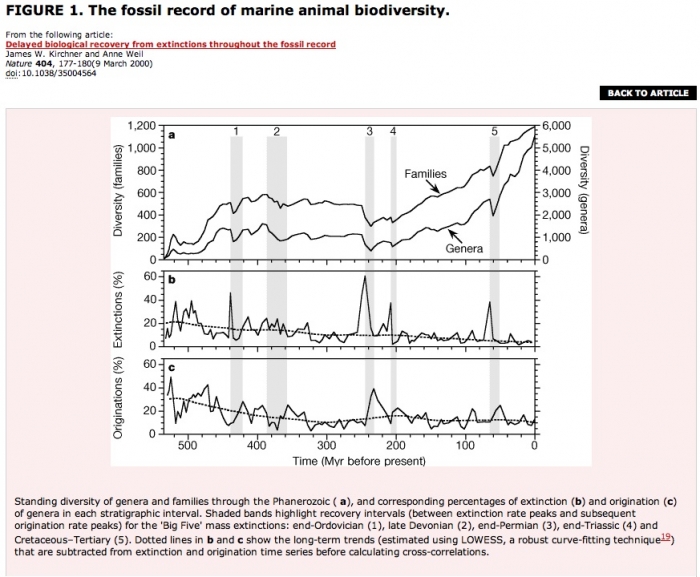
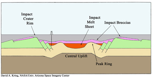
The figure below shows a simplified geologic cross-section of an impact crater in Chicxulub, Mexico. This crater is thought by most scientists to be the impact crater resulting from the asteroid collision that caused the mass extinction event at the end of the Mesozoic era about 65 million years ago. In this lesson, we will discuss prevailing hypotheses for this and other mass extinction events during Earth's history. We will also discuss the effect on evolution/diversification of life following mass extinction events.
About Lesson 3
I think the subject matter of this lesson is an important educational topic for two reasons. The first is that any discussion of the pattern of evolution, diversification, and extinction of life on Earth over geologic time must necessarily bring up the subject of deep time and the age of our planet. The age of the Earth is not at all a controversial subject among scientists, but recently in the United States, public schools have been pressured to teach "alternative explanations" that have no scientific merit. The second reason is that the subject of mass extinction events ties together the disciplines of geology and biology; it is an important part of teaching and learning science to recognize that scientific disciplines are linked, even though they are usually taught in schools as completely separate fields.
What will we learn in Lesson 3?
By the end of Lesson 3, you should be able to:
- List the evidence for an extraterrestrial impactor at the K/T boundary
- List other hypotheses that have been proposed for the K/T extinction
- List the evidence for an extraterrestrial impactor at the end-Permian extinction
- List other hypotheses that have proposed for the end-Permian extinction
- Explain the difficulties of finding ancient impact sites
- State how often the Earth is hit by extraterrestrial objects of various dimensions
- Describe the aftermath of an asteroid strike (i.e., immediate and long-term environmental effects)
- Describe the effect on evolution/diversification of life following mass extinction events
- State the ages of the K/T extinction event and the end-Permian extinction event
- State the age of the Earth and why we know this is true
What is due for Lesson 3?
Lesson 3 will take three weeks to complete. 18 Sep - 8 Oct 2019.
The chart below provides an overview of the assignments for Lesson 3. There are two problem sets and two discussions. One of the problem sets is broken into two parts (each part with a different due date).
| Requirement | Submitted for grading? | Due date |
|---|---|---|
| Reading: An introduction to recent debates | No |
24 Sep |
| Problem set: Antipodes and Geologic Time, part 1 |
Yes—Submitted to the "Antipode and timescale problem set part 1" assignment in Canvas |
24 Sep (end of week 1) |
| Problem set: Antipodes and Geologic Time, part 2 | Yes—Submitted to the "Antipode and timescale problem set part 2" assignment in Canvas | 1 Oct (end of week 2) |
| Reading: The K/T extinction event | Yes-Graded discussion in Canvas | participation spanning 25 Sep - 1 Oct (2nd week) |
| Reading / Discussion: Exploring a controversial theory—the Permian/Triassic Extinction | Yes-Graded group discussion in Canvas | 1 Oct (end of week 2) |
| Problem set: Correlating impacts and extinctions | Yes—Submitted to the "Impact craters problem set" assignment in Canvas | 8 Oct (end of week 3) |
| Reading: Recovering from an extinction | No | 8 Oct |
| Discussion: Teaching and learning about mass extinctions | Yes—Graded discussion in Canvas | participation spanning 2 - 8 Oct (3rd week) |
Questions?
If you have any questions, please post them to our Questions? discussion forum (not e-mail). I will check that discussion forum daily to respond. While you are there, feel free to post your own responses if you, too, are able to help out a classmate.
An Introduction to Recent Debates
Introduction
The pattern of evolution, diversification, and extinction of species on Earth is a topic worthy of an entire course (but so are the other topics in Earth 501, as you have no doubt realized at this point). Here we will focus on two major extinction events in geologic history. One of them happened approximately 250 million years ago. It marks the end of the Permian period of the Proterozoic Era and marks the beginning of the Triassic period of the Mesozoic Era. This extinction event was the most catastrophic in geologic history in terms of the number of species that disappeared at this time. The other event we'll study is better known. It happened 65 million years ago, ending the Mesozoic Era and the Cretaceous period, and beginning the Tertiary period of the Cenozoic Era. This is the event that killed the dinosaurs and is often called the "K/T" extinction (K is the abbreviation used for Cretaceous; T is the abbreviation for Tertiary).
These two extinction events have some characteristics in common: extraterrestrial impacts as kill mechanisms have been proposed for both, and in both cases, scientists continue to debate other possibilities as well. In this lesson we will examine different hypotheses proposed for each of the two events, we will examine a database of known impact sites on the planet, and we will try to wrap our minds around the concept of deep geologic time.
Reading assignment
Read the following article, available through Canvas:
- Science and Technology: Making an end of it; Mass extinctions. (2003).The Economist, 369(8349), 100.
This article gives a brief overview of some of the most recent debates surrounding the causes of mass extinction events that happened during the Mesozoic Era. Read this now as an introduction to some of the topics we will pursue more deeply as this lesson progresses.
When you read this article, think about the following:
- Three separate mass extinction events are discussed. When did each one occur? How do we know the ages of these extinction events?
- Are you familiar with the names given to divisions in geologic time? Do you know how these divisions have been decided?
- For each of the three, what are the competing hypotheses given for the kill mechanism and what are the arguments for and against each one?
- Were you familiar with any of these hypotheses before you read this article? Which ones? Are you familiar with any other hypotheses for the mass extinction events discussed in this article?
- This article says, "It is . . . unlikely that two impacts as big as the one that caused the Mexican crater and the one that spread iridium around the world would occur within 300,000 years of each other." In fact, we can assess how often the Earth is hit by asteroids of various sizes using a database of known impact craters, and we will do this later in the lesson.
This article does not answer all the questions above, and I have italicized the questions that you may or may not know the answer to depending on your background knowledge of the geologic timescale.
Tell me about it!
Please post any comments or questions to the Questions? discussion forum, especially if you want more background pertaining to the italicized questions (or other questions). If you have the answers to help out a fellow student, please post!
A Short Tour of a Long Time
How is geologic time divided?
Geologic mapping involves a certain amount of detective work. Layers of rock preserve a record of the planet's past climate and its biological population. Early versions of the geologic timescale were mostly based on index fossils—these are fossils commonly found in a particular sequence of rock around the world. Finding a certain index fossil meant being able to correlate that rock with other rocks containing that same fossil in other places on Earth. Divisions of time were generally assigned based on the disappearance of index fossils or on changes in rock type at certain points in geologic history. Relative ages of rocks around the world have been cataloged for over a hundred years. However, it has only been since the advent of radiometric dating and paleomagnetic measurements that we have also been able to assign numerical ages to the different divisions.
Here are two versions of the geologic timescale (both are in PDF format):
We do not have perfect preservation of the entire 4.5 billion year history of the planet. Preservation increases towards the present time, as you would expect. Therefore the geologic timescale contains more detailed divisions the closer we get to the present. The first abundant organisms with shells in the fossil record don't even appear until about 542 million years ago, which is a fifth of the way back from the present time. I annoted the second of the two time scales linked above to show where the two extinction events pertinent to this lesson appear in time, and to give you a warning about how the layout isn't to scale.
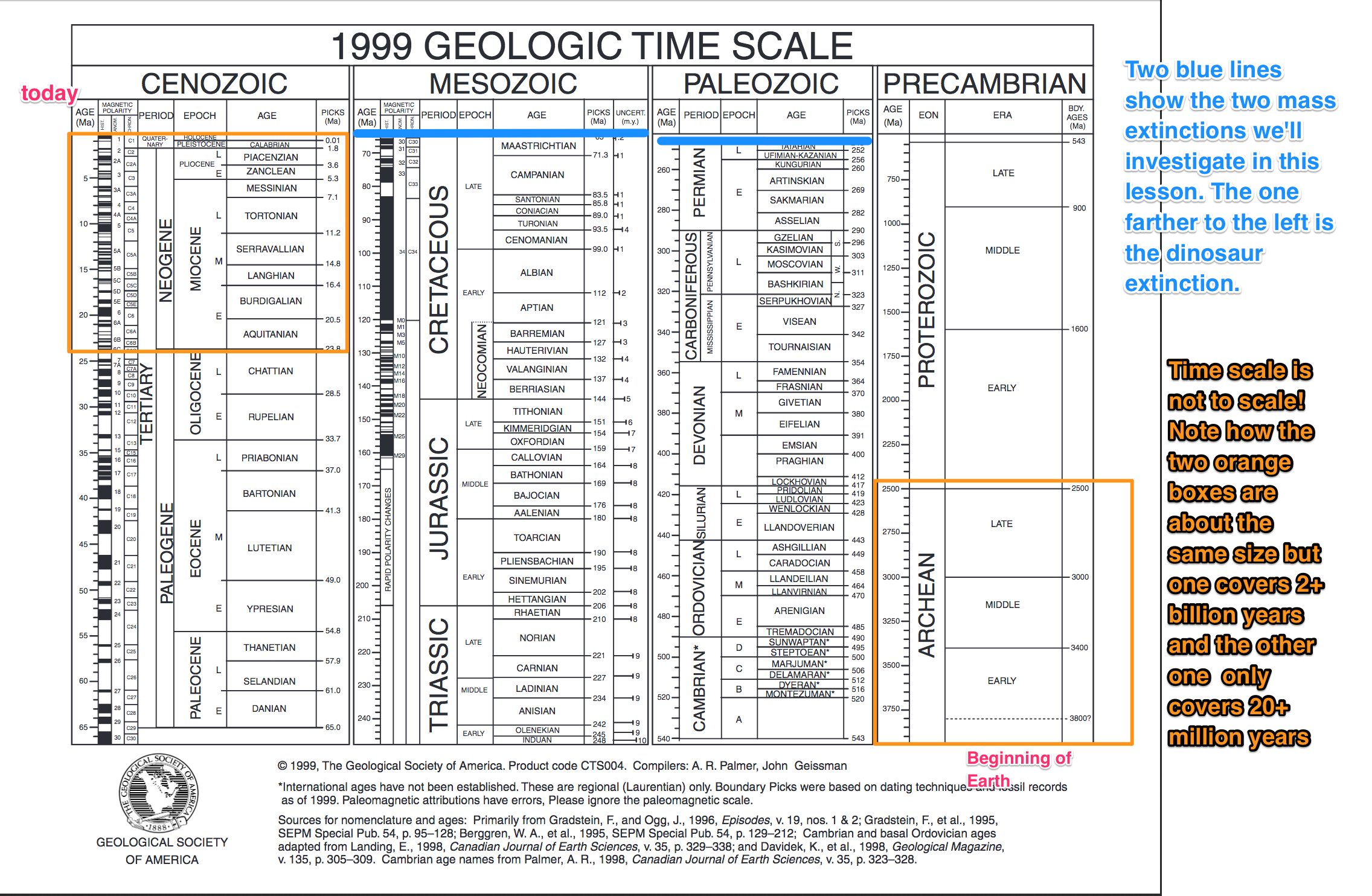
Antipodes and Geologic Time
How to comprehend deep time
In the activity below, the whole class will work together to make a representation of the geologic timescale. The way we'll do this uses the concept of antipodes. The antipode is the opposite point of any point on the surface of the Earth so that if you connected the two points with a line through the center of the Earth, that line would be an exact diameter. Mathematically, the antipode of a point whose latitude and longitude are (A, B) equals (-A, B ± 180°).
As an example, the latitude and longitude for State College, PA, is
40.8° N, 77.9° W
Its antipode is 40.8° S, 102.1° E, as shown on a map of where this is located [72].
As you can see, when my children get in the sandbox, they are not digging a hole to China. They are in fact digging a hole to the Southern Indian Ocean off the west coast of Australia.
Having trouble visualizing antipodes on a sphere?
Here's an animation of an antipode using Eliza's Cherry Skewer Mental Model (Click to download) [73]
Try This!
Calculate the antipode of your home town. Here is a good link for looking up the latitude and longitude of many locations in the world: Get Latitude and Longitude. [74]
What does this have to do with the geologic timescale?
Our planet is approximately 4.55 billion years old. It is a challenge for any human being to comprehend just how long a billion years is. This is one of the reasons that many people have trouble accepting the fact that biological processes such as natural selection can work. How can we try to represent the age of the Earth in a way that people will really understand what a billion years mean?
Antipode and Timescale Problem Set
In this activity, we'll use distance as a proxy for time. Penn State's campus at University Park, PA (in State College) will represent the present time, and PSU's antipode will represent 4.55 billion years ago when the Earth was formed. The great circle distance between PSU and its antipode then represents 4.55 billion years.
Part 1
Save the Antipode and Timescale Worksheet [75] to your computer. Use that word processing document to record your work.
- Save the worksheet to your computer by right-clicking on the link above and selecting "Save link as..."
- The worksheet is in Microsoft Word format. You can use whatever word processor you like to work on it. I can read most formats but check with me if you use something unusual.
Record your answers to the following questions on your worksheet:
- Calculate the great circle distance between PSU (40.8 N, 77.9 W) and its antipode (40.8 S, 102.1 E). What is this distance in kilometers? **If you don't remember how to calculate great circle distance go back to the tsunami travel time problem set from Lesson 2 and review it.
- The distance between PSU and its antipode is half the circumference of the Earth, and in our model, it corresponds to 4.55 billion years. How many million years is 4.55 billion years?
- In this model, calculate how many kilometers correspond to one billion years. How many kilometers correspond to one million years in this model?
- Calculate the great circle distance between PSU and the city where you were born. What is this distance in kilometers?
- How many years prior to the present time does this distance represent? (Remember that the location of PSU corresponds to the present time in our model.)
- Calculate the great circle distance between PSU and somewhere else of your choosing (e.g., where you live now, or the best place you ever visited, or a place you want to go). What is this distance in kilometers?
- How many years prior to the present time does this distance represent?
- Using the geologic timescale, what are the era and period corresponding to each of your two points in time?
Submitting your work
First, add your data to our class table in Canvas. My data is given as an example. Next, save your worksheet as a Microsoft Word, Macintosh Pages, or PDF file in the following format: Antipode_AccessAccountID_LastName.doc (or .pages or .pdf). For example, Cardinal starting pitcher Adam Wainwright's file would be named Antipode_apw50_wainwright.doc
Upload your Antipode Worksheet to the Antipode and timescale problem set part 1 assignment in Canvas by the end of the first week of this lesson. I will check your work so that you can make any corrections to the class table if you need to before Part 2 is due. Part 2 will be due a week later (the end of the second week of this lesson).
There is a week in between the due dates of part 1 and part 2 of this assignment so I can check part 1 and have you make corrections if necessary. Meanwhile, go on and do the reading assignments/discussions on the following pages, then come back here to finish part 2.
Part 2. Make your own geologic timescale
I want you to make a geologic timescale in which the dimension of time is measured consistently at a single scale. The two pdf files of the timescale produced by GSA and the USGS linked from page 3 of this lesson are made the way they are because the authors wanted each named portion of time to be legible, and they wanted to produce something that more or less fit on a page. This is instructive, but it can be misleading because periods of time closer to the present time are given more space. For example, see in the USGS timescale how the Holocene epoch (in which we now live) is given approximately the same amount of space as the late Jurassic. The Holocene is about 11,500 years long and the late Jurassic lasted about 15 million years. So, obviously, we are distorting time in favor of the present. Let's have a little humility and make a model to scale.
It is not as easy to appreciate the vastness of time before anything cool (like life!) began on this planet unless you can see what the timescale looks like when it is drawn to scale, so that's what we'll do next.
-
Choose a scale that makes sense to you and allows you to fit your timescale on one 8.5" x 11" page. This means you must come up with a scale that will fit 4.55 billion years into something less than eleven inches. Keep in mind that you are not being asked to recreate the standard-issue geologic time scale as they are rarely created with a consistent time scale. HINT: The easiest way to do this will be to draw your timescale on graph paper. You can make your own graph paper online for free and print it out at Incompetech Inc. [76]
Note:
You will need to submit your timescale electronically. It is okay to draw your timescale by hand and then scan it. Or, draw your first draft of it by hand and then make an electronic version of it. If you scan something that you have drawn by hand, please check for legibility before submitting it.
- Include the following dates on your timescale:
- origin of the Earth
- present time
- Permian/Triassic extinction
- Cretaceous/Tertiary extinction
- beginning of the Cambrian
- each class member datapoint from the table in Part 1
- Include the following time periods on your timescale:
- Paleozoic era
- Mesozoic era
- Cenozoic era
- Holocene epoch
-
Save an electronic version of your timescale as a Microsoft Word, Macintosh Pages or PDF file in the following format:
Timescale_AccessAccountID_LastName.doc (or .pdf or .pages).
For example, Cardinal outfielder Dexter Fowler's file would be named "Timescale_wdf25_fowler.doc"
Submitting your work
Upload the electronic version of your timescale (from Part 2) to the Antipode and timescale problem set part 2 assignment in Canvas by the end of the second week of this lesson. NOTE: The timescale (part 2) is due a week later than the antipode worksheet calculations (part 1). This is because you will need the data your classmates provide in Part 1 to complete Part 2. You are probably wondering why I've repeated this fact about four times now. Just to see if you're still reading! No, but, really, I've had somebody get confused about this every time I've taught this class, I swear.
Grading rubric
I'll use my general rubric for grading problem sets [47] to grade this activity. I made each half of this problem set worth 50 points so together they'd add up to the usual 100 points.
Cretaceous/Tertiary Extinction

The mass extinction event that occurred about 65 million years ago brought about an end to the domination of the planet by reptiles and, in so doing, opened up ecological niches within which mammals flourished several million years later (including, happily, human beings!).
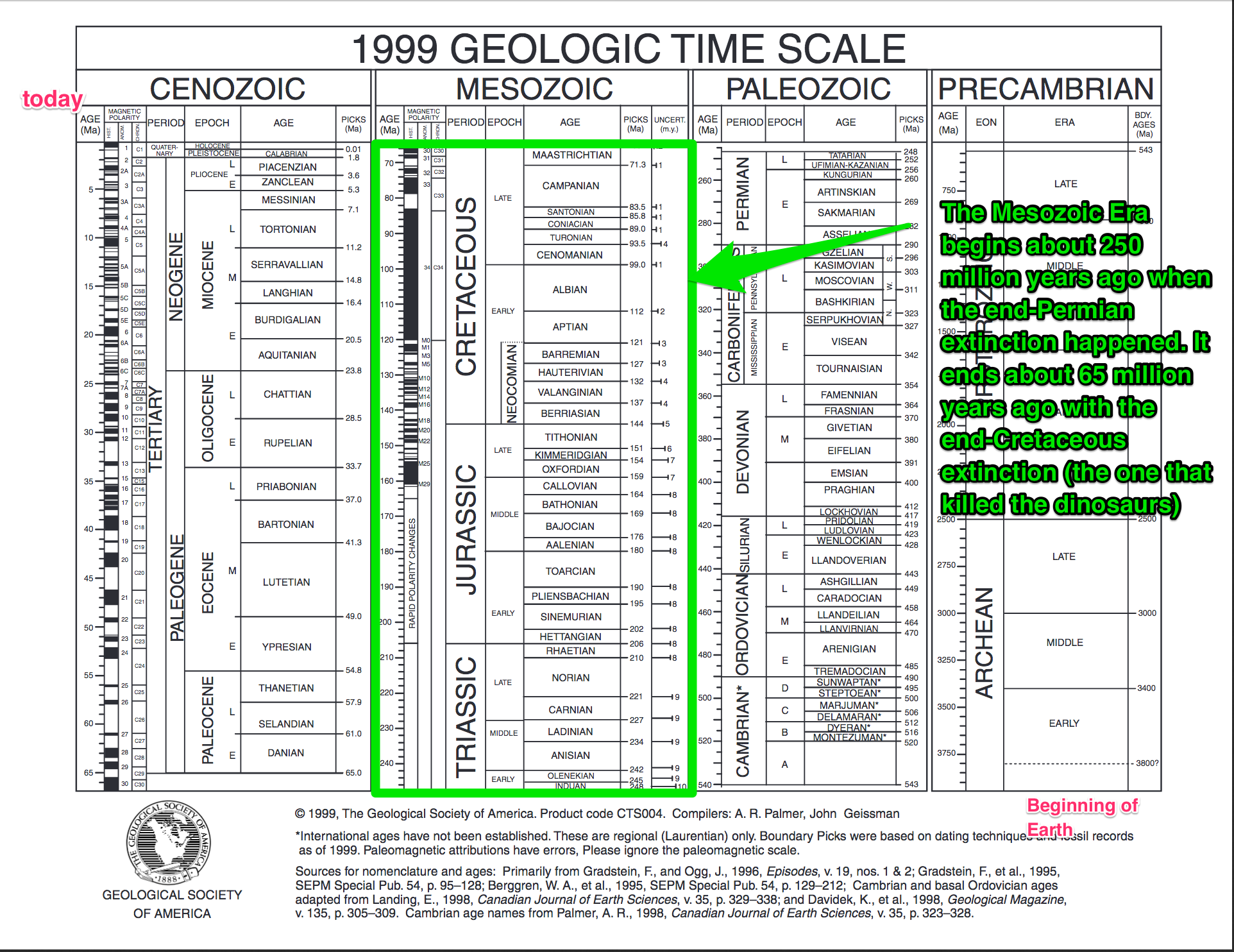
Evidence for an impact at the K/T boundary
History of the impact theory as the cause of the Cretaceous/Tertiary extinction 65 million years ago begins in the Italian town of Gubbio (green arrow in the map below).
The rock sequence preserved in a gorge outside of Gubbio preserves the transition between the Cretaceous and Tertiary periods. The site was visited by geologists conducting paleomagnetic surveys used to make precise dates of geologic horizons. These workers had noticed that while the lower beds of the Cretaceous contained many fossils, the Tertiary beds above the boundary were surprisingly depleted in fossils. There was a thin layer of clay at the boundary, which turned out to have an extremely high concentration of iridium. Iridium does occur in the Earth's crust but the concentration of it in this layer was so high that either the layer must have been deposited over a very long period of time in a way that concentrated the iridium, or else this iridium must have been delivered to Earth all at once from an extraterrestrial source. Precise dates from paleomagnetic data on the beds above and below the clay layer eliminated the possibility that the clay was just a thin feature representing a very long time, so an extraterrestrial source was hypothesized by a team of scientists led by Luis Alvarez and his son Walter Alvarez. We'll read their 1980 paper in Science that outlines their theory. (Alvarez, L., et al., 1980, Extraterrestrial Cause for the Cretaceous-Tertiary Extinction, Science 208, p 1095-1108.) Since this discovery, iridium-rich clay layers have been found at the K/T boundary in rocks all over the world, making the hypothesis for a planet-wide ecological catastrophe caused by an asteroid or comet impact much stronger.
Photo gallery
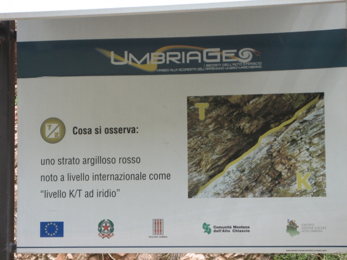
Where did the impact occur?
Other evidence of an extraterrestrial impact from the Cretaceous/Tertiary boundary rocks includes tektites, which are glassy spherules of melt ejected from the crater, and shocked quartz, a form of high-pressure quartz only found at other known meteorite impact craters on Earth. The photo below shows tektites from the K/T boundary in Haiti.
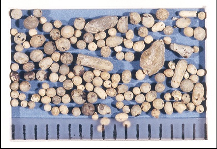
Tektites and shocked quartz are found in K/T boundary rocks all over the Earth, but the concentrations of them in rocks around the Gulf of Mexico narrowed the search for the crater to that area. Calculations based on the amount of iridium in the boundary clay gave scientists an estimate of the size of the crater they were looking for. About 15 years ago scientists "found" the Chicxulub crater in the Yucatan peninsula and began a drilling project there to date the crater. I wrote "found" in quotation marks because this crater's existence was known in the oil industry for some time, but the idea that it could be the K/T crater was not thought of until the early 1990s. The 1992 Swisher et al. paper in Science that we will read as part of the reading assignment for this section of this lesson details the age-dating of this crater and other evidence to support Chicxulub as the site of the K/T impact.
Do all scientists believe the impact theory?
Well, what would the fun of that be? The majority of Earth scientists do agree with the Alvarez impact hypothesis because so many lines of evidence support it. However, there are some other fairly catastrophic events that happened on the planet at about 65 Ma, making for an odd coincidence at the very least. For example, the flood basalts of the Deccan Traps in India spewed out at about 65 million years ago. Such extensive volcanism would no doubt have altered the climate seriously. Would that have been enough to cause a mass extinction event? Plenty of geologists think so. It is safe to say a significant number of geologists who work in this field think that there was a sequence of events that led to the end-Cretaceous extinction event, with the asteroid impact being one of them.
The K/T Extinction Reading Assignment
My suggestion is to read through the press releases and summaries first because they are intended for a more general audience. Then read/skim the scientific papers, which have been written for experts. Note the different writing styles and differing amounts of technical jargon in the different papers! I have posted some discussion questions you might want to look at first help guide your thinking, so you are ready to discuss.
We will discuss these papers together via a discussion in Canvas. This discussion will take place over the second week of this lesson.
Reading + Discussion Assignment
Directions
- Read the following press releases and summaries, which are available in Canvas. You will see that there is a set of questions, below, to guide your thinking as you read.
- "Why we can’t get over the death of the dinosaurs" (2019). Nature, 568, 143.
- Burgess, S. (2019). Deciphering mass extinction triggers. Science, 363, 815-816.
- Preston, D. (2019). "The Day the Dinosaurs Died". The New Yorker.
- Read the following papers, which are available linked from Canvas:
- DePalma, R.A., J. Smit, D. A. Burnham, K. Kuiper, P. L. Manning, A. Oleinik, P. Larson, F. J. Maurrasse, J. Vellekoop, M. A. Richards, L. Gurche, and W. Alvarez (2019). A seismically induced onshore surge deposit at the KPg boundary, North Dakota. Proceedings of the National Academy of Sciences of the United States of America, 116, 8190-8199.
- Schoene, B., M. P. Eddy, K. M. Samperton, C. B. Keller, G. Keller, T. Adatte, S. F. R. Khadri. (2019). U-Pb constraints on pulsed eruption of the Deccan Traps across the end-Cretaceous mass extinction. Science 363, 862–866.
- Sprain, C. J., P. R. Renne, L. Vanderkluysen, K. Pande, S. Self, T. Mittal.(2019). The eruptive tempo of Deccan volcanism in relation to the Cretaceous-Paleogene boundary. Science 363, 866–870.
- As you read, keep in mind these questions:
- What is the evidence supporting an extraterrestrial impact at the K-T boundary? Is there evidence against it? What are the other hypotheses?
- How does argon-argon dating work? How does U-Pb dating work? What are the advantages and disadvantages of each method?
- How can you summarize the controversy? What do you think is the next step in resolving the debate between these groups?
- Enter the L3 K/T Boundary Reading Discussion in CANVAS. You will see the questions above already there. I've organized this discussion as separate threads, each dealing with one question at a time to see where that leads us. Please participate by answering my question, responding to a classmate, asking another relevant question or furthering the discussion in another meaningful way
Grading rubric: Please see the rubric for discussions. [1]
Permian/Triassic Extinction
The Great Dying
Now we're going to begin thinking about a different, even more, catastrophic mass extinction event.
The Permian-Triassic extinction event marked the end of the Paleozoic era and the beginning of the Mesozoic era, which, in turn, was ended by the K/T mass extinction we just finished reading about.
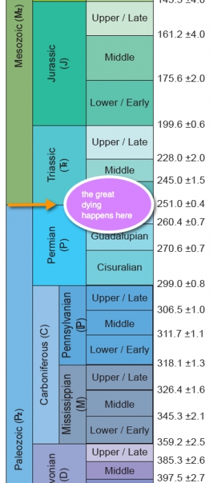
Approximately 250 million years ago, the biggest extinction event in the history of the Earth (in terms of the number of species that disappeared) took place at the end of the Permian period. This event marks the end of the Paleozoic era and the beginning of the Mesozoic era. The rise of reptiles, such as the dinosaurs, is most probably a direct outcome of these species flourishing in the ecological niches left by the end-Permian extinction event. Several theories have been proposed to explain the "Great Dying," but many of these lack global evidence to prove or disprove them, or they do not provide a kill mechanism that is quick enough or extensive enough. One of the difficulties in pinning down a kill mechanism is the dearth of well-preserved outcrops that record this time period in geologic history.
As you read the papers in our next activity that deal with the Permian/Triassic extinction, I want you to keep in mind the major difference between what the scientific community thinks about this extinction, as opposed to the Cretaceous/Tertiary extinction that we read about previously. In the case of the Cretaceous/Tertiary extinction, the impact hypothesis is widely believed and supported and has been for at least a decade. I can verify this because when I teach large-enrollment residential courses for non-science majors here at Penn State, the great majority of the class knows that "a meteor killed the dinosaurs." Usually, none of these same students have even heard of the Permian/Triassic extinction event, despite the fact that whatever happened on Earth at the end of the Permian was quite a bit more catastrophic. At the end of this section of the lesson, we will have a summary discussion so we can compare the story of two different extinction events and discuss why the explanation for one of them is apparently much less controversial than the other.
Watch this!
To see some 250-million-year old rocks, check out this video clip from NOVA [78] in which Neil deGrasse Tyson interviews several geologists who are hunting for answers about the end-Permian extinction out in the field and through computer models.
Penn State Research
Lee Kump, Dean of PSU's College of Earth and Mineral Sciences (we filmed this back when he was merely a professor in Penn State's Department of Geosciences), has been studying ancient climates based on the evidence left behind in marine sediments for most of his career. Watch this video below to see him explain some of his hypotheses about the end-Permian mass extinction and to hear more about his research.
Watch this!
Video: Interview with Lee Kump - Part One (5:37)
DR. LEE KUMP: I'm Lee Kump. I'm a professor of earth sciences at Penn State and a paleoceanographer. Paleoceanographer is kind of strange term. I'm a person who studies ancient oceans. And this is something I came to as a graduate student. I was always interested in the oceans, and my graduate training is in oceanography. But my undergraduate work was in geology. So I had these dual interests of the oceans and the geologic record, and I was looking for something that would bring these two things together, and I found paleoceanography.
So it's a study of ancient oceans, looking at their record as they are preserved in sedimentary rocks. So I study intervals of Earth history that are particularly interesting, we look for rocks that are of that age, we investigate them, and then we try to put that in the context of how the oceans, and the atmosphere, operated as a system, and how they might have behaved during these interesting intervals.
So we're focusing on a particularly interesting and controversial interval of Earth history. It's the end-Permian mass extinction. So this was an interval, a brief interval, of geologic history some 250 million years ago, that represents the largest mass extinction of all time. It's estimated that as much as 95-99% of all species on the planet went extinct during this interval of time. And so it's a major event in the history of the planet. And it's an extraordinary event. And so we're certain that it was the result of very extraordinary causes.
There have been a number of hypotheses that have been proposed, including asteroid impacts, massive volcanic eruptions. We've been focusing on the state of the ocean at this interval of time because there's good evidence that the ocean then, was very different than what it is today. Today, if we were to go down in a submarine, and go down into the deep ocean, we'd find an environment that was cold and was oxygen-rich. And so it's an environment that supports diverse types of life that are like ourselves, needy of an oxygen-rich environment.
When we look at the evidence from the Permian ocean, we find out that the deep ocean was much warmer than it is today, and it was devoid of oxygen. And so it was a very different, sort of hostile world, from the perspective of animal life. And what's really unusual about the evidence for the Permian ocean is that it wasn't only free of oxygen, but it had a poisonous mixture of hydrogen sulfide and carbon dioxide that would have been instantly fatal to any organism like ourselves, like fish, or even marine plants like algae, exposed to that ocean.
What we're investigating is the possibility that this poisonous ocean of the late Permian migrated from not just being in the depths of the ocean, but migrated up toward the surface and poisoned all the life at the surface. And, just as importantly, as this hydrogen sulfide rose to the surface it, as a gas, escaped into the atmosphere. I think we're all familiar with hydrogen sulfide. It's that characteristic smell of rotten eggs. What we think happened at the end of the Permian, is that this poisonous ocean rose to the surface. Hydrogen sulfide, as a gas, escaped into the atmosphere and wafted up onto the continents in big clouds of poisonous gas wiping out life on land.
One of the great mysteries of the Permian extinction is that it was a mass extinction not just in the oceans, but on land. And so we're looking for some connection that links the ocean extinction to the land extension. We began studying the Permian ocean, came to realize that it had this toxic mixture, and then with some simple modeling-- computer modeling calculations, found out that that hydrogen sulfide could escape to the atmosphere and create toxic conditions in the atmosphere as well.
So this is, of course, quite controversial. There is some evidence for it, but not overly convincing evidence. And other people have their own pet theories about what c caused this. We've had quite vigorous arguments at national meetings about this issue. One idea is that the buildup of hydrogen sulfide in the atmosphere, this is our particular idea, would lead to chemical reactions that would destroy the ozone layer. And we've demonstrated that with a computer model.
Other people link to that event to massive volcanism. And so there are these interesting clues from the geologic record that the environment was quite different. And one thing that we know, and the dating now of those rocks as has demonstrated pretty much beyond the shadow of a doubt, at the same time the organisms were dying all over the planet, massive volcanoes were erupting in Siberia. These are called the Siberian Traps, and there are still voluminous basaltic rocks that have been preserved on the Siberian plateau that were deposited at this instant in geologic time. So any theory for the cause of this mass extinction has to include those volcanoes. This is one of the most massive volcanic eruptions of all time.
Video: Interview with Lee Kump - Part Two (6:44)
[MUSIC PLAYING] LEE KUMP: Well, the volcanologists, for a long time, argued that the volcano must have been the cause of the Permian extinction and environmental consequences resulting from this massive volcanic eruption. The oceanographers, the paleoceanographers, have been looking at the ocean. They see an anoxic ocean. They see evidence for hydrogen sulfide. That must have been the cause.
What we're trying to do, actually, with our computer models is to bring this all together, to synthesize these into a consistent story of environmental change. And remember, this is perhaps the singular event in earth history. This set the stage, in some regards, for the evolution of the dinosaurs. This was just before the dinosaurs. And perhaps the biotic change that happened at this time allowed the dinosaurs to take over during the ensuing Mesozoic.
And then, the asteroid hits, it wiped out the dinosaurs, and mammals evolved. And so there are these events in Earth history that seem to be critical to the path of evolution. So it's an important question. And a lot of people are working on it, and they're working on it from their own specialties and their own perspectives.
[MUSIC PLAYING]
One of the things that we do as geologists is to look for modern analogs-- places that we can go today that we think are like what the environment we're studying in the ancient rock record was like back then. And so our interests are, of course, these hydrogen sulfide-rich marine environments. And the most obvious place one could go to study that in the modern world is the Black Sea, but that's very inaccessible. Fortunately, here at Penn State, we have a lake nearby. It's actually near Syracuse, New York. But it's a lake that we think is much like what the Permian ocean was like back then.
It has a layer at the top of the lake that's well mixed and oxygenated. In fact, people swim there and fish there. It's a state park. But lurking down below this upper 60 feet of well-oxygenated water is a poisonous mixture of this hydrogen sulfide-rich water. And so we've been going there. We study this by going scuba diving, so we have divers who dive down into this environment, myself included, collecting samples, not just of the water, but of the organisms that live right at this interface between oxygen-rich water and hydrogen sulfide-rich water below.So we dive right to this interface. We don't spend much time below it, because it's poisonous and prolonged exposure to hydrogen sulfide-rich water can be fatal. So we dive down to this layer, maybe dip down just below to collect some samples very quickly, and we're looking at the chemistry of this water and the organisms that are living there. And we're looking for organisms in particular that produce compounds that we find in the rock record associated with the Permian mass extinction.
[MUSIC PLAYING]
So it turns out that organisms that live right at this interface between poisonous and non-poisonous water produce compounds that are preserved in sedimentary rocks for up to billions of years. And so we're looking at these modern organisms. We're extracting these chemical compounds from-- we're analyzing them and then we're comparing them as a fingerprint, as a sort of a chemical fossil, of what was living in the ocean at the time.
These organisms are bacteria. They don't leave fossils like we're used to thinking of, shells or bones. What they leave are distinctive organic compounds that we're trying to relate from the living organism to these ancient fossils. And once we can do that and we can look at their distribution in these modern environments, then we'll have a much better picture of the conditions in which they were thriving in this Permian ocean.
[MUSIC PLAYING]
One of the other interesting things about this interval of time is that the oceans became very similar to what we think they were billions of years ago. And so the Permian, 250 million years ago, was a time period in which the oceans were transformed into what we think the oceans were like a billion years ago. And we know that a billion years ago, the types of organisms that thrived in this poisonous, oxygen-free environment, generated a type of rock that is known as a stromatolite. And in fact, this is a stromatolite here.
It's a layered rock that forms. This is a cross-section through one. If you could imagine what this would look like, it would be like a head of cabbage. And its layer upon layer upon layer of a bacteria that are growing up off the seafloor forming a mound. It's called a stromatolite.
And in this case, this rock has been truncated as we can see the inner laminations of this. This is formed entirely by bacteria, and it forms in environments today in very extreme environments, but it was much more abundant in the distant geological past such as in the Precambrian.
What we find out is that right after the Permian extinction, stromatolites come back. So there's a reappearance of this very ancient life form-- something that we usually associate with the Precambrian billions of years ago. At the end of the Permian, right after the mass extinction, these bacterial communities come back and thrive.
And so this is another piece of evidence that the Permian ocean became such an inhospitable place for advanced life forms that it reverted back to an earlier state that we think was more associated with the Precambrian in which bacteria thrived.
[MUSIC PLAYING]
In addition, here is a press release about Lee's hydrogen sulfide hypothesis:
- "Hydrogen Sulfide, Not Carbon Dioxide, May Have Caused Largest Mass Extinction [80]," ScienceDaily (Nov. 5, 2003)
Here's the citation for the scientific paper:
- Kump, L.R., A. Pavlov, and M.A. Arthur, 2005, Massive release of hydrogen sulfide to the surface ocean and atmosphere during intervals of oceanic anoxia, Geology 33, 397–400.
Exploring a Controversial Theory
In this next activity, we'll concentrate on the relatively new and controversial theory that an asteroid impact caused the Permian/Triassic extinction event. By doing this, I admit that I'm deliberately not spending time on the other theories that have more adherents, such as the theories that Lee talked about in the video on the previous page. First, I want us to talk about impacts, in general, this week. Second, this gives us a way to compare what the state-of-the-art thinking is with respect to extraterrestrial impacts for the Permian/Triassic extinction while the evidence for an impact at the K/T boundary is still fresh in our minds.
Fall 2019: We will not discuss the papers below as part of a graded discussion. Please do skim them because some of the knowledge you get from them will help inform you when you work on the impact craters problem set. I alternate between discussing the K/T and the P/Tr papers each time I teach this class. So the assignment below is just for reading, this time, not discussing.
Reading Assignment
Directions
- I have divided up the relevant reading material for this activity into two sets. Each set contains one scientific paper, as well as press releases, summaries, and/or comments from other scientists that are directly related to that paper. First, find your teams and then read each of the popular press articles and each scientific paper designated for your team. You will see that there are specific questions that go along with each set of readings, which you will be addressing in the discussion component of this activity. I want you to know the arguments the authors make without getting bogged down by technical details. I suggest keeping track of terminology or technical details that are confusing to you and post them to your team's discussion board. This looks like a lot of reading at first glance, but the articles aren't too long. You will engage in a team discussion of your team's set of papers in the "Lesson 3 - Permian/Triassic Extinction" team discussion forums. (See "Submitting your work" below)
- Next, skim the discussions that went on in the other team's forum so that you are acquainted with all of the reading material. You can ask them questions if there's something you don't get!
-
Then, engage in a class discussion of these hypotheses, which will take place in the "Lesson 3 - Permian/Triassic Extinction" class discussion forum. (See "Submitting your work," below.)
Special note to Group-Work-Haters: I am dividing you up in teams because I have assigned more reading than I think each of you can be expected to process on your own. So, each of you only has to read half of it. Therefore, the job of the group discussion is to clarify your thinking about the papers and also to provide an overview to the other team, through your discussion, of the content of the papers you read.
Team 1
- SCIENTIFIC PAPER - Becker, L., Poreda, R. J., Hunt, A. G., Bunch, T. E., & Rampino, M. (2001). Impact event at the Permian-Triassic boundary; evidence from extraterrestrial noble gases in fullerenes. Science, 291(5508), 1530–1533.
- PRESS RELEASE - Kerr, R. A. (2001). Whiff of gas points to impact mass extinction. Science, 291(5508), 1469–1470.
- Farley, K. A., Mukhopadhyay, S., Isozaki, Y., Becker, L., & Poreda, R. J. (2001). An Extraterrestrial Impact at the Permian-Triassic Boundary? Science, 293(5539), 2343a. doi: 10.1126/science.293.5539.2343a.
QUESTIONS:
- What's a fullerene and what's the connection between fullerenes and an extraterrestrial impactor?
- Evidence for an impact is different in this case than for the K/T boundary impact. How and why?
- How is the size of the asteroid estimated from the He data? Could you follow the logic here?
- What are the objections raised by Farley and Isozaki? How does Becker's group reply to the objections? Which do you find more compelling? What should be done next to try to settle this debate?
Team 2
- SCIENTIFIC PAPER - Becker, L., Poreda, R. J., Basu, A. R., Pope, K. O., Harrison, T. M., Nicholson, C., et al. (2004). Bedout; a possible end-Permian impact crater offshore of northwestern Australia. Science, 304(5676), 1469–1476.
- PRESS RELEASE - Science and Technology: Bang and blame; The end of the Permian. (2004).The Economist,371(8375), 89.
- Wignall, P., Thomas, B., Willink, R., Watling, J., & al, E. (2004). Is Bedout an Impact Crater? Take 1/Response. Science, 306(5696), 609.
- Renne, P. R., Melosh, H. J., Farley, K. A., Reimold, W. U., et al. (2004). Is Bedout an Impact Crater? Take 2/Response. Science, 306(5696), 610.
- Glikson, A. (2004). Comment on "Bedout: A Possible End-Permian Impact Crater Offshore of Northwestern Australia". Science, 306(5696), 613b. doi: 10.1126/science.1100404.
- Becker, L., Poreda, R. J., Basu, A. R., Pope, K. O., Harrison, T. M., Nicholson, C., et al. (2004). Response to Comment on "Bedout: A Possible End-Permian Impact Crater Offshore of Northwestern Australia". Science, 306(5696), 613c. doi: 10.1126/science.1103906.
- Dalton, R. (2004). Comet impact theory faces repeat analysis. Nature, 431(7012), 1027.
QUESTIONS:
- Assuming that Becker's arguments are true about the P/Tr extinction having been caused by an impact, what is the evidence in favor of Bedout as the crater location for that impact?
- What is the evidence against Bedout as the crater location for the end-Permian extinction?
- What parts of this story of the hunt for the crater are similar to the Chicxulub story and what parts are different?
Class discussion
QUESTIONS:
- Why do you think the impact theory is popular for the K/T extinction but not for the P/T?
- The previous lesson in this course dealt with a controversy that involved both science and public policy because it concerned hazard mitigation. In this case, the debate is really just scientific. (i.e., nobody on this planet faces some immediate danger if we can't pin down a kill mechanism for the P/T extinction). Does that fact change the way you approach your thinking about it? Does it seem like it changes the way the scientists who wrote these articles approach it?
Submitting your work
You will need to participate multiple times during the discussions.
- Enter your team's forum of the "Lesson 3 - Permian/Triassic Extinction" team discussion forums (there is one for each reading set).
- You will see the discussion questions posted there.
- Respond to one question that hasn't already been chosen by another student. If all questions have already been addressed, then select a question where you can further the discussion and post there.
- Return to the discussion periodically to read your classmates postings and to respond by asking for clarification, asking a follow-up question, expanding on what has already been said, etc. week 2 of this lesson
- After the team discussion period ends, read the discussion threads in the other team's forum. If you can't get the gist of the articles they read, ask them some questions until you have a clearer picture.
- Enter the "Lesson 3 - Permian/Triassic Extinction" class discussion forum.
- Repeat steps 2-4 above. week 3 of this lesson
Grading criteria: Fall 2019 remember that this is not a graded assignment, just read on your own.
You will be graded on the quality of your participation, both in your team discussion and in the discussion involving the whole class. See the grading rubric [1] for specifics on how this assignment will be graded.
Optional further reading
The articles below are press releases that accompanied scientific papers that detail other theories for the end-Permian extinction event. Check them out:
- "New Evidence Indicates Biggest Extinction Wasn't Caused By Asteroid Or Comet [81]," ScienceDaily (Jan. 23, 2005)
- "Hydrogen Sulfide, Not Carbon Dioxide, May Have Caused Largest Mass Extinction [80]," ScienceDaily (Nov. 5, 2003)
- "Global Warming Led To Atmospheric Hydrogen Sulfide And Permian Extinction [82]," ScienceDaily (Mar. 1, 2005)
- "Volcanic Eruptions And Global Warming Likely Cause Of Great Dying 250 Million Years Ago [83]," ScienceDaily (Oct. 25, 2007)
- "Mass Extinction's Cause: 'Sick Earth' [84] ," ScienceDaily (Oct. 21, 2006)
- "When Bivalves Ruled The World [85]," ScienceDaily (Sep. 1, 2007)
Correlating Impacts and Extinctions
In this activity, you will explore the relationship between known impact events and sudden extinctions on Earth. Want to see a hand sample from an impact crater? Here is a piece of rock from the Vredefort structure in South Africa. The Vredefort is so big that you can't even see across it. The extreme heat of impact created glassy flow bands in the rocks of the crater ring. That's the black part in the photo. It's a little easier to see in the outcrop scale, but it's still cool!
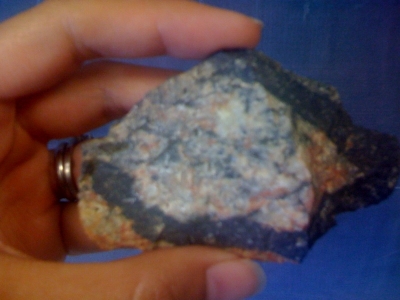
The world map shown in this screencast comes from the impact crater database [86] maintained by the University of New Brunswick's Planetary and Space Science Centre. It shows the locations of known impact crater sites (noted as white dots on the map). In this screencast, I explain the map in more detail [87]. You can also read a transcript of my discussion of the map [88].
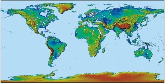
As discussed in the screencast, it is instructive to see where craters are and are not found on Earth. For example, craters are conspicuously absent from the oceans, Antarctica, Greenland, the Amazon river basin, central Africa, and Indonesia. Is this real (i.e., is there a scientific reason why asteroids or comets would fall to Earth in certain locations?) or is this an artifact? The reason why craters are not found uniformly over the globe is a result of preferential preservation in some places and also some places on the planet are not as easy to get to, thus potential impact sites have not been explored there.
In the case of the oceans, plate tectonic activity means that the oldest ocean crust dates from the Jurassic, so no impacts older than that could be found there. In addition, oceanic crust is quite thin and not conducive to preserving evidence of an impact.
Impact Craters problem set
Frame 1 - Man: I used to think correlation implied causation.
Frame 2 - Man: Then I took a statistics class. Now I don't.
Frame 3 - Woman: Sounds like the class helped. Man: Well, maybe.
Directions
For this problem set, create your own document instead of downloading a worksheet.
- On the geologic timescale you constructed earlier in the lesson (see "Antipodes and geologic time"), mark the known impact structures in the PASSC database [90] according to their ages. To avoid monumental clutter, remove the class member data from your timescale and don't try to write the name of each crater on your timescale. I do want you to create a visual representation of how often the Earth has been hit by objects of various sizes, so use five different symbols or colors to represent the following crater diameter ranges:
- <0.09 km
- 0.1–0.9 km
- 1–9 km
- 10–99 km
- 100+ km
- Now mark the "big five" extinction events on the timescale. Use a different symbol or color than any of the five from #1 above. (Make sure to include a key on your timescale.) These events are:
- end-Ordovician (444 Ma)
- late Devonian (385 Ma)
- end-Permian (251 Ma)
- end-Triassic (200 Ma)
- end-Cretaceous (65 Ma)
- Make a scatterplot of crater diameter vs. crater age. [On the PASSC database, they used to have a 3-column table with name, age, and diameter of craters and you could sort the table on any of those categories. I don't really know whey they abandoned this way of displaying their data. Right now it takes a lot of extra work to make a table from which to make a simple scatter plot. I have done the sorting and organizing for you on this one. Choose the file format that works best for you. Let me know if you'd like a different format and I'll see what I can do.These data are current as of February 2016.] Impact Crater data in .csv [91] or Impact Crater data in .xlsx [92] or Impact Crater data in .pdf [93]
- Where is the biggest known impact crater on the planet and how old is it?
- Why are there more impacts in the database the closer we get to the present time?
- How old is the oldest crater with a diameter less than 1 km? Why aren’t there any older craters of this size or smaller?
- According to this database, about how often does the Earth get struck by an extraterrestrial object that makes a crater as large as the one found at Chicxulub? What bearing does this have on the debate between Keller's group and the other groups? (Note: If you aren’t clear what debate I’m referring to, then reread the article from The Economist called “Making an End of It”)
- How well do the "big five" extinction events correlate with known impacts? Specifically, does this database support the Becker group's idea that the P/T extinction is impact-related?
- Let the following be my hypothesis: All impact craters with a diameter greater than 100km must have caused an extinction event. Can this hypothesis be proven true, or proven false, or not even usefully tested with this database? Explain.
- We are going to read a paper that deals with how life on the Earth recovers from a mass-extinction event next. See Figure 1 [94] from this paper. You will see that apart from the "big five" extinction events, the Earth has undergone several smaller-sized extinctions and originations of life over the past 500 million years. Do any of these smaller extinctions coincide with impacts?
- Find the maximum innocuous crater size from this database. What I mean is, what is the largest crater since the beginning of the Cambrian that has no extinction event associated with it in time?
- One of the main points of this problem set is to explore the relationship between correlation and causality. Explain briefly what that relationship is and use a real-world example (doesn’t have to be from this problem set) to illustrate your point.
Submitting your work
Your completed problem set should include your timescale, your scatter plot of crater diameter vs. age and answers to the follow-up questions. Save an electronic version of your work in the following format:
Impactcraters_AccessAccountID_LastName.doc (or .yourFileExtension).
For example, Cardinal relief pitcher Tyler Lyons' file would be named "Impactcraters_twl70_lyons.doc"
Upload your document to the Impact craters problem set assignment in Canvas by the end of week 3 of this lesson.
Grading rubric
I'll use my to grade this assignment. [47]
Recovering From an Extinction
How did the mass extinction events of the past change the trajectory of evolution on Earth? How much do human beings impact the future of biodiversity on the planet? In the following reading assignment, we'll explore these topics.
Reading assignment
Read the following articles:
- University of California at Berkeley. (2000, March 29). New Study Suggests Humans Will Not Live Long Enough To See Earth Recover From A Mass Extinction [95]. Retrieved May 30, 2008, from http://www.sciencedaily.com/releases/2000/03/000329080536.htm.
- Erwin, D. (2000). Life's downs and ups. [96] Nature, 404(6774), 129.
- Kirchner, J. W., & Weil, A. (2000). Delayed biological recovery from extinctions throughout the fossil record [97]. Nature, 404(6774), 177.
As you read these articles, think about these questions:
- What is meant by "biological recovery" (i.e., after a mass extinction, how do scientists measure the quantity and quality of life on Earth)?
- Think about how humans interact with the biosphere. Is there evidence that we are causing changes that are beyond fixing? How do the timescales for recovery compare with various human-induced changes to biodiversity?
- I find it interesting to think about what the Earth would be like if there had not been mass extinction events in the past. Would hominids have evolved at all? Does our existence now preclude the evolution of some smarter creatures that could have sprung up instead of us?
Tell me about it!
Feel like sharing your thoughts? Use the Questions? discussion forum to do so!
Teaching and Learning About Mass Extinctions
Let's take some time to reflect on what we've covered in this lesson!
Teaching/Learning Discussion Activity
Directions
For this activity, I want you to reflect on what we've covered in this lesson and to consider how you might adapt these materials to your own classroom. Since this is a discussion activity, you will need to enter the discussion forum more than once in order to read and respond to others' postings. This discussion is scheduled to run during the last week of this lesson.
Submitting your work
- Enter the "Teaching and Learning About Mass Extinctions" discussion forum
- Post your thoughts about and reflections on this lesson. What content was new? What science skills did you think I was trying to emphasize? What are some of the ways you teach these skills?
- Read postings by other EARTH 501 students, too, and respond to at least one other posting by asking for clarification, asking a follow-up question, expanding on what has already been said, etc.
Grading criteria
You will be graded on the quality of your participation. Please see the rubric for teaching/learning discussions. [1]
Additional Resources
Resources on the web:
Keeping an Eye on Space Rocks [98]: this is an interactive flash movie made by Caltech's JPL about monitoring asteroids and comets close to Earth.
Map Tunneling Tool [99]: this is an interactive web site that helps you locate the antipode of any point on Earth.
Further reading about other extinctions and impacts
Check out these readings if you are interested in other extinction events and/or other impact events. Note: I didn't put any of these readings in our course reserves, but as a PSU student you have access to the PSU libraries, which contain all of these articles. To find out how to get access to them, see Online Students Use of the Library [100].
Mammoth extinction (13 ka)
- Dalton, 2007, Blast in the Past?, Nature, 447, 256–7.
- "It came like yesterday", The Economist, 24 May 2007.
Popigai, Siberia crater (35.7 Ma)
- Bottomley et al., 1997. The age of the Popigai impact event and its relation to events at the Eocene/Oligocene boundary, Nature 388, 365–368.
- Stöffler and Claeys, 1997. Earth rocked by combination punch, Nature 388, 331–332.
End of Triassic extinction (206 mya)
- Bice et al., 1992, Shocked Quartz at the Triassic-Jurassic Boundary in Italy, Science, 255, 443–446.
- "The Big Heat", The Economist, 26 Aug 1999.
- McElwain et al., 1999. Fossil Plants and Global Warming at the Triassic-Jurassic Boundary, Science 285, p. 1386–90.
- Marzoli et al., 1999. Extensive 200-Million-Year-Old Continental Flood Basalts of the Central Atlantic Magmatic Province Science 284, 616–618.
More Permian/Triassic extinction (250 mya)
- Kaiho, K., et al. (2001). End-Permian catastrophe by a bolide impact; evidence of a gigantic release of sulfur from the mantle. Geology, 29(9), 815–818.
- Geological Society of America. (2001, August 28). Permian Extraterrestrial Impact Caused Largest Mass Extinction On Earth [101]. ScienceDaily. Retrieved May 30, 2008, from http://www.sciencedaily.com/releases/2001/08/010828075843.htm.
- Koeberl, C., Gilmour, I., Reimold, W. U., Claeys, P., & Ivanov, B. (2002). End-Permian catastrophe by bolide impact: Evidence of a gigantic release of sulfur from the mantle: Comment and Reply: COMMENT. Geology, 30(9), 855–856. doi: 10.1130/0091-7613(2002)030<0855:EPCBBI>2.0.CO;2.
- Kaiho, K., Kajiwara, Y., & Miura, Y. (2002). End-Permian catastrophe by bolide impact: Evidence of a gigantic release of sulfur from the mantle: Comment and Reply: REPLY. Geology, 30(9), 856. doi: 10.1130/0091-7613(2002)030<0856:>2.0.CO;2.
"Verneshots"
- Phipps Morgan et al., 2004. Contemporaneous mass extinctions, continental flood basalts, and ‘impact signals’: are mantle plume-induced lithospheric gas explosions the causal link? Earth Plan Sci Lett, 217, 263–284.
Extinction recoveries
- Payne, et al., 2004, Large Perturbations of the Carbon Cycle During Recovery from the End-Permian Extinction, Science 305, 506–509.
Asteroid 2008 TC3, which hit the Earth in October 2008
- Kwok, R. 2009, The Rock that Fell to Earth, Nature 458, 401-403.
Tell me about it!
Have another reading or Web site on these topics that you have found useful? Share it in the Questions? discussion forum!
Summary and Final Tasks
In this lesson, we briefly covered the construction of the geologic timescale and discussed two of the five great mass extinction events that happened since life began on the planet. These topics are controversial in two important ways. First, scientists still argue about the exact cause of mass extinction events on Earth. Impacts have been invoked for both of the two we discussed but it is interesting how much contention there is, especially for the Permian/Triassic extinction. Second, anytime biology and geology meet, the subject of the age of the Earth and the processes of evolution and natural selection naturally come up. These are not scientifically controversial topics but are often represented that way by nonscientists.
Reminder—Review the Lesson 3 Overview
You have reached the end of Lesson 3! Double-check the list of requirements on the Lesson 3 Overview page to make sure you have completed all of the activities listed there.
Lesson 4: Is the New Madrid Seismic Zone at Risk for a Large Earthquake?
Overview
The map below is a seismic hazard map of the continental United States produced by the USGS. The red bull's eye covering the bootheel of Missouri is the New Madrid Seismic Zone. In this lesson, we will learn about the 1811-12 earthquake sequence in the New Madrid Seismic Zone and discuss the controversy regarding the extent of seismic risk in the central United States today. We will learn how to estimate earthquake recurrence interval using a variety of methods.
Video: USGS Seismic Hazard Maps Explained (1:05)
PRESENTER: This is a seismic hazard map of the continental US produced by the US Geological Survey. There's two types of data that go into making a map like this. And one is knowledge of where earthquakes happen. The second is knowledge of how far away you can feel shaking from any given earthquake. How far away you can feel shaking is a function of both the size of the earthquake and also some characteristics of the rocks in that area of the country.
Now, the colors denote the level of horizontal shaking that is calculated to have a 1 in 50 chance of being exceeded in a 50-year period. And the colors are all percentages of little g, where little g is 9.8 meters per second squared.
So for the next three weeks, we will explore why the [INAUDIBLE] seismic zone, which is right here, has a color that is just as high as the West Coast of the United States over here. So this is far away from a plate boundary. Why is the seismic hazard so high there?
About Lesson 4
Most people on the West Coast of the United States who live near faults or volcanoes (or both) are somewhat familiar with the risks involved with these phenomena. Far fewer East Coast dwellers have felt an earthquake. However, the central U.S. is actually fairly seismically active for a continental interior. This region has experienced large earthquakes in the past and these may happen again. How should residents of this area plan for a potential earthquake hazard? In this lesson, we will explore intraplate seismicity and the New Madrid region in particular. We'll use seismic catalogs to estimate earthquake recurrence interval and we'll discuss the scientific controversy surrounding the potential for large earthquakes in this region.
What will we learn in Lesson 4?
By the end of Lesson 4 you should be able to:
- Describe the cyclical process of strain accumulation, earthquake generation, and post-seismic relaxation along plate boundaries.
- Define "recurrence interval."
- Explain ways in which recurrence interval is estimated for a given fault, and compare the inherent uncertainties with each method.
- Explain the basic mathematical and physical tenets of plate tectonics.
- Summarize various hypotheses for the existence of seismicity away from plate boundaries.
- Describe the 1811–1812 sequence of large events on the New Madrid Seismic Zone and explain how scientists have determined the properties of these events.
- Describe potential hazards/consequences of a sequence similar to the 1811–1812 sequence occurring today.
- Construct a frequency-magnitude plot using earthquake catalog data
- Compare frequency-magnitude diagrams for intraplate regions, plate boundary regions, and global datasets
- Extrapolate from a frequency-magnitude diagram to estimate an earthquake recurrence interval
- Analyze a collection of various datasets to compare their predictions of seismic hazard at New Madrid.
What is due for Lesson 4?
Lesson 4 will take three weeks to complete. 9 -29 Oct 2019. You will complete reading assignments by the end of the first week. You'll submit the data analyses at the end of the second week. The team reading and discussion assignments will take place over the second week. The whole class paper discussion and the teaching and learning discussion will take place during the third week. The fact sheet paper is due at the end of the third week. See the table below for complete details.
| Requirement | Submitted for Grading? | Due Date |
|---|---|---|
| Reading: "The Mississippi Valley Earthquakes of 1811 and 1812: Intensities, Ground Motion, and Magnitudes" | No | 15 Oct (end of 1st week) |
| Reading: "Earthquake hazard in the heart of the homeland" | No | 15 Oct (end of 1st week) |
| Reading: series of papers about glacial rebound, failed rift, and the Farallon slab. | No | 15 Oct (end of 1st week) |
| Problem set: Earthquake catalog data analyses | Yes - Submitted to "Earthquake catalog problem set" assignment in Canvas | 22 Oct (end of 2nd week) |
| Reading/Discussion: "Debating hazard at New Madrid" | Yes - Graded group discussion in Canvas | participation spanning 16 - 22 Oct (2nd week) |
| Reading/Discussion: "Debating hazard at New Madrid" | Yes - Graded whole-class discussion in Canvas | participation spanning 23 - 29 Oct (3rd week) |
| Paper: NMSZ Fact Sheet paper | Yes - Submitted to the "Fact Sheet Paper" assignment in Canvas | 29 Oct (end of 3rd week) |
| Discussion: "Teaching and Learning About Earthquakes" | Yes - graded whole class to the "Teaching and Learning About Earthquakes" discussion forum in Canvas | participation spanning 23 - 29 Oct (3rd week) |
Questions?
If you have any questions, please post them to our Questions? discussion forum (not e-mail). I will check that discussion forum daily to respond. While you are there, feel free to post your own responses if you, too, are able to help out a classmate.
The 1811-1812 New Madrid Earthquakes
Rumbling on the Reelfoot Fault
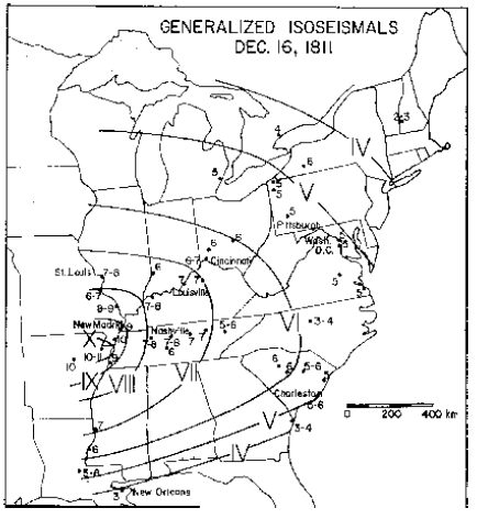
Video: Isoseismal Maps Explained (3:03)
PRESENTER: This is an isoseismal map from Otto Nuttli's paper about the 1811-1812 sequence of three earthquakes that happened in New Madrid. An isoseismal map is one in which similarly felt seismic intensities are contoured so that you can see how far away different intensities of shaking were felt from the epicenter of the earthquake. It helps you figure out where the epicenter probably was, and it helps you figure out what the magnitude probably was. So these kinds of maps are normally used when we don't have the instrumentation to actually have determined where the epicenter was or the magnitude with a seismometer.
In this case, the way Nuttli made this map is that he combed through old newspaper accounts of eyewitness reports of felt shaking from this earthquake, and then he put those on a scale of one to 12, one being hardly felt it at all or not at all, and 12 being absolute destruction, hell on Earth. So for example, near New Madrid, where the epicenter was, there are some reports of 10 to 11. Far away in New England, this earthquake was felt but at a much smaller intensity, so there's an intensity of two or three. Then after you collect a lot of this data and put it on a map, you can try to connect up similar intensities and, basically, you end up drawing rings of intensity around your epicenter.
So here is the contour for intensity 10, say. Out here is the contour that separates the fours from threes, and so on. One thing to notice from this map is that there weren't a lot of people west of the Mississippi, so all the rings kind of die out here at the Mississippi. That's the best we can do. These maps are actually still used today, but they're usually used for ground truthing, as best we can, historic earthquakes. For example, when the magnitude 5.8 earthquake happened in August of 2011, you could have logged into the USGS site, told them your zip code, told them how much shaking you thought you felt, and then they compiled the map. And this is the map they compiled that shows how much shaking there were in different places around the country.
So the folks in Richmond felt very strong shaking between intensity six and seven, estimated. And up into Canada, people felt this earthquake too. So of course, we know the actual magnitude in this earthquake because we have instrumentation now. We can calculate it. So what this is useful for is to take a map like this and, if you know you have historic earthquakes in this area, you can try to figure out how far away people felt that and then guess about what magnitude it probably was compared to where people felt it today where we do know what the magnitude was. So when you read Nuttli's paper, keep in mind how these isoseismal maps are made and how much detective work it takes to actually do this.
Please read this article describing the 1811–1812 New Madrid earthquake sequence, then proceed with the rest of the lesson.
Reading assignment
Nuttli, O. W. (1973). The Mississippi Valley Earthquakes of 1811 and 1812: Intensities, Ground Motion, and Magnitudes. Bulletin of the Seismological Society of America, 63(1), 227–248.
This paper was written by Otto Nuttli, a seismologist at Saint Louis University. He looked at many historical accounts of the 1811–1812 New Madrid earthquake sequence in order to describe the physics of these events with as much accuracy as possible. This is a technical paper, intended for an audience of other seismologists. I don't expect you to digest every detail of Nuttli's analysis.
Read these sections and their included figures: Abstract, Introduction, Intensity data, Discussion, Reflections.
Skim the following sections: Relations between intensity and ground motion, Magnitudes and ground motion of the 1811–1812 earthquakes, Appendix.
When you read this article try to answer or at least think about the following:- Why don't we know the exact magnitudes of these earthquakes?
- How many earthquakes were there?
- Where is the New Madrid Seismic Zone?
- Different magnitude scales are mentioned, such as MM, Ms, and Mb. What are these? Do you know how each one is measured?
- What's an isoseismal map?
- What is attenuation? What is important about attenuation with regard to these earthquakes?
Tell us about it!
What other questions do you have after reading this article? Post to the Questions discussion.
Today's Risk at New Madrid
What if the 1811–1812 sequence happened today?
Check this out!
This is a slick USGS-produced poster with an overview of historical earthquakes in the New Madrid Seismic Zone. For best viewing, you will want to download the file from the USGS so you can zoom in and read the text.
Before you proceed, please complete the following reading assignment. Then, in the next part of the lesson, we will discuss the scientific background necessary to appreciate why there is a scientific controversy over the level of seismic hazard in the central USA.
Reading assignment
Gomberg, J., & Schweig, E. (2002). Earthquake hazard in the heart of the homeland [104]. Fact Sheet - U. S. Geological Survey, 4.
This reading is a fact sheet published by the USGS [105]in 2002 that addresses the level of present-day earthquake hazard in the central USA. As you read, think about the following:
- Why does the USGS produce different seismic hazard maps for different probabilities and time periods? In practice, what does this mean to you when you look at a hazard map?
- On the hazard map shown on page 2 of the fact sheet, why is the central USA given a hazard rating as high as that for the San Andreas fault area in California?
- Why is paleoseismology important in determining the seismic hazard of a region?
- What are the probabilities of various sizes of earthquakes happening in given time periods? How were these numbers determined? (Can you tell from this fact sheet? Can you list everything you'd need to estimate or assume in order to make a probability prediction?)
Tell me about it!
If you have questions or comments, especially pertaining to the questions I have posed above, please post to the Questions discussion. There is nothing to submit for this assignment, but you will want to read this fact sheet thoughtfully because your final assignment for this lesson will be to rewrite and update it with new data.
Plate Tectonics and Intraplate Earthquakes
The theory of plate tectonics makes two mathematical assumptions:
- The Earth is a sphere.
- Plates are rigid, except at their boundaries.
In fact, the Earth is not a perfect sphere; it bulges at the equator a bit. The second assumption is also not quite true. If plates were perfectly rigid in their interiors, then earthquakes could only happen at plate boundaries. Nearly all earthquakes (98%+) do happen at the plate boundaries, but there are some anomalous events, called intraplate earthquakes, that happen far from the boundaries.
The map below shows earthquake locations around the world for a six-month period. Compare it to the plate boundary map below it and you will see that earthquakes roughly define the plate boundaries. Focus on the North American plate. It is bounded on the west at the edge of the continent and on the east by the Mid-Atlantic Ridge. The East Coast and the central United States are quite far away from any plate boundaries, yet you may notice a fair amount of seismicity locating there. Seismologists are interested in these earthquakes because plate tectonics doesn't explain their existence very well.
Video: Why Intraplate Seismicity (1:04)
PRESENTER: Appear on top is a map that I made with data from the National Earthquake Information Center. It's six months of global seismicity. And down here is a map of plate boundaries in the world.
I hope you'll agree with me that earthquake locations are pretty good at telling you where the plate boundaries are. But let's look at North America for a second. Down here on this map on the bottom, you'll see that there's a plate boundary on the western edge of North America. And then here is a plate boundary. This is the mid-Atlantic ridge. There's a little plate boundary down here.
But if you look up at the top, you'll see a lot of shallow seismicity that locates far away from any of those plate boundaries. Specifically, here's the new [INAUDIBLE] seismic zone right there.
Now, scientists are interested in intraplate earthquakes because the theory of plate tectonics doesn't really explain them very well. And the reading assignment further down this page will allow you to check out three different hypotheses for why these earthquakes happened.
Reading Assignment
Why do earthquakes happen in the center of the continent? Different scientists have different favorite explanations. Below are three scientific papers that each present a different hypothesis to explain why the New Madrid Seismic Zone is seismically active. I have also included three companion articles written for the popular press. For this activity, you will read the articles. You don't need to turn anything in, but you will want to internalize the main arguments of each hypothesis in order to include this information in your fact sheet paper (the culminating assignment for this lesson).
Directions
Read each of the following popular press articles and scientific papers. Keep track of any points made in the scientific papers that you don't understand so you can ask about them. There's no formal graded discussion of these papers, but feel free to post comments/questions in the Questions discussion forum. My suggestion is to read the companion popular press article in each set first so that you are already familiar with the main points of the hypothesis before tackling the scientific paper.
- Hypothesis I: Glacial rebound
- Do Old Glaciers Cause New Earthquakes In New Madrid, Missouri? [107] (26 March 2001).ScienceDaily. Retrieved April 22, 2008, from http://www.sciencedaily.com/releases/2001/03/010309080443.htm.
- Grollimund, B., & Zoback, M. D. (2001). Did deglaciation trigger intraplate seismicity in the New Madrid seismic zone? Geology, 29(2), 175–178.
- Hypothesis II: Mantle Convection
- Lloyd, Robin. Source of Major Quakes Discovered Beneath U.S. Heartland [108] (02 May 2007). LiveScience. Retrieved 09 September 2008 from http://www.livescience.com/environment/070502_newmadrid_quake.html
- Forte, A. M., Mitrovica, J. X., Moucha, R., Simmons, N. A., & Grand, S. P. (2007). Descent of the ancient Farallon slab drives localized mantle flow below the New Madrid seismic zone. Geophysical Research Letters, 34(4).
- Hypothesis III: Ancient Failed Rift (this one is probably the most popular)
- Johnston, A. C., & Kanter, L. R. (1990). Earthquakes in stable continental crust. Scientific American, 262(3), 42–49.
- Braile, L. W., Keller, G. R., Hinze, W. J., & Lidiak, E. G. (1982). An ancient rift complex and its relation to contemporary seismicity in the New Madrid seismic zone. Tectonics, 1(2), 225–237.
- What does the glacial rebound hypothesis predict regarding future seismicity at New Madrid? What about the other two hypotheses?
- What is the Farallon slab? Where did it come from? How do we know where it is? Why does it have an effect on the crust above it?
- What is a failed rift? Are there any places on the globe today where a rift might be failing?
- What is the evidence for and against each hypothesis? Could they all be true or do any of them exclude the possibilities of the others being correct? Which hypothesis seems most plausible to you and why?
- Can you suggest some studies that would help refine any of these three hypotheses or rule any of them out?
In the next part of this lesson, you will analyze seismic data and learn how to estimate earthquake recurrence times with seismicity catalogs. Then you'll read some scientific articles that detail the other ways recurrence intervals can be estimated. You will have to synthesize the uncertainties and limitations inherent with each method in order to get the complete picture of how earthquake risk is determined.
Earthquake Population Statistics and Recurrence Intervals
How many earthquakes?
Here is an important observation about earthquake populations worldwide: earthquakes of a given magnitude happen about 10 times as frequently as those one magnitude unit larger.
| Magnitude | Average Annually | How we know |
|---|---|---|
| 8 and higher | 1 | observations since 1900 |
| 7.0-7.9 | 15 | observations since 1900 |
| 6.0-6.9 | 134 | observations since 1990 |
| 5.0-5.9 | 1319 | observations since 1990 |
| 4.0-4.9 | 13,000 | estimated |
| 3.0-3.9 | 130,000 | estimated |
| 2.0-2.9 | 1,300,000 | estimated |
Annual earthquake population statistics compiled by the USGS [109].

Video: Earthquake Frequency-Magnitude Relationships Introduced (3:41)
PRESENTER: This data table comes from the USGS and it tells you how many earthquakes of a given magnitude happen on average every year all over the world. So you can see that there are way fewer really big earthquakes than small earthquakes, and that's a good thing.
I like to make a plot out of this data because I think it's more instructive to make a plot. So over here, I've already drawn my axes. This is magnitude on the x-axis, and this is number of earthquakes on the y-axis. And you can see that I've made a log scale plot here. So this is 10, this is 100 million up here.
Why don't we just plot this data from this table onto this and we'll see what it looks like? So how many earthquakes of eight and higher are there? Well, there's about one, and that is right about here on my plot. For magnitude seven, it's about 15. That's about here. For magnitude sixes, 134, that's about here. And fives, a little bit over 1,000. Magnitude fours, a little bit over 10,000. Magnitude threes, estimated to be a little over 130,000. Magnitude twos, estimated to be a little over a million.
Magnitude ones and anything smaller aren't in this table. But I bet we can just extrapolate it, can't we? Because if we connect up all these points, we have drawn a line. So I can extrapolate that magnitude ones are probably a little over 10 million, and magnitude zeros, anything smaller, is a little over a hundred million. Magnitude is a log scale, so it actually is meaningful to have a magnitude zero.
All right, so we've drawn this line. And when I was a kid in school, I learned that the formula for a line is y equals mx plus b. So why don't we write this formula in terms of what we know about this plot, all right? What's y? Well, y is the number of earthquakes as a log scale, right? So it's actually log of the number.
Slope. Slope is rise over run, right? So the rise is actually negative minus one unit on our plot, and the run is plus one unit on our plot. So that's a slope of negative 1. And x is magnitude. And the y-intercept is a little over 100 million. It's probably 130 million, right? That's how the numbers are going up. So we could just guess 130 million.
So the log-- log of the number of earthquakes equals negative 1 times the magnitude plus 130 million for the whole world for a year. Now who cares, right? Why why are we bothering to write this down? Well, the reason is that, in fact, you will verify in your problem set that this slope is always negative one. No matter what part of the world it is and no matter what the timescale is. The only thing that changes when you don't look at the whole world annually is that this y-intercept will change, right? Because if you look at, say, California, there's fewer earthquakes in California than the whole world, right?
But this line is basically always true. So if you want to predict how often a really big earthquake is going to happen, then it's important to keep track of how many small ones happen because then you can draw this line and guess how often the big ones happen. That's what you're going to do in your problems set.
Earthquake populations approximately follow this relationship:
log N = a - bM.
This is a power-law equation in which N is the number of earthquakes whose magnitude exceeds M and a and b are constants. For the majority of earthquake catalogs, the constant b is approximately equal to 1. When b≈ 1, this equation describes a line whose slope is about -1.
Seismologists can test the validity of the equation above using catalogs of earthquakes to make "frequency-magnitude diagrams." These diagrams show how many earthquakes of a given magnitude there are in a population of earthquakes.
A frequency-magnitude plot with real data! [110]You can also read a transcript of my discussion of a frequency-magnitude diagram [111] of a year's worth of earthquakes from around the world.
Now observe the plot below. For two separate catalogs of earthquakes that occurred in the New Madrid region, magnitude is plotted vs. the mean annual occurrence of earthquakes greater than or equal to a given magnitude. This plot is only different from the example plot above in that the N values on the y-axis have been normalized to one year. This is so two catalogs that span different lengths of time can be compared directly.
Video: Earthquake frequency-magnitude data for the NMSZ Explained (3:32)
PRESENTER: What do I see when I look at this plot? I see that we have magnitude on the x-axis and we have mean annual occurrence of earthquakes greater than or equal to some magnitude on the y-axis. So this means this plot is the same as the plot that we sketched earlier, showing how often earthquakes of different magnitudes happen.
But this data is not for the whole world. It's just for the New Madrid seismic zone. And there's two different data sets being plotted on top of each other here. So let's just look at those.
One is Otto Nuttli's catalog. And it spans 1816 through 1984. It might be a little hard to see, so I'll just draw over it. But it looks like this. It goes down here and there's some kind of jaggedy curves like that.
OK. The other catalog is the New Madrid Seismic Zone catalog. This is the digital catalog. And it's shorter. It only spans 24 years. It looks sort of like this.
Great. So the difference between these two catalogs is that one spans a lot longer in time. But since it isn't a digital catalog, it doesn't have as many small earthquakes in it. The other one has more small earthquakes, but isn't as long in time, so it doesn't have as many big earthquakes.
And neither of these looks exactly like the plot we sketched. Remember the plot we sketched looks sort of like this. We had magnitude here and log of the number here. And there was this perfect straight line.
And these don't have that perfect straight line. They tip over and kind of go flat at some point. But you can extrapolate if they did have a perfect straight line it would look like this.
So what this is saying is that earthquakes smaller than about magnitude 3 in the Nuttli catalog, or about magnitude 1 and 1/2 or so in the digital catalog, those earthquakes are there, but they're just not getting recorded. So when a plot like this flatlines, that's what it means.
At this end, it's not a pretty straight line. It's kind of jaggedy. That's just because the catalog is limited in time, so there's just not enough big earthquakes to really do useful statistics.
In order to get a recurrence interval, these researchers extrapolate from the part where they have data to the part where they don't. And they calculate these time intervals.
This is how often you can expect a magnitude 6 to happen in this region based on this earthquake data. Here's how often you can expect a magnitude 7. And here's how often you can expect a magnitude 8.
Now is a good time to point out that uncertainty in the magnitude of those historic earthquakes in 1811 and 1812 becomes uncertainty in calculating the recurrence interval, because it makes a big difference if you know you're trying to calculate how often a magnitude 7 is going to happen as opposed to how often a magnitude 8's going to happen, right? See how different these numbers are.
So there's kind of two big ways that you can have uncertainty in one of these calculations. One is just the limit of your catalog. The shorter your catalog is in time, the more you have to extrapolate from what you know to what you don't know. And the more uncertainty you have in the magnitude of the earthquake that you're looking for, like whether it's a 8 or an 8, the more uncertain you're going to be in calculating a recurrence time also.
Both of the curves in the plot above deviate from a straight line relationship log N = a - bM at small magnitudes. For the Nuttli Catalog, the line has a slope of about -1 at magnitudes greater than 3.5 and for the NMSZ catalog, the line has a slope of about -1 for approximately magnitude 1.5 and greater. Doesn't it look like in the Nuttli Catalog, there is the same number of magnitude 2 earthquakes every year as there are magnitude 3 earthquakes? But didn't we say that there should be ten times more magnitude 2's? What's going on?
Furthermore, how come there aren't any big earthquakes in this plot? The New Madrid Seismic Zone (NMSZ) catalog peters out at about magnitude 5 and the Nuttli Catalog doesn't have anything much over magnitude 6. But we know there have been big earthquakes in this region in the past, (or else why argue about seismic risk here), so where are they?
Limits of our observations
The answer to both of these problems is simply that any catalog of earthquakes is limited in two ways (pencast graphical explanation of observation limits [112]). The first way is that not every piece of the Earth has a seismometer sitting on it, therefore there will be some small earthquakes that don't get recorded, even though they happened. For most catalogs, some standard is applied with regard to how many seismometers have to record an earthquake in order to include it in the catalog. This is for quality control reasons. It is hard to locate an earthquake and calculate its origin time within acceptable error limits if not enough stations recorded it. Therefore, the farther apart the seismometers are, the fewer small earthquakes will end up being included in the catalog. For the Nuttli Catalog, we can say that the catalog is incomplete below the threshold of M ≈ 3.5 because that is where the slope of the line (or the "b-value") begins to deviate from -1. The threshold for the NMSZ catalog is lower. Why do you think this is?
The second way a catalog is limited is that it is finite in time. Let's say for a given region, magnitude 8 earthquakes happen once every 1,000 years or so. If your catalog only spans 10 years, how likely are you to have a magnitude 8 in your catalog? For that matter, how likely are you to have a magnitude 7 in your catalog? How many magnitude 6's can you expect in 10 years? In the plot above, the time ranges for both catalogs are listed on the plot. Why does the NMSZ catalog have a lower maximum magnitude than the Nuttli Catalog?
Calculating a recurrence interval from a seismic catalog
In order to assess seismic risk, we want to know how often a large earthquake happens in this region. How do we do that if our seismometers haven't ever recorded a big earthquake? We have to extrapolate using the data that we do have. Extrapolation is a tricky business because small uncertainties turn into huge uncertainties the farther away you get from what you've actually measured. For a catalog of seismicity, we rely on the assumption that the relationship log N = a - bM holds true overall magnitudes and times. We then extend our catalog data into the realm of the unknown and predict how often large magnitude earthquakes are expected. In the plot above from Newman et al., 1999, they use dashed lines to show their extrapolations. How often do they predict a magnitude 7 will happen in the NMSZ? What about a magnitude 8? What uncertainties do they associate with these predictions?
How to extrapolate seismic catalog data in order to calculate a recurrence interval! [113]You can also read a transcript of my explanation of extrapolating catalog data [114] to calculate a recurrence interval.
Earthquake Catalog Data Analysis Problem Set
For the following problem set, you will work with the seismicity catalog maintained by the University of Memphis for the New Madrid region in order to make your own frequency-magnitude diagrams and calculate a recurrence interval for a large earthquake at the NMSZ. You will also compare NMSZ data to seismicity catalogs for southern California and the world. The point of this comparison is that you will see that the overall shape of a frequency-magnitude diagram is scale-independent. It doesn't matter how big your regional area is, or how many years your catalog covers, the same basic -1 slope coupled to two sections on either end that deviate from -1 will always be there. What changes is the place on the diagram where the deviation occurs? Pay attention to this when you make your different plots.
Part 1: Get familiar with the NMSZ and its seismicity
Go to the New Madrid Earthquake Catalog Search. [115]
Once you get there, follow my directions to make a 1-year catalog of NMSZ seismicity:
Video: How to Make a 1-year Catalog of NMSZ Seismicity (2:18)
PRESENTER: So you've landed on the New Madrid Earthquake Catalog search page. And here's how we're going to get our first catalog of earthquakes out of here. First, I'm going to change the year to 2011, and then in this box, I'm going to change it to 2012. And you'll notice that this gives me a full year of earthquakes. It's actually not crucial that you pick the exact same year I did, but in this example, I'm just going to pick 2011.
I do want you to get a full year. So now in the magnitude range, we'll just leave this alone. The lat long box search, we are going to change these numbers around slightly from the defaults. The minimum latitude we're going to use is 34 degrees, and the maximum latitude we're going to use is 39 degrees. The minimum longitude we are going to use is negative 92 degrees. That's 92 degrees west. And the maximum longitude is going to be negative 87 degrees. So that's 87 degrees west.
Now, leave the radial search numbers alone, and we are ready to just click Begin Search. So now we pop up the catalog search results page. You can click here, and you'll see your catalog. You can go to the File menu and save the page as some plain text suitable for importing into your favorite plotting program.
You go back to the catalog search results page by clicking the Back button on your browser, you can also read a description of the catalog information which tells you what's in every column of your text file. And I also want you to generate a map. You can play around with all of these options on your own, but clicking generate map will generate a map of the catalog you've just made. Looks like this. I want you to save this map somewhere to your computer and paste it into your problem set for turning in later on. That's all there is to it.
Here is video above as plain text [116]
Create a word processing document (Microsoft Word, Macintosh Pages, Google Docs, or PDF) to record your work for this problem set.
On the worksheet, paste in your map of the 1-year catalog you made. Then answer the following questions:
1.1 How many earthquakes are in your catalog?
1.2 What is the largest magnitude earthquake in your catalog? How many earthquakes are there of this magnitude in your catalog?
1.3 What's the smallest magnitude earthquake in your catalog? How many earthquakes are there of this magnitude in your catalog?
1.4 Describe your map in a few sentences. (What part of the country is it? Are the earthquakes sprinkled randomly about or do they cluster in patterns? If the latter, describe what the patterns look like.)
Double-Check! Your worksheet should now have a map and answers to the Part 1 questions. If it does, you are ready to take on Part 2.
Part 2: Making frequency-magnitude plots of NMSZ seismicity
Make three different frequency-magnitude plots using the New Madrid Earthquake Catalog data: The first plot will use the one-year catalog you made in Part 1 of the problem set. In the second plot, you will add curves that correspond to a 10-year, 20-year, and 30-year catalog. The third plot will depict the same data as in the second plot, except that you will normalize all the catalogs to one year. Specific directions follow:
Plot 1: Make a frequency-magnitude plot using the one-year-long catalog that you just made in Part 1 of this problem set.
For this plot, all you need are the magnitudes, which are in column 7 of your plain text catalog file. Post to Questions if you need help isolating that column. My recommendation is to create a new file in whatever plotting/spreadsheet program you like and then you will type your counting statistics into this new file. In your new file, you want to create the values that will be on the x-axis of your plot. They will be magnitudes from your catalog's lowest to your catalog's highest in 0.1-unit bins. To create the values that will be on the y-axis of your plot, count how many earthquakes in your catalog are equal to or greater than each value of magnitude. These are your y-values: cumulative frequency. It's easier to count if you sort your magnitudes first, which is fine to do because we do not care what order they are in for this plot.
Then plot cumulative frequency vs. magnitude.
Use a logarithmic (base 10) scale for the y-axis or take the log of your cumulative frequency data and plot that on a linear axis. You can use a linear x-axis because magnitude is already a power of 10. [Is this confusing? Post to the Questions forum if you need help.]
If you are having trouble, see my example plot [117] for a one-year catalog of earthquakes in the New Madrid Seismic Zone (NMSZ). I used the year 1975, so this plot will not be precisely the same as yours, but it should look pretty close.
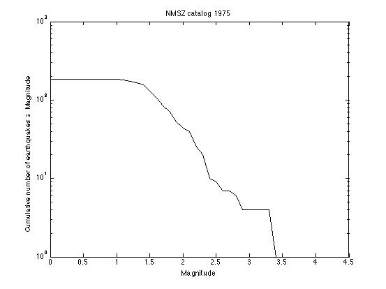
Plot 2: Make a plot that has four different frequency-magnitude curves on it.
Start with the plot you just made.
Go back to the New Madrid Earthquake Catalog and make a catalog for a ten-year time period (you can choose any ten-year period). Overlay the frequency-magnitude curve for this ten-year catalog onto the curve you made in the first plot.
Repeat for a twenty-year period.
Repeat for a thirty-year period.
You should now have one plot with four curves on it.
Make sure each curve is distinguishable (by color or linestyle) and labeled.
Plot 3: Make a plot that has four different normalized frequency-magnitude curves on it.
Start with the original one-year catalog plot you made.
Overlay the curve for the ten-year catalog, but normalize the curve to one year. This is accomplished by dividing each of your y-values by 10.
Repeat for the twenty-year catalog (divide y-values by 20)
Repeat for the thirty-year catalog (divide y-values by 30)
You should now have one plot with four curves on it.
Use the same distinguishing color or linestyle for each curve as you did in your second plot.
Dust off your worksheet from Part 1. On the worksheet, first paste your three plots into the worksheet, then answer the following questions:
2.1 Look at the first frequency-magnitude plot you made of the one-year catalog. Approximately what is the lower magnitude threshold for this catalog? (Follow your data from right to left and tell me at about what magnitude the line flattens out to having zero slope?)
2.2 Now look at the other two plots you made. Do the other curves show a significantly different lower magnitude threshold? From this observation, what do you conclude about the relationship between catalog timespan and lower magnitude sensitivity?
2.3 Look at the second plot you made. Describe the differences and similarities among the four curves in a few sentences. For example, are the curves of the same shape? Where are the x- and y-intercepts relative to each other? What makes the y-intercepts different? What causes the x-intercepts to be different?
2.4 Look at the second plot you made. Imagine having a catalog that spans 100 years. Using the four curves you made as a guide, extrapolate where the x and y intercepts would each be for a 100-year catalog. What is the largest earthquake you would expect for a 100-year catalog?
2.5 Look at the third plot you made. Extrapolate your curves and predict how often a magnitude 7 earthquake will occur in this region and how often a magnitude 8 will occur in this region. I want you to make a reasonable eyeball-fit. I am not asking you to calculate a best fit line. **If the answer is a fraction less than one, then you can take the reciprocal and predict how many years go by in between magnitude 7's and in between magnitude 8's.
2.6 You have just used frequency-magnitude relationships to predict a recurrence interval for a large New Madrid earthquake. Cool! What are the sources of uncertainty in the prediction you made in problem 2.5? (One way to realize just how much uncertainty there is in an extrapolation like this one is to try making several slightly different fits to the data that all look "pretty good" to you and see how different your final answers end up being.)
Double-Check! Now your worksheet should have the map and answers from Part 1 as well as three plots and answers for Part 2. Hang on to the worksheet and use it for Part 3.
Part 3: Comparing the NMSZ to Southern Cal and to the world
Plot: Southern California
Use the Southern California Earthquake Center Web site to make a seismicity catalog, map, and frequency-magnitude plot.
Go to the Southern California Earthquake Data Center's Earthquake Catalog Search [118] page.
Video: How to Make a One-Year Catalog of Seismicity (2:10)
PRESENTER: Here we are at the Southern California Earthquake Data Center catalog search page. What we're about to do is create a catalog that is the same length in time as our one year New Madrid catalog, and also covers the same latitude and longitude box area. So that way, we can really compare how active this area is in terms of number of earthquakes produced compared to New Madrid, because we'll be looking at the same size and length of time.
All right, so the catalog to search is this one. The output format default is fine. Let's make a one year catalog for the same year as we did before. So let's make it 2011, day one, month one. Like that.
We'll leave the magnitude and depth defaults alone. For latitude, let's change it to 33 and 38. And for longitude, we're going to change it to West 124 and West 119. I'm going to Shift Click to select local, regional, and teleseisms.
And I want to send this output to a file. So you're going to save this as plain text somewhere on your computer so that you can manipulate it to make a frequency magnitude plot later on. Let's get rid of that right now.
Now, I also want you to make a map. So in that case, what you do is go back up here to the output format, leaving everything else the same. And change the output to a Google map. Now you're going to want to output this to a web page. Submit request. Stare off into space while this thing happens.
And you have a map. You might want to zoom out or center it differently. And then take a screenshot of this map and paste it into your problems set.
Or follow along as a plain text [119] to make a one-year catalog of seismicity.
Take a screenshot of the google map you made and paste it into your problem set.
Make a frequency-magnitude plot for the events in this catalog:
- Start with your frequency-magnitude plot for the one-year NMSZ catalog.
- Overlay the frequency-magnitude curve for your Southern California catalog on the same axes. The magnitudes are in column 5 of the SCEDC catalog file, and they are all you need.
- Make sure each of your curves are distinguishable and labeled.
- Save this plot because you are going to add another curve to it.
Add to your plot: The World
Use the United States Geologic Survey catalog to make a one-year global seismicity catalog, and add this data to your frequency-magnitude plot that has Southern Cal and the NMSZ on it.
Go to the USGS Earthquake Search [120] page.
Once you are there, follow my plain text directions for making a one-year global catalog [121].
Add to your plot!
- Start with the frequency-magnitude plot you made that has a curve for the one-year NMSZ catalog and a curve for the SCEDC catalog.
- Overlay the frequency-magnitude curve for the global catalog on the same axes.
- Make sure each of your curves are distinguishable and labeled.
- Paste this plot into your problem set.
A few more questions
3.1 How many earthquakes are in your one-year catalog for Southern California? What is the largest magnitude earthquake in the catalog? How many earthquakes are there of this magnitude?
3.2 How many earthquakes are in your one-year catalog for the world? Are you surprised by this number? What is the largest magnitude earthquake in the world catalog? How many earthquakes are there of this magnitude? Remember that we cut off our global catalog at a minimum magnitude of 4.5. Look at your frequency-magnitude curve for the global catalog and estimate how many earthquakes there would be in your catalog if we had gone all the way down to zero for the minimum magnitude. Translate that into an approximate number of earthquakes per day in the world. (wow, huh!)
3.3 Look at your map of Southern Californian earthquakes. Describe it in a few sentences (i.e., Where are the earthquakes? Do they cluster in space? Beware of artificial clustering that we induced by where we set our search parameters.).
3.4 Look at the map of one year's worth of earthquakes made by the Advanced National Seismic System [122] and describe it in a few sentences. How do the earthquakes cluster?
3.5 Compare the frequency-magnitude curves for New Madrid and Southern California. Which one of the two catalogs is has its lower magnitude threshold at a smaller magnitude? Which region is more seismically active in terms of the number of earthquakes? Which region is more seismically active in terms of earthquake magnitude?
3.6 Compare all three frequency-magnitude curves. How often does a big earthquake (M > 7 or so) happen in the global catalog vs. in the two regional catalogs? Why is this?
Submitting your work
Now your worksheet should contain the map and answers from Part 1, the three plots and answers from Part 2, and the map, plot, and answers from Part 3. And the green grass grows all around and the green grass grows all around. Haha, but seriously, save your file in the following format:
L4_catalog_AccessAccountID_LastName.doc (or .yourExtension)
For example, Cardinal pitcher Michael Wacha's file would be named "L4_catalog_mjw52_wacha.doc"
Create one document that contains:
- Part 1 NMSZ map
- Part 1 answers to follow-up questions
- Part 2 three frequency-magnitude diagrams
- Part 2 answers to the follow-up questions
- Part 3 a map for southern Cal
- Part 3 one frequency-magnitude diagram with the NMSZ, SCEC, and USGS catalog data on it
- Part 3 answers to the follow-up questions.
Once you've finished this whole problem set, submit it to the "Earthquake catalog problem set" assignment in Canvas by the due date listed on the table on the first page of this lesson.
Grading rubric
I will use my general rubric for grading problem sets [47] to grade this activity.
Different Methods for Determining Recurrence Interval
Why the disagreement about seismic risk at New Madrid?
The New Madrid Seismic Zone presents a difficult problem. We know that large earthquakes have happened in the past. If earthquakes of that magnitude happened today, the damage and recovery would be difficult. Here is the problem: how big were those historical earthquakes actually? How likely are they to happen again? How should the cost of retrofitting be weighed against the predicted cost of a large earthquake? Scientists and policymakers have different training. Scientists are trained to assess the recurrence interval and estimate the ground motion of hypothetical events, while policymakers are trained to assess normative problems (i.e. given a seismic risk at some level, what should we do about it?)
In the data analyses you just completed, you became familiar with earthquake catalogs, including their strengths and limitations. You practiced looking at frequency-magnitude diagrams and you used this data to estimate the recurrence interval for earthquakes of various sizes. In fact, seismological data is just one of the tools scientists use to estimate earthquake recurrence interval. In the reading activity on the next page, you will break up into groups to investigate other methods of studying the NMSZ.
Geodetic Surveys
Over the past ten or fifteen years, global positioning system satellite data has become an invaluable tool for measuring plate motion and strain accumulation across faults. This data is gathered by installing geodetic markers in the ground. Scientists then use GPS receivers at the sites of the markers to find out their exact locations from satellites. Over time, the position of some markers may shift relative to each other; for example, markers on opposite sides of a fault may move closer together or further apart or be offset laterally as the years go by. This motion can be used to infer the strain rate in the crust. In the case of the New Madrid Seismic Zone, the faults are buried, so GPS data can help to find out exactly where the faults are and to determine the direction and extent of motion along them.
After several years of repeated measurements, the motion of the markers over the measurement time period is assessed. At active plate boundaries, such as along the San Andreas Fault on the West Coast of the United States, geodetic surveys have been used in concert with detailed records of seismicity to estimate stress buildup on faults and to predict seismic hazard. For example, a suite of geodetic markers may be placed around a fault of interest. After many measurements, the motion of the markers relative to each other can confirm the sense of motion on the fault, how fast the plates on either side of the fault are moving, and whether the fault itself is creeping or locked.
There have been several GPS campaigns over the last decade whose purpose has been to discover how much strain is building up at the New Madrid Seismic Zone. This work has been tricky because the faults involved are not well mapped, so the decision about where to place the markers hasn't been straightforward. The debate is still ongoing concerning whether the strain rates are high, thus posing a great seismic risk, or whether the strain rates are low, thus posing a lesser seismic risk to the area.
The map below shows current GPS stations operating in the USA.
Paleoseismology
Some faults can be excavated and mapped geologically in order to find out about the recurrence interval for large earthquakes. This sort of work is often done by digging a big trench with a backhoe and then trying to date any large offsets that are found. This technique is useful because the largest possible earthquakes of even quite active faults usually happen several hundred years apart. (Recall the ballpark range of recurrence intervals you estimated in your data analysis exercise.) We simply don’t have seismicity records that go back that far in this country. Dates for prehistoric earthquakes can be estimated by using the dates of the sediments that have been interrupted by an earthquake or some bit of organic material, such as charcoal, in an adjacent layer that can be dated. In the New Madrid Seismic Zone, stream offsets and evidence of liquefaction (sand blows and dikes) caused by strong shaking are also clues to past earthquakes. Paleoseismologists use all these clues to try to put together a timeline of recurrence interval and the approximate earthquake magnitude for a particular fault. These data can be linked with seismicity catalogs and geodetic surveys to get a fuller picture of seismic hazard.
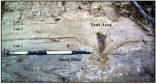
Watch this!
To see excavation and mapping in action, check out this short video from Teachers' Domain and NOVA Online about the work of Kerry Sieh [127], a paleoseismologist at The Earth Observatory of Singapore (He was a prof at Caltech when they made this video).
Video: NOVA: The Work of Kerry Sieh (3:19)
PRESENTER: A young geologist named Kerry Sieh started work that would lead to a new approach to earthquake prediction based on the prehistoric record. The theory of plate tectonics told him that the buildup of strain along the fault was steady. Perhaps there was some regularity in the release.
Another 10-meter earthquake might take place when another 10 meters of strain had built up. Kerry needed to figure out the rate at which the strain was accumulating. A stream that had been moved off course by a series of earthquakes offered a tantalizing clue.
KERRY SIEH: We recognized that this channel at one time flowed across the fault in a straight line, but it has been offset now 130 meters. But it now has a dogleg in it along the fault and then continues to flow out into the valley.
PRESENTER: If Kerry could determine how long ago the creek ran straight across the fault, then by simply dividing the distance it had moved by the number of years it had taken, he would arrive at the rate of strain accumulation. The history of the now dry stream bed could be read in the way that sediments had been deposited over the centuries.
A trench 12 feet deep has been cut across the fault. A sedimentary record of the past 3,000 years is exposed. Each layer is identified and marked. Breaks in the layers are the result of earthquakes. Eventually, samples will be collected and earthquakes dated. Individual earthquakes can be identified with the help of a diagram, like this one made at a site called Pallett Creek.
KERRY SIEH: As the sediments have been accumulating over the past two millennia, they've recorded the story of the San Andreas Fault. The reason they've done that is that every hundred or a couple hundred years, the San Andreas fault breaks and disrupts these sediments, as you can see here.
Now let's look, for example, at this particular place. This layer was the ground surface in 1480 AD, about the time that Columbus was discovering America. So you can imagine a little Native American boy standing here about four feet high on this old marshy, boggy ground. If he'd been standing right here, what he would have seen, looking out this way, is the ground suddenly drop and shift this way during the great earthquake.
What formed was a scarp about a foot high, or about 30 centimeters high, here. You can see this layer has been broken off from its continuation over here. In the succeeding 100 or 200 or 300 years, these layers of sand and silt and peat accumulated and buried that fault scarp completely. So here we are here we have a beautiful example of a buried fault scarp produced by a paleo earthquake, or an ancient prehistoric earthquake, about the time that Columbus was setting foot in North America.
Heat flow
The Earth produces heat from the decay of radioactive elements in its interior. This heat drives mantle convection and therefore the movement of tectonic plates. Heat flow is routinely measured in boreholes around the planet. These measurements are compiled to produce a map of heat flow for the Earth's surface. Some degree of estimation and smoothing must be applied to the measurements because the boreholes are not evenly spaced and some are on continents while other measurements are taken in oceanic crust. The map below shows global heat flow.
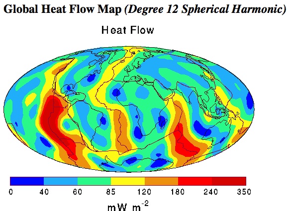
This map shows color-coded contours of the global distribution of heat flow at the surface of the Earth's crust. Major plate boundaries and continent outlines are also shown. The fundamental data embodied in this map are the more than 24,000 field measurements in both continental and oceanic terrains, supplemented by estimates of the heat flow in the unsurveyed regions. The estimates are based on empirically determined characteristic values for the heat flux in various geological and tectonic settings. Observations of the oceanic heat flux have been corrected for heat loss by hydrothermal circulation through the oceanic crust. The global data set so assembled was then subjected to a spherical harmonic analysis. The map is a representation of the heat flow to spherical harmonic degree and order 12.
What does this have to do with the New Madrid Seismic Zone? By looking at the map above, you can see that the amount of heat flowing out of the Earth is not uniform over the surface of the planet. Some areas have much higher heat flow than others and these areas are usually associated with tectonic activity such as volcanism and plate boundaries. For example, the boundaries of the North American plate, the Mid-Atlantic Ridge and the San Andreas fault system, both show up as "warm" places on this map. Heat flow measurements have been made in the New Madrid Seismic Zone to see whether this is a high heat flow area compared to what would be expected for the interior of a continent. (Conventional geophysical wisdom holds that the interior of continents should be old, cold, and stable.) If heat flow is higher than expected, this would be evidence for why earthquakes happen in this area. This remains a point of scientific contention. Past surveys concluded that heat flow was high in the NMSZ, but the most recent studies disagree with those earlier findings.
The map below comes from the Global Heat Flow Database [130], at the University of North Dakota. They have heat flow maps and data files for all different parts of the world. This particular map shows borehole data for the United States. Warm colors denote higher heat flow than cool colors (see the legend, which shows milliwatts per meter squared values color-coded). Notice that this map looks different than the global map above. It looks different because it shows exact borehole measurements as opposed to smoothed values that have been interpolated over the whole map. Where is the heat flow highest? Where is it lowest? Compare this map with the map above to see whether they are consistent for the US.
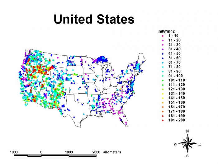
Debating GPS, Geologic, and Heat Flow Studies of the NMSZ
In this assignment, you will break up into teams to read and discuss the papers designated for you. After this, the class will regroup as a whole and discuss all the papers.
Reading/Discussion Activity
Directions
I will divide the class into 3 teams.
Each team should begin by reading their assigned readings and consider the related discussion questions as described below. Papers are linked from your team's discussion board in Canvas.
Team 1: GPS measurements
Members of Team 1 should read thoroughly the seven letters, responses, and summaries listed below to get a sense of the debate about GPS measurements of the NMSZ. Then read/skim the two scientific papers to flesh out your understanding of the studies involved in this debate.
- Letters, responses, and summaries arising from scientific papers:
- Calais, E., Mattioli, G., DeMets, C., Nocquet, J., Stein, S., Newman, A., et al. (2005). Seismology: Tectonic strain in plate interiors? Nature, 438(7070), E9-E10. doi: 10.1038/nature04428.
- Stein, S. (2007). New Madrid GPS; much ado about nothing? Eos, 88(5), 59.
- Newman, A. (2007). Earthquake risk from strain rates on slipping faults. Eos, 88(5), 60.
- Rydelek, P. A. (2007). New Madrid strain and postseismic transients. Eos, 88(5), 60–61.
- Smalley and Ellis (2008). Space geodesy and the New Madrid Seismic Zone Eos, 89 (28).
- Stein, S. (2009). Background for the Calais and Stein 2009 paper in Science [132]6pp.
- Strelich, L. (2015), Aftershocks of old quakes still shake New Madrid Seismic Zone [133], Eos, 96, doi:10.1029/2015EO040129.
- Scientific papers:
- Smalley, R., Ellis, M. A., Paul, J., & Van Arsdale, R. B. (2005). Space geodetic evidence for rapid strain rates in the New Madrid seismic zone of central USA. Nature, 435(7045), 1088–1090. doi: 10.1038/nature03642.
- Calais, E., and Stein, S. (2009). Time-Variable Deformation in the New Madrid Seismic Zone. Science, 323, 1442.
- Discussion questions for Team 1:
- How is a strain rate calculated from geodetic data?
- How can two geodetic surveys in the same region get different answers about strain rate?
- How does strain rate translate to seismic hazard? What assumptions are necessary to get from strain rate to recurrence interval to seismic hazard?
- Some scientific debates arise over the actual results of an experiment, and some arise over the interpretation of those results. In this case, we have both! Elaborate on this point with specific evidence from these papers.
Team 2: Paleoseismology
From the list below, members of Team 2 should browse Martitia Tuttle's Web site and read the Geotimes and Economist articles to get a sense of the current state of the art in paleoseismology at New Madrid. The short article from The Economist discusses a pretty new and novel way of approaching paleoseismology. Then skim the two scientific papers by Roger Saucier to flesh out your understanding of the studies involved.
- Summaries and news articles:
- Tuttle, M. P. New Madrid Seismic Zone [134]. Retrieved June 2, 2008, from http://mptuttle.com/newmadrid1.html.
- Yauck, J. (2006). River bends reveal past quakes [135]. Geotimes, 51(10), 14.
- Dating earthquakes with stalagmites: Written in stone. The Economist, 4 Oct 2008, 88.
- Scientific papers:
- Saucier, R. T. (1989). Evidence for episodic sand-blow activity during the 1811–12 New Madrid (Missouri) earthquake series. Geology, 17(2), 103–106.
- Saucier, R. T. (1991). Geoarchaeological evidence of strong prehistoric earthquakes in the New Madrid (Missouri) seismic zone. Geology, 19(4), 296–298.
- Discussion questions for Team 2:
- What kinds of geologic detective work have been done in the New Madrid region?
- What's the difference between paleoseismology here and, say, near the San Andreas Fault? (If you didn't watch the video about Kerry Sieh's work in southern California linked on the previous page, now is a good time.)
- How do you get from a sandblow or stalagmite to a recurrence time and thus a seismic hazard estimate?
- What are the uncertainties involved with dating liquefaction features?
Team 3: Heat flow measurements
Members of Team 3 should read thoroughly the two summaries and news articles listed below to get a sense of the debate about heat flow measurements of the NMSZ. Then read the two scientific papers to flesh out your understanding of the studies involved in this debate.
- Summaries and news articles:
- New Madrid Seismic Zone May Be Cold And Dying, New Evidence Shows [136]. (29 December 2006).ScienceDaily. Retrieved 22 April 2008, from http://www.sciencedaily.com/releases/2006/12/061211221056.htm.
-
Midcontinent heat may explain great quakes [137]. (1993).Science News, 143(22), 342.
- Scientific papers:
- Liu, L., & Zoback, M. D. (1997). Lithospheric strength and intraplate seismicity in the New Madrid seismic zone. Tectonics, 16(4), 585–595.
- McKenna, J., Stein, S., & Stein, C. (2006). Is the New Madrid seismic zone hotter and weaker than its surroundings? [138] In Special Paper 425 (167–175). The Geological Society of America. Retrieved June 2, 2008, from http://www.earth.northwestern.edu/people/seth/Texts/nmszhf.pdf.
- Discussion questions for Team 3
- What causes surface heat flow to vary in different places around the Earth?
- How is heat flow measured?
- How do you get from heat flow to recurrence interval to seismic hazard?
Submitting your work
Upon completion of the reading, you are to engage in a discussion of the readings, first within your team and then with the rest of the class. The team discussion component of this activity will take place over a few days and will require you to participate multiple times over that period. Likewise, the class discussion will then take place over the subsequent few days.
Team discussions:
- Enter the special discussion forum created for your team (e.g., "Debating Hazard at New Madrid - Team 1 Discussion (GPS)")
- You will see your team's discussion questions there.
- Respond to one question that hasn't already been chosen by another student. If all questions have already been addressed, then select a question where you can "further" the discussion and post there.
- Return to the discussion periodically to read your teammates' postings and to respond by asking for clarification, asking a follow-up question, expanding on what has already been said, etc.
Class discussion:
Once you have discussed these topics within your team, we will regroup to engage in a discussion with the entire class. This class discussion will take place in a separate discussion forum titled "Debating Hazard at New Madrid - Class Discussion."
- Before joining the class discussion, skim the discussions that have taken place in ALL of the team discussion spaces in order to acquaint yourself with the other topics and issues.
- Next, enter the "Debating Hazard at New Madrid - Class Discussion" forum and post a response to each of the following questions. Remember, if there are already postings there from other students, then respond by asking for clarification, asking a follow-up question, expanding on what has already been said, etc.
- Each group discussed a different technique for studying the New Madrid Seismic Zone. What are the different uncertainties associated with each one? What are the different assumptions made when interpreting the results of each technique?
- In what ways do these different techniques agree and disagree in terms of estimation of recurrence interval and seismic hazard?
- How do the results of GPS, paleoseismology, and heat flow measurements square with the results from seismicity catalogs in terms of recurrence interval and seismic hazard? (When thinking about this question, remember that you are participating in science here! You made your own calculations and estimations with seismicity data. Now you can compare your results to the work of other scientists who may have made different interpretations with a different geophysical method.)
Grading criteria
You will be graded on the quality of your participation. Please see the rubric for teaching/learning discussions. [1]
Paper Assignment
For this activity, you will rewrite the USGS fact sheet you read earlier in the lesson, updating it with the research progress that has been made since it was published.
Fact Sheet Paper
Rewrite USGS Fact Sheet FS-131-02, Earthquake Hazard in the Heart of the Homeland [102], highlighting the research progress that has been made since 2002, when this fact sheet was published. Specifically, your mission, should you choose to accept it, is to do a better job than the USGS did themselves when they updated FS-131-02 in late 2009 with this new fact sheet, FS09-3071, Earthquake Hazard in the New Madrid Seismic Zone Remains a Concern [139]. (Maybe they were worried that alums of this course would steal their jobs).
I expect your fact sheet to be well organized and coherent, with none or few grammatical and spelling errors. It needs to be completely rewritten in your own words. All references to the scientific work of others (this includes summaries of their results and/or any borrowed figures) must be properly cited and a bibliography must be included.
This fact sheet is meant to be explanatory and persuasive. It should be written for a hypothetical general audience (i.e., non-scientists). It should be clear to me that you understand the significance of the results of all the scientific studies you refer to in your paper (including your own). See grading rubric below for more details.
The successful paper should meet the following criteria (points out of 100 total in parentheses):
- be approximately the same length as the original (5)
- be visually interesting (you can use graphics made by others with appropriate citation) (10)
- be rewritten entirely in your own words without significant grammar/syntax problems (10)
- include at least three post-2002 sources (10)
- include at least two estimations of recurrence interval for the New Madrid region using different methods, should include your own calculation (10)
- include at least two estimates (using different methods) of the magnitude of the earthquakes in the 1811–1812 sequence (5)
- include some of your original research from the data analyses in this lesson (20)
- demonstrate your knowledge of the different methods of investigating seismicity in this region (10)
- demonstrate your knowledge of the different hypotheses for the causes of seismic activity at New Madrid (10)
- include a bibliography (10)
It is fine to use figures, graphics, and data from other sources as long as you cite them appropriately and include them in the bibliography. It is also fine (and encouraged!) to organize the fact sheet differently than the original or to emphasize different areas of research than the original. Be creative!
The following resources might be helpful to you in your task. (You are in no way limited to these, of course. You may use whatever appropriate sources you want to.) References that are not clickable are linked from the Canvas module for this lesson.
- New Madrid Seismic Zone: Not Dead Yet. Page, M.T. and S. E. Hough, 2014, Science 343, 762-764.
- Lasting Earthquake Legacy Parsons, T., 2009, Nature 462, 42-43.
- Long Aftershock Sequences Within Continents and Implications for Earthquake Hazard Assessment. Stein, S. and M. Liu, 2009, Nature 462, 87-89.
- Should Memphis Build for California Style Earthquakes? [140] Stein et al., 2003. Eos 84
- No Free Lunch Stein, 2004. Seism. Res. Lett., 75, 555–6.
- Uncertainties in Seismic Hazard Maps for the New Madrid Seismic Zone and Implications for Seismic Hazard Communication Newman et al., 2001. Seism. Res. Lett., 72, 647–663.
- Analysing the 1811–1812 New Madrid earthquakes with recent instrumentally recorded aftershocks Mueller et al., 2004., Nature 429, 284–288.
- Comment on “Should Memphis Build for California's Earthquakes?” Hough, S. E. (2003), Eos Trans. AGU, 84(29), 271.
- New Madrid Earthquakes Still Threaten The Central United States, Scientists Conclude [141] Reuters. ScienceDaily 29 September 2000. Accessed 13 March 2008
- When safety costs too much Stein, S. & Tomasello, J. The New York Times 10 January 2004.
- Reeling housing industry feels new jolt from unexpected quake-proof code Charlier, T. The Commercial Appeal 25 January 2008
- Earthquake Facts about the New Madrid Seismic Zone [142] Missouri Department of Natural Resources. Accessed 13 March 2007.
- Implications of Earthquake Risk in Mississippi Summary of "Addressing the Earthquake risk in central Mississippi: A forum for insurance and earthquake hazards professionals." Held December 3, 1997, Peabody Hotel, Memphis, Tenn.
- Hazus 99: Estimated Annualized Earthquake Losses for the United States [143] FEMA
- New Madrid seismic zone: Overview of earthquake hazard and magnitude assessment based on fragility of historic structures [144] NAHB Research Center, 2003. Prepared for US Dept of Housing and Urban Development, 110p.
Save your paper as either a Microsoft Word or PDF file in the following format: L4_paper_AccessAccountID_LastName.doc (or .pdf) For example, Cardinal relief pitcher Trevor Rosenthal's file would be named "L4_paper_tjr26_rosenthal.doc"
Submitting your work
Upload your paper to the Fact Sheet Paper assignment in Canvas by the due date indicated in the table on page 1 of this lesson.
Grading rubric
- An "A" fact sheet is well organized and coherent, has no or few grammatical errors, meets the assignment's length requirement, and has been completely rewritten in your own words. Additionally, an "A" fact sheet includes several detailed and clearly-explained examples of scientific studies that postdate the original fact sheet. Examples from your own work on the topic are also included. Figures are easy to read, have appropriate captions, legends and axes, and they support the arguments made in the paper. An "A" fact sheet looks cool!
- A "B" fact sheet is like that of an "A" fact sheet except that it may refer to scientific studies to back up most but not all of its assertions OR its assertions may only rely on the work of others and not on your own work. A "B" fact sheet's figures may have some minor flaws. Additionally, a "B" fact sheet may be an "A" fact sheet content-wise but it has minor grammatical errors or minor organizational problems or looks kind of boring. A "B" fact sheet meets the length requirement.
- A "C" fact sheet may have organization, coherence, or grammatical problems that hinder a smooth reading of the fact sheet, but not to the extent that the paper is incomprehensible. A "C" paper may also not meet the assignment length requirement. NOTE ON ASSIGNMENT LENGTH: Papers that significantly deviate from the length assignment by being too short (half as long as the assignment length requirement or less) OR too long (twice as long as the assignment length requirement or more) will receive a "C". A paper that has excellent organization and content, but fails to address the topic of the assignment will receive a "C." A fact sheet that does not include results and figures from your own work will receive a "C."
- A "D" fact sheet has severe organizational, coherence, or grammatical problems so that the reader has trouble comprehending what is being communicated. A "D" fact sheet may significantly deviate from the length requirement. A fact sheet that does not refer to the results of any specific scientific studies at all will receive a "D" no matter how well-written it is or how good its arguments are. A fact sheet that fails to include any figures at all will receive a "D."
Teaching and Learning About Earthquakes
Let's take some time to reflect on what we've covered in this lesson!
Teaching/Learning Discussion
Directions
For this activity, I want you to reflect on what we've covered in this lesson and to consider how you might adapt these materials to your own classroom. Since this is a discussion activity, you will need to enter the discussion forum more than once in order to read and respond to others' postings.
Participating in the Discussion
- Enter the "Teaching and Learning About Earthquakes" discussion forum.
- Post your ideas for how the materials we covered in this lesson might be adapted for your own classroom. What skills were emphasized? How do you deal with plotting data and large datasets in your class?
- Read postings by other students.
- Respond to at least one other posting by asking for clarification, asking a follow-up question, expanding on what has already been said, etc.
Grading criteria
You will be graded on the quality of your participation. Please see the rubric for teaching/learning discussions. [1]
Additional Resources and Bibliography
Various Web sites with links to resources aimed at teachers and students:
- Southern California Earthquake Center - Educational Resources [145]
- Public Earthquake Resource Center (PERK) [146]
- USGS Educational Resources for Teachers [147]
- National Geographic's Forces of Nature -- Earthquakes [148]
Nature podcast featuring Seth Stein and the New Madrid fault zone:
Nature Publishing Group [149]
A good book written for nonscientists about the 1811–1812 New Madrid sequence:
- Feldman, J., When the Mississippi Ran Backwards: Empire, Intrigue, Murder, and the New Madrid Earthquakes, Simon & Schuster, 2005.
Bibliography
Newman et al. (1999) Slow Deformation and Lower Seismic Hazard at the New Madrid Seismic Zone, Science, 284, 619–621.
Boyd, O.S., R. Smalley, Jr., and Y. Zheng (2015), Crustal deformation in the New Madrid seismic zone and the role of postseismic processes, J. Geophys. Res. Solid Earth, 120, 5782–5803, doi:10.1002/2015JB012049.
Summary and Final Tasks
The New Madrid Seismic Zone is enigmatic because it has produced large earthquakes in the past, but its future is unclear. Deciding how to plan for the seismic hazard is not easy and this is compounded by the fact that large sums of money and large amounts of government intervention are involved. I want to stress that just because scientists do not agree, this does not mean that science doesn't work! The problem is that scientists and policy-makers have different training. What do you think forms the greatest barrier between science and public policy?
Reminder - Complete all of the lesson tasks!
You have finished Lesson 4. Double-check the list of requirements on the Lesson 4 Overview page to make sure you have completed all of the activities listed there before beginning the next lesson.
Tell us about it!
If you have anything you'd like to comment on or add to, the lesson materials, feel free to post your thoughts in the Teaching/Learning discussion! It's one of your final assignments in this lesson anyway. For example, what did you have the most trouble with in this lesson? Was there anything useful here that you'd like to try in your own classroom? Is seismic hazard a topic you and your students are interested in? Are there many well-known seismically active faults where you live? (Even if you don't think so, you could always try playing around with the seismic catalog search features we used in this lesson to find out.)
Lesson 5: How Do We Know the Climate is Changing?
Overview
In this lesson, we will investigate a combination of several different datasets and models in order to analyze the extent to which global climate is affected by human activity. We will discuss the short and long term consequences of global warming and try to quantify the uncertainties inherent in scientific measurements.
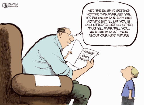
About Lesson 5
Lesson 5 will take us two weeks to complete. The topic here (also worthy of a course in itself) is recent climate change. My plan is to spend week one studying the data and observations related to climate change and then spend the second week thinking about models, theories, predictions, and discourse (scientific and political) based on those data and observations. I chose to break up this lesson in this manner because I think some of the misunderstandings about what is, and is not, known about recent climate change comes from a general public that is not literate when it comes to the task of distinguishing observations from models, and from scientists who use words such as "belief" and "uncertainty" without realizing that the general public interprets those words differently than scientists do.
The topics in lesson 5 are covered in a more rigorous semester-long fashion in Meteo 469, so if climate science interests you, that's a good course to take.
What will we learn in Lesson 5?
By the end of Lesson 5, you should be able to:
- Differentiate between data and models
- Predict short- and long-term consequences of global warming
- Quantify the uncertainties inherent in scientific measurements
- Define feedback mechanisms associated with climate systems
- Define the greenhouse effect and list greenhouse gases
- List causes and consequences of sea level rise
What is due for Lesson 5?
The table below provides an overview of the requirements for Lesson 5. Lesson 5 will take us two weeks to complete. 30 Oct - 12 Nov 2019
| Requirement | Submitted for Grading? | Due Date |
|---|---|---|
| Reading: "The Curse of Akkad" | No |
5 Nov (end of1st week) |
| Reading/Discussion: "Rapid Wastage of Alaska Glaciers and Their Contribution to Rising Sea Level" | Yes—posted to the "Alaskan Glaciers" discussion forum in Canvas | participation spanning 30 Oct - 5 Nov (1st week) |
| Problem set: Plot your own climate data | Yes—Submit this assignment to the "Keeling curve problem set" dropbox in Canvas | 5 Nov (end of 1st week) |
| Reading: "The Real Holes in Climate Science", "Fixing the communications failure", "Climate Confusion Among US Teachers", "Climate Change: Past as guide to the future," and "Global-scale temperature patterns and climate forcing over the past six centuries" | No---but necessary for the Teaching/Learning discussion |
12 Nov (end of the second week) |
| Problem set: Write your own climate lesson using the JCM | Yes—Submit to the "Java Climate Model" dropbox in Canvas | 12 Nov (end of the second week) |
| Discussion: "Teaching and learning about climate change" | Yes—posted to the "Teaching and Learning About Climate Change" discussion forum in Canvas | participation spanning 6 - 12 Nov (second week) |
Questions?
If you have any questions, please post them to our Questions? discussion forum (not e-mail). I will check that discussion forum daily to respond. While you are there, feel free to post your own responses if you, too, are able to help out a classmate.
Climate Change in the Holocene
Reading assignment
As we begin Lesson 5, first read the following article, located through Library Reserves:
- Kolbert, E. (2005). The Climate of Man—II; Annals of Science. The New Yorker, 81(11), 064.
This article appeared in The New Yorker in 2005 and was written for a general audience. I think it gives a good introduction to the topic of climate change for two reasons. Firstly, it gives a brief overview of how global climate models work and what kinds of measurements climate scientists make. Secondly, the interesting link between catastrophic climate change and the fall of ancient civilizations is explored. This is a topic that all intelligent and scientifically literate people of the world today would do well to think about.
As you read, contemplate the following questions:
- What are the first-order effects and second-order effects of global warming mentioned in this article? What's the difference in general between a first-order effect and a second-order effect?
- What is the approximate magnitude of the time lag involved with today's anthropogenic climate forcing (i.e., when human activity increases CO2 levels by some amount, how long does it take the global climate system to equilibrate)? What does this time lag mean for people and policy-makers?
- Do you think today's societies are better or worse-equipped to deal with disastrous climate change compared to the ancient societies discussed in this article?
Evidence for Increasing Temperatures
Measurements of air, land surface, and sea surface temperatures
If one wants to make the case for global warming, why not start with the obvious and find out what recent temperature measurements have to say? The plot below shows temperature measurements for the ocean surface, the lower atmosphere, and the land averaged together. The x-axis is time, from the year 1850 until the year 2007. The left-hand y-axis is the global temperature anomaly in degrees Celsius. This anomaly is taken relative to the average of the span from 1961 to 1990. We can see that the land, sea, and air were colder before 1961–1990, and they are all warmer now and have been increasing steadily and rapidly over the last few decades. Note that the rate of increase is getting faster, as the fits to the data points for shorter timescales are steeper (compare the slope of the red line that fits the data over the last 150 years to the slope of the yellow line that fits the data for the last 25 years).
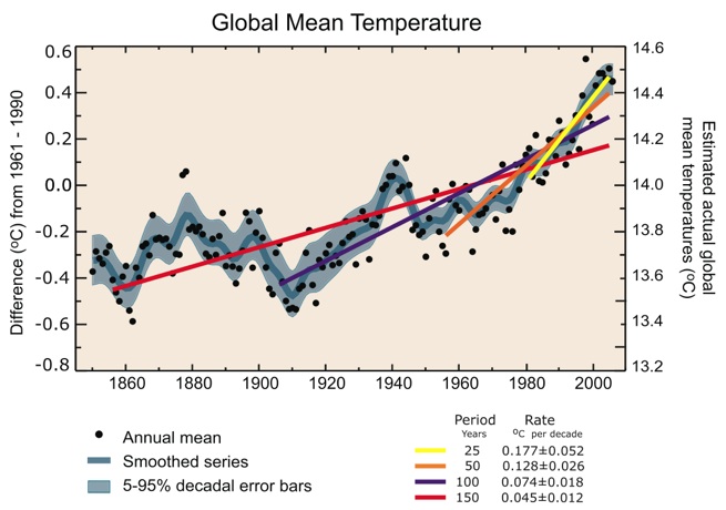
Annual global mean observed temperatures (black dots) along with simple fits to the data. The left-hand axis shows anomalies relative to the 1961 to 1990 average and the right-hand axis shows the estimated actual temperature (°C). Linear trend fits to the last 25 (yellow), 50 (orange), 100 (purple), and 150 years (red) are shown, and correspond to 1981 to 2005, 1956 to 2005, 1906 to 2005, and 1856 to 2005, respectively. Note that for shorter recent periods, the slope is greater, indicating accelerated warming. The blue curve is a smoothed depiction to capture the decadal variations. To give an idea of whether there are meaningful, decadal 5 to 95% (light blue) error ranges about that line are given (accordingly, annual values do exceed those limits). Results from climate models driven by estimated radiative forcings for the 20th century suggest that there was little change prior to about 1915 and that a substantial fraction of the early 20th-century change was contributed by naturally occurring influences including solar radiation changes, volcanism, and natural variability. From about 1940 to 1970, the increasing industrialization following World War II increased pollution in the Northern Hemisphere, contributing to cooling, and increases in carbon dioxide and other greenhouse gases dominate the observed warming after the mid-1970s.
Remember that the overall annual average temperature of something huge, like the ocean, or the land surface, is not directly relevant to daily weather patterns. Therefore, even what looks like a modest increase of less than a whole degree Celsius over twenty years can have a large impact on world climate.
Measurements from boreholes
Recall from our discussion of heat flow in the New Madrid lesson that the Earth is a constant emitter of heat, both from the original heat of formation of the planet and from the decay of radioactive elements. The geothermal gradient describes the rate of increase of temperature of the interior of the planet as a function of depth and can be inferred from theoretical geochemical calculations, as well as seismic wave speed. The average geothermal gradient of the Earth is about 15°–25° C per km. This depends on the tectonic setting, as we saw in the New Madrid lesson.
Instrumented boreholes are used to measure heat flow at the surface (upper few kilometers or so) and they generally show a negative deviation from the geothermal gradient in the upper hundred meters of the subsurface because heat loss is greatest where the temperature difference is greatest—at the surface. This leads to a temperature vs. depth relationship that should look like the red lines on the figure below. In fact, boreholes are increasingly showing evidence of recent warming at the surface of the Earth. In the figure below the actual temperature measurements are the black dots and the red lines are just a sketch. The black dots show a positive deviation from the expected geothermal gradient. The observed profiles indicate warming, and the depth of the bend indicates warming in the last 100 years.
.jpg)
Temperature measurements (black dots) and a sketch of the expected geothermal temperature profile (red curves) in three boreholes in eastern Canada. The curvature in the upper parts of the profiles is a response, at least in part, to temperature changes at the surface. The linear increase of temperature with depth in the deeper sections of the holes is the undisturbed geothermal gradient.
Observations of Melting Ice
Sea Ice
One of the direct consequences of a climate that is becoming warmer on average is that global repositories of ice are beginning to melt. Measuring the amount of melting takes time and requires repeated observations because ice caps and glaciers have natural seasonal cycles (more ice in the winter, less ice in the summer). Below is a schematic figure showing data collected for forty years in the Arctic. Polar sea ice thinned by an average of over a meter during that time!
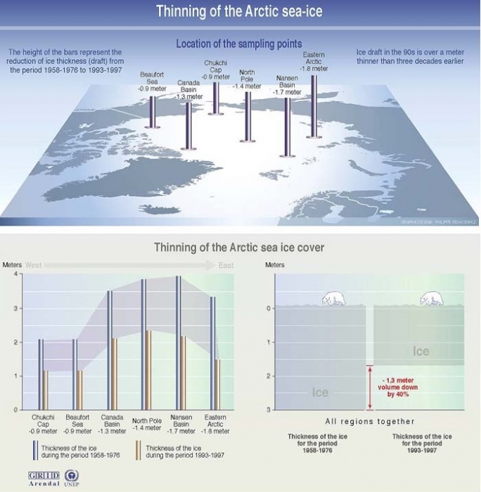
Glacial ice
A survey of over 60 glaciers in Alaska has shown an alarming trend. On average, glaciers have been thinning from 1950 onwards. The rate of thinning has rapidly increased during the last ten years or so. Be careful to note the difference between discussing the amount of thinning and the rate of thinning. The amount of thinning is found by measuring the thickness of ice at two different times and subtracting. The rate of thinning refers to how fast the ice is getting thinner. Mathematically, the rate of thinning is the derivative of the amount of thinning, just like velocity is the derivative of displacement if you want to think of it in terms of simple motion. So, even if the rate of thinning was a constant number, say 10 centimeters per year, the amount of thinning would still be increasing every year (by 10 cm). The two figures below show a map of the glaciers from Arendt et al.'s 2002 study of Alaskan glaciers and a bar graph that denotes the rate of thinning for two different time periods of each glacier in the study. The observation of an increase in the rate of thinning is like an acceleration, to continue the analogy to simple motion. It means that glaciers in the past 10 years have been thinning even faster than they used to be.
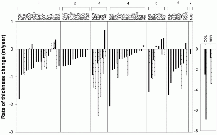
Consequences of melting ice
What happens when ice melts? That's easy: it turns into water. Where does the water go? Eventually, it finds its way into the ocean. In the case of Arctic sea ice, the contribution of melt to global sea level is negligible. That's because this ice is already sitting in the water. The density of ice is less than that of water, but not by a whole lot. On the other hand, when Alaskan glaciers melt, this extra water does increase sea level around the world because the ice had been trapped on the land before. The activity below demonstrates this principle in a simple way.
Try this!
- Get a clear glass and fill it about half full with water. A pint glass works well for this.
- Mark on the side with a china marker the level of the water.
- Put a few ice cubes in the water and make another mark where the level of the water is now.
- Observe how much of the ice is above the top of the water and how much is hanging below. The amount below is called the "draft."
- Let your glass sit around until the ice melts. Notice that the level of the water is not too much different from the higher mark you made. Melting the floating ice doesn't raise the water level very much compared the initial amount it was raised by adding the ice to the system in the first place.
Penn State Research
Sridhar Anandakrishnan, a professor in Penn State's Department of Geosciences, conducts field geophysical experiments on glaciers in Antarctica. Watch the video below to find out more about how his work on glacier dynamics relates to other studies of recent climate change.
Video: A Visit to Antarctica with Dr. Anandakrishnan - Part 1 (05:06)
[MUSIC PLAYING] SRIDHAR ANANDAKRISHNAN: Hi my name's Sridhar Anandakrishnan. I'm an associate professor of geosciences at Penn State University.
I'm going to give you a short bio, a little bit of background about myself. I first went to Antarctica-- gosh-- almost 30 years ago in 1985. It was the first time I went down. I went down just as a worker on a project with some other folks that were studying these glaciers.
I just went there to look around and to help out on the project. I was captivated by the, really, the stark and uncompromising beauty of the continent. And I decided I want to study this.
Over the years, I discovered that not only was it personally fulfilling because I was working in a beautiful place, but it was also important for the rest of the planet. What happens in Antarctica doesn't just stay in Antarctica. It actually comes out and affects the rest of us here. And I've enjoyed very much being a part of that-- that search.
[MUSIC PLAYING]
What got me most interested in glacial climate change was originally simply I wanted to be in Antarctica. And one of the most important things about Antarctica is how it's going to change in the future as we continue to pump carbon dioxide, CO2 into the atmosphere, as the temperature starts to increase-- continues to increase, what does it do to the ice of Antarctica?
That's what originally got me interested in it. But since then, one of the things that sustains my interest is what's going to happen to people who depend on water from glaciers, fresh water from glaciers-- people in the Mountain West of this country, people in the Andes, and most importantly to me, people in India and Bangladesh and Pakistan, who depend on meltwater from glaciers in Himalayan mountain range.
And as temperatures increase, those glaciers are melting and being lost at an increasingly rapid pace. And so the future looks very bleak for those people. We need to understand this.
So when I'm in Antarctica, our days are divided, really, into three parts. One part is simply surviving, living-- waking up in the morning, making breakfast, feeding ourselves and making communications.
We've got to call folks back home and let them know we're OK. If they don't hear from us for a day or two days, then they'll send out a rescue airplane. Because we're in such a remote place, we have to keep very close touch with our base station.
It's just four of us out there in the middle of the glacier and not another person for maybe 500 miles in any direction and just four of us in our tents and our gear. So the first thing that we do out there is just make sure we're safe, make sure that we're happy, healthy, things are going OK.
The second thing that we do out there is do our work-- wake up in the morning. We've taking care of ourselves. The next thing is we have to go out and do the work that the National Science Foundation is paying us to do, that Penn State University is paying me to do and that I love to do.
And that research is you try and understand how thick the glacier is and what's underneath the glacier when I walk around on top of any landmass a glacier or even the rocks of central Pennsylvania, all you see is the surface. What's down below, what's down a mile underneath us?
You don't really know unless you can do the experiments that I do, which are called seismic reflection imaging where we set off a small explosive shot at the surface. And the sound waves from that go down through the glacier, hit the bottom, bounce off it, come back up to the surface.
And then we measure how long did it take, how much energy did it leave going down and coming back-- those sorts of things tell us a lot about the glacier. So that's the work we do. So wake up in the morning and spend the whole day setting off explosive shots, a pyromaniac's dream come true.
But we do it safely. We do it carefully. We don't do it in a wasteful way. And we are doing it to find out more about the glacier.
And then we'll do that all day long until the evening. And then once again we have to make sure we're safe, make sure we're healthy.
The third thing we do is try and keep the excitement of being out there, that energy up through a long, six-week, eight-week, 10-week season. You have to make sure you're having fun. Make sure that everybody's spirits are up. And it's an incredibly important part of the day to come together as a community, even though a very small community-- four of us-- and make sure everybody's OK.
[MUSIC PLAYING]
Video: A Visit to Antarctica with Dr. Anandakrishnan - Part 2 (5:07)
[MUSIC PLAYING] DR. SRIDHAR ANANDAKRISHNAN: So some of the things that are really good about this job are I get to do fun things in beautiful places. But that's a very personal reward. It's almost a selfish reward. Really, one of the most extraordinary, positive aspects of this work is what's happening in Antarctica affects us over here in central Pennsylvania.
Sea levels are rising. Glaciers are melting. Temperatures are rising. Sea ice is melting. All these things affect us here in the US, and I have a piece of that. I'm working on that. I'm studying that. I'm learning about it. And boy, is that ever an exciting and deeply fulfilling part of the job. So that's the positive part.
And the downside of it is I'm gone from home a long time. I'll leave here sort of mid-November. You have to remember, in Antarctica, the seasons are reversed. And so it's summertime down there in November, December, and January. And so I go down there when it's, quote, "summer," even though it's still cold. You can see the snowmobiles whipping by behind me.
And I'm away from home for 10 weeks at a time. And that's pretty hard on my family. But nevertheless, we manage. I've been doing this for a number of years. So those are the-- you have to always balance these things.
[MUSIC PLAYING]
If there's one cliche that people know about glaciers is, oh, it's moving at a glacial pace. You get behind your grandmother driving a Buick LTD and you say, oh, she's moving at a glacial pace. One of the extraordinary things that I have discovered that nobody expected-- I didn't expect, anybody else expected-- is that these glaciers are astonishingly dynamic. They change the speed at which they flow from their standard glacial pace to what are, for glaciers, extraordinarily fast rates over very short periods of time.
So let me give you an example. Most glaciers flow maybe two or three feet in a day, and that's a booking case for glaciers. Most glaciers, 90% of the glaciers, will flow maybe a few inches per day. But the really fast ones might make it to two or three feet in a day.
Well, there's one glacier in particular in Antarctica that I've worked on a lot called William's Ice Stream that goes the whole range. Part of the day, it goes at zero to one inch per day, just hardly moving at all, just sitting there stuck. And then, for very short periods of that day, it'll suddenly lurch forward. It'll speed up to 5 or 10 or 15 feet per day. The speed at which it's going will suddenly just whip forward.
Now, 15 feet per day might not sound like a lot to you. You could probably do 15 feet in just a few seconds with just walking along. But for a glacier to speed up from nothing to very, very fast for a glacier and then back to nothing in a day is an astonishing phenomenon, and one that nobody really expected. And I'm really quite proud to have been a part of that discovery.
Let me tell you a little bit about what comes next. We've spent a lot of time studying the continent. We've learned some of these extraordinary things that we didn't know-- what I referred to a little while ago about how the glaciers can change their speed at rates that we hadn't understood. It's those sorts of unanticipated, unexpected behavior modes of the glacier that we really need to nail down in the coming years.
So when scientists go out and study a system, they like to build computer models of how that system is operating now and how it's going to operate in the future so that we can dial in different parameters. We can say, OK, the temperature's going to go up by two degrees. What'll happen to Antarctica? It'll go up by three degrees. What'll happen to Antarctica?
Well, for us to believe those projections, believe those prognostications, those models need to be good models. And we're finding out that these glaciers are changing so rapidly that our models aren't as good as we thought. And that's what we're going to have to work on next.
[MUSIC PLAYING]
Reading Assignment: Alaskan Glaciers and Antarctic Ice Sheets
How much water is in a cubic kilometer of water?
The volumes discussed in studies like these (for example, the amount of ice loss, the amount of meltwater produced, etc.) are given in cubic kilometers. Do you have any sense about how much water is in a cubic kilometer? Here's a little estimation that puts this into perspective
Video: Cubic Kilometer (3:44)
PRESENTER: When I try to picture really big or really small numbers, I like to break it down into something else that I can understand a little better just so that I have some idea of what's going on.
In this lesson, we read a paper by this group of scientists, and they estimated that between the 1950s in the 1990s, Alaskan glaciers lost an average volume of around 50 cubic kilometers of water every year. And then between the 1990s and the early 2000s, those same glaciers lost closer to 100 cubic kilometers per year of water. Do you have any idea how much water is in a cubic kilometer, much less several cubic kilometers? Let's do a little calculation to try to put that into perspective.
What if I took one cubic kilometer of water and I wanted to apportion that water out for the entire world so that every single person in the world would get some of that cubic kilometer. How much water would everybody get? Well, we can do that calculation.
If I have one cubic kilometer, that is a box with 1,000 meters on a side. So that equals 1,000 times 1,000 times 1,000 meters. That is 1 billion cubic meters. And I also know that in one cubic meter, there are 1,000 meters.
So if we have 1 billion cubic meters, and there's 1,000 liters in each cubic meter, that means we have 10 to the 12th meters of water in a cubic kilometer. Now's a good time for me to give a shout out to my 12th grade government teacher from Blacksburg High School, Karen Colson, who explained to our class that she thought that one of the reasons Jimmy Carter did not get elected to a second term is because he tried to convert this country to the metric system. And we all know how well that worked-- not very well. So I don't think most people can actually even picture what a liter probably is. But all of us non-scientist, milk-drinking Americans probably know what a gallon looks like. It looks like this. And there's about four liters in every gallon.
So if I have 10 to 12 liters and I divide that by 4 to get gallons, then that's about 0.25 times 10 to the 12th gallons. And as of late 2012, there were about 7 billion people in the world, so we just have to divide this number by 7 billion. And we'll figure out how many gallons of water everybody is going to get.
And that number is this. We can write this in a much more normal way by just moving this decimal three places over to take care of this exponent. And what we find out is in each person in the world gets about 36 gallons if we had one cubic kilometer of water and we apportion that up over everybody.
But remember, in this paper we're not talking about one cubic kilometer of water. We're talking about between 50 and 100 cubic kilometers of water every year. That is a lot of water, my friends.
Reading/Discussion
The contribution of land glacier melting to global sea level rise has been explored in a recent study of Alaskan glaciers. In this study, airborne laser altimetry was used to determine the mass and thickness of over fifty glaciers. This method is a huge improvement over previous studies that have used complicated and imprecise mass-balance calculations to estimate the rate of glacial melting. The results of this new study show that Alaskan glaciers contribute more meltwater than was previously thought and are losing mass faster than was previously thought. When you read these papers, think about how the results of this study will be incorporated into global climate models.
Then, read a paper that is about climate modeling in which researchers construct a model that does a better job of fitting the sea level and temperatures of the past than has previously been accomplished. The key was adding in warming ocean currents, a warm atmosphere, and a chain reaction of collapsing ice shelves.
As usual, for the Alaskan glaciers paper, I recommend reading the accompanying Perspective (Meier and Dyurgerov, 2002) first, then reading the scientific paper (Arendt et al., 2002). For the modeling work, I recommend reading the accompanying News Focus first (Tollefson, 2016) and then the scientific paper (DeConto and Pollard, 2016).
Alaska
- Meier, M. F., & Dyurgerov, M. B. (2002). How Alaska affects the world. Science, 297(5580), 350.
- Arendt, A. A., Echelmeyer, K. A., Harrison, W. D., Lingle, C. S., & Valentine, V. B. (2002). Rapid wastage of Alaska glaciers and their contribution to rising sea level. Science, 297(5580), 382
Antarctica
- Tollefson, J. (2016). Trigger seen for Antarctic collapse. Nature, 531, 562.
- DeConto, R.M. and D. Pollard (2016). Contribution of Antarctica to past and future sea-level rise. Nature, 531, 591.
Questions for discussion:
- What are the specific causes of sea level rise and how are these causes measured?
- What factors contribute to predictions of future sea level rise? How does the new data detailed in Arendt et al.'s study impact sea level rise calculations? How does the new model in DeConto and Pollard's study impact sea level rise predictions?
- What are the difficulties involved in making measurements of ice volume? What are the different methods used and how do they work?
- How is past sea level reconstructed?
Participating in the discussion
The discussion component of this activity will take place over Week 1 of this lesson and will require you to participate multiple times over that period.
- Enter the "Alaskan Glaciers and Antarctic Icepapers" discussion forum.
- You will see the questions above already there
- Respond to a question that hasn't already been chosen by another student. If all questions have already been addressed, then select a question where you can further the discussion and post there.
- Return to the discussion periodically to read your classmates' postings and to respond by asking for clarification, asking a follow-up question, expanding on what has already been said, etc.
Grading criteria
You will be graded on the quality of your participation. Please see the rubric for teaching/learning discussions. [1]
Greenhouse Gases and the Keeling Curve
The Greenhouse Effect
One of the most common misconceptions about global climate is that the greenhouse effect is just a hypothesis whose role in recent climate change is debatable. In fact, the greenhouse effect is an observable fact of what goes on in our atmosphere. The sun's radiation is transmitted to the Earth through our atmosphere. Some of this radiation is reflected back out into space, but some of the radiation in the infrared spectrum gets absorbed and re-radiated by the greenhouse gases in our atmosphere. This warms up the surface of the planet and it's an extremely important effect because without it the planet would be way too cold for us to live on it. The schematic cartoon below depicts this. The main greenhouse gases are water vapor (making up about 2/3 of the total), carbon dioxide, and methane. These all occur naturally, but human activities have increased the concentrations of carbon dioxide and methane through industrial activities and clear-cutting forests. We've also synthesized some greenhouse gases that aren't naturally occurring and added those to the atmosphere, too.
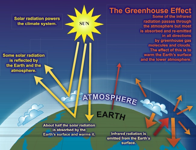
Even though Earth's natural carbon cycle moves a gigantic amount of carbon between the land, sea, and atmosphere naturally, the balance is pretty delicate and the amount humans have been adding to the atmosphere since the Industrial Revolution lingers in the atmosphere for over 100 years. This means that the effects of climate change we feel now were produced by activities in the past. The fact that greenhouse gases keep being emitted by human activity now means that we have already committed to a warmer future.
Carbon dioxide
The "Keeling Curve" might be the most famous plot of global climate data. Charles Keeling began measuring the atmospheric concentration of carbon dioxide at Mauna Loa in 1958. Today, four air samples an hour are collected from the observation towers at Mauna Loa and the concentrations of several gases are measured. The NOAA keeps track of observations from over 50 stations around the world. The average concentration of CO2 in the atmosphere has steadily increased ever since monitoring began.
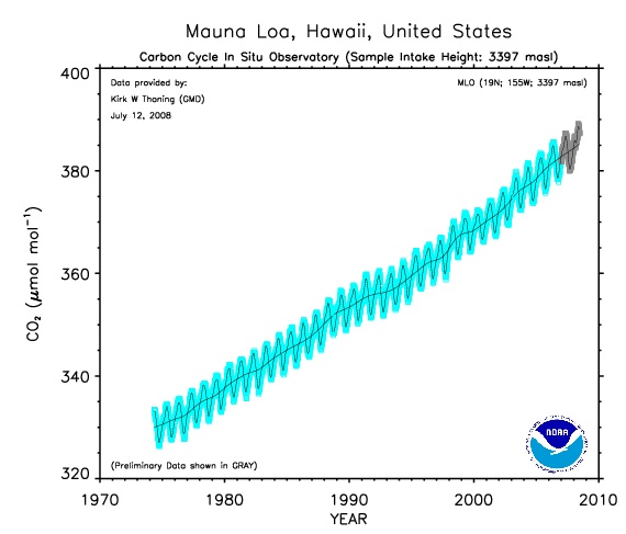
Let's take a look at this plot together (oops! note that in my explanation I mistakenly say that the y-axis is carbon dioxide concentration in millimoles per mole of air when in fact it is micromoles per mole.):
In addition, check out this really cool animation that shows how carbon dioxide concentrations have increased in the atmosphere globally over the past few decades. In the video, the x-axis is latitude and the y-axis is CO2 concentration. The various different symbols represent different types of recording stations (tower, airplane, etc) and the line is an average value.
- GlobalView-CO2, 2008 [154]
Problem Set: Plot Your Own Climate Data
In this activity, you will use the Interactive Atmospheric Data Visualization tools of NOAA's Earth System Research Laboratory to create some plots of climate data that interest you.
Problem set
Part 1: Visualize your own climate data
Go to Interactive Atmospheric Data Visualization [155] and follow my directions:
-
The main page has an interactive map of the world with a bunch of colored dots on to designate places where atmospheric data is habitually collected by NOAA. You'll see that the default current selection is set to the Mauna Loa Observatory. Click “Carbon Cycle Gases” to expand that menu and then choose Time Series. You will be taken to a new page. Don’t change anything on the page, just scroll down and click the Submit button. You have just generated a time series plot of carbon dioxide concentrations recorded at 3397 meters above sea level at the Mauna Loa observatory. In fact, it is exactly the same plot we discussed on the previous page of this lesson, except more updated because I created that course page a while ago. Go ahead and try it! Then after you check out the plot, you can click the “Site Selection" link to get back to the original page we started on.
-
Now back at the original page, you see a world map and by hovering your mouse over the different circles you can find out the name of any station and what kind of samples it takes (carbon dioxide, methane, whatever) and how long the station has been active. If you click on one of the network station symbols, the menu side of the page changes so that you can make a plot of that station's atmospheric data. Go ahead and play around with this Web site. There's a lot of neat stuff here. You can always click “Site Selection" to get back to the original page we started on.
-
Pick two stations other than Mauna Loa and preferably ones that have at least a couple of years of data. It’s also interesting to pick one in the northern hemisphere and one in the southern hemisphere.
-
Make time series plots for both carbon dioxide (CO2) and methane (CH4) at your stations—that's 4 plots. You can save the plots to your computer by clicking where it says "PDF version" on the page where it makes your plot.
-
Create a word processing document (Microsoft Word, Macintosh Pages, Google Docs, or PDF) to record your work for this problem set.
-
Paste your plots into your document, and answer these questions.
- Where are your stations and what type of data collection do they employ? (i.e., how far above sea level? surface? airplane? tower?)
- Compare your time series plots of CO2 to that of Mauna Loa in a few sentences. Are the ambient levels of CO2 today the same or different at each of the three stations? Is the change per year about the same or different? Is CO2 level rising faster / slower / at the same rate at your stations compared to Mauna Loa?
- What is the seasonal variability of CO2 at your stations compared to that at Mauna Loa? (You can see the average seasonal pattern better by choosing the "seasonal patterns" option when you make your plot.)
- Compare your time series plots of CH4 to that of Mauna Loa in a few sentences. Are the ambient levels of CH4 today the same or different? Is the change per year about the same or different? Is CH4 level rising faster / slower / at the same rate at your stations compared to Mauna Loa?
- What is the seasonal variability of CH4 at your stations compared to that at Mauna Loa? (You can see the average seasonal pattern better by choosing the "seasonal patterns" option when you make your plot.)
- A well-mixed atmosphere is one that is basically homogenous with respect to gas concentrations on short timescales (less than a year). If our atmosphere is well-mixed, it means that regardless of the locations of the sources of the greenhouse gas emissions, all parts of the world have about the same level of greenhouse gas concentrations. Based on this exercise, is our atmosphere well-mixed with regard to carbon dioxide and methane? (Feel free to check out a few more stations to verify your answer.)
- Before the Industrial Revolution, the concentration of carbon dioxide in the atmosphere was about 270 parts per million. Many climate scientists have hypothesized that the present climate conditions for which our species is adapted will deteriorate significantly and irrevocably if the atmospheric concentration of carbon dioxide doubles from its pre-industrial level. If the current average rate of increase of carbon dioxide concentration you have observed at your three stations remains the same, when will atmospheric carbon dioxide double its concentration from pre-industrial times?
Part 2: Bad cherrypicking of good data
People often wonder how there can be different interpretations of the same datasets. In Part 2 of this activity, we will deliberately set up a "strawman" of a dataset that has been selected to maximize the potential for incorrect interpretation in order to see how different interpretations can arise. To do this we will take advantage of the fact that there is natural variability in the concentration of CO2 in the atmosphere due to the seasonality of plant growth. We will make two plots, each containing several months of data at Mauna Loa.
Go to NOAA's Trends in Atmospheric Carbon Dioxide [156] page and follow my directions:
-
Scroll down to the bottom of the page so that you are looking at the plot called “Mauna Loa Daily,
Monthly and Weekly Averages for two years”
-
Use the slider bars below the plot to make the x-axis go from Oct 2017 to April 2018. Take a screenshot of this plot and include it in your document.
-
Use the slider bars below the plot to make the x-axis span June 2018 - October 2018. Take a screenshot of this plot and include it in your document.
-
Answer the Part 2 questions on your document.
Here are the Part 2 questions:
- Look at the October to April plot. Pretend you have never seen the full range of data spanning multiple decades. Estimate the rate of change of atmospheric carbon dioxide from this plot.
- Look at the June to October plot. Pretend you have never seen the full range of data spanning multiple decades. Estimate the rate of change of atmospheric carbon dioxide from this plot.
- Why is it so important to sample the atmosphere continuously and for a long period of time?
- What are some of the points raised in this problem set that do not lend themselves to simple table-top experiments in a lab or a classroom?
Submitting your work
Upload your document to the "Lesson 5 - Keeling curve problem set" assignment in Canvas by the due date indicated on the first page of this lesson. Here's what should be in your document: 4 plots from part 1 and the answers to the part 1 questions; two plots from part 2 and answers to the part 2 questions. Name your document like this:
L5_keelingcurve_AccessAccountId_LastName.doc/.pdf/.pages
For example, Cardinals second baseman Kolten Wong would name his problem set L5_keelingcurve_kkw16_wong.doc
Grading rubric
I will use my general rubric for grading problem sets [47] to grade this activity.
Specific Heat Capacity of Water
The world's climate system does not respond fully and immediately to externally applied forcing. This lag time has allowed the debate about the effect of human activities on climate to go on longer than it would have if everything we did were instantly noticeable. For example, when a certain amount of extra CO2 is added to the atmosphere, the warming effects on the air, land, and ocean take some time to be fully realized. Even if there was a way to add heat directly to the Earth, it would still take time for the temperatures we measure to increase. In this activity, we'll conduct a simple experiment to observe the specific heat capacity of water. By doing so, we'll be able to gain some insight about the lag time of the climate system's response to external forcing.
The specific heat capacity (Cp) of liquid water at room temperature and pressure is approximately 4.2 J/g°C. This means it takes 4.2 joules of energy to raise 1 gram (or 1 milliliter if you'd rather think of the equivalent volume of 1 gram of water) of water by 1 degree Celsius. This is actually quite large. The specific heat capacity of water vapor at room temperature is also higher than most other materials. Here is a table of the specific heat capacities of various materials:
| Material | Cp(J/g°C) |
|---|---|
| liquid water | 4.2 |
| air | 1.0 |
| water vapor | 1.9 |
| granite | 0.8 |
| wood | 1.7 |
| iron | 0.0005 |
Note that none of the other materials listed above come close to water's ability to absorb heat. (Nitpicker alert: Water does not have the highest known heat capacity. The heat capacity of pure hydrogen gas at room temperature is 14.3 J/g°C, according to the CRC Handbook of Chemistry and Physics. Pure H2 is not a big player in the Earth's climate system, though.)
The high Cp of water is why "a watched pot never boils!" This is also the main reason the climate is slow to respond to external changes. It is lucky for us that the ocean has the ability to absorb a lot of heat before its temperature rises appreciably. The flip side of this is that once an external source of energy is removed, the ocean is similarly slow to respond. Its temperature will not begin to decrease right away. In the next activity, we will observe this phenomenon.
Optional Fun Lab!: Specific Heat Capacity of Water Lab Experiment
The world climate does not respond immediately to the external forcings applied by human activity. A simple way to show why this is so is to make some simple observations about the heat capacity of water.
Materials
These are the materials you need for this lab: water, a pot, a thermometer, a stove or other heat source, a watch or other timer.
Directions
- Measure a volume of water (you can choose the volume) into your pot.
- Measure the starting temperature of the water.
- Put the pot on the stove and turn on the stove (you can choose how high to turn it up, but keep the level constant)
- Measure the temperature of the water at regular intervals. It is up to you to decide how often you need to make measurements.
- When the water boils, note the time, and remove the pot from the heat.
- Continue to make regular measurements of the temperature of the water until it cools back down to the initial temperature from step 2.
- Now pick an experimental variable, such as the initial volume of water in the pot, the kind of pot, how high to turn on the stove. Change this variable and repeat the experiment. Change this same variable at least one more time and do the experiment again.
Answer the following questions:
- Plot your data for each experiment.
- How long did it take each pot of water to boil?
- How long did it take each one to cool back down?
- Eyeball a best fit function to the water-heating-up data for each experiment. What do these functions look like (linear? curved? could you write an equation down to describe them?) What is indicated by the shapes of these functions? Were they affected by the changes you made between experiments?
- Eyeball a best fit function to the water-cooling-down data for each experiment. What do these functions look like? Are they all similar to each other? Do they have the same form as the water-heating-up functions? Discuss why or why not.
- Describe which experimental variable you changed and how the change you made affected your results.
- Speculate about what would have happened if you had chosen a different experimental variable to change. Predict how changing that other experimental variable would have changed your results.
- How could you improve this experimental design?
Note:
This is optional, so there is nothing to turn in for this assignment, but this is a fairly simple and instructive experiment, so give it a try if you get a chance!
See my plot below of two experiments in which I varied the initial volume of water in the pot. Note how much time it takes for the water to return to the starting temperature after boiling!
Predictions Made by Climate Models
Now let's take a look at some predictions of future climate based on global climate models. Recall from Elizabeth Kolbert's article that there are several groups around the world in the business of producing, running, and tweaking global climate models. Each one is slightly different in the way it treats various Earth properties. For example, some climate models do a more extensive job of modeling the oceans, and others do a more extensive job of modeling atmospheric conditions, etc. Different climate predictions result from different initial conditions, different parameterizations of interactions between systems, and different assumptions about emissions into the future.
Climate scientists are often frustrated by the portrayal of different results as "scientists don't even agree on global climate change, so how are regular people supposed to know what's happening?" In fact, climate scientists do not disagree with the basic tenets of climate change. The fact that different global climate models output somewhat different results gives scientists better insight into the sensitivities of the models. All climate models that are part of the IPCC reports agree that the Earth's average temperature has increased since the Industrial Revolution. The exact details of how much warming, how that warming has been parceled out between reservoirs, and how much warming will continue into the future is debated among groups. It is statistically quite improbable that every group would be wrong and wrong in the same direction.
Recently, a survey was given to over 10,000 earth scientists to find out whether they thought that average global temperature has increased over the last two hundred years and whether human activities caused it. The results were that 90% think that global temperature has increased and 82% thought it was because of human activities (Doran and Kendall-Zimmerman, 2009). These findings are in contrast to another study that determined that only 52% of the general public thinks that climate scientists agree that the Earth is warming and that 47% of the general public believes that climate scientists agree that humans have caused it (http://www.pollingreport.com/enviro.htm) So, there is a definite discrepancy between what the scientific consensus is and what most people think the scientific consensus is.
I have chosen to discuss a few samples of model predictions from the Intergovernmental Panel on Climate Change for two reasons. The first is that its publications are the result of a huge collaborative international effort, so the plots you see below are have incorporated the widest agreement among climate scientists. Secondly, its estimates are pretty conservative (having to get past the most politicians) so we can proceed to look at their predictions without wondering whether these people are just a bunch of fringe group alarmist crackpots. They're not!
The first set of plots below shows a prediction of average global temperature rise from the present to the year 2100. The different line types represent several different model runs using six different "scenarios." These are called SRES scenarios and the main differences among them are the assumptions they make about the world's population and its greenhouse gas emissions into the future (i.e., whether emissions will continue to rise at today's pace, or whether emissions will stay at today's level but not continue to rise, or whether we will decrease emissions). The idea here is to bring climate modelers together, give them a suite of reasonable future scenarios, and then have them all run their models and see what the output is. Note that all models accurately reproduce past average temperature measurements (see right panel "1765–2100"). This is important because it establishes that these models can do a good job of "predicting" what has already happened. These models predict an increase in the global average temperature of between 1° and 6°C. Remember from our reading that during the last ice age the average temperature was only about 9°C colder than now.
Understanding how CO2 concentrations in the atmosphere will change in the future requires carbon cycle models which model the relationship between emissions and atmospheric concentrations. In the figure below, a few selected emission scenarios are shown in the left panel, and the estimated CO2 concentrations in the atmosphere for these scenarios are shown in the right panel. All three scenarios—even one in which we reduce our rate of emission—result in increased atmospheric concentrations that are well above pre-industrial levels by 2100 (75% to 220% higher). Climate-induced environmental changes cannot be reversed quickly. Even if the anthropogenic emissions of CO2 are stabilized or reduced, the CO2 content in the atmosphere will still increase for some time.
The paper detailing the study of Alaskan glacier wastage we read last week explains one of the results of a warming global climate: rising sea level. The plot below shows model predictions for global average sea level rise based on six emission scenarios. Think about how average sea level is measured. It's not so simple when you think about it. Remember from the tsunami lesson that at many places on the globe, daily tidal fluctuations are on the order of meters. Both tides and average sea level have natural seasonal variations, too. This means that average sea level must be measured carefully with respect to a reference point. It would be easy to produce a misleading dataset if measurements were taken haphazardly at different times of the year or without respect to some established baseline.
What effect does rising sea level have? What proportion of humanity lives within a meter of sea level? The model predictions in the plot below guess that by 2100 sea level might rise by about half a meter. These models probably err on the conservative side because they don't take into account as much glacial melting as many scientists now believe will happen.
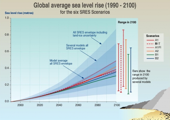
The Grim and Treacherous Politics of Global Climate Change
Reading/Discussion Assignment:
Read the following articles, (linked directly from Canvas):
1. Plutzer, E., M. McCaffrey, A. L. Hannah, J. Rosenau, M. Berbeco, A. H. Reid, (2016) Climate Confusion Among U.S. Teachers. Science 351, 664-665.
2. Schiermeier, Q. (2010) The Real Holes in Climate Science. Nature 463, 284-287.
3. Kahan, D. (2010) Fixing the communications failure. Nature 463, 296-297.
And skim these two articles, (also linked directly from CANVAS):
4. Hegerl, G. (1998) Climate Change: Past as guide to the future. Nature 392, 758-759.
5. Mann, M. E., R. S. Bradley, and M. K. Hughes (1998) Global scale temperature patterns and climate forcing over the past six centuries. Nature 392, 779-787.
Teaching and Learning! (and Eliza's soapbox)
Climate scientists for many years hoped that the preponderance of observational data from a variety of sources would "speak for itself" and convince even the most jaded skeptics that the Earth is indeed warming. To their great dismay, the politics of global climate science continues to be as contentious as ever. As educators, it is up to us to train the world's future decision-makers. We need to make sure the general population has the ability to make logical conclusions based on observations, to evaluate a scientific argument, and to appreciate the social and psychological implications of the intersection of science and policy. I picked the articles above to get us thinking about these topics. A short preview of them:
Dan Kahan's article is an excellent piece on scientific communication and it explains how people align themselves with certain viewpoints. Quirin Schiermeier's piece is a straightforward treatment of what we don't know about Earth's climate. He makes an important point that every minute scientists waste debating facts that nobody should dispute is a minute not spent searching for the answers to the pressing knowledge gaps he writes about.
The other two articles are science research articles. The 1998 paper by Mike Mann and coauthors is the one that has the original "hockey stick" graph (reproduced above) that shows the recent abrupt upward swing in global temperatures based on a variety of observed and proxy data. The piece by Gabriele Hegerl is a "News and Views" article, similar to other ones you've read before in this class. The point of a "News and Views" article in Nature is to summarize a research paper in the same issue, putting it into context so that other scientists outside the field may appreciate the original article's impact. I put Mike Mann's article in our course reserves precisely because I think it is important for you to be exposed to the actual science at the heart of the controversy, as opposed to only hearing the spin on either side of the debate. Let me point out that I am only asking you to skim this article because it is extremely complicated and lengthy. It was not written for a general audience of nonscientists! In fact, you'd have to be pretty far inside the loop to make a considered judgment of their statistical analysis and evaluate all the different datasets that went into this paper. I still think you should have a look at it, though.
Consider these questions for our discussion:
- Consider the paper by Kastens et al. that we read way back in Lesson 1. How do feedback loops, spatial awareness, and deep time figure in to the debate about climate?
- Consider the paper by Bloom and Weisberg that we read way back in Lesson 1 about how people process scientific concepts they are unfamiliar with. How do the tendencies discussed in that paper impact the climate debate? Do the concepts Bloom and Weisberg talk about seem validated by the Plutzer et al. paper?
- What role should scientists play in communication with the public? What role should journalists play? What role should educators play? What role should politicians play?
- What is the appropriate level of education secondary students should receive about global climate and how do you navigate the politics of this subject?
Participating in the Teaching/Learning/Reading Discussion
- Enter the "Teaching and Learning About Climate Change" discussion forum in Canvas
- You'll see the reading guidance questions there, but I also want you to contribute your own thoughts about how this issue is or is not addressed in your community.
- Read postings by other EARTH 501 students, too, and respond to at least one other posting by asking for clarification, asking a follow-up question, expanding on what has already been said, etc.
Grading criteria
You will be graded on the quality of your participation. Please see the rubric for teaching/learning discussions. [1]
Playing with a Simple Climate Model
The purpose of the following activity is to introduce you to an interesting and simple climate model that can be run fairly easily on a Web browser. The main thing I want you to do is to fiddle around with this model, try things, and see what happens. Pretty vague directions, huh?! But there's a catch. The deliverable for this activity will be that you come up with a short lesson based on using this model that you think would be appropriate for students. This will aid your thinking about your capstone project for this course.
Write Your Own Climate Lesson Using the JCM
Directions
- Go to the Java Climate Model [159].
Follow their directions to launch the JCM. My personal preference is to download the zip file and run the program offline. - Once you have launched the model, you are presented with an alarmingly busy page with a menu panel, a panel full of words, and four colored plots that don't all necessarily follow Eliza's Rules for Good Labelling. This is an example of a model created by scientists for scientists, perhaps that is their excuse. In any case, I will not try to explain everything you see here, especially since this model's Web designers did a pretty good job of it themselves. Follow my example below and then you are free to do what you want to for this assignment.
- My best advice: If you ever find yourself completely confused and want to start over again, just quit the model and restart it. Doing so will initialize the setup from the original starting point.
- Watch my JCM5 demo screencast [160] to see me show you around the basics of this interactive model.
- Here are some things to remember: The default upon starting up the model is to present plots that assume a scenario in which the world has capped the concentration of CO2 in the atmosphere at 450ppm by the year 2100. Pay attention to cause and effect in this model. For example, if, as in the default scenario, we cap CO2 concentration at 450ppm by 2100, then the sea level rise plot shows the effect of that, but the emissions plot shows what we'd have to do to stabilize at that concentration, and the temperature plot shows what the temperature rise relative to 1850 would be in that situation. In other words, CO2 concentration stabilization does not cause emissions reduction! It's the other way around! Sounds obvious but it can be confusing if you don't think it through and pay attention to which parameter you use to drive the model.
- Now it is up to you to play around with this model and come up with a lesson that explores a parameter (or more than one) that interests you. This is what I want you to do:
- Find a parameter that interests you: emissions, sea level rise, temperature, a particular emissions scenario, a mitigation strategy, etc., and play around with this model to find some interesting data to plot and interpret.
- Write down step-by-step instructions so that somebody else (like ME, because I will follow your instructions when I grade this!) could follow along the path you took and get the result you got.
- Decide what you want to teach. (If you made a student go through this exercise, what would the take-home message be for them?)
- Write down some follow-up questions for the mythical student so that the student would have to interpret the plot they made and think a little bit about the implications of the results they got. Be sure to include the answers to these questions! This will help me understand what level of thinking you expect from your intended audience.
- Write a short paragraph that explains to me why you chose the parameter or scenario you did and what you hope will be the take-home message from your exercise.
- Save an electronic version of your activity as either a Microsoft Word, Macintosh Pages, or PDF file in the following format:
L5_lessonplan_AccessAccountID_LastName.doc (or .pdf).
For example, St Louis Cardinal third base coach and former "secret weapon" Jose Oquendo's file would be named "L5_lessonplan_jmo1_oquendo.doc" You can look it up: his given name is José Manuel Roberto Guillermo Oquendo Contreras.
Submitting your work
Upload your file to the Java Climate Model dropbox in CANVAS by the due date indicated on the first page of this lesson.
Grading rubric
I will use my general grading rubric for problem sets [47] to grade this activity.
Additional Resources
Websites
- The US Environmental Protection Agency's site for schools [161]--actually the current administration has taken this site down as of spring 2017
- The Center for Remote Sensing of Ice Sheets - K-12 Education Overview [162]
- The Center for Remote Sensing of Ice Sheet (Kansas University) sea level rise maps [163]
- NOVA - "Mountain of Ice: If the Ice Melts [164]
- Climate Wizard: a user-friendly visualization tool for historic and predicted temperature and rainfall maps [165]
- Frequently Asked Questions about Climate Change (at the CO2 Information Analysis Center of the US Department of Energy) [166]
Publications
Dessler, A.E. and E.A. Parson. (2006). The Science and Politics of Global Climate Change: A Guide to the Debate, Cambridge University Press, 190pp.
Doran, P.T. and M. Kendall Zimmerman. (2009). Examining the Scientific Consensus on Climate Change, Eos 90, 22-23.
Gehrels, W. R., B. P. Horton, A. C. Kemp, and D. Sivan. (2011). Two Millenia of Sea Level Data: The Key to Predicting Change, Eos 92, 289-290.
Hegerl, G. and P. Stott. (2014). From Past to Future Warming, Science 343, 844-845,
Howat, I. M., K. Jezek, M. Studinger, J. A. MacGregor, J. Paden, D. Floricioiu, R. Russell, M. Linkswiler, R. T. Dominguez (2012). Rift in Antarctic Glacier: A Unique Chance to Study Ice Shelf Retreat, Eos 93, 77-78.
Mote, P., L, Brekke, P. B. Duffy, and E. Maurer. (2011). Guidelines for Constructing Climate Scenarios, Eos 92, 257-258.
Pierrehumbert, R. T. (2011). Infrared radiation and planetary temperature [167]. Physics Today, 64(1), 33-38.
Rowley, R. J., Kostelnick, J. C., Braaten, D., Li, X., & Meisel, J. (2007). Risk of rising sea level to population and land area. Eos, 88(9), 105–107.
Summary and Final Tasks
One of the great challenges ahead in climate modeling is to extend the results of global climate models to make predictions about what will happen at the regional or local level. Where will there be more extreme weather? What areas will experience more rainfall and where will there be extensive droughts? How will the addition of cold fresh water to the oceans change the ocean's circulation pattern? These changes are coming because of the anthropogenic forcings we have already added to the climate system. It yet remains for public policy and mitigation efforts to catch up with and support the scientists who study global climate.
Reminder - Complete all of the lesson tasks!
You have finished Lesson 5. Double-check the list of requirements on the Lesson 5 Overview page to make sure you have completed all of the activities listed there before beginning the next lesson.
Lesson 6: Capstone Project
Overview
About Lesson 6
Lesson 6 will take us two weeks complete, but PSU has a week-long Thanksgiving break, so I'll make the due date after that. This lesson is the capstone project for this course, in which you are free to design your own course module, based (as much or as loosely as you want) on one of the topics we covered in the earlier lessons of this course.
What will we learn in Lesson 6?
By the end of Lesson 6, you should be able to:
- Reflect on the topics we've covered in this course
- Decide which parts of these are appropriate to teach to an audience of your choosing
- Write a lesson plan and learning objectives to teach your chosen topic to your chosen audience
What is due for Lesson 6?
The chart below provides an overview of the requirements for Lesson 6.
Lesson 6 will end on 3 Dec 2019
| Requirement | Details | Due Date |
|---|---|---|
| Choose a topic | Just email me a brief description of your plan | 19 Nov (end of week 1) |
| Capstone project | Submit this to the Capstone project assignment in Canvas | 3 Dec |
| Student Educational Experience Questionnaire | This is optional and anonymous but useful for me. Please do it! It won't take you long. It's linked from Canvas in the Lesson 6 module | 13 Dec |
Questions?
If you have any questions, please post them to our Questions? discussion forum (not e-mail). I will check that discussion forum daily to respond. While you are there, feel free to post your own responses if you, too, are able to help out a classmate.
Capstone Project Assignment
My philosophy for this course
I chose the topic of contemporary Earth sciences controversies because I wanted to focus on issues that wouldn't necessarily be covered in a textbook since they are ongoing and unresolved debates. I tried to put together a mix of types of controversies . . . for example, the New Madrid seismic risk controversy pits scientists against each other but also pits scientists against policymakers. On the other hand, mass extinction controversies do not involve any public policy. I also wanted you to participate in the process of science by carrying out analyses as well as reading research papers. I used publicly available datasets because I hoped that if you found any of the analyses interesting, you could easily co-opt them for your own use. The "teaching and learning" discussions were intended to get you to think about how you might use some of this material if you wanted to turn around and teach it, and also to think about necessary science skills independent of science content.
My guess is that you can take bits and pieces of this course and transform them into a lesson for your own use. Now is the time to prove it!
Activity: Capstone Project
In this activity, you will design a lesson for an audience of your choosing based on one of the topics we covered in this course.
Directions:
- Figure out approximately what you want to teach and email me a brief description of your plan and your audience. For example, you could just say, "I'm going to design a lesson where high school students investigate GPS measurements of local faults" or something like that.
- Write up your lesson plan. Your lesson plan should include the following:
- A brief overview of what will be taught and why
- A set of learning objectives (What will your students know or be able to do at the end of your lesson?) For this, I would like you to think about both the content (facts, concepts, etc.) as well as the skills (critical thinking, data analysis, etc.) that you hope students get from your lesson.
- A description of your plan (What will the students do?) This plan needs to have enough detail so another person could follow it and carry it out exactly as you intend.
- List of necessary materials
- A list of deliverables (What will the students turn in? How will you know if they learned what you wanted them to learn?) I want to see sample answers or a key so I know what kind of responses/ results you expect from your students.
- An evaluation rubric (so that another teacher could assess the students in the manner that you intended)
Save an electronic version of your activity in the following format:
L6_capstone_AccessAccountID_LastName.doc/.pdf/.pages/.your extension
For example, Cardinals manager and former catcher Mike Matheny would name his capstone project L6_capstone_msm1_Matheny.doc
Submitting your work
Upload your capstone project file to the Capstone project assignment in Canvas by the due date on the first page of this lesson.
Note on Grading:
I am interested in the scientific accuracy of the topic you choose to teach and how well your lesson incorporates scientific thinking skills.
I am not going to base my grade on whether you have constructed a lesson plan in some special way (as long as all the components listed above are there). My assumption is that for those of you who are teachers, you don't need me to tell you how to write a lesson plan because you already know. For those of you who are not teachers, I am not the one who is going to instruct you on correct lesson plan-making. However, I am a scientist, so if facts are not right, or could use clarification, I can assist with that.
Grading rubric
- An "A" capstone project is complete, clear, and organized. It contains all the components listed above. The science is accurate and the activity is well-posed. I can follow your instructions and get the results you expected me to get. The questions you made up are well-designed and would elicit the appropriate amount of thinking and interpretation on the part of the intended audience. Your project shows independent thinking.
- A "B" capstone project is like that of an "A" project, except that its directions may not be clear enough that I can follow them without having to guess a little bit about your exact intentions. A "B" write-up is complete and contains all the components listed above.
- A "C" capstone project may have clarity problems, leading me to have to guess how to follow your instructions. A "C" write-up may also be incomplete with some of the assignment components missing. The science may not be accurate.
- A "D" capstone project has such badly written directions that I can't even begin to guess how to follow your instructions. A "D" write-up may be significantly incomplete and it may contain gross factual errors.
Summary and Final Tasks
This has been fun and hopefully, you've had a useful experience and learned a few things in this course. I'd like science to be more interesting and more accessible to more people. You are free to use any of the lessons and activities from this course for your own purposes in teaching. If you do, I'd love to hear about it.
Reminder - Complete all of the lesson tasks!
You have finished Lesson 6. Double-check the list of requirements on the Lesson 6 Overview page to make sure you have completed all of the activities listed there.
What's next?
Glad you asked! If you liked this course, here are some others we are offering during the Summer 2017 semester:
EGEE 401 [168]: ENERGY IN A CHANGING WORLD
EARTH 540 [169]: Oceanography for Educators
There are two C I (curriculum and instruction) courses that are required for the program
C I 501: Teaching as Inquiry
C I 550: Overview of Contemporary School Curriculum
A complete course calendar for the M.Ed. in Earth Sciences program can be found at the M. Ed. in Earth Sciences website [170]
Supporting Pages
General Grading Rubric for Problem Sets
General Expectations
- If an activity worksheet has been provided, then you need to submit that document, along with any other analyses, plots, or calculations you made to arrive at the answers in your worksheet.
- I should be able to follow your calculations so that I can provide feedback if you have made a mistake.
- Responses to follow-up questions should be in complete sentences and demonstrate your ability to interpret the results of the analysis.
- If you are submitting a scanned, hand-drawn plot, chart, or drawing as part of a data analysis activity, then please double check to make sure everything on the electronic version of it is legible. See below for more details.
Grading Rubric
All the data analysis activities, regardless of length or difficulty, are worth 100 points because that makes my life easier. I make each numbered problem worth the same number of points also. So, if there are 10 problems, they are each worth 10 points. If there are 8 problems they are each worth 12 points (and I spot you the other 4 points because I’m just that benevolent).
My grading procedure is as follows:
- Fully correct responses receive full credit
- Blank responses receive no credit
- Assigning partial credit for partially correct responses is always a subjective process, but I try my best to be consistent.
- In the case of a partially correct calculation, I follow along with the work you’ve shown in order to figure out where your error is. If you don’t show your work, then I can’t give as much partial credit.
- In the case of partially correct responses to open-ended discussion questions, I try to assign partial credit based on how close you were to the thoroughly correct answer that I was aiming for. Please proofread all answers to discussion questions so that you can make sure your answers make grammatical and logical sense. I can’t give as much partial credit if I can’t figure out what you are trying to say!
- In the case of a partially correct plot or graph, I assign partial credit based on the number of correct elements including data points, labels on axes, legends, and general legibility
- In the case where an error you have made early on in a problem set affects later answers, I strive only to deduct points for the first mistake. This is also a case in which showing your work is helpful because then I can find the original source of your error, track it through your later calculations, and you will not have to lose points more than once because of it!
My numerical grading scale (i.e. what range of scores equals an “A” or a “B”, etc.) can be found linked under Syllabus in the menu bar.
New Madrid Seismic Network Catalog Directions
Instructions for creating your own earthquake catalog from the New Madrid Seismic Network
Go to the New Madrid Earthquake Catalog [115]
- Enter times so that you get a full year of data. Which year you pick is not so important to me, as long as it is a full year. For example, if you wanted to make a catalog that spans 2018, you'd fill in 2018 into the box for Start Date Year, and 2019 into the box for End Date Year, and leave the other boxes in this section alone.
- Leave the Magnitude Range alone. The defaults are fine.
- We will do a Lat-Lon Box Search with the following parameters: Lat min = 34, Lat max = 39, Lon min = -92, Lon max = -87. The longitudes should be entered as negative numbers since we are in the Western hemisphere.
- Click the BEGIN SEARCH button
Download your catalog
Now you will be taken to a page titled Catalog Search Results. From here you will want to click the link to "View or Download Catalog Search Results." This will bring up a plain text file that you can save to your own computer somewhere that you can find it later.
Make your map
Once you have downloaded that file, hit the back button on your browser to return to the Catalog Search Results page. Choose any of the options you want and then hit the button that says "Generate Map." You will be taken to a page with a map of the earthquakes in your catalog. Save this map by right-clicking the image (control-click on a Mac), or taking a screenshot of it.
SCEDC Catalog Directions
Make your own earthquake catalog from the SCEDC
Go to the Southern California Earthquake Data Center [118]. Click the link for "SCSN Catalog Search."
On this page:
- Output format: leave as SCEDC
- Choose the same start and end dates as you did when you made your 1-year NMSZ catalog
- Leave the magnitudes and depths alone
- We will do a box search as follows: Southern latitude: 33, Northern latitude 38, West longitude -124, East longitude -119
- Event type: leave as Earthquake
- Geographic type: leave as local
- Don't choose legacy output format
- Choose to send output to file. This will make a popup box and you can save the plain text file it generates to your computer.
- Press the Submit Request button
Make a map of your catalog
Still on the catalog search page,
- Go back up to the top and choose Google Map as the output from the dropdown menu
- Leave everything else the same except,
- At the bottom where it asks you whether to Send Output to File, choose, "no, output to web page"
- Press the Submit Request button
Now you can download your map or take a screenshot of it to save it.
USGS Catalog Search Directions
Make your own catalog from the USGS earthquake search page
Go to the USGS Earthquake Search [120] page. Once you are there
- Magnitude: Click the "4.5+" button
- Date & Time: Click the "Custom" button, and enter the same dates as you did for your other one-year catalogs
- Geographic Region: Click the button for "World"
- Skip "Advanced Options" (don't change anything in there)
- Click the + to open up the "Output Options" menu
- Under "format" choose CSV
- Under "order by" choose Magnitude-Largest first (you won't have to sort them yourself now!)
- Press the Search button
Hints for Lesson 4 Catalog Problem Set
Watch the videos below to see how I set up my data tables and make the plots for the earthquake catalog problem set in Lesson 4. In my example, I use Numbers, a mac spreadsheet program similar to excel.
In the first video, I show you how I sort the data in order to make counting a large number of earthquakes a straightforward and efficient process.
Video: Cubic Kilometers (3:44)
PRESENTER: When I try to picture really big or really small numbers, I like to break it down into something else that I can understand a little better just so that I have some idea of what's going on.
In this lesson, we read a paper by this group of scientists, and they estimated that between the 1950s in the 1990s, Alaskan glaciers lost an average volume of around 50 cubic kilometers of water every year. And then between the 1990s and the early 2000s, those same glaciers lost closer to 100 cubic kilometers per year of water. Do you have any idea how much water is in a cubic kilometer, much less several cubic kilometers? Let's do a little calculation to try to put that into perspective.
What if I took one cubic kilometer of water and I wanted to apportion that water out for the entire world so that every single person in the world would get some of that cubic kilometer. How much water would everybody get? Well, we can do that calculation.
If I have one cubic kilometer, that is a box with 1,000 meters on a side. So that equals 1,000 times 1,000 times 1,000 meters. That is 1 billion cubic meters. And I also know that in one cubic meter, there are 1,000 meters.
So if we have 1 billion cubic meters, and there's 1,000 liters in each cubic meter, that means we have 10 to the 12th meters of water in a cubic kilometer. Now's a good time for me to give a shout out to my 12th grade government teacher from Blacksburg High School, Karen Colson, who explained to our class that she thought that one of the reasons Jimmy Carter did not get elected to a second term is because he tried to convert this country to the metric system. And we all know how well that worked-- not very well. So I don't think most people can actually even picture what a liter probably is. But all of us non-scientist, milk-drinking Americans probably know what a gallon looks like. It looks like this. And there's about four liters in every gallon.
So if I have 10 to 12 liters and I divide that by 4 to get gallons, then that's about 0.25 times 10 to the 12th gallons. And as of late 2012, there were about 7 billion people in the world, so we just have to divide this number by 7 billion. And we'll figure out how many gallons of water everybody is going to get.
And that number is this. We can write this in a much more normal way by just moving this decimal three places over to take care of this exponent. And what we find out is in each person in the world gets about 36 gallons if we had one cubic kilometer of water and we apportion that up over everybody.
But remember, in this paper we're not talking about one cubic kilometer of water. We're talking about between 50 and 100 cubic kilometers of water every year. That is a lot of water, my friends.
If you still aren't sure how to make a table of values out of your sorted list of magnitudes, watch the second video (below):
Video: Sorting Data (2:17)
PRESENTER: In this video, I'm going to give you some tips for how to organize your data to make the plotting in this problem set easier. So your data file probably looks like this. This is just a text file. And for each earthquake, in the row, there's a bunch of information about it. There's the day that it happened. There's the time, the latitude, the longitude, the depth, the magnitude, and then some text information.
So what you want to do is just grab out the magnitudes, because we don't really care about anything else at all in this. Just to make our plot, all we want is the magnitudes. So I use [INAUDIBLE], but you can use something else, or nothing, if you'd rather just work with this entire big data file. So I make a new file that just has the magnitudes in it, and here it is. So here's all the magnitudes in order.
And now I'm just going to use Control-A to copy the whole file-- or select the whole file and then Control-C to copy it. And I'm going to open up a spreadsheet document. I use Numbers, because I'm a Mac user, but it's very similar to Excel. So if you're used to that, this is going to look normal to you. And then I'm just going to paste in the contents of that file right into this spreadsheet with Control-V. And there are all my earthquakes.
So they're all sitting here in this column now. And the thing I'm going to do to make my life easier is I'm going to choose to sort them in descending order, having the largest magnitude earthquake moves into spot number one-- it's a 4.3-- and the smallest one moves into the spot in the bottom. I'll move this file up so you can see it better. But there's 180-some earthquakes in my catalog, and the smallest one is a magnitude 1. So there we are.
Now, there's only 180-some earthquakes in this catalog, so it's conceivable that you could count them all by hand, because you want to populate an x and y table with the magnitude and then the number of earthquakes greater than or equal to that magnitude. So it won't take you too long to count them by hand. But if you had a really, really big data file, like 20,000 earthquakes, you would not want to count them by hand, of course.
So look at how these are sorted, and see if you can think of a way to count them without doing it by hand. And if you're still stumped, then watch the next video.
Want some further tips on how to make the plot after you've constructed your table of values? Watch the third video (below):
Video: Table of Values (4:18)
PRESENTER: In this video, I'm going to explain to you how to construct your xy data pairs so that you can make the plot that shows the frequency magnitude distribution of these earthquakes. So let's go back to the spreadsheet here. I've got my table of values that shows all the magnitudes of the earthquakes that happened in 1975 in the New Madrid region. And I have them sorted in descending order. So the largest magnitude earthquake is up here in spot number one, and the lowest one is down here in spot number 183. And that's the total number of earthquakes that there were in 1975 that were recorded.
Now, I've made a second table of values over here. And there's is one column called Magnitude and one column that that's says number of earthquakes greater than or equal to that magnitude. And these are going to end up being the x and y values of the plot that I'm going to make. And we're going to get these x and y values by doing some manipulation of the original data over here.
So my x values, I've already just stuck them in. They should go from the largest magnitude by increments of 0.1-- so you can see that, right?-- down to the lowest magnitude that you have in your catalog. And my lowest magnitude is 1.0. So there that is. And now we want to find at each magnitude how many earthquakes are there in the catalog that have that magnitude or a higher magnitude?
That's why we sorted these earthquakes, so it'd be easier to figure that out. OK, so let's go back to the catalog and start with that. So the largest is 4.3. And how many are there of those? There's just the one. So 1, easy. OK now, this is the part where you have to think just a little bit.
The next earthquake down from 4.3 is 3.3. And there's three of those, right? So what we want to do is write down the number of earthquakes that are at least magnitude 3.3 in this catalog. And there are four of those, right? Because there's this 3.3, this one, this one, and the 4.3. All of those earthquakes are 3.3 or greater.
Now, what we can see is that the actual number corresponding to the last 3.3 magnitude earthquake is the number we're looking for, right? So we go over here to our xy table, find 3.3, and write in a 4. Now, what we do with these blank spots up here? Well, let's just think about it. How many earthquakes are at least magnitude 3.4 in this catalog?
Well, there's just one. There's just the 4.3 that's larger or equal to 3.4, right? So there's just one. And now I hope you can see that you could fill in a 1 in each one of these boxes as well. In fact, you have to. That's correct. All right, so let's go back to our catalog now and go to the next earthquake down.
The next magnitude down is 2.8 and there's two of them. So we can see that there are six earthquakes in this catalog at least as large as magnitude 2.8. So let's go over here now. And we write 6. Then we fill in the blank ones above 2.8 in this row with 4's, using the same logic that we used to fill in the 1's above magnitude 3.3.
OK, let's go back to our catalog. Here's 2.7. There's just one of those. This is easy. So we read off a 7 right there. Hopefully you can see the pattern now. There's two of these. There's nine earthquakes in the catalog that are at least magnitude 2.5 or greater.
So that means there's a 9 here, and that means above that where there's a blank spot, we put in a 7. There's at least 10 earthquakes in the catalog whose magnitude-- sorry, there are exactly 10 earthquakes in the catalog whose magnitude is at least 2.4. Put the 10 here. There are exactly 20 earthquakes in this catalog whose magnitude is at least 2.3. And I think you can do the rest of this by hand yourself.
Having trouble plotting more than one dataset on the same axes? The video below gives some tips for doing this in Numbers.
Video: Plotting More Than One Dataset on the Same Axis (2:10)
PRESENTER: Now I'm going to use the table values that I just made to make a plot of this data. And Numbers makes it pretty easy to do that. I just have to select this table and figure out what kind of plot I want to make. I like the scatter plot. And now it's plotted the x-values in this column versus the y-values in this column.
So let's look at our chart here. Now, first of all, we want this to be a log-to-log plot. Magnitude's already a log scale, so that's fine. You can leave that alone. We want to change it so that the y-axis is a log scale, and we can do that right here.
And then we want to clean up some things about this plot, because "Chart 4," for example, is really not a very good title. Let's call it something else that's more meaningful. We don't need a legend, because we're only plotting one piece of data. So let's get rid of that.
And then let's use the Chart Inspector over here to figure out how we're going to label our axes, because you have to label your axes, otherwise people don't know what you're plotting.
What's on the y-axis? The y-axis is showing the number of earthquakes greater than or equal to some magnitude. And then the x-axis is magnitude. We'll just call it M. And now I can clean this up a little bit. Also, I don't really like the data symbol. It's just my personal preference to use something besides a plus mark. Let's connect the points.
There we go. That's it. You've made your plot. Looking good.
If you are an excel user, much of the functionality of the program is similar to numbers, but if you have run into trouble making logarithmic axes, here's how:
Video: Help Making Logarithmic Axes (1:09)
PRESENTER: All right, so if you are using Excel, not Numbers, and you've had difficulty figuring out how to make a plot a log log axes, here's how you do it. So this is a plot of just some random data, this has actually nothing to do with the [INAUDIBLE] data or anything else. And I'm just doing this for a test, because you can see it's got this ugly legend and it says, "series one," which I do not like.
OK, so I got this plot, I'm in Excel. And if I want to make the y-axis log, what I would do is, I make this plot active and then click on the axis line, so then this thing that says "value-- y-axis" pops up. And you can see these two squares you here so you know that you selected it. Now up to Format and select, Selected Axis. Then this other little window pops up. I'm [? scootching ?] it in so you can see what it says. And you want to click the buttons that says Scale. And then right down here, you can choose Logarithmic Scale. OK. And see how this plot has changed. You can do that for both axes too if you want. So that's how you do it.
Lesson 4, Activity 4 Figure