Lesson 5: How Do We Know the Climate is Changing?
Overview
In this lesson, we will investigate a combination of several different datasets and models in order to analyze the extent to which global climate is affected by human activity. We will discuss the short and long term consequences of global warming and try to quantify the uncertainties inherent in scientific measurements.
About Lesson 5
Lesson 5 will take us two weeks to complete. The topic here (also worthy of a course in itself) is recent climate change. My plan is to spend week one studying the data and observations related to climate change and then spend the second week thinking about models, theories, predictions, and discourse (scientific and political) based on those data and observations. I chose to break up this lesson in this manner because I think some of the misunderstandings about what is, and is not, known about recent climate change comes from a general public that is not literate when it comes to the task of distinguishing observations from models, and from scientists who use words such as "belief" and "uncertainty" without realizing that the general public interprets those words differently than scientists do.
The topics in lesson 5 are covered in a more rigorous semester-long fashion in Meteo 469, so if climate science interests you, that's a good course to take.
What will we learn in Lesson 5?
By the end of Lesson 5, you should be able to:
- Differentiate between data and models
- Predict short- and long-term consequences of global warming
- Quantify the uncertainties inherent in scientific measurements
- Define feedback mechanisms associated with climate systems
- Define the greenhouse effect and list greenhouse gases
- List causes and consequences of sea level rise
What is due for Lesson 5?
The table below provides an overview of the requirements for Lesson 5. Lesson 5 will take us two weeks to complete. 30 Oct - 12 Nov 2019
| Requirement | Submitted for Grading? | Due Date |
|---|---|---|
| Reading: "The Curse of Akkad" | No |
5 Nov (end of1st week) |
| Reading/Discussion: "Rapid Wastage of Alaska Glaciers and Their Contribution to Rising Sea Level" | Yes—posted to the "Alaskan Glaciers" discussion forum in Canvas | participation spanning 30 Oct - 5 Nov (1st week) |
| Problem set: Plot your own climate data | Yes—Submit this assignment to the "Keeling curve problem set" dropbox in Canvas | 5 Nov (end of 1st week) |
| Reading: "The Real Holes in Climate Science", "Fixing the communications failure", "Climate Confusion Among US Teachers", "Climate Change: Past as guide to the future," and "Global-scale temperature patterns and climate forcing over the past six centuries" | No---but necessary for the Teaching/Learning discussion |
12 Nov (end of the second week) |
| Problem set: Write your own climate lesson using the JCM | Yes—Submit to the "Java Climate Model" dropbox in Canvas | 12 Nov (end of the second week) |
| Discussion: "Teaching and learning about climate change" | Yes—posted to the "Teaching and Learning About Climate Change" discussion forum in Canvas | participation spanning 6 - 12 Nov (second week) |
Questions?
If you have any questions, please post them to our Questions? discussion forum (not e-mail). I will check that discussion forum daily to respond. While you are there, feel free to post your own responses if you, too, are able to help out a classmate.
Climate Change in the Holocene
Reading assignment
As we begin Lesson 5, first read the following article, located through Library Reserves:
- Kolbert, E. (2005). The Climate of Man—II; Annals of Science. The New Yorker, 81(11), 064.
This article appeared in The New Yorker in 2005 and was written for a general audience. I think it gives a good introduction to the topic of climate change for two reasons. Firstly, it gives a brief overview of how global climate models work and what kinds of measurements climate scientists make. Secondly, the interesting link between catastrophic climate change and the fall of ancient civilizations is explored. This is a topic that all intelligent and scientifically literate people of the world today would do well to think about.
As you read, contemplate the following questions:
- What are the first-order effects and second-order effects of global warming mentioned in this article? What's the difference in general between a first-order effect and a second-order effect?
- What is the approximate magnitude of the time lag involved with today's anthropogenic climate forcing (i.e., when human activity increases CO2 levels by some amount, how long does it take the global climate system to equilibrate)? What does this time lag mean for people and policy-makers?
- Do you think today's societies are better or worse-equipped to deal with disastrous climate change compared to the ancient societies discussed in this article?
Evidence for Increasing Temperatures
Measurements of air, land surface, and sea surface temperatures
If one wants to make the case for global warming, why not start with the obvious and find out what recent temperature measurements have to say? The plot below shows temperature measurements for the ocean surface, the lower atmosphere, and the land averaged together. The x-axis is time, from the year 1850 until the year 2007. The left-hand y-axis is the global temperature anomaly in degrees Celsius. This anomaly is taken relative to the average of the span from 1961 to 1990. We can see that the land, sea, and air were colder before 1961–1990, and they are all warmer now and have been increasing steadily and rapidly over the last few decades. Note that the rate of increase is getting faster, as the fits to the data points for shorter timescales are steeper (compare the slope of the red line that fits the data over the last 150 years to the slope of the yellow line that fits the data for the last 25 years).
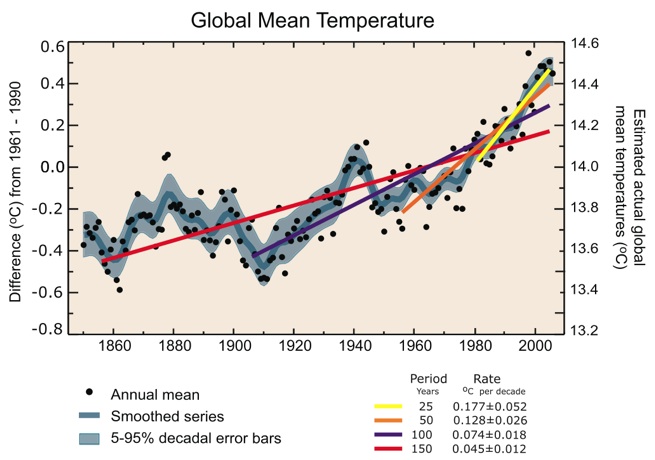
Annual global mean observed temperatures (black dots) along with simple fits to the data. The left-hand axis shows anomalies relative to the 1961 to 1990 average and the right-hand axis shows the estimated actual temperature (°C). Linear trend fits to the last 25 (yellow), 50 (orange), 100 (purple), and 150 years (red) are shown, and correspond to 1981 to 2005, 1956 to 2005, 1906 to 2005, and 1856 to 2005, respectively. Note that for shorter recent periods, the slope is greater, indicating accelerated warming. The blue curve is a smoothed depiction to capture the decadal variations. To give an idea of whether there are meaningful, decadal 5 to 95% (light blue) error ranges about that line are given (accordingly, annual values do exceed those limits). Results from climate models driven by estimated radiative forcings for the 20th century suggest that there was little change prior to about 1915 and that a substantial fraction of the early 20th-century change was contributed by naturally occurring influences including solar radiation changes, volcanism, and natural variability. From about 1940 to 1970, the increasing industrialization following World War II increased pollution in the Northern Hemisphere, contributing to cooling, and increases in carbon dioxide and other greenhouse gases dominate the observed warming after the mid-1970s.
Remember that the overall annual average temperature of something huge, like the ocean, or the land surface, is not directly relevant to daily weather patterns. Therefore, even what looks like a modest increase of less than a whole degree Celsius over twenty years can have a large impact on world climate.
Measurements from boreholes
Recall from our discussion of heat flow in the New Madrid lesson that the Earth is a constant emitter of heat, both from the original heat of formation of the planet and from the decay of radioactive elements. The geothermal gradient describes the rate of increase of temperature of the interior of the planet as a function of depth and can be inferred from theoretical geochemical calculations, as well as seismic wave speed. The average geothermal gradient of the Earth is about 15°–25° C per km. This depends on the tectonic setting, as we saw in the New Madrid lesson.
Instrumented boreholes are used to measure heat flow at the surface (upper few kilometers or so) and they generally show a negative deviation from the geothermal gradient in the upper hundred meters of the subsurface because heat loss is greatest where the temperature difference is greatest—at the surface. This leads to a temperature vs. depth relationship that should look like the red lines on the figure below. In fact, boreholes are increasingly showing evidence of recent warming at the surface of the Earth. In the figure below the actual temperature measurements are the black dots and the red lines are just a sketch. The black dots show a positive deviation from the expected geothermal gradient. The observed profiles indicate warming, and the depth of the bend indicates warming in the last 100 years.
.jpg)
Temperature measurements (black dots) and a sketch of the expected geothermal temperature profile (red curves) in three boreholes in eastern Canada. The curvature in the upper parts of the profiles is a response, at least in part, to temperature changes at the surface. The linear increase of temperature with depth in the deeper sections of the holes is the undisturbed geothermal gradient.
Observations of Melting Ice
Sea Ice
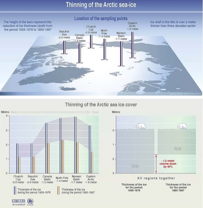
One of the direct consequences of a climate that is becoming warmer on average is that global repositories of ice are beginning to melt. Measuring the amount of melting takes time and requires repeated observations because ice caps and glaciers have natural seasonal cycles (more ice in the winter, less ice in the summer). Below is a schematic figure showing data collected for forty years in the Arctic. Polar sea ice thinned by an average of over a meter during that time!
Glacial ice
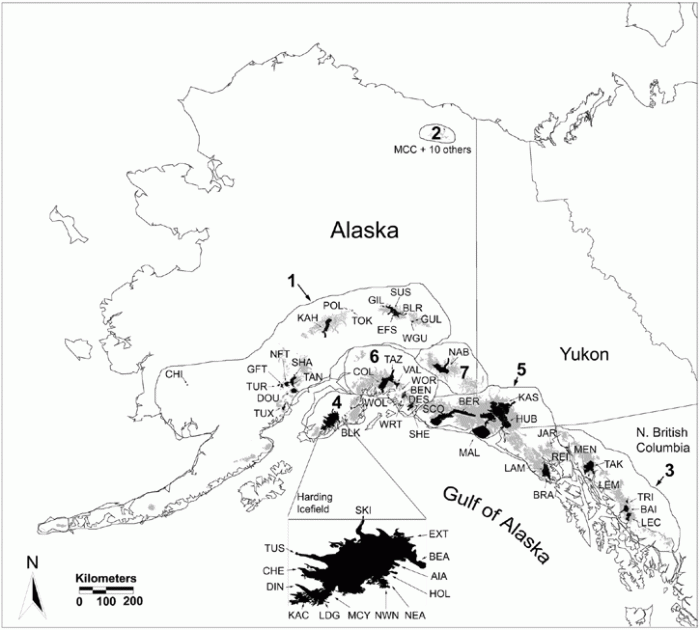
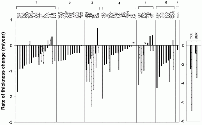
A survey of over 60 glaciers in Alaska has shown an alarming trend. On average, glaciers have been thinning from 1950 onwards. The rate of thinning has rapidly increased during the last ten years or so. Be careful to note the difference between discussing the amount of thinning and the rate of thinning. The amount of thinning is found by measuring the thickness of ice at two different times and subtracting. The rate of thinning refers to how fast the ice is getting thinner. Mathematically, the rate of thinning is the derivative of the amount of thinning, just like velocity is the derivative of displacement if you want to think of it in terms of simple motion. So, even if the rate of thinning was a constant number, say 10 centimeters per year, the amount of thinning would still be increasing every year (by 10 cm). The two figures below show a map of the glaciers from Arendt et al.'s 2002 study of Alaskan glaciers and a bar graph that denotes the rate of thinning for two different time periods of each glacier in the study. The observation of an increase in the rate of thinning is like an acceleration, to continue the analogy to simple motion. It means that glaciers in the past 10 years have been thinning even faster than they used to be.
Consequences of melting ice
What happens when ice melts? That's easy: it turns into water. Where does the water go? Eventually, it finds its way into the ocean. In the case of Arctic sea ice, the contribution of melt to global sea level is negligible. That's because this ice is already sitting in the water. The density of ice is less than that of water, but not by a whole lot. On the other hand, when Alaskan glaciers melt, this extra water does increase sea level around the world because the ice had been trapped on the land before. The activity below demonstrates this principle in a simple way.
Try this!
- Get a clear glass and fill it about half full with water. A pint glass works well for this.
- Mark on the side with a china marker the level of the water.
- Put a few ice cubes in the water and make another mark where the level of the water is now.
- Observe how much of the ice is above the top of the water and how much is hanging below. The amount below is called the "draft."
- Let your glass sit around until the ice melts. Notice that the level of the water is not too much different from the higher mark you made. Melting the floating ice doesn't raise the water level very much compared the initial amount it was raised by adding the ice to the system in the first place.
Penn State Research
Sridhar Anandakrishnan, a professor in Penn State's Department of Geosciences, conducts field geophysical experiments on glaciers in Antarctica. Watch the video below to find out more about how his work on glacier dynamics relates to other studies of recent climate change.
Video: A Visit to Antarctica with Dr. Anandakrishnan - Part 1 (05:06)
[MUSIC PLAYING] SRIDHAR ANANDAKRISHNAN: Hi my name's Sridhar Anandakrishnan. I'm an associate professor of geosciences at Penn State University.
I'm going to give you a short bio, a little bit of background about myself. I first went to Antarctica-- gosh-- almost 30 years ago in 1985. It was the first time I went down. I went down just as a worker on a project with some other folks that were studying these glaciers.
I just went there to look around and to help out on the project. I was captivated by the, really, the stark and uncompromising beauty of the continent. And I decided I want to study this.
Over the years, I discovered that not only was it personally fulfilling because I was working in a beautiful place, but it was also important for the rest of the planet. What happens in Antarctica doesn't just stay in Antarctica. It actually comes out and affects the rest of us here. And I've enjoyed very much being a part of that-- that search.
[MUSIC PLAYING]
What got me most interested in glacial climate change was originally simply I wanted to be in Antarctica. And one of the most important things about Antarctica is how it's going to change in the future as we continue to pump carbon dioxide, CO2 into the atmosphere, as the temperature starts to increase-- continues to increase, what does it do to the ice of Antarctica?
That's what originally got me interested in it. But since then, one of the things that sustains my interest is what's going to happen to people who depend on water from glaciers, fresh water from glaciers-- people in the Mountain West of this country, people in the Andes, and most importantly to me, people in India and Bangladesh and Pakistan, who depend on meltwater from glaciers in Himalayan mountain range.
And as temperatures increase, those glaciers are melting and being lost at an increasingly rapid pace. And so the future looks very bleak for those people. We need to understand this.
So when I'm in Antarctica, our days are divided, really, into three parts. One part is simply surviving, living-- waking up in the morning, making breakfast, feeding ourselves and making communications.
We've got to call folks back home and let them know we're OK. If they don't hear from us for a day or two days, then they'll send out a rescue airplane. Because we're in such a remote place, we have to keep very close touch with our base station.
It's just four of us out there in the middle of the glacier and not another person for maybe 500 miles in any direction and just four of us in our tents and our gear. So the first thing that we do out there is just make sure we're safe, make sure that we're happy, healthy, things are going OK.
The second thing that we do out there is do our work-- wake up in the morning. We've taking care of ourselves. The next thing is we have to go out and do the work that the National Science Foundation is paying us to do, that Penn State University is paying me to do and that I love to do.
And that research is you try and understand how thick the glacier is and what's underneath the glacier when I walk around on top of any landmass a glacier or even the rocks of central Pennsylvania, all you see is the surface. What's down below, what's down a mile underneath us?
You don't really know unless you can do the experiments that I do, which are called seismic reflection imaging where we set off a small explosive shot at the surface. And the sound waves from that go down through the glacier, hit the bottom, bounce off it, come back up to the surface.
And then we measure how long did it take, how much energy did it leave going down and coming back-- those sorts of things tell us a lot about the glacier. So that's the work we do. So wake up in the morning and spend the whole day setting off explosive shots, a pyromaniac's dream come true.
But we do it safely. We do it carefully. We don't do it in a wasteful way. And we are doing it to find out more about the glacier.
And then we'll do that all day long until the evening. And then once again we have to make sure we're safe, make sure we're healthy.
The third thing we do is try and keep the excitement of being out there, that energy up through a long, six-week, eight-week, 10-week season. You have to make sure you're having fun. Make sure that everybody's spirits are up. And it's an incredibly important part of the day to come together as a community, even though a very small community-- four of us-- and make sure everybody's OK.
[MUSIC PLAYING]
Video: A Visit to Antarctica with Dr. Anandakrishnan - Part 2 (5:07)
[MUSIC PLAYING] DR. SRIDHAR ANANDAKRISHNAN: So some of the things that are really good about this job are I get to do fun things in beautiful places. But that's a very personal reward. It's almost a selfish reward. Really, one of the most extraordinary, positive aspects of this work is what's happening in Antarctica affects us over here in central Pennsylvania.
Sea levels are rising. Glaciers are melting. Temperatures are rising. Sea ice is melting. All these things affect us here in the US, and I have a piece of that. I'm working on that. I'm studying that. I'm learning about it. And boy, is that ever an exciting and deeply fulfilling part of the job. So that's the positive part.
And the downside of it is I'm gone from home a long time. I'll leave here sort of mid-November. You have to remember, in Antarctica, the seasons are reversed. And so it's summertime down there in November, December, and January. And so I go down there when it's, quote, "summer," even though it's still cold. You can see the snowmobiles whipping by behind me.
And I'm away from home for 10 weeks at a time. And that's pretty hard on my family. But nevertheless, we manage. I've been doing this for a number of years. So those are the-- you have to always balance these things.
[MUSIC PLAYING]
If there's one cliche that people know about glaciers is, oh, it's moving at a glacial pace. You get behind your grandmother driving a Buick LTD and you say, oh, she's moving at a glacial pace. One of the extraordinary things that I have discovered that nobody expected-- I didn't expect, anybody else expected-- is that these glaciers are astonishingly dynamic. They change the speed at which they flow from their standard glacial pace to what are, for glaciers, extraordinarily fast rates over very short periods of time.
So let me give you an example. Most glaciers flow maybe two or three feet in a day, and that's a booking case for glaciers. Most glaciers, 90% of the glaciers, will flow maybe a few inches per day. But the really fast ones might make it to two or three feet in a day.
Well, there's one glacier in particular in Antarctica that I've worked on a lot called William's Ice Stream that goes the whole range. Part of the day, it goes at zero to one inch per day, just hardly moving at all, just sitting there stuck. And then, for very short periods of that day, it'll suddenly lurch forward. It'll speed up to 5 or 10 or 15 feet per day. The speed at which it's going will suddenly just whip forward.
Now, 15 feet per day might not sound like a lot to you. You could probably do 15 feet in just a few seconds with just walking along. But for a glacier to speed up from nothing to very, very fast for a glacier and then back to nothing in a day is an astonishing phenomenon, and one that nobody really expected. And I'm really quite proud to have been a part of that discovery.
Let me tell you a little bit about what comes next. We've spent a lot of time studying the continent. We've learned some of these extraordinary things that we didn't know-- what I referred to a little while ago about how the glaciers can change their speed at rates that we hadn't understood. It's those sorts of unanticipated, unexpected behavior modes of the glacier that we really need to nail down in the coming years.
So when scientists go out and study a system, they like to build computer models of how that system is operating now and how it's going to operate in the future so that we can dial in different parameters. We can say, OK, the temperature's going to go up by two degrees. What'll happen to Antarctica? It'll go up by three degrees. What'll happen to Antarctica?
Well, for us to believe those projections, believe those prognostications, those models need to be good models. And we're finding out that these glaciers are changing so rapidly that our models aren't as good as we thought. And that's what we're going to have to work on next.
[MUSIC PLAYING]
Reading Assignment: Alaskan Glaciers and Antarctic Ice Sheets

How much water is in a cubic kilometer of water?
The volumes discussed in studies like these (for example, the amount of ice loss, the amount of meltwater produced, etc.) are given in cubic kilometers. Do you have any sense about how much water is in a cubic kilometer? Here's a little estimation that puts this into perspective
Video: Cubic Kilometer (3:44)
PRESENTER: When I try to picture really big or really small numbers, I like to break it down into something else that I can understand a little better just so that I have some idea of what's going on.
In this lesson, we read a paper by this group of scientists, and they estimated that between the 1950s in the 1990s, Alaskan glaciers lost an average volume of around 50 cubic kilometers of water every year. And then between the 1990s and the early 2000s, those same glaciers lost closer to 100 cubic kilometers per year of water. Do you have any idea how much water is in a cubic kilometer, much less several cubic kilometers? Let's do a little calculation to try to put that into perspective.
What if I took one cubic kilometer of water and I wanted to apportion that water out for the entire world so that every single person in the world would get some of that cubic kilometer. How much water would everybody get? Well, we can do that calculation.
If I have one cubic kilometer, that is a box with 1,000 meters on a side. So that equals 1,000 times 1,000 times 1,000 meters. That is 1 billion cubic meters. And I also know that in one cubic meter, there are 1,000 meters.
So if we have 1 billion cubic meters, and there's 1,000 liters in each cubic meter, that means we have 10 to the 12th meters of water in a cubic kilometer. Now's a good time for me to give a shout out to my 12th grade government teacher from Blacksburg High School, Karen Colson, who explained to our class that she thought that one of the reasons Jimmy Carter did not get elected to a second term is because he tried to convert this country to the metric system. And we all know how well that worked-- not very well. So I don't think most people can actually even picture what a liter probably is. But all of us non-scientist, milk-drinking Americans probably know what a gallon looks like. It looks like this. And there's about four liters in every gallon.
So if I have 10 to 12 liters and I divide that by 4 to get gallons, then that's about 0.25 times 10 to the 12th gallons. And as of late 2012, there were about 7 billion people in the world, so we just have to divide this number by 7 billion. And we'll figure out how many gallons of water everybody is going to get.
And that number is this. We can write this in a much more normal way by just moving this decimal three places over to take care of this exponent. And what we find out is in each person in the world gets about 36 gallons if we had one cubic kilometer of water and we apportion that up over everybody.
But remember, in this paper we're not talking about one cubic kilometer of water. We're talking about between 50 and 100 cubic kilometers of water every year. That is a lot of water, my friends.
Reading/Discussion
The contribution of land glacier melting to global sea level rise has been explored in a recent study of Alaskan glaciers. In this study, airborne laser altimetry was used to determine the mass and thickness of over fifty glaciers. This method is a huge improvement over previous studies that have used complicated and imprecise mass-balance calculations to estimate the rate of glacial melting. The results of this new study show that Alaskan glaciers contribute more meltwater than was previously thought and are losing mass faster than was previously thought. When you read these papers, think about how the results of this study will be incorporated into global climate models.
Then, read a paper that is about climate modeling in which researchers construct a model that does a better job of fitting the sea level and temperatures of the past than has previously been accomplished. The key was adding in warming ocean currents, a warm atmosphere, and a chain reaction of collapsing ice shelves.
As usual, for the Alaskan glaciers paper, I recommend reading the accompanying Perspective (Meier and Dyurgerov, 2002) first, then reading the scientific paper (Arendt et al., 2002). For the modeling work, I recommend reading the accompanying News Focus first (Tollefson, 2016) and then the scientific paper (DeConto and Pollard, 2016).
Alaska
- Meier, M. F., & Dyurgerov, M. B. (2002). How Alaska affects the world. Science, 297(5580), 350.
- Arendt, A. A., Echelmeyer, K. A., Harrison, W. D., Lingle, C. S., & Valentine, V. B. (2002). Rapid wastage of Alaska glaciers and their contribution to rising sea level. Science, 297(5580), 382
Antarctica
- Tollefson, J. (2016). Trigger seen for Antarctic collapse. Nature, 531, 562.
- DeConto, R.M. and D. Pollard (2016). Contribution of Antarctica to past and future sea-level rise. Nature, 531, 591.
Questions for discussion:
- What are the specific causes of sea level rise and how are these causes measured?
- What factors contribute to predictions of future sea level rise? How does the new data detailed in Arendt et al.'s study impact sea level rise calculations? How does the new model in DeConto and Pollard's study impact sea level rise predictions?
- What are the difficulties involved in making measurements of ice volume? What are the different methods used and how do they work?
- How is past sea level reconstructed?
Participating in the discussion
The discussion component of this activity will take place over Week 1 of this lesson and will require you to participate multiple times over that period.
- Enter the "Alaskan Glaciers and Antarctic Icepapers" discussion forum.
- You will see the questions above already there
- Respond to a question that hasn't already been chosen by another student. If all questions have already been addressed, then select a question where you can further the discussion and post there.
- Return to the discussion periodically to read your classmates' postings and to respond by asking for clarification, asking a follow-up question, expanding on what has already been said, etc.
Grading criteria
You will be graded on the quality of your participation. Please see the rubric for teaching/learning discussions. [4]
Greenhouse Gases and the Keeling Curve
The Greenhouse Effect
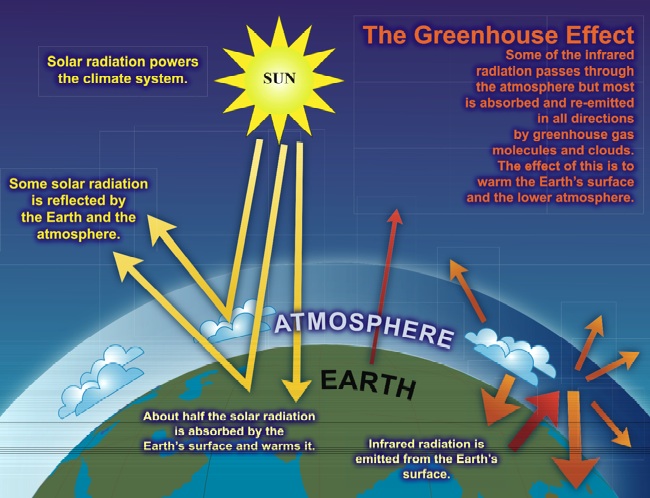
One of the most common misconceptions about global climate is that the greenhouse effect is just a hypothesis whose role in recent climate change is debatable. In fact, the greenhouse effect is an observable fact of what goes on in our atmosphere. The sun's radiation is transmitted to the Earth through our atmosphere. Some of this radiation is reflected back out into space, but some of the radiation in the infrared spectrum gets absorbed and re-radiated by the greenhouse gases in our atmosphere. This warms up the surface of the planet and it's an extremely important effect because without it the planet would be way too cold for us to live on it. The schematic cartoon below depicts this. The main greenhouse gases are water vapor (making up about 2/3 of the total), carbon dioxide, and methane. These all occur naturally, but human activities have increased the concentrations of carbon dioxide and methane through industrial activities and clear-cutting forests. We've also synthesized some greenhouse gases that aren't naturally occurring and added those to the atmosphere, too.
Even though Earth's natural carbon cycle moves a gigantic amount of carbon between the land, sea, and atmosphere naturally, the balance is pretty delicate and the amount humans have been adding to the atmosphere since the Industrial Revolution lingers in the atmosphere for over 100 years. This means that the effects of climate change we feel now were produced by activities in the past. The fact that greenhouse gases keep being emitted by human activity now means that we have already committed to a warmer future.
Carbon dioxide
The "Keeling Curve" might be the most famous plot of global climate data. Charles Keeling began measuring the atmospheric concentration of carbon dioxide at Mauna Loa in 1958. Today, four air samples an hour are collected from the observation towers at Mauna Loa and the concentrations of several gases are measured. The NOAA keeps track of observations from over 50 stations around the world. The average concentration of CO2 in the atmosphere has steadily increased ever since monitoring began.
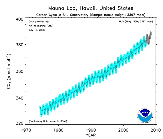
Let's take a look at this plot together (oops! note that in my explanation I mistakenly say that the y-axis is carbon dioxide concentration in millimoles per mole of air when in fact it is micromoles per mole.):
In addition, check out this really cool animation that shows how carbon dioxide concentrations have increased in the atmosphere globally over the past few decades. In the video, the x-axis is latitude and the y-axis is CO2 concentration. The various different symbols represent different types of recording stations (tower, airplane, etc) and the line is an average value.
Problem Set: Plot Your Own Climate Data
In this activity, you will use the Interactive Atmospheric Data Visualization tools of NOAA's Earth System Research Laboratory to create some plots of climate data that interest you.
Problem set
Part 1: Visualize your own climate data

Go to Interactive Atmospheric Data Visualization [8] and follow my directions:
-
The main page has an interactive map of the world with a bunch of colored dots on to designate places where atmospheric data is habitually collected by NOAA. You'll see that the default current selection is set to the Mauna Loa Observatory. Click “Carbon Cycle Gases” to expand that menu and then choose Time Series. You will be taken to a new page. Don’t change anything on the page, just scroll down and click the Submit button. You have just generated a time series plot of carbon dioxide concentrations recorded at 3397 meters above sea level at the Mauna Loa observatory. In fact, it is exactly the same plot we discussed on the previous page of this lesson, except more updated because I created that course page a while ago. Go ahead and try it! Then after you check out the plot, you can click the “Site Selection" link to get back to the original page we started on.
-
Now back at the original page, you see a world map and by hovering your mouse over the different circles you can find out the name of any station and what kind of samples it takes (carbon dioxide, methane, whatever) and how long the station has been active. If you click on one of the network station symbols, the menu side of the page changes so that you can make a plot of that station's atmospheric data. Go ahead and play around with this Web site. There's a lot of neat stuff here. You can always click “Site Selection" to get back to the original page we started on.
-
Pick two stations other than Mauna Loa and preferably ones that have at least a couple of years of data. It’s also interesting to pick one in the northern hemisphere and one in the southern hemisphere.
-
Make time series plots for both carbon dioxide (CO2) and methane (CH4) at your stations—that's 4 plots. You can save the plots to your computer by clicking where it says "PDF version" on the page where it makes your plot.
-
Create a word processing document (Microsoft Word, Macintosh Pages, Google Docs, or PDF) to record your work for this problem set.
-
Paste your plots into your document, and answer these questions.
- Where are your stations and what type of data collection do they employ? (i.e., how far above sea level? surface? airplane? tower?)
- Compare your time series plots of CO2 to that of Mauna Loa in a few sentences. Are the ambient levels of CO2 today the same or different at each of the three stations? Is the change per year about the same or different? Is CO2 level rising faster / slower / at the same rate at your stations compared to Mauna Loa?
- What is the seasonal variability of CO2 at your stations compared to that at Mauna Loa? (You can see the average seasonal pattern better by choosing the "seasonal patterns" option when you make your plot.)
- Compare your time series plots of CH4 to that of Mauna Loa in a few sentences. Are the ambient levels of CH4 today the same or different? Is the change per year about the same or different? Is CH4 level rising faster / slower / at the same rate at your stations compared to Mauna Loa?
- What is the seasonal variability of CH4 at your stations compared to that at Mauna Loa? (You can see the average seasonal pattern better by choosing the "seasonal patterns" option when you make your plot.)
- A well-mixed atmosphere is one that is basically homogenous with respect to gas concentrations on short timescales (less than a year). If our atmosphere is well-mixed, it means that regardless of the locations of the sources of the greenhouse gas emissions, all parts of the world have about the same level of greenhouse gas concentrations. Based on this exercise, is our atmosphere well-mixed with regard to carbon dioxide and methane? (Feel free to check out a few more stations to verify your answer.)
- Before the Industrial Revolution, the concentration of carbon dioxide in the atmosphere was about 270 parts per million. Many climate scientists have hypothesized that the present climate conditions for which our species is adapted will deteriorate significantly and irrevocably if the atmospheric concentration of carbon dioxide doubles from its pre-industrial level. If the current average rate of increase of carbon dioxide concentration you have observed at your three stations remains the same, when will atmospheric carbon dioxide double its concentration from pre-industrial times?
Part 2: Bad cherrypicking of good data
People often wonder how there can be different interpretations of the same datasets. In Part 2 of this activity, we will deliberately set up a "strawman" of a dataset that has been selected to maximize the potential for incorrect interpretation in order to see how different interpretations can arise. To do this we will take advantage of the fact that there is natural variability in the concentration of CO2 in the atmosphere due to the seasonality of plant growth. We will make two plots, each containing several months of data at Mauna Loa.
Go to NOAA's Trends in Atmospheric Carbon Dioxide [9] page and follow my directions:
-
Scroll down to the bottom of the page so that you are looking at the plot called “Mauna Loa Daily,
Monthly and Weekly Averages for two years”
-
Use the slider bars below the plot to make the x-axis go from Oct 2017 to April 2018. Take a screenshot of this plot and include it in your document.
-
Use the slider bars below the plot to make the x-axis span June 2018 - October 2018. Take a screenshot of this plot and include it in your document.
-
Answer the Part 2 questions on your document.
Here are the Part 2 questions:
- Look at the October to April plot. Pretend you have never seen the full range of data spanning multiple decades. Estimate the rate of change of atmospheric carbon dioxide from this plot.
- Look at the June to October plot. Pretend you have never seen the full range of data spanning multiple decades. Estimate the rate of change of atmospheric carbon dioxide from this plot.
- Why is it so important to sample the atmosphere continuously and for a long period of time?
- What are some of the points raised in this problem set that do not lend themselves to simple table-top experiments in a lab or a classroom?
Submitting your work
Upload your document to the "Lesson 5 - Keeling curve problem set" assignment in Canvas by the due date indicated on the first page of this lesson. Here's what should be in your document: 4 plots from part 1 and the answers to the part 1 questions; two plots from part 2 and answers to the part 2 questions. Name your document like this:
L5_keelingcurve_AccessAccountId_LastName.doc/.pdf/.pages
For example, Cardinals second baseman Kolten Wong would name his problem set L5_keelingcurve_kkw16_wong.doc
Grading rubric
I will use my general rubric for grading problem sets [10] to grade this activity.
Specific Heat Capacity of Water
The world's climate system does not respond fully and immediately to externally applied forcing. This lag time has allowed the debate about the effect of human activities on climate to go on longer than it would have if everything we did were instantly noticeable. For example, when a certain amount of extra CO2 is added to the atmosphere, the warming effects on the air, land, and ocean take some time to be fully realized. Even if there was a way to add heat directly to the Earth, it would still take time for the temperatures we measure to increase. In this activity, we'll conduct a simple experiment to observe the specific heat capacity of water. By doing so, we'll be able to gain some insight about the lag time of the climate system's response to external forcing.
The specific heat capacity (Cp) of liquid water at room temperature and pressure is approximately 4.2 J/g°C. This means it takes 4.2 joules of energy to raise 1 gram (or 1 milliliter if you'd rather think of the equivalent volume of 1 gram of water) of water by 1 degree Celsius. This is actually quite large. The specific heat capacity of water vapor at room temperature is also higher than most other materials. Here is a table of the specific heat capacities of various materials:
| Material | Cp(J/g°C) |
|---|---|
| liquid water | 4.2 |
| air | 1.0 |
| water vapor | 1.9 |
| granite | 0.8 |
| wood | 1.7 |
| iron | 0.0005 |
Note that none of the other materials listed above come close to water's ability to absorb heat. (Nitpicker alert: Water does not have the highest known heat capacity. The heat capacity of pure hydrogen gas at room temperature is 14.3 J/g°C, according to the CRC Handbook of Chemistry and Physics. Pure H2 is not a big player in the Earth's climate system, though.)
The high Cp of water is why "a watched pot never boils!" This is also the main reason the climate is slow to respond to external changes. It is lucky for us that the ocean has the ability to absorb a lot of heat before its temperature rises appreciably. The flip side of this is that once an external source of energy is removed, the ocean is similarly slow to respond. Its temperature will not begin to decrease right away. In the next activity, we will observe this phenomenon.
Optional Fun Lab!: Specific Heat Capacity of Water Lab Experiment
The world climate does not respond immediately to the external forcings applied by human activity. A simple way to show why this is so is to make some simple observations about the heat capacity of water.
Materials
These are the materials you need for this lab: water, a pot, a thermometer, a stove or other heat source, a watch or other timer.
Directions
- Measure a volume of water (you can choose the volume) into your pot.
- Measure the starting temperature of the water.
- Put the pot on the stove and turn on the stove (you can choose how high to turn it up, but keep the level constant)
- Measure the temperature of the water at regular intervals. It is up to you to decide how often you need to make measurements.
- When the water boils, note the time, and remove the pot from the heat.
- Continue to make regular measurements of the temperature of the water until it cools back down to the initial temperature from step 2.
- Now pick an experimental variable, such as the initial volume of water in the pot, the kind of pot, how high to turn on the stove. Change this variable and repeat the experiment. Change this same variable at least one more time and do the experiment again.
Answer the following questions:
- Plot your data for each experiment.
- How long did it take each pot of water to boil?
- How long did it take each one to cool back down?
- Eyeball a best fit function to the water-heating-up data for each experiment. What do these functions look like (linear? curved? could you write an equation down to describe them?) What is indicated by the shapes of these functions? Were they affected by the changes you made between experiments?
- Eyeball a best fit function to the water-cooling-down data for each experiment. What do these functions look like? Are they all similar to each other? Do they have the same form as the water-heating-up functions? Discuss why or why not.
- Describe which experimental variable you changed and how the change you made affected your results.
- Speculate about what would have happened if you had chosen a different experimental variable to change. Predict how changing that other experimental variable would have changed your results.
- How could you improve this experimental design?
Note:
This is optional, so there is nothing to turn in for this assignment, but this is a fairly simple and instructive experiment, so give it a try if you get a chance!
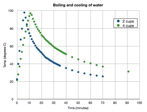
See my plot below of two experiments in which I varied the initial volume of water in the pot. Note how much time it takes for the water to return to the starting temperature after boiling!
Predictions Made by Climate Models
Now let's take a look at some predictions of future climate based on global climate models. Recall from Elizabeth Kolbert's article that there are several groups around the world in the business of producing, running, and tweaking global climate models. Each one is slightly different in the way it treats various Earth properties. For example, some climate models do a more extensive job of modeling the oceans, and others do a more extensive job of modeling atmospheric conditions, etc. Different climate predictions result from different initial conditions, different parameterizations of interactions between systems, and different assumptions about emissions into the future.
Climate scientists are often frustrated by the portrayal of different results as "scientists don't even agree on global climate change, so how are regular people supposed to know what's happening?" In fact, climate scientists do not disagree with the basic tenets of climate change. The fact that different global climate models output somewhat different results gives scientists better insight into the sensitivities of the models. All climate models that are part of the IPCC reports agree that the Earth's average temperature has increased since the Industrial Revolution. The exact details of how much warming, how that warming has been parceled out between reservoirs, and how much warming will continue into the future is debated among groups. It is statistically quite improbable that every group would be wrong and wrong in the same direction.
Recently, a survey was given to over 10,000 earth scientists to find out whether they thought that average global temperature has increased over the last two hundred years and whether human activities caused it. The results were that 90% think that global temperature has increased and 82% thought it was because of human activities (Doran and Kendall-Zimmerman, 2009). These findings are in contrast to another study that determined that only 52% of the general public thinks that climate scientists agree that the Earth is warming and that 47% of the general public believes that climate scientists agree that humans have caused it (http://www.pollingreport.com/enviro.htm) So, there is a definite discrepancy between what the scientific consensus is and what most people think the scientific consensus is.
I have chosen to discuss a few samples of model predictions from the Intergovernmental Panel on Climate Change for two reasons. The first is that its publications are the result of a huge collaborative international effort, so the plots you see below are have incorporated the widest agreement among climate scientists. Secondly, its estimates are pretty conservative (having to get past the most politicians) so we can proceed to look at their predictions without wondering whether these people are just a bunch of fringe group alarmist crackpots. They're not!
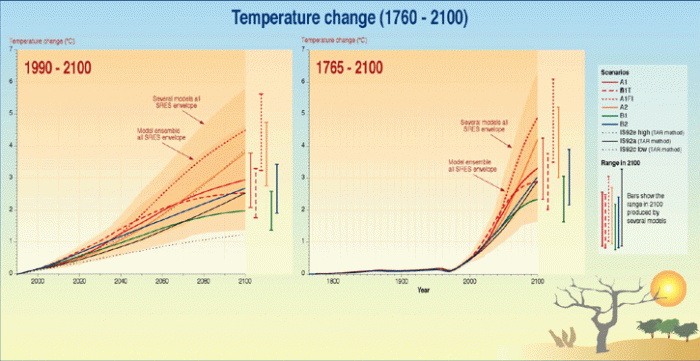
The first set of plots below shows a prediction of average global temperature rise from the present to the year 2100. The different line types represent several different model runs using six different "scenarios." These are called SRES scenarios and the main differences among them are the assumptions they make about the world's population and its greenhouse gas emissions into the future (i.e., whether emissions will continue to rise at today's pace, or whether emissions will stay at today's level but not continue to rise, or whether we will decrease emissions). The idea here is to bring climate modelers together, give them a suite of reasonable future scenarios, and then have them all run their models and see what the output is. Note that all models accurately reproduce past average temperature measurements (see right panel "1765–2100"). This is important because it establishes that these models can do a good job of "predicting" what has already happened. These models predict an increase in the global average temperature of between 1° and 6°C. Remember from our reading that during the last ice age the average temperature was only about 9°C colder than now.
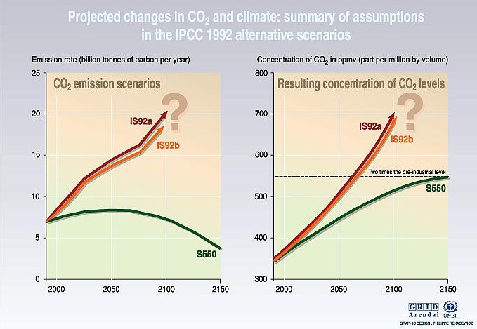
Understanding how CO2 concentrations in the atmosphere will change in the future requires carbon cycle models which model the relationship between emissions and atmospheric concentrations. In the figure below, a few selected emission scenarios are shown in the left panel, and the estimated CO2 concentrations in the atmosphere for these scenarios are shown in the right panel. All three scenarios—even one in which we reduce our rate of emission—result in increased atmospheric concentrations that are well above pre-industrial levels by 2100 (75% to 220% higher). Climate-induced environmental changes cannot be reversed quickly. Even if the anthropogenic emissions of CO2 are stabilized or reduced, the CO2 content in the atmosphere will still increase for some time.
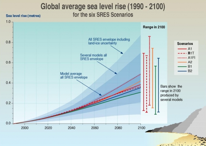
The paper detailing the study of Alaskan glacier wastage we read last week explains one of the results of a warming global climate: rising sea level. The plot below shows model predictions for global average sea level rise based on six emission scenarios. Think about how average sea level is measured. It's not so simple when you think about it. Remember from the tsunami lesson that at many places on the globe, daily tidal fluctuations are on the order of meters. Both tides and average sea level have natural seasonal variations, too. This means that average sea level must be measured carefully with respect to a reference point. It would be easy to produce a misleading dataset if measurements were taken haphazardly at different times of the year or without respect to some established baseline.
What effect does rising sea level have? What proportion of humanity lives within a meter of sea level? The model predictions in the plot below guess that by 2100 sea level might rise by about half a meter. These models probably err on the conservative side because they don't take into account as much glacial melting as many scientists now believe will happen.
The Grim and Treacherous Politics of Global Climate Change
Reading/Discussion Assignment:
Read the following articles, (linked directly from Canvas):
1. Plutzer, E., M. McCaffrey, A. L. Hannah, J. Rosenau, M. Berbeco, A. H. Reid, (2016) Climate Confusion Among U.S. Teachers. Science 351, 664-665.
2. Schiermeier, Q. (2010) The Real Holes in Climate Science. Nature 463, 284-287.
3. Kahan, D. (2010) Fixing the communications failure. Nature 463, 296-297.
And skim these two articles, (also linked directly from CANVAS):
4. Hegerl, G. (1998) Climate Change: Past as guide to the future. Nature 392, 758-759.
5. Mann, M. E., R. S. Bradley, and M. K. Hughes (1998) Global scale temperature patterns and climate forcing over the past six centuries. Nature 392, 779-787.
Teaching and Learning! (and Eliza's soapbox)
Climate scientists for many years hoped that the preponderance of observational data from a variety of sources would "speak for itself" and convince even the most jaded skeptics that the Earth is indeed warming. To their great dismay, the politics of global climate science continues to be as contentious as ever. As educators, it is up to us to train the world's future decision-makers. We need to make sure the general population has the ability to make logical conclusions based on observations, to evaluate a scientific argument, and to appreciate the social and psychological implications of the intersection of science and policy. I picked the articles above to get us thinking about these topics. A short preview of them:
Dan Kahan's article is an excellent piece on scientific communication and it explains how people align themselves with certain viewpoints. Quirin Schiermeier's piece is a straightforward treatment of what we don't know about Earth's climate. He makes an important point that every minute scientists waste debating facts that nobody should dispute is a minute not spent searching for the answers to the pressing knowledge gaps he writes about.
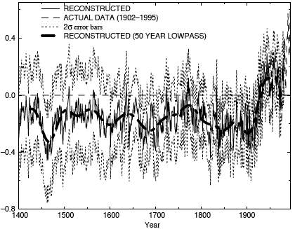
The other two articles are science research articles. The 1998 paper by Mike Mann and coauthors is the one that has the original "hockey stick" graph (reproduced above) that shows the recent abrupt upward swing in global temperatures based on a variety of observed and proxy data. The piece by Gabriele Hegerl is a "News and Views" article, similar to other ones you've read before in this class. The point of a "News and Views" article in Nature is to summarize a research paper in the same issue, putting it into context so that other scientists outside the field may appreciate the original article's impact. I put Mike Mann's article in our course reserves precisely because I think it is important for you to be exposed to the actual science at the heart of the controversy, as opposed to only hearing the spin on either side of the debate. Let me point out that I am only asking you to skim this article because it is extremely complicated and lengthy. It was not written for a general audience of nonscientists! In fact, you'd have to be pretty far inside the loop to make a considered judgment of their statistical analysis and evaluate all the different datasets that went into this paper. I still think you should have a look at it, though.
Consider these questions for our discussion:
- Consider the paper by Kastens et al. that we read way back in Lesson 1. How do feedback loops, spatial awareness, and deep time figure in to the debate about climate?
- Consider the paper by Bloom and Weisberg that we read way back in Lesson 1 about how people process scientific concepts they are unfamiliar with. How do the tendencies discussed in that paper impact the climate debate? Do the concepts Bloom and Weisberg talk about seem validated by the Plutzer et al. paper?
- What role should scientists play in communication with the public? What role should journalists play? What role should educators play? What role should politicians play?
- What is the appropriate level of education secondary students should receive about global climate and how do you navigate the politics of this subject?
Participating in the Teaching/Learning/Reading Discussion
- Enter the "Teaching and Learning About Climate Change" discussion forum in Canvas
- You'll see the reading guidance questions there, but I also want you to contribute your own thoughts about how this issue is or is not addressed in your community.
- Read postings by other EARTH 501 students, too, and respond to at least one other posting by asking for clarification, asking a follow-up question, expanding on what has already been said, etc.
Grading criteria
You will be graded on the quality of your participation. Please see the rubric for teaching/learning discussions. [4]
Playing with a Simple Climate Model
The purpose of the following activity is to introduce you to an interesting and simple climate model that can be run fairly easily on a Web browser. The main thing I want you to do is to fiddle around with this model, try things, and see what happens. Pretty vague directions, huh?! But there's a catch. The deliverable for this activity will be that you come up with a short lesson based on using this model that you think would be appropriate for students. This will aid your thinking about your capstone project for this course.
Write Your Own Climate Lesson Using the JCM
Directions
- Go to the Java Climate Model [13].
Follow their directions to launch the JCM. My personal preference is to download the zip file and run the program offline. - Once you have launched the model, you are presented with an alarmingly busy page with a menu panel, a panel full of words, and four colored plots that don't all necessarily follow Eliza's Rules for Good Labelling. This is an example of a model created by scientists for scientists, perhaps that is their excuse. In any case, I will not try to explain everything you see here, especially since this model's Web designers did a pretty good job of it themselves. Follow my example below and then you are free to do what you want to for this assignment.
- My best advice: If you ever find yourself completely confused and want to start over again, just quit the model and restart it. Doing so will initialize the setup from the original starting point.
- Watch my JCM5 demo screencast [14] to see me show you around the basics of this interactive model.
- Here are some things to remember: The default upon starting up the model is to present plots that assume a scenario in which the world has capped the concentration of CO2 in the atmosphere at 450ppm by the year 2100. Pay attention to cause and effect in this model. For example, if, as in the default scenario, we cap CO2 concentration at 450ppm by 2100, then the sea level rise plot shows the effect of that, but the emissions plot shows what we'd have to do to stabilize at that concentration, and the temperature plot shows what the temperature rise relative to 1850 would be in that situation. In other words, CO2 concentration stabilization does not cause emissions reduction! It's the other way around! Sounds obvious but it can be confusing if you don't think it through and pay attention to which parameter you use to drive the model.
- Now it is up to you to play around with this model and come up with a lesson that explores a parameter (or more than one) that interests you. This is what I want you to do:
- Find a parameter that interests you: emissions, sea level rise, temperature, a particular emissions scenario, a mitigation strategy, etc., and play around with this model to find some interesting data to plot and interpret.
- Write down step-by-step instructions so that somebody else (like ME, because I will follow your instructions when I grade this!) could follow along the path you took and get the result you got.
- Decide what you want to teach. (If you made a student go through this exercise, what would the take-home message be for them?)
- Write down some follow-up questions for the mythical student so that the student would have to interpret the plot they made and think a little bit about the implications of the results they got. Be sure to include the answers to these questions! This will help me understand what level of thinking you expect from your intended audience.
- Write a short paragraph that explains to me why you chose the parameter or scenario you did and what you hope will be the take-home message from your exercise.
- Save an electronic version of your activity as either a Microsoft Word, Macintosh Pages, or PDF file in the following format:
L5_lessonplan_AccessAccountID_LastName.doc (or .pdf).
For example, St Louis Cardinal third base coach and former "secret weapon" Jose Oquendo's file would be named "L5_lessonplan_jmo1_oquendo.doc" You can look it up: his given name is José Manuel Roberto Guillermo Oquendo Contreras.
Submitting your work
Upload your file to the Java Climate Model dropbox in CANVAS by the due date indicated on the first page of this lesson.
Grading rubric
I will use my general grading rubric for problem sets [10] to grade this activity.
Additional Resources
Websites
- The US Environmental Protection Agency's site for schools [15]--actually the current administration has taken this site down as of spring 2017
- The Center for Remote Sensing of Ice Sheets - K-12 Education Overview [16]
- The Center for Remote Sensing of Ice Sheet (Kansas University) sea level rise maps [17]
- NOVA - "Mountain of Ice: If the Ice Melts [18]
- Climate Wizard: a user-friendly visualization tool for historic and predicted temperature and rainfall maps [19]
- Frequently Asked Questions about Climate Change (at the CO2 Information Analysis Center of the US Department of Energy) [20]
Publications
Dessler, A.E. and E.A. Parson. (2006). The Science and Politics of Global Climate Change: A Guide to the Debate, Cambridge University Press, 190pp.
Doran, P.T. and M. Kendall Zimmerman. (2009). Examining the Scientific Consensus on Climate Change, Eos 90, 22-23.
Gehrels, W. R., B. P. Horton, A. C. Kemp, and D. Sivan. (2011). Two Millenia of Sea Level Data: The Key to Predicting Change, Eos 92, 289-290.
Hegerl, G. and P. Stott. (2014). From Past to Future Warming, Science 343, 844-845,
Howat, I. M., K. Jezek, M. Studinger, J. A. MacGregor, J. Paden, D. Floricioiu, R. Russell, M. Linkswiler, R. T. Dominguez (2012). Rift in Antarctic Glacier: A Unique Chance to Study Ice Shelf Retreat, Eos 93, 77-78.
Mote, P., L, Brekke, P. B. Duffy, and E. Maurer. (2011). Guidelines for Constructing Climate Scenarios, Eos 92, 257-258.
Pierrehumbert, R. T. (2011). Infrared radiation and planetary temperature [21]. Physics Today, 64(1), 33-38.
Rowley, R. J., Kostelnick, J. C., Braaten, D., Li, X., & Meisel, J. (2007). Risk of rising sea level to population and land area. Eos, 88(9), 105–107.
Summary and Final Tasks
One of the great challenges ahead in climate modeling is to extend the results of global climate models to make predictions about what will happen at the regional or local level. Where will there be more extreme weather? What areas will experience more rainfall and where will there be extensive droughts? How will the addition of cold fresh water to the oceans change the ocean's circulation pattern? These changes are coming because of the anthropogenic forcings we have already added to the climate system. It yet remains for public policy and mitigation efforts to catch up with and support the scientists who study global climate.
Reminder - Complete all of the lesson tasks!
You have finished Lesson 5. Double-check the list of requirements on the Lesson 5 Overview page to make sure you have completed all of the activities listed there before beginning the next lesson.