Course Outline
Lesson 1: Preinstructional Activities
Overview

Did you read the Syllabus?
Good idea to do it before you begin this course.
About Lesson 1
The point of this lesson is to get some free practice completing some activities that are similar to ones you'll have to complete later in the course for a grade. That way, if you run into trouble doing things like making a plot, or taking a quiz in Canvas, we can solve the problem right now. I don't want pesky technical problems getting in the way of fun science later on!
What will we learn in Lesson 1?
By the end of Lesson 1, you should be able to:
- Read a scientific article and discuss it with the class using a Canvas discussion board.
- Make an acceptable-looking plot of a dataset using a plotting program of your choice.
- Submit an assignment in Canvas.
- Take a quiz in Canvas.
What is due for Lesson 1?
Lesson 1 will take us one week to complete. Try to get Lesson 1 done by 26 May 2020.
The chart below provides an overview of the requirements for Lesson 1. Lesson 1 assignments are graded based on participation, not correctness. Completing all the assignments in Lesson 1 is 5% of your course grade. Assignments are detailed more thoroughly on subsequent pages in this lesson.
| Requirement | Submitted for Grading? | Due Date |
|---|---|---|
| Participate in 'Meet and Greet' discussion forum | Yes - Your discussion board participation counts toward your Lesson 1 grade. | Multiple participation spanning 18 - 26 May 2020 |
| Read an excerpt from a book and discuss it with the class. | Yes - Your discussion board participation counts toward your Lesson 1 grade. | Multiple participation spanning 18 - 26 May 2020 |
| Create plots of datasets | Yes - This exercise will be submitted to a Canvas assignment and will count toward your Lesson 1 grade (participation, not correctness). | 26 May 2020 |
| Pre-instructional quiz | Yes - Taking this Canvas-based quiz will count toward your overall Lesson 1 grade (you will not be graded on the correctness of your responses, only on whether you completed the quiz). | 26 May 2020 |
Questions?
If you have any questions, please post them to our Questions? Discussion Forum (not e-mail). I will check that discussion forum daily to respond. While you are there, feel free to post your own responses if you, too, are able to help out a classmate.
Getting to Know You
I'd like to get to know you...and help you get to know each other!
Meet and Greet Discussion
Introduce yourself and meet the rest of the class!We will use a discussion forum to post and read self-introductions. To access the discussion forum:
- Go to the Canvas home page for this course
- Find Module One: Preinstructional Activities.
- If it is not expanded, click the triangle to expand the module
- Go to the Meet and Greet discussion
- Create a new thread containing your personal introduction. You can type into the box that says "Reply":
- Who are you?
- What do you do when you are not taking this class?
- What's your background in science, education, or something else?
- What is your interest in this course?
- View and reply to other students' postings to learn more about them.
- Try to get this done by the due date indicated in Canvas.
Reading & Discussion Assignment
To begin, I would like you to read an excerpt from the book Earthshaking Science, by Susan Hough. It is a part of a chapter that tells a brief historical account of the plate tectonics revolution. I think this is an ideal starting point for this course and hopefully, it will stir your interest because, in Lesson 2, you will be researching the scientific contributions made by various scientists who had a part in formulating plate tectonics. The discussion of this reading will last throughout the week, so be sure to read it early and check in to the discussion forum often. See the Overview page for specific dates.
Earthshaking Science Excerpt
Directions
Read the following excerpt from Earthshaking Science, available in Canvas.
- Hough, Susan, "Plate Tectonics Revolution", excerpted from Earthshaking Science: What we know (and don't know) about earthquakes, Princeton University Press, 2002, pp. 1-12. (Read up to the bold heading Seismology and Plate Tectonics)
Submitting your work
Once you have finished the reading, engage in a class discussion as described below.
This discussion will take place over the entire week devoted to Lesson 1 and will require you to participate multiple times during that period.
- Find Lesson 1 - Plate Tectonics Revolution Discussion Forum in Canvas
- You will see the questions below already there:
- What types of evidence did Wegener call on for his continental drift hypothesis? Why was his hypothesis not accepted by other scientists of the time?
- Hough calls Harry Hess's 1962 paper "The History of Ocean Basins" an idea paper. What is meant by this? Why was this paper so important?
- Discuss some of the technological advances that aided the plate tectonics revolution.
- I think it is too easy to read an account of a scientific revolution and assume that people back then were just ignorant. (Why didn't they get it? It's so obvious!) However, science is often more of a steady march than a series of dazzling leaps. There are unsolved problems now that will be solved by today's scientists and future generations will scoff at us for not "getting it" at the time. What is your favorite unsolved problem today? (In any field, not just Earth science.)
- Respond to a thread that includes responses to these questions. If you feel that your response has already been "said" by another student, then post a response to someone else's remarks that expand on what has already been said, asks for clarification, asks a follow-up question, or furthers the discussion in some other meaningful way.
- By the end of the activity, I would like you to post at least one original thought/opinion/question and at least one thoughtful response to someone else's post.
Grading criteria
You will be graded on the quality of your participation. See the grading rubric [1] for specifics on how this assignment will be graded.
Plotting, Part I
Note:
If you have already taken EARTH 501, you are in luck! This assignment is almost identical to the one you did for Lesson 1 of that course, so this should not take you too long at all. Hooray!
Choosing a graphics program
When you have your students make plots of data in your classes, what medium do they use? Do they use a computer program, or a graphing calculator, or pencil and paper? Something else? I actually find pencil and paper to be extremely instructive. When I use a pencil and paper, I have to think about how to draw my axes and what the plot will probably look like before I begin. However, I think we all expect our own students to be a little more savvy about computer use than we were at their age. When I make plots for my research I use MATLAB. I expect many of you have access to or regularly use Microsoft Excel. (I find that most plots produced in Excel look ugly or have incomprehensible labels or both. However, if you can make a good plot with Excel, go for it!)
On the next page of this lesson, you will complete an activity that involves reproducing three plots using the graphing program of your choice. For this course, it does not matter what program you choose. What does matter, is that you are able to generate a dataset and make a plot with it that looks adequate for a 500-level college class. So first, you need to figure out which program you would like to use. If you already have a program you like, by all means, use it. If you don't, or you want to check out some other possibilities, here are some links to other programs.
Freely available programs
- Soft Integration [2]
- ChartPart [3]
- Kids' Zone: Learning with NCES [4]
- GCalc [5]
- Apache Open Office: [6] The program you want here is called "calc"
- Plot2: [7] Mac OSX platform only
- Gnuplot: [8] Need to be able to interact with the command line for this one
- Octave-Forge: [9] Mimics Matlab, but you need to be a fairly savvy user for this one
Programs with a free demo available
- Synergy Software [10]
- DeltaGraph [11]
- Ma [12]tlab [13]
Tell us about it!
For my benefit and the benefit of future students, if you know of other programs, please post the link to Questions?. If you check out any of the above programs, please share what you like and dislike about them as well. If any of you have access to MATLAB and would like to learn more about it, let me know.
Plotting, Part II
Now that you have identified the software you want to use to create plots of datasets, I want you to reproduce three plots and submit these to me for review. This activity will be graded based on participation only (either you made three plots or you didn't). I will provide constructive feedback to you about the way your plots look. Even though I will not grade this particular exercise for accuracy, the rest of the lessons in this course (as well many lessons in other courses in the program) will require you to make some plots. Your grades on those activities will in part depend on your ability to produce a clear and satisfactory plot, so consider this exercise free practice.
Reproduce 3 Plots
Directions
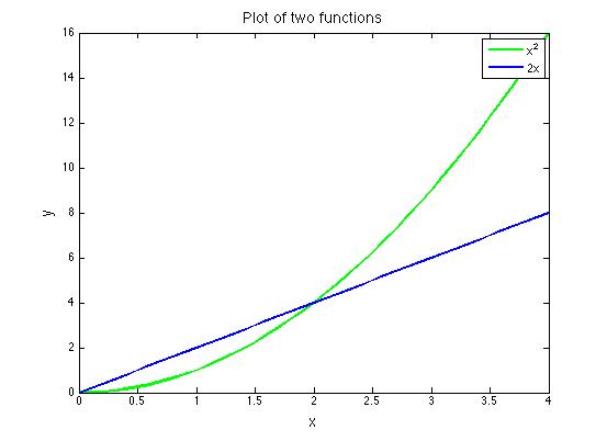
Below is the first plot you have to reproduce. Graph the functions y = x2 and y = 2x on the same set of axes. The satisfactory plot will include: a title, labeled axes, axes tick marks and labels, two different line styles (doesn't have to be color) to differentiate the functions, and a correct legend identifying the two functions. All fonts should be large enough to be legible. You may choose the range of your axes, the aspect ratio of your plot, and the line style of each function.
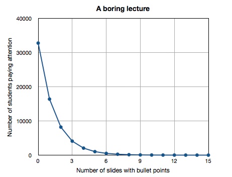
Next shown is the second plot you have to reproduce. When I was in grad school we joked that when a scientist gave a presentation, every equation shown would cause half the audience to stop paying attention. I have noticed this is also true of students attending lectures in which the lecture consists entirely of powerpoint slides with nothing but text bullet points on them. Let's pretend we are at a boring lecture of this type and the person giving the lecture has 15 slides. At the beginning of the lecture, before any slides are shown, everyone in the audience is paying attention. Each time a new slide full of text bullet points is shown, half of the audience tunes out. How many people would have to be in the audience for there to be one person left paying attention at the end? It's easier to figure this out if you work backward in time. I have included a partial table of values below to get you started. You can continue filling the rest of it out until you get to the zeroth slide.
| Number of slides shown | Number of audience members paying attention |
|---|---|
| 15 | 1 |
| 14 | 2 |
| 13 | 4 |
| 12 | 8 |
This plot should be made on linear axes. The satisfactory plot will include a title, labeled axes, axes tick marks, and labels. Since you are plotting discrete data points, please plot them with a symbol. Since it is understood that each data point follows the previous one in time, you can connect the symbols with a line. All fonts should be large enough to be legible. You may choose the aspect ratio of your plot and what kind of symbol and line style to use.
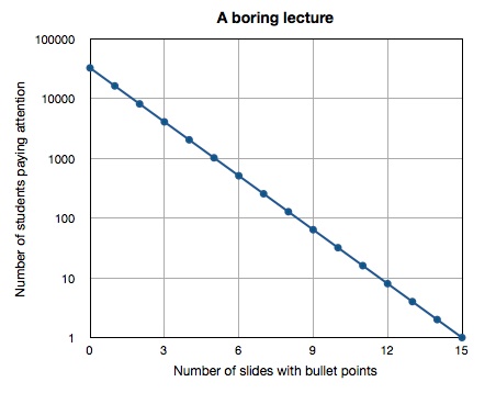
For your third plot, use the table of values you generated when making plot #2 to make the same plot, but using a logarithmic y-axis. The satisfactory plot will include a title, labeled axes, axes tick marks, and labels. Since you are plotting discrete data points, please plot them with a symbol and connect the symbols with a line. All fonts should be large enough to be legible. You may choose the aspect ratio of your plot and what kind of symbol and line style to use. *Alternative: If you have trouble making log axes, you may instead take the log of each y-value in your table and plot the resulting data instead. Your plot should still look like the plot below, but if you choose this option, you must label your y-axis accordingly.
Submitting your work
You may choose to submit these plots one of two ways: you may save them as graphics files (.jpg, .pdf or .tiff) or if you use a Web plotting program that allows you to save your plot as a link, then you may paste the links in when you submit your assignment.
Save your files in the following format:
L1_plot1_AccessAccountID_LastName.doc (or .jpg or .pdf or .tiff).
For example, Cardinals former second baseman and hall of famer Lou Brock would name his file "L1_plot1_lcb20_brock.doc"
Submit your three plots in Canvas. Go to Module One: Preinstructional Activities and find 3 Plots. Click that and once you've done that you will see a "Submit Assignment" button. Press that and get ready to upload your files or paste your link in there.
Grading criteria
As I mentioned at the top of the page, this activity will be graded based on participation only (either you made three plots or you didn't). However, I will provide constructive feedback to you about your plots.
What is your Solid Earth Science Background?
Pre-instructional Quiz
Go to Canvas and take the Lesson 1 - Pre-instructional quiz, located in Module One: Pre-instructional Activities
Submitting your work
The quiz is entirely self-contained in Canvas. When you click on the Submit button at the bottom of your quiz, it will be shared with me.
Grading criteria
This quiz is NOT graded for accuracy, only for participation. I just want to get a sense of your Earth science background relevant to the lessons we'll cover in this course. I will provide feedback about incorrect answers, though. Don't worry if Canvas gives you a bad grade because I will go in manually and override it. This also means there's no reason to take the quiz more than once. Just read the feedback and move on.
Summary and Final Tasks
Okay, enough with the background stuff, let's move on to Lesson 2 and do some science!
Reminder - Complete all of the lesson tasks!
You have finished Lesson 1. Double-check the list of requirements on the Lesson 1 Overview page to make sure you have completed all of the activities listed there before beginning the next lesson.
Tell me about it!
If you'd like to comment on, or add to, the lesson materials, feel free to post your thoughts in one of the course discussion boards in Canvas, such as the Random Thoughts board or the Questions? board
Lesson 2: The Giants of Science
Overview
In Lesson 1, we read a brief history of the basic research that led to the formulation of plate tectonics. In this lesson, research the life and scientific contributions of the scientist of your choice. The goal is to explain to your classmates how your scientist contributed to our modern view of the solid Earth.
I like the idea of starting this course with some exploration of the history of plate tectonics because it is such a young theory. In addition, if you probe a little farther you'll find that we knew a lot about the Earth before plate tectonics pulled it all together. I think it is pretty impressive to contemplate some of the observations made decades ago when scientists had nothing like the equipment capabilities for measurement and computation that we have available to us now.
I also think this is the perfect opportunity to get to know each other better by reading each other's work.
What will we learn in Lesson 2?
By the end of Lesson 2, you should be able to:
- edit a Web page in Canvas
- research the contribution to our knowledge of the solid Earth made by a particular scientist
- explain the technological advances that improved geological observations of plate motions
- describe the differences between the concepts of "continental drift," "sea-floor spreading," and "plate tectonics"
- define and explain the following terminology: plate, lithosphere, asthenosphere, crust, mantle
What is due for Lesson 2?
The table below provides an overview of the requirements for Lesson 2. For assignment details, refer to the lesson page noted.
Lesson 2 will take us two weeks to complete. 27 May - 9 Jun 2020
| Requirements | Submitted for Grading? | Due Date |
|---|---|---|
| Choose your scientist. | No | |
| Research your scientist. | No | |
| Create your Web page. | Yes - create content in Canvas. (Your content will be graded after you've had time to reflect on it and revise it.) | 2 Jun 2020 |
| Requirements | Submitted for Grading? | Due Date |
|---|---|---|
| Respond to the Web pages made by your classmates. | Yes - Use the Canvas Lesson 2 peer review discussion boards. Your thoughtful critique will be part of your grade. | multiple participation spanning 3 - 9 Jun 2020 |
| Revise your page in response to comments and reflections. | Yes - your final content will be graded. | 9 Jun 2020 |
Questions?
If you have any questions, please post them to our Questions? Discussion Forum (not e-mail). I will check that discussion forum daily to respond. While you are there, feel free to post your own responses if you, too, are able to help out a classmate.
Contracting Earth v. Continental Drift v. Plate Tectonics
Even though the point of this lesson is for you to create your own knowledge, I think it is worth me giving you the one-page summary as I see it of the history of plate tectonics. Your job is to focus on a scientist who contributed to our current knowledge of how the solid Earth works, but here I will give you a synopsis of how the prevailing wisdom changed gradually from about the time Wegener published "The Origin of the Continents and Oceans" in 1915 up until 1968 which is approximately when Plate Tectonics became the standard.
Contracting Earth theory (early 20th century)
In the early 20th century the prevailing wisdom regarding how mountain belts were formed and why the sea is deep was that the Earth started out as a molten blob and gradually cooled. When it cooled, heavier metals such as iron sank down and formed the core, while lighter metals such as aluminum stayed up in the crust. The cooling also caused contraction and the pressure produced by contraction caused some parts of the crust to buckle upwards, forming mountains. Other parts of the crust buckled downwards, creating ocean basins. Picture in your mind a grape turning into a raisin as it dries out.
Video: Contracting Earth Hypothesis (1:21)
Click here for transcript
Before Alfred Wegener came along and proposed continental drift, the prevailing wisdom of how the Earth’s topography was created was based on the hypothesis that the Earth had contracted from its original state as a molten blob. So you can kind of imagine a grape turning into a raisin and see how this raisin has some mountain belts and some deep valleys which could be like the ocean floor, maybe.
This model has 2 big predictions that we can test with observations, and one of them is that the crust can’t move horizontally, it can only move vertically. The pressure caused by contraction causes some places to uplift and some places to buckle downward, but they don’t move from side to side, right. And the other prediction which is a little more subtle, I think if you look at a handful of raisins you’ll see what I mean. And that is that all of the elevations are normally distributed about some mean elevation. So what I mean is that if you can picture all of the different elevations, high and low, on the surface of this raisin, there should be basically a bell curve of elevations and the middle of that bell curve would be the sort of average elevation.
And we can actually test both of these predictions and we’ll see why they don’t work. Ultimately that’s one of the reasons why the contracting Earth hypothesis has to be rejected.
Isostasy
The contracting Earth hypothesis was further refined by introducing isostasy. Isostasy is the concept that all elements in a system are in hydrodynamic equilibrium or trying to get there. For example, if you have a bathtub of water, a chunk of balsa wood floats higher than an ice cube because balsa wood is less dense than ice. If you were to push the balsa wood down, it would pop back up when you took your hand away. The popping back up is the balsa wood bringing itself back into equilibrium. It happens very fast because water has low viscosity. Now, what if you had a bathtub full of molasses instead of water? When you push the balsa wood down, it will indeed rise back up again after you take your hand away but it will happen more slowly because molasses is more viscous than water.
What does this have to do with the Earth? Well, the pre-continental drift idea went like this. Heavy parts of the crust sank down and lighter parts raised up not only due to the pressure of contraction but also due to isostatic adjustments. The interior of the Earth was thought to be a viscous fluid that could accommodate this sinking and rising. This was the proposed mechanism favored by paleontologists who thought the reason identical fossil species were found on continents separated by oceans was that there had been connecting land bridges that sank.
Now, in fact, it is true that isostasy does govern mountain elevations. In fact, most mountain belts have a "root" like the keel of a boat and over long timescales, the mantle, in fact, does flow viscously, but the mantle is solid rock, not a fluid. Land bridges did not sink down into the mantle. That part is wrong.
Video: Isostasy (1:25)
Click here for transcript
So this little schematic drawing kind of shows the parts of isostasy that are right and the parts that aren’t right at the same time. See how this is a cross-section of the Earth and here’s a continent and then this is the sea floor. And you can see that this mountain belt has a root underneath it. This is right. This is a pretty good cross section of what the crust looks like.
The idea for how you end up with ocean in between two continents for some people was, well, ok, you have this bit of continental crust and it sank down into the mantle, and now these two things are separated by ocean. But let’s remember that the contracting Earth hypothesis didn’t allow for any lateral motion of the crust, only vertical motion. So, it leaves you to wonder how this ocean crust could get here. Where did it come from? If you have this land that sinks down, and now you have some ocean crust that pops up, how could you do that if all you can have is vertical motion? Well, you can’t. It doesn’t work, and so this is one of the limitations of this hypothesis and it was mechanical problems like this that people just swept under the rug because they couldn’t explain them and so they just didn’t think about it anymore.
Enter Alfred Wegener
So, this is where Wegener comes in. He had a Ph.D. in astronomy but most of his scientific contributions were in meteorology. He became very well known in his own lifetime as an explorer of Greenland and as a meteorologist. In fact, he died in 1950 while leading an expedition across Greenland.
His interest in geology was basically a sidelight to his regular academic career and he had no training in geology. He assembled circumstantial evidence for his idea that the continents had once been joined. Let's examine that circumstantial evidence.
Jigsaw puzzle fit
Alfred Wegener was not the first person to notice that the continents fit together across the Atlantic Ocean. In fact, in the 1500s and 1600s when reliable maps of the east coasts of North and South America were produced, this feature was obvious. I've always thought that this piece of evidence has a little bit of Western ego attached to it. For example, if you look at a map centered on the Pacific Ocean, do you notice anything? No, not really, because there is a complete absence of anything that looks like a jigsaw puzzle fit there.
Rock types and geologic structures
If you fit the continents back together the way the "jigsaw puzzle fit" suggests you should do it, then you'll see that rock ages, rock types, and mountain belts match up across the boundaries between continents (sketch below). In fact, other scientists have likened this to taking two halves of a newspaper torn lengthwise and fitting it back together so the sentences can once more be read across the tear.

Fossil evidence
Fossils of terrestrial plants and animals identical to each other were found on continents now separated by water. Could seeds be dispersed across an ocean by wind, water, or animal activity? Could animals that don't look like swimmers (see the Lystrosaurus below for example) get across an ocean some other way? Some people suggested the sinking land bridge idea, but we've already discussed the mechanical problems with that model. Others suggested mats of vegetation that could have drifted across the ocean carrying plants and animals to a new continent.

Evidence of ancient climates
Under the assumption that the kinds of climates that would form particular rock types and structures are similar today as they were millions of years ago, we can infer the past climate of a locality from studying its geology. If, for example, you find evidence of glaciation in a place that is now temperate and not ice-covered (such as Southern Africa), you are left to infer that the climate of the whole world was different, or else that Southern Africa was a lot farther from the equator when that glaciation happened than it is today. Alfred Wegener made a lot of contributions to these types of observations since meteorology and glaciology were his fields. Upon fitting the continents together as he proposed (sketch below), glacial striations found on now-separated land masses even looked like they radiated out from a common source.

Statistical Analysis of Topography
Remember back at the top of the page when we were examining the raisin? I said that with a raisin, even though the surface of the raisin is all wrinkly, the highs and lows of the surface are likely to be normally distributed about some mean value. If the contracting Earth hypothesis were true, one observation it predicts is that Earth's topography would be normally distributed about some mean also. We can check this out! When we do, we find that Earth's topography is not normally distributed, which leads us to the important conclusion that continental crust and oceanic crust are fundamentally different from each other (see my screencast explanation below). The realization that oceanic and continental crusts are different from each other was a huge leap towards figuring out sea-floor spreading and plate tectonics.
Video: Analysis of Earth's Topography (1:14)
If the contracting earth hypothesis were true then what you would expect is a random distribution of elevations at the surface. So, on this plot, I’ve got elevation on the y-axis and the thick line represents sea level. I’ve got an arbitrary frequency on the x-axis. Here’s what a random distribution would look like. In fact, the mean elevation on Earth is actually at about 2km below sea level. If the contracting Earth hypothesis were right, this distribution is what we’d expect to find. But this isn’t the real distribution. The real distribution looks like this. It’s bimodal. There are two peaks. One is near sea level, which is the average elevation of continents. The other one is a peak at almost -5 kilometers that corresponds to the abyssal seafloor. Statistically what this tells you is that the process by which these elevations are distributed is not random. In fact, there are probably two different processes, one that makes continental crust and one that makes oceanic crust. Once you take that into account, you realize that the contracting Earth hypothesis doesn’t really work very well.
Lack of mechanism for continental drift
Circumstantial evidence is just not enough! Each piece of Wegener's evidence was dismissed at the time because he couldn't come up with a physical mechanism that would work to move continents laterally apart from each other. I also think no small part of it is that scientists don't necessarily love it when outsiders to the subdiscipline come in with a novel idea. (True 100 years ago, true today.) Since Wegener was trained as a meteorologist, many geophysicists were skeptical of his ideas right from the start.
Video: Lack of Mechanism for Continental Drift (1:50)
Wegener knew that the sinking land bridge idea would violate isostasy and so he thought the continents did actually move apart from each other. His mechanism for how this would work is shown in this little sketch here where you’ve got continents and some sea floor. He actually thought continents would plow through the sea floor because the mantle is viscous. The problem with this is that the frictional resistance that you’d encounter when pushing a giant continent over the ocean floor is enormous. Think about trying to push a carpet across your floor just by shoving on one end of it. It wouldn’t work. You’d never be able to do it. Not only that but his idea that solid Earth tides would drive this didn’t really work either because some of the geophysicists like Harold Jeffreys calculated that if solid Earth tides were strong enough to move continents then actually the Earth’s rotation would stop in less than a year and also some mountains would probably collapse under their own weight. So the geophysicists knew that his model wasn’t going to work but they basically just dismissed the fact that the contracting Earth hypothesis had a bunch of internal contradictions and it couldn’t work either. It’s a little bit surprising, actually, that nobody kept hammering at that actually. Arthur Holmes proposed around this same time that convection in the mantle would drive continents to move and that’s not so far wrong from our picture today but it’s interesting that nobody took that idea and ran with it back then.
Conceptual sketch of plate tectonics
Video: Conceptual Sketch of Plate Tectonics (1:14)
This sketch is much closer to our conception of how plate tectonics actually works. I make a distinction between plate tectonics and continental drift because I think continental drift specifically refers to Wegener’s hypothesis which didn’t have a mechanism and therefore you can’t really call it a valid theory because it wasn’t accepted by other scientists and it did have some things wrong with it. Plate tectonics is a theory. And it works to explain most of the rest of the phenomena that we’re going to talk about in this course. In this sketch the mantle’s down here, here’s a couple of continents, and the sea floor, but now you can notice that sea-floor spreading is the mechanism by which new crust is created, so there’s a big sea-floor spreading center in the middle of the ocean floor, for example, pushing the continents on either side of it away so the ocean gets bigger. The Earth remains the same size. That means if you create new crust, then crust has to be consumed somewhere else, and we take care of this with a subduction zone like the one shown here where sea floor goes down and gets recycled into the mantle. So this is just a sketch and we will flesh out more about how this works as this course progresses.
Why so slow?
I think it is interesting to consider how long the plate tectonics revolution took to unfold. Consider that Wegener published "Origin of the Continents and Oceans" in 1915 in which he laid out the circumstantial evidence that indicated the continents had once been joined, but plate tectonics was not accepted as a theory until about 1968. Let's put that length of time into human perspective:
Check Your Understanding - Question 1
How many US presidents were there between 1915 and 1968?
Click for answer
Nine: Wilson, Harding, Coolidge, Hoover, Roosevelt, Truman, Eisenhower, Kennedy, and Johnson.
Check Your Understanding - Question 2
How many times did the Yankees win the World Series between 1915 and 1968?
Click for answer
The Yankees won the World Series twenty times between 1915 and 1968: 1923, 1927, 1928, 1932, 1936, 1937, 1938, 1939, 1941, 1943, 1947, 1949, 1950, 1951, 1952, 1953, 1956, 1958, 1961, and 1962. Just in case any of you were under the false impression that it's only recently that the Yankees have been treating all the other Major League teams as their own personal farm system, nope; it's how they've always operated. : )
Check Your Understanding - Question 3
How long had Joe Paterno been coaching at Penn State by 1968?
Click for answer
JoePa was hired as an assistant coach here @ PSU in 1950. Yes, he coached 18 years before plate tectonics!
Choose your Scientist
Directions
-
First, you need to pick a scientist. I have made a list of scientists below, but you are not limited to this list. Once you have decided on one, go into the Canvas lesson 2 space and find the pages that are now titled "scientist 1","scientist 2", etc. Go in and edit one of them so that the name of your scientist and your own name appear at the top. Then I'll go in and change the page title. This way other students will know who has been picked already.
Pick me! Pick me! Some possible Scientists for Lesson 2:
- Don Anderson
Tanya Atwater- Brian Atwater
- Francis Bacon
- Markus Båth
Hugo Benioff- Bernard Bruhnes
- Teddy Bullard
- Allan Cox
- Brent Dalrymple
- Charles Darwin
- Arthur Day
- Robert Dietz
- Richard Doell
- Maurice Ewing
- Beno Gutenberg
- Edmond Halley
- Harry Hess
- Arthur Holmes
- Bryan Isacks
- Thomas Jaggar
- Harold Jeffreys
- Tom Jordan
- Brian Kennett
- Inge Lehmann
- Xavier le Pichon
- Drummond Matthews
- Motonori Matuyama
- Dan McKenzie
- Felix Andries Vening Meinesz
- Giuseppe Mercalli
- John Milne
- Andrija Mohorovičić
- W. Jason Morgan
- Lawrence Morley
- Richard Dixon Oldham
- Jack Oliver
- Fusakichi Omori
- Bob Parker
- Harry Reid
- Charles Richter
- Keith Runcorn
- Chris Scholz
- Eduard Suess
- Lynn Sykes
Marie Tharp- Alex du Toit
Frederick Vine- Kiyoo Wadati
- Alfred Wegener
John Tuzo Wilson- Peter Alfred Ziegler
-
Once you have chosen a scientist, you need to spend a little time researching the life and times of whoever you chose. Best practice is to find and read a paper they wrote. I can help you traverse the Penn State Library for this task if you need help.
-
Next, populate your page in Canvas with information and images. The editor is pretty user friendly; post to Questions? if you have trouble. Please include links and citations to all the places where you found borrowed graphics and other information. Check out some of the papers on the Additional Resources page of this lesson (penultimate page) for more background on plate tectonics or to get some inspiration for this assignment. If your chosen scientist is still among the living, feel free to contact him/her. Former students have had some wonderful correspondences with the scientists they chose. Geoscientists are a friendly bunch.
Submitting your work
This lesson is two weeks in length. You need to complete your Web page by the last day of this first week of this lesson (see the Overview page for the date). That will enable us to spend the next week (Week 2 of this lesson) reflecting, reviewing, and revising.
Grading criteria
Your grade for this activity will be based on both the quality of your site, as well as on your thoughtfulness during the discussion portion of this lesson.
Response, Reflection, and Revision
Peer Review
Directions
Now that you have completed your own Web page, I want you to read the Web pages of your classmates and post your comments or questions. To do that, go to Module 2 in Canvas. There you will see I have made n new discussions where n = number of students in Earth 520. The discussions are labeled with the names of the scientists you all chose. The comments and questions should include interesting insights you may have gained from your fellow students' presentations, questions you might like them to answer, or something you want them to clarify.
Submitting your work
This is a graded activity. I would like to see each of you, individually, post at least one thoughtful comment or question to each of the other students' Web pages.
You may (should!) revise your own page in response to the critiques of your classmates. The final due date for the completed Web pages is the last day of lesson 2 (see the Overview page).
Note:
Do NOT edit/change any part of another student's page. You can't get away with this even if you try, because as the course editor, I can see who has logged in and made revisions to any page :-)
Grading criteria
As with other online discussions in this course, you will be graded on the quality of your participation. See the grading rubric [14] for specifics on how this assignment will be graded.
Resources
Here are some optional resources linked from our Canvas space. You may wish to skim these to get some details about the work done by the scientist you are researching.
- Like a Soup Plate on the Ground (1969). Nature 224, pp. 107-108.
- Hess, H. (1962). History of Ocean Basins. In Petrologic Studies: A Volume to Honor A. F. Buddington, pp. 599-620.
- Hallam, A. (1975). Alfred Wegener and the Hypothesis of Continental Drift. Scientific American 232, pp. 88-97.
- Chase, C. G., E. M. Herron,& W. R. Normark. (1975). Plate Tectonics: Commotion in the ocean and continental consequences. Annu Rev. Earth Planet Sci. 3, pp. 271-291.
Tell us about it!
Do you have another reading or Web site on these topics that you have found useful? Share it in the peer review discussions and cite it on your Web page!
Summary and Final Tasks
Hopefully we've all taught each other something new about the history of the plate tectonics revolution and some of the scientists involved. As an aside, I also hope that you've all become pretty familiar with the Web environment of this course.
Reminder - Complete all of the lesson tasks!
You have finished Lesson 2. Double-check the list of requirements on the Lesson 2 Overview page to make sure you have completed all of the activities listed there before beginning the next lesson.
Lesson 3: The Geodynamo
Overview
This lesson focuses on Earth's magnetic field. We will go over some background material regarding how the magnetic field is generated and why it is important that this planet has one. We'll discuss how to measure the field and also important implications of the magnetic field that led to other discoveries. Namely, we'll use magnetic anomaly maps to reconstruct plate tectonic motion, and we'll explore the Neat-o Interdisciplinary Idea of magnetoreception in animals.
What will we learn in Lesson 3?
By the end of Lesson 3 you should be able to:
- use magnetic anomaly charts to calculate ridge spreading rates.
- deduce plate speed using a variety of measurement techniques.
- discuss the ways in which animals interact with Earth's magnetic field.
- describe the characteristics of a dipole field.
- calculate paleomagnetic latitude for a given magnetic inclination.
What is due for Lesson 3?
As you work your way through these online materials for Lesson 3, you will encounter additional reading assignments and hands-on exercises and activities. The chart below provides an overview of the requirements for Lesson 3. For assignment details, refer to subsequent pages in this lesson.
Lesson 3 will take us one week to complete. 10 - 16 Jun 2020
| Requirement | Submitted for Grading? | Due Date |
|---|---|---|
| Reading discussion | Yes - we will discuss this in a discussion forum in Canvas. This will be part of your course discussion grade. | multiple participation spanning 10 - 16 Jun 2020 |
| Paleomag problem set | Yes - turn in to Canvas assignment called "L3: Paleomag problem set." This will be part of your course data analysis grade. | 16 Jun 2020 |
Questions?
If you have any questions, please post them to our Questions? Discussion Forum (not e-mail). I will check that discussion forum daily to respond. While you are there, feel free to post your own responses if you, too, are able to help out a classmate.
Reading Discussion
Please read the following articles, linked in Canvas. The first one, by William J. Broad, is a science article from the New York Times that discusses some of the recent research into the strength of Earth's magnetic field and also briefly delves into the history of magnetic field measurements. Broad also touches on our Neat-o Interdisciplinary Idea that animals use the magnetic field to navigate. In fact, he references the study done by Kenneth Lohmann and colleagues using sea turtles that you will also read as part of this assignment. The brief article from The Economist is a synopsis of a study done by Sabine Begall and colleagues in which they used Google Earth to try to assess the extent to which cows line themselves up preferentially with magnetic north while they graze. I have also included a recent article regarding measurements of magnetic fields induced by the small tsunami generated by the mag 8.8 earthquake in Chile that happened in April 2010.
Watch this!
A short video produced by Science discussing magnetoreception research. We Don't Know: Magnetoreception [15]
Readings
- Broad, W. J. (2004, July 13). Will Compasses Point South? New York Times, F.1.
- Lohmann, Kenneth; Cain, S. D.; Dodge, S. A.; & Lohmann, C. M. F. (2001). Regional magnetic fields as navigational markers for sea turtles. Science, 294(5541), pp. 364-366.
- Begall, Sabine (2008). Science and Technology: Animal attraction; Magnetism and behavior. The Economist, 388(8595).
- Manoj, Chandrasekharan and Stefan Maus (2011). Observation of Magnetic Fields Generated by Tsunamis. Eos, 92 pp. 13-14.
As you read, consider these questions
- What are some of the consequences of a deterioration of Earth's magnetic field for human activities?
- How has the path of evolution changed in response to field changes? (This is something I think about when I read about how animals interact with the magnetic field.) For example, turtles have been around since about the Devonian (around 400 million years ago). This is before the Atlantic Ocean even opened up, but since that time, how many times has the field reversed? (You can look this up!) How much do different migratory paths lengthen or shorten each year based on the movement of the plates? What does Lohmann speculate about how much a field reversal would impact his turtles?
- Do you understand how electromagnetic induction works? Does the Manoj and Maus article explain this property of tsunami waves or were they aiming at an audience who knows already? What are some of the practical uses of the kinds of measurements Manoj and Maus discuss?
Submitting your work
Once you have finished the readings, engage in a class discussion that will take place over the entire week devoted to Lesson 3. This discussion will require you to participate multiple times over that period. See the Overview page of this lesson for specific dates.
- Enter the Lesson 3 - Magnetic Field Discussion Forum in Canvas
- You will see postings already there, each containing one of the discussion questions above.
- Post a response to each question. If you feel that your response has already been "said" by another student, then post a response to someone else's remarks that expands on what has already been said, asks for clarification, asks a follow-up question, or furthers the discussion in some other meaningful way. By the end of the activity, I would like you to post at least one original thought/opinion/question and at least one thoughtful response to someone else's post.
- Don't feel like you have to give the most complete entire answer to each question as soon as you land on the discussion board. I want this to be an exchange of ideas, so it will work out better if everybody is able to contribute to the knowledge and ideas we are building as a class. Sometimes the best discussions are ones in which the first person only answers part of the question and thus leaves the door open for everyone else to participate.
Grading criteria
You will be graded on the quality of your participation. See the grading rubric [14] for specifics.
How is the Field Generated?
For an observer at the Earth's surface, the magnetic field is reminiscent of a permanent bar magnet whose poles are close to the geographic poles. Today the magnetic poles are about 11.5° away from the geographic poles. It is this difference that makes it necessary to set a correction on a GPS unit or a compass to account for the angle of declination (the azimuth of the horizontal component of the magnetic field) at your location. In the case where the magnetic and geographic poles coincide, which was most recently true in the late 1600s, the declination would be zero.
Consider a bar magnet

In order to build up a mental model of the Earth's magnetic field, let's start by considering a bar magnet like the one sketched below. You can also watch and listen to me draw a sketch of a bar magnet [16] and there's a transcript of my explanation of a bar magnet's field lines [17].
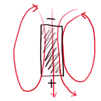
This bar magnet is a good first order approximation of the Earth's field. Note that I drew the negative pole on top and the positive pole on the bottom. The pole that we call the "north" pole is actually a south magnetic pole because the north poles of magnets are attracted to it! At the poles, the strength of Earth's field is about 6 x 10⁻⁵ Tesla, and at the equator, its strength is about half that.
At the atomic level
Why does a bar magnet have a magnetic field, anyway? At the atomic level, all atoms have electromagnetic properties because the electrons orbiting the nucleus of the atom produce a magnetic field perpendicular to the spin axis of the electrons as shown in the sketch below. You can also watch and listen to me draw the sketch of the alignment of electron spin axes [18] in a magnetic material as well as read the transcript of me describing electron spin axis alignment [19].
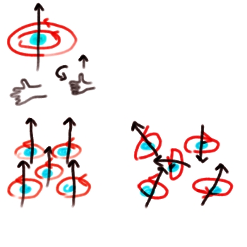
However, most materials, such as wood, glass, gold, or plastic have atoms randomly oriented so that the teensy magnetic fields produced by each atom cancel each other out. Some special materials like iron and magnetite are composed of atoms where the spin axes of the orbiting electrons all line up in the same orientation. These teensy magnetic fields add to each other and the result is a material that is permanently magnetized. The Chinese figured out thousands of years ago that if you heated iron above a certain temperature (modern science calls this the Curie temperature) and cooled it slowly you could form a magnet out of it. Above the Curie temperature, the iron is so hot that the atoms become disordered and vibrate about. Once the iron begins to cool, the atoms vibrate less and less and they lock into place in accordance with the field of the Earth. After the iron is cooled all the way, the orientation in which it cooled is "locked in." You can pick up the iron and wave it around, and it will still be permanently magnetized according to the direction it was pointed in as it cooled.
Self-exciting dynamo
So, the Earth is basically a great big permanent magnet. But how does it sustain its own magnetic field? Several models were put forward as early as 1600 to describe Earth's field. One idea was that the Earth's core functioned as a big iron bar magnet, like the first sketch above. In fact, the field lines observed at the surface of the Earth don't rule out this possibility. However, the temperature in the core is hotter than the Curie temperature for iron. The Curie temperature for iron is 770°C, whereas laboratory studies estimate that the temperature at the center of the Earth is about 6600 ± 1000°C. Furthermore, the exact direction and strength of the field fluctuate over time (for example, right now the field is getting weaker and drifting to the west—recall this from Broad's article), and this would not happen if the core were permanently magnetized and stationary. Therefore, the model that best fits our observations of the field is that of a self-exciting geomagnetic dynamo. What this means is that the outer core is composed of an electrically conducting fluid whose motions produce a magnetic field. This model was developed in the 1940s by Elsasser and Bullard and refined in the 1970s by Parker and Levy. A sketch of a simple self-exciting dynamo is shown below. You can also watch and listen to me draw the sketch of the dynamo [20] as well as read the transcript of the screencast about the dynamo [21].
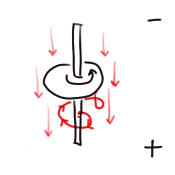
The Earth is different from this simple sketch because instead of just having a metal disk spinning about an axis with a hole in the middle, the Earth's outer core is a hot convecting fluid. Nevertheless, the sketch does have a couple of important features that are consistent with Earth's field. It can work in either direction, and it sustains its own field through its rotation.
Try this!
Typically textbooks will tell you to demonstrate magnetic field lines by sprinkling iron filings on a piece of paper and holding it over a magnet; the iron filings will orient themselves in the direction of the field lines of the magnet. This works if you happen to have a lot of iron filings at your disposal. If you don't, try this instead: Get a magnet and hold it up to the screen of your old picture tube TV set (you can do this with an old computer monitor too, but be careful because a strong magnet can play havoc with your hard drive). You should see rings of color around the magnet corresponding to the magnetic field of the magnet. This works because the way the TV projects a picture on to its screen is to electrify particular combinations of the red, green, and blue lights in each picture cell to create the image you see. If you get really close to your TV, you can see the picture cells. When you hold your magnet up to the screen you are basically overriding the magnetic field it was generating on its own.
Word of caution: Don't leave the magnet there too long or this effect can be permanent and you'll have to take your TV into a repair shop to have it degaussed. This experiment is best performed without any interested toddlers around to observe you!
Another word of advice: This won't work on any of them gol' durn newfangled LCD TV's. You've got to have an old one. What better use for an old tv set sitting around in your basement than donating its body to science, anyway?
Magnetic Field Reversals
The Earth's magnetic field occasionally undergoes a spontaneous reversal in which the north and south poles switch places. The mechanism of reversals is still not completely understood, although simulations on supercomputers have been able to reproduce them. These reversals happen very fast geologically speaking.
Quiz Yourself!
How do we know reversals must happen fast? (I mean geologically fast)
Click here to see if you are right!
Glatzmaier-Roberts Model
Below are some snapshots from the Glatzmaier-Roberts model of the geodynamo, which was first published in 1995. This model successfully reproduces the intensity of the Earth's field, its dipole character, and its present westward drift. It has also undergone a spontaneous reversal, as shown below (Figures from Glatzmaier and Roberts,1995).
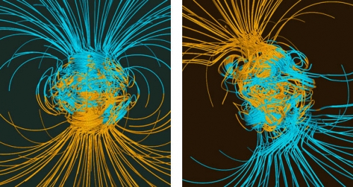
RIGHT: Like in the previous figure, but 500 years before the middle of a magnetic dipole reversal.
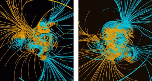
RIGHT: Like in the previous three figures, but 500 years after the middle of the reversal.
We still don't have a perfect understanding about how the outer core's convection has sustained the field for at least 3,500 million years, but being able to simulate the most obvious features of the Earth's field correctly is an awfully good start.
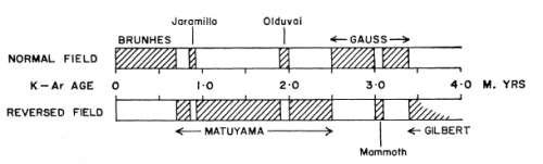
Geomagnetic Epochs in Time
Below is the 1999 Geological Society of America geologic time scale chart. The main thing I want you to see on this chart is that the periods of normal and reversed polarity have been marked so that they correspond with various ages on the time scale. These periods of time have mostly been set by careful correlation of marine floor magnetic properties.
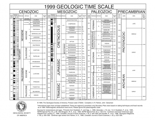
Watch this!
In the screencast below, I point out the markings indicating episodes of normal and reversed polarity as shown on the 1999 GSA geologic time scale.
GSA's Geologic Timescale with magnetic polarities
Click for transcript
This is a portion of the Geological Society of America’s version of the geologic timescale. Starting with the Cenozoic Era. This is today. Time goes backward down this axis and picks up again here in the Mesozoic at 65 million years ago. And then time keeps on going backward, down to about 250 million years ago. What I want you to see is that next to these ages — here’s 10 million years ago, 15 million years ago and so on — the direction of the Earth’s magnetic field is recorded. Each of these black bands, like this one, is showing times of normal polarity in which the Earth’s magnetic field is aligned the same way it is today. Then each of these white bands; for example, right here, here, and down here, show times when the field was reversed compared to today’s field. You can see that there are several reversals, many many. They don’t happen in any particularly periodic way, and they happen for different lengths of time.
Paleomagnetism, Polar Wander, and Plate Tectonics
The study of the Earth's magnetic field as recorded in the rock record was an important key in reconstructing the history of plate motions. We have already seen how the recording of magnetic reversals led to the confirmation of the seafloor spreading hypothesis. The concept of apparent polar wander paths was helpful in determining the speed, direction, and rotation of continents.
Apparent Polar Wander
To illustrate the idea of polar wander, imagine you have a composite volcano on a continent like the one in the sketch below. I assure you that the sketch will be better understood if you also watch the screencast in which I talk while I draw it.
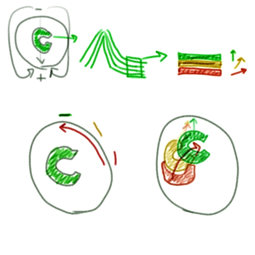
Apparent polar wander sketch
Click here for transcript
In order to illustrate an apparent polar wander path, let’s say we’ve got the Earth here, and it’s got its poles like so, just the way they are today. The magnetic field lines are going like that. And let’s say we’ve got a continent sitting here. It looks like this. There’s a volcano on this continent and it’s a composite volcano. A composite volcano spews out lava and it gradually builds up the mountainside with its lava flows like this. Here’s the lava coming down this side. Let’s pretend we are a geologist and we’re going to go to this volcano and we’re going to take some samples of these lava flows. We’ll zoom in on these lava flows here. The uppermost sample of the lava flow, we’ll call that this green one here. Underneath that green one there’s a more orange-yellow lava flow and then under that there’s this oldest one here. We have a magnetometer and so we can try to figure out which way all these lava flows thought north was when they formed and cooled. Let’s say that the red one points sort of in this direction and the yellowish one looks like this. The green one was formed during the field like it is today so its north is like that. There are two possible explanations for how this could have occurred. We’ll draw those right here. Explanation 1 is that the poles moved around and the continent stayed in the same place. In that case, we’ve got a continent sitting here. When the most recent lava formed, this green stuff, the pole was right up here, where it is today. But back when this volcano was making the yellow lava, the pole was in a slightly different place. It was more like over here. The oldest lava flow is recording a pole that was more like in that direction. In this case we end up with what we call an apparent polar wander path. Over time from back when to the present time the pole moved in that direction. The other possibility is that the continent moved and the pole stayed in the same place. In that case, the green continent of today would be here. When this lava froze, it was pointing north toward the north pole. Back when this yellow lava formed, if the pole was in the same place then the continent would have to have been over here somewhere like this because its lava froze pointing north, but then over time when this continent moved to its present position with the lava still frozen in place it is now pointing in a different direction that isn’t where north is anymore. If we go back even farther in time toward the red lava, then the continent must have been sitting in a position sort of like this. When its lava formed, it was pointing north, then when this continent went through this rotation, this lava was already frozen in place, so the direction it’s pointing isn’t in the same place that north is now. We can construct a path — an apparent wander path if you will — of the continent. We can see that the continent must have gone sort of like this. This is in the opposite direction of the one we constructed before.
This volcano erupts from time to time, and when its lava solidifies and cools, it records the direction of the Earth's magnetic field. A geologist armed with a magnetometer could sample down through the layers of solidified lava and thus track the direction and intensity of the field over the span of geologic time recorded by that volcano. In fact, geologists did do this, and they discovered that the direction of the north pole was not stationary over time, but instead had apparently moved around quite a bit. There were two possible explanations for this:
- Either the pole was stationary and the continent had moved over time, or
- The continent was stationary and the pole had moved over time.
Seafloor Spreading Saves the Day!
Before plate tectonics was accepted, most geologists thought that the pole must have moved. However, once more and more measurements were made on different continents, it turned out that all the different polar wander paths could not be reconciled. The pole could not be in two places at once, and furthermore, the ocean floors all recorded either north or south, but not directions in between. So how could lavas of the same age on different land masses show historic directions of the north pole differently from each other? Once seafloor spreading was recognized as a viable mechanism for moving the lithosphere, geologists realized that these "apparent polar wander paths" could be used to reconstruct the past motions of the continents, using the assumption that the pole was always in about the same place (except during reversals).
Calculating a Paleomagnetic Latitude
The example in my fabulous drawing gives a rather vague description of the idea behind using paleomagnetic data to reconstruct the former positions of the continents, but how is it actually done? We use magnetometers.
The angle between the Earth's magnetic field and horizontal is called the magnetic inclination. Because the Earth is a round body in a dipole field, the inclination is directly dependent on latitude. In fact, the tangent of the angle of inclination is equal to twice the tangent of the magnetic latitude, which is the latitude at which the permanently magnetized rock was sitting when it became magnetized. Therefore, given knowledge of your present location and a magnetometer reading of the inclination of your geologic item of interest, such as a basalt flow, you can calculate the magnetic latitude at the time of its formation, compare it to your present location, and determine how many degrees of latitude your present location has moved since that rock cooled.
Paleomag Problem Set
Directions
Save the Lesson 3 Paleomag Problem Set [23] to your computer. You will use this word processing document to record your work. The worksheet content is reproduced below but the link saves you from copying and pasting from the website. The worksheet is in Microsoft Word format. If you don't have access to Microsoft Word, let me know and I can give it to you in another format. You can use whatever text editor you like to work on this assignment. You can even do it by hand, as long as I can read your writing when you scan it. You will submit your worksheet to a Canvas assignment when you are done, so it must be in a format such as .doc, .docx, .pdf, .pages, .jpg, .png, .rtf or .txt so I can open it. If you have a format different than one of the ones listed, it still might work, but check with me first. If you do your calculations on a separate document or piece of paper, then submit those, too, so I can follow your calculations.
Problem Set
For the following problems let's assume that the magnetic poles coincide with the geographic poles to ease our calculations.
Example problem: State College, PA is located at 40.8° N, 77.9° W. Calculate its magnetic inclination.
Answer: Use the formula in which λ = the magnetic latitude and we are trying to solve for I. So,
Your turn!
Part 1
1.1 Auckland, New Zealand is located at 36.9° S, 174.8° E. Calculate its magnetic inclination.
1.2 Look up the coordinates of your hometown and calculate the magnetic inclination there.
1.3 If I = 0°, where are you?
Part 2
2.1 You are at a site in India whose coordinates are 23.3° N, 75.8° E studying some basalt outcrops and your magnetometer tells you that the magnetic inclination of the basalt is 30°. Calculate the latitude of this outcrop at the time the basalt erupted and cooled. (This problem is contrived on purpose to be the Deccan Traps, for those of you familiar with that location and where the Indian subcontinent was when they erupted)
2.2 If you can calculate the distance latitudinally that this site moved since this basalt erupted, do so. If not, say why you can't calculate it.
2.3 If you can calculate the distance longitudinally that this site moved since this basalt erupted, do so. If not, say why you can't calculate it.
2.4 Assume there was a 7% error in your magnetometer reading. How much would this error affect the distance you just calculated in 2.2 and/or 2.3?
The figure below is modified from Fred Vine's 1966 paper on seafloor magnetic reversals. Use it to answer the questions in part 3. Study the plot and verify in your head that you can find the names of seven epochs. These are geomagnetic epochs, which are not the same as "epochs" on the geologic time scale. I agree it is silly and confusing to use the same word for different things, but it's the way it is.
Part 3
3.1 Which geomagnetic epochs correspond to times when the field is normally polarized?
3.2 Which geomagnetic epochs correspond to times when the field is reversed?
Part 4
The East Pacific Rise profile below is also modified from Fred Vine's 1966 paper on sea-floor magnetic reversals. Use it together with the figure from Part 3 to answer the questions in Part 4.
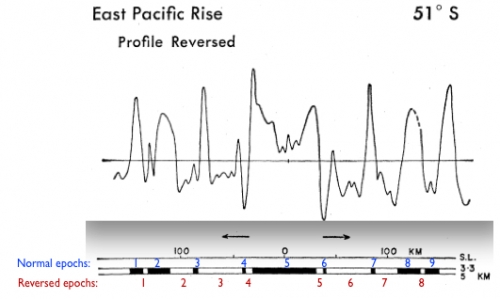
4.1 Identify the 9 normal geomagnetic epochs and the 8 reversed epochs I have labeled with numbers. The blue numbers are meant to lie on top of the black bits that show normally polarized times, and the red numbers are meant to lie directly underneath the white bits that show reversed times. I want you to identify the epoch that corresponds with each number. It may be easier to identify repeating epochs if you start from the middle and work outward.
4.2 Which geomagnetic polarity epoch corresponds to the crust that is 100 km from the spreading ridge?
4.3 About how old is the crust that is 100 km from the spreading ridge?
4.4 Calculate the spreading rate for this ridge (assume it is constant over the time shown in the profile).
Part 5
The South Atlantic ridge profile below is also modified from Fred Vine's 1966 paper on sea-floor magnetic reversals. Use it together with the figure from Part 3 to answer the questions in Part 5.
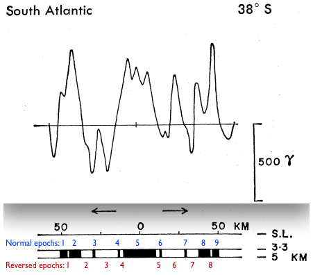
5.1 Identify the 9 normal geomagnetic epochs and the 8 reversed epochs I have labeled with numbers. The blue numbers are meant to lie on top of the black bits that show normally polarized times and the red numbers are meant to lie directly underneath the white bits that show reversed times. I want you to identify the epoch that corresponds with each number. It may be easier to identify repeating epochs if you start from the middle and work outwards.
5.2 Which geomagnetic polarity epoch corresponds to the crust that is 50 km from the spreading ridge?
5.3 About how old is the crust that is 50 km from the spreading ridge?
5.4 Calculate the spreading rate for this ridge (assume it is constant over the time shown in the profile).
Part 6
The figure below is from Müller et al., 2007. Use it to answer the questions in Part 6. This figure shows the age of oceanic lithosphere around the globe ranging from warm colors (young) to cool colors (old).
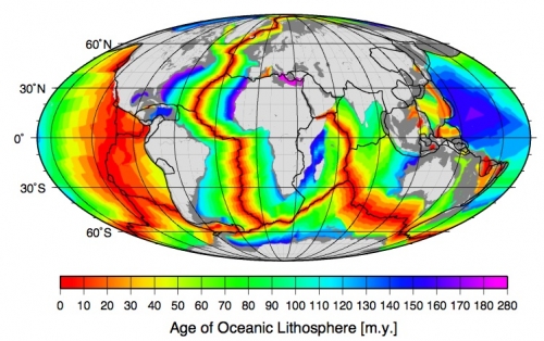
6.1 How can you deduce the relative speeds of the spreading rates of the different mid-ocean ridges from this figure?
6.2 Compare the East Pacific rise with the South Atlantic ridge. Do the relative spreading rates agree with the calculations you made in Part 4, Question 4 and Part 5, Question 4?
6.3 Where is the oldest ocean crust?
6.4 Why isn't there any ocean crust on this map that is older than 280 million years?
Submitting your work
Save an electronic version of your problem set in a format I can read. I gave you a list at the top of the page, but check with me if you aren't sure. Name your file like this:
L3_paleomag_AccessAccountID_LastName.doc (or other format)
For example, former Cardinals pitcher and hall of famer Dizzy Dean would name his file "L3_paleomag_jhd17_dean.doc"
Upload your problem set to the Paleomag Problem Set assignment in Canvas by the due date indicated on the Overview page.
Grading criteria
I will use my general grading rubric for problem sets [24] to grade this activity.
Additional Resources and Bibliography
Other Web sites with open datasets
IAGA magnetic palaeointensity database [25]
Bibliography
Müller, R. D., Sdrolias, M., Gaina, C., & Roest, W. R. (2008). Age, spreading rates, and spreading asymmetry of the world's ocean crust. Geochemistry, Geophysics, Geosystems 9 (4), @Citation Q04006. [Available through Library Reserves]
Vine, F. J. (1966). Spreading of the Ocean Floor: New Evidence. Science, 154, pp. 1405-1415.
Glatzmaier, G. A., & Roberts, P. H. (1995). A three-dimensional self-consistent computer simulation of a geomagnetic field reversal, Nature, 377, pp. 203-209.
Additional Reading
Johnsen, S., & Lohmann, K. J. (2008). Magnetoreception in animals. Physics Today 61 (3), 29-35.Tell us about it!
Have another reading or Web site on these topics that you have found useful? Share it in the next Teaching/Learning discussion!
Summary and Final Tasks
The intricacies of Earth's magnetic field are an ongoing area of research. We understand many things about the field, such as how the clues it leaves behind in the rock record can be used to test the hypotheses of seafloor spreading and tectonic motion. There are also parts of it we don't understand, such as exactly how it has sustained itself for 3500 million years and what really causes a reversal to happen. Finding out how living things on the planet use the magnetic field is also a fairly new discovery. Do you think humans use the field unconsciously? Is this why some people are good at finding their way around and others get lost all the time? Perhaps, if you are one of those people who refuses to ask for directions, you can give the excuse that you are getting in touch with your ability to perceive the magnetic field.
Reminder - Complete all of the lesson tasks!
You have finished Lesson 3. Double-check the list of requirements on the Lesson 3 Overview page to make sure you have completed all of the activities listed there before beginning the next lesson.
Lesson 4: Earth's Interior
Overview
Lesson 4 will take two weeks to complete. In this lesson, we'll investigate the structure of the interior of the Earth. The Neat-o Interdisciplinary Idea for this lesson is optics. We'll complete a lab investigation of the index of refraction of water in order to make some simple observations about how light travels through materials with different optical properties. We'll extend this knowledge to seismic waves and then observe seismic waves to infer some simple aspects of the material properties of the interior of the Earth.
What will we learn in Lesson 4?
By the end of Lesson 4, you should be able to:
- List different methods scientists use to infer the material properties of the Earth's interior.
- Measure the angle of incidence and angle of refraction of light passing through water.
- Calculate the index of refraction of water.
- Use the index of refraction to predict raypaths through layered media.
- Pick P wave arrival times on a seismogram.
- Construct a travel time curve for P waves.
What is due for Lesson 4?
The tables below provide an overview of the requirements for Lesson 4. For assignment details, refer to subsequent pages in this lesson.
Lesson 4 will take two weeks to complete. 17 - 30 Jun 2020.
| Requirement | Submitted for Grading? | Due Date |
|---|---|---|
| Reading assignment: "Mineral physics quest to the Earth's core" and "Driving the Earth machine? " | Yes - We will discuss these two papers in a discussion forum in Canvas | multiple participation spanning 17 - 23 Jun 2020 |
| Optics lab | Yes - submit your worksheet to the Canvas assignment called "Optics Lab." | 23 Jun 2020 |
| Requirement | Submitted for Grading? | Due Date |
|---|---|---|
| P wave path problem set | Yes - submit your worksheet to the Canvas assignment called "P wave path problem set" | 30 Jun 2020 |
| Teaching and Learning Discussion I | Yes - this activity will be part of your overall discussion grade. The discussion will take place in the "Teaching/Learning I" discussion forum in Canvas | multiple participation spanning 24 - 30 Jun 2020 |
Questions?
If you have any questions, please post them to our Questions? Discussion Forum (not e-mail). I will check that discussion forum daily to respond. While you are there, feel free to post your own responses if you, too, are able to help out a classmate.
What's Down There?
In this lesson, we'll explore the Earth's interior. We'll find out what materials Earth is made of and determine their properties by making some measurements using seismic waves.
Earth's interior has 3 chemically distinct layers
Let's start with a basic description of what's down there. Earth has three major concentric shells of chemically distinct material: the crust, the mantle, and the core. (See figure below and my screencast explanation.)
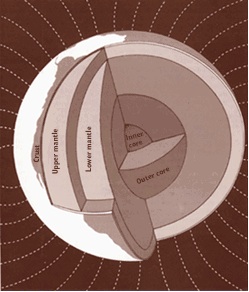
Click here for transcript
Here is a schematic diagram of a cross-section of the Earth. You can see this tiny thin part here is the crust. From the base of the crust, all the way to this boundary is the mantle. And from this boundary, all the way to the center of the Earth is called the core. We also distinguish between the upper and lower mantle. That is this boundary right here. And the inner and outer core. That is this boundary here. So how do we decide where to actually place these boundaries? That knowledge comes from observations of seismic waves. In fact, we can use observations of seismic waves to tell us a lot of other things about the composition of the interior of the Earth such as its exact mineralogic composition and the pressure and the density and temperature.
The crust is Earth's outer shell. It's the thinnest layer, but it is still important, mostly because it's where we all live! Also, during Earth's formation, when Earth became layered, the thin veneer of the crust retained some of the interesting metallic minerals that otherwise all went to the core because of their weight. This has been important for people because we've figured out how to extract these minerals and use them for industrial purposes. The crust is just a few kilometers thick at spreading ridges in the ocean, and as many as 50-80 km thick under continental mountain belts such as the Himalayas, but even at its thickest, the crust is quite thin compared to the radius of the Earth, which is about 6370 km. The most abundant rocks in the crust are silicate minerals, such as feldspar, quartz, mica, and amphibole.
The mantle occupies the most volume of the Earth; it extends from the base of the crust down to almost 3000 km depth. It is composed mostly of silicate rock, but denser forms of silicate than are commonly found in the crust, such as olivine, garnet, and eclogite.
The radius of the core is about 3000 km (almost half of the radius of the Earth). Its density is about twice that of the mantle. It is most likely made up of an alloy of iron and nickel, with some other heavy metals thrown in there as well.
The Earth has a dynamic interior
As models and measurements have become more sophisticated, the simple diagram above has been shown to be too simplistic. Instead, geophysicists envision a planetary interior that looks more like the figure below. (Also see my screencast explanation of the same figure.) Alternatively, you can read an approximate text transcript of my screencast of the modern view of Earth's mantle [27].
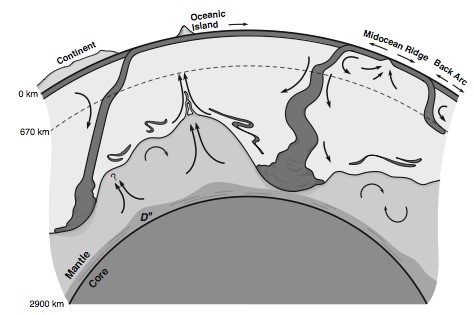
Click here for transcript
This schematic diagram is a much more up to date version of what we think is going on in the interior of the Earth, at least in the mantle. The take-home message here is motion. See all these little black arrows everywhere. They are showing you that the mantle is not actually just statically sitting there. It is moving around all the time. The thing that drives that motion is internal heat. The core has a lot of excess heat from the formation of the Earth and from the decay of radioactive elements. It needs to get rid of that heat somehow. The way it does it is by convection. That means moving hot material from one place to another where it can give that heat away. From the core mantle boundary up, first of all, you have got this weird D double prime layer where strange things happen to seismic waves that get in there. Here is a plume of material that is buoyantly rising because it is hot. This has been posited to be the source for hot spot volcanoes like this one in the picture here. We also have arrows that show things that are sinking. Right here is a cross-section of a subduction zone and you can see the slab is sinking. A lot of slabs get sort of hung up around 670 km depth. This is where the mantle has an increase in density and so it is harder for a sinking slab to get through there but they do get through most of the time. When they do the material that composes them piles up down here so it can later be recycled into whatever the rest of the mantle is doing. The take-home message here again is motion. But I want you to also remember that we are talking about solid rock here. It is by no means a liquid, so that motion is happening on very long timescales.
Notice all the little black arrows in the illustration above. Those arrows show movement of material in the mantle. The core loses heat to the overlying mantle. This heated material rises buoyantly to the surface. In this model, the core-mantle boundary is posited to be the source for mantle plumes that give rise to hot spot volcanism at the surface. You can also see some arrows showing heat escaping at a mid-ocean ridge. Heat escapes as new hot crust is formed at the ridges. Far away from a mid-ocean ridge, old cold oceanic lithosphere sinks at a subduction zone. Images from seismic velocity measurements show that these lithospheric slabs can sink all the way to the bottom of the mantle, where they pile up. Whether or not this material eventually becomes well-mixed with the rest of the lower mantle or remains in its own chemically distinct pool is still a topic of debate. So, the big idea to take home from this diagram is that the mantle of the Earth is in constant motion, driven by heat. This motion, however, is quite slow because the mantle is not a liquid, but is actually solid rock.
Quiz Yourself!

It is popular to demonstrate what goes on in the dynamic interior of the Earth by showing students a lava lamp. Can you identify the main similarities and differences between what goes on in a lava lamp and what goes on in Earth's mantle?
A lava lamp is similar to the mantle of the Earth because it has material that is heated, rises buoyantly, then cools and sinks. Convection.
A lava lamp is different from the mantle of the Earth because the Earth has an internal heat source, which is the heat of initial formation of the core as well as radioactive decay. In contrast, a lava lamp has an external heat source, usually a light bulb or something else that has to be plugged in or turned on. The mantle is solid rock and is composed of a variety of silicate minerals whose degree of mixing is still debated by scientists. It moves over long timescales. A lava lamp contains two immiscible fluids so that a person can have fun watching them move on short timescales.
But How Do We Know What's Down There? / Reading & Discussion Assignment
Observing the Interior
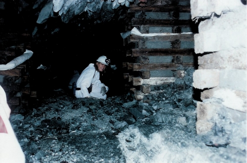
The deepest boreholes only go several kilometers into the Earth. A mine is the deepest place a person can go into the Earth (see Eliza, below) and while it's pretty incredible down there, even being deep in a gold mine does not offer much information about what the Earth is like hundreds or thousands of kilometers below the surface.
Seismic Waves
Since we can't go to the center of Earth, we have to rely on indirect observations of the materials of the interior. These observations mostly come from seismic waves. When an earthquake occurs, energy is radiated from the location of the earthquake in waves that travel through the Earth and arrive at seismometers at some distance from the source. The speed of these waves through the Earth is controlled by the properties of the material that the waves pass through. By measuring the time it takes for various waves to get from an earthquake to a given seismometer, scientists can back out what the material properties must have been like along the path taken by the wave.
Cool historical side note: The major boundaries of the Earth's interior were discovered by seismologists.
In 1909, Andrija Mohorovičić, a Croatian seismologist, discovered the boundary between the crust and the mantle by observing the sudden increase of seismic waves as they passed from the crust to the mantle. Because of the sudden jump in wave velocity, he was able to infer that there must be a change in the composition in the rocks at that depth. The boundary between the crust and the mantle is generally known as the "Moho" since most scientists had trouble finding the special characters needed to write Mohorovičić's entire last name correctly using a western keyboard. ha ha, only kidding. "Moho" is merely used because it is a shorter word. In 1912, Beno Gutenberg used observations of the sudden drop in P wave speed together with the observation of a "shadow zone" in which direct P and S waves do not arrive at seismograms a certain distance from the source (more on this later in this lesson) to calculate that the depth of the core-mantle boundary must be at about 2900 km. In 1936, Inge Lehmann observed a second "shadow zone" within the core itself to discover the boundary between the inner core and the outer core.
Laboratory Measurements
Seismic waves aren't the only way scientists try to figure out the properties of the interior of the Earth. Some geophysicists try to simulate conditions in the deep Earth by heating and squeezing likely mineral assemblages to see how they behave under the intense pressure and temperature regimes of the lower mantle and core. One way this is done is in a diamond anvil cell. The mineral assemblage of interest is squeezed between diamonds and sometimes simultaneously heated with a laser in an attempt to achieve the enormous temperature and pressure deep in the Earth. People are often impressed by the size of a diamond anvil apparatus, and I don't mean because it is so big! Check out the photos of one below.
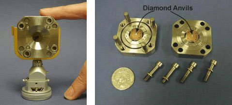
Carbonaceous chondrites
Geochemical theory also predicts the composition of the mantle and core. Meteorites give us information about the composition of the early solar system, and many of them have been dated to be older than the oldest crustal rocks on Earth. Carbonaceous chondrites, like the one in the photo below, are a special class of meteorites. Geologists think that these are representative of the composition of the whole Earth. So, by analyzing the elements contained in one of these meteorites, we should be able to back out the composition of our planet. This is one of the ways we've guessed at the composition of the core. Meteorites tell us that the Earth should have a lot more iron and nickel than what we have observed in the crust. It can't go in the mantle because the seismic wave speeds aren't fast enough and also we don't observe iron and nickel coming out of volcanoes that apparently have a deep mantle source. Therefore, the missing iron and nickel must be in the core.
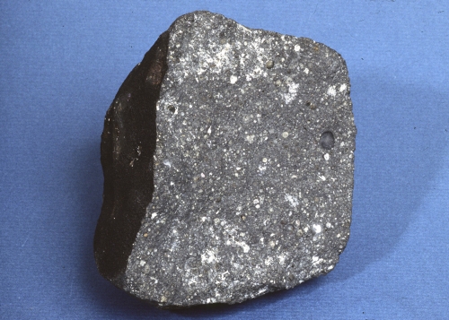
Reading and Discussion Assignment
Read these two papers:
- Dubrovinsky, L. & J. F. Lin (2009). Mineral Physics Quest to the Earth's Core, Eos 90, pp. 21-22.
- Anderson, D. L. and S. D. King Driving the Earth machine? Science 346, 1184 (2014); DOI: 10.1126/science.1261831
The Dubrovinski & Lin article summarizes the state of the art among mineralogists who are studying the composition of the deep Earth. The Anderson & King paper offers a perspective that the asthenosphere is hotter than we thought and may be the source of non-subduction-zone volcanism. When you read them, think about the following questions for discussion:
Discuss in Canvas, starting with these questions
- What are the best guesses about the pressure and temperature at the center of the Earth? How did scientists arrive at these estimates?
- What does "seismic anisotropy" mean? What does the observation of seismic anisotropy in the inner core tell us about its structure?
- Look at the left panel of Figure 1 in the Dubrovinsky and Lin paper and compare it to the figure in the Anderson & King paper. How can you reconcile these two images?
- Explain the arguments against a deep mantle source for "plume volcanism" made by Anderson & King.
Grading criteria
You will be graded on the quality of your participation. See the grading rubric [14] for specifics on how this assignment will be graded.
Optics / Lab Activity
This lesson's Neat-o Interdisciplinary Idea is Optics.
Often, optics is a topic covered in a physics class, not necessarily in an Earth science class. However, having a good grasp about how light waves are refracted and reflected at the interface between two materials will help us later when we have to visualize how seismic waves travel through the Earth. That's why we're going to have a little optics lab experiment here. The ultimate overriding objective in this lesson is for you to make your own observations using real seismic data and be able to picture in your head how seismic waves travel through the Earth's mantle. Before we jump straight into an activity that uses seismic data, let's back up and make sure we understand some principles of optics.
Lab Activity
In this activity, we will calculate the index of refraction of water by measuring the angles of incidence and refraction of light as it passes from air to water.
What you will need:
- Tank of water. A square or rectangular food storage container works well, as long as you can see through it and it is big enough. A fish tank would work really well, too. NOTE: You really do want to find a container that is big enough. If you can't or don't want to or it's not in your budget, it's okay, but just recognize that you are going to have a longer discussion of error and uncertainty at the end of the exercise. Why? Because if your container is too small, you won't be able to make observations over a wide range of angles of incidence.
- Paper
- Pen
- Straightedge
- Protractor
- Compass
- Three objects that you can see well when looking through the water. Upside down pushpins or screws work. I'm going to use Pez dispensers in my example.
The photo below shows my collection of materials for this activity.
Directions
-
Save the Optics Lab worksheet [29] to your computer. You will use this document to record your work in the remaining steps. The worksheet is in Microsoft Word format. You can use another format if you want to. You will submit your worksheet at the end of the activity, so it must be in a word processing, text, or image format I can open. Ask me if you think you have a weird format.
- Mark the location of the tank of water on the paper.
- Put one of your objects on one side of the tank of water so that if you look through the tank from the other side, you can see it through the water. I'm going to use Woodstock (see photo of step 3):
 Illustration of step 3. Woodstock is standing on the left side of the tank of water.
 - Look from the other side of the tank at your first object and cover one eye (see photo of step 4):
 Illustration of step 4. I can see Woodstock through the tank full of water.
 - Now put one of your other two objects between your eye and the tank so that your first object is completely eclipsed (see photos).
 Illustration of step 5, eye view (left) and plan view (right). Chewbacca eclipses Woodstock.
 - Now put your third object between your eye and your second object so that the second object is completely eclipsed (see photos).
 Illustration of step 6, eye view (left) and plan view (right). SpongeBob eclipses both Chewbacca and Woodstock.
 - Now take a pen and mark the location of your objects. I made a mark in the little divot right between their feet.
- Now you can take your objects and the tank of water away from the paper. You should have an outline of your tank and three dots drawn on your paper.
 Illustration of step 8. There's the outline of the tank plus three dots showing the former locations of Woodstock, Chewbacca, and SpongeBob.
 - Connect the Chewbacca and SpongeBob dots with a line that extends to the outline of the tank.
 Illustration of step 9. Construct the incident ray with a straightedge.
 - Draw a line parallel to the Chewbacca-SpongeBob line that goes through the Woodstock point and connects to the outline of the tank on Woodstock's side of the tank. You can use a compass and straightedge to construct a parallel line. There is a Web site that gives a good tutorial showing how to do this: Math Open Reference [30]
- Use the straightedge to connect the two points on each side of the outline of the tank. Now you should have three line segments that show how light traveled from Woodstock through the air, through water, through air again, and to your eye.
Nitpicker Alert!
It is true that light was bent as it traveled from the air, through the wall of the tank and then through the water, then the wall on the other side of the tank, then the air again. Unless your tank has really thick walls, like, for example, the underwater viewing area of polar bear exhibits at zoos that have glass several inches thick, we should be able to ignore the effects of the thickness of the tank walls.
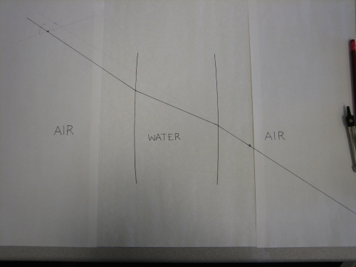 Illustration of step 11. There's the outline of the tank plus three line segments connecting the former locations of Woodstock, Chewbacca, and SpongeBob to the tank outline
 - Draw a line perpendicular to the tank outline at the point at which the incident ray from Woodstock to the tank intersects the tank outline.
- Measure the angle of incidence. This is the angle between the Woodstock-tank line segment and the perpendicular line.
- Measure the angle of refraction. This is the angle between the perpendicular line and the ray path inside the tank. See photo below.
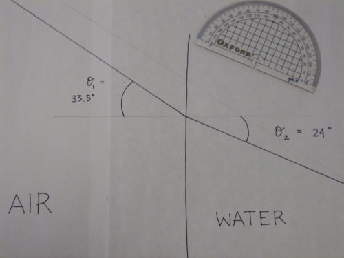 Illustration of steps 12, 13, and 14. The angle of incidence (θ1) = 33.5° and the angle of refraction (θ2) = 24°. Note that the protractor is just sitting there as a prop. I obviously did not measure the angles from way over there!
 - Replace the tank, put Woodstock in a different place and repeat the above procedure. You may also leave Woodstock in the same place and move your eye to a different place. Either way, repeat several times with either or both of the above variations.
- Using the worksheet for Lesson 4 Activity: Optics Lab, fill out Table 1 with your angle measurements.
- Eat all the Pez. This will ensure that your blood sugar is sufficiently high to carry out the next set of calculations.
- Continue completing the Lesson 4 Activity: Optics Lab worksheet.
Submitting your work
Submit your Lesson 4 Activity: Optics Lab worksheet. It should contain the plots you made and the answers to the questions at the end of this lab experiment. Please save your worksheet in the following format:
L4_Optics_AccessAccountID_LastName.doc (or whatever your file extension is).
For example, former Cardinals pitcher and hall of famer Bob Gibson would name his file "L4_Optics_rxg45_gibson.doc"
Then, upload your worksheet to the Optics Lab assignment in Canvas by the due date specified on the first page of this lesson.
Grading criteria
I will use my general grading rubric for problem sets [24] to grade this activity.
Snell's Law
Now that we are experts on how light is refracted as it passes from air to water, we can extend what we know to generalized waves passing through any medium. As long as we know the index of refraction, we should be able to describe the path a wave takes through some complicated layered structures. (See where we are going here? The Earth can be thought of as a big piece of material consisting of layers through which seismic waves pass.)
Snell's law describes the refraction of a wave passing through two materials that transmit the wave at different velocities:
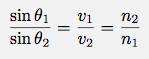
In words, the formula above says that if a wave passes from material 1 to material 2, the ratio of the sines of the angles of incidence and refraction (θ1 and θ2) will be a constant number and this constant number is equal to the ratio of the transmitting velocities of the two materials (v1 and v2) as well as the inverse ratio of the indices of refraction of the two materials (n1 and n2).
A diagram of what this formula means graphically is shown below.
.jpg)
Hopefully this rings a bell from the lab experiment we just did! In our experiment, our two materials were air and water just like in the diagram above. Air has an index of refraction of 1 (n1 = 1) and water has an index of refraction of 1.33 (n2 = 1.33).
Nitpicker Alert
Okay, actually a vacuum has an index of refraction of 1. Air at room temperature, pressure, and humidity has an index of refraction of about 1.0003. You'd have to design an experimental setup with a little more precision than what we did to resolve this discrepancy.
This means that we can use Snell's Law and calculate that the sine of the angle of incidence sin(θ1) divided by the sine of the angle of refraction sin(θ2) will always be equal to the ratio of the two indices of refraction, 1.33/1. This is what we confirmed in our experiment. Yay! Science works!
This also means we know that the ratio of the velocity of light through air to the velocity of light through water is equal to 1.33.
Quiz Yourself!
The velocity of light through air is 3 x 10⁸ m/s. What is the velocity of light through water?
Try it yourself and then click here to see my answer
The velocity of light through water is about 2.26 x 10^8 m/s. I got that answer by dividing 3 x 10^8 by 1.33.
Raypaths Through the Earth
The structure of the Earth makes tracing raypaths more complicated than the simple layered models we considered in the problem set. For one thing, the Earth is round, not flat. This means that all waves that start at the surface return to the surface, whether they encounter velocity changes along their path or not. Also, the concentric layers of material that make up the Earth aren't necessarily homogeneous. This means that sometimes waves are transmitted faster in certain directions than others. Let's discuss how raypaths travel through a homogeneous spherical body and then add complexity to see how seismic waves travel through a more "Earth-like" structure of concentric shells. Then we'll check out some actual seismic data to see how well the Earth mimics our simple model.
If the Earth were a Homogeneous Sphere
The animation below shows a cross-section through a homogeneous sphere. In this case, an earthquake that occurs somewhere on its surface would send seismic waves out in all directions and these waves would travel straight through to the other side.
This is a cross section through a homogeneous sphere. Let us just imagine that we have an earthquake that happened somewhere on the surface of the sphere over here. The wavefronts will travel outward from the source sort of like this, you know, the way that noise travels in all directions from a noise source. Or, if you toss a rock in a pond, the waves travel outward in concentric circles from the source. These are pictures of what the wavefronts look like. The ray paths are perpendicular to the wavefronts. We draw them like this. In a homogeneous sphere, all the ray paths would just travel straight through the sphere to the other side.
Hopefully you guessed that there was a point to all those refraction calculations you just did. What was that point? Well, the Earth is not a homogeneous sphere. It is composed of concentric shells of material and each one transmits seismic waves at a different velocity.
If the Earth had two layers over a homogeneous center
Let's consider a model like the sketch below, which is just a couple of spherical layers over a homogeneous center. This one is a little more Earth-like than the previous model we considered. When the incident ray strikes the boundary between the two layers, it will be refracted. It is refracted again at the next boundary, and then it happily travels along until it strikes the underside of that same boundary again and makes its way back up to the surface. In the animation below, note the shape of the ray paths through this model as opposed to the last model.
I've drawn here two layers over a homogeneous middle part. Each of these layers has a transmitting velocity. Let us say that each one of them is slower than the one below. Now let's say we've got an earthquake up here. One of the ray paths comes down like this. It hits this layer, and since the lower layer is a little faster, (you remember this, right) it is going to refract away from the normal, so it's going to go like that. Then it's going to do that same thing again because the third layer is even a little bit faster. Now it hits the underside of the layer and refracts back toward the normal and up. This can be generalized to any ray path that comes from this event. Here is another one. It even works if you have some ray paths that do not ever get as deep as that bottom layer. Here is an example of some ray paths that go through this layered media. Remember the difference between what this looks like and what the ray paths looked like in the earlier sketch where the Earth was completely homogeneous.
Earth model in which transmitting velocity increases smoothly with depth
Now what if you imagined a sphere composed of an infinite number of concentric layers, and let's say that each layer transmits seismic waves just a little faster than the layer above. This model in which velocity increases with depth is even more Earth-like than the previous model. At each local boundary, the ray still has to obey Snell's law, but since the layers are infinitely thin, the path ends up being a smooth curve. To see some of these curved ray paths, check out the animation below.
This model is even more Earth-like than the previous two. There are two big differences here. This model does not have a core in it, and also you need to have a little bit of imagination here because what I am hoping to have you think about is that you have got this gradation from dark to light that is smooth. I know you can see rings here but pretend they aren't there. what this model would show is if the Earth only had a mantle and it got successively denser and denser and denser from the outside to the inside, the waves would be transmitted faster and faster and faster. The effect of this would be to make the ray paths curved because at each layer's boundary the waves would still have to obey Snell's Law and refract, but if each layer is infinitely thin then mathematically that ends up being a curve. So let me just draw some sample rays. Here is an earthquake right here and so ray paths would curve like this or like that. Or like this. Anything that went straight down would just head through the middle but that is the only path that would be the same as the analogous path in a homogeneous Earth. Every other path curves. You might want to look back at the previous sketches to see the difference between these ray paths and the ray paths that went through a homogeneous Earth, or even the one that just had a couple of layers at the top.
Now, armed with our model of a sphere in which velocity increases with depth, we should be ready to plop seismometers down all over the world, measure the P and S wave arrival times from earthquakes, and confirm our idea about how wave speed varies in the Earth. In fact, seismologists did do this, and when they did, they realized that at some distances away from earthquakes, they didn't get any P or S arrivals at the times they should have arrived. They realized that there had to be a major boundary inside the Earth where material properties changed drastically, thus altering the wave paths enough to create a "shadow zone" where there are no direct arrivals from P and S waves. This is how the Earth's core was discovered. Seismologists knew that seismic rays took a curved path through the Earth. As the distance between the source and the receiver increased, the "turning point" (the deepest point along the wave's path) got a little deeper. At the farthest distance direct body waves were recorded, the turning point corresponding to that raypath must have been the depth of the mystery boundary, because a ray that tries to turn at a deeper point will run into that boundary, get refracted, and follow a different path. The depth of the boundary between the mantle and the outer core was found to be about 2900 km. This corresponds to a shadow zone for direct arrivals of P and S waves beginning at about 104° from the source. The same method was used to discover the inner core of the Earth as well.
A Seismic Record Section from the 2004 Sumatra-Andaman Earthquake
Let's check out some actual seismic data to see if we can distinguish all the features of the raypaths in the Earth-like models we considered. Below is a record section from the 2004 26 December Sumatra-Andaman earthquake. Creating a record section means plotting a suite of seismograms that are arranged in order by their distance from the earthquake. In this record section, the closest station is CHTO, at about 16 degrees away, and the farthest station is PAYG, at about 173 degrees away (Can't get too much farther than that because 180 degrees would be exactly on the other side of the Earth!). Each seismogram has some colored bars on it. These colored bars are arrival time picks for various body waves. Watch the two screencasts below the figure to see me sketch the paths the seismic waves took through the Earth to produce each of these arrivals.
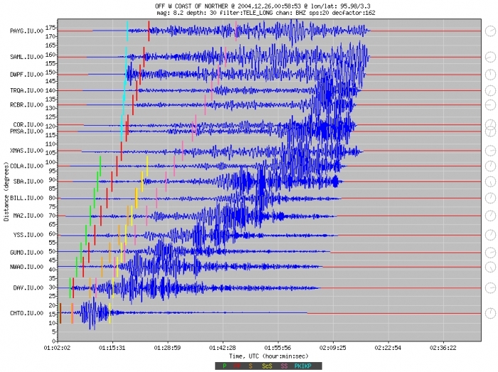
Seismogram Arrivals Explained!

First I'll single out station SBA and draw a cross-sectional sketch of the Earth [31] that shows how each arriving wave gets from the earthquake to SBA.
This is a record section from the 2004 Sumatra Andaman earthquake. A record section just means that I have taken a bunch of seismograms and arranged them in order of their distance from the earthquake. So, on the x-axis here is time. On the y-axis is distance in degrees. Each of these seismograms is plotted with the name of its station and its distance away from the earthquake. What I'm going to do now is just focus on one of these stations. This station, SBA, here. I'm going to show you just by sketching that path that each of these arriving waves took to get from the earthquake to this station. These colored bars here are arrival time picks for various waves. This was probably done by an automatic picker that knows about how long it takes for each type of wave to get from one point to another on Earth. If I just make this little sketch right here of the Earth. I'm leaving out the crust here, but basically, this is a cross-section. Here's the mantle, and here's the outer core, and here's the inner core. And let us just pretend that my earthquake happened right up here at the top. We can pick any spot I guess. I'm going to choose this station SBA because it is handily almost exactly 90 degrees away and that is easy for me to freehand. So we'll draw a little house. That's our seismometer. The first arriving wave that gets from the earthquake to the seismometer is this one that is marked in green right here. It is the direct P wave. The path that the direct P wave takes through the mantle is kind of like that. Notice how it curves. It does not follow a straight line path. That is because seismic wave speed increases with depth. The next arriving wave is this arrival marked in red. That is PP. What PP does is it goes through the mantle and bounces once between the earthquake and the station, and then it continues on its way to the station. Each of these waves is a P wave in the mantle so we call it PP. The next arriving wave; well actually this orange one and this yellow one come practically on top of each other. The orange one is the direct S wave and the direct S wave follows the exact same path as the direct P wave only shear waves are slower so that is why it takes longer than the P wave to get from the earthquake to the station. The yellow one is a little more interesting. It is an S wave that bounces off the core mantle boundary and then gets to the station. So it is S and then that bounce point is called little c and then it is S again so the entire wave is called ScS. The next arriving wave is this pink one. The pink one is SS which follows the same path as PP only shear waves are slower so it takes it longer to get to the station. Those are all the waves marked here. We have this big high amplitude this coming in later on and those are actually surface waves. They travel along a path like this. Takes them longer to get there because the crust doesn't transmit waves as fast.
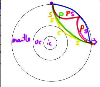
Now...Station PAYG is trickier! No direct P wave! No direct S wave! In fact, by looking at seismic records like this one, seismologists figured out that the Earth must have a core made of significantly different material than the mantle. Based on the "shadow zone," the distance range over which no direct mantle body waves are observed, seismologists also figured out the size of the core. The fact that no S waves could make it through the core showed scientists that at least part of it had to be a liquid. Watch my sketch of how this works for the arrivals at station PAYG. [32]
Let us look at the same record section, but a different station. This time I am going to look at station PAYG, which is almost 180 degrees away from the earthquake. I have drawn it down here. What you will notice right away is that the number of arrivals is fewer. There is no direct P wave and there is no direct S wave. The reason for that is that the core gets in the way. Remember at the earlier station that P waves and S waves take a kind of curving path through the mantle that I'm showing you right now with the mouse. If you are farther away than about 104 degrees then these waves will bounce off the core or they will be refracted within the core as P waves and so you will not get a direct arrival. This is how the core was discovered. What are the arrivals that are coming in at this station? The first one is this one here and that one is labeled PKiKP. What that wave does is, it is a P wave in the mantle, it comes down here, it gets refracted in the outer core, and the inner core, and back through the outer core, and back out through the mantle to this station. The path is called a P wave when it is in the mantle, and then a P wave in the outer core is called K. I do not know why that is. In the inner core it is called i. And then it goes back out as K and P. The whole thing together is called PKiKP. The next arriving wave is PP. That is our old friend. We know how that works. It goes through the mantle and it bounces and it goes to the station. Each of these paths is a P wave in the mantle. It is called PP. The last arriving wave is SS. It follows the same path as PP except shear waves are slower so it takes it longer to get there.
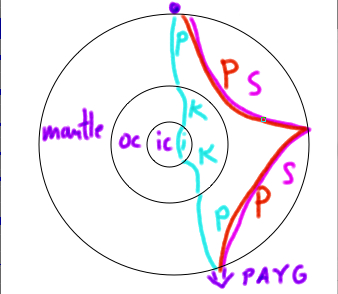
Want to make your own record section of a recent earthquake?
Thanks to the good folks at IRIS [33], the Incorporated Research Institutions for Seismology, it is not too hard for anyone to do. I recommend letting your students play around with this!

-
Go to Wilber3 [34], where you can request seismic data from recent earthquakes.
-
The default page has a map with recent (last month or so) earthquakes on it. The map is interactive, so you can draw a box to zoom in, and there are also some dialog boxes you can type into in order to narrow down the number of events in the list by date, location and magnitude.
-
The map locations are clickable colored circles. Clicking on one of them will highlight that event in the list on the same page.
-
After you've clicked on your selection in the list, the map will refresh and now show you all the stations that recorded data from your selected earthquake.
-
At this point you can click a button that says "Show Record Section"
What path does a P wave take through the mantle?
Motivation and Preamble
The Earth is optically opaque. Unlike the tank you used in the optics lab, you can't see through the Earth to verify what path a P wave takes on its way from an earthquake to a seismometer. How do we know what path a P wave takes? What data can we collect to help us find this out? We are going to take a two-step approach to answering these questions. We are going to collect some data from seismometers around the world that all recorded the same earthquake, and then we will use that data to plot a travel-time curve. We will then construct some models about what the data would look like given certain mantle properties. We will compare the data with our models to see if they match up or not.
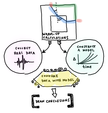
What you will need:
You will need a plotting program, a scientific calculator, a protractor, and a straightedge to complete this problem set. Drawing software is only suggested if you have a program you are already adept at using, otherwise, sketch by hand.
Directions
You can save the P wave path worksheet [35] to your computer, and use it to record your work. The worksheet is in Microsoft Word format. To work on this assignment, you can use a word processing program, or even do it all on paper as long as I can read the scanned pages. You will submit your worksheet electronically, so it must be in a format I can open. Ask me if you aren't sure whether your format is weird. The downloadable worksheet has the same problems as are written out below; the worksheet is just to save you copy-and-pasting effort. This website has a couple of screencasted hints that are not in the worksheet, though.
Part 1: Snell's Law Warm-Up Calculations
Before we start jumping right into the data and models, we will do some warm-up calculations involving how rays travel. The point of this is so we have some intuitive sense later on about the meaning of our data and models, and what we might expect them to look like. In this part of the problem set, you will make calculations involving the refraction of waves through media and you will trace ray paths through media. You will have to make some sketches. If you want to use drawing software, go ahead. If you want to make your sketches by hand and take pictures of them, that is also fine. When I grade your sketches I will not be using a protractor to judge the precision of your angles, but I will be looking to see if your angles are correct relative to each other on the same sketch. For example, if the angle of refraction should be greater than the angle of incidence in a particular problem then you need to draw it that way.
The Problems
1.1 Calculate the angle of refraction for a ray of light passing from air to water with an incident angle of 45°. Assume the index of refraction of water (nwater) is 1.33 and nair is 1. Sketch the path of the ray through the water layer. 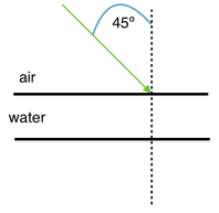
1.2 Calculate the angle of refraction for a ray of light passing from water to air with an incident angle of 30°. Assume the index of refraction of water (nwater) is 1.33 and nair is 1. Sketch the path of the ray through the air layer. 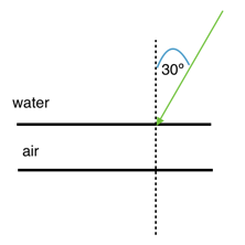
1.3 Suppose you have a ray of light that passes through three layers: air - water - air. The angle of incidence at the first air - water boundary is 20°. Calculate the angle of refraction at the first boundary in the diagram below and calculate both the angle of incidence and angle of refraction at the second (water - air) boundary. 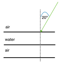
1.4 Now let's consider the path taken by a seismic wave instead of light. For the purposes of this calculation, we'll pretend the Earth is flat. An earthquake happens at the surface of a series of layers as pictured below. Consider a P wave that leaves the source along the path as shown in the cartoon and hits the boundary between the upper layer and the second layer with an angle of incidence of 30°. Given the transmitting velocities for a P wave in all the subsequent layers, sketch the path of the ray until it hits the bottom, and find all the angles of incidence and refraction along the way.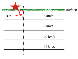
1.5 Let’s consider a seismic wave that passes through the square-shaped object below. In this object there is a fast center and an outer layer of slower material. The P wave leaves the source and hits the first boundary with an incident angle of 40°. Sketch the path taken by the P wave until it gets back to the outer surface of the square and calculate all the angles of incidence and refraction along the way.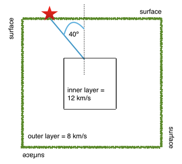
1.6 Now let’s say that same square-shaped object in #1.5 is actually homogeneous. Draw the path that the P wave would have followed to get from the source to the position of the “receiver” (where you calculated that it arrived at the outer surface in #1.5). Is the distance traveled as measured along the surface the same, shorter or longer as the distance as measured along the surface in #1.5? Is the actual path traversed by the P wave the same, shorter, or longer than the actual path traversed by the P wave in #1.5?
Road Check
Okay, so you just did a bunch of calculations and sketches. What's the upshot? Here's what we found out: Rays travel the fastest path they can. This will be a straight line path through a homogeneous solid, but might not be a straight line path in an object composed of different materials that transmit rays at different speeds. Rays change direction at the boundary between two materials.
Therefore, if the mantle is homogeneous then a P wave will take a straight line path with a constant velocity through it. If the mantle is not homogeneous then the P wave's velocity will not be constant all the way through and its path will not be a straight line. The obvious next step towards our goal of figuring out what path a P wave takes through the mantle is to collect some data about P wave velocities. We should look for data covering a variety of paths so we can compare if the velocities are all the same or not. What we want is to either go get data from a station that recorded P waves from earthquakes all over the world, or else get data from one earthquake that was recorded by stations all over the world.
We could do either one, but data is commonly archived by earthquake instead of by station, so it will be more convenient to collect data from a variety of stations that all recorded the same earthquake. Let's do it!
Part 2: Collecting data and making observations
In this part of the problem set, you will pick the arrival times of P waves on seismograms and use them to construct a travel time curve for P waves through the mantle. Then, you will compare this data to models of travel time curves for an assumed homogeneous mantle.
The seismograms for this activity are clickable thumbnails so you can work with a big version of each one. On this web page there are several hints about how to do most of the calculations.
The seismograms you'll be working with are from the Amatrice, Italy, earthquake of 24 August 2016. Its location was 42.7226° N, 13.1871° E, and it happened at 01:36:32 UTC. All the seismogram times are also in UTC.
The Seismograms
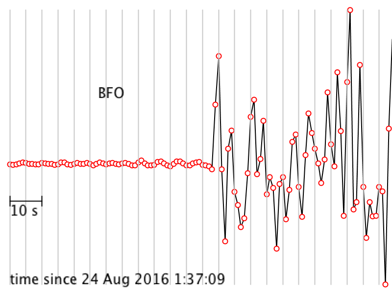 [36]
[36]
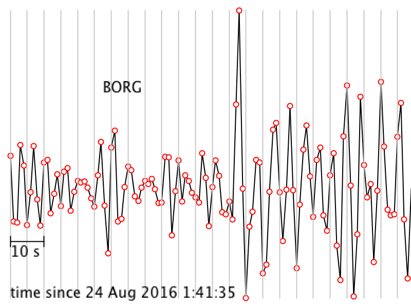 [37]
[37]
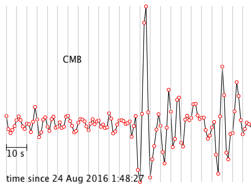 [38]
[38]
 [39]
[39]
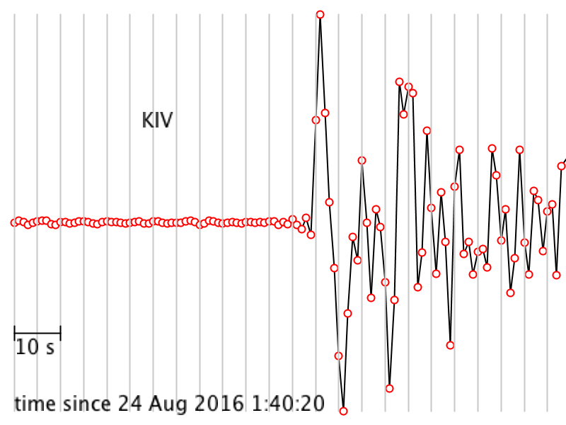 [40]
[40]
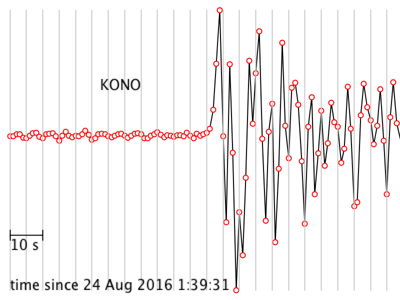 [41]
[41]
 [42]
[42]
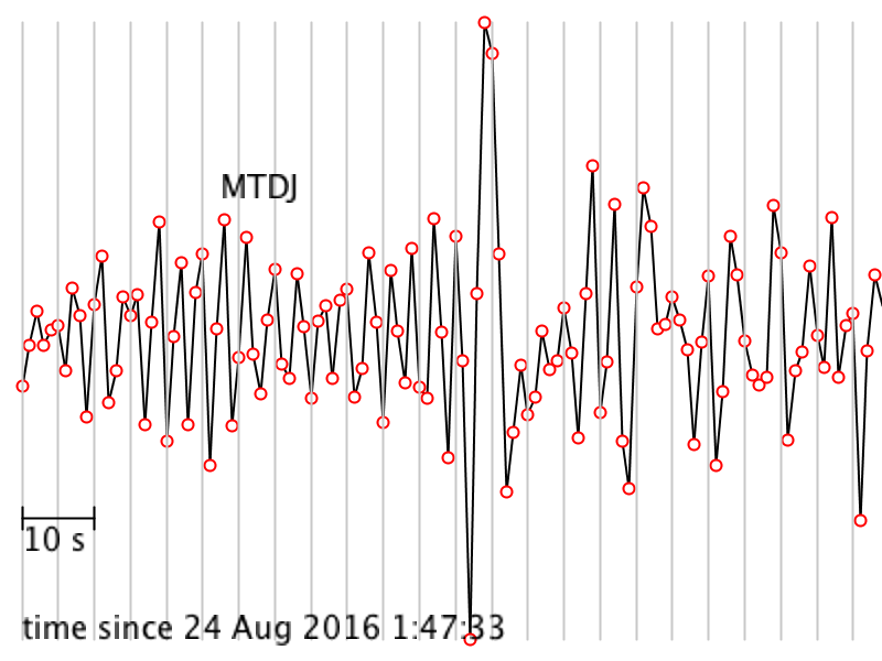 [43]
[43]
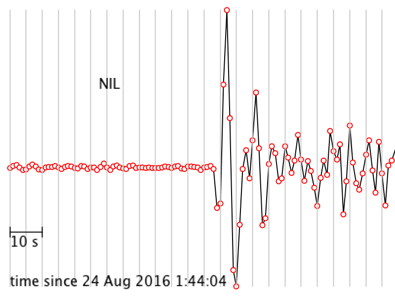 [44]
[44]
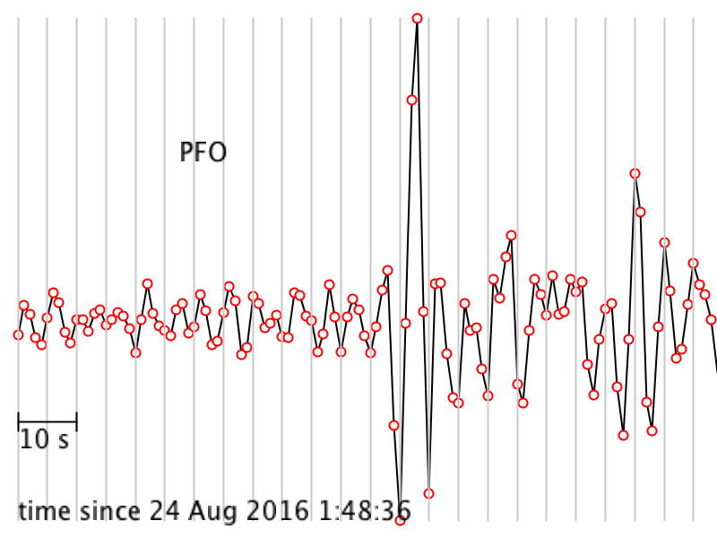 [45]
[45]
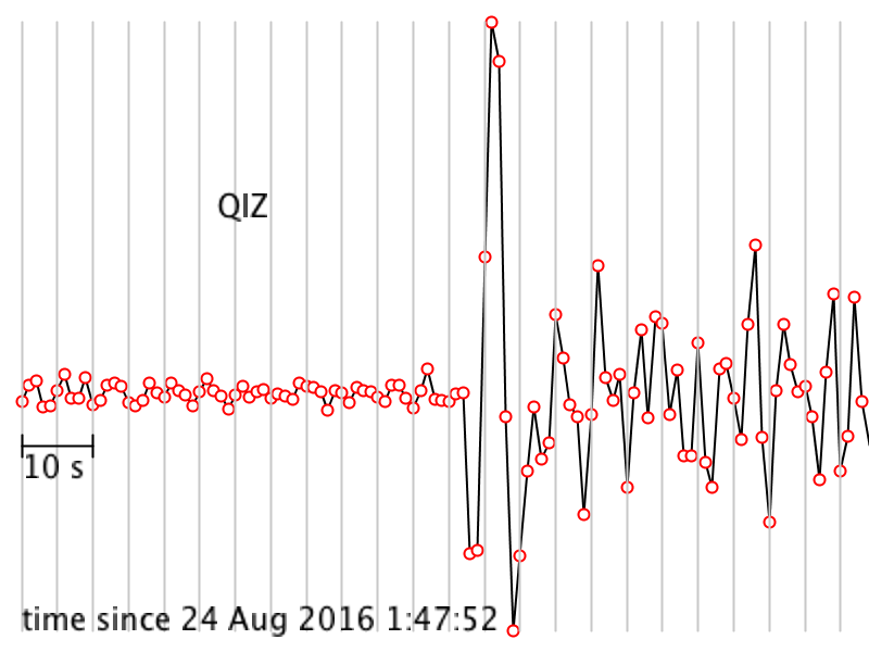 [46]
[46]
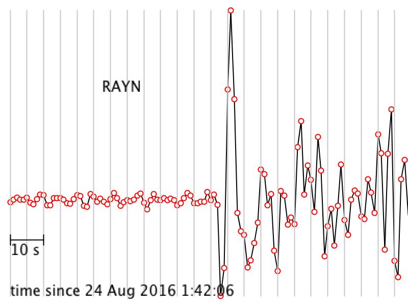 [47]
[47]
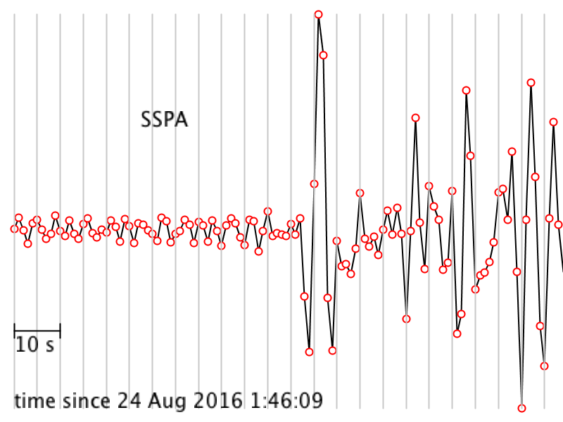 [48]
[48]
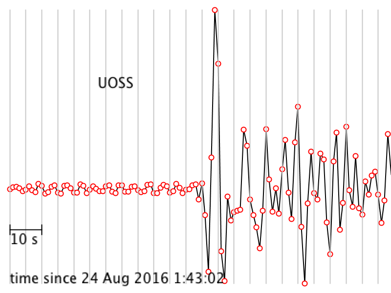 [49]
[49]
The Problems
For #s 2.1, 2.2, and 2.3 I find it easiest to make a table in which I write down the station name in column 1, The P wave arrival time at that station in column 2, the travel time in column 3 and the distance in degrees in column 4. Doing so makes it easier to make plots and be organized. I am leaving it up to you to construct such a table, or if you hate tables, to ignore this advice.
2.1 For each seismogram, pick the arrival time of the P wave. The P wave is the first impulsive arrival that rises appreciably higher than the background noise level. It can take a bit of skill and practice to pick arrivals on a seismogram, but at least P waves are easier than the later arrivals.
My tutorial for picking the arrival time of a P wave [50] (and a transcript [51])
2.2 Calculate the time it took the P wave to get to each station.
My tutorial for calculating P wave travel time [52] (and a transcript [53])
2.3 Calculate the distance between each station and the event in degrees. In order to do this, you'll have to compute the great circle distance between the event and each station. Here is the formula for great circle distance between two points on the surface of a sphere: cos(d) = sin(a)sin(b) + cos(a)cos(b)cos|c| in which d is the distance in degrees, a and b are the latitudes of the two points and c is the difference between the longitudes of the two points. Jean-Paul Rodrigue, at Hofstra University, provides an excellent explanation and tutorial of how to calculate distance along a great circle path [54].
My tutorial for calculating great circle distance [55] (and a transcript [56])
There is a nice website that will calculate the great circle distance for you [57] and it will give you the answer in kilometers, so if you use it, divide your distances by 111.32 to get from kilometers to degrees in order to make your plot in #2.4.
2.4 Make a plot of distance in degrees vs. P wave travel time. Note that choice of which quantity to put on which axis depends on what you are trying to do with this data. Many seismologists put distance on the x axis and travel time on the y axis because then the slope of the data is the quantity known as the “slowness.” However, doing it the other way around is also quite common, especially if you are stacking record sections to make a plot. You can choose.
2.5 Which station was closest and which station was farthest away? What were the distances between the earthquake and each of these two stations? What was the difference in arrival time between those two stations?
2.6. This event was large enough that it was recorded by stations even farther away than the farthest station you worked with. Why didn't I make you pick P waves for stations that were farther away?
2.7 We know the travel time of the P wave to each station and we know the surface distance between the earthquake and each station but we don’t know the actual path the P wave took and we don’t know whether velocity was constant along that path or not (Remember that those are the two things we are trying to find out in this lab exercise). So when we calculate velocity, keep in mind that it is an apparent, average velocity. What is the apparent average velocity of the P wave for the closest station? What is the apparent average velocity of the P wave for the farthest station? Are they the same or not? If they are not the same, can the difference be attributed to rounding during calculations, mistakes in arithmetic, or other uncertainties?
2.8 Look at your plot from #2.4 and describe how the apparent average velocity changes with station distance, if it does. For example, are the data randomly scattered with no relationship among them? Is there a smooth variation with distance? If there’s a smooth variation, does velocity increase or decrease? Or, does the velocity stay about the same? Are there sudden jumps?
Road Check
Up until now we have been collecting and analyzing a dataset chosen to help us figure out if the Earth’s mantle is homogeneous or not. The next step is to predict what travel time data would look like if the mantle is in fact homogeneous. Then we can compare it to our actual data and see what we find out.
Part 3: Construct a model and compare it to the data
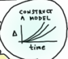 We will construct a model plot of travel time vs distance (like the plot in #2.4) except that we will set the velocity to a constant and we will calculate what the travel time curves should look like instead of using real data. Doing this is not quite as trivial as you might guess. It takes a little bit of trigonometry to do this correctly.
The Problems
3.1 If the great circle distance between an earthquake and a station is 45º, what is the straight-line path distance through the Earth between them? (see hint cartoon and screencast below)
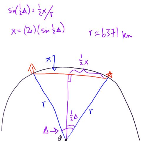
You can also read this transcript of me screencasting the right triangle sketch
Here is how to solve for the path length of a P wave through the mantle on the assumption that the mantle is homogeneous and transmits waves at the same speed regardless of depth.
I am just going to draw a hemisphere of the Earth. Here is the center of the Earth. Let us assume there is an earthquake that happens over here. And you have a seismometer over here that recorded a P wave. If the mantle is homogeneous it means that the P wave will travel a straight line path through the Earth from the earthquake to the seismometer. To solve this problem of what this distance x is, I am going to first draw a radius from the center of the Earth to my earthquake and another radius from the center of the Earth to the seismometer. This is an isosceles triangle because these two sides are both the radius of the Earth and then this other side here is the one we are trying to find. We also know something else about this triangle. We know this angle. This angle seismologists call delta, and it is exactly the great circle arc distance between the earthquake and the seismometer. You have already calculated delta for all the stations in this problem set. We drop a perpendicular line from x to the center of the Earth bisecting x and bisecting this angle delta. This is a right angle here, and this distance is one half x and this angle here is one half delta. The sine of one half delta is equal to the opposite side, which is one half x, divided by the hypotenuse, which is the radius of the Earth. Let us write that down. This is a fabulous expression because we know everything in it except x and we are trying to solve for x so that is awesome. Let us rearrange. x equals twice the radius times the sine of one half delta. If you want to find x you can just plug in delta, which you have already calculated, and the radius of the Earth, which we can take as 6371 km. That's a good approximation. And away you go. X is the distance between the earthquake and the station traversed by a P wave if you assume the mantle is homogeneous.
3.2 Suppose a P wave traveled along the path you calculated in #3.1 at a constant speed of 8 km/s. Calculate its travel time between the earthquake and the station.
3.3 Suppose a P wave traveled along the path you calculated in #3.1 at a constant speed of 10 km/s. Calculate its travel time between the earthquake and the station.
3.4 Suppose a P wave traveled along the path you calculated in #3.1 at a constant speed of 12 km/s. Calculate its travel time between the earthquake and the station.
3.5. Assume constant mantle velocities of 8, 10, and 12 km/sec. Draw the three travel-time curves that correspond to these velocities on one set of axes.
My tutorial for how to make your reference travel time curves [59] now that you know how to calculate the straight-line P wave path and find the travel time for a single station. (and a transcript [60])
 3.6. Combine your plot from #2.4 and your plot from #3.5 on the same axes. Can your data be fit with a curve representing constant velocity? Feel free to try other values for the velocity if 8, 10, and 12 don’t work.
 3.7. Time to answer the big question from the beginning of the problem set! Does the P wave follow a straight line path through the mantle? How do you know? Lead me through your logic and your observations from this lab to answer this question.
Submitting your work
Please save your worksheet and name it like this:
L4_Ppath_AccessAccountID_LastName.doc (or whatever your file extension is).
For example, former Cardinals manager and hall of famer Whitey Herzog would name his file "L4_Ppath_dnh24_herzog.doc"--This naming convention is important, as it will help me make sure I match each submission up with the right student! You can look it up; his given name is Dorrel Norman Elvert Herzog. Upload your finished product to the Canvas assignment by the due date listed on the first page of the lesson.
Grading Criteria
I will use my general grading rubric for problem sets [24] to grade this activity.
Teaching and Learning Discussion I
Let's take some time to reflect on what we've covered in the past two lessons!
For this activity, I want you to reflect on what we've covered in Lessons 3 and 4 and consider how you might adapt these materials to your own classroom or share the ways in which you already teach this material. Since this is a discussion activity, you will need to enter the discussion forum more than once to read and respond to others' postings. This discussion will take place over the second week of this lesson.
Graded Discussion Directions
- Enter the Teaching and Learning I Discussion Forum
- Post your thoughts.
- Read postings by other EARTH 520 students, too, and respond to at least one other posting by asking for clarification, asking a follow-up question, expanding on what has already been said, etc.
Grading criteria
You will be graded on the quality of your participation. See the grading rubric [14] for specifics on how this assignment will be graded.
Additional Resources and Bibliography
Additional resources
Web sites
Papers
- Irifune, T. and R. J. Hemley (2012). Synthetic Diamond Opens Windows Into the Deep Earth, Eos 93, 65-66.
Bibliography
Anderson, D. L. (1989). Theory of the Earth. Boston: Oxford. Blackwell Scientific Publications, p. 366
Dziewonski, A. M. & Anderson, D. L. (1981). Preliminary Reference Earth Model, Physics of the Earth and Planetary Interiors, 25 (4), pp. 297-356.
Summary and Final Tasks
By now you should have a handle on the material properties of the interior of the Earth. In this lesson you made some simple optical measurements and extended them to figure out some properties of the Earth's mantle. You know why seismic waves take the paths they take and about how long it takes them to do it. You also found out the current state-of-the-art thinking about how hot the center of the Earth is and what it is made of. Oh, and hopefully, you got to eat some Pez candy, too.
Reminder - Complete all of the lesson tasks!
You have finished Lesson 4. Double-check the list of requirements on the Lesson 4 Overview page to make sure you have completed all of the activities listed there before beginning the next lesson.
Lesson 5: Forensic Geology
Overview
Lesson 5 will take us one week to complete. This lesson is about mineralogy and forensic geology. First we'll examine a case study of sorts by reading an account about FBI agents and geologists who tracked down the origin of some soil adhering to the body of a murdered DEA agent in Mexico in the 1980s. Then you will come up with a short learning activity of your own in which students would examine local mineralogy.
What will we learn in Lesson 5?
By the end of Lesson 5, you should be able to:
- Describe the unique mineral assemblage present in the samples of soil discussed in "Death of an Agent."
- Differentiate between different types of volcanoes and the igneous rocks they produce.
- Guess which minerals to expect in soil or sand based on local knowledge of bedrock characteristics.
- Construct a short activity in which students investigate different soils or sands.
What is due for Lesson 5?
The chart below provides an overview of the requirements for Lesson 5. For assignment details, refer to the lesson page noted.
Lesson 5 will take us one week to complete. 8 Jul - 14 Jul 2020.
| Requirement | Submitted for Grading? | Due Date |
|---|---|---|
| Reading assignment "Death of an Agent" | No | |
| Activity: Design your own forensic mineralogy activity. | Yes - submit to Canvas assignment called "Forensics Lesson". | 14 Jul 2020 |
Questions?
If you have any questions, please post them to our Questions? Discussion Forum (not e-mail). I will check that discussion forum daily to respond. While you are there, feel free to post your own responses if you, too, are able to help out a classmate.
Reading Assignment
The reading assignment for this lesson is an account of some detective work done by geologists working for the FBI during the 1980s. They used forensic mineralogy to find the burial site of an undercover US DEA agent who had been killed in Mexico. One of the reasons I like this article is that it presents a case study. It's almost a story with a plot line, so it is a nice break from reading scientific articles. Furthermore, it puts into context why studying mineralogy and knowing how to identify certain types of rocks and minerals has important applications. Another reason I like it is that it synthesizes some of the material we've already covered in this course and in other courses in the M.Ed. program, while bringing up some new information, too. For example, we already know how to read geologic maps to get a feel for the plate tectonic structure of a region. After reading this article, we will study the tectonics of western Mexico and then extend our thinking to subduction zones, and volcanoes in particular.
Reading assignment
McPhee, J. (1996). The gravel page. The New Yorker, 71(46), 44, pp. 60-69.
Note that this reading is an excerpt from a larger article. Your assignment begins on page 60 under the heading "Death of an Agent," and ends on page 69 before Annie Leibovitz's article about showgirls in Vegas.
Overview
Here is a quick overview of the main points of McPhee's article: Witnesses saw Enrique Camarena kidnapped in broad daylight in Guadalajara (red dot on the map of Mexico, below). His body was later "found" by the MFJP at the Bravo family ranch in Michoacán (yellow dot on the map below). However, the soil from his body didn't match the soil at the Bravo ranch, it matched the soil in Bosques la Primavera state park in Jalisco (green dot on the map below).
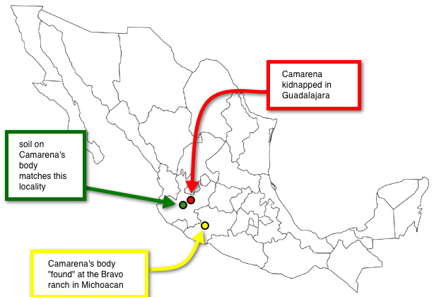
The story hinges upon not just being able to differentiate between the two soils, but also upon being able to locate the real source of the soil on Camarena's body. In order to appreciate how the FBI geologists were able to do this, we will step back and discuss some basic points regarding mineralogic classifications and we will think about this in the wider framework of the mineralogic products of volcanoes. Knowing why certain volcanoes produce certain types of mineral assemblages comes from putting together a tectonic history of the volcanoes of interest, so we'll do this, too.
Mineralogy Review
What's a Mineral?
A mineral is a homogeneous, naturally occurring, solid inorganic substance with a definable chemical composition and an internal structure characterized by an orderly arrangement of atoms, ions, or molecules in a lattice.
Wow, that's kind of a mouthful, but each part of the definition is easy to explain.
- Homogeneous: The material is the same through and through. Are any of you old enough to remember when milk came in bottles and you had to skim the cream off the top? Now, the all milk available in grocery stores is homogenized, which means it has been processed so that the cream doesn't separate.
- Naturally occurring: True minerals are not formed by the activities of people. For example, manufactured industrial diamonds are “synthetic minerals.”
- Solid: Gases and liquids are not minerals.
- Inorganic substance: Oil, gas, fat, and plastic are organic and therefore not minerals.
- Definable chemical composition: Minerals have a chemical formula you can write down.
- Orderly arrangement of atoms in a lattice: The atom, ions, or molecules occur in a specific repeating pattern called a crystal lattice.
Quiz yourself!
- Is a snowflake a mineral? (check your answer [62])
- Is glass a mineral? (check your answer [63])
Did you know?
It is a common urban myth that glass acts like a liquid over long timescales. This myth, mostly perpetuated by tour guides in cities with old windows, is "proven" by pointing out to onlookers that the window glass in old buildings is thicker at the bottom. This is used as "evidence" that the glass flows downward over time due to gravity and has piled up at the bottom of the pane. Actually, the fact that old windows are thicker at the bottom is an artifact of an old method of glass-blowing, called the "crown glass procedure." In this method, still-molten glass was spun on a disc to flatten it as it cooled. This had the effect of making the disc fatter at the edges. Then the panes of glass were cut with an asymmetrical thickness built in to them. These panes were then usually installed with the thick end down because that is more stable. For a more detailed analysis of this topic, check out Plumb, 1989. "Antique windowpanes and the flow of supercooled liquids." J. Chem. Educ., 66, pp. 994-996.
Isotopes and Polymorphs
In order to discuss the the classification of various types of minerals, let's take a quick look at the Periodic Table of the Elements and review some simple atomic chemistry. All elements in the periodic table are made of one kind of atom, with a specific number of protons in its nucleus. The number of protons in the nucleus is the atomic number of the element. Below is an image of the periodic table. I assume this is familiar to you from high school and college!
Let's take the element carbon, for example. Its atomic number is 6. That means it has 6 protons in its nucleus and 6 electrons orbiting. It can have different numbers of neutrons in its nucleus (6,7,8 are common). Two atoms with the same number of protons, but different numbers of neutrons are isotopes. Common isotopes of carbon are carbon-12 and carbon-14, denoted like this: C12 and C14. The superscripts in the examples for carbon are the atomic weights of the isotopes. C12 has 6 protons and 6 neutrons in its nucleus, so its atomic weight is 12. C14 has 6 protons and 8 neutrons in its nucleus, so its atomic weight is 14. Two minerals that have the same chemical composition but different crystal lattice structures are called polymorphs. For example, graphite and diamond are both pure carbon, but the way the carbon atoms are arranged is completely different, giving rise to their very different chemical and physical properties (see images below). In graphite, the carbon atoms are arranged in sheets that are weakly bonded to each other. In a diamond, the lattice structure involves a much stronger bond framework.
Silicate minerals
Not all of the elements in the Periodic Table are particularly common in the Earth's crust. Most minerals are formed from different arrangements of just a handful of the most commonly occurring elements. By weight, the two most abundant elements in the crust are oxygen and silicon. The figure below shows the abundance of elements in the crust as parts-per-billion by weight plotted vs. the atomic number of the element. See that oxygen (atomic number = 8, shown by one of the yellow dots) and silicon (atomic number = 14, shown by one of the red dots) are the highest.
Tectonic Setting of La Primavera Caldera
In order to identify the unique suite of minerals found in the soil on Camarena's body, we must first acquire some knowledge about the tectonic history of the area. Then we can narrow our scope to the actual volcano that produced the minerals in question.
Below is a map of the plate boundaries near the western coast of southern Mexico. See if you can apply what you've learned about plate boundaries and map-reading from previous lessons to make a mental picture of the interactions of all the plates and faults depicted on the map, then watch my screencast to hear me explain what I see when I look at this map.
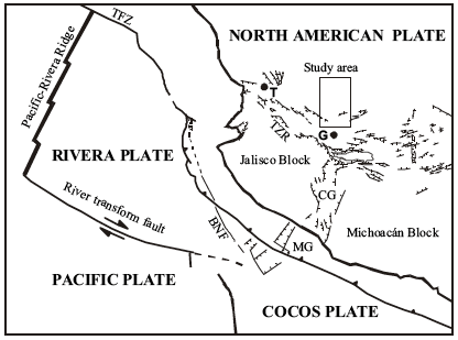
Click here for transcript
What do I see when I look at this figure? There are four plates shown here. The North American plate, the Rivera plate, the Pacific plate and the Cocos plate. Let us make sure we understand how they are all moving relative to each other. Over here there is a ridge between the Pacific plate and the Rivera plate. That is a divergent boundary. So, we can draw some arrows to show which way they are moving. This is a spreading center. These arrows I have drawn luckily jive with the arrows on the transform fault down here between the Rivera plate and the Pacific plate. The Rivera plate is moving from west to east and the Pacific plate is swinging up to the east. This is a kind of complicated area because this is where three plates come together. The authors who drew this figure were not sure exactly how it worked. Since there are some normal faults here my sense is that the Rivera plate and the Cocos plate must have some motion between them that might be pulling apart. Where exactly this boundary is that is between all these plates is kind of complicated. There is still the Cocos plate and the North American plate and there is a great big subduction zone that runs along like this. I will draw the teeth on it a little bigger so you can see them. The teeth are drawn on the overriding plate. That means we have a subduction zone in which the Cocos plate is heading this way and the North American plate is heading that way. The Cocos plate, and the Rivera plate at an oblique angle are diving under the North American plate at this boundary. This boundary here that I am marking in red is the boundary between the ocean and the land. It is the shoreline. The North American plate is everything on land plus this amount of continental shelf before you get to the trench. And then the Cocos plate, the Rivera plate, and the Pacific plate are all out in the ocean. This big subduction zone is probably the most important thing for our discussion. As these plates go down this trench, they are causing volcanism and uplift back here on the continent. That is where the Primavera caldera is located.
Volcanic history: basalt and rhyolite
The map below zooms in on a section of the first map (note that the rectangular dotted line corresponds to the rectangular box on the first map) and gives details about the volcanic history of this region. We can see from this map that this has been quite an active region volcanically. There are two distinct episodes of volcanism mapped. The shaded areas show basalt flows that have been dated between 9 to 11 million years old. On top of that is a younger (less than 7 million years old) deposit of rhyolitic lava. Each little dot is a separate volcanic vent.
Vents and collapsed calderas
The difference between a vent and a volcano is that a vent emits volcanic products (gas, lava, ash, etc.) but is not necessarily a mountain. Vents can be minor and often occur on the flanks of active volcanoes where lava and gas have found a different weak spot to escape from other than the main crater. Another feature on the map below is the number of collapsed calderas. These are shown as ring-shaped normal faults with the dip lines pointing inwards to show a circular depression. Collapsed calderas are formed when a large explosive volcanic eruption has blown away the magma chamber as well as the entire volcano, leaving behind a giant crater-shaped depression. Many of these calderas will still have active vents or resurgent volcanoes at their centers. Follow along with my screencast to hear me describe the details of the map.
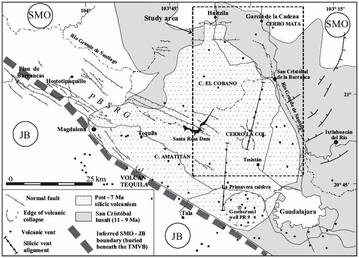
Click here for transcript
Here is a more detailed map of subduction zone volcanism on the west coast of Mexico in the Guadalajara region. Let us orient ourselves. Here is the metropolis of Guadalajara. Here is the town of Tequila over here. True fact for the day. The Jose Cuervo distillery is actually in this town. To get a volcanic history of this region let us go back about eleven million years. That is when the San Cristobal basalt was erupting. That eruption spread out over everything within this boundary here given by the darker shading in this figures. It goes off the map to the southeast and all the way back around so it covers everything within there. Basaltic eruptions are usually high temperature and low viscosity which means they flow pretty readily. Think of Hawaii. And they cover everything. All this area was covered by basalt. Then about seven million years ago the character of the lavas coming out of these volcanoes changed. They became more silicic. An example of a silicic lava is a rhyolite. The area covered by those lavas is shown by the stippled region and I am outlining it, too. Rhyolites are much more viscous. They melt at a lower temperature, and so they are kind of like the toothpaste of lavas. They are so viscous and they often have a lot of gas trapped in them that they lead to very explosive eruptions. Sometimes they are so explosive that they blow away the entire mountain during the eruption. There is evidence that that did happen here. All these circular features denoted like this are collapsed calderas. These happen when you get a giant eruption that blows away the entire mountain and leaves a little depression behind. Volcanism can still happen in there. La Primavera caldera is one of these little calderas and it is right here. It is in a line of other rhyolitic vents. Here is another one. All these other little dots are other rhyolite vents. So this was a very very active region.
Viscosity and Rhyolitic lava
As we were just discussing, collapsed calderas are formed when a large explosive volcanic eruption has blown away the magma chamber as well as the entire volcano, leaving behind a giant crater-shaped depression. Often, calderas are associated with rhyolitic lavas because rhyolite, with its high silica content, is viscous. See the chart below for a comparison of the viscosity of different lavas. Viscosity is a measure of resistance to flow. Lavas with high viscosity tend to form steep-sided volcanoes and often the lava cools right on top of the main vent, essentially plugging it up. Then, pressure builds up in the magma chamber as gases, ash, and lava want to escape but can't. When the pressure finally exceeds the strength of the plug and the eruption happens, it may be so violent that an extremely large volume of ground is blown to smithereens. Historically, large and destructive eruptions, such as Krakatoa and Tambora, happened this way. Note on the map above the sheer size of some of the calderas in the stipple-shaded region that marks the rhyolitic lava flows. La Primavera caldera, at the heart of our story, is shown as one of the many silicic vents in this region.
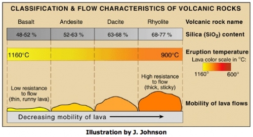
Temperature and composition both affect viscosity. The same substance at higher temperature will usually be less viscous. Think of an ordinary substance like candle wax. When you heat it up it gets more runny, but it is always wax, it has not changed what it is made out of. Two different mineralogies will normally have different viscosities depending on their silica content. The higher the silica content, the higher the viscosity. But note the actual numbers in the classification chart! Geologists talk about basalt as "low silica" but that's only in comparison to other lavas. In fact basalt is about 50% silica!
Bosque la Primavera
Below is a photo of the piney, mountainous state park in Jalisco described in "Death of an Agent."
The photo below shows an outcrop of rhyolite tuff. A tuff is deposited as an air-fall ash layer from an explosive eruption. Up close, you'd see that each grain is full of air bubbles that were trapped in the rock particles when the ash cooled as it flew through the air. The scale of this outcrop gives an indication of the massive eruption that produced this ash layer.
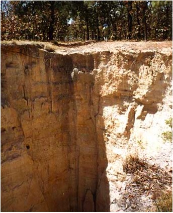
Mineralogy of La Primavera Caldera
The story of two different volcanic soils
The FBI geologists in "Death of Agent" were able to prove that Camarena did not die at the Bravo family ranch because the soil on his body was not at all like the soil at the Bravo ranch. Both soils derived from the weathered products of volcanoes, but the volcanoes couldn't have been the same because the mineralogy was different. The soil from the Bravo ranch was described as containing a lot of obsidian (see image below). Obsidian is a volcanic glass. The obsidian from the Bravo ranch was "globular" meaning that it was probably eroded and rounded by water.
In contrast, the soil on Camarena's body was rhyolite (see image below). It is described as an ash that probably cooled as it flew through the air from an explosive eruption. This process creates small particle sizes and highly vesiculated (full of air bubbles) grains.
What is rhyolite?
What is the mineralogic composition of rhyolite, and specifically this particular rhyolite? Rhyolite is analogous to its more commonly known cousin, granite. The difference is that granite is an intrusive igneous rock that cools underground without erupting, whereas rhyolite is an extrusive igneous rock that forms a lava and cools out of the ground after an eruption. Otherwise, mineralogically speaking, the two rocks have the same composition. Rhyolite has the highest silica (SiO2) content of the extrusive igneous rocks, but it also has lesser components of some other compounds such as aluminum, potassium, sodium, magnesium and iron oxides. See the chart below for the average breakdown of compounds in each of the four most common extrusive igneous rocks.
If the soil on Camarena's body had been just a run-of-the-mill rhyolite, his original burial spot would have been impossible to locate. Handily, there were a few diagnostic minerals that were part of the assemblage, and luckily these minerals had been studied and the results published by earlier field geologists. The other minerals found on Camarena’s body were cristobalite (clear and “opalized”), bixbyite, and rose quartz.
Cristobalite is a high-temperature polymorph of quartz often found in volcanic deposits. Remember from earlier in this lesson that polymorphs have the same chemical formula but different lattice structures. Below is a phase diagram of silica showing the different pressure and temperature regimes that produce its different polymorphs.

Rose quartz also has the chemical formula SiO2. This is the same formula as regular quartz and cristobalite. So why do they look different? Pure quartz is colorless. However, quartz often contains impurities. In the case of rose quartz, the impurities are titanium and iron. The impurities are at the parts-per-million or parts-per-billion level, so they do not get written in the chemical formula, even though their presence completely changes the look of the mineral!
Bixbyite is manganese iron oxide (Mn,Fe)2O3. It is not such a common mineral, but when it is found, it is usually found in rhyolite deposits.
Recap
We know from this case study where the original burial spot of Enrique Camarena was located because of the unique mineral assemblage of the soil adhering to his body. What do we know about this soil? It was rhyolite. This rhyolite has several characteristics that helped the FBI geologists narrow down its provenance. The crystals were tiny and full of air bubbles, which meant that they probably came from a volcano that had erupted explosively because the small crystals would have cooled as they flew through the air. This knowledge led them to look at the region near the subduction zone west of Guadalajara where all those collapsed calderas indicated past explosive eruptions. They knew they needed to look in a mountainous region because the grains were still sharp and comparatively unweathered. They also knew they needed to find a rhyolite that contained some interesting minor minerals in specific percentages: cristobalite, rose quartz, and bixbyite.
Create Your Own Forensics Lab
Activity
In this activity, I'd like you to create a forensic mineralogy lab or lesson. Make it short and simple (just one or two class periods in length). If you have big ideas for a longer, more involved project, that is fine—why not save that for the course capstone project (Lesson 8) when your assignment is to create a longer lesson?
An example to get you thinking
I made a really simple lab for an undergrad course in which students looked through a low-powered microscope at three samples of sand. One was synthetic sand from a playground sandbox, one was pure quartz with a very narrow grain size ordered from the US Silica Company, and one came from a beach in North Carolina. The students had to figure out which sample was which based on their observations. I had them make some drawings of the grains, and then make educated guesses about the mineralogy with the right reference books at their disposal.
Directions
- Write up your lesson plan. Your lesson plan should include the following:
- A brief overview of what will be taught and why. This overview should include a statement about the background information students will need to know in order to complete your lab successfully.
- A set of learning objectives. (What will your students know or be able to do at the end of your lesson?)
- A description of your plan. (What will the students do?)
- A list of necessary materials. (Feel free to be creative here. This is basically a hypothetical assignment, so if you think you need some equipment or other materials that you don't have immediate access to, don't let that stop you from including it!)
- A list of deliverables. (What will the students turn in? How will you know if they learned what you wanted them to learn?) Note: You need to include a "key" or set of answers to any follow-up questions or other material students will hypothetically turn in. That will help me assess the accuracy of the science you are presenting and it will also give me a clue about the level of thinking you expect from your students.
- An evaluation rubric. (So that another teacher can assess the students in the manner that you intended.)
- Save an electronic version of your activity and name it like this:
L5_forensicslab_AccessAccountID_LastName.doc (or your file extension).
For example, former Cardinals outfielder and hall of famer Stan "The Man" Musial would name his file "L5_forensicslab_sfm6_musial.doc"
Submitting your work
- Upload your lesson plan file to the Canvas assignment "Forensics Lab" by the due date specified on the first page of this lesson.
Grading rubric
Note on Grading: I am interested in the scientific accuracy of your exercise. I am not going to base my grade on whether you have constructed a lesson plan in some special way (as long as all the components listed above are there). My assumption is that those of you who are teachers already know how to write a lesson plan. For those who are not teachers, I am not going to instruct you on correct lesson-plan making here. However, I am a scientist, so if the facts are not right, or could use clarification, I can assist with that.
- An "A" forensics lesson is complete, clear, and organized. It contains all the components listed above. The science is accurate. I can follow your instructions in the way that you intended without a lot of guesswork (It's fine if part of the lab involves making students guess and hypothesize. I'm talking about whether your directions are clear or not). The lesson is well-designed and would elicit the appropriate amount of thinking and interpretation on the part of the intended audience. Your lesson shows independent thinking.
- A "B" forensics lesson is like that of an "A" project, except that its directions may not be clear enough that I can follow them without having to guess a little bit about your exact intentions. A "B" write-up is complete and contains all the components listed above.
- A "C" forensics lesson may have clarity problems, leading me to have to guess how to follow your instructions. A "C" write-up may also be incomplete with some of the assignment components missing. The science may not be accurate.
- A "D" forensics lesson has such badly written directions that I can't even begin to guess how to follow your instructions. A "D" write-up may be significantly incomplete and it may contain gross factual errors.
Additional Resources and Bibliography
Additional resources
- USGS volcano hazards page [74]
- Science of Sand [75]
Bibliography
Ferrari, L., Pasquaré, G., Venegas-Salgado, S., Romero-Ríos, F. (2000). Geology of the western Mexican Volcanic Belt and adjacent Sierra Madre Occidental and Jalisco block. Geological Society of America, Special Paper, 334, pp. 65-84.
Ferrari, L., Rosas-Elguera, J. (2000). Late Miocene to Quaternary extension at the northern boundary of the Jalisco block, western Mexico: The Tepic-Zacoalco rift revised. Geological Society of America, Special Paper, 334, pp. 41-64.
Murray, Raymond C. (2004). Evidence from the Earth: Forensic geology and Criminal Investigation. Missoula, MT: Mountain Press Publishing Company, p. 226
Rossotti, A., Ferrari, L., López-Martínez, M., & Rosas -Elguera, J. (2002). Geology of the boundary between the Sierra Madre Occidental and the Trans-Mexican Volcanic Belt in the Guadalajara region, western Mexico. Revista Mexicana de Ciencias Geologicas, 19, pp. 1-15.
Do you have another reading or Web site about these topics that you have found useful? Share it in our Teaching/Learning Discussion!
Summary and Final Tasks
I chose a case study to highlight the Neat-o Interdisciplinary Idea for this lesson: Forensics. I like introducing the subject of mineralogy this way because I think it is more exciting to see a real-life example of why you might want to know how to classify rocks and minerals rather than just memorizing a list of classifications, vocabulary, and chemical formulas.
While memorization does have its place and studying science does require learning some new vocabulary, putting these ideas into the context of a true story can make learning seem less burdensome and more like a discovery process--don't you agree?
Reminder - Complete all of the lesson tasks!
You have finished Lesson 5. Double-check the list of requirements on the Lesson 5 Overview page to make sure you have completed all of the activities listed there before beginning the next lesson.
Tell us about it!
If you have anything you'd like to comment on, or add to, the lesson materials, feel free to post your thoughts to our next Teaching/Learning discussion. For example, are you grateful that you were not unlucky enough to stumble onto some traffickers while hiking in Mexico in the 1980s?
Lesson 6: Volcanic Eruptions
Overview
Lesson 6 will take us one week to complete. This lesson is about volcanic eruptions.
What will we learn in Lesson 6?
By the end of Lesson 6, you should be able to:
- Compare the size of historical eruptions in terms of explosivity and volume of ejected material.
- List the types of material ejected from volcanoes during eruptions.
- Correlate typical volcanic products with certain tectonic regimes.
- Explain the life cycle of a caldera-forming volcano.
- Debunk some commonly held myths concerning volcanoes and volcanic eruptions.
- Interact with the real-time, volcano-monitoring datasets provided by the Volcanoes Exploration Program (hosted by the USGS).
What is due for Lesson 6?
The chart below provides an overview of the requirements for Lesson 6. For assignment details, refer to the lesson page noted.
Lesson 6 will take us one week to complete. 15 - 21 Jul 2020.
| Requirement | Submitted for Grading? | Due Date |
|---|---|---|
| Reading Assignment: "Witness accounts of the catastrophic event of August 1986 at Lake Nyos (Cameroon)" | No | 21 Jul 2020 |
| Eruptions problem set | Yes - Turn it in to the "eruptions problem set" assignment in Canvas. | 21 Jul 2020 |
| Teaching and Learning II | Yes - This will be part of your discussion grade for the course. Participate in the Canvas discussion called "Teaching/Learning 2" | multiple participation spanning 15 - 21 Jul 2020 |
Questions?
If you have any questions, please post them to our Questions? Discussion Forum (not e-mail). I will check that discussion forum daily to respond. While you are there, feel free to post your own responses if you, too, are able to help out a classmate.
Where Does Volcanic Activity Occur?
Myth: Most of the Earth's igneous rocks are produced at the "Ring of Fire."
Fact: 70% of the Earth's surface is ocean floor, which is made of basalt, an igneous rock produced at mid-ocean ridges. The ridges are the most volcanically active features on the planet.
Plate boundary volcanism
Volcanic activity occurs at two types of plate boundaries: mid-ocean ridges and subduction zones. At mid-ocean ridges, basaltic eruptions produce new sea-floor crust. These underwater eruptions don't produce big mountainous volcanoes, which is why they are often overlooked as the most volcanically active features on Earth. Commonly, basalt is erupted at mid-ocean ridges as blob-shaped "pillows." These pillows form when basalt is suddenly quenched as it comes into contact with sea water. If you cut a pillow in half, you'll find a glassy rind around the outside, where the lava cooled so fast that it couldn't form any crystals. Inside the pillow will be a crystalline matrix of cooled basaltic lava.
Watch this!
Here's a short video clip taken from the Alvin, a submersible oceanographic vehicle, as scientists tried to collect some pillow basalts underwater in the Gulf of Alaska.
At subduction zones, volcanoes are created on the overriding plate as melt from the subducting plate rises up through the mantle and crust. See the map below.
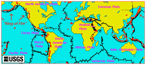
Think about this...
Recall that there are three types of plate boundaries: convergent, divergent, and transform. Volcanism occurs at convergent boundaries (subduction zones) and at divergent boundaries (mid-ocean ridges, continental rifts), but not commonly at transform boundaries. Why not?
Hot spots (or not)
Hot spot volcanoes occur somewhat randomly around the globe. Their relationship (or lack of one) to the plate tectonic cycle is still being debated. The map below shows several hot spots, but not all the existing ones. In fact, there are over 100 hot spots that have been active sometime during the last 10 million years or so. Notice on the map below that out of the 25 hot spots shown, about 10 occur on top of a mid-ocean ridge. Whether this is a coincidence or not is a current topic of debate among scientists.
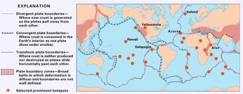
Mantle plumes (hot jets of material that well up from deep in the mantle at a speed of centimeters per year) were proposed as the source of hot-spot volcanoes at about the time of the plate tectonics revolution. Until recently, the prevailing wisdom held that hot spots have a deep source (perhaps as deep as the core-mantle boundary) and that they are nearly stationary with respect to the plates. Geologists, therefore, have used hot spots as an absolute reference frame from which to derive plate motions, and they have studied the geochemical signatures of the lava that has erupted at hot-spot volcanoes as a way to learn something about the composition of the lower mantle. Recent observations of some small young sea mounts east of Japan have initiated a vigorous debate about whether the standard plume model needs to be revised, or maybe even thrown out completely. This particular chain of seamounts occurs away from a plate boundary and the melt is probably coming from a source deeper than 100 km, but researchers who studied the geochemical signature of the lava concluded that the melt cannot have a very deep source, such as the lower mantle or core-mantle boundary. Their hypothesis is that a crack in the plate allowed some partial melt that was present in the upper mantle to rise to the surface and form the sea-mount volcanoes. The schematic diagram below shows their model, which they call "petit-spot" volcanism.
How to Melt a Rock
Myth: The plates are floating on an ocean of liquid magma.
Fact: There is not a giant reservoir of molten rock just hanging out beneath the crust, waiting to spurt to the surface at any available weak spot. The mantle is solid rock. (Remember the lesson about the Earth's interior earlier in this course: If the mantle were a liquid, earthquake S waves couldn't travel through it.)
So where does that lava come from? How do rocks melt? At surface pressures, all you have to do to melt a solid is to heat it up to its melting point. It is true that the temperature rises as you go deeper and deeper into the Earth (15 - 20°C / km is the typical geothermal gradient). However, pressure is also rising as you descend into the Earth, and increased pressure inhibits melting. There are three basic ways that rocks melt to form the lavas that erupt from volcanoes: decompression, addition of volatiles, and conduction. Let's explore each of these in turn.
Decompression
Decompression melting occurs at mid-ocean ridges. When two plates move apart, they create a space that can be filled by hot rock that rises buoyantly from below. As long as this hot rock rises faster than the temperature can cool off, the rock can melt because the pressure is decreasing as the rock gets closer to the surface. See pencast sketch of decompression melting at a midocean ridge! [77]
Let's visualize what decompression melting looks like as a plot in Pressure-Temperature space [78]!
You can construct Pressure-Temperature plots to show melting curves for all kinds of substances, not just lava at a mid-ocean ridge. For example, the plot below shows data for table salt. Note that these scientists put temperature on the y axis, and pressure on the x axis. We did it the other way around (and had pressure increasing downwards on the y axis) because we wanted pressure to be analogous to depth in the Earth in our plot.
Volatiles
Rocks melt at a lower temperature in the presence of volatiles such as water and carbon dioxide. How do you get water underneath a volcano? The most common way to do it is to send it down a subduction zone. When a subducting plate sinks under the overriding plate, the water-saturated upper part of the lithosphere goes down, too. As the cold slab sinks, water is forced out and percolates upward into the overlaying hot, dry mantle rock. This sudden addition of water lowers the melting point of that mantle rock, and it begins to melt. See my pencast of this process [79].
Volatile-driven melting happens at all subduction zones. The melt is generally formed at the point when the slab gets to a certain depth (the depth at which the pressure becomes high enough to force out the water). Pencast of a plot in Pressure-Temperature space for volatile-driven melting! [80] Therefore, you can figure out the angle of subduction (i.e., how steeply the subducting plate is sinking) based on how far the subduction zone volcanoes are inboard of the trench. If the volcanoes are close to the trench, it means the slab is subducting steeply, and if the volcanoes are far away from the trench, it means that the slab is subducting at a shallow angle.
Try this!
Below are two maps at the same scale showing two different subduction zones. On the top is a subduction zone in the central Andes in South America. The trench is the dark nearly north-south line offshore. The slab is subducting from west to east. On the bottom is a subduction zone south of Japan in the western Pacific Ocean. This slab is subducting from east to west. Note the positions of the trenches with respect to the volcanic arcs associated with each one (the volcanoes are shown by the hokey little orange volcano symbols). Which plate is subducting at a steep angle and which one is subducting at a shallow angle?
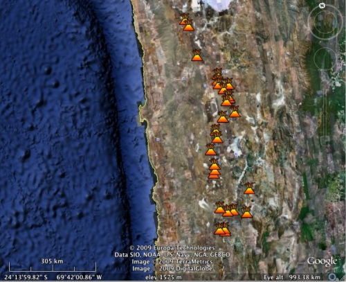
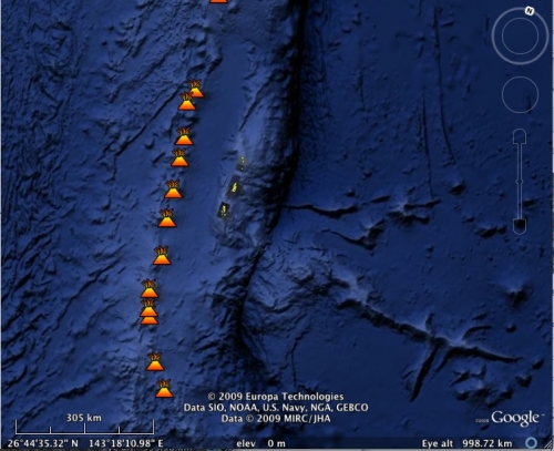
Conduction
The third way to melt a rock is by conduction. Conduction is the simplest way to transfer heat. At the atomic scale, hotter particles vibrate more. When they come into contact with other nearby particles, some of that vibrational heat energy is transferred to those nearby particles, heating them up. At the macroscopic scale, when rocks melt by either decompression or by addition of volatiles, the more buoyant melt rises toward Earth's surface. When this rising melt comes into contact with solid lithospheric rock on its path upward, it can transfer enough heat to the surrounding rock to melt it. This often happens in subduction zones as the initial melt created at the slab/mantle boundary travels upward into the rock of the overriding plate.
Different Kinds of Eruptions
Myth: When a volcano erupts, that means lava is coming out of it.
Fact: The statement above is misleading because it is true some of the time but not all of the time. One absolute fact is that lava is never the only product of eruption. And, some eruptions involve no lava at all. There can be a great variety of material ejected from a volcano during an eruption; the most likely ones in addition to lava are ash and gas.
Volcanic products at Kilauea (and some other volcanoes, too)
The discussion below won't be an exhaustive list, but it will give you an idea of the variety of volcanic emissions routinely monitored, collected, and studied by volcanologists. Let's break it down into liquids, gases, and solids because those classifications are easy to grasp, and you will see all of these later on when you work on the problem set concerning volcano monitoring at Kilauea. I have constructed this discussion to use Kilauea's products as the main example.
Liquids: Lava
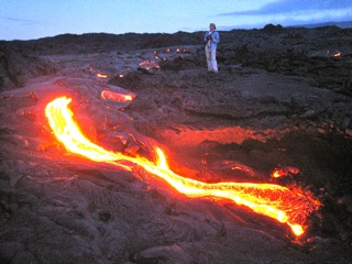
The typical cartoon-style drawing of a volcano is of a mountain with orange lava running down the sides of it. In fact, this mental image isn't really wrong, but it only works for certain types of volcanoes. Lava is the catch-all term for molten rock that extrudes from the Earth and cools at the surface. It can vary in temperature, viscosity, and mineralogic composition depending on the tectonic regime of the particular volcano. Different classifications are given to lavas based on their texture, which tells us about the cooling history of the rock and the amount of silica they contain (which, as you'll recall from the previous lesson, is the primary distinction between different lavas mineralogically).
- Mid-ocean ridges produce basaltic lava, which cools to form the sea-floor.
- Shield volcanoes, such as the Hawaiian Island volcanoes and other ocean island volcanoes, also produce primarily basaltic lava during their eruption. Remember from the previous lesson that basaltic lava has a high melting temperature, a low viscosity, and a low silica content.
- Subduction zone volcanoes often go through a life cycle that involves extruding lava that contains higher and higher concentrations of silica as geologic time goes by. Lava with a high silica content is rhyolite. Rhyolite has a lower melting temperature than basalt, and a higher viscosity. We will discuss the influence of lava mineralogy on volcano morphology a little later on in this lesson.
Gases: Steam, carbon dioxide and sulfur dioxide
Ninety-nine percent of the gas molecules emitted during a volcanic eruption at Kilauea volcano are water vapor (H2O), carbon dioxide (CO2), and sulfur dioxide (SO2). The remaining one percent is made up of hydrogen sulfide (H2S), carbon monoxide (CO), hydrogen chloride (HCl), hydrogen fluoride (HF), and a few others. At Kilauea, gas is monitored daily by scientists who go out and collect the data. The way they do it is to attach an ultraviolet spectrometer to the side of a vehicle and then they drive the vehicle back and forth under the plume. The main thing they are interested in is sulfur dioxide because that gas is really the most noxious. It is the main contributor to "vog" (volcanic smog), it can produce acid rain, and too much exposure to sulfur dioxide has been known to aggravate pre-existing respiratory conditions, such as asthma.
Can an eruption be only gas with no lava at all? Yes, in August 1986, a sudden outgassing of CO2 from Lake Nyos in Cameroon, killed over 1,500 people and hundreds of animals in the valleys surrounding the lake. Lake Nyos is a lake that formed in the caldera of a volcano. If you have seen Crater Lake in Oregon, that is also a lake that filled a collapsed caldera. As CO2 was emitted from Lake Nyos, it flowed down the sides of the mountain, displacing the normal air because CO2 is heavier than regular air, which is mostly nitrogen, N2, with some oxygen, O2, thrown in. (Recall from basic chemistry that CO2 has an atomic weight of 6+8+8 = 22, whereas N2 has an atomic weight of 7+7=14 and O2has an atomic weight of 8+8=16). Carbon dioxide is not poisonous, but if you are breathing it instead of air, you will suffocate quickly. The effect of this outgassing was to quietly put out all the cooking fires and suffocate all the people and animals in the valleys around the mountain. Scientists have disagreed about the exact cause of the sudden eruption of CO2. One camp believes that there was a lot of CO2 dissolved in the bottom water of the lake, and something triggered a sudden overturning of the lake's water, bringing the CO2 to the surface. Others hypothesize that the CO2 was a volcanic outgassing from the seemingly dormant caldera. At present there are efforts underway to keep the bottom of the lake free of too much CO2 in case the first explanation is correct. In your reading assignment below, you will read a paper in which a team tries to use witness testimony from survivors to figure out which explanation is correct.
Reading Assignment
This article is located in our Canvas space:
- Le Guern, F., E. Shanklin and S. Tebor (1992). Witness accounts of the catastrophic event of August 1986 at Lake Nyos (Cameroon) Journal of Volcanology and Geothermal Research, 51, pp. 171-184.
This article is another good example of a multidisciplinary collaboration. The three authors are a volcanologist, an anthropologist, and a Peace Corps worker. They collaborated to piece together interviews from survivors and witnesses of the CO2 eruption at Lake Nyos that killed over 1,500 people in the valleys surrounding the lake. This effort involved translation and also geologic interpretation of the accounts of the interviewees to get a better idea about what happened at Lake Nyos and whether this could happen again.
As you read, contemplate the following questions:
- What two possible causes of the CO2 degassing event are discussed? What is the difference between them and how do the authors propose to distinguish between the two possibilities?
- How did these researchers use the witness testimony as a way to inform scientific thinking?
- At present, there are ongoing efforts to keep Lake Nyos degassed. Based on the conclusions of this paper, will this endeavor reduce the likelihood of future CO2 eruptions, or not?
Solids: tephra
The solids that come out of Kilauea are mineralogically identical to the lava because it's all coming from the same place, made of the same stuff. However, volcanologists differentiate between molten rock that flowed out --lava-- and solid rock that was thrown out, or cooled as it flew through the air, called tephra. You don't have to be an eyewitness to the eruption to tell the difference between what came out as a solid and what came out as a liquid. You can tell by looking at the texture of the rock after it has cooled. For example, a specific class of tephra, called reticulite, is basically the basaltic version of pumice. You can tell it was thrown out in a high-speed froth because it cooled while trapping the evidence of gas bubbles within it. See photo below.
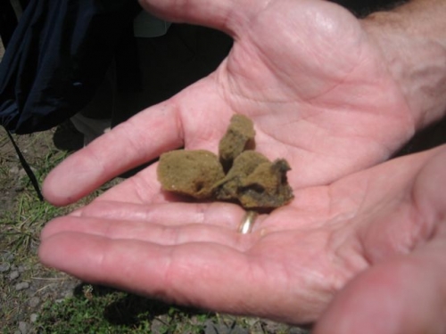
Reticulite (photo above) looks like a sponge and at the sample size above feels nearly weightless in your hand. Does it float like pumice does?
Click here to find out if reticulite does or does not float like pumice does.
In fact, reticulite does not float the way pumice usually does. The reason pumice floats is that its structure is full of mostly unconnected void spaces. The "unconnected" part is the key. If the water can't get into the void space very easily, it can't saturate the rock and the rock won't sink.
Reticulite has such an open structure that water easily permeates the rock, so it will sink.
Volcanic products at other volcanoes
The proportion of solids, liquids, and gases that volcanoes emit depends on mineralogy and the plumbing system. Mineralogy can generally be tied to the tectonic setting of the volcano. In your problem set you will have a chance to compare the products of a variety of volcanoes and discuss these products in terms of tectonic regime. In addition to the general "Kilauea-specific products" discussed above, here is a mostly non-Kilauea volcanic product to know:
Ash and other pyroclastic items
Myth: Volcanic ash is just like the ash that comes from burning wood or paper, except there's more of it.
Fact: Unlike the soft, pulpy, dissolvable ash that fires produce, volcanic ash is solid rock. Volcanic ash fragments can be quite tiny. That's why they can be dispersed a great distance (thousands of kilometers!) through the air and look just like a regular cloud.
Note the jagged morphology in the photomicrograph of an ash particle from the 1980 Mt. St. Helens eruption. You can also observe the evidence of what were once gas bubbles trapped in the rock.
Volcanic ash is formed when volcanoes erupt explosively. When volatiles, such as water vapor or carbon dioxide, are trapped in magma, they want to bubble out and escape. If the lava is too viscous for the bubbles to rise to the surface and escape, the gas pressure inside the magma builds up until the gas bubbles explode, sending magma shrapnel out of the volcano, flying through the air as it cools into tiny ash fragments. During an eruption, as the magma is explosively ejected, pressure is decreased on deeper magma, causing it to quickly rise and follow the same explosive path. Other pyroclastic materials that erupt from volcanoes include blocks (big ones—these can be house-sized), bombs (medium ones—these can be football-sized), and lapilli (small ones—these are pebble-sized). These items are basically classified by size. Given their particle sizes, they don't stay airborne or travel particularly long distances from the immediate area of the volcano. Below is a recent (2009) photo of Redoubt volcano. Note the height of the ash cloud rising from the volcano and think about the fact that although it looks just like a nice puffy cloud, it is actually composed of nasty sharp little pieces of solid rock.
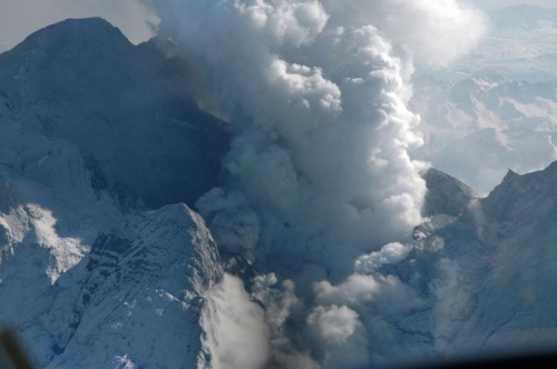
How Big is Big? (Volcanoes)
Myth: Stratovolcanoes (like Mt. St. Helens and Vesuvius) are huge, but shield volcanoes (like the Hawaiian islands), with their gentle slopes, are pretty much flat and not very big.
Fact: Shield volcanoes do indeed have gentle slopes, but these are the hugest volcanoes on Earth.
Shield Volcanoes
"Shield" volcanoes are so named because their shape is reminiscent of a shield lying on the ground with its convex side pointing up. Their widths are much broader than their heights and they have gentle slopes. (Side note here: Don't confuse shield volcanoes with continental shields, which are also named for their shield-like shape. The two don't have anything in common except for their morphology. Continental shields, such as the Canadian shield, and the Kaapvaal craton in South Africa, represent the oldest still-intact blocks of crust from the early history of the Earth.)
The most obvious examples of shield volcanoes are the Hawaiian Islands. See the photo of Mauna Loa shown here and note the shape of the mountain. The photo almost makes Mauna Loa look like a small, insignificant mountain, doesn't it? Actually, if you start measuring at the ocean floor, which is the real bottom of the mountain, Mauna Loa is 9 km tall, easily taller than Mt. Everest, and much wider. Only the top 4km rises above the water, though.
Shield volcanoes are formed by low-viscosity basaltic lava flows. Because basalt has such a low viscosity, it spreads out in thin sheets and can travel a long way before freezing. Gradually, after many repeated eruptions from a central fissure, a mountain will be formed—one that is much wider at its base than it is tall, but one that has the potential to be quite tall, depending on how long the magma source remains active.
Stratovolcanoes
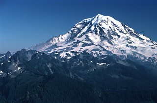
Stratovolcanoes are sometimes also called "composite" volcanoes. They most often form on the continental overriding plate in a subduction zone. The Cascade Range volcanoes are all stratovolcanoes, for example. If you asked a child to draw a volcano, the shape they are most likely to come up with is the conical, steep-sided shape of a stratovolcano. See the photo of Mt. Rainier shown here and compare it to the photo of Mauna Loa above. From the photo, Rainier looks like a bigger mountain than Mauna Loa. In fact, its actual elevation above sea level (4392 m) is higher than Mauna Loa's, but remember that the base of Mauna Loa is really about 5 km below sea level!
Stratovolcanoes are shaped the way they are because they are formed by alternating layers of lava and pyroclastic material, both of which have a higher viscosity, and thus a greater resistance to flow than the basalt-only shields. Stratovolcanoes are more likely to erupt explosively and emit ash and gas. Many subduction zone stratovolcanoes go through a life cycle spanning millions of years in which the composition of their magma changes over time. This change in the mineralogy of the magma leads to changes in the type of eruption and the morphology of volcano itself. At the beginning, mostly basaltic magma erupts. This is because basaltic magma is the original source of magma coming from the volatile-driven melting going on at the top of the subducting slab under the subduction zone. As this basaltic magma continues to be produced by more and more lithosphere going down the subduction zone, it begins to melt some of the overlaying continental crust by conduction. This new addition to the magma generally has a higher concentration of silica in it because continental crust is more enriched in silica than oceanic crust. The addition of silica lowers the melting point of the magma and also increases its viscosity. So, now the eruptions will be more explosive, involve ash and pyroclastic debris, and stratovolcanoes will form. Next, the magma chamber will be highly silicic, quite viscous, and can erupt in a huge caldera-forming event. Finally, whatever is left of the magma body slowly cools, forming little resurgent domes, hot springs, and at the end, great bodies of intrusive igneous rocks such as granites. Below is a cartoon sketch of this cycle.
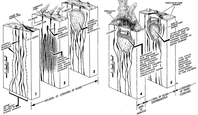
Think about this!
Can you tell what part of the caldera cycle Mt. Rainier is in right now? Think back to the previous lesson. What part of the caldera cycle is La Primavera in right now? Is there any evidence from earlier stages of La Primavera's cycle in the geologic maps of Mexico that we looked at?
How Big is Big? (Eruptions) and Problem Set, part 1
Myth: The eruption of Mt. St. Helens in 1980 was enormous! Just huge!
Fact: The 1980 eruption of Mt. St. Helens wasn't even close to some of the biggest eruptions in human recorded history as measured by the volume of ejected material. Compared to some prehistoric eruptions, it was actually pretty small.
In the following problem set, you will use data from the VOGRIPA program, which is run by the British Geological Survey, to compare some past eruptions of various volcanoes. There are two main questions to ask when comparing eruptions:
- How much material was erupted? and
- How explosive was the eruption?
These, and others, are the questions you'll answer in this problem set.
Problem Set
Directions
NOTE:
For this assignment, you will need to record your work in a word processing document. I'm not giving you a worksheet this time. It is up to you to construct your own document.
Go to the main page of the Volcano Global Risk Identification and Analysis Project (VOGRIPA) [81]. Find information about the eruptions for the volcanoes listed below. You can find each of these volcanoes by using the SEARCH tab. When you click the SEARCH tab you will get taken to a new page. Just scroll down a little way down the page and type the name of the volcano in, don't change anything else, then press the Submit button. Some volcanoes in my list have lots of documented eruptions. I've given you the dates of the ones I want you to look at.
- Sierra la Primavera (95,000 BP)
- St Helens (1980)
- Kilauea (1790)
- Eyjafjallajökull (2010)
- Pinatubo (1991)
- Vesuvius (79)
- Krakatau (1883)
- Tambora (1812)
- Fernandina (1968)
- Redoubt (1989)
- Toba (74,000 BP)
Make some kind of a table to store useful information about these eruptions. Specifically you will want to know the type of volcano, the composition of the eruption, the eruption magnitude, and the bulk volume.
Answer these follow-up questions:
- Which eruption in this activity was the largest in terms of explosivity and which was the largest in terms of volume?
- Where does the 1980 eruption of Mt. St Helens rank among all the eruptions in this activity? How about the 79 AD Vesuvius eruption? Are you surprised by these results?
- Describe the correlation (if any) between the type of volcano and the magnitude of its eruptions.
- Which volcanoes in this activity are the most active in terms of the numbers of number of confirmed eruptions?
- You may have to look at a map for this one. Can you tell which volcanoes are hot spot volcanoes and which ones are subduction zone volcanoes? What are the clues besides looking at a map that will tell you.
- Discuss whether there is a relationship between type of lava, magnitude of eruption, and volume of eruption for the volcanoes in this exercise. Feel free to supplement with other volcanoes if it helps to make your point. Figure out how to make a plot that illustrates your point. I know that I'm asking you to compare three things: composition, magnitude, and volume, but spend some time thinking about how to visualize their relationship. Post to Questions if you are stuck. It also may help to refer back to lesson 5 in which we discussed the characteristics of different types of lava and their compositions and viscosities relative to each other.
Submitting your work (not yet -- there's a part 2)
Save your word processing document as either a Microsoft Word or PDF file in the following format:
L6_eruptions_AccessAccountID_LastName.doc (or .pdf).
For example, former Cardinals manager and hall of famer Red Schoendienst would name his file "L6_eruptions_afs2_schoendienst.doc"
Hang on to your document because you will need it for part 2 of this problem set.
Grading criteria
I will use my general grading rubric for problem sets [24] to grade this activity.
How Long does an Eruption Last?
Myth: Volcanoes are dormant for a very long time, suddenly erupt, and then become dormant again.
Fact: There are a wide variety of eruption lengths. Stromboli volcano off the coast of Italy has been erupting more or less continuously for over 2000 years! Other volcanoes have eruptions that last less than a day. According to the Smithsonian Institute's Global Volcanism Program, the median length of time for a single eruption is seven weeks.
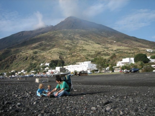
There are two timescales of interest where erupting volcanoes are concerned:
- How long does a volcano stay active and what controls this? and
- How long does a single eruption last and what controls this?
The main factor controlling volcanic activity in an area is the timescale over which melt is produced. For example, in a subduction zone setting, volcanism goes on for as long as the subduction zone is active. Remember, from a couple of pages ago, the overall timescale for the lifetime of a caldera. Subduction is a process that generally lasts for millions of years. It shuts off when an entire plate has disappeared, or something causes the plate to change its direction so that it is no longer subducting. For an ocean island volcano, the timescale for activity is the lifetime of the mantle plume or other source of melt.
For a single eruption, the controlling factor is the volume of melt present in the magma chamber and the degree to which the magma chamber is over-pressurized. An eruption will usually last until the local melt has been depleted, or until the gas pressure inside the magma chamber falls to a level at which gas is no longer trying to escape. Certainly this is a fairly simplified overview. The internal plumbing of a volcano can be quite complicated, though recent monitoring efforts involving GPS, local seismometers, and tiltmeters are getting better and better at capturing the size, depth, and activity of magma chambers under active volcanoes.
Hawaiian Volcano Monitoring
The Volcanoes Exploration Program at Pu'u O'o
VEPP was a project funded by NASA [82], implemented by USGS [83], and supported by SOEST [84] at the University of Hawai‘i at Mānoa [85]. The project lasted for about 5 years from 2010-2015. The project goal was to make available a subset of volcano monitoring data from the Hawaiian Volcano Observatory [86] (HVO) for educational purposes. The Web site—with data streams from the Hawaiian Volcano Observatory [86]—provided a means for students to experience and interpret current volcano-monitoring data.
The blurb above was cribbed directly from the now-sunsetted Volcanoes Exploration Program at Pu'u O'o web site and explains the point of the project. Even though the project is over we are still able to use its data for the second part of the problem set in this lesson.
The data provided by the VEPP program comes from the Pu'u O'o vent, which is on the east flank of Kilauea, so it represents just a subset of the many monitoring activities of the Hawaiian Volcano Observatory. See the map below to find the location of Pu'u O'o. It is one of the vents in the East Rift zone, the source of most of Kilauea's recent lava flows.
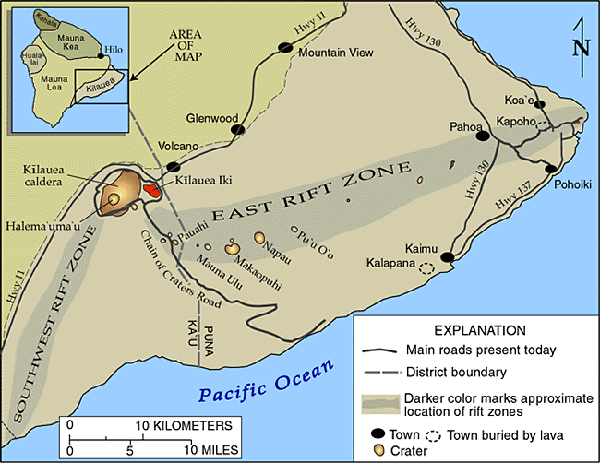
Instrumention
There are a variety of different instruments installed around Pu'u O'o to track what the volcano is doing in real-time. The general purpose of these measurements is to alert the scientists who receive the data about whether an eruption is imminent. This goal is worthy enough, but there is also the overarching scientific goal of getting a better understanding of how the plumbing system of a volcano works in the short-term and in the long-term. Here is a list of the types of instruments that record the data we'll explore, and a brief description of each one.
Tiltmeters
Tiltmeters are installed to measure any change in the angle of the ground with respect to horizontal. The goal is to make an observation of any bulge or inflation of the ground around a vent, which could be indicative of rising magma. Once an eruption has begun, tiltmeters can also measure deflation as the source of the eruption escapes from the ground. Below is a map of the three tiltmeters installed at Pu'u O'o. The Hawaiin Volcano Observatory (HVO) [87] web site also has some detailed information about tiltmeters and what their data look like.
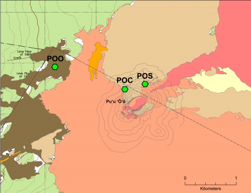
GPS stations
Pu'u O'o has a network of seven GPS stations (see map below) that continuously monitor the location of each station to within several millimeters by recording signals from orbiting satellites. You will recall from the New Madrid lesson in Earth 501, that GPS stations are routinely used to monitor the movement across faults and to confirm the magnitude and direction of plate motions inferred from magnetic sea-floor anomalies. At active volcanoes, GPS data is used to keep track of any surface deformation of the volcano. The HVO [87] website also has some more detailed i [88]nformation about GPS stations and some examples of data from them.
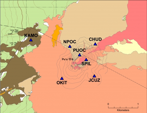
Seismometers
Pu'u O'u has two seismometers, located in the same place (see map below), but measuring different frequency bands. One of them is a "short-period" seismometer, which is sensitive to higher frequencies, such as the harmonic tremor that is often associated with the movement of magma at active volcanoes. The other seismometer is a "broadband" instrument, which is sensitive to a wider range of frequencies than the short-period instrument, and to generally lower frequencies. Broadband seismometers are installed all over the world to monitor ordinary earthquakes, but short-period seismometers are usually only for measuring what is going on in a small locality. If you want to see recent earthquakes recorded in Hawaii, you can check out HVO's seismicity map [89].
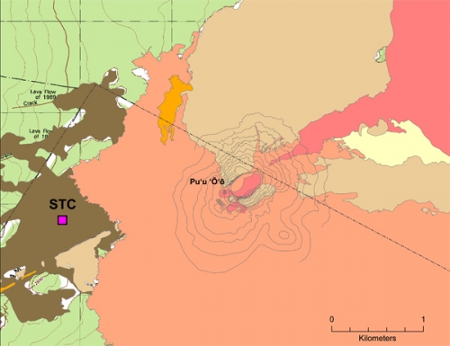
Webcams
Pu'u O'o has two webcams that each take a snapshot every few minutes. One of them is mounted on the north rim of the crater and looks southward into the crater. The other one is installed on the southeast flank of Pu'u O'o. It looks east across the currently active vent.
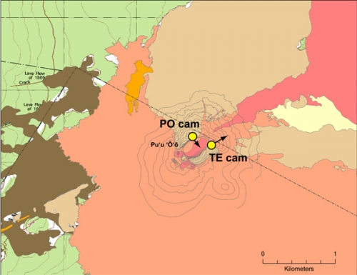
An example of an Inflation-Deflation event recorded at Pu'u O'o and how I made these plots
The three plots below show seismic (top), tilt (middle), and GPS (bottom) instrument records for 17-23 March 2009 at Pu'u O'o. I found this event by searching month-by-month using the software package the HVO scientists use, which used to be available to educators when the VEPP project was going on. I looked for distinctive jumps in the seismic amplitude data. Once I found one, I looked to see if it correlated with a tilt and GPS signal. The data depicted in these plots tell us about the behavior of the volcano's inner workings.
RSAM (seismic) data
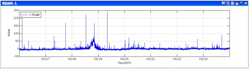
Tilt data
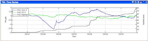
GPS data
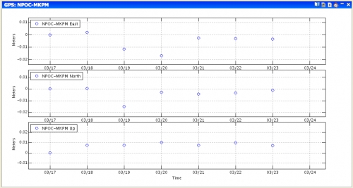
Eruptions problem set, part 2
The following is a problem set that will allow you to explore the various monitoring datasets that are used at Kilauea volcano. I am more interested in you being able to get a grasp of what instrumentation is deployed, what it measures, why it is important, and how the various measurements work together to give scientists a picture of the overall state of the volcano. I am less concerned with you being able to define each bump and wiggle that you might see. So think big picture when you look at the tilt, rsam, and gps data.
Kilauea Volcanism Problem Set
Directions
The goal of this problem set is for you to:
- read a report detailing recent eruptive activity at Kilauea volcano.
- predict hypothetical instrument responses to certain volcanic activities
- calculate the rate of magma movement based on measured seismicity
- use tilt, GPS, and RSAM data to describe an eruptive event at Kilauea.
Part 1, reading and questions
Read this paper, available in our Canvas space. This paper is a report of some sustained eruptive activity that occurred on Kilauea and its East Rift Zone during the summer of 2007. The activity was recorded by a wide variety of geological, geophysical, and geochemical monitoring instruments, the details of which are discussed in the paper. If you are unfamiliar with any or all of the types of instrumentation described, this paper may seem dense. My advice when reading is to try to focus on the space-time sequence of events, rather than the specifics of the instrumentation. In addition, you may want to go back one page in this lesson to refresh your memory of what each type of instrument measures. Perusing my follow-up questions first will help focus your reading.
Poland, M., A. Miklius, T. Orr, J. Sutton, C. Thornber, and D. Wilson, 2008. New Episodes of Volcanism at Kilauea Volcano, Hawaii, Eos 89, 37-38.
Answer the following questions. Append them to the same document you started for the eruptions problem set that dealt with the VOGRIPA database.
Questions:
- Look at Figure 2 of Poland et al., 2008. Find the summit caldera. Find the three instruments UWE, UWEV, and AHUP. UWE is a tiltmeter. UWEV and AHUP are GPS stations. If the summit were inflating with magma, would you expect UWEV and AHUP to get closer together or farther apart? Why? If the summit were inflating, in what direction would UWE tilt? Why?
- This question is just hypothetical! It is not directly related to the paper you read. Draw a sketch of the expected signal during a hypothetical summit caldera inflation and subsequent eruption. The blue sketch below shows the hypothetical caldera for this problem. A and B are both GPS stations and C is a tiltmeter. The triangle is the caldera summit. On the blank axes, time is on the x axis and distance is on the y axis for the GPS signal. Time is on the x axis and angle is on the y axis for tilt. The vertical dotted lines mark the beginning of caldera inflation and the beginning of the eruption. To make your drawing, you can use the simple drawing tools associated with your favorite word processing program, or just draw it by hand, take a picture of it, and insert it into your document. I am not looking for correct units, this is just a sketch.
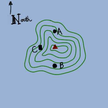
- Calculate magma flow speed based on earthquake locations given in the bottom panel of Figure 3B of Poland et al., 2008. Speed should be calculated over the time period spanned by the episodes labeled T1 - T5. Note the scale bar of 1 km given in the lower corner of the plot. When you write your answer to this question, please lead me through your logic. You will have to make some choices about how to estimate times and distances, and I want to hear your explanation of how you chose to do this.
Part 2, analyze and interpret real data from the 2018 eruption at Kilauea
The Hawaiian Volcano Observatory continuously monitors both the Kilauea summit and the Pu'u O'o vent to the east with a variety of geophysical instrumentation. Their Deformation Data [90]page explains how to interpret deformation plots in light of what the volcano is doing.
There was an eruption that began in May 2018. I want you to use GPS, tilt and seismic data to describe it. This is part of the real fun of using real scientific data that hasn't been sanitized for "educational purposes"! Post to the Questions discussion board if you get stuck!
Below is a map of instrument locations. Use it to answer questions 1 and 2. For more detailed maps, refer to the maps on the previous page.
- The tilt stations are UWE and POC. Where are these two stations relative to the summit and the Pu'u O'o vent? If the magma chamber under the summit were inflating, describe what each tiltmeter would be doing.
- The GPS data from Pu'u O'o is plotted as the distance between the two stations PUOC and JCUZ. Where are those two stations in relation to the Pu'u' O'o vent? Would they be getting farther apart, closer together, or staying the same distance apart if the magma chamber under Pu'u O'o were inflating?
 Map of earthquakes near Kilauea from July 2017-July 2018USGS
 Map of earthquakes near Kilauea from July 4 - July 11 2018USGS
 - Look at the maps of earthquake locations above. The top map is a year's worth of locations, and the bottom is just for a single week in July 2018. Describe in a few sentences the differences and similarities between them. Obviously there are a lot more earthquakes over a year as opposed to a week, but can you see any changes in where earthquakes tend to locate?
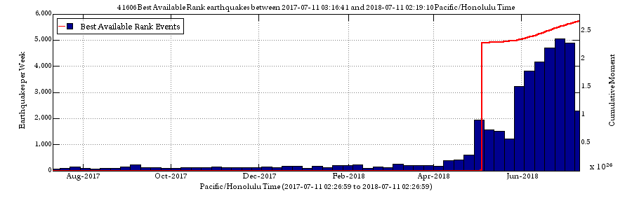 Earthquake counts per week at Kilauea from July 2017 - July 2018USGS
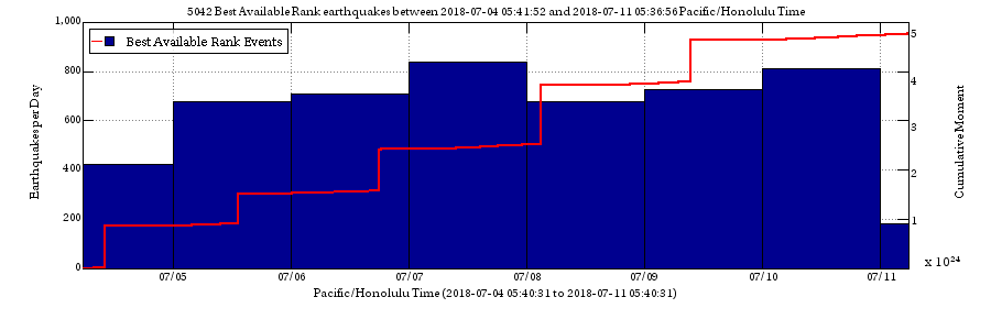 Earthquake counts per day at Kilauea from July 4, 2018 - July 11, 2018USGS
 - The two plots above show earthquake counts (blue bars) and cumulative moment (red lines) for a year (July 2017-July 2018) and for a single week in July 2018. When during the year-long interval did the seismicity per day begin to increase? Look at the plot of amount of seismicity over the week-long interval and determine whether seismicity has increased, decreased, or stayed about same with regard to the peak seismicity over the year-long interval. Pay attention to the y axis scale because the year-long plot is counts per week, whereas the week-long plot is in counts per day.
- There was a magnitude 6.9 on May 4 that is the single biggest jump in the red line on the top plot of cumulative moment release. Find it on the seismic locations map and tell me its approximate location (lat, lon). Hint: it's orange, and it isn't shown on the week-long seismic locations map because it happened before that week.
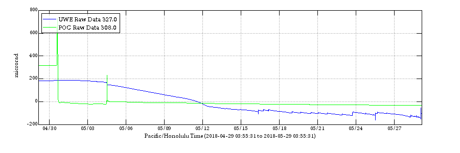 Kilauea summit and Pu'u O'o tilt from April - May 2018USGS
 - Now let's take a look at the tilt data. What time period does the plot above cover? Go back and read your own answer to question 1 in this problem set and use it to describe what is probably going on underneath each instrument over this time period. For example, is the magma chamber inflating or deflating? Is there steady behavior or little jumps that indicate unrest at the volcano?
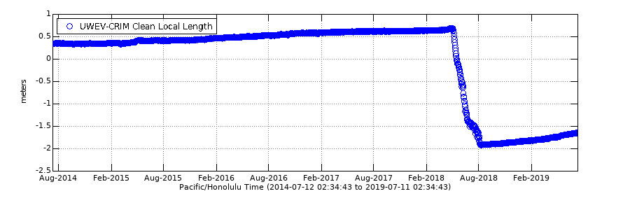 Length change across Kilauea summit recorded by GPSUSGS
 Length change across Pu'u O'o vent recorded by GPSUSGS
 - Onto the GPS data! What is the approximate rate of change of the distance between CRIM and UWEV between August 2014 and August 2017. What I am asking you for is a velocity. Are the two stations getting closer together or farther apart, and how fast is this happening? Pay attention to the units.
- What is the amount of change between CRIM and UWEV from approximately May 2018 to August 2018?
- Describe what is happening between CRIM and UWEV post August 2018.
- Describe what happens between NPOC and JCUZ (NPOC is co-located with POC on the map) between August 2014 and February 2019. How is the GPS data different at the summit as opposed to Pu'u O'o regarding the 2018 eruption?
- When did the 2018 eruption end? Check out the current alert status at Kilauea [91] to find out.
Submitting your work
Upload the document containing both your earlier work from VOGRIPA and the work you just did with Kilauea to the eruptions problem set assignment in Canvas by the due date specified on the first page of this lesson.
Grading criteria
I will use my general grading rubric for problem sets [92] to grade this activity.
Teaching and Learning II
For this activity, I want you to reflect on what we've covered in Lessons 5 and 6 and to consider how you might adapt these materials to your own classroom. Since this is a discussion activity, you will need to enter the discussion forum more than once in order to read and respond to others' postings. This discussion will take place over the week devoted to lesson 6.
Submitting your work
- Enter the Teaching and Learning II Discussion Forum.
- Post your ideas about how the materials we covered in the past two lessons might be adapted to your own classroom.
- Read postings by other EARTH 520 students.
- Respond to at least one other posting by asking for clarification, asking a follow-up question, expanding on what has already been said, etc.
Grading criteria
You will be graded on the quality of your participation. See the grading rubric [14] for the specifics about how this assignment will be graded.
Additional Resources and Bibliography
Additional Resources
Web sites
- Eruption of Stromboli Volcano from NASA's Visible Earth Project [93]
- USGS Volcano Hazards site [74]
- Alaska Volcano Observatory [94]
- Hawaiian Volcano Observatory [86]
- Yellowstone Volcano Observatory [95]
- Cascades Volcano Observatory [96]
- Volcano Resources for Educators (USGS) [97]
- Volcanic Gas Hazard Monitoring at Kilauea (National Park Service) [98]
- Encounters of aircraft with volcanic ash clouds: a compilation of known incidents, 1953-2009 [99]
- Global Volcanism Program of the Smithsonian Institute [100]
- World Organization of Volcanic Observatories [101]
Papers
- Kauahikaua, J. and M. Poland (2012). One Hundred Years of Volcano Monitoring in Hawaii, Eos 93, pp. 29-30.
Bibliography
Akella, J., Vaidya, S. N., & Kennedy, G. C. (1969). Melting of sodium chloride at pressures to 65 kbar, Phys. Rev., 185, pp.1135-1140.
Fisher, R.V., Heiken, G., & Hulen, Jeffrey B. (1997). Volcanoes: Crucibles of Change. Princeton University Press, p.317
Halbwachs, M., et al. (2004). Degassing the "Killer Lakes" Nyos and Monoun, Cameroon. Eos, 85, pp.281, 285.
Hirano, N., et al. (2006). Volcanism in Response to Plate Flexure. Science, 313, pp.1426-1428.
Tell us about it!
Have another reading or Web site on these topics that you have found useful? Share it in the Teaching/Learning discussion!
Summary and Final Tasks
In Lesson 6 we covered some topics about erupting volcanoes with an eye towards dispelling some common myths about them. I chose the particular myths in this lesson by asking my non-Earth-scientist friends what they thought about volcanoes.
Reminder - Complete all of the lesson tasks!
You have finished Lesson 6. Double-check the list of requirements on the Lesson 6 Overview page to make sure you have completed all of the activities listed there before beginning the next lesson.
Tell us about it!
If you have anything you'd like to comment on, or add to, the lesson materials, feel free to post your thoughts in our Teaching/Learning discussion. For example, are there other common misconceptions your students or other people you know have about volcanoes?
Lesson 7: Faults and "Ordinary" Earthquakes
Overview
This lesson will last one week. In it, we'll explore some basic points about faults and earthquakes. We will also see how archaeology and solid Earth geoscience are linked.
Objectives:
By the end of Lesson 7 you should be able to:
- Download, manipulate, and analyze publicly available earthquake catalog data from the Incorporated Research Institutions in Seismology (IRIS) and from the United States Geological Survey (USGS).
- Download, manipulate, and analyze publicly available geodetic data from UNAVCO.
- Recognize different types of faults on a map.
- Associate specific stress fields with the types of faults they produce.
- Describe the different methods for measuring earthquake magnitudes and energies.
- Calculate seismic energy released for a given seismic magnitude.
- Explain the physical meaning of earthquake magnitude.
- Construct a dataset appropriate for verifying a given empirical observation.
- Predict the approximate timing, sizes, and areal extent of aftershocks following an earthquake of a given magnitude.
What is due for Lesson 7?
Lesson 7 will take us one week to complete: 22 - 28 Jul 2020.
The chart below provides an overview of the requirements for Lesson 7.
| Requirement | Submitted for Grading? | Due Date |
|---|---|---|
| Reading discussion: Read articles and discuss them with the class | Yes - Your discussion board participation counts toward your discussion grade. | ongoing participation in the Canvas discussion "Delphic Oracle" 22 - 28 Jul 2020 |
| Problem set: Greek earthquake problem set | Yes - This exercise will be submitted to the "Greek earthquake problem set" assignment in Canvas. | 28 Jul 2020 |
Questions?
If you have any questions, please post them to our Questions? Discussion Forum (not e-mail). I will check that discussion forum daily to respond. While you are there, feel free to post your own responses if you, too, are able to help out a classmate.
Were the Ancient Writings About the Temple of Apollo True?
Introduction
This lesson's Neat-o Interdisciplinary Idea is that solid Earth geoscience can be linked with archaeology. We are going to begin this lesson on faults and earthquakes by reading two related papers about how a team that consisted of a geologist, an archaeologist, a toxicologist, and a chemist worked together to find out whether ancient writings about the Temple of Apollo at Delphi were true. Two-thousand-year-old texts claimed that noxious vapors and springs came out of the ground at the site of the Temple of Apollo at Delphi and that the oracle of the temple got her powers of divination from breathing them. In the early 1900s, geologists and archeologists thought those writings were complete fiction because they found no evidence of any vapors. However, a more thorough recent investigation of the tectonic setting at Delphi, done by the authors of the papers we'll read, supports the ancient writings and even makes a reasonable claim about the probable composition of the gas.
Reading Assignment and Discussion
Directions
- Read the following articles, linked from the Discussion space in Canvas:
- Hale, J. R.,de Boer, J.Z., Chanton, J. P., & Spiller, H. A. (2003). Questioning the Delphic Oracle. Scientific American, 289(2), pp. 66-72.
- de Boer, J. Z., Hale, J. R., & Chanton, J. (2001). New evidence for the geological origins of the ancient Delphic oracle (Greece). Geology, 29(8), pp. 707-710.
- As you read, consider the following questions. We will discuss these as a class via a discussion forum.
- What is the basic tectonic setting of this region? What is going on in terms of the big picture—plate tectonics, and the small picture—local faults.
- What was the view held by modern archaeologists concerning the Temple of Apollo previous to this study? Why?
- How did the members of this team work together?
Submitting your work
Once you have finished the readings, engage in a class discussion as described below.
This discussion will take place over the first week of this lesson and will require you to participate multiple times during that period.
- Enter the Lesson 7 - Delphic Oracle Discussion Forum.
- You will see postings already there, containing the discussion questions above.
- Post a response to each question. If you feel that your response has already been "said" by another student, then post a response to someone else's remarks that expands on what has already been said, asks for clarification, asks a follow-up question, or furthers the discussion in some other meaningful way. By the end of the activity, I would like you to post at least one original thought/opinion/question and at least one thoughtful response to someone else's post.
Grading criteria
You will be graded on the quality of your participation. See the grading rubric [14] for specifics on how this assignment will be graded.
Faults
In the articles you just read, the authors assume you know something about faults: how they are classified, what kind of motion they experience, what sense of stress they feel, and how to recognize them on a map. Therefore, it is time to step back a little and review some basic material about faults and earthquakes.
A fault is formed in the Earth's crust as a brittle response to stress. Generally, the movement of the tectonic plates provides the stress, and rocks at the surface break in response to this. Faults have no particular length scale. If you whack a hand-sample-sized piece of rock with a hammer, the cracks and breakages you make are faults. At the other end of the spectrum, some plate-boundary faults are thousands of kilometers in length.
Fault categories
The sense of stress determines the type of fault that forms, and we usually categorize that sense of stress in three different ways:
- compression,
- tension, and
- shear.
Handily, these three senses of stress also correlate with the three types of plate boundaries.
- Compressive stress happens at convergent plate boundaries where two plates move toward each other.
- Tensional stress happens at divergent plate boundaries where two plates are moving away from each other.
- Shear stress is experienced at transform boundaries where two plates are sliding past each other.
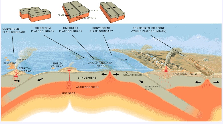
In terms of faulting, compressive stress produces reverse faults, tensional stress produces normal faults, and shear stress produces transform faults. *Terminology alert: Geoscientists refer to faults that are formed by shearing as transform faults in the ocean, and as strike-slip faults on continents. Otherwise, these two types of faults are basically the same thing. Check out the sketches below to see a cartoon of what each of these fault types look like in cross-section.
Eliza's nifty sketches
Here we have a basic cross-section consisting of three rock layers: brown, pink, and granite. You can tell it's a cross-section because I drew a little tree (Bob Ross-style!) and a couple of birds and the sun.
Now we'll apply some tensional stress to this terrain. Tension has the effect of pulling and elongating. If this material were ductile, it would stretch and get thinner, but we are dealing with brittle rocks here, so instead they will break. The way this typically happens is by forming a fault at some angle to the bedding. Then the whole package of rocks slides along this fault. The type of fault formed here is called a normal fault. This terminology came from miners in Germany who noticed that most of the faults where they were working were of this nature, so they called them "normal," meaning typical.

As you can see, the fault has had the effect of dropping the block on the right with respect to the block on the left. If you saw something like this in the field, you'd be able to tell how much offset there was on the fault by measuring how much the layers had moved across the fault.
If we instead apply compressive stress, this has the effect of squeezing and shortening the terrain. A fault will form that looks an awful lot like the normal fault in the previous example, but the motion on this fault is in the opposite direction. This fault is called a reverse fault because it is the "reverse," meaning opposite, of normal. Reverse faults tend to form scarps--a scarp is the piece of rock that has been thrust up higher than the original surface level.
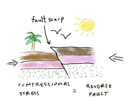
The third typical fault type is the strike-slip fault. Strike-slip faults are distinct from the previous two because they don't involve vertical motion. They form via shear stress. These are not as easy to recognize in cross-section unless there has been so much movement on the fault that there are completely different rock types on either side of the fault. Most strike-slip faults are close to vertical with respect to the bedding.
See in the animation below how the various fault types move. Animation is silent and comes from IRIS [103].
Each of these three types of faults is marked in a standard way on a geologic map. I've sketched those symbols below.
- A normal fault is typically shown by a line representing the fault trace with a little perpendicular line to show the direction of the block that has slid down. Sometimes two parallel lines are drawn to represent plates moving apart instead.
- A reverse fault is a line with teeth on it. The teeth are drawn on the side of the overriding block. At a subduction zone plate boundary, the teeth are on the upper plate.
- A strike-slip fault is drawn as a line, usually (but not always) with a half-arrow on each side to show which direction the two sides of the fault are moving. The example below shows a left-lateral fault.
.jpg)
Fault symbol ID check!
Can you identify the type of faulting occurring at each plate boundary in the map below? Check your answer here [104]. (and a captioned version [105]).
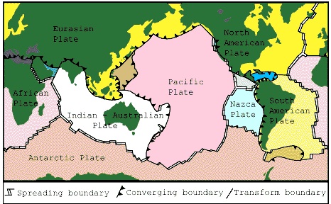
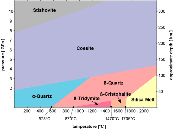
Applying what you know
Have another look at Figure 1 from de Boer et al., 2001 (reproduced below). What type of faulting is being depicted on that map? Can you picture in three dimensions how the lithosphere is moving in that map? Think about it and compare your idea to my sketch [107] (and a captioned version [108]).
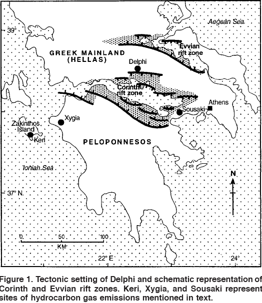
Magnitude and Energy
When an earthquake happens, the main quantity of interest is its magnitude. How big was the earthquake? Over the years, scientists have developed various ways to measure earthquake size and strength. Here's an overview of the most common magnitude measurements.
Mercalli Intensity Scale
This scale is a qualitative measure of the amount of felt shaking caused by an earthquake. This scale goes from I (not much of anything) to XII (total destruction). The amount of felt shaking is generally measured by interviewing witnesses to find out how much shaking they felt. Sometimes the interviews can be supplemented by observing any earthquake damage to buildings. For earthquakes in the historic record that happened before the advent of seismometers, Mercalli intensities are often assigned by checking out old newspaper reports and examining the foundations of old buildings. Mercalli intensities are generally depicted on maps by several concentric rings around the epicenter of the earthquake that give some idea of the severity of the felt shaking at various distances away from the earthquake. The Mercalli is not a very useful scale for science because it can't tell us much about big earthquakes that are not felt by people--earthquakes that occur at a great depth, or in the ocean, for example.
Richter Scale
Charles Richter developed a magnitude scale in the 1930s because he wanted to be able to characterize the seismicity he had been measuring in California with some kind of numbering system that would encompass all the earthquakes, from ones that had hardly been felt at all, up to really big ones. The way he did this was to pick a reference earthquake and measure its maximum ground motion. Then all the other earthquakes he had recorded could be compared to the reference, after correcting for distance. Each integer increase represented a factor of 10 increase in ground motion amplitude. This scale worked because he always used the same type of seismometer and all his earthquakes were in southern California, so there didn't have to be any extra corrections for different depth or rock type. Today, scientists don't use the Richter scale the way he did because not all earthquakes of interest happen in California, and also because the type of seismometer he used is out of date now. For all measurements recorded on a different type of instrument or that measured amplitudes of different wavetypes, you'd have to make a conversion to get your number to be in line with Richter's scale. The handy thing about the Richter scale is that for most earthquakes of interest, the magnitudes end up being numbers that range from about 3 - 9 and these are numbers easily understood by people. (In fact the scale itself does not set an upper or lower limit; limits of earthquake size are set by the Earth).
Moment Magnitude
Today scientists calculate the seismic moment of an earthquake when they want to talk about how big it was. Seismic moment (M0) is simply the product of the average amount of slip that happened, the area of the fault that slipped, and the rigidity of the rock. The equation is :
M0 = rigidity x area x slip
The rigidity of rock is a constant number based on the rock type. It has units of pressure. Typical assumptions are on the order of 3 x 10¹⁰ N/m2. Slip is a length and it is on the order of centimeters (meters for a great earthquake). Area is in units of length2 and is often on the order of km2. The units for seismic moment are then Nm (newton meters). As an example, the 2004 26 December Sumatra-Andaman earthquake had the following dimensions as reported by Lay et al. (2005): Its slip averaged about 5 m, its rupture length was about 1300 km and the fault width was between 160 - 240 km. Assuming a rigidity of 3 x 10¹⁰ N/m2 gives us a seismic moment of 3.9 x 10²²Nm. See a pencast calculation of this earthquakes's seismic moment [109].
Now, the problem with seismic moment is that regular people who watch the news or read the papers don't really know what to make of a number like 4.4 x 10²²Nm, and even scientists are smart enough to realize this, so we convert seismic moment to a magnitude scale called "moment magnitude," usually symbolized Mw or sometimes just M. This scale is designed purposely to be about equal to Richter's scale so that people will have a feel for what it means. Hiroo Kanamori at Caltech derived the formula for the conversion of seismic moment to moment magnitude as follows:
Mw = (2/3)*logM0 - 6.05
Calculate magnitude yourself!
Using Kanamori's formula to convert seismic moment to moment magnitude, what was the magnitude of the 2004 Dec 26 Sumatra-Andaman earthquake? Try it yourself and then check your work by clicking below:
Click here for my answer for the magnitude of the Sumatra-Andaman earthquake.
The answer is 9.05. Here is how I got that answer:
The seismic moment was 4.4 x 10^22 Nm.
Take the log (base 10) of that number and get 22.64
Multiply that by 2/3 and get 15.10
Subtract 6.05 and get 9.05
Energy
Another way to think about earthquake size is in terms of the energy released by an earthquake. It is actually not terribly easy to measure all the energy released by an earthquake because you have to integrate over time and space and include the broadest possible spectrum of frequencies to make sure you are recording all the energy. Therefore, direct measurements usually underestimate the energy. If they aren't trying to measure it instrumentally, most seismologists just use the following empirical formula, developed by Båth (1966) to relate magnitude to energy (in units of joules):
log E = 5.24 + 1.44M
This relationship was only meant to work for fairly big (M > 5) earthquakes. Plug magnitude values of 5.0, 6.0, and 7.0 into the equation above. The energy released by an M5 earthquake is about 2.8 x 10¹² joules. An M6 earthquake releases 7.8 x 10¹³ joules, and an M7 radiates 2.1 x 10¹⁵ joules. If you don't have a sense for what these numbers mean, the bomb dropped on Hiroshima released about 7.4 x 10¹² joules. Even though all of these are large numbers, what I want you to see here is that the difference between these values is huge. A magnitude 7 releases almost 30 times as much energy as a magnitude 6.

Time for the big picture!
Using the formula to relate magnitude to energy, how much energy was radiated by the Sumatra-Andaman earthquake? Try it yourself and then check your work by clicking below:
Click here for my answer to how much energy was radiated by the Sumatra-Andaman earthquake.
The answer is 1.84 x 10^18 joules. Here is how I got that answer:
The magnitude is 9.05. We already knew that.
Multiply magnitude by 1.44 and get 13.03.
Add 5.24 and get 18.27
Raise 10 to the power of 18.27 and get 1.84 x 10^18 joules
A 60-watt incandescent light bulb uses 60 joules of energy per second. The rupture of the Sumatra-Andaman earthquake lasted about 500 seconds. So,this earthquake released enough energy during its rupture to light up how many 60-watt lightbulbs? Try it yourself and then check your work by clicking below:
Click here for my answer to how many 60-watt lightbulbs the energy would light up.
The answer is 6.14 x 10^13 60-watt lightbulbs. Here is how I got that answer:
The earthquake radiated 1.84 x 10^18 joules. We knew that already.
Multiply 60 by 500 and get 30000 joules used by one lightbulb in 500 seconds
Divide that into 1.84 x 10^18 joules and get 6.15 x 10^13 lightbulbs
Wow, that's a lot of light bulbs! In fact, if you assume they are all about 4 inches in diameter, then if you put this many lightbulbs side by side you would have a trail that goes farther than the distance from the Sun to Neptune. That's a long way.
That was a really big earthquake.
All About Aftershocks

Large earthquakes trigger seismicity dynamically from shaking as well as statically, from changing the surrounding stress field. Aftershocks are a specific class of triggered seismicity whose spatial and temporal properties have been well characterized by many empirical observations. By "empirical" I mean that the laws that govern the timing and size of aftershocks are not based on any kind of physics; instead they are merely fits to many observations. However, the observations have been so numerous that we know these fits are robust, hence we call them "laws." I hesitate to use the word "prediction" when talking of earthquakes, but in the case of aftershocks, their timing and areal extent can be estimated fairly accurately just from knowing the size and location of the mainshock.
Båth's Law
This empirical law states that the largest magnitude aftershock will be between 1.1 and 1.2 magnitude units smaller than the mainshock. This observation is independent of the size of the mainshock. Now is a good time to digress and mention that some of this categorization is definition dependent. What I mean is that, because of the way we define them, aftershocks can never be bigger than the mainshock. If an aftershock bigger than the mainshock were to occur, we'd just reclassify that one as the mainshock and call the previous biggie a foreshock. This may seem conveniently circular, but, logically, there's no other way to do it. The biggest earthquake in a sequence has to be called the mainshock.
Omori's Law
The Japanese seismologist after whom this law is named formulated his empirical observation about the temporal decay of aftershocks in the 1890s. (See Lesson 2 for more about his life and times!) He realized that the rate of aftershocks decays with time after the mainshock and that this decay happens to be inversely proportional to the time after the main shock. The modified version of his law is written like this:
N(t) ∝ (c+t)-p
in which N is the number of aftershocks as a function of time t after the mainshock and c and p are constants. In practice c is a very small number and p is somewhere around 1. In the case of c = 0 and p = 1, the equation above just simplifies to Omori's original law:
N(t) ∝ 1/t.
Try plugging in some numbers to this equation with any units you want for time, such as days. You will see that the number of aftershocks drops off rapidly at first and then decays more slowly. Once the number of aftershocks has dwindled to whatever the normal background seismicity rate is for the region, we say the aftershock sequence is over. Having trouble picturing this concept? See my screencast explanation of Omori's Law [111]. Click here for a close-captioned explanation of Omori's Law [112].
People often get confused and think that this law governs both the size and timing of aftershocks. In fact, Omori's law says nothing about the size of aftershocks. The often-observed fact that bigger aftershocks usually happen pretty soon after the main shock is just a mathematical coincidence. Because there are fewer and fewer aftershocks at all as time gets farther from the main shock, the likelihood of one of them being big is also less. This is simply because there are always many more small earthquakes than big ones in any region for any period of time. (If you took EARTH 501, you will remember this from the frequency-magnitude plots you made in the New Madrid lesson.)
Rupture Area
A third useful observation about aftershocks is that they usually cluster around the edges of the area ruptured by the main shock. I think this makes intuitive sense. You can think of an earthquake rupture as getting rid of all the built-up stress over the patch that breaks. However, maybe some of the excess stress at the edges where the earthquake stops is still there. As the fault gets used to the new stress field, little earthquakes happen at the boundary between what broke and what didn't. This feature of aftershocks comes in handy because it helps for estimating hazard and risk associated with aftershocks if you know approximately where they are going to be. It is also useful scientifically because it provides a check on the calculated size of the rupture area that seismologists normally derive from theoretical models. The map below shows aftershock locations following the 26 December 2004 Sumatra-Andaman earthquake. This earthquake ruptured the longest segment of a fault ever recorded, somewhere between 1300 and 1600 kilometers. You can see what a huge areal extent the aftershocks cover. Each little colored circle on the map below is an aftershock.
Greek Earthquake Problem Set
Now you are going to use the USGS Web site to find out some earthquake parameters using their database of publicly available earthquake data. Since we started out this lesson by discussing the particulars about an interesting tectonic regime in ancient Greece, let's stay in Greece and find out some things about its more recent tectonic activities.
Part 1 - General questions about an earthquake in Greece in 2008
Go to the USGS Latest Earthquakes Map [113]and follow my directions below. We are looking for a magnitude 6.4 earthquake that happened in Greece on June 8, 2008.
My directions:
-
Click the settings icon, which looks like a bike sprocket in the upper right corner of the page.
-
Scroll down in the settings menu to the Search Earthquake Catalog bar and click it
-
Under Magnitude, click the Custom button and enter 6 as the minimum magnitude
-
Under Date & Time, enter 2008-06-08 as the start date and 2008-06-09 as the end date
-
Under Geographic Region, select World
-
Don't change anything else.
-
Scroll down and click Search
-
There's your earthquake. It should be the only one on the map. Click the circle on the map where your earthquake is located. Now a pop-up box appears in the bottom left corner of the page with a link that says M 6.4 - southern Greece. Click that link.
-
You'll be taken to a page that has lots of scientific information about this earthquake. All the questions I ask you in this part of the problem set are found there, or can be figured out from information that is there.
-
Create a word processing document (Microsoft Word, Macintosh Pages, Google Docs, or PDF) to record your work for this problem set.
Part 1 questions:
1.1 What was the location of this earthquake (latitude, longitude, depth)?
For 1.2 and 1.3 you should look at the ShakeMap and Did You Feel It? links.
1.2 About how far was this earthquake from Delphi? (See Figure 1 in the de Boer et al. Geology paper for a map showing the location of Delphi.)
1.3 What was the estimated intensity of ground shaking that was felt at Delphi from this earthquake?
1.4 Calculate energy released for this event
Part 2 - Aftershocks of the 2008 Greek earthquake
I want you to learn to use the various earthquake search features that the USGS provides. If you took EARTH 501, then you know something about this already. In this part of the activity, we'll use the search feature to find aftershocks of the mag 6.4 event we found in Part 1.
Go to the USGS Latest Earthquakes Map [113]and follow my directions below.
My directions:
- Go to earthquake.usgs.gov
- Click the settings icon, which looks like a bike sprocket in the upper right corner of the page.
- In the settings menu, scroll down and click the bar to Search Earthquake Archives
- Under Magnitude click the Custom button and change minimum magnitude to 0.
- Under Date & Time enter 2008-06-08 as the start date and enter 2008-12-31 as the end date
- Under Geographic Region choose World
- We will use the circle/donut search feature to look for aftershocks. Click to expand Advanced Options. Where it says Circle type the earthquake's latitude and longitude into the boxes designated Center Latitude and Center Longitude. Make the Outer Radius 100. Leave everything else blank.
- Scroll down and click to expand Order Options. Select Order By Time - Oldest First
- Click Search.
- There's your map and list of earthquakes.
Part 2 questions
2.1 How many earthquakes did this search find?
2.2 What was the biggest event (not including the mag 6.4 main shock), and how many are there of this size? Does this observation support Båth's Law?
For 2.3, you will want to download the list of earthquakes. Do so by clicking 'Click for more information' at the top of the list.
2.3 Make a plot that compares the aftershock data you found for this earthquake to Omori's law. Note: I think the easiest way to do this will be to count the number of aftershocks each day and plot that number vs. time. Then put another line on your plot that shows the ideal Omori relationship. That way you can compare the two. (If you have trouble getting started with this, post to the "Questions" discussion board.)
2.4 Does the number of earthquakes in this region decay with time as Omori's Law predicts? Discuss the observations suggested by your plot. If you did not find an Omori-type relationship, what are some possible reasons?
2.5 What assumptions did we make that may or may not have been valid when we looked for aftershocks using this search feature?
2.6 Make an educated guess about the background rate of seismicity in this area. How did you decide?
Part 3 - Aftershocks of the 2011 Great Tohoku earthquake
Let's look at the aftershock sequence of the Mw 9.0 earthquake of 11 Mar 2011. If you want to check it out, I made an animation of a two-month time window centered on the earthquake [114], using an exponential scale for symbol size since that is closer to accurate. Let's go through a similar exercise as with the Greek earthquake and see how well Omori's Law works in this case.
Go back to the USGS Latest Earthquakes Map [113] and follow my directions.
My directions:
- Go to earthquake.usgs.gov
- Click the settings icon, which looks like a bike sprocket in the upper right corner of the page.
- In the settings menu, scroll down and click the bar to Search Earthquake Archives
- Under Magnitude change minimum magnitude to 2.5.
- Under Date & Time, enter 2011-03-11 05:46:24 as the Start date and 2011-03-12 05:46:24 as the End date. This gives you a day of aftershocks.
- Under Geographic Region, choose Custom
- Click to expand Advanced Options and under Geographic Region enter 42 in the North box, 34 in the South box, 140 in the West box, and 146 in the East box.
- Click to expand Output Options and choose Map and List as the FORMAT and Time-Oldest First as the ORDER BY option.
- Click search.
- Take note of the number of events plotted on the map. This is the number for day 1 of your Omori plot.
- Redo the search changing nothing except under Date & Time enter 2011-03-12,05:46:24 as the Start date and 2011-03-13,05:46:24 as the End date. This gives you the second day of aftershocks.
- Click search.
- Take note of the number of events plotted on the map. This is the number for day 2 of your Omori plot.
- Keep going until you think you have enough data to interpret your plot.
Part 3 Questions:
3.1 When did you decide to end your search (how many days had elapsed after the mainshock)? How many earthquakes did your search find? Do you think you found all the earthquakes in this aftershock sequence? More? Fewer? Why?
3.2 Make a plot that compares the aftershock data you found for this earthquake to Omori's law.
3.3 Does the number of earthquakes in this region decay with time as Omori's Law predicts? Discuss the observations suggested by your plot. If you did not find an Omori-type relationship, what are some of the reasons?
3.4 Can you tell what the background seismicity rate is for this area? Why or why not?
3.5 Compare the aftershock sequence for this event to the one you observed for the Greek earthquake. Does this sequence merely look exaggerated (because the mainshock was so much bigger) but otherwise the same or are there other significant differences? What I am driving at is for you to try to decide whether you can verify the idea that aftershock sequences are scale independent. I know we are only comparing two sequences instead of a statistically meaningful number, but it is still worth thinking about.
Part 4 - Find your own earthquake
The point of this part of the problem set is for you to learn how you can adapt the catalog search features offered by the USGS for your own use. What better way to do this than to find the most recent earthquake closest to where you live? Here's how:
Go back to the USGS Latest Earthquakes Map [113] and follow my directions below.
My directions:
- Go to earthquake.usgs.gov
- Click the settings icon, which looks like a bike sprocket in the upper right corner of the page.
- In the settings menu, scroll down and click the bar to Search Earthquake Archives
- Under Basic Options, change minimum magnitude to zero
- Under Date & Time enter a time several years ago as the Start date and leave the default (today's date) as the End date.
- click where it says Draw Rectangle on Map and draw a rectangle around your state if you are in the US, or some other reasonable regional size if you live outside the US. It is helpful to use the + - buttons to zoom in first.
- Once you like your rectangle, click Use This Region.
- Choose Map and List as the FORMAT
- Click search
If your search returns nothing, choose a bigger region or else make the start time a few years earlier. If your search turns up a huge number of earthquakes you may want to do it again with a smaller region or a shorter time window.
Choose the earthquake closest to where you live, or a different one that looks exciting, and answer the Part 4 questions.
Part 4 questions:
4.1 What was the date of your earthquake?
4.2 What was the location (latitude, longitude, depth) of your earthquake?
4.3 What was the magnitude of your earthquake?
4.4 How close was this earthquake to where you actually live? Did you feel it? If there is a DYFI map, check it out and see if anybody else near you felt it.
Save your word processing document and name it like this:
L7_greek_earthquake_AccessAccountID_LastName.doc (or your file extension).
For example, former Cardinals right fielder and hall of famer Enos Slaughter would name his file "L7_greek_earthquake_ebs9_slaughter.doc"
Submitting your work
Upload your file to the Lesson 7 - Greek earthquake problem set assignment in CANVAS by the due date indicated on the first page of this lesson.
Grading rubric
I will use my general grading rubric for problem sets [92] to grade this activity.
Summary and Final Tasks
I am not a social scientist by training, but I still think it is pretty interesting to think about how much the Earth has shaped the course of human history. I guess that shouldn't be too surprising, since this planet is our home, but I think it can be overlooked. In this lesson we just touched on one small aspect. Think about how much the Oracle at Delphi affected political decisions in ancient Greece. The placement of the Temple of Apollo over a particular type of fault made it all possible. Cool, no?
Reminder - Review the Lesson 7 Overview
You have reached the end of Lesson 7! Double-check the list of requirements on the table on the first page of the lesson to make sure you have completed all of the activities listed there.
Tell us about it!
If you have anything you'd like to comment on or add to the lesson materials, feel free to post your thoughts in our next Teaching/Learning discussion!
Lesson 8: Not-So-Ordinary Earthquakes
Overview
This lesson will last one week. In it, we'll explore some things scientists have learned about how faults work that are new (since early 2000s) discoveries.
Objectives:
By the end of Lesson 8 you should be able to:
- Download, manipulate, and analyze publicly available earthquake catalog data from the Incorporated Research Institutions in Seismology (IRIS) and from the United States Geological Survey (USGS).
- Download, manipulate, and analyze publicly available geodetic data from UNAVCO.
- Calculate plate velocities and earthquake slip from geodetic data
What is due for Lesson 8?
Lesson 8 will take us one week to complete: 29 Jul - 4 Aug 2020.
The chart below provides an overview of the requirements for Lesson 8.
| Requirement | Submitted for Grading? | Due Date |
|---|---|---|
| Teaching/Learning Discussion III | Yes- this discussion will be part of your overall discussion grade | 12 Aug 2020 |
| Problem set: Spectrum of Fault Slip problem set | Yes - this exercise will be submitted to the "Slow Slip problem set" assignment in Canvas | 4 Aug 2020 |
Teaching and Learning III
Let's discuss the topics covered in Lessons 6 and 7, plus any other tidbits you've been dying to get off your chest all semester. Now's your chance!
Post to the Teaching/Learning 3 discussion board in Canvas. Don't be shy. This discussion is scheduled for this week plus the week devoted to the capstone project.
Measuring plate motion with geodesy
The sudden movements on faults that produce earthquakes are recorded by seismometers, but we know that all the plates on the surface of the Earth are in constant motion. Over the past ten or fifteen years, global positioning system satellite data has become an invaluable tool for measuring plate motion and strain accumulation across faults. This data is gathered by installing geodetic markers in the ground. Scientists then use GPS receivers at the sites of the markers to find out their exact locations from satellites. Over time, the position of the markers shift as the plate they are affixed to moves. The markers also move relative to each other; for example, markers on opposite sides of a fault may move closer together or further apart or be offset laterally as the years go by. This motion can be used to infer the strain rate in the crust. After several years of repeated measurements, the motion of the markers over the measurement time period is assessed. At active plate boundaries, such as along the San Andreas Fault on the West Coast of the United States, geodetic surveys have been used in concert with detailed records of seismicity to estimate stress buildup on faults and to predict seismic hazard. For example, a suite of geodetic markers may be placed around a fault of interest. After many measurements, the motion of the markers relative to each other can confirm the sense of motion on the fault, how fast the plates on either side of the fault are moving, and whether the fault itself is creeping or locked.
The Plate Boundary Observatory was a geodetic observatory designed to study the three-dimensional strain field resulting from deformation across the active boundary zone between the Pacific and North American plates in the western United States. The observatory consisted of arrays of Global Positioning System [115] (GPS) receivers and Strainmeters [116] (see map below for the locations of currently installed PBO instruments) which were be used to deduce the strain field on timescales of days to decades and geologic and paleoseismic investigations to examine the strain field over longer time scales.
The PBO was combined with some other networks in Central and South America in 2018 and is now called NOTA, Network of the Americas. You can read more about it UNAVCO's website [117].
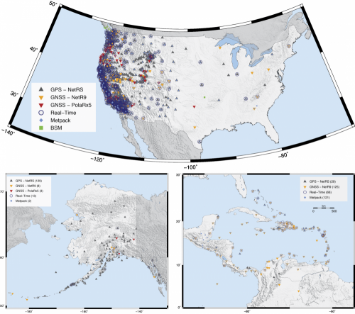
What does GPS time series data look like?
Let's walk through the signals recorded by a typical PBO geodetic station. I chose a station at random in Big Bear City, California, called BBRY. The map below shows a snapshot of the location of BBRY (the orange one) as well as a bunch of nearby stations (the purple ones).
Typically, GPS stations record their position based on communicating with a satellite once per day or so. Below are plots of the three components of time series data recorded by BBRY since 2004. All three plots have time on the x axis. The top plot shows position in the north-south direction, the middle plot shows position in the east-west direction, and the bottom plot shows vertical position. When I look at these plots, I see that since 2004, BBRY has been moving steadily to the northwest and its vertical position is basically constant. How do I read this from the plots? Let's check it out together (pencast) [118]. You may also want to check out UNAVCO's reference guide [119] for reading GPS time series plots.
Calculate plate motion using GPS data
Determining plate motion: displacement
How far and in what direction did station BBRY move between since January 2004 and March 2011? This is a reasonable question to ask because it helps us determine strain rate in the crust.
The way to do it is:
- Observe each of the three components of the time series data and measure the displacement for each one. In the time series plots, each blue dot is a verified measurement, the red dots are the most recent measurement that probably have not yet been checked for accuracy, and the red line is a linear best fit line (done by a computer program) to the data.
- Then, add the three components of motion.
That's all! But there's a small wrinkle. The motion is happening in three-dimensional space. We need to use vector addition to get the right answer. This sounds fancy, but we just need to remember the Pythagorean theorem. Maybe you've only used this theorem to find the hypotenuse of a right triangle, but it works nicely in three dimensions, too:
north2 + east2 + vertical2 = total2
If you wanted greater accuracy, you should get the actual data for a station, instead of just visually estimating from a plot, but for our purposes here, estimation is going to be good enough. So let's do it. The north component has gone from -40mm to +50mm, for a total of 90mm north. The east component has gone from +40mm to -50mm for a total of 90mm west. (WEST! because negative East is West). The vertical component looks like it hasn't changed. Let's assume the vertical motion is zero, so neither up nor down over this time period.
We can use the Pythagorean theorem to get the answer:
902 + 902 +02 = total2
8100 + 8100 + 0 = total2
16200 = total2
sqrt(16200) = total
127.28mm northwest is my answer. I probably shouldn't keep two places past the decimal given how cavalier I was about my initial observations from the plot, so let's round to a whole number. BBRY moved about 128 mm northwest between January 2004 and March 2011.
Determining plate motion: velocity
What was the average velocity of BBRY between January 2004 and March 2011? We already have all the information we need to make this calculation.
velocity = distance / time
We know the distance because we just calculated that. What about time? Here's something fun about geodesy: The convention is to divide up a year into 10 equal parts instead of using months, or days. Months are all different lengths, so this way of doing things makes calculations easier. See how each year on the x axis has 10 little tick marks on the plot of BBRY that we've been looking at. What time span is covered by the data in the plot? It goes from the beginning of 2004 up to about the second tick mark after the beginning of 2011. So let's call that 8.2 years.
velocity = 128mm / 8.2 years
velocity = 15.61mm/year
Once again I don't think we should keep so many digits after the decimal. We can't justify that level of precision. Let's round and say BBRY has moved at a rate of about 16 mm/year northwest. Now we could look up what an "accepted value" is for how fast various plates move and compare our calculations to those. We'd need to look at a map and make sure we know which plate BBRY is sitting on.
This kind of calculation verifies the calculations you did back in Lesson 3 with Fred Vine's data from the 1960's, which is cool!!
The Secret Lives of Subduction Zones
Cool things happen at subduction zones. In Lesson 6 we explored volcanoes that happen at these plate boundaries. Now let's explore how those plate boundaries move mechanically to generate earthquakes, and a relatively newly discovered phenomenon called "slow slip." First of all, let's remember what a subduction zone looks like, and what kinds of instruments we use to figure out what it's up to.
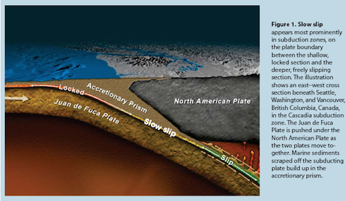
Quiz Yourself Review!
Let's review some things from Lesson 6 by looking at the drawing of the Cascadia subduction zone above.
Where are the Cascade Range volcanoes on the upper plate? Where does that correspond to on the lower plate? What kind of volcanoes are they? What kind of melting produces these volcanoes and how is it depicted in the cartoon?
Think about it and then watch my explanation as a screencas [120]t. You can also read a transcript of my quick Lesson 6 review [121].
Subduction zone mechanics: standard textbook vs. what we know now
Below is a “textbook” depiction of a subduction zone [122] and associated plate movement. This is a map of southern Alaska. In an introductory class or typical textbook, we’d probably draw arrows right on the plate boundary (trench) showing the two plates converging, like I did in this map. The teeth are on the upper plate. The Pacific Plate is heading northwest and diving under Alaska. The green bubbles are GPS station locations. The orange arrows show the direction of motion of the two converging plates.
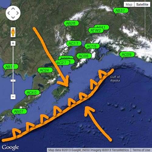
Geodetic data from instruments near plate boundaries tell us that the image above is an oversimplification. In a subduction zone capable of sustaining great earthquakes, the upper plate and lower plate are locked together for some distance inboard of the trench. Therefore GPS stations on the upper plate near the plate boundary will record motion consistent with the direction of the lower plate. In fact, geodetic data can be used to infer the location of the locked section (see figure below).
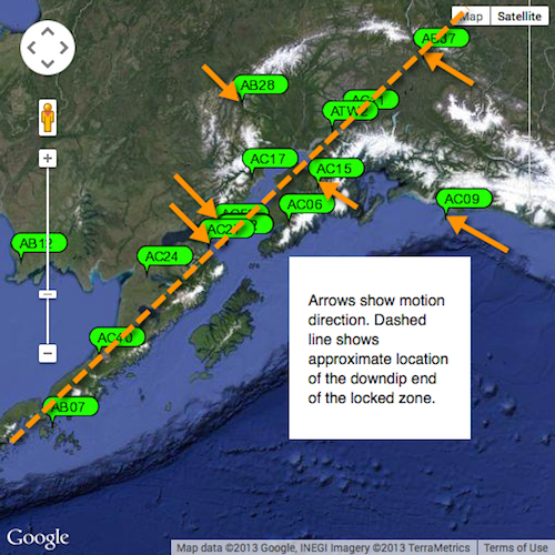
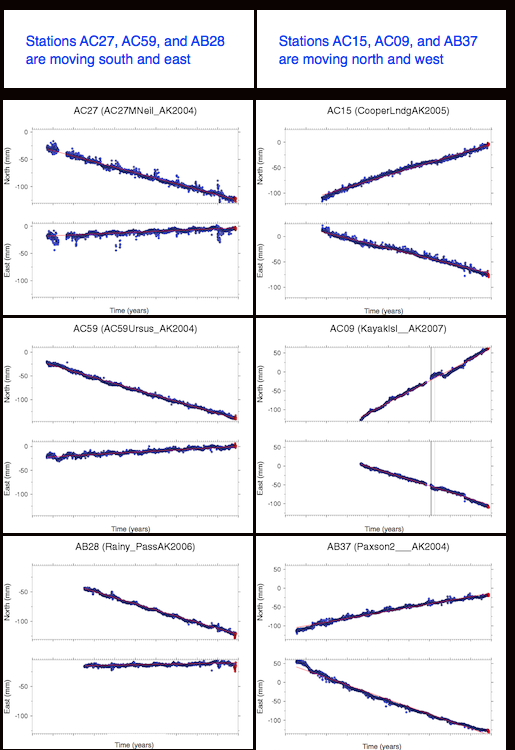
The point here is to see, via GPS, how the portion of the upper plate directly on top of the locked zone is dragged along in the direction of subduction because the plates are locked together. Green bubbles point to PBO stations. GPS stations on top of the locked zone show motion in the direction of the lower plate (northwest). GPS stations on top of the freely slipping zone show movement in the direction of the upper plate (southeast). We can infer where the locked zone ends by knowing the angle of subduction and by looking to see where the GPS stations record direction of motion consistent with the upper plate’s macro-motion.
The GPS time series plots show motion south and east for stations AC27, AC59, and AB28. Those three stations are all far enough inboard on the upper plate that they are not over the locked zone. The GPS time series plots show motion north and west for stations AC15, AC09, and AB37. Those three stations are closer to the plate boundary and are over the locked zone. They are moving in the direction of the lower plate.
What does an earthquake look like in a GPS time series?
A GPS station normally records its position once per day. An earthquake only takes seconds to minutes to happen so a GPS station doesn't record all the details, like the arrival of P waves and S waves and things like that. It only records its own position. If the earthquake is big enough and nearby enough, GPS will show a sudden jump in the direction of earthquake slip. Let's check that out with an example.
This is a station near the border of Baja CA and the US. It shows background plate motion to the northwest, then a sudden jump to the southeast. Sudden big jumps in geodetic data (that are not data dropouts!) are earthquakes. Most geodetic data is recorded daily but earthquakes take way less than a day to slip, so there is a sudden gap on the y axis. (A gap in x denotes a data dropout due to an equipment problem or something like that)
Slow Slip Events
For a long time we were all pretty happy with the idea that the life of a subduction zone involved a cycle of building up stress and having an earthquake that released the stress, then starting over again. But it turns out there's more going on.
Slow slip events have only been discovered in the last 10 or 15 years! They occur between the locked section and the freely slipping section of a subduction zone. Some people refer to the “locked section” as the seismogenic zone. If you are going to have a great subduction zone earthquake, such as Alaska 1964, or Chile 1960, or Tohoku-Oki 2011, this is the zone where it initiates and ruptures. The freely slipping section is the part of the downgoing plate that is too deep to be touching the other plate. It's the part that is hanging down into the mantle. In most subduction zones there is a region between the locked and the freely slipping parts, and that is where slow slip happens. It is usually at about 30-70 km depth.
Slow slip events do not generate seismic waves, so seismometers do not record them. GPS stations can, though! What does one look like? Let's check that out.
This figure was modified from Outerbridge et al., 2010 and depicts GPS time series data that was recorded in Costa Rica in 2007. It shows a slow slip event that took place between about day 125 and day 175 on this plot. Why do we call this a slow slip event? It is too fast to be the usual plate rate, and it is also in the opposite direction. It is way too slow for an earthquake because remember in the earlier GPS time series from Baja that an earthquake basically looks like a sudden jump that happens all at once, not something that takes 50 days to happen.
Check that you can read this plot!
What is the background plate direction and rate? What is the duration, direction, and rate of the SSE? Try it yourself and then click below to see my answers:
My answers to the posed questions.
The background plate rate (eyeballing here) looks like about 0.01 m per 100 days to the north, which is equivalent to 3.7 cm/year. That's a reasonable ballpark number. Note that we are only looking at the north component here so we can't say anything about whether it's east/west or up/down. The SSE begins around day 125 and lasts about 50 days. During that time this station moved about .005m south. From about day 175 until the end of 2007, this station was back to its usual plate rate.
Quick quiz to check yourself
An SSE involves slip in the same direction an earthquake would move, or in the same direction as background plate rate? Or are those two directions the same?
Answer to the quick quiz
An SSE involves slip in the same direction an earthquake would move, which is opposite the ordinary direction of this station because this station is on the part of the upper plate locked to downgoing plate. One way to remember this is that GPS stations are land-based. Land is always on the upper plate side of a subduction zone. So, GPS stations at subduction zones are measuring the position of stations on the upper plate. Stations over the locked zone will show you the sense of motion of the lower zone. Stations farther away from the plate boundary in the interior of the upper plate record the motion of the upper plate. Mechanically, the upper plate over top of the locked zone is getting scrunched during interseismic periods. During an earthquake it suddenly unscrunches. A slow slip event is a really slow unscrunching that seismometers can't hear.
Slow Slip Events: More details
Rupture characteristics of slow slip events
- They slip faster than the plate speed but slower than an earthquake. Millimeters per week is a good ballpark estimate of the speed.
- The ones measured so far slip as much as a large-magnitude earthquake but take a lot longer to accomplish that slip. That's why they are called "slow slip events."
- They are not detectable by seismometers due to the long rise time and slow rupture velocity. We use Global Positioning System data to measure them.
For example, the rise time for an earthquake is often negligible compared to the rupture duration, but for a slow slip event, the rise time can be a significant fraction of the overall time of rupture.
Rise time? What's rise time?
The rise time is how long it takes an earthquake to go from zero to its seismic rupture velocity. Generally speaking, earthquake rise times are fast compared to how long the earthquake lasts. Another interesting thing about earthquake rise times is that they are about the same regardless of the final size of the earthquake. The rise time of a magnitude 5 and a magnitude 8 are about the same. The difference is that a magnitude 8 lasts longer and a bigger chunk of ground is involved in the earthquake. For a slow slip event, the rise times are incredibly long and the event never does get up to a seismic speed at all. Since the motion is all so smooth and slow, seismic waves aren't generated. That's why we have to use GPS instead of seismometers to measure slow slip events. See my screencast for a sketch explaining rise time [123]. Click here for a close-captioned version of the rise-time sketch [124].
Where have slow slip events been found?
The figures below are reproduced from published papers that describe slow slip events detected in New Zealand, Nicaragua, Mexico, and Alaska. Their locations in the grand scheme of the world are shown with rectangles on the world map above, except Japan is missing from the detailed maps below. All the slow slip events shown here have two main things in common:
- Long duration compared to an earthquake (days to months instead of seconds to minutes), and
- Cumulative slip equivalent to 6.9-7.5 moment magnitude.
Spectrum of Fault Slip problem set
Note for Fall 2017
The problem set is a pdf file in CANVAS in the Lesson 7 module called "SSEProbSet.docx"
Download it, create your own word processing document with your answers, then
Turn it in to the Canvas assignment called L7-Slow slip problem set
Bibliography and Additional Resources
Bibliography
Schwartz, S. Y., and J. M. Rokosky (2007), Slow slip events and seismic tremor at circum-pacific subduction zones, Rev. Geophys. 45, RG3004, doi:10.1029/2006RG000208
Radiguet, M., F. Cotton, M. Vergnolle, M. Campillo, B. Valette, V. Kostoglodov and N. Cotte (2011), Spatial and temporal evolution of a long term slow slip event: the 2006 Guerrero Slow Slip Event, Geophys. J. Int., 184, 816–828, doi: 10.1111/j.1365-246X.2010.04866.x
Outerbridge, K. C., T. H. Dixon, S. Y. Schwartz, J. I. Walter, M. Protti, V. Gonzalez, J. Biggs, M. Thorwart, and W. Rabbel (2010), A tremor and slip event on the Cocos‐Caribbean subduction zone as measured by a global positioning system (GPS) and seismic network on the Nicoya Peninsula, Costa Rica, J. Geophys. Res., 115, B10408, doi:10.1029/2009JB006845
Wei, M., J. J. McGuire, and E. Richardson (2012), A slow slip event in the south central Alaska Subduction Zone and related seismicity anomaly, Geophys. Res. Lett., 39, L15309, doi:10.1029/2012GL052351
McCaffrey, R., L. M. Wallace and J. Beavan (2008) Slow slip and frictional transition at low temperature at the Hikurangi subduction zone, Nature Geoscience, 1, 316-320, doi:10.1038/ngeo178
Vidale, J.E. and H. Houston (2012), Slow slip: A new kind of earthquake, Phys. Today 65, 38, doi: 10.1063/PT.3.1399
Here are a few more books that discuss the links between archaeology and earthquakes.
de Boer, J. Z. & Sanders, D. T. (2007). Earthquakes in Human History: The Far-Reaching Effects of Seismic Disruptions. Princeton University Press, p. 304.
Kovach, R. L. (2004). Early Earthquakes of the Americas. Cambridge University Press, p. 280.
Nur, A. & Burgess, D. (2008). Apocalypse: Earthquakes, Archaeology, and the Wrath of God. Princeton University Press, p. 324.
Here are other articles relevant to this lesson.
Showstack, Randy. (2011). Scientists Examine Challenges and Lessons From Japan’s Earthquake and Tsunami, Eos 92, p. 97-99.
Tell us about it!
Have another reading or Web site on these topics that you have found useful? Share it in the next Teaching/Learning Discussion!
Lesson 9: Capstone project
Overview
This lesson is actually just the capstone project for this course, in which you are free to design your own course module, based (as much or as loosely as you want) on one of the topics we covered in the earlier lessons of this course. I'd also like you to fill out the anonymous end-of-course survey. Your responses will help me improve the course for future students.
What will we learn in Lesson 9?
By the end of Lesson 9, you should be able to:
- Reflect on the topics we've covered in this course.
- Decide which parts of these topics are appropriate to teach to an audience of your choosing.
- Write a lesson plan and learning objectives to teach your chosen topic to your chosen audience.
What is due for Lesson 9?
The chart below provides an overview of the requirements for Lesson 9. For assignment details, refer to the lesson page noted. We will finish Lesson 9, and this course, by 12 Aug 2020
| Requirement | Submitted for Grading? | Due Date |
|---|---|---|
| Course capstone project | YES - submit to the Canvas assignment called "Capstone Project." This project is worth 15% of your final course grade. | 12 Aug 2020 |
| SEEQ (Student Educational Experience Questionnaire) | No. This is optional and anonymous, but useful for me. Please do it, it won't take you long. There is a link from Canvas in the lesson 9 space. | 12 Aug 2020 |
Questions?
If you have any questions, please post them to our Questions? Discussion Forum (not e-mail). While you are there, feel free to post your own responses if you, too, are able to help out a classmate.
Capstone Project Assignment
My philosophy for this course
I chose to call this course "Plate Tectonics and People" because I wanted to emphasize the human element of science of the solid Earth. Whenever possible, I tried to incorporate a multidisciplinary study as part of the reading assignment for a particular lesson so that you could appreciate the degree of interconnectivity among different scientific subfields. I also used publicly available datasets because I hoped that, if you found any of the analyses interesting, you could easily co-opt them for your own use. If the only thing you take away from this course is a feeling of empowerment concerning your ability to go out, find an available dataset on the Web, and teach students to make some interesting observations from it, then I'll call that a success! The "teaching and learning" discussions were intended to get you to think about how you might use some of this material if you wanted to turn around and teach it.
My guess is that you can take bits and pieces of this course and transform them into a lesson for your own use. Now is the time to prove it!
Activity: Capstone Project
In this activity, you will design a lesson for an audience of your choosing based on one of the topics we covered in this course.
Directions:
- Figure out what you want to teach.
- Write up your lesson plan, including the following:
- A brief overview of what will be taught and why--this should be 100-150 words explaining your topic choice, how it fits into your curriculum. If you do not currently have your own classroom, think hypothetically.
- A brief statement about your intended audience: What grade level? What background knowledge do you assume they have already? This includes science knowledge and other quantitative skills.
- A set of learning objectives. (What will your students know or be able to do at the end of your lesson?)
- A description of your plan: How will you present the material? What will the students do? How long will it take? I want you to write the content of your actual lesson in this section! That means if you are going to prepare some powerpoints or notes from a textbook, I want to see them. I want the bibliographic information from all your references, and/or the link to any Web site you use. The key here is to build a lesson with enough detail so that another teacher could pick it up and teach from it without having to guess your intentions at any point.
- A list of necessary materials.
- A list of deliverables: What will the students turn in? How will you know if they learned what you wanted them to learn? Your lesson plan must include at least one quantitative activity for the students, e.g. they have to make a map, a table, a plot--something that uses data. It can be data they collect themselves, or that they retrieve from somewhere else, but they have to manipulate it or interpret it in a meaningful way. Your lesson plan must also include follow-up questions that the students have to answer along with a key that contains your answers to those questions. This helps me to grasp the level of thinking you expect from your students.
- An evaluation rubric (such that another teacher could assess the students in the manner that you intended).
- Save an electronic version of your activity as either a Microsoft Word, Macintosh Pages or PDF file in the following format:
L8_capstone_AccessAccountID_LastName.doc (or your file extension).
For example, former Cardinals pitcher and hall of famer Bruce Sutter would name his file "L8_capstone_hbs42_sutter.doc"
Submitting your work
Upload your capstone project file to the Capstone Project assignment in Canvas by the due date indicated on the first page of this lesson.
Grading rubric
Note on Grading: I am interested in the scientific accuracy of the topic you choose to teach. I am not going to base my grade on whether you have constructed a lesson plan in some special way (as long as all the components listed above are there). My assumption is that those of you who are teachers already know how to write a lesson plan. For those of you who are not teachers, I am not going to instruct you on correct lesson-plan making here. However, I am a scientist, so if facts are not right, or could use clarification, I can assist with that.
- An "A" capstone project is complete, clear, and organized. It contains all the components listed above. The science is accurate. I can follow your instructions and get the results you expected me to get. The questions you made up are well-designed and would elicit the appropriate amount of thinking and interpretation on the part of the intended audience. Your project shows independent thinking.
- A "B" capstone project is like that of an "A" project, except that its directions may not be clear enough for me to follow without having to guess a little bit about your exact intentions. A "B" write-up is complete and contains all the components listed above.
- A "C" capstone project may have clarity problems, causing me to guess about how to follow your instructions. A "C" write-up may also be incomplete with some of the assignment components missing. The science may not be accurate.
- A "D" capstone project has such badly written directions that I can't even begin to guess how to follow them. A "D" write-up may be significantly incomplete and it may contain gross factual errors.
Summary and Final Tasks
This course has been fun for me, and hopefully you've had a useful experience and learned a few things in this course. I'd like science to be more interesting and more accessible to more people. You are free to use any of the lessons and activities from this course for your own purposes in teaching. If you do, I'd love to hear about it.
Reminder - Complete all of the lesson tasks!
You have finished Lesson 9, and this course.
What's next?
Glad you asked! If you liked this course, or even if you didn't, a complete course calendar for the M.Ed. in Earth Sciences program can be found at the M.Ed. in Earth Sciences course calendar page [125].
Supporting pages
Activity: Constructing a P Wave Travel Time Curve
Sidelight: Note about my teaching philosophy
If you aren't really interested in finding out why I chose to make the problem set this way, don't keep reading this section, but sometimes I like to be able to explain why I decided to teach a topic a particular way. . .
In my courses, I like to use data that is openly accessible by you and requires little or no preprocessing by me to make it usable. I do this on purpose because I want you to be able to go to the place where we got this data and get more if you want to, or repurpose it for your own classroom in a way that makes sense to you. I want you to be able to do this later on without needing me! On the other hand, sometimes there's a measurement or an observation I want you to be able to make without spending hours wrestling with an unfamiliar file format. That's the situation with the seismograms for this exercise. If you were all Ph.D. students of mine who were hoping to become card-carrying seismologists, then I would tell you that it is important for you to delve into the exciting nuances of seismic data files. But you aren't, so I don't want to make you spend hours on that problem when all I want you to do is to pick some P waves, construct a travel time curve, and think about the physics that makes it work.
If you are interested in how I produced these plots, I made an appendix page to this lesson where you can see exactly what I did. If you ever do want to construct your own exercise like this one using different data, but you get stuck, feel free to contact me, or the folks at IRIS, for help!
Station Records
The earthquake whose waveforms we'll use for this exercise should be ingrained in your recent memory. It happened in Haiti on 12 January 2010. The origin time is 21:53:09 (UTC--all times are given in UTC) Its coordinates are lat = 18.45 N, lon = 72.45 W, depth = 10 km. It was a mag 7.0 event. For all the records below, we will look at long-period data, which is recorded every one second. I have given you a one-minute window around the P wave arrival. In order to construct a travel time curve, you need to pick the P wave arrival, subtract that time from the origin time of the event and plot that travel time vs. the distance between the station and the earthquake.
Record 1: Station: 230A - Sterling City, TX, USA
Network: TA - USArray Transportable Network (new EarthScope stations)
Lat: 31.89 Lon: -101.11 Elev: 742.00
Record 2: Station: 734A - La Parita Creek, Jourdanton, TX, USA
Network: TA - USArray Transportable Network (new EarthScope stations)
Lat: 28.85 Lon: -98.56 Elev: 121.00
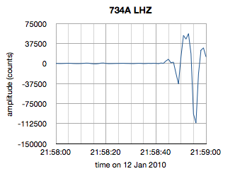
Record 3: Station: ANTO - Ankara, Turkey
Network: IU - Global Seismograph Network (GSN - IRIS/USGS)
Lat: 39.87 Lon: 32.79 Elev: 1090.00
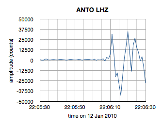
Record 4: Station: COLA - College Outpost, Alaska, USA
Network: IU - Global Seismograph Network (GSN - IRIS/USGS)
Lat: 64.87 Lon: -147.86 Elev: 200.00
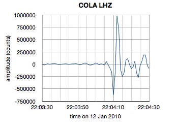
Record 5: Station: H17A - Grant Village (NPS), Yellowstone Nt. Park, WY, USA
Network: TA - USArray Transportable Network (new EarthScope stations)
Lat: 44.40 Lon: -110.58 Elev: 2400.00
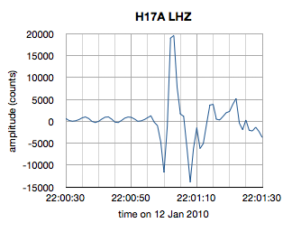
Record 6: Station: I03D - Drain, OR, USA
Network: TA - USArray Transportable Network (new EarthScope stations)
Lat: 43.70 Lon: -123.35 Elev: 140.00
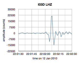
Record 7: Station: I28A - Midland, SD, USA
Network: TA - USArray Transportable Network (new EarthScope stations)
Lat: 44.00 Lon: -101.17 Elev: 655.00
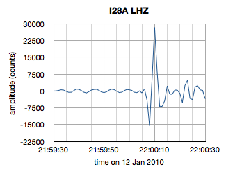
Record 8: Station: K21A - Alcova, Casper, WY, USA
Network: TA - USArray Transportable Network (new EarthScope stations)
Lat: 42.63 Lon: -107.25 Elev: 1960.00
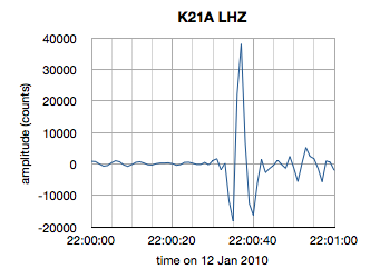
Record 9: Station: KEV - Kevo, Finland
Network: IU - Global Seismograph Network (GSN - IRIS/USGS)
Lat: 69.76 Lon: 27.00 Elev: 100.00
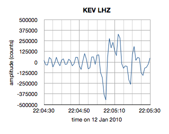
Record 10: Station: KIEV - Kiev, Ukraine
Network: IU - Global Seismograph Network (GSN - IRIS/USGS)
Lat: 50.70 Lon: 29.22 Elev: 180.00
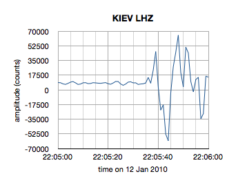
Record 11: Station: KMSC - Kings Mountain, Blacksburg, SC, USA
Network: TA - USArray Transportable Network (new EarthScope stations)
Lat: 35.14 Lon: -81.33 Elev: 240.00
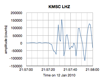
Record 12: Station: KONO - Kongsberg, Norway
Network: IU - Global Seismograph Network (GSN - IRIS/USGS)
Lat: 59.65 Lon: 9.60 Elev: 216.00

Record 13: Station: LCO - Las Campanas Astronomical Observatory, Chile
Network: IU - Global Seismograph Network (GSN - IRIS/USGS)
Lat: -29.01 Lon: -70.70 Elev: 2300.00
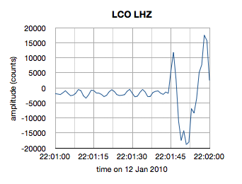
Record 14: Station: PAB - San Pablo, Spain
Network: IU - Global Seismograph Network (GSN - IRIS/USGS)
Lat: 39.54 Lon: -4.35 Elev: 950.00
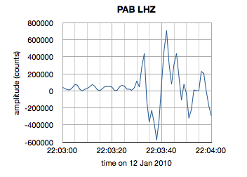
Record 15: Station: PMSA - Palmer Station, Antarctica
Network: IU - Global Seismograph Network (GSN - IRIS/USGS)
Lat: -64.77 Lon: -64.05 Elev: 40.00
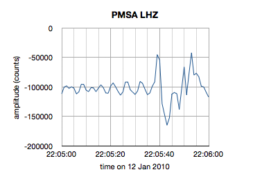
Record 16: Station: Q29A - Oakley, KS, USA
Network: TA - USArray Transportable Network (new EarthScope stations)
Lat: 38.89 Lon: -100.98 Elev: 895.00
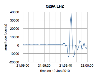
Record 17: Station: RCBR - Riachuelo, Brazil
Network: IU - Global Seismograph Network (GSN - IRIS/USGS)
Lat: -5.83 Lon: -35.90 Elev: 400.00
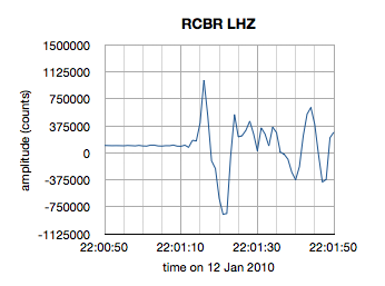
Record 18: Station: SDV - Santo Domingo, Venezuela
Network: IU - Global Seismograph Network (GSN - IRIS/USGS)
Lat: 8.88 Lon: -70.63 Elev: 1620.00
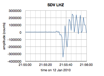
Record 19: Station: TEIG - Tepich, Yucatan, Mexico
Network: IU - Global Seismograph Network (GSN - IRIS/USGS)
Lat: 20.23 Lon: -88.28 Elev: 40.00
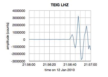
Record 20: Station: TIXI - Tiksi, Russia
Network: IU - Global Seismograph Network (GSN - IRIS/USGS)
Lat: 71.63 Lon: 128.87 Elev: 40.00
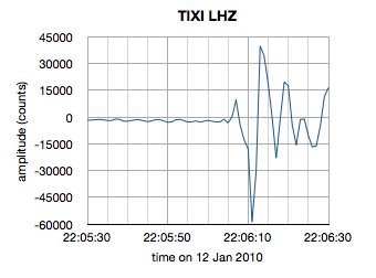
Record 21: Station: TRIS - Tristan da Cunha
Network: IU - Global Seismograph Network (GSN - IRIS/USGS)
Lat: -37.07 Lon: -12.32 Elev: 60.00
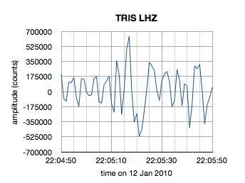
Record 22: Station: TRQA - Tornquist, Argentina
Network: IU - Global Seismograph Network (GSN - IRIS/USGS)
Lat: -38.06 Lon: -61.98 Elev: 540.00
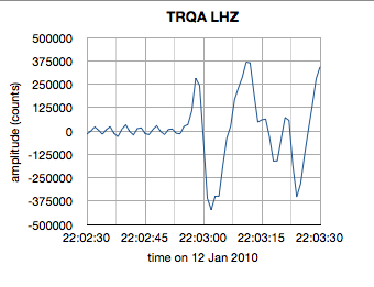
Record 23: Station: WCI - Wyandotte Cave, Indiana, USA
Network: IU - Global Seismograph Network (GSN - IRIS/USGS)
Lat: 38.23 Lon: -86.29 Elev: 210.00
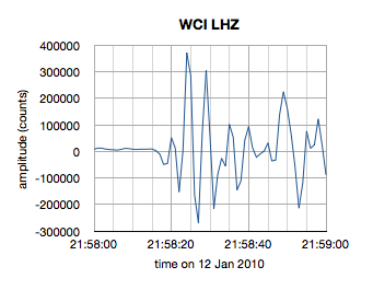
General Grading Rubric for Problem Sets
General Expectations
- If an activity worksheet has been provided, then you need to submit that document, along with any other analyses, plots, or calculations you made to arrive at the answers in your worksheet.
- I should be able to follow your calculations so that I can provide feedback if you have made a mistake.
- Responses to follow-up questions should be in complete sentences and demonstrate your ability to interpret the results of the analysis.
- If you are submitting a scanned, hand-drawn plot, chart, or drawing as part of a data analysis activity, then please double check to make sure everything on the electronic version of it is legible. See below for more details.
Grading Rubric
All the data analysis activities, regardless of length or difficulty, are worth 100 points because that makes my life easier. I make each numbered problem worth the same number of points also. So, if there are 10 problems, they are each worth 10 points. If there are 8 problems they are each worth 12 points (and I spot you the other 4 points because I’m just that benevolent).
My grading procedure is as follows:
- Fully correct responses receive full credit
- Blank responses receive no credit
- Assigning partial credit for partially correct responses is always a subjective process, but I try my best to be consistent.
- In the case of a partially correct calculation, I follow along with the work you’ve shown in order to figure out where your error is. If you don’t show your work, then I can’t give as much partial credit.
- In the case of partially correct responses to open-ended discussion questions, I try to assign partial credit based on how close you were to the thoroughly correct answer that I was aiming for. Please proofread all answers to discussion questions so that you can make sure your answers make grammatical and logical sense. I can’t give as much partial credit if I can’t figure out what you are trying to say!
- In the case of a partially correct plot or graph, I assign partial credit based on the number of correct elements including: data points, labels on axes, legends, and general legibility
- In the case where an error you have made early on in a problem set affects later answers, I strive only to deduct points for the first mistake. This is also a case in which showing your work is helpful because then I can find the original source of your error, track it through your later calculations, and you will not have to lose points more than once because of it!
My numerical grading scale (i.e. what range of scores equals an “A” or a “B”, etc.) can be found on the syllabus page for this course, which is linked in the box on the left margin under the Resources heading.