Lesson 1: Preinstructional Activities
Overview

Did you read the Syllabus?
Good idea to do it before you begin this course.
About Lesson 1
The point of this lesson is to get some free practice completing some activities that are similar to ones you'll have to complete later in the course for a grade. That way, if you run into trouble doing things like making a plot, or taking a quiz in Canvas, we can solve the problem right now. I don't want pesky technical problems getting in the way of fun science later on!
What will we learn in Lesson 1?
By the end of Lesson 1, you should be able to:
- Read a scientific article and discuss it with the class using a Canvas discussion board.
- Make an acceptable-looking plot of a dataset using a plotting program of your choice.
- Submit an assignment in Canvas.
- Take a quiz in Canvas.
What is due for Lesson 1?
Lesson 1 will take us one week to complete. Try to get Lesson 1 done by 26 May 2020.
The chart below provides an overview of the requirements for Lesson 1. Lesson 1 assignments are graded based on participation, not correctness. Completing all the assignments in Lesson 1 is 5% of your course grade. Assignments are detailed more thoroughly on subsequent pages in this lesson.
| Requirement | Submitted for Grading? | Due Date |
|---|---|---|
| Participate in 'Meet and Greet' discussion forum | Yes - Your discussion board participation counts toward your Lesson 1 grade. | Multiple participation spanning 18 - 26 May 2020 |
| Read an excerpt from a book and discuss it with the class. | Yes - Your discussion board participation counts toward your Lesson 1 grade. | Multiple participation spanning 18 - 26 May 2020 |
| Create plots of datasets | Yes - This exercise will be submitted to a Canvas assignment and will count toward your Lesson 1 grade (participation, not correctness). | 26 May 2020 |
| Pre-instructional quiz | Yes - Taking this Canvas-based quiz will count toward your overall Lesson 1 grade (you will not be graded on the correctness of your responses, only on whether you completed the quiz). | 26 May 2020 |
Questions?
If you have any questions, please post them to our Questions? Discussion Forum (not e-mail). I will check that discussion forum daily to respond. While you are there, feel free to post your own responses if you, too, are able to help out a classmate.
Getting to Know You
I'd like to get to know you...and help you get to know each other!
Meet and Greet Discussion
Introduce yourself and meet the rest of the class!We will use a discussion forum to post and read self-introductions. To access the discussion forum:
- Go to the Canvas home page for this course
- Find Module One: Preinstructional Activities.
- If it is not expanded, click the triangle to expand the module
- Go to the Meet and Greet discussion
- Create a new thread containing your personal introduction. You can type into the box that says "Reply":
- Who are you?
- What do you do when you are not taking this class?
- What's your background in science, education, or something else?
- What is your interest in this course?
- View and reply to other students' postings to learn more about them.
- Try to get this done by the due date indicated in Canvas.
Reading & Discussion Assignment
To begin, I would like you to read an excerpt from the book Earthshaking Science, by Susan Hough. It is a part of a chapter that tells a brief historical account of the plate tectonics revolution. I think this is an ideal starting point for this course and hopefully, it will stir your interest because, in Lesson 2, you will be researching the scientific contributions made by various scientists who had a part in formulating plate tectonics. The discussion of this reading will last throughout the week, so be sure to read it early and check in to the discussion forum often. See the Overview page for specific dates.
Earthshaking Science Excerpt
Directions
Read the following excerpt from Earthshaking Science, available in Canvas.
- Hough, Susan, "Plate Tectonics Revolution", excerpted from Earthshaking Science: What we know (and don't know) about earthquakes, Princeton University Press, 2002, pp. 1-12. (Read up to the bold heading Seismology and Plate Tectonics)
Submitting your work
Once you have finished the reading, engage in a class discussion as described below.
This discussion will take place over the entire week devoted to Lesson 1 and will require you to participate multiple times during that period.
- Find Lesson 1 - Plate Tectonics Revolution Discussion Forum in Canvas
- You will see the questions below already there:
- What types of evidence did Wegener call on for his continental drift hypothesis? Why was his hypothesis not accepted by other scientists of the time?
- Hough calls Harry Hess's 1962 paper "The History of Ocean Basins" an idea paper. What is meant by this? Why was this paper so important?
- Discuss some of the technological advances that aided the plate tectonics revolution.
- I think it is too easy to read an account of a scientific revolution and assume that people back then were just ignorant. (Why didn't they get it? It's so obvious!) However, science is often more of a steady march than a series of dazzling leaps. There are unsolved problems now that will be solved by today's scientists and future generations will scoff at us for not "getting it" at the time. What is your favorite unsolved problem today? (In any field, not just Earth science.)
- Respond to a thread that includes responses to these questions. If you feel that your response has already been "said" by another student, then post a response to someone else's remarks that expand on what has already been said, asks for clarification, asks a follow-up question, or furthers the discussion in some other meaningful way.
- By the end of the activity, I would like you to post at least one original thought/opinion/question and at least one thoughtful response to someone else's post.
Grading criteria
You will be graded on the quality of your participation. See the grading rubric [1] for specifics on how this assignment will be graded.
Plotting, Part I
Note:
If you have already taken EARTH 501, you are in luck! This assignment is almost identical to the one you did for Lesson 1 of that course, so this should not take you too long at all. Hooray!
Choosing a graphics program
When you have your students make plots of data in your classes, what medium do they use? Do they use a computer program, or a graphing calculator, or pencil and paper? Something else? I actually find pencil and paper to be extremely instructive. When I use a pencil and paper, I have to think about how to draw my axes and what the plot will probably look like before I begin. However, I think we all expect our own students to be a little more savvy about computer use than we were at their age. When I make plots for my research I use MATLAB. I expect many of you have access to or regularly use Microsoft Excel. (I find that most plots produced in Excel look ugly or have incomprehensible labels or both. However, if you can make a good plot with Excel, go for it!)
On the next page of this lesson, you will complete an activity that involves reproducing three plots using the graphing program of your choice. For this course, it does not matter what program you choose. What does matter, is that you are able to generate a dataset and make a plot with it that looks adequate for a 500-level college class. So first, you need to figure out which program you would like to use. If you already have a program you like, by all means, use it. If you don't, or you want to check out some other possibilities, here are some links to other programs.
Freely available programs
- Soft Integration [2]
- ChartPart [3]
- Kids' Zone: Learning with NCES [4]
- GCalc [5]
- Apache Open Office: [6] The program you want here is called "calc"
- Plot2: [7] Mac OSX platform only
- Gnuplot: [8] Need to be able to interact with the command line for this one
- Octave-Forge: [9] Mimics Matlab, but you need to be a fairly savvy user for this one
Programs with a free demo available
- Synergy Software [10]
- DeltaGraph [11]
- Ma [12]tlab [13]
Tell us about it!
For my benefit and the benefit of future students, if you know of other programs, please post the link to Questions?. If you check out any of the above programs, please share what you like and dislike about them as well. If any of you have access to MATLAB and would like to learn more about it, let me know.
Plotting, Part II
Now that you have identified the software you want to use to create plots of datasets, I want you to reproduce three plots and submit these to me for review. This activity will be graded based on participation only (either you made three plots or you didn't). I will provide constructive feedback to you about the way your plots look. Even though I will not grade this particular exercise for accuracy, the rest of the lessons in this course (as well many lessons in other courses in the program) will require you to make some plots. Your grades on those activities will in part depend on your ability to produce a clear and satisfactory plot, so consider this exercise free practice.
Reproduce 3 Plots
Directions
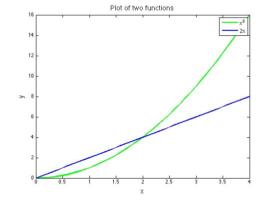
Below is the first plot you have to reproduce. Graph the functions y = x2 and y = 2x on the same set of axes. The satisfactory plot will include: a title, labeled axes, axes tick marks and labels, two different line styles (doesn't have to be color) to differentiate the functions, and a correct legend identifying the two functions. All fonts should be large enough to be legible. You may choose the range of your axes, the aspect ratio of your plot, and the line style of each function.
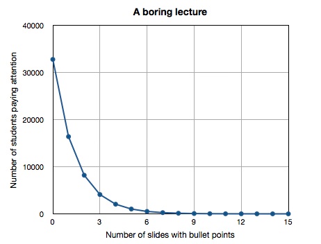
Next shown is the second plot you have to reproduce. When I was in grad school we joked that when a scientist gave a presentation, every equation shown would cause half the audience to stop paying attention. I have noticed this is also true of students attending lectures in which the lecture consists entirely of powerpoint slides with nothing but text bullet points on them. Let's pretend we are at a boring lecture of this type and the person giving the lecture has 15 slides. At the beginning of the lecture, before any slides are shown, everyone in the audience is paying attention. Each time a new slide full of text bullet points is shown, half of the audience tunes out. How many people would have to be in the audience for there to be one person left paying attention at the end? It's easier to figure this out if you work backward in time. I have included a partial table of values below to get you started. You can continue filling the rest of it out until you get to the zeroth slide.
| Number of slides shown | Number of audience members paying attention |
|---|---|
| 15 | 1 |
| 14 | 2 |
| 13 | 4 |
| 12 | 8 |
This plot should be made on linear axes. The satisfactory plot will include a title, labeled axes, axes tick marks, and labels. Since you are plotting discrete data points, please plot them with a symbol. Since it is understood that each data point follows the previous one in time, you can connect the symbols with a line. All fonts should be large enough to be legible. You may choose the aspect ratio of your plot and what kind of symbol and line style to use.
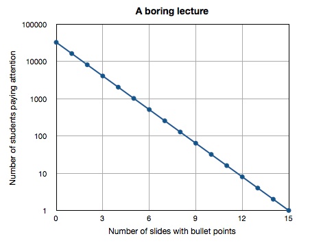
For your third plot, use the table of values you generated when making plot #2 to make the same plot, but using a logarithmic y-axis. The satisfactory plot will include a title, labeled axes, axes tick marks, and labels. Since you are plotting discrete data points, please plot them with a symbol and connect the symbols with a line. All fonts should be large enough to be legible. You may choose the aspect ratio of your plot and what kind of symbol and line style to use. *Alternative: If you have trouble making log axes, you may instead take the log of each y-value in your table and plot the resulting data instead. Your plot should still look like the plot below, but if you choose this option, you must label your y-axis accordingly.
Submitting your work
You may choose to submit these plots one of two ways: you may save them as graphics files (.jpg, .pdf or .tiff) or if you use a Web plotting program that allows you to save your plot as a link, then you may paste the links in when you submit your assignment.
Save your files in the following format:
L1_plot1_AccessAccountID_LastName.doc (or .jpg or .pdf or .tiff).
For example, Cardinals former second baseman and hall of famer Lou Brock would name his file "L1_plot1_lcb20_brock.doc"
Submit your three plots in Canvas. Go to Module One: Preinstructional Activities and find 3 Plots. Click that and once you've done that you will see a "Submit Assignment" button. Press that and get ready to upload your files or paste your link in there.
Grading criteria
As I mentioned at the top of the page, this activity will be graded based on participation only (either you made three plots or you didn't). However, I will provide constructive feedback to you about your plots.
What is your Solid Earth Science Background?
Pre-instructional Quiz
Go to Canvas and take the Lesson 1 - Pre-instructional quiz, located in Module One: Pre-instructional Activities
Submitting your work
The quiz is entirely self-contained in Canvas. When you click on the Submit button at the bottom of your quiz, it will be shared with me.
Grading criteria
This quiz is NOT graded for accuracy, only for participation. I just want to get a sense of your Earth science background relevant to the lessons we'll cover in this course. I will provide feedback about incorrect answers, though. Don't worry if Canvas gives you a bad grade because I will go in manually and override it. This also means there's no reason to take the quiz more than once. Just read the feedback and move on.
Summary and Final Tasks
Okay, enough with the background stuff, let's move on to Lesson 2 and do some science!
Reminder - Complete all of the lesson tasks!
You have finished Lesson 1. Double-check the list of requirements on the Lesson 1 Overview page to make sure you have completed all of the activities listed there before beginning the next lesson.
Tell me about it!
If you'd like to comment on, or add to, the lesson materials, feel free to post your thoughts in one of the course discussion boards in Canvas, such as the Random Thoughts board or the Questions? board