Lesson 2 - Markets: Demand
Lesson 2 Overview
In Lesson 1, we spoke of markets and their role as both a process and arena for making production, consumption, and allocation decisions. In this lesson, we will introduce the fundamental tool for analyzing how markets work: the supply and demand diagram. After this introduction, we will take a deeper dive into one side of the market, the demand side. We will examine why people make the consumption choices they make, and how we can map these choices into a functional relationship between price and quantity consumed.
What will we learn?
By the end of this lesson, you should be able to:
- define and explain the concept of declining marginal utility;
- read a demand schedule and convert it into an individual demand curve;
- aggregate individual demand curves into a market demand curve;
- define and calculate price elasticities of demand.
What is due for Lesson 2?
This lesson will take us one week to complete. Please refer to Canvas for specific time frames and due dates. There are a number of required activities in this lesson. The chart below provides an overview of those activities that must be submitted for this lesson. For assignment details, refer to the lesson page noted.
| Requirements | Submitting Your Work |
|---|---|
| Reading: Chapters 3 and 7 in Gwartney et al. OR Chapters 3 and 5 in Greenlaw et al. | Not submitted |
| Lesson Homework and Quiz | Performed in Canvas |
Market Structures
Reading Assignment
Please read Chapter 3: "Supply, Demand and the Market Process" in the textbook. This chapter covers the material that will be covered in the next three course lessons, although it is in a bit of a different order to how we will cover it. I will focus on a few specific issues, and try to go into a little bit more depth than the text. So, I suggest that before you start this lesson, you should read through Chapter 3 and then refer back to the appropriate material as we work through the next three lessons.
In Lesson 1, we spoke of some of the axioms of economics and the fundamental questions that we are trying to address: who makes and sells what, and for how much?
Historically, there have been two basic schools of thought, which can be roughly categorized as "markets" (or "capitalism") and "central planning." In centrally planned economies, government agents are responsible for making decisions about production, distribution, and pricing of goods. In markets, these decisions are decentralized, placed in the hands of millions of individuals, who invest their time, money and ideas into the manufacture or sale of some product, with the hope of making a profit and enhancing their own lives.
Throughout much of the 20th century, there was tension between advocates of market economies and those of centrally planned ones, but over the past 30 years, there appears to have been a clear shift in thinking across the globe towards market systems. Centrally planned economies were largely shown to be less successful at meeting the needs and wants of their consumers, and less able to efficiently allocate money and resources in production. Even countries that are still nominally referred to as "communist," such as China, have adopted market-based reforms that have led to great increases in the welfare and quality of life of their citizens.
The Knowledge Problem
The great problem of attempting to centrally plan an economy is that of information. While it may be possible to understand technology, inputs, and production and distribution costs, and it may be possible to establish what the basic human needs of a society are (e.g., necessary quantities of housing, food, transportation, etc.), it is impossible to assess the entirety of human wants. We all want more than we need, and we all have a different idea of what it is that we want. Indeed, for each of us, what we want is a constantly changing thing, as our tastes, desires and abilities change over the course of our lives. The greatest benefit of a market-based economy is that it is the only place where all of this widespread information about diverse and dynamic human wants is exposed. This information guides producers to alter their production and investment choices to ensure that human needs and wants are addressed. In a market context, this is what Adam Smith referred to as "the invisible hand," the assembly of unseen consumer forces continually changing the production landscape.
Markets and Mixed Economies
When we speak of central planning versus market economies, it is very easy to assume these to be two discrete states of social organization. The reality, of course, is that we exist at some place "in the middle." For this reason, I am reluctant to use the term "free markets," as this implies that under a market system, people are free to do whatever they want. This is not true - there are many constraints on human behavior. Some of these are social and cultural, but a great many are regulatory in nature: governments telling people what they can and cannot do. In the context of an economic system, this is manifested by things like labor laws, product safety rules, hazardous materials rules, consumer protection from fraud at the retail level, and so on. We have a great deal of government involvement in our economic lives, even in the United States, which is frequently held up as the standard-bearer for free-market economics in today's world. Indeed, every year, several thousand pages of new regulations are added at the federal level, and countless thousands more at the state and local levels. Almost no aspect of our economic lives is free of some restriction or regulation.
An economy without any form of government intervention is referred to as "laissez-faire." This is a French term that translates to "let it happen," and the United States is certainly not a laissez-faire economy. The peak of laissez-faire probably occurred in the second half of the 19th century, and gave rise to industrial titans such as Andrew Carnegie and John Rockefeller, who became known as "robber-barons" because of the allegedly predatory way in which they ran their businesses. This gave rise to the first great wave of business regulation, and we have not stopped since. Thus, when speaking of market economies, it is best to refer to them as "competitive markets," and not as free markets, because they certainly are not free in the sense that market participants are not unrestricted agents.
A Model for a Market Economy
The market is a system where producers and consumers interact for the benefit of all involved. It is helpful to look at these two sides of the market separately at first.
On one side of the market is the Demand Side. People on this side of the market can be referred to as consumers, demanders, or buyers - these terms will all be used interchangeably for the rest of this course. Consumers can be thought of as "Utility Maximizers," where the definition of utility is that referred to in Lesson 1. When we speak of consumers, we are generally referring to the end-users of products or services, and not firms that make intermediate purchases of materials or labor.
The other side of the market is known as the Supply Side. On this side, market participants can be called suppliers, producers, or sellers. Once again, all three of these terms can and will be used interchangeably. Producers are typically thought of as profit-maximizers, not utility maximizers, and this is a crucial distinction and affects the way we analyze the behavior of these two sides of the market.
The title of this section uses the term model. A model is a way of representing something else, a kind of "stand-in." A model is necessarily simpler than the thing it is trying to represent and, because of this, there is some detail that is lost in the process. The trade-off that is made when using a model is that a model can make things easier to understand. When we speak of a market, we are talking about something that involves the individual, private decisions of billions of consumers and producers. There is no way in which we can represent all of these decisions and interactions, but we can come up with a tool that illuminates some of the big-picture, general concepts in a way that is easy to grasp and comprehend, and has stood the test of usefulness over time. This is what the supply and demand concept consists of - it is elegant in its simplicity, and extremely powerful at describing the behavior of markets in a generalized way at a high level.
If you choose to study economics in more depth after this course, you will find that the supply and demand diagram will still be the key tool that is used. But at higher levels, we look in more detail at either aberrations from the simplified behavior described in the supply and demand diagram, or we look in more detail at specific parts of the market. However, my point here is that the supply and demand concept is the main underlying model of a market economy, and a good and thorough understanding of it will allow you to make a solid analysis of any situation involving market interactions, even without deeper knowledge of the situation at hand.
The main goal of analyzing markets is to try to figure out:
- “How much of what stuff is made, and by what methods?”
- “At what price is it sold?”
To figure these things out, we study supply and demand. The basic analytical tool is the supply and demand diagram, which is a MODEL of a market, as shown below:
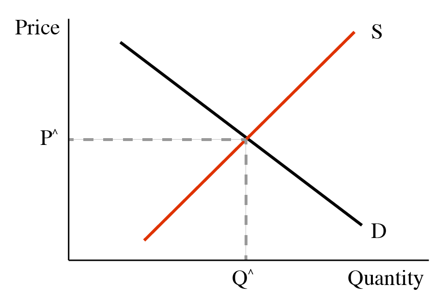
Parts of the Supply and Demand Diagram:
- x-axis: measurement of quantity
- y-axis: measurement of price
- Demand curve: relationship between price and quantity people are willing to buy
- Supply curve: relationship between price and quantity that firms are willing to sell
- Intersection point of supply and demand curves: “market equilibrium”
Markets are dynamic—always changing—so a supply-demand diagram is always just a “snapshot” of a market at a moment in time. Another dimension is “time,” which we do not consider at this point.
Figure 2.1 has two lines, which represent the two sides of the market, or the two parties in any economic transaction. The demand curve describes the behavior of the demanders in the economy. These people can also be called buyers or consumers. Restating: "demanders," "buyers," and "consumers" all mean essentially the same thing.
The other side of the market is described by the supply curve - the red upward-sloping line in the diagram above. The people *(or, typically, firms) on this side of the market can be called suppliers, or sellers, or producers. These three terms all mean basically the same thing.
Table 2.1 Demand Curve/Supply Curve Explanation| Demand curve describes behavior of: | Supply curve describes behavior of: |
|---|---|
| Demanders | Suppliers |
| Buyers | Sellers |
| Consumers | Producers |
Marginal Utility
In the first lesson, we spoke of the concept of marginal analysis. That is, we look at how something changes if we change some other thing a little bit. For example, what will be the effect on sales of raising price a little bit? Or what will be the effect on price of adding some new regulations to a market? We also spoke in Lesson One about the concept of "utility," which is the economist's catch-all term to describe happiness, wealth, value-from-use, and so on. Utility is basically the benefits that derive to a person from using or consuming a product or service, or, more generally, the amount of extra happiness a person gets from making a certain decision and executing that choice. One of the axioms we spoke of is that people are utility maximizers, and every choice that is made is made with the goal of increasing utility.
When we speak of demand in a market, we have to consider just how much utility does a person get from consuming a certain good, at the margin. So, we are considering a process of gradual change: how much utility does a person get from consuming one more unit of a good, and how does this change with further consumption? A great deal of research has been performed on this issue, and it generally backs up what we all know intuitively: the more we have consumed of something, the less value the next unit of consumption holds for us. This is defined as the concept of Declining Marginal Utility. This sounds like a complicated piece of jargon, but it helps to think of what each word means, and the concept becomes easy to grasp.
- "Declining" means "decreasing," or "getting smaller."
- "Marginal," as described above, refers to the effect of enacting some small change, i.e., "at the margin."
- "Utility" refers to the happiness we get from doing something.
String these three definitions together, and what we are saying is that the amount of happiness we get from consuming some good goes down as we consume more of it.
So, what does this mean in the context of a market? Well, to consume a good, we have to give up something to get it. Put simply, we have to buy it. So we give away some money, which can be thought of as a measure of potential utility, for a good that gives us actual utility. Since we want to maximize utility, we will willingly trade money for a good as long as we get more utility from consuming a good than we are giving away to get it. I will restate this, as it is perhaps the key underlying principle of a market economy: if someone gets $5 of happiness from consuming something, they will be happy to pay up to $5 for that good. If the price of the good is $6, then a rational utility maximizer will not buy the good: he is giving away $6 worth of utility to get $5 worth of utility. Nobody will do this willingly - if he has full knowledge of the values of the good and the money.
The concept of declining marginal utility is the foundation of demand-curve modeling, which is one side of our market model. This will be described in more depth in the next section.
Demand Curve
We will look at the supply and demand curves separately before we look at the way that they work together. We will start by looking at the demand curve. This is a Functional Relationship between the price of something and the amount of that thing that buyers (consumers, demanders) will buy at a given price. Looking at it another way, it is the maximum amount that a person is willing to pay for some amount of a good.

Where does the demand curve come from? It comes from individual preference and utility. An “individual demand curve” is how much a person will pay for a certain amount. This is calculated based upon the idea of “declining marginal utility,” which is another way of saying that the more we have of a certain thing, the less we value getting an additional unit of that good. For example, when you are hungry, you may place a lot of value on the first slice of pizza because you get a lot of utility (happiness) out of that first slice. The second slice gives you more happiness, but not as much as the first, and so on.
When you have had 3 slices, you place very little value on the 4th slice.
A person is willing to pay up to his marginal utility, but not more (because you will not give away more money than the amount of utility you get from using something).
Individual Demand Schedule
| Quantity of Pizza Consumed | Utility derived from consuming last slice |
|---|---|
| 1 | $5 |
| 2 | $4 |
| 3 | $3 |
| 4 | $2 |
| 5 | $1 |
| 6 | $0 |
Individual Demand Curve
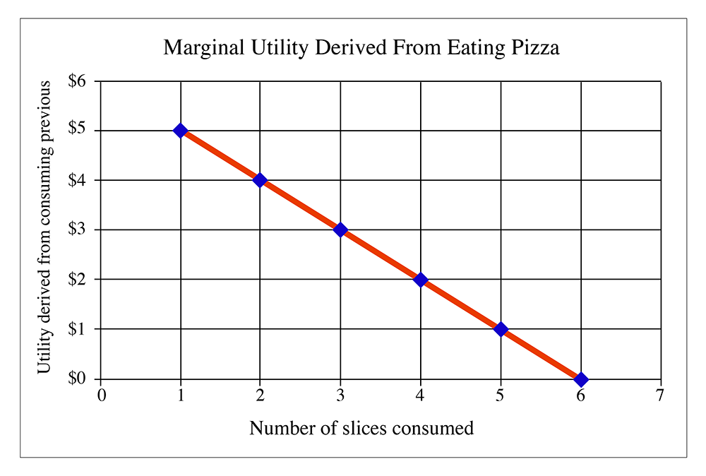
Figure 2.2 tells us that after eating five slices of pizza, a person derives no marginal utility from consuming the sixth slice. It is entirely possible that the demand curve can go negative, although economists never really examine this. However, just think about it: let's say you have eaten six slices, and are very full. Eating another slice may cause you to get an upset stomach, or may make you throw up your food. Both of these are things that people do not want to happen under normal circumstances. In this case, the seventh slice of pizza is no longer a "good," but it is a "bad": consuming it will actually decrease the total amount of happiness of the individual. A rational person would certainly not eat a seventh slice.
Figure 2.2 is the demand curve for an individual. Usually, a market consists of more than one individual, so if we want to find out what the demand curve looks like for a market in its entirety, we simply add together all individual demand curves.
What do we mean by "add together"? Well, we can construct a demand schedule for everybody in the market added together. Looking at the demand schedule, we have it written in the form "How much utility do I get from each slice?" We can reverse this, however, and say "At a certain price, how many slices would I buy? If the price of a slice is $2.50, the person described by the demand schedule would buy three slices. They would not buy the fourth slice, because this slice only gives the $2 of utility, but they would pay $2.50 for it. That means that this person would be voluntarily making himself poorer by buying a fourth slice of pizza, and this would violate our assumption about rational utility maximization. As I have said before, in real life there are cases where people do not make the proper decision, but we have to assume that people usually intend to make a utility-maximizing decision. If we don't make that assumption, there are basically no rules for examining human behavior. We are left with chaos; I would not be able to teach this course. So, the assumption of rational utility maximization gives us a sense of peace and order that allows us to study economics. We can look at the messier stuff about bad market decisions later on.
So, getting back on topic, how do we create a market demand curve? Well, let's do a demand schedule, but instead of having the number of slices in the first column, instead, we have the price in the first column. In the second column, we have the total amount of slices sold at that price. By "total amount," we want to think about the total in the market area for one pizza store, or in one town, or on one university campus. It also makes this problem easier to analyze if we assume that the pizza from every shop in town or on campus is identical. Obviously, in the real world, this is not true, but we make this assumption, called "product homogeneity," because it makes life easier for us. Don't worry, we will relax it a little later in the course and see what happens. (Hint: more chaos! I prefer to avoid chaos.)
So, let's assume that I have collected a demand schedule from every person in town and that every person knew just how much utility they got from eating each extra slice of pizza. (Maybe they are all economics students and think about every aspect of their lives in terms of declining marginal utility and rational utility maximization.) (Hey, I do. It makes me a real hit at parties.)
So, now I put together a schedule of how much pizza will be sold at each price point. Let's say it looks like this:
| Price | Quantity of slices sold |
|---|---|
| $1 | 3000 |
| $2 | 2050 |
| $3 | 1350 |
| $4 | 750 |
| $5 | 350 |
| $6 | 125 |
| $7 | 5 |
If we were to plot this, like the individual demand curve, we get the following:
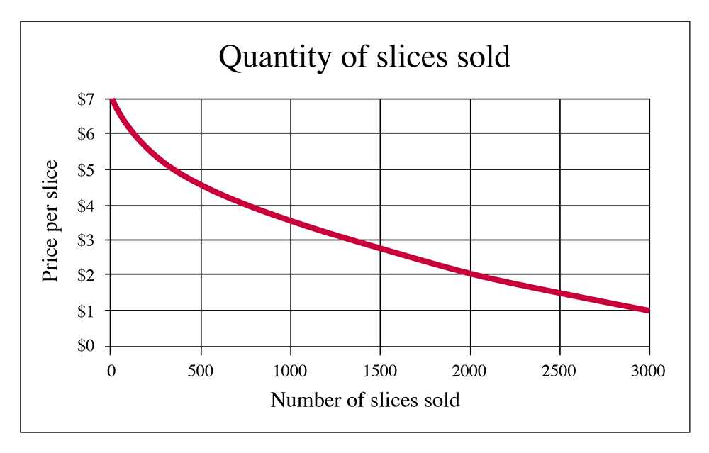
So, Figure 2.3 is what a "market demand curve" looks like. If you were the owner of the only pizza joint in town, this would let you know how many slices you will sell at each price. Of course, real life is a little more complicated for several reasons. Firstly, it is very unlikely that you have "perfect knowledge" of the demand curve. After all, how can you get everybody in town to tell you how much utility they get from each additional slice? And then, of course, we have another dimension: time. The demand for pizza on Friday night during the school year is a lot different than the demand on a Wednesday morning in the summer. And if you aren't the only guy in town, but one of several pizzerias, how much of that market will you capture? But, of course, we are making simplifications for the purpose of explaining simple principles here. As I keep promising, we can relax some of these assumptions and make things more complicated later. But, for now, let's keep things simple.
There is one thing you should note about the demand curves in both of the above graphs: they slope downwards as we go to the right. This means that as the price of a good decreases, more of it will be sold. Or you can say that as the price rises, fewer will be sold. Why? Because of declining marginal utility. After a person has consumed one unit of a good, they usually get a little bit less happiness from consuming the second unit of a good. Sometimes the difference in utility is very small, which means the curve will be very flat (more on this in the next section), sometimes it will be very steep, but in any case, it will be downward sloping. We cannot believe that somebody gets more marginal utility from consuming an additional unit. This is what we call the "First Law of Demand": demand curves are downward sloping. This means that if a seller raises the price, fewer of an item will sell.
Some Marginal Analysis
You are looking to buy pizza. Your “pizza happiness” in $ is described in the table below. Pizzas cost $2 each. How many should you buy?
| # of Pizzas | 0 | 1 | 2 | 3 | 4 | 5 |
|---|---|---|---|---|---|---|
| Pizza Happiness ($) | 0 | 10 | 17 | 22 | 25 | 26 |
Method 1: Brute Force
Simply figure out your happiness for each number. Happiness=Pizza Happiness-Total Cost (remember pizzas cost $2 each). Inelegant, low score on exam, but it will work. Fill in the table below and choose the spot that maximizes your happiness (what we will soon call consumer surplus).
| # of Pizzas | 0 | 1 | 2 | 3 | 4 | 5 |
|---|---|---|---|---|---|---|
| Pizza Happiness ($) | 0 | 10 | 17 | |||
| Total Cost ($) | 0 | 2 | 4 | |||
| Happiness ($) | 0 | 8 | 13 |
Method 2: The Elegant Economic Way of Thinking (This gets you all the credit!)
Let Marginal Happiness(X)=Pizza Happiness(X)-Pizza Happiness(X-1). Keep buying pizza as long as marginal happiness>cost of pizza (here $2).
Remember, decisions are made on the margin!
| # of Pizzas | 0 | 1 | 2 | 3 | 4 | 5 |
|---|---|---|---|---|---|---|
| Pizza Happiness ($) | 0 | 10 | 17 | 22 | 25 | 26 |
| Marginal Happiness ($) | - | 10 | 7 | |||
| Total Cost ($) | 0 | 2 | 4 | |||
| Total Happiness (Consumer Surplus) | 0 | 8 | 13 |
Fill in the blanks, and pick your bliss point!
Practice Exercise
Delicious cuy (a delicacy in Peru) costs $10 a serving. Your cuy happiness is given in the table below. How many cuy will you buy, and what will be your total happiness?

| # of Cuy | 1 | 2 | 3 | 4 | 5 |
|---|---|---|---|---|---|
| Cuy Happiness ($) | 20 | 36 | 47 | 52 | 54 |
Some people talk about something called a Giffen Good. This is a mythical good with an upward sloping demand curve, meaning that more sell if the price is higher. Sir Robert Giffen hypothesized that an inferior staple good, such as bread, might actually see an increase in demand as its price rises. The idea being that as the price of bread increases, poor consumers would have less money to spend on other goods (meat, for example), and would actually need to purchase more bread. You can probably see, however, that there would have to be a lot of constraints on this hypothetical world- no other types of inferior staple goods available as substitutes, and no corresponding wage inflation to provide additional income to buy bread, to name a few. In order to come up with a scenario where we have an actual, upward-sloping demand curve, we need to do a lot of semantical gymnastics and make a lot of special-case assumptions. Life is much simpler if we just believe that the First Law of demand holds. Which it does, of course, because it is the law, and not merely just a good idea. I like to think of it as the economic law of gravity. In a few special, rare and carefully constructed circumstances, you can appear to circumvent it, but for almost all of us almost every day, it holds true. (Or, I should say, is not falsified.)
Definitions
Demand Curve
relationship between price and quantity that people want to buy. Demand is not a number or a constant: it is a function, with different values at different places.
Marginal
This is an adjective (a descriptive word) that refers to the effect of doing a little bit more of something. So, the Marginal Utility from consuming pizza refers to the extra amount of utility you will get from eating one more slice of pizza. We often say “what will change at the margin,” which means “What will be the effect of a small change in one of the inputs?”
Main points about the demand curve:
- Demand curves always slope downwards (have a negative slope).
- This is called the “First Law of Demand.”
- They slope downwards because of Declining Marginal Utility: the amount of utility we get from consuming an extra unit of something is less than the amount we got from consuming the previous unit of that thing.
- Market demand curves are the sum of all individual demand curves.
Consumer Surplus
Assume you are hungry and you are willing to pay 5 dollars for one slice of pizza. However, you find that you can buy that slice for only 2 dollars. In that case, your total gain from buying that slice of pizza is 3 dollars because you were able to buy it for less than the value you put on it. This gain is called Consumer Surplus.
“Consumer Surplus is the difference between the maximum price consumers are willing to pay and the price they actually pay.”
-- Gwartney, et al., Microeconomics: Private and Public Choice, 14th Edition
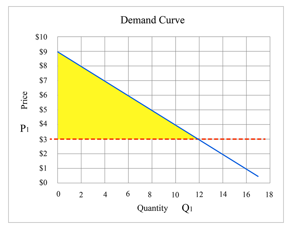
Now consider the pizza market: individuals who are hungry and want to buy pizza, people who have different willingnesses to pay for one slice of pizza, some people who put more and some who put less value on that. Consequently, some have more and some have less gain (consumer surplus) by buying a slice of pizza. The summation of all these individual gains is called total consumer surplus in the entire market. In the following figure, the size of the triangular area shows the total consumer surplus gained by all the consumers in the market.
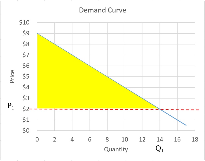
Assume P1 = $2 is the price of one slice of pizza. All the slices of pizza sold in the market (Q1) are purchased by the consumer who value the slice more than and equal to $2. Some consumers value it very highly ($span>8) and some value it less ($5). For each consumer, the gain is the difference between the value and the $2. Therefore, the area of the triangle between demand curve and price (P1) equals the summation of all gains. Clearly, if the value that a consumer puts on the slice pizza is $2 and he pays $2 for it, then the gain will be zero.
Note that we should distinguish between marginal value and total value of a good. At each point (at each quantity of good sold), the marginal value for the consumers is the height of the demand curve and the total value equals the summation of all those marginal values. Marginal gain equals the difference between marginal value and price. Therefore, total gain, which we call consumer surplus, equals the summation of all marginal gains.
In order to calculate the consumer surplus, we need to find the area between demand curve and market price, the area under the demand curve and above the price (horizontal line). As we can see in the graph, consumer surplus is affected by the price. The higher price makes the area smaller and causes lower consumer surplus. The lower price makes the area larger and causes higher consumer surplus.
So, in this example, consumer surplus can be calculated as:
Mathematical Representation of Demand Curve
We often want to perform calculations concerning total utility in a market, or total costs, or some such thing, and to do this, it is helpful to define the functional relationships on a supply and demand diagram with a mathematical equation.
So, an example of a demand curve may be specified as follows (Please note that P stands for "Price," and Q stands for "Quantity") :
This describes a downward sloping line, which intersects the y-axis (which represents price in a supply-demand diagram) at a value of 100, and declines in value by 2 for each extra unit we travel along the x-axis (which represents quantity of goods sold in a supply-demand diagram).
So, if the Quantity is 20, we would say , , and so on.
If you look at the market demand curve for pizza, on the previous page, we might want to describe it as P = 9 - 0.5Q, which describes a straight line with a y-intercept of 9 and a slope of -0.5. In that case, for example, market price for pizza when the quantity is 10 will be: .
Example:
Assume the market demand curve for pizza is . Calculate the consumer surplus if the price of pizza equals $3. Try to use two methods to calculate the consumers surplus:
- Mathematical equation
- Geometry: and calculating the area of the triangle
Then compare your answers. You should have the same answer.
Answer:
We need to calculate the area of the triangle. First, we need to find the coordinates of three corners of the triangle between demand curve and price. Then we have to find the length of the sides.
The coordinate of the three corners are:
Top corner: (0,9)
Bottom left: (0,3)
Bottom right: to find this point, we need to plug the price = 3 into the demand equation and find the Q. . And Q will be 12. So, the coordinate of the bottom right corner will be (12,3)
Knowing these three points, we should be able to calculate the area of the triangle as:
Geometry:
We need to draw the graph and calculate the area of the triangle ( ):
The market demand curve could be a more complicated function. This illustrates what I have mentioned before: real life is a very complicated thing to model, but in economics, we can use simple models to describe and explain human behavior and market outcomes. So assuming a linear demand curve may be a simplification of reality, but it aids our understanding of markets, and if we can perform numerical examples, it makes the illustration of concepts easier for a lot of us.
Practice Exercise
Calculate the the consumers surplus for P = 60 when demand function is P = 90 − 6Q.
P1 = 60
60 = 90 - 6Q then Q1 = (90 - 60)/6 = 5
CS = (90 - 60)*5/2 = 75
Price Elasticity of Demand
Reading Assignment
Please read Chapter 7 in the text (Consumer Choice and Elasticity) to accompany the material in this section.
Economics is a dynamic process. Given the millions of human interactions that make up an economy, it is not surprising that things do not stay the same for very long, if at all. Things change: this is the nature of a dynamic economy. We now ask, how much do they change?
At this point, this question relates to the shapes and slopes of the demand curves, which we will examine here. We will look at the supply curve in the next lesson.
In physics, the term “elasticity” refers to how much something stretches when force is applied to it. In economics, when we think about "elasticity," we are interested in how much a quantity demanded or supplied will change when some “force” is applied to the market. Both the demand and supply curves have elasticities. Let us talk first about the elasticity of demand. The phrase “elasticity of demand” is incomplete: we are talking about the response of demand to something. So, for the title to be complete, we have to talk about the price elasticity of demand. That is, how much does the quantity demanded change when price is changed? We could also talk about the income elasticity of demand, which asks “how much does the quantity demanded change with income?”
The price elasticity of demand is defined as the percentage change in quantity divided by the percentage change in price. Or, mathematically, we get:
The Greek letter eta, , is used to denote elasticity.
The notation is shorthand for "percent change in price", where the Greek letter delta denotes the change in something. This equation is also called “endpoint” elasticity.
A percent change in some variable is: .
For example, if the price of a bag of Doritos rises from 99 cents to $1.29, then the percent price change will be:
We use this format (a percentage change divided by a percentage change) because it conveniently lets us work in a dimensionless world. If we instead looked at absolute changes in quantity and absolute changes in price, our results would have to have dimensions, such as “pounds of oranges per thousand dollars” or “cars per million Euros.” Instead, when comparing a percentage change in one thing to a percentage change in another, we avoid the confusion of what units we should be using.
This formula uses the endpoints of the interval, which means that if we calculate the elasticity from point 1 to point 2, it will be different than the elasticity from point 2 to point 1. This is seen to give inconsistent answers; so instead, we often calculate the “midpoint” elasticity. That is, instead of defining the elasticity using Q1 and P1 in the denominators, we use the midpoint between P1 and P2, and Q1 and Q2. So, the formula for the midpoint elasticity is:
We can also define a “point” elasticity. If we shrink the interval between Q1 and Q2, we end up not using the distance between two points, but instead we have the reciprocal of the slope of the line multiplied by the ratio of the values of P and Q at the point in question. The slope of a line on a supply and demand diagram will be , but because we are interested in the change in quantity that comes from the change in price, we examine the reciprocal (1 divided by the value), of . Because we want to cancel out any units, we have to multiply this slope by the actual values. So, if we look at the point elasticity at a point (Q1, P1) then we would calculate it as:
Example
Suppose that at a price of $10 per box, a store will sell 1000 boxes of bananas a week. If the store raises its prices to $12 per box, it will sell 750 boxes. What is the elasticity?
This particular demand curve is illustrated in the following diagram:
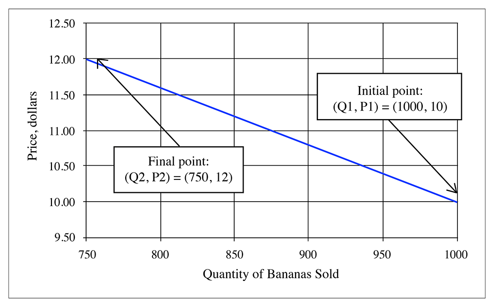
1) Using the original formula, we get:
2) Using the midpoint formula, we get:
So, these numbers are quite different.
What about the point elasticity? Well, to answer this, we need the slope of a line. If we assume that the demand curve is a straight line, then what is the slope? Given that we have the points (Q,P ) = (1000, 10) and (750, 12), then the slope is . But in the elasticity, we need , which is . (Remember, the Greek letter delta, , is shorthand for "change in").
So, at point 1, the point elasticity will be . At point 2, it would be .
Steepness of Elasticity
If something only stretches a small amount under pressure, then we say it is inelastic. In economics, we say that a good is inelastic if its quantity demanded does not change very much with a change in price. On a supply and demand diagram, an inelastic good is one that has a very steep slope. This is shown in the following diagram:
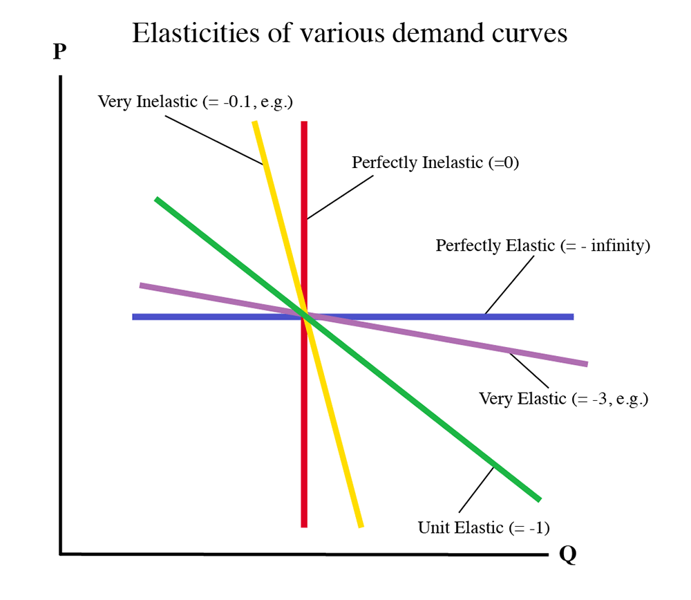
Typically, goods that are thought of as necessities will be very inelastic. That is, no matter how expensive they get, we will still buy them. Health care, staple foods and gasoline are goods with low elasticities. If a demand curve is perfectly vertical (up and down) then we say it is perfectly inelastic. If the curve is not steep, but instead is shallow, then the good is said to be “elastic” or “highly elastic.” This means that a small change in the price of the good will have a large change in the quantity demanded. If the curve is perfectly flat (horizontal), then we say that it is perfectly elastic. Luxury goods are often very elastic – if the price increases a little, then people will move over to something else.
Remember that the elasticity is a ratio of percent changes in quantity and price.
Also, remember that all elasticities of demand will be negative, since the demand curve slopes downwards.
Example
So, if we say that the elasticity of gasoline is -0.1, how much less gasoline will we consume if its price increases 10%?
Rearranging:
So, a 10% increase in the price of gasoline will only decrease its quantity sold by 1%. So, if you buy 10 gallons a week when the price is $3.00, then you will reduce consumption to 9.9 gallons if the price goes up to $3.30.
Practice Exercise
Assume demand function for a product in a hypothetical market is P = 40 – 4Q. Calculate the price elasticity of demand when price increases from $16 to $20.
Summary
- A Perfectly Inelastic Demand Curve is vertical (η = 0). This is very rare in reality. You could claim that the elasticity of life-saving medical treatment is perfectly inelastic, since most of us would give anything and everything to stay alive.
- A highly inelastic demand curve is very steep (η close to zero, e.g., -0.1). Many goods that are necessities or have very few substitutes behave this way.
- A demand curve with an elasticity near -1 is said to be “uniformly elastic.”
- A highly elastic demand curve is very flat (η between -2 and -5). Luxury goods, or goods with lots of substitutes behave like this.
Perfectly elastic goods have a horizontal demand curve (η = -∞). This is rare in the world. - In the following diagram, the supposed value of the price elasticity of demand is shown beside each line.
Some sample elasticities (from the real world):
- Gasoline: -0.04
- Sugar: -0.31
- Long distance phone service (1995): 0.35
- Tires: -1.20
- Movies: -3.70
So, let's think for what these numbers mean. The elasticity of gasoline (or, if I want to be complete and formal, the price elasticity of demand of gasoline) is -0.04. Put another way, this means that if the price increases 1%, the quantity that the public wants to purchase only goes down 0.04%. Or if we scale these numbers up, we can say that if the price increases by 100% (that is, it doubles), then the quantity consumed only falls by 4%. So, if gasoline gets a lot more expensive, people will still use almost as much, at least in the short term. This is because most of us don't have a lot of choice about using gasoline (in the short term - more about what "short-term" means a bit later). A lot of us don't have the option of using less gasoline, because we still need to get to the store and to work, and so on. Gasoline was more than twice as expensive in 2012 as it was in 2002, but we used about the same amount.
The number for long-distance phone service was also quite inelastic, because back in 1995 we didn't have a lot of options. Today, this number would be very different. Now we have cell phones that don't charge by how far you are from the caller, and we have Skype and we have VOIP and we have iPhones with video talk and we have webcams, and we have cable companies offering calling plans, and we have people talking about setting up communications networks on power lines, and so on.
Looking at the number for movies, we see that it has a high value (actually, because it is a negative number, it's actually smaller, but it is bigger in absolute terms). This means that if the price goes up 1%, then the quantity demanded goes down by 3.4%. This is because movies are somewhat of a luxury, and there are usually plenty of alternatives.
We'll talk a lot more about the reasons behind these elasticities in Lesson 4 when we talk about market dynamics or what happens to supply and demand when we consider the effects of time and of the costs of other things. The important thing to take from this lesson is just to understand what a demand curve is, and how we measure just how much the quantity of a good demanded changes with the price of the good.
Reiteration
If you remember nothing else from this lesson, I hope you remember and understand the following two points.
- A demand curve is a functional relationship. I cannot say this enough times. It is a curve that defines the relationship behind how much of a good will be demanded in a market at a certain price. Change the price, and a different quantity will be demanded. Demand is not a constant, but a variable.
- Demand curves slope downwards because of the notion of declining marginal utility - the more of something that one has consumed, the less benefit (and, therefore, the less they are willing to pay) for the next unit of the good in question. Also, this is why the price elasticity of demand is negative: if price goes up, quantity demanded goes down, and vice versa.
Summary and Final Tasks
In this lesson, we introduced the concept of a market system, and our core tool for analysis of markets, the supply and demand diagram.
We examined in detail the origins and underpinnings of one half of this market model: the demand curve.
At this point, you should be able to perform the following tasks:
- Explain what a market-based economy is, and what the most common alternative form of economic organization is.
- Define and understand what is meant by the term, "declining marginal utility."
- Identify the parts of a supply and demand diagram.
- Read an individual demand schedule and use it to draw an individual demand curve.
- Understand that a demand curve is a functional relationship between two things: the quantity of goods (Q) that is demanded by consumers at a given price (P). Demand is not a constant, but a line that has changing Q for changing P.
- Amalgamate individual demand curves to obtain a market demand curve.
- Understand what the term "price elasticity of demand" refers to.
- Be able to calculate a price elasticity of demand.
Graded Assessment
If you log in to Canvas, you will find a short written quiz for lesson 2. Complete that by the date noted on the calendar tab in Canvas.
There will also be a new discussion forum topic posted this week.
Have you completed everything?
You have reached the end of Lesson 2! Double check the list of requirements on the first page of this lesson to make sure you have completed all of the activities listed there.
Tell us about it!
If you have anything you'd like to comment on or add to the lesson materials, feel free to post your thoughts in the discussion forum in Canvas. For example, if there was a point that you had trouble understanding, ask about it.