
When we use the world “dynamics,” we simply mean that things change with time, that they do not stay the same. We defined the equilibrium in a market as the point where the supply and demand curves intersect, which is also called the “market clearing” point, where the amount and price of goods that sellers want to sell matches the price and quantity that buyers want to pay. An equilibrium is a “steady state” that things tend towards, and where they will tend to stay unless there is some upsetting force. If you think of a marble in a salad bowl: if you drop the marble from the rim of the bowl, it will move around for a while, but it will settle in the bottom of the bowl, and will not move unless some external force is applied to it – unless it is disturbed.
A market tends towards an equilibrium, but the equilibrium does not stay still. Think about this: the price of a good, and the quantity sold, does not tend to stay the same over time for many goods. For example, in 1998, the average price of gasoline was $1.03/gallon, and about 350 million gallons per day were consumed in the US. By 2007, the price had risen to $2.80, and the consumption had risen to 390 million gallons/day. But in 2009, the average price was $2.35 and consumption had dropped to 378 million gallons/day. Each of these three points represents an equilibrium, and each is quite different.
Figure 4.5 is a plot of the annual average equilibria for gasoline in the United States from 1992 to 2015. The point at the start of the line, near the lower left corner, is the equilibrium for 1992, and the line then travels through the next 24 years.
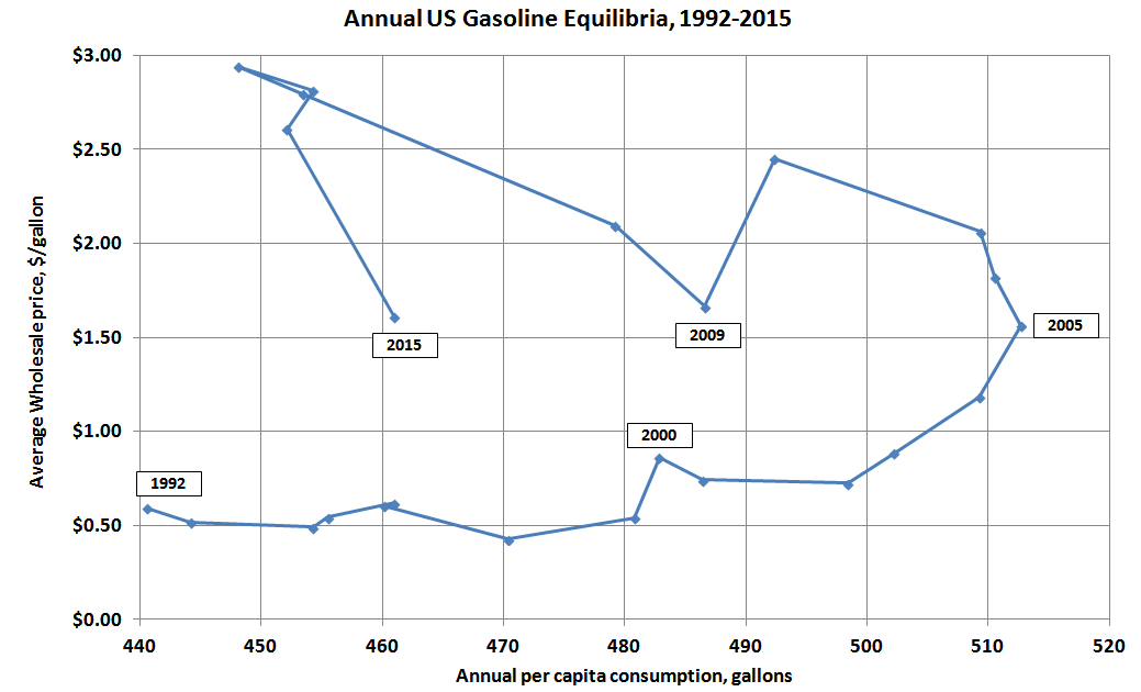
In this chart, I have population-weighted sales by simply dividing sales by annual average population. You might notice that the path that is followed is pretty predictable for much of the period – the price is fairly stable for several years, from about 1992 to 2002, after which it climbs pretty steadily through 2008. We also see the quantity of sales per person growing quite steadily from 1992 to 2005. Over this period, the average person was consuming more gasoline, but the price was pretty stable. In 2005, volumes were 16% higher than 1992. Then something strange happens – for the years 2006-2012, the path of the equilibrium has “doubled back” on itself, with quantity falling as price tended to rise (if we take out the anomalous bom-bust of 2008 and 2009, prices rose quite steadily from 2005 through 2012. Then, starting in 2013, this trend reversed, and now we are starting to see some modest growth in consumption. We saw a big jump in 2015 as the price dropped a great deal after the oil price crash of Fall 2014. We will talk a little more about “why" in the next section, but I am showing you this path here to illustrate the idea of economic dynamics: how things change with time. Each point on Figure 4.5 represents an equilibrium, an intersection of (not shown) supply and demand curves. But the equilibrium moves with time, with both the equilibrium price and quantity shifting. If each point is an intersection of two lines, clearly one or both of the lines are moving with time. When you look at a standard supply and demand diagram, you are looking at something that is in two dimensions: it has length and width, or price and quantity, and these are both variable, but there is a third variable that we cannot see on the S-D diagram: time. If we had some sort of 3-D paper, there would be not two but three axes intersecting at the origin: price, quantity, and time, and the supply and demand curves would not be lines, but planes that have three dimensions, planes that are wavy and twisty, not flat.
This is a rather long-winded way of saying: things change with time. All things change with time, and markets are no exception.
Results of Changes in the Market
Please read Section 3.3 in the text
In the previous two lessons, we talked about what causes the movements of the supply and demand curves, here we will model the results of these changes. That is, what happens to the equilibrium as market dynamics occur?
Our model of a market consists of two things: a demand curve, and a supply curve. So, when we look at market dynamics, we are looking at a movement of either the demand curve or the supply curve, or, more likely, a movement of both. Let’s take a look at these one at a time first, and then together.
Movements of the Demand Curve
Below, we have a basic, properly-labeled supply and demand diagram. The axes are labeled as price, P (the y-axis), and quantity, Q (the x-axis), the upward-sloping supply curve in red, labeled “S”, the downward-sloping demand curve in blue, labeled “D”, and the equilibrium, at the intersection of the supply and demand curves, labeled “e”, and the equilibrium price and quantity, shown as P* and Q*.
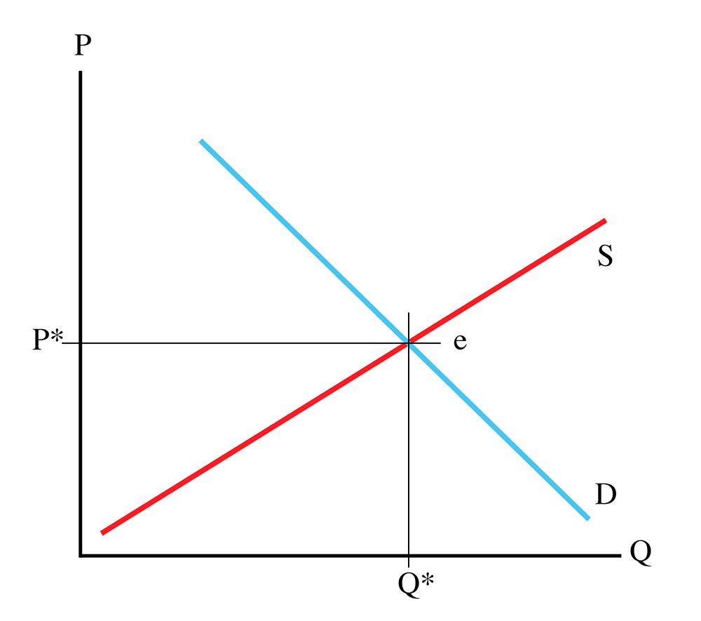
It is important for me to state here: an equilibrium is ALWAYS an ordered pair: (Q*, P*). If I ask a question in a quiz or exam where I ask for an equilibrium, and you give me only a price or a quantity, you will be giving me only half of the answer. Price and quantity.
So, focusing on the demand curve, for the sake of simplicity, we will leave the slope unchanged, and simply look at side-to-side movements. The demand curve can be shifted to the right. This is the same as shifting it upwards, or the same as shifting it diagonally away from the origin. This is called an “outward” shift of the demand curve, as it moves out from the origin. Such a movement is shown in Figure 4.7.
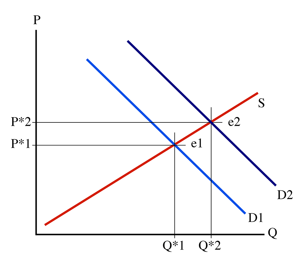
Figure 4.7 shows a movement of the demand curve, from D1 (in light blue) to D2 (in dark blue). Look at what has happened to the equilibrium: it has shifted from (Q*1, P*1) to (Q*2, P*2). Note that P*2 > P*1, and Q*2 > Q*1. In other words, an outward shift of the demand curve results in a larger quantity of goods being sold, and at a higher price. Why? Well, remember that the demand curve is a functional relationship that defines how much people are willing to pay for any given quantity of goods, and this willingness to pay is based on how much happiness people get from consuming one more unit of the goods in question (the marginal utility). When the demand curve shifts outward like this, it means that people are willing to pay more for any given amount of goods. So, given the same upward-sloping supply curve, we can expect more goods to be sold, and at a higher price, because people are willing to pay more, and because they are willing to pay more, producers make more to match their marginal cost with the higher price.
Notice that the equilibrium has moved from e1 to e2. It has moved “along” the supply curve. The demand curve moved outwards, and the equilibrium “slid” along the static supply curve. If you read the popular press, you’ll often see writers talking about “demand for a good increasing.” What they really should say is, “The demand curve has moved outwards, and the equilibrium quantity has increased.”
I will leave it as an exercise for you to figure out what happens when the demand curve moves to the left (which is the same as the demand curve moving downwards, or towards the origin), known as an “inward” movement of the demand curve.
Movements of the Supply Curve
A movement of the demand curve is pretty unambiguous: if the curve moves outwards, equilibrium price and quantity both increase. If the demand curve moves inwards, then equilibrium price and quantity both decrease. Things are a little bit more complicated for movements of the supply curve.
First, let us look at a downward (or rightward) shift of the supply curve while holding the demand curve steady. This is shown in Figure 4.8, with the supply curve shifting from its original position, S1 (in red), to a second position, S2 (in green).
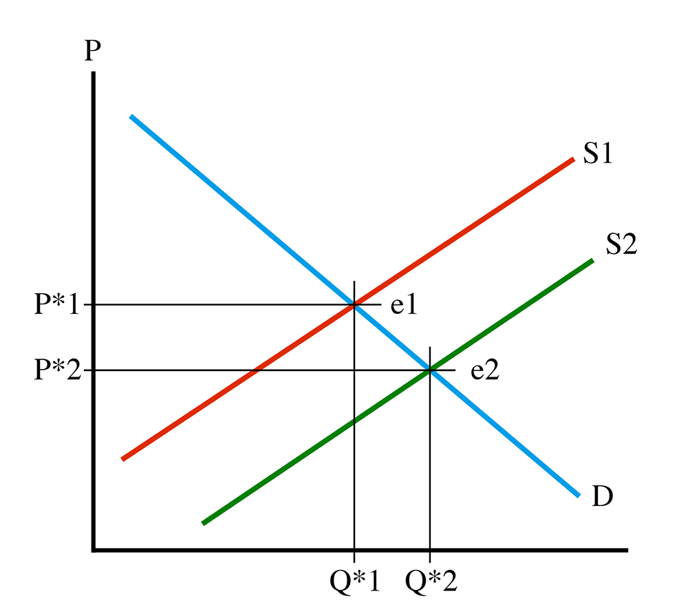
See how the equilibrium has “slid” along the demand curve, from e1 to e2. Now, notice that at e2, quantity has increased (Q*2 > Q*1), but equilibrium price has moved down (P*2 < P*1). This tells us that a movement of the supply curve downwards means that more goods will be sold, and at a lower price. This sounds like a good thing, at least from the consumer’s point of view, but the phrase “supply shifting downwards” might lead a person to think that fewer goods will be made. What is happening? Well, the supply curve is a functional relationship (there’s that phrase again) which describes the marginal cost of producing a given quantity of goods. If the curve shifts down, it means that the cost of producing the nth instance of the good has decreased. Repeating myself: costs have come down. Producers are willing to accept a lower payment for each unit of the good in question because it does not cost as much to produce. A lot of technology goods follow a path like this: when I bought my first personal computer in 1989 it cost me over $3,000, and there were far fewer sold than today. The same goes for my first CD player and first cell phone. As these technologies improved, prices dropped and the volumes sold increased, sometimes dramatically.
So, what happens in the opposite case, an upwards shift of the supply curve? I will leave the diagram to you, but it is not too hard to understand that equilibrium price will increase, and the quantity sold will decrease.
Movements of Both Curves
It is typically true that both supply and demand curves observe shifts over time. Let’s take a look at what happens when both move at the same time. First case, what about an outward shift of the demand curve and downwards shift of the supply curve? This is shown in Figure 4.9.
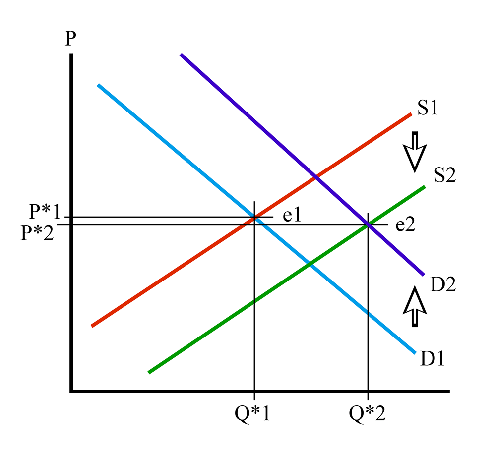
I have put some arrows on Figure 4.9 to show the downward movement of the supply curve, from S1 to S2, and the upward movement of the demand curve, from D1 to D2. The equilibrium has shifted from point e1 to point e2.
What has happened to equilibrium quantity? It has increased – Q*2 > Q*1. Both movements have led to an increase in Q*. What about equilibrium price? Well, the demand curve movement caused P* to increase, but the supply curve movement caused P* to decrease. One step up, one step down. Which one is bigger? Well, on the diagram, it looks like P*2 is a little bit lower than P*1, but I should make it very clear that this diagram is an illustration, and not to scale. There are no numbers on it. In a real life situation, we will be measuring things and will be able to determine the answer, but here, in the theoretical abstract, we do not know which one is bigger.
We know that Q* increases because the supply curve movement makes the equilibrium move to the right, and then the demand curve movement also makes the equilibrium move to the right. Both changes push quantity in the same direction, so we know that Q* must increase. But P*, we don’t know.
So, to summarize, if D shifts up and S shifts down, then Q* increases and the change in P* is undetermined.
I will leave it up to you to draw diagrams of the other three combinations, but I will give you a shorthand summary of the four results:
Take Aways
After working through the material on this page and reading the associated textbook content, you should be able to confidently:
- understand and describe the changes in market equilibrium caused by an outward movement of the demand curve;
- understand and describe the changes in market equilibrium caused by an inward movement of the demand curve;
- understand and describe the changes in market equilibrium caused by an upward movement of the supply curve;
- understand and describe the changes in market equilibrium caused by an downward movement of the supply curve;
- understand and describe the results of combinations of movements of the supply and demand curves;
- understand the difference between the movement of a curve and the change in equilibrium - that is, the movementOF a curve versus the movement of an equilibrium ALONG a curve.