Lesson 4 - Market Dynamics
Lesson 4 Overview
In the previous two lessons, we discussed the basics of the supply and demand curve, and the origins of the curves. In this lesson, we will take a look at how the interaction of the two sides of the market creates wealth for both sides, and then we will talk about how the market changes with time, and what drives those changes. What factors cause prices to go up or down, and what drives the quantities of different goods sold?
What will we learn?
By the end of this lesson, you should be able to:
- explain what consumer surplus, producer surplus and total wealth generated by a market are;
- identify the parts of a supply and demand diagram that represent consumer and producer surplus;
- describe the changes in the equilibrium prices and quantities caused by movements of the supply and demand curves;
- describe and explain the underlying causes of movements of the supply and demand curves.
What is due for Lesson 4?
This lesson will take us one week to complete. Please refer to Canvas for specific time frames and due dates. There are a number of required activities in this lesson. The chart below provides an overview of those activities that must be submitted for this lesson. For assignment details, refer to the lesson page noted.
| Requirements | Submitting Your Work |
|---|---|
| Reading |
In Gwartney et al., read Chapter 9 "Price Takers and the Competitive Process", or, in earlier versions, "The Firm Under Pure Competition." OR In Greenlaw et al,. read Chapter 8 "Perfect Competition." |
| Lesson homework and quiz | Submitted via Canvas |
Market Equilibrium
Now we have defined these two relationships: the demand curve, which defines the relationship between the maximum amount that somebody will pay for a certain quantity of goods, which is defined by the marginal utility derived from consuming that good, and the supply curve, which defines the relationship between the minimum amount that a firm is willing to accept for a certain quantity of goods, derived from the notion of marginal cost and declining marginal returns to a factor. For any given quantity of goods, these two curves define the limits of the price we expect to see for a good. The price should not be higher than the marginal utility, because a rational individual would not give away more utility (in the form of money) than the utility he or she would get from consuming the good. The price would not be below the marginal costs, because the firm would be losing money on production of the unit, and thus they would choose to not make the unit of the good in the first place.
So, we have a downward sloping demand curve and an upward sloping supply curve. Unless the supply curve is higher than the demand curve at the zero quantity, then the curves will intersect somewhere. In the case that the supply curve starts above the demand curve, this means that the cost of producing one good is higher than the highest amount of utility anybody gets from consuming that good, which is a trivial outcome: none of the good will be produced, and there will be no market for it. So, we can forget about this case (except and until the government gets involved...)
Below is an example of a supply and demand diagram:
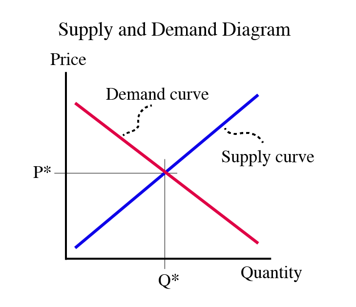
So, looking at Figure 4.1, the demand curve begins on the left, above the supply curve, and as quantity increases as the curves move to the right, they get closer and closer. Then they intersect. This intersection is the point where the utility of consumption of the marginal good is exactly the same as the cost of making it. If we go further to the right, the cost of production is higher than the utility of consumption. This means that for a quantity to the right of the intersection, nobody is willing to pay the full cost of production of the good, with the result that those goods will not be made.
The point where the supply and demand curves intersect is called the Market Equilibrium. An equilibrium is defined as some condition that is not prone to change from minor perturbances. If you drop a marble down the side of a salad bowl, the marble will settle at the bottom and will not move from the bottom unless there is a major disturbance. It is said to be in equilibrium. When a market is in equilibrium, it is not prone to change - it is at a "stable" amount of output at a "stable" price. Equilibrium is where we expect a market to be. Why? If the quantity of goods being produced is lower than the equilibrium quantity (if we are producing at the left of the equilibrium), then there are some people who are willing to pay more than the marginal cost of the good. This means that somebody can make a profit from making more of the good, so we expect production to increase until we hit the equilibrium point. If production is to the right of the equilibrium point, units are being made that nobody will buy, and firms will lose money on them. This incentivizes firms to make less of a good, once again driving the market towards equilibrium.
The equilibrium is not a number, but an ordered pair of numbers: a price and a quantity. We typically use the notation (Q*, P*) to describe an equilibrium. If I ask a question about a market equilibrium, and the answer is only a single number, it will be considered incomplete. An equilibrium consists of an equilibrium price, P*, and the quantity at which that price is observed, Q*. The equilibrium price is sometimes called the "market-clearing" price, meaning that it is the price where the market "clears" all of the goods in it: If the price is below the market clearing price, people will want to buy more, and more will be made. If the price is above the market-clearing price, more will want to be made by producers.
At any given point in time, we expect the market to be in equilibrium. Of course, a market, being the result of human wants, is always changing, and, in this context, you can think of the equilibrium as something that is always shifting, like a set of moving goalposts in a hockey game, but is something that the market is always striving to move towards. The equilibrium is like a magnet, always pulling the market towards it, but always moving, so the market is always chasing. We will talk more about these market dynamics in the next lesson.
Summarizing the supply and demand diagram:
- x-axis: measurement of quantity
- y-axis: measurement of price
- Demand curve: relationship between price and quantity people are willing to buy, derived from marginal utility of consumption
- Supply curve: relationship between price and quantity that firms are willing to sell, derived from marginal cost of production
- Intersection point of supply and demand curves: “market equilibrium”
Perfect Competition
Given all of the assumptions we have made to date, the market that is described above is what we call “perfect competition.” This does not exist in real life, but is a good starting place to study markets.
Perfect competition is based upon four assumptions:
- Nobody has market power. This means that nobody has the ability to change the market equilibrium price based on their own behavior. This means that there must be many buyers and many sellers. We also say “everybody is a price-taker,” which means that they must accept the market price, and they are not “price-setters.”
- Perfect information. This means two things – first, that everybody knows what their own choices are, and also that they know everything about the product.
- Product homogeneity. This means that in a specific market, all products are identical. In real life, no two things are identical, and people make “differentiation” between products. But, for purposes of modeling, we assume that certain groups of products are close enough to being the same.
- Free entry and exit. This means that people only make production and consumption decisions based upon their own free will. They are not forced to buy or sell things they do not want. It also means that people are not negatively affected by other people’s market decisions.
The closest we get to perfect competition is a large stock market like those in New York or London.
A perfectly competitive market gives the greatest possible wealth - we will show just how in the next lesson. Any market that fails to get this full amount is not perfect, and we say that we have a “market failure.” By “failure” we simply mean “not perfect.” All markets are in failure, but some more than others.
Many people wish to correct market failure, and to do this, they usually decide that government must act since no individual has enough power to correct the failures.
However, sometimes in their attempt to fix the problem, the government actually makes things worse (that is, they make the consumer and/or producer surplus even smaller). When this happens, we have what we call “government failure.” We have government failure when a government tries to fix a problem but only makes it worse. Even if the government has good intentions, it usually makes things worse.
Much of the rest of the course will look at deviations from this notion of perfectly competitive markets, that is, violations of one or more of our assumptions of perfect competition, and how these violations play out in real life. We will spend a lot of time looking at market failures, and ways in which we can deal with them, with a focus on how these things affect markets in the energy and resources spheres.
Take Aways
After working through the material on this page and reading the associated textbook content, you should be able to confidently:
- sketch out a supply and demand diagram, and identify the equilibrium;
- define and understand the four assumptions of “perfect competition”:
- nobody has market power
- perfect information
- product homogeneity
- free entry and exit
- understand the concepts of wealth maximization and market failure:
- when is wealth maximized?
- when is a market said to be in failure?
Wealth Created by Markets
Reading Assignment
Read Chapter 9 (Pages 196-215). If you are using an earlier version of the text, read the chapter entitled "Price Takers and the Competitive Process", or, in much earlier versions, "The Firm Under Pure Competition." This is the chapter directly following "Costs and the Supply of Goods."
We have now defined the demand and supply curves and described where they "come from" and how they fit together, giving us a "market equilibrium," which is a combination of a price and quantity that we expect a market to move towards and stay at if there are no external disturbances. If we assume for a moment that we have a stable market that is at equilibrium, we will be able to take a look at how, and by how much, a market system improves wealth in a society. And remember, when I talk about wealth, I am not talking about money, but about the things that improve the quality of our lives. Money is merely a mechanism for interaction that allows us to exchange our labor and investments for goods that we derive utility from.
There are two reasons why we have trade in markets:
- People trying to maximize their utility
- Firms trying to maximize their profits, which increases what they can pay their owners, who can then convert these profits into utility-bearing goods to help maximize owner utility
A reminder: the demand curve is defined by the maximum amount a person is willing to pay for something, which equals the utility gained from consuming goods, which equals the wealth gained. (Wealth ≠ cash). An individual's maximum willingness to pay is sometimes called the "reservation price."
An Aside...
The law of one price. As mentioned above, we are going to assume that the market is in equilibrium. A follow on from this is that the amount of goods sold will equal Q* on the supply and demand diagram and that all of those goods will be priced at the equilibrium price, P*. That is, we are assuming that everybody pays the same price, P*. We call this the "law of one price," and it holds under our assumption of perfect competition. In real life, it is not always true, but as I have mentioned several times, it is a simplifying assumption that is not unreasonable and allows us to use a simple model to develop understanding. As we move through the course, this is one of the assumptions we will relax and look at the effects.
In a perfectly competitive market, we hold that an individual (a consumer, demander, or buyer) will freely enter into a market to exchange money for goods and that a firm (a producer, supplier, or seller) will take that cash in exchange for the good in question. In order for self-interested, non-coerced individuals and firms to enter into such a transaction, it must be in the self-interest of both, and by “in the self-interest,” we mean that each side will gain from the trade. The individual will exchange money for a good that gives him/her more utility than he/she gets from the money, and the firm will gain more money from the sale than it cost to make the good. Remember, people are utility maximizers (happiness maximizers), and firms are profit maximizers.
So, in a (theoretical, perfectly competitive) market, everybody gains something from participating in the market. In the real world, this still holds generally, although not universally, true: most people do not buy things they do not value, and most firms cannot continue to operate while losing money for very long.
The question we wish to ask now is, how much wealth (happiness + profits) is generated by a market? Well, before talking about wealth, let's quickly review the concepts of Consumer Surplus (CS) and Producer Surplus (PS).
A consumer’s net gain of wealth in a trade = maximum amount willing to pay – the purchase price.
(Remember, the maximum willingness to pay is the marginal utility obtained from consuming the good. A rational person will not pay more than the value he gets from the good.) Because we assume the law of one price, all consumers pay the same price, which happens to be the equilibrium price, P*.
Add this up for all buyers, and we have the total wealth created by the market for consumers. This is called Consumer Surplus.
The consumer surplus is the sum of the net wealth gain for each buyer in the market. If a buyer has a willingness to pay (henceforth referred to as WTP) \$10 and the price is \$7, then he has gained \$3 in wealth (\$10 - \$7). If a buyer has a WTP of \$7, he has just broken even (we might say that he is “indifferent” to making this purchase, as he has the same amount of utility whether he makes the trade or not.) If a buyer has a WTP of \$6.50, he would not willingly make the trade, because he is would be exchanging \$7 of money for \$6.50 worth of happiness, and nobody would rationally decrease their amount of happiness (given our assumptions of rational behavior and perfect information).
Note that WTP is the function defined as the demand curve.
So, the consumer surplus (we’ll call this CS to save typing time for me) for the entire market (all buyers added together) is the area between the demand curve and the equilibrium price, to the left of the equilibrium quantity, or the yellow shaded area in the following diagram:
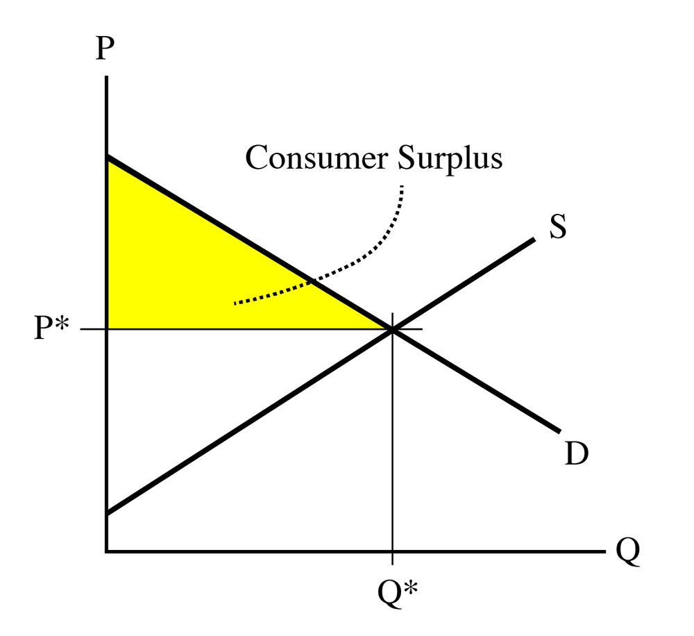
We do not have to worry about what happens to the right of the equilibrium quantity, Q*, because at this point, trades are not made, because the equilibrium price (a constant, and hence, a horizontal line) is above the willingness to pay (above the demand curve) to the right of the equilibrium point.
Now, let’s look at the supply side of the market. Remember our definition of the supply curve:
Supply curve = minimum amount a seller is willing to accept = marginal cost of producing a good.
A producer will not want to sell at below the marginal cost, because this will result in negative net revenue (, so , which equates to a LOSS!). So, any producer in the market will want to sell goods up to the point where price equals marginal cost.
Why? Because this is a profit-maximizing strategy.
Let’s spend a couple of minutes examining why this is. We can assume that we have an UPWARD SLOPING supply curve. In real life, supply curves are usually U-shaped, meaning that the marginal cost of the first few items is very high, then goes down to some minimum point, and then starts to slope upwards (that is, marginal cost will increase with the quantity produced.) Why would MC slope upwards? Because, as you start to add more resources to your production function (remember the previous lesson?), you will have to pay more to attract them away from some other use. There are some special cases where marginal cost is always sloping down – this is something called a natural monopoly that we will talk about later, and is quite common in some parts of the energy industry – but, for the time being, we can assume that near the equilibrium point, the supply curve will be upward sloping, which means that the marginal cost is increasing with increases in Q.
So, if , you are earning an accounting profit of , which is larger than 0. This means you will want to produce more of a good. As you produce more, it gets more expensive, because of the upward slope of the supply curve.
Let’s say we are producing at , with a marginal cost of . Given an equilibrium price P*, then Profit at . Now, we produce at , which means . Profit at , which is smaller than the profit at . The firm will want to keep producing more, and earning a positive but declining profit on each unit, up until we reach the point (call it unit “n”, or ) where . At this point, the accounting profit from marginal unit Qn is exactly zero. Every unit you have produced up to Qn has earned you a positive accounting profit, but now you have hit the point where , so .
As a producer, this is where you want to stop. If you make another unit, the marginal cost will be above the market equilibrium price, and you will make a negative profit (sometimes called a “loss” ) on the next unit. A rational actor will not want to make a loss, so he will prefer to stop at the point where .
This is what we call the “profit-maximizing condition”: profit is maximized when the quantity produced is sufficient to make . Make less than this quantity, and you are leaving money (and profit) on the table. Make more than this quantity, and you will be losing money on some items. In either case, making the quantity will give you the most amount of profit. Hence, the use of the term “profit-maximizing” condition.
I will point out here, again, that we are assuming a “Perfectly Competitive Market,” which is one in which there is perfect information, so every producer will know what his marginal costs are and what the market-clearing price, P*, will be. In real life, this is not true, and producers have to use their best judgment, intelligence, and experience to try to get as close to . But, for the time being, we can assume we have perfect information, just to make understanding of the basic concept a little simpler than real life.
A producer’s net gain of wealth in a trade for a single good = purchase price – minimum willingness to accept. This is the same as “equilibrium price minus marginal cost.”
To get the total profit generated from all goods sold in the market, add the “net gain” up for all goods from sellers, and we have the total wealth created by the market for producers. This is called Producer Surplus (PS).
The minimum willingness to accept (WTA) is defined as the marginal cost curve, which is also called the supply curve.
So, PS is the area between the equilibrium price and the supply curve:
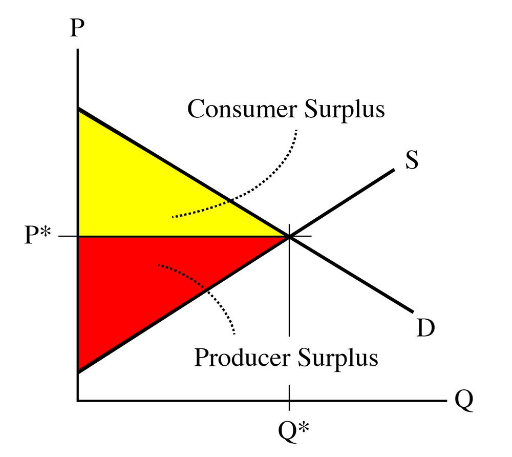
“The sum of consumer surplus and producer surplus is social surplus, also referred to as economic surplus or total surplus.” We also call it the total wealth created by a market.
The qualification about trade only taking place to the left of the equilibrium also applies here. No producer would want to sell to the right of the equilibrium, because the price received will be less than the marginal cost. And, also, the supply curve is above the demand curve, so the price demanded will be above the willingness to pay
The sum of the consumer surplus and the producer surplus is the total wealth created by a market.
Market Equilibrium Example
Example: In a hypothetical market
Demand is given by:
Supply is given by:
- What is the competitive market equilibrium, the consumer surplus and the producer surplus?
- Given the data from Question 1, how much wealth will a consumer make if his willingness to pay is 70? 40? 30?
- Given the data from Question 1, how much wealth will a producer make if his willingness to accept is 70? 40? 30?
Part 1)
At equilibrium, supply equals demand (both quantity and price). So, first, we need to equate the supply and demand functions and find the equilibrium price and quantity .
Then,
At equilibrium
Then, equilibrium quantity will be
By plugging equilibrium quantity ( ) in one of the supply or demand equations (doesn’t matter which one, we should get the same answer), we will find the equilibrium price ( ):
The next step will be calculating the CS and PS at market equilibrium :
And total wealth created by the market
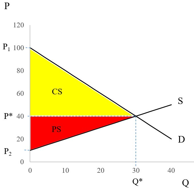
Note for review: Here are the steps in calculating the equlibrium, consumer surplus, and producer surplus:
- P* and Q* can be calculated by solving the supply and demand system of equations for P and Q, which give P* = 40 and Q* = 30
- Consumer surplus is the area of triangle above the P* and below the demand curve (yellow triangle): area = base times height/2
- base of this triangle = Q* = 30
- height = P1 - P*
P1 is the intercept of demand function. So, we can find P1 by plugging Q = 0 into the demand function.
P1 = 100 - 2*0 = 100
Then, height = 100 - 40 = 60 - Consumer Surplus = area of yellow triangle = base * height/2 = (30 * 60)/2 = 900
- Producer surplus, is the area of triangle below the P* and above the supply curve (red triangle): area = base times height/2
- base of the red triangle = Q* = 30
- height of the red triangle = P* - P2
- P2 is the intercept of the supply curve. So, we just need to plug Q = 0 into the supply function to find the P2.
P2 = 10 + 1*0 = 10
So, height of the red triangle = P* - P2 = 40 - 10 = 30 - Producer Surplus = area of red triangle = base * height/2 = (30*30)/2 = 450
Part 2)
: the consumer will make
: the consumer will make
: the consumer will not buy the good because willingness to pay > price
Part 3)
: the producer will not sell the good because willingness to accept < price
: the producer will make
: the producer will make
Practice Exercise
Assume In a hypothetical market demand and supply functions for a good are
Demand:
Supply:
Calculate the competitive market equilibrium, consumer surplus, producer surplus, and total wealth created by the market.
Take Aways
After working through the material on this page and reading the associated textbook content, you should be able to confidently:
- calculate the consumer surplus created by a single trade and by a market;
- calculate the producer surplus created by a single trade and by a market;
- calculate the total wealth created by a single trade and by a market;
- understand why a buyer decides to enter the market (or not);
- understand why a seller decides to enter the market (or not);
- understand why there are no trades to the right of the equilibrium.
Market Dynamics
When we use the world “dynamics,” we simply mean that things change with time, that they do not stay the same. We defined the equilibrium in a market as the point where the supply and demand curves intersect, which is also called the “market clearing” point, where the amount and price of goods that sellers want to sell matches the price and quantity that buyers want to pay. An equilibrium is a “steady state” that things tend towards, and where they will tend to stay unless there is some upsetting force. If you think of a marble in a salad bowl: if you drop the marble from the rim of the bowl, it will move around for a while, but it will settle in the bottom of the bowl, and will not move unless some external force is applied to it – unless it is disturbed.
A market tends towards an equilibrium, but the equilibrium does not stay still. Think about this: the price of a good, and the quantity sold, does not tend to stay the same over time for many goods. For example, in 1998, the average price of gasoline was $1.03/gallon, and about 350 million gallons per day were consumed in the US. By 2007, the price had risen to $2.80, and the consumption had risen to 390 million gallons/day. But in 2009, the average price was $2.35 and consumption had dropped to 378 million gallons/day. Each of these three points represents an equilibrium, and each is quite different.
Figure 4.5 is a plot of the annual average equilibria for gasoline in the United States from 1992 to 2015. The point at the start of the line, near the lower left corner, is the equilibrium for 1992, and the line then travels through the next 24 years.
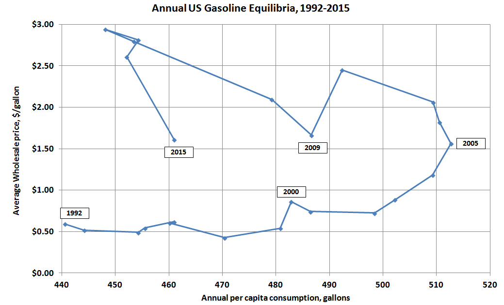
In this chart, I have population-weighted sales by simply dividing sales by annual average population. You might notice that the path that is followed is pretty predictable for much of the period – the price is fairly stable for several years, from about 1992 to 2002, after which it climbs pretty steadily through 2008. We also see the quantity of sales per person growing quite steadily from 1992 to 2005. Over this period, the average person was consuming more gasoline, but the price was pretty stable. In 2005, volumes were 16% higher than 1992. Then something strange happens – for the years 2006-2012, the path of the equilibrium has “doubled back” on itself, with quantity falling as price tended to rise (if we take out the anomalous bom-bust of 2008 and 2009, prices rose quite steadily from 2005 through 2012. Then, starting in 2013, this trend reversed, and now we are starting to see some modest growth in consumption. We saw a big jump in 2015 as the price dropped a great deal after the oil price crash of Fall 2014. We will talk a little more about “why" in the next section, but I am showing you this path here to illustrate the idea of economic dynamics: how things change with time. Each point on Figure 4.5 represents an equilibrium, an intersection of (not shown) supply and demand curves. But the equilibrium moves with time, with both the equilibrium price and quantity shifting. If each point is an intersection of two lines, clearly one or both of the lines are moving with time. When you look at a standard supply and demand diagram, you are looking at something that is in two dimensions: it has length and width, or price and quantity, and these are both variable, but there is a third variable that we cannot see on the S-D diagram: time. If we had some sort of 3-D paper, there would be not two but three axes intersecting at the origin: price, quantity, and time, and the supply and demand curves would not be lines, but planes that have three dimensions, planes that are wavy and twisty, not flat.
This is a rather long-winded way of saying: things change with time. All things change with time, and markets are no exception.
Results of Changes in the Market
Please read Section 3.3 [2] in the text
In the previous two lessons, we talked about what causes the movements of the supply and demand curves, here we will model the results of these changes. That is, what happens to the equilibrium as market dynamics occur?
Our model of a market consists of two things: a demand curve, and a supply curve. So, when we look at market dynamics, we are looking at a movement of either the demand curve or the supply curve, or, more likely, a movement of both. Let’s take a look at these one at a time first, and then together.
Movements of the Demand Curve
Below, we have a basic, properly-labeled supply and demand diagram. The axes are labeled as price, P (the y-axis), and quantity, Q (the x-axis), the upward-sloping supply curve in red, labeled “S”, the downward-sloping demand curve in blue, labeled “D”, and the equilibrium, at the intersection of the supply and demand curves, labeled “e”, and the equilibrium price and quantity, shown as P* and Q*.
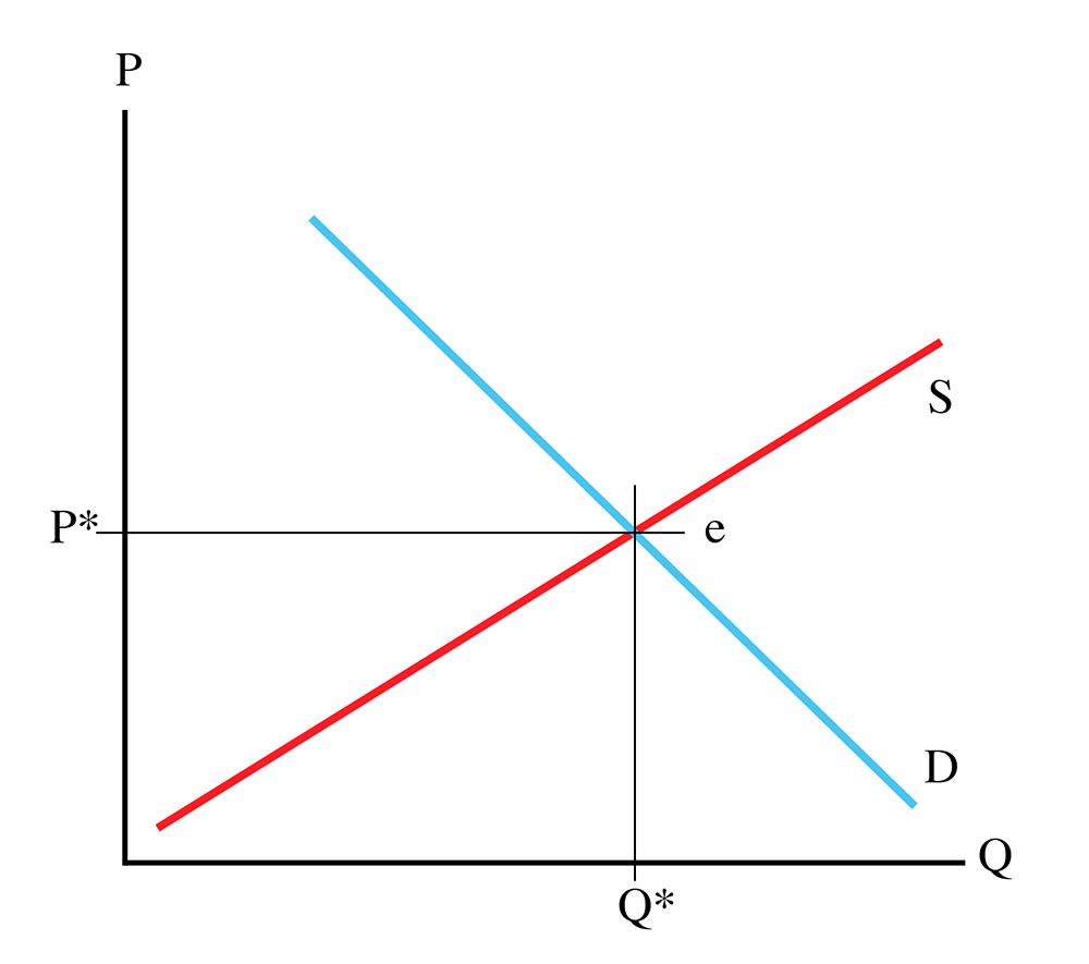
It is important for me to state here: an equilibrium is ALWAYS an ordered pair: (Q*, P*). If I ask a question in a quiz or exam where I ask for an equilibrium, and you give me only a price or a quantity, you will be giving me only half of the answer. Price and quantity.
So, focusing on the demand curve, for the sake of simplicity, we will leave the slope unchanged, and simply look at side-to-side movements. The demand curve can be shifted to the right. This is the same as shifting it upwards, or the same as shifting it diagonally away from the origin. This is called an “outward” shift of the demand curve, as it moves out from the origin. Such a movement is shown in Figure 4.7.
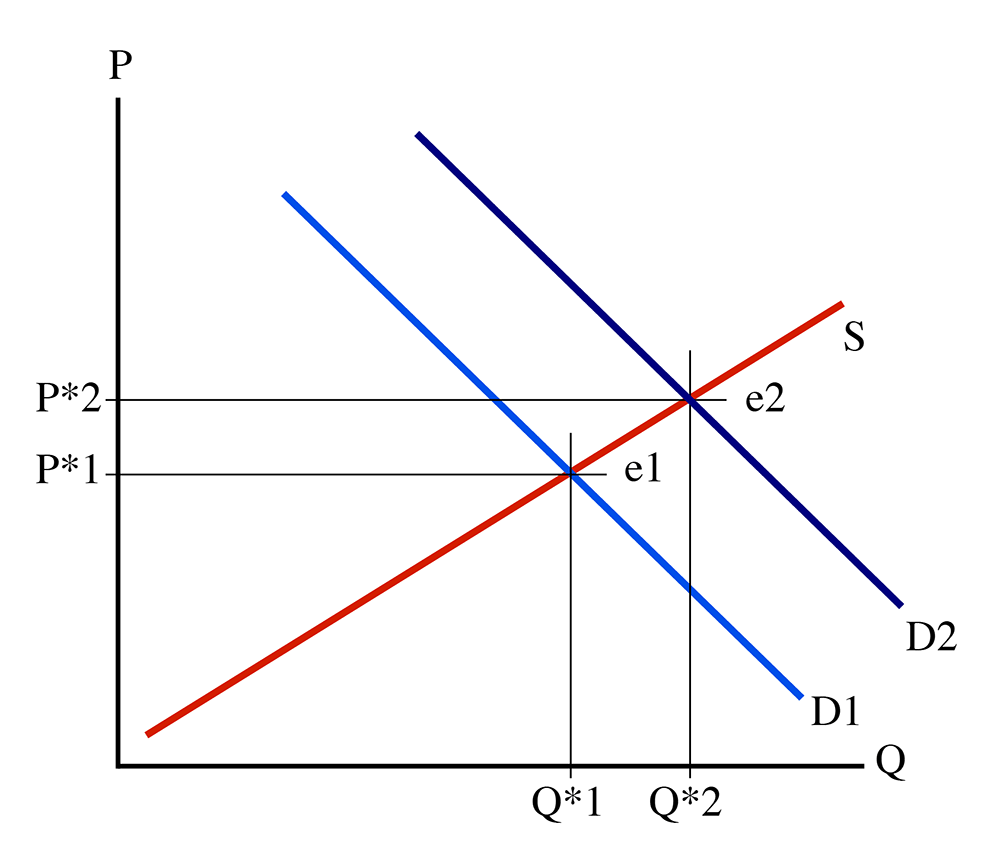
Figure 4.7 shows a movement of the demand curve, from D1 (in light blue) to D2 (in dark blue). Look at what has happened to the equilibrium: it has shifted from (Q*1, P*1) to (Q*2, P*2). Note that P*2 > P*1, and Q*2 > Q*1. In other words, an outward shift of the demand curve results in a larger quantity of goods being sold, and at a higher price. Why? Well, remember that the demand curve is a functional relationship that defines how much people are willing to pay for any given quantity of goods, and this willingness to pay is based on how much happiness people get from consuming one more unit of the goods in question (the marginal utility). When the demand curve shifts outward like this, it means that people are willing to pay more for any given amount of goods. So, given the same upward-sloping supply curve, we can expect more goods to be sold, and at a higher price, because people are willing to pay more, and because they are willing to pay more, producers make more to match their marginal cost with the higher price.
Notice that the equilibrium has moved from e1 to e2. It has moved “along” the supply curve. The demand curve moved outwards, and the equilibrium “slid” along the static supply curve. If you read the popular press, you’ll often see writers talking about “demand for a good increasing.” What they really should say is, “The demand curve has moved outwards, and the equilibrium quantity has increased.”
I will leave it as an exercise for you to figure out what happens when the demand curve moves to the left (which is the same as the demand curve moving downwards, or towards the origin), known as an “inward” movement of the demand curve.
Movements of the Supply Curve
A movement of the demand curve is pretty unambiguous: if the curve moves outwards, equilibrium price and quantity both increase. If the demand curve moves inwards, then equilibrium price and quantity both decrease. Things are a little bit more complicated for movements of the supply curve.
First, let us look at a downward (or rightward) shift of the supply curve while holding the demand curve steady. This is shown in Figure 4.8, with the supply curve shifting from its original position, S1 (in red), to a second position, S2 (in green).
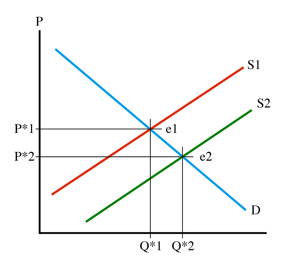
See how the equilibrium has “slid” along the demand curve, from e1 to e2. Now, notice that at e2, quantity has increased (Q*2 > Q*1), but equilibrium price has moved down (P*2 < P*1). This tells us that a movement of the supply curve downwards means that more goods will be sold, and at a lower price. This sounds like a good thing, at least from the consumer’s point of view, but the phrase “supply shifting downwards” might lead a person to think that fewer goods will be made. What is happening? Well, the supply curve is a functional relationship (there’s that phrase again) which describes the marginal cost of producing a given quantity of goods. If the curve shifts down, it means that the cost of producing the nth instance of the good has decreased. Repeating myself: costs have come down. Producers are willing to accept a lower payment for each unit of the good in question because it does not cost as much to produce. A lot of technology goods follow a path like this: when I bought my first personal computer in 1989 it cost me over $3,000, and there were far fewer sold than today. The same goes for my first CD player and first cell phone. As these technologies improved, prices dropped and the volumes sold increased, sometimes dramatically.
So, what happens in the opposite case, an upwards shift of the supply curve? I will leave the diagram to you, but it is not too hard to understand that equilibrium price will increase, and the quantity sold will decrease.
Movements of Both Curves
It is typically true that both supply and demand curves observe shifts over time. Let’s take a look at what happens when both move at the same time. First case, what about an outward shift of the demand curve and downwards shift of the supply curve? This is shown in Figure 4.9.
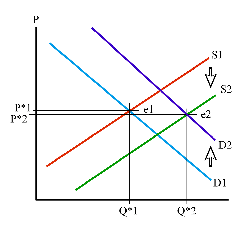
I have put some arrows on Figure 4.9 to show the downward movement of the supply curve, from S1 to S2, and the upward movement of the demand curve, from D1 to D2. The equilibrium has shifted from point e1 to point e2.
What has happened to equilibrium quantity? It has increased – Q*2 > Q*1. Both movements have led to an increase in Q*. What about equilibrium price? Well, the demand curve movement caused P* to increase, but the supply curve movement caused P* to decrease. One step up, one step down. Which one is bigger? Well, on the diagram, it looks like P*2 is a little bit lower than P*1, but I should make it very clear that this diagram is an illustration, and not to scale. There are no numbers on it. In a real life situation, we will be measuring things and will be able to determine the answer, but here, in the theoretical abstract, we do not know which one is bigger.
We know that Q* increases because the supply curve movement makes the equilibrium move to the right, and then the demand curve movement also makes the equilibrium move to the right. Both changes push quantity in the same direction, so we know that Q* must increase. But P*, we don’t know.
So, to summarize, if D shifts up and S shifts down, then Q* increases and the change in P* is undetermined.
I will leave it up to you to draw diagrams of the other three combinations, but I will give you a shorthand summary of the four results:
Take Aways
After working through the material on this page and reading the associated textbook content, you should be able to confidently:
- understand and describe the changes in market equilibrium caused by an outward movement of the demand curve;
- understand and describe the changes in market equilibrium caused by an inward movement of the demand curve;
- understand and describe the changes in market equilibrium caused by an upward movement of the supply curve;
- understand and describe the changes in market equilibrium caused by an downward movement of the supply curve;
- understand and describe the results of combinations of movements of the supply and demand curves;
- understand the difference between the movement of a curve and the change in equilibrium - that is, the movementOF a curve versus the movement of an equilibrium ALONG a curve.
Market Dynamics Examples
Suppose orange demand function in a small town is given by . Also, supply function is given by . Where P is the price of one pound of orange ($/lb) and Q is the total pounds of orange demanded/supplied in the market (lb). Find the equilibrium price and quantity.
Assume hurricane damages some orange farms this year. Consequently, supply curve is shifted upward. The new supply curve will be . Find the equilibrium price and quantity.
As we can see from the result upward movement of supply shifts the new equilibrium to ( ). The new equilibrium has higher price and lower quantity.
Following the previous example, we found that if demand and supply functions for a local orange market are and , then market equilibrium will be ( )
Now assume, results of a recently published study shows that eating an orange a day will have significant health benefit. And this causes the demand curve to shift outward (to the right). Assume new demand function will be
Find the equilibrium price and quantity
Then, new equilibrium is , which indicates that outward (to the right) shift of demand curve increase equilibrium price and quantity.
And let’s find the equilibrium considering both supply and demands shifts. Assume hurricane damages some orange farms causing the supply curve to shift upward with new supply curve of . Also, the recently published study causes the demand curve to shift outward (to the right) with new demand function of . Find the new equilibrium in the market. What are your expectations on the new equilibrium price and quantity? Higher or lower compared to initial case?
Causes of Market Dynamics I
Reading Assignment
In Chapter 7 ("Consumer Choice and Elasticity"), there is coverage of material concerning complements, substitutes, and income elasticities. You may wish to refer back to this chapter to complement the content here.
In the previous section, we examined what happens to the market equilibrium when the supply and/or demand curves move. Because markets are dynamic things, that is, they are always changing with time, the market equilibrium is always moving. From the previous section, you should understand what happens to a market when the demand and supply curves move up or down (or in or out.) Now we want to consider why these curves move.
It is important to remember that the supply and demand diagram is a static object, but the economy is not static, and things are changing all the time. A supply and demand diagram is only a snapshot of a market at some fixed point in time. We need to understand what causes changes, and what results from these changes.
Causes of Demand Curve Movements
When thinking of things like this, I always like to go back to “first principles.” Or what are sometimes called “fundamentals.” That is, when trying to understand why something happens, try to go back to the underlying root causes. To do that in this instance, we first have to understand what a demand curve is. You should be able to tell me at this point: it is a functional relationship that describes the quantity of goods that consumers in a market will want to purchase at any given price. Digging a bit deeper into the fundamentals, we understand where the demand curve comes from: marginal utility, or how much happiness the consumers obtain from consuming the good.
So, if the demand curve comes from the amount of utility a consumer will get from consuming the good, then the demand curve can only change if the consumers get a different amount of utility from the good in question.
That’s a bit of a mouthful. I’ll try to make it simpler: demand curves change because people change their willingness to pay. They want to buy more or less of the good. The next question then arises: what causes this change in utility?
There are several factors that can cause the demand curve to shift. If the curve shifts upwards (or outwards, away from the origin), then more of a good is demanded by the consumers at a given price. Or, looked at another way, for a fixed quantity, the price will be higher. This means that people derive more utility from a unit of the good. If the reverse happens, and the curve shifts down (or inwards, toward the origin) then less is demanded at a given price, or a lower price will be offered for a certain quantity, and this happens because something has caused the consumer to derive less utility from consumption of the good.
Some Causes of Demand Shifts
Cause #1 – Population
This one is pretty trivial. As we know, a market demand curve is simply an aggregation of every consumer’s individual demand curve. So, it is a matter of arithmetic to understand that if there are more consumers, then there are more individual demand curves to add together, and therefore, the demand curve will be further to the right. There are many examples of this. For example, when Penn State was a much smaller school, in the 1960s and 1970s, there were far fewer apartment complexes in State College. We now have many more apartments than we had in 1970 because there are far more students, and not because students today want to consume more apartments than they did 40 years ago.
Cause #2 – Income
As a person makes more money, their ability to consume more goods increases. The “willingness to pay” increases because the consumer has more money to spend. For this reason, for a lot of goods, as a person makes more money, the individual demand curve shifts to the right. In a community, the wealthier the community, the more the aggregate demand curve moves outwards. This explains why stores that sell luxury goods are usually in well-to-do suburbs, and not poor, inner-city neighborhoods.
To describe this situation, we define something called the “income elasticity of demand.” This is written as follows:
where “I” is the symbol for income
Spelled out, this means “the percent change in the quantity demanded for a given percent change in income.” If your consumption of sushi goes from 2 times a month to 3 when your salary goes up 10%, then your income elasticity of demand for sushi is .
Example, assume demand for economy car falls from 4000 to 3000 units per year if the average real income of the customers decreases from $60,000 to $50,000. Find the income elasticity of demand for the economy car in this town.
Using the income elasticity of demand formula,
The income elasticity can either be positive or negative. If it is positive, then the quantity demanded increases as income increases (a positive number divided by a positive number). Goods that have positive income elasticities are usually referred to as “normal” goods by economists. Luxury cars have positive income elasticities.
It is also possible for a good to have a negative income elasticity. This means that as I increases, Q decreases (a negative number divided by a positive number = a negative number). What does this mean? It means that as a person makes more money, their marginal utility from consuming a certain good declines. I mentioned above that while luxury cars have positive income elasticities, we might say that used cars, or economy cars, have negative elasticities: as people in a society make more money, they are less likely to consume a good. I know that as I have gone through life, my willingness to buy new cars has increased, and my desire to purchase used cars has declined.
Another example might be ramen noodles: students typically do not have a lot of money, so they buy a lot of cheap food, and ramen noodles are about as cheap as it comes. However, when students graduate and get jobs, they can afford to eat better, more satisfying meals, and given that most of us eat a fixed amount of food, this means that the quantity of ramen noodles decreases as income rises. (For the record, I still like a brick of noodles every once in a while, but I do not eat them nearly as much as when I was a student.)
Goods that have negative income elasticities are referred to by economists as “inferior” goods. An inferior good is one that we consume less of as we become wealthier. As we have more money, we can substitute for the inferior good with something that is more expensive, but more enjoyable. We will talk more about substitutes in a minute.
Cause #3 – The Price of Other Goods
The willingness to pay for a good is always relative to the willingness to pay for any and all other goods. The price of some other good can have an effect on our consumption choices.
When we think of how the price of one good can affect the demand curve for another good, we have to define two categories of goods: substitutes and complements.
A substitute is a good that you would consume instead of the good in question. As mentioned above, ramen noodles and steaks can be thought of as substitutes: if you are eating a lot of one, you are likely not eating a lot of the other. Life is full of substitution options: working instead of going to school, taking the bus instead of driving, renting a house instead of buying, taking an expensive vacation versus buying football tickets, going to a movie instead of going to a nightclub, and so on.
A complement is a good that you consume in addition to the good in question, with the condition that without one, you would not consume the other. For example, cars and gasoline (and tires) are all complements. On their own, each of these goods is fairly useless. But use them together, and they suddenly have more value. And, as you consume more of one, you are likely to consume more of another. Think of DVDs and DVD players, or iPods and earbuds, or shoes and shoelaces.
Now, we have to think about how the price of one good can affect the price of another. For this, we define the term “cross-elasticity of demand”. This is defined as follows:
where X and Y are subscripts denoting the two goods in question.
Spelled out, this statement reads: the cross-elasticity of goods X and Y is the percent change in the quantity of good X demanded that corresponds to a percent change in the price of good Y.
Assume demand for chicken is 2000 lbs per day and beef price $3/lb. Holding everything else constant, demand for chicken increases to 3000 lbs per day when beef price increase to $4/lb. Calculate cross-elasticity of demand for chicken.
The cross-elasticity can be either positive or negative, and the sign will tell us if goods are substitutes or complements. In the previous example cross-elasticity of chicken and beef is positive. So, we can say they are substitutes.
Let’s think of two common substitutes: chicken and beef. It is not hard to understand that if the price of beef goes up while the price of chicken stays the same, then people will tend to substitute chicken for beef. So, as the price of beef increases, the quantity of chicken demanded increases. The cross-elasticity in this case is a positive number divided by a positive number (or a negative divided by a negative), which gives us a positive number. Therefore, substitute goods have a positive cross-elasticity.
Now, let us think about complements. In the 1980s, CD players came on to the market. At first, CD players were very expensive, and very few people had them. Correspondingly, there were fewer music CDs sold. Over time, the price of CD players came down, and as a result, the quantity of CDs sold increased dramatically (even though the price did not change much for many years). It is easy to see that CD players and CDs are complements: one of the two is of little use without the other. So, when we look at our formula for the cross-elasticity, a decrease in the price of CD players led to an increase in the quantity of CDs demanded. A positive number ( ) is divided by a negative number ( ). Thus, the cross-elasticity is negative.
This leads to the definition of a handy rule: if the cross-elasticity of two goods can be shown to have a consistently positive value, then the goods are substitutes. If the cross-elasticity is shown to be consistently negative, the goods are complements. If the cross elasticity is either zero, or inconsistent, then it is likely that the goods are neither complements nor substitutes, but unrelated. Obviously, in our complicated economy, everything is related to everything else - the price of jet planes in Europe probably has some effect on the price of corn in Illinois, but the effect of one on the other is so dispersed as to be unobservable in any meaningful manner.
Causes of Market Dynamics II
Cause #4 – Expectations
This is similar to income, but instead refers to future changes that a buyer expects to happen in the near future. For example, if you expect gasoline to be more expensive next week, you are more likely to fill up this week. This will cause the equilibrium for gasoline to shift today.
Cause #5 – Taste (or Fashion)
Some things, such as music styles, car models, clothing or house furnishings change in style over time. As such, desires for certain styles can change. What is fashionable, and popular one day may be out-of-date and unwanted the next. For example, why is it that skinny ties or Britney Spears CDs sell millions in one year, but are not popular a couple of years later? This is a point where economics starts to approach psychology, which is an area where I have little expertise. At this point, we need simply be content with the fact that at different points in time, people will want to buy different quantities of things for reasons that do not have any direct economic causes.
Cause #6 – Information
Going back to fundamentals, the demand for a good is based upon the utility, or happiness, one gets from consuming it. Sometimes, new information comes onto the market that leads to a change in the happiness that someone derives from consuming a good. The most obvious example of this has to do with health information. We often learn that consumption of a good may have beneficial or detrimental effects on one’s health. A few years ago, the “Atkins” diet was popular, in which it was believed that people could lose weight by eating a diet that was high in proteins and low in carbohydrates. A lot of people adopted this diet, so much so that many bakeries went out of business because bread sales declined a great deal. A little while later, some detrimental health effects of the Atkins diet were publicized, and this caused some people to abandon this diet. Fewer people smoke today than in the past, because we have better information about the long-term effects of smoking on health.
Health information is not the only form of information that can move demand curves. For example, when some people publicized what they felt were poor working conditions in clothing factories in Asia, a number of people in the US decided against purchasing goods made in those factories. In other cases, people fall out of favor. There are probably not too many Brett Favre football jerseys being sold in Green Bay these days, even though he was a hero in that city for many years. Deciding to play for a rival team in Minnesota greatly reduced the demand for clothing with his name and picture on it in Green Bay.
Causes of Movements of the Supply Curve
Unlike changes in demand, changes in supply are usually simpler to explain. A downward shift of the supply curve, which means that more goods are supplied at the same price, usually results from a lowering of the cost of production. This cost reduction could be because of a new, more efficient technology, or could be because of lowered taxes, or cheaper labor costs.
An upward shift of the supply curve (less being offered at the same price) is usually the result of some disturbance in the market. The most common example is when crops are damaged by weather conditions: hurricanes, unexpected cold, not enough rain, and so on. If prices for materials or labor of energy, any of the things that go into making a good, have increased in price, then the supply curve shifts upwards. If a tax on a good is increased, then the supply curve will shift upwards, as a tax is a cost that has to be paid on the good, not to the seller of the good or to the sellers of the factors of production, but to government. We will talk more about the incidence and effects of taxes later in the course.
Sample Question
Let us suppose that the following two events happen simultaneously:
- The Food and Drug Administration releases a report showing that drinking orange juice causes bald men to grow hair.
- A giant freeze destroys the orange crop in Florida, meaning that we have to import all of our oranges from Brazil for a year.
What do you expect to happen to the equilibrium price and quantity of orange juice?
Answer
The first statement will likely cause many bald men to start drinking more orange juice. This will cause an outward shift of the demand curve.
The second statement means that oranges will likely be more expensive to produce, which corresponding to an upward shift of the supply curve.
The demand curve movement will increase the equilibrium price and quantity. The supply curve movement will increase the equilibrium price, but reduce the equilibrium quantity.
Therefore, the net result will be an increase in the price of orange juice (both curve movements cause price to increase), but the change in quantity sold is unknown from the information at hand. One movement increases quantity sold, the other decreases it. Without measurement, we do not know which effect will dominate the other.
Conclusion
When prices change, they change because either the supply curve or demand curve (or both) has moved. Whenever a price changes, to understand why we want to figure out which of the underlying curves has moved, and why. After working through this lesson, you should be able to explain what happens when supply and demand curves move, and what some of the common causes of such movements are.
Take Aways
After working through the material on this page and reading the associated textbook content, you should be able to confidently:
- explain the basic causes of the movements of the demand curve;
- changes in tastes
- the prices of other goods
- changes in income
- new information
- expectations
- population changes
- understand the concepts of complementary and substitute goods;
- explain how cross-elasticity is linked to the definition of substitutes and complements
- understand what the sign of the cross-elasticity implies
- understand the concepts of normal and inferior goods;
- explain how income-elasticity is linked to the definition of substitutes and complements
- understand what the sign of the income elasticity implies
- explain the basic causes of upwards and downwards shifts of the supply curve;
- understand that the supply curve is strongly related to the cost of producing goods.
Summary and Final Tasks
In this lesson, we studied the notions of wealth creation in markets - how both buyers and sellers can be made "better off" (increase their utility or profits) by participating in markets. We then addressed the concept that a market is a dynamic thing - it is constantly changing with time. Since we model a market by using two things: a demand curve and a supply curve - we are able to examine all changes in a market by movements of the supply and demand curves.
We looked at what happens to markets when supply and demand curves move. We then examined the root causes of movements of the supply and demand curves.
Have you completed everything?
You have reached the end of Lesson 4! Double check the list of requirements on the first page of this lesson to make sure you have completed all of the activities listed there.
Tell us about it!
If you have anything you'd like to comment on or add to the lesson materials, feel free to post your thoughts in the discussion forum in Canvas. For example, if there was a point that you had trouble understanding, ask about it.