Lesson 9 - Technical Analysis
Lesson 9 Introduction
Overview
Thus far, we have addressed the fundamental factors that influence energy prices. We also established that there are two main groups that trade in the financial energy commodities markets, commercial and non-commercial. The latter group represents the “pure” traders or “speculators." These participants are only interested in price movement. The type of commodity does not matter to them. In order to make trading decisions, they use technical analysis as opposed to fundamental analysis.
Technical analysis involves the use of charts to track price movement, establish the current market trend, and determine the probability of prices moving in one direction or another. Simply put, technical or “day” traders are interested in market activity as illustrated by the resulting prices.
Since the prices that occur in the market are the result of human decision-making, technical analysis really examines the behavior of market participants. As such, patterns emerge that have a high probability of recurring. It is precisely these events that technical traders are looking for. But, make no mistake; fundamental events cause traders to react emotionally, the results of which are also reflected in the price action.
In technical analysis, traders must first establish what the current price trend is, up or down. Then, they must determine the probability of the trend lasting or changing direction. It is this information that guides their buy/sell decisions.
Learning Outcomes
At the successful completion of this lesson, students should be able to:
- distinguish the difference between technical and fundamental market analysis;
- identify different types of technical charts and their uses;
- recognize trend lines and market signals;
- analyze “momentum” indicators.
What is due for this lesson?
This lesson will take us one week to complete. The following items will be due Sunday at 11:59 p.m. Eastern Time.
- Lesson 9 Quiz
- Lesson 9 activities as assigned in Canvas
Questions?
If you have any questions, please post them to our General Course Questions discussion forum (not email), located under Modules in Canvas. The TA and I will check that discussion forum daily to respond. While you are there, feel free to post your own responses if you, too, are able to help out a classmate.
Reading Assignment: Lesson 9
Reading Assignment:
Seng - Chapter 10
Errera & Brown - Chapter 8
This text is available to registered students [1] via the Penn State Library.
Key Points of Emphasis
- Technical analysis relies on the principles of probability and statistics.
- The (3) most popular technical charts are Line or "close only," Bar, and Candlestick.
- Line charts record only the daily closing price and are best used for long-term trending.
- Bar charts indicate the daily Open, High, Low, and Closing prices for the trading day.
- Candlestick charts also show the OHLC but do so in a fashion as to illustrate the market direction, up or down, for that day's trading.
- Identifying the current trend is the first step.
- Determining if the trend is going to change is the next step. This can be ascertained if the preponderance of the evidence indicates it will. Buy/sell decisions will then be made.
- Trend lines are used to indicate the trends.
- Various price patterns exist for traders to identify.
- Volume is a good indicator of market activity and can reinforce the day's price movement.
- Resistance is the price level at which sellers enter the market again. It establishes a "ceiling" price in the current market.
- Support is the price level at which buyers enter the market again. It establishes a "floor" price in the current market.
- Moving averages are good studies to utilize if you believe in the statistical premise of "reversion to the mean."
Charting Methods
There are several types of charting methods, but three of them are the most popular.
Bar Chart
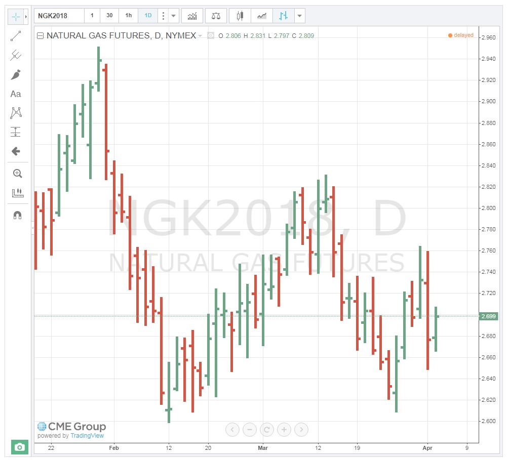
In a bar chart, a vertical line is shown for each time increment selected. In the chart below, a “daily” chart is used to show the May NYMEX contract for natural gas. Each bar shows the price results for that day’s trading. The mark to the left of the bar represents the first trade of the day, or the “Open.” This is the price of the first trade that occurs right after the bell rings to start trading. The vertical line itself represents the full range of prices for the day, that is, the High and Low prices. And the mark to the right of the bar represents the final closing, or “Settlement” price for the day. This is often referred to as the "OHLC" chart (Open/High/Low/Close). Note that if the Open price is lower than the Close, the bar is green. If the Open price of the day is higher than the Close price, the bar is red. It shows the direction of the market movement; do prices tend to go up or down?
Style of Charts
You can change the style of the chart and type of information that you want to be displayed by clicking on the Bar Style toolbar 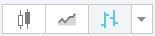 and selecting from the list of chart options which include things like bars, candles, line, area, and point & figure. The image below is an example of a “Line” or “Close Only” chart showing the same May natural gas contract. You will notice that it only shows the daily market closing (settlement) price. It provides much less information than the Bar chart and is mainly used for longer-term trend analysis.
Candlestick Charts
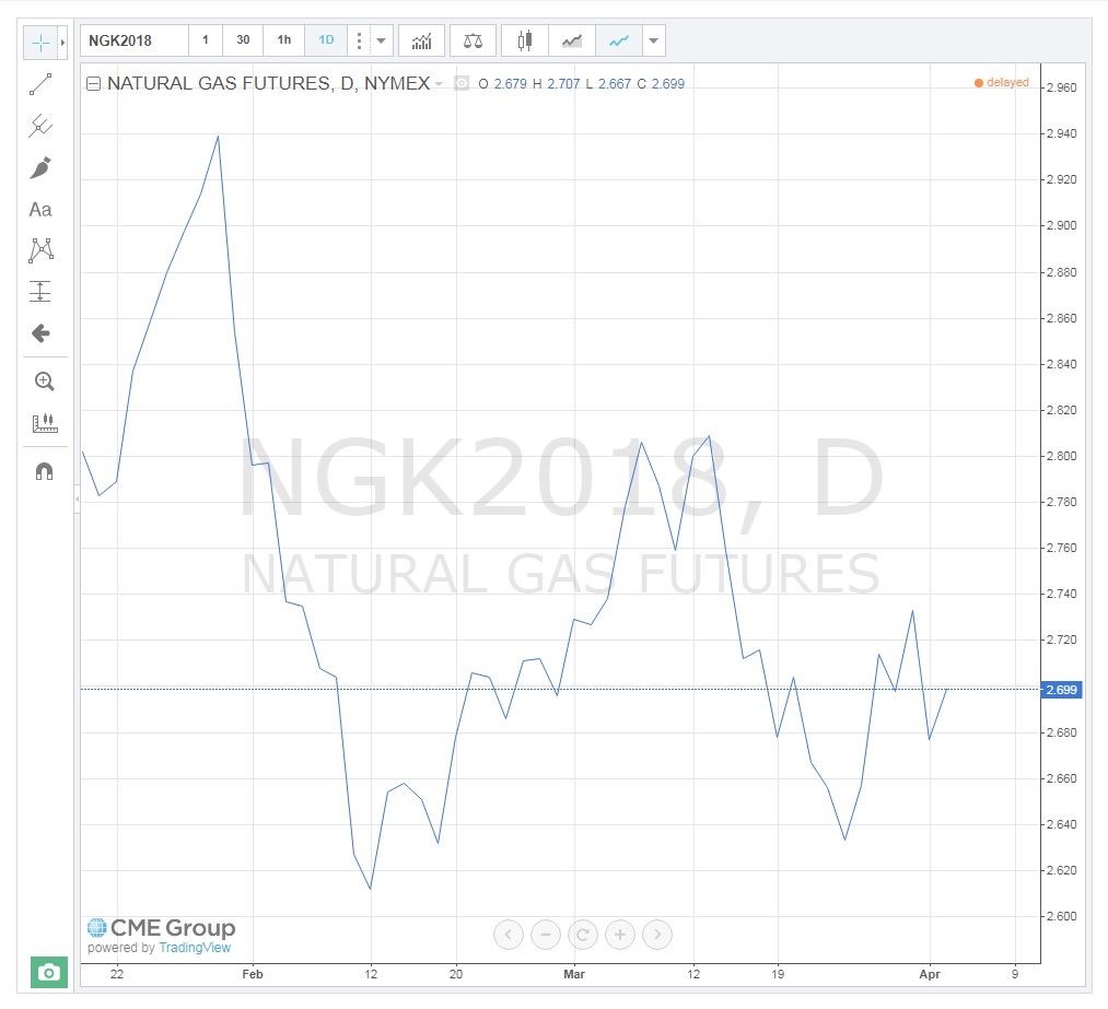
Candlestick charts were developed by the Japanese centuries ago. They provide information similar to the Bar chart, but also indicate “up and down” days. That is, they clearly show the direction the market took on a daily basis. The top end of the “candle” still represents the "High" for the day, and the lower end represents the “Low,” but the “body” indicates the Open and Closing prices in relation to one another. For example, if the Open is higher than the Close, the Open price is at the top of the “body” of the candle and represents a day where prices fell (red candle). Conversely, if the Close is found on the top of the “body,” it represents an “up” day, and on the chart below, appears with a green “body.” As you can now see, the up-and-down days are easily visible on the Candlestick chart. By counting these, we can determine the current trend. For traders, the question is, when will it reverse course?
Trendlines
Trend lines can be used to identify both long- and, short-term price trends. They are also used to indicate support and resistance prices and channels (covered later). A trend line only has significance if it touches at least two price points. The chart below shows an obvious long-term downtrend going back one year.

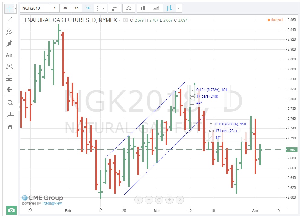
This next chart illustrates two short-term trendlines, one up and one down.
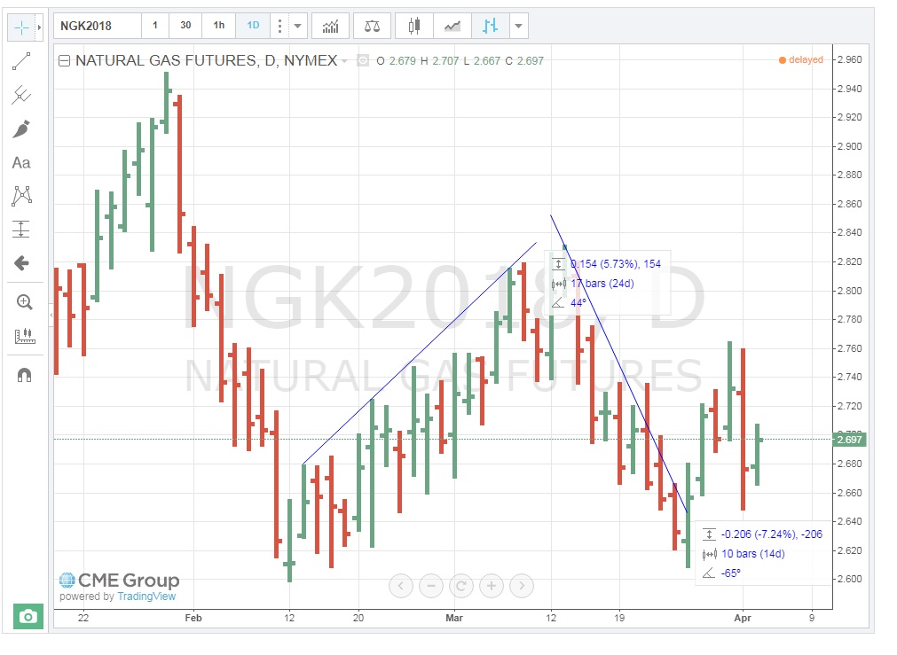
When one trendline connects two or more price points and another trendline connects two or more price points in parallel fashion, they form a “channel,” as shown below. Channels have significance in that traders look for prices to move above or below the confines of the channel. This is referred to as a “breakout,” and depending on the number of days that form the channel, this can occur with good momentum, resulting in a large price move in that direction.
Trend Indicators
Volume
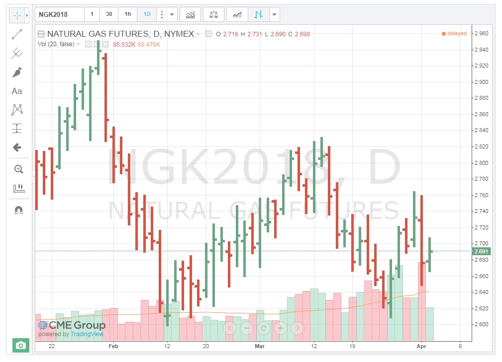
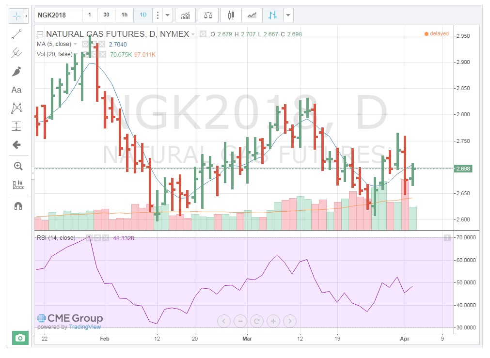
One of the simplest clues to the strength of price movement is that of the volume of contracts traded. If a price shows a large range or change in direction on a particular day, looking at the volume of contracts traded indicates how well-supported that move was by the market participants. A $0.10 movement up or down in natural gas is not very significant if a low volume of contracts is traded. On the other hand, when large volumes trade, that definitely reinforces the price action for the day. It’s as if those trading have agreed on the price outcome. The chart below is a Daily Bar Chart with volume for natural gas. Notice that on April 1st, prices traded in a $0.1 range and a very large amount of contracts exchanged hands, solidifying the move. Also, on March 27th, the second-highest volume for the contract traded. Both of these volumes add legitimacy to the price action for those days.
You can add the volume traded to the chart by clicking on “Indicators, …”  on the toolbar and choosing the "Volume" from the resulting list.
Moving Averages (MA)
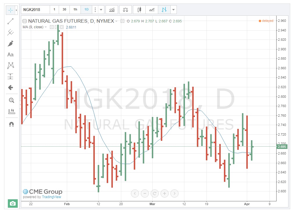
For those of you who have had statistics, you should be familiar with the term “reversion to the mean.” For those of you who have not, the concept hinges on the idea that all prices will eventually return to their average, despite dramatic movements up or down. I have found this to be especially true for energy commodities, at least in the short-term. Therefore, tracking commodity moving average prices can be a good signal for a change in the direction of a trend. The chart below shows that the Moving Average (MA) for May 2018, Natural Gas. If prices go up, there is a good probability that they will eventually fall towards the MA. It may be a gradual decline which also means the average will change, but as long as the MA is lower, prices will gravitate towards it. The exact opposite occurs when prices fall below the MA.
Note that the timeframe for the MA is set to the particular trader’s needs. I have set the MA at 5 days, as that represents a full week of trading (regular session, pit trading only occurs on weekdays). See how the prices, while moving above and below the MA, ultimately return to it. This is a key sign for making buy/sell decisions.
You can add the Moving Averages traded to the chart by clicking on “Indicators, …” on the toolbar and choosing the "Moving Average" from the resulting list.
Relative Strength Index
Relative Strength Index (RSI) is a momentum oscillator that measures the speed and change of price movements. RSI oscillates between zero and 100. Traditionally, RSI is considered overbought when above 70 and oversold when below 30. RSI can also be used to identify the general trend. (Technical Indicators and Overlays - ChartSchool [3]) Understanding the exact RSI calculation is not necessary to understand how to use this indicator. The next chart is a Daily Bar Chart with Volume, MA, and now, the RSI study. Note that the current RSI is over "70" which is considered “overbought". This could, therefore, be a signal to "sell."
You can add the Relative Strength Index traded to the chart by clicking on “Indicators, …” icon on the toolbar and choosing the "Relative Strength Index" from the list.
Price Signals
As with trend analysis and market indicators, there are several types of price signals. We will deal with a few of the ones that are more common and easy to use.
Support & Resistance
As prices move up and down, traders make decisions as to when to continue to buy in an uptrend and when to sell in a downtrend; that is, they try to determine when the current trend will exhaust itself and change direction. One way to do this is to look at the “support” and “resistance” price levels. Support represents a price level at which buyers will step back into the market after a period of selling. This interest establishes a “floor” price. Traders find value at this level and start to buy-up the contracts again. In some cases, traders who have been selling contracts during the downtrend may be buying them back to take some profits. Resistance is the price level at which the market is no longer interested in buying contracts. The price is deemed to be too high and sellers re-enter the market, thus establishing a "ceiling" price.
So, how do we establish these pricing points? As the chart below (shifted to the right) shows, when we draw upper and lower trend lines, the lines continue through price points on the right, vertical axis. Where the upper trend line crosses the right axis is the resistance point, while the price where the lower trend line crosses the right axis is the support point. Theoretically, then, these represent both the maximum the market is willing to pay as well as the minimum at which it is willing to sell.
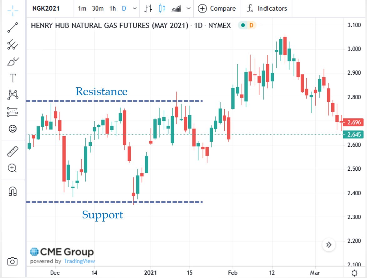
This chart indicates that resistance and support. Traders will now look to see if prices can trade above, or below, these levels. If they do, there will be a flurry of activity in the direction of the move.
Tops & Bottoms
Since we are on the subject of support and resistance, we can discuss price signals related to those concepts. As we have said, traders are interested solely in price movement. And support and resistance levels represent buying and selling interest. So, what happens when the buyers or sellers step in to halt the moves higher or lower? They are testing the points of support and resistance. If the sellers can’t break through support, it is a result of buyers stepping in. As mentioned above, that sets a “floor” or “bottom” price on that day. Likewise, if buyers test the resistance price and sellers step in to prevent a breach of that level, a “ceiling” or “top” is established.
While a one-day occurrence of these events is not a very strong indicator of a change in direction, the more a “bottom” or “top” is tested and holds, the more significant that price level becomes. Think about it this way. Let’s say natural gas Traders are trying to sell May contracts and push the price down to the $2.37 Support level on the chart above. Buyers step in at that price and the sell-off fails. The next day, Sellers again attempt to push prices down to $2.37, and again, the move fails.
Let's assume the market now begins to see $2.37 as a stronger Support price. We refer to this as a “double-bottom.” While this is still a good indicator of price levels, a third day, or “triple-bottom” is a strong indicator that prices could rally higher. Traders have no choice but to recognize the buying interest at $2.37 and thus will buy contracts until the Resistance, or “top” is tested. The same holds true for resistance levels, but in reverse. The more “tops” are established, the stronger the level at which sellers will step in and sell contracts.
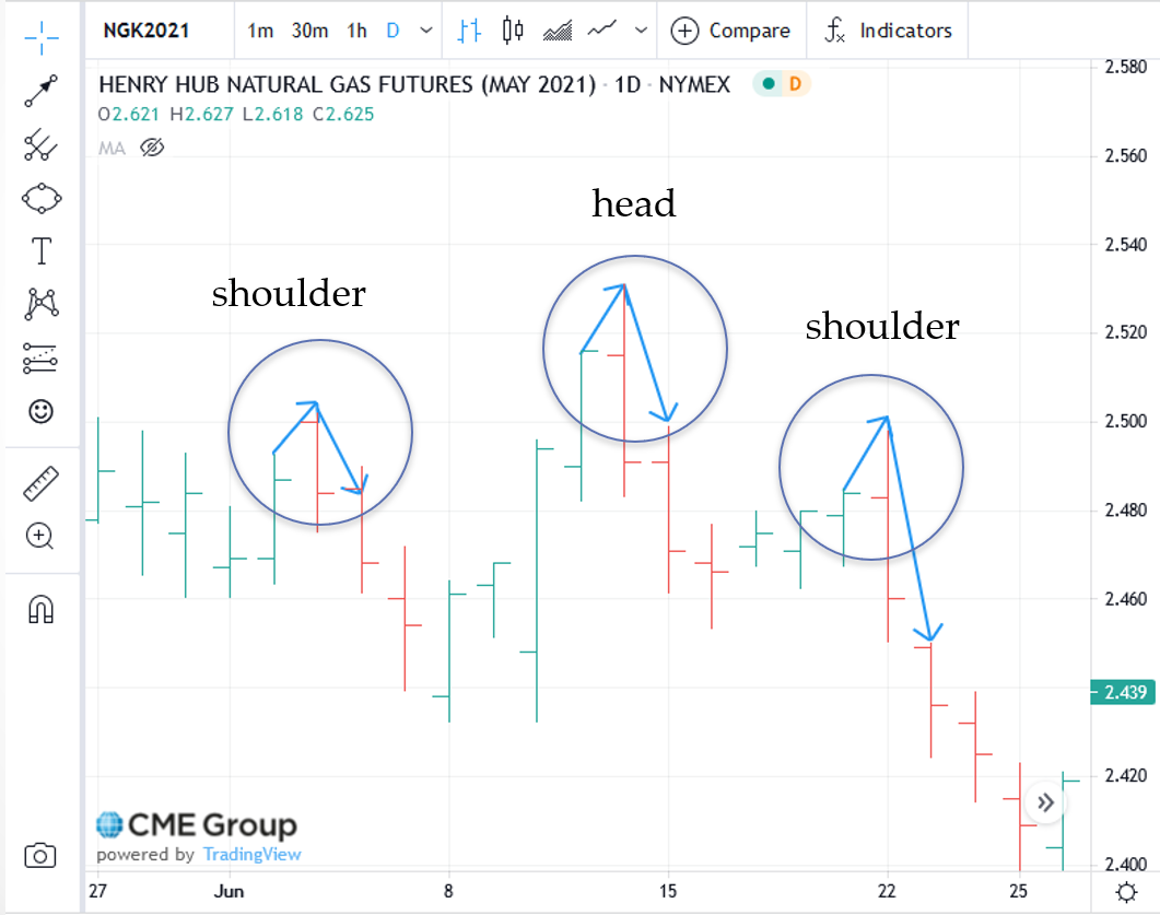
"Head-and-Shoulders" Reversal Patterns
Head and shoulder reversal patterns are identifiable, price patterns that signal a change in direction and can be used for long-term or short-term trend analysis. This consists of three trading days where the middle day’s High, or Low, is higher or lower than that of the other two days. The first day then represents the “left shoulder,” the second day is the “head,” and the third day is the “right shoulder.” Using the chart below without all the trend lines, we can see that on June 14th, the High for the day was higher than the 3rd. We are now looking for the completion of the pattern, the right shoulder. And on June 22nd, the High for the day was lower than the head. Now you can see the pattern whereby the 3rd is the “right shoulder,” the 14th is the “head,” and the 22nd is the “right shoulder.” The right shoulder “leans” in the direction of the price change. In this case, prices reversed from an uptrend to a downtrend. There are also “reverse” head-and-shoulders patterns. These occur in an upside-down fashion and signal a move from a downtrend to an uptrend.
"Consolidation” Patterns
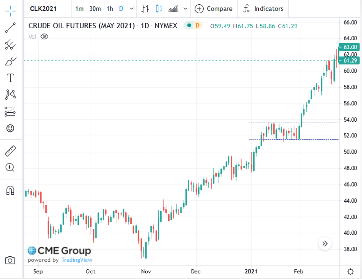
When upper and lower trend lines are drawn and are parallel to one another and perpendicular to the Y-axis, they form a rectangular shape. The upper trendline does represent resistance, with the lower trend line indicating support. In this pattern, prices will move up-and-down within the rectangle. This “consolidation” is indicative of market indecision. Traders are not really sure what direction prices should take. It is a battle between buyers and sellers. The key here is the number of days this pattern continues to exist. The longer traders battle, the more momentum builds-up for when prices break-out of this range. Think of it as a spring that winds tighter and tighter for each day prices stay within the consolidation range. That means a very large price movement will occur in the direction of the breakout. A good illustration of this is the May 2021 crude oil contract, shown below. Starting in January, the contract bounded by a Low of about $52 for twenty-four straight days. The High was about $54 with the exception of attempted "break-outs". On February 2nd, prices broke-out to the upside with good momentum.
These are but a few of the methods in Technical Analysis used to try to determine when a greater probability exists of prices moving in one direction vs. another. Once determined, traders enter or exit the market at those price levels.
Summary and Final Tasks
In addition to my explanations, the definitions of terminology used in Technical Analysis can be found at:
Technical Indicators and Overlays - ChartSchool [3]
Key Learning Points: Lesson 9
- Technical Analysis is mainly used by “day” traders, or speculators, to determine the greater probability of one thing happening over another (price direction).
- By plotting prices, technical charts actually record the behavior of the market participants. Technical analysts look for these patterns to repeat themselves.
- There are (3) main types of technical charts used:
- daily bar chart, which shows the “Open/High/Low/Close” prices;
- “close only” or line chart, which shows the settlement price for each time segment;
- candlestick chart, which shows the same information as the daily bar chart, but also indicates “up and down” days.
- Trend lines are used to identify current and past trends, but must touch-on at least two pricing points to have significance.
- Examples of simple trend indicators are:
- volume – this illustrates the amount of activity behind the price movement, which either reinforces it or fails to support it;
- moving averages – traders look to the statistical “regression to the mean” as a predictor of price direction;
- relative strength index – a momentum indicator that identifies both the speed and change in price with a resultant “overbought,” “oversold,” or “neutral” market condition.
- Examples of price signals are:
- support – the price level at which buyers will step in, establishing a “floor”;
- resistance – the price level at which sellers will step-in, establishing a “ceiling”;
- “tops and bottoms” – these are recurring Highs or Lows that “hold,” thus establishing strong support or resistance. Double or triple tops and/or bottoms are very strong indicators of a possible change in price direction;
- “head-and-shoulders” reversal pattern – a 3-day price pattern whereby the middle day’s High or Low is higher or lower than the other two, thus forming a “left shoulder,” “head,” “right shoulder” configuration. The right shoulder “leans” in the direction of the price change;
- “consolidation” – this represents several days of trading stuck within a certain High/Low range. It indicates price indecision by the market and a “battle” between buyers and sellers. The more days within the pattern, the greater the velocity of any “break-out” of the pattern.
In the next lesson, we will explore other, more advanced, financial derivatives that can also be used for hedging. Among these are "swaps", "spreads", and "options". They are mostly traded in the "over-the-counter" markets, that is, non-exchange traded. "OTC" encompasses electronic trading platforms as well as "voice" brokers where transactions occur over the phone.
Reminder - Complete all of the lesson tasks!
You have reached the end of this lesson. Double-check the list of requirements on the first page of this lesson to make sure you have completed all of the activities listed there before beginning the next lesson.