Lesson 11: Technical Analysis - Hidden
Overview
Thus far, we have addressed the fundamental factors that influence energy prices. And we established that there are two main groups that trade in the financial energy commodities markets, commercial and, non-commercial. The latter group represents the “pure” Traders or “speculators." These participants are only interested in price movement. The type of commodity does not matter to them. In order to make trading decisions, they use Technical Analysis as opposed to Fundamental Analysis.
Technical Analysis involves the use of charts to track price movement, establish the current market trend, and to determine the probability of prices moving in one direction or another. Simply put, technical or “day” Traders are interested in market activity as illustrated by the resulting prices.
Since the prices that occur in the market are the result of human decision-making, Technical Analysis really examines the behavior of market participants. As such, patterns emerge that have a high probability of recurring. It is precisely these events that technical Traders are looking for. But, make no mistake; fundamental events cause Traders to react emotionally the results of which are also reflected in the price action.
In Technical Analysis, Traders must first establish what the current price trend is, up or down. Then, they must determine the probability of the trend lasting or changing direction. It is this information that guides their buy/sell decisions.
Learning Outcomes
At the successful completion of this lesson, students should be able to:
- Distinguish the difference between Technical and Fundamental market analysis
- Identify different types of technical charts and their uses
- Recognize Trendlines and market signals
- Analyze “momentum” indicators
What is due for Lesson 11?
This lesson will take us one week to complete. There are a number of required activities in this module. The chart below provides an overview of the activities for Lesson 11. For assignment details, refer to the location noted.
All assignments will be due Sunday, 11:59 p.m. Eastern Time.
REQUIREMENT | LOCATION | SUBMITTING YOUR WORK |
|---|---|---|
| Reading Assignment: Errera & Brown, and Pring | Reading Assignment page | No submission |
| Lesson Activity: Technical Chart Analysis | Lesson Activity page | Submitted via email |
| Lesson 11 Quiz | Summary and Final tasks page | Submitted through ANGEL |
Questions?
If you have any questions, please post them to our Questions? discussion forum (not e-mail), located under the Communicate tab in ANGEL. The TA and I will check that discussion forum daily to respond. While you are there, feel free to post your own responses if you, too, are able to help out a classmate.
Reading Assignment: Lesson 11 - Hidden
Reading Assignment:
Errera & Brown - Chapter 8
Pring - Chapter 1 - 3, Chapter 4 (p. 43-48, 63-67, 76-80, 88-96), Chapter 5 (p. 97-111), Chapter 6.
Key Points of Emphasis for Reading Assignment:
- Technical Analysis relies on the principals of probability and statistics.
- The (3) most popular technical charts are Line or "close only," Bar, and Candlestick.
- Line Charts record only the daily Closing price and are best used for long-term trending.
- Bar Charts indicate the daily High, Low, Open and Closing prices for the trading day.
- Candlestick Charts also show the HLOC but do so in a fashion as to illustrate the market direction, up or down, for that day's trading.
- Identifying the current trend is the first step.
- Determining if the trend is going to change is the next step. This can be ascertained if the preponderance of the evidence indicates it will. Buy/Sell decisions will then be made.
- Trendlines are used to indicate the trends.
- Various price patterns exist for Traders to identify.
- Volume is a good indicator of market activity and can reinforce the day's price movement.
- Resistance is the price level at which Sellers enter the market again. It establishes a "ceiling" price in the current market.
- Support is the price level at which Buyers enter the market again. It establishes a "floor" price in the current market.
- Moving Averages are good studies to utilize if you believe in the statistical premise of "reversion to the mean."
Charting Methods - Hidden
There are several types of charting methods, but three of them are the most popular.
1) “Bar Chart” – a vertical line is shown for each time increment selected. In the chart below, a “daily” chart is used to show the September NYMEX contract for natural gas. Each bar shows the price results for that day’s trading. The mark to the left of the bar represents the first trade of the day, or the “Open.” This is the price of the first trade that occurs right after the bell rings to start trading. The vertical line itself represents the full range of prices for the day, that is, the High and Low prices. And the mark to the right of the bar represents the final closing, or “Settlement” price for the day.This is often referred to as the "OHLC" chart (Open/High/Low/Close).

2) “Close Only” – this type of chart shows only the daily market settlement price. It provides much less information than the Bar Chart and is mainly used for longer-term trend analysis. The chart below shows the same September natural gas contract in this form.

3) “Candlestick” – these charts were developed by the Japanese centuries ago. They provide information similar to the Bar Chart but also indicate “up and down” days. That is, they clearly show the direction the market took on a daily basis. The top end of the “candle” still represents the High for the day, and the lower end represents the “Low,” but the “body” indicates the Open and Closing prices in relation to one another. For example, if the Open is higher than the Close, the Open price is at the top of the “body” of the candle and represents a day where prices fell (solid "body"). Conversely, if the Close is found on the top of the “body,” it represents an “up” day, and on the chart below, appears with a hollow “body.” As you can now see, the up-and-down days are easily visible on the Candlestick Chart. By counting these, we can determine the current uptrend. For Traders, the question is, when will it reverse course?

Trendlines - Hidden
Trendlines can be used to identify both long- and, short-term price trends. They are also used to indicate Support and Resistance prices and Channels (covered later). A trendline only has significance if it touches at least two price points. The chart below shows an obvious long-term downtrend going back one year.

This next chart illustrates two short-term trendlines, one up and one down.

When one trendline connects two or more price points and another trendline connects two or more price points in parallel fashion, they form a “Channel,” as shown below. Channels have significance in that traders look for prices to move above or below the confines of the Channel. This is referred to as a “breakout,” and depending on the number of days that form the Channel, this can occur with good momentum, resulting in a large price move in that direction.

Trend Indicators - Hidden
1) Volume - One of the simplest clues to the strength of price movement is that of the Volume of contracts traded. If a price shows a large range or change in direction on a particular day, looking at the volume of contracts traded indicates how well supported that move was by the market participants. A $0.10 movement up or down in natural gas is not very significant if a low volume of contracts traded. On the other hand, when large volumes trade, that definitely reinforces the price action for the day. It’s as if those trading have agreed on the price outcome. The chart below is a Daily Bar Chart with Volume for natural gas. Notice that on August 9th, prices traded in a $0.25 range and a very large amount of contracts exchanged hands, solidifying the move. Then, on August 10th, prices fell and the second-highest Volume for the contract traded. Both of these Volumes add legitimacy to the price action for those days

2) Moving Averages – For those of you who have had statistics, you should be familiar with the term “reversion to the mean.” For those of you who have not, the concept hinges on the idea that all prices will eventually return to their average despite dramatic movements up or down. I have found this to be especially true for energy commodities, at least in the short-term. Therefore, tracking commodity moving average prices can be a good signal for a change in the direction of a trend. For instance, the chart below shows that the Moving Average for September, 2012, crude oil over a 30-day period was $95.69 while prices had risen to as high as $97.50. This means there is a good probability that they will eventually fall towards $95.69. It may be a gradual decline which also means the average will change, but as long as the MA is lower, prices will gravitate towards it. The exact opposite occurs when prices fall below the MA. The chart below illustrates this principal with the September, 2012, crude oil contract. Note that the timeframe for the MA is set to the particular Trader’s needs. I have set the MA at 5 days, as that represents a full week of trading (regular session, pit trading only occurs on weekdays). See how the prices, while moving above and below the MA, ultimately return to it. This is a key sign for making buy/sell decisions.

3) Relative Strength Index - Relative Strength Index (RSI) is a momentum oscillator that measures the speed and change of price movements. RSI oscillates between zero and 100. Traditionally, RSI is considered overbought when above 70 and oversold when below 30. RSI can also be used to identify the general trend. (http://stockcharts.com/school/doku.php?id=chart_school:technical_indicators [1]) Understanding the exact RSI calculation is not necessary to understand how to use this indicator. The next chart is a Daily Bar Chart with Volume, MA and now, the RSI study. Note that the current RSI is over "70" which is considered “overbought. This could, therefore, be a signal to "Sell."

Price Signals - Hidden
As with trend analysis and market indicators, there are several types of price signals. We will deal with a few of the ones that are more common and easy to use.
1) Support & Resistance: As prices move up-and-down, Traders make decisions as to when to continue to buy in an uptrend and when to sell in a downtrend; that is, they try to determine when the current trend will exhaust itself and change direction. One way to do this is to look at the “Support” and “Resistance” price levels. Support represents a price level at which Buyers will step back into the market after a period of selling. This interest establishes a “floor” price. Traders find value at this level and start to buy-up the contracts again. In some cases, Traders who have been selling contracts during the downtrend may be buying them back to take some profits. Resistance is the price level at which the market is no longer interested in buying contracts. The price is deemed to be too high and Sellers re-enter the market, thus establishing a "ceiling" price.
So, how do we establish these pricing points? As the chart below shows, when we draw upper and lower trendlines, the lines continue through price points on the right, vertical axis. Where the upper trendline crosses the right axis is the Resistance point while the price where the lower trendline crosses the right axis is the Support point. Theoretically, then, these represent both the maximum the market is willing to pay as well as the minimum at which is it willing to sell.

This chart indicates that Resistance is about $97.20 and, Support is about $95.00. Traders will now look to see if prices can trade above, or below, these levels. If they do, there will be a flurry of activity in the direction of the move.
2) “Tops & Bottoms.” Since we are on the subject of Support and Resistance, we can discuss price signals related to those concepts. As we have said, Traders are interested solely in price movement. And Support and Resistance levels represent buying and selling interest. So what happens when the Buyers or Sellers step-in to halt the moves higher or lower? They are testing the points of Support and Resistance. If the Sellers can’t break-through Support, it is a result of Buyers stepping-in. As mentioned above, that sets a “floor” or “bottom” price on that day. Likewise, if Buyers test the Resistance price and Sellers step in to prevent a breach of that level, a “ceiling” or “top” is established.
While a one-day occurrence of these events is not a very strong indicator of a change in direction, the more a “bottom” or “top” is tested and holds, the more significant that price level becomes. Think about it this way. Let’s say crude oil Traders are trying to sell September contracts and push the price down to the $95.00 Support level on the chart above. Buyers step in at that price and the sell-off fails. The next day, Sellers again attempt to push prices down to $95.00, and again, the move fails. The market now begins to see $95.00 as a stronger Support price. We refer to this as a “double-bottom.” While this is still a good indicator of price levels, a third day, or “triple-bottom” is a very strong indicator that prices will rally higher. Traders have no choice but to recognize the buying interest at $95.00 and thus will buy contracts until the Resistance, or “top” is tested. The same holds true for Resistance levels, but in reverse. The more “tops” are established, the stronger the level at which Sellers will step-in and sell contracts.
The September, 2012, natural gas chart below clearly illustrates this point. On August 15th, prices reached a High of $2.84. The next day, this level was tested by Buyers and "held," resulting in a “double-top” at $2.84. After that, the market reversed direction and tested new Lows. But, $2.68 held for 3-consecutive days, forming a "triple-bottom." This caused prices to rally the next day.

3) “Head-and-shoulders” reversal patterns: These are identifiable, 3-day price patterns that signal a change in direction and can be used for long-term or short-term trend analysis. This consists of three consecutive trading days where the middle day’s High, or Low, is higher or lower than that of the other two days. The first day then represents the “left shoulder,” the second day is the “head,” and the third day is the “right shoulder.” Using the chart below without all the trendlines, we can see that on July 31st, the High for the day was higher than the 30th. We are now looking for the completion of the pattern the next day. And on August 1st, the High for the day was lower than the prior day. Now you can see the pattern whereby the 30th is the “left shoulder,” the 31st is the “head,” and the 1st is the “right shoulder.” The right shoulder “leans” in the direction of the price change. In this case, prices reversed from an uptrend to a downtrend. There are also “reverse” head-and-shoulders patterns. These occur in an upside-down fashion and signal a move from a downtrend to an uptrend. Looking at August 6th, we see that the day’s Low was lower than that on the 3rd. Then on the 7th, the pattern was completed as that day’s Low was higher than the 6th. Since the “right shoulder” is leaning upward, the trend is now upwards.

4) “Consolidation” patterns: when upper and lower trendlines are drawn and are parallel to one another and perpendicular to the Y axis, they form a rectangular shape. The upper trendline does represent Resistance, with the lower trendline indicating Support. In this pattern, prices will move up-and-down within the rectangle. This “consolidation” is indicative of market indecision. Traders are not really sure what direction prices should take. It is a battle between Buyers and Sellers. The key here is the number of days this pattern continues to exist. The longer Traders battle, the more momentum builds-up for when prices break-out of this range. Think of it as a spring that winds tighter and tighter for each day prices stay within the consolidation range. That means a very large price movement will occur in the direction of the breakout. A good illustration of this is the September, 2012 natural gas contract, shown below. Starting on June 25th, the contract bounded by a Low of $2.70 for sixteen straight days. The High was $2.91 with the exception of three attempted "break-outs" that failed as prices returned to the Channel. But on July 18th, prices broke-out to the upside with good momentum and hit a 6-month High.

These are but a few of the methods in Technical Analysis used to try to determine when a greater probability exists of prices moving in one direction vs. another. Once determined, Traders enter or exit the market at those price levels.
Lesson Activity: Technical Chart Analysis - Hidden
Lesson Activity: Technical Chart Analysis & on-going Trading Simulation
Using what you have learned in this lesson, answer the following questions regarding the chart below andsubmit your answers to the course TA.
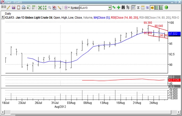 [2]
[2]
- What type of chart is this?
- What type of price information does it show?
- What is the prevailing trend?
- What does the blue line represent?
- What is the single red line in the second box?
- What is indicated in the bottom box?
- What are the two red lines connecting price points called?
- The point at which the upper red line crosses the right axis is called?
- The point at which the lower red line crosses the right axis is called?
- Is this market “overbought,” “oversold,” “neutral”?
Grading Criteria
You will be graded on the quality of your participation. See the grading rubric for specifics on how this assignment will be graded. Please submit you answers to the TA, Mike McCormick mwm5342@psu.edu [3].