Infographic Assignment
Translating the learning and personal growth that comes from a study abroad experience can be difficult. While you’ve done a lot of this in your journal entries, the goal of this final assignment is to synthesize your experience in a short, concise way that others will want to review. You will be doing that by creating an infographic. An infographic is a way to integrate your experience and share your learning, growth, and travel abroad story with the world. It also provides you with an educational artifact you can share on a blog, and even in Penn State poster expositions or competitions if you so choose. You can read more about the exciting poster opportunities on the "Sharing Your Experience [1]" page. NOTE: You do not need to be on campus to present. Your advisor can help facilitate remote attendance.
As someone who has completed several different study abroad opportunities, I know there is much to share. An infographic will help you tell that story, but more importantly, it will help you reflect on your experience.
An infographic is a way to visually represent your experience in an interesting, clear, and concise way. It should be
- focused - specific and relevant information;
- graphic - graphics and images tell the story (fewer than 800 words total);
- ordered - the sequence should be obvious; simple flow paths and cues should guide the reader.
Please review the following video to learn more about the qualities commonly included in infographics.
What makes an effective infographic (2:13)
PRESENTER: Do you know what it takes to create a unique and engaging infographic? Striking colors? Neat typography? Sensational headlines?
There are so many roads that your infographic could go down. At its core, an infographic is supposed to be a quick and easy way of conveying information to your audience. It should visually appeal to the audience, convey essential data, build awareness, and maybe even generate leads if you're using infographics for business purposes.
So what makes an infographic effective? Number one, informational honesty. We live in an internet age where fact-checking is easier than ever, so be sure that all the information in your infographic is truthful and honest. If you provide figures from somewhere else, back up these figures by asterisking your sources.
Number two, legibility. Although it's tempting to whip out the calligraphy style fonts in an effort to look fancy, you should prioritize fonts that are simple and easy to read. Also, avoid making your infographic too busy, keeping the style on the minimalist side.
Number three, simple illustrations. Make your illustrations simple and ensure that they complement the data being conveyed in the infographic. Complex illustrations will distract your audience from what's important, your message. You're trying to communicate information, not replace Rembrandt.
Number four, limited colors. Limit your color palette if you're trying to create an infographic that is visually appealing. As a general rule of thumb, use three main colors with the lightest color forming the background and the darker two colors breaking up different sections. Too many clashing colors will give your audience a headache.
Number five, interactive elements. Although adding interactive elements to your infographic is appealing, consider whether it is relevant to what you're trying to achieve. If you need to convey a lot of information about different subjects, interactivity could be the easiest way to spread out this information without having to make your font tiny.
And there you have it. Go forth, and spread your message with your fancy new infographic.
Infographic Deliverables
The infographic assignment is really a set of three assignments you will complete in succession.
- Outline
- Draft
- Final version
I highly recommend that you read through the entire infographic lesson prior to beginning so you have a good idea of what the project is and how to approach it.
Special thanks to Hailley Fargo, Head of Education and Outreach Services, Northern Kentucky University for much of the guidance and information contained in this lesson.
Create an Outline
The first assignment is an outline of the story you want to tell.
Outline Details
In order to put together a good infographic, you must first create an outline, decide what areas you want to highlight, and determine how you will represent those ideas! Because you've been journaling about both your personal growth and a general interest topic (most likely your capstone), you should have enough information to create your outline and infographic. If you've received funding from the Student Engagement Network, it is recommended that your infographic focus on their recommended topics.
NOTE
The outline should address the questions below that are applicable and should include some ideas for how you will present that information on the infographic. Keep in mind that this outline is a large percent of your semester grade. As such, you are expected to spend a significant amount of time and effort on this assignment. Think through what you'd like to present in your infographic and how it's all related. Feel free to review the rubric to better understand how it will be graded.
Introduction (must be included, regardless of topic chosen)
Provide an overview of your experience, including:
- location(s) visited
- length of trip
- focus of trip
Capstone focused infographic
- Which UN Sustainability Development Goals (pick two of the most prominent ones) related to your experience?
- What issue, problem or challenge did your project address?
- Provide an overview of the proposal you presented in your capstone project (who, what, where, etc.).
- What was the motivation for the project?
- What communities could be impacted by the project if implemented?
- What tools, skills, experiences, classes, etc helped you formulate this project?
- What resources did you use to help you research your project?
- What were some of the challenges you anticipate encountering with the project implementation?
- What did you learn from this project? Did you learn more about an area of interest?
- What questions remain?
- Anything else you want to add about the experience or your project.
Personal-growth focused infographic
- Which UN Sustainability Development Goals (pick two of the most prominent ones) related to your experience?
- What two growth areas were you working on during your experience?
- What tools, skills, experiences, classes, etc prepared you for this experience?
- What did you do during this experience?
- What were some of the best moments during this experience? Why?
- What are some of the challenges you faced?
- What did you learn from this experience? What did you learn about yourself?
- What questions were raised as a result of this experience?
- How has this experience impacted what you'll do next?
- Anything else you want to add about the experience or your personal growth as a result of studying away.
Deliverable
Please submit your outline, with ideas for graphics, as a Word or PDF to the "Infographic Outline" Dropbox by the date provided to you by the instructor.
This is graded out of 10 points and is worth 10% of your final grade.
Special thanks to Hailley Fargo, Student Engagement Librarian, The Pennsylvania State University for much of the guidance and information contained on this page.
Choose the Layout
Consider the Layout
Now that you have an outline of what you want to present, it is time to choose a layout. As you can imagine, creating an effective infographic is a bit more complicated than simply putting facts and images together. The information must also be efficiently organized to demonstrate the connections between important concepts or ideas. There are several ways in which you can organize your content. Please watch the following video for some ideas.
10 Types of Infographics (3:50)
PRESENTER: So you have your idea, you've done your research, and you've collected your data. Now you're probably wondering what type of infographic format would best represent and communicate your information effectively. There are many different types of infographics. And sometimes a combination of these types is used in a single infographic. So as you plan your infographic design, consider these 10 types of infographics.
Number 1, a visual article infographic makes a piece of writing more visual. It is best used to cut down on text or make an article more interesting and enjoyable to consume. It also increases sharing potential through social networks.
Number 2, the list-based infographic supports a claim through a series of steps. It is best used to support a specific claim or argument. Your list can go from top to bottom, left to right, or it can even move across your page.
Number 3, a map infographic showcases data trends based on location. It is best used to compare places or cultures with setting-centric data or demographics.
Number 4, the comparison, or versus infographic compares two things in a head-to-head study. It is best used to highlight differences between two similar things or highlight similarities between two unlike things. It can also be used to prove how one option is superior or inferior to the other option.
Number 5, the flowchart infographic offers specific answers to a question via reader choices. It is best used to provide personalized solutions for readers or show how multiple situations can reach the same conclusion.
Number 6, a data visualization infographic communicates complex data through charts and graphs. It can even showcase data through design. It is best used to make data driven arguments easier to understand and make facts or statistics more enjoyable to absorb.
Number 7, the timeline infographic tells a story through a chronological flow. It is best used to show how something has changed over time or make a long, complicated story easier to understand. It can also show how one thing leads to another.
Number 8, a visual resume turns text-based resumes into stunning visuals. It is best used to help job candidates get noticed during the recruitment process. It also helps candidates stand out in non-traditional industries or positions that are looking for creative and out-of-the-box thinking.
Number 9, a process infographic helps explain a series of steps or actions to complete a task. It is best used to simplify a complex process or to break down each step with information that is easy to digest.
Number 10, an animated infographic adds motion to complex information and ideas. It is best used to capture and hold your viewer's attention. It can also direct the attention where you want it.
Now that you're familiar with these 10 types of infographics and when to use them, it's easy to choose a format that works for your content. So grab your information and data because you're ready to organize it visually.
Your experience probably best fits into one of the following: the visual article, the flowchart, the timeline, or the map. But, you don't have to use these types, feel free to improvise, combine, or modify any of them to reach your desired outcome!
Layout Cheat Sheet
The image below offers some additional layout ideas for your infographic.
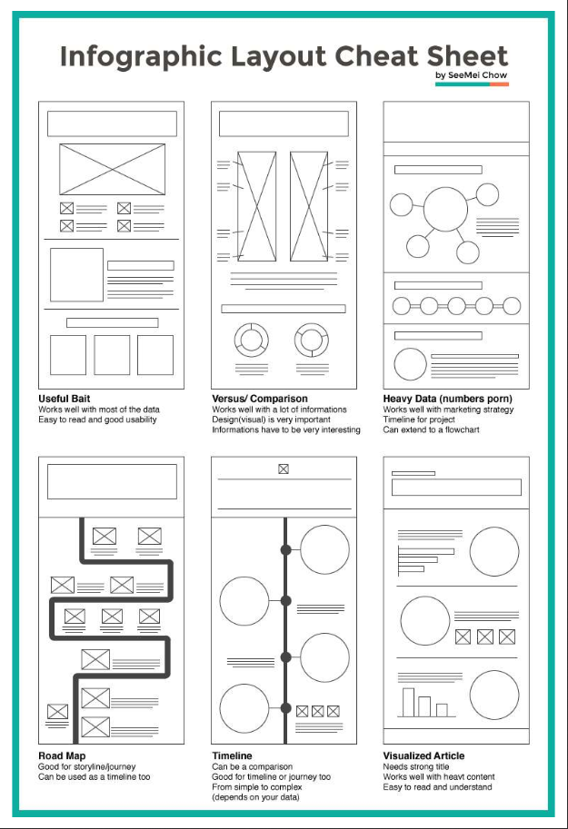
- Useful Bait: Works well with most of the data; Easy to read and good usability
- Versus/ Comparison: Works well with a lot of information; Design(visual) is very important; Information has to be very interesting
- Heavy Data (numbers porn): Works well with a marketing strategy; TImeline for the project; Can extend to a flowchart
- Road Map: Good for storyline/journey; Can be used as a timeline too
- Timeline: Can be a comparison; Good for timeline and journey too; From simple to complex (depends on your data)
- Visualized Article: Needs strong title; Works well with heavy content; Easy to read and understand
Again, some of the layouts shown above may fit your story better, but there is no prescription here, be creative!
Your experience probably best fits into one of the following: the visual article, the flowchart, the timeline, or the map. But, you don't have to use these types, feel free to improvise, combine, or modify any of them to reach your desired outcome!
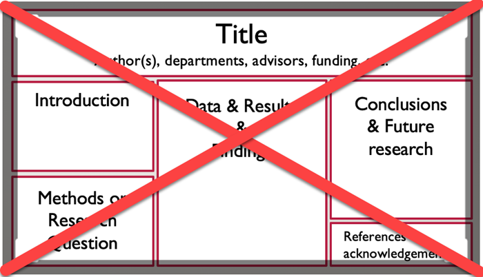
Example of what not to do
Below is an example of a traditional poster. Most of your infographics should not look like this.
Special thanks to Hailley Fargo, Head of Education and Outreach Services, Northern Kentucky University for much of the guidance and information contained on this page.
Choose the software
Now that you know the core elements of infographics, you may be wondering how to actually get started. There are many programs out there to create infographics, but most are not recommended or supported by Penn State (for various reasons). We recommend that you use PowerPoint and start with a blank slide. The following video will walk you through how to find and import graphics into PowerPoint. You will find additional tips on the "How to Make an Infographic in PowerPoint: The Beginners’ Guide [5]" tutorial on the Graphic Mama blog.
How to Create an Infographic in PowerPoint (5:49)
Hi there.
Many of us have used PowerPoint to create presentations. But did you know, with some formatting and a bit of creativity you can use PowerPoint to create fun and engaging infographics? Let's take a moment to see how you can set up PowerPoint for an infographic.
Your first step is to set up your slide. After opening PowerPoint you're given the option to select a template or to start from a blank presentation. A lot of the templates are designed for presentations and don't work so well as infographics, so we recommend going with a blank presentation. It's a good idea to remove any placeholders from the slide. Under the Home tab select Layout and then select Blank.
Now it's time to set size and orientation. Changing your mind later on will cause a lot of problems so give this decision a lot of thought.
Under the Design Tab select Slide Size and then select Custom Size. Here you'll be able to decide whether the orientation of your infographic will be portrait or landscape. The slide's default slide size will probably be too small for your infographic. You can make your slide larger by increasing the width or height of the slide. If you decided to create a portrait-sized infographic, you'll want to increase your slide's height and if you decided to create a landscape-sized infographic then increase your slide's width. Since you have not started building your infographic, you can select either the Maximize or the Ensure Fit option.
Now let's select the theme and font. In the Design tab, select the down arrow in the Variants section.
Now select Colors. Here you will be able to select your infographic's color palette. Don't like any of the default options? Select Customize Colors to create your own.
To change the default font for your infographic, select Fonts from the Variants section. You can also create your own font theme by selecting Customize Font.
Graphics and icons work much better than photographs in an infographic. A great resource for royalty-free and creative commons graphics is The Noun Project. Type your keywords in the search bar and then select a graphic. Click download. The PNG file format works very well with PowerPoint. Choose Creative Commons. This lets you use the graphic free of charge, as long you cite the creator. If you choose Royalty Free, you'll have to pay for the graphic but you can use it without citing the creator.
Just like in any academic paper, citing your resources is very important. Leave a bit of space at the bottom of your infographic for your citations. Unless instructed differently by your instructor, you can provide an abbreviated citation that credits the person who made the resource and where you found it.
Shapes are often used throughout an infographic. You can use them to organize your content, direct the reader's gaze or make your information appear more visually interesting. To add a shape, select the Insert tab and then select the Shapes option. Here, you'll see PowerPoint's large collection of shapes. Select a shape, then click and hold the left mouse button while moving the mouse until you have drawn your desired shape. To recolor your shape, select the shape and then select the Format tab under Drawing Tools and change the Shape Fill and Shape Outline colors. You can also choose from the Shape Styles section.
Want to add some text to your shape? Simply select the shape and start typing.
SmartArt is another great tool for displaying information in a visual format. Under the Insert tab, select SmartArt. Now select the type of SmartArt that will best present the information you are trying to share. Once selected, write your information into the SmartArt's placeholders. You are able to recolor your SmartArt by selecting the Design tab under SmartArt Tools and selecting Change Color.
Charts are commonly found in infographics. To insert a chart select the Insert tab and then select Chart. Choose the type of chart that you wish to insert and then click Ok. Use the small spreadsheet that pops up to enter your information. When you're finished entering your info you are able to recolor your chart by selecting Change Colors located under the Design tab within Chart Tools.
You can insert graphics by going to the Insert tab and selecting Pictures. Navigate to where your graphic file is located on your computer and select Insert. You can also drag graphics directly onto your infographic. To crop your graphic, select the graphic you want to crop, select the Format tab located under Picture Tools and select Crop. Use the black corner guides to resize your graphic.
Once you're finished, select Crop again. To recolor your graphic, select the Format tab located under the Picture Tools and select Color. If you do not see your desired color you will need to change the color theme you are using for your infographic.
Always save your work while you build your infographic. You never know when the power is going to go out or when your laptop battery will die!
To make it easier for your professor to read your infographic you may want to save it as a PDF. Do so by selecting the File tab, Save As, and then select PDF from the Save As Type drop down box.
Other good options, but not supported by Penn State help desk include:
Adobe Spark [6] is part of Adobe's Creative Cloud Suite. It allows you to create a variety of graphic-based resources. As a registered Penn State student, you have free access to this software.
Canva [7] also offers free accounts. It has a simple and easy-to-use interface and each item you create is downloadable in a PDF format. *Please note: Canva offers graphics and other elements for an additional fee. You are not expected to purchase anything in order to create your infographics. Doing so is at your own discretion.
Feel free to experiment and try different software until you find one that works well for you.
Design your inforgraphic
Note:
In order to be able to use this in a poster exposition or competition, it should not exceed 46” (W) x 36” (H).
Tips for Designing an Effective Infographic
- Present all information in a visual and concise way.
- Cite all data and graphics.
- Choose your fonts carefully.
- Choose a font that is easy to read.
- Limit font choices to 2-3 different fonts and be consistent where you use them (titles, headers, text, etc.).
- Limit the amount of text. Each text box should contain a maximum of 50 words.
- Limit your color scheme to 2-3 colors. Use color to:
- connect your ideas, sections, categories, etc;.
- highlight the most important elements;
- direct your audience through the story;
- Consider the size of various elements. Size helps to:
- suggest the importance and relevance of various elements -- the bigger something is the more important it is;
- connect ideas and sections;
- direct your viewer through the display;
Examples 1 - 3
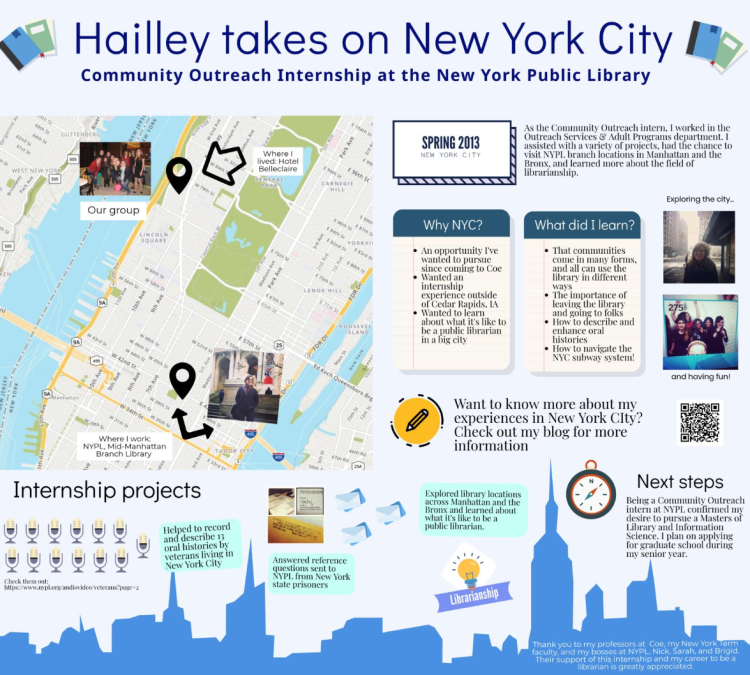
Example 1
Notice how this infographic tells a story in an interesting and appealing way. It would be an even better example if there were background colors to chunk sections of information.
Example 2
This is a great example: It is attractive. The information is in manageable bits and the road illustrates progression and connection while maintaining it’s not a hard and fast rule.
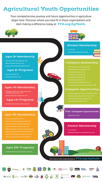
Agricultural Youth Opportunities
Your comprehensive journey and future opportunities in agriculture begin here. Discover where you best fit in these organizations and start making a difference today at FFA.org/AgYouth
| Age Group | Available Opportunities |
|---|---|
| Age 9+ Membership |
|
| Age 9+ Programs |
|
| Age 14+ Membership |
|
| Age 14+ Programs |
|
| Student Membership |
|
| Ages 18+ Membership |
|
| Collegiate Membership |
|
| Collegiate Opportunities |
|
| Ages 25+ Programs |
|
| Post-Collegiate Opportunities |
|
| Alumni Membership |
|
Get to know these organizations at FFA.org/AgYouth
This infographic leads with a title in blue, larger than the rest of the text, "Agricultural Youth Opportunities". It is then followed by black text explaining what the infographic is about along with a link to the site. Their goal is to explain the different opportunities offered by their organization for different age groups. To show this, they have a black line, resembling a road, winding back and forth between the different groups: Student Membership ⇒ Ages 9+ Membership/Ages 9+ Program ⇒ Collegiate Membership/Collegiate Opportunities ⇒ Ages 14+ Membership/Ages 14+ Programs ⇒ Post-Collegiate Opportunities ⇒ Ages 18+ Membership ⇒ Alumni Membership ⇒ Ages 25+ Programs.
All of the "Ages ___" are on the left side whereas the more specific group labels are on the right (ex: Student, Collegiate, etc.).
In addition to the basic, colorful boxes connected by the winding, black road, there are small graphics of trees, cars, tractors, grain, farm, city-scape, etc. placed strategically on the page.
Example 3
This example shows what you can do when you have a lot of information. It also demonstrates how visuals are essential in telling a story.
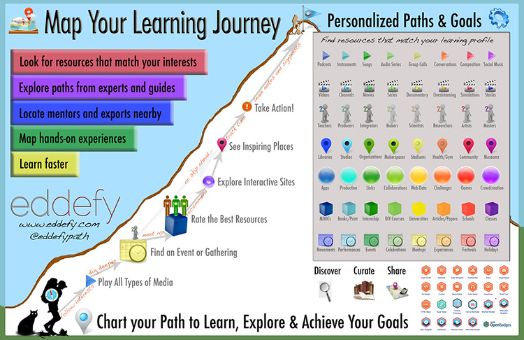
Map Your Learning Journey
- Look for resources that match your interests
- Explore paths from experts and guides
- Locate mentors and exports nearby
- Maps hands-on experiences
- Learn faster
Eddefy
www.eddefy.com [11]
@eddefypath
Follow interests à "Play All Type of Media” à dig deeper à “Find an Event or Gathering” à meet up à “Rate the Best Resources” à recommend à “Explore Interactive Sites” à “See Inspiring Places” à trick time à “Take Action!” à leave notes and signposts
OR “Find an Event or Gathering” à or skip ahead… à “See Inspiring Places” à etc.
Personalized Paths & Goals
Find resources that match your learning profile
- Row 1 - Play button
- Blue: Podcasts
- Teal: Instruments
- Dark Green: Songs
- Light Green: Audio Series
- Yellow-Green: Group Calls
- Orange: Conversations
- Red: Composition
- Purple: Social Music
- Row 2 - Clap Board
- Blue: Videos
- Teal: Channels
- Dark Green: Movies
- Light Green: Series
- Yellow-Green: Documentary
- Orange: Livestreaming
- Red: Simulations
- Purple: Stories
- Row 3 - Person Holding "?"
- Blue: Teachers
- Teal: Producers
- Dark Green: Integrators
- Light Green: Makers
- Yellow-Green: Scientists
- Orange: Researchers
- Red: Artists
- Purple: Masters
- Row 4 - Map Pin
- Blue: Libraries
- Teal: Studies
- Dark Green: Organizations
- Light Green: Makerspaces
- Yellow-Green: Stadiums
- Orange: Health/Gym
- Red: Community
- Purple: Museum
- Row 5 - Circle
- Blue: Apps
- Teal: Production
- Dark Green: Links
- Light Green: Collaborations
- Yellow-Green: Web Data
- Orange: Challenges
- Red: Games
- Purple: Crowd Creation
- Row 6 - Cube
- Blue: MOOCs
- Teal: Books/Print
- Dark Green: Internship
- Light Green: DIY Courses
- Yellow-Green: Universities
- Orange: Articles/Papers
- Red: Schools
- Purple: Classes
- Row 7 - Calendar
- Blue: Movements
- Teal: Performances
- Dark Green: Events
- Light Green: Celebrations
- Yellow-Green: Meetups
- Orange: Experiences
- Red: Festivals
- Purple: Holidays
Chart your Path to Learn, Explore & Achieve Your Goals
- Discover
- Curate
- Share
This infographic is very colorful and uses a lot of visual graphics. There is a small graphic of a map with pins on it next to the title in the left corner: “Map Your Learning Journey”. Below that are five blocks of color with text: Red – “Look for resources that match your interests”, purple – “Explore paths from experts and guides”, blue – “Locate mentors and exports nearby”, green – “Maps hands-on experiences”, yellow – “learn faster”. Below that there is the name of the group that made the infographic, the website, and the social-media name. To the right of all of that, in the background, there is a simple mountain. At the bottom left of the mountain, there is a graphic of a hiker and a cat with the safari logo in the black graphic. Then it follows gray, labeled arrows to the top of the mountain. On the top right of the infographic is the title “Personalized Paths & Goals” with the graphic of a cog next to it. Below that is a gray box with the text, “Find resources that match your learning profile” at the top. In the box there are 7 rows each with a different graphic: play button, clapboard, figure holding a “?”, map pin, circle, cube, calendar. Each column is a different color (left to right): blue, teal, dark green, light green, yellow-green, orange, red, purple.
Below the gray box, there are 3 graphics: Magnified-glass, Books, and a Map with a pin. Each with a Label: Discover, Curate, Share. Next to that, there is a collection of 22 hexagons representing “OpenBadges”.
At the very bottom of the infographic is the sentence “Chart you Path to Learn, Explore & Achieve Your Goals”
Examples 4 - 6
Here are some examples of infographics that may give you some ideas and inspiration! This is just a few examples. You can find many more with a simple Google search.
Example 4
This example focuses an audience's attention into the center of an illustration, using color to organize the learner's experience and interconnections. There's A LOT going on within this illustration and the minute detail can make the reading of the infographic seem like a puzzle to untangle.
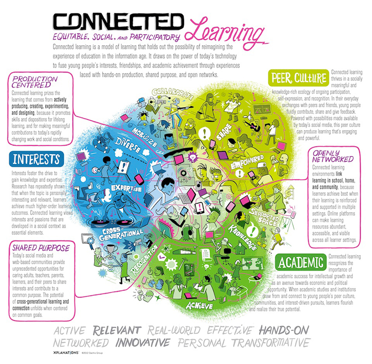
Connected: Equitable, Social, and Participatory Learning
Connected learning is a model of learning that holds out the possibility of reimagining the experience of education in the information age. It draws on the power of today’s technology to fuse young people’s interests, friendships, and academic achievement through experiences laced with hands-on production, shared purpose, and open networks.
- Production Centered: Connected learning prizes the learning that comes from actively producing, creating, experimenting, and designing, because it promotes skills and dispositions for lifelong learning, and for making meaningful contributions to today’s rapidly changing work and social conditions.
- Interests: Interests foster the drive to gain knowledge and expertise. Research has repeatedly shown that when the topic is personally interesting and relevant, learners achieve much higher-order learning outcomes. Connected learning views interests and passions that are developed in a social context as essential elements.
- Shared Purpose: Today’s social media and web-based communities provide unprecedented opportunities for caring adults, teachers, parents, learners, and their peers to share interests and contribute to a common purpose. The potential of cross-generational learning and connection unfolds when centered on common goals.
- Academic: Connected learning recognizes the importance of academic success for intellectual growth and as an avenue towards economic and political opportunity. When academic studies and institutions draw from and connect to young people’s peer culture, communities, and interest-driven pursuits, learners flourish and realize their true potential.
- Openly Networked: Connected learning environments link learning in school, home, and community, because learners achieve best when their learning is reinforced and supported in multiple settings. Online platforms can make learning resources abundant, accessible, and visible across all learner settings.
- Peer Culture: Connected Learning thrives in a socially meaningful and knowledge-rich ecology of ongoing participation, self-expression, and recognition. In their everyday exchanges with peers and friends, young people fluidly contribute, share and give feedback. Powered with possibilities made available by today’s social media, this peer culture can produce learning that’s engaging and powerful
ACTIVE RELEVANT REAL-WORLD EFFECTIVE HANDS-ON NETWORKED INNOVATIVE PERSONAL TRANSFORMATIVE
This infographic is a bit “busier” and “free-flowing”, using a lot of graphics and organizing things by color. It leads with “CONNECTED” in large black text, followed by a subheading of
“Equitable, Social and Participatory Learning” in purple and pink with a smaller, gray paragraph underneath explaining the purpose of the infographic. Then it starts to get a little busy.
In the center there is a blob of graphics, split into an even, three different colors: blue, dark green and light green. Blue is labeled “Interests” and has graphics of characters partaking in different activities like dancing, painting, skateboarding, etc. and also has a small box of gray text underneath. The format is the same for the light green “Peer Culture” section and the dark green “Academic” section. In addition to the characters, there are words written in white bubble letters. In the blue section, there are the words: “cross-generational”, “expertise”, “diverse”, and “space”. Lastly, in the dark green area, there are the words: “knowledge”, “achieve”, and “recognition”.
There are also three more text boxes, surrounded by a pink border with lines drawn to the center of the “blob”, placed between the other three text boxes. There’s “Production Centered” placed between “Interests” and “Peer Culture”, “Shared Purpose” placed between “Interests” and “Academic”, and “Openly Networked” placed between “Peer Culture” and “Academic”. At the very center of the “blob”, it seems that all of these different elements connect.
At the bottom of the infographic, there are several keywords listed in large gray text.
Example 5
This example utilizes historical imagery and variations in sizing of both photographs and text to emphasize key information.
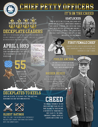
NAVAL HISTORY AND HERITAGE COMMAND
Chief Petty Officers: It’s in the Creed
- Deckplate Leaders: Chief petty officers make up the highest enlisted ranks in the U.S. Navy. Known as “Deckplate leaders” chiefs act as a bridge between officers and junior enlisted.
- April 1, 1893: Date proclaimed by Navy circular #1 (early navadmin message) that created the establishment of a chief petty officer rank.
- 55: Number of chief petty officers that have earned the medal of honor
- Deckplates to Keels: Chiefs are so vital to the Navy that two ships have been named USS CHIEF (both minesweepers).
- Oldest Ratings: Since 1797, only two ratings have continuously included chiefs among their ranks: Boatswain’s Mate and Gunner’s Mate.
- Goatlocker: From the age of sail to steam, goats were kept aboard ships in separate compartments known as “Goat Lockers.” Stubborn, sure-footed and tough, goats were used for their fresh milk and meat – they also helped lift up morale. Goat lockers were eventually adopted by chiefs who kept the name and adopted the goat moniker.
- First Female Chief: On March 21, 1917, Loretta Walsh became the first woman Navy chief petty officer when sworn in as a chief yeoman.
- Fouled Anchor: The chief petty officer cap device was authorized in 1897. CPO collar devices were introduced in 1959.
- Rocker Device: The advent of a rocker device was the first insignia for chiefs to wear, and was originally borrowed from the master-at-arms rating. It became official in 1894
- Creed: The original version of the CPO Creed was written in the late 1940s. Reading the creed became a fixture in the transition of a first class to the visible, confidently humble deckplate leaders chiefs strive to be.
This infographic has a simpler design, mainly focusing on three/four colors: blue, yellow/gold, gray and white. At the very top of the infographic is the title: “Chief Petty Officers: It’s in the Creed” in gold and then there are 10 headers with a sentence or two below describing the header. The headers are either gold or white, but all of the text below them are white. Additionally, all of the headings have images next to them to give the reader a visual. The background of the infographic is a dark gray with a light gray “stamp” of a compass. Additionally, the bottom 20% of the background has a blue/teal overlay.
Example 6
This "top ten" list simply draws the attention vertically downward in a sequential series of steps. The simple display of color and patterning communicates the learner's message clearly.

Pain Doctor: We Change Lives Here
Top 10 Pain Breakthroughs in 2014
- University of Toronto finds 30% of children whose parents suffer from addiction are at risk to develop arthritis
- UNC researchers create a new comprehensive way to table pain management
- Genes may predict pain levels, notes American Academy of Neurology scientist
- Researchers at Rutgers find acupuncture can help with inflammation
- Washington University scientists stimulate bone growth to help osteoporosis patients
- Placental stem cells may help treat multiple sclerosis symptoms finds Mount Sinai researchers
- Two new experimental migraine medications are presented at the American Academy of Neurology
- Laval University scientists find new way to reduce pain sensitivity
- Whole body vibration can relieve fibromyalgia pain, notes Indiana University researchers
- McGill University scientists study medical marijuana effects on nerve pain
Read more at Top 10 Biggest Pain Breakthroughs 2014 [19]
This infographic is very simple. The title of the infographic, “Top 10 Pain Breakthroughs in 2014” is placed on the cover of a newspaper with a stripe of teal behind it, on the otherwise white/gray background. Below that are ten different breakthroughs in green boxes with images corresponding to each of them, alternating from the right side to the left.
Examples 7-9
Example 7
This is another vertical "top down" sequence that guides the audience with arrows and simple drawings.
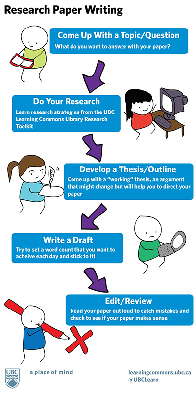
- Come Up With a Topic/Question: What do you want to answer with your paper?
- Do Your Research: Learn research strategies from the UBC Learning Commons Library Research Toolkit
- Develop a Thesis/Outline: Come up with a “working” thesis, an argument that might change but will help you to direct your paper
- Write a Draft: Try to set a word count that you want to achieve each day and stick to it!
- Edit/Review: Read your paper out loud to catch mistakes and check to see if your paper makes sense
This infographic is extremely simplistic. There is a black title in the top left: “Research Paper Writing” and below it are blue boxes with the different stops and a small description in white letters. These steps are connected with poorly drawn purple arrows. Additionally, next to each blue box is a very simple drawing of characters representing/doing each of the steps.
Example 8
A comic-style infographic like this one is a fun and familar way for the audience to understand a story or process.
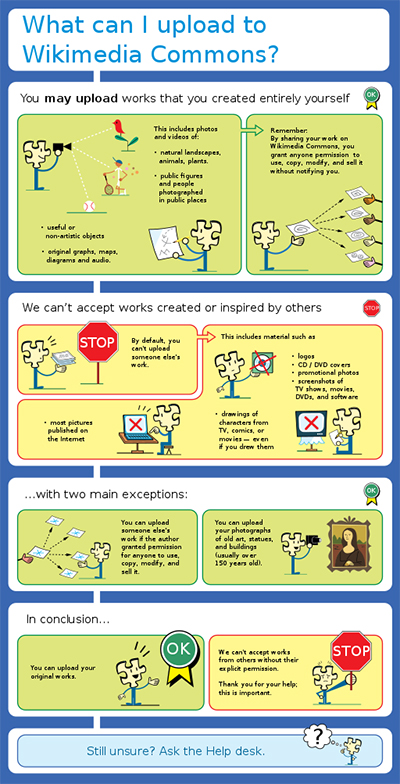
What can I upload to Wikimedia Commons?
- You may upload works that you created entirely yourself.
- This includes photos and videos of:
- natural landscapes, animals, plants;
- public figures and people photographed in public places;
- useful or non-artistic objects;
- original graphs, maps, diagrams and audio.
- Remember: By sharing your work on Wikimedia Commons, you grant anyone permission to use, copy, modify, and sell it without notifying you.
- This includes photos and videos of:
- We can’t accept works created or inspired by others:
- by default, you can’t upload someone else’s work;
- this includes materials such as:
- logos;
- CD/DVD covers;
- promotional photos;
- screenshots of TV shows, movies, DVDs, and software;
- drawings of characters from TV, comics, or movies – even if you drew them;
- most pictures published on the Internet.
- … with two main exceptions:
- you can upload someone else’s work if the author granted permission for anyone to use, copy, modify, and sell it;
- you can upload your photographs of old art, statues, and buildings (usually over 150 years old).
- In conclusion…
- you can upload your original works;
- we can’t accept works from others without their explicit permission;
- thank you for your help; this is important.
- Still unsure? Ask the Help desk.
This infographic includes an original character/graphic (a puzzle-piece with a body and arms) and is split into six white boxes, each with a header and one to two yellow/green boxes below the header. The exception to this is the first white box, which just includes the title: “What can I upload to Wikimedia Commons?” in large, blue text. The yellow boxes are outlined in red to represent the things that people can’t do, where the green boxes are outlined in green and show things that people can do. They also make use of a STOP sign graphic and a green OK ribbon graphic. In all of the green/yellow boxes, their original character is partaking in some of the activities they describe to further emphasize the information.
Example 9
This inforgraphic shares A LOT of information in a "light-hearted" way by coupling comic illustrations with tables and text boxes.
Submit your draft infographic
Deliverables
Create an infographic DRAFT that tells the story of your travel abroad.
Upload a PDF of the Infographic draft to the same "Infographic Draft" Dropbox by the date found on the syllabus.
Submit your final infographic
Deliverables
Create an infographic that tells the story of your learning while traveling abroad. When it's complete, upload a PDF of the Infographic to the "Infographic" Dropbox.
Sharing Your Experience
Presenting at poster exhibitions is a great way to gain professional experience and share the things you are learning. Now that you have completed an infographic, there are just a few simple steps to convert it to a poster.
I strongly suggest you consider presenting at one of the several exhibitions on campus (listed below). You might be surprised to learn that this opportunity is not limited to resident students. World Campus students are encouraged to present as well!
How does it work?
You can work with the instructor to have your poster printed.
- If you’re on campus, you’ll deliver the poster and present it in person.
- If you’re a World Campus student:
- the poster will be delivered for display at the event,
- you will receive a copy of the poster,
- we will then arrange for you to present remotely, interacting with the attendees in real time.
Check out this 1:46 minute video showing one of our World Campus students from Florida participating in the 2018 Undergraduate Poster Exhibition.
PRESENTER: Every year, students gather for the undergraduate exhibition at Penn State. They come from all of the Penn State campuses, including a World Campus student who participated from over 1,000 miles away.
STUDENT: So where are you?
JENNIFER: I'm in Jacksonville, Florida.
PRESENTER: Jennifer Bocchicchia is pursuing a BS in energy and sustainability policy.
JENNIFER: It's really great. It's so great to be present and a part of it all.
PRESENTER: Thanks to a TelePresence robot, Jennifer presented her work for the poster competition.
STUDENT: What is the knowledge you gained?
JENNIFER: What I gained out of it after my research is that--
[MUSIC PLAYING]
PRESENTER: In addition to practicing her presentation skills--
STUDENT: Can you hear me all right?
JENNIFER: I can hear you perfectly, yes.
PRESENTER: --she was also able to maneuver the robot and exchange ideas with other students.
JENNIFER: How long have you been working on this?
STUDENT: So I joined this research--
PRESENTER: As the spouse of an active-duty service member, Jennifer needs the flexibility to study from anywhere in the world.
JENNIFER: That's really interesting. Well, thank you for walking me through it. I loved hearing about it.
PRESENTER: With a TelePresence robot, no matter the distance, Jennifer can engage in the Penn State experience.
STUDENT: So this is the union building on campus. This is the hub.
JENNIFER: That's so neat.
STUDENT: It was a pleasure to talk to you.
JENNIFER: Yes, nice talking with you, too. Thanks for stopping by.
STUDENT: Oh, you bet.
Potential Events
Because you received a grant from the Student Engagement Network, you are eligible and encouraged to consider presenting at a future Student Engagement EXPO. Typically the EXPOs are head in the fall at University Park, but presenting remotely is an option for online students!
This exhibition is typically held in the spring at University Park and there is an engagement poster session included just for you! Again, presenting remotely is an option for everyone, no matter your location!
Scheudled for: April 3, 2023
Please do not hesitate to contact me or your adviser if you see any opportunities happening on campus that are not listed here that you would like to participate in. We would be happy to talk to you about how to get involved.