3: Using Outlooks
Overview
Overview
So far, we have explored what energy outlooks are, who creates them, and we started to understand what they tell us. In this lesson, we will use the information learned to actually use the outlooks to obtain information. Specifically, we will use the EIA outlook to learn aspects about global and U.S. national energy supply and demand.
This exercise has real-world implications. Policy-makers at the state level across the U.S. are preparing for potential energy shortages this year including heating oil shortages paticularly in the Northeast and Upper Midwest. State officials are tracking supplies and prices of key heating fuels in order to assess where shortages might occur if prices would rise causing problems for those who could not afford it. The EIA outlook, in particular, is a key source of information for the reponsible officials as it gives a sense of how much fuel might be available, where it could be, and what the trends in prices are.
Learning Outcomes
By the end of this lesson, you should be able to:
- Make comparative analyses from data sets provided in the outlooks such as differences in energy use trends among sectors or differences in trends between energy sources
- Learn how the trends would vary if assumptions change
- Draw conclusions from graphs generated using the EIA outlook
Lesson Roadmap
| Read | Lesson 3 content |
|---|---|
| Create | A graph based on outlook data |
| Write | An essay which summarizes the data on your graph |
Questions?
If you have questions, please feel free to post them to the Questions about EGEE 401 Discussion forum in Canvas. While you are there, feel free to post your own responses if you, too, are able to help a classmate.
Analyzing Outlooks
In order to prepare for the assignment of this lesson, let’s go back to the EIA website to create some graphs and see how we can glean information from interpreting the data.
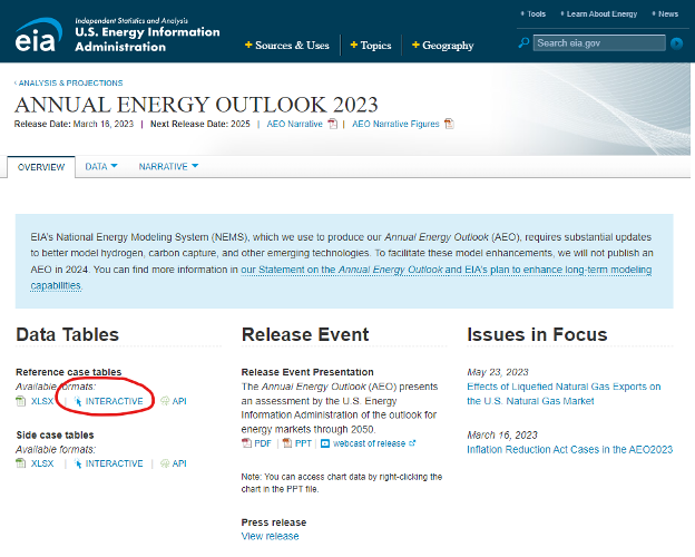
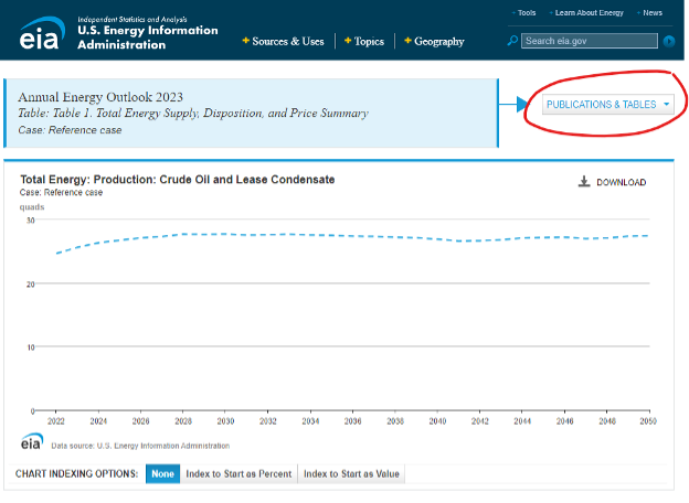
Under “Data Tables” in the subsection titled “reference case tables” click on Interactive (highlighted with a red circle in the image above). The page opens to Table 1 from the Annual Energy Outlook 2023. On the top line to the right of the table title, there is a drop-down menu called “Publications and Tables” with numerous options to choose from.
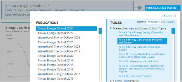
For the first example, I chose Annual Energy Outlook 2023 as the publication, and Table 2.
Below the graph, you will see a table with a column called PIN. Here we see the usage sectors (residential, commercial, industrial, transportation, etc.) and, underneath each of those, you will see the fuel type. Click on the light blue icon to the right of your desired entry or entries in the PIN column to plot those specific items above in the graph. It will superimpose as many as you choose.
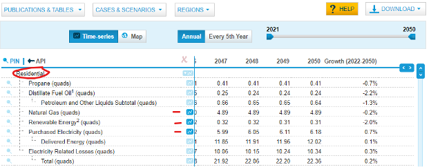
I chose to plot electricity, renewable energy consumption and natural gas consumption in the residential sector. I clicked on the three items and we see them plotted. You can now use this information to draw some immediate conclusions. For example, we see that renewable energy use in the residential sector stays very low, and declines slightly, over time. Natural gas usage is much higher, but it also declines slightly. Electricity demand, on the other hand, is the highest in terms of projected use, and actually increases over time.
Why is that? You would look into the rest of the report, especially the sections on those sectors and sources, to see why. Could it be that the shift of natural gas prices is making it less attractive? Is fracking projected to be banned at some point? Why is renewable such a small percentage and actually declining? To answer such questions, you will need to drill into the outlook a bit.
Feel free to go back to the landing page for the 2023 Outlook and click on the “Narrative” drop down to learn more about what is driving the trends and usage you have plotted. The overall point is that, by navigating the various parts of the Outlook, there is a wealth of information which can be gleaned from the narratives and data.
Interpreting Data
Overview:
By reviewing outlooks, we can gain an understanding of the drivers or influences that impact how they are created. Various companies seek to create outlooks that reflect the priorities that are most important to their goals and the anticipated needs of their consumers. Being able to analyze and interpret the data is an important skill you will need in order to achieve success in your chosen career. For this assignment, we will deep dive into one of the outlooks, the EIA Outlook, and explore the data in more detail.
Purpose:
To successfully complete this assignment, you will write an essay where you interpret the trends reflected in a graph you will create using the interactive function of the EIA Outlook.
Interpreting and explaining data:
As we demonstrated in the example above, it is possible to plot information from several variables in order to interpret what the patterns and trends tell us about energy sources and uses. This could be aspects related to different sources of energy such as natural gas or coal; or aspects about user patterns, such as residential vs. industrial. It is important that there be logic as to why you chose the variables to compare, as well as knowing where to find the supporting information from which you can draw conclusions about what you see. In the example above, we looked at other information in the EIA Outlook to explain the patterns that we saw in the graph we constructed.
Successful Completion:
We will revisit the EIA outlook we explored in Lesson 2, and the link. Energy Information Agency: The Energy Information Administration (EIA) is an office within the U.S. Department of Energy and was established in 1977. It is primarily a statistical and analytic agency and provides neutral data for others to use.
https://www.eia.gov/outlooks/aeo/ [2]
In 325 words (plus or minus 10%) write an essay that explores information presented by the outlook. Begin by creating a comparative graph as we did in the example but select different parameters. It would be best to compare logical items. For example, you might wish to compare industrial natural gas demand trends vs. residential trends. Or you might want to compare electricity vs. gasoline in the transportation sector. Do not feel limited to only two items; feel free to group several together that tell a logical story. For example, in our sample above, we chose two energy sources in the residential sector in order to try to draw conclusions. Your essay should be submitted in Microsoft Word and will address the following questions.
- Which parameters did you choose and why?
- What are the trends for each and how do they differ?
Using supporting information from the rest of the outlook, try to explain why the trends are what they are. The best way to do this is to read about the logic for each item. You can use the topic specific PDF or PPT links on the home page.
What is your opinion about the projection? Does it make sense to you? In our example above, one might wonder why the renewable energy use in the residential sector never really takes off.