Lessons
Lesson 1 - General Overview of Global Energy Markets
The links below provide an outline of the material for this lesson. Be sure to read carefully through the entire lesson before returning to Canvas to submit your assignments.
Lesson 1 Overview
Lesson 1 Overview
Overview
This lesson will discuss the way that energy decision makers and stakeholders look at development of new projects and technologies. We will define the motivation for the entire EME 801 Course. We will also hopefully allow students to be able to take a holistic view of energy markets and place them in a broader context to understand how various stakeholders will act in various situations. By training ourselves to ask these questions, we will be able to participate in and even help drive the energy transition.
Please note that we will be convening as a team to discuss this course's subject matter as well as any other energy transition matters the cohort would like to cover.
Learning Outcomes
By the end of this lesson, you should be able to:
- Discuss topics related to global energy markets
- Explain the importance of energy markets in an economic context, a geo-political context, and an environmental context
- Explain the placement of the current energy transition in a historic context
- Describe the sources and sinks of energy in the United States energy eco-system
- Develop a global list of stakeholders for energy decisions
- State your preference for the time/day of a recurring class Zoom call
Reading Materials
Each of the reading assignments below is meant to introduce the importance of -- and give a taste of -- the structure of global energy markets. While reading these, please think about how to describe how you think energy questions affect the near and long-term future of your business and our society.
- World Economic Forum (2022). 6 Ways Russian's Invasion of Ukraine Has Reshaped the Energy World [1]
- TheNationalNews.com (2022). BP Signs Long-Term LNG Contract with China's Shenzhen Energy [2]
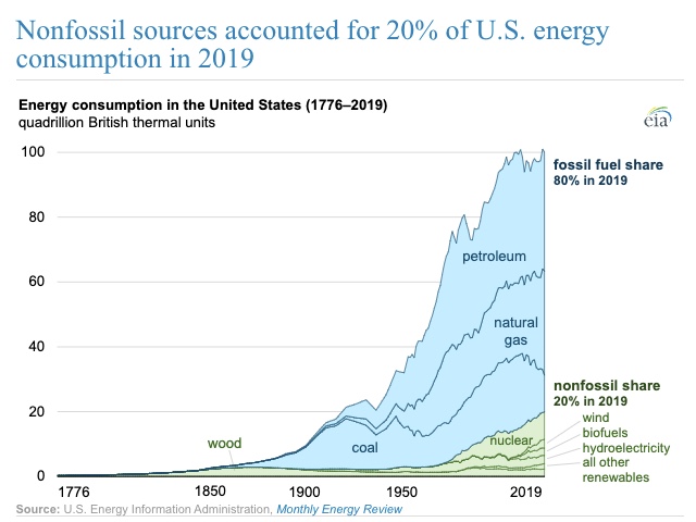
- U.S. Energy Information Administration (2020). Nonfossil sources accounted for 20% of US Energy Consumption in 2019 [3]
- Bond, K, and Butler-Sloss, S. (2022). Peaking: A Brief History of Select Energy Transitions [4]
- World Economic Forum (2022). The 200-year History of Mankind's Energy Transitions [5]
What is due for Lesson 1?
This lesson will take us one week to complete. Please refer to the Course Calendar for specific due dates. Specific directions for assignments are in the Lesson 1 module in Canvas.
- Complete all of the Lesson 1 readings and viewings, including the lesson content
Questions?
If you have any questions, please post them to our Questions? discussion forum (not email). I will not be reviewing these. I encourage you to work as a cohort in that space. If you do require assistance, please reach out to me directly after you have worked with your cohort --- I am always happy to get on a one-on-one call, or even better, with a group of you.
The Importance of Energy to the Economy, the Environment, and the World
The Importance of Energy to the Economy, the Environment, and the World
The Economy
As we walk through our daily lives, it becomes very easy to take for granted the almost complete dependence we have, as humans in a post-industrial economy, on the incredible supply of inexpensive and convertible energy. If we live in anything other than a tropical climate, we require heating so that we don’t freeze. We use energy to till our fields and harvest our food. We also use energy to provide light during non-daylight hours as well as power machines that allow for inexpensive manufactures such as clothing and other household items. We move about, except when walking or bicycling, through the conversion of some sort of potential energy into the kinetic energy of the plane, train, automobile, or boat. And finally, we use energy to communicate and store and manipulate data. This vast network of comfort, nourishment, nutrition, transportation and information would be utterly impossible without inexpensive and readily dispatchable energy. It is literally the life’s blood of the entire economic system.
The resemblance between the human circulatory system and the natural gas grid (or the electric transmission and distribution grid) is similar, and the energy delivery system is almost as crucial to the economy as the circulatory system is to the human.

This chart shows the dependence on energy of various economies around the world. This is directly showing Tons of Oil equivalent to make $1,000 of GDP. A tonne of oil is equivalent to 7.44 barrels or 11,630 kWh. The implications are massive. Every 1,000 dollars of GDP in the US has at least 1 MWh or almost a barrel of oil embedded in it. More importantly, this offers no quantification of the risk to the economy should this energy supply be disrupted. Then the energy intensity would increase massively and whole supply chains and communication networks would be disrupted.
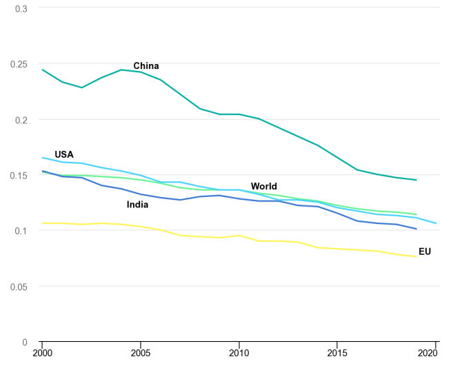
| USA | India | World | China | EU | |
|---|---|---|---|---|---|
| 2000 | 0.165 | 0.153 | 0.152 | 0.244 | 0.106 |
| 2001 | 0.161 | 0.148 | 0.149 | 0.233 | 0.106 |
| 2002 | 0.16 | 0.147 | 0.149 | 0.228 | 0.105 |
| 2003 | 0.156 | 0.14 | 0.148 | 0.237 | 0.106 |
| 2004 | 0.153 | 0.137 | 0.147 | 0.244 | 0.105 |
| 2005 | 0.149 | 0.132 | 0.145 | 0.242 | 0.103 |
| 2006 | 0.143 | 0.129 | 0.142 | 0.235 | 0.1 |
| 2007 | 0.143 | 0.127 | 0.138 | 0.222 | 0.095 |
| 2008 | 0.139 | 0.13 | 0.136 | 0.209 | 0.094 |
| 2009 | 0.136 | 0.131 | 0.136 | 0.204 | 0.093 |
| 2010 | 0.136 | 0.128 | 0.136 | 0.204 | 0.095 |
| 2011 | 0.132 | 0.126 | 0.133 | 0.2 | 0.09 |
| 2012 | 0.127 | 0.126 | 0.131 | 0.192 | 0.09 |
| 2013 | 0.127 | 0.122 | 0.128 | 0.184 | 0.089 |
| 2014 | 0.125 | 0.121 | 0.126 | 0.176 | 0.084 |
| 2015 | 0.12 | 0.115 | 0.122 | 0.165 | 0.083 |
| 2016 | 0.117 | 0.108 | 0.119 | 0.154 | 0.082 |
| 2017 | 0.114 | 0.106 | 0.117 | 0.15 | 0.081 |
| 2018 | 0.113 | 0.105 | 0.116 | 0.147 | 0.078 |
| 2019 | 0.111 | 0.101 | 0.114 | 0.145 | 0.076 |
| 2020 | 0.106 | -- | -- | -- | -- |
The Environment
The Environment
The constituents of global greenhouse gas emissions (those gasses which contribute to global warming) can be seen below:
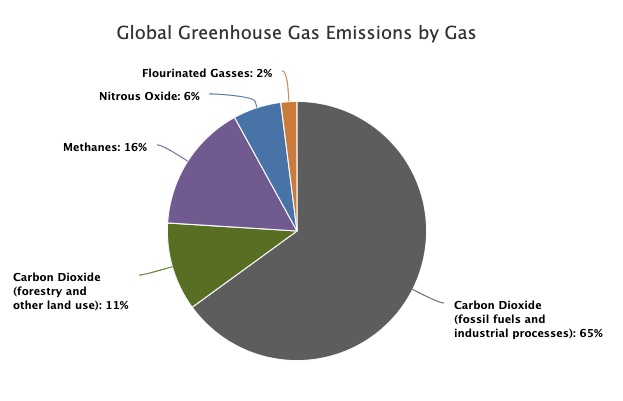
| Source | 2010 Data |
|---|---|
| Carbon Dioxide (fossil fuels and industrial processes) | 65% |
| Carbon Dioxide (forestry and other land use) | 11% |
| Methane | 16% |
| Nitrous Oxide | 6% |
| Flourinated Gasses | 2% |
To see just how much the energy sector contributes to these emissions, please see below.
Note: The pie chart below is interactive. You can click on sectors of the chart to see the proportions within a sector or category.
| Sector | Category | Industry Sub-sector | Emissions % |
|---|---|---|---|
| Energy (73.2%) |
Used in Industry (24.2%) |
Other | 10.6 |
| Iron and Steel | 7.2 | ||
| Chemical and Petrochemical | 3.6 | ||
| Food and Tobacco | 1.0 | ||
| Non Ferrous | 0.7 | ||
| Paper Pulp | 0.6 | ||
| Machinery | 0.5 | ||
| Used in Buildings (17.5%) |
Residential | 10.9 | |
| Commercial | 6.6 | ||
| Transportation (16.2%) |
Road | 11.9 | |
| Aviation | 1.9 | ||
| Shipping | 1.7 | ||
| Rail | 0.4 | ||
| Pipeline | 0.3 | ||
| Unallocated Fuel Combustion | 7.8 | ||
| Fugitive Emissions | 5.8 | ||
| Agriculture & Fishing | 1.7 | ||
| Agriculture (18.4%) |
Livestock and Manure | 5.8 | |
| Agricultural Soils | 4.1 | ||
| Crop Burning | 3.5 | ||
| Deforestation | 2.2 | ||
| Cropland | 1.4 | ||
| Rice Cultivation | 1.3 | ||
| Grassland | 0.1 | ||
| Industry (5.2%) |
Cement | 3.0 | |
| Chemicals | 2.2 | ||
| Waste (3.2%) |
Landfills | 1.9 | |
| Wastewater | 1.3 |
Hopefully, it becomes apparent that to address the threat of global warming, addressing the greenhouse gas intensity of the energy sector is paramount. In order to address this intensity, we must understand how the markets for energy work. This understanding helps us to make better decisions as we are confronted with choices to make in our professions.
The World
The World
Energy dependence drives geopolitics in a significant way. Many (if not most) of the world conflicts since the early 1980s either have been directly caused by a scramble for energy or had significant energy undertones. The flashpoints for global conflict include Iraq, Iran, Libya, Syria, Ukraine, Russia, Nigeria, and Venezuela. Each of these nations has significant energy wealth. The recent and deadly conflict in Ukraine has significant energy implications. The Donbas region is a part of Ukraine with large oil and gas reserves. This potential supply, when interwoven with greater integration of Ukraine’s economy, represents a threat to Russia’s position as the EU’s energy supplier. Please read the article "6 Ways Russia's Invasion of Ukraine Has Reshaped the Energy World" for a view into the conflict and the effect on energy throughout the world.
There are many other examples of how energy and its uninterrupted supply influence geopolitics and national security strategy. These include a huge and continuous US Navy presence in the Persian Gulf and the Mediterranean Sea as well as the long-term contracting of China for Petroleum products. Please read the article called "BP Signs Long-Term LNG Contract with China's Shenzhen Energy."
Energy Transition in Historical Context
Energy Transition in Historical Context
The current energy transition away from fossil fuels is dramatic until it is placed in a historical context. Let’s look at the graph below for a great visualization:
Make sure to read the following articles, which are all listed on the Lesson 1 Overview page:
- "Nonfossil Sources Accounted for 20% of US Energy Consumption in 2019"
- "Peaking: A Breif History of Slelect Energy Transitions"
- "The 200-year History of Mandkind's Energy Transitions"
Sources and Sinks (Or Supply and Demand)
Sources and Sinks (Or Supply and Demand)
Definitions:
- Source - a place, person, or thing from which something comes or can be obtained.
- Sink - a fixed basin.
- Supply - a stock of a resource from which a person or place can be provided with the necessary amount of that resource.
- Demand - the desire of purchasers, consumers, clients, employers, etc., for a particular commodity, service, or other item.
Please see the figures below to visualize the various sources and sinks of energy in the US economy. Both of these figures show the original source of energy, whether it be direct radiation from the sun, from combustion of natural gas, nuclear fission, or some other source. From there, we see how the sources "move" through the various conversion systems to provide energy services to the various sectors like transportation or residences (sinks):
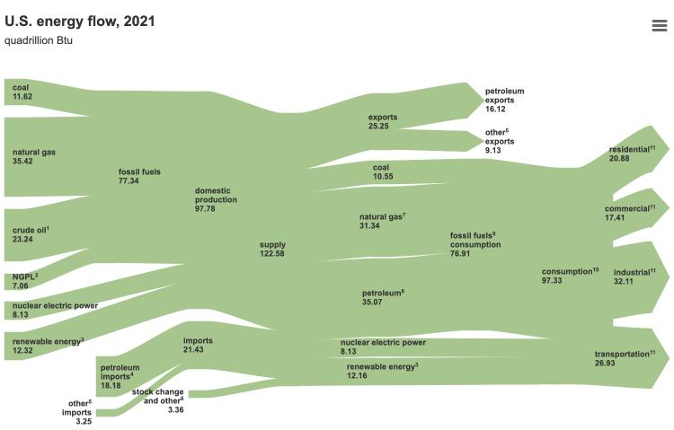
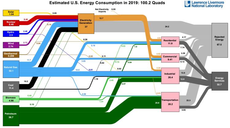
One of the most interesting sinks in the US economy is rejected energy. Rejected energy is that which does not provide useful work. Rejection is usually in the form of heat, but also in the form of transportation losses. What does this imply for the potential to decarbonize?
We discuss sources and sinks here to illustrate the level of energy consumption across the US and also how complex the overall market is.
We will discuss supply and demand in greater detail toward the end of the course. Understanding how these forces interact in the present as well as how they will interact in the future will help inform all of the decisions we make in our professions.
Global Stakeholder Identification
Global Stakeholder Identification
What is the definition of a stakeholder?
A stakeholder is defined as, "a person or entity with an interest or concern in something.” Further elucidation might say “Individuals and organizations who are actively involved in the enterprise, or whose interests may be positively or negatively affected as a result of the enterprise.” An addition to this definition would also include those who believe their interest may be affected by the enterprise. This is a very useful definition as it allows us to cast a very wide net to make sure that all the people and institutions that will be affected by our decisions are considered.
On a global scale this is clearly a very “wide net.” It includes the entire earth and many different people and entities. And many entities will have more than one stakeholder identification. Below are some obvious energy stakeholders in the global market:
- Producers
- Consumers
- Local, State, and National Government
- Transporters of Energy
- Marketers
- Citizens
Please see if you can double or even triple the number of stakeholders globally as you consider the energy market.
Lesson 1 Summary and Final Tasks
Lesson 1 Summary and Final Tasks
Lesson Summary
Hopefully in this lesson you learned how energy decision makers and stakeholders look at development of new projects and technologies. We defined the motivation for the entire EME 801 Course. We also hopefully allowed you to be able to take a holistic view of energy markets and place them in a broader context to understand how various players will act in various situations. By training you to ask these questions, you are becoming able to participate in and even help drive the energy transition.
Reminder - Complete all of the Lesson 1 tasks!
Please double check the What is Due for Lesson 1? list on the first page of this lesson to make sure you have completed all of the activities listed there before you begin Lesson 2.
Lesson 2 - Project Pre-Research
The links below provide an outline of the material for this lesson. Be sure to carefully read through the entire lesson before returning to Canvas to submit your assignments.
Lesson 2 Overview
Lesson 2 Overview
Overview
This Module introduces the Final Project in full detail. You will learn what is required to complete the project and place it in the context of the global energy market. The learning objectives of the course include not just exposure to the structure and performance of energy markets, but most importantly, the determination of what the structure and performance of these markets mean for the business in which you might be engaged. To create this “laboratory” where you can test out you hypothesis of viability, we need to create a “project” against which we can test certain assumptions. For this purpose, we will spend a week understanding just what is expected for the project as well as identifying some of the major parameters of the project.
Learning Outcomes
By the end of this lesson, you should be able to:
- Discuss elements of the semester project: clients, local, project charters, stakeholder, costs and benefits
- Investigate ideas for the client, locale, and major stakeholders for your project
- Examine the roles of the client, locale, and major stakeholders for the project
- Explain the importance of a project charter
- Explain the importance of a stakeholder register
- Consider the other costs and benefits of the project besides simply the financial
Reading Materials
- Brown, A. S. (2005). The charter: Selling your project [20]. Paper presented at PMI Global Congress 2005
- Murali, L. (2023). What is Stakeholder Analysis? [21]
- Project Management Academy (2021). What is a Stakeholder Register? [22]
What is due for Lesson 2?
This lesson will take us one week to complete. Please refer to the Course Calendar for specific due dates. Specific directions for the assignment below are in the Lesson modules in Canvas.
- Complete the assigned readings and viewings for Lesson 2
- Participate in the Zoom discussion
- Complete Quiz 2
- Project work: preliminary Project Charter (due at the end of Lesson 3)
- Project work: preliminary Stakeholder Register (due at the end of Lesson 3)
Questions?
If you have any questions, please post them to our Questions? discussion forum (not email). I will not be reviewing these. I encourage you to work as a cohort in that space. If you do require assistance, please reach out to me directly after you have worked with your cohort --- I am always happy to get on a one-on-one call, or even better, with a group of you.
The Project, Specifically (Why so early?)
The Project, Specifically (Why so early?)
This course offers students a broad introduction to project decision-making in the energy industries, and the impacts that markets, institutions and regulations have on investments and decisions made by firms in the energy industries. Topics to be covered include a discussion of market structures for natural gas, crude-oil, transportation fuels and electric power; basic project evaluation and decision-making for energy projects; and the impacts of major environmental regulations at the state and federal level of the functioning of energy markets and energy project decision-making. - Directly from the course catalog.
As this course is part of a Master's Degree in professional Studies, real-world application of the concepts in the course is paramount to the design of this course. Consequently, we introduce the project in the first few weeks of the course so that the student can immediately begin to apply the course content presented in the following modules to a real-world problem, which the student hopefully either finds applicable to his current or future profession or just particularly interesting. Either way (or potentially both) the student will be learning the content with an eye to how the content about market structure and financial principles may have on the chosen project. The intent of the project is to allow you to define an interesting or important problem and learn how the dynamic regulatory and market landscape will affect outcomes. You will not be penalized for taking on too grand or too small a project. You will learn, however, as you go through the project, that you may have chosen too grand or too small a project... but, that is important learning, too. The design of the course and the intent of the instructor are to allow for corrections should this become a problem. Please understand that you are being granted some serious agency, here, and that should help you gain control of your own learning and success. But also understand that the cohort and your instructor are available to help should the lack of "guardrails" be more of a hindrance than a help. The energy transition is very dynamic at this point in time. Therefore, the opportunity to generate a dynamic project without overwhelming constraints most closely reflects the industry that we are studying.
The project will be defined as such:
Investigate an energy project that you as a developer or corporate decision maker would like to construct or replace. This investigation will include the development of a full financial model to inform investment decisions as well as test various scenarios for the project’s development. We will also develop a full stakeholder register and a review of how governmental policy would affect your project. The project will be worth 700 points of your grade. They will be divided scored as shown below:
| Task | Points | |
|---|---|---|
| 1 | Project Charter and Stakeholder Register | 75 |
| 2 | Development of Revenue Time Series | 50 |
| 3 | Development of Operating Expense Time Series | 50 |
| 4 | Development of Capital Costs | 50 |
| 5 | Development of Financial Metrics | 50 |
| 6 | Program Excel Financial Model | 50 |
| 7 | Development of Risk Management Measures | 50 |
| 8 | Development of Policy Sensitivities | 50 |
| 9 | Development of Electricity Market Sensitivities | 50 |
| 10 | Development of Fossil Fuel Market Sensitivities | 50 |
| 11 | Non-Financial Costs and Benefits | 75 |
| 12 | Final Presentation of Results | 100 |
| Total | -- | 700 |
Each of the tasks will require some quantification to ultimately assess the financial value of your project, but there will also be a required write-up of the derivation of your values. Instructions will be provided in each module on what is required.
The Client and Locale
The Client and Locale
Client: Someone who pays for goods or services.
Locale: A place where something happens.
In the case of your project, you will be required to identify exactly who is going to pay for the energy that your project is going to produce. This “who” can be many different people or entities, but determining this upfront will be very important. For example, we could have a client be a residential customer installing a solar rooftop, a large commercial building upgrading its HVAC system, a big box retail customer wanting to “green up” its energy purchases, a large manufacturer who wants to install a combined heat and power system or a government agency who wants to take advantage of latent energy in its wastewater system to provide heat to district energy. The possibilities are really quite broad for defining your client.
Client definition is important though because the client will be the entity paying for the energy that is generated (saved) from your project. This may be different than the actual end-user of the energy and it is important to make sure that the client’s requirements are kept utmost in mind for the greatest success of the project.
The course is designed so that the student can be very creative with respect to client selection. There will not be specific prohibitions on client selection, however, the knowledge base of the evaluator is limited and the further the student strays from conventional technologies as well as political and economic regimes that are familiar, the more difficult will it be for there to be accurate feedback and evaluation. Innovation is encouraged, but please be ready to defend and justify your assumptions and parameters.
The locale is the “where.” But the “where” has many characteristics. For example:
- The geography
- The demography
- The locale economy
- The local, state and federal policy, government and attitude toward energy projects
- The general suypply chain including labor, transportation availability of energy
- The local and regional energy market and infrastructure
This is not an extensive list, but gives one a general idea of what will need to be researched to develop your project.
What is a Project Charter?
What is a Project Charter?
A project charter is a formal, typically short document that describes your project in a general fashion — including what the objectives are, how it will be carried out, and who the stakeholders are. It is a crucial ingredient in planning the project because it is used throughout the project lifecycle and is a living breathing document that may change from start to finish. It provides a very simple guideline to which the project manager and team members can refer for clear guidance when reaching or (not reaching) milestones. It can be modified as the project evolves, but will always provide the direction to ensure that the project does not drift. Typical elements of the project charter will include the following elements:
- Reasons for the project
- Objectives and constraints of the project
- The main stakeholders
- Risks identified
- Benefits of the project
- General overview of the budget
As we will be going into a great deal of detail on many of these elements as that is the point of the course, the only elements that the Project Charter that must be included for now are:
- Reasons for the project
- The potential benefits of the project
- The locale
- The client
- The stakeholders
- The technology
In Canvas, please take a look at the example project charter and stakeholder register submitted by your peers in a previous semester. They provide great examples for how to think about this.
Stakeholders
Stakeholders
Stakeholder: A person with an interest or concern in something, especially a busines.
So this is the rest of the “who” after we define the client.
According to the Project Management Institute, project stakeholders are defined as: “Individuals and organizations who are actively involved in the project, or whose interests may be positively or negatively affected as a result of project execution or successful project completion.” An addition to this definition would also include those who believe their interest may be affected by the project. This is a very useful definition as it allows us to cast a very wide net to make sure that all the people and institutions that will be affected by our project are considered.
Stakeholder Identification Process:
While the stakeholder identification process is begun and hopefully very close to completed at the beginning of project development, it is an on-going process with certain stakeholders leaving and potentially appearing as the project evolves. It is therefore very important to be flexible and alert for the disappearance and emergence of stakeholder as the project develops. The specific steps we can take in the Identification Process are:
- Review the project documents
- Brainstorm with your project team
- Communicate
- Develop and maintain a stakeholder register
Let’s take a look at each of the steps to define what we must do to complete these steps:
- Review the Project Documents – There will be certain project documents that can be reviewed to help identify stakeholders. In particular, the project charter and previous Stakeholder registers will be of particular assistance. Your project charter will have identified technology, locale, and size of the project. This should help you think about who the stakeholders will be. Previous Stakeholder Registers will allow the project manager to avoid “re-inventing the wheel.” Other documents which will be important are the various government regulations governing solar development, utility and ISO tariffs, labor standards, impact assessment studies from non -governmental organizations and solar industry standards.
- Brainstorm with your project team - The project team in this case will be your cohort in this course, but if you were working for a solar development company, there would be a project team which would provide you with assistance here.
- Communicate – As stakeholders are identified and brought into the project appropriately, they may also help to identify others who will be affected or need to be consulted.
- Develop and Maintain a Stakeholder Register - This document will allow for documentation of the Stakeholder Management process. Typical information about the stakeholders which will be included in the Stakeholder Register are:
- Name
- Contact information
- Title
- Role on Project
- Interests
- Expectations
- Influence
- Impact
- Internal/External
A full development of the stakeholder register along with the actual information for your locale, technology and client for your project will be required as a completion requirement for the final Project write-up.
Let us now take a look at who the most likely stakeholders for a solar project might be:
- The Client
- The Developer (you)
- The Lender(s)
- The local authorities (we'll get further into this in the policy section
- The State
- The Federal Government
- Labor
- Local non-governmental groups
- State and national non-governmental groups
- Local Politicians
- Local Businesses
- Elements in the non-labor supply chain
See if you can increase the list. Remember to appropriately de-risk the project, the identification of, and communication with, the important stakeholders is paramount from the very beginning.
Certain Stakeholder Roles May Include:
The Developer (you)
The developer is responsible to devise and manage the whole process from ideation to delivery of the project and in many cases through portions of the active life of the project.
The Lender
The lender provides capital dollars to the project. The lender will require statements of satisfactory financial viability ( a Pro Forma among other documents) as well as proof of other approvals (environmental, utility, zoning…)
Authorities at Various Levels
Each of these may have to weigh in or grant certain approvals.
Labor
There are some different facets to the labor question. Making sure that there is appropriate human resources to complete the specific project is important, but there may also be certain areas of backlash as other workers could be displaced by solar energy. There is a significant push to ensure that re-training of energy workers occurs to ensure a renewable energy workforce that is fit for purpose.
Local Non-governmental Groups
There may be local interest groups who are very strong supporters of sustainable development for instance; there may also be local interest groups opposed to your development for reasons such as clashing with the natural landscape.
State and National Non-Governmental Groups, Local Politicians, and Local Businesses
Similar to the local groups support and opposition can be found for solar development which could impact your project.
Elements in the Non-Labor Supply Chain
Supply chain issues are much more prevalent with the current level of solar penetration than they have ever been. Special care to treat these very important stakeholders well will mitigate significant risks in delivery of the project.
See if you can develop these roles further in your own thinking as well as identify more as we work through the course. Please take a look at the sample stakeholder register that has been submitted by a student in AE 878 that is a great example of how to think about this:
A good way to think about stakeholder management in particular is to look at the following image:
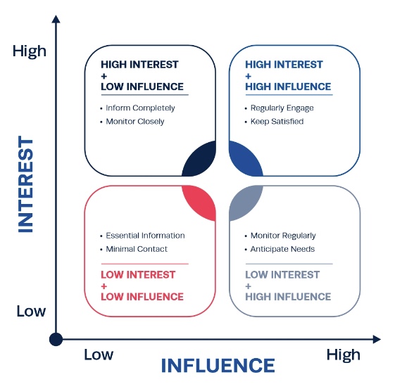
| Low Influence | High Influence | |
|---|---|---|
| High Interest | Inform completely Monitor closely |
Regularly engage Keep satisfied |
| Low Interest | Essential information Minimal contact |
Monitor regularly Anticipate needs |
Here we see the intersection of interest and influence. As we work through the course, see if you can think of the stakeholders that will be introduced and how you might manage them. While this is not a course in project management, we are learning about energy markets through the lens of developing a project.
Other Costs and Benefits
Other Costs and Benefits
Here we want to be sure that as we talk about energy markets we become aware that there may be benefits of energy development outside of the localized strict financial analysis There may be incremental jobs as a result of the development. There could be reduction in carbon footprint as a result of the project. There could be many others. There may also be costs associated with the project that are not captured in the strict localized financial analysis such as increased carbon, flicker from a wind turbine, or the fouling of the view through a solar development.
Lesson 2 Summary and Final Tasks
Lesson 2 Summary and Final Tasks
This Module introduced the Final Project in full detail. We hope you learned what is required to complete the project and place it in the context of the global energy market. The learning objectives of the course include not just exposure to the structure and performance of energy markets, but most importantly, the determination of what the structure and performance of these markets mean for the business in which you might be engaged. To create this “laboratory” where you can test out you hypothesis of viability, we are creating a “project” against which we can test your assumptions. For this purpose, we spent this week understanding just what is expected for the project as well as identifying some of the major parameters of the project.
Reminder - Complete all of the Lesson 2 tasks!
You have reached the end of Lesson 2! Double-check the What is Due for Lesson 2? list on the first page of this lesson to make sure you have completed all of the activities listed there before you begin Lesson 3.
Lesson 3 - Basic Accounting and Corporate Finance
The links below provide an outline of the material for this lesson. Be sure to carefully read through the entire lesson before returning to Canvas to submit your assignments.
Lesson 3 Overview
Lesson 3 Overview
Overview
Steve Jobs and Bill Gates started their respective companies (Apple and Microsoft) in their garages. That makes for a nice story, but how exactly did these companies go from garage-band material to global behemoths? They had to raise money or "capital" somehow - there was only so far that Steve Jobs' own bank account (or his parents' bank account) was going to take him. Eventually, both Jobs and Gates needed to seek additional capital from various sorts of investors to help their companies grow - there is, after all, an old saying that it "takes money to make money." True enough; in this lesson, we will take a bit of a closer look at the process of raising capital, from venture capital to stocks to bonds. The world of corporate finance can get very murky very fast; and, in some ways, it's more of a legal practice than a business practice. Our focus is going to be on understanding the various mechanisms that are used to finance energy projects and the implications of those funding mechanisms on overall project costs.
Where we will ultimately wind up is at this mysterious quantity called the "discount rate." Where does that come from? When we are looking at social decisions that involve common costs and benefits, the discount rate is usually more of a matter of debate than anything else. But when a business decision is involved (and that business is a for-profit entity), then there is a rhyme and reason behind the determination of the discount rate as the "opportunity cost" of its investors. There are many different types of investors in a typical firm or project, all of whom face different opportunity costs, so we will encapsulate these in a single number called the "weighted average cost of capital" (WACC). The WACC turns out to be the correct discount rate for a company or a project.
Finally, most of the material that we will develop in this lesson is targeted toward for-profit companies making investments that are expected to earn some sort of positive return over a relevant time horizon. We won't talk much about the non-profit sector except at the very end, when we discuss how the deregulation of commodity markets has changed the investment game for many for-profit firms, but not necessarily for publicly-owned or cooperative firms. If you are interested specifically in project finance concepts for non-profit firms, the Non-profit Finance Fund [24] has some good resources available.
Learning Outcomes
By the end of this lesson, you should be able to:
- Discuss topics related to Basic Accounting and Corporate Finance
- Explain the fundamental difference between debt and equity financing
- Identify different types of equity investors
- Calculate the cost of debt and equity financing for a single company or project
- Using the cost of debt and equity financing, calculate the weighted average cost of capital
- Determine the client, locale, and major stakeholders for your project
- Develop a preliminary Project Charter and Stakeholder Register for your project
Reading Materials
We will draw on sections from several readings. In particular, there are a number of good online tutorials on the weighted average cost of capital. If you want to get deeper into this subject, there is no substitute for a good textbook on corporate finance. The all-time classic is Principles of Corporate Finance by Brealy, Myers, and Allen (672 pp., McGraw Hill). This book has gone through a number of editions, so earlier editions are probably available online for relatively little cost.
Please watch the following video interview with Elise Zoli (43:45). If this video is slow to load here on this page, you can always access it and all course videos in the Media Gallery in Canvas.
ELISE: Sure. But first, I'm going to start by saying it's an honor and pleasure to be here. And there's no one that I'd rather talk about this stuff with than you. Thank you. My background is I'm a lawyer, I am middle aged, have worked in law exclusively in the sustainability space for more than two decades. I went back to school, that's a family thing, and I also have my MBA.
MARK: Great, actually, so, how did you end up choosing the law as a profession?
ELISE: For me, when I started practicing law, there were a number of new laws that were transformational about how we approach our economy and our collective prosperity. And I thought that these new laws were going to alter the way that we decide to move money in the world. And I really believed that if we were going to design a better economic structure worldwide, that we all had to participate and show up and figure out how to do that right... Right. So I was a big fan of these new ways of thinking of integrating sustainability, of integrating carbon and new currencies and integrating diversity and equity. And I'm a small woman, middle aged, Italian. I could see that if we were going to have a more prosperous, more fair economy, that we had to do things differently. And I was excited to be part of the team thinking about that. Right. Great. You're at Wilson Sonsini now, what are your current duties there? Yeah. Wilson Sonsini is somewhat of a unique law firm. It was created for the new economy. We help entrepreneurs, founders and innovators make the great leap forward. And it was a natural place for me to be... because we work shoulder to shoulder with people who are thinking about how to design the new world. And that's the form of service and support I like to provide.
MARK: Tell us about some of the kinds of projects you work on for WS.
ELISE: Yeah, I'm a little bit of a different critter. Like I said, I'm granola, crunchy. I've only worked in the sustainability space, but I have worked in forms of clean energy that maybe are broader than many people think of them. I've worked in Fission. I've worked in Fusion. I've worked in regenerative farming. I've worked in advanced forms of fuels. Okay. Particularly hydrogen. And I've worked in ways of thinking about how we structure waste and water more than the average bear. And so I think I view energy in the real physics sense of the term, right? Any caloric flux is really important to me. And I'm going to encourage you and your students in this conversation to think broadly about what we mean by energy. Right. And I think that's what's good for their careers.
MARK: Right. Well, it's interesting because one of the things that we show at the very beginning of, of the course is a, a graph that shows 67% of the energy being rejected. And that's something that's near and dear to both of us, really appreciate you bringing that up and how the caloric flux, that's a great way to talk about it.
ELISE: Exactly Right. And I think that I'm going to talk about, in very particular terms, what I do, which is principally to move money. But I think it's really important that we start to get people to think differently about energy and how it's used. And my daughter is 12, my son is 19, and one of the things you can see in their eyes and the way they behave and the way they think about the world is that my daughter grew up with plug-ins, hybrid vehicles and electric vehicles as the norm. And my son grew up with internal combustion engines. For my daughter, she really doesn't understand why people would want to leave their house to fuel their cars. She doesn't understand why public infrastructure is necessary. That all seems illogical to her, right, because she's used to this intrinsic convenience of why would you leave your home to go fuel your vehicle to come back home. That way of thinking she doesn't understand. And one of the things that I really encourage people to do is as they're thinking about the future, try not to see it so much with the constraints we currently have, but really see it in the way that you can help be part of that innovation team that's designing for something different. Right. That means, I think necessarily seeing the things that Bill Gates and Stephen Jobs and all of these extraordinary people who looked at the way that we shared information and said oh, we can do this better and faster. Right. We have to do that with energy. If we do that with energy, I think we're all going to be exactly where we want to be.
MARK: All right. That's great stuff. Tell us a little bit about the work you do for the Stimpson Center.
ELISE: At the Stimson Center, I'm on the board of directors. I'm always going to encourage people to think about participating in the not for profit side of the world, as well as the for profit as we build this new economy. You're going to see there's a blending of those. Heat is a perfect example, Right. Under the new EPA program to allocate $27,000,000,000 to national not for profits to be able to drive the finance of the new economy, right? There's this belief structure that not for profits should be the recipient of these funds. That's not the way we thought about things a decade ago. Right. No one stood up and said, yeah, let's give our money to not for profits or NGOs or to states. But what we've learned based on great data is that allocation of federal and state capital makes a huge difference. So getting a DOE grant makes a huge difference to your future. And that non dilutive capital, that capital that doesn't have to be repaid in the same way as a traditional loan or traditional equity investment would have to be paid, is transformational of how companies and how entrepreneurs advance and succeed. The Stimson Center is a not for profit, nonpartisan think tank that focuses on advancing a safer, more peaceful, more prosperous future. I'm part of the Stimson Center and a co founder of the Alliance for a Climate Resilient Earth. Which is designed to allow some of the leading institutions on earth, the national labs, universities, and corporations, to come together and talk about strategies for advancing a sustainable supply chain, better technology and ESG thinking into their systems and structures. We do that because we believe that convening makes a difference. We believe that if you don't give people a place to talk about how they're working together, you don't spread the ideas as fast as you otherwise could. That's my reason for being at the Stimson Center. The underpinnings of that and my decision to participate at the Stimson Center came from work that's being done at Brookings. I'm going to encourage everyone if they haven't, some of my favorite science out there, If you haven't looked at the geography of prosperity, the Hamilton project at Brookings, I'm going to encourage you to go there and take a look at what, and how we build prosperous communities. That places that you'd want to live and that your students want to live and raise their children, rear their children. And I think it's really important to see what the fundamental underpinnings of prosperity are. And they're education, innovation, diversity. That's an oversimplification, but only slightly, and that's where we need to get to.
MARK: Right. Great, thank you. So take it down a little bit to the blood and guts of this. Can you give students a glimpse into how a simple structured finance transaction might work?
ELISE: Yeah, so let's talk about capital stacks, right? And just money, how does money help you advance? Ten years ago and 20 years ago, if you were a new company, you went out and got equity. And you built your first things and then you built your second things and your third things. And hopefully they worked and then maybe you went to a different bank and you got some working capital or line of credit to fund your business. And then you went out to a third bank to get project finance. And that was mostly blended equity and debt, but much larger than what you started with with your venture capital. Today, many of those lines are blurred. They just are, and particularly for clean energy, climate solutions, climate tech, and clean tech companies. It's very rare that they're building a company and then going out and having a project. Usually, the company's success depends on their having a project that works, right? And that's particularly true for fusion and fission, right? If you don't have a reactor, if you don't have a Tokamak, you don't exist. Right now what we've started to do, and some of this is as recent as a year ago, some of it's as recent as seven years ago, is we've started to redesign the capital allocation to better suit the companies, as opposed to forcing the companies to go out and do different things. Right. And now, there are absolutely great groups of investors out there. I'm going to give some examples. They are not meant to be talismenic, they're not meant to say you must look to these entities, But they are examples of enterprises that are investors that are providing the full capital stack in a different way. So today we would tend to have blended finance, where you go out and you get from the same investor some equity for your corporation and then some finance for your first project all at once. Okay. And in Boston, you know, that looks like Creo Syndicate or Spring Lane Capitol. Any number of great investors out there that are really focused on climate solutions and understand you've got to provide both. It often looks like great family offices who are really focused on both allocating the capital but also making sure that the sustainability metrics, the carbon reductions, the emissions reductions, the waste reductions, all of those alternative currencies are all being met as well, Right? Right. So today I think that the thing that if I were an entrepreneur I'd want to know most and best is that you get to design your own capital stack and you're going to fall within the traditional norms of the last 25, 50 years, but you also can cross those norms as an early stage company. Then I'm going to suggest as well that every single early stage company in our space is looking at the capital that's afforded by the federal government. In the United States, under the IRA and BIL, state governments like California, New York, and Illinois. The green banks that are out there. There are 21 green banks in 16 states and NDC. And trying to think about new forms of relationships to be able to move their company forward with aligned capital. Does that help?
MARK: Immensely. That's just great stuff for the students. When Elise says capital stack, we're talking about capital structure for your project. That's important and to the extent that you're doing your project and students are... they do a project, that's the whole course, that this is a very important piece of how it all fits together and what that capital structure looks like. So feel free to not necessarily stay in that debt / equity realm, but you can fuse them as Elise is saying and if you want to, you can even say that the ... the investment tax credit, is a form of capital, If you're so inclined to look at it that way.
ELISE: I absolutely agree with you. I think that LC, the California Systems for Supporting Innovative technologies and projects, the federal systems are critically important and they are forms of capital. And let's just call capital what it is. We're just talking about money here, right? And what we're really talking about is when you build your first project, who is willing to come in and give you money to be able to do it? Right. And if you think about the different spaces, in the nuclear space, that almost can't be done without the Department of Energy. Right. In the solar space, that really shouldn't be done, without, if you're doing it on farms, the USDA. If you're doing it in a traditional industrial context, Department of Energy, or the tax incentive systems. If you're doing it in California without the LCFS system, right? If you start to think about those forms of capital, of money and/ or incentives which are surrogates for capital, then all of a sudden you can start to get to a capital stack, or a money stack that is more than 50 to 70% of what you need to be able to do your first project. If you can do that with government money, which is customarily given to you without an expectation of a return on that investment, then that allows you to build a project with a lower risk of failure, a higher return to your investors seeking returns on investment. And object to, so it should go more easily, better and faster. And in fact my experiences, they do. Right, right. It's, the term we use is leverage, straight, straight, straight, straight, straight and simple. Right? And that's, that allows us to lever things up and get the returns on the equity higher. But I also would say that in this world, it is now reasonable to expect that the private capital is more reasonable in their expectations about a return on investment. So the wealth transfer from the federal government should be in part to the company and in part to their investors. I would not ordinarily want to see 100% of the non dilutive capital that the US government or states are providing, going 100% to investors, right? Because that's too much, right? Right. Agreed. Part of the reason we have project finance is because it should be a lower IRR, right? A lower return on investment, right, than for traditional equity at the venture high risk stage, right? Does that make sense? Or is that too much a level of detail? No, no, that's perfect. This is all great stuff. You mentioned project finance. Why is project finance such an important concept when it comes to funding energy projects? Yeah. Essentially it's the whole ball of wax, right? It is the center of energy projects. And it's because in order to be able to finance projects, we have to come up with both a structure, committed line of capital and a repayment system that allow people to believe that they will, that their money is not being thrown away. It's that simple. And project finance does that by providing a security or a right, a legal right with respect to some of the equipment. Right. That's being constructed. And if you think about solar, for instance, 70% of the typical cost of a solar installation is an equipment that can be repurposed. Right? Right. And so there's downside projection for the investors. Right? And that's why much of the solar agreements that you'll see talk about rights in case the project does not go forward. Right, right. And part of the complexity of project finance and part of the fun of it from our perspective. Is that a lot of what you think about is how you get the electrons out. Get the electrons paid for at the right price. And then how that allows you to return value to your investors, right, while reducing risk. That's the whole ball of wax, right? And when for all of your students that are going to structure these transactions, if you can reduce them to their most simplistic formula, then it becomes much easier to design them to get people aligned and stop. A little bit of the complexity that I think sometimes turns these agreements into something less efficient than they could be.
MARK: Right, right. Exactly. So really appreciate that. Very enlightening I think, so. Do you think there are any policy levers you'd like to see pulled to move along the transition in your mind either at the state level or federal level?
ELISE: You know. So I don't litigate very often, but I have litigated including in the United States Supreme Court in favor of a new economy, and carbon. Accurate calculation of adverse impacts is the way I'd really say it and a way of reducing impacts. Because if innovation means anything, it means doing more with less, right? Right. Not doing less with more. We have hit our ecological limits and less with more is no longer an option, right? And so the question is, how do we have a consensus discussion about what doing more with less looks like? And I'm open to many and different ways of doing that, but while we have the dollar in the United States as our fundamental currency, it seems to me that we should put a price on impacts. Right? Right. So I like all forms of carbon tax. I think they work fairly reasonably. There is something called an internal carbon price and most large corporations actually already do this internally, right? And so there are surrogates that are in place because we don't have, you know, a national mandatory carbon markets, a carbon tax, or another system for assessing, valuing projects, particularly clean energy projects that outperform their peers by having lower impacts. As a consideration. So, from my perspective, I would set up three forms of values. The first, I would have a capacity factor, installed capacity value nationwide. Are you there? Are you reliable? Can you provide power when needed? And I would put a price on that. Secondarily, I would put a price on the reduced impacts associated with your project. Third, while no one talks about this, and it's probably slightly out there, I would put a security framework around the energy resource and what it's providing, so that, to the extent that, it's likely to experience much lower supply chain disruption. To the extent that it can work, um, outside, and readily integrate its electrons within the grid, or sell its fuels into an existing system for transporting fuels. I would put a high premium on that because I think we as a globe, have begun to experience significant disruptions, both extreme weather and now, pandemics and also armed conflicts that we didn't expect. Right. And I think we have to prepare better for all of those. And that means that we have to start thinking in terms of security.
MARK: Yes. And I mean, resiliency of the supply chain is, obviously, I think that's what you're getting at there.
ELISE: Resiliency of the supply chains, ability to be deployed in isolation. Distributed power has an enormously high value, right? Redundancy, which we don't value at all, to me has an enormously high value, and so I think that what Europe has learned. And thankfully with a very warm winter, is that you can't have overdependence on a single source of fuel.
MARK: Very true.
ELISE: Or a single force of electricity. And I think it's time that we got our hands around that. In a more mathematical, I'm a mathematical being, we've got to get our hands around that in a more mathematical way.
MARK: Right. Right, exactly. To talk a little bit about that, maybe even take that conversation a step further, what about the notion of economic justice? Just transition for labor and capital and that kind of thing. I mean, do you think there's maybe maybe a place for a price tag on that as well? I'm just bringing that into the conversation because you got me thinking about that.
ELISE: I'm a huge believer in equity and of valuing equity. Some years ago, my team and I worked on and designed the first human health metric, to my knowledge, that valued clean energy production by showing the avoided morbidity, mortality, lost work days, healthcare costs associated with some forms of electricity. The idea was that if we're going to have a functional, prosperous, integrated society, you can't have disproportionate burden of certain forms of disease. And I think that increasingly that discussion is being rephrased. It's better, as equity. Right? Right. So I absolutely believe that a society that is healthier, on balance, will achieve more, right? For my, MBA, I did a significant amount of work looking at the effects of war on multigenerational effects of conflict. And in particular looked at epigenetics, which is where even though you and I fought in war wars, but our children did not, but nonetheless experience increased rates of depression and related conditions because of the effects that you and I experienced in battle. And if you start to think about epigenetic effects and you start to calculate, and this is a very early field, I don't want to suggest otherwise, and the science may prove out differently. But right now, what we believe is that conflict has a long tail. And what we mean by that is that living under extreme circumstances is... affects not only the generation that experiences it, but follow on generations, right? In material ways. So I believe we have to think about diversity as equity and inclusion, as building a better society. One that is able to participate in a meritocracy. And if you adversely affect some parts of the population disproportionately and significantly, then that has a serious cost directly, but also in a multi-generational way. Right? So I believe that it should affect whether we wage war. I feel like that should affect whether we have disproportionate negative impacts on certain portions of our population, and I believe we should do everything we can to remedy that.
MARK: Excellent, appreciate that. Are there any other markets or conditions that are affecting project finance in a manner that we might not have anticipated three to five years ago? Inflation.
ELISE: Absolutely. Absolutely. I'm going to say some of this is actually closer to home. I think that the shift to electric vehicles is having a significant multiplier effect. Not only on the way we drive and how we perceive that experience, but also how electrified our homes are, where we allocate electrons and what the future looks like. And I think that we, as a group, and I include myself in this, did not fully appreciate how quickly we would accelerate vehicle electrification for light vehicles. I think we have not fully appreciated how quickly we're going to need hydrogen for long haul trucking and heavy vehicles. And transformational... what a transformation that's going to be on the way we fuel things and how we produce fuel. Right? So if you're using electrolyzers that's not 3 mi below the ore surface, right? Right. All of a sudden now you're going to start to see fuel production around you. That's going to be a very different structure.
MARK: Right. Right.
ELISE: Then lastly, I think that we haven't begun to think hard about food production and in particular, you know, carbon capture utilization and sequestration. I think we're in what people refer to as hype cycle one, but version 1.0 you have many CCUS, that's the acronym, technologies, right? And I think that they are going to be extraordinary. Nothing short of extraordinary in the near term, in terms of how we manage for climate, for carbon and emissions, other air emissions. So it would not surprise me if three years from now we find that our ability to produce cementitious materials from CO2 two has transformed the way we think of cement production, right? And therefore, what we think about CO2. And I would not be surprised to find that we go from thinking of CO2 as a waste to be avoided or sequestered to a feedstock to be repurposed and used efficiently. That's what I'm hopeful for, right?
ELISE: Right. So what are the biggest challenges facing your business in today's energy markets?
MARK: I think, you know, we're gladiators. Mark, you know this better than anybody else, right? The difficulties of being in a new space, an emerging space is that often you have to explain yourself, you have to educate, you have to surmount the both lack of awareness, lack of understanding and fear people have about new things. And always remind myself that there must have been a moment, I know there was a moment, right, where the CEO and the Board of Smith Corona, the leading typewriter manufacturer of the '70s, were in a room, and a consultant accountant and a law firm and the boards on the CFO all got in the room and someone said, there are these two little companies. Should we buy Apple? One's called Apple or some fruit. One is called...does the stuff that's used to make apple thing work, and it's called Microsoft, and should we buy them? And the price on those guys was what? Maybe 5 million, ten million dollars, right? And the board of Smith Corona, which had a typewriter in every office and many homes decided on balance, they didn't need to. Right? And that means that somebody sat down in a room and thought about it and said we got auto-correct. Right. And I'm not criticizing in any way, shape or form. I think every single one of us makes those decisions every day. And we have to make fewer of them. And we have to be open and aware of what the possibilities for change are. I think the hardest thing is to get up every morning and think, how do we best advance something really novel and maybe a little scary? Because I work so much in nuclear and fission and fusion, I think it's easy to be more afraid than to be excited. Yeah, I feel for the Wright brothers and I feel for folks redesigning hydrogen pipelines. And the question is, how we come up with, with a nod Amos Tversky, the extraordinary Amos Tversky and Danny Khaneman... and how do we get better about behavioral economics? How do we get better at communicating probabilities to human beings? And how do we make more rational and informed decisions sooner? Right. Together.
MARK: Right. All right, great stuff. So what do you think the major roadblocks are in the transition? At this point?
ELISE: I think, I think it's easy for people to talk about the companies. I don't really see that. I really think it's us. I really do. And I think that we have to, it's so clear when we vote with our dollars and with our preferences, how quickly we can transform things. Going from Ma Bell to an iPhone is a non trivial change in human development, right? And human preferences. I think that we have to get better about working together and being less fearful about the new world. And I don't think we have 30 years to do it. That means that we have to get excited about solar on our roofs and we have to get excited about better use of water in our homes. I think if we could change one thing, I would eliminate planned obsolescence. That I think would be most transformational if we could get a government that says to hell with crap, when you buy something that you plug in, it has to work for a generation, right? It has to be, we can no longer afford white good waste, tire waste, all of those things that are readily fungible, fast fashion, all of that stuff should have a significant tax associated with it. And then, can you imagine you would start to focus on the companies that actually do more with less make better product. I think when people join my team, I make them spend an hour at least with en-Roads. If you haven't done Mit's en-Roads, if you haven't taken the time to simulate and solve climate change for yourself, what you really see when you work in en-Roads is that it is an entire economy contribution. That it's not just about electrons or just about fuels, or just about food, or just about carbon capture utilization and sequestration. And I think if you start to see that, then you start to look around yourself and say, okay, I'm not going to use plastics anymore, okay, I am going to work to reduce my footprint. Okay, I'm going to make sure that I demand better products that are more efficient. And as you start to make those decisions, I think you really start to see amplification around change.
MARK: Right. Right. So what do you think are the most important things our students should take away from this discussion?
ELISE: I think they are at this extraordinary moment, I can liken it only to the 1920s and the beginnings of the automotive and age of flight, the 1970s and late '60s and '70s. And really the publicity around space travel and the beginnings of the computing age, right? We are in this transformational age around our impacts and reducing our impacts in a way that allows us to have more equitable, more functional, longer lived prosperity. And I believe that every person's thought needs to be, to come into play -- if you have a great idea, I don't care whether it's B to B or B to C, business to business or business to consumer. I don't care whether it's in food, fuel, electrons; I don't care whether it's on the policy side, the money side or the technology side. We need every great brain thinking about how to do this better. And I believe in this economy, there is a place for everybody to be able to, on the basis of excellence, advance reasonably, and that there's an open possibility to really change the world around you. And Mark, you know, I don't know where you're from, but like again, I'm a small, middle-aged Italian woman. Right. And I was to some degree, the first in my generation of families to go to private school, to be able to be a lawyer, to go get my MBA, to work in a highly technical field. And I know there's a tendency to focus on barriers...and the best advice that I can give is to the extent that you can... recognizing that economics matter, experience matters, and role models matter. They all matter. And we agree. I'm not trivializing how high the burdens are, but I think if you can every morning, sort of ignore all of the barriers and get up with that belief that the world is your oyster, as they say, I'm vegan, I don't particularly like that metaphor. But if you could say I'm going to look at the world and ignore the barriers that I think... being a little hard-headed, being a little resilient, being a little immune to criticism and limits is the best advice that I can give anybody. And forge ahead.
MARK: Really appreciate that. Anything else you'd like to add, Elise?
MARK: No, I always say the same thing, which is where you and I are always happy to talk with anybody who wants to make their way forward in this space. They can reach out to you, they can Google and find me. Our mission and obligation is to be able to enable the next generation. And that's when I say obligation, I really mean obligation. Folks should treat us as ready, willing, and able to spend the time to talk. We welcome that.
MARK: Yes, exactly. Thank you for that, Elise, and really, really appreciate your time today. Thank you.
ELISE: It's an honor and a pleasure. Be well. Thank you.
- M.G. Morgan, et al., "The U.S. Electric Power Sector and Climate Change Mitigation," Section II (pp. 20-26) [26]
- Business Week, "Debt and Equity Financing" [27] (This is an article that is geared more towards small businesses but has good concise definitions of "debt" and "equity.")
- G. Krellenstien, "Transmission Financing" [28] (This presentation presents a clear and frank look at the world of financing energy projects.)
- A primer on "Project Finance" [29] written by HSBC.
- In Canvas, registered students can access the following: Groobey, C, et al. (2010). Project Finance Primer for Renewable Energy and Clean Tech Projects. Wilson Sonsini Goodrich & Rosati Professional Corp.
What is due for Lesson 3?
This lesson will take us one week to complete. Please refer to the Course Calendar for specific due dates. Specific directions for the assignment below can be found within this lesson.
- Complete all assigned readings and viewings for Lesson 3
- Project work: Preliminary Project Charter
- Project work: Preliminary Stakeholder Register
Questions?
If you have any questions, please post them to our Questions? discussion forum (not email). I will not be reviewing these. I encourage you to work as a cohort in that space. If you do require assistance, please reach out to me directly after you have worked with your cohort --- I am always happy to get on a one-on-one call, or even better, with a group of you.
Financing Investment Projects: An Introduction
Financing Investment Projects: An Introduction
A lot of what we will be studying in this lesson falls under the umbrella of "corporate finance," even though our focus is actually individual energy projects, not necessarily the companies that undertake those projects. Still, there are a number of parallels and many concepts of how companies should finance their various activities are immediately relevant to the analysis of individual projects. After all, like companies as a whole, individual projects have capital, staffing, and other costs that need to be met somehow. And a company can sometimes be viewed as simply a portfolio of project activities. Similarly, an individual project can be viewed as being equivalent to a company with one single activity. (Following deregulation in the 1990s, a number of major energy projects, such as power plants, were actually set up as individual corporate entities under a larger "holding company.") A lot of the emphasis in the corporate finance field is how companies should finance their various activities. (For example, in the readings and external references, you will see a lot of mention of "target" financial structures.) That isn't really our focus - we are more concerned with understanding the various options that might be available to finance project activities. The "right" financing portfolio is ultimately up to the individuals or companies making those project investment decisions.
Project financing options are numerous and sometimes labyrinthine. You may not be surprised that lawyers play an active and necessary role (sometimes the most active role) in structuring financial portfolios for a project or even an entire company. While individual finance instruments span the range of complexities, the basics are not that difficult. For an overview, let's go back to the fundamental accounting identity:
The balance sheet for any company or individual project must obey this simple equation. So, if an individual or company wants to undertake an investment project (i.e., to increase the assets in its portfolio), then it needs some way to pay for these assets. Remembering the fundamental accounting identity, if Assets increase, then some combination of Liabilities and Owner Equity must increase by the same dollar amount. Herein lies the fundamental tenet of all corporate and project finance: financing activities that increase the magnitude of Assets must be undertaken through the encumbrance of more debt (which increases total Liabilities) or through the engagement of project partners with an ownership stake (which increases total Owner Equity).
Hence, all projects must be financed through some combination of "debt" (basically long-term loans by parties with no direct stake in the project other than the desire to be paid back) and "equity" (infusions of capital in exchange for an ownership stake or share in the project's revenues).
The following video introduces debt and equity in a little more detail. The article from Business Week [27], while it goes more into the specifics for small businesses than our purposes require, also has a nice overview of debt and equity concepts.
Video: Debt and Equity Financing (4:51)
MATT ALANIS: Welcome to Alanis Business Academy. I'm Matt Alanis. And this is an introduction to debt and equity financing.
Finance is the function responsible for identifying the firm's best sources of funding, as well as how to best use those funds. These funds allow firms to meet payroll obligations, repay long-term loans, pay taxes, and purchase equipment, among other things. Although many different methods of financing exist, we classify them under two categories, debt financing and equity financing.
To address why firms have two main sources of funding, we have to take a look at the accounting equation. The accounting equation states that assets equal liabilities plus owner's equity. This equation remains constant, because firms look to debt, also known as liabilities, or investor money, also known as owner's equity, to run operation.
Now let's discuss some of the characteristics of debt financing. Debt financing is long-term borrowing provided by non-owners, meaning individuals or other firms that do not have an ownership stake in the company. Debt financing commonly takes the form of taking out loans and selling corporate bonds. For more information on bonds, select the link above to access the video "How Bonds Work." Using debt financing provides several benefits to firms. First, interest payments are tax deductible. Just like the interest on a mortgage loan is tax-deductible for homeowners, firms can reduce their taxable income if they pay interest on loans. Although the deduction doesn't entirely offset the interest payments, it at least lessens the financial impact of raising money through debt financing. Another benefit to debt financing is that firms utilizing this form of financing are not required to publicly disclose of their plans as a condition of funding. This allows firms to maintain some degree of secrecy so that competitors are not made aware of their future plans. The last benefit of debt financing that we'll discuss is that it avoids what is referred to as the dilution of ownership. We'll talk more about the dilution of ownership when we discuss equity financing.
Although debt financing certainly has its advantages, like all things, there are some negative sides to raising money through debt financing. The first disadvantage is that a firm that uses debt financing is committing to make fixed payments, which include interest. This decreases a firm's cash flow. Firms that rely heavily on debt financing can run into cash flow problems that can jeopardize their financial stability. The next disadvantage to debt financing is that loans may come with certain restrictions. These restrictions can include things like collateral, which require a firm to pledge an asset against the loan. If the firm defaults on payments, then the issuer can seize the asset and sell it to recover their investment. Another restriction is what's known as a covenant. Covenants are stipulations, or terms, placed on the loan that the firm must adhere to as a condition of the loan. Covenants can include restrictions on additional funding, as well as restrictions on paying dividends.
Now that we've reviewed the different characteristics of debt financing, let's discuss equity financing. Equity financing involves acquiring funds from owners, who are also known as shareholders. Equity financing commonly involves the issuance of common stock in public and secondary offerings or the use of retained earnings. For information on common stock, select the link above to access the video "Common and Preferred Stock." A benefit of using equity financing is the flexibility that it provides over debt finance. Equity financing does not come with the same collateral and covenants that can be imposed with debt financing. Another benefit to equity financing is that it does not increase a firm's risk of default like debt financing does. A firm that utilizes equity financing does not pay interest. And although many firms pay dividends to their investors, they are under no obligation to do so.
The downside to equity financing is that it produces no tax benefits and dilutes the ownership of existing shareholders. Dilution of ownership means that existing shareholders' percentage of ownership decreases as the firm decides to issue additional shares. For example, let's say that you own 50 shares of ABC Company. And there are 200 shares outstanding. This means that you hold a 25% stake in ABC Company. With such a large percentage of ownership, you certainly have the power to affect decision making. In order to raise additional funding, ABC Company decides to issue 200 additional shares. You still hold the same 50 shares in the company. But now there are 400 shares outstanding, which means you now hold a 12 and 1/2% stake in the company. Thus, your ownership has been diluted due to the issuance of additional shares. A prime example of the dilution of ownership occurred in the mid-2000s when Facebook co-founder Eduardo Saverin had his ownership stake reduced by the issuance of additional shares.
This has been an introduction to debt and equity financing. For access to additional videos on finance, be sure to subscribe to Alanis Business Academy. And also remember to Like and Share this video with your friends. Thanks for watching.
Debt and equity each have costs. The cost of debt is pretty explicit - lenders typically charge interest. The cost of equity is a little more complex since it represents an "opportunity cost." If an equity investor (like a potential holder of stock) buys into Acme PowerGen Amalgamated, that investor is foregoing the returns that it could have earned from some other investment vehicle. The attitude of most investors, in the immortal words of Frank Zappa, is "we're only in it for the money." Those foregone returns represent the opportunity cost of investing in Acme PowerGen Amalgamated. If we weight these costs by the proportion of some project that is financed through debt and equity means, we have a number that is known as the "weighted average cost of capital" or WACC. The general equation for WACC is:
Here, the "costs" are generally in terms of interest rates or rates of return. So, a company facing a 5% annual interest rate would have a "cost of debt" equal to 5% or 0.05. We'll get into these pieces in more depth, and will explain the strange tax term in the WACC equation after we gain more of an understanding of debt and equity, and how the costs of debt and equity might be determined.
Equity Financing
Equity Financing
The term "equity" in corporate or project finance jargon indicates some share of ownership in a company or project - i.e., some level of entitlement to some slice of the revenues brought in by the company or project. There are different priority levels of this entitlement - typically operating costs must be paid (including, in some cases borrowing costs) before equity investors can get their slice of the net revenues. There are also multiple priority levels of equity investors, which determines who gets paid first if profits are scarce.
The simplest, and one of the most common, forms of equity ownership is through the ownership of company stock. A share of stock is simply an ownership right to a portion of the company's profits. When public stock is initially issued by a company (called an "initial public offering"), the price paid for that stock is effectively a capital infusion for the company.
When you think about shares of stock, you may have in your mind things that are traded on the New York Stock Exchange. Not all stock is traded or issued this way, at least not initially. Often, company founders or owners will decide to sell limited amounts of stock in a company without that stock being available for the general public to purchase or being traded on an exchange like the New York Stock Exchange. A company that issues stock in this way is often referred to as being a "private" company, which means that its stock is held and traded (if it's ever traded) in the hands of individuals or institutions selected by the company. Often times, stock in a private company comes with some sort of voting right or other representation into how the company runs its operations.
A company that issues shares of stock to the general public is called a "publicly-traded" or "public" (for short) company. The term "public" in this case should not be confused with ownership by any government or the mission of the company - the term simply refers to the availability of the company's stock. The decision to "go public" is complicated and has costs as well as benefits. The obvious benefit is that issuing public stock is a relatively straightforward way to raise large amounts of capital. Owners of private stock that allow their stock to be sold in the public offering can also make substantial amounts of money if the demand for the stock among the public is high. There are, however, a couple of big down sides. First, issuing more shares of stock effectively dilutes the value of existing shares. If a company has $1 million in profits over a time period and increases the number of shares of stock from 1 million to 2 million, then the earnings per share of the company drops from $1 per share to $0.50 per share over that time period. People are sometimes willing to pay large sums for company stock if they believe that profits will increase in the future. Second, the more equity investors there are (public or private), the larger the loss of control by the company's initial shareholders.
Raising equity capital can happen through a number of different channels. Brief descriptions of a few of the major channels follow:
- Angel investors
are generally individuals who take equity shares in a company when the company is very young. Often times, friends or family are the original "angel" investors. Angels often take very large stakes in projects or companies, which also gives angels substantial control (in many cases) in how those projects or companies are run. - Venture capital firms are partnerships that make investments in start-up companies. The big difference between venture capitalists and angel investors is that venture capital firms typically invest in a large number of different start-up companies or projects, and so are more diversified.
- Institutional investors
represent groups (not individuals) that can invest money in companies or projects. Examples include pension companies, endowments and even universities (interestingly, during the financial crisis in 2008/09, many universities lost billions of dollars when their investments went sour). Sometimes, institutional investors make direct investments on their own, and sometimes they do so as part of venture capital firms. Institutional investors are generally more restrictive in the riskiness of the projects that they can take on than individual venture capitalists or angel investors might be. - Corporate investors
represent companies that buy equity interests in other companies. It is very common for large companies to purchase direct stakes in smaller companies or individual projects. - Tax equity investors
are especially important to renewable energy projects. These investors provide funds to renewable energy companies or projects in exchange for a share of the tax benefits that those companies enjoy through subsidies and incentives (more on these in Lesson 12). This concept may seem a bit odd - if a company is installing solar PV panels and can claim tax credits for those panels, then why not just claim the credits themselves? The answer is that if the solar PV company is small, then either it does not have a large tax liability in the first place and would not benefit as much from the credits; or it may not be sophisticated enough to wind its way through the maze of tax forms necessary to claim the credits. This is where the tax equity investor comes in. Typically, a tax equity investor will purchase an equity stake in a company (a so-called "joint venture") that is about equal to the value of the tax incentives for that particular investor. Only certain types of entities may act as tax equity investors, and these activities are regulated in the U.S. by the Internal Revenue Service (so-called "passive activity" companies [30]).
The "cost of equity" for a project or company represents the return that an equity investor would need in order to judge that project or company a worthwhile investment. Remember that the cost of equity is really an opportunity cost. Individual investors may have their own criteria for judging opportunity cost, and we can't get into their heads all of the time. So, how do we estimate opportunity cost for a particular project or company? The most common framework is to use a framework called the "Capital Asset Pricing Model" (CAPM). Investopedia has a nice introduction to this framework [31]that includes both the intuition and the equations. Here, we will stick mostly to the intuition.
- First, investments in individual projects or companies are risky, and an investor can always put her money into a safe asset. A bank deposit is typically a safe asset. U.S. treasury bonds are also considered to be pretty safe assets, at least historically. So, the return on equity investment needs to be higher than the return on a safe asset.
- But by how much? One approach that investors sometimes take is to look at similar investments (similar projects or companies) to see how these returns have performed relative to the safe asset. This number is called the "risk premium."
- Finally, there is always some correlation between an individual asset and the market as a whole. This correlation is known as the "beta" and is obtained through statistical analysis of individual project or company returns relative to a market index or average. If a company has a high correlation with the overall market, then returns on that company will be subject to all of the volatility of the market as a whole. In this case, the "beta" for that company would be high, and the cost of equity would also be high.
Using the CAPM to determine the cost of equity, the equation is:
For project evaluation, it is common to use the beta and risk premium relevant to the industry in which the project is going to operate (e.g., utilities for a power plant or gasoline for a refinery). This web page has a nice table estimating the cost of equity for different industries [32].
Debt Financing
Debt Financing
Debt financing refers to capital infusions by entities that do not take any ownership or equity stake in the company or project. Debt financing is like a loan - in fact, bank loans are among the most common forms of debt financing for projects and companies. Most debt is "private," in that it is held in the hands of a single entity (like a bank) or group of entities, and transferring that debt to another party is time-consuming. Just as with stocks, there is "public" debt that is traded openly. Many corporations issue various types of bonds that can be traded no differently than stocks.
The big difference between debt and equity financing has to do with repayment. Equity financing is essentially a loan that is "repaid" through entitlements to a stream of future company or project profits. Debt financing involves various terms of repayment. In many cases, holders of debt have priority on repayment before holders of equity interests in a company.
The cost of debt is determined primarily by how likely or unlikely the lender is to be paid back. If a project goes into bankruptcy, for example, holders of debt may not earn back their entire investments. (One of the advantages of being a lender is that in the case of bankruptcy, lenders often have a higher priority for repayment than equity shareholders.) Rating agencies such as Moody's, S&P, and Fitch use ratings as a general indication of the riskiness of debt.
Wikipedia has nice overview tables and charts [33]of what the various ratings mean. For our purposes, the long-term column is more important than the short-term column. The Federal Reserve Bank of St. Louis [34] is a nice resource for finding returns or "yields" on corporate bonds of various grades. Often times, for each step away from the top rating (AAA, for example), investors demand a roughly 0.25% to 0.5% increase in yield in exchange for that increased risk of default, but this is not always the case. (You may see examples when you click on different links for corporate bond return data.) The list of available corporate bond rates from the St. Louis Fed can be dizzying. If you search on the website for the bond grade that you're looking for (like "AAA" or "BB") then you can find information more easily. You can also try using a web search engine by typing in "FRED AAA Corporate bond yield" if you were looking for the AAA bond. A couple of specific examples that you can look at to compare yields are:
- AA Corporate Bond Yield [35]
- BBB Corporate Bond Yield [36]
- CCC Corporate Bond Yield [37] (remember, this means "high yield" but also "high risk"!)
Weighted Average Cost of Capital
Weighted Average Cost of Capital
Now that we've covered the basics of equity and debt financing, we can return to the Weighted Average Cost of Capital (WACC). Recall the WACC equation from the beginning of the lesson:
Evaluating the WACC for a company is different than evaluating the WACC for an individual energy project. When the WACC for a company is evaluated, we are often trying to determine (under imperfect information) what a company's costs of capital are. In this case, we would utilize as much financial data as possible in order to estimate the various terms in the WACC equation.
For an individual energy project, the various terms in the WACC equation are determined in large part by the type of investment being made, the type of market (regulated versus deregulated) in which the investment is occurring and the individual company or group of companies making the investments.
The tax rate term in the WACC equation may seem odd. Why discount the tax rate from the cost of debt financing? The reason is that from the perspective of a company, the interest on debt (i.e., the cost of debt) is tax-deductible, so interest payments are offset by tax savings.
Let's go through a hypothetical example to see how this works. Suppose that Mark Linguine PetroServices Amalgamated wanted to invest in a new oil refinery. What is the discount rate that Mark Linguine PetroServices should use in evaluating the NPV of the refinery project? The answer is that the discount rate is equal to the firm's Weighted Average Cost of Capital! So we need to calculate the WACC to determine the discount rate that Mark Linguine PetroServices should use.
Let's assume that 15% of Mark Linguine PetroServices' refinery activity would be financed by debt (just to use a single number). Oil company bonds have historically had very high ratings, so we'll assume that Mark Linguine PetroServices has a long-term bond rating of AAA. Looking online at corporate bond yields [38], we see that a 20-year AAA corporate bond would have a yield of 2.5% (as of the time of this writing - keep in mind that these rates can and do change frequently).
If Mark Linguine PetroServices faced a 35% marginal tax rate, then its cost of debt financing would be 0.025 × (1-0.35) = 0.02, or 2% (I'm rounding up here - the answer to more significant digits is 1.6%).
Turning now to the cost of equity financing, we need the return on the safe asset; the market risk premium; and the beta for the petroleum industry. The yield on the 30-year treasury bond [39] was 2.34% at the time of this writing. We will assume a risk premium of 5%, and from the "Cost of Capital by Sector [32]" web page we see that the beta for the petroleum industry is between 1.30 and 1.45 (the beta is in the second column of the table; we'll use 1.45 for this example). Thus, the cost of equity for Mark Linguine PetroServices would be 0.0234 + (1.45 × 0.05) = 0.1, or 10% (Again, I'm rounding here - the answer to more significant digits is 9.59%).
Assuming that 15% of the refinery was financed through debt and 85% through equity, the WACC for the Mark Linguine PetroServices refinery project would be:
The WACC represents the discount rate that a company should use in conducting a discounted cash flow analysis of a given energy project. The reason is that the discount rate represents the opportunity cost of getting something in the future relative to getting something today. Since the WACC represents the average return for an energy project (remembering that that average is weighted across both debt and equity investors), it represents a kind of average opportunity cost for investment in a project.
Market Deregulation and the Cost of Capital
Market Deregulation and the Cost of Capital
Please read Section II (Problems in Managing the Restructured Industry) from Morgan, et al. [40] and have a look at the presentation from Gary Krellenstein [28]. Krellenstein's presentation in particular, while focused mostly on transmission investment, raises a number of really important issues regarding how changes in market institutions - such as decontrols on wellhead prices for natural gas, or electricity deregulation - have changed the investment environment for large energy projects. These impacts have perhaps been most evident in electricity, but are not confined to just the electricity sector.
The main idea from both readings is that deregulation has done two things simultaneously. First, it has removed the guarantee of cost recovery from major energy projects such as power plants. (Krellenstein's presentation is focused on transmission because, at the time that it was written, the U.S. federal government was considering proposals to deregulate transmission the same way that it had deregulated generation. In the end, it did not, and most transmission lines continue to enjoy cost recovery ensured by the state or federal government.) This means that energy projects need to earn sufficient revenues to cover costs, plus meet the rate of return demanded by investors. Second, commodity prices in deregulated energy markets are volatile - we have seen this in previous lessons with oil, petroleum products, natural gas, and electricity. Since the revenue stream for energy projects became more volatile, the projects themselves are viewed as being increasingly risky.
The point that Krellenstein makes on slide 13 of his presentation about "system" versus "project" financing sums it up nicely. From an investor's point of view, regulated energy markets are safe because the risks of cost recovery are effectively shifted from the project's owners to the people who pay energy bills. This may not be economically efficient, but from capital's point of view it is safe. Deregulation has shifted some of this risk back to the project's owners (i.e., the company building/operating the plant and its equity shareholders). This is why Krellenstein points out that the majority of "project financed" energy investments are heavily weighted towards debt financing. Since this debt financing is not highly rated (see Figure 3.1, from Krellenstein's presentation), it carries higher yields. The equity component of that financing also becomes more expensive since investors demand returns over a shorter time horizon, as shown in Figure 3.2 (also from Krellenstein).
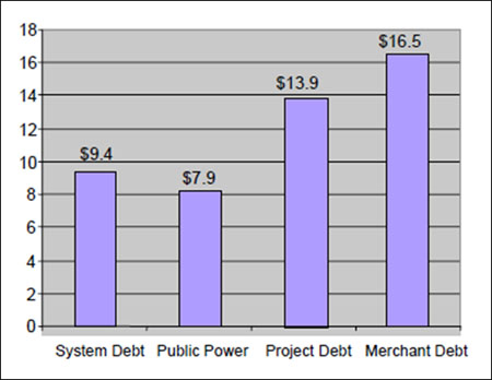
Project Finance
Project Finance
Project Finance is the funding of a specific project or group of projects (like a PV Solar electricity generation project) on a non-recourse basis through a special purpose entity. What does that exactly mean?
- The lenders to the project do not have access to the assets of the corporation, but only the assets of the project if the project defaults (non-recourse).
- There is a special purpose entity (SPE) set up to construct, operate and maintain the project(s). This SPE is responsible to also distribute the funds from operations such as expenses, taxes, debt service and returns to equity through the life of the project.
Why do we use project finance?
- Lower financing costs.
Because debt is cheaper than equity and a project financed structure can use more debt the overall cost of capital is lower. This makes the project have a higher return. To convince yourself of the benefits of leverage go to this simplified model. Play around with the debt percentages in cells d2 and g2. This shows how higher debt levels can increase returns to equity shareholders. Also please note that above a certain level of debt, the model does not compute a return. This is because, at a certain level of debt, lenders become less willing to capitalize projects if developers do not have some “skin in the game” (bear some risk). You will also see that the interest rate increases on the debt as the leverage goes up. Why do you think the interest on the debt would increase as the leverage increases? - Enforces discipline on how the project is developed and managed.
Because the debt is tied to a specific project, the project developers are required to spend the capital and manage the project subject to covenants agreed to by the lender and developer. - Allows greater investment in worthy projects.
By providing for the financing off the balance sheet and therefore not breaching its corporate debt covenants or other constraints, the developer can raise most of the funds to capitalize the project based on the projected cash flows of the project.
Lesson 3 Summary and Final Tasks
Summary and Final Task
In this lesson, we took closer look at the process of raising capital, from venture capital to stocks to bonds. The world of corporate finance can get very murky very fast; and, in some ways, it's more of a legal practice than a business practice. Our focus was on understanding the various mechanisms that are used to finance energy projects and the implications of those funding mechanisms on overall project costs.
When we are looking at social decisions that involve common costs and benefits, the discount rate is usually more of a matter of debate than anything else. But when a business decision is involved (and that business is a for-profit entity), then there is a rhyme and reason behind the determination of the discount rate as the "opportunity cost" of its investors. There are many different types of investors in a typical firm or project, all of whom face different opportunity costs, so we will encapsulate these in a single number called the "weighted average cost of capital" (WACC). The WACC turns out to be the correct discount rate for a company or a project.
Reminder - Complete all of the Lesson 3 tasks!
You have reached the end of Lesson 3! Double-check the What is Due for Lesson 3? list on the first page of this lesson to make sure you have completed all of the activities listed there before you begin Lesson 4.
Lesson 4 - Basic Accounting and Corporate Finance, Cont'd
The links below provide an outline of the material for this lesson. Be sure to carefully read through the entire lesson before returning to Canvas to submit your assignments.
Lesson 4 Overview
Lesson 4 Overview
Overview
The next series of lessons, starting with this one, will develop quantitative tools that will allow you to prepare an assessment of the profitability of an energy project, whether that project falls into a conventional energy category (e.g., a natural gas power plant) or a sustainable energy category (e.g., solar hot water heating). While our focus here will be on profitability as a performance metric for project evaluation, it is possible to use other performance metrics (such as life-cycle impacts; embedded energy, carbon equivalent or water). In the investment world, these alternative metrics are used less frequently in project evaluation.
This lesson will build up to the construction of the "pro forma" financial statement for a single energy project. Along the way, we will learn a little about the unique language of accounting, what "depreciation" means to a tax accountant, and how a "10K" is not just a road race.
Learning Outcomes
By the end of this lesson, you should be able to:
- Discuss topics related to basic accounting and corporate finance
- Differentiate debits (assets) from credits (liabilities) in an accounting statement and verify the fundamental accounting identity
- Explain the process of financial depreciation and calculate depreciation using several different methods
- Explain sensitivity analysis and uncertainty
- Build a Revenue Time Series
- Construct an Operating Expense Time Series
Reading Materials:
Basic accounting concepts and the items on the pro forma income and cash flow statements will be explained using the following resources
- Accounting Basics [41]
- A Primer on Financial Statements [42]
- "Primer on Financial Accounting," by Alison Kirby Jones [43] (especially the second part on income and cash flow)
What is due for Lesson 4?
This lesson will take us one week to complete. Please refer to the Course Calendar in Canvas for specific due dates. Specific directions and grading rubrics for assignment submissions can be found in the Lesson 4 module in Canvas.
- Participate in the Zoom call
- Complete Quiz 3
- Final Project: Revenue Time Series
- Final Project: Op Expense Time Series
Questions?
If you have any questions, please post them to our Questions? discussion forum (not email). I will not be reviewing these. I encourage you to work as a cohort in that space. If you do require assistance, please reach out to me directly after you have worked with your cohort --- I am always happy to get on a one-on-one call, or even better, with a group of you.
The Basic Language of Accounting
The Basic Language of Accounting
This is not a course in accounting. But I really recommend that you take one. Accounting often gets a reputation as a monotonous and boring field, and since there is so much number-crunching involved in accounting, there are times when this is true. But to really understand the drivers of how business decisions get made, you need to start with some accounting – because the process of accounting provides the basic language and building blocks for determining which companies, technologies, and projects will ultimately be viewed as successes and failures.
The goal in this section is to familiarize you with some of the most basic concepts in accounting. It's meant to get you comfortable with the language of ledgers, not necessarily to convert you into one of those guys with the green eyeshades [44]. And you might even understand why your taxes are so complicated (at least, if you live in the United States).
The website Investopedia has a very nice introduction to accounting concepts. [45] At this point, you should go ahead and read it, especially the first five parts (through the section on financial statements). Once you are comfortable with that material, go ahead and have a look at Alison Kirby Jones's accounting tutorial [43], which focuses nicely on financial accounting. The second part of the tutorial, which focuses on the accounting statements of income and cash flows, is most relevant to us.
What we will focus on in this lesson is the practice of financial accounting - the preparation of a synopsis of a company's financial health. The primary tools in financial accounting are a series of tables or "statements" that convey specific information about the financial position of the company. The most important of these statements are:
- Balance Sheet: Summarizes the financial position of a company - what its assets and liabilities are;
- Income Statement (or Profit and Loss or "P&L" Statement): Summarizes a company's operating revenues and expenses for a particular time period;
- Cash Flow Statement: Summarizes outflows and inflows of cash for a company over some period of time - it describes where a company gets its money (i.e., revenues from a product or service; investing activities, etc.). The income statement is generally divided into sections on "operating cash flow" (which comes from the income statement) and "investing cash flow," which is where we will find project capital costs.
The readings for this lesson and some of the discussion should focus on the company as the unit of analysis for accounting. But virtually all of the concepts that we develop can be applied to a specific project as well. In fact, the main purpose for going through these accounting concepts is so that you can apply them to the evaluation of energy projects, through a series of weekly assignments and (eventually) the final semester project.
The remainder of this section will be devoted to understanding the Balance Sheet and the Fundamental Accounting Identity. The Balance Sheet is just a tabular summary of the net financial position of a company at some point in time (note that this is a fundamental difference between the Balance Sheet and the P&L or Cash Flow Statements, which usually capture financial positions over a period of time, rather than just a snapshot). The Balance Sheet has just two columns - one which measures what the company owns (or its assets, sometimes called credits) and the other that measures what the company owes (or its liabilities, sometimes called debits).
Assets and liabilities, from an accounting standpoint, are just two sides of the same coin. When a company has possession of something that it hopes will net it a future benefit (an asset), that future benefit generates a "claimant" (liability). After all, if a company purchases equipment, supplies or labor, the money for those assets had to come from somewhere. Typical examples of claimants would include lenders (like a bank), shareholders in the company, or even the company's owners if they are the ones that put up money. Table 4.1 summarizes things that would go in the Asset and Liability sides of the Balance Sheet (note that this is just a summary of the figures on pages 3 and 4 of the Jones reading).
| Assets | Liabilities |
|---|---|
| Cash | Accounts Payable (what the company owes its suppliers) |
| Accounts Receivable (what the company is owed by customers) |
Claims by Lenders (what the company owes its creditors) |
| Inventory | Owner's Equity (anything that the owner or shareholders put up to fund the company) |
| Property, Plant and Equipment (PP&E basically any physical plant assets) |
One important feature of the Liabilities side of the Balance Sheet is how creditors (lenders) and suppliers are separated from equity owners (the company's employees and shareholders). Creditors and suppliers have claims to fixed sums of money from the company, equivalent to whatever they are owed. Equity owners have a claim to any "residual" income of the company after the creditors and suppliers have been paid. For this reason, equity owners are often referred to as "residual claimants."
Since every asset generates its own future liability, every entry on the Asset side of the Balance Sheet needs to have a corresponding entry on the Liability side. Put another way, Assets (the left side of the Balance Sheet) generally describe investing activities, which are undertaken by the company in order to make more money in the future (well, we hope). But the funds for those investing activities have to come from somewhere. So, the Liabilities (the right side of the Balance Sheet) describe the financial activities that are undertaken to support the investments. The Liabilities side of the balance sheet describes not only the total sum of what the company will owe to various parties in the future, but also what the distribution of those parties is (banks, shareholders, company owners, and so forth).
Owner's equity is the simplest example. If I set up a company with $10,000 of my own money, then the balance sheet on the first day of the company's operations would look like the one shown in Table 4.2:
| Assets | Liabilities |
|---|---|
| Cash: $10,000 | Accounts payable: $0 (what the company owes its suppliers) |
| Accounts Receivable : $0 (what the company is owed by customers) |
Claims by lenders: $0 (what the company owes its creditors) |
| Inventory: $0 | Owner's equity: $10,000 (anything that the owner or shareholders put up to fund the company) |
| Property, Plant and Equipment : $0 (PP&E basically any physical plant assets) |
Here is another example, which builds upon Table 4.2. Suppose now I issue shares of stock in my company, to the tune of another $10,000. I use $5,000 of that money to purchase a piece of office equipment. On the Assets side, I would then have $15,000 in cash and $5,000 worth of PP&E. On the Liabilities side, I would have $20,000 worth of owner's equity. This is shown in Table 4.3.
| Assets | Liabilities |
|---|---|
| Cash: $15,000 | Accounts payable: $0 (what the company owes its suppliers) |
| Accounts Receivable: $0 (what the company is owed by customers) |
Claims by Lenders: $0 (what the company owes its creditors) |
| Inventory: $0 | Owner's Equity: $20,000 (anything that the owner or shareholders put up to fund the company) |
| Property, Plant and Equipment: $5,000 (PP&E basically any physical plant assets) |
As one final example, suppose that instead of using the cash I raised to purchase the $5,000 worth of office equipment, I purchased the equipment half with cash and half on credit from an office supply store. This credit is a promise to pay the office supply store $2,500 at some future point. So, at that point, I would have $17,500 in cash and $5,000 worth of PP&E in the Assets column. As Liabilities, I would have the $2,500 of credit from the office supply store as Accounts Payable, plus the $20,000 in owner's equity. This situation is shown in Table 4.4.
| Assets | Liabilities |
|---|---|
| Cash: $17,500 | Accounts payable: $2,500 (what the company owes its suppliers) |
| Accounts Receivable: $0 (what the company is owed by customers) |
Claims by lenders: $0 (what the company owes its creditors) |
| Inventory: $0 | Owner's equity: $20,000 (anything that the owner or shareholders put up to fund the company) |
| Property, Plant and Equipment: $5,000 (PP&E basically any physical plant assets) |
You might have noticed that the Assets and Liabilities columns both add up to the same number ($10,000 in Table 4.1, or $22,500 in Table 4.4). This is no accident - the examples collectively illustrate what is known as the Fundamental Accounting Identity, which states that the sum of Liabilities to creditors and owner's equity (which, remember, includes shareholders) must equal the company's total Assets.
Depreciation Accounting
Depreciation Accounting
The term "depreciation" usually refers to the physical degradation of some capital asset, like wear and tear. My car, for example, doesn't drive as smoothly with 120,000 miles on it as it did when it had 12,000 miles. As some piece of capital gets older, you might naturally expect it to be worth less, either because it requires more maintenance or because it cannot be resold for as high a price. (Though the concept of "value" of physical plant can be a bit tricky, as we will learn in the next section.) It is often said that the value of a new car drops by 20% as soon as it is driven off the lot, even though it's basically the same vehicle that was bought for a new-car price. This illustrates the difference that can sometimes arise between physical depreciation and the depreciation in a capital asset's store of value.
Depreciation of an asset's store of value has substantial implications for the financial analysis of energy projects. You might recall from Lesson 5 that the profits of a regulated public utility are determined in large part by its total stock of non-depreciated capital. Who determines the rate at which a power plant, substation or other asset depreciates in value? Similarly, tax authorities in many countries allow companies to "write off" the depreciated value of assets when calculating their total income on which they are subject to paying tax. The term "write off" here refers to a deduction from total taxable income, rather than a deduction in the total tax bill, per se. For example, if you can claim that some capital asset has depreciated in value by $100 over the course of some year, and the tax rate is 35%, then that $100 asset depreciation will ultimately lower your tax bill by $35 (35% of $100), not by $100. This is the difference between a "tax deduction" and a "tax credit." Tax credits will appear later in the course when we discuss financial subsidies for energy projects.
The rate at which an asset is financially depreciated for tax, regulatory, or other financial purposes may be very different than the rate at which the asset actually physically depreciates in value. It is even possible that an asset could be treated as completely depreciated in the eyes of a regulator or the tax authority, yet could still be generating a lot of value for its owner. Many power plants or natural gas mains in the U.S., for example, are several decades old - well beyond their intended 30 to 40 year life spans. These assets are mostly considered to be depreciated assets, yet some continue to be highly profitable.
Depreciation allowances are usually determined by the regulator, tax authority or other relevant oversight body in order to allow the owners of depreciable capital assets to recover the costs of those assets through a series of tax deductions or other gains over the course of some number of years. The idea here is to encourage investment by allowing companies to use investment vehicles to reduce their tax burden. Our discussion here will focus on depreciation allowances that are allowed by tax authorities, since those allowances are ultimately the most important for development of energy project financial statements. The U.S. Internal Revenue Service, if you happen to be interested, maintains a mind-bogglingly complex list of types of property that are eligible for different depreciation schedules and methods. Here is an "introduction" to depreciation from the IRS. [46]
A depreciation schedule lists the percentage of the original (so-called "book") value of a piece of property that can be claimed as a depreciation allowance for tax reporting purposes. Broadly, there are two types of depreciation schedules: straight-line depreciation and so-called accelerated depreciation methods.
Before we get into the mechanics of depreciation, we need to develop some notation.
- P = the up-front cost of the asset;
- F = the salvage value of the asset at the end of its useful life;
- N = the number of years over which the asset will be depreciated;
- A(t) = the depreciation allowance for year t (t = 1,…, N), in percentage terms, such that (i.e., the asset must be fully depreciated over N years);
- D(t) = the depreciation allowance for year t (t = 1,…, N), in dollar terms, so that D(t)=A(t)×P;
- B(t) = the remaining book value of the asset after year t.
Based on these definitions, we can immediately see that B(t) is just equal to the original book value (P) less all of the cumulative depreciation allowances from year 1 to year t. In mathematical terms,
Table 4.5 provides the mathematical formulas for some common depreciation methods. Note that Modified Accelerated Cost Recovery Systems (MACRS), which have become more commonplace, are not included in Table 4.5 but will be discussed below.
| Depreciation Method | D(t) | B(t) |
|---|---|---|
| Straight Line | ||
| Sum of the Year's Digits | ||
| Declining Balance | ||
| Note: | ||
The most straightforward depreciation method is straight-line depreciation. Under straight-line depreciation, the book value of an asset (less its salvage value, if any) can be depreciated evenly over some number of years. For example, if you had an asset with a book value of $1,000; no salvage value; and a ten-year depreciation horizon, you could claim $100 each year for ten years as a depreciation expense and tax deduction.
The other three depreciation methods that we will discuss here - sum of the year's digits, declining balance, and MACRS - are all forms of "accelerated depreciation." Under accelerated depreciation systems, a larger proportion of the asset's book value is allowed to be depreciated in the earlier years of its use, with smaller proportions depreciated in later years of use. This allows the asset owner to enjoy a lower tax burden earlier in the asset's life. Other things being equal, this leads to higher profits in the years immediately following investment. Accelerated depreciation can substantially affect the value of an asset to its owner; we will see later just how this re-allocation of tax burden and profits across the useful life of an asset increases the asset's lifetime benefit to its owner.
The three accelerated depreciation methods that we will illustrate in this lesson are:
- Sum of the Year's Digits (SYD): SYD is best illustrated using a simple example. Suppose that an asset could be depreciated over five years. Then the sum of the digits would be 1+2+3+4+5 = 15. The first year, you could claim 5/15 = 33% of the asset's book value as a depreciation expense, so that A(1) = 33%. The second year, the depreciation allowance would be A(2) = 4/15 = 27%. You can verify for yourself that A(3) = 20%; A(4) = 13%; and A(5) = 7%.
- Declining balance: This could also be called "exponential depreciation" since it depreciates an asset at a constant rate, rather than a constant amount. If an asset is depreciated using the declining balance method over a fixed number of years, the residual book value of the asset is used as the depreciation allowance in the final year. For example, if you had a $100 asset with no salvage value, and were claiming depreciation according to the declining balance system at 25% per year over five years, in the first year your depreciation allowance would be D(1) = 0.25 × $100 = $25. In the second year, you would have D(2) = 0.25 × ($100 - $25) = 0.25 × $75 = $18.75. You can verify for yourself that D(3) = $14.06; D(4) = $10.55, and D(5) = $7.91.
- Modified Accelerated Cost Recovery: MACRS, popular in the United States, is embodied in a series of depreciation tables published by the U.S. Internal Revenue Service. The tables dictate the values of A(t) to be used each year, and also describe which types of assets are eligible for MACRS and over how many years. In other words, different asset types have different values of N and different depreciation schedules A(t). One thing to note about MACRS is that the N-year depreciation schedules actually cover N+1 years (so, for example, five-year MACRS allows depreciation over six years).
As a means of comparison between all of these methods, let's take a hypothetical asset with a book value of $1,000 and zero salvage value, and depreciate that asset over a ten-year time horizon. Table 4.6 and Figure 4.1 show the values of B(t) during each year for each of the four methods. For declining balance, we will use 25% per year. For MACRS we are using the 10-year table in Appendix 1 of Publication 496 [47].
As an exercise, see if you can reproduce the table and the figure.
| Year | Straight-Line | SYD | MACRS | Balance |
|---|---|---|---|---|
| 0 | $1,000.00 | $1,000.00 | $1,000.00 | $1,000.00 |
| 1 | $900.00 | $818.18 | $900.00 | $750.00 |
| 2 | $800.00 | $654.55 | $720.00 | $562.50 |
| 3 | $700.00 | $509.09 | $576.00 | $421.88 |
| 4 | $600.00 | $381.82 | $460.80 | $316.41 |
| 5 | $500.00 | $272.73 | $368.60 | $237.30 |
| 6 | $400.00 | $181.82 | $294.90 | $177.98 |
| 7 | $300.00 | $109.09 | $229.40 | $133.48 |
| 8 | $200.00 | $54.55 | $163.90 | $100.11 |
| 9 | $100.00 | $18.18 | $98.30 | $75.08 |
| 10 | $ --- | $ --- | $32.70 | $ --- |
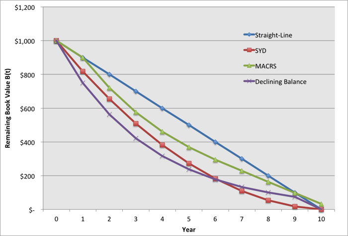
The Pro Forma Income (P&L) and Cash Flow Statements
The Pro Forma Income (P&L) and Cash Flow Statements
The Balance Sheet that was discussed earlier in this lesson provides a snapshot in time of the financial health of a firm or the valuation (again, at a snapshot in time) of a specific investment project. The last two financial statements - the P&L and the cash flow statement - are used in two ways, depending on whether the entity under analysis is a company or a specific project. Either way, they have roughly the same format.
At this point, please read "A Primer on Financial Statements." [48] The first big table in the article lays out the structure of the P&L statement pretty nicely, at least up until the row that is labeled "Net Income." The rows below Net Income pertain to calculating financial metrics for valuation of specific companies. The P&L and cash flow statements for U.S. companies, at least those that are publicly traded, are laid out in a mandatory quarterly filing to the Securities and Exchange Commission called the Form 10K. Some companies publish similar information in their annual reports to shareholders, but these annual reports are not subject to any sort of regulatory scrutiny, whereas 10K filings can be audited if necessary. So, the 10K is the real deal as far as determining the financial position of a company. This is not to say that all companies massage the numbers in their annual shareholder reports, only that you may find differences between the annual report and the 10K, if you look hard enough. 10K filings in the U.S. are public information, so you should be able to easily find them, as long as the company is required to file one.
Individual energy projects are often evaluated using P&L and Cash Flow statements that jointly are known as the "pro forma." Unlike the P&L and Cash Flow statements for a company, which should represent actual historical data, the pro forma represents the analyst's evaluation of the financial worthiness of a potential energy project. (It is possible to put together a historical pro forma for an individual energy project, but we'll focus on the pro forma for evaluation of potential energy projects.)
As we go through the various parts of the pro forma, it will be useful to refer to a numerical example, to keep things a little less abstract. I have posted a simple pro forma statement for a hypothetical natural gas power plant, in Microsoft Excel format. Look for the Pro Forma Example.xlsx file in the in Canvas. Please download the spreadsheet for reference (for those who do not have access to Excel, the spreadsheet should be easily opened in Open Office or in a Google Spreadsheet). The spreadsheet has four tabs:
- The Plant Properties tab contains some overview information about the power plant. This is reprinted here as Table 4.7.
- The Depreciation tab contains the annual depreciation allowances (the A(t) values) assuming that all components of the plant are eligible for 10-year MACRS depreciation.
- The P&L tab contains the P&L statement for a fifteen-year operational period.
- The Cash Flow tab contains the Cash Flow statement for the same fifteen-year operational period.
Our hypothetical natural gas power plant has the following properties that are shown in Table 4.7 (from the Plant Properties tab). Some of these plant properties aren't relevant to us right now, but we will come back and use this hypothetical plant as an example in future lessons.
| Capital Cost | $500,000 | |
| Annual discount rate | 10% | |
| Decision Horizon (N) | 10 | Years |
| Annual Output | 4500 | MWh |
| Marginal Cost | $60 | per MWh |
| Variable O&M | $5 | MWh |
| Fixed O&M | $10,000 | per year |
| Tax Rate | 35% |
Below this table on the Plant Properties tab, you will notice a set of assumed annual sales prices, in $ per MWh, for the fifteen-year operational period.
Table 4.8 shows the first few years of the P&L statement (not all fifteen; for the full P&L statement, please refer to the Excel spreadsheet in Canvas). We will refer to Table 4.8 as we go through the items on the P&L statement.
First, note that we label the construction year as "Year 0" and the operational years as "Year 1-15." That is just a numbering convention indicating that we assume that the power plant is built this year and is operated beginning the following year for fifteen subsequent years.
The first section of the P&L, on lines (1) through (5), outlines the costs and revenues of the power plant project.
- Line (1) contains the construction cost from the Plant Properties tab. This cost is assumed to be incurred only in Year 0.
- Line (2) contains the annual revenue from energy sales, equal to the annual production of 4,500 MWh times the annual electricity price (which changes from year to year).
- Line (3) contains the annual variable operating cost, which is equal to the annual production of 4,500 MWh times the sum of the marginal cost and the variable O&M cost (both are assumed to be constant at $60 per MWh and $5 per MWh, respectively).
- Line (4) contains the fixed O&M cost, assumed to be $10,000 per year.
- Line (5) shows net operating revenue before taxes and depreciation, also known sometimes as the EBIDTA (Earnings Before Interest, Depreciation and Taxes). This is equal to total revenues minus total expenses, or Line (2) less the sum of Lines (3) and (4).
| Year 0 | Year 1 | Year 2 | Year 3 | ||
|---|---|---|---|---|---|
| (1) | Construction Cost | $500,000 | $ | $ | $ |
| (2) | Annual Operating Revenue | $428,175 | $305,332 | $383,445 | |
| (3) | Annual Variable Operating Cost | $292,500 | $292,500 | $292,500 | |
| (4) | Annual Fixed Operating Cost | $10,000 | $10,000 | $10,000 | |
| (5) | Annual Net Operating Revenue | $125,675 | $2,832 | $80,945 | |
| (6) | |||||
| (7) | Depreciation Expense | $50,000 | $90,000 | $72,000 | |
| (8) | |||||
| (9) | Taxable Net Income | $75,675 | $(87,168) | $8,945 | |
| (10) | |||||
| (11) | Taxes | $26,486 | $------ | $3,131 | |
| (12) | |||||
| (13) | Income Net of Taxes | $49,189 | $(87,168) | $5,814 |
Lines (7) and (9) incorporate the depreciation allowance. The depreciation allowance is calculated using the $500,000 book value of the plant (i.e., the construction cost) and the annual depreciation allowance percentages from the MACRS table (the Depreciation tab in the spreadsheet). Taxable net income on Line (9) is calculated as the net operating revenue or EBIDTA, less the allowable tax deduction for depreciation.
Taxes owed by the plant are shown in Line (11), equal in this example to 35% of taxable net income, as long as taxable net income is positive. In year 2, for example, you will notice that the plant has a large negative taxable net income. This is not because the plant did not make any money (it made a little bit as you could see from Line (5) in Table 8.8) but because the allowable depreciation expense is so large that for tax purposes it appears as though the plant lost money. In this case, there is no income to be taxed, and the plant would not pay any taxes that year. On the P&L statement, its income net of taxes (Line (13) in Table 4.8) would be negative.
Of course, the plant did not really lose money in year 2, because the depreciation expense is not a real expense, in the sense of representing a cash outlay by the company that owns the power plant. For the purposes of calculating tax liability, however, the depreciation allowance is treated as a real expense.
Finally, we move onto the Cash Flow statement. In this example, the Cash Flow statement is much easier to put together than the P&L statement. Table 4.9 shows the first few years of the Cash Flow statement for purposes of illustration.
| Year 0 | Year 1 | Year 2 | Year 3 | ||
|---|---|---|---|---|---|
| (1) | Investment Activities | $(500,000) | |||
| (2) | |||||
| (3) | Net Income from Operating | $49,189 | $(87,168) | $5,814 | |
| (4) | |||||
| (5) | Depreciation Expenses | $50,000 | $90,000 | $72,000 | |
| (6) | |||||
| (7) | Net increase or decrease | ||||
| (8) | in cash | $(500,000) | $99,189 | $2,832 | $77,814 |
The first line on the Cash Flow statement lists all investment activities in that year - these represent outlays of cash (even if the Balance Sheet for that year would indicate that the investment activities were financed through debt or owner/shareholder equity). In our example, there is only one year - the construction year - with any investment activities. Line (3) is the final line item from the P&L statement, showing the post-tax net income from operating activities. The crucial point to remember here is that this figure includes the depreciation expense, which is not a real expense in the sense of any cash outlays. So, to get a real sense of how the project's cash holdings have changed throughout the year we need to add the depreciation expenses (Line (5) in Table 4.9) back to the net income (Line (3) from Table 4.9). The resulting sum is the "Net increase or decrease in cash," and it shows the end-of-year cash holdings for the power plant project. These cash holdings are used to pay back creditors and are disbursed among equity shareholders (i.e., the project's owners).
Lesson 4 Summary and Final Tasks
Summary and Final Tasks
Summary
Accounting is the language that is used to describe business transactions and the financial viability of companies and projects. This same language is used to determine the viability of any type of for-profit energy company and project, whether based on conventional or alternative energy resources or technologies. We learned about the three fundamental accounting statements – the Balance Sheet, the P&L, and the Cash Flow. The latter two of these make up the “pro forma” evaluation of a potential energy project.
Reminder - Complete all of the Lesson 4 tasks!
You have reached the end of Lesson 4! Double check the What is Due for Lesson 4? list on the first page of this lesson to make sure you have completed all of the activities listed there before you begin Lesson 5.
Lesson 5 - Cost-Benefit Analysis and Decision Making
The links below provide an outline of the material for this lesson. Be sure to carefully read through the entire lesson before returning to Canvas to submit your assignments.
Lesson 5 Overview
Overview
Many major energy projects last a long time. Even those that aren't quite so long-lived are built with the intention that they will operate for many years. Moreover, different energy technology options have different construction and operating costs. The finances of energy projects can be difficult to evaluate for just this reason - they often involve large immediate capital outlays, followed by a stream of revenues (or costs, if the project is uneconomical) over a long period of time. The process of "discounting" is the way that we think about future costs and revenues in terms of decisions that we are forced to make today.
This lesson will be the most mathematically-intensive of the semester. We will learn about the "net present value" as a way of measuring the benefits versus the costs of a long-lived energy project. We will also discuss several other metrics that can be used to evaluate energy projects, and how these metrics are complementary — and can sometimes cause confusion. These metrics represent the “language” of the energy finance community who is responsible to make decisions about financing projects. The market participants use these metrics to compare energy capital investments against each other as well as against other ways to invest capital. For this reason it is very important for the energy professional to master them.
Learning Outcomes
By the end of this lesson, you should be able to:
- Discuss topics related to cost-benefit analysis and decision making
- determine discounted cash flows for an energy project and calculate the net present value based on the pro forma statements
- calculate the internal rate of return for an energy project
- compare the internal rate of return with the project's discount rate, and explain why the internal rate of return will not necessarily lead you to choose the most profitable project
- calculate the levelized cost of energy for an energy project
- develop a solid estimate of the capital costs for your final project
Reading Materials
There are lots of good online resources for understanding net present value. Our primary external resource will be the article Have We Caught Your Interest? [49] This article goes deeper into the math than we will need to, but is nice and concise, and has all of the relevant information on discounting. You should skim this piece before you start in on the lesson material online. You can then return to the reading as a reference.
What is due for Lesson 5?
This lesson will take us one week to complete. Please refer to the Course Calendar in Canvas for specific due dates. Specific directions and grading rubrics for assignment submissions can be found in the Lesson 5 module in Canvas.
- Final Project: Capital Costs
Questions?
If you have any questions, please post them to our Questions? discussion forum (not email). I will not be reviewing these. I encourage you to work as a cohort in that space. If you do require assistance, please reach out to me directly after you have worked with your cohort --- I am always happy to get on a one-on-one call, or even better, with a group of you.
Discounting the Future
Discounting the Future
Suppose, hypothetically (or perhaps not), that you really like chicken wings. Now, suppose that I were going to give you chicken wings right now. If you are hungry, then you will be happy since I am giving you something that: (a) sates your hunger; and (b) tastes yummy. And I'm giving them to you right now. No waiting.
Now, suppose that I told you that I would give you the same chicken wings, but one hour from now. Assume that I just bought the chicken wings, and I'm going to let them sit in my car for the next hour. How happy are you right now about the prospect of getting these particular chicken wings in one hour? Well, maybe they will get a little bit cold, and maybe in the meantime you would eat something else to satisfy your hunger, but in one hour they will seem like pretty much the same chicken wings.
Now, suppose that I buy chicken wings right now, but I'm going to wait until tomorrow (24 hours from now) to give it to you. How happy are you right now about these chicken wings that you will get tomorrow? Probably less so - first of all, you are hungry now. Sure, you will be hungry again tomorrow, but will those chicken wings taste quite as good after sitting in my car for a day? Probably not.
Now, (really, we're almost to the point), suppose that I buy chicken wings right now, but I'm going to wait six months to give them to you. How happy are you right now about these chicken wings that will sit in my car for six months before being given to you? What will happen to those chicken wings between now and six months from now? Will they still even be recognizable as chicken wings? I won't even mention the special sauce…
On the other hand, they’re chicken wings. Why is it any different to you whether you get it now, a day from now, or six months from now? Basically, there are three reasons:
- Physical depreciation: After six months or even maybe one day, those chicken wings won't be as tasty as right now because they are a perishable product. This is the same thing as "inflation" when we talk about money. Inflation depreciates the purchasing power of a fixed quantity of money.
- Impatience: If you are hungry, then you want the chicken wings right now, not sometime in the future. Even if I told you that I would buy you fresh chicken wings six months from now, that's not a very meaningful promise at this moment in time. Remember, you are hungry now!!!
- Opportunity cost: If I make you wait an hour for the chicken wings, then you have to be hungry for an hour. On the other hand, you could also eat something else right now instead of having to wait an hour for the chicken wings. Whatever you chose not to eat right now in order to wait for the chicken wings reflects an "opportunity cost" that you have foregone.
Evidently, the same chicken wings (whether they will be fresh or had sat in my car for some unfathomable period of time) are worth less to you if you get them in the future than if you get them now. The process of measuring how fast those chicken wings lose value to you, relative to their value right now, is called discounting. The "discount rate" measures how quickly or slowly something loses value over time. A high discount rate means that something loses value quickly relative to its value at the present time. A low discount rate means that something loses value slowly relative to its value at the present time. A discount rate of zero means that something does not lose any value over time - it's worth just as much in a day, week, year, decade, or century as it is right now. Remember: the discount rate measures how quickly something loses value over time. It does not measure whether something is valuable or not valuable in absolute terms.
The particular method of discounting that we will cover in this lesson is known as "exponential discounting" because of the assumption that something loses value at a constant rate (percent per year) over time. An alternative discounting method that we won't cover, but you can look at in your spare time, is known as "hyperbolic discounting." Wikipedia has a nice article on hyperbolic discounting. [50]
Before we can dive in, we need some terminology:
- PV = Present Value, i.e., the value of something today (or what something in the future is worth to you in today's terms). The present value is sometimes called the "principal" (as in the case of a loan).
- FV(t) = Future Value of something at time t. This time t is usually defined relative to the present day, and usually (but not always, so be careful) in years. So, t = 5 would mean five years from this year.
- r = Discount rate, in percentage terms. This is also usually defined on an annual basis, but does not need to be. So, a value of r = 0.05 would be a discount rate of 5% per year. In the case of a loan, r is equivalent to the annual interest rate.
Suppose that you were to put some amount PV in a simple investment vehicle, like a bank account, that paid back your money plus a rate of return r every year. The future value of that amount in one year (t=1) would be:
If you kept your money in the account for another year, in that second year you would earn a rate of return r on all the money that was in your account the first year:
Note that you have effectively earned interest in the second year on the interest that you earned in the first year. This phenomenon is called "compounding." Since interest is calculated once per year in this model, we call this "annual compounding."
There is a detailed section in the "Have We Caught Your Interest" reading that discusses compounding at intervals more frequent than annually, all the way up to continuous compounding. Please read this section carefully, although in this class we will use annual compounding almost exclusively.
Going back to our little bank account, more generally, in year t the future value of the investment that you make today is:
This equation is an indifference condition - it says that you would be equally happy getting some amount of money PV right now, or if you had to wait t years to get your money. The factor just measures your opportunity cost for having to wait t years.
Now, we will flip the equation on its head. Suppose that you were promised some amount of money FV(t) in year t, sometime in the future. What is that promise of future wealth worth to you today? In other words, what would you need to be paid today in order to be equally happy between getting money today and getting the amount FV(t) in the future? We can find this by manipulating the previous equation to solve for PV. Dividing both sides by , we get:
Assuming that r is greater than zero, this means that the value in the present of some amount of money that you are going to get in the future is lower than the face value of that amount of money. In other words, you would be willing to accept less money right now in exchange for not needing to wait to get it. This is sensible, if you think about it. First, people are impatient. Second, there is an opportunity cost to waiting. If I got some amount PV right now (rather than some larger amount FV(t) in the future), then I could take that amount PV and do something with it that might increase its worth t years from now.
The term is known as the "discount factor" and it measures how quickly something has declined in value between now and t periods from now.
Here are two examples that illustrate the mechanics of discounting.
Example #1: Suppose that r = 0.04 (4%), t=20. The discount factor is equal to:
Thus, PV = 0.46×FV. What this says is that the present value is less than half of the future value after 20 years.
Example #2: Now suppose that t = 100. The discount factor is equal to:
Thus, PV = 0.02×FV. What this says is that the present value is only 2% of the future value.
These two examples, although simple and without much context, illustrate two important properties of exponential discounting. First, at any positive discount rate, if you go far enough into the future, then the future is worthless, and you would never consider it when making decisions in the present. Second, the higher the discount rate, the faster the future becomes worthless relative to the present. Remember that the discount rate does not determine whether one thing will be worth more or less in the future than another thing. It only measures the value of something in the future relative to that same thing in the present (like chicken wings six months from now versus the exact same chicken wings today).
There is almost nothing that puts students to sleep faster than the discount rate. Frankly, it's a dry topic. But the discount rate is actually front and center - in some ways, much more so than any science - in the debate over climate change and how societies should respond. The reason for the controversy is simple - if the worst impacts of climate change are going to be felt even two generations from now, then unless we use a discount rate of zero or near zero (meaning that we value the future exactly as much as the present) it is difficult to justify large and costly climate-related interventions in the present, in order to yield substantial benefits far in the future. But such a low discount rate flies in the face of what economists actually know about preferences that people seem to have for happiness now versus happiness (or wealth) in the future. If you are really interested in this topic from the perspective of climate change, Grist has a nice piece [51] (from a while ago). Since our focus in this course is on commodity markets and business decisions, we'll find (in the next couple of lessons) that there is a logical way to determine the "right" discount rate for those types of decisions.
Project Decision Metrics: Net Present Value
Project Decision Metrics: Net Present Value
Suppose that you were an electric utility considering two potential generation investment opportunities: A natural gas-fired generator with a capital cost of 600 dollars per kW and operating costs of 50 dollars per MWh, or a wind farm with a capital cost of 1,200 dollars per kW and operating costs of 5 dollars per MWh. For the purposes of this example, assume that either power plant could meet the same reliability goals that your utility had. But your regulator wants you to minimize economic costs to consumers. Which should you pick?
This is a difficult choice because it involves tradeoffs over time. The natural gas generator has a low up-front cost but a higher operating cost. The wind generator has a higher up-front cost but a very low operating cost, because fuel from the wind is free (at the margin). This tradeoff is shown visually in Figure 5.1, for a 1 MW natural gas and wind power plant — for the sake of comparison, we assume that each of the plants operates 30% of the time, so each produces 1 MW × 8,760 × 0.3 = 2,628 MWh per year.
This 30% figure is called the capacity factor, and it measures how much electricity a power plant produces in a year versus how much it could produce each year if it operated all the time at 100% capacity.
Capacity Factor = (Annual Production) ÷ (Capacity × 8,760 hours per year).
Figure 5.1 illustrates the tradeoff but doesn't say much about which decision you should make. Part of the problem is that by investing in the wind turbine, you are accepting a high cost right now in exchange for a stream of operating cost savings in the future. Is this stream of operating cost savings worth it?
One of the most frequently-used metrics to compare projects with different capital and operating cost streams is the net present value, which incorporates the present discounted value of all project costs and revenues.
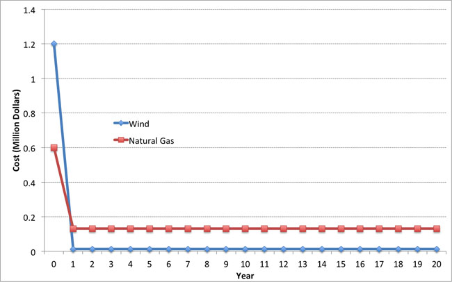
The net present value (NPV) is defined by two terms: the present discounted value of costs and the present discounted value of revenues. If we let Bt be the (undiscounted) revenues (benefits) of some project during year t and we let Ct be the (undiscounted) costs of the same project during year t, then we can calculate the NPV as follows:
/p>
In the equations, T is the time horizon for the project and r is the discount rate. If the net present value of a project is greater than zero, then the project is said to break even or be "feasible" in present discounted value terms. If you are in a position where you are evaluating multiple alternatives, you would normally want to choose the alternative with the highest net present value.
Sometimes, we will be interested in the net present value of a project as of some year prior to T. We will call this the "Cumulative NPV" as of year X. Mathematically, this is defined as:
Where X is some number smaller than T.
To illustrate, let's go back to one of our examples from earlier in this lesson. Our wind power plant had a capital cost of $1.2 million and annual operations costs of $13,140. Suppose that it had annual revenues of $100,000 and faced a discount rate of 10% per year. Each year, it thus has annual profits of $86,860.
Assuming that all of the capital costs were incurred in Year 0 and the plant began operating in Year 1, the present discounted value of each of the first three years of operation would be:
PV(0) = -$1.2 million (this is just the capital cost, note that this is a negative number)
PV(1) = $86,860÷(1.1)1 = $78,963.64
PV(2) = $86,860÷(1.1)2 = $71,785,12
PV(3) = $86,860÷(1.1)3 = $65,259.20
The Cumulative NPV for the first three years would be:
Cumulative NPV(0) = PV(0) -$1.2 million
Cumulative NPV(1) = PV(0) + PV(1) = -$1.12 million
Cumulative NPV(1) = PV(0) + PV(1) + PV(2) = -$1.05 million
Cumulative NPV(1) = PV(0) + PV(1) + PV(2) + PV(3) = -$983,992
Calculating NPV is reasonably straightforward in a spreadsheet program such as Excel. There are two functions in Excel, PV and NPV, that will calculate net present value for you. The difference between the PV and NPV functions is that the PV function assumes that you have the same profits in each period (as in our example above), while the NPV function does not make this assumption.
The video below shows an example of evaluating NPV using Excel. The example in the video is our natural gas plant from the previous lesson. Registered students can access the Excel file discussed in the video in Canvas.
Video: NPV Example Video (15:19)
So in this video, I'm going to show you how to set up a very simple undiscounted cash flow analysis and calculate a net present value in Excel two different ways. So we're going to go through two different ways of calculating the net present value. One way will be basically by brute force, which will show you how to calculate the present discounted value of costs and benefits in each year. And then you add them up by brute force to get NPV.
The second way is using a built-in function in Excel called the PV function. So we're going to go through both of these. The example or the situation that we're going to use is a power plant. So we have an example of a hypothetical power plant. And it has some capital cost, so some cost to build.
And then once it's built, it has some annual costs in revenues. And so the question is, in present value terms, does this plant make any money? Does this plant pass the cost benefit test? Are the present discounted value of all of the benefits equal-- or all of the revenues, really-- equal to the present discounted value of all of the costs? Or are they bigger, or are they smaller.
So I'm going to start off by typing in some numbers here. And this spreadsheet will also be posted up on Angel if you want to take a look at it. So I'm going to assume that the capital cost is $500,000. So that's how much it costs to build the plant. I'm going to assume that the interest rate here is 10%. I'm going to assume that the relevant decision horizon here is 5 years. So that's the time period over which we're evaluating the profitability of the plant.
I'm going to assume that its annual output is 4,500 megawatt hours of electrical energy. I'm going to assume that its variable cost, so the cost to produce 1 megawatt hour is $60. And so the total annual operating cost, where I here written total variable cost is going to be equal to $60 per megawatt hour times the number of megawatt hours. And so what we get is $270,000 per year. That's how much it costs to operate this plant, assuming that it produces 4,500 megawatt hours each year.
So the sales price for each megawatt hour I assume is going to be $90 per megawatt hour. And so then we can calculate the annual revenue is equal to the sales price, $90 per megawatt hour times the number megawatt hours. And so what we get is annual revenues of $405,000 per year.
The stuff below the cost and revenue figures in the spreadsheet is basically the simple version of the cash flow balance sheet for this power plant. So you have a column for capital cost, a column for operating cost, a column for revenue, a column for the annual undiscounted cash flow, or the net benefit, a column for the discounted cash flow, and then a column here, which I have labeled as cumulative net present value, which will show the overall net present value of this power plant after each year.
And we have year 0, so the current year, all the way down through 5 years from now. So now we have to fill in these table with numbers. So the capital cost we assume is incurred only in year 0. So you only have to spend money this year to build the plant. So that's going to be equal to minus $500,000. You have to be a little careful here when you're doing these things in Excel. You have to be careful that costs are negative numbers and revenues are positive numbers. Otherwise, Excel will mess up your calculations because it doesn't know which one is which.
So this plant has a capital cost of $500,000 in year 0, and that no capital cost in years 1 through 5. So are we going to assume here that the plant is built in year 0 and operates in year 1 through 5. So in each of years 1 through 5, we're going to have an operating cost equal to minus $270,000. And that's going to be the same for each year. Revenues in each year are going to be equal to positive $405,000. and those are going to be the same for each year.
So the annual undiscounted cash flow is going to be the sum of capital cost, operating cost, and revenue for each year. So I'm going to use the sum function here in Excel. Summing over those three columns. In undiscounted terms, this plant costs the owner $500,000 in the first year, and then brings in benefits equal to $135,000 a year for five years.
So now we need to discount this. So remember that to discount some future value back to the present, we take that future value and divide by 1 plus the interest rate raised to the t-th power, where t is the year that we're talking about. So we're going to take this and divide it by 1 plus-- and I'm going to lock this cell by putting dollar signs around it-- raised to 0th power. And so this is just going to give us minus $500,000, because we're raising something to the 0th power, so she's going to be 1.
And then in this cell here, we have next year's future value of $135,000 discounted by one year. So this is $135,000 that we would enjoy in one year. And that's equivalent to $122,727.27 this year. We can do the same thing for years 2 through 5.
So what the discounted cash flow column tells us is the present discounted value of each year's costs and benefits. What we sometimes want to know is, after some number of years, how is the plant doing? What are its cumulative present discounted costs and benefits up to that year?
So to do that, we start with year 0, which is minus $500,000. And then the cumulative net present value of the power plant after the first year is equal to its net present value after 0 years, or minus $500,000. Plus whatever the present discounted value of the first year's net revenues are.
The cumulative net present value in year 2 is equal to whatever the plant was worth cumulatively at the end of year 1, which would be this $377,272.73 plus the present discounted value of its net revenues in year 2.
And if we keep going here, what we find is that at the end of year 5, in present discounted value terms, the plant is worth $11,756.21. So that's the same thing that you would get if you were to add up all of the discounted cash flows. So I'll do that here.
So if you add all of the discounted cash flows, just following the formula that was in the reading and in the lecture notes, you'll get the same thing as what you would get in year 5 if you calculated the cumulative net present value of this plant after every year.
So that's how you would use Excel to calculate the net present value, or to do what we call discounted cash flow analysis by brute force. So what we did was we figured out the costs and revenues each year in these cells over here, calculated the undiscounted cash flow, discounted appropriately back to present value terms, and then added everything up.
In Excel, there's a way to do this with a shortcut, without having to do all of these calculations manually. And it is called the Present Value or PV function. And so the way that you would call the PV function is to type =pv and then parentheses. And then the first thing that asks you for is the annual interest rate, the number of periods. And then the undiscounted cash flow each year in years 1 through t. So here in years 1 through 5. So we're going to give it that.
One of the things about using the PV function is that it does not understand year 0. So it does all of its discounting starting from year 1. And so you then have to add in year 0. And the other thing about the PV function is that it assumes that all numbers are negative. So you have to put a negative in front of the PV sign. And when you do that, you will see that you get the same answer that we did using the brute force method.
There's another function called NPV, which you can use in much the same way that you use PV, except you would use NPV when your annual undiscounted cash flows are not the same in every year. In our example here, the annual undiscounted cash flows were basically the same every year. So the way that you call-- so, here, I'll label this.
So the way that you call this is =npv, and then the discount rate. And then your stream of future earned discounted cash flows. And just like the PV function, the NPV function does not understand year 0. So you have to add in anything in year 0 separately. And you get exactly the same answer.
There are two special cases where calculating the NPV is especially simple - the "annuity" and the "perpetuity." When a project's annual cash flow is the same in each year, not unlike a fixed-rate mortgage, we refer to this type of project as having an annuity structure. In this case, because the cash flow is the same each year, the summation term in the NPV can be greatly simplified. The formula for the present value of an annuity is shown below; if you are interested you can find the derivation in the reading accompanying this lesson.
where a is the annual cash flow. To illustrate this, let's calculate the present value of the wind power plant over a three year operating time horizon (T=3), using the annuity formula. One of the tricks here is that you need to take the Year 0 cash flow (the 1.2 million dollars capital cost) outside of the formula.
, which is just what we got using the NPV formula.
If an annuity involves identical payments over a long period of time (tens of decades, for example), we can approximate the NPV of the annuity using an extremely simple formula called a perpetuity. If we take the annuity formula and let T get really really large (tending towards infinity) then the "-1" term from the numerator becomes meaningless relative to the term, and the present value becomes:
.
As a rule of thumb, if the annuity lasts longer than 30 years, you can probably approximate the present value reasonably well using the perpetuity formula.
Project Decision Metrics: Internal Rate of Return
Project Decision Metrics: Internal Rate of Return
The internal rate of return (IRR) is one of the most frequently used metrics for assessing investment opportunities. The IRR is defined as the discount rate for which the NPV of a project is zero. The definition is simple, but the IRR is generally impossible to calculate without a computer.
If you use Excel, there is a built-in IRR function that will calculate the IRR for you, given a stream of costs and benefits over time.
Unlike the NPV, which takes units of dollars, the IRR is given in percentage terms (% discount rate per year such that the project NPV is zero). We call this a "yield" measure of return. This can be very convenient when comparing different types of projects. In many cases, the project with the largest yield (i.e., highest IRR) will be the most desirable. The IRR can also be compared to the investor's "hurdle rate," which is the lowest return that an investor is willing to accept before putting money into a project. Energy projects that will sell their output into competitive markets often need a yield higher than, say, a 15% hurdle rate over a five-year period. This means that the project's return on investment must be at least 15%, and that this yield must be realized within five years. If the IRR of a prospective project is higher than the hurdle rate, the project could be considered attractive to an investor.
While the IRR is often an appropriate measure for determining whether an individual project is worthwhile, there are three cases where IRR may not be very useful or may yield misleading information.
First, if a project has some years with positive cash flow and some years with negative cash flow (an example is on the power plant pro forma from the previous lesson), then it is possible that the IRR may have multiple values. Mathematically, this arises because a high-order polynomial equation may have multiple (non-unique) roots. As a simple example, if the cash flows for a project over three years are -$10, $21 and -$11, then there would be two IRRs for this potential project: 0% (because it just breaks even) and 10%.
Second, if a project has negative total undiscounted cash flows over its lifetime, then the IRR is mathematically undefined.
Third, it is possible that the project with the highest IRR may not be the project with the largest NPV. In other words, some types of projects can see their NPV increase when the discount rate goes up, which is the opposite of what we would expect to happen. This situation occurs when projects have large cash outlays at their end-of-life. Nuclear power plants are a good example — at the end of a nuclear power plant's life (at least in most developed countries), the owner must pay a large amount to have the plant decommissioned. If the discount rate used by the plant's owner is low, this increases the contribution of that end-of-life cash outlay to the NPV. If the discount rate used by the plant's owner is high, then that end-of-life cash outlay is not very important, in present value terms.
Here is a simple example. Suppose that a hypothetical investment requires a $5 cash outlay in Year 0, then earns $5 per year in Years 1 through 5. In Year 6, the project requires a cash outlay of $22.50. As an exercise, calculate the NPV assuming a discount rate of 10% per year and 5% per year. You should get NPVs of $1.25 and -$0.14.
Project Decision Metrics: Levelized Cost of Energy (LCOE)
Project Decision Metrics: Levelized Cost of Energy (LCOE)
Let's return to our wind power and natural gas power plant example from earlier in this lesson. Suppose that both power plants were selling electricity into the same deregulated generation market and both had the same expected operational life. Which plant would be more profitable? Since both plants would be facing the same market price for the electricity that they sell, the more profitable plant would be the one that had the lower average cost per Megawatt-hour of electricity over its entire lifetime.
The Levelized Cost of Energy (LCOE) can be used to help evaluate problems like this one, and is one of the most commonly used metrics for assessing the financial viability of energy projects. It is used particularly often in situations like the one we just discussed - comparing the lifetime costs of different technologies for electric power generation. The LCOE can, however, be applied to other energy projects as well (like oil and gas wells, or refineries).
The LCOE is defined as the energy price ($ per unit of energy output) for which the Net Present Value of the investment is zero.
The LCOE is thus the average revenue per unit of energy output (so this would be $/MWh for a power plant, or $/barrel for an oil well, for example) over a project's lifetime such that the plant breaks even. The LCOE is sometimes called the Unit Technical Cost (UTC). It represents the lifetime average cost of energy for a specific project.
We will now get into the mathematics of calculating the LCOE. We will first present the most generic LCOE formula, and then we will discuss some simplifications of the formula.
LCOE is defined as the solution to the equation:
where Ct represents all capital costs incurred in year t (these may be zero except during the first few years of the project); Mt represents all operational costs incurred in year t, and Qt represents the total output of the project in year t. The term Ct + Mt represents the annual costs of the project (which may include payments on capital, fuel, labor, land leases and so forth). The term Qt represents the annual energy output of the plant.
Note that if all capital costs are incurred in year zero, then the term Ct factors out of the LCOE equation. In this case, you will sometimes see the capital cost term referred to as "Total Installed Cost" (TIC) or "Overnight Cost" (OC). In this case, we write the LCOE equation as:
In some other contexts (for those of you taking AE 878 through the RESS program, for example), you may see the discount rate r referred to as the "Weighted Average Cost of Capital" (WACC). We will devote an entire lesson later in the term to the relationship between the discount rate and the WACC (sneak preview: if the entity making the project investment is a for-profit entity, then the discount rate and WACC should be the same thing), and methods for calculating what the WACC should be.
We can thus solve for LCOE as:
There are a couple of ways to make this calculation easier. Often times when evaluating prospective energy projects we make two assumptions:
- First, annual output of the project is constant in each year.
- Second, the variable cost of production per unit of output is constant each year.
In this case, the Q and M terms from the LCOE equation are the same in each year, and we can write the LCOE as the sum of two terms:
- Levelized Fixed Cost (LFC), which calculates the average payment required to "amortize" or pay off capital costs over T years.
- Levelized Variable Cost (LVC), which calculates the average payment required to cover per-unit operational costs.
If the variable cost of production (this would include fuel, labor and any variable operations/maintenance costs) don't change, then the LVC is just equal to this total variable cost per unit of output. Referencing the LCOE equations above, LVC would just be equal to M ÷ Q. (The LVC may also just be given in the problem statement, as in the examples below.)
Calculating LFC is a little bit more complicated. Assume that the project involves a discount rate r; the life of the project is T years; and the capital costs are paid in one lump sum TIC at the beginning of the project. LFC solves the equation:
which we can rewrite as:
Using some mathematics of finite sums (if you are really curious, Wikipedia has a detailed article on the "geometric series [53]," which describes the denominator of the LFC equation), since r is less than one, we can rewrite the denominator as
Thus,
and finally, we have our expression for LCOE:
Along these same lines, another (less messy) way to write the LCOE when output and variable costs are constant over time uses the "fixed charge rate" (FCR). The FCR is just the fraction of the Total Installed Cost (TIC) that must be set aside each year to retire capital costs (which includes interest on debt, return on equity and so forth - we'll discuss these in more detail in future lessons). Thus, TIC × FCR is the annuity payment (the sum of principal plus interest payments, like you would have with a home mortgage or a college loan) needed to pay off the investment's capital cost. The FCR is calculated as:
(You may see or have seen the FCR equation written with the WACC rather than the discount rate r. Remember that, for our purposes, there is really no difference between the two.)
Using the fixed charge rate, the LCOE can be written as:
In this simpler version of the LCOE equation, note that the first term is just the Levelized Fixed Cost (LFC) and the second term (M/Q) is just the Levelized Variable Cost (LVC).
Here is an example: Suppose that a power plant costs $10 billion to build and has an expected life of 30 years. The variable cost of producing one MWh of electricity is $20. It will operate 24 hours a day, 360 days a year at a capacity of 1000 MW. (Note: to get output, multiply capacity and hours of operation over the plant's life). What is the levelized cost of energy if the interest rate is 5%?
Here is the answer: First, we calculate the total amount of electricity produced annually:
(360 days per year) × (24 hours per day) × 1000 MW=8.64 million MWh per year.
This is Q in our LCOE formula. LVC is equal to $20 per MWh. So, we calculate LCOE as:
As an exercise for yourself, calculate the LCOE for the natural gas power plant and the wind power plant that we laid out earlier in this lesson. As a reminder, the wind plant has a capital cost of $1.2 million and a variable cost of $5/MWh. The natural gas plant has a capital cost of $600,000 and a variable cost of $50/MWh. Each plant produces 2,628 MWh per year. Assume a 10% annual discount rate and a 20-year life for each project. You should find that the wind plant has LCOE = $58.63/MWh and the gas plant has LCOE = $76.82 per MWh.
The LCOE can be used to compare energy projects to prevailing market prices. If the market price is higher than the LCOE, then the margin per unit of output is positive (Market price - LCOE is greater than zero) and the project should be profitable. If the market price is lower than the LCOE, then the project will have negative margins and will not be profitable. There are some pitfalls to using LCOE in this way to evaluate variable renewables like wind and solar, since the LCOE is often compared to the average electricity price. If you think about it, this comparison is biased against solar and biased towards wind because solar is more likely to be producing electricity during the daytime (when prices are high) and wind is more likely to be producing electricity during the nighttime (when prices are usually low). A more consistent approach, which is just as relevant for fossil-fired power plants as for renewables, would be to compare the LCOE to the average price when you would expect the power plant to be generating electricity.
Lesson 5 Summary and Final Tasks
Summary and Final Tasks
Summary
Most energy projects involve large capital outlays at the beginning of project life, followed by a stream of costs and benefits during the project's years in operation. (Some types of energy projects would end their lives with large capital outlays as well, to handle decommissioning or other environmental issues.) Since waiting to enjoy future benefits from an energy project involves opportunity costs, a dollar of benefit in the future is worth less than a dollar of benefit now. These streams of future costs and benefits need to be expressed in terms of value at the time that the project decision is being considered or initiated. This process is called "discounting."
Project alternatives may have different capital and operating costs, even if they ultimately produce the same product. Electricity is probably the best example of this - power plants generally exhibit a tradeoff between capital and operating cost. We developed three different but related metrics to evaluate stand-alone projects and to compare the relative economic merits of project alternatives. The net present value will tell you which project will be the most profitable in absolute present-value dollar terms. The internal rate of return can be useful in comparing percentage returns or "yields" on different projects, or for checking whether a proposed investment exceeds the hurdle rate set by an individual investor or company. The internal rate of return cannot, however, always identify the most profitable project. The levelized cost of energy will tell you the average revenue per unit of output required for a proposed investment to break even, in present value terms. Levelized costs are often compared to prevailing market prices to estimate margins, but this comparison needs to be done with care if energy projects are not expected to run around the clock.
Reminder - Complete all of the Lesson 5 tasks!
You have reached the end of Lesson 5! Double-check the What is Due for Lesson 5? list on the first page of this lesson to make sure you have completed all of the activities listed there before you begin Lesson 6.
Lesson 6 - Cost-Benefit Analysis and Decision Making, Cont'd.
The links below provide an outline of the material for this lesson. Be sure to carefully read through the entire lesson before returning to Canvas to submit your assignments.
Lesson 6 Overview
Overview
In one sense, energy projects are no different than playing the roulette wheel in Las Vegas. Both are inherently risky, and you may well not have the shirt left on your back at the end. Actually, in one important sense, you should feel more confident about the roulette wheel than with energy projects – with roulette at least you know how terrible your odds are, and nothing is going to change those terrible odds. Because the financial fate of energy projects winds up so often in the hands of market and political factors, both of which can turn on a dime (just ask the coal industry following the publication of the Clean Power Plan [54], or electricity demand response companies like EnerNOC when a major aspect of its business model was overturned by the DC Circuit Court [55] in 2014 - even though that ruling was eventually overturned by the Supreme Court), or even the renewable energy industry during 2022 when Build Back Better was defeated, but the inflation Reduction Act passed Building A Clean Energy Economy [56], it can be difficult to know whether your project has a good or bad chance of succeeding. Given the nature of energy project investing – large up-front capital costs that must be recovered over a long duration – it’s sometimes a wonder that anything gets built at all!
The basic problem here is that the future is uncertain. In this lesson, we will look at a few different ways of considering uncertainty in project evaluation. Uncertainty has lots of different sources – markets may shift during a project cycle, making commodities more or less valuable; regulations may change; or public opposition to a project may be stronger than initially anticipated, making project permitting and siting all but impossible. Our focus here primarily will be on quantitative methods for incorporating uncertainty into project analyses, rather than on the sources of uncertainty themselves.
Learning Outcomes
By the end of this lesson, you should be able to:
- Discuss topics related to cost-benefit analysis and decision making
- Calculate the expected monetary value of an energy project in the face of one uncertain variable
- Illustrate the concept of Value at Risk for an energy project
- Explain commodity price risk and how it could affect your project
- Explain what sensitivity analysis is and how you will use it in your project
- Explain two types of uncertainty and how you might mitigate these risks in your project
Reading Materials
We will draw on sections from the following readings. The readings on coal-fired power plants and wind plants are a bit out of date but are useful illustrations of the types of uncertainty that energy projects face in the real world.
- M.G. Morgan, et al., “The U.S. Electric Power Sector and Climate Change Mitigation,” Section II (pp. 20-26) [57]
- U.S. Energy Information Administration (EIA), “Wind Production Tax Credit Set to Expire in 2012” [58]
- A. Damadoran, “Value at Risk” [59]
Registered students can access copies of the readings in the Lesson 6 module.
What is due for Lesson 6?
This lesson will take us one week to complete. Please refer to the Course Calendar in Canvas for specific due dates. Specific directions and grading rubrics for assignment submissions can be found in the Lesson 6 module in Canvas.
- Participate in the Zoom call
- Complete Quiz 4
Questions?
If you have any questions, please post them to our Questions? discussion forum (not email). I will not be reviewing these. I encourage you to work as a cohort in that space. If you do require assistance, please reach out to me directly after you have worked with your cohort --- I am always happy to get on a one-on-one call, or even better, with a group of you.
Hindsight is Always 20/20
Hindsight is Always 20/20
Before we get into quantitative methods for considering uncertainty in energy project evaluation, have a look at the piece from the EIA on the wind production tax credit, [58] as well as the following story from CNN on nuclear energy [60]. (Note that the EIA story is still relevant, even though the debate on the wind production tax credit has now come and gone.)
There are certainly enough differences between the situations being faced by the wind and nuclear industries. But the commonality among them here is that both of these low-carbon power generation technologies face substantial uncertainty that will affect project investment decisions going forward. Wind energy has enjoyed a number of years of rapid growth in the U.S. and in Europe, but it is unclear how long that level of growth can be sustained. Nuclear energy appears to be in a period of decline. Whatever happened to the “energy transition” towards low-carbon electricity generation?
Figure 6.1 shows a screenshot from the PJM Renewable Dashboard [61], which illustrates all renewable energy projects within the PJM footprint that are currently in the queue for permission to interconnect to the PJM transmission grid. (There isn’t anything particularly special about PJM here, except that they have this nice graphical display of proposed and pending renewable energy projects.) The figure, which changes frequently as new projects are added and withdrawn from the queue, suggests a lot of enthusiasm for renewable electricity generation in PJM, particularly solar and wind. In fact, until coal-fired power plants started announcing their intention to retire a couple of years back, wind energy represented the largest source of planned new generation capacity of any type in the PJM system (yes, even more than natural gas, though that is no longer true as gas power plant projects position themselves to replace retiring coal plants). While there is plenty of interest, the reality is that few of these projects will actually get built, because their revenue streams depend on a number of factors that are highly uncertain.
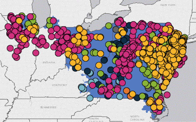
Virtually all investments are always made under the shroud of uncertainty, but the problem is particularly acute for energy investments. The development of energy resources typically requires large up-front capital outlays, so investors need some assurance that revenue streams over time will be sufficient for cost recovery. You can get something of a sneak peek of how changes in market institutions in the electricity industry have increased both the potential financial rewards from low-cost electricity generation but also uncertainty in power generation investment by reading the selection from Morgan, et al., “The U.S. Electric Power Sector and Climate Change Mitigation.” [40]
Returning to the nuclear and wind energy examples for a moment, these two technologies nicely represent two distinct but equally important sources of uncertainty facing energy projects.
The example with nuclear energy is primarily an illustration of market uncertainty. Just a few years ago, before the natural gas supply boom, electricity prices were high and nuclear power (having very high reliability and low production costs) was highly profitable. Companies that ran large fleets of nuclear power plants well – the biggest in the United States was Exelon – earned large returns for shareholders. Many existing nuclear power plants continue to make money, though the number of nuclear power plant retirements has accelerated in recent years. The biggest problem facing new nuclear plants, as well as some existing plants, is uncertainty in the market price of electricity. In deregulated electricity markets, the price of electricity is most often driven by the price of natural gas. As gas prices have plummeted with the unconventional natural gas boom, so have electricity prices. This squeezes profit margins for existing plants and makes the financial prospects for new plants look bleak. Will natural gas prices rise again in five to ten years (roughly the timeline for a new nuclear build in the United States)? Who knows – current markets are not betting on it, as you could observe by looking at the futures curve for natural gas.
The example with wind energy is primarily an illustration of regulatory uncertainty. As we have discovered, wind energy is not always competitive with other forms of power generation without some form of subsidy or incentive (the same could actually be said for most low-carbon power generation technologies, including nuclear). The production tax credit (PTC) was implemented in order to provide a boost to the wind industry. The PTC basically amounts to a direct payment of a bit more than $20 per MWh for all qualifying wind energy plants. Other countries have implemented subsidy programs similar to the PTC, such as feed-in tariffs. But as the EIA article points out, since the PTC does not represent a long-term commitment by the U.S. government (it needs to be renewed periodically), when the PTC is not renewed, wind energy investments shrivel because the future availability of subsidies is uncertain. The piece by Morgan, et al., points out that the lack of a commitment to a carbon policy by the United States has been a major barrier to the development of a variety of low-carbon energy resources – not just wind and solar but also low-carbon bio-energy and technologies that can capture and store greenhouse gas emissions.
Other major sources of uncertainty for the energy project include:
- cost overruns (for large energy facilities in particular, cost overruns have been notoriously problematic);
- performance uncertainty – plants may not work as expected, which was a problem plaguing the nuclear energy industry in the United States for many years;
- permitting and siting risk – in many countries, citizens are increasingly reluctant to allow large energy facilities to be sited in their communities.
Uncertainty cannot be eliminated, but we can incorporate it into our project analyses in a few different ways, as we’ll discuss in the next several components of the lesson. Our use of the word “uncertainty” here rather than “risk” is purposeful. Use of the term “risk” implies some knowledge about the probabilities of uncertain events, like a coin flip or the roll of some dice. But placing probabilities on specific events isn’t always straightforward or even possible. So, we use the broader term “uncertainty” to describe situations where some set of future outcomes is unknown. In particular (for our context), these outcomes are unknown at the time that some decision is to be made. Broadly, we can identify a few different types of such decision situations:
- decisions where all outcomes are known with certainty through net present value calculations;
- decisions where some outcomes are unknown, but we are able to identify a set of possible outcomes and apply probabilities to those outcomes;
- decisions where were are not able to apply probabilities to all outcomes, either because we have insufficient information to determine probabilities or we are unable to think of all possible outcomes.
We will first discuss decision problems of the second type, then move on to the third type.
Expected Monetary Value and Value at Risk
Expected Monetary Value and Value at Risk
Before we dive into probability and expected monetary value (EMV), we will introduce a motivational problem from the petroleum industry. You are exploring the possibility of drilling a potential new oil field. You can either do the drilling yourself, or you can “farm out” the drilling operation to a partner. The field in which you are proposing to drill may or may not have oil – you don’t know until you drill and find out. If you drill yourself, you take on the risk if the field is not a producer, but if the field is a producer, you don’t need to share your profits with anyone. If you farm out the drilling operation, you are not exposed to any losses if the field is not a producer, but if the field is a producer, the drilling company will take the lion’s share of the profits. Table 6.1 shows the net present value of the prospective oil field.
| Field is Dry | Field is a Producer | |
|---|---|---|
| Drill Yourself | -$250,000 | $500,000 |
| Farm Out | $0 | $50,000 |
Clearly, if you knew the field was a producer you would want to drill yourself (and if you knew it wasn’t, then you would not want to drill at all). But you don’t know this before you make your drilling decision. What should you do?
Suppose that you had enough information on the productivity of wells drilled in a similar geology to estimate that the probability of a dry hole was 65% and the probability of a producing well was 35%. Do these probabilities make your life any easier?
These decision problems can be solved by calculating a quantity known as the “expected monetary value” (EMV) – basically a probability-weighted average of net present values of different outcomes. Formally, the EMV is defined by determining probabilities of each distinct or “mutually exclusive” outcome, determining the NPV under each of the possible outcomes, and then weighting each possible value of the NPV by its probability. In mathematical terms, if Z is some alternative; Y1, Y2, …, Yn represent a set of possible outcomes of some uncertain variable; X1, X2, …, Xn represent the NPVs associated with each of the possible outcomes; and P(Y1), P(Y2), …, P(Yn) represent the probabilities of each of the outcomes, then the EMV is defined by:
The alternative with the highest EMV would be the option chosen. A decision-maker who chooses among alternatives in this way would be called an “expected-value decision-maker.”
Some things to remember about probabilities:
- A probability is a number between zero and one. So P(Yj) = 0.05 means that there is a 5% chance of outcome j occurring. If P(Yj) = 0, it means that outcome j never occurs and if P(Yj) = 1, it means that outcome j always occurs.
- If a set of outcomes is mutually exclusive (meaning that multiple outcomes cannot occur) and exhaustive (meaning that the set captures all possible outcomes), then the probabilities of all outcomes in that set would be equal to one. Rolling a six-sided die with the outcomes {1,2,3,4,5,6} is an example. This set of outcomes is mutually exclusive because the face of the die cannot show two numbers at once (unless the die is crooked). The set of outcomes is exhaustive since it contains all possible outcomes of the die being rolled. In this case, P(1) + P(2) + P(3) + P(4) + P(5) + P(6) = 1. The set of outcomes {1,2,3} is an example of non-exhaustive outcomes, since the die could show a 4, 5 or 6 upon being rolled.
Now, back to our oil field problem. We’ll describe the problem again, using the language of expected monetary value. There are two alternatives – to drill yourself or to farm-out. The uncertainty is in the outcome of the drilling process. The set of mutually exclusive and exhaustive outcomes is {dry hole, producer}. These are the only two possible outcomes, regardless of whether you choose to drill yourself or farm-out. The NPVs of each alternative, under each possible outcome, are shown in Table 10.1. To decide whether to drill or farm out, you would calculate the EMV of each option as follows:
In this case, you should choose to farm out the drilling operation.
The basic idea behind EMV is fairly straightforward, assuming that you can actually determine the relevant probabilities with some precision. But the meaning of the EMV is a little bit subtle and requires some degree of care in interpretation. Let’s take a very basic situation – a coin flip. Suppose that we were to flip a coin. If it shows heads, you must pay me $1. If it shows tails, then I must pay you $1. The EMV of this game, assuming that heads and tails have equal probabilities, is $0. (See if you can figure out why, based on the EMV equation and the fact that P(heads) = 0.5 and P(tails) = 0.5.) But if you think about this for a minute, how useful is the EMV? If you play the coin-flipping game once, you will never ever have an outcome where the payoff to you is $0. The payoff will either be that you gain or lose one dollar.
If you look at the EMVs from the oil-field problem, you will see the same thing. The EMV of drilling is $12,500 but there is no turn of events under which you would wind up earning $12,500 – if you drill, it would either be that you lose $250,000 or gain $500,000. Similarly, if you farm out you will never earn exactly $17,500. You will either lose nothing (payoff of $0) or you will gain $50,000. So what does the EMV mean when it tells you that farming-out is the better option?
It’s important to remember that the EMV is a type of average. If you were to play the coin-flip game or the oil-field game a large number of times under identical circumstances, and make the same decision each time (i.e., to drill or to farm out), then over the long run you would expect to wind up with $12,500 if you choose to drill and $17,500 if you choose to farm out. While the EMV may be useful for gamblers or serial investors, using EMV needs to be done with some care for stand-alone projects in the face of uncertainty.
One potential alternative to calculating EMV when probabilities are known (or can be estimated) is to use those probabilities to describe the likelihoods of gaining or losing certain amounts of money. This is the idea behind the “value at risk” for an investment project or a portfolio of projects. The value at risk (VaR) describes the amount of money that will be gained or lost with some probability, typically worst-case situations (like describing the amount of money that would be gained or lost with a 5% probability). From a decision perspective, you might want to avoid investment opportunities with a large VaR (given some probability). Many times, VaR will have a duration associated with it, most often when calculated in reference to portfolios of financial assets (like stocks or bonds).
Wikipedia has a very descriptive entry for VaR [62]. The introductory section of the Damadoran VaR paper [59] is written in clearer English, but gets into the details quickly after the first few pages.
To force the example a little bit, here is how VaR might be applied in our simple oil field problem. The field will either yield a producer (probability 35%) or a dry hole (probability 65%). Those are the only two outcomes and probabilities for this problem. If we think about the negative outcome – the dry hole – and ask how much of the value of the project might be at risk if the hole turns out to be dry, then we can calculate VaR just by using the NPVs from Table 10.1. (In this example, there is no time dimension to VaR since the project is a one-shot deal.)
If we choose the option to drill ourselves, the 65% VaR would be -$250,000. If we choose to farm-out the drilling operation, the 65% VaR would be $0. We might choose to farm out simply because the VaR technique tells us that our extreme losses would be lower if we farm-out than if we drill the well ourselves.
Decision Analysis Without Probabilities
Decision Analysis Without Probabilities: Sensitivity, Threshold and Scenario Analysis
In the oil-field example from the previous section, the probabilities of a dry hole and a producer were known with confidence. This isn’t always true in the real world. Moreover, sometimes in real-world situations, there are so many possible outcomes that is impossible to assign a specific probability to each outcome. Suppose, just hypothetically, that oil prices could vary between $50 and $100 per barrel over the next five years. What is the probability that oil prices will average $50.03 per barrel? $50.04 per barrel? $99.30 per barrel?
In cases where determining probabilities explicitly is not possible or practical, threshold analysis and sensitivity analysis can be useful in understanding how the net present value of different alternatives may vary with some variation in key variables. Both of these techniques are useful in identifying situations under which one alternative is better than another. This can make even complex decision problems much more tractable for the decision-maker, since it reduces the problem from needing to calculate net present values for a large number of alternative outcomes to a judgment of whether one or another set of outcomes is more likely.
As we go through these techniques, we will often refer to something called a “parameter” in the decision problem. In this case, a parameter refers to a variable whose value affects the outcome of one or more alternatives – so a parameter is different from an alternative. In the oil field problem, the major parameter would be whether the field is a dry hole or whether it is a producer (so the parameter itself would be the probability of a producer versus a dry hole). The price of oil or the quantity of oil (if any) might be other important parameters for a problem such as this one.
Sensitivity Analysis
Sensitivity analysis proceeds by selecting one parameter, changing its values, and observing how these new values change the net present value (or EMV) of some alternative. If sensitivity analysis is conducted using a small range of alternative values, or if the alternative values represent different scenarios, then it is sometimes (aptly) called “scenario analysis.” There's more material on scenario analysis further down this page.
We’ll illustrate this using the oil-field problem, performing a sensitivity analysis on the EMV of the drilling option as we vary the dry-hole probability. In this case the outcome is the EMV and the parameter that we are varying is the probability of a dry hole. This analysis is pretty straightforward since we can write an expression for the EMV of drilling. We will need to use the fact that P(producer) = 1 – P(dry hole). (What rules of probability tell us that this is true?)
We can rearrange terms in the equation to get:
This equation tells us a couple of things. First, the EMV of drilling is going to decline as the probability of a dry hole increases. This makes sense, since we lose money if we drill ourselves and the field is not a producer. Second, the relationship between EMV and the dry hole probability is linear, so the EMV falls at a constant rate as the dry hole probability increases. We can also use the equation to find the dry hole probability where the EMV is equal to zero. We do this by setting EMV(drill) equal to zero and manipulating the equation as follows:
Normally, sensitivity analysis is utilized to visualize the change in net present value or EMV with the change in some parameter of interest. For the drilling option, this is shown in Figure 10.2, which plots the EMV versus the dry hole probability. Also shown in Figure 6.2 is the dry-hole probability where the EMV is equal to zero.
As an exercise for yourself, perform the same sensitivity analysis on the option to farm-out. The parameter is still the same (the probability of a dry hole) but the outcome is different (the option to farm-out versus the option to drill). Your graph should look like the one in Figure 6.3.
Threshold Analysis
Threshold analysis (also called break-point analysis) seeks to identify the value of a parameter where the best decision changes. Instead of asking what the probability of a producer versus a dry hole might be (and what are the associated EMVs of the option to drill or farm-out), a threshold analysis would ask how likely would it need to be for the field to be a producer for the expected-value decision-maker to choose the option to drill.
Threshold analyses can proceed graphically or algebraically. We will use the oil field example to illustrate both. Remember that the EMV of both the drilling and the farm-out options are functions of the dry-hole probability and of the NPVs for drilling and farming-out. Holding the NPVs constant as in Table 10.1, we can write a mathematical expression for the EMV of each option as a function of the dry-hole probability P(dry hole). We will need to use the fact that P(producer) = 1 – P(dry hole). (What rules of probability tell us that this is true?)
If we graph the EMVs together on the same set of axes (as in Figures 6.2 and 6.3), the point at which the two lines cross would be the threshold. Figure 6.4 illustrates this crossing point. Note that the scale of the axes, especially the horizontal axis, is different than in Figures 6.2 or 6.3.
Looking carefully at Figure 6.4, we can see that at a dry hole probability of around 65% or lower, the EMV of drilling is higher than the EMV of the farm-out option (this is why the drilling curve is above the farm-out curve). If the dry hole probability is above 65%, then the farm-out option has a higher EMV.
Algebraically, we can solve explicitly for the threshold value of the dry hole probability, by setting EMV(drill) equal to EMV(farm-out) and solving for the dry hole probability that makes these EMVs identical. Here we go!
Threshold analysis in particular can be a very powerful way of making difficult decisions seem more tractable. Even in the simple oil-field problem, the relevant question for the investor evaluating the oil-field decision is not to determine the exact probability of the field being a producer. The threshold analysis approach asks the potential investor whether they believe that there is more than a 65% chance of the field being dry. If so, then they should farm out drilling or not drill at all. If not, then the investor should choose to drill themselves.
Scenario Analysis
Scenarios about future outcomes or states of the world can be powerful tools for getting decision-makers to think about uncertainty. While scenario analysis is simpler than a sensitivity or a threshold analysis, scenarios can often be made up of specific values of multiple parameters. Scenario analysis is not about predicting the future or making projections. Like sensitivity and threshold analysis, it is a way to get decision-makers to consider different possible future states of the world, to identify the drivers that might lead to those states of the world, and to make plans for those possible states of the world.
In the energy world, one of the pioneers of scenario-based planning has been Shell [64], which started using scenario-based planning in the 1960s, as computer-aided decision-making was emerging among large businesses. Shell adopted scenario planning when it (and other large energy companies) were surprised by the emergence of environmentalism and the OPEC cartel as unforeseen but potentially disruptive forces to their business. The Harvard Business Review [65] has a nice article about Shell's development and use of scenario planning. (The article is also available through Canvas.)
The process of scenario planning has a number of steps:
- Determine drivers of change (largely done via brainstorming)
- Determine links and interdependencies among drivers of change - an example is that technological and regulatory change may be intertwined. The purpose of this step is to recognize the existence of interdependent or connected drivers of change, and possible directions of influence.
- Group drivers that are logically connected into "scenarios." Typically, at this stage the scenarios are brainstormed, without too much worry about whether the scenarios overlap with or contradict one another.
- The larger set of scenarios is reduced to a smaller set of scenarios. In Shell's method, the aim is to get to around three scenarios - the idea is that this avoids a focus on one scenario as being the most or least likely. It's also important to recognize at this stage that scenarios are different than alternatives so we don't really talk about scenarios that might be preferred over others. At this stage, scenarios are ideally complementary rather than in opposition (having a good and bad scenario, for example).
- Tell a story about each scenario. This often involves giving each scenario a name and including some context - not just the specific parameter values associated with different scenarios but the events that might lead to those scenarios.
Scenario planning has its critics - one thing about scenarios, for example, is that good scenarios are based around plausibility and not probability. This can lead to different decision-makers having different views of likely versus unlikely states of the world. Regardless, scenario planning is still a widely-used tool for decision-making.
Lesson 6 Summary and Final Tasks
Summary and Final Tasks
Uncertainty is a critical problem in the evaluation of energy projects, owing to the capital-intensive nature of most projects and the need for cost recovery over long time frames. Projecting the market and regulatory conditions over such long time frames is often fraught with error and, in hindsight, bad decisions. Two of the major sources of uncertainty facing energy projects are market uncertainty (market prices or price volatility are not known with certainty into the future) and regulatory uncertainty (relevant policy measures cannot be anticipated with perfect foresight). Since low-carbon energy projects in particular need policy support to achieve widespread market deployment, regulatory uncertainty in the form of a lack of climate-change policy or inconsistent application of subsidies and incentives can be especially difficult for investors in low-carbon energy technologies. Even if the future cannot be predicted perfectly, there are ways to incorporate uncertainty into project evaluation. Calculation of expected monetary values (EMV) is possible when all possible outcomes can be identified and probabilities assigned, but since the EMV represents the average payoff over a large number of trials, it may not be appropriate for single energy project evaluation. Sensitivity analysis and threshold analysis are ways of visualizing how the NPV or EMV of a project may change under different values of key parameters.
Reminder - Complete all of the Lesson 6 tasks!
You have reached the end of Lesson 6! Double check the What is Due for Lesson 6? list on the first page of this lesson to make sure you have completed all of the activities listed there before you begin Lesson 7.
Lesson 7 - Risk Management in the Energy Space
Lesson 7 Overview
Overview
As Energy Market Professionals, we run across many different types of risk that we will need to manage going forward. Certain of these risks are very obvious - like the cost of the natural gas commodity increasing as the weather gets colder leading into October. Other risks may be less obvious - like the long term cost of the natural gas commodity remaining at long term historically low levels and thereby placing the value proposition of your utility scale solar power plant at risk. Other risks are seemingly less direct - such as the potential for the US Legislature to reduce or eliminate the Investment Tax Credit for a solar project or the imposition of tariffs on certain components. In this lesson, we will talk about identifying risks and ways to mitigate (or exacerbate) them through market-based and non-market-based instruments. We will further our understanding of risk management and how certain instruments can be used to de-risk our projects.
Learning Outcomes
By the end of this lesson, you should be able to:
- Explain the simple risk management financial derivatives;
- Develop risk management solutions for each identified risk in your project;
- Develop Pxx values for a typical solar project;
- Explain how contracts work to mitigate certain risks but introduce other risks;
- Develop a holistic risk mitigation strategy for your project.
Reading Materials
- Risk.net (2022) Editorial: How Energy Risk Managers are Responding to Extreme Volatility [66]
- kWh Analytics (2023): Solar Risk Assessment 2023 [67]
-
Video interview (32:44) with Jayson Kaminsky, CEO of kWh Analytics. If this video is slow to load here on this page, you can always access it and all course videos in the Media Gallery in Canvas.
Video interview with Jayson Kaminsky (35:41).Click here for transcript of Jayson Kaminsky interviewHi Jayson. It's great to chat with you about energy markets and specifically energy risk management. We appreciate you taking the time to help our students understand this very important topic. May I ask you to tell us a little bit about your background, Mark? Thank you for having me and thank you everyone for listening. Yeah, my background. Let's see. I studied a technical undergrad. I guess I'll start there. I studied mathematics and climate change degree before climate change degrees existed. I'd like to say it's called atmospheric science, but the physical environment approach to the environment. Then I got a graduate degree in business and in energy systems, and this was now 15 years ago or so, solar. 15 years ago. Even at the time felt a little bit mature. I was like, I don't know, this industry seems like it's got all figured out. I was very wrong. It's got a lot to still be solved, it turns out. And a lot of growth ahead of us. We can talk a little bit more about that in a second. But I entered really as a solar developer, or working for a solar developer, A company that built, developed, and built projects really up and down California would talk to off takers, sell them a power purchase agreement. And then we also did the construction. They call it the solar coaster. I was laid off of that company a year and a half out of grad school. So there you go. Actually, the best thing that happened to me, I ended up at Wells Fargo doing a very specialty form of finance called tax equity. It was project finance. Making investments against hard assets but monetizing the tax credit predominantly in solar. And then about nine years ago left that job to come co found KH Analytics. Then I've been here now nine years. When we started, the thesis was better data to help identify and manage risk in a solar industry. About five years ago we pivoted into insurance, so I can also talk about that later on. All right, but that's been my path is not really thing I could have planned. It was taking the opportunities that seem the most interesting and frankly pushed me the most out of my comfort zone were the ones that seem like the best options. Great, great stuff. Was there a methodology? Choosing the energy business, or you just end up there at the beginning, did you say, hey, I wanted to do this or how did that fit together for you? Now, it's a good question. I know I wanted to work on something environmental. An undergrad math was too esoteric as doing pure math. It's like you lose grounded in reality. Law felt not really what I wanted to do. Policy felt too slow. I wanted to do something environmental. I didn't really know what business school became. An opportunity that emerged from me my first year in business school. I really took it as an opportunity to explore what is the right role for me. And I was looking at everything from corporate social responsibility to energy, to carbon, to you name it. And energy felt like the right intersection of topics. That was interesting to me. It was like global in nature. It affects geopolitics very much has a core economic benefit. It just felt like the most natural, maybe the most obvious opportunity, but also it's an important lever on almost everything else we do. Like if we're electrifying the grid, getting V's all that requires a long energy. It seemed like a macro theme that after my first year of business school, like okay, this is what I want to do then. Solar was an accident. I didn't think I was going to end up in solar, but it just happened to be the job that I found stuck here for 15 years. So I guess I like it right, exactly. What are your current duties at KWH Analytics? Are my current duties. Well, I'm the CEO, I got to keep on the lights. I guess that's my main duty. Okay. I was COO for about eight years and I became CEO a year ago. Maybe a little bit of a lens into the team, I guess is maybe the best way to frame that. I have a COO and a CTO. Most of my engineering rest, the CTO, I'm definitely not qualified to do anything there. My COO runs, I'll call it operations at some strategic initiatives, but HR, finance, legal, that stuff. Then I have a head of each of my product units. I have a new product development person, You know, I work very closely with our marketing and sort of, I guess I work closely with everyone. But a lot of my day is on raising awareness of the company, with the market, Working with the team obviously on sales, at operations, goal setting, priority setting. I often think I could do my job in any industry and it would feel the same day to day. I'm making calls, I'm sending e mails, I'm doing financial modeling, right. That's not really fulfilling to me. Doing what I'm doing to sell potatoes is often analog would not get me excited to wake up in the morning. Really like what I do. I really like the industry we're in. I think it's important. I have a young child now, Even more important than it was a year ago. What I've dedicated my career to, I think it's got a huge talent need. The more people we can get into it, there's tons of opportunity here and you feel good doing what you're doing. Well, congratulations on your new addition. Thankful. What exactly is KVH analytics to? Good question. I'm going to answer that nontraditional way. The lubrication, the enabling factor of pretty much anything in energy is the capital that is flowing into the industry. Whether or not you're a capitalist or not, like the end of the day is you can't build an asset if you don't have the capital court. So I'll say that's thesis number one. These number two is there's very, very large pools of capital, right? You have bank capital, you have private capital, giant pool of capitals and insurance capital. And you can't build a project if you can't insure that asset either. We really started as I touched on, as a data and risk management company. We were collecting data, evaluating risk, understanding predominantly how assets are performing and why they're not. Then five years ago or so, we said, hey, we think we have the best view on this risk, this was happened to be production risk at the time. Wouldn't it be cool if we could take this and package it up and allocate some of that to the insurance markets. These are insurance turns out is like nd finance for five years. Very similar, but they change all of the terms. It's opaque to many people, but essentially what you're doing is you're renting a balance sheet, right? You're transferring some risk. You're paying them a premium. If there's an event, they pay you back claim that's at the end of the day, then that gets packaged up, they reinsure it, they send it into other capital markets. It's a pretty elegant, a pretty efficient way to take really well defined risks and allocate into another market. A common thing we said at the bank was this is a pretty good risk, but it's not a commercial banking risk. The banks binary either have a default or you don't have a default. And if you have a, a loan, it's a really bad thing. Like people come out of the woodwork they didn't know existed to shine a light on your bad loan at an insurance company, a claim. And not that they don't care, but that's a common event, right? There's reasons to think that you could either take higher levels of risk and allocate it into the insurance market or more efficiently diversify risk and push into the insurance market. We do that with solar production, with the thesis being that if we take volatility in those cash flows. Project finance, you're lending against an asset, and I know you teach courses on this, but the asset needs to generate enough cash flow to pay off the loan. And it's not the owner. The ultimate parent, whoever that is, does not need to inject cash. They can just leave the asset and say, good luck to you, right? If you put a floor on the production, typically there's a revenue contract, you're putting a floor on the revenues. And the lenders can lend more capital against that because it's a more firm cash flow stream, that's a solar revenue put. Then a couple years ago, I got a call from some folks in banking that I used to do deals with. They said, Jason, we have a problem. Half of our loans are in what they call technical default. That means you're in violation of some term of your loan agreement. It's not bad enough. You're going to call the loan and foreclose on the asset, but it's bad enough that have a problem basically. Right. And they said we're in tech equal default because there's all these property insurance requirements and our loans, So object against things like fire, flood, hail, and our clients are saying they can't get the coverage anymore, right? So this used to be a check the box, I could tell you four years of banking. I spent an hour thinking about insurance, right? Went from really far down the chain of things that we cared about to like a top three issue for us, right? And that sounded like a pain point that should have a business opportunity, right? So we put together a team, put together a thesis, all of our, all of our business about using data to sort of get a differentiated view on risk. We collected a bunch of data on physical risk to solar assets. We entered the property insurance market earlier this year, now July 2023, depending on earlier this year we entered the market. It's proven to be a very important lever as well because if you can't get property insurance on your asset, you also can't finance it, right? These are hundreds of millions of dollars of assets sometimes. And the insurance companies are saying it's really expensive to insure and B are going to hold and retain a lot of that risk as an owner anyway. Long way of saying is we use data to underwrite risk. And allocate some of that risk into the insurance markets as an enabling the capital for other capital. Right? Right. All right. So that's, that's really interesting stuff and for students, you know, you know, hedging, hedging, that production risk is obviously very important because you've got an intermittent resource with the sun and that kind of thing. Just curious. Has there been folks who are interested in doing the same type of thing on the wind side and is it something you guys would consider? That's a complicated question. I'm trying to think the most efficient way to answer. In solar, we take really two risks. Predominantly, we take resource risk, which the sun is honestly mostly stable. Maybe getting a not the sun but like the resource risk exam, a little bit less stable as you have wildfire smoke, as you have pretty crazy environmental conditions that are happening all over the world. But the resource itself is mostly stable then operating risk and that's where you have a lot of volatility equipment outages predominantly, so that's what we underwrite. There was a product that was price risk and resource risk. This is the surety had a product with Hurricane EN in Texas, the Texas Freeze. A lot of those transactions I think had issues because grid prices were very volatile in Texas. That is not as active anymore in when what you have is a lot of resource volatility. But most of the availability or equipment warranties sit with basically the giant global manufacturers we've looked at. Could we provide more resource insurance? Reason why this is a complicated answer is that much of the Nancy for Solar is built around an investment tax credit, at least today. The structures that they use for that basically pushes a lot of that production risk onto the lenders. And when a lot of the investment structures are built around the production tax credit, actually the investor structure, the loan or the tax equity investment, that they can actually, there's more volatility allowed within the structure. The market demand for it hasn't been as strong. And honestly, if you look what's being built, most of the time the solar revenue put is being sold into a new build. Solar is actually being built more predominantly than wind, at least today, right? So we've looked at it, mark. But what I'd say is the structures I'd say are a little bit more insulated, the financing structures are a little bit more insulated from the volatility. Just from like a market demand perspective. I think we've seen solar is a little bit more attractive, right? Currently a lot of the wind that's getting built is offshore. And that would be to find a market in that case. Yeah. They are giant assets that the development timelines on those, they're still years away, right? Exactly. Excellent. What current trends in the energy markets are affecting your business right now? Let me answer a few ways. One is the Inflation Reduction Act, I think generally is helpful. Solar on a standalone basis, on an unsubsidized basis. You could look at the Lazard LC studies. It's cheaper to build the solar project today than even buy the coal to operate a coal plant on a fundamental economics unsubsidized basis Makes the most sense on a subsidized basis, even more so. But the inflation reduction at anytime, you can make those economics even more attractive. Certainly a tailwind, I'd say. Sitting here in bid 2023, what we're seeing is actually people are still waiting for guidance from Treasury and from the IRS. People are saying, well if I just wait a few months, maybe I'll get a bigger tax credit. This actually slowed down some of the development sitting here present day. But ultimately a big tailwind that's important for anyone who's looking at, at this market. Part of the Inflation Reduction Act allows for transfer of tax credits. Tax equity, the business I used to do, candle, is pretty inefficient and pretty scarce and pretty expensive. The idea is that if you can take the tax credit and transfer it outside of a tax equity structure, basically you can sell the tax credit to a corporate, or a bank, or anyone that wants it. It should, in many ways, democratize the ability to build and finance these assets. That's a very big theme. I think it's going to fundamentally change a lot of the way these assets get built. What kind of projects can get built? What kind of capital will be in the market? And is yet to be seen really how that changes the market. But I think it will have very dramatic effects on the market. Okay. The other theme, which isn't necessarily energy related but affects my business, is the insurance markets have also, I'd say, challenged. It seems like there's more billion dollar disasters every year than the year prior. Insurance companies buy insurance, they call that reinsurance. And one of the metrics that you look at is how expensive is the reinsurance in the property market, which is the market that I operate in. Reinsurance rates have gone up dramatically this year. The renewals were the most expensive renewals in the last 20 years. What does that mean? It just means that insurance costs generally are going up as appetite, I'd say, for very large limits for any asset, but renewables included. The consequence of that is that owners of these assets have to retain more of the risk. They have to have large deductibles, they're going to have lower limits that are available to them, especially for some of these natural disasters. It, if you're an owner of assets, it affects your own risk profile because it used to be able to insure all of that risk away and now you can't. I guess that's the energy connection. You know, like Texas now, there's as much solar in Texas as in California. Right? Texas is a lot of hail, California, unfortunately there's fires. So like pretty material risks and the forecast is we're going to build as much in the next five years as the last 20 years combined globally, Right? Right. So like, you know, I entered this industry thinking we had it all figured out, We're going to enter another *****, dramatic dramatic growth, right? So, a lot of these problems are only going to be more acute as we continue to grow and build in places that maybe aren't best suited from a physical perspective. For the other reasons to build there cots, a pretty liberal market permitting is pretty easy, the grid is pretty flexible from a contracting perspective. It just happens that you get four inch hail on a semi regular basis, which put glass panels out in the field. Those are the rest that we think about on a regular basis. All right. Right. Interesting. I'm sure you have a view on this. Are you seeing more folks decide to take the production tax credit on the solar side than the ITC? Is that a thing? I heard that people were thinking it might be something that would happen and I just wonder if you have a view on it for our students as they're thinking about their projects. Yeah, it's a good question. The investment tax credit, I assume people know what it is, but I'll just say it upfront. Is a tax credit based on the amount of capital you invest in the asset production? Tax credit is tax credit linked per Megawatt hour that you produce. When you look at what I call it, market analysis shows, you expect that you take the production tax credit or more likely to take it in regions with a high solar resource. If your production relative to your capital cost is high, the PTC tends to be more favorable than the ITC. That's one of those things that are still very new in the market. Folks structuring deals with PTC's but just beginning to do that cycle for these is a while the restructuring deals to allow for it, you have to bring in a different form of, if you're restructuring your tax equity deal could take some time. More people think. I think there's a thesis that the transfer market is also right for PTCs, but that transfer market is also brand new. It's coming, Mark, I'd say sitting here today, I know folks are looking at it, predominantly the Southwest, right? California, Arizona, sort like, where you have a super high solar resource, makes the most sense for it. I think it will be a bigger theme, but probably TBD, exactly what that looks like and how that ends up flowing through the capital markets, right? All right, But certainly maybe a greater opportunity for the kind of insurance that you guys do, right? I mean, anytime your production becomes a bigger proportion of your revenue stream. Absolutely. Right. Right. So there conditions, any markets or conditions that are affecting solar business in a manner that we might not have anticipated three to five years ago. I know that's a very broad question, but I mean, anything that you've seen that if you were sitting here and say 2019, well, I don't expect that to happen now. It has. And you're sitting here saying, oh, things look a lot different for our business and what we do. Yeah. You know the thing about how do I answer this? There's a couple, yeah, there's a couple of say political things. Affect our market that were maybe unanticipated. The inflation reduction at, I'd say I thought any extension of tax credits was dead until that was passed. So certainly that's a tailwind that was unexpected. There's regularly legislation or dispute about where the equipment comes from. A lot of the solar modules come from China, I think in the US. The average cost of a solar module is like 30% higher than anywhere else in the world. Because we have a lot of anti dumping duties, countervailing, countervailing dumping duties, and we have some restrictions on silicon and where it comes from. And if it's from the Injong region, I say from a supply chain perspective, like last year, much of 2022, it was hard to import modules like they were getting held at the border. Maybe in 2019 I would say is probably to continue because it was happening in 2019 and just like never end. But certainly the political environment matters. I've been surprised by how quickly growth has happened in Texas. Texas was very small market in 2019. As I said earlier, it's now the same size as California as far as installed capacity. Hopefully, this is not a self interested comment. But in 2019, insurance was not viewed as actually a very big risk, like you could easily buy an infinite level of insurance. Now you can't the proof point, I'll say that it's maybe a more macro theme is solar conferences. You go to them, you look at the agendas. Insurance was never talked about and the biggest asset management conferences here, there are four sessions on it. It's become a more acute form of capital, which is maybe a good macro theme for my business is at. But from a solar perspective, I'd say it's just become, become a much more serious issue. Led to new technology innovations, led to new operating innovations, led to different risk allocations in the market, trying to think what else as it relates to the AD CVD like. It also has led to some of the technology changes. Bifacial equipment, for example, where you have glass on the front and glass on the back and yourself get production from sides, was carved out of that legislation or somehow excluded from it. You saw a big wave of bifacial equipment being installed. The market is pretty efficient. The extent there's gaps in legislation, we're able to find a way to get around it. But has effects on the market in ways that are maybe hard to predict. Sure, bifacial thing is somewhat interesting because I'm putting together a discussion on the duck curve, which is much, much later in the course. And people are saying, well, if you do bifacial, we'll flatten that thing and it'll work out much better. That's an interesting new way of looking at things, not to try too deeply. You talked about product development. Is there anything in the pipeline that you might give a hint about, I don't want to take away, steal your IP here or anything like that, but any hints that other things you might want to cover off or you might get into business of, Yeah, maybe I'll just say areas that are probably right for innovation, some of which we're looking at. I view my business, I'll call it performance assurance type of products, and have more physical risk products. In the performance assurance world, there's a lot of new technology that's coming out that people aren't really sure how it's going to work. If it will work, we get a lot of requests for things like storage and is that going to generate the revenue? It's hard to underwrite. Still, pretty emerging technologies, we get a lot for that. I wouldn't necessarily this is a new technology, but curtailment, we get a lot of requests for other ways to manage curtailment, particularly in Texas in a more efficient way. But as hydrogen, as other technologies become much more prevalent, I think we'll see a bigger need for risk transfer within my property or physical risk business. There's some natural extensions like usually they call it property and casualty Insurance. Casualty is the liability side, basically, if you burn down your own system, that's property. If you burn down someone else's house, hurt them on site, that's casualty. All right, we're looking at that. Other types of extensions of the business that we can distribute through our existing channel and add value to ultimately the end user who's the owner of these assets. We're always thinking about ways to use these other very large, honestly, trillions of dollars of insurance capital to help enable other capital to flow into the industry, Right? All right, exactly. Are there any roadblocks you see in the transition to developing more renewable energy? Just from your perspective? Yeah. I mean, there's always road blocks, honestly. One of the big ones right now is labor, whether that's talent doing the financing. I mean, there's like challenges on the bank side, getting the human talent to get capital out the door. There's labor challenges on the insurance side of people that know how to underwrite all this stuff. And there's labor challenges for people out in the field, right? Building and operating all this equipment. Labor challenges is certainly one. The market is pretty efficient about siting, about permitting, about all this stuff. It's just to me, I feel like the industry scaled very quickly and it's hard for me to fathom what it's going to look like to double the installed base in five years, right? So we're going to have a lot of growing pains. I think even 15 years after I thought I was entering a mature industry, right? Sort of my macro thesis is that with the Inflation Reduction Act and the transferability of tax credits, one of the things that sort of pushed our market into having more large owners of these assets. Aggregating assets, tax equity, like they only worked with the biggest, most sophisticated companies that goes away, right? You can democratize who's building this. You could be a smaller developer or you could be a smaller asset owner. One of the challenges I see is how do you get best practices in the hands of all these people about how to build, how to operate all this equipment? We publish that solar risk assessment in part to share best practices with the industry, but that, to me, is going to be like one of our biggest challenges. We're going to have an influx of talent, much needed. We're going to have an influx of people that are interested in renewables, doing work for the right reasons but just are new to the industry, don't know all the works that we have and don't know what to avoid or what to do to do things the best way. And how do we permeate and disseminate best practice information out to the industry to say, hey, you're going to be developing a project in the Midwest, you've got to think about hail, and here's the right ways to think about it. Or hey, if you're building a project, here's how to think about a string inverter versus a central inverter. And here's how to manage your supply chain and here's how to think about their parts. And he's like, there's a lot of stuff that it takes to build and operate the stuff. If I look forward, that's probably going to be one of our industry challenges. And it's a little bit of who's the right company to do it, who's the right entity to do it, you know, There's no natural answer to that, I guess. Right? Or what's the right hub to even distribute this information and the technologies change in every six months even when you think you know what you're doing. Even for those of us who have been doing it 15 years, right, I learn something new every day. Like we're surprised by how things change. I view that as a macro challenge for us is if we're really going to build all this infrastructure which we need to build, how to make sure we do it just in a way that's building resilient assets. That's my latest thing is we can build really cheap assets and we do it pretty well. How do we build more resilient assets that are going to last 30 years that they should be designed to last, Right? Even though right now we've got stuff that hasn't been even through its entire life cycle yet. Most of the stuff that was put in when you came into the industry still has useful life on. It's difficult to make that decision when everything changes so quickly and at the same time you don't even have a lifecycle yet. Very interesting times thinks is very specific to my industry or to my business. But if you're insuring an old asset, let's say one of the ones I built 15 years ago, they don't even make that technology anymore. It's like 600 bolt systems. Now, everything is 1,500 bolt. The modules are 130 watts. Now everything's 500 watts. They don't even make it anymore. So you have a problem on the site building a new site. You have a problem on the site. Like what tech even knows how to work on that? Yeah, but it should work. You're right. I mean, assuming nothing goes wrong is designed for 2030. 40 Ellie's, what's interesting about it is we know the electric generation business. It's fossil fire. We have 100 years of how, how those things work, even though technology has changed a little bit. Ge frame seven. Ge frame seven, and has been for 30 years. We know what that looks like. This stuff you don't even know, 15 years ago, it's completely different. So it's an interesting problem. I think, I think a common misconception is because it doesn't have a spinning turban, that Solar is easy, right? Like you put it out there and you don't touch it, all right? And that's very far from the truth. I think that's probably the biggest gap is like what could go wrong? And then you start working in the industry and you're like, oh, everything can go wrong, everything go wrong. That's probably like my biggest learning from early on is it seems very easy on the outside. But when you're in a global industry with physical hard assets and you have contractors that are building it and you have guys that are spend all day at the site and you have vandalism. You have bugs in the boxes. You have weeds that grow. I mean, they think some little things but they all matter when it comes to the quality of the underlying asset. Exactly. So do you have any advice for our students who be considering a career in the energy sustainability business? Yeah, I think for me the first question I like to think about what is like, what's the technology that most excites you? Maybe it's at least a useful starting point. I'm a solar guy, I guess for better or worse, I've found my way into this industry. There's more established growth industries like solar, and then there's very emerging technologies that have been enabled by some legislation. There's a whole segment around direct air capture. Whole segment now, and a lot of excitement and hydrogen, but that list goes on and on. I think the dynamics of each of those is similar but different enough. Probably a good starting point if you're looking to get a job in. My next thing is then go become an expert and at least a part of it read the news. If you're going to an interview, you want to be able to speak eloquently about what you think about the space and where it's going. Right. That's not hard read the news, follow the blogs that are specific to what you like. There's a two by two, I guess that I'd like to think about careers. On one side you have your industry, you can call it renewable energy, you can call it hydrogen. On the other axis is your function. If you're a earlier career person, go experiment. I think the first seven years of a career is basically experimentation. Go try a bunch of stuff and see what you like and see what you don't. If your later career at least try to fit your function that you have experienced in within the industry and then you can try to adapt into something that might be a better career for you. Yeah, there's a lot of opportunity, a lot of different needs whether that product finance, construction project management, If you have a skill, there's a way to put it into renewable energy. But it will look different depending on to me, depending on what technology you want to deploy it with. Any other points you'd like to add, Jason? No. Go work in renewables. If you're taking this class you're probably thinking about it. So we need all the talent and all the experienced people we can get. Great. Thank you, Jayson. Really appreciate your time.Interview with J. Kaminsky by M. Kleinginna © Penn State is licensed under CC BY-NC-SA 4.0 [25]
Registered students can also access videos in the Media Gallery in Canvas.
What is due for Lesson 7?
This lesson will take us one week to complete. Please refer to the Course Calendar in Canvas for specific due dates. Specific directions and grading rubrics for assignment submissions can be found in the Lesson 7 module in Canvas.
- Complete the assigned readings and viewings for Lesson 7
- Complete Quiz 5
- Project work - Risk Management Measures
Questions?
If you have any questions, please post them to our Questions? discussion forum (not email). I will not be reviewing these. I encourage you to work as a cohort in that space. If you do require assistance, please reach out to me directly after you have worked with your cohort --- I am always happy to get on a one-on-one call, or even better, with a group of you.
Financial Risk
What is Financial Risk?
I typed "financial risk" into the search engine as I was putting this module together, and this is the really cool graphic that confronted me:
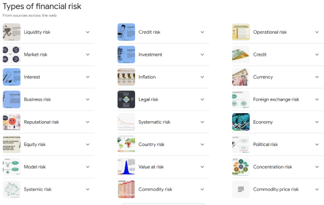
Woah! Twenty four different types of risk? Well yes, the management of each of these risks is important in your energy project. But don’t fret, many of these can be mitigated with simple measures and others might be ignored. First, let's get a definition (or two):
Financial Risk: "The possibility of losing money on an investment or business venture" (Investovepia.com [68]).
Risk can also be defined as: "The probability that actual results will differ from expected results" (Corporate Finance Institute.com [69]).
We'll take a look first at market risk.
Market Risk
Market Risk: "The possibility that an individual or other entity will experience losses due to facturs that affect the overall performance of investments" (Investopedia.com [70]).
The factors that affect the overall market are things like demographics, the overall inflation and interest rates, and a very recent and obvious one: the COVID 19 pandemic. All investments are subject to these kinds of factors and our energy projects will certainly have their returns affected by these macroeconomic parameters. Some of these parameters can be mitigated or “hedged” while others may not be able to be covered. For instance, if a developer were worried about rising inflation causing his returns to erode in the upcoming years, they might decide to include an escalator in the price of the output of the project. A more subtle form of risk mitigation for long term projects is to borrow money (take on debt) at a fixed interest rate for the term of the loan. This will shield the project developer against the potentiality of an increase in interest rates that might be catastrophic for returns in the future. Of course, when the developer decided to do a deal for debt at a fixed interest rate, they also removed the potential upside of a decrease in interest rates in the future, which could cause returns to be significantly higher than expected.
Doing a deal that removes pricing volatility for a period of time and for a known quantity is what is known in the financial community as a fixed for float swap. We will see this again as we move through the commodity markets as well as markets for other inputs into our project.
Commodity Price Risk
What is Commodity Price Risk?
Commodity Price Risk: "The possibility that commodity price changes will cause financial losses for either commodity buyers or producers" (Investopedia.com [71]).
Let us think about some examples of commodity price risk. Think, for example, about a natural gas consumer in the month of October. This company is thinking about how there is a heating season coming up and how natural gas might be trading at $3.00 per MMBtu and how he knows that natural gas prices can go up significantly during the winter months because demand for natural gas increases significantly in the heating season. Now the natural gas consumer in this situation is what is called a “natural short” - meaning that the consumer has a requirement that has not been contracted for or fulfilled. This natural short position places them at significant budgetary risk should prices increase, as they can, in the winter period. Should prices rise from $3.00 per MMBtu to $4.50 per MMBtu, the commodity portion of their natural gas exposure would rise 50%.
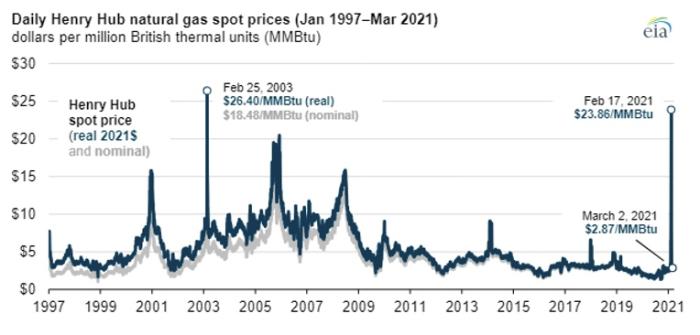
As you can see from the graph above, the volatility of the natural gas market could definitely produce this kind of risk for the consumer.
Another example of commodity price risk is that which might be experienced by a producer of a commodity. Imagine, for instance, if one were a solar developer. The solar developer wants to sell his electricity into the market to be able to pay his creditors and earn a return. If the revenue (which is equal to the quantity of electricity times the price of the electricity for the period in question) is subject to large swings in the price, the entire value proposition of the project could be at risk. This is one of the most important risks to any energy project and one that the savvy project developer (you, in this course) will want to mitigate.
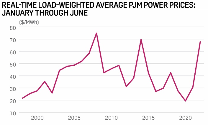
Above is some significant electric price volatility over a 20 year period (remember - your project is likely 25-30 years). Mitigating this risk would be very important for investors in your project. Mitigating Commodity price risk can take on many forms (and we will go into more detail at the end of this lesson), but probably the simplest form would be to engage in a transaction to fix the price. The natural gas consumer above would likely estimate their usage (or burn) for the volatile period and fix the price for that volume in $/MMBtu. This consumer would then have much less heartburn over the winter period, since the indigestion of worrying about gas prices would not arise. The consumer simply buys a contract for delivery of natural gas at the current price. Similarly, the power developer would want to fix the price for its output for the term of the contract in $/MWh. Both of these simple strategies allow for more stable cash flows over a season or a project life.
Basis Risk and Counterparty Risk
Basis Risk: "The financial risk that offsetting investments in a hedging strategy will not experience price changes in entirely opposite directions from each other." (Investopedia.com [73]).
This type of risk takes place when the risk manager is not able to buy or sell a financial product that is an exact match for the product he needs to buy or sell. For instance, the gas purchaser in the example on the last page might not have enough load to buy a contract for each month in the winter. So he might buy just a January contract. If the other contracts were to settle differently than the January contract, this purchaser would have the basis risk associated with the mismatched purchases. In the energy market, there is a very specific basis risk that we call “locational bass risk.” This risk comes from the fact that a commodity may be produced or consumed at a point on the energy transportation network that is different from where the commodity is typically traded. In the second example on the previous page, where the developer is producing electrical energy, the price he would receive at his delivery point into the grid might be less (or more) than is paid at a liquid trading point. This potential differential is called “location” or "transportation” basis risk. (insert diagram here)
Counterparty Risk: "The probability that the other party in an investment, credit, or trading transaction may not fulfill its part of the deal and may default on the contractual obligations." (Investopedia.com [74]).
In our example from the previous page, the seller of the natural gas or the buyer of the developer’s solar output could default on the obligation it has taken on to sell or buy the product in each transaction. This means that when looking at mitigating these risks, it is very important to ensure that the party on the other side of the transaction is credit worthy and will perform their obligations. This phenomenon was of particular concern in late 2001 when Enron started to default on its many obligations to the energy market as it could no longer maintain liquidity. If you’ve never read or seen “The Smartest Guys in the Room” - It is highly recommended. Here's a trailer:
Please watch the following video (2 min):
Speaker: It had taken enron 16 years to go from about 10 billion of assets to 65 billion of assets and took them 24 days to go bankrupt.
Interviewee: "The fatal flaw at enron was pride, arrogance, intolerance."
Enron trader on recorded phone conversation: "All the money you guys stole from from those poor grandmothers?"
Speaker: "We can add a gazillion dollars to the bottom line."
Speaker: "All right! That sounds fantastic!"
Congressman: "id you convert stock worth 66 million dollars"
Enron CEO Jeffrey Skilling: "Ah,I don't know."
Enron employee: "I netted approximately 100 million dollars."
Enron executive: "Enron is a company that deals with everyone with absolute integrity."
Enron employee: "Talk about my compensation... and if i step on somebody's throat on the way that doubles it, well I'll stomp on the guy's throat [laughs]."
Narrator: "The other thing about people at enron is a lot of them were former nerds. You wanted to be the most popular guy on Wall Street, you were going to do whatever you had to do."
Speaker: "They sought out every loophole they could in order to profit."
Enron CEO Jeffrey Skilling: "The rules weren't quite clear."
Speaker: "They could bury debt; they could bury losses.
Speaker: "An industry that was very reliable for a hundred years was all of a sudden turned into a casino."
Speaker: "Those guys could just yank the California economy on its leash whenever they wanted to and they did it and they did it and they did it."
Enron Trader: "You just steal money from California to the tune of a million bucks or two a day."
Another Enron Trader: "Can we rephrase that?"
Speaker: "Could I predict phony energy crisis as a result of the regulation? Yes. Could I predict that Arnold Schwarzenegger would be our governor as a result of deregulation? Oh, i didn't expect that."
Representative Henry Waxman: "How exactly does Enron make its money?"
Speaker: "Accounting doesn't get that creative."
Speaker: "I would like to know if you are on crack.
Reporter: "This is the shredded evidence just came out of Enron."
Speaker: "Everyone was on the bandwagon. And it can happen again."
"We are the good guys. We are on the side of angels."
Speaker: "It has evolved to the corporate crime of the century."
Operational Risk
Operational Risk: Operational Risk "summarizes the uncertainties and hazards a company faces when it attempts to do its day-to-day business activities within a given field or industry." A type of business risk [75], it can result from breakdowns in internal procedures, people, and systems. (Investopedia.com [76]).
There are two specific types of operational risk that should accounted for in your project or in an energy enterprise: Production Risk and Expense Risk.
Production Risk
Production risk is the uncertainty associated with the energy production of your project. In renewable energy projects like wind and solar projects, the variability and intermittency of wind and sunlight can significantly affect the amount of energy produced. In oil and gas production, hydrocarbon reservoirs can produce more or less petroleum than expected. These uncertainties create uncertainty in the revenue profile for the project. If revenue is uncertain, then returns will be as well.
The operational risk faced by projects due to the uncertainty of the intermittent resource is significant, and without understanding and accounting for this risk, project stakeholders will not invest in the project. To account for the variation in the resource, the industry utilizes a probabilistic approach. The analyst cannot predict with 100% certainty what the output will be. The analyst can, however, use past data to predict with a level of certainty that an array will produce at least a certain amount of power. The analyst does this by developing P-values. For instance, a P50 value is that level of production that would expect to be exceeded annually at least 50% of the time. For a P90 value, we have a level of production that we expect to exceed 90% of the time or 9 out of 10 years.
Typically, lenders are interested in P90 or P95 values because they want to make sure that the debt payment will be made without interruption every year that the loan is outstanding. Developer and equity investors tend to look at the rosier P50 values, as these values are what should give the best estimates for equity returns.
For a really great exposition of how to account for variation in the solar resource, please read the blog by Solar GIS entitled How to Calculate P90 (or Other Pxx) PV Energy Yield Estimates [77], where there are a number of techniques to develop Pxx values discussed.
Expense Risk
Expense risk is the risk that input values like fuel or maintenance costs will be different than projected. Obviously, unexpected increases in expenses will put pressure on the returns of a project.
Risk Mitigation Measures
One can mitigate risks through a number of different measures:
- Contracting (for physical commodities or services)
- Buying or selling futures contracts
- Buying or selling options
It is always important to understand that as the developer or operator moves to reduce risk in certain areas, they may be taking on unidentified risk in another area. Please keep this in mind as you work to de-risk your projects in this class and in your career. As Stephen Covey has said, “When you pick up one end of the stick, you pick up the other.”
Contracting (for physical commodities or services)
One of the simplest ways to remove price and performance risk is to enter into a contract for services or a commodity. These types of arrangements take on many forms and can be very simple and also very complex. Natural gas and power purchase arrangements can be 50-100 pages in length, as many different terms and conditions need to be agreed upon. Typical terms that are covered in energy contracts include:
- Term (how long?)
- Quantity (how many?)
- Price (how much does it cost?)
- Credit (how much do I trust you will perform?)
- Termination (how do we end the deal?)
- Payment terms
- Force Majeure (when can the parties be excused from performance?)
- Liability
- Confidentiality
- Governing Law
Contracts for services can include many other provisions as well, such as:
- Non-discrimination (who to hire)
- Prevailing wage (how much to pay people working on the job)
- Safety
- Limitations on performance
- Project Timelines
The general idea of a commodity or performance contract is to remove certain risks that one counterparty has to another counterparty who is better able to mitigate that risk. For instance, I would probably hire a plumber if my garbage disposal were clogged. This would allow me to remove the risk of flooding my kitchen and/or injuring my hand. The plumber gets paid to take on that risk, which he or she is much better at mitigating because he or she is a trained professional. These types of arrangements occur all the time even though we may not be aware that they are risk management measures. It is important, though, to make sure that when one mitigates risk with a contract that one is confident in the performance of the counterparty. The best contract doesn’t mitigate any risk if the party on the other side can’t or won’t perform.
Buying or Selling Futures Contracts
A futures contract is an agreement traded [78] on an organized exchange to buy or sell assets, especially commodities or shares, at a fixed price but to be delivered and paid for later. The most relevant futures contract that the North American energy market deals with is the NYMEX Natural Gas Futures Contract. One can trade natural gas on the New York Mercantile Exchange in contracts of 10,000 MMBtu per month on a fairly liquid basis out about 3 years and in less liquid manner about 10 years beyond that. Buying a futures contract obligates one to take delivery of that gas in the month specified for the price agreed to. Selling a futures contract obligates one to deliver gas in the month specified for the price agreed to.
Buying or Selling Forward Contracts and Options
A forward contract is an informal agreement traded through a broker-dealer [79] network to buy and sell specified assets or commodities.
There are two basic options (and many other options) in the energy markets. The put and the call. The put allows but does not obligate the owner to deliver energy in a certain quantity at a certain price for a certain period. This type of contract is very helpful to a generator or producer because they can lay off the risk of prices falling below a certain level and not having enough revenue for the project.
The call allows but does not obligate the owner to receive energy in a certain quantity at a certain price for a certain period. This type of contract is very helpful to a consumer because they can lay off the risk of prices rising above a certain level and not having enough revenue for the project.
When one sells a put and buys a call, they are then a buyer in a forward contract. When one sells a call and buys a put, they are then a seller in a forward contract.
Lesson 7 Summary and Final Tasks
Summary and Final Task
I hope you enjoyed the exploration of risk in the energy markets. Please remember to:
1. Watch the interview with Jason Kaminsky
2. Complete the risk management assignment
3. Take the Quiz.
Reminder - Complete all of the Lesson 7 tasks!
You have reached the end of Lesson 7! Double check the What is Due for Lesson 7? list on the first page of this lesson to make sure you have completed all of the activities listed there before you begin Lesson 8.
Lesson 8 - Taxes, Subsidies, and Incentives for Renewable Energy Resources
The links below provide an outline of the material for this lesson. Be sure to carefully read through the entire lesson before returning to Canvas to submit your assignments.
Lesson 8 Overview
Overview
Low-carbon energy in many regions has started to become competitive with fossil-fuel generation on an LCOE basis when including certain incentives we will discuss in this section. The social costs of some harmful pollutants emitted when fossil fuels are burned for useful energy are not reflected in the price of the fuel itself or the price of the final energy output. It is also important to consider that while subsidies are given to renewable sources of energy, certain in-kind subsidies to fossil fuels such as low cost mineral rights and the ability to socialize environmental clean-up do not make it into the LCOEs of these sources.
One solution to this problem is to place a price on pollution, which would make non-polluting alternatives look more economically attractive. The United States and many other countries actually do this with some types of pollutants - sulfur dioxide and oxides of nitrogen, for example. The European Union (and some areas of the U.S.) impose a price on carbon dioxide emissions through a system of tradeable emissions permits. Whether those prices are sufficiently high as to reflect the true social cost of pollution is subject to a lot of debate, some of it quite heated. But in concept, it is possible to level the playing field by taxing or pricing pollution.
We'll talk a bit about taxes in this lesson, but will spend more time on the other alternative, which is to subsidize or incentivize energy sources that don't pollute. Many jurisdictions actually do a bit of both. The motivation for these subsidies can be as much about politics as environmental quality - in many cases renewable energy subsidies are a form of industrial policy, meant to promote growth in a specific sector (like wind or solar), rather than about reducing pollution per se. These subsidies and incentives can take several different forms, from providing payments for each unit of energy generated to lowering capital or financing costs for new investments.
Our focus here is really on how these subsidies and incentives affect the financial analysis of power plants. We won't go too deeply into the mechanisms behind each specific type of incentive program, nor will we talk too much about how effective the incentive programs might be. (Another course offered through the RESS program, EME 803, touches on these issues.) We'll also limit ourselves to those types of incentives that directly affect project financing or financial analysis. There are a very wide variety of policy options, apart from direct taxes, subsidies or incentives, that can have the effect of shifting investment decisions towards renewable energy.
Learning Outcomes
By the end of this lesson, you should be able to:
- Discuss topics related to taxes, subsidies, and incentives for renewable energy resources
- Describe the mechanisms by which tax credits, feed-in tariffs, rebates and loan guarantees all lower the cost of low-carbon energy resources as compared to fossil resources;
- Illustrate the impact of different types of subsidies and incentives on the pro forma financial statements for a renewable energy project;
- Use the DSIRE website (dsireusa.org) to gather information on available subsidies and incentives for use in a pro forma financial analysis;
- Build a financial model for your project;
- Construct the financial metrics for your project.
Reading Materials
- Database of State Incentives for Renewable Energy (DSIRE) [80]. This is a fairly comprehensive online resource for information on renewable energy incentives.
- One focus of this lesson is on the markets for Renewable Energy Credits, which are tradeable certificates generated by renewable and alternative energy projects constructed under state renewable portfolio standards, which set quotas for electricity generation from alternative energy sources. The National Renewable Energy Laboratory publishes an annual summary of the REC market, which is very well done: NREL: Status and Trends in the US Voluntary Green Power Market [81].
- Section III of The Cost of the Alternative Energy Portfolio Standard in Pennsylvania [82] by S. Blumsack, A. Kleit, and B. Idrisu, which contains a good description of how renewable portfolio standards work in a number of different states.
- Wind Pro Forma Example [83] (no PTC)
- Wind Pro Forma Example [84] (with PTC)
- Discussion with Nicolle Natali on the recent implications of the Inflation Reduction Act on Renewable Energy (specifically the solar market). This video is embedded in the lesson content.
What is due for Lesson 8?
This lesson will take us one week to complete. Please refer to the Course Calendar for specific due dates. See the specific directions for the assignments below.
- Complete the Lesson 8 readings, including the lesson content
- Participate in the Zoom discussion
- Complete Quiz 6
- Project work: Financial Model
- Project work: Financial Metrics
Questions?
If you have any questions, please post them to our Questions? discussion forum (not email). I will not be reviewing these. I encourage you to work as a cohort in that space. If you do require assistance, please reach out to me directly after you have worked with your cohort --- I am always happy to get on a one-on-one call, or even better, with a group of you.
Types of Subsidies and Incentive Programs
Types of Subsidies and Incentive Programs
Before you get too deeply into this lesson, have a look at the Glossary page from the DSIRE website [85]. Focus on the first section of the page, which defines a number of types of financial incentives. The definitions here aren't too in-depth, but reviewing them will get you familiar with the language of different types of incentives. If you are interested, the section of the page on "Rules, Regulations and Policies" is also worth a look to give you some appreciation for the truly dizzying array of ways that governments at various levels (state, federal, and local) are trying to encourage the use of renewable energy resources, particularly for the production of electricity.
In general, DSIRE is a very good resource for learning about renewable energy and energy-efficiency incentives in the United States. The following video provides a quick tour of some of the most useful information on the DSIRE website. (Note: as of this writing the DSIRE website was undergoing some major revisions, but the structure of the website itself does not appear to have changed that much. It is worth some time wandering around that website to see what information is available.)
Video: DSIRE Video (4:20)
SETH BLUMSACK: The Database of State Incentives for Renewables & Efficiency is one of the most useful online resources for information about incentives and subsidies available to renewable energy and energy efficiency in the United States. And it is limited to the US. But it's probably one of the best centralized locations for this information on the web. And so, the website is www.dsireusa.org [86]. Or if you just go to Google and type in DSIRE, you'll probably find it. So, when you go to the Home page, the first thing that you will see is this map of the United States. And each of the states and territories within the US is clickable to get more information about incentives available in that state. So, for example, I'm going to click on my home state of Pennsylvania. And it brings up a page with a very long list of different incentives available for renewable energy projects and energy efficiency projects in the state of Pennsylvania. all of these different incentive programs are run by either the state or some area within the state, like a county or an electric utility or a town, or something like that. And so, at the very top of the page, you can find information about all sorts of financial incentives. And then, if you scroll down to the bottom of the page, you can find information on state policies that are relevant to renewable energy or energy-efficient development. And so policies don't include things that would directly affect the financials of a project, like a rebate or a tax credit, or something like that. And so, you can find this stuff for just about any state in the US. DSIRE also has a nice list of federal incentives. And there's a special page for federal incentives. And if you look for the little American flag icon, just about anywhere on the DSIRE's website, it'll bring you to the page for federal incentives. And again, the page is divided into a section for financial incentives. So, these would be things like tax credits and loan guarantees. And then, relevant to federal policies for the renewable energy and energy efficiency sectors. The last thing that I wanted to point out, which is really useful on the DSIRE website is this page of maps. So, if on the left hand side on the menu bar, you'll see a page that says summary maps. And they have a whole bunch of different maps available that give you information on different things. So, one of the most commonly used is the map showing which states in the US have renewable portfolio standards. And so, they have these in PowerPoint and PDF formats. And I'll click on the PDF one-- show you what it looks like. And here it comes up. And it highlights all of the states that have enacted some sort of renewable portfolio standard. And it gives you some information about whether certain technologies are eligible under the standard. So, if you see a little sun icon, for example, that means that there's a special solar power quota within that state's RPS. And so what you're looking at here is the map that is basically Figure 1 from the lesson.
We'll categorize subsidies and incentives into a few broad categories:
- Tax incentives
Tax incentives include credits, deductions and exemptions. Understanding the difference between the three is important. A "credit" represents a rebate on your tax bill, while a "deduction" represents a reduction in your taxable income. An "exemption" is simply an excusal from paying a certain category of tax (you could look at an exemption as a credit or deduction equal to 100%). There are relatively few tax exemptions for renewable energy as compared to the number of different tax credits or deductions. So, the difference between a credit and deduction comes down to whether the subsidy is applied pre-tax or post-tax. Recall our discussion of the pro forma profit and loss statement from Lesson 8. The depreciation allowance for invested capital is a good example of a deduction, since depreciation is subtracted from pre-tax net income. A credit is really no different than a direct payment since it is applied as a reduction to taxes paid, or as an adder to after-tax income (the two are mathematically equivalent).
As a simple example, suppose that a project had a pre-tax income of $100 in some year, and faced a 35% tax rate. Without any subsidies, the tax bill for the project would be $35, and its after-tax income would be $65. Now, suppose that the project could take advantage of a tax deduction or a tax credit, both of which were equal to 20%. If the subsidy were structured as a credit, the 20% would be subtracted from the 35% tax rate, for a net tax rate of 15%. The tax bill for the project would fall to $15 (15% of $100) and after-tax income would rise to $85.
Now, if the subsidy were structured as a deduction, the tax analysis would go like this:- The subsidy would reduce taxable income by 20%, so taxable income in this case would fall to $80.
- The 35% tax rate would be applied to the reduced taxable income. So total taxes for our hypothetical project would be 35% × $80 = $28.
- After-tax income would be $100 - $28 = $72.
Because the credit is applied either to the tax rate itself or post-tax, tax credits are often more generous than tax deductions. In some circumstances, a company or project may even claim a tax credit if the income for the project during the relevant year was negative (so the project owner would get paid in the form of the tax credit, even if her project did not make any money and would not have paid any taxes in the first place).
Video: Interview with Nicolle Natali (18:37) from AE 878
If this video is slow to load here on this page, you can always access it and all course videos in the Media Gallery in Canvas.
Video interview with Nicolle Natali (18:37).Click here for transcript of Nicolle Natali interviewMARK KLEINGINNA: Hi everybody, this is Mark Kleinginna again, your instructor for EME 801, and today I'm joined by Nicolle Natali, who is actually a former student and a recent graduate of the renewable energy system and sustainability program at Penn State. And she's a great financial whiz and expert on all things Inflation Reduction Act, and I'm really, really pleased to have her here, and she's just a great, great individual. So hi Nicolle, how are things with you?
NICOLLE NATALI: Hi Mark, thanks for having me. Things are good. Good to be here. I just moved from New York City to San Francisco, so definitely have been busy. How about you?
MARK: I'm doing-- I'm doing very well. I'm doing very well, and as many people know, I move around quite a bit myself, so I'm in Boston as we do this interview and probably won't be when you guys see this. But anyway, it doesn't matter. Tell us a little bit about your career path and how you ended up doing what you're currently doing.
NICOLLE: Yeah, sure. I guess I don't have a traditional career path, but I started by studying accounting for my bachelor's degree, and then I went on to get my CPA in New York while working in public and private accounting. And then I went back to school in the RESS program at Penn State to study renewable energy, and I also worked in corporate sustainability while I was there. Since I just graduated this past May, I had started a new role now in project finance at ForeFront Power, which is a smaller solar developer focused on solar and storage projects for commercial offtakers in North America.
MARK: Excellent. Tell us a little bit about your RESS experience and how it shaped your current thinking. Yeah, so the program was great, and it taught me a lot about the energy industry and, more specifically, renewable energy and how it's always evolving. And the industry is ever-changing, and it's a really fast-paced field to work in. So this really drove home the point of also the interconnected nature of finance policy and the technical aspects of a lot of renewable energy projects, specifically focusing on wind and solar, battery storage, et cetera. And it was also interesting, I feel like, to study some of the ethical aspects of it, like ensuring sustainable and equitable outcomes with these systems.
MARK: Excellent. So you're a financial professional, a CPA and so on. I think you majored in accounting, correct? What kind of work do you do today?
NICOLLE: Yeah, so in my new role, I'm in a project finance function. So I work pretty closely with the sales team, the development team, the engineering teams, all at my company, and then also with external investors. And we basically try to ensure that the solar projects that we're presenting are economically attractive so that investors are comfortable with providing capital for these projects. And this is a really important project-- or important aspect-- of solar is being able to finance these projects with a large capital upfront cost. So our team basically ensures that we monetize the tax benefits available for solar, specifically the ITC, so I do a lot of financial modeling and also transaction due diligence.
MARK: Excellent. Excellent. So let's dig a little bit into the IRA, or the Inflation Reduction Act, since that will certainly be driving some of the activity here in the US over the next 10 years. What's your overall impression of the IRA for renewable energy?
NICOLLE: Yeah, so the IRA is very exciting. I think it's been recognized as a game changer for the energy industry because it extends and modifies the investment tax credit and the production tax credit, which really have played important roles in driving the economics for solar and wind projects in the US. And the IRA is also awesome because it includes tax incentives related to electric vehicles, clean hydrogen, clean energy manufacturing domestically. So overall, I think it just really helps provide regulatory certainty, which has been a challenge in this industry. So I think that's a really positive impact of it.
MARK: Excellent. How about how about the IRA specifically to solar? Any thoughts there?
NICOLLE: Yeah, a lot of thoughts. So the IRA, in regard to the ITC, it extends the credit at 30% for projects placed in service over the next few years, which previously, before the act was introduced, the ITC was set to phase down 26% this year, 22% next year, and only 10% thereafter. So that really impacts the economics of these solar projects. And it also introduces a couple of other new interesting aspects of the field, which one would be, I guess, the two-tier credit structure. So the ITC is actually at a base rate of 6%. And then you can claim a 30% rate if you meet these new prevailing wage and apprentice requirements, and a lot of other interesting aspects that I guess we'll dive into next.
MARK: Sure. Absolutely. Well, I mean, before we go specifically into those pieces on the solar, what about storage and the IRA?
NICOLLE: Yeah, definitely. Storage is another key component of this-- how exciting the IRA is-- because the ITC was previously only claimable for storage projects that were combined with solar. But now you can claim the ITC for standalone energy storage, which is a big difference in this field. There is a few caveats, though. It has to be at least 5 kilowatt hour system, and it's only available once-- after this year, for systems placed in service after 2022.
MARK: Right. Right. So specifically, what is an investment tax credit?
NICOLLE: So an investment tax credit is a federal tax incentive, which is part of the Internal Revenue Code, and it allows businesses to deduct 30% of the upfront cost for a solar project from their income taxes. But one aspect of this that's important is that not all businesses or solar developers can have the tax appetite to take advantage of this incentive. So a lot of times, these transactions are structured in a partnership where a bank or another tax equity partner that can take advantage of the full 30% benefit-- they'll partner with us so that they can take advantage of it more efficiently.
MARK: Right. Right. And how does the Inflation Reduction Act change the current law?
NICOLLE: So as I mentioned, it does change the ITC down to a lower base rate, but with the potential to have the full 30% rate, which is important because a lot of these projects are going to have to prove that they're meeting the new prevailing wage and apprentice requirements. And another part of the law that has changed is that the IRA introduces bonus credits or adders, which I think is really interesting because it can further increase the ITC amount past 30% after 2022 for projects that meet domestic content requirements or those that are located in energy communities or those that are built in low-income communities, which is a really important aspect of the energy transition, making sure it's equitable.
MARK: Right.
NICOLLE: So that's another really interesting change to the law. The law also introduces technology-neutral investment tax credits and also production tax credits in the future. So that will be really interesting, to expand the definition of what renewable energy technology can qualify for these incentives.
MARK: Right. So tell us a little bit about this prevailing wage requirement that you spoke of. Yeah, definitely.
NICOLLE: So these requirements-- the prevailing wage requirement essentially means that any laborers employed for the solar project-- if any of those laborers are paid prevailing rates, which are determined by the Department of Labor. And then the apprentice requirement entails that 10% to 15% of the total labor hours spent on project construction and also modifications to the project over the next few years, if any are required, are performed by qualified apprentices through a registered apprentice program.
MARK: Right. And those-- do those wage requirements step up over time, I think?
NICOLLE: Yeah-- Depending upon when they're-- The apprentice requirement steps up year over year. It increases, I think, from like 10% to 12 and a half to 15. And also, a key point would be that these requirements only apply to projects that are greater than one megawatt AC, and also if they start-- if a project starts construction before 60 days after the IRS issues guidance, which is still forthcoming, then they do not need to meet these requirements.
MARK: Right. Right. And what about the domestic content requirement? What's in it for the developer in that case? Yeah, so this is an interesting credit. It essentially is that 100% of steel and iron ferrous ore facility is produced in the US, and there's also a designated other percentage for manufactured products that are also used as components for the facility. They must be based in the US, and this one is also a step-up. So before 2025, it's 40% of the manufactured content must be in the US. And then it steps up to 45%, 50%, and then 55%.
MARK: OK. And tell us a little bit about the Energy Community opportunity.
NICOLLE: Yeah, so this one's really interesting. I think the definition is a little complicated right now, because we need kind of a map resource, which a lot of groups, such as SEIA and others are working on. So you can overlay--
MARK: Who is SEIA? ... So everybody knows who that is.
NICOLLE: The Solar Energy Information Administration?
NARK: Industry Association.
NICOLLE: Industry Association. Sorry. I always use the acronym. But they're a great group. Definitely check them out for a lot of good webcasts on the IRA.
MARK: Absolutely. Yep.
NICOLLE: So an Energy Community in the act is defined as a brownfield site, as one option. And then it can also be a community with a recently retired coal mine or a coal-fired generating unit. And then thirdly-- these are all "or" options. They don't have to meet all of these criteria, but so a community with a certain percentage of unemployment-- or a certain percentage of employment, or local tax revenue related to fossil fuel extraction and processing. And they also must have an unemployment rate above the national average. So that last piece-- or last tier-- of the options can be kind of complicated because the percentage of employment and local tax revenue and the unemployment rate, those three variables, will all change year-over-year, based on ...data ..
MARK: Right.
NICOLLE: So it's always changing.
MARK: Right. Right. Yeah, and with oil prices so high, it might be difficult to get the unemployment rate high enough in those areas. So it's--
NICOLLE: Going to be a tricky one to-- It's
MARK: A moving target, right, right. Exactly. And what about the low-income opportunities? What's going on there?
NICOLLE: Yeah, so another point I guess I forgot to mention is the domestic content requirement, if it's met, it's a 10% adder on the ITC and then same with the energy community, a 10% adder. Those are both subject to the prevailing wage or apprentice requirement, so it's really 2% times a 5% adder to get to the 10. But for the low-income, it's structured a little differently. It is a 10% adder-- true 10%-- for projects that are less than 5 megawatts AC. And any project-- it has to be any project built in a low-income community or on Indian land. So for the low-income community definition, it refers to the Internal Revenue Code, which is a poverty rate of at least 20%. And then instead of that, if that can't be met, then it can be a census tract where the median family income is 80% or less of the statewide median income. So if those two are met, it's considered low-income.
MARK: All right.
NICOLLE: And then further, the credit could be increased to 20% instead of 10% if the project is also a part of a qualified low-income residential housing project or an economic benefit project, which is basically catered towards community solar because it's based on the offtakers of the electricity, if 50% of the benefits are provided to households with income below 200% of the poverty line or 80% of area median income, then the project can claim the 20%.
MARK: Great. Great. So let's see here. What's a production tax credit, or a PTC?
NICOLLE: So a Production Tax Credit is another federal incentive, part of the Internal Revenue Code, which is mainly used for wind projects, where the ITC is mainly used for solar projects currently. And the PTC provides a tax credit of a few cents per kilowatt hour of electricity produced by the solar project or the wind project during its first 10 years of production. So the ITC is based on the capital cost, whereas the PTC is based on electricity generated. And the production tax credit, like I mentioned, is mainly used for utility-scale wind projects at the moment.
MARK: Right.
NICOLLE: And the credit amount this year I think is 2.6 cents per kilowatt hour, but it's-- $26, yeah. Yeah, adjusted for inflation annually by the IRS.
MARK: Right. Right. So how would you go about choosing between using the PTC or the ITC?
NICOLLE: That's an interesting question, I think. After the IRA was brought about, a lot of people started asking that question. So the PTC is a credit earned over the first 10 years of production for a facility, whereas the ITC is claimed up front on the capital cost. So when determining if you want to monetize your project using one or the other, since now with the IRA, either can be used for solar or wind, which is really interesting, it's going to be a function of the capital cost, or more so used as a unit cost, like the dollar per watt of capacity.
MARK: Right.
NICOLLE: Compared to the net capacity factor, so projects with a high unit cost but lower capacity factors are going to benefit more from the ITC with that higher cost upfront, whereas those are the lower unit cost but higher capacity factors generating more electricity would likely benefit more from the Production Tax Credit. So there is an inflection point between benefits when one is more favorable than the other, but I think it seems that the ITC will still be used for really smaller-scale solar projects, with high cost, lower output, or located in areas with less solar resource available. But then the PTC for larger utility-scale projects, I think could end up being more [? accretive, ?] in some cases, than the PTC.
MARK: Right. That's a great explanation. Thank you. Can you talk a little bit about the direct pay and the transferability options when it comes to the ITC?
NICOLLE: Yeah, these are really interesting aspects of the act. So direct pay, one important point is that it's only for tax-exempt entities, which includes state and local governments, electric co-ops, and et cetera, a few other groups. So these entities, with the direct pay option, can elect a refund cash payment from the IRS for the value of the ITC in lieu of claiming a tax credit. So that's really monumental. I think, personally, for-- it could help decrease barriers to entry to adopt solar for some more non-profit entities that typically don't have access to these financing structures that-- like tax equity-- like that my company works with. And then transferability is for non-tax-exempt entities after this year. The ITC value can be transferred from one taxpayer to another in exchange for cash. However, I think one point here that is important, but also still under evaluation, I guess, is that the transferability provision probably won't let you monetize a project's depreciation benefits, which also usually depreciation helps increase the economics for solar projects in these typical financing structures that we use.
MARK: Sure. Yeah.
NICOLLE: So it might be more advantageous still to pursue a tax equity financing structure, which can be more complicated and complex and cost more, but it really will depend on what buyers are willing to pay for the credits when exchanged or transferred to each other. Right. So that's an interesting-- it'll be interesting to see how that plays out.
MARK: Excellent. So anything else about the IRA that you want to cover?
NICOLLE: Nothing specifically, but I would encourage everyone to-- oh, one other important thing, I think, is that the ITC definition also now includes interconnection costs, which I think previously were ineligible. So now that capital cost that the ITC can be claimed on can also include a bigger chunk of the cost associated with these projects. But I encourage everyone to read the other parts of the bill on electric vehicles, carbon capture, et cetera, because those are also really interesting, and I think they will complement the other changes to the ITC and the PTC.
MARK: Right. Right. Excellent. Now, those interconnection costs can be very, very significant. So I would encourage as you guys work through your projects to think very hard about what kind of benefit that can actually be to the project, for sure.
NICOLLE: Any further thoughts on the solar industry in general or your experience in it?
MARK: It'll be exciting now, to say the least, over the next few years as all of these new aspects of the industry play out from a regulatory and policy perspective. But it's a really exciting industry. There's a lot of cross-collaboration involved, which is really nice to work with professionals in a lot of different areas. And I think there's something for everyone to do so, if you're interested, definitely take a look.
NICOLLE: Excellent. Excellent. Well, thank you so much for your time today. Really, really appreciate it. It's been great to talk to you, and thanks for sharing your expertise with our students.
MARK: Thanks for having me, and I wish you all a great semester.
NICOLLE: Thank you.
Credit: M. Kleinginna © Penn State University - Loan programs
Loan programs are generally advantageous because they can lower the cost of debt faced by an energy project or investor, which in turn will lower the WACC, sometimes dramatically. There are basically two flavors of loan programs. Many governmental entities offer low-interest or zero-interest loans for renewable energy projects. There are also loan guarantees, which reduce the cost of debt by providing a sort of insurance in case the project does not perform as anticipated or if the project owner defaults on her debts. Loan guarantees are often used by governments to convince private investors to purchase debt being offered by companies promoting technologies that have not yet been market tested. Ultimately the loan guarantee has the same effect as the low-interest or zero-interest loan - it can lower the cost of debt and thus the WACC. - Rebates and Grants
Rebates and Grants, although technically different, work much the same way. Both act to offset the capital cost of renewable energy technologies. There are some technical differences - for example in some jurisdictions a rebate is actually considered income that could be taxed, whereas a grant is exempt from any income tax. - Feed-in Tariffs
Feed-in Tariffs (or what DSIRE calls "performance-based incentives") are payments to the owners of qualifying energy projects for each unit of energy produced from those projects. Feed-in tariffs actually have much the same effect on a project's financial position as a tax credit. Feed-in tariffs are not used very often in the United States, but have become quite common in Europe. Germany, for example, had for years set a very high feed-in tariff for solar photovoltaics. As a result, Germany became one of the world's largest markets for solar energy despite having a climate that, compared especially to hot desert climates, was not all that advantageous for solar.
The Renewable Portfolio Standard (RPS, sometimes called Clean Energy Standards) also deserves some mention, since it has been a popular mechanism to support renewable energy development in the United States in particular. Please have a look at Section III of "The Cost of the Alternative Energy Portfolio Standard in Pennsylvania" (reading on Canvas), which describes the RPS in one particular U.S. state, Pennsylvania. Pennsylvania's RPS is typical of how many such portfolio standards work. The reading also provides an overview of RPS policies in some other states. (You might notice that Pennsylvania qualifies some fossil fuels as "alternative energy sources" under its RPS, which demonstrates that RPS policies are not always equivalent to low-carbon policies.)
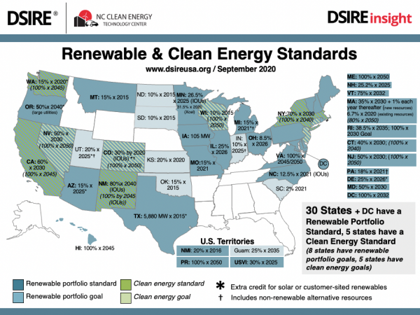
The RPS is basically a quota system for renewable energy and has been applied mostly to electricity. More than half of U.S. states have adopted some form of RPS, as shown in Figure 8.1, taken from the DSIRE website (note: look on the DSIRE web site for the most up to date version of this picture, as state programs change structure rapidly). Some countries have adopted policies for blending petroleum-based transportation fuels with biomass-based fuels (such as the Renewable Fuels Standard in the U.S., which you can read about through the U.S. Environmental Protection Agency [87], but our discussion here will focus on portfolio standards for alternative electricity generation technologies. Rather than subsidizing renewables through financial mechanisms as we have already discussed, RPS sets quantity targets for market penetration by designated alternative electricity generation resources within some geographic territory, like a state or sometimes an entire country. Typical technologies targeted under RPS include wind, solar, biomass, and so forth. The way that RPS systems typically work in practice is that electric utilities can either build the required amount of alternative power generation technologies themselves, or they can contract with a separate company to make those investments. Companies that build renewable energy projects can register those projects in a jurisdiction with the RPS to generate tradeable renewable energy credits (RECs). The RECs can then be sold to electric utilities who can use those credits to meet their renewable energy targets.
You can find more [88] information on REC prices through the NREL REC report assigned as part of this week's reading [81]. The data in the report makes a distinction between "voluntary" REC prices and "compliance" prices. Some states or areas have RPS targets that are not mandated by law, while in other states utilities face penalties if they do not comply with meeting their RPS targets.
Impacts on the LCOE for Energy Projects
Impacts on the LCOE for Energy Projects
Incentives and subsidies, if structured correctly, should act to make the technologies that qualify for those subsidies more competitive (compared to technologies that do not qualify). One mechanism that we can use to measure how this works, and whether the subsidy or incentive is likely to be effective, is by looking at how the incentive measure affects the levelized cost of energy (LCOE) for different projects.
Incentives and subsidies can affect the LCOE in one of two basic ways: they can reduce the LCOE directly through tax credits or feed-in tariff type structures, or they can reduce the WACC faced by the project developer (i.e., through loan guarantees or low/zero-interest loans).
The production tax credit (PTC) is one of the most well-known incentive programs for renewable energy in the United States. The structure of the PTC has changed over time, but it currently provides a tax credit equal to $22 per MWh for each MWh of electricity generated by a qualifying wind facility. The PTC does not actually extend over the entire life of the wind facility but, for the purposes of this example, we'll ignore that detail.
Suppose that we had a single 1 MW wind turbine that cost $1,200 per kW (or $1.2 million total) to construct. The wind turbine produces 3,000 MWh of electricity each year and the developer faces a WACC of 15% per year. The operations cost for the wind turbine is $5 per MWh. The lifetime of the project is assumed to be ten years. Remember our formula for the LCOE:
Here the LVC is $5/MWh. Looking back to the formula from Lesson 9, verify for yourself that the LFC for our hypothetical wind turbine is $79.70 per MWh, so the LCOE is $79.70 + $5 = $84.70 per MWh.
Recall that the way the production tax credit works is that it acts like a rebate to the owner of the project receiving the credit, for each MWh of electricity generated (note that not all tax credits work like this - some tax credits are based on capacity or on the amount invested). That rebate is functionally like a discount on the LCOE. So, to incorporate the impact of the PTC, we just subtract it from the LCOE. Thus, the impact of the PTC on our hypothetical wind turbine is:
Recall from the introduction to the lesson that there is some equivalence, in terms of encouraging low-carbon energy resources, between providing subsidies or incentives for those resources and imposing a tax or a price on emissions from polluting resources. You can see how this might work using the LCOE equation. If we were to take a hypothetical 1 MW coal plant with a capital cost of $2,000 and a marginal operations cost of $20 per MWh, assuming that the coal plant produced 7,000 MWh each year under the same financial terms (WACC and time horizon) as the wind plant, you would get the LCOE for that power plant to be $76.93 per MWh (try it yourself). Without any taxes, subsidies or incentives, the coal plant would look cheaper than the wind plant. But with the PTC, the LCOE for the wind plant would fall below that of the coal plant.
Now, let's see what happens if we were to impose a carbon tax of $10 per MWh on the coal plant (one MWh of coal-fired electricity has about one tonne of embedded CO2, so a tax of $10 per MWh is roughly equivalent to a carbon tax of $10 per tonne of CO2). The carbon tax is just a variable cost of operation, so it increases the LVC for the coal plant from $20 per MWh to $30 per MWh. The LCOE rises by $10 per MWH to $86.93 per MWh. With the carbon tax, the coal plant now looks to be more expensive than the wind plant without the PTC. (The wind plant looks a lot better if it happened to get the PTC at the same time that the coal plant was being taxed for its carbon emissions.)
Next, we'll take a look at the impact that a loan guarantee or low-interest loan might have on the LCOE for our hypothetical wind project. Suppose that we got to our 15% WACC for the wind plant through the following calculation: the wind plant is financed 50% by debt and equity, with costs of 15% and 20%, respectively. If the tax rate is 35%, then we would get a WACC of approximately 15% (try it yourself).
Now, suppose that the wind project is able to obtain a loan guarantee that lowers its cost of debt to 3% (assume for the purposes of this example that the share of debt and equity financing stays constant). This would lower the WACC to 11.2% and would lower the LCOE to $73.49 per MWh (again, you should try these calculations yourself). In this case, comparing the impact of the loan guarantee to the impact of the PTC, we can see that the PTC is more advantageous (i.e., it yields a greater reduction in LCOE).
Subsidies and Incentives in the Pro Forma
Subsidies and Incentives in the Pro Forma
In this section, we'll take our hypothetical wind project and look more closely at how subsidies and incentives can be incorporated into the pro forma financial statements. We'll focus on the PTC for this example. The project parameters for the wind turbine will remain the same, except that we'll extend the operational time horizon to 15 years from 10 years and assume fixed operations and maintenance costs of $10,000 per year. We'll also assume a sales price of $60 per MWh over the entire life of the wind project. The project parameters are shown in Table 8.1.
| Capital Cost | 1,200,000 | |
|---|---|---|
| Annual discount rate | 15 | percent |
| Decision Horizon (N) | 10 | Years |
| Annual Output | 3,000 | MWh |
| Marginal Cost | $0 | per MWh |
| Variable O&M | $5 | per MWh |
| Fixed O&M | $10,000 | per year |
| Tax Rate | 35 | percent |
| Sales Price | $60 | per MWh |
The analysis that we are describing here is included in an Excel file posted on the Lesson 8 Overview page [89], called "Wind Pro Forma.xlsx (no PTC)." The tables below will show some excerpts from the full P&L and Cash Flow tables.
First, we'll take a look at the pro forma without the production tax credit. Tables 8.2 and 8.3 show excerpts from the P&L and Cash Flow statements (Years 0 through 3 for each statement). You could also try to reproduce these yourself as an exercise.
| Year 0 |
Year 1 |
Year 2 |
Year 3 |
|
|---|---|---|---|---|
| Construction Cost | $1,200,000 | 0 | 0 | 0 |
| Annual Operating Revenue | $0 | $180,000 | $180,000 | $180,000 |
| Annual Variable Operating Cost | $0 | $15,000 | $15,000 | $15,000 |
| Annual Fixed Operating Cost | $10,000 | $10,000 | $10,000 | |
| Annual Net Operating Revenue | $155,000 | $155,000 | $155,000 | |
| Depreciation Expense | $120,000 | $216,000 | $172,800 | |
| Taxable Net Income | $35,000 | $(61,000) | $(17,800) | |
| Taxes | $12,250 | $ - | $ - | |
| Income Net of Taxes | $22,750 | $(61,000) | $(17,800) |
| Year 0 |
Year 1 |
Year 2 |
Year 3 |
||
|---|---|---|---|---|---|
| (1) | Investment Activities | $(1,200,000) | |||
| (2) | |||||
| (3) | Net Income from Operating | $22,750 | $(61,000) | $(17,800) | |
| (4) | |||||
| (5) | Depreciation Expenses | $120,000 | $216,000 | $172,800 | |
| (6) | |||||
| (7) | Net increase or decrease | ||||
| (8) | in cash | $(1,200,000) | $142,750 | $155,000 | $155,000 |
Based on the cash flow statement, we can calculate the net present value and IRR for this project. If you make the calculation yourself or look at the Excel sheet, you will find that the project has a 15-year NPV that is negative - over that time period the project loses $400,440 in present discounted value terms. The IRR is calculated to be 7%.
Here the IRR is itself useful information - it tells you how low the WACC would need to be in order for the project to break even. You can thus use the IRR in evaluating the usefulness of loan guarantees or low-interest loans in making renewable energy projects profitable. In this case, if the wind project has a 50% debt and 50% equity financing structure, then even if the cost of debt were driven down to 0%, the project would still face a WACC of around 10%. Since this is higher than the IRR, we can conclude that unless the mix of debt and equity financing can be adjusted (more debt, less equity) then a zero-interest loan will not be sufficient to make our wind project profitable.
Now, we'll incorporate the production tax credit for wind into our analysis. This section of the discussion will reference a different Excel file, "Wind Pro Forma.xlsx (with PTC)," which is also posted and can be downloaded from the Lesson 8 Overview page [89]. Here we'll simply assume that our project is eligible for the PTC, and that the PTC is set at $23 per MWh.
To incorporate the PTC into the pro forma, we need to add an extra line to the P&L statement, which calculates the amount of the tax credit. Since the tax credit is calculated as a direct deduction from taxes paid, it is possible (and you'll see it happen in this example) that the Taxes line item in the P&L actually turns out to be negative. This indicates that the wind project receives a check from the IRS each year, because of the production tax credit. (The depreciation allowances also contribute here.) Table 8.4 shows Years 0 through 4 of the P&L statement with the PTC included. Please have a look at the Excel file in Canvas as well - you will notice that there is a line item for the tax credit only for years 1 through 10 (after which the project is no longer eligible for the PTC).
| Year 0 |
Year 1 |
Year 2 |
Year 3 |
|
|---|---|---|---|---|
| Construction Cost | $1,200,000 | 0 | 0 | 0 |
| Annual Operating Revenue | $180,000 | $180,000 | $180,000 | |
| Annual Variable Operating Cost | $15,000 | $15,000 | $15,000 | |
| Annual Fixed Operating Cost | $10,000 | $10,000 | $10,000 | |
| Annual Net Operating Revenue | $155,000 | $155,000 | $155,000 | |
| Depreciation Expense | $120,000 | $216,000 | $172,800 | |
| Taxable Net Income | $35,000 | $(61,000) | $(17,800) | |
| Tax Credit | $69,000 | $69,000 | $69,000 | |
| Taxes | $(56,750) | $(69,000) | $(69,000) | |
| Income Net of Taxes | $91,750 | $8,000 | $51,200 |
Table 8.5 shows the cash flow statement for Years 0 through 3. There is no real adjustment needed for the cash flow statement since the cash flow statement starts with the "Income Net of Taxes" line item from the P&L.
| Year 0 |
Year 1 |
Year 2 |
Year 3 |
||
|---|---|---|---|---|---|
| (1) | Investment Activities | $(1,200,000) | |||
| (2) | |||||
| (3) | Net Income from Operating | $91,750 | $8,000 | $51,200 | |
| (4) | |||||
| (5) | Depreciation Expenses | $120,000 | $216,000 | $172,800 | |
| (6) | |||||
| (7) | Net increase or decrease | ||||
| (8) | in cash | $(1,200,000) | $211,750 | $224,000 | $224,000 |
We can again go and calculate the net present value and IRR of the plant. The PTC in this case does not make the NPV positive - the project loses $54,145 in present discounted value terms - but the PTC does increase the NPV by close to $350,000 over the life of the plant. It also raises the IRR to 14%. In this case, if the PTC could be coupled with RECs for the project (even if those RECs were not worth very much individually), then the NPV would likely increase to positive territory.
Lesson 8 Summary and Final Tasks
Summary and Final Tasks
Summary
Many renewable energy projects are currently at a cost disadvantage to conventional energy projects that do not account for in-kind subsidies to conventional projects for two reasons. First, many renewable energy technologies are not as mature as conventional technologies. Second, the social costs of pollution associated with fossil-fuel usage are not always fully incorporated into the prices charged in the marketplace. If the avoidance of those social costs could be monetized, then perhaps renewables would be more competitive with conventional energy resources. There are two basic ways to incorporate those social costs. First, polluting energy resources could be taxed (or a price put on their polluting emissions). Second, non-polluting energy resources could be given incentives or subsidies in some way, which lowers their costs compared to conventional energy resources. In this lesson, we discussed four basic mechanisms for providing subsidies and incentives. Tax credits and feed-in tariffs act as direct subsidies for each unit of energy produced. Rebates and grants can offset capital costs of new investments. Loan guarantees or low/zero-interest loans can substantially lower a project's WACC, increasing the present discounted value. Renewable portfolio standards or clean energy standards offer quota-based mechanisms for drawing alternative energy resources into the marketplace.
Reminder - Complete all of the Lesson 8 tasks!
You have reached the end of Lesson 8! Double-check the What is Due for Lesson 8? list on the first page of this lesson to make sure you have completed all of the activities listed there before we begin the next lesson.
Lesson 9 - Introduction to Regulatory and Rule-Making Process
Lesson 9 Overview
Lesson 9 Overview
Overview
We started the course with a discussion of how important energy is to the economy and the society. WIth such an important (some would say existential) dependence on reliable, affordable and safe energy, it is little wonder that the government might have something to say about how these important products and services are provided. There are some great books and even treatises that have been written by economists and attorneys on the regulation of the energy industry in the US and globally. This lesson will focus only on the United States because a global survey would be too broad for inclusion and because many of the lessons learned in the US will be applicable to the rest of the developed world.
Learning Outcomes
By the end of this lesson, you should be able to:
- Discuss topics related to utility regulation in the US
- Explain Rate Base/Rate of Return Regulation in a simple form
- Identify the levels of regulatory jurisdiction
- Explain where federal and state jurisdiction boundaries are drawn
- Articulate the reason for the "Regulatory Construct"
- List the most important Regulatory Cases in the past 150 years and discuss their importance
- Develop the policy sensitivities section of your project
Reading Materials
- Chapters 1 and 10 of Principles of Public Utility Rates [90] by J. C. Bonbright
- The first four entries of Penn State Extension's article, Electricity Deregulation [91]: Why the Legislation? What is Deregulation? What Guidelines did PUC Set for Deregulation? and What is the Local utility Company's Role in Deregulation?
- Please watch the following interview with Frank Lacey (50 min.), which is borrowed from EME 897: Solar Energy Integration and Economics. If this video is slow to load here on this page, you can always access it and all course videos in the Media Gallery in Canvas.
Interview with F. Lacey by M. Kleinginna © Penn State is licensed under CC BY-NC-SA 4.0
What is due for Lesson 9?
This lesson will take us one week to complete. Please refer to the Course Calendar in Canvas for specific due dates. Specific directions and grading rubrics for assignment submissions can be found in the Lesson 9 module in Canvas.
- Complete Quiz 7
- Project work - Policy Sensitivities
Questions?
If you have any questions, please post them to our Questions? discussion forum (not email). I will not be reviewing these. I encourage you to work as a cohort in that space. If you do require assistance, please reach out to me directly after you have worked with your cohort --- I am always happy to get on a one-on-one call, or even better, with a group of you.
Why Do We Regulate?
Why Do We Regulate?
Economic Regulation
In theoretical economics there is the idea that certain services and goods are most efficiently provided by what is defined as a “natural monopoly.” A natural monopoly is a type of monopoly [92] in an industry or sector with high barriers to entry and start-up costs that prevent any rivals from competing. As such, a natural monopoly has only one efficient player. This company may be the only provider of a product or service in an industry or geographic location. Here's a nice definition of a natural monopoly [93]. One can see that there are places in the energy value chain where it might be most efficient to have a natural monopoly. For instance, it does not make sense from an efficiency standpoint to have more than one set of electricity distribution wires in the street. This also makes sense for natural gas distribution. Electric and natural gas transmission also are more efficient with fewer rather than many players. In the case of natural gas transmission, regulators allowed for limited competition among certain pipeline companies to many city gates in the Northeast and Midwest while there is pretty unbridled competition in the Texas and Louisiana markets. Regardless, large infrastructure projects are usually more efficient if not duplicated. For instance, do we need more than one wastewater system or more than one transit authority in a particular geographic region?
While it is quite likely that the best outcome from an efficiency perspective comes from a natural monopoly, there is an asymmetry that occurs with respect to pricing power particularly when the good or service provided is considered to be very important by the end user like heat or water or power. This price “inelasticity” for the consumer sets up the owner of the natural monopoly with significant pricing power. This pricing power over time could make the goods and services unaffordable to the consumer and allow for significant monopoly rents to be earned by the supplier.
This is where utility regulation seeks to “level the playing field” by regulating the prices (rates) of these granted natural monopolies. We will further discuss this process in section 9.4
Environmental Regulation
Environmental regulations are governmental incentives or laws passed in attempts to protect the environment in a variety of ways: such as by reducing waste, requiring companies to cut back on production in order to reduce nation-wide emissions, or banning the use of harmful chemicals and substances to protect the environment, human health, and biodiversity.
In general, environmental regulation is dedicated towards the initial activities at the production site and how the waste is handled following the manufacturing process of a product.
The main goal of environmental regulation is to require strict rules on the measures necessary in order to reduce emissions and protect the environment – many of which would not occur if it weren’t for environmental regulations. Environmental regulations do the same: many wouldn’t commit to the environmental measures necessary on their own, but with the environmental regulations – it no longer becomes a choice, but a legal requirement that makes a global difference. There are many other courses in the RESS curriculum that cover Environmental regulation and policy. It is an extremely important topic and compliance with these regulations can be costly and is something that in a more complex development of a project like the ones we are doing here would require significant due diligence. Further - there are environmental policies which promote the development of renewable energy like Renewable Portfolio Standards (RPS), carbon taxes and feed-in tariffs. Please check out this link if you want more information about this: Our 2023 Guide to Environmental Regulations in the US [94].
Other Regulations
Municipalities, State and the Federal Government also have other regulations such as labor, zoning, procurement and land use regulations. Think about some other types of regulation your project may come under as you work through it.
Authorities Having Jurisdiction
Authorities Having Jurisdiction
Authorities Having Jurisdiction (AHJ) are governmental or non-governmental entities responsible for enforcing building codes, fire codes, and other regulations in a given jurisdiction. These entities can have a significant impact on your project. You may want to circle back to your Stakeholder Register to see if you’ve covered the important AHJ’s in that document. The AHJs we will be covering in this lesson have mostly to do with the regulation of the various functions of the energy business. There are other AHJs that are important like environmental regulators, taxing authorities and zoning boards, but these AHJs are outside the scope of EME801.
Regulatory Bodies
Regulatory Bodies
In the United States there are three levels of government: Federal, State and Local. Each of these levels of government regulates the various aspects or functions of the energy delivery systems. When it comes to the economic regulation of the energy business, the Federal and State governments provide the vast majority of economic regulation. At the federal level, we have the Federal Energy Regulatory Commission (FERC), which is responsible for regulating the interstate sale and transmission of crude oil, refined products, natural gas and electricity. We will mostly focus on the regulation of the transportation of natural gas and electricity. FERC ensures the proper operation, expansion, abandonment and rate structure and level for interstate natural gas pipelines, which move gas from production areas like Texas, Louisiana, and the Appalachian regions of Pennsylvania, West Virginia and Ohio to load centers like New York City, Chicago and San Francisco. FERC also regulates interstate electric transmission through its regulation of Regional Transmission Organizations like PJM, ISONE and CalISO.
At the state level, each state has a utility commission which ensures the safe operation and fair rates for natural gas and electricity. These bodies include the Pennsylvania Public Utility Commission, The Illinois Commerce Commission and the Massachusetts Department of Public Utilities. These agencies provide important oversight to gas and electric utilities due to the nature of most utility service being a natural monopoly.
The Way Rates Are Made
The Way Rates Are Made
Remember back in the beginning of the course when we started talking about certain accounting terms and definitions? Well here we go again. In the first sections, we focused on starting with developing a time series of revenue and expenses by assuming some prices and volumes and costs (both capital and O&M). Using some financial analysis techniques we determined whether we had a viable project or not. Well, the way that the utility makes its rates is a little sideways from that. The utility starts with certain assumptions about the return required to allow investors to buy equity in the enterprise. This cost of equity is a heavily debated topic in a rate case because there are many views on how to determine how risky an enterprise is. But let’s just say that we agree that this cost of equity for the utility can be determined. Once this cost of equity is determined, we can then determine the total cost of capital because the debt used to finance the capital in the utility is already a known quantity and the capital structure has been set by how much capital is financed through debt vs equity. Now the next step, once we know the cost of capital, is to determine the amount of net operating income (NOI) that is required to be earned by the utility to recover its cost of capital. This is derived by multiplying the cost of capital by the “rate base” for the utility. The utility’s rate base is defined as the total value of a utility’s assets (e.g., plant, equipment, working capital, and deductions for accumulated depreciation). This then gives us our targeted NOI. We then add to NOI all the expenses of the utility. This includes taxes, depreciation and amortization, operating expenses and administrative and general expenses. The sum of these is equal to the revenue requirement for the utility. This revenue requirement is then divided by the billing determinants (in energy this could be kWh, MMBtu or MCF). Dividing the revenue requirement by the volumes then gives a rate in $/kWh or $/MMBtu. This is called then the rate for service.
Rates are set in quasi-judicial proceedings called rate cases. These are usually presided over by administrative law judges at the state and federal level. The utility “puts on” its rate case through a very large filing of a lot of data. Other parties to the case like consumer advocates, Commission Staff, Industrial Intervenors and activists will also file evidence in the rate case. These parties will typically represent the interests of their constituencies. You could imagine a large industrial customer saying his rate was too high so that the other customers should pay more. Consumer advocates will say that residential customers are paying too much so those folks will advocate for higher costs to other rate classes. All the intervenors will likely say that the utility is asking too much in general and will try to argue for a lower cost of equity, a smaller rate base and higher volumes, as each of these factors would keep rates lower overall.
Lesson 9 Summary and Final Tasks
Summary and Final Tasks
Please be sure to read the assigned readings, complete the deliverable, complete the quiz, and play around in the utility rate-making spreadsheet.
Reminder - Complete all of the Lesson 9 tasks!
You have reached the end of Lesson 9! Double check the What is Due for Lesson 9? list on the first page of this lesson to make sure you have completed all of the activities listed there before you begin Lesson 10.
Lesson 10 - National and Global Markets for Petroleum and Natural Gas
Lesson 10 Overview
Overview
This lesson will introduce you to the global markets for the petroleum commodities (crude oil, refined products, and natural gas). These commodities, along with coal, are commonly called fossil fuels. The inherent value of these fuels comes from their relative ease of transportation, their energy density, and their ability to be inventoried and dispatched as needed to meet demand. These characteristics should always be kept in mind when trying to understand the challenges associated with a transition away from fossil fuels.
There is a great deal of complexity in the world of petroleum markets. There are entire 3- and 6-credit courses offered on the subject. We will cover a lot of ground in this single module. There is also supplementary material from the previous iteration of EME 801 (written and developed by Dr. Seth Blumsack) which is attached as an appendix. You are strongly encouraged to read this material and digest it, as further background on energy markets provides great insight to inform decisions that each of you will be called on to make.
Learning Outcomes
By the end of this lesson, you should be able to:
- Discuss topics related to national and global markets for petroleum and natural gas
- Use the NYMEX (CME Group) website to construct a forward curve for crude oil, refined products and natural gas
- Identify the role that the “Henry Hub” plays in North American natural gas pricing
- Define “wellhead” and “citygate” prices for natural gas, and explain why these prices are usually different
- Calculate correlations between natural gas prices in different regions of the United States, using data from the Energy Information Administration
- Develop the Fossil Fuel Market Sensitivities section of your project
Reading Materials
Aside from the online materials, you will need to access the websites of the EIA and NYMEX (CME Group).
- S. van Vactor, Flipping the Switch: The Transformation of Energy Markets [95]. Note: Chapter 5 of this reading has a nicely detailed discussion of the development and structure of markets in both the US and Europe.
- Hall and Day, Revisiting the Limits to Growth Under Peak Oil [96]
- Episodes 1, 2, and 3 of the podcast Planet Money Buys Oil [97]
- U.S. Energy Administration (2022), Natual Gas Explained [98]
- The Heart of the Matter: Everything You Need to Know about the Cushing Oil Hub [99]
- RBN Energy (2015), Henry the Hub, I am, I am [100] - Evolution of the Natural Gas Benchmark
- RBN Energy (2022), The Way She Moves [101]- A Deep Dive into the Process, Quirks and Idiosyncrasies of U.S. Natural Gas Pricing
What is due for Lesson 10?
This lesson will take us one week to complete. Please refer to the Course Calendar for specific due dates. See the specific directions for the assignments below.
- Complete all of the Lesson 10 readings and viewings, including the lesson content
- Participate in the Zoom discussion
- Project work: Fossil Fuel Market Sensitivities
Questions?
If you have any questions, please post them to our Questions? discussion forum (not email). I will not be reviewing these. I encourage you to work as a cohort in that space. If you do require assistance, please reach out to me directly after you have worked with your cohort --- I am always happy to get on a one-on-one call, or even better, with a group of you.
Introduction to Global Markets for Crude Oil
Introduction to Global Markets for Crude Oil
Crude oil is one of the most economically mature commodity markets in the world. Even though most crude oil is produced by a relatively small number of companies, and often in remote locations that are very far from the point of consumption, trade in crude oil is robust and global in nature. Nearly 80% of international crude oil transactions involve delivery via waterway in supertankers. Oil traders are able to quickly redirect transactions towards markets where prices are higher.
Global supply and demand determines prices for fossil fuels. Events around the world can affect our prices at home for oil-based energy such as gasoline, heating oil and natural gas. Political unrest in some oil-producing nations also contributes to high prices - basically, there is a fear that political instability could shut down oil production in these countries. OPEC, the large oil-producing cartel, does have some ability to influence world prices, but OPEC's influence in the world oil market is shrinking rapidly as new supplies in non-OPEC countries are discovered and developed.
Our discussion of the world market for crude oil will be broken into a few sections. We will first focus on what's called the "spot" and "forward" market for crude oil. The term "spot market" generally refers to a short-term commodity transaction where the physical commodity changes hands very soon after the seller receives payment. Most retail consumer purchases are examples of spot transactions. When I buy a newspaper at the convenience store or a slice of pizza at the pizza shop, I get the product right after I pay for it. Forward markets refer to contracts where buyers and sellers agree up-front on a price for a commodity that will be delivered at some point in the future. When I subscribe to the newspaper and have it delivered to my house every day, I am signing a type of forward contract with the newspaper company. When I call the pizza shop and ask them to deliver a pizza to my house one hour or one day from now, then I am also engaging in a type of forward contract.
We will also discuss "futures" markets for crude oil. The difference between futures and forward markets can be confusing at times. The primary difference is that a futures contract is a highly standardized commodity sold through a financial exchange, rather than a highly customizable contract bought and sold through one-on-one transactions. Futures markets do have the advantage that they have been able to attract many more buyers and sellers than forward markets.
Finally, we will spend time in this lesson learning where to find data on global oil markets and discussing the issue of "peak oil" - whether world oil reserves are dwindling or whether there is actually enough to support rising oil consumption over the coming decades. There is more data on the web than you might think, but the difficulty is in knowing where to find exactly what you are looking for.
Beginnings of a Market to 1970
Beginnings of a Market to 1970
Through much of the first half of the 20th Century, the United States was the dominant world oil producer and was, in fact, a net exporter. By the early 1900s, a bilateral "world" market for oil had developed, but the world price was simply the U.S. price plus the cost of freight. Russia's production did not lag far behind U.S. production during this time, but their relatively closed economy precluded much trade with the rest of the world. Table 10.1 shows the leading crude oil producers up to 1970.
| Year | U.S. | Mexico | Venezuela | Russia | Indonesia | Middle East |
|---|---|---|---|---|---|---|
| 1910 | 575 | 10 | 0 | 170 | 30 | 0 |
| 1920 | 1,214 | 430 | 1 | 70 | 48 | 31 |
| 1930 | 2,460 | 408 | 374 | 344 | 114 | 126 |
| 1940 | 3,707 | 12 | 508 | 599 | 170 | 280 |
| 1950 | 5,407 | 198 | 1,498 | 729 | 133 | 1,755 |
| 1960 | 7,055 | 271 | 2,854 | 2,957 | 419 | 5,255 |
| 1970 | 9,637 | 487 | 3,708 | 6,985 | 854 | 13,957 |
Unlike OPEC, the market for crude oil in the U.S. was generally competitive since mineral rights did not belong to the state but to the landholder. If it was under your property, you owned it. Since oil (and gas) reservoirs often crossed property boundaries, "rights" were hard to specify and enforce. If an oil reservoir was split between my property and yours, the money would flow to whoever could suck all the oil out first. Overdrilling was the result, as was the birth of "wildcatters," individuals who would dig oil wells on unproven land, hoping to strike it rich.
During the period up to 1970 (and even beyond), the "market" for crude oil was characterized largely by within-company exchanges. Most oil companies were "vertically integrated," meaning that the company operated all the way down the value chain - crude oil would go from the field to the refiner to the marketer (and then to the retailer, like a gas station) while staying within company borders. There was a small number of market transactions at what were referred to as "posted prices." Posted prices are essentially fixed offer prices posted by companies in advance of transactions. Posted prices were originally painted on wooden signs and hung on posts (hence the name), each remaining in effect until it was replaced by a new one. Now, posted prices take the form of electronic bulletins issued by major oil producers. (The spot market for crude oil is still not very large, so posted prices are not always representative of market conditions.) An example of a posted price bulletin is shown in Figure 10.1.
Memorandum - August 23, 2013
East of the Rockies - Bulletin 13-E163
Chevron has changed its posted prices as shown below:
Effective 7:00 a.m. on the date(s) indicated, and subject to change without notice and subject to the terms and conditions of its division orders or other contracts, Chevron will pay the following prices ($/bbl) for oil at 40.0° API and above, except as noted below, delivered into pipelines for its account into the custody of its authorized carrier or receiving agent. The posted prices for crude oil transported by truck or barge will be the following prices less appropriate trucking or barge cost. The posted prices for crude oil received offshore will be the following prices, less appropriate transportation and quality costs to get the crude on shore. For information on Chevron's most recent prices, call Cliff Williams +1 832 544 5822.
For fax receipt problems, call +1 832-854-2929.
For a voice-recorded message of the posted prices each day, please call 832 854 3033.
Note: Effective January 1, 2008, Chevron will begin posting for Rocky Mountain Condensate.
1 Prices are subject to a Gravity Adjustment Scale.
| East of the Rockies | Price | Change | Gvty Adj1 |
|---|---|---|---|
| Altamont Yellow Wax | 90.92 | 1.39 | --- |
| Rocky Mountain Condensate | 95.42 | 1.39 | --- |
| Southwest Wyoming Sweet | 98.92 | 1.39 | --- |
| Uinta Basin Black Wax | 98.92 | 1.39 | --- |
| Western Colorado | 96.42 | 1.39 | --- |
Note: Prices in $/bbl
Measurement
The prices are based upon the computation of quantities by mutually acceptable automatic measuring equipment in accordance with provisions of API Standard 1101 or from 100% tank tables with corrections of volume and gravity for temperature to 60°F in accordance with ASTM D-1250 and supplements thereto, if any, and with deductions for full sediment, water and other impurities. Only merchantable oil acceptable to the receiving agency designated by Chevron and containing not more than 1% sediment and water will be accepted.
OPEC Seizes Control: The Energy Crisis and the Arab Oil Embargoes of 1973 and 1979
OPEC Seizes Control: The Energy Crisis and the Arab Oil Embargoes of 1973 and 1979
OPEC was formed in 1960, largely as a way for governments of oil-producing nations to capture oil revenues that, at the time, were going to foreign-producing firms. The motivation for founding OPEC was not market power, but rather a tax dispute. Oil was originally taxed as income. Thus, as prices fell with increased competition, the tax collected by the oil-producing nations also fell. The members of OPEC decreed that oil taxes would now come in the form of excise taxes, levied on a per-barrel basis. In other words, they succeeded in separating tax revenue from the value of the taxable commodity. The rise in oil prices around this time (see Table 10.1 on the previous page) reflects the fact that spot prices reflected taxes collected by OPEC governments, rather than market transactions since excise taxes act as a floor on prices. As a cartel attempting to coordinate actions among its members, OPEC has had only mixed success, as we will discuss below. Two incidents, one in 1973 and one in 1979, however, did impact the world oil market substantially, as shown in the middle section of Table 10.1, and cemented OPEC's reputation into place for the following decades.
In 1971 and 1972, fears began to grow in the developed world that if we were not already running out of energy supplies, we would soon, as additional nations adopted Western industrial structures. Then-president Richard Nixon appeared particularly concerned that Arab nations might impose a selective embargo on the United States for its pro-Israel policy. Such a selective embargo could not have worked; the world crude-oil market was too large, and replacement oil could have been found in too many places. The energy crisis was largely hysteria - production was increasing with no end in sight, and imports, particularly from Saudi Arabia, were rising.
It is important to separate the energy crisis from the Arab oil embargo of 1973. The two are separate but related events. The Arab oil embargo was successful only because of the price controls and rationing that occurred as a result of the energy crisis. It is possible (but perhaps a stretch) that the high prices and lines at the gas pumps may have happened even without cutbacks in supply from the Arab oil producers. The oil embargo officially started in October 1973, when a group of Middle East countries announced a 5% production cut per month as a reaction to the Yom Kippur War between Egypt and Israel (or, more precisely, Israel's victory in that war, aided by nations such as the United States). The embargoing nations said that the cuts would be restored once Israel withdrew from Palestine and Jerusalem.
The oil embargo of 1979 was not really much of an embargo at all, at least not in the sense of the 1973 embargo. The output cuts in 1979, however, were much larger, and the overall effect was more lasting than its predecessor six years earlier. The primary player in the 1979 embargo was Saudi Arabia, which cut production following a strike by Iranian oil workers. The production cuts were an attempt to raise prices. This they did, but they also reawakened fears of an energy crisis, with politicians muttering I-told-you-sos about how the world was in for a severe energy shortage. The cutbacks by Saudi Arabia only lasted three months, but the damage was done, and Saudi Arabia was recognized as the only single player that had the capability to move the world oil market. The following year, the Saudis found themselves in the enviable position of being able to raise prices without lowering output.
Current World Oil Market
The current market for crude oil is truly global in reach. Oil cargoes move with relative ease between countries and across oceans. While most U.S. oil imports come from a relatively small group of countries, it is misleading to think that only those countries have an impact on oil prices in the United States. Because oil can and does move so freely from one area to another across the globe, it is better to think of the oil market as a global pool, rather than as a network of suppliers and buyers. If one supplier shrinks the overall depth of the pool by withholding supply (or floods the pool by producing a lot of oil), then the impact will be felt uniformly throughout the pool.
At this point, you are encouraged to listen to episodes 1, 2, and 3 of the Planet Money Buys Oil podcast [97]. This podcast is very entertaining and will give you a sense of what the "physical" market for crude oil is like. The physical market is what we've been talking about so far in this lesson - the part of the oil market where buyers and sellers exchange money for crude oil. In the next part of the lesson, we'll move into the "futures market" for crude oil, which is where all sorts of different market players hedge and speculate on the physical price of crude oil. Episode 3 gets into the refining area which we are also covering here.
The pricing of oil is determined largely by a mix of fundamental supply and demand factors, as well as expectations. How much of any given oil-price movement is due to each of these three factors is an eternal mystery that keeps a small army of editorial columnists and television talking heads in business. The supply-demand balance is perhaps the easiest piece to explain - when demand is high (for example, during the wintertime when heating oil demands are high or during the summer when people tend to drive more often and further distances), consumers are willing to pay more for refined petroleum products, and higher-cost oil supplies must be brought online. Thus, the price goes up. Similarly, when accidents, political strife, or war keep supplies offline, higher-cost replacements must be found, and the price goes up. Expectations can play a large role in pricing outcomes in the oil (as well as gas and refined products) markets. The role of people’s expectations can be traced back to OPEC's successes in the 1970s in increasing world oil prices, even for brief periods. Believing that OPEC had the power to do pretty much whatever it wanted, market participants began engaging in a series of self-fulfilling prophecy games. They worked something like this. First, one or more market participants would believe that OPEC would act to increase prices or reduce supply. Afraid of getting caught short or unable to fulfill contracts, stockpiling commenced, pushing up spot prices. Thus, all OPEC needed to do was cause panic in the markets by spreading rumors of policy changes. The gains were nearly always short-lived as the high cost of inventories would result in sell-offs, bringing oil prices down to pre-panic levels. Nowadays, broader geopolitical concerns, particularly in the Middle East, Africa, and Russia/Ukraine, have replaced the grumblings of OPEC as the source for expectations-induced spikes in fossil fuel prices including natural gas.
OPEC was mentioned earlier as an entity that has been able to exert substantial influence on global markets for crude oil. OPEC operates as a cartel - a group of producing countries that attempt to coordinate supply decisions in order to exert some influence on prices. OPEC does not try to set prices directly, as is often believed. What OPEC countries try to do is to expand or contract oil production in order to keep the world price within some band that the countries collectively deem desirable.
OPEC's actual ability to manipulate oil prices is not all that clear, and its influence has dwindled as more "unconventional" petroleum resources have been developed, including the oil sands in Canada and shale oil in the United States. Most cartels are difficult to sustain since each member of the cartel has the incentive to cheat - in OPEC's case, this means that countries have often produced more oil than they were supposed to under the quota system, as shown in Figure 10.2 (the most consistent cheater seems to have been the country of Algeria). Even during the 1973 embargo, none of the OPEC nations approached the formal 5% production cut mentioned in the embargo. Saudi Arabia's production decreased by 0.8%. Iraq and Oman saw the biggest percentage cuts in production at 1%. Prices did indeed go up, but largely as a result of fear and higher taxes rather than actual supply shortages. The actual production cuts lasted only three weeks; the embargo fell apart in December when Saudi Arabia raised production.
NOTES:
- Roll your mouse over the name of a country to highlight the plotted line for that country.
- Roll your mouse over the plotted lines to reveal data values.
- Click on country names to hide or reveal the data from the graph.
| Algeria | Indonesia | Iran | Libya | Nigeria | Qatar | Saudi Arabia | UAE | Venezuela | |
|---|---|---|---|---|---|---|---|---|---|
| 1982 Jan | 53 | -3 | 110 | 67 | -8 | 0 | -21 | 18 | 27 |
| 1982 Mar | 49 | 0 | 81 | 50 | -5 | 6 | -15 | 15 | 22 |
| 1982 Jun | 46 | 3 | 52 | 34 | -2 | 11 | -10 | 12 | 17 |
| 1982 Sep | 42 | 6 | 24 | 18 | 1 | 16 | -4 | 9 | 12 |
| 1983 Jan | 39 | 10 | -5 | 2 | 4 | 21 | 1 | 6 | 7 |
| 1983 Mar | 41 | 10 | -5 | 2 | 6 | 19 | 0 | 10 | 8 |
| 1983 Jun | 43 | 11 | -5 | 3 | 8 | 17 | -2 | 15 | 8 |
| 1983 Sep | 45 | 12 | -5 | 4 | 10 | 15 | -4 | 19 | 9 |
| 1984 Jan | 46 | 13 | -5 | 4 | 12 | 14 | -5 | 23 | 10 |
| 1984 Mar | 48 | 13 | -5 | 5 | 14 | 12 | -7 | 28 | 10 |
| 1984 Jun | 50 | 14 | -5 | 5 | 15 | 10 | -8 | 32 | 11 |
| 1984 Sep | 50 | 14 | -5 | 5 | 15 | 10 | -8 | 32 | 11 |
| 1985 Jan | 50 | 14 | -6 | 5 | 15 | 9 | -8 | 32 | 11 |
| 1985 Mar | 49 | 14 | -6 | 5 | 15 | 8 | -8 | 32 | 11 |
| 1985 Jun | 49 | 14 | -6 | 5 | 15 | 7 | -7 | 32 | 11 |
| 1985 Sep | 49 | 14 | -6 | 5 | 15 | 7 | -7 | 32 | 10 |
| 1986 Jan | 49 | 14 | -7 | 5 | 15 | 6 | -7 | 32 | 10 |
| 1986 Mar | 48 | 14 | -7 | 5 | 15 | 5 | -7 | 32 | 10 |
| 1986 Jun | 48 | 13 | -7 | 5 | 15 | 4 | -6 | 32 | 10 |
| 1986 Sep | 59 | 16 | 6 | -4 | 4 | 2 | -1 | 35 | 16 |
| 1987 Jan | 61 | 16 | 0 | -1 | 6 | -25 | 2 | 62 | 15 |
| 1987 Mar | 63 | 16 | -6 | 3 | 8 | -53 | 4 | 88 | 13 |
| 1987 Jun | 59 | 14 | -5 | 10 | 10 | -18 | 9 | 75 | 16 |
| 1987 Sep | 56 | 13 | -5 | 18 | 12 | 17 | 13 | 62 | 19 |
| 1988 Jan | 56 | 13 | -2 | 16 | 13 | 16 | 13 | 63 | 18 |
| 1988 Mar | 56 | 13 | 0 | 13 | 15 | 15 | 13 | 65 | 18 |
| 1988 Jun | 56 | 13 | 3 | 11 | 17 | 14 | 13 | 67 | 16 |
| 1988 Sep | 56 | 13 | 6 | 9 | 19 | 13 | 13 | 69 | 16 |
| 1989 Jan | 53 | 10 | -47 | 7 | 23 | 16 | 8 | 74 | 13 |
| 1989 Mar | 50 | 7 | -99 | 6 | 27 | 19 | 3 | 78 | 10 |
| 1989 Jun | 43 | 4 | -3 | 3 | 20 | 12 | 8 | 95 | 8 |
| 1989 Sep | 40 | 1 | -5 | 4 | 8 | 7 | 5 | 90 | 4 |
| 1990 Jan | 43 | 8 | -1 | 13 | 13 | 8 | 22 | 70 | 11 |
| 1990 Mar | 46 | 14 | 3 | 21 | 18 | 9 | 38 | 50 | 17 |
| 1990 Jun | 47 | 13 | 3 | 15 | 13 | 7 | 25 | 34 | 13 |
| 1990 Sep | 48 | 12 | 3 | 9 | 8 | 5 | 12 | 18 | 9 |
| 1991 Jan | 49 | 12 | 3 | 3 | 3 | 3 | -2 | 2 | 5 |
| 1991 Mar | 53 | 12 | 4 | 2 | 6 | 1 | 0 | 3 | 6 |
| 1991 Jun | 56 | 13 | 5 | 1 | 9 | 0 | 1 | 4 | 6 |
| 1991 Sep | 60 | 14 | 6 | 6 | 12 | -1 | 3 | 4 | 6 |
| 1992 Jan | 60 | 14 | 6 | 5 | 12 | 4 | 3 | 4 | 6 |
| 1992 Mar | 59 | 14 | 6 | 4 | 13 | 9 | 2 | 3 | 5 |
| 1992 Jun | 59 | 14 | 6 | 4 | 13 | 13 | 2 | 2 | 4 |
| 1992 Sep | 58 | 13 | 6 | 3 | 14 | 18 | 1 | 1 | 4 |
| 1993 Jan | 63 | 16 | 9 | 0 | 12 | 14 | 3 | 2 | 9 |
| 1993 Mar | 61 | 15 | 6 | 0 | 9 | 15 | 3 | 2 | 11 |
| 1993 Jun | 60 | 13 | 3 | -1 | 6 | 16 | 3 | 3 | 13 |
| 1993 Sep | 60 | 14 | 3 | 0 | 7 | 20 | 3 | 3 | 15 |
| 1994 Jan | 61 | 14 | 3 | 0 | 8 | 23 | 3 | 3 | 17 |
| 1994 Mar | 62 | 14 | 3 | 0 | 9 | 27 | 3 | 4 | 19 |
| 1994 Jun | 63 | 14 | 3 | 1 | 11 | 31 | 3 | 4 | 21 |
| 1994 Sep | 64 | 14 | 3 | 1 | 12 | 35 | 4 | 5 | 23 |
| 1995 Jan | 65 | 15 | 3 | 1 | 13 | 38 | 4 | 5 | 25 |
| 1995 Mar | 66 | 15 | 3 | 1 | 14 | 42 | 4 | 5 | 27 |
| 1995 Jun | 67 | 15 | 3 | 2 | 16 | 46 | 4 | 6 | 29 |
| 1995 Sep | 67 | 15 | 3 | 2 | 17 | 50 | 5 | 6 | 31 |
| 1996 Jan | 68 | 15 | 3 | 2 | 18 | 53 | 5 | 7 | 33 |
| 1996 Mar | 69 | 15 | 3 | 3 | 19 | 57 | 5 | 7 | 35 |
| 1996 Jun | 65 | 14 | 1 | 2 | 18 | 60 | 5 | 6 | 35 |
| 1996 Sep | 60 | 12 | -1 | 1 | 17 | 62 | 4 | 5 | 35 |
| 1997 Jan | 56 | 10 | -3 | 0 | 16 | 65 | 4 | 4 | 34 |
| 1997 Mar | 51 | 9 | -4 | -1 | 15 | 68 | 4 | 3 | 34 |
| 1997 Jun | 47 | 7 | -6 | -2 | 13 | 70 | 4 | 2 | 34 |
| 1997 Sep | 42 | 5 | -8 | -3 | 12 | 73 | 3 | 1 | 33 |
| 1998 Jan | 55 | 19 | 10 | 4 | 1 | 2 | 2 | 7 | 6 |
| 1998 Mar | 46 | 10 | 1 | -4 | 16 | 86 | 1 | 8 | 38 |
| 1998 Jun | 52 | 14 | 3 | 0 | 15 | 62 | 2 | 8 | 26 |
| 1998 Sep | 57 | 18 | 6 | 4 | 13 | 37 | 3 | 8 | 14 |
| 1999 Jan | 63 | 22 | 8 | 8 | 12 | 13 | 4 | 8 | 3 |
| 1999 Mar | 61 | 19 | 8 | 7 | 36 | 13 | 4 | 9 | 2 |
| 1999 Jun | 60 | 17 | 9 | 7 | 59 | 13 | 3 | 9 | 1 |
| 1999 Sep | 59 | 14 | 9 | 7 | 82 | 12 | 2 | 10 | 2 |
| 2000 Jan | 57 | 12 | 9 | 6 | 106 | 12 | 1 | 10 | 1 |
| 2000 Mar | 56 | 10 | -63 | 5 | 96 | 13 | 3 | 6 | 3 |
| 2000 Jun | 50 | 3 | -3 | 1 | 3 | 10 | 3 | 4 | -3 |
| 2000 Sep | 55 | 9 | 3 | 4 | 10 | 15 | 4 | 9 | 6 |
| 2001 Jan | 63 | 9 | 0 | 6 | 10 | 16 | 4 | 10 | 4 |
| 2001 Mar | 65 | 10 | 3 | 6 | 16 | 15 | 4 | 8 | 4 |
| 2001 Jun | 67 | 12 | 5 | 6 | 23 | 15 | 4 | 6 | 4 |
| 2001 Sep | 86 | 13 | 8 | 13 | 21 | 21 | 8 | 10 | 5 |
| 2002 Jan | 76 | 7 | -10 | 13 | 19 | 21 | 10 | 8 | -15 |
| 2002 Mar | 67 | 2 | -28 | 13 | 17 | 21 | 12 | 7 | -36 |
| 2002 Jun | 57 | -4 | -46 | 12 | 15 | 22 | 13 | 6 | -56 |
| 2002 Sep | 47 | -9 | -62 | 12 | 13 | 22 | 15 | 4 | -76 |
| 2003 Jan | 38 | -16 | 1 | 7 | -3 | 17 | 15 | 4 | -33 |
While OPEC has been viewed historically as a cartel that keeps oil prices high, its members have, more recently, probably been at least partially responsible for the rapid decline in oil prices. The Economist has a nice and recent article [103] describing the factors that have been contributing to the slide in oil prices. This has been partly due to sluggish economies in developing countries, energy efficiency in rich countries, the boom in shale-oil production in the United States (which we will come back to in a few weeks), and a strategic decision by Saudi Arabia to maintain high oil production levels even in the face of low prices (this is perhaps an attempt to inflict economic pain on the shale-oil business in the U.S.).
Earlier, it was discussed that when demand increases, higher-cost supplies must be brought online to meet that higher demand. Prices for oil have certainly been on a roller-coaster ride over the past few years. Does this mean that a few years ago, we thought all of the cheap oil in the world was gone, but we have now discovered new supplies of cheap oil? And if not, then what explains the price movements that we have seen in the oil market in recent years?
The answer depends on some understanding of the cost of supplying crude oil. Figure 10.3 provides a rough idea of the cost of extracting different types of oil resources. The low-cost resources are conventional oil fields that have been operating for decades. The higher-cost resources are so-called "unconventional" sources of oil, including deepwater or Arctic drilling; the oil sands of Alberta, Canada; and extraction of oil from shale formations (one of the best-known examples is the Bakken shale in North Dakota, whose extraction costs are somewhere in the lower end of the range shown - perhaps around $50 to $60 per barrel). If the producers of conventional oil were to flood the market, then the price would drop so low that unconventional players would be forced to shut down. This would be good for consumers right now, but bad for the producers of conventional oil (and eventually for consumers), since there would be less oil to sell later on. Thus, conventional oil producers hold some output back, leaving the unconventional producers to serve the leftover or "marginal" demand. This is good for conventional oil producers in both the short and long term (because they earn larger profits), but is bad for consumers in the short term. (In the long term, this strategy keeps prices from rising to even higher levels in the future.)

| Energy Source | Potential Production (billion barrels) | Production Cost ($ per barrel) |
|---|---|---|
| Conventional Oil | 2000 | 10-15 |
| EOR | 2000-3000 | 15-20 |
| Tar Sands/Heavy Oil | 3000-5000 | 20-22 |
| Gas to liquid synfuel | 5000-8000 | 20-30 |
| Coal to liquid synfuel | 8000-16000 | 32-34 |
| Oil Shales | 16000-18000 | 30-90 |
Part of the reason that crude-oil prices have been so high for so long is the increased role that unconventional oil is playing in world oil supply. This is due in some part to the natural decline in output that is expected from conventional oil fields as they mature (more on this later when we talk about "peak oil"). The growth in unconventional oil supplies has been so rapid that countries with large reserves of unconventional oil, such as the United States, have become large oil producers in a very short period of time.
Future Markets for Crude Oil
Not much has been made here of long-term contracts for oil. This is because up until the early 1980s there were not very many. Production continued as long as the extracted oil could find a home in the spot market. The oil-producing countries, recognizing their market power, either implicitly or explicitly avoided long-term contracts in pursuit of volatile and largely lucrative spot prices.
We have already explained the difference between spot markets and forward markets. Both are "physical" markets, in that their main purpose is to exchange commodities between willing buyers and sellers. A spot or forward transaction typically involves the exchange of money for a physical commodity. Within the past few decades, entities with sufficiently large exposure in the physical market (i.e., the need to buy or sell lots of physical barrels of crude oil) have developed financial instruments that can help them "hedge" or control price volatility. By far the most important of these financial instruments is the "futures" contract.
Futures contracts differ from forward contracts in three important ways. First, futures contracts are highly standardized and non-customizable. The NYMEX futures contract is very tightly defined, in terms of the quantity and quality of oil that makes up a single contract, the delivery location and the prescribed date of delivery. Forward contracts are crafted between a willing buyer and seller and can include whatever terms are mutually agreeable. Second, futures contracts are traded through financial exchanges instead of in one-on-one or "bilateral" transactions. A futures contract for crude oil can be purchased on the NYMEX exchange and nowhere else. Third, futures contracts are typically "financial" in that the contract is settled in cash instead of through delivery of the commodity.
A simple example will illustrate the difference. Suppose I sign a forward contract for crude oil with my neighbor, where she agrees to deliver 100 barrels of crude oil to me in one month, for 50 dollars per barrel. A month from now arrives and my neighbor parks a big truck in my front yard, unloads the barrels, and collects 5000 dollars from me. This is a "physical" transaction. If I were to sign a futures contract with my neighbor, then in one month instead of dropping off 100 barrels of crude oil in front of my house, she pays me the value of that crude oil according to the contract (this is called "settlement" rather than "delivery"). So, I would receive 5000 dollars. I could then go and buy 100 barrels of crude oil on the spot market. If the price of crude oil on the spot market was less than $50 per barrel, then in the end I would have made money. If it was more than 50 dollars per barrel, then in the end I would have lost money, but not as much as if I had not signed the futures contract.
This simple example illustrates the primary usefulness of futures contracts, which is hedging against future fluctuations in the spot price. A hedge can be thought of as an insurance policy that partially protects against large swings in the crude oil price.
NYMEX (now called the "CME Group") provides a platform for buying and selling crude oil contracts from one month in advance up to eight and a half years forward. The time series of futures prices on a given date is called the "forward curve," and represents the best expectations of the market (on a specific date) as to where the market will go. The value of these expectations, naturally, depends on the number of market participants or "liquidity." For example, on a typical day, there are many thousands of crude oil futures contracts traded for delivery or settlement one month in advance. On the other hand, there may be only a few (if any) futures contracts traded for delivery or settlement eight years in advance.
The NYMEX crude oil futures contract involves the buying and selling of oil at a specific location in the North American oil pipeline network. This location, in Cushing Oklahoma, was chosen very specifically because of the amount of oil storage capacity located there and the interconnections to pipelines serving virtually all of the United States.
There is a wealth of data out there on crude oil markets. The following video will help orient you toward a website where you can find information on crude oil prices, demand, shipments and other data. Although this is a U.S. website, there is a good amount of data on global markets.
Video: Crude Oil Futures (4:01)
Many of the world's most active energy commodity markets are run by an organization called the CME Group. And in this video, I'm gonna show you the CME group's website and show you how to find information on energy futures markets through the CME Group. And the specific example we're gonna use in this video is how to find information about the futures market for West Texas Intermediate Crude Oil, which is the benchmark crude oil futures market. So we're gonna go to the CME Group website, CME Group.com. And then we're gonna click on markets. And then in the section here where it says "browse by," we're going to click on energy. And then once we come to the energy futures and options page, we're going to click on "Products." And this will take us further down the page to where we can find information on a number of different energy futures markets. The one we're most interested in right now is crude oil futures. What we're going to click on that. And then it may take a second for the page to load. But what is going to pop up is a whole bunch of information about the futures market for West Texas Intermediate Crude Oil. And so I'll just say a little bit about what these different columns mean. The Month column is the month of contract delivery, not the month that the contract was treated. So September 2020, for example, that indicates the contract for deliveries of West Texas Intermediate crude oil in September 2020. The last column, the column that says "Last" here, that shows the last recorded offer for West Texas Intermediate Crude Oil in that month. It takes units of dollars per barrel. So here, the September 2020 contract, the last offer that was received is $42.78 per barrel. And the "Change" column is just the change, again, in dollars per barrel, from teh previous author. The "Prior settle" column is one that we'll use a lot. And that represents the last recorded price at which a buyer and a seller were matched at which to trade happened. And so here the prior subtle column for the September 2020 contract is $42.89 per barrel. The "Open" and "High" and "Low" columns, show the price for the West Texas Intermediate Crude Oil Futures contract at the start of the trading day. And then the highest price and the lowest price where the crude oil contract traded on each day. Then the volume just shows you the number of contracts that have traded. And these orange flashes you see will happen because this data is effectively updated in real time. And so when there are additional contracts traded or when the price changes, those will show up in real time on the screen. So this video has shown you how to get to the CME group's website, where to find information on energy contracts, and specifically, how to get data on the West Texas Intermediate Crude Oil futures contract.
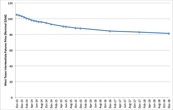
If you look at Figure 10.4, you might notice that the price of crude oil generally declines as you move farther out into the future. This is called "backwardation." The opposite, in which the price of crude oil increases as you move farther out into the future, is called "contango." In general, we expect the crude oil market to be in backwardation most of the time; that is, we expect the future price to be lower than the current (spot) price. This can be true even if we expect demand for crude oil to increase in the future. Why would this be the case? If demand is expected to rise in the future, shouldn't that bring the market into contango?
Sometimes this does happen. Most often, the crude oil market is in backwardation because storing crude oil generally involves low costs and has some inherent value. Suppose you had a barrel of crude oil. You could sell it now, or store it to sell later (maybe the price will be higher). The benefit to storing the barrel of oil is the option to sell it at some future date, or to keep on holding on to the barrel. This benefit is known as the "convenience yield." Now, suppose that hundreds of thousands of people were storing barrels of oil to sell one year from now. When one year comes, all those barrels of oil will flood the market, lowering the price (a barrel in the future is also worth less than a barrel today; a process called discounting that we will discuss in a later lesson). Thus, because inventories of crude oil are high, the market expects the price to fall in the future.
The ability to store oil implies that future events can impact spot prices. A known future supply disruption (such as the shuttering of an oil refinery for maintenance) will certainly impact the futures price for oil, but should also impact the spot price as inventories are built up or drawn down ahead of the refinery outage.
Are We Running Out of Oil?
Are we running out of oil?
Our transportation systems are highly dependent on petroleum. High and volatile prices for oil (and at the pump) naturally give rise to suggestions that oil production has peaked, or that we are running out of oil. Concern over oil supplies is not new. Looking back over the past hundred years [105], there have been five or six projections from governments, researchers and other groups suggesting that the world was about to run out of oil, precious metals or other valuable commodities.
In the 1950s, a geologist named M. King Hubbert looked at oil production data from all of the major oil-producing countries in the world (at that time). Based on his statistical analysis of the data, he projected that U.S. oil production would peak in the 1970s and that world oil production would peak during the first decade of the 21st century. These projections came to be known as "Hubbert's Peak." And it turns out that Hubbert's projections were highly accurate - U.S. oil production did peak in the 1970s, and the collection of oil-producing countries that Hubbert originally studied did see their collective oil production peak in the early 2000s. So, maybe Hubbert had a point, and maybe there is something to the "peak oil" paranoia.
The reality of the "amount of oil" is more complex. When Hubbert made his predictions in the 1950s, the oil industry was still in its technical infancy. Most oil production came from so-called "elephant" oil fields, tremendously large reservoirs of easily-accessible oil. To imagine what these "elephant" fields were like, think about the theme song to the Beverly Hillbillies [106], when Jed Clampett shoots a hole in the ground and oil comes spouting up. The elephant oil fields that represented most oil production during Hubbert's time were basically like "Jed Clampett oil." What Hubbert was predicting was really the decline in Jed Clampett oil.
While Hubbert was right about Jed Clampett oil, his analysis did not consider the advances in technology that would make extraction of oil possible from less-accessible reservoirs. Nor did he consider that a rise in the price of oil would make oil extraction from so-called "unconventional" reservoirs profitable enough to undertake. Deepwater drilling (like in the Gulf of Mexico), the Canadian oil sands, and even extraction of oil from shales via hydraulic fracturing in North Dakota are all examples of unconventional oil production.
In fact, most geologists now believe that the amount of unconventional oil is much larger than all of the Jed Clampett oil fields put together. A recent study from University of California at Berkeley ("Risks of the Oil Transition" by Alex Farrell and Adam Brandt, Environmental Research Letters (2006)) estimated that the world has used up only about 5% of known technically recoverable oil reserves. A future supply curve for liquid hydrocarbons (crude oil and usable synthetic liquid fuels), as shown in Figure 10.5 and adapted from the Brandt/Farrell paper, demonstrates this shift from "conventional" resources (i.e., Jed Clampett oil) to unconventional resources. These unconventional resources include the oil sands for which Alberta is now well known; bitumen-laden "heavy oils" (for which Venezuela is also known); enhanced oil recovery from conventional wells (EOR); synthetic fuels manufactured using natural gas or coal as a feedstock; and oil shales, which includes both naturally occurring deposits of oil in low-porosity shale formations (typically requiring hydraulic fracturing to extract) and hydrocarbon-rich shales that are used to produce a synthetic crude oil.
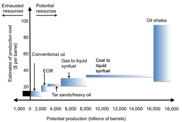
| Energy Source | Potential Production (billion barrels) | Production Cost ($ per barrel) |
|---|---|---|
| Conventional Oil | 2000 | 10-15 |
| EOR | 2000-3000 | 15-20 |
| Tar Sands/Heavy Oil | 3000-5000 | 20-22 |
| Gas to liquid synfuel | 5000-8000 | 20-30 |
| Coal to liquid synfuel | 8000-16000 | 32-34 |
| Oil Shales | 16000-18000 | 30-90 |
The reality is not that we are "running out of oil," but rather that we are transitioning from a period of easily-accessible oil at low prices to an era of increasingly unconventional production, which has higher costs. Companies will not try to develop these unconventional resources unless consumers are willing to pay the price (economic and environmental) or governments heavily subsidize oil production or consumption. So far, the world has found a way to consume plenty of $100-per-barrel oil. At some point, unconventional oil exploration will get so expensive that consumers will look to lower-cost alternatives. Oil will price itself out of the market before the world truly runs out. The increasing popularity of hybrid vehicles, electric vehicles, bicycle transportation in urban areas and even natural gas vehicles are examples of such a shift, even if government policies are required to affect the decisions that consumers make.
Sheik Ahmed Zahi Yamani, the longtime Saudi oil minister and a key founder of OPEC, has perhaps summed up the world oil market the most nicely. He said, "The Stone Age came to an end, not for lack of stones, and the oil age will end, but not for lack of oil."
The Process of Crude Oil Refining
The process of crude oil refining
Despite all of the attention that it gets, no one actually wants crude oil – what people want are the various products that are derived from crude oil. These products include not only gasoline, heating oil, and so forth (which will be the focus of our discussions) but everyday consumer items like plastics, long underwear, and crayons. In this lesson, we’ll discuss markets for energy commodities that are refined from petroleum. While conditions in the crude oil market are highly influential in determining the prices of these products, in some sense each petroleum product market has a life of its own.
Once crude oil is extracted from the ground, it must be transported and refined into petroleum products that have any value. Those products must then be transported to end-use consumers or retailers (like gasoline stations or the company that delivers heating oil to your house, if you have an oil furnace). The overall well-to-consumer supply chain for petroleum products is often described as being segmented into three components (shown graphically in Figure 10.6).
- Upstream activities involve exploring for crude oil deposits and the production of crude oil. Examples of firms that would belong in the upstream segment of the industry include companies that own rights to drill for oil (e.g., ExxonMobil) and companies that provide support services to the drilling segment of the industry (e.g. Halliburton).
- Midstream activities involve the distribution of crude oil to refiners; the refining of crude oil into saleable products; and the distribution of products to wholesalers and retailers. Examples of firms that would belong in the midstream segment of the industry include companies that transport oil by pipeline, truck or barge (e.g., Magellan Pipeline); and companies that refine crude oil (e.g., Tesoro).
- Downstream activities involve the retail sale of petroleum products. Gasoline stations are perhaps the most visible downstream companies, but companies that deliver heating oil or propane would also fall into this category.
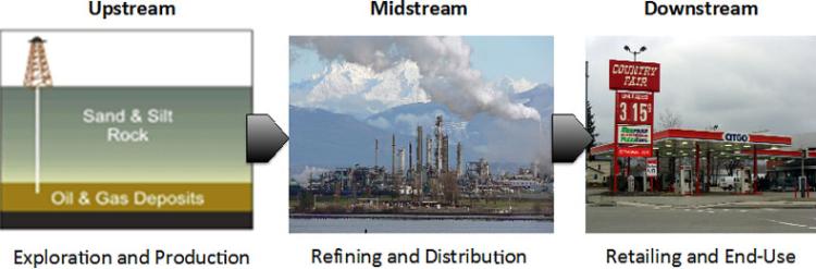
Some companies in the petroleum industry have activities that would fall into upstream, midstream and downstream segments. ExxonMobil is one example of such a firm. Others have activities that fall primarily into only one segment. The KinderMorgan pipeline company is an example of a specialized petroleum firm, in this case belonging to the midstream segment. Many regions have local gas station brands that would specialize in the downstream segment of the industry. One of the best-known regional examples is the WaWa chain of gas stations and convenience stores in eastern Pennsylvania, but large grocery stores and retailers like Costco and Wal-Mart are increasingly involved in downstream sales of petroleum products.
Petroleum refineries are large-scale industrial complexes that produce saleable petroleum products from crude oil (and sometimes other feedstocks like biomass). The details of refinery operations differ from location to location, but virtually all refineries share two basic processes for separating crude oil into the various product components. Actual refinery operations are very complicated, but the basic functions of the refinery can be broken down into three categories of chemical processes:
- Distillation involves the separation of materials based on differences in their volatility. This is the first and most basic step in the refining process, and is the precursor to cracking and reforming.
- Cracking involves breaking up heavy molecules into lighter (and more valuable) hydrocarbons.
- Reforming involves changing the chemical nature of hydrocarbons to achieve desired physical properties (and also to increase the market value of those chemicals).
The link below will take you to a 10-minute video that provides more details on the various refining processes.
Video: Petroleum Refining Basics (10:00)
PRESENTER: For crude oil to be used effectively by modern industry, it has to be separated into its component parts and have impurities like sulfur removed. The most common method of refining crude is the process of fractional distillation. This involves heating crude oil to about 350 degrees Celsius, to turn it into a mixture of gases. These are piped into a tall cylinder, known as a fractional tower. Inside the tower, the very long carbon chain liquids, such as bitumen and paraffin wax, are piped away to be broken down elsewhere. The hydrocarbon gases rise up inside the tower, passing through a series of horizontal trays and baffles called bubble caps. The temperature at each tray is controlled so as to be at the exact temperature that a particular hydrocarbon will condense into a liquid. The distillation process is based on this fact. Different hydrocarbons condense out of the gas cloud when the temperature drops below their specific boiling point. The higher the gas rises in the tower, the lower the temperature becomes.
The precise details are different at every refinery, and depend on the type of crude oil being distilled. But at around 260 degrees, diesel condenses out of the gas. At around 180 degrees, kerosene condenses out. Petrol, or gasoline, condenses out at around 110 degrees, while petroleum gas is drawn off at the top. The distilled liquid from each level contains a mixture of alkanes, alkenes, and aromatic hydrocarbons with similar properties, and requires further refinement and processing to select specific molecules. The quantities of the fractions initially produced in an oil refinery don't match up with what is needed by consumers. There is not much demand for the longer chain, high molecular weight hydrocarbons, but a large demand for those of lower molecular weight-- for example, petrol.
A process called cracking is used to produce more of the lower molecular weight hydrocarbons. This process breaks up the longer chains into smaller ones. There are many different industrial versions of cracking, but all rely on heating. When heated, the particles move much more quickly, and their rapid movement causes carbon-carbon bonds to break. The major forms of cracking are thermal cracking, catalytic, or cat cracking, steam cracking, and hydrocracking. Because they differ in reaction conditions, the products of each type of cranking will vary. Most produce a mixture of saturated and unsaturated hydrocarbons. Thermal cracking is the simplest and oldest process. The mixture is heated to around 750 to 900 degrees Celsius, at a pressure of 700 kilopascals That is, around seven times atmospheric pressure. This process produces alkenes, such as ethane and propane, and leaves a heavy residue.
The most effective process in creating lighter alkanes is called catalytic cracking. The long carbon bonds are broken by being heated to around 500 degrees Celsius in an oxygen-free environment, in the presence of zeolite. This crystalline substance, made of aluminum, silicon, and oxygen, acts as a catalyst. A catalyst is a substance that speeds up a reaction or allows it to proceed at a lower temperature than would normally be required. During the process, the catalyst, usually in the form of a powder, is treated and reused over and over again. Catalytic cracking is the major source of hydrocarbons, with 5 to 10 carbon atoms in the chain. The molecules most formed are the smaller alkanes used in petrol, such as propane, butane, pentane, hexane, heptane, and octane, the components of liquid petroleum gas. In hydrocracking, crude oil is heated at very high pressure, usually around 5,000 kiloPascals, in the presence of hydrogen, with a metallic catalyst such as platinum, nickel, or palladium. This process tends to produce saturated hydrocarbons, such as shorter carbon chain alkanes, because it adds a hydrogen atom to alkanes and aromatic hydrocarbons. It is a major source of kerosene jet fuel, gasoline components, and LPG.
In one method, thermal steam cracking, the hydrocarbon is diluted with steam and then briefly heated in a very hot furnace, around 850 degrees Celsius, without oxygen. The reaction is only allowed to take place very briefly. Light hydrocarbons break down to the lighter alkenes, including ethane, propane, and butane, which are useful for plastics manufacturing . Heavier hydrocarbons break down to some of these, but also give products rich in aromatic hydrocarbons and hydrocarbons suitable for inclusion in petrol or diesel. Higher cracking temperature favors the production of ethene and benzene. In the coking unit, bitumen is heated and broken down into petrol alkanes and diesel fuel, leaving behind coke, a fused combination of carbon and ash. Coke can be used as a smokeless fuel. Reforming involves the breaking of straight chain alkanes into branched alkanes. The branched chain alkanes in the 6 to 10 carbon atom range are preferred as car fuel. These alkanes vaporize easily in the engine's combustion chamber, without forming droplets and are less prone to premature ignition, which affects the engine's operation.
Smaller hydrocarbons can also be treated to form longer carbon chain molecules in the refinery. This is done through the process of catalytic reforming, When heat is applied in the presence of a platinum catalyst, short carbon chain hydrocarbons can bind to form aromatics, used in making chemicals. A byproduct of the reaction is hydrogen gas, which can be used for hydrocracking. Hydrocarbons have an important function in modern society, as fuel, as solvents, and as the building blocks of plastics. Crude oil is distilled into its basic components. The longer carbon chain hydrocarbons may be cracked to become more valuable, shorter chain hydrocarbons, and short chain molecules can bind to form useful longer chain molecules. [MUSIC PLAYING]
The first process is known as distillation. In this process, crude oil is heated and fed into a distillation column. A schematic of the distillation column is shown in Figure 10.7. As the temperature of the crude oil in the distillation column rises, the crude oil separates itself into different components, called “fractions.” The fractions are then captured separately. Each fraction corresponds to a different type of petroleum product, depending on the temperature at which that fraction boils off the crude oil mixture.
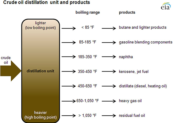
| Boiling Range in degrees Fahrenheit | Products |
|---|---|
| <85 | Butane and Lighter products |
| 85-185 | Gasoline blending components |
| 185-350 | Naptha |
| 350-450 | Kerosene, jet fuel |
| 450-650 | Distillate (diesel, heating oil) |
| 650-1050 | Heavy Gas Oil |
| >1050 | Residual fuel oil |
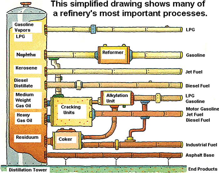
| Distillation tower | Process’ | Ending Products |
|---|---|---|
| Gasoline Vapors/LPG | LPG | |
| Naphtha | Reformer | Gasoline |
| Kerosene | Jet Fuel | |
| Diesel Distillate | Diesel Fuel | |
| Medium Weight Gas Oil | Cracking Units, Alkylation Unit | LPG Gasoline |
| Heavy Gas Oil | Cracking Units | Motor Gasoline, Jet Fuel, Diesel Fuel |
| Residuum | Coker or nothing | Industrial Fuel or Asphalt Base |
The second and third processes are known as cracking and reforming. Figure 10.8 provides a simplified view of how these processes are used on the various fractions produced through distillation. The heaviest fractions, including the gas oils and residual oils, are lower in value than some of the lighter fractions, so refiners go through a process called “cracking” to break apart the molecules in these fractions. This process can produce some higher-value products from heavier fractions. Cracking is most often utilized to produce gasoline and jet fuel from heavy gas oils. Reforming is typically utilized on lower-value light fractions, again to produce more gasoline. The reforming process involves inducing chemical reactions under pressure to change the composition of the hydrocarbon chain.
The production of final petroleum products differs from refinery to refinery, but in general, the oil refineries in the U.S. are engineered to produce as much gasoline as possible, owing to high demand from the transportation sector. Figure 10.9 shows the composition of output from a typical U.S. refinery.
| Product | Gallons |
|---|---|
| Diesel | 11 |
| Heating Oil | 1 |
| Jet Fuel | 4 |
| Other Products | 7 |
| Heavy Fuel Oil (residual) | 1 |
| Liquefied Petroleum Gases (LPG) | 2 |
| Gasoline | 19 |
Nearly half of every barrel of crude oil that goes into a typical U.S. refinery will emerge on the other end as gasoline. Diesel fuel, another transportation fuel, is generally the second-most-produced product from a refinery, representing about one-quarter of each barrel of oil.
Futures Contracts for Refined Petroleum Products
Futures contracts for refined petroleum products
Gasoline, diesel fuel, and heating oil are volatile commodities – prices fluctuate up and down, sometimes dramatically, as shown in Figure 10.10 which compares spot prices for crude oil with retail prices (i.e., what you would pay at the pump) for gasoline and diesel fuel. Focusing on gasoline and diesel fuel, you will notice that there is some pattern to all of the noisiness in the graphic – prices for both fuels tend to rise starting in the spring and tend to decline in the late summer and fall. This reflects the increased demand for transportation (primarily driving) during the summer months.
Why are prices for petroleum products so volatile? The easy (but not that satisfying) answer is that the price of crude oil can be volatile. In the United States, about 65 cents of every dollar we pay for diesel fuel or gasoline represents the cost of crude oil. The rest represents taxes assessed at the state and federal level. (In European countries, taxes are a much bigger component of gasoline costs.) You can see the volatility visually through the use of the crude oil price graphing tool [111] from the U.S. Energy Information Administration. It allows you to plot the price of West Texas Intermediate (the benchmark crude oil price in the U.S.) on a daily, monthly, and annual basis (depending on how much variability you want to see).
Starting in early 2008, prices climbed very rapidly, reaching nearly $150 per barrel in early July. But by December of that year, the price had dropped by almost 75%! Meanwhile, more recently, the price has dropped to $40 per barrel or even lower! What on earth is going on?
That supply and demand forces were at work is the primary reason, but the nature of the supply and demand forces are worth some time discussing. Suppose that the demand for crude oil or a refined petroleum product were to increase by some amount. How would that demand be met? There are basically two options: existing idle capacity (oil wells or petroleum refineries, for example) could be restarted, or that demand could be met by drawing down crude oil or petroleum product storage. If additional capacity could be restarted, the increase in demand would lead to an increase in the market price due to the higher costs of the capacity brought back online.
But what is the cost of releasing additional supply from storage? Here, we have a tricky economics problem – the actual cost (in accounting terms) of releasing additional supply is probably pretty small. But if you are the owner of some crude oil or petroleum products in storage, if you release supply from storage now, then you can’t release those same barrels again at some point in the future unless you replenish your storage facility (which requires buying oil or petroleum products on the open market and then putting them in storage). So, by releasing from storage now, you are giving up the opportunity for some future profit. This is referred to as “opportunity cost.” (Another term used in the finance field is the “convenience yield.”) Whether the opportunity cost is high or low depends on your expectations about the future price in the crude oil or petroleum products market. If you think demand is going to continue to be high tomorrow, then you face a high opportunity cost by releasing supply from your storage today. If you think that the increase in demand is transient, then that opportunity cost is low (because you think that demand is going to go back down tomorrow).
As it turns out, the opportunity cost of releasing supply from storage is related to the amount of spare production capacity, as shown in Figure 10.11. Generally, as the demand for oil or refined petroleum products rises, more expensive capacity (whether it’s oil wells or refineries) must be brought online, so the market price rises as demand goes up. As you get close to the total capacity constraint (the dashed vertical line in the figure), there is literally no more capacity to be brought online, so the price must rise rapidly in order for one of three things to happen: (i) additional supply is released from storage; (ii) new capacity can be constructed, which of course is expensive; or (iii) demand can go down because the price is too high. This transition from a slow and steady price increase to a regime of substantial volatility is endemic to the market for nearly every energy commodity, and the kink in the supply curve shown in Figure 10.11 is appropriately known as the “devil’s elbow” in the energy commodity business.
Bringing on new capacity will eventually lead to lower prices if demand stays constant – all it does is to shift the capacity constraint and the devil’s elbow in Figure 10.11 further to the right (this is shown in Figure 10.12). But this may have a self-reinforcing effect of keeping new capacity out of the market. Since new capacity in the refining business is generally built in large chunks (so-called “lumpy” investment – no one is going to build a refinery that processes a few marginal barrels of oil per day), if a new refinery is built without an increase in demand for petroleum products, the net effect may be to reduce the price for petroleum products so much that the new refinery is not profitable. Because of the devil’s elbow and the lumpy nature of bringing new sources online, energy commodity markets generally do not have a stable equilibrium like you might find in economics textbooks.
NYMEX (now called the "CME Group") offers futures contracts for several refined petroleum products - the most frequently-traded are heating oil and gasoline. The video below shows you where to find these prices on the CME Group website.
Video: Refined Product Futures (2:34)
In this video, I'm going to show you where to find information on futures markets for refined petroleum products from the CME Group. So again, we'll start at the CME Group website and we'll click on "Markets." We'll click on "Energy." And then we'll click on "Products." And this will take us down to all of their different energy commodity futures markets. So the two that I'm going to show you are the heating oil futures contract, which says "New York Harbor ultra low sulfur diesel," and the gasoline futures contract, which, here, says "RBOB," which stands for "Refiner Blend on Board." So I'll click on the gasoline one first. And again, we have to wait a minute for information to pop up. And you'll see very similar information about prices and trading volumes that you saw for the crude oil contracts. So we have the month of delivery, we have the last traded price, and the change in the price. And here for the gasoline contract, you'll note that the prices are in dollars per gallon, note dollars per barrel, which is why the numbers look a lot different. And then you'll have the prior subtle for the gasoline contract, the opening high and low prices for the day, and the volume of contracts traded. So that was the gasoline futures contract. I'll now show you where to find the heating oil contract, which is the "New York Harbor ultra low sulfur diesel." And so we'll click on that one. And again, the same kind of information shows up. Now the prices here, like the gasoline contract, are in dollars per gallon. So for the September 2020 contract, this is 1 dollar and 24.31 cents per gallon, not per barrel like in the crude oil contract. So this is how we have used the CME Group website to find information on two of the most commonly traded refined petroleum product markets, heating oil and gasoline.
Characteristics of Natural Gas
Characteristics of Natural Gas
There's an old joke from the oil industry that goes something like this:
An oil company executive walks into a bar and sees a wildcatter slouched over the bar, staring into his drink.
"What's the matter?" says the oil company executive. "Another dry hole?"
"Worse," says the wildcatter, "we found gas!"
For many decades, natural gas was the poor cousin to crude oil. Often found alongside crude oil in reservoirs, natural gas was considered to be a low-value waste product that was often flared or vented into the atmosphere in very large quantities (enough to supply several European countries for an entire year), in order to more easily access the high-value crude. Natural gas is extremely important in the North American energy market for two distinct but interrelated reasons. First, natural gas has become the fuel of choice for dispatchable electricity generation. This means that all alternative forms of generation are compared on a cost basis with the constriction and operation of a gas-fired power plant. Second, natural gas is the major source of heating for the built environment throughout North America. It represents a very important source of energy storage that can be dispatched upon very little notice. Particularly with the rapid emergence of unconventional natural gas resources (these are often grouped into a catch-all category of “shale gas” but include natural gas found in sandstone formations, coal beds, and other types of geologic formations other than shales), there are lots of perceived opportunities in natural gas. We will discuss shale gas in the next lesson, but first, we will walk through an introduction to natural gas as a commodity and the functioning of North American markets for natural gas.
Like crude oil, natural gas is an energy source based on hydrocarbon chains, but the composition of natural gas is generally different than the composition of crude oil. Natural gas is primarily composed of methane, though some natural gas deposits also contain substantial fractions of other hydrocarbon gases or liquids such as ethane and propane (these are longer hydrocarbon chains that have substantial value as chemical feedstocks). Most gas deposits also contain impurities such as sulfur or other carbon compounds that must be separated prior to the gas being injected into transmission or distribution pipelines. Gas deposits that consist primarily of methane are known as “dry” gas deposits, while those with larger fractions of other hydrocarbons are known as “wet” or “rich” gas deposits.

Unlike oil, natural gas is essentially wedded to its transportation system – without pipelines (and liquefied natural gas tankers, which we’ll discuss later), there is no economical way to get large quantities of gas to market. Moreover, natural gas pipelines generally need to be dedicated assets. Using oil or petroleum product pipelines to move natural gas is not really possible, and moving other products in natural gas pipelines is not possible without completely repurposing the pipeline (and the injection/withdrawal infrastructure on either end). This asset specificity and complementarity between natural gas and the pipeline transportation infrastructure has been a significant factor in the development of the natural gas market. Each has little use without the other.
Basic Drivers of Natural Gas Demand
Basic Drivers of Natural Gas Demand
Natural gas is used in industrial, commercial, residential, and electric power applications. Natural gas demand in the United States has remained virtually flat for the better part of a decade, although, as shown in Figure 10.14, there has been a shift in the composition of that demand, away from industrial utilization and towards the electric power sector. Expectations are that the emergence of low-priced gas supplies from unconventional sources will change the drivers of natural gas in two ways – first, demand among both the industrial and electric power sector is anticipated to increase. Second, surplus natural gas supplies may open up an entirely new export sector for North American natural gas.
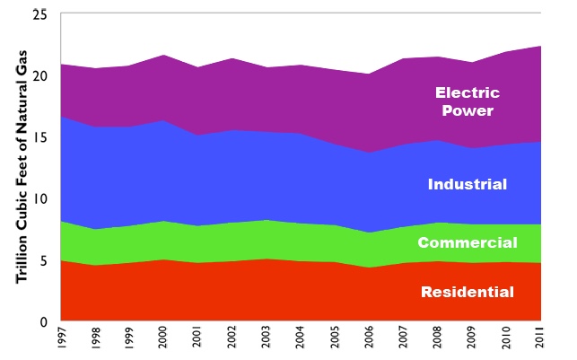
Each demand sector has its own intra-annual pattern of natural gas demand. Residential demand, for example, tends to be highest in the winter (because of demand for space heating), while demand in the electric power sector tends to be highest in the summer, due to higher demand for electricity (for air conditioning). Overall, natural gas demand in the United States peaks in the wintertime, with a lesser peak during the summer. A typical set of annual demand profiles is shown in Figure 10.15. There are some shifts occurring here as well, particularly as demand from the electric power sector continues to climb.
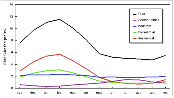
Beginning in the mid to late 1990s, the U.S. electric power sector started undergoing a transformation away from building new coal-fired power plants and towards building new natural gas plants. This shift took place for a variety of reasons, including increasingly stringent environmental requirements for power plants and a shift in the market for electricity induced by deregulation and restructuring. This shift towards more gas-fired power generation was associated with a pronounced increase in both the average spot price of natural gas and the volatility of natural gas prices, as shown in Figure 10.16. This association seems to have broken down since 2009 – there has been additional investment in, and utilization of, gas-fired power generation but a pronounced decline in natural gas prices. This trend reflects the influence of additional gas supplies from unconventional deposits (primarily shales and tight sandstone formations) coming online. Referencing our discussion of capacity constraints in the lesson on petroleum refining, the price and utilization trends in Figure 10.16 reflect textbook energy economics – the build-out in natural gas generation represented increased demand without a corresponding increase in natural gas supply, pushing the global demand curve towards the capacity constraint and rapidly increasing prices (some price spikes such as those observed in 2000, 2005, and 2008 are associated with extreme weather events like hurricanes or interruptions to gas pipeline networks, such as an explosion in the Western U.S. in 2000).
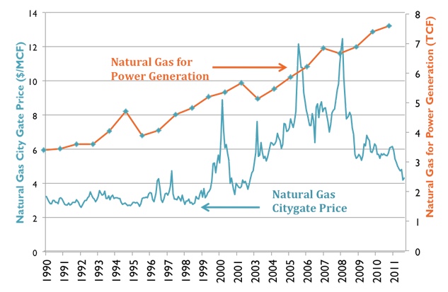
Credit: Energy Information Administration data
Evolution and Structure of Natural Gas Markets
Evolution and structure of natural gas markets
Please read Chapter 5 of the van Vactor reading (Flipping the Switch: The Transformation of Energy Markets [95]), along with the two RBN Energy articles (Henry the Hub, I am I am [100] and The Way She Moves [101]), before you proceed with the written material here. Sections 5.3 to 5.5 of the van Vactor reading are particularly important.
The North American natural gas market is structured based on what has been called the “hub” model of gas pricing. In markets with hub pricing, the interaction of supply and demand sets prices at a small number of specific locations. These locations are the "hubs." (In the van Vactor reading and in one of the assignment questions for this week, there is some discussion about the properties of a good "hub" trading point.) The "local" price at any other location or points of consumption in the commodity network is thus the hub price plus the cost of transportation from the hub. Price differences between any two points in the gas pipeline network represent just the cost of transportation between those two points.
We can also describe this using some terminology from the natural gas industry (this terminology is also commonplace in the oil industry). If the hub represents some point where it is easy to obtain natural gas without much transportation, this would be referred to as the wellhead price. The point where the natural gas enters the distribution system for local delivery (see Figure 5.1 from the van Vactor reading) is known as the citygate. The citygate price should generally be higher than the wellhead price because of the transportation cost associated with moving the gas from the wellhead to the citygate. The wellhead price simply represents the market equilibrium for the natural gas commodity, not including any transportation costs.
One implication of the hub pricing model is that the entire gas market should roughly obey the law of one price, which says that if the gas market is working efficiently, then price differences should reflect transportation costs. A change in the wellhead price of natural gas would be reflected everywhere else in the network.
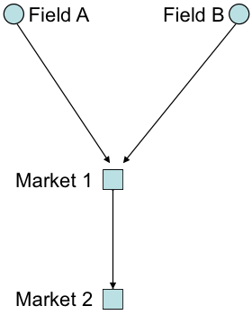
Here is a simple illustration of the law of one price, using the small network shown in Figure 10.17. In this example, p represents the price at a given location and c represents the transportation cost to get from the supply point (wellhead) to a specific location. Gas fields A and B are connected via pipeline to market centers (you can think of these as citygates) 1 and 2. A and B can deliver to both markets, but the transportation cost c is higher to get to market 2 than market 1. Thus, c1 < c2 and in equilibrium, p1 < p2. Thus, gas at Market 1 will be cheaper than gas at Market 2.
Further, in equilibrium p2 = p1 + (c2 – c1), which in words says that the price at Market 2 would be equal to the price at Market 1 plus the transportation cost to Market 2 from Market 1 (the transportation cost to Market 1 from the wellhead is already reflected in the price at Market 1). Using number, suppose that the price of natural gas at the wellhead (either field A or B) was $5 per million BTU ($/MMBTU). The transportation cost to market 1 is $1/MMBTU and the transportation cost to market 2 is $3/MMBTU. If this gas market obeyed the law of one price, then the citygate price at market 1 would be $5/MMBTU + $1/MMBTU = $6/MMBTU. The citygate price at market 2 would thus be $6/MMBTU + ($3/MMBTU - $1/MMBTU) = $8/MMBTU.
One implication of the law of one price is that changes in supply or demand at one location can affect pricing at all locations in the network. Here is another example, again using the same network (see Figure 10.18). Suppose that demand in market 2 were to increase. Suppliers in both fields would increase their offer prices so that p2 > p1 + (c2 – c1). Assuming that there are no constraints on the size of the pipeline, that increased demand at market 2 would bid up the price for all market points in the network, since all suppliers would try to move their gas to market 2. (Of course, there is some limit to this redirection of supply, since demand in market 2 is finite.) Supply to market 1 would decrease, raising prices in market 1 to restore equilibrium (where the price difference between markets is equal to the difference in transport costs).
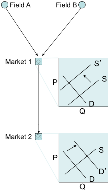
It is possible for markets connected by pipelines to depart from the law of one price. The simplest example of how this might happen is if there is a constraint or an interruption on a pipeline. For example, suppose that the pipeline between markets 1 and 2 were to be removed from service, isolating market 2. What would happen to prices at market 1? Market 2? In the assignment for this lesson, you will get some practice looking at the law of one price in the North American natural gas market using data from the U.S. Energy Information Administration.
Every natural gas field within some geographic area has the potential to be a hub pricing point. Locations that are close to producing areas and are also connected to a large number of gas transmission pipelines also have the potential to be good hub pricing points. In general, hub pricing points need to be highly connected to the rest of the network – it should be easy to move gas from the hub point to any other location in the network.
The major hub pricing point in North America is the “Henry Hub,” which is a physical location in Louisiana, indicated in Figure 10.19. Henry Hub is well-connected to the rest of the North American market (as indicated by the flows of gas through North America as shown graphically in Figure 10.20).
The Henry Hub is also the point at which the NYMEX futures contracts for natural gas are priced. The following video shows how to access natural gas pricing data from EIA and NYMEX.
Video: Natural Gas Futures (1:55)
In this video, I'm going to show you how to find natural gas futures price information on the CME Group website. The process is going to be similar to how we found futures price information for crude oil and refined petroleum products. But natural gas is just in a little bit different place. So we're going to start from the CME Group homepage and we're gonna go to markets, and then we're gonna go to energy. Then when the page loads, we're gonna go to products. And then last time, for the crude oil futures information, we had used the crude and refine section. Now we're going to scroll down and go to the Natural Gas section. And what we want here are the Henry Hub natural gas futures. So remember that the Henry Hub is the location where all natural gas futures contracts in North America are treated. So we're gonna click on Henry Hub. And it's going to bring us to the futures price information page, which is going to look similar to what we saw for other futures contracts for crude oil and refined petroleum products. So we're going to have the month for delivery. We're going to have the last recorded price. And here, the prices are in dollars per million BTUs of natural gas. So this is a very different price unit than we saw for oil or refined petroleum products. And then we have the the prior settle column, which is the last traded price that was recorded. And then we have the open opening price, the high and low price for the day for each particular contract, and the number of contracts traded.
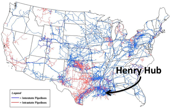
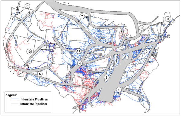
Lesson 10 Summary and Final Tasks
Summary
This lesson introduced you to the global markets for the petroleum commodities (crude oil, refined products, and natural gas). These commodities, along with coal, are commonly called fossil fuels. The inherent value of these fuels comes from their relative ease of transportation, their energy density, and their ability to be inventoried and dispatched as needed to meet demand. These characteristics should always be kept in mind when trying to understand the challenges associated with a transition away from fossil fuels.
There is a great deal of complexity in the world petroleum markets. There are entire 3- and 6-credit courses offered on the subject. We covered a lot of ground in this single module. There is also supplementary material from the previous iteration of EME 801 (written and developed by Dr. Seth Blumsack) which is attached as an appendix. You are strongly encouraged to read this material and digest it as further background on energy markets provides great insight to inform decisions that each of you will be called on to make.
Reminder - Complete all of the Lesson 10 tasks!
You have reached the end of Lesson 10! Double-check the What is Due for Lesson 10? list on the first page of this lesson to make sure you have completed all of the activities listed there before you begin Lesson 11.
Lesson 10 Appendix
Three Phases of the World Oil Market
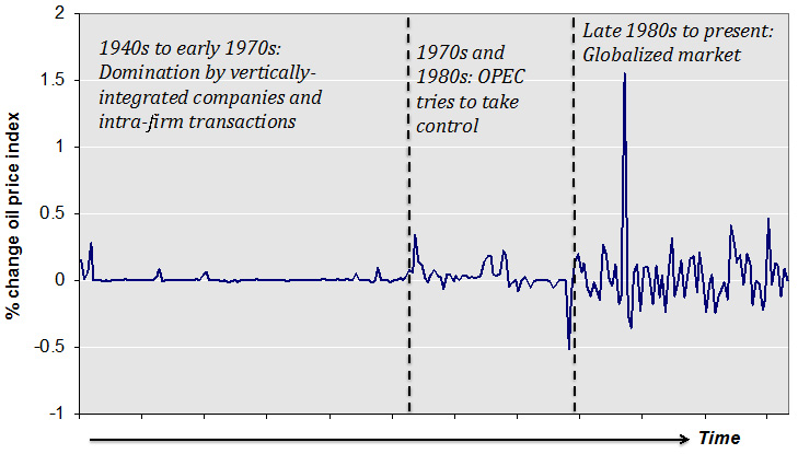
As shown in Figure 10A.1, the development of our current globalized oil market can be broken down into a few different stages. The first phase was marked largely by intra-company transactions, with occasional inter-company "spot" sales. The second was defined by the emergence of OPEC and its attempts to influence an increasingly global oil trade for political ends. The third is defined by the commoditization of oil markets, with regional prices linked by inter-regional trade and the development of sophisticated financial instruments such as futures and option contracts, which we'll discuss in more detail below.
Regional Pricing of Crude Oil
While the market for oil is global in reach, trade has clustered itself into several primary regions. This has happened despite shipping costs that are generally low (only a few dollars per barrel) and the ease with which oil cargoes can be directed and redirected towards the highest-priced buyers (in financial terms, oil is "fungible"). Nevertheless, prices in these regions tend to move in tandem.
One reason for regional pricing of crude oil is that it is a heterogeneous commodity - not all crude oils are alike. Some oil can be extracted at a cost of a few dollars per barrel, and flows like water (it would look like Coca-Cola coming out of the ground). Other oil requires sophisticated equipment, techniques and processing to extract, and is thick as tar, requiring special methods to transport it to the refinery (and to refine into saleable petroleum products). In general, oil with a low viscosity is referred to as "light," while thicker, higher-viscosity crude oils are referred to as "heavy." Light oils are generally valued higher than heavy oils. The viscosity of crude oil is measured on a scale known as the API gravity (API stands for "American Petroleum Institute"). The API gravity scale measures how heavy or light a crude oil is, relative to water (thus the terms heavy and light oil). The API gravity of a crude oil is measured by taking its specific gravity (density relative to water), and calculating:
API Gravity = (141.5 ÷ Specific Gravity) - 131.5.
Sulfur content is another important determinant of value; the lower the sulfur content the better. So-called "sweet" oils are low in sulfur, while "sour" oils have a higher sulfur content. There are some differences in crude oil quality among the major trading regions. Pricing of heterogeneous commodities often involves establishing a benchmark or "marker" price that is used to track general price movements. Pricing in any particular transaction is based on the marker price, with adjustments for location and quality. Below are some brief descriptions of some of the major global benchmark oil streams, and the Energy Information Administration has a very nice article [113] on the most important global marker prices. The first two, West Texas Intermediate (WTI) and Brent, are the most important benchmark oil prices in the world.
- West Texas Intermediate (WTI) is a light crude oil that is primarily representative of the U.S. market. It is a "light sweet" oil, meaning that it has low density (high API gravity of around 40) and a low sulfur content.
- Brent is a blend of light sweet crude oils from the North Sea, off the coast of the United Kingdom. Its API gravity is around 38 and it has a somewhat higher sulfur content than WTI. Still, in terms of quality, WTI and Brent are largely comparable.
- Fateh is a crude oil stream from the emirate of Dubai (which is why it is sometimes simply called "Dubai Crude"). Fateh has an API gravity of around 31, making it a denser crude oil than either WTI or Brent. Fateh is also classified as a "sour" oil for having a higher sulfur content than WTI or Brent. The importance of Fateh as a benchmark oil price is that it is representative of crude oil shipments from the Middle East to Asia.
- Bonny Light is a light sweet crude oil stream from Nigeria. It serves as a benchmark for African crude oils because its low density and sulfur content make it comparable to WTI and Brent (and, indeed, the major source of demand for Bonny Light has historically been refineries in Europe and the U.S.).
- Urals is a heavy (low API gravity) and sour crude oil blend from Russia. It serves as a benchmark for oil exports from Russia.
A Market Squeeze
A very interesting and entertaining thing happened in the crude oil market in April 2020, when the price of oil on the futures market went negative, trading at -$37.63 per barrel. This means that if you were a potential buyer of crude oil, someone would have paid you $37.63 for every barrel of oil you agreed to buy. I don't know about you, but no one has ever paid me to fill my car's gas tank. It usually works the other way around. What on earth happened here? This short blog post from RBN Energy [114] has a good explanation. The reason for this price craziness has to do a little bit with panic in the oil market because of the coronavirus pandemic and a little bit with how futures markets work. Basically, what happened was that there were a bunch of crude oil traders who had contracts to buy crude oil for delivery in May 2020. Those traders either had to take physical delivery of a bunch of barrels of crude oil in May, or find someone else to assume their contract (this is called "closing one's position" in commodity market parlance). Well, since the pandemic had hit and crude oil demand had collapsed, there was no one in the market who really wanted to buy crude oil from these traders. And, there was no place for these traders to physically put the crude oil that they were obligated to take in May 2020. So these traders got caught in a market squeeze and had to pay others to close their positions. It's crazy, and hasn't happened in the crude oil market before...but it makes perfect sense when you realize how this market actually works!
Regional Analysis of Petroleum Product Movements: Petroleum Administration for Defense Districts
Please read this short but informative background on the PADD system [115] from the Energy Information Administration:
Originally created during World War II for the purposes of regional rationing of gasoline supplies, the Petroleum Administration for Defense Districts (PADDs) are still utilized today to track regional movements of crude oil and (particularly) petroleum products in the United States. While the PADD system might seem a bit archaic, studying the movements of petroleum products between the PADD regions is useful for understanding how these markets are segmented in the United States. Figure 10A.2 shows a map of the PADDs with the locations of oil refineries.
The description of the PADD system from the EIA includes some data on inter-PADD shipments of petroleum products (remember that most of these will be gasoline and the “distillates” – diesel fuel and heating oil). Figure 2.6 shows this data in visual form, again using the PADD designation map from the EIA. The figure indicates that there is substantial inter-PADD trade between the eastern states, the Gulf Coast and the Midwest. The Rocky Mountain states and the U.S. West Coast, on the other hand, are largely isolated from the rest of the United States and even from one another. Because of a lack of refinery capacity and pipeline capacity, the U.S. West Coast, in particular, has a gasoline and diesel market that is largely separate from the rest of the country. (This is also due in part to California’s gasoline standards, which are more stringent than in the rest of the U.S.)
Petroleum product pipeline maps are not available in the public domain, but you can view an image online at the following websites.
- United States Pipelines map [117]
- United States Pipelines map information [118] (for an explanation of what you will see on the map)
Refinery Economics
Oil refineries produce value-added petroleum products from crude oil. Profitability is thus determined by several different variables:
- Feedstock costs (primarily crude oil)
- Fuel costs and other operational costs for the refinery itself
- Costs of complying with emissions regulations (particularly NOx)
- Market prices for the products produced.
Determining profitability for a specific refinery is very difficult, since data on operational and environmental compliance costs are generally not available. A rough measure could be obtained by calculating the cost of crude-oil feedstock (though to do this with precision would require knowledge of the crude blends used in a specific refinery) and comparing that cost with the market value of the suite of products produced at the refinery. This still requires more information than might be publicly available for a typical refinery, and is subject to market conditions for the various products produced.
A useful but simplified measure of refinery profitability is the “crack spread.” The crack spread is the difference in the sales price of the refined product (gasoline and fuel oil distillates) and the price of crude oil. An average refinery would follow what is known as the 3-2-1 crack spread, meaning for every three barrels of oil, the refinery produces an equivalent of two barrels of gasoline and one barrel of distillate fuels (diesel and heating oil). This ratio of refined product output closely mirrors the composition in Figure 2.4, but remember that the crack spread is only a first-order approximation of how profitable a refinery would be at the margin! The higher the crack spread, the more money the refinery will make, so it will be utilizing as much capacity it has available. Inversely, at some lower crack spread prices, it actually may be in the refinery’s best interest, due to costs for the plant, to scale back the amount of capacity utilized. Please see the appendix for an example and further elucidation of the crack spread.
Calculating the 3-2-1 Crack Spread
Calculating the 3-2-1 crack spread typically uses published prices for crude oil, gasoline and distillates. These prices are typically taken from the New York Mercantile Exchange. The NYMEX has traded contracts for crude oil and gasoline, but no contract for diesel fuel (the most-produced of the distillate fuel oils). In calculating the 3-2-1 crack spread, prices for heating oil futures are typically used instead. Below is an example of how to calculate the crack spread, using data from 2012.
- Oil Price: $84.54/barrel
- Gasoline Price: $2.57/gallon
- Heating Oil Price: $2.79/gallon
- (remember that 42 gallons = 1 barrel)
- (2 barrels * 42 gallons/barrel * $2.57/gal of gas) +
(1 barrel * 42 gallons/barrel * $2.79/gal of heating oil) -
(3 barrels * $84.54/barrel of oil) =
$79.44 profit / 3 barrels of oil. - The crack spread would thus be $79.44 / 3 = $26.48/barrel of oil
The crack spread, of course, is not a perfect measure of refinery profitability. What it really measures is whether the refinery will make money at the margin – i.e., whether an additional barrel of crude oil purchased upstream will yield sufficient revenues from saleable products downstream. In reality, existing refineries must consider their refining costs in addition to just the cost of crude oil. These costs include labor (though that is generally a small part of refinery operations); chemical catalysts; utilities; and any short-term financial costs such as borrowing money to maintain refinery operations. These variable costs of refining may amount to perhaps $20 per barrel (depending on conditions in utility pricing and financial markets). In the example above, the true margin on refining would be $6.58 per barrel of crude oil – much lower than the simple crack spread would suggest.
The crack spread tends to be sensitive to the slate of products produced from the refinery. In the example above, we used gasoline and distillate fuel oil (heating oil) because those are two typically high-valued products, and U.S. refineries are generally engineered to maximize production of gasoline and fuel oil.
The crack spread is also sensitive to the selection of the oil price used. In the example above, we used the NYMEX futures price for crude oil, which recall is based on the West Texas Intermediate blend - a fairly light crude oil. Many U.S. refineries, however, are engineered to accept heavier crude oils as feedstocks. If there are systematic differences in the prices of heavy crude oils versus West Texas Intermediate, then the crack spread calculation (while illustrative) may not be sensible for a particular refinery.
The Energy Information Administration recently published a couple of good articles describing how the U.S. refinery fleet has been adjusting to changes in U.S. crude oil production. Not only has the quantity of crude oil produced in the U.S. been increasing rapidly, but the oil coming out of the large shale plays (like the Bakken in North Dakota) is much lighter than the crude oils typically accepted by U.S. refineries.
The first article, "Regional Refinery Trends Continue to Evolve," [119] published on 7 January 2015
The second article, "Regional Refinery Trends Evolve to Accommodate Increased Domestic Crude Oil Production," [120] published on 15 January 2015
Lesson 11 - Regulation and Deregulation in the Electric Industry
Lesson 11 Overview
Overview
The regulated electric utility model served the industry and U.S. consumers well for nearly a century. Costs and prices fell nearly continuously, and service expanded to nearly every corner of the U.S. While other countries experimented with their own regulatory systems, for the most part, these involved national electric utilities, not the regulated private enterprises found in the United States.
Beginning in the 1970s, the trend of falling prices suddenly reversed, and the decades of technological progress in power generation slowed. The rapid pace of technological advance had masked some fundamental problems with the way in which electric utilities were regulated. Dissatisfaction among electricity consumers grew, paving the way for the grand experiments in electricity deregulation and restructuring that continue to this day. This lesson and the following lesson will provide an in-depth discussion of how these new markets are structured and will describe some fundamental changes in how the price of electricity is determined. The basic market concepts will be discussed in this lesson, while the next lesson will examine how these markets are changing in response to the emergence of large-scale renewable power generation.
Learning Outcomes
By the end of this lesson, you should be able to:
- Discuss topics related to regulation and deregulation in the electricity industry
- Explain which segments of the electricity industry have been “deregulated” and which have been “restructured”
- Explain what a Regional Transmission Organization is, and how it is different from an electric utility
- Calculate the “system marginal price” for a pool-type electricity market
- Calculate “locational marginal prices” in a simple two-node electricity system with congested transmission lines
Reading Materials
- The National Energy Technology Laboratory has created a nice series of primers on each of the regional electricity markets in the United States. You can download the ZIP file here: NETL series of primers [121].
- Lessons Learned from Electricity Market Liberalization [122], by Paul Joskow (2008) in the Energy Journal. This paper has some descriptions of electricity deregulation efforts throughout the world.
- Measuring the Benefits and Costs of Regional Electric Grid Integration [123], by Seth Blumsack (2007) in the Energy Law Journal. The first couple of sections of the paper contain an overview of electricity restructuring in the U.S.
-
Interview with Trevor Lauer
Please watch the following video interview (32:44). If this video is slow to load here on this page, you can always access it and all course videos in the Media Gallery in Canvas.
Video interview with Trevor Lauer (32:44).Click here for transcript of Trevor Lauer interviewMARK KLEINGINNA: Hi everybody. This is Mark Kleinginna, your professor for EME 801. And today I have the honor to talk with an old colleague and friend of mine and a Penn State graduate by the name of Trevor Lauer. I'm going to not try to mess up what you're doing right now, Trevor, and allow you to talk a little bit about your background and just first of all, really express my appreciation for your time today because because I know it's valuable. Tell us a little bit about yourself and from an educational perspective and your professional experience and that kind of thing.
TREVOR LAUER: Yeah, thanks Mark. And it is great to see you again. Undergraduate degree at Penn State, loved my time at the College of Earth and Mineral Sciences. I'm a mineral economics undergrad, a very proud mineral economics undergrad. And then once I got my graduate degree, I did at the University of Maryland. And I got an MBA at the University of Maryland a couple of years after I worked and then got my MBA while I was working. My wife and I now live in Michigan. We live in Bloomfield Hills, Michigan, just north of the city of Detroit. I've got two boys, they both happen to be at Penn State right now. It makes me even a more proud stat. I've got one son in the computer engineering program and another one in the chemical engineering program. I'm a very proud Penn Stater. Currently, my job right now is I'm President and Chief Operating Officer of DTE Energy and my specific job is leading the electric utility, which includes everything from our nuclear generation to our renewable generation, renewable development, energy efficiency, safety, environmental regulatory affairs, a whole host of different activities here at the utility. And I've been with DTE now since 2005. Maybe one last thing, Mark, and you know some of this but for your students, I started my career with Honeywell in the Washington DC. Area. I was in Honeywell and then I was fortunate enough when I got my MBA to be part of three start-up energy businesses. Mark you and I met at the last one of those, which was one of the true joys of my absolute life at Strategic Energy. And I've now been here for 18 years, so been a great run.
MARK KLEINGINNA: Great. How did you end up in the energy business Trevor?
TREVOR LAUER: That's a great question. When I graduated from college Mark, you didn't choose where you wanted to live. When you got a job offer, you were so honored that somebody who was willing to actually pay you that you took the job. And it seems silly when I say that, but Honeywell was the first person that offered me a job when I was graduating from Penn State. And I was honored and I wanted to be in the DC area because there was a big group of Penn Staters. But the real attraction to energy was the more I got involved in the energy efficiency side of the business with Honeywell, the more I recognize the absolute importance of energy and the energy markets. Not only to residential customers, but to all businesses across the United States. This is a macro and micro economic issue. When you think about the way energy affects consumers and businesses, I was very attracted to that as a business platform. And then when we got into the individual proprietor, owning businesses, I realized pretty quickly that you didn't have to be super successful in the energy markets to have a pretty big business. You only need to be really incrementally successful because there's so many transactions in the energy markets are so large and fluid. It's just been a fascination of mine ever since I was at Penn State.
MARK KLEINGINNA: Excellent. So what do you currently do at DTE?
TREVOR LAUER: Yeah, sometimes I ask myself that same question, but I lead the biggest business unit here, we have about 6,000 employees that fall underneath my business unit, and it varies from our energy generation. We own a 1,200 Megawatt nuclear power plant. Our fermi nuclear power plant. We own 10,000 Megawatts of coal and natural gas fired generation. We just built the newest combined natural gas plant that was constructed and brought up in the United States. And then currently we own about 3 Gw, or 3,000 Mw of renewable generation, wind and solar. I also oversee our distribution system. We've got one of the largest electric distribution systems. And we're undergoing a rapid transformation of our electric distribution system. Not only for reliability sake, but also because of the penetration of electrification, electric electric vehicles. We have another group that works on electrification. I've got a renewable development team that's got 109 renewable development projects in some phase of development. We've got an energy efficiency team here that saves our customers about 250, $300,000,000, a year helping them be more efficient in their businesses. I'd say everything that surrounds the electric utility and then a lot of the regulatory and legislative issues that go with it. Yeah, we'll come back to some of that as we walk through this, but I know the students will be particularly interested in the renewable piece and talking about what maybe your portfolio is there and how that gets developed, as well as the integration issues that you've got. On the distribution side, obviously there were loads coming along with electrification of Transportation. But then at the same time, how to handle even solar that comes into the distribution system off people's roofs and commercials and things like that. We'll come back to that a little bit. We can go there. This is always very important. And I worked for utility a long, long time ago. But the thing, it was always, always stressed, first and foremost, was safety and reliability.
MARK KLEINGINNA: Can you talk a little bit about that with respect to how that works at a utility? It's quite different from what we might have done, a strategic energy or what we might have do as a consultant and how important that is, the distribution utility itself.
TREVOR LAUER: Yeah, thank you, Mark, for that. I can't begin to stress how important safety is and how much we talk about it at the utility. We start every day with safety briefs. We have pre-job briefs at every single construction site you're working on. And then you end your day talking about how you did with safety. And why do you do it? Well, the voltages that we operate, the distribution in the sub-transmission system are not ones that you can make a mistake with. If you make a mistake in our business, the chances are that you will die or you will cause somebody else to lose their life. It's really sad. We lost one of our employees in March of this year. In the electric utility, my substation, electrical, mechanical journeyman. There was a human performance error and he lost his life. Those are the worst days you could possibly have when you have to meet with somebody's family and spouse. And this was a gentleman that had worked for us for 28 years, was experienced, knew what he was doing. But the Swiss cheese, as we talk about with human performance all lined up one day and a mistake happened. We talk about safety a lot. We look at OSHA recordable injuries. We want to understand precursors to work to make sure that people are doing the right work. They're stretching. People laugh, But we encourage our people to stretch. In the morning, we ask our supervisors to get all the people in the field to stretch with them so that you can avoid injuries. We're really proud of our safety record here at DTE. We're in top decile safety, but there's a very little correlation between fatalities and top decile regular injuries. We're digging in really hard on the things -- we call it our sticky campaign, or the stuff that can kill you, and we're trying really hard to get our employees to pay attention when you're in a job with high energy enclosed spaces, lifting heavy loads and rigging. These are the times when you're in a sticky area or stuff that can kill you. We need to bring their attention focused on it.
MARK KLEINGINNA: All right. Great. Now, thank you for that. It's so important that folks understand that we do pay a very lot of attention to safety, not just from a workers standpoint, but from the folks in the field as, as the customers as well. Talk a little bit as - I went to over safety - but talk a little bit about reliability as an electric utility and exactly what that means and how safety and reliability are different. And when you and I talk about reliability, we mean something by that so our students can understand what that means.
TREVOR LAUER: Yes, reliability, we measure it really two different ways. But I tend to think of distribution reliability or making sure the lights stay on. Reliability is measured two ways. We measure safety or the frequency of outages. And then we talk about Kd, and that's the duration of outages. Here at DTE, we're pretty good at safety. We don't have a lot of outages. We're in the second quartile. We can obviously get better. We need to continue to get better, right? But we need to dramatically improve what I call Kd, or our duration. So we're in the process right now of adding automated devices, or these devices, we call them reclosers, all over our system so that from our systems operation center, if there's a fault on the distribution circuit, you can reroute power using these intelligent devices, and you can get 50 to 60% of your customers back into power without ever having a truck rolled out into the field. It also helps you identify exactly where the outage could be. A tree branch came down and came across two phases, you had a breaker open... . We can identify that a lot better with all these automated devices. So here's the other thing. I'd say mark reliability is probably the thing that customers notice the most about their distribution utility, right? Nobody wants to pay our bill. I get it. Nobody wants to pay any bill. But when your power goes out, now you're just flat-out mad. You don't think about your distribution utility. You expect perfect power, and our power is Six Sigma. We offer Six Sigma service. But when you lose it, even if it's for only 2 hours, you're really mad. And now it's a pandemic when people are working from home. Momentary outages? Momentary outages are classified as an outage less than 5 min. It may not mean a lot to the electric utility if you're sitting in my seat. But if I'm at home and I'm working on an important research paper and I don't have it saved, and all of a sudden I lose power and I lose everything for that 1 min outage, again, I'm pretty upset with my electric utilities. So again, reliability of the distribution system is a really big deal and we spend a lot of time talking about it. We spend Invest a lot of money right now. We're investing 1.5 billion dollar a year in our distribution reliability systems.
MARK KLEINGINNA: Wow. That's great stuff. Great stuff. Just to take it a little bit beyond that. And I could talk to you about reliability all day long because it's so near and dear to my heart as an old gas supply guy. But we'll just segue into that. What are current fuel markets doing with respect to the short-term and then long-term decisions you guys are making at DTE?
TREVOR LAUER: Yeah, it's interesting, the current fuel markets have been a little bit of a wild ride in 2022, at least for us. Nobody saw the blow up in the natural gas markets, right? So if you take a portfolio like ours where we burn natural gas as a fuel, we collect dollars from our customers. And it's called a fuel clause, well we under collected on our fuel clause, meaning we spent more than we got from our customers $450,000,000 because of the blow up of natural gas. Well, we were one of the best in the country. There were utilities in Florida that were undercollected by 1.2 billion. Right. That's a lot of cash not to be bringing into your business. So one of the things we've done was we started a hedging program for natural gas where we implemented a 36-month hedging program. We're layering in a 3% hedge every month. Take that volatility out. We're not trying to buy at the bottom right, what we can do is remove a lot of the volatility for our customers so that they don't see that blow up in price. Right? I think the other interesting one we're seeing in the current fuel markets - this may have more to do with the tax markets than it does the fuel markets, but we're accelerating our renewable build and our energy storage build based on the Inflation Reduction Act. And the tax credits that were given in the inflation, it's causing us to flip over our generation fleet faster than we were planning. We're de-hedging our way back out of coal. Right? We're shutting down, we own, we own one of the largest coal shipping terminals on the Great Lakes. We're shutting it down in 2025 as we move further and further into our renewables business.
MARK KLEINGINNA: Right. All right. So that'll take the renewables will take some of the volatility out because you don't you don't have a variable costs associated with the sun and the wind, so to speak, right?
TREVOR LAUER: That's right.
MARK KLEINGINNA: That's great. So talk a little bit about how power transmission is affecting what you guys do. And you guys have a sort unique, want to say unique situation. But it's somewhat different situation than we might face in different markets around the country. Because you guys are a peninsula, Florida is a peninsula. Things are a little different in Michigan than they might be in Pennsylvania or Illinois, or even California.
TREVOR LAUER: Yeah, so I'll start by saying I'm a big fan of transmission build out, but I also recognize how hard it is to build out transmission. The NIMBI issues are stronger in transmission than I think they are anywhere else. You mentioned us being a peninsula. 90% of the generation to have grid stability has to be in the state of Michigan. So transmission is a big issue for us, but I'll also say DTE, we spun out our transmission company as an independently owned transmission company back in 2003. So we're one of three transmission dependent utilities in the United States. So we depend on a third party to provide our transmission. So what's that practically mean? Well, there's three issues that I think we probably struggle with the most. One is renewable integration and interconnection. I like being able to build out the system the way I need to build it. And I can do that on the distribution side. If I announce a 300 Megawatt solar array, well, I now have to go to a third party and say, hey, when can you build that transmission for me. And transmission is an absolute monopoly, so I don't have the right to build it for them or have a third party. So transmission integration is number one. Number two, we have large customer loads as the electrification of transportation is happening. So if somebody comes and says in Michigan, we'd like to build a battery plant. We have this giant load. We want to sit down here. Well, if it's my distribution system, I tell every distribution engineer and all of our supply chain guys need to make that happen in here. It doesn't happen that way with transmission. Transmission, they called me and say, well maybe we can have it done in 36 months. And what you find is it's affecting our economic development and the competitiveness of our state on how quickly we can build that. Then the third is affordability. While I am a huge supporter of transmission build out, we also have to do it at very competitive rates. So we work with our local transmission company just to make sure that there... if there are other alternatives. Because an alternative to transmission could be generation, right? It could be energy efficiency. So, how do we think about understanding those alternatives so that we have the most affordable solution for our customers, right?
MARK KLEINGINNA: All right. So when you say transmission, is that the transmission company ITC? That was with consumers that you guys are consumers? Is there someone else in that group as well or is it just you two?
TREVOR LAUER: Well, us, consumers, and elite. The three that spun out. And ITC bought all three of those transmission companies last year. Two or three years ago, ITC sold themselves to Fortis, which is a Newfoundland, Canada-based company that now ITC and a couple of other utilities in the United States.
MARK KLEINGINNA: Right. Right. So for folks who are interested in the regulatory side of this, you find yourself... you find yourself intervening in their rate cases at FERC from time to time.
TREVOR LAUER: Yeah. Yeah, We're constantly they're intervening at our rate cases at the state level, and we're intervening theirs at the federal level. Right. I will also tell you I have dinner with the CEO. Her and I are very good friends, right? We have dinner 3, 2-3 times a year just to make sure the companies are ... we need each other and it's important that we communicate, right? But without being vertically vertically integrated like most utilities are, it adds a level of complexity to our business that other utilities don't see.
MARK KLEINGINNA: It's really interesting because vertical integration usually goes, you know, distribution, transmission back to the generation. But you guys kinda pulled the middle out where you're still owning generation and you still got distribution. But the link in the middle at a little bit different which makes your problem somewhat different from others, although they all tend to be somewhat the same. Great. Are there any other markets or conditions that are affecting your company that you might not have anticipated a couple of years ago?
TREVOR LAUER: Yeah, you know, there's a handful of things that came out of the pandemic that I'll say we're still struggling with. One is supply chain issues. If you would have told me that transformers could take me 18 months to get my hand on a transformer...we used to be able to much any size transformer we needed for our customers. Somewhere in the four to eight week time frame. Now we're buying transformers. I have teams that are scouring the world, finding other transformer suppliers, because transformers have become one of the most critical issues. I have a couple of customers where I haven't been able to interconnect them to the distribution grid because they don't have the right size transformers and I've never thought that we would have to tell a customer, I'm sorry, you have to wait four weeks to connect to our system so you can start to use our electricity. You can't buy transformers in the United States right now. The other interesting thing with supply chain is the quality of the work that third parties do for utilities like ours is really declined quite dramatically. We're having a new state built for our nuclear power plant right now, and we had it manufactured over at Belford, France. And the number of manufacturing defects that we've found ... so now, any highly engineered, highly manufactured part, I have 24/7 people at those factories watching the manufacturing and signing off on any deviation, due to the number of defects we've found in the supply chain. All of that is new since Covid hit. Something happened in the supply chain and we lost a little bit of quality. I think the other thing that's happened that's really impacted us and our customers is as interest rates have risen, the cost of debt was something we never really talked about at utilities, right? Because utilities borrow more money than they take in every year. A lot of people don't realize with our capital plans and dividends, but we're the largest, single user of the capital markets in the United States. Now, when interest rates have gone from 2.5% up to 6% right? You know, just at the electric utility, at DTE, it means my borrowing costs have gone up by almost $70 million annually. Well, that's a big deal when you're trying to hit your profitability numbers. You're trying to keep affordability low customers. That's also just a practical consideration that if you're buying a mortgage, you're buying a new car, you might think about it. But when you're operating at the scale we do, that number gets really big, really fast.
MARK KLEINGINNA: Yeah, absolutely. What do you think are the biggest challenges facing you guys in today's energy markets?
TREVOR LAUER: Biggest challenges...I like to talk in three, so I'll give you my example. Yeah, I think number one is affordability of our product for our customers. As we redo our distribution grid to handle distributed generation, electrification of transportation, it's putting a lot of pressure on rebuilding your distribution grids. So we're putting massive amounts of capital into our distribution grid. At the same time, we've declared that we want to be net zero by 2050. So we're changing out our generation fleet at the same time, where we're also investing 1 billion plus a year of capital. That's all in an environment where you have little to no growth at the utility, meaning, for your students, there's no more money coming in than there was the year before because of these great energy efficiency programs we have for our customers, right? So how do you balance getting through this transition where we all see this future, where all this additional electrification is going to show up? Somebody's got to pay the bills. How do you manage between now -- and I keep saying 2032, or 2033, when we see a meaningful ramp of this electrification of load, right? Affordability, I think is the single largest challenge that we have. The second really large challenge I believe we have is with our employees. How do you make sure that our employees stay highly engaged as we go through this energy transition? Look, Mark, you and I've been kicking around these markets for a long time. The pace of change inside of our industry right now is unlike anything I've ever seen. I've never worked at a utility before I came to work here. It's stunning to me how fast things are changing. And our employee base says, well, at a utility, it's kind of interesting, but maybe I go to work for the solar developer. IBM runs these great commercials about the smart grid. And what I have to help them understand is, yeah, they're doing a piece of it, but 80% of all of that's happening at your electric utilities, right? We're building 80% of everything. We're the ones integrating the smart grid. How do you help them see the broad view that they can have a great career at a company like this? They can grow, prosper, and continue to advance their careers. Attracting and retaining that right level of talent is hugely important. Then I think the third challenge that we see is reliability, right? The city of Detroit was one of the first electrified cities, not only in the US but in the entire world, right? We have pieces of our distribution grid that have been operating since the 1920s. We pull cables out of the ground that are over 100 years old. We are racing against time to improve reliability and to invest in a scale and manner that is unheard of across the country. We need to do it better than everybody else because we're short on time and I need to do it more efficiently than everybody else. So this concept you asked me about earlier, distribution reliability, is the third one that really, those are the three that keep me up at night, right?
MARK KLEINGINNA: Right. All right. So let's switch gears a little bit here and talk a little bit about your plans for transition to renewables. You said you had a 2050 net zero goal is that right?
TREVOR LAUER: Yeah, net zero.
MARK KLEINGINNA: Obviously, that's going to enable or and ensure some pretty significant commitment to renewables. So talk a little bit about that.
TREVOR LAUER: Yeah, At DTE we're really proud. We were the second utility in the United States to come out with a stated carbon reduction goal, and we did it very deliberately because we're the very environmentally friendly state, and we see renewables is just another great business. Back in 2008, we passed our first renewable portfolio standard here in the state of Michigan that required us to get to 15% renewables. We achieved that goal back in 2015, and we have been on a march since then. We now have the single largest voluntary renewable program where our customers can pay a small premium -- we have 85,000 residential customers and almost 20% of our overall load of buying on a voluntary renewable program, which is a really cool thing to do, right? But we got big goals ahead of us, Mark. So as we retire, it just so happens that we own the fourth-largest coal-fired power plant in the world. When we built it, it was the largest coal fired power plant, right? I've announced retiring, I have retired six coal-fired power plants in the last six years. We've announced the retirement of our Bell River coal-fired power plant in 2025 and we're going to convert that to natural gas so it serves as a peaker and allows us to do additional renewable integration. And our long-term plan requires us to build out 15 Gw of solar and wind in addition to the 3 Gw we have today. So it's a huge undertaking. The last thing I'll just add to it is this nuclear power plant we have... I can do what's called an extended power uprate, where I can add about 16% capacity to the nuclear power plant. So we're working through how to do the extended power upgrade because that's 100% clean energy that operates 100% at the time.
MARK KLEINGINNA: Right. All right. So when does, when does, how long is the license go on Furmi? Do you have another... another extension coming soon?
TREVOR LAUER: We extended until 2045. We intend to try to extend it to 2065. We're starting that process. We'll start that process probably in the next five years. Just given how long it takes to work with the Nuclear Regulatory Commission.
MARK KLEINGINNA: Absolutely, absolutely. So are there any roadblocks you see in the transition to renewable sources?
TREVOR LAUER: Yeah. Yeah. Single largest roadblock to renewables is land use. We talked about nimbiism with transmission, renewables straight. Everybody loves it until I show up in your backyard and say, I want to build a 2000-acre solar farm that you're going to see every day driving, or until I'm building a 2000-acre wind farm. The land use issues are the most overwhelming issues. We used to talk about project mortality, and about 50% of our projects would have project mortality. That's now edged up to almost 70%.
MARK KLEINGINNA: Wow.
TREVOR LAUER: It has to do -- Michigan's a state that has local control. Local municipal and township control. We don't have statewide zoning for each individual township -- we may span four or five townships with a project -- each of those have to have their own zoning and have to vote projects through. It's difficult, not unworkable. Is that is probably the most difficult thing that we're dealing with. And then the other transition I think is regulatory alignment. And how would I say this? I believe we need a little bit of everything, right? You can't be so pure and just saying I want 100% solar, I want you to have 100% solar and wind and nothing else. There's a transition that has to happen. So legislatively. There's a group of people that think they know exactly how to get there. At the regulators, there's a group of people at the regulators that are absolutely certain they know how to get there. And then there's us that actually run the business day to day, right, that think, okay, well, we're actually doing the work, we know how to get there also, So getting all those parties to align, right, may seem easy, but boy oh boy, is that hard on days.
MARK KLEINGINNA: Right. And then you get folks like consumer advocates and, and environmental advocates and maybe an industrial advocate or two. And they all have, they all have different, different ways to look at things too. I see you smile because you know exactly what I'm talking about.
TREVOR LAUER: Well, we're doing our integrated resource plan right now, and I don't know if you've talked to your students, but it's how you design your assets for the next 15 years, right? We have 27 different advocates in our current integrated resource plan. I have to get to a negotiated settlement with 27 different parties. Everybody cares usually about one, maybe two things, but we have to care about everything. It's cobbling together all of these pieces, of these opinions and different studies. And by the way, a lot of these stakeholders are really smart. I appreciate what they bring to us. Yeah. But you've got to turn it into a workable plan, and that can feel very difficult at times.
MARK KLEINGINNA: Absolutely, absolutely. Let's ... putting it all together, what do you think the most important takeaways for our students are from this discussion?
TREVOR LAUER: If I was a student and I was listed in discussion, what I would advise the students is to think about a couple of things. One is be curious. I meet a lot of people that are very principled in my business day in and day out. And when I say principled, they absolutely believe that you must move as fast as you can, and today you need to get there, and this is the crisis of the world. By the way, I believe that climate change is the single largest issue that our generation will face. And businesses like ours have to be in the middle of it. We have to. There's no way you solve climate change if we're not in the middle of it, right? But it doesn't mean I don't have to remain curious, and I have to listen to others. And I have to listen to their viewpoints. And I can't be so principled that I close myself off and I'm not hearing all the other really smart people that are in the middle of this debate remain curious is number one. The second thing I'd say to students is understand that there's people that pay the bills at the other end. All these decisions we make result in cost for customers, could decreased cost, or it could be increased costs. Right here for DTE, for my electric utility, we serve 6 million of the 10 million customers in the state of Michigan. I have a huge responsibility to the industrial customers and the residentials to make sure that we're doing this in a way that keeps bills and rates as low as we possibly can. While that means I may not move as fast as everybody would like me to, affordability really matters. I say that all the time. And then lastly, Mark, I'd say to students, all sources matter. It's a little bit of everything. I'd encourage them never to become so principled that they say it can only be solar, or it can only be nuclear. Because the great portfolios are going to come together and they're going to look like nuclear, they're going to look like carbon sequestration on gas, they're going to look like large solar, they're going to look energy storage with lithium-ion batteries. We happen to own the largest pump storage facility also in the United States. So it's a little bit of all these are the ways we're going to get there. That's how you become sustainable, that's how you become carbon neutral.
MARK KLEINGINNA: Right, Right. Great stuff. Anything else you'd want to add, Trevor?
TREVOR LAUER: Well, look, I love Penn State. I'll add that I am so fortunate to say that I have a degree from the College of Earth and Mineral Sciences. It's set me up for an opportunity to be really successful. Mark, you and I've had the opportunity to work together. Everybody I know from Penn State is successful. So I just encourage your students, put your head down, you can do anything you want in this world ... it is just a great school and I'm so proud to be a Penn Stater.
MARK KLEINGINNA: Well, thank you, Trevor. Really appreciate it.
Interview with T. Lauer by M. Kleinginna © Penn State is licensed under CC BY-NC-SA 4.0 [25]
What is due for Lesson 11?
This lesson will take us one week to complete. Please refer to the Course Calendar in Canvas for specific due dates. Specific directions and grading rubrics for assignment submissions can be found in the Lesson 11 module in Canvas.
- Complete all of the Lesson 11 readings and viewings, including the lesson content
- Complete Quiz 8
- Project work - No deliverables this week
Questions?
If you have any questions, please post them to our Questions? discussion forum (not email). I will not be reviewing these. I encourage you to work as a cohort in that space. If you do require assistance, please reach out to me directly after you have worked with your cohort --- I am always happy to get on a one-on-one call, or even better, with a group of you.
What Went Wrong with Rate of Return Regulation?
What went wrong with rate of return regulation?
Technology improvements and economies of scale caused electric rates to fall until 1970, which made industry and residential customers happy. In 2002 dollars, prices fell from about $5.15 per kWh in 1892 to about 9.7 cents per kWh in 1970. The highly regulated structure of the electric utility business created a stable environment for expansion of access to electric power. Beginning in 1970, however, prices for electric power began to rise sharply: 320% in current dollars from 1970 to 1985 (28% in inflation-adjusted prices), as shown in Figure 11.1.
The oil embargo of 1973-74 affected both the production and consumption of electricity. Petroleum fueled 17% of US electricity generation at that time, and so the curtailment in supply reduced the ability to generate needed electricity (Today, petroleum supplies only 2%). The uncertain supply and much higher prices (which jumped from $3 in September 1973 to $12 a barrel in January 1974) had a devastating effect on the economy directly and the demand for electricity indirectly. Electric power generation in the United States in the period 1949 through 1973 increased exponentially (at the compounded rate of 7 ¾ % per year), and linearly since 1973 (with annual increases of 70 billion kilowatt-hours per year, the equivalent of roughly 15 new large generation plants per year), as shown in Figure 11.2. The transition from exponential to linear growth was unanticipated and led to the decade-long over-capacity of generation discussed above. The industry went through a difficult time after 1973, adjusting to the slower rate of growth utilities had in startup, construction, or planning a doubling of generation capacity. No one knew how long the decreased demand would last and, given the penalties of delaying or canceling construction, much of this capacity was built. If the industry had continued to grow exponentially, it would be almost twice as large today as it actually is.
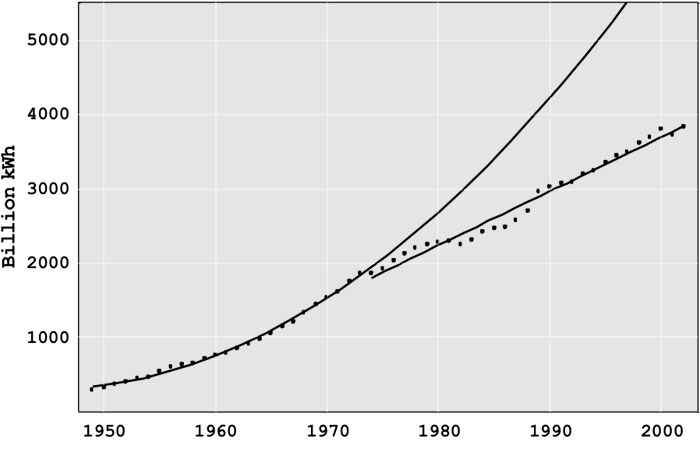
Price increases were driven by higher petroleum, coal, and natural gas prices, rate increases to cover the cost of over-capacity, particularly in generation, reduced rates of technology improvement, and by investments in coal and nuclear generation plants of a size that stretched available technology beyond cost effectiveness. In the 1970s, nuclear power plants promised low-cost, environmentally benign power. Many utilities started the construction of new nuclear plants. Unfortunately, the utilities learned that building and operating nuclear plants was much more difficult than operating dams and fossil fuel plants. As a result, there were vast cost overruns in construction, e.g., Diablo Canyon and the Washington Public Power System, and poor plant operation, e.g., the fuel rod meltdown at Three Mile Island.
Building excess capacity, eliminating some plants that were in planning or early stages of construction, and having nuclear plants that turned out to be much more expensive than estimated and which didn’t operate well generated tremendously high costs. Public Utility Commissions and consumers resisted putting these costs into the rate base since they raised costs (and prices) markedly. However, since the PUCs had generally approved the investments, there was little alternative to reimbursing the utilities for the majority of these costs.
The electricity price increases came at a time when the deregulation of the airlines (1978), railroads, and the trucking industry (1980) were reducing prices substantially. The price increases upset consumers and generated intense political pressure to hold down electricity rates. One proposed answer was deregulating electricity, fostering competition and lower prices
As a reaction to the 1973 energy crisis, Congress passed the 1978 Public Utilities Regulatory Policies Act (PURPA), eliminating, at least in principle, protected monopolies for electric generation. The success of early non-utility generation facilities and of deregulation in other industries led to provisions in the 1992 Energy Policy Act encouraging wholesale and retail choice in electricity. Over the next decade, nineteen states and the District of Columbia enacted some form of electric restructuring legislation.
As shown in Figure 11.1, the price of electricity rose 50% from 1970 to 1975. The “minor” issues in the Rate of Return Regulation (RORR) structure that had been ignored now became major problems. The defects had been hidden by rapidly evolving generation technology that continually lowered generation costs.
- Growing Technical Complexity: As the grid grew in size and complexity, technical difficulties arose. While ever-larger generators had lowered costs for 70 years, the new 1,000 megawatt (MW) generators had unexpected problems. Starting in 1962, many utilities tied their systems together for mutual support. Although this may have reduced the number of small failures, the interconnections among utilities produced blackouts that affected millions of people beginning in 1965.
- Over-Investment: The profit that a utility could earn is directly tied to book value of its assets; the more assets, the greater the potential profit. The desire to build more generation and T&D was compounded by the fact that, in most years, a utility could borrow money (through loans or by setting bonds) at less than the allowed rate of return. Thus, investing in more assets with borrowed money allowed shareholders to earn much more than the allowed rate of return on their equity. For example, if the utility were allowed to earn 10% on assets and could borrow the money at 8%, a $100 million investment would return an additional $2 million per year to stockholders. This “Averch-Johnson” effect motivated utilities to find more investment opportunities, even if they were not really needed to provide reliable service. Since regulators demand high reliability, it was easy to justify increased investment as needed to prevent electricity shortages and blackouts.
- Bureaucratic Complexity of the State Regulatory Process: The state Public Utility Commissions (PUC) operated in a political-legal environment, often taking years to make decisions. The utilities benefited before 1970 when a new generator with low costs came online, since average generation costs fell. The utility was in no hurry to have the PUC act to adjust the price downward since they were earning profits above their target level.
- Technical-Business Knowledge of the Commissioners: Knowledge of the technology or business of the industry was rarely a criterion for selection to the PUC. Rather, the governor appointed political allies, usually lawyers, with limited technical or business knowledge to the PUC positions. The technical and business issues are sufficiently complicated, which means that even bright individuals, within a four-year term of office, are unlikely to understand the implications of the decisions they must make. Many utilities learned to manage the PUC, usually getting their desired outcomes. If, for myriad reasons, a utility doesn’t desire to be completely candid in describing its operations and costs, it could present data that would deter all but the most skilled auditors from learning what is going on. A commissioner with no technical or business background has little or no chance to figure out what the utility doesn’t want them to learn. Commission decisions see-sawed between compliance, giving the utility whatever it asked for, and being extremely critical, denying even fair requests.
- Political Decisions: The RORR process focused on the issues of greatest concern to the governor and commissioners, sometimes to the detriment of the average customer. Many commissions focused on subsidizing favored groups or large employers, resolving even unreasonable consumer complaints, and helping the political allies of the governor, rather than delivering low-cost electricity.
- Revolving Door: Some commissioners went to work for the industry when their terms of office ended, either as company executives or as lawyers. The key to having a good job at the end of the term was pleasing companies while in office.
- Punishing Risk Taking: Before an asset can go into the rate base, the PUC must find that it is a prudent investment. Since prudency review generally takes place after the asset is constructed, RORR gave utilities a strong incentive not to take chances on new technologies. Since operating costs were automatically passed through, utility management had little incentive to keep employment low and boost productivity. One indication of the effect of passing through operating costs is the massive reductions in the utility workforce in the mid-1990s stemming from the threat of deregulation and other changes.
- Low R&D Investment: Much of the R&D was done by equipment suppliers rather than the regulated utilities. The utilities in fact spent so little on R&D that, in the early 1970s, Congress seemed poised to order utilities to pay into a fund for the Department of Energy’s R&D. The threat was headed off by the formation of the Electric Power Research Institute, a nonprofit organization that would manage industry R&D. However, utility contributions to EPRI declined for two decades, and total R&D spending is extremely low, about 0.2% of revenue. This low level of spending is at variance with the technical problems in the industry and the promising opportunities for new technology.
Clearly, there were problems with RORR. One alternative would have been to reform the regulatory process, as was originally tried in the United Kingdom. The other alternative, which was embraced first within Chile and the United Kingdom before spreading to the United States, was a package of reforms that would change the way that some parts of the industry were regulated, and loosen regulations in other parts of the industry.
Deregulation or Restructuring?
Deregulation or restructuring?
The terms “deregulation” and “restructuring” are sometimes used interchangeably to describe the changes in the electric power industry starting in the 1990s. While the terms are not interchangeable, both in fact are correct. The generation segment of the electricity supply chain has been progressively deregulated, with power plants competing with one another in many areas of the world to provide service to a regional grid operator. Electric transmission has largely been restructured, not deregulated, with transmission regulation shifting from a local to a regional scale. In the U.S., this has meant that the regulation of electric transmission has shifted from state to federal authorities. Electric distribution has, with few exceptions, retained the same regulated structure that it has always had. This “last mile” of wires service is provided by a public utility that is granted a local monopoly in exchange for rate of return regulation by the state. In states that have undertaken deregulation and/or restructuring, the “electric utility” is in many cases just a distribution company.
Please read the first two sections from Blumsack, Measuring the Benefits and Costs of Regional Electric Grid Integration [123], which describes in more detail the process of deregulation/restructuring and some of the important U.S. federal policy initiatives that have pushed the industry towards its new state. It is important to realize that some aspects of restructuring have essentially arisen from federal initiatives and some from state initiatives. The most important aspects of electricity restructuring are:
- The vertical disintegration of the electric utility into separate generation, transmission and distribution companies. In some jurisdictions, this has been accompanied by the divestiture of generation plants by the former utility company.
- The establishment of “open-access” transmission regulations at the federal level, requiring all transmission-owning companies to offer non-discriminatory access to their transmission grids. This measure is aimed at promoting regional competition between generators.
- The creation of competitive wholesale markets for electric energy through the creation of “Regional Transmission Organizations.” These entities will be discussed further later in this lesson.
- Some states have opened up retail generation service to competitive forces. In these states, consumers purchase transmission and distribution service from the utility but have the option to purchase generation service from a company other than the utility. If this model sounds confusing, it is actually very similar to how telecommunications was deregulated in the 1980s, where you got to choose your long-distance phone company, but local calls were handled by your telephone utility.
Not all areas of the U.S. have adopted deregulation or restructuring. Figures 11.3 and 11.4 show the areas of the U.S. that have adopted competitive wholesale markets for electric energy generation and those individual states that have taken on power-sector reforms at the retail level.
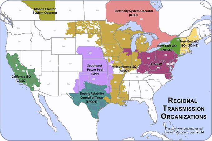
- California ISO, which includes CA and part of SW Nevada.
- Electric Relability Council of Texas (ERCOT), which includes most of TX.
- Southwest Power Pool (SPP), which includes a portion of N. TX, all of OK, KS, most of Nebraska, and western pieces of MO, AK, and the NW tip of LA.
- Midcontinent ISO (MISO), which contains portions of the following states: LA, AK, MS, MO, IL, IN, IA, MI, WI, MN, ND, SD, MT.
- PJM ISO, which includes portions of KY, VA, WV, WI, IL, IN, MI, and all of OH, PA, NJ, MD, and DE.
- New York ISO (NYISO), which includes all of NY.
- New England ISO (SO-NE), which contains all of CT, MA, RI, NH, VT, and most of ME.
- Electricity System Operator (IESO), which contains portions or all of Ontario, Canada.
- Alberta Electric System Operator, which contains portions or all of Alberta, Canada.
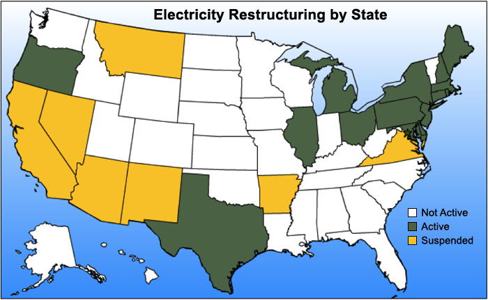
Regional Transmission Organizations
Regional Transmission Organizations
Regional Transmission Organizations (RTOs) are non-profit, public-benefit corporations that were created as a part of electricity restructuring in the United States, beginning in the 1990s. Some RTOs, such as PJM in the Mid-Atlantic states, were created from existing “power pools” dating back many decades (PJM was first organized in the 1920s). The history of the RTO dates back to FERC Orders 888 and 889, which suggested the concept of the “Independent System Operator” (ISO) to ensure non-discriminatory access to transmission systems. FERC Order 2000 encouraged, but did not quite require, all transmission-owning entities to form or join a Regional Transmission Organization to promote the regional administration of high-voltage transmission systems. The difference between RTO and ISO is, at this point, largely semantic. Order 2000 contains a set of technical requirements for any system operator to be considered a FERC-approved RTO.
RTOs are regulated by FERC, not by the states (i.e., RTO rules are determined by a FERC-approved tariff and not by state Public Utility Commissions) and membership in a RTO by any entity is voluntary. Including Texas (which is technically outside of FERC’s jurisdiction), there are seven RTOs in the U.S., covering about half of the states and roughly two-thirds of total U.S. annual electricity demand. Each RTO establishes its own rules and market structures, but there are many commonalities. Broadly, the RTO performs the following functions:
- management of the bulk power transmission system within its footprint;
- ensuring non-discriminatory access to the transmission grid by customers and suppliers;
- dispatch of generation assets within its footprint to keep supply and demand in balance;
- regional planning for generation and transmission (though see below for limitations to this function);
- with the exception of the Southwest Power Pool (SPP), RTOs also run a number of markets for electric generation service.
In many ways, RTOs perform the same functions as the vertically-integrated utilities that were supplanted by electricity restructuring. There are, however, a number of important distinctions between RTOs and utilities.
- RTOs do not sell electricity to retail customers. RTOs purchase power from generators, resell it to electric distribution utilities, who then resell it again to end-use customers.
- RTOs may not earn profits.
- RTOs do not own any physical assets – they do not own generators, power lines or any other equipment. RTOs generally cannot force generation or transmission companies to make investments.
- RTO decision-making is governed by a “stakeholder board” consisting of various electric sector constituencies. In some cases, the RTO can implement policy unilaterally without approval by the stakeholder board, but this is generally rare. All policies must, however, be approved by FERC.
- RTOs do not take any financial or physical position in the markets they operate. They must remain neutral market-makers, although they do monitor activity in their markets to avoid manipulation by individual generators or groups of generators.
The set of NETL power market primers zipped file [126] contains more information on specific differences between the various RTO markets.
The separation of ownership from control in RTO markets raises some interesting complications for planning. RTOs have responsibility for ensuring reliability and adequacy of the power grid. They must perform regional planning, meaning that they determine where additional power lines and generators are required in order to maintain system reliability. But RTOs generally cannot require that member companies make any investments. They generally rely on a variety of market mechanisms to create financial incentives for member firms to invest in generation. Many transmission investments needed for reliability are eligible for fixed rates of return set by FERC.
Operating a power system requires making decisions on time scales covering fifteen orders of magnitude prior to real-time dispatch, as shown in Figure 11.5.
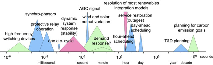
Since the RTO does not own any physical assets, it must effectively sign contracts with generation suppliers to provide needed services. The market mechanisms run by the RTO are used to procure generation supplies needed to maintain reliability. Once generation supplies are procured by the RTO, it can dispatch generation as needed to meet demand.
RTOs run three types of markets that enable them to manage the power grid over time scales ranging from cycles (one cycle = 1/60th of one second) to several years in advance of real-time dispatch, as shown in Figure 11.6.
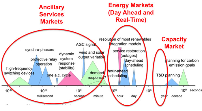
Capacity Markets are meant to provide financial incentives for suppliers to keep generation assets online and to induce new investment in generation. Capacity markets are generally forward markets to have generation capacity online and ready to produce electricity at least one year ahead of time. PJM’s capacity market is run three years ahead of time. For example, a generator that participates in the PJM capacity market in 2023 is effectively making a promise to have generation capacity online and ready to produce in 2026. Capacity markets are thought to be necessary because prices in other RTO markets are not always sufficiently high to keep existing generation from shutting down or to entice new generators to enter the market. Not all RTOs have forward capacity markets. Texas, for example, does not operate a capacity market. We will discuss capacity markets in more detail in Lesson 12.
Energy Markets are perhaps the most well-known of all market constructs run by RTOs. Like capacity markets, energy markets are forward markets but are used by the RTO to ensure that enough generation capacity is online and able to produce energy on a day-ahead (24-hour ahead) to one-hour-ahead basis. RTOs run two types of energy markets. The first, the “day-ahead market” is used to determine which generators are scheduled to operate during each hour of the following day (and at what level of output), based on a projection of electricity demand the following day. The second, the “real-time market” is somewhat poorly named; this market is used by the RTO to adjust which generators are scheduled to run on an hour-ahead basis. A better term for the real-time market (which is used in some cases) would be “adjustment market” or “balancing market” since supplies for this so-called real-time market are actually procured one day in advance (but after supplies are procured through the day-ahead market). The prices prevailing in the day-ahead and real-time markets are the most commonly referenced and quoted of all markets run by the RTOs.
Ancillary Services Markets allow the RTO to maintain a portfolio of backup generation in case of unexpectedly high demand or if contingencies, such as generator outages, arise on the system. There are many different types of ancillary services, corresponding to the speed with which the backup generation needs to be dispatched. “Reserves” represent capacity that can be synchronized with the grid and brought to some operating level within 60, 30, or 15 minutes. “Regulation” represents capacity that can change its level of output within a few seconds in response to fluctuations in the system frequency. Ancillary services are increasingly important for renewable energy integration, so we will discuss those markets in Lesson 12.
Suppliers may participate in multiple markets. For example, a 100 MW generator could offer 80 MW to the day-ahead market, 10 MW to the real-time market, and 5 MW each to the regulation and reserves markets. The generator would earn different payments for each type of service provided to the grid. Thus, while the day-ahead or real-time price is often referred to as “the” market price of electricity, in reality, there are many different prices in the RTO market at any given time, each representing a different type of service offered to the RTO.
Because the RTO operates its entire system in an integrated way, even though its footprint may encompass many different utility territories and transmission owners, RTO type markets are sometimes referred to as “power pools” or simply “pools.” The following video contains more information about how the pool-type markets are structured, using the largest pool type model (PJM, in the Mid-Atlantic U.S.).
Video: PJM Model and SMP (9:37)
Seth Blumsack: PJM - ah, they used a different model, a different market model, which is sometimes called a pool. And the way the PJM, or pool market, works is that individual generators commit their capacity to the market, or the pool. The pool decides which generators are going to run at which hours. The way that generators are allowed to structure supply offers is much more limited in the pool than it was in the power exchange. In the pool, the supply offers from generators basically just reflected variable cost. And so, capital cost recovery and other things were made up through separate payments or separate markets.
So, the pool-type market has really become the dominant market model used in the US today. The pool-type market was, more or less, what FERC's standard market design looked like. The markets that are run by regional transmission organizations are all run as what we call uniform price auctions. They way that a uniform price auction works is that suppliers submit supply offers to the RTO and then these offers are aggregated to form a system supply curve. Originally, demand was assumed to be perfectly inelastic - which is the same thing as saying a vertical demand curve - so, whatever demand happened to be, that's what it was and they would pay whatever price the market happened to produce. At the point where this vertical demand curve crossed the offer curve, or the supply curve, was the market clearing price, or what we call the system marginal price for that particular time. I'll show you a couple of different pictures of this.
This is approximately what the supply curve looks like for the PJM market. A couple of things about this supply curve are that, first of all, it has this hockey stick sort of shape. Over a large range of electricity demand, the market price would not vary all that much - or the cost of generation would not vary all that much. In the example that I have here, if demand is a hundred thousand megawatt hours, which is this vertical line about here, then the point where that line crosses the supply curve is what sets the market price for that particular time period. And so, in this particular time period, at a demand of a hundred thousand megawatt hours, the price would be eighty dollars per megawatt hour. And if the price were a little bit lower or a little bit higher than that, say eighty thousand instead of a hundred thousand, the market clearing price would not change all that much. But as demand increases, in this case past a hundred and or a hundred and twenty thousand megawatt hours, then the cost of the capacity you'd have to use in order to satisfy that demand starts to rise very sharply. So, this point, the part of the supply curve over here where the price starts to rise very steeply is sometimes called the "devil's elbow."
If we have demand of a hundred and forty thousand megawatt hours, then, all of a sudden, the price would jump to $160 per megawatt hour. So, we have increased demand by 40% and we have doubled the price. At high levels of electricity demand, the small changes in demand can produce much larger than proportional changes in the market price.
The last generator that is dispatched to meet electricity demand is the generator that basically sets the market price, or the system marginal price. And the way these uniform price auctions work is that that system marginal price, or that market price, is paid to every generator whose supply offer was lower than the market price. So, if you're a generator, your profit during any time period is equal to whatever the market the price is minus your marginal cost. Sometimes, you'll hear this market referred to as a scarcity rent. The way that these uniform price auctions work, if you've take Econ 101, is not dissimilar to just about any other market in the world.
There is a variation on the uniform price auction called the pay-as-bid auction. This is used in the UK but not in the United States. The idea behind the pay-as-bid auction is that there's still a system marginal price that is produced through the market, but rather than each generator earning the system marginal price, each generator who is accepted into the auction, each generator that bids below what the system marginal price turns out to be, is payed whatever their bid was. As I said, this is used in the UK but not in the US. The belief in the US is that if you switched to a pay-as-bid system, this would simply give generators incentives to manipulate their bids. So, if you're a generator that has a marginal cost of five dollars per megawatt hour and you believe that the market price, or the system marginal price, will be fifty dollars per megawatt hour, in the uniform clearing price option, you would earn fifty minus five equals forty-five dollars per megawatt hour in profit. In the pay-as-bid auction, if you actually submitted a bid that was equal to your marginal cost, then you would earn five dollars per megawatt hour. The thought is, in the US, is that this would give this particular supplier an incentive to inflate their bid up to whatever they thought the market clearing price would be. So, the pay-as-bid is not really used in the US.
So, basically, all of the centralized wholesale markets run by RTOs follow this uniform price option format.
If you are interested, the following two videos discuss electricity market structures that are alternatives to the pool:
Video: Bilateral Markets Exist in Regions of the U.S. (4:25)
Seth Blumsack: Areas of the US that do not have these centralized electricity markets do have wholesale trade of electricity between generators and buyers, between utilities and so on and so forth. These are what we call bilateral markets, and these bilateral markets actually existed long before electricity deregulation, long before the PJM electricity market and so on and so forth. The first of these was actually set up in the western US in the late 1980s. It was called the Western Systems Power Pool. It's actually still in place - so, the market structure that was set up in the 1980s in the western states is actually still used there today.
The way that bilateral markets work is that large volumes of electricity, sometimes called bulk power, is traded between utilities, between buyers and sellers, at whatever price the two counter parties agree upon. And how these trades actually occur is that potential counter parties actually call each other up on the phone. So, I might be, like, Bonneville Power Administration and I could call somebody at SMUD (The Sacramento Municipal Utility District) and say, "I've got spare electricity to sell; do you want to buy any?" This is basically how the bilateral markets work. And sometimes, the energy that's purchased through these bilateral markets is coupled with access to the transmission grid so that you could actually deliver the electricity. This is sometimes called "firm" energy, as opposed to non-"firm" energy, which is sold without access to the transmission grid. These bilateral markets still exist today. Now, a lot of the bilateral trading takes place over electronic trading platforms. People don't call each other up on the phone as much; instead they might log in to some electronic trading platform, kind of like e-Bay or something like that. When we talk about centralized electricity markets, just keep in mind that places in the US that do not have centralized electricity markets still have trading of electricity through these bilateral markets.
In the mid-1990s, California and a handful of Mid-Atlantic states (the "PJM" market, which stands for Pennsylvania, New Jersey, and Maryland), as part of a broader electricity market restructuring effort, set up much more coordinated, much more formal mechanisms for trading electricity. The California model was a little bit different from the PJM model, but the big similarity that they shared was that rather than people calling each other up on the phone, there would be a centralized exchange setup, kind of like something analogous to the New York Stock Exchange or the New York Mercantile Exchange, where crude oil futures are traded. And rather than buyers and sellers trying to find each other by calling each other up on the phone, everybody would go to this centralized market, or this centralized exchange
Video: The Power Exchange Model Was Tried for a Couple of Years in California (6:00)
Seth Blumsack: Video 11.3: The power exchange model was tried for a couple of years in California, prior to that state’s energy crisis in 2000 and 2001. The function of the power exchange is to facilitate the purchase and sale of bulk wholesale electricity using a structure very much like a financial exchange.
Click for transcript of The Power Exchange Model Was Tried for a Couple of Years in California.
For these centralized electricity markets….I'd said that starting in the 1990s there were two competing models for setting up electricity markets: one in California and one in the PJM states. What California did was it tried most directly to replicate a financial exchange, like the New York Stock Exchange, for buying and selling electricity. And so, it opened The California Power Exchange. So, California's biggest utilities, they all agreed to go along with this, and they agreed to buy all of their power from the power exchange. So, how the power exchange worked was this:
First, individual generators decided whether or not they wanted to enter their supplies into the power exchange. This is called decentralized unit commitment. It was up to the generators whether or not they wanted to make their capacity available to the exchange. The bids from the generators, there was an overall cap, so a maximum amount, that the generators could bid, but beyond that, the generators could more or less do whatever they wanted. They could submit whatever type of supply offer they wanted to. And then, just as generators had to submit supply offers, the three large California utilities, they also had to submit demand bids. So, the idea was that you would have so many suppliers rushing into this market to serve so much electricity demand that there would be sort of this vigorous competition that would ensue, sort of like in an auction.
So, the way that the power exchange market worked was that every hour, suppliers would submit supply offers, which is the blue curve here, and the supply offer indicated how much generating capacity the supplier was willing to make available to the power exchange at what price. So, when you put all of these together you got what we call a supply curve or an offer curve. And that's in the blue. On the demand side, the utilities had to submit the amount of electricity that they were willing to buy from the exchange at some price. And so, that's the pink curve right over here. And when these purchase offers were aggregated together you got kind of a California system demand curve. And where the supply and demand curve met determined the price and quantity at which the electricity market would clear. So, in this example, and this is a picture from the late 1990s, the point where supply equals demand, the market cleared for this particular hour at about 32,500 megawatts of generation capacity would be utilized to serve 32,500 megawatt hours of energy demand, and the market clearing price would be $190 per megawatt hour. So, this was repeated every single hour of every single day. And in the event that there wasn't enough electricity purchased in through the power exchange to serve all of California's electricity demand, there was a secondary balancing market that would ultimately equate demand and supply on a sub-hourly basis. So, this was basically how the power exchange model worked, and the California power exchange lasted for about two and a half years, and after the California power crisis, as California's sort of screeching halt to electricity deregulation, the power exchange was shut down. Partially because of California's sort of dismal failure, the power exchange model has not really been replicated anywhere else except in Alberta, up in Canada, where they actually have had a power exchange type market for well over a decade. They seem to like it, but in California, it didn't work so well.
Virtually all RTO markets are operated as “uniform price auctions.” Under the uniform price auction, generators submit supply offers to the RTO, and the RTO chooses the lowest-cost supply offers until supply is equal to the RTO’s demand. This process is called “clearing the market.” The last generator dispatched is called the “marginal unit” and sets the market price. Any generator whose supply offer is below the market-clearing price is said to have “cleared the market,” and is paid the market-clearing price for the amount of supply that cleared the market. Generators with marginal operating costs below the market-clearing price will earn profits. In general, if the market is competitive (all suppliers offer at marginal operating cost) the marginal unit does not earn any profit.
The uniform price auction is illustrated in Figure 11.7. There are five suppliers, each of which offers its capacity to the market at a different price. These supply offers are shown in Table 11.1. Here we will assume that supply offers are equal to the marginal costs of each generator, but in the deregulated generation market suppliers are not really obligated to submit offers that are equal to costs. The RTO aggregates these supply offers to form a single market-wide “dispatch stack” or supply curve. Demand is represented by a vertical line (the RTO assumes that demand is fixed, or “perfectly inelastic” with respect to price). In this case, demand is 55 MWh. Generators A, B, C and D clear the market. Generator E does not clear the market since its supply offer is too high. The market-clearing price, known as the “system marginal price (SMP)” would be $40 per MWh. Generators A, B, C, and D would each be paid $40 per MWh. Generators A, B and C would earn profit. Generator D is the marginal unit so it earns zero profit.
| Supplier | Capacity (MW) |
Marginal Cost ($/MWh) |
|---|---|---|
| A | 10 | $10 |
| B | 15 | $15 |
| C | 20 | $30 |
| D | 25 | $40 |
| E | 10 | $70 |
Let’s calculate the profits for each of our generators. Remember that each generator that clears the market (in this case, it would be A, B, C, and D; E does not clear the market) earns the SMP for each unit of electricity they sell. Total profits are thus calculated as:
Profit = Output × (SMP – Marginal Cost).
Since the SMP in our example is equal to $40, profits are calculated as:
Firm A profit = 10 × (40 – 10) = $300
Firm B profit = 15 × (40 – 15) = $375
Firm C profit = 20 × (40 – 30) = $200
Firm D profit = 10 × (40 – 40) = $0
Firm E profit = 0 × (40 – 70) = $0.
Note in particular that Firm D, which is the “marginal unit” setting the SMP of $40/MWh, clears the market but does not earn any profits. We will come back to this case when we discuss capacity markets in Lesson 7.
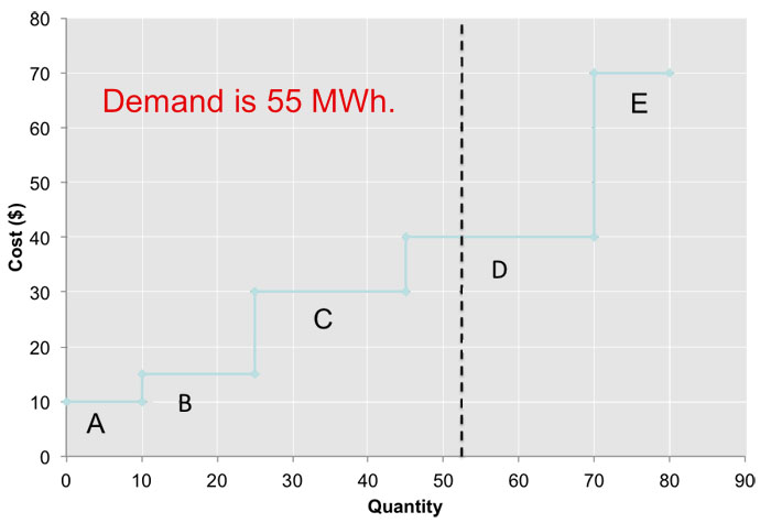
Locational Marginal Pricing
Locational Marginal Pricing
Unlike petroleum pipelines or natural gas pipelines, which in most cases require compression to maintain sufficient pressure to move product from the wellhead to the sales point, the cost of moving additional electrons through a network of conductors is essentially zero, since there is no fuel cost for “compression” in electrical networks.
(Actually, this isn’t quite true for a couple of reasons. First, transmission lines aren’t perfect conductors, so there is some resistance in the network. Because of this resistance, some of the electricity injected into the transmission grid by power generators is lost as heat between the power plant and the customer. The magnitude of these “resistive losses” is around 10% in a modern power grid like North America’s. What this means is that the system has to generate more power than is actually demanded, to account for these losses. For example, if demand in a system with 10% losses is 100 MW, then the system will need to generate around 111 MW. Second, the transmission grid needs to maintain a certain voltage level, and maintaining this level sometimes involves output adjustments at the power plant location, which does impose an economic cost on the system. In the discussion here, we will ignore these two costs to focus on the effects of transmission congestion.)
In the market-clearing example that we just went through, all suppliers were paid the market-clearing “system marginal price,” and the problem did not really say anything about where the generators or customers were located, or what the transmission network looked like. We just assumed that power produced at any one plant could be delivered to a customer at any location in the transmission network. Thus, electricity markets should exhibit the law of one price, just as we saw in natural gas networks.
While electricity markets should exhibit the law of one price, the reality is that they often do not. Figure 11.8 shows a contour map of electricity prices in the PJM electricity grid on a warm, but not terribly hot day in June 2005. You can find more up-to-date maps [127] on the PJM website [128]. You can also find a really nifty animation of LMPs [129] from the MISO market [130]. If you look carefully at the MISO animation, you may see some negative prices, meaning that someone using electricity gets paid to use it, and someone producing electricity actually pays to generate power! While this may seem strange, it is actually a natural economic outcome of a market with fluctuating supply and demand, and no storage. We'll get to the negative-price phenomenon later in the course.
Getting back to our picture of prices in the PJM system, you can see that prices in the western portion of PJM’s grid are an order of magnitude lower than prices in the eastern portion of the grid. This means that a power plant located in, say, Pittsburgh could make a lot of money by selling electricity to customers in Washington, DC. The demand from Washington should bid up the price in Pittsburgh as more generation in Pittsburgh comes online to serve the Washington market. This is just what we saw in our study of natural gas markets. But this doesn’t happen in electricity. Why?
The basic answer is “transmission congestion.” Conductors cannot hold an infinite number of electrons. At some point, the resistive heat would just cause the conductor to melt. (Remember that materials expand when they get hot. When you hear about power lines “sagging” into trees, that is what’s going on.) So, power system engineers place limits on the amount of power that a transmission line can carry at any point in time. When a line’s loading hits its rated capacity, we say that the line is “congested” and it can’t transfer any additional power. So, the system has to find another way to meet demand, without additionally loading congested lines. Usually, this involves reducing output at low-cost generators and increasing output at higher-cost generators. This process, known as “out of merit dispatch,” imposes an economic cost on the system.
After correcting for transmission congestion by adjusting the dispatch of power plants, the cost of meeting demand in one location (e.g., Washington) may be substantially higher than the cost of meeting demand in another location (e.g., Pittsburgh). The locational marginal price (LMP) at some particular point in the grid measures the marginal cost of delivering an additional unit of electric energy (i.e., a marginal MWh) to that location.
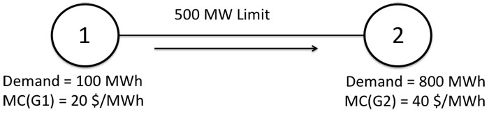
We will illustrate the concept of LMP using the two-node network shown in Figure 11.9. Node 1 has 100 MWh of demand, while node 2 has 800 MWh of demand. There are two generators in the system – one at node 1 with a marginal cost of $20/MWh and one at node 2 with a marginal cost of $40/MWh. A transmission line connects the two nodes. For the purposes of this example, assume that either of the generators could produce 1,000 MWh, and we will ignore any issues with transmission losses. Both generators submit supply offers to the electricity market that are equal to their marginal costs.
Suppose that the transmission line could carry an infinite amount of electricity. How should the system operator dispatch the generators to meet demand? Either generator by itself could meet all 900 MWh of demand in the system, so the system operator would dispatch generator 1 at 900 MWh and generator 2 would not be dispatched. The SMP would be equal to $20/MWh.
Now, suppose that the transmission line could carry only 500 MWh. In this case, the system operator could supply all of the demand at node 1 with generator 1, but only 500 MWh of demand at node 2 with generator 1. The remaining demand at node 2 would need to be met by dispatching generator 2. Since there is plenty of generation capacity left at generator 1, if demand at node 1 were to increase by 1 MWh, it could be met using generator 1 and thus the LMP at node 1 is $20 per MWh. If demand at node 2 were to increase, that demand would need to be met by increasing output at generator 2. Thus, the LMP at node 2 would be $40 per MWh.
Next, we'll look at how much the Generators are paid and how much the Customers pay. Customers at Node 1 are charged $20 per MWh, while customers at Node 2 are charged $40 per MWh for all energy consumed. Generator 1 is paid $20 per MWh, while Generator 2 is paid $40 per MWh for all energy produced. You may notice here that while customers at Node 2 pay $40 per MWh for all 800 MWh that they consume, some of that energy was imported from Node 1 at a much lower cost. This is not a mistake - it's how the LMP pricing system works in the US.
The RTO collects revenue from the customers as follows:
From Node 1: 100 MWh × $20 per MWh = $2,000
From Node 2: 800 MWh × $40 per MWh = $32,000
Total Collections = $34,000
The RTO pays the generators as follows:
To Node 1: 600 MWh × $20 per MWh = $12,000
From Node 2: 300 MWh × $40 per MWh = $12,000
Total Collections = $24,000
The RTO collects excess revenue in the amount of $34,000 - $24,000 = $10,000. It collects this excess revenue because customers at Node 2 pay $40/MWh for all energy consumed, while some of those megawatt-hours only cost $20/MWh to produce.
This excess revenue is called "congestion revenue." In general, when there is congestion in the network and LMPs differ, then there will be some congestion revenue. We will discuss later in the course what the RTO does with this extra revenue. For now, just remember that whenever there is transmission congestion and LMPs at different nodes of the network aren't equal, the RTO will usually wind up with some congestion revenue.
As an exercise for yourself, calculate the LMPs and congestion revenue under a second two-node example. Demand at Node 1 is 5 MWh, while demand at Node 2 is 10 MWh. The transmission line connecting Nodes 1 and 2 has a capacity of 5 MWh. The marginal cost of Generator 1 is $10/MWh while the marginal cost of Generator 2 is $15/MWh.
You should find that the LMP at Node 1 is $10/MWh; the LMP at Node 2 is $15/MWh; and that 5 MW of power is exported from Node 1 to Node 2 on the transmission line.
You should also find that congestion revenue is equal to $25.
Lesson 11 Summary and Final Tasks
Summary and Final Tasks
While rate of return regulation served the electricity industry and consumers well for many decades, it had embedded in it a number of incentive problems that made for inefficient operation of electric utilities and some behavior by regulators that was not always in the public interest. In particular, rate of return regulation gave electric utilities incentives to over-invest in capital - the so-called "Averch Johnson" effect. Regulators, in turn, labored under incomplete information regarding the state of the utilities that they were supposed to regulate. Even on their best day, the utilities knew more about the power grid than their regulators, so utilities could more easily get regulators to approve investments. Public utility commissioners are aided by large technical staffs, but at the end of the day, these staff members had expert knowledge but still had less data and system information than the utilities.
Recognizing that generation could be competitive over large regional areas, and that transmission and distribution needed to retain some form of regulation, the restructuring of the electricity industry consisted of the following fundamental changes:
- Dis-integration (or "vertical unbundling") of the regulated electric utility; or privatization of the national electric company in countries that had formerly known governmental control over electricity.
- A shift in transmission regulation away from state or local control and towards federal control. Federal policy encouraged the establishment of Regional Transmission Organizations (RTOs), which would manage electric grids over wide geographic areas.
- Establishment of competitive electricity markets for power generation, run by the RTOs. Generation companies would no longer enjoy a guaranteed rate of return, but would need to earn profits by providing services to RTOs at a lower price than their competitors.
- At the state level, establishment of retail competition for generation services.
In the United States in particular, restructuring has proceeded unevenly. Around half of U.S. states now have a power sector that has been restructured in some way. The other half still operate following the regulated utility structure that we discussed in Lesson 5.
Reminder - Complete all of the Lesson 11 tasks!
You have reached the end of Lesson 11! Double check the What is Due for Lesson 11? list on the first page of this lesson to make sure you have completed all of the activities listed there before you begin Lesson 12.
Lesson 12 - Economic Challenges in Integration of Renewable Resources
Lesson 12 Overview
Overview
For many decades, the companies that operated electricity grids had to do so with two objectives in mind: reliability (keeping the lights on) and cost (keeping electricity affordable). Despite the complexities of the electric grid, these two objectives were relatively simple to meet, in part because the regulatory system shifted a lot of the financial risk away from companies and onto ratepayers. It isn’t that hard to keep a power grid reliable by overbuilding it.
This lesson builds on the previous two objectives by adding a third to power grid operations – lowering the environmental footprint of power generation by adding large amounts of low-emissions generation resources. This is, very broadly, sometimes called the “renewable integration” challenge. The technical challenges in maintaining the balance of supply and demand are immense, but our focus is on the economic challenges, particularly in the context of electricity deregulation.
Learning Outcomes
By the end of this lesson, you should be able to:
- Define the term “Variable Energy Resource” (VER)
- Explain three reasons why large-scale power generation from VERs poses an economic challenge to the electricity industry, not just a technical challenge
- Identify the various types of ancillary services that electric system operators require to maintain reliability, and identify those that are likely to be particularly important for VER integration
- Explain capacity payments and the rationale for having separate payments for electric capacity and electric energy
- Explain how demand-side resources could participate in deregulated electricity markets
Reading Materials
There are a lot of good resources that describe the renewables integration challenge. We will lean on external readings more heavily in this lesson than in previous lessons.
- Carnegie Mellon University Scott Institute for Energy Innovation (2013). Managing Variable Energy Resources to Increased Renewable Electricity's Contribution to the Grid [131].
- Cardwell, D. (Aug. 15, 2013). Grappling with the Grid: Intermittent Nature of Green Power is Challenge for Utilities [132]. New York Times.
- Reed, S. (Dec. 25, 2025). Power Prices Go Negative in Germany, a Positive for Energy Users [133]. New York Times.
- Hittinger, E. (2012). Chapter 4: The Effect of Variability-Mitigating Market Rules on the Operation and Deployment of Wind Farms [134]. In Energy Storage on the Grid and the Short-term Variability of Wind. [Doctoral Dissertation, Carnegie Mellon University.] The important part of this chapter is the discussion of different renewables integration policies around the world. Note that the link goes to the entire document but that you are required to read only Chapter 4.
- National Energy Technology Laboratory (2013). Ancillary Services Primer [135]. This short paper describes different types of ancillary services and how generation companies can compete to provide these ancillary services. For related, optional reading, download this Power Market Primers ZIP file [136].
- Rocky Mountain Institute (n.d.). The Economics of Grid Defection [137]. The report as a whole is worth a read, but the four-page summary captures the main points.
- Please watch the following video interview (43:29). If the video is slow to load on this page, you can always access it and all videos via the Media Gallery in Canvas.
MARK K: So Elizabeth, we've known each other for about six months. Tell us a little bit about yourself.
ELIZABETH COOK: Yeah. So I am born and raised in Pittsburgh, Pennsylvania. I'm currently working for the electric utility that serves Pittsburgh, but also just two counties, Allegheny and Beaver County. I went to school at the University of Pittsburgh, and I guess I got my bachelor's there. Continued on with my education. Got my Kansas State master's degree while employed. And then I currently wrapped up my doctorate just this last October in electrical engineering from the University of Pittsburgh. So I'm a Pittsburgh diehard fan, and that's kind of the perspective that I can share today.
MARK K: Excellent. Excellent. And apologies for the banner behind-- behind there. I'm a Penn Stater. You've talked about your educational background. Why did you study electrical engineering?
ELIZABETH COOK: Ironically, I've had to share this story a couple times this year already.
MARK K: [LAUGHS]
ELIZABETH COOK: My father-- I was always good at math and physics, and my father towards the end of my high school career said that he would support our-- our, me and my two older brothers-- if we were either a doctor, a lawyer, or an engineer. So he got three engineers and one turned lawyer out of that speech. So he just really told me that-- and he's actually an accountant by trade, CFO. And I was raised-- my mother was a nurse. So it's not like engineering's in our family. But he just sure that having these types of degrees would have-- it would open doors for us. And I definitely have to agree with him now, looking back. Many doors have been opened with my electrical engineering degree.
MARK K: Great. So you're now working at Duquesne Light, who's the-- who's the local utility-- the local electrical utility in the city of Pittsburgh. What specifically are you working on there?
ELIZABETH COOK: So when I came to Duquesne Light-- I've been here for five years. Prior to that, I was actually a power system analysis consultant where I worked for Mitsubishi Electric. And I specifically was in the transmission world, really running studies and understanding how the system works and all the equipment associated with it. And I was traveling quite a bit. And my family more or less started saying things like, where are you, Mom? So I-- actually, it's six miles from my house. And I was the system planning manager. So I'm transmission and distribution. At first, just transmission, and then I took over the distribution role. And I started seeing a lot of parallels in regards to how the distribution grid was starting to become very different than the last 100 years. So the last couple years, I've been really arming Duquesne Light leadership and really awareness that we as a business and a utility model need to focus on the edge of the grid. So just this past December, I was promoted to general manager of Advanced Grid Solutions. And the idea behind this new team is really for us to not-- not lose focus of the core business, which is operational efficiency and creating the safe, reliable, and secure grid that we have, but really, what can we do from a technology, people, and processes perspective to ensure that we're prepared and set to pivot at any point in regards to all the different new energy-type technologies that are kind of playing in our field now? So I'm overseeing that role and really just kind of educating the company and external stakeholders of how we can evolve and transform the current electrical grid for the future that has yet to be defined. So--
MARK K: Great. Great. So what do you think will be the most important takeaways for a student trying to understand the electrical system of the day?
ELIZABETH COOK: I could talk about this a lot, a long time. So one thing I think is really powerful is really digging into and thinking about, where did the grid come from, and why is the grid what it is today? And so there's great history in how the largest machine in the world has been created. And it really came from the backbone of engineering, science, and physics, evolving this idea of, OK, there's this flow of electrons. How do we maintain control and use it to our advantage, which is to power our lives? So the grid is only 140 years old in retrospect. And when you think about how it started and where it is today, we're actually using a lot of the basic fundamental principles from and founded in the 1600s and 1800s. And once we decided on how to set up the system and run those electrons across America and really the world, a lot of the innovation and the spirit behind new ideas or thinking outside the box was really hard to penetrate into this very massive machine. But understanding how those different technologies that exist today were able to become imprinted on the grid will really help us kind of, like, peel back the onion. Understand, how can we now really start thinking and re-innovating how we use our grid? Based on the fact that semiconductor theory and the inverters and all of the newer technology that wasn't available or known 100 years ago can now be used. So how can we work those two worlds together, the old and the new? So I think that's-- you know, really dig in and just kind of understand the history. And then start thinking of, well, why? And you'll find it really comes down to legislation and policy. [LAUGHS] But also the technology part of being efficient and affordable.
MARK K: Right. Right. And a really interesting place to do it is in Pittsburgh, because so much of the business really evolved there at the end of the day, right? I mean, the founder of the company you work for was a pretty famous guy. [LAUGHS]
ELIZABETH COOK: Right. Westinghouse. And--
MARK K: Mr. Westinghouse. Yeah.
ELIZABETH COOK: George Westinghouse's brother-- I believe it was Herman-- was the president of Duquesne Light. So that's kind of an interesting history.
MARK K: Very-- very cool stuff. So what's the-- the biggest thing that you think has changed in the wholesale-- wholesale power market since you've been in the industry?
ELIZABETH COOK: So definitely my career started-- I was not learning about markets. And it was really about, how does the electrons get from-- from A to B? However, with the introduction of the renewables and really the idea that they are intermittent, so they're not baseload and not available when called upon, it had to-- the markets had to change to that ideology, right? And they started creating non-standard products to sell in the markets, right? And it started in California. The whole-- I don't know if you guys know about the duck curve, but--
MARK K: Oh, absolutely. You know, the duck curve is probably the-- it's the introduction of the whole course here, so yeah, please go on.
ELIZABETH COOK: So you know, that belly and how to handle the belly part as well as the speed, like, that you had to create new products. And those were very unique, but now they're becoming more proliferated across all of the grid and really changing how the markets are structured. So I guess the idea that the markets had to create something non-standard, and now the non-standard's becoming standard, so what's next? And just the load-- how we're shifting our load. Like, we're very predictable creatures. So we all got-- get up. We used to all go to work, come home, and go back to bed. So that load-- that load and matching the generation was very common. But now is there are different ways that we can dispatch that generation to serve our varying load purposes.
MARK K: Right. So I guess rather than talk about the wholesale and the resale market, maybe we can talk about it in terms of transmission and distribution. So what do you think on the distribution side has changed since you've here since you've been doing this?
ELIZABETH COOK: There really was no market on the distribution side, so now there's been a lot of talk lately of, what is this-- what could this market be? What really-- could we reinvent it? Or do we merge the distribution with the transmission market, or does it have its own? But in regards to, like-- you mean the retail market?
MARK K: Sure.
ELIZABETH COOK: From-- from PA, we're deregulated. So the retail market, we actually have a lot of protections as customers. So we don't have that scenario such as what just happened in Texas, right? Where we may possibly get a bill for thousands of dollars based on the retail market going crazy. So it's a little bit calm. But one thing that we do have in PA is the net metering option for customers where they can be prosumers. So just instead of consuming the electrons, they're also pushing onto the grid, and they get paid-- you know, I think in our territory, like, $0.07 per kilowatt hour. So I mean, there's a market there. I think because solar-- I might be jumping the ship, but--
MARK K: No, go ahead.
ELIZABETH COOK: --is cheaper and affordable to the masses because of the whole economics of how it is just getting cheaper, because more people are using it, that $0.07 is becoming actually a very possible profitable number to then install the solar. So just in the last three, four years, watching our interconnection queue filling up. You know, some say it's not here, but I truly-- f you read the tea leaves and observe what has been happening in other states, it is here, and it's only going to proliferate based on the economics. So that retail market. And then really, also what's happening at the same time is we have that FERC Order 2222.
MARK K: Right.
ELIZABETH COOK: So there's going to be a pivot point for our customers as well as the third party aggregators or those entities that want to play in the solar market is choosing, do I stay on the retail versus-- or do I want to play in the wholesale with my generation? And that's just creating a dynamic of just looking at both markets and trying to understand, you know, what's the best plan?
MARK K: Right.
ELIZABETH COOK: So I know you have more questions.
MARK K: Oh, sure. Absolutely. But I mean, that's great. So what trends do you see in the market itself and in what you're doing from the interconnections perspective that are encouraging to build out of, say, 1 utility scale solar?
ELIZABETH COOK: So we probably don't see it right now, like, at Duquesne Light or in PA, but there are definitely case studies that are showing that the utility scale PV is up-- it can be seen as a positive, right? Non-wire solutions are becoming options where the distributed resources at the edge of the grid can help and support the reliability and resiliency of the entire network. So that seemed like maybe a pie in the sky. Not a lot of believers maybe five-- even five years ago. But they're definitely have-- projects been done, cases have been proven that if they are placed in the right areas of the grid and planned accordingly that they can be an asset and not just a detriment to the grid's operation.
MARK K: Right.
ELIZABETH COOK: I think that's promoting utilities to look there, because it could be cheaper to install this instead of building a large line or increasing capacities in transformers, et cetera.
MARK K: Right. Right. Due you think-- and I'm getting a little bit off the script here. Do you think that the proliferation of the solar plus storage solution makes it even more attractive for utilities to want to-- to want to interconnect with these types of assets?
ELIZABETH COOK: I mean, you know, from our-- just, like, Duquesne Light's perspective, we're a lines-only company, so we can't really have a play in the generation space. But yes, [INAUDIBLE]. The solar battery combo is really the Achilles heel of tipping the whole grid of how we actually start to think about how we receive our energies. So that has definitely become a great incentive to really look at those projects. Even like a company as large as NextEra, you know, they first were the kings of wind, you know? They've [INAUDIBLE] a significant amount of wind on our transmission grid. Then they went to solar. And now more recently, they're becoming very quick to batteries. So it's like a trifecta. You've got your wind, solar, and your batteries. I mean, just a few of those built on the large scale will transform how we think about, again, our baseload generation and really kind of turning a turning point.
MARK K: Right.
ELIZABETH COOK: And then also from, like, a DLC, like, our C&I customers, right? That's Commercial and Industrial customers. They're pushing their incentives to be-- you know, have renewable resources and that desire in their portfolio. So that's really driving DLC's perspective of understanding how those technologies work, and it's showing up for the deregulated side that we have to understand it and connect with it and ensure that our grid can handle that. So we're seeing that right now.
MARK K: Great. So what are-- and this gets really to, I guess, kind of what you do. You know, what do you see as the biggest interconnection challenges for-- for solar or solar plus battery, and even other Distributed Energy Resources or DERs?
ELIZABETH COOK: So depending on the size of the connection, you know, anything over five megawatts triggers an interconnection study by the utility. So like, I oversee the interconnection study process where, one, if you think about how the grid evolved, again, is you've got-- you had your generation serve the transmission which stepped down to the distribution. And it wasn't until really the 1970s, maybe a little-- slightly earlier, we started tying the transmission grid in with other transmission grids, which really drove the necessity for models. So really, since the '80s and '90s, we've been able to run real-time power flow simulations on the models. 16:48 But those electrons went one way. So from the distribution grid's perspective, it was really Ohm's law. And you can kind of calculate, OK, well, here's a feeder. Here's the impedance. Here's the load. And to plan the distribution system really didn't require those large, verbose models to run these power flow systems. What's happening is with DER and the introduction of, hey, I want to connect your distribution grid, it's requiring the utility space and those who do not have models to very quickly get models.
MARK K: Right.
ELIZABETH COOK: So that's a hindrance, I think, that just from a utilities perspective is like, we've got to create these models a lot faster than we thought we needed. And therefore, AKA, like, that could be a challenge, that you're trying to connect with a utility that can't study it. But let's just say they do have models and they can run the studies. You know that. There's a long delay period. And then it comes down to-- and when the proliferation is low, the likelihood of triggering some large investment in the grid is very small. But one thing we're starting to see-- and really, I know Central PA utility is seeing it too is you're starting to see penetration on the distribution feeders that are actually triggering some pretty expensive investments. So then it's the same question the transmission grid had to deal with 20 years ago. Who pays for that? Right? So if you want to connect your five-megawatt solar farm and it creates an overload and now it's $5 million to make this circuit viable, who pays for that? So that'll complicate it. But then getting into more challenging is the facilities part. Like, what is the metering? What is the sensing? You know, what is your communication? And then what is the utility saying needs to happen during a system fault? So really just getting to the nitty gritty of how that inverter will operate with the integration of the grid. And you'll find a lot of utilities are taking different positions. Some utilities are OK with some wireless communication. Others are driving fiber all the way up. Who pays for the fiber? So I think just a big challenge for solar developers is every utility that they engage with is going to be a different processor of flow, different technical [INAUDIBLE],, and different standards. So you just kind of have to be on your toes and really be-- have the technology part on your side as a developer to be able to work with the utility space, because everyone's very different. So I mean, those are lots of challenges there, but that's kind of the nitty gritty.
MARK K: Sure. So shifting gears a little bit, I'd love to hear your perspective on the recent reliability events that we've had, both sort of the cold weather winter storm Uri and also what kind of happened in California with the blackouts that they had to run out there because of the fires.
ELIZABETH COOK: So Texas, you know, was-- I mean, I think it's pretty basic. They didn't plan for the cold weather as an entity. So-- as an entity meaning the state of Texas.
MARK K: Right.
ELIZABETH COOK: So if you think about transmission planning, distribution planning studies, we do it based on peak loading and light loading. And then you break it down by, like, summer peaks, winter peak. So fundamentally, they did not study what would happen if there was a cold snap across all of Texas. Therefore, that triggered a lot of things that they probably overlooked, and that came down to the winterizing of their equipment. And when I say their equipment, the generation side. So it wasn't-- the wind wasn't blowing, right? Because they were frozen or the solar panel shocks. I mean, Texas has barely no solar panels. But the gas lines froze. Some coal piles froze, right? So really, it just came down to not having your generation there when it was called upon. So the operators created controlled blackouts, which I think a lot of people missed that in the media. It wasn't that they lost control of the grid. It was that they made decisions quickly to drop loads in parts of the grid, and so that they could bring it back on. So from-- you know, one thing, if you think about it, if you look at the polar vortexes, I think we had one in 2011, '14 '18, and now 2021 that not only-- it didn't impact Texas. It impacted, like, SBP, MISO, and PJM. I believe we were a 500-megawatt generator away from a blackout at PJM in 2011.
MARK K: Right.
ELIZABETH COOK: So I think there's just going to be a lot of lessons learned. And if you think about, what would be required of this generator fleets to winterize, it could be quite pricey, because a lot of the stuff is done during construction. So you know, who pays for that? Like, what's the incentive? Maybe it's a very high risk but low probability that we're ever going to have a cold snap. And then there's a lot of talk about them being not federally regulated. We actually do not have any standards on our federal-- so from NERC-- that demand or require generation fleets to winterize. But as an industry, you do best practice. So ironically, we're in drafting stages of creating winterized standards. So it wasn't just Texas that didn't winterize. It's just a best practice, and they got stuck in very cold weather. So it was just a very sad event. But I think there are a lot of positives that didn't get a lot of attention. But they were and able' to stop and prevent a month-long-- months-long blackout based on understanding how the grid was operating and how to save those generators from going offline indefinitely by having the technology. So that's Texas. And then California, well, there's the wildfires and then also the heat snap when-- if you think about California's grid is they import a lot during their peak season for that base load generation. You know, Palo Verde the nukes near Arizona, and then there's, like, [? Knob ?] up there in Nevada. And then you have all your hydro coming down from Oregon and stuff. And so I believe during some of the scheduled blackouts-- which, aren't they called brownouts? But I don't know.
MARK K: Yes.
that actually had the generation were using it. So I think then it comes down to that built-in reliability and resiliency of having that reserves available. And right or wrong, you know, California has reduced a large amount of their baseload fossil fuels or even nukes, right? And they just have a whole new solution to figure out. But that's why it was happening and the generation wasn't there. And then with the wildfires, they were-- PG&E ultimately got sued for the fires. So therefore, they took the hard line and said, OK, if we're going to be at fault for these fires, then we're going to turn people off when the fires are near our lines or any potential thereof. So again, it was a controlled approach that no one fundamentally understands and probably wasn't-- no one really liked their lights being turned off. So one thing I think's going to come out of California is this idea of expediting microgrids, right? The smaller-- creating microgrids for pockets of their communities that it's actually-- when they have one singular line being fed out into the middle of nowhere to, like, several hundred homes, it could be in their best interest to create a microgrid out there instead of running that line through the woods. So it'll be interesting to see what different products and ideas that they come up with.
MARK K: Definitely-- definitely disruptive.
ELIZABETH COOK: Yeah.
MARK K: So given these-- these crises or reliability events, do you think that this-- that they'll slow down the uptake of renewables or not?
ELIZABETH COOK: I think the path that the-- you know, the economics that are occurring right now, it would be very hard to slow down renewables or clean energy technologies. I think right behind wind, solar, batteries is going to be green hydrogen, and that's coming hot in regards to being accessible and available. And I don't think it will-- I mean-- I mean, this is my humble opinion. I feel like gas will be probably a big gap fuel for a while. I think coal in general just-- there hasn't been enough recent investment in these large power plants. It's just going to be-- the economics aren't there to save them, and they need to reinvent themselves in-- you know, they're just old and it's expensive for the fuel.
MARK K: Right.
ELIZABETH COOK: So I don't think this is going to slow it down, but I think more people are tuned into this new technology that creates new markets that drives more jobs. That really gives us something new to work with. Therefore, it's like another avenue to proliferate this technology. Is it the answer? You know, it might not be the-- batteries and solar may not be the perfect answer, but I think it's going to keep moving.
MARK K: Right. Right. So it certainly-- it certainly helps to smooth out some of that intermittency and actually could provide some of the ancillary services that you get from a gas plant or a-- or a coal-fired power plant. So what do you think are the biggest challenges we face in these markets going forward or on the grid going forward in general?
ELIZABETH COOK: Oh, where to start? So I think--
MARK K: That's-- keep going. That's why we're here, right? We want to talk about this.
ELIZABETH COOK: So one of the big ones that, you know, I don't think a whole lot of people talk about is, like, the utilities ability to see the edge of the grid. So there hasn't been a need to understand what's happening in each of our homes. And not that utility wants to know what's going on inside the home. They just want to know, are you going to be injecting electrons, or are you going to be absorbing them? And is your load curve changing? Because, oh, by the way, customers, we've believed you to be very predictable for the last 100 years. So that's how we have all of our equipment designed and standardized to. So if this is going to change, well, we need to understand it so that we can then serve and continue to serve. So I think the customers and regulatory and third parties just understanding the idea that utility space needs to get up to speed in regards to having that ability to understand what's happening on the grid that they currently are regulatorily required to be safe, reliable, and affordable. So there's a lot of dynamics there on how much technology can be invested and when and how quickly.
MARK K: Right.
ELIZABETH COOK: And so when I talk about technologies, I guess what I'm thinking about is applying the sensors and the equipment at the edge, having the ability to bring back now massive amounts of data that we've never had to handle or even know what to do with, create that technical [INAUDIBLE] within the utility space. And then once it's available that you're cleaning it, you're organizing it, and you're providing it so that insights can be made. So there's tons of opportunity for computer science, machine learning, big data analytics that need-- the utilities need to kind of latch on to and start to develop. So that has to be happening while the core of the utility business is still occurring. The poles are staying in the ground. The wires are healthy and strong. The transformers are being refreshed and not running to failure.
MARK K: Right.
ELIZABETH COOK: So you're transforming kind of the core of how you do all of that, while also at the same time setting yourselves up to prepare for this deluge of new technology that we've never had to deal with.
MARK K: Right.
ELIZABETH COOK: So I guess when I said, you know, what are the difficulties, it's really just keeping your pulse on all of these different technologies and third-party entities that want to take part. You know, and support, help build the bridge. You can call it whatever. It's still-- it's just different. So there's lots of challenges. But just-- I think everyone, we need to do it together. That's another thing. Like, collaboratively and with a mission of one goal, that we keep the lights on for all, and not this idea that we have all these new technologies that can take big chunks of C&I customers off of the core grid, leaving the low income, middle class entities stuck with the grid that now becomes even more expensive because everyone's off doing their own thing with their new technology.
MARK K: Right.
ELIZABETH COOK: So how does that happen together I think is going to be a huge challenge.
MARK K: Right. Right. Cost shifting could be a-- it's-- it's--
ELIZABETH COOK: Right. They'll be stuck with an old grid and higher bills.
MARK K: Right. Well, I-- I can-- I can tell you stories about the-- the other-- the other utility that was there in Pittsburgh that was owned by Westinghouse Equitable Gas. And we used to always get very, very worried that there was going to be one customer and one MCF over which we had to flow all our fixed costs, because everyone was going to-- everyone was going to leave. So it's a similar it's a similar situation that you guys are looking at there as well. So yeah, I can't-- it's difficult for me to comprehend when I go on to-- go on to the PJM website and look at all the nodes that they have to price and see the number of records, and see it out, you know, 8760 data, which then becomes 8760 times 50,000 nodes, right? That's fine. But then look at Duquesne Light, and how many customers do you have? And you have to-- you have to-- do you have to have that kind of information there? And it's a couple of orders of magnitude probably even more with the way that the-- the potential intermittency that could happen with solar coming on and on and off at all these nodes. And then somebody decides they want to charge their electric vehicle or discharge their electric vehicle, because they have some sort of service-- service opportunity to provide power back to the grid during a demand response event, right? And you need it there, and how does all that-- how does all that fit together?
ELIZABETH COOK: Yeah. So like, just kind of summarizing all the different disruptions is you have your distributed energy resources. So you have the solar, the battery, and everything that's happening at the edge. And you mentioned it. Transportation electrification, right? So now you have all of these EV charging stations popping up on your grid. How do you ensure that we are going to be present and available to serve all of those new charging points?
MARK K: Right.
ELIZABETH COOK: And then this idea that us customers, we will want to become more active and understand and have access to how we use our energy from a day-to-day. So what kind of digital gadgetry can we all have at our fingertips where we get to change our thermostats, which we're all doing right now, right? If someone gets a pulse point, like, hey, if you change your thermostat, you'll get an extra couple cents on your bill.
MARK K: Right.
ELIZABETH COOK: And then just energy efficiency, right? So while we're having this uptick in electric vehicle charging stations, we have this huge energy efficiency drive with buildings becoming more efficient and everything else for the sustainable kind of green initiatives. And now we have to balance that with our increasing load. So that's just very dynamic.
MARK K: Right. Right. Absolutely. So just to talk a little bit about Order 220-- Order 2222. Do you have any notion about how that might fit together? And does that keep you up at night? Or you know, what makes you think about-- what do you think about that particular piece of legislation? Or regulation, sorry.
ELIZABETH COOK: Yeah. So I think it is-- you know, from the personal just, like, challenging perspective, it's pretty exciting. From the business model and are we prepared and ready, it's daunting. So FERC Order 2222, not only are they reducing the boundaries or, you know, attempting to for injectable DER-- so like the solar battery at the edge-- but they're now quantifying DER as energy efficiency programs, demand responsive programs. So kind of all those disruptions I just spoke about, it really gives-- this order is challenging PJM, which-- who is our overseer of the transmission market. They only see down the transmission node. The power to open up markets to this new distribution asset idea. So there's just a lot of push and pull of, like, who has the data? Why do they need the data? Who has the control? Why do they need the control? And so I think from my perspective, it's still a lot of education to-- you know, like, if you think about the transmission and distribution world, up until, like, 15 years ago, the transmission folk didn't even know about the distribution and vice versa in utility space. And the lines became slightly blurred. But unless you worked in both, power grids operate and what you're concerned about and why and when and where is so different.
MARK K: Right.
ELIZABETH COOK: So what I find very interesting is the conversations that the TOs, the transmission people, make very broad, sweeping statements that do not relate to how the distribution grid actually works. So that part is really daunting-- like, education piece in general, right? Like, you have an entity that's being required by the federal government to create rules and policies and procedures to enable something that they're not very familiar with how it should even-- nobody is, really. It's not just them, of how that's going to react. So the owners of these assets are still going to be required to deliver a safe, reliable, and affordable grid. They have, like, thousands of new entities that want to play with it too.
MARK K: Right.
ELIZABETH COOK: So like, everyone-- I think FERC was requiring all the RTO ISOs to file by this July, but majority of us have filed for an extension. So we do have another six months to kind of work together to come up with something that we can work with. And I think everyone understands it's going to be-- it's the journey. Like, there's not going to be a destination. But we need to be careful of, are we going to trigger anything that-- and this is actually-- the federal jurisdiction is kind of creeping into the state jurisdiction. So if you think of PJM, they see 13 states and DC. So from a state's perspective, like the commissioner's, they're saying, well, who's going to pay for this type of investment in technology to enable this? And that's just, like, one kind of fundamental question. Like, who's going to pay for it? And then how quick can some of these utilities get their act together to be able to allow this market to occur? So everyone's at different stages in regards to their technology, people, and processes. So it's just going to be a very challenging order, I think, to execute. But it's going to create a lot of discussion and maybe changes in plans.
MARK K: Mm-hmm. Sure.
ELIZABETH COOK: It'll be disruptive.
MARK K: Right. Right.
ELIZABETH COOK: It could create some great things.
MARK K: So just to kind of conclude here, I know you're an active-- an act-- an avid reader from your posts on LinkedIn and our discussions. Are there any books you would recommend for engineers and professionals that are taking this course that might-- they might add to their libraries?
ELIZABETH COOK: Yeah. I was-- I brought-- I brought the books nearby, so--
MARK K: Awesome. [LAUGHTER]
ELIZABETH COOK: I don't know if you'll be able to see them with my virtual background.
MARK K: That's all right. We'll follow up on it in the show notes, for sure.
ELIZABETH COOK: Empires of Light, which is Jill Jones. She's actually local to Pittsburgh. But this is all about the development of the grid in Pittsburgh in the 1880s.
MARK K: Awesome.
ELIZABETH COOK: I think everyone should read that. And then a couple books-- I think The Conundrum by David Owen. And How Scientific Innovation, Increased Efficiency, and Good Intentions Can Make Our Energy and Climate Problems Worse.
MARK K: OK.
ELIZABETH COOK: And then there's another one, The Great Transition: Shifting from Fossil Fuels to Solar and Wind. They're just interesting perspectives, I believe. And then another-- by Lester Brown. And then the other one was The Legacy, David-- I can't say his last name. Can you see it? Or is it too blurry?
MARK K: I can't see it. That's OK.
ELIZABETH COOK: S-U-Z-U-K-I. And it was-- it's about An Elder's Vision for Our Sustainable Future.
MARK K: OK.
ELIZABETH COOK: So I thought they were pretty good in regards to, like, the green initiative. And then the other one, which is more textbook, but I think is a great one and still relevant, is Reinventing Fire by the Rocky Mountain Institute and Amory Lovins. I think that's another--
MARK K: Awesome.
ELIZABETH COOK: I read that one, I remember, on a car ride as I was-- I was-- I wasn't driving, but with a fellow employee when we were driving to MISO. And it kind of both changed our worlds on, like, we could do this. Like, we could do some changes that create a better future.
MARK K: Right. Awesome. Anything in closing that you'd want to add to what we've discussed here for our engineering and energy students.
ELIZABETH COOK: So I think you picked a great class to be in.
MARK K: [LAUGHS]
ELIZABETH COOK: I feel the world of-- I mean, the energy sector in general is-- can open so many doors to so many places, especially if you enter with an altruistic heart. And I think that's what the space needs. You know, open mind, open heart. There's the technologies there. How do we create the mind, shape the minds to really transition us into a future that we all can engage in? And I know that's a little-- you know. But I started this career not really knowing anything about power but having the right mentorship and the right engagement and the right people, really creating a passion within me that I hope that maybe a little bit of this can inspire and help some of the students really come down a path. And you can get a job in any state, any country, because we all need power, so just stay focused.
MARK K: Excellent. Well, Liz, thank you very much for your time, and look forward to chatting again.
ELIZABETH COOK: Yeah.
What is due for Lesson 12?
This lesson will take us one week to complete. Please refer to the Course Calendar in Canvas for specific due dates. Specific directions and grading rubrics for assignment submissions can be found in the Lesson 12 module in Canvas.
- Complete all of the Lesson 12 readings and viewings, including the lesson content
- Participate in the Zoom discussion
- Complete Quiz 9
- Project work - Electricity Market Sensitivities
Questions?
If you have any questions, please post them to our Questions? discussion forum (not email). I will not be reviewing these. I encourage you to work as a cohort in that space. If you do require assistance, please reach out to me directly after you have worked with your cohort --- I am always happy to get on a one-on-one call, or even better, with a group of you.
A Cautionary Tale from Vermont
A Cautionary Tale from Vermont
Before you get into the details of the lesson, please have a look at the following story from the New York Times about wind farms in Vermont: Intermittent Nature of Green Power is Challenge for Utilities [132].

As you are reading the story, think about the following questions (these would apply to solar as well as wind, but since the story is specifically about wind, we’ll pick on wind to frame the questions). Clearly, the integration of wind into the Vermont electric grid (which is interconnected to the rest of the New England grid) has not gone as smoothly as we might have hoped.
- Why does one wind farm in Vermont represent a challenge for ISO New England, which is the RTO that operates the electric transmission system in all six New England states (not just Vermont)? Isn’t this one wind farm too small to have much of an impact, relative to the entire New England power grid?
- What has ISO New England done in response to that challenge?
- How have other generation resources within Vermont or the New England grid been impacted?
- What is the impact of ISO New England’s operational rules and market structures on the financial viability of wind energy in Vermont? Of other generators in New England, given increasing wind penetration in the New England grid?
- Do you see any conflicts or complementarities between ISO New England’s operational rules and the desire of states within the ISO New England footprint to increase their utilization of renewable energy? The tension between RTO rules and state energy policy is a complex legal issue that is affecting many areas right now, not just one small state in New England.
Variable Energy Resources and Three Economic Challenges
Variable Energy Resources and Three Economic Challenges
Please read the “Overview” section (through page 14) from " Managing Variable Energy Resources to Increase Renewable Electricity’s Contribution to the Grid. [140]"
The terms “renewable energy resources” and “variable energy resources” are often used interchangeably when applied to electric power generation. The two are, in fact, not the same, although there is some overlap. The term “Variable Energy Resource” (VER) refers to any generation resource whose output is not perfectly controllable by a transmission system operator, and whose output is dependent on a fuel resource that cannot be directly stored or stockpiled and whose availability is difficult to predict. Wind and solar power generation are the primary VERs since the sun does not shine all the time (even during the day, clouds and dust can interfere with solar power generation in surprising ways) and the wind does not blow all the time. In some cases, hydroelectricity without storage (so-called “run of river” hydro) could be considered a VER since its output is dependent on streamflows at any given moment. VERs are, in some sense, defined in relation to so-called “dispatchable” or “controllable” power generation resources, which encompass fossil-fuel plants, nuclear, and some hydroelectricity (with reservoir storage). The VER concept is pretty vague if you think about it – after all, coal or natural gas plants can sometimes break and so don’t have perfect availability. Fuel supply chains can also be disrupted for fossil plants. In addition, the “variable” aspect is, at least in concept, nothing new for system operators. Demand varies all the time and system operators are able to handle it without substantial negative impacts.
Keep in mind that the “variability” of VERs is different over different time scales. Figures 7-9 of “Managing Variable Energy Resources to Increase Renewable Electricity’s Contribution to the Grid” show how wind and solar are variable over time scales of days or fewer. Figure 12.2, below, shows wind energy production in the PJM RTO every five minutes over a period of two years. This figure shows how wind production varies seasonally and also inter-annually, with windier and less windy years.
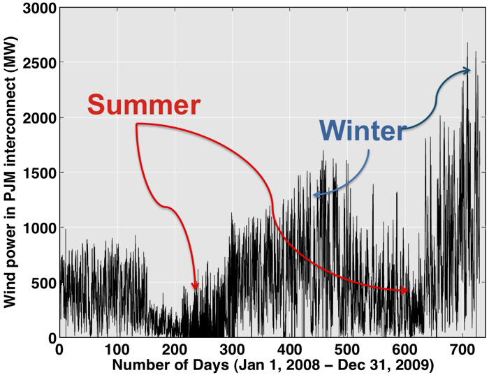
Variability with respect to electricity demand is also important. If you think about it, electric system operators don’t really care about variability in demand or in VERs per se – what they care about is being able to match supply and demand on a continuous basis. If variability between VERs and demand were perfectly synchronous, so that VERs would increase (or decrease) in output right at the moments when demand increased or decreased in output, then there would be no problems. If VERs and demand are anti-correlated or perfectly asynchronous, that poses more of a challenge. Part of the challenge with the wind in Vermont, as you have read, is that the wind tends to blow most strongly at night when there is less electricity demand and the power plants that are serving that demand are inflexible “base load” units that are difficult to ramp down. This is typical of wind – Figure 12.3 shows (normalized) wind and electricity demand by season in the PJM RTO. Solar, on the other hand, is much more highly correlated with electricity demand (at least on a day-to-day basis).
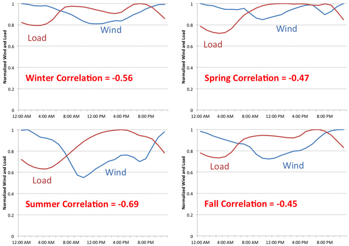
Whether or not you believe that there is anything “special” about VERs, electric grid operators around the world are rethinking the way that they plan and operate their systems and markets in order to accommodate various forms of policy that are promoting investment in VERs. Read the introductory portion of Chapter 4 of Energy Storage on the Grid and the Short-term Variability of Wind and pp.15-20 of “Managing Variable Energy Resources to Increase Renewable Electricity’s Contribution to the Grid,” which discuss various types of strategies that grid operators have been using to manage large-scale VERs on the grid. As you may have gathered from the Vermont article, some of the control strategies used most often by grid operators (such as manually curtailing wind energy output during periods when supply exceeds demand) have also been the most controversial.
More generally, there are three economic challenges relevant to VER integration, each of which we will discuss in a bit more detail.
- VERs tend to depress market prices for electric energy, sometimes even producing negative prices. These negative prices make some economists cringe but are completely sensible in the world of electricity. Remember from Lesson 11 that the Locational Marginal Price (LMP) at a specific location in the grid reflects the cost of delivering electricity to that location. If there is more demand than supply at a given location and the transmission grid is constrained, the LMP at that location will be high. But if there is more supply than demand at a given location, which could happen when there is more wind or solar energy produced than the grid can absorb, then the opposite effect happens with the LMP at that location and the LMP will become negative. This is good for consumers, but not so good for power producers (both conventional generators and VERs). While this has certainly been a challenge for states in the U.S. that have seen rapid growth in wind and solar (primarily California and Texas), it is by no means a challenge specific to the United States. Germany, which has been very aggressive towards a renewable power generation transition, has seen a rise in the frequency of negative prices [141], which is great for consumers (hey, you get paid to use cheap green electricity) but terrible for power generation companies. A solution to this challenge in some areas has been to establish “capacity” payments that are designed to make generators whole financially and keep power plants from retiring too early. You can see a nice animation of electricity prices, including when prices go negative, in this picture for the Texas grid, known as ERCOT [142].)
The emergence of low-cost solar photovoltaics and energy storage presents an additional challenge to the business models of electric utilities. This is more complex than the disruptive competition that new technologies can generate, because the electric utility has a regulatory mandate to provide universal service at high reliability. If solar PV and energy storage steal business from the utility, then the social question arises of whether we find ways to continue to pay for the electric grid (for those who continue to depend on electric service from the grid) or whether we abandon the utility's social mandate to ensure electric reliability. You can read more about this in the report "The Economics of Grid Defection" [143] from the Rocky Mountain Institute. - Fluctuations in VERs can sometimes happen too quickly for system operators to respond manually, so automated response systems are required. These are generically termed “ancillary services.” The economic challenge is that VERs increase the demand for ancillary services and probably require the establishment of new types of ancillary services.
- Part of the reason that the first two challenges exist is because demand for electricity is treated as being “inelastic” or unresponsive to price. Designing a financial mechanism that matches demand with VER production is a major potential application of “smart grid” systems. For now, electricity markets have opened programs for “demand response,” which offer payments to customers that are able to adjust demand quickly.
Capacity Markets
Capacity Markets
Many restructured electricity markets offer power generators payments for the capacity that they have ready to produce electricity, not just for the electricity that they actually produce. For example, if you owned a 100 MW (100,000 kW) power plant and the capacity payment was $10 per kW per month, you would earn $12 million per year regardless of how much electricity you actually produced. In areas that have them, capacity payments have become a major portion of a generator’s revenue stream.
Capacity markets are a little bit odd. Almost no other market for any commodity, anywhere in the world, has them. (There is a capacity market for natural gas pipelines, but it is operated differently than electricity capacity markets.) In markets for other non-storable goods, like hotel rooms and seats on airplanes, any fixed costs of operations are rolled into the room rate or ticket price. If there is enough unused capacity, then it will exit the market (the hotel will close, or the airline will go bankrupt). Yet, this doesn’t really happen in electricity.
There are three features in electricity markets that have justified the need for capacity markets – two are regulatory interventions. The first goes back to 1965, when a large blackout crippled much of the U.S. Northeast [144] [13]. Rather than being saddled with additional regulations imposed by an angry government, the electricity industry adopted a set of then-voluntary standards [145] [14] for reliability. (The standards are now mandatory.) One of these standards was called the “installed capacity” requirement, which stated that electric grid operators needed to control more capacity than they thought they would need to meet peak demand. For example, if annual peak electricity demand in your system was 100 MW, you might be required to own or control 120 MW of capacity, just in case your power plants broke; your estimate of demand was wrong; or some combination of both. This extra capacity requirement is sometimes called the “capacity margin.”
The second intervention goes back to California’s power crisis of 2000 and 2001. California was one of the first states to deregulate its electricity industry, and it got a lot wrong in the deregulation process. In particular, as firms like Enron found out, the markets created in California were ridiculously simple to manipulate. Prices could easily be driven to levels 100 times higher than normal. Following California’s debacle, other regions did push forward with deregulation, but no one wanted to be the next California. So, virtually all restructured markets instituted “caps” (or upper limits) on electricity prices. In PJM, for example, the price cap is set at $1,000 per MWh. This is the maximum amount that any company may charge for electricity. The markets also instituted watchdogs known as “market monitors” who are tasked with reviewing supply bids submitted by generating companies and flagging those that are deemed to be manipulative. California showed us that electricity markets (even those that are well-designed) are susceptible to manipulation, so many of these market monitors are quite aggressive, punishing firms that submit bids that are higher than marginal costs.
The final regulatory intervention is retail electric rates that are fixed and do not reflect fluctuations in the cost of generating electricity. This has partly been justified on the grounds of protecting consumers from volatile energy prices (the fact is that no energy commodity has more price volatility than does electricity), and also due to the fact that the electric meters that most customers have are still based on a century-old analog technology that does not allow the utility to bill customers based on time of use.
So, suppose that the electric system operator decided that a new power plant needed to be built “for reliability” (i.e., in order to meet the installed capacity requirement). In a market environment, all you would need is for someone to build the plant, operate it during times of peak demand when prices are relatively high, and rake in the dough. Sounds simple enough, right?
Figure 12.4 shows why, in fact, the situation is not so simple. The figure shows the average cost of producing one megawatt-hour from a new natural gas power plant (the “levelized cost of energy,” which we will meet in detail in a future lesson), as a function of how often the plant operates. The more hours the plant operates, the more productive hours over which it can spread its capital cost, so the lower price it would need to charge in order to be profitable. A typical power plant that would operate only during the highest-priced hours would need to charge a price higher than the price cap in order to remain financially solvent. Furthermore, consumers buying energy from that plant would pay the fixed retail rate, not the plant’s levelized cost of energy.
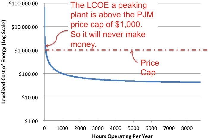
Figure 12.4 basically illustrates the conundrum: someone needs to build the plant for reliability reasons. But because of price caps and fixed retail pricing, no one would ever make money operating this plant. We are stuck in a contradiction – the system operator needs to maintain its installed capacity margin, but no power generation company has any incentive to build the plants that will meet this regulatory requirement.
In electric systems that have not restructured, this isn’t so much of a problem since the regulated utility can ask its public utility commission to pass through the costs of this plant to its ratepayers. But in a deregulated generation environment, there is no guarantee of cost recovery. This conundrum is sometimes called the “missing money” problem. Capacity payments are supposed to solve this problem by providing additional revenue to power plants to keep them operating. It is important to realize that capacity payments have been incredibly controversial since they are sometimes viewed as windfall profits for power generators.
To see the relevance to VER integration, let’s take our example of the uniform price auction from the previous lesson. In that example, we have five generators and demand is 55 MWh. Generator D clears the market and the SMP is $40/MWh. Profits are:
- Firm A: $300
- Firm B: $375
- Firm C: $200
- Firm D: $0
- Firm E: $0
You can see how Firm D might have a “missing money” problem since it produces electricity but earns no profits. If Firm D is the “marginal generator” too often, it will not be able to cover any fixed costs and will eventually go out of business. (We didn’t have fixed costs in the example, but most power plants do have some fixed costs of operation, like land leases or other rental payments.)
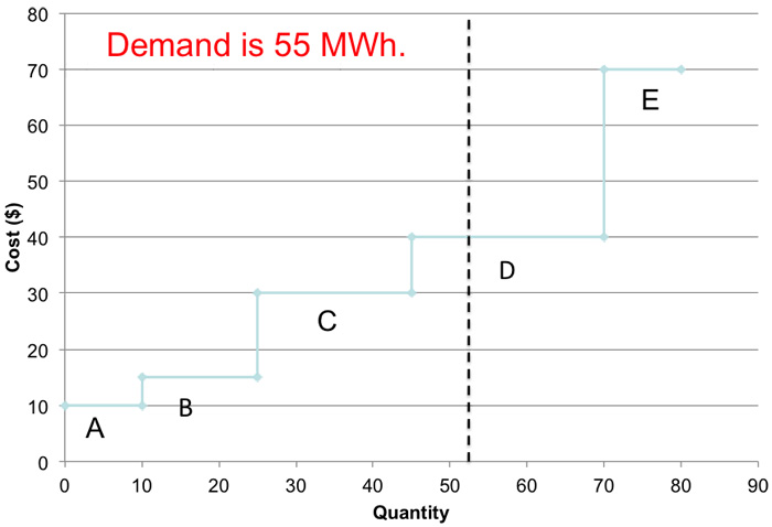
Now suppose that a 20 MW wind plant was built in this market. Wind energy has a very low marginal cost – so close to zero that we can just call it zero for this example. This new wind energy plant moves the entire dispatch curve to the right by 20 MW. If the wind is producing at full capacity and demand is 55 MWh, then Firm C becomes the market-clearing generator and the SMP falls to $30/MWh. (The 20 MW of wind with zero marginal cost has the same effect on Firms A through E as a 20 MW decline in electricity demand – why?) Try recalculating profits yourself under this scenario. You should get:
- Firm A: $200
- Firm B: $225
- Firm C: $0
- Firm D: $0
- Firm E: $0
- Wind Farm: $600
While it is nice that the wind farm’s profits are so high and that the wholesale price of power has fallen, three of the five existing generating firms are not making any profit and might consider shutting down altogether. But according to reliability rules, we need those plants to be operating in order to have enough bulk generation capacity. Because of this requirement, the wind farm has effectively instigated a “missing money” problem for some of the other generators in the system. Hence, there is some need for a capacity payment or other revenue stream, but only because of the regulatory requirements for installed capacity.
To figure out what the capacity payment needs to be for a specific generator, we can compare its revenues to its total costs. The difference represents the capacity payment needed for the power plant to break even. Consider two cases as an illustration. First, suppose that Firm C in our example above had fixed costs of $100. With the wind plant in the market, Firm C breaks even on its operating costs (the SMP is $30 per MWh and its production cost is also $30 per MWh) but covers zero of its fixed costs. So, the capacity payment needed for Firm C would be $100. As a second example, suppose that Firm A had fixed costs of $250. With the wind plant in the market, Firm A earns $200 in operating profit, but its fixed costs are $250. Its total profit would thus be -$50 and Firm A would need a capacity payment of $50 in order to break even.
Finally, suppose that Firm B had fixed costs of $100. With operating profits of $225, Firm B earns a total profit of $225 - $100 = $125. Thus, Firm B is profitable even without a capacity payment. Does that mean that Firm B is not allowed to earn a capacity payment in the electricity market? No - Firm B can compete in the capacity market and earn a capacity payment just like any other power plant. While the capacity market was set up because some power plants (like A and C in our illustrations) have revenue shortfalls, participation in the capacity market is not limited just to those plants who "need" a capacity payment to avoid losing money.
You might be wondering what happened to the 20 MW of new wind – doesn’t that count as “capacity?” The answer is that different regions have very different ways of allocating capacity credits to VERs. Typically, the system operator will let a VER count for a fraction of its capacity. So, our 20 MW wind farm in this example would count for perhaps 2 or 3 MW towards the system-wide installed capacity requirement.
In some areas with a high penetration of VERs, particularly wind, the price of electricity has started to become negative, meaning that suppliers must pay the system operator in order to keep producing electricity. This also means that consumers get paid to use more electricity, which sounds like a terrific deal. Here’s how such a thing is possible. Mount Storm Lake in West Virginia is home to both a large coal plant (one of the biggest in the state) and a large wind farm. These plants are connected to the same transmission line that winds its way towards Washington D.C. This transmission line is almost always congested, so the Mount Storm group of power plants cannot always produce at full combined capacity. During an autumn evening, when electricity demand is low, the Mount Storm coal plant is producing at full capacity and meeting electricity demand. All of a sudden, the wind picks up and the Mount Storm wind farm starts to generate a lot of power and there is excess supply at Mount Storm. What options does the system operator have? It could simply shut down the coal plant (which would be hard to do quickly since coal plants are inflexible) or shut down the wind farm (which, as you saw in Vermont, is not without its own problems). Or it could allow the price to go negative and charge either (or both) plants to continue to produce electricity. If there happened to be some electricity consumer at Mount Storm, that consumer could get paid for absorbing that excess supply locally.
Ancillary Services
Ancillary Services
In a power grid, supply and demand must be matched at every second. In order to keep the grid operating reliably, system operators need a portfolio of backup resources in case of unplanned events. These backup resources are collectively known as “ancillary services.” These are purchased by the system operator through a type of option arrangement. The system operator might have an agreement with a power plant that gives the system operator the right to start up or shut down that plant if a contingency arises on the power grid, or if demand increases or decreases in ways that the system operator did not predict.
A very simple example of how this might work is shown in Figures 12.6 and 12.7. Figure 12.6 illustrates a hypothetical power system with some amount of predicted or “scheduled” demand. Actual demand deviates from this scheduled demand by small amounts – sometimes higher and sometimes lower. Figure 12.7 shows how a generator providing ancillary services would change its output in response to demand fluctuations – a practice known as “load following.” Ancillary services are the primary mechanisms currently in place for system operators to accommodate unanticipated variations in VER output.
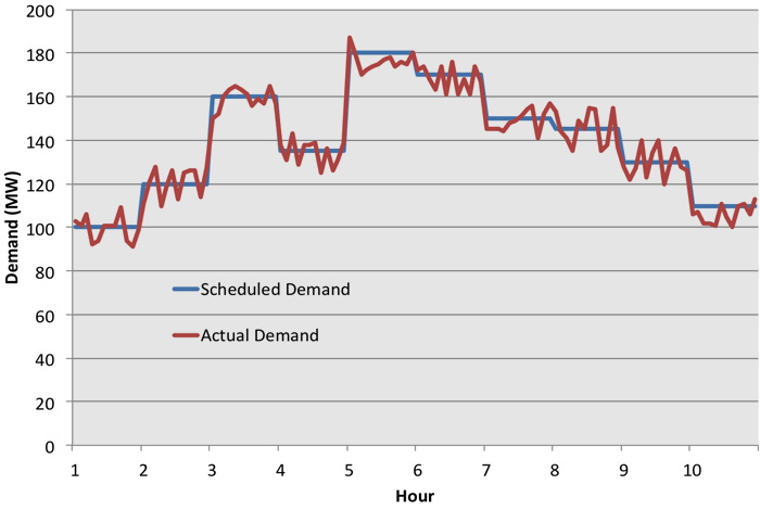
There are many different flavors of ancillary services. Please read the “Ancillary Services Primer” which provides some more detailed information. Two types of ancillary services are of particular relevance for VER integration – reserves and regulation.
“Reserves” represent backup generation that can be called upon in a certain amount of time in case of a contingency on the power grid, like the unexpected loss of a generator or transmission line (interestingly enough, it’s not clear whether or not the unanticipated loss of a VER for resource reasons, like the wind stops blowing, is considered a “contingency” in the eyes of reliability regulators). There are two types of reserves:
- Spinning Reserves: Generation that is synchronous with the grid (“spinning”) and is able to increase power in 10, 30, or 60 minutes (depending on the flavor).
- Non-spinning reserves: Generation that can start up and provide power within a specified time frame (usually 30 or 60 minutes).
“Frequency regulation” or just “regulation” refers to the generation that can respond automatically to detected deviations from the frequency at which all generators in a synchronous AC system are rotating (in the US, this is 60 Hertz; some other countries use 50 Hertz). Regulation is sometimes called “automatic generation control” since the response is typically too fast for a human being to initiate.
Regulation is, at this point in time, the most relevant ancillary service for VER integration and is also one of the most difficult to understand. The frequency of the power grid needs to remain constant at 50 or 60 Hertz (depending on the country). That frequency is related to the demand-supply balance. It may be helpful to think about frequency as analogous to the water level in a bathtub, as illustrated in Figure 12.8. The balance of demand and supply is like the tub having an identically-sized faucet and drain. If the faucet is larger than the drain, the water level rises – and in a power grid if the supply is larger than the demand, then the frequency will go up. If the drain is larger than the faucet (or if demand exceeds supply), then the system frequency declines.
Frequency regulation as an ancillary service corrects for frequency deviations by increasing or decreasing the output of specific generators, usually by small amounts, in order to effectively increase or decrease the size of the faucet relative to the drain. Response times for generators providing regulation are typically on the order of seconds, which is primarily why frequency regulation is used as a way for system operators to ride through unanticipated fluctuations in VER output.
Demand Response in Electricity Markets
Demand Response in Electricity Markets
Recall from the Ancillary Services discussion that generators are used to provide frequency regulation by effectively increasing the size of the faucet relative to the drain. There is no particular reason that generators need to have a monopoly on this. If we were to change the size of the drain relative to the faucet, we would accomplish the same thing, right?
The idea of balancing supply and demand on the demand side rather than solely on the supply side is not that new – electric utilities have been paying their customers to put timers on thermostats or hot water heaters for decades. Some utilities have even figured out how to charge customers more for electricity during the day than at night. But following an order from the Federal Energy Regulatory Commission in 2012 (Order 745), there has been a renewed interest in developing mechanisms to pay people and businesses not to consume electricity. “Demand Response” refers to end-use customers adjusting demand in response to price signals, or energy conservation during periods of high demand (to prevent blackouts). Many electricity systems, particularly those with active wholesale markets, have implemented wholesale demand response programs that allow customers to offer demand reduction on the same basis that generators offer supply. There are two basic flavors of demand response:
- “Economic” Demand Response: You make a negative supply offer to the system operator, and you can then be “dispatched” to reduce demand. The system operator then pays you for reducing demand, relative to some measured “baseline.”
- “Capacity” Demand Response: You give the system operator the right to call upon you to reduce demand during reliability emergencies; typically on hot days during the summer.
Many electricity systems, both regulated and restructured, are also experimenting with allowing demand-side participants to offer ancillary services such as frequency regulation (remember the bathtub analogy and you will see that, at least in concept, this is a perfectly sensible idea). But to date, the vast majority of demand-side participation, and over 90% of all of the profits from demand response, has been through the capacity market. Figure 12.9 illustrates the rapid growth in demand-side capacity market participation. In recent capacity auctions, the largest source of new “capacity” was actually commitments to reduce demand rather than increase supply. This figure shows how the components of the PJM Base Residual Auction (BRA) for installed capacity (ICAP) changed over the years 2007-2015. The left side of the figure shows the components of capacity reductions in the form of retirements, derates, et cetera. The right side shows the components of the capacity additions in the form of new generation, demand response, et cetera.
The result has been to introduce volatility into capacity market pricing. Just as the introduction of VERs lowered the price in the electricity market in our previous example, so too has demand response lowered prices in the capacity market, to the point where generators have started to complain of a “missing money” problem in the capacity market as well!
The primary piece of regulation that has enabled demand response in electricity markets is known as FERC Order 745 [146], which mandated that Regional Transmission Organizations compensate demand response at the prevailing market price under most conditions. This means that if you successfully offer electricity demand reduction to the RTO, you benefit twice. First, you benefit by not having to pay for the electricity that you did not consume. Second, you benefit because the RTO pays you the prevailing market price for all of that foregone consumption.
Because of the way that Order 745 has mandated that demand response be paid, it has been very controversial, so much so that it was successfully challenged in May of 2014 before the U.S. Circuit Court in Washington, DC. You can read the entire ruling here [147], but the gist of the arguments against Order 745 were as follows:
- Paying demand response the prevailing market price is arbitrary and not justified by the value that it provides to the market;
- Because demand response market participants are retail electricity customers, connected to the low-voltage local distribution grid, the U.S. federal government has no jurisdiction to set prices for those customers. Instead, that is the responsibility of the states.
The D.C. Circuit Court agreed with both of these arguments and overturned FERC Order 745, effectively removing economic demand response as a participant in U.S. electricity markets. In a moment that captured the attention of electric power industry geeks everywhere, the D.C. Circuit Court decision was appealed to the U.S. Supreme Court [148], which overturned [149]the Circuit Court decision and allowed demand response to be paid the same way that power plants get paid. If you happen to be a legal junkie, you might like to read the Supreme Court's decision [150], which has had implications for a lot of different smart grid technology programs run by regional power markets.
Lesson 12 Summary and Final Tasks
Lesson 12 Summary and Final Tasks
Variable Energy Resources (VERs) - specifically wind and solar - do introduce some special economic challenges to power grids and electricity markets. Since VERs have such low marginal costs (remember that fuel from the wind and sun is free) they do have the potential to depress prices in the day-ahead and real-time energy markets, even producing negative prices in some cases. This creates challenges for system operators in restructured areas in particular, since they are charged with having enough generation capacity on the grid to meet reliability requirements, but individual generation owners will stay in the market based only on business criteria - whether they earn enough money to make continued operations worthwhile. The resulting conflict between market and regulatory signals has been called the "missing money" problem, and capacity payments have been introduced, albeit controversially, as a mechanism to make up for the "missing money." Energy output from VERs can also fluctuate faster than system operators are able to adjust for, so large-scale VER integration will almost certainly increase the demand for existing ancillary services (particularly frequency regulation) and may necessitate new types of ancillary services, which could be provided by either demand-side or supply-side resources.
Reminder - Complete all of the Lesson 12 tasks!
You have reached the end of Lesson 12! Double check the What is Due for Lesson 12? list on the first page of this lesson to make sure you have completed all of the activities listed there before you begin Lesson 13.
Lesson 13 - Economic Challenges in the Integration of Renewable Resources, Cont'd.
The links below provide an outline of the material for this lesson. Be sure to carefully read through the entire lesson before returning to Canvas to submit your assignments.
Lesson 13 Overview
Overview
In our last Lesson, we touched on the challenges of the integration of intermittent generating resources into the power grid. We will continue the discussion of these challenges, add some more concepts, and discuss some real world examples of the types of issues we now confront and some of those we will confront in the future. The lesson is pretty heavy on readings from research and academia this week. This is to be expected, as we are dealing with major transitions, here. One thing you can be sure of - the readings will be foundational, but also out of date fairly shortly. Certain problems will persist, while others will be solved. The motivation for the inclusion of these papers is to show the current state of affairs while also allowing you to place the best thinking about these problems in context.
Learning Outcomes
By the end of this lesson, you should be able to:
- Define energy storage and its many forms
- Explain why transmission of energy is such an important topic
- Suggest ways that ancillary services could be provided to the grid and by what assets
- Explain the Duck Curve
- Explain the Falcon Curve
- Discuss how storage, transmission, and the evolving grid fit into your project
Reading Materials
There are a lot of good resources
- N.A. (2022). 3 Key Takeaways from New Study on Building Electrification - Introducing the Falcon Curve [151]. Harvard T.H. Chan School of Public Health.
- Buonocore, J., Salimifard, P., Zeyneg, M., and Allen, J. (2022). Inefficent Building Electrification Will Require Massive Buildout of Renewable Energy and Seasonal Energy Storage [152]. Nature.com/Scientific Reports.
- Jones-Albertus, B. (2017). Confronting the Duck Curve: How to Address Over-Generation of Solar Energy [153]. Office of Energy Efficiency & Renewable Energy.
- N.A. (2023). Flattening the Duck Curve with Vertical Solar Panels [153]. Sunzaun Verticle Solar Systems.
- Pitra, G., and Sastry, M. (2022). Impact Analysis of Duck Curve Phenomena with Renewable Energies and Storage Technologies [154]. Journal of Engineering Research and Sciences.
- US Energy Information Administration (2023). As Solar Capacity Grows, Duck Curves Are Getting Deeper in California [155]. Eia.gov website.
- Seel, J., Millstein, D., Milles, A. et al. (2021). Plentiful Electricity Turns Wholesale Prices Negative [156]. Lawrence Berkeley National Laboratory.
- N.A. (2023). Types of Energy Storage [157]. New York State Energy Research and Development Authority.
- N. A. (2023). Tackling High Costs and Long Delays for Clean Energy Interconnection [158]. Office of Energy Efficiency & Renewable Energy.
- N.A. (2022). Solar-Plus-Storage: 3 Reasons Why They're Better Together [159]. UtilityDive.
- Please watch the following interview with Ben Kroposki (26:43). If this video is slow to load here on this page, you can always access it and all course videos in the Media Gallery in Canvas.
Interview with B. Kroposki by M. Kleinginna © Penn State is licensed under CC BY-NC-SA 4.0
- Please watch the following Solar Podcast video (57:47): Grid Interactive Buildings with Mark Kleinginna and Jared Rodriguez. If this video is slow to load here on this page, you can always access it and all course videos in the Media Gallery in Canvas.
Continental Energy Solutions. "Grid Interactive Buildings with Mark Kleinginna and Jared Rodriguez/Solar Podcast Ep. 98." YouTube. April 27, 2021.
What is due for Lesson 13?
This lesson will take us one week to complete. Please refer to the Course Calendar for specific due dates. Specific directions for the assignment below can be found within this lesson.
- Complete all assigned readings and viewings for Lesson 13
- Complete Quiz 10
- Project work: No deliverables this week
Questions?
If you have any questions, please post them to our Questions? discussion forum (not email). I will not be reviewing these. I encourage you to work as a cohort in that space. If you do require assistance, please reach out to me directly after you have worked with your cohort --- I am always happy to get on a one-on-one call, or even better, with a group of you.
Energy Storage
Energy Storage
The notion of energy storage is fairly straight forward and simple from a business context. In business we would call it “inventory.” This is the notion that we should have enough supply in stock to meet demand on a timely basis. In the context of a supermarket, the grocer would have a certain number of cartons of eggs, for instance, so that throughout the day as customers showed up, there would be eggs available to be bought. Energy as a good is slightly different from eggs, though. Certain forms of energy can be stockpiled or inventoried like gasoline in your car’s tank or natural gas in a storage reservoir. Other forms of energy must be produced at exactly the same time as they are consumed. This is mainly true for electricity, which must be balanced on any hourly basis. Natural gas loads are balanced with supply on an hourly basis as the commodity can be stored and pressures can fluctuate to allow for peaks and troughs in delivery. The storage of energy allows us to match supply with demand on a timely basis (instantaneously, hourly, daily, seasonally, annually).
In the case of natural gas we have a storage network by state that looks like this in the US:
| Billion Cubic Feet | States |
|---|---|
| 0 | NV, ID, AZ, ND, SD, WI, ME, VT, NH, MA, RI, CT, NJ, NC, SC, GA, FL |
| 1-150 | WA, OR, WY, UT, CO, NM, NE, KS, MN, IA, MO, AR, IN, KY, TN, AL, VA, NY |
| 151-300 | MT, OK, MS, OH, WV |
| 301-450 | CA, IL, PA |
| >450 | TX, LA, MI |
Check out the US Energy Information Administration site's Natural Gas page [160] for some interesting discussion about natural gas storage.
In terms of the types of storage and the locations, please see the map below (Figure 13.2).
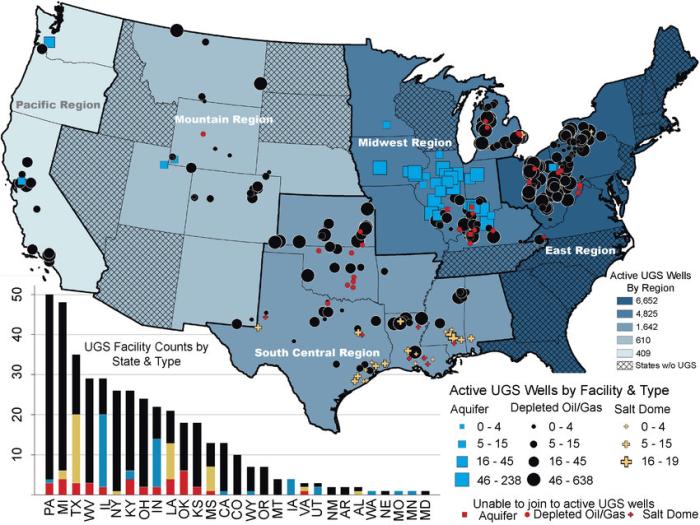
This US map shows active UGS wells by region, active UGS wells by facility and type, and UGS facility counts by state and type. Most active UGS wells are in the Eastern, Midwestern, and South Central regions of the US. Active UGS wells include aquifers, depleted oil/gas wells (PA, MI, and TX have most), and salt dome wells. Most aquifers are located in the Midwest (IL has most), most depleted oil/gas wells are concentrated in the Mid-Atlantic region, and most salt dome wells are in the Gulf region (TX, LA, and MI have most).
Natural gas can be stored in underground caverns for release on a seasonal, monthly, daily and intra-day basis. The need to balance the system is not necessarily instantaneous, but there does need to be gas available to meet sudden increases in demand (usually due to cold weather).
The electricity grid, though, must be able to meet increases and decreases in demand on an instantaneous basis. This means that until recently, almost all fluctuations in electricity demand were met by ramping a power plant up or down. With the advent of intermittency on the generation side, the value of the ability to meet less predictable fluctuations has increased the interest in electricity storage. Please see the diagram below for insight into the technologies being considered as we transition to a more flexible energy delivery system. The diagram shows how various technologies are positioned to provide services to the electricity grid. On the x-axis is depicted the scale in terms of the capacity of the resource in Ws. On the y-axis, we see the temporal ability of the resource in terms of seconds, minutes, and hours. The selected technology then appears at an intersection of those two variables (capacity and size). For instance, a nickel-cadmium battery can provide up to 200 kW in the second-to-minute range, making it a good resource to provide Uninterrupted Power Supply (UPS) or Power Quality services.
The diagram shows how various technologies are positioned to provide services to the electricity grid. On the x-axis there is depicted the scale in terms of capacity of the resource in Ws. On the y-axis we see the temporal ability of the resource in terms of seconds, minutes and hours. The selected technology then appears in an intersection of those two variables (capacity and size). For instance, a nickel-cadmium battery can provide up to 200 kW in the second to minutes range making it a good resource to provide Uninterrupted Power Supply (UPS) or Power Quality services.
Energy Transmission and Interconnection
Energy Transmission and Interconnection
One of the most important issues in the renewable energy transition is that posed by the ability of the grid to accept the great quantity of renewable resources required for decarbonization. The issues can be broken down into two major categories. The first is location. We have discussed transportation basis differential in previous lessons, and it plays an important role in the integration of renewable resources as well. It is simply a fact that the renewable resources are not necessarily located near the energy loads. Supply and demand are separated by space. (Much of the electric load in the US is located near the coasts, while much of the wind resource is located in the Mid-Continent or off-shore. There is a great solar resource in the desert of Arizona without a really significant load there.) Consequently, the interstate electric transmission grid will need to be built out to a significant degree for the loads intended to be met with electricity to be served. This is not always an easy process as transmission paths can be disputed and new transmission is expensive to build.
The second issue is variability. Intermittent renewable resources like wind and solar do not respond to grid dispatch commands the way that on-demand combustion and steam turbines do. Since most renewable resources are not currently dispatchable and actually may become available in large quantities at inconvenient times, there comes a place for increased levels of ancillary services provided by the transmission grid. These services take the form of frequency response, spinning and non-spinning reserve. Sometimes these services can be supplied by shifting loads, electric and thermal storage, but very often by dispatchable gas or diesel fired combustion turbines. These combustion turbines are often very carbon intensive, and if we are to reduce the carbon footprint of the electric grid, it becomes essential to try to move to supplying these ancillary services from other sources. This is one of the reasons we are starting to see greater deployment of battery storage with solar and wind.
Current Integration Issues
Current Integration Issues
The Duck Curve
The Duck Curve is a classic example of having a lot of something when you might not need it as much as you used to. In California, electricity loads peak in the mid-day when commercial and residential air conditioning peaks as a result of warm weather. This mid- to late-afternoon peak coincides quite nicely with the fact that the solar resource is also at its greatest when the sun is high in the sky. The electricity generation eco-system in California responded by building a lot of roof-top, commercial and utility scale solar to capture this resource as well as meet environmental energy generation targets. This led to a significant proliferation of solar generation, which provided huge amounts of energy in the middle of the day, thereby depressing the mid-day peak and moving it to the late afternoon with a significant ramp. Please see the figure below, which shows the net loads on the CAISO during the March-May time frame. Kind of looks like a duck, no?
This graph shows, in gigawatts, CAISO's lowest net load day each spring for March through May from 2015 - 2023. The x-axis shows time of day and the y-axis shows gigawatts from 0 to 25 in increments of 5. The general form of the lines on the graph (one for the trend for each year, 2015 - 2023) takes the form of a duck's silhouette (raised tail, low belly, high head and beak - it looks like a wide letter U). The data shows that the lowest loads always occur at mid day, and that the curve has been getting steadily deeper since the spring of 2015. The lowest gigawatt measure in the spring of 2015 was about 15 (at around 2 pm) but has continually dipped and hit 0 gigawatts at around 1 pm in the spring of 2023.
This phenomenon poses two significant problems for the energy market. First, grid stress - the system has to be able to meet that ramp in net usage from HE1600-HE1900 which is very steep. Second, economics - how does the market price a resource for which there may be zero demand, as is shown above?
The Falcon Curve is a potential problem that we could face as we start to electrify heating and domestic hot water in the cold climates around the world. A significant portion of the energy consumed in the northern states and in Canada goes to provide heating in cold climates. One very simple decarbonization strategy for the decarbonization of heating is the installation of air source heat pumps. This strategy appears attractive currently because the electric system is built to provide enough electricity for a currently high summer peak. So currently, there is enough electric system transmission and distribution capacity to meet demand for the addition of a certain level of air source heat pumps. Unfortunately, these air source heat pumps do not operate as well when temperatures get lower. As we approach a greater saturation rate with air source heat pumps, virtually all systems will become winter peaking, which will cause the annual energy demand to be much higher than it currently is in the winter months. This phenomenon was actually experienced in Texas in February 2021 during Winter Storm Uri when electric heating demand skyrocketed when temperatures plummeted. If there had not been blackouts, it is entirely possible that the Texas grid would have posted an all-time peak in the winter even in a climate as usually warm as Texas is. The curve below kind of looks like a Falcon, eh?
The Falcon Curve, the silhouette of which (sort of) resembles a bird in flight -- lifted wings on either side of a head - shows that if we electrify, then during cold months, our energy usage will become much greater than it currently is in the summer months. Consequently, when we graph this useage on an annual basis, it etches out a silhouette resembling a falcon.
The challenges of renewable energy integration are many, but these examples provide a look at how people are thinking about them. I challenge you as a student of EME 801 to begin to use some of the tools we developed in class and during the project to think about challenges you face and how you might meet them. Enjoy.
Lesson 13 Summary and Final Tasks
Summary and Final Tasks
Summary
In this lesson, we have presented a few of the problems with the integration and development of renewables as they exist in the current environment. As the energy transition continues, some of these will be solved, some will be exacerbated and others will emerge. The skills developed and honed in this course will allow you to think critically about them and help to solve them.
Reminder - Complete all of the Lesson 13 tasks!
You have reached the end of Lesson 13! Double check the What is Due for Lesson 13? section of the Lesson 13 Course Overview page. Complete the quiz and remember and rejoice - there is no deliverable due for Lesson 13.... but please continue to work on your project!
Note: Lesson 13 is the final lesson of new content for EME 801.