
Reading Assignment - Energy Primer
Please review the Energy Explained portion of the USA Dept. of Energy's Energy Information Administration website.
When you are reading, I want you to focus on Forms of energy, Sources of energy, and Supply (production) vs. Demand (consumption) of energy. These four terms are simple but very specific. One thing that you can use to remember them: energy is neither created nor destroyed, but can be transformed from one form to another, and we call our sources of energy resources. The economics of energy is also directly discussed in terms of supply and demand.
Energy Demand in USA Society
We believe the global demand for energy in its various forms will keep rising, spurred on by an expected increase in population and industrialization of many developing countries. Policy makers, entrepreneurs, and scientists will be faced with serious questions on how to produce and deliver required energy to consumers. But focusing in on the USA, how does a country use energy where local population growth is smaller and energy use has been outsourced to other developing nations?

Bottom of chart displays dates from approximately 1775 to nearly 2010, marked in increments of 10 years. The left side of chart displays Energy consumed in Quadrillion BTUs, marked in increments of 5 Quadrillion BTUs. Six types of fuel are displayed on the chart: Wood, Coal, Petroleum, Natural Gas, Nuclear, and Hydro.
Wood begins at a little above 0 Quadrillion BTUs in 1775 and stays low, rising to only about 4 at its peak in about 1870.
Coal begins at a little above 0 Quadrillion BTUs in about 1850, becomes the primary fuel source from about 1883 -1950, rising to a height of about 17 Quadrillion BTUs in the 1920s and 1940s (with a dip in the 1930s), suffers another dip from about 1950-1960 (during which time petroleum and natural gas were gaining great ascendency), then rises again to about 22 Quadrillion BTUs by the early 2000s. Coal begins dipping again as the chart ends near 2010.
Petroleum begins at about 1 Quadrillion BTUs in about 1900 and starts to rise sharply by about 1917. By 1950, it equals coal at about 12 -13 Quadrillion BTUs. Petroleum continues to rise sharply, reaching a peak of close to 40 Quadrillion BTUs in the early 2000s. Petroleum begins dipping again before the chart ends near 2010.
Natural gas is close to 1 Quadrillion BTUs in about 1920. Its usage rises to about 23 Quadrillion BTUs by about 1970 before dipping in the 1970s, then rising again to about 23 Quadrillion BTUs by the end of the chart.
Nuclear begins at just above 0 Quadrillion BTUs a little before 1950, stays steady until close to 1970, then begins rising slowly to a peak of about 7 Quadrillion BTUs by the end of the chart.
Hydro begins at just above 0 Quadrillion BTUs in 1775 and stays low, rising to about 4 Quadrillion BTUs at its peak in the late 1990s.
Trends and milestones in the past few centuries
1880 to 1920:
- Farming work displaced by machines (industry).
- USA urban population grows from 28% to 50%.
1883:
- Fossil fuel combustion (coal) equal to biofuel combustion (wood).
1950-1980 (Post WWII):
- US urban population growth slows.
- Cars and highways lead people to the suburbs.
- Manufacturing decreases (outsourcing energy).
2010:
- Renewable energy surpasses nuclear power: exponential growth of the renewable industry kicks in hard!
- Wind surfaces as a large renewable energy player.
- Solar emerging: Decentralized solar power is rapidly expanding on rooftops ("behind the meter")
2010-2020:
- Emergence of 100% renewable cities and communities – USA: Rock Port, MO (2008); Greensburg, KS (2013); Burlington, VT (2014); Kodiak Island, AS (2014); Aspen, CO (2015); Georgetown, TX (2018). More than 40 cities globally. (CleanChoice Energy, 2024)
2019:
- Solar energy system costs hit historic lows, falling ~70% over the 2010-2020 decade, to become economically competitive with other energy sources.
- Significant growth of solar installed capacity: total new electric capacity increased from 4% in 2010 to 40% in 2018 in the USA.
2020:
- Globally, renewable sources demonstrated the fastest growth over the past two decades reaching over 11% contribution to the global energy mix.
Year Fossil fuels Wood biomass nuclear renewables 2000 77.3% 10.2% 5.9% 6.6% 2020 78.0% 6.7% 4.0% 11.2% Source: World Economic Forum, 2022
The Big Picture
Click here to see the larger version of this chart.
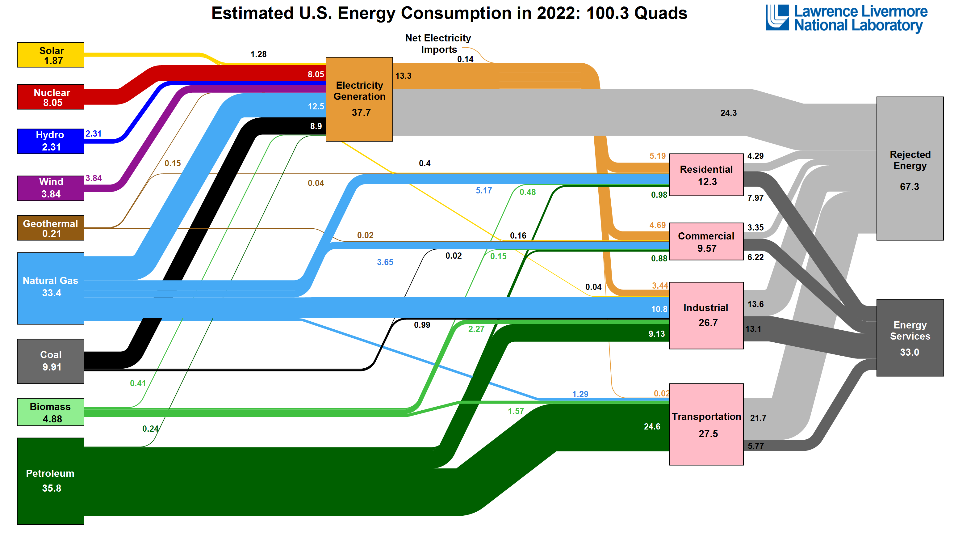
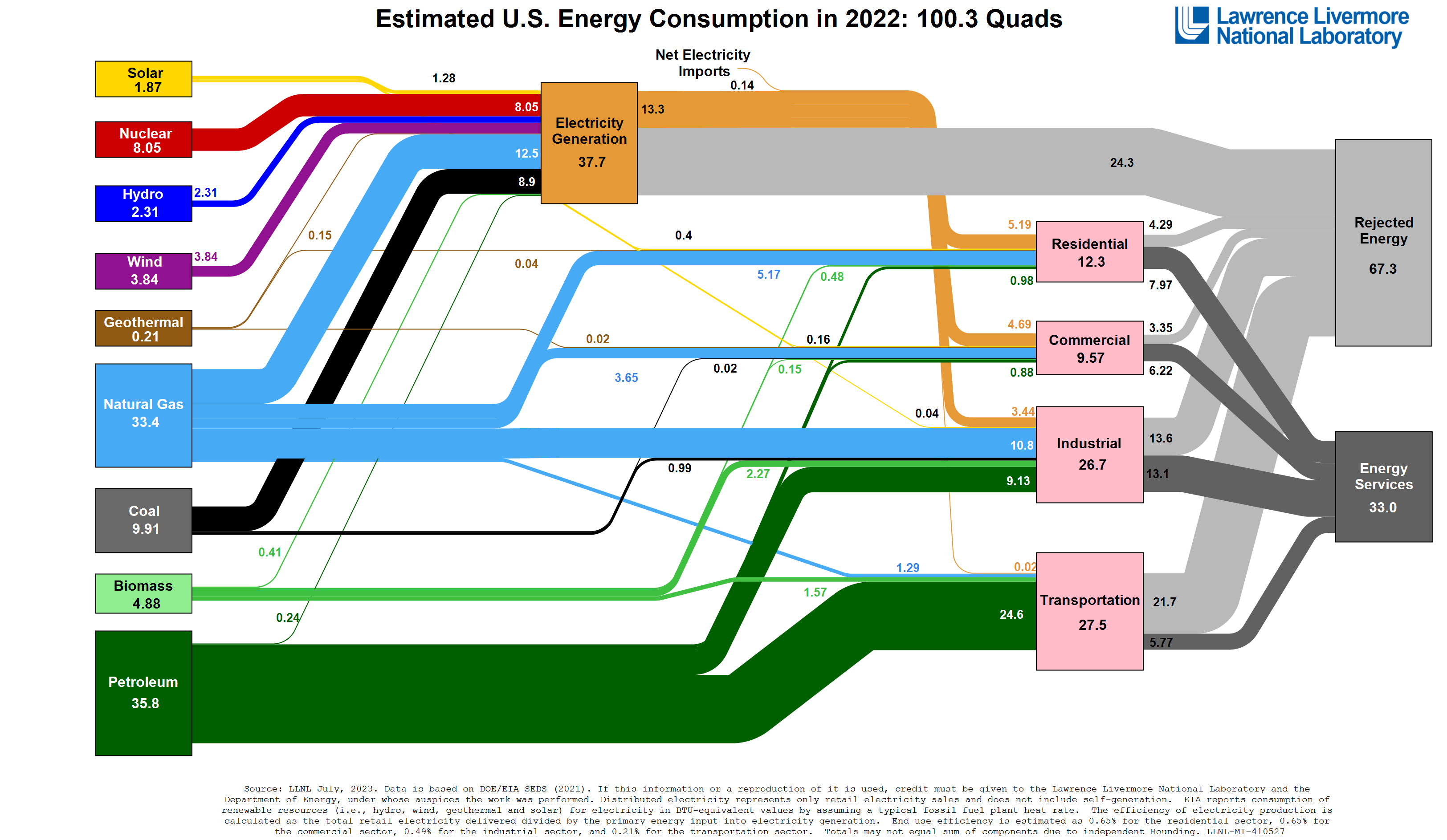
This annual energy flow chart shows the total energy generated by different sources and consumed by different sectors. The units used here are quadrillions of Btu’s (“quads” for short) indicate massive amounts of energy used at the national scale.
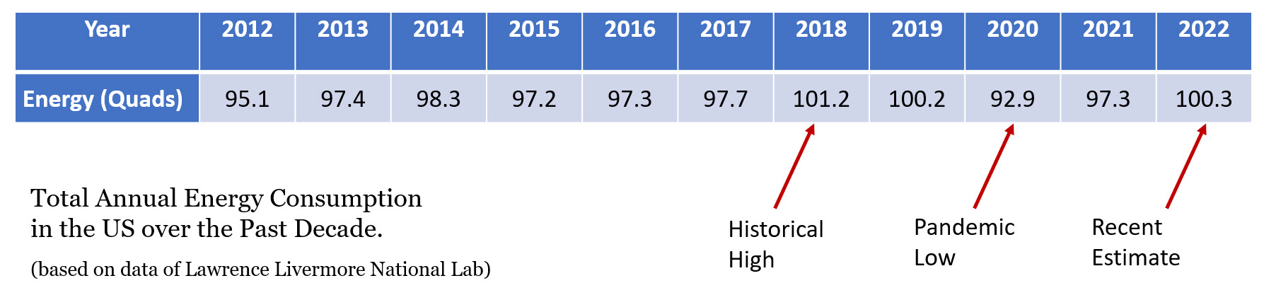
The total estimated energy consumption in the US in 2022 is around 100 Quads, and this number is on the upper end of the typical consumption bracket:
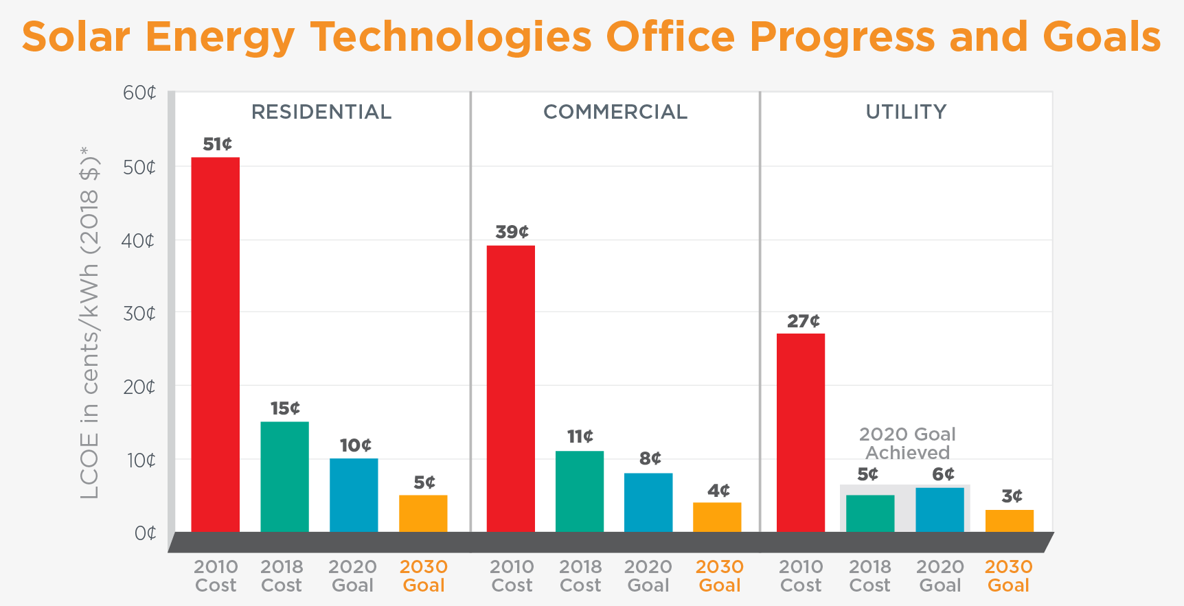
The contribution of solar energy has not yet approached the magnitude of traditional fossil fuel sources in the US, however its contribution to the renewable share of the electricity generation is actually substantial.
Let’s crunch some numbers:
National Electricity Mix
Total renewable energy share (including solar, wind, hydro, biomass, and geothermal) in the electricity sector sums up to 7.9 Quads (21%), which is comparable to 8 Quads (22%) for nuclear energy, 8.9 Quads (24%) for coal, and 12.5 Quads (33%) for natural gas. That is about 1/5 of the entire national electricity mix. If we look back at similar data for the year of 2012, renewables only accounted for 12% at that time.
What sources are fastest growing?
Comparing the data from the historical energy data from a decade ago (2012) and the most recent (2022), the fastest growing generation capacities are solar, wind, and natural gas. Nuclear remained steady, hydropower and geothermal showed small decline, biomass – small increase, and coal was on significant decline over these ten years.
Summarizing the trends:
| Sector | Growth from 2012 to 2020 |
|---|---|
| Solar | + 698% |
| Wind | +182% |
| Natural Gas | +28% |
| Biomass | +13% |
| Nuclear | 0% |
| Geothermal | - 7.5% |
| Hydropower | - 14% |
| Coal | - 43% |
Look up the historical versions of energy flow charts here.
By a big margin, solar has been the fastest growing source (almost 7-times growth!) in the national energy industry. The impacts were primarily seen in the residential and commercial sectors, which in addition to the grid may benefit from the distributed generation options (small-scale and off-grid installations).
Projections
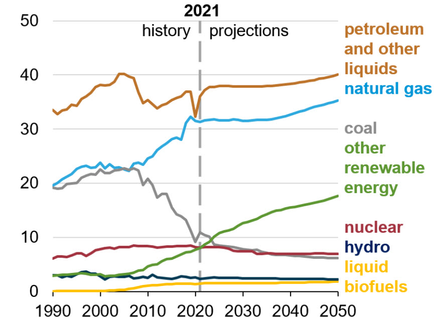
Projections shown in this plot are based on the analysis of energy markets by EIA: “we project that renewable energy will be the fastest-growing U.S. energy source through 2050. Policies at the state and federal levels continue to provide incentives for significant investment in renewable resources for electricity generation and transportation fuels. New technologies continue to lower the cost to install wind and solar generation, further increasing their competitiveness in the electricity market, even as the policy effects we assume level out over time.”
“We project that consumption of natural gas will keep growing as well, maintaining the second-largest market share overall. The expected growth in natural gas consumption is driven by expectations that natural gas prices will remain low compared with historical levels.” (EIA, AEO2022)
Major Players
In the past century, society has been dependent on combustible products such as coal, natural gas, and petroleum products as the fuels of choice. While these energy sources are relatively cheap, they are not always available or located where we most need them, and they are non-renewable. In addition to this, there are real concerns about the effects burning these products could have on human health and safety as well as large impacts on the environment in general. The following are geofuels (resources from the Earth that are non-renewable).
- Coal (fossil fuel)
- Petroleum derivatives (fossil fuel)
- Natural Gas (fossil fuel)
- Nuclear (fissile fuel)
Nuclear energy is an additional geofuel that does not have a major CO2 impact and is a major resource in countries like France. However, it has a strong "yuck factor" for the majority of society in Germany and the USA. It has the additional challenge of undesirable proliferation of fissile material for arms use. Again, there are numerous countries including the USA that make use of nuclear power for low-CO2 energy, but infrequent, high-visibility events such as Three-Mile Island, Chernobyl, and Fukashima Daiichi continue to influence popular will to invest and develop the resource.
Renewable energy sources provide a suitable alternative to using fossil fuel combustion (which generates CO2) to meet our energy needs. The well-planned use of renewable energy sources such as solar energy must form a part of the portfolio of energy sources. There are numerous real challenges for renewables like solar, such as intermittency and diurnal cycles (night-day), as well as the ability to identify economic opportunities, which is why we are putting a lot of effort into understanding the solar resource and the related economics in this course.
Energy production and CO2 production—link to population
The following link uses Gapminder World to show the increases in cumulative CO2 production through time associated with population growth. Click on the link and press "Play" in the bottom left of the diagram:
You can explore this tool later and create your own plots with respect to time. For example, if you were to plot energy production (Supply) or use (Demand) you would see the same trend, or if you were to plot cumulative CO2 (log) vs. total energy production (log), they would show a rough linear correlation. But, for now, I want you to see where there are links between population, energy production, and CO2 production. Why is the USA more or less stable in its CO2 production?