
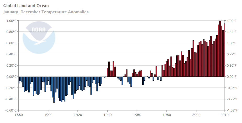
Everything we've talked about in class up until this point has been predicated on the notion that our climate is changing. But what does that change look like exactly? Let's take a closer look at some longitudinal data to get an idea of how the climate is changing over time. This can be a difficult concept for people, especially relatively young people to grasp because our experience with climate is really more about our experience with weather. And, if you're like me and you were born after about 1978, you'll notice on the graph below that we've not been alive for a year with lower than average global average temperature. So, effectively, our norm, and the Earth's new norm, is already warmer than it should be, and so our individual anecdotal recollection of climate is all based on evidence that's already above the average.
 In the fall of 2018, the IPCC released a special report (Global Warming of 1.5 Degrees Celsius) sounding the alarm on the urgency with which we must act if we want to contain warming to 1.5 degrees Celsius beyond our pre-industrial levels. But why is that a magic number? Beyond 1.5 C warming (for the global average), we trigger catastrophic impacts to the climate system - impacts that we can't easily unwind, even if we aggressively mitigate emissions later. We'll look at mitigation and adaptation and the relative merits of each way of approaching climate change in Unit 3, but, for now, understand that this report served as a siren that if we want to avoid the worst of the impacts we could envision in a changing climate, 1.5 degrees of warming was our targeted containment. They estimate that we've already caused 0.8 - 1.2 C warming and that we'll hit that 1.5 C threshold somewhere in the 2030-2052 time frame if we hold constant with current practices.
This bar chart depicts the global land and ocean temperature anomalies from 1880-2019. It shows that since just before 1980, every single year has been above normal temperatures with the trend consistently moving upward over time and now reaching almost 2 degrees Fahrenheit.
Visit the Climate at a Glance website to explore this data in more detail and other visual applications or download it in its entirety.
Visit the Climate at a Glance website to explore this data in more detail and other visual applications or download it in its entirety.
Credit: NOAA National Centers for Environmental information, Climate at a Glance: Global Time Series, published January 2021, retrieved on January 20, 2021 from https://www.ncdc.noaa.gov/cag/
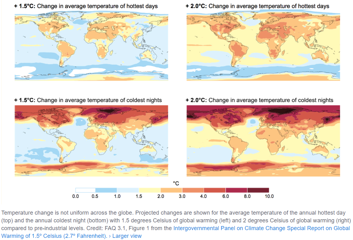
But wait! Geography matters. It's important to remember that when we think about a warming world and talk about increases in average temperature or precipitation those changes aren't happening uniformly. Instead, there are some pretty big differences depending on where on the planet you are (so, if we think back to our studies of vulnerability, this would be related to exposure). Let's take a closer look.
These maps illustrate that temperature changes will not be felt uniformly around the world given different global average temperature increase scenarios. The polar regions are expected to warm much faster than the mid-latitudes.
Credit: FAQ 3.1, Figure 1 from the Intergovernmental Panel on Climate Change Special Report on Global Warming of 1.5º Celsius (2.7º Fahrenheit). © IPCC (Fair Use)