Thematic Maps: Visualizing Data
We first introduced thematic maps in Lesson One, and described them as maps intended to highlight features, data, or concepts (either quantitative or qualitative). In Labs One and Two, we used visual variables to show order and category of typical map features on maps.
The maps we’ve created so far have been general purpose maps—designed to display features of general interest. In designing our maps, we created abstract representations of the real world, with roads, rivers, lakes, county lines, etc., with hues and shapes different from what would be captured by a photograph. Despite this, our designs have still reasonably matched their physical reality. In this lesson, we turn to more abstract depictions of the world, designed using thematic data. View for example, the map in Figure 3.1.1.
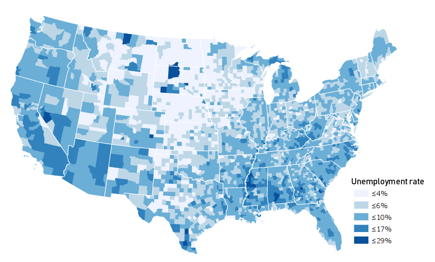
This map uses color value—not to show category or hierarchy of map features—but to visually encode county-level unemployment data. Figure 3.1.1 also simplifies the map of the US (not showing even major highways or mountain ranges, but only state and county boundaries) to emphasize the map’s theme.
Due to thoughtful use of color and a simple layout design, this map successfully communicates geographic trends of unemployment in the United States. But was this the best choice to show this concept? Might there be a better way?
View the map in Figure 3.1.2 below.
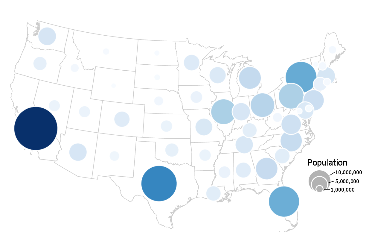
This map uses a similar color scheme and layout, but encodes its data primarily using proportionally-sized symbols. Color value is used for additional effect, a technique called dual encoding.
These maps (3.1.1; 3.1.2) are both correct—they fit into cartographic conventions. But there are other maps that this cartographer could have made with each dataset that would have been equally correct. There are also maps they could have made that would have been—arguably—quite wrong. How to decide?
Student Reflection
Do you think the data mapped in Figure 3.1.1 would be appropriate for making a proportional symbol map (e.g., Figure 3.1.2)? Why or why not?
Before beginning the how of making a map, we need to take a step back and consider the what—the geographic phenomena we want our map to be about.
Geographic phenomena are elements that exist over geographic space. When we say geographic we typically mean anything between the size of a human and the size of the world. So, while still spatial, the connections between the neurons in your brain or the arrangement of atoms in a ceramic material do not constitute geographic phenomena. In this lesson, you will learn tools for conceptualizing, visualizing, and communicating the many phenomena that do.
Recommended Reading
US Census Bureau. 2021. “Interactive Maps.” Accessed May 31.