Color Overview
Color is frequently used to symbolize information on maps. In recent years, cartographers have begun to employ color more and more: in a study of map-color use in scientific journals, White et al., (2017) found that the use of color in published map figures increased from 18.4% in 2004 to 69.9% in 2013. This trend can primarily be attributed to the loosening of practical map production constraints. The cost of color printing, for example, is no longer prohibitory. This is in large part due to the increasing popularity of web-based dissemination of maps and other visual graphics, which makes such costs irrelevant. Tools such as ColorBrewer and Colorgorical have also made color selection easier; the first of these is even now integrated into the color selection tools in ArcGIS Pro.
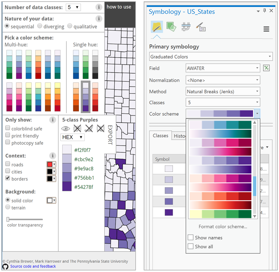
In this lesson, we will explore the basics of specifying, mixing, and selecting colors for maps. You should aim to understand and properly apply the color schemes available in GIS software, as well as to alter them as appropriate based on your maps’ audience, medium, and purpose. Eventually, you might even design your own color schemes from scratch.
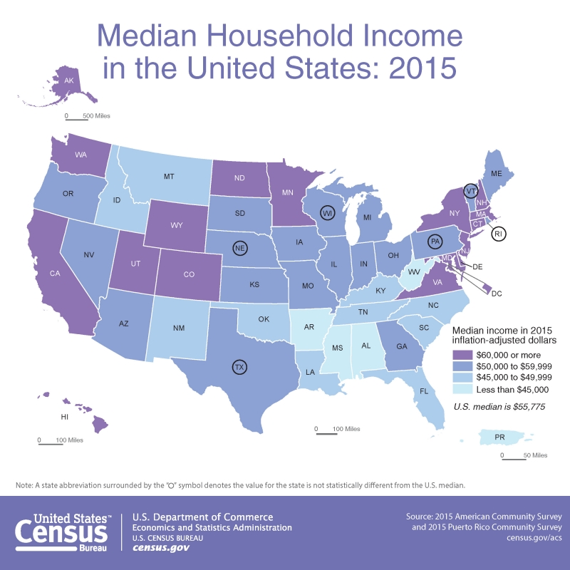
You might remember the map in Figure 4.1.2 from Lesson 1. This map is a thematic map, and more specifically, a choropleth map. Discussions of color in mapping often focus on choropleth maps. This is for good reason—choropleth mapping is the most common thematic mapping technique, and its employment typically requires thoughtful analytical use of color. We will discuss the details of choropleth mapping later in this lesson, but note that color is frequently used on other types of maps as well. General purpose maps often employ color to delineate between kinds of features, and maps that focus on other visual variables (e.g., proportional symbol maps) often also use color to encode an additional variable, or to add visual interest.
Recommended Reading
- Harrower, Mark, and Cynthia A. Brewer. 2003. “ColorBrewer.Org: An Online Tool for Selecting Colour Schemes for Maps.” The Cartographic Journal 40 (1): 27–37. doi:10.1002/9780470979587.ch34.
- Gramazio, Connor C., David H. Laidlaw, and Karen B. Schloss. 2017. “Colorgorical: Creating Discriminable and Preferable Color Palettes for Information Visualization.” IEEE Transactions on Visualization and Computer Graphics 23 (1): 521–530. doi:10.1109/TVCG.2016.2598918.
- White, Travis M., Terry A. Slocum, and Dave McDermott. 2017. “Trends and Issues in the Use of Quantitative Color Schemes in Refereed Journals.” Annals of the American Association of Geographers 4452 (April): 1–20. doi:10.1080/24694452.2017.1293503.