Specifying Colors
When you hear the word "color," words such as blue, red, and green likely spring to mind. Though these are colors in the colloquial sense, these are better described as color hues. When using color as a visual variable, each color is specified not just by color hue but by three dimensions: hue, lightness, and saturation (Figure 4.2.1).
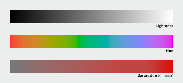
Color is produced when light is either reflected off of (e.g., a car; a printed map) or emitted by (e.g., a computer screen) an object. Hue refers to the wavelength of that light, from longest (oranges and reds), to shortest (blues and violets). Figure 4.2.2 shows nine swatches of color with different hues, in the order of the rainbow spectrum.

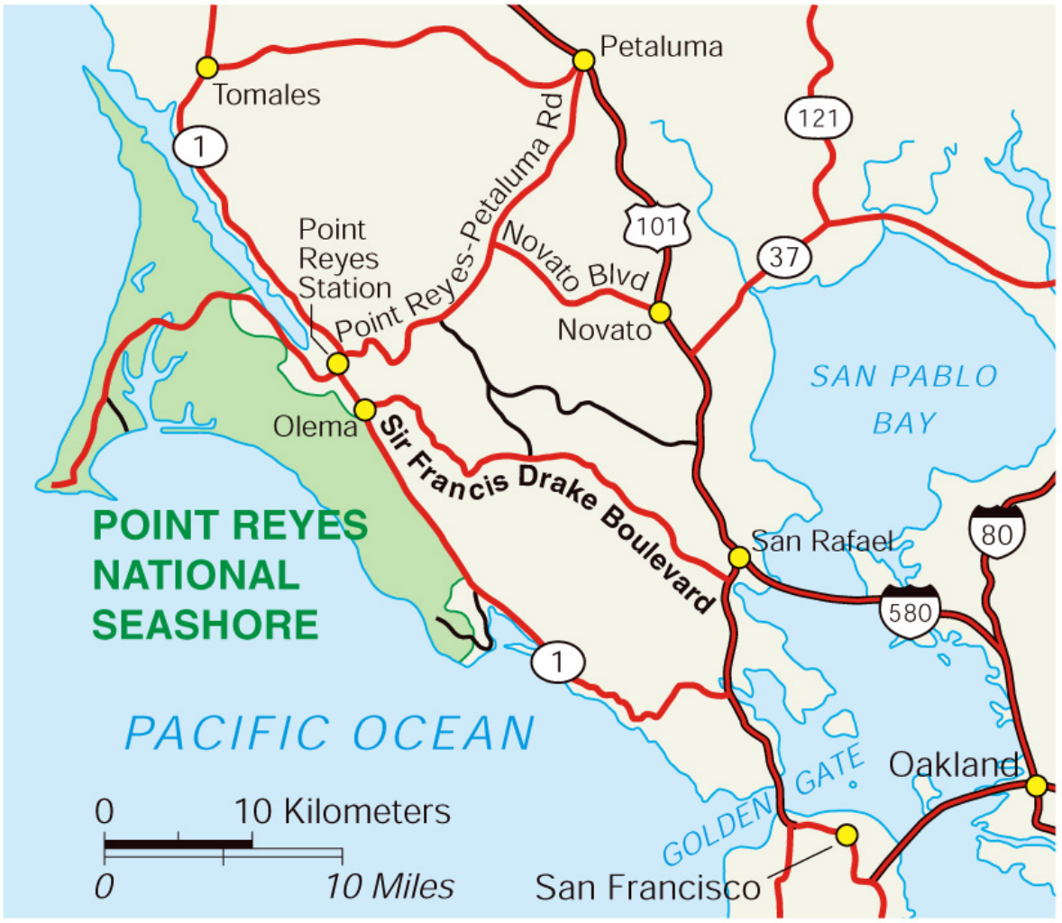
In mapping contexts, hue is typically used to differentiate between features. In general purpose maps, for example, hue is used to create categories, and to help the reader identify different features as belonging to a particular group. In Figure 4.2.3, for example, color is used well, and improves the legibility and aesthetics of the map. Though multiple types of roads are shown, all roads are shown in red. Similarly, all hydrologic features and labels are shown in blue - a familiar color easily recognizable by map-readers as associated with water.
Lightness is another dimension of color; it describes how perceptually close a color appears to a pure white object. Lightness is also commonly called value, though cartographers sometimes avoid that term, as value is also used to describe data values—using the same word for both items can cause confusion. Lightness works well for visually encoding the order and/or magnitude of thematic data values—typically, lighter colors signify lower data values (i.e., less signifies less), and darker, more visually-prominent features signify higher data values.
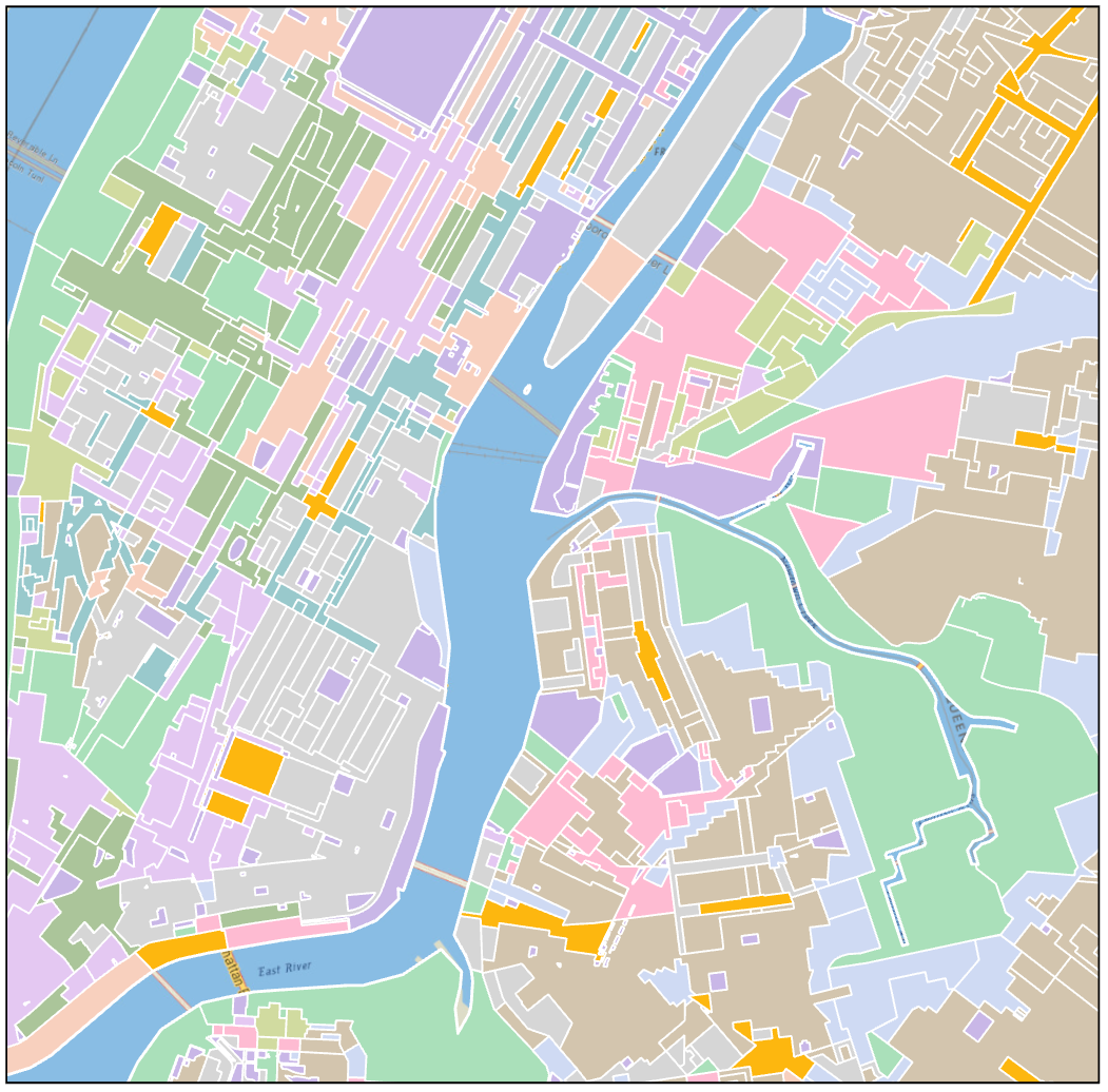
The third dimension of color is saturation. Saturation is also sometimes called chroma. In map design, saturation is generally less important than hue and value, but it still can play an important role. Highly saturated colors are particularly useful for calling attention to small but important map elements that would otherwise be lost (Figure 4.2.4). Caution should be used when using saturation in this way, however—the use of too highly saturated colors, particularly over large areas, may be distracting or accidentally overemphasize those features.
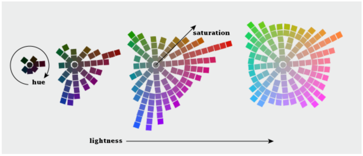
These three dimensions (hue; lightness; saturation) were originally identified by Dr. Albert H. Munsell in the early 20th century. Munsell’s first color model, a color sphere, was an attempt to fit these three dimensions of color into a regular shape. Though this model was still a breakthrough, Munsell realized that it was quite insufficient, as human color perception is not linear and cannot be accurately modeled by a regular shape. The final shape he landed on looks more like a lopsided ellipsoid.
Figure 4.2.5 below takes a top-down approach to visualizing this color space: each of the four graphics demonstrate what is, in essence, a slice of the Munsell model, with increasing lightness from left to right. As shown, the colors which the human eye can perceive do not change linearly through color space—this makes color specification and design a challenging task.
Student Reflection
Imagine you want to create a categorical map with a large variety of colors. What does Munsell’s model suggest about what kind of colors would be best used for this purpose?
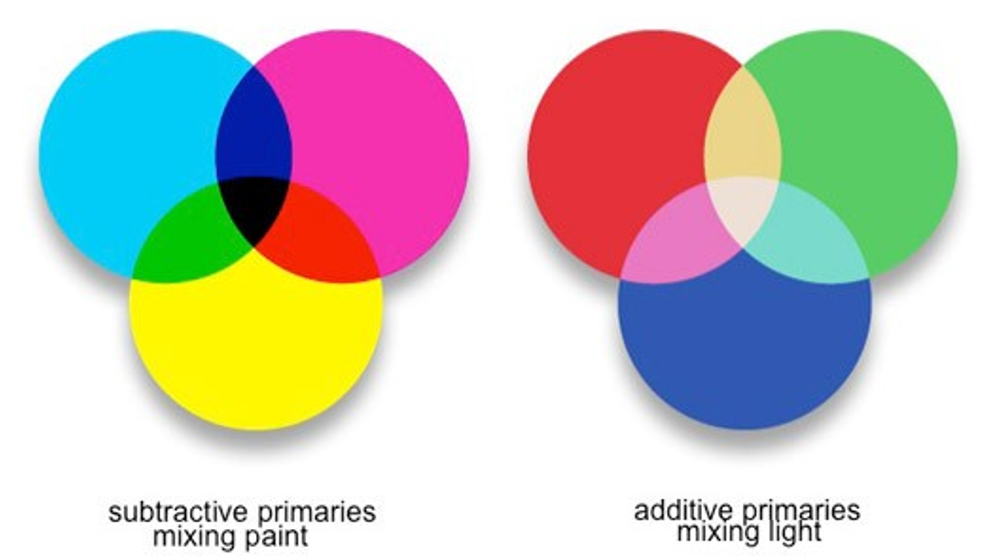
Though Munsell’s model is helpful for understanding color perception, and perhaps for sharing color specifications with others, a working knowledge of other models is required for building color schemes in GIS and graphic design software. When specifying colors, it is important to consider the display medium that you are using to create them. When mixing paint, cyan, magenta, and yellow (CMY) are used. As mixing paint (or laser printing inks) results in less light being reflected from the color surface, this is called subtractive mixing. The opposite occurs on digital display screens, which create colors by mixing red, blue, and green (RGB) light. Mixing these primaries is called additive mixing.
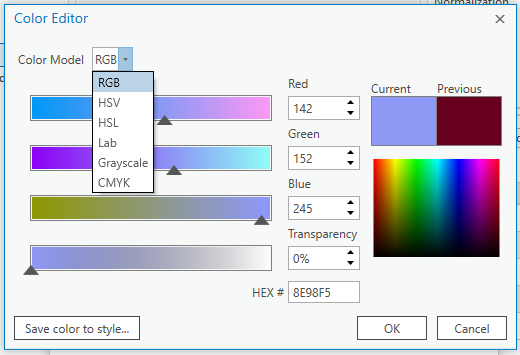
ArcGIS offers a wide selection of color model choices for specifying colors, including RGB, HSV, and CMYK. RGB and CMYK color models refer to the aforementioned models for mixing additive and subtractive primaries, respectively. RGB is useful for digital media, and CMYK is the color language typically used by graphic artists. Another popular model is HSV (hue, saturation, and value). HSV is reminiscent of the Munsell model (see Figure 4.2.8), but with much greater symmetry—recall the oddly-shaped structure of Munsell’s model.
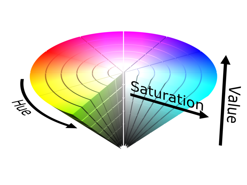
The symmetry of HSV makes it fit much better into the language of computers, but as human color perception is not linear (recall Figure 4.2.5), using HSV can cause problems unless you remain cognizant of this shortcoming.
Additional color models, including HSL and CIELAB, offer other ways of specifying colors. We will not go further into the details of color specification here, but you are encouraged to explore the recommended readings for more information.
Recommended Reading
Chapter 7: Color Basics. Brewer, Cynthia A. 2015. Designing Better Maps: A Guide for GIS Users. Second. Redlands: Esri Press.