Geographic Data: Levels of measurement
Data is typically classified as either qualitative (e.g., land use; political boundaries) or quantitative (e.g., per capita income; temperature)—you likely recall learning about this distinction in earlier courses. The classification of your data as qualitative or quantitative will have significant influence on which visual variables you use to map your data. Color hue, for example, is excellent for qualitative data, while color value demonstrates order and thus is a better choice for designing quantitative maps.
Nominal is a common term used to described qualitative, or categorical data. Land use and land cover maps are popular examples of nominal data. They might show, for example, residential blocks as distinct from parks and green space, but this does not suggest that one is lesser or greater than the other.
Quantitative data can be further classified as ordinal, interval, or ratio data.
Ordinal data has an order, but cannot be presumed to show differences in magnitude. Sports team rankings, for example, describe which teams are better, but not by how much.
Interval data describes orders of magnitude but has an arbitrary zero point. The classic example is temperature: 30 degrees is warmer than 10 degrees, but it’s not necessarily three times as warm. Another good example is shoe size—you can say that a size 12 is larger than a size 6, and that (unlike if it were ordinal data) there is more difference between a 6 and a 12 than between a 12 and a 13, but the 12 is not twice as large as 6.
Ratio data, conversely, has a non-arbitrary zero point. Examples of ratio data include counts of forest fire incidence, and yearly household income (e.g., $50,000 is twice as much as $25,000). Interval and ratio data are often grouped together and classified as numerical data.
Student Reflection
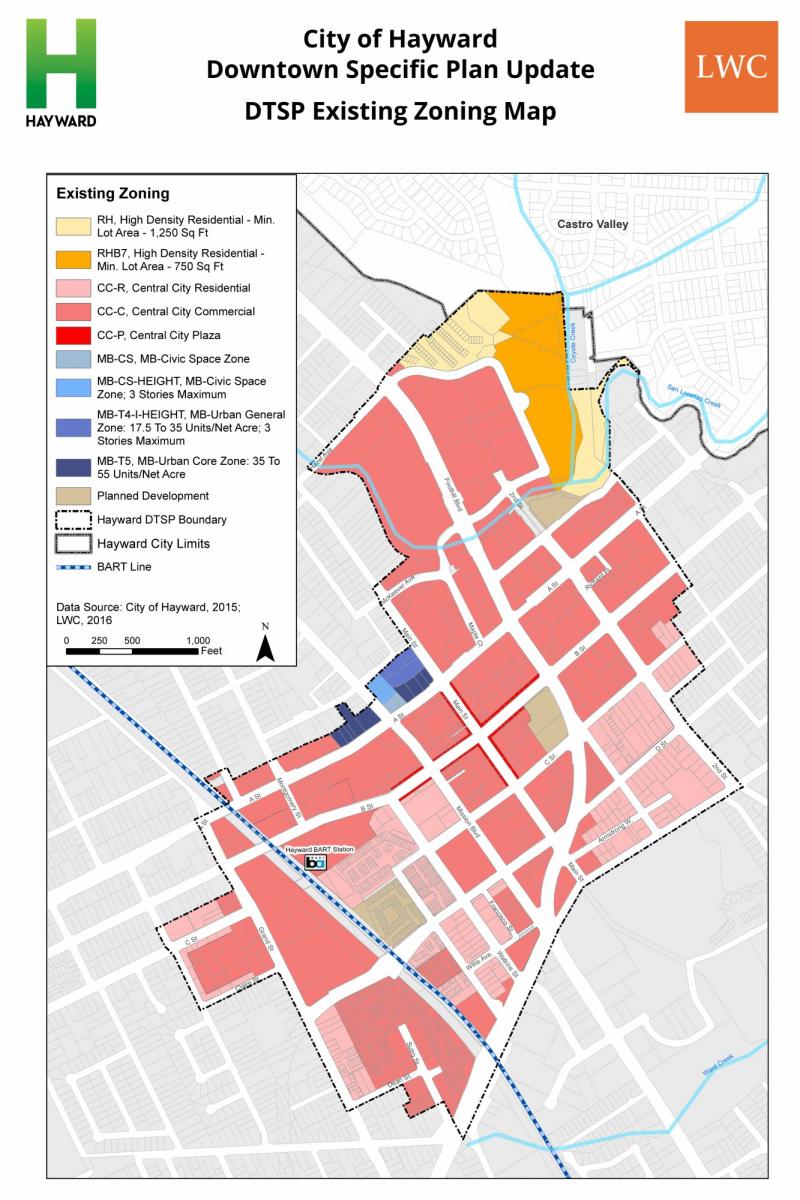
View the map in Figure 3.4.2 above—is the data shown qualitative, ordinal, interval, or ratio? How does this compare to the likely level of measurement of this data when it was first collected?
Student Reflection
Consider time—would you usually consider this to be nominal, ordinal, interval, or ratio data? Why?
Recommended Reading
Chang, Kang-tsung. 1978. “Measurement Scales in Cartography.” The American Cartographer 5 (1): 57–64. doi:10.1559/152304078784023006.