Making Sense of Maps
By now, you should feel pretty good about creating a single, choropleth map. Such maps are often requested, designed, and distributed. Yet the power of maps often comes from our ability to compare them. Static maps—all of the maps we’ve discussed thus far—typically only represent one snapshot in time. What if we are interested in how a phenomenon has changed over time, or how it varies between two disparate locations?
View the two maps below in Figure 4.7.1. They are both maps of population density in the United States and are shown at the same scale. At first glance (to non-US residents, perhaps), it might appear that Vermont has a higher level of population density. But take a closer look at the legends -
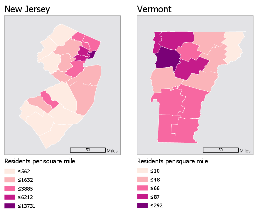
The legends in the maps in Figure 4.7.1 don’t match—the darkest color, for example, represents a vastly higher level of population in the first map than in the second. How much does population density differ between New Jersey and Vermont?—due to the unmatched legends, it’s really almost impossible to tell.
Using the same data classification scheme for a set of maps is the easiest way to make them directly comparable. For example, the maps in Figure 4.7.2 use the same data, but this time, both legends are equivalent.
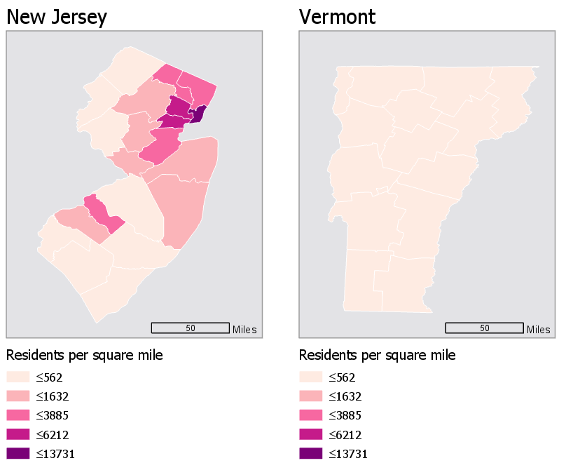
This gives us an entirely different view of the data—New Jersey is now visible as obviously more densely populated. Note, however, that this map just took the default classification scheme from New Jersey, and applied it to Vermont, which is still not a good solution. Though it is now easy to compare these states, we are unable to discern which areas of Vermont are more populated than others: they are all simply classified as "less than 562 residents per square mile." Making maps that work well both independently and when compared is a challenging task, and one which we will contend with in Lab 4.
Another important aspect of choropleth—and any—map design is making sure that marginal elements such as legends and labels are well-crafted to support reader comprehension of your map. For example, see Figure 4.7.3. It may seem at first that this legend is too text-heavy: you don’t generally create visual graphics with the intention of asking people to read. However, without this level of detail, the content of the map would be confusing, and many readers would likely misinterpret it.
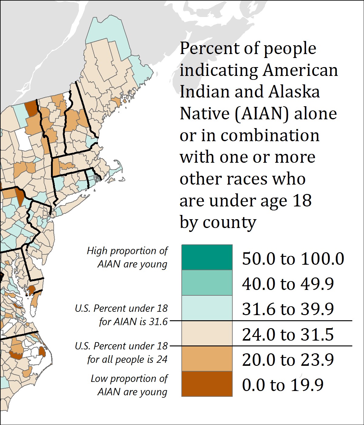
This map also purposefully places breaks in the data—for example, one break is placed at 24 percent, which is the percentage of all people in the US who are under 18 years old. The break is annotated to inform the reader of this fact—without this annotation, the use of this specific break would not be useful. Additional legend annotations (e.g., “High proportion of AIAN are young”) serve to clarify the map.
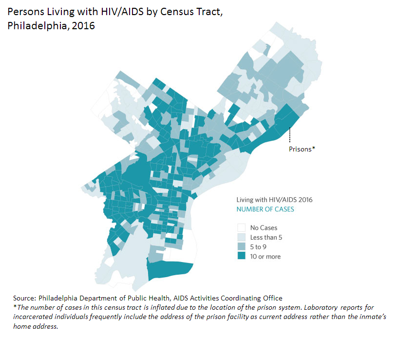
Figure 4.7.4 below similarly uses a text explanation to clarify the data mapped. Due to the classification scheme used, the location indicated by the leader line and Prisons* note does not immediately stand out as an outlier. However, given the topic of the map, this explanation is important. We discussed dealing with outliers earlier in the lesson—one option for dealing with a relevant outlier is simply to point it out to your readers via explanatory text. Mapping is all about graphic presentation, but sometimes the best solution is a simple, concise, text explanation.
Recommended Reading
- Chapter 3: Explaining Maps. Brewer, Cynthia A. 2015. Designing Better Maps: A Guide for GIS Users. Second. Redlands: Esri Press.
- Chapter 5: Color: Attraction and Distraction. Monmonier, Mark. 2018. How to Lie with Maps. The University of Chicago Press.