Flow Mapping
Choosing an appropriate projection is important for all mapping tasks. Consider, for example, a proportional symbol map. You would not want to use a projection that significantly distorts area—as the intention of such a map is to compare the size of the symbol to the size of its underlying area, this would be misleading.
A map type that we haven’t yet discussed, and to which projection choice can be integral, is a flow map. A flow map is a map that visualizes movement between places—often across large regions, even the entire globe.

Flow maps can be classified into two main types: those that represent origins and destinations, and those that map routes. Origin-destination flow maps show the start and end points (and often the direction) of flows, but do not map out a route. An example is shown in Figure 5.8.1. Flow arrows in Figure 5.8.1 show the direction and magnitude of migration flows, but the route paths are not meaningful. Note, for example, the placement of a large red arrow showing migration from many locations to California. This indicates that many people migrated from these places to California during that time period, but we can imagine that their actual movement covered various routes.
Other flow maps show meaningful routes, such as the flow of traffic, or stream flows. Figure 5.8.2 is an example—instead of focusing on the starts and ends of flows, it maps out a route network. Size is used to visually encode the amount of truck traffic. Though the focus is on truck traffic, traffic volume overall is also visualized in grey, highlighting the difference between routes used primarily by passenger cars and those used for trucking.

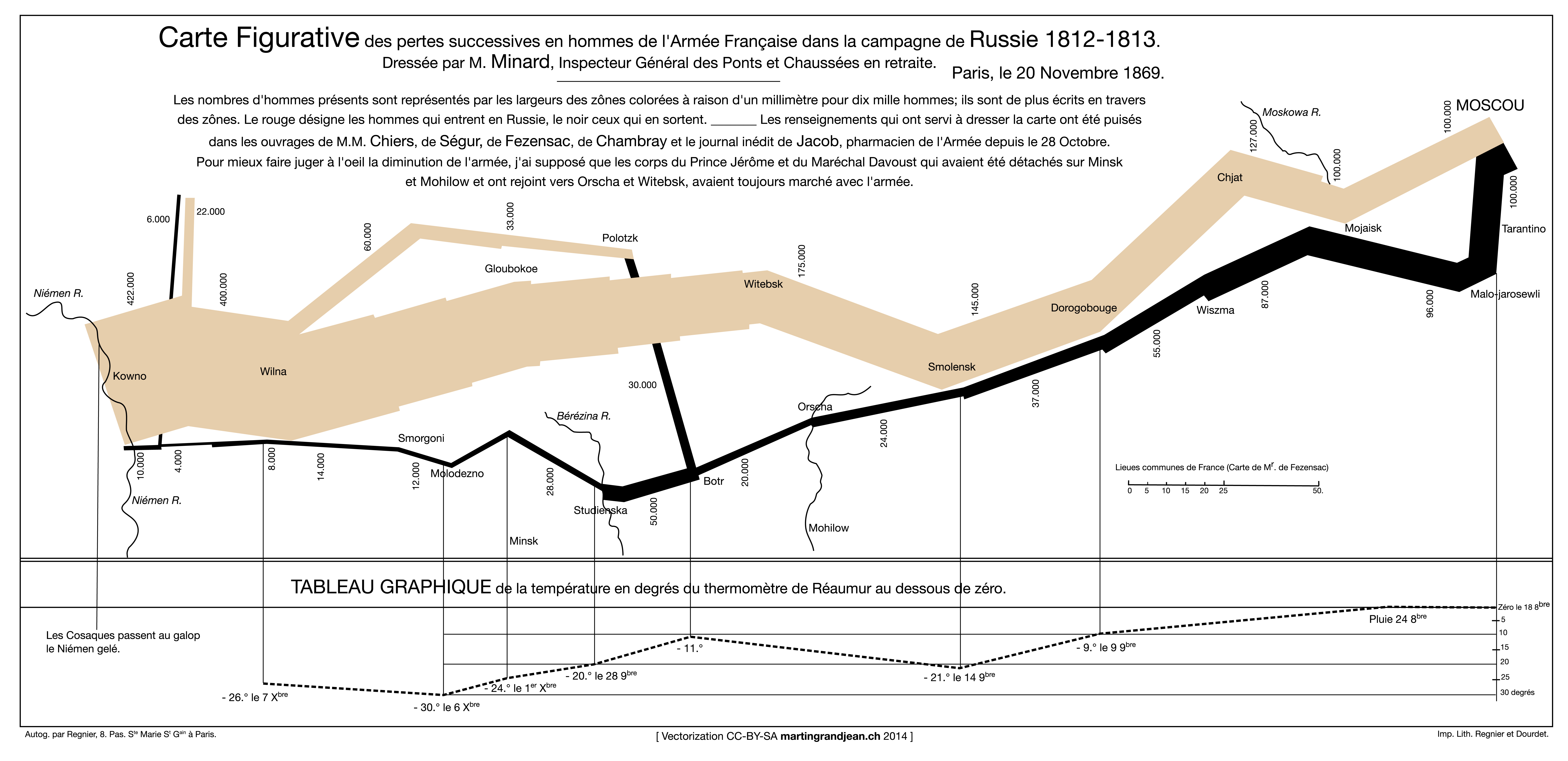
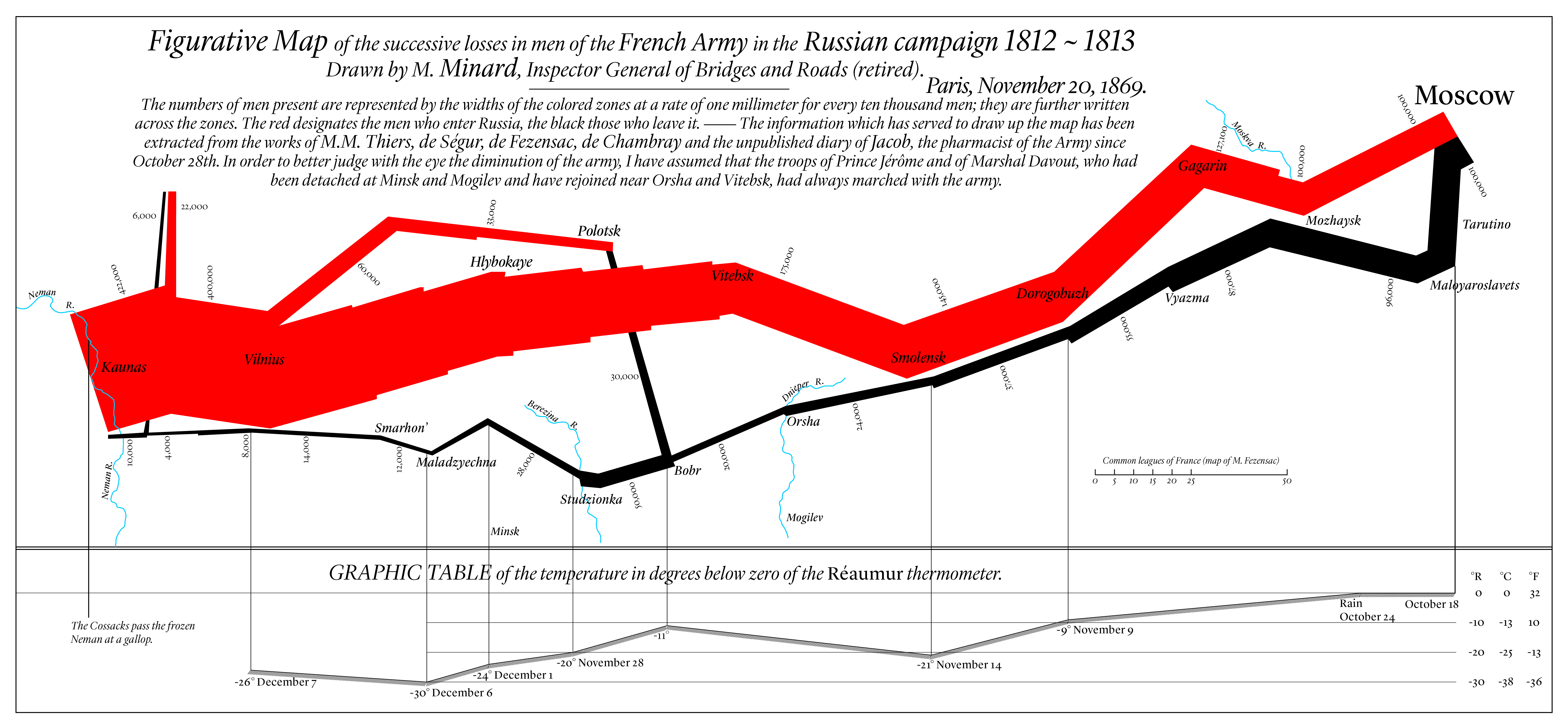
Possibly the most famous flow map ever designed was drawn by Charles Minard; it represents the French army’s travel and suffering during the Russian campaign of 1812 (Figure 5.8.3). Edward Tufte, in his influential book The Visual Display of Quantitative Information, described this work as perhaps the best statistical graphic that had ever been created (Tufte 2001).


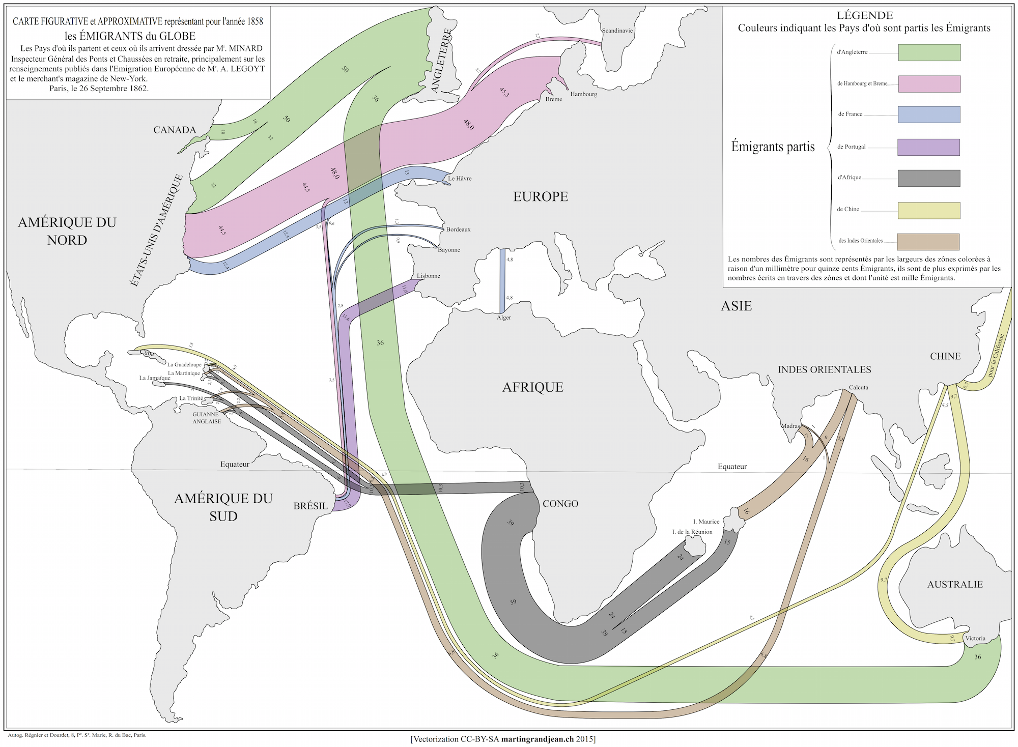
Another map by Minard (Figure 5.8.5) is more reminiscent of modern flow maps. It illustrates migration flows across the world using multiple visual variables. The achromatic continent fills and boundaries place emphasis on the flowlines as the more important component of the map.

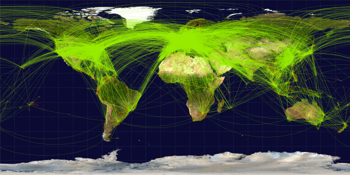
Figure 5.8.5, as well as Figure 5.8.3 (and 5.8.4) above, are examples of aggregating flows to create a more comprehensible map. Figure 5.8.5 shows the magnitude of migration flow between Europe and America, for example, but it does not show the many routes these people likely traveled. Figure 5.8.6 below is an example of the opposite design chose—all paths are mapped. This is appropriate for some mapping purposes, but if there are many routes, this makes the map more challenging to read.

Figure 5.8.6 also differs from the other flow maps shown above in that it does not visualize any data except the flight paths and endpoints. When creating flow maps, whether you map entire routes or just origin-destinations, and whether you chose to visually encode additional data, such as with size or color hue, will depend on the intended purpose of your map.
Flow maps can also be combined with other types of thematic maps, such as proportional symbol or choropleth maps, to show multiple sets of data. Figure 5.8.7, for example, combines a qualitative choropleth map with directional flows.

Student Reflection
In Figure 5.8.7 above, what visual variables are used? What levels of measurement are used to map the flows?
Recommended Reading
- Doantam Phan, Ling Xiao, R. Yeh, P. Hanrahan, and T. Winograd. 2018. “Flow Map Layout.” In IEEE Symposium on Information Visualization, 2005. INFOVIS 2005., 219–224. IEEE. Accessed October 30, 2018.
- Chapter 6: Maps that Advertise. Monmonier, Mark. 2018. How to Lie with Maps. 3rd ed. The University of Chicago Press. (part of this week's required readings).