Map Generalization
In Lesson 7, we discussed uncertainty visualization—yet another component of a common theme in cartography: transferring the complexities of our world into a visualization via a map. When we transform the many features of Earth’s geography into a form more appropriate for a map’s given scale and purpose, this is called cartographic generalization. Thorough understanding of generalization and the related concept of scale is—and has always been—essential for creating high quality maps. The increased prevalence of web-maps, which permit zooming and panning across multiple extents and scales, has encouraged increased research in these topics. In this lesson, we discuss generalization, both in general, and in the context of multi-scale and interactive web maps.
All maps contain some level of generalization—maps would be unusable otherwise. Representing every element of the real world on a map is not feasible, nor would such a map be interpretable by readers. Generalization permits cartographers to construct maps with an appropriate level of detail. In Lesson 6, we discussed the necessity of using the correct resolution of (raster) digital elevation data to create terrain visualizations. In this lesson, we focus primarily on the generalization of vector data, such as hydrologic features and political boundaries.
When considering what level of detail is appropriate, it is important to consider your map's location, scale, and geographic extent. A map of seaside hotel locations in Massachusetts would, for example, show a much more detailed coastline of Cape Cod than would a map of the entire United States.
Natural Earth is a popular source of boundary data that we have used extensively in this course. Figure 8.1.1 below demonstrates the differences in level of detail between different boundary datasets that Natural Earth offers. The purple boundaries (left) show the most detail. Such data are appropriate for maps of large regions (e.g., scale = 1:10m). The pink (center) boundaries would be better suited for small-scale maps of continents or the entire globe (e.g., scale = 1:50m). The blue (right) boundaries are heavily generalized, and would be best suited for very small-scale maps, or maps meant to emphasize style over accuracy (e.g., scale = 1:110).
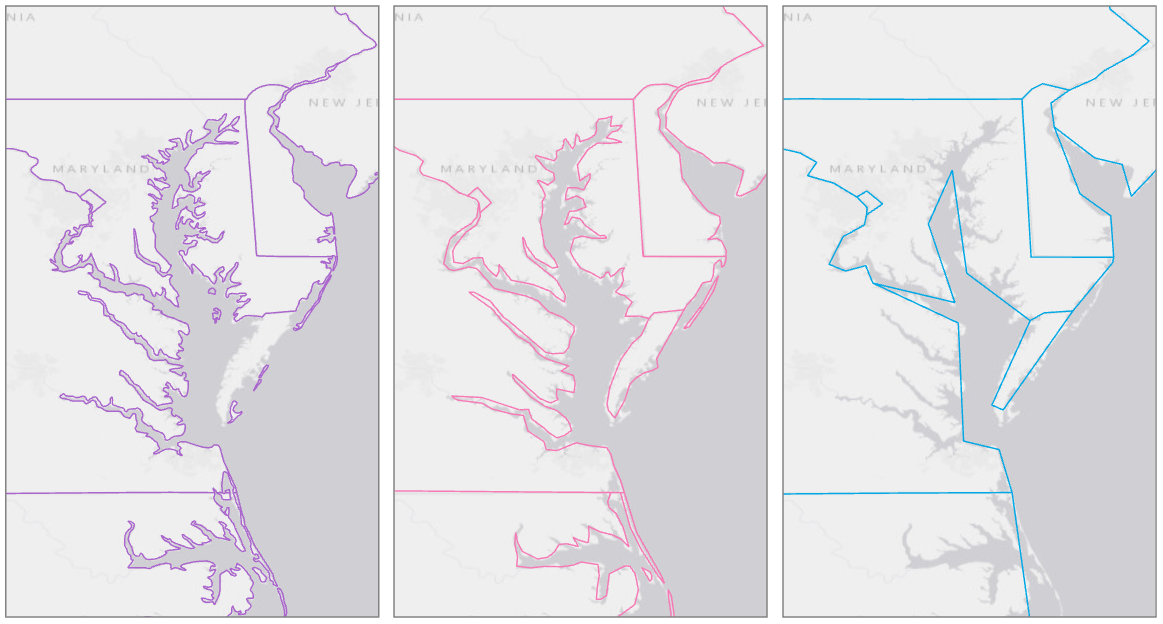
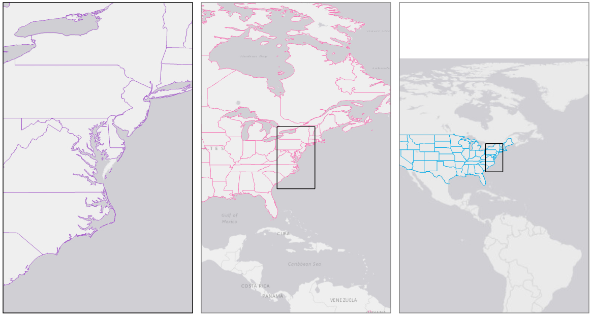
Figure 8.1.2 shows each of the above boundary files at an appropriate scale given their level of detail. The extent of the largest-scale map (left) is shown by the extent indicator in the center and right maps.
Student Reflection
For an interactive experience with generalization, try uploading a shapefile from NaturalEarth to the interactive tool MapShaper.
So far, we have talked about the overall idea of generalization – using data that is the correct level of detail for your map’s scale. A general-purpose map of a small town, for example, would likely show lakes, ponds, and reservoirs, while a small-scale map of a large region would show only the largest waterbodies (e.g., rivers, large lakes, and oceans). Often, objective rules are used to determine what elements are displayed on a map (e.g., “only show lakes that cover more than five square miles”). However, due to the uneven distribution of features across the landscape, cartographers also have to make some generalization decisions that are complex, subjective, and specific.
An example of this is demonstrated by Figure 8.1.3. Some cities are labeled, and some are not. At first, it may appear that the largest cities are labeled, and to some extent this is true. New York, NY is labeled, as well as Washington, DC. However, you may notice some cities that are absent—most notably Philadelphia, PA. A city with 1.5 million people is left off the map, while Reading, PA—a city of about 88,000—is included. Why?
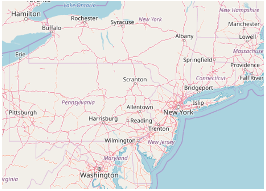
Philadelphia is located in a densely-populated region, with many nearby cities, such as Trenton, Baltimore, and Washington, D.C. By contrast, Reading, PA is surrounded only by smaller towns. Web-maps are designed to display—or not display—city labels based on a number of factors. These include population and general importance, but also design-relevant factors, such as the density of labels on the map.
OpenStreetMap (figure 8.1.3) is designed as a general-purpose map; the maps you create will typically have a more specialized purpose. And if your map’s topic was related to the city of Philadelphia, you would be sure to use your judgment to adjust the decisions made by OpenStreetMap’s generalization algorithm.
Recommended Reading
Chapter 3: Map Generalization: Little White Lies and Lots of Them. Monmonier, Mark. 2018. How to Lie with Maps. 3rd ed. The University of Chicago Press.