Typographic Design
“The choices of fonts for uses can be seen as related to the personality of the fonts. The Script/Funny fonts scored high on Youthful, Casual, Attractive, and Elegant traits which are all related to Children’s Documents and artistic elements. The Serif and Sans Serif fonts were seen as more stable, practical, mature, and formal; the uses they are appropriate for fit these characteristics.” (Shaikh, Chaparro, and Fox 2006)
“Make it easy to read.” – Roger Black
There are many elements to consider when designing text for maps. As a cartographer, you want your text to be clearly legible against the map background, be appropriate for the features you are labeling, and match the overall aesthetics of your map.
As you start designing labels, it is best to learn a bit about typographic design.
A typeface is a design applied to text that gives letters a certain style. An example of a typeface is Arial. Many typefaces contain multiple fonts, so typefaces are sometimes called font families. For example, the Arial font family contains several fonts, including Arial Black and Arial Narrow (Silverant 2016). Though it is technically incorrect to do so, the words typeface and font are often used interchangeably. It is less important to understand this nuance than to understand how to apply fonts in practice.
Classifying Fonts
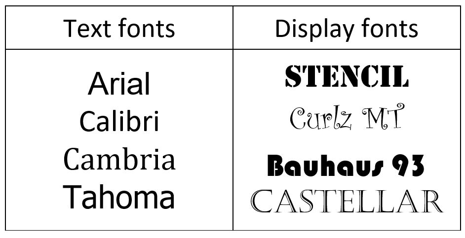
Fonts can be classified in several ways. For example, as text fonts vs. display fonts (Figure 2.2.1).
Text fonts are designed to be simple and legible: examples include Arial, Calibri, Cambria, and Tahoma. Display fonts are decorative fonts like Stencil, Curlz MT, Bauhaus 93, and Castellar. These fonts are often used in branding and for advertisements. Use these fonts with caution, and sparingly on maps. They are perhaps appropriate for a map title, but for little else (Brewer 2015).
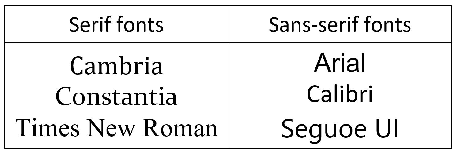
Possibly the most common way to classify fonts is as serif or sans-serif (Figure 2.2.2). Serifs are small strokes added to the end of some letters in a font, such as in the widely-recognized font Times New Roman. Sans-serif fonts do not contain these small strokes. Sans-serif fonts as sometimes viewed as informal, modern, and best suited to digital formats; serifs are often described as best for formal print production. These general guidelines, however, are less important than the specific context in which you use a font. In map design, pairing a serif and a sans-serif together in a map often works best.
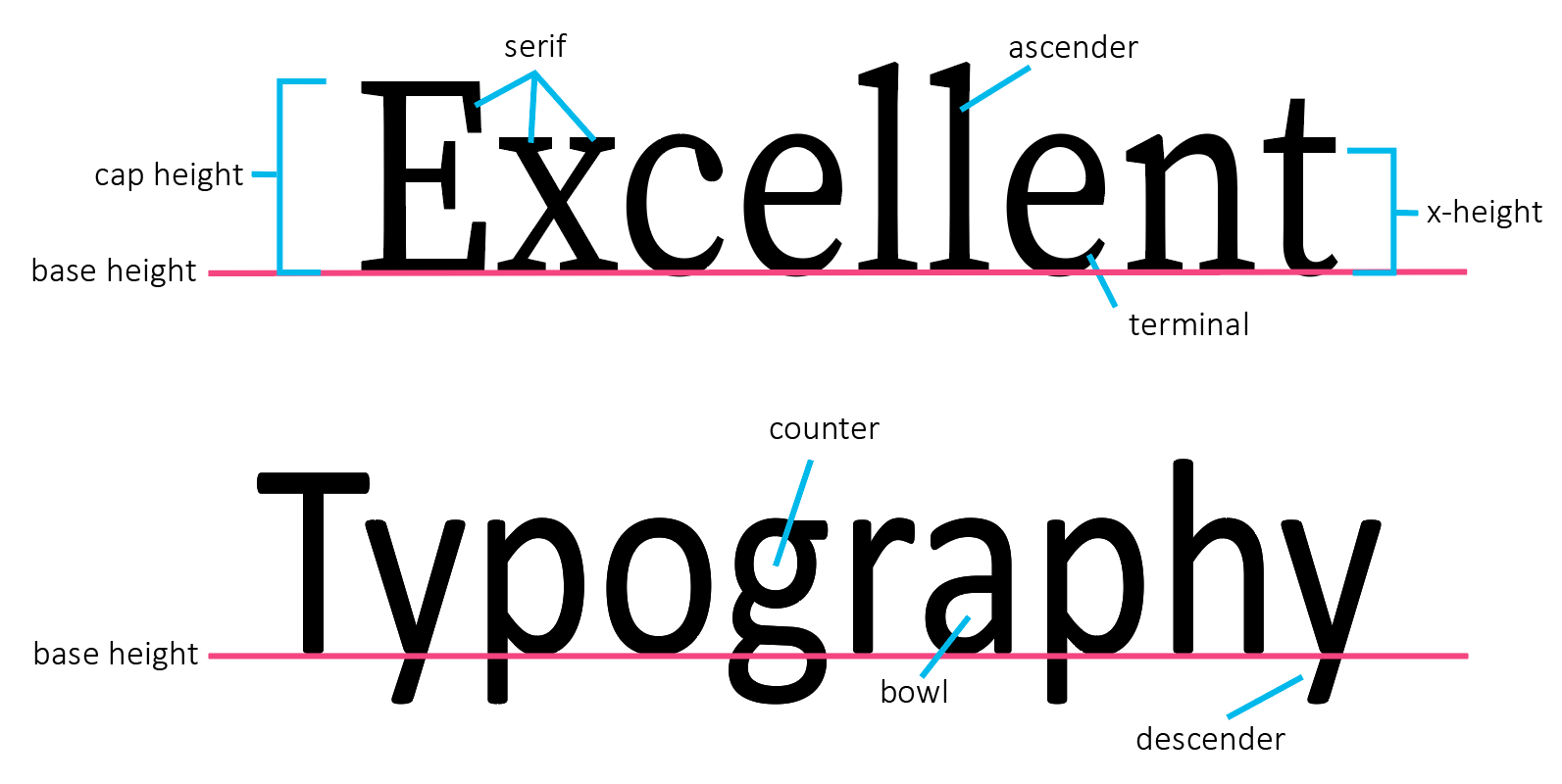
Though the presence or absence of serifs may be one of the most obvious characteristics of a font, there are many design factors that influence a font's style. Figure 2.2.3 below illustrates many of the different components of type design. Changes to these elements create the difference between different font styles.
Student Reflection
Browse the web—or your closet—looking for logos and similar advertisements that employ text as part of their branding design. How does the style of a font change your perception of that brand or item? Do you notice any that work particularly well? Why is this?
There are a wide number of web resources available for learning more about typography—some are linked in the recommended reading section of this lesson topic. Much of this advice, developed for graphic designers, journalists, and others, will also apply to text design for maps. In Designing Better Maps, Cynthia Brewer (2015) outlines several features of fonts that make them particularly useful for cartographers. You should keep these in mind when selecting fonts for your maps.
1. A large font family (i.e., the availability of many fonts within a single typeface):
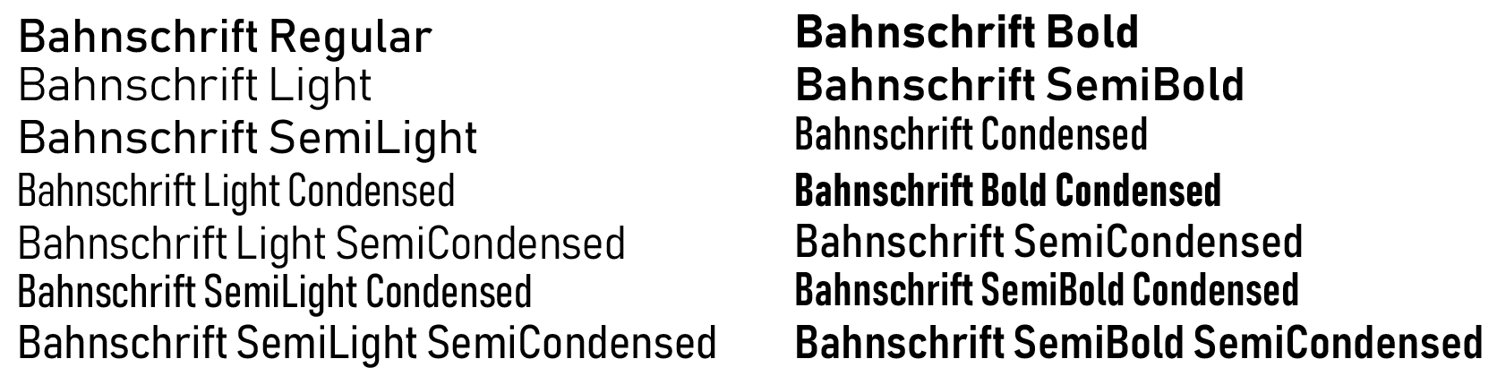
As shown in Figure 2.2.4, some typefaces contain many font variations. This can be very useful for map labeling, as it permits the cartographer to create distinct labels for different types of features while maintaining a consistent look and feel throughout the map.
2. Italic as a separately installed font:
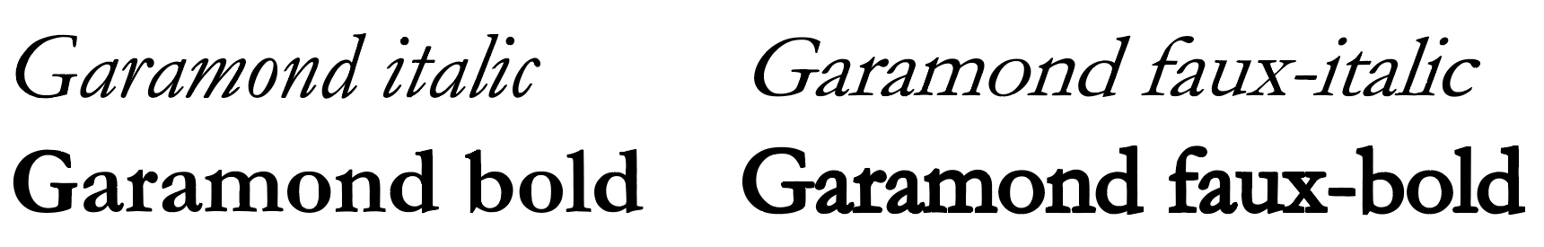
You are likely quite familiar with the use of bolding and/or italics to create distinct font styles. A distinction of note, however, is shown in Figure 2.2.5—the difference between an italic and bold font, and bold and italics as applied afterword by a word processing program such as Microsoft Word. Though applied italics and bolding (Figure 2.2.5; right) will work in a pinch, bold and italic fonts designed as a separate font style (Figure 2.2.5; left) take specific characteristics of the typeface into careful account when applying these styles, typically resulting in improved aesthetics and legibility.
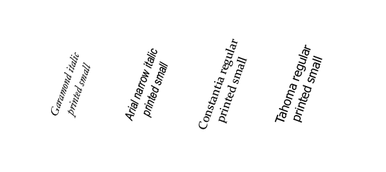
3. Text that is readable at small point sizes and at angles:
Unlike when writing a paper, where most of your text is horizontal and of similar size, the variability of text sizes and angles on a map presents and additional challenge to cartographers. As you will likely use a font in many different instances on your map, a good font choice is one that remains legible when angled and printed small or viewed from a large distance.
4. A large x-height:
X-height has a simple definition – the height of a lowercase x.
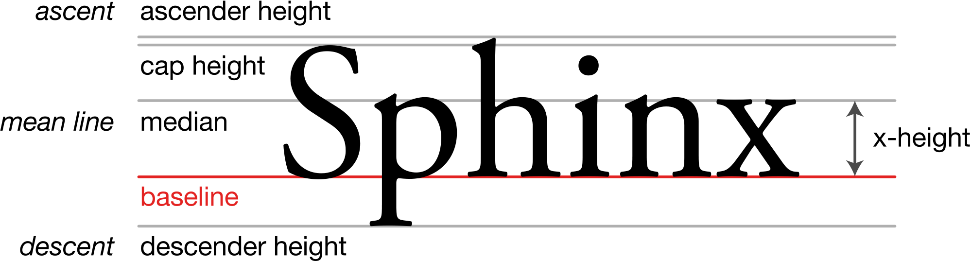
A small x-height results in greater distinction between different letters, which is helpful when reading a block of text. When creating labels for maps, however, a large x-height is typically preferred, it results in fonts that are easier to read when printed small on a page.
5. Distinction between a capital i, lowercase L, and number 1:
This one is self-explanatory, though it may not always be possible (e.g., when using most sans serif fonts). Legibility is improved when the reader can tell immediately whether a letter is an uppercase i, lowercase L, or a number 1. The same goes for distinguishing between a zero and an uppercase O. Though typically a zero is shown as a thinner ellipsoid, in some fonts this difference is more distinct than in others.
In addition to selecting proper fonts, there are many design details that can be applied to improve your map labels. These include text color, halos, and shadows, as well as changes to character spacing and sizing.
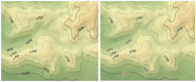
A halo is often helpful, particularly against busy backgrounds, for helping text display over the background of a map. Halos are distinct from outlines, as they are placed behind text—and they are typically a better choice for legibility, as they do not interfere at all with the text itself (Figure 2.2.8).

Halos are not always as pronounced as the one shown in Figure 2.2.8. Choosing a halo that blends in with the background color of the map creates a subtle look that doesn’t call attention to the halo, but still sets the text legibly apart from any lines that may cross beneath it. See Figure 2.2.9 below – a subdued yellow-green halo blends into most of the background but prevents contour lines from obscuring the legibility of the interval numbers.
Many text effects are available in ArcGIS, and in graphic design software such as Adobe Illustrator. Experiment with text effects when designing your maps, and don’t be afraid to move beyond default settings to create more engaging, legible, and attractive maps.
Recommended Reading
- Lupton, Ellen. 2009. “Thinking with Type.”
- Cousins, Carrie. 2018. “Serif vs. Sans Serif Fonts: Is One Really Better Than the Other?” Design Shack.
- Silverant, Martin. 2016. “What’s the Difference Between a Font and a Typeface?” Mental Floss.
- Magalhães, Ricardo. 2017. “To Choose the Right Typeface, Look at Its x-Height.” Prototypr.Io.
- Chapter 5: Type Basics. Brewer, Cynthia A. 2015. Designing Better Maps: A Guide for GIS Users. Second. Redlands: Esri Press.