Data Journalism
As demonstrated by the Portland AirBnb example, interactive maps designed for public consumption often do not stand alone. Except in the case of very simple data visualizations, these maps and graphics tend to be accompanied by additional text, both within the visualization interface and outside. Such maps are often included—in either static or interactive form—in the type of articles and other media described as data journalism.
Data journalism is a general term that refers to the increasing influence of numerical data in news reporting; data are often reported and/or visualized alongside articles and reports disseminated to the public. Though data journalism does not necessarily have to include visual depictions of data, it often does—and for good reason. Visual graphics tend to captivate readers, and charts, maps, and graphics are much better at communicating data at a glance than data tables and spreadsheets alone. The article in Figure 9.5.1 is an example of this. The article includes a large map, as well as a set of small multiple maps, to visualize the geographic distribution of ammonia. Article text gives the reader additional information about the ammonia gas.

Important Links
Journal outlets such as the NY Times, Washington Post, and National Geographic are among those creating high-quality graphics and accompanying article content. Visit the links below to see examples:
As demonstrated by the links above, media outlets frequently report on important and emotionally-engaging information. Journalists take on the challenging job of reporting this information to the public. Often, pairing interactive maps and graphics with carefully curated text is the most effective way to do so.
Student Reflection
Think back to MacEachren’s Cartography Cube. Where would you place the maps/graphics included in the articles referenced in the links above?
Given recent trends, including as the proliferation of interactive maps and visual analytics, cartographers have begun to focus more on maintaining a balance of text, graphics, and other elements in their work. Think back to our discussion in Lesson 2 of frame lines and neat lines for map layouts—such simple guidelines seem almost irrelevant in the context of data journalism and interactive map making. While cartographers still face traditional design constraints when creating maps for print (e.g., magazine spreads, print advertisements), they must now also work with more complex design formats such as infinite scrolling web pages and interactive dashboards.
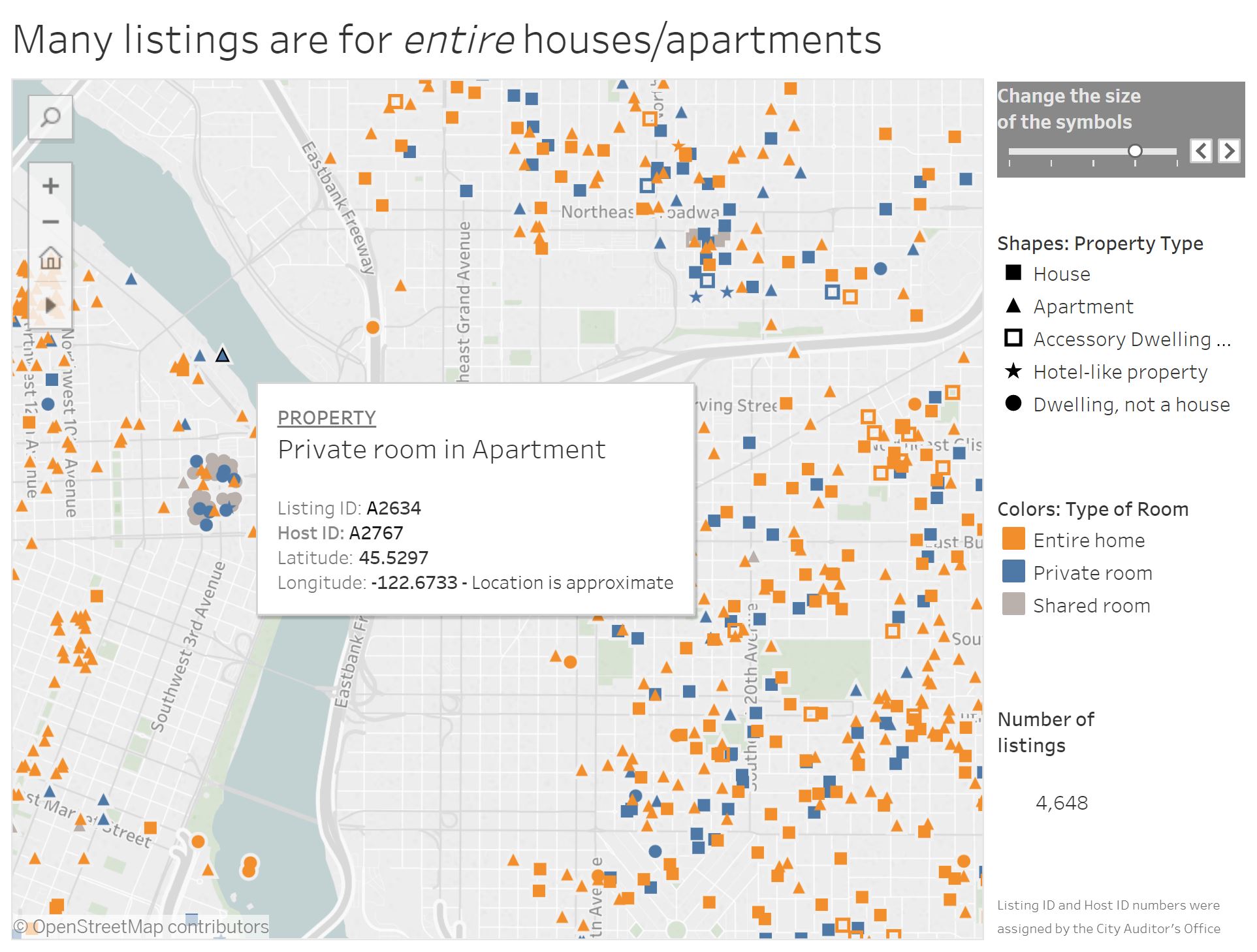
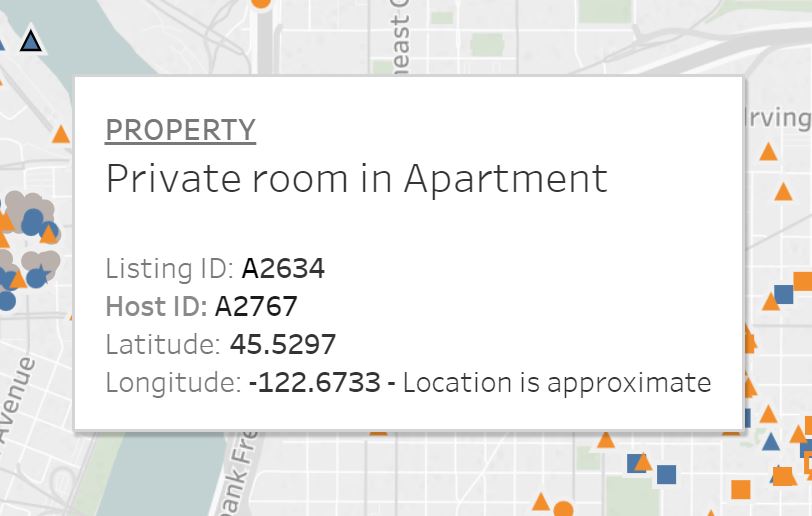
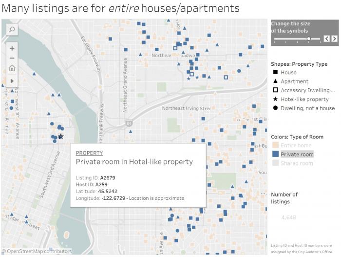
In previous lessons, we discussed the importance of design thinking that reaches beyond the map—configuring page layouts and explanatory text in a neat, usable, aesthetically-pleasing fashion. Given our current focus on the map user, note that ideally this design thinking ought to be implemented at all stages of map interaction. For example, see Figure 9.5.2. Shown in this view is the map “on-hover,” which means that the user has hovered their cursor over the point that is highlighted. The tooltip which appears (Figure 9.5.3) must present an amount of information that is adequate but not overwhelming for map users. It could be argued that this is not successfully accomplished here—the coordinate location is likely unnecessary information, and the addition of a short description of the property would assist the map user.
The visual information-seeking mantra, first proposed by computer scientist Ben Shneiderman, is frequently referenced by information designers: “Overview first, zoom and filter, and details-on-demand” (Shneiderman 1996).
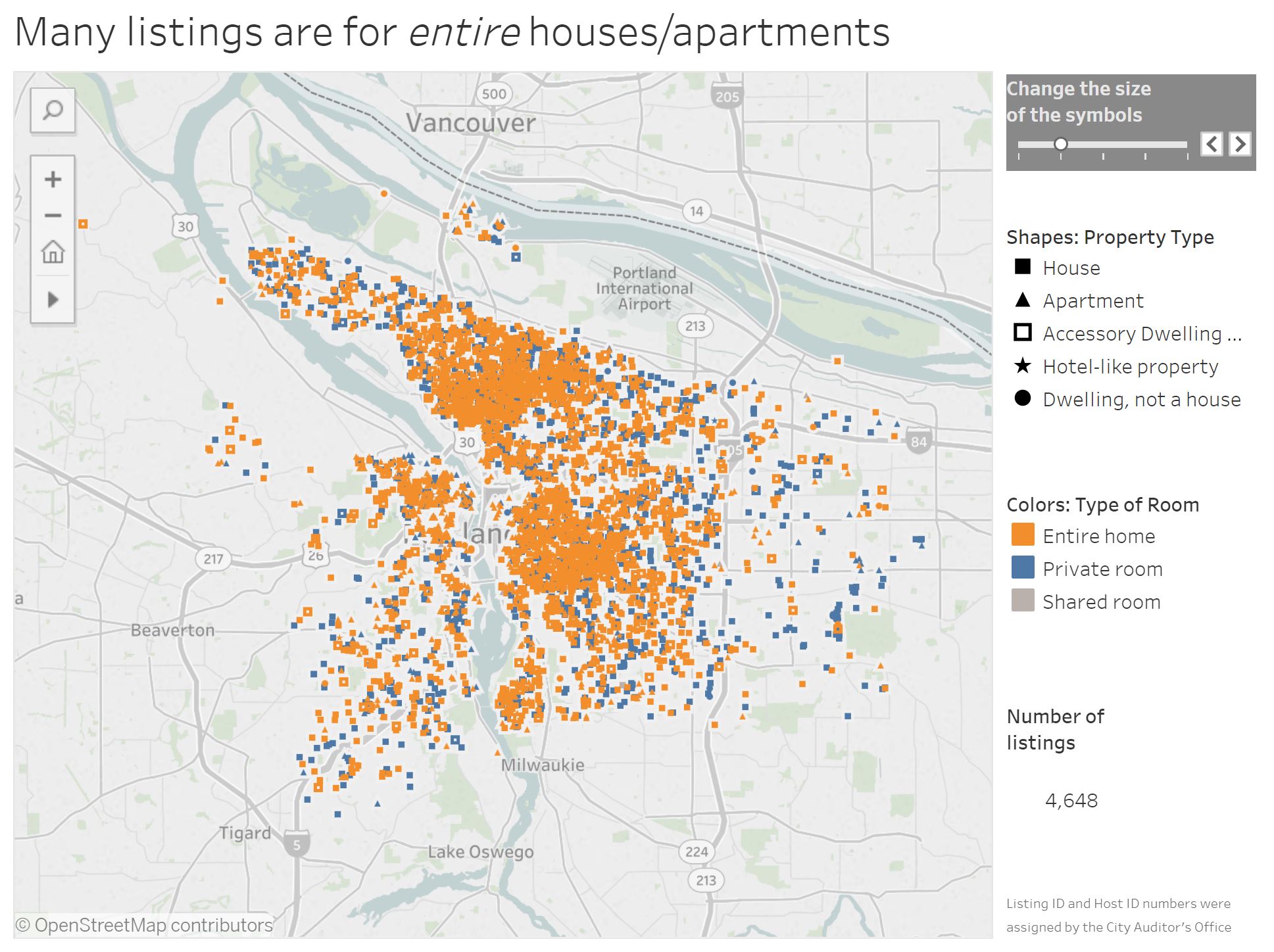
We will use the Portland Airbnb Tableau dashboard to explore this mantra in practice. First, in Figure 9.5.4, the starting view of the dashboard, which shows all of the listings in Portland: overview first.
From the starting view, the user can zoom in and/or pan around the map, and filter the map data by selecting a category of interest. The tool state in Figure 9.5.5 shows the view after the user has zoomed into the map, and selected the "private room," room type. This data could be further filtered by by selecting a property type, such as "hotel-like property." This is the second stage of the mantra: zoom and filter.
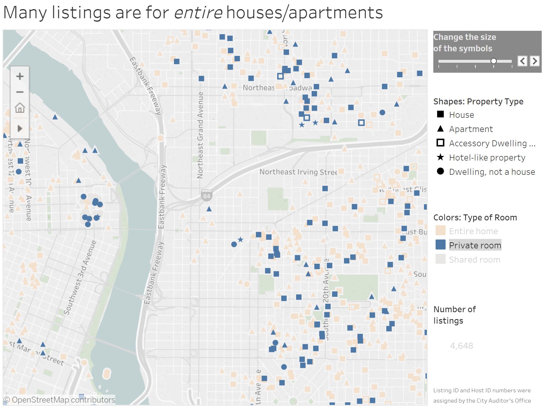
Figure 9.5.6 shows the view in 9.5.5 upon mouse hover of this hotel-like property near the river. ID numbers for the host and listing, as well as lat/long coordinates, are given in the tooltip. This is the final element of Shneiderman's mantra: details-on-demand.
Student Reflection:
Play around with this Tableau Story, Airbnb Data in Portland—in addition to helping you understand the concepts presented in this lesson, it may give you ideas as you work on Lab 9.
Small snippets of text such as tooltips, titles, weblinks, and error messages associated with your maps will often be designed by you, the cartographer. Such text is often called microcontent, and despite its minimal nature can have a large impact on user interpretation of your visualizations.
The Nielsen Norman Group provides a helpful reference on how to write such content here: Microcontent: A Few Small Words Have a Mega Impact on Business. Their site is also an informative reference for many aspects of usability and user experience design.
Recommended Reading:
Shneiderman, B. 1996. “The Eyes Have It: A Task by Data Type Taxonomy for Information Visualizations.” Proceedings 1996 IEEE Symposium on Visual Languages, 336–343. doi:10.1109/VL.1996.545307.