When Not to Map
The visual analytic tools we have have explored thus far include both maps and graphs, and these different data visualization elements have been connected via coordinated views, permitting user filtering, zooming, and more. Given the limited space available in these dashboards—particularly if they are intended for viewing on small, mobile screens—an important question surfaces: do I need a map at all?
When designing data visualizations, maps often provide an invaluable source for insight generation. However, they are not necessarily always the best choice for your data—even if the data contain spatial information. View the dashboard below in Figure 9.6.1.

This dashboard does not contain a map—and though it’s possible that adding one might provide additional information or interest, its current form gets across the core message: drug overdoses are increasing in Philadelphia, and this is being driven by opioids in general, and fentanyl in particular.
Given the increasing ubiquity of GPS and other location-based technologies, data that contains a geographic component (e.g., state, county, coordinates) is fairly easy to come by. Still, this does not mean that creating a map is always the answer. Imagine, for example, if you had collected data on the rate of Alzheimer's disease by state. Were you to map this data, popular retirement states such as Florida and Arizona would likely jump out—not because there is anything inherently unhealthy about those locations, but because their populations are significantly older. To eliminate the effect of this confounding variable, you could map age-adjusted Alzheimer's rates instead. It's important to consider, however, whether this would be the most informative way to visualize your data. If you were you simply hoping to educate people about Alzheimer's, a graph or chart comparing Alzheimer's rates by gender, age, race, or socioeconomic status might serve your purposes just as well.
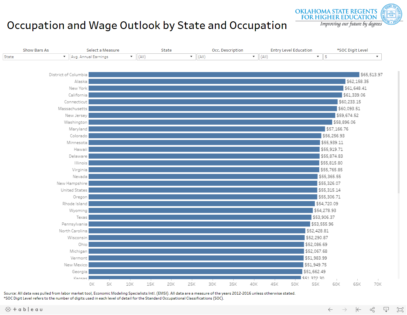
Conversely, there are many data visualizations that unfortunately treat space (i.e., geography) as just another variable. For an example, view the dashboard in Figure 9.6.2 below. The designer of this dashboard chose to visualize states as list of values, rather than to create a map. Though this is not inherently incorrect, it is a missed opportunity to provide the user with an at-a-glance understanding of spatial patterns in occupational data. Sure, the user could still pick out individual data values, or compare average annual earnings state-to-state. But data visualization (cartography included) is about making complex data clear—if your visualization is no more useful than its source data table, then why design it at all?