Lesson 4 Lab Visual Guide
Lesson 4 Lab Visual Guide Index
- Starting File
- Explore the Health Insurance Data in Excel
- Standardize Chosen Data for Visualization
- Create Dot Plots Using your Standardized Data
- Use this Plot to Visually Select Breaks
- Create Maps (1 & 2) Using These Breaks
- Create Maps (3 & 4) Using Diverging Colors
- Create Maps (5 & 6) Unclassed vs. Classed
- Final Deliverables
- Example Map Pair #1
- Example Map Pair #2
- Example Map Pair #3
- Additional Tips
-
Starting File
This is your starting file in ArcGIS Pro. It includes county-level boundary data for the United States. This county-level file has been joined with health insurance data for New England from the American Community Survey (ACS). A state boundaries file is also included – this file is not needed to map the health insurance data, but you may choose to symbolize it to create visible state boundaries on your map.
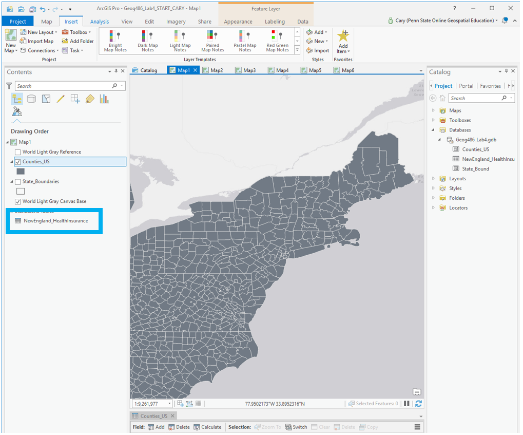 Visual Guide Figure 4.1. Starting file in ArcGIS Pro.
 -
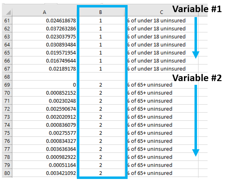
Explore the Health Insurance Data in Excel
Within the health insurance data provided in the Lab 4 zipped folder, find two variables you are interested in and their associated universes. For example, if you were interested in uninsured people under 18, your value and universe would be those shown in Figure 4.2 below. (note: this is one variable, you need to choose two).
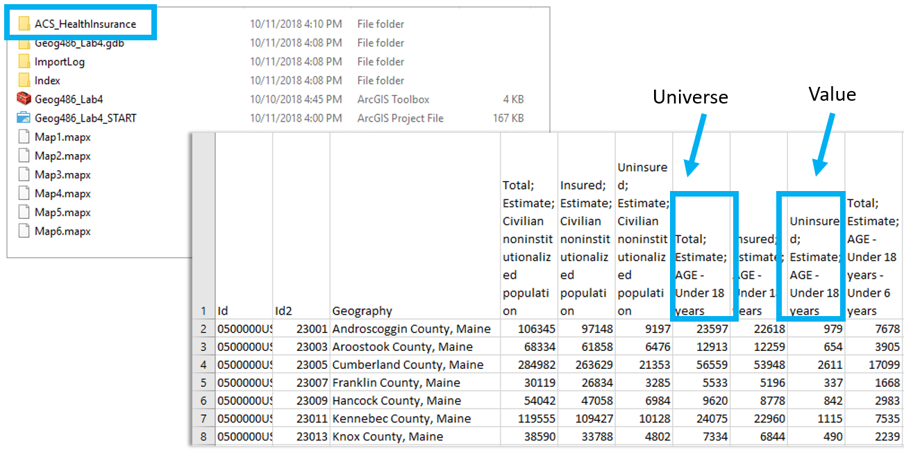 Visual Guide Figure 4.2. Uninsured people under 18 (example variable of interest), and its associated universe (all people under 18).
 -
Standardize Chosen Data for Visualization
Paste the four columns you will need "as values" (see Figure 4.3) into the Chosen Data sheet. (Reminder: use something other than just age for your maps). This will eliminate the clutter of the full dataset, giving you space to calculate standardized values from your data. We will use these standardized values to determine class breaks for our first set of maps.
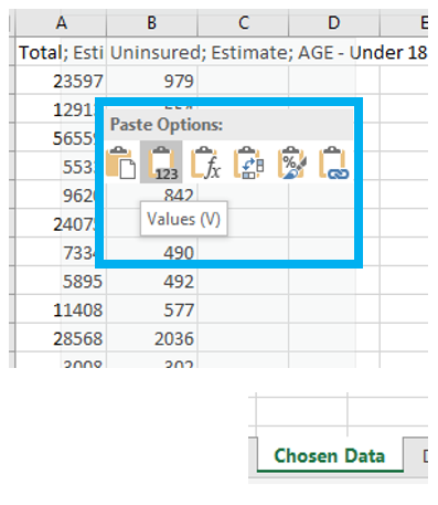 Visual Guide Figure 4.3. Pasting data as "Values" into the Chosen Data sheet
Once you have your two variables of interest (and their universes) in the Chosen Data sheet, use Excel to calculate a standardized column of data for each of your variables. You want to divide each variable of interest by its universe (recall the Data Standardization section in Lesson 4).
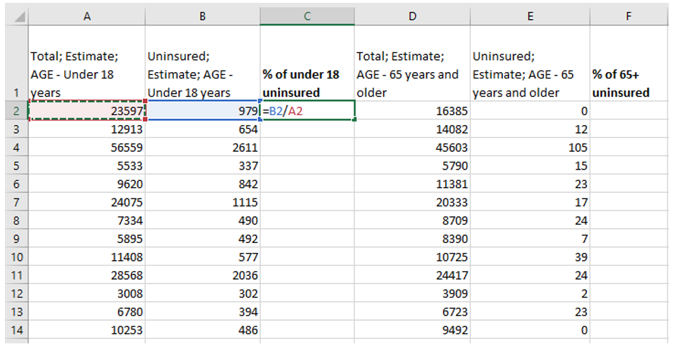 Visual Guide Figure 4.4. Calculating columns of standardized values in Excel.
 -
Create Dot Plots Using your Standardized Data
Insert a column of 1s and 2s as shown - we will use this to create a dot plot. When you select columns A and B below and insert a scatter plot, this will create a dot plot showing the distribution of your two standardized variables along the number line.
 Visual Guide Figure 4.5. Adding values in a second column - these are just so we can create a neat dot plot.
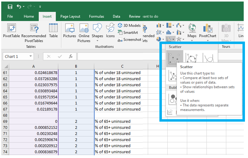 Visual Guide Figure 4.6. Using our two columns (standardized data; 1s and 2s) to insert a scatter plot in Excel.
 -
Use this Plot to Visually Select Breaks
Draw lines with the "insert shape" tool to illustrate where you will be placing breaks in your data. Annotate your lines if you choose the breaks for a reason other than just eyeing the dot distribution. For example, if you place a break at the national average for a variable, annotated this break with a text box explanation such as "US national average." Ex: “national average."
Note that Figure 4.7 is an example of how to draw lines above your dot plot, but these are not good breaks.
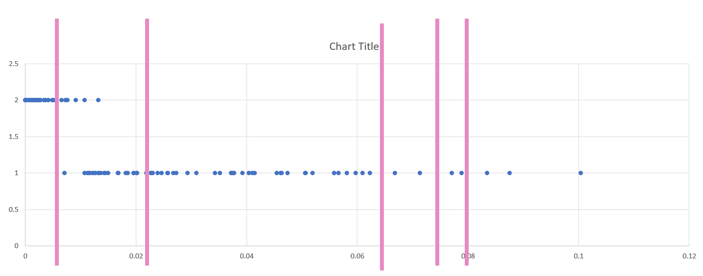 Visual Guide Figure 4.7. Dot plot of two standardized variables in Excel.
 -
Create Maps (1 & 2) Using These Breaks
We will not be importing our excel data into ArcGIS, as I have already loaded the health insurance data into ArcGIS for you. We only needed the Excel file to decide on what breaks to use for our data classification. Instead of importing standardized values, use ArcGIS to standardize your data for you: make sure the variables you choose match the ones you chose earlier!
You will then manually edit your class breaks to match the ones you drew on your dot plot (use your eye to estimate the values). The screenshot in Figure 4.8 (below) is an example of a screenshot from the Symbology Pane. You will submit a screenshot of the Symbology Pane for both maps in layout one, in addition to an image of your dot plot with annotated breaks.
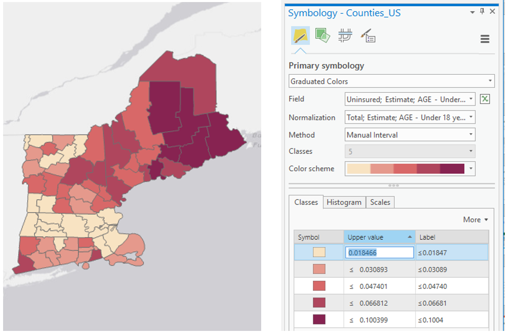 Visual Guide Figure 4.8. A sequential color map (left); manually editing data classes (right).
 -
Create Maps (3 & 4) Using Diverging Colors
For these maps, you will be setting a critical class break (e.g., based on the mean of the data) and a diverging color scheme. To create your second pair of maps, choose a diverging color scheme. Then, set a deliberate and useful critical class or break. Once the break is set, you should manipulate the other class breaks manually. As a suggestion, for the other class breaks you could start with the manual breaks you chose for your first two maps, but may need to adjust them to work with this new color scheme. Reference the Lesson 4 reading for ideas and advice on how to choose a critical class or break.
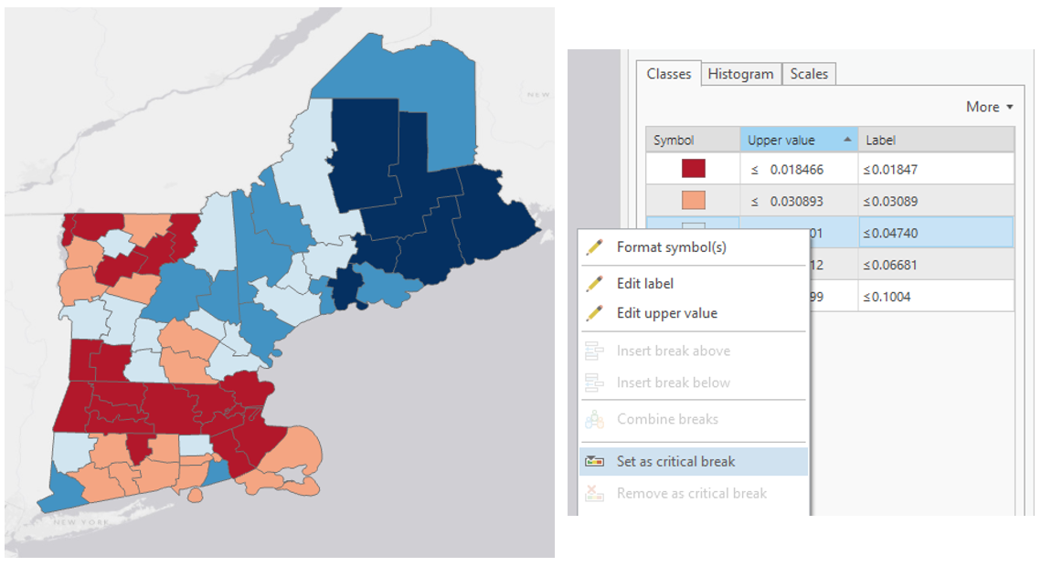 Visual Guide Figure 4.9. Adjusting class breaks and setting a critical break in ArcGIS Pro.
 -
Create Maps (5 & 6) Unclassed vs. Classed
For the third set of maps, abandon your previously-selected class breaks. In this set of maps, you will compare the visual difference between a classed map and an unclassed map. Use the same sequential color scheme for both maps so they can be adequately compared. You should also use consistent line design, etc., so as to not distract from the primary difference of interest - the classification method used. Unlike with the first two sets of maps, you will not be mapping two different variables for comparison here. You will choose just one of the variables from your previous maps, and visualize this variable on both of maps 5 & 6.
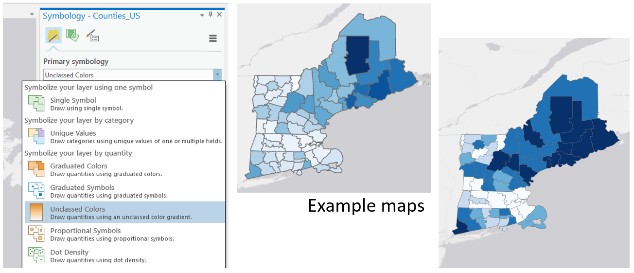 Visual Guide Figure 4.10. The unclassed map symbology option (left); An example set of a classed and unclassed map, shown here without their respective legends (right).
For your classed map, choose any of the methods available in ArcGIS Pro – but have a reason why! You will discuss your reasoning for choosing one of these methods in your write-up for this map pair.
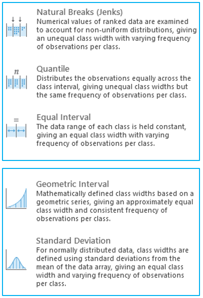 Visual Guide Figure 4.11. Data classification options in ArcGIS Pro.Click here for a text alternative to data classification options in ArcGIS Pro.
Natural Breaks (Jenks): Numerical values of ranked data are examined to account for non-uniform distributions, giving an unequal class width with varying frequency of observations per class.
Quantile: Distributes the observations equally across the class interval, giving unequal class width but the same frequency of observations per class.
Equal Interval: The data range of each class is held constant, giving an equal class width with varying frequency of observations per class.
Defined Interval: Specify an interval size to define equal class widths with varying frequency of observations per class.
Manual Interval: Create class breaks manually or modify one of the present classification methods appropriate for your data.
Geometric Interval: Mathematically defined class widths based on a geometric series, giving an approximately equal class width and consistent frequency of observations per class.
Standard Deviation: For normally distributed data, class widths are defined using standard deviations from the mean of the data array, giving an equal class width and varying frequency of observations per class. -
Final Deliverables
For this lab you will submit three layouts, each containing a pair of maps. You will also submit a write-up document, with a 100+ word explanation of your design (data classification and color) choices for each map pair. Make sure to also design a neat and useful layout - see Lesson/Lab 2 for layout design advice.
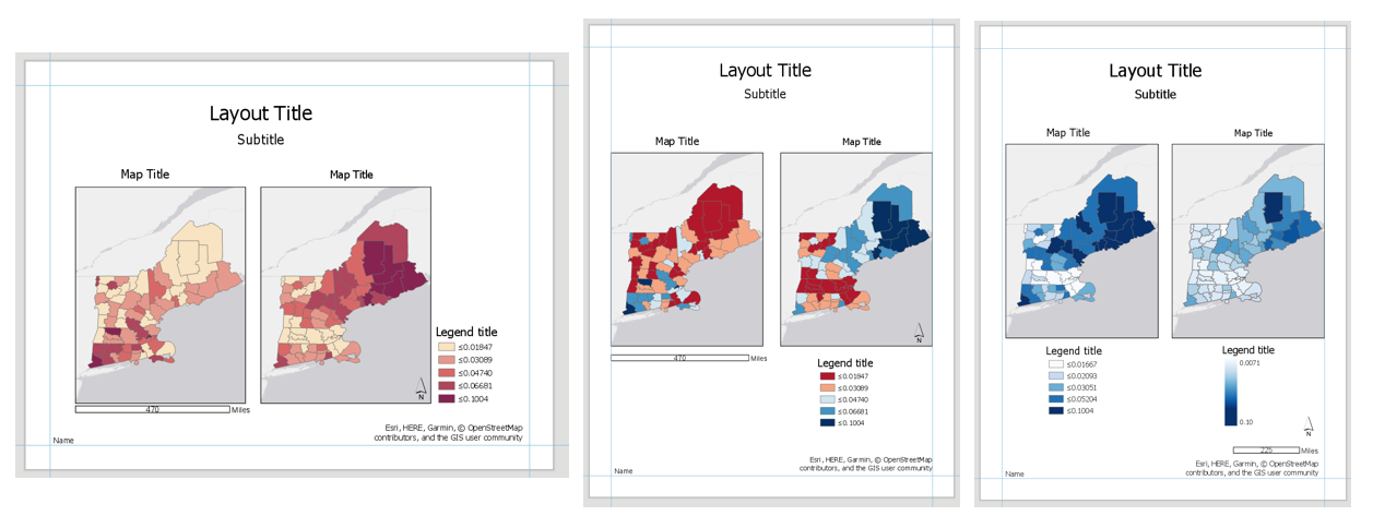 Visual Guide Figure 4.12. Visual example of the three layouts (albeit not well-designed ones) - but these demonstrate the elements required for inclusion in each layout in this lab.
-
Example Map Pair #1
Don’t copy this (poor) layout design – use your own knowledge and judgment. Clean up titles, marginal elements, alignments, etc. – use either portrait or landscape, whichever you prefer. Note that elements which refer to both maps (legend; north arrow; scale bar) need only be included once.
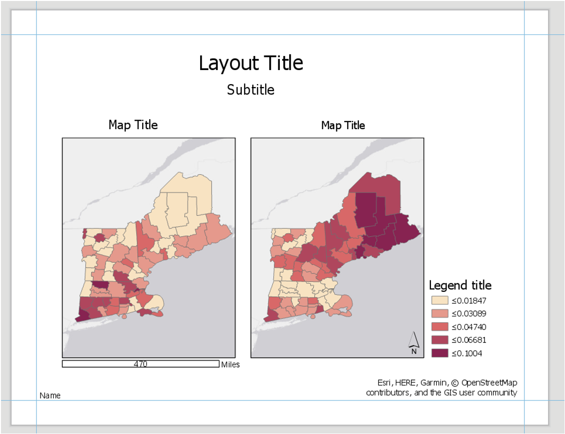 Visual Guide Figure 4.13. Example Map Layout #1
 -
Example Map Pair #2
Don’t copy this (poor) layout design – use your own knowledge and judgment.
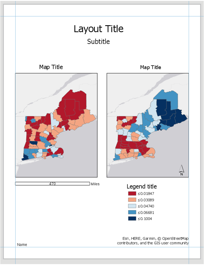 Visual Guide Figure 4.14. Example Map Layout #2
Use convert to graphics to manually improve your legend. Use a text box to annotate your critical class/break!
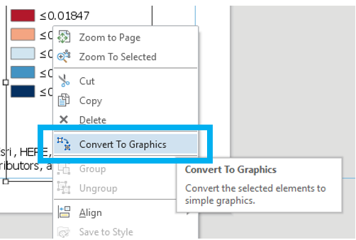 Visual Guide Figure 4.15. Using the Convert to Graphics function.
 -
Example Map Pair #3
Don’t copy this (poor) layout design – use your own knowledge and judgment. Remember this map pair uses the same data for each map – it is demonstrating the effects of classification. Your goal should be to make a clean, useful legend for each map - make it look better than the legend design below.
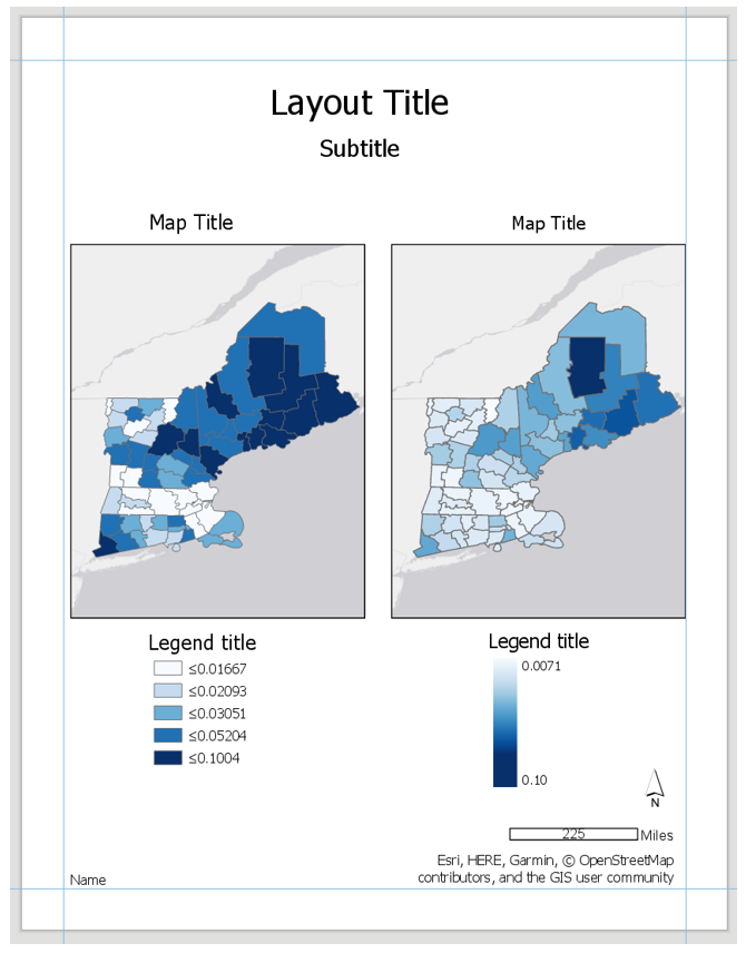 Visual Guide Figure 4.16. Example Map Layout #3.
-
-
Additional Tips
Think about color and what you are mapping. Are you mapping insured or uninsured? Choose colors wisely – what do they represent?
Remember that you can employ text to explain your map! Use text sparingly but effectively – don’t be afraid to use convert to graphics and/or manually edit text and layout elements. When choosing a color scheme as well as when doing your write-up, keep in mind: the perceptual progression of your data should match the perceptual progression of your color scheme.
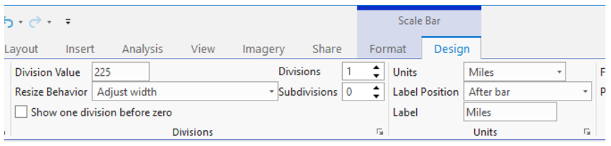 Visual Guide Figure 4.17. Cleaning up your scale bar design - the "adjust width" option for resize behavior can be very helpful!
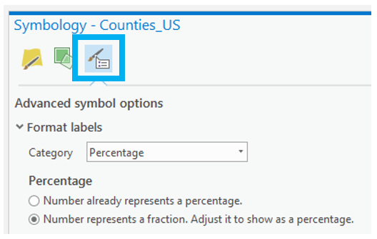 Visual Guide Figure 4.18. Simplifying legend labels in the Symbology Pane - think about how your data values were calculated when selecting a label format.
Credit for all screenshots is to Cary Anderson, Penn State University; Data Source, US Census Bureau.