Lesson 5 Lab Visual Guide
Lesson 5 Lab Visual Guide Index
- Starting File
- Explore the Flight Data
- Create Flight Paths Using the X-Y to Line Tool
- Choose and Customize a Map Projection
- Symbolize Flight Paths by Their Length
- Repeat to Create the 2nd Layout
- Repeat to Create the 3rd Layout
- Additional Tips
Throughout this lab, keep the following statement in mind:
"The projection you choose will depend on the characteristics most important to be preserved, given the purpose of your map."
-
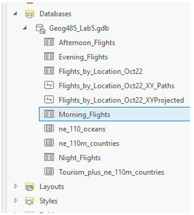
Starting File
This is your starting file in ArcGIS Pro: It contains boundary, flight, and tourism data. The flight data is in table form - we will be using these data tables to create flight paths and visualize them on the map.
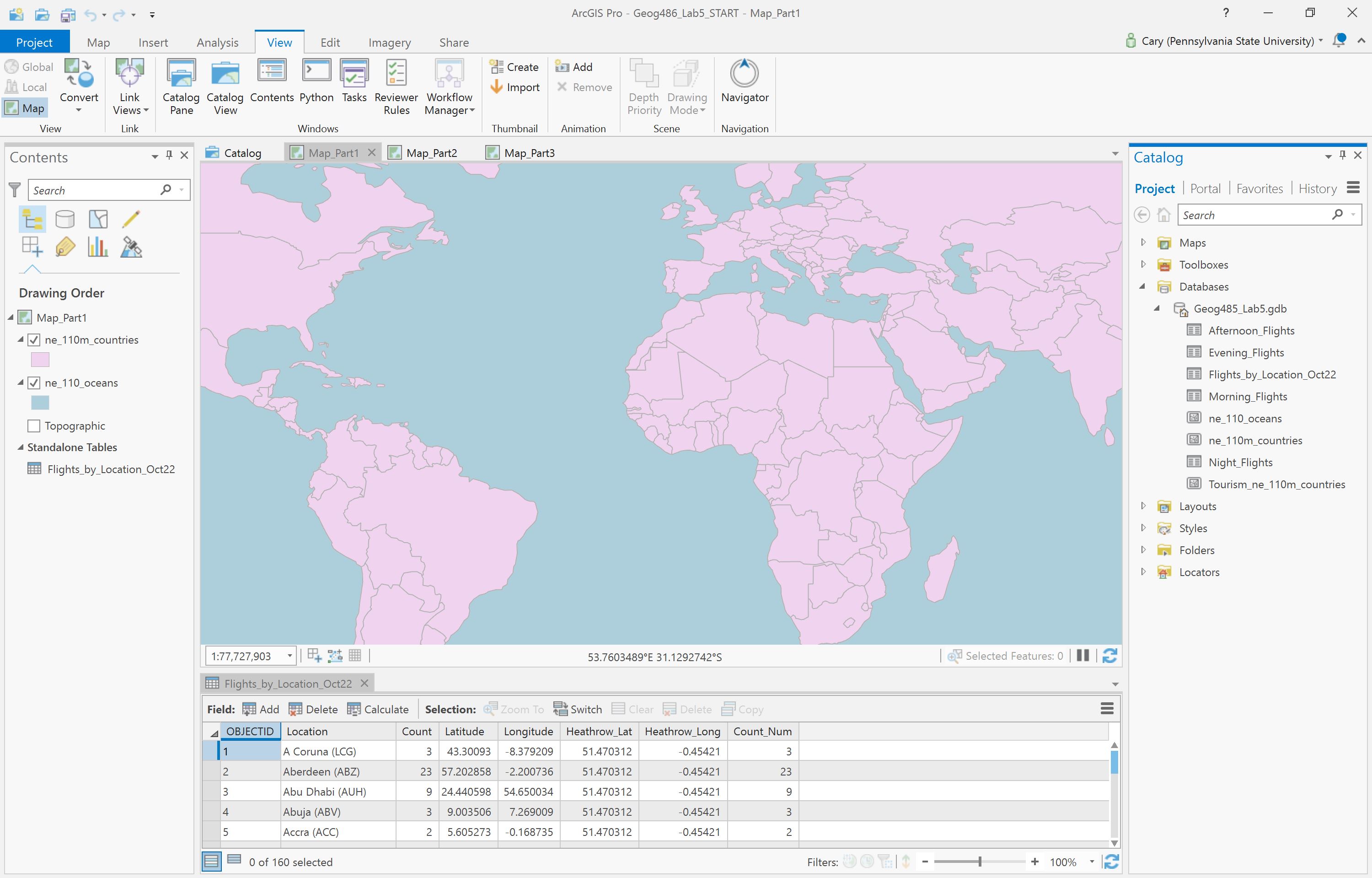 Visual Guide Figure 5.1. Lab 5 starting file in ArcGIS Pro.
 -
Explore the Flight Data
The primary flight data table is the one shown below - it contains a full day of flight data (Oct 22nd, 2018). Listed in the table are all locations which had a flight arrive from, or depart to, London Heathrow Airport (LHR). We will not differentiate between arrival and departure flights in this lab.
The count of flights to or from this location is listed in the Count_Num field. For the purposes of this lab, we will assume that October 22nd is representative of an average day at LHR, and thus use this dataset as a proxy for LHR’s “daily” flight data. You do not need to mention October 22nd anywhere on your maps.
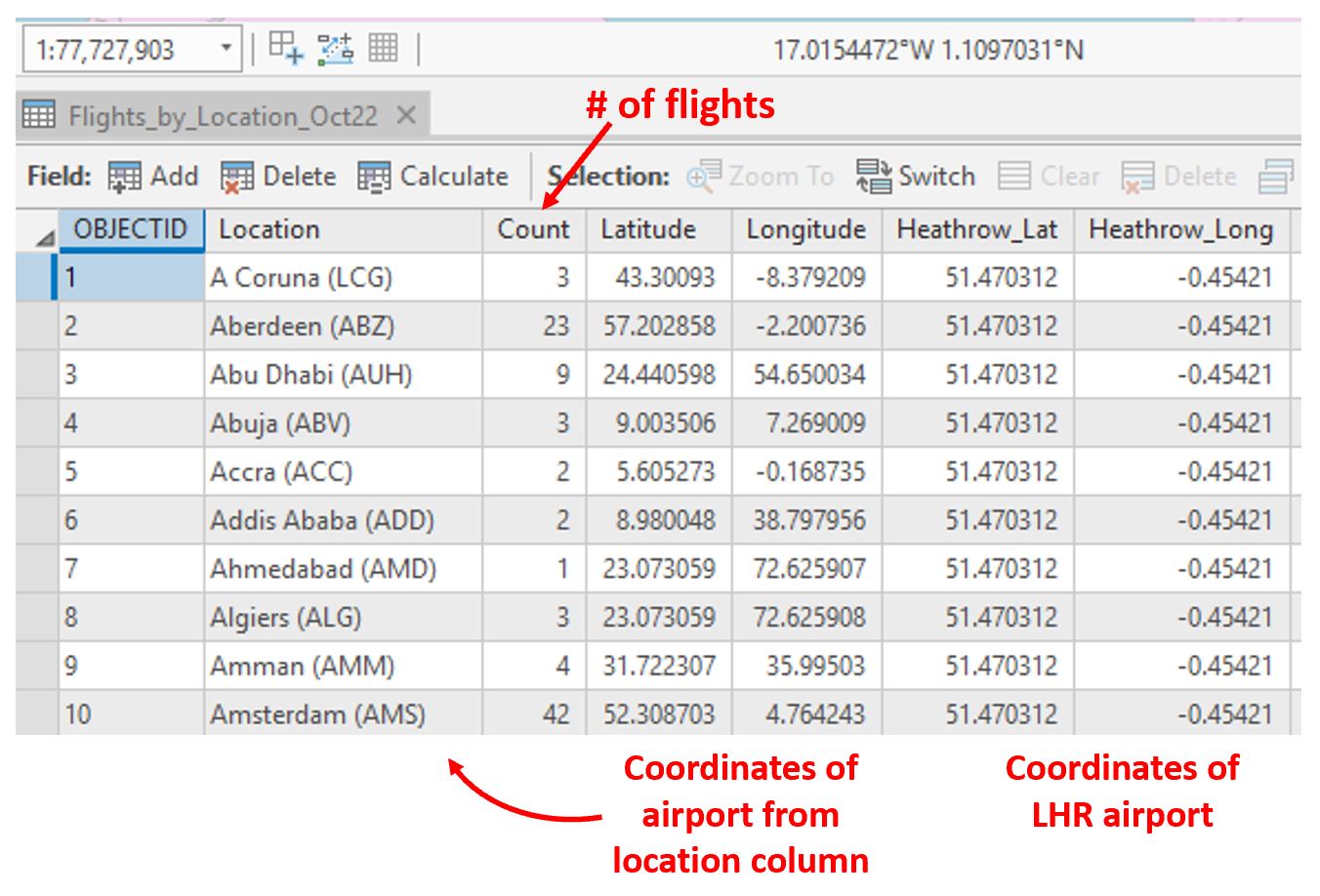 Visual Guide Figure 5.2. Flight data table as shown in ArcGIS Pro.
 -
Create Flight Paths Using the XY to Line Tool
In our flight data, we have lots of origin-destination data. We want to visualize these data as flows on our map. For this, we use the XY to line tool. Think carefully about the fields you choose for each parameter when running this tool. If you do it incorrectly the first time, don't worry - re-think and re-do.
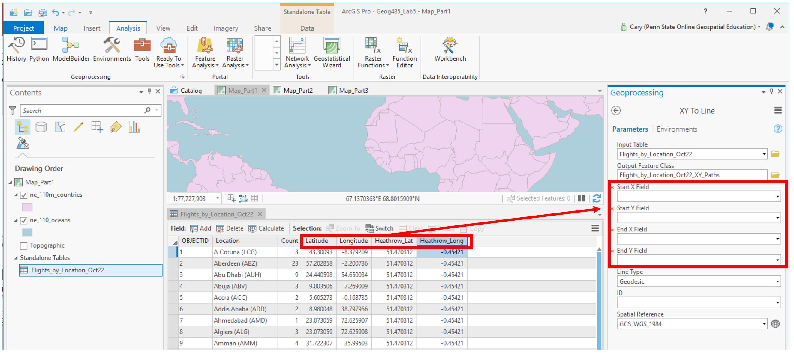 Visual Guide Figure 5.3. Running the XY to Line tool to create flowlines.
 -
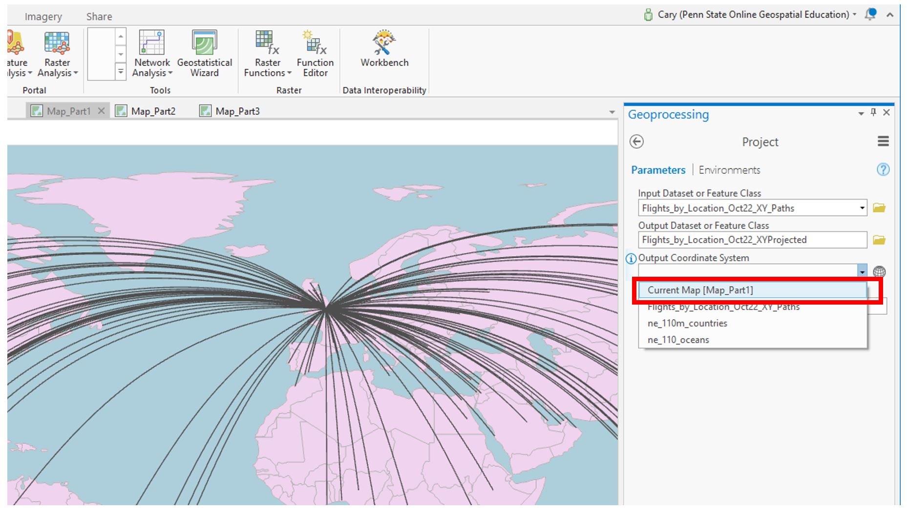
Choose and Customize a Map Projection
For each map layout in this lab, you will be creating a customized map projection (use the Project tool). Reference the projection lesson and consider each advertisement's goal/purpose to help you decide which projection to choose/customize for each map. You may want to try adding the map to a layout at this stage of the lab to decide if you like it. Remember that you will be asked to defend this choice in the reflection you submit with this lab.
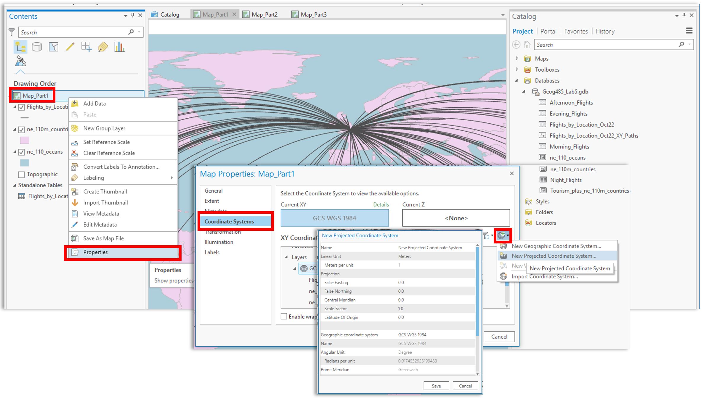 Visual Guide Figure 5.4. Creating a new projected coordinate system and assigning it to your map.
You may need to try a few different projections or customization parameters to find a map projection you are happy with. When you have settled on a projection, use the project tool to project your flowlines to match the map's projection. As shown below, ArcGIS makes this pretty easy.
 Visual Guide Figure 5.5. Projecting your flowlines.
Recall that we will be visualizing flight paths based on their length. We can use the Shape_Length field which ArcGIS automatically calculated for us from our origin-destination data to do this. Note that before projecting these lines, the Shape_Length field will not contain meaningful values.
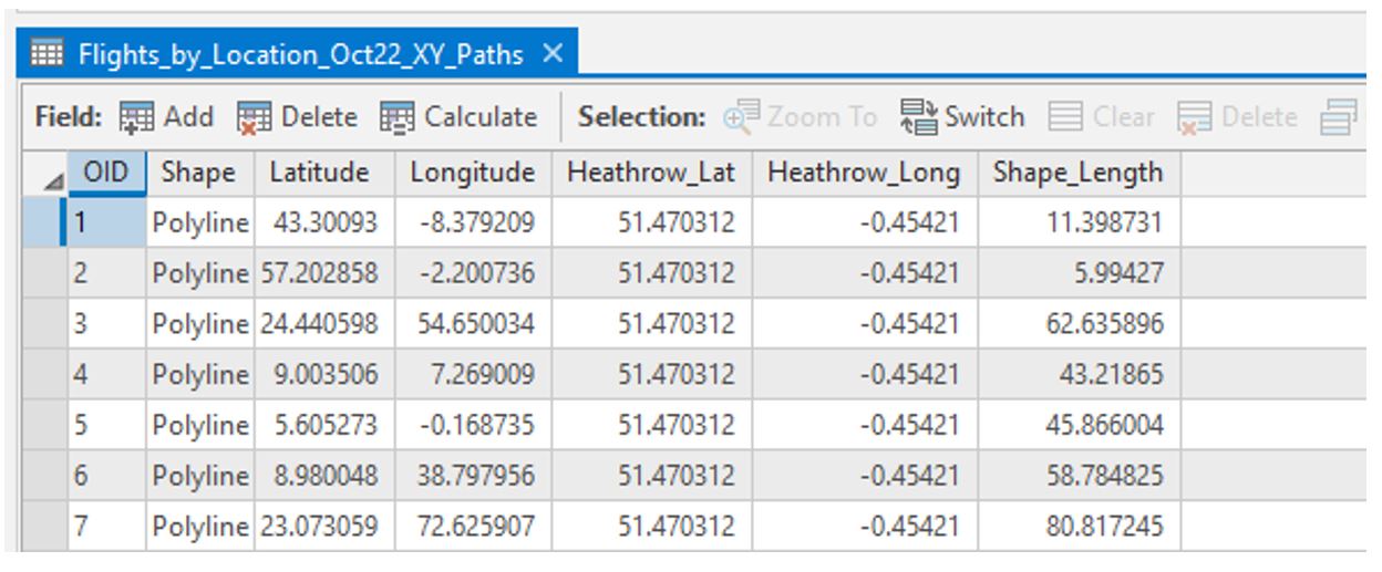 Visual Guide Figure 5.6. Flowline attribute table before projection.
Once your flight paths are projected, the Shape_Length field will be calculated in meters.
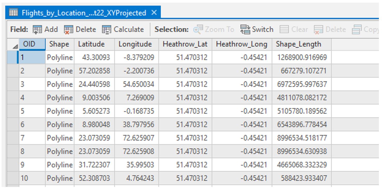 Visual Guide Figure 5.7. Flowline attribute table after projection.
As you may have noticed, the flight path data doesn't contain any location names or flight count numbers. We'll need to join the original flight data table to the flight path data to get all our data in one place.
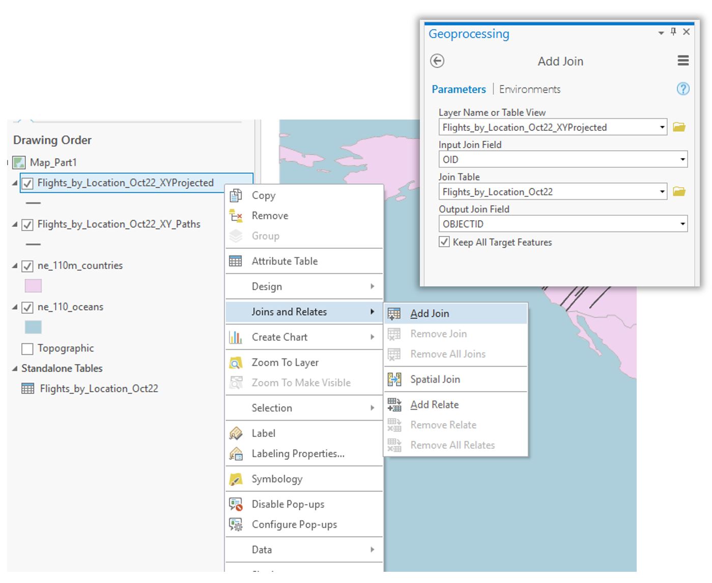 Visual Guide Figure 5.8. Adding a join to add attribute data to our flight paths.
 -
Symbolize Flight Paths by Their Length
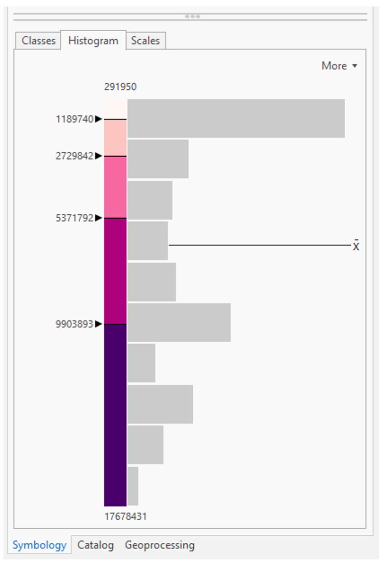
Use external research or the data distribution to decide on classifications for short vs. long flights, etc. (3+ classes). Recall considerations for data classification from Lesson/Lab 4.
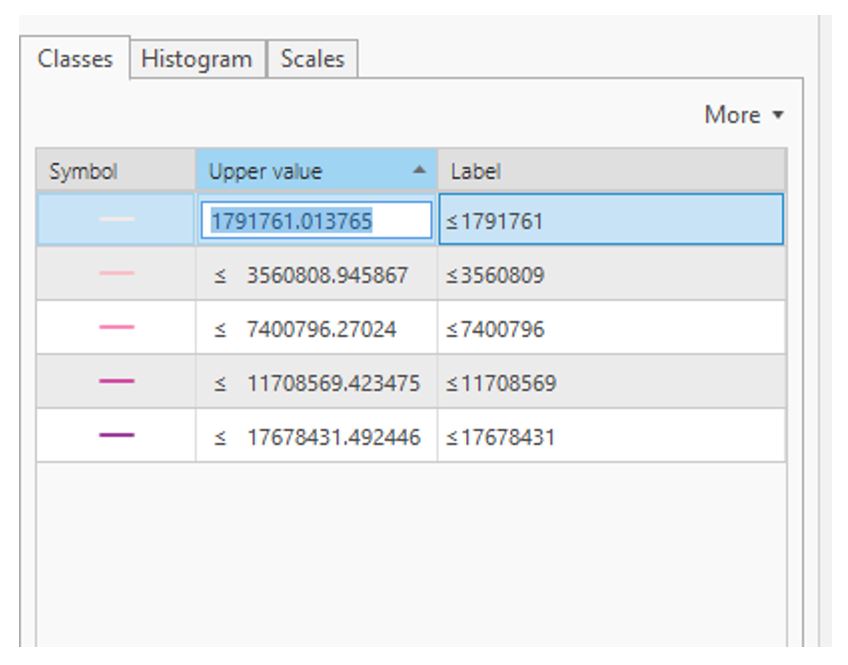 Visual Guide Figure 5.9. Manually editing classifications.
You may use any or multiple visual variables of your choice to symbolize your flowline data - size, value, etc... as long as it is appropriate given the perceptual structure of your data, you can be creative with it.
 Visual Guide Figure 5.10. Making additional edits in the Symbology Pane.
Add your map to a layout: create a catchy title/subtitle and customize your legend. Add a graticule (ArcGIS Pro calls this a “grid”) if you wish.
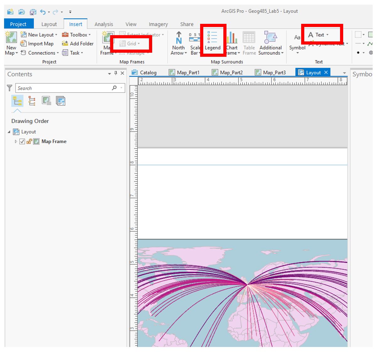 Visual Guide Figure 5.11. Example map with flowlines inserted into a layout.
Make sure all layout elements are neat and orderly – “convert to graphics” will likely be helpful. Keep in mind lessons from previous labs: legends and any explanatory text should be clear, etc.
-
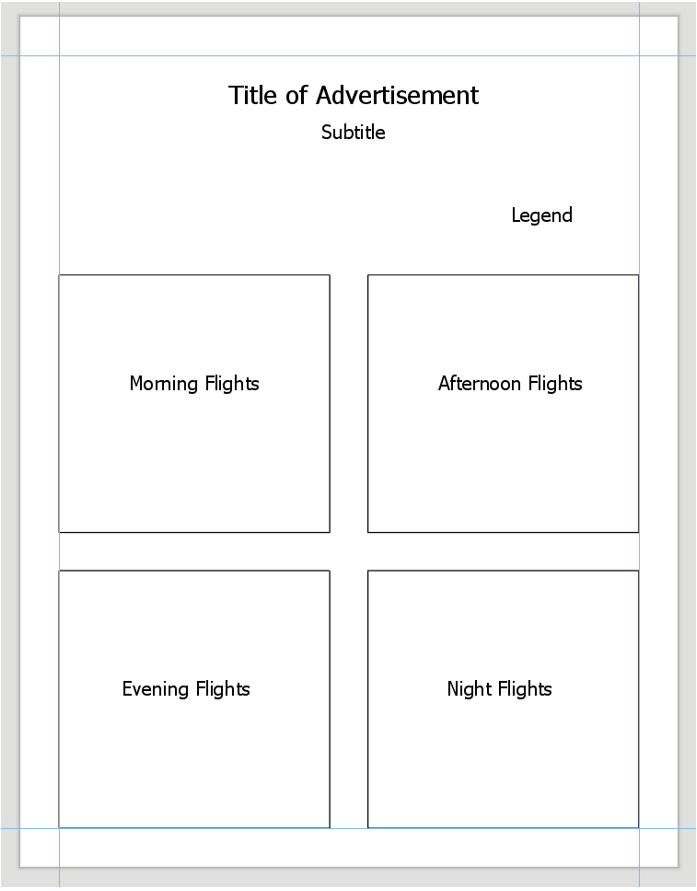
Repeat These Same General Steps to Create the 2nd Layout
You’ll want to create three new maps (four total) to separate the flight types (morning, afternoon, evening, night). If you prefer, you can do a Save-As and keep work done on this project separate form the previous one. In any case, save frequently!
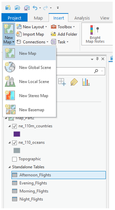 Visual Guide Figure 5.12. Adding a new map for the afternoon flights.
You can drag the tables onto their appropriate map from the Contents Pane.
 Visual Guide Figure 5.13. Flight tables in the Contents Pane.
Use creativity, appropriate visual variables, and good design in this ad as well! Remember the goal of this layout - highlighting that Heathrow can fit anyone’s schedule.
 Visual Guide Figure 5.14. Example layout for advertisement #2.
 -
Repeat to Create the 3rd Layout
For the third advertisement, we will add additional data to our map to demonstrate to the reader that flights from LHR go to desirable locations. Choose a field such as “International Tourist Arrivals 2017” that makes sense to use in an ad about air travel. Visualize this data on your map how you choose - remember that you will still be visualizing the flight paths. You may use the same flight path layer from Map #1, but you will need to re-project it to match your projection for Map #3.
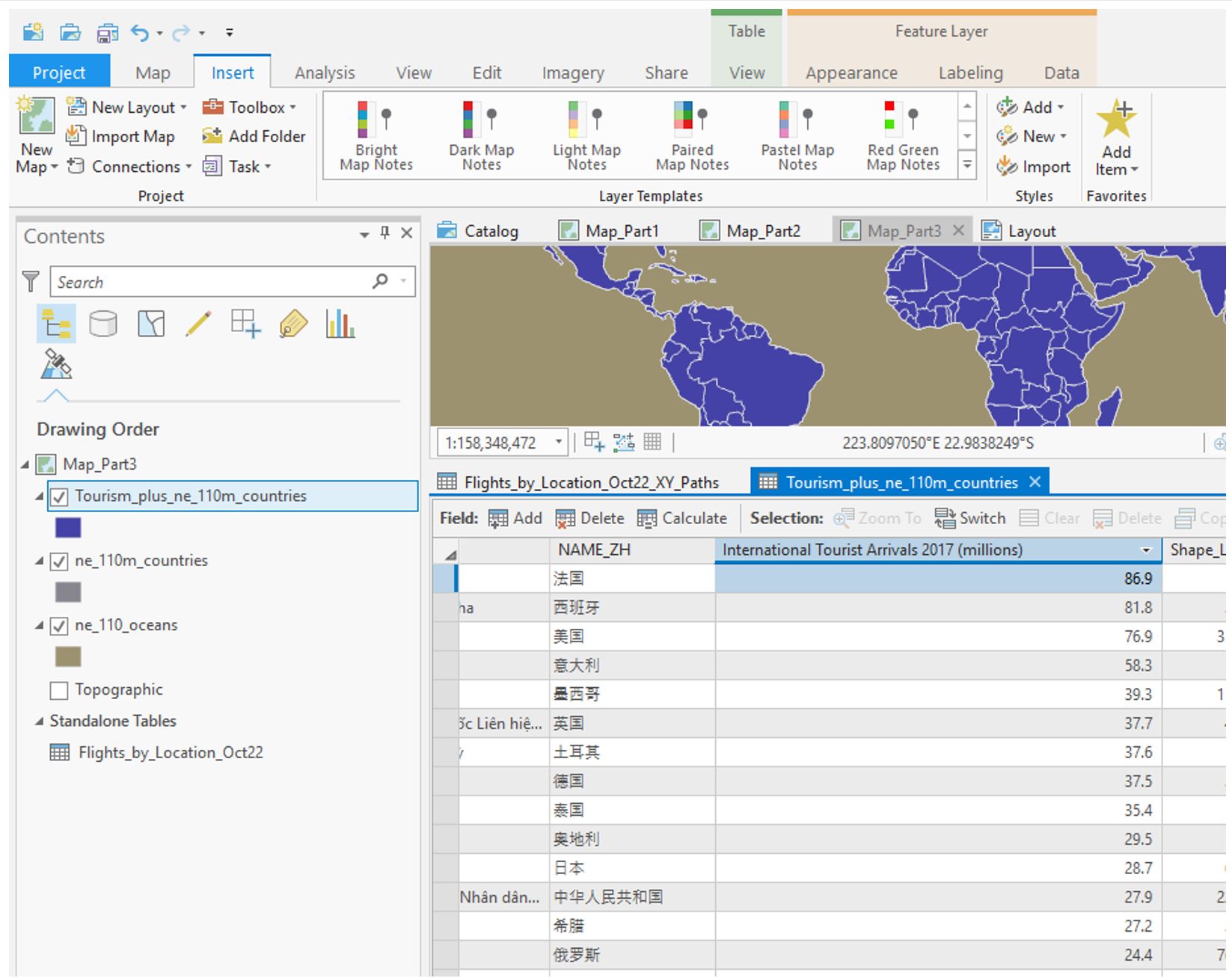 Visual Guide Figure 5.15. Exploring the attribute table for the included tourism data.
Choose and customize a projection you haven’t used yet – be prepared to write about the reason for this selection. Think about your map type and purpose.
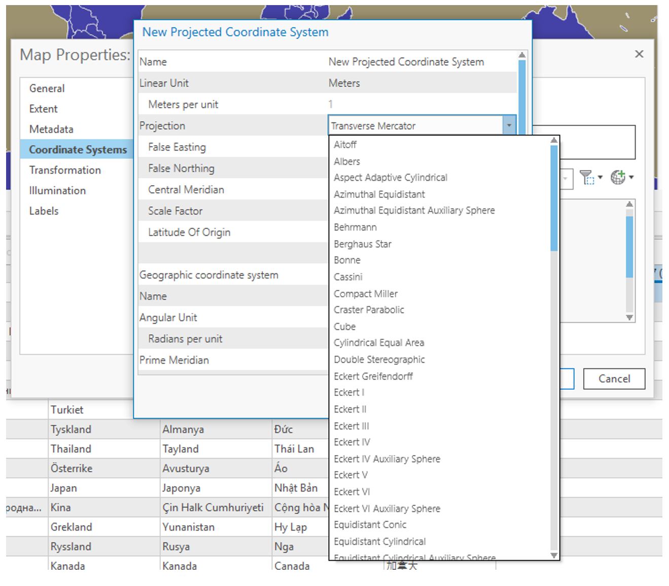 Visual Guide Figure 5.16. Adding a projected coordinate system to your map.
Ensure that both your flight path and other thematic data is included in your layout - below is just an example of how you might symbolize this data, but there are many other possible ways. If you do not want to use tourism data, you can use a field that was automatically imported with the Natural Earth boundary data such as GDP. Consider how you will visualize null values.
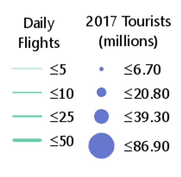 Visual Guide Figure 5.17. Example legend.
 -
Additional Tips
- Remember these are advertisements! Use good design but have fun with titles, colors, etc.
- You may want to use an interesting projection - such as one that visualizes the world as a sphere - for one or more of your maps. Be sure it is appropriate for your map's purpose.
- Adding a grid often aids in reader interpretation of small-scale maps.
- You do not need a scale bar or north arrow for any of these map layouts - they are generally considered unnecessary (and often inappropriate) for global-scale maps.
- When you write your reflection, include a screenshot of the map's projection details (such as in Figure 5.18 below) for each map layout. You will likely use the same projection for all four maps in layout #2, so you only need to include one screenshot for layout #2 and note that it was used four times.
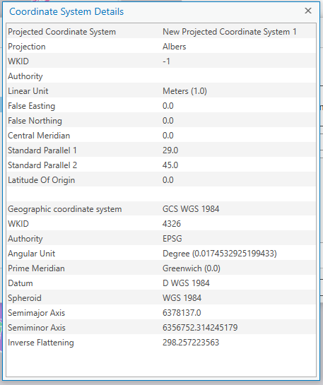 Visual Guide Figure 5.18. Map projection details.
Credit for all screenshots is to Cary Anderson, Penn State University; Data Source: Flightradar24, Natural Earth.