Lesson 7 Lab Visual Guide
Lesson 7 Lab Visual Guide Index
- Starting File
- Explore the Happiness Data
- Create Your Primary Map
- Add Visual Depiction of Uncertainty
- Create Small Multiple Maps and Final Document
- Additional Tips
Credit for all screenshots is to Cary Anderson, Penn State University; Data Source: World Happiness Report (Helliwell et al. 2018), Natural Earth.
-
Starting File
This is your starting file in ArcGIS Pro: It contains boundary data from Natural Earth, as well as thematic data from the World Happiness Report.
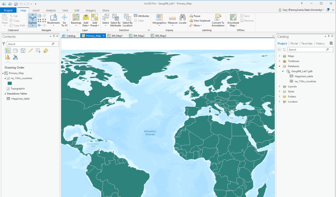 Visual Guide Figure 7.1. Lab 7 starting file in ArcGIS Pro.
 -
Explore the Happiness Data
As suggested above, the purpose of this lab is to visualize data from the World Happiness Report. You should explore this data in ArcGIS Pro (Figure 7.2), and view the World Happiness Report online to get a sense of what the data means. Definitions for each happiness indicator variable are also listed at the bottom of the Lab 7 requirements page.
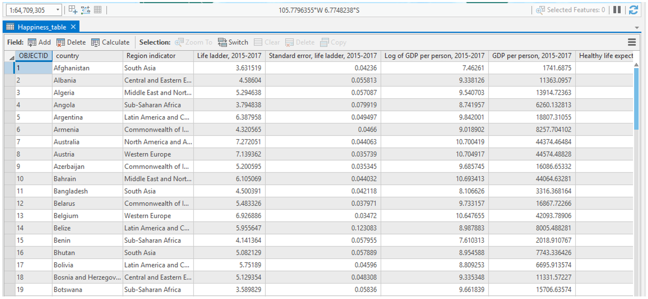 Visual Guide Figure 7.2. The World Happiness data table as viewed in ArcGIS Pro.
 -
Create Your Primary Map
Your first task is to choose a happiness variable of interest and to map this as your primary map for the lab. For this map, you must select one of the variables with an associated "Standard Error" column. We will be using this as a proxy for uncertainty (more on that later).
You may choose from among several thematic mapping options (choropleth; graduated symbol; proportional symbol, etc.) to map your happiness data. This survey data is a bit more abstract than the data we have become accustomed to working with, so for this lab, you have a bit more freedom than usual in selecting a mapping method. Shown below are some examples of symbolization methods that you might use for your primary map.
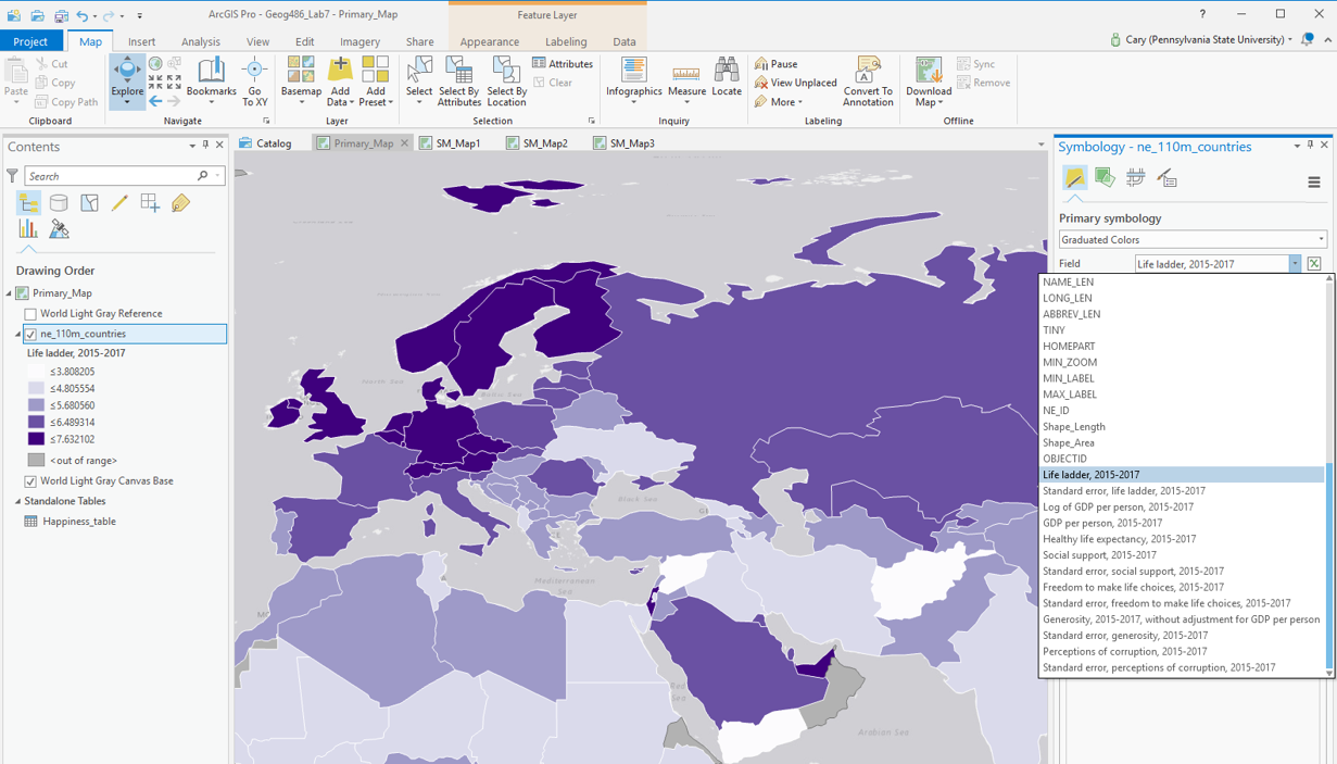 Visual Guide Figure 7.3. Example symbolization method - Choropleth.
The data provided to you for this lab has already been standardized for you, so you will not need to choose a "normalization" field.
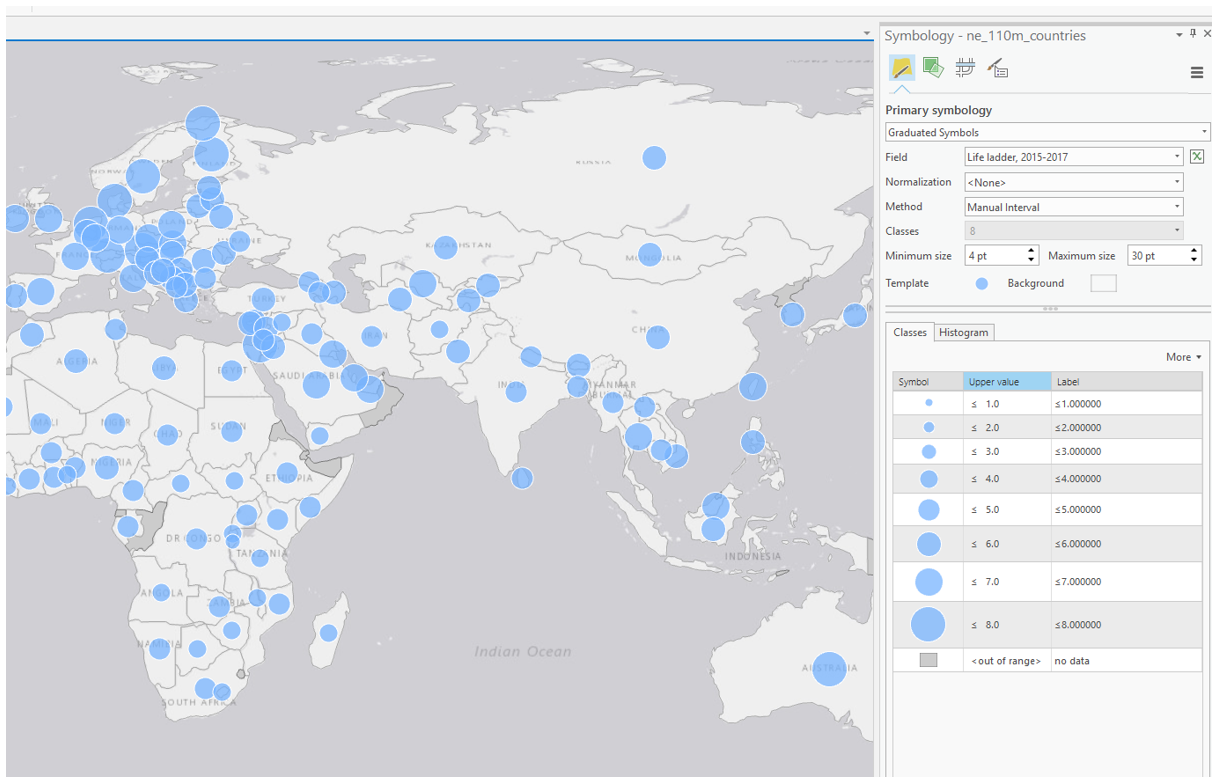 Visual Guide Figure 7.4. Example symbolization method - Graduated Symbols.
When designing your map symbols, recall previous labs and focus on creating a useful and aesthetically-pleasing design. If using proportional symbols, for example, you will likely want them to be semi-transparent so that both symbols can be seen in the case of overlap.
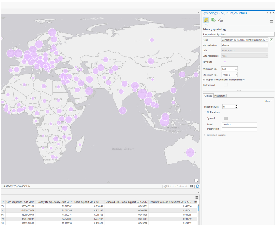 Visual Guide Figure 7.5. Example symbolization method - Proportional Symbols.
As you might notice, not every country is included in the World Happiness Report. Due to this, an important element of your map design will be deciding how to visualize null values. You want it to be clear to the map reader which countries are not included in the report, but you do not want these to be too prominent in your map's visual hierarchy - they should not distract from your map's main purpose. As shown below, symbolizing null or "out of range" values is a slightly different process depending on which symbolization method you choose.
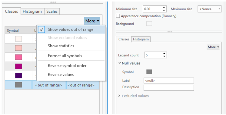 Visual Guide Figure 7.6. Visualizing null values in ArcGIS Pro. Choropleth maps (left), Proportional Symbol maps (right).
 -
Add Visual Depiction of Uncertainty
Your primary map should visualize not only the happiness indicator you have selected, but also its associated uncertainty. For this lab, you will use your chosen variable's associated "standard error" field as a proxy for uncertainty. Assume that higher standard error = higher uncertainty. Though the statistics involved are slightly more complicated than this, the focus of this lab is on visualization and thus this generous assumption is suitable for our purposes. Additionally, as we are interested in where the data is more or less certain, rather than in the actual standard error values, you should classify this uncertainty data into general groupings (e.g., "low," "medium," "high").
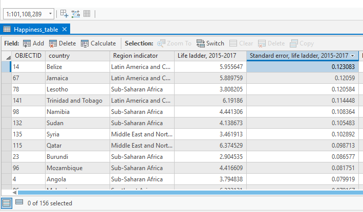 Visual Guide Figure 7.7. Happiness data uncertainty - highlighted here is the standard error column for the happiness variable life ladder.
You may choose to visualize uncertainty either extrinsically or intrinsically. When selecting a method, consider how you will represent this uncertainty in your map's legend, as well as how your design might be interpreted by your map's intended audience. This guide presents two popular methods for visualizing uncertainty, though there may be others.
Option #1: Extrinsic uncertainty visualization
The easiest way to create an extrinsic uncertainty visualization layer is to copy-and-paste your country-boundary layer (which includes all the happiness data), and to symbolize uncertainty with the duplicate layer.
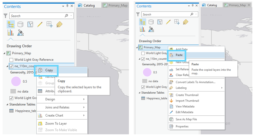 Visual Guide Figure 7.8. Copying and pasting a layer in the ArcGIS Pro contents pane.
Two examples of extrinsic uncertainty visualization are shown in Figure 7.9. Recall from the lesson content the visual variables most effective for visualizing uncertainty. Your goal should be to create an intuitive design.
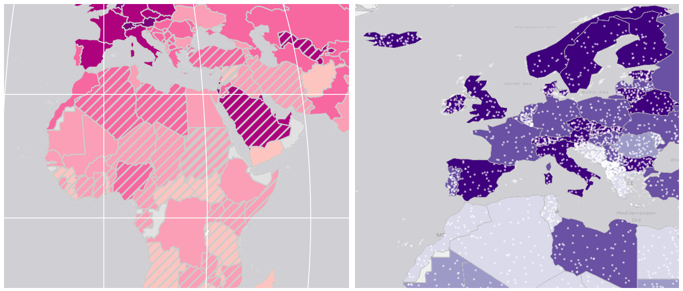 Visual Guide Figure 7.9. Examples of extrinsic uncertainty visualization. Overlay data is used to obscure less-certain values.
Once you've finished creating your map and adding it to a layout, you'll need to design an import part of this lab - your map legend. Figure 7.10 below contains some examples of legend designs. More so than with previous labs, you will likely want to make significant edits to your legends via the "convert to graphics" function in ArcGIS Pro.
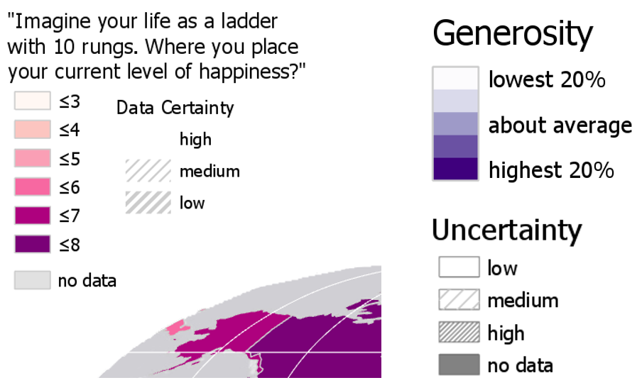 Visual Guide Figure 7.10. Example multivariate map legend designs.
Option #2: Intrinsic uncertainty visualization.
The other primary option for visualizing uncertainty in your map is intrinsically, via the "vary symbology by attribute" option in ArcGIS Pro. Think carefully about how you apply elements like transparency—the progression of your data should match the visual progression of your design. To accurately depict your data and its uncertainty, you may have to manually edit or reverse a color scheme or transparency range.
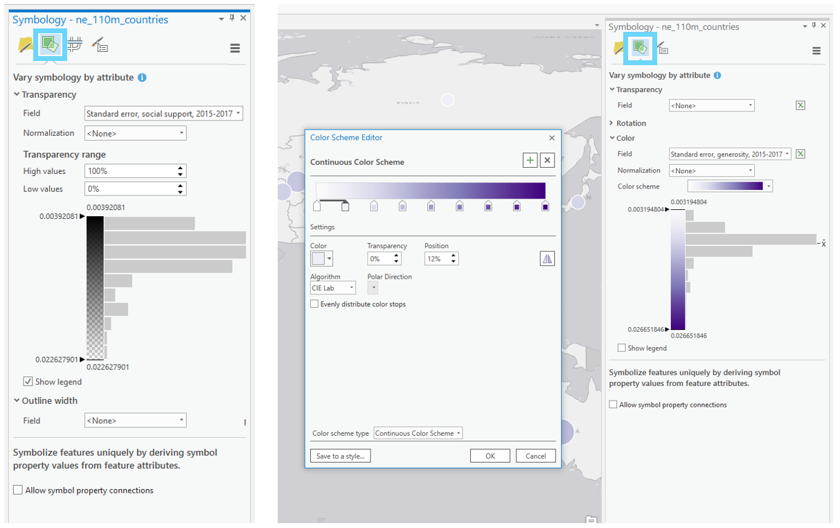 Visual Guide Figure 7.11. Varying symbology by attribute in ArcGIS Pro.
 -
Create Small Multiple Maps and Final Document
Once you've finished your primary map, you will create three smaller maps. These maps should visualize three additional variables from the World Happiness Report. You do not need to visualize uncertainty in these smaller maps. For this lab's final deliverable, you will include your four maps in a report that focuses on answering the following questions:
- Why did you choose to map the happiness indicators that you did?
- What do the maps you created tell us?
- Where (or how), based on conclusions drawn from your maps, do you think funding ought to be directed, and why? What role should knowledge of data uncertainty play in these decisions?
You may start with this template: Report Template: Lab 7 and customize it as you wish. You do not need to include additional research from sources outside of the World Happiness Report, though you may if you wish.
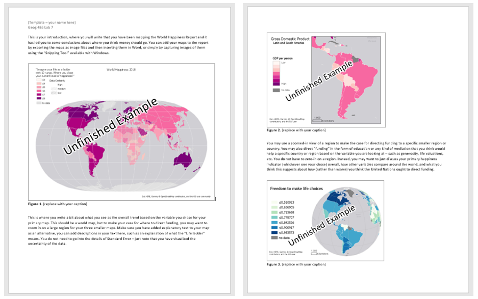 Visual Guide Figure 7.12. A preview of the document template.
 -
Additional Tips
Remember design ideas from previous labs - you may want to add elements such as a grid, explanatory text, and data credits to your layouts. It's up to you how you balance your final document with such elements - for example, instead of listing a data source on your map images, you can simply include this source in the text you write. Also, note that due to the scale of these maps you do not need a north arrow or scale bar - focus on creating a useful and cohesive document, as well as smartly-designed legends.