Lesson 3: From Data to Design
Overview
Overview
Welcome to Lesson 3! In previous lessons, we discussed broad concepts related to map and map symbol design, including designing for a map’s audience, medium, and purpose. We learned about visual variables and how to designate order and category with map symbols. In the context of text on maps, we discussed these ideas in greater detail; we created symbols with labels and learned how to place them appropriately on maps. We then put everything together in a map layout.
So far, we have only designed general purpose maps. Though these maps still contain data (e.g., road networks, lakes, boundaries), we have not yet added more abstract data to maps. In this lesson, we discuss thematic maps and the ways in which we can use maps to effectively visualize spatial data. When deciding how to map, we’ll consider the spatial dimensions and models of geographic phenomena, levels of data measurement, and appropriate methods of visual encoding. We’ll compare and contrast the four most common types of thematic maps (choropleth, isopleth, proportional symbol, dot) and map two of these in Lab 3, using a popular data source for thematic mapping – the US Census Bureau.
Learning Outcomes
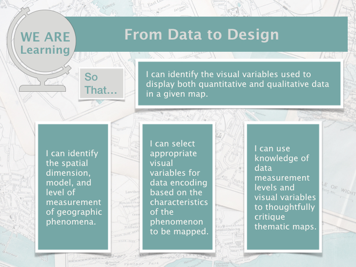
By the end of this lesson, you should be able to:
- identify the visual variables used to display both quantitative and qualitative data in a given map.
- identify the spatial dimension, model, and level of measurement of geographic phenomena.
- select appropriate visual variables for data encoding based on the characteristics of the phenomenon to be mapped.
- use knowledge of data measurement levels and visual variables to thoughtfully critique thematic maps.
Lesson Roadmap
| Action |
Assignment |
Directions |
|---|---|---|
| To Read |
In addition to reading all of the required materials here on the course website, before you begin working through this lesson, please read the following required readings:
Additional (recommended) readings are clearly noted throughout the lesson and can be pursued as your time and interest allow. |
The required reading material is available in the Lesson 3 module. |
| To Do |
|
|
Questions?
If you have questions, please feel free to post them to the Lesson 3 Discussion Forum. While you are there, feel free to post your own responses if you, too, are able to help a classmate.
Thematic Maps: Visualizing Data
Thematic Maps: Visualizing Data
We first introduced thematic maps in Lesson One, and described them as maps intended to highlight features, data, or concepts (either quantitative or qualitative). In Labs One and Two, we used visual variables to show order and category of typical map features on maps.
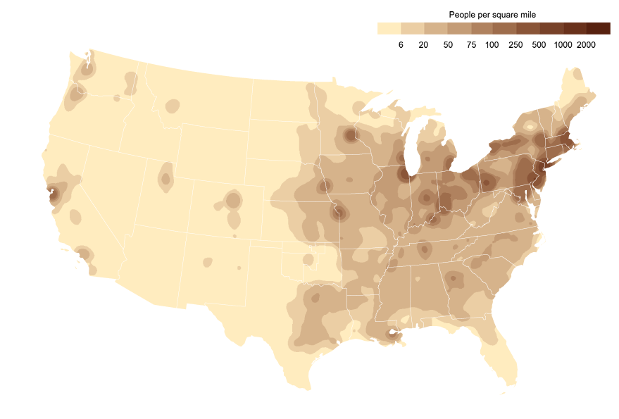
The maps we’ve created so far have been general purpose maps—designed to display features of general interest. In designing our maps, we created abstract representations of the real world, with roads, rivers, lakes, county lines, etc., with hues and shapes different from what would be captured by a photograph. Despite this, our designs have still reasonably matched their physical reality. In this lesson, we turn to more abstract depictions of the world, designed using thematic data. View for example, the map in Figure 3.1.1.
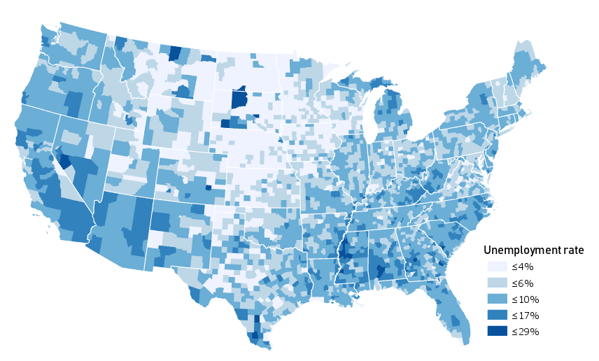
This map uses color value—not to show category or hierarchy of map features—but to visually encode county-level unemployment data. Figure 3.1.1 also simplifies the map of the US (not showing even major highways or mountain ranges, but only state and county boundaries) to emphasize the map’s theme.
Due to thoughtful use of color and a simple layout design, this map successfully communicates geographic trends of unemployment in the United States. But was this the best choice to show this concept? Might there be a better way?
View the map in Figure 3.1.2 below.
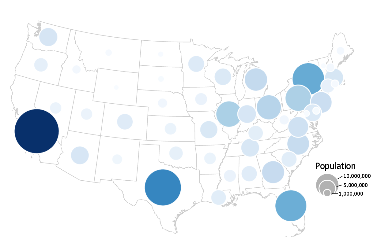
This map uses a similar color scheme and layout, but encodes its data primarily using proportionally-sized symbols. Color value is used for additional effect, a technique called dual encoding.
These maps (3.1.1; 3.1.2) are both correct—they fit into cartographic conventions. But there are other maps that this cartographer could have made with each dataset that would have been equally correct. There are also maps they could have made that would have been—arguably—quite wrong. How to decide?
Student Reflection
Do you think the data mapped in Figure 3.1.1 would be appropriate for making a proportional symbol map (e.g., Figure 3.1.2)? Why or why not?
Before beginning the how of making a map, we need to take a step back and consider the what—the geographic phenomena we want our map to be about.
Geographic phenomena are elements that exist over geographic space. When we say geographic we typically mean anything between the size of a human and the size of the world. So, while still spatial, the connections between the neurons in your brain or the arrangement of atoms in a ceramic material do not constitute geographic phenomena. In this lesson, you will learn tools for conceptualizing, visualizing, and communicating the many phenomena that do.
Recommended Reading
US Census Bureau. 2021. “Interactive Maps [1].” Accessed May 31.
Geographic Phenomena: Spatial Dimensions
Geographic Phenomena: Spatial Dimensions
Geographic phenomena are often classified according to the spatial dimension best used to describe their nature. These include points, lines, areas, and volumes (3D). As you likely remember, we used the spatial dimension of map elements (e.g., line vs. point) in the last lab to decide how to symbolize and apply feature labels to our maps.
Points exist in a singular location and thus have theoretically zero dimensions. Points are usually specified using a coordinate pair (x, y) of latitude and longitude, though they occasionally include a z (height).
Lines are one-dimensional spatial features, typically defined by a series of (x, y) coordinates. A z (height) dimension can also be assigned to lines, but this is uncommon. Lines are used to map phenomena that are best conceived of as linear features, including both some features that have greater dimensionality in reality (e.g., rivers) and those that do not visibly exist in the real world at all (e.g., property lines).
Area features are two dimensional and are represented by a series of (x, y) points that enclose a space. Areal phenomena include natural features like lakes and parks, as well as human-defined locations—from continents to census blocks.

2-½ and 3-D features are sometimes grouped together, but the distinction between them is important. 2-½D features define a continuous surface—they have an x, y, and a z at every location. A good example is elevation, which varies continuously across the landscape. Therefore, a topographic map is a common depiction of 2-½D phenomena.
True 3D maps have an x, y, and z, plus an additional data value, at every location. Imagine, as an example, a map of elevation like the one above; but at every point along the terrain surface, there are additional measurements being taken at various depths. Thus, rather than depicting a continuous surface, true 3D maps depict a continuous volume.
Keep in mind that the scale of your map has significant influence on what spatial dimension will best represent the phenomenon you intend to map. Cities, for example, are usually drawn as areas on large-scale maps, but appear as points on smaller-scale maps. Rivers are usually drawn as lines on small-scale maps but are better represented as areas on large-scale maps. We will discuss this more during discussions of cartographic generalization later in the course.
Recommended Reading
- Peuquet, D J. 1984. “A Conceptual Framework and Comparison of Spatial Data Models.” Cartographica 21 (4): 66–113. doi:10.3138/D794-N214-221R-23R5.
- Couclelis, Helen. 1992. “People Manipulate Objects (but Cultivate Fields): Beyond the Raster-Vector Debate in GIS.” GIScience Conference Pa. doi:10.1007/3-540-55966-3.
Geographic Phenomena: Models
Geographic Phenomena: Models
When conceptualizing the geographic phenomena we want to map, it is important to consider the best way that these phenomena can be modeled. In general, we can categorize the best model for a given phenomenon as existing somewhere along two continuums: (1) from discrete to continuous, and (2) from smooth to abrupt.
You likely learned the difference between discrete (e.g., as shown by a histogram) and continuous (e.g., as shown by the bell curve) variables in an introductory statistics course. The distinction in cartography is similar.
Discrete phenomena have well-defined boundaries: they occur at specific locations, with space in between. Examples include people, cars, houses, hospitals, and roads.
Continuous phenomena, conversely, have ill-defined or irrelevant boundaries. Examples include temperature, air quality, and elevation.
Phenomena can also—independent of their classification as discrete or continuous—be considered either smooth or abrupt.
Smooth phenomena are those that change gradually over geographic space. Examples include precipitation levels and solid aridity: they vary by location but do not typically change abruptly at geographic bounds.
Abrupt phenomena do change suddenly at a geographic boundaries, whether physical or cultural. Often, phenomena are not clearly smooth or abrupt, but fall somewhere in between. The amount of pesticides in soil, for example, might vary somewhat continuously over space, but change rather abruptly at political boundaries (e.g., due to changing government regulations).
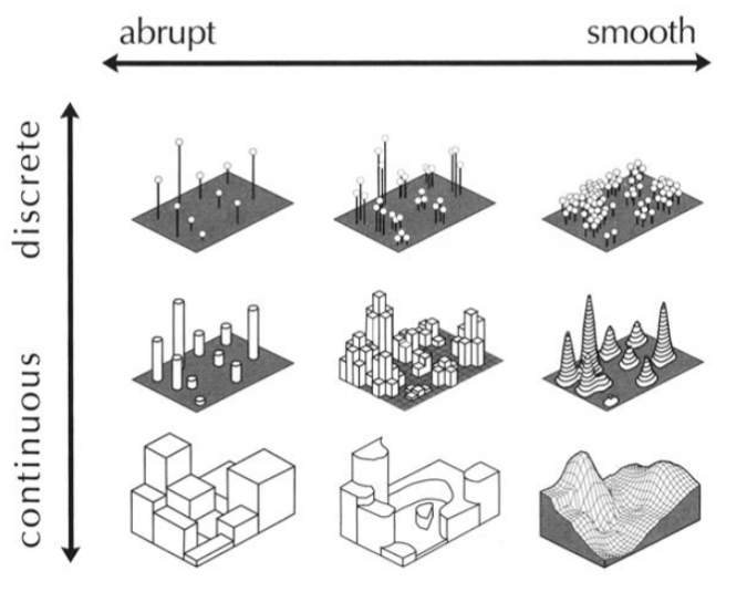
Figure 3.3.1 illustrates various surfaces used to represent geographic phenomena throughout the discrete to continuous and abrupt to smooth continuums. Keep this idea of a continuum in mind—geographic phenomena often cannot be classified into neat categories, and it is typically more fruitful to think of them as “more continuous” or “more discrete” than to try and fit them into a box.
Student Reflection
Identify the proper (approximate) location in Figure 3.3.1 or the following phenomena: Health insurance (% of people covered); water quality; political affiliation; surface porosity. Why did you place them where you did?
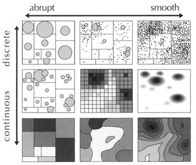
Figure 3.3.2 above shows different map representations that are suited to mapping the geographic phenomena located at these relative positions along the continuous-discrete and abrupt-smooth continua. We will discuss the appropriateness of various thematic mapping methods further later in this lesson.
Recommended Reading
MacEachren, Alan M. 1992. “Visualizing Uncertain Information.” Cartographic Perspectives 13 (13): 10–19. doi:10.1.1.62.285.
Practical Mapping: What about the data?
Practical Mapping: What about the data?
Considering the characteristics of the geographic phenomena you wish to map will inevitably improve the quality of your maps. However, before you design your map, you must understand the distinction between the characteristics of the phenomena and those of your data.
Consider again the map from Figure 3.1.1.
This map illustrates unemployment rates in the US at the county level. Though it is a well-designed and attractive map, consider the characteristics of unemployment as a geographic phenomenon. The abrupt change in unemployment rates at county boundaries in this map obscures the underlying heterogeneity in unemployment within county bounds. The phenomenon of unemployment varies by person, while the mapped unemployment data varies by county. This doesn’t mean the map is wrong, but it is a reality important to be cognizant of, both while creating your own maps and while critiquing those designed by others.
Relatedly, when creating maps, you will often rely on data that has already been collected by others. Often, this data is collected (as in the example in Figure 3.1.1 above) by enumeration units, such as counties, census tracts, or states. Unemployment does vary by person, but it is unlikely that this fine-grained data will be available to you. If you have somewhat coarse (e.g., state level) data, you cannot create a map that shows variation by person, by county, etc., even if this would be a more accurate depiction of the phenomena. The only way to create a more detailed map is to collect more granular data. Your map design can always be altered to present a simplified depiction of your data—but not the other way around.
Recommended Reading
Slingsby, Aidan, Jason Dykes, and Jo Wood. 2011. “Exploring Uncertainty in Geodemographics with Interactive Graphics.” IEEE Transactions on Visualization and Computer Graphics. doi:10.1109/TVCG.2011.197.
Geographic Data: Levels of measurement
Geographic Data: Levels of measurement
Data is typically classified as either qualitative (e.g., land use; political boundaries) or quantitative (e.g., per capita income; temperature)—you likely recall learning about this distinction in earlier courses. The classification of your data as qualitative or quantitative will have significant influence on which visual variables you use to map your data. Color hue, for example, is excellent for qualitative data, while color value demonstrates order and thus is a better choice for designing quantitative maps.
Nominal is a common term used to described qualitative, or categorical data. Land use and land cover maps are popular examples of nominal data. They might show, for example, residential blocks as distinct from parks and green space, but this does not suggest that one is lesser or greater than the other.
Quantitative data can be further classified as ordinal, interval, or ratio data.
Ordinal data has an order, but cannot be presumed to show differences in magnitude. Sports team rankings, for example, describe which teams are better, but not by how much.
Interval data describes orders of magnitude but has an arbitrary zero point. The classic example is temperature: 30 degrees is warmer than 10 degrees, but it’s not necessarily three times as warm. Another good example is shoe size—you can say that a size 12 is larger than a size 6, and that (unlike if it were ordinal data) there is more difference between a 6 and a 12 than between a 12 and a 13, but the 12 is not twice as large as 6.
Ratio data, conversely, has a non-arbitrary zero point. Examples of ratio data include counts of forest fire incidence, and yearly household income (e.g., $50,000 is twice as much as $25,000). Interval and ratio data are often grouped together and classified as numerical data.
Student Reflection
View the map in Figure 3.4.2 above—is the data shown qualitative, ordinal, interval, or ratio? How does this compare to the likely level of measurement of this data when it was first collected?
Student Reflection
Consider time—would you usually consider this to be nominal, ordinal, interval, or ratio data? Why?
Recommended Reading
Chang, Kang-tsung. 1978. “Measurement Scales in Cartography.” The American Cartographer 5 (1): 57–64. doi:10.1559/152304078784023006.
Choosing Symbols for Maps
Choosing Symbols for Maps
Understanding your data’s spatial dimensions, geographic model, and levels of measurement will help you select which visual variables to use in your map. Recall the table of visual variables we first encountered in Lesson One (Figure 3.5.1). This is a good time to check your own knowledge and consider which of the follow seven variables are best for visualizing data category, and which are best for visualizing order.
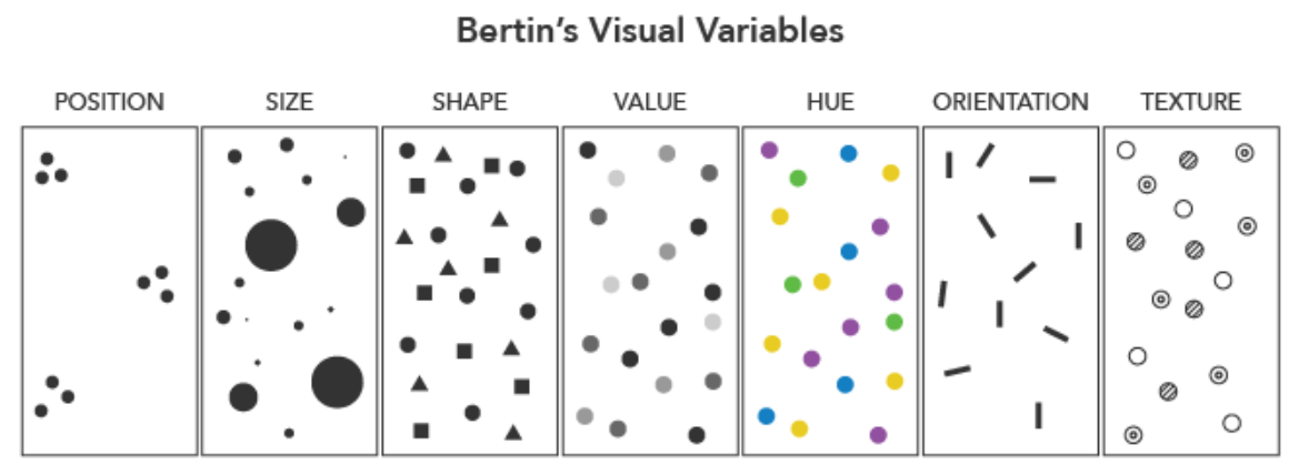
Some visual variables are also better than others for encoding data with different levels of measurement. Bertin (1967) only considered size (other than position on the map) to be a truly quantitative variable, its visual representation able to be matched precisely to a numerical value. This makes it a good choice for mapping ratio-level data, as making mathematical calculations with such data can be useful. Visual variables that can typically encode only category, not order (e.g., color hue; shape) are best for qualitative data.
Note that the visual variables presented in Figure 3.5.1 are those originally proposed by Bertin, and though they are arguably the most common still in use, this is not a comprehensive list. The graphic also does not demonstrate the many ways in which these variables might be altered and/or combined to create new designs. At the end of this lesson, we will assess a variety of maps, many of which use multiple visual variables. We will also discuss multivariate mapping further in Lesson 7 (Multivariate and Uncertainty Visualization).
The figures above focus on geometric visual variables (e.g., color; pattern; size), though another common mapping technique is to use pictographic or iconic symbols (Figure 3.5.2).
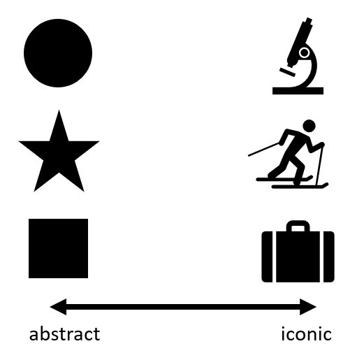
Iconic symbols are those that provide a closer visual match to their referent, or the real-world element meant to be depicted by the map symbol (Maceachren et al. 2012). The map in Figure 3.5.3 below uses flower symbols that are drawn similarly to how they appear in reality to create an engaging and useful map. It is important to balance usability and realism when using iconic symbols on maps - ensure that they do not become overcrowd, or distract from the map's purpose.
Another important consideration that should be weighed when considering the use of iconic symbols is the cultural context of those symbols. Iconic symbols can have meaning only to a specific group of individuals. For example, imagine that you are driving down the interstate and see a road sign that shows a knife and fork. Some people would understand these icons to imply food. However, the knife and fork icon is not necessarily understood to imply food by individuals who, for example, only use their hands while eating and may have never seen a knife and fork. Iconic symbols, therefore, are very culturally contextualized and that context should be weighed before icon symbols are chosen to be used on a map. Here is an article [11] that further explores the idea of symbols and icons and their meaning in cartography.
Like other continuums we have discussed (e.g., discrete to continuous; abrupt to smooth), map symbols cannot always be classified as simply abstract or iconic, and instead, exist somewhere in the middle. National Geographic's Atlas of Happiness [13] for example, uses smiling face graphics to encode data about happiness. Thus, it is less abstract than if this data had been encoded only with color value or size, but less iconic than if more realistic graphic images of people were used.
Visual variables are used in many mapping techniques: in addition to selecting which visual variables you use for your maps, you will also need to choose what type of thematic map you will create. The four most popular thematic map types are choropleth, isopleth, proportional symbol, and dot maps.
Student Reflection
This would be a good point to complete the required reading for this week, particularly pages 81-91 in Thematic Cartography and Geovisualization. The reading gives an excellent overview of visual variables and thematic mapping techniques.
The required reading gives more detailed descriptions, but below we give a general overview of the four most popular types of thematic maps.

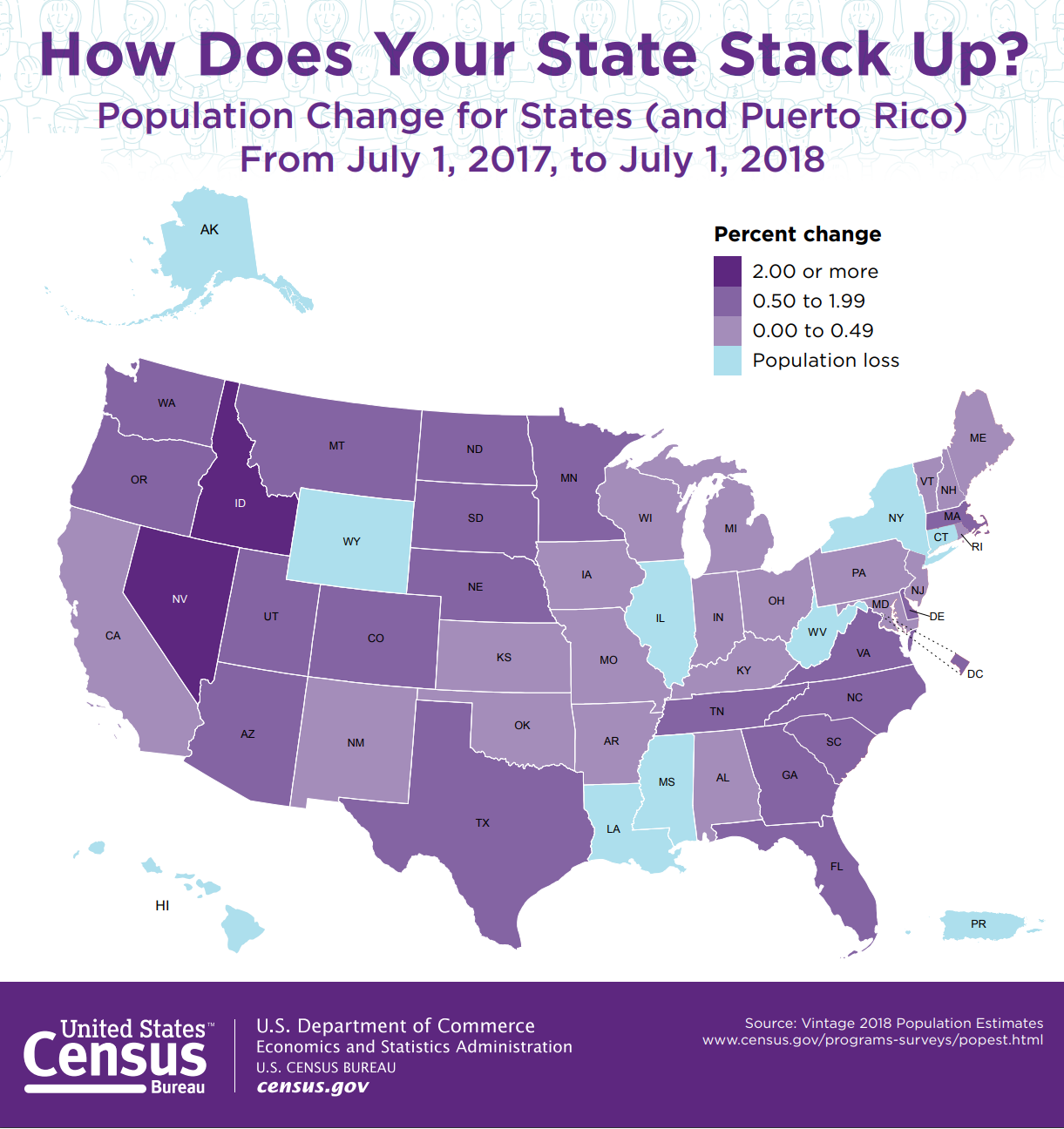
Choropleth Maps are maps in which color or shading is applied to distinct enumeration units, usually statistical or administrative areas. Color hue, saturation, and value are the most frequently used visual variables in choropleth mapping, though pattern is sometimes used as well. Choropleth mapping should not be used to encode exact counts (e.g., number of people living in each state), as the visual encoding of color by enumeration units makes this confusing. For example, consider that more people live in California than in any other state. You could create a state-by-state choropleth map showing counts of, say, universities or gas stations, and California would likely lead in both. But a map showing this would not be interesting—California has more people and things because it is a bigger enumeration unit. The map would tell us nothing interesting about California's system of education, or its residents' consumption of gas.
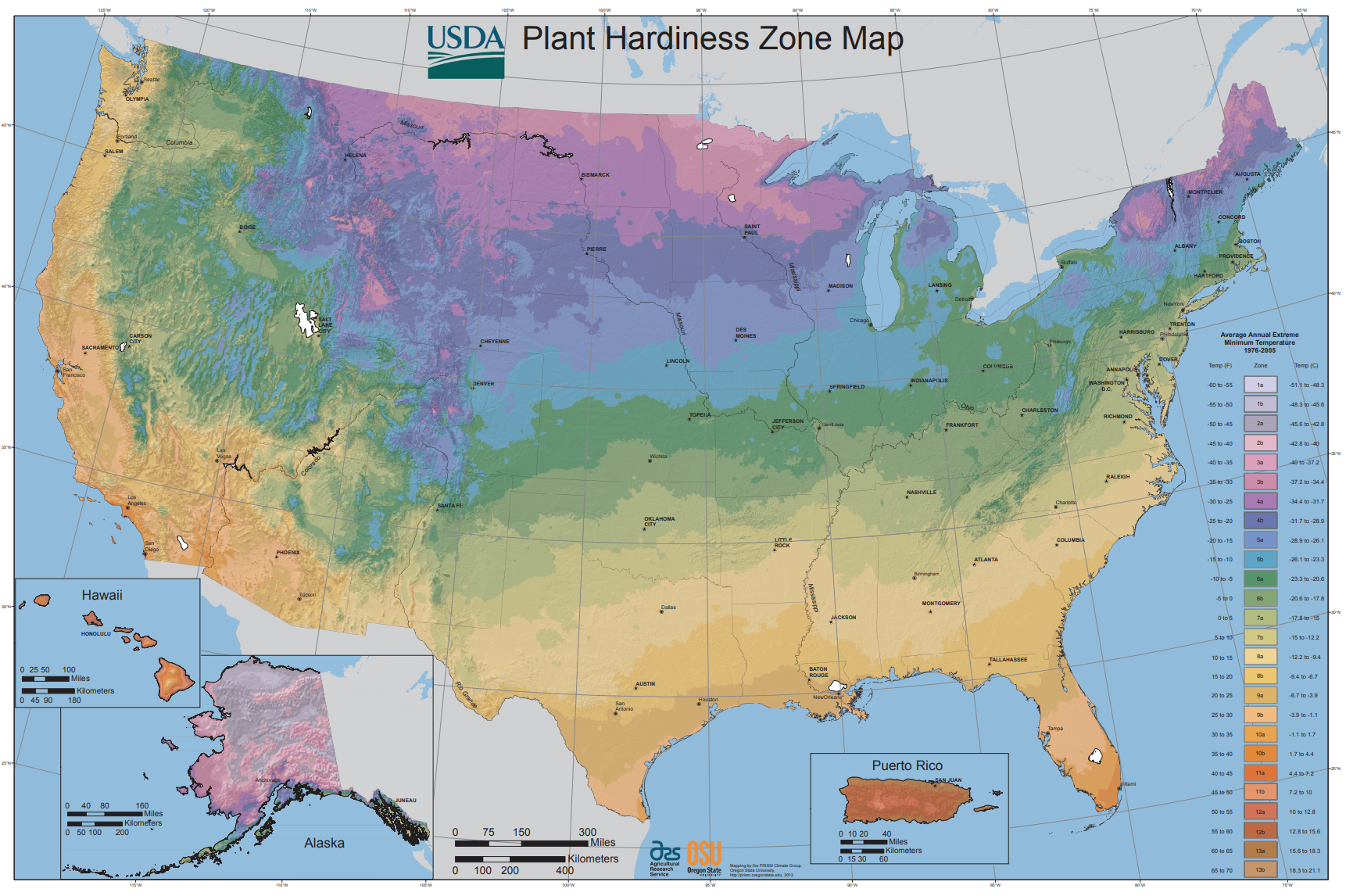
Isopleth Maps are like choropleth maps in that they typically use color value to encode data values, but unlike choropleth maps, they do not visualize the enumeration units from which they are built. Isopleth maps are preferred for mapping phenomena that vary continuously over space, as they better represent the distributions of these phenomena than choropleth maps. The primary disadvantage of isopleth maps is that they require quite a bit of data to design them accurately. They should also not be used to map data that change abruptly at administrative boundaries (e.g., percent sales tax). Choropleth mapping is a simpler and more appropriate method for mapping such data.
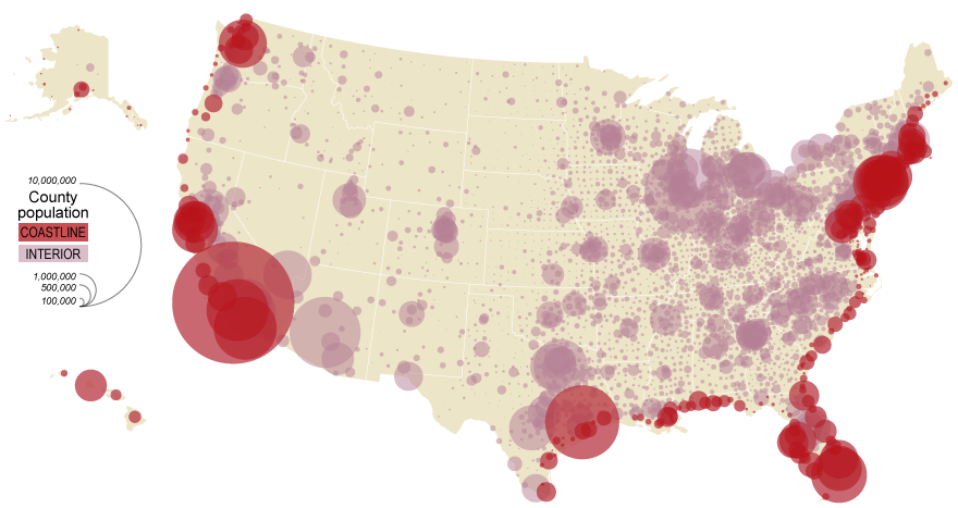
Proportional Symbol Maps are best for mapping abrupt, discrete data; they visualize data using the size of a symbol (most often a circle) placed inside an enumeration unit. As the symbols are scaled only based on the data value—irrespective of the size of the enumeration unit—this permits the reader to not only view the variation between symbols, but also perform a visual comparison of the size of the symbol and the size of the enumeration unit over which it is placed. Note that the map in 3.5.6, unlike the previous two maps (3.5.4 and 3.5.5) displays count data (population) rather than a rate (percent in poverty; people per sq. mile). This is an appropriate choice for a proportional symbol map.
Size, the visual variable used in proportional symbol mapping, should not be used to map standardized data such as rates (e.g., people per sq. mile). When mapping count data such as population counts, you should use a proportional symbol map, or you should standardize your data before using it to make a choropleth or isoline map. We will talk more about standardization in Lesson Four.
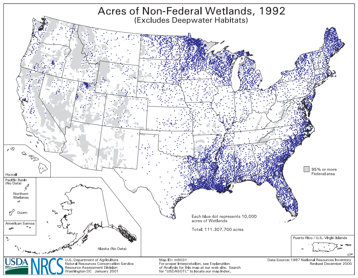
Dot Maps are like proportional symbol maps in that they are excellent for visualizing discrete data. Rather than displaying a different-sized symbol per enumeration unit, however, dot maps are constructed by filling enumeration units with a count of symbols (usually dots) based on the count of the variable of interest within the unit. Thus, this technique is preferred over proportional symbol mapping for mapping data which vary more continuously over geographic space.
It's important to think critically when creating and reading dot maps. Often, dot maps are made by scattering the appropriate number of dots randomly throughout each enumeration unit. To a novice viewer, they give the illusion of high precision - you might assume that if every dot represents one person, that the dots are placed on the map exactly where those people live! However, this is very rarely the case. We will explore the differences between dot and proportional symbol maps more in the lab at the end of this lesson. As you will see, which method is most appropriate depends not only on what phenomenon you are mapping, but also on the scale at which you map it.
Recommended Reading
Chapter 5: Principles of Symbolization. Slocum, Terry A., Robert B. McMaster, Fritz C. Kessler, and Hugh H. Howard. 2009. Thematic Cartography and Geovisualization. Edited by Keith C. Clarke. 3rd ed. Upper Saddle River, NJ: Pearson Prentice Hall.
Note: This chapter includes the 10 pages of required reading for this week, but if you have access to the text, you may find the additional pages in the chapter useful as well.
Visual Encoding: Examples for Reflection
Visual Encoding: Examples for Reflection
Student Reflection
Analyze the maps shown below. For each map, identify the level of measurement of the data mapped. What visual variables are used to encode this data? Is the map effective—does it tell you what you need to know?
Critique #2
Critique #2
During this course, we will be completing several critiques. In Week One, we critiqued a map from an external source. Participating in these critiques will improve both how you think about cartographic design skills and your ability to critically evaluate the map design of others.
For this second critique, you will engage in a peer-to-peer review (or peer review). In this activity, you will be assigned a colleague's map from this class to critique. Your assignment for this peer review includes writing up a 300+ word critique of one of your colleague’s Lesson 2 Lab.
In your written critique please describe:
- three (3) things you think the map does very well
- three (3) suggestions you have for improvement
According to the two prompts above, a map critique is not just about finding problems, but about reflecting on a map in an overall context. Your critique should focus on things the map does well as much as it does on suggestions for improvement. In your discussion, you should connect your ideas back to what we learned in the previous lessons.
You may find these two resources helpful as you write your critiques:
- Daniel Huffman’s 2020 blog post on how to “Critique with Empathy [21]"
- Ordnance Survey’s (Wesson, Glynn and Naylor, 2013) list of effective cartographic design principles [22]
Submission Instructions
You will work on Critique #2 during Lesson 3 and submit it at the end of Lesson 3.
Step 1: When a peer review has been assigned, you will see a notification appear in your Canvas Dashboard To Do sidebar or Activity Stream. You should also receive an email notification. Upon notification of the Peer Review (Critique), go to Lesson 2: Lab 2 Assignment. You will see your assignment to peer review one other classmate.
Step 2: Download/view your classmate's Lab.
Step 3: Write up your critique using the prompts above in a Word document. Be sure to also review the rubric in which you will be graded for Critique #2 for more guidance. Save your Word document as a PDF. Use the naming convention outlined below. Please list the name of the student you have been assigned to critique at the top of the page.
- YourLastName_LastNameOfColleagueCritiqued_C2.pdf
Step 4: In order to complete the Peer Review/Critique, you must
- Add the PDF as an attachement in the comment sidebar in the assignment.
- Include a comment such as "here is my critique" in the comment area.
- PLEASE DO NOT complete the lesson rubric as your review, award points, or grade the map you are critiquing. Even though Canvas asks you to complete the rubric, PLEASE DO NOT COMPLETE THE RUBRIC OR ASSIGN POINTS/GRADE.
Step 5: When you're finished, click the Save Comment button. You may need to refresh your browser to see that you've completed the required steps for the peer review.
Note: Again, you will not submit anything for a letter grade or provide comments in the lesson rubric.
Peer Review Canvas Help
Lesson 3 Lab
Lesson 3 Lab
From Data to Design
This week, we'll be making two map layouts with the same data, so as to compare two different thematic mapping techniques. During this lab, you'll also be downloading some of the data yourself, and choosing a census variable and location based on your interests. This lab is our first thematic mapping lab, but when mapping, you should integrate your design knowledge from previous lessons, such as techniques for creating balanced map layouts and neat map marginalia. The lab requirements are listed below: you should reference this page periodically as you work on the lab, and review the lab rubric as well before submitting your work.
Lab Objectives
- Explore the influence of symbolization method (dot density vs. proportional symbol) and scale (state vs. county vs. census tract) on map output and design using ArcGIS.
- Download, join, and symbolize data from the US Census Bureau.
- Create two map layouts to demonstrate the assigned thematic mapping techniques.
Overall Lab Requirements
For Lab 3, you will create and submit two map layouts. One will be composed of three proportional symbol maps; the other will be composed of three dot maps. Your final task will be to write a reflection that compares these two techniques in the context of this lab.
- Symbolize data from the American Community Survey (ACS)—chose a variable appropriate for mapping with these two symbolization methods.
- Include a written reflection (250+ words); use the following questions to guide your writing:
- For each scale (state; county; tract), which symbolization method is most appropriate?
- At the state scale, which map is most misleading? Why?
- Submit this reflection as a text comment or in a separate .pdf document.
Map Requirements
Part One: Proportional Symbols
- Create three maps at the same scale using census data to show a variable of interest to you at three different scales (state; county; census tract).
- Use the proportional symbols thematic mapping technique to symbolize your data.
- Combine your three maps into one map layout with scale bars, legends, and supplemental map text (e.g., map titles, legend titles) as appropriate.
Part Two: Dot Density
- Create three maps at the same scale using census data to show a variable of interest to you at three different scales (state; county; census tract).
- Use the dot density thematic mapping technique to symbolize your data.
- Combine your three maps into one map layout with scale bars, legends, and supplemental map text (e.g., map titles, legend titles) as appropriate.
Lab Instructions
- Download the Lab 3 zipped file [25] (40.2 MB). It contains:
- a project (.aprx) file to be opened in ArcGIS Pro;
- a database that includes the spatial data needed to start this lab.
Note: The mapped state must contain at least 30 counties.
The following states meet this requirement: Alabama, Arkansas, California, Colorado, Florida, Georgia, Idaho, Illinois, Indiana, Iowa, Kansas, Kentucky, Louisiana, Michigan, Minnesota, Mississippi, Missouri, Montana, Nebraska, New Mexico, New York, North Carolina, North Dakota, Ohio, Oklahoma, Oregon, Pennsylvania, South Carolina, South Dakota, Tennessee, Texas, Virginia, Washington, West Virginia, Wisconsin.
- Data source: US Census Bureau (TIGER boundary files)
- Additional Census data will be downloaded from the following locations
- United States Census Bureau TIGER/Line Shapefiles [26]
- United States Census Bureau Data Tool [27] (you can try the Advanced Search option for faster results)
- Extract the zipped folder, and double-click the blue (.aprx) file to open ArcGIS Pro.
- You'll see the starting file, which includes state and county boundary data. You'll need to download census tract boundary data for a state of your choosing, as well as appropriate statistical data from the US Census Bureau's American Community Survey. See the Lab 3 visual guide for further instructions.
Grading Criteria
A rubric is posted for your review.
Submission Instructions
- Submit two PDFs—both should be designed in a neat 8.5 x 11-inch layout using the naming conventions below. You may attach your statement about the maps as an additional .pdf document, or add the text as a comment with your assignment.
- Map Layout 1—Proportional Symbols: LastName_Lab3_Map1.pdf
- Map Layout 2—Dot Density: LastName_Lab3_Map2.pdf
- Submit the PDFs and your reflection statement to Lesson 3 Lab.
Ready to Begin?
More instructions are available in the Lesson 3 Lab Visual Guide.
Lesson 3 Lab Visual Guide
Lesson 3 Lab Visual Guide Index
- Starting File
- Get spatial data for the census tract-level map
- Download Census Data to Map
- Format Census Data for Import
- Add ACS data to your project
- Joining Census data to boundary files
- Symbolizing Data
- Creating a Layout
- Save-As: Building Dot Density Maps
- Additional Tips
-
Starting File
This is your starting file in ArcGIS Pro: It contains state and county boundary data for the entire US. Your maps will focus on a state of your choosing from the list given in the lab document.
For each mapping technique (proportional symbol; dot map), you will create three maps: state-level, county-level, and census-tract level. In addition to using the boundary files provided, you will download and add census tract boundaries, and data from the US Census Bureau's American Community Survey.
 Visual Guide Figure 3.1. Starting file in ArcGIS Pro
 -
Get spatial data for the census tract-level map
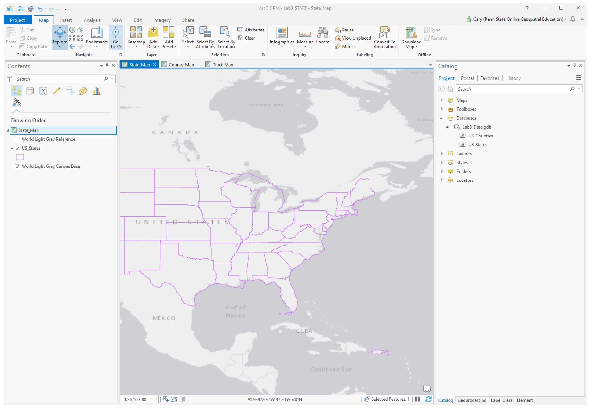
Visit US Census Bureau: TIGER/Line Shapefiles [26]. Select the appropriate data using the drop-down menus. Download and paste the zipped folder into your Lab 3 folder, extract all files, and import as a feature class into ArcGIS Pro (see Figures 3.2 and 3.3).
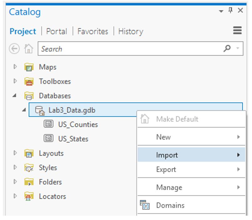 Visual Guide Figure 3.2. The starting data in this lab file - you will be importing more.
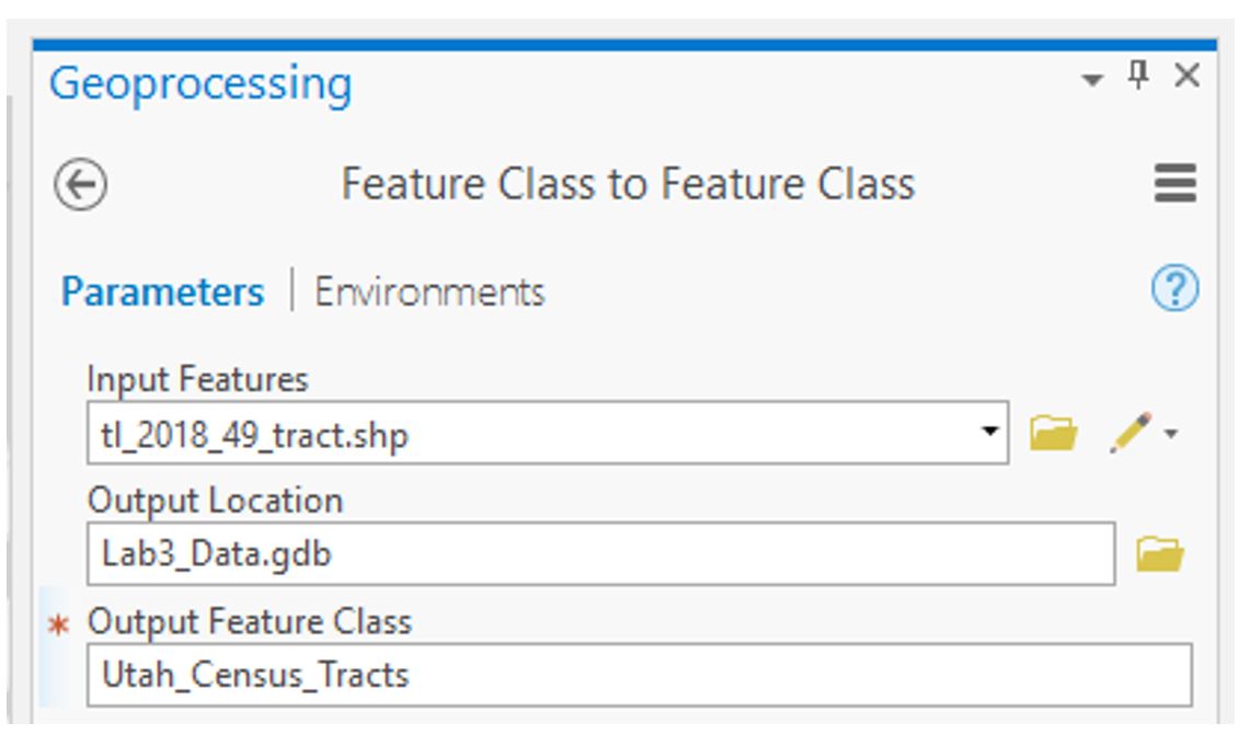 Visual Guide Figure 3.3. Running the import tool to add census tract data to your project's database.
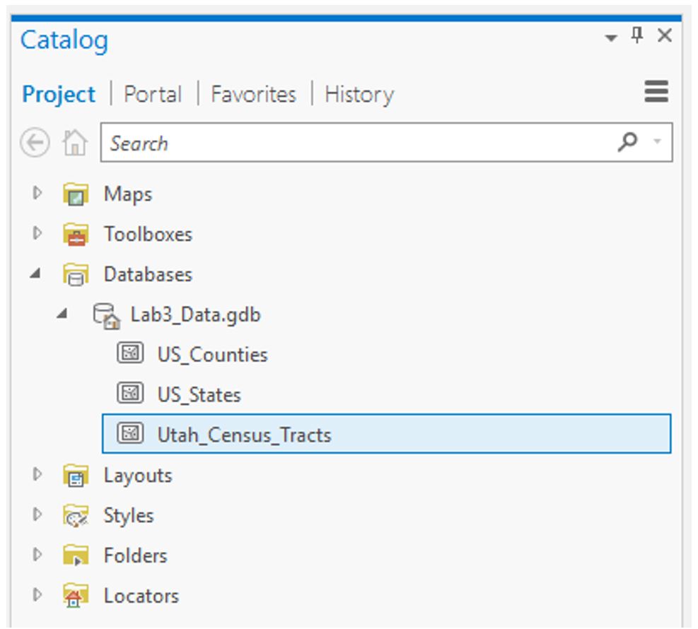 Visual Guide Figure 3.4. The result of your import: census tract data for one state in your geodatabase.
Add your newly-imported census tract data to the Tract_Map. At this stage, you should have three maps with boundaries: state, county, and census tract.
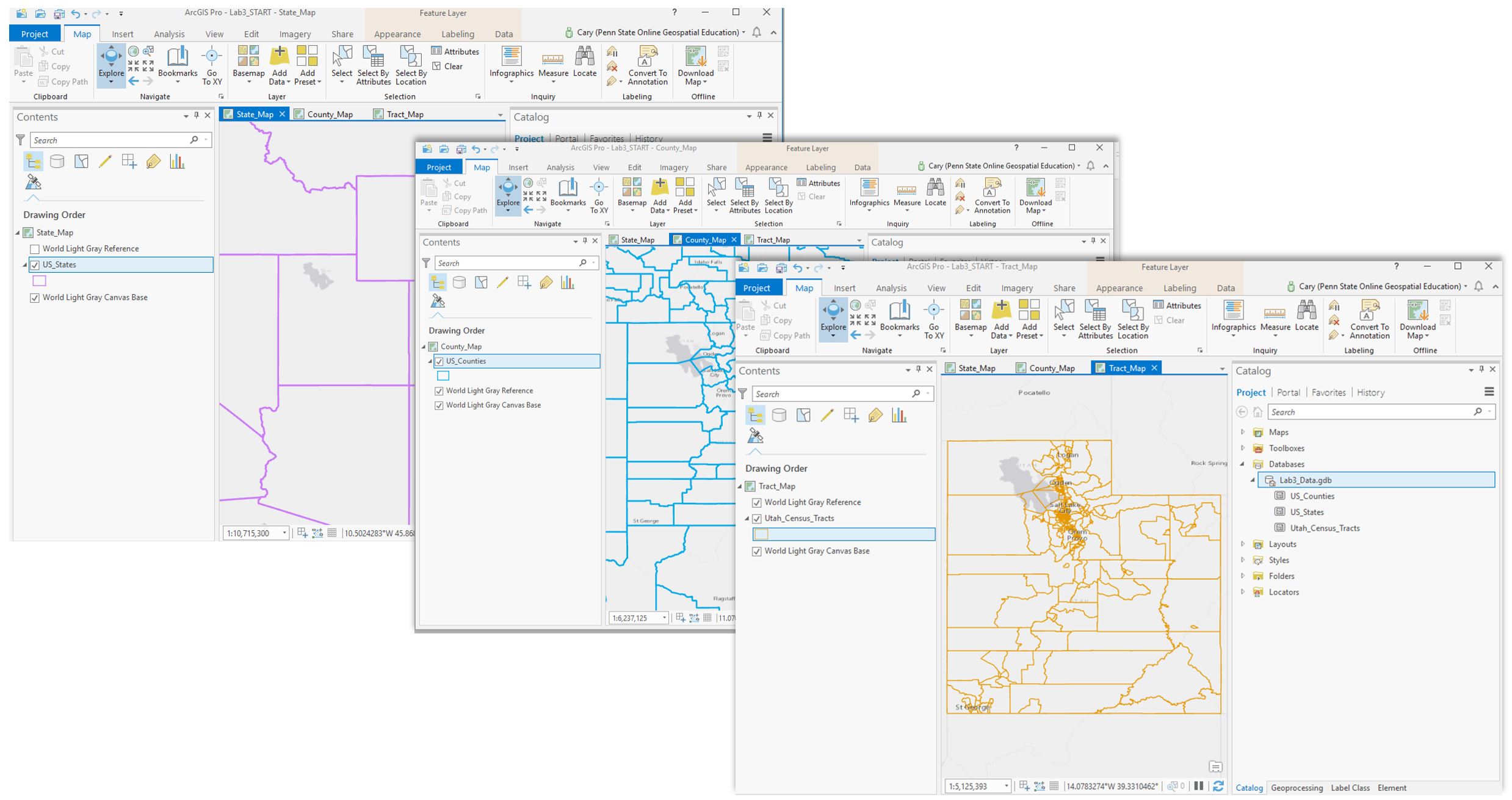 Visual Guide Figure 3.5. Three maps of boundaries, each at a different scale.
 -
Download Census Data to Map
You will be downloading your census data using the US Census Bureau Data Tool [27]
The ACS census data that you download will include demographic data of your choosing for the state, county, and tract level geographies. This demographic data will be in spreadsheet format that you will then join to the TIGER boundary files.
If you use the Advanced Search option in the census data tool, you may find it easier to search for Census data according to specific topics, geography, years, surveys, or codes. For example, assume I am interested in choosing ACS 2015 five year surveys for all census tracts in Ohio for the purpose of examining the number of veterans. Here is what I would search on using the Advanced Search option. The words listed below correspond to the search criteria in the Advanced Search interface. Note that you can narrow your serach for data by clicking on any of the search criteria in any order. Here is the order I used.- Surveys: Choose the ACA (American Community Survey) ACS 5-year estimates detailed tables
- Geogrpahy: Choose Tract - Ohio - then All tracts within Ohio
- Years: Choose 2015
- Topics: Download topic of interest for a variable of interest (e.g., populations and people - veterans)
- A listing of detailed tables will be returned from which you can choose one table
- The census tract results will likely be too large to display (no worries). On the screen that appears, download the data as a zipped Excel file format (do not just download the XLS or CSV format as these will not have the fields used for the join process)
- Once you have downloaded the tract data into your lesson folder, extract its content from the *.zip file, open up the Excel file, and inspect the rows and columns
- As you review the tract data, make sure the data you selected is appropriate for the symbolization methods in this lab (i.e., raw totals or counts)
- You can delete any columns that include null values as these values will not be mapped
- Repeat this process for the county and state data files for this lesson
Tip!
These screenshots show the ACS data sets for the "Households_" spreadsheet files containing count data as separate folders. Think about what makes the households an appropriate choice for the symbolization methods in this lesson? Please choose a different dataset other than housholds for your own maps.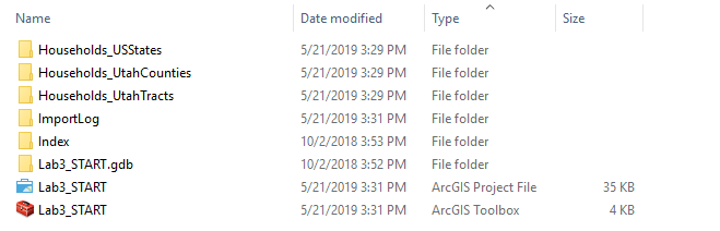 Visual Guide Figure 3.6. All folders neatly labeled within the Lab3 folder. The Households_ folder contain the ACS demographic data.
 -
Format Census Data for Import
For each geographic scale (state; county; tract), open the appropriate Excel file from your downloaded data folder and follow these steps:
1) Delete the top row (you only want one header row; this will become your top row/field names in ArcGIS).
2.) Save-As each Excel file (one per geographic scale) as a *.csv formatted file with a sensible name (so you can easily find it to import).As you scan through your file, you will see that there are likely a lot of data columns. Choose one column (variable) that interests you. Most of these columns (variables) you will not use for this lesson. Therefore, it is also helpful to delete the columns you don't need for your map, as this will make the table easier (faster) to import and deal with in ArcGIS.
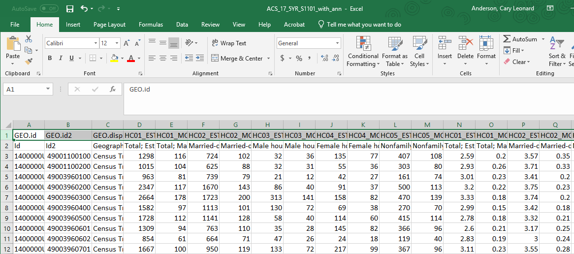 Visual Guide Figure 3.7. An American Community Survey (ACS) data file in Excel for the census tracts. The highlighted top row should be deleted from your *.csv file leaving the more helpful field names.
 -
Add ACS data to your project
Use the import table(s) function to import your CSV files. Hit F5 (refresh) if your data appears to be missing! It likely just needs to be refreshed.
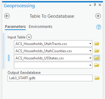 Visual Guide Figure 3.8. Importing your .csv files as tables in ArcGIS Pro.
Refresh your database in the catalog pane to see the tables you have imported.
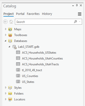 Visual Guide Figure 3.9. The Catalog Pane.
 -
Joining Census data to boundary files
For each map, we want to join our imported ACS table to the spatial boundary file.
To do this, we want to find the field that matches between the ACS table and the spatial attribute table – we will join them using this field. Figure 3.10 below shows that the STATEFP field in the US_States boundary files matches the Id2 field in our Census data table.
We have one problem: the values in the STATEFP field (boundary file) are stored as text values, but those in Id2 are stored as numbers.
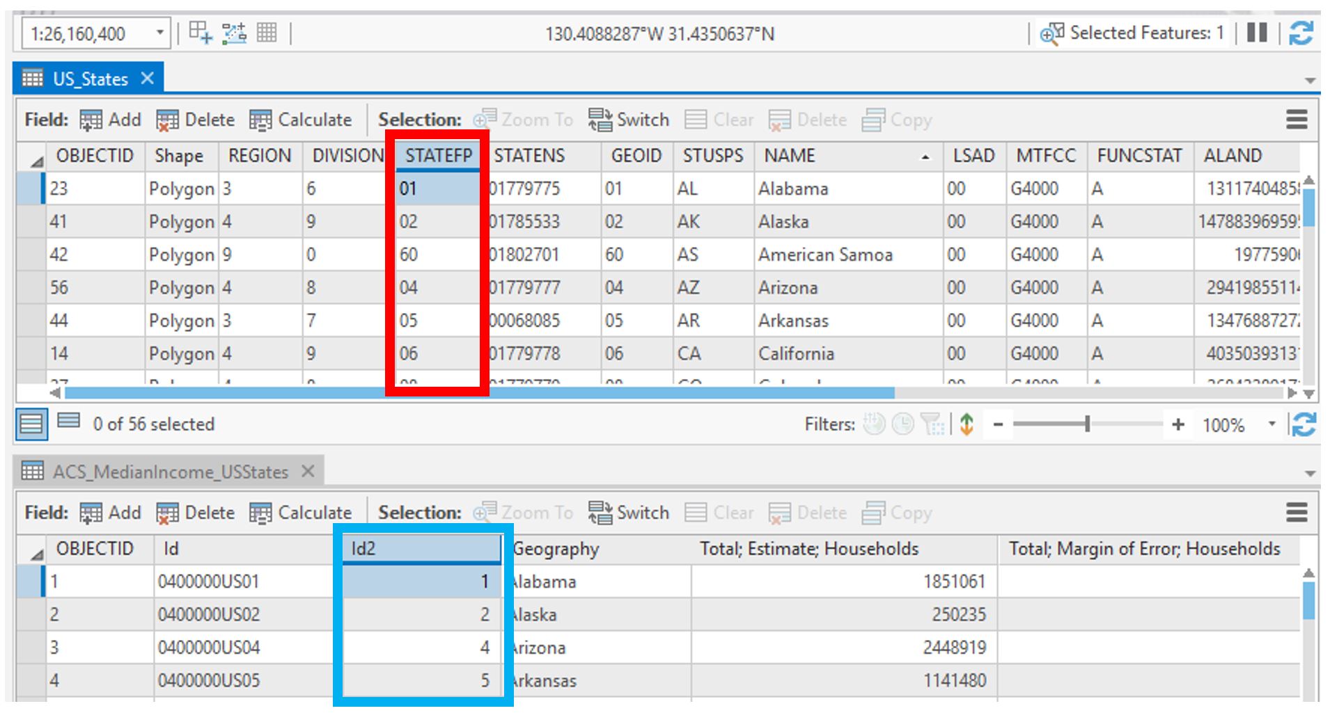 Visual Guide Figure 3.10. Comparing the type of values in the two attribute tables we want to join.
The easiest way to remedy this is to create a numerical field in our spatial boundary data attribute table and use that field to join it to the ACS data table.
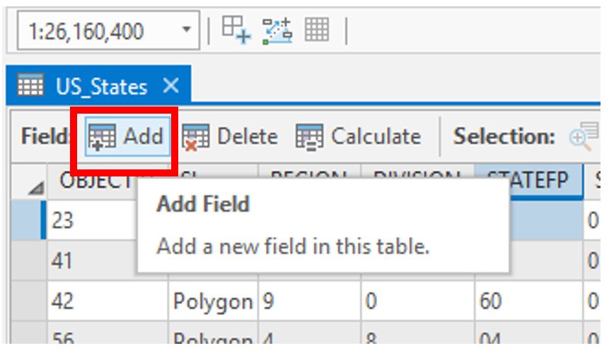 Visual Guide Figure 3.11. Adding a new field to an attribute table.
Choose “Double” as your Data Type. Don't forget to save!
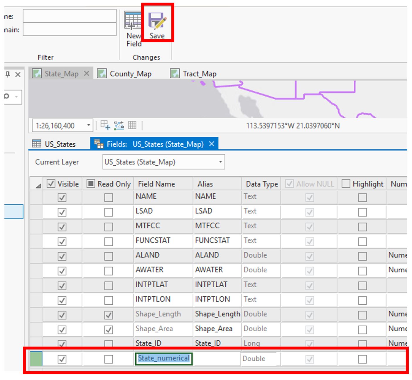 Visual Guide Figure 3.12. Adding a new (numerical) field.
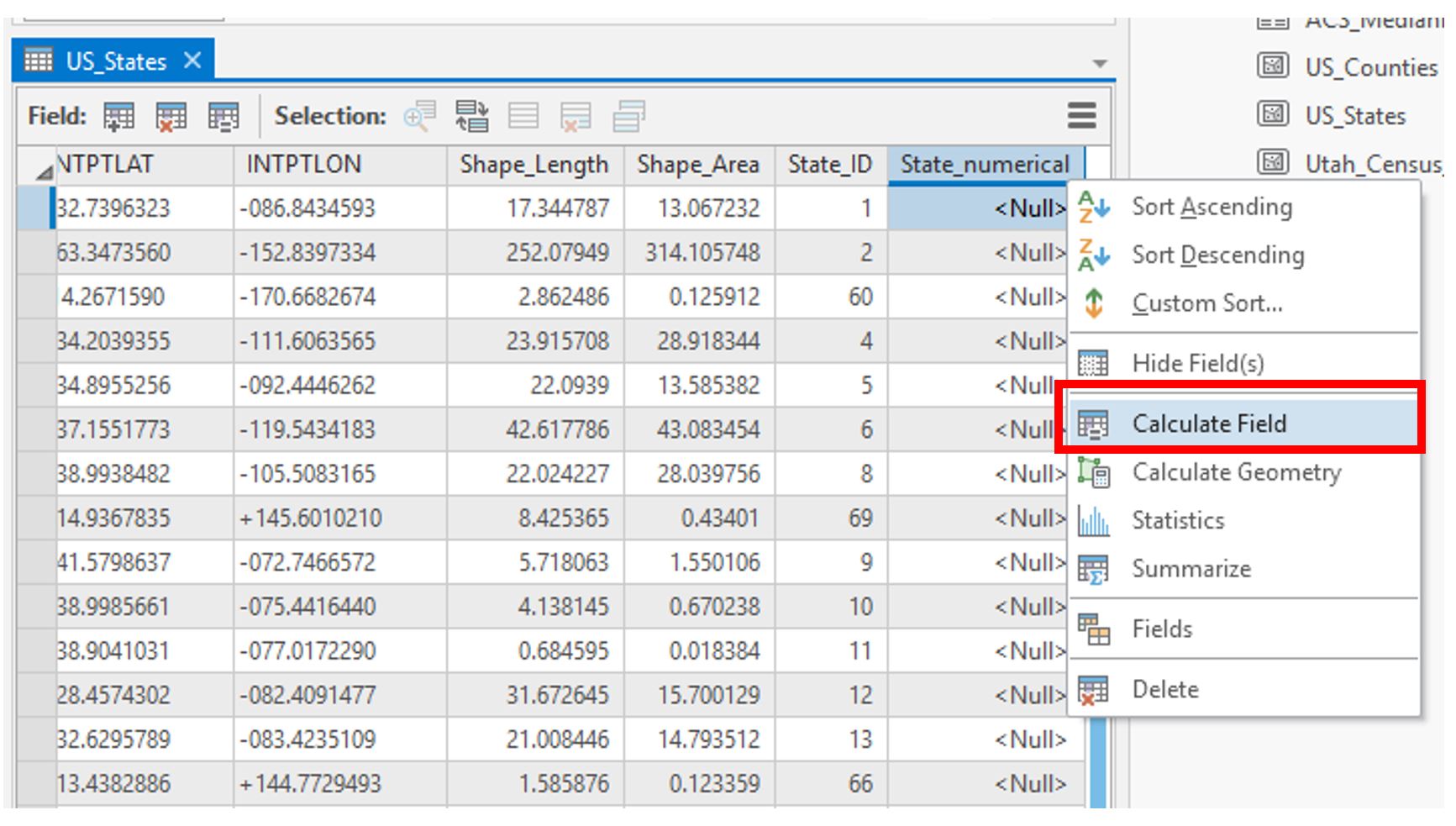 Visual Guide Figure 3.13. Calculating our newly-created field.
We will calculate this field by requesting that the new values be equivalent to those in the original text-based field (STATEFP) we wanted to use. In essence, we are creating a duplicate field with the same values, except that this time the values will be stored in numerical form.
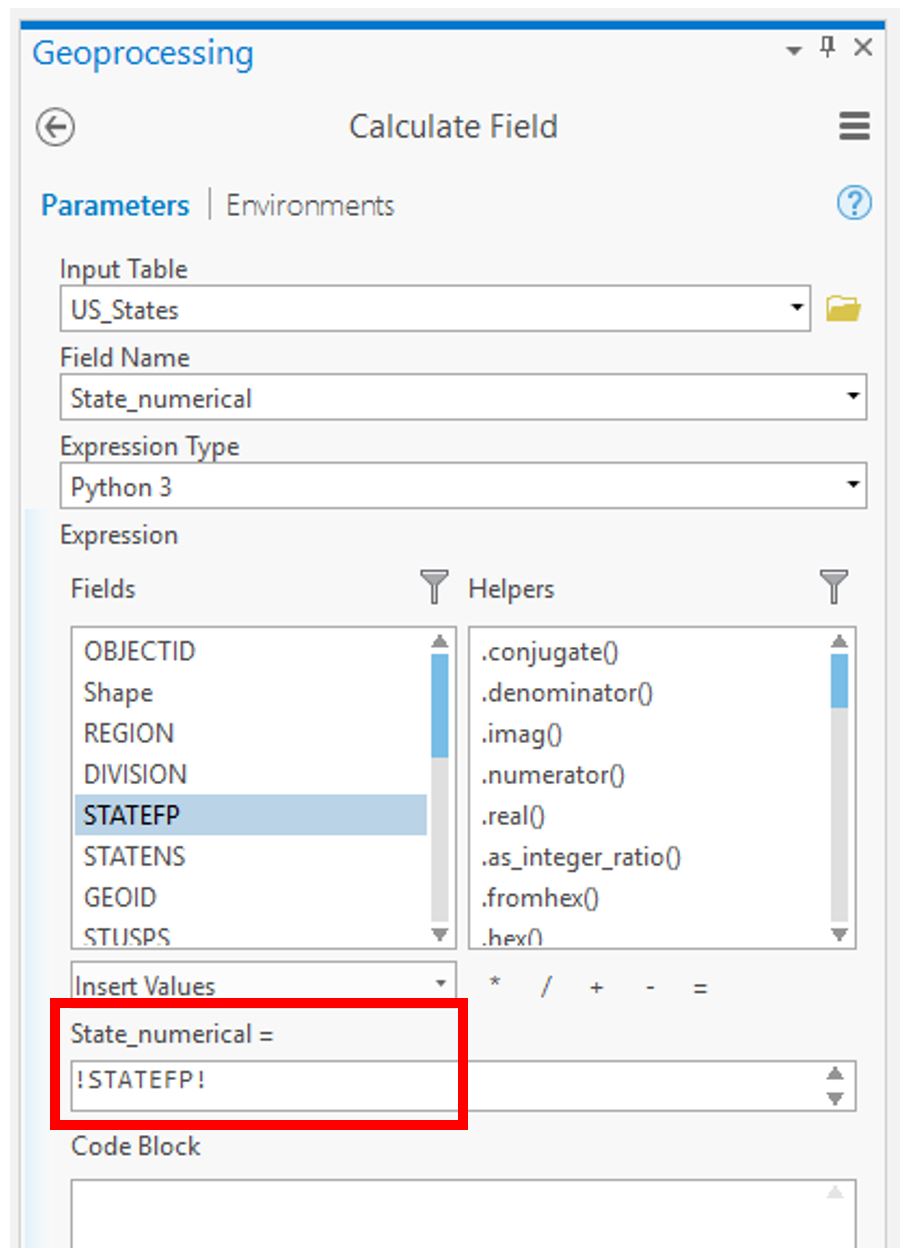 Visual Guide Figure 3.14. Calculating the field via an expression in ArcGIS Pro.
Your spatial file should now be ready to be joined to your ACS data!
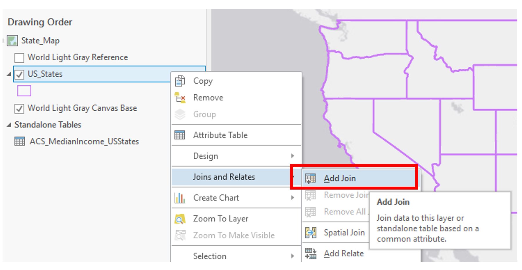 Visual Guide Figure 3.15. Adding a Join.
Add the join, using your newly calculated field and the matching field in your ACS data.
A Few Notes on Joining the State, County, and Tract Level Data.
- For the State table: when formatting the state *.csv data in Excel, add an ID column to the right of GeoID and type the value of the last 2 digits in GeoID (after "US") into each field, ex. 0400000US01 should be 1 or 0400000US10 should be 10.
- For the County table: do the same thing as directed above but type all of the digits following "US."
- For the Census Tract table: instead of creating a field in the Excel file, go into ArcGIS Pro and create a Text field within the census shapefile. Next, calculate the new field to equal this expression: "1400000US" + !GEOID!. Then join the Census Tract table to the census shapefile using that new field.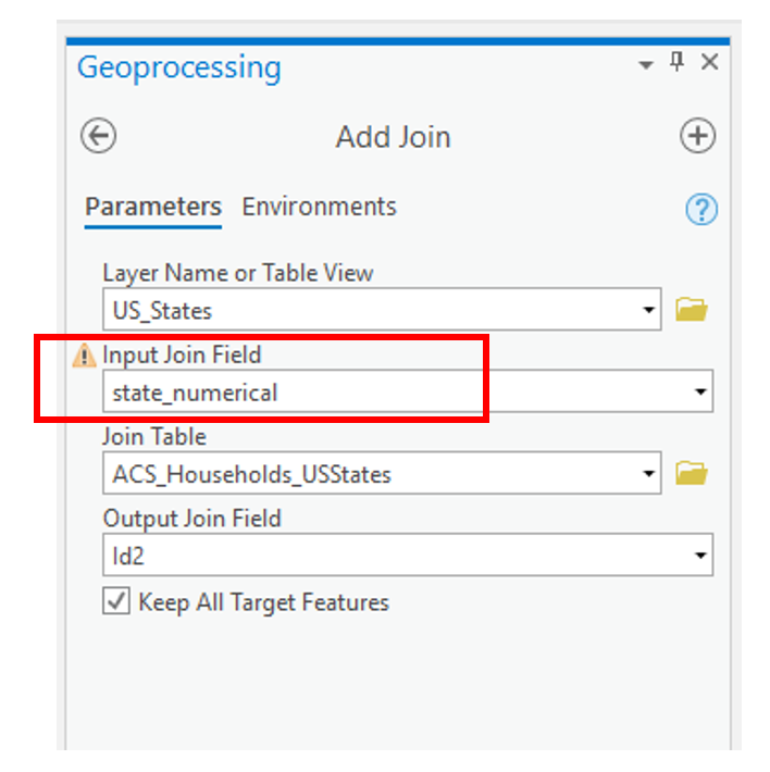 Visual Guide Figure 3.16. Adding a join - the geoprocessing view.
 -
Symbolizing Data
Before symbolizing your maps, repeat the previous steps (create and calculate new field; join ACS data) for your county-level and census tract-level maps. You will then have three maps ready to symbolize.
 Visual Guide Figure 3.17. ArcGIS Pro symbolization choices.
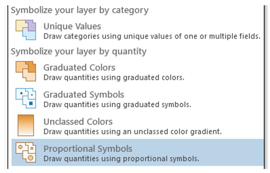
Use the Proportional Symbols method to symbolize your data.
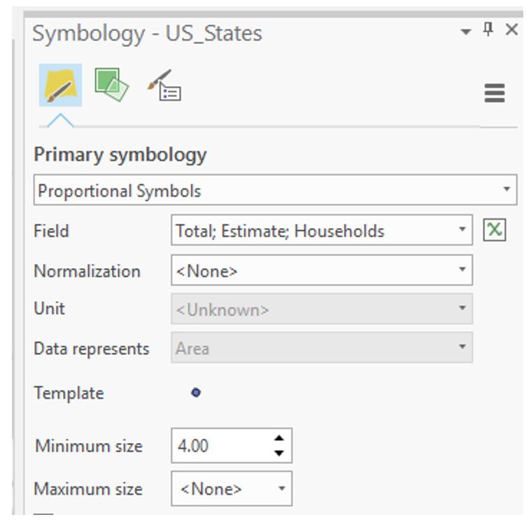 Visual Guide Figure 3.18. Proportional symbols in the Symbology pane.
Proportional Versus Graduated Symbosls
Think carefully about the parameters you choose here! If you set the parameter to <None>, the software will give you truely proportional symbols - allowing the symbol sizes to vary according to the range of data values. In some cases, your range of data may be very large. As a result, unless you constrict the Maximum Size to some value, your proportional symbols may become too large, cover up much of the map space, and create a visually undesirable design. Setting the Maximum size to some value constricts the range of symbol sizes and therefore does not portray a true proportional symbol approach. However, your design may benefit from setting the Maximum size to some finite value. Note that for true proportional symbols, your maximum symbol size should be <None> - otherwise, you are creating graduated, not proportional symbols. Remember that graduated symbols create individual classes of symbols where each class represents a range of data values and that range is symbolized by a single symbol. Proportional symbols, on the other hand, are displayed on a map where each symbol is shown in proportion to a data value. With proportional symbols, if you have 50 unique data values, then you will have 50 unqiuely sized symbols. You will need to experiment a bit here to determine which approach creates a more appropriate design for your data.
Background Option
On the Proportional Symbol window shown in Figure 3.18, the Background option is present. This option allows you to alter the outline style and fill color of the enumeration unit. This option comes in handy so that you don't need to add an unnecessary data layer of your enumeration units to your map environment. By setting the outline style and fill color using the Background option, your enumeration units will have a cohesive and appropriate design to them.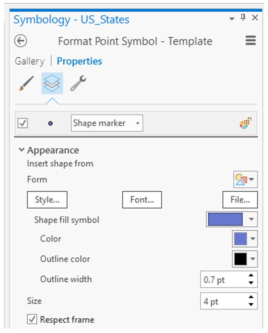 Visual Guide Figure 3.19. Changing the style of your proportional symbol template.
 -
Creating a Layout
Create a new standard-size (8.5" x 11") layout as you did in Lab #1. Insert a map frame and copy and paste it in the layout: this will create three maps at the same scale.
This (Figure 3.20) is just a quick layout example and should not be considered finished! You should follow the guidelines we have learned for creating a visual hierarchy and an excellent layout, etc.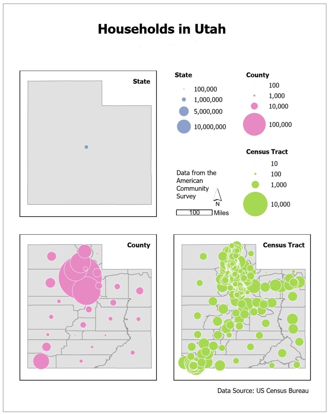 Visual Guide Figure 3.20. Example map layout with three maps, one for each scale. This is NOT a finalized design!
 -
Save-As: Building Dot Density Maps
Use the “Save-As” function and save a copy of your map project with a new name (like YourName_DotDensityMaps). This way, you won’t have to add any new data. Creating your second layout will be much easier this way - instead of doing data joining, downloading, etc., you can just focus on the design!
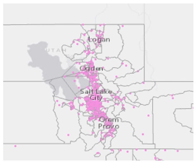 Visual Guide Figure 3.21. Example view of dots on a map.
 Visual Guide Figure 3.22. Choosing the dot density symbolization method.
Have fun adjusting your symbolization as appropriate! Try out different colors and symbols. Experiment with the parameters to see what works! The best design will depend on many factors, including the scale of your map, your chosen state, and the data you are mapping.
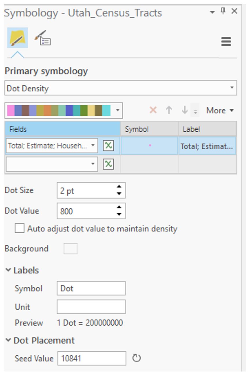 Visual Guide Figure 3.23. Adjusting parameters using the dot density symbolization method.
 -
Additional Tips
You are free to edit your data in this lab as needed to clean it up. Delete states (or any type of row) as needed. You may want to make any unneeded boundaries invisible instead, as this will make it easier to bring them back if necessary.
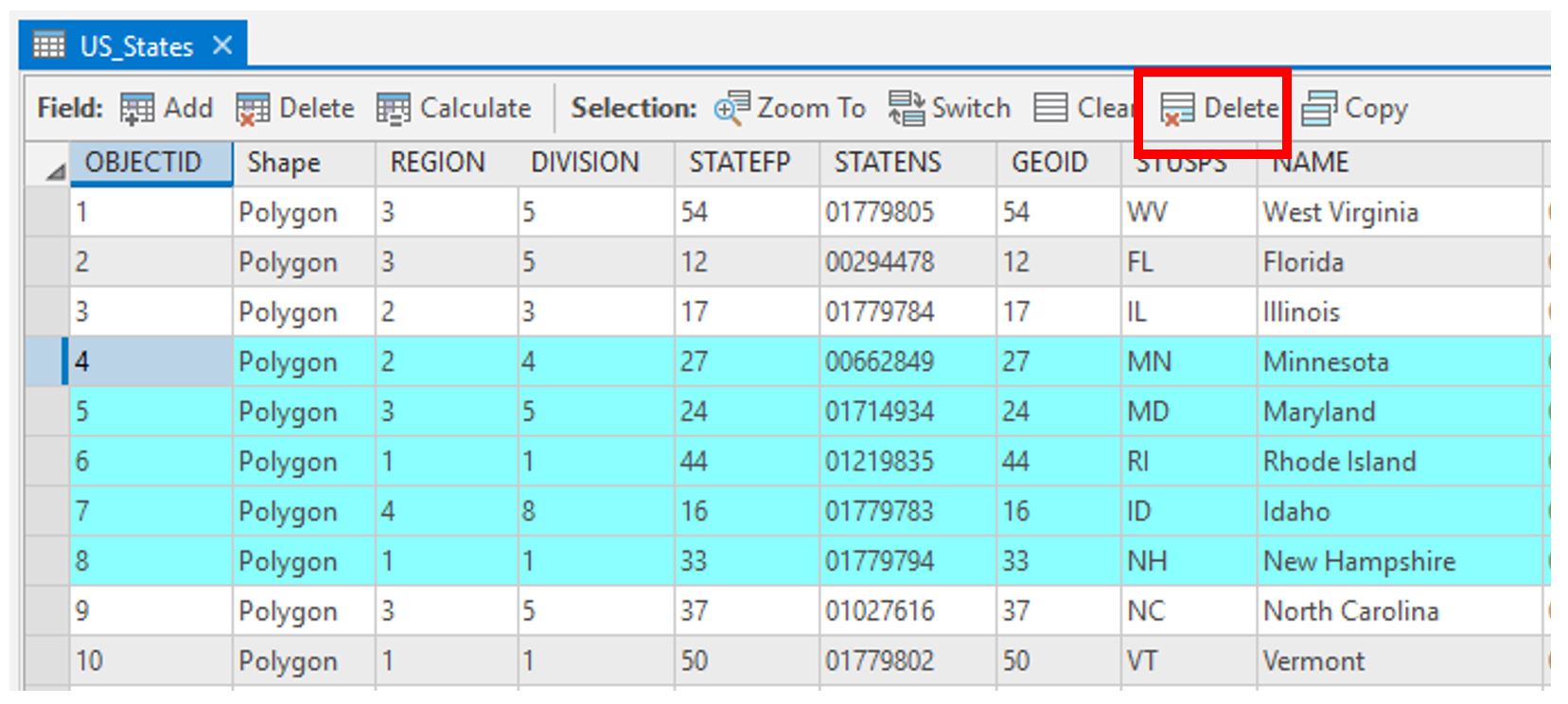 Visual Guide Figure 3.24. Selecting rows for deletion in the attribute table.
You can change the number of legend items using the symbology pane.
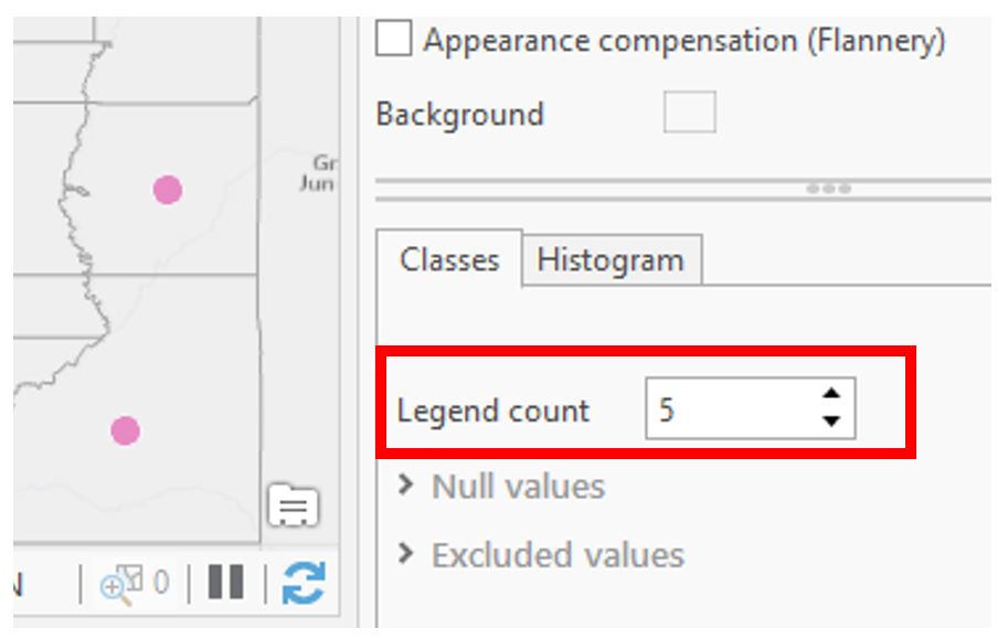 Visual Guide Figure 3.25. Adjusting your map legend via the Symbology Pane.
Reference current and previous lesson content for design ideas. Test several layout configurations and lots of symbol designs (sizes; colors; outlines; transparency) – you’ll learn a lot as you go!
Credit for all screenshots is to Cary Anderson, Penn State University; Data Source: US Census Bureau.
Summary and Final Tasks
Summary and Final Tasks
Summary
We've reached the end of Lesson 3! In this lesson, we learned a lot about thematic maps - what they are, why we design them, and how to choose the best thematic mapping technique based on characteristics of your data and of the geographic phenomena you wish to map. We discussed challenges you might encounter when making thematic maps, such as when the level of measurement of the data available to you doesn't match the level of measurement of the phenomena. In Lab 3, we created both proportional symbol and dot density maps - exploring the differences between map types and their appropriateness at different scales.
Though our focus this lesson was on mapping data, you'll notice that concepts we learned earlier - such as visual variables, map labels, and layout design - have remained of high importance. The tasks in this course are intended to build upon each other. I look forward to watching you thoughtfully integrate concepts from throughout the course into your maps each week.
Reminder - Complete all of the Lesson 3 tasks!
You have reached the end of Lesson 3! Double-check the to-do list on the Lesson 3 Overview page [28] to make sure you have completed all of the activities listed there before you begin Lesson 4.