Lesson 4: Color and Choropleth Maps
Overview
Overview
Welcome to Lesson 4! Last lesson, we learned about thematic maps, including how to choose a thematic mapping method and adjust our designs based on the characteristics of a geographic phenomenon. This week, we focus on a specific type of thematic map: choropleth maps. Choropleth maps are the most popular thematic map type, and designing them properly relies on adequate understanding of other important topics in cartography, such as data standardization and classification methods. Choropleth maps also typically employ color in their design: in Lesson 4, we discuss color in-depth. You will learn about the different ways in which we can model color space, and how visual perception constraints - both in the general population, and in those with color-vision impairments - influence map perception.
In Lab 4, we'll explore how choosing a different color scheme and/or classification method can alter how readers interpret your maps. We’ll also learn how to make maps that work well in pairs—a common task that is often significantly more challenging than making one map that stands alone.
Learning Outcomes
By the end of this lesson, you should be able to:
- match the most fitting type of color scheme (e.g., sequential; diverging; qualitative) to specific data sets;
- demonstrate how to identify and specify colors using the three perceptual dimensions of hue, saturation, and lightness;
- integrate knowledge of color perception and human visual limitations (including color-vision impairment) into map color decision-making;
- standardize and classify data appropriately for use on choropleth maps;
- select an appropriate color scheme for a map based on probable perceived connotations of those colors as they relate to the map's data.
Lesson Roadmap
| Action |
Assignment |
Directions |
|---|---|---|
| To Read |
In addition to reading all of the required materials here on the course website, before you begin working through this lesson, please read the following required reading:
Additional (recommended) readings are clearly noted throughout the lesson and can be pursued as your time and interest allow. |
The required reading material is available in the Lesson 4 module. |
| To Do |
|
|
Questions?
If you have questions, please feel free to post them to the Lesson 4 Discussion Forum. While you are there, feel free to post your own responses if you, too, are able to help a classmate.
Color Overview
Color Overview
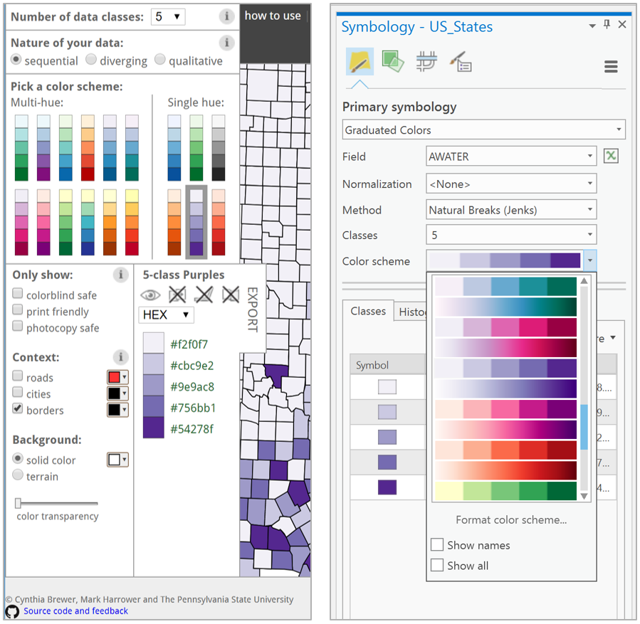
Color is frequently used to symbolize information on maps. In recent years, cartographers have begun to employ color more and more: in a study of map-color use in scientific journals, White et al., (2017) found that the use of color in published map figures increased from 18.4% in 2004 to 69.9% in 2013. This trend can primarily be attributed to the loosening of practical map production constraints. The cost of color printing, for example, is no longer prohibitory. This is in large part due to the increasing popularity of web-based dissemination of maps and other visual graphics, which makes such costs irrelevant. Tools such as ColorBrewer and Colorgorical have also made color selection easier; the first of these is even now integrated into the color selection tools in ArcGIS Pro.
In this lesson, we will explore the basics of specifying, mixing, and selecting colors for maps. You should aim to understand and properly apply the color schemes available in GIS software, as well as to alter them as appropriate based on your maps’ audience, medium, and purpose. Eventually, you might even design your own color schemes from scratch.
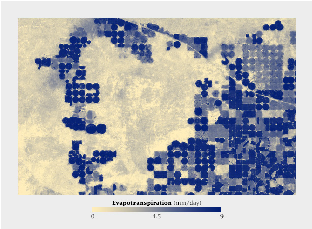
You might remember the map in Figure 4.1.2 from Lesson 1. This map is a thematic map, and more specifically, a choropleth map. Discussions of color in mapping often focus on choropleth maps. This is for good reason—choropleth mapping is the most common thematic mapping technique, and its employment typically requires thoughtful analytical use of color. We will discuss the details of choropleth mapping later in this lesson, but note that color is frequently used on other types of maps as well. General purpose maps often employ color to delineate between kinds of features, and maps that focus on other visual variables (e.g., proportional symbol maps) often also use color to encode an additional variable, or to add visual interest.
Recommended Reading
- Harrower, Mark, and Cynthia A. Brewer. 2003. “ColorBrewer.Org: An Online Tool for Selecting Colour Schemes for Maps.” The Cartographic Journal 40 (1): 27–37. doi:10.1002/9780470979587.ch34.
- Gramazio, Connor C., David H. Laidlaw, and Karen B. Schloss. 2017. “Colorgorical: Creating Discriminable and Preferable Color Palettes for Information Visualization.” IEEE Transactions on Visualization and Computer Graphics 23 (1): 521–530. doi:10.1109/TVCG.2016.2598918.
- White, Travis M., Terry A. Slocum, and Dave McDermott. 2017. “Trends and Issues in the Use of Quantitative Color Schemes in Refereed Journals.” Annals of the American Association of Geographers 4452 (April): 1–20. doi:10.1080/24694452.2017.1293503.
Specifying Colors
Specifying Colors
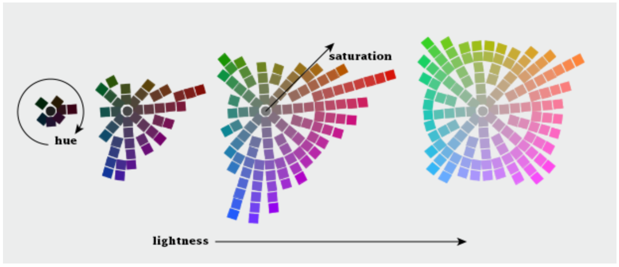
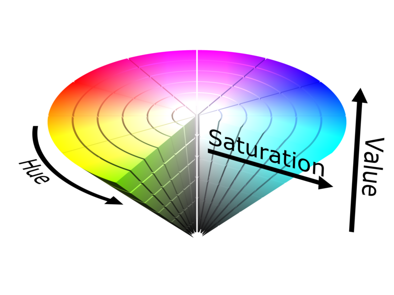
When you hear the word "color," words such as blue, red, and green likely spring to mind. Though these are colors in the colloquial sense, these are better described as color hues. When using color as a visual variable, each color is specified not just by color hue but by three dimensions: hue, lightness, and saturation (Figure 4.2.1).
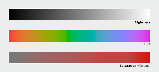
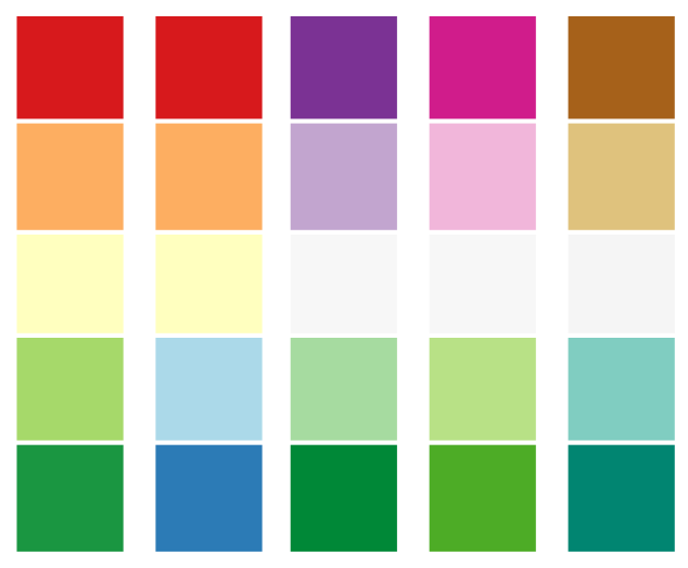
Color is produced when light is either reflected off of (e.g., a car; a printed map) or emitted by (e.g., a computer screen) an object. Hue refers to the wavelength of that light, from longest (oranges and reds), to shortest (blues and violets). Figure 4.2.2 shows nine swatches of color with different hues, in the order of the rainbow spectrum.

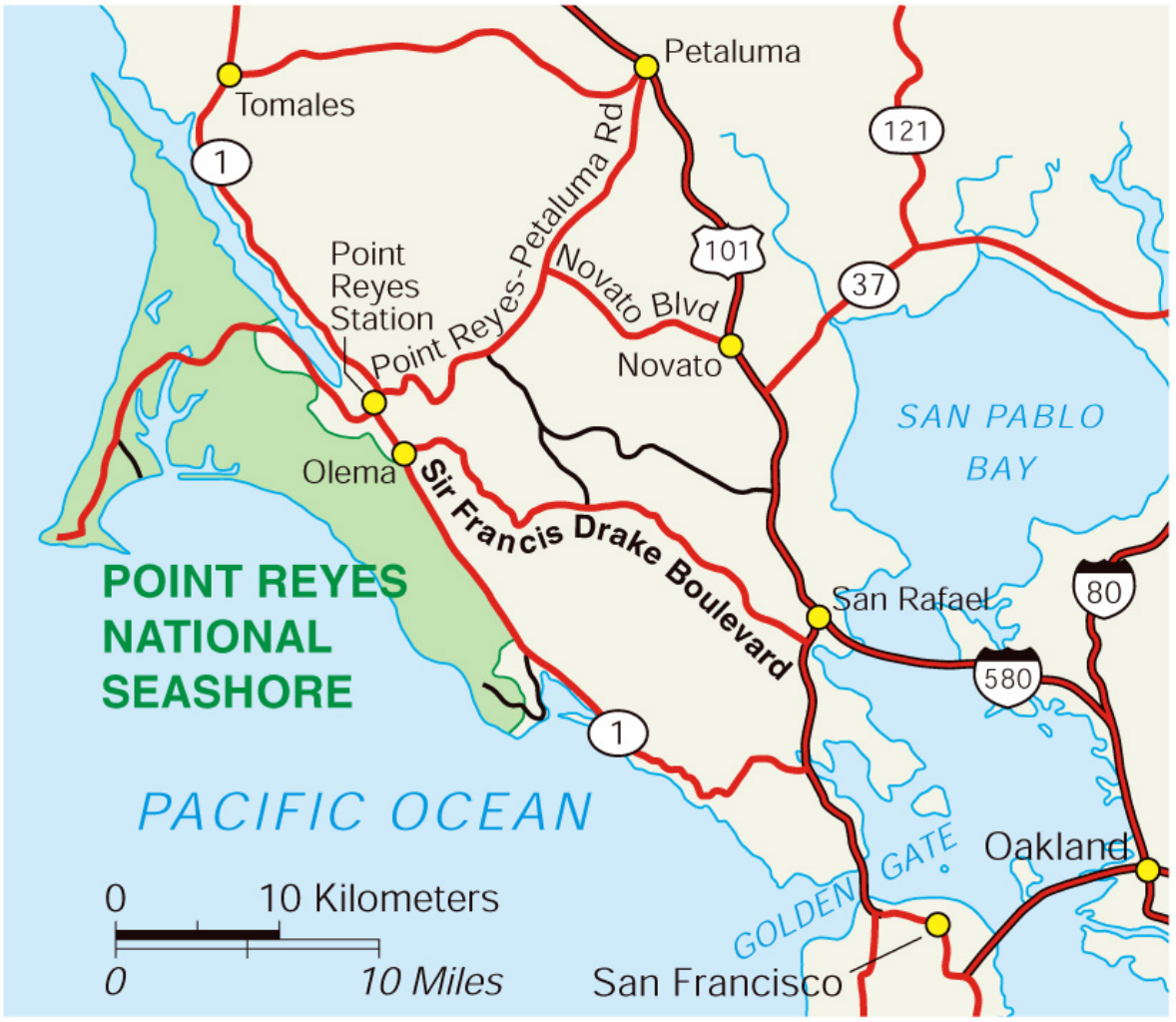
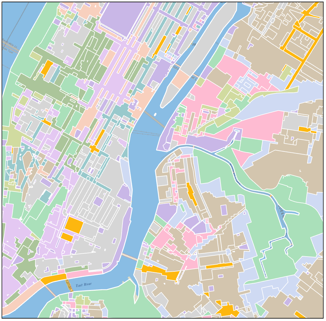
In mapping contexts, hue is typically used to differentiate between features. In general purpose maps, for example, hue is used to create categories, and to help the reader identify different features as belonging to a particular group. In Figure 4.2.3, for example, color is used well, and improves the legibility and aesthetics of the map. Though multiple types of roads are shown, all roads are shown in red. Similarly, all hydrologic features and labels are shown in blue - a familiar color easily recognizable by map-readers as associated with water.
Lightness is another dimension of color; it describes how perceptually close a color appears to a pure white object. Lightness is also commonly called value, though cartographers sometimes avoid that term, as value is also used to describe data values—using the same word for both items can cause confusion. Lightness works well for visually encoding the order and/or magnitude of thematic data values—typically, lighter colors signify lower data values (i.e., less signifies less), and darker, more visually-prominent features signify higher data values.
The third dimension of color is saturation. Saturation is also sometimes called chroma. In map design, saturation is generally less important than hue and value, but it still can play an important role. Highly saturated colors are particularly useful for calling attention to small but important map elements that would otherwise be lost (Figure 4.2.4). Caution should be used when using saturation in this way, however—the use of too highly saturated colors, particularly over large areas, may be distracting or accidentally overemphasize those features.
These three dimensions (hue; lightness; saturation) were originally identified by Dr. Albert H. Munsell in the early 20th century. Munsell’s first color model, a color sphere, was an attempt to fit these three dimensions of color into a regular shape. Though this model was still a breakthrough, Munsell realized that it was quite insufficient, as human color perception is not linear and cannot be accurately modeled by a regular shape. The final shape he landed on looks more like a lopsided ellipsoid.
Figure 4.2.5 below takes a top-down approach to visualizing this color space: each of the four graphics demonstrate what is, in essence, a slice of the Munsell model, with increasing lightness from left to right. As shown, the colors which the human eye can perceive do not change linearly through color space—this makes color specification and design a challenging task.
Student Reflection
Imagine you want to create a categorical map with a large variety of colors. What does Munsell’s model suggest about what kind of colors would be best used for this purpose?
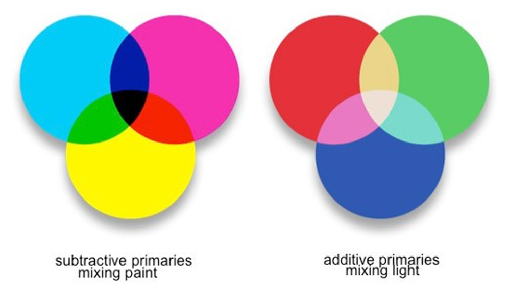
Though Munsell’s model is helpful for understanding color perception, and perhaps for sharing color specifications with others, a working knowledge of other models is required for building color schemes in GIS and graphic design software. When specifying colors, it is important to consider the display medium that you are using to create them. When mixing paint, cyan, magenta, and yellow (CMY) are used. As mixing paint (or laser printing inks) results in less light being reflected from the color surface, this is called subtractive mixing. The opposite occurs on digital display screens, which create colors by mixing red, blue, and green (RGB) light. Mixing these primaries is called additive mixing.
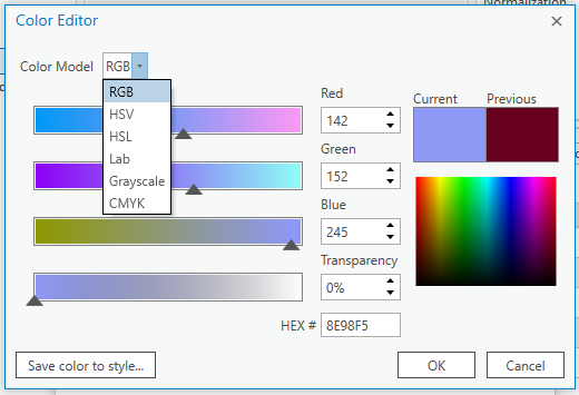
ArcGIS offers a wide selection of color model choices for specifying colors, including RGB, HSV, and CMYK. RGB and CMYK color models refer to the aforementioned models for mixing additive and subtractive primaries, respectively. RGB is useful for digital media, and CMYK is the color language typically used by graphic artists. Another popular model is HSV (hue, saturation, and value). HSV is reminiscent of the Munsell model (see Figure 4.2.8), but with much greater symmetry—recall the oddly-shaped structure of Munsell’s model.
The symmetry of HSV makes it fit much better into the language of computers, but as human color perception is not linear (recall Figure 4.2.5), using HSV can cause problems unless you remain cognizant of this shortcoming.
Additional color models, including HSL and CIELAB, offer other ways of specifying colors. We will not go further into the details of color specification here, but you are encouraged to explore the recommended readings for more information.
Recommended Reading
Chapter 7: Color Basics. Brewer, Cynthia A. 2015. Designing Better Maps: A Guide for GIS Users. Second. Redlands: Esri Press.
Types of color schemes
Types of color schemes
When applying color schemes to maps, there are many factors to consider. First and foremost, keep this rule in mind: the perceptual structure of the color scheme should match the perceptual structure of the data. For example, if your data go from high to low (sequential data), you should use a color scheme that demonstrates this order, as shown in the map in Figure 4.3.1.
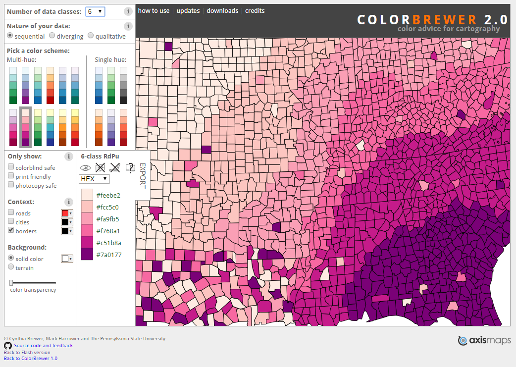
There are three main types of color schemes: sequential, diverging, and qualitative. A popular tool for choosing color schemes on maps is ColorBrewer, designed by Dr. Cynthia A. Brewer at Penn State. ColorBrewer’s interface is shown in Figure 4.3.2. You may find it helpful to explore the many color schemes available on the site as you read more about types of color schemes in this lesson and consider how you might apply them to your maps.
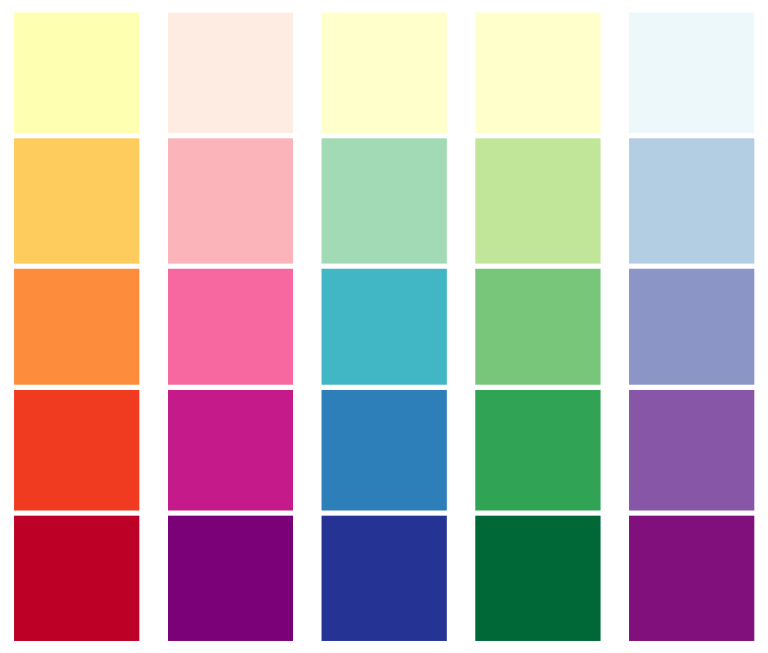
Sequential color schemes are the most popular color schemes used in thematic mapping, as they are excellent for demonstrating the order of data values. Several examples of sequential color schemes are shown in Figure 4.3.3.

Though color lightness is effective on its own, sequential color schemes are also often designed with multiple harmonious hues, such as in the color schemes shown in Figure 4.3.4. The multi-hued nature of these color schemes can make it easier for viewers to discriminate between all data classes on the map. They also often create more aesthetically-pleasing visualizations. As long as it doesn't take away from readers' comprehension of your data, why not make a better-looking map?
As shown in Figure 4.3.5, when hue is paired with lightness it can create a dramatic effect in a sequential map. When making such maps, ensure that they accurately reflect the progression of your data—it is challenging to create an effective sequential color scheme that relies heavily on hue.
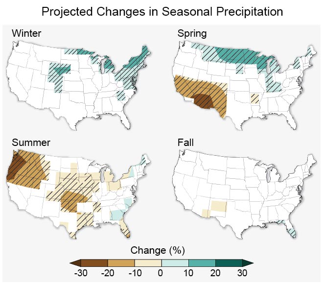
Diverging color schemes are similar to sequential color schemes, as they also demonstrate order. Instead of showing a single progression, however, they visualize the distance of all values from a critical point. These color schemes work well for depicting data that have a critical middle value or class (such as maps showing percent change).
If your data has a natural midpoint—such as the absence of change— a diverging color scheme works well, as it permits the reader to easily identify values on the map as either above or below that value. An example of this is shown in Figure 4.3.7 below.
Other values can also serve as helpful midpoints in mapped data. For example, a map might use a diverging color scheme to demonstrate values that fall above or below the data’s mean, or perhaps some external goal-worthy value (e.g., a choropleth map of median income where a diverging color scheme is centered around a calculated value of a living wage).
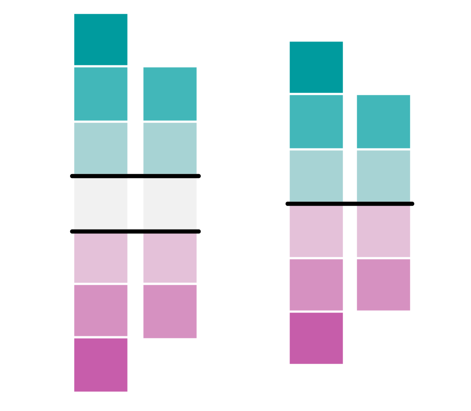
An important consideration when applying a diverging color scheme is whether your data has a critical break or a critical class (Figure 4.3.8). Using a diverging scheme with a critical class will highlight a critical group of areas on your map, as well as those above and below. A critical break will show all areas as either above or below a critical value –there is no “neutral” color class in this scheme. Diverging schemes also do not always have to be symmetrical. Your critical break/class will often be near the center of your data range, but it in no way needs to be.
Keep the divergent schemes shown in Figure 4.3.8 below in mind as we discuss data classification for choropleth mapping later in the lesson.
Student Reflection
View the map in Figure 4.3.9 below. Why is a diverging color scheme used here? What does the map tell you? What doesn’t it tell you? Would you design it differently?
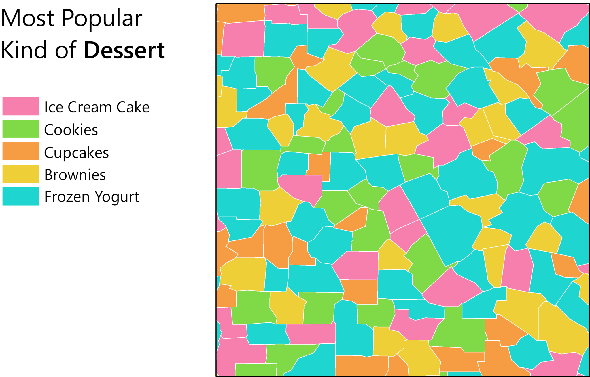
The third type of color scheme is the qualitative color scheme. These schemes are used to demonstrate differences—but not order—between map features. Several examples are shown in Figure 4.3.10 below.

Qualitative color schemes are often used when creating maps of political boundaries, or to create categorical choropleth maps, such as the one in Figure 4.3.11. As the term choropleth is composed of the Greek words for “area/region” and “multitude,” it is technically incorrect to refer to a map of nominal values as a choropleth map, despite the characteristic enumeration-unit shading such maps employ. These maps should instead be called chorochromatic maps.
Perhaps the most common use of qualitative color schemes in mapping is in land use/land cover maps. These maps seek to demonstrate category (e.g., residential vs. commercial) but not to demonstrate order. An example of a land cover map is shown in Figure 4.3.12.
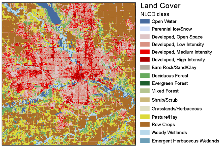
The (color vision unimpaired) human eye can discriminate between about twelve different hues; dependent on the reader and the design of the map, often even less. Many maps, and land use/land cover maps in particular, contain more than this number of categories. A frequent strategy is to group categories into hue classes (e.g., green for vegetation) and then to use lightness and saturation to create intra-class differences. In Figure 4.3.12, for example, green hue is used for forest, and lightness variations are used to differentiate between forest types.
Student Reflection
View the categories of land cover in Figure 4.3.12. Does the perceptual structure of the data match the perceptual structure of the colors assigned? Does it do so in more ways than one?
Recommended Reading
- Chapter 8: Color on Maps. Brewer, Cynthia A. 2015. Designing Better Maps: A Guide for GIS Users. Second. Redlands: Esri Press.
- Chapter 14: Choropleth Maps. Slocum, Terry A., Robert B. McMaster, Fritz C. Kessler, and Hugh H. Howard. 2009. Thematic Cartography and Geovisualization. Edited by Keith C. Clarke. 3rd ed. Upper Saddle River, NJ: Pearson Prentice Hall.
Visual perception constraints
Visual perception constraints
So far this lesson, we have talked about multiple ways to specify colors, and how we might apply them to maps. As we discuss color, however, we also need to discuss color vision deficiency—the inability to discriminate between certain (or occasionally, all) colors. Though color blindness varies by gender and ethnicity, you can generally expect that about five percent of your map readers will have some form of color deficiency. You may have some form of color vision deficiency yourself.
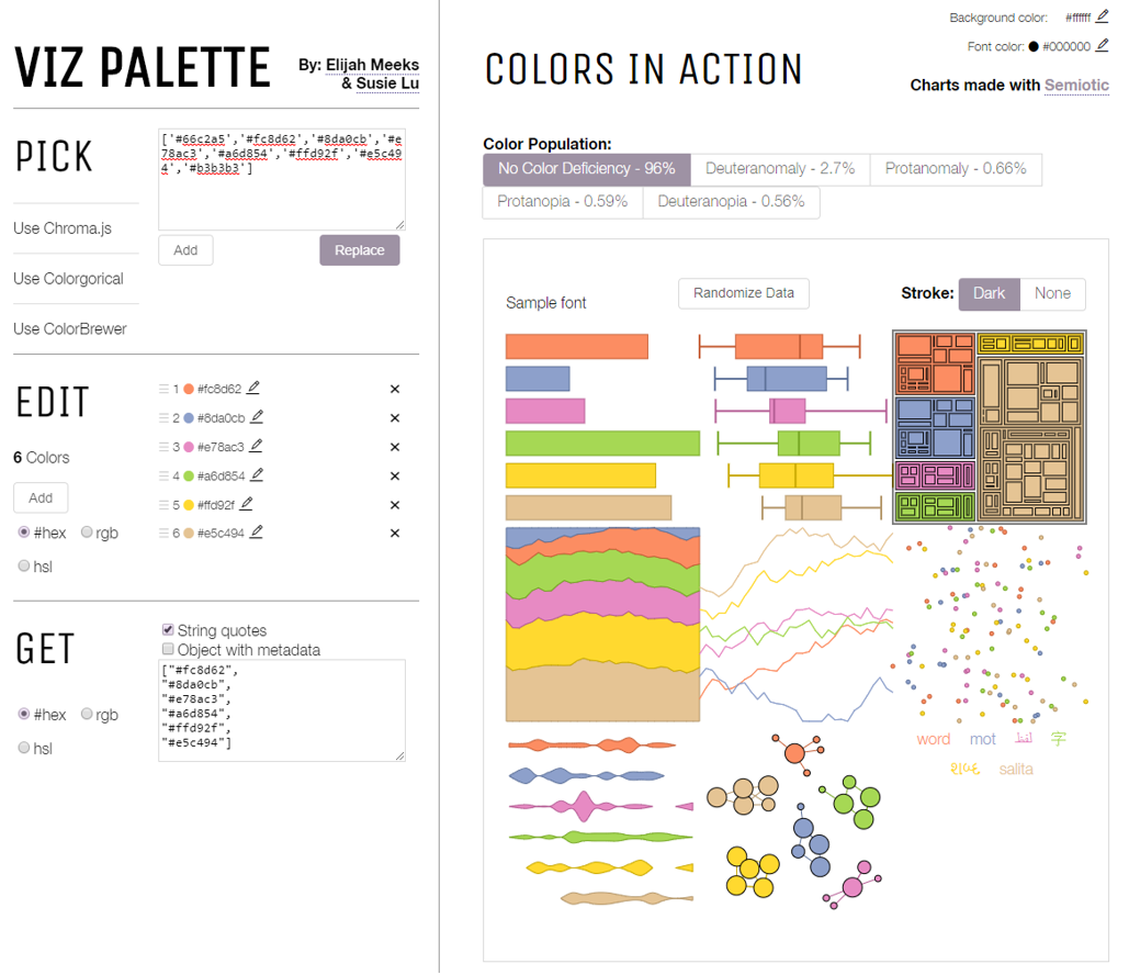
The good news is that several web tools exist to help you design more accessible maps. Viz Palette, developed by Elijah Meeks and Susie Lu, is one useful example. It permits you to import your own color schemes from popular color-picking tools such as ColorBrewer and view their appearance through the eyes of those with different types of color vision deficiencies.
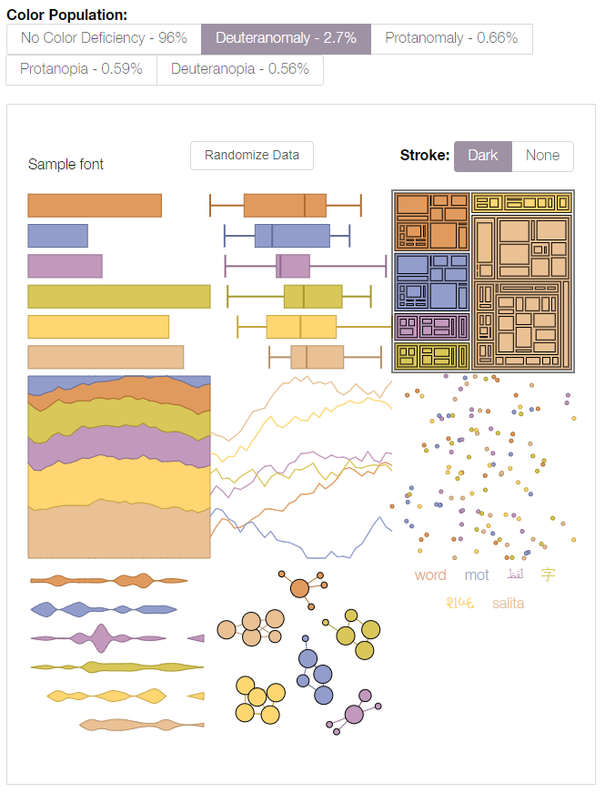
Tools such as Viz Palette are useful for understanding how different people might view your data visualizations and maps. You can then decide for yourself whether your chosen palette is acceptable. ColorBrewer also lets you select from among only color schemes that have been empirically-verified as colorblind friendly - its interface includes an option to show only “colorblind safe” color schemes. Unsurprisingly, the scheme in Figure 4.4.1(2) does not appear.
How much you factor color accessibility into your map design will depend greatly on its audience, medium, and purpose. Color discriminability is affected by many factors outside of genetics, including reader age, lighting conditions, and map resolution. It is also more crucial in some mapping contexts than in others. A map for entertainment, for example, may sacrifice accessibility for increased aesthetics and visual interest among the not color-vision impaired. When a map’s purpose is emergency management or vehicle routing, however, the cartographer may place a greater value on ensuring readability for all map users.
Even among those without color vision impairments, human color perception does not come without flaws. View the squares labeled A and B in Figure 4.4.3—do they look the same to you?
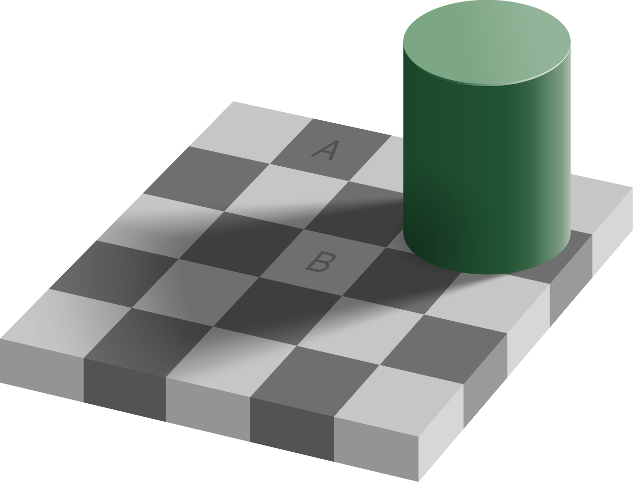
Your eyes are deceiving you—these two squares are exactly the same shade of grey. (If you don't believe it, check out the interactive version of this graphic at illusionsindex.org [19]). This is the result of a principle of color interpretation called simultaneous contrast, or induction—colors appear differently, dependent on the backdrop against which they appear.
Student Reflection
View the maps in Figure 4.4.4: which colors in the second map (1, 2, 3, 4) do you think match the colors in areas A and B?
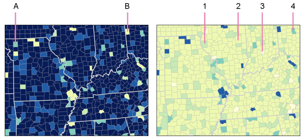
Student Reflection answer: The color in A matches the color in 4; the color in area B matches area 2. Is this what you were expecting?
To date, little empirical research in cartography has evaluated the influence of induction on map interpretation, and, thus, few suggestions exist for minimizing its effects in practice. You should, however, anticipate the effects that varied backgrounds will have on the interpretation of your map symbol colors, particularly for maps in which such comparisons are common and/or critical.
So far in this lesson, many of our examples have been choropleth maps—the most common thematic mapping technique, and one which typically makes extensive use of color as a visual variable. In the next section, we will focus on other aspects of choropleth mapping, including data standardization and classification, as a deeper understanding of how these maps are built using data is required for selecting an effective color scheme.
Recommended Reading
- Chapter 8: Color on Maps. Brewer, Cynthia A. 2015. Designing Better Maps: A Guide for GIS Users. Second. Redlands: Esri Press. Bach, M. (n.d.).
- The Illusions Index [21]
Data Standardization
Data Standardization
As discussed in Lesson 3, the choropleth mapping technique should be used on standardized data such as rates and percentages—rather than on totals or counts—which are better represented by point symbol maps.
Your data will sometimes be delivered in the proper standardized format. For example, you might have for each enumeration unit in your data a rate, density, or index value. All of these are appropriate for choropleth mapping. Oftentimes, however, you will need to calculate these values yourself. Data from the US Census, for example, is often delivered as count data by enumeration unit but includes a population field which can be used for standardization.
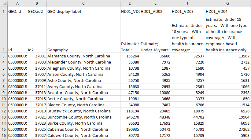
Using the example data in Figure 4.5.1 above, imagine we wanted to map the number of people in each county who are under 18 years old AND have one type of health insurance coverage (Column F). And imagine we created a county-level choropleth map using those Column F values. What would this map tell us? It might tell us a little something about geographic health insurance trends in North Carolina, but mostly it would just show us in which counties more people live.
Remember the importance of map purpose: rather than just making a population map, we want to understand the geography of health insurance coverage for young people. For this, we need to map standardized values. To do so, we can divide the number of under 18-year-olds with one type of health insurance (Column F) by the appropriate universe: the count of items (here, people) that could possibly fall into this category. Since our data value of interest only applies to a specific age group, our universe, in this case, is not all people (Column D), but all people under 18 (Column E).
Some texts and software programs, including ArcGIS, call this process normalization rather than standardization. As suggested by (Slocum et al. 2009) we use the term standardization, as normalization has a more specific meaning in statistics with which we do not want this process to be confused.
Making Choropleth Maps
Making Choropleth Maps

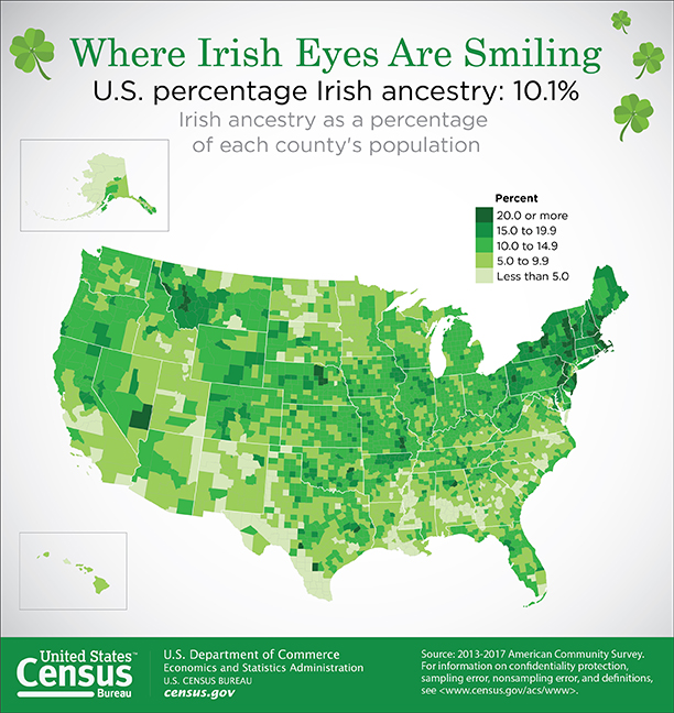
Let’s return again to a map that should be becoming familiar, posted now as Figure 4.6.1. Median income is visually encoded in each state as belonging to one of four classes: (1) less than $45,000; (2) $45,000 to $49,999; (3) $50,000 to $59,999, and (4) $60,0000 and more. How were these classes chosen?
Student Reflection
One side-step before we discuss data classification: think back to our discussion of types of color schemes—can you think of another type of color scheme that would be effective in Figure 4.6.1? Do you think it would be better?
When the map in Figure 4.6.1 was being designed, the aforementioned classes had to be decided upon – and there are many different ways in which class breaks in median income could have been drawn. So, how do you choose? Rather than simply choosing the default classification scheme that your GIS software suggests, you should think critically about how your data classes are defined. The first decision you should make, however, is not how, but whether to class your data.

Figure 4.6.2 shows an example of two maps—one unclassed (sometimes called a "class-less" map), and one classed. Unclassed maps encode color (usually with lightness) based on the specific value within each enumeration unit, rather than based on a pre-defined class within which the data value falls. These maps are useful as—if designed properly—they may more accurately reflect nuances in the distribution of the data. However, they should not be considered an easy solution to the problem of data classification. They have their own disadvantages, for example, they make it challenging for the reader to match the value encoded in an enumeration unit to its location on the legend.
Before modern GIS software, unclassed maps were quite difficult to create, but new technology has made their design quite simple. Unclassed maps show a more “direct” visualization of the data, while classifying maps gives you more control over the final map. It will be up to you as the map designer to decide whether to class your map; however, many map readers—and cartographers—still prefer classed maps.
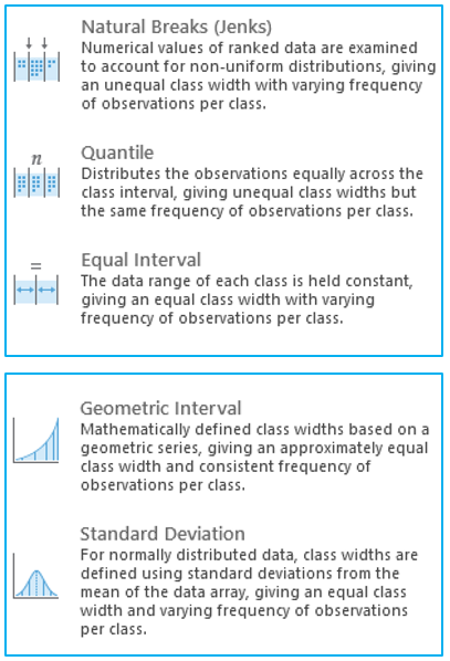
As you will likely be classifying your maps, it is important to understand how this process can influence your final map design. Most of the commonly-used classification methods are available in ArcGIS, and the software interface gives a good simple explanation of each of these methods (Figure 4.6.3). We will not discuss the mathematical details of each of these classification methods here—it is recommended that you explore the recommended readings or do your own research on the web to learn more.
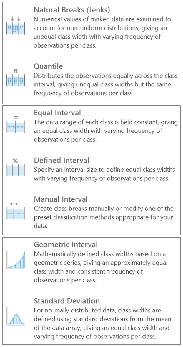
Natural Breaks (Jenks): Numerical values of ranked data are examined to account for non-uniform distributions, giving an unequal class width with varying frequency of observations per class.
Quantile: Distributes the observations equally across the class interval, giving unequal class width but the same frequency of observations per class.
Equal Interval: The data range of each class is held constant, giving an equal class width with varying frequency of observations per class.
Defined Interval: Specify an interval size to define equal class widths with varying frequency of observations per class.
Manual Interval: Create class breaks manually or modify one of the present classification methods appropriate for your data.
Geometric Interval: Mathematically defined class widths based on a geometric series, giving an approximately equal class width and consistent frequency of observations per class.
Standard Deviation: For normally distributed data, class widths are defined using standard deviations from the mean of the data array, giving an equal class width and varying frequency of observations per class.
Though Figure 4.6.3 gives helpful descriptions of each classification method, it offers little advice as to when to use them. A good way to approach this question is to view your data along the number line. You can use histograms (for large data sets) or dot plots (for small data sets) to visualize how your data is distributed, and to select class breaks accordingly. The following suggestions are given by Penn State cartographer Dr. Cynthia Brewer.
1. For data with near-normal distributions, consider classifying your data based on the mean and standard deviation.
2. For skewed distributions, consider systematically increasing classes, such as arithmetic and geometric classing methods.
3. If your data are evenly distributed, equal interval and quantile classing methods work well. These methods are also best for ranked data.
4. Natural breaks, created using Jenks classing method or in selecting breaks by eye, work best for data which shows obvious groupings through the range. The natural breaks method highlights the natural sets of values in the data.
We will look at data using dot plots during this lab associated with this lesson. When you make maps, unless you are working with a very large data set, this will often be the most effective way to visually investigate your dataset in order to choose a classification method or visually/manually place your own breaks. ArcGIS, however, creates histograms of your data that you can also use to understand how the breaks you have chosen relate to the spread of your data.
Student Reflection
Compare the breaks, histograms, and maps in Figure 4.6.4 below. Which classification method would you have chosen? Why?
![comparison of two maps (top map created using quantiles classification method, bottom map using natural breaks [Jenks]), see surrounding text](/geog486/sites/www.e-education.psu.edu.geog486/files/Lesson_04/Images/4.5.10.PNG)
Note that the spread of your data is only one of multiple elements you should consider when choosing how to classify your data. As with other map design choices, your map's intended audience, medium, and purpose are also of vital importance here.
In addition to choosing a classification method for your maps, you also must decide how many classes to create. It may be tempting to create a large number of classes, as more classes means less simplification of your data, and thus more information conveyed to the map viewer. Unfortunately, the human eye can only differentiate between so many colors. The limit is about a dozen colors for a qualitative map, ten for a diverging scheme, and only eight for a sequential scheme. If anything, these are optimistic estimates—your map reader is likely to be able to differentiate between even less.
Student Reflection
View the maps in Figure 4.6.5 below. Looking at the map on the left, can you identify within which class county x belongs? How confident are you that this is the correct answer? What about in the map on the right?

Finally, when classifying your map data, you will have to contend with outliers in your dataset. Consider a county-level map, where one county has double the rate (for example, of people with graduate-level degrees) of any other county in your data. Some classification methods, such as natural breaks or equal intervals, will most likely group this outlier into a class of its own. Other methods, such as quartiles, will simply place it into a group with all the next-highest counties.
There is no rule for which method is best, except that context matters. Is the rate high because that county contains the most prestigious university in the state? In that case, you probably want it to be highlighted on your map. If instead, it is the highest because only five people live there—and two are college professors—you probably don’t. In general, the more data you have, the less likely an outlier is to be noise: this is called the law of large numbers. Whenever possible, however, you should investigate the possible causes of an outlier—there is no substitute for contextual clues.
There are additional ways to classify your data, including by combining methods—for example, using equal intervals for most of the range, and then switching to natural breaks. Methods also exist that consider not just the distribution of data along the number line, but its distribution through geographic space as well. These are beyond the scope and intent of this lesson, but be aware that you may encounter them in the future.
Recommended Reading
- Chapter 4: Data Classification. Slocum, Terry A., Robert B. McMaster, Fritz C. Kessler, and Hugh H. Howard. 2009. Thematic Cartography and Geovisualization. Edited by Keith C. Clarke. 3rd ed. Upper Saddle River, NJ: Pearson Prentice Hall.
- Chapter 11: Data Maps: A Thicket of Thorny Choices. Monmonier, Mark. 2018. How to Lie with Maps. 3rd ed. The University of Chicago Press. (this week's required reading - it relates especially well to this topic).
- Tversky, Amos, and Daniel Kahneman. 1971. “Belief in the Law of Small Numbers [23].” Psychological Bulletin 76 (2): 105–110.
Making Sense of Maps
Making Sense of Maps
By now, you should feel pretty good about creating a single, choropleth map. Such maps are often requested, designed, and distributed. Yet the power of maps often comes from our ability to compare them. Static maps—all of the maps we’ve discussed thus far—typically only represent one snapshot in time. What if we are interested in how a phenomenon has changed over time, or how it varies between two disparate locations?
View the two maps below in Figure 4.7.1. They are both maps of population density in the United States and are shown at the same scale. At first glance (to non-US residents, perhaps), it might appear that Vermont has a higher level of population density. But take a closer look at the legends -
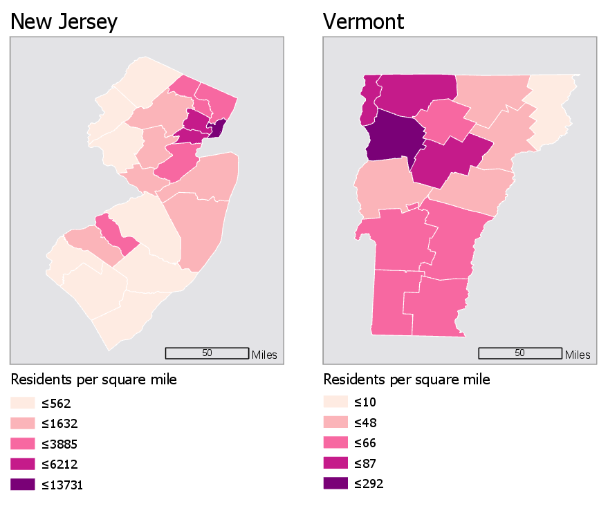
The legends in the maps in Figure 4.7.1 don’t match—the darkest color, for example, represents a vastly higher level of population in the first map than in the second. How much does population density differ between New Jersey and Vermont?—due to the unmatched legends, it’s really almost impossible to tell.
Using the same data classification scheme for a set of maps is the easiest way to make them directly comparable. For example, the maps in Figure 4.7.2 use the same data, but this time, both legends are equivalent.
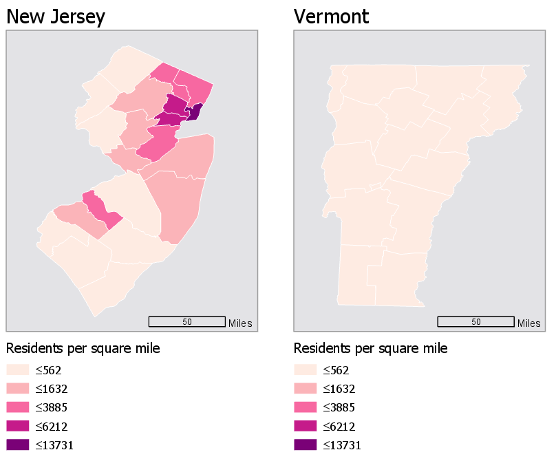
This gives us an entirely different view of the data—New Jersey is now visible as obviously more densely populated. Note, however, that this map just took the default classification scheme from New Jersey, and applied it to Vermont, which is still not a good solution. Though it is now easy to compare these states, we are unable to discern which areas of Vermont are more populated than others: they are all simply classified as "less than 562 residents per square mile." Making maps that work well both independently and when compared is a challenging task, and one which we will contend with in Lab 4.
Another important aspect of choropleth—and any—map design is making sure that marginal elements such as legends and labels are well-crafted to support reader comprehension of your map. For example, see Figure 4.7.3. It may seem at first that this legend is too text-heavy: you don’t generally create visual graphics with the intention of asking people to read. However, without this level of detail, the content of the map would be confusing, and many readers would likely misinterpret it.
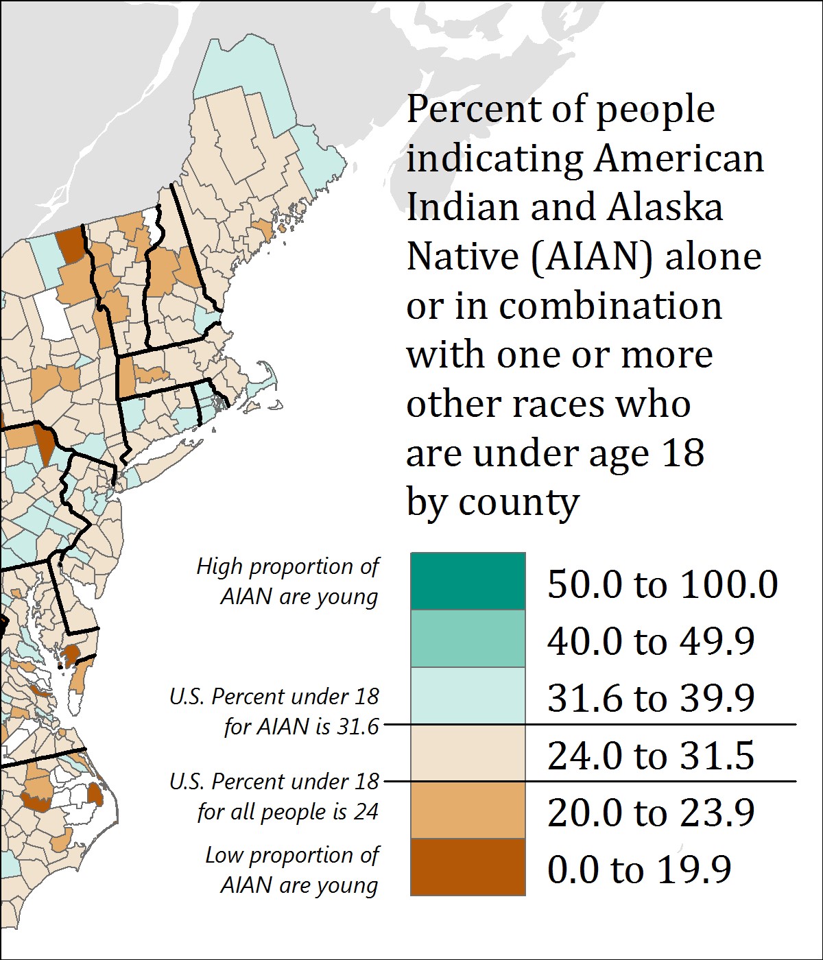
This map also purposefully places breaks in the data—for example, one break is placed at 24 percent, which is the percentage of all people in the US who are under 18 years old. The break is annotated to inform the reader of this fact—without this annotation, the use of this specific break would not be useful. Additional legend annotations (e.g., “High proportion of AIAN are young”) serve to clarify the map.
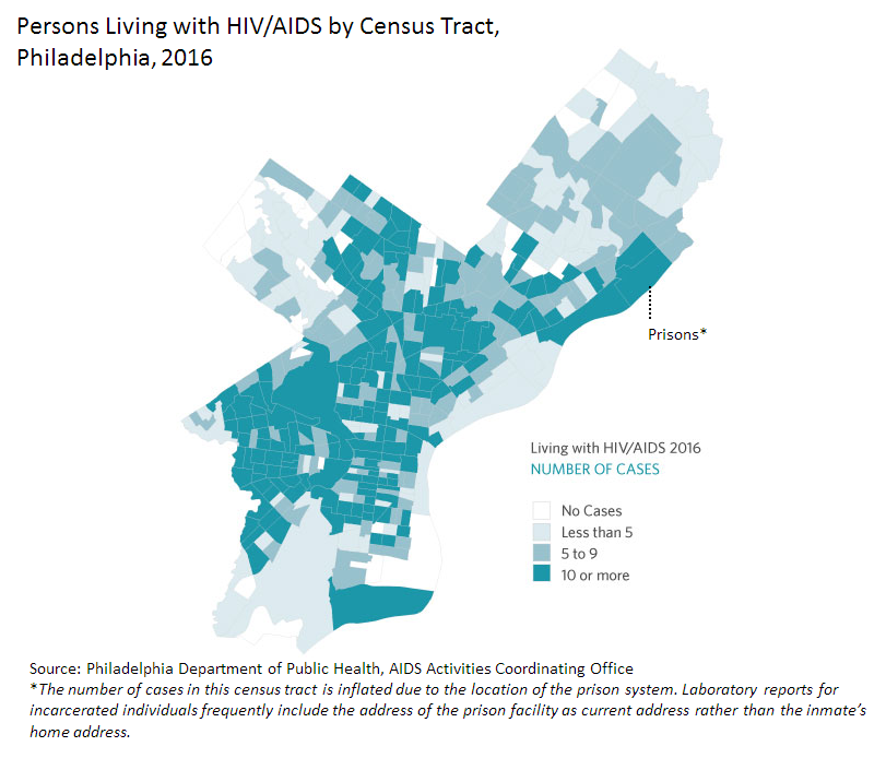
Figure 4.7.4 below similarly uses a text explanation to clarify the data mapped. Due to the classification scheme used, the location indicated by the leader line and Prisons* note does not immediately stand out as an outlier. However, given the topic of the map, this explanation is important. We discussed dealing with outliers earlier in the lesson—one option for dealing with a relevant outlier is simply to point it out to your readers via explanatory text. Mapping is all about graphic presentation, but sometimes the best solution is a simple, concise, text explanation.
Recommended Reading
- Chapter 3: Explaining Maps. Brewer, Cynthia A. 2015. Designing Better Maps: A Guide for GIS Users. Second. Redlands: Esri Press.
- Chapter 5: Color: Attraction and Distraction. Monmonier, Mark. 2018. How to Lie with Maps. The University of Chicago Press.
Color and Data
Color and Data
When using color as a symbol on your maps, your first priority should be to apply it analytically. As stated before: the perceptual structure of your color scheme should match the perceptual structure of your data. You should apply color based on the guidelines previously discussed in this lesson before worrying about choosing aesthetically-pleasing colors, or your audiences’ likely favorite colors, or colors that correspond to the context of the data (e.g., using a green color scheme to create a map about sustainability).
However—when appropriate—adding context to colors in your maps can benefit your readers. See the map in Figure 4.8.1 below. Rather than choosing a traditional sequential color scheme, this cartographer chose to match the colors of the leaves to the colors on the map.
This approach may not always work to best represent the mathematical order of your data classes. But your maps aren’t just about dots along a number line—they represent real-world phenomena. Using color assignments that make sense (e.g., red for negative values), or are customary (e.g., yellow for residential in zoning maps) can improve the clarity and comprehensibility of your maps.
Recommended Reading
- Lin, Sharon, and Jeffrey Heer. 2014. “The Right Colors Make Data Easier to Read. [26]” Harvard Business Publishing.
- Bartram, Lyn, Abhisekh Patra, and Maureen Stone. 2017. “Affective Color in Visualization.” CHI Proceeding: 1364–1374. doi:10.1145/3025453.3026041.
Lesson 4 Lab
Lesson 4 Lab
Color and Choropleth Mapping in Series
In Lab 4, we will explore different ways of choosing data classification and color schemes for choropleth maps. As a cartographer, you will often have to choose between several of these options - many of which may seem at first glance to be equally appropriate. In Lab 3, we used data from the American Community Survey, provided by the US Census - a commonly-used source of data for statistical maps. In this lab, we use the same data source but focus on a specific variable frequently in focus during public policy debates: health insurance.
The first part of Lab 4 will focus on data classification. There are many ways to classify statistical data on maps, and it is important that you understand them, and be able to defend your choice of classification scheme to others. As we will be not only be classifying data but also adding that data to maps, this lab will also focus on the use of color on maps. Finally, as suggested in the lesson content, we will explore ways of making comparable maps - in this lab, we will be making three pairs of maps.
This lab, which you will submit at the end of Lesson 4, will be reviewed/critiqued by one of your classmates in Lesson 5.
Lab Objectives
- Create three pairs of county-level choropleth maps describing health insurance in New England.
- Utilize shared or similar legends to help readers understand the relationships between pairs of maps.
- Use information about data distributions and health insurance rates in New England and the US overall to plan shared data classification breaks.
- Understand the impact of different color schemes and classification methods; be able to reflect upon and write about these decisions.
Overall Lab Requirements
For Lab 4, you will create three pairs of maps, each pair as its own full-page map layout. In total, you will have three separate pages. Two maps will appear on each page. You will also write a short reflection statement about each pair of maps.
- For each pair, use the same map positioning and scale within each frame; one scale bar for both maps.
- Prepare balanced page layouts with all elements suitably sized and balanced negative space—no pinched elements or visual collisions.
- Attend to text hierarchy: overall title, subtitles, legend title(s), legend class labels, scale, data source, and name. Use thoughtful and efficient wording when labeling map elements.
Map Requirements
Map Pair One: Use a Sequential Color Scheme
- Choose two related variables to map from the provided American Community Survey (ACS) data.
- Do not just choose two age groups (e.g., 18-under; 19-25 years).
- Select class breaks manually: Create dot plots in Microsoft Excel and draw appropriate breaks using your eye to judge the data; enter these as manual breaks in ArcGIS Pro.
- Use a sequential color scheme and a single shared legend for both maps.
- Include a short write-up (100+ words) which includes a screenshot of your dot plot with lines drawn to demonstrate the breaks you chose, as well as a short description of how you selected these breaks. Also, include a screenshot of the symbology pane for both maps.
Map Pair Two: Use a Diverging Color Scheme
- Re-create your maps from map pair #1 using a diverging color scheme.
- Choose a critical break or class using external information – you can either use a value that is directly derived from your chosen data set (e.g., the mean of the data) or any logical dividing point that is calculated from an external source (e.g., the U.S. national average); adjust other class breaks accordingly.
- Use a single well-designed shared legend for both maps.
- Include a short write-up (100+ words) describing the critical break or class you chose and why. You may also discuss why you selected this particular color scheme.
Map Pair Three: Unclassed vs. Classed Maps (Choose your own appropriate color scheme)
- Choose one of the maps from map pairs #1 and #2 and create two more maps of this data—unlike in the previous layouts you made, these two maps will show the same data/topic.
- One of the maps should be an unclassed map; one should be classed.
- For the classed map, choose a classification method available in ArcGIS Pro—do not manually adjust the class breaks created, but ensure that this method is appropriate for the data you are mapping.
- Include a well-designed legend for each map.
- Include a short write-up (100+ words) that describes why you chose the classification method you did, and how you think its effectiveness compares to that of the unclassed map.
Lab Instructions
- Download the Lab 4 zipped file [27] (43.2 MB). It contains:
- a project (.aprx) file to be opened in ArcGIS Pro;
- a database that includes the spatial boundary and health insurance data needed to start this lab;
- a spreadsheet containing New England health insurance data.
- Data source: US Census Bureau - TIGER boundary files and American Community Survey (ACS) S2701 (Health Insurance Coverage Status) 5-year estimates for 2016.
- For the purposes of this lab, New England is defined as the following states: Massachusetts, Connecticut, Rhode Island, Vermont, New Hampshire, and Maine.
- Extract the zipped folder, and double-click the blue (.aprx) file to open ArcGIS Pro.
- In addition to the ArcGIS Pro file, you will also be using the ACS_2016_NewEngland_HealthInsurance.xlsx file to explore New England health insurance data.
- Note that you will not need to import any data into ArcGIS Pro - all data is included and ready to map. The Excel file is only for visually exploring the data in order to select class breaks for your maps.
Grading Criteria
A rubric is posted for your review.
Submission Instructions
- You will have three map layout PDFs to submit. Each will contain one map pair using the naming conventions outlined below.
- Map Layout/Pair 1: LastName_Lab4_MapPair1.pdf
- Map Layout/Pair 2: LastName_Lab4_MapPair2.pdf
- Map Layout/Pair 3: LastName_Lab4_MapPair3.pdf
- Include your write-ups (all three in one document) as a separate PDF.
- Lab Write-up: LastName_Lab4_WriteUp.pdf
- Remember that your write-up should include three 100+ word sections (300+ words in total) - these write-ups should defend your data classification and color scheme selection choices. The write-up for your first pair of maps must also include an image of your dot plot with annotated breaks, and screenshots of the Symbology Pane in ArcGIS Pro for both maps.
- Lab Write-up: LastName_Lab4_WriteUp.pdf
- Submit the three map layout PDFs and one write-up (also PDF) to Lesson 4 Lab for instructor and peer review. (Note: The critique/peer review will occur in Lesson 5.)
Ready to Begin?
More instructions are available in the Lesson 4 Lab Visual Guide.
Lesson 4 Lab Visual Guide
Lesson 4 Lab Visual Guide
Lesson 4 Lab Visual Guide Index
- Starting File
- Explore the Health Insurance Data in Excel
- Standardize Chosen Data for Visualization
- Create Dot Plots Using your Standardized Data
- Use this Plot to Visually Select Breaks
- Create Maps (1 & 2) Using These Breaks
- Create Maps (3 & 4) Using Diverging Colors
- Create Maps (5 & 6) Unclassed vs. Classed
- Final Deliverables
- Example Map Pair #1
- Example Map Pair #2
- Example Map Pair #3
- Additional Tips
-
Starting File
This is your starting file in ArcGIS Pro. It includes county-level boundary data for the United States. This county-level file has been joined with health insurance data for New England from the American Community Survey (ACS). A state boundaries file is also included – this file is not needed to map the health insurance data, but you may choose to symbolize it to create visible state boundaries on your map.
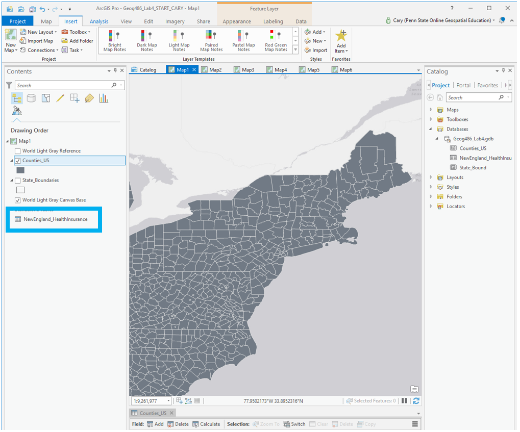 Visual Guide Figure 4.1. Starting file in ArcGIS Pro.
 -
Explore the Health Insurance Data in Excel
Within the health insurance data provided in the Lab 4 zipped folder, find two variables you are interested in and their associated universes. For example, if you were interested in uninsured people under 18, your value and universe would be those shown in Figure 4.2 below. (note: this is one variable, you need to choose two).
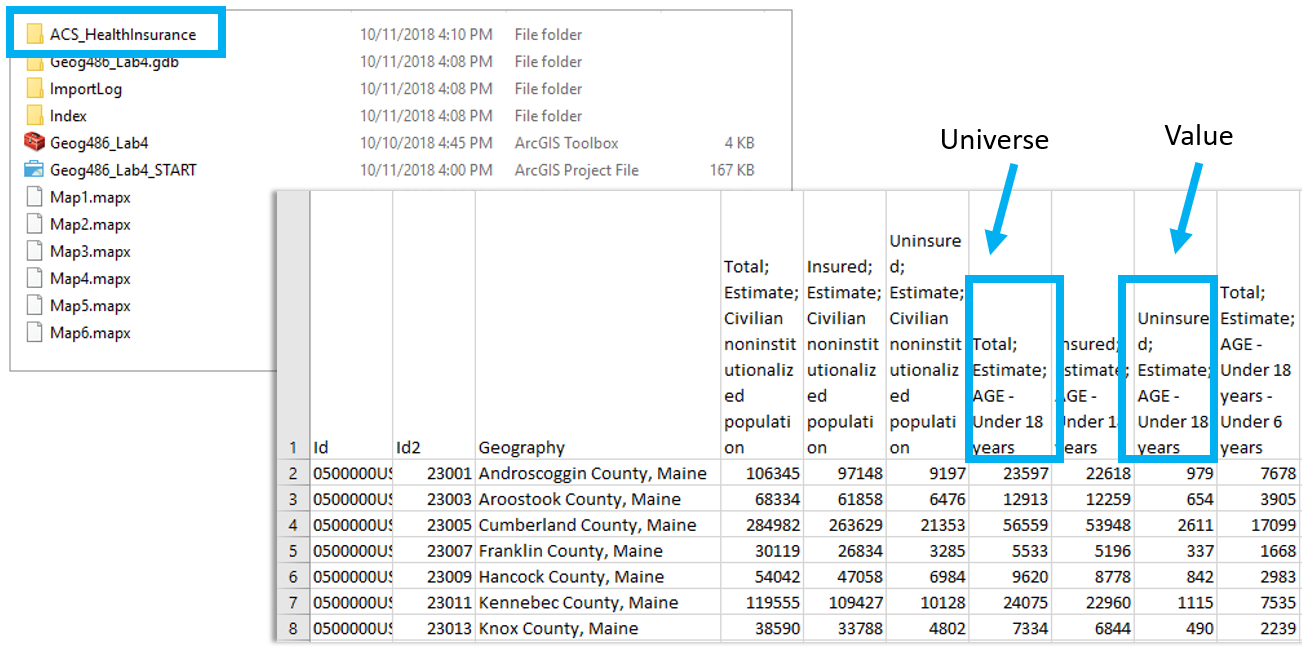 Visual Guide Figure 4.2. Uninsured people under 18 (example variable of interest), and its associated universe (all people under 18).
 -
Standardize Chosen Data for Visualization
Paste the four columns you will need "as values" (see Figure 4.3) into the Chosen Data sheet. (Reminder: use something other than just age for your maps). This will eliminate the clutter of the full dataset, giving you space to calculate standardized values from your data. We will use these standardized values to determine class breaks for our first set of maps.
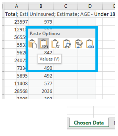 Visual Guide Figure 4.3. Pasting data as "Values" into the Chosen Data sheet
Once you have your two variables of interest (and their universes) in the Chosen Data sheet, use Excel to calculate a standardized column of data for each of your variables. You want to divide each variable of interest by its universe (recall the Data Standardization section in Lesson 4).
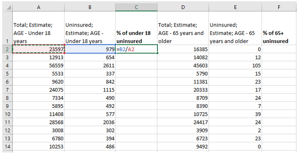 Visual Guide Figure 4.4. Calculating columns of standardized values in Excel.
 -
Create Dot Plots Using your Standardized Data
Insert a column of 1s and 2s as shown - we will use this to create a dot plot. When you select columns A and B below and insert a scatter plot, this will create a dot plot showing the distribution of your two standardized variables along the number line.
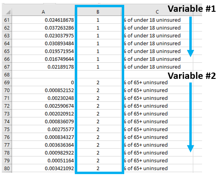 Visual Guide Figure 4.5. Adding values in a second column - these are just so we can create a neat dot plot.
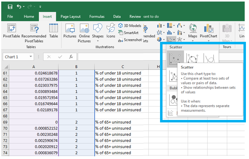 Visual Guide Figure 4.6. Using our two columns (standardized data; 1s and 2s) to insert a scatter plot in Excel.
 -
Use this Plot to Visually Select Breaks
Draw lines with the "insert shape" tool to illustrate where you will be placing breaks in your data. Annotate your lines if you choose the breaks for a reason other than just eyeing the dot distribution. For example, if you place a break at the national average for a variable, annotated this break with a text box explanation such as "US national average." Ex: “national average."
Note that Figure 4.7 is an example of how to draw lines above your dot plot, but these are not good breaks.
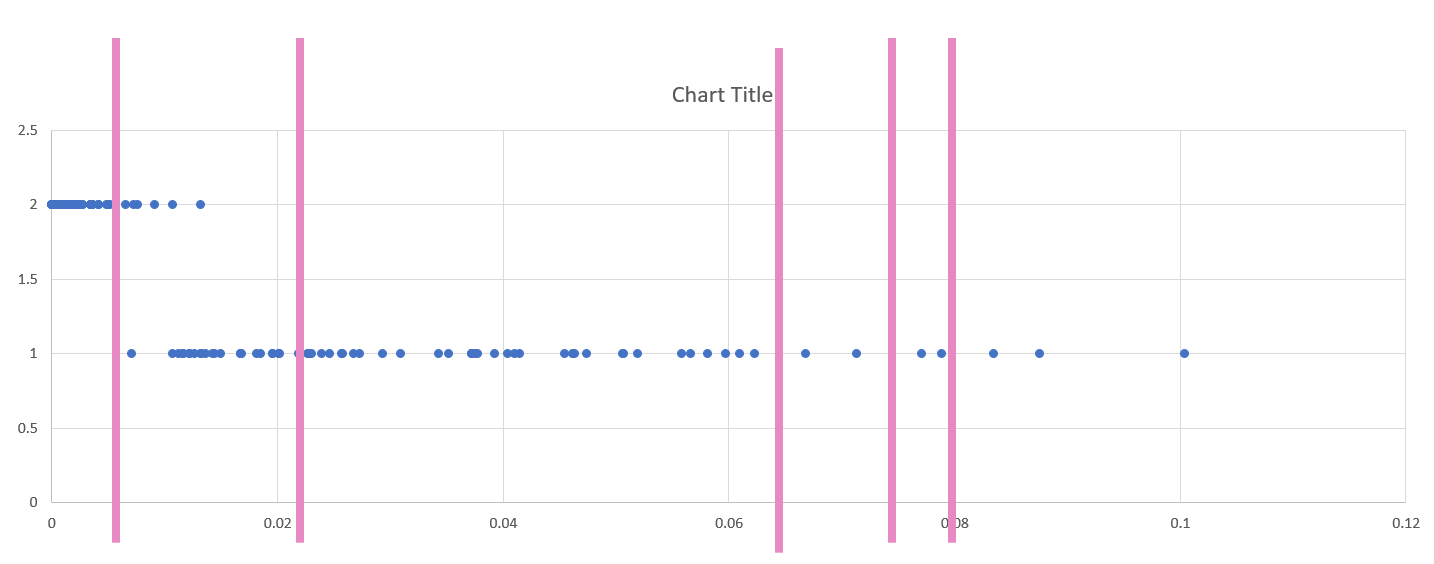 Visual Guide Figure 4.7. Dot plot of two standardized variables in Excel.
 -
Create Maps (1 & 2) Using These Breaks
We will not be importing our excel data into ArcGIS, as I have already loaded the health insurance data into ArcGIS for you. We only needed the Excel file to decide on what breaks to use for our data classification. Instead of importing standardized values, use ArcGIS to standardize your data for you: make sure the variables you choose match the ones you chose earlier!
You will then manually edit your class breaks to match the ones you drew on your dot plot (use your eye to estimate the values). The screenshot in Figure 4.8 (below) is an example of a screenshot from the Symbology Pane. You will submit a screenshot of the Symbology Pane for both maps in layout one, in addition to an image of your dot plot with annotated breaks.
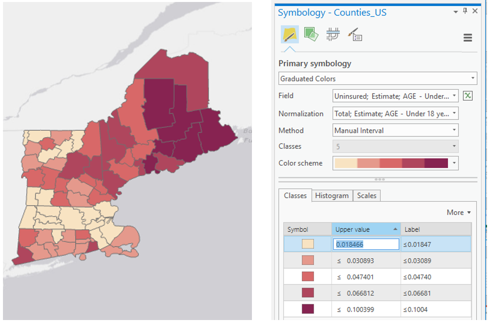 Visual Guide Figure 4.8. A sequential color map (left); manually editing data classes (right).
 -
Create Maps (3 & 4) Using Diverging Colors
For these maps, you will be setting a critical class break (e.g., based on the mean of the data) and a diverging color scheme. To create your second pair of maps, choose a diverging color scheme. Then, set a deliberate and useful critical class or break. Once the break is set, you should manipulate the other class breaks manually. As a suggestion, for the other class breaks you could start with the manual breaks you chose for your first two maps, but may need to adjust them to work with this new color scheme. Reference the Lesson 4 reading for ideas and advice on how to choose a critical class or break.
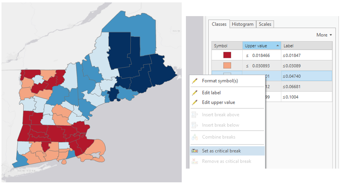 Visual Guide Figure 4.9. Adjusting class breaks and setting a critical break in ArcGIS Pro.
 -
Create Maps (5 & 6) Unclassed vs. Classed
For the third set of maps, abandon your previously-selected class breaks. In this set of maps, you will compare the visual difference between a classed map and an unclassed map. Use the same sequential color scheme for both maps so they can be adequately compared. You should also use consistent line design, etc., so as to not distract from the primary difference of interest - the classification method used. Unlike with the first two sets of maps, you will not be mapping two different variables for comparison here. You will choose just one of the variables from your previous maps, and visualize this variable on both of maps 5 & 6.
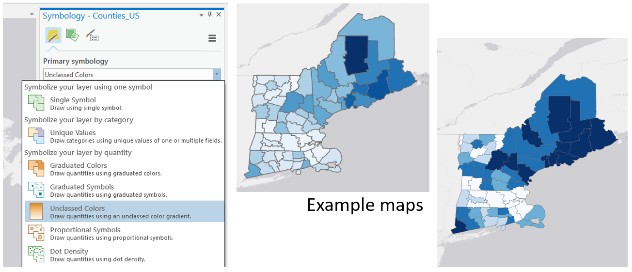 Visual Guide Figure 4.10. The unclassed map symbology option (left); An example set of a classed and unclassed map, shown here without their respective legends (right).
For your classed map, choose any of the methods available in ArcGIS Pro – but have a reason why! You will discuss your reasoning for choosing one of these methods in your write-up for this map pair.
 Visual Guide Figure 4.11. Data classification options in ArcGIS Pro.Click here for a text alternative to data classification options in ArcGIS Pro.
Natural Breaks (Jenks): Numerical values of ranked data are examined to account for non-uniform distributions, giving an unequal class width with varying frequency of observations per class.
Quantile: Distributes the observations equally across the class interval, giving unequal class width but the same frequency of observations per class.
Equal Interval: The data range of each class is held constant, giving an equal class width with varying frequency of observations per class.
Defined Interval: Specify an interval size to define equal class widths with varying frequency of observations per class.
Manual Interval: Create class breaks manually or modify one of the present classification methods appropriate for your data.
Geometric Interval: Mathematically defined class widths based on a geometric series, giving an approximately equal class width and consistent frequency of observations per class.
Standard Deviation: For normally distributed data, class widths are defined using standard deviations from the mean of the data array, giving an equal class width and varying frequency of observations per class. -
Final Deliverables
For this lab you will submit three layouts, each containing a pair of maps. You will also submit a write-up document, with a 100+ word explanation of your design (data classification and color) choices for each map pair. Make sure to also design a neat and useful layout - see Lesson/Lab 2 for layout design advice.
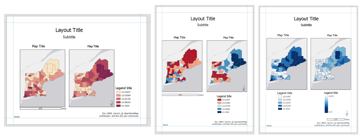 Visual Guide Figure 4.12. Visual example of the three layouts (albeit not well-designed ones) - but these demonstrate the elements required for inclusion in each layout in this lab.
-
Example Map Pair #1
Don’t copy this (poor) layout design – use your own knowledge and judgment. Clean up titles, marginal elements, alignments, etc. – use either portrait or landscape, whichever you prefer. Note that elements which refer to both maps (legend; north arrow; scale bar) need only be included once.
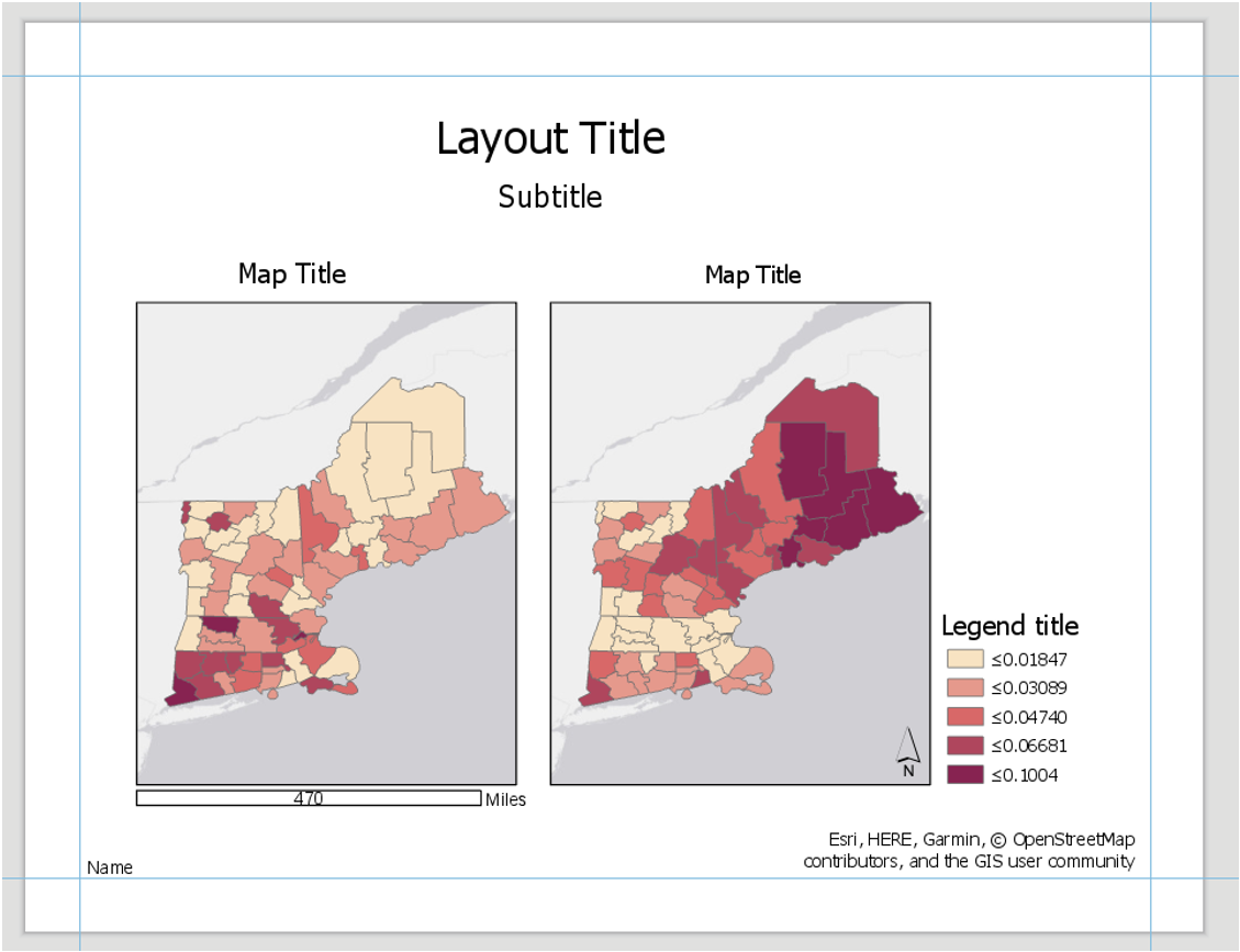 Visual Guide Figure 4.13. Example Map Layout #1
 -
Example Map Pair #2
Don’t copy this (poor) layout design – use your own knowledge and judgment.
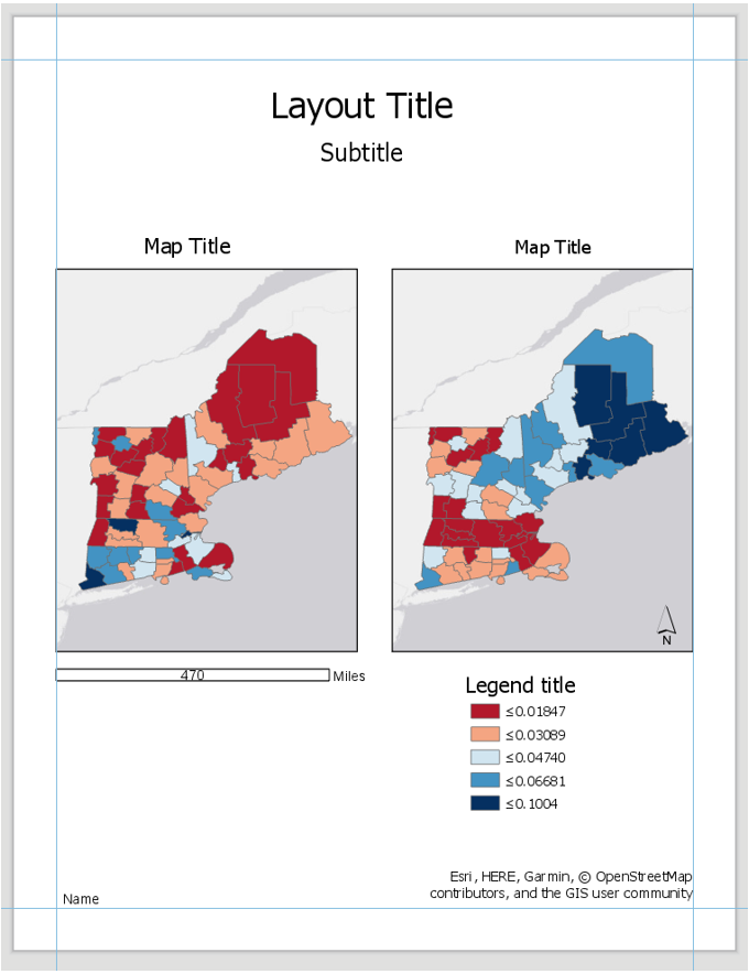 Visual Guide Figure 4.14. Example Map Layout #2
Use convert to graphics to manually improve your legend. Use a text box to annotate your critical class/break!
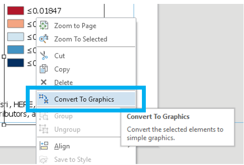 Visual Guide Figure 4.15. Using the Convert to Graphics function.
 -
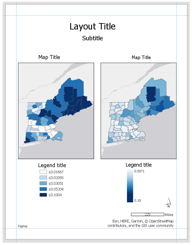
Example Map Pair #3
Don’t copy this (poor) layout design – use your own knowledge and judgment. Remember this map pair uses the same data for each map – it is demonstrating the effects of classification. Your goal should be to make a clean, useful legend for each map - make it look better than the legend design below.
 Visual Guide Figure 4.16. Example Map Layout #3.
-
-
Additional Tips
Think about color and what you are mapping. Are you mapping insured or uninsured? Choose colors wisely – what do they represent?
Remember that you can employ text to explain your map! Use text sparingly but effectively – don’t be afraid to use convert to graphics and/or manually edit text and layout elements. When choosing a color scheme as well as when doing your write-up, keep in mind: the perceptual progression of your data should match the perceptual progression of your color scheme.
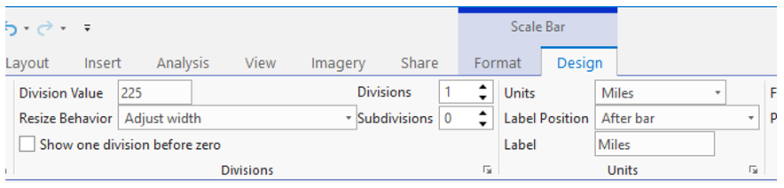 Visual Guide Figure 4.17. Cleaning up your scale bar design - the "adjust width" option for resize behavior can be very helpful!
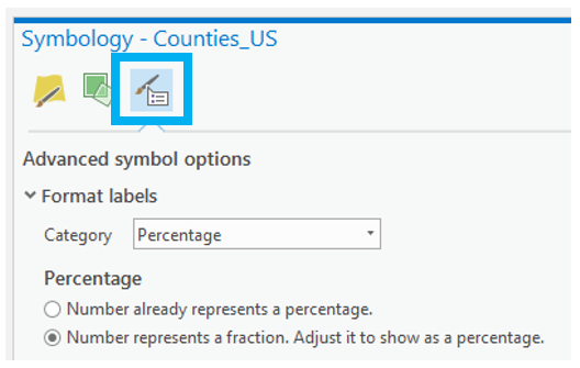 Visual Guide Figure 4.18. Simplifying legend labels in the Symbology Pane - think about how your data values were calculated when selecting a label format.
Credit for all screenshots is to Cary Anderson, Penn State University; Data Source, US Census Bureau.
Summary and Final Tasks
Summary and Final Tasks
Summary
Congrats on making it to the end of Lesson 4! In this lesson, we learned about color and choropleth maps - two topics that are quite inter-related. During our discussion on color models and human color vision, we talked about how to apply color to maps. We learned how to choose a type of color scheme for a map based on the perceptual progression of our data, as well as how to consider other factors such as map purpose, color accessibility, and data context.
In Lab 4, we made three different pairs of maps. In doing so, we took on the challenge of making maps that work well both independently and when viewed together. We also compared the visual effect of classed vs. unclassed maps, and considered the impact of each method on reader perception of our maps. In building our final map layouts, we utilized knowledge from earlier lessons, such as legend and layout design. As we move forward with the course, the skills we learn will continue to build upon each other. We will design some more interesting map layouts in Lab 5!
Reminder - Complete all of the Lesson 4 tasks!
You have reached the end of Lesson 4! Double-check the to-do list on the Lesson 4 Overview page [28] to make sure you have completed all of the activities listed there before you begin Lesson 5.