Lesson 5: Flow Mapping and Projections
Overview
Overview
Welcome to Lesson 5! In previous lessons, we discussed and designed several types of thematic maps, including proportional symbol, dot, and choropleth maps. Here, we discuss a more specialized type of thematic map - flow maps. In this lesson, we'll integrate our knowledge of visual variables, map symbolization, and levels of measurement into our discussion of these flow maps: maps that show movement between locations.
Before diving into our flow map discussion, however, we introduce another topic integral to cartography: map projection. We explore the different ways in which we define locations on Earth's surface, the process of creating a map projection, and how our choice of projection alters readers' interpretations of our maps. By the end of this lesson, you should understand the different classes and cases of projections, as well as popular map projections and their characteristics. In Lab 5, we use this knowledge to create custom projections for flow map-based advertisements - a twist intended to emphasize the vast variety of clients and audiences for whom cartographers design thematic maps.
Learning Outcomes
By the end of this lesson, you should be able to:
- explain the relationship between the geoid, a reference ellipsoid, and a datum, as well as the importance of these elements in cartography;
- classify projections based on their class, case, and aspect;
- describe projection properties and their respective utility for different mapping tasks;
- integrate knowledge of a map’s purpose, scale, and location into the projection selection process;
- describe the use of visual variables and levels of measurement in flow maps.
Lesson Roadmap
| Action |
Assignment |
Directions |
|---|---|---|
| To Read |
In addition to reading all of the required materials here on the course website, before you begin working through this lesson, please read the following required readings:
If you want to dive into the material a bit further, a good place to start with map projections and learning about their influence on map design, check out this article [1]: Hsu, Mei-Ling. "The role of projections in modern map design." Cartographica: The International Journal for Geographic Information and Geovisualization 18, no. 2 (1972): 151-186. Additional (recommended) readings are clearly noted throughout the lesson and can be pursued as your time and interest allow. |
The required reading is available in the Lesson 5 module. |
| To Do |
|
|
Questions?
If you have questions, please feel free to post them to the Have a question about Lesson 5? Ask here! forum. While you are there, feel free to post your own responses if you, too, are able to help a classmate.
Modeling Earth
Modeling Earth
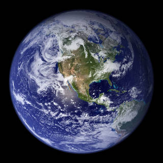
From a young age, we are generally taught that Earth is a sphere. Images such as those taken from space (e.g., Figure 5.1.1) serve to reinforce this idea. Yet, this is an oversimplification—Earth's actual shape is more complicated than the spherical shape it appears to be.
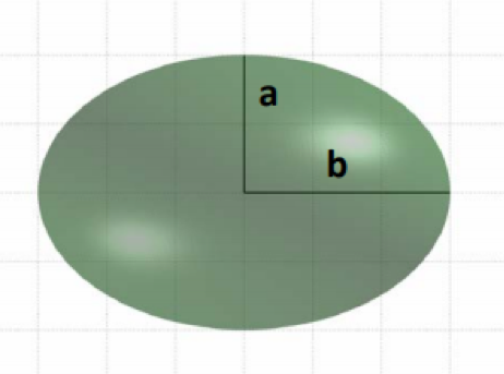
Due to the centrifugal force created by Earth’s rotation, Earth bulges slightly at the center—it is wider around the equator than from pole to pole. Because of this, a better way to describe Earth’s shape is as an ellipsoid. Ellipsoids which closely resemble spheres are often called spheroids—and as Earth is wider in the East-West direction, the most precise word to describe the approximation of Earth's shape is oblate spheroid (or oblate ellipsoid). In literature about this topic, the terms spheroid and ellipsoid are often used interchangeably. The term you use is less important than your understanding of the general concepts involved.
Though the terms ellipsoid or oblate spheroid better describe Earth’s surface than the term sphere, this is still an over-simplification. Due to gravitational forces and natural landforms, the Earth is not perfectly smooth. A very complex mathematical model has been developed to precisely model Earth's surface, but this is of little practical use in cartography so we will not discuss that model here. The most precise model of the Earth which is of practical use to cartographers is the one called the geoid.
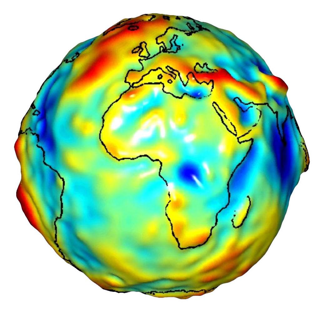
The geoid is defined as “a smooth, undulating surface the Earth would take on if the oceans were allowed to flow freely over the continents—without currents, tides, waves, and so on—which would create a single undisturbed water body” (Slocum et al. 2009, pg. 125). It is an uneven surface which approximates mean sea level across the Earth’s surface by taking gravitational forces into account.
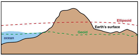
The geoid is constantly changing—due both the ever-changing nature of Earth’s surface (e.g., from continental shifts), and because technological advancements have allowed for more and more precise calculations over the years. The dynamics of Earth and the imprecision of measurement techniques mean that any model of the geoid is only an approximation—and mean sea level itself remains an approximation for Earth’s surface in reality.
Recommended Reading
- Chapter 8: The Earth and Its Coordinate System. Slocum, Terry A., Robert B. McMaster, Fritz C. Kessler, and Hugh H. Howard. 2009. Thematic Cartography and Geovisualization. Edited by Keith C. Clarke. 3rd ed. Upper Saddle River, NJ: Pearson Prentice Hall.
Geographic Coordinate Systems
Geographic Coordinate Systems
Due to the complexity of modeling the geoid and the reasonable similarity between Earth and a regular ellipsoid, we do not use the geoid directly to designate horizontal locations on Earth’s surface. Instead, we use geographic datums—models that describe the locations on an approximation of Earth as a smooth, defined ellipsoid.
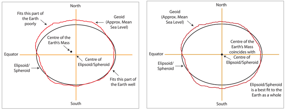
Horizontal datums denote locations using a system of longitude and latitude. The network of latitude and longitude lines that appears on a map is called the graticule. Horizontal datums are created using a reference ellipsoid – an ellipsoid whose shape approximates that of Earth’s surface. Not all datums use the same reference ellipsoid. Similar to how maps are designed with a purpose in mind, the specifics of a reference ellipsoid’s shape and position are determined based on the intended use of the datum.
The two illustrations in Figure 5.2.1 below demonstrate how datums differ in their design based on their intended purpose. In Figure 5.2.1 (left), the reference ellipsoid is aligned to closely fit the geoid in one part of the world (Australia). This is a local datum developed for use in Australia, and though the ellipsoid fits other parts of the world poorly, this is acceptable given the datum's intended use. In Figure 5.2.1 (right), the reference ellipsoid more closely fits the geoid overall. This is important for horizontal datums that are used to specify coordinates across the entire globe. The reference ellipsoid in 5.2.1 (right) is also centered at the center of Earth’s mass, which is important for GPS positioning.
Another type of datum is a vertical datum, which is used to specify vertical heights from a base surface approximated using calculations of mean sea level. Vertical datums are important for designing cartometric maps, but we will not discuss them in detail here.
The three most popular datums used in North America are the North American Datum of 1927 (NAD27), the North American Datum of 1983 (NAD83), and the World Geodetic System (WGS84). NAD27 was the first standardized connected system of location points in North America. It was based off the Clarke Ellipsoid of 1866—measurements were made and recorded based on the relative positioning of all locations from Meade’s Ranch in Kansas. NAD83 is the modernized replacement of NAD27 and sought to improve positional accuracy as a result of adding thousands of new benchmarks.
Student Reflection
In a time before computers and satellite measurements, why do you think Kansas was chosen to start measurements for the North American Datum of 1927? What role does this location play in GIS today?
NAD83 replaced NAD27 in 1983; its increase in accuracy came from its use of a greater number of benchmarks than NAD27. Still, NAD83, still relied on the human measurement of triangulation from a control points. The World Geodetic System (WGS84) was developed alongside GPS technology, permitted the creation of an accurate worldwide datum. WGS84 is the standard datum used by GPS technologies today, though NAD83 remains popular for non-GPS-based mapping activities in North America. A new horizontal datum for North America, the North American Terrestrial Reference Frame 2022 (NATRF2022), is under development and is planned for release in 2025. More information on this and other new datums is available from the National Geodetic Survey [6].
Historical maps and data often reference the now-outdated NAD27 datum; it is important to be aware of the datum which was used to designate the locations of your spatial data. Datum transformation is the process of re-calculating locations based on a different datum and may be necessary if you are combining datasets that were specified using different datums (e.g., NAD27 vs. NAD83), or if you are hoping to map historical data using a more up-to-date system.
As noted previously, modeling the earth as an ellipsoid or geoid is necessary for Cartometric mapping—mapping that involves the taking of precise measurements. Current GIS software tools (and the computers they run on) are now powerful enough to create projections based on an ellipsoidal Earth without much difficulty. For most thematic mapping purposes, however, conceptualizing Earth as a sphere is close enough.
For the rest of this lesson, we will discuss Earth’s shape as if it were spherical, despite this being an oversimplification. The reason for this is that to create a map—that is, a 2D (flat) rendering of Earth’s surface—we need to represent a 3-Dimensional object on a 2-Dimensional plane. And even with a simple sphere, this is no simple task.
Recommended Reading
The following lists provides supplemental readings on related topics that you can provide more detail about datums and map projections.
- DM-44 [7], Earth's Shape, Sea Level, and the Geoid by Thomas Meyer. UCGIS Body of Knowledge.
- DM-51 [8], Vertical (Geopotential) Datums by Fritz Kessler. UCGIS Body of Knowledge
- CV-06 [9], Map Projections by Sarah Battersby. UCGIS Body of Knowlegde
- NOAA [10], Global Positioning. (A series of lessons on topics related to geodesy such as horizontal and vertical datums, gravity, and the geoid)
Projecting the Earth
Projecting the Earth
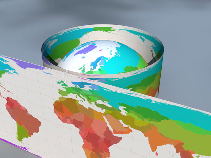
Unlike Earth, maps are flat. Though Earth can also be represented as a globe, globes are inconvenient, expensive, and challenging to design. Maps are much more convenient: they are easier both to produce and to reproduce, and are better suited for displaying detailed data. The process of transforming latitude and longitude values from the 3D earth onto a 2D surface (a map) is called map projection.
In the past, cartographers were tasked with projecting maps by hand. Fortunately, GIS software such as ArcGIS is now able to perform this task of projection for us mathematically. Though manual map projection is uncommon today, terms from this era of map production are still in use and are helpful for conceptualizing how the process of map projection works.
To create a map, cartographers transfer a model of the earth as it appears on a reference globe to a developable surface.
A reference globe is a model of Earth (including landmasses, oceans, and the graticule) at some chosen scale, which is the final scale of the map to be created (Slocum et. al 2009). This projected map is thus modeled from an imaginary scaled-down version of Earth.
A developable surface is a mathematically-definable surface onto which landmasses and the graticule (lines of latitude and longitude) are projected (Slocum et. al 2009). In simpler terms, a developable surface is any surface that can be “unrolled” flat (and thus, create a 2D map). Typically, either a cone, a plane (flat surface), or a cylinder is used. In this next section, we discuss how the choice of a developable surface—among other factors—influences a map projection's characteristics.
Student Reflection
Imagine the cone developable surface as a party hat placed on top of Earth. After projection, which locations do you imagine would appear the least distorted on the resulting map? Which would appear the most distorted?
Recommended Reading
- Chapter 9: Elements of Map Projections. Slocum, Terry A., Robert B. McMaster, Fritz C. Kessler, and Hugh H. Howard. 2009. Thematic Cartography and Geovisualization. Edited by Keith C. Clarke. 3rd ed. Upper Saddle River, NJ: Pearson Prentice Hall.
Characteristics of Projections
Characteristics of Projections
There are many projections to choose from, as well as many options for customizing the projection you choose. Before you decide, it will help to understand the characteristics of different projections. Projections are generally defined by their class, case, and aspect. All three of these characteristics refer to the way in which the developable surface relates to the reference globe.
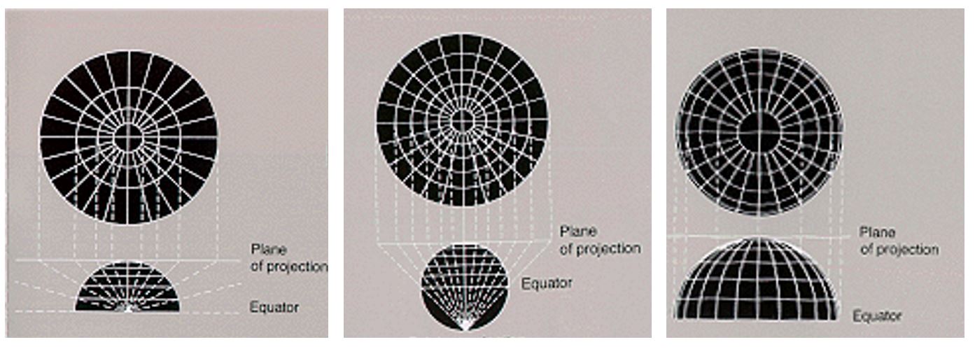
A projection’s class refers to which developable surface was used to create the projection. Was the developable surface a cone (conic class), plane (planar class/azimuthal), or cylinder (cylindric class)?
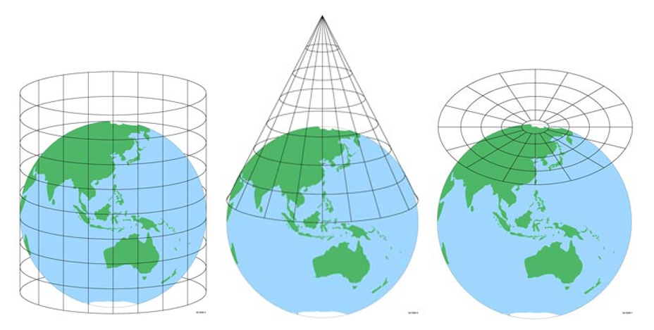
Cylinder (left), Cone (middle), and Plane (right).
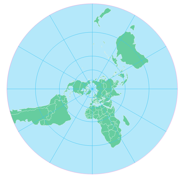
Which class of projection you use will depend, among other factors, on the location of the region you intend to map. Planar projections, for example, are often used for polar regions.
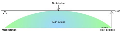
As shown by the figure below (Figure 5.4.2), a map will contain no distortion at the location where the reference globe touches the developable surface, and distortion increases with distance from this location.
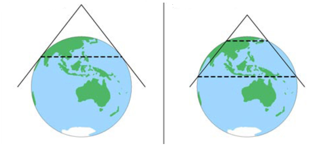
Even among projections of the same class, there is more than one way to create a projection with the selected developable surface. A projection’s case refers to how this surface was positioned on the reference globe. If the developable surface touches the globe at only one point or line, this is called a tangent projection. If it touches at two, this is called a secant projection.
Figure 5.4.3 illustrates the difference between a tangent and secant projection.
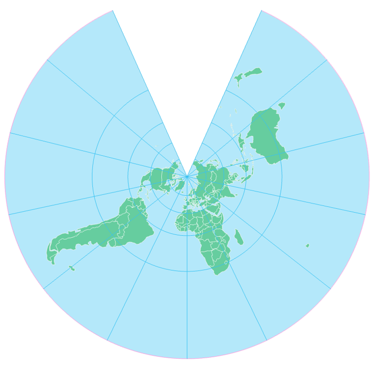
Aspect refers to where the developable surface is placed on the globe. If it is placed over one of the Poles (North or South), this is called a polar aspect projection. If the center is along the equator, this creates an equatorial projection. If the developable surface is placed anywhere else, we call this an oblique projection.
No matter what its class, case, and aspect, all projections have distortion. Just by nature of transforming from a 3D globe to a 2D projection, distortion is inevitable. Different projections, however, have different types of distortion. In the next section, we discuss these differences.
Student Reflection
When all else is equal, secant projections have less distortion than tangent projections. Why?
Recommended Reading
- Chapter 9: Elements of Map Projections. Slocum, Terry A., Robert B. McMaster, Fritz C. Kessler, and Hugh H. Howard. 2009. Thematic Cartography and Geovisualization. Edited by Keith C. Clarke. 3rd ed. Upper Saddle River, NJ: Pearson Prentice Hall. Harris, Johnny. 2016.
- “All Maps Are Wrong. I Cut Open a Globe to Show Why [13].” Vox.
Projection Properties
Projection Properties
All map projections distort the landmasses (and waterbodies) on Earth’s surface in some way. Even so, projections can be designed to preserve certain types of relationships between features on maps. These include equivalent projections (which preserve areal relationships), conformal projections (angular relationships), azimuthal projections (directional relationships), and equidistant projections (distance relationships). The projection you choose will depend on the characteristics most important to be preserved, given the purpose of your map.
Equivalent
Equivalent projections preserve areal relationships. This means that comparisons between sizes of land-masses (e.g., North America vs. Australia) can be properly made on equal area maps. Unfortunately, when areal relationships are maintained, shapes of landmasses will inevitably be distorted—it is impossible to maintain both.
In Figure 5.5.1 below, shape distortion is most pronounced near the top and bottom of the map. This is because the poles of Earth (North and South) are represented as lines the same length as the equator. Recall that lines of longitude on the globe converge at the poles. When these convergence points are instead mapped as lines, landmasses are stretched East-West, which means that to maintain the same area, landmasses must be compressed in the opposite direction. In the map below, Russia (and other landmasses) are represented at the proper size (compared to other landmasses on the map) but their shapes are significantly distorted.
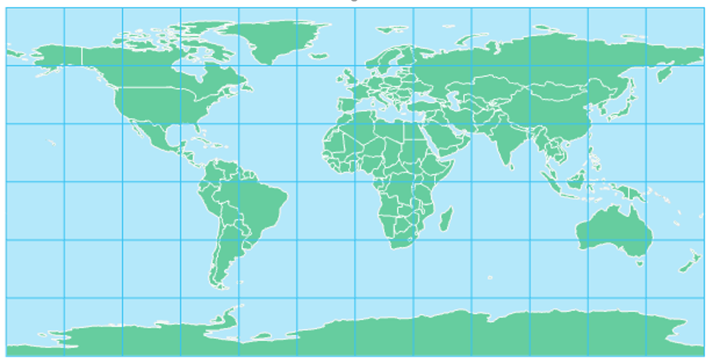
The projection property of equivalence is perhaps best understood by contrasting its properties with a popular projection that greatly distorts area—the Mercator projection (Figure 5.5.2).
The Mercator projection results in a significant distortion of areas, particularly at locations far from the equator. In order to maintain local angles, parallels (lines of latitude) are placed further and further apart as you depart from the equator. The website thetruesize.com [14] demonstrates this effect.
Despite this, the Mercator is useful for some purposes. It has historically been used for navigation—it is efficient for routing as any straight line drawn on the map represents a route with a constant compass bearing (e.g., due West). This “line of constant compass bearing” is commonly referred to as a rhumb line or loxodrome. The Mercator is a conformal projection.
Conformal
Conformal projections preserve local angles. Though the scale factor (map scale) changes across the map, from any point on the map, the scale factor changes at the same rate in all directions, therefore maintaining angular relationships. If a surveyor were to determine an angle between two locations on Earth’s surface, it would match the angle shown between those same two locations on a conformal projection.
As mentioned previously, the angle-preserving nature of conformal projections makes them useful for navigation. Any path across Earth that follows a constant compass bearing is called a rhumb line, or loxodrome. Any straight line drawn on a map based on a Mercator projection is a rhumb line. Rhumb lines and loxodromes facilitate navigation, as navigators prefer to follow a straight-line route on the map and set their compass direction accordingly.
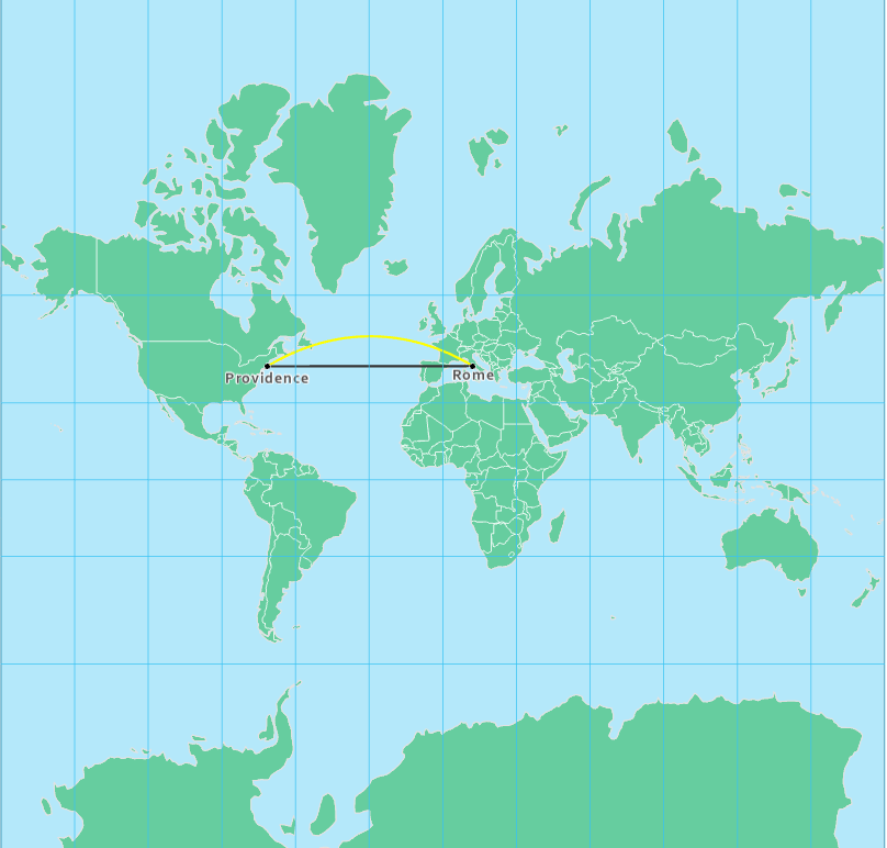
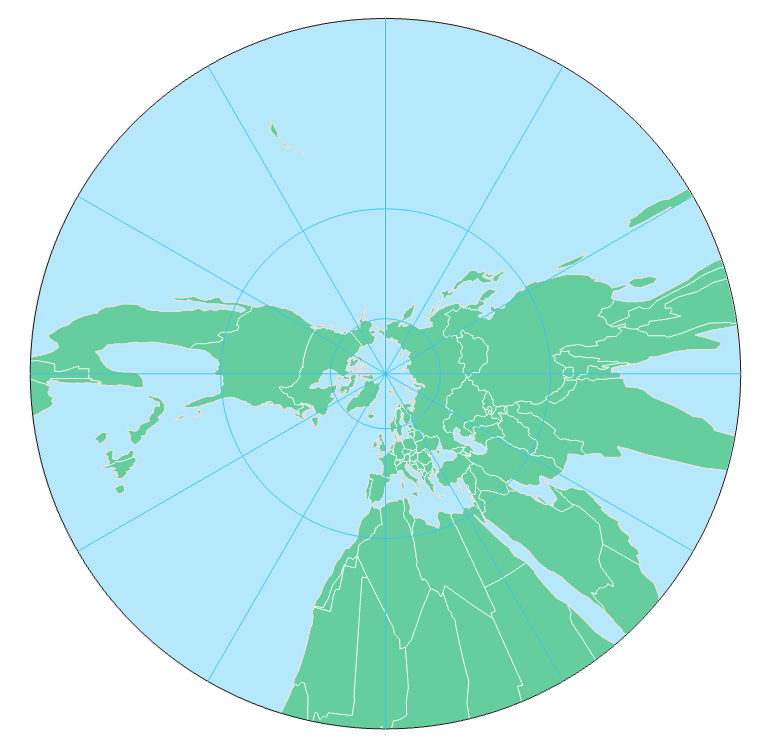
Despite their usefulness for navigation, rhumb lines do not show the shortest distance between two points. The shortest point between two points on Earth is called a great circle route. Unlike rhumb lines, such lines appear curved on a conformal projection (Figure 5.5.4). Of course, the literal shortest path from Providence to Rome is actually a straight line: but you'd have to travel beneath Earth's surface to travel it. When we talk about the shortest distance between two points on Earth, we are talking in a practical sense of traveling across or above Earth's surface.
The gnomonic map projection has the interesting property that any straight line drawn on the projection is a great circle route. The gnomonic projection is an example of an azimuthal projection.
Azimuthal
Azimuthal projections are planar projections on which correct directions from the center of the map to any other point location are maintained. The stereographic projection is another example of an azimuthal projection. Though only on the gnomonic projection is every straight line a great circle route, a straight line drawn directly from the map’s center is a great circle on any azimuthal projection.
The most common types of azimuthal projections are the gnomonic, stereographic, Lambert azimuthal equal area, and orthographic projections. The primary difference between azimuthal projection types is the location of the point of projection. In Figure 5.5.7 below, a gnomonic projection occurs when the point of projection is Earth’s center. Stereographic maps have a point of projection on the side of Earth opposite the plane’s point of tangency; the point of projection for an orthographic map is at infinity.
Equidistant
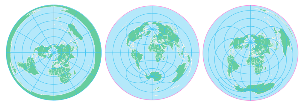
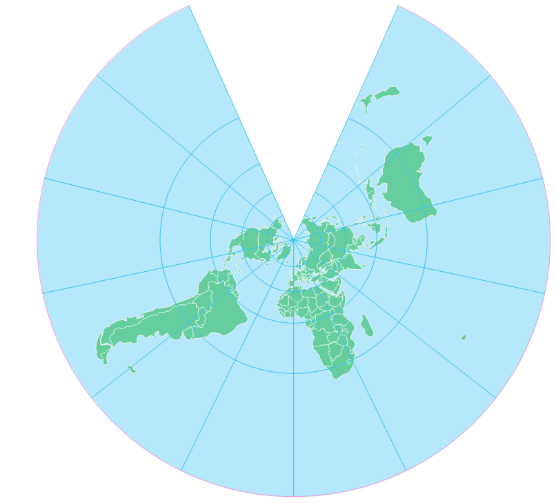
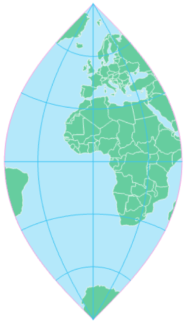
Equidistant projections are often useful as they maintain distance relationships. However, they do not maintain distance at all points across the map. Instead, an equidistant projection displays the true distance from one or two points on the map (dependent on the projection) to any other point on the map or along specific lines.
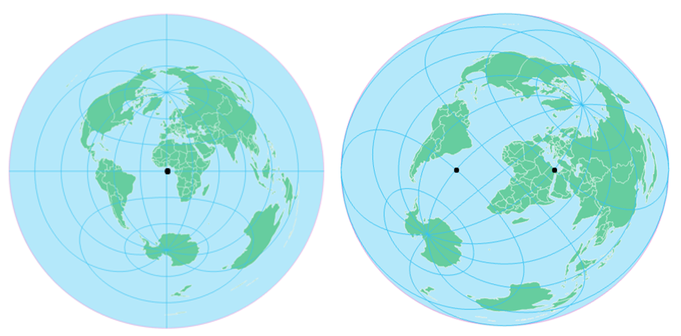
In the azimuthal equidistant projection (Figure 5.5.8, left) distance can be correctly measured from the center of the map (shown by the black dot) to any other point. In two-point Equidistant projection (Figure 5.5.8, right), correct distance can be measured from any two points to any other point on the map (and, thus, to each other). In the example above, those two points are (30⁰S, 30⁰W) and (30⁰N, 30⁰E). These values were supplied as parameters to GIS software while projecting the map—a process called projection customization. When customizing your own projection, you will select locations relevant to your map’s purpose.
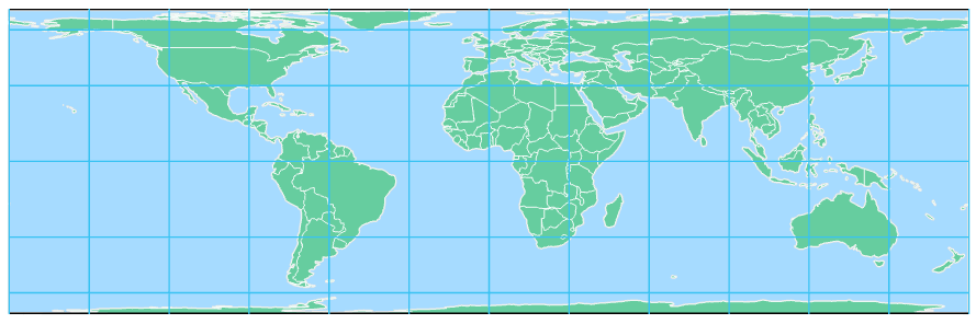
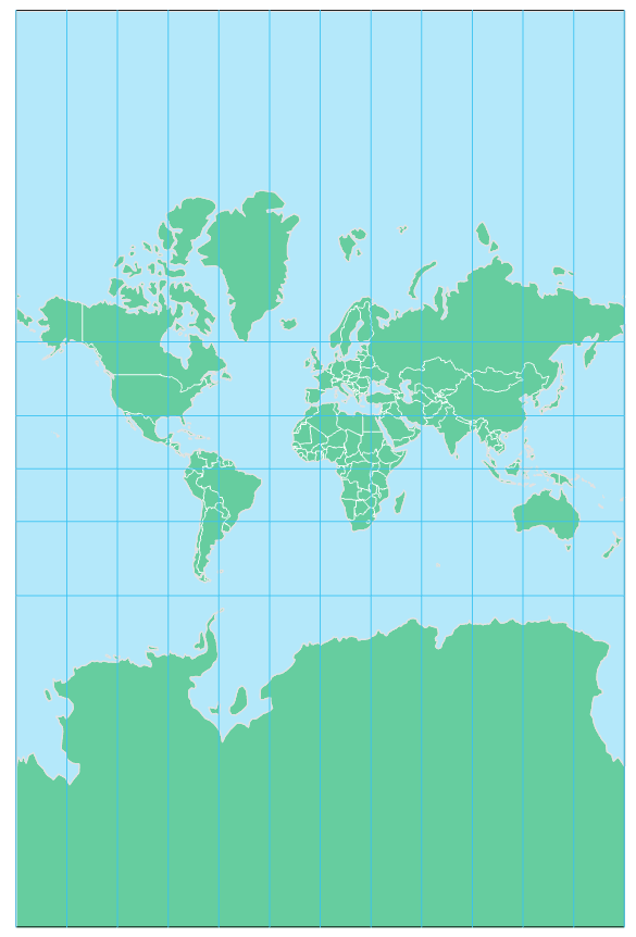
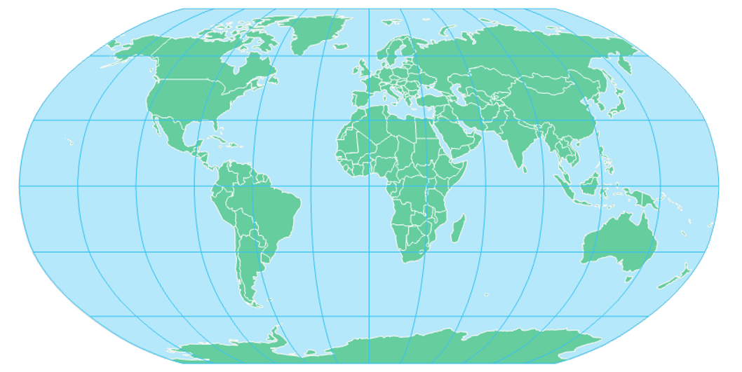
Not all equidistant maps are circular in shape. The cylindrical equidistant projection, for example, is equidistant wherein correct distances can be measured along any meridian. When the cylindrical equidistant projection uses the Equator as its standard parallel, the graticule appears to be comprised of grid squares, and it is called the Plate Carrée, a popular map projection due to its simplicity and utility.
Student Reflection
Imagine you are planning a flight path and tasked with finding the shortest route from Alaska to New York. Which map would you use? Why? Would the map you use first to draw the route be different than the map you would use while traveling?
So far, we have discussed maps that preserve areal (equivalent), angular (conformal), distance (equidistant), and directional (azimuthal) relationships. As demonstrated by the previous examples, maps that preserve certain properties do so at the expense of others. It is impossible to preserve angular relationships, for example, without significantly distorting feature areas. For this reason, another class of projections exists—compromise projections.
Compromise
Compromise projections do not entirely preserve any property but instead provide a balance of distortion between the various properties. A popular example is the Robinson Projection, shown in Figure 5.5.10 below. Note on this projection how the landmasses appear more similar in shape and size to what is seen on a globe compared to their appearance on a projection that preserves a specific property entirely (e.g., The Mercator).
Interruption is not a projection property, but interrupted projections can also be useful in some mapping contexts. Interrupted maps, such as the Goode homolosine interrupted projection (Figure 5.5.11), are reminiscent of an “orange-peel” pressed against a flat surface, a common metaphor for map projections.
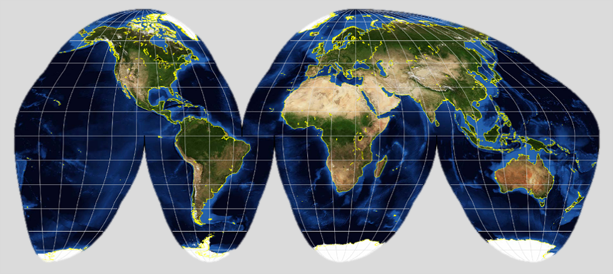
The interrupted nature of this projection severely distorts (by dividing) water bodies, and so would not be useful for maps related to oceanic data, or those intending to visualize routes across Earth’s (connected) surface. These distortions, however, allow the map to display a more accurate representation of landmasses’ sizes and shapes. Note that while the divisions on the projection shown in Figure 5.5.11 are over water, divisions over land are also possible, though not as popular.
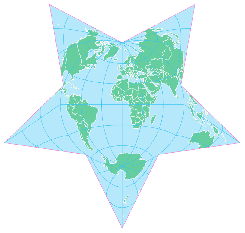
Many projections are available in ArcGIS and other software, some of which are imaginative and fun (e.g., the Berghaus star; Figure 5.5.12) and all of which can be customized to suit a map’s location and purpose. We will talk more about how to select an appropriate map projection in the next section.
Recommended Reading
- Battersby, Sarah E., and Fritz C. Kessler. 2012. “Cues for Interpreting Distortion in Map Projections.” Journal of Geography 111 (3): 93–101. doi:10.1080/00221341.2011.609895.
- Judy M. Olson (2006) Map Projections and the Visual Detective: How to Tell if a Map is Equal-Area, Conformal, or Neither, Journal of Geography, 105:1, 13-32, DOI: 10.1080/00221340608978655 Axis Maps. 2018.
- “Map Projections [17].” Cartography Guide. Accessed October 30, 2018.
Choosing a Projection
Choosing a Projection
There are many factors to keep in mind when choosing a projection for your map. The number of projections available can sometimes seem overwhelming, and as there is no distortion-free map, the selection of any projection involves a trade-off between different properties.
Slocum et al. (2009) provide five suggestions for choosing a projection for a thematic map:
- The cartographer should aim to select the projection with the least distortion.
- Distortion can be kept to a minimum by aligning the location of the map with the location of the standard line(s) or point(s)—where the reference globe meets the developable surface.
- As the amount of geographic area covered by the map increases, distortion becomes more of an issue—projection selection is much less consequential with large-scale “zoomed-in” detailed maps.
- Some projections are popular and in widespread use—this does not necessarily mean they are the best choice for your map.
- Projection influences the overall look of your map design—this has been less studied and is generally less quantifiable than other factors, but it’s still important to consider.
When selecting a projection for your map, your map’s purpose and location should be at the forefront of your decision-making process. Many cartographers have proposed guidelines or tools to assist map-makers in choosing an appropriate projection.
Frederick Pearson (1984), for example, suggested simple guidelines for map projection selection based on the latitude of the area to be mapped. If the map was of an equatorial region, he suggested a cylindric projection. If it was mid-latitude, a conic projection, if it was polar, a planar projection (Pearson 1984). While this is a good starting point, it does not account for the purpose or the map, nor help the map-maker choose between the many projections that exist of each type (e.g., there are many different conic projections).
Some online tools have been developed to help in the projection selection process. One such tool is Projection Wizard, developed Bojan Šavrič (Šavrič, Jenny, and Jenny 2016). It is a web-based tool that suggests projections based on user input of only the intended distortion property (e.g., equal-area), and the location of the map (input via an adjustable map frame).
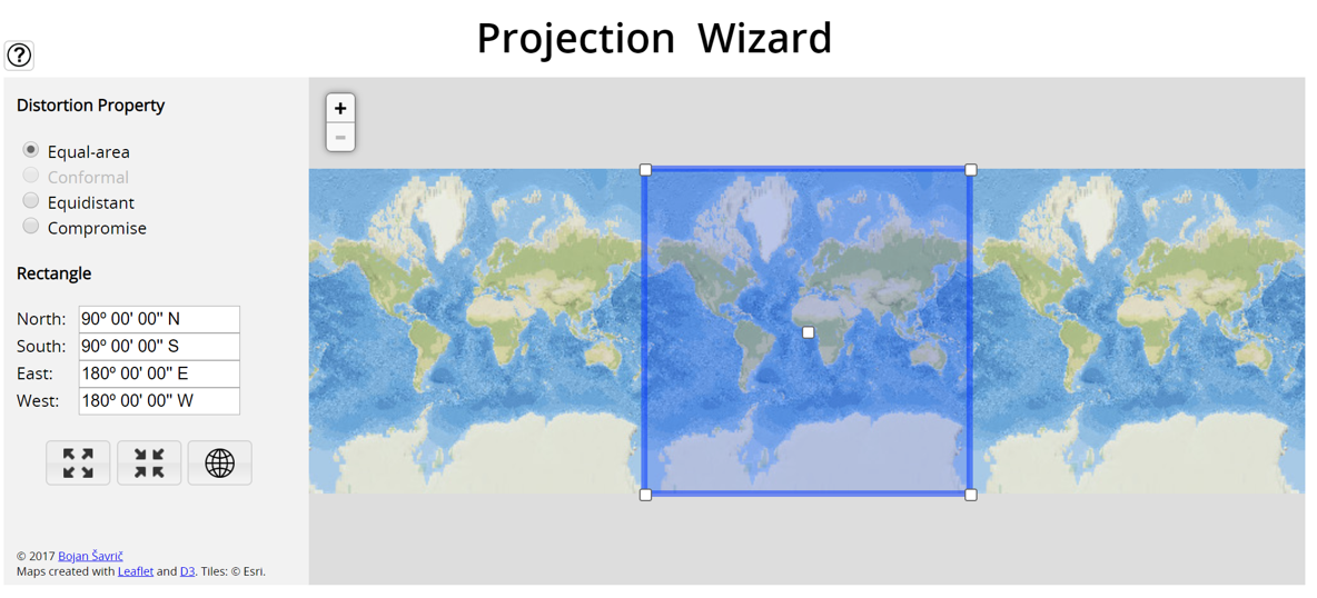
Projection Wizard is based largely on projection selection guidelines developed by John Snyder (1987), guidelines which are also discussed in detail by Slocum et al. (2009). These sources are listed in the recommended readings for this section—highly suggested if you would like to learn more about this topic.
As noted by Slocum et al. (2009), selecting an appropriate projection requires thinking not only about its objective utility, but about its overall design and what your map’s readers will think of it. Recent research has investigated user responses to map projections. Battersby and Kessler (2012) investigated novice and experienced map-readers’ strategies for comprehending distortion on maps, and found that both groups struggled to correctly specify distortion on maps. Šavrič et al. (2015) focused on user preference and found that many readers tend to favor the Robinson (and similar) projections, and that general map-readers have somewhat different preferences for map projections overall than experienced cartographers.
In addition to attending to projection guidelines and anticipating reader responses, it is often helpful simply to experiment with different projections. The following tools are good resources to explore projection properties and distortion:
- Jason Davies - Map Projection Transitions [19]
- Projection Explorer [20]
- Mercator Puzzle [21]
Student Reflection
Another helpful way to learn is to create a simple map in ArcGIS and practice changing its projection—load simple boundary files (such as those provided for Lab 5) and notice how altering the projection and projection parameters changes the final design.
Recommended Reading
- Chapter 10: Selecting an Appropriate Map Projection. Slocum, Terry A., Robert B. McMaster, Fritz C. Kessler, and Hugh H. Howard. 2009. Thematic Cartography and Geovisualization. Edited by Keith C. Clarke. 3rd ed. Upper Saddle River, NJ: Pearson Prentice Hall.
- Kessler, F., &; Battersby, S. E. (2019). Working With Map Projections: A Guide to Their Selection (First ed.). Boca Raton, FL: CRC Press/Taylor & Francis Group.
- Jenny B., Šavrič B., Arnold N.D., Marston B.E., Preppernau C.A. (2017) A Guide to Selecting Map Projections for World and Hemisphere Maps. In: Lapaine M., Usery E. (eds) Choosing a Map Projection. Lecture Notes in Geoinformation and Cartography. Springer, Cham.
- Robinson A.H., The Committee on Map Projections (2017) Matching the Map Projection to the Need. In: Lapaine M., Usery E. (eds) Choosing a Map Projection. Lecture Notes in Geoinformation and Cartography. Springer, Cham.
Popular Projections and Coordinate Systems
Popular Projections and Coordinate Systems
Two common map projections used in the United States are the Lambert conformal conic and transverse Mercator. The Lambert conformal conic, as its name suggests, is a conformal (preserves local angles) projection that uses a cone as its developable surface. The name “Lambert” is from its inventor—Swiss scientist Johann Heinrich Lambert. Conic projections are particularly useful for mid-latitude regions with primarily East-West extent, such as the United States.
The transverse Mercator projection is a slight alteration of the Mercator projection. Where the Mercator uses the equator as its line of tangency, the transverse Mercator uses a meridian. Figure 5.7.2 below uses the prime meridian as its standard line.
These two projections are used in the State Plane Coordinate System (SPCS), a coordinate system designed for use in the United States. The SPCS is useful for some mapping tasks such as local government planning, as these coordinate systems have been designed to be highly accurate within each zone. Problems can occur, however, when areas of interest cross a zone boundary: this requires that at least one set of data be transformed so that proper GIS analysis can be conducted.
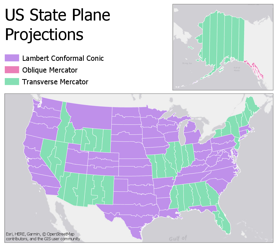
As shown, the transverse Mercator is used in states with a primarily North-South extent (e.g., Vermont, New Jersey) or in locations where the state is usefully divided into multiple North-South extent (e.g., New York). The Lambert conformal conic projection is similarly used for East-West extents. Some states, such as Florida, use both (Lambert conformal conic is used for the Florida panhandle). The oblique Mercator is used only in one case—the Alaska panhandle—as this region has an extent that is neither North-South nor East-West.
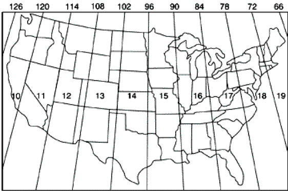
Another popular coordinate system is the Universal Transverse Mercator (UTM). The system divides the world into 60 zones, each of which covers six degrees of longitude. The set of zones that covers the US is shown in Figure 5.7.4.
Each UTM zone uses a secant transverse Mercator projection with unique parameters based on the longitudes of its bounds. As the Mercator is a conformal projection, local angles are maintained. Areas and distances are distorted, but the use of secant projections and the somewhat small size of the zones keeps this distortion low – at about 1 part in 1,000. The larger size of these zones means that they are more likely than SPCS zones to cover the entirety of a local area of interest, though recommendations exist for adjusting maps in cases where a mapped area overlaps multiple zones. UTM's worldwide coverage also makes it useful for creating maps that are shared around the world, and it is widely used in military applications.
Recommended Reading
- Chapter 3: Geodesy and Map Projections. Bolstad, Paul. 2012. GIS Fundamentals: A First Text on Geographic Information Systems. 4th ed. XanEdu Publishing Inc. Stockton, Nick. 2013.
- “Get to Know a Projection: Lambert Conformal Conic [24].” WIRED.
Flow Mapping
Flow Mapping
Choosing an appropriate projection is important for all mapping tasks. Consider, for example, a proportional symbol map. You would not want to use a projection that significantly distorts area—as the intention of such a map is to compare the size of the symbol to the size of its underlying area, this would be misleading.
A map type that we haven’t yet discussed, and to which projection choice can be integral, is a flow map. A flow map is a map that visualizes movement between places—often across large regions, even the entire globe.

Flow maps can be classified into two main types: those that represent origins and destinations, and those that map routes. Origin-destination flow maps show the start and end points (and often the direction) of flows, but do not map out a route. An example is shown in Figure 5.8.1. Flow arrows in Figure 5.8.1 show the direction and magnitude of migration flows, but the route paths are not meaningful. Note, for example, the placement of a large red arrow showing migration from many locations to California. This indicates that many people migrated from these places to California during that time period, but we can imagine that their actual movement covered various routes.
Other flow maps show meaningful routes, such as the flow of traffic, or stream flows. Figure 5.8.2 is an example—instead of focusing on the starts and ends of flows, it maps out a route network. Size is used to visually encode the amount of truck traffic. Though the focus is on truck traffic, traffic volume overall is also visualized in grey, highlighting the difference between routes used primarily by passenger cars and those used for trucking.

Possibly the most famous flow map ever designed was drawn by Charles Minard; it represents the French army’s travel and suffering during the Russian campaign of 1812 (Figure 5.8.3). Edward Tufte, in his influential book The Visual Display of Quantitative Information, described this work as perhaps the best statistical graphic that had ever been created (Tufte 2001).
Another map by Minard (Figure 5.8.5) is more reminiscent of modern flow maps. It illustrates migration flows across the world using multiple visual variables. The achromatic continent fills and boundaries place emphasis on the flowlines as the more important component of the map.
Figure 5.8.5, as well as Figure 5.8.3 (and 5.8.4) above, are examples of aggregating flows to create a more comprehensible map. Figure 5.8.5 shows the magnitude of migration flow between Europe and America, for example, but it does not show the many routes these people likely traveled. Figure 5.8.6 below is an example of the opposite design chose—all paths are mapped. This is appropriate for some mapping purposes, but if there are many routes, this makes the map more challenging to read.
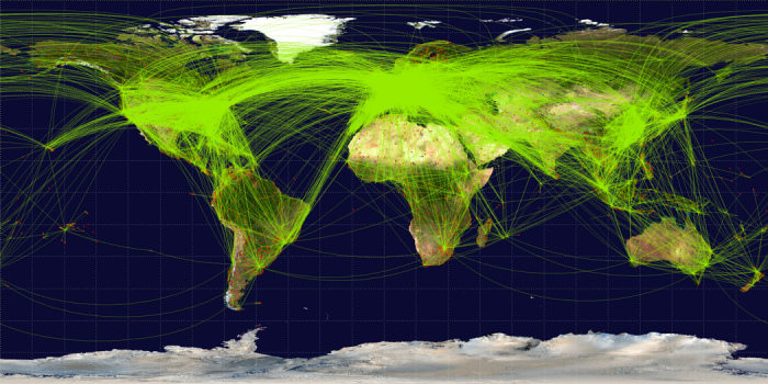
Figure 5.8.6 also differs from the other flow maps shown above in that it does not visualize any data except the flight paths and endpoints. When creating flow maps, whether you map entire routes or just origin-destinations, and whether you chose to visually encode additional data, such as with size or color hue, will depend on the intended purpose of your map.
Flow maps can also be combined with other types of thematic maps, such as proportional symbol or choropleth maps, to show multiple sets of data. Figure 5.8.7, for example, combines a qualitative choropleth map with directional flows.

Student Reflection
In Figure 5.8.7 above, what visual variables are used? What levels of measurement are used to map the flows?
Recommended Reading
- Doantam Phan, Ling Xiao, R. Yeh, P. Hanrahan, and T. Winograd. 2018. “Flow Map Layout.” In IEEE Symposium on Information Visualization, 2005. INFOVIS 2005., 219–224. IEEE. Accessed October 30, 2018.
- Chapter 6: Maps that Advertise. Monmonier, Mark. 2018. How to Lie with Maps. 3rd ed. The University of Chicago Press. (part of this week's required readings).
Critique #3
Critique #3
Critique #3 will be your second critique involving a peer review. For this critique, you will be reviewing a colleague's map from Lab 4: Color and Choropleth Mapping in Series. During that lab, you put significant thought and effort into classifying your data and applying color - now you will appraise another's work instead of your own. This new perspective is likely to be beneficial to you both while you are writing the critique, and later, when you review the feedback provided to you by one of your peers.
Your assignment includes writing up a 300+ word critique of an assigned classmate’s Lesson 4 Lab (as assigned).
In your written critique please describe:
- three (3) things you think were done well and why,
- three (3) suggestions you have for improvement.
As Lab 4 included three map-pair map layouts as the deliverable, the best way to approach this critique is to write about one well-done element and one suggestion for improvement for each pair of maps. You may stray slightly from this format if you are particularly interested in one of the map pairs (layouts), but, please, at least briefly mention all map pairs in your critique.
Your critique should be as much about reflecting upon things well-done as it is about suggesting improvements to be made. In your discussion, you should connect your ideas back to concepts in Lesson Four; you may also reference concepts from earlier lessons where relevant.
Please list the student name of the map you have been assigned at the top of the page.
Grading Criteria
A rubric is posted for your review.
Submission Instructions
You will work on Critique #3 during Lesson 5 and submit it at the end of Lesson 5.
Step 1: Upon notification of the Peer Review (Critique), go to Lesson 4: Lab 4 Assignment. You will see your assignment to peer review. (Note: You will be notified that you have a peer review in the Recent Activity Stream and the To-Do list. Once peer reviews are assigned, you will also be notified via email.)
Step 2: Download/view your classmate's Lab.
Step 3: Write up your critique using the prompts above in a Word document. Be sure to also review the rubric in which you will be graded for Critique #3 for more guidance. Save your Word document as a PDF. Use the naming convention outlined below.
- YourLastName_LastNameOfClassmateReviewed_Critique3.pdf
Step 4: In order to complete the Peer Review/Critique, you must
- Add the PDF as an attachement in the comment sidebar in the assignment.
- Include a comment such as "here is my critique" in the comment area.
- PLEASE DO NOT complete the lesson rubric as your review, award points, or grade the map you are critiquing. Even though Canvas asks you to complete the rubric, PLEASE DO NOT COMPLETE THE RUBRIC OR ASSIGN POINTS/GRADE.
Step 5: When you're finished, click the Save Comment button. You may need to refresh your browser to see that you've completed the required steps for the peer review.
Note: Again, you will not submit anything for a letter grade or provide comments in the lesson rubric.
.
Peer Review Canvas Help
Lesson 5 Lab
Lesson 5 Lab
Flow Mapping with Customized Projections
In Lesson 5, we discussed map projections and projection characteristics. We also discussed how to choose a map projection based on your map's intended location, scale, and purpose. It can be challenging, however, to really understand how the choice of a projection alters your map without trying it out for yourself. In Lab 5, we will be creating three map layouts that visualize flight data as flowlines. This ties together both of the topics in Lesson 5 (flow mapping, projections), and provides a practical demonstration of the influence of map projections in small-scale thematic mapping.
For good measure, we will design each of these map layouts as advertisements: encouraging creative design and adding emphasis to the importance of map purpose and audience in choosing projections for maps. Recall from this week's required reading, Mark Monmonier's discussion of Maps that Advertise. Your challenge this week is to create map layouts that are both scientifically-appropriate and engaging to your intended customers - the readers of your maps.
Lab Objectives
- Create three advertisements for London Heathrow Airport (LHR) using flight origin-destination data.
- Select and customize map projections based on each map’s purpose and overall design.
- Use appropriate visual variables to symbolize background data and flowlines.
- Create well-designed layouts with appropriate legends and text elements.
Overall Lab Requirements
For Lab 5, you will use the provided data to create three different map layouts, each of which is an advertisement for LHR airport.
- For each map, you should choose and customize an appropriate map projection.
- Each layout must use a different projection. For layout #2, which contains four maps, you may use the same projection for all maps.
- Include a written reflection (250+ words); use the following questions to guide your writing:
- For each map layout, which projection did you choose, how did you customize it, and why?
- Include a screenshot of the projection customization window (Visual Guide Figure 5.18) for each map layout (3 screenshots in total).
Map Requirements
Layout One: Highlight the distance a flight from Heathrow can take you
- Create a map that highlights distance – how far a customer can go via Heathrow’s non-stop flights.
- Classify and visualize flight paths based on their length (e.g., short haul vs. long haul). Use sensible units and at least three classes.
Layout Two: Highlight that Heathrow can fit anyone’s schedule
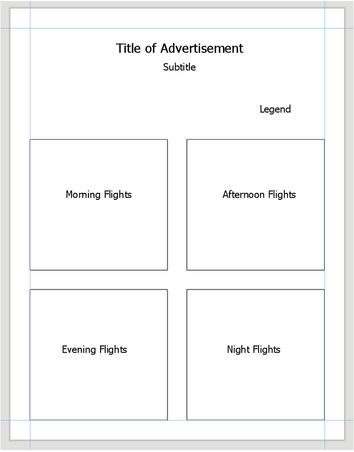
- Use the flight path data that has been pre-segmented into time blocks: Morning (7am-noon), Afternoon (noon-5pm), Evening (5pm-10pm), and Night (10pm-7am).
- Design with category and hierarchy; visualize daily counts of flights during each time block.
- Combine these four maps (one per time block) into one balanced layout with an appropriate legend.
Layout Three: Highlight that Heathrow flies to desirable locations
- Create a world map that shows all flight paths to and from London Heathrow (LHR). Symbolize as appropriate.
- Add and symbolize tourism data (included as its own layer) to demonstrate that flights from LHR take customers to popular tourist destinations.
- Instead of using the tourism data, you may symbolize a relevant field from the Natural Earth (boundary file) data on your map.
Lab Instructions
- Download the Lab 5 zipped file [35] (485 KB). It contains:
- A project (.aprx) file to be opened in ArcGIS Pro.
- This file contains boundary, flight, and tourist data – the focus here is on design; you will not need to upload any new data of your own.
- Flight data coordinates use the datum WGS 1984.
- Data Sources:
- Arrival/Departure flight data source: https://www.flightradar24.com/ [36]
- Boundary data source: Natural Earth
- Tourism Data: UNWTO (World Tourism Organization)
- A project (.aprx) file to be opened in ArcGIS Pro.
- Extract the zipped folder, and double-click the blue (.aprx) file to open ArcGIS Pro.
- You should see the starting file, with all data included. See the Lab 5 Visual Guide for additional guidance.
Grading Criteria
A rubric is posted for your review.
Submission Instructions
- You will have three map layout PDFs to submit. Please use the naming conventions outlined below—each should be in 8.5 x 11-inch (Portrait or Landscape) design.
- LastName_Lab5_Layout1.pdf
- LastName_Lab5_Layout2.pdf
- LastName_Lab5_Layout3.pdf
- Include your write-up/reflection as a separate PDF.
- Lab Write-up: LastName_Lab5_WriteUp.pdf
- Remember that this document should include screenshots of the projection customization window for each projection used.
- Lab Write-up: LastName_Lab5_WriteUp.pdf
- Submit the three map layout PDFs and one write-up (also PDF) to Lesson 5 Lab.
Ready to Begin?
Further instructions are available in the Lesson 5 Lab Visual Guide.
Lesson 5 Lab Visual Guide
Lesson 5 Lab Visual Guide
Lesson 5 Lab Visual Guide Index
- Starting File
- Explore the Flight Data
- Create Flight Paths Using the X-Y to Line Tool
- Choose and Customize a Map Projection
- Symbolize Flight Paths by Their Length
- Repeat to Create the 2nd Layout
- Repeat to Create the 3rd Layout
- Additional Tips
Throughout this lab, keep the following statement in mind:
"The projection you choose will depend on the characteristics most important to be preserved, given the purpose of your map."
-
Starting File
This is your starting file in ArcGIS Pro: It contains boundary, flight, and tourism data. The flight data is in table form - we will be using these data tables to create flight paths and visualize them on the map.
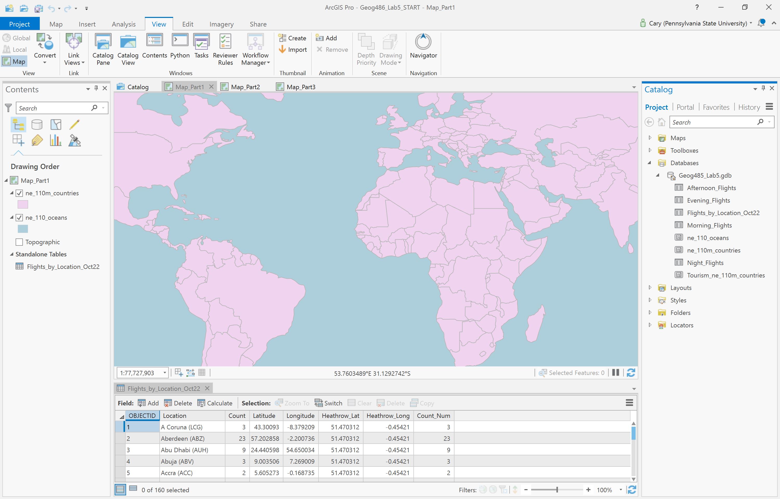 Visual Guide Figure 5.1. Lab 5 starting file in ArcGIS Pro.
 -
Explore the Flight Data
The primary flight data table is the one shown below - it contains a full day of flight data (Oct 22nd, 2018). Listed in the table are all locations which had a flight arrive from, or depart to, London Heathrow Airport (LHR). We will not differentiate between arrival and departure flights in this lab.
The count of flights to or from this location is listed in the Count_Num field. For the purposes of this lab, we will assume that October 22nd is representative of an average day at LHR, and thus use this dataset as a proxy for LHR’s “daily” flight data. You do not need to mention October 22nd anywhere on your maps.
Flight data source [36].
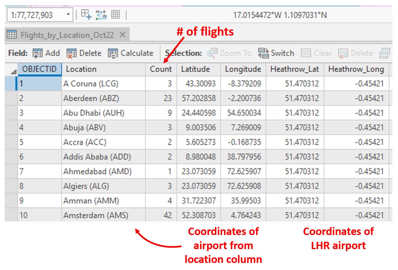 Visual Guide Figure 5.2. Flight data table as shown in ArcGIS Pro.
 -
Create Flight Paths Using the XY to Line Tool
In our flight data, we have lots of origin-destination data. We want to visualize these data as flows on our map. For this, we use the XY to line tool [37]. Think carefully about the fields you choose for each parameter when running this tool. If you do it incorrectly the first time, don't worry - re-think and re-do.
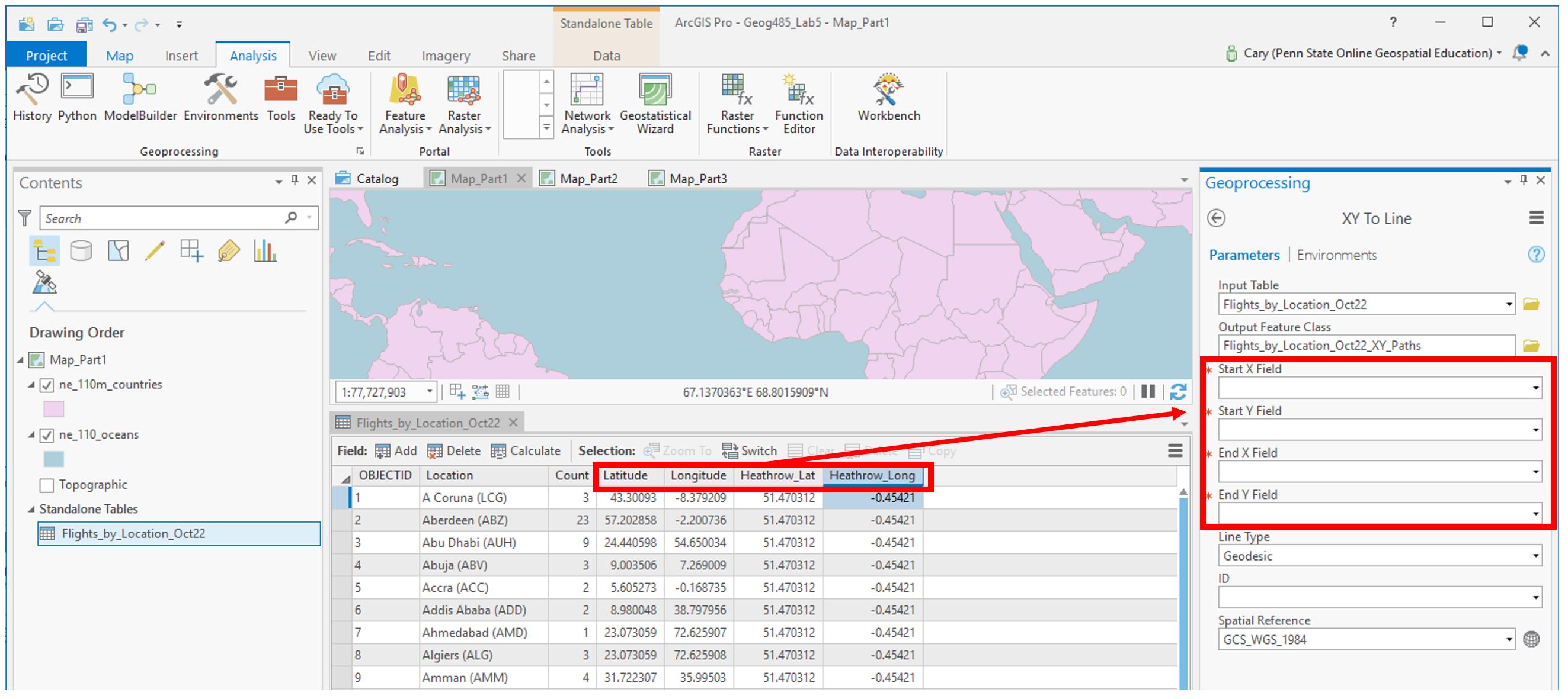 Visual Guide Figure 5.3. Running the XY to Line tool to create flowlines.
 -
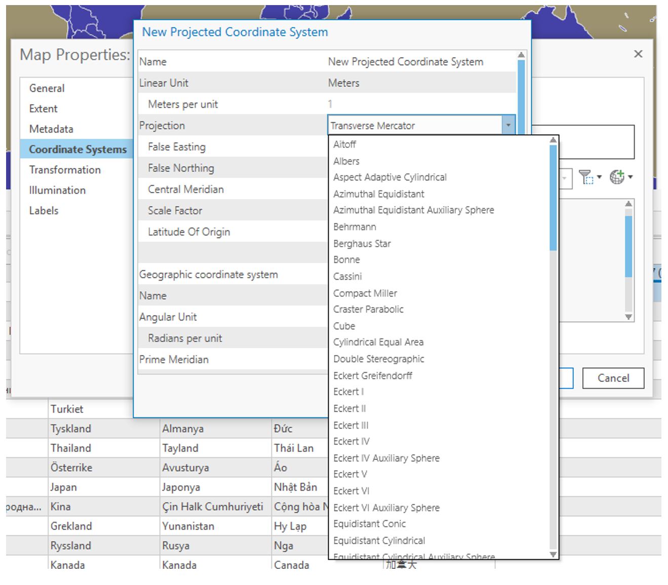
Choose and Customize a Map Projection
For each map layout in this lab, you will be creating a customized map projection (use the Project tool). Reference the projection lesson and consider each advertisement's goal/purpose to help you decide which projection to choose/customize for each map. You may want to try adding the map to a layout at this stage of the lab to decide if you like it. Remember that you will be asked to defend this choice in the reflection you submit with this lab.
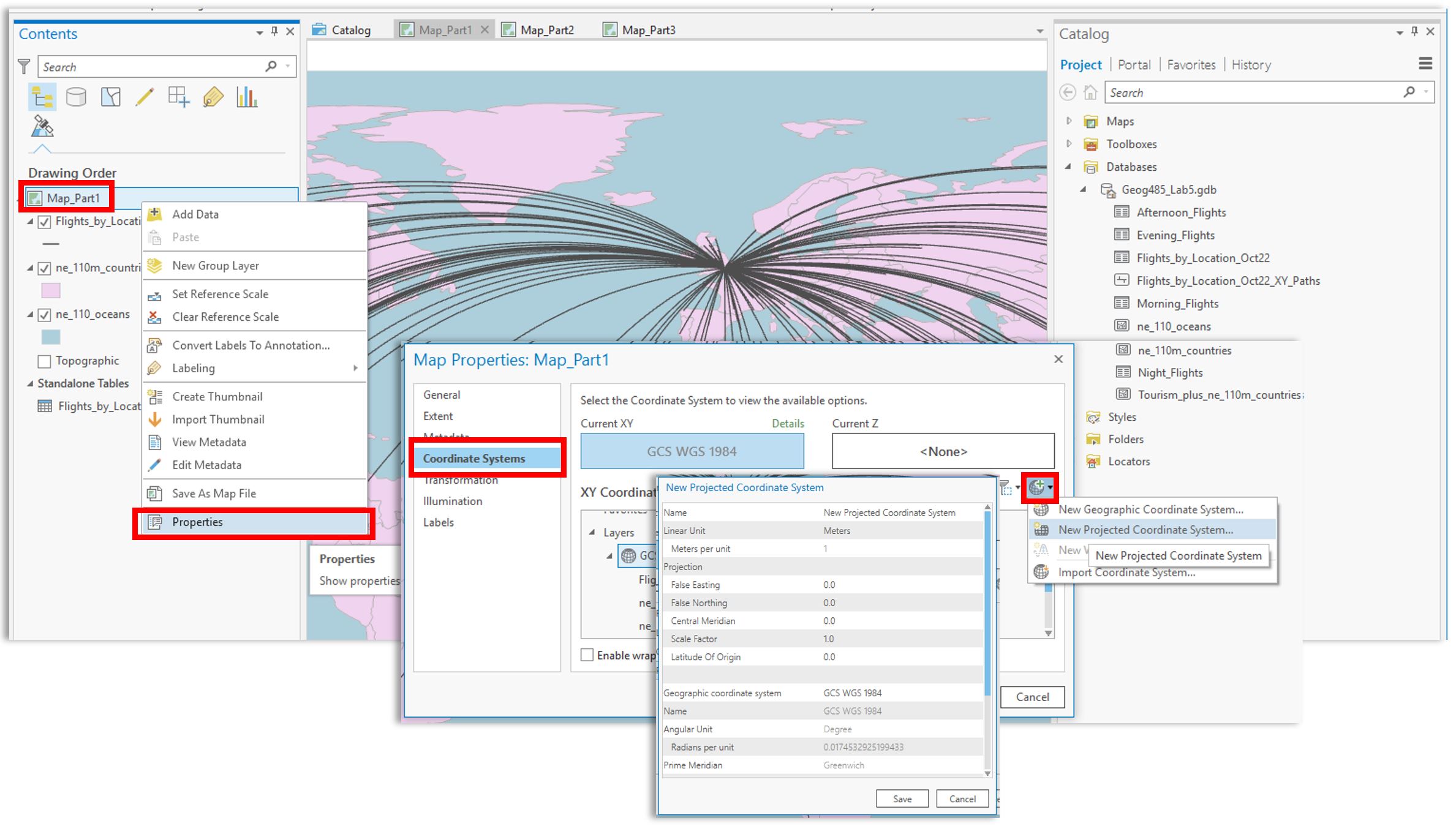 Visual Guide Figure 5.4. Creating a new projected coordinate system and assigning it to your map.
You may need to try a few different projections or customization parameters to find a map projection you are happy with. When you have settled on a projection, use the project tool to project your flowlines to match the map's projection. As shown below, ArcGIS makes this pretty easy.
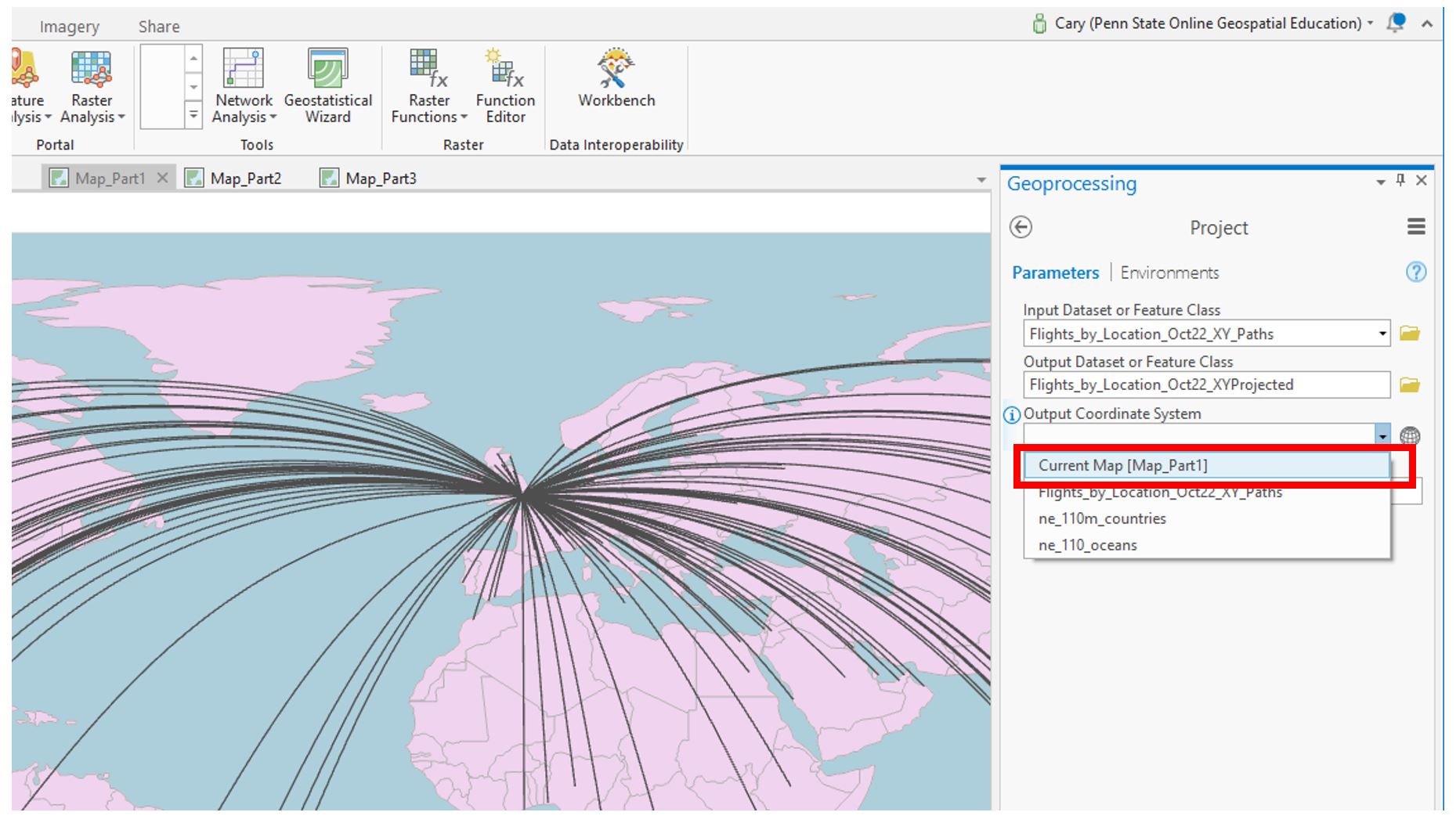 Visual Guide Figure 5.5. Projecting your flowlines.
Recall that we will be visualizing flight paths based on their length. We can use the Shape_Length field which ArcGIS automatically calculated for us from our origin-destination data to do this. Note that before projecting these lines, the Shape_Length field will not contain meaningful values.
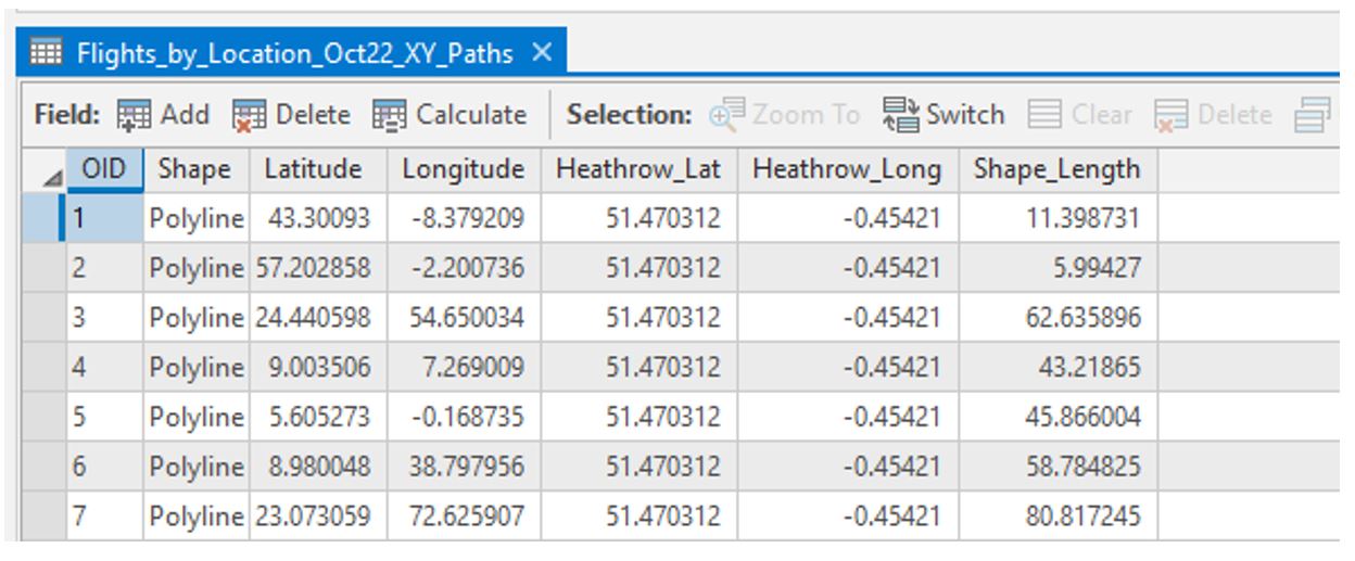 Visual Guide Figure 5.6. Flowline attribute table before projection.
Once your flight paths are projected, the Shape_Length field will be calculated in meters.
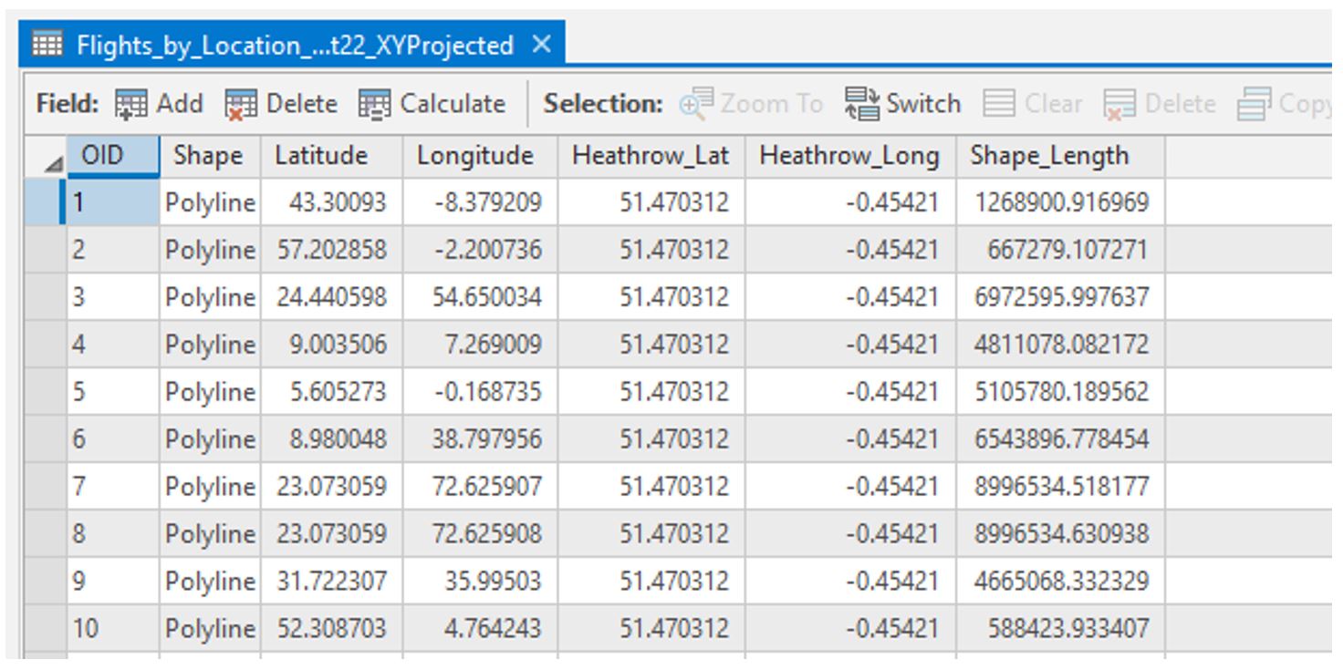 Visual Guide Figure 5.7. Flowline attribute table after projection.
As you may have noticed, the flight path data doesn't contain any location names or flight count numbers. We'll need to join the original flight data table to the flight path data to get all our data in one place.
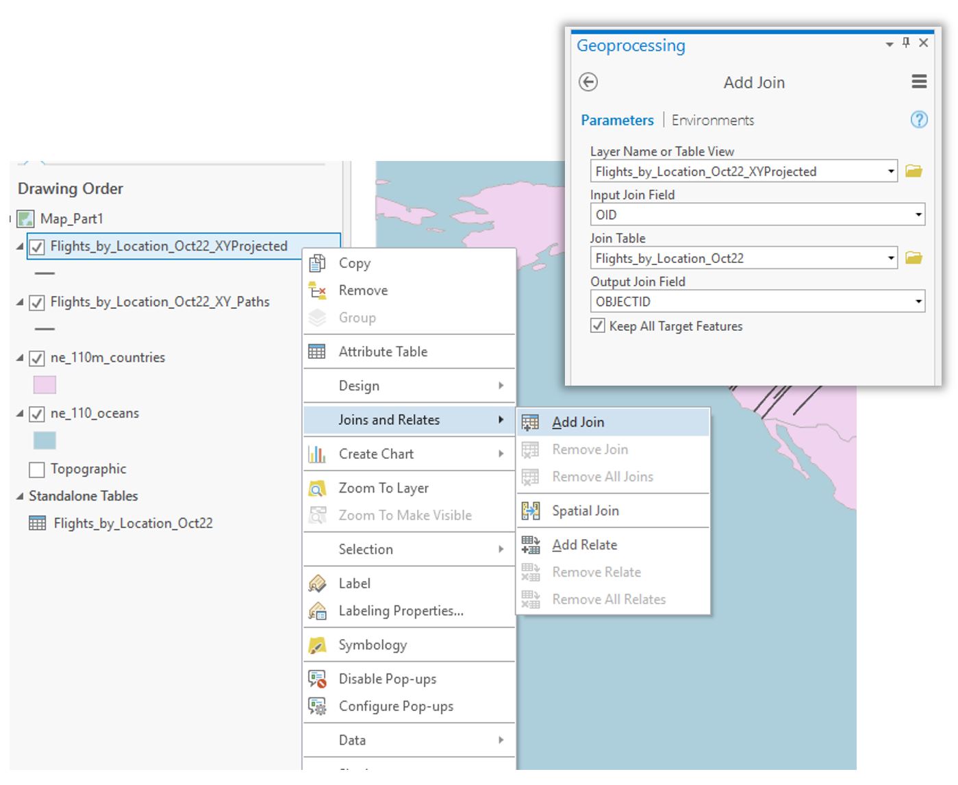 Visual Guide Figure 5.8. Adding a join to add attribute data to our flight paths.
 -
Symbolize Flight Paths by Their Length
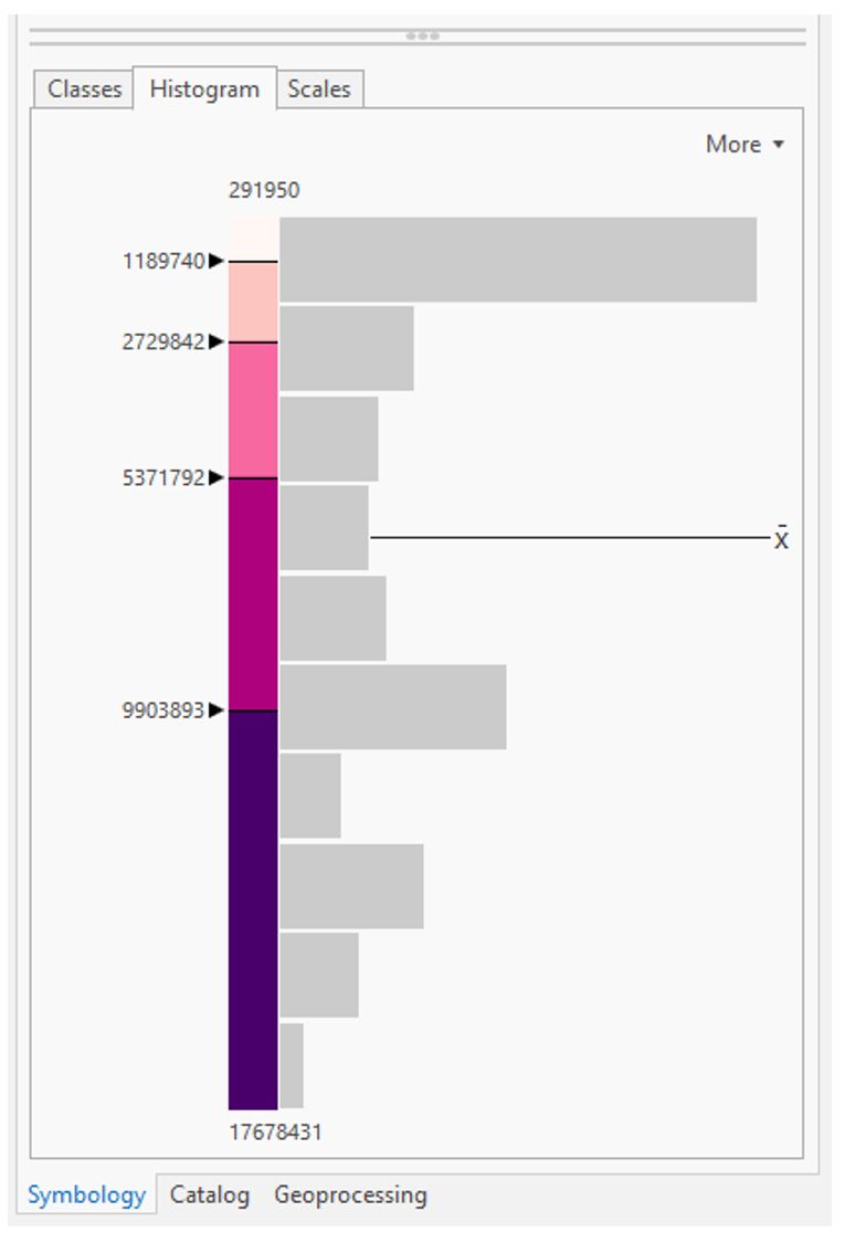
Use external research or the data distribution to decide on classifications for short vs. long flights, etc. (3+ classes). Recall considerations for data classification from Lesson/Lab 4.
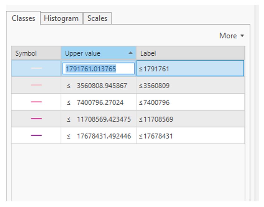 Visual Guide Figure 5.9. Manually editing classifications.
You may use any or multiple visual variables of your choice to symbolize your flowline data - size, value, etc... as long as it is appropriate given the perceptual structure of your data, you can be creative with it.
 Visual Guide Figure 5.10. Making additional edits in the Symbology Pane.
Add your map to a layout: create a catchy title/subtitle and customize your legend. Add a graticule (ArcGIS Pro calls this a “grid”) if you wish.
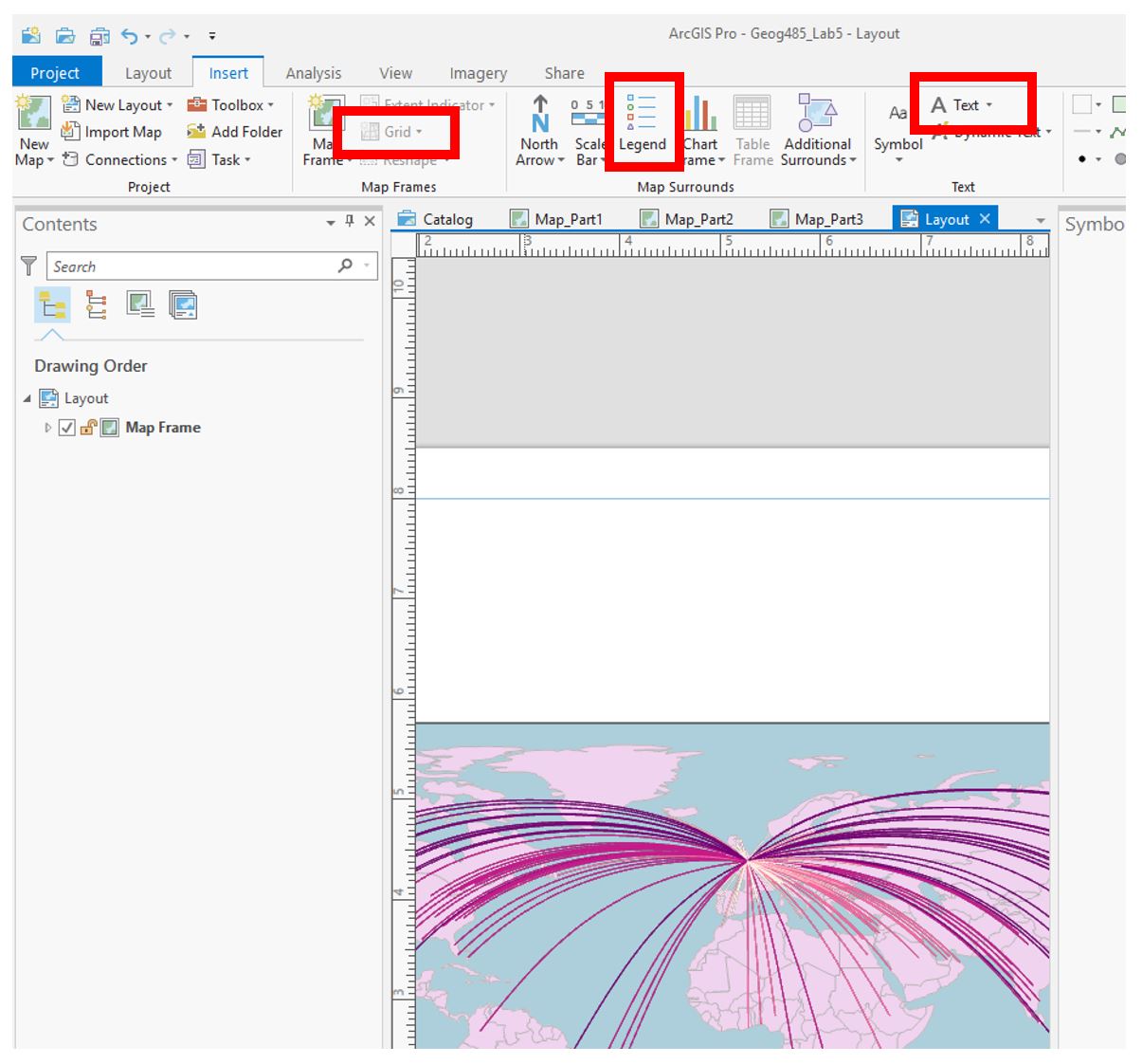 Visual Guide Figure 5.11. Example map with flowlines inserted into a layout.
Make sure all layout elements are neat and orderly – “convert to graphics” will likely be helpful. Keep in mind lessons from previous labs: legends and any explanatory text should be clear, etc.
-
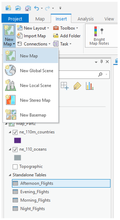
Repeat These Same General Steps to Create the 2nd Layout
You’ll want to create three new maps (four total) to separate the flight types (morning, afternoon, evening, night). If you prefer, you can do a Save-As and keep work done on this project separate form the previous one. In any case, save frequently!
 Visual Guide Figure 5.12. Adding a new map for the afternoon flights.
You can drag the tables onto their appropriate map from the Contents Pane.
 Visual Guide Figure 5.13. Flight tables in the Contents Pane.
Use creativity, appropriate visual variables, and good design in this ad as well! Remember the goal of this layout - highlighting that Heathrow can fit anyone’s schedule.
 Visual Guide Figure 5.14. Example layout for advertisement #2.
 -
Repeat to Create the 3rd Layout
For the third advertisement, we will add additional data to our map to demonstrate to the reader that flights from LHR go to desirable locations. Choose a field such as “International Tourist Arrivals 2017” that makes sense to use in an ad about air travel. Visualize this data on your map how you choose - remember that you will still be visualizing the flight paths. You may use the same flight path layer from Map #1, but you will need to re-project it to match your projection for Map #3.
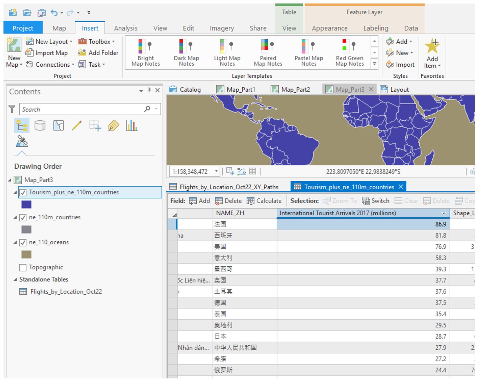 Visual Guide Figure 5.15. Exploring the attribute table for the included tourism data.
Choose and customize a projection you haven’t used yet – be prepared to write about the reason for this selection. Think about your map type and purpose.
 Visual Guide Figure 5.16. Adding a projected coordinate system to your map.
Ensure that both your flight path and other thematic data is included in your layout - below is just an example of how you might symbolize this data, but there are many other possible ways. If you do not want to use tourism data, you can use a field that was automatically imported with the Natural Earth boundary data such as GDP. Consider how you will visualize null values.
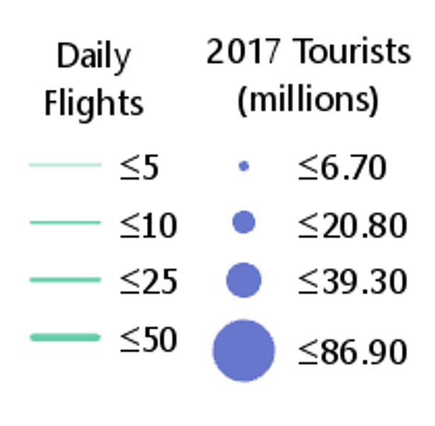 Visual Guide Figure 5.17. Example legend.
 -
Additional Tips
- Remember these are advertisements! Use good design but have fun with titles, colors, etc.
- You may want to use an interesting projection - such as one that visualizes the world as a sphere - for one or more of your maps. Be sure it is appropriate for your map's purpose.
- Adding a grid often aids in reader interpretation of small-scale maps.
- You do not need a scale bar or north arrow for any of these map layouts - they are generally considered unnecessary (and often inappropriate) for global-scale maps.
- When you write your reflection, include a screenshot of the map's projection details (such as in Figure 5.18 below) for each map layout. You will likely use the same projection for all four maps in layout #2, so you only need to include one screenshot for layout #2 and note that it was used four times.
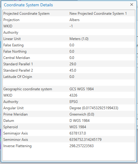 Visual Guide Figure 5.18. Map projection details.
Credit for all screenshots is to Cary Anderson, Penn State University; Data Source: Flightradar24, Natural Earth.
Summary and Final Tasks
Summary and Final Tasks
Summary
Welcome to the end of Lesson 5! In this lesson, we discussed the complex process of modeling Earth's surface, and how concepts such as reference ellipsoids and datums relate to the map projections used by cartographers every day. During our discussion of characteristics of map projections, we focused on the appropriateness of various map projections for different mapping tasks: based on a map's location, scale, and purpose. Finally, we connected these ideas to a new thematic mapping technique - flow mapping. Though projection choice is often particularly consequential in flow map design—due to the nature of the data visualized, and to the large regions such maps often depict—it is an important consideration in many mapping projects. You will often have to select an appropriate map projection when making other kinds of thematic maps, including proportional symbol, dot density, and choropleth maps.
In Lab 5, we explored the effect of projection selection on small-scale thematic map design while creating map-based advertisements for London Heathrow Airport (LHR). We designed these maps using prior knowledge of visual variables and symbols on maps, and put together neat, useful layouts intended to appeal to our map readers. Prepare for another creative real-world mapping task in Lab 6!
Reminder - Complete all of the Lesson 5 tasks!
You have reached the end of Lesson 5! Double-check the to-do list on the Lesson 5 Overview page [38] to make sure you have completed all of the activities listed there before you begin Lesson 6.