Lesson 6: Terrain Visualization
Overview
Overview
Welcome to Lesson 6! Last lesson, we talked in-depth about map projection: the process of transforming Earth's three-dimensional surface into a form that can be depicted on a flat map. Earth's terrain poses a similar challenge - how can we depict the intricacies of Earth's surface on a two-dimensional piece of paper or computer screen? Fortunately, just as with the challenge of projections, cartographers have been designing creative solutions to this problem for many years. In this lesson, we'll learn about many techniques that exist for modeling Earth's terrain. These include both oblique and vertical map views, contour maps, and physical models. We'll also talk a bit about how different terrain layers are built-in GIS software, and the importance of balancing the visualization of terrain with other map data, such as political boundaries, roads, water features, and trails.
In Lab 6, we'll put all this together to create a trail run map for an imagined event, The Paradise Valley Trail Run. You'll generate and design terrain layers, overlay additional base and thematic data, and use your knowledge of symbol and layout design to create a map that would be helpful to runners and their supporters. Let's get started!
Learning Outcomes
By the end of this lesson, you should be able to:
- understand various terrain representations’ relationship with each other and with the earth's physical environment;
- select a a scale-appropriate Digital Elevation Model (DEM) for terrain visualization;
- generate additional terrain layers from a Digital Elevation Model (DEM);
- visualize terrain layers through careful application of hue, saturation, and inter-layer transparency;
- balance the design of thematic overlay data with terrain to create a usable map.
Lesson Roadmap
| Action | Assignment | Directions |
|---|---|---|
| To Read |
In addition to reading all of the required materials here on the course website, before you begin working through this lesson, please read the following required readings:
Additional (recommended) readings are clearly noted throughout the lesson and can be pursued as your time and interest allow. |
This week's reading is provided in ebook form through the Penn State library system. |
| To Do |
|
|
Questions?
If you have questions, please feel free to post them to the Lesson 6 Discussion Forum. While you are there, feel free to post your own responses if you, too, are able to help a classmate.
Visualizing a Landscape
Visualizing a Landscape
In Lesson Five, we discussed map projections—the act of transferring the 3D earth onto a 2D map. In this lesson, we discuss a similar problem—representing Earth’s three-dimensional terrain surface on a 2D map.
When artists depict three-dimensional landscapes, they commonly use an oblique view. See the example painting in Figure 6.1.1—the perspective of the drawing makes the landscape appear three-dimensional, though it is only a two-dimensional piece of art.
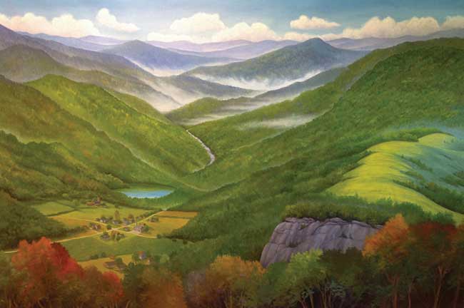
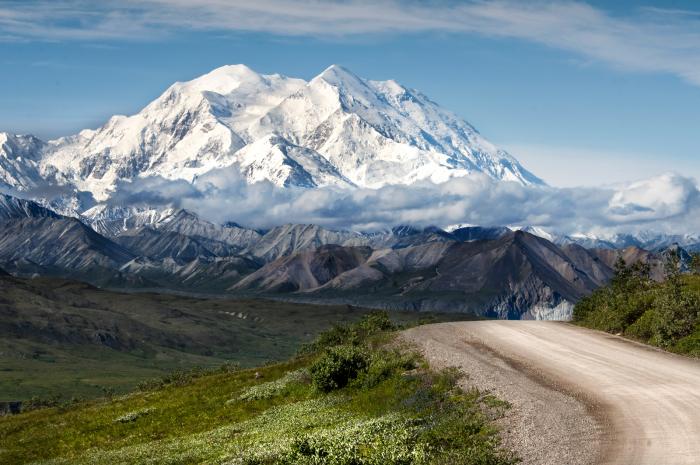
Whether in an artists’ rendering (Figure 6.1.1), photograph (Figure 6.1.2), or digital model, the oblique perspective is effective in its realism: it depicts what might be seen by a person on or near the ground.
Though the oblique view creates a favorable artistic impression, it has its disadvantages. First, this perspective inherently obscures some of the landscape—mountains and similar heightened features hide the land behind them. Secondly, oblique views are often constructed by exaggerating the height of landforms, so as to create an interesting visual depiction. This can make between-map comparisons challenging, and cause issues for cartographers hoping to take accurate measurements with such maps.
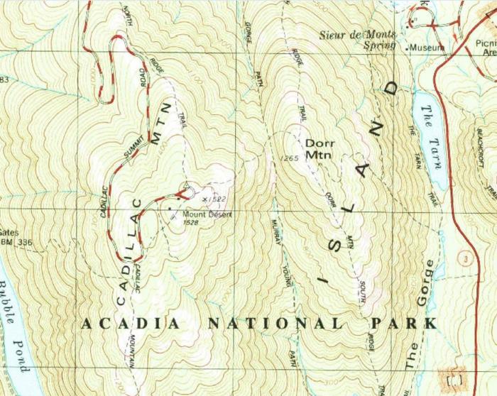
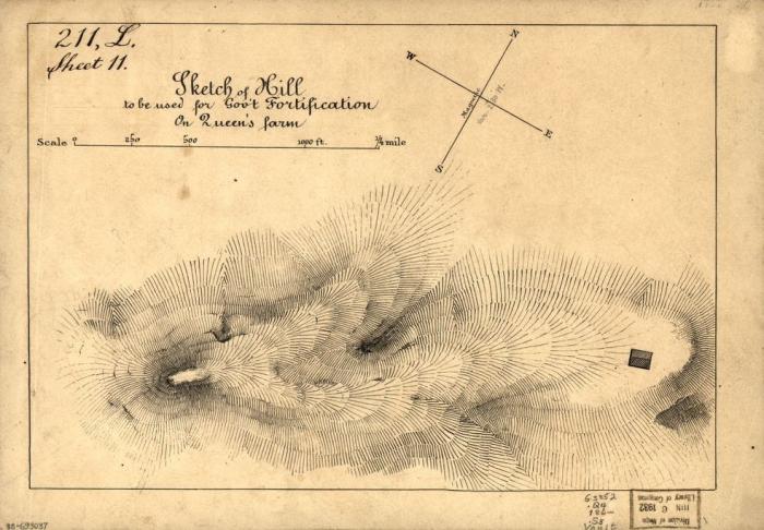
To account for these shortcomings, several vertical view techniques for depicting terrain were developed. Figure 6.1.5 shows a topographic map from the United States Geological Survey (USGS), which depicts a section of Acadia National Park. Topographic maps are maps that quantitatively depict terrain, typically with contour lines. Contour lines on a map connect points of equal elevation, and when drawn, they visualize hills, valleys, and other landforms. In the next sections, we discuss in further detail techniques for using both oblique and vertical map views to represent Earth's terrain.
Student Reflection
Visualizing three-dimensional terrain without obstructing parts of the landscape has been a challenge in cartography for centuries. Can you think of a modern mapping technique that presents similar problems and challenges for map-makers and readers?
Recommended Reading
- Chapter 5: Statement of the Problem. Imhof, Eduard. 2007. Cartographic Relief Presentation. Redlands: Esri Press.
- Chapter 20: Visualizing Terrain. Slocum, Terry A., Robert B. McMaster, Fritz C. Kessler, and Hugh H. Howard. 2009. Thematic Cartography and Geovisualization. Edited by Keith C. Clarke. 3rd ed. Upper Saddle River, NJ: Pearson Prentice Hall.
Oblique Views
Oblique Views
Despite the challenges involved with accurately depicting and visualizing all of the landscape with an oblique view, such views are still useful in some contexts. For some map uses, for example, a detailed view of a small part of the terrain may be more useful than a view from above of a wider area. As with all maps, attention to audience, purpose, and medium is important, and cartographers take these factors into account when deciding how to best represent terrain on a map.
One technique, used commonly in Geology to show underground rock or soil properties, is the block diagram.
Block diagrams show the surface of the landscape as well as underground structures and materials. This gives them a natural advantage over vertical-view maps if the goal of the map is also to visualize both above and below Earth’s surface. The disadvantage of block diagrams is that they cannot depict all sides of the terrain. In Figure 6.2.1, for example, it is unclear whether the composition of underground materials behind the diagram matches that shown in the front. These diagrams are also more challenging to create than traditional maps, though new software developments continue to make this process easier.
Student Reflection
Imagine viewing a block diagram such as the one in Figure 6.2.1 in an interactive web environment, rather than on paper. How might this alleviate some of the problems caused by the oblique view?
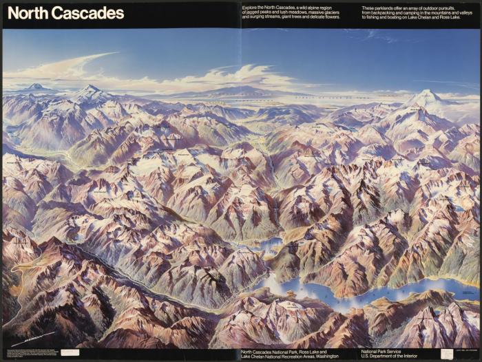
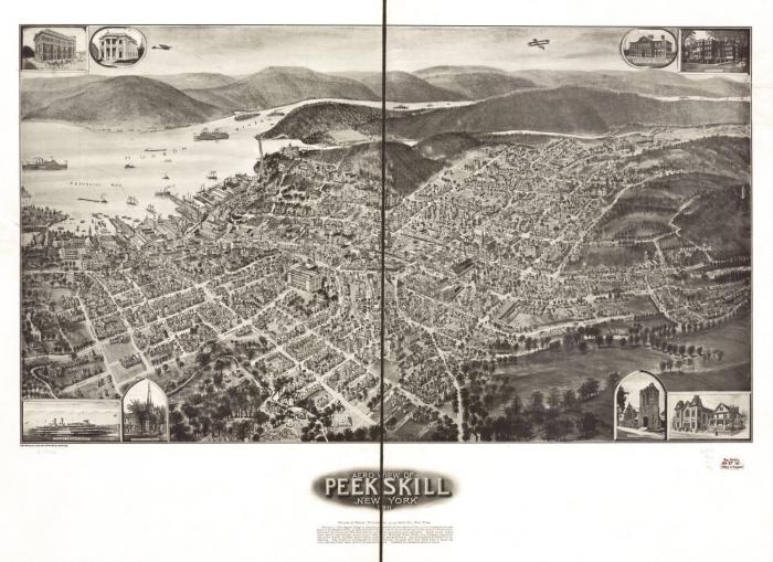
Panoramas are wide-angle views of an area and another popular technique for visualizing terrain. Several maps we saw in the first section, such as Figure 6.1.3, are panoramic maps. The map in Figure 6.2.2 is available from the Library of Congress—if you are interested in these types of historical maps, the LoC is an excellent source to explore.
The birds-eye perspective often given by panoramic maps provides an easily-comprehensible view of the landscape to the map user. Hills and valleys, for example, appear as they would to an observer in the real world, and thus their recognition requires no prior knowledge of cartography. Despite this, these maps are uncommonly used for scientific purposes as they do not show a geometrically-accurate view of the landscape.

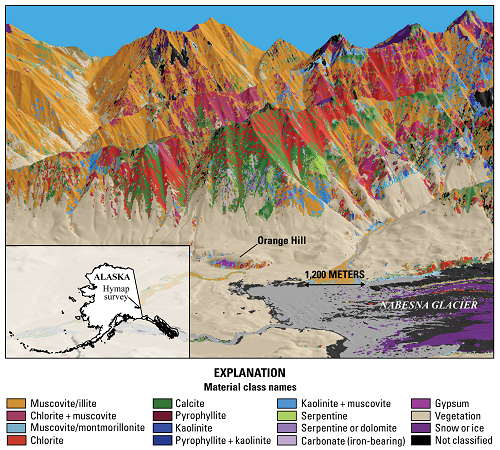
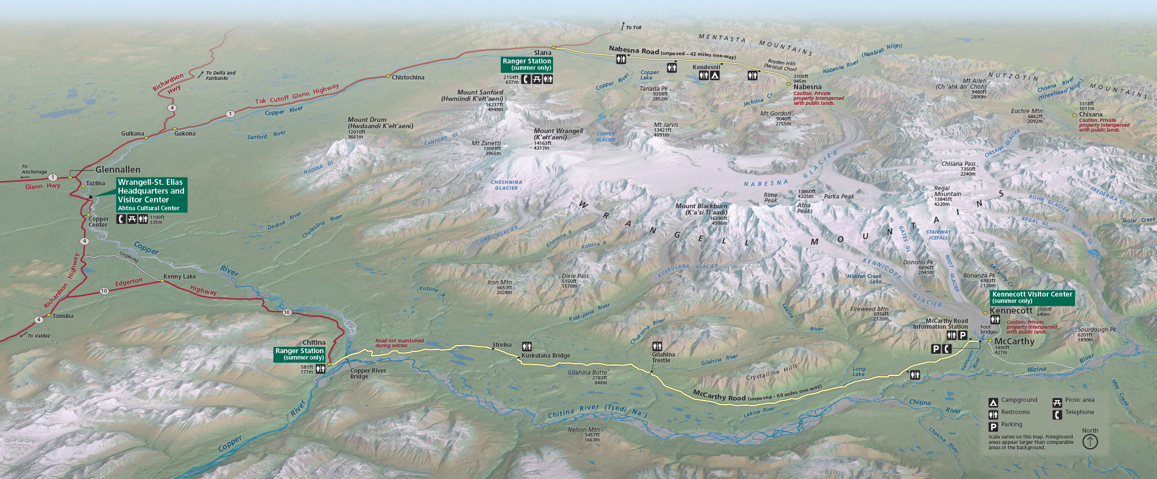
The map in Figure 6.2.3, for example, is a beautiful depiction of the mountains in Wrangell-St. Elias National Park. But if a map reader were to take measurements from this map, they would not be correct. Not only does the oblique view complicate measurement tasks with such maps, but mountain heights are typically exaggerated—not drawn to scale.
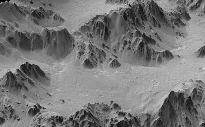
Draped images are a form of oblique view maps that have recently become more popular due to the increased availability of satellite imagery and advances in 3D visualization software. They are created by—in essence—draping a remotely-sensed image over a 3D digital terrain model. An example is shown in Figure 6.2.4.
The combination of remotely-sensed data and terrain visualization in draped images can be particularly useful for analyzing a combination of terrain and surface characteristics (e.g., for research on forest fires or ecological suitability).
Recommended Reading
- Chapter 20: Visualizing Terrain. Slocum, Terry A., Robert B. McMaster, Fritz C. Kessler, and Hugh H. Howard. 2009. Thematic Cartography and Geovisualization. Edited by Keith C. Clarke. 3rd ed. Upper Saddle River, NJ: Pearson Prentice Hall. Patterson, Tom. 2018.
- “Shaded Relief [10].” Accessed November 9, 2018.
- “Relief Shading [11].” Accessed November 9, 2018.
Physical Models
Physical Models
The oblique view, when compared to the vertical view, provides a more intuitive view of Earth’s landscapes. However, there is an even more intuitive way to model landscapes—with physical 3D models.
Physical models have been around since the time of the Ancient Greeks, but the time and expense required to create such models has sharply decreased in recent years due to the advent of new computer modeling techniques and 3D printing capabilities (Slocum et al. 2009). This has led, as you might imagine, to a recent increase in the popularity of such maps.
Physical representation can be combined with other terrain visualization techniques. The USGS, for example, produces topographic raised relief maps, such as the one in Figure 6.3.2. These maps combine the contour mapping technique with a haptic representation of terrain—creating engaging as well as useful maps.
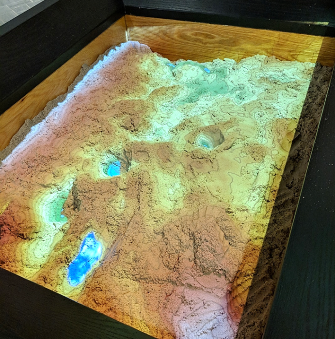
Another new technology, augmented reality (AR), has become popular for creating realistic and dynamic physical models of landscapes. Shown in Figure 6.3.3 below is an augmented reality sandbox, which draws contour lines and hypsometric tints by detecting the shape of the landscape as molded by sandbox-users.
Video Demo!
A similar sandbox is available at UCLA. Watch this video, UCLA's Augmented Reality Sandbox [13], for an exciting demonstration of this technology.
We will talk more about applications of augmented reality and similar technologies (e.g., virtual reality, mixed reality) later in the course.
Recommended Reading
- Chapter 20: Visualizing Terrain. Slocum, Terry A., Robert B. McMaster, Fritz C. Kessler, and Hugh H. Howard. 2009. Thematic Cartography and Geovisualization. Edited by Keith C. Clarke. 3rd ed. Upper Saddle River, NJ: Pearson Prentice Hall.
Vertical Views
Vertical Views
Techniques for depicting terrain from directly above were developed for two primary reasons. First, the oblique view inherently hides some map features; a vertical view, by contrast, offers a view of all landscape features within the map frame. The vertical view also allows the map maker to position features appropriately in geographic space—thus providing concrete spatial information, rather than a more artistic visual representation (Slocum et al. 2009).
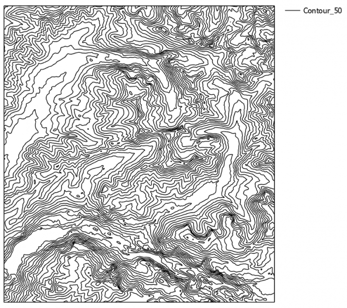
In the vertical view, terrain is typically represented with contour lines. Contour lines drawn on a map connect points of equivalent elevation. Figure 6.4.1 demonstrates how contour lines relate to the landscape from which they are derived—note that the bottom image is a 2D rendering of what is presumed to be a regularly-shaped mountain feature.
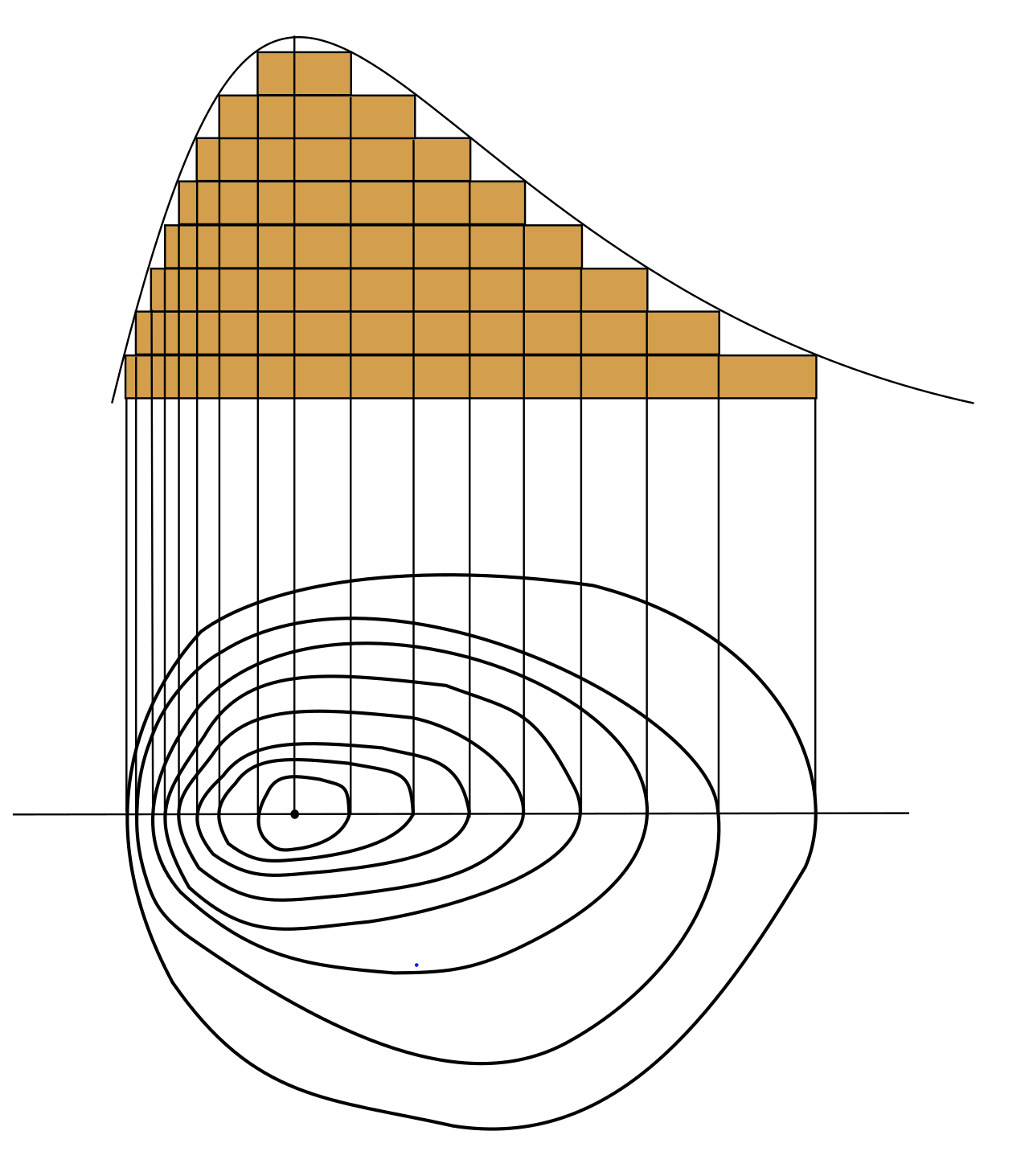
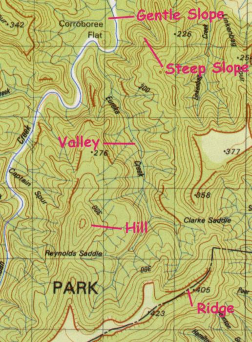
As demonstrated by Figure 6.4.1, gentle slopes are represented on contour maps by lines spaced farther apart than steep slopes. This is because elevation values change more quickly across steeper slopes, meaning that contour lines will need to be drawn more often (across the same map distance) to accurately represent the terrain. Figure 6.4.2 below shows a topographic map with markings to denote gentle and steep slopes, as well as valleys, hills, and ridges.
A map’s contour interval is the change in elevation (typically in meters) between drawn contour lines. This is a form of sampling (e.g., every 20m), meaning that topographic maps do not display every possible contour line, but rather display (as all maps do) a simplified view of the landscape.
In addition to mapping elevated features such as hills and mountains, contour maps are also useful for depicting underwater terrain. While topographic maps visualize elevations above sea level, bathymetric maps depict elevations below sea level.
On topographic maps, increasing values indicate higher elevations. Bathymetric values—as they also represent a distance from sea level—increase in the opposite direction. So just as the highest values on topographic maps represent the highest mountains, the highest bathymetric measurements represent the deepest depths of the earth’s oceans.
Despite their usefulness in accurately depicting terrain, contour lines do require some prior knowledge for their proper interpretation, as they do not present an immediately intuitive view of the landscape. To mediate this, cartographers have developed innovative methods for artistically depicting terrain on vertical-view maps using additional elements of design.
One popular method is Tanaka’s method (Tanaka 1950), often called Tanaka contours. Tanaka contours assume that the map is being illuminated by a light source from some direction, and contour lines are drawn lighter (i.e., illuminated) and thinner when facing the light source, and darker (i.e., in shadow) and thicker when perpendicular to the light source. The result is a contour map wherein the form of the landscape is more intuitively depicted (Figure 6.4.5). Ridges and valleys are far less likely here to be confused.
A similar but simplified method called illuminated contours was developed by J. Ronald Eyton (1984).
This method, shown in Figure 6.4.6, varies lightness as in Tanaka’s technique but does not vary line thickness. Contrary to Tanaka’s approach, which was applied manually, Eyton (1984) developed his method in the early days of computerized mapping—he used consistent line thickness to reduce computation time.
Other techniques for designing contour maps have been developed by other cartographers. You are encouraged to explore the recommended readings or search the web on your own to learn more about these techniques.
A mostly-outdated alternative to contour lines called hachures also exists. Hachures are created by drawing a series of lines perpendicularly to contours. The spacing between hachures are drawn proportional to the slope—steeper areas are highlighted by increased density of these lines (Slocum et al. 2009). A hachure-like technique can also be used to manually create shaded relief (a visually-appealing and artistic depiction of landforms), but its traditional purpose was to show a geometrically-correct depiction of slope.
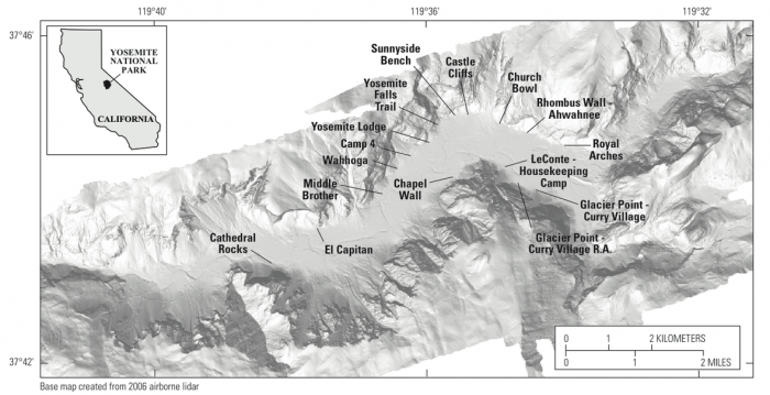
Shaded relief is commonly added to maps to give the reader a more intuitive impression of landform shapes. It presumes the existence of an imaginary light source and displays shadows over landforms accordingly, giving the illusion of depth. An example is shown in Figure 6.4.8.
The light source imagined in shaded relief mapping comes traditionally from the upper-left of the map (Northwest, assuming a North-up map view). At first, this might seem inappropriate—the sun rarely shines onto the Earth from a Northwestern direction, at least in the locations where most people live. This convention does not come from the earth sciences, however, but instead from guidelines in art developed in response to the realities of everyday life at the human scale.
Humans are used to illumination from the sun—as well as other light sources (e.g., lamps, overhead lighting)—coming from above our heads. As most people are right-handed, an upper-left light source ideal for writing. Even left-handed people typically write from left-to-right and top-to-bottom, due to the left-right convention of most languages. Figure 6.4.9 demonstrates the appropriateness of this upper-left light source.

We have become so accustomed to this location of light that light projected from other directions (e.g.. from underneath) results in features looking incorrect to the human eye. Imagine someone holding a flashlight underneath their chin in the dark—the reason their facial features appear so strange is that we are accustomed to seeing them lit from above.
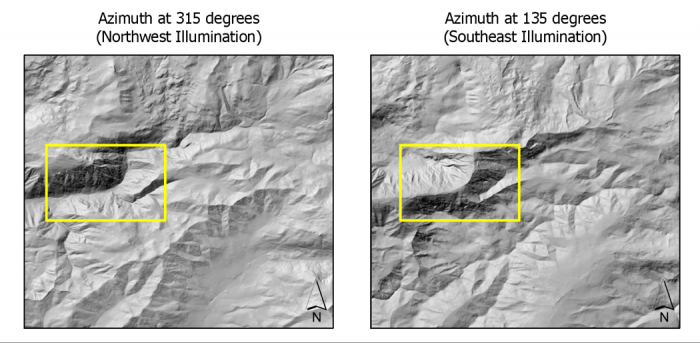
Figure 6.4.10 below shows how changing the azimuth direction of an imagined light source can create confusion in the interpretation of landscape features. Both below maps depict the same location, and a valley exists within the yellow box on each. Left, the valley is shown via traditional Northwest illumination. When the map is illuminated from the Southeast (right) the valley now appears inverted—it looks like a ridge.
Much of cartography is about understanding not only the analytical elements of landscapes and map design variables, but human perception. The Northwest oblique light source convention is an excellent example of how cartographers have developed their techniques with this understanding in mind.
Recommended Readings
- Chapter 5: Landform Portrayal. Muehrcke, Phillip C., Juliana O. Muehrcke, and A. Jon Kimerling. 2001. Map Use: Reading, Analysis, Interpretation. Fourth. Madison, Wisconsin: JP Publications. Intergovernmental Committee on Surveying and Mapping. 2018.
- “Topographic Maps [16].” Accessed November 9, 2018.
Building Terrain Layers
Building Terrain Layers
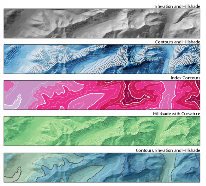
Before the widespread use of computers and GIS for map-making, terrain visualization techniques such as hachures were drawn by hand, and elevation values were approximated using photographs and survey data. In modern cartography, almost all terrain layers begin with one map layer—a digital elevation model (DEM). Though you likely often see DEMs with additional design elements such as color tints and shaded relief, DEM data is actually as simple as shown in the image in Figure 6.5.1 below.
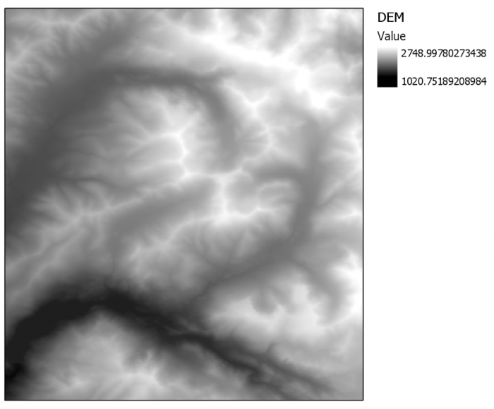
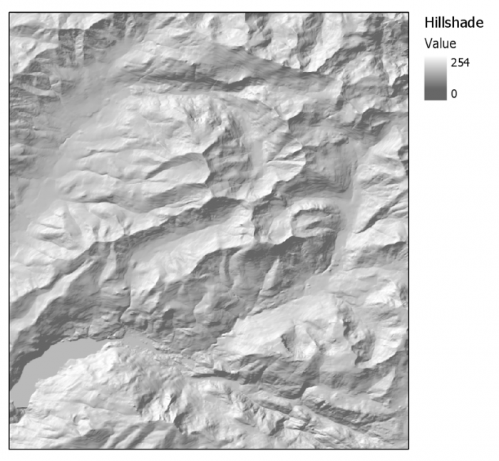
DEMs are raster, or grid-based data. Each grid cell (also called a pixel) in a DEM image has a single value, which corresponds to its elevation. In Figure 6.5.1 for example, the values closest to white are the locations of highest elevation at this location. Using GIS software, DEM data can be used to easily create additional terrain layers—the most common being hillshade, curvature, and contours.
Hillshade is a term often used interchangeably with the term shaded relief discussed earlier. Hillshade is a greyscale raster data layer which uses lightness to imitate the highlights and shadows that would be cast by a hypothetical oblique light source. The highest values in a hillshade layer, then, are those which would be met with the highest levels of illumination from the light source.
Contour lines, as discussed in the vertical views section lesson, connect points of equal elevation across a terrain surface. The density of lines across the map depends on the slope of the terrain—steeper slopes result in lines being drawn closer together. When creating a contour map, you choose what contour interval to use on your map. Theoretically, an infinite number of contour lines can be drawn on any map. Cartographers typically consider multiple factors when choosing a contour interval, including the scale of their map and the steepness of the terrain.
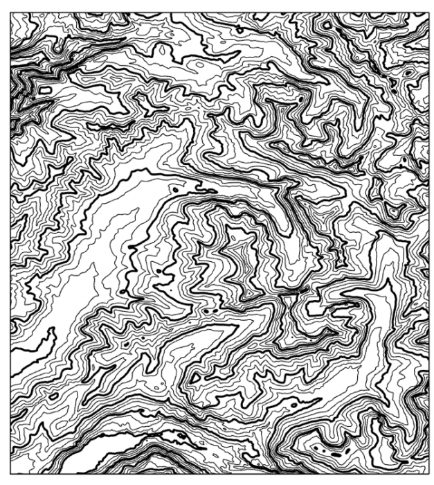
A common technique when symbolizing contour lines on maps is to draw index contours—contour lines that are more visually prominent—at less frequent intervals. Often, to avoid map clutter, only these contour lines are labeled. Map readers can then use the lines between them, called intermediate contours, to interpolate elevation values between them.
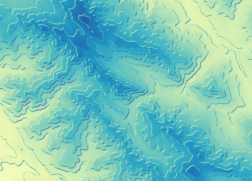
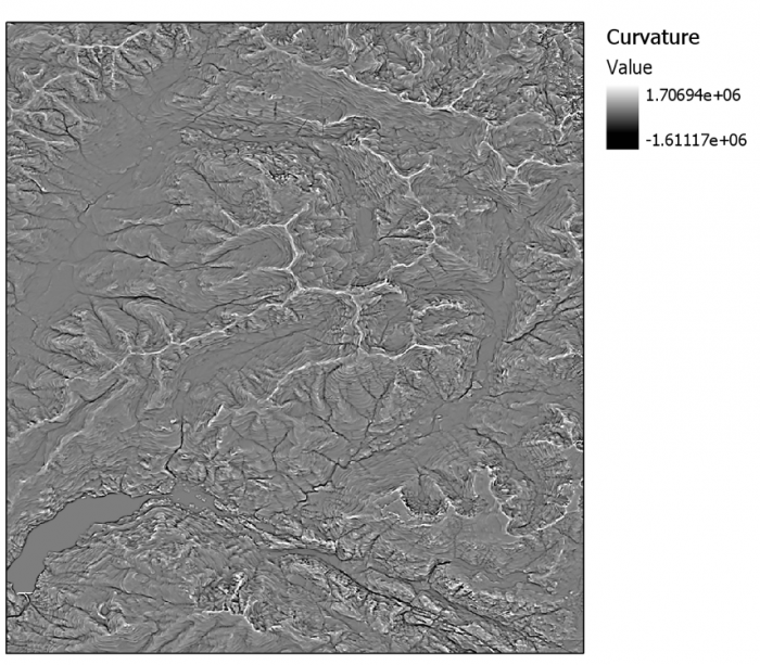
Digital Elevation Models can also be used to generate curvature layers, such as the one shown in Figure 6.5.5. Curvature is often referred to as “the slope of the slope.” In mathematical terms, it represents the second derivative of a terrain surface (Muehrcke, Muehrcke, and Kimerling 2001). We will not go into the technical details of how this layer is calculated—the important thing to know for map design is that curvature is excellent for showing inflection points in a surface—sharp ridges and deep valleys. In this way, adding a curvature layer can add additional visual interest to your terrain map.
Viewed individually, none of these layers are very interesting. However, with just a digital elevation model from a source such as The National Map, you can generate several different terrain layers and use layer transparency, color, and other design elements to create imaginative depictions of Earth's terrain. Though terrain visualizations are typically used as a base layer for thematic or general-purpose map data, making maps just of Earth's terrain and experimenting with new, creative designs can be quite fun.
Recommended Readings
- Kennelly, Patrick. 2009. “Hill-Shading Techniques to Enhance Terrain Maps [23].” In International Cartographic Conference.
- Nelson, John. 2018. “Hacking a DEM Sunrise. [24]” ArcGIS Blog. Accessed November 9, 2018.
Terrain as a Basemap
Terrain as a Basemap
Though terrain layers can be used to make fun and interesting map designs, terrain is rarely the sole element on a map. USGS topographic maps, for example, depict much more than just contour lines across the landscape—they also include political boundaries, streets, water features, and more. This is particularly challenging in urban areas, as demonstrated by the map in Figure 6.6.1, located in Manhattan, NY.
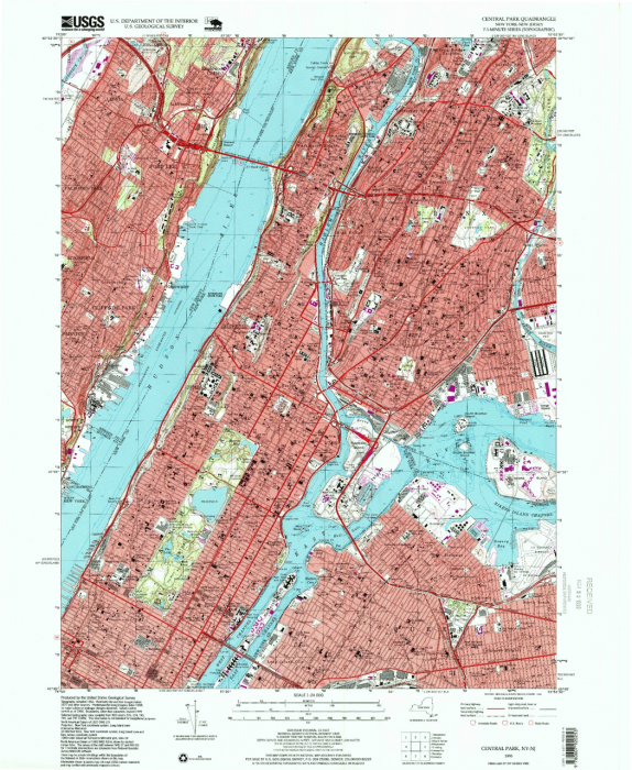
Even when terrain is the main feature of interest, such as in the thematic map in Figure 6.6 2 below, design adjustments must be made to ensure the terrain is visualized appropriately given the map’s projection, level of detail, other visual variables (here, color), and background.
Some types of maps more frequently contain depictions of terrain than others. As designing a good terrain base layer typically involves significant effort—and makes map symbol design more complicated—terrain is typically left off of maps when it is considered irrelevant, such as in thematic maps of political or social data. In some maps however, (e.g., maps of ski trails), terrain visualization is essential. Most maps fall somewhere in between.
Whether or not you decide to depict your location’s terrain—and how detailed that design will be—will depend, as with most design decisions, on your map’s intended audience, medium, and purpose. You will likely also need to take other constraints into consideration (e.g., availability of data and time).
Student Reflection
Google maps (maps.google.com) offers users the option of replacing the default Google basemap with a map that visualizes terrain. What use cases can you imagine for routing over such a basemap, rather than the simpler standard map?
Recommended Reading
- Chapter 2: Basemap Basics. Brewer, Cynthia A. 2015. Designing Better Maps: A Guide for GIS Users. Second. Redlands: Esri Press.
- Chapter 14: Interplay of Elements. Imhof, Eduard. 2007. Cartographic Relief Presentation. Redlands: Esri Press.
Terrain through Scale
Terrain through Scale
So far in this course, we have been working primarily with vector data. Though scale is an important consideration in all mapping tasks, working with raster data such as Digital Elevation Models presents a unique set of challenges for data management and design.
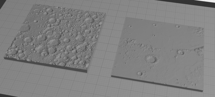
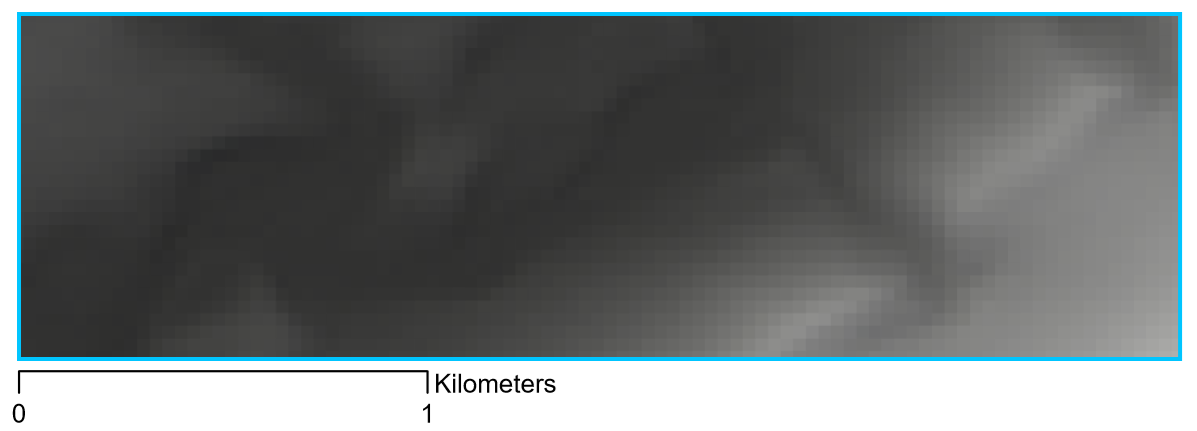
When mapping terrain, it is important to use elevation data that is appropriate for the scale of your map. The image in Figure 6.7.1, for example, appears pixelated and blurry. The resolution of the data used (1-arc-second) is too coarse for creating a clear image at this scale.
The solution to this is, as you might have guessed, to use higher-resolution data. See, for example, the map in Figure 6.7.2. The scale of this map is the same as in Figure 6.7.1, but the finer-grained data results in a much clearer image.
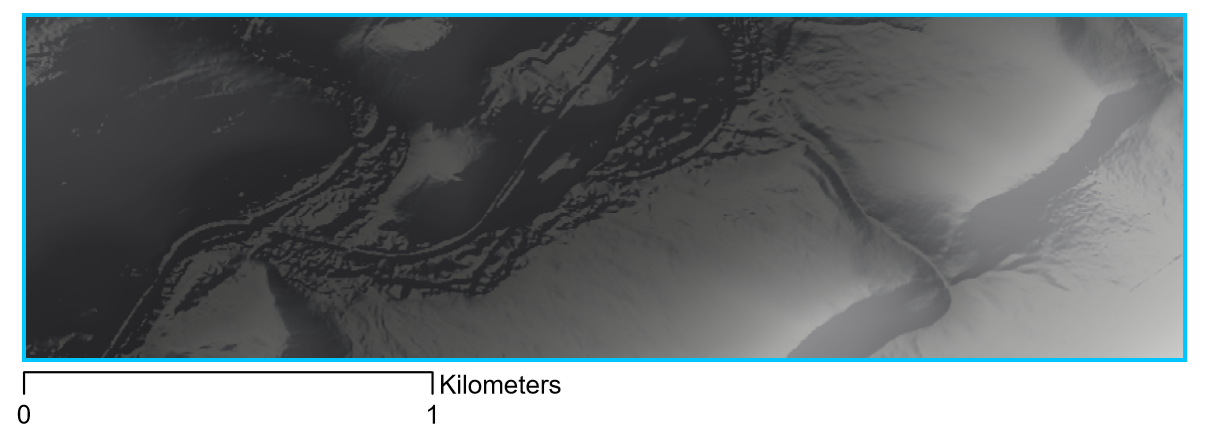
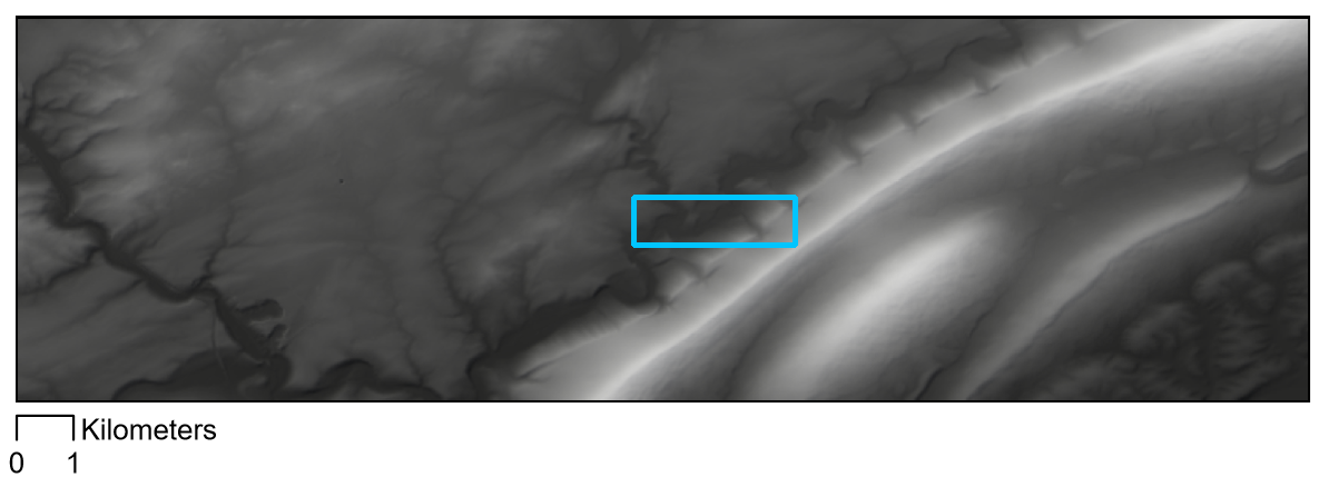
It is important to note that the answer is not to always use the highest-resolution data you can find. The map in Figure 6.7.3, for example, shows a 1-arc-second DEM: the same as used in the blurry image in Figure 6.7.1. At this new scale (1:120,000) this coarser data is quite appropriate. To understand the difference in scale between these maps, note that the extent of the maps above (6.7.1 and 6.7.2) is shown by the blue extent indicator in Figures 6.7.3 and 6.7.4 below.
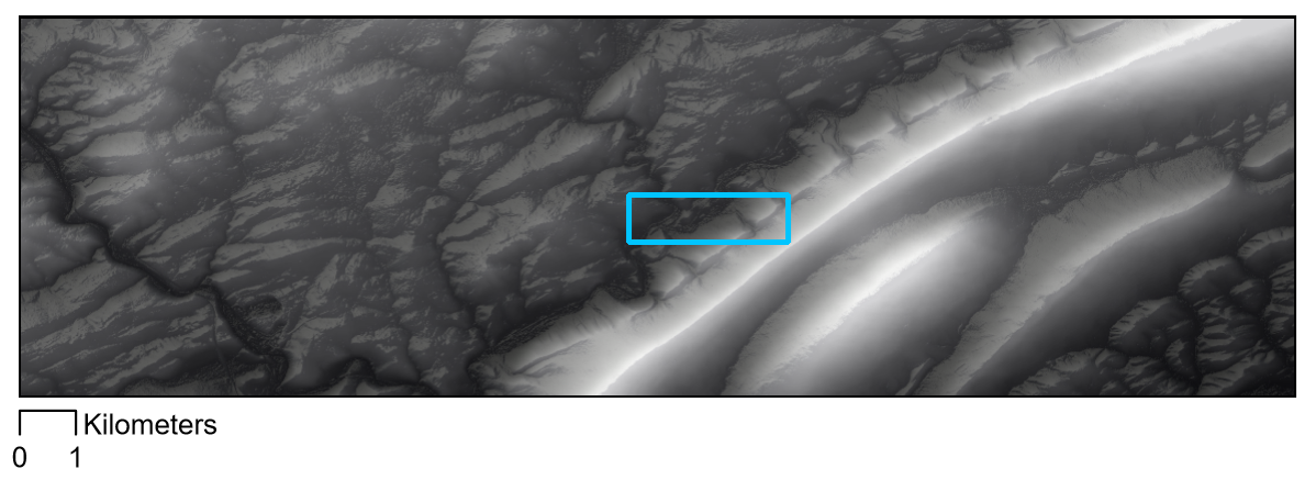
Raster data is much more space-intensive than vector data, and high-resolution raster data means particularly large file sizes. Using coarse data when appropriate will keep you from unnecessarily filling up all the space on your computer. This is not the only reason for not always using high-resolution DEM data, however. Using data that is too fine for a particular scale can result in undesirable visual effects, similarly to how using data that is too coarse can lead to a very pixelated image. Figure 6.7.4 is an example of a map created with terrain data that is a bit too unecessarily-detailed for its scale.
The good news in this second example is that DEMs can be simplified: GIS software can be used to re-sample and generalize terrain data. As with all data processing tasks, however, it is not possible to go in the opposite direction. The only way to create a more detailed terrain map is to collect more detailed data.
Recommended Reading
- Chapter 2: Basemap Basics. Brewer, Cynthia A. 2015. Designing Better Maps: A Guide for GIS Users. Second. Redlands: Esri Press.
Lesson 6 Lab
Lesson 6 Lab
Terrain and Trails Visualization
In this lab, you will be creating a map of the (imaginary) Paradise Valley Trail Run in southern San Francisco, California. Imagine the final map will be handed out in race packets - what do trail runners and their supporters want to see? As the race takes place over hilly terrain, you will first design the terrain backdrop of the map, and then add overlay data such as route paths, water stops, and general base data. Finally, you'll put it all together in a layout with an elevation profile for the 10K route and map marginalia.
This lab, which you will submit at the end of Lesson 6, will be reviewed/critiqued by one of your classmates in Lesson 7 (critique #4).
Lab Objectives
- Create a trail map for the Paradise Valley Trail Run in southern San Francisco, California.
- Symbolize routes and route points of interest (e.g., water stations) using category and hierarchy.
- Use the supplied DEM to generate additional terrain layers; design and layer them into an aesthetically-pleasing base layer using transparency and symbology options in ArcGIS.
- Create an inset map that works with the primary map to provide locational context to the map reader.
- Build the map into a layout with an elevation profile for the 10k route, an inset map, and appropriate marginal elements (scale bar; titles; legend).
Overall Lab Requirements
For Lab 6, you will be creating only one map layout, though it will contain several different elements: the primary map, an inset map, an elevation profile, and marginal elements (scale bars, north arrows, text, and legend).
Map Requirements
Map One: Primary Map
- Use the provided DEM to generate contours, hillshade, and curvature terrain layers: design and layer terrain data into an aesthetically-pleasing base layer using transparency and symbology options in ArcGIS.
- Symbolize and label all routes and points of interest (water stations; endpoints; mile markers) related to the trail run using category and hierarchy.
- Symbolize and label additional base layer data from The National Map (transportation; hydrography; boundaries) as appropriate for additional map base context.
- Orient the map in a way that works for displaying routes – do not orient this map directly North-up.
- Use the feature editor to edit layers if desired; create arrows to show the direction of both routes.
Map Two: Inset Map
- Label prominent map features as appropriate at this scale.
- The intent of this map is to provide locational context for people unfamiliar with the location—design features and labels accordingly.
- Include an extent indicator to show the location of the primary map.
Layout requirements
- Add an elevation profile chart showing the terrain of the 10K route.
- Include your two map frames at appropriate scales (main map and locator/inset map).
- Create and include appropriate marginal elements:
- two north arrows (one for each map);
- as many scale bars as you deem necessary; use clean design and sensible labels;
- a legend: design its style, placement, and descriptive text;
- a hierarchy of marginal text (e.g., title, subtitle, data source, your name, legend text, legend title) – not necessarily in this order.
- Create a balanced page layout (either portrait or landscape). Attend to negative space.
Lab Instructions
- Download the Lab 6 zipped file [30] (227.3 MB). It contains:
- a project (.aprx) file to be opened in ArcGIS Pro;
- a database that includes the spatial data needed to start this lab.
- Data source: Base data and DEM from The National Map.
- Additional data was created by the course developer. Lengths of routes and locations of mile markers are approximate.
- Extract the zipped folder, and double-click the blue (.aprx) file to open ArcGIS Pro.
- All data you will need to complete this lab has already been downloaded to the included geodatabase.
Grading Criteria
A rubric is posted for your review.
Submission Instructions
- You will have one map layout (PDF format) to submit. All elements must be included on one 8.5 x 11 page. Please use the naming convention outlined below.
- LastName_Lab6.pdf
- Submit your PDF to Lesson 6 Lab for instructor and peer review. (Note: The critique/peer review will occur in Lesson 7.)
Note: While Paradise Valley is a real place in California, data related to the Paradise Valley Trail Run in this lab was invented and built by the course author. Any existence of a real event with this name or in this location is coincidental. The Resources menu links to important supporting materials, while the Lessons menu links to the course lessons that provide the primary instructional materials for the course.
Need Guidance?
Please refer to Lesson 6 Lab Visual Guide.
Lesson 6 Lab Visual Guide
Lesson 6 Lab Visual Guide
Lesson 6 Lab Visual Guide Index
- Starting File
- Step 1: Create your Terrain Basemap
- Step 2: Symbolize Base Data
- Step 3: Symbolize Thematic Data
- Step 4: Create your Inset Map
- Step 5: Create your 10K Elevation Profile
- Step 6: Add Route Direction Arrows
- Lab 6 Final Tips & Tricks
-
Starting File
This is your starting file in ArcGIS Pro. It contains data for the Paradise Valley Trail Run, as well as base data (e.g., boundaries, transportation) and a Digital Elevation model (DEM). Your goal is to turn this data into a map for trail race participants and their supporters.
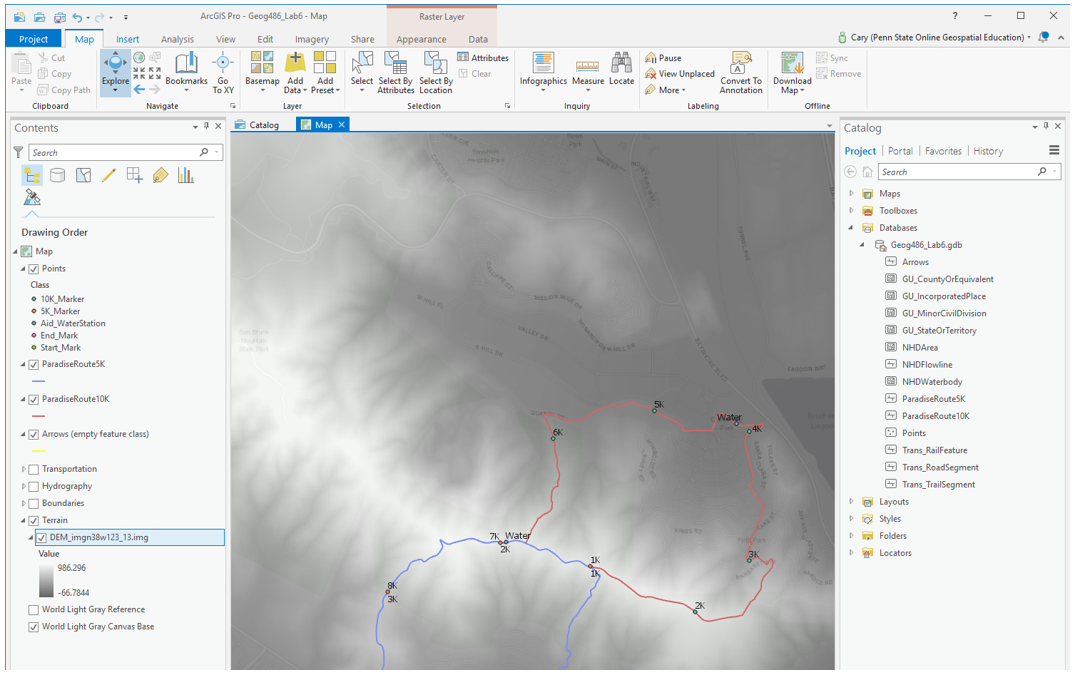 Visual Guide Figure 6.1. Lab 6 Starting File.
 -
Step 1: Create your Terrain Basemap
Your first goal in this lab is to use the included DEM to generate additional terrain layers. Create three terrain layers: Hillshade, Contours, and Curvature.
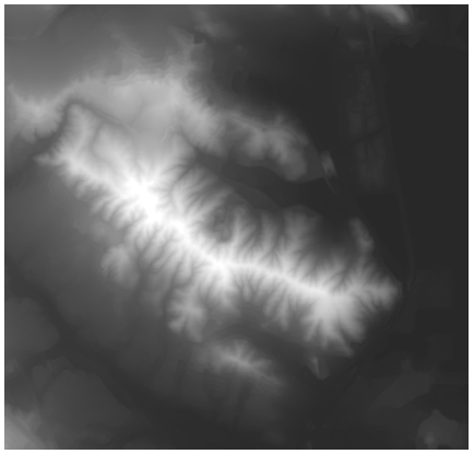 Visual Guide Figure 6.2. The Digital Elevation Model (DEM) provided in this lab.
The default settings/parameters provided by ArcGIS are ok for generating the Hillshade and Curvature layers. Make sure your output is saved to the geodatabase for the current project (Lab6_data.gdb).
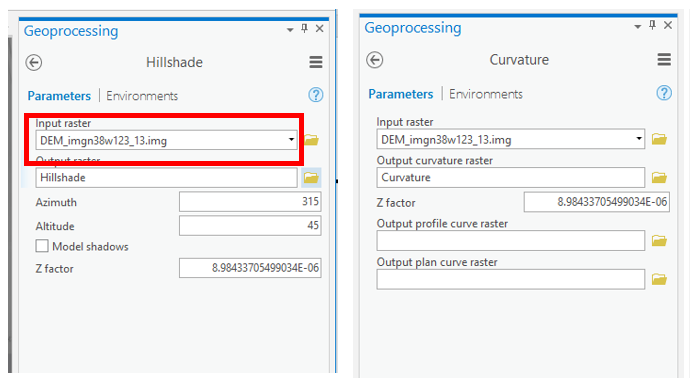 Visual Guide Figure 6.3. Generating Hillshade and Curvature terrain layers.
You will need to choose an appropriate interval for your contours - if you don't like the result, you can always choose a new interval and run the tool again.
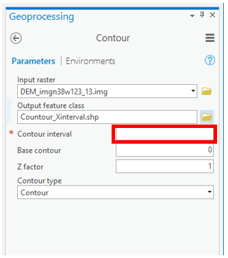 Visual Guide Figure 6.4. Generating contours.
Keep your terrain layers organized in the "terrain" layer group in the contents pane - think about your layer ordering, and don't be afraid to re-order layers as you go! Use the transparancy slider so you can see multiple layers at once - all of your terrain layers should contribute to your design.
Try out different symbology methods and color schemes. A simple stretch sequential color scheme (often greyscale) tends to work best for hillshade and curvature, but you can be a bit more creative with the DEM. Right click on a color scheme to reverse it if needed. Remember that higher hillshade values represent greater illumination - so unlike with most map data, higher values should be paired with lighter color. Keep your design subtle enough for your thematic (race info) data to show up on top. This map design is all about balance.
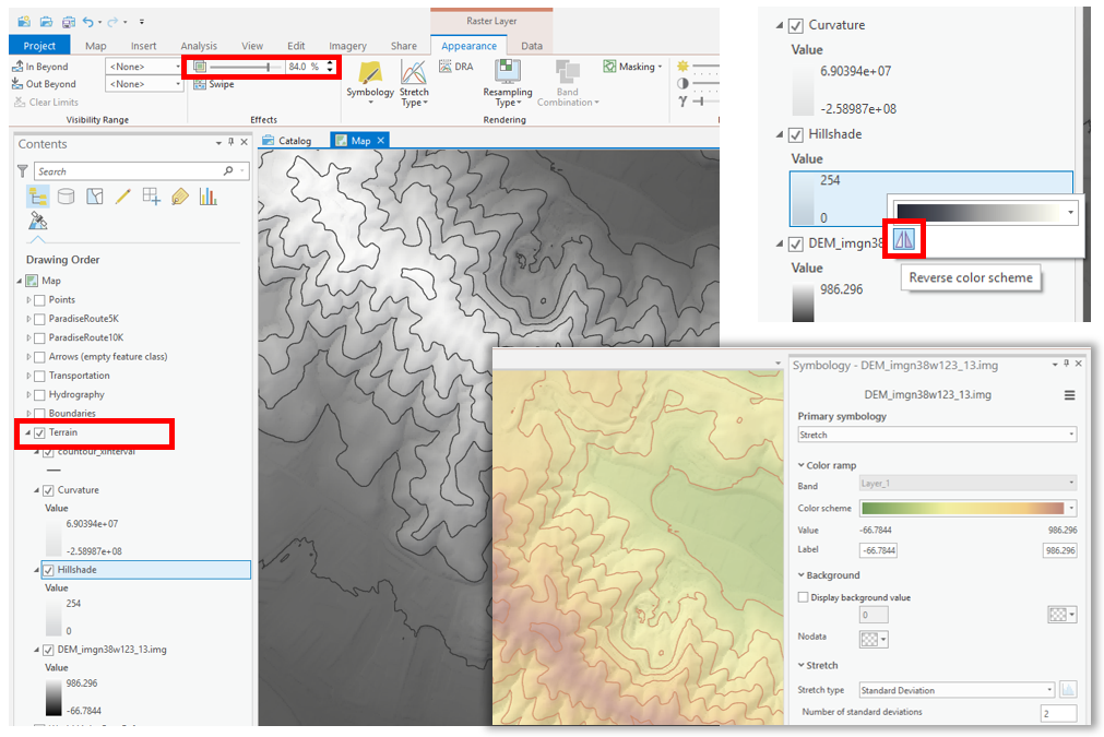 Visual Guide Figure 6.5. Editing terrain designs in ArcGIS Pro.
 -
Step 2: Symbolize Base Data
Symbolize the transport, hydro, and boundary layers as appropriate for this map’s purpose. Reference previous labs (particularly 1 and 2) for basemap design ideas. Remember you can create new label classes using SQL! This base data should be visible over the terrain data, but not be so overwhelming so as to detract from the data about the Paradise Valley Trail Run.
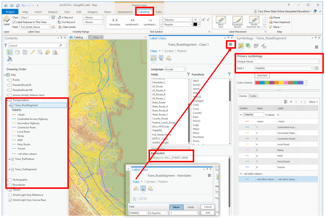 Visual Guide Figure 6.6. Symbolizing base data.
 -
Step 3: Symbolize Thematic Data
Choose line width, color, etc. to symbolize the two race routes. Think about how you can you display these two (overlapping!) routes at once. Design labels for water stations, route markers, and Start/End points. The Gallery may have helpful ideas for your point symbol designs, and there are many ways you can customize them yourself. Explore the available options. You may also want to look at running or trail maps on the web for ideas - but note that some that you find may not be well designed!
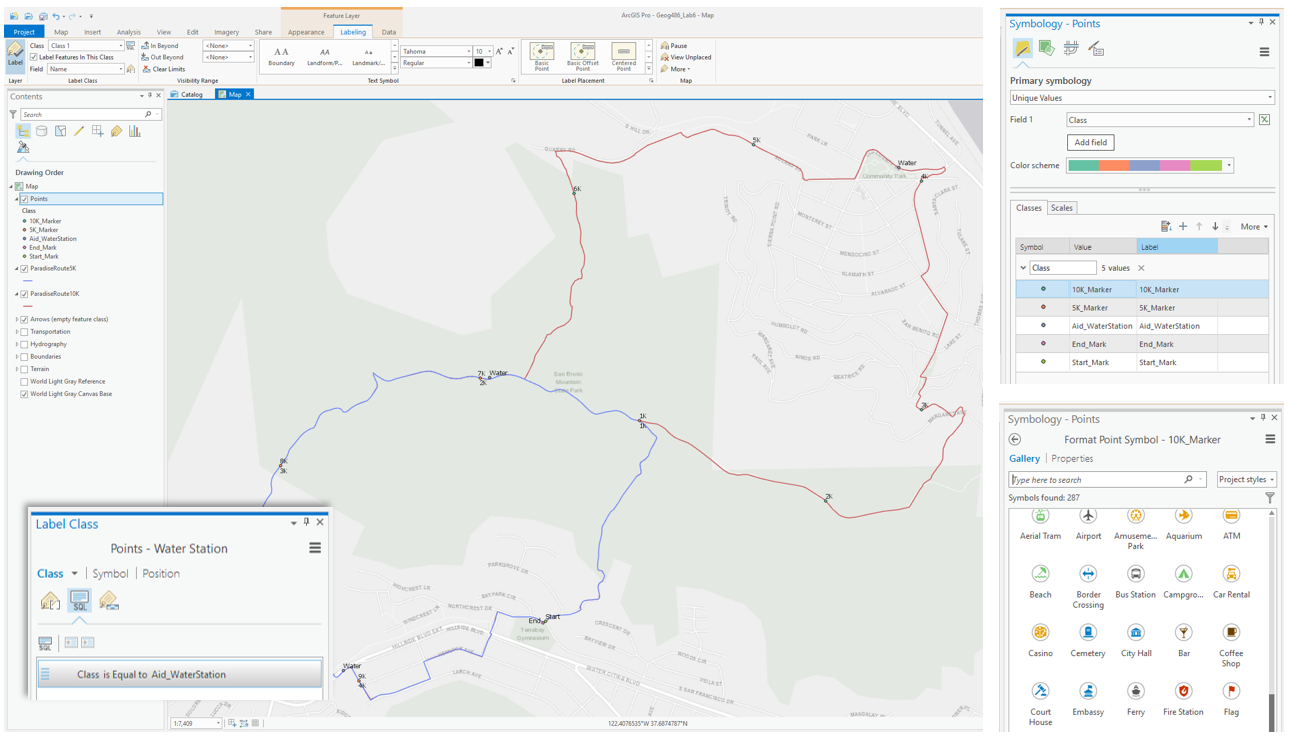 Visual Guide Figure 6.7. Symbolizing data related to the Paradise Valley Trail Run.
 -
Step 4: Create your Inset Map
Once you are happy with your primary race map, you're ready to start experimenting with layout designs and adjusting your map scales. To design your inset/locator map, it is recommended that you follow the familiar "Save-As map file" and re-import procedure illustrated below. Save a copy of your map, then import it into your map project. You can then alter the design so it works as an inset map.
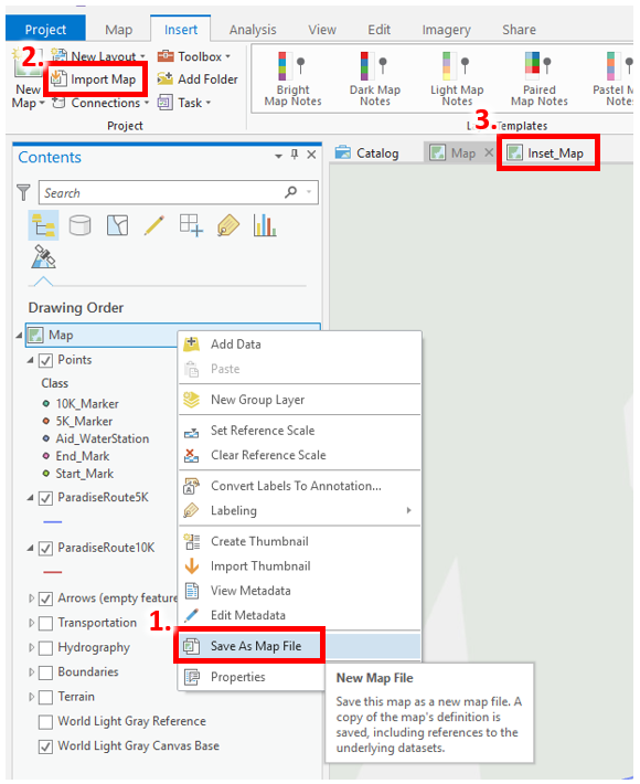 Visual Guide Figure 6.8. A review: saving a map file and re-importing it into the project.
The Navigator can be used to change a map’s orientation when the map is activated. Remember that your primary map cannot be directly North-Up for this project!
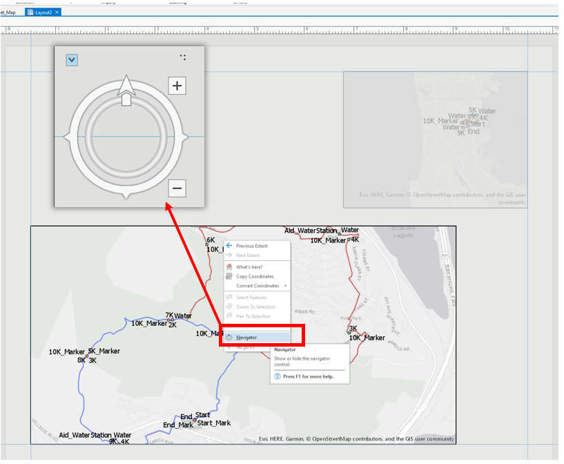 Visual Guide Figure 6.9. Opening the Navigator in Layout view.
 -
Step 5: Create your 10K Elevation Profile
We want to create an elvation profile to help trail runners anticipate the difficulty of the race. To do this, we will be using ArcGIS Pro’s Interpolate Shape [31]tool. This tool turns a 2D line feature into a 3D line feature based an input DEM or other surfaces. We will use this 3D line feature to create an elevation profile. You do not need to create an elevation profile for the 5K route, but you may do so if you choose.
 Visual Guide Figure 6.10. The Interpolate Shape tool.
Once you have created a 3D line, you can use this line to create a profile graph. As noted below, the design of your profile graph can be edited. You can also wait and edit the design as you work on your map layout.
Your profile graph will cover a slightly different horizontal distance than in the screenshot below - this is ok!
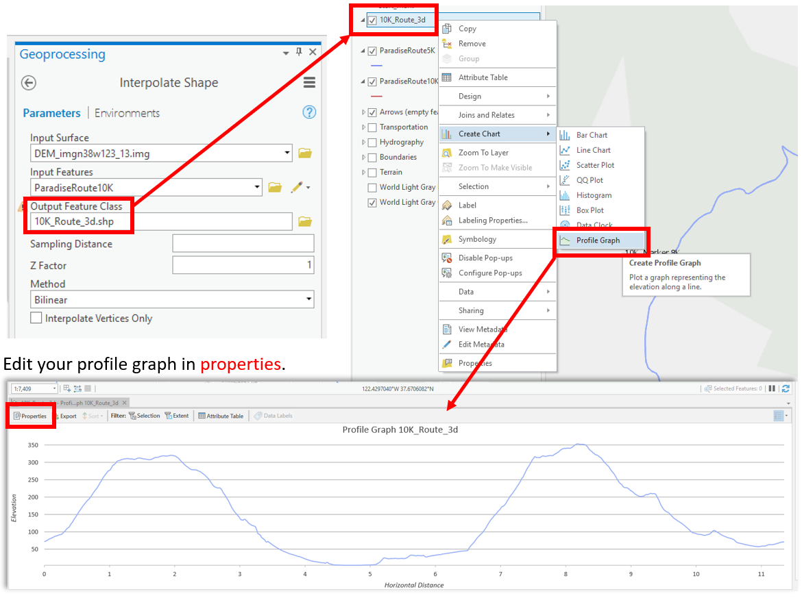 Visual Guide Figure 6.11. Generating a 3D line; using this to create a profile graph.
 -
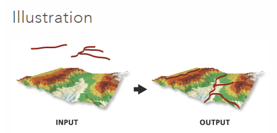
Step 6: Add Route Direction Arrows
An important part of route maps like this is to inform the reader of their direction of travel! There are many options for adding directional arrows to your map - two are listed below. You may design your arrows any way you want as long as you do not use any software other than ArcGIS Pro.
Option #1: Use the Edit [32] tab to create arrow features by drawing new lines. An empty “Arrows” feature class has been added to the map for you to facilitate this method. Use the editing toolbar to finish or discard map feature changes in this layer. And always save your edits!
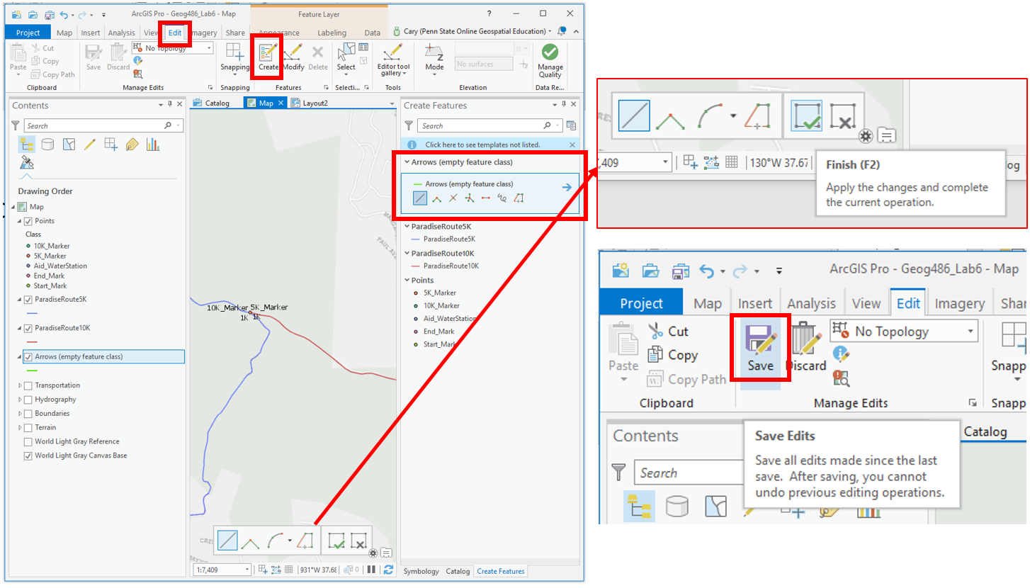 Visual Guide Figure 6.12. Creating and editing lines in the "Arrows" feature class using the Edit toolbar.
Option #2: Manually add arrows to your map via the map’s layout shape/line tools.
ArcGIS has tools for adding arrows and editing graphics, but is not fully-fledged graphic software (e.g., Adobe Illustrator). Keep this in mind as you decide which of options #1 and #2 for adding arrows works best for you. You might also try them both out and see which works best for your map.
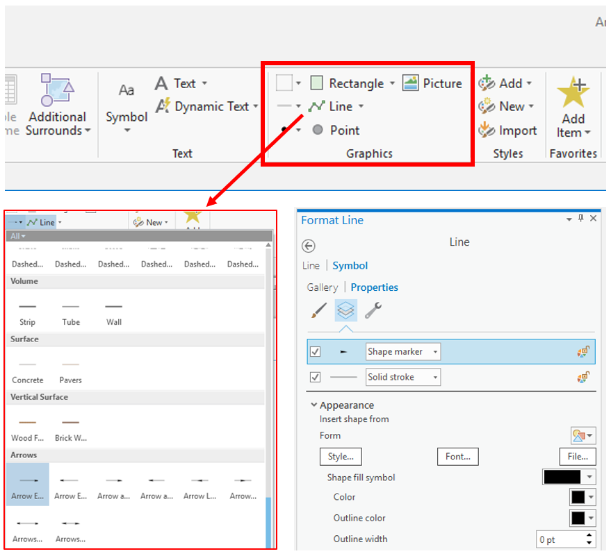 Visual Guide Figure 6.13. Inserting arrows into a map layout.
 -
Lab 6 Final Tips & Tricks
Insert your 10K elevation profile into your layout. (But note that you can keep the old 2D route for your map design).
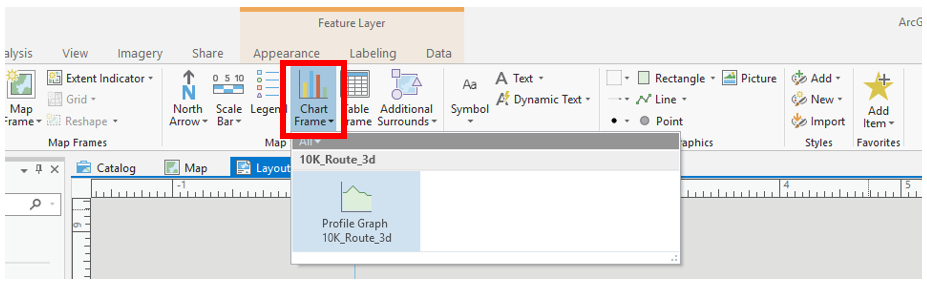 Visual Guide Figure 6.14. Inserting a profile graph into your layout.
Map routes, stops, and marker locations are approximate. You may alter them slightly if you would like. Reference the lesson and previous labs for ideas. Check the lab assignment for a list of specific requirements and ask questions in the discussion forum. Don't forget to add an extent indicator and marginal elements (e.g., scale bars, north arrows). Feel free to customize your layout and map elements creatively!
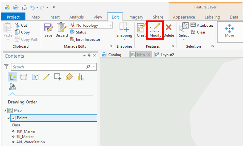 Visual Guide Figure 6.15. Modifying the marker points layer in ArcGIS Pro.
Credit for all screenshots is to Cary Anderson, Penn State University; Data Source: The National Map.
Summary and Final Tasks
Summary and Final Tasks
Summary
You've reached the end of Lesson 6! This lesson, we discussed the many techniques available for visualizing Earth's terrain, including vertical views (e.g., contour lines, hachures), oblique views (e.g., panoramas, draped images), and 3D physical models. We also explored the terrain layers available to be generated and designed in ArcGIS and similar software, and talked about the importance of DEM resolution (scale) for terrain-mapping projects.
In Lab 6, we put all this together with concepts from earlier lessons. We built a map for an imagined trail run in San Francisco, which involved the design of base, thematic, and underlying terrain data, as well as the composition of a neat, useful, and visually-appealing layout. This kind of mapping task is quite common—cartographers must often combine techniques from many different aspects of map design in their work.
Another important aspect of this lab was our focus on the intended map-reader: someone running a trail race, or cheering on a participating friend or family member. We'll talk more in-depth about map readers (and map users, in the case of interactive maps) in upcoming lessons. How can we design maps so that they best communicate our data, or assist their readers in making better decisions? Continue to Lesson 7 to find out.
Reminder - Complete all of the Lesson 6 tasks!
You have reached the end of Lesson 6! Double-check the to-do list on the Lesson 6 Overview page [33] to make sure you have completed all of the activities listed there before you begin Lesson 7.