Lesson 7: Multivariate and Uncertainty Visualization
Overview
Overview
Welcome to Lesson 7! During the course so far, we have discussed many ways in which cartographers symbolize data on maps. We used visual variables to create category and order for basemap and label design, compared proportional symbol, dot, and choropleth maps, and visualized flowlines and terrain. In most cases, our maps have focused on one data variable (e.g., % of people with health insurance), or layered different kinds of data (e.g., race routes layered over terrain). This week, we introduce multivariate mapping—maps that visualize more than one data attribute at once.
Following our discussion of multivariate maps, we introduce a special type of data—uncertainty. When mapping predicted flood zones, for example, we might want the reader to understand not only the predicted flood values across the map, but their associated uncertainty—how certain those values are to reflect reality across different locations. As uncertainty plays a pivotal role in decision-making, we close out our discussion of uncertainty visualization with a short summary of its influence on decision-making with maps. In Lab 7, we explore both multivariate data and uncertainty visualization techniques while creating maps for a new imagined set of decision-makers—a group of policy-makers at the United Nations—using data from the World Happiness Report.
Learning Outcomes
By the end of this lesson, you should be able to:
- anticipate the influence of uncertainty visualization on decision-making with map-based displays based on knowledge of related research.
- interpret advanced multivariate maps that use visuals such as Chernoff faces and glyphs.
- use appropriate combinations of visual variables to design multivariate maps.
- describe cluster analysis and its function in multivariate thematic mapping.
- understand geographic uncertainty and the role of its visualization in map design.
- evaluate the benefits and downsides of multivariate mapping compared to designing multiple maps (i.e., compare vs. combine) for a specific mapping purpose.
Lesson Roadmap
|
Action |
Assignment | Directions |
|---|---|---|
| To Read |
In addition to reading all of the required materials here on the course website, before you begin working through this lesson, please read the following required readings:
Additional (recommended) readings are clearly noted throughout the lesson and can be pursued as your time and interest allow. |
The required reading material is available in the Lesson 7 module. |
| To Do |
|
|
Questions?
If you have questions, please feel free to post them to the Lesson 7 Discussion Forum. While you are there, feel free to post your own responses if you, too, are able to help a classmate.
Multivariate Maps
Multivariate Maps
So far in this course, we have discussed many different ways of symbolizing data using visual variables. Our focus has been primarily on univariate maps—maps that show only one thematic data attribute.
This is a good start, but cartographers often wish to map more than one variable in a thematic map. This is called multivariate mapping. When creating multivariate maps, you should think about the best way to map each individual variable, as well as how you can best combine them to suit your maps audience, medium, and purpose.

The map in Figure 7.1.1 is a multivariate map. The map visualizes two variables at each location—rent prices, and the number of Section 8 vouchers. These variables are each mapped appropriately individually: first, rental prices are visually encoded with a sequential color scheme, a good symbolization choice for normalized data such as rates. The number of Section 8 vouchers at each location is mapped with size, an appropriate visual variable for mapping count data. Together, these symbols work together to visualize this housing data from Portland.
Note that the legend in Figure 7.1.1 is more complicated than many of the legends that we’ve seen so far. The format shown—one variable along the x-axis, and one along the y-axis, is common in bivariate maps, or maps that display two data variables. It not only explains how to data is encoded, but helps the map reader to understand how the data are related to each other. The more complicated a map becomes, the more challenging it will be to design a useful legend. Legend design is an important task however, as your legend is key for proper reader interpretation of your map. The map in Figure 7.1.2 below uses short text blurbs to assist the reader in this interpretation.
As we continue through this lesson, keep an eye on the legends used in various maps. Some maps, such as bivariate choropleth maps, have somewhat standard legend designs. Others, such as the one used in Figure 7.1.2, are somewhat less so; they are designed and customized by the cartographer to suit the map’s data and purpose. Legend design is an important component of cartographic design in general, but is particularly important for multivariate maps.
Student Reflection
Consider the legends you have made for your maps in lab thus far. For which map did you find designing the legend most challenging? Why?
Multivariate Choropleths
Multivariate Choropleths
As choropleth maps are the most popular type of univariate thematic map, it is not surprising that they are also commonly used in multivariate mapping. Most common are bivariate choropleths—choropleth maps that visualize two variables. Note that while cartographers have historically described maps of two data variables as bivariate, these maps can also be described as multivariate (more than one variable). In the context of this lesson and course, we will generally use the more comprehensive description multivariate maps.
The map in Figure 7.2.1 is an example of a bivariate choropleth distributed by the U.S. Census Bureau. It uses a hue progression (yellow to blue) to visually encode population density, and color lightness to visually encode population change. The way these symbols are combined is explained by the 3x3 box legend in the lower right.
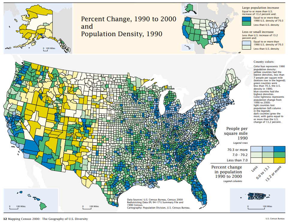
You might notice that this map uses color hue to encode population density, which is a sequential quantitative variable—a design choice we have discouraged in previous lessons. In general, color lightness is a much better choice for encoding quantitative data. In this map, however, color lightness is already being used to map the other variable—population change. Creating multivariate maps sometimes requires bending the rules of cartographic conventions a bit so as to best represent all of your data.
Recommended Reading
- Brewer, Cynthia A. 1994. “Color Use Guidelines for Mapping and Visualization.” In Visualization in Modern Cartography, edited by Alan M. MacEachren and D.R. F. Taylor, 123–147. Pergamon.
- Axis Maps. 2018. “Bivariate Choropleth [4].” Cartography Guide. Accessed November 14.
- Stevens, Joshua. 2018. “Bivariate Choropleth Maps: A How-to Guide [5].” Accessed November 14.
Multivariate Dot and Proportional Symbol Maps
Multivariate Dot and Proportional Symbol Maps
Another commonly-used thematic map type for multivariate mapping is the proportional symbol map. Making these types of maps is often easier than making bivariate choropleth maps. As the main visual variable used in proportional symbol mapping is size, another variable can be added quite easily—color. The challenge lies in their interpretation: as the visual variables of size and color are quite different, this can make it challenging for the multiple variables on the map to be directly compared by readers.
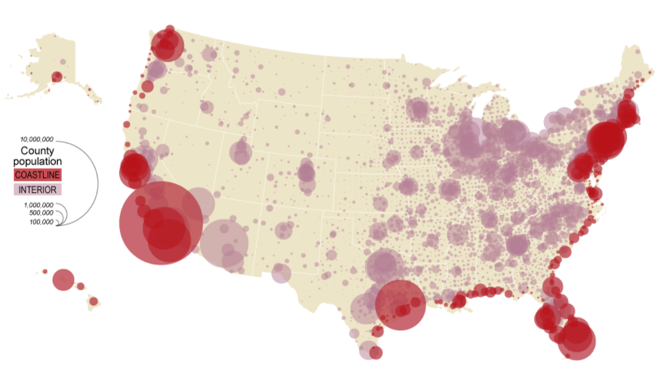
Figure 7.3.1 above is a bivariate proportional symbol map that visualizes two variables: population by county (a quantitative variable, with the visual variable size) and coastline vs. interior (a qualitative variable, with the visual variable color hue).
Student Reflection
Imagine you were tasked to create the map above, but instead of symbolizing points as coastline vs. interior, you were asked to symbolize all points by income per capita (in addition to population). What would you change about this map design to fit that new data?
Another method of multivariate map design is to stack multiple layers so they can be viewed simultaneously. Often, this is done by displaying proportional or graduated symbols on top of a choropleth or isoline map. An example is shown in Figure 7.3.2.
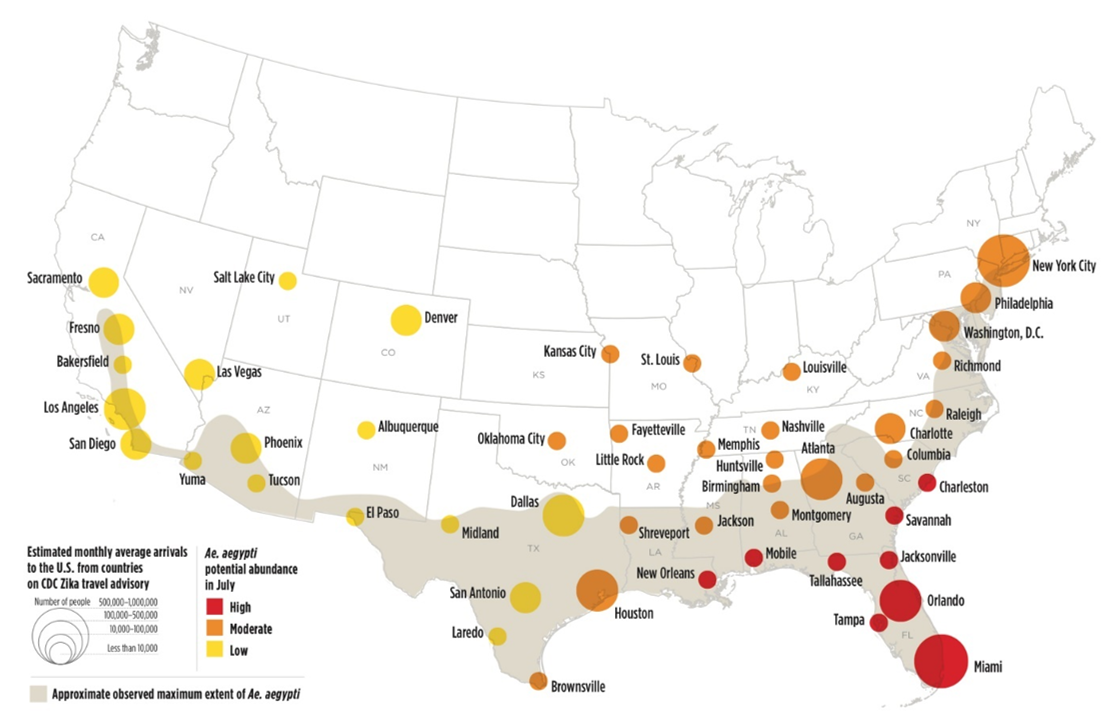
In the map above, visual emphasis is placed on the proportional symbols: they use size to symbolize a primary variable of interest—the estimated count of people in each city who arrived there after visiting a country on the CDC’s Zika travel advisory list. Another variable, Ae. aegypti (a mosquito capable of transporting the Zika virus) abundance, is visualized with color lightness/hue. A third variable—the approximate observed maximum extent of this mosquito, is visualized in the background for additional context. Note the careful legend design.
Making a map such as this one is a challenge, but is an example of how related variables can be mapped together to create an engaging and useful map.
Recommended Reading
Nelson, Elisabeth S. 1999. “Using Selective Attention Theory to Design Bivariate Point Symbols.” Cartographic Perspectives Winter (32): 6–28.
Cartograms
Cartograms
Thus far, we have discussed several methods for visually encoding maps with multiple variables via the addition of map symbols. There is another popular option: encoding data by altering the map’s shape or size itself. Area cartograms are maps in which the areal relationships of enumeration units are distorted based on a data attribute (e.g., the size of states on a map might be drawn proportional to their populations) (Slocum et al. 2009).
Figure 7.4.1 shows a choropleth map of Social Capital Index ratings (Lee 2018) at the top, and two cartograms beneath it. Each of these maps encode every state's Social Capital Index ranking using a multi-hue sequential color scheme. The bottom two cartograms also distort the area of each state by sizing them based on their population—but they use different techniques for doing so.

In Figure 7.4.1, the map on the bottom left is a density-equalizing, or contiguous cartogram. Though areas are distorted, connections between the areal units (here, states) are maintained. The map on the right, conversely, is a noncontiguous cartogram. States are still sized according to their population, but this method used does not require the maintenance of connections at areal boundaries. The relaxation of this requirement allows areas to be re-sized without their shapes being particularly distorted. The inclusion of state political boundaries on this map also allows the reader to make an interesting comparison: which states are disproportionally populated, and which as disproportionally less so?
Student Reflection
Think back to earlier lessons—how might you apply color differently to improve the maps in Figure 7.4.1?
An alternative technique to constructing cartograms, called “Value-by-Alpha” mapping, was recently defined by Roth, Woodruff, and Johnson (2010). Rather than re-sizing areas based on their population, value-by-alpha maps use transparency to fade less-populated areas into the background, giving areas of higher population greater visual prominence. Thus, they serve a similar purpose to cartograms, but do not distort the map’s geography. This is not to say that they should always be used instead of cartograms—but they are perhaps an appropriate alternative when the shock value of a cartogram is undesirable, and maintenance of both area borders and shapes is desired (Roth, Woodruff, and Johnson 2010), which is not possible with traditional cartogram maps.

Recommended Reading
- Roth, Robert E, Andrew W Woodruff, and Zachary F Johnson. 2010. “Value-by-Alpha Maps: An Alternative Technique to the Cartogram.” The Cartographic Journal 47 (2): 130–140. doi:10.1179/000870409X12488753453372.
- Sun, Hui, and Zhilin Li. 2010. “Effectiveness of Cartogram for the Representation of Spatial Data.” The Cartographic Journal 47 (1): 12–21. doi:10.1179/000870409X12525737905169.
Multivariate Glyphs
Multivariate Glyphs
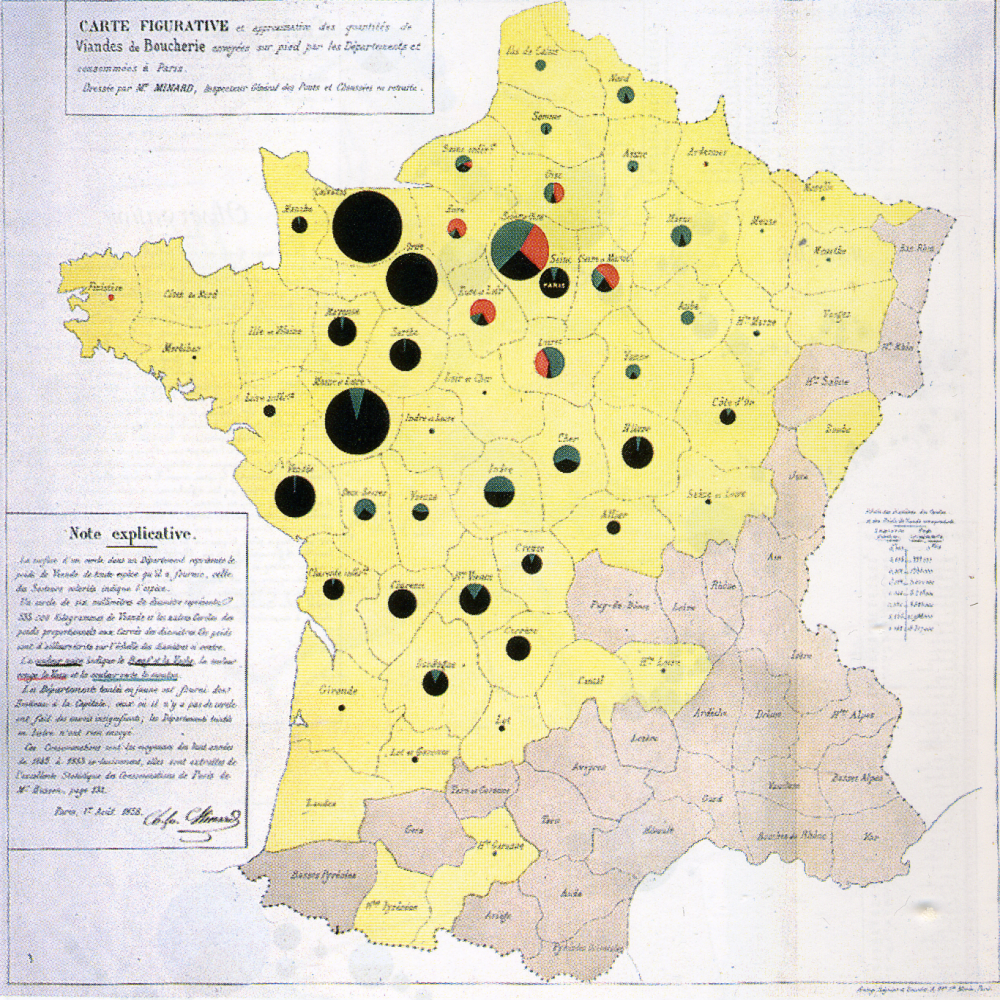
The examples we have explored so far have only visualized two or three variables at once. Occasionally, you may want to visualize more. One possible solution is to design data graphics that can then be incorporated into your map. A classic example of this is the use of pie charts as proportional symbols: an example is shown in Figure 7.5.1 below.
A more recent (and more complicated) example is shown in Figure 7.5.2.
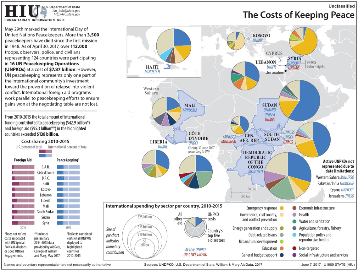
Though the use of overlay glyphs does permit the addition of many variables onto the map, this does not mean it is always the best solution. As shown in the above examples, including a large amount of data in a map can make it challenging to interpret. Additionally, multivariate glyphs in general—and pie charts in particular—have well-documented disadvantages in terms of reader comprehension (Tufte 2001). Adding graphics that are already challenging for people to understand to maps tends to exacerbate such issues. This is not to say that they should never be used, however—just with caution. And fortunately, there are ways in which such maps can be made easier to interpret.
One way that multivariate maps can be made more comprehensible is through the addition of user interaction. Figure 7.5.3, for example, is challenging to interpret as a static image, particularly as the glyphs used are quite small. However, this is an interactive map. Clicking on a state creates a more informative pop-up, shown in Figure 7.5.4.
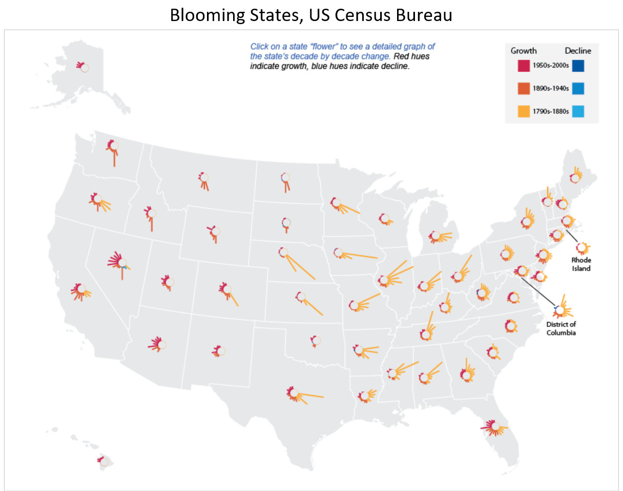
We will discuss the merits and challenges of map interactivity further in Lesson 8.

Student Reflection
Explore the use of multivariate glyphs to explore data about well-being [13]. Can you think of ways in which this data might be symbolized instead as a static map or maps?
Despite the difficulty of creating maps with multivariate glyphs, cartographers have long attempted to tackle this challenge. One particularly interesting example of this is Chernoff faces. Chernoff faces are glyphs created by mapping variables onto facial attributes. When mapping the variable average household income, for example, a bigger smile might indicate a higher income level.
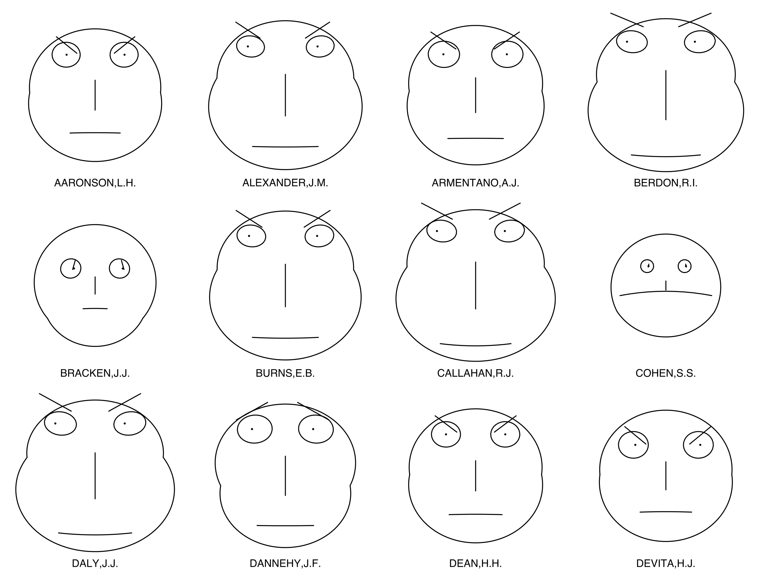
The Chernoff face technique was first proposed by Herman Chernoff in 1973. Chernoff's intention was to capitalize on the ability of humans to intuitively interpret differences in facial characteristics—both by subconsciously noting important differences in expressions that are almost unmeasurable—and by being able to ignore large differences when these differences are not relevant in context (Chernoff 1973). Chernoff also noted that his method was desirable as it permitted the designer to map many variables (as many as 18!) onto just one graphic.
Chernoff’s original application of his technique used fossil and geological data, but Chernoff mapping is more commonly used to depict social data such as well-being, or other topics related to the emotions that might be intuitively encoded using facial attribute variables. The history of Chernoff mapping is rife with controversy—some Chernoff maps such as this one: Life in Los Angeles by Eugene Turner, 1977 [14], have been heavily criticized for their use of stereotypical facial attributes and a cartoonish over-simplification of complex issues.
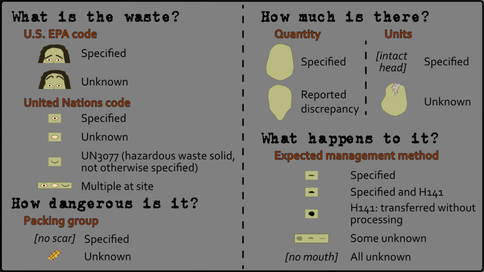
In response to these critiques, some cartographers have developed techniques for utilizing the advantages of Chernoff faces without some of the downsides. Heather Rosenfeld and her colleagues, for example, proposed using Zombieface glyphs rather than human faces—maintaining the emotive content and still capitalizing on people's ability to intuitively interpret facial features, but removing the human context and thus lowering the likelihood of reinforcing harmful stereotypes (Figure 7.5.6).
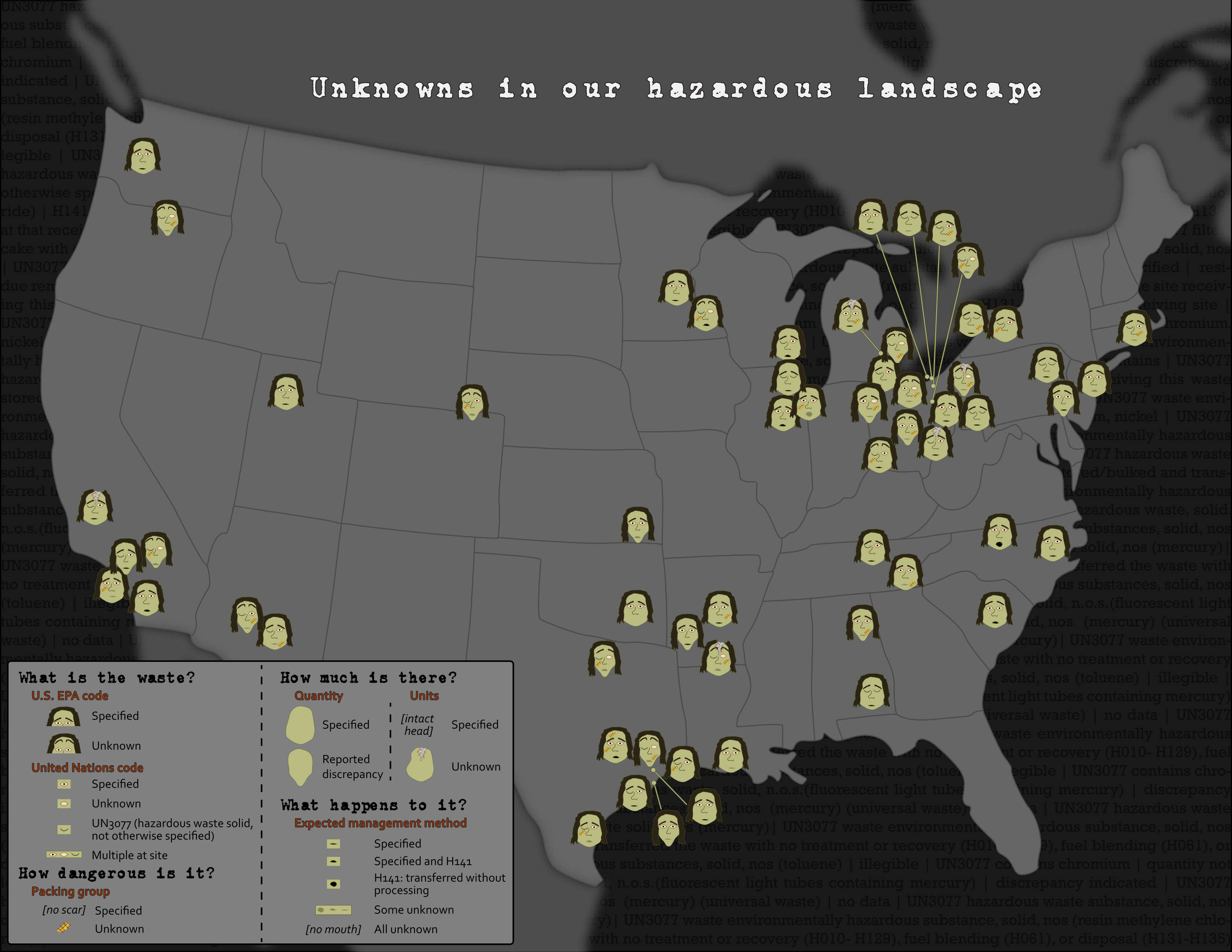
Take a closer look at the legend of this map—which demonstrates how the hazardous waste data was mapped to Zombie facial attributes—in the image below. As you can see, the map focuses on visualizing the presence of unknowns and uncertainty in the mapped dataset. We'll discuss further techniques for visualizing uncertainty later in this lesson.
Chernoff Zombies are among several creative solutions recently proposed: a fun example is shown in the following quasi-Chernoff map: Mapping Happiness [17]. It maps happiness, or well-being, across the United States using emoticons. Though these abstract icons cannot easily encode as many data attributes as Chernoff faces, they share the benefit of visualizing data at-a-glance using facial expressions.
Recommended Reading
Esri Blog: Chernoff Faces [18] by John Nelson.
Comparing vs. Combining
Comparing vs. Combining
As demonstrated by previous examples, multivariate maps are often challenging—both for cartographers to create and for readers to interpret. The term multivariate map is typically defined as a map that displays two or more variables at once (Field 2018). There is another popular option, however—comparing multiple maps. One common and often useful technique is to design a layout with many maps and show them in a progression—this is called small multiple mapping.

Small multiple maps are particularly useful for depicting data over time, as they can be arranged in a linear sequence, the way that time is typically depicted. With the increasing popularity of web-maps, small multiple mapping is often replaced with an animated map—in such maps, each map shown is shown as an individual time-stamped frame. Despite the advantages of animated maps (e.g., creating visual interest, efficient use of layout space), there are still benefits to traditional small multiple mapping. One primary advantage? The ability to simultaneously compare the various maps.
While multivariate maps are often engaging and visually interesting, it is important to keep in mind the alternatives available. We can imagine combing the set of maps in Figure 7.6.1 with some sort of transparent layering, or perhaps with an animated map that alternates between the two views. In this case, however, such designs would likely add little to the presentation value of these maps and be quite challenging to create. Here, simple works well.

Cluster Analysis
Cluster Analysis
So far, we have discussed two ways of mapping multiple variables—combining visual variables to encode multiple variables into one map, and visually comparing sets of maps of different data. There is a third, considerably different method that is often used for mapping multivariate data sets: cluster analysis. Cluster analysis refers to mathematical methods used to combine multiple quantitative variables into one map (Slocum et al. 2009).
There are multiple methods for clustering, the most popular of which is the K-Means algorithm, the goal of which is to identify groups of like observations based on several attributes—groups are assigned in a way that minimizes intra-group differences, while maximizing inter-group differences. Consider, for example, that you are interested in visualizing education, income, and access to green space in the US by county. You could map these three variables individually, or you could use cluster analysis to identify groups of counties that are similar along all three dimensions. Once such groups are determined, you could map them with a qualitative color scheme onto a chorochromatic map.

Cluster analysis is a complicated topic, and we will not go into its details in this course. What is important to understand is that it provides a mathematical alternative to the other more design-based multivariate mapping techniques we have explored so far. You are encouraged to explore the recommended readings if you are interested in learning more about cluster analysis and about implementing it in GIS.
Recommended Reading
ArcGIS Pro Tool Reference: How Multivariate Clustering Works [23]. Esri 2018.
Jain, A. K. 2009. "Data Clustering: 50 years beyond K-Means [24]." Pattern Recognition Letters.
The Visualization of Uncertainty
The Visualization of Uncertainty
Of the many variables you may wish to include in your maps, there is one that has received particular focus from cartographers due to its unique characteristics—uncertainty. Uncertainty is a complex concept which has been defined differently by various authors. For example, Longley et al. (2005) define uncertainty as "the difference between a real geographic phenomenon and the user’s understanding of the geographic phenomenon." We use this definition as it encompasses the many variations of uncertainty that in emerge during multiple stages of map-making—during data collection, data classification, visualization, map-reader interpretation, and more (Kinkeldey and Senaratne, 2018).
It can be assumed that all geographic data contain some level of uncertainty. A map of average income by county, for example, might classify a county as having an average household income between $50,000 and $60,000. Despite this, it is possible that the actual value falls outside of this range—due to survey response errors, non-response to survey (e.g., Census) requests by some residents, or changes in the data over time (e.g., some survey respondents have moved in or out of the county since the data was collected). A map of precipitation levels, similarly, will also contain uncertainty, likely due to the imprecision or inaccuracy of measurement instruments, but possibly due to human error or related factors as well.
Recommended Resource:
A helpful list of terms and definitions related to uncertainty can be found here: Kinkeldey, C., & Senaratne, H. (2018). Representing Uncertainty [25]. The Geographic Information Science & Technology Body of Knowledge (2nd Quarter 2018 Edition), John P. Wilson (ed.). DOI: 10.22224/gistbok/2018.2.3
Traditionally, researchers have grouped geodata uncertainty into three categories – the what (attribute/thematic uncertainty), the where (positional or locational uncertainty), and the when (temporal uncertainty) (MacEachren et al. 2005). The success of visual variables for depicting uncertainty depends on the type of uncertainty to be mapping. Containing a point within a colored glyph or circle, such as Google’s “blue dot,” might be most effective for depicting positional uncertainty (Google Maps; McKenzie et al. 2016). Use of another variable such as transparency might be more effective for depicting attribute uncertainty, such as uncertainty of unemployment rates in a county-level map.
Like other multivariate data, uncertainty can be combined with the other visualized data in a map, or compared by visualizing it in a separate map view. Figure 7.8.1 shows two maps that use different techniques to visualize the uncertainty in the data. Figure 7.8.1 (top) uses a combining technique, in which a visual overlay is used to show attributional uncertainty. Figure 7.8.1 (bottom) uses a reliability diagram—an inset map that the reader can reference to understand which locations on the map contain the most certain data values. In general, the combining method is a more popular technique, though a compare technique might be useful if the primary map is sufficiently complex, and thus adding overlay would make the map difficult to comprehend.

Among combined uncertainty visualization techniques, methods for visualizing uncertainty are typically classified as either intrinsic or extrinsic. Intrinsic uncertainty visualization techniques cannot be visually separated from the visualization of one or more other variables, while extrinsic visualization techniques are easier to interpret separately. An example of the difference between these two techniques is shown in Figure 7.8.2.

In Figure 7.8.2, both extrinsic (top) and intrinsic (bottom) uncertainly visualization techniques are shown. The extrinsic visualization uses a hatched fill overlay to denote uncertain values—thus, the visualization of uncertainty is visually separable from the visualization of the data underneath. Figure 7.8.2 (bottom) by contrast, uses an intrinsic visual variable—transparency—to visualize data uncertainty. The two variables are combined together to create the legend as well.
Any visual variable can be adapted to demonstrate uncertainty. However, some have been developed specifically for this purpose. MacEachren (1995) proposed the idea of clarity as a visual variable for static maps, an overarching concept that can be further divided into three visual variables: transparency, crispness, and resolution (MacEachren 1995). Transparency is a somewhat familiar visual variable, as it has been adapted for other purposes than displaying uncertainty, such as in the value-by-alpha maps described earlier in this lesson.
Crispness is a particularly intuitive way of visualizing uncertainty. Features are depicted on a continuum from crisp to blurry, with less certain values appearing appropriately out-of-focus (Figure 7.8.3).

Resolution creates a similar effect—features with less certain boundaries or attributes are depicted in courser resolution, suggesting a lack of certainty in the map.

These visual variables are popular for depicting uncertainty as they intuitively suggest uncertainty (or certainty) by design. Just as higher data values are visually encoded with larger symbols, less certain boundaries, for example, may be visually encoded with fuzzy boundaries.
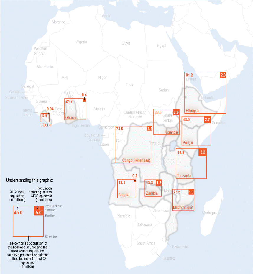
Though uncertainty is often discussed in terms of uncertainty within data due to imprecise instruments, imperfect collection methods, etc., an important additional context where uncertainty plays a role is in the mapping of future scenarios. Climate models, for example, use past and present data to predict future conditions, but these predictions are inherently uncertain. Figure 7.8.5 below contains maps of temperature and precipitation change predictions. The first map (top left) maps the average result of 37 predictive models intended to estimate temperature change by 2050 (Kennedy 2014). The middle map shows the warmest 20% of models—the 20% coldest models are summarized at the right. The bottom three maps show a similar comparison of maps created from precipitation models.

Unlike previous examples, these maps do not use intuitive visual depictions of uncertainty. However, the map-maker's inclusion of all three maps for each data variable shows the range of possibilities that might lie ahead: the future is always an uncertain entity. It is implied that these maps depict not all possible scenarios but a range of likely ones; they intend not to precisely predict the future but to help users understand what might future conditions they might expect to come about.
Recommended Reading
- MacEachren, Alan, Anthony Robinson, Susan Hopper, Steven Gardner, Robert Murray, Mark Gahegan, and Elisabeth Hetzler. 2005. “Visualizing Geospatial Information Uncertainty: What We Know and What We Need to Know” 32 (3): 139–160.
- Slingsby, Aidan, Jason Dykes, and Jo Wood. 2011. “Exploring Uncertainty in Geodemographics with Interactive Graphics.” IEEE Transactions on Visualization and Computer Graphics. doi:10.1109/TVCG.2011.197.
Uncertainty and Decision-Making
Uncertainty and Decision-Making
In the last section, we discussed how to conceptualize uncertainty, and ways in which it can be visualized. One important question remains: why should we do so? Creating well-designed maps can be challenging, and adding a depiction of uncertainty makes this process even more so.
Uncertainty is typically depicted in maps for two primary reasons: (1) its inclusion may be regarded as an ethical necessity—many maps are created with significantly uncertain data, and a cartographer might feel that withholding this information from the map reader would be misleading. (2) Consideration of uncertainty plays an important role in decision-making, and thus its visualization might be necessary in some contexts—for example, maps of predictive hurricane paths tend to include a “cone of uncertainty” (Figure 7.9.1)—and such maps often play an important role in decisions made by residents of storm-affected areas.

So how does the visualization of uncertainty effect decision-making with maps? Kinkeldey et al. (2015) conducted a review of studies that attempted to answer this question. Most of the studies they analyzed suggested that the visualization of uncertainty does have an effect on task performance with maps and similar spatial displays (Kinkeldey et al. 2015). Simpson et al. (2006), for example, studied the use of uncertainty visualization in surgical tasks with graphic displays, and noted that the inclusion of uncertainty visualization improved performance accuracy. The positive influence of uncertainty visualization on task-completion accuracy with maps is a somewhat common finding. Though findings are less consistent with regards to task completion times (i.e., speed), uncertainty visualization seems at least not to significantly increase task-completion times (Kinkeldey et al. 2015).
Despite this, there is still not a consensus concerning whether uncertainty visualization is always helpful for decision-makers—some studies note that participants perceive uncertain data as risky, which can induce irrational decision-making via loss-aversion (Hope and Hunter 2007). Whether uncertainty visualization is useful—and whether it is useful enough to warrant the design efforts it requires—is context dependent and still thoroughly up for debate.
Recommended Reading
- Kinkeldey, Christoph, Alan M. MacEachren, Maria Riveiro, and Jochen Schiewe. 2015. “Evaluating the Effect of Visually Represented Geodata Uncertainty on Decision-Making: Systematic Review, Lessons Learned, and Recommendations.” Cartography and Geographic Information Science 0406 (August 2016). Taylor & Francis: 1–21. doi:10.1080/15230406.2015.1089792.
- Deitrick, Stephanie, and Elizabeth A. Wentz. 2015. “Developing Implicit Uncertainty Visualization Methods Motivated by Theories in Decision Science” 105 (May 2013): 531–551.
Critique #4
Critique #4
For Critique #4, you will be reviewing a colleague's map from Lab 6: Terrain and Trails Visualization. Lab 6 focused on terrain visualization, as well as the symbolization of overlay data to create a map for the imagined Paradise Valley Trail run in San Francisco, California. While completing this critique, you should attempt to view your classmate's map from the perspective of its intended reader - a registered trail runner or one of their supporters. In other words, how successful do you think the map would be, for example, assisting you navigating to the race or determining how best to train or compete in the race?
For this assignment, write a 300+ word critique of your classmate’s Lesson 6 Lab (as assigned).
In your written critique please describe:
- three (3) things you think the map does very well,
- three (3) suggestions you have for improvement.
Your map critique should be constructive and, as suggested above, should focus as much on what the map does well as it does on suggestions for improvement. Due to this lab's specific focus on map audience and purpose, you may find it helpful to reflect upon for whom (e.g., runners vs. spectators) elements of the map's design might be most helpful. You should connect your ideas back to concepts we have discussed in the course content thus far.
Please list the student name of the map you have been assigned at the top of the page.
Grading Criteria
A rubric is posted for your review.
Submission Instructions
You will work on Critique #4 during Lesson 7 and submit it at the end of Lesson 7.
Step 1: Upon notification of the Peer Review (Critique), go to Lesson 6: Lab 6 Assignment. You will see your assignment to peer review. (Note: You will be notified that you have a peer review in the Recent Activity Stream and the To-Do list. Once peer reviews are assigned, you will also be notified via email.)
Step 2: Download/view your classmate's Lab.
Step 3: Write up your critique using the prompts above in a Word document. Be sure to also review the rubric in which you will be graded for Critique #4 for more guidance. Save your Word document as a PDF. Use the naming convention outlined below.
- YourLastName_LastNameOfClassmateReviewed_Critique4.pdf
Step 4: In order to complete the Peer Review/Critique, you must
- Add the PDF as an attachement in the comment sidebar in the assignment.
- Include a comment such as "here is my critique" in the comment area.
- PLEASE DO NOT use the rubric in the lesson assignment to award points or grade the map you are critiquing. Only submit your PDF document.
Step 5: When you're finished, click the Save Comment button. You may need to refresh your browser to see that you've completed the required steps for the peer review.
Note: Again, you will not submit anything for a letter grade or provide comments in the lesson rubric.
Peer Review Canvas Help
Lesson 7 Lab
Lesson 7 Lab
Multivariate Mapping of the World Happiness Report
For this lab, imagine you are the mapping specialist and a member of a new “Happier World 2020” team, tasked with creating a report of maps and supporting text (500+ words) to present to a group of leaders at the United Nations. The total length of the report should be no longer than 7 pages (this page count is inclusive of all text and maps).
Use data from the 2018 World Happiness Report [31] to visualize multiple variables related to world happiness and well-being; these relate to the UN’s Sustainable Development Goals for 2030 [32]. In creating this document, you will gain experience both with creating maps from a multivariate data set and in visualizing data uncertainty. In compiling these maps as a document rather than in a map layout, you will explore a new way to present your maps - one that is common when designing maps to present to policy-makers, or when illustrating a scientific paper.
Lab Objectives
- Create both a primary map and three smaller maps.
- Compile these maps into a neat and useful document with supporting text and good design.
Overall Lab Requirements
For Lab 7, your only deliverable will be a single compiled PDF with text and images of your four maps.
Map Requirements
Primary Map
- Map a focus variable of these provided happiness indicators: Life ladder, Social support, Freedom, Generosity, and Perceptions of corruption.
- Create a world map visualizing your chosen indicator and associated uncertainty – your primary map's focus variable must have an associated standard error measure.
- Non-survey indicators (GDP and Life Expectancy) are not accompanied by a standard error value in the World Happiness Report. You can use these variables for some of your small multiple maps if you choose, but not for your primary map.
- Variables may be mapped as raw values or calculated into ordinal values to be mapped (e.g., rankings, percentile, or high-medium-low). You choose how to best visualize your data.
- Null values (i.e., countries not included in the World Happiness Report) should be mapped, but not prominent in the map’s visual hierarchy.
- Thoughtfully select an appropriate symbolization method, projection, and visual variables for your map.
Small Multiples
- Create 3 smaller maps to visualize additional happiness/well-being indicators.
- If you would like, you may choose a large region (e.g., Latin and South America, Europe) to focus on—this region should still visualize many countries (so do not choose North America, Australia, etc.)
Compiled document requirements
Export your main map and three smaller maps as images (or use the Snipping tool) and include them as figures in a report with accompanying text. As when creating a map layout, attend to aesthetics, visual hierarchy, and negative space.
- Use concise explanatory text for legends, titles, and any additional map text.
- Define any non-obvious terms, such as the “life ladder” in your report. Definitions of all indicators are included at the bottom of this page in the "Happiness Indicator Definitions" section, and more information is available in the 2018 World Happiness Report [31].
- In your report (500+ words), focus on answering the following questions:
- Why did you choose to map the happiness indicators that you did?
- What do the maps you created tell us?
- Where (or how), based on conclusions drawn from your maps, do you think funding ought to be directed, and why? What role should knowledge of data uncertainty play in these decisions?
- Download the Lab 7 zipped file [33]. It contains:
- A project (.aprx) file to be opened in ArcGIS Pro.
- A database that includes the data needed to start this lab.
- Data source: World Happiness Report (Helliwell et al. 2018), Natural Earth.
- Extract the zipped folder, and double-click the blue (.aprx) file to open ArcGIS Pro.
- All the data you will need to complete this lab has already been downloaded to the included geodatabase.
- Compile your maps into a Word document with accompanying text to be saved as a PDF.
- You may start with this template: Report Template: Lab 7 [34] and customize it as you wish.
Grading Criteria
A rubric is posted for your review.
Submission Instructions
- Submit one PDF—save your Word document report as a PDF file in Word. Please use the naming convention outlined here: Map Report: LastName_Lab7.pdf
- Submit the PDF to Lesson 7 Lab.
Need Guidance?
Please refer to the Lesson 7 Lab Visual Guide.
Happiness Indicator Definitions
You can learn more about these indicators in the World Happiness Report [31], but this will help you get started as you decide what indicators to map and what ideas you might propose in your report.
The Life (Cantril) Ladder asks people to imagine a ladder with steps from 0 to 10 (the top), where the top of the ladder is their best possible life, and the bottom is the worst—and to place their life at the present at some point on the ladder.
GDP per capita is calculated in terms of Purchasing Power Parity (PPP) in 2011 international dollars as indicated by the World Bank.
Healthy life expectancy is calculated based on data from the World Health Organization (WHO) and WDI. WHO data is based on estimates from 2012.
Social support is the national average of responses (0 or 1) to the question “If you were in trouble, do you have relatives or friends you can count on to help you whenever you need them, or not?” This question is part of the Gallup World Poll (GWP).
Freedom is calculated as the national average of responses to the question “Are you satisfied or dissatisfied with your freedom to choose what you do with your life?” This question is part of the Gallup World Poll (GWP).
Generosity is calculated as the residual of regressing the national average of answers to: “Have you donated money to a charity in the past month?” on GDP per capita. This question is part of the Gallup World Poll (GWP).
Perceptions of corruption is calculated as the average of answers to two questions: “Is corruption widespread throughout the government or not?” and “Is corruption widespread within businesses or not?” Perception of business corruption is used as a proxy for a total corruption measure in countries where responses to questions of government corruption are not available. These questions are part of the Gallup World Poll (GWP).
Helliwell, J., Layard, R., & Sachs, J. (2018). World Happiness Report 2018, New York: Sustainable Development Solutions Network.
Lesson 7 Lab Visual Guide
Lesson 7 Lab Visual Guide
Lesson 7 Lab Visual Guide Index
- Starting File
- Explore the Happiness Data
- Create Your Primary Map
- Add Visual Depiction of Uncertainty
- Create Small Multiple Maps and Final Document
- Additional Tips
Credit for all screenshots is to Cary Anderson, Penn State University; Data Source: World Happiness Report (Helliwell et al. 2018), Natural Earth.
-
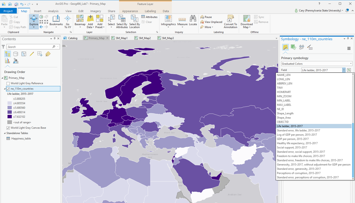
Starting File
This is your starting file in ArcGIS Pro: It contains boundary data from Natural Earth, as well as thematic data from the World Happiness Report [35].
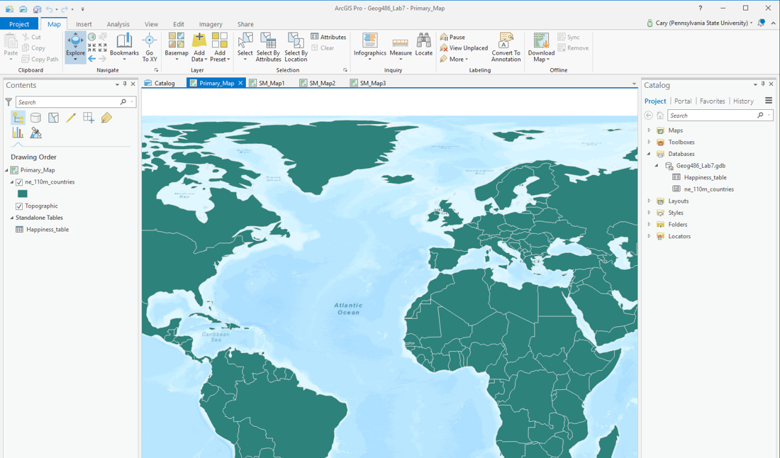 Visual Guide Figure 7.1. Lab 7 starting file in ArcGIS Pro.
 -
Explore the Happiness Data
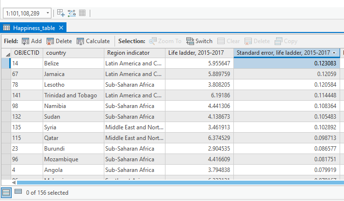
As suggested above, the purpose of this lab is to visualize data from the World Happiness Report. You should explore this data in ArcGIS Pro (Figure 7.2), and view the World Happiness Report [35] online to get a sense of what the data means. Definitions for each happiness indicator variable are also listed at the bottom of the Lab 7 requirements page.
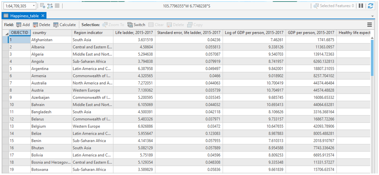 Visual Guide Figure 7.2. The World Happiness data table as viewed in ArcGIS Pro.
 -
Create Your Primary Map
Your first task is to choose a happiness variable of interest and to map this as your primary map for the lab. For this map, you must select one of the variables with an associated "Standard Error" column. We will be using this as a proxy for uncertainty (more on that later).
You may choose from among several thematic mapping options (choropleth; graduated symbol; proportional symbol, etc.) to map your happiness data. This survey data is a bit more abstract than the data we have become accustomed to working with, so for this lab, you have a bit more freedom than usual in selecting a mapping method. Shown below are some examples of symbolization methods that you might use for your primary map.
 Visual Guide Figure 7.3. Example symbolization method - Choropleth.
The data provided to you for this lab has already been standardized for you, so you will not need to choose a "normalization" field.
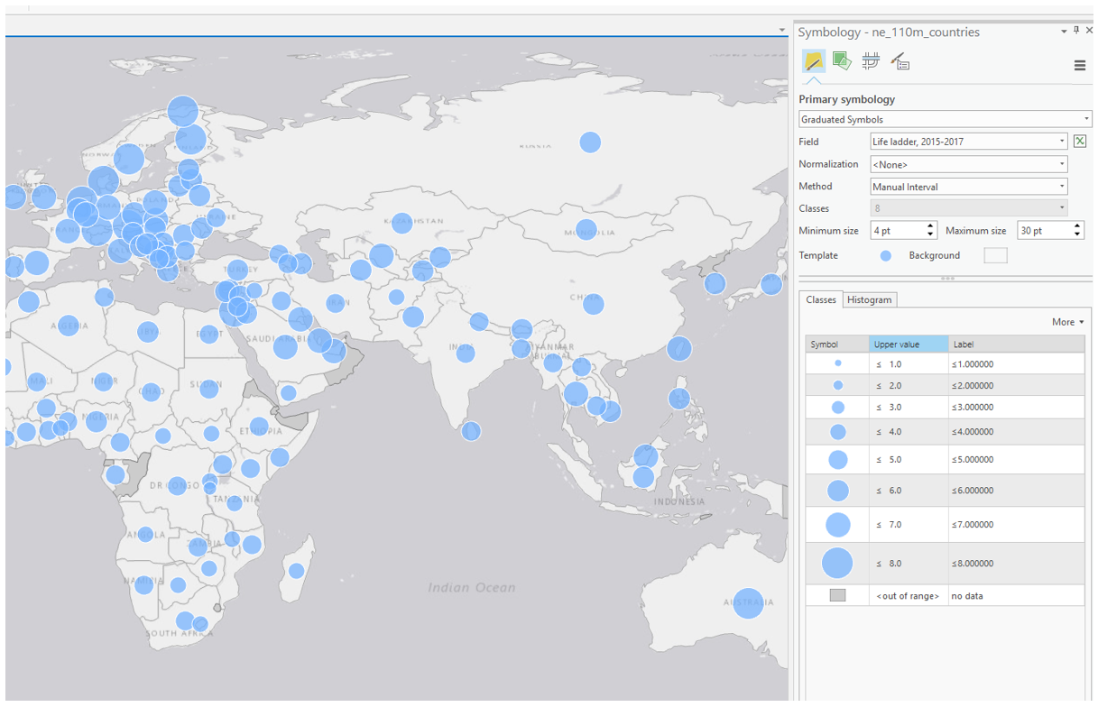 Visual Guide Figure 7.4. Example symbolization method - Graduated Symbols.
When designing your map symbols, recall previous labs and focus on creating a useful and aesthetically-pleasing design. If using proportional symbols, for example, you will likely want them to be semi-transparent so that both symbols can be seen in the case of overlap.
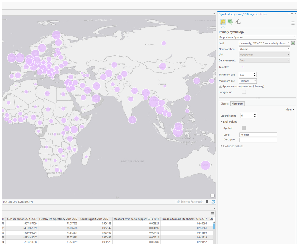 Visual Guide Figure 7.5. Example symbolization method - Proportional Symbols.
As you might notice, not every country is included in the World Happiness Report. Due to this, an important element of your map design will be deciding how to visualize null values. You want it to be clear to the map reader which countries are not included in the report, but you do not want these to be too prominent in your map's visual hierarchy - they should not distract from your map's main purpose. As shown below, symbolizing null or "out of range" values is a slightly different process depending on which symbolization method you choose.
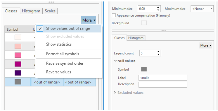 Visual Guide Figure 7.6. Visualizing null values in ArcGIS Pro. Choropleth maps (left), Proportional Symbol maps (right).
 -
Add Visual Depiction of Uncertainty
Your primary map should visualize not only the happiness indicator you have selected, but also its associated uncertainty. For this lab, you will use your chosen variable's associated "standard error" field as a proxy for uncertainty. Assume that higher standard error = higher uncertainty. Though the statistics involved are slightly more complicated than this, the focus of this lab is on visualization and thus this generous assumption is suitable for our purposes. Additionally, as we are interested in where the data is more or less certain, rather than in the actual standard error values, you should classify this uncertainty data into general groupings (e.g., "low," "medium," "high").
 Visual Guide Figure 7.7. Happiness data uncertainty - highlighted here is the standard error column for the happiness variable life ladder.
You may choose to visualize uncertainty either extrinsically or intrinsically. When selecting a method, consider how you will represent this uncertainty in your map's legend, as well as how your design might be interpreted by your map's intended audience. This guide presents two popular methods for visualizing uncertainty, though there may be others.
Option #1: Extrinsic uncertainty visualization
The easiest way to create an extrinsic uncertainty visualization layer is to copy-and-paste your country-boundary layer (which includes all the happiness data), and to symbolize uncertainty with the duplicate layer.
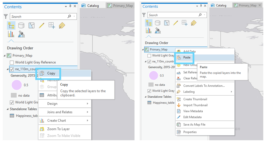 Visual Guide Figure 7.8. Copying and pasting a layer in the ArcGIS Pro contents pane.
Two examples of extrinsic uncertainty visualization are shown in Figure 7.9. Recall from the lesson content the visual variables most effective for visualizing uncertainty. Your goal should be to create an intuitive design.
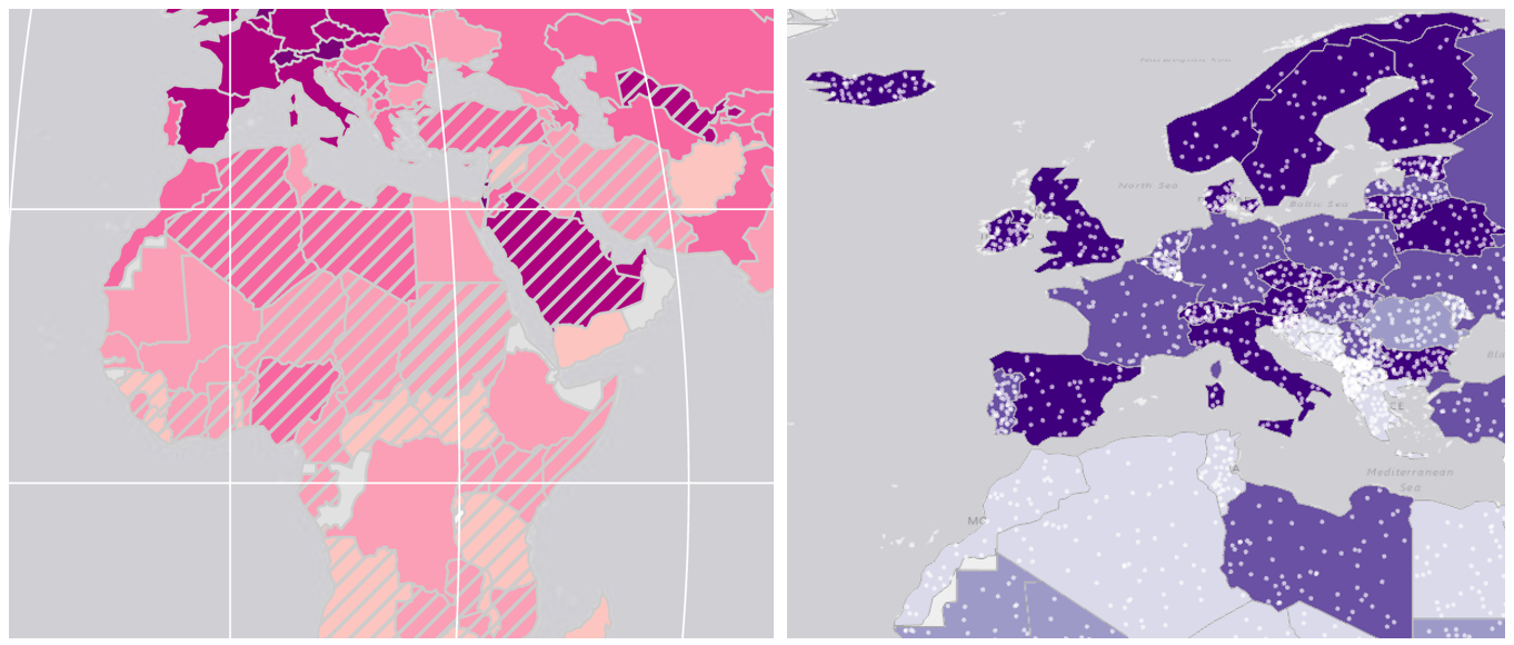 Visual Guide Figure 7.9. Examples of extrinsic uncertainty visualization. Overlay data is used to obscure less-certain values.
Once you've finished creating your map and adding it to a layout, you'll need to design an import part of this lab - your map legend. Figure 7.10 below contains some examples of legend designs. More so than with previous labs, you will likely want to make significant edits to your legends via the "convert to graphics" function in ArcGIS Pro.
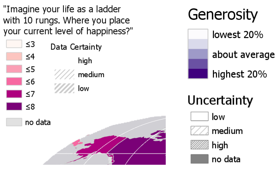 Visual Guide Figure 7.10. Example multivariate map legend designs.
Option #2: Intrinsic uncertainty visualization.
The other primary option for visualizing uncertainty in your map is intrinsically, via the "vary symbology by attribute" option in ArcGIS Pro. Think carefully about how you apply elements like transparency—the progression of your data should match the visual progression of your design. To accurately depict your data and its uncertainty, you may have to manually edit or reverse a color scheme or transparency range.
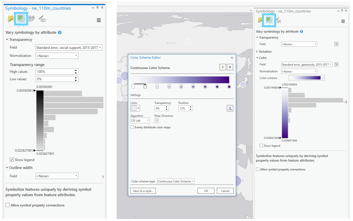 Visual Guide Figure 7.11. Varying symbology by attribute in ArcGIS Pro.
 -
Create Small Multiple Maps and Final Document
Once you've finished your primary map, you will create three smaller maps. These maps should visualize three additional variables from the World Happiness Report. You do not need to visualize uncertainty in these smaller maps. For this lab's final deliverable, you will include your four maps in a report that focuses on answering the following questions:
- Why did you choose to map the happiness indicators that you did?
- What do the maps you created tell us?
- Where (or how), based on conclusions drawn from your maps, do you think funding ought to be directed, and why? What role should knowledge of data uncertainty play in these decisions?
You may start with this template: Report Template: Lab 7 [36] and customize it as you wish. You do not need to include additional research from sources outside of the World Happiness Report, though you may if you wish.
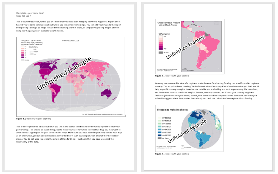 Visual Guide Figure 7.12. A preview of the document template.
 -
Additional Tips
Remember design ideas from previous labs - you may want to add elements such as a grid, explanatory text, and data credits to your layouts. It's up to you how you balance your final document with such elements - for example, instead of listing a data source on your map images, you can simply include this source in the text you write. Also, note that due to the scale of these maps you do not need a north arrow or scale bar - focus on creating a useful and cohesive document, as well as smartly-designed legends.
Summary and Final Tasks
Summary and Final Tasks
Summary
You’ve reached the end of Lesson 7! In this lesson, we explored the concept of multivariate mapping, wherein multiple data attributes are visualized in one map. We discussed the many ways in which cartographers visualize complex data, including with multivariate choropleths, cartograms, cluster analysis, and multivariate glyphs. In the case of a particular additional variable—uncertainty—we discussed intrinsic vs. extrinsic uncertainty depiction, as well as usefully intuitive visual variables such as crispness and resolution.
In Lab 7, we compiled a document with a set of maps intended to influence a group of decision-makers at the United Nations. In doing so, we explored the challenge of mapping multivariate data (and used the compare small-multiples technique), as well as adequately visualizing uncertainty. In this course, we have often made multiple maps in one lab—this assignment provides an example of how such maps might be combined with text in a practical and important mapping task. In Lab 8, we take on a less serious topic—creating an interactive basemap inspired by a favorite work of art.
Reminder - Complete all of the Lesson 7 tasks!
You have reached the end of Lesson 7! Double-check the to-do list on the Lesson 7 Overview page [37] to make sure you have completed all of the activities listed there before you begin Lesson 8.