Lesson 2: Lettering and Layouts
Overview
Overview
Welcome to Lesson 2! In the previous lesson, we learned the basics of map and map symbol design, and created some general purpose maps in ArcGIS Pro. This week, we're going to focus on what we left out of those maps - most notably, place labels and marginal map elements (e.g., scale bars, north arrows, etc.). We'll discuss typography and the art of text-based elements: you'll learn how to classify and select appropriate fonts, and how to apply this knowledge when creating place labels for maps. Then, we'll focus on another important topic in cartography: the design of a map layout. You'll build and customize a map legend, and practice designing with appropriate visual hierarchy and balanced negative space.
In this week's lab, we'll be working from the maps we designed last lesson. That way, you'll be able to focus on applying the new topics we have learned, rather than starting from the beginning. By the end of this lesson, you will have learned how to create a complete, well-designed general purpose map from open source data. In addition to that being an achievement in itself, these general skills will prepare you for creating more specific, topic-driven thematic maps in labs to come.
Learning Outcomes
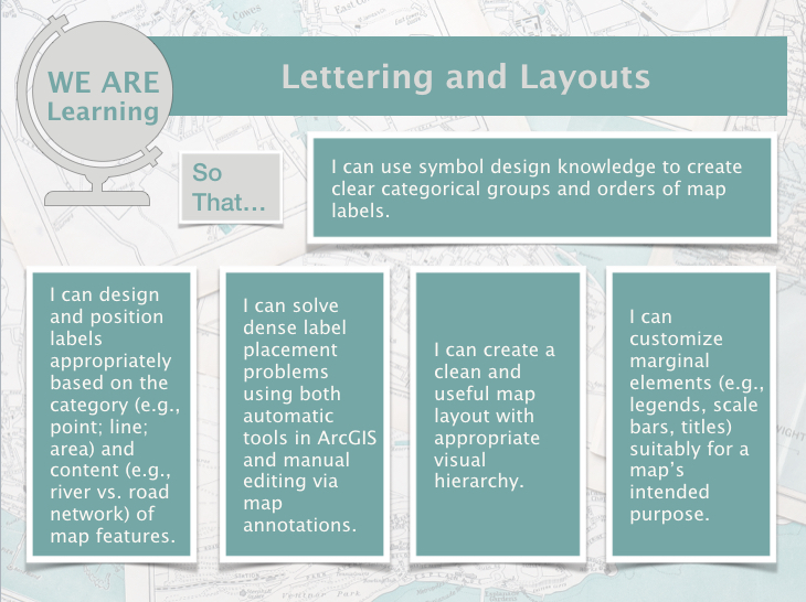
By the end of this lesson, you should be able to:
- use symbol design knowledge to create clear categorical groups and orders of map labels;
- design and position labels appropriately based on the category (e.g., point; line; area) and content (e.g., river vs. road network) of map features;
- solve dense label placement problems using automatic tools in ArcGIS Pro;
- create a clean and useful map layout with appropriate visual hierarchy;
- customize marginal elements (e.g., legends, scale bars, titles) suitably for a map’s intended purpose.
Lesson Roadmap
|
Action |
Assignment | Directions |
|---|---|---|
| To Read |
In addition to reading all of the required materials here on the course website, before you begin working through this lesson, please read the following required readings:
Additional (recommended) readings are clearly noted throughout the lesson and can be pursued as your time and interest allows. |
The required reading material is available in the Lesson 2 module. |
| To Do |
|
|
Questions?
If you have questions, please feel free to post them to Lesson 2 Discussion Forum. While you are there, feel free to post your own responses if you, too, are able to help a classmate.
Text on Maps
Text on Maps
When you think of maps, you likely don’t think much about text. In Lesson One, we defined graphicacy—the skill needed to interpret that which cannot be communicated by text or numbers alone—as distinct from literacy (Balchin and Coleman 1966). Despite this, map graphics are often augmented with text, either on the map itself (as in map labels), or in the margins (titles, legends, etc.) Thus, text plays an important role in map design.
View the map in Figure 2.1.1 below—can you immediately tell what is missing? Can you still recognize the location?
As shown above, good label design often employs different colors, font styles, sizing, and more. Map labels play an important role in mapping—not only by labeling symbols, but also by serving as symbols themselves. In this lesson, we’ll learn about the many design effects that can be used to make appropriate text symbols and aesthetically pleasing designs.
Text on maps, as seen in Figure 2.1.1 above, often refers to place names. The study of geographic names is its own subject of study. A commission within the International Cartographic Association (ICA) is dedicated to toponomy, or the study of the use, history, and meaning of place names. If this interests you, you can learn more about toponomy and the ICA on the ICA website [1].
Particularly in thematic mapping, text is employed not just to identify places, but to explain data. In Figure 2.1.3 below, text is used in the making of map legends, scale bars, and so on. Despite this map’s careful color and layout design, without text—it would be unusable.
Student Reflection
Place naming is often a contentious and complicated task. Can you think of a place that is referred to differently by those who live there than by those who do not? How do these different names influence the identity of this place?
Recommended Reading
Rose-Redwood, Reuben S. 2008. “From Number to Name: Symbolic Capital, Places of Memory and the Politics of Street Renaming in New York City.” Social and Cultural Geography 9 (4): 431–452. doi:10.1080/14649360802032702.
Typographic Design
Typographic Design
“The choices of fonts for uses can be seen as related to the personality of the fonts. The Script/Funny fonts scored high on Youthful, Casual, Attractive, and Elegant traits which are all related to Children’s Documents and artistic elements. The Serif and Sans Serif fonts were seen as more stable, practical, mature, and formal; the uses they are appropriate for fit these characteristics.” (Shaikh, Chaparro, and Fox 2006)
“Make it easy to read.” – Roger Black
There are many elements to consider when designing text for maps. As a cartographer, you want your text to be clearly legible against the map background, be appropriate for the features you are labeling, and match the overall aesthetics of your map.
As you start designing labels, it is best to learn a bit about typographic design.
A typeface is a design applied to text that gives letters a certain style. An example of a typeface is Arial. Many typefaces contain multiple fonts, so typefaces are sometimes called font families. For example, the Arial font family contains several fonts, including Arial Black and Arial Narrow (Silverant 2016). Though it is technically incorrect to do so, the words typeface and font are often used interchangeably. It is less important to understand this nuance than to understand how to apply fonts in practice.
Classifying Fonts
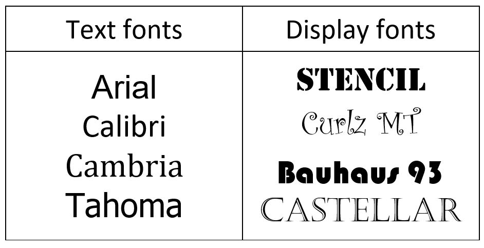
Fonts can be classified in several ways. For example, as text fonts vs. display fonts (Figure 2.2.1).
Text fonts are designed to be simple and legible: examples include Arial, Calibri, Cambria, and Tahoma. Display fonts are decorative fonts like Stencil, Curlz MT, Bauhaus 93, and Castellar. These fonts are often used in branding and for advertisements. Use these fonts with caution, and sparingly on maps. They are perhaps appropriate for a map title, but for little else (Brewer 2015).
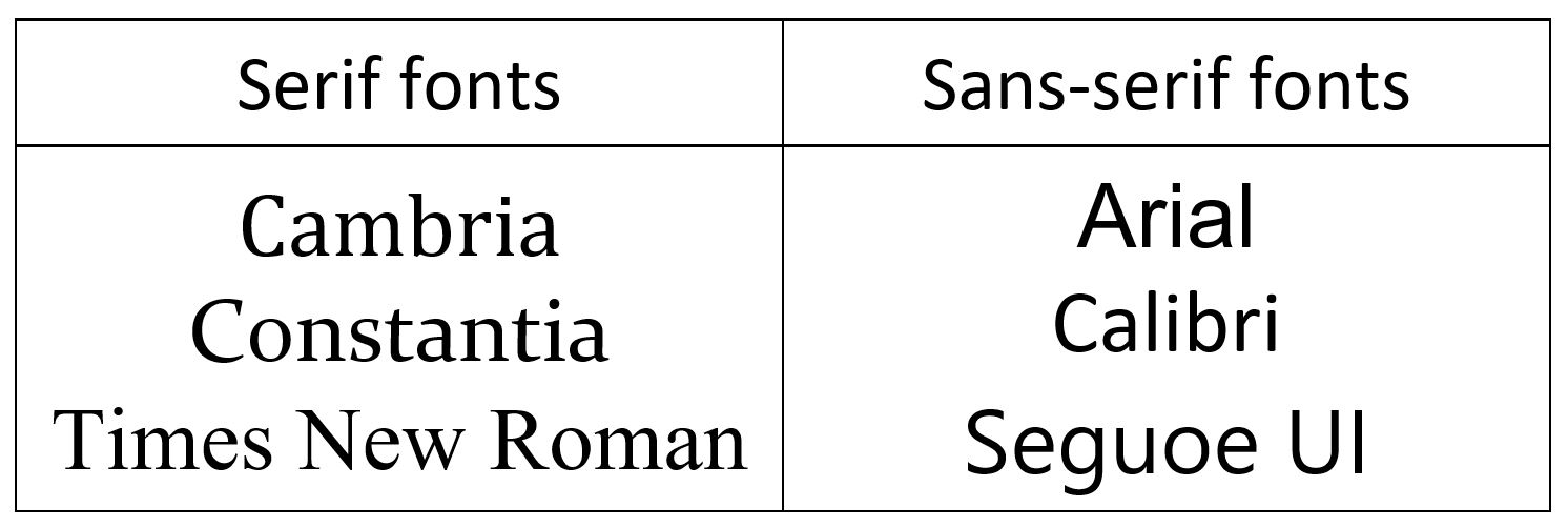
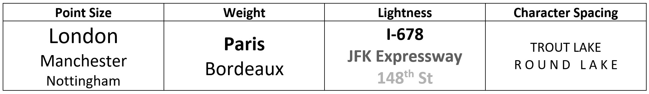
Possibly the most common way to classify fonts is as serif or sans-serif (Figure 2.2.2). Serifs are small strokes added to the end of some letters in a font, such as in the widely-recognized font Times New Roman. Sans-serif fonts do not contain these small strokes. Sans-serif fonts as sometimes viewed as informal, modern, and best suited to digital formats; serifs are often described as best for formal print production. These general guidelines, however, are less important than the specific context in which you use a font. In map design, pairing a serif and a sans-serif together in a map often works best.
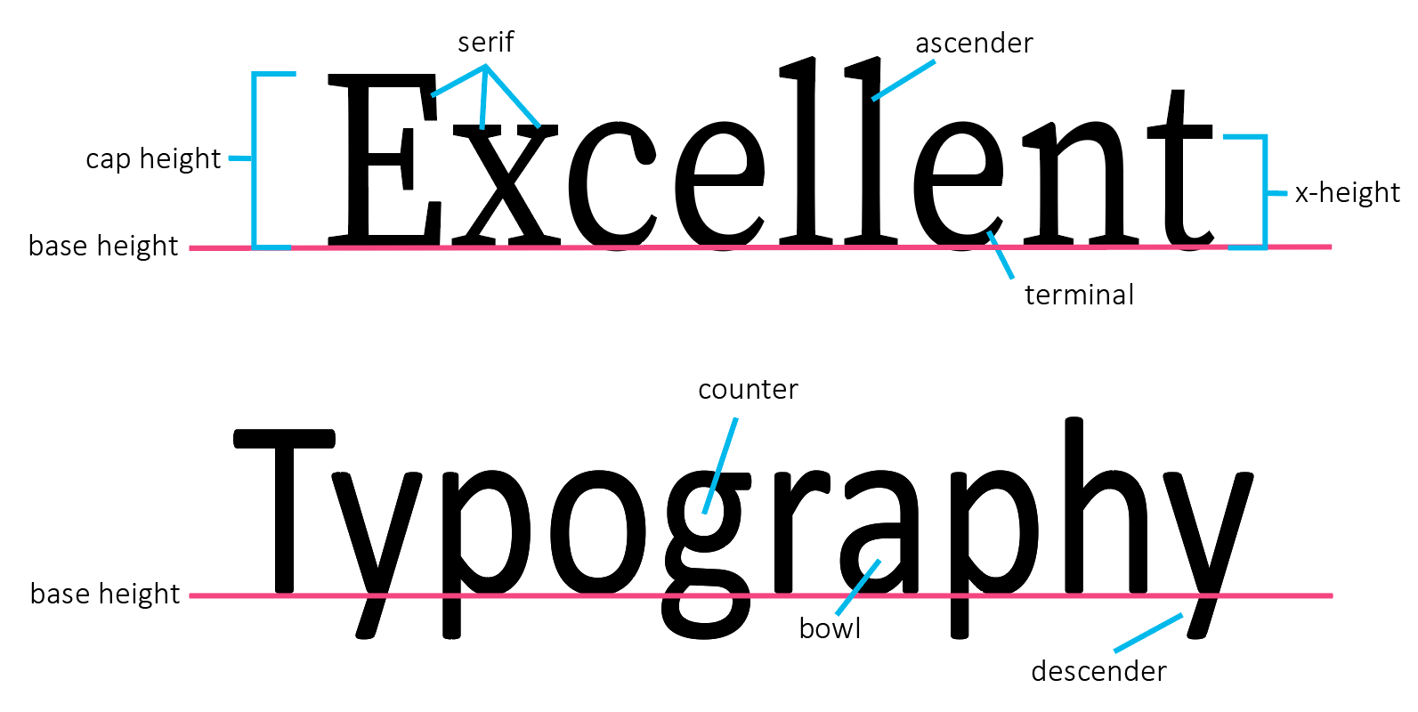
Though the presence or absence of serifs may be one of the most obvious characteristics of a font, there are many design factors that influence a font's style. Figure 2.2.3 below illustrates many of the different components of type design. Changes to these elements create the difference between different font styles.
Student Reflection
Browse the web—or your closet—looking for logos and similar advertisements that employ text as part of their branding design. How does the style of a font change your perception of that brand or item? Do you notice any that work particularly well? Why is this?
There are a wide number of web resources available for learning more about typography—some are linked in the recommended reading section of this lesson topic. Much of this advice, developed for graphic designers, journalists, and others, will also apply to text design for maps. In Designing Better Maps, Cynthia Brewer (2015) outlines several features of fonts that make them particularly useful for cartographers. You should keep these in mind when selecting fonts for your maps.
1. A large font family (i.e., the availability of many fonts within a single typeface):
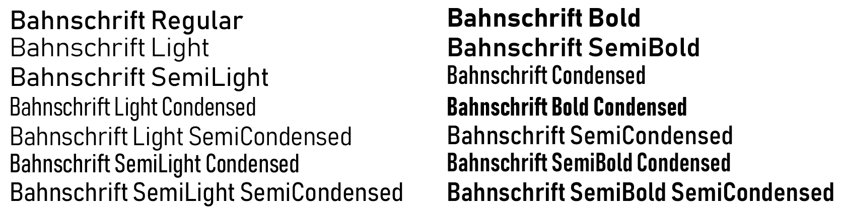
As shown in Figure 2.2.4, some typefaces contain many font variations. This can be very useful for map labeling, as it permits the cartographer to create distinct labels for different types of features while maintaining a consistent look and feel throughout the map.
2. Italic as a separately installed font:
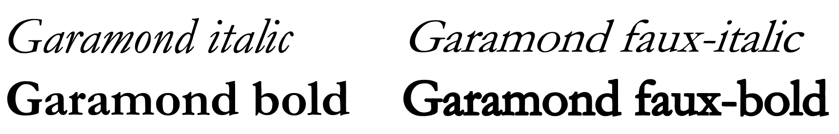
You are likely quite familiar with the use of bolding and/or italics to create distinct font styles. A distinction of note, however, is shown in Figure 2.2.5—the difference between an italic and bold font, and bold and italics as applied afterword by a word processing program such as Microsoft Word. Though applied italics and bolding (Figure 2.2.5; right) will work in a pinch, bold and italic fonts designed as a separate font style (Figure 2.2.5; left) take specific characteristics of the typeface into careful account when applying these styles, typically resulting in improved aesthetics and legibility.
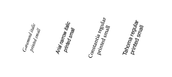
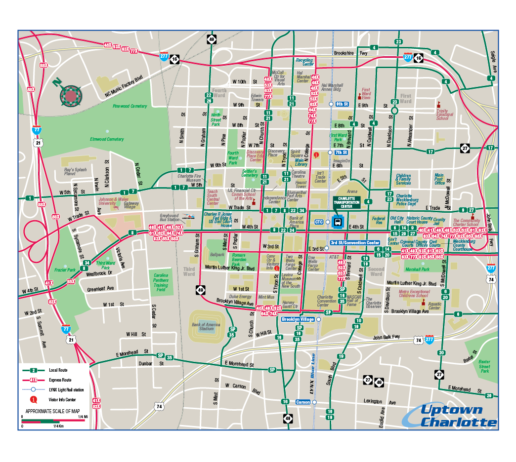
3. Text that is readable at small point sizes and at angles:
Unlike when writing a paper, where most of your text is horizontal and of similar size, the variability of text sizes and angles on a map presents and additional challenge to cartographers. As you will likely use a font in many different instances on your map, a good font choice is one that remains legible when angled and printed small or viewed from a large distance.
4. A large x-height:
X-height has a simple definition – the height of a lowercase x.

A small x-height results in greater distinction between different letters, which is helpful when reading a block of text. When creating labels for maps, however, a large x-height is typically preferred, it results in fonts that are easier to read when printed small on a page.
5. Distinction between a capital i, lowercase L, and number 1:
This one is self-explanatory, though it may not always be possible (e.g., when using most sans serif fonts). Legibility is improved when the reader can tell immediately whether a letter is an uppercase i, lowercase L, or a number 1. The same goes for distinguishing between a zero and an uppercase O. Though typically a zero is shown as a thinner ellipsoid, in some fonts this difference is more distinct than in others.
In addition to selecting proper fonts, there are many design details that can be applied to improve your map labels. These include text color, halos, and shadows, as well as changes to character spacing and sizing.
A halo is often helpful, particularly against busy backgrounds, for helping text display over the background of a map. Halos are distinct from outlines, as they are placed behind text—and they are typically a better choice for legibility, as they do not interfere at all with the text itself (Figure 2.2.8).

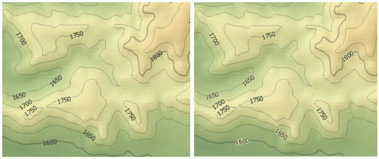
Halos are not always as pronounced as the one shown in Figure 2.2.8. Choosing a halo that blends in with the background color of the map creates a subtle look that doesn’t call attention to the halo, but still sets the text legibly apart from any lines that may cross beneath it. See Figure 2.2.9 below – a subdued yellow-green halo blends into most of the background but prevents contour lines from obscuring the legibility of the interval numbers.
Many text effects are available in ArcGIS, and in graphic design software such as Adobe Illustrator. Experiment with text effects when designing your maps, and don’t be afraid to move beyond default settings to create more engaging, legible, and attractive maps.
Recommended Reading
- Lupton, Ellen. 2009. “Thinking with Type [3].”
- Cousins, Carrie. 2018. “Serif vs. Sans Serif Fonts: Is One Really Better Than the Other? [4]” Design Shack.
- Silverant, Martin. 2016. “What’s the Difference Between a Font and a Typeface? [5]” Mental Floss.
- Magalhães, Ricardo. 2017. “To Choose the Right Typeface, Look at Its x-Height. [6]” Prototypr.Io.
- Chapter 5: Type Basics. Brewer, Cynthia A. 2015. Designing Better Maps: A Guide for GIS Users. Second. Redlands: Esri Press.
Creating Symbols with Labels
Creating Symbols with Labels
We learned about visual variables in Lesson One and applied those ideas to create general purpose maps. For example, you might have used different line weights to create hierarchies of road features, or different hues and/or patterns to differentiate between types of waterbodies. In this lesson, we apply these same ideas to text.
Student Reflection
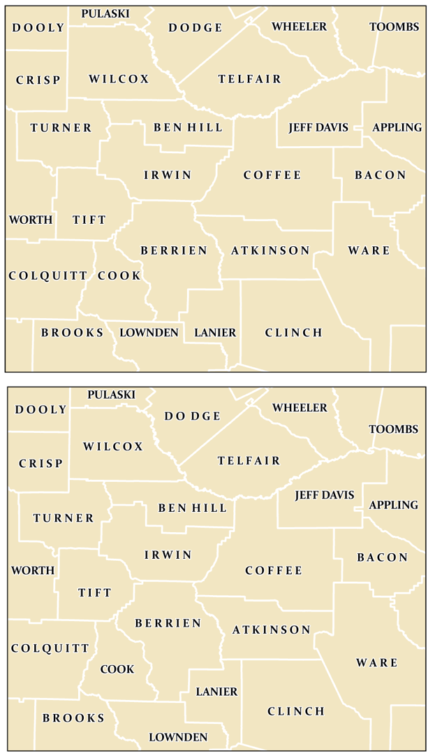
Look at the labels on the map in Figure 2.3.1. Which show categorical differences from others? Which show order differences? Which show both?
When designing labels to show order (e.g., population size, (road) speed limit), choose text characteristics that demonstrate differing levels of importance, such as those shown in Figure 2.3.2.
When designing labels to demonstrate category, choose text characteristics that demonstrate difference, but not importance or order (Figure 2.3.3).
As with symbol design, it may often be prudent to use both types of characteristics together—creating labels that show both order and category. When designing labels, be cautious to attend to the aesthetics of your map, and avoid over cluttered or overcomplicated design. It often looks messy to use more than two fonts on a map, so try to stick to two: as noted previously, pairing a serif and a sans-serif font that look good together often does the trick.
Recommended Reading
Chapter 6: Labels as Symbols. Brewer, Cynthia A. 2015. Designing Better Maps: A Guide for GIS Users. Second. Redlands: Esri Press.
Label Placement
Label Placement
Ideal label placements are always context dependent—many factors, such as the density of map features or character length of place names, will determine the best way to place your labels. Even so, it is helpful to understand best-practice guidelines for placing labels on maps. In this section, we will learn how best to place map labels for point, line, and area (polygon) features. As a cartographer, you will apply these guidelines using both automatic labeling procedures in GIS software and though the manual editing of graphic text.
Point labels
When placing point labels, two factors are of primary importance: (1) legibility, and (2) association. You don’t want your reader to struggle to read your map labels, and it should always be clear to which point each label refers.
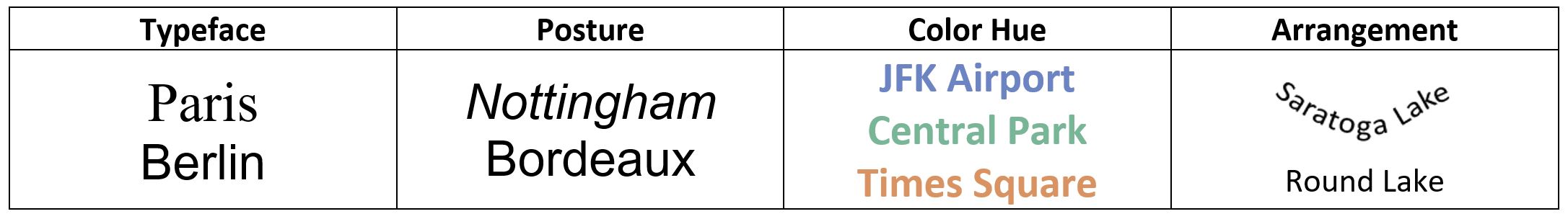
The first guideline to remember is that adding point labels is not like making a bulleted list—your labels should be shifted up or down from their associated point feature. An example ordered ranking of label placements for point feature labels is shown in Figure 2.4.1.
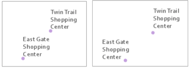
Though the placement ranking guidelines in Figure 2.4.1 provide a good starting point, it is notable that cartographers do not always agree on this specific order. If you are a very astute reader, you may notice that these recommendations vary slightly from the point label placement guidelines given by Field (2018) in this week's required reading. Cartography is not only a science but an art, and sometimes there is more than one right answer. Additionally, while such guidelines are helpful, label placement is a continuous balancing act. Figure 2.4.2 (left) shows two labeled points, both placed at the ideal label position shown in Figure 2.4.1. This arrangement of point labels, however, makes it seem ambiguous to which point “East Gate Shopping Center” refers. In Figure 2.4.2 (right), this label is moved to the second position. The ambiguity disappears.
In addition to the orientation of point labels, you will also need to decide how closely to place them to your point features. In the left image, labels are placed very close to points, while on the right, labels are placed at a greater distance from their associated point symbols. Though map elements that appear too tightly packed are generally undesirable, how closely your labels and points are placed will depend on the size, shape, and density of your labels, points, and map. Most important is maintaining consistency throughout your map design.
Another important consideration is when and where you will apply line breaks to the text on your map. When it fits on the map, showing the entire label on one line (Figure 2.4.3; left) is appropriate. However, due to the density of map features and length of feature names, this is often not possible.

When line breaks are used, place them at natural breaks in the feature name. For example, Mission Hills Country Club looks strange as Mission/Hills Country/Club (Figure 2.4.3; middle) but natural as Mission Hills/Country Club (Figure 2.4.3; right). You should also use spacing between lines that is smaller than the spacing between other labels on the map, clearly demonstrating that these lines of text belong together.
Point labeling is further complicated when labeling multiple types of point features. Your goal should be again to avoid ambiguity—labels should help demonstrate feature categories. As shown in Figure 2.4.4, it is best to label land features on land, and coastal features in water.
Label design is about the details, and often very small changes to label placements can really improve the readability of your map. Figure 2.4.5 below shows how a couple of small edits were used to improve a set map labels. From left to right, line spacing within the “Shawnee Nieman Center” label was decreased to -2 pts., and then the "Nieman Plaza label" was shifted to the left.
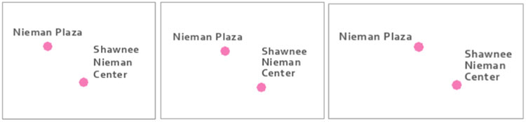
Note that though counterintuitive, the use of -2 line spacing, or leading, does not create overlapping lines. Negative leading is generally recommended for multi-line labels—too much space between lines makes them look disjointed, which may cause map readers to incorrectly perceive them as separate labels (referring to separate features).
Line Labels
When labeling line features, similar guidelines as for point labeling exist—design for association, but not at the expense of legibility. Labels should generally follow line features—but not cross over perpendicular lines—as this makes the text harder to read. In some instances, this advice will not be practical, but it is best to first learn the rules so you can more thoughtfully break them.
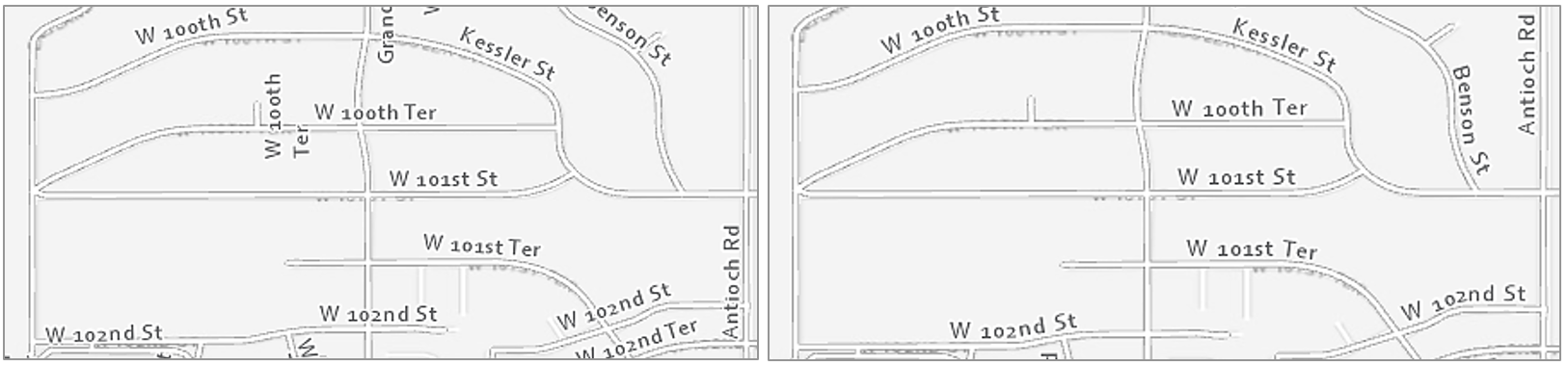
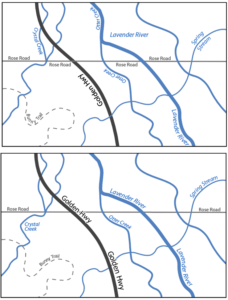
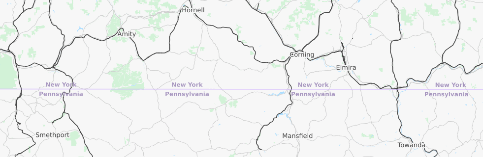
Figure 2.4.6 shows two maps with labeled streets; the right-sided image is a definite improvement. Unlike in the left map, labels in the right map are aligned with streets and do not cross other lines. Labels in the right map are also better aligned for the eye to understand the naming conventions of the neighborhood: see W 100th Ter, W 101st St, and W 101st Ter, from North to South (maps are North-up). It is much easier to understand this progression in the right map. This sort of line placement is also useful when labeling contour lines, which have an even more important orderly progression.
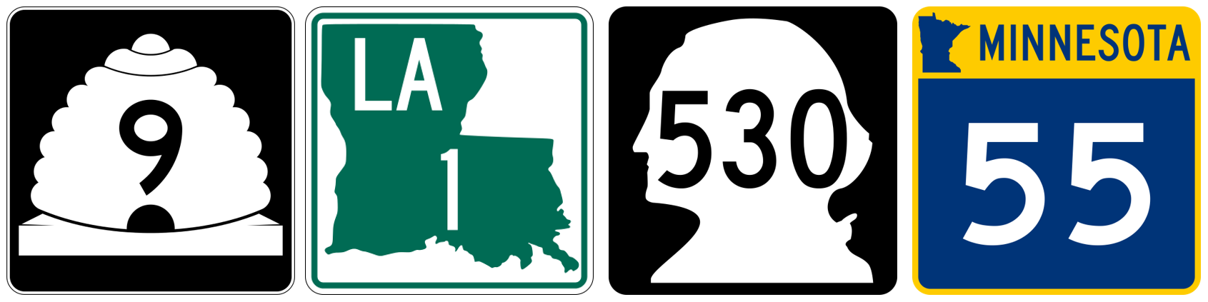
In lieu of map labels, shields are often used to label highways and other important roads. Though interstate shields in the US are consistent, many states have unique highway shield designs. Using these custom shields in your maps is not always practical, but it can give them local character, and create a better match between the map and the real world.
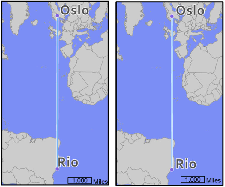
Similar but additional guidelines exist for labeling non-road line features, such as flowlines. Streams, rivers, and other waterlines should be labeled with text that shows their categorical difference from road features. This is often done with italics (text posture), and/or by using a hue that matches the feature symbol. Figure 2.4.7 shows several examples of labels applied to the stream “Little Cedar Creek”. The label in the map at the left is legible but does not follow the flow of the creek—it looks rigid, as if it is a road label. In the middle map, the label does follow the creek, but this time too much so—it is difficult to read. The label placement in the far-right map is best—a gentle curve makes it clear that this label refers to a water feature, but not at the expense of legibility.
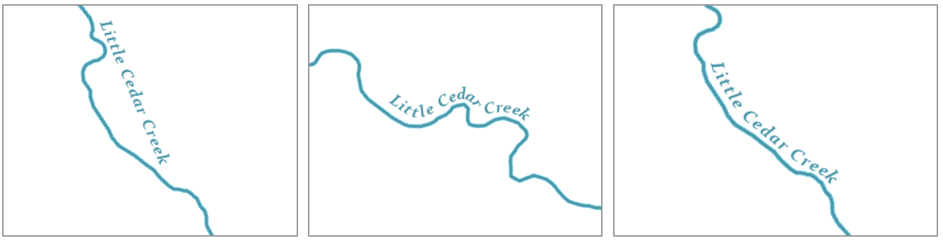
Figure 2.4.9 contains additional examples of line label improvements. Three general guidelines are demonstrated by this figure: (1) follow the feature, but not at the expense of legibility, (2) place labels above lines rather than below, (3) don’t write upside down.
If a line feature is quite long, the label will need to be repeated periodically. The interval at which your line labels repeat is up to you as the map designer and will depend on the map’s feature density, audience, presentation medium, and purpose.
Area labels
Just as rivers are labeled with curves to follow the flow of water, area features should be labeled in a way that highlights their most characteristic feature: extent. Labels for natural features such as water bodies and mountain ranges should demonstrate their physical extent across the landscape. Use UPPERCASE letters and stretch the label across the area of the feature.
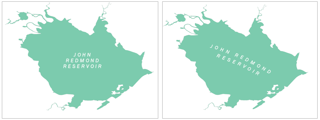
When covering areal extent with labels, focus on finding a balance between character spacing and size. Increasing spacing is generally best—recall that increased font size suggests increased importance. To cover the extent of a feature, however, you may want to increase font sizing somewhat—too distant spacing with a small font size is likely to be challenging to read.
A common mistake to avoid is aligning area labels horizontally across the map frame. Though horizontal alignment is helpful when reading large blocks of text, this design is off-putting when viewed on a map (Figure 2.4.11; top). Stagger area labels for increased legibility (Figure 2.4.11; bottom).
Like regular line feature (e.g., roads, rivers) labeling, avoid labeling across boundary lines when prudent. When labels must cross over map lines, ensure that this does not compromise their legibility, nor overly obscure the feature underneath.
In some instances, particularly for political boundaries, it makes more sense to label the boundary of a feature, rather than its extent. You have likely seen this implemented in maps for navigation, or other interactive basemaps (Figure 2.4.12).
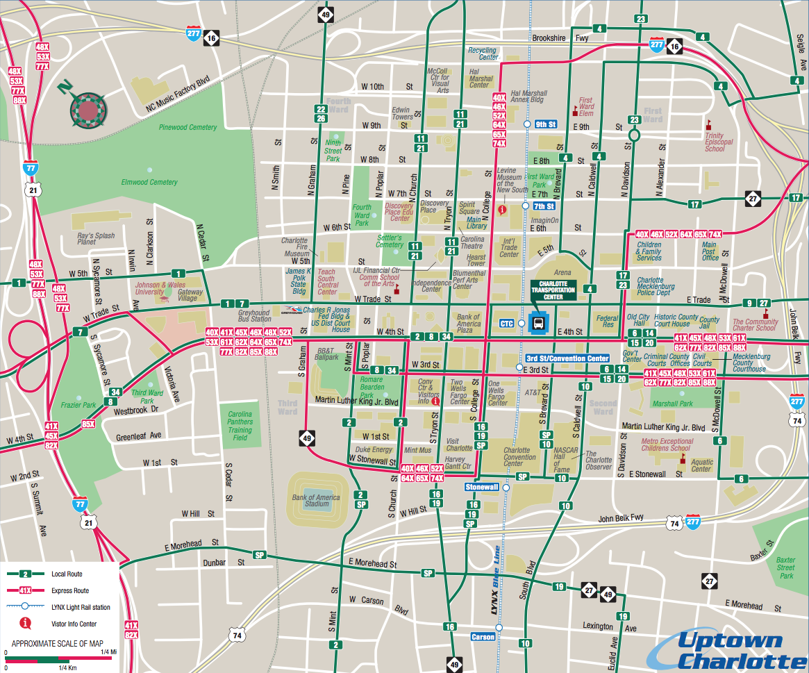
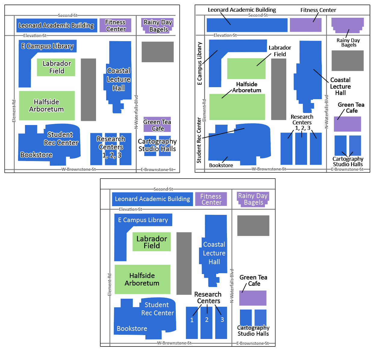
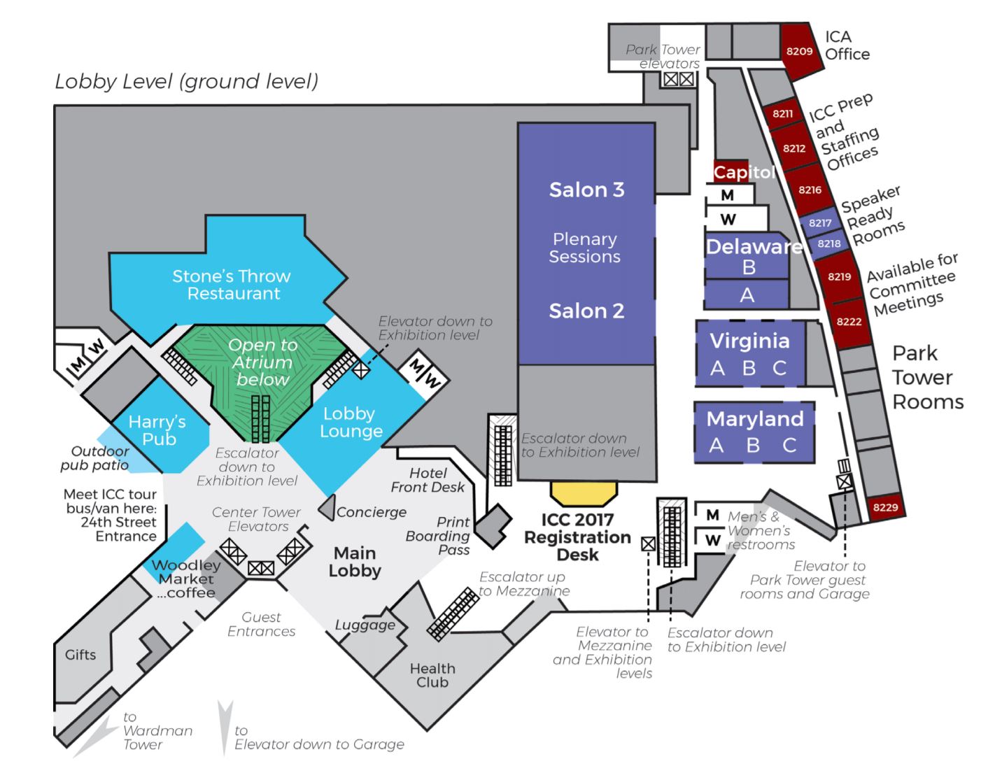
When labeling maps, you will often encounter locations with a lot of features in need of labels; this can pose a significant challenge. Leader lines can be used to connect features with labels that do not fit on or directly adjacent to their respective feature on the map. However, you should not overuse text halos, as these can obscure the map features underneath (Figure 2.4.13; top left). Nor should you overuse leader lines (as shown in Figure 2.4.13; top right)—this leads to a visually confusing map. Instead, find a balance between these techniques; experiment with label hue contrast and use leader lines sparingly. With practice, you will be able to create a well-balanced set of labels, such as shown in Figure 2.4.13 (bottom).
Further improved cartographic design is shown in Figure 2.4.14. This map shows how text color contrast, sizing, and occasional use of leader lines can create a balanced, legible, and aesthetically pleasing map design—even in a complicated map with many labels.
In summary: when creating a map feature label, balance different techniques, and continually ask yourself two over-arching questions: (1) Is the label clearly associated—both in style and positioning—with the feature being labeled? (2) Can I read it?
Recommended Reading
- Imhof, Eduard. 1975. “Positioning Names on Maps.” The American Cartographer 2: 128–144.
- Chapter 6: Labeling Maps. Brewer, Cynthia A. 2015. Designing Better Maps: A Guide for GIS Users. Second. Redlands: Esri Press.
- Placing type (pgs. 346-350): Field, Kenneth. 2018. Cartography. Esri Press.
- Axis Maps. 2017. “Labeling and Text Hierarchy in Cartography [11].” Cartography Guide.
Layout Essentials
Layout Essentials
“Design is as much an act of spacing as it is an act of marking.” – Ellen Lupton, Thinking with Type
When designing a map layout, it is important to design using visual hierarchy—arrangement of graphic elements in a way that signifies their order.
The following map elements are listed by (Slocum et al., 2009) in their general order of importance:
- Frameline and neat line
- Mapped Area
- Inset (e.g., locator map)
- Title and Subtitle
- Legend
- Metadata (Author, Date when map was made, Data Source, Data Source Year)
- Scale
- Orientation (e.g., a north arrow)
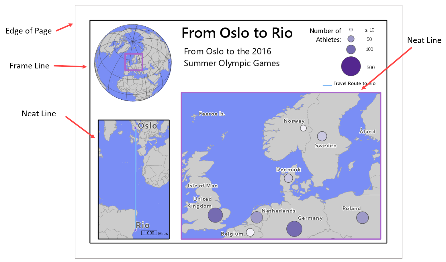
Frameline
Most of these elements are intuitively named, but the difference between a map’s frameline and neat line can be confusing. A frame line encloses all elements on the map layout, while a neat line crops the map area. A graphic explanation is shown in Figure 2.5.1. A frame line might also act as a neat line if all elements (e.g., legend, title) are shown within the map area (Slocum et al., 2009).
Organizing Space
It is typically efficient to place the most important features first, as they will take up the most space on the page. Be cautious, however, not to just start adding items wherever there are holes in the layout—good design is about balancing white space, which does not mean just filling it in. Often, the best way to find a good layout arrangement is to try many different arrangements and note what works. There will never be just one correct way to arrange all map elements.
Important Reading!
The graphics and explanations in Designing Better Maps are exceedingly helpful for developing an understanding of layout balance and design. This would be a good time to complete the required reading for this week.
When placing elements on the page, be cautious to leave enough space between them. For example, Figure 2.5.2 below shows how adding just a bit of negative space can result in a cleaner, clearer map design.
Another important component of layout design is the intentional reduction of ambiguity. For example, if your layout includes multiple maps (e.g., a primary and a locator map), and multiple scale bars, it should be clear which scale bar is associated with which map.
Using boxes (e.g., boxed legends) will often seem like an easy solution, but you should use these sparingly, as they tend to create crowding and making aligning map elements more challenging. As you finish designing your layout, ensure that all elements are visually aligned. See the recommended reading below, as well as the required reading for this week, for additional detail and images of proper layout alignment and design.
Recommended Reading
Chapter 11: Map Elements and Typography. Slocum, Terry A., Robert B. McMaster, Fritz C. Kessler, and Hugh H. Howard. 2009. Thematic Cartography and Geovisualization. Edited by Keith C. Clarke. 3rd ed. Upper Saddle River, NJ: Pearson Prentice Hall.
Building a Legend
Building a Legend
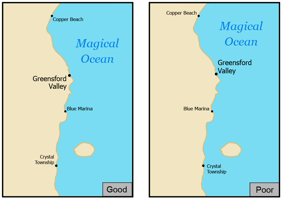
The part of your map layout that will likely require the most thought—except of course, for your map itself—is your map's legend. A map legend is a key composed of graphics and text that explains the meaning of any non-obvious map symbols. This non-obvious component is important to remember. Consider the general purpose map in Figure 2.6.1 below:
The legend isn’t incorrect, but it doesn’t help explain the map’s already clear design. Did you need a legend to understand that the blue features were water? Every element in your layout takes up precious space—there is no need to waste it explaining symbols that your readers will understand without it.
The same principle applies when adding text to your legend, such as a legend title. Legend titles should be used to add context and explain your map. Don’t title your legend “legend”—your reader will know it is a legend. If there’s no better title then "legend", it doesn’t need a title at all.
If your map does require a legend, use the same care to design it as you do with map symbols and labels. Be cautious of the way you create column breaks or other visual groups in your legend design. People tend to perceive groups of things as related - use this to your advantage in your legend design.
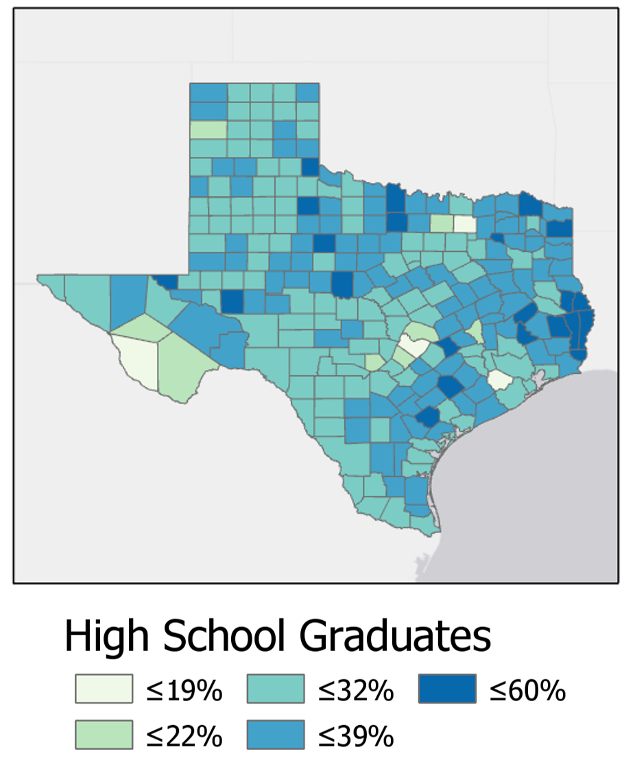
Figures 2.6.2 below shows a choropleth map with an accompanying legend. Though the legend accurately prints the map colors and their matching data values, the splitting of legend items across three columns breaks up the list in a way that may be confusing to the reader.
Below in Figure 2.6.3, the legend design has been much improved. A single column creates an easy visual representation of the color scheme for the reader.
For some legends, you will want not to eliminate column groupings, but to re-position or even create them. In Figure 2.6.4 below, inappropriate column groupings lead to ambiguity regarding the classification of some symbols. Are trails part of transportation, or are they their own category? What about streams? This legend leaves too much up to the reader to interpret.
Figure 2.6.5 shows an improved version of this legend. Note that the different shape of the legend container means that it will need to be placed differently on the page—this highlights the importance of experimenting with layout arrangements throughout the design process.
Note that the examples in 2.6.4 and 2.6.5 contradict the previous statement that obvious symbols like "lake" can be left off the legend. We will slightly relax this "only non-obvious features" guideline in order to practice creating well-designed legends, and due to the presumption that some of our symbol designs may stray far enough from cartographic convention to be nonintuitive to map readers.
Recommended Reading
Chapter 3: Explaining Maps. Brewer, Cynthia A. 2015. Designing Better Maps: A Guide for GIS Users. Second. Redlands: Esri Press.
Marginalia Design
Marginalia Design
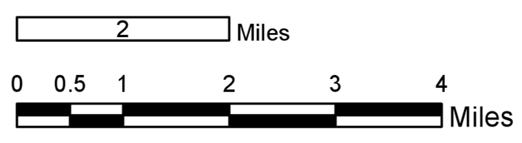
In addition to a legend, your maps will often contain other supporting graphic elements such as a scale bar and north arrow. Similar principles apply—you should make your design as simple as possible while still supporting the reader’s understanding of the map. Commercial GIS software such as ArcGIS permits you to easily add accurate scale bars to your map. These will automatically match your map’s scale, and dynamically update if you re-scale your map within your layout. When it comes to visual design, however—be wary of GIS defaults. You will typically have to make manual simplifications to these elements, scale bars in particular.
Figure 2.7.1 shows examples of default scale bar designs inserted into a map layout in ArcGIS, alongside illustrations of their appearance after manual adjustment.
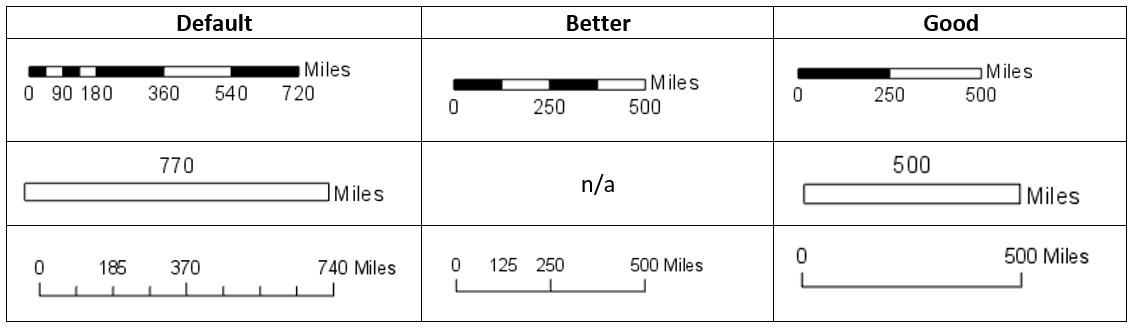
Like making a legend, the first question you should ask yourself before designing a north arrow for your map is: do you need it? Depending on the map projection you use, the direction which points north may not be consistent across your map—in this case, a background grid may be more appropriate. Most maps do use a north arrow, however, and if you do use one, similar conventions to scale bar design exist. Aim to make your design as simple as possible without sacrificing comprehensibility.
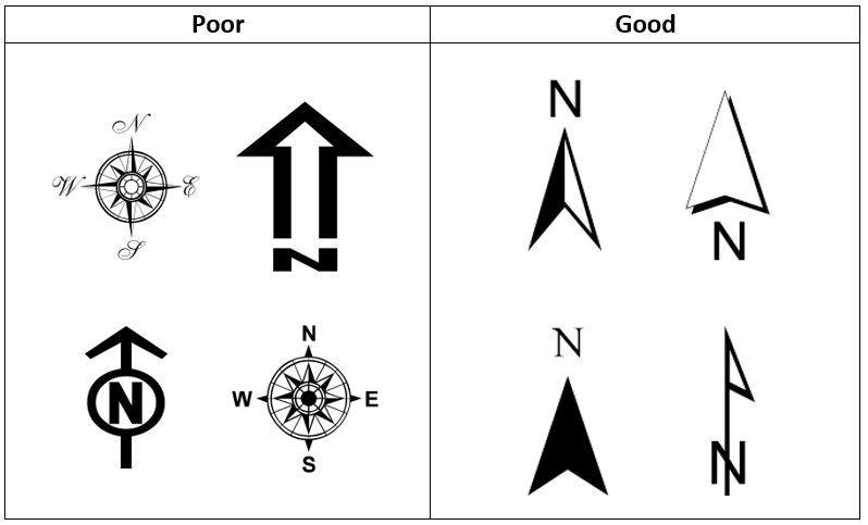
Student Reflection
View the two scale bars in Figure 2.7.3. In general, as described in Figure 2.7.1, the top scale bar is considered better design. Can you think of a map for which the scale bar at the bottom would be more suitable? Why would it be?
Lesson 2 Lab
Lesson 2 Lab
Lettering and Layouts
This week, we'll revise and combine our two maps from Lab 1 into one neat, well-designed layout with labels, a legend, and marginal map elements (e.g., scale bars, north arrow). You'll get to build off your hard work from last week and apply new knowledge from this week: typographic design, label symbology, and layout design.
This lab, which you will submit at the end of Lesson 2, will be reviewed/critiqued by one of your classmates as part of Lesson 3. Receiving critique of your work and using this to inform future cartographic design decisions is an important skill to develop. Giving feedback to others also often teaches you new ways of looking at your own and others’ map designs.
Lab Objectives
- Create appropriate labels for map features using Maplex automated labeling tools in ArcGIS Pro.
- Apply labels to your maps from Lab 1, designing to show both category and hierarchy.
- Apply what you learned about multi-scale map design in Lab 1 by creating both a main map frame and an accompanying locator map.
- Use visual hierarchy when designing symbols, labels, a legend, and a layout.
Overall Lab Requirements
For Lab 2, you will create one complete map layout, with a main and a locator map.
- Modify your maps from Lab 1 to create new maps—you will need to make significant changes for them to work at the new scales; you may start over from the beginning if you wish.
- The best approach is likely to design your main map first, then create a copy of this map which you will modify/generalize/redesign as appropriate for the smaller (1: 1,000,000) inset map scale.
- Use these approximate scales: 1:40,000 for the main map, 1: 1,000,000 for the locator map.
- Design over ArcGIS Pro’s light gray canvas basemap—the same basemap we used in Lab 1 but please turn off the Esri basemap before submitting your lesson.
- Use color hue as you wish—be cautious not to overuse it. There is no restriction on color use for this lab.
Map Requirements
Labeling Requirements
- Coordinate label appearance with feature symbol design.
- Create label types with style settings; use SQL queries create specific feature label classes.
- Remove all nonsensical labels, using SQL queries and other methods of feature removal.
- Use expressions to augment at least one category of labels with additional text and/or combine data attributes.
- Use label placement conventions for line and area features.
Map One: Primary Map (1:40,000)
- Examine your map and develop at least four or more label categories based on the map feature classes (e.g., Highways, Lakes, Streams, Boundaries, etc.). You can use other names for your label categories.
- Within each label category, create one or more label classes. The label classes should demonstrate a hierarchy to a label category (e.g., interstate, collector road, local road, etc.).
- Create at least eight different label classes in total. You will likely have more label classes in some label categories than others.
- For this lab, a map feature class is considered different if defined differently in the data (e.g., local and collector roads have different TNMFRC codes; lakes and reservoirs have different FTypes). Note that while some map feature classes have a different FType, for instance, this difference doesn't necessarily mean that those features need to have unique label designs (e.g., what is the practical difference between a lake and reservoir on your map?). You do not need to create a unique label class for every map feature class, just the eight in total as described above. Some of the geographic areas in LA, for example, don't have a tunnel.
Map Two: Locator Map (1: 1,000,000)
- The locator map should be placed on the same layout as the main map.
- Label prominent map features as needed at this scale.
- Remember that this inset map is needed to provide locational context for people unfamiliar with the location you are mapping—design features and labels accordingly. Also, be judicious in how much information you show on your locator map.
Layout requirements
- Create two frames at different scales (main map and locator map). The main map should be larger in size than the inset map.
- Create appropriate marginal elements:
- a north arrow for the locator map (confirm north is up in both map frames);
- two scale bars; use clean design and label with sensible numbers;
- a legend; design its style, placement, and descriptive text;
- a hierarchy of marginal text (e.g., title, subtitle, data source, your name, legend text, legend title) – not necessarily in this order.
- Create a balanced page layout (either portrait or landscape). Attend to negative space.
Lab Instructions
- Open your project from Lab 1 and re-save with a new name (e.g., "Geog486_Lab2").
- If desired, you may re-download the zipped folder from Lesson 1 Lab and start the new map design from scratch.
- Start designing!
- As in Lab 1, there are few steps that must be completed in order - map design is not a linear process. You are encouraged to reference the visual guide for additional instructions and guidance. If you have a question, comment, or suggestion, please post it to the Lesson 2 Discussion forum.
Grading Criteria
A rubric is posted for your review.
Submission Instructions
- Submit one PDF—all elements must be included on one 8.5 x 11 page. Use the naming convention outlined below. You do not need to include a written statement or explanation with this lab assignment.
- Map Layout: LastName_Lab2.pdf
- Submit the PDF to Lesson 2 Lab for instructor and peer review. (Note: The critique/peer review will occur in Lesson 3.)
Ready to Begin?
More instructions are provided in Lesson 2 Lab Visual Guide.
Lesson 2 Lab Visual Guide
Lesson 2 Lab Visual Guide
Lesson 2 Lab Visual Guide Index
Part I: Labeling
- Starting file
- Finding names in your data
- Adding labels to your map
- Editing label classes
- Designing label symbols
- Positioning label symbols
- Creating label expressions
Part II: Layouts
- Putting it all together
- Build your layout
- Add marginal elements
- Create a legend
- Final tips and tricks
Part I: Labeling
-
Starting file
Start this lab by opening your project file from Lab 1. Use “Save As” to create a new project for Lab 2. After this, you'll be ready to add labels!
 Visual Guide Figure 2.1. Opening and saving your Lab 1 as a second file.
 -
Finding names in your data
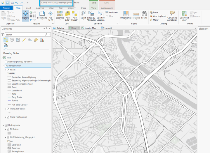
We do not have to write our own labels for map features - they're already in our data - we just need to make them visible. Map features often contain multiple fields (data columns) with possible names, so we need to identify the best ones to use. To do this, open the attribute table for the layer you want to label. We can see the Full_Street_Name field seems like a good option to start with for this layer.
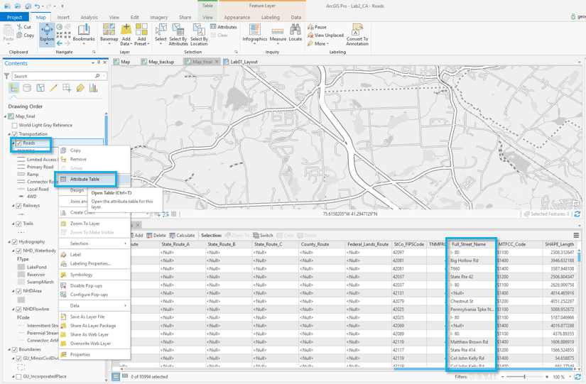 Visual Guide Figure 2.2. Searching the Roads attribute table for an appropriate field to use for naming.
 -
Adding labels to your map
To turn on labels for a layer, right-click the layer and toggle labeling on. To edit the labels, open Labeling Properties as shown below. This will open the Label Class pane. In this pane, the expression box shows how your labels are being drawn from a field in the attribute table. In some cases, ArcGIS will correctly identify the best field to use for labels. In other cases, it will not, and you will have to alter the expression manually. We will use Full_Street_Name, the field we identified earlier.
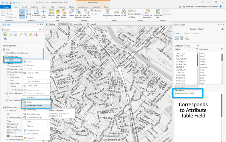 Visual Guide Figure 2.3. Opening and editing labeling properties.
 -
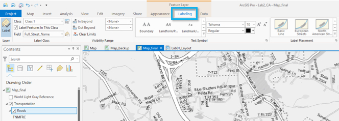
Editing label classes
Begin editing the style of your labels&nbwith the Labeling menu in the ribbon shown below. The default label symbols available are good starting points - they will help give you an idea of how to best design your own labels.
 Visual Guide Figure 2.4. The labeling menu in the ribbon.
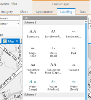 Visual Guide Figure 2.5. The Gallery of default labeling symbol options.
You should also create label classes using this top menu bar. Similar to when we classified roads by their TNMFRC code in Lab 1, we create label classes so that we can create different types of labels within a feature category, and use these classes to design our labels with visual order and/or category.
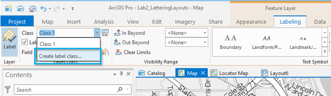 Visual Guide Figure 2.6. Creating a new label class in the Labeling menu in the ribbon.
When you create a label class, all you are creating is a class with a name - ArcGIS will not automatically recognize, for example, that a label class named "Interstates" should only be applied to roads which are interstates. We will tell ArcGIS this using SQL (structured query language).
In our data, all interstates have a TNMRC code of 1 (this code signifies the interstate road-type; see Figure 2.8). We can define this label class using the SQL view in the label class pane. See below:
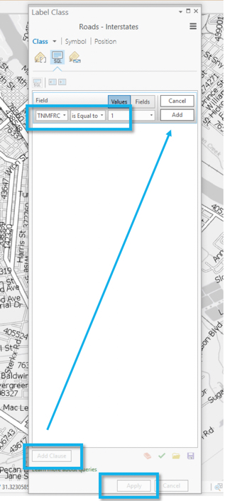 Visual Guide Figure 2.7. Adding an SQL clause to define a label class.
Note: The Label Class Pane can also be used to create label classes, instead of the top menu bar. You may find it more helpful to use the Label Class Pane for most labeling tasks.
If you forget which TNMFRC code refers to which road type, you should refer to the image below. You can also open this view in your project - your road features should still be classified by TNMFRC code, so viewing it in the symbology pane should create a view similar to the one below.
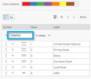 Visual Guide Figure 2.8. Referencing the TMFRC code definitions in the Symbology pane.
You should create a different label class for each road type for which you wish to have a different type of label. This includes small differences, such as font size. You do not necessarily have to create a different label class for every road type, but you will likely have several (e.g., local road, collector road, highway, etc.). You should reference the lab requirements page to ensure that you have created enough different label classes throughout your map.
Once you create your label classes, you can switch back and forth between them while editing using the Class dropdown menu. Note that if you create multiple label classes, you will need to define all of them, including the default label class. If you do not, you will have duplicate labels. For example, you may have Interstates labeled in one class, and all roads labeled in the default class - causing interstates to be labeled in both classes.
Another option is to delete the default label class - but be careful when doing so that you are maintaining all the labels you need.
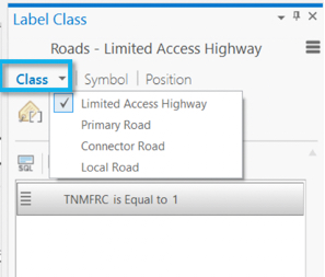 Visual Guide Figure 2.9. Switching back and forth between label classes.
 -
Designing label symbols
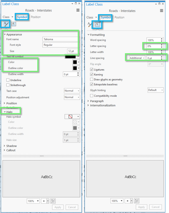
Once you've created a label class, you can use the Symbol tab in the Label Class pane to edit its style. Shown here is the label symbol editing menu (left), and the formatting menu (right). These are used to change many aspects of a label's symbology - including fonts, sizes, spacing, color, etc. Highlighted in green are options I’ve found especially helpful – but don’t limit yourself to these. You should experiment with all options for symbol design—font, weight, spacing, etc. Recall from the lesson content that line spacing (leading) can be a negative value.
 Visual Guide Figure 2.10. Editing label symbology.HINT: As you work with the labels, you may find see that there is a lot of "clutter." The number of labels can be overwhelming. When you initially try to label the roads layer, it will likely slow your computer way down to the point of stopping (or at least appearing that it stops). To help reduce the clutter, consider using the select tools in ArcPro to select roads by attribute or by location and then export the selected data to its own layer. Then, work with just that layer when labelilng. This is a quick way to remove some of the road clutter from the map. Simply "un"-symbolizing the layers does not prevent the roads from being labeled. Using this method to select roads that, for example, intersect with another feature or have one or two TMFRCs, can save you computing power (and frustration).
 -
Positioning label symbols
In addition to changing the style of your labels, it is important to also assign how they should be positioned. Recall the lesson content on text placement - our goal for this lab is to place labels only with automatic rules. We will not be placing or adjusting labels by hand.
There are many positioning parameters you can adjust in the label position tab—try them out and watch how your labels change. There are a lot of useful options (e.g., Feature Weight) whose function may not be immediately clear to you - I recommend using the link at the end of this sentence to learn more about labeling with the ArcGIS Pro Maplex Label Engine [12].
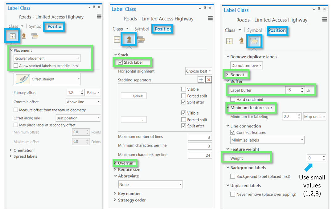 Visual Guide Figure 2.11. Label positioning options.
 -
Creating label expressions
In addition to simply drawing a label from a feature's attribute table, you can edit label expressions using SQL to append words or other text for more descriptive labels. Don't worry if you haven't done any programming - you only need to make minor edits to create label expressions.
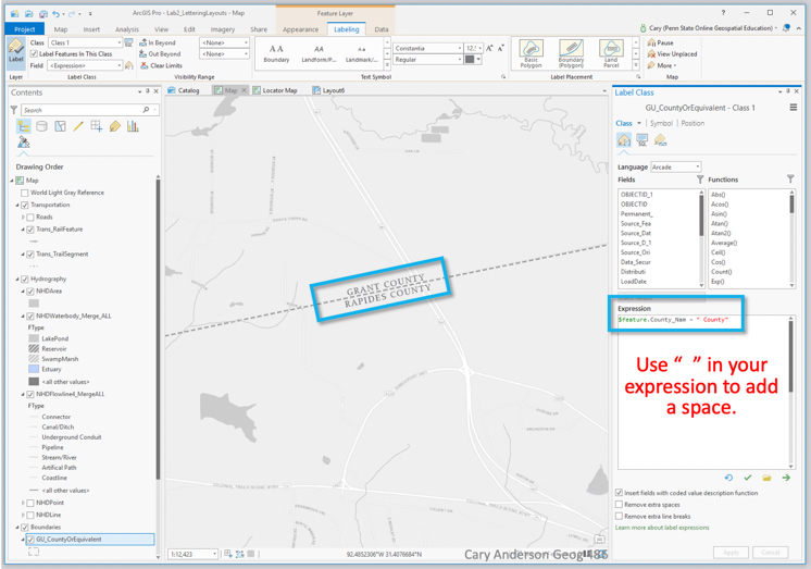 Visual Guide Figure 2.12. Creating a label expression by appending the word "County" to labels using SQL.
You can also use SQL to append additional text to a label from the attribute table. An example is shown below - though, in this example, you are creating quite a wordy label, which is generally not recommended.
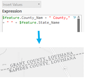 Visual Guide Figure 2.13. Using SQL to create another label expression.
Part II: Layouts
-
Putting it all together
Remember that you will be adding labels both to your large-scale (primary) map, and your small-scale (locator) map. Once you've finished adding labels to your primary map, you can add similar labels to your locator map. You can also save and then import a copy of your large scale map into your project, and then adjust it for the new smaller scale. This is the same process we used to create our second map in Lab 1.
To duplicate/re-import (a refresher):
- Save the most current version of your map as a map file (right-click on the Map in the Table of Contents (TOC)).
- Import that saved the map as a copy back into your project (Insert Tab --> Import Map).
- Change the scale of your new map, and design for this new smaller scale as a locator map.
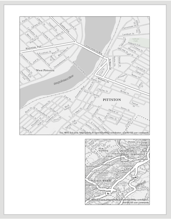
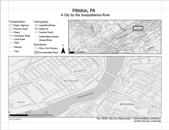
Your final task is to create a Portrait or Landscape layout with your two maps, a legend, and text elements. An example layout design is shown below.
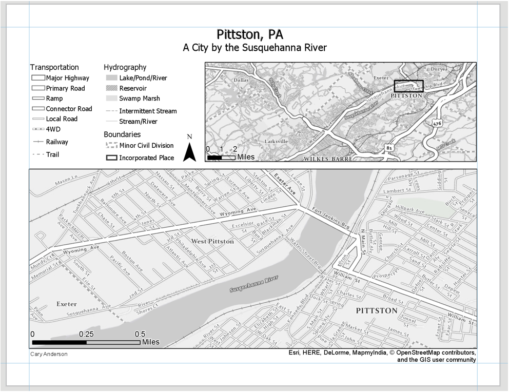 Visual Guide Figure 2.14. An example landscape layout.
An example of a portrait layer is shown below: not that your map will also include a title, legend, etc. Additionally, these map examples are not shown in their final form - you are encouraged to use them for layout ideas, but you should not copy their designs.
 Visual Guide Figure 2.15. Designing a Portrait layout.
 -
Build your layout
Before importing your maps, add guides for ½ inch margins – you should not include anything on the page outside of these margins. Note again that the examples below contain unfinished design—they should not be interpreted as examples of finished feature or label symbology.
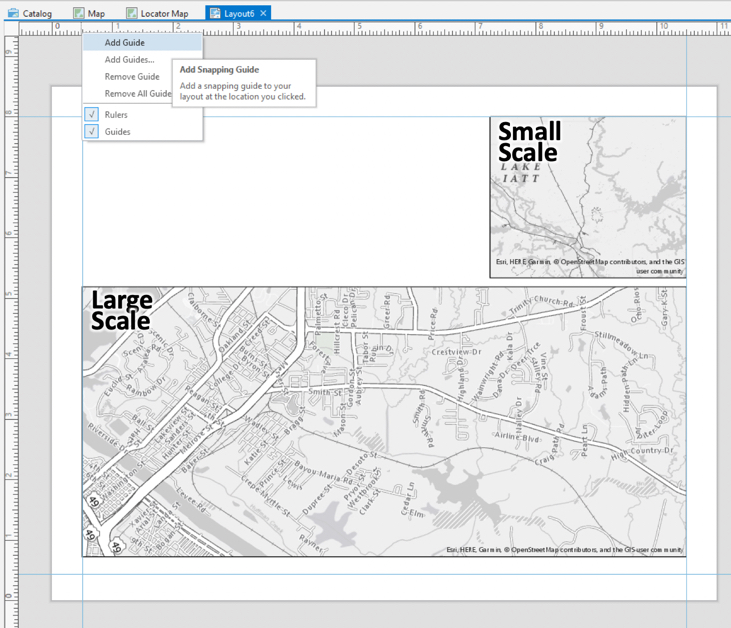 Visual Guide Figure 2.16. Adding guides to a layout to ensure a 1/2" margin.
For the locator map to be useful, you will need to insert an extent indicator. You should do so with the small scale map selected. This will draw a rectangle showing the extent of your large-scale map within the (larger) region covered by your small-scale, inset/locator map.
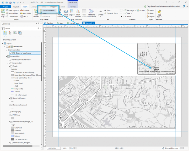 Visual Guide Figure 2.17. Adding an extent indicator.
 -
Add marginal elements
Marginal elements such as north arrows and scale bars should be added at this point. Keep your North arrow and scale bars simple and easy to read. Use “adjust width” to create clean scale bar values. You can also edit the color, font, label locations, etc., of all marginal elements. Reference lesson content for design ideas.
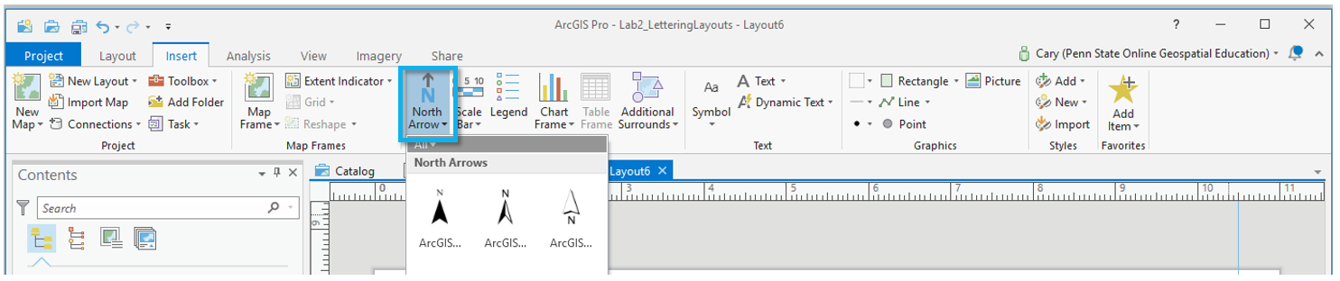 Visual Guide Figure 2.18. Adding a north arrow.
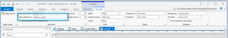 Visual Guide Figure 2.19. Adjusting the design of a scale bar.
 -
Create a legend
Another important component of your map layout for this lab will be its legend. Insert a legend with your large-scale map selected so it reflects your large-scale symbol design. Your locator map should use similar symbols, and therefore should not need a legend.
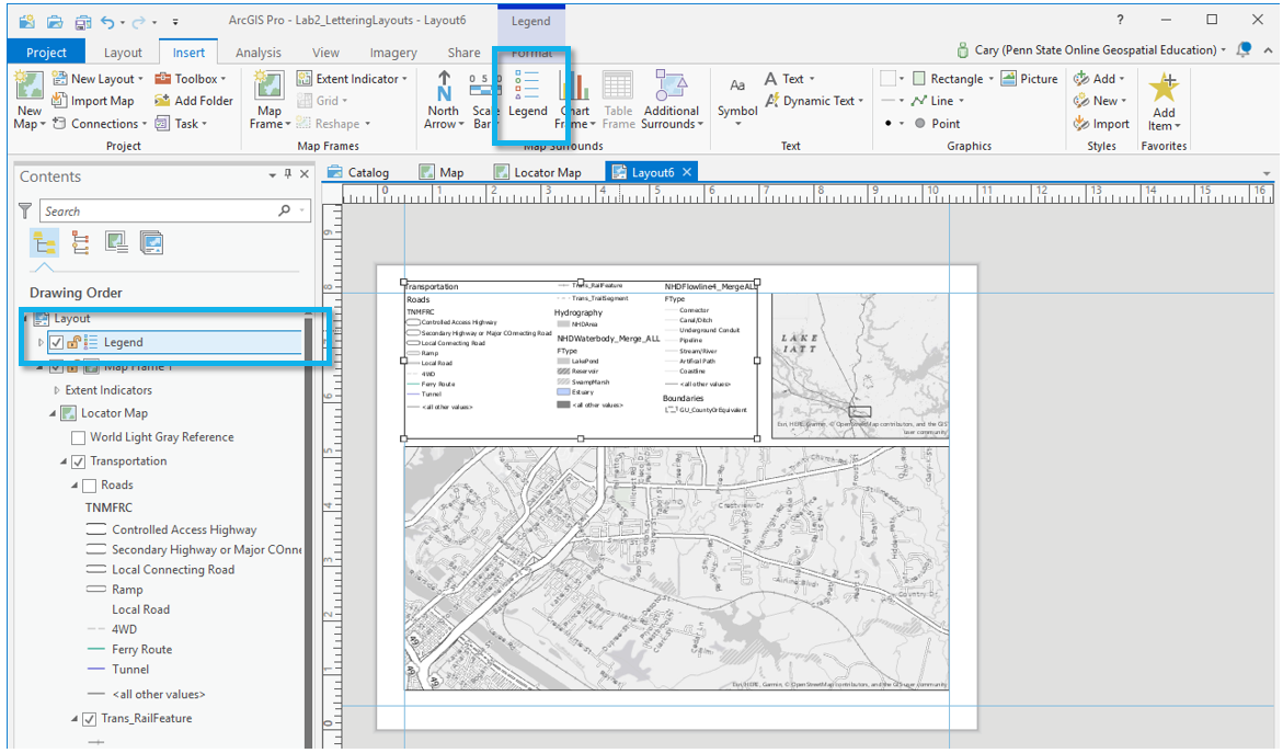 Visual Guide Figure 2.20. Adding a legend.
Right-click your new legend element in the contents pane, and choose “Properties” to edit.
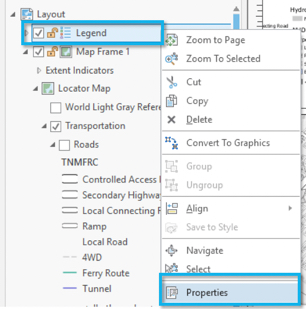 Visual Guide Figure 2.21. Opening legend properties.
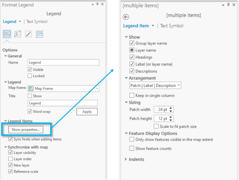 Visual Guide Figure 2.22. Editing legend properties.
You do not have to include every item in your legend, and you may want to change the names of some items significantly. Your goal is to create a comprehensible map. To change the design of different legend elements, select them from the drop-down menu in the Format Legend pane.
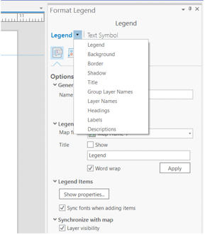 Visual Guide Figure 2.23. Selecting a legend element to edit.
You can also make changes from the ribbon.
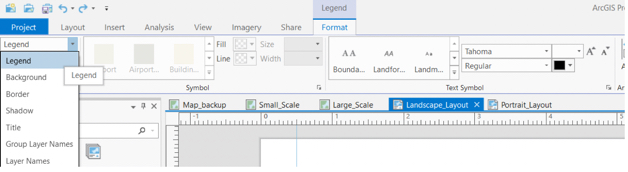 Visual Guide Figure 2.24. The Format-Legend menu bar in the ribbon.
An efficient way to clean legend titles is to edit the layer titles themselves in the TOC—for example, by opening the properties dialog box for the county boundary layer and changing “GU_CountyOrEquivalent” to “County.”
Once you have made sufficient edits, you may want to disconnect your legend from the data by converting to graphics. This will give you more freedom over the design, but as your legend will no longer update dynamically if you update any map symbols, you should save this step until the end. You will have to “ungroup” the elements to edit them. Once you convert to graphics, you will need to right-click and “ungroup” multiple times to edit the elements for detailed design work. (Note that this is not a well-edited legend, just an example of one in process).
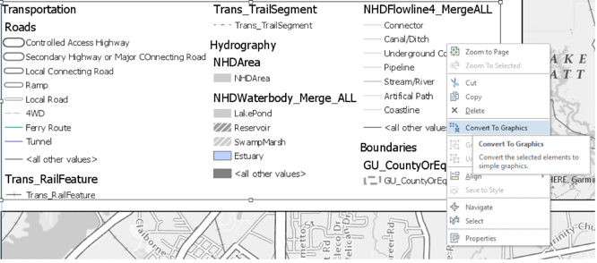 Visual Guide Figure 2.25. Converting a legend to graphics for fine-grained edits.
Once your legend is complete, there are only a few final touches to be made. Use the “Dynamic Text” dropdown to move the service layer (basemap) credits out of the map frame and place them elsewhere in your layout, for a cleaner look.
 Visual Guide Figure 2.26. Adding service layer credits as dynamic text.
Don't be afraid to re-arrange your layout elements as you go! It may take quite a few tries before you find an optimal design.
Remember to create visual hierarchy for marginalia elements:
- Title
- Subtitle
- Legend Titles
- Legend Text
- Data Source
- Name
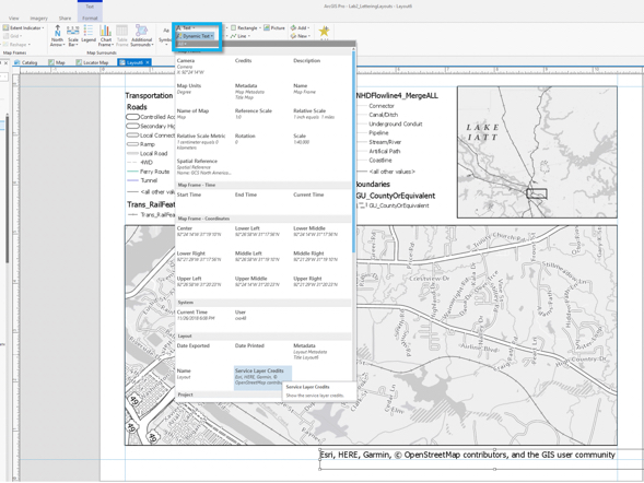
Below is an example of a landscape layout made from similar data - you will need to adjust your map to work with the assigned data and location. Note also that the map below may not include all required elements for this lab, but is an example of how your layout might look if you are on the right track.
 Visual Guide Figure 2.27. Example map layout.
 -
Final tips and tricks
- You may use color, but do not over-rely on it. It is often advised to use all greyscale at first, and then add color later on for emphasis. Too much color on a map that is not well balanced will result in a poorly designed map.
- Don’t be afraid to change course while you work—try out different labeling and layout options before committing to a final design.
- Lesson 2 Visual Guide contains many design ideas and suggestions. Do not rely on the Guide to tell you how to design your map. Instead, use the insturctions to learn how tools in ArcGIS Pro are used and then let your creativity guide your design.
- See the Lab 1 instructions if you need a refresher on how to design symbols or how to export your map. Remember, if your map uses a gradient fill, complex area fill patterns, or coastline effects, export the map setting the resolutoin to be no more than 150dpi.
- Check that your map meets all listed requirements by referring to the lab instruction document andrubric before you submit.
Credit for all screenshots is to Cary Anderson, Penn State University; Data Source: The National Map.
Summary and Final Tasks
Summary and Final Tasks
Summary
Here we are - at the end of Lesson 2! In this lesson, we learned about two vitally important but occasionally overlooked aspects of map design: the design of labels and other text elements, and the building of a neat, balanced map layout. In Lesson 1, we discussed visual variables and how they can be used to visually encode order and category in map symbols. In Lesson 2, we extended this idea to include map label design. We also discussed order in another context - the creation of a visual hierarchy in a map layout.
As you likely noticed while working on Lab 2, neither adding labels nor designing a map layout are trivial tasks. Something as simple as creating a legend or scale bar requires significant thought and attention. Little details such as the alignment of layout elements may feel like the "last mile" in the making of a map, but they are key for getting your readers' minds to where they ought to go.
Reminder - Complete all of the Lesson 2 tasks!
You have reached the end of Lesson 2! Double-check the to-do list on the Lesson 2 Overview page [13] to make sure you have completed all of the activities listed there before you begin Lesson 3.