Lesson 8: Multiscale Web Mapping
Overview
Overview
Welcome to Lesson 8! In this lesson, we discuss another key topic in cartography: map generalization. Generalization, or transforming a map’s features (traditionally from large-scale to small-scale) to fit a map’s given scale and purpose, has been increasingly in focus given the proliferation of interactive multi-scale web maps. Such maps are among a new generation of 'fast maps', which include interactive, animated, and viral maps and mapping products. These maps, as well as other products of technological advancements in mapping, including 3D maps and extended reality applications, present new challenges and opportunities for geographers across many fields of interest.
In Lab 8, we break from our focus on mapping in ArcGIS to design an interactive multiscale basemap using the online map design platform Mapbox Studio. To highlight the creative designs possible with such tools, we design this map by taking inspiration from a favorite piece of media/art. Lab 8 thus ties together our discussion of generalization and interactivity with previous discussions of maps for advertising, map symbology, and basemap design.
Learning Outcomes
By the end of this lesson, you should be able to:
- describe the differences between content, geometry, and symbology generalization operators and their roles in multi-scale map design;
- evaluate a map designer’s use of selection and generalization on a map and the logical and ethical implications of these decisions;
- articulate the merits and challenges associated with designing and using animated and/or interactive maps (vs. static maps);
- discuss applications of cartography within the domain of Extended Reality (XR) – such as Virtual Reality (VR) and Augmented Reality (AR), while recognizing their respective disadvantages;
- design a custom multi-scale Mapbox basemap in the style of a movie, TV show, or other favorite piece of media and/or art.
Lesson Roadmap
|
Action |
Assignment | Directions |
|---|---|---|
| To Read |
In addition to reading all of the required materials here on the course website, before you begin working through this lesson, please read the following required readings:
Additional (recommended) readings are clearly noted throughout the lesson and can be pursued as your time and interest allow. |
The required reading material is available in the Lesson 8 module. |
| To Do |
|
|
Questions?
If you have questions, please feel free to post them to Lesson 8 Discussion Forum. While you are there, feel free to post your own responses if you, too, are able to help a classmate.
Map Generalization
Map Generalization
In Lesson 7, we discussed uncertainty visualization—yet another component of a common theme in cartography: transferring the complexities of our world into a visualization via a map. When we transform the many features of Earth’s geography into a form more appropriate for a map’s given scale and purpose, this is called cartographic generalization. Thorough understanding of generalization and the related concept of scale is—and has always been—essential for creating high quality maps. The increased prevalence of web-maps, which permit zooming and panning across multiple extents and scales, has encouraged increased research in these topics. In this lesson, we discuss generalization, both in general, and in the context of multi-scale and interactive web maps.
All maps contain some level of generalization—maps would be unusable otherwise. Representing every element of the real world on a map is not feasible, nor would such a map be interpretable by readers. Generalization permits cartographers to construct maps with an appropriate level of detail. In Lesson 6, we discussed the necessity of using the correct resolution of (raster) digital elevation data to create terrain visualizations. In this lesson, we focus primarily on the generalization of vector data, such as hydrologic features and political boundaries.
When considering what level of detail is appropriate, it is important to consider your map's location, scale, and geographic extent. A map of seaside hotel locations in Massachusetts would, for example, show a much more detailed coastline of Cape Cod than would a map of the entire United States.
Natural Earth [1] is a popular source of boundary data that we have used extensively in this course. Figure 8.1.1 below demonstrates the differences in level of detail between different boundary datasets that Natural Earth offers. The purple boundaries (left) show the most detail. Such data are appropriate for maps of large regions (e.g., scale = 1:10m). The pink (center) boundaries would be better suited for small-scale maps of continents or the entire globe (e.g., scale = 1:50m). The blue (right) boundaries are heavily generalized, and would be best suited for very small-scale maps, or maps meant to emphasize style over accuracy (e.g., scale = 1:110).
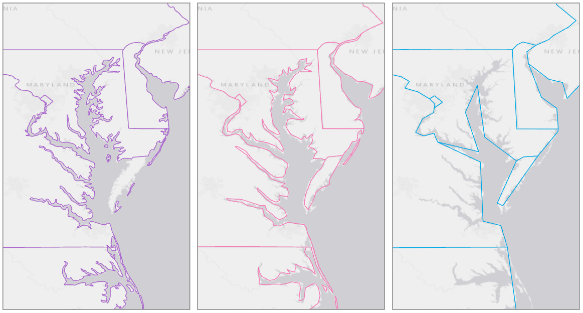
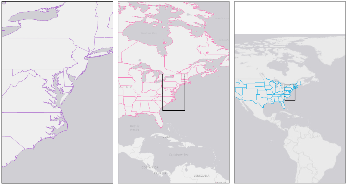
Figure 8.1.2 shows each of the above boundary files at an appropriate scale given their level of detail. The extent of the largest-scale map (left) is shown by the extent indicator in the center and right maps.
Student Reflection
For an interactive experience with generalization, try uploading a shapefile from NaturalEarth [2] to the interactive tool MapShaper [3].
So far, we have talked about the overall idea of generalization – using data that is the correct level of detail for your map’s scale. A general-purpose map of a small town, for example, would likely show lakes, ponds, and reservoirs, while a small-scale map of a large region would show only the largest waterbodies (e.g., rivers, large lakes, and oceans). Often, objective rules are used to determine what elements are displayed on a map (e.g., “only show lakes that cover more than five square miles”). However, due to the uneven distribution of features across the landscape, cartographers also have to make some generalization decisions that are complex, subjective, and specific.
An example of this is demonstrated by Figure 8.1.3. Some cities are labeled, and some are not. At first, it may appear that the largest cities are labeled, and to some extent this is true. New York, NY is labeled, as well as Washington, DC. However, you may notice some cities that are absent—most notably Philadelphia, PA. A city with 1.5 million people is left off the map, while Reading, PA—a city of about 88,000—is included. Why?
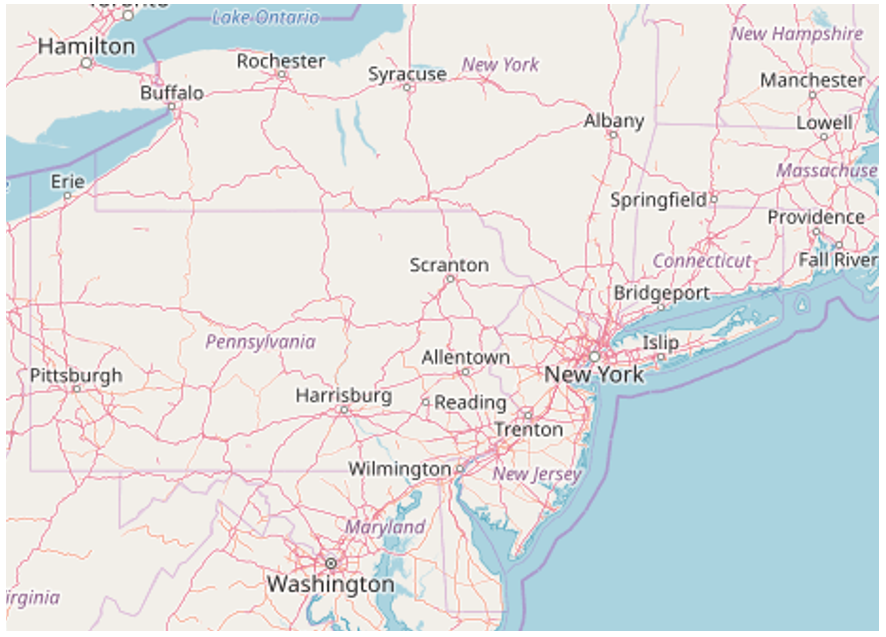
Philadelphia is located in a densely-populated region, with many nearby cities, such as Trenton, Baltimore, and Washington, D.C. By contrast, Reading, PA is surrounded only by smaller towns. Web-maps are designed to display—or not display—city labels based on a number of factors. These include population and general importance, but also design-relevant factors, such as the density of labels on the map.
OpenStreetMap (figure 8.1.3) is designed as a general-purpose map; the maps you create will typically have a more specialized purpose. And if your map’s topic was related to the city of Philadelphia, you would be sure to use your judgment to adjust the decisions made by OpenStreetMap’s generalization algorithm.
Recommended Reading
Chapter 3: Map Generalization: Little White Lies and Lots of Them. Monmonier, Mark. 2018. How to Lie with Maps. 3rd ed. The University of Chicago Press.
Generalization Operators
Generalization Operators
As suggested by the previous OpenStreetMap example, generalization is a process for dealing with conflict and congestion among map symbols—a strategy for creating a more readable and useful map. Though this is a complex and context-dependent problem, some resources are available to help you determine the appropriate level of detail for your maps. ScaleMaster (Brewer et al. 2007) for example, available at scalemaster.org (Note: As of July 28, 2023, the scalemaster.org site no longer exists), offers advice to mapmakers on which features ought to be included at different scales, and for different mapping purposes.
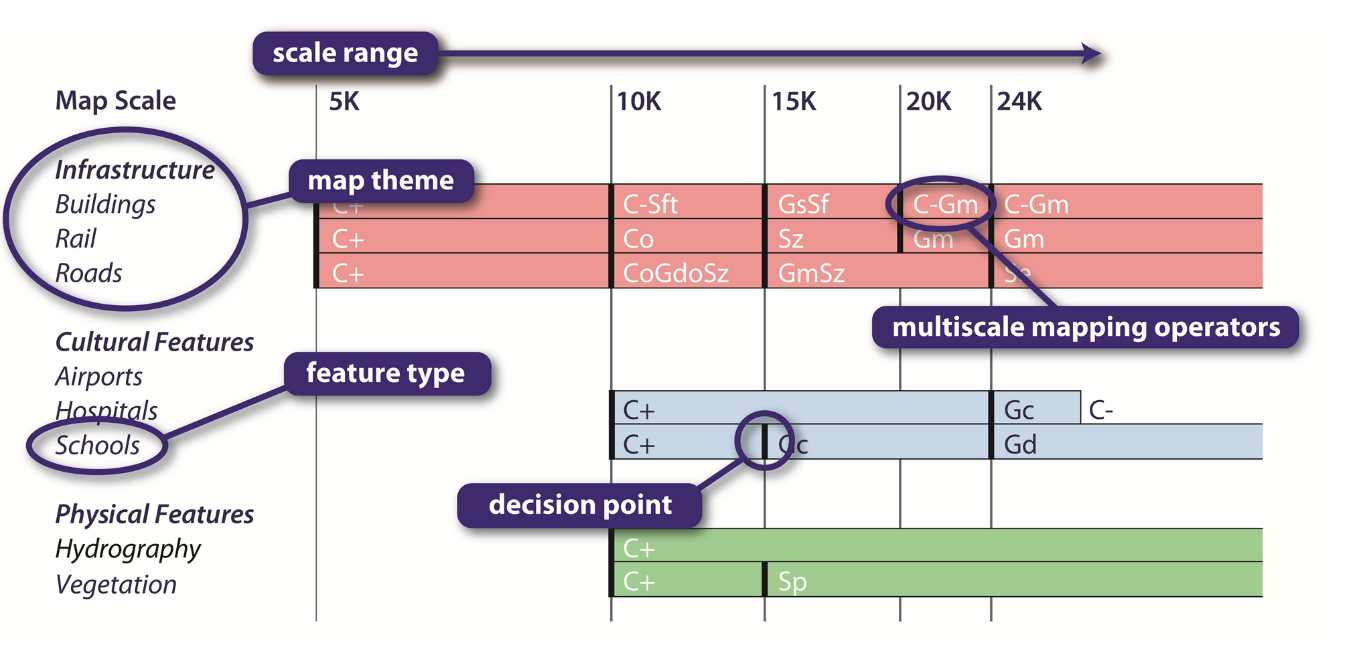
We will not go into the details of ScaleMaster in this lesson, but you are encouraged to read more about this idea through the Cartographic Perspectives article if you are interested. The most important takeaway is that different scales require differing levels of detail, and that the appropriate level of detail is mediated by the map’s context (e.g., topographic vs. zoning maps).
Generalization can be broadly categorized as either selection or symbolization. Selection is simple—it refers to the decision of whether to include (or not include) a feature at a certain scale. Symbolization refers to alteration of the way a feature is designed in order to make its design more appropriate for the scale at hand. For example, when designing a small-scale map, you might choose to not include cities unless they are high population (selection), and to symbolize these cites as labeled points rather than as areas (symbolization). Generalization traditionally refers to reducing detail in a map as much as is necessary to maintain legibility and usefulness at a specified scale. Generalizing multi-scale web maps (which exist at many rather than one scale) is more challenging, but not fundamentally different—we can think of every possible scale step (or zoom level) of a multi-scale web map as its own map for which an appropriate level of detail must be determined.
As generalization is a fundamental topic in cartography, many cartographers have proposed theoretical frameworks for discussing generalization. For simplicity, in this lesson, we will focus on the set of generalization operators recently proposed by Roth et al. (2011), as they were developed based on a comprehensive review of previous literature. As we discuss generalization operators, an important distinction should be made between generalization operators and generalization algorithms. Operator refers to a cartographer’s conceptualization of an intended change (e.g., I want to remove some roads to reduce the visual clutter of this road network), while an algorithm is a system followed for implementing this idea (e.g., I will remove all roads with speed limits below 25mph) (Roth et al. 2011). Like Roth et al., we focus on operators rather than algorithms in this lesson as they are more widely applicable to map-making tasks, and not dependent on the use of specific datasets or GIS software tools.
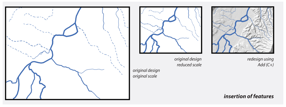
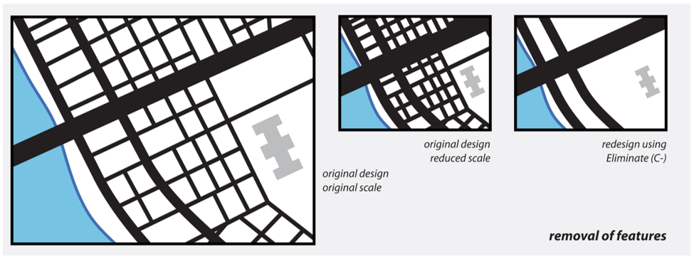
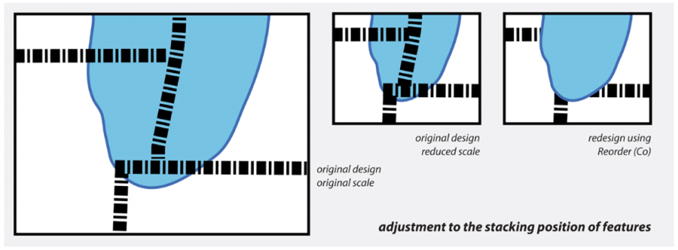
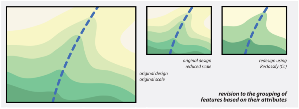
Roth et al. (2011) classify feature generalization operators into three groups: content, geometry, symbol. Content operators directly alter the content of the map, typically by adding or removing features at particular scales. An example would be deciding not to include local roads or trails in a small-scale map. These operators include: add, eliminate, reorder, and reclassify.
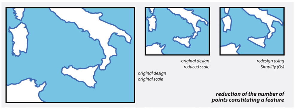
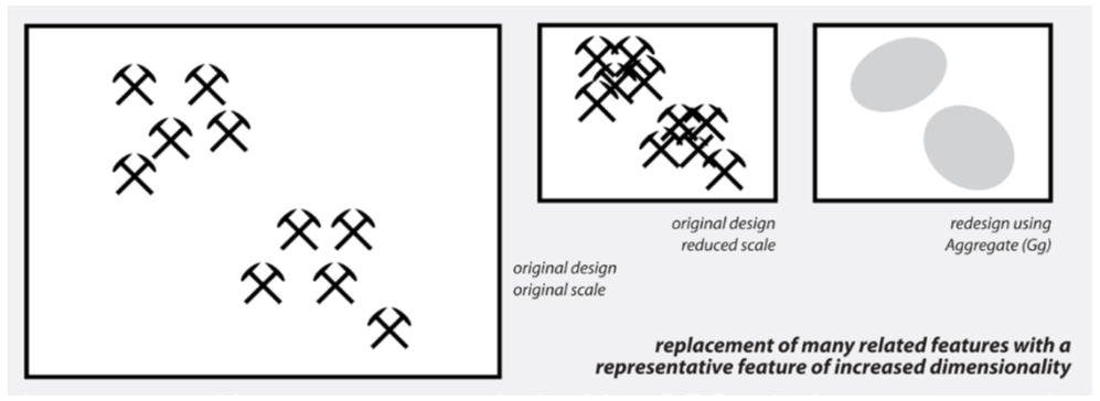
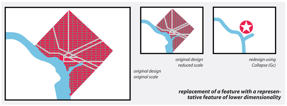
Geometry operators describe the ways in which different features' geometry can be altered to create a map that is more legible and aesthetically pleasing. Examples include smoothing a line feature and representing a city as a point rather than an area. Geometry operators include: simplify, aggregate, collapse, merge, displace, exaggerate, and smooth.
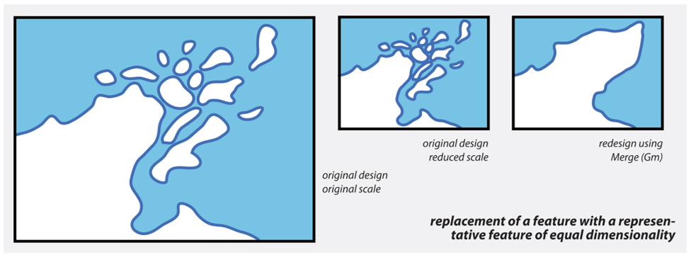
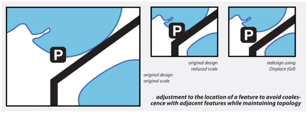
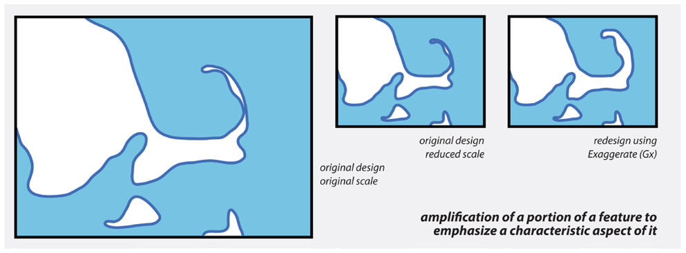
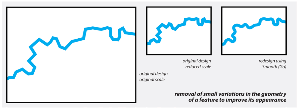
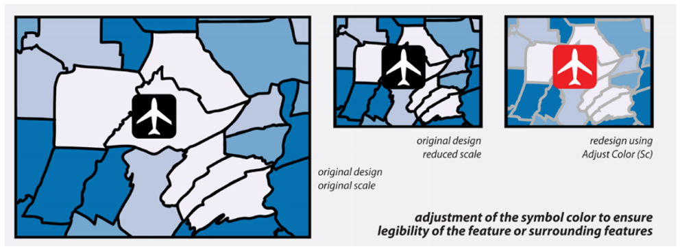
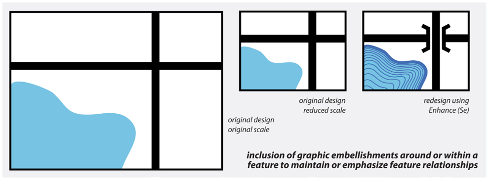
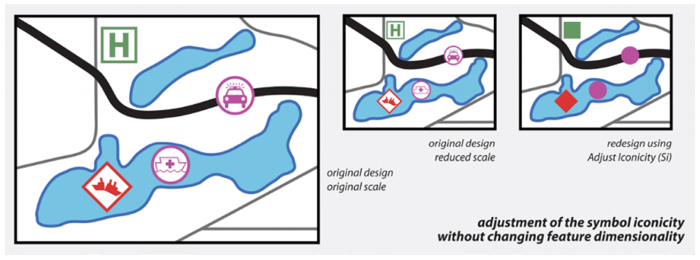
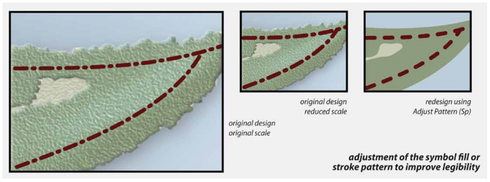
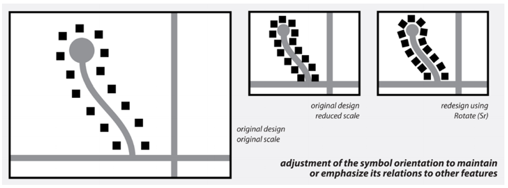
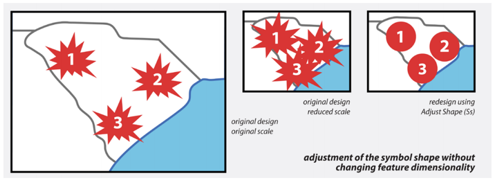
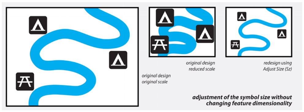
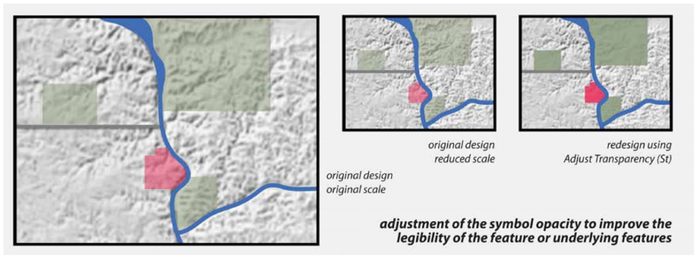
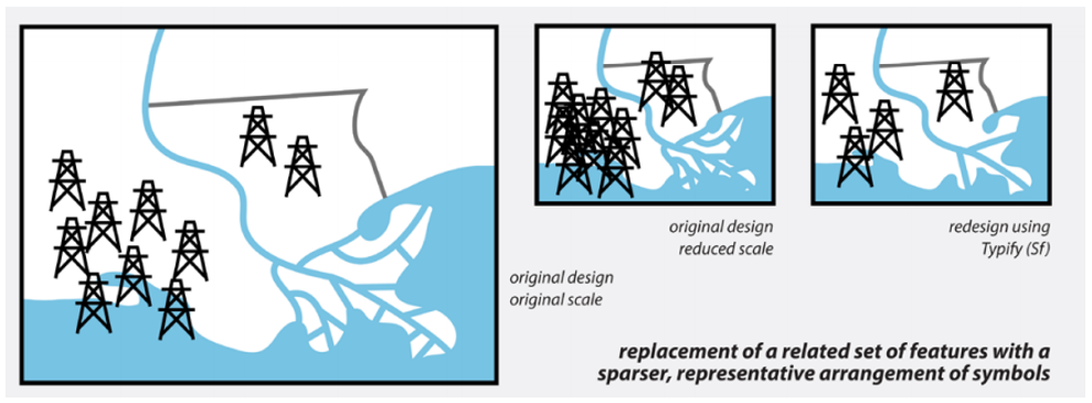
Symbol operators alter feature symbology to improve legibility, but do not change the features’ underlying geometry. An example would be simplifying the pattern in an area fill so it still looks good at a smaller scale. Symbol operators include adjust color, enhance, adjust iconicity, adjust pattern, rotate, adjust shape, adjust size, adjust transparency, and typify.
It is not necessary to memorize the above operators, but you should aim to understand the difference between the three groups of operators (i.e., content, geometry, symbol) and think critically about situations in which each might be useful.
Recommended Reading
- Brewer, Cynthia A., and Barbara P. Buttenfield. 2007. “Framing Guidelines for Multi-Scale Map Design Using Databases at Multiple Resolutions.” Cartography and Geographic Information Science 34 (1): 3–15. doi:10.1559/152304007780279078.
- Roth, Robert E., Cynthia A. Brewer, and Michael S. Stryker. 2011. “A Typology of Operators for Maintaining Legible Map Designs at Multiple Scales.” Cartographic Perspectives 68 (68): 29–64. doi:10.14714/CP68.7.
- Brewer, Cynthia A., and Barbara P. Buttenfield. 2010. “Mastering Map Scale: Balancing Workloads Using Display and Geometry Change in Multi-Scale Mapping.” GeoInformatica 14 (2): 221–239. doi:10.1007/s10707-009-0083-6.
Dynamic Maps
Dynamic Maps
The advent of the world wide web initiated many changes in the world of map-making. Though centuries-old cartographic principles are still relevant in a web-mapping world, digital map-making has presented new unique opportunities and challenges for cartographers.
The increasing ubiquity of the Internet has influenced cartography in many ways, from changing the nature of maps themselves (e.g., with new interactive and animated maps), to facilitating a system wherein map-making tools are widely accessible—a world in which almost anyone can make and widely-share a map.
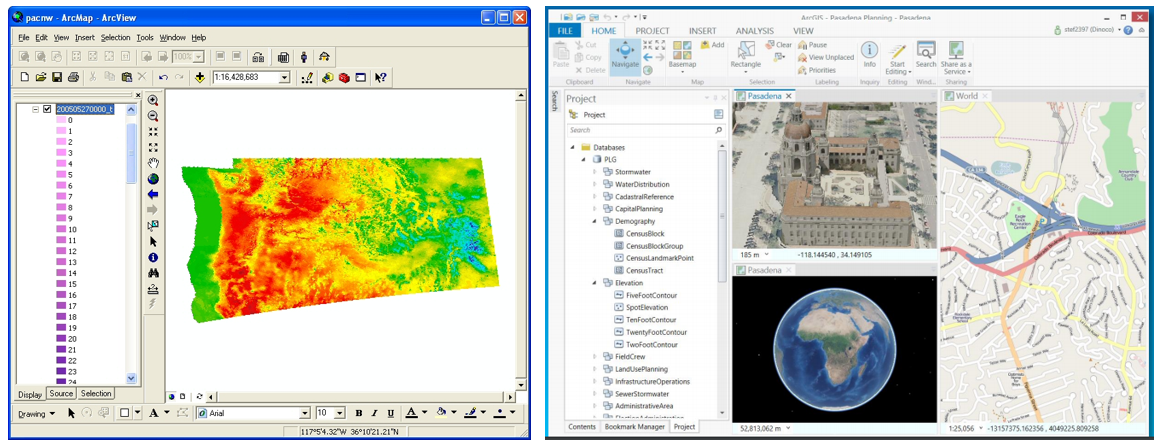
Figure 8.3.1 demonstrates the evolution of the popular GIS software ArcGIS, from ArcMap/ArcView to the newly-released ArcGIS Pro, designed with modern graphics, searchable toolboxes, and a ribbon-based interface. Perhaps even more indicative of the times is the widespread availability of web-based mapping tools and libraries, including CARTO [8], Leaflet [9], Mapbox [10], Social Explorer [11], and many more.
Geographer Mark Monmonier (2018) uses the term “fast maps” as an umbrella term to describe many new forms of maps and mapping products that have come about in the internet age. These include interactive maps, animated maps, and viral maps—maps that may be static or otherwise but are nevertheless a product of new technologies and widely spread due to the Internet and social media. New interests in virtual and augmented reality have also added to the variety of maps available in this widely-connected world.
Student Reflection
If you have several years of experience using GIS Software, consider how this software has changed over the course of your career. What software did you use when you were first learning GIS? How is it different from ArcGIS Pro?
Recommended Reading
Chapter 14: Fast Maps: Animated, Interactive, or Mobile. Monmonier, Mark. 2018. How to Lie with Maps. 3rd ed. The University of Chicago Press.
Interactive Maps
Interactive Maps
We briefly discussed interactive maps in the previous lesson on multivariate mapping—interactivity is often used to solve problems related to multivariate mapping, such as the challenge of fitting all the necessary data into one map frame. New technologies (most notably, mobile smart phones) have both increased the challenge of designing maps and contributed their own solutions. Creating a map that can be viewed on a 4.7-inch screen, for example, can be quite a difficult design problem. Yet, accessibility to mobile cell data and location-aware devices have enabled the creation of zoomable, pan-able, user specific maps—thus reducing the amount of map content required in-view at any one time.
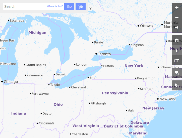
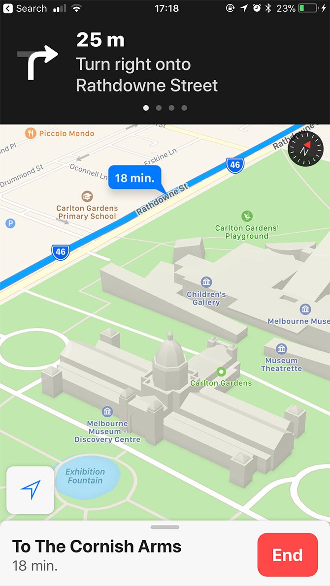
Web maps such as the one in Figure 8.4.1, which allow the user to zoom and pan around the extent of the map, are commonly called slippy maps. While they may serve as general purpose maps themselves, these maps are most often used as basemaps that provide location context for a variety of thematic or functional overlays—such as the traffic volume data or navigational functionality of Google Maps.
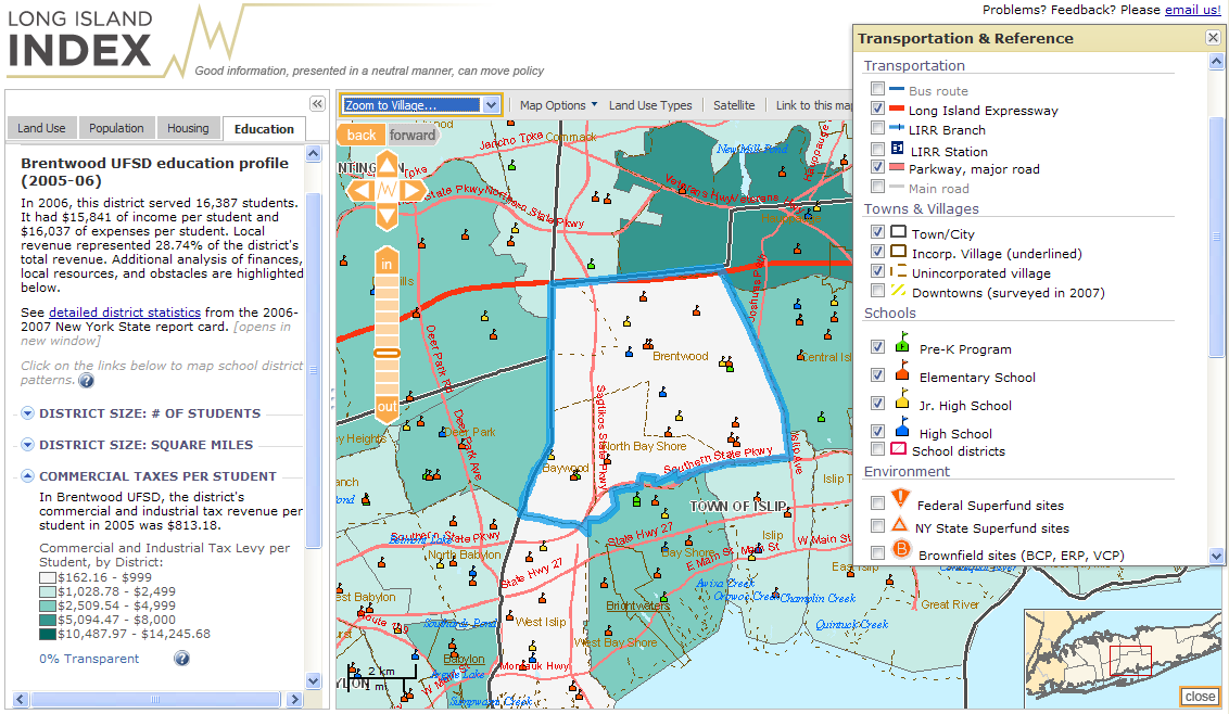
We often categorize interactive maps by the level of user interaction (low to high) they permit. Some maps allow only simple interactions such as panning or zooming, or perhaps show additional information about features on mouse hover or click. Others may be developed for expert users, and include the ability to search, filter, and analyze data, as well as the option to upload the user’s own data for exploration and analysis. Many interactive maps, such the one in Figure 8.4.2, fall somewhere in the middle of this continuum.
While the term interactive map is most often used to describe maps such as the one in Figure 8.4.2, other maps are better characterized as containing passive interactivity. These are maps that respond to actions of the user, though not in the traditional sense of a user interacting with tools via a map interface (Monmonier 2018). An example of this is an automotive personal navigation device (PND).
Though these devices also contain traditionally interactive components, they are primarily designed to respond to one particular user behavior—movement through space and time. Such mapping tools provide navigation, real-time traffic, and safety-zone warnings; some even provide advanced notifications such as lane departure warnings via unit-mounted cameras and other sensors.
Interactive maps have the potential to be useful in any geographic decision-making context, wherein the map can provide an appropriate interface between the human and the machine (Monmonier 2018). Due to the complexity of many of these products, however, the effectiveness of an interactive map is often dependent not only on the design of the map itself, but on its interface and related functions. This has made interactive map-making a particularly interdisciplinary subset of cartography, as successful approaches borrow increasingly from research in data visualization, human-computer interaction (HCI), and computer science. We will discuss the interface between maps and their users in more detail in Lesson 9.
Recommended Reading
Roth, Robert E. 2013. “Interactive Maps: What We Know and What We Need to Know.” Journal of Spatial Information Science 6: 59–115. doi:10.5311/JOSIS.2013.6.105.
Animated Maps
Animated Maps
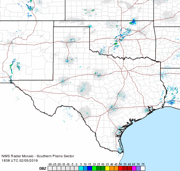
Though animated maps may also have interactive components, they are uniquely defined by their use of animation to display spatial data. A type of animated map you have likely seen and used is a weather radar map, such as the one shown in Figure 8.5.1. These maps typically contain little user-interaction capabilities—they are watched by the user as if watching a movie—though they may contain zooming or panning functionality, or the option to pause the animation at a point in time.
Animated maps are used to visualize a wide range of data topics, from weather to health data, demographic statistics to travel routes. Most common among these maps is the inclusion of time as the variable that is changed as the animation is performed. Though, theoretically, any quantitative variable could be depicted via animation, the use of animation to depict data through time is supported by the congruence principle which states that the external graphic representation of data should match its intrinsic characters (e.g., in the case of animation, the animation plays across time, and represents temporal data) (Tversky, Morrison, and Betrancourt 2002).
Despite the popularity of animated maps for data visualization, little research has yet been conducted that supports its use as a replacement for static graphics such as small multiple maps (Tversky, Morrison, and Betrancourt 2002; Griffin et al. 2006). Animated maps present unique challenges for users, who are often hindered by perceptive constraints, such as change blindness – the inability to detect changes in maps across animated frames, often combined with user overconfidence in map comprehension (Fish, Goldsberry, and Battersby 2011).
Griffin et al. (2006) conducted a map-cluster detection study with animated maps and small multiples and found that users did tend to be more successful with animated rather than static maps for this task. They note an important challenge in animated map design, however—that the pace or speed of the animation is influential on user success, and that different paces are more useful for different maps. There is no ideal animation pace for maps, though cartographers ought to consider what pace might be most useful for their map’s intended audience and purpose. One way to sidestep this decision is to add simple interaction features to animated maps, such as the ability to pause or step through time, so the user might adjust the animation to a speed that works best for them (Tversky, Morrison, and Betrancourt 2002). Though many visual variables are used in animated mapping, pace is among the visual variables used specifically for encoding data via animation. Other animation-relevant variables include rate of change – how much the map changes between each animated frame, and order (DiBiase et al. 1992), which is the order in which individual frames are presented (often chronologically, but not always).
Student Reflection
Consider a mapping purpose for which you might want to create an animated map with frames in non-chronological order. Why would this design choice benefit the map user?
Alan MacEachren (1995) extended the above-mentioned visual animation variables to include display date – the starting time of a temporal sequence, frequency – the number of unique states within each unit of time (e.g., animated frames per year), and synchronization – the coincidence (or otherwise) of time series when two or more are displayed at once (e.g., snowfall and school attendance might be displayed out of sync).
Recommended Reading
- Tversky, Barbara, Julie Bauer Morrison, and Mireille Betrancourt. 2002. “Animation: Can It Facilitate?” Int. J. Human-Computer Studies Schnotz & Kulhavy 57: 247–262. doi:10.1006/ijhc.1017.
- Griffin, Amy L, Alan M MacEachren, Frank Hardisty, Erik Steiner, and Bonan Li. 2006. “A Comparison of Animated Maps with Static Visually Maps for Identifying Clusters Space-Time.” Annals of the Association of American Geographers 96 (4): 740–753.
- Dibiase, David, Alan M. MacEachren, John B. Krygier, and Catherine Reeves. 1992. “Animation and the Role of Map Design in Scientific Visualization.” Cartography and Geographic Information Systems 19 (4): 265–266. doi:10.1080/152304092783721295.
Viral Cartography
Viral Cartography
Though the term “dynamic maps” implies movement within maps (i.e., animation and interaction), we discuss here a similar category of maps, as suggested by Monmonier (2018) in his categorization of “fast maps” – viral maps. Though there is no widely-accepted definition of a viral map, the term applies broadly to a map that is shared widely, and through non-traditional processes (i.e., through users sharing content with each other, rather than from a singular, popular provider) (Robinson 2018).
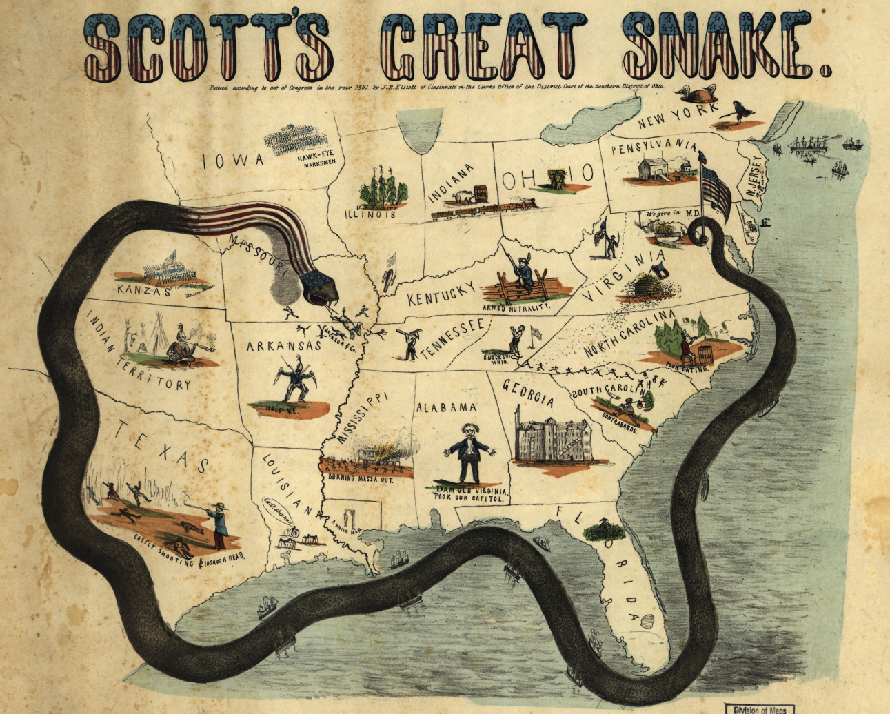
Maps that spread in this way tend to inspire emotion and be persuasive in nature (Monmonier 2018; Muehlenhaus 2014; Robinson 2018). Despite the heightened study of such emotive and persuasive maps due to their dispersion on social media, persuasive maps themselves are not new. Figure 8.6.1 shows a map from the Civil War, which illustrates General Winfield Scott’s plan to conquer the south. The snake illustrates a dark, emotional message.
Social networking sites such as Twitter have facilitated the spread of maps to a global audience with incredible speed. Such sites also invite the designing and sharing of persuasive maps by nearly anyone with access to the Internet—it is difficult to overstate the contrast between this new environment of online map distribution and cartography’s history of maps being made primarily by professional cartographers or those in positions of power. In many ways, we find ourselves in an exciting, dynamic, more democratic era of map-making. It is important to note, however, the challenges that have arisen in this new era. The increasing ubiquity of maps and map-making has blurred the lines between mapmakers who make mistakes and those who deliberately mislead; between personal perspectives and dangerous propaganda.
Related to the increased availability of map-making tools and online map distribution channels, web technologies have facilitated increased access to wide amount of data within the public domain. Where debate tends to ensue, however, is when such data are made more visible and accessible to everyone, such as with the creation of an engaging map. Maps printed along with an article in a local newspaper titled “The Gun Owner Next Door: What You Don’t Know About the Weapons in Your Neighborhood” provide a useful case study of such a debate. The article and accompanying maps identified gun-owners in the local area by their names and addresses. The map itself ‘went viral’ both due to people's intrigue in the data mapped, and the outrage that the discussions surrounding it incurred.
Student Reflection
Read the article mentioned above, available here: “The Gun Owner Next Door: What You Don’t Know About the Weapons in Your Neighborhood [21].” Would you consider it ethical to map any data, as long as it is available in the public domain? If not, where do you stand on this issue? How might we decide where to draw the line?
As a Penn State Student, you have free access to the NY Times, the Wall Street Journal, and others through the Student News Readership Program. This link [22] provides instructions on how to get access.
Maps are omnipresent in political media—consider the interactive maps used extensively on news channels while reporting election results. About a month before the 2016 US Presidential election, Nate Silver (Silver 2016) posted a map with the heading “Here’s what the election map would look like if only women voted: [23]”
In addition to reaching viral status itself, the map inspired many others to create similar maps, such as what the election map would look like if only millennials/white women/people of color voted. Robinson (2018) uses Silver’s map as an instrumental example of a viral map in his recent paper, Viral Elements of Cartography. He notes that it is characteristic of viral maps to inspire the creation of others.
Though viral and persuasive maps are often discussed in tandem (e.g., Muehlenhaus 2014), viral maps need not always be persuasive or political. The map in Figure 8.6.2 below was designed by Joshua Stevens, a cartographer at NASA who despite being well-known in the data visualization community, has only a fraction of the online following of journalist Nate Silver (Silver 2018). It was the creativity and entertainment value generated by Stevens’s map which was responsible for generating its viral status.
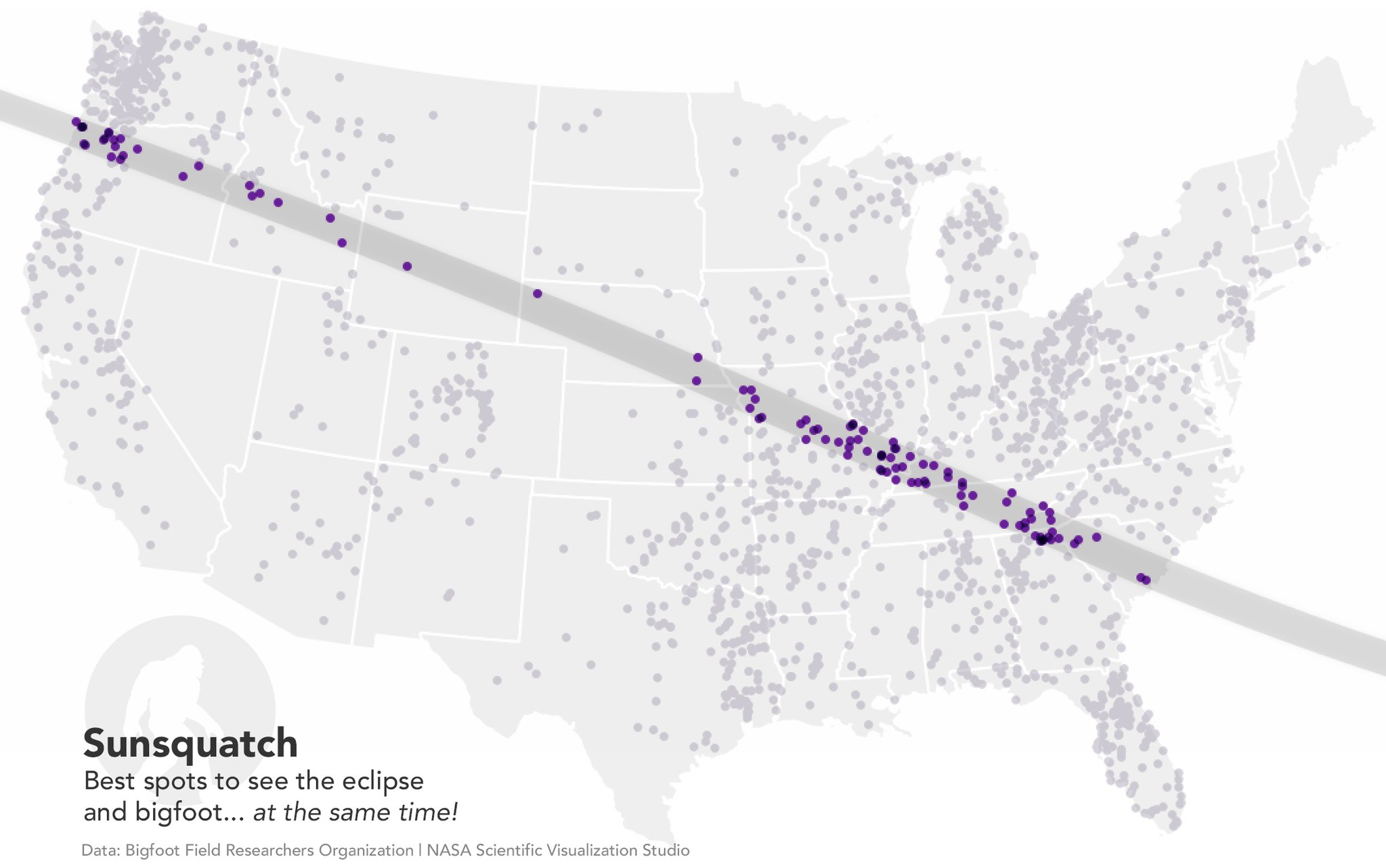
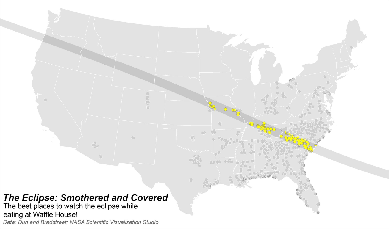
Like Silver’s map of women voters, Stevens’s Sunsquatch map inspired the design of many others, some of which went viral themselves, such as Jerry Shannon’s Smothered and Covered map (Figure 8.6.3) which illustrated where one could watch the eclipse while eating at Waffle House.
These maps by Silver, Stevens, and Shannon highlight the usefulness of Monmonier’s classification of new-era maps facilitated by web technologies as fast rather than dynamic or interactive maps (Monmonier 2018). The speed at which these maps were shared to thousands of users certainly qualifies them as fast, though they are simple, static maps. And though these static maps do not include animation or permit user interaction, they did instigate discussion and inspire further map-making, making them interactive in their own right. Certainly, interactive and/or animated maps can also ‘go viral.’ The above examples illustrate, however, the power in pairing a simple illustrative graphic with a creative idea.
Recommended Reading
- Muehlenhaus, Ian. 2014. “Going Viral: The Look of Online Persuasive Maps.” Cartographica: The International Journal for Geographic Information and Geovisualization 49 (1): 18–34. doi:10.3138/carto.49.1.1830.
- Robinson, Anthony C. 2018. “Elements of Viral Cartography.” Cartography and Geographic Information Science 00 (00). Taylor & Francis: 1–18. doi:10.1080/15230406.2018.1484304.
3D Maps
3D Maps
Similar to how new web-based technologies have made it easier to design interactive and animated maps, technological advancements have altered mapmaking in another, related way—enabling more realistic depictions of the real world through more accessible 3D-mapping tools and virtual/augmented reality.
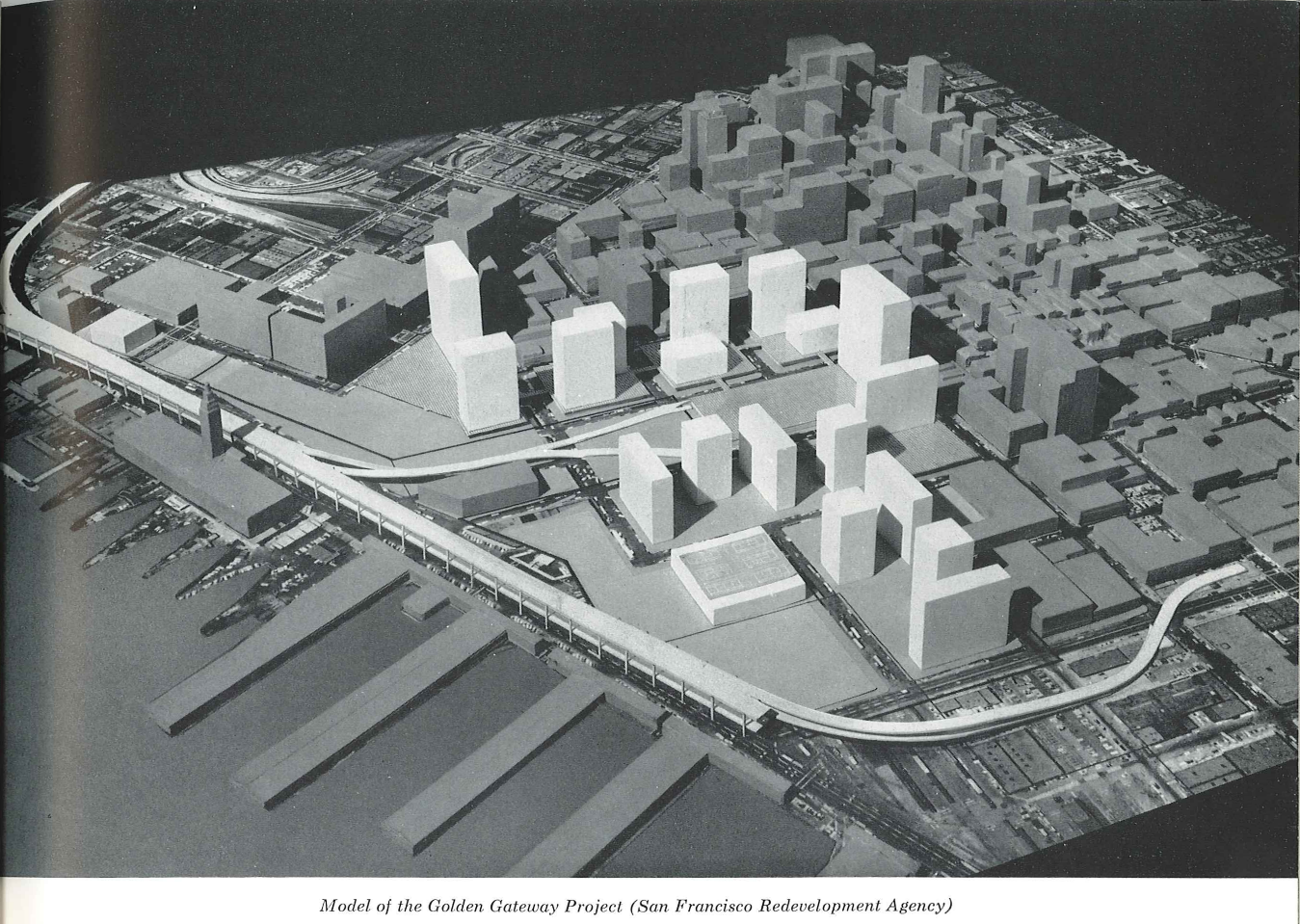
Three-dimensional visualizations have long been used to create city models (e.g., Figure 8.7.1) and similar models of Earth’s terrain or built environment. As we discussed in Lesson 6, these models are useful in that they provide a realistic view of the environment, but their realism and complexity often come at a cost. For example, the oblique view inherently obstructs some of the scene (e.g., locations behind tall buildings), and physical models are typically not built to scale.
In the past, creating complex 3D digital visualizations and physical models came at a near-prohibitory cost. Yet recent increases in the computational power of mainstream computers and new software tools have reduced the time, capital, and expertise required to create three-dimensional maps. Naturally, this has encouraged cartographers to make more of them. The inclusion of 3D visuals in mapping tools has become increasingly widespread—realistic modeling of buildings can now be seen, for example, in popular mapping applications such as Apple Maps [29].
Increasing interest in and availability of 3D mapping tools has also resulted in an increased use of extruded or perspective height as a visual variable. Unlike the 3D map examples above, perspective height uses a third dimension to encode a variable distinct from the actual physical height of a feature.
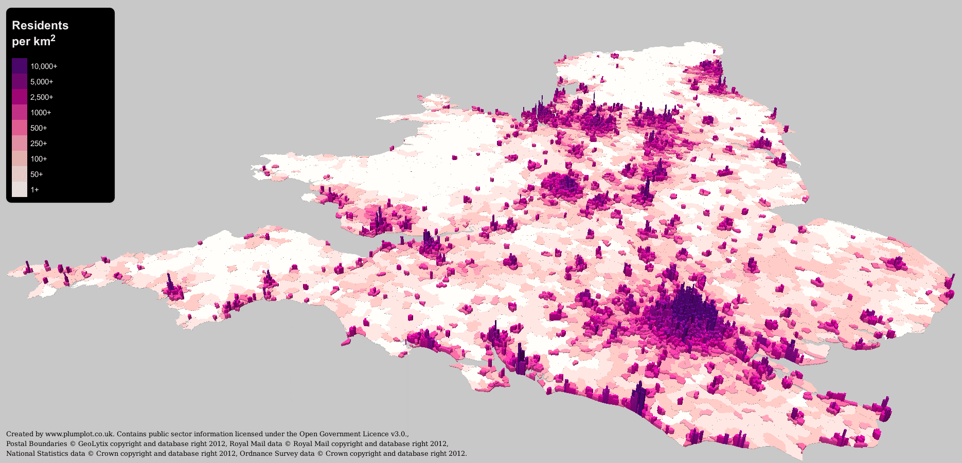
An example is shown below (Figure 8.7.2). This is a choropleth map that uses a multi-hue sequential color scheme to encode the population density of the United Kingdom by postal code. In addition to color, however, another visual variable is used—perspective height. Areas with higher densities are extruded from the map, giving them increased visual emphasis. The result is a map that portrays the look of a varied terrain—only instead of actual physical terrain, it visualizes the terrain of people across the landscape.
Similar to the visual depiction of uncertainty, an important question surrounds the use of 3D visualization: is it useful? The answer, as provided by recent cartographic research, is similar: it depends. Generally, studies have found that people enjoy using 3D maps more than their 2D counterparts. These studies also typically find, however, that people perform tasks less efficiently with 3D graphics than with simpler 2D visualizations (Smallman and John 2005).
There is no scientific consensus on whether 3D visualization tends to be helpful for users, and due to the context-dependence of such a question, it is unlikely that there will be an answer anytime soon. What the current state of research suggests is that 3D visualizations should be used with caution. In contexts where seconds count (e.g., emergency management; disaster response) for example, 3D visualization tools might be a risky option. In contexts where user enjoyment is of greater priority (e.g., in a university’s campus map), it might instead be an excellent choice.
Recommended Reading
- Padilla, Lace. 2018. “How Do We Know When a Visualization Is Good? Perspectives from a Cognitive Scientist [31].” Medium.
- Çöltekin, A., I. Lokka, and M. Zahner. 2016. “On the Usability and Usefulness of 3D (Geo)Visualizations - A Focus on Virtual Reality Environments.” International Archives of the Photogrammetry, Remote Sensing and Spatial Information Sciences - ISPRS Archives 41 (June): 387–392. doi:10.5194/isprsarchives-XLI-B2-387-2016.
Extended Reality
Extended Reality
Related to 3D visualization is a new system of technologies that has quickly gained attention in recent years: extended reality. Extended reality is an umbrella term that encompasses several related technologies including virtual reality and augmented reality. You have likely seen examples of these technologies used for sports and gaming—examples include Pokémon GO, an augmented reality mobile game, and Samsung’s Oculus Rift virtual reality headset.
Student Reflection
Even the yellow first down line you see on the football field during NFL games is an example of augmented reality. Watch the video about it: How the NFL's magic yellow line works [32]. Can you think of an environmental or emergency management scenario in which similar technology might be useful?
MacEachren and colleagues (1999), based on the work of Michael Heim (1998), categorized extended reality technologies by “the four I’s” – immersion, interactivity, information intensity, and intelligence of objects. It may be helpful to consider these factors as we discuss extended reality technologies. The most common way to categorize these tools, however, is via a continuum of immersion, from augmented reality (i.e., the overlay of objects onto the real world), to virtual reality (i.e., full immersion in an imagined space).

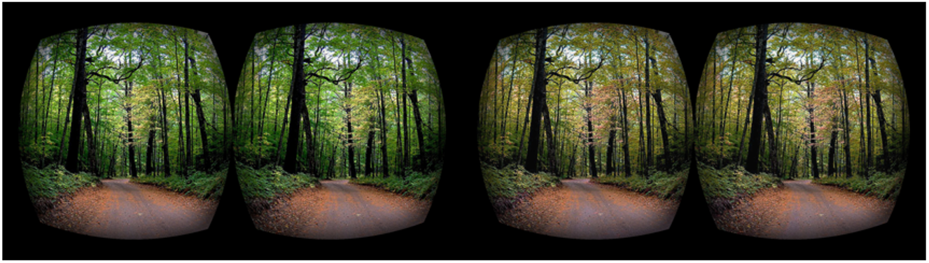
As it is the most commonly-used term and a sufficient label for this technology, we will use the term virtual reality when discussing immersive computer-modeled environments. Note, however, that some scholars have used the term virtual environments instead. A virtual environment is a defined three-dimensional computer-simulated environment that enables user navigation and interaction (Slocum et al. 2009). The reason this term is occasionally preferred over virtual reality is that virtual environments often depict imagined things—for example, by visualizing Earth’s ozone layer, which is not actually visible to the human eye, and thus not a part of reality (Slocum et al. 2009).
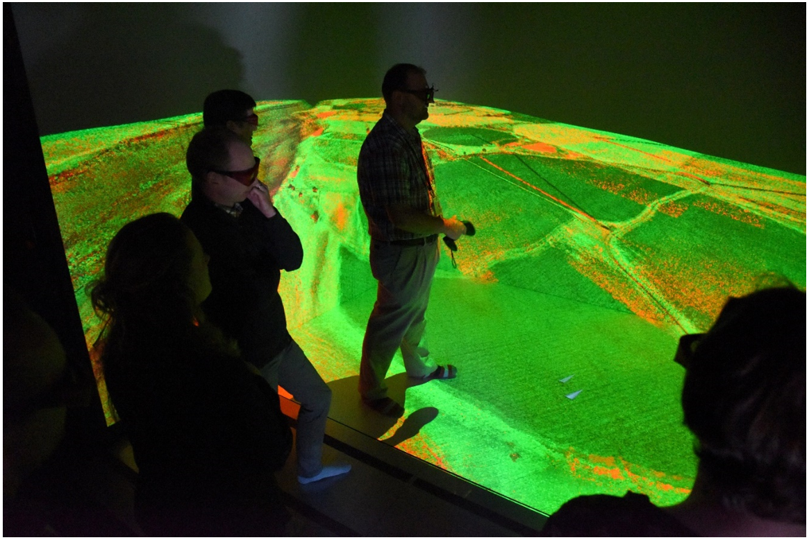
Applications of extended reality in geography include creating virtual cities, virtual field trips, digital globes, and more. Shown in Figure 8.8.2 is a Computer-Assisted Virtual Environment (CAVE) from the Idaho National Laboratory.
Similar projects have been developed here at Penn State. In broadest terms, virtual reality is being used to permit travel to locations otherwise inaccessible to users. Immersive Technologies for Archaeology [34], for example, is a project that brings users to the Mayan ruins at Cahal Pech in Belize. Future plans for the project include completing a historical model of the Mayan city—permitting users to view not only a place but also a time—that they would otherwise be unable to inhabit. Other projects, such as Visualizing Forest Futures [35] (VIFF; Figure 8.8.3) extend in the opposite direction, giving users a view of the projected future of forests, based on possible future climate scenarios.
Student Reflection
Think back to the first topic introduced in this lesson: cartographic generalization. How do we resolve the differences between the premise of generalization and the goals of VR?
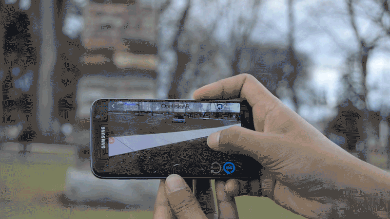
As mentioned previously, not all extended reality is fully immersive—in fact, the fastest-growing type of extended reality is augmented reality (AR). Social media applications such as Snapchat use augmented reality as entertainment value, but AR can also be used in education and research applications. Figure 8.8.4 below shows the application Obelisk AR, developed at Penn State. Users can use the app to interact with a real-world object (The Obelisk) in a mobile environment. Tapping on a stone on the Obelisk, for example, brings up a pop-up on the user’s smartphone screen that explains the type and origin of the type of stone selected.
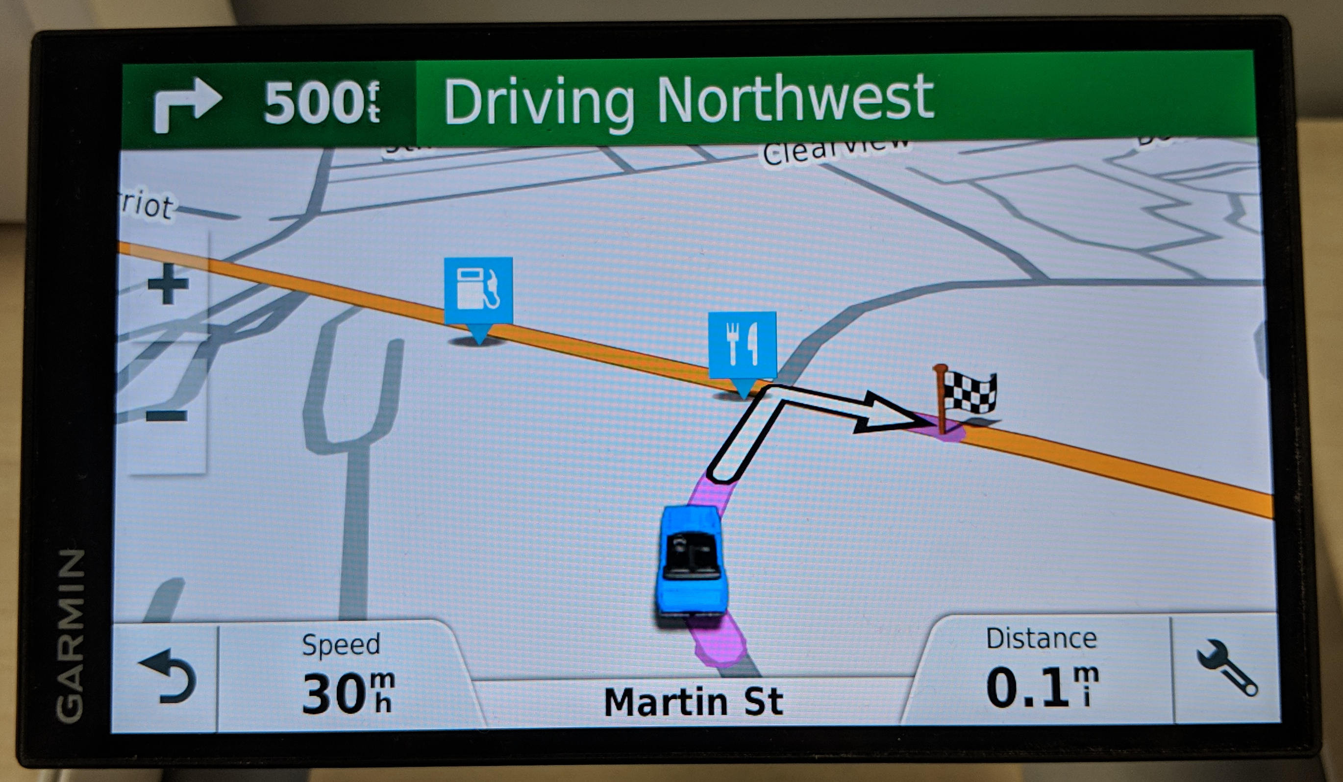
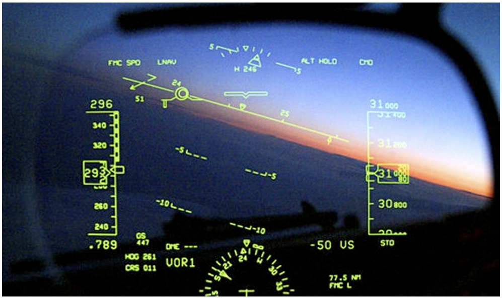
Augmented reality has also shown incredible potential for navigational and wayfinding applications. Earlier in this lesson, we discussed personal navigational devices in the context of passive interactivity. In some cases, augmented reality has taken such navigational devices to the next level. Pilots, for example, are often assisted via heads-up displays (Figure 8.8.5). These displays show crucial information overlaid across the environment, providing a better decision-making tool than a separate digital display.
Heads-up displays are also used for automobile navigation; such displays are offered by some luxury vehicle navigational systems, such as the one in Figure 8.8.6. Unlike AR pilot navigation systems, automobile heads-up navigation displays are not in widespread use. Increasing accessibility and affordability of these technologies, however, may result in them being the way of the future.
Watch this video of a car using a heads-up navigation display as it drives through intersections and accelerates onto a highway (2:02).
Lesson 8 Lab
Lesson 8 Lab
Multiscale Map Design in Mapbox Studio
In Lesson 8, we talked a lot about interactive maps, and how the recent proliferation of such interactive maps has brought the challenges of map generalization back into focus. To create an effective interactive map, cartographers must consider not only how a map looks at one scale and extent (i.e., as in a typical static map) but at all locations and every scale.
As suggested above, creating an interactive web basemap can be a challenging task. Fortunately, tools exist to make this process easier and more efficient. In Lab 8, rather than using ArcGIS Pro, we will be working in Mapbox Studio [43]. Mapbox Studio is an online mapping platform for creating custom interactive maps. Mapbox maps can be used on their own, but they are also often used as basemaps in web-mapping applications and interactive thematic maps.
Before getting into the details of working in Mapbox, please be aware that the software is different than ArcPro. You need to remove much if not all of how you approach working with data in Mapbox. Aside from layers, there is little else in common between the way that Mapbox and ArcPro handles data. Thus, expect that there will be a bit of a learning curve with this lesson.
Lab Objectives
- Design an interactive basemap from the ground up using Mapbox Studio [43].
- Build a creative map design inspired by a favorite piece of media and/or art.
- Use your knowledge of map generalization to build a map that functions well at multiple scales.
- Reflect on the experience and challenges involved in designing an interactive web map.
Overall Lab Requirements
- Submit only one PDF document: this should include a link to your working map as well as a reflection.
- Example art-inspired basemaps:
Specific Requirements
Mapbox Map
- Use at least 12 different layers (total) in your map. Each layer should be individually styled: do not use default settings.
- Include at least 3 label layers (example: road labels,(admin) place labels, (poi) points of interest labels, or other labels that relate to your theme).
- For one of your layers, use one of the available Mapbox terrain layers.
- Data should transition appropriately across scales. Your map will be checked at large (local), medium (regional), and small (world) scales – you will need to set zoom-level controls for some of your layers so that they either appear/disappear or change their styling as the user zooms in and out.
- Draw inspiration from a favorite piece of media/art, such as a famous painting for favorite TV series – have fun with this – be creative!
Reflection requirements (250+ words)
- Explain the inspiration source (e.g., movie, TV show, art)behind your basemap design – include an image or images for illustration purposes.
- Explain key challenges you faced when designing your map, and how you overcame them.
Lab Instructions
- Create an account (with your PSU email) with Mapbox Studio [46].
- All map design will take place within the Mapbox Studio web interface.
- You will not need to download or upload any data to complete this lab.
Grading Criteria
A rubric is posted for your review.
Submission Instructions
- Submit one PDF using the naming convention below.
- LastName_Lab8.pdf
- This document should include your written reflection as detailed above, as well as a working link to your online map.
- Submit to Lesson 8 Lab for instructor and peer review. (Note: The critique/peer review will occur in Lesson 9.)
Ready to Begin?
Further instructions are available in Lesson 8 Lab Visual Guide.
Lesson 8 Lab Visual Guide
Lesson 8 Lab Visual Guide
Lesson 8 Lab Visual Guide Index
- Introduction to Mapbox
- Creating a New Style
- Add Additional Layers
- Add a Label Layer
- Publish and Add Creative Styling
- Styling with Conditions
- Labeling Roads and More
- Adding and Styling Terrain
- Additional Tips and Video Tutorial Links
Lesson 8 Lab Visual Guide
-
Introduction to Mapbox
Unlike our other labs, we will not be using ArcGIS Pro for this lab, so there is no starting file! Instead, we will design an interactive basemap with Mapbox Studio.
Mapbox is an interactive web map design platform; there are many examples on their site of the possibilities designing with Mapbox provides. Check out the Mapbox Gallery [47]!
As you likely notice in the gallery link above, some of the most visually appealing Mapbox maps are not what we would consider traditional basemaps. They take significant creative license with their color and pattern design, while still incorporating proper cartographic generalization and providing legible map symbols. Our goal is to do the same in Lab 8 - you will be creating a new interactive basemap inspired by a favorite piece of art/media/design - have fun with it!
The first step in this lab is to create a Mapbox Studio account. Use your university email account, which will enable all necessary features for free. Once you're logged in, you should see the starting dashboard (Figure 8.0). Once the start-up screen is visible, you will click in the "Start by desinging a map >" area.
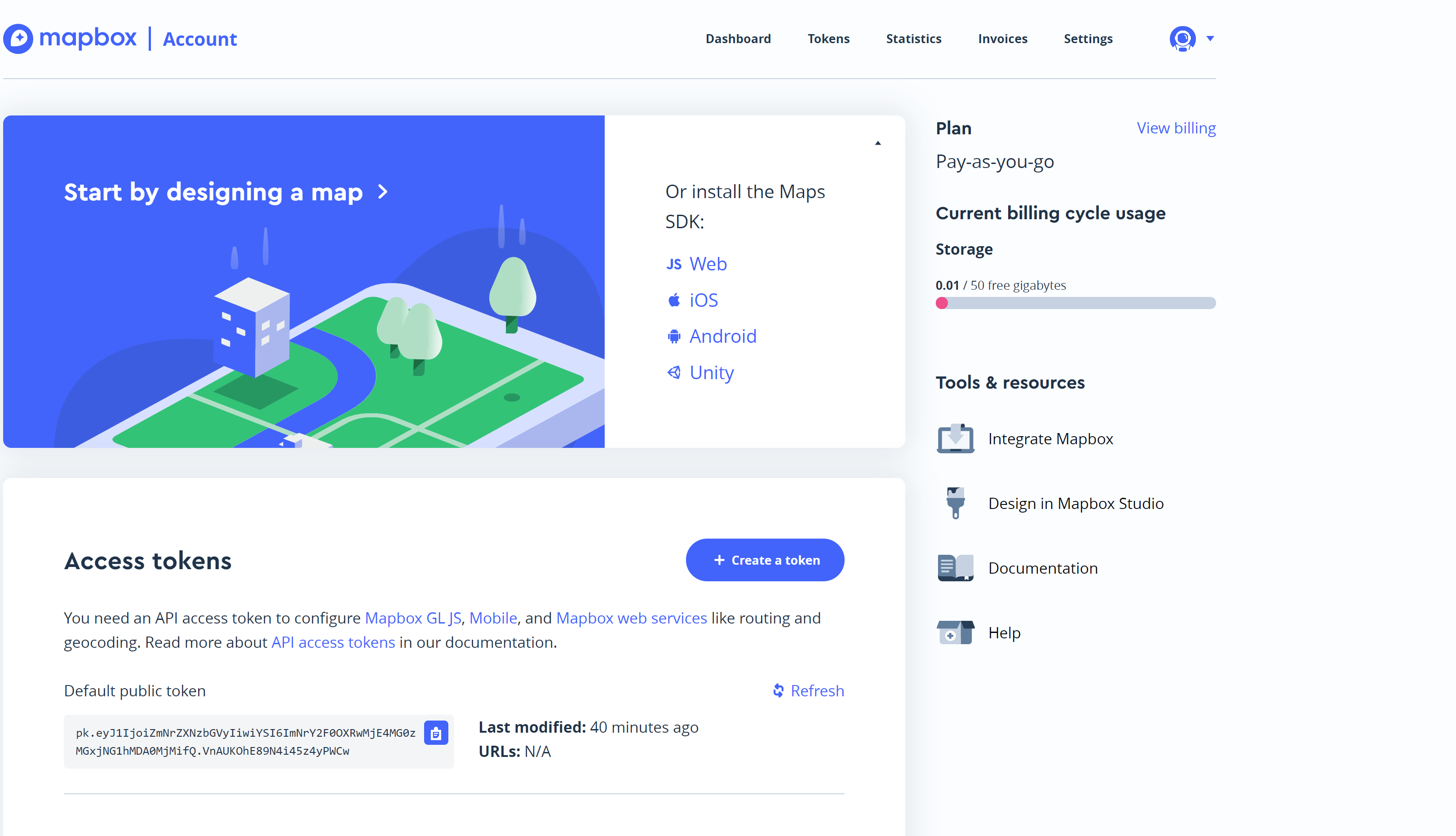 Visual Guide Figure 8.0. Starting dashboard - Mapbox Studio.
 -
Creating a New Style
In the next window to appear (Figure 8.1), select the New style button to create a blank template that you will use to build your own map.
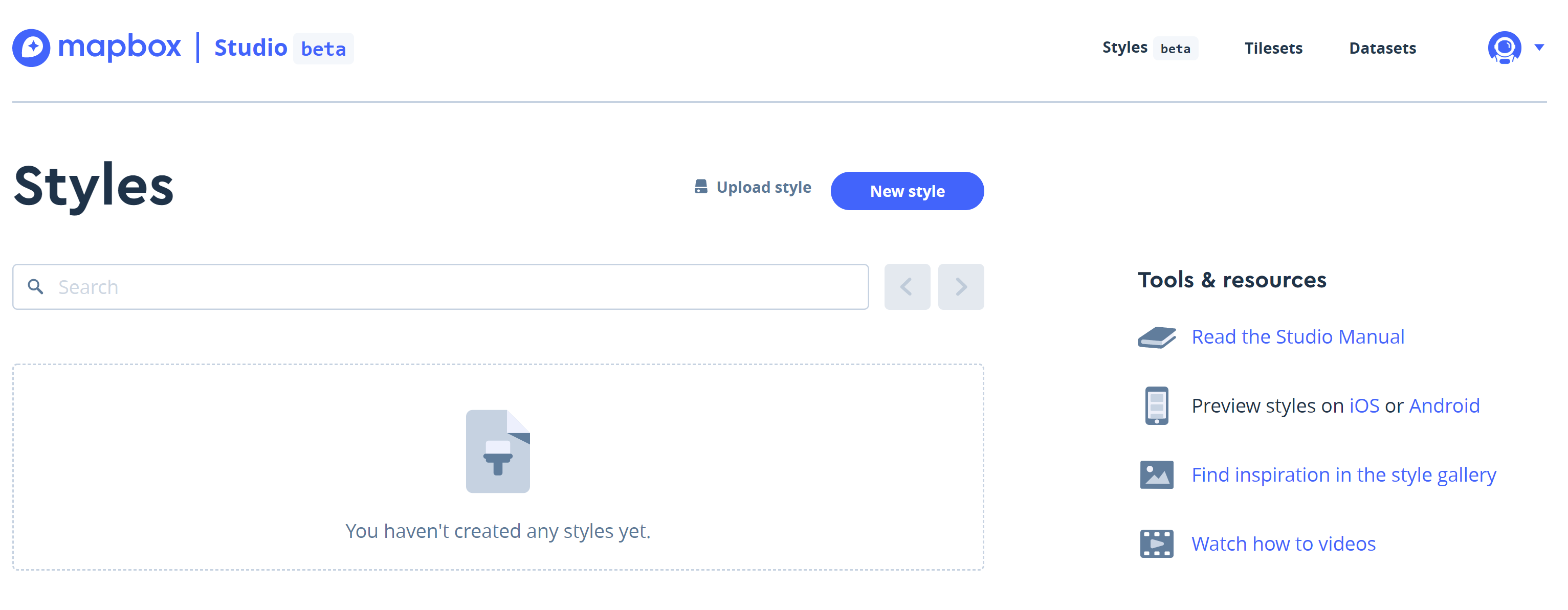 Visual Guide Figure 8.1. Starting a New Style in Mapbox.
 -
Creating a Blank Template
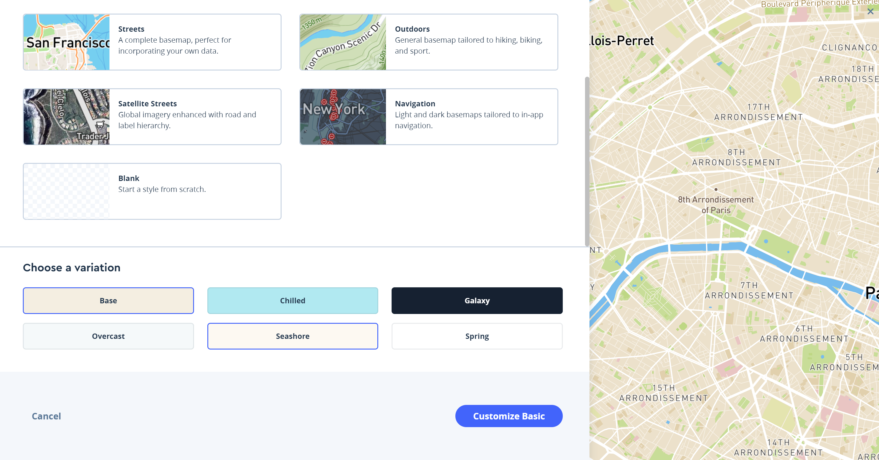
With Mapbox, you work with styles. These are templates that get you started with your design. Note, that styles are easily changed. Having selected New style on the previous window (Figure 8.1), you will now use an empty template from which to build your own map. A new window appears (Figure 8.2) listing several defualt style templates. Don't start with any of the pre-made templates that are listed. Instaed, scroll down the list of available styles and choose the Blank style. Then, select the Customize Blank button.
 Visual Guide Figure 8.2. Starting a blank template in Mapbox.
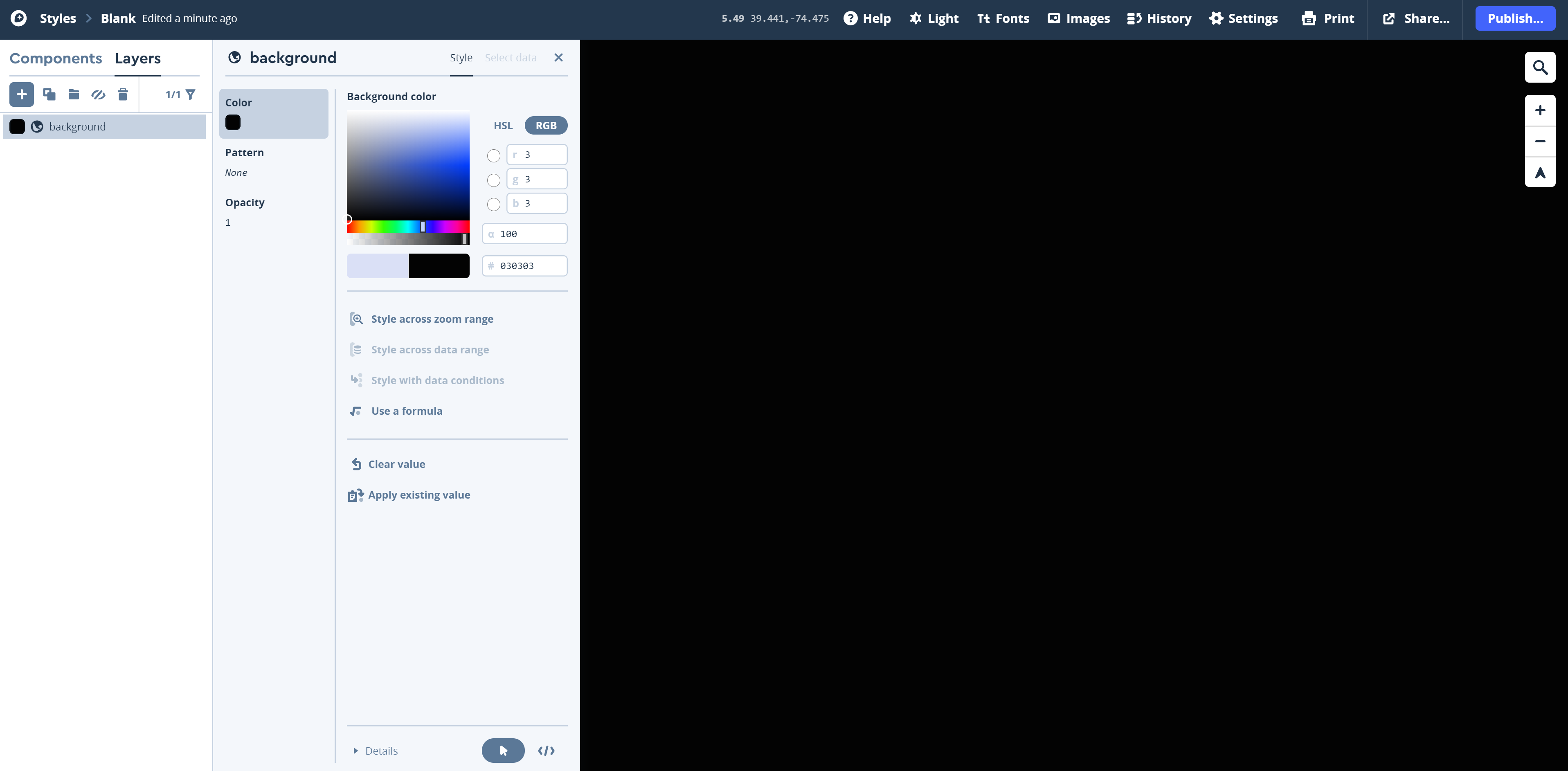
After selecting the Cutsomize Blank map template option, the studio editor will load: you should see a empty space to fill. We will be adding and styling layers one-by-one to create our basemap starting with the background layer (Figure 8.3). Before continuing, note that the process we will use to build a map in Mapbox is different from when we designed basemaps in ArcGIS Pro, keep in mind that many of the same principles apply (e.g., arranging the order of layers to match the visual order of the layers the reader sees).
 Visual Guide Figure 8.3. The Blank starting map in Mapbox Studio.
Start by designing the background for your map. You can alter your background's color, opacity, etc. To turn on the background layer for you to edit, select...
- Layers
- the "+" icon
- Convert to background layer option unser Source.
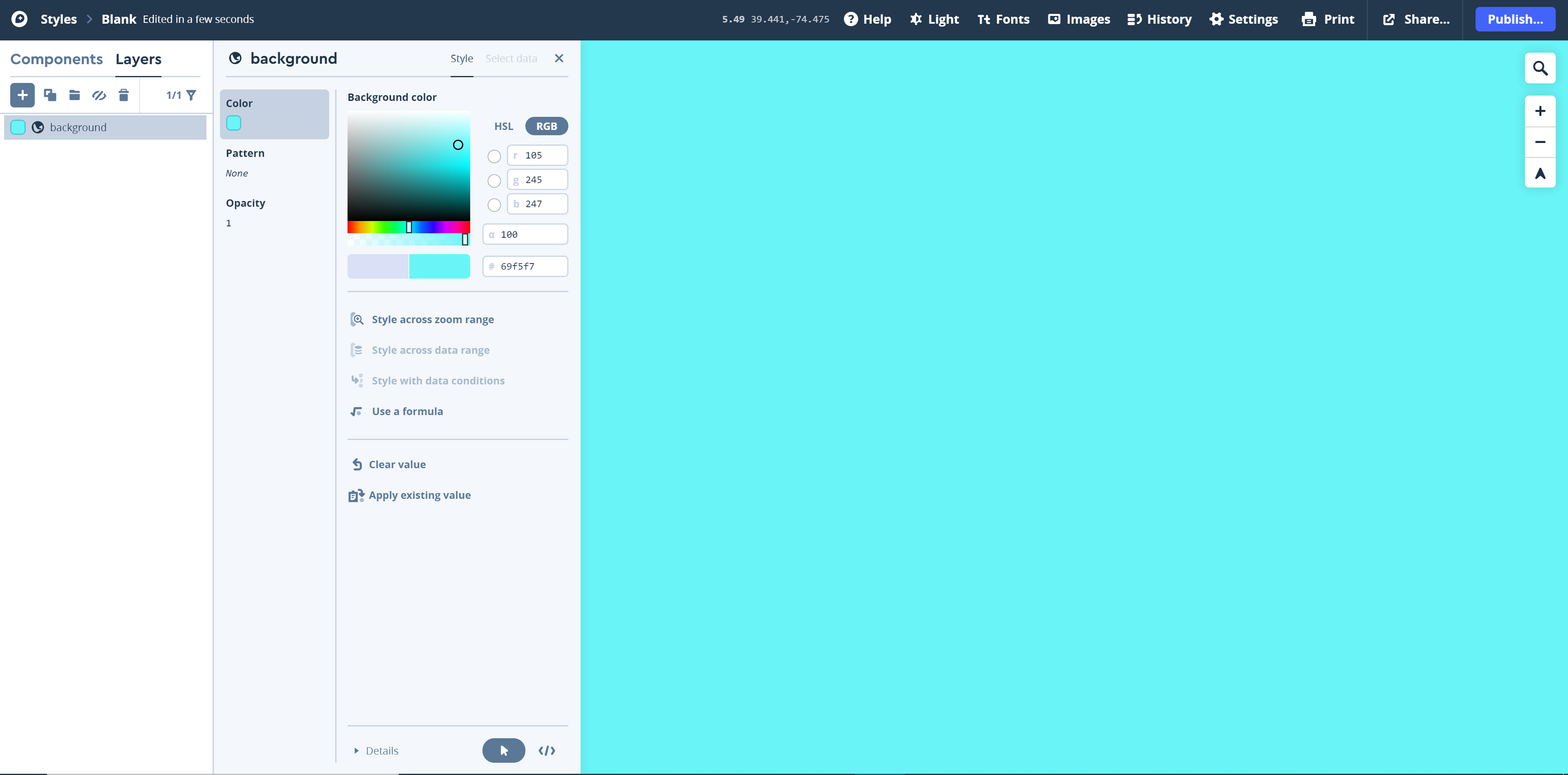
Figure 8.3 shows the default background layer style as a black background. You can and should change this default setting to something that is inline with your own design inspriation. For example, in Figure 8.4, I've selected a cyan or sea-green hue (click somewhere inside the color palette to set the color) as my background color. To change the background color, click on the square color chip next to the background layer. Note that you can also change the name of the background layer to something else by clicking on the word "background" at the top-left corner of the background window. Once you are finished with editing the background colot, exit out of the editing session by clicking on the "X" next to the Style and Select text in the upper-right corner of the background window. As the goal of this lab is to draw inspiration from a piece of art/media for your design, you will probably come back to alter the background layer more than once. I strongly encourage you to experiment with the many style options available first, and then go back later to make changes to your design at a later time.
Visual Guide Figure 8.4. Editing the map background layer. -
A Styling Example
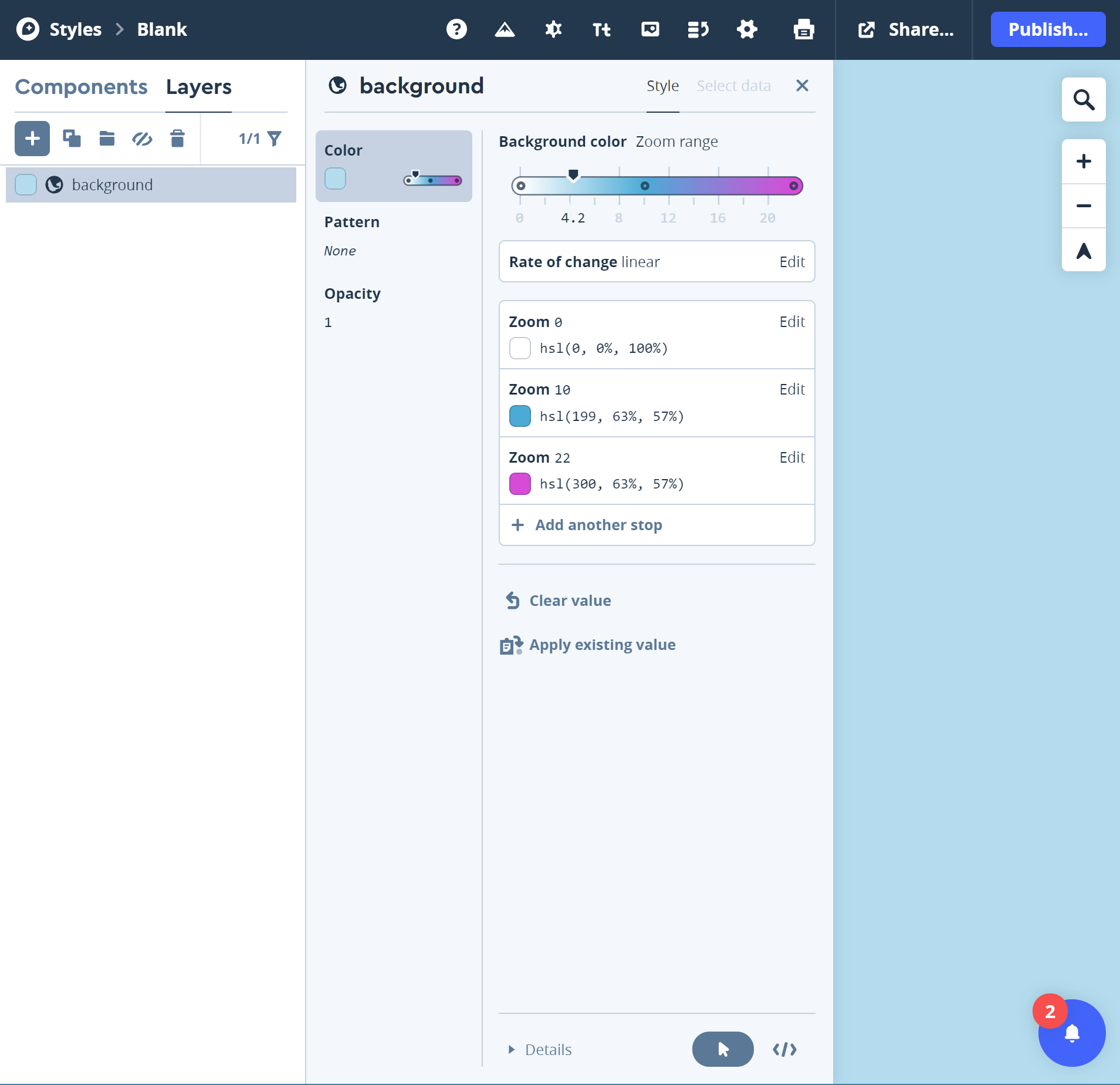
Mapbox allows you to add or change a style according to, for example, different zoom levels. In Figure 8.4b, I have set up a simple example where the background color changes according to the zoom range. Recall that a zoom range for basemaps runs from 0 (world view) to 22 (completely zoomed in view). Notice that there are three "stops" that exist. Zoom 0 is assigned a white bcakground fill. At zoom level 10, a cyan fill is assigned to the background, and at zoom 22, a magenta completes the zoom range color assignments. As the user zooms across the different ranges, the color changes in a linear fashion (as set by the Rate of change option). You can add additional zoom stops by selecting the "Add another stop" option, using the slider to set the zoom level where the change will take place, selecting a new color for the layer, and then selecting the Done button to set the action.
Visual Guide Figure 8.4b. Setting a color change across zoom levels in Mapbox Studio. -
Add Additional Layers
One by one, we will now add additional layers to our map. Click the "+" icon. Note that the New Layer window that appears is listed under the Select data item. Under Source, select the None selected option. In the panel that appears, use the vertical slider bar to navigate down to the Mapbox Streets V8 source as shown in Figure 8.5. The styles of the various "street" elements are shown. We'll start by adding the admin layer (you may have to scroll down a bit to see the admin layer. Select the layer to load it to your layer list. This page [48] provides an overview of all the individual types of layers and their attributes that are available in the Streets V8 file.
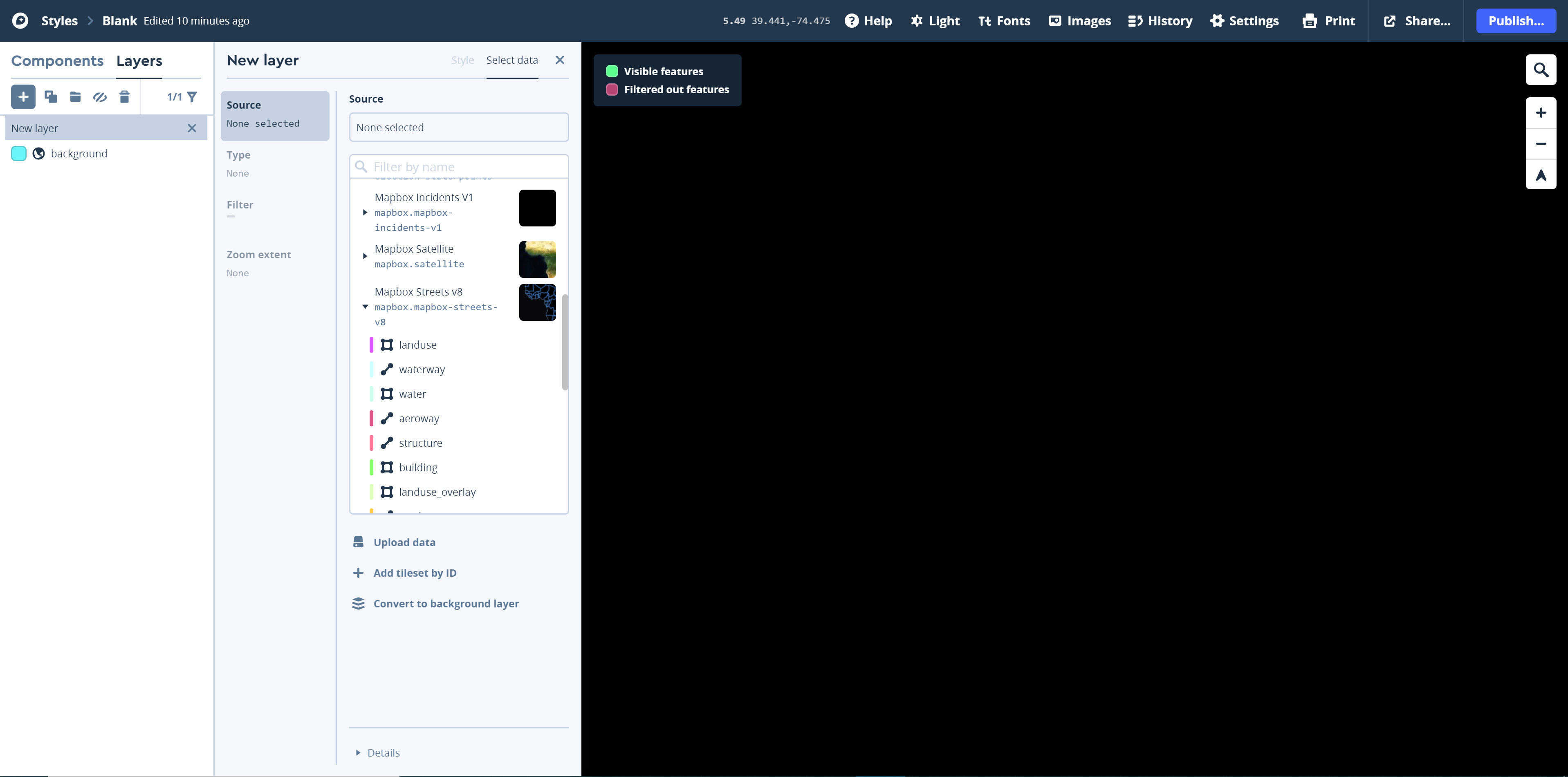 Visual Guide Figure 8.5. Adding the admin line layer from the Mapbox Streets v8 source.
Now that you have some data loaded, we can Style the new layer. Similar to how we edited the map background, we can edit the color, opacity, line width, etc., of the administrative boundary lines in this layer. Click on any of the options shown in the admin window and alter them as needed. Figure 8.6 shows the backtground color overprinted by darker blue county and state outlines. Note that as the admin layer only consists of lines, we cannot fill in the administrative boundaries - the fill for the administrative boundaries will be the color of your background layer. Of course, you can return and change the color of the background layer if you so choose. Next, we will change the color of the ocean by adding a water layer later.
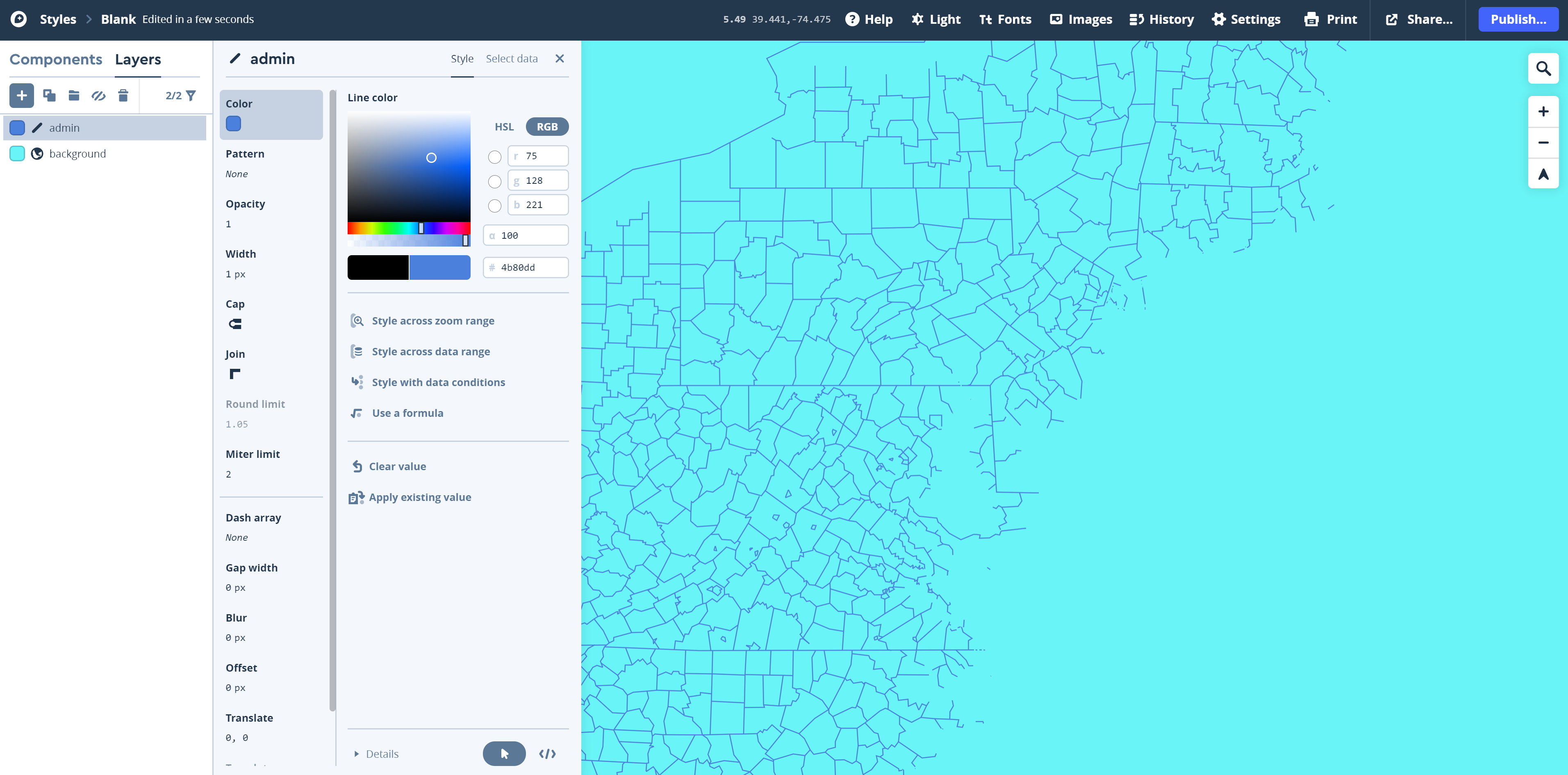 Visual Guide Figure 8.6. Editing the admin line layer in Mapbox Studio.
 -
Add a Label Layer
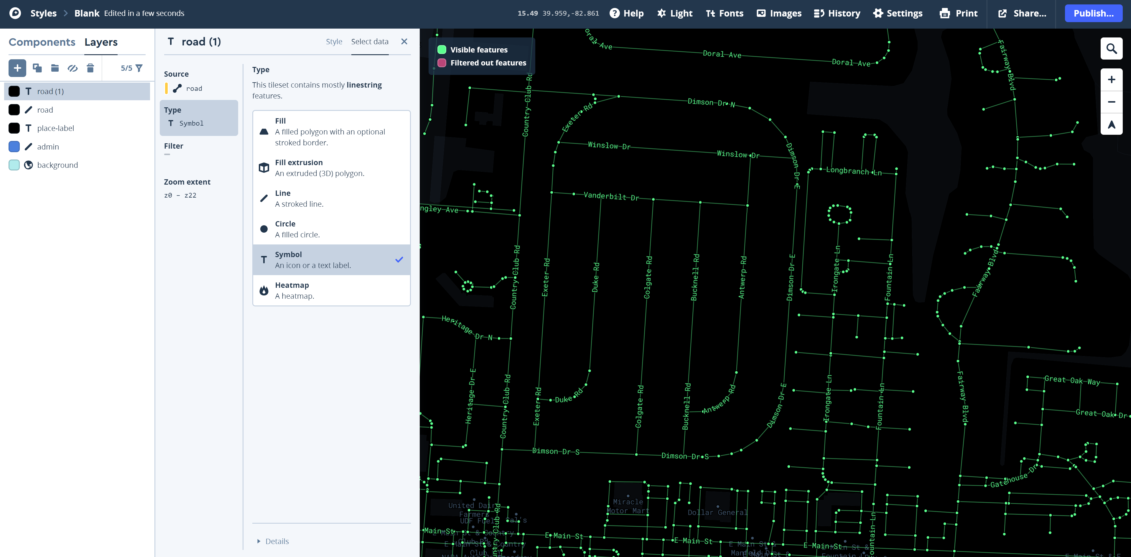
Add another layer: this time, select place-label from the Mapbox Streets V8 data set. Click on Type to set the type characteristics for this layer. To begin, choose Symbol (Figure 8.7). This action will result in your place labels displaying as text rather than as another kind of symbol such as a circle.
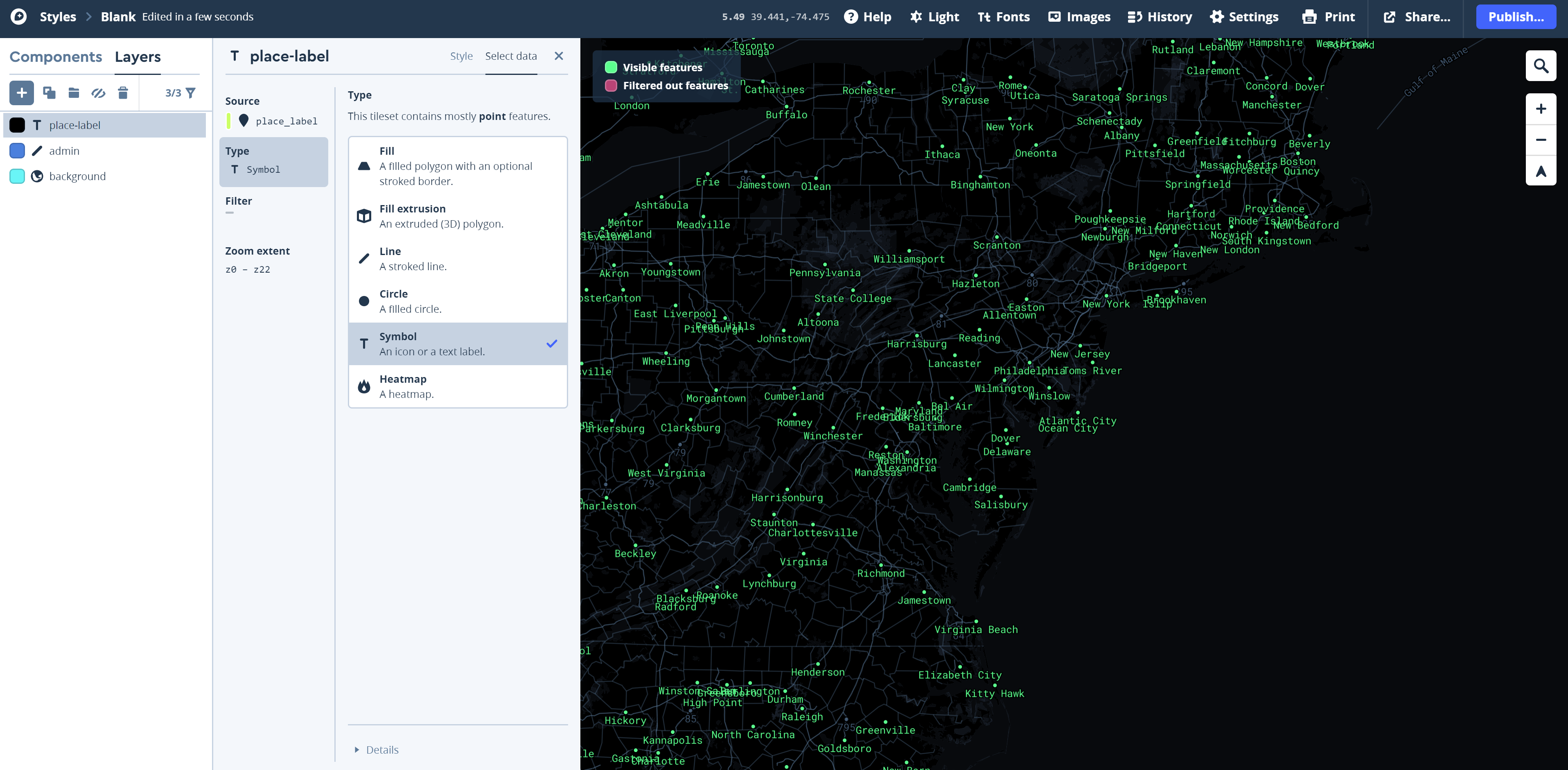 Visual Guide Figure 8.7. Adding a label layer (here, place_labels).
To display the labels and edit their appearance, you need to edit the Style of the place-label layer. To do this, click on the black rectangle to the left of the T place-label in the layer listing. On the menu items that appear, notice that the Text field option. Click on this option to select a "Text Field" that will be used to supply the text for your labels. Think of this process as choosing a field header of an attribute table. Select the Insert a data field that contains the labels you want.
-
If you look down the list of available data fields, you start your labeling by looking at either the "name" or "name_en" data field (Figure 8.8), depending on whether you would like the place names to display in the local language or always in English, respectively. You should explore other data fields for additional labels.
Once you have selected a data field to label, you will want to Style those labels using the Text, Icon, Position, and Placement options on the T Place-label window. Remember to work with the zoom across range option to maximize the visilibilty of your labels at different zoom ranges.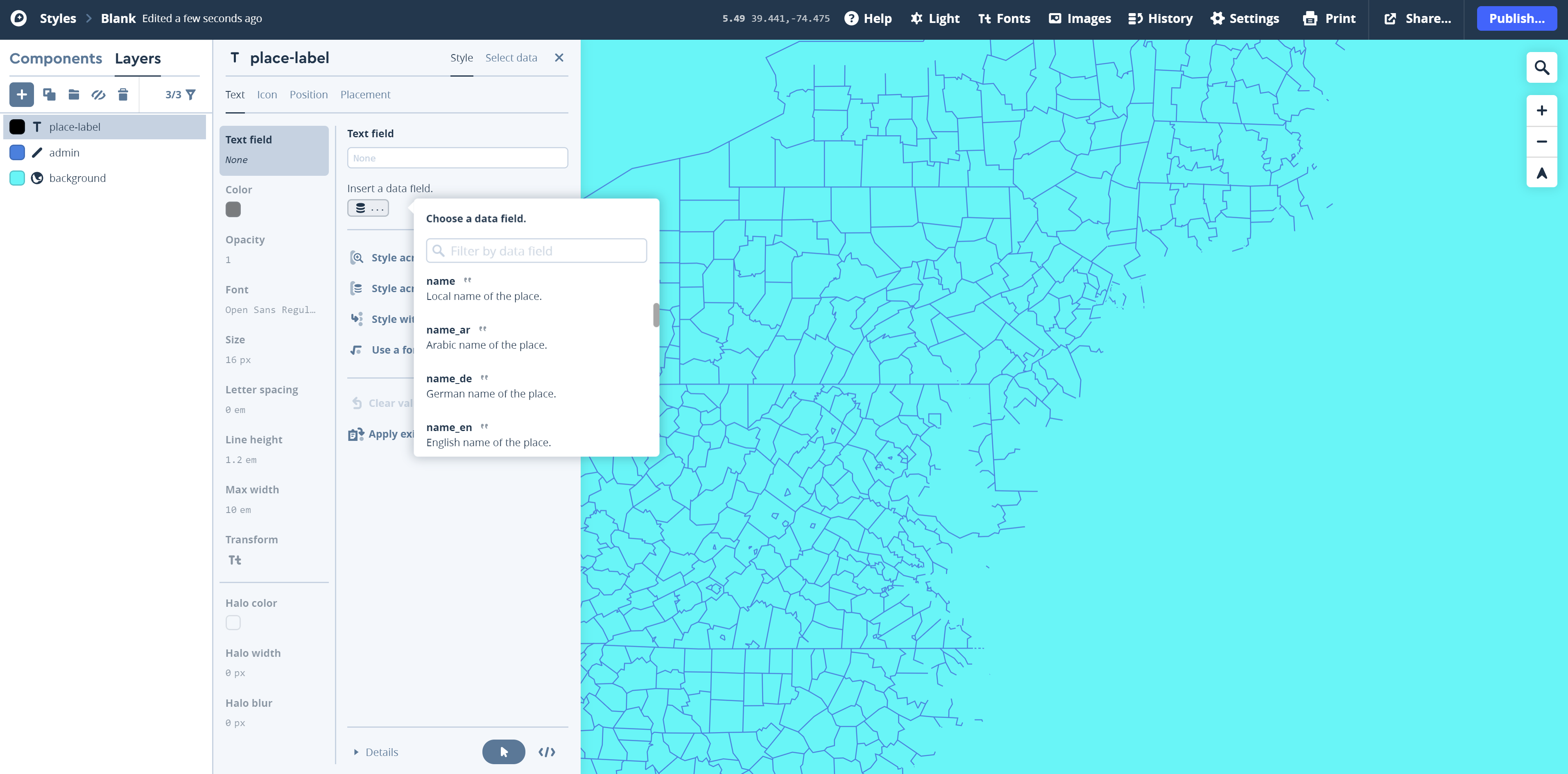 Visual Guide Figure 8.8. Choosing to insert a data field to display as a text label in Mapbox Studio.
 -
Publish and Add Creative Styling
Once you've made a bit of progress on your map, you should Publish it. To do so, click on the Publish button in the upper right-hand corner of the screen. The Publish Blank window appears (Figure 8.9) - this also saves the map in your account. You should re-publish as you work, similar to how you regularly save your work while using desktop software.
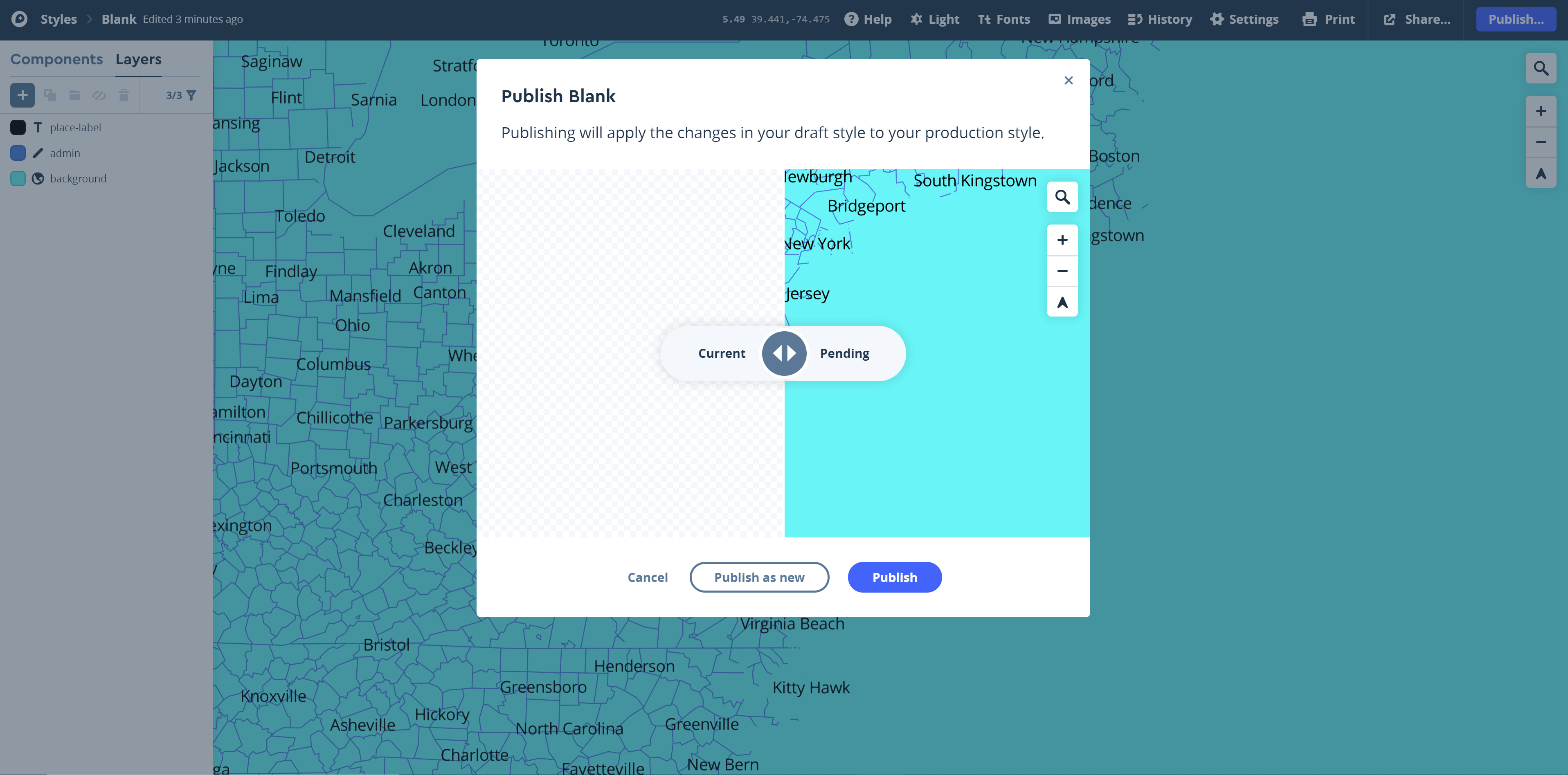 Visual Guide Figure 8.9. Publishing your mapbox basemap.
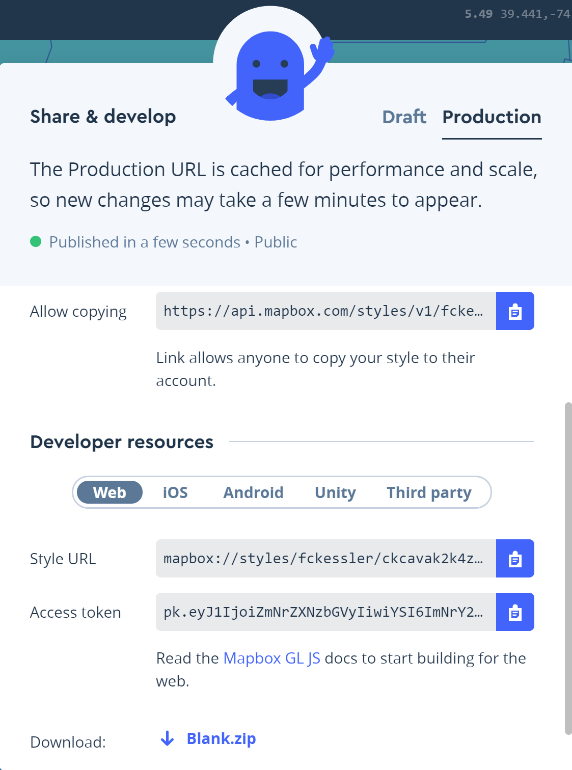
Once your map is published to the web, it will be available via a shared URL so that anyone with the link can view your map. Set your style to public. To Share your Mapbox creation through a URL, click on the Share button to the left of the Publish button (Figure 8.10a). On this window, you can Make public your Style URL. This is the URL that uniquely is attached to your Mapbox style. Note in FIgure 8.11 the Allow copying (at the top center of the window in Figure 8.10a) is how you can copy the URL, submit that URL with your deliverable, and share yoru Mapbox creation with others in the class for their peer review efforts.
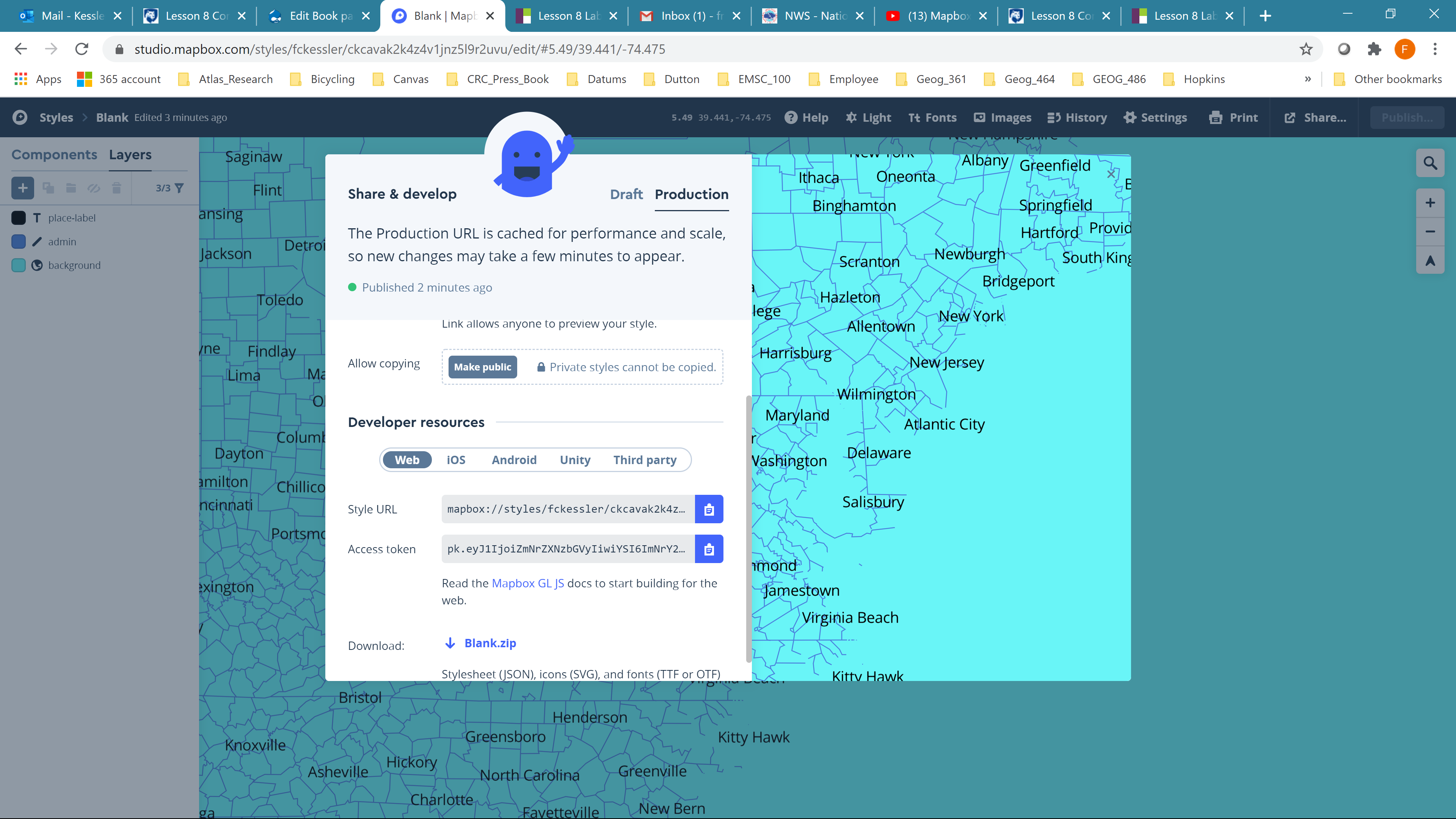 Visual Guide Figure 8.10a. Setting your map viewing settings to public.
Once you have Shared your style, you can let anyone with the link can view your map (Figure 8.10b). When you Allow copying with others in the class, make sure to copy the URL link that starts with https://api.mapbox.com/styles/v1/...
 Visual Guide Figure 8.10b. Setting your map viewing settings to public.
In addition to adding and styling new layers, Mapbox permits a lot of creative customization. Though it's not required, you may want to add a creative font to your map - such as one that is distinctly used in your inspiration source. Many open source fonts are available: here I've uploaded an OTF (OpenType Font) file, which I downloaded online from fontspace [49]. This font is called the priest. The font looks kind of strange but it could work with a sci-fi kind of theme. To load the font for a particular layer, click on the Font option in the Style item (Figure 8.11). Select the "Manage font in your account: link at the bottom of the listing of available fonts. Note that TTF (TrueType Font) files will work as well - try Google Fonts [50] for free downloadable font files.
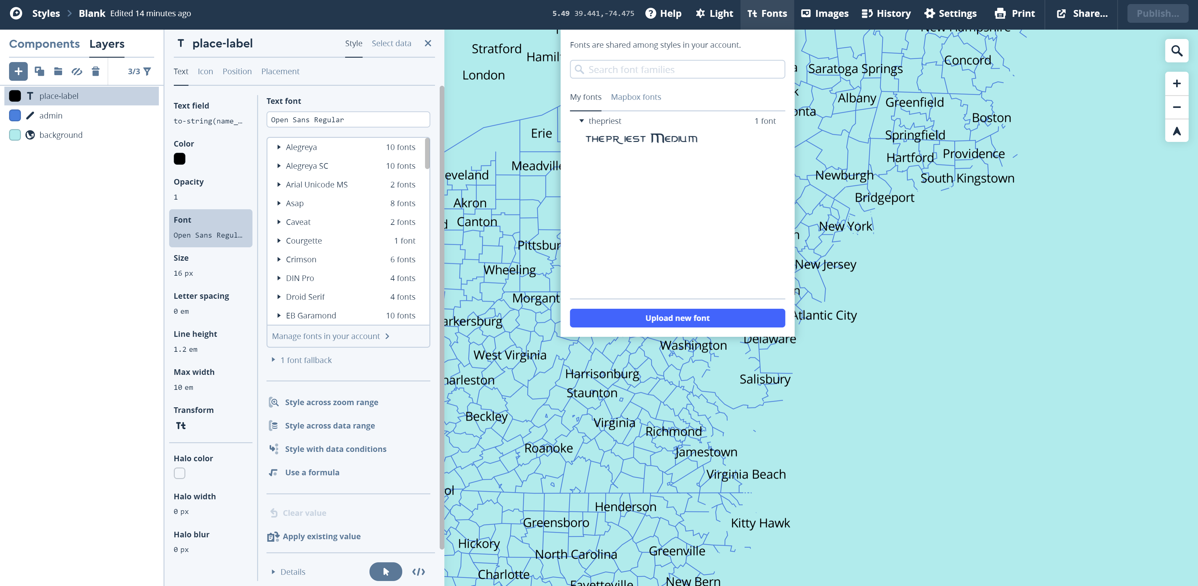 Visual Guide Figure 8.11. Uploading a new font.
As shown in Figure 8.12, this custom font creates an interesting look and feel to the map.
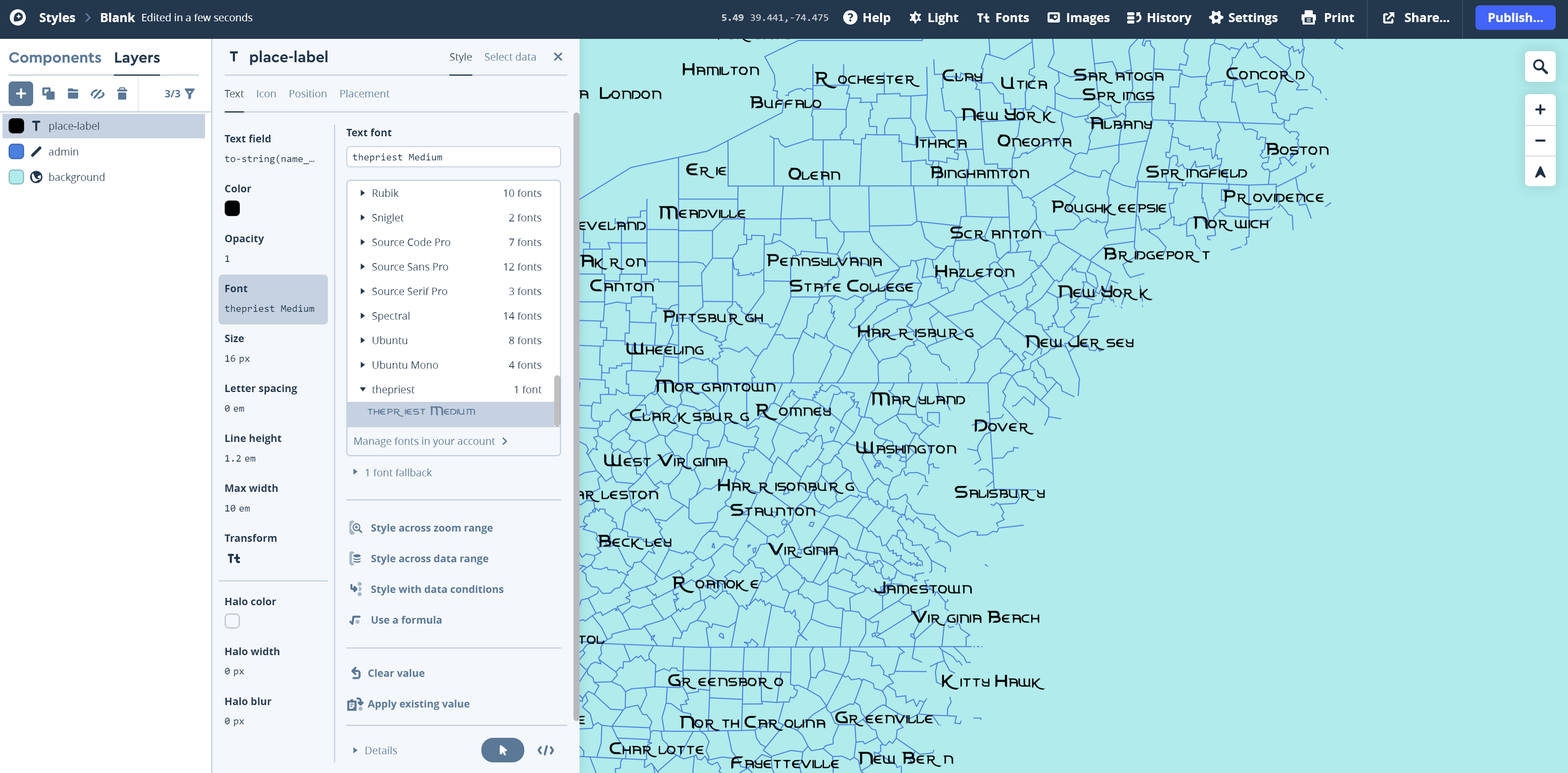 Visual Guide Figure 8.12. Creating place labels with a custom font.
 -
Styling with Conditions
Once you've made some progress on designing your basic map style, you should make some more detailed edits. Remember that we are creating a multiscale map. You may, for example, want your place labels to appear at a different point size based on the map's zoom level.
In Mapbox, certain layers have a minimum zoom level. For example, administrative boundaries are seen at all zoom levels (so, this layer has a minimum zoom level of 0), poi_labels have a minimum zoom level of 5, and large buildings have a minimum zoom level of 13 (all buildings show up at zoom level of 16).
To style place labels, use the "Style across zoom range" function (Figure 8.13).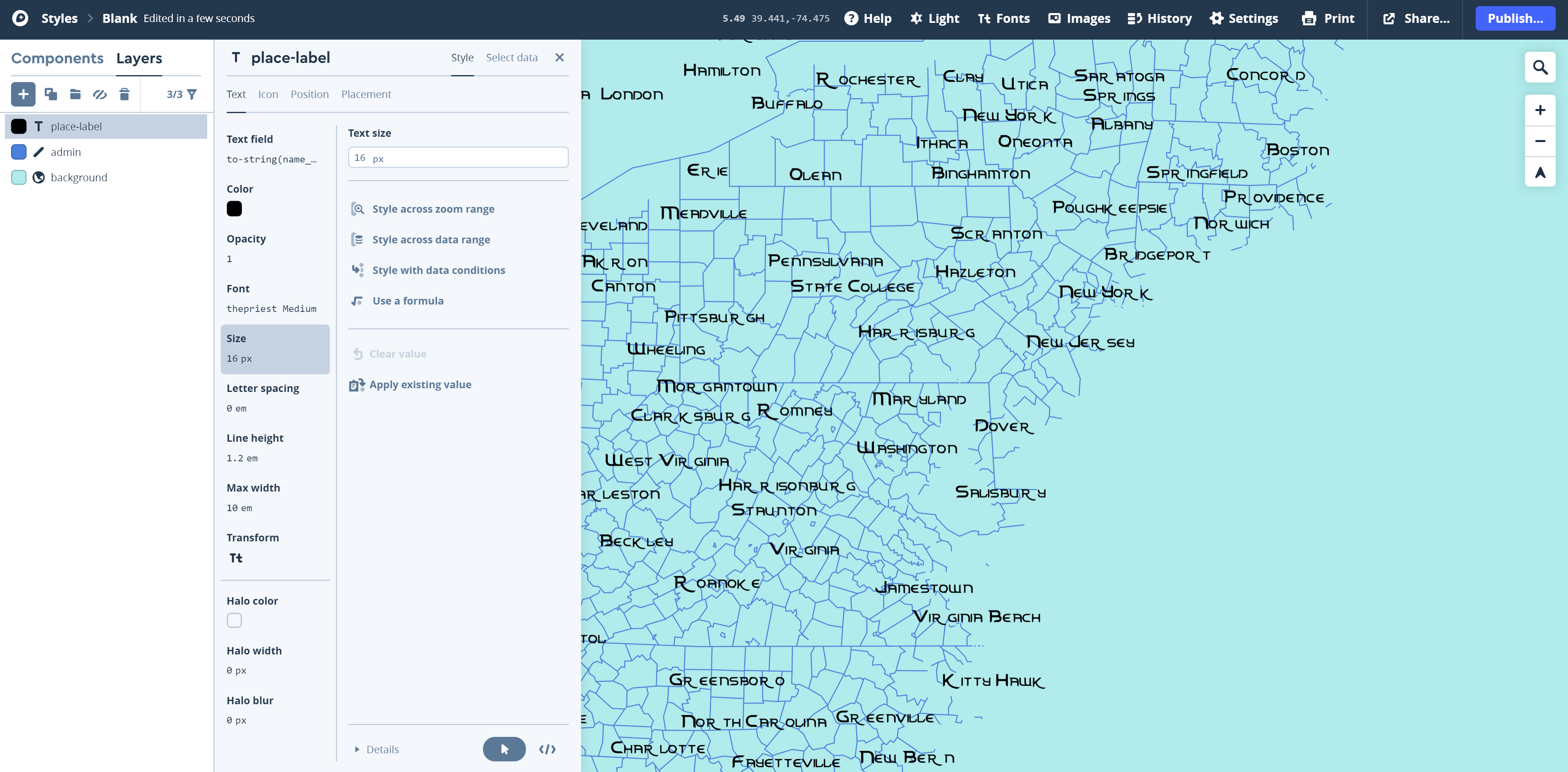 Visual Guide Figure 8.13. Changing style (here, font size) based on zoom range.
Style across zoom range permits you to alter the look and feel of a map symbol dynamically as the user zooms in and out of your map. Figure 8.13 shows that you can choose from different rates of change (e.g., linear - where symbols change gradually, or step - where symbols change abruptly at zoom levels you define). You don't have to do anything overly complicated - the goal is just to map your map look nice at small, medium, and large scales.
Tip! Look at other online interactive basemaps (e.g., Google Maps), as well as the Mapbox examples listed at the top of this guide for ideas about what symbols should appear at which scales, and how they might look best.
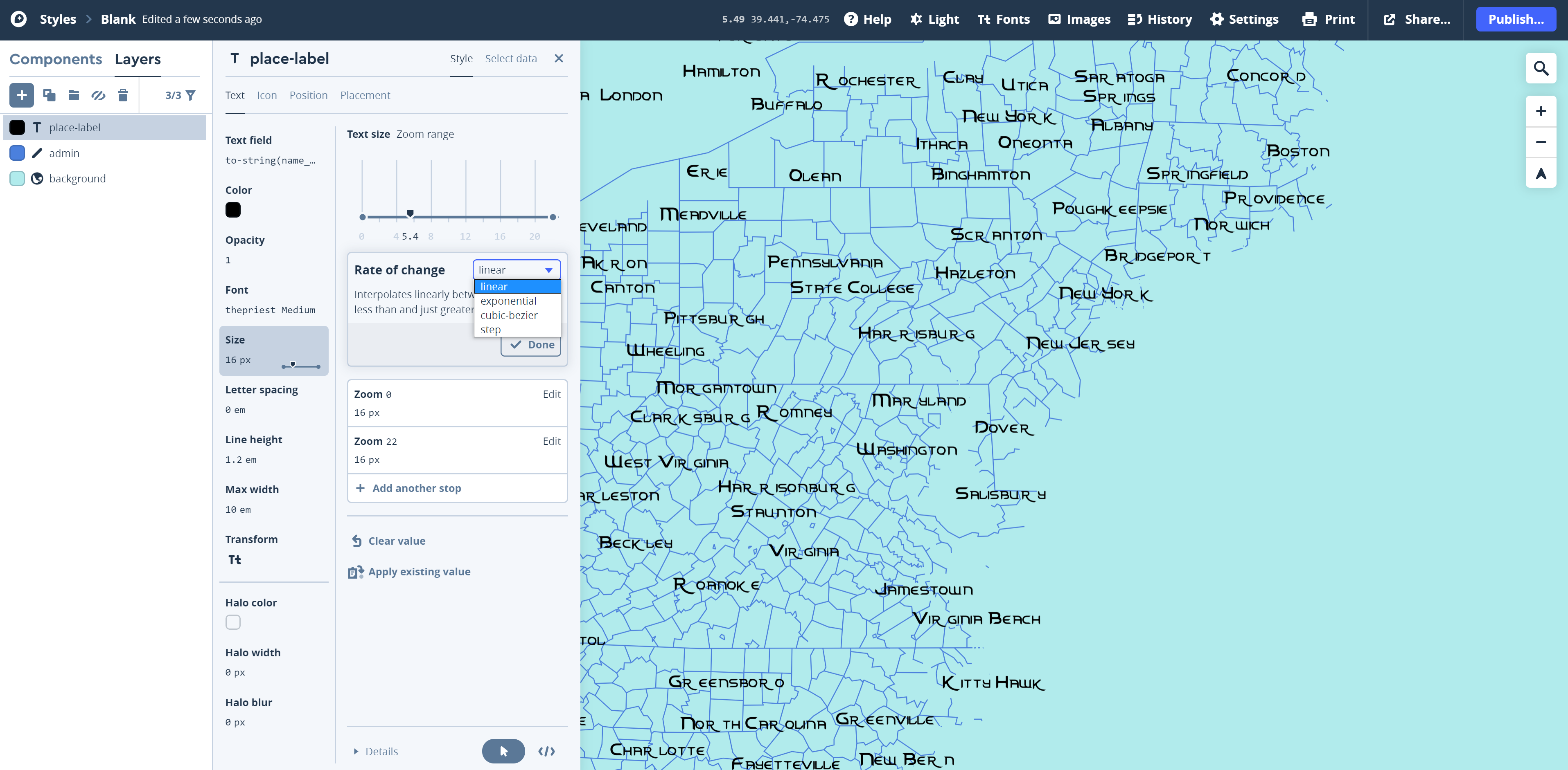 Visual Guide Figure 8.14. Linearly changing font size through zoom levels.
In addition to styling your layers based on the zoom layers, there is another type of condition you should utilize: the type of feature. Some layers contain contain multiple types of features - road is a prime example. Mapbox permits you to style features differently based on a data condition. In this example (Figure 8.15) roads with the class "primary" are assigned to be sized larger (2 pt.) than those with the class "secondary" roads (0.75 pt.). This weight difference is very similar to when we used TNMFRC codes (e.g., " 1 = Interstate," " 4 = Local Road").in ArcGIS Pro to assign different road types to label classes, and sized the labels based on their classification.
It is important to note that the naming convention of the different types of roads in Mapbox does not necessarily follow what you are accustomed to with interstate, secondary roads, and so forth. You should explore the different naming conventions to make sure you understand to what each class refers. This page [48]may be of some use to you as you explore the different classes of roads.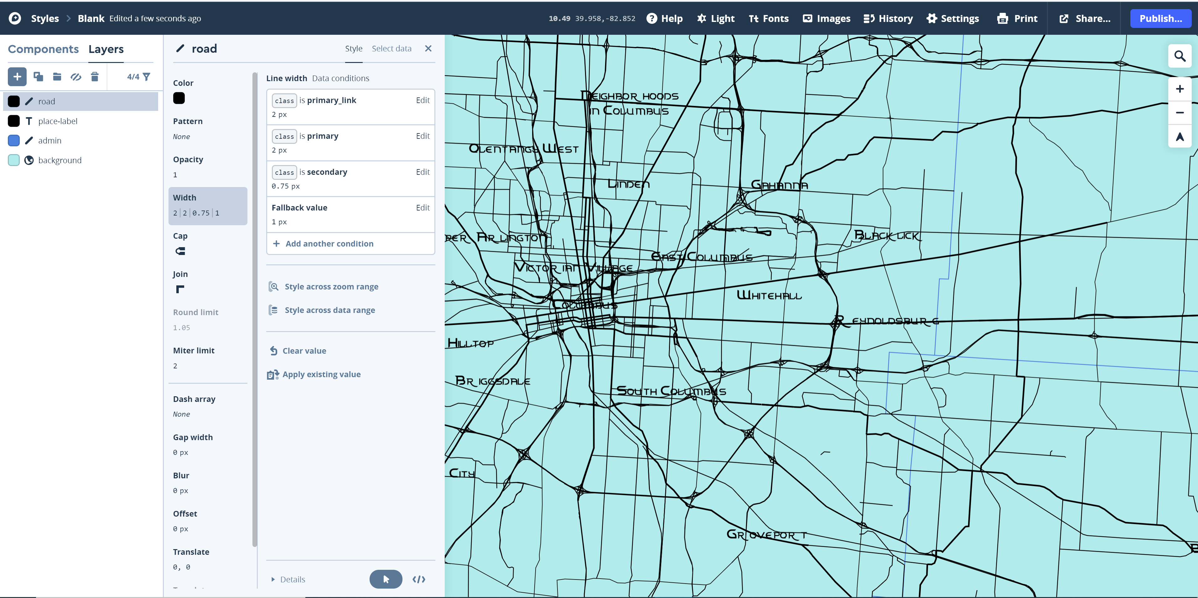 Visual Guide Figure 8.15. Sizing roads based on their classification in the Mapbox Streets data.
 -
Labeling Roads and More
Once you have added roads, buildings, etc. you will want to add additional labels to your map. We previously added the place-labels layer to our map, which is a layer intended just for labeling. However, we can also add labels using other layers. To label roads, for example, add another instance of the road layer using the "+" button, but this time select Symbol as the Type instead of Line (the default). See Figure 8.16.
 Visual Guide Figure 8.16. Adding a label layer for roads.
 -
Adding and Styling Terrain
Most of your layers will come from the Mapbox Streets source, but you should also add one terrain layer. Just as in Lab 6 (terrain visualization) you should use transparency and layer ordering to establish your terrain visualization effective. As usual, you want the terrain layer to be visible, but not visually overwhelming. You can drag and re-arrange layers in the left pane of Mapbox studio just as we did in ArcGIS Pro. Note that the design shown in Figure 8.17 is not that good. You can do better!!!
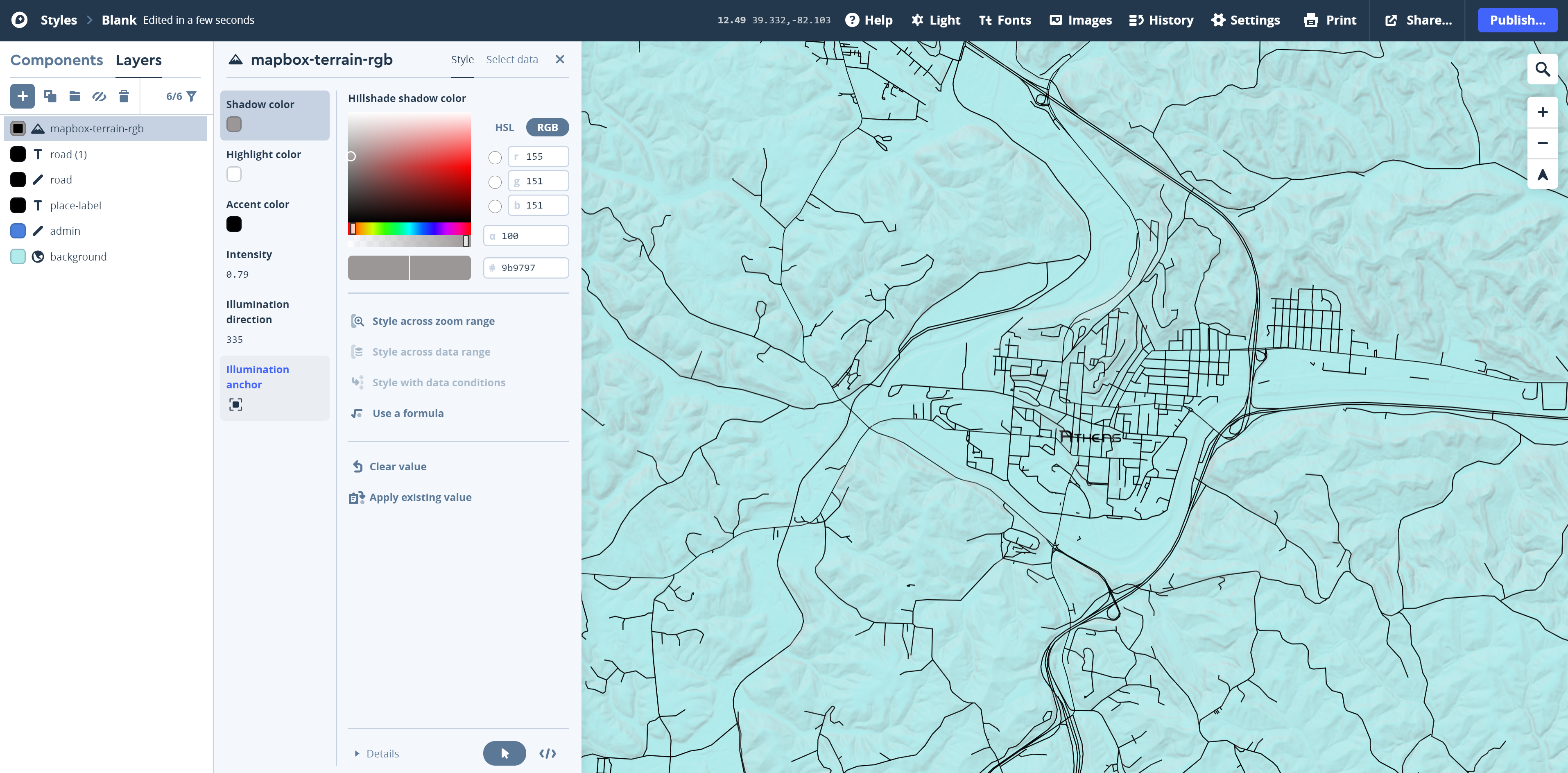 Visual Guide Figure 8.17 Symbolizing terrain in Mapbox studio - here, terrain is moved to the bottom layer, and transparency is added to layers above so that it is visible but pretty ugly.
 -
Additional Tips and Video Tutorial Links
As this is likely to be your first time using Mapbox Studio and the interface is different, take your time to become accustomed with how Mapbox works. For more practice, you might want to run-through an online tutorial such as Mapbox's Create a Custom Style Tutorial [51]. Though this will be informative and helpful, you should still follow this guide and start from blank, rather than using a pre-made Mapbox template or the color suggested in an online tutorial.
Here is a video tutorial [52] on how to filter what appears on your Mapbox creation.
Here are a series of video tutorials [53] on some basic manipulations in Mapbox by a fellow colleague of mine: Ian Muehlenhaus.Map design is an iterative process and it may take time for you to get a design you are happy with - be patient with yourself and remember to draw ideas from other maps, your media/art inspiration, and course content.
Credit for all screenshots is to Fritz Kessler, Penn State University. Screenshots and data from Mapbox Studio.
Summary and Final Tasks
Summary and Final Tasks
Summary
You've reached the end of Lesson 8! This lesson, we discussed the related topics of cartographic generalization and multiscale maps, as well as how these concepts are integral to creating effective interactive web-maps. While introducing new mapping techniques (e.g., animated maps, virtual reality) we discussed both the opportunities and challenges that new technologies in map-making provide. Using Mark Monmonier's conceptualization of fast maps, we discussed how even static maps have taken new forms in recent years due to the ability of social media to spread such maps fast, far, and wide.
In Lab 8, we used a new cartographic tool—Mapbox Studio—to create an interactive basemap inspired by a favorite piece of art. In Lesson 9, we continue along this trajectory of focus on interactivity and web-based map dissemination. We move next from creating an interactive basemap to an interactive thematic map and visual graphics with data visualization software Tableau.
Reminder - Complete all of the Lesson 8 tasks!
You have reached the end of Lesson 8! Double-check the to-do list on the Lesson 8 Overview page [54] to make sure you have completed all of the activities listed there before you begin Lesson 9.