Lesson 9: Beyond the Map
Overview
Overview
Welcome to Lesson 9! Last week, we discussed some of the new technologies that have been influential on current trends in cartography, including interactive and animated maps, 3D visualization, and augmented reality. While interactive and dynamic maps present a myriad of opportunities for creating new and exciting designs, they also introduce many new challenges. Studies of interactive maps draw from research not only in cartography and psychology but in other cognate fields such as human computer interaction (HCI), human factors, and usability engineering. We will discuss various approaches for studying dynamic maps in this lesson.
Unlike the static maps that we have focused on for most of this course, maps we discuss here are dynamic—they change based on interactions (either active or passive) by the map reader. In such cases, we begin to consider the map reader instead as a map user. Additionally, as these maps typically appear alongside other media (e.g., supplemental charts, article text, videos), we consider these map-adjacent elements and how they influence the user experience. In Lab 9, we put this knowledge to use and design an interactive data visualization story with the visual analytics platform Tableau.
Learning Outcomes
By the end of this lesson, you should be able to:
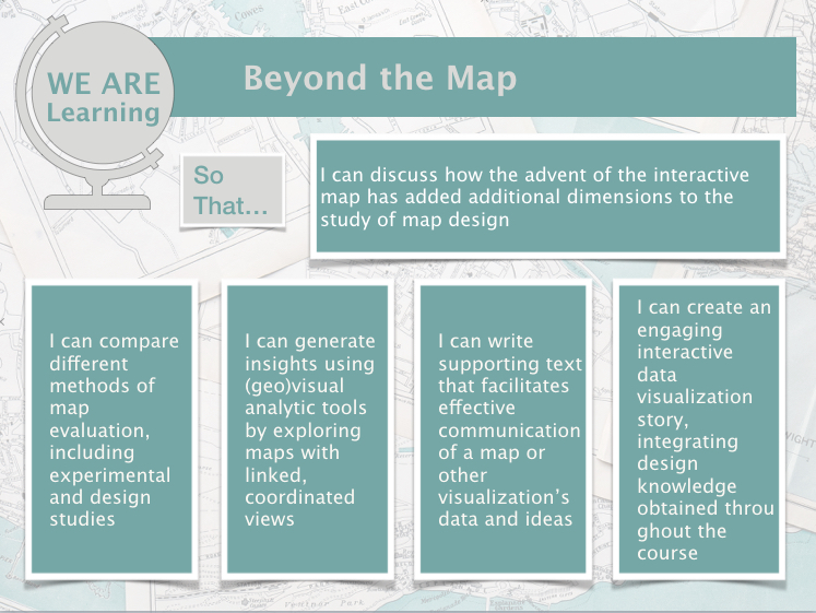
- discuss how the advent of the interactive map has added additional dimensions to the study of map design;
- compare different methods of map evaluation, including experimental and design studies;
- generate insights using (geo)visual analytic tools by exploring maps with linked, coordinated views;
- write supporting text that facilitates effective communication of a map or other visualization’s data and ideas;
- create an engaging interactive data visualization story, integrating design knowledge obtained throughout the course.
Lesson Roadmap
|
Action |
Assignment | Directions |
|---|---|---|
| To Read |
There are no external required readings for Lesson 9. Instead, you should explore in-depth the links included in this week's lesson content. In particular, please explore the three links to graphic compilations (NYT [1]; Washington Post [2]; Nat Geo [3]) and the Tableau Stories about AirBnb in Portland [4] in the Data Journalism section. Additional (recommended) readings are clearly noted throughout the lesson and can be pursued as your time and interest allow. |
|
| To Do |
|
|
Questions?
If you have questions, please feel free to post them to Lesson 9 Discussion Forum. While you are there, feel free to post your own responses if you, too, are able to help a classmate.
From Reader to User
From Reader to User
We often consider how our map readers might interpret or respond to a map we make. Predicting and designing our maps to account for this is a complex problem that we have discussed throughout this course. When making maps, we often must choose a suitable projection, symbolize data appropriately, visualize additional elements such as terrain, and so on. We also account for contextual factors: for example, we might expect our map readers to be stressed or working within time constraints. We may also need to design for media-based constraints such as black-and-white newspaper printing, or for challenging viewing scenarios, such as small sizes (e.g., in an academic journal article) or far distances (e.g., in a slideshow presentation).
You might recall the maps in Figure 9.1.1 from Lesson 1 - each was designed with a different type of map reader in mind.
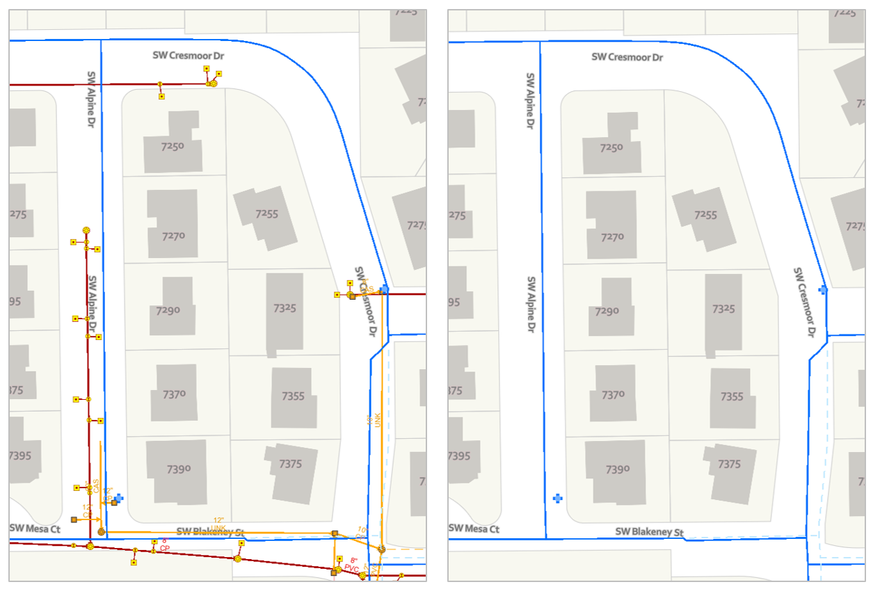
Figure 9.1.1 shows how minor alterations to a static map (here, technically still-frames of a larger map) can make it more suitable for a given map audience or purpose. Last lesson, we introduced interactive maps—maps that change based on some form of user input. This new realm of interactive mapping has turned our focus from the map reader to the map user (Roth et al. 2017). We now must consider not just how our map’s audience will interpret the map we design in a single state, but how they will interpret it as they use it, which is to say, as they alter it. An interactive map must work not only in one state, but ideally at every state that might be reasonably encountered by the map user. This is no small task.
Even basic interactions such as panning around a slippy map can introduce challenges. Figure 9.1.2, for example, shows two locations on an OpenStreetMap basemap, both at a 1:5,000 scale.
These maps are shown at the same scale but appear vastly different—and this makes sense, given that they are very different places. What this example highlights, however, is the variety between locations that pan-able maps must often be designed to cover. Web maps typically cannot be designed separately for each location (imagine the time that would take!) so cartographers use generalization algorithms and design rules to ensure that their maps will work at locations rural and urban, near and far, and at scales both small and large.
Panning (i.e., moving the map to another location) is among the most basic functions performed with interactive maps. Additional functions such as filtering and route-planning introduce further complexities to interactive map design. For insight on how to best support such tasks, cartographers have turned to the study of usability. Usability is defined by the International Organization for Standardization (ISO 9241-11:2018) as “the extent to which a system, product or service can be used by specified users to achieve specified goals with effectiveness, efficiency and satisfaction in a specified context of use.” Designers of websites, mobile apps, and many other technologies consider system usability when building their products. Though it is a subject with a rich history and many facets, Jakob Nielsen’s (1994) usability heuristics [7] provide an excellent foundation for assessing the usability of a system (such as an interactive map).
Figure 9.1.3 demonstrates two of Nielsen's usability heuristics: error prevention, and consistency and standards.
Student Reflection
View Nielsen’s usability heuristics [8] online. Open ArcGIS Pro, and search for examples of these heuristics in the interface. You might also try this out with another favorite (or least favorite) software program. Which heuristics are implemented? Which are forgotten?
As suggested by the ISO (2018) definition, an important component of usability, and one that ought to be considered when implementing the usability heuristics is the idea of context of use. For example, a routing app might be designed specifically so that the interface can be safely manipulated (or not) while the user’s vehicle is in motion.
Despite the importance of context in designing usable systems, a significant amount of scientific research related to usability has focuses on developing more generalizable findings, such as whether users can identify changes in animated maps (Fish, Goldsberry, and Battersby 2011). When we consider how to assess maps in terms of their usefulness, it is helpful to distinguish between these two primary approaches: traditional, experimental research intended to elucidate generalizable insights, and design studies that focus on context-specific design. Roth and Harrower (2008) describe these sorts of studies as a continuum from controlled experimentation to usability testing. Despite the helpfulness of conceptualizing cartographic evaluation methods as existing along a continuum, we discuss these methods as falling more generally into one of two categories (1) experimental studies, and (2) design studies, for simplicity and brevity.
Recommended Reading
- Roth, Robert E., and Mark Harrower. 2008. “Addressing Map Interface Usability: Learning from the Lakeshore Nature Preserve Interactive Map.” Cartographic Perspectives, no. 60: 46–66. doi:10.14714/CP60.231.
- Roth, Robert E, Arzu Coltekin, Luciene Delazari, Homero Fonseca Filho, Amy Griffin, Andreas Hall, Jari Korpi, et al. 2017. “User Studies in Cartography: Opportunities for Empirical Research on Interactive Maps and Visualizations.” International Journal of Cartography. doi:10.1080/23729333.2017.1288534.
Experimental Studies
Experimental Studies
As noted in the previous section, experimental studies seek to identify generalizable findings. These studies draw heavily from work in psychology, a discipline with a rich history of closely-controlled experimental research. Research conducted by Fish, Goldsberry, and Battersby (2011) on change blindness is a helpful example of experimental research in cartography.
Student Reflection
Consider the maps in Figure 9.2.1 below – after viewing these animated frames, do you think you would remember which states changed from the first (left) to the second (right) frame?

Fish, Goldsberry, and Battersby (2011) found that not only did their participants often incorrectly identify which locations had changed from previous animation frame, they were consistently overconfident in their reports. A suggestion made by the authors to mitigate this effect was to incorporate tweening, or gradual graphic transitioning between animation frames, into animated map designs. This suggestion is applicable to a wide variety of animated mapping contexts.
Similar studies have been conducted on other aspects of map design. Limpisathian (2017), for example, studied the influence of visual line and color contrast on map reader perceptions of feature hierarchy and aesthetic quality. Unlike Fish et al., who conducted their research with participants in a lab, Limpisathian recruited and tested participants using the crowd-sourcing platform Amazon Mechanical Turk (MTurk). Such platforms have become increasing popular in recent years as—despite their shortcomings—they enable researchers to run large studies with more diverse sets of participants and at lower costs.
Experimental studies often use web surveys, which can measure task (e.g., map data retrieval) accuracy and speed. Some surveys take advantage of new technologies such as eye-tracking, which measures fixations of the human eye. Griffin and Robinson (2015), for example, used eye-tracking to measure the efficiency of color and leader-line approaches when highlighting geovisualizations. Eye-tracking is a popular method for understanding user response to design, and is regularly used by web design practitioners and in marketing research. Figure 9.2.2 shows an example record of eye-tracking from a study performed on the Healthcare.gov website. Similar studies have been conducted with maps and other spatial tools.
Recommended Reading
Fish, Carolyn, Kirk P. Goldsberry, and Sarah Battersby. 2011. “Change Blindness in Animated Choropleth Maps: An Empirical Study.” Cartography and Geographic Information Science 38 (4): 350–362. doi:10.1559/15230406384350.
Design Studies
Design Studies
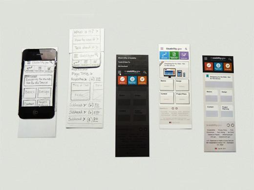
While experimental studies focus on producing generalizable findings (e.g., “people suffer from change blindness when viewing animated maps”), design studies focus on more specific use contexts. The goal of these studies is generally to improve a specific map or mapping product. Testing often begins early in the design stage, with preliminary design sketches and/or paper prototypes (Figure 9.3.1). Paper prototypes are generally preferred to more formalized mock-ups early in the design process, as they cost little to create, leaving designers more willing to change their designs in accordance with suggestions by testers. Research has also found that testers of "sketchy" designs and paper prototypes are more likely to elicit big picture design suggestions than more formalized prototypes (Dykes and Lloyd 2011). This is because test users are more able to focus on the overall functions of a tool when they view it as unfinished—they are not distracted by small design details (Dykes and Lloyd 2011).
As design studies focus on a specific use context, it is important to test with target users (i.e., the intended users of the product) whenever possible. A map designed to be used by police officers, for example, will likely require input from these users to be made sufficiently useful in that context. A popular mantra in usability research is this: you are not your users. When designing a map intended for use by the general public (e.g., Figure 9.3.2), it might be enough to test your design with a group of college undergrads for course credit, or through a crowdsourcing platform such as Amazon Mechanical Turk. For more specialized contexts, recruiting those target users is necessary.
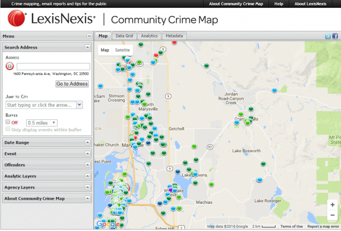
Roth, Ross, and MacEachren (2015) emphasize this importance of involving target users throughout the map design process. In their work designing an interactive mapping tool to support the needs of the Harrisburg, PA Bureau of Police, they suggest an iterative approach to system design. They outline three U’s of interactive map design: user (i.e., considerations of target users and use-case scenarios), utility (i.e., whether the map performs the tasks that its users require), and usability (i.e., whether the tool’s functions align with usability design principles/heuristics).
Recommended Reading
- Lloyd, David, and Jason Dykes. “Human-Centered Approaches in Geovisualization Design: Investigating Multiple Methods Through a Long-Term Case Study.”
- Roth, Robert, Kevin Ross, and Alan MacEachren. 2015. “User-Centered Design for Interactive Maps: A Case Study in Crime Analysis.” ISPRS International Journal of Geo-Information 4 (1): 262–301. doi:10.3390/ijgi4010262.
Geovisualization and GeoVisual Analytics
Geovisualization and GeoVisual Analytics
When we talk about interactivity in maps, we must consider not just user interactivity within maps, but interactively among maps, as well as with other tools and visual graphics. Interactive mapping has played an important role in the field of visual analytics, defined as “the science of analytical reasoning facilitated by interactive visual interfaces” (Thomas and Cook 2005).
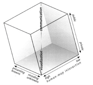
Recall the Cartography Cube from Lesson 1 (review this concept in the Communicating with Maps [13] section). Most of the maps we have designed thus far would be considered to be in the communication (public, static, and intended to present known information) corner of the cube. Visual analytic tools typically belong in the opposite corner—these tools are characterized by high human-map interaction and are often designed with private data or data that is otherwise meant for domain experts. They also focus on revealing unknowns (i.e., generating insights), rather than communicating known trends.
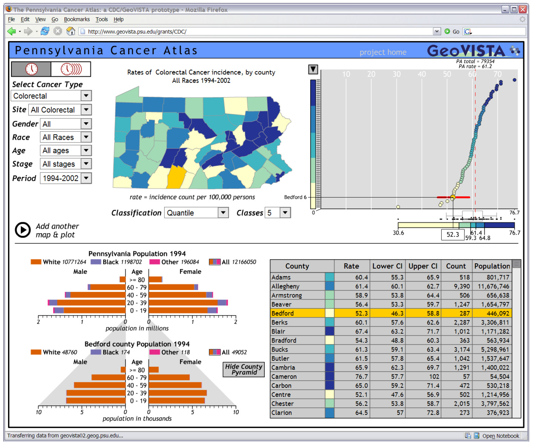
One domain in which visual analytics has been particularly popular is in public health and epidemiology. An example tool is shown below (Figure 9.4.2). The Pennsylvania Cancer Atlas is an interactive tool designed at the GeoVISTA Center at Penn State, with assistance from the Centers for Disease Control (CDC) (Bhowmick et al. 2008). The atlas includes a choropleth county-level map of Pennsylvania, coordinated charts and tables, and filtering and selection options to compare data across the views. In the view shown below, for example, Bedford County has been selected on the map by the user, and the scatterplot and table have been highlighted to focus on that county as well. This connecting of multiple visual depictions of data is called coordinated views.
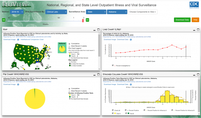
A more recent example is FluView, a visual analytic dashboard designed by the CDC for analyzing data related to incidence of the flu in the United States. FluView is shown in Figure 9.4.3 below—you can try it out by selecting the link here: FluView [16].
A demo of a more complex geovisualization built around visual storytelling, Detecting Disease Spread from Microblogs, is shown in the video in Figure 9.4.4. below:
Selecting ‘lil’ microblogs (0:02)
The first stage of our analysis involved identifying the key words and phrases that we thought were associated with the epidemic, this allowed us to select only those blog entries that we thought were relevant for the analysis of the disease.
Where, when, what (0:13)
Our main application comprised three views of the blog posts, firstly one showing where they occurred, secondly one showing when they occurred, including the associated weather over this timeline, and thirdly, the posts themselves. The distribution of posts shown on the map indicate a concentration around the hospitals, this led us to believe that at least some of these posts were second or third entries from people who’d already fallen ill elsewhere. We could confirm this by examining the history of the people who tweeted on the map. Here we see all posts by the same poster, indicating that they’d tweeted several times about the same illness. This led us to filter our data so that only the first entry from each poster was shown on the graph, here shown by red bars, and on the map we see that there are no longer any concentrations around the main hospitals, indicating that people first posted when they became ill, away from the hospitals.
Ground zero (1:21)
The timeline shows very clearly when the epidemic first starts, about the 18th of May. We can do a temporal selection on the data to find out how to disease begins to spread from that point. The timeline shows data grouped into bins of 6 hours. To identify ground zero we can change the resolution of the bins to a much finer-grained analysis. By performing a temporal selection at this new resolution, we begin to see what happens at the start of the outbreak. Looking at the map view as we move through time, we begin to see the first outbreaks of the disease in the downtown area. This led us to believe that there were three areas in the downtown region where the disease first emerged: The Vastopolos Dome, next to this Vastopolos Hospital, and around the Convention Center. We also see some spread towards the riverside of the Dome.
Spread and containment (2:18)
To be sure that we were viewing the real spread of the disease, rather than the propensity to microblog, we created a chi-expectations surface of the region, where dark green areas show a greater than expected density of ill posts, and purple areas show a less than expected density. In addition to the Dome, the Hospital, and the Convention Center, this also reveals that Eastside has a greater than expected density of incidences. The third region to show the spread of the disease is toward the west of the region on the banks of the river. This is in contrast to the southern areas of downtown and uptown area, which seem relatively unaffected by the disease. Finally, we summarize the distribution of points using a standard ellipse. This allows us to examine how the disease spreads over time, by performing a temporal selection on the bar chart at the bottom, and then moving through time, we can see how that standard ellipse, which gets dark green with a high concentration of the disease, is dragged towards the southwest by instances of a completely different disease, associated with the river. By filtering posts that show sickness, diarrhea, and stomach cramps, we clearly see the river association of the disease, which started at 2am on the 19th. To examine whether there’s any spread beyond the length of the river, we can perform a spatial selection of just those points associated with the river, and examine how that changes over time. Doing so reveals that while there’s a high concentration towards the northeast of the river, this doesn’t move downstream over time. We can therefore be confident that the disease is relatively well-contained.
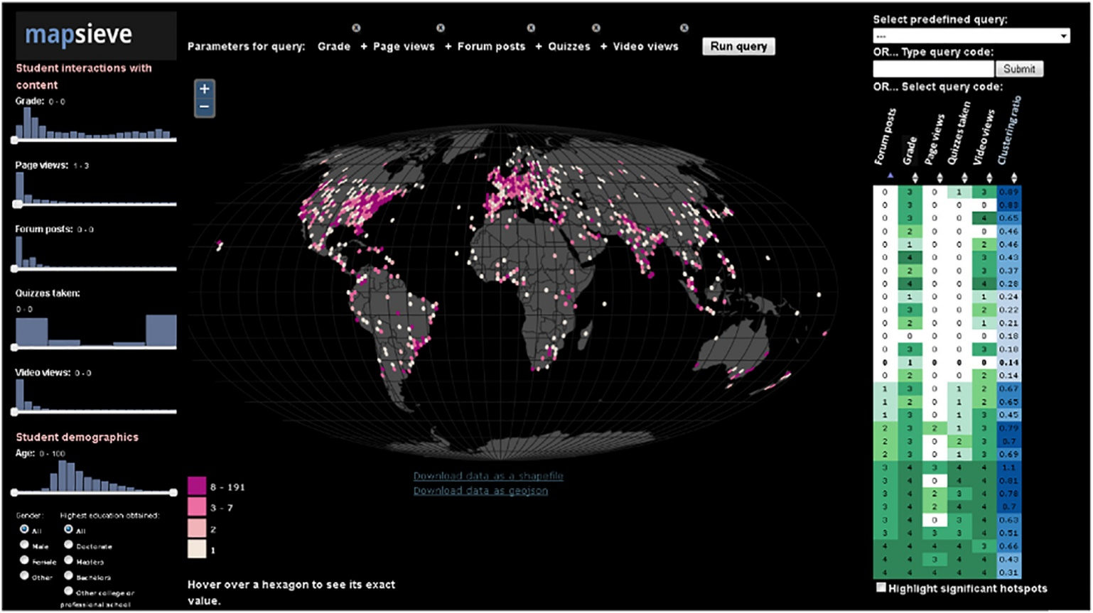
Though health and public safety applications are popular uses for (geo)visual analytic tools, they have been used in many domains. Figure 9.4.5 below shows the geovisualization tool MapSieve, designed for analyzing spatial patterns of student engagement in online courses taken by students all over the world.
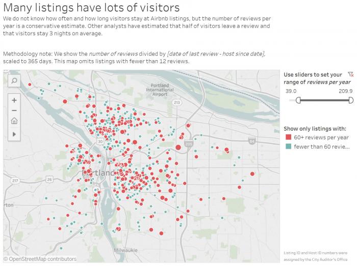
While the tools above focus on fairly complex data that often require domain knowledge for effective interpretation, similar visualization tools are also often used in more fun, less serious contexts. Figure 9.4.6, for example, shows a Tableau (data visualization software) dashboard that visualizes AirBnb data in Portland, Oregon. We will take a closer look at dashboards like this later in this lesson.
Similar interactive tools are often designed for mapping election results or other data of public interest. Graphics are often accompanied by a significant amount of text, both within the main view as explanatory text, or adjacent, to tell a story supported by the data. We discuss this more in the next section: Data Journalism.
Recommended Reading
Bhowmick, Tanuka, Anthony C Robinson, Adrienne Gruver, Alan M MacEachren, and Eugene J Lengerich. 2008. “Distributed Usability Evaluation of the Pennsylvania Cancer Atlas.” International Journal of Health Geographics, no. February 2015. doi:10.1186/1476-072X-7-36.
Data Journalism
Data Journalism
As demonstrated by the Portland AirBnb example, interactive maps designed for public consumption often do not stand alone. Except in the case of very simple data visualizations, these maps and graphics tend to be accompanied by additional text, both within the visualization interface and outside. Such maps are often included—in either static or interactive form—in the type of articles and other media described as data journalism.
Data journalism is a general term that refers to the increasing influence of numerical data in news reporting; data are often reported and/or visualized alongside articles and reports disseminated to the public. Though data journalism does not necessarily have to include visual depictions of data, it often does—and for good reason. Visual graphics tend to captivate readers, and charts, maps, and graphics are much better at communicating data at a glance than data tables and spreadsheets alone. The article in Figure 9.5.1 is an example of this. The article includes a large map, as well as a set of small multiple maps, to visualize the geographic distribution of ammonia. Article text gives the reader additional information about the ammonia gas.

Important Links
Journal outlets such as the NY Times, Washington Post, and National Geographic are among those creating high-quality graphics and accompanying article content. Visit the links below to see examples:
As demonstrated by the links above, media outlets frequently report on important and emotionally-engaging information. Journalists take on the challenging job of reporting this information to the public. Often, pairing interactive maps and graphics with carefully curated text is the most effective way to do so.
Student Reflection
Think back to MacEachren’s Cartography Cube. Where would you place the maps/graphics included in the articles referenced in the links above?
Given recent trends, including as the proliferation of interactive maps and visual analytics, cartographers have begun to focus more on maintaining a balance of text, graphics, and other elements in their work. Think back to our discussion in Lesson 2 of frame lines and neat lines for map layouts—such simple guidelines seem almost irrelevant in the context of data journalism and interactive map making. While cartographers still face traditional design constraints when creating maps for print (e.g., magazine spreads, print advertisements), they must now also work with more complex design formats such as infinite scrolling web pages and interactive dashboards.
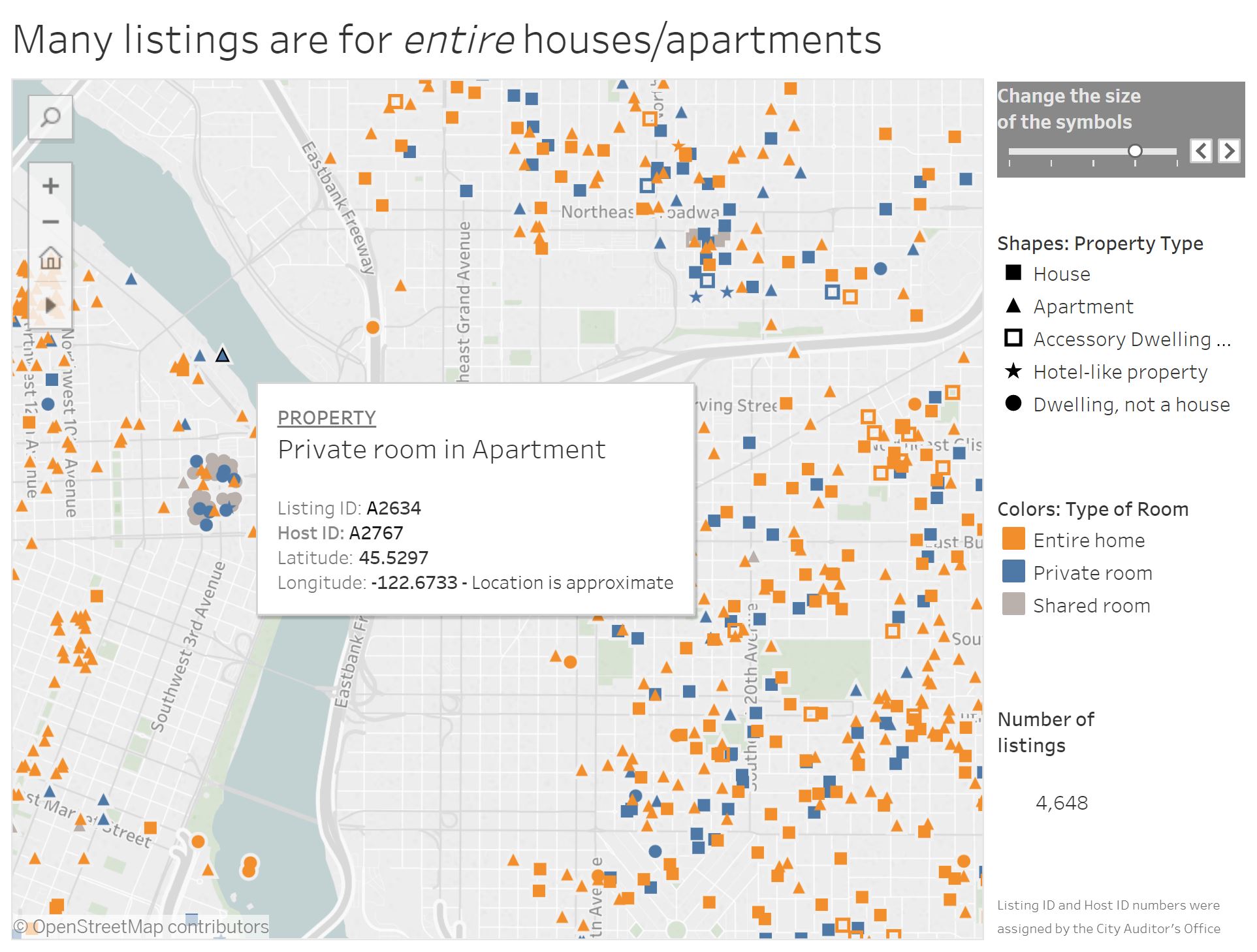
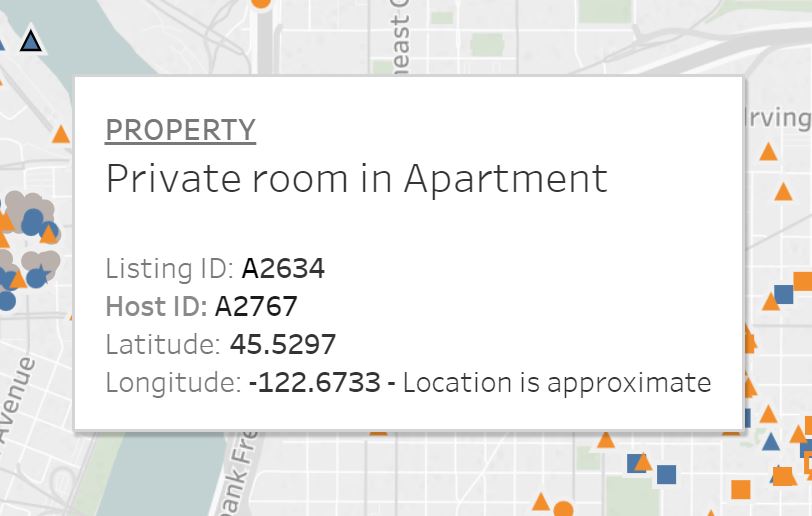
In previous lessons, we discussed the importance of design thinking that reaches beyond the map—configuring page layouts and explanatory text in a neat, usable, aesthetically-pleasing fashion. Given our current focus on the map user, note that ideally this design thinking ought to be implemented at all stages of map interaction. For example, see Figure 9.5.2. Shown in this view is the map “on-hover,” which means that the user has hovered their cursor over the point that is highlighted. The tooltip which appears (Figure 9.5.3) must present an amount of information that is adequate but not overwhelming for map users. It could be argued that this is not successfully accomplished here—the coordinate location is likely unnecessary information, and the addition of a short description of the property would assist the map user.
The visual information-seeking mantra, first proposed by computer scientist Ben Shneiderman, is frequently referenced by information designers: “Overview first, zoom and filter, and details-on-demand” (Shneiderman 1996).
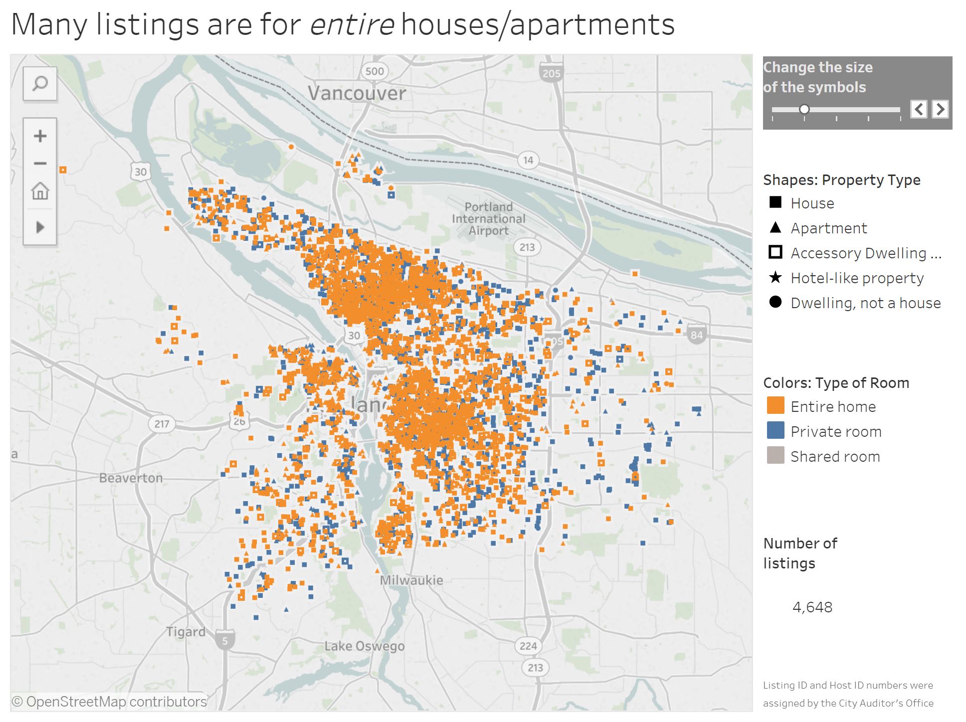
We will use the Portland Airbnb Tableau dashboard to explore this mantra in practice. First, in Figure 9.5.4, the starting view of the dashboard, which shows all of the listings in Portland: overview first.
From the starting view, the user can zoom in and/or pan around the map, and filter the map data by selecting a category of interest. The tool state in Figure 9.5.5 shows the view after the user has zoomed into the map, and selected the "private room," room type. This data could be further filtered by by selecting a property type, such as "hotel-like property." This is the second stage of the mantra: zoom and filter.
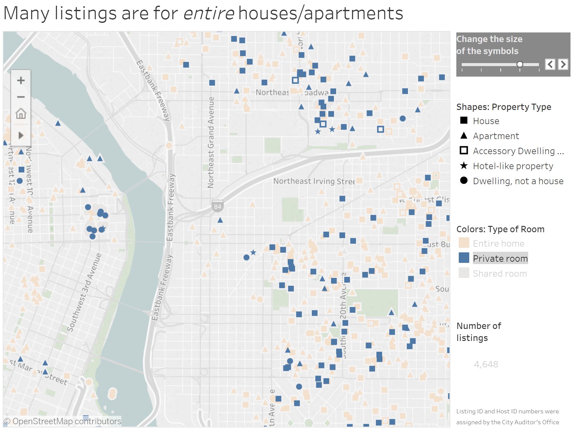
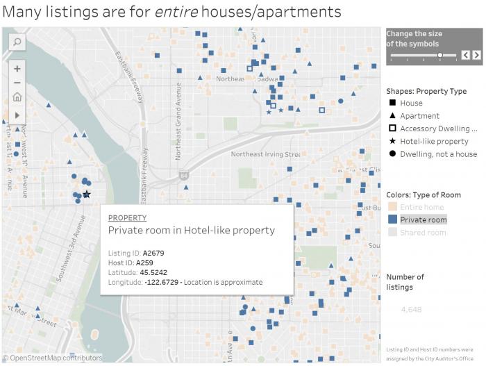
Figure 9.5.6 shows the view in 9.5.5 upon mouse hover of this hotel-like property near the river. ID numbers for the host and listing, as well as lat/long coordinates, are given in the tooltip. This is the final element of Shneiderman's mantra: details-on-demand.
Student Reflection:
Play around with this Tableau Story, Airbnb Data in Portland [24]—in addition to helping you understand the concepts presented in this lesson, it may give you ideas as you work on Lab 9.
Small snippets of text such as tooltips, titles, weblinks, and error messages associated with your maps will often be designed by you, the cartographer. Such text is often called microcontent, and despite its minimal nature can have a large impact on user interpretation of your visualizations.
The Nielsen Norman Group provides a helpful reference on how to write such content here: Microcontent: A Few Small Words Have a Mega Impact on Business. [25] Their site is also an informative reference for many aspects of usability and user experience design.
Recommended Reading:
Shneiderman, B. 1996. “The Eyes Have It: A Task by Data Type Taxonomy for Information Visualizations.” Proceedings 1996 IEEE Symposium on Visual Languages, 336–343. doi:10.1109/VL.1996.545307.
When Not to Map
When Not to Map
The visual analytic tools we have have explored thus far include both maps and graphs, and these different data visualization elements have been connected via coordinated views, permitting user filtering, zooming, and more. Given the limited space available in these dashboards—particularly if they are intended for viewing on small, mobile screens—an important question surfaces: do I need a map at all?
When designing data visualizations, maps often provide an invaluable source for insight generation. However, they are not necessarily always the best choice for your data—even if the data contain spatial information. View the dashboard below in Figure 9.6.1.

This dashboard does not contain a map—and though it’s possible that adding one might provide additional information or interest, its current form gets across the core message: drug overdoses are increasing in Philadelphia, and this is being driven by opioids in general, and fentanyl in particular.
Given the increasing ubiquity of GPS and other location-based technologies, data that contains a geographic component (e.g., state, county, coordinates) is fairly easy to come by. Still, this does not mean that creating a map is always the answer. Imagine, for example, if you had collected data on the rate of Alzheimer's disease by state. Were you to map this data, popular retirement states such as Florida and Arizona would likely jump out—not because there is anything inherently unhealthy about those locations, but because their populations are significantly older. To eliminate the effect of this confounding variable, you could map age-adjusted Alzheimer's rates instead. It's important to consider, however, whether this would be the most informative way to visualize your data. If you were you simply hoping to educate people about Alzheimer's, a graph or chart comparing Alzheimer's rates by gender, age, race, or socioeconomic status might serve your purposes just as well.
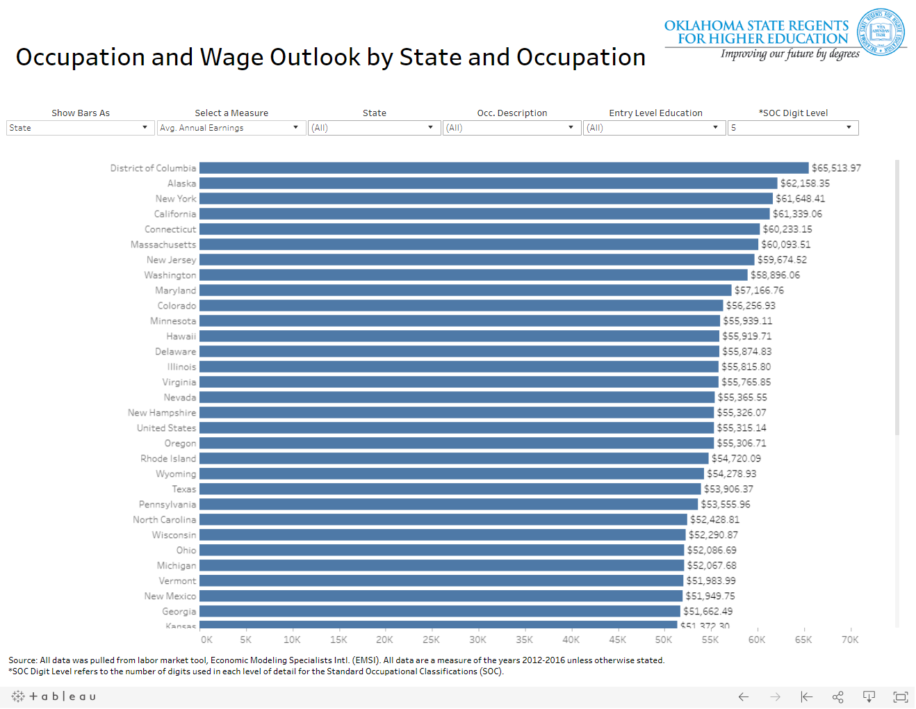
Conversely, there are many data visualizations that unfortunately treat space (i.e., geography) as just another variable. For an example, view the dashboard in Figure 9.6.2 below. The designer of this dashboard chose to visualize states as list of values, rather than to create a map. Though this is not inherently incorrect, it is a missed opportunity to provide the user with an at-a-glance understanding of spatial patterns in occupational data. Sure, the user could still pick out individual data values, or compare average annual earnings state-to-state. But data visualization (cartography included) is about making complex data clear—if your visualization is no more useful than its source data table, then why design it at all?
Lesson 9 Lab
Lesson 9 Lab
Geovisualization Design in Tableau
Your final lab assignment in this course is to design an interactive geovisualization using Tableau. While this lab draws heavily on concepts discussed in Lesson 9, you will be incorporating knowledge from throughout the course in your design. Unlike other labs, Lab 9 is a two-week assignment.
In Week One, you should develop an idea and gather data for your lab, and complete the example Tableau Story tutorial (Visual Guide Part 1). This tutorial is ungraded, but will teach you the basics of working in Tableau. You will then create your own Tableau Story using your own data. The Lab 9 Visual Guide Part 2 contains tips and tricks for working in Tableau beyond what is covered in Part 1, and a wealth of additional resources are available via the web.
Lab Objectives
- Use data from a source of your choice to create a geovisualization in Tableau Story form.
- Integrate knowledge gained throughout the course to create engaging interactive maps and graphics.
- Examples from the Visual Guides for reference here:
- Part 1 (tutorial): Aging in the United States [28]
- Part 2 (tips and tricks): Schooling in Philadelphia, PA [29]
Overall Lab Requirements
Submit the link to your Story (hosted on Tableau Public) as a text comment. There is no PDF deliverable for this lab.
Story Requirements
Tableau Story: Overall
- Create a Tableau "Story" which includes at least 2 "story points". Each story point should contain a Tableau dashboard.
- Design with attention to detail; include an appropriate title, tooltips, and explanatory text.
- Use consistent look and feel throughout the story; balance negative space.
Tableau Dashboards (2 in total)
- In each dashboard, include at least one map and one additional data graphic (e.g., bar chart, scatterplot, treemap).
- Use appropriate visual variables to encode your data. You should map your data by country, state, or by zip code, or display point locations. Mapping with other geographies (e.g., counties, census tracts) is permissible but not recommended unless you are already comfortable working in Tableau.
- Use dashboard actions (e.g., highlighting, filtering) to connect your map and other data graphic(s).
Lab Instructions
- Download Tableau Desktop on your machine. Reference the Getting Started in Tableau announcement for additional details.
- Create a duplicate of the first example Tableau story with the Lab 9 Visual Guide Part 1: Intro to Tableau Tutorial.This tutorial will walk you through the process of creating a Tableau Story. Though optional, you will likely find it helpful to complete this before designing a Tableau Story of your own.
- For additional assistance, explore the Lab 9 Visual Guide Part 2: Tips and Tricks, and utilize online tutorials and training materials such as those listed below:
- Tableau 10 Essential Training [30] Your access to Linkedin Learning (aka Lynda.com) is provided through your Penn State login
- Build a Simple Map [31] This link and the one below are tutorials provided by Tableau
- Customize how your Map Looks [32]
Grading Criteria
A rubric is posted for your review.
Submission Instructions
- Submit the link to your Tableau Story.
Ready to Begin?
Please refer to the Lesson 9 Lab Visual Guides: Part 1 and Part 2.
Lesson 9 Lab Visual Guide Part I
Lesson 9 Lab Visual Guide Part I
In Part 1, follow these steps to create the example, Tableau Story.
- Introduction to Tableau
- Starting in Tableau
- Symbolize your Map
- Create a Graph/Chart
- Create your First Dashboard
- Create a Tableau Story
-
Introduction to Tableau
In this lab, we will design an interactive geovisualization with Tableau. The final result will be a Tableau Story similar to the one about Airbnb data in Portland we discussed in Lesson 9.
To begin, open the Age_andSex_AFF_ACS_2017 [33] Excel file. This file has multiple fields (columns) of data for each state in the United States. It was created by making minor edits to a CSV file downloaded from the US Census Bureau's American Community Survey (ACS). If you're not sure what data to use for your own project, the ACS is a good place to start.
The most important component of this Excel sheet is the State column—Tableau will automatically recognize and map several geographies, such as States, Countries, Zipcodes, and Coordinates (lat/long). You may choose to map another geography (e.g., counties, census tracts, block groups) for your own Lab, but using one of these geographies is more advanced and will not be covered here.
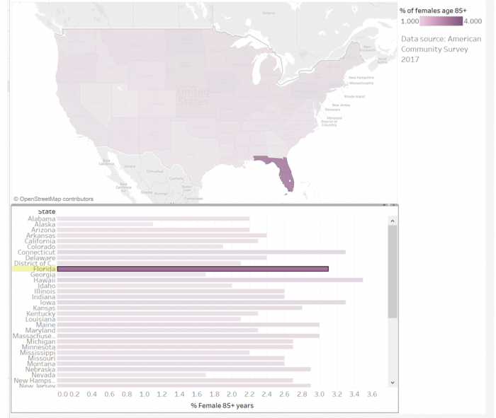
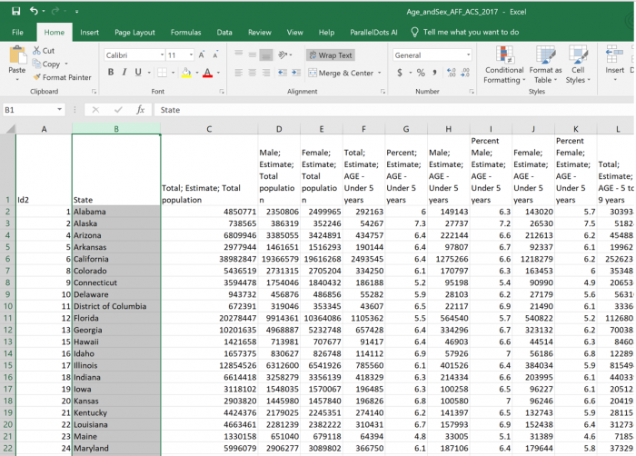 Visual Guide Figure 9.1. Lab 9 Tutorial Starting Excel file.
 -
Starting in Tableau
Open Tableau Desktop and Connect to the Excel File (Figure 9.2.). The file has already been formatted properly for import. If you like, you can select "Extract" to extract the data. If not, you will be prompted to do so later, before publishing your Story online.
Select Sheet 1 at the bottom of the page to open a Tableau worksheet.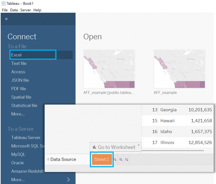 Visual Guide Figure 9.2. Opening Tableau and connecting to an Excel File.
Before continuing, save your file as a Tableau Workbook file (the default file type). As with projects in ArcGIS Pro, you should regularly save as your work.
You should now see a screen similar to the one in Figure 9.3. State should be listed among your tables, and your measures should list the many fields of data that were included in your Excel file.
The distinction between table and measures in Tableau is important. A table is an element, such as a state, year, company, etc. that you are interested in viewing data about. A measure is that data, such as % insured, or a number of products sold. For geographic data, a table is always the geographic unit (e.g., state, country) and a measure is the data to be mapped. Tableau often correctly identifies the table and measures in your data, though occasionally you may have to convert one to the other. In this example, all measures and tables were correctly identified.
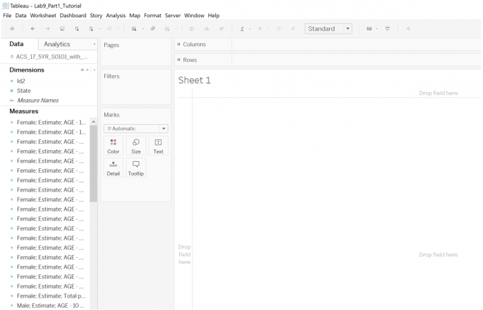 Visual Guide Figure 9.3. The start of a Worksheet in Tableau Desktop.
Now it's time to make your first map! Click and drag the State table into the middle of your worksheet (Figure 9.4). Tableau will automatically recognize this geography and create a map.
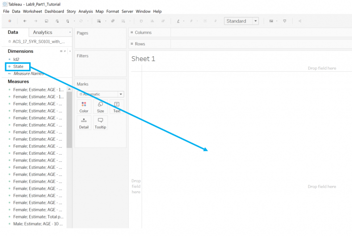 Visual Guide Figure 9.4. Creating a map from a Geography table in Tableau Desktop.
 -
Symbolize your Map
Drag a measure of interest onto an appropriate visual variable in the Marks section (Figure 9.5). In this example, “Percent Female; Estimate; AGE 85 years and over” is dragged to the Color box. You might choose another mark (symbol) type such as size if you were mapping count values (such as the TOTAL number of 85+ yr old females, rather than the rate).
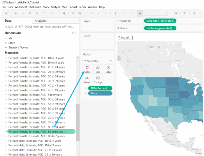 Visual Guide Figure 9.5. Creating a simple map in Tableau.
Select “Edit Colors” to choose a different color palette – remember to choose a color progression appropriate for the progression of your data! You can use the “advanced” menu to make further edits.
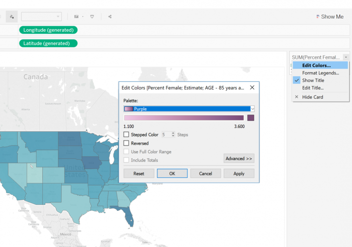 Visual Guide Figure 9.6. Editing a color scheme in Tableau.
 -
Create a Graph/Chart
Recall that the focus of this lab is to create an interactive map/dashboard with coordinated views. Here, we create a bar chart with the same data as our map. The intent of this is to show the same data in two different ways. Eventually, we will connect the map and graph so that the user can explore one via the other.
To create a graph, first, create a new worksheet. Then drag one measure (e.g., “Percent Female; Estimate; AGE 85 years and over”) and one table (here, "State") to Columns and Rows section. It doesn't matter which is which - switching them will simply change the orientation of your graph.
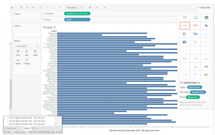 Visual Guide Figure 9.7. Creating a bar graph in Tableau.
You may notice that when you add your measure (here, % female 85+) to a graph/chart/map in Tableau, the default measurement is SUM (see Figure 9.7). Since in our data we have only one value per state, the sum is equivalent to the original value. Thus, changing this is not necessary. If you had an Excel file with multiple rows for each state, Tableau would sum those values and display that calculated value - you may, in that case, want to display the average in each state instead. You can change how your measures are calculated by clicking on the colored green oval "pill" of the measure you want to change.
Once we've created a graph, it's time to add color! Drag the same data measure from the sidebar to the Color box in the Marks section to color your bars according to that data—as the length of the bar already represents this value, adding color here is called dual encoding. Edit your color scheme so that it matches the one from your map. Your color schemes (map and graph) should be equivalent, as we are only going to create one legend for our dashboard.
The last step before adding our visualizations to a dashboard is to clean up their design. Add chart/map titles (if you wish), shorten and clarify axis labels, and simplify tooltips (Figure 9.8). Adjust font size and style as appropriate.
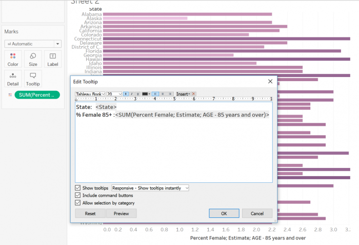 Visual Guide Figure 9.8. Editing tooltips in Tableau.
 -
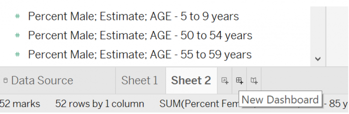
Create your First Dashboard
Click the "New Dashboard" icon at the bottom of the screen (Figure 9.9) to create a Tableau Dashboard. This is what we will use to connect our map and graph. Drag your two worksheets onto the dashboard and re-arrange as you wish. Experiment with different arrangements of elements (e.g., map, graph, legend) on the dashboard.
 Visual Guide Figure 9.9. Creating a new dashboard in Tableau.
Note: I have increased the size of my dashboard for demo purposes - you will likely want to use a standard size, and these are listed in the Size dropdown menu. The size of your dashboard on your screen vs. on the web will depend on the resolution of your laptop screen. It may take a bit of trial and error to get yours to appear the correct size.
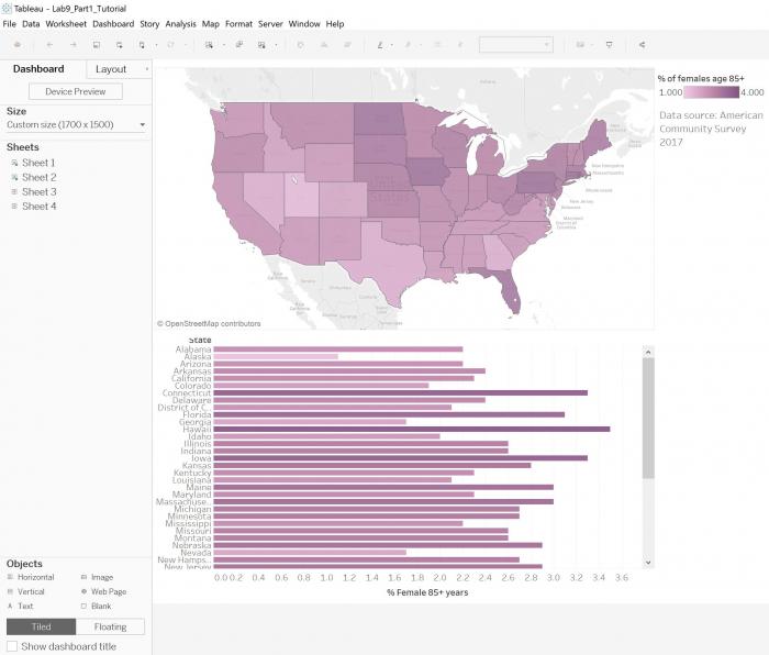 Visual Guide Figure 9.10. An example Tableau dashboard.
You can use the Objects menu (bottom left) to add other elements, such as images, text, and blank layout elements to your dashboard. In Figure 9.10, a text object was used to add explanatory text, and an empty object was used to insert a margin above the legend.
To connect your map and graph, use the Actions menu (Figure 9.11). Here, Highlight is used to connect your map and graph upon user selection of an element on either. This is the default action if you do not customize anything, but you are welcome to use a different action or actions if you choose.
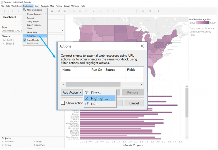 Visual Guide Figure 9.11. Creating and adding an action to a Tableau dashboard.
Your graph and map should now be connected! Example connection upon user interaction shown in Figure 9.12.
 Visual Guide Figure 9.12. A demonstration of dashboard connectivity.
Once this is complete, create two more worksheets (one map; one graph) for another measure (I chose % Males 85+). When this is complete, you will have two similar dashboards that visualize your two chosen variables (e.g., % Females 85+, % Males 85+). You may choose to use the same legend and color scheme for both dashboards or switch it up – just keep in mind design principles from this course.
-
Create a Tableau Story
Select "New Story" at the bottom of the page to create a Tableau Story. While Tableau dashboards can contain multiple worksheets, Tableau stories can contain multiple dashboards.
Here, we create simple Story: Drag your first dashboard to the center of your new Story, then add a New Blank Story point. Use that new Story point to add your 2nd dashboard. Add an overall Story title and Story point titles (shown in the clickable grey boxes) as you wish.
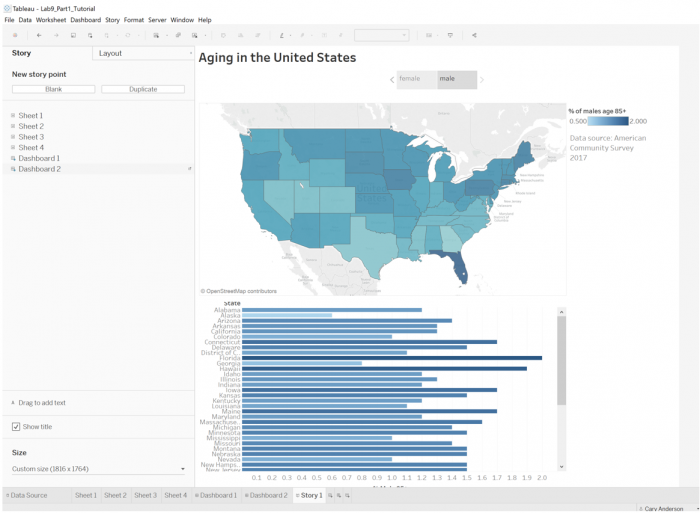 Visual Guide Figure 9.13. Creating a Tableau Story using the two dashboards.
Once you're happy with your Story design, you're ready to publish to Tableau Public. Make sure you've saved your work first! You will need to sign into (or create) your Tableau Public account before you can publish your work.
To publish to Tableau Public, use the menu structure to go to Server -> Tableau Public -> Save to Tableau Public (Figure 9.14). If you make changes to your Story, you can "re-publish" it at any time to update the online version.
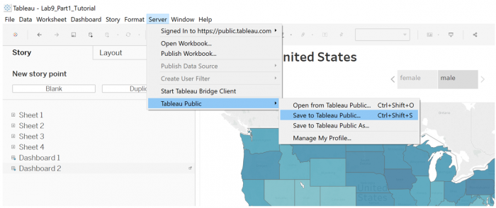 Visual Guide Figure 9.14. Publishing to Tableau Public.
When publishing your Story, you may be presented with a notice that a Data Extract is required (Figure 9.15). If so, simply select Create Data Extract in the window, and save the extracted data as suggested. Then repeat the above steps (Figure 9.14) to publish.
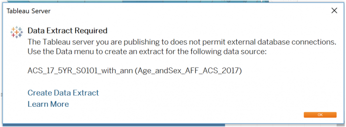 Visual Guide Figure 9.15. Data Extract Required message from Tableau.
This example can be found here: Aging in the United States, a Tableau Story by Cary Anderson. [28] Use this link to check and see how your results from this visual guide/tutorial compare! If you do not see the "Create Data Extract" option as shown in Figure 9.15, then look at this link [34] to a help page with steps on how to do it. About midway down the webpage is the "Create an extract" section and it worked to publish part 1.
Credit for all screenshots is to Cary Anderson, Penn State University. Screenshots from Tableau Desktop, data source: US Census Bureau, the American Community Survey.
Lesson 9 Lab Visual Guide Part II
Lesson 9 Lab Visual Guide Part II
In Part 2, create your own Tableau Story.
- Delving into New Data
- Mapping Point Data in Tableau
- Symbolization with Charts
- Adding New Area Data
- Advanced Customization
- Combining Charts and Maps
-
Delving into New Data
There are several geographies that Tableau will automatically recognize: States, Countries, Zipcodes, and Coordinates (lat/long). The process for Countries and Zipcodes is the same as States, which was demonstrated in the tutorial (Visual Guide Part 1). Shown below is a spreadsheet of school locations in Philadelphia, PA, which includes point location data (lat/long coordinates).
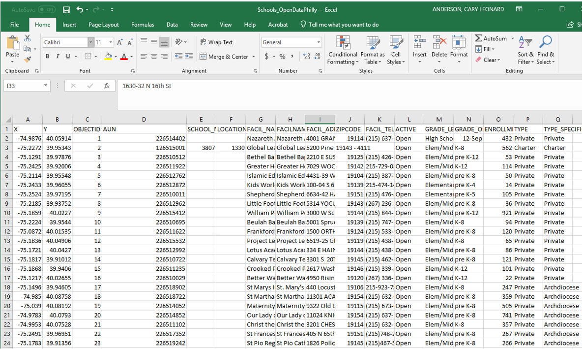 Visual Guide Figure 9.16. Philadelphia school data from OpenDataPhilly.
Lat/long data in the above spreadsheet is shown in the X and Y columns. To make things easier, I'm going to rename these latitude and longitude. Clean up anything else as needed. I edited one zipcode that was improperly formatted.
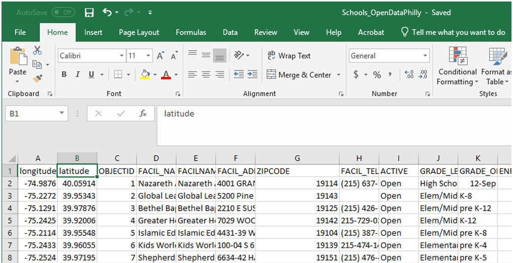 Visual Guide Figure 9.17. Editing Coordinate Data.
 -
Mapping Point Data in Tableau
Recall from Part 1 that dimensions are elements such as States that you want to visualize data about, and measures are the variable data we want to display. In this example, Tableau categorized latitude and longitude as measures, but we would like to use them as dimensions. To change a data type from a measure to a dimension, simply drag it to the dimensions section.
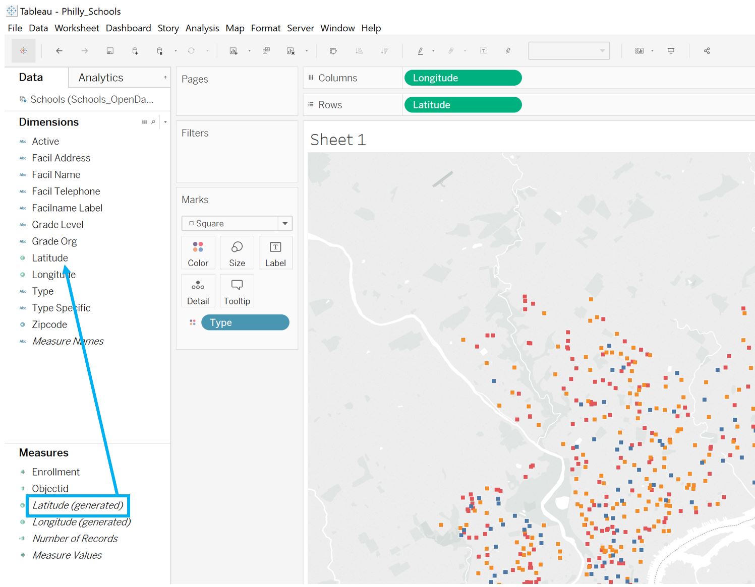 Visual Guide Figure 9.18. Changing latitude from a measure to a dimension.
Once you have longitude and latitude dimensions, you can add them to the columns and rows sections (respectively) to create your point locations map! Use the Marks menu (Figure 9.18) for adjusting symbol size, shape, etc.
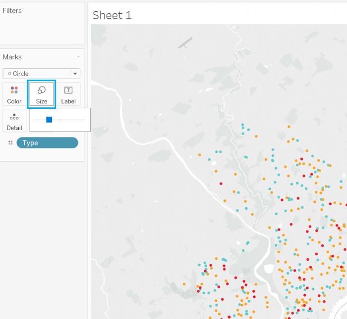 Visual Guide Figure 9.19. Adjusting point location size.
We previously discussed cleaning up tooltips in Tableau. Tooltips will automatically describe data displayed on your map, but you may want to add additional data to them. For example, here we have mapped all schools and colored them by their school type. If we want to add the school name to the tooltip but not to the map, we can drag that measure directly to the Tooltip box in the Marks section to add it.
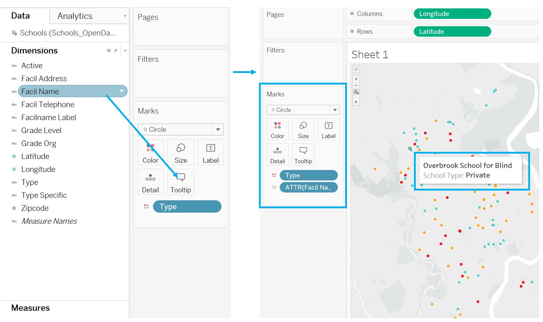 Visual Guide Figure 9.20. Adding facility (school) names to the map's tooltips.
 -
Symbolization with Charts
There are many options for altering the design of graphs and charts as well. For example, you can "drag to resize" a chart (Figure 9.21). Note in this example that the categorical color palette matches the one from the map - this is a good way to make comparisons easier for your viewers.
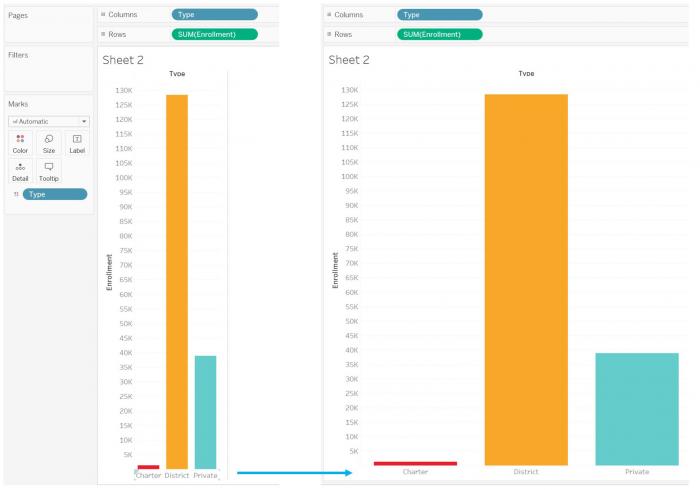 Visual Guide Figure 9.21. Dragging to re-size a bar chart.
You can also change how your measures are calculated (and thus, displayed). In Part 1, each dimension (state) had only one row in the data table, so it didn't matter whether we mapped the sum or the average - they were the same value. In this second example, we could visualize the sum, or total enrollment for each type of school, (as in Figure 9.21) but it would be more interesting to show the average enrollment for each school type. You can alter how a measure is calculated as shown in Figure 9.22 below.
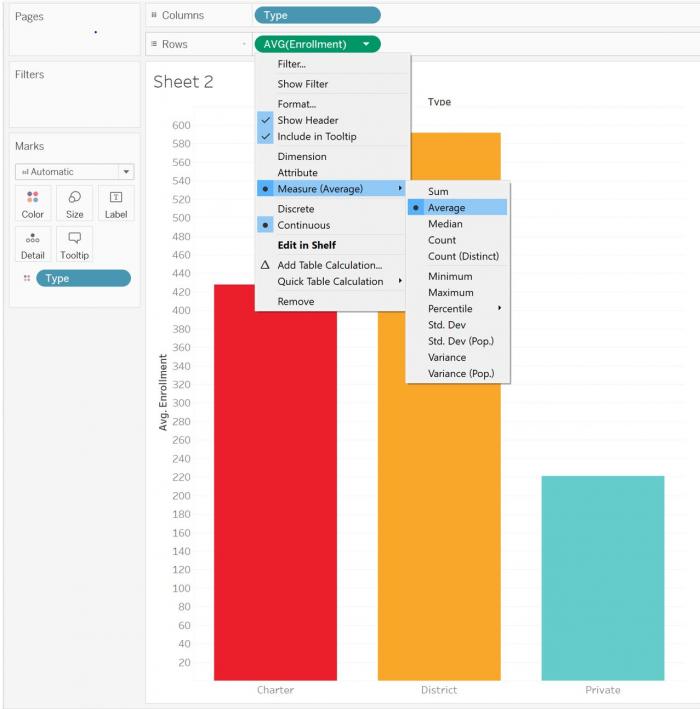 Visual Guide Figure 9.22. Changing how a measure is calculated and displayed.
Though the examples in the lab instructions only use maps and bar charts, there are many other charts available in Tableau that you might create. The example shown below is a treemap. Click the "Show Me" menu to view all chart options. You also can look online for more advanced customization options - for example, there are tutorials that discuss how to create hexbin maps.
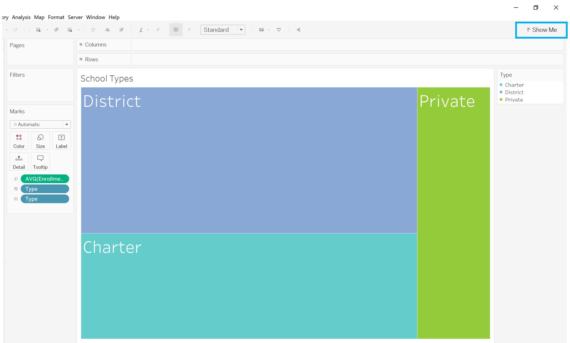 Visual Guide Figure 9.23. Designing a treemap in Tableau.
 -
Adding New Area Data
The data you use may have multiple types of geographies. For example, though we have only mapped the schools from this Philadelphia Schools dataset as points so far, the data also listed the zipcode for each school. Zipcodes are one of the geographies that Tableau automatically recognizes, so we can use this to create a graduated symbol or choropleth map to compare with our point locations map.
To do this, as we did with the States dimension in Part 1 of the Visual Guide, simply drag the Zipcode dimension onto the map.
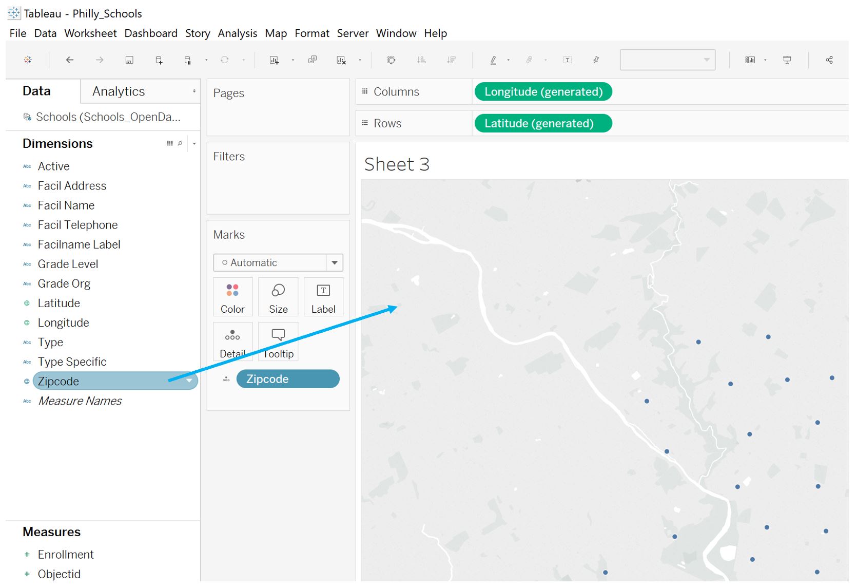 Visual Guide Figure 9.24. Creating a map from a Geography dimension (here, zipcodes) in Tableau Desktop.
To symbolize this map, drag your measure of interest to the color section of the Marks window, as shown below. Tableau will likely automatically created a choropleth (they call this a "filled map") but you can change this as well.
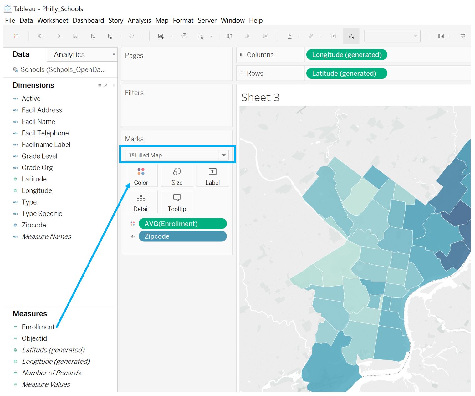 Visual Guide Figure 9.25. Symbolizing a map in Tableau: creating a choropleth map from a data measure.
 -
Advanced Customization
Tableau provides quite a few options for advanced customization. For example, you may want to use a color palette, such as one from ColorBrewer [35] or CARTOColors [36], that is not included in Tableau. Follow the instructions here: Create Custom Color Palettes [37] to add your own custom color palette.
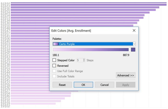 Visual Guide Figure 9.26. A graph designed with a custom color palette imported from CartoColors.
Another (simpler) customization you can make is to change the basemap used in your Tableau map. The default light grey Tableau map, for example, does not provide much locational context. We can instead use a basemap from Mapbox. Log into your Mapbox Studio account, and find a map - you should select "Share & use" as shown in the top-right corner of Figure 9.27 below. This will lead to a URL you will paste into Tableau.
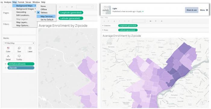 Visual Guide Figure 9.27. Adding a Mapbox basemap to your Tableau map.
Instructions are also listed in Mapbox for adding a map to Tableau. You should follow these instructions (click Map > Background Maps > Map Services > add > Mapbox Maps; paste the share URL). Once you paste the URL, the other fields in Tableau will auto-populate.
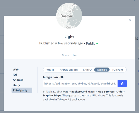 Visual Guide Figure 9.28. Getting a share URL from Mapbox Studio.
 -
Combining Charts and Maps
Tableau dashboards can become fairly complex, but for this lab, we will not include too many pieces. Figure 9.29 is an example of a dashboard that compares two maps and a bar chart. See Part 1 of this visual guide for a refresher on how to create a Tableau dashboard.
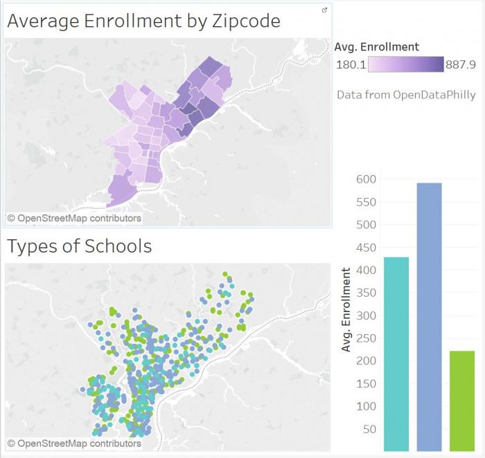 Visual Guide Figure 9.29. An example Tableau dashboard.
As you work, try out different arrangements of maps and charts, as well as different chart types. In Figure 9.30 below, the graphics shown in this guide have been divided into two dashboards: one about enrollment by zipcode, and one about enrollment by school type. Each of these dashboards was then added to the overall Tableau Story as a story point (the two story points are Enrollment and Types).
Once you've designed your story, the last step is to shorten and clarify axis labels, simplify tooltips, adjust font sizes and styles, etc.
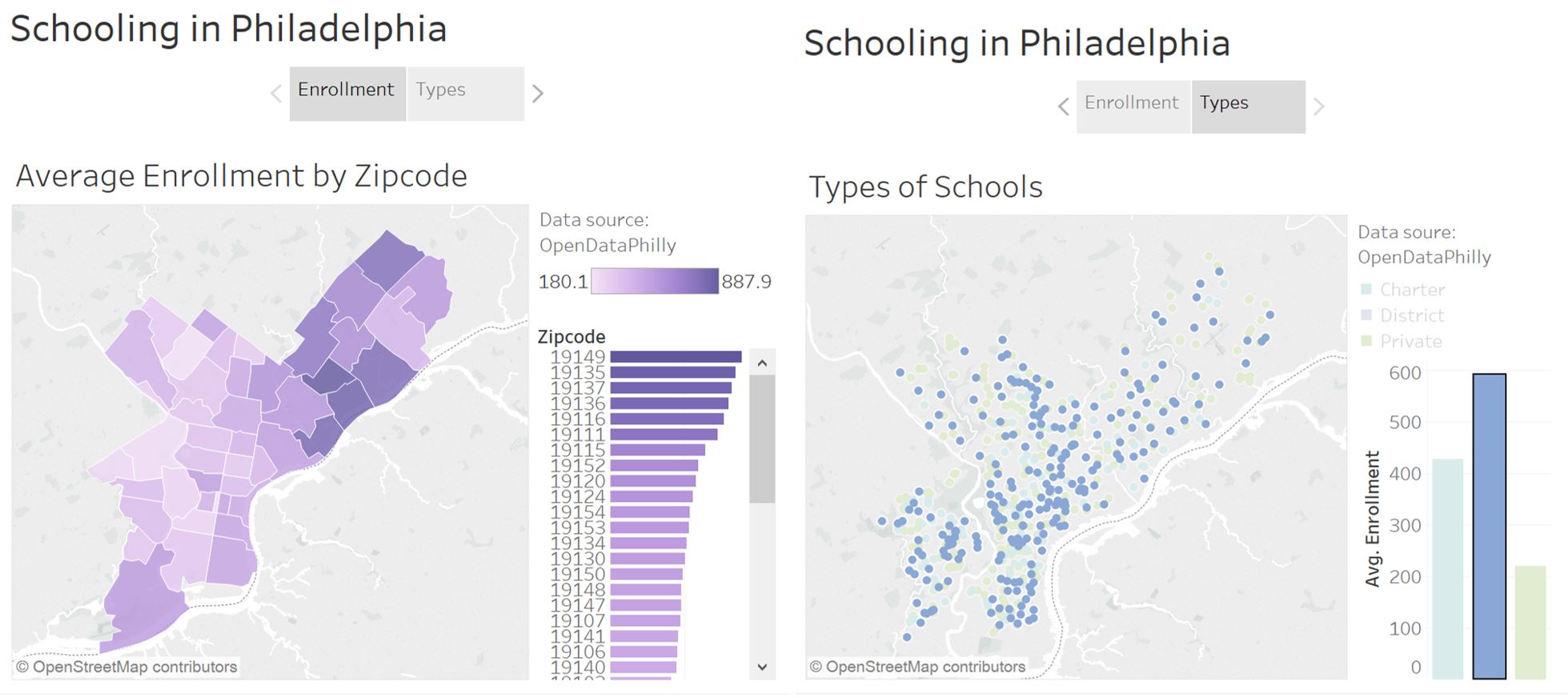 Visual Guide Figure 9.30. Editing bar chart tooltips in Tableau.
This example can be found here: Schooling in Philadelphia, a Tableau Story by Cary Anderson. [38] Note that you can download the workbook to practice with if you so choose.
Credit for all screenshots is to Cary Anderson, Penn State University. Screenshots from Tableau Desktop, data source: OpenDataPhilly, School Facilities [39]
Summary and Final Tasks
Summary and Final Tasks
Summary
Congrats, you've made it to the end of the course! In this lesson, we discussed how the recent re-visioning of the map reader as a map user has changed the cartographic design process, as well as how we evaluate maps. We discussed many different elements that may be integrated with maps, such as graphs, charts, and explanatory text, and explored the different mediums (e.g., interactive dashboards, data journalism) in which these elements are combined.
At the end of the lesson, we discussed when not to map, encouraging a practical approach to data visualization that views maps as a valuable tool but not a panacea. Relatedly, we note that much of cartographic design theory is widely applicable, and can be applied when designing other data visualizations or writing graphic-adjacent text—from microcontent to full articles.
In Lab 9, we designed an interactive map-based story using the visual analytics platform Tableau. Though this lab focused heavily on concepts from Lessons 8 and 9, we also drew from concepts throughout the course—refining layouts, symbolizing data, and thinking critically about map audience and purpose. This Story is now available on the web for you to share with others as demonstration of your skills in map design and data visualization. You're now ready and able to create, analyze, critique, and share high-quality maps!
Reminder - Complete all of the Lesson 9 tasks!
You have reached the end of Lesson 9! Double-check the to-do list on the Lesson 9 Overview page [40] to make sure you have completed all of the activities listed there. After that, you'll have finished the course!