Lesson 6 Lab Visual Guide
Lesson 6 Lab Visual Guide
Lesson 6 Lab Visual Guide Index
- Starting File
- Step 1: Create your Terrain Basemap
- Step 2: Symbolize Base Data
- Step 3: Symbolize Thematic Data
- Step 4: Create your Inset Map
- Step 5: Create your 10K Elevation Profile
- Step 6: Add Route Direction Arrows
- Lab 6 Final Tips & Tricks
-
Starting File
This is your starting file in ArcGIS Pro. It contains data for the Paradise Valley Trail Run, as well as base data (e.g., boundaries, transportation) and a Digital Elevation model (DEM). Your goal is to turn this data into a map for trail race participants and their supporters.
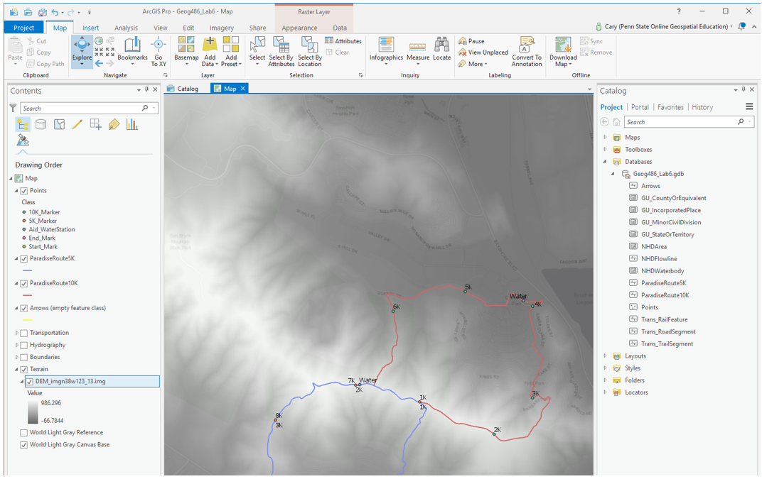 Visual Guide Figure 6.1. Lab 6 Starting File.
 -
Step 1: Create your Terrain Basemap
Your first goal in this lab is to use the included DEM to generate additional terrain layers. Create three terrain layers: Hillshade, Contours, and Curvature.
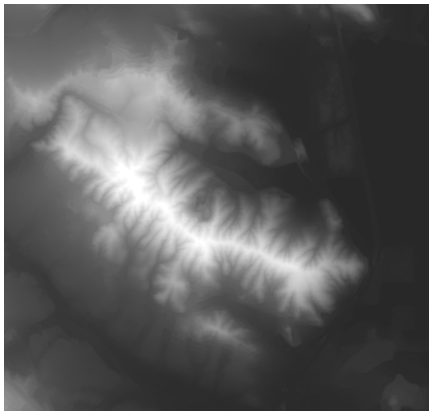 Visual Guide Figure 6.2. The Digital Elevation Model (DEM) provided in this lab.
The default settings/parameters provided by ArcGIS are ok for generating the Hillshade and Curvature layers. Make sure your output is saved to the geodatabase for the current project (Lab6_data.gdb).
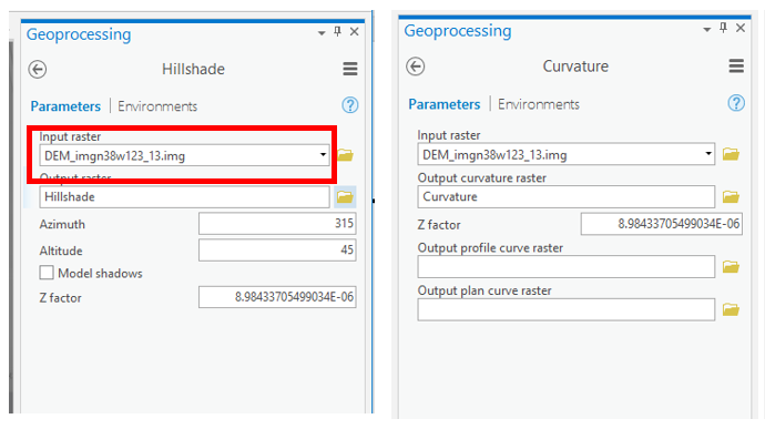 Visual Guide Figure 6.3. Generating Hillshade and Curvature terrain layers.
You will need to choose an appropriate interval for your contours - if you don't like the result, you can always choose a new interval and run the tool again.
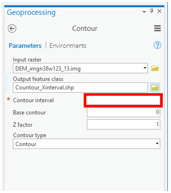 Visual Guide Figure 6.4. Generating contours.
Keep your terrain layers organized in the "terrain" layer group in the contents pane - think about your layer ordering, and don't be afraid to re-order layers as you go! Use the transparancy slider so you can see multiple layers at once - all of your terrain layers should contribute to your design.
Try out different symbology methods and color schemes. A simple stretch sequential color scheme (often greyscale) tends to work best for hillshade and curvature, but you can be a bit more creative with the DEM. Right click on a color scheme to reverse it if needed. Remember that higher hillshade values represent greater illumination - so unlike with most map data, higher values should be paired with lighter color. Keep your design subtle enough for your thematic (race info) data to show up on top. This map design is all about balance.
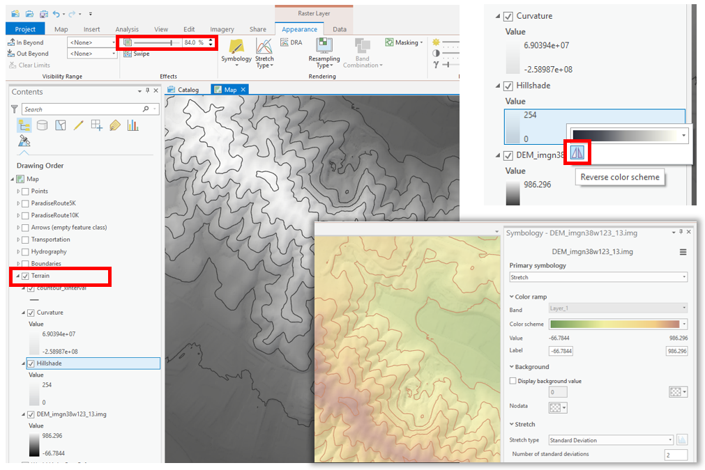 Visual Guide Figure 6.5. Editing terrain designs in ArcGIS Pro.
 -
Step 2: Symbolize Base Data
Symbolize the transport, hydro, and boundary layers as appropriate for this map’s purpose. Reference previous labs (particularly 1 and 2) for basemap design ideas. Remember you can create new label classes using SQL! This base data should be visible over the terrain data, but not be so overwhelming so as to detract from the data about the Paradise Valley Trail Run.
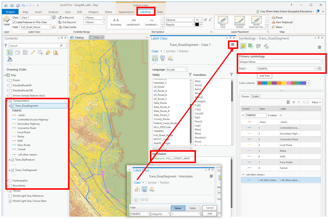 Visual Guide Figure 6.6. Symbolizing base data.
 -
Step 3: Symbolize Thematic Data
Choose line width, color, etc. to symbolize the two race routes. Think about how you can you display these two (overlapping!) routes at once. Design labels for water stations, route markers, and Start/End points. The Gallery may have helpful ideas for your point symbol designs, and there are many ways you can customize them yourself. Explore the available options. You may also want to look at running or trail maps on the web for ideas - but note that some that you find may not be well designed!
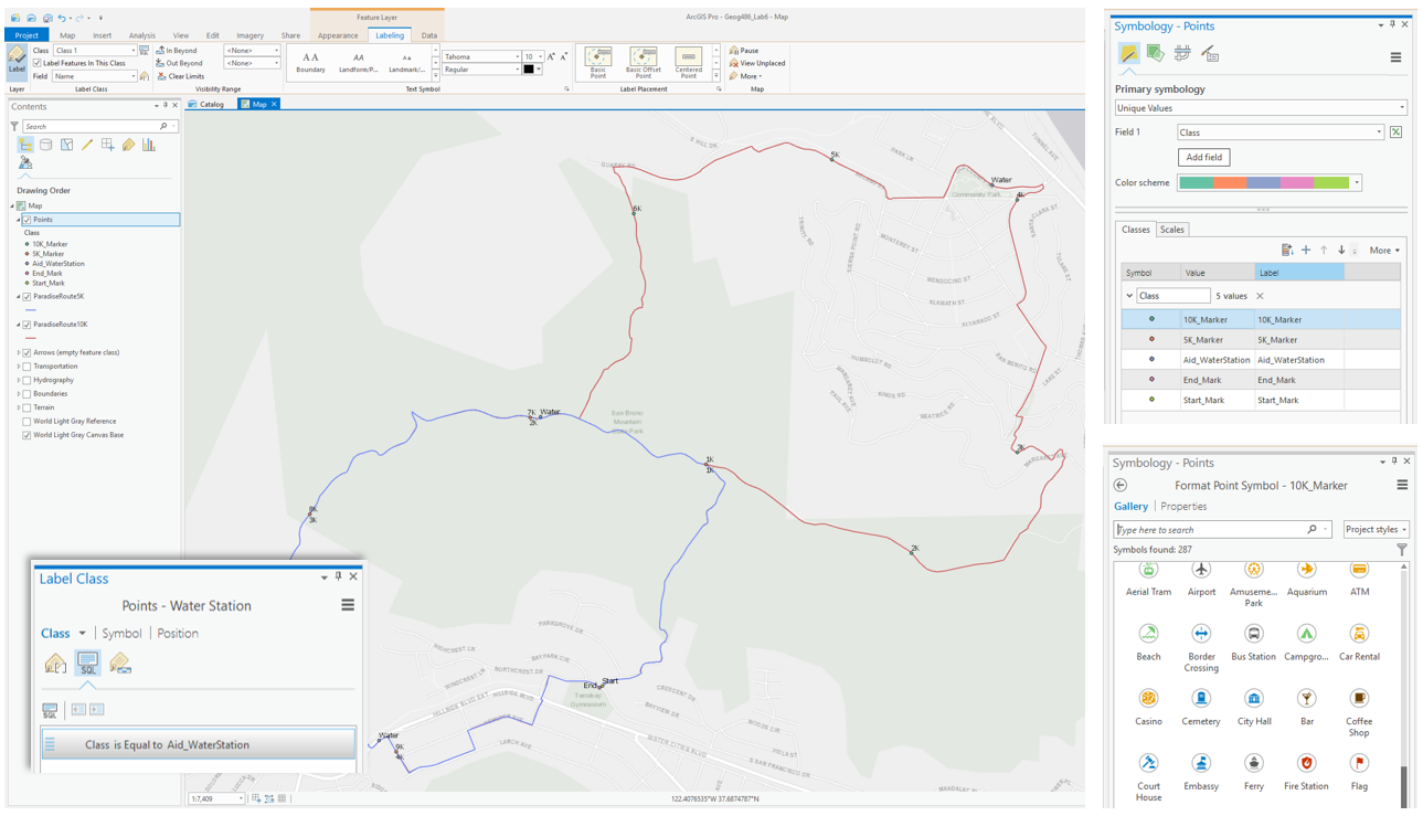 Visual Guide Figure 6.7. Symbolizing data related to the Paradise Valley Trail Run.
 -
Step 4: Create your Inset Map
Once you are happy with your primary race map, you're ready to start experimenting with layout designs and adjusting your map scales. To design your inset/locator map, it is recommended that you follow the familiar "Save-As map file" and re-import procedure illustrated below. Save a copy of your map, then import it into your map project. You can then alter the design so it works as an inset map.
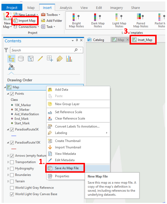 Visual Guide Figure 6.8. A review: saving a map file and re-importing it into the project.
The Navigator can be used to change a map’s orientation when the map is activated. Remember that your primary map cannot be directly North-Up for this project!
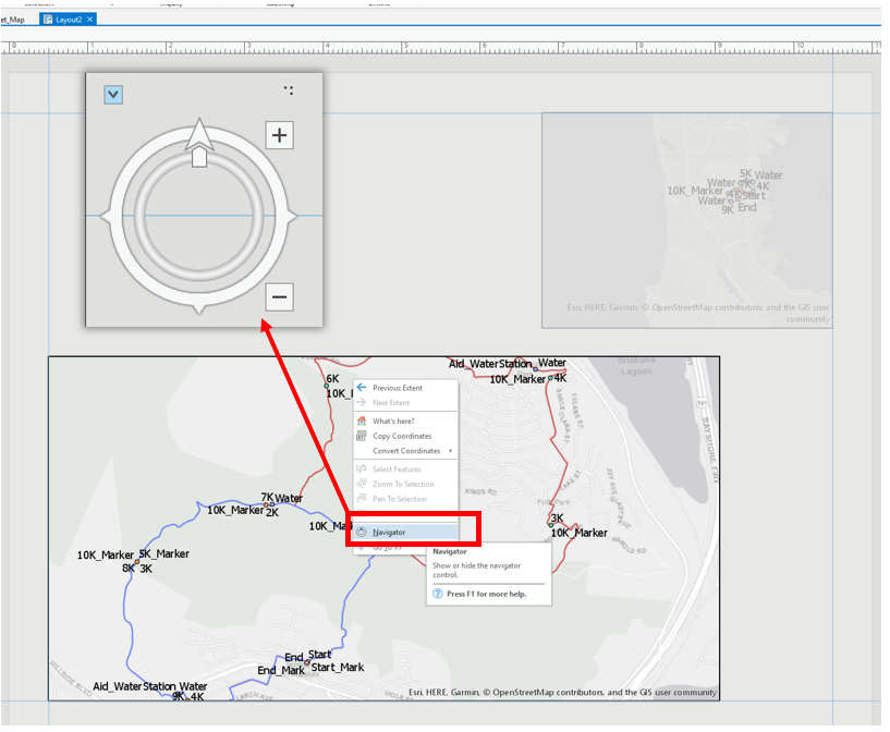 Visual Guide Figure 6.9. Opening the Navigator in Layout view.
 -
Step 5: Create your 10K Elevation Profile
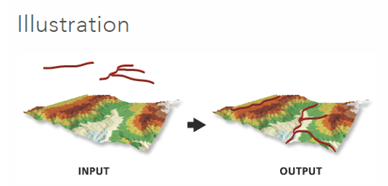
We want to create an elvation profile to help trail runners anticipate the difficulty of the race. To do this, we will be using ArcGIS Pro’s Interpolate Shape [1]tool. This tool turns a 2D line feature into a 3D line feature based an input DEM or other surfaces. We will use this 3D line feature to create an elevation profile. You do not need to create an elevation profile for the 5K route, but you may do so if you choose.
 Visual Guide Figure 6.10. The Interpolate Shape tool.
Once you have created a 3D line, you can use this line to create a profile graph. As noted below, the design of your profile graph can be edited. You can also wait and edit the design as you work on your map layout.
Your profile graph will cover a slightly different horizontal distance than in the screenshot below - this is ok!
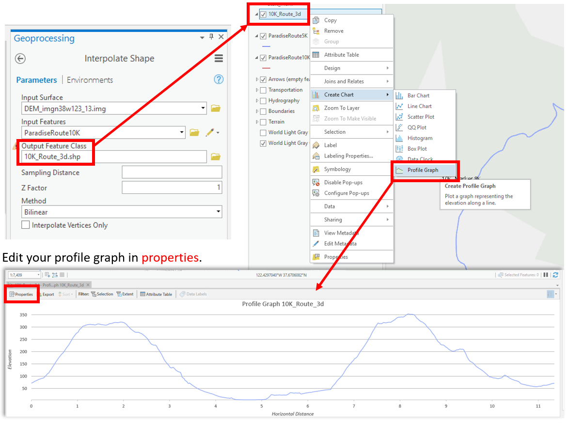 Visual Guide Figure 6.11. Generating a 3D line; using this to create a profile graph.
 -
Step 6: Add Route Direction Arrows
An important part of route maps like this is to inform the reader of their direction of travel! There are many options for adding directional arrows to your map - two are listed below. You may design your arrows any way you want as long as you do not use any software other than ArcGIS Pro.
Option #1: Use the Edit [2] tab to create arrow features by drawing new lines. An empty “Arrows” feature class has been added to the map for you to facilitate this method. Use the editing toolbar to finish or discard map feature changes in this layer. And always save your edits!
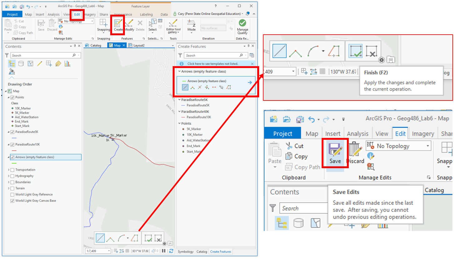 Visual Guide Figure 6.12. Creating and editing lines in the "Arrows" feature class using the Edit toolbar.
Option #2: Manually add arrows to your map via the map’s layout shape/line tools.
ArcGIS has tools for adding arrows and editing graphics, but is not fully-fledged graphic software (e.g., Adobe Illustrator). Keep this in mind as you decide which of options #1 and #2 for adding arrows works best for you. You might also try them both out and see which works best for your map.
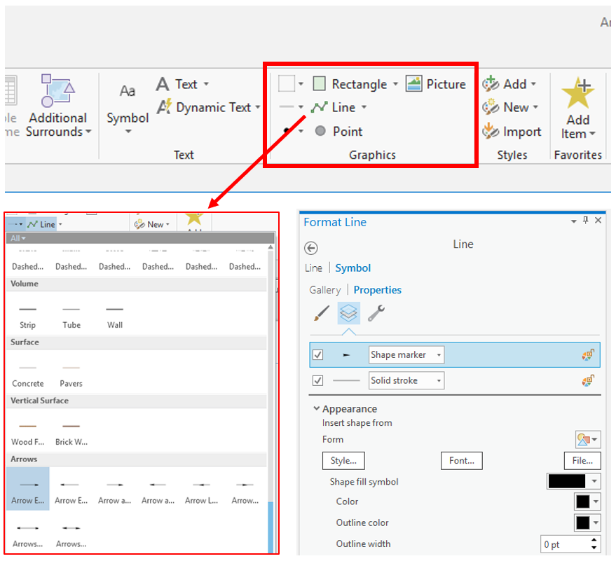 Visual Guide Figure 6.13. Inserting arrows into a map layout.
 -
Lab 6 Final Tips & Tricks
Insert your 10K elevation profile into your layout. (But note that you can keep the old 2D route for your map design).
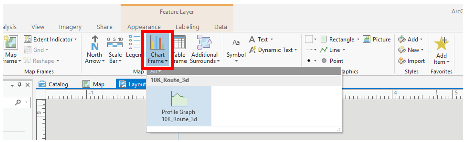 Visual Guide Figure 6.14. Inserting a profile graph into your layout.
Map routes, stops, and marker locations are approximate. You may alter them slightly if you would like. Reference the lesson and previous labs for ideas. Check the lab assignment for a list of specific requirements and ask questions in the discussion forum. Don't forget to add an extent indicator and marginal elements (e.g., scale bars, north arrows). Feel free to customize your layout and map elements creatively!
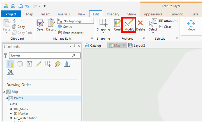 Visual Guide Figure 6.15. Modifying the marker points layer in ArcGIS Pro.
Credit for all screenshots is to Cary Anderson, Penn State University; Data Source: The National Map.