Lesson 4: Wetland Restoration and Invasive Species Part II
Lesson 4 Overview and Checklist
Lesson 4 Overview
Introduction
In Lesson 3, we created several custom datasets for our study area wetlands within the Ottawa National Wildlife Refuge. These data contain information about plant species, vegetation groups, and invasive species for five snapshots in time between 1939 and 2005. In Lesson 4, we will use these datasets to understand how vegetation changes in response to water level fluctuations. In particular, we are interested in how emergent vegetation changes, since this group of plants provides the highest quality habitat in the wetland. We are also interested in how invasive species spread over time. Comparing multiple datasets over many time periods can get a bit complicated. In this lesson, we will explore several tools to make it easier to identify trends over time between multiple datasets.
Scenario
Lesson 4 is a continuation of the scenario from Lesson 3 - "You are part of a research team tasked with creating a restoration plan for a degraded wetland complex. You need to understand how the vegetation within the wetland has historically responded to changes in water levels. This information will enable you to predict the health of the wetland in future scenarios, including anticipated hydrological changes due to climate change. You begin by searching for publicly available sources of data for your analysis. You find that there is not a dataset that has sufficient detail about vegetation for your study area. Furthermore, you are unable to find a dataset that shows wetland vegetation at multiple points in time. Your team hires a remote sensing specialist to acquire and interpret historical imagery and digitize polygons representing vegetation over time. Your job is to figure out how to use the vegetation data and GIS software to understand the relationship between fluctuating water levels and changes in vegetation."
Goals
At the successful completion of Lesson 4, you will have:
- explored and interpreted results from GIS operations;
- used ArcGIS tools to visually compare multiple datasets (e.g., time-series data);
- used ArcGIS tools to statistically compare multiple datasets.
 |
 |
 |
 |
 |
Questions?
If you have questions now or at any point during this lesson, please post them to the Lesson 4 Discussion.
Checklist
This lesson is worth 100 points and is one week in length. Please refer to the Course Calendar for specific time frames and due dates. To finish this lesson, you must complete the activities listed below. You may find it useful to print this page out first so that you can follow along with the directions. Simply click the arrow to navigate through the lesson and complete the activities in the order that they are displayed.
- Read all of the pages in Lesson 4.
Read the information on the "Background Information," "Required Readings," "Lesson Data," "Step-by-Step Activity," "Advanced Activities," and "Summary and Deliverables" pages. - Download and read the required readings.
See the "Required Readings" page for links to the PDFs. - Download Lesson 4 datasets.
See the "Lesson Data" page. - Download and complete the Lesson 4 Step-by-Step Activity.
See the "Step-by-Step Activity" page for a link to a printable PDF of steps to follow. - Complete the Lesson 4 Advanced Activity.
See the "Advanced Activity" page. - Complete the Lesson 4 Quiz.
See the "Summary and Deliverables" page. - Create and submit Lesson 4 Discussion Post.
Specific instructions are included on the "Summary and Deliverables" page.
Optional - Check out additional resources.
See the "Additional Resources" page. This section includes links to several types of resources if you are interested in learning more about the GIS techniques or environmental topics covered in this lesson.
SDG image retrieved from the United Nations [1]
Background Information
Background Information
Water Levels and Wetland Vegetation
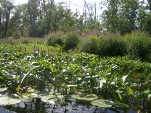
Last week, we talked about why wetlands are important, threats to wetlands such as human activities and invasive species, and wetland protection and restoration programs. This week, we will discuss how wetlands function. Hydraulic conditions are very important in wetland ecosystems because they influence their physical and chemical properties. Water depth is particularly important because it influences which types of vegetation are present, their abundance, and where they grow. Certain types of vegetation provide much better habitat than others. For example, aquatic and emergent vegetation provide cover that fish need to hide from predators and raise their young. Plants can be grouped into a few main categories based on the depth of water they prefer (listed from deepest water to dry land): submersed aquatic, floating aquatic, emergent, and terrestrial (e.g., shrubs and trees). These groups should look familiar to you (Hint: look in the Veg_Group shapefiles we created last week).
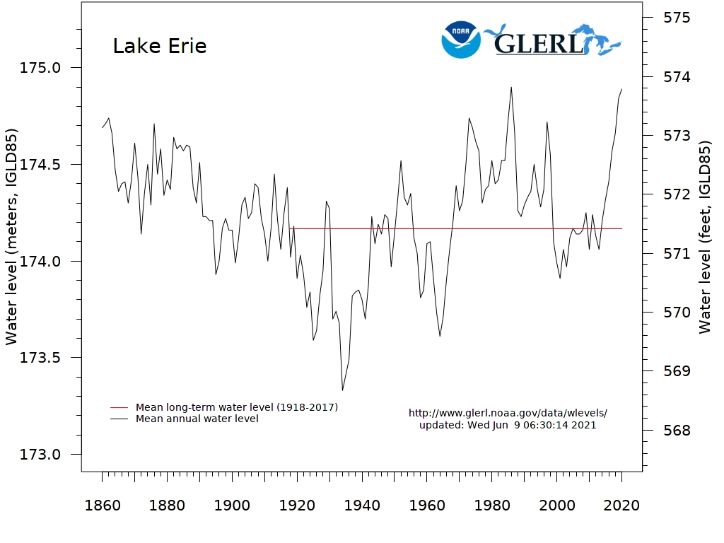
Wetlands are very dynamic; the physical and chemical properties of a given wetland can vary depending on current hydraulic conditions within a watershed. Some wetlands fluctuate more than others, especially those that are hydraulically connected to larger bodies of water such as drowned river-mouth wetlands along the Great Lakes or tidal salt marshes along the nation’s coasts. In these types of wetlands, the water elevation of the wetland rises and falls in response to water elevation changes in the main body of water. Water levels can fluctuate at different time scales, such as centuries, decades, annually, seasonally, daily, and even hourly. For example, the graph below shows the water levels of Lake Erie between 1850 and the present. You can see that water levels can fluctuate by more than 3 ft in a period of one or two years.
As water levels rise and fall, the water depths at any given location within a wetland will vary based on its bathymetry. For example, in an area with gentle slopes, an increase in water elevation will be spread over a larger area, so the water depth will not increase as much as in an area with steep slopes. This constant change in water depths naturally regulates plant communities. During periods of lower water levels, species that require deep water don’t survive. At the same time, underlying soils are exposed, allowing seeds from a variety of plants to germinate and mature. The opposite is also true. During periods of high water, species that require shallow water are drowned and eliminated. When the hydraulic properties of a wetland are modified, the natural cycle of vegetation regulation and regeneration is disturbed. Without low water levels to control their growth, some species are able to thrive season after season while others are never given the opportunity to grow.
Study Site Background Information
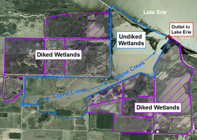
The drowned-river mouth wetlands within our study are part of the Ottawa National Wildlife Refuge, which was created in 1961 to preserve vital habitat for migratory birds. The refuge contains approximately 4,500 acres of wetlands, the majority of which have been diked to control their water levels for over 60 years. Refuge managers use the dikes to maintain a series of ponds with different water depths at different times of the year. This allows them to create habitat for a variety of species, though management techniques favor migratory birds. By mimicking the natural rise and fall of water levels within the diked wetlands, emergent vegetation, which is habitat for many species, is able to thrive. Without the dikes, much of the habitat would not exist. However, the dikes hydraulically disconnect the pools from Crane Creek and Lake Erie, so that only a subset of wetland species can utilize the habitat. For example, fish, clams, and other small organisms cannot travel over the dikes.
Only a small portion of the wetlands in the refuge are not diked (e.g., wetlands within the study site); however, they are severely degraded. These wetlands have the potential to provide critical habitat since they are still connected to Lake Erie. The frequent high water levels of Lake Erie since the 1970s have contributed to the lack of natural regeneration of emergent vegetation in the undiked wetlands. Without human intervention, it is unlikely that water levels will lower enough to re-establish the vegetation that fish use for spawning and protection of their young. Wetland managers are also struggling to control the spread of several invasive plants, that threaten the native flora and fauna, including giant reed-grass (Phragmites australis), reed-canary grass (Phalaris arundinacea), narrow-leaved cattail (Typha augustifolia), purple loosestrife (Lythrum salicaria), and flowering rush (Butomus umbellatus).
Using GIS for Wetland Restoration Projects
GIS is a powerful tool to help wetland managers. We know that wetlands fluctuate over time in response to changes in local and regional hydrological conditions. Historical aerial photos can help us understand these changes over time. For example, they can show how vegetation in a particular wetland has responded in the past to changes in water levels. Digitizing the vegetation into a GIS database is much more useful than just looking at the images. Once the data are in a GIS format, wetland managers can easily calculate statistics, identify trends, and create models that allow them to predict the types and abundance of vegetation they can expect at different water levels. For example, they could model future vegetation changes in response to water level fluctuations caused by climate change. They can also use the data to create baseline vegetation maps to evaluate restoration efforts, such as attempts to regenerate emergent vegetation, map the spread of invasive species over time, and evaluate control methods.
Last week, we used several publicly available datasets to familiarize ourselves with our study area wetlands. We also created several new datasets related to wetland vegetation, including species, vegetation groups, and invasive species. In Lesson 4, we are going to use this data to explore a real-world example of how GIS can be used to assist wetland managers in restoration efforts. We will also explore several methods in ArcGIS to interpret and compare multiple time-series datasets.
Required Readings and Website Exploration
Required Readings and Website Exploration
There are two types of required readings for Lesson 4, USGS information and Esri Help Topics, and a couple of websites that I would like you to explore. The first reading is a fact sheet that provides more information about the invasive species in our study area. The second link sends you to a Virginia Institute for Marine Science (VIMS)/Center for Coastal Resource Management (CCRM) page that outlines GIS methods that are used when producing a shoreline and tidal marsh inventory. The third is a link to the Virginia Coastal Resource Tools Portal and within that page is a link to the Virginia Comprehensive Map Viewer. The Comprehensive Map Viewer displays a specific example of the shoreline and tidal marsh inventory produced by the CCRM. Feel free to explore additional VIMS/CCRM pages, there are many additional links that provide tidal marsh inventory examples. There are also a handful of Esri help topics related to operations we will use in ArcGIS during the Step-by-Step Activity.
USGS and VIMS
- "Invasive Phragmites in the Great Lakes Wetlands" [3]
- VIMS/CCRM - Shoreline & Tidal Marsh Inventory Methods [4]
- Virginia Costal Resources Tools [5] - select the Virginia Coastal Viewer [6] and take a look at various layers, including Phragmites and Tidal Marsh, under Shoreline Inventory Layers. Also, look at the Virginia Coastal Resources Tools [5] to view the various dashboards that monitor the local river and shoreline systems.
Esri Help Topics
Find the help articles listed below on ArcGIS Pro Resource Center [7] website.
- “Importing Symbology from Another Layer [8]”
- "Animation basics [9]"
- "Author a new animation [10]"
- "The Keyframe List [11]”
- "A Quick Tour of Charts [12]"
Lesson Data
Lesson Data
This section provides links to download the Lesson 4 data and reference information about each dataset (metadata). Briefly review the information below so you have a general idea of the data we will use in this lesson.
Lesson 4 Data Download:
Note: You should not complete this activity until you have read through all of the pages in Lesson 4. See the Lesson 4 Checklist for further information.
Create a new folder in your GEOG487 folder called "L4." Download a zip file of the Lesson 4 Data [13]and save it in your "L4" folder. Extract the zip file and view the contents. Information about all datasets used in the lesson is provided below.
Metadata
In Lesson 4, we will use many of the same datasets from Lesson 3, including the custom data sets we created in Part II of the Step-by-Step Activity. I have provided clean copies of these datasets in the zip file above. Please use these during Lesson 4, just in case you made an error during Lesson 3. You may want to compare the data you created in Lesson 3 to the provided datasets and see if there are any differences.
- Base Map: OpenStreetMap from ArcGIS Online (see Lesson 3 for more details).
- The study site boundary (Study_Site) represents the wetland areas within Ottawa National Wildlife Refuge that are hydraulically connected to Lake Erie.
- Boundary of Ottawa National Wildlife Refuge: “OttawaNWR.”
- Polygons of Vegetation Groups for the 1930s (30s_VegGrp), 1950s (50s_VegGrp), 1960s ( 60s_VegGrp), 1970s (70s_VegGrp), and 00s (00s_VegGrp).
- Polygons of Invasive Species Classes for the 1930s (30s_Invasive), 1950s (50s_Invasive), 1960s ( 60s_Invasive), 1970s (70s_Invasive), and 00s (00s_Invasive).
- Polygons of Plant Species for the 1930s (30s_Species), 1950s (50s_Species), 1960s ( 60s_Species), 1970s (70s_Species), and 00s (00s_Species).
Step-by-Step Activity
Step-by-Step Activity: Overview
Step-by-Step Activity: Overview
In Part I, we will explore tools to visually explore and compare multiple datasets, such as animations and layouts with multiple map frames. In Part II, we will explore tools to statistically compare multiple datasets, including calculating percent area and creating graphs. We will use both techniques to interpret our data and explore how vegetation within our study area changes over time as it responds to changes in water levels.
Lesson 4 Step-by-Step Activity
Note: You should not complete this step until you have read through all of the pages in Lesson 4. See the Lesson 4 Checklist for further information.
Part I: Visually Explore Trends
Part I: Visually Explore Trends
Part I, we will explore several tools and technique to make it easier to visually interpret patterns in your data using ArcGIS. These can be especially helpful when you have multiple datasets to compare.
-
Organize Your Map and Data
- Open a new blank Map and save the project in your L4 folder (uncheck "Create a new folder for this project").
- Set your Current Workspace and Scratch Workspace to your L4 folder by navigating to the Analysis tab, Geoprocessing group, Environments
 .
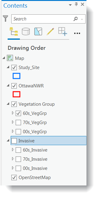
. - Add the study area boundary (Study_Site), Ottawa National Wildlife Refuge boundary (OttawaNWR), polygons of vegetation groups (60s_VegGrp, 70s_VegGrp, 00s_VegGrp), and polygons of invasive species classes (60s_Invasive, 70s_Invasive, and 00s_Invasive) from your L4 folder.
- Change the study site and refuge boundaries symbology to hollow outlines. You don’t need to alter the symbology of the remaining layers since we will be doing this in Step 3.
- Check the projection of the current Map by right-clicking on “Map” in the Contents pane > Properties > Coordinate System. It should say “NAD_1983_UTM_Zone_17N.”
- Add the Open Street Map layer as a Basemap.
- Save your project.
-
Review Contextual Information
- One of our main research questions is how vegetation within our study area changes over time in response to fluctuating water levels. We need to know what the water elevation was for our study area for each of our study years. Since the wetlands in our study area are hydraulically connected to Lake Erie, we know they will both have the same water elevation.
- The water levels in the table below are from the Lake Erie Hydrograph [14] (graph of water level over time). Compare the water levels for each year and rank them as high, medium, or low.
Year water Level (m) High, Med, Low 1962 173.9 1973 174.9 2005 174.2 
Based on the Lake Erie Hydrograph, how do the water levels for 1962, 1973, and 2005 compare to the long term averages for Lake Erie? Which years had the highest and lowest water levels between 1920 and the present?
-
Set Layer Symbology
- One of the first steps to understand trends in your data is to simply look at the spatial patterns. To compare time-series datasets, you want to make sure all of your layers have the same symbology settings. If not, it won’t make sense to visually compare them because changes in patterns may be related to different symbology settings instead of changes in your actual data.
- Layer files (.lyr) are a way to save symbology settings in ArcGIS. I’ve already created layer files for you for two purposes, first to save you time and second to demonstrate some of the tools available in ArcGIS to make your life easier.
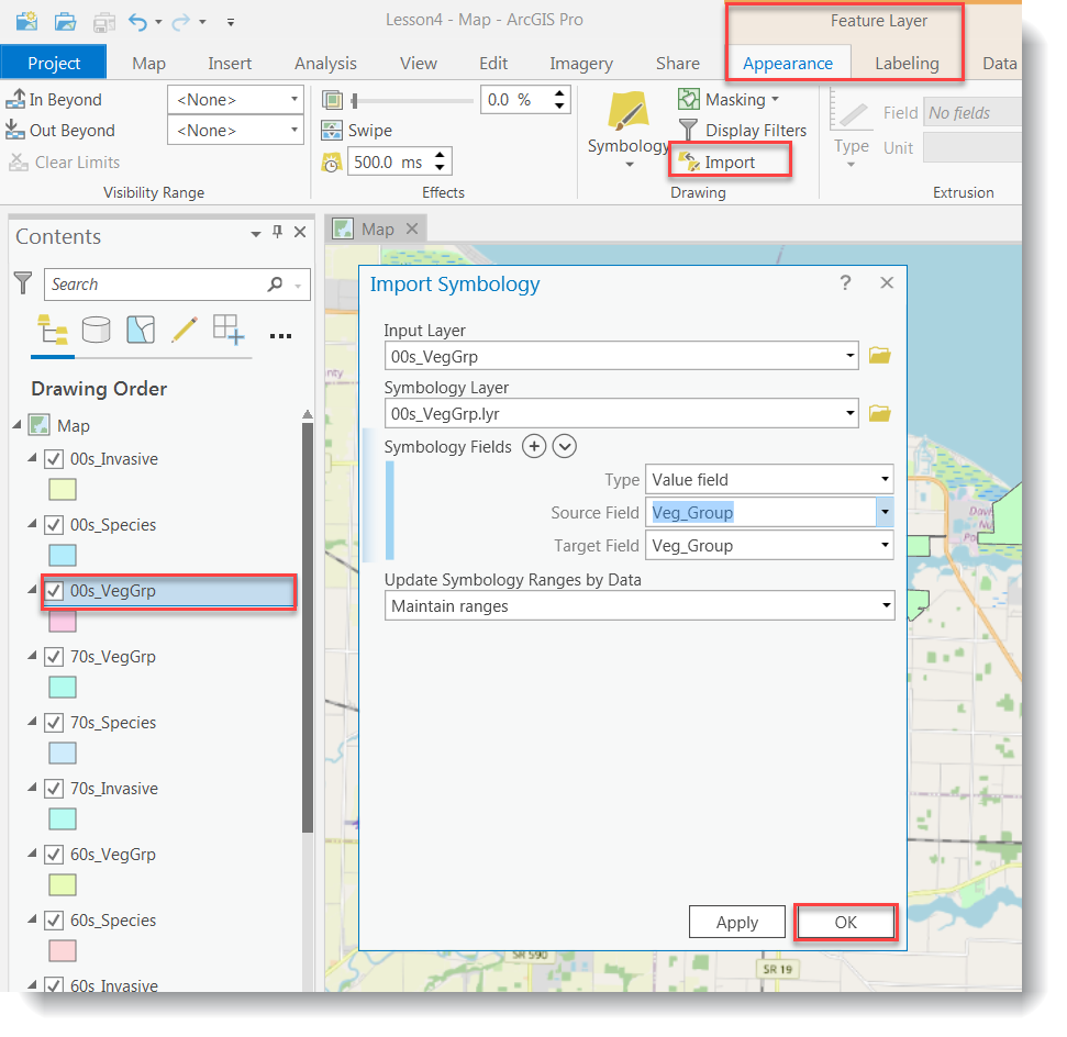
- Highlight the 00s_VegGrp in the Contents pane. Under Feature Layer, on the Appearance tab, in the Drawing group, click Import. This will allow you to import symbology from symbology layer file. Browse to the 00s_VegGrp.lyr file in your L4 folder. Make sure the Value Field matches as shown below. Click OK to apply and import the Symbology. Repeat for the 70s_VegGrp and the 60s_Veg_Grp layers in the Contents pane. Import the 00_VegGrp.lyr as the Symbology layer for both.
- Use the 00s_Invasive.lyr layer in your L4 folder to set the symbology for the time series invasive shapefiles. Save your map.
- Turn the different layers on and off to explore the changes over time.

One of the challenges of looking at time-series data of the same location is that all of the datasets overlap each other. It is very difficult to see all of the datasets at the same time if you have them all on the same map, especially if they are polygon files.
-
Create Time Series Animation
- Turning layers on and off manually is not really the best technique to visualize changes over time, especially if you have a lot of datasets or if you want to repeat the task many times. ArcGIS has a tool that allows you to set up animations of datasets that are in the same Map.
- To use this tool, I like to organize our data into different group layers within the Contents pane. Hold down the Ctrl key and select the “60s_VegGrp,” “70s_VegGrp,” and “00s_VegGrp” layers. Right-click > Group.
- Name the group “Vegetation Groups.” Repeat for the invasive species shapefiles. Name the group “Invasive.”
- The order in which the layers appear in the animation we are going to create is based on the order the layers are arranged Contents. Arrange the layers within each group so they increase in time from top to bottom like the example below.
In this lesson, we arranged the layers within each group chronologically. You could also arrange them in a different order, such as by their water level (low, medium, high) to visualize how the vegetation changes correlate with water level changes.
- We’ll start by creating an animation of the vegetation groups over time. Turn the “Invasive Group Layer” off in the Contents pane.
- In the Contents pane, make only the "Study_Site" and "OttawaNWR" layers visible. Go to the View tab, Animation group, and select Add
 .
. - Select the Append tool
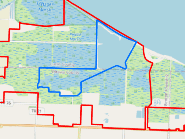
 from the Create group. An Animation Timeline window will open with one thumbnail image in the Keyframe Gallery (showing the study site and Ottawa NWR layers at zero seconds).
 - Continue to append keyframes for each Vegetation Group layer by clicking the append next keyframe button
 after updating your map by turning the layers off and on.
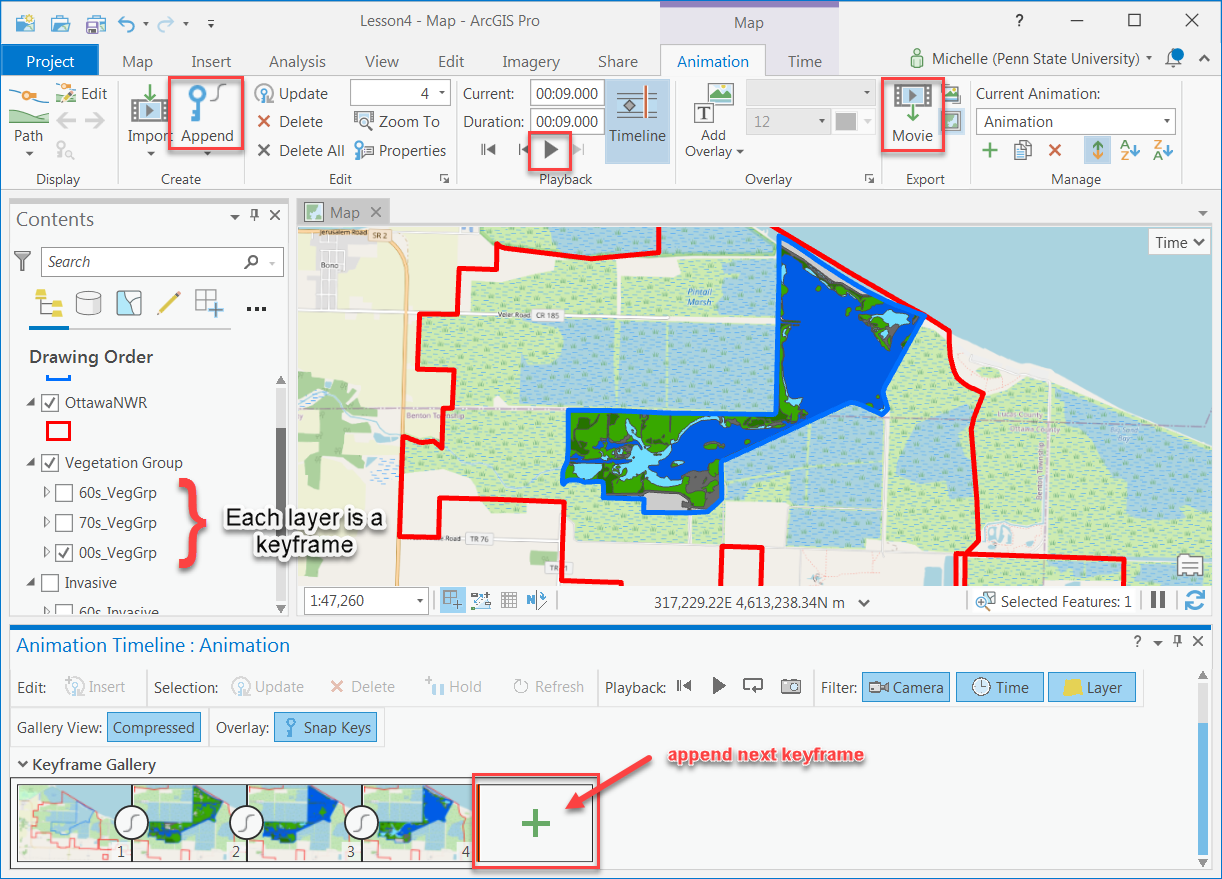
- Click the play button
 to preview your animation. You can adjust the duration if necessary.
 -

Make sure you have the correct answer before moving on to the next step.
When you preview your animation, you should see one layer turned on at a time beginning with the VegGrp_60s and ending with the VegGrp_00s.
If your data is not close to the example, go back and redo the previous step. You’ll need to clear the animation first by going to the View tab, Animation group, select Remove.
- Once you think that the animation is ready go to the Animation tab, Export group, and select Export Movie
 . Export the animation to your L4 folder (the example was exported to a .gif).
 - Now we’ll create an animation of the invasive species data over time using the Invasive Group Layer. Make sure you uncheck the “Vegetation Group Layer” and check the “Invasive Group Layer” in the Contents pane.
- Go to the Animation tab, Manage group, and select Create Animation
 to create a second animation within the Lesson4 project.
 - Repeat steps g and h using the Invasive Group layers.
- Preview your animation. Once you are satisfied with it, save it in your L4 folder. Go to the Animation tab, Export group, and select Export Movie.
If you want to be able to view your animation outside of ArcGIS, you can export your animation to a video file. You can also make your animations more sophisticated by exploring the available animation tools and options within ArcGIS. For example, you can add looping, string multiple animations together, add time-series labels, and add graphs that update over time along with your animation. You can find more information, such as help articles, sample animations, and tips in the Esri help topics.
-
Create a Map Layout with Multiple Map Frames
Animations are great for emailing to a client or adding to a presentation. However, if you want to print your maps, you need to create a layout. We are going to create a layout with multiple map frames to make it easier to compare our data over time. When working with multiple map frames that show similar information, it is easier to set the symbology, extent, and scale in one map, then make copies of the map, instead of setting up each map separately.
The final map layout should include all of the following elements:
- 7 map frames:
- The six main map frames should show the study area boundary, the Ottawa National Wildlife Boundary, and the Open Street Map layer.
- 3 of these map frames should show the vegetation group data, one for each time period (60s, 70s, 00s), each with its own title.
- 3 of these map frames should show the invasive species data, one for each time period (60s, 70s, 00s), each with its own title.
- 1 map frame should contain a locator map (see instructions below). This should be at a scale to show the study area in relation to the state of Ohio. It should include the Open Street Map layer and the location of the study area.
- The six main map frames should show the study area boundary, the Ottawa National Wildlife Boundary, and the Open Street Map layer.
- Legend (do not use default layer names with “_” or abbreviations)
- The water level during each time period (m)
- Scale (with units of km or miles)
- North Arrow
- Source Information:
-
In ArcGIS Pro, if two or more map frames reference the same map, any manipulation to the layers in the map (such as turning any layer on or off or zooming in or out) affects both map frames because the layout is referencing the same Map. To bypass this, a separate Map must be referenced for each Map Frame in a Layout. Go to the Insert tab, Project group, and select New Map. Insert six New Maps to your project (each should default to a different name Map, Map1, Map2, Map3...).
-
Switch back to your original Map. Switch off the Open Street Map Basemap for now, as it will increase the loading time while you are setting up your layout. Adjust your scale and extent, right-click on “Study_Site” in the Contents pane > Zoom to Layer. Turn on the 60sVegGrp layer.
-
Hold down the control key and highlight the "Study_Site", "OttawaNWR", "Vegetation Group" and "OpenStreetMap" layers in the Contents pane. Right-click and select Copy.
-
Go to Map1, right-click on the map name in the Contents pane > Paste. Turn the Study_Site, OttawaNWR, and 70sVegGrp layers on. Do the same in Map2 but turn Study_Site, OttawaNWR, and 00sVegGrp layers on.
-
Switch back to your original Map. Adjust your scale and extent, right-click on “Study_Site” in the Contents pane > Zoom to Layer.
-
Hold down the control key and highlight the "Study_Site", "OttawaNWR", "Invasive Group" and "OpenStreetMap" layers in the Contents pane. Right-click and select Copy.
-
Go to Map3, right-click on the Map name in the Contents pane > Paste. Turn the Study_Site, OttawaNWR, and 60s_Invasive layers on. Do the same in Map4 but turn Study_Site, OttawaNWR, and 70s_Invasive the layers on. And, then in Map5 turn on Study_Site, OttawaNWR, and 00s_Invasive the layers on.
-
Go to Map6, right-click on the Map name in the Contents pane > Paste. Turn the Study_Site, and OttawaNWR layers on.
- Go to the Insert tab, Project group, and select New Layout.
- Set up the page layout. Choose a Portrait page size of Tabloid (or another 11x 17-inch equivalent).
- Go to the Insert tab, Map Frames group, and click on the Map Frame tool
 . Select the default extent of the original Map in the gallery. On the layout, click and drag a rectangle to create the map frame for the original Map. Insert a total of 7 map frames (i.e., Map, Map1, Map2, Map3, Map4, Map5, and Map6) in your layout.
 - Select the Map6 map frame in the layout to activate it, and then right-click > Properties. In the Format Map Frame pane, select the placement button, and adjust the Width and Height. Resize the Map6 map frame to be 3 inches by 2 inches. This will become the locator map.
- Next, we’ll organize the map frames in the layout. Go to the Layout tab, Show group, and check the Rulers and Guides boxes.
- We’ll start by setting up guides and snapping to make it easier to format your layout. To add guides, right-click the ruler and pick "Add Guide" or "Add Guides". Pick Add Guide to create a single vertical or horizontal blue guide at the location you right-clicked the ruler. Pick Add Guides to open a dialog box with options for placing guides at exact locations.
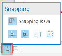
- At the bottom of the layout view, click the Snapping button on. Also, click on the “Snap to guides” and "Snap to other elements" while in this option.
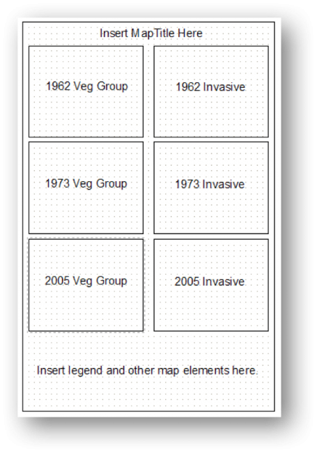
- Drag or reposition the map frames so they look like the example in the following template example. The locator map should fit in the area that says “Insert legend and other map elements here” in the graphic below.
- If one of your map frames has a handlebar border, this means it is the active map frame. The title of the active map frame will also appear bold in the Layout Contents pane. You can change which map frame is active by either selecting it in the layout or right-clicking on its name in the Contents pane > Activate.
Notice that all of the map frames are named “Map Frame.” Next, we’ll rename each map frame so we can tell which map frame belongs to which contents entry. It may help to click the arrow next to the titles in the Contents pane to hide the contents.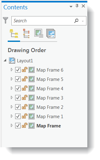
- In the layout, right-click on the map frame in the top left > Properties. The Format Map Frame pane will open, under General type “1962 Veg Groups” in the “Name”. Notice the map frame name also updates in the Contents pane. Rename the remaining map frames as shown in the graphic from step g above. Name the smallest map frame “Locator Map.”
- Remove the datasets that do not belong in each of the map frames. For example, in the “1962 Veg Group” remove the 70s and 00s VegGrp and all the invasive shapefiles.
- Insert a legend, scale bar, north arrow (you only need one of each since all of the map frames have the same symbology and scale), titles for each map frame, and source information.
- You will have to adjust the Legend to show all the layers in the map frames. After you insert the legend, right-click > Properties to see the Format Legend pane. Go to Options > Legend Items > Show properties and try turning off the Layer names to see multiple items in the legend. You may have to experiment a bit.
- Include the water levels for each year, from the table earlier in this document, on your map layout to aid in showing relationships between the water levels and the map layers.
- Turn back on the base maps in all of the map frames and save your project.
Adding neatlines to your map layouts helps to visually group elements together. This is helpful when your map has a lot of information. Go to the Insert tab, Graphics and Text group, and then click on Rectangle. After you place the rectangle in the layout, you can select it and right-click to format and adjust the symbology settings of the neatline.
- 7 map frames:
-
Visually Interpret Trends Using Maps
- Use the map layout you created in Step 5 to try to answer the following questions. We will repeat this exercise in Part II using statistical techniques instead of visual techniques.
- How has the amount and location of emergent vegetation changed over time? For example, has it increased or decreased?
- How has the amount and location of invasive species changed over time?
- How has the quality of habitat changed over time?
- How has the amount of emergent vegetation changed in response to water level fluctuations?
- Use the map layout you created in Step 5 to try to answer the following questions. We will repeat this exercise in Part II using statistical techniques instead of visual techniques.
Part II: Statistically Explore Trends
Part II: Statistically Explore Trends
Visually exploring your data is a good way to start interpreting your results. However, it is difficult to determine the magnitude of change just by looking at a map. Calculating statistics allows you to have actual numbers to work with, allowing you to say that “variable x increased by 12%” instead of “variable x increased.”
While calculating statistics, it is very easy to make mistakes such as typos, choosing incorrect input layers, or using incorrect order of operations. To avoid possible errors, you should first visually explore your data so you have an idea of the trends that exist in the data. After calculating statistics, you can compare your results to your visual interpretation to make sure your statistical results seem reasonable.
-
Calculate Area Statistics
- Use the attribute tables of the vegetation groups and invasive species data to fill in the table below. You will use this table to answer some of the Lesson 4 Quiz questions.
Study Results Work Table Study Year Water Level (High, Med, Low) Area Open Water (sq m) Area Emergent Vegetation (sq m) Area Invasive Species (sq m) Area Controlled Invasive Species (sq m) 1962 1973 2005 Which year has the most emergent vegetation? Which year has the most open water? Did you find it difficult to compare such complex numbers (lots of digits and decimal places)?
- Another technique to compare multiple datasets is to use percent of total area values instead of actual areas. It is important that all of the datasets you want to compare have the same area to use this technique, which is why we had to union and clip our starting data with the Study Area Boundary in Lesson 3.
- Add a new short integer field to the 60s_VegGrp named “pct_tot.” In this case, we are using an integer data type since we are not concerned with decimal places.
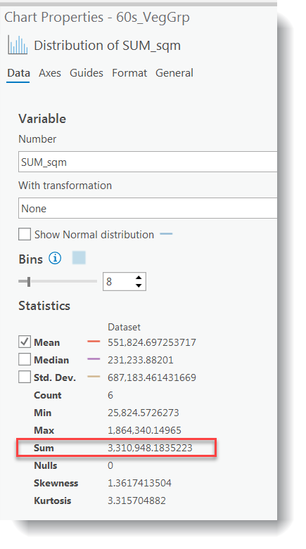
- Calculate the percent total of each vegetation group using the field calculator. (Percent Total Area = Area of Each VegGroup/Area of All VegGroups * 100). Hint: You can use the Statistics tool to easily find the combined area of all VegGroups. Right-click the SUM_sqm field. The graphics below show the area value from the 60s_Veg_Group file. There may be a slight difference in the total area values between the different layers.
![screenshot pct_tot= [SUM_sqm]/(sum from previous image) * 100](/geog487/sites/www.e-education.psu.edu.geog487/files/image/lesson04/pct_tot.png)
- Repeat for all of the remaining vegetation and invasive shapefiles.
- Fill in the table below based on your results. You will use this table to answer some of the Lesson 4 Quiz questions.
Study Results Work Table 2 Study Year Water Level (High, Med, Low) % Tot. Area Open Water % Tot. Area Emergent Vegetation % Total Area Invasive % Tot. Area Controlled Invasive 1962 1973 2005 Which year has the most invasive species? Which year has the least open water? How does this correlate with water levels? Which files have the most missing data? After comparing several datasets using calculated areas and percent total areas, which technique do you find is easier to detect trends between multiple datasets?
- Use the attribute tables of the vegetation groups and invasive species data to fill in the table below. You will use this table to answer some of the Lesson 4 Quiz questions.
-
Create Graphs from Attribute Tables
- You can combine statistical techniques with visual techniques by creating graphs from your attribute tables. There are many different types of graphs to choose from. In this lesson, we will look at two options: pie charts and vertical bar charts.
- Let's look at a vertical bar chart. In the Contents pane of your original Lesson 4 Map, right-click the 60s_VegGrp layer > Create Chart > Bar Chart. A Chart Properties pane will open that guides you through the graph creation process. Use the settings below:
- Category or Date: Veg_Group
- Aggregation: <none>
- Numeric field (s): SUM_sqm
- Check the box “Label bars”
- Click Apply
- Click General, give the graph a meaningful title and meaningful axis titles. Note: Do not use the default names, which have “_” and abbreviations that may be confusing to your target audience.
- Accept the defaults for the remaining options. You may need to resize it to view all of the labels.
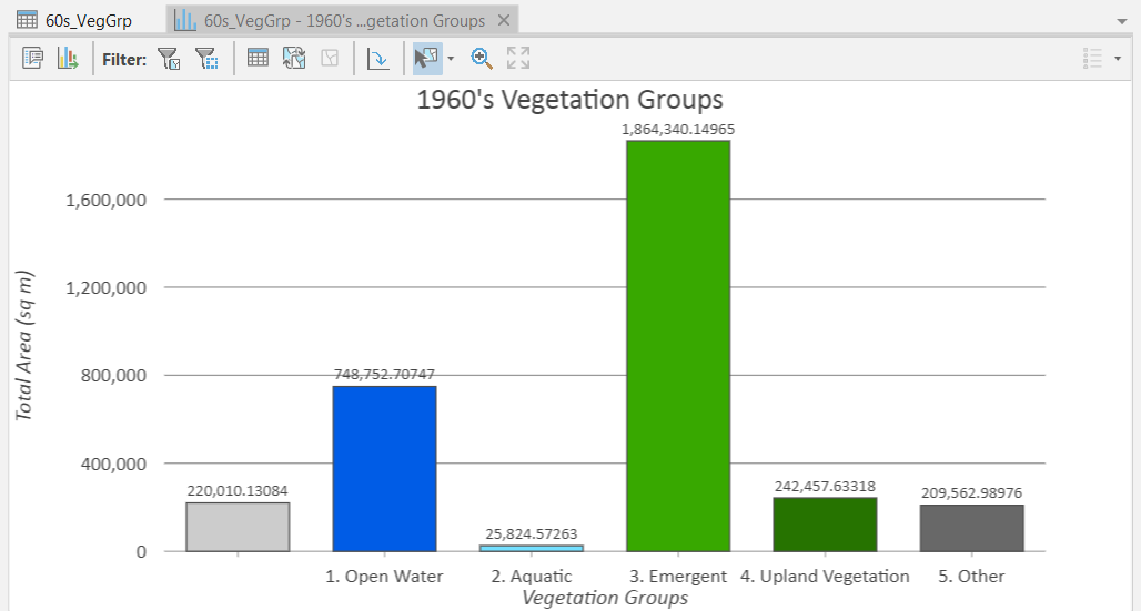
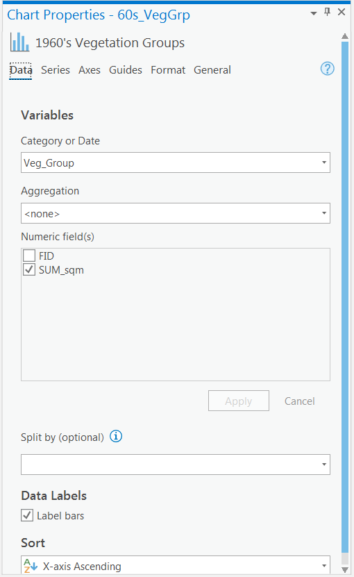
- Look at the output graph. Is it easy to tell how the amount of vegetation within each group compares to other groups? Notice how the y-axis defaults to the highest value in your dataset. If you wanted to compare graphs from multiple datasets, you would need to make sure that all of the graphs have the same minimum and maximum values on the y-axis. You can add the graph directly to your layout. We are not going to do this in this lesson, but you could see how this may be valuable for other projects, especially if you combined it with the available animation tools.
-
Interpret Trends Using Statistics and Graphs
- Use the statistics and graph you calculated to answer the following questions again. Compare them to your answers from step 6 of Part I.
- How has the amount and location of emergent vegetation changed over time?
- How has the amount and location of invasive species changed over time?
- How has the quality of habitat changed over time?
- How has the amount of emergent vegetation changed in response to water level fluctuations?
- Use the statistics and graph you calculated to answer the following questions again. Compare them to your answers from step 6 of Part I.
After experimenting with both visual and statistical techniques to determine trends in your data, can you think of any scenarios in which one is preferable over the other?
That’s it for the required portion of the Lesson 4 Step-by-Step Activity. Please consult the Lesson Checklist for instructions on what to do next.
Advanced Activity
Advanced Activity
Advanced Activities are designed to make you apply the skills you learned in this lesson to solve an environmental problem and/or explore additional resources related to lesson topics.
Directions:
Use the tools and techniques covered in the lesson and data within your L4 folder to answer questions related to the 1930s and 1950s data. You may want to read the related questions within the Lesson 4 Quiz before completing the activity so you know what information to look out for.
Summary and Deliverables
Summary and Deliverables
In Lesson 4, we explored several techniques to interpret data and compare multiple datasets over time. Lesson 4 concludes the two-part lesson in which we completed the typical required steps in a GIS workflow (acquire or create new data, understand data content and limitations, customize data for your project, design & run analysis, interpret results, present results). In Lessons 5-8, we will demonstrate how to use several tools in ArcGIS, AGO, and Spatial Analyst to address a variety of specific environmental questions.
Lesson 4 Deliverables
Lesson 4 is worth a total of 100 points.
- (60 points) Lesson 4 Quiz
- (40 points) Lesson 4 Discussion Post. To submit your assignment, make a post in the Lesson 4 Blog Post [Deliverable] discussion. Include your name and the elements below:
- Map layout.
- Reflection: In ~500 words, discuss the process of communicating the kind of information from Lesson 4 in a cartographic medium, thinking specifically about the map elements you used in the activity. In what ways is a static map an effective vehicle for communicating this data? What audience would best benefit from these maps? In what ways was it challenging to present this data in map form? Would you have have packaged or presented this data to better communicate your message?
- Peer Review (optional): Explore other students' submission and add a short comment on their post.
| Map Layout | The layout is posted and includes the required elements (6 map frames and an overview map, legend, scale bar, north arrow, titles, water levels, data sources, and author). (20pts) | The layout is present but is missing one or two required elements. (15pts) | The layout is present but map is missing several elements or is poorly designed. (10pts) | Map is missing. (0pts) | 20pts |
|---|---|---|---|---|---|
| Reflection | Discussion is present and includes ~500 words addressing ways in which maps are effective, challenges to communicating this data, and other presentation options. (15pts) | Discussion is present but is missing a required topic. (10pts) | Discussion is present but is missing several required topics. (5pts) | Discussion is missing. (0pts) | 15pts |
| Prose Quality | Is free or almost free of errors (complete sentences, student's own words, grammar, spelling, etc.). (5pts) | Has errors, but they don't represent a major distraction. (2pts) | Has errors that obscure meaning of content or add confusion. (0pts) | 5pts | |
| TOTAL | 40pts | ||||
Tell us about it!
If you have anything you'd like to comment on, or add to the lesson materials, feel free to post your thoughts in the Lesson 4 Discussion. For example, what did you have the most trouble with in this lesson? Was there anything useful here that you'd like to try in your own workplace?
Additional Resources
Additional Resources
This page includes links to resources such as additional readings, websites, and videos related to the lesson concepts. Feel free to explore these on your own. If you'd like to suggest other resources for this list, please post them in the Lesson 4 Discussion.
Study Site Information:
Websites:
- Society of Wetland Scientists [17]
- U.S. Environmental Protection Agency [18]
- USDA National Invasive Species Information Center [19]
- The Great Lakes Commission [20]