2.4 GUI programming basics
By now you probably already have a very good idea of how one can write longer and more complex Python programs including standalone programs that work outside of the ArcGIS script tool environment (for example running code from the command prompt or IPython). Functions and modules are two of the main constructs for splitting the code into smaller units and keeping it readable, manageable, and reusable. However, there is one key component of standalone programs that we have not really discussed in GEOG485 and this course so far, and that is the design and creation of graphical user interfaces (GUIs) for your Python programs. These days we are all used to working with a mouse or other pointing device to interact with the different windows, buttons, and other interactive elements that make up the GUI of most of the software applications we are using. Maybe you have already wondered about how to create such GUI-based software with Python.
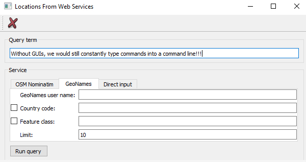
When writing script tools for ArcGIS, we mainly relied on the script tool dialog box provided by ArcGIS for a GUI that allows the user to provide values for the input variables of our script tool in a convenient way. In our Python code, we didn’t have to worry about the dialog box; this was all automatically taken care of by ArcGIS based on the parameters we declared for our script tool. However, even in the context of more advanced script tools, being able to create and use your own GUIs in Python can be very useful, for instance when you want to create a script tool that requires a lot of interaction with the user and additional input while the tool is being executed (an example of such a tool will be discussed later in this lesson). Therefore, it is really getting time for us to talk a bit about GUI development in general, and in Python in particular!
To create a GUI in a given programming language and for a given platform, you often can choose between different GUI libraries (also called GUI toolkits) available for that language and platform. These GUI libraries define classes and auxiliary functions that allow for creating, combining, connecting, and managing the different components of a GUI such as windows, buttons, etc. with a minimal amount of code. Often, GUI libraries are also simply referred to as GUIs, so the term can either mean a particular software library or package used for creating graphical interfaces or the concrete interface created for a particular application. Moreover, some libraries contain much more than just the GUI related classes and components. For instance, the QT5 library we are going to talk about and use later on is actually a cross-platform application development framework with support for non-GUI related things like database and network access.
A GUI library is often complemented by additional tools for supporting the creation of graphical interfaces with that library. Some languages provide a GUI library as part of their standard library, so it is directly available on all platforms the language is available for without having to install additional 3rd party packages. There also exist GUI libraries that have been made available for different languages like the already mentioned QT library that is written in C++ but can be used with a large number of different programming languages. Wrapper packages, also called bindings, make the components and functionality of the library available in the respective other programming language. In the case of QT, there exist two commonly used wrapper packages for Python, PyQT and PySide (see Section 2.5.2.1 [1]). In the following, we provide a brief overview on the main concepts and techniques related to GUI development that we encounter in most GUI libraries.
2.4.1 GUI widgets
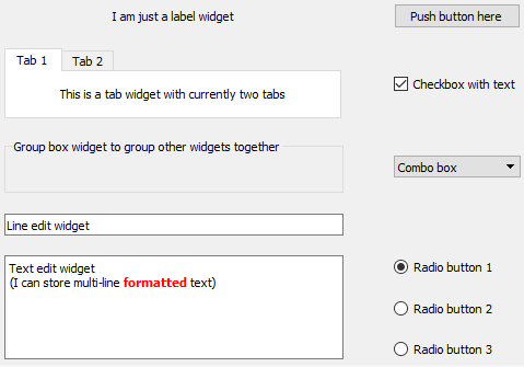
We already mentioned some of the main visible components that serve as the construction blocks for building GUIs in typical GUI libraries, like windows and buttons. The image below shows a few more that we commonly encounter in today’s software applications including group boxes, labels, check boxes, radio buttons, combo boxes, line input fields, text input areas, tab views, and list views. Others that you are probably familiar with are tool bars, tool buttons, menu bars, context menus, status bars, and there are many, many more!
Typically, the GUI library contains classes for each of these visible elements, and they are often referred to as the widgets. Certain widgets can serve as containers for other widgets and, as a result, widgets tend to be organized hierarchically within a concrete graphical interface. For instance, a dialog box widget can contain many other widgets including a tab widget that in turn contains labels and buttons on each of its tab areas. If a widget A directly contains another widget B, we say that B is a child of A and A is B’s parent. A widget without a parent is a window that will be displayed independently on the screen. Widgets can have many different attributes for controlling their visual appearance, their layout behavior, and how they operate. Methods defined in the respective widget class allow for accessing and modifying these attributes. The most common operations performed with widgets in program code are:
- Creating the widget
- Adding the widget to another widget (widget becomes the child of that other widget)
- Adding another widget to the widget (the widget becomes the parent containing the other widget)
- Changing an attribute of the widget (for instance, you may change the text displayed by a label widget)
- Reading an attribute of the widget (for instance, you may need to get the text that a user entered into a line input widget)
- Setting the layout management method for the widget; this determines how the child widgets of that widget will be arranged to fill the widget’s content area
- Linking an event that the widget can trigger to event handler code that should be executed in that case (for instance, you may want that a particular function in your code be called when a particular button is clicked)
We will explain the ideas of layout management and event handling hinted at in the last two bullet points above in more detail in the next sections. From the user's perspective, widgets can be interacted with in many different ways depending on the type of the widget, including the following very common forms of interactions:
- The user can click on the widget with the mouse to start some action, change the state of the widget, or open a context menu.
- The user can give focus to a widget either by clicking it or using the TAB key for moving the focus to the next widget in a specified order. At any time, only a single widget can have focus, meaning it will receive keyboard input which allows for typing into a text input widget or "clicking" a button by pressing ENTER. Similarly, the user makes a widget lose focus when giving focus to another widget.
- The user can enter some text into the widget.
- The user can drag the widget and drop it onto another widget, or drop something on the widget.
In addition, there are complex widgets that allow the user to interact with them and change their state by clicking on particular parts of a widget. Examples are the user unfolding a combo box to select a different value, the user clicking on a menu in the menu bar to open that menu and select an item in it, the user moving the slider component of a widget to adapt some value, or the user selecting a color by clicking on a particular location in a widget with a chromatic circle. The events caused by such user interactions are what drives the order of code execution in the underlying program code as will be further explained in Section 2.4.3 [2].
2.4.2 Layout management
Widgets can be freely arranged within the content area of their parent widget (for instance a window widget). This can be done with the help of pixel coordinates that are typically measured from the top left corner of the content area. However, it would be very cumbersome to create GUIs by specifying the x and y coordinates and width and height values for each widget. More importantly, such a static layout will only look good for the particular size of the parent it has been designed for. When the containing window is resized by the user, you would expect that the dimensions and positions of the contained widgets adapt accordingly which will not be the case for such a static coordinate-based layout.
Therefore, in modern GUI libraries the task of arranging the child widgets within the parent widget is taken care of by so-called layout managers. This happens dynamically, so if the window is resized, all content will be rearranged again down the hierarchy of widgets by the different layout managers involved. The GUI library defines different layout classes to create the layout manager objects from. The three most common layout types are:
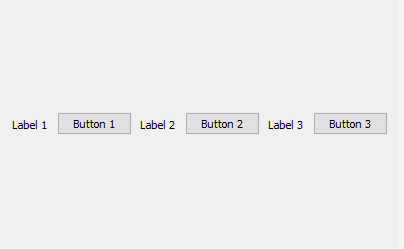
- Horizontal layout: All child widgets are arranged horizontally in the order in which they have been added to the parent
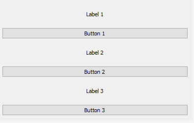
- Vertical layout: All child widgets are arranged vertically in the order in which they have been added to the parent
- Grid layout: Child widgets are arranged in a table or grid layout consisting of columns and rows. The child widgets are added to a particular cell in the layout by providing row and column indices and can potentially span multiple rows and/or columns.
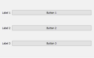
The images below illustrate these three basic layout types for a set of three label and three push button widgets. Because of their layout preferences, both labels and buttons remain at their preferred height in the horizontal layout, but are expanded to fill the available space horizontally in the vertical layout. In the grid layout, the labels have been set up to form the first column of a grid with 3 rows and 2 columns, while the buttons have been set up to occupy the cells in the second column.
In many cases, these three layout types are already sufficient to arrange the widgets as desired because of the way layouts can be nested. For instance, you can have the components of a window organized in a grid layout and then use a vertical layout to arrange several widgets within one of the cells of the grid. As indicated above, widgets have attributes that affect their layout behavior and, as a result, how much space the layout manager will assign to them in the vertical and horizontal dimensions taking into account the other child widgets of the same parent and their attributes. These attributes can, for instance, define the minimum, preferred, and/or maximum dimensions or general size policies for width and height. For instance, as we saw in the examples from the previous figures, a standard push button widget often has a size policy for its height that says that the height should not be increased beyond its default height even if there is space available, while in the horizontal dimension the button may be expanded to fill available space that the layout manager would like to fill. We will talk more about layout management when we will start to work with the QT library later on in this lesson.
2.4.3 Events and event handling, signals and slots
So far, we are used to the code in a script file being executed line-by-line from the top to the bottom with the order of execution only being affected by loops, if-else and function calls. GUI based applications operate a bit differently. They use what is called an event-driven programming approach. In event-driven programming, the code is organized as follows:
- Initalization phase:
- The GUI is created by instantiating the widgets (= creating objects of the widget classes) and organizing them in parent-child hierarchies using suitable layout manager objects to achieve the desired arrangement.
- Event handling code is defined for dealing with events from user interactions (like clicking a button) or other types of events.
- Different events are associated with the corresponding event handling code.
- Execution phase:
- An infinite loop is started that waits for GUI events and only terminates if the application is closed. In the loop, whenever an event occurs, the respective event handling code is executed, then the waiting continues until the next event happens.
The order of the first two points of the initialization phase can sometimes be swapped. The code for running the event processing loop is something you do not have to worry about when programming GUI based applications because that part is being taken care of by the GUI library code. You just have to add a command to start the loop and be aware that this is happening in the background. Your main job is to produce the code for creating the GUI and defining the event handlers in the initialization part of the program.
As indicated above, widgets can be interacted with in different ways and such interactions cause certain types of events that can be reacted on in the code. For instance, a button widget may cause a “button pressed” event when the user presses the left mouse button while having the mouse cursor over that button and a “button released” event when the mouse button is released again. In addition, it will cause a “button triggered” event after the release but this event can also be triggered by pressing the RETURN key, while the button has focus (e.g. when the button is hovered over with the mouse). The functionality of the GUI is realized by setting up the event handler code. That code typically consists of the definitions of event handler functions that are invoked when a certain event is caused and that contain the code that determines what should happen in this case. For instance, we may set up an event handler function for the “button triggered” event of the mentioned button. The code of that function may, for example, open a dialog box to get further information from the user or start some computations followed by displaying the results.
Precisely how events are linked to event handling functions depends on the GUI library used. We will see quite a few examples of this later in this lesson. However, we already want to mention that in the QT library we are going to use, the event-based approach is covered under what QT calls the signals & slots approach. When an event occurs for a particular QT widget (e.g., user clicks button), that widget emits a signal specific for that event. A slot is a function that can be called in response to a signal (so essentially an event handler function). QT’s widgets have predefined slots so that it is possible to directly connect a signal of one widget to a slot of another widget. For instance, the “clicked” signal of a button can be connected to the “clear” slot of a text widget, such that the text of that widget is cleared whenever the button is clicked. In addition, you can still write your own slot functions and connect them to signals to realize the main functionality of your application. No worries if this all sounds very abstract at the moment; it will get clear very quickly as soon as we look at some concrete examples.