Lessons
L1: Why spatial data is special
The links below provide an outline of the material for this lesson. Be sure to carefully read through the entire lesson before returning to Canvas to submit your assignments.
Lesson 1 Overview
Spatial data is special and can be problematic. However, as we will see later in this course, there are instances when this can be useful, so understanding how we deal with it is important.
Learning Outcomes
By the end of this lesson, you should be able to:
- List four major problems in the statistical analysis of geographic information: autocorrelation, the modifiable areal unit problem, scale dependence, edge effects.
- Identify and discuss the implications of the Modifiable Areal Unit Problem.
Checklist
Lesson 1 is one week in length. (See the Calendar in Canvas for specific due dates.) The following items must be completed by the end of the week. You may find it useful to print this page out first so that you can follow along with the directions.
| Step | Activity | Access/Directions |
|---|---|---|
| 1 | Work through Lesson 1 | You are in the Lesson 1 online content now. Be sure to carefully read through the online lesson material. |
| 2 | Reading Assignment | Before we go any further, you need to complete the reading from the course text plus an additional reading from another book by the same author:
|
| 3 | Weekly Assignment | Examine the Modifiable Areal Unit Problem while analyzing voting results |
| 4 | Term Project | Post term-long project topic idea to the project topic discussion forum in Canvas. |
| 5 | Lesson 1 Deliverables |
|
Questions?
Please use the 'Discussion Forum' to ask for clarification on any of these concepts and ideas. Hopefully, some of your classmates will be able to help with answering your questions, and I will also provide further commentary where appropriate.
The Pitfalls of Spatial Data
Required Reading:
Read the course textbook, Chapter 1: pages 1-21.
Also read: Chapter 3, The Modifiable Areal Unit Problem, pages 29-44 in Lloyd, C. D. (2014). Exploring Spatial Scale in Geography. West Sussex, UK: Wiley Blackwell. This text is available electronically through the PSU library catalog.
Spatial Autocorrelation
The source of all the problems with applying conventional statistical methods to spatial data is spatial autocorrelation [3]. This is a big word for a very obvious phenomenon: things that are near each other tend to be more related than things that are far apart. If this were not true, the world would be a very strange and rather scary place. For example, if land elevation were not spatially autocorrelated, huge cliffs would be everywhere. Turning the next corner, we would be as likely to face a 1000-meter cliff (up or down, take your pick!), as a piece of ground just a little higher or a little lower than where we are now. An uncorrelated, or random, landscape would be extremely disorienting.
The problem this creates for statistical analysis is that much of statistical theory is based on samples of independent observations that are not dependent on one another in any way. In geography, once we pick a study area, we are immediately dealing with a set of observations that are interrelated in all sorts of ways (in fact, that's what we are interested in understanding more about).
Having identified the problem, what can we do about it? Depending on how deeply you want to go into it, quite a lot. At the level of this course, we don't go much beyond acknowledging the problem and developing some methods for assessing the degree of autocorrelation (Lesson 4). Having said that, there are some methods that recognize the problem and take advantage of the presence of spatial autocorrelation to improve analysis. These include point pattern analysis (Lesson 3) as well as interpolation and some related methods (Lesson 6) that recognize the problem and even take advantage of the presence of spatial autocorrelation to improve the analysis.
The Ecological Fallacy
The ecological fallacy may seem obvious, but it is routinely ignored. It is always worth keeping in mind that statistical relations are meaningless unless you can explain them. Until you can develop a plausible explanation for a statistical relationship, it is unsafe to assume that it is anything more than a coincidence. Of course, as more and more statistical evidence accumulates, the urgency of finding an explanation increases, so statistics remain useful.
The Pitfalls of Spatial Data, II
In Lesson 1's reading we learned about some of the reasons why spatial data is special, including spatial autocorrelation, spatial dependence, spatial scale, and the ecological fallacy.
This week in our project we will look closely at another pitfall, the Modifiable Areal Unit Problem (MAUP).
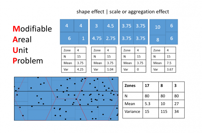
The Modifiable Areal Unit Problem (MAUP)
Often, MAUP is considered to consist of two separate effects:
- A shape or zonation effect
- A scale or aggregation effect
Both effects are evident in the example in Figure 1.2 and further emphasized in Figure 1.3. The shape effect refers to the difference that may be observed in a statistic as a result of different zoning schemes at the same geographic scale. This is the difference between the 'north-south' and 'east-west' schemes. The scale or aggregation effect is observable in the difference between the original data and either of the two aggregation schemes.
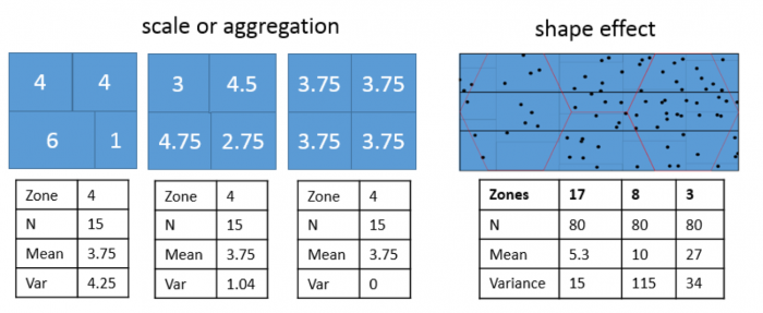
Aggregation:
- combines smaller units into bigger units
- affects results!
- variance (Figure 1.3, left) decreases, although the mean stays the same.
MAUP is, if anything, more problematic than spatial autocorrelation. It is worth emphasizing just how serious the MAUP effect can be: in a 1979 paper, Openshaw and Taylor demonstrated by simulation that different aggregation (i.e., zoning) schemes could lead to variation in the apparent correlation between two variables from -1 to +1, in other words, the total range of variation possible in the correlation between two variables.
In practice, very little research has been done on how to cope with MAUP, even though the problem is very real. MAUP is familiar to politicians, who often seek to redistrict areas to their spatial advantage in a practice commonly referred to as "gerrymandering." In the practical work associated with this lesson, you will take a closer look at this issue in the context of redistricting in the United States.
Project 1: Converting and Manipulating Spatial Data
Background
In this week's project, we use an example from American electoral politics to revisit the modifiable areal unit problem (introduced in the reading for Lesson 1) and also as a reintroduction to ArcGIS, in case you've gotten rusty. This lesson's project is based on a real dataset. You will begin using the Spatial Analyst extension and learn to convert data between different spatial types. The ease with which you can do this should convince you that many of the distinctions made between different spatial data types are less important than they may at first appear.
Project Resources
- You will be using ESRI's ArcGIS Pro software (or ArcGIS Desktop 10.X) and the Spatial Analyst and Geostatistical Analyst extensions in this course.
As a registered student in GEOG 586, you can get either:- a free Student-licensed edition of ArcGIS Pro.
- a free Student-licensed edition of ArcGIS Desktop.
Instructions on how to access and download either of these are available here: Downloading Esri Products from Penn State [4].
- The data you need for Project 1 are available in Canvas for download. If you have any difficulty downloading, please contact me.
Geog586_Les1_Project.zip -- A file geodatabase containing the data sets required for the project.
Once you have downloaded the file, double-click on the .zip file to launch 7-Zip or another file compression utility. Follow your software's prompts to decompress the file. You should end up with a folder called TexasRedistricting.gdb, which contains a large number of fairly small items.
Summary of the Minimum Project 1 Deliverables
As you complete certain tasks in Project 1, you will be asked to submit them to your instructor for grading.
The final page of the lesson's project instructions gives a description of the form the weekly project reports should take and content that we expect to see [5] in these reports. In this course you will not only practice conducting geographical analysis but also learn about how to communicate analytical results.
To give you an idea of the work that will be required for this project, here is a summary of the minimum items you will create for Project 1. You should also get involved in discussions on the course Discussion Forum about which approach of the three described in this lesson (polygon to point, KDE, or uniform distribution) is most appropriate, before choosing one.
- Create a map of the RepMaj attribute for districts108_2002 for your write-up, along with a brief commentary on what it shows: Are Republican districts more rural or more urban? What other patterns do you observe, if any?
- Comment on the new Districting plan adopted by the Texas Senate in October 2004. What would you expect it to do to the balance of the electoral outcome? Can you tell, just by examining this map? Put your comments in your write-up.
- Create a map of the 'predicted' electoral outcome for the new districts similar to the original map for the 2002 election and insert it into your write-up. Feel free to provide additional commentary on this topic.
Questions?
Please use the 'Week 1 lesson discussion' forum to ask for clarification on any of these concepts and ideas. Hopefully, some of your classmates will be able to help with answering your questions, and I will also provide further commentary there, where appropriate.
Project 1: Getting Started
- Open ArcGIS Pro and create a new project with the Map template. If you haven't used ArcGIS Pro in another course or at work, or if it has been a while since you've last used it and you need a refresher, you might consider walking through one or two of the QuickStart tutorials [6] on the Esri website to learn about how it is organized a bit differently to ArcMap. One of the nice things about ArcGIS Pro is that it will automatically save your analysis results to the project geodatabase, so you no longer have to set path names.
- Open the Catalog Pane and use it to add the feature classes in TexasRedistricting.gdb file geodatabase to your project. You will first need to add a connection to the geodatabase so that you can see the files (as you would have in ArcMap). To begin with, you only need to look at districts108_2002. This shows the 32 Congressional districts in Texas in which the Federal elections were held in November 2002. One attribute in this file is RepMaj, an integer value indicating the winning margin for the Republican candidate in each district (a negative value if the Republican candidate lost).
- Create a map of the RepMaj attribute for districts108_2002. For best results, you should use a diverging color scheme with two color hues, with pale colors showing results near 0, and deeper colors indicating a larger majority for one party or the other (red for Republicans and blue for Democrats is conventional).
- Make sure to save the project file periodically so that you don't lose work if ArcGIS crashes.
Deliverable
Put this map in your write-up, along with a brief commentary (a few sentences or short paragraph will suffice) on what it shows: Are Republican districts more rural or more urban? What other patterns do you observe, if any?
- Next, look at the tx_voting108 data. This records votes cast for the Republican and Democratic candidates in county-based subdivisions of the districts.
Note:
Note that counties and congressional districts are not a precise fit inside one another, so many of the units in tx_voting108data are parts of counties that were subdivided among two or more districts.
- Also examine the new Districting plan adopted by the Texas Senate in October 2004. This is shown in newDistricts2003. You may find it helpful to put this layer on top and set the fill to 'no color' so that the outlines of these districts are visible over the top of your previous map of the electoral outcome in the 108th Congressional Districts.
Deliverable
Comment on the redistricting plan. What would you expect it to do to the balance of the electoral outcome? Can you tell, just by examining this map? Put your comments in your write-up.
Project 1: Estimating results for the new Congressional Districts
In the next few pages, the steps required to estimate possible outcomes of the 2004 election based on the new districting plan by three different methods (Polygon to point, KDE, and uniform distribution) are described, along with an explanation of what each method will do.
After reviewing these methods, you should get involved in the discussions on the course Discussion Forum for this week's project, and then choose one of these methods and proceed to complete the project by producing a map of the estimated 2004 election result. Completion of the project also requires you to comment on your choice of method.
Before using any of the methods, you should check that the Spatial Analyst extension is enabled. You can do this in Project - Licensing. You should see that it says 'Yes' in the Licensed column in the Esri Extensions table.
Once Spatial Analyst is enabled, you should also select the following settings from the Analysis - Environments... menu:
- Under Processing Extent, select 'Same as Layer "tx_voting108"' as the 'Extent'. This ensures that the analysis is carried out to the state boundary.
- Under Raster Analysis, select tx_voting108 as the 'Mask', and for 'Cell size', type a value of 1000 into the box. This will ensure that output raster layers have a cell resolution of 1 kilometer. You may optionally decide that this resolution is rather high and change it to something larger [using too high a resolution can be a problem if you are using the VPN to access ArcGIS Pro, so keep this in mind].
With these settings completed, you are ready to try the alternative methods for generating voter population surfaces.
Project 1: Density Surface Options
Option 1: Points at Polygon Centroids
The first option is to make a set of points, one for each polygon in our 2002 voting data, and to use these to represent the distribution of the vote that might be expected in 2004. This approach assumes that it is close enough to assign all the voters in each polygon to a single point in the middle of that polygon.
This is a two-step process, creating a point layer, and converting the point layer to a raster.
To make the point layer:
- Open the Geoprocessing pane from Analysis-Tools. Then search for the Feature to Point tool with the search bar and launch it. Select tx_voting108 as the 'Input Features' and specify a name for the point layer to be produced. You may also optionally choose to force the points to lie inside the polygons.
NOTE: this is a step that requires an Advanced level license. Your student license should be an Advanced level license.
HOWEVER... because this is Lesson 1, we have provided the results of this step (with the 'force inside' option not selected), in the layer tx_voting108_centers layer.
By whatever means you arrive at a point layer, make sure you understand what is going on here. In particular, check to see if all polygons have an associated center point. Are all the 'centers' inside their associated polygons? (If not, why not?)
Once you have the point layer, you can make raster layers (one for Republican voters, and one for Democratic voters) as follows:
- Search for and launch the Point to Raster tool.
- Select the centroids layer you just made as the Input Features and either REP or DEM as the 'Value field' (you need to make one surface for each attribute).
- Also specify a name for the new raster surface to be created (reps_point or dems_point as appropriate).
- Use 'SUM' as the 'Cell assignment type' (why?).
You will get a raster layer with No Data values in most places, and higher values at each location where there was a point in the centroids layer.
Option 2: Density Estimation from Points
The second option is to use kernel density estimation (which we will look at in more detail in Lesson Three) to create smooth surfaces representing the voter distribution across space. This method requires you to choose a radius that specifies how much smoothing is applied to the density surface that is produced.
The steps required are as follows:
- Search for and launch the Kernel Density tool
- Set 'Input data' to the point centers layer (as made in the previous method). For the 'Population field' select REP or DEM (you will be doing both anyway). Set the 'Search radius' to 20,000 [or another value you feel is appropriate for modelling voter distribution], and 'Area units' to 'Square Kilometers'. You should also specify a name to save the output to (I suggest reps_kde, or dems_kde, as appropriate). Then run the tool.
The search radius value here specifies how far to 'spread' the point data to obtain a smoothed surface. The higher the value, the smoother the density surface that is produced.
If you encounter problems, post a message to the boards, and also check that the map projection units you are using are meters (the easiest way to check this is to look at the coordinate positions reported at the bottom of the window as you move the cursor around the map view).
When processing is done, ArcGIS Pro adds a new layer to the map, which is a field of density estimates for voters of the requested type. You should repeat steps 1 and 2 to get a second field layer for the other political party, making sure that you calculate both fields with the same parameters set in the Kernel Density tool.
NOTE: If you have changed the Analysis Environment Cell Size setting from the suggested 1000 meters, then the density values you get are correct, but when it comes to summing them (in a couple more steps' time), they will not produce correct estimates of the total number of votes cast for each party. This is because the density values are per sq. km, but there is not one density estimate for every sq. km. For example, if you set the resolution to 5000 meters, then there will be one density estimate for every 25 sq. kms. To correct for this, you need to use the raster calculator to multiply the density surface by an appropriate correction factor: in this case, you would multiply all the estimates by 25.
NOTE 2: If you are running ArcGIS Pro 2.8 or later, there has been a change to how the KDE tool works. To produce the expected result, you will need to change the processing extent in the Environments tab to either the same as the 'tx_voting108' layer or to the 'union of inputs'. Otherwise, you'll see a result that appears to include only North Texas.
Option 3: Assumed even population distributions
The third option is to assume that voters are evenly distributed across the areas in which they have been counted. We can build a surface under that assumption and base the final estimated votes in the new districts based on that. This method takes a couple of steps and creates two intermediate raster layers using the Spatial Analyst extension on the way to the final estimate.
A number of steps are required:
- Search for and launch the Polygon to Raster tool and use it to make new raster layers from the OBJECTID, REP and DEM fields of the tx_voting108 layer. You will need to run the tool three different times, to make three different layers. The default cell size should be 1000 meters. You should specify a sensible (and memorable) name for each raster layer you create (reps, dems, ids are what I used).
- For the raster layer made from the OBJECTID field, you need to count the size of each area, in raster cells. Search for and launch the Lookup tool from the Spatial Analyst toolbox. Choose your ids raster as the 'input raster', Count as the 'lookup field', and name your output layer ids_count. This will produce a new raster that stores the number of pixels in each voting district. Because you set the cell size to 1000 meters, this is also effectively an area in square kilometers.
- Now, search for and launch the Raster Calculator tool. Then, for each party, use the Raster Calculator to calculate the number of Republican and Democratic Party voters per raster cell (i.e., per square kilometer) as shown in Figure 1.4. Notice that we used the int function to make sure that we have integers because votes only exist in integer quantities -- there are no partial votes! Make sure you build the expression by clicking on items rather than typing. This will make it less likely that you get a syntax error.
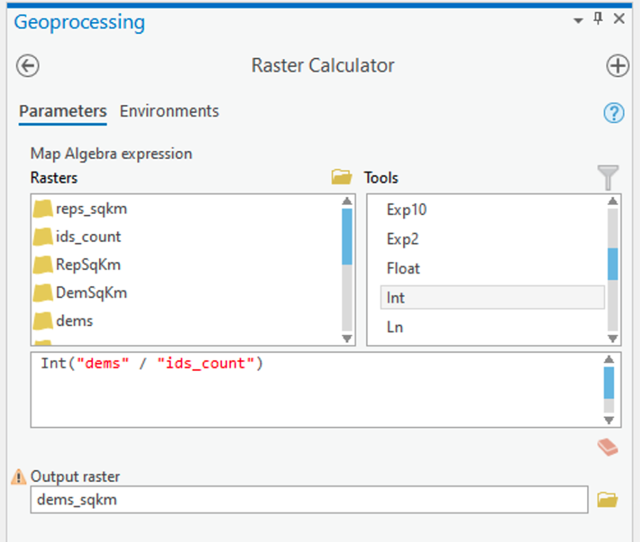 Figure 1.4: Raster CalculatorClick for a text description of the Raster Calculator Example image.The raster calculator expression should be the name of the democrat raster layer divided by the result of the lookup tool. Notice that we used the int function to make sure that we have integers because votes only exist in integer quantities – there are no partial votes! The output parameter should set the name of the output to something informative.Credit: Griffin
ArcGIS Pro will think about things for a while and should eventually produce a new layer (in this case called dems_sqkm). This layer contains in each cell an estimate of the number of voters of the specified party in that cell.
Project 1: Creating an Estimated Republican Majority Surface
Whichever approach you have chosen to make voter population surfaces, it is the difference between the votes for each party that will determine the estimated election results; so, at this point, it is necessary to combine the two estimated surfaces in a 'map calculation'.
- Use the Raster Calculator to specify an equation subtracting the estimated Democratic Party voter density from the estimated Republican Party voter density, and run the tool. Call your resulting layer RepMaj plus a suffix that indicates which density surface method you derived the layer from.
You should get an output surface that is positive in some areas (Republican majority) and negative in others (Democratic majority).
NOTE: If you are interested in comparing the results of the three methods, you need to calculate the difference between the votes for each party described above, and the step described on the next page for each of the methods (i.e., three times). The comparison between the three methods is optional.
Project 1: Aggregating Density Surface Data to Areas
Whichever approach you chose to make the Republican majority surface, the final step is to sum the estimated majorities that fall inside each new Congressional District in the newDistricts2003 layer to get a predicted outcome for the 2004 elections:
- Search for and launch the Zonal Statistics as Table tool. The settings in Figure 1.5 should work (with any necessary changes to layer names):
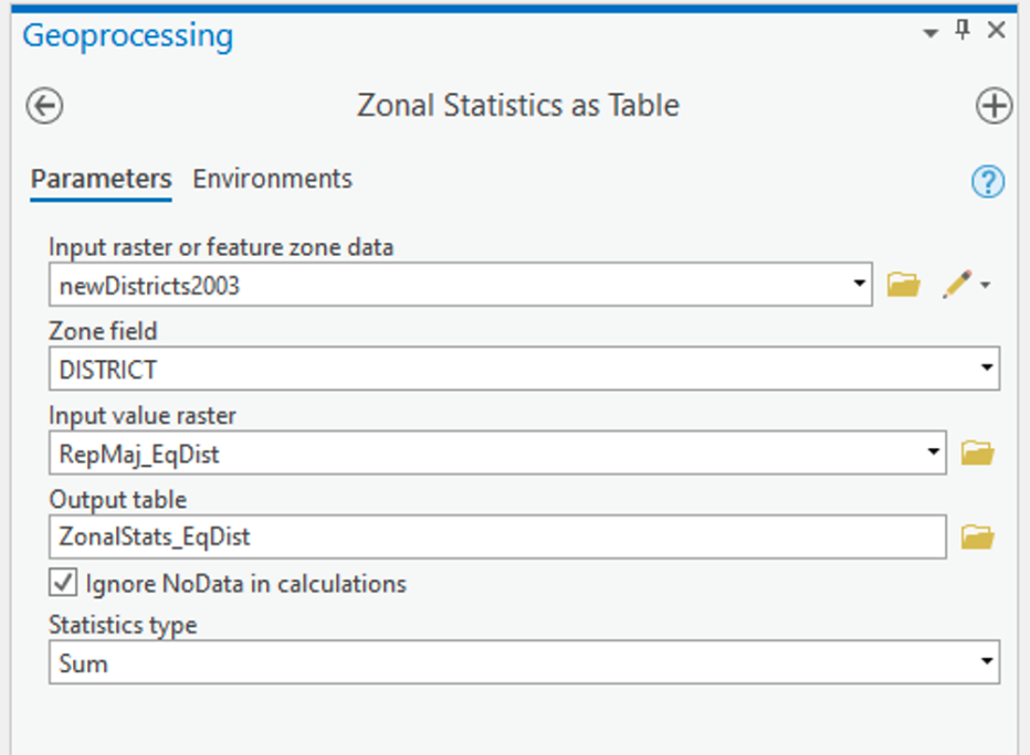 Figure 1.5: Zonal Statistics as TableClick for a text description of the Zonal Statistics as Table Example image.The input feature zone tool parameter should be set to newDistricts2003. For the zone field parameter, choose DISTRICT. The input value raster is the layer you created in the previous step. The output parameter should give the result of this tool a sensible name. Finally, the statistics type should be set to SUM.Credit: Griffin
This will make a table of values, one for each new district, which is the SUM of the Republican majority surface values inside that district.
Once you've done this summation, you should be able to join the table produced to the newDistricts2003 layer via the DISTRICT field, so that there is now an estimated Republican majority for each of the new districts. Using this new attribute, you can make a map of the 'predicted' electoral outcome for the new districts similar to the original map for the 2002 election, but based on the estimated Republican majority results.
Deliverable
You should insert this new map into your write-up. Feel free to provide additional commentary on this topic. Points to consider include:
- How does the overall outcome differ from the 2002 results?
- How many congressional races did the Republicans win in 2002?
- How many might you expect them to win in 2004 with the new congressional districts, based on your analysis?
- Is there anything about the spatial characteristics of the new districts that might lead you to think they were constructed with electoral advantage in mind, rather than fairness?
- What sort of spatial characteristics might be used to spot egregious examples of gerrymandering?
- Why did you choose the method you did to make the estimates?
- What problems do you see in the method we have used to estimate the next round of elections? (This includes weaknesses in the basic assumptions, as well as more technical matters.)
Project 1: Finishing up
Here is a summary of the minimal deliverables for Project 1. Note that this summary does not supersede elements requested in the main text of this project (refer back to those for full details). Also, you should include discussions of issues important to the lesson material in your write-up, even if they are not explicitly mentioned here.
- A map of the RepMaj attribute for districts108_2002, along with a brief commentary on what it shows.
- A short commentary on the new Districting plan adopted by the Texas Senate in October 2004.
- A map of the 'predicted' electoral outcome for the new districts in the newDistricts2003 layer similar to the original map for the 2002 election and an accompanying commentary on how you made this map, problems with the method, and any other issues you wish to mention
Form and structure of weekly project reports
Your report should present a coherent narrative about your analysis. You should structure your submission as a report, rather than as a bullet list of answers to questions.
Part of the learning in this course relates to how to write up the results of a statistical analysis, and the weekly project reports are an opportunity to do this and to get feedback before you have to report on your term-long projects.
In your report, you should include:
- An introduction and conclusion section that sets the context for (i.e., describes the aims, goals and objectives) and summarizes the major takeaways of the analysis, respectively.
- Use section headers to help you organize your ideas and to assist the reader to better understand the framework of your analysis.
- Make sure that for every figure and/or table you include in your write-up, you use figure numbers and captions as well as table numbers and headers. Figure and caption numbers should be unique and sequential. Table numbers and captions go above the table, while figure numbers and captions go below the figure.
- Reference each figure and/or table individually in the text of your report (e.g., Figure 1 or Table 2). Doing so is reflective of professional writing practices.
- Make sure that all parts of each figure are legible and that the information presented in tables is well-organized.
- Cite back to the lesson material and text book for ideas that link course concepts to your analysis. This helps to present an intellectual foundation for your analysis and provides evidence that you understand how the theory of the lesson applies to the practice of spatial analysis.
- While there is a detailed rubric for each lesson (shown in the grade book), I will be particularly checking for evidence of careful examination of the dataset and any of limitations of the data you observe through your exploratory analysis.
Please put one of the following into the assignment dropbox for this lesson:
- A PDF of your write-up, -or-
- An MS-Word compatible version.
Make sure you have completed each item!
That's it for Project 1!
Term Project Overview and Weekly Deliverables
Throughout this course, a major activity is a personal GIS project that you will develop and research on your own (with some input from everyone else taking the course). To ensure that you make regular progress toward completion of the term project, I will assign project activities for you to complete each week.
The topic of the project is completely up to you, but you will have to get the topic approved by me. Pick a topic of interest, and use the different methods applied during this class to better understand the topic.
This week, the project activity is to become familiar with the weekly term project activities and to think about possible topics and post an idea you have in mind. Each week, the project activity requirements for that week will be spelled out in more detail on a page labeled 'Term Project', located in the regular course menu.
Term Project: Breakdown of Week by Week Activities
The breakdown of activities and points are as follows:
- Week 1: 1 point for posting topic ideas
- Week 2: 2 points for submission of a project proposal
- Week 4: 3 points for on-time submission of a satisfactory revised project proposal
- Week 5: 3 points for feedback to your colleagues on their project proposals
- Week 6: 6 points for the final project proposal
- Week 9: 12 points for quality of the project and the report
- Week 10: 3 points for your involvement in discussions of the final projects
Below is an outline of the weekly project activities for the term-long projects. You should refer back to this page periodically as a handy guide to the project 'milestones'.
| Week | Detailed description of weekly activity on term project |
|---|---|
| 1 | Read this overview! Identify and briefly describe a possible project topic (or topics). Post this information to the 'Term Project: Project Idea' discussion forum as a new message. This posting should include a paragraph of no more than 1 page max!, 250 words max!, single spaced, and 11pt or 12pt sized font. |
| 2 | Submit a more detailed project proposal (2 pages max!, 600 words max!, single spaced, and 11pt or 12pt sized font) to the 'Term Project: Preliminary Proposal' discussion forum. This week, you should research your topic a bit more and start to obtain the data you will need for your project. Do not underestimate the amount of time you will need to devote to formatting and manipulating your data. The proposal must identify at least two (preferably more) data sources. Inspect your data sources carefully. It's important to get started on finding and examining your data early. You do not want to find out in Week 8 that your dataset is not viable or will take you two weeks just to format your data for use in the software! Over the next few weeks, you will be further developing your proposal, which will be reviewed by other students and by me, and revised to a more complete form due in Week 6. |
| 3 | This is a busy week, so no term project activity is due. Start getting your interactive peer review meeting date and time organized with your group. |
| 4 | Refine your project proposal and post it to the 'Term Project: Revised Proposal' discussion forum for peer review in Week 5. (2 pages max!, 800 words max!, single spaced, and 11pt or 12pt sized font) |
| 5 | Interactive peer review of term project proposals. You will meet with your group and provide interactive feedback. These reviews are intended to help you further refine your project idea and plans. |
| 6 | A final project proposal is due this week. This will commit you to some targets in your project and will be used as a basis for assessment of how well you have done. The final proposal should be submitted through the 'Term Project: Final Project Proposal' dropbox. (3 pages max!, 1,000 words max!, single spaced, and 11pt or 12pt sized font) |
| 7 | You should aim to make steady progress on the project this week. |
| 8 | You should aim to make steady progress on the project this week. |
| 9 | This week, you should complete your project work and post it as a PDF attachment on the 'Term Project: Final Discussion' discussion forum and let the class know that you are finished. The report should be suitable for anyone involved with the course to read and understand. Note that there are no other course activities at all this week, to give you plenty of time to work on completion of the project. You should also submit the final term project to the 'Term Project: Final Project Submission' dropbox. (20 pages max! inclusive of all required elements, approximately 10,000 words, single spaced, and 11pt or 12pt sized font) |
| 10 | Finally, the whole class, including the instructor, will use the posted project reports as a basis for reviewing what we have all learned (hopefully!) from the course. Contributions to discussions of one another's projects will be evaluated, as well as the projects themselves. Think of this as a virtual version of an in-class presentation of your project with an opportunity for members of the class (and the instructor) to ask questions, make suggestions, share experiences, review ideas, and so on. |
Term Project (Week 1) - Identifying a Project Topic
In addition to the weekly project, it is also time to start to think about your term project.
- Review the project outline and become familiar with what is required each week. Timely submission of an appropriate topic suggestion is important at this stage since you will need to provide the entire class a project proposal that will be peer reviewed during Lesson 5.
- This week, you need to provide a minimal description of the project that is identifying a topic and its geographical scope. By minimal, I mean a single paragraph that includes no more than 250 words max!, single spaced, and 11pt or 12pt sized font.
- Timely submission of your preliminary project topic.
Deliverable: Post your topic ideas to the 'Term Project: Project Topic' Discussion Forum. One new topic for each student, please! Even at this early stage, if you have constructive suggestions to make, then by all means make them by posting comments in reply to their topic.
Questions?Please use the General Issuesdiscussion forum to ask any questions now or at any point during this project.
Term Project (Week 2) - Writing a Preliminary Project Proposal
Submit a brief project proposal (2 pages max!, 600 words max!, single spaced, and 11pt or 12pt sized font) to the 'Term Project: Preliminary Proposal' discussion forum. This week, you should start to obtain the data you will need for your project. The proposal must identify at least two (preferably more) likely data sources for the project work, since this will be critical to success in the final project. Inspect your data sources carefully. It's important to get started on this early. You do not want to find out in Week 8 that your dataset is not viable! Over the next few weeks, you will be refining your proposal. During Week 5, you will receive feedback from other students. This will help you revise your final proposal which will be due in Week 6.
This week, you must organize your thinking about the term project by developing your topic/scope from last week into a short proposal.
Your proposal should include the following section headers and content for each section:
Background:
-
some background on the topic particularly, why it is interesting or a worthwhile research pursuit;
-
research question(s). What, specifically, do you hope to find out?
Methodology:
-
Data: list and discuss the data required to answer the question(s). Be sure to clearly explain the role each dataset will play.
- Data Sources: Be sure to list where you will (or have) obtain the required data. This may be public websites or perhaps data that you have access to through work or personal contacts.
- Obtain and explore the data: attributes, resolutions, scale.
- Is the data useful or are there limitations?
- Will you need to clean and organize the data in order to use it?
- Obtain and explore the data: attributes, resolutions, scale.
- Data Sources: Be sure to list where you will (or have) obtain the required data. This may be public websites or perhaps data that you have access to through work or personal contacts.
- Analysis: what you will do with the data, in general terms
-
Analysis Methods: What sort of statistical analysis and spatial analysis do you intend to carry out? I realize, at this point, that you may feel that your knowledge is too limited for this. Review Figure 1.2 and skim through the lessons to identify the methods you will be using. If you don't know the technical names for the types of analysis you would like to do, then at least try to describe the types of things you would like to be able to say after finishing the analysis (e.g., one distribution is more clustered than another). This will give me and other students a firmer basis for making constructive suggestions about the options available to you. Also, look through the course topics for ideas.
-
Expected Results:
-
what sort of maps or outputs you will create
References:
-
references to papers you may have cited in the background or methods section. Include URLs to data sources here (if you didn't include the URLs in the Data section.
The proposal does not have to be detailed at this stage. Your proposal should be no longer than 2 pages max!, 600 words max!, single spaced, and 11pt or 12pt sized font. Make sure that your proposal covers all the above points, so that I (Lesson 3 & 4) and others (Lesson 5 – peer review) evaluating the proposal can make constructive suggestions about additions, changes, other sources of data, and so on.
Additional writing and formatting guidelines are provided in the document (TermProjectGuidelines.pdf) in 'Term Project Overview' in Canvas.
Term Project - (Week 3)
No set deliverable this week. Read through other proposals and make comments. Continue to refine your project proposal.
Project Proposal: I will be providing each of you with feedback this week on the Preliminary Project Proposals you submitted last week (Week 2).
Peer-review Groups: I will be assigning you groups this week so that you have plenty of time to set up a meeting time during Week 5.
Revising and finalizing your project proposal. Over the next few weeks, you will be refining and extending your term project proposal and receiving feedback from me and your peers. To make this task less daunting and more manageable, we have broken down the process into a series of steps that allows you to evaluate new methods and their applicability to your project as well as receive feedback. Below is a quick overview of the steps each week.
- Week 3 - You will be assigned a peer review group and receive feedback from the instructor on your preliminary proposal. This week, make arrangements for your group's meeting in Week 5.
- Week 4 - Post your project proposal to the discussion forum as text and also attach the Word document and/or send it to your group. You should meet with your group during Week 5 for 1 hour at a mutually agreed upon time. Once you have set a date and time, send the instructor the information with the Zoom link.
- Week 5 - Meet via Zoom for 1 hour. See the instructions below. Make a post to the peer review discussion board about what feedback you found valuable.
- Week 6 - Further refine your project proposal and submit it to the Final Proposal dropbox.
Term Project (Week 4) - Revising and Submitting a Project Proposal/h3>
Refine your project proposal and post the proposal to the 'Term Project: Peer-Review' discussion forum so that your peer review group can access the proposal.
Your revised proposal should take into account the feedback provided by the instructor in Week 3. Keep the revised proposal to be no more than 2 pages max!, 800 words max!, single spaced, and 11pt or 12pt sized font.
Deliverable: Post your project proposal to the 'Term Project: Revised Proposal' discussion forum and share it with your group.
Term Project (Week 5) - Interactive Peer-Review Process
This week, you will be meeting with your group to discuss your proposed project idea.
You should consider the following aspects:
- Are the goals reasonable and achievable? It is a common mistake to aim too high and attempt to do too much. Suggest possible amendments to the proposals' aims that might make them more achievable in the time frame.
- Are the data adequate for the task proposed? Do you foresee problems in obtaining or organizing the data? Suggest how these problems could be avoided.
- Are the proposed analysis methods appropriate? Suggest alternative methods or enhancements to the proposed methods that would also help.
- Provide any additional input that you feel is appropriate. This could include suggestions for additional outputs (e.g., maps) not specifically mentioned by the author, or suggestions as to further data sources, relevant things to read, relevant other examples to look at, and so on.
Remember... you will be receiving reviews of your own proposal from the other students in the group, so you should include the types of useful feedback that you would like to see in those commentaries. Criticism is fine, provided that it includes constructive inputs and suggestions. If something is wrong, how can it be fixed?
Week 5: Term Project - Interactive Peer Review Meeting and Discussion Post Instructions
Now, you will complete peer reviews. You will be reviewing the other group members' proposals for this assignment. Your instructor will divide the class into groups. The peer reviews will take place using Zoom. You should have arranged the time of the meeting with your group in Week 3 or 4.
- You will arrange to meet with your group for 1 hour using Zoom [7] to interactively discuss your term project. The hour that you meet should be mutually agreed upon by everyone in the group. One team member should agree to be "host."
- Once you have set a date and time, the session "host" should sign in to psu.zoom.us to schedule the meeting; see instructions in below and circulate the "invitation" details to the other group members.
- Send the instructor the meeting details (day and time). The instructor will join the meeting if schedules align. If the instructor can not join the meeting, then record the meeting, then send the instructor a link to the recording for a later viewing.
- Each student has 15 minutes to discuss their project. During this time, each student will describe their project for about 5 minutes and then receive feedback, answer questions, and provide clarifications for the remainder of their 15-minute period.
- Remember to take notes during your question and answer session so that you can incorporate the feedback you receive into your final proposal.
- Once the peer review session is finished, to make your post, click Reply in the Interactive Peer Review discussion forum.
- Click Attach, and select the original term project outline that you uploaded last week (i.e., your revised proposal) and attach it to your discussion post.
- Post 1 sentence to the discussion for each "peer" in your group that indicates the most useful question, comment, or suggestions you received from each of your Peer Review group members (thus 2 or 3 sentences depending on Peer Review group size) and a second sentence that describes how you are thinking about responding to that feedback.
Zoom: As a PSU student, you should have access to Zoom [7]. Once you have been assigned a group, work with your group to set up a mutually agreed upon date and time to meet via Zoom. One team member should agree to be "host". If you have not used Zoom yet, then use the following instructions to set up a meeting [8].
Deliverable: Post a summary of the comments and feedback you received from others about your term-long project in your group to the 'Term Project: Peer Review' discussion forum. Your peer review comments are due by the end of week 5.
Term Project (Week 6) - Finalizing Your Project Proposal
Based on the feedback that you received from other students and from the instructor, revise your project proposal and submit a final version this week. Note that you may lose points if your proposal suggests that you haven't been developing your thinking about your project.
In your final proposal, you should respond to as many of the comments made by your reviewers as possible. However, it is OK to stick to your guns! You don't have to adjust every aspect of the proposal to accommodate reviewer concerns, but you should consider every point seriously, not just ignore them.
Your final proposal should be between 600 and 800 words in length (3 pages max!, 1,000 words max!, single spaced, and 11pt or 12pt sized font). The maximum number of words you can use is 800. You will lose points if your word count exceeds 800. Make sure to include the same items as before:
- Topic and scope
- Aims
- Dataset(s)
- Data sources
- Intended analysis and outputs -- This is a little different from before. It should list some specific outputs (ideally several specific items) that can be used to judge how well you have done in attaining your stated aims. Note that failing to produce one of the stated outputs will not result in an automatic loss of points, but you will be expected to comment on why you were unable to achieve everything you set out to do (even if that means simply admitting that some other aspect took longer than anticipated, so you didn't get to it).
Additional writing and formatting guidelines are provided in the document (TermProjectGuidelines.pdf) in 'Term Project Overview' in Canvas.
Deliverable: Post your final project proposal to the Term Project: Final Proposal dropbox.
Term Project (Week 7) - Continue Working on Your Final Project Report
There is no specific deliverable required this week, but you really should be aiming to make some progress on your project this week!
Term Project (Week 8) - Continue Working on Your Final Project Report
There is no specific deliverable required this week, but you really should be aiming to make some progress on your project this week!
Term Project (Week 9) - Submitting Your Final Project Report
Project Overview
Your report should describe your progress on the project with respect to the objectives you set for yourself in the final version of your proposal. The final paper should be no more than 20 pages max! inclusive of all required elements specified in the list below, approximately 10,000 words, single spaced, and 11pt or 12pt sized font. As a reminder, the overall sequence and organization of the report should adhere to the following section headers and their content:
-
Paper Title, Name, and Abstract -
-
This information can be placed on a separate page and does not count toward the 20 page maximum.
-
Make sure your title is descriptive of your research, including reference to the general data being used, geographic location, and time interval.
-
Don’t forget to include your name!
-
The abstract should be the revised version of your proposal (and any last-minute additions or corrections based on the results of your analysis). The abstract should be no longer than 300 words.
-
-
Introduction - one or two paragraphs introducing the overall topic and scope, with some discussion of why the issues you are researching are worth exploring.
-
Previous Research - provide some context on others who have looked at this same problem and report on their conclusions that helped you intellectually frame your research.
-
Methodology
-
Data - describe the data sources, any data preparation/formatting that you performed, and any issues/limitations with the data that you encountered.
-
Methods - discuss in detail the statistical methods you used, and the steps performed to carry out any statistical test. Make sure to specify what data was used for each test.
-
-
Results - individually discuss the results with respect to each research objective. Be sure to reflect back on your intended research objectives, linking the results of your analysis to whether or not those objectives were met. This discussion should include any maps, table, charts, and relevant interpretations of the evidence presented by each.
-
Reflection - reflect on how things went. What went well? What didn't work out as you had hoped? How would you do things differently if you were doing it again? What extensions of this work would be useful, time and space permitting?
-
References - include a listing of all sources cited in your paper (this page does not count toward the 20 page maximum).
Other Formatting Issues
- Use a serif type face (like Times New Roman), 1.5 line spacing, with 11pt or 12pt sized font.
- Include any graphics and maps that provide supporting evidence that contributes to your discussion. The graphics and maps should be well designed and individually numbered.
- Tables that provide summaries of relevant data should also be included that are individually numbered (e.g., Table 1) and logically arranged.
- For each graphic, map, or image make sure to appropriately reference them from your discussion (e.g., Figure 1) so that the reader can make a connection between your discussion points and each included figure.
Deliverables
- Post a message announcing that your project is 'open for viewing' to the Term Project: Final Discussion discussion forum. You can upload your project report directly to the discussion forum or provide a URL to a website (e.g., Google Docs) where the project report can be found by others in the class!
- At the same time, put a copy of the completed project in the Term Project: Final Project Writeup dropbox.
-
Next week, the whole class will be involved in a peer-review where you will discuss each other's work. You will be reviewing the members of your group from the initial peer-review session in week 5. It is important that you meet this deadline to give everyone a clear opportunity to look at what you have achieved.
Term Project (Week 10) - Submitting Your Final Project Report
Think of this as a virtual version of an in-class presentation of your project with an opportunity for members of the class (and the instructor) to reflect on each other's work.
In order to earn points for this deliverable, you should read through the term papers of those who were in your peer-review zoom session during week 5. Then, post your comments on the papers written by the members of your peer review session in the discussion forum. Here are a few things to consider as you review your group member's write-ups.
- think about the organization of the paper (does the paper flow from an introduction, spatial analysis, and conclusion?)
- what is the research question(s) and it is clearly stated?
- what does the literature review say about the research question?
- what evidence does the analysis provide (is there a spatial component to the evidence)?
- do the results answer the research question(s)?
- is there a conclusion and did you learn anything from the analysis?
These comments can include, but are not limited to, feedback on interpreting the results, make suggestions regarding the methodology, share experiences on the writing process, mention other ideas on the research topic, and so on.
Contributions to discussions of one another's projects will be evaluated, as well as the projects themselves.
Term Project (Week 1): Topic Idea
In addition to the weekly project, it is also time to start to think about your term project.
- Review the project outline and become familiar with what is required each week (Term Project Overview and Weekly Deliverables [9]). Timely submission of an appropriate topic suggestion (or suggestions) is important at this stage, since you will need to provide the entire class a project proposal that will be peer-reviewed during Lesson 5.
- Post a single paragraph that discusses the following three (3) things about your term project for this class. At this stage of the term project, keep the paragraph to less than 300 words.
- What is your term project's main "topic" of focus? Think broadly here (both geographically and conceptually).
- Why is your topic important, relevant, timely, etc.?
- Describe one (1) data set that you think you will need to collect for your term project. While you are at it, you should verify that you can access the data. Having access to the geographic scale, geographic extent, and temporal dimension of your data is a major hurdle that researchers encounter. Don't put off looking into acquiring your data until later in the course. Later may be too late for the term project.
Again, we are looking for a "big picture" description of your term project for this deliverable.
Deliverable
Post your topic idea to the 'Term Project: Topic Idea' Discussion Forum. One new topic for each student, please!
Even at this early stage, if you have constructive suggestions to make for other students, then by all means make them by posting comments in reply to the topic.
Questions?
Please use the Discussion - General Questions and Technical Help discussion forum to ask any questions now or at any point during this project.
Final Tasks
Lesson 1 Deliverables
- Complete the Lesson 1 quiz.
- Complete the Project 1 activities. This includes inserting maps and graphs into your write-up along with accompanying commentary. Submit your assignment to the 'Assignment: Week 1 Project' dropbox provided in Lesson 1 in Canvas.
- Post your project topic idea to the project topic discussion forum in Canvas.
NOTE: When you have completed this week's project, please submit it to the Canvas drop box for this lesson.
Reminder - Complete all of the Lesson 1 tasks!
You have reached the end of Lesson 1! Double-check the to-do list on the Lesson 1 Overview page [10] to make sure you have completed all of the activities listed there before you begin Lesson 2.
Additional Resources
For those of you who work with environmental data, this article might be of interest:
Dark, S. J. & D. Bram. (2007). The modifiable areal unit problem (MAUP) in physical geography. Progress in Physical Geography, 31(5): 471-479.
L2: Spatial Data Analysis: Dealing with data
The links below provide an outline of the material for this lesson. Be sure to carefully read through the entire lesson before returning to Canvas to submit your assignments.
Lesson 2 Overview
Geographic Information Analysis (GIA) is an iterative process that involves integrating data and applying a variety of spatial, statistical, and visualization methods to better understand patterns and processes governing a system.
Learning Outcomes
At the successful completion of Lesson 2, you should be able to:
- deal with various types of data;
- develop a data frame and structure necessary to perform analyses;
- apply various statistical methods;
- identify various spatial methods;
- develop a research framework and integrate both statistical and spatial methods; and
- document and communicate your analysis and findings in an efficient manner.
Checklist
Lesson 2 is one week in length. (See the Calendar in Canvas for specific due dates.) The following items must be completed by the end of the week. You may find it useful to print this page out first so that you can follow along with the directions.
| Step | Activity | Access/Directions |
|---|---|---|
| 1 | Work through Lesson 2 | You are in Lesson 2 online content now. Be sure to read through the online lesson material carefully. |
| 2 | Reading Assignment | Before we go any further, you need to complete all of the readings for this lesson.
|
| 3 | Weekly Assignment | Project 2: Exploratory Data Analysis and Descriptive Statistics in R |
| 4 | Term Project | Submit a more detailed project proposal (1 page) to the 'Term Project: Preliminary Proposal' discussion forum. |
| 5 | Lesson 2 Deliverables |
|
Questions?
Please use the 'Discussion - Lesson 2' forum to ask for clarification on any of these concepts and ideas. Hopefully, some of your classmates will be able to help with answering your questions, and I will also provide further commentary where appropriate.
Spatial Data Analysis
Required Reading:
Read Chapter 1: "Introduction to Statistical Analysis in Geography," from Rogerson, P.A. (2001). Statistical Methods for Geography. London: SAGE Publications. This text is available as an eBook from the PSU library [11] (make sure you are logged in to your PSU account) and you can download and save a pdf of this chapter (or others) to your computer. You can skip over the section about analysis in SPSS.
Spatial analysis:
Refers to the "general ability to manipulate spatial data into different forms and extract additional meaning as a result" (Bailey 1994, p. 15) using a body of techniques "requiring access to both the locations and the attributes of objects" (Goodchild 1992, p. 409). This means spatial analysis must draw on a range of quantitative methods and requires the integration and use of many types of data and methods (Cromley and McLafferty 2012).
Where and how to start?
In Figure 2.0, we provided an overview of the process involved, now we will provide some of the details to get you familiar with the research process and the types of methods you may be using to perform your analysis.
Research framework
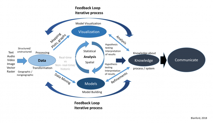
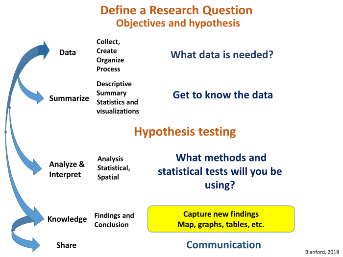
Where and how do we start to analyze our data? Analyzing data whether it is spatial or not is an iterative process that involves many different components (Figure 2.1). Depending on what questions we have in mind, we will need some data. Next, we will need to get to know our data so that we can understand its limitations, identify transformations required to produce a valid analysis, and better grasp the types of methods we will be able to use. Next, we will want to refine our hypothesis and then perform our analysis, interpret our results, and share our findings.
Statistical and Spatial Analysis
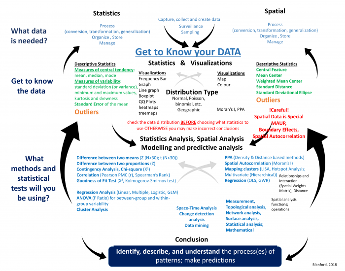
Now that you have an understanding of the research process, let’s start to familiarize ourselves with the different types of statistical and spatial analysis methods that we may need to use at each stage of the process (Figure 2.2). As you can see from Figure 2.2, statistical and spatial analysis methods are intertwined and often integrated. I know this looks complex, and for many of you the methods are new, but by the end of this course, you will have a better understanding of many of these methods and how to integrate them as you require spatial and/or statistical methods.
- Data: Determine what data is needed. This may require collecting data or obtaining third-party data. Once you have the data, it may need to be cleaned, processed (transformed, aggregated, converted, etc.), organized, and stored so that it is easy to manage, update, and retrieve for later analyses.
- Data: Get to know the data. This is an important step that many people ignore. All data has issues of one form or another. These issues are based on how the dataset was collected, formatted, and stored. Before you moving forward with your analysis, it is vital to understand
- What are a dataset's limitations? For example, you may be interested in learning about the severity of a disease across a region. The dataset you obtained contains count data (total number of cases). This count data will not give you an overall picture of the disease's impact and severity since one should adjust the case count according to the underlying population distribution (create a percent of total or incidence rate).
- Determine the usefulness of a dataset. Look at the data and determine if that data will fit your needs. For example, you may have obtained point data, but your analysis needs to operate on area-based data. Is the conversion between point to area-based data an appropriate way to answer your research question?
- Learn how the data are structured. Spreadsheets are convenient ways to store and share data. But how is that data arranged inside the spreadsheet? The data that you need may be there but the formatting is not advantageous (e.g., rows and columns need to be switched, dates need to be sequentially ordered, attributes need to be combined, etc.).
- identify any outliers. To better understand and explore the data, you can use descriptive spatial and non-spatial statistical methods as well as visualize the data either in graphs or plots as well as in the form of a map. Outliers may be signs of data entry errors or data that are atypical and depending on the intended statistical test may need to be removed from the data listing.
- Spatial Analysis and Statistical Methods. As you work through the analysis, you will use a variety of methods that are statistical, spatial, or both, as you can see from Figure 2.2. In the upcoming weeks, we will be using many of these methods starting with Point Pattern Analysis (PPA) in Lesson 3, spatial autocorrelation analysis (Lesson 4), regression analysis (Lesson 5), and the use of different spatial functions for performing spatial analysis (Lessons 6-Lesson 8). Remember, this is an iterative process that will likely require the use of one or more of the methods summarized in the diagram that are either traditional statistical methods (on the left) or a variety of spatial methods (on the right). In many cases, we will likely move back and forth between the different components (up and down) as well as between the left and right sides.
- Communication. Lastly, an important part of any research process is communicating your findings effectively. There are a variety of ways that we can do this, using web-based tools and integration of different visualizations.
Now that you have been introduced to the research framework and have an idea of some of the methods you will be learning about, let’s cover the basics so that we are all on the same page. We will start with data, then spatial analysis, and end with a refresher on statistics.
Data
Required Reading:
Read Chapter 2.2, pages 23-37 from the course text.
Data comes in many forms, structured and unstructured, and is obtained through a variety of sources. No matter its source or form, before the data can be used for any type of analysis, it must be assessed and transformed into a framework that can then be analyzed efficiently.
Some Special Considerations with Spatial Data [Rogerson Text, 1.6]
There shouldn't be anything new to anyone in this class in these pages. Since analysis is almost always based on data that suffer from some or all of these limitations, these issues have a big effect on how much we can learn from spatial data, no matter how clever the analysis methods we adopt become.
The separation of entities from their representation as objects is important, and the scale-dependence issue that we read about in Lesson 1 is particularly important to keep in mind. The scale dependence of all geographic analysis is an issue that we return to frequently.
GIS Analysis, Spatial Data Manipulation, and Spatial Analysis
From Figure 2.2, it is clear that spatial analysis requires a wide variety of analytical methods (statistical and spatial).
Spatial analysis functions fall into five classes that include: measurement, topological analysis, network analysis, surface analysis and statistical analysis (Cromley and McLafferty 2012, p. 29-32) (Table 2.0).
| Function Class | Function | Description |
|---|---|---|
| Measurement | Distance, length, perimeter, area, centroid, buffering, volume, shape, measurement scale conversion | Allows users to calculate straight-line distances between points, distances along paths, arcs, or areas. Distance as a measure of separation in space is a key variable used in many kinds of spatial analysis and is often an important factor in interactions between people and places. |
| Topological analysis | Adjacency, polygon overlay, point-in-polygon, line-in-polygon, dissolve, merge, clip, erase, intersect, union, identity, spatial join, and selection | Used to describe and analyze the spatial relationships among units of observation. Includes spatial database overlay and assessment of spatial relationships across databases, including map comparison analysis. Topological analysis functions can identify features in the landscape that are adjacent or next to each other (contiguous). Topology is important in modeling connectivity in networks and interactions. |
| Network and location analysis | Connectivity, shortest path analysis, routing, service areas, location-allocation modeling, accessibility modeling | Investigates flows through a network. Network is modeled as a set of nodes and the links that connect the nodes. |
| Surface analysis | Slope, aspect, filtering, line-of-sight, viewsheds, contours, watersheds; surface overlays or multi-criteria decision analysis (MCDA) | Often used to analyze terrain and other data that represent a continuous surface. Filtering techniques include smoothing (remove noise from data to reveal broader trends) and edge enhancement (accentuate contrast and aids in the identification of features). Or to perform raster-based modeling where it is necessary to perform complex mathematical operations that combine and integrate data layers (e.g., fuzzy logic, overlay, and weighted overlay methods; dasymetric mapping). |
| Statistical analysis | Spatial sampling, spatial weights, exploratory data analysis, nearest neighbor analysis, global and local spatial autocorrelation, spatial interpolation, geostatistics, trend surface analysis. | Spatial data analysis is closely tied to spatial statistics and is influenced by spatial statistics and exploratory data analysis methods. These methods analyze information about the relationships being modeled based on attributes as well as their spatial relationships. |
Although maps are used to present research results (when they present known results and are represented using public, low-interaction devices), many more maps are impermanent, exploratory devices, and with the increased use of interactive web-based data graphs and maps, often driven by dynamically changing data, this is even more so the case.
With this, there is an ever-increasing need for spatial analysis, particularly since much of the data collected today contains some form of geographic attribute and every map tells a story… or does it? It is easy to feel that a pattern is present in a map. Spatial analysis allows us to explore the data, develop a hypothesis, and test that visual insight in a systematic, more reliable way.
The important point at this stage is to get used to thinking of space and spatial relations in the terms presented here — distance [12], adjacency [13], interaction [14], and neighborhood [15]. The interaction weight idea is particularly commonly used. You can think of interaction as an inverse distance measure: near things interact more than distant things. Thus, it effectively captures the basic idea of spatial autocorrelation [16].
Summarizing Relationships in Matrices [Lloyd text, section 2.2]
This week's readings discuss some of the ways matrices are used in spatial analysis. You'll notice that distances and adjacencies appear in Table 2.0. At this stage, you only need to get the basic idea that distances, adjacencies (or contiguities), or interactions can all be recorded in a matrix [17] form. This makes for very convenient mathematical manipulation of a large number of relationships among geographic objects. We will see later how this concept is useful in point pattern analysis (Lesson 3), clustering and spatial autocorrelation (Lesson 4), and interpolation (Lesson 6).
Statistics, a refresher
Statistical methods, as will become apparent during this course, play an important role in spatial analysis and are behind many of the methods that we regularly use. So to get everyone up to speed, particularly if you haven’t used stats recently, we will review some basic ideas that will be important through the rest of the course. I know the mention of statistics makes you want to close your eyes and run the other direction .... but some basic statistical ideas are necessary for understanding many methods in spatial analysis. An in-depth understanding is not necessary, however, so don't get worried if your abiding memory of statistics in school is utter confusion. Hopefully, this week, we can clear up some of that confusion and establish a firm foundation for the much more interesting spatial methods we will learn about in the weeks ahead. We will also get you to do some stats this week!
You have already been introduced to some stats earlier on in this lesson (see Figures 2.0-2.3). Now, we will focus your attention on the elements that are particularly important for the remainder of the course. "Appendix A: The elements of Statistics," linked in the additional readings list for this lesson in Canvas, will serve as a good overview (refresher) for the basic elements of statistics. The section headings below correspond to the section headings in the reading.
Required Reading:
Read the Appendix A reading provided in Canvas (see Geographic Information Analysis [18]), especially if this is your first course in statistics or it has been a long time since you took a statistics class. This reading will provide a refresher on some basic statistical concepts.
A.1. Statistical Notation
One of the scariest things about statistics, particularly for the 'math-phobic,' is the often intimidating appearance of the notation used to write down equations. Because some of the calculations in spatial analysis and statistics are quite complex, it is worth persevering with the notation so that complex concepts can be presented in an unambiguous way. Really, understanding the notation is not indispensable, but I do hope that this is a skill you will pick up along the way as you pursue this course. The two most important concepts are the summation symbol capital sigma (Σ), and the use of subscripts (the i in xi).
I suggest that you re-read this section as often as you feel the need, if, later in the course, 'how an equation works' is not clear to you. For the time being, there is a question in the quiz to check how well you're getting it.
A.2. Describing Data
The most fundamental application of statistics is simply describing large and complex sets of data. From a statistician's perspective, the key questions are:
- What is a typical value in this dataset?
- How widely do values in the dataset vary?
... and following directly from these two questions:
- What qualifies as an unusually high or low value in this dataset?
Together, these three questions provide a rough description of any numeric dataset, no matter how complex it is in detail. Let's consider each in turn.
Measures of central tendency such as the mean and the median provide an answer to the 'typical value' question. Together, these two measures provide more information than just one value, because the relationship between the two is revealing. The important difference between them is that, the mean is strongly affected by extreme values while the median is not.
Measures of spread are the statistician's answer to the question of how widely the values in a dataset vary. Any of the range, the standard deviation, or the interquartile range of a dataset allows you to say something about how much the values in a dataset vary. Comparisons between the different approaches are again helpful. For example, the standard deviation says nothing about any asymmetry in a data distribution, whereas the interquartile range—more specifically the values of Q25 and Q75—allows you to say something about whether values are more extreme above or below the median.
Combining measures of central tendency and of spread enables us to identify which are the unusually high or low values in a dataset. Z scores standardize values in a dataset to a range such that the mean of the dataset corresponds to z = 0; higher values have positive z scores, and lower values have negative z scores. Furthermore, values whose z scores lie outside the range ±2 are relatively unusual, while those outside the range ±3 can be considered outliers. Box plots provide a mechanism for detecting outliers, as discussed in relation to Figure A.2.
A.3. Probability Theory
Probability is an important topic in modern statistics.
The reason for this is simple. A statistician's reaction to any observation is often along the lines of, "Well, your results are very interesting, BUT, if you had used a different sample, how different would the answer be?" The answer to such questions lies in understanding the relationship between estimates derived from a sample and the corresponding population parameter, and that understanding, in turn, depends on probability theory.
The material in this section focuses on the details of how probabilities are calculated. Most important for this course are two points:
- the definition of probability in terms of the relative frequency of events (eqns A.18 and A.19), and
- that probabilities of simple events can be combined using a few relatively simple mathematical rules (eqns A.20 to A.26) to enable calculation of the probability of more complex events.
A.4. Processes and Random Variables
We have already seen in the first lesson that the concept of a process is central to geographic information analysis (look back at the definition on page 3).
Here, a process is defined in terms of the distribution of expected outcomes, which may be summarized as a random variable. This is very similar to the idea of a spatial process, which we will examine in more detail in the next lesson, and which is central to spatial analysis.
A.5. Sampling Distributions and Hypothesis Testing
The most important result in all of statistics is the central limit theorem. How this is arrived at is unimportant, but the basic message is simple. When we use a sample to estimate the mean of a population:
- The sample mean is the best estimate for the population mean, and
- If we were to take many different samples, each would produce a different estimate of the population mean, and these estimates would be normally distributed, and
- The larger the sample size, the less variation there is likely to be between different samples.
Item 1 is readily apparent: What else would you use to estimate the population mean than the sample mean?!
Item 2 is less obvious, but comes down to the fact that sample means that differ substantially from the population mean are less likely to occur than sample means that are close to the population mean. This follows more or less directly from Item 1; otherwise, there would be no reason to choose the sample mean in making our estimate in the first place.
Finally, Item 3 is a direct outcome of the way that probability works. If we take a small sample, then it is prone to wide variation due to the presence of some very low or very high values (like the people in the bar example). On the other hand, a very large sample will also vary with the inclusion of extreme values, but overall is much more likely to include both high and low values.
Try This! (Optional)
Take a look at this animated illustration of the workings of the central limit theorem [19] from Rice University.
The central limit theorem provides the basis for calculation of confidence intervals, also known as margins of error, and also for hypothesis testing.
Hypothesis testing may just be the most confusing thing in all of statistics... but, it really is very simple. The idea is that no statistical result can be taken at face value. Instead, the likelihood of that result given some prior expectation should be reported, as a way of inferring how much faith we can place in that expectation. Thus, we formulate a null hypothesis, collect data, and calculate a test statistic. Based on knowledge of the distributional properties of the statistic (often from the central limit theorem), we can then say how likely the observed result is if the null hypothesis were true. This likelihood is reported as a p-value or probability. A low probability indicates that the null hypothesis is unlikely to be correct and should be rejected, while a high value (usually taken to mean greater than 0.05) means we cannot reject the null hypothesis.
Confusingly, the null hypothesis is set up to be the opposite of the theory that we are really interested in. This means that a low p-value is a desirable result, since it leads to rejection of the null, and therefore provides supporting evidence for our own alternative hypothesis.
Visualizing the Data
Not only is it important to perform the statistics, but in many cases it is important to visualize the data. Depending on what you are trying to analyze or do, there are a variety of visualizations that can be used to show:
- Composition: where and when something is occurring at a single point in time (e.g., dot map; choropleth map; pie chart, bar chart) or changing over time (e.g., time-series graphs), which can be further enhanced by including intensity (e.g., density maps, heat maps),
- the relationship between two things (e.g., scatterplot (2 variables), bubbleplots (e.g., 3 variables)),
- distribution of the data (e.g., frequency, histogram, scatterplot),
- comparison between variables (e.g., single or multiple).
For a visual overview of some different types of charts, [20] see the graphic produced by Dr Abela (2009).
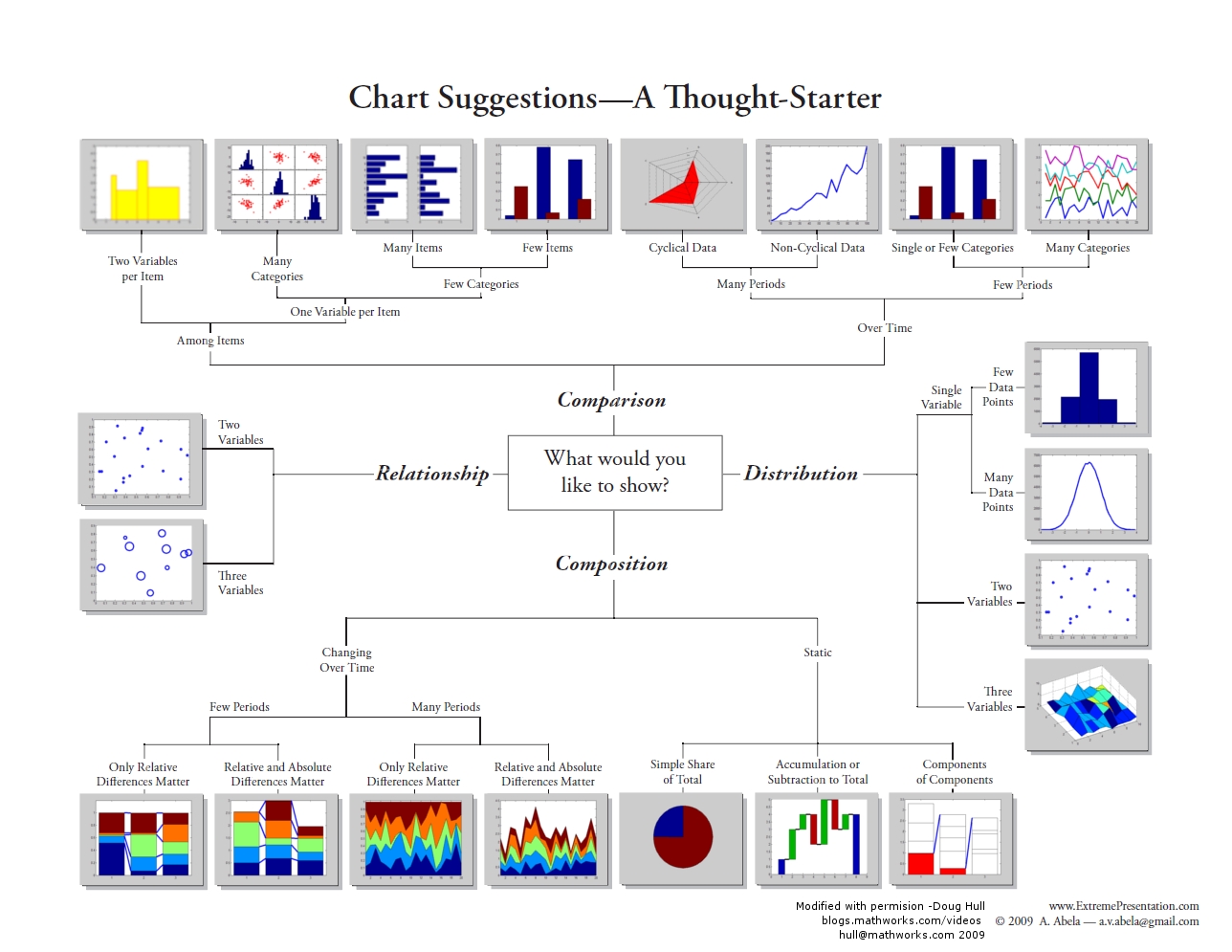
For example, earlier we highlighted the importance of understanding our data using descriptive statistics (mean and variation of the data). By using frequency distributions and histograms, we can further understand these aspects since these visualizations reveal three aspects of the data:
- where the distribution has its peak (central location) - the clustering at a particular value is known as the central location or central tendency of a frequency distribution. Measures of central location can be in the middle or off to one side or the other.
- how widely dispersed the distribution is on either side of its peak (spread, also known as variation or dispersion) - this refers to the distribution out from a central value.
- whether the data is more or less symmetrically distributed on the two sides of the peak (shape) - shape can be symmetrical or skewed.
Telling a story with data
An important part of doing research and analysis is communicating the knowledge you have discovered to others and also documenting what you did so that you or others can repeat your analysis. To do so, you may want to publish your findings in a journal or create a report that describes the methods you used, presents the results you obtained, and discusses your findings. Often, we have to toggle between the software and a word document or text file to capture our workflow and integrate our results. One way to do this is to use a digital notebook that enables you to document and execute your analysis and write up your results. If you'd like to try this, in this week's project, have a crack at the "Try This" box in the project instructions, which will walk you through how to set up an R Markdown notebook. There are other popular notebooks, such as Jupyter [21]; however, since we are interested in R, those who wish to attempt this can try with the R version.
An important part of telling a story is to present the data efficiently and effectively. The project this week will give you an opportunity to apply some stats to data and get you familiar with running different statistical analyses and applying different visualization methods.
Project 2: Exploratory Data Analysis and Descriptive Statistics in R
Background
This week, we covered some key concepts important for conducting research and analysis. Now, it is time for you to put this information to use through some analysis. In this week's project, you will be analyzing some point data describing crimes in St. Louis, Missouri and creating a descriptive analysis of the data. Next week, you will build on this analysis by using some spatial point pattern statistics with the same dataset to look at the spatial patterns of crime in more detail.
To carry out this week's analysis, you will use RStudio and several packages in R. The assignment has been broken down into several components.
You will analyze the data and familiarize yourself with R by copying and pasting the provided R code from Lesson 2 into RStudio. In some cases, you will want to modify this code to analyze additional variables or produce different graphs and charts that you think will help with your analysis. As you work through the analysis, make some informal notes about what you are finding.
The outputs generated by running these analyses provides evidence to answer the questions listed at the bottom of this page. Once you have completed your analysis and obtained the different statistical and graphical outputs, use this evidence to create a more formal written report of the analysis.
Project Resources
You need an installation of R and RStudio, to which you will need to add the packages listed on a subsequent page of these instructions.
You will also need some data. You will find a data archive to download (Geog586_Les2_Project.zip) in the Lesson 2 materials in Canvas. If you have any difficulty in downloading the data, please contact me.
This archive includes the following files:
- Crime data files for St Louis: crimeStLouis20132014b.csv, crimeStLouis20132014b_agg.csv
- Boundary of St Louis data file (shapefile): stl_boundary_ll.shp
How to Move Forward with the Analysis
As you work your way through the R code on the following pages of the project instructions, keep the following questions in mind. Jotting down some notes related to each of them will help you to synthesize your findings into your project report.
Discuss Overall Findings
- What types of crime were recorded in the city?
- Was there a temporal element associated with each of the crimes?
- How did the occurrence of crimes changes between the years?
- Where did crimes take place? Was there a particular spatial distribution associated with each of the crimes? Did they take place in a particular part of the city?
- What additional types of analysis would be useful?
Descriptive Statistics
- What type of distribution does your data have?
- What is a typical value in this dataset?
- How widely do values in the dataset vary?
- Are there any unusually high or low value in this dataset? (e.g., outliers)
Visualizing the Data
- Map the data: What is spatial distribution of crimes?
- Create graphs:
- Of the crimes in the dataset, is there a crime that occurs more than others?
- Is there a month when crimes occur more than others?
- Have crimes increased or decreased over time?
Summary of the Minimum Project 2 Deliverables
To give you an idea of the work that will be required for this project, here is a summary of the minimum items you will create for Project 2.
- Create necessary maps, graphics, or tables of the data. Include in your written report any and all maps, graphics, and tables that are needed to support your analysis.
- The analysis should help you present the spatial patterns of crime types across the city as well as what evidence exists showing any temporal trend in crime overall and for individual crime types.
Questions?
Please use the 'Week 2 lesson discussion' forum to ask for clarification on any of these concepts and ideas. Hopefully, some of your classmates will be able to help with answering your questions, and I will also provide further commentary there where appropriate.
Project 2: Getting Started in R and RStudio
RStudio/R is a standard statistical analysis package that is free, is extensible, and contains many new methods and analysis that are contributed by researchers across the globe.
Install R First
Navigate to the R website [22] and choose the CRAN [23] link under Download in the menu at the left.
Select a CRAN location. R is hosted at multiple locations around the world to enable quicker downloads. Choose a location (any site will do) from which, among other things, you will obtain various packages used during your coding.
On the next page, under Download and Install R, choose the appropriate OS for your computer.
Windows installs
On the next page, for most of you, you will want to choose the Install R for the first time link (on Windows). Note that the link you select is unique to the CRAN site you selected.
On the next page, choose the Download R 4.1.2 for Windows link (or whatever version is current).
The file that is downloaded is titled R-4.1.2-win.exe (note that the 4.1.2 specifies the version while win indicates the OS).
Once the file is downloaded, initiate the executable and follow the prompts to download and install R.
Mac OS X installs
From the Download and Install page, simply choose the link for the latest release package (for Mac OSX) and then double-click the downloaded installer and follow the installation prompts.
Install RStudio
Once R is successfully installed, you can download and install RStudio.
You'll install RStudio at this link [24]. Versions are available for all the major platforms. RStudio offers several price points. Choose the price point you are interested in and download and install RStudio. (I assume you are interested in the FREE version).
Once both R and RStudio are installed, start RStudio.
The console window appears as shown in Figure 2.4. The console window includes many components. The Console tab is where you will do your coding. You can also go to File - New File - R Script to open the Source window and enter your code there. The Environment tab in the upper-right corner shows information about variables and their contents. The History tab allows you to see the history of your coding and changes. The lower-right corner has several tabs. The Plots tab shows you any graphical output (such as histograms, boxplots, maps, etc.) that your code outputs. The Packages tab allows you to, among other things, check to see which packages are currently installed with your program. The Help tab allows you to search for R functions and learn more about their utility in your code.
As you work through your code, you should get in the habit of saving your work often. Compared to other programs, R is very stable, but you never know. You can save your R code by looking under File and choosing the Save As option. Name your code file something logical like Lesson_2.

Project 2: Obtaining and installing R packages
R contains many packages that researchers around the world have created. To learn more about what is available, look through the following links.
- Available R Packages [25]
- R-studio Packages [26]
- Datacamp Packages Guide [27]
Packages in R
R itself has a relatively modest number of capabilities grouped in the base package. Its real power comes from its extensive set of libraries, which are bundled up groups of functions called packages. However, this power comes at the cost of the fact that knowing which statistical tool is in which particular package can be confusing to new users.
During this course, you will be using many different packages. To use a package, you will first need to obtain it, install it, and then use the library() command to load it. There are two ways in which you can select and install a package.
Installing packages by command line
> install.packages("ggplot2")
> library(ggplot2)
Installing packages with RStudio
Click the Packages tab and click Install (Figure 2.5). A window will pop up. Select repository to install from, and then type in the package(s) you want. To install the package(s), click Install. Once the package has been installed, you will see it listed in the packages library. To turn a package on or off, click on the box next to the package listed in the User Library on the packages tab. Some packages 'depend' on other packages, so sometimes to use one package you have to also download and install a second one. Packages are updated at different intervals, so check for updates regularly.
Troubleshooting
In some cases, a package will fail to load. You may not realize this has happened until you try to use one of the functions and an error will return saying something to the effect that function() was not found. This happens, but you should not take this as a serious error. If you run into a situation where a package fails to install, try installing it again.
If you get an error message saying something like: Error if readOGR(gisfile, layer = "stl_boundary_11", GDAL1_integert64_policy = FALSE) : could not find function "readOGR"
Then, issue the ??readOGR command in the RStudio console window and figure out which package you are missing and install (or reinstall) it.
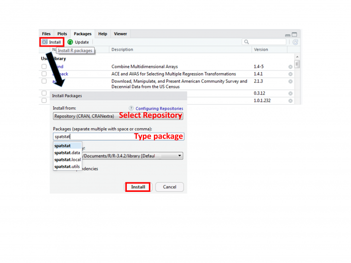
What to install
By whatever method you choose, install the following packages. Links are provided for a few packages, providing a bit more information about the package.
Installing these packages will take a little time. Pay attention to the messages being printed in the RStudio console to make sure that things are installing correctly and that you're not getting error messages. If you get asked whether you want to install a version that needs compiling, you can say no and use the older version.
Various packages used for mapping, spatial analysis, statistics and visualizations:
- doBy
- dplyr
- ggmap (although the tmap package is relatively newer and works with the newer sf format)
- ggplot2
- gridExtra
- gstat
- leaflet: mapping elements [28]
- spatstat
- sf (a relatively new format for R objects)
- sp
- spdep
- raster
- RColorBrewer
Additional help is available through video tutorials at LinkedInLearning.com [29]. As a PSU student, you can access these videos. Sign in with your Penn State account, browse software, and select R.
Project 2: Introduction to R: the essentials
In Canvas, you will find Statistics_RtheEssentials_2019.pdf in the Additional Reading Materials link in Lesson 2. It contains some essential commands to get you going.
This is not a definitive resource – since it would end up as a book in its own right. Instead, it provides a variety of commands that will allow you to load your data, explore, and visualize your data.
Three Considerations As You Write and Debug Code
Coding takes patience but can be very rewarding. To help you work through code, here are three suggestions.
1. If there is something that you would like your code to do but is not covered explicitly in the lesson instructions, or you are not able to figure out an error, then post a question to the discussion forum and either another student or I may know the answer. If you are asking about a solution to an error in your code, please provide a screenshot of the error message and lines around the place in the code where the error is reported to occur. Simply posting that "my program doesn't work" or "I am getting an error message" will not help others help you.
2. If you discover or know some code that is useful or goes beyond that which is covered in the lesson and would be beneficial to others in the class, then please share it. We are all here to learn in a collective environment.
3. Use scripts! (go to file/new script). These allow you to save your code, so you don't have to retype it later. If you enter your code into the console then the computer will "talk to you" and run the commands, but it will not remember anything - AKA you are having a phone call with the computer but speaking the language R. But with a script, you can enter and save your commands and return back to them (or re-run them later) - so to build on the metaphor, this is like sending an e-mail, you have a written record of what you said.
Project 2: Setting Up Your Analysis Environment in R
Adding the R packages that will be needed for the analysis
Many of the analyses you will be using require commands contained in different packages. You should have already loaded many of these packages [30], but just to ensure we document what packages we are using, let's add in the relevant information so that if the packages have not been switched on, they will be when we run our analysis.
Note that the lines that start with #install.packages will be ignored in this instance because of the # in front of the command. Lines of code with a # symbol are treated as comments by the compiler. If you do need to install a package (e.g., if you hadn't already installed all of the relevant packages), then remove the # when you run your code so the line will execute.
Note that for every package you install, you must also issue the library() function to tell R that you wish to access that package. Installing a package does not ensure that you have access to the functions that are a part of that package.
#install and load packages here

install.packages("ggplot2")
library(ggplot2)
install.packages("spatstat")
library (spatstat)
install.packages("leaflet")
library(leaflet)
install.packages("dplyr")
library (dplyr)
install.packages("doBy")
library(doBy)
install.packages("sf")
library(sf)
install.packages("ggmap")
library (ggmap)
install.packages("gridExtra")
library(gridExtra)
install.packages("sp")
library(sp)
install.packages("RColorBrewer")
library (RColorBrewer)
Set the working directory
Before we start writing R code, you should make sure that R knows where to look for the shapefiles and text files. First, you need to set the working directory. In your case, the working directory is the folder location where you placed the contents of the .zip file when you unzipped it. To follow up, make sure that the correct file location is specified. There are several ways you can do this. As shown below, you can set the directory path to a variable and then reference that variable whereever and whenever you need to. Notice that there is a slash at the end of the directory name. If you don't include this, it can lead to the final folder name getting merged with a filename, meaning R cannot find your file.
file_dir_crime <-"C:/Geog586_Les2_Project/crime/"
Note that R is very sensitive to the use of "/" as a directory level indicator. R does not recognize "\" as a directory level indicator and an error will return. DO NOT COPY THE DIRECTORY PATH FROM FILE EXPLORER AS THE FILE PATH USES "\" but R only recognizes "/" for this purpose.
You can also issue the setwd() function that "sets" the working directory for your program.
setwd("C:/Geog586_Les2_Project/crime/")
Finally and most easily, you can also set the working directory through RStudio's interface: Session - Set Working Directory - Choose Directory.
Issue the getwd() function to confirm that R knows what the correct path is.
#check and set the working directory
#if you do not set the working directory ensure that you use the full directory pathname to where you saved the file.
#R is very sensitive to the use of "/" as a directory level indicator. R does not recognize "\" as a directory level indicator and an error will return.
#DO NOT COPY THE DIRECTORY PATH FROM YOUR FILE EXPLORER AS THE FILE PATH USES "\"
#e.g. "C:/Geog586_Les2_Project/crime/">
#check the directory path that R thinks is correct with the getwd() function.
getwd()

#set directory to where the data is so that you can reference these varibles later rather than typing the directory path out again.
#you will need to adjust this for your own filepath.
file_dir_crime <-"C:/Geog586_Les2_Project/crime/"

#make sure that the path is correct and that the csv files are in the expected directory
list.files(file_dir_crime)
#this is an alternative way of checking that R can see your csv files. In this version of the command, you are asking R to list only the .csv files
#that are in the folder located at the filepath filedircrime.
list.files(path = file_dir_crime, pattern = "csv")

#to view the files in the other directory
file_dir_gis <-"C:/Geog586_Les2_Project/gis/"

#make sure that the path is correct and that the shp file is in the expected directory
list.files(file_dir_gis)
# and again, the version of the command that limits the list to shapefiles only
list.files(path = file_dir_gis, pattern="shp")

#You are not creating any outputs here, but you may want to think about setting up a working directory
#where you can write outputs when and if needed. First create a new directory, in this case called outputs
#and then set the working directory to point to that directory.
wk_dir_output<-setwd("C:/Geog586_Les2_Project/outputs/")
When you've finished replacing the filepaths above to the relevant ones on your own computer, check the results in the RStudio console with the list.files() command to make sure that R is seeing the files in the directories. You should see outputs that print that list the files in each of the directories. 90% of problems with R code come from either a library not being loaded correctly or a filepath problem, so it is worth taking some care here.
Loading and viewing the data file (Two Code Options)
Add the crime data file that you need and view the contents of the file. Inspect the results to make sure that you are able to read the crime data.
#Option #1: Read in crime file by pasting the path into a variable name
#concatenate the filedircrime (set earlier to your directory) with the filename using paste()
crime_file <-paste(file_dir_crime,"crimeStLouis20132014b.csv", sep = "")
#check that you've accessed the file correctly - next line of code should return TRUE
file.exists(crime_file)

crimesstl <- read.csv(crime_file, header=TRUE,sep=",")

#Option #2: Set the file path and read in the file into a variable name
crimesstl2 <- read.csv("C:/Geog586_Les2_Project/crime/crimeStLouis20132014b.csv", header=TRUE, sep=",")

#returns the first ten rows of the crime data
head(crimesstl, n=10)

#view the variable names
names(crimesstl)

# view data as attribute tables (spreadsheet-style data viewer) opened in a new tab.
# Your opportunity to explore the data a bit more!
View(crimesstl) #feel free to use the 'View' function whenever you need to explore data as an attribute table
View(crimesstl2)

#create a list of the unique crime types in the data set and view what these are so that you can select using these so that you can explore their distributions.
listcrimetype <-unique(crimesstl$crimetype)
listcrimetype
Project 2: Running the Analysis in R
Now that the packages and the data have been loaded, you can start to analyze the crime data.
Before Beginning: An Important Consideration
The example descriptive statistics that are reported below are just that, examples of what is possible - not necessarily a template that you should follow exactly. In a similiar light, the visuals that are shown below are only examples of the evidence that you could create for your analysis. In other words, avoid the tendancy to simply reproduce the descriptive statistics and visuals that are shown in the sections that follow. This analysis you create should be based on your investigation of the data and the kinds of research questions that you want to answer. Think about the questions about the data that you want answered and the descriptive statistics and visuals that are needed to help you answer those questions.
Descriptive Statistics
Use various descriptive statistics that have been discussed or others that you are aware of to analyze the types of crime that have been recorded, when these crimes were most abundant (e.g., during what year, month, and time of the day), and where crimes were most abundant. Refer to the RtheEssentials.pdf for additional commands and visualizations you can use.
#Summarise data
summary(crimesstl)

#Make a data frame (a data structure) with crimes by crime type
dt <- data.frame(cnt=crimesstl$count, group=crimesstl$crimetype)
#save these grouped data to a variable so you can use it other commands
grp <- group_by(dt, group)

#Summarise data from library (dplyr)
#Summarise the number of counts for each group
summarise(grp, sum=sum(cnt))
#transpose the table
tapply(crimesstl$count, crimesstl$crimetype,sum)
Visualizations of the data
#Descriptive analysis
#Barchart of crimes by month
countsmonth <- table(crimesstl$month)
barplot(countsmonth, col="grey", main="Number of Crimes by Month",xlab="Month",ylab="Number of Crimes")
#Barchart of crimes by year
countsyr <- table(crimesstl$year)
barplot(countsyr, col="darkcyan", main="Number of Crimes by Year",xlab="Year",ylab="Number of Crimes")
#Barchart of crimes by crimetype
counts <- table(crimesstl$crimetype)
barplot(counts, col = "cornflowerblue", main = "Number of Crimes by Crime Type", xlab="Crime Type", ylab="Number of Crimes")
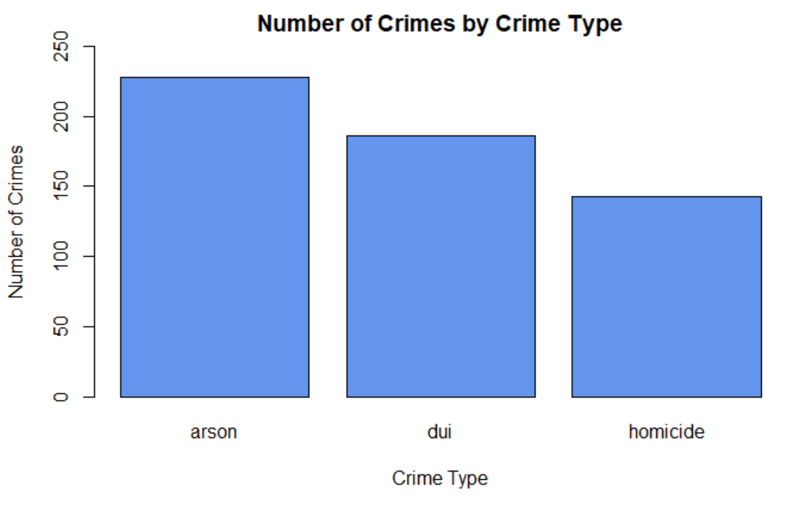
#BoxPlots are useful for comparing data.
#Use the dataset crimeStLouis20132014b_agg.csv.
#These data are aggregated by neighbourhood.
agg_crime_file <-paste(file_dir_crime,"crimeStLouis20132014b_agg.csv", sep = "")
#check everything worked ok with accessing the file
file.exists(agg_crime_file)
crimesstlagg <- read.csv(agg_crime_file, header=TRUE,sep=",")

#Compare crimetypes
boxplot(count~crimetype, data=crimesstlagg,main="Boxplots According to Crime Type",
            xlab="Crime Type", ylab="Number of Crimes",
            col="cornsilk", border="brown", pch=19)
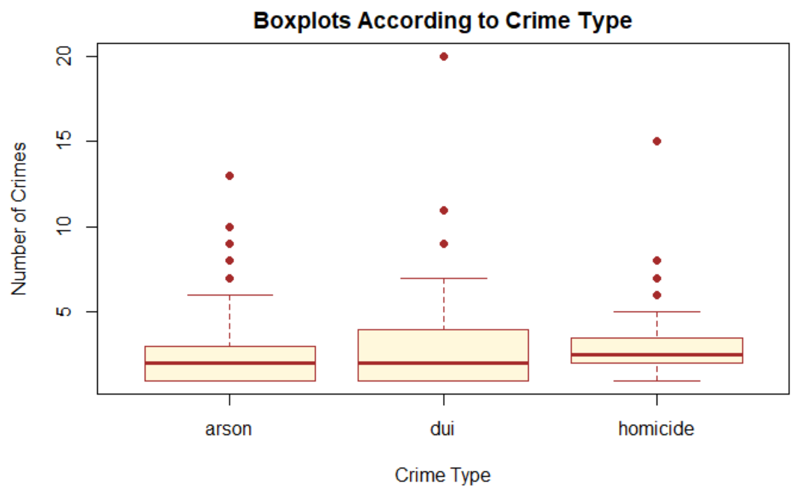
Mapping the data
Now let’s see where the crimes are taking place. Create an interactive map so that you can view where the crimes have taken place.
#Create an interactive map that plots the crime points on a background map.

#This will create a map with all of the points
gis_file <- paste(file_dir_gis,"stl_boundary_ll.shp", sep="")
file.exists(gis_file)

#Read the St Louis Boundary Shapefile
StLouisBND <- read_sf(gis_file)

leaflet(crimesstl) %>%
  addTiles() %>%
  addPolygons(data=StLouisBND, color = "#444444", weight = 3, smoothFactor = 0.5,
                  opacity = 1.0, fillOpacity = 0.5, fill= FALSE,
                  highlightOptions = highlightOptions(color = "white", weight = 2,
                                                      bringToFront = TRUE)) %>%
  addCircles(lng = ~xL, lat = ~yL, weight = 7, radius = 5,
    popup = paste0("Crime type: ", as.character(crimesstl$crimetype),
                              "; Month: ", as.character(crimesstl$month)))
Viewing different crimes
To view different crimes you will need to refer back to the section where you viewed the different crime types in the datasets so that you can specify what crimes to select. View either the boxplot you created or the summaries you created. You will map the distribution of arson, dui, and homicide in the St. Louis area.
To create a map of a specific type of crime you will first need to create a subset of the data.
#Now view each of the crimes
#create a subset of the data
crimess22 <- subset(crimesstl, crimetype == "arson")
crimess33 <- subset(crimesstl, crimetype == "dui")
crimess44 <- subset(crimesstl, crimetype == "homicide")

#Check to see that the selection worked and view the records in the subset.
crimess22
crimess33
crimess44

#Create an individual plot of each crime to show the variation in crime distribution.
# To view a map using ggplot the shapefile needs to be converted to a spatial data frame.
stLbnd_df <- as_Spatial(StLouisBND)

#create the individual maps using ggplot
g1<-ggplot() +
      geom_polygon(data=stLbnd_df, aes(x=long, y=lat,group=group),color='black',size = .2, fill=NA) +
      geom_point(data = crimesstl, aes(x = xL, y = yL),color = "black", size = 1) + ggtitle("All Crimes") +
      coord_fixed(1.3)

g2<- ggplot() +
     geom_polygon(data=stLbnd_df, aes(x=long, y=lat,group=group),color='black',size = .2, fill=NA) +
      geom_point(data = crimess22, aes(x = xL, y = yL),color = "black", size = 1) +
  ggtitle("Arson") +
      coord_fixed(1.3)

g3<- ggplot() +
       geom_polygon(data=stLbnd_df, aes(x=long, y=lat,group=group),color='black',size = .2, fill=NA) +
        geom_point(data = crimess33, aes(x = xL, y = yL), color = "black", size = 1) + ggtitle("DUI") +
      coord_fixed(1.3)

g4<- ggplot() +
  geom_polygon(data=stLbnd_df, aes(x=long, y=lat,group=group),color='black',size = .2, fill=NA) +
  geom_point(data = crimess44, aes(x = xL, y = yL), color = "black", size = 1) + ggtitle("Homicide") +
      coord_fixed(1.3)


#Arrange the plots in a 2x2 column

grid.arrange(g1,g2,g3,g4, nrow=2,ncol=2)
#Create an interactive map for each crimetype
#To view a particular crime you will want to create a map using a subset of the data.
#Or use leaflet and include a background map to put the crime in context.

leaflet(crimesstl) %>%
  addTiles() %>%
  addPolygons(data=StLouisBND, color = "#444444", weight = 3, smoothFactor = 0.5,
                  opacity = 1.0, fillOpacity = 0.5, fill= FALSE,
                  highlightOptions = highlightOptions(color = "white", weight = 2,
                                                      bringToFront = TRUE)) %>%

  addCircles(data = crimess22, lng = crimess22$xL, lat = crimess22$yL, weight = 5, radius = 10,
    popup = paste0("Crime type: ", as.character(crimess22$crimetype),
                              "; Month: ", as.character(crimess22$month)))


#Turn these on when you are ready to view them. To do so remove the # and switch off the addCircles above by adding a #
#addCircles(data = crimess33, lng = crimess33$xL, lat = crimess33$yL, weight = 5, radius = 10,
    #popup = paste0("Crime type: ", as.character(crimess33$crimetype),
                              #"; Month: ", as.character(crimess33$month)))

#addCircles(data = crimess44, lng = crimess44$xL, lat = crimess44$yL, weight = 5, radius = 10,
    #popup = paste0("Crime type: ", as.character(crimess44$crimetype),
                              #"; Month: ", as.character(crimess44$month)))
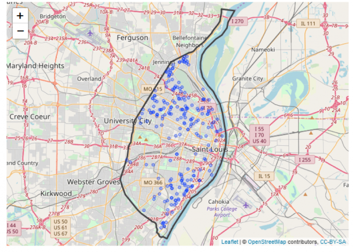
Project 2: Finishing Up
Summary of Project 2 Deliverables
To give you an idea of the work that will be required for this project, here is a summary of the minimum items you will create for Project 2.
- Create necessary maps, graphics, or tables of the data. Include in your written report any and all maps, graphics, and tables that are needed to support your analysis.
- The analysis should help you present the spatial patterns of crime types across the city as well as what evidence exists showing any temporal trend in crime overall and for individual crime types.
Note that this summary does not supersede elements requested in the main text of this project (refer back to those for full details). Also, you should include discussions of issues important to the lesson material in your write-up, even if they are not explicitly mentioned here.
Use the questions below to organize the narrative that you craft about your analysis.
- Discuss Overall Findings
- What types of crime were recorded in the city?
- Was there a temporal element associated with each of the crimes? If so, then were there any considerations about the temporal element in your analysis.
- How did crimes changes between the years?
- Where did crimes take place? Was there a particular spatial distribution associated with each of the crimes? Did they take place in a particular part of the city?
- What additional types of analysis would be useful?
- Visualizing the Data
- Map the data: Explain the spatial distribution of crimes?
- Create some graphs:
- Of the crimes in the dataset, is there a crime that occurs more than others?
- Is there a month when crimes occur more than others?
- Have crimes increased or decreased over time?
- Descriptive Statistics
- What type of statistical distribution does your data have?
- What is the typical value in this dataset?
- How widely do values in the dataset vary?
- Are there any unusually high or low value in this dataset?
Please upload your write-up (in Word or PDF format) in the Project 2 Drop Box.
That's it for Project 2!
Project 2: (Optional) Try This - R Markdown
You've managed to complete your first analysis in RStudio, congratulations! As was mentioned earlier in the lesson, R also offers a notebook-like environment in which to do statistical analysis. If you'd like to try this out, follow the instructions on this page to reproduce your Lesson 2 analysis in an R Markdown file.
R Markdown: a quick overview
Since typing commands into the console can get tedious after a while, you might like to experiment with R Markdown.
R Markdown acts as a notebook where you can integrate your notes or the text of a report with your analysis. When you are finished, save the file; if you need to return to your analysis, you can load the file into R and run your analysis again. Once you have completed the analysis and write-up, you can create a final document.
Here are some resources to help you better understand RMarkdown and other tools.
- Learning tools in R
- markdown: RMarkdown cheat sheet [31]
- markdown: RMarkdown Reference guide [32]
- markdown: RMarkdown Tutorial [33]
- swirl: Learn R, in R [34]
- rcmdr: GUI for different statistical methods [35]
Before doing anything, make sure you have installed and loaded the rmarkdown package.
 install.packages("rmarkdown")
library(rmarkdown)
To create a new RMarkdown file, go to File – New File – R Markdown. Select the Output Format and Document. Select HTML (Figure 2.16).
Opening the RMD File and Coding
In the Lesson 2 data folder, you will find a .rmd file.
In RStudio, load the .rmd file, File – Open File. Select the Les2_crimeAnalysis.Rmd file from the Lesson 2 folder.
The file will open in a window in the top left quadrant of RStudio. This is essentially a text file where you can add your R code, run your analysis, and write up your notes and results.
The header is where you should add a title, date, and your name as the author. Try customizing the information there.
R code should be written in the grey areas between the ``` and ``` comments. These grey areas are called "chunks".
Note that the command {r, echo=TRUE), written at the top of each R code chunk, will include the R code in the output (see line 20 in Figure 2.17). If you do not want to include the R code, then set echo=FALSE. There are several chunk options that you can explore on your own.
include = FALSEprevents code and results from appearing in the finished file. R Markdown still runs the code in the chunk, and the results can be used by other chunks.echo = FALSEprevents code, but not the results from appearing in the finished file. This is a useful way to embed figures.message = FALSEprevents messages that are generated by code from appearing in the finished file.warning = FALSEprevents warnings that are generated by code from appearing in the finished.fig.cap = "..."adds a caption to graphical results.
Of course, setting any of these options to TRUE creates the opposite effect. Chunk options must be written in one line; no line breaks are allowed inside chunk options.
Once you have added what you need to the R Markdown file, you can use it to create a formatted text document, as shown below.
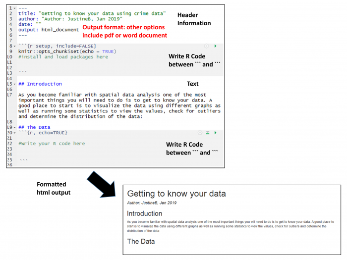
For additional information on formatting, see the RStudio cheat sheet [36].
To execute the R code and create a formatted document, use Knit. Knit integrates the pieces in the file to create the output document, in this case an html_document. The Run button will execute the R code and integrate the results into the notebook. There are different options available for running your code. You can run all of your code or just a chunk of code. To run just one chunk, click the green arrow near the top of the chunk.
If you are having trouble with running just one chunk, it might be because the chunk depends on something that was done in a prior chunk. If you haven't run that prior chunk, then those results may not be available, causing either an error or an erroneous result. We recommend generally using the Knit approach or the Run Analysis button at the top (as shown in Figure 2.18).
Try the Run and Knit buttons
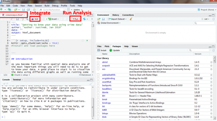
Note for Figure 2.18:
You probably set the output of the "knit" to HTML. Oher output options are available and can be set at the top of the markdown file.
title: "Lesson1_RMarkdownProject1doc"
author: "JustineB"
date: "January 24, 2019"
output:
word_document: default
html_document: default
editor_options:
chunk_output_type: inline
always_allow_html: yes
Add the "always_allow_html: yes" to the bottom
Your Turn!
Now you've seen how the analysis works in an R Markdown file. Try adding another chunk (Insert-R) to the R Markdown document and then copy the next blocks of your analysis code into the new chunk in the R Markdown file and then try to Knit the file. It's best to add one chunk at a time and then test the file/code by knitting it. That will make it easier to find any problems.
If you're successful, continue on until you've built out your whole R Markdown file. If you get stuck, post a description of your problem to the Lesson 2 discussion forum and ask for some help!
Term Project (Week 2) - Writing a Preliminary Project Proposal
Submit a brief project proposal (1 page) to the 'Term Project: Preliminary Proposal' discussion forum. This week, you should start to obtain the data you will need for your project. The proposal must identify at least two (preferably more) likely data sources for the project work, since this will be critical to success in the final project. Over the next few weeks, you will be refining your proposal. Next week you will submit a first revision of your project proposal based on feedback from me and your continued work in developing your project. During week 5, you will receive feedback from other students. This will help you revise a more complete (final) proposal which will be due in Week 6. For a quick reminder, view Overview of term project and weekly deliverables [9]
This week, you must organize your thinking about the term project by developing your topic/scope from last week into a short proposal.
Your proposal should include:
Background:
- some background on the topic, particularly why it is interesting;
- research question(s). What specifically do you hope to find out?
Methodology:
- data: data required to answer the question(s) – list the data sets you think are needed and what role each will play.
- where you will obtain the data required. This may be public websites or perhaps data that you have access to through work or personal contacts.
- Obtain and explore the data: attributes, resolutions, scale.
- Is the data useful or are there limitations?
- Will you need to clean and organize the data in order to use it?
- Obtain and explore the data: attributes, resolutions, scale.
- analysis: what you will do with the data, in general terms
- What sort statistical analysis and spatial analysis, do you intend to carry out? Review Figure 1.2 and skim through the lessons to identify the methods you will be using. If you don't know the technical names for the types of analysis you would like to do, then at least try to describe the types of things you would like to be able to say after finishing the analysis (e.g., one distribution is more clustered than another). This will give me and other students a firmer basis for making constructive suggestions about the options available to you. Also, look through the course topics for ideas.
Expected Results:
- what sort of maps or outputs you will create.
References:
- include references to papers you may have cited in the background or methods section.
I realize, at this point, that you may feel that your knowledge is too limited for the last point in particular (Analysis). Skim through the lessons from the course website, where you are now and visit the course syllabus, where there is an overview of each lesson and the methods you will be learning.
The proposal does not have to be detailed at this stage. Your proposal should be no longer than about 1 page (max.). Make sure that your proposal covers all the above points, so that I (Lesson 3 & 4) and others (Lesson 5 – peer review) evaluating the proposal can make constructive suggestions about additions, changes, other sources of data, and so on.
Deliverable
Post your preliminary proposal to the 'Term Project: Preliminary Proposal' discussion forum.
Questions?
Please use the Discussion - General Questions and Technical Help discussion forum to ask any questions now or at any point during this project.
Final Tasks
Lesson 2 Deliverables
- Complete the Lesson 2 quiz.
- Complete the Project 2 activities. This deliverable includes inserting maps, graphs, and/or tables into your write-up along with accompanying commentary. Submit your assignment to the 'Assignment: Week 2 Project' dropbox provided in Lesson 2 in Canvas.
- Term Project: Submit a more detailed project proposal (1 page) to the 'Term Project Discussion: Preliminary Proposal' discussion forum.
NOTE: When you have completed this week's project, please submit it to the Canvas drop box for this lesson.
Reminder - Complete all of the Lesson 2 tasks!
You have reached the end of Lesson 2! Double-check the to-do list on the Lesson 2 Overview page [37] to make sure you have completed all of the activities listed there before you begin Lesson 2.
References and Resources
Here are some additional resources that might be of use.
L3: Understanding Spatial Patterns
The links below provide an outline of the material for this lesson. Be sure to carefully read through the entire lesson before returning to Canvas to submit your assignments.
Lesson 3 Overview
As humans, we are predisposed to seeing patterns when there may not necessarily be any. This week, you will be using a mixture of qualitative and quantitative methods to examine the spatial distribution of crimes.
Learning Outcomes
At the successful completion of Lesson 3, you should be able to:
- describe and provide examples of simple deterministic and stochastic spatial processes;
- list the two basic assumptions of the independent random process (i.e., no first or second order effects);
- outline the logic behind derivation of long run expected outcomes of the independent random process using the quadrat counts for a point pattern as an example;
- outline how the idea of a stochastic process might be applied to line, area and field objects.
- define point pattern analysis and list the conditions necessary for it to work well;
- explain how quadrat analysis of a point pattern is performed and distinguish between quadrat census and quadrat sampling methods;
- outline kernel density estimation and understand how it transforms point data into a field representation;
- describe distance-based measures of point patterns (mean nearest neighbor distance and the G, F and K functions);
- describe how the independent random process and expected values of point pattern measures are used to evaluate point patterns, and to make statistical statements about point patterns;
- explain how Monte Carlo methods are used when analytical results for spatial processes are difficult to derive mathematically;
- justify the stochastic process approach to spatial statistical analysis;
- discuss the merits of point pattern analysis and outline the issues involved in real world applications of these methods.
Checklist
Lesson 3 is one week in length. (See the Calendar in Canvas for specific due dates.) The following items must be completed by the end of the week. You may find it useful to print this page out first so that you can follow along with the directions.
| Step | Activity | Access/Directions |
|---|---|---|
| 1 | Work through Lesson 3 | You are in Lesson 3 online content now. Be sure to carefully read through the online lesson material. |
| 2 | Reading Assignment |
Before we go any further, you need to read the chapter associated with this lesson from the course textbook:
|
| 3 | Weekly Assignment |
This week's project explores the spatial patterns of the St. Louis crime dataset you worked with in Lesson 2. Note that you will download new crime data from St. Louis for Lesson 3. PART A: Analyze spatial patterns through R functions |
| 4 | Term Project | There is no specific deliverable this week as the weekly assignment is quite involved. Be sure to get in touch with your peer review group to set a time to meet in Week 5. |
| 5 | Lesson 3 Deliverables |
|
Questions?
Please use the 'Discussion - Lesson 3' Forum to ask for clarification on any of these concepts and ideas. Hopefully, some of your classmates will be able to help with answering your questions, and I will also provide further commentary where appropriate.
Spatial Point Pattern Analysis
In classical spatial point pattern analysis, standard statistical concepts are applied to the description and assessment of spatial point patterns, using the concept of a spatial process. The essential idea is to compare observed patterns on maps (i.e., what we see in the world) to the patterns we expect based on some model of a spatial process. In this lesson, you will examine spatial patterns created using a variety of methods and then examine some real spatial data to better understand what processes might be driving different spatial patterns.
Fundamentals: Maps as Outcomes of Processes
Required Reading:
Before we go any further, you need to read a portion of the chapter associated with this lesson from the course text:
- Chapter 8, "Point Patterns and Cluster Detection," pages 243 - 270.
Spatial analysis investigates the patterns [43] that arise as a result of spatial processes [43], but we have not yet defined either of these key terms.
Here, the rather circular definition, "A spatial process is a description of how a spatial pattern might be generated" is offered. This emphasizes how closely interrelated the concepts of pattern and process are in spatial analysis. In spatial analysis, you don't get patterns without processes. This is not as odd a definition as it may sound. In fact, it's a fairly normal reaction when we see a pattern of some sort, to guess at the process that produced it.
A process can be equally well described in words or encapsulated in a computer simulation. The important point is that many processes have associated with them very distinct types of pattern. In classical spatial analysis, we make use of the connection between processes and patterns to ask the statistical question, "Could the observed (map) pattern have been generated by some hypothesized process (some process we are interested in)?"
Measuring event intensity and distance methods (section 8.3) and statistical tests of point patterns (section 8.4)
These sections are intended to show you that for at least one very simple process (a completely random process), it is possible to make some precise mathematical statements about the patterns we would expect to observe. This is especially important because human beings tend to have a predisposition to see non-random patterns, even if there is no pattern.
Don’t get bogged down with the mathematics involved. It is more important to grasp the general point here than the particulars of the mathematics. We postulate a general process, develop a mathematical description for it, and then use some probability theory to make predictions about the patterns that would be generated by that process.
In practice, we often use simulation models to ask whether a particular point pattern could have been generated by a random process. The independent random process (IRP), also described as complete spatial randomness (CSR), has two requirements:
- an event must have an equal likelihood of occurring in any location; and
- there must be no interactions between events.
The discussion of first [43]- and second-order [43] effects in patterns is straightforward. Perhaps not so obvious is this: complete spatial randomness (i.e., the independent random process) is a process that exhibits no first- or second-order effects. In terms of the point [43] processes discussed above, there is no reason to expect any overall spatial trend in the density of point events (a first-order effect), nor is there any reason to expect local clustering [43] of point events (a second-order effect). This follows directly from the definition of the process: events occur with equal probability anywhere (no trend), and they have no effect on one another (no interaction).
Stochastic processes in lines, areas, and fields
The basic concept of a random spatial process can be applied to other types of spatial object than points. In every case, the idea is the same. Lines [43] (or areas [43] or field values [43]) are randomly generated with equal probability of occurring anywhere, and with no effect on one another. Importantly, the mathematics become much more complex as we consider lines and areas, simply because lines and areas are more complex things than points!
Do:
Now it is your turn to explore spatial processes. To do so, you will use R to generate a series of point patterns that are driven by different mathematical equations and methods that simulate first- and second-order processes.
Project 3, Part A: Understanding Random Spatial Processes
Background
During the first part of this week's project, you will be examining randomness in the context of spatial processes. This is a critical issue, because human beings are predisposed to seeing patterns where there are none, and are also not good at understanding the implications of randomness.
For example, if you ask someone to think of a number between 1 and 10, in Western culture at least, there is a much better than 1 in 10 chance that the number will be a 7. Similarly, if data for the national or state lottery tells you that the numbers 3, 11, 19, 24, 47, and 54 haven't 'come up' for many weeks, that should not be your cue to go out and pick those numbers; yet, for some people, it is, out of a misguided notion that on average all the numbers should come up just as often as each other. This is true, but it has no bearing on which particular numbers should come up in any particular week.
It is our weakness at dealing with the notion of randomness on this basic level that makes gambling such a profitable activity for those who do understand, by which I mean the casino owners and bookmakers, not the gamblers... anyway... this week, the project is an attempt to develop your feel for randomness by experimenting with a random spatial pattern generator, or in other words, a spatial process.
Project 3, Part A has been broken down into three sections where you will be exploring the outcomes of different processes:
- the Independent Random Process;
- the Inhomogenous Poisson Process; and
- interactions between events.
Work through each section, and answer the questions that have been posed to help you construct your project 3A write-up.
Project Resources
For Part A of this lesson's project, you will need an install of RStudio with the spatstat package installed and loaded.
Summary of Project 3A Deliverables
For Project 3A, the items you are required to include in your write-up are:
- Screen shots showing the different point patterns you generated according to different random processes with accompanying commentary that explains the patterns were created. Specific questions have been included in each section to guide you with the type of commentary to include.
Project 3, Part A: The Independent Random Process
The independent random process, or complete spatial randomness, operates according to the following two criteria when applied to point patterns:
- events occur with equal probability anywhere; and
- the place of occurrence of an event is not affected by the occurrence of other events.
The spatstat package provides a number of functions that will generate patterns according to IRP/CSR. The 'standard' one is rpoispp, which is actually a Poisson point process. This does not guarantee the same number of events in every realization as it uses a background process intensity to probabilistically create events. An alternative is the spatial point process function runifpoint, which guarantees to generate the specified number of events.
Begin by making sure that the spatstat library is loaded into RStudio:
> library(spatstat)
Then use the Poisson process to generate a point pattern. The rpoispp method takes one parameter, N, the number of events. N has been set to 100 in this case. Draw and examine the pattern in the Plots window.
> pp <- rpoispp(100)
> plot(pp)
After examining the pattern, use the up arrow key in the console, pressing it twice, to repeat the code that generates the pattern and then use the up arrow to repeat the line of code that draws the pattern. You should see the pattern change in the plots window. How similar or different is the second pattern?
It is often helpful to examine multiple realizations of a process to see whether the patterns exhibit any regularities. We can use R to generate and plot several realizations of the Poisson process at once so we can more easily compare them. The first line of code below sets a framework of three plots in one row for laying out multiple plots in the Plots window in RStudio. The subsequent lines generate the patterns and plot them.
> par(mfrow=c(1, 3))
> pp1 <- rpoispp(100)
> plot(pp1)
> pp2 <- rpoispp(100)
> plot(pp2)
> pp3 <- rpoispp(100)
> plot(pp3)
Deliverable
Now, using examples of patterns generated from the rpoispp() or the runifpoint() functions to illustrate the discussion, comment on the following topics/questions in your Project 3A write-up:
- Do all these IRP/CSR patterns appear 'random'? If not, how do they seem to differ from 'random' patterns? (Be sure to include example plots to help the reader understand your discussion points).
- Do some of the patterns exhibit 1st order effects? Or, conversely, 2nd order effects? Provide an example from your explorations, and explain how it is possible for such seemingly 'non-random' patterns to be generated by a completely random process.
Project 3, Part A: An Inhomogeneous Poisson Process
Now, you are going to look at the inhomogeneous Poisson process. This is a spatial point process that generates events based on an underlying intensity that varies from place to place. In other words, it departs from IRP due to a first-order trend across the study area.
To introduce a trend, we have to define a function in place of the fixed intensity value of the standard (homogenous) Poisson process.
> pp <- rpoispp(function(x,y) {100*x + 100*y})
This tells R that the intensity of the Poisson point process varies with the x and y coordinates according to the function specified.
NOTE: if you want to visualize a 3D plot of any equation, you can simply copy and paste the equation into a Google search and an interactive 3D graph of the equation will appear. Google supports equation graphing through their calculator options [44].
You might also want to plot the density and the contours of points. The first line creates and plots a density plot. The second line overplots the points on top of the density plot. The pch parameter controls which graphical mark is used to plot the points. You can see a full list of different mark symbols here [45].
> plot(density(pp))
> plot(pp, pch = 1, add = TRUE)
To plot contours, use the following code:
> contour(density(pp))
> plot(pp, pch = 1, add = TRUE)
Make a few patterns with this process and have a look at them. Experiment with this by changing the x and y values (e.g.,: 100*x + 50*y) until you understand how they interact with one another.
We have also provided two additional functions for you to explore using this same procedure.
Vary the intensity with the square of x and y coordinates:
pp <- rpoispp (function(x,y) {100*x*x + 100*y*y})
Vary the intensity with the distance from the center of the unit square:
pp <- rpoispp (function(x,y) {200*sqrt((x-0.5)^2 + (y-0.5)^2)})
Deliverable
Now, using examples of patterns generated using rpoispp() with a functionally varying intensity to illustrate the discussion, comment on the following topics/questions in your Project 3A write-up:
- Do all these patterns appear random?
- How do they differ from the random patterns you generated in the previous section, if at all?
- Can you identify the presence of 1st order effects in each pattern through visual inspection?
Project 3, Part A: Processes with Interaction Between Events
Finally, we will introduce second-order interaction effects using one spatial process that can produce evenly spaced patterns (rSSI) and one that produces clustered patterns (rThomas).
Note that there are other available processes in the spatstat package in R (e.g., evenly-spaced patterns using rMaternI(), rMaternII() and clustered patterns using rMatClust() as well as rCauchy(), rVarGamma(), rNeymanScott(), rGaussPoisson()). You can feel free to experiment with those if you are interested to do so. You can find out about the parameters they require with a help command:
> help("rMaternI")
rSSI is the Simple Sequential Inhibition process.
> pp <- rSSI(a, N)
where a specifies the inhibition distance and N specifies the number of events.
Events are randomly located in the study area (which by default is a 1-by-1 square, with x and y coordinates each in the range 0 to 1), but, if an event is closer to an already existing event than the inhibition distance, it is discarded. This process continues until the required number of events (N) have been placed. As the inhibition distance is reduced, the resulting pattern is more like something that might be generated by IRP/CSR, although events are still not completely independent of one another.
rThomas is a clustering process.
> pp <- rThomas(a, b, N)
a specifies the intensity of a homogeneous Poisson process (i.e., IRP/CSR), which produces cluster centers.
b specifies the size of clusters as the standard deviation of a normally distributed distance from each cluster center. This means that events are most likely to occur close to cluster centers, with around 95% falling within twice this distance of centers, and very few fall more than three times this distance from cluster centers.
N specifies the expected number of events in each cluster.
Experiment with at least these two models (rSSI and rThomas) to see how changing their parameter values changes the spatial pattern in the plots. In your experimentation, I suggest varying one parameter while keeping the other parameter(s) constant until you understand the parameter's behavior. Use the R commands we've already introduced in the earlier parts of this lesson in your explorations of the homogeneous and inhomogeneous Poisson processes to create graphics to illustrate your write-up.
Deliverable
Now, using examples of patterns that you generated by the rSSI() and rThomas() models to illustrate uniformity and clustered patterns, comment on the following topics/questions in your Project 3A write-up:
- Explain the basics of how each of the rSSI() and rThomas() models work.
- Do all the created patterns appear random?
- How do the patterns differ from the random patterns you generated in the first section, if at all?
- Discuss whether it is possible to visually identify that 2nd order effects are influencing the locations of events in these patterns.
Point Pattern Analysis
We saw how a spatial process can be described in mathematical terms so that the patterns that are produced can be predicted. We will now apply this knowledge while analyzing point patterns.
Point pattern analysis has become an extremely important application in recent years, not only because it has become increasingly easy to collect precise information about something (e.g., using GPS coordinates through mobile technologies) but also is extensively used in crime analysis, in epidemiology, and in facility location planning and management. Point pattern analysis also goes all the way back to the very beginning of spatial analysis in Dr. John Snow's work on the London cholera epidemic of 1854. In Part B of this week’s lesson, you will be applying a range of exploratory and spatial statistical methods that would have helped Dr. Snow identify the source of the cholera infection quickly and efficiently. See more information about Snow's contribution to epidemiology [46].
Where to start?
Required Reading:
- Chapter 8, "Point Patterns and Cluster Detection," pages 247 - 260.
- Chapter 2.4, "Moving window/kernel methods", pages 28 - 30
Introduction to point patterns
It should be pointed out that the distinction between first- [43] and second-order [43] effects is a fine one. In fact, it is often scale-dependent, and often an analytical convenience, rather than a hard and fast distinction. This becomes particularly clear when you realize that an effect that is first-order at one scale may become second-order at a smaller scale (that is, when you 'zoom out').
The simplest example of this is when a (say) east-west steady rise in land elevation viewed at a regional scale is first-order, but zooming out to the continental scale, this trend becomes a more localized topographic feature. This is yet another example of the scale-dependence effects inherent in spatial analysis and noted in Lesson 1 (and to be revisited in Lesson 4).
A number of different methods can be used to analyze point data. These range from exploratory data analysis methods to quantitative statistical methods that take distance into consideration. A summary of these methods are provided in Table 3.1.
|
PPA Method |
Points 
Figure 3.2
Credit: Blanford, 2019
|
Kernel Density Estimate 
Figure 3.3
Credit: Blanford, 2019
|
Quadrat Analysis 
Figure 3.4
Credit: Blanford, 2019
|
Nearest Neighbour Analysis 
Figure 3.5
Credit: Blanford, 2019
|
Ripley's K 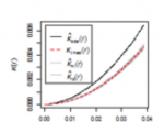
Figure 3.6
Credit: Blanford, 2019
|
|---|---|---|---|---|---|
| Description | Exploratory Data Analysis Measuring geographic distributions Mean Center; Central/Median Center Standard Distance; Standard Deviation/Standard Deviational Ellipse |
Exploratory Data Analysis Is an example of "exploratory spatial data analysis" (ESDA) that is used to "visually enhance" a point pattern by showing where features are concentrated. |
Exploratory Data Analysis Measuring intensity based on density (or mean number of events) in a specified area. Calculate variance/mean ratio |
Distance-based Analysis |
Distance-based Analysis Measures spatial dependence based on distances of points from one another. K (d) is the average density of points at each distance (d), divided by the average density of points in the entire area. |
Density-based point pattern measures [pages 28-30, 247-249, 256-260]
It is worth emphasizing the point that quadrats [43] need not be square, although it is rare for them not to be.
With regard to kernel density estimation [43] (KDE) it is worth pointing out the strongly scale-dependent nature of this method. This becomes apparent when we view the effect of varying the KDE bandwidth on the estimated event [43] density map in the following sequence of maps, all generated from the same pattern [43] of Redwood saplings as recorded by Strauss, and available in the spatstat package in R (which you will learn about in the project). To begin, Table 3.2 shows outputs created using a large, intermediate and small bandwidth.
| Bandwidth = 0.25 | Bandwidth = 0.01 | Bandwidth = 0.05 |
|---|---|---|
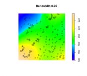
Figure 3.7
Credit: O'Sullivan
|
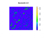
Figure 3.8
Credit: O'Sullivan
|
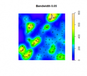
Figure 3.9
Credit: O'Sullivan
|
| Using a larger KDE bandwidth results in a very generalized impression of the event density (in this example, the bandwidth is expressed relative to the full extent of the square study area). A large bandwidth tends to emphasize any first-order trend variation in the pattern (also called oversmoothing). | The map generated using a small KDE bandwidth is also problematic, as it focuses too much on individual events and small clusters of events, which are self-evident from inspecting the point pattern itself. Thus, an overly small bandwidth does not depict additional information beyond the original point pattern (also called undersmoothing). | An intermediate choice of bandwidth results in a more satisfactory map that enables distinct regions of high event density and how that density changes across space to be identified. |
The choice of the bandwidth is something you will need to experiment. There are a number of methods for 'optimizing' the choice, although these are complex statistical methods, and it is probably better to think more in terms of what distances are meaningful in the context of the particular phenomenon being studied. For example, think about the scale at which a given data set is collected or if there is a spatial association to some tangible object or metric. Here is an interesting interactive web page visualizing the KDE density function [47]. Here is a good overview of bandwidth selection [48] discussing how bandwidth values affect plot smoothness, techniques for bandwidth value selection, cross validation techniques, the differences between the default bandwidth value in languages like R and SciPy.
Distance-based point pattern measures [pages 249-255]
It may be helpful to briefly distinguish the four major distance [43] methods discussed here:
- Mean nearest neighbor distance [43] is exactly what the name says!
- G function [43] is the cumulative frequency distribution of the nearest neighbor distance. It gives the probability for a specified distance, that the nearest neighbor distance to another event in the pattern will be less than the specified distance.
- F function [43] is the cumulative frequency distribution of the distance to the nearest event in the pattern from random locations not in the pattern.
- K function [43] is based on all inter-event distances, not simply nearest neighbor distances. Interpretation of the K function is tricky for the raw figures and makes more sense when statistical analysis is carried out as discussed in a later section.
The pair correlation function (PCF) is a more recently developed method that is not discussed in the text. Like the K function, the PCF is based on all inter-event distances, but it is non-cumulative, so that it focuses on how many pairs of events are separated by any particular given distance. Thus, it describes how likely it is that two events chosen at random will be at some particular separation.
It is useful to see these measures as forming a progression from least to most informative (with an accompanying rise in complexity).
Assessing point patterns statistically
The measures discussed in the preceding sections can all be tested statistically for deviations from the expected values associated with a random point process [43]. In fact, deviations from any well-defined process can be tested, although the mathematics required becomes more complex.
The most complex of these is the K function, where the additional concept of an L function is introduced to make it easier to detect large deviations from a random pattern. In fact, in using the pair correlation function, many of the difficulties of interpreting the K function disappear, so the pair correlation function approach is becoming more widely used.
More important, in practical terms, is the Monte Carlo procedure [43] discussed briefly on page 266. Monte Carlo methods are common in statistics generally, but are particularly useful in spatial analysis when mathematical derivation of the expected values of a pattern measure can be very difficult. Instead of trying to derive analytical results, we simply make use of the computer's ability to randomly generate many patterns according to the process description we have in mind, and then compare our observed result to the simulated distribution of results. This approach is explored in more detail in the project for this lesson.
Practical Point Pattern Analysis
Required reading:
- Chapter 8, "Point patterns and cluster detection," page 261; pages 264 - 269.
You may want to come back to this page later, after you've worked on this week's project.
In the real world, the approaches discussed up to this point have their place, but they also have some severe limitations.
Before we begin, it is important to understand that some people conflate random with "no pattern." Random is a pattern. From the perspective of this class, every point distribution has a pattern - which may in fact be random, uniform, or clustered.
The key issue is that classical point pattern analysis [43] allows us to say that a pattern [43] is 'evenly-spaced [43]/uniform' or 'clustered [43]' relative to some null spatial process [43] (usually the independent random process), but it does not allow us to say where the pattern is clustered. This is important in most real-world applications. A criminal investigator takes it for granted that crime is more common at particular 'hotspots', i.e., that the pattern is clustered, so statistical confirmation of this assumption is nice to have ("I'm not imagining things... phew!"), but it is not particularly useful. However, an indication of where the crime hotspots are located would certainly be useful.
The problem is that detecting clusters in the presence of background variation in the affected population is very difficult. This is especially so for rare events [43]. For example, although the Geographical Analysis Machine (GAM) has not been widely adopted by epidemiologists, the approach suggested by it was ground-breaking and other more recent tools use very similar methods.
The basic idea is very simple: repeatedly examine circular areas on the map and compare the observed number of events of interest to the number that would be expected under some null hypothesis [43] (usually spatial randomness). Tag all those circles that are statistically unusual. That's it! Three things make this conceptually simple procedure tricky.
- First, is the statistical theory associated with determining an expected number of events is dependent on a number of spatially varying covariates of the events of interest, such as populations in different age subgroups. Thus, for a disease (say cancer or heart disease) associated with older members of the population, we would naturally expect to see more cases of the disease in places where more older people live. This has to be accounted for in determination of the number of expected events.
- Second, there are some conceptual difficulties in carrying out multiple statistical significance [43] tests on a series of (usually) overlapping circles. The rather sloppy statistical theory in the original presentation of the GAM goes a long way to explaining the reluctance of statistical epidemiologists to adopt the tool, even though more recent tools are rather similar.
- Third, is the enormous amount of computation required for exhaustive searching for clusters. This is especially so if stringent levels of statistical significance are required, since many more Monte Carlo simulation [43] runs are then required.
Another tool that might be of interest is SatSCAN [49]. SatSCAN is a tool developed by the Biometry Research Group of the National Cancer Institute in the United States. SatSCAN works in a very similar way to the original GAM tool, but has wider acceptance among epidemiological researchers. You can download a free copy of the software and try it on some sample data. However, for now, let’s use some of the methods we have highlighted in Table 3.1 to analyze patterns in the real world.
Quiz
Ready? First, take the Lesson 3 Quiz to check your knowledge! Return now to the Lesson 3 folder in Canvas to access it. You have an unlimited number of attempts and must score 90% or more.
Project 3, Part B: Understanding patterns using Point Pattern Analysis (PPA)
Background
In project 3B, you will use some of the point pattern analysis tools available in the R package spatstat to investigate some point patterns of crime in St. Louis, Missouri. You will be building on what you started in Lesson 2.
Project Resources
For Project 3B, make sure that following packages are installed in RStudio: spatstat and sf. To add any new libraries (e.g., sf), use the Packages - Install package(s)... menu option as before. If the package is installed but not loaded, use the library(package_name) command to load the package.
The data you need for Project 3B are available in Canvas for download. If you have any difficulty downloading, please contact me. The data archive includes:
- Boundary of St Louis (shapefile): stl_boundary.shp (St. Louis boundary file)
- Projected data: stl20132014sube.shp (crime points)
- Both files are projected into the Missouri State Plane Coordinate System east zone.
- NOTE: The data available for this lesson builds on the crime data from Lesson 2. Please use the data for Lesson 3 as the data is more comprehensive than what was available in Lesson 2.
Summary of Project 3B Deliverables
For Project 3B, the items you are required to submit in your report are as follows:
- First, create density maps of the homicide data, experimenting with the kernel density bandwidth, and provide a commentary discussing the most suitable bandwidth choice for this analysis visualization method and how you made that selection.
- Second, perform a point pattern analysis on any two of the available crime datasets (DUI, arson, or homicide). It would be beneficial if you would choose crimes with contrasting patterns. For your analysis, you should choose whatever methods discussed in this lesson seem the most useful, and present your findings in the form of maps, graphs, and accompanying commentary.
As you work your way through the R code keep the following ideas in mind:
- What were your overall findings about crime in your study area?
- Where did crimes take place? Was there a particular spatial distribution associated with each of the crimes? Did they take place in a particular part of the city?
- Did the different crimes you assessed cluster in different parts of the study area or did they occur in the same parts of the city?
- What additional types of analysis would be useful?
Project 3, Part B: Reading in and Mapping your Data in R
Adding the R packages that will be needed for the analysis
Double-check that you've loaded sf and spatstat.
Set the working directory
Use Session - Set Working Directory - Choose Directory to set your working directory to the unzipped folder with the Lesson 3 data.
Reading in and Mapping The Data
The first step in any spatial analysis is to become familiar with your data. You have already completed some of this in Lesson 2 when you used a mixture of descriptive statistics and visualizations (e.g., map of crime, boxplots, bar charts, and histograms) to get a general overview of the types of crimes that were taking place in St Louis over time and where these were occurring.
In Project 3B, we will be revisiting the crime data that you saw in Lesson 2. However, for Lesson 3, the crime data and St. Louis boundary are contained within two shapefiles (stl20132014sube.shp and stl_boundary, respectively) where each shapefile is projected into the Missouri State Plane Coordinate System east zone. The methods introduced in this lesson require that the data be projected.
Why? Think about this a bit as you work through the lesson's steps.
You might find it helpful to copy the code lines into the console one-by-one so that you can see the result of each line. This will help you to better understand what each line is doing.
#Set up links to the shapefiles -- you will need to change the filepaths as appropriate on your machine
#the code example presumes your data are stored in C:\Geog586_Les3_Project

#crime data
file_dir_gis <-"C:/Geog586_Les3_Project/gis/"
gis_file <-paste(file_dir_gis,"stl20132014sube.shp", sep="")

#check that R can find the file and that there are no path name problems. This should return a message of TRUE in the console.
#if everything is ok, move on. If not, you might be missing a "/" in your file path or have a spelling error.
file.exists(gis_file)

#read in the shapefile
crimes_shp_prj<-read_sf(gis_file)

#study area boundary -- notice this is adding a file from the lesson 2 data. Be sure you have the right path.
gis_file_2 <-paste(file_dir_gis,"stl_boundary.shp", sep="")
file.exists(gis_file_2)
StLouis_BND_prj <-read_sf(gis_file_2)

#Set up the analysis environment by creating an analysis window from the city boundary
Sbnd <-as.owin(StLouis_BND_prj)

#check the shapefile will plot correctly
plot(Sbnd)

#add the crime events to the analysis window and attach point attributes (marks)
crimes_marks <-data.frame(crimes_shp_prj)
crimesppp <-ppp(crimes_shp_prj$MEAN_XCoor, crimes_shp_prj$MEAN_YCoor, window=Sbnd, marks=crimes_marks)

#plot the points to the boundary as a solid red circle one-half the default plotting size
points(crimesppp$x, crimesppp$y, pch = 19, cex=0.5, col = "red")
For more information on handling shapefiles with spatstat, you can consult this useful resource [50]. This might be helpful if your term-long project involves doing point pattern statistics.
Project 3, Part B: Kernel Density Estimation
Kernel Density Analysis
When we plot points on a map, sometimes the points are plotted on top of one another, making it difficult to see where the greatest number of events are taking place within a study area. To solve this problem, kernel density analysis is often used.
Kernel density visualization is performed in spatstat using the density() function, which we have already seen in action in Lesson 3A. The second (optional) parameter in the density function is the bandwidth (sigma). R's definition of bandwidth requires some care in its use. Because it is the standard deviation of a Gaussian (i.e., normal) kernel function, it is actually only around 1/2 of the radius across which events will be 'spread' by the kernel function. Remember that the spatial units we are using here are feet.
It's probably best to add contours to a plot by storing the result of the density analysis, and you can add the points too.
R provides a function that will suggest an optimal bandwidth to use. Once the optimal bandwidth value has been calculated, you can use this in the density function. You may not feel that the optimal value is optimal. Or you may find it useful to consider what is 'optimal' about this setting.
#KDE Analysis

#Density
K1 <-density(crimesppp) # Using the default bandwidth
plot(K1, main=NULL, las=1)
contour(K1, add=TRUE, col = "white")
#add a label to the top of the plot
mtext("default bandwidth")

#Density–changing bandwidth
K2 <-density(crimesppp, sigma=500) # set different bandwidths. This data is in projected feet.
plot(K2, main=NULL)
contour(K2, add=TRUE, col = "white")
mtext("500 feet")

#Density–optimal bandwidth

#R provides a function that will suggest an optimal bandwidth to use:
#You can replicate this code to find out the other bandwidth values. when you examine
#individual crime types later in the lesson.
KDE_opt <-bw.diggle(crimesppp)

K3 <-density(crimesppp, sigma=KDE_opt) # Using the diggle bandwidth
plot(K3, main=NULL)
contour(K3, add=TRUE, col = "white")

# Convert the bandwidth vector to a character string with 5 character places
diggle_bandwidth <-toString(KDE_opt, width = 5)
# Add the bandwidth value to the plot title
mtext(diggle_bandwidth)

#Now that you are familiar with how KDE works, lets create a KDE for one particular crime type.

#To select an individual crime specify the crimetype as follows:
xhomicide <-crimesppp[crimes_shp_prj$crimet2=="homicide"]

KHom<-density(xhomicide) # Using the default bandwidth
plot(KHom, main=NULL, las=1)
contour(KHom, add=TRUE, col = "white")
plot(xhomicide, pch=19, col="white", use.marks=FALSE, cex=0.75, add=TRUE) #the pch=19 sets the symbol type
#to a solid filled circle, the col="white" sets the fill color for the symbols,
#we set use.marks=FALSE so that we aren't plotting a unique symbol (ie square, circle, etc) for each observation,
#cex=0.75 sets the size of the symbol to be at 75% of the default size,
#and add=TRUE draws the crime points on top of the existing density surface.
mtext("homicide default bandwidth")
Note that you can experiment with the plot symbol, color, and size if you would like, in the plot() function. Here is a link to a quick overview page discussing plot() commands [51].
Remember to select the specific crime of the overall data set before continuing.
#To select an individual crime specify the crimetype as follows:
xhomicide <-crimesppp[crimes_shp_prj$crimet2=="homicide"]
For the remainder of this project: in addition to homicide, also examine two additional crime types using KDE. Review the plots created during Lesson 2 to select your crimes to analyze.
Deliverable
Create density maps (in R) of the homicide data, experimenting with different kernel density bandwidths. Provide a commentary discussing the most suitable bandwidth choice for this visual analysis method and why you chose it.
Project 3, Part B: Mean Nearest Neighbor Distance Analysis
Mean Nearest Neighbor Distance Analysis for the Crime Patterns
Although nearest neighbor distance analysis on a point pattern is less commonly used now, the outputs generated can still be useful for assessing the distance between events.
The spatstat nearest neighbor function nndist.ppp() returns a list of all the nearest neighbor distances in the pattern.
For a quick statistical assessment, you can also compare the mean value to that expected for an IRP/CSR pattern of the same intensity.
Give this a try for one or more of the crime patterns. Are they clustered? Or evenly-spaced?
#Nearest Neighbour Analysis
nnd <-nndist.ppp(xhomicide)
hist(nnd)
summary(nnd)

mnnd <-mean(nnd)
exp_nnd <-(0.5/ sqrt(xhomicide$n / area.owin(Sbnd)))
mnnd / exp_nnd
Repeat this for the other crimes that you selected to analyze.
Project 3, Part B: Quadrat Analysis in R
Quadrat Analysis in R
Like nearest neighbor distance analysis, quadrat analysis is a relatively limited method for the analysis of a point pattern, as has been discussed in the text. However, it is easy to perform in R, and can provide useful insight into the distribution of events in a pattern.
The functions you need in spatstat are quadratcount() and quadrat.test():
> q <- quadratcount(xhomicide, 4, 8)
> quadrat.test(xhomicide, 4, 8)
The second and third parameters supplied to these functions are the number of quadrats to create across the study area in the x (east-west) and y (north-south) directions. The test will report a p-value, which can be used to determine whether the pattern is statistically different from one generated by IRP/CSR.
#Quadrat Analysis
q <-quadratcount(xhomicide, 4, 8)
plot(q)

#Add intensity of each quadrat
#Note, depending on your version of R, this line of code may not work correctly
plot(intensity(q, image=TRUE), main=NULL, las=1)

#perform the significance test
quadrat.test(xhomicide, 4, 8)
Repeat this for the other crimes that you selected to analyze.
Project 3, Part B: Distance Based Analysis with Monte Carlo Assessment
Distance Based Analysis with Monte Carlo Assessment
The real workhorses of contemporary point pattern analysis are the distance-based functions: G, F, K (and its relative L) and the more recent pair correlation function. spatstat provides full support for all of these, using the built-in functions, Gest(), Fest(), Kest(), Lest() and pcf(). In each case, the 'est' suffix refers to the fact the function is an estimate based on the empirical data. When you plot the functions, you will see that spatstat actually provides a number of different estimates of the function. Without getting into the details, the different estimates are based on various possible corrections that can be applied for edge effects.
To make a statistical assessment of any of these functions for our patterns, we need to compare the estimated functions to those we expect to see for IRP/CSR. Given the complexity involved, the easiest way to do this is to us the Monte Carlo method to calculate the function for a set of simulated realizations of IRP/CSR in the same study area.
This is done using the envelope() function. Figure 3.10 shows examples of the outputs generated from the different functions for different spatial patterns.
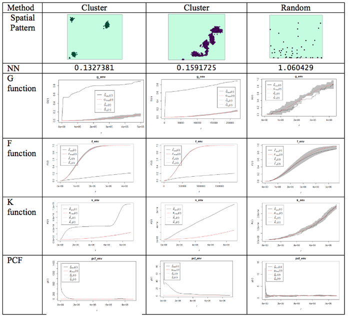
What do the plots show us?
Well, the dashed red line is the theoretical value of the function for a pattern generated by IRP/CSR. We aren't much interested in that, except as a point of reference.
The grey region (envelope) shows us the range of values of the function which occurred across all the simulated realizations of IRP/CSR which you see spatstat producing when you run the envelope function. The black line is the function for the actual pattern measured for the dataset.
What we are interested in is whether or not the observed (actual) function lies inside or outside the grey 'envelope'. In the case of the pair correlation function, if the black line falls outside the envelope, this tells us that there are more pairs of events at this range of spacings from one another than we would expect to occur by chance. This observation supports the view that the pattern is clustered or aggregated at the stated range of distances. For any distances where the black line falls within the envelope, this means that the PCF falls within the expected bounds at those distances. The exact interpretation of the relationship between the envelope and the observed function is dependent on the function in question, but this should give you the idea.
NOTE: One thing to watch out for... you may find that it's rather tedious waiting for 99 simulated patterns each time you run the envelope() function. This is the default number that are run. You can change this by specifying a different value for nsim. Once you are sure what examples you want to use, you will probably want to do a final run with nsim set to 99, so that you have more faith in the envelope generated (since it is based on more realizations and more likely to be stable). Also, you can change the rank setting. This will mean that the 'high' and 'low' lines in the plot will be placed at the corresponding high or low values in the range produced by the simulated realizations of IRP/CSR. So, for example:
> G_e <- envelope(xhomicide, Gest, nsim=99, nrank=5)
will run 99 simulations of and place high and low limits on the envelope at the 5th highest and 5th lowest values in the set of simulated patterns.
Something worth knowing is that the L function implemented in R deviates from that discussed in the text, in that it produces a result whose expected behavior for CSR is a upward-right sloping line at 45 degrees, that is expected L(r) = r, this can be confusing if you are not expecting it.
One final (minor) point: for the pair correlation function in particular, the values at short distances can be very high and R will scale the plot to include all the values, making it very hard to see the interesting part of the plot. To control the range of values displayed in a plot, use xlim and ylim. For example:
> plot(pcf_env, ylim=c(0, 5))
will ensure that only the range between 0 and 5 is plotted on the y-axis. Depending on the specific y-values, you may have to change the y-value in the ylim=() function.
Got all that? If you do have questions - as usual, you should post them to the Discussion Forum for this week's project. Also, go to the additional resources at the end of this lesson where I have included links to some articles that use some of these methods. Now, it is your turn to try this on the crime data you have been analyzing.
#Distance-based functions: G, F, K (and its relative L) and the more recent pair correlation function.  Gest(), Fest(), Kest(), Lest(), pcf()

#For this to run you may want to use a subset of the data otherwise you will find yourself waiting a long time.

g_env <-Gest(xhomicide)
plot(g_env)

#Add an envelope
#remember to change nsim=99 for the final simulation

#initializing and plotting the G estimation
g_env <-envelope(xhomicide, Gest, nsim=5, nrank=1)
plot(g_env)

#initializing and plotting the F estimation
f_env <- envelope(xhomicide, Fest, nsim=5, nrank=1)
plot(f_env)

#initializing and plotting the K estimation
k_env <-envelope(xhomicide, Kest, nsim=5, nrank=1)
plot(k_env)

#initializing and plotting the L estimation
l_env <- envelope(xhomicide, Lest, nsim=5, nrank=1)
plot(l_env)

#initializing and plotting the pcf estimation
pcf_env <-envelope(xhomicide, pcf, nsim=5, nrank=1)
# To control the range of values displayed in a plot's axes use xlim= and ylim= parameters
plot(pcf_env, ylim=c(0, 5))
Repeat this for the other crimes that you selected to analyze.
Project 3, Part B: Descriptive Spatial Statistics
Descriptive Spatial Statistics
In Lesson 2, we highlighted some descriptive statistics that are useful for measuring geographic distributions. Additional details are provided in Table 3.3. Functions for these methods are also available in ArcGIS.
Table 3.3 Measures of geographic distributions that can be used to identify the center, shape and orientation of the pattern or how dispersed features are in space
| Spatial Descriptive Statistic | Description | Calculation |
|---|---|---|
| Central Distance | Identifies the most centrally located feature for a set of points, polygon(s) or line(s) | Point with the shortest total distance to all other points is the most central feature |
| Mean Center (there is also a median center called Manhattan Center) | Identifies the geographic center (or the center of concentration) for a set of features **Mean sensitive to outliers** |
Simply the mean of the X coordinates and the mean of the Y coordinates for a set of points |
| Weighted Mean Center | Like the mean but allows weighting by an attribute. | Produced by weighting each X and Y coordinate by another variable (Wi) |
| Spatial Descriptive Statistic | Description | Calculation |
|---|---|---|
| Standard Distance | Measures the degree to which features are concentrated or dispersed around the geometric mean center The greater the standard distance, the more the distances vary from the average, thus features are more widely dispersed around the center Standard distance is a good single measure of the dispersion of the points around the mean center, but it doesn’t capture the shape of the distribution. |
Represents the standard deviation of the distance of each point from the mean center: Where xi and yi are the coordinates for a feature and and are the mean center of all the coordinates. Weighted SD Where xi and yi are the coordinates for a feature and and are the mean center of all the coordinates. wi is the weight value. |
| Standard Deviational Ellipse | Captures the shape of the distribution. | Creates standard deviational ellipses to summarize the spatial characteristics of geographic features: Central tendency, Dispersion and Directional trends |
For this analysis, use the crime types that you selected earlier. The example here is for the homicide data.
#------MEAN CENTER
#calculate mean center of the crime locations
xmean <- mean(xhomicide$x)
ymean <-mean(xhomicide$y)

#------MEDIAN CENTER
#calculate the median center of the crime locations
xmed <- median(xhomicide$x)
ymed <- median(xhomicide$y)

#to access the variables in the shapefile, the data needs to be set to data.frame
newhom_df<-data.frame(xhomicide)
#check the definition of the variables.
str(newhom_df)

#If the variables you are using are defined as a factor then convert them to an integer
newhom_df$FREQUENCY <- as.integer(newhom_df$FREQUENCY)
newhom_df$OBJECTID <- as.integer(newhom_df$OBJECTID)

#create a list of the x coordinates. This will be used to define the number of rows
a=list(xhomicide$x)


#------WEIGHTED MEAN CENTER
#Calculate the weighted mean
d=0
sumcount = 0
sumxbar = 0
sumybar = 0
for(i in 1:length(a[[1]])){
  xbar <- (xhomicide$x[i] * newhom_df$FREQUENCY[i])
  ybar <- (xhomicide$y[i] * newhom_df$FREQUENCY[i])
  sumxbar = xbar + sumxbar
  sumybar = ybar + sumybar
  sumcount <- newhom_df$FREQUENCY[i]+ sumcount
}
xbarw <- sumxbar/sumcount
ybarw <- sumybar/sumcount


#------STANDARD DISTANCE OF CRIMES
# Compute the standard distance of the crimes
#Std_Dist <- sqrt(sum((xhomicide$x - xmean)^2 + (xhomicide$y - ymean)^2) / nrow(xhomicide$n))

#Calculate the Std_Dist
d=0
for(i in 1:length(a[[1]])){
  c<-((xhomicide$x[i] - xmean)^2 + (xhomicide$y[i] - ymean)^2)
  d <-(d+c)
}
Std_Dist <- sqrt(d /length(a[[1]]))

# make a circle of one standard distance about the mean center
bearing <- 1:360 * pi/180
cx <- xmean + Std_Dist * cos(bearing)
cy <- ymean + Std_Dist * sin(bearing)
circle <- cbind(cx, cy)


#------CENTRAL POINT
#Identify the most central point:
#Calculate the point with the shortest distance to all points
#sqrt((x2-x1)^2 + (y2-y1)^2

sumdist2 = 1000000000
for(i in 1:length(a[[1]])){
  x1 = xhomicide$x[i]
  y1= xhomicide$y[i]
  recno = newhom_df$OBJECTID[i]
  #print(recno)
  #check against all other points
    sumdist1 = 0
    for(j in 1:length(a[[1]])){
      recno2 = newhom_df$OBJECTID[j]
      x2 = xhomicide$x[j]
      y2= xhomicide$y[j]
      if(recno==recno2){
      }else {
      dist1 <-(sqrt((x2-x1)^2 + (y2-y1)^2))
         sumdist1 = sumdist1 + dist1
         #print(sumdist1)
         }
    }
    #print("test")
    if (sumdist1 < sumdist2){
           dist3<-list(recno, sumdist1, x1,y1)
           sumdist2 = sumdist1
           xdistmin <- x1
           ydistmin <- y1
         }
}

#------MAP THE RESULTS
#Plot the different centers with the crime data
plot(Sbnd)
points(xhomicide$x, xhomicide$y)
points(xmean,ymean,col="red", cex = 1.5, pch = 19) #draw the mean center
points(xmed,ymed,col="green", cex = 1.5, pch = 19) #draw the median center
points(xbarw,ybarw,col="blue", cex = 1.5, pch = 19) #draw the weighted mean center
points(dist3[[3]][1],dist3[[4]][1],col="orange", cex = 1.5, pch = 19) #draw the central point
lines(circle, col='red', lwd=2)
Deliverable
Perform point pattern analysis on any two of the available crime datasets (DUI, arson, or homicide). It would be beneficial if you would choose crimes with contrasting patterns. For your analysis, you should choose whatever methods seem the most useful, and present your findings in the form of maps, graphs, and accompanying commentary.
Project 3: Finishing Up
Please upload your write-up Project 3 Drop Box.
Deliverables
For Project 3, the items you are required to submit are as follows:
- First, create figures of the different point patterns you generated in Part A according to different random processes with accompanying commentary that explains the patterns that were created
- Second, create density maps of three of the available crime datasets (homicide + 2 of your choice) , experimenting with the kernel density bandwidth, and provide a commentary discussing the most suitable bandwidth choice for this analysis visualization method.
- Third, perform point pattern analyses in Part B on three of the available crime datasets (homicide + 2 of your choice). It would be beneficial if you would choose crimes with contrasting patterns. Crimes with low counts will not produce very compelling patterns and the analysis techniques will not be meaningful.
-
Use the questions below to help you think about and synthesize the results from the various analyses you completed in this project:
- What were your overall findings about crime in your study area?
- Where did crimes take place? Was there a particular spatial distribution associated with each of the crimes? Did they take place in a particular part of the city?
- Did the different crimes you assessed cluster in different parts of the study area or did they occur in the same parts of the city?
- What additional types of analysis would be useful?
- Another part of spatial analysis is centered on ethical considerations about the data, which include but are not limited to: who collected the data and what hidden (or overt) messages are contained within the data?
- Consdier that the St. Louis dataset contains roughly a year's worth of crime data leading up to the protests that took place in Ferguson, MO during August 2014. Here is one news reporting [52] of that event.
- Data are inherently contrived by the individuals and organizations that collect, format, and then make data available for use.
- As the analyst for this project, comment on the ethical considerations that you shojuld take when formatting, analyzing, and reporting the results for Lesson 3? Knowing that the data included possible events leading up to the Ferguson protests, what kinds of decisions would you make in analyzing the data in Lesson 2?
- Remember that data is not simply binary or a listing of numbers, but can be a complex set of biases and injustices that may be opaque to the user.
That's it for Project 3!
Afterword
Now that you are finished with this week's project, you may be interested to know that some of the tools you've been using are available in ArcGIS. You will find mean nearest neighbor distance and Ripley's K tools in the Spatial Statistics - Analyzing Patterns toolbox. The Ripley's K tool in particular has improved significantly since ArcGIS 10, so that it now includes the ability to generate confidence envelopes using simulation, just like the envelope() function in R.
For kernel density surfaces, there is a density estimation tool in the Spatial Analyst Tools - Density toolbox. This is essentially the same as the density() tool in R with one very significant difference, namely that Arc does not correct for edge effects.
In Figure 3.11 the results of kernel density analysis applied to all the crime events in the project data set are shown for (from left to right) the default settings in ArcGIS, with a mask and processing extent set in ArcGIS to cover the city limits area, and for R.
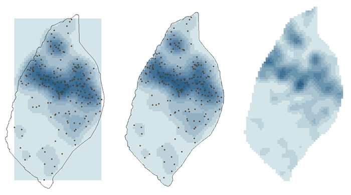
The search radius in ArcGIS was set to 2 km and the 'sigma' parameter in R was set to 1 km. These parameters should give roughly equivalent results. More significant than the exact shape of the results is that R is correcting for edge effects. This is most clear at the north end of the map, where R's output implies that the region of higher density runs off the edge of the study area, while ArcGIS confines it to the analysis area. R accomplishes this by basing its density estimate on only the bandwidth area inside the study area at each location.
Descriptive Spatial Statistics in ArcGIS:
The descriptive spatial statistics tools can be found in the Spatial Statistics – Measuring Geographic Distributions toolbox in ArcToolbox. To do this analysis for different crime types or different time periods (year, month) set the case field.
The extensibility of both packages makes it to some extent a matter of taste which you choose to use for point pattern analysis. It is clear that R remains the better choice in terms of the range of available options and tools, although ArcGIS may have the edge in terms of its familiarity to GIS analysts. For users starting with limited knowledge of both tools, it is debatable which has the steeper learning curve - certainly neither is simple to use!
Term Project (Week 3): Peer review group meeting info
The project this week is quite demanding, so there is no set deliverable this week.
Continue to refine your project proposal. In a separate announcement, information about the peer review group membership will be sent. Once you know your group memeber, you can communicate with them and set a day and time to meet.
Additional details can be found on the Term Project Overview Page [9].
Questions?
Please use the 'Discussion - General Questions and Technical Help' discussion forum in Canvas to ask any questions now or at any point during this project.
Final Tasks
Lesson 3 Deliverables
- Complete the Lesson 3 quiz.
- Complete the Project 3A and 3B activities. This includes inserting maps and graphs into your write-up along with accompanying commentary. Submit your assignment to the 'Assignment: Week 3 Project' dropbox provided in Lesson 3 in Canvas.
Reminder - Complete all of the Lesson 3 tasks!
You have reached the end of Lesson 3! Double-check the to-do list on the Lesson 3 Overview page [53] to make sure you have completed all of the activities listed there before you begin Lesson 4.
References and Additional Resources
For additional information about spatstat refer to this document by Baddeley [54]
To see how some of these methods are applied, have a quick look at some of these journal articles.
Here is an article to an MGIS capstone project that investigated sinkholes in Florida. [55]
Related to crime, here is a link to an article that uses spatial analysis for understanding crime in national forests [56].
Here's an article that uses some of the methods learned during this week's lesson to analyze the distribution of butterflies within a heterogeneous landscape. [57]
For a comprehensive read on using crime analysis, look through Crime Modeling and Mapping Using Geospatial Technologies [58] book available through the Penn State Library.
Don't forget to use the library and search for other books or articles that may be applicable to your studies.
L4: Cluster Analysis: Spatial Autocorrelation
The links below provide an outline of the material for this lesson. Be sure to carefully read through the entire lesson before returning to Canvas to submit your assignments.
Lesson 4 Overview
Spatial clustering methods are useful for making sense of complex geographic patterns. In this week's lesson, we look in a more general way at the various approaches that spatial analysts and geographers have developed for measuring spatial autocorrelation.
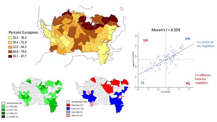
Learning Outcomes
At the successful completion of Lesson 4, you should be able to:
- define spatial autocorrelation with reference to Tobler's 'first law' of geography, and distinguish between first- and second-order effects in a spatial distribution;
- understand how to compute Moran's I for a pattern of attribute data measured on interval or ratio scales;
- explain the importance of spatial weights matrices to the development of spatial autocorrelation measures and variations of the approach, particularly lagged spatial autocorrelation;
- explain how spatial autocorrelation measures can be generalized to compute and map Local Indices of Spatial Association (LISA);
- describe how Monte Carlo methods may be used to determine significance for LISA.
Checklist
Lesson 4 is one week in length. (See the Calendar in Canvas for specific due dates.) The following items must be completed by the end of the week. You may find it useful to print this page out first so that you can follow along with the directions.
| Step | Activity | Access/Directions |
|---|---|---|
| 1 | Work through Lesson 4. | You are in the Lesson 4 online content now. Be sure to carefully read through the online lesson material. |
| 2 | Reading Assignment |
Before you go any further, you need to read the portions of the course text associated with this lesson:
After you've completed the reading, get back into the lesson and supplement your reading from the commentary material, then test your knowledge with the quiz. |
| 3 | Weekly Assignment | This week's project explores ethnic residential segregation in Auckland, New Zealand using spatial autocorrelation measures provided by the GeoDa tool. |
| 4 | Term Project | Finalize your Term Project Proposal for the peer review next week. |
| 5 | Lesson 4 Deliverables |
|
Questions?
Please use the 'Week 4 lesson and project discussion' to ask for clarification on any of these concepts and ideas. Hopefully, some of your classmates will be able to help with answering your questions, and I will also provide further commentary where appropriate.
Introduction
The most basic observation to be made about spatial data is that it typically exhibits spatial structure. In statistical terms, this translates to the observation that spatial data are not random. Knowing something about a phenomenon at some location A, often tells us a great deal about the same phenomenon at a location not far away from A. Another way of putting this is that spatial data sets are correlated with themselves over distance.
When two variables x and y are correlated, then given the value of x for a particular case, I can make a good estimate of the likely value of y for that case. Similarly, given information about the value of some attribute measured at spatial location A, then I can often make a reasonable estimate of the value of the same attribute at a nearby location to A. This is due to spatial autocorrelation (spatial self-correlation). What is "nearby" is something defined by the statistician and defined mathematicaly by a geographical weighting scheme. Whatever the measure we use, we often refer to this statistical description of nearby observations as a spatial lag.
Much of the material we study in this course makes use of spatial autocorrelation in data, whether it is assumed or measured. Perhaps the best example is interpolation (see the upcoming Lesson 6), where we use the information only from nearby control points to inform our calculation of an estimated value at a location where no observation has been recorded. We do this because we expect nearby data to be more relevant than distant data. In kriging, this is taken one step further when one method of measuring spatial autocorrelation--the semivariogram--is used to improve further the estimates produced by an interpolation method.
Measures of Spatial Autocorrelation
Required Reading:
Before we go any further, you need to read a portion of the chapter associated with this lesson from the course text:
- Chapter 4, "Spatial patterning," pages 73 - 99.
- Chapter 2.2, "Approaches to local adaptation," pages 23-27.
There is a brief section (page 81) discussing the Joins Count approach to measuring spatial autocorrelation. This approach is useful for non-numeric data. However, it is only infrequently used, and so, although the concepts introduced are useful, they are not central to a modern treatment of spatial autocorrelation.
Other measures have been developed for numerical data, and, in practice, these are much more widely used. These are discussed in Section 4.3, with a particular focus on Moran's I.
While equation 4.8 (page 82) for Moran's I looks intimidating, it makes a great deal of sense. It consists of:
- a measure of similarity,
- a mechanism that includes only those map units that are near to one another in the calculation, and
- a weighting factor that scales the resulting calculation so that it is in a standard numerical range.
In the case of Moran's I, the similarity measure is the standard method used in correlation statistics, namely the product of the differences of each value from the mean. This produces a positive result when both the value and neighboring values are higher or lower than the mean, and a negative result when the value and neighboring values are on opposite sides of the mean (one higher, the other lower).
The difference measure is summed over all neighboring pairs of map units (this is where the wij values from a weights matrix come in) and then adjusted so that the resulting index value is in a standard numerical range.
Weight Matrices, pages 24-25
The inclusion of spatial interaction [14] weights between pairs of map units in the formulas for calculating I means that it is possible to experiment with a wide variety of spatial autocorrelation [16] measures by tailoring the particular choice of interaction weights appropriately.
Local Indicators of Spatial Association
The final topic in measuring spatial autocorrelation [16] is LISA or Local Indicators of Spatial Association.
All the previously discussed measures of spatial autocorrelation share the common weakness that they do not identify specific locations on a map where the measured autocorrelation is most pronounced. That is, they are global measures, which tell us that the map data are spatially autocorrelated but not where to find the data that contribute most to that conclusion. Equally, global measures do not allow us to identify map regions where the pattern runs counter to the overall spatial autocorrelation trend.
LISA statistics address these failings and exemplify a trend in spatial analysis in favor of approaches that emphasize local effects over global ones. (See the papers by Unwin 1996 and Fotheringham 1997 cited in the text for more details on this trend.)
The LISA approach simply involves recording the contributions from individual map units to the overall summary measure, whether it is Moran's I or any other measure.
Significance tests on LISA statistics are hard to calculate and generally depend on Monte Carlo simulation [59], which is discussed on page 84 and again on pages 89-90 of the text, and which you also encountered in Lesson 3's project. The idea is that a computer can randomly rearrange the map unit values many times, measuring the LISA statistic for each map unit each time, and then determine if actual observed LISA values are unusual with respect to this simulated distribution of values. There are some wrinkles to this, revolving around the challenges of multiple testing.
Project 4: Spatial Autocorrelation Analysis Using GeoDa
Background
This week's project uses not a GIS program, but a package for exploratory spatial data analysis called GeoDa. GeoDa is a good example of research software. It implements many methods that have been in the academic research literature for several years, some of which have yet to make it into standard desktop GIS tools. Among the methods it offers are simple measures of spatial autocorrelation.
You will use GeoDa to examine the spatial distribution of different ethnic groups in Auckland, New Zealand. In this lesson, you are working with a real dataset.
Until the last 20 years or so, Auckland was a relatively 'sleepy' industrial port. It has been New Zealand's largest city for about a century, but its dominance of the national economy has become even more marked in recent years. This is partly attributable to increasing numbers of immigrants to New Zealand, many of whom have settled in the Auckland region. Today, Auckland accounts for about one third of the total population of the country (about 1.6 million people, depending on where you think the city stops), and for a much larger fraction of the more recent migrant groups. Auckland is the largest Pacific Islander city in the world, and also home to large populations of Māori (the pre-European settlement indigenous people), and Asian peoples, alongside the majority European-descended (or, in Māori, 'Pakeha') 'white' population.
Such rapid change is exciting (it has certainly improved the food in Auckland!), but can also lead to strains and tensions between and within communities. We can't possibly explore all that is going on in a short project like this, but, hopefully, you will get some flavor of the city from this exercise.
The basic analytical approach adopted in this project is very similar to that presented by Andrea Frank in an article:
'Using measures of spatial autocorrelation to describe socio-economic and racial residential patterns in US urban areas' pages 147-62 in Socio-Economic Applications of Geographic Information Science edited by David Kidner, Gary Higgs and Sean White (Taylor and Francis, London), 2002.
This week's project is deliberately more like a short exercise than some of the upcoming projects. This is for two reasons. First, you should be spending a good amount of time starting to develop your term-long project, and producing your project proposal. Second, we will cover some ideas in this project not covered in the readings and also introduce a new tool. If you want to explore these ideas and the GeoDa tool further, then I hope that this exercise will give you an idea where to start!
Project Resources
The zip file you need for Project 4, project4materials.zip, is available in Canvas for download. If you have any difficulty downloading this file, please contact me.
The contents of this archive are as follows:
- ak_CAU01_ethnic shapefiles showing the greater Auckland region delineated by the New Zealand 2001 Census Area Units (CAUs). CAUs are roughly equivalent to tracts in the US census, with a few thousand people in each CAU. There are 355 of these in the greater Auckland region. The data table for this shapefile contains counts and percentages of the population in each of five groups (European, Māori, Pacific Islander, Asian, and 'Other').
- akCity_CAU01_ethnic shapefiles showing the 101 CAUs of the central Auckland 'City' region. This area contains the CBD and many of the more upscale neighborhoods of the city. The ethnicity count and percentage data are repeated in these files.
- akCity_MB01_ethnic shapefiles showing 2001 Census 'Mesh Blocks' for the City area. Mesh Blocks (MBs) are the smallest areal unit used in the New Zealand census with no more than a few hundred people in each. There are almost 3000 MBs in the City area alone.
- ak_DEM_100 raster digital elevation model files that will give you some idea of the topography of the city, although this is for interest only and has no effect on the details of the project.
- nz_coastline shapefiles are also for interest only and will give you some context for Auckland's location relative to the country as a whole (it's 'near the top'!).
- Three GAL files showing contiguity for the census shapefiles. These are used by GeoDa to perform spatial autocorrelation analysis and will be explained in more detail in the project instructions.
You will also need a copy of the GeoDa software in order to run the required analysis for this project.
GeoDa was originally developed at the Spatial Analysis Laboratory (SAL) at the University of Illinois at Urbana-Champaign. The lead researcher on this project has moved now to the University of Chicago. You can download GeoDa software from this site [60].
The instructions in this project refer to Version 1.14.0 of GeoDa on Windows 10, but things are very similar in the other versions. There are also versions for the Mac and Linux.
Summary of Project Deliverables
For this week’s project, the minimum items you are required to have in your write-up are:
- For a single variable on a single map, describe the results of a global Moran's I spatial autocorrelation analysis. Include a choropleth map and Moran scatterplot along with commentary and your interpretation of the results. In particular, identify any map areas that contribute strongly to the global outcome.
- For a single variable on a single map (but the same variable and a different map from the last one), describe results of a univariate LISA analysis. Include the cluster map and Moran scatterplot in your write-up along with commentary and your interpretation of the results.
Questions?
Please use the 'Discussion - Lesson 4' forum to ask for clarification on any of these concepts and ideas. Hopefully, some of your classmates will be able to help with answering your questions, and I will also provide further commentary there where appropriate.
Project 4: GeoDa Basics
Once installed, you run GeoDa by clicking an icon or double-clicking a shortcut in the usual way. If the GeoDa installer did not make an entry in the Start Menu, you can create a shortcut by navigating to C:\Program Files\GeoDa\geoda_version.exe (or wherever you find the .exe file on your computer) then right-clicking and selecting Create Shortcut.
When GeoDa starts up, Connect to a data source using the File tab. If the 'Connect to a data source' window does not automatically appear, Choose File-New and it should open. Choose a shapefile to examine.
Making maps in GeoDa is simple: select the type of map you want from the Map menu. With the datasets you are working with in this project, only the following four options, Quantile, Percentile, Box Map and Standard Deviation make sense. Each of these makes a choropleth with the class intervals based on a different statistical view of the data.
Be particularly careful in your interpretation of a Quantile or Percentile map if you make one: the class intervals do not relate to the percent values but to the ranking of data values.
Note:
In some versions of GeoDa, I have been unable to get the Cartogram to work with the Census Area Unit shapefiles used in this project. [NB: It does work in the most recent version: 1.14.0].
I believe that this is a problem with the shapefiles, and not with GeoDa. Specifically, when ArcGIS is used to aggregate polygon shapefiles from smaller units (here, I made the CAUs from the mesh block data), it often shifts polygon boundaries sufficiently that they no longer touch one another. The cartogram tool relies on polygons touching one another for its simplified picture of the map. If you are interested in making a cartogram, the akCity_MB01_ethnic shapefile works, or try the sample data sets supplied with GeoDa.
The main focus of GeoDa is exploratory spatial data analysis (ESDA). To get a flavor of this, try making a histogram or scatterplot using the named options in the Explore menu. Once you have a histogram or scatterplot in one window, you can select data points in the statistical display, and see those selections highlighted in the map views. In general, any selection in any window in GeoDa will be highlighted in all map views. This is called linked-brushing and is a key feature of exploratory data analysis.
Linked-brushing can help you to see patterns in spatial data more readily, particularly spatial autocorrelation effects. When data is positively spatially autocorrelated, moving the 'brush' in an area in a statistical display (say a scatterplot) will typically show you sets of locations in the map views that are also close together. Moving the brush around can help you to spot cases that do not follow the trend.
Note:
For a moving brush, make a selection in any view while holding down the <CTRL> key (CMD key if you are working on a Mac). Once you have made the selection, you can let go of the <CTRL> key and then move the selection area around by dragging with the mouse. To stop the moving selection, click again, anywhere in the current view.
However, seeing a pattern is not the same as it really being there. You will see repeated examples of this in lessons in this course. In the case of spatial autocorrelation, that is the role of the measures we have covered in this lesson's reading, and in particular, Moran's /, which we will look at more closely in the remainder of this project.
Project 4: Global Spatial Autocorrelation
While GeoDa is like a GIS, you will soon find its cartographic capabilities somewhat limited. Where it really comes into its own is in the integration of spatial analysis methods with mapping tools.
Contiguity matrices
To determine the spatial autocorrelation of a variable globally across a map using Moran's I, you access the Space - Univariate Moran's I menu. However, before doing this, you need a representation of the contiguity structure of the map, that is, which map units are neighbors to each other. This provides the wij values for the Moran's I calculation to determine which pairs of attribute values should be included in the correlation calculation.
GeoDa provides tools for creating contiguity matrices under the Tools - Weights Manager > Create menu option. Selecting this option opens the Weights File Creation dialog (Figure 4.1).


The various options available here are explained in the GeoDa documentation [61]. For the purposes of this project, I have already created simple contiguity matrix files called ak_CAU01.gal, akCity_CAU01.gal and akCity_MB01.gal. Use the Weights Manager to load the .gal file that matches the shapefile you have added to the project.
It is instructive to examine (but don't edit!) these .gal files in a text editor. For example, if you open akCity_CAU, the first few lines look like this:
101
1 6
3 5 21 23 25 28
2 4
3 4 21 34
3 5
1 2 4 5 21
4 5
2 3 5 6 34
5 7
1 3 4 6 25 28 29
The first line here shows how many areal units there are in the associated shapefile, in this case the 101 CAUs in Auckland City. Each pair of lines after that has the following format.
- First is an ID number for an areal unit followed by the number of neighbors it has. In this case, the CAU with ID number (in fact, just a sequence number) 1, has 6 neighbors.
- In the next line, the sequence numbers of these are identified as 3, 5, 21, 23, 25 and 28.
A more complete explanation of alternative formats for GAL and GWT formats (the latter allows weighted contiguities based on inverse distance and so on) is provided in the GeoDa documentation.
Notes
NOTE 1: The real reason I have provided pre-calculated GAL files is that the previously mentioned problem with the CAU shapefiles (see the previous page) prevents some versions of GeoDa from successfully calculating them itself. I was able to get around the problem using R [62] with the spdep, shapefile and maptools packages. If you ever face a similar problem, you may also find this helpful. spdep provides a method for calculating GAL files that includes a tolerance, so that areal units within a specified 'snap' distance of one another are considered neighbors.
NOTE 2: In some versions of GeoDa, you may get a warning that the .GAL file relies on 'recorder ordering' rather than an ID variable, and suggesting you make a new weights file. There is no need to do this – the provided GAL file will work fine.
NOTE 3: More recently, it has become possible to create spatial weights matrices in ArcGIS, although these follow their own file format. If you want to pursue this, try the Spatial Statistics Tools - Modeling Spatial Relationships - Generate Spatial Weights Matrix script.
Project 4: Calculating Global Moran's I and the Moran Scatterplot
This is easy. Select the Space - Univariate Moran's I menu option and specify the variable to use, and the contiguity matrix to use. GeoDa will think for a while, and then present you with a display that shows the calculated value of Moran's I and a scatterplot (Figure 4.2).

The Moran scatterplot is an illustration of the relationship between the values of the chosen attribute at each location and the average value of the same attribute at neighboring locations. In the case shown, large Percentages of Europeans (points on the right-hand side of the plot) tend to be associated with high local average values of Percentage of Europeans (points toward the top of the plot).
It is instructive to consider each quadrant of the plot. In the upper-right quadrant are cases where both the value and local average value of the attribute are higher than the overall average value. Similarly, in the lower-left quadrant are cases where both the value and local average value of the attribute are lower than the overall average value. These cases confirm positive spatial autocorrelation. Cases in the other two quadrants indicate negative spatial autocorrelation. Depending on which groups are dominant, there will be an overall tendency towards positive or negative (or perhaps no) spatial autocorrelation.
Using linked brushing, you should be able to identify which areas of the map are most responsible for high or low observed spatial autocorrelation, and which, if any, locations run counter to the overall pattern.
Deliverable
For a single variable on a single map, describe the results of a global Moran's I spatial autocorrelation analysis in your write-up. Include a choropleth map and Moran scatterplot in your write-up along with commentary and your interpretation of the results. In particular, identify map areas that contribute strongly to the global outcome.
Project 4: Local Indicators of Spatial Association
Deriving a global, whole-map measure is often not the thing of most interest to analysts. Rather, it may be more important to know which local features in the data are contributing most strongly to the overall pattern.
In the context of spatial autocorrelation, the localized phenomena of interest are those areas on the map that contribute particularly strongly to the overall trend (which is usually positive autocorrelation). Methods that enable an analyst to identify localized map regions where data values are strongly positively or negatively associated with one another are collectively known as Local Indicators of Spatial Association (or LISA).
Again, GeoDa has a built-in capability to calculate LISA statistics and provide useful interactive displays of the results.
How LISA works
The menu option in GeoDa is Space - Univariate Local Moran's I. The easiest way to learn how LISA works is to run it through the user interface shown in Figure 4.3.
- Select the Space - Univariate Local Moran's I menu option. In the dialog boxes that appear, specify the variable to use and the spatial weights file (i.e., the GAL file).
- Request the Moran scatterplot, the significance map, and the cluster map.
- GeoDa will think for a moment and then produce three new displays.
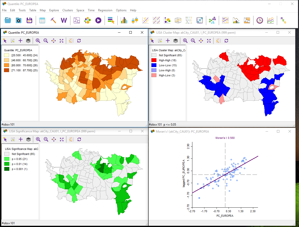
Note that the map view here (top left) was present before LISA was run. Depending on which version of the software you are using, the windows may be separate or part of a larger interface.
The meaning of each of these displays is considered in the next sections.
Moran scatterplot
This display is exactly the same as the one produced previously using global Moran's I. By linking and brushing between this and other displays, you may be able to develop an understanding of what they are showing you.
LISA Cluster Map
The LISA cluster map looks like the pattern shown in Figure 4.4.
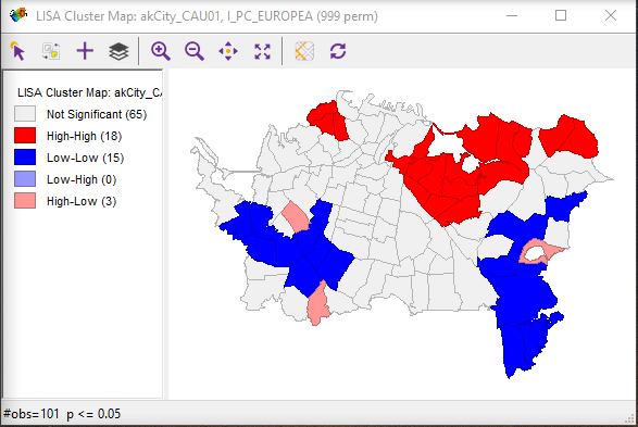
Interpretation of this map is straightforward. Red highlighted regions have high values of the variable and have neighbors that also have high values (high-high). As indicated in the legend, blue area are low-low in the same scheme, while pale blue regions are low-high and pink areas are high-low. The strongly colored regions are therefore those that contribute significantly to a positive global spatial autocorrelation outcome, while paler colors contribute significantly to a negative spatial autocorrelation outcome.
By right-clicking in this view, you can alter which cases are displayed, opting to see only those that are most significant. The relevant menu option is the Significance Filter. The meaning of this will become clearer when we consider the LISA Significance Map.
LISA Significance Map
The LISA Significance Map is shown in Figure 4.5.
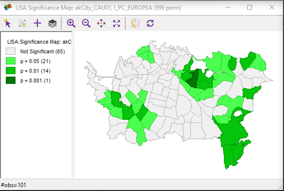
This display shows the statistical significance level at which each region can be regarded as making a meaningful contribution to the global spatial autocorrelation outcome.
This is determined using a rather complex Monte Carlo randomization procedure:
- The LISA value for each location is determined from its individual contribution to the global Moran's I calculation, as discussed on pages 87-88 of the course text.
- Whether or not this value is statistically significant is assessed by comparing the actual value to the value calculated for the same location by randomly reassigning the data among all the areal units and recalculating the values each time.
- Actual LISA values are ranked relative to the set of values produced by this randomization process.
- If an actual LISA score is among the top 0.1% (or 1% or 5%) of scores associated with that location under randomization, then it is judged statistically significant at the 0.001 (or 0.01 or 0.05) level. Note that a statistically significant result may be either very high or very low.
The combination of the cluster map and the significance map allows you to see which locations are contributing most strongly to the global outcome and in which direction.
By adjusting the Significance Filter in the cluster map, you can see only those areas of highest significance. By selecting the Randomization right-click menu option and choosing a larger number of permutations, you can test just how strongly significant are the high-high and low-low outcomes seen in the cluster map.
Note:
I know that this is all rather complicated. Feel free to post questions to this week's discussion forum if you are not following things. Your colleagues may have a better idea of what is going on than you do! Failing that, I will respond, as usual, to messages posted to the boards to help clear up any confusion.
Deliverable
For a single variable on a single map (using the same variable and a different map (shapefile) from the last one), describe the results of a univariate LISA analysis. Include the cluster map and Moran scatterplot in your write-up along with commentary and your interpretation of the results.
Project 4: Finishing Up
Summary of Project 4 Deliverables
For Project 4, the minimum items you are required to have in your write-up are:
- For a single variable on a single map, describe the results of a global Moran's I spatial autocorrelation analysis. Include a choropleth map and Moran scatterplot along with commentary and your interpretation of the results. In particular, identify any map areas that contribute strongly to the global outcome.
- For a single variable on a single map (but the same variable and a different map from the last one), describe results of a univariate LISA analysis. Include the cluster map and Moran scatterplot in your write-up along with commentary and your interpretation of the results.
Term Project (Week 4): Revising a Project Proposal
This week you should be revising your project proposal and getting ready for the peer-review meeting with your group next week. Post your revised project proposal to the Term Project: Revised Proposal discussion forum.
Additional details can be found on the Term Project Overview Page [9].
Deliverable
Post your revised project proposal to the 'Term Project: Revised Proposal' discussion forum.
Questions?
Please use the Discussion - General Questions and Technical Help discussion forum to ask any questions now or at any point during this project.
Final Tasks
Lesson 4 Deliverables
- Complete the Lesson 4 quiz.
- Complete the Project 4 activities. This includes inserting maps and graphs into your write-up along with accompanying commentary. Submit your assignment to the 'Assignment: Week 4 Project' dropbox provided in Lesson 4 in Canvas.
- Term project: post a preliminary project proposal to the forum.
Reminder - Complete all of the Lesson 4 tasks!
You have reached the end of Lesson 4! Double-check the to-do list on the Lesson 4 Overview page [63] to make sure you have completed all of the activities listed there before you begin Lesson 5.
Additional Resources
For more information on GeoDa explore the GeoDa website [64].
For more information on how spatial clustering can be used, perform a search using Google Scholar (search on terms such as GeoDa, Moran’s I, spatial autocorrelation).
L5: Regression Analysis
The links below provide an outline of the material for this lesson. Be sure to carefully read through the entire lesson before returning to Canvas to submit your assignments.
Lesson 5 Overview
Regression analysis is a statistical method used to estimate or predict the relationship between one or more predictor variables (also called independent variables). The independent variables are selected with the assumption that they will contribute to explaining the response variable (also called the dependent variable). In regression, there is only one dependent variable that is assumed to “depend” on one or more independent variables. Regression analysis allows the researcher to statistically test to see how well the independent variables statistically predict the dependent variable. In this week’s lesson, we will provide a broad overview of regression, its utility to predict something, and a statistical assessment of that prediction.
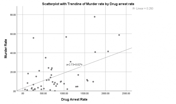
Learning Outcomes
At the successful completion of Lesson 5, you should be able to:
- perform descriptive statistics on data to determine if your variables meet the assumptions of regression;
- test these factors for normality;
- understand how correlation analysis can help you to understand relationships between variables;
- create scatterplots to view relationships between variables;
- run a regression analysis to generate an overall model of prediction;
- interpret the output from a regression analysis; and
- test the regression model for assumptions.
Checklist
Lesson 5 is one week in length. (See the Calendar in Canvas for specific due dates.) The following items must be completed by the end of the week. You may find it useful to print this page out first so that you can follow along with the directions.
| Step | Activity | Access/Directions |
|---|---|---|
| 1 | Work through Lesson 5 | You are in Lesson 5 online content now. |
| 2 | Reading Assignment |
Read the following section of the course text:
Also read the following articles, which registered students can access via the Canvas module:
|
| 3 | Weekly Assignment | This week’s project explores conducting correlation and regression analysis in RStudio. Note that there is no formal submission for this week’s assignment. |
| 4 | Term Project | Interactive peer review: Meet with your group to receive and provide feedback on project proposals. |
| 5 | Lesson 5 Deliverables |
Lesson 5 is one week in length. (See the Calendar in Canvas for specific due dates.) The following items must be completed by the end of the week.
|
Questions?
Please use the 'Discussion - Lesson 5' discussion forum to ask for clarification on any of these concepts and ideas. Hopefully, some of your classmates will be able to help with answering your questions, and I will also provide further commentary where appropriate.
Introduction
Understanding why something is occurring in a particular location (high levels of a pollutant) or in a population (a measles outbreak) is important to determine which variables may be responsible for that occurrence. Last week, we used cluster analysis to identify positive or negative spatial autocorrelation. This week, we will examine the variables that contribute to why those clusters are there and understand how these variables may play a role in contributing to those clusters. To do so, we will use methods that allow researchers to ask questions about the variables that are found in that location or population and that statistically correlate with the occurrence of an event. One way that we can do this is through the application of correlation and regression analysis. Correlation analysis enables a researcher to examine the relationship between variables while describing the strength of that relationship. On the other hand, regression analysis provides us with a mathematical and statistical way to model that relationship. Before getting too far into the details of both analyses, here are some examples of these methods as they have been used in spatial studies:
Below is a listing of five research studies that use regression/correlation analysis as part of their study. You can scan through one or more of these to see how multiple regression has been incorporated into the research. One take-away from these studies is to recognize that multiple regression is rarely used in isolation. In fact, multiple regression is used as a compliment to many other methods.
Magnusson, Maria K., Anne Arvola, Ulla-Kaisa Koivisto Hursti, Lars Åberg, and Per-Olow Sjödén. "Choice of Organic Foods is Related to Perceived Consequences for Human Health and to Environmentally Friendly Behaviour [69]." Appetite 40, no. 2 (2003): 109-117. doi:10.1016/S0195-6663(03)00002-3
Oliveira, Sandra, Friderike Oehler, Jesús San-Miguel-Ayanz, Andrea Camia, and José M. C. Pereira. "Modeling Spatial Patterns of Fire Occurrence in Mediterranean Europe using Multiple Regression and Random Forest [70]." Forest Ecology and Management 275, (2012): 117-129. doi:10.1016/j.foreco.2012.03.003
Park, Yujin and Gulsah Akar. "Why do Bicyclists Take Detours? A Multilevel Regression Model using Smartphone GPS Data [71]." Journal of Transport Geography 74, (2019): 191-200. doi:10.1016/j.jtrangeo.2018.11.013
Song, Chao, Mei-Po Kwan, and Jiping Zhu. "Modeling Fire Occurrence at the City Scale: A Comparison between Geographically Weighted Regression and Global Linear Regression [72]." International Journal of Environmental Research and Public Health 14, no. 4 (2017): 396. Doi: 10.3390/ijerph14040396
Wray Ricardo J., Keri Jupka, and Cathy Ludwig-Bell. “A community-wide media campaign to promote walking in a Missouri town [73].” Prevention of Chronic Disease 2, (2005): 1-17.
Correlation Analysis
Correlation analysis quantifies the degree to which two variables vary together. If two variables are independent, then the value of one variable has no relationship to the value of the other variable. If they are correlated, then the value of one is related to the value of the other. Figure 5.1 illustrates this relationship. For example, when an increase in one variable corresponds to an increase in the other, a positive correlation results. However, when an increase in one variable leads to a decrease in the other, a negative correlation results.
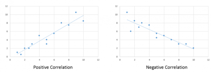
A commonly used correlation measure is Pearson’s r. Pearson’s r has the following characteristics:
- Non-unit tied: allows for comparisons between variables measured using different units
- Strength of the relationship: assesses the strength of the relationship between the variables
- Direction of the relationship: provides an indication of the direction of that relationship
- Statistical measure: provides a statistical measure of that relationship
Pearson’s correlation coefficient measures the linear association between two variables and ranges between -1.0 ≤ r ≤ 1.0.
When r is near -1.0 then there is a strong linear negative association, that is, a low value for x tends to imply a high value for y.
When r = 0, there is no linear association, There may be an association, just not a linear one.
When r is near +1.0 then there is a strong positive linear association, that is, a low value of x tends to imply a low value for y.
Remember that just because you can compute a correlation between two variables, it does NOT necessarily imply that one causes the other. Social/demographic data (e.g., census data) are usually correlated with each other at some level.
Try This!
For fun: try and guess the correlation value using this correlation applet [76].
Interactively build a scatterplot [77] and control the number of points and the correlation coefficient value.
Regression Analysis: Understanding the Why?
Regression analysis is used to evaluate relationships between two or more variables. Identifying and measuring relationships lets you better understand what's going on in a place, predict where something is likely to occur, or begin to examine causes of why things occur where they do. For example, you might use regression analysis to explain elevated levels of lead in children using a set of related variables such as income, access to safe drinking water, and presence of lead-based paint in the household (corresponding to the age of the house). Typically, regression analysis helps you answer these why questions so that you can do something about them. If, for example, you discover that childhood lead levels are lower in neighborhoods where housing is newer (built since the 1980s) and has a water delivery system that uses non-lead based pipes, you can use that information to guide policy and make decisions about reducing lead exposure among children.
Regression analysis is a type of statistical evaluation that employs a model that describes the relationships between the dependent variable and the independent variables using a simplified mathematical form and provides three things (Schneider, Hommel and Blettner 2010):
- Description: Relationships among the dependent variable and the independent variables can be statistically described by means of regression analysis.
- Estimation: The values of the dependent variables can be estimated from the observed values of the independent variables.
- Prognostication: Risk factors that influence the outcome can be identified, and individual prognoses can be determined.
In summary, regression models are a SIMPLIFICATION of reality and provide us with:
- a simplified view of the relationship between 2 or more variables;
- a way of fitting a model to our data;
- a means for evaluating the importance of the variables and the fit (correctness) of the model;
- a way of trying to “explain” the variation in y across observations using another variable x;
- the ability to “predict” one variable (y - the dependent variable) using another variable (x - the independent variable)
Understanding why something is occurring in a particular location is important for determining how to respond and what is needed. During the last two weeks, we examined clustering in points and polygons to identify clusters of crime and population groups. This week, you will be introduced to regression analysis, which might be useful for understanding why those clusters might be there (or at least variables that are contributing to crime occurrence). To do so, we will be using methods that allow researchers to ask questions about the factors present in an area, whether as causes or as statistical correlates. One way that we can do this is through the application of correlation analysis and regression analysis. Correlation analysis enables us to examine the relationship between variables and examine how strong those relationships are, while regression analysis allows us to describe the relationship using mathematical and statistical means.
Simple linear regression is a method that models the variation in a dependent variable (y) by estimating a best-fit linear equation with an independent variable (x). The idea is that we have two sets of measurements on some collection of entities. Say, for example, we have data on the mean body and brain weights for a variety of animals (Figure 5.2). We would expect that heavier animals will have heavier brains, and this is confirmed by a scatterplot. Note these data are available in the R package MASS, in a dataset called 'mammals', which can be loaded by typing data (mammals) at the prompt.
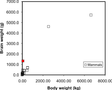
A regression model makes this visual relationship more precise, by expressing it mathematically, and allows us to estimate the brain weight of animals not included in the sample data set. Once we have a model, we can insert any other animal weight into the equation and predict an animal brain weight. Visually, the regression equation is a trendline in the data. In fact, in many spreadsheet programs, you can determine the regression equation by adding a trendline to an X-Y plot, as shown in Figure 5.3.
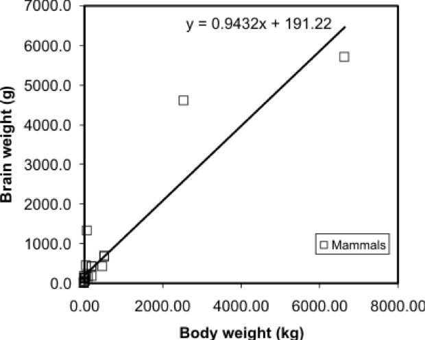
... and that's all there is to it! It is occasionally useful to know more of the underlying mathematics of regression, but the important thing is to appreciate that it allows the trend in a data set to be described by a simple equation.
One point worth making here is that this is a case where regression on these data may not be the best approach - looking at the graph, can you suggest a reason why? At the very least, the data shown in Figure 5.2 suggests there are problems with the data, and without cleaning the data, the regression results may not be meaningful.
Regression is the basis of another method of spatial interpolation called trend surface analysis, which will be discussed during next week’s lesson.
For this lesson, you will be analyzing health data from Ohio for 2017 and use correlation and regression analysis to predict percent of families below the poverty line on a county-level basis using various factors such as percent without health insurance, median household income, and percent unemployed.
Project Resources
You will be using RStudio to undertake your analysis this week. The packages that you will use include:
- ggplot2
- The ggplot2 package [78] includes numerous tools to create graphics in R.
- corrplot
- The corrpplot package [79] include useful tools for computing and graphical correlation analysis.
- car
- The car package [80] stands for “companion to applied regression” and offers many specific tools when carrying out a regression analysis.
- pastecs
- The pastecs package [81] stands for “package for analysis of space-time ecological series.”
- psych
- The psych package [82] includes procedures for psychological, psychometric, and personality research. It includes functions primariy designed for multivariate analysis and scale construction using factor analysis, principal component analysis, cluster analysis, reliability analysis and basic descriptive statistics.
- QuantPsyc
- The QuantPsyc package [83] stands for “quantitative psychology tools.“ It contains functions that are useful for data screening, testing moderation, mediation and estimating power. Note the capitalization of Q and P.
Data
The data you need to complete the Lesson 5 project are available in Canvas. If you have difficulty accessing the data, please contact me.
Poverty data (download the CSV file called Ohio Community Survey [84]): The poverty dataset that you need to complete this assignment was compiled from the Census Bureau's Online Data Portal [85] and is from the 2017 data release. The data were collected at the county level.
The variables in this dataset include:
- percent of families with related children who are < 5 years old, and are below the poverty line (this is the dependent variable);
- percent of individuals > 18 years of age with no health insurance coverage (independent variable);
- median household income (independent variable);
- percent >18 years old who are unemployed (independent variable).
During this week’s lesson, you will use correlation and regression analysis to examine percent of families in poverty in Ohio’s 88 counties. To help you understand how to run a correlation and regression analysis on the data, this lesson has been broken down into the following steps:
Getting Started with RStudio/RMarkdown
- Setting up your workspace
- Installing the packages
Preparing the data for analysis
- Checking the working directory
- Listing available files
- Reading in the data
Explore the data
- Descriptive statistics and histograms
- Normality tests
- Testing for outliers
Examining Relationships in Data
- Scatterplots and correlation analysis
- Performing and assessing regression analysis
- Regression diagnostic utilities: checking assumptions
Project 5: Getting Started in RStudio/RMarkdown
You should already have installed R and RStudio from earlier lessons. As we discussed in Lab 2, there are two ways to enter code in R. Most of you have likely been working in R-scripts where the code and results run in the console. R-Markdown is another way to run code, where you essentially make an interactive report which includes "mini consoles" called code chunks. When you run each of these, then the code runs below each chunk, so you can intersperse your analysis within your report itself. For more details on R Markdown:
- To get started, see Lesson 2 - markdown [86]
- For a general tutorial by the R-studio team, see here: https://rmarkdown.rstudio.com/lesson-1.html [87]
For this lab, you can choose to use either an R-script or an R-Markdown document to complete this exercise, in whichever environment you are more comfortable.
The symbols to denote a code chunk are ```{r} and ``` :
```{r setup, include=FALSE}
#code goes here
y <- 1+1
```
So if you are running this in a traditional R script, in these instructions, completely ignore any variant of lines containing ```{r} and ``` .
Let's get started!
- Start RStudio.
- Start a new RMarkdown file.
You learned in Lesson 2 that you should set your working directory and install the needed packages in the first chunk of the RMarkdown file. Although you can do this in the Files and Packages tab in the lower right-hand corner of the Studio environment, you can hard-code these items in a chunk as follows:
### Set the Working Directory and Install Needed Packages

```{r setup, include=FALSE}

# Sets the local working directory location where you downloaded and saved the Ohio poverty dataset.
setwd("C:/PSU/Course_Materials/GEOG_586/Revisions/ACS_17_5YR_DP03")

# Install the needed packages
install.packages("car", repos = "http://cran.us.r-project.org")
library(car)

install.packages("corrplot", repos = "http://cran.us.r-project.org")
library(corrplot)

install.packages("ggplot2", repos = "http://cran.us.r-project.org")
library(ggplot2)

install.packages("pastecs", repos = "http://cran.us.r-project.org")
library(pastecs)

install.packages("psych", repos = "http://cran.us.r-project.org")
library(psych)

install.packages("QuantPsyc", repos = "http://cran.us.r-project.org")
library(QuantPsyc)

```
Project 5: Preparing the Data for Analysis
In the second chunk of RMarkdown, you will confirm that the working directory path is correct, list the available files, and read in the Ohio poverty data from the *.csv file.
### Chunk 2: Check the working directory path, list available files, and read in the Ohio poverty data.

```{r}

# Checking to see if the working directory is properly set
getwd()

# listing the files in the directory
list.files()

# Optionally, if you want to just list files of a specific type, you can use this syntax.
list.files(pattern="csv")

# Read in the Ohio poverty data from the *.csv file. The .csv file has header information and the data columns use a comma delimiter.
# The header and sep parameters indicate that the *.csv file has header information and the data are separated by commas.
Poverty_Data <- read.csv("Ohio_Community_Survey.csv", header=T, sep=",")

```
Project 5: Explore the Data: Descriptive Statistics and Histograms
Exploring your data through descriptive statistics and graphical summaries assists understanding if your data meets the assumptions of regression. Many statistical tests require that specific assumptions be met in order for the results of the test to be meaningful. The basic regression assumptions are as follows:
- The relationship between the y and x variables is linear and that relationship can be expressed as a linear equation.
- The errors (or residuals) have a mean of 0 and a constant variance. In other words, the errors about the regression line do not vary with the value of x.
- The residuals are independent and the value of one error is not affected by the value of another error.
- For each value of x, the errors are normally distributed around the regression line.
Before you start working with any dataset, it is important to explore the data using descriptive statistics and view the data’s distribution using histograms (or another graphical summary method). Descriptive statistics enable you to compare various measures across the different variables. These include mean, mode, standard deviation, etc. There are many kinds of graphical summary methods, such as histograms and boxplots. For this part of the assignment, we will use histograms to examine the distribution of the variables.
### Chunk 3: Descriptive statistics and plot histograms
```{r}

# Summarize the Poverty Dataset
# describe() returns the following descriptive statistics
# Number of variables, nvalid, mean, standard deviation (sd), median, trimmed median, mad (median absolute deviation from the median), minimum value, maximum value, skewness, kurtosis, and standard error of the mean.

attach(Poverty_Data)
descriptives <- cbind(Poverty_Data$PctFamsPov, Poverty_Data$PctNoHealth, Poverty_Data$MedHHIncom, Poverty_Data$PCTUnemp)
describe(descriptives)

# skew (skewness) = provides a measure by which the distribution departs from normal.
# values that are “+” suggest a positive skew
# values that are “-“ skewness suggest a negative skew
# values ±1.0 suggests the data are non-normal data

# Create Histograms of the Dependent and Independent Variables

# Percent families below poverty level histogram (dependent variable)
# Note that the c(0,70) sets the y-axis to have the same range so each histogram can be directly compared to one another
hist(Poverty_Data$PctFamsPov, col = "Lightblue", main = "Histogram of Percent of Families in Poverty", ylim = c(0,70))

# Percent families without health insurance histogram
hist(Poverty_Data$PctNoHealth, col = "Lightblue", main = "Histogram of Percent of People over 18 with No Health Insurance", ylim = c(0,70))

# Median household income histogram
hist(Poverty_Data$MedHHIncom, col = "Lightblue", main = "Histogram of Median Household Income", ylim = c(0,70))

# Percent unemployed histogram
hist(Poverty_Data$PCTUnemp, col = "Lightblue", main = "Histogram of Percent Unemployed", ylim = c(0,70))

```
Figure 5.4 shows a summary of the various descriptive statistics that are provided by the describe() function. In Figure 5.4, X1, X2, X3, and X4 represent the percent of families below the poverty level, the percent of individuals without health insurance, the median household income, and the percent of unemployed individuals, respectively.
| X1 | X2 | X3 | X4 | |
|---|---|---|---|---|
| vars <dbl> |
1 | 2 | 3 | 4 |
| n <dbl> |
88 | 88 | 88 | 88 |
| mean <dbl> |
24.55 | 7.87 | 51742.20 | 6.08 |
| sd <dbl> |
8.95 | 3.99 | 10134.75 | 1.75 |
| median <dbl> |
24.20 | 7.30 | 49931.50 | 5.85 |
| trimmed <dbl> |
24.49 | 7.48 | 50463.38 | 6.02 |
| mad <dbl> |
9.86 | 2.08 | 8158.75 | 1.70 |
| min <dbl> |
5.8 | 3.3 | 36320.0 | 2.6 |
| max <dbl> |
43.1 | 40.2 | 100229.0 | 10.8 |
| range <dbl> |
37.3 | 36.9 | 63909.0 | 8.2 |
| skew <dbl> |
0.00 | 6.04 | 1.82 | 0.41 |
| kurtosis <dbl> |
-0.86 | 46.36 | 5.22 | 0.08 |
| se <dbl> |
0.95 | 0.42 | 1080.37 | 0.19 |
We begin our examination of the descriptive statistics by comparing the mean and median values of the variables. In cases where the mean and median values are similar, the data’s distribution can be considered approximately normal. Note that a similarity in mean and median values can be seen in rows X1 and X4. For X1, the difference between the mean and median is 0.35 percent and for X4 the difference is 0.23 percent. There is a larger difference between the mean and median for the variables in rows X2 and X3. The difference between the mean and median for X2 and X3 is 0.57 and $48,189, respectively. Based on this comparison, variables X1 and X4 would seem to be more normally distributed than X2 and X3.
We can also examine the skewness values to see what they report about a given variable’s departure from normality. Skewness values that are “+” suggest a positive skew (outliers are on located on the higher range of the data values and are pulling the mean in the positive direction). Skewness values that are “–“ suggest a negative skew (outliers are located on the lower end of the range of data values and are pulling the mean in the negative direction). A skewness value close to 0.0 suggests a distribution that is approximately normal. As skewness values increase, the severity of the skew also increases. Skewness values close to ±0.5 are considered to possess a moderate skew while values above ±1.0 suggests the data are severely skewed. From Figure 5.4, X2 and X3 have skewness values of 6.04 and 1.82, respectively. Both variables are severely positively skewed. Variables X1 and X4 (reporting skewness of 0.00 and 0.41, respectively) appear to be more normal; although X4 appears to have a moderate level of positive skewness. We will examine each distribution more closely in a graphical and statistical sense to determine whether an attribute is considered normal.
The histograms in Figures 5.5 and 5.6 both reflect what was observed from the mean and median comparison and the skewness values. Figure 5.5 shows a distribution that appears rather symmetrical while Figure 5.6 shows a distribution that is distinctively positively skewed (note the data value located on the far right-hand side of the distribution).
Project 5: Explore the Data: Normality Tests and Outlier Tests
Now that you have examined the distribution of the variables and noted some concerns about skewness for one or more of the datasets, you will test each for normality in the fourth chunk of RMarkdown.
There are two common normality tests: the Kolmogorov-Smirnov (KS) and Shapiro-Wilk test. The Shapiro-Wilk test is preferred for small samples (n is less than or equal to 50). For larger samples, the Kolomogrov-Smirnov test is recommended. However, there is some debate in the literature whether the “50” that is often stated is a firm number.
The basic hypotheses for testing for normality are as follows: H0: The data are ≈ normally distributed. HA: The data are not ≈ normally distributed.
Note that the use of the ≈ symbol is deliberate, as the symbol means “approximately.”
We reject the null hypothesis when the p-value is ≤ a specified α-level. Common α-levels include 0.10, 0.05, and 0.01.
## Chunk 4: Carry out normality tests on the variables

```{r}

# Carry out a normality test on the variables
shapiro.test(Poverty_Data$PctFamsPov)
shapiro.test(Poverty_Data$PctNoHealth)
shapiro.test(Poverty_Data$MedHHIncom)
shapiro.test(Poverty_Data$PCTUnemp)

# Examine the data using QQ-plots
qqnorm(Poverty_Data$PctFamsPov);qqline(Poverty_Data$PctFamsPov, col = 2)
qqnorm(Poverty_Data$PctNoHealth);qqline(Poverty_Data$PctNoHealth, col = 2)
qqnorm(Poverty_Data$MedHHIncom);qqline(Poverty_Data$MedHHIncom, col = 2)
qqnorm(Poverty_Data$PCTUnemp);qqline(Poverty_Data$PCTUnemp, col = 2)

```
Using the shapiro.test() function two statistics are returned: W (the test statistic) and the p-value.
| Variables | W | p-value |
|---|---|---|
| Percent Families Below Poverty | 0.981 | 0.2242 |
| Percent Without Health Insurance | 0.50438 | 9.947e-16 |
| Median Household Income | 0.85968 | 1.219e-07 |
| Poverty_Data$PCTUnemp | 0.97994 | 0.1901 |
In Table 5.1, the reported p-values suggest that the percent families below the poverty level and percent unemployed are both normal at any reasonable alpha level. However, the p-values for percent without health insurance and median household income are both less than any reasonable alpha level and therefore are not normally distributed.
The normality of the data can also be viewed through Q-Q plots. Q-Q plots represent the pairing of two probability distributions by plotting their quantiles against each other. If the two distributions being compared are similar, the points in the Q-Q plot will approximately lie on the line y = x. If the distributions are linearly related, the points in the Q-Q plot will approximately lie on a line, but not necessarily on the line y = x, If the distributions are not similar (demonstrating non-normality), then the points in the tails of the plot will deviate from the overall trend of the points. For example, the median household income shown in Figure 5.7 does not completely align with the trend line. Most of the middle portion of the data do align with the trend line but the data “tails” deviate. The data “tails” signal that the data may not be normal.
A good overview of how to interpret Q-Q plots can be seen here [88].
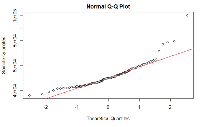
What should I do if data are not normally distributed?
We see that two variables are not normal: percent families with no health insurance and median household income. Based on the evidence supplied by the descriptive statistics, histograms, and Q-Q plot, we suspect that outliers are the reason why these two datasets are not normal. Generally speaking, an outlier is an atypical data value.
There are several approaches that are used to identify and remove outliers. To add a bit of confusion to the mix, there isn’t a single quantitative definition that describes what is atypical. Moreover, there isn’t a single method to detect outliers – the chosen method depends on your preferences and needs. For an overview of how outliers are defined and some of the methods used to identify those outliers, check out the following two websites:
### Chunk 5: Conduct outlier test and clean the data
```{r}

# Check for Outliers and Clean those Variables of Outliers
outlier <- boxplot.stats(Poverty_Data$PctFamsPov)$out

outlier # Report any outliers

# Check for Outliers and Clean those Variables of Outliers
outlier <- boxplot.stats(Poverty_Data$PctNoHealth)$out

outlier # Report any outliers
# An outlier was detected.
# Find the row number.
row_to_be_deleted <- which(Poverty_Data$PctNoHealth == outlier)

# Delete the entire row of data
Poverty_Data_Cleaned <- Poverty_Data[-c(row_to_be_deleted),]

# Redraw the histogram to check the distribution
hist(Poverty_Data_Cleaned$PctNoHealth, col = "Lightblue", main = "Histogram of Percent of People over 18 with No Health Insurance", ylim = c(0,70))

# Check for Outliers and Clean those Variables of Outliers
outlier <- boxplot.stats(Poverty_Data_Cleaned$MedHHIncom)$out

outlier # Report any outliers
# An outlier was detected.
# Use another method to remove rows of data. Find the minimum outlier value
outlier <- min(outlier)
# Subset the data values that are less than the minimum outlier value.
Poverty_Data_Cleaned <- subset(Poverty_Data_Cleaned, Poverty_Data_Cleaned$MedHHIncom < outlier)

# Median household income histogram
hist(Poverty_Data_Cleaned$MedHHIncom, col = "Lightblue", main = "Histogram of Median Household Income", ylim = c(0,70))

# Carry out a Normality Test on the Variables
shapiro.test(Poverty_Data_Cleaned$MedHHIncom)
outlier <- boxplot.stats(Poverty_Data_Cleaned$PCTUnemp)$out

# Report any outliers
outlier

# Find the row number.
row_to_be_deleted <- which(Poverty_Data_Cleaned$PCTUnemp == outlier)

# Delete the entire row of data
Poverty_Data_Cleaned <- Poverty_Data_Cleaned[-c(row_to_be_deleted),]

# Redraw the histogram to check
hist(Poverty_Data_Cleaned$PCTUnemp, col = "Lightblue", main = "Histogram of Percent of People over 18 with No Health Insurance", ylim = c(0,70))

# Carry out a Normality Test on the Variables
shapiro.test(Poverty_Data_Cleaned$PCTUnemp)

```
You should realize that removing outliers does not ensure that your data will be normal. Even after removing outliers, your data may still not be normal. If removing outliers does not remediate the normality issue, then you can attempt to transform the data. A data transformation applies a specific mathematical function to the data, attempting to normalize the data. For example, data that exhibit extremely strong positive skewness can be transformed by applying the log10 transformation to the data. Applying a transformation has the effect of changing the scale of the data and therefore the distribution’s “shape” and hopefully skewness. There are several data transformations available, but the more common include log10(x), x2, sqrt(x), and ln(x).
Here is a brief but useful site that covers most of the major data transformations [91].
It is important to note that in most cases, your data are not going to be normally distributed. The degree of departure from normality can be extremely challenging to deal with especially as some statistical tests require that the data be normal before running the test (like regression). This assumption has a lot to do with making the regression model residuals more symmetric since one assumption in linear regression is that the errors are Gaussian (normally distributed). Not meeting the normality assumption has serious consequences in the ability of the correlation and regression analysis to produce meaningful results.
Project 5: Examine Relationships in Data: Scatterplots and Correlation Analysis
An underlying idea of regression analysis is that the variables are linearly related. To begin to visualize that linear relationship, we will start with an examination of a scatterplot matrix showing the variables in the sixth chunk of RMarkdown. In its simplest form, a scatterplot graphically shows how changes in one variable relate to the changes in another variable.
### Chunk 6: Scatterplot Matrix
```{r}

# Create a Scatterplot Matrix
pairs(~Poverty_Data_Cleaned$PctFamsPov+Poverty_Data_Cleaned$PctNoHealth+Poverty_Data_Cleaned$MedHHIncom+Poverty_Data_Cleaned$PCTUnemp, main = "Scatterplot of Ohio Poverty Data", lwd=2, labels = c("% Poverty", "% No Health Insurance", "Median Household Income", "% Unemployed"), pch=19, cex = 0.75, col = "blue")

```
Figure 5.8 shows a scatterplot matrix of the variables selected for this regression analysis. The labels in the main diagonal report the variables. In the upper left box, the percent of families below the poverty line appears. Reading to the right, we see a scatter of points that relates to the correlation of percent of families below the poverty line with the percent of families without health insurance. In this case, the percent of families below the poverty line is the dependent variable (y) and the percent without health insurance is the independent variable (x). The scatter of points suggests that as the percent of people without health insurance increases, the percent of families below the poverty line also increases. This relationship suggests a positive correlation (the variables both change in the same direction). Continuing reading to the right, we see that as the median household income increases, then the percent of families below the poverty line decreases. This relationship illustrates a negative correlation (e.g., as one variable increases, the other variable decreases). By examining the scatterplot matrix, it is possible to see the relationships between the different variables.
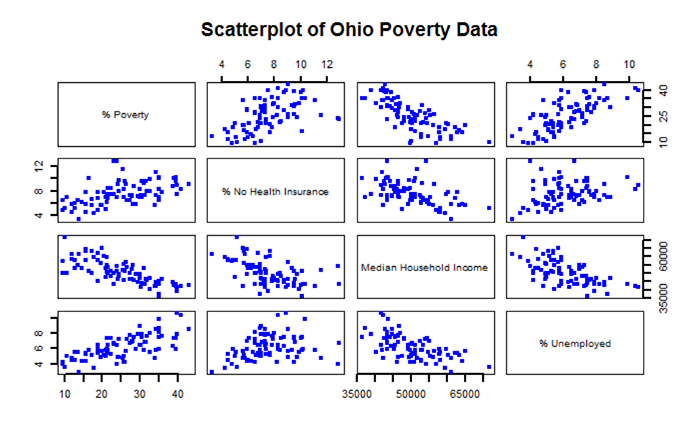
After examining the scatterplot matrix and getting a visual sense of the variables and their relationships, we can derive a quantitative measure of the strength and direction of the correlation. There are several measures of correlation that are available. One of the more common is the Pearson product moment (or Pearson’s r), which is used in Chunk 7 of RMarkdown. From Figure 5.8, we can see that the main diagonal of the matrix is 1.00. This means that each variable is perfectly correlated with itself. Elsewhere in the matrix, note that the “-“ sign indicates a negative correlation, while the absence of a “-“ sign indicates a positive correlation.
Values of Pearson’s r range from -1.0 (perfectly negatively correlated) to +1.0 (perfectly positively correlated). Values of r closer to -1.0 or +1.0 indicate a stronger linear relationship (correlation). From Table 5.2 we see that the percent of families below the poverty line and median household income have a Pearson’s r value of -0.76, which suggests a rather strong negative linear correlation. On the other hand, the percent of individuals with no health insurance has a rather low Pearson’s r value of 0.29 indicating a rather weak positive correlation.
| PctFamsPov | PctNoHealth | MedHHIncom | PCTUnemp | |
|---|---|---|---|---|
| PctFamsPov | 1.00 | 0.52 | -0.76 | 0.71 |
| PctNoHealth | 0.52 | 1.00 | -0.52 | 0.29 |
| MedHHIncom | -0.76 | -0.52 | 1.00 | -0.62 |
| PCTUnemp | 0.71 | 0.29 | -0.62 | 1.00 |
### Chunk 7: Correlation Analysis
```{r}

# Remove the non-numeric columns from the poverty data file
Poverty_corr_matrix <- as.matrix(Poverty_Data_Cleaned[-c(1,2,3)])
# Truncate values to two digits
round (Poverty_corr_matrix, 2)

# Acquire specific r code for the rquery.cormat() function
source("http://www.sthda.com/upload/rquery_cormat.r")
col <- colorRampPalette(c("black", "white", "red"))(20)
cormat <- rquery.cormat(Poverty_corr_matrix, type = "full", col=col)

# Carry out a Correlation Test using the Pearson Method and reported p-values
corr.test(Poverty_corr_matrix, method = "pearson")

```
Table 5.3 shows the p-values for each correlation measure reported in Table 5.2. The p-values report the statistical significance of the test or measure. Here, all of the reported Pearson’s r values are statistically significant – meaning that the correlation values statistically differ from an r value of 0.0 (which is a desirable outcome if you are expecting your variables to be linearly related).
| PctFamsPov | PctNoHealth | MedHHIncom | PCTUnemp | |
|---|---|---|---|---|
| PctFamsPov | 0 | 0.00 | 0 | 0.00 |
| PctNoHealth | 0 | 0.00 | 0 | 0.01 |
| MedHHIncom | 0 | 0.00 | 0 | 0.00 |
| PCTUnemp | 0 | 0.01 | 0 | 0.00 |
Figure 5.9 shows a graphical method of illustrating Pearson’s r values. Values of grey represent a negative correlation while values of red indicate a positive correlation. The size of the circle represents the correlation strength – the larger the circle the greater the correlation strength. Large dark grey circles (e.g., between percent families below the poverty line and median household income) represent a strong negative correlation (-0.76) while large dark red circles (between percent unemployed and percent families below the poverty line) represent a strong positive correlation (0.71).
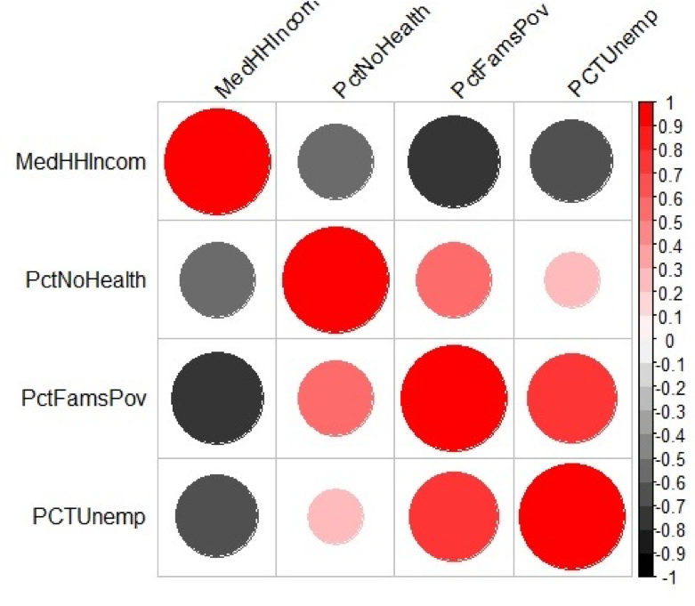
Project 5: Examine Relationships in Data: Performing and Assessing Regression Analysis
To perform a regression analysis, there are several functions available in RStudio that we will use. To begin, we will create a multivariate regression model using the independent variables for this assignment. Chunk 8 shows the different functions that will be used to run and summarize the regression output, conduct a VIF test, and examine the results of the ANOVA test.
### Chunk 8: Mulitvariate Regression, VIF, and ANOVA
```{r}

# Run a Regression Analysis on the Poverty Data
Poverty_Regress <- lm(Poverty_Data_Cleaned$PctFamsPov~Poverty_Data_Cleaned$PctNoHealth+Poverty_Data_Cleaned$MedHHIncom+Poverty_Data_Cleaned$PCTUnemp)

# Report the Regression Output
summary(Poverty_Regress)

# Carry ouf a VIF Test on the Independent Variables
vif(Poverty_Regress)

# Carry out an ANOVA test
anova(Poverty_Regress)

```
Perform a Regression Analysis
In RStudio, a regression is carried out using the lm function (linear method). Using our poverty data, the dependent variable is the percent of families below the poverty line while the independent variables include the percent of individuals without health insurance, median household income, and percent of unemployed individuals. The tilde character ~ means that the percent of families below the poverty line is being predicted from the independent variables. The additional independent variables are appended to the list through the use of the “+” sign. Note that we are creating a new object called Poverty_Regress that will hold all of the regression output.
Annotated Regression Analysis in RStudio
To summarize the results of this regression, use the summary() function:
> summary(Poverty_Regress)
which returns the following output…
Residuals:
	Min	1Q	Median	3Q	Max
	-11.8404	-2.9583	0.6864	2.7394	9.2912

Coefficients:
                                   	  Estimate  	Std. Error	t value	Pr(>|t|)
(Intercept)                        	 30.9649344 	8.4170726	3.679	0.000429 ***
Poverty_Data_Cleaned$PctNoHealth	  0.8289709 	0.3323119	2.495	0.014725 *
Poverty_Data_Cleaned$MedHHIncom 	 -0.0005061 	0.0001061	-4.770	8.43e-06 ***
Poverty_Data_Cleaned$PCTUnemp   	  2.1820454 	0.4326694	5.043	2.91e-06 ***
---
Signif. codes:  0 ‘***’ 0.001 ‘**’ 0.01 ‘*’ 0.05 ‘.’ 0.1 ‘ ’ 1

Residual standard error: 4.797 on 78 degrees of freedom
Multiple R-squared:  0.6984,	Adjusted R-squared:  0.6868
F-statistic: 60.21 on 3 and 78 DF, p-value: < 2.2e-16
Writing the Regression Equation
Recall that the general regression equation takes the form of
where
According to the values shown in the RStudio output under the Coefficients heading, the regression equation for percent below poverty predicted from the independent variables is shown in Equation 5.1. The value 30.9649344 is the y-intercept and 0.8289709 represents the slope of the regression line. Thus, we have the following (rounding to two significant digits):
Equation 5.1 suggests that by inserting any value of x for each independent variable into the equation, a value of y (percent below poverty) will be predicted based on the regression coefficients. Remember that the original variables were cast in percentages and dollars.
Interpreting Equation 5.1, we see that when all of the independent variables’ values are 0 (the value of x = 0), then the baseline percentage of families below the poverty line is 30.96%. In other words, if no one had health insurance, no one made any income, and no one was employed, then there would be a moderate level of poverty. This is a rather unrealistic scenario, but it helps to understand a baseline of what the regression equation is reporting.
Continuing on, if we have one percent of individuals who are unemployed (keeping all other variables constant), then that one percent unemployed will contribute an additional 2.18% to the increase in families below the poverty line. Evidence of this result can also be seen in the reported correlation value of 0.71 between these two variables shown in Table 5.2. Adding an extra dollar of median household income decreases the percent of families below the poverty line by a paltry 0.0005 percent. In other words, small changes in the percent unemployed appear to be more impactful on determining the percent of individuals in poverty compared to increasing or decreasing the median household income.
Assessing the Regression Output
Just how significant is the regression model? The software RStudio provides several metrics by which we can assess the model’s performance.
The t- and p-values
The t-value is given for both the intercept and all independent variables. We are most interested in whether or not an independent variable is statistically significant in predicting the percent below poverty. The t- and p-values can assist us in this determination. Notice that the t-values listed range from -4.770 to 5.043. For example, we can examine the significance of this t-value (5.043). Using an alpha of 0.05 and 80 degrees of freedom (n – 1) and α = 0.01 we find that the table t-value is 2.374 [92]. This means that the likelihood of a t-value of 2.374 or greater occurring by chance is less than 1%. So, a t-value of 5.043 is a very rare event. Thus, this variable is statistically significant in the model.
To confirm each independent variable's statistical significance, we can examine their p-values, which are listed under the Pr(>|t|) heading. For example, the p-value for the percent with no health insurance is 0.014, which is statistically significant at the 0.1 and 0.05 levels, but not at the 0.01 level. Depending on our p-value threshold, we can conclude that this variable is statistically significant in the regression model. Both median household income and percent unemployed have very small p-values, indicating that both are highly statistically significant at predicting the percent below the poverty line. This high level of statistical significance is also provided by the “***” code printed to the right of the Pr(>|t|) value, indicating that the significance is very high.
Coefficient of Determination
The r2 assesses the degree to which the overall model is able to predict a value of y accurately. The multiple r2 value as reported here is 0.6984. If there had been only one independent variable, then the multiple r2 value would have been the same as was computed through Pearson’s r. Interpreting the value of 0.6984 can be tricky. Generally speaking, a high value of r2 suggests that the independent variables are doing a good job at explaining the variation in the dependent variable while a low r2 value suggests that the independent variables are not doing a good job of explaining the variation in the dependent variable. Here, the three independent variables appear to explain almost 70% of the variation in percent below the poverty line. There are likely other variables that can increase the predictive ability of the model.
It is important to note that in general terms, r2 is a conservative estimate of the true population coefficient of determination, which is reported by the adjusted r2. Note that the value of the adjusted r2 will always be less than the value of the multiple r2. In this case, the adjusted r2 value is 0.6868.
Examining the Independent Variables in the Regression Model
Although seemingly useful, one should not rely solely on the value of r2 as a measure of the overall model’s success at making predictions. Instead, we need to confirm the statistical value of the model in predicting y. We can do this through the results of the anova() function using Poverty_Regress, which calculates the F-statistic and its p-value for each independent variable in the equation.
Analysis of Variance Table
Response: Poverty_Data_Cleaned$PctFamsPov
		                            Df	Sum Sq	  Mean Sq	 F value	Pr(>F)
Poverty_Data_Cleaned$PctNoHealth	1	1588.09	   1588.09	 69.001	    2.393e-12 ***
Poverty_Data_Cleaned$MedHHIncom	    1	1983.49	   1983.49	 86.181	    3.046e-14 ***
Poverty_Data_Cleaned$PCTUnemp	    1	 585.37 	585.37	 25.434 	0.908e-06 ***
Residuals                        	78	1795.20 	 23.02
---
Signif. codes:  0 ‘***’ 0.001 ‘**’ 0.01 ‘*’ 0.05 ‘.’ 0.1 ‘ ’ 1
Looking at the RStudio output from the anova() function, we see several data values for each variable. The ANOVA table can help us refine our understanding of the contribution that each independent variable makes to the overall regression model. To learn about each independent variable and its contribution to the overall model’s ability to explain the variation in the dependent variable, we need to examine the data values in the sum of squares (Sum Sq) column. The total sum of squares value for the model is 5952.15 (add up the individual sum of squares for each row in the Sum Sq column). Dividing each sum of squares value by this sum of squares total will indicate the percent contribution each independent variable has in explaining the dependent variable. For example, percent with no health insurance has a sum of squares value of 1588.09. Dividing 1588.09 / 5952.15 = 27%. This 27% implies that percent with no health insurance explains 27% of the variation in percent below the poverty line. Median household income and percent unemployed explain 33% and 9% of percent below the poverty line, respectively. Adding 27%, 33%, and 9% produces the same 69% that was reported by in the multiple r2 statistic shown in the summary() function output.
Multicollinearity of the Independent Variables
Ideally, we would like to have the independent variable (or in the case of multiple regression, several independent variables) highly correlated with the dependent variable. In such cases, this high correlation would imply that the independent variable or variables would potentially contribute to explaining the dependent variable. However, it is also desirable to limit the degree to which independent variables correlate with each other. For example, assume a researcher is examining a person’s weight as a function of their height. The researcher collects, each person's height and records that height in centimeters and inches. Obviously, the height variables in centimeters and inches would be perfectly correlated with each other. Each measurement would give the same predictive ability for weight and thus are redundant. Here, one of these height variables should be eliminated to avoid what is referred to as multicollinearity.
The important question here is, when should the researcher consider removing one or more independent variables? The VIF (variance inflation factor) test helps answer this question in cases where there are several independent variables. The vif() function examines the independent variables that are used to build the multiple regression model. Specifically, the VIF test measures whether one or more independent variables are highly correlated with one each other. You must have more than one independent variable to use the vif() function. The smallest possible value of VIF is one (absence of multicollinearity). As a rule of thumb, a VIF value that exceeds 5 or 10 (depending on the reference selected) indicates a problem with multicollinearity (James et al., 2014). Based on the VIF values reported from the vif() function results, none of our independent variables exhibit multicollinearity as all of the values are smaller than 5.
Poverty_Data_Cleaned$PctNoHealth	Poverty_Data_Cleaned$MedHHIncom
	1.368166	2.018607

   Poverty_Data_Cleaned$PCTUnemp
   	1.616680
James, Gareth, Daniela Witten, Trevor Hastie, and Robert Tibshirani. 2014. An Introduction to Statistical Learning: With Applications in R. Springer Publishing Company, Incorporated.
Project 5: Examine Relationships in Data: Regression Diagnostic Utilities: Checking Assumptions
As was discussed earlier, regression analysis requires that your data meet specific assumptions. Otherwise, the regression output may not be meaningful. You should test those assumptions through statistical means. These assumptions can be assessed through RStudio.
Plot the Standardized Predicted Residuals against the Standardized Residuals
First, compute the predicted values of y using the regression equation and store them as a new variable in Poverty_Regress called Predicted.
>Poverty_Regress$Predicted <- predict(Poverty_Regress)
Second, compute the standardized predicted residuals (here we compute z-scores of the predicted values – hence the acronym ZPR).
>Poverty_Regress$ZPR <- scale(Poverty_Regress$Predicted, center = TRUE, scale = TRUE)
Third, compute the standardized residuals.
>Poverty_Regress$Std.Resids <- rstandard(Poverty_Regress)
Fourth, create a scatterplot of the standardized residuals (y-axis) plotted against the standardized predicted value (x-axis).
>plot(Poverty_Regress$ZPR, Poverty_Regress$Std.Resids, pch = 19, col = "Blue", xlab = "Standardized Predicted Values", ylab = "Standardized Residuals", xlim = c(-4,4), ylim = c(-3,3))
Explaining some of the parameters in the plot command
- col is the color definition.
- xlim and ylim parameters control the numerical range shown on the x and y axes, respectively.
- bg is the background color. The scatterplot will have a grey background.
- pch is the plotting character used. In this case, the plotting character “19” is a solid fill circle whose fill is blue. For those of you with a more artistic background, here is a pdf of the color names used in r [93].
Figure 5.10 shows a scatterplot of the standardized predicted values (x-axis) plotted against the standardized residuals (y-axis). Note that there are two dashed lines drawn on the plot. Each dashed line is centered on 0. The dashed lines correspond to the mean of each standardized dataset. The other values represent standard deviations about the mean. Ideally, you would like to see a scatter of points that shows no trend. In other words, the scatter of points should not show an increase or decrease in data values going from + to - or - to + standard deviation. In Figure 5.10, we see a concentration that is more or less centered about the 0, 0 intersection, with the points forming a circular pattern.
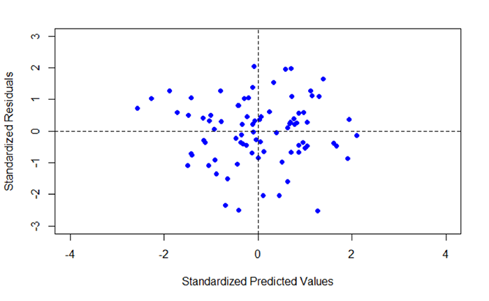
Fifth, create a histogram of the standardized residuals.
>hist(Poverty_Regress$Std.Resids, col = "Lightblue", main = "Histogram of Standardized Residuals")
In addition to examining the scatterplot, we can also view a histogram of the standardized residuals. By examining the distribution of the standardized residuals, we can see if the residuals appear to be normally distributed. This idea gets back to one of the assumptions of regression, which is that the errors of prediction are normally distributed (homoscedasticity). Looking at Figure 5.11, we see a distribution that appears to be fairly normally distributed.
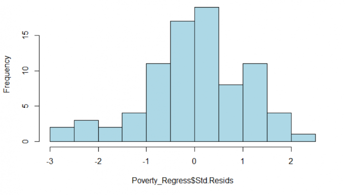
Assessing residuals for normality and homoscedasticity
It is important to test the standardized residuals for normality. For our test, we will use the Shapiro-Wilk normality test, which is available in the psych package.
>shapiro.test(Poverty_Regress$Std.Resids)
This command produced the following output.
Shapiro-Wilk normality test data:
Poverty_Regress$Std.Resids
W = 0.98025, p-value = 0.2381
Recall the hypothesis statement:
H0: data are ≈ normal
HA: data are ≈ not normal
The returned p-value is 0.2381. Using α = 0.05, the p-value is greater than 0.05, and thus we accept the null hypothesis that the standardized residuals are normal. This result helps to confirm that we have met the homoscedasticity assumption of regression.
Assessing the assumption of Independence: The Durbin-Watson Statistic
> durbinWatsonTest(Poverty_Regress$Std.Resids)

[1] 1.8058
In order to meet this assumption, we expect to see values close to 2. Values less than 1.0 or greater than 3.0 should be a warning that this assumption has not been met (Field, 2009). In this case, the Durbin-Watson statistic is 1.80, which suggests that we have met the condition of independence and no multicollinearity exists and the residuals are not autocorrelated.
Field, A.P. (2009). Discovering Statistics using SPSS: and Sex and Drugs and Rock ‘n’ Roll (3rd edition). London: Sage.
### Post-Regression Diagnostics
```{r}

# Compute the Predicted Values from the Regression
Poverty_Regress$Predicted <- predict(Poverty_Regress)

# Compute the Standardized Predicted Values from the Regression
Poverty_Regress$ZPR <- scale(Poverty_Regress$Predicted, center = TRUE, scale = TRUE)

# Compute the Standardized Residuals from the Regression
Poverty_Regress$Std.Resids <- rstandard(Poverty_Regress)

# Plot the Standardized Predicted Values and the Standardized Residuals
plot(Poverty_Regress$ZPR, Poverty_Regress$Std.Resids, pch = 19, col = "Blue", xlab = "Standardized Predicted Values", ylab = "Standardized Residuals", xlim = c(-4,4), ylim = c(-3,3))

# Divide the plot area into quadrate about the mean of x and y
abline(h=mean(Poverty_Regress$ZPR), lt=2)
abline(v=mean(Poverty_Regress$Std.Resids), lt=2)

# Plot a Histogram of Standardized Residuals
hist(Poverty_Regress$Std.Resids, col = "Lightblue", main = "Histogram of Standardized Residuals")

# Conduct a Normality Test on the Standardized Residuals
shapiro.test(Poverty_Regress$Std.Resids)

# Conduct a Durbin Watson Test on the Standardized Residuals
durbinWatsonTest(Poverty_Regress$Std.Resids)

```
Now you've walked through a regression analysis and learned to interpret its outputs. You'll be pleased to know that there is no formal project write-up required this week.
Project 5: Finishing Up
Now you've walked through a regression analysis and learned to interpret its outputs. You'll be pleased to know that there is no formal project write-up required this week.
You're now done with Project 5!
Term Project (Week 5): Peer-Review of Projects
This week, you will be meeting with your group to conduct an interactive peer review.
Additional details can be found on the Term Project Overview Page [9].
Deliverable
Post your comments on each group member's feedback to the 'Term Project: Peer-Review' discussion forum as comments on your posted project proposal. Your peer reviews are due by the end of this week.
Questions?
Please use the Discussion - General Questions and Technical Help discussion forum to ask any questions now or at any point during this project.
Final Tasks
Lesson 5 Deliverables
- Complete the Lesson 5 quiz.
- Read an article that used regression and post your reflections on the authors' use of regression in the 'Reflections on the Regression Reading' discussion forum on Canvas. The article is available in the discussion forum.
- Participate in the interactive peer review and post your response to the peer feedback to the 'Term Project: Peer-Review' discussion forum on Canvas.
Reminder - Complete all of the Lesson 5 tasks!
You have reached the end of Lesson 5! Double-check the to-do list on the Lesson 5 Overview page [94] to make sure you have completed all of the activities listed there before you begin Lesson 6.
L6: Interpolation - From Simple to Advanced
The links below provide an outline of the material for this lesson. Be sure to carefully read through the entire lesson before returning to Canvas to submit your assignments.
Lesson 6 Overview
Interpolation is one of the most important methods of spatial analysis. Many methods of spatial interpolation exist, all of them based to some extent on the principle that phenomena vary smoothly over the Earth’s surface and Tobler’s First Law of Geography. Essentially, interpolation methods are useful for estimating values from a limited number of sample points for locations where no samples have been taken. In this lesson, we will examine several interpolation methods.
Learning Outcomes
By the end of this lesson, you should be able to
- explain the concept of a spatial average and describe different ways of deciding on inclusion in a spatial average;
- describe how spatial averages are refined by inverse distance weighting methods;
- explain why the above interpolation methods are somewhat arbitrary and must be treated with caution;
- show how regression can be developed on spatial coordinates to produce the geographical technique known as trend surface analysis;
- explain how a variogram cloud plot is constructed and informally show how it sheds light on spatial dependence in a dataset;
- outline how a model for the semi-variogram is used in kriging and list variations on the approach;
- make a rational choice when interpolating field data between inverse distance weighting, trend surface analysis, and geostatistical interpolation by kriging;
- explain the conceptual difference between interpolation and density estimation.
Checklist
Lesson 6 is one week in length. (See the Calendar in Canvas for specific due dates.) The following items must be completed by the end of the week. You may find it useful to print this page out first so that you can follow along with the directions.
| Step | Activity | Access/Directions |
|---|---|---|
| 1 | Work through Lesson 6 | You are in the Lesson 6 online content now and are on the overview page. |
| 2 | Reading Assignment | The reading this week is again quite detailed and demanding and, again, I would recommend starting early. You need to read the following sections in Chapters 6 and 7 in the course text:
|
| 3 | Weekly Assignment | Exploring different interpolation methods in ArcGIS using the Geostatistical Wizard |
| 4 | Term Project | A revised (final) project proposal is due this week. This will commit you to some targets in your project and will be used as a basis for assessment of how well you have done. |
| 5 | Lesson 6 Deliverables |
|
Questions?
Please use the 'Week 6 lesson and project discussion' to ask for clarification on any of these concepts and ideas. Hopefully, some of your classmates will be able to help with answering your questions, and I will also provide further commentary where appropriate.
Introduction
In this lesson, we will examine one of the most important methods in all of spatial analysis. Frequently, data are only available at a sample of locations when the underlying phenomenon is, in fact, continuous and, at least in principle, measurable at all locations. The problem, then, is to develop reliable methods for 'filling in the blanks.' The most familiar examples of this problem are meteorological, where weather station data are available, but we want to map the likely rainfall, snowfall, air temperature, and atmospheric pressure conditions across the whole study region. Many other phenomena in physical geography are similar, such as soil pH values, concentrations of various pollutants, and so on.
The general name for any method designed to 'fill in the blanks' in this way is interpolation. It may be worth noting that the word has the same origins as extrapolation, where we use some observed data to extrapolate beyond known data. In interpolation, we extrapolate between measurements made at a sample of locations.
Spatial Interpolation
Required Reading:
Before we go any further, you need to read a portion of the chapter associated with this lesson from the course text:
- Chapter 6, "Spatial Prediction 1: Deterministic Methods," pages 145 - 158.
The Basic Concept
A key idea in statistics is estimation. A better word for it (but don't tell any statisticians I said this...) might be guesstimation, and a basic premise of much estimation theory is that the best guess for the value of an unknown case, based on available data about similar cases, is the mean [95] value of the measurement for those similar cases.
This is not a completely abstract idea: in fact, it is an idea we apply regularly in everyday life.
I'm reminded when a package is delivered to my home. When I take a box from the mail carrier, I am prepared for the weight of the package based on the size of the box. If the package is much heavier than is typical for a box of that size, I am surprised, and have to adjust my stance to cope with the weight. If the package is a lot lighter than I expected, then I am in danger of throwing it across the room! More often than not, my best guess based on the dimensions of the package works out to be a pretty good guess.
So, the mean value is often a good estimate or 'predictor' of an unknown quantity.
Introducing Space
However, in spatial analysis, we usually hope to do better than that, because of a couple of things:
- Near things tend to be more alike than distant things (this is spatial autocorrelation [3] at work), and
- We have information on the spatial location of our observations.
Combining these two observations is the basis for all the interpolation methods described in this section. Instead of using simple means as our predictor for the value of some phenomenon at an unsampled location, we use a variety of locally determined spatial means, as outlined in the text.
In fact, not all of the methods described are used all that often. By far, the most commonly used in contemporary GIS is an inverse-distance weighted spatial mean.
Limitations
It is important to understand that all of the methods described here share one fundamental limitation, mentioned in the text but not emphasized. This is that they cannot predict a value beyond the range of the sample [96] data. This means that the most extreme values in any map produced from sample data will be values already in the sample data, and not values at unmeasured locations. It is easy to see this by looking at Figure 6.1, which has been calculated using a simple average of the nearest five observations to interpolate values.
It is apparent that the red line representing the interpolated values is less extreme than any of the sample values represented by the point symbols. This is a strong assumption made by simple interpolation methods that kriging attempts to address (see later in this lesson).
Distinction Between Interpolation and Kernel Density Estimation
It is easy to get interpolation and density estimation [97] confused and, in some cases, the mathematics used is very similar, adding to the confusion.
Spatial Interpolation - Regression on Spatial Coordinates: Trend Surface Analysis
With even a basic appreciation of regression [98] (Lesson 5), the idea behind trend surface [99] is very clear. Treat the observations (temperature, height, rainfall, population density, whatever they might be) as the dependent variable in a regression model that uses spatial coordinates as its independent variables [100].
This is a little more complex than simple regression, but only just. Instead of finding an equation
where z are the observations of the dependent variable, and x is the independent variable, we find an equation
where z is the observational data, and x and y are the geographic coordinates of locations where the observations are made. This equation defines a plane of "best fit."
In fact, trend surface analysis finds the underlying first-order trend in a spatial dataset (hence the name).
As an example of the method, Figure 6.2 shows the settlement dates for a number of towns in Pennsylvania as vertical lines such that longer lines represent later settlement. The general trend of early settlement in the southeast of the state around Philadelphia to later settlement heading north and westwards is evident.
In this case, latitude and longitude are the x and y variables, and time of settlement is the z variable.
When trend surface analysis is conducted on this dataset, we obtain an upward sloping mean [95] time of settlement surface that clearly reflects the evident trend, and we can draw isolines (contour lines) [101] of the mean settlement date (Figure 6.3).
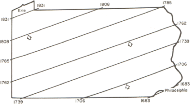
While this confirms the evident trend in the data, it is also useful to look at departures from the trend surface, which, in regression analysis are called residuals or errors (Figure 6.4).
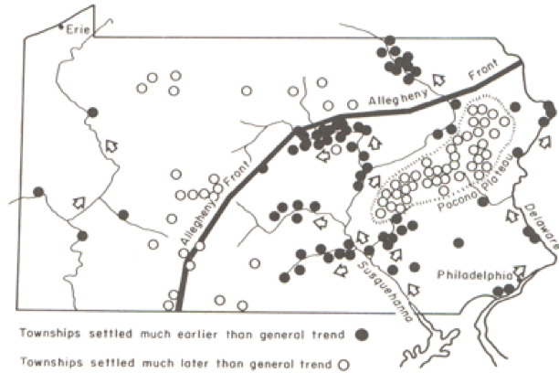
The role of the physical geography of the state on settlement time is evident in the pattern of early and late settlement, where most of the early settlement dates are along the Susquehanna River valley, and many of the late settlements are beyond the ridge line of the Allegheny Front.
This is a relatively unusual application of trend surface analysis. It is much more commonly used as a step in universal kriging, when it is used to remove the first order [102] trend from data, so that the kriging procedure can be used to model the second order [103] spatial structure of the data.
A Statistical Approach to Interpolation: Kriging
Required Reading:
Before we go any further, you need to read a portion of the chapter associated with this lesson from the course text:
- Chapter 7, "Spatial Prediction 2: Geostatistics," pages 191 - 212.
We have seen how simple interpolation methods use locational information in a dataset to improve estimated values at unmeasured locations. We have also seen how a more 'statistical' approach can be used to reveal first order [102] trends in spatial data. The former approach makes some very simple assumptions about the 'first law of geography' in order to improve estimation. The latter approach uses only observed patterns [104] in the data to derive spatial patterns. The last approach to spatial interpolation that we consider combines both methods by using the data to develop a mathematical model for the spatial relationships in the data, and then uses this model to determine the appropriate weights for spatially weighted sums.
The mathematical model for the spatial relationships in a dataset is the semivariogram [105]. In some texts, including your course text, this model is called a variogram. The sequence of steps beginning on page 197 of the course text, Local Models for Spatial Analysis, describes how a (semi-)variogram function may be fitted to a set of spatial data. See also Figure 7.4 in the text on page 205.
It is not important in this course to understand the mathematics involved here in great detail. It is more important to understand the aim, which is to obtain a concise mathematical description of some of the spatial properties of the observed data that may then be used to improve estimates of values at unmeasured locations.
You can get a better feel for how the variogram cloud and the semivariogram work by experimenting with the Geostatistical Wizard extension in ArcGIS, which you can do in this week's project.
Semivariogram and Kriging
Exploring Spatial Variation
This long and complex section builds on the previous material by first giving a more complete account of the semivariogram [105]. Particularly noteworthy are:
- The discussion beginning on page 198 (section 7.4.4 and its associated subjections) demands careful study. It describes how the (semi-)variogram summarizes three aspects of the spatial structure of the data:
- The local variability in observations, in a sense, the uncertainty of measurements, regardless of spatial aspects, is represented by the nugget [106] value;
- The characteristic spatial scale of the data is represented by the range [107]. At distances [12] greater than the range, observations are of little use in estimating an unknown value;
- The underlying variance in the data is represented by the sill [108] value.
Kriging
Make sure that you read through the discussion of the different forms of kriging. There isn't one form of kriging, but several. Each form has definite assumptions, and those assumptions need to be met for the interpolation to give accurate results. For example, universal kriging is a form of kriging that is used when the data exhibit a strong first order [102] trend. You would be able to see a trend, for example, in a semivariogram as the sill value would not be 'leveling off' but continuously rising. Because of the trend, the further apart are any two observations, the more different their data values will be. We cope with this by modeling the trend using trend surface analysis [99], subtracting the trend from the base data to get residuals, and then fitting a semivariogram to the residuals. This form of kriging is more complex than ordinary kriging where the local mean of the data are unknown but assumed to be equal. There is co-kriging, simple kriging, block kriging, punctual kriging, and the list continues.
If you have a strong background in mathematics, you may relish the discussion of kriging, otherwise you will most likely be thinking, "Huh?!" If that's the case, don't panic! It is possible to carry out kriging without fully understanding the mathematical details, as we will see in this week's project. If you are likely to use kriging a lot in your work, I would recommend finding out more from one of the references in the text (Isaaks and Srivastava's Introduction to Geostatistics [109]) is particularly good, and amazingly readable given the complexities involved.
Quiz
Ready? Take the Lesson 6: Advanced Interpolation Quiz to check your knowledge! Return now to the Lesson 6 folder in Canvas to access it. You have an unlimited number of attempts and must score 90% or more.
Project 6: Interpolation Methods
Introduction
This week and next, we'll work on data from Central Pennsylvania, where Penn State's University Park campus is located. This week, we'll be working with elevation data showing the complex topography of the region. Next week, we'll see how this ancient topography affects the contemporary problem of determining the best location for a new high school.
The aim of this week's project is to give you some practical experience with interpolation methods, so that you can develop a feel for the characteristics of the surfaces produced by different methods.
To enhance the educational value of this project, we will be working in a rather unrealistic way, because you will know at all times the correct interpolated surface, namely the elevation values for this part of central Pennsylvania. This means that it is possible to compare the interpolated surfaces you create with the 'right' answer, and to start to understand how some methods produce more useful results than others. In real-world applications, you don't have the luxury of knowing the 'right answer' in this way, but it is a useful way of getting to know the properties of different interpolation methods.
In particular, we will be looking at how the ability to incorporate information about the spatial structure of a set of control points into kriging using the semivariogram can significantly improve the accuracy of the estimates produced by interpolation.
Note: To further enhance your learning experience, this week I would particularly encourage you to contribute to the project Discussion Forum. There are a lot of options in the settings you can use for any given interpolation method, and there is much to be learned from asking others what they have been doing, suggesting options for others to try, and generally exchanging ideas about what's going on. I will contribute to the discussion when it seems appropriate. Remember that a component of the grade for this course is based on participation, so, if you've been quiet so far, this is an invitation to speak up!
Project Resources
The data files you need for the Lesson 6 Project are available in Canvas in a zip archive file. If you have any difficulty downloading this file, please contact me.
- Geog586_Les6_Project.zip (zip file available in Canvas) for ArcGIS
Once you have downloaded the file, double-click on the Geog586_Les6_Project.zip file to launch WinZip, PKZip, 7-Zip, or another file compression utility. Follow your software's prompts to decompress the file. Unzipping this archive, you should get a file geodatabase directory (centralPA_gdb.gdb) and an ArcGIS Pro package or ArcMap .mxd.
- pacounties - the counties of Pennsylvania
- centreCounty - Centre County, Pennsylvania, home to Penn State
- pa_topo - a DEM at 500 meter resolution showing elevations across Pennsylvania
- majorRoads - major routes in Centre County
- localRoads - local roads, which allow you to see the major settlements in Centre County, particularly State College in the south, and Bellefonte, the county seat, in the center of the county
- allSpotHeights - this is a point layer of all the spot heights derived from the statewide DEM
Summary of Project 6 Deliverables
For Project 6, the minimum items you are required to submit are as follows:
- Make an interpolated map using the inverse distance weighted method. Insert this map into your write-up, along with your commentary on the advantages and disadvantages of this method, and a discussion of why you chose the settings that you did.
- Make a layer showing the error at each location in the interpolated map. You may present this as a contour map over the actual or interpolated data if you prefer. Insert this map into your write-up, along with your commentary describing the spatial patterns of error in this case.
- Make two maps using simple kriging, one with an isotropic semivariogram, the other with an anisotropic semivariogram. Insert these into your write-up, along with your commentary on what you learned from this process. How does an anisotropic semivariogram improve your results?
Questions?
Please use the 'Discussion - Lesson 6' forum to ask for clarification on any of these concepts and ideas. Hopefully, some of your classmates will be able to help with answering your questions, and I will also provide further commentary there where appropriate.
Project 6: Making A Random Spot Height Dataset
In this case, we have a 500 meter resolution DEM, so interpolation would not normally be necessary, assuming that this resolution was adequate for our purposes. For the purposes of this project, we will create a random set of spot heights derived from the DEM, so that we can work with those spot heights to evaluate how well different interpolation methods reconstruct the original data.
The easiest way to do this is to use the Geostatistical Analyst - Utilities - Subset features tool. This tool is self-explanatory - you will want to run it on the allSpotHeights layer, and make a sample of 5% of the control points, or, alternatively, you can specify how many points you want (about 1500). You do not need to specify both a training feature class and a test feature class (that is helpful if you want to split a dataset for Machine Learning classifier). Here we are just interested in a 5% sample and only need one feature class. Make sure you turn on the Geostatistical Analyst extension to enable the tool.
An alternative approach might be to use the Data Management - Create Random Points and the Spatial Analyst - Extraction - Extract By Points tools. If you have the appropriate licenses (Advanced), then you can experiment with using these instead to generate around 1500 spot heights.
A typical random selection of spot heights is shown in Figure 6.5 (I've labeled the points with their values).
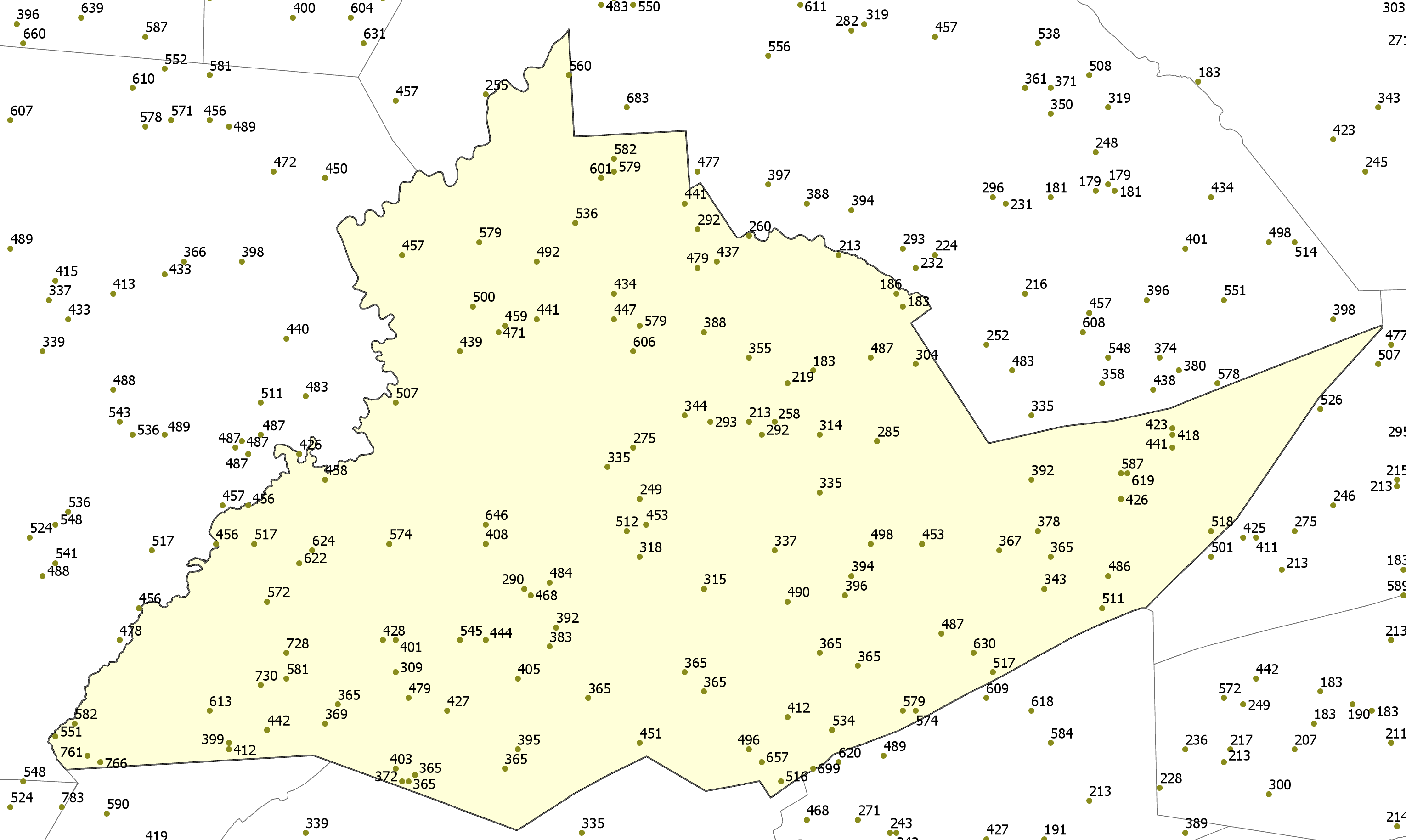
Project 6: Inverse Distance Weighted Interpolation (1)
Preliminaries
There are two Inverse Distance Weighting (IDW) tools that you can use to work with this data. The IDW tool can be found in the Spatial Analyst and Geostatistical Analyst tools. While each IDW tool creates essentially the same output, each tool includes different parameters. Both tools include the ability to specify the power, number of points to include when interpolating a given point, whether the search radius is fixed or variable, etc. However, the IDW tool found in the Geostatistical Analyst includes the parameters to change the search window shape (from a circle to an ellipse), change the orientation of the search window, change the length of the semi-major and semi-minor axes of the search window, etc. to enable more of a customizable search window. You can use either tool to complete this lesson. In fact, I would encourage you to experiment a bit with both IDW tools for the first part of this lesson and see what differences result.
To enable the Spatial Analyst:
- Select the menu item Analysis - Toolboxes... and select either the Geostatistical Analyst - Interpolation - IDW or the Spatial Analyst - Interpolation - IDW tool.
Performing inverse distance weighted interpolation
Figure 6.6 shows the IDW dialog for the Spatial Analyst tool.
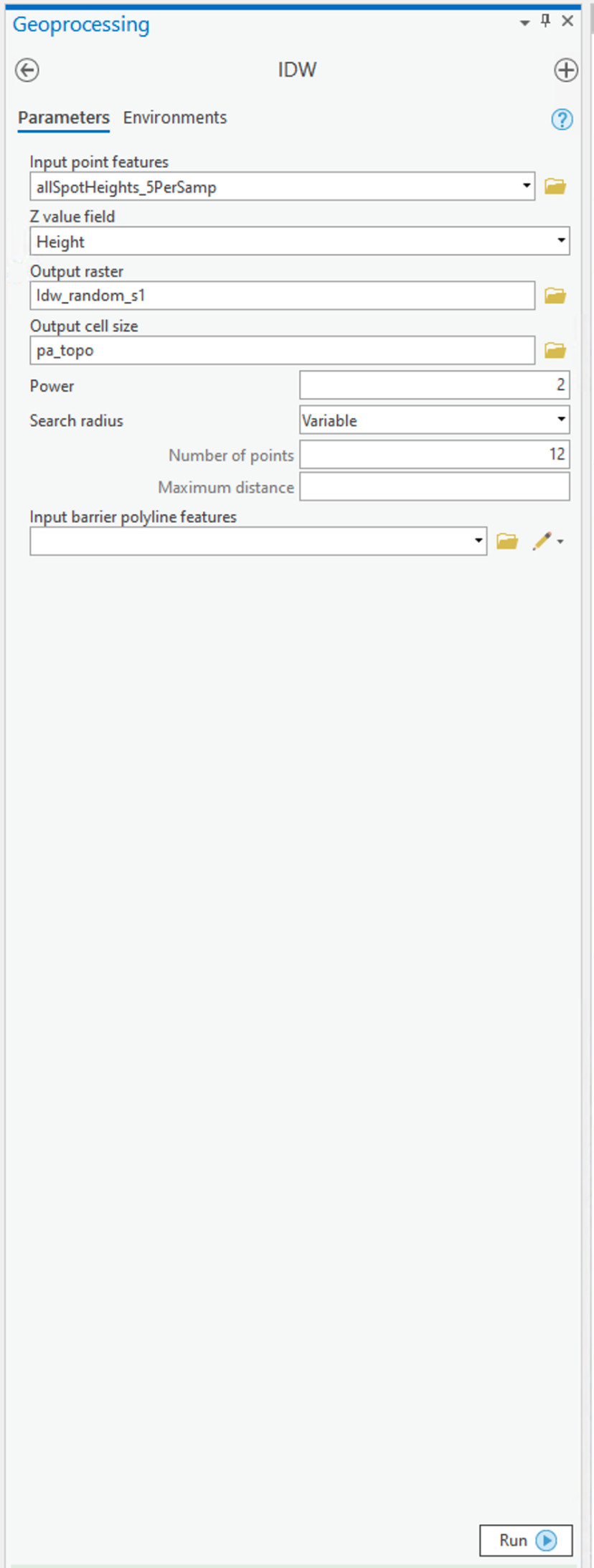
To set up the Spatial Analyst options:
- Select the Environments... tab item on the tool window - set the Mask to match the allSpotHeights layer. Set the Output Cell Size to be the Same as layer pa_topo.
- Select the Parameters... tab item on the tool window.
- Here are the options on the Parameters tab that you can specify that as discussed in the text:
- Input points specifies the layer containing the randomly sampled control points.
- Z value field specifies which attribute of the control points you are interpolating (in our case, it should be Height).
- Output raster. To begin with, it's worth requesting a <Temporary> output until you get a feel for how things work. Once you are more comfortable with it, you can specify a file name for permanent storage of the output as raster dataset.
- Output cell size. This cell size should be defined as 500 meters already (when you set the Environments... values (see above)).
- Power is the inverse power for the interpolation. 1 is a simple inverse (1 / d), 2 is an inverse square (1 / d2). You can set a value close to 0 (but not 0) if you want to see what simple spatial averaging looks like.
- Search radius type specifies either 'Variable radius' defined by the number of points or 'Fixed radius' defined by a maximum distance.
- Search radius settings here you define Number of points and Maximum distance as required by the Search radius type you are using.
- You can safely ignore the Barrier polyline features settings.
Experiment with these settings until you have a map you are happy with.
Deliverable
Make an interpolated map using the inverse distance weighted method. Insert the map into your write-up, along with your commentary on the advantages and disadvantages of this method and a discussion of why you chose the settings that you did.
Project 6: Inverse Distance Weighted Interpolation (2)
Creating a map of interpolation errors
The Spatial Analyst IDW tool doesn't create a map of errors by default (why?) but, in this case, we have the correct data, so it is instructive to compile an error map to see where your interpolation output fits well and where it doesn't.
- Use the Spatial Analyst tool - Map Algebra - Raster Calculator... tool to bring up the Raster Calculator dialog (Figure 6.7).
Here, you can define operations on raster map layers, such as calculating the error in your interpolation output.
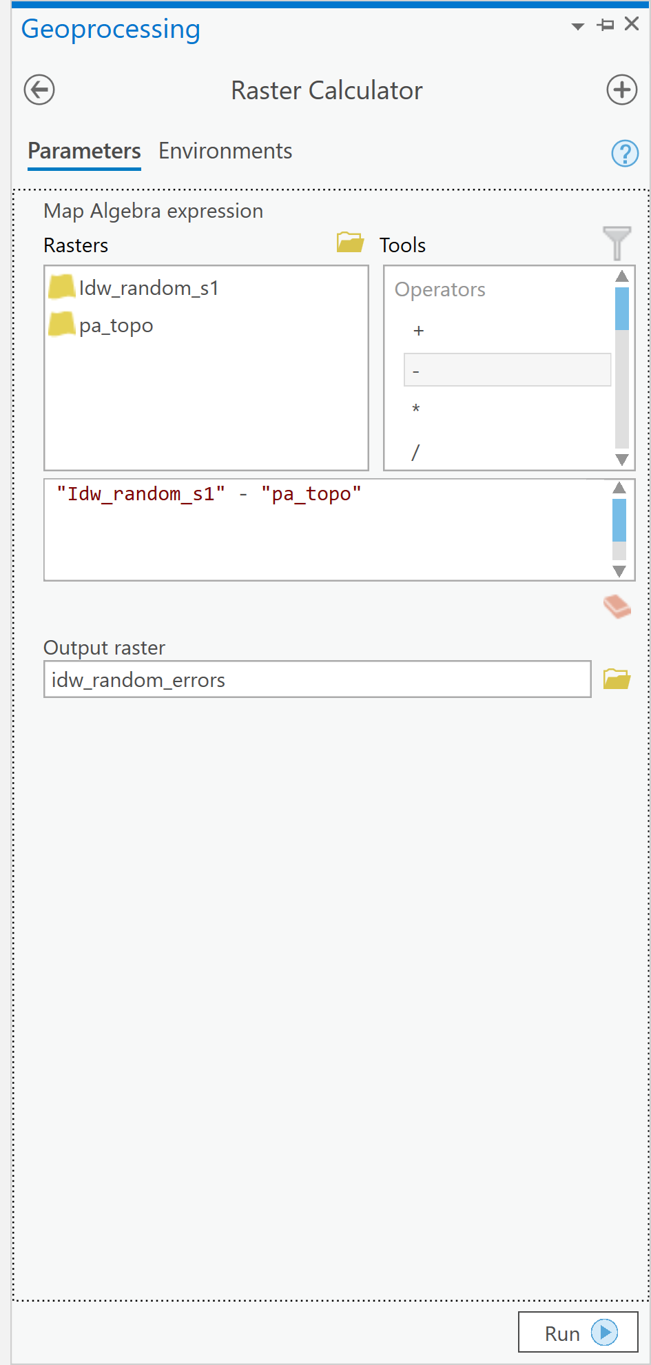 Figure 6.7: The Raster Calculator user interface.Credit: Kessler.
 - The error at each location in your interpolated map is (interpolated elevation - actual elevation). It is a simple matter to enter this equation in the expression editor section of the dialog, as shown [note: the name of your interpolated layer may be different]. When you click Run, you should get a new raster layer showing the errors, both positive and negative, in your interpolation output.
- Using the Spatial Analyst Tools - Surface - Contour tool, you can draw error contours and examine how these relate to both your interpolated and actual elevation maps. When designing your map, think about how you would choose colors to appropriately symbolize the positive and negative errors. Some ideas to think about when examining the error contours...
- Where are the errors largest?
- What are the errors at or near control points in the random spot heights layer?
- What feature of these data does inverse distance weighted interpolation not capture well?
Deliverable
Make a layer showing the error at each location in the interpolated map. You may present this as a contour map over the actual or interpolated data if you prefer. Insert the map into your write-up, along with your commentary describing the spatial patterns of error in this case.
Project 6: Kriging Using The Geostatistical Wizard
Preliminaries
To use the Geostatistical Analyst, look along the main menu listing and choose Analysis. Then, along the tool ribbon, click on the Geostatistical Wizard toolbar icon. The dialogue window will appear.
'Simple' kriging
We use the Geostatistical Wizard to run kriging analyses.
- The Geostatistical Wizard: Choose Method and Input Data dialog (Figure 6.8).
Begin by selecting Kriging/Cokriging from the list. Next, specify the Input Data (your random spot heights layer) and the Data field (Height) that you are interpolating. Then click Next > Figure 6.8: The Choose Method and Data Input screen of the Geostatistical Wizard: Kriging/CoKriging user interface.Credit: Kessler
 - The Geostatistical Wizard - Kriging dialog
The next step allows you to select the exact form of kriging you plan to perform (Figure 6.9). You should specify a Simple Kriging method and Prediction output type. Under the Transformation type, select None. Note that you can explore the possibilities for trend removal later, once you have worked through the steps of the wizard. If you do so, you will be presented with an additional window in the wizard, which allows you to inspect the trend surface you are using. For now, just click Next. Figure 6.9: The Kriging screen of the Geostatistical Wizard: Kriging/CoKriging user interface.Credit: Kessler
 - The Geostatistical Wizard - Semivariogram/Covariance Modeling dialog (Figure 6.10).
Here you should see the semivariogram plot on the left by selecting the Function Type. A goal with kriging is to choose a model that "fits" the scatter of points. There are several models from which to choose. These models are found under the pull-down menu located to the right of the Model #1 option. Choosing different models automatically updates the "fit" (or blue line) in the semivariogram. You can experiment with choosing different models. Note that you may not immediately see a difference in the fit of any given model to the scatter of points.
There is also an option here to specify assuming Anisotropy (True/False) in constructing the semivariogram (you may want to refer back to the readings in the text on understanding this idea better). This will be an important concept later, when it comes to the deliverables for this part of the project.
When you are finished experimenting, click on Next. Figure 6.10: The Semivariogram/Covariance Modeling screen of the Geostatistical Wizard: Kriging/CoKriging user interface.Credit: Kessler
 - The Geostatistical Wizard - Searching Neighborhood dialog (Figure 6.11).
Here you can get previews of what the interpolated surface will look like given the currently selected parameters. Also, specify how many neighbors to include using the Neighborhood Type options. You can specify how many Neighbors to Include in the local estimates and also how they are distributed around the location to be estimated using the Sector Type options. The various 'pie slice' or sector options define several regions around the estimation location. These sectors are each required to contain the defined number of neighboring control points, as specified by the minimum and maximum neighbors options.
Together, these options enable a wide range of neighborhood types to be applied, and you should feel free to experiment. Often, you will find that it takes dramatic changes to the neighborhood specification to make much noticeable difference to the outcome surface.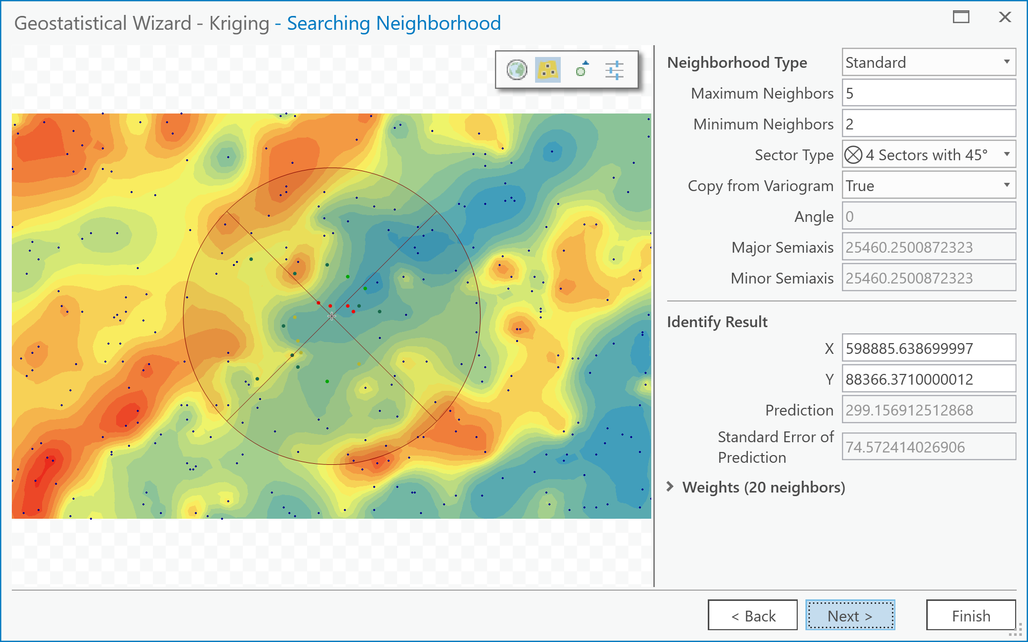 Figure 6.11: The Searching Neighborhood screen of the Geostatistical Wizard: Kriging/CoKriging user interface.Credit: Kessler
 - After this stage, click Next and then Finish. (We won't be going into the Cross Validation screen in the Wizard, although you can explore it, if you like!) As a suggestion, the different parameters listed on this screen give an assessment of the overall error in the kriging. You can compare one or more of the values on this screen between the Anisotropy option set to True and False. The Geostatistical Analyst makes a new layer and adds it to the map. You may find it helpful to right-click on it and adjust its Symbology so that only contours are displayed when comparing this layer to the 'correct' result (i.e., the pa_topo layer).
Things to do...
The above steps have walked you through the rather involved process of creating an interpolated map by kriging. What you should do now is simply stated, but may take a while experimenting with various settings.
Deliverable
Make two maps using simple kriging, one with an isotropic semivariogram, the other with an anisotropic semivariogram. Insert these into your write-up, along with your commentary on the different settings you applied, what is the difference between the two maps, and what you learned from this process. How (if at all) does an anisotropic semivariogram improve your results?
Try This!
See what you can achieve with universal kriging. The options are similar to simple kriging but allow use of a trend surface as a baseline estimate of the data, and this can improve the results further. Certainly, if kriging is an important method in your work, you will want to look more closely at the options available here.
Project 6: Finishing Up
Please put your write-up, or a link to your write-up, in the Project 6 drop-box.
Summary of Project 6 Deliverables
For Project 6, the minimum items you are required to submit are as follows:
- Make an interpolated map using the inverse distance weighted method. Insert this map into your write-up, along with your commentary on the advantages and disadvantages of this method, and a discussion of why you chose the settings that you did.
- Make a layer showing the error at each location in the interpolated map. You may present this as a contour map over the actual or interpolated data if you prefer. Insert this map into your write-up, along with your commentary describing the spatial patterns of error in this case.
- Make two maps using simple kriging, one with an isotropic semivariogram, the other with an anisotropic semivariogram. Insert these into your write-up, along with your commentary on what you learned from this process. How does an anisotropic semivariogram improve your results?
I suggest that you review the Lesson 6 Overview page [110] to be sure you have completed the all required work for Lesson 6.
That's it for Project 6!
Term Project (Week 6): Revising Your Project Proposal
Based on the feedback that you received from other students and from me, make final revisions on your project proposal and submit a final version this week. Note that you may lose points if your proposal suggests that you haven't been developing your thinking about your project.
In your revised proposal, you should try to respond to as many of the comments made by your reviewers as possible. However, it is OK to stick to your guns! You don't have to adjust every aspect of the proposal to accommodate reviewer concerns, but you should consider every point seriously, not just ignore them.
Your final proposal should be between 600 and 800 words in length (about 1.5 ~ 2 pages double-spaced max.). The maximum number of words you can use is 800. Make sure to include the same items as before:
- Topic and scope
- Aims
- Dataset(s)
- Data sources
- Intended analysis and outputs -- This is a little different from before. It should list some specific outputs (ideally several specific items) that can be used to judge how well you have done in attaining your stated aims. Note that failing to produce one of the stated outputs will not result in an automatic loss of points, but you will be expected to comment on why you were unable to achieve everything you set out to do (even if that means simply admitting that some other aspect took longer than anticipated, so you didn't get to it).
Additional writing and formatting guidelines are provided in a pdf document in the 'Term Project Overview' page in Term Project Module in Canvas.
Deliverable
Post your final project proposal to the Term Project -- Final Project Proposal drop box.
Questions?
Please use the Discussion - General Questions and Technical Help discussion forum to ask any questions now or at any point during this project.
Final Tasks
Lesson 6 Deliverables
- Complete the Lesson 6 quiz.
- Complete the Lesson 6 Weekly Project activities. This includes inserting maps and graphics into your write-up along with accompanying commentary. Submit your assignment to the 'Project 6 Drop Box' provided in Lesson 6 in Canvas.
- Submit your final project proposal to the 'Term Project - Final Project Proposal' drop box in Canvas.
Reminder - Complete all of the Lesson 6 tasks!
You have reached the end of Lesson 6! Double-check the to-do list on the Lesson 6 Overview page [110] to make sure you have completed all of the activities listed there before you begin Lesson 7.
Additional Resources:
Interpolation methods are used for creating continuous surfaces for many different phenomena. A common one that you will be familiar with is temperature.
Have a quick search using Google Scholar to see what types of articles you can find using the keywords "interpolation + temperature" or "kriging + temperature".
L7: Surface Analysis and Modeling Data
The links below provide an outline of the material for this lesson. Be sure to carefully read through the entire lesson before returning to Canvas to submit your assignments.
Lesson 7 Overview
The analytical power of any GIS system lies in its ability to integrate, transform, analyze, and model data using simple to complex mathematical functions and operations. In the lesson this week, we will look at the fundamentals of surface analysis and how a flexible map algebra raster analysis environment can be used for the analysis of field data.
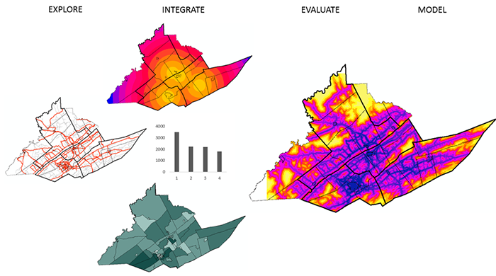
Learning Outcomes
At the successful completion of Lesson 7, you should be able to:
- describe data models for field data: regular grid, triangulated irregular network, closed form mathematical function, control points; and discuss how the choice of model may affect subsequent analysis;
- explain the map algebra concept and describe focal operations, local operations, and between-map operations;
- understand the idea of slope and aspect as a vector field;
- explain how slope or gradient can be determined from a grid of height values;
- describe how surface aspect may be derived from a grid of height values;
- re-express these operations as local operations in map algebra;
- describe how map algebra operations can be combined to develop complex functionality.
Checklist
Lesson 7 is one week in length. (See the Calendar in Canvas for specific due dates.) The following items must be completed by the end of the week. You may find it useful to print this page out first so that you can follow along with the directions.
| Step | Activity | Access/Directions |
|---|---|---|
| 1 | Work through Lesson 7 | You are in Lesson 7 online content now. You are on the Overview page right now. |
| 2 | Reading Assignment | You need to read the following selections:
NOTE:This reading is available through the Penn State Library’s e-reserves. You may access these files directly through the library Resources link in Canvas. Once you click on the Library Resources tab, you will select the link titled “E-Reserves for GEOG 586 - Geographical Information Analysis." A list of available materials for this course will be displayed. Select the appropriate file from the list to complete the reading assignment. The required course text does not cover all the material we need, so there is some information in the commentaries for this lesson that is not covered at all in the textbook reading assignments. In particular, read carefully the online information for this lesson on "Map Algebra" and "Terrain Analysis." After you've completed the reading, get back online and supplement your reading from the commentary material, then test your knowledge with the self-test quiz. |
| 3 | Weekly Assignment | This week, you will apply various surface analysis methods and spatial analysis functions, including more complex map algebra operations, to choose a suitable location for a new high school using ArcGIS. (The materials for Project 7 can be found on Canvas.) |
| 4 | Term Project | There is no specific output required this week, but you should be aiming to make some progress on your project this week. |
| 5 | Lesson 7 Deliverables |
|
Questions?
Please use the 'Discussion - Week 7' forum to ask for clarification on any of these concepts and ideas. Hopefully, some of your classmates will be able to help with answering your questions, and I will also provide further commentary there where appropriate.
Introduction
Once you have field data, whether as a result of interpolation, or based on more complete original data, perhaps from aerial surveys or remotely sensed imagery, you will likely want to analyze it in a variety of ways. Use the outputs of the analysis to make an informed decision. Over the past few weeks, you have been using many spatial analysis functions (review Table 2.0, Lesson 2 [111]). This week, we will look at how we can integrate outputs that may have been created from these different functions to help us make an informed decision.
Map Algebra
Required Reading:
Before we go any further, you need to read the following text, which is available through the Library Resources tab in Canvas:
- Chapter 10: GIS - Fundamentals: A First Text On Geographic Information Systems by Paul Bolstad, 2005
Map algebra is a framework for thinking about analytical operations applied to field data. It is most readily understood in the case of field data that are stored as a grid of values but is, in principle, applicable to any type of field data.
The map algebra framework was devised by Dana Tomlin and is presented in his 1990 book Geographical Information Systems and Cartographic Modeling (Prentice Hall: Englewood Cliffs, NJ), which you should consult for a more detailed treatment than is given here. Another good reference on map algebra (and much else besides) is GIS Modeling in Raster (Wiley: New York, 2001) by Michael DeMers.
Many GIS (including Esri’s ArcGIS) support map algebra. In ArcGIS, the tool most closely related to map algebra is called the ‘raster calculator'.
Basic concepts
The fundamental concepts in map algebra are the same as those in mathematical algebra, that is:
- Values are the 'things' on which the algebra operates. Input data and output data (results) are presented as grids of values. Values can be categorical (nominal or ordinal) or numerical.
- Operators may be applied to single values to transform them, or between two or more values to produce a new value. In mathematical algebra, the minus sign '-' is an operator that negates a single value when placed in front of it, as in -5. The plus sign '+' is also an operator, signifying the addition operation, which, when applied between two values, produces a new value: 1 + 2 = 3
- Functions are more complex, but still well defined, operations that produce a new output value from a set of input values. The input set may be a single value, as in , or a set of values, as in .
To apply an operation or function to these values, there are many different ways to proceed that range in complexity from simple to advanced and from local to global operations.
Below are examples of local, focal, zonal, and global operations and how they work when evaluating cells. Each of the operation types differs in how much of the cell’s neighborhood is used by the operator or in the operation.
| Local | A local operation or function in map algebra is applied to each individual cell value in isolation. |
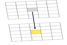
Figure 7.1. Result of a local operation/function
Credit: Blanford, © Penn State University, licensed under CC BY-NC-SA 4.0 [1]
|
This means that the value at each location in the output grid is arrived at by evaluating only values at the location of each individual cell. |
|---|---|---|---|
| Focal | Uses a user-defined neighborhood surrounding a cell (often 3 x 3 but other neighborhood sizes and shapes are also possible) in the map algebra operation. |
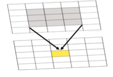
Figure 7.2 Result of the focal max. The result at each location in the output grid is determined by combining values focused at the corresponding location in the input grid or grids, as shown by the shading.
Credit: Blanford, © Penn State University, licensed under CC BY-NC-SA 4.0 [1]
|
Many functions can be applied focally in this way, such as maximum, minimum, mean (or average), median, standard deviation, and so on. A different choice of focal neighborhood will alter the output grid that results when a focal function is applied. |
| Zonal | Is applied to a set of map zones (e.g., counties, Congressional Districts, etc.). |
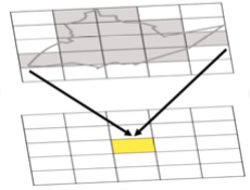
Figure 7.3 Example of a zonal operation where the result at each location in the output grid is determined from the set of values in the zone that the cell falls within as shown by the shading.
Credit: Blanford, © Penn State University, licensed under CC BY-NC-SA 4.0 [1]
|
Zonal operations and functions are an extension of the focal concept. Rather than define operations with respect to each grid cell, a set of map zones is defined (for example, counties), and operations or functions are applied with respect to these zones. |
| Global | Values at each grid cell in an output grid may potentially depend on the values at all grid cell locations in the input grid(s). |
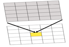
Figure 7.4 Example of a global operation where the result at each location in the output grid is determined from the set of values at that location and other locations in the input grid, as shown by the shading.
Credit: Blanford, © Penn State University, licensed under CC BY-NC-SA 4.0 [1]
|
Global operations and functions include operations that find the cost (in time or money) of the shortest path from a specified location (e.g., the yellow cell in the figure) to every other location. Such operations may have to take into account values at all locations in a grid to find the correct answer. |
Derived Measures on Surfaces
Required Reading:
Before we go any further, you need to read the following text, which is available through the Library Resources tab in Canvas:
- Chapter 11: GIS - Fundamentals: A First Text On Geographic Information Systems by Paul Bolstad, 2005
The measures discussed in this section are just a small sample of the types of surface analysis measures that can be devised. Map algebra operations can vary in complexity from simple to advanced.
In doing so, they may integrate single mathematical functions or increase in complexity by integrating multi-step mathematical functions/operations that may be evaluative (e.g., nested functions) and/or dynamical in nature (e.g., spatio-temporal models, agent-based models, process-based models, overlay models (more on this in Lesson 8), depending on what is being analyzed.
Agent-based models are spatio-temporal models that are often applied in cell-based environments and contain agents that move across the landscape reacting to the environment based on a set of pre-defined rules.
Process-based models might be used to predict the temporal fluctuations in soil moisture, water levels and hydrologic networks or for disease prediction where temporal fluctuations in temperature and rainfall might affect the host-pathogen interaction and disease outcome in the environment (e.g. Blanford, et al. 2013 Scientific Reports [112]).
The examples below should give you a feel for the flexibility of the map algebra framework and how it can be used to capture simple processes as well as more complex processes.
In this week's project, you will have an opportunity to explore map algebra more thoroughly in a practical setting.
| Relative relief | Relative relief, from the definition in the text, is readily expressed as a map algebra function: rel_relief = focal_max( [elevation] ) – focal min( [elevation] ) where the focal region is defined accordingly. |
|---|---|
| Surface gradient and aspect | Surface gradient is more complex to model, requiring a number of steps. First, two focal functions must be defined to calculate the slope in two orthogonal directions. These will be similar functions but must have specially defined focal areas that pick out the immediately adjacent grid cells on either side of the focal cell in each of the two cardinal directions. If these resulting slopes are called ew-gradient (for east-west) and ns-gradient (for north-south), then the overall gradient can be calculated in the second step by: gradient = square-root( ( arctan( ew-gradient ) )2 + ( arctan( ns-gradient ) )2 ) and the overall aspect is given by aspect = arctan( ( ew-gradient ) / ( ns-gradient ) ) |
| Nested Functions | A conditional statement works in much the same way as an if-then-else statement and can be used to nest functions. Output = Con (Test statement, if true do something, if false do something) For example, to identify roads that are in areas with low avalanche risk, the following statement will create a new output that only contains roads that are in low risk areas. SuitableRoads = Con (AvalancheRisk < 1, Roads) |
Vector Fields
So far in this course, we have only considered attribute data types that are single-valued, whether that value is categorical or numerical. In spatial analysis, we frequently encounter attributes that are not conveniently represented in this way. In particular, we may need to use vectors to represent some types of data.
A vector is a quantity that has both value (or magnitude) and direction. The most obvious vector in real-life applications is wind, which has a speed (its magnitude or strength) and direction. Without wind direction information, wind speed information is not very useful in many applications. For example, an aircraft navigator needs to know both wind speed and direction to accurately plot a course and to estimate arrival times or fuel requirements.
The most fundamental vector field is the gradient field associated with any scalar (i.e., simple numerical) field. This often has practical applications. For example, the gradient field of atmospheric pressure is important in meteorology in determining the path of storm systems and wind directions.
Quiz
Ready? Take the Lesson 7 Surface Analysis quiz to check your knowledge! Return now to the Lesson 7 folder in Canvas to access it. You have an unlimited number of attempts and must score 90% or more.
Project 7: Surface Analysis and Map Algebra
Background
Now, let's continue our work on data from Central Pennsylvania, where Penn State's University Park campus is located. This week, we'll see how this ancient topography affects the contemporary problem of determining potential locations for a new high school.
Note that this project is more involved than some of the earlier ones. The instructions are also less comprehensive than in previous projects - by now you should be getting used to finding your way around in ArcGIS. Of course, if you are struggling, as always, you should post questions to the discussion forums.
Introduction
The Centre County region of Pennsylvania is among the fastest growing regions in the state, largely as a result of the presence of Penn State in the largest town, State College. Growth is putting pressure on many of the region's resources, and some thought is currently being given to the provision of high schools in the region. In this project, we will use raster analysis based on road transport in the region to determine potential sites for a new school. This will demonstrate how complex analysis tasks can be performed by combining results from a series of relatively simple analysis steps.
Project Resources
The data files you need for Project 7 are available in Canvas. If you have any difficulty downloading this file, please contact me.
Once you have downloaded the file, double-click on the Lesson7_project.ppkx file to open it in ArcGIS Pro or unzip the .zip file for use in ArcGIS Desktop 10.X.
This project contains a geodatabase with the lesson data (Lesson7.gdb) and a raster file with a digital elevation model to provide context.
Open the ArcGIS Pro project file or ArcGIS Desktop .mxd file to find layers as follows:
- highSchools- four high schools in Centre County, Pennsylvania
- centreCountySchoolDistricts - the corresponding school districts
- majorRoads - major roads in the region
- localRoads - minor roads in the region
- centreCountyCivilDivisions - showing townships and boroughs in the county
- representativePopInSchoolDistricts - a point layer derived from census block group centroids with attributes for total population and children aged between 5 and 17 from the 2017 release of the 5-year American Community Survey population estimates
- centreBGdemographics - more complete demographic data from the 2017 release of the 5-year American Community Survey population estimates associated with polygons representing the block groups for which the data were collected
- centredem500 - the topography of the county at 500 meter resolution.
Summary of Project 7 Deliverables
For Project 7, the minimum items you are required to have in your write-up are:
- Describe in your write-up how the distance analysis operation works, including commentary on how you would combine multiple distance analysis results (one for each high school) to produce an allocation analysis output and the differences in the straight line distance allocation and the actual allocation of places to school districts in the present example.
- Describe in your write-up how you created the roads raster.
- Perform the cost weighted distance analysis for high schools using the roads raster layer. Examine the resulting allocation layer. How does it differ from the straight-line distance allocation result? Do the roads account for all the inconsistencies between the straight line distance allocation and the actual school districts? Answer these questions in your write-up.
- Estimate the number of school-aged children in the four school districts, and also in the road travel cost-weighted distance allocation zones associated with each school, and put these estimates in your write-up. Also, describe how you arrived at your estimates.
- Insert into your write-up a map and other details of your proposals for a new high school and associated district, including arguments for and against, possible problems with your analysis, maps, and explanations of any analysis carried out.
Questions?
Please use the 'Discussion - Lesson 7' forum to ask for clarification on any of these concepts and ideas. Hopefully, some of your classmates will be able to help with answering your questions, and I will also provide further commentary there where appropriate.
Project 7: Allocation Based on Straight-Line Distance
Note:
Analysis - Environments...should be set appropriately before doing any analysis (Figure 7.5).
In particular, use the centreCountyCivilDivisions layer as the Mask and also for the Processing Extent. You should also carefully consider what is an appropriate Cell Size for the analysis and set that parameter.
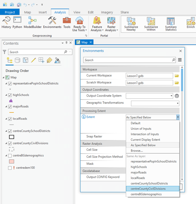
The first analysis we will do uses the Spatial Analyst Tools - Distance - Euclidean Allocation tool from the Tools menu (Figure 7.6). This allocates each part of the map to the closest one of a set of points and is the raster equivalent of proximity polygons.
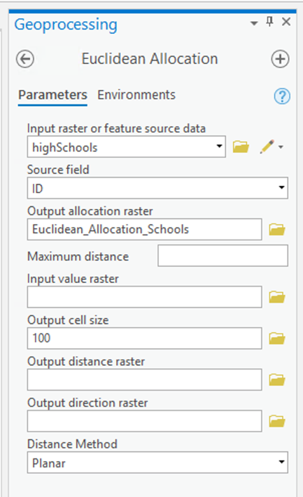
Running this Euclidean Allocation (straight line distance) analysis will produce an allocation layer (Figure 7.7).
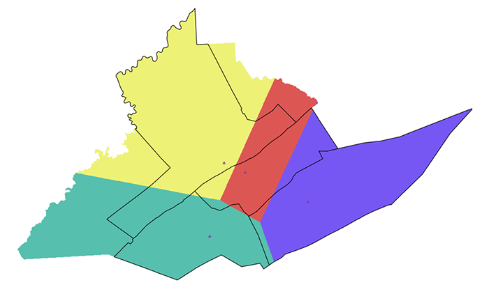
You can also request a distance layer (Figure 7.8).
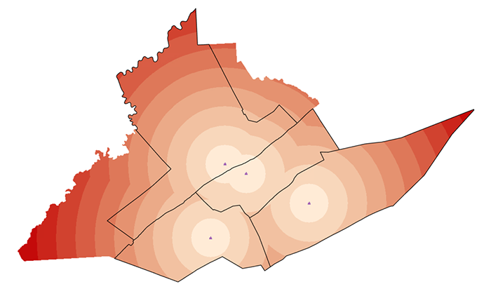
You can further analyze these layers. For example, it may be easier to read the distance analysis if you create contour lines. The results of the allocation analysis can be converted to vector polygons, which might make subsequent analysis operations easier to perform, depending on which approach you decide to take.
Deliverable
In your Project 7 write-up, describe how the distance analysis operation works. In your description, comment on how you would combine multiple distance analysis results (one for each high school) to produce an allocation analysis output. [Hint: First run the Euclidean Distance Tool for each high school individually and then look for a tool that when used can generate the same map that the Euclidean Allocation analysis provides (i.e., the map shown in Figure 7.7). There is a tool which could help with this -- take a look at the tools available in Spatial Analyst - Local (e.g., Cell statistics or Lowest).]
As part of your discussion, include the output maps generated by the Euclidean Allocation and Euclidean Distance processes.
Finally, comment on the differences in the Euclidean (straight-line) distance allocation and the actual allocation of places to school districts. (You will need to look at the roads, topography, and minor civil divisions to make sense of this.)
Project 7: Allocation Based on Road Distances, Generating a Raster Roads Layer
Clearly, roads are a major factor in the difference between straight-line distance allocation of school districts and the actual school districts. In this part of the project, you will create a raster layer representing the roads of Centre County to use in a second, roads-based distance analysis.
Creating a roads raster layer using map algebra operations
- Using the Conversion Tools - To Raster - Polyline to Raster... tool, make raster layers from the majorRoads and localRoads layers. Make sure that you use the same resolution for both layers. Consider what spatial resolution might be appropriate for this analysis.
- Use the Spatial Analyst Tools - Reclass - Reclassify and Spatial Analyst Tools - Map Algebra - Raster Calculator tools to manipulate and combine these layers into a single roads layer where major road cells have value 1, minor road cells have value 2, and off-road cells have some high value (say 100).
Note:
There are multiple workflows you can use to produce the end result described in Step 2 above. Whichever workflow you choose, it will require multiple steps—you will have to create intermediate layers and combine those in some way to arrive at the final result as shown in Figure 7.9. The Reclassify tool in particular is your friend here, but be careful that all cells in your intermediate outputs have a value (i.e., don’t allow cells to have a value of NODATA) or you will have problematic results when you use the Raster Calculator in subsequent steps.
The end result will look something like this (although you should consider creating a better designed map):
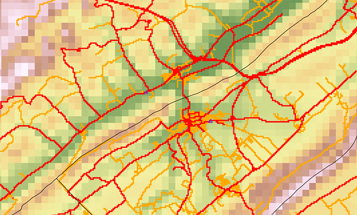
Deliverable
In your Project 7 write-up, describe how you created the roads raster and the resulting output. Include any maps, figures, or tables that help you to explain your workflow.
Project 7: Allocation Based on Road Distances, Cost Allocation
Using the roads raster layer for distance analysis
Distance analysis using a roads raster layer is straightforward. The values in the layer are regarded as 'weights' indicating how much more expensive it is to traverse that cell than if the cell were unweighted. Thus, with the roads layer you just created, traveling on major roads incurs no penalty, traveling on local roads is twice as expensive (takes twice as long), and traveling off-road is very slow indeed (100 times slower). These are not accurately determined weights, but serve to demonstrate the potential of these methods.
Select the Spatial Analyst Tools - Distance - Cost Allocation tool (Figure 7.10).
Here you are performing another distance analysis, but this time weighted by the roads raster layer you just created. Again, request an Allocation output from the analysis. (You might also be interested to request the Output distance raster to look at the distances that accumulate for each cell.)
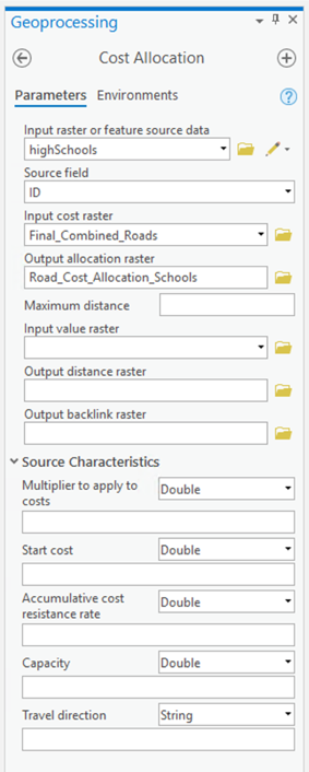
Deliverable
Perform the cost-weighted distance analysis for high schools using the roads raster layer. Examine the resulting allocation layer. How does it differ from the straight-line distance allocation result? Do the roads account for all the inconsistencies between the straight-line distance allocation and the actual school districts? Respond to these questions in your Project 7 write-up. Make sure to include the resulting map to support your explanation.
Project 7: Estimating School-Aged Population in your New Districts
Estimating the school-aged population in each of your new school districts
Given the representativePopInSchoolDistricts and CentreCountyBGDemographics layers, the next task is to estimate how many children are in each school district, as a preliminary step before deciding where a new school would be most useful.
There are many different ways that you could tackle this task.
Some of them involve raster operations (recall the approaches used in the Texas redistricting example in Lesson 3), and the Spatial Analyst Tools - Zonal - Zonal Statistics tool. But before you can use these, you would have to construct a raster representation of the school-aged population. Again, consider how this was done in the Texas example.
A more straightforward approach will use Analysis - Summarize Within (Figure 7.11), a Spatial Join (Analysis - Spatial Join, Figure 7.11), or Analysis Tools - Overlay - Spatial Join from the Tools menu.
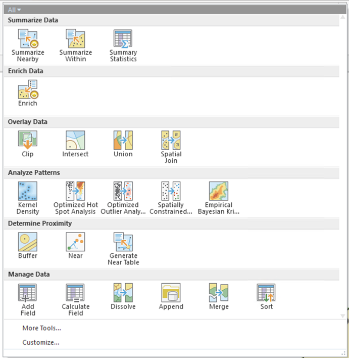
In analysis like this, there is no 'right' or 'wrong' way, just what works, so here's the deliverable - you figure out how to get there. Do this step for both the original districts and the road-cost-weighted districts.
Deliverable
For your Project 7 write-up, include these estimates and explain how you went about determining the number of the school-aged children in the four school districts.
Project 7: Where to Build a New School and Define Its District?
And so... where to put a new school, and what should be its district?!
The headline above summarizes the last part of the project. Based on the analyses already carried out, and any other analyses required to support your answer, locate a new high school in Centre County.
As a minimum, you should use the editing tools (Edit – Create, Figure 7.12) to add a school to the highSchools layer and create a map of the new school and what the new school's associated district would be. You should insert this map, together with a description of how you arrived at it, into your Project 7 write-up. Note that school districts are always made up of a contiguous collection of townships and/or boroughs, and that the centreCountyCivilDivisions layer shows these.
Deliverable
Insert into your Project 7 write-up a map and other details of your proposal for a new high school and associated district. Include an estimate of the number of school-aged children in each zone, arguments for and against the particular location, and a map showing the new district boundaries you are proposing, possible problems with your analysis, maps, and explanations of any analysis carried out to support your decision-making. You should also calculate the road travel cost-weighted distance allocation zone associated with each school and show your results in a map (or maps).
Project 7: Finishing Up
Please put your write-up, or a link to your write-up, in the Project 7 drop-box.
Summary of Project 7 Deliverables
For Project 7, the items you are required to have in your write-up are:
- Describe in your write-up how the distance analysis operation works, including commentary on how you would combine multiple distance analysis results (one for each high school) to produce an allocation analysis output and the differences in the straight-line distance allocation and the actual allocation of places to school districts in the present example. In your write-up, be sure to include maps and associated tables you feel will help illustrate this part of your analysis.
- Describe in your write-up how you created the roads raster. In your write-up, be sure to include maps and associated tables you feel will help illustrate this part of your analysis.
- Perform the cost-weighted distance analysis for the high schools using the roads raster layer. Examine the resulting allocation layer. How does it differ from the straight-line distance allocation result? Do the roads account for all the inconsistencies between the straight-line distance allocation and the actual school districts? Answer these questions in your write-up. In your write-up, be sure to include maps and associated tables you feel will help illustrate this part of your analysis.
- Estimate the number of school-aged children in the four school districts and put these estimates in your write-up. Also, describe how you arrived at your estimates. In your write-up, be sure to include maps and associated tables you feel will help illustrate this part of your analysis.
- Insert into your Project 7 write-up a map and other details of your proposal for a new high school and associated district, including an estimate of the number of school-aged children in each zone, arguments for and against the particular location and district boundaries you are proposing, possible problems with your analysis, maps, and explanations of any analysis carried out to support your decision-making. You should also calculate the road travel cost-weighted distance allocation zone associated with each school and show your results in a map (or maps).
I suggest that you review the Lesson 7 Overview page [113] to be sure you have completed the all required work for Lesson 7.
That's it for Project 7!
Term Project (Week 7)
There is no specific output required this week, but you should be aiming to make some progress on your project this week.
Additional details about the project can be found on the Term Project Overview Page [9].
Questions?
Please use the Discussion - General Questions and Technical Help discussion forum to ask any questions now or at any point during this project.
Final Tasks
Lesson 7 Deliverables
- Complete the Lesson 7 quiz.
- Complete the Lesson 7 Weekly Project activities. This includes inserting maps and graphics into your write-up along with accompanying commentary. Submit your assignment to the 'Project 7 Drop Box' provided in Lesson 7 in Canvas.
Reminder - Complete all of the Lesson 7 tasks!
You have reached the end of Lesson 7! Double-check the to-do list on the Lesson 7 Overview page [113] to make sure you have completed all of the activities listed there before you begin Lesson 8.
Additional Resources
Least-cost paths are used for more than modeling the movements of people or goods. They are frequently used in animal ecology as well.
A number of researchers have turned to least-cost paths to help in identifying potential movement corridors that should be preserved to maintain landscape connectivity and avoid negative effects on animal population numbers and density because of increasing habitat fragmentation.
A key challenge in this type of modeling lies in defining the habitat and animal species characteristics that can inform the cost weights that describe how the animal moves through the landscape.
If these applications are of interest to you, the two papers below are worth looking at:
LaPoint, S., Gallery, P., Wikelski, M., & Kays, R. (2013). Animal behavior, cost-based corridor models, and real corridors [114]. Landscape Ecology, 28(8), 1615-1630.
Belote, R.T., Dietz, M.S., McRae, B.H., Theobald, D.M., McClure, M.L., Irwin, G.H., McKinley, P.S., Gage, J.A. and Aplet, G.H., 2016. Identifying corridors among large protected areas in the United States [115]. PLoS One, 11(4), p.e0154223.
L8: Overlay Analysis
The links below provide an outline of the material for this lesson. Be sure to carefully read through the entire lesson before returning to Canvas to submit your assignments.
Lesson 8 Overview
Overlay analysis or Multi-Criteria Decision Analysis (MCDA) are a set of methods that are widely used for suitability mapping. In this lesson, we will introduce you to MCDA and how you can use these methods to perform simple to advanced analyses.
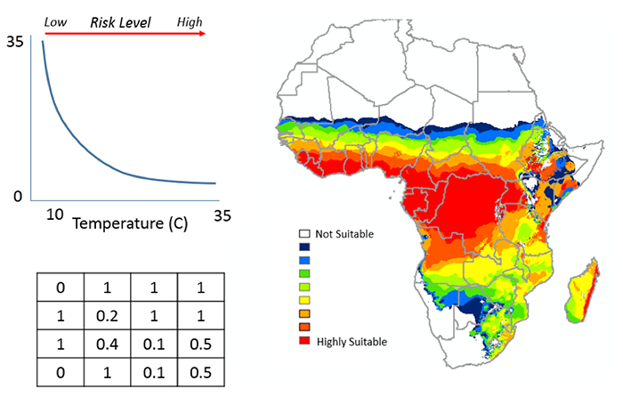
Objectives
By the end of this lesson, you should be able to
- formally describe overlay methods;
- explain how these techniques have been widely used in suitability mapping;
- understand why co-registration of input maps in overlay is critical to the success of the analysis;
- describe how co-registration is achieved by a combination of translation, rotation, and scaling transformations;
- outline how overlay is implemented in vector and raster GIS;
- outline approaches to overlay based on alternative ways of combining layers-additive and indexed schemes, fuzzy methods, and weights of evidence methods;
- describe how model-based overlay approaches and regression are related to one another.
Checklist
Lesson 8 is one week in length. (See the Calendar in Canvas for specific due dates.) The following items must be completed by the end of the week. You may find it useful to print this page out first so that you can follow along with the directions.
| Step | Activity | Access/Directions |
|---|---|---|
| 1 | Work through Lesson 8 | You are in Lesson 8 online content. You are on the Overview page right now. |
| 2 | Reading Assignment |
You need to read the following selections:
NOTE: This reading is available through the Penn State Library’s e-reserves. You may access these files directly through the library Resources link in Canvas. Once you click on the Library Resources tab, you will select the link titled “E-Reserves for GEOG 586 - Geographical Information Analysis." A list of available materials for this course will be displayed. Select the appropriate file from the list to complete the reading assignment. The required course text does not cover all the material we need, so there is some information in the commentaries for this lesson that is not covered at all in the textbook reading assignments. In particular, read carefully the online information for this lesson on "Selection and Classification" and "Overlay." After you've completed the reading, get back online and supplement your reading from the commentary material, then test your knowledge with the self-test quiz in the L8 Canvas module. There are two additional readings included in this lesson. Registered students can access them via the L8 Canvas module. 1. Skim the paper A Climate-based Distribution Model of Malaria Transmission in Sub-Saharan Africa by Craig, Snow, and leSueur (1999) to see how MCDA and in particular fuzzy logic was used in IDRISI to create one of the first continental malaria maps. 2. Read Raines, G.L., Sawatzky, D.L. and Bonham-Carter, G.F. (2010) Incorporating Expert Knowledge: New fuzzy logic tools in ArcGIS 10. ArcUser Spring 2010: 8-13 |
| 3 | Discussion Forum Post | Contribute your thoughts to the 'Discussion - Lesson 8' forum, responding to the question: "Map overlay and map algebra: the same or different?" |
| 4 | Term Project | Continue to work on Term Project. |
| 5 | Lesson 8 Deliverables |
|
Questions?
Please use the 'Discussion - Lesson 8' forum to ask for clarification on any of these concepts and ideas. Hopefully, some of your classmates will be able to help with answering your questions, and I will also provide further commentary where appropriate.
Introduction
It is fairly likely that the first analysis method you encountered in learning about GIS was overlay, where information from several different GIS layers is combined to enable complex queries to be performed. In this lesson, we will examine both the fundamentals of overlay, particularly the importance of registering layers to the same geographical coordinate system, and more elaborate versions of the method. As will become clear, overlay analysis can be generalized to almost any operation involving multiple map layers and is therefore very close to map algebra as discussed in the previous lesson.
The Multi-criteria decision analysis (MCDA) method (also known as surface overlay methods) are a set of methods that are used to combine different criteria. Criteria are ranked indicating their strength and importance of membership in a set. A number of different types of membership or overlay method can be used. These include:
- Boolean Overlay
Overlay data together to identify areas where values are suitable or not suitable. Data are transformed to represent areas that are suitable (1) or not suitable (0). - Weighted Overlay
Overlays several rasters using a common measurement scale and weights each according to its importance. This approach normalizes the output values. - Weighted Sum
Overlays several rasters and weights each according to its importance. This approach doesn't normalize the output values. - Fuzzy Overlay
Combine fuzzy membership data together, based on selected overlay type. The membership of the data are based on a fuzzification algorithm that transforms the input raster into a 0 to 1 scale (0 = no membership, 1 = full membership), indicating the strength of a membership in a set.
Overlay Analysis
Required Reading:
Before we go any further, you need to read the following text, which is available through the Library Resources tab in Canvas:
- Chapter 9: GIS - Fundamentals: A First Text On Geographic Information Systems by Paul Bolstad, 2005, pages 324-335
- Description of the Affine transformation in Chapter 4, GIS - Fundamentals: A First Text On Geographic Information Systems by Paul Bolstad, 2005, pages 144-145
Overview of Overlay Analysis
This section lays out the five basic steps in overlay analysis, namely:
- Determining the inputs
- Getting the data
- Getting data sources into the same coordinate system
- Assign data to a membership group
- Overlaying the maps
Steps 1 and 2 are not major concerns from our perspective (although they are, of course, vitally important in real cases). In this section, we focus on step 3, while the remainder of the lesson considers some of the options available for step 4.
Co-registration of data to the same coordinate system
Note that affine transformation as discussed on pages 144-145 of the Bolstad text is often used. The affine transformation requires matrix [17] mathematics, particularly multiplication, for a thorough understanding.
The most important aspect to appreciate about this discussion is that, although the mathematics involved in co-registration of map layers is relatively complex, the required computations are almost always performed by a GIS.
In practical GIS applications, a simple linear regression approach, based on a number of ground control points in each layer, is often used to achieve co-registration. This provides estimates of the required parameters for the affine transformation matrix, which are generally sufficient to accurately co-register layers.
Exceptions may occur if the study region is large enough that map projection distortions between layers projected differently are significant. In such cases, first reprojecting layers to the same coordinate system is advisable.
Beyond Boolean overlay
The standard approach to overlay simply produces a set of polygons, each of them inheriting all the properties of the 'parent' polygons whose intersection formed them.
The most fundamental problem with simple overlay is that it is 'black and white,' allowing only yes/no answers. The input layers divide the study region into areas that are of interest or not on the criterion in question. The output layer identifies the area that is of interest on all the input criteria. This is a very limiting approach.
Other problems that follow from this all boil down to the same thing: an implicit assumption that there is no measurement error, whether of attributes or of spatial extents, which is unreasonable. There is always error.
Alternatives to Boolean Overlay
Required Reading:
Before we go any further, you need to read the following text, which is available through the Library Resources tab in Canvas:
- Chapter 13: GIS - Fundamentals: A First Text On Geographic Information Systems by Paul Bolstad, 2005
The underlying idea here is a simple one. Boolean overlay is effectively a multiplication operation between binary encoded maps. If each layer is coded '1' in areas of interest and '0' in areas not of interest, then the product of all layers at each location produces an output map coded '1' in the area of interest on all criteria.
This is a map algebra operation. In the terminology of Lesson 7, it is a local operation applied across multiple map layers. It is worth noting how this reinforces the idea introduced right at the beginning of this course, that vector [116] and raster [117] representations of geospatial data are effectively interchangeable. If map overlay [118], which we usually think of as performed on vector-based polygon [119] layers, is precisely equivalent to a map algebra [120] operation (which we usually think of as a raster operation), then clearly differences between the two data representations are more apparent than real.
The different favorability functions introduced below are really just a series of alternative map algebra operations, all of them local operations applied across multiple layers.
Indexed overlay
The most obvious alternative to Boolean overlay is to allow shades of gray in the black and white picture, and the easiest way to do this is to sum the 0/1 input layers. If we are combining n layers, then the resulting range of possible output values is 0 through n with regions of more interest on the criteria in question scoring higher.
As soon as we introduce this approach, it is obvious that allowing 'shades of gray' in the input layers is also straightforward, so instead of values of 0 or 1 only, each input layer becomes an ordinal [121] or interval [122]/ratio [123] scale.
One problem to look out for here is that input layers on different numerical scales can bias results in favor of those scales with larger numerical ranges. For example, a slope layer with numerically precise slopes (in the range 0 to 90 degrees) should not be combined directly by simple summation with an ordinal three-point scale of population density (low-medium-high) coded 0-1-2. Instead, input layers should be standardized to the same scales, with a 0 to 1 scale being usual.
A further refinement is to weight the input layers according to some predetermined judgment of their relative importance to the question at hand. This is a huge subfield in itself, for the obvious reason that it immediately opens up the question, "How do I choose the weights?" The short answer is, "Any way you can get away with." The only difficulty is that you have to get everyone involved in the decision at hand to agree that the chosen weights are appropriate. Given that the choice of weights can dramatically alter the final analysis outcome, this is never easy. Although many different methods for choosing weights have been suggested, ultimately this is not an area where nifty technical methods can help out very much, and choosing weights is always difficult.
My personal favorite method of multicriteria evaluation (as this topic is known) is called Pareto ranking. It is theoretically interesting and attempts to make no assumptions about the relative importance of different factors. The unfortunate side-effect is that, in all but the simplest cases, this method produces more than one possible result! This is a commonly faced problem in this sort of work: there are as many answers to real problems as there are ways of ranking the relative importance of factors. Furthermore, the answers are not technical ones at all, but, more often than not, political ones. Weighting is discussed in the Bolstad text on p. 437-443.
Weights of evidence
Weights of evidence [124] is another possible approach to multicriteria evaluation. The idea is to determine, for the events of interest, how much more likely they are on one particular land-cover class than they are in general. This 'multiplication factor' is the weight of evidence for the event associated with the land-cover class.
Combining layers by weights of evidence values is relatively involved. In fact, combining weights of evidence involves logarithms and other complex manipulations. Full details are discussed in Geographic Information Systems for Geosciences by Gerard Bonham-Carter (Oxford: Pergamon, 1995). I strongly recommend that text if you need to follow up on this approach. Also, for additional information about different types of multi-criteria analyses see J Cirucci's 596A presentation (click on link below Figure 8.1 to watch J. Cirucci's presentation).
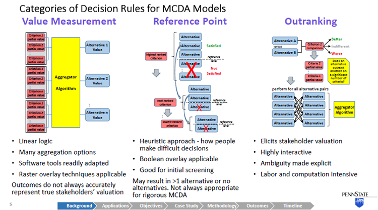
Video: Multi-Criteria Analyses (1:32:19)
DOUG MILLER: Hi, everyone. This is Doug Miller and I want to welcome everyone to our fall 2 version of geography 596A, the capstone proposal process. We have three evenings of talks this week. Tonight, tomorrow night, and Thursday night, I guess. This is Tuesday.
At any rate, I want to welcome you all. We have a kind of a sparse crowd. Hopefully, we'll have some more folks joining us tonight. And I know all of our students have been busy working on their proposals with their advisors during the semester and I'm looking forward to hearing what everybody has been busy working on.
I'll point out a couple of things to you. We ask that all in attendance, not just the students taking the course, to fill out the evaluation form. It's in the upper right hand pod under Notes. There's a link there for you to fill out that peer review evaluation form. And again, it's a bit of a misnomer. We ask the faculty, staff, students, casual attendees take a couple minutes to fill out the evaluation. That goes directly to the student and provides them some feedback.
Additionally, we have a question and answer session at the end of each talk. Presenters will have 25 minutes to present their work and then they'll be five minutes for interaction. Speakers, I will send you a private chat message when 10 minutes remain, five minutes remain and then one minute remains. And so check that, you'll get some sense of where we are with timing.
Our speakers today are John Cirucci, Josh DeWees, Chris Dunn, and Matthew White. And our first speaker is John Cirucci. John began this semester as a gainfully employed person. And then in the middle of the semester, he retired from his first career, and he's now jumping into his capstone work over the next two months.
And it was great to get him started. Justin has done the bulk of the advising with John. But it's really interesting project. And the MCDA work is actually something that we should be doing more of in terms of trying to quantify decision approaches. So John, I'll let you get it when you're ready and take it away.
JOHN CIRUCCI: OK, thank you very much, Doug. Yes this is John Cirucci. I have the coveted first time slot here tonight, so I'll get things rolling. The subject of my capstone project is retrospective GIS-based multi criteria decision analysis. Bit of a mouthful and I'll try to explain what that is and describe the objectives of my project. I've selected as a case study topic, the sighting of waste transfer stations in California. And my advisors are Justine Blanford and Doug Miller.
There we go. OK, so this is an overview of what I'll cover. I'll go over a background on multi criteria decision analysis, MCDA, talk about its applications with GIS-based MCDA. And then get into the objectives of the work that I intend to do, taking a retrospective view on GIS-based MCDA. I'll cover the selection of my case study, the methodology that I'll use, expected outcomes, and the timeline for my capstone project.
So I think we all appreciate that we're making decisions every day. And most of those decisions entail considering multiple criteria. the Decisions are usually intuitive, the process is simple the criteria are implicit, and more often than not, there's just one person making the decision.
When we talk about MCDA, we're really describing a collection of formal processes that take explicit account of multiple criteria. And these methods are especially applied-- when the decisions are complicated, they involve perhaps conflicting objectives. Often, there's multiple stakeholders involved. And ultimately, the results have a high impact.
Of course, many decisions are spatial in nature. And perhaps many of you have been involved with using a GIS to provide spatial decision support. So it's quite logical to marry these disciplines of GIS and MCDA. And that intersection is in fact an expanding niche field. I've shown a plot there in the lower left corner that depicts the peer reviewed articles on GIS-based data. This was as of 2006. There were about 300 articles. That number is now upwards of 500 to 600.
This is a graphic showing the general MCDA process. Of course, we start off with identification of the problem. And then go through a problem structuring phase. This is the point at which we identify the criteria that will be involved in the decision process. We explicitly identify alternatives. We characterize the uncertainties with our criteria and other constraints. We identify the stakeholders who will influence the decision and other environmental system factors and constraints.
These all feed into then a model building step, which is really the meat of the MCDA. And in model building, a variety of different kinds of decision rules are applied to develop a criteria preference and aggregate that criteria data into something that tells us the rank or value of the alternatives. And I'm going to take a little bit of time to deep drill decision rules.
The model then has an outcome that provides information to the stakeholders. They have to process that information and synthesize that into an action plan.
So getting into the decision rule models now, I've taken a rather simplistic view categorize them into three different buckets. And this is simplistic. There are really literally, dozens of different MCDA methodologies that have been developed over the last couple of decades. And they don't all neatly fit into these categories. But more or less, this is a way of looking at them and I think it will serve us well as a basic starting point for MCDA.
The first type of MCDA, decision rule model, is value measurement. And this is perhaps the most logical intuitive concept around decision making. For a given alternative, the criteria are assigned a partial value that may be a direct measurement of something that can be determined objectively. Or it may actually be a stakeholder's subjective value.
And for all those criteria, the partial value associated with an alternative then is aggregated in some way to derive a value for each alternative. And then once the alternatives have been valued, they can be ranked and compared.
This follows a rather linear logic. And it's easily handled by a lot of software tools. Certainly, our GIS has a lot of tools in the tool set that apply to this, lends itself to two raster algebra, and overlay techniques. Unfortunately, the critics of value measurement point out that although it gives you a neat answer, it doesn't always accurately represent really, the subjective valuation of stakeholders. So other methods have been developed and proposed.
Second category is reference point models. And in a reference point model, for every criterion, a reference level is identified. Again, this might be an objective measurement or more than likely it's a value a subjective value of the stakeholders and alternatives have to satisfy that reference level. So starting with the perceived highest ranked criterion, alternatives that don't meet the reference point are eliminated. And we march down through the other criteria and do the same.
So it's a heuristic approach. It's purportedly more like the way that people actually think about making decisions. Because it has a number of binary switches in it, a Boolean overlay is very ethical here. On the downside, you may not get one alternative at the end of this. You may have more than one or you may have none. So to really use it thoroughly, it has to be iterative. You make a pass through this and then you go back and adjust your reference levels. And as such, it's a really good screening technique, may not be appropriate, always for rigorous MCDA.
The final category I'll describe is outranking. Outranking results in a ranked set of alternatives. And it's a rather rigorous process, where alternatives are compared pair wise for each discrete criterion. And for a given criterion, an alternative is either determined to be better, indifferent, or worse than another alternative. And again, this is a stakeholder's value judgment. So the stakeholder doesn't have to assign a value he or she just needs to make this determination. And then we march through all of the criterion for that pair, and then repeat this for all the pure combinations of alternatives.
So it's a way of eliciting stakeholder valuation. This is what your eye doctor does when you get the lenses to look through, and is it lens one, lens two, which is clear. Lens three or lens four. You're not assigning a value to the clarity of the picture. But by comparing two things, you essentially are doing that. And when you take the results of all these pairwise comparisons then, that can be aggregated in a number of different ways to develop a ranking of alternatives.
So it's highly interactive. On the downside, that involves a lot of involvement from the stakeholders. It's very labor intensive and computationally intensive. So it may not always be an option for some decisions.
I'm going to take a look at two specific examples of GIS-based MCDAa in these next two slides. The first example I'm pulling up is a some work that was done this year, published this year by Lawrence Berkeley on the land suitability for agave crop used for bioenergy feedstock.
They applied a value measurement method. Actually, specifically, the analytical hierarchy process method, which some consider to be a category in its own right. It's a rather popular rigorous method. And they've used it here. The gist of it is that as opposed to having kind of a flat level of criteria which then is aggregated to derive an alternative value, the criteria is grouped into subsets into a sort of a logical tree structure hierarchy to develop intermediate levels of criteria valuation.
You can see this in the-- it's a rather busy slide-- but in the center there, I have a large blue circle around soil. So you see that there's a number of discrete criteria for soil. And then those are rolled up together into a soil suitability criteria valuation. By doing this, first of all, you simplify the model, but also avoid some overweighting of criteria that is related to each other.
In the case of their work here after arriving at a theoretical suitability, then they really used a hybrid approach where although they didn't call it out as such, it's a reference point method, where they've then looked at their theoretical suit suitability, and eliminated alternatives that don't meet certain constraints that they've applied.
In the next example, this is the sighting of a housing development in Switzerland using an outranking method. And what I found interesting about this work was that with outranking, you have to identify specific. Alternatives but in many siting decisions, you theoretically have an infinite number of alternatives. So to work around that issue, they used a closeness relationship methodology to identify homogeneous zones, which would represent discrete alternatives that they could then take through the outer ranking methodology to derive a siting map that indicates suitability as favorable or unfavorable. Or in the case that is a possible outcome from outranking, uncertainty about the suitability.
So I've gone through about 30 different GIS-based MCDA descriptions and case studies, and I've summarized them here. I found predominantly in the work that I've pulled up that value measurement, and specifically, analytical hierarchy process methods, were predominant. I've also indicated the types of decision problems. And most of these were associated with land suitability and site selection.
There was a rather comprehensive literature survey done by Jacek Malczewski in 2006 in a highly cited review article, where he did a lot of categorization. These are the results from his work. You see this matrix of decision problem and application domain.
So he identified that the most predominant decision problems were land suitability scenario evaluation, site selection, and resource allocation. And application domains included environmental applications, urban planning forestry, transportation, hydrology, and waste management. But there was quite a distribution. So it gives a flavor of the breath of the application of GIS-based MCDA.
So now let's talk about retrospective GIS-based MCDA. This is something that I have not come across in the literature, but intrigue me. I put forward the hypothesis that given a large enough population set of similar historical spatial decisions, that we can take an inverse problem approach to determine the subjective valuation of criteria from the stakeholders without a primary knowledge.
So in a traditional forward theory, we take parameters, we plug them into our model and we derive a predicted result. In inverse theory, you take observed results, assume a model, and work backwards to try to come up with the model parameters. Now I intend to apply that to a prior GIS-based MCDA decision set.
So this is the summary of my capstone. I will integrate GIS and MCDA to retrospectively examine a prior site decision case study data set, and I will look at a case study, which fits the bill for the type of problems that come up with MCDA that have multiple stakeholders, conflicting motivations, and uncertainty in the data.
My approach will be to actually look at the decision results for a domain case, and contrast predictive results using regression and stochastic analysis to look at criteria weighting and its uncertainty, without any explicit information about what the stakeholders actually did to come up with that decision. In my objectives, I hope to be able to create a probabilistic model for prediction of future related decision outcomes, and provide insights, really, trying to get inside the head of the stakeholders. So get insights in their strategies.
And this is a novel methodology. So I hope an outcome of this is that I can demonstrate this is a new methodology applicable to other GIS decision domains.
So I had to choose a case study topic. This is really, of course, an MCDA problem in its own right. Of course, I start off with areas though that we're familiar to me from my work experience, particularly in the energy and environmental field. So I really considered a number of different potential topics, but made my selection really based on the availability of the data, because it's important.
Because I expect them going into new territory, with statistical analysis, I wanted to ensure that I have a large population set that there is some consistency in that set that I can get at the source information readily. And a result of this selection process I arrived at selecting waste transfer stations as my case study domain. The siting of waste transfer stations.
Waste transfer stations are intermediate points for solid waste. It comes from its source, and residences, or businesses. Ultimately, it ends up in a landfill or an incinerator. But it's not always cost effective to deliver it from the source point to the final destination, because of the cost of the small vehicles that drive around and pick up peoples municipal waste. So often, waste transfer sites are located at an intermediate point representing the optimal location, so that the solid waste can be in some cases, sorted, compacted, but then transferred into a larger haul vehicle.
Now of course, waste transfer stations on the one hand, have to be near the source where people live, but no one wants them near where they live. So it's a good NIMBY problem and has a lot of conflicting issues associated with siting.
There's a lot of information available on best practices. There's some EPA manuals and documents that I've shown there. There's also organizations that deal with this. So I find it's interesting, it's a field in its own right. But having best practices doesn't necessarily ensure that how decisions were actually made. And that's what I'm going to dig into.
Also with these decisions, one of the complexities is that there's many stakeholders. And because of the NIMBY issues, of course, it's community and neighborhood issue. Sometimes, the waste transfer stations are commercially owned and operated. There may be industry involved, environmental organizations. Of course, local and state officials, and public work officials, and sometimes, academic institutions. So it's a right MCDA GIS problem.
Waste transfer station permitting varies from state to state, so I wanted to stay within state boundaries. And looking over the large state, I arrived at California because of its large population, large number of waste transfer stations. And also, a good database that has a lot of transparent information about their waste transfer stations.
There's over 3,000 solid waste facilities identified in California's solid waste information system database. 700 of those are active waste transfer stations. And then I'd pare that down to about half of them, deal with mixed municipal wage waste, which is what I'm going to focus on.
In addition to having a lot of information about the waste transfer stations, they also have linked access to the permits, which I'm going to have to dig into to understand when these were built and other details that I'm going to have to deal with and looking at criteria.
So as an example here, I'll zoom in on Orange County. There's 41 waste transfer stations in Orange County. They serve three county landfills. In the middle of this slide, you'll see the area I've shown one waste transfer station, the CBT Regional Transfer Station, it's privately owned and operated for the city of Anaheim. There are a number of other waste transfer stations within a three mile radius. So they're effectively competing for the same solid waste. And that waste then is delivered to the Olinda Alpha Sanitary Landfill about 10 miles over the road.
Over on the right hand aerial-- you can see a bird's eye view of what that waste transfer station looks like. It's a covered facility, ready access to the highway in industrially zoned area. But it is fairly proximate to a residential area with townhouses and single family dwellings just across the highway.
Now one of the challenges I'll have, just to contrast that with another waste transfer station in Western California. So I don't have to describe too much about the details of these waste transfer stations for you to understand there's substantial differences that went into the sighting of these two locations. The one on the right is in San Bernardino County. It's actually operated by the California transportation department co-located with a maintenance facility, and doesn't quite have the same kind of NIMBY issues.
So I'm going to certainly have to go through this database and identify subsets of similar types of facilities so that I can have a reasonable opportunity to be able to do good statistical analysis.
Here is an overview of my methodology. There is no pure inverse problem, because you can't just take results and work backwards without any knowledge of what happens. You really have to come at it from both sides. So I have to really go through the problem structuring phase, and then take the results, and converge on the model building, trying to identify a useful model. And develop through statistical analysis, the parameters that went into the criteria and its aggregation.
I've completed our preliminary data preparation, and in the process, reviewing and deep drilling several site locations, will actually go into beyond what I will be able to do with the broad set of data-- that is get into the public record and understand exactly what transpired when these were cited.
Then with that information, I'll prepare the balance of the data. It's going to require some automation techniques to pull up information for permits. And then breakout some homogeneous subsets that I'll work with. I'll develop model structures. I'm going to focus on value measurement a reference point decision rule models because it's more logical to reverse engineer them.
And then applying both deterministic regression methods and stochastic analysis, I will try to derive create criteria parameters, partial values, and the reference points for these data. I'll evaluate the model effectiveness, goodness of fit to try to understand what the uncertainty is in the model.
And then as outcomes, I hope that I'm able to characterize these site decisions in the form of a probabilistic model that actually would serve to predict future decisions. And also with this criteria valuation, gain some useful insights into the stakeholder's own subjective valuation process. With this, I'll have performed an assessment of this new retrospective GIS MCDA methodology.
I'll learn what other kinds of insights can be gained in terms of stakeholder strategy, and the predictive effectiveness of the method, as well as its deficiencies in development needs. I will assess the methods and then ability to other application domains and other GIS decision problems, and recommend future work requirements and practical applications. It's my intention to publish the results of this study in a refereed journal in addition to presenting at one or more conferences.
So this is my timeline. I plan to complete this work in the spring two semester. So I'm on a rather short fuse to submit an abstract with the intention of being able to make a presentation sometime during that semester, ideally in April. But I also will be preparing a journal paper, and submitting it towards the end of the semester.
The body of work I described in my methodology then, it's under way now and it's going to be rather intensive for the next couple of months. I will largely have to have completed that work by April.
I've pored over dozens of articles about GIS MCDA, and I kind of feel like I've just scratched the surface. There is a lot of rich information out there. I learn a little bit every time I look at something that's going to be an ongoing process.
I'd like to acknowledge a few people, two individuals from Arizona State University, Professor Tom Seager and Valentina Prado, who I've worked with on MCDA as it relates to sustainability analysis. And that was the inspiration for looking at it from the perspective of a GIS. I'd also like to thank Doug Miller, who I started conversations with this going back to last summer, and got me started for the semester. And Justine, who took over afterwards and has been very, very helpful and who I will rely on very heavily as I get into the rigorous statistical work in the next couple of months.
So with that, I want to thank you and I'll be happy to take questions.
OK I see some folks typing.
Dan asked, will this model be developed as an application down the road. That's a little bit hard to imagine right now. I think it's a possibility. That seems to be the route for a lot of these MCDA methodologies. They start off as concepts and methods. And many of them have developed into applications.
There are also some application toolboxes that have a lot of different pieces to them. One of them discussed by both Doug Miller and Justin Blanford is IDRISI, which is a toolbox that does a lot of things with GIS, including MCDA. So it's possible, but I'm not thinking that far ahead yet. It won't be an outcome of my work this next semester.
Thanks.
Regarding the peer reviewed articles, there's an individual-- I mentioned his name, Jacek Malczewski. He's at Western Ontario University. He's kind of then the guy who's done much of the survey work through a number of papers. He actually wrote a book it's sitting in front of me, it's called GIS and Multi Criteria Decision Analysis. It's the only book on the subject, and he's about ready to put another one out.
So he did the footwork on that 2006 survey, and I expect he'll be doing update work on that as well with his new book that will be coming out probably just about the time I've finished my work.
Thanks, Dan.
OK, perhaps that's it.
DOUG MILLER: We'll give it a second here to see if there are questions here.
JOHN CIRUCCI: Thanks.
DOUG MILLER: Great talk, John. And again, the MCDA is something that has been overlooked in a lot of quarters. And It is a really interesting way to be able to think about how do we quantify decision making. And we're looking forward to your work. It is an aggressive schedule, but I think you're set for it, and ready to jump into it. And we'll check in with you at the end of spring two.
JOHN CIRUCCI: OK, thanks.
DOUG MILLER: Josh Dewees is our next speaker. And, Josh, if you want to go ahead and load your--
You can get started whenever you'd like, Josh.
JOSHUA DEWEES: I'm starting at the end, going back to the beginning. Good evening. I'm Josh DeWees, and my project is regarding utility vegetation management application.
I'm going to be designing a mobile geospatial application to streamline some field collection processes in my current job, and maybe improve the report record keeping that we currently do.
I'd like to introduce this presentation with just a quick overview of the topics that I will cover. I want to start by laying out a few goals for the design. I'll talk about what makes a good utility vegetation management program. I'm going to cover a few basic operations of the distribution utility, and present a case study of the vegetation manager program here at Spoon River Electric Cooperative.
And then from there, I'll move on to talk about my prototype design strategy, and the basic information products that are required, and a proposed timeline for this project. After that, I'll open it up for any questions.
The goal of this project is to design a prototype for a mobile application that can be used to streamline the vegetation management field survey work here at Spoon River Electric Cooperative. This application will improve the consistency in quantifying vegetation management work and improve the record keeping and documentation of the work performed by the crews.
I put a few photos on the slide to use as examples of vegetation management work. You'll see some manual work here and right away mower that we use, and some bucket trucks here doing some side work in the right away areas.
Vegetation management is one of the most expensive maintenance activities in the electric utility business. It's necessary for safe and reliable electric grid. Safety and reliability are two things that will cause public action on our mandated and regulated by government agencies.
Maintaining vegetation requires a dedicated program that uses a solid planning strategy. This can be based on certain time schedules or of rotation. It can involve contracted workers or dedicated staff. But it requires a consistent policy and budget to be effective. It requires detailed records to track the spatial characteristics over time.
The important factors our tree species, volume, and location. Tracking this helps to identify the best integrated vegetation management strategies over time.
Here are three main ways that vegetation impacts primary distribution lines, direct contact, overhanging branches, and underbrush that prevents access to the line for inspection and maintenance activities.
This is just a photo that shows an example of what happens when trees make direct contact with high voltage bare conductors. The area inside that yellow diamond shows where vegetation is self pruning by burning off at the wire. This causes a broom effect that you can see clearly in this photo. It also causes flickering lights and outages.
The yellow diamond here just indicates where the wire is in this photo. It was a little bit hard to see where the wires were going through there. The branches overhanging the wire can be a major cause for outage during storm events that include high wind or freezing rain. And this time of year in Illinois, we often have periods of freezing rain that can cause branches to become heavy and fail during wind events. And when they break off, they interrupt power either by physically breaking the line or activating the protective devices.
This picture includes some trees growing directly under and around the lines that can definitely impact not only power quality, but also, the access to the line. If it happens to break or come down, if maintenance activities are required, even though this is right along a county road, it still would pose a very difficult challenge to get back in there and repair that.
There are a few basic things to understand about the electric grid and how vegetation impacts it. Faults occur when vegetation provides a path to ground for electricity flowing through the power line. These can be high current or low current events. High current events can cause outages by activating current protective devices. The picture on this slide are examples of two basic system protective devices.
The picture on the left is a fuse cutout. And it works very much like a fuse in a fuse box at home. When the current becomes too high it contains a sacrificial braided fuse link that burns through, and interrupts the flow of power. The picture on the right is a simple oil circuit recorder.
This acts like a breaker that can reset itself automatically. This allows transient types faults to clear before reenergizing the line. So if you have a branch that falls into the wire, sometimes it will go ahead and fall down through and then this will open long enough to let that fault pass.
OK, can everybody hear me now?
OK, I'll just start over here with this slide. There are a few basic things about the electric grid and how vegetation impacts it. Faults here can occur when vegetation provides a path to ground for the electricity flowing to the power line. They can be high current events or low current events.
High current events can cause outages by activating the current protective devices. These are fuses and oil circuit recorders a fuse basically acts like a fuse in your fuse box at home.
When the line is overloaded, it'll activate, blowing the fuse. It'll open the trapdoor and disconnect power. A recloser acts like a breaker that can reset itself. So it will open temporarily, allowing a transient fault to pass through the line, such as when a branch falls into the wire it might cause a high current event that will cause the power to disconnect, allowing the branch to fall through. And then it'll close back in power will be restored with just a momentary interruption.
These issues cause customer dissatisfaction, economic disturbance, and ultimately, regulatory issues. So proper vegetation management minimizes the number of faults caused by trees and animals.
Spoon River Electric Cooperative operator vegetation management division. They perform vegetation management work for three rural electric cooperatives here in central Illinois. The graphic shows the general location for these cooperatives. Spoon River has about 15 employees, whose primary function is to perform vegetation management activities. This program currently uses Esri software and hand-held GPS equipment to plan and document the work activities there are several manual steps to transcribe data from the field into the GIS database.
The current GIS model utilizes linear referencing and route event tables to create paper work maps for the field crews. The field work is then documented in a similar way, where GPS points and paperwork logs are manually recorded in the database.
These can be sources of error or places where transcription errors can occur.
This is the current workflow for the vegetation management program. The planning process starts with the job foreman and myself performing a pre-work inspection of a substation. This involves traveling the entire route and documenting work areas with Garmin 72H GPS.
Handwritten notes are taken regarding the type of equipment required, that access constraints, steepness of the terrain, percent canopy coverage, and special notes such as notes about member concerns or access issues.
The GPS is downloaded in the office and paper notes are transcribed into the GIS database. Color coded maps are then printed from that GIS for the field crews to use when they go to do the work.
After the workers perform, the field crew collect GPS points and documents what was done and when it was done. Also, any customer issues that come up can be recorded during that. The worksheets are collected weekly, and this data is also transcribed into the database for long term record keeping. This can be used to calculate work footage and operation reports.
This an example of the field sheet that we use for data collection of the pre-work inspection. This sheet was developed over time working with the job foreman to make data collection simpler and more consistent. One of the places for error were in the handwritten notes.
The more variation there was between different job foremen, the more issues I had in transcribing that into the database to get an accurate picture of what was required in the field. So that was a place to introduce transcription errors and misinterpretation in those field notes.
This is the current database table that we use. And the database reflects many of the same fields as the data worksheet from the previous slide. It includes additional fields used to calculate the footage and work units needed for estimating and budgeting. The calculation used for this is shown here at the top. And it's very simple, but it has really improved our ability to estimate accurately how long it's going to take, and what's going to be required at the job site.
So just having the consistency of the work unit didn't give you a hardcoded value for what that work unit was going to cost or how long it was going to take. But it allows you to kind of make an interpretation based on the crew, whether they're capable of accomplishing 10 work units in a day or 20. You can at least evaluate how long it will take to do that work based on any given crew.
So this is a sample of the field map that we would typically print out for the workers.
This along with the written notes that are taken are used by the foreman to identify the work in the field. Yellow indicates a bucket tram. Green might be some sort of manual work. And the orange might indicate the need for the right away mower. In this case, there might be multiple lines. And this indicates that you're going to need multiple crews to perform that work.
So the goal of this project is to create a prototype for a mobile application that streamlines this manual process. This will improve the efficiency and both the planning and the record keeping steps of the workflow. It would also reduce the need for print maps for the field crews. And these could be replaced by the mobile version So the updates appear as the changes were made.
To start the process, I have a workflow diagram showing my anticipated workflows. I'm using the case study here, Spoon River Electric Cooperative, as a starting point. And from that, I want to design a survey that will go to all the distribution cooperatives in Illinois. The purpose of the survey will be to identify vegetation management strategies at these other cooperatives. And this will be used to identify any additional design criteria.
The initial prototype will be tested here Spoon River Electric Cooperative in our vegetation management program. Due to time constraints for this project, I realize it may not be possible to do all of this within the scope for this particular educational project, but I'd like to continue to develop this after that point.
The survey will be sent out to the cooperative managers in Illinois. And this serves a couple of purposes. First, it gets the upper management involved and lets them know why I'm asking questions about their private business. And the manager is also the best person to talk to identify who's actually the boots on the ground that I need to talk to regarding the more detailed questions about the work methods.
I also want to take a look at what is available from commercial off the shelf solutions. And so discussing that with all the other co-ops, I feel like if there is anything out there that they're currently using that I can evaluate that might be a good idea to get that feedback from them, as well as any research they do on my own. So another big consideration for me is the server implementation. Options include the cloud services such as our RGIS Online and an Amazon AWS. And using even the traditional RGIS server that I have here behind my firewall to publish to one of those services will be considered.
Deciding whether to use cloud technology or whether it's better to just use our existing technology will basically be a financial decision. I think that cloud makes a good case for the web server, for sure, and using a tool like RGIS online.
While the main focus for this design is on the features of the application, another important aspect will be the interface that will be used for data entry. Certain constraints will be included to maintain the consistency in the database. And these include features like coded domains and some Boolean fields. And they can be accessed through different types of interfaces, like drop downs, checkboxes, radio buttons.
And this paper prototype will help me identify a user focused preference for those things. And I would like to work that out in case there is custom programming that I need to do to create this type of interface to the web application.
My initial design requirements include a mobile design that works with tablets or smartphones. And this application needs to be capable of disconnected editing, and capable of synchronizing back with a distributed database when a network connection is available.
This application also has to be very easy for my employees to use in the field, as this will be a change in the workflow for the current field personnel. If it's not easy, there'll be resistance from them, probably, to adopt it. And that'll be a problem moving forward with the application. If they're not using it, it'll be hard for me to make a case that it's something that we should move to.
I think the most important aspects of the design process are identifying the primary information products. I identified these products. They are listed here, from the current workflow. Number one, create maps for communicating the work type in the location to field crews. I think that is the primary goal.
Number two, create records showing the daily work progress and the long term maintenance records. And number three, creating the estimates for the work units in describing each substation or circuit. This list really boils down the primary functions of the current system.
So product one is mass for communicating the work type and location to the field crews. This product should answer job performance question, where are the trees, and what equipment will I need to clear them from right away.
Product 2 is about records showing daily progress and long term maintenance history. And this is really meant to answer somebody in my position, the line clearance manager's question, of, is the work complete, when was it complete, and were there any problems or concerns from the members that need to be documented or dealt with?
And product number 3, estimates for work unit describing each substation or circuit. This really focuses on what does the CEO need to know. What does the board of directors want to know about this. And it's how long should this work take, how much will it cost, and how are we performing against our budget and our work estimates?
Without answering that last question. It's uncertain whether funding will be available to actually produce this product. So my capstone timeline, I proposed this timeline of approximately six months. Kind of the seventh month will be used to review the results and develop my conclusions from the design process. I anticipate presenting this at the Esri User Conference in July.
And I hope to have a working prototype by then to show at the conference. I recognize that this may be a little out of the scope for the design proposal. But I hope to have that ready by July to present this work.
And this is just a Gantt chart showing my timeline. It kind of breaks the work into manageable pieces and helps me stay on track for my presentation so I have a baseline at least to gauge against as I go through this.
I'd like to thank Dr. Anthony Robinson for serving as my advisor and for patience and assistance in this endeavor. And I also have some references if anybody's interested. The last couple of slides here are my references, but they'll be posted later if you want to see them. If there's any questions, now would be the time for questions.
It says, sounds like a very useful app. What device is it aimed at? It would probably be aimed at iPads at this point, just because we have those available to us at the co-op.
There is also a lot of guys now have their own Android phones. And so it will probably be a balance, but I suspect the iPad will be a little more user friendly just because the size.
Asking about including pictures. And yes, there's definitely GPS units that are capable of pictures. There's also pictures from the iPad and using the GPS in those units. And those are definitely things that I would look at. They're probably out of the scope for this part of the project, but definitely in the future, That's something that we would want to include.
No, probably not native apps, at least not right at the beginning. Web based applications, the stuff that's available through ArcGIS online is probably more what I had in mind to begin with, at least to get through the prototyping.
Would you consider letting users design their own interface from the paper parts? Yes. Actually, that's part of the idea behind the paper prototype testing for the interface, to let them make some suggestions. Leave it a little more open ended so they can describe what they like.
Does this need to work in all weather using gloves? Ideally, it would be better if you could use it in any and all weather conditions, especially in our business, and be able to use it using gloves. But I think a lot of that record keeping can be done from inside the truck as far as filling in the blanks. So that probably won't be part of this first prototype, anyway.
Yes, that's what I've been looking into. Especially as every generation of ArcGIS comes out, it seems like they have more to offer in technology. And one of the things is the offline ability to have disconnected editing, even on their web applications. And so that's definitely a concern for me, because there's still a lot of places where you can't get cell service in the areas where we're working.
If the majority of other co-ops are using off the shelf solutions, I guess that means that I should look at those same solutions. I'm somewhat confident that at least the co-ops here in Illinois aren't doing that, mainly due to expense. I'll be interested to see what I learned from those other co-ops, because that's definitely an area where I don't have a good answer. So if there are other off the shelf solutions, then that's what I want to look at.
Are there any other questions?
DOUG MILLER: OK, Josh, thanks a lot. Great project in the sense getting your workflow, and essentially streamlining your processes for something as this is every day you do this stuff. And those kinds of applications are worth their weight in gold. We'll be really looking forward to see how this comes out when we're out at the User Conference.
Our next speaker is Chris Dunn. And Chris, if you can load up your slides whenever you get a chance. I'll remind everyone again that all of our speakers value your feedback. And if you weren't able to ask a question or if you think of something later, please use the URL in the upper right corner there to provide feedback. That goes directly immediately to the student, and they can see those comments.
I'll also remind everyone that we'll do this again tomorrow evening and again on Thursday evening. And I believe we'll have a total of 11 talks this fall 2 semester. And Chris, I'll let you get started whenever you're ready to go in and we'll learn about your work in Portland.
CHRISTOPHER DUNN: All right, thank you. Good evening, everyone. I'm Christopher Dunn. My project is a quantitative analysis of the bicycle infrastructure of Portland, Maine, which is where I live. My advisor is Dr. Alexander Klippel.
So here in Portland, it really feels like bicycling is becoming more and more common as a lot more people move towards more sustainable lifestyles. And bicycling is frequently used by many people as a way to commute, to get exercise, or to simply just get outside and explore.
There are multiple benefits to bicycling, including personal health benefits, and benefits as far as environmental sustainability. But despite those benefits, many people are concerned about safety when riding a bicycle. And a lot of people can be deterred by the risk of getting into an accident, especially one with a car. Nobody wants that.
Not only has cycling become a more mainstream activity for the general public, but government guidance documents are including cycling guidelines at both the federal level, and at least here in Maine, we have state specific recommendations as well.
So at the federal level, the United States Department of Transportation has a specific policy statement regarding cycling and pedestrians. Basically, they acknowledge that infrastructure specific to bicycling or pedestrians is equally as important as infrastructure for vehicles. Then they have minimum recommendations for design features to maximize bicycle and pedestrian safety.
Not only do they have those minimum recommendations, but they recommend that municipalities, and transportation planners, and other agencies go beyond the minimum requirements as a way to ensure that long term transportation demands can be met.
And at the state level, Maine has the Sensible Transportation Policy Act, which I think is just a great name. It requires that all options including things like improving bicycle infrastructure be considered before a municipality simply improves their vehicle capacity with more lanes or wider lanes or higher speed limits or something like that. This policy also provides incentives for non-automobile based transportation planning.
And at the local level around Portland, there is the Portland area comprehensive transportation system, which covers Portland and several surrounding towns. And they have a regional transportation plan which has some even more specific details about cycling. And it calls for improved and expanded bicycle infrastructure, both to help with safety concerns and for sustainability.
Really, in both the federal and the state cases the policies and recommendations are not just designed for safety, but it feels like they're actually there to help planners find ways to encourage people to use alternative means of transportation as a way to curb vehicle traffic growth and help deal with population growth in a more sustainable manner.
So when I talk about bicycle infrastructure, what bike bicycle infrastructure is it physical characteristics of a roadway that are intended for use by cyclists as a way to better integrate them with the automobile traffic. There's many different types. They can be defined in a few different ways, but some of the common ones you'll see include bike lanes, which probably everybody has seen. It's probably what most people will think of when I start talking about bicycle infrastructure. This is a delineated lane intended to be used by cyclists that's part of the regular roadway.
Another one you might see is a paved shoulder, which is just a small area to the right of a travel lane that is marked off, but it's not really bicycle specific. And there may or may not be parking in it or bus stops, as you can see in this picture.
There are also shared lanes, which are frequently denoted by shared use arrows, which are the ones you can see right here. Those are also called sharrows. They tend to be used in situations where the road is too narrow for a paved shoulder or a bike lane. And they are frequently accompanied by signs that say, share the road, or something indicating that cyclists have the right to use the lane as well as cars.
You'll also see mixed use paths, which are physically separated from the road. They provide alternate routes for pedestrians and cyclists. This picture here is a very popular path in Portland called the Back Cove Trail, which connects many dense residential neighborhoods that are off of the Portland downtown peninsula. And it connects them to routes which lead downtown while also avoiding major arterials.
It's a very popular path. I've walked around at many times, and there's always lots of cyclists. And it's popular for recreation, and running. And it's just really pretty in the summer as well.
You'll also see bike boulevards, which are slower, smaller local streets where cycling is encouraged as a way to avoid more dangerous roads. So sometimes, they'll plan to indicate that specific side streets are bike boulevards to help cyclists avoid specific areas or specific roads. So roads that have low amounts of traffic, and low speed limits can be given additional signage to help cyclists find their way along the boulevards.
Another major type is the cycle track, which is a bicycle only lane that is physically separated from the road. They tend to be highly favored by cyclists. They're fairly safe and we don't actually have any here in Portland. I think you probably see them more in major cities because they require a bit more infrastructure and a lot more work to put in. And you need a wider street or a specific situation where you can actually have one installed.
This is the current bicycle infrastructure here in Portland. I will show a few specific spots.
This road here is Brighton Ave. And that is one of the major routes into the city. And as you can see, that is a shared lane, so there are sharrows marking that along the road. And then this route here is Forest Avenue, which is the other major route that a lot of cyclists and a lot of cars use, it gets very heavy use. And that has some bike lanes, but then there are spots where the bike lane stops, and it drops down to a shared lane because of just whatever the situation is, or how the road was designed. Because the roads were there for a long time before they added the bike lanes.
And there's also the Back Cove that I mentioned. That's this right here. You can see the multi-use path goes around the cove. And the road on the Western side of the cove actually has a bike lane as well.
So earlier, I mentioned that cycling has quite a few benefits. There are a lot of documented benefits, people have done research into this. The personal health and fitness benefits are kind of the most obvious that a lot of people might think of. Cycling can burn a lot of calories, and regular exercise helps with cardiovascular health, and can greatly reduce rates of obesity, and related ailments like diabetes.
Financially, if you cycle as an alternative to using your car, such as for commuting or to run errands, you can save money on gas, and car maintenance. And depending on where you live, you might be able to give up owning a car altogether.
And as far as sustainability goes, choosing a bicycle over a car will reduce air pollution, and noise pollution, and lessen the consumption of fossil fuels. One study analyzed the various benefits and risks of cycling, and found that the benefits are substantially larger than the associated risks.
So what are some of those risks? The first thing most people think of that I mentioned earlier is personal injury due to a crash. That could be a crash for the vehicle or also, pedestrians, other cyclists, or a stationary object like a fire hydrant or a signpost.
While there are the health benefits, there are also the health risks other than crashes of personal injury. Increased exposure to air pollution is a major one, especially fine particulate submitted by automobiles. Particulates are linked to respiratory problems like asthma and other conditions of the heart and lungs. One study actually found that car drivers are exposed to a higher concentration of particulates, but because of increased respiration during cycling, cyclists we'll inhale more air, so their lungs absorb more particulates than if you're driving a car. So presumably, the problem of air pollution exposure would be lessened as more and more people choose walking or biking over driving a car.
But despite these risks, the health benefits of cycling alone have been found to have a net positive benefit to personal health. And then the additional societal and sustainability benefits on top of that from bicycling are just kind of icing.
So as far as bicycle use rates go, the USA is fairly low. You can see in this graph, about 1% trips are estimated to be taken via bicycle. Some other countries are much higher. The Netherlands is a pretty common one that most people reference there at around 26%.
There also is a study that has looked at rates over the past 40 years or so, which interestingly, a lot of these countries have stayed relatively stagnant or have even dropped off a little bit. So at least the USA has not dropped. We've actually raised that a teeny tiny bit.
And other countries, there's a lot of different factors that go into bicycle usage than other ones in particular. Public opinion is very different the infrastructure is very different. Their health system is very different. So there are a lot of things that go into know into these numbers.
And even with the higher per capita ridership in the Netherlands, fatal accident rates are very similar between the US and the Netherlands, which I thought was interesting. They were both roughly at around two per 100,000 people, riders. So like I said, a lot of different things go into that.
And there are two specific studies that I wanted to highlight. So while researching this project, I was steered towards these. They're frequently cited in the world of bicycle research and advocacy. One is Safety in numbers-- more walkers and bicyclists, Safer walking and bicycling is the title, which you can probably guess what that's going to be about. And the second one is Route Infrastructure and the Risk of Injuries to Bicyclists-- A Case-Crossover Study by K. Teschke.
So the first study by PL Jacobson. Basically, they looked at the relationship between the number of pedestrians and cyclists and the rate of accidents involving cars and those pedestrians and bicyclists. They had several data sets for a variety of countries. And they wanted to find out if increased bicycle and pedestrian traffic actually resulted in more accidents between cars and non-cars. A lot of people seem to think that that would be the case.
What they actually found was a strong inverse relationship, meaning that as the amount of pedestrians and bicyclists relative to automobile traffic increased, the number of accidents actually went down. So in other words, if more people are walking or cycling in an area, then it is less likely that they will be injured by a motorist, and the safer it then become for pedestrians and cyclists. Which I think is a pretty important conclusion as far as the world of cycling goes.
And the Teschke study compared the relative risk of injury associated with various types of bicycle infrastructure. They surveyed several hundred people who were injured in cycling accidents to find out the details of their route. And then they compared their routes to the routes where injury occurred with randomly selected routes with the same start and endpoint as a control. And then they calculated the relative risk of each type of cycling infrastructure using regression analysis.
And this is a figure from the Teschke study. They have compared the risk associated with each type of bicycle infrastructure to route preference, which came from surveys of cyclists done in another study. And they've highlighted the infrastructure types that are both viewed favorably by cyclists and are considered more safe based on the results of their study.
So here you can see the cycle track, which as I said, we don't have in Portland, is both highly favored and considered very safe based on their data. There is also the bike only path here, local street with a bike route, a local street without a bike, or major street with no parked cars and a bike lane. Those are the types of infrastructure that are most highly favored-- highly favored and considered the safest by the study.
What I think is important about both of these studies is how they show the importance of increasing ridership as far as safety goes, and making planning decisions based around both perceptions of safety and empirical safety data. Because even if a type of bicycle infrastructure is considered safe by the people that have studied these, it may not actually be utilized if the public doesn't see it that way. And if we want to increase ridership to increase safety, we need these things to kind of happen in tandem.
So I'm going to go over the data that I've gathered in order to do this project. This map shows the locations of accidents in Portland involving bicycling and cars. This just covers 2011 to 2013. I have been on the hunt for more data. And actually, about four hours ago, I finally got an email with some crash data covering 2004 to 2013. So hopefully, that gives me a much more robust data set to work with.
So in order to start developing an understanding of what may be the driving factors in Portland's crashes, I started looking at different attributes that came with the crash data. So I have time of day, which is broken down. I've got daylight, dawn or dusk, and then at night, either in the dark with a light or without a light.
Road conditions. Most of the accidents appear to be on dry roads, which actually I was kind of surprised about. But there's also someone sand, slush, or wet roads.
Then I also have information about the type of location, such as a curved road a straight road. Various types of intersections or driveways.
Weather when the accident took place, whether it was clear, cloudy, raining, et cetera.
I also have more quantitative data associated with each road segment that I could join with the crash data to perform an analysis. I've got the speed limits, which are shown here. And the average annual daily traffic as well. I am looking for additional data. The accident data-- like I said, I just got some. So hopefully, that helps out a lot.
The other key piece is bicycle ridership data. We want to know how many people are actually riding their bikes on these roads. Having those counts will let me compare the number of cyclists relative to the number of cars, which I think could add a lot of depth to the analysis. There are two automated stations that count bicycles along that Back Cove Trail, but I haven't actually been able to get that over those data yet. But I would really like to see bicycle counts and the actual roads with the cars.
The Greater Portland Council of Governments, which is one of the organizations I talk to a few times during this project, they have some count data, but it's very sporadic. I'm still kind of looking at that to see if it'll be useful. They're also planning on purchasing ridership data from Strava, which is an app similar to Map My Ride, it's an iPhone app. And people can track where they know where they start and end. And they have a lot of data available.
This map shows the data that they have on their website. They only show it for Portland. You can't download anything. But they have a lot of coverage. So I think that would be really interesting and useful to look at. I could also calculate a few things to add into the analysis, such as the distance to intersections at each accident location, or accident density along road segments, or population density. So there's a few different things that could be involved.
So for the analysis, we're looking at a few different ways and sort of still assessing the data to see what sort of analysis will be most appropriate. We can start with simple visualizations, looking for spatial patterns like a hot spot analysis or heat map. We can use statistical methods such as chi-square test to look for dependents using the qualitative variables like the time of day, and the road conditions, and the bicycle infrastructure, which is, of course, one of the big ones. I could also use the quantitative variables like the speed limit, the traffic, or anything that I might calculate on top of that for a regression model to start really looking at what might be most influencing or causing accidents to happen here in Portland.
So my anticipated results, I really just am looking to find or get a better understanding of factors that are contributing to the safety are either increasing or decreasing safety for bicyclists here in Portland.
And beyond actually completing the project, I would like to make recommendations to the city or to the GPCOG for steps that could increase the safety of the current bicycle infrastructure or to assess the safety of any proposed bicycle infrastructure. I've also thought about maybe making a web map, a safety website map showing routes that people might want to avoid or really safe areas or high crash rates or things like that.
Here's a map showing the proposed infrastructure for Portland. And you can see there's quite a bit of shared lanes that they're hoping to put in the downtown area along with some bike lanes leading downtown off of that Back Cove path.
So my timeline, the next two months or so, I want to continue to gather and assess all of the data. And then conduct the analysis, write my paper. And I've submitted an abstract to the American Association of Geographers Conference in Chicago at the end of April. So I will be presenting something there.
And I just have my references page, which people can review later if they'd like. And then just a few thank yous to my advisor, Alexander Klippel. Rick Harbison, the transportation coordinator with the Greater Portland Council of Governments. Jim Tasse at the Bicycle Coalition of Maine, who pointed me to some studies. And to Rick and Duane Brunell, who just sent me that crash data from the Maine Department of Transportation. So I think I still have a few more minutes if anyone has any questions.
So Dan says, have I considered making a generalized model that can be used by other cities? I think that would be great. It definitely will sort of depend on my results. And I think it will be interesting to look at because Portland is a fairly small city, and we have limited bicycle infrastructure. So I don't know if the model would be that scalable, but it's definitely something I would want to look into. And
I think other people have done similar things in some bigger cities. Most of the studies I looked at were actually from Canadian cities. So I'm not sure how much has been done here in the US.
Matthew says, where you're getting the detailed information on road conditions, like conditions?
You're right. I think that is unusual for bicycle accident reports. This all came from the Maine Department of Transportation. And I believe they are getting it from the police database. So I guess that would be considered some bias in my data, is all these crashes are only ones that actually ended up getting police reports. So if it was a minor altercation or then nobody called the police, then it wouldn't end up in this database.
There is a voluntarily reported bike accident database that the Bicycle Coalition of Maine has that hopefully they'll be willing to share with me. They just have to scrub some of the personal information out of it. So hopefully, that can supplement what I have from the police department from the main DOT. But it might not have some of the same attributes, so I don't know how well I'll be able to meld the two.
Dan says, is Portland perceived by cyclists as generally safe or is there community-wide unease? I think it is considered fairly safe. One of the biggest issues are those two main roads I pointed out, Forest Ave. and Brighton Ave. They really are the best way to get to certain parts of the city, and they're not really great for cyclists. They're just very old roads they're not always that well maintained. The infrastructure isn't great.
I'm a member of a couple bike commuting groups on Facebook and on MeetUp, and people definitely have some issues. But for the most part, I think Portland is considered a very bikeable city, even though it's really hilly, so it gets difficult sometimes.
Nicholas says Toledo, Ohio has a well-supported public park network, but I don't know how many bike riders I've ever seen. They might be a good possibility for future comparison. Yeah, that's true. The Back Cove Trail is actually maintained by an organization called Portland Trails, and they have quite a few trails around the city, some of which they encourage people to bicycle on. And some of those might not actually be on the bicycle infrastructure map I have, so I should look into combining those or seeing if they have any idea of how many people use their trails for cycling to avoid specific roads other than using Back Cove.
Yes, though. John says, planning to do some fieldwork on the subject. Unfortunately, between now and April, it's not really prime cycling weather here in Maine. But I might have to ground truth some results next summer.
Well, thank you, everyone.
It doesn't look like anybody else is typing.
DOUG MILLER: Thanks, Chris. I know that the subject is near and dear to your advisor's heart as a European who enjoys his bicycle, and finds it strange the way we failed to have connected with that device in America. So looking forward to your results.
CHRISTOPHER DUNN: He has mentioned that once or twice.
DOUG MILLER: Yes, just a couple times, Alex Klippel.
OK, our next speaker is scheduled to be Matthew White. He's actually in Uganda. So it's about, if I'm correct, I think it's probably 3:00 or 4:00 in the morning there. And he doesn't seem to be with us. One of the first times this has happened. But not surprising that in a developing country, he may be experiencing an inability to get on the internet.
We're going to work at tracking that down for either one of the next two evenings to see if we can get Matthew connected and have him give his talk. We'll start to work on that as soon as we can. And we do have a time slot on the last evening that is unfilled. There are only three speakers that evening.
So I'll let everyone go at this point. And please tune back in again tomorrow evening. We will begin again at 6:30. We'll have four speakers tomorrow evening. And we also ask you, remind you again, to consider providing feedback to the speakers through the evaluation form at the URL the top of the Notes pod.
I want to take this time to thank all of our speakers tonight. Great projects. Really just shows the breadth and depth of our program, and the quality of our students, and the impact that they make in their everyday jobs and in their communities. So I want to thank you all for that. And I'm very proud of the work that I saw tonight. And I know that tomorrow evening, we'll have another set of equally good talks.
So good evening. And see you again tomorrow evening at 6:30 in the chat room here. Good night.
Model-driven overlay using regression
It is worth emphasizing here that many researchers who use this approach do not think of their work as overlay analysis at all. Although it is clear that what they are doing is a form of overlay analysis combining map layers, it is equally clear that much of the process is non-spatial in that it is simply based on the input layers' attribute data and not on the spatial patterns. This approach is extremely common. GIS is increasingly important in organizing, manipulating, preparing, and managing spatial data in the context of this type of research, and comes into its own in presenting the results of such analysis; however, little use is made of the spatial aspects of data.
Fuzzy-logic overlay methods
Lastly, fuzzy logic overlay methods are useful for assigning different membership values on a continuum from 0 to 1 depending on the algorithm that you use. Here are some papers for you to skim through that capture how fuzzy methods have been useful for incorporating expert knowledge with spatial data.
To Do (papers are available on Canvas):
- Skim Paper by Craig et al. 1999 to see how MCDA and in particular fuzzy logic was used in IDRISI to create one of the first continental malaria maps.
- Raines, G.L., Sawatzky, D.L. and Bonham-Carter, G.F. (2010) Incorporating Expert Knowledge: New fuzzy logic tools in ArcGIS 10. ArcUser Spring 2010: 8-13
Quiz
Ready? Take the Lesson 8 Quiz on Overlay Analysis to check your knowledge! Return now to the Lesson 8 folder in Canvas to access it. You have an unlimited number of attempts and must score 90% or more.
Project: Lesson 8
There is no weekly project activity this week. Instead Contribute to the Discussion Forum, answering the question about whether or not map overlay and map algebra are the same thing or something different.
Term Project (Week 8)
Term Project (Week 8)
There is no specific output required this week, but you really should be aiming to make some progress on your project this week as it is due at the end of next week (Week 9)!
Review the Term Project Overview Page [9] for additional information.
Questions?
Please use the Discussion - General Questions and Technical Help discussion forum to ask any questions now or at any point during this project.
Final Tasks
Lesson 8 Deliverables
There is no weekly project activity this week. Instead, work on your term project:
- Complete the self-test quiz, available in Canvas.
- Contribute to the Discussion Forum topic on the similarities and differences between map overlay and map algebra.
- Continue the Term Project. The term project is due at the end of next week (Week 9) so you should really aim to make progress on your project this week.
Reminder - Complete all of the Lesson 8 tasks!
You have reached the end of Lesson 8! Double-check the to-do list on the Lesson 8 Overview page [125] to make sure you have completed all of the activities listed there before you begin Lesson 9.
Additional Resources
As a student, you can access this book through the Penn State Library. Please click go to the following link.
Malczewski, J., & Rinner, C. (2015). Multicriteria Decision Analysis in Geographic Information Science [126]. New York: Springer Science + Business Media.
L9: Finishing Your Term Project
The links below provide an outline of the material for this lesson. Be sure to carefully read through the entire lesson before returning to Canvas to submit your assignments.
Lesson 9 Overview
Timely submission of your final project report is worth 2 of the 30 total points available for the term-long project.
Your report should describe your progress on the project with respect to the objectives you set for yourself in the final version of your proposal. The final paper should be no longer than 20 pages inclusive of all elements specified in the list below. As a reminder, the overall sequence and organization of the report should adhere to the following headers and their content:
- Paper Title, Name, and Abstract - Make sure your title is descriptive of your research including reference to the general data being used, geographic location, and time interval. Don’t forget to include your name! The abstract should be the revised version of your proposal (and any last minute additions or corrections based on the results of your analysis). The abstract should be no longer than 300 words.
- Introduction - one or two paragraphs introducing the overall topic and scope, with some discussion of why the issues you are researching are worth exploring. Previous Research - provide some context on others who have looked at this same problem and their conclusions that help you and your research.
- Methodology
- Data - describe the data sources, any data preparation that you performed, and any issues or limitations with the data that you encountered.
- Methods - discuss in detail the statistical methods you used, and the steps performed to carry out any statistical test. Make sure to specify the specific data that was used for each test.
- Results - discuss the results with respect to each research objective. Be sure to reflect back on your intended research objectives, linking the results of your analysis to whether or not those objectives were met. This discussion should include any maps, table, charts, and relevant interpretations of these.
- Reflection - reflect on how things went. What went well? What didn't work out as you had hoped? How would you do things differently if you were doing it again? What extensions of this work would be useful, time permitting?
- References - Include a listing of all sources cited in your paper.
Other Formatting Issues
- Use a serif type face (like Times New Roman), 1.5 line spacing, with 11pt type size.
- Include any graphics and maps that provide supporting evidence that contributes to your discussion. The graphics and maps should be well designed and individually numbered.
- Tables that provide summaries of relevant data should also be included that are individually numbered and logically arranged.
- For each graphic, map, or table, make sure to appropriately reference them from your discussion (e.g., Figure 1) so that the reader can make a connection between your discussion points and each figure or table.
Deliverables
- Post a message announcing that your project is 'open for viewing' to the Term Project: Final Discussion discussion forum. You can upload your project report directly to the discussion forum or provide a URL to a website (e.g., Google Docs) where the project report can be found by others in the class!
- At the same time, put a copy of the completed project in the Term Project -- Final Project Writeup drop-box.
- Next week, the whole class will be involved in a peer-review process and discussing each other's work, so it is important that you hit this deadline to give everyone a clear opportunity to look at what you have achieved.
Questions?
Please use the 'Discussion - General Questions and Technical Help' discussion forum to ask any questions now or at any point during this project.
L10: Putting it All Together - The Projects
The links below provide an outline of the material for this lesson. Be sure to carefully read through the entire lesson before returning to Canvas to submit your assignments.
Lesson 10 Overview
Introduction
This week's lesson is different from those in previous weeks. Rather than introduce any new material, the idea is to pull together all that we have learned during the course, by critically and constructively evaluating each other's project work.
To do this...
- First, by now, you should already have submitted your project report so that it is readable online by everyone else, and announced the fact on the "Term Project: Final Discussion" forum (if not, you're late! do it NOW!).
- Second, visit the "Term Project: Final Discussion" forum and comment on the completed projects from your group on which you provided commentary way back in Week 5 (the peer review session). You should do this by midnight (Eastern Standard Time) Monday. In your comments, you should identify at least one aspect you really liked about each project and at least one aspect you think could be improved (also saying how it could be improved).
- Third, as soon as comments start to appear on projects, feel free to contribute to the discussions. As discussions proceed, I will also contribute where necessary, and, of course, read what you are all saying. The purpose here is to use this time to reflect on what we have all learned during the course. I am not looking for clever-clever comments on how things could be better, but for considered reflection on the difficulties of doing this kind of work and on how you might approach it differently given more time, better data (what data you would really like to have?), and so on.
From the discussions, I'm hoping for some reassurance that you have all learned some things during the course!
Timely submission of your peer reviews is worth up to 3 points of the total 30 points available for the term-long final project.
I'm also hoping that we all enjoy the discussions and find them useful in reinforcing the knowledge you have acquired through the course overall.
The remaining 12 points for the term-long project will be based on my evaluation of your report and overall performance in this part of the course.
Questions?
Please use the 'Discussion - General Questions and Technical Help' discussion forum to ask any questions now or at any point during this project.