L6: Interpolation - From Simple to Advanced
The links below provide an outline of the material for this lesson. Be sure to carefully read through the entire lesson before returning to Canvas to submit your assignments.
Overview
Interpolation is one of the most important methods of spatial analysis. Many methods of spatial interpolation exist, all of them based to some extent on the principle that phenomena vary smoothly over the Earth’s surface and Tobler’s First Law of Geography. Essentially, interpolation methods are useful for estimating values from a limited number of sample points for locations where no samples have been taken. In this lesson, we will examine several interpolation methods.
Learning Outcomes
By the end of this lesson, you should be able to
- explain the concept of a spatial average and describe different ways of deciding on inclusion in a spatial average;
- describe how spatial averages are refined by inverse distance weighting methods;
- explain why the above interpolation methods are somewhat arbitrary and must be treated with caution;
- show how regression can be developed on spatial coordinates to produce the geographical technique known as trend surface analysis;
- explain how a variogram cloud plot is constructed and informally show how it sheds light on spatial dependence in a dataset;
- outline how a model for the semi-variogram is used in kriging and list variations on the approach;
- make a rational choice when interpolating field data between inverse distance weighting, trend surface analysis, and geostatistical interpolation by kriging;
- explain the conceptual difference between interpolation and density estimation.
Checklist
Lesson 6 is one week in length. (See the Calendar in Canvas for specific due dates.) The following items must be completed by the end of the week. You may find it useful to print this page out first so that you can follow along with the directions.
| Step | Activity | Access/Directions |
|---|---|---|
| 1 | Work through Lesson 6 | You are in the Lesson 6 online content now and are on the overview page. |
| 2 | Reading Assignment | The reading this week is again quite detailed and demanding and, again, I would recommend starting early. You need to read the following sections in Chapters 6 and 7 in the course text:
|
| 3 | Weekly Assignment | Exploring different interpolation methods in ArcGIS using the Geostatistical Wizard |
| 4 | Term Project | A revised (final) project proposal is due this week. This will commit you to some targets in your project and will be used as a basis for assessment of how well you have done. |
| 5 | Lesson 6 Deliverables |
|
Questions?
Please use the 'Week 6 lesson and project discussion' to ask for clarification on any of these concepts and ideas. Hopefully, some of your classmates will be able to help with answering your questions, and I will also provide further commentary where appropriate.
Introduction
In this lesson, we will examine one of the most important methods in all of spatial analysis. Frequently, data are only available at a sample of locations when the underlying phenomenon is, in fact, continuous and, at least in principle, measurable at all locations. The problem, then, is to develop reliable methods for 'filling in the blanks.' The most familiar examples of this problem are meteorological, where weather station data are available, but we want to map the likely rainfall, snowfall, air temperature, and atmospheric pressure conditions across the whole study region. Many other phenomena in physical geography are similar, such as soil pH values, concentrations of various pollutants, and so on.
The general name for any method designed to 'fill in the blanks' in this way is interpolation. It may be worth noting that the word has the same origins as extrapolation, where we use some observed data to extrapolate beyond known data. In interpolation, we extrapolate between measurements made at a sample of locations.
Spatial Interpolation
Required Reading:
Before we go any further, you need to read a portion of the chapter associated with this lesson from the course text:
- Chapter 6, "Spatial Prediction 1: Deterministic Methods," pages 145 - 158.
The Basic Concept
A key idea in statistics is estimation. A better word for it (but don't tell any statisticians I said this...) might be guesstimation, and a basic premise of much estimation theory is that the best guess for the value of an unknown case, based on available data about similar cases, is the mean [2] value of the measurement for those similar cases.
This is not a completely abstract idea: in fact, it is an idea we apply regularly in everyday life.
I'm reminded when a package is delivered to my home. When I take a box from the mail carrier, I am prepared for the weight of the package based on the size of the box. If the package is much heavier than is typical for a box of that size, I am surprised, and have to adjust my stance to cope with the weight. If the package is a lot lighter than I expected, then I am in danger of throwing it across the room! More often than not, my best guess based on the dimensions of the package works out to be a pretty good guess.
So, the mean value is often a good estimate or 'predictor' of an unknown quantity.
Introducing Space
However, in spatial analysis, we usually hope to do better than that, because of a couple of things:
- Near things tend to be more alike than distant things (this is spatial autocorrelation [3] at work), and
- We have information on the spatial location of our observations.
Combining these two observations is the basis for all the interpolation methods described in this section. Instead of using simple means as our predictor for the value of some phenomenon at an unsampled location, we use a variety of locally determined spatial means, as outlined in the text.
In fact, not all of the methods described are used all that often. By far, the most commonly used in contemporary GIS is an inverse-distance weighted spatial mean.
Limitations
It is important to understand that all of the methods described here share one fundamental limitation, mentioned in the text but not emphasized. This is that they cannot predict a value beyond the range of the sample [4] data. This means that the most extreme values in any map produced from sample data will be values already in the sample data, and not values at unmeasured locations. It is easy to see this by looking at Figure 6.1, which has been calculated using a simple average of the nearest five observations to interpolate values.
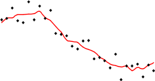
It is apparent that the red line representing the interpolated values is less extreme than any of the sample values represented by the point symbols. This is a strong assumption made by simple interpolation methods that kriging attempts to address (see later in this lesson).
Distinction Between Interpolation and Kernel Density Estimation
It is easy to get interpolation and density estimation [5] confused and, in some cases, the mathematics used is very similar, adding to the confusion.
Spatial Interpolation - Regression on Spatial Coordinates: Trend Surface Analysis
With even a basic appreciation of regression [6] (Lesson 5), the idea behind trend surface analysis [7] is very clear. Treat the observations (temperature, height, rainfall, population density, whatever they might be) as the dependent variable in a regression model that uses spatial coordinates as its independent variables [8].
This is a little more complex than simple regression, but only just. Instead of finding an equation
where z are the observations of the dependent variable, and x is the independent variable, we find an equation
where z is the observational data, and x and y are the geographic coordinates of locations where the observations are made. This equation defines a plane of "best fit."
In fact, trend surface analysis finds the underlying first-order trend in a spatial dataset (hence the name).
As an example of the method, Figure 6.2 shows the settlement dates for a number of towns in Pennsylvania as vertical lines such that longer lines represent later settlement. The general trend of early settlement in the southeast of the state around Philadelphia to later settlement heading north and westwards is evident.
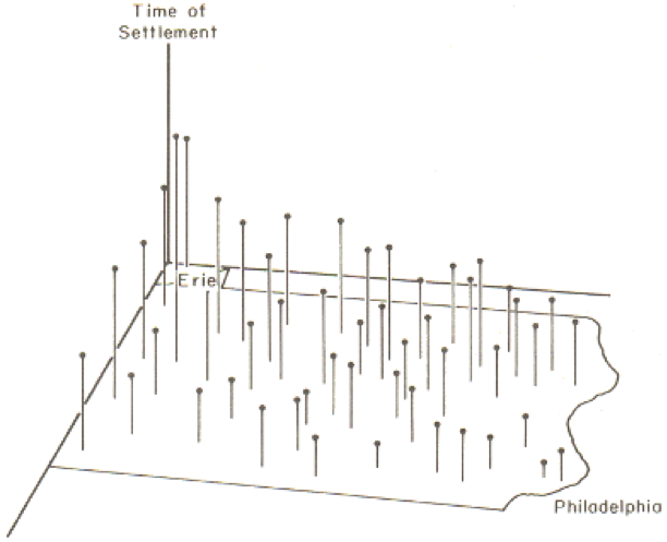
In this case, latitude and longitude are the x and y variables, and time of settlement is the z variable.
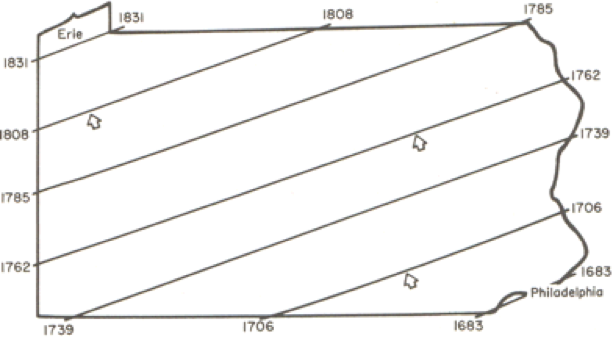
When trend surface analysis is conducted on this dataset, we obtain an upward sloping mean [2] time of settlement surface that clearly reflects the evident trend, and we can draw isolines (contour lines) [9] of the mean settlement date (Figure 6.3).
While this confirms the evident trend in the data, it is also useful to look at departures from the trend surface, which, in regression analysis are called residuals or errors (Figure 6.4).
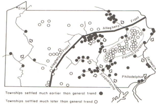
The role of the physical geography of the state on settlement time is evident in the pattern of early and late settlement, where most of the early settlement dates are along the Susquehanna River valley, and many of the late settlements are beyond the ridge line of the Allegheny Front.
This is a relatively unusual application of trend surface analysis. It is much more commonly used as a step in universal kriging, when it is used to remove the first order [10] trend from data, so that the kriging procedure can be used to model the second order [11] spatial structure of the data.
A Statistical Approach to Interpolation: Kriging
Required Reading:
Before we go any further, you need to read a portion of the chapter associated with this lesson from the course text:
- Chapter 7, "Spatial Prediction 2: Geostatistics," pages 191 - 212.
We have seen how simple interpolation methods use locational information in a dataset to improve estimated values at unmeasured locations. We have also seen how a more 'statistical' approach can be used to reveal first order [10] trends in spatial data. The former approach makes some very simple assumptions about the 'first law of geography' in order to improve estimation. The latter approach uses only observed patterns [12] in the data to derive spatial patterns. The last approach to spatial interpolation that we consider combines both methods by using the data to develop a mathematical model for the spatial relationships in the data, and then uses this model to determine the appropriate weights for spatially weighted sums.
The mathematical model for the spatial relationships in a dataset is the semivariogram [13]. In some texts, including your course text, this model is called a variogram. The sequence of steps beginning on page 197 of the course text, Local Models for Spatial Analysis, describes how a (semi-)variogram function may be fitted to a set of spatial data. See also Figure 7.4 in the text on page 205.
It is not important in this course to understand the mathematics involved here in great detail. It is more important to understand the aim, which is to obtain a concise mathematical description of some of the spatial properties of the observed data that may then be used to improve estimates of values at unmeasured locations.
You can get a better feel for how the variogram cloud and the semivariogram work by experimenting with the Geostatistical Wizard extension in ArcGIS, which you can do in this week's project.
Semivariogram and Kriging
Exploring Spatial Variation
This long and complex section builds on the previous material by first giving a more complete account of the semivariogram [13]. Particularly noteworthy are:
- The discussion beginning on page 198 (section 7.4.4 and its associated subjections) demands careful study. It describes how the (semi-)variogram summarizes three aspects of the spatial structure of the data:
- The local variability in observations, in a sense, the uncertainty of measurements, regardless of spatial aspects, is represented by the nugget [14] value;
- The characteristic spatial scale of the data is represented by the range [15]. At distances [16] greater than the range, observations are of little use in estimating an unknown value;
- The underlying variance in the data is represented by the sill [17] value.
Kriging
Make sure that you read through the discussion of the different forms of kriging. There isn't one form of kriging, but several. Each form has definite assumptions, and those assumptions need to be met for the interpolation to give accurate results. For example, universal kriging is a form of kriging that is used when the data exhibit a strong first order [10] trend. You would be able to see a trend, for example, in a semivariogram as the sill value would not be 'leveling off' but continuously rising. Because of the trend, the further apart are any two observations, the more different their data values will be. We cope with this by modeling the trend using trend surface analysis [7], subtracting the trend from the base data to get residuals, and then fitting a semivariogram to the residuals. This form of kriging is more complex than ordinary kriging where the local mean of the data are unknown but assumed to be equal. There is co-kriging, simple kriging, block kriging, punctual kriging, and the list continues.
If you have a strong background in mathematics, you may relish the discussion of kriging, otherwise you will most likely be thinking, "Huh?!" If that's the case, don't panic! It is possible to carry out kriging without fully understanding the mathematical details, as we will see in this week's project. If you are likely to use kriging a lot in your work, I would recommend finding out more from one of the references in the text (Isaaks and Srivastava's Introduction to Geostatistics [18]) is particularly good, and amazingly readable given the complexities involved.
Quiz
Ready? Take the Lesson 6: Advanced Interpolation Quiz to check your knowledge! Return now to the Lesson 6 folder in Canvas to access it. You have an unlimited number of attempts and must score 90% or more.
Project 6: Interpolation Methods
Introduction
This week and next, we'll work on data from Central Pennsylvania, where Penn State's University Park campus is located. This week, we'll be working with elevation data showing the complex topography of the region. Next week, we'll see how this ancient topography affects the contemporary problem of determining the best location for a new high school.
The aim of this week's project is to give you some practical experience with interpolation methods, so that you can develop a feel for the characteristics of the surfaces produced by different methods.
To enhance the educational value of this project, we will be working in a rather unrealistic way, because you will know at all times the correct interpolated surface, namely the elevation values for this part of central Pennsylvania. This means that it is possible to compare the interpolated surfaces you create with the 'right' answer, and to start to understand how some methods produce more useful results than others. In real-world applications, you don't have the luxury of knowing the 'right answer' in this way, but it is a useful way of getting to know the properties of different interpolation methods.
In particular, we will be looking at how the ability to incorporate information about the spatial structure of a set of control points into kriging using the semivariogram can significantly improve the accuracy of the estimates produced by interpolation.
Note: To further enhance your learning experience, this week I would particularly encourage you to contribute to the project Discussion Forum. There are a lot of options in the settings you can use for any given interpolation method, and there is much to be learned from asking others what they have been doing, suggesting options for others to try, and generally exchanging ideas about what's going on. I will contribute to the discussion when it seems appropriate. Remember that a component of the grade for this course is based on participation, so, if you've been quiet so far, this is an invitation to speak up!
Project Resources
The data files you need for the Lesson 6 Project are available in Canvas in a zip archive file. If you have any difficulty downloading this file, please contact me.
- Geog586_Les6_Project.zip (zip file available in Canvas) for ArcGIS
Once you have downloaded the file, double-click on the Geog586_Les6_Project.zip file to launch WinZip, PKZip, 7-Zip, or another file compression utility. Follow your software's prompts to decompress the file. Unzipping this archive, you should get a file geodatabase directory (centralPA_gdb.gdb) and an ArcGIS Pro package or ArcMap .mxd.
- pacounties - the counties of Pennsylvania
- centreCounty - Centre County, Pennsylvania, home to Penn State
- pa_topo - a DEM at 500 meter resolution showing elevations across Pennsylvania
- majorRoads - major routes in Centre County
- localRoads - local roads, which allow you to see the major settlements in Centre County, particularly State College in the south, and Bellefonte, the county seat, in the center of the county
- allSpotHeights - this is a point layer of all the spot heights derived from the statewide DEM
Summary of Project 6 Deliverables
For Project 6, the minimum items you are required to submit are as follows:
- Make an interpolated map using the inverse distance weighted method. Insert this map into your write-up, along with your commentary on the advantages and disadvantages of this method, and a discussion of why you chose the settings that you did.
- Make a layer showing the error at each location in the interpolated map. You may present this as a contour map over the actual or interpolated data if you prefer. Insert this map into your write-up, along with your commentary describing the spatial patterns of error in this case.
- Make two maps using simple kriging, one with an isotropic semivariogram, the other with an anisotropic semivariogram. Insert these into your write-up, along with your commentary on what you learned from this process. How does an anisotropic semivariogram improve your results?
Questions?
Please use the 'Discussion - Lesson 6' forum to ask for clarification on any of these concepts and ideas. Hopefully, some of your classmates will be able to help with answering your questions, and I will also provide further commentary there where appropriate.
Project 6: Making A Random Spot Height Dataset
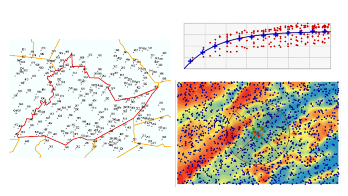
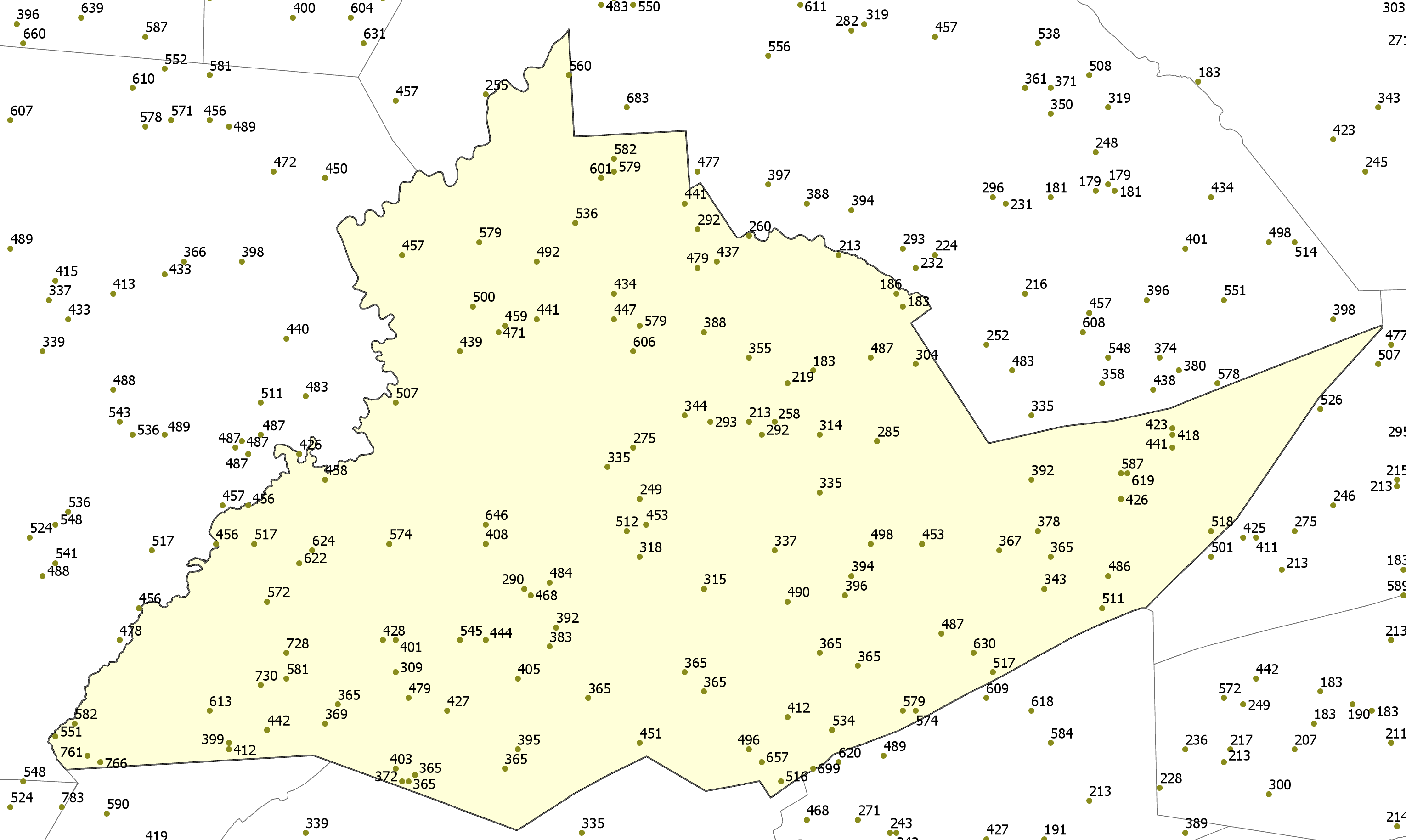
In this case, we have a 500 meter resolution DEM, so interpolation would not normally be necessary, assuming that this resolution was adequate for our purposes. For the purposes of this project, we will create a random set of spot heights derived from the DEM, so that we can work with those spot heights to evaluate how well different interpolation methods reconstruct the original data.
The easiest way to do this is to use the Geostatistical Analyst - Utilities - Subset features tool. This tool is self-explanatory - you will want to run it on the allSpotHeights layer, and make a sample of 5% of the control points, or, alternatively, you can specify how many points you want (about 1500). You do not need to specify both a training feature class and a test feature class (that is helpful if you want to split a dataset for Machine Learning classifier). Here we are just interested in a 5% sample and only need one feature class. Make sure you turn on the Geostatistical Analyst extension to enable the tool.
An alternative approach might be to use the Data Management - Create Random Points and the Spatial Analyst - Extraction - Extract By Points tools. If you have the appropriate licenses (Advanced), then you can experiment with using these instead to generate around 1500 spot heights.
A typical random selection of spot heights is shown in Figure 6.5 (I've labeled the points with their values).
Project 6: Inverse Distance Weighted Interpolation (1)
Preliminaries
There are two Inverse Distance Weighting (IDW) tools that you can use to work with this data. The IDW tool can be found in the Spatial Analyst and Geostatistical Analyst tools. While each IDW tool creates essentially the same output, each tool includes different parameters. Both tools include the ability to specify the power, number of points to include when interpolating a given point, whether the search radius is fixed or variable, etc. However, the IDW tool found in the Geostatistical Analyst includes the parameters to change the search window shape (from a circle to an ellipse), change the orientation of the search window, change the length of the semi-major and semi-minor axes of the search window, etc. to enable more of a customizable search window. You can use either tool to complete this lesson. In fact, I would encourage you to experiment a bit with both IDW tools for the first part of this lesson and see what differences result.
To enable the Spatial Analyst:
- Select the menu item Analysis - Toolboxes... and select either the Geostatistical Analyst - Interpolation - IDW or the Spatial Analyst - Interpolation - IDW tool.
Performing inverse distance weighted interpolation
Figure 6.6 shows the IDW dialog for the Spatial Analyst tool.
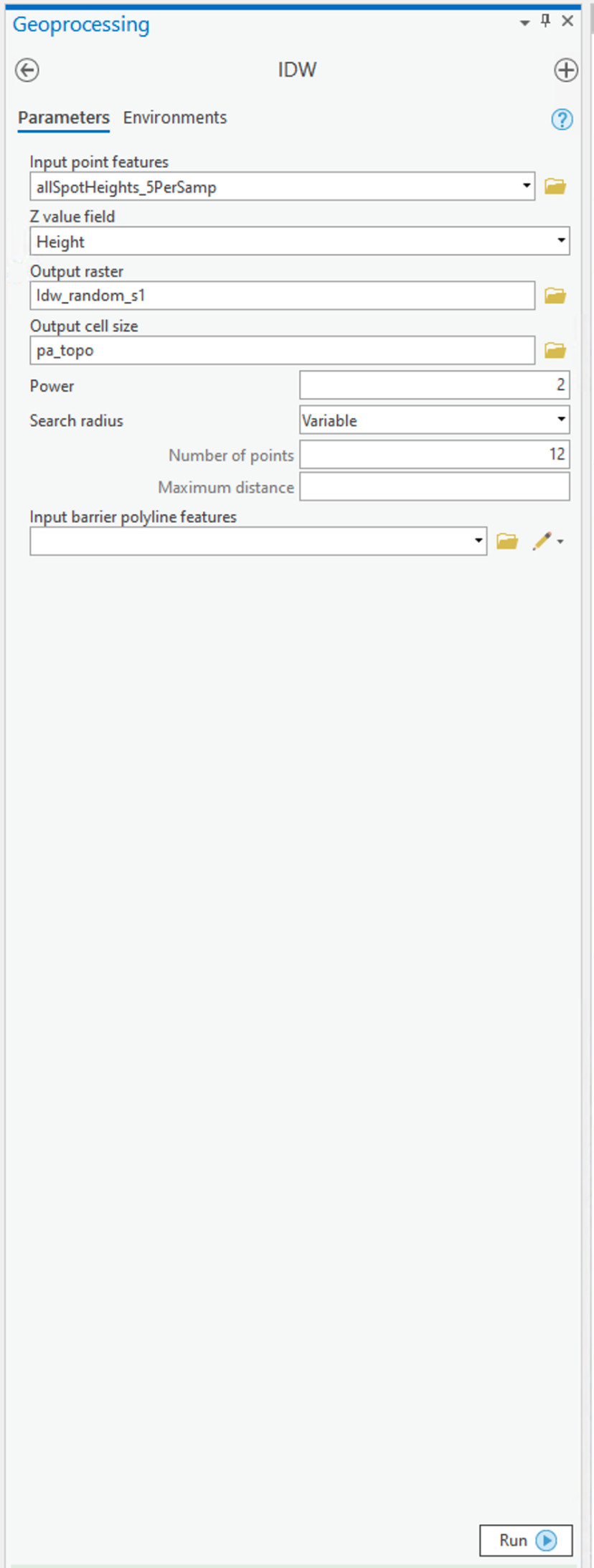
To set up the Spatial Analyst options:
- Select the Environments... tab item on the tool window - set the Mask to match the allSpotHeights layer. Set the Output Cell Size to be the Same as layer pa_topo.
- Select the Parameters... tab item on the tool window.
- Here are the options on the Parameters tab that you can specify that as discussed in the text:
- Input points specifies the layer containing the randomly sampled control points.
- Z value field specifies which attribute of the control points you are interpolating (in our case, it should be Height).
- Output raster. To begin with, it's worth requesting a <Temporary> output until you get a feel for how things work. Once you are more comfortable with it, you can specify a file name for permanent storage of the output as raster dataset.
- Output cell size. This cell size should be defined as 500 meters already (when you set the Environments... values (see above)).
- Power is the inverse power for the interpolation. 1 is a simple inverse (1 / d), 2 is an inverse square (1 / d2). You can set a value close to 0 (but not 0) if you want to see what simple spatial averaging looks like.
- Search radius type specifies either 'Variable radius' defined by the number of points or 'Fixed radius' defined by a maximum distance.
- Search radius settings here you define Number of points and Maximum distance as required by the Search radius type you are using.
- You can safely ignore the Barrier polyline features settings.
Experiment with these settings until you have a map you are happy with.
Deliverable
Make an interpolated map using the inverse distance weighted method. Insert the map into your write-up, along with your commentary on the advantages and disadvantages of this method and a discussion of why you chose the settings that you did.
Project 6: Inverse Distance Weighted Interpolation (2)
Creating a map of interpolation errors
The Spatial Analyst IDW tool doesn't create a map of errors by default (why?) but, in this case, we have the correct data, so it is instructive to compile an error map to see where your interpolation output fits well and where it doesn't.
- Use the Spatial Analyst tool - Map Algebra - Raster Calculator... tool to bring up the Raster Calculator dialog (Figure 6.7).
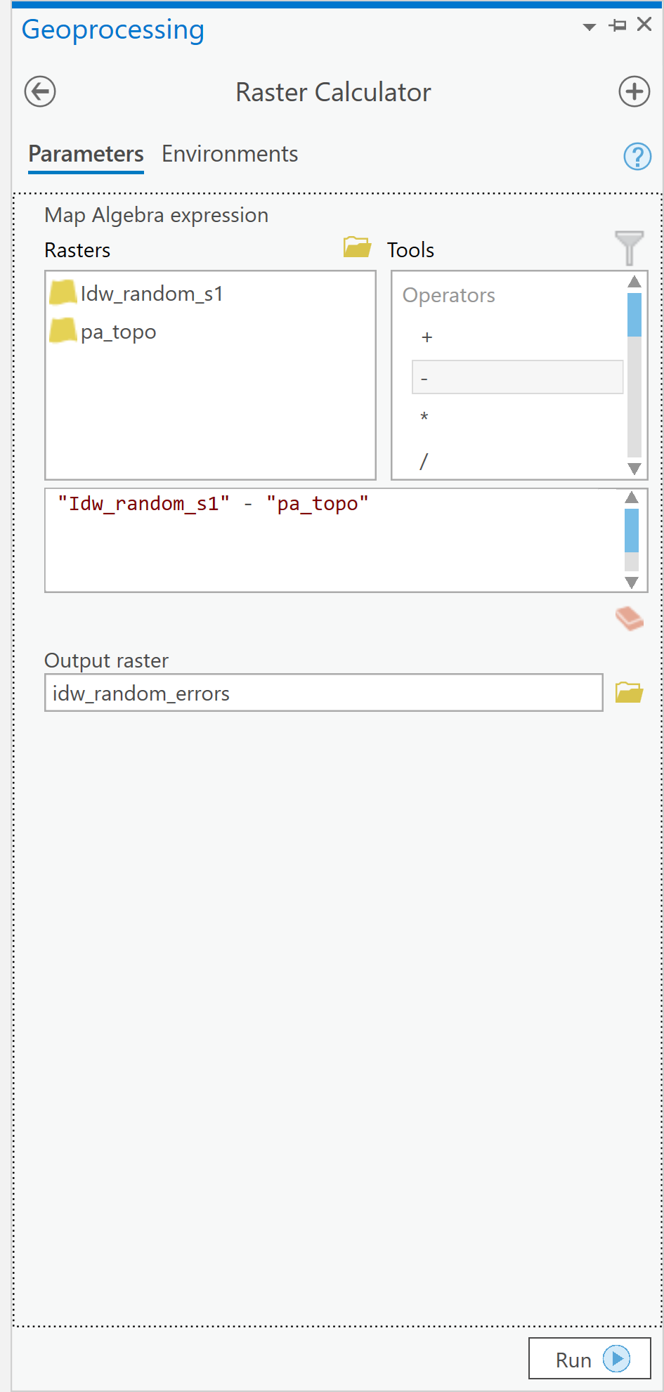 Figure 6.7: The Raster Calculator user interface.Credit: Kessler.
Here, you can define operations on raster map layers, such as calculating the error in your interpolation output. - The error at each location in your interpolated map is (interpolated elevation - actual elevation). It is a simple matter to enter this equation in the expression editor section of the dialog, as shown [note: the name of your interpolated layer may be different]. When you click Run, you should get a new raster layer showing the errors, both positive and negative, in your interpolation output.
- Using the Spatial Analyst Tools - Surface - Contour tool, you can draw error contours and examine how these relate to both your interpolated and actual elevation maps. When designing your map, think about how you would choose colors to appropriately symbolize the positive and negative errors. Some ideas to think about when examining the error contours...
- Where are the errors largest?
- What are the errors at or near control points in the random spot heights layer?
- What feature of these data does inverse distance weighted interpolation not capture well?
Deliverable
Make a layer showing the error at each location in the interpolated map. You may present this as a contour map over the actual or interpolated data if you prefer. Insert the map into your write-up, along with your commentary describing the spatial patterns of error in this case.
Project 6: Kriging Using The Geostatistical Wizard
Preliminaries
To use the Geostatistical Analyst, look along the main menu listing and choose Analysis. Then, along the tool ribbon, click on the Geostatistical Wizard toolbar icon. The dialogue window will appear.
'Simple' kriging
We use the Geostatistical Wizard to run kriging analyses.
- The Geostatistical Wizard: Choose Method and Input Data dialog (Figure 6.8).
Begin by selecting Kriging/Cokriging from the list. Next, specify the Input Data (your random spot heights layer) and the Data field (Height) that you are interpolating. Then click Next >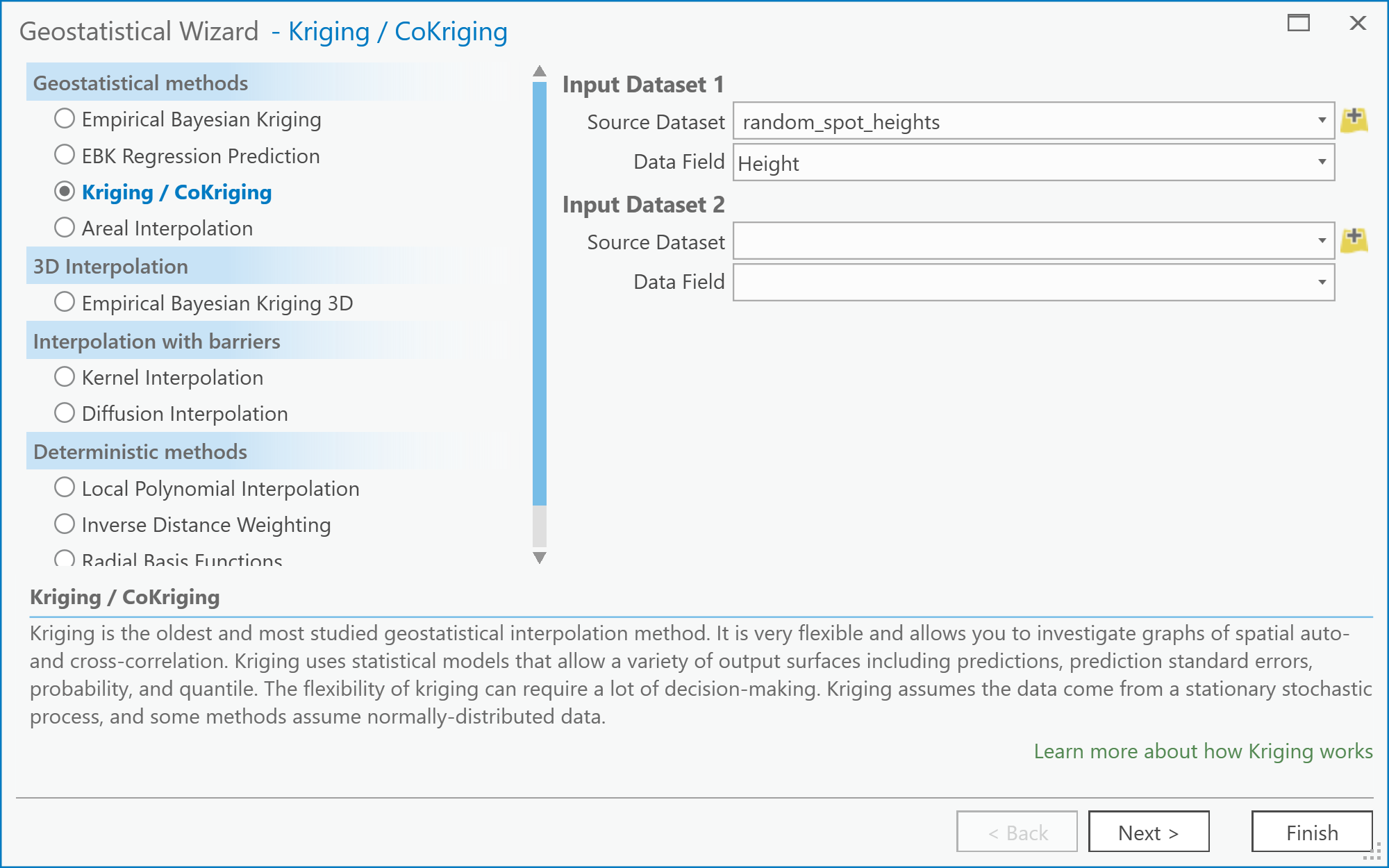 Figure 6.8: The Choose Method and Data Input screen of the Geostatistical Wizard: Kriging/CoKriging user interface.Credit: Kessler
 - The Geostatistical Wizard - Kriging dialog
The next step allows you to select the exact form of kriging you plan to perform (Figure 6.9). You should specify a Simple Kriging method and Prediction output type. Under the Transformation type, select None. Note that you can explore the possibilities for trend removal later, once you have worked through the steps of the wizard. If you do so, you will be presented with an additional window in the wizard, which allows you to inspect the trend surface you are using. For now, just click Next.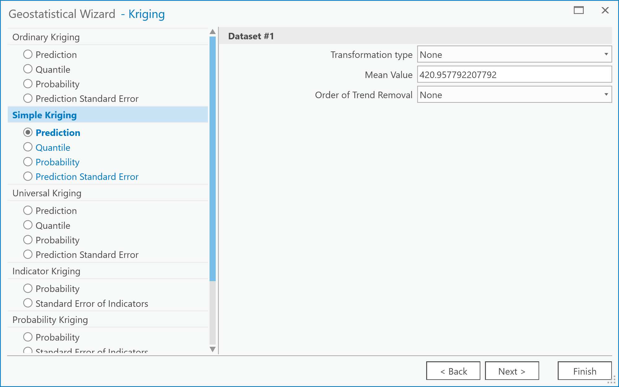 Figure 6.9: The Kriging screen of the Geostatistical Wizard: Kriging/CoKriging user interface.Credit: Kessler
 - The Geostatistical Wizard - Semivariogram/Covariance Modeling dialog (Figure 6.10).
Here you should see the semivariogram plot on the left by selecting the Function Type. A goal with kriging is to choose a model that "fits" the scatter of points. There are several models from which to choose. These models are found under the pull-down menu located to the right of the Model #1 option. Choosing different models automatically updates the "fit" (or blue line) in the semivariogram. You can experiment with choosing different models. Note that you may not immediately see a difference in the fit of any given model to the scatter of points.
There is also an option here to specify assuming Anisotropy (True/False) in constructing the semivariogram (you may want to refer back to the readings in the text on understanding this idea better). This will be an important concept later, when it comes to the deliverables for this part of the project.
When you are finished experimenting, click on Next.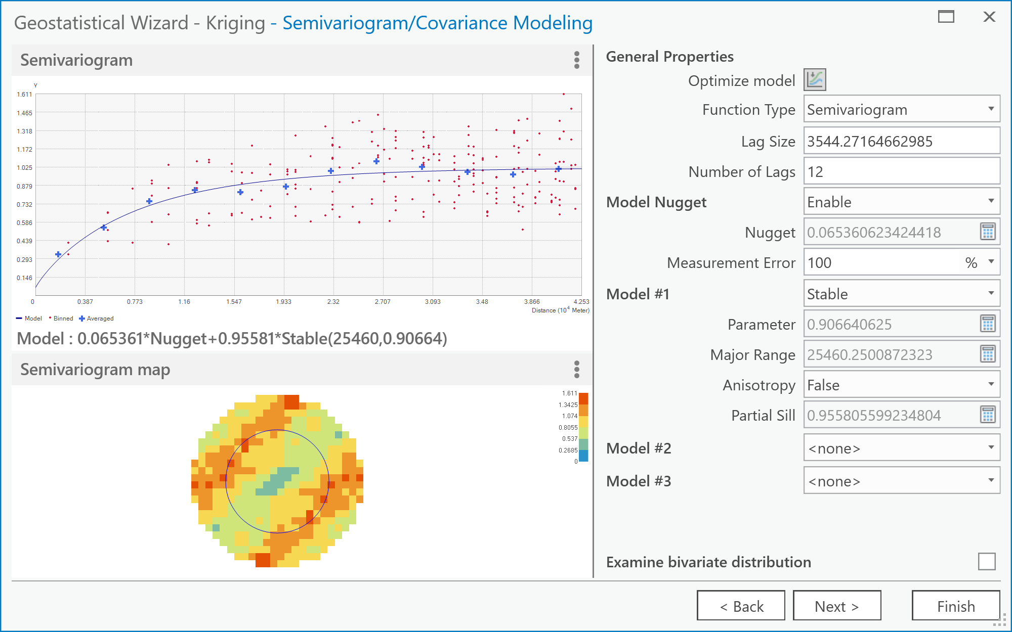 Figure 6.10: The Semivariogram/Covariance Modeling screen of the Geostatistical Wizard: Kriging/CoKriging user interface.Credit: Kessler
 - The Geostatistical Wizard - Searching Neighborhood dialog (Figure 6.11).
Here you can get previews of what the interpolated surface will look like given the currently selected parameters. Also, specify how many neighbors to include using the Neighborhood Type options. You can specify how many Neighbors to Include in the local estimates and also how they are distributed around the location to be estimated using the Sector Type options. The various 'pie slice' or sector options define several regions around the estimation location. These sectors are each required to contain the defined number of neighboring control points, as specified by the minimum and maximum neighbors options.
Together, these options enable a wide range of neighborhood types to be applied, and you should feel free to experiment. Often, you will find that it takes dramatic changes to the neighborhood specification to make much noticeable difference to the outcome surface.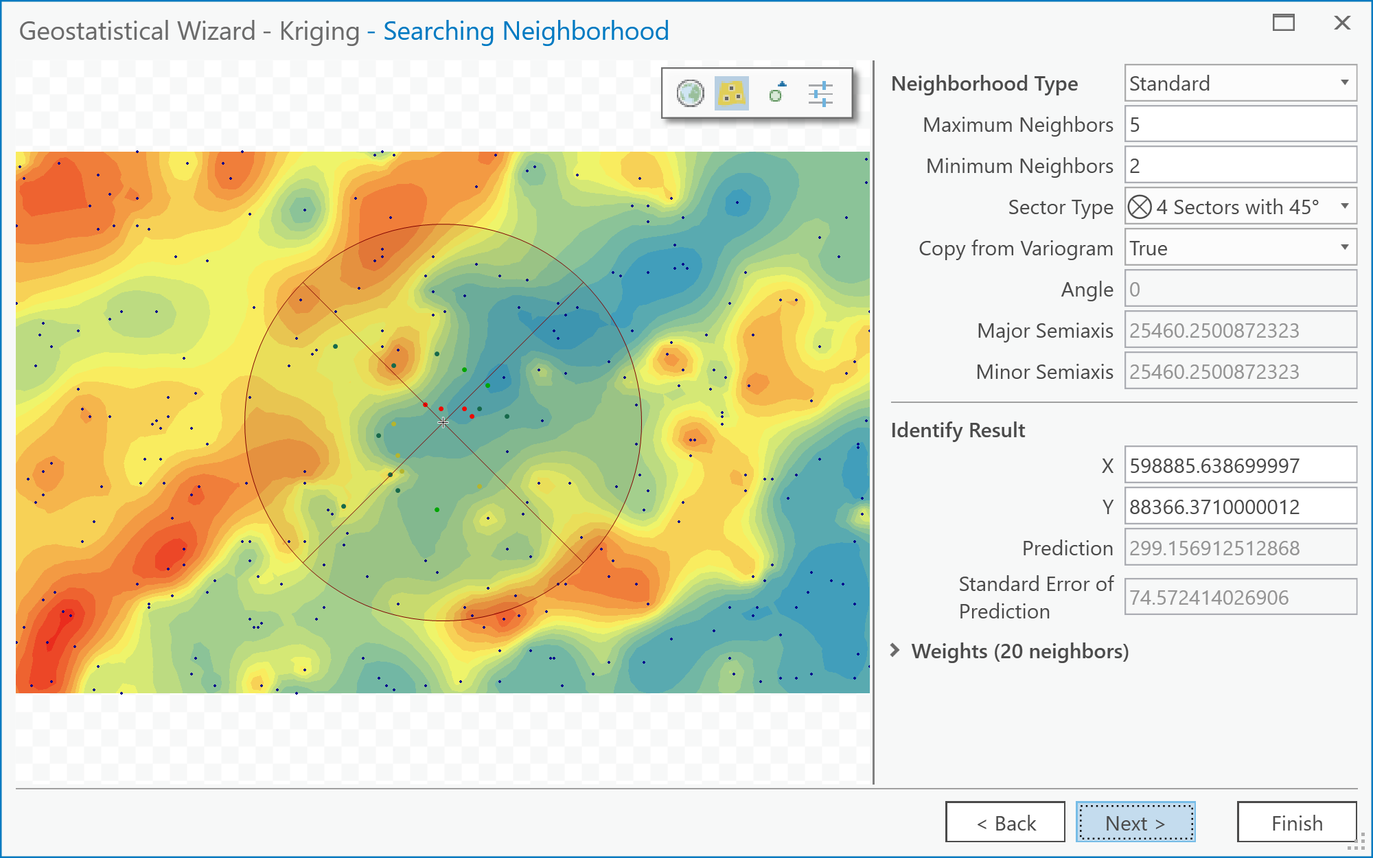 Figure 6.11: The Searching Neighborhood screen of the Geostatistical Wizard: Kriging/CoKriging user interface.Credit: Kessler
 - After this stage, click Next and then Finish. (We won't be going into the Cross Validation screen in the Wizard, although you can explore it, if you like!) As a suggestion, the different parameters listed on this screen give an assessment of the overall error in the kriging. You can compare one or more of the values on this screen between the Anisotropy option set to True and False. The Geostatistical Analyst makes a new layer and adds it to the map. You may find it helpful to right-click on it and adjust its Symbology so that only contours are displayed when comparing this layer to the 'correct' result (i.e., the pa_topo layer).
Things to do...
The above steps have walked you through the rather involved process of creating an interpolated map by kriging. What you should do now is simply stated, but may take a while experimenting with various settings.
Deliverable
Make two maps using simple kriging, one with an isotropic semivariogram, the other with an anisotropic semivariogram. Insert these into your write-up, along with your commentary on the different settings you applied, what is the difference between the two maps, and what you learned from this process. How (if at all) does an anisotropic semivariogram improve your results?
Try This!
See what you can achieve with universal kriging. The options are similar to simple kriging but allow use of a trend surface as a baseline estimate of the data, and this can improve the results further. Certainly, if kriging is an important method in your work, you will want to look more closely at the options available here.
Project 6: Finishing Up
Please put your write-up, or a link to your write-up, in the Project 6 drop-box.
Summary of Project 6 Deliverables
For Project 6, the minimum items you are required to submit are as follows:
- Make an interpolated map using the inverse distance weighted method. Insert this map into your write-up, along with your commentary on the advantages and disadvantages of this method, and a discussion of why you chose the settings that you did.
- Make a layer showing the error at each location in the interpolated map. You may present this as a contour map over the actual or interpolated data if you prefer. Insert this map into your write-up, along with your commentary describing the spatial patterns of error in this case.
- Make two maps using simple kriging, one with an isotropic semivariogram, the other with an anisotropic semivariogram. Insert these into your write-up, along with your commentary on what you learned from this process. How does an anisotropic semivariogram improve your results?
I suggest that you review the Lesson 6 Overview page [19] to be sure you have completed the all required work for Lesson 6.
That's it for Project 6!
Term Project (Week 6): Revising Your Project Proposal
Based on the feedback that you received from other students and from me, make final revisions on your project proposal and submit a final version this week. Note that you may lose points if your proposal suggests that you haven't been developing your thinking about your project.
In your revised proposal, you should try to respond to as many of the comments made by your reviewers as possible. However, it is OK to stick to your guns! You don't have to adjust every aspect of the proposal to accommodate reviewer concerns, but you should consider every point seriously, not just ignore them.
Your final proposal should be between 600 and 800 words in length (about 1.5 ~ 2 pages double-spaced max.). The maximum number of words you can use is 800. Make sure to include the same items as before:
- Topic and scope
- Aims
- Dataset(s)
- Data sources
- Intended analysis and outputs -- This is a little different from before. It should list some specific outputs (ideally several specific items) that can be used to judge how well you have done in attaining your stated aims. Note that failing to produce one of the stated outputs will not result in an automatic loss of points, but you will be expected to comment on why you were unable to achieve everything you set out to do (even if that means simply admitting that some other aspect took longer than anticipated, so you didn't get to it).
Additional writing and formatting guidelines are provided in a pdf document in the 'Term Project Overview' page in Term Project Module in Canvas.
Deliverable
Post your final project proposal to the Term Project -- Final Project Proposal drop box.
Questions?
Please use the Discussion - General Questions and Technical Help discussion forum to ask any questions now or at any point during this project.
Final Tasks
Lesson 6 Deliverables
- Complete the Lesson 6 quiz.
- Complete the Lesson 6 Weekly Project activities. This includes inserting maps and graphics into your write-up along with accompanying commentary. Submit your assignment to the 'Project 6 Drop Box' provided in Lesson 6 in Canvas.
- Submit your final project proposal to the 'Term Project - Final Project Proposal' drop box in Canvas.
Reminder - Complete all of the Lesson 6 tasks!
You have reached the end of Lesson 6! Double-check the to-do list on the Lesson 6 Overview page [19] to make sure you have completed all of the activities listed there before you begin Lesson 7.
Additional Resources:
Interpolation methods are used for creating continuous surfaces for many different phenomena. A common one that you will be familiar with is temperature.
Have a quick search using Google Scholar to see what types of articles you can find using the keywords "interpolation + temperature" or "kriging + temperature".