Regression Analysis: Understanding the Why?
Regression analysis is used to evaluate relationships between two or more variables. Identifying and measuring relationships lets you better understand what's going on in a place, predict where something is likely to occur, or begin to examine causes of why things occur where they do. For example, you might use regression analysis to explain elevated levels of lead in children using a set of related variables such as income, access to safe drinking water, and presence of lead-based paint in the household (corresponding to the age of the house). Typically, regression analysis helps you answer these why questions so that you can do something about them. If, for example, you discover that childhood lead levels are lower in neighborhoods where housing is newer (built since the 1980s) and has a water delivery system that uses non-lead based pipes, you can use that information to guide policy and make decisions about reducing lead exposure among children.
Regression analysis is a type of statistical evaluation that employs a model that describes the relationships between the dependent variable and the independent variables using a simplified mathematical form and provides three things (Schneider, Hommel and Blettner 2010):
- Description: Relationships among the dependent variable and the independent variables can be statistically described by means of regression analysis.
- Estimation: The values of the dependent variables can be estimated from the observed values of the independent variables.
- Prognostication: Risk factors that influence the outcome can be identified, and individual prognoses can be determined.
In summary, regression models are a SIMPLIFICATION of reality and provide us with:
- a simplified view of the relationship between 2 or more variables;
- a way of fitting a model to our data;
- a means for evaluating the importance of the variables and the fit (correctness) of the model;
- a way of trying to “explain” the variation in y across observations using another variable x;
- the ability to “predict” one variable (y - the dependent variable) using another variable (x - the independent variable)
Understanding why something is occurring in a particular location is important for determining how to respond and what is needed. During the last two weeks, we examined clustering in points and polygons to identify clusters of crime and population groups. This week, you will be introduced to regression analysis, which might be useful for understanding why those clusters might be there (or at least variables that are contributing to crime occurrence). To do so, we will be using methods that allow researchers to ask questions about the factors present in an area, whether as causes or as statistical correlates. One way that we can do this is through the application of correlation analysis and regression analysis. Correlation analysis enables us to examine the relationship between variables and examine how strong those relationships are, while regression analysis allows us to describe the relationship using mathematical and statistical means.
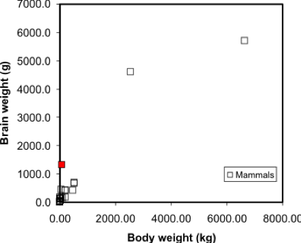
Simple linear regression is a method that models the variation in a dependent variable (y) by estimating a best-fit linear equation with an independent variable (x). The idea is that we have two sets of measurements on some collection of entities. Say, for example, we have data on the mean body and brain weights for a variety of animals (Figure 5.2). We would expect that heavier animals will have heavier brains, and this is confirmed by a scatterplot. Note these data are available in the R package MASS, in a dataset called 'mammals', which can be loaded by typing data (mammals) at the prompt.
A regression model makes this visual relationship more precise, by expressing it mathematically, and allows us to estimate the brain weight of animals not included in the sample data set. Once we have a model, we can insert any other animal weight into the equation and predict an animal brain weight. Visually, the regression equation is a trendline in the data. In fact, in many spreadsheet programs, you can determine the regression equation by adding a trendline to an X-Y plot, as shown in Figure 5.3.
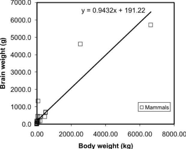
... and that's all there is to it! It is occasionally useful to know more of the underlying mathematics of regression, but the important thing is to appreciate that it allows the trend in a data set to be described by a simple equation.
One point worth making here is that this is a case where regression on these data may not be the best approach - looking at the graph, can you suggest a reason why? At the very least, the data shown in Figure 5.2 suggests there are problems with the data, and without cleaning the data, the regression results may not be meaningful.
Regression is the basis of another method of spatial interpolation called trend surface analysis, which will be discussed during next week’s lesson.
For this lesson, you will be analyzing health data from Ohio for 2017 and use correlation and regression analysis to predict percent of families below the poverty line on a county-level basis using various factors such as percent without health insurance, median household income, and percent unemployed.
Project Resources
You will be using RStudio to undertake your analysis this week. The packages that you will use include:
- ggplot2
- The ggplot2 package [1] includes numerous tools to create graphics in R.
- corrplot
- The corrpplot package [2] include useful tools for computing and graphical correlation analysis.
- car
- The car package [3] stands for “companion to applied regression” and offers many specific tools when carrying out a regression analysis.
- pastecs
- The pastecs package [4] stands for “package for analysis of space-time ecological series.”
- psych
- The psych package [5] includes procedures for psychological, psychometric, and personality research. It includes functions primariy designed for multivariate analysis and scale construction using factor analysis, principal component analysis, cluster analysis, reliability analysis and basic descriptive statistics.
- QuantPsyc
- The QuantPsyc package [6] stands for “quantitative psychology tools.“ It contains functions that are useful for data screening, testing moderation, mediation and estimating power. Note the capitalization of Q and P.
Data
The data you need to complete the Lesson 5 project are available in Canvas. If you have difficulty accessing the data, please contact me.
Poverty data (Ohio Community Survey [7]): The poverty dataset that you need to complete this assignment was compiled from the American Factfinder online data portal [8] and is from the 2017 data release. The data were collected at the county level.
The variables in this dataset include:
- percent of families with related children who are < 5 years old, and are below the poverty line (this is the dependent variable);
- percent of individuals > 18 years of age with no health insurance coverage (independent variable);
- median household income (independent variable);
- percent >18 years old who are unemployed (independent variable).
During this week’s lesson, you will use correlation and regression analysis to examine percent of families in poverty in Ohio’s 88 counties. To help you understand how to run a correlation and regression analysis on the data, this lesson has been broken down into the following steps:
Getting Started with RStudio/RMarkdown
- Setting up your workspace
- Installing the packages
Preparing the data for analysis
- Checking the working directory
- Listing available files
- Reading in the data
Explore the data
- Descriptive statistics and histograms
- Normality tests
- Testing for outliers
Examining Relationships in Data
- Scatterplots and correlation analysis
- Performing and assessing regression analysis
- Regression diagnostic utilities: checking assumptions