Heatwave Vulnerability, Impacts, and Mitigation Options
Introduction
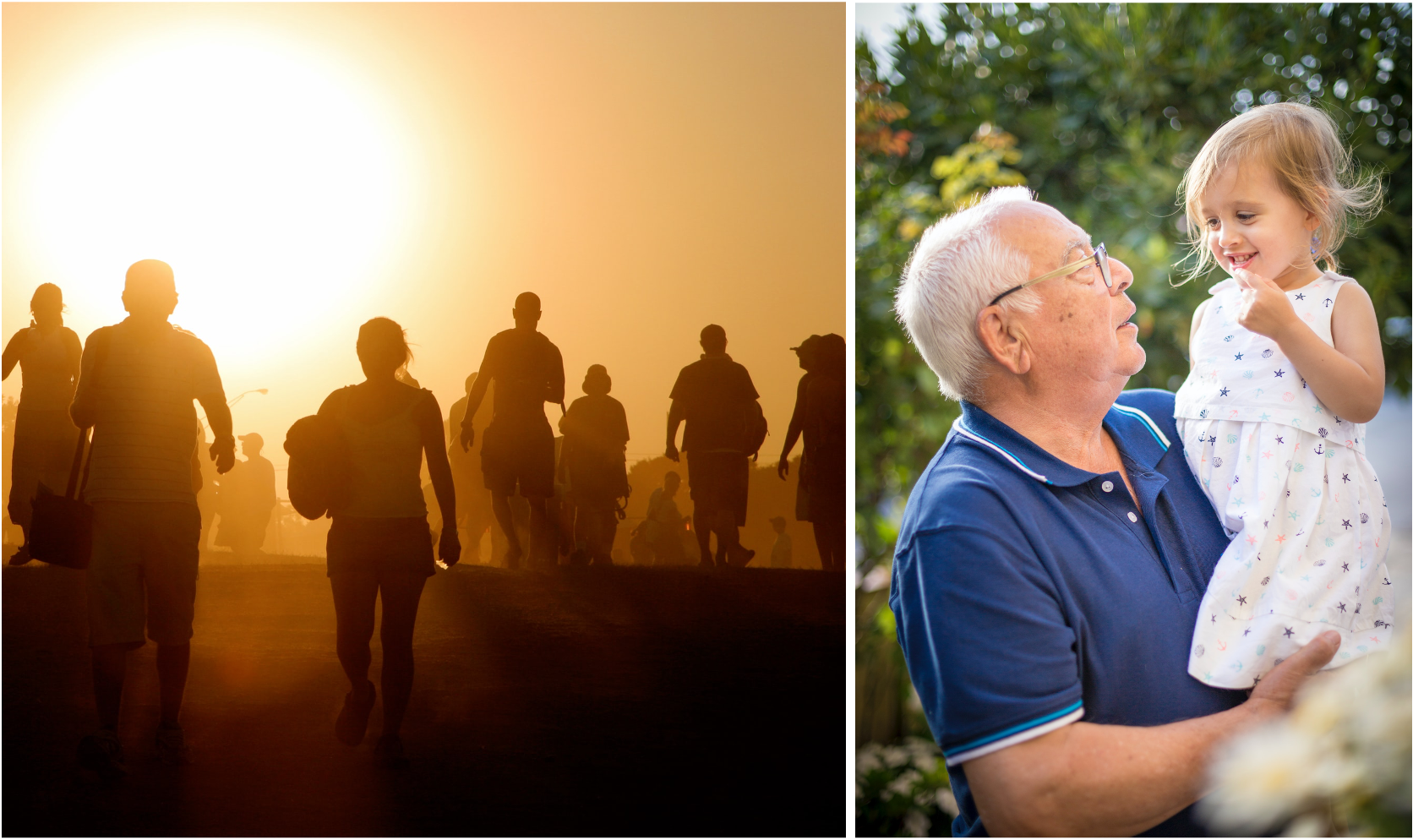
The last year has seen extreme heatwaves affecting much of the world including in China, India, the USA, and Europe. Heatwaves damage infrastructure, overload power grids, reduce work safety and productivity, and have negative impacts on quality of life in general. Moreover, more deaths and illness are due to heatwaves than any other natural disaster, and in the case of the USA and Australia, more than all other natural disasters combined.
Heatwaves can also compound the impacts of other types of disasters. For example, earlier this year Australia experienced extreme flooding followed by a heatwave. This led to a situation where people were outside cleaning up when temperatures were dangerously high.
Heatwave deaths and illness are generally thought of as being entirely preventable. That is, proper mitigation, preparedness and response activities can be undertaken to minimize or eliminate harm e.g., through effective heatwave warning systems and providing the public with “cool places” to get out of the heat.
There is also a strong emphasis on planning and implementing mitigation and adaptation strategies to reduce vulnerability and promote resilience when heatwaves strike. For example:
-
Urban planning might focus on “green and blue infrastructure” to reduce Urban Heat Island (UHI) effects;
-
Social welfare groups (e.g., Red Cross) have “opt-in” systems where vulnerable older people are contacted throughout the heatwave event to make sure they are coping well; and/or
-
Heat-health outreach to help educate the community about the dangers of extreme heat, how to respond to warning messages, and what steps to take.
Heatwave vulnerability and impacts are not spread evenly across populations and geography. This has a lot to do with differences in socioeconomic factors and characteristics of the built environment e.g., low tree cover, poorly designed housing. Just as there is a geography to vulnerability and impacts, there is also a geography to potential solutions. We often think of these as “spatially targeted interventions”.
In this exercise, you will consider these issues in greater detail and use spatial data and analysis to identify patterns of vulnerability and potential impact along with ways of addressing risk and reducing vulnerability.
Learning Goals
- Examine what defines a heatwave and its relationship to weather and microclimate
- Describe trends in heatwave occurrence, duration, and severity both in the past and in the context of global warming
- Develop an understanding of heat impacts on people and infrastructure, particularly regarding key socioeconomic vulnerabilities
- Understand how heatwaves are managed and how they can compound other common natural hazards
- Be able to discuss heatwave vulnerability, impacts, mitigation, and adaptation options in the context of the emergency response cycle
Analysis Steps
- Heatwave trends and impacts
- Vulnerability mapping and assessment
- Spatial analysis of mitigation and adaptation options
- Report to planners and emergency managers
Part 1 - Heatwave trends and impacts
In this section, you will take a close look at key characteristics of heatwaves, trends related to climate change, and some of the direct impacts of heat on people. You will produce a few graphs and maps that will be incorporated into your write-up in Part 4.
A. What are heatwaves?
Understanding Heatwaves (2:05)
Insert transcript here
From the video, take note of these key characteristics of heatwaves:
- Occurrence - How often do heatwaves occur?
- Duration - How long do they last?
- Severity - How severe are the impacts?
- Diurnal cooling - Is there 'cool relief' overnight e.g., are nights hot too?
Source: Australian Bureau of Meteorology Heatwave Forecast Service
Heatwaves are not defined just based on temperature, rather humidity and longer term trends (acclimatization) need to be incorporated. In the map above based on Excess Heat Factor (EHF), heatwaves are classified into three types, based on intensity. Note these mention potential impacts on people, infrastructure and the environment.
- Low-intensity heatwaves are the most common—most people are able to cope with this level of heat
- Severe heatwaves are less frequent and are challenging for vulnerable people such as the elderly—particularly those with pre-existing medical conditions
- Extreme heatwaves are the rarest kind. They affect the reliability of infrastructure, like power and transport, and are dangerous for anyone who does not take precautions to keep cool—even those who are healthy. People who work or exercise outdoors are particularly at risk
Source: Australian Bureau of Meteorology Heatwave Forecast Service
B. How have heatwaves have changed over time, and why?
Heatwave occurrence, duration and severity have all been changing over time. There are several important drivers of heatwaves, including reduction in vegetation cover and more built-up (impervious) surfaces in cities. Climate change is perhaps the strongest factor causing changes in heatwave characteristics (see list above).
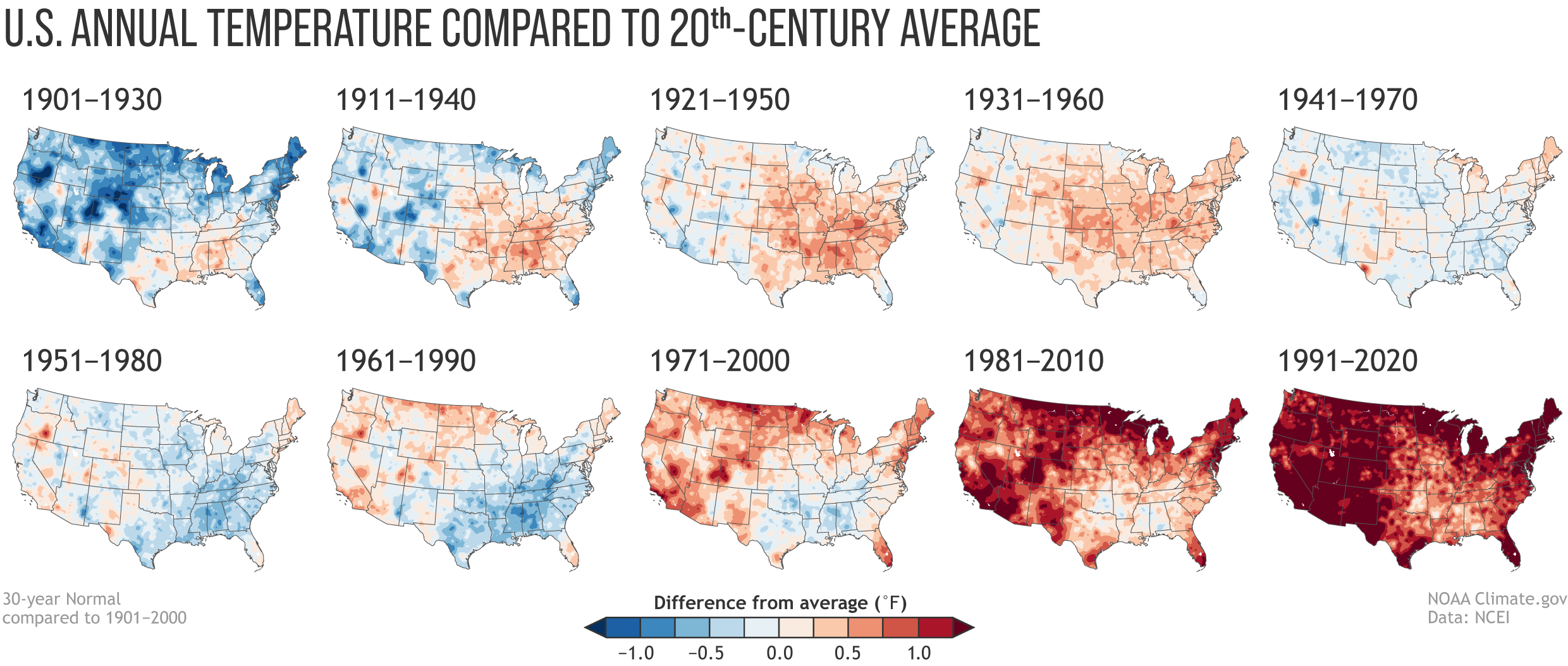
Consider the following series of maps showing annual temperature trends in the USA. These patterns are similar to what we are observing globally.
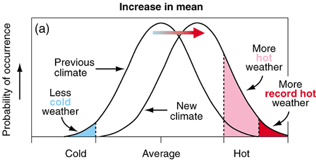
In addition to changes in average temperatures, there have also been changes in the occurrence of extreme events. The following diagram illustrates this, where a shift in mean climate results in more hot and extreme days. As an aside, there is a growing interest in the effects 'chronic heat' on health and wellbeing i.e., hot days but not falling into the 'heatwave' range.
You will finish off this section by conducting some analysis of trends in the key heatwave characteristics (mentioned above) in the USA.
- Create bar charts showing - Heatwave Characteristics in the US by Decade 1961-2021
- Use the "Heatwave characteristics USA - trends.csv" in the GEOG_858_Lesson_3 project folder (download from class OneDrive folder)
- You can use Microsoft Excel. Make sure the charts are easy to understand and have appropriate labels and titles. (A 2 x 2 panel of charts would be a good choice!)
- Create a map - Examine regional differences Heatwave Characteristics in 50 Large US Cities, 1961-2021
- Use the "Heatwaves_USA_cities_trends" table in the GEOG_858_Lesson_3 ArcGIS Pro project (created for you - GEOG_858_Lesson_2.aprx; download from class OneDrive folder)
- You will need to spatially enable this table using the latitude and longitude fields in the table
- Make sure the map is easy to understand and have appropriate symbology and design (graduate circles would be a good choice).
- Summarize the main trends/messages in a couple of sentences? This will feed into your report in Part 4.
Deliverables 1.1
- Create bar charts showing - Heatwave Characteristics in the US by Decade 1961-2021
- Create a map - Examine regional differences Heatwave Characteristics in 50 Large US Cities, 1961-2021
- Summarize the main trends/messages in a couple of sentences? This will feed into your report in Part 4.
C. Heatwave impacts
This section focuses on some of the "direct effects" of heatwaves on people, including deaths and illness.
The following image is a warning poster produced by the SA Health to help people recognize the signs of heat exhaustion and heat stroke. Note this is advice aimed at everyone and not targeted to specific groups or places.
Heat-Related Illness Signs, Symptoms And Treatment
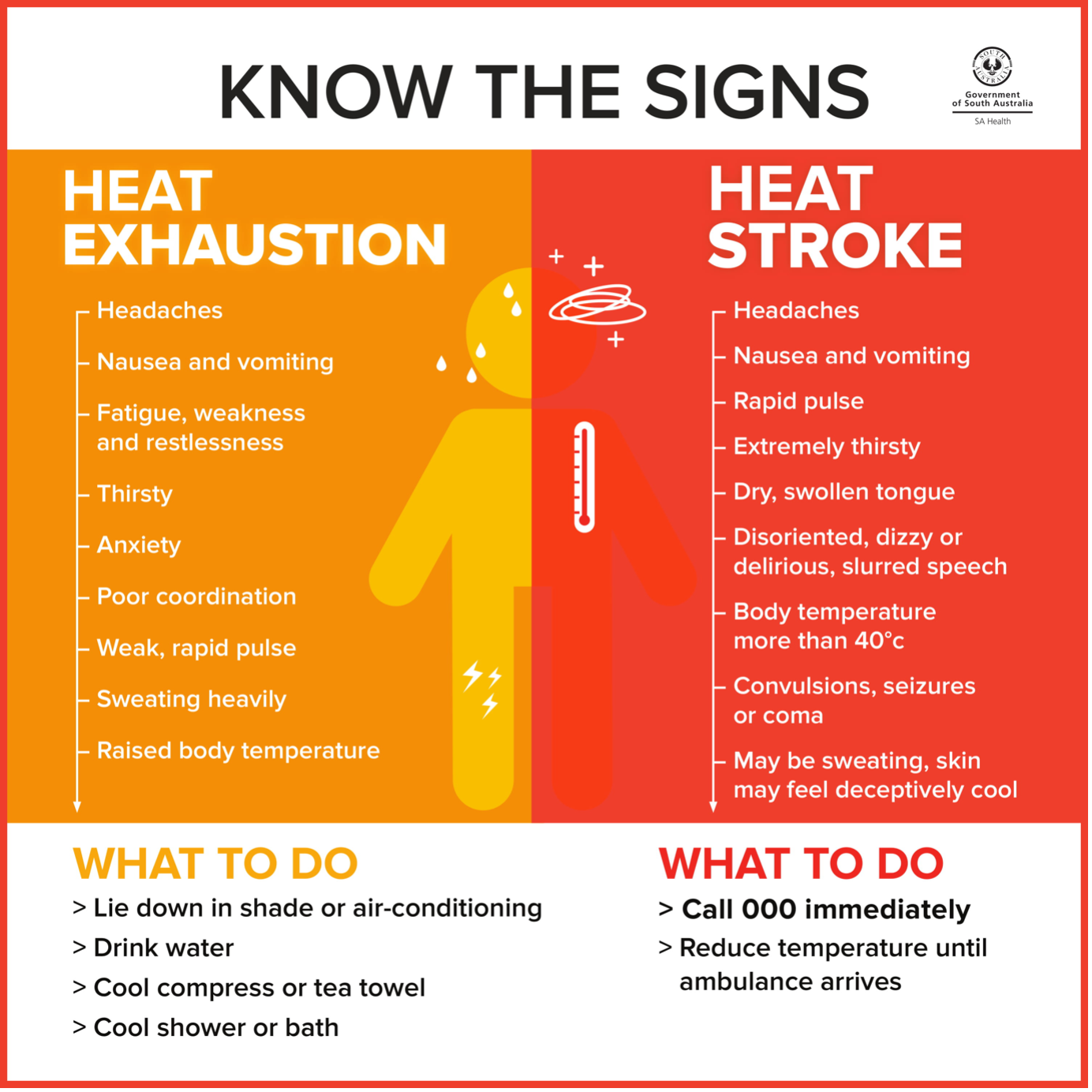
Public warning message, such as this, provide simple and consistent information. These are linked to dedicated websites focused on heat related health. Have a quick look at these two examples, again noting that heatwave illness and deaths are, in theory, entirely preventable.
- Heat-Related Illness Signs, Symptoms And Treatment page from SA Health.
- CDC's Natural Disasters and Severe Weather website.
Heatwaves also have significant impacts on critical infrastructure and the environment. We won't go into much detail, but watch this short video from the Today Show, noting the reporting on impacts to critical infrastructure and the environment. If you want to learn more, there is no shortage of news coverage and research literature on these impacts.
Record-Shattering Heat Wave Leads To Deaths Across Britain (2:24)
Insert transcript here
You will finish off this section by looking at some trends in heat related deaths and illness.
- Create a time-series graph showing - Deaths Classified as "Heat-Related" in the United States, 1979-2018
- Use the "Heat related deaths USA 1979 - 2020.csv" file in the GEOG_858_Lesson_3 project folder (download from class OneDrive folder)
- You can use Microsoft Excel. Make sure the charts are easy to understand and have appropriate labels and titles.
- Use the CDC National Environmental Public Health Tracking Network tool to examine broad patterns in heat related mortality and illness.
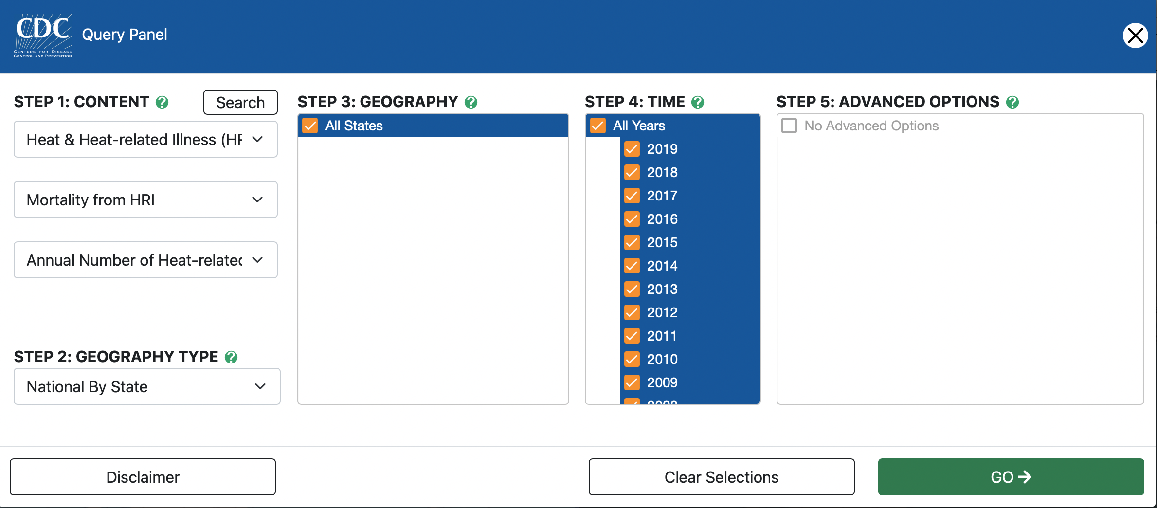
- Navigate to the website and have a look at what information is available. Then launch the Data Explorer Tool (noting this can be a little slow).
- On the left side map, fill in Steps 1-5 as shown in the image below. On the right side, use the same options but change "Mortality from HRI" to "Emergency Department Visits".
- Look at different years by adjusting the "Year" pull down menu.You can also click on the "Play" and observe how the number of cases vary by year.
- Consider taking a few screenshots to have on hand for Part 4.
- Finally, download the two datasets (Mortality and ED) using the "Export Data" button. Before leaving the site, change one of the maps to heat related Hospitalizations and export that data too.
- Create a time-series graph showing changes in mortality, emergency department admissions, and hospitalizations for California versus the national average.
- Open the Mortality dataset in Microsoft Excel and insert a Pivot Table. Drag "State" to the Filter box, "Years" to the Row box, and "Value" to the Values box (change from Count to Average). In a new worksheet, copy and past the pivot table as values. Rename columns to "Year" and "US_average".
- Go back to pivot table and select California from the State pull down menu, and change Average of value to Sum of value. Cut and paste the Sum of Value column to the sheet with the US_average. Your columns should have these headings - "Year", "US_average", and "California". Delete the Grand Total row.
- Plot the two time series together. Make sure the charts are easy to understand and have appropriate labels and titles.
- Repeat for Emergency Department and Hospitalizations and display the three charts on a single page for easy comparison.
- Summarize the main trends/messages in a couple of sentences? This will feed into your report in Part 4.
- Optional: You looked at counts of events. Would it be better to look at rates on a population basis (e.g., per 100,000)?
Deliverables 1.2
- Create a time-series graph showing - Deaths Classified as ""Heat-Related"" in the United States, 1979-2018.
- Use the CDC National Environmental Public Health Tracking Network tool to examine broad patterns in heat related mortality and illness.
- Create a time-series graph showing changes in mortality, emergency department admissions, and hospitalizations for California versus the national average.
- Summarize the main trends/messages in a couple of sentences? This will feed into your report in Part 4.
Part 2 - Vulnerability mapping and assessment
So far we have considered broad trends in heatwave characteristics and direct impacts on people (e.g., heat stroke) and infrastructure. In this section you will consider some of the factors that make a person or community more vulnerable to adverse heatwave impacts. We will be taking a much more granular look at the problem in this and the following sections.
What are the factors contributing to heatwave vulnerability?
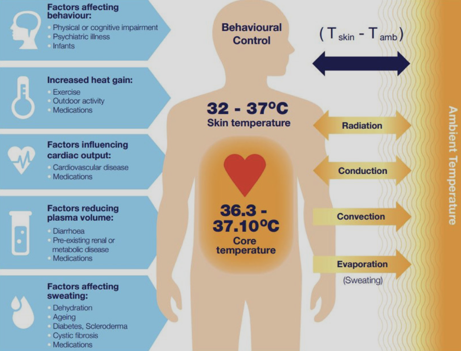
We are going to focus on heatwave vulnerability and impacts from the perspective of human health. This figure illustrates the basic problem - people must maintain their body temperature within a specific range to avoid adverse health outcomes. This is influenced by the ambient environment and characteristics of that person e.g., do they have existing health problems that may compromise their ability to thermo-regulate?
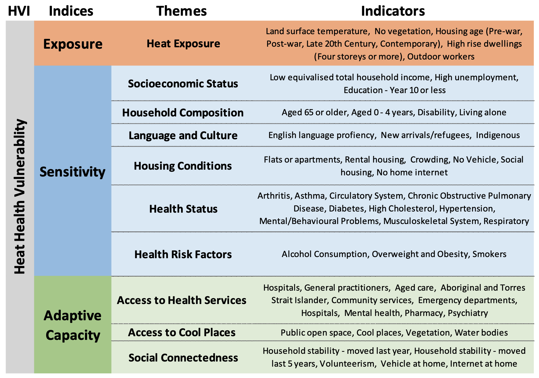
There are also a set of broader factors influencing heat health. The framework illustrated in this figure was used in a recent study to understand heat health vulnerability. This is similar to the CDC Social Vulnerability Index (SVI) you would have seen in one of the previous videos, however the focus here is explicitly on heatwaves.
Vulnerability indices
Generally speaking, indices are designed to help us describe concepts that are not able to be measured directly. For example, "Vulnerability" or "Socioeconomic status" are a multidimensional concept that cannot be measured with a single variable. There are many different indices developed for different purposes. Here you will take a closer look at two of the most widely used approaches.
FEMA's National Risk Index (NRI)
Have a closer look at the FEMA's National Risk Index website. There are three components to the NRI:

Note that the Social Vulnerability component is based on another index called the Social Vulnerability Index, or SoVI. This is one of the first approaches ever developed for emergency management, and it uses principal components analysis PCA) to reduce a set of variables to one index representing low to high vulnerability.
Similarly, Community Resilience is based on another commonly used approach called Baseline Resilience Indices for Communities (BRIC). BRIC also uses a set of indicators to build up the indices, but it does this through a "standardize and rank approach". To learn more, have a look at the NRI website and/or download the NRI manual.
When considering index approaches such as these (and any dataset for that matter), it is important to consult available metadata and "data dictionaries" (e.g.,here is the NRI data dictionary), sometimes referred to as the Data Item List (DIL), that goes with a given dataset. You will find the NRI data in the ArcGIS Pro Project accompanying this lesson. I have mapped the SoVI component of the NRI. Have a look at the NRI attribute table, scan the field names, and look up a few variables in the data dictionary.
CDC Social Vulnerability Index (SVI)
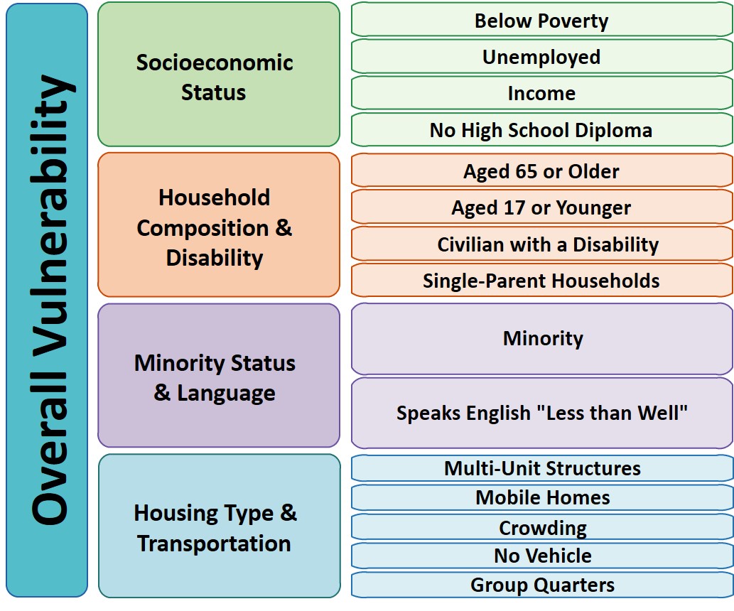
Next, have a closer look at the CDC Social Vulnerability Index (SVI). The SVI takes an approach that is similar to BRIC, where individual variables are used to calculate sub-indices (Themes) and then the overall index. For example, Socioeconomic Status cannot be measured directly, so "below poverty" line, "Unemployed", "Income", and "No High School Diploma" are combined to get at this construct.
Note the table accompanying the SVI feature class includes the underlying data that is used in the index calculations. If you want to "unpack" a given index, you can look at individual variables. For example, you may observe a "vulnerability hotspot" and wish to know why that is the case. SVI let's you drill down to themes and individual variables. In a particular area, you may find that socioeconomic status is the most important theme and poverty and unemployment may be the most important single indicators. You will take a closer look at the CDC SVI, and, as with NRI, it is important to have any metadata and data item list handy (open a copy with this link SVI data dictionary).
Urban Heat Island and Microclimate
When we hear about heatwaves, we often focus on weather as the main driver. However, heatwaves are experienced differently in different places due to variation in microclimate related to the build and natural environment.
Urban Heat Islands
Microclimate
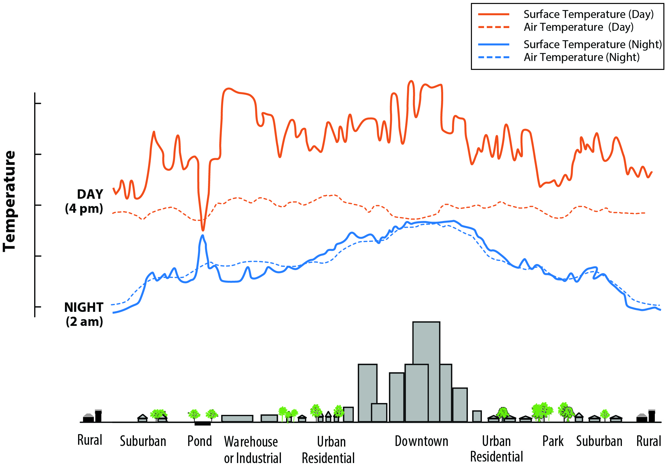
In addition to broader UHI effects, there is considerable variation in microclimate (e.g., local temperature) related to features of the built environment. In the following thermal image from Los Angeles in Summer 2018, you can clearly see higher temperatures in more built up areas. Major roads, downtown LA, and the Port of Long Beach stand out as hot spots while areas such as Beverly Hills and Santa Monica along the coast are cooler. Note how you can actually see the "hot" road network grid in the area around Anaheim. This illustrates very fine variation in land surface temperatures. A key point to takeaway, is that local conditions can enhance or ameliorate heatwaves e.g., think about the simple example of standing in an open parking lot versus standing under a tree during a heatwave!
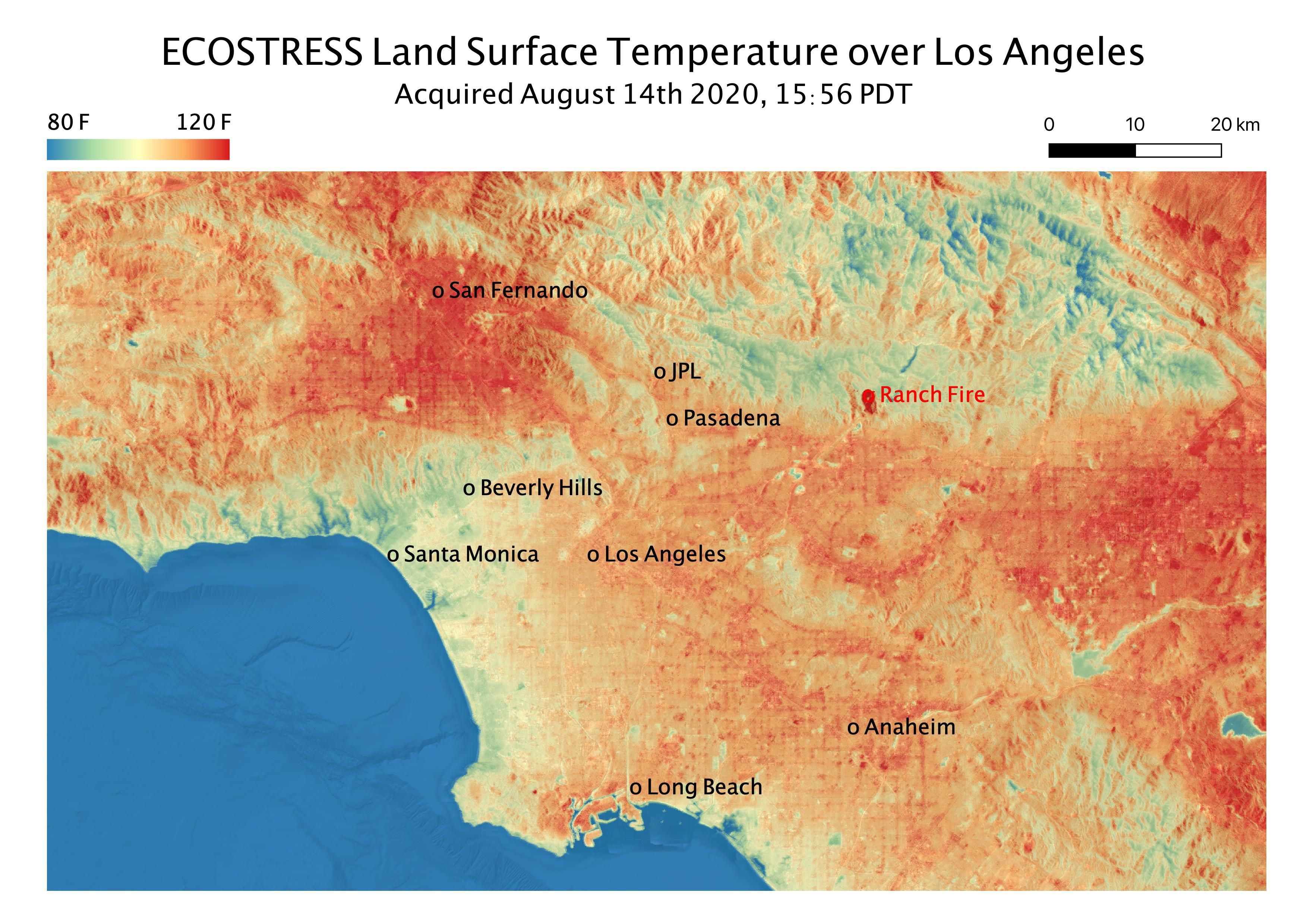
Los Angeles Heat Wave. Source: NASA Jet Propulsion Laboratory
You will finish off this section by continuing to looking heat health vulnerability in Los Angeles County, California. All of the spatial data are provided in the ArcGIS Pro Project, GEOG_858_Lesson_3.aprx.
Mapping social vulnerability
- Take a closer look at the National Risk Index (NRI) by first looking at the attribute tables and data dictionaries.
- The NRI data are in the "NRI_LA_County_tract" feature class. Look at the attribute table and data dictionary to get a general idea of what it contains.
- Create three maps based on these data, and consider putting them together on a single page for easy comparison.
- Overall NRI
- Social Vulnerability
- Community Resilience
- When mapping these data, use the Quintile classification method with five classes. This will put each census tract into groups of 20% each. Also, note you can copy and paste each feature within the Contents Panel as you create new maps i.e., you don't have to load a new feature class every time.
- Create three maps based on these data, and consider putting them together on a single page for easy comparison.
- The CDC SVI data are in the "SVI_LA_County_tract" feature class. Look at the attribute table and data dictionary to get a general idea of what it contains.
- Create four maps based on these data, and consider putting them together on a single page for easy comparison.
- The overall SVI
- Socioeconomic Status theme
- Minority Status and Language Theme
- Choose a single variable to map e.g., Aged over 65, single parent households,... your choice!
- Create four maps based on these data, and consider putting them together on a single page for easy comparison.
- Make sure your maps are easy to understand and have appropriate symbology and design.
- Summarize the main trends/messages in a couple of sentences? This will feed into your report in Part 4.
Urban Heat Island and Microclimate
- Look at the Urban Heat Island Map for Los Angeles County developed by CalEPA (already in the Lesson 3 ArcGIS Pro project). In 2-3 sentences, describe what this map is showing and how it relates to the social vulnerability mapping you did in the last section e.g., how intense is the UHI effect in vulnerable areas of LA County?
- Explore variation in microclimate using the California Heat Assessment Tool dataset in your ArcGIS Pro project. You can also use the online tool. Start by looking at the CHAT metadata and data dictionary. Note that the data in the project have been extracted from the CHAT website and represent historical conditions for June, July, and August and for the general population.
- From the "CHAT_LA_County_historical_JJA_general_population" feature class, map:
- Historical average maximum temperature
- Historical average duration
- Historical average number of events
- These can be single maps, but feel free to be creative e.g., can you visualize some of this data in a single map?
- From the "CHAT_LA_County_vulnerability_indicators", map
- CHAT Heat Health Action Index (heat_health_action_index)
- Percent population experiencing poverty (perc_poverty)
- One other vulnerability indicator of your choosing e.g., Elderly, Asthma Prevalence
- Make sure your maps are easy to understand and have appropriate symbology and design.
- Summarize the main trends/messages in a couple of sentences? This will feed into your report in Part 4.
Deliverables 2
|
Part 3 - Spatial analysis of mitigation and adaptation options
The final part of your analysis will focus on an assessment of a some heatwave mitigation options. The first focuses on "green infrastructure" and the role of tree canopy cover in urban cooling. You will then look at the distribution of "Cooling Centers" in LA County and the populations they serve. For both cases, you will use spatial data to assess the current situation and provide analysis and advice on what could be done in the future.
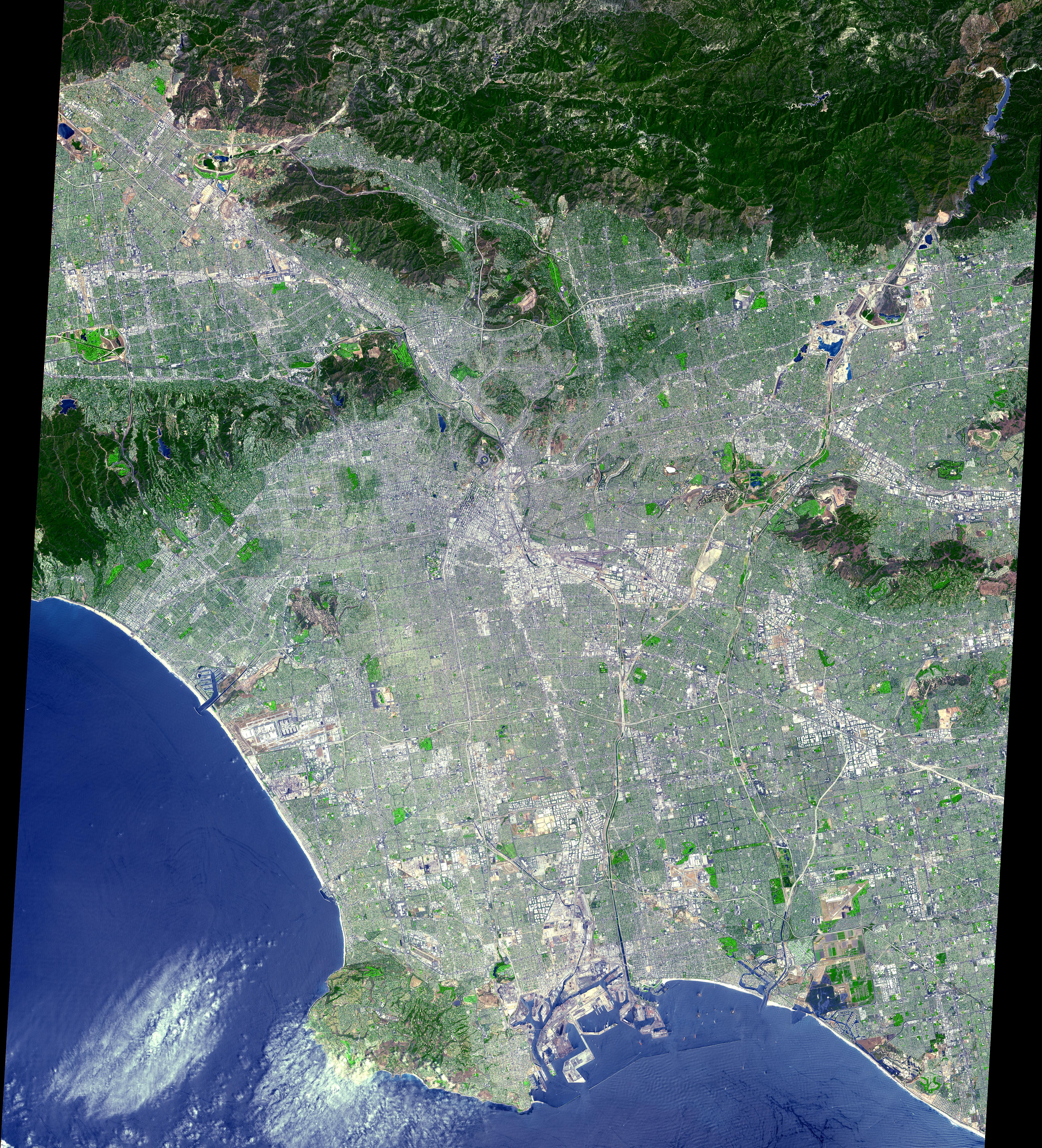
ASTER Los Angeles from Space - Source: NASA JPL
Canopy cover, social vulnerability and mitigation
- In the ArcGIS Pro project, display the Tree Canopy Layer. Note the general patterns across LA County.
- Create a second map showing one of the other land cover types e.g., Grass, Shrub, buildings.
- Use bi-variate maps to look at relationship between canopy cover and social vulnerability
- You will use the "CHAT_LA_County_vulnerability_indicators" layer.
- Take a look at the bi-variate map of the Heat Health Action Index and Percent No Tree Cover I have already created, and note how the bi-variate maps are set up in Symbology.
- What does the map show?
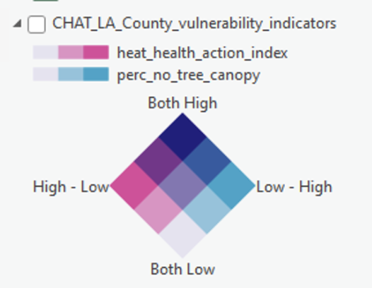 |
| Bi-variate map legend for Heat Health Action Index and Percent No Tree Cover. Note "Both High" indicates areas with low tree cover and high heat health vulnerability |
- Next, replace the Heat Health Action Index variable with another variable in the "CHAT_LA_County_vulnerability_indicators" layer e.g., poverty, race, asthma.
- When choosing think about what you want to investigate regarding the relationship between no canopy cover and social vulnerability.
- Finally, look at the bi-variate map showing existing versus potential tree cover. This has already been produced for you.
- The potential tree cover layer is based on whether there is "physical space" for new trees. What does this suggest about the potential for urban greening in vulnerable communities?
- Make sure your maps are easy to understand and have appropriate symbology and design.
- Summarize the main trends/messages in a couple of sentences? This will feed into your report in Part 4.
Cool place accessibility
Many cities now have designated "cool places" people can go during heatwaves. In this part of the exercise, you will look at whether officially designated cool places in LA County provide good coverage of the city, are easily accessible, and how they may be improved.
- Before getting started, make sure you are connected to the Penn State University Portal. You can check this by looking in the upper right side of ArcGIS Pro. You should see your name followed by the text "Penn State University". This is important because the next steps use Esri credits, and we don't want these deducted from your work account!
- In the Lesson 3 project showing the location of Cooling Centers. Have a look at the distribution and areas supported.
- Use the Generate Drive Time Trade Areas tool in ArcGIS Pro from the Business Analyst Toolbox.
- You will consider two cases
- Cooling centers that are within 15 minute and 30 minute walking times
- Cooling centers that are within 15 minute and 30 minute driving times
- Run these tools and view the mapped results
- You will consider two cases
- Now estimate the proportion of the LA County population that falls within a 15 minute walk of these official cooling centers. Do this by selecting census tracts in the "SVI2018_LA_County_tract" feature class based on the 15 minute walk time areas and summing the population field (E_TOTPOP)
- Summarize the main trends/messages in a couple of sentences? What are the areas of unmet need? Are cooling centers in vulnerable parts of the city? This will feed into your report in Part 4.
Deliverable 3
|
Part 4 - Report to planners and emergency managers
For the final part of this assignment, you will draw upon the analysis and key points developed in Parts 1, 2, and 3 to write a short briefing document (500 words) for planners and emergency managements in Los Angeles County. This should cover:
- Heatwave trends and impacts - Explain how and why heatwaves are an emergency management problem and the major trends and patterns across the USA.
- Vulnerability mapping and assessment - Describe social vulnerability to heat within LA County, and relationships with the Urban Heat Island effect and microclimate variation.
- Spatial analysis of mitigation and adaptation options - Provide an assessment for the potential for urban green in the most vulnerable areas. Share findings and recommendations from your cooling center evaluation.
- Any overall observations and recommendations not already included in report.
Deliverable 4
|