Lessons
Lesson 1: Spatial Data Science for Emergency Management
Overview and Checklist
Overview
In my opinion, there is an interesting paradox with geospatial analysis and crisis management - we continually develop new and improved methods for handling disaster situations, but our increasingly complicated societies, economies, and infrastructures increase the challenges associated with disasters. People and their environments are more interconnected than ever, and spatial data science and related technologies are in many cases the most appropriate mechanism for analyzing and rectifying emergency situations.
There are four key phases of emergency management: vulnerability assessment, preparedness, response, and recovery. In subsequent lessons, we will explore each of those topics in detail. Later, we will work together to research and apply methods from spatial data science to emergency management contexts, and we will explore how geospatial perspectives and technologies have been used in a variety of ways in recent disasters.
Each week, you will learn about an emerging technology trend and how it relates to geospatial analysis and crisis management. One of my goals is to make sure you learn about and consider new trends and themes in technology, and imagine how those advances can and will impact Spatial Data Science for Emergency Management in the future. The geospatial planning activities you participate in now should take into account new types of technologies that will be commonplace in the next 5-10 years.
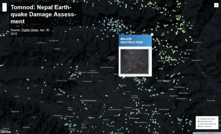
Example - Changing approaches to rapid damage assessment after a disaster
Crowdsourcing approaches for damage assessment have been popular, with micro-tasking platforms like Tomnod used to leverage digital volunteers, as shown here for the 2015 Nepal Earthquake. Volunteers look at images of structures and rate the level of damage.
What You Will Learn
By the successful completion of this lesson, you should be able to:
- articulate the role of spatial data science, including geospatial perspectives and technologies, in emergency management;
- evaluate and discuss how recent technology trends in geospatial interaction relate to emergency management;
- understand the final project assignment for this class and brainstorm some ideas;
- discuss the role of spatial data science in emergency management with your classmates.
What You Will Do
Lesson 1 is one week in length. To finish this lesson, you must complete the activities listed below.
| To Read |
|
|---|---|
| To Do |
|
Please refer to the Course Calendar for specific due dates.
Questions?
If you have questions about the content or lesson activities, please post them to the General Questions and Discussion forum in Canvas. While you are there, feel free to post your own responses if you, too, are able to help a classmate. If your question is of a personal nature, please email me directly through Canvas.
Rethinking Emergency Management
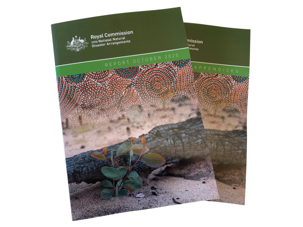
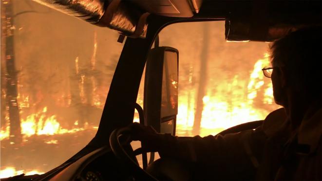
Before going any further, I'd like you to consider the devastating 2019-20 Black Summer Bushfires in Australia. I focus on event because it has prompted a major National Review of disaster and emergency management arrangements. The Royal Commission into Natural Disaster Arrangements [3] released their final report at the end of last year. Royal Commissions are basically a big investigation that relies on submissions from all kinds of stakeholders, from academics, to frontline workers, to citizens. This process results in a series of recommendations that the government considers. While the bushfires prompted this review, the recommendations take a multi-hazard approach. So, how can you manage fires, smoke, heatwaves, floods, cyclones in a more coordinated way.
I'd like you to look at a few sections of this report and also keep it on hand as we go through the course. It has a lot of information relevant to the topics we cover, albeit we are exploring geospatial dimensions in greater depth. First, have a look at some photos and videos from the Bushfire History Project (below) to get a feel for what happened last year.
2019-20 Bushfire History Project - Fires (3:51 minutes)
No Audio - images only
2019-20 Bushfire History Project - Damage (2:54 minutes)
No Audio - images only
2019-20 Bushfire History Project - Recovery (2:06 minutes)
No Audio - images only
Now, look at the download the report from this direct link or go to the Commission's website [4].
Royal Commission into National Natural Disaster Arrangements Report [5]
Royal Commission into National Natural Disaster Arrangements Appendices [6]
Please read the following sections (don't worry if these seem a bit technical given you just started the course):
- Forward - page 5-7
- The 2019-20 disaster season - page 19
- Disasters have changed & We need to act on multiple fronts - page 22
- A national picture needs national data - page 28-29
- The impact of natural disasters on essential services (Figure 35) - page 227-229
- Mental health and natural disasters - page 345-348
- Earth observation systems - page 498
I'd like you to consider a few questions (nothing to submit now!):
- From these sections of the report, does anything jump out at you with regard to data needs in emergency management?
- Do you think the Australia situation is similar to your home country?
- From what you know so far (and it is early in the course!) do you think geospatial data is most useful for:
- Preparing for a disaster?
- Responding when it is in progress?
- Recovering and rebuilding?
I hope this has provided a concrete and current picture of the complexity of emergency management. I'll refer you back to the Royal Commission report later in the class.
The Four Stages of Emergency Management
The improvement of the built and social environment in order to reduce, withstand or prevent disaster impacts.
- Hazard Analysis
- Vulnerability Assessment
- Scenario Development
- Community Engagement and Education
- Planning and Infrastructure Work
Actions taken prior to a disaster with the intent of ensuring a better event response
- Planning
- Training and Exercises
- Logistics
- Technology infrastructure
- Agency and stakeholder coordination
- Provide information and tools to citizens
Actions taken immediately before, during and after an event to alleviate suffering and prepare for recovery
- Establish Situational Awareness
- Evacuations and Shelters
- Respond to remaining hazard
- Search and Rescue
- Mass Care
- Logistics response
- Initiate Recovery
The rebuilding or improvement of disaster-affected areas
- Debris Management
- Return essential services
- Food and water
- Temporary housing
- Economic assistance
- Insurance claims and rebuilding
- Business aid
Definitions from the Tomaszewski (2014) textbook
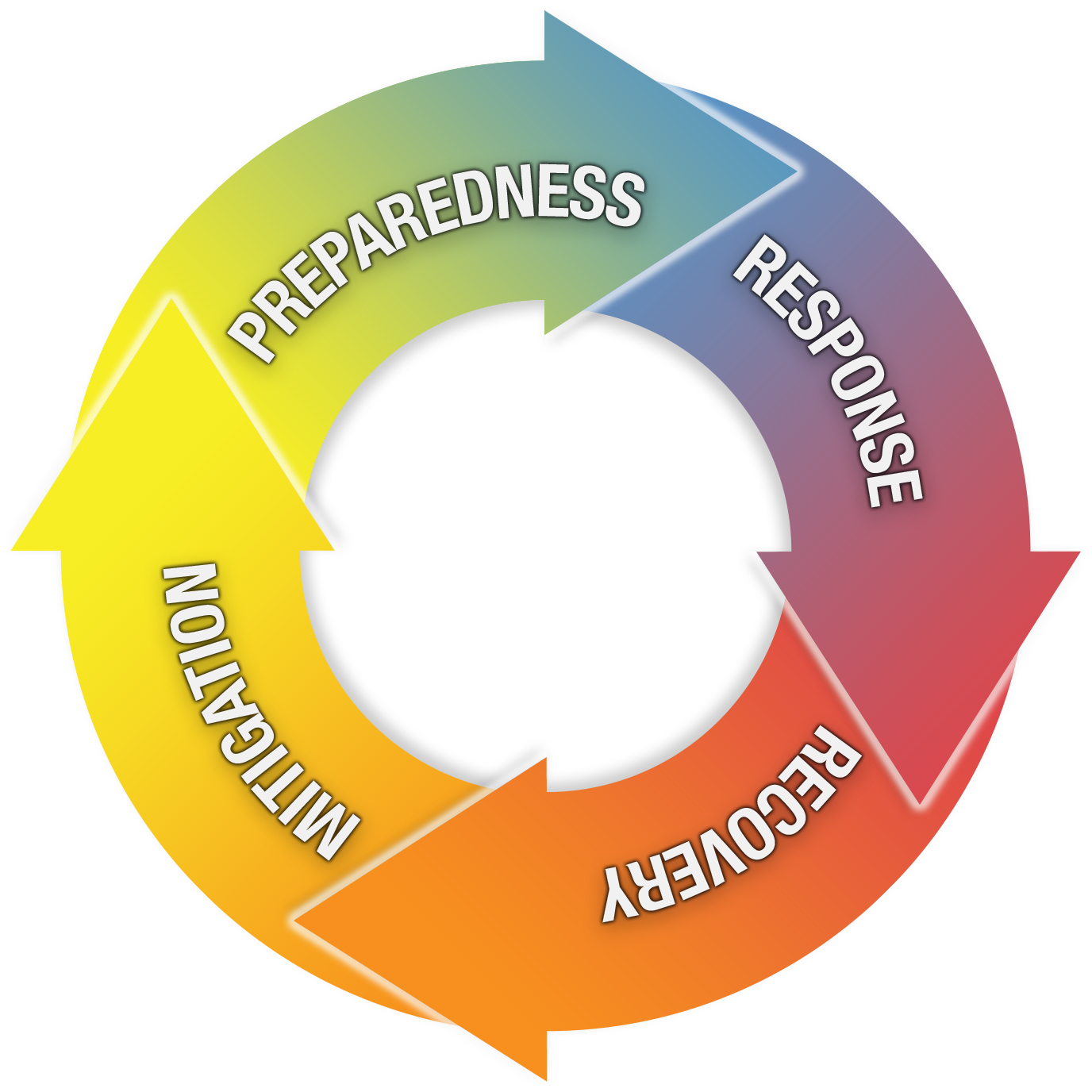
It is generally agreed upon that there are four key stages of emergency management problems.
- Planning & Mitigation
- Preparedness
- Response
- Recovery
You can probably imagine a wide array of possible geospatial applications that would make sense for each of these stages of emergency management. Lesson 2 in this class will talk about hazards more generally, and then, in Lessons 3-6, we'll start a deep dive into how geospatial perspectives and technologies can be used in these four stages. In Lessons 7-9, we'll explore scenarios and cover a few case studies to see how geospatial analysis has been used in real-world emergency situations.
Here are brief definitions for each stage of emergency management:
Planning & Mitigation: Evaluation of the potential types of disasters and the development of plans for reducing their probability or their impact on life & resources.
Preparedness: Actions undertaken when mitigation efforts have not prevented or are unable to prevent a disaster from taking place.
Response: Activities that occur in the wake of a disaster that are intended to identify and assist victims and stabilize the overall disaster situation.
Recovery: Actions following a disaster that aim to restore human and environmental systems back to normal.
Geospatial Approaches and Technology in Emergency Management
We will begin our consideration of geospatial approaches and technologies related to emergency management by contrasting four perspectives. On this page, the role of geospatial analysis in the work of the Federal Emergency Management Agency (FEMA) is described. This includes some historical perspective on how FEMA's mission has evolved over the last 10 years or so. Next, we will focus on emergency management related applications developed by Esri, the peak GIS software company globally. Then, for a very different perspective, you will consider what the 'digital humanitarian' community is doing in response to factors like big data, volunteered geographic information (VGI) and social media. Finally, we will consider emergency management in light of cutting-edge technologies. Of course, all of these areas are interrelated, and we will cover much more as the course proceeds! The idea is to start building a context and framework for developing a deep understanding of the topics to come.
First, we will take a look at the Federal Emergency Management Administration [8] (FEMA). If you're not familiar, FEMA is part of the US Department of Homeland Security and is the lead agency for preparing for, responding to and assisting with recovery from major disasters. Have a look at their website if you want to learn more. (As we move through the course, pay attention to the different roles that emergency management organizations play, particularly at local, state and federal levels, and the types of incidents they are responsible for).
For a little context, here's what FEMA Enterprise GIS Services considers its mission with respect to GIS and Emergency Management.
FEMA Enterprise GIS Services
Our primary mission is administration, coordination, collection, and dissemination of geographic information for FEMA and the Emergency Management Community under Emergency Support Function #5 (Information and Planning) of the National Response Framework and in support of the Robert T. Stafford Disaster Relief and Emergency Assistance Act (PL 93-288) as amended. Our current concept of operations includes a full range of GIS services to all FEMA program offices that encompasses sophisticated geospatial analytics through the Mapping and Analysis Center (MAC) and deployable GIS technology through the Deployable Emergency GIS program (DEGS).
Let's dig deeper into this. First, consider this excerpt from FEMA's Mapping and Analysis Center in 2008 [9] (note it is no longer maintained by FEMA and the MAC has evolved into other departments). Make a mental note of the range of functions that they focused on and some of the ways they went about their work. I wanted you to look at this old description, so you can contrast it with what FEMA does now, and more importantly to highlight how much has changed in a short period of time with regard to the ways geospatial products are generated and distributed.
Now, let's jump ahead 10 years! Start with the interesting 2018 presentation slides from Chris Vaughan [10] on GIS @ FEMA Working Smarter Through Data Analytics. Finally, have a look at the 20 September 2017 FEMA Geospatial Coordination Call briefing [11]. This is a summary of 'situation awareness' for the day Hurricane Maria hit landfall in Puerto Rico and is quite comprehensive.
With this historical context, have a look at some of FEMA's current offerings at the FEMA Geospatial Resource Center "Hub" [12]. Notice the dashboard with a summary of current hazard events. Click on a few of the hazards and look at what's available.
Consider these artifacts and reflect on what you see that may have changed in recent years, e.g., increasing focus on analytics and real-time.
Reading Assignment
How Reading Assignments Work
For each lesson, I will ask you to read parts of your textbooks and/or selected online materials and articles. As you can see below, I'll try to make it as clear as possible what you're expected to do by always identifying specific reading assignments in a separate box.
You can access the readings right in the course website, and they are also available in Canvas.
Lesson 1 Reading and Writing Assignment
For our first set of readings, we will focus on setting the stage for the rest of the lessons this term. First, I'd like you to read the white papers developed by folks at Esri and contrast it with the company’s current software and service offerings. These provide a simple overview of the common terms and topics associated with GIS for Emergency Management, and they show you how the GIS Goliath perceives the role of geospatial tools and methods in the context of Emergency Management. You just read a bit about how FEMA sees the state of affairs, and I think you'll notice some key similarities (and differences) in how the world is viewed from these two perspectives.
Second, I've selected a chapter from a National Academies of Science report written in 2007 that sets a research agenda for GIS in Emergency Management. The specific chapter I've picked for this week focuses on how GIS was or could have been used in a few different disaster scenarios. Unfortunately, these are examples that are still relevant today, over 10 years on.
Finally, you’ll contrast these perspectives with the emerging field of Spatial Data Science. First, you will look at a journal article focused on spatial data science and how it is shaping cartography/visualization. You'll see throughout this course that visualization is an essential part of understanding and addressing problems in emergency management. So, it is useful to explore spatial data science through this lens. The book chapter from Digital Humanitarians introduces how the disaster and humanitarian community is opening up and engaging with big data and volunteered geographic information (VGI) at a remarkable pace.
1. READ
ESRI White Paper on GIS for Emergency Management, [13] which outlines how Esri sees a role for ArcGIS in Emergency Management (in 2012!). Contrast this with Esri’s current ArcGIS for Disaster Management [14] tools on their website.
THINK ABOUT
These materials present definitions and roles for GIS in the context of Emergency Management. They also reflect the view from a major software vendor in this field. As you peruse these documents, think about which aspects seem software-specific vs. those that appear to be more general to all geospatial applications in emergency management. How would you define roles differently, or broaden some of their definitions?
2. READ
Chapter 2: Thinking About Worst Cases from Successful Response Starts With a Map: Improving Geospatial Support for Disaster Management. Please visit The National Academies Press [15] and read the chapter online or, you can create an account and download the chapter for free. This chapter is VERY OLD now (2007), but I think it will provide a good background for thinking about different disasters and how geospatial approaches can help us understand what might happen. Reflect on how things may be in 2023. For example, scenario two talks about a hurricane hitting the New York region, and this actually happened with Hurricane Sandy. We will talk about Sandy later in the course.
3. READ
Robinson, A.C. et al. 2017. Geospatial big data and cartography: research challenges and opportunities for making maps that matter [16]. International Journal of Cartography 3: 32-60.
If you are having trouble accessing the paper through the link above, you can download the PDF directly here [17].
4. READ
This short web article - Becoming a digital humanitarian, one deployment at a time [18] and Chapter 1: The Rise of Digital Humanitarians from Digital Humanitarians. See the Library Resources menu to read the chapter.
RESPOND
As you read the three different worst-case scenarios, it should be apparent that a key challenge is simply developing a rapid picture of the spatial extent of a disaster. If you assume that a given disaster will disable local EOCs and their accompanying geospatial tools and data, describe at least two ways that emergency managers brought in from afield could quickly assemble data that describes the extent of the disaster. How would folks from the digital humanitarian community approach this problem?
Deliverable
Complete the writing assignment - Details on the next page!
Writing Assignment
Based on this week's lesson, address the following:
1. As you read the three different worst-case scenarios, it should be apparent that a key challenge is simply developing a rapid picture of the spatial extent of a disaster. If you assume that a given disaster will disable local EOCs and their accompanying geospatial tools and data, describe at least two ways that emergency managers brought in from afield could quickly assemble data that describes the extent of the disaster. How would folks from the digital humanitarian community approach this problem?
2. What do you consider to be the one or two key challenges facing the application of Spatial Data Science to Emergency Management in (a) temporally short, geographically local event(s) versus (b) temporally extended, geographically regional events? Assume your audience is a group of emergency management planners considering incorporating geospatial data and analysis into their operations. They don't have a lot of time, so be direct and succinct in your analysis.
Make clear how your response relates to the readings.
This response should be between 500 - 600 words in length.
This class is writing intensive. I'll be editing and commenting on your written work throughout the term. Penn State's Style for Students [19] guide can be a huge help if it's been a while since you've written for a course like this.
Submission Instructions
It is important for you to save your files in the following format so that I can match each submission up with the correct student.
L1_assign_firstinitialLastName.doc For example, my file would be named "L1_assign_mBeaty.doc"
Upload your assignment to the Writing Assignment (L1) dropbox. See the Course Calendar for specific due dates.
Grading Criteria
This assignment is worth 4% of your total course grade and will be graded out of 20 points using the following rubric.
| Criteria | Description | Possible Points |
|---|---|---|
|
Content and Impact |
You make strong and logical arguments and provide analytical insights. Ideas are well organized, clearly communicated and relevant to the prompt. All criteria are accurately addressed. Supporting details are shared, elaborated upon and demonstrate understanding. Examples are provided, and your post includes images or other multimedia that support content. | 15 |
|
Clarity and Mechanics |
Evidence of editing and proofreading is evident. Writing is engaging and well-structured with excellent transitions between sentences and paragraphs. Concepts are integrated in an original manner. | 5 |
Discussion Expectations and Grading
Discussion Assignments - Readings and Emerging Themes
A key component of your graduate coursework will be participating in online discussions with classmates. This will occur around two main activities: 1) Discussion of the weekly readings and/or 2) Discussions of the Emerging Theme content.
In this class, you will be expected to be online and participating in online discussions at least 3 days a week. While the times of day and specific days of the week in which you do this work are flexible, you must participate actively and regularly in online discussions in order for you to be successful and fulfill your responsibilities as a member of the class learning community. I would suggest setting aside dedicated time several times a week for participation.
Timeline
Lessons begin on Wednesday and the discussion will be open for 10 days (even though the rest of the lesson is only scheduled for one week). Your initial post is due on Sunday. You are then required to participate in the conversation on at least two different days by or before the following Thursday.
Content
In addition to being thoughtful about the discussion prompts, I would like to see you asking and answering questions, making suggestions, and sharing examples from your own life. I would like to see this begin to look like a true conversation, so while most of your posts should be about a paragraph in length, some may be shorter and conversational. Remember to contribute to the learning community by being creative in your approaches to topics, being relevant in the presented viewpoints, and attempting to motivate the discussion. And remember, there is value in diverse perspectives, so it is ok to have a constructive and considerate disagreement.
Rubric
Your contributions will be scored as follows.
| Criteria | Points |
|---|---|
| Initial post is submitted on time | 3 |
| Follow up posts were made on two different days, 2 days gets full points, less than 2 days gets 0 points. | 6 |
| Quality of contributions | 6 |
| Total | 15 |
Emerging Theme: Introduction
Emerging Theme: Introduction
OK, you might think, "Well - isn't GIS already something most people consider high tech?" The answer to that question is a little complicated. In comparison to where we were about 20 years ago, yes, current GIS systems are pretty high tech. In comparison to recent advances in software, interfaces, and the ways in which regular people can participate in the development of data and tools - no, off-the-shelf desktop GIS software isn't so radical anymore.
What I hope to do in this course is to bring in new trends and themes in technology and imagine how those advances can and will impact spatial data science in the future, with particular emphasis on how those technologies fit or could be adapted to support geospatial analysis for emergency management.
Emerging Themes
Each lesson features an Emerging Theme page that presents a technology and encourages you to envision its potential impact on GIS systems for Emergency Management. I draw upon video lectures, links to live demonstrations, and other multimedia as much as possible to make these modules as engaging as possible.
The themes we will cover this term are:
- New Methods of Geospatial Interaction
- GIS and Unmanned Aerial Systems (UAS) - includes an exercise working with UAS data
- Volunteered Geographic Information (VGI) - includes an exercise
- Spatial Data Science - Data and analytics
- Real-time GIS and Analytics - includes an exercise working with operations dashboards
- Humanitarian Logistics and Supply Chains
- Social Media and Crisis Mapping
- Geospatial Artificial Intelligence (geoAI)
- Digital Twin
- Work on Term Project
The following 4:30 minute video, Geospatial - A Golden Thread in the Fourth Industrial Revolution is from the geospatial industry website, Geospatial World. It is a bit sensationalized but does cram in a lot of interesting content about technology and geospatial and provides some viewpoints from industry leaders. I hope it makes you want to learn more about these emerging themes!
Click for a transcript of the Fourth Industrial Revolution video.
A golden thread in the Fourth Industrial revolution
KUMAR NAVULUR: The key word is revolution, how a common person's life is changed with these technologies. So the first one is steam. The next one is electricity. The third one are computers.
[MUSIC PLAYING]
ANNE HALE MIGLARSE: It's about machine learning. It's about the internet of things. It's about the world awash in data. Certainly, data is a big part of what will drive the Fourth Industrial Revolution.
KUMAR NAVULUR: It's the disappearance of technology in good ways that is becoming ubiquitous. So the technology is hidden, but it's still there. The Fourth Industrial Revolution is all about new technologies, including artificial intelligence, robotics, connectivity of societies. When you have all the globe connected with internet, that kind of connectivity was never seen before.
SANDEEP SINGHAL: The Fourth Industrial Revolution. And I really regard it as the marriage of data, analytics, and real time presentation.
WILLY GOVENDER: How we as consumers of data are producing loads of data, more data every day than we have collected in a couple of decades we are producing nowadays. And it's how we are going to handle this data.
SANDEEP SINGHAL: Applying deep analytics, big data analysis, and machine learning to infuse that data together and really draw conclusions, and then present that information very, very quickly in order to drive changes in how we manufacture, changes in how we schedule resources, and so on.
ROBERT LAUDATI: And now you see that revolution made possible by the increase in sensors, In the increase in the analytical tools that many of the industry has. It's really about moving from data to answers.
NIGEL CLIFFORD: The revolutions that are going on in terms of affordable, massive technological shifts, geospatial is one really significant golden thread that's going to enable all users to find sense in some of the huge changes that are going on.
KUMAR NAVULUR: If we talk about augmented reality, yes, geospatial plays a role in terms of creating that virtual environment. If we talk about machine learning, robotics, geospatial definitely has a role.
WILLY GOVENDER: Just the proliferation of fake news-- we'll probably see fake data also appearing and making our lives more difficult. And that's where you're going to find that we need this geospatial industry to make the world better understand the data that we're producing, acknowledging the data, and verifying it so that we make the critical decisions.
ROBERT LAUDATI: All of us in the industry, from the data, the sensor developers and providers to the software providers, we see that wave coming of really the democratization of GIS and geospatial technology. Everyone will be using it in some form or fashion. But they won't have to be experts in the field to be able to process the information.
ANNE HALE MIGLARSE: We absolutely have a place to play in it. And our expertise in analyzing place is what brings us to the table. And so I think we should embrace fully participating in it.
KUMAR NAVULUR: So geotechnology, the location technology, is foundational to the Fourth Industrial Revolution. And I'm glad that our industry is a critical part of that.
On the next page, you'll find your first Emerging Theme assignment. In this assignment, we will examine new types of mobile interfaces and discuss how they could be integrated into future GIS systems for emergency management.
Emerging Theme: New Methods for Interaction with Location
This week, I’d like you to take a look at a few very exciting technology demonstrations that I think are relevant to spatial data science applications for emergency management. These videos show the cutting edge of what is possible with computers, and I think it’s quite reasonable to expect that in the next 5 years or so these things will become quite common in consumer and professional systems.
Throughout this course, we will be considering information from different viewpoints, including industry, government, NGO, and academia.
Let's start with this video about the ways spatial data and technology are being used (to varying effect) to address different aspects of the COVID-19 response.
How geospatial technologies can help combat COVID-19 (3:15 minutes)
Music playing
The next video is from the DHS Science and Technology Directorate’s Next Generation First Responder Program [21] and describe how emerging technology, including geospatial, are being incorporated in first response situations. They both describe a high level of integration amongst technology. Think about how this might fall down in a real emergency situation.
Next Generation First Responder (5:22 minutes)
Next Generation First Responder
[BEEP]
SERGEANT PARKER: Confirm what appears to be a building explosion and fire at the intersection of Hughes and Third.
DISPATCHER: Roger, 734. Additional units and fire are en route. Fire will provide incident command. I am patching your body cam feed to command now.
SERGEANT PARKER: Roger, dispatch.
[SIRENS]
OFFICER: What do we have, Sarge?
SERGEANT PARKER: Pretty much what the 911 caller reported. It looks like a building explosion.
OFFICER: The fire command is set up one block over. Williams and Moore are over there.
SERGEANT PARKER: Audrey, patch this call to Corporal Williams on his radio.
AUDREY: Copy that, Sergeant Parker. Patching you to Corporal Williams, located two blocks east on Third Avenue.
[BEEP]
CORPORAL WILLIAMS: Williams.
SERGEANT PARKER: Corporal, this is Sergeant Parker.
CORPORAL WILLIAMS: Go, Sarge.
SERGEANT PARKER: You've got Incident command setting up over there where you are. I need you to reroute traffic and keep onlookers way back so fire and EMS can get through.
CORPORAL WILLIAMS: Roger. Already on it. Sarge, check your phone. We got an alert.
SERGEANT PARKER: Audrey, get me incident command, any path.
AUDREY: Linked to incident command.
[BEEPING]
SERGEANT PARKER: Command, this is Sergeant Parker.
BATTALION CHIEF BENDER: Battalion Chief Bender here, Sergeant. I see you're on the northwest corner. From your video, it looks like the building entrance is blocked with debris.
SERGEANT PARKER: It's going to take some digging to get inside.
BATTALION CHIEF BENDER: We're linked to the closed circuit cameras in the building. We also have a drone up overhead showing two large hot spots on the top floor. But a witness says there are at least two people still in the building, so I'm sending a team to the Third Street entrance.
FIREFIGHTER: I've got two civilians here.
[BEEPING]
Who's in trouble?
FIRE CHIEF: Fire Team One, it looks like we have a mayday. Firefighter Thompson is down. Heart and breathing rates spiking.
FIREFIGHTER: We're on it, chief. He got pinned by a chunk of ceiling. We're also bringing out two civilians. We put vital sensors on them. EMS should be getting readings now.
FIRE CHIEF: EMS, do you copy the message from Fire Team One.
EMT: Got it, chief. I'm getting vital signs on one firefighter, two civilians. Looks like we have two red tagged patients with severe burns and trouble breathing and a firefighter with possible crush injury. I need you to start the IV and get ready to intubate. Audrey, connect me to the nearest trauma center.
AUDREY: Linking to St. Anthony's trauma center, 3.7 miles. Estimated travel time, seven minutes.
NURSE: This is Miriam Zheng. Go ahead, EMS.
EMT: I have three victims, two civilians, one firefighter. I don't have eyes on them yet, but I'm sending you telemetry.
NURSE: Yes, I see the data. Definitely two red tags there. Do you have RSI medications ready and prepared to intubate if needed?
FIRE CHIEF: We do. Soon as we get them stabilized and we're on the way, I'll send more telemetry and detailed assessment information.
NURSE: OK, we'll be ready. Thanks for the heads up. I'll continue monitoring their vitals and transport.
EMT: Audrey, patch me to command.
FIRE CHIEF: This is command. Go, EMS.
EMT: Chief, we have two victims in serious, maybe critical condition. I'm recommending a medevac.
FIRE CHIEF: Copy that. I'll alert aviation. There's a park two blocks east of here. Looks like the best landing site. I'll have law enforcement cordon it off.
CCTV REVIEWER 1: I have the view from a camera on a building across the street. It looks under control.
CCTV REVIEWER 2: I have a white SUV matching the description on two traffic cams headed east on Third past Tacony. I think I can pull the plate number from that.
COMMANDER: OK, great work. Let's datacast the route that vehicle's on to all patrol units, and when we get the plate number, let's send that out, as well.
[BUZZ]
OFFICER: Good job, Sarge.
NARRATOR: First responders today have nothing like the communications tools in this video, but we are making progress. Through its Next Generation First Responder Program, the DHS Science and Technology Directorate is leading the effort to develop these capabilities and get them into the hands of responders in the next five years. It's important work that will help law enforcement, fire, and emergency medical personnel save lives, protect property, and enhance security in communities everywhere.
Finally, take a look at the I-React project funded by the European Commission that use augmented reality in an disaster response situation. Visit this website [22] and watch the video below.
Emergency Management with Augmented Reality (4:00 minutes)
NARRATOR: Environmental catastrophes have reached levels that have never been recorded anywhere in the world. To face such a powerful and often unpredictable events, it is essential to work on prevention and emergency management. Nowadays, a smartphone application can be a valid tool to save lives.
PRESENTER: In the last 10 years, natural disasters have caused around 7 million casualties in Europe alone, and up to 113 billion euros of overall economic losses. Floods are the biggest hazard in the EU, in terms of people affected and economic damage.
At the Civil Protection Control Room in Turin, it's an emergency simulation day. Developers from the I-React team are here to lead their final tests on a smartphone app improving risk management systems that will help citizens to cope with climate related disasters. The app is part of a complex system which processes large amounts of data and generates valuable information during a natural disaster.
NARRATOR: I-React, as we saw during the exercise, gives us the ability to gather your reference data on the ground to know where the critical points are and to know what is happening and what main information is needed.
PRESENTER: I-React is the first European-wide platform to integrate emergency management data coming from multiple sources, including satellite climate services and weather forecasts, combined with information sent by emergency workers and citizens through the mobile app. It provides real-time pictures of the situation.
NARRATOR: The data from the I-React system is generated by devices that are present in our daily lives, such as applications on our smartphones, social networks, and above all, e-matches and data from the Copernicus Satellite System.
PRESENTER: The app, which was issued by a European research project, is meant to be a valuable tool for emergency workers. But not only that, it also allows for involvement of citizens, who can be an important element in the information gathering process.
NARRATOR: This app is designed for ordinary people, not only for civil protection, to send reports on an emergency situation and to receive reports from an operation center.
PRESENTER: Civil protection volunteers are often first on the scene during an environmental emergency, that's why an easy to use device is key for their mission.
NARRATOR: I found it extremely simple and fast. In a real emergency, it's important to send updates on the situation in real-time, not only with words, but with images.
PRESENTER: I-React enables the operators to gather and send data in different ways during an emergency operation. In addition to smartphones, stakeholders are also equipped with smart glasses and other wearable georeference devices so they can receive and send information without using their hands.
NARRATOR: What I'm wearing is a prototype of augmented reality glasses, able to perform some functions that can also be performed on the app. For example, if there is a river that is flooding, I can take a picture. I follow the same steps I would do with my cellphone, but in this case using only one hand. And thanks to this remote control, I can send the report to the operations center.
PRESENTER: After having tested the effectiveness of the app during an international civil protection exercise in 2018, researchers of the pan-European I-React Team are currently fine-tuning the system before they release it to the emergency management market at the end of this year.
Digital Twins (4:24 minutes)
Music Playing
Deliverable
- Post a comment in the Emerging Theme Discussion (L1) forum that describes how you envision one or more of these technologies integrating into a spatial data science for emergency management. Do you see any problems with integration, or, perhaps, you don't think we should consider them for emergency situations. That could be a valid position to take as well.
- The initial post should be completed during the first 5 days of the lesson.
- Then, I'd like you to offer additional insights, critiques, a counter-example, or something else constructive in response to your colleagues on two of the following 5 days.
- Brownie points for linking to other technology demos, pictures, blog posts, etc., that you've found to enrich your posts.
NOTE: Respond to this assignment in the Emerging Theme Discussion (L1) forum by the date indicated on the course calendar.
Grading Criteria
This discussion will be graded out of 15 points.
Please see the Discussion Expectations and Grading page under the Orientation and Course Resources module for details.
Term Project Description
Term Project Overview
This course is built around a term project that will integrate your understanding of geospatial perspectives and technologies with what you have learned about how they can be applied to emergency management. You will select a project topic from one of the options described below and write a report that includes spatial data analysis and visualization approaches. In some cases, this might take the form of a case study, in others, a proposed geospatial system design or a demonstration (e.g., dashboard or app) that illustrates either current trends in applying geospatial thinking to emergency management or what might be possible in the near future.
To a large degree, you will have the freedom to shape the specifics of your term project around the geospatial and/or emergency management contexts in which you are most interested. I hope that this allows you to either focus on a topic related to your day-to-day work or to choose an area that sparks your curiosity. That said, it should be clear who you are writing for and the role you are playing in preparing this report.
Your analysis will be informed by relevant datasets that you find, analyse, and visualize. A key task early on is identifying a suitable dataset and developing some ideas about what you’d like to do with it. I can help with this process and when you develop the abstract for the project, we will meet to discuss your ideas and make sure they are achievable in the time you have. I will also circulate a list of websites where you can search for suitable data. There are many options, so don’t be too concerned about being able to find suitable data.
You can choose from a wide range of tools to conduct your analysis and visualize the results, including Esri products like ArcGIS Pro or ArcGIS Online/Portal. You have access to a wide range of Esri tools through your Penn State Accounts. But don’t forget about other possibilities such as web mapping tools like MapBox or open-source tools like QGIS and R. In this course, we use a range of data and technologies and you can do the same with your projects. Just keep in mind you’ll need to balance the time you have to do the analysis and write your report with the time you have to learn new software.
Each week, you will notice that at least one page of the lesson is dedicated to a goal or assignment associated with your term project. In about half of those Lessons, you need to complete a graded deliverable related to your final project. I've developed a project schedule that is designed to make sure you make steady progress on the term project and that also ensures that we have one full round of draft editing to refine your work. I don't like classes that end with submitting a final project with no chance to do any revisions. That seems silly to me.
My hope is that you end the semester with a product that has utility beyond just meeting the course requirements. It could end up being a use case or a proposal that you share with others in your organization. This has been the case for some students in past offerings of GEOG 858.
Term Project Options
Here are some options for your term project. You can choose one of these options, or if you'd like to riff on one of these and take it in a different direction, by all means, do so! These are really just suggestions: I want you to be innovative and surprise me with your good ideas for projects. But I also know that many of you want to know what a good example project might look like, which is why I've listed these options here.
- OPTION 1: Develop a case study on the use of specific geospatial data and technologies from a recent crisis or disaster. Using geospatial data and analyses, demonstrate at least one way that geospatial approaches were used effectively and at least one way their use could have been improved. This option should be built on your original analysis and not just a review of what others have done.
- OPTION 2: Develop a vulnerability, hazard assessment, and mitigation case study for a place that has not recently been impacted by a disaster. Develop a concept for a geospatial system to support these activities and build a prototype to illustrate your main points.
- OPTION 3: Address the question, Why is recovery so difficult? For this project, conduct a comparative analysis of recovery after recent disasters (ones that occurred within the last ten years) in two to three case study areas. Use geospatial data and analysis to help illustrate and communicate the comparisons and main points you make.
- OPTION 4: Focus on an emerging technology that is changing how geospatial analysis is applied in emergency management. You may consider a technology we cover in this course, or focus on a different technology (but provide an argument for your choice). Provide context for the technology, but focus on some specific aspects of its use that you can demonstrate using spatial data and analyses.
Deliverables (for Future Lessons)
The term project includes the following deliverables that will be assigned to you in future lessons:
- Project Abstract indicating which project option you have chosen and describing in general terms what you will cover - assigned in Lesson 2 (Worth 5% of total grade)
- Project Outline and Short Video Presentations (headings and several bullets under each heading for the main topics you'll cover). Produce a short 3-5 minute video introducing your topic to the class - assigned in Lesson 4 (worth 8% of total grade)
- Full Draft of your Term Project Report, no longer than 5000 words, not including an appendix where you can outline your methodology in greater detail - assigned in Lesson 6 (worth 12% of total grade)
- Revised Term Project Report, no longer than 5000 words, not including an appendix where you can outline your methodology in greater detail - assigned in Lesson 10 (worth 16% of total grade)
- 5-7 Minute Video Presentation of your Term Project - assigned in Lesson 10 (worth 4% of total grade)
Look for details on each deliverable (including specific due dates and grading criteria) in future lessons.
NOTE: I have provided examples of each term project deliverable on the following page in CANVAS.
Summary and Final Tasks
Summary
In this lesson, you have received an introduction to some of the major concepts associated with spatial data science for emergency management. You reviewed the four basic stages of emergency management and read some background material that defines common terms to geospatial science and emergency management.
Disasters and emergencies provide a wide range of opportunities for geospatial systems to play an important role, and in future lessons, we will delve into these possibilities in detail.
This week, we covered our first emerging technology theme. I've created a page for every lesson that focuses on a different technology theme that I think is relevant in some way to future geospatial applications for emergency management. When we are concerned about planning future geospatial systems, it is essential to become aware of new technology trends that could significantly impact how systems work in the not-too-distant future.
In the next lesson, we will review the range of hazards and emergencies that may require the use of spatial data science to aid mitigation, preparation, response, and recovery efforts.
Reminder - Complete all of the Lesson 1 tasks!
You have reached the end of Lesson 1! Double-check the to-do list on the Lesson 1 Checklist page to make sure you have completed all of the activities listed there before you begin Lesson 2.
Questions?
If you have any questions, please post to the Canvas Discussion Forum called "General Questions" or email the instructor via Canvas conversations (if the question is personal in nature).
Lesson 2: Hazards and Disasters
Overview and Checklist
Overview
Threats to people and their property can take many forms. Many of the situations we concern ourselves with in this course are linked to natural events. But it is also important to consider a wide range of social and economic triggers that could cause emergency management situations. In this lesson, we'll take a look at a variety of disaster types and their associated geographic attributes.
What You Will Learn
By the end of this lesson, you should be able to:
- identify the wide array of emergency situations in which geospatial tools could be used;
- evaluate possible term project topics and related datasets, choose a topic, write an abstract and present to the instructor;
- learn more about the growing technological trend of UAV systems and how they relate to geospatial analysis and crises;
- complete a hazard/risk assessment using GIS and UAV date and evaluate the results.
What You Will Do
Lesson 2 is one week in length. To finish this lesson, you must complete the activities listed below.
| To Read |
|
|---|---|
| To Do |
|
Please refer to the Course Calendar for specific due dates.
Questions?
If you have questions about the content or lesson activities, please post them to the General Questions and Discussion forum in Canvas. While you are there, feel free to post your own responses if you, too, are able to help a classmate. If your question is of a personal nature, please email me directly through Canvas.
Hazards and Disasters
There is a very wide range of hazards and disasters we must consider when planning and implementing geospatial solutions for emergency management. It is easy to focus on the very large and obvious events - things like hurricanes, earthquakes, and disease epidemics. For many geospatial managers, however, there are day-to-day emergency situations on a local level that deserve plenty of attention: house fires, auto accidents, and violent crimes - just to name a few.
In this lesson, you will consider some of the characteristics of disaster and emergency events in three main ways. On this page, you will explore how different organizations track and provide up to date information on emergencies around the world - A key message that will become evident is that there are many diverse disasters and emergencies occurring at any given time. On the following pages, you will read about some specific hazards and disasters and how they are understood from a geospatial perspective, and you will do a hands-on hazard and damage assessment.
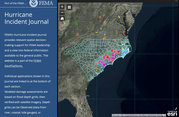
Let's jump in! The Federal Emergency Management Agency (FEMA) keeps a running tab of declared disaster events in the US [25]. You've probably heard of these on the news when the President declares a location a "Federal Disaster Area". In addition to these alerts, FEMA now publishes quite a few interesting summary maps of recent disasters at their GeoPlatform. Please spend some time looking at the various components of the FEMA GeoPlatform [12]. While there, think about what information is provided - DataHubs like this are becoming popular and useful tools for providing external facing data and mapping services. Who is the target audience for this? Is this a potential data source or is it locked down? Some of these pages rely on Esri Story Maps, a tool you will use later in the course. You might want to bookmark this to come back to as we talk about different types of Hazards and Disasters and when new events happen in the United States as we work through this course.
Next, have a quick look at the following presentation prepared for a daily FEMA Geospatial Coordination Conference Call for Hurricane Lane as it passed near Hawaii in the summer of 2018 [26] (You looked at a similar one of these in Lesson 1 focused on Hurricane Maria). These briefings describe the state of Situation Awareness, particularly from a geospatial readiness perspective. We’ll revisit this concept in coming lessons but for now, note the range of actors and their different roles/viewpoints on this event. This is also a much more technical view than what is provided in the GeoPlatform, and you can find some of the data behind this on their GIS portal.
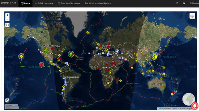
Finally, a complementary example identifying and tracking emergencies and disasters can be found on a map developed by the Emergency and Disaster Information Service (EDIS) to provide information on a wide range of hazards and disasters around the world. Take a look at this application called EventMap [27].
 [27]
[27]
There are other examples like this that we will come across during this course and as part of future lessons, and we will also look at geospatial tools for understanding particular events on a much more detailed level. Next, you will consider some hazards and disasters in greater detail through this week's readings.
Reading Assignment
How Reading Assignments Work
Here is a quick recap of how the reading assignments work. For each lesson, I will ask you to read parts of your textbooks, online materials I select, or articles I've found. As you can see below, I'll try to make it as clear as possible what you're expected to do by always identifying specific reading assignments in a separate box.
Part of your class participation grade will be making responses on our discussion board to questions I pose about the readings. Whenever you see a RESPOND prompt, you need to respond to that question as directed. Occasionally, I'll mark items THINK ABOUT when I simply want to direct your thoughts as you read.
You can access most of the readings via the links on this page. Some are also available as files in the Lesson 2 Module of Canvas.
Lesson 2 Reading Assignment
The readings for this week are selected to continue the introduction to spatial data science for emergency management and to hazards and disasters in particular. These are some fundamental concepts you will very likely refer back to as you engage with the course material and develop your own term project. The first reading is from your GIS for Disaster Management textbook and provides a broad background on disaster management and GIS. It also introduces the important point that there are different levels of responsibility for responding to events, some overlapping some distinct. You should think about the role of government (local, state, and federal), non-government organizations, industry and private sector, and the research and education organizations in each phase of emergency management. It is a complex landscape, and this course often considers the ways these actors intersect.
The second reading is a report/handbook developed by the Association of Southeast Asian Nations (ASEAN) on different hazard and disasters, their complex characteristics and how to address them. You will read just a part of the handbook, but it is likely to be of use as you move through the course and encounter different topics you want to learn more about (It could also provide inspiration for your choice of term project topic!).
1. READ
"GIS for Disaster Management" - Chapter 5, "Disaster Management and Geographic Information Systems" (see Library Resources link in Canvas).
Respond
In your view and based on the readings, what are the major challenges in GIS and emergency management for the three major areas of government: local, state, and federal? How do the issues at one level affect those at another? What are the barriers to a cohesive, integrated approach to emergency management across the levels? Finish your evaluation with a couple of sentences about what happens when you overlay a pandemic like what we are experiences with COVID-18. Be critical!
2. READ
From the 2017 ASEAN report “Specific Hazards: Handbook on Geospatial Decision Support in ASEAN Countries [28]” read the Preface, pages 1 – 13 and then pick one of the chapters on specific hazards (e.g., “Landslide”). The other chapters will be a good reference as you consider other hazards in this class.
Think About
What are some of the general principals, approaches, and technologies applicable across the range of hazards considered in this report? Then, think about how these play out for a specific hazard, particularly with regard to:
- the spatial and temporal characteristics of the hazard,
- how quickly geospatial information can be assembled to aid in decision support.
3. READ
The 2021 report "Hitting Home: The Compounding Costs of Climate Inaction [29]" by the Climate Council highlights describes how climate change is influencing the timing, frequency, and severity of different disasters. Play attention to what they say about future trajectories, and think about whether we are heading in the right direction with our approaches to emergency management.
Deliverable
- Post a comment in the Reading Discussion (L2) forum that addresses the conditions mentioned in the RESPOND prompt above. Post your initial comment during the first 5 days of the lesson.
- Then, I'd like you to offer additional insights, critiques, a counter-example, or something else constructive in response to your colleagues on three of the following 5 days.
- Brownie points for linking to other technology demos, pictures, blog posts, etc., that you've found to enrich your posts.
NOTE: Respond to this assignment in the Reading Discussion (L2) forum by the date indicated on the course calendar.
Grading Criteria
This discussion will be graded out of 15 points.
Please see the Discussion Expectations and Grading page under the Orientation and Course Resources module for details.
Emerging Theme: GIS and UAVs
Unmanned Aerial Vehicles (UAVs)
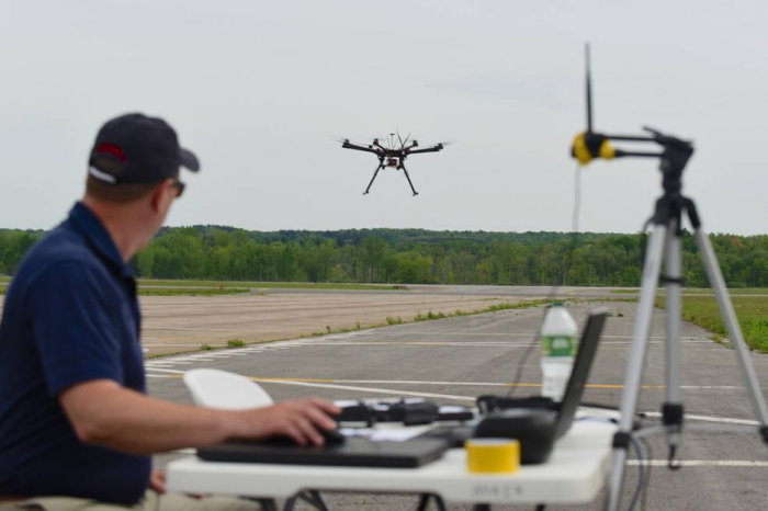
We are probably all familiar with drones, or UAVs, as they are virtually everywhere these days. UAVs are remote controlled airplanes and helicopters that are capable of providing surveillance and attack capabilities for military and civilian uses (no attack capabilities in the civilian case, unless you mount a potato gun). Their development grew out of the need for airborne reconnaissance on missions that are either too dangerous or too tedious for piloted aircraft. Today, UAVs have evolved to the point that some platforms are small enough to be easily deployed by a small support team and require only a hand launch or a very short runway. They are often referred to more generically as Unmanned Aerial Systems (UAS), as the vehicles themselves are just one piece of the overall puzzle in most geospatial workflows You may also be interested to look at another one of the GIS courses we offer, GEOG 892: Geospatial Applications of Unmanned Aerial Systems (UAS) [30]. It is focused explicitly on how UAVs and GIS working together.
UAVs for Emergency Management
In the emergency management context, UAVs are already used in a variety of ways and new applications continue to emerge.
UAVs are capable of surveying areas very quickly to provide imagery to - or other types of - remotely-sensed data. Satellite data is always valuable and desirable, but satellites cannot always be overhead at the right times on demand. UAVs can be deployed very quickly and can be easily directed toward different areas as the situational picture develops. It is worth noting that UAV footage combined with new approaches to image processing means emergency responders can have high-quality imagery and maps in a matter of hours rather than days.
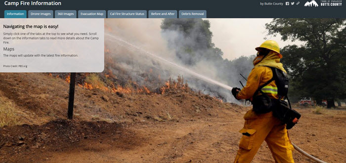
Click on the image below to see a great example of how UAV footage was used to create a compelling story and reference document about the 2018 Camp Fire in California.
 [31]
[31]
Drone Mapping of the California Camp Fire
The following 2:28 minute video provides a good illustration of the links between drone mission planning/field operations, image processing, and delivery of products for use in response and recovery activities. Note the time frames involved in this, and how much shorter they are than other traditional aerial or remote sensing efforts. However, the time required to process imagery from those platforms is rapidly shortening as well.
Click here for a transcript of the Disaster drone mapping of the Camp Fire video.
GREG CRUTSINGER: My name's Greg Crutsinger. I was the drone data analyst for the Public Safety UAS teams associated with the tragic campfire in Paradise, California over the past week. I was called in to be the drone data coordinator, so playing the role of coordinating the data side of around 15 to 16 public safety teams made up of law enforcement and fire.
Over a period of two days or so of full flights and another half day of kind of preliminary flights, we were able to map about 26.2 square miles or around 17,000 acres over about 518 drone flights using primarily DJI Phantom 4 Pros. That produced around 70,000 photos, representing about 460 gigs of information. From air, those data were run by runners down to San Francisco and processed by drone deploy and turned around in 24 hours. So each day, they would process for 24 hours. And it would be done by the end of-- so by 48 hours, we were finished with all of those data.
Around 12 hours later or so, that was all accumulated into one big map and put online and made public for public agency use for local and state and federal agencies to get very high-resolution information for the town of Paradise. It's also going to be used by utilities and insurance companies and then, of course, the residents that are impacted by this tragic event. So there's lots and lots of lessons that were learned from this event. And those will be shared over time. I think that the drones finally really showed that they're a valuable tool and just another part of these kinds of disaster responses.
So it's Thanksgiving Day. I got my coffee. I finally slept a little bit. I haven't slept in about seven days.
The information can be found on the Butte County website. And I'm going to take it easy. So Happy Thanksgiving, everyone.
We are all pretty familiar with the use of drones for imagery, but here are a few additional emerging uses for drones in emergency stations. The next video is a bit of a ‘vision’ for drone use and this is followed by a few specific examples of how drones are being used in emergency response.
The following 3:30 minute video: Disaster Response Support with Drones, provides a nice overview.
PRESENTER: Numerous hikers have gone missing after a strong storm yesterday. Currently, three people are still missing. They were hiking separately on hiking trail 34. Drone special teams start the search with search parties and drones from the nearest farm.
[SIREN BLARING]
[DRAMATIC MUSIC PLAYING]
[ON SCREEN TEXT WHILE DRONES ARE FLYING AND RESCUE TEAM SEARCHES AND REVIEWS THE DRONE FOOTAGE: Disaster response support with Drones. Mission and path planning. Aerial Surveillance. Image Processing. Wireless multimedia communications. Drone-based delivery. Coordination and swarming. Autonomous navigation Human drone interaction. Precise landing.]
Payload Drones
It’s not just about Amazon delivering goods to your door… Payload drones are increasingly being used in crises as illustrated in the following videos from WeRobotics and Zipline.
Watch WeRobotics Amazon Rainforest Cargo Drones (2:35 minutes)
Click here for a transcript of the Amazon Rainforest Cargo Drones Video.
NARRATOR: The Amazon rainforest is home to thousands of indigenous communities spread across very remote areas. Their only means of transportation is by riverboat. It can take many hours, and even days to reach the next village.
When local doctors run out of medicines, new supplies have to be shipped by boat. So for example, if a villager is bitten by a snake and a doctor is out of antivenom, the villager may not live to see the medicine when it finally arrives. Snake bites are a major concern in the Amazon. Doctors report an average of 45 snake bites per month in the Contamana region alone.
WeRobotics was invited by the Peruvian Ministry of Health and local doctors to explore whether drones could support medical delivery efforts in the rainforest. WeRobotics Peru Flying Labs took the lead in the field testing and were highly successful.
JUAN BERGELUND: Actually, we were able to transport medicine, the antivenom, and medicine from the Contamana city to Pampa Hermosa city.
NARRATOR: The cold pack with the antivenom was placed into the drone and then hand launched. It took the drone 35 minutes to reach the village of Pampa Hermosa, about 40 kilometers away. A regular boat would have required six hours to reach the village. In Pampa Hermosa, villagers witnessed the first ever drone delivery in their village. The local doctors asked a boy to simulate a snakebite so they could demonstrate the importance of drone deliveries. That night, the drone flew back to Contamana.
JUAN BERGELUND: We flew both sample a special refrigerated vessel, and then we flew back to Contamana and they were able to get that one. We go to the main square and we show to the whole population about the importance of using these UAVs for humanitarian reasons.
NARRATOR: The first ever cargo drone deliveries in the Amazon rainforest were a success. As a result, the Ministry of Health and local doctors have invited WeRobotics to carry out additional deliveries to even more remote villages.
[MUSIC PLAYING]
If you have some time it is worth checking out WeRobotics [32] [32]on their website or YouTube. Patrick Meier, the author of Digital Humanitarians, is also a co-founder of WeRobotics.
Now watch the 4:05 minute video about airdrops of medical supplies to African Villages.
Click here for a transcript of the Zipline drones airdrop medical supplies to African villages video.
Zipline drones airdrop medical supplies to African villages
[MUSIC PLAYING]
KELLER RINAUDO: Zipline designs, manufacturers, and operates robotic aircraft that deliver medicine to people in hard-to-reach places and save lives as a result. We primarily work with governments, particularly governments in the developing world that often have challenges delivering medical products to people who live in rural or isolated communities, things like blood, rabies vaccine, normal vaccines, oxytocin-- things that if patients need, you really need it in that moment because your life is on the line. We started working on Zipline as a product about 2 1/2 years ago. And we are actually just beginning to operate at a national scale in Rwanda this month. And so that represents the world's first drone delivery service that's actually operating in a routine way and at a national scale.
DRONE PILOT: Kigali Tower, Zip 24, how do you read me?
AIR TRAFFIC CONTROLLER: [INAUDIBLE] contact 24, Kagli Tower. I read you 5 by 5.
KELLER RINAUDO: So we're standing by a launcher which has a Zip on it. And the Zip is actually ready to fly and go make a delivery. The reason we use launchers and the recovery system-- that we're going to look at in a sec-- is that these vehicles don't have landing gear on them. And it's actually not possible to build a runway in every place that we might want to deploy a system. So the Zip basically attaches to the launcher here, and then this launcher will tension. There's a bungee in the middle of this structure. And then when you press that button, it will basically accelerate the vehicle. And the vehicle's flying autonomously and ready to make a delivery.
LORA KOLODNY: Why was it designed like this? What were some of the safety considerations?
KELLER RINAUDO: So as I mentioned, one the challenges of everything that we do is that if you want to be able to fly beyond line of sight and you want to fly over populated areas-- which are two things that oftentimes regulators are uncomfortable with-- you really have to be able to show that these kinds of vehicles can operate at a level of safety that's equivalent to a general aviation aircraft.
LORA KOLODNY: Where are these things set up-- the launchers?
KELLER RINAUDO: So basically, the launcher, the recovery system, as well as the shipping containers all form the distribution center. And we set up a distribution center usually near a medical supply warehouse so we don't have to stock all the medicine ourselves. Really, the distribution center is designed to be kind of a magical technology that enables that warehouse to make hundreds of deliveries-- instant deliveries-- per day to any location within a 75-kilometer radius.
Today in Rwanda, we're focused exclusively on blood. And that might sound simple, but it's actually really complicated. The government of Rwanda delivers about 65,000 units of blood a year. 50% of that is going toward moms who are suffering from postpartum hemorrhage. And then, 30% is going to our kids under the age of five who suffer from severe anemia due to malaria.
So this is really important. It's a complete emergency. Someone's life is on the line when you need one of these products. But it's very difficult to stock these products reliably because you have red blood cells, platelets, plasma. You need all three. They all have different storage requirements, different shelf lives. And then with red blood cells, you've got eight different types-- A, B, AB, and O, and positive and negative Rh factor of each.
So it's basically an impossible logistics challenge. And what's so great about this is it allows them to go from trying to make these impossible predictions of what's needed where to keep the blood in one place and send it when you have a patient whose life is in danger. It's a vast simplification of the supply chain that actually saves the government money and can save thousands of lives in the long run.
LORA KOLODNY: We talk about drone delivery for convenience. And it's a lot of fun flying a Slurpee across the desert or a burrito to a college campus, but Zipline has the potential to save lives.
Cooperating Drones
Drones are also able to work together to complete tasks. You may have seen the insane “swarm” drone light display at the opening ceremony [34] of the Winter Olympics in Pyeong Chang in 2018. Other applications are being developed such as the three drones working together to build a rope bridge that can support humans in the following (3:26 minute video).
Building a rope bridge with flying machines (3:26)
AI and Drones
Finally, I’d like you to consider how drones are being incorporated with other emerging technology such as artificial intelligence. In the video example below (from Australia!) drones are able to identify swimmers, swimmers in need, sharks, stingrays, and many other things. (2:05 minutes)
Click for a transcript of the Little Ripper Lifesaver video.
[WAVES]
[MUSIC PLAYING]
EDDIE BENNET: Australia has a very long coastline, and that presents us with some unique challenges. Drones provide us with a great opportunity to get a lifesaving service outside of where we traditionally have those services now. In 2015, we used the first drone to fly along a beach and look for people in trouble and to save lives.
We used the drones in three ways. The first is for surveillance. So we're able to get vision and understand situations, understand when people might be getting into trouble. We have warning devices, loudspeakers fitted to the drone so that we can actually warn people that they are about to get into trouble or what to do if they are in trouble. And the third thing is that we can intervene and deploy an automatically inflatable rescue device from the drone which can support up to four people. And it keeps them afloat in the surf, in the water, until they can be rescued.
Earlier this year, on the Central Coast, a sandbank collapsed and 12 people were washed into deep water. A lifesaving drone was sent to the area and quickly located exactly where they were. Lifesavers responded to the area very quickly and all 12 people were saved.
TONI BURKETT: If we could get that longer flying time, it would be really helpful for our job as lifeguards as well as being able to fly in all weather, such as high winds and rain, because that's when we're going to need that aerial perspective. And if the integration of the lifesaving technology in the drones could be improved, such as the sharks' water, that would be really helpful in our jobs as well.
EDDIE BENNET: So if we can use artificial intelligence to help us detect people and respond to situations, then that is going to be a wonderful opportunity to save lives. Little Ripper Lifesaver has very advanced lifesaving drones. Intel has very advanced artificial intelligence. Imagine a world if we combine those two together. What a great opportunity to save a life anywhere in the world.
Work with GIS and UAV Data, Exercise Overview
We've covered a lot so far in this lesson, and now you will start putting things together through an applied exercise. You will be working with GIS and UAV data to help develop situation awareness for first responders and search and rescue teams approaching an impacted area - NOTE that this will be a common theme throughout this exercise. These teams need to know quickly whether it is safe for them to proceed and what the conditions on the ground might be like. Imagine you are a geospatial professional supporting these efforts with existing GIS data and UAV data coming in from the field in near real-time.
Note: You will be setting up some software and downloading some relatively large datasets. Please do this early in the lesson even if you are unable to begin the exercise right away.
Here is a quick overview of what you will be doing and how it links with what we have learned so far.
- Part 1: You will gain experience using UAV-derived data products, in particular very high-resolution orthomosaics and 3D textured mesh models. Three case study areas from Switzerland are examined. Note, these represent situations with the technology and capability to develop these products rapidly and represents the cutting edge of what can be done with drone images and photogrammetry. The imagery you will look at does not come from a place with an active event but, as mentioned above, you will assume the role of a geospatial analyst developing an analysis for first responders and search and rescue teams moving into an area with an active incident. Most of your work will focus on the interpretation of an orthomosaic of a large industrial area. Then, you will consider the additional insights you can get from 3D textured mesh data but focused on smaller areas for the purposes of this exercise.
- Part 2: You will shift your focus to the use of UAV data in the immediate aftermath of the direct hit by Hurricane Irma on the small island nation of Antigua and Barbuda. The imagery is similar to what you examined in Part 1 but is coupled with a high resolution "before" satellite image. You will examine the scope of the damage done to the study area and provide some guidance to search and rescue and damage assessment.
- Deliverable: You will write two short reports for Part 1 and Part 2 that provide advice to emergency responders on what you have observed from the image analysis. As part of this, you will reference and provide some maps/screenshots of relevant parts of the UAV derived scenes.
See the following pages for more details.
Exercise: Part 1, Mapping for Situation Awareness
Introduction
In this section of the exercise, you will work with two types of UAV-derived geospatial products, orthomosaics, and 3D textured mesh datasets. Your goal is to evaluate ways to use these data to support situational awareness for first responders and urban search and rescue teams. For example, think about suggested plans for an evacuation of the area and providing guidance for where search and rescue teams and damage assessment efforts should focus first. Remember to imagine that this is early data coming in from an emergency situation and that you are tasked with quickly providing spatial products for field operations.
Analysis Steps to Support Field Operations with UAS
Import and process UAV mission data using ArcGIS Pro and Pix4D
- Install ArcGIS Pro and Pix4D
You will use ArcGIS Pro and Pix4D to manipulate and interrogate 2D and 3D UAS datasets- You probably have ArcGIS Desktop and ArcGIS Pro already installed. If you don’t, this can take some time, so make sure you do it right away. Contact the instructor if you have any questions.
- You will also need to download and install Pix4D Mapper. Instructions are provided in Canvas.
- Access the Data
I have already processed the raw UAV data with Pix4D for each step in this section because the computing time can be significant. I advise that you do the lesson with the pre-processed data first. However, feel free to experiment with the data processing steps. There is also an optional exercise that will provide an opportunity for you to process the data on your own using Pix4D.- Begin by accessing the data and associated metadata in the OneDrive folder I shared with you via the the emailed link. Let me know right away if you haven't already downloaded the data.
- The datasets include:
- A Pix4D Project named Building Scene -- This is also a 3D Textured Mesh, but in this case, it provides a detailed 3D view of a cluster of buildings.
- A Pix4D Project named Forensic Scene -- This is a 3D Textured Mesh that provides an introduction to what can be done with drone imagery these days. You will contrast this interactive 3D view with the more common 2D view.
- An ArcGIS Pro Project named Orthomosaic Industrial Area -- This is a very high-resolution mosaic of many individual photos taken by the UAV. You will start by interpreting and interrogating this dataset before learning more about how these images are created using photogrammetric techniques in Pix4D.
- Explore the Data
As you copy and unzip these datasets, take a moment to review and identify key information from the metadata document (i.e. the mission report). What do you think is most important to understand about the mission and the data? For example, what is the coordinate system and map projection, and do they match the other datasets you might use?
Pix4D Quick Start
Pix4D is used to develop high-resolution imagery products (2D maps and 3D textured mesh images) based on captured images and their associated location information. So, it is a tool that could be used to develop spatial products in a relatively short period of time. Here, I have provided a quick start tutorial using the buildings dataset.
-
Double click to open the Pix4D project building_1.p4d. If prompted, navigate to the images folder associated with this project.
-
Explore the Map View. This shows the general study area and the locations of where the UAV images were taken, denoted by the red circles. Go ahead and click on one of the circles to see the corresponding image and parameters.
-
Open the Processing Options by selecting the button on the lower left of the display. This is where you set up the parameters for processing the raw imagery. Some of the options for outputs include point cloud, 3D mesh, Digital surface model, or Orthomosaic. There is also a panel that shows Resources and Notifications. You can view the resources available on your computer to do the processing.
-
Look at Processing panel (also at the lower left of the display). This shows the selected options and allows you to launch the model. NOTE: Because Pix4D can be really resource intensive, I have already generated output for you to consider. However, feel free to have a go at running this yourself – it just might take a while.
Now have a look at the processed results and explore some of the options for interrogating the data.
- Select rayCloud view from the left hand options. Zoom in and note what is being displayed – toggle layers on and off.
- Deactivate the Tie Point layer and look at the Cameras layer. This shows you the location and orientation of the camera at the time of acquisition by the UAV.
- Activate the Point Clouds (and Point Groups) layers. This shows the point could be generated from the imagery and location information.
- Activate Triangle Meshes and deactivate all other layers. This 3D textured mesh combines the 3D geometry with the imagery.
- Explore the 3D textured mesh with the available tools in the Navigation and View toolbars.
- Traditional pan and zoom with the standard navigation
- 3D trackball navigation
- Focus on the Selection tool
- View from Top tool
Interrogate 2D Orthomosaic imagery
- Open the ArcGIS Pro Project and have a look at what’s there. Examine the flight trajectory map and refer back to the mission report if you need to. Note the area covered and any variation in the quality of the mission. It is worth noting that you may not have complete coverage of the impacted area. That's where some historical imagery can be useful, as it allows you to provide advice about other potential nearby hazards, e.g., what do you do if the SAR teams are moving into places that are downstream from floodwater or hazardous facilities?
- Note that these high resolution images have already been orthorectified and mosaicked by the drone data processing software (in this case Pix4D Mapper). So, soon after the mission, the data are provided to you in ready-to-use form. There are other courses and training you can do if you are interested in photogrammetry and image processing. There are a lot of services that can do this for you as well, and you have the option to work with Pix4D Mapper below.
- Familiarize yourself with the content of the scene by panning and zooming around the image. Think about the advantages of having such high-resolution imagery when going into an uncertain environment. Start with some general observations about the industrial park, e.g., entrances and exits and then consider specific types of activities that are evident in the imagery through observing things like forklifts, loading areas, and liquid nitrogen stacks.
- Create a point feature class in ArcGIS Pro and map five or more locations within the study area that you think are important for first responders and search and rescue teams to know about. These locations could include things like barriers (e.g., narrow access points, obstacles, dead ends), access points for responders and equipment, or potential hazards. There are no wrong answers here. The point is for you to get a sense for just how much information you can quickly gain from UAV data products.
Interrogate 3D Textured Mesh Data
- In this part of the exercise, you will work with UAV-derived 3D Textured Mesh Data data in Pix4D Mapper.
- You will be using this program as a way to explore the data rather than processing the raw imagery. Processing large UAV datasets can take considerable time (up to several hours) and the idea here is for you to use these products to think about an emergency management problem. That said, in the next OPTIONAL section, you can take a deeper dive and process some imagery yourself if you like.
- You will look at two examples of 3D Textured Mesh models. These are high-resolution 3D models of locations that also have imagery draped over them in an accurate and realistic way. For example, you could move around a building to view a particular exit or even see fine details such as car headlights. Again, consider the implications of having access to this data product for emergency management operations and situation awareness.
- Open the Pix4D Mapper project Forensic-1.p4d
- Go to the Map View. Look at the study area and flight path.
- Go to the Ray View and note the different Layers.
- Toggle each layer on and off and note what each is representing and how it illustrates how the final products are derived. For example, note the camera locations and how they are linked to one another and the derived point cloud.
- Turn off all layers except for the Triangle Meshes dataset. Pan and zoom around the image and make some observations about what you think would be useful for emergency teams with access to this level of detail.
- Repeat these steps with the Pix4D Mapper project Building-1, but consider the greater complexity in this scene from the point of view of supporting emergency response activities.
Part 1 Deliverable
Now you will write a short (400 words + figures) assessment of the situation on the ground as observed in the orthomosaic, keeping in mind your role as a geospatial analyst supporting operations and field teams. Focus mostly on the issues raised when looking at the orthomosaic, as described above, but provide a few insights into the potential advantages of providing 3D products to emergency managers and responders as well.
Submit, along with Part 2, to the GIS and UAV Data Exercise Dropbox.
Later in the course, you will learn about using geoAI and machine learning for rapid, automated assessment of imagery like this. We will also consider how data like this can be delivered more effectively to first responders and others in the field during emergencies.
Exercise: Part 2, Damage Assessment following Hurricane Irma
Introduction
In 2017, Hurricane Irma had devastating impacts on much of the Caribbean, especially the island nation of Antigua and Barbuda. In fact, nearly all of the buildings on the island of Barbuda were destroyed, and almost the entire population was evacuated to Antigua before or immediately after the storm.
For more context, have a quick look at this reporting from the Guardian, The night Barbuda died: how Hurricane Irma created a Caribbean ghost town [40]. If you have trouble with this link, go to the next page in Canvas.
In this section, you will compare UAV imagery collected soon after the hurricane hit with ‘baseline’ satellite imagery taken before the storm. I want you to contrast the type of information you can get from high-resolution satellite imagery with that from an insanely high-resolution UAV mission. Approach this from the point of view of an emergency manager coordinating search, rescue, and recovery efforts in the immediate aftermath of the event. Also, consider the damage evident in the imagery in support of overall damage assessment and teams entering the field.
The data you will be working with came from a Canada-based group called UAViators [41] and it is distributed on OpenAerialMap [42]. If you are interested in this type of data (for your term project?), the OpenAerialMap website might be a good place to start looking.
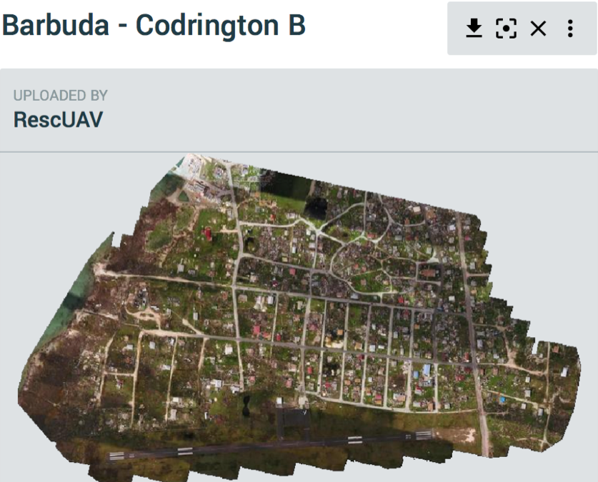
Steps to follow:
- Begin by accessing the data and associated metadata in the OneDrive folder I shared with you via the the emailed link. Let me know right away if you haven't already downloaded the data.
- Look at the ArcGIS Pro Project that I have created to help support your analysis. There are many different layers in this project, so have a quick look to see what’s there as you consider the specific context in Barbuda. Note the analysis focuses on the main settlement, Codrington. The data have been sourced from:
- Humanitarian Data Exchange [43]
- OpenStreetMap [44] Barbuda
- Global Health Data Exchange [45] – Census Data
- The Caribbean Development Portal [46] – Antigua and Barbuda
- Think about how these easy to obtain datasets can rapidly paint a picture of conditions on the ground and the likely impacts on people and infrastructure. Is there anything major missing data-wise, and do you think you could easily find what you need in a hurry?
- Next, load the satellite and drone imagery.
- The pre-event satellite imagery from Maxxar’s Open Data Program [23] is another source of freely available data for disaster events. You might want to make note of this site when considering your term project.
- As mentioned above, the post-event UAV aerial imagery comes from UAViators [41] via OpenAerialMap [47].
- Have a look at the properties of these two images and note their spatial resolutions, keeping in mind how these may influence the information that can be derived from the image.
Part 2 Deliverable
Write a short assessment of the situation on the ground, keeping in mind your role as a geospatial analyst supporting operations and field teams.
- Conduct a simple visual damage assessment, e.g., what is the extent of the damage?
- Has critical infrastructure (such as ports, roads, key buildings) been destroyed or blocked by debris?
- Develop some broad search-and-rescue advice, e.g., what could you tell teams about conditions on the ground?
- What quick mapping products can you envisage creating from these data that could be distributed to the teams?
Submit, along with Part 1, to the GIS and UAV Data Exercise Dropbox.
Exercise Submission and Grading
For each part of this exercise, you'll write a short assessment of the situation on the ground, keeping in mind your role as a geospatial analyst supporting operations and field teams.
Each response should be about 400 words in length. Together, they are worth 50 points.
Submission Instructions
It is important for you to save your files in the following format so that I can match each submission up with the correct student.
L2_exercise_firstinitialLastName.doc For example, my file would be named "L2_exercise_mBeaty.doc"
Upload your assignment to the Deliverable: GIS and UAV Data Exercise Dropbox (L2). See the Course Syllabus or Calendar for specific due dates.
Grading Criteria
This will be graded out of 50 points and will count towards the Exercise portion of your grade. I will assess it using the following rubric.
| Criteria | Points |
|---|---|
| Content (part 1) You make strong and logical arguments and provide analytical insights. Ideas are well organized, clearly communicated and relevant to the prompt. All criteria are accurately addressed. Supporting details are shared, elaborated upon and demonstrate understanding. Examples are provided, and your essay includes images or other multimedia that support content. |
20 |
| Content (part 2) You make strong and logical arguments and provide analytical insights.[j1] Ideas are well organized, clearly communicated and relevant to the prompt. All criteria are accurately addressed. Supporting details are shared, elaborated upon and demonstrate understanding. Examples are provided, and your essay includes images or other multimedia that support content. |
20 |
|
Clarity and Mechanics (parts 1 & 2) |
10 |
| Total | 50 |
Term Project - Abstract
In Lesson 1, you were introduced to the term project for this class. This week, you will choose one of the project options and decide what your project will cover. Your abstract should be no longer than 400 words. The goal of this exercise is to pave the way for you to write an exemplary term project, therefore, each section of the abstract will be graded on a satisfactory (1 point)/unsatisfactory (0 points) basis.
Your abstract is worth 6 points and should have the following sections and address these questions:
- Problem statement – In concise terms, what is your project about?
- Background – What is the context for your work?
- Objectives – What do you aim to achieve/demonstrate?
- Data and Methods – What data and methods do you anticipate using?
- Implications – What is the significance of your work? How might it be used in Emergency Management?
This week, I would also like you to set up a time to run your ideas by me. I think this will be particularly important with regard to the data component of your project. I can provide you with some feedback on whether the scope of the work seems too big, too small, or just right, and whether I think you’ll be able to get the data you need. This can be a quick discussion or we can take a bit longer if that is helpful.
I know it might be challenging to find a time to meet since we are likely in very different time zones - you probably recall I am based in Melbourne, Australia. That said, there will probably be some overlap where we can set up a voice or video call with Zoom [48]or Skype or communicate via chat. I am fine with getting up early or staying up late to overlap with folks. Have a look at the World Clock Meeting Planner [49] where you can put in your location and my location and see the hours of overlap. Then suggest a time you'd like to talk. I am happy to help with this as well.
Deliverables
Please submit your assignment as a word document to the "Term Project Abstract" dropbox in Canvas. See the Course Calendar in Canvas for specific due dates.
Grading
The goal of this exercise is to pave the way for you to write an exemplary term project, therefore, each of the six sections listed above will be graded on a satisfactory (1 point)/unsatisfactory (0 points) basis for a total of 6 points. You will have an opportunity to revise your abstract after receiving my feedback.
Summary and Final Tasks
Summary
This week, you have been introduced to the range of potential hazards that spatial data science for emergency management must be prepared to handle. In your reading assignment, we began to explore some of the key issues associated with supporting emergency management tasks with geospatial tools. Knowing how to design an effective geospatial system for emergency management depends on understanding hazards as much as it depends on understanding the capabilities and limitations of current geospatial technology.
Now that you have a general understanding of the types of hazards relevant to spatial data science for emergency management, we will begin examining the first of the four stages of emergency management in greater detail. In the next lesson, we will explore the role of geospatial perspectives and technologies for Preparedness activities.
Reminder - Complete all of the Lesson 2 tasks!
You have reached the end of Lesson 2! Double-check the to-do list on the Lesson 2 Overview page to make sure you have completed all of the activities listed there before you begin Lesson 3.
Questions?
If you have any questions, please post to the Canvas Discussion Forum called "General Questions" or email the instructor via Canvas conversations (if the question is personal in nature).
Lesson 3: Vulnerability Assessment and Hazard Mitigation
Overview & Checklist

This week, we focus on the first of the four phases of emergency management - vulnerability assessment and hazard mitigation. We will read about risk mapping and vulnerability assessment using spatial data and GIS. Building on the background knowledge we've gained from previous lessons, each of you will conduct an analysis of Heatwave vulnerability, impacts, and mitigation strategies using social and environmental data. You will also continue making progress on the term project assignment.
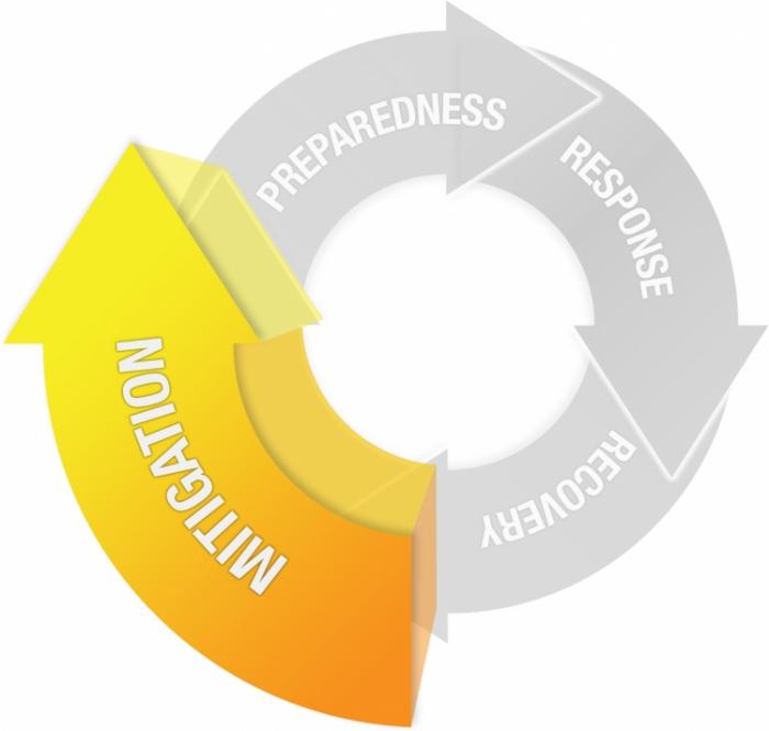
CC BY-NC-SA 4.0 [7]
Mitigation
The improvement of the built and social environment in order to reduce, withstand, or prevent disaster impacts.
- Hazard Analysis
- Vulnerability Assessment
- Scenario Development
- Community Engagement and Education
- Planning and Infrastructure Work
What You Will Learn
By the successful completion of Lesson 3, you should be able to:
-
describe the concepts associated with risk mapping and vulnerability assessment,
-
conduct your own vulnerability assessment using social and environmental spatial data and summarize your findings in a short essay,
-
conduct background research for your final project,
-
and discuss the technology trend of volunteered geographic information (VGI).
What You Will Do
Lesson 3 is one week in length. To finish this lesson, you must complete the activities listed below.
| To Read |
|
|---|---|
| To Do |
|
Please refer to the Calendar in Canvas for specific timeframes and due dates.
Questions?
If you have questions about the content or lesson activities, please post them to the General Questions and Discussion forum in Canvas. While you are there, feel free to post your own responses if you, too, are able to help a classmate. If your question is of a personal nature, please email me directly through Canvas.
Mapping Risk
Understanding the Geography of Vulnerability
Developing a clear picture of an area's vulnerability to hazards and disasters is a non-trivial task. It's hard to predict exactly what could happen in a disaster situation. However, even a rough estimate can be a huge help to emergency managers and decision makers who can use that information to develop plans for allocating resources and managing recovery operations. By collecting socio-economic and environmental data sources in a GIS, for instance, we can develop risk maps to highlight the potential impact of disasters on people and infrastructure. In this lesson, we will examine some of the specific analytical methods for doing a vulnerability assessment, and we will reflect on the critical issues associated with planning an emergency management GIS system that includes vulnerability assessment as one of its key functions. Most systems for geospatial and emergency management are designed for reaction, not prediction and mitigation, but that’s changing fast.
There is a wide range of relevant questions to consider when conducting a vulnerability assessment, including answers to the following key questions:
- Who is at risk? How many will be affected?
- What is the spatial and temporal extent of the vulnerability?
- What capacity does the population at risk have for coping with the disaster?
- What is the range of scenarios given different conditions (for example, a Category 2 hurricane vs. a Category 5 hurricane)?
- What happens when multiple disasters occur at the same time (for example, heatwaves during major wild fires; hurricanes during pandemic shutdown)?
- Across all of these is the ‘where’ question, and what roles do spatial relationships play?
Here are a couple of examples of web-based services providing geospatial data on hazards and vulnerability; there are many others!
The first example is a map service developed and maintained by the U.S. Federal Emergency Management Agency (FEMA) that coordinates and conducts a great deal of vulnerability assessment work [50], including flood mapping. FEMA flood maps are used to help set flood insurance rates, among other things. The flood mapping tool [51] shows an overview of ongoing FEMA flood mapping, levee repair, and other flood-related risk assessment and mitigation tasks. Contrast this with recent research reported in this interactive New York Times page - New Data Reveals Hidden Flood Risk Across America [52]. Note: you shoudl be able to view the interactive maps without a subscription, but if you are having trouble, you can view a copy of the article on the following page in Canvas.
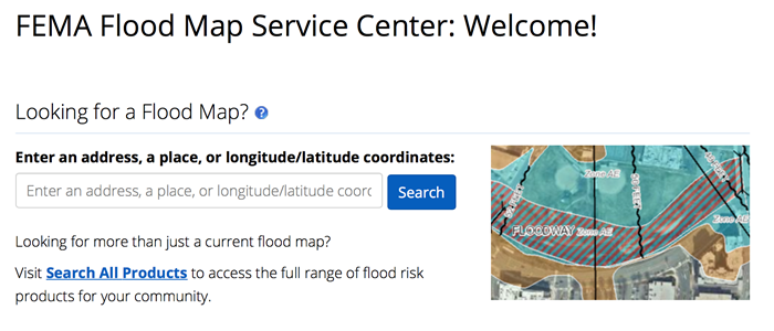 [51]
[51]
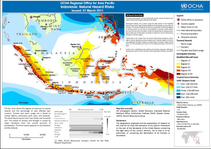
Indonesia: Natural Hazards Risks
The United Nations engages with other entities to develop risk maps for developing countries where they are likely to be involved in future disaster situations. If you check out the map above [53] in greater detail, notice who the collaborators are. They include several NGOs, as well as Munich Re, a major re-insurance player. Interesting, huh?
Keep this Indonesia map in mind, because later in the course you will be considering the 2018 Sulawesi Earthquake and Tsunami in greater detail.
Some private sector firms provide what is known as Address Risk Rating products - in essence, you can look up a specific address and get a report outlining all of the vulnerabilities associated with that location. One of our PSU faculty, Dr. James O'Brien, works for Risk Frontiers [54] in Australia, a firm that works on Address Risk Rating products among others. Here is another example, UNHaRMED [55] model, from the University of Adelaide and the Australian Bushfire and Natural Hazard Cooperative Research Centre.
These examples don't explicitly consider people and the wide range of factors that make some people and places vulnerable while others are not. You will see it is not just a matter of whether you are inside or outside of an impacted area. Geographers have done a lot of work on social vulnerability analysis as part of a rich tradition of Hazards Research.
Vulnerability Assessment
In this week's hands-on exercise, you will be working with some data related to heatwaves in the USA. Through this work, you will gain an understanding of vulnerability assessment approaches using geospatial data and how they can be used to understand some of the priority areas for action leading up to and during a disaster.
Before conducting the analysis and developing the accompanying short report, I would like you to watch a short overview video on Social Vulnerability Indices (SVI), read a chapter from your textbook on GIS and Disaster Mitigation, and read a journal article on Social Vulnerability to Natural Hazards in Brazil. This material will help you gain an understanding of the human dimensions of vulnerability that I mentioned previously.
Watch
Please watch this 3:45 minute video on Social Vulnerability Indices (SVI) from the US Centers for Disease Control and Prevention (CDC).
Click here for a transcript of the Social Vulnerability Index (SVI) video.
Social Vulnerability Index (SVI) - An Overview
PRESENTER: Welcome to our video, Introduction to CDC's Social Vulnerability Index, also known as the SVI. Please visit svi.cdc.gov to explore our website and interactive maps after this presentation.
All communities exhibit varying degrees of physical vulnerability to potential disaster, both natural and human caused. However, it is a community's social vulnerability that may determine how well it responds to and recovers from a disaster.
Studies have shown the socially vulnerable are often less prepared for a disaster event, less likely to recover from it, and more likely to be injured or die. Effectively addressing social vulnerability decreases human suffering and reduces post-disaster cost to society.
Our group at ATSDR, known as GRASP, developed the SVI to help identify socially vulnerable populations before, during, and after hazardous events.
The SVI is a database that ranks the relative social vulnerability of US census tracts. We score and rank each tract in the nation on each of 15 census variables to determine its social vulnerability. The right side column of this graphic shows the variables we use in the SVI. The 15 census variables are further grouped into four themes. Tracts are ranked on these four themes, as well.
Finally, the sums of the scores for the 15 individual variables are ranked for each tract to determine overall vulnerability. So there are three ranking options for each tract, for each variable, for each theme, and overall.
Our rankings were calculated using a percentile ranking method. A percentile rank of 0 means least vulnerable. A percentile rank of 1 means most vulnerable. All census tracts are ranked between 0 and 1. As an additional measure, we flag tracts with any variables ranked at 0.9 or more, to help us easily identify tracts that are particularly vulnerable. We also determined tract rankings within individual states.
Here are SVI maps of Gwinnett County, Georgia, showing each of the four themes, as well as its overall social vulnerability. As you can see, the vulnerability of any given tract may vary by theme. Some tracts are highly vulnerable for all four themes, and will likely have the highest vulnerability overall. Other tracts may be highly vulnerable on one or more themes, or have low vulnerability on all themes.
You can use the interactive mapping application to create a map showing the social vulnerability of your own community, county, or state. And you can examine the detailed social vulnerability and ranking of any tract in the United States, as well as download SVI data and tools. Other data, including such features as hospitals or schools, can be combined with information on impending hazards to assess overall risk to a community. Emergency planners can direct specific attention to areas most in need of funding and physical support over the course of a disaster event.
There are many potential uses for the SVI. Please visit the SVI website at svi.cdc.gov. Learn more about our methods and how to use the interactive map in our other videos. Thank you.
Read
-
GIS for Disaster Management - Chapter 8 "Geographic Information Systems and Disaster Mitigation (pp. 233-250)
In this chapter from your textbook, the author goes into some good detail on assessing and modeling risk and vulnerability using GIS, including where to get data to do your own and a few straightforward analysis steps using GIS. It also includes core concepts associated with evaluating mitigation policies as well as the ways in which people can develop social and environmental variables to model risk and resilience. -
Loyola Hummell, Cutter, Emrich (2016). Social Vulnerability to Natural Hazards in Brazil. International Journal of Disaster Risk Science, volume 7 (issue 2), 111-122 [56]. This final reading will serve as a rough model for what we will work on next in the hands-on portion of this exercise.
-
OPTIONAL / FYI - Georgianna Strode et al. (2020). Exploratory Bivariate and Multivariate Geovisualizations of a Social Vulnerabity Index [57].
Vulnerability Assessment Exercise
Heatwave Vulnerability, Impacts, and Mitigation Options
Introduction
The last year has seen extreme heatwaves affecting much of the world including in China, India, the USA, and Europe. Heatwaves damage infrastructure, overload power grids, reduce work safety and productivity, and have negative impacts on quality of life in general. Moreover, more deaths and illness are due to heatwaves than any other natural disaster, and in the case of the USA and Australia, more than all other natural disasters combined.
Heatwaves can also compound the impacts of other types of disasters. For example, earlier this year Australia experienced extreme flooding followed by a heatwave. This led to a situation where people were outside cleaning up when temperatures were dangerously high.
Heatwave deaths and illness are generally thought of as being entirely preventable. That is, proper mitigation, preparedness and response activities can be undertaken to minimize or eliminate harm e.g., through effective heatwave warning systems and providing the public with “cool places” to get out of the heat.
There is also a strong emphasis on planning and implementing mitigation and adaptation strategies to reduce vulnerability and promote resilience when heatwaves strike. For example:
-
Urban planning might focus on “green and blue infrastructure” to reduce Urban Heat Island (UHI) effects;
-
Social welfare groups (e.g., Red Cross) have “opt-in” systems where vulnerable older people are contacted throughout the heatwave event to make sure they are coping well; and/or
-
Heat-health outreach to help educate the community about the dangers of extreme heat, how to respond to warning messages, and what steps to take.
Heatwave vulnerability and impacts are not spread evenly across populations and geography. This has a lot to do with differences in socioeconomic factors and characteristics of the built environment e.g., low tree cover, poorly designed housing. Just as there is a geography to vulnerability and impacts, there is also a geography to potential solutions. We often think of these as “spatially targeted interventions”.
In this exercise, you will consider these issues in greater detail and use spatial data and analysis to identify patterns of vulnerability and potential impact along with ways of addressing risk and reducing vulnerability.
Learning Goals
- Examine what defines a heatwave and its relationship to weather and microclimate
- Describe trends in heatwave occurrence, duration, and severity both in the past and in the context of global warming
- Develop an understanding of heat impacts on people and infrastructure, particularly regarding key socioeconomic vulnerabilities
- Understand how heatwaves are managed and how they can compound other common natural hazards
- Be able to discuss heatwave vulnerability, impacts, mitigation, and adaptation options in the context of the emergency response cycle
Analysis Steps
- Heatwave trends and impacts
- Vulnerability mapping and assessment
- Spatial analysis of mitigation and adaptation options
- Report to planners and emergency managers
Part 1 - Heatwave trends and impacts
In this section, you will take a close look at key characteristics of heatwaves, trends related to climate change, and some of the direct impacts of heat on people. You will produce a few graphs and maps that will be incorporated into your write-up in Part 4.
A. What are heatwaves?
Understanding Heatwaves (2:05)
Insert transcript here
From the video, take note of these key characteristics of heatwaves:
- Occurrence - How often do heatwaves occur?
- Duration - How long do they last?
- Severity - How severe are the impacts?
- Diurnal cooling - Is there 'cool relief' overnight e.g., are nights hot too?
Source: Australian Bureau of Meteorology Heatwave Forecast Service [59]
Heatwaves are not defined just based on temperature, rather humidity and longer term trends (acclimatization) need to be incorporated. In the map above based on Excess Heat Factor (EHF), heatwaves are classified into three types, based on intensity. Note these mention potential impacts on people, infrastructure and the environment.
- Low-intensity heatwaves are the most common—most people are able to cope with this level of heat
- Severe heatwaves are less frequent and are challenging for vulnerable people such as the elderly—particularly those with pre-existing medical conditions
- Extreme heatwaves are the rarest kind. They affect the reliability of infrastructure, like power and transport, and are dangerous for anyone who does not take precautions to keep cool—even those who are healthy. People who work or exercise outdoors are particularly at risk
Source: Australian Bureau of Meteorology Heatwave Forecast Service [59]
B. How have heatwaves have changed over time, and why?
Heatwave occurrence, duration and severity have all been changing over time. There are several important drivers of heatwaves, including reduction in vegetation cover and more built-up (impervious) surfaces in cities. Climate change is perhaps the strongest factor causing changes in heatwave characteristics (see list above).
Consider the following series of maps showing annual temperature trends in the USA. These patterns are similar to what we are observing globally.
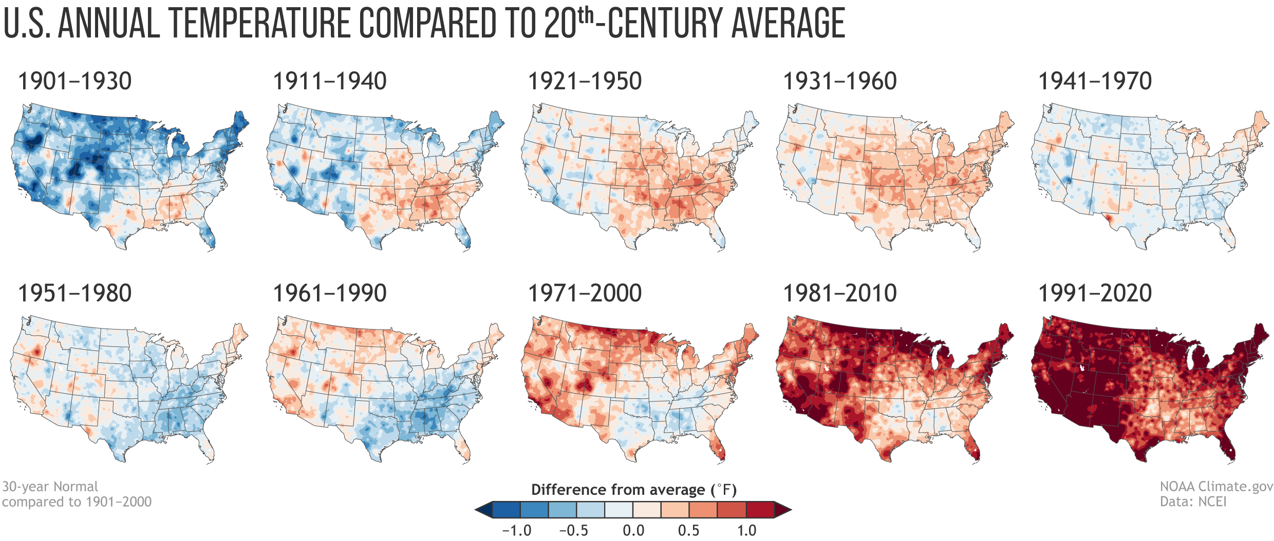
In addition to changes in average temperatures, there have also been changes in the occurrence of extreme events. The following diagram illustrates this, where a shift in mean climate results in more hot and extreme days. As an aside, there is a growing interest in the effects 'chronic heat' on health and wellbeing i.e., hot days but not falling into the 'heatwave' range.
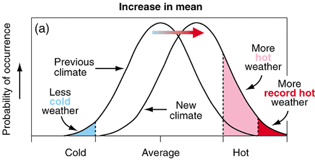
You will finish off this section by conducting some analysis of trends in the key heatwave characteristics (mentioned above) in the USA.
- Create bar charts showing - Heatwave Characteristics in the US by Decade 1961-2021
- Use the "Heatwave characteristics USA - trends.csv" in the GEOG_858_Lesson_3 project folder (download from class OneDrive folder)
- You can use Microsoft Excel. Make sure the charts are easy to understand and have appropriate labels and titles. (A 2 x 2 panel of charts would be a good choice!)
- Create a map - Examine regional differences Heatwave Characteristics in 50 Large US Cities, 1961-2021
- Use the "Heatwaves_USA_cities_trends" table in the GEOG_858_Lesson_3 ArcGIS Pro project (created for you - GEOG_858_Lesson_2.aprx; download from class OneDrive folder)
- You will need to spatially enable this table using the latitude and longitude fields in the table
- Make sure the map is easy to understand and have appropriate symbology and design (graduate circles would be a good choice).
- Summarize the main trends/messages in a couple of sentences? This will feed into your report in Part 4.
Deliverables 1.1
- Create bar charts showing - Heatwave Characteristics in the US by Decade 1961-2021
- Create a map - Examine regional differences Heatwave Characteristics in 50 Large US Cities, 1961-2021
- Summarize the main trends/messages in a couple of sentences? This will feed into your report in Part 4.
C. Heatwave impacts
This section focuses on some of the "direct effects" of heatwaves on people, including deaths and illness.
The following image is a warning poster produced by the SA Health to help people recognize the signs of heat exhaustion and heat stroke. Note this is advice aimed at everyone and not targeted to specific groups or places.
Heat-Related Illness Signs, Symptoms And Treatment
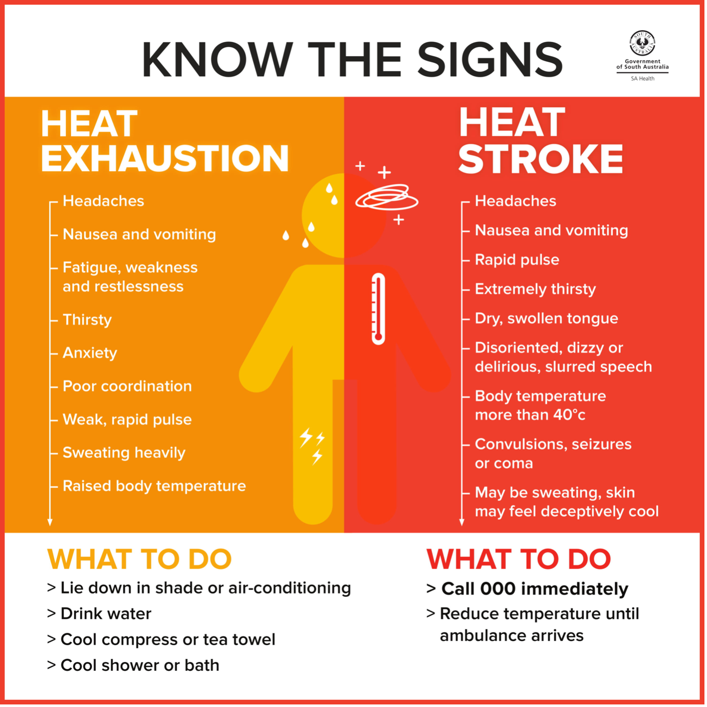
Public warning message, such as this, provide simple and consistent information. These are linked to dedicated websites focused on heat related health. Have a quick look at these two examples, again noting that heatwave illness and deaths are, in theory, entirely preventable.
- Heat-Related Illness Signs, Symptoms And Treatment [63] page from SA Health.
- CDC's Natural Disasters and Severe Weather website [64].
Heatwaves also have significant impacts on critical infrastructure and the environment. We won't go into much detail, but watch this short video from the Today Show, noting the reporting on impacts to critical infrastructure and the environment. If you want to learn more, there is no shortage of news coverage and research literature on these impacts.
Record-Shattering Heat Wave Leads To Deaths Across Britain (2:24)
Insert transcript here
You will finish off this section by looking at some trends in heat related deaths and illness.
- Create a time-series graph showing - Deaths Classified as "Heat-Related" in the United States, 1979-2018
- Use the "Heat related deaths USA 1979 - 2020.csv" file in the GEOG_858_Lesson_3 project folder (download from class OneDrive folder)
- You can use Microsoft Excel. Make sure the charts are easy to understand and have appropriate labels and titles.
- Use the CDC National Environmental Public Health Tracking Network [65] tool to examine broad patterns in heat related mortality and illness.
- Navigate to the website and have a look at what information is available. Then launch the Data Explorer Tool [66](noting this can be a little slow).
- On the left side map, fill in Steps 1-5 as shown in the image below. On the right side, use the same options but change "Mortality from HRI" to "Emergency Department Visits".
- Look at different years by adjusting the "Year" pull down menu.You can also click on the "Play" and observe how the number of cases vary by year.
- Consider taking a few screenshots to have on hand for Part 4.
- Finally, download the two datasets (Mortality and ED) using the "Export Data" button. Before leaving the site, change one of the maps to heat related Hospitalizations and export that data too.
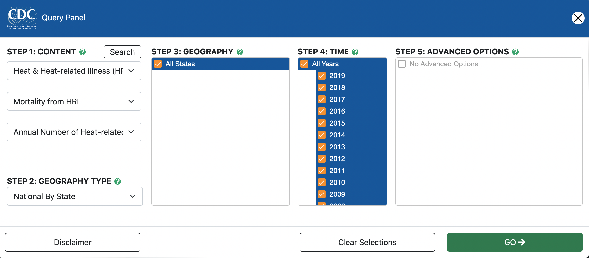
- Create a time-series graph showing changes in mortality, emergency department admissions, and hospitalizations for California versus the national average.
- Open the Mortality dataset in Microsoft Excel and insert a Pivot Table. Drag "State" to the Filter box, "Years" to the Row box, and "Value" to the Values box (change from Count to Average). In a new worksheet, copy and past the pivot table as values. Rename columns to "Year" and "US_average".
- Go back to pivot table and select California from the State pull down menu, and change Average of value to Sum of value. Cut and paste the Sum of Value column to the sheet with the US_average. Your columns should have these headings - "Year", "US_average", and "California". Delete the Grand Total row.
- Plot the two time series together. Make sure the charts are easy to understand and have appropriate labels and titles.
- Repeat for Emergency Department and Hospitalizations and display the three charts on a single page for easy comparison.
- Summarize the main trends/messages in a couple of sentences? This will feed into your report in Part 4.
- Optional: You looked at counts of events. Would it be better to look at rates on a population basis (e.g., per 100,000)?
Deliverables 1.2
- Create a time-series graph showing - Deaths Classified as ""Heat-Related"" in the United States, 1979-2018.
- Use the CDC National Environmental Public Health Tracking Network tool to examine broad patterns in heat related mortality and illness.
- Create a time-series graph showing changes in mortality, emergency department admissions, and hospitalizations for California versus the national average.
- Summarize the main trends/messages in a couple of sentences? This will feed into your report in Part 4.
Part 2 - Vulnerability mapping and assessment
So far we have considered broad trends in heatwave characteristics and direct impacts on people (e.g., heat stroke) and infrastructure. In this section you will consider some of the factors that make a person or community more vulnerable to adverse heatwave impacts. We will be taking a much more granular look at the problem in this and the following sections.
What are the factors contributing to heatwave vulnerability?
We are going to focus on heatwave vulnerability and impacts from the perspective of human health. This figure illustrates the basic problem - people must maintain their body temperature within a specific range to avoid adverse health outcomes. This is influenced by the ambient environment and characteristics of that person e.g., do they have existing health problems that may compromise their ability to thermo-regulate?
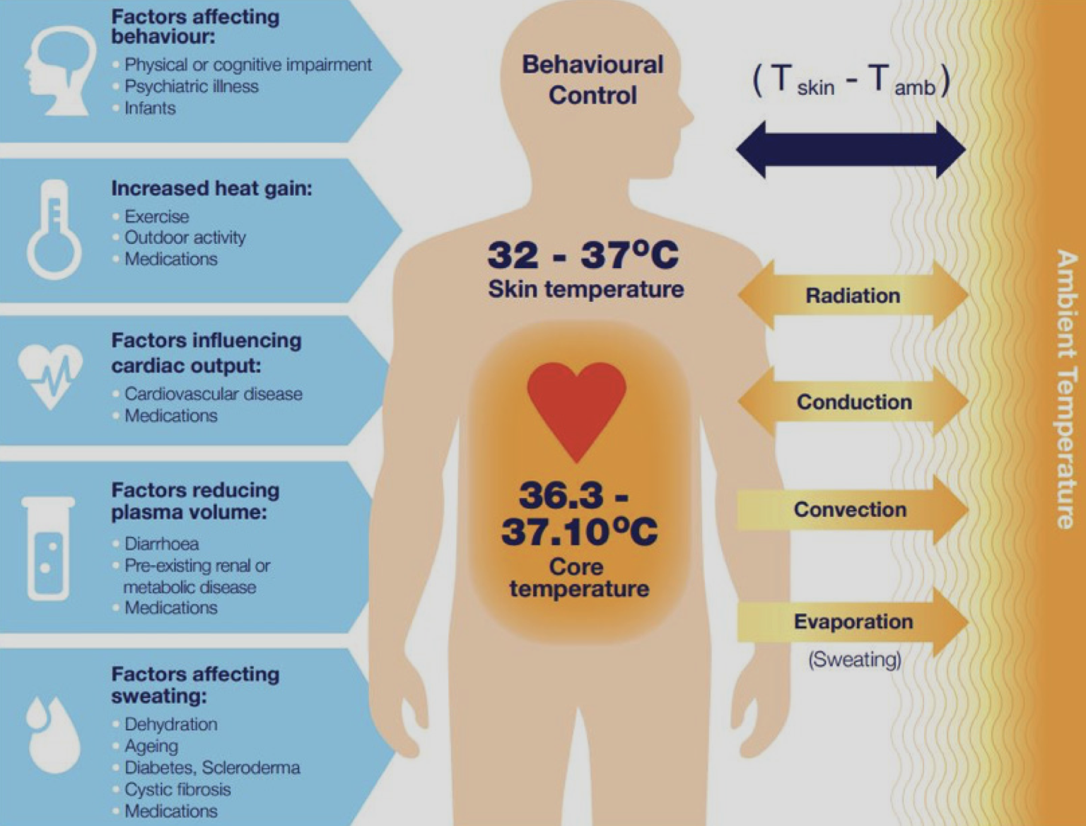
There are also a set of broader factors influencing heat health. The framework illustrated in this figure was used in a recent study to understand heat health vulnerability [69]. This is similar to the CDC Social Vulnerability Index (SVI) you would have seen in one of the previous videos, however the focus here is explicitly on heatwaves.
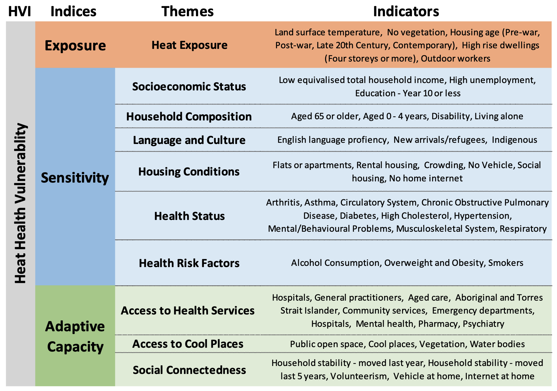
Vulnerability indices
Generally speaking, indices are designed to help us describe concepts that are not able to be measured directly. For example, "Vulnerability" or "Socioeconomic status" are a multidimensional concept that cannot be measured with a single variable. There are many different indices developed for different purposes. Here you will take a closer look at two of the most widely used approaches.
FEMA's National Risk Index (NRI)
Have a closer look at the FEMA's National Risk Index website [71]. There are three components to the NRI:

Note that the Social Vulnerability component is based on another index called the Social Vulnerability Index, or SoVI. This is one of the first approaches ever developed for emergency management, and it uses principal components analysis PCA) to reduce a set of variables to one index representing low to high vulnerability.
Similarly, Community Resilience is based on another commonly used approach called Baseline Resilience Indices for Communities (BRIC). BRIC also uses a set of indicators to build up the indices, but it does this through a "standardize and rank approach". To learn more, have a look at the NRI website and/or download the NRI manual [72].
When considering index approaches such as these (and any dataset for that matter), it is important to consult available metadata and "data dictionaries" (e.g.,here is the NRI data dictionary [73]), sometimes referred to as the Data Item List (DIL), that goes with a given dataset. You will find the NRI data in the ArcGIS Pro Project accompanying this lesson. I have mapped the SoVI component of the NRI. Have a look at the NRI attribute table, scan the field names, and look up a few variables in the data dictionary.
CDC Social Vulnerability Index (SVI)
Next, have a closer look at the CDC Social Vulnerability Index (SVI) [74]. The SVI takes an approach that is similar to BRIC, where individual variables are used to calculate sub-indices (Themes) and then the overall index. For example, Socioeconomic Status cannot be measured directly, so "below poverty" line, "Unemployed", "Income", and "No High School Diploma" are combined to get at this construct.
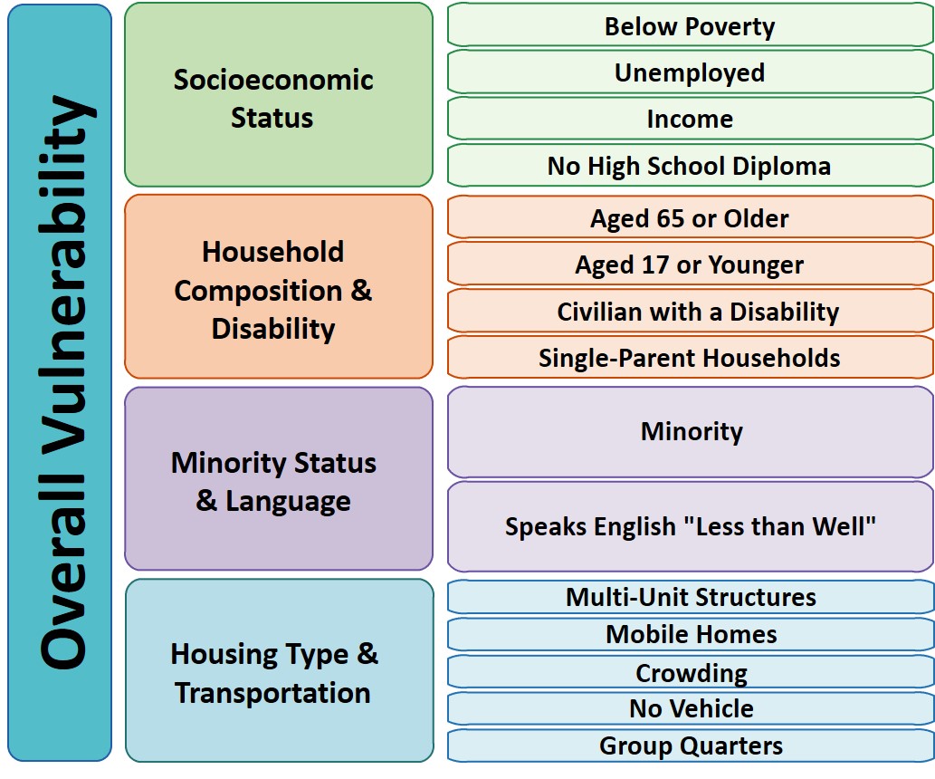
Note the table accompanying the SVI feature class includes the underlying data that is used in the index calculations. If you want to "unpack" a given index, you can look at individual variables. For example, you may observe a "vulnerability hotspot" and wish to know why that is the case. SVI let's you drill down to themes and individual variables. In a particular area, you may find that socioeconomic status is the most important theme and poverty and unemployment may be the most important single indicators. You will take a closer look at the CDC SVI, and, as with NRI, it is important to have any metadata and data item list handy (open a copy with this link SVI data dictionary [76]).
Urban Heat Island and Microclimate
When we hear about heatwaves, we often focus on weather as the main driver. However, heatwaves are experienced differently in different places due to variation in microclimate related to the build and natural environment.
Urban Heat Islands
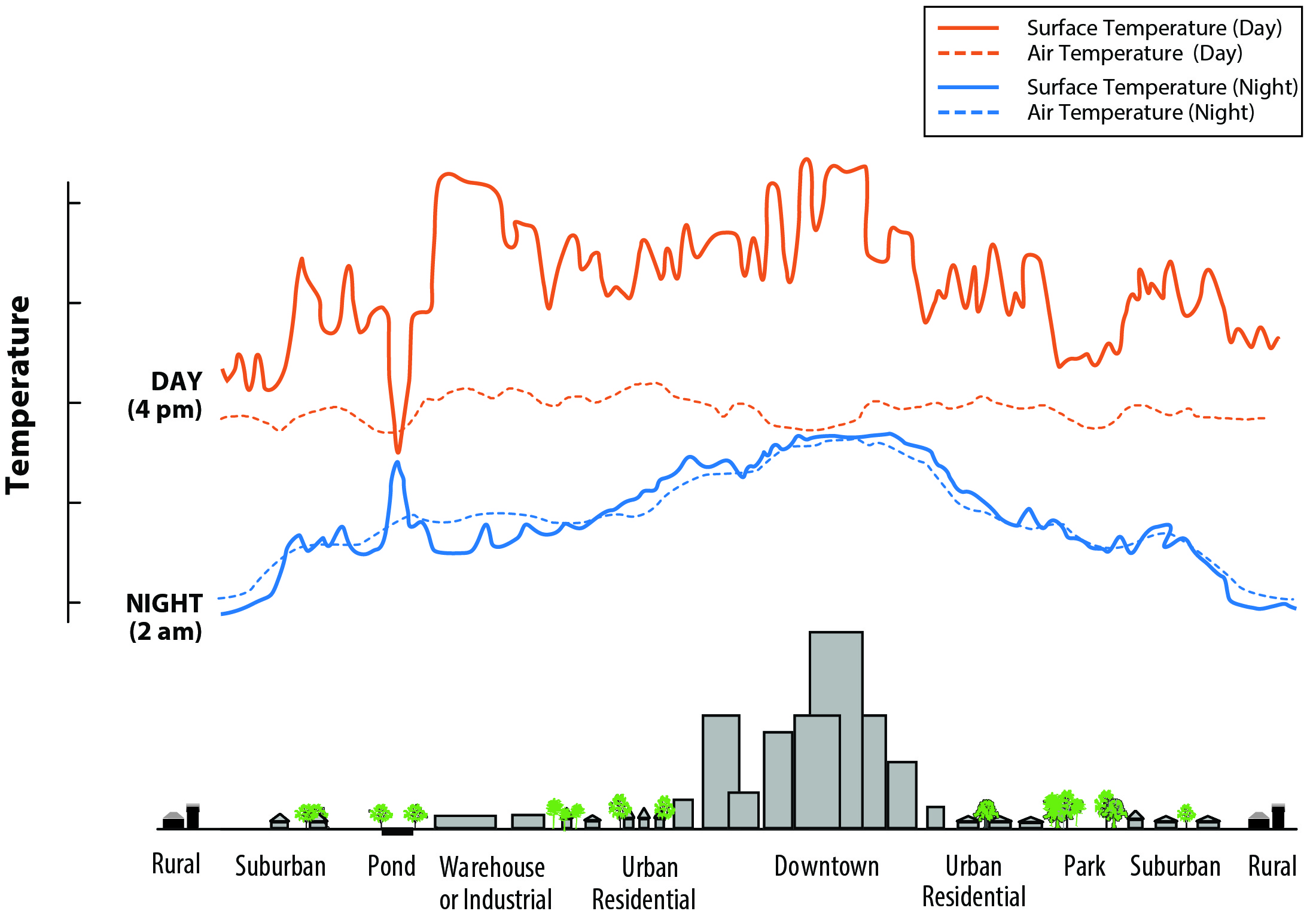
Microclimate
In addition to broader UHI effects, there is considerable variation in microclimate (e.g., local temperature) related to features of the built environment. In the following thermal image from Los Angeles in Summer 2018, you can clearly see higher temperatures in more built up areas. Major roads, downtown LA, and the Port of Long Beach stand out as hot spots while areas such as Beverly Hills and Santa Monica along the coast are cooler. Note how you can actually see the "hot" road network grid in the area around Anaheim. This illustrates very fine variation in land surface temperatures. A key point to takeaway, is that local conditions can enhance or ameliorate heatwaves e.g., think about the simple example of standing in an open parking lot versus standing under a tree during a heatwave!
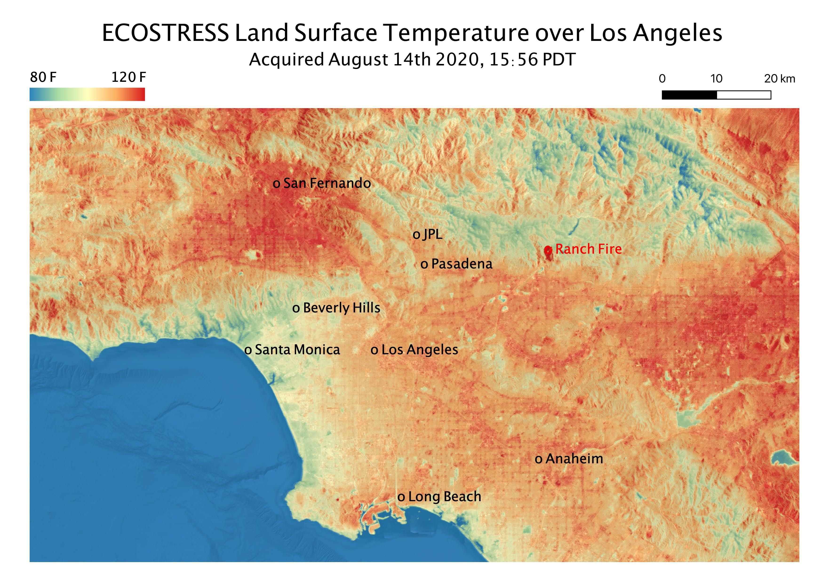
Los Angeles Heat Wave. Source: NASA Jet Propulsion Laboratory [78]
You will finish off this section by continuing to looking heat health vulnerability in Los Angeles County, California. All of the spatial data are provided in the ArcGIS Pro Project, GEOG_858_Lesson_3.aprx.
Mapping social vulnerability
- Take a closer look at the National Risk Index (NRI) by first looking at the attribute tables and data dictionaries.
- The NRI data are in the "NRI_LA_County_tract" feature class. Look at the attribute table and data dictionary to get a general idea of what it contains.
- Create three maps based on these data, and consider putting them together on a single page for easy comparison.
- Overall NRI
- Social Vulnerability
- Community Resilience
- When mapping these data, use the Quintile classification method with five classes. This will put each census tract into groups of 20% each. Also, note you can copy and paste each feature within the Contents Panel as you create new maps i.e., you don't have to load a new feature class every time.
- Create three maps based on these data, and consider putting them together on a single page for easy comparison.
- The CDC SVI data are in the "SVI_LA_County_tract" feature class. Look at the attribute table and data dictionary to get a general idea of what it contains.
- Create four maps based on these data, and consider putting them together on a single page for easy comparison.
- The overall SVI
- Socioeconomic Status theme
- Minority Status and Language Theme
- Choose a single variable to map e.g., Aged over 65, single parent households,... your choice!
- Create four maps based on these data, and consider putting them together on a single page for easy comparison.
- Make sure your maps are easy to understand and have appropriate symbology and design.
- Summarize the main trends/messages in a couple of sentences? This will feed into your report in Part 4.
Urban Heat Island and Microclimate
- Look at the Urban Heat Island Map [79] for Los Angeles County developed by CalEPA (already in the Lesson 3 ArcGIS Pro project). In 2-3 sentences, describe what this map is showing and how it relates to the social vulnerability mapping you did in the last section e.g., how intense is the UHI effect in vulnerable areas of LA County?
- Explore variation in microclimate using the California Heat Assessment Tool [80] dataset in your ArcGIS Pro project. You can also use the online tool. Start by looking at the CHAT metadata and data dictionary [81]. Note that the data in the project have been extracted from the CHAT website and represent historical conditions for June, July, and August and for the general population.
- From the "CHAT_LA_County_historical_JJA_general_population" feature class, map:
- Historical average maximum temperature
- Historical average duration
- Historical average number of events
- These can be single maps, but feel free to be creative e.g., can you visualize some of this data in a single map?
- From the "CHAT_LA_County_vulnerability_indicators", map
- CHAT Heat Health Action Index (heat_health_action_index)
- Percent population experiencing poverty (perc_poverty)
- One other vulnerability indicator of your choosing e.g., Elderly, Asthma Prevalence
- Make sure your maps are easy to understand and have appropriate symbology and design.
- Summarize the main trends/messages in a couple of sentences? This will feed into your report in Part 4.
Deliverables 2
|
Part 3 - Spatial analysis of mitigation and adaptation options
The final part of your analysis will focus on an assessment of a some heatwave mitigation options. The first focuses on "green infrastructure" and the role of tree canopy cover in urban cooling. You will then look at the distribution of "Cooling Centers" in LA County and the populations they serve. For both cases, you will use spatial data to assess the current situation and provide analysis and advice on what could be done in the future.
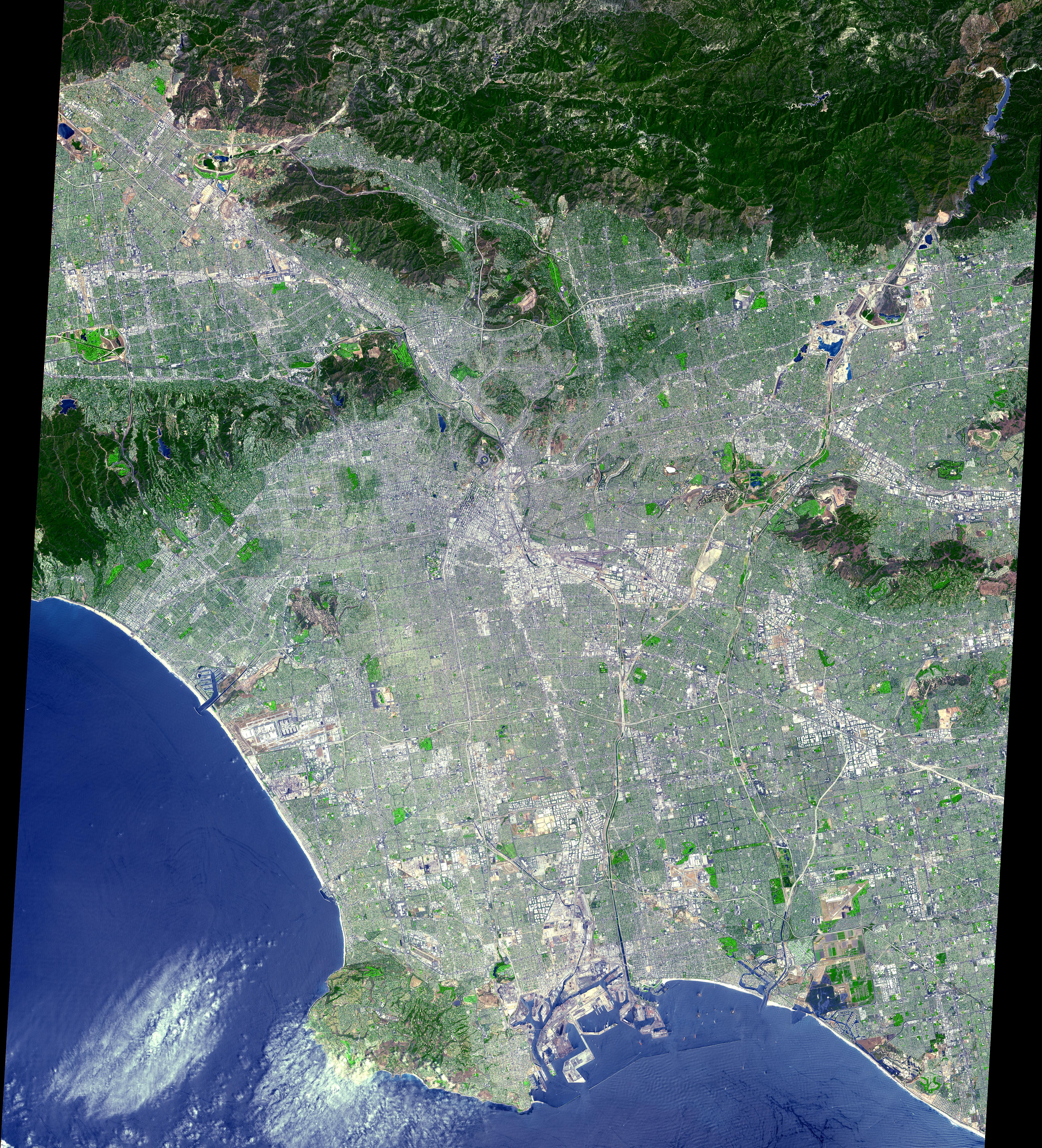
ASTER Los Angeles from Space - Source: NASA JPL [82]
Canopy cover, social vulnerability and mitigation
- In the ArcGIS Pro project, display the Tree Canopy Layer. Note the general patterns across LA County.
- Create a second map showing one of the other land cover types e.g., Grass, Shrub, buildings.
- Use bi-variate maps to look at relationship between canopy cover and social vulnerability
- You will use the "CHAT_LA_County_vulnerability_indicators" layer.
- Take a look at the bi-variate map of the Heat Health Action Index and Percent No Tree Cover I have already created, and note how the bi-variate maps are set up in Symbology.
- What does the map show?
 |
| Bi-variate map legend for Heat Health Action Index and Percent No Tree Cover. Note "Both High" indicates areas with low tree cover and high heat health vulnerability |
- Next, replace the Heat Health Action Index variable with another variable in the "CHAT_LA_County_vulnerability_indicators" layer e.g., poverty, race, asthma.
- When choosing think about what you want to investigate regarding the relationship between no canopy cover and social vulnerability.
- Finally, look at the bi-variate map showing existing versus potential tree cover. This has already been produced for you.
- The potential tree cover layer is based on whether there is "physical space" for new trees. What does this suggest about the potential for urban greening in vulnerable communities?
- Make sure your maps are easy to understand and have appropriate symbology and design.
- Summarize the main trends/messages in a couple of sentences? This will feed into your report in Part 4.
Cool place accessibility
Many cities now have designated "cool places" people can go during heatwaves. In this part of the exercise, you will look at whether officially designated cool places in LA County [83] provide good coverage of the city, are easily accessible, and how they may be improved.
- Before getting started, make sure you are connected to the Penn State University Portal. You can check this by looking in the upper right side of ArcGIS Pro. You should see your name followed by the text "Penn State University". This is important because the next steps use Esri credits, and we don't want these deducted from your work account!
- In the Lesson 3 project showing the location of Cooling Centers. Have a look at the distribution and areas supported.
- Use the Generate Drive Time Trade Areas tool [84] in ArcGIS Pro from the Business Analyst Toolbox.
- You will consider two cases
- Cooling centers that are within 15 minute and 30 minute walking times
- Cooling centers that are within 15 minute and 30 minute driving times
- Run these tools and view the mapped results
- You will consider two cases
- Now estimate the proportion of the LA County population that falls within a 15 minute walk of these official cooling centers. Do this by selecting census tracts in the "SVI2018_LA_County_tract" feature class based on the 15 minute walk time areas and summing the population field (E_TOTPOP)
- Summarize the main trends/messages in a couple of sentences? What are the areas of unmet need? Are cooling centers in vulnerable parts of the city? This will feed into your report in Part 4.
Deliverable 3
|
Part 4 - Report to planners and emergency managers
For the final part of this assignment, you will draw upon the analysis and key points developed in Parts 1, 2, and 3 to write a short briefing document (500 words) for planners and emergency managements in Los Angeles County. This should cover:
- Heatwave trends and impacts - Explain how and why heatwaves are an emergency management problem and the major trends and patterns across the USA.
- Vulnerability mapping and assessment - Describe social vulnerability to heat within LA County, and relationships with the Urban Heat Island effect and microclimate variation.
- Spatial analysis of mitigation and adaptation options - Provide an assessment for the potential for urban green in the most vulnerable areas. Share findings and recommendations from your cooling center evaluation.
- Any overall observations and recommendations not already included in report.
Deliverable 4
|
Emerging Theme: Volunteered Geographic Information
For this week's Emerging Theme, you will review the materials below and engage in a Canvas discussion with your classmates - see details below.
Spatial data has traditionally been developed by government agencies and businesses who could afford the technical and financial expenditure necessary to digitize spatial information. Recent advances in web mapping and GPS technology make it possible for tech-savvy volunteers to develop their own spatial datasets. This sort of geographic data is frequently called "Volunteered Geographic Information" or VGI for short. The following short (31 seconds) video below shows the dramatic VGI response to the 2010 Haiti Earthquake through additions and corrections to OpenStreetMap data for the country. Haiti had previously been a poorly-mapped place, and there was an immediate need in the aftermath of the disaster to develop a much better base-map to help recovery efforts. This was a watershed event in VGI for disaster/humanitarian response as discussed by Meier in the first chapter of Digital Humanitarians you read in Lesson 1.
OpenStreetMap - Project Haiti [85] from ItoWorld [86] on Vimeo [87].
One of the most effective VGI efforts can be found at OpenStreetMap.org [88]. OpenStreetMap has the goal of developing a basemap of roads, place names, and other common spatial features for the world, based entirely on volunteered contributions. The OpenStreetMap project aims to provide a completely free worldwide geospatial dataset without any legal or technical restrictions on its use. Most popular web mapping resources like Google Maps or Bing Maps tightly constrain how their data can be manipulated, published, or displayed. Quite a few folks take it for granted that these maps are free, but, in fact, they are only free because those companies are providing access to them right now for free. You are not allowed to re-use and re-purpose those resources or download their data yourself, and if Google decided tomorrow to charge you for access to their maps, you would have no recourse to ensure you kept access for free.
Another important trend in VGI is the use of microtasking or ‘micromapping’ campaigns that split up a big task into small chunks that the VGI community can take on. For example, have a look at the this interesting and useful review of microtasksings role in emergency management from the Australian Institute of Disaster Resilience [89]. In some systems, you are presented with tiles from high-resolution imagery and you are asked to search for and tag features like ‘Trash heaps’, ‘Blocked roads’ and ‘Damaged buildings’. It is worth noting that microtasking like this can also be used to train Machine Learning algorithms to detect these same features with high accuracy. You can read more about this in Chapter 6, ‘Artificial Intelligence in the Sky’, of Digital Humanitarians. This is really cutting-edge stuff that is happening now.
Now, I’d like you to consider VGI with “citizens as sensors”. This is where information relevant to the disaster is collected through devices people are carrying around. I am sure you can think of lots of examples of data you could get from smartphones, but I wanted to highlight a project that started in Japan shortly after the Fukushima Daiichi nuclear disaster. The Safecast [90]team developed small devices for radiation, mapping the results which you can see on the web map here [91]. A very recent example of citizens as sensors is the COVIDSafe App [92] being used in Australia. This is a contract tracing app that records all of the people you come in contact with via Bluetooth on mobile phones. The data are encrypted on your phone and only accessed if someone you came in contact with someone who tested positive for COVID-19.
Finally, for a critical perspective, please look at the recent (2018) paper by Billy Tusker Haworth titled, “Implications of Volunteered Geographic Information for Disaster Management and GIScience: A More Complex World of Volunteered Geography [93]".
Deliverable
- Post a comment in the Emerging Theme Discussion (L3) forum that describes how you think the emergence of new sources of VGI impacts geospatial systems for Emergency Management. Are there future sources of VGI we should be planning for? Are current methods for providing VGI sustainable over the long term? How do you ensure that there will always be volunteers?
- Provide a link and short description to a VGI effort ‘in the news’ or that you have otherwise come across.
- NOTE: Respond to this assignment in the Emerging Theme Discussion (L3) forum by the date indicated on the course calendar.
Grading Criteria
This discussion will be graded out of 15 points.
Please see the Discussion Expectations and Grading page under the Orientation and Course Resources module for details.
Term Project - Research
This week, I will be evaluating the abstracts you developed last week. While I do that, I encourage you to spend some time looking for relevant background information that will help you develop your project. This should include identifying some of the data sources you will need. I am happy to provide suggestions of places to look, but have a go on your own first!
To get started, you could:
- look for background and context information for the topic you have chosen (who has worked in this area before, and what did they accomplish?);
- look for examples you can use to justify your choice of methods;
- look for application examples of the use of geospatial analysis in emergency management;
- identify and compile the data you need for your analysis (and touch base with me if you have any problems – the earlier the better!).
Each project will have quite specific needs, so you will need to think of the additional information you will need to write your report.
Some Suggestions...
- I encourage you to make use of our excellent Penn State library resources [94]. You can skip the overview (but I don't suggest it) and go right to the library search [95] as well. You probably know this, but the search functions include a lot more than books, e,g., reports, journal articles, dissertations, and theses. Many of the references are available in electronic form and can be downloaded. The library also has an "Ask a Librarian" chat that allows you to chat with a librarian in real time.
- Google Scholar [96] is your friend. This is one of the primary ways academics now search for articles. It is also a good way of developing scientific 'social networks' as it is easy to follow links to other works by an author, or who they are working with, etc.
- Finally, have a look at the recent proceedings from the ISCRAM conference [97]. There are tons and tons of good stuff there. Oh, ISCRAM is a professional society for people working in the field of Information Systems for Crisis Response and Management.
NOTE:
You do not need to turn anything in for your Term Project this week, but you really should get cracking on your background research. Don't let this time slide by without making some progress on that effort.
If you have questions about how to proceed - you can ask those in the General Questions Discussion in Canvas. It's great if you're able to help a classmate, too, so don't be shy.
Summary and Final Tasks
Summary
In this lesson, we have learned about the first stage of emergency management - vulnerability assessment and hazard mitigation. We focused attention on how geospatial data and tools can be used to conduct risk mapping analyses to identify places where populations and critical infrastructure are vulnerable to disasters.
An effective vulnerability assessment requires answers to the following questions (among others, of course):
- Who is at risk? How many people will be affected?
- What is the spatial and temporal extent of the vulnerability?
- What capacity does the population at risk have for coping with the disaster?
When developing geospatial system for emergency management, one must consider the analytical tools and data sources necessary to answer these questions. Often, decision makers need information on potential human and financial losses to make their case for resources to mitigate against disasters.
In the next lesson, we will shift focus toward situations in which a disaster is imminent and geospatial analysis is called upon to help prepare for potential impacts. Even in the best case scenarios, there is often very little warning (and sometimes no warning at all) prior to a disaster, so there is a serious need for efficient and effective geospatial systems to evacuate citizens and stage response resources.
Reminder - Complete all of the Lesson 3 tasks!
You have reached the end of Lesson 3! Double-check the to-do list on the Lesson 3 Overview page to make sure you have completed all of the activities listed there before you begin Lesson 4.
Lesson 4: Preparedness
Overview & Checklist
Overview
We are shifting our focus now from vulnerability assessment and hazard mitigation to the next stage of emergency management, preparedness. One way you can think of this phase is that it involves activities to address shortcomings in planning aimed at reducing vulnerability and mitigating hazards. Preparedness is about what you need to be able to do when the worst happens - being ready to respond and promote recovery.
In this lesson, you will read about ways in which geospatial analysis can be used to target intervention and evacuation efforts to reduce the impact of forecast disasters. You'll respond to one of the readings with a written critique. This week, the emerging theme discussion focuses on Humanitarian Logistics and Supply Chains. Finally, for your term project, you will develop a detailed outline to help guide your progress.
What You Will Learn
At the successful completion of Lesson 4, students should be able to:
- explain disaster preparedness and how it is supported by geospatial perspectives and technology;
- critically evaluate technical literature on geospatial analysis for emergency preparedness;
- evaluate and discuss disaster and humanitarian logistics and supply chains;
- complete an outline for your term project report.
What You Will Do
Lesson 4 is one week in length. To finish this lesson, you must complete the activities listed below.
| To Read |
|
|---|---|
| To Do |
|
Please refer to the Course Calendar for specific due dates.
Questions?
If you have questions about the content or lesson activities, please post them to the General Questions and Discussion forum in Canvas. While you are there, feel free to post your own responses if you, too, are able to help a classmate. If your question is of a personal nature, please email me directly through Canvas.
Disaster Preparedness
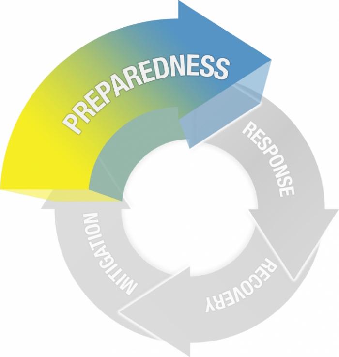
CC BY-NC-SA 4.0 [7]
Preparedness
Actions taken prior to a disaster with the intent of ensuring a better event response
- Planning
- Training and Exercises
- Logistics
- Technology infrastructure
- Agency and stakeholder coordination
- Provide information and tools to citizens
An Ounce of Preparation...
...is worth a pound of cure, right? Often disaster situations do not present themselves with substantial warning. Some events, like earthquakes or terror attacks, occur with little or no advanced warning. Other events, like hurricanes or tsunamis, may allow for some substantial amount of time (ranging from an hour or two in the case of a tsunami to several days in the case of a hurricane) to prepare for the initial impact. No matter what the type of event, there are ways we can prepare by taking advantage of geospatial capabilities.
In lesson, we will explore geospatial enabled preparedness in several ways. On this page you will contrast different scenario-based activities - one focused on large scale disasters and another on a more localized emergency. Then you will consider some of the science behind forecasting and modeling potential emergencies, and the geospatial technologies that are being used to develop the capacity ahead of time for situation awareness when disasters do strike. Finally, you will once more contrast large and small scale preparedness activities and the role of geospatial data and analysis by looking at Humanitarian and Disaster Logistics and models for improving building evacuation. So the idea is to think about preparedness as a set of activities with multiple dimensions (spatial and temporal scales) and geospatial analysis as a key tool for managing this complexity.
Scenario-based Exercises
A highly regarded method for preparing for disasters involves the use of scenarios to conduct realistic exercises to simulate a crisis situation. Using the examples below, contrast live training exercises on small-scale (such as Active Attacker Situations) with those developed by FEMA for large-scale earthquake scenarios. For disasters that provide no advanced warning, using scenarios may be the only way to really prepare in advance. We'll go in-depth on designing scenarios later on in Lesson 7, but for now, read this short article from GovTech about how GIS can help communities prepare for disasters [101]. How effective do you think these activities would be? Could the community be engaged more actively? How do you think things have changed since the GovTech essay?
FEMA Earthquake Preparedness Scenario
FEMA has developed a wide range of training exercises to aid in disaster preparedness and response. I'd like you to consider the following materials they developed for a catastrophic earthquake in Southern California. Here is their description of this resource.
Scenario for a Catastrophic Earthquake on the Newport-Inglewood Fault
"Emergency planners use HAZUS-MH to provide realistic catastrophic planning exercises. Over the last several years, FEMA has supported the development of a suite of "priority maps" to support our Federal Response Plan (FRP) partners in preparing for, and responding and recovering from a catastrophic earthquake. A suite of ten priority maps that illustrate the region of strong ground shaking, direct and induced damage, as well as estimated social impacts were developed to provide information for FRP partners within a few hours of an earthquake event. By using the priority maps in regular planning exercises, the FRP partners will become familiar with the map information produced within a few hours of a damaging earthquake." Credit: FEMA [102]
Here is an example of one of the exercise's realistic maps showing casualties. Other realistic geospatial products and other material are produced and presented to participants during the course of the exercise to help prepare emergency managers for real events. When reviewing these materials, do a quick thought experiment and think about all of the different groups involved in a disaster like this. Think about the agencies and organizations involved and the level of coordination required at local, state, and federal levels. We'll consider these issues as we move on through the course.
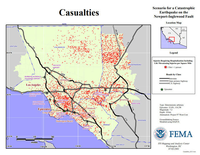
Active Attacker Preparedness Exercises
Preparedness scenario exercises are not just undertaken for large scale, catastrophic events but are increasingly being used in response to local events. One of the clearest examples of this, unfortunately, is the increasing prevalence of active shooter or active attacker drills. These range from training for police to more detailed and realistic exercises involving first responders along with real civilians (including students and teachers) and perpetrators played by actors.
I'd like you to have a look at two example videos. The first one is a news report on a very realistic drill being conducted at a Colorado school. This video provides a pretty good behind the scenes view of how elaborate this training can be. The second item to look at is a more educational-type video produced by Penn State for Students, Faculty, and Staff to help them know what to do during an Active Attacker situation.
Warning! These videos depict simulated active shooter scenario that some people might find distressing. If you prefer not to watch the video, please reach out to the instructor for alternative media.
Video: Police Practice Active Shooting Drill at Colorado High School (8:03 minutes)
Click here for a transcript of the Police Practice Active Shooting Drill video.
DAN HARRIS: Shots fired at a high school. Hostages strapped to explosives. It's a nightmare scenario for law enforcement. How do they respond? Tonight, you're going to see police stage an extraordinary active shooter drill, and it all plays out on camera. Here's ABC'S Clayton Sandell.
CLAYTON SANDELL: Inside this Colorado high school, we are on the front line of one of the most dynamic active shooter drills in the country.
[GUNSHOTS]
The goal, make it as real and stressful as possible-- gory makeup on victims, fire alarms, heavy smoke, deputies rushing in amid screams and confusion. Their mission? To subdue the shooter as quickly as possible.
POLICE OFFICER: Stop! Stop!
[GUNSHOTS]
Shooter down.
JEFF ENGEL: They're going to have to prioritize, one, what's the priority of life? One is to stop the threat. The second is to start saving lives. Walking wounded. People--
CLAYTON SANDELL: Sergeant Jeff Engel is coordinating today's exercise for the Douglas County Sheriff's Department here in suburban Denver.
JEFF ENGEL: There's got to be that immediacy, that aggressive action, that you need to go in and stop the threat.
CLAYTON SANDELL: With 248 mass shootings this year and counting, his department, and those around the country, are using real life tragedies as a way to prepare. And you incorporated some of Orlando into what you were doing today, right? Tell me what it was you did.
JEFF ENGEL: Having a situation where we had a whole bunch of folks that were surrounded by a device. And how are we going to move people from a place of danger to a place of security?
POLICE OFFICER: Moving.
POLICE OFFICER: Moving.
CLAYTON SANDELL: And this school mere miles from Columbine High.
POLICE OFFICER: Free to move again.
CLAYTON SANDELL: In a region that's seen more than its share of mass shooting tragedy.
PETER JENNINGS: There's been a day of horror in Littleton, Colorado, just south of Denver.
GEORGE STEPHANOPOULOS: A terrifying moment in Colorado late Tuesday. A horrific scene east of Denver, where a night at the movies has turned into a nightmare.
JEFF ENGEL: Colorado is kind of the epicenter of these immediate action events and these active killer events.
CLAYTON SANDELL: When Columbine was attacked in 1999, it had long been the policy for officers to wait outside for the SWAT team to arrive, but that 45-minute delay before officers went in was later criticized for allowing the gunmen to continue their killing spree, precious moments lost that might have saved lives.
PARAMEDIC: I was one of the first medics at Columbine. We did have to stand outside, unfortunately, and wait for the building to be cleared before we could go in and find any survivors.
TRAINER: Explosion in an office complex.
CLAYTON SANDELL: Today, training calls for even the most junior cops to immediately take the fight to the bad guy and take him out.
JEFF ENGEL: They want officers, when they come out of the law enforcement academy, would like to have them to have that ability to go in as a single unit, or as a two-person unit, to go in and take care of a threat, because that is the reality.
TRAINER: If you cover me, I'll cuff him.
This is what I signed up for. I'm going to be scared. I know that. But it's all about how you kind of control your emotions, and you kind of funnel that into something that's effective.
CLAYTON SANDELL: Deputy Kristen Tinsley knows the heartache all too well.
KRISTEN TINSLEY: Moving.
CLAYTON SANDELL: She went to Columbine High School.
KRISTEN TINSLEY: We have a lot of very local things that we can go to for experience to train from. It's happened, you know, just miles away.
CLAYTON SANDELL: Today's drill, more than 60 officers and 50 students acting as victims. For Jeremy Finkenbinder, training these teams hits home. When something like Newtown, San Bernardino, Orlando happens, do those things keep you up at night?
JEREMY FINKENBINDER: I think about them quite a bit, I really do. This is my passion.
CLAYTON SANDELL: What's the goal now?
JEREMY FINKENBINDER: The goal now is to be able to render medical aid quickly, to save more lives. That's really what it boils down to. Tip of the spear, my first priority is to get the bad guy terminated. He's out of the equation.
TRAINER: Be aware of your cover and what you guys are moving to. If your partner gets hit, what do you do?
CLAYTON SANDELL: The first scenario of the day begins.
TRAINER: --been reports of two shooters wearing tan pants and black shirts.
KRISTEN TINSLEY: It's like a nervous excitement. It's the anticipation of-- it's like the fear of the unknown. You want to do really well for your teammates and for the people that you're trying to help out.
CLAYTON SANDELL: Tinsley and her team get ready to rush in. The officers navigate through pandemonium.
POLICE OFFICER: Aggressive target.
CLAYTON SANDELL: This is what you call a contact team, three or four officers all working together, moving right to the threat as fast as they can.
[GUNSHOTS]
They quickly overtake the gunman.
POLICE OFFICER: Shooter down.
CLAYTON SANDELL: But the teams find even simulated chaos comes with real problems, even real wounds.
POLICE OFFICER: And a bad guy, obviously got one off and I took a round as soon as I even came on point.
CLAYTON SANDELL: Plus all that noise drowns out police radios. There's confusion.
POLICE OFFICER: Is that it? Three inside?
CLAYTON SANDELL: And now police have more to worry about.
POLICE OFFICER: Contact.
CLAYTON SANDELL: They must also protect unarmed paramedics moving in right behind them.
JEREMY FINKENBINDER: We'll provide safety for them while they're taking care of business inside and rendering aid.
CLAYTON SANDELL: For the day's final drill, Tinsley and her fellow first responders will deal with a worst case scenario, shots fired at a high school, hostages strapped to explosives. The teams race toward the sound of gunshots, down stairs and hallways, not knowing how many gunmen there are. Just as things are heating up at the high school, another call sending deputies to a different school up the street.
DISPATCHER: We're getting reports of a possible active shooter at middle school.
POLICE OFFICER: 204, 203, we copy.
CLAYTON SANDELL: Two deputies head in alone, no time to wait for backup. Inside, helpless victims, one student chained to a bomb. But these cops know their first priority is to eliminate the threat.
POLICE OFFICER: Where is he?
CLAYTON SANDELL: A shooter in a first floor bathroom.
[GUNSHOTS]
POLICE OFFICER: Come out with your hands up.
POLICE OFFICER: Come on, come out with your hands up.
CLAYTON SANDELL: But just as the officer tries to take that final shot, her gun jams. Their backup arrives just in time.
POLICE OFFICER: All right, so they're pinned down by the bathroom taking shots. Is he by himself, or does he have a hostage in there? Do we move? Do we hold?
POLICE OFFICER: Is he in there by himself, do you know?
POLICE OFFICER: I think so. I don't know.
[GUNSHOTS]
POLICE OFFICER: Suspect down.
[INTERPOSING VOICES]
One suspect down.
CLAYTON SANDELL: But upstairs, a surprise second shooter.
POLICE OFFICER: Drop the weapon.
[GUNSHOTS]
[SCREAMS]
CLAYTON SANDELL: Officers quickly take him down.
POLICE OFFICER: He is out of play. He is out of play.
CLAYTON SANDELL: When it's all over, they talk about what went right and what went wrong.
JEFF ENGEL: Who identified themselves as the tactical supervisor? If no tactical supervisor's there, how chaotic would it be? I mean, how chaotic is it with a tactical supervisor? Now imagine without. So there needs to be-- try to get that command and control.
CLAYTON SANDELL: As jarring as the day was, Sergeant Engel hopes the day has given his troops a taste for the real thing.
JEFF ENGEL: You had some IEDs. You had multiple threats. We had multiple engagements. We had compromised entry points. I mean, those things are coming this way. That's what truly does scare me.
CLAYTON SANDELL: You think it's coming this way. I mean, it's--
JEFF ENGEL: Oh, it's here.
CLAYTON SANDELL: He knows the harsh reality for Kristen Tinsley and her fellow cops. It's not a matter of if she'll use what she learned today, but when.
KRISTEN TINSLEY: I'm going to feel a heck of a lot more prepared than I did coming into today, that's for sure. I mean, you're still going to have all the different emotions of the unknown and everything, but at least I have some sort of base to build on now.
JEREMY FINKENBINDER: Everybody's got to be ready, no matter-- first day on the job to the guy that's going to retire next week, we want them all to be ready, because you know, a warrior's a warrior, and it never quits.
CLAYTON SANDELL: For Nightline, I'm Clayton Sandell in Highlands Ranch, Colorado.
[MUSIC PLAYING]
Video: Run, Hide, Fight - Surviving an Active Attacker (6:42 minutes)
[SINISTER MUSIC PLAYING]
Instuctor walking around a classroom: Less than a minute to finish up, folks. What have you got?
[INTERPOSING VOICES]
[MUSIC PLAYING]
[BOMB EXPLODING]
[HIGH-PITCHED RINGING]
[INTERPOSING VOICES]
CHRIS: We can't stay. We need to go.
SPEAKER 2: Where we gonna go?
CHRIS: I don't know. We just need to go.
[INTERPOSING VOICES]
PRESENTER: What would you do if you learned that there was a bombing on campus?
SPEAKER 3: Explosion or something. I don't know. I don't know.
PRESENTER: How would you react if you heard gunshots coming from outside your classroom? Or worse yet, what if someone with a knife or a gun came into your classroom or office and began to attack?
[GUNSHOTS]
To help us remember the options available to you, let's use the phrase "run, hide, fight." Have an escape route in mind. Find a place to hide. If necessary, fight the attacker as a last resort.
SPEAKER 4: Where did that come from?
SPEAKER 5: I don't know.
SPEAKER 6: Shots fired.
SPEAKER 7: Shots?
SPEAKER 5: Oh my god. I don't know.
SPEAKER 4: Chris is right. We need to go.
SPEAKER 8: Come on, let's go.
[INTERPOSING VOICES]
CHRIS: I think we're clear. Let's go.
PRESENTER: One option you have is to run for an exit. Get away from the attacker. Run in the opposite direction. Get out of the area and find a safe place as soon as possible.
[MUSIC PLAYING]
CHRIS: OK, let's go.
[MUSIC PLAYING]
[GUNSHOTS]
[SCREAMING]
[GUNSHOTS]
[MUSIC PLAYING]
PRESENTER: Once you feel that you're in a safe place, alert the authorities. Call 911. Just remember to first get somewhere safe.
CHRIS: I think we're safe, but you need to call the police.
SPEAKER 8: Yeah.
SPEAKER 9 (ON PHONE): University police. Where is your emergency?
SPEAKER 8: There was an explosion. And heard gunshots.
PRESENTER: Don't assume someone else has already called 911. Provide the operator with as many details of the situation as you can.
SPEAKER 10: I think there are two shooters in the building.
PRESENTER: Don't call anyone else. The 911 operator may want to call you back for further information.
SPEAKER 11: We need help. Please hurry.
PRESENTER: Another option you have is to find a place to hide from the attackers.
SPEAKER 12: Shooters in the building. Find a place to hide.
PRESENTER: If the room appears to be empty, there's a better chance the attacker will simply pass it by. If you choose to hide, be sure to lock and barricade the door. Use whatever you can find to block the door to prevent the attacker from coming in.
[MUSIC PLAYING]
[GUNSHOT]
[MUSIC PLAYING]
[GUNSHOTS]
[MUSIC PLAYING]
[DOORKNOB RATTLES]
[MUSIC PLAYING]
[SIRENS BLARING]
[MUSIC PLAYING]
If the attacker has entered your immediate vicinity and there's no way out, you need to be prepared to end the threat and fight the intruder.
SPEAKER 4: We're trapped!
[MUSIC PLAYING]
SPEAKER 13: Threat forward. Threat forward. Turn right. Right down, break off for cover. Put your hands on your head. Put your hands on your head.
PRESENTER: Remember-- run, hide, fight. No one wants to be involved in an active attacker situation, but these incidents do happen on and off campus. If you take a moment to think through how you would act, you will increase your chances of survival. Commit to taking action. If you're ever caught in an active attacker situation, now you know just what to do.
[MUSIC PLAYING]
Simulating Disasters
GIS and other geospatial technologies can support a key element of disaster preparation through computational simulation and modeling. A wide array of specialized modeling software extensions for ArcGIS and other GIS platforms are available. This software enables users to tweak disaster parameters and simulate damage patterns due to storms, earthquakes, disease outbreaks, and fires (think back to InaSAFE from the previous lesson). With the rise of cloud computing, near-real-time data streams, and big data analytics, much of this happens at a fast pace including analysis well before the event up to the start of the event itself. For example, thinking about the preparations for Hurricane Florence and how often decisions on pre-deploying assets changed as new information became available to the managers. This will become clearer when we consider disaster and humanitarian logistics later in this lesson.
The output of these models can be viewed in static maps or interactive web tools. Some real-time modeling capabilities exist for emergency managers to test various parameters and visualize their potential impact, but few of these systems are available for free to the general public (very unfortunate!). The Pacific Disaster Center [105] in Hawaii does quite a lot of work on modeling and visualizing model outputs for disaster scenarios. Have a closer look at this site and some of the tools and apps PDC offers [106], including the disaster preparedness training [107].
One publicly available resource is provided by the USGS in the form of their Prompt Assessment of Global Earthquakes for Response (PAGER [108]) system. PAGER provides rapid reporting on the potential impacts of recent earthquakes on human life and structures in easy-to-consume reports and maps.
Note
You may want to refer back to some of these resources (and find others!) as potential sources of data for your term project and the case study assignments coming later in this course.
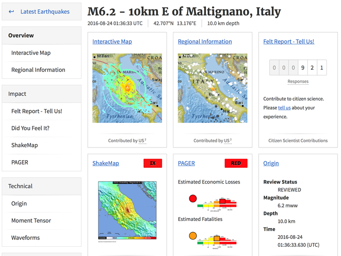
Towards Situation Awareness
A rapidly growing part of preparedness is the development of geospatial tools, data analytics, and visualizations that can be put into place ahead of a disaster. This includes making sure existing datasets, like roads and other infrastructure, demographics, and critical facilities are ready to use. Increasingly, these efforts involve the use of real-time or near real-time information from data feeds including Internet of Things (IoT) devices, reports from field crews, streaming model outputs, and others. We will focus on this in greater detail in Lesson 5 and again later when we consider the emerging technology of IoT. This diverse range of information is often summarized using maps and emergency management dashboards. Below, we'll consider some interesting examples of these trends.
Let's start with something very familiar, Google Maps! While many sophisticated methods for modeling disaster impacts aren't yet publicly available in web tools, there are in fact a very large range of options for free platforms used to evaluate and monitor a situation in progress. The Pacific Disaster Center's Global Hazards Atlas [110], introduced on the previous page, is one such system. Google Crisis Response [111], also mentioned earlier, is another example and is more readily available and usable by the responders and the general public alike.
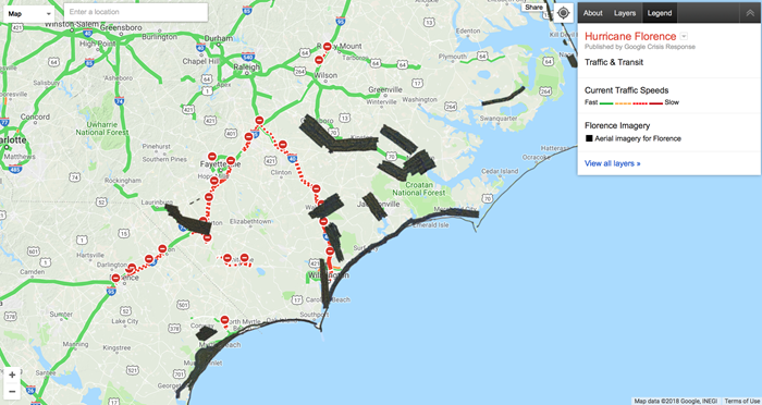
This next example is from the PDC Global Hazard Atlas and shows the position and projected path of a tropical cyclone bearing down on Japan. Note that as with the Google map, there are a lot of other layers that can be examined to gauge likely impact and help make decisions about where resources might need to be pre-positioned. Another way this data can be used is for future planning and mapping of disaster prone areas (think back to the FEMA Southern California Earthquake example). Finally, and you will see this more in the following video, these maps can help emergency managers evaluate the potential for disasters to interact. For example, some areas may be vulnerable to a cyclone and may also have a critical facility like a power station. GIS 101 but very powerful nonetheless.
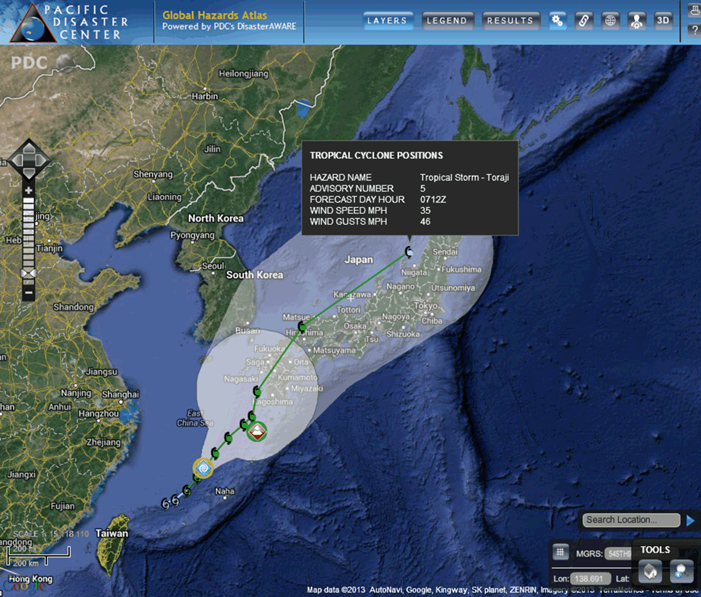
Finally, check out the impressive Nationwide Operational Assessment of Hazards (NOAH) program from the Philippines [112]. This is a good example of the trend toward multi-hazard approaches to emergency management, rather than focusing on a single hazard type. This site has a lot of functionality including the ability to map the likely impact of different hazards based on historical data. After viewing this short video, take some time to click on a few of the buttons and see what you can learn. For example, display volcano hazards alongside critical facilities to see if there are places particularly at risk.
Video: How Project NOAH helped avert potential disasters (2:14 minutes)
The Habagat 2012. One month after the launch of project NOAH, there was a warning about the imminent floods that was going to happen. The warning was provided at 2 a.m. in the morning. The warning was three hours in advance of the peak floods, and when the floods came in the people were already out of harm's way.
I think this kind of system is already being viewed as best practice in the world. Because I don't know of many other countries that have this kind of system that make use of sensors deployed all over the Philippines. All 1,500 of them streaming data every 15 minutes, and the top achievements that I can think of are these three.
The first is that we were able to map out the hazards of the country in very high resolution. These are the flood hazard maps. The storm surge hazard map is already complete for the entire Philippines for different scenarios. The landslide maps are also complete, and they're very high-detailed.
The second one is NOAH helped in raising awareness trying to change the mindset of the Filipino people. And, moreover, we were able to empower the Filipinos with a lot of information regarding weather events and its hazards impacts.
The third is, I think which is the most important, is that the instruction was delivered. The instruction was to create a program to warn the people hours in advance. And because of the methods that were used in NOAH over the past four years wherein we complemented the forecast with near real-time information for data, we were able to avert at least 13 extreme hazard events.
For further information
For more on NOAH, have a look at this journal article: Disseminating near-real-time hazards information and flood maps in the Philippines through Web-GIS [113]. This link takes you to the abstract. To see the entire document, see e-Reserves under Library Resources in Canvas.
Reading Assignment and Live Discussion
The readings this week continue our focus on preparedness. You will read a chapter in your textbook that covers some of the broader issues around GIS and disaster preparedness, continuing some of the themes we've been covering. Next, you will consider a journal article that takes a (very) deep dive into emergency building evacuation modeling. This paper is challenging but has a lot of useful information even if the technical bits are too much!
I like to remind students that, as you read, it is important to read critically and not necessarily accept what you read at face value, even if it appears in a peer-reviewed journal. Many of the course assignments are aimed at helping you build the skills to assess published reports on geospatial technology objectively and critically. There are multiple perspectives from which to critically assess what you read. No papers can cover all issues and no author is all-knowing; thus, it is likely that you know something relevant that the author does not (or that he/she did not consider relevant, but that is relevant from your perspective). Methods of data processing and analysis that might be acceptable in one discipline may be at odds with established methods in another discipline, so you will find disagreement among authors about what methods are “right.” People make mistakes (in their original conceptualization of a problem, in carrying out work, and in interpreting the results) – and your practical experience and/or solid grounding in geospatial analysis may give you special insight to identify these mistakes. In many cases, the authors may have limited practical knowledge, thus, they may completely ignore issues that are critical in a real world context.
1. READ
From "GIS for Disaster Management": Chapter 6 - "Geographic Information Systems and Disaster Planning and Preparedness". See Library Resources in Canvas for the electronic version.
These chapters focuses on the various ways preparation can be characterized in the context of GIS, as well as some of the key methods by which geospatial tools can be used to support near-term preparation when we know a disaster is about to strike.
Think about
What are some of the specific ways in which preparedness is different from mitigation? You might consider this from the perspective presented by text author or (more interestingly) from the perspective of a GIS manager in a state Emergency Operations Center, from the perspective of a local regional government deciding whether to invest in GIS, or from the point of view of a citizen who expects service from their government. How might GIS activities to support preparedness differ for different kinds of emergencies – what are examples of different kinds of emergencies in which preparedness activities would differ?
2. READ
Bo Li and Ali Mostafavi 2022. Location intelligence reveals the extent, timing, and spatial variation of hurricane preparedness [114]. Scientific Reports 12:16121. (PDF version [115])
This paper examines preparedness for hurricanes based on geospatial data and anlaysis
Respond
Are there other data and technologies that could be brought to bear on the problem of disaster prepartedness? How might the authors’ work be applied in other emergency situations e.g., fire, flood? Note, you will provide a written critique of this article following on the live discussion - details to follow!
Deliverable
- This week, you will be participating in a "live discussion" with some of your classmates and me! So, no written posts are required! The meeting will last one hour.
- We will focus on the Lochhead and Hedley paper, so come to the discussion with any points or questions you would like to raise.
- I will send out a Doodle poll so we can fined some times that will work for everyone. We will meet in small(ish) groups so everyone can participate.
- Note: You will also do a short writing assignment that will critique this article as well. This will give you a chance to reflect on what comes out of the live discussion.
Grading Criteria
This discussion will be graded out of 15 points - pretty easy this week! Just show up and share your thoughts.
Emerging Theme: Spatial Data Science
For this week’s Emerging Theme topic, we are going to take a step back from emergency management and focus on spatial data science (SDS) in general. I want to emphasize that SDS (and terms like Big Data or Machine Learning) can mean several different things.
On the one hand, it is how we talk about GIS and geospatial science in the age of large data sets (e.g., imagery and otherwise), enhanced computing power, and networked data and services. A lot of traditional GIS workflows are described in (spatial) data science terms. For example, variants of regression analysis and hotspot analysis are referred to as machine learning and cluster detection, respectively. This is all fine, but SDS is also the integration of big data, high performance computing, and programming of machine learning/AI algorithms to conduct analysis in some fundamentally different ways from traditional GIS/geospatial analysis. You will explore and discuss some this complexity in this Emerging Theme Discussion.
To set the stage, I'd like you to have a look at few perspectives on spatial data science, and where it is heading, from two geospatial industry leaders, Esri [116] and Carto [117], and university researchers at the Center for Spatial Data Science [118] at the University of Chicago.
What is Spatial Data Science?
What is Spatial Data Science (6:08)
When considering SDS as a set of activities, we can identify several interrelated parts. These are listed here with some examples of common associated tasks (not exhaustive):
- Data ingestion, cleaning and management
- Obtain data, formatting, cleaning, and management in database system
- Exploratory data analysis
- Statistical methods for data reduction, data visualization
- Data enrichment
- Data linkage, spatially enabling data, calculate new variables
- Spatial analysis
- Mapping, hot spot analysis, space-time analysis, overlays and spatial queries
- Machine Learning
- Cluster analysis, regression, predictive analytic, object recognition
- Big Data Analytics
- Big data, (near) real-time
- Visualization and Communication
- Maps, graphics, interactive, web, Tableau/Qlik/BA
Visit Carto's Technology Stack Overview [119] page to see a similar list. Take note of the Data ingestion and Management & Analysis steps. Are you familiar with the technologies listed there? Pick a couple e.g., PostGIS, Python SDK, ELT, PostgresSQL that you are not familiar with and look them up. Gaining a general familiarity with the various parts of SDS is a good first step.
Finally, Carto have produced a useful free e-book on Becoming a Spatial Data Scientist (download the PDF here [120]). Read the first chapter and have quick look at the rest of the book. This may be a good resource for you going forward as it lists many of the tools you can use for analytics projects.
You are probably aware that the dominant player in the GIS space is Esri [121], the developer of ArcGIS Pro amongst many other offerings. In addition to desktop software, they offer server and cloud based services that allow for big data analytics at scale.
Visit the Esri Spatial Analysis and Data Science [122] page. Note the components of SDS they outline and a few of the tools on offer. I'd like you to take a closer Machine Learning and AI & Big Data Analytics.
Machine Learning and AI
Artificial Intelligence is a somewhat generic term for a class of techniques including machine learning and deep learning. On a basic level, AI is all about developing algorithms that can "learn", or can be "trained", to recognize patterns in datasets and then predict likely behavior. For example, algorithms have been written to identify and differentiate sharks from swimmers in real-time UAV camera feeds over beaches in Australia. Post hurricane damage assessment is also commonly done by AI these days, often with the help of volunteers training the algorithms e.g., looking at single buildings and decided on a damage class.
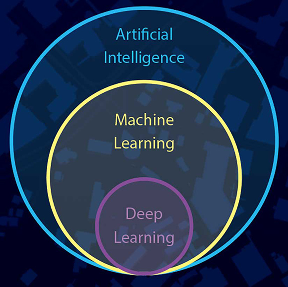
Artificial intelligence, machine learning and deep learning. Source: Esri
Read this short article on Machine Learning in ArcGIS [123] by Esri Spatial Analyst Lauren Bennent. What are some of the key issues she cites about using ML and GIS? What stands out as being different from what you can do with Desktop GIS alone? Do you think you can get started with ML using ArcGIS Pro? What constraints might you run up against?
Big data analytics
One way SDS is different from traditional GIS workflows is the ability to deal with large volumes of data including collection and cleaning, storage, analysis and visualization. Analysis of real-time (or near real-time) data is a rapidly growing area for geospatial science and emergency management applications in particular. Have a look at the following video and website [124] to see a geo-analytics workflow using Esri.
Real-Time GIS and Analytics (5:42)
Center for Spatial Data Science
The geospatial industry are making great advances in SDS and delivering data and tools to a wide audience, however research groups at universities have been at the cutting edge of developments in (spatial) data science for many years. This includes work in computer science, high performance computing, mathematics, statistics, geography, human-computer interaction, amongst others.
One research group that has been very influential across these areas is Professor Luc Anselin's Center for Spatial Data Science [125] at the University of Chicago. Have a look at a few of the research projects this center has undertaken in recent years. What similarities or differences do you see compared to the problems described in the Carto or Esri sites, or that you have usually thought about in the context of GIS problems?
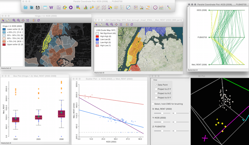
Screenshot of multiple linked displays from analysis with GeoDA
One of this group's most widely used products is the GeoDA software. [126] This program has a lot of basic GIS functionality but is also loaded with easy to use advanced spatial analysis tools. This is a desktop application, but many of the tools can be used by coding with Python and R, thus making the tools scalable with data and hardware needs.
Look at the GeoDA [127] pages and also visit their github site [128] which hosts software and training materials. Be sure to scroll down this page to view the desktop spatial analysis program GeoDA. As mentioned, they are also actively developing R libraries. Why would they focus on both?
Note that you can download and use GeoDA for free (and it works on multiple platforms). It might be worth considering as part of your projects?
Data Science Computing
As mentioned previously, SDS goes beyond desktop GIS and requires the use of a range of computing resources and programming tools to manage different analysis steps.
What about the hardware required for Spatial Data Science. In many ways it is all about scalability. You may be able to accomplish many tasks with desktop software like ArcGIS Pro, but for bigger and more complex analysis you may need to rely on enterprise solutions or high performance computing.

NVIDIA A100 Tensor Core GPU (Source: NVIDIA)
Have a very quick look at this fact sheet for the NVIDIA A100 Tensor Core GPU [129]. This type of hardware is designed for for AI, data analytics and high performance computing in server/cloud applications.
Hardware like this is used in distributed computing where tasks to be split up and conquered by a stack or cluster of processors. The figure below is from the Riga Technical University [130] and shows how a central computer (head node) is orchestrates analysis jobs undertaken by computing nodes.
Distributed computing example (Source: Riga Technical University [130])
Distributed computing is controlled by software systems such as Hadoop [131]. Here is a description from the developers website of what Hadoop does:
The Apache™ Hadoop® project develops open-source software for reliable, scalable, distributed computing.
The Apache Hadoop software library is a framework that allows for the distributed processing of large data sets across clusters of computers using simple programming models. It is designed to scale up from single servers to thousands of machines, each offering local computation and storage. Rather than rely on hardware to deliver high-availability, the library itself is designed to detect and handle failures at the application layer, so delivering a highly-available service on top of a cluster of computers, each of which may be prone to failures. - Source Hadoop [131]
Data Science Software and Programming
I'd like to end this section by showing you a useful diagram produced by Carto (again!). It is meant to show the relationships amongst data science tools and geospatial analysis.
Python and R are the main languages used for data manipulation and analysis in much of SDS. The two languages overlap in functionalist but also offer different capabilities (R is good for some things / Python excels at others). This highlights that you need to be somewhat pragmatic and use whatever tool will work best. The tools hanging off the R and Python circles refer to specific packages e.g., ArcPy is the site package used by Esri for accessing ArcGIS functionality. SQL is the main language for querying and managing databases. Finally, the platforms area refers to the many ways you can interact with the data and run analyses. Are you familiar with any of these? The Carto book recommended above provides some practical help on how to set some of these up for your own analysis.
Data Science tools for spatial analysis (Source: Carto - What is Spatial Data Science? [132])
Additional Resources
We will come back to the topics of GeoAI and real-time analytics later in the course, but in the meantime Esri and Carto offer many free resources on SDS (some listed above) and this includes free seminars and training materials. Have a look at this page listing current resources and upcoming events - Spatial Data Science Events, Videos, Webinars and Courses [133].
The growing interest in spatial data science has spawned several conferences that bring together scientists and analysts in the public and private sectors. I encourage you to take a look at the Spatial Data Science Conference website [134]. You can register and attend online for free this year.
Deliverable
- Post a comment in the Emerging Theme Discussion (L4) forum that describes similarities and differences between traditional desktop GIS and Spatial Data Science. How you think spatial data science is changing or will change crisis and emergency management approaches?
- Provide a link and short description to a VGI effort ‘in the news’ or that you have otherwise come across.
- NOTE: Respond to this assignment in the Emerging Theme Discussion (L4) forum by the date indicated on the course calendar.
Grading Criteria
This discussion will be graded out of 15 points.
Please see the Discussion Expectations and Grading page under the Orientation and Course Resources module for details.
Term Project - Create an Outline
This week, you need to compile and submit an outline for your term project paper. By now, you've received my feedback on your project abstract, and you had time last week to collect some background information.
Outline Description
A good outline will help you complete your term project as efficiently as possible. I like working with an outline, because then I know the gaps that I need to fill. It's also an excellent way of narrowing what your paper will cover given a specific word count constraint.
Your outline should include:
- major sections and subsections of your paper;
- organized sections in a logical flow that guide the reader from start to finish;
- some details about the dataset and analysis you plan to use including where you plan to source data if you haven’t already (now is a good time for me to help out if you are having any problems).
The outline should reflect the limitations you have on word count (no more than 3000 words) for the final product (you won't be able to have dozens of sections covering every possible topic).
I like to add short statements for the key ideas I will cover in each subsection; that way I know exactly what I must cover to complete the paper, but I'll leave it up to you to decide how much detail your outline includes beyond section and subsection headings.
For your term project, you must include the sections/headings provided in the table below. These are the major items I will be looking for. You can create subheadings as you see fit.
| Section | Description |
| Introduction | The introduction meaningfully engages the target audience/reader and clearly presents the central argument along with its substantive, technical and applied contexts. |
| Background and Supporting Research | The paper is well researched and contains references to peer-reviewed articles, government documents and industry reports that relate to the arguments in a logical manner. References are correctly cited. |
| Analysis and Interpretations |
The design and implementation of a methodology was appropriately used to address the central arguments of your topic. Critical, relevant and consistent connections are made between evidence and central arguments. Includes appropriate use of maps, graphics, and tables. Analytical insights are sound and show a deep understanding of the issues. Depending on your selected topic, this may involve describing the steps taken for data analysis and mapping (NOTE –step by step instructions can be put into an appendix and will not count against word limits – disc |
| Conclusion |
Excellent summary of topic and central arguments with concluding statements that impacts the target audience/reader. |
The content of this announcement will not be visible to users until Mar 8 at 0:00
Submission Instructions
Submit your assignment as a word document or PDF to the Term Project: Outline dropbox in Canvas.
Save your files in the following format: L4_tp_firstinitialLastName.doc.
See our Canvas Course Calendar for specific due dates.
Grading Criteria
The goal of this exercise is to pave the way for you to write an exemplary term project; therefore, each section will be graded on a satisfactory (1 point)/unsatisfactory (0 points) basis. You need to address the following criteria:
- a title is present that reflects the focus of the project,
- clear headings and subheadings are present for each paragraph,
- appropriate and high-quality datasets for your project have been identified,
- a plan for locating and acquiring the data has been determined (and instructor consulted if having problems),
- a clear and detailed plan for analyzing the data has been given.
The outline is worth 5% of your total course grade and will be graded out of 45 points.
Project Proposal Presentation
The ability to synthesize technical information into a concise package that is appropriate for a broad audience is a skill that is hard to hone and yet highly sought after in the workplace. This assignment provides you an opportunity to do just that. I would like you to create a short (5 - 7 minute) recorded presentation about your term project proposal. The presentation will be shared with your classmates.
Guidelines for your video
- Must be no longer than 5-7 minutes (no exceptions!).
- Outline the topic you chose, brief background, and key contributions of your work.
- Create a slide presentation that includes key points, graphics, photos, etc. to explain the project.
- Avoid lots of text (and reading your slides) if you can make the same points with a graphic. You want the audience to focus on what you are saying and not on reading the slide!
- Do not go into extreme detail in five minutes - the idea here is to provide a quick teaser of your work that will entice someone to read your final report.
- Be creative!
Make Your Video
- You may choose your own screen recording software, or record your screencast from within Canvas. Here is a link to instructions (Links to an external site.) [135] on how to use Kaltura Capture to record within Canvas. Note: Kaltura Capture is accessed in Canvas by clicking on My Media in the Canvas menu and "Add new". If you do not use Kaltura Capture, you will need to upload your own video file to My Media using these instructions (Links to an external site.) [136].
- Record your screen while you give your five to seven-minute slideshow (make sure the slides are visible and the audio is clear - using a headset microphone is normally the best way to ensure decent audio quality).
- Need more help? Contact the World Campus Helpdesk [137] for assistance.
- Make sure that you have added your screencast video to My Media in Canvas.
Add Your Video to the Media Gallery
You're almost done! The last step is to add your video to our Term Project Presentation gallery so everyone can see!
1. Click the Media Gallery link in the course navigation on the left side of the page.
2. Click the + Add Media button in the upper right of the page.
3. Select the video you would like to add by checking the checkbox to the left of the video.
4. Click Publish in the upper right of the page.
5. Let me know you've uploaded your video, and I'll approve it for the Media Gallery.
NOTE: The video will not appear in the Media Gallery until I approve it.
Review your peers' presentations
Go to the Media Gallery in Canvas and view your peers' presentations. Please provide comments and feedback to your peers.
Deliverables
- Share your video in the Media Gallery.
Writing Assignment
The chapter from your book is matched with a journal paper that focused on GIS for emergency management situations that include preparedness components. Your written deliverable for this week’s lesson (beyond what you wrote for the class participation section) is to produce a brief (no more than 400 words) critical assessment of the paper by Lochhead and Hedley. The critical assessment should begin with a one-two sentence summary of the authors’ goals in the project reported. Then, in 2-4 paragraphs, discuss the strengths and weaknesses of the work reported. Consider the following issues:
- the most important contribution that the paper makes to understanding the role of geospatial data and approaches in emergency management (what do we know now that we did not know before this work?);
- critical aspects of the methods applied and/or decisions made about those methods that make the work something that others should emulate (e.g., things that they considered that, if they had been ignored, would make the conclusions unreliable or invalid);
- flaws that you see in the work reported (these might be in methods developed, in the way they were applied, or in the interpretations that the authors make about the applicability of their results).
Submission Instructions
Please name your document using the following as an example: L4_assign1_firstinitialLastName.doc
Submit your assignment to the Lesson 4 Writing Assignment (L4) Dropbox. See the Course Calendar for specific due dates.
Grading Criteria
For this assignment, I will assign grades with the following rubric. It is worth 4% of your total course grade and will be graded out of 20 points.
| Criteria | Description | Possible Points |
|---|---|---|
| Content and Impact | You make strong and logical arguments and provide analytical insights. Ideas are well organized, clearly communicated and relevant to the prompt. All criteria are accurately addressed. Supporting details are shared, elaborated upon and demonstrate understanding. Examples are provided, and your post includes images or other multimedia that support content. | 15 |
| Clarity and Mechanics | Evidence of editing and proofreading are evident. Writing is engaging and well-structured with excellent transitions between sentences and paragraphs. Concepts are integrated in an original manner. | 5 |
Summary and Final Tasks
Summary
This week, we focused on how GIS can be used to prepare for a disaster. Different disasters present different types of opportunities for preparation - some, like terror attacks or earthquakes, provide little or no warning time at all. Others, like hurricanes or other severe storms, may offer a window of opportunity where geospatial data and tools can be used to coordinate evacuations and other types of preparation efforts (sandbagging levees, for example).
One way to prepare for disasters that offer little or no warning is to develop spatial computational models of disaster impacts and use a GIS to run simulations of hypothetical emergency situations. In this lesson, we looked at how the USGS uses PAGER to quickly estimate damage from earthquakes. When planning a geospatial system for emergency management, it may be very useful to allocate time and resources toward disaster modeling efforts to simulate situations that present very little advanced warning.
In the next lesson, we will shift our attention to the response phase of emergency management. In the time immediately following a disaster, GIS and other geospatial technologies will be called upon to develop a situational picture and to allocate first responder resources. In Lesson 5, we will delve into a wide variety of challenges that are associated with disaster response.
Reminder - Complete all of the Lesson 4 tasks!
You have reached the end of Lesson 4! Double-check the to-do list on the Lesson 4 Overview page to make sure you have completed all of the activities listed there before you begin Lesson 5.
Questions?
If you have any questions, please post to the Canvas Discussion Forum called "General Questions" or email the instructor via Canvas conversations (if the question is personal in nature).
Lesson 5: Response
Overview & Checklist

In this lesson, we will focus on how geospatial perspectives and technology are used in response to emergency situations. Geospatial analysis has tremendous potential for aiding disaster response, but as you will learn, it is not easy to quickly translate geospatial data into actionable information when lives are at stake. Responders need to know where to go and how to get there, and emergency managers need to understand and react to a changing situational picture.
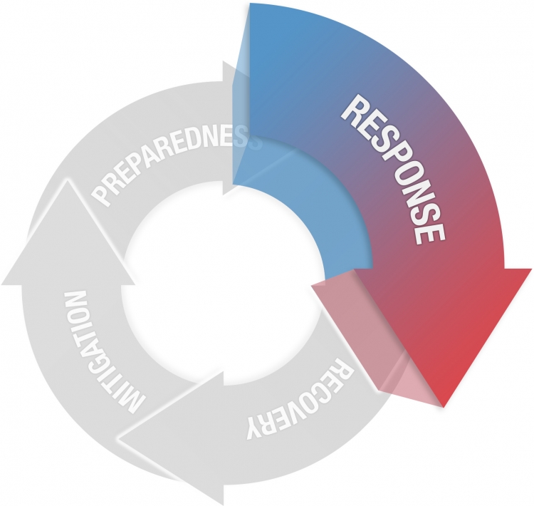
CC BY-NC-SA 4.0 [7]
Response
Actions taken immediately before, during and after an event to alleviate suffering and prepare for recovery
- Establish Situational Awareness
- Evacuations and Shelters
- Respond to remaining hazard
- Search and Rescue
- Mass Care
- Logistics response
- Initiate Recovery
What You Will Learn
By the successful completion of this lesson, you should be able to:
- identify the roles that geospatial approaches and technologies can play in disaster response;
- discuss some of the issues that geospatial analysis systems must overcome in response situations with your colleagues;
- understand the implications of real-time mapping and spatial analytics;
- create real-time mapping and spatial analytics dashboards.
What You Will Do
Lesson 5 is one week in length. To finish this lesson, you must complete the activities listed below.
| To Read |
|
|---|---|
| To Do |
|
Please refer to the Course Calendar for specific due dates.
Questions?
If you have questions about the content or lesson activities, please post them to the General Questions and Discussion forum in Canvas. While you are there, feel free to post your own responses if you, too, are able to help a classmate. If your question is of a personal nature, please email me directly through Canvas.
The Role of Geospatial Analysis in Disaster Response
When Disaster Strikes, What's Next?
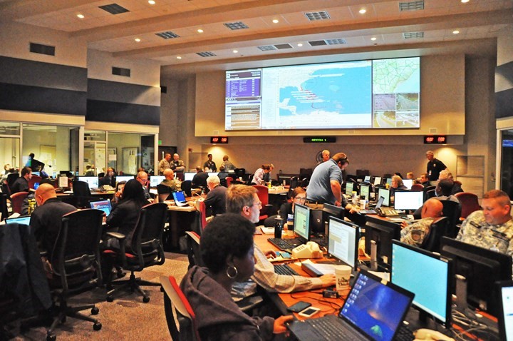
In the wake of a serious disaster, geospatial analysts along with other emergency managers are expected to provide a wide array of information with short deadlines for a variety of important tasks. First, it is essential for everyone involved to have a clear sense of the current situation (situation awareness) and to receive updates on the situational picture as time progresses. This can be a serious challenge because often a disaster can impact the types of data that are available. Also, consider the extreme case of the EOC for New York on 9/11 which was located at 7 World Trade Center, and its state-of-the-art equipment and data were destroyed as a result of the attacks.
For Further Reading - Optional
You can read more here on how GIS resources were developed on an ad hoc basis during the 9/11 crisis [140]. It is interesting to contrast these activities with what is possible now, over 20 years later! In particular, think about the crowdsourcing and crisis mapping efforts you read about in the Digital Humanitarians chapters.
Any geospatial plan for responding to an emergency or crisis should consider several key questions:
- Are there backup sources for equipment and data?
- Is there an alternate site where personnel can gather in the event that the primary EOC is taken out by the disaster?
- What are the basic geospatial-dependent products you must be able to provide to support fundamental response efforts?
- What are the plans for dealing with power and communication (Internet) outages, especially when current and emerging geospatial applications are dependent on these?
Even contemporary web-based geospatial systems present possible challenges in a real crisis situation. While cloud-hosted solutions can help avoid the risks associated with data storage in a single EOC, many disasters make Internet access difficult or impossible. We will consider this issue in more detail later.
Who Needs Help, And Where is the Help?
The most pressing need facing geospatial managers during the immediate aftermath of a disaster is to estimate the impact of the disaster on the local population to determine where first responders should focus their rescue efforts. This problem requires an awareness of the scale and scope of the disaster as well as the ability to know where response resources are located, what their capabilities are, and what routes are available for them to take to those who need their help.
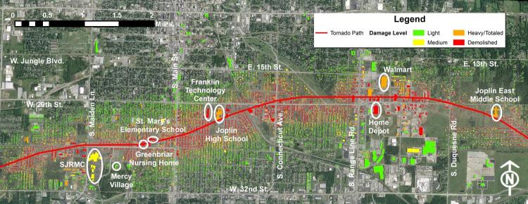
As an example, consider the May 22, 2011 tornado that went through Joplin, Missouri. The map above shows locations of key facilities and estimated building damage levels. Developing an understanding of the scope of damage during and immediately following an event is a key goal for geospatial analysis. Spatial data on the location and functions of key facilities can be developed as part of mitigation and preparedness.
Later in this lesson, we will consider these issues in greater detail when we look at (near) real-time mapping and spatial analytics. The data and tools to support emergency management are changing rapidly and are much more advanced than they were just a few years ago.
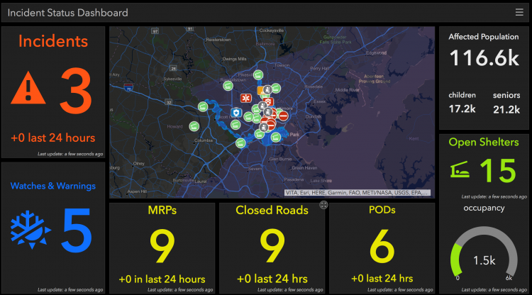
On the next page, you'll find your reading assignment for this week, where we'll delve deeper into how GIS and other spatial tools are used during response activities, including a focus on the limitations of GIS systems in response situations.
Reading Assignment
The readings for this week focus on the fourth component of emergency management, response. You will read an overview chapter from your textbook, review a situation awareness briefing from FEMA during Hurricane Maria, and a book chapter on emergency management communications technology.
1. READ
"GIS for Disaster Management" - Chapter 7 - "Disaster Management and Geographic Information Systems"
Previous readings have focused on how GIS can be used to avoid disasters, mitigate the consequences of events that may happen in the future, and prepare (in those cases where there is warning) for a disastrous event that is likely to happen (e.g., a hurricane that exists and has a predicted track and severity). These chapters focuses on how GIS can help in situations where an emergency/crisis is unfolding and shows how a well-reasoned, timely response can make a difference in the consequences of a disaster. Have a look at the entire chapter but focus on pages 192 - 203 – Geographical Aspects of Situational Awareness.
RESPOND
What are the key inter-agency coordination issues that should be considered to make a GIS-based response effort successful? How might recent advances in location-based services change the ways in which emergency management professionals and the public interact through geospatial information and technologies to respond to a disaster?
2. REVIEW
Situation awareness described in FEMA Geospatial Coordination Updates on two days during Hurricane Maria. The PDF's are located in Module 5 of Canvas.
These slide decks supported one of the daily coordination briefings that FEMA ran in the days up to and following Hurricane Maria. They provide a nice summary of what different FEMA teams and allied agencies are doing. It is meant to provide an overall summary of the current situation. Contrast these "hard copy" products with newer web based tools in the FEMA Geospatial Resource Center. [145]
RESPOND
Take note of the range of information and resources contributing to situation awareness for this event. Does anything seem to be missing? How well do you think the work of this group may support other parts of the emergency response e.g., search and rescue teams?
3. READ
Norris, C. 2018. Chapter 2 - Computer Networks and Emergency Management from Technology and Emergency Management found in Module 5 of Canvas.
Finally, I’d like you to think a bit more about communication systems during disasters. This book chapter provides some interesting, albeit a bit basic, information on communication systems and then describes some of the ways they are impacted by disasters and how they can be restored during a disaster. It is good background given how much geospatial technologies depend on reliable ICT.
You might also be interested in this late 2017 news article on What Happens to the Internet After a Disaster? [146]
THINK
What are some of the specific geospatial challenges to communication and IT systems disruptions during emergencies? Does this make geospatial approaches vulnerable and potentially ineffective? Are there new ways for restoring these resources in a hurry?
Deliverable
- Post a comment in the Reading Discussion (L5) forum that addresses the RESPOND prompt above during the first 5 days of the lesson.
- Then, I'd like you to offer additional insights, critiques, a counter-example, or something else constructive in response to your colleagues on two of the following 5 days.
- Brownie points for linking to other technology demos, pictures, blog posts, etc., that you've found to enrich your posts.
NOTE: Respond to this assignment in the Reading Discussion (L5) forum by the date indicated on the course calendar.
Grading Criteria
This discussion will be graded out of 15 points.
Please see the Discussion Expectations and Grading page under the Orientation and Course Resources module for details.
Emerging Theme: Real-time Mapping and Spatial Analytics
Overview
This week’s emerging theme focuses on the topic of looking at disasters and maintaining situation awareness in (near) real time. To complete this section, you will need to:
- review a short video and reading to get you started;
- use ArcGIS Online to create your own emergency response dashboard;
- identify and add live data feeds to your dashboard;
- conduct analysis to develop situation awareness that can be used to target response resources; and
- write a short report summarizing your work and findings.
Real-Time Mapping and Spatial Analytics
For this exercise, we are going to focus primarily on the Solutions for Emergency Management [147] apps that have been developed by Esri and are based on their suite of ArcGIS technologies, especially cloud and web-based GIS services. Also, see Esri’s Disaster Response Program [148] website for the help the company offers during emergencies. There are other systems out there, some that leverage major industry platforms and some that are developed in-house from open-source software (e.g., recall InaSAFE [149], PDC [150], and even Google Crisis Response [151]).
Regardless of the system being used, they have similar goals such as providing:
- base maps and other datasets that can be prepared beforehand and deployed during an event, e.g., road networks, building footprints;
- infrastructure for communicating with a range of stakeholders from local first responders, EOCs, specialists working at a distance, and the general public;
- a means to upload data, including real-time, from the field and other sources;
- rapid analysis and then uploading and sharing derived products, e.g., spatial data analytics, rapid image processing for damage assessment; and
- visualize diverse datasets in an easy to update and understandable format, e.g., multiple map displays on a dashboard with other charts, figures, and video feeds.
Before developing your own situation awareness app, have a look at the two videos and the optional reading below. The first (short) video is an overview of a case study where these approaches are used by the California Office of Emergency Services (Cal OES). The second (longer) video provides more detailed examples about incorporating live data feeds into a situational awareness app and dashboard using Esri tools. These concepts are further discussed in the optional reading from The ArcGIS Book.
ArcGIS Online Case Study: Emergency Management – Cal OES (3:54 minutes)
[BEEPING]
DAN BOUT: My name is Dan Bout. And I serve as the assistant director for response at the California Governor's Office of Emergency Services. Cal OES is responsible for all disasters that occur in California that exceed the locals' abilities to respond to them. Far and away, the biggest challenge we have as it relates to data in an incident is synthesizing data into information that's useful. So there's a huge potential for miscommunication. And as you get more and more data feeds, that becomes a more and more salient issue.
[FIRE ENGINE SIRENS SOUNDING]
PRESENTER 1: Here is the latest on the breaking news we're following out of northern California. A strong earthquake rocked--
PRESENTER 2: Parts of Napa got hit hard, hammered by this quake early this morning. One example--
JOSE LARA: The Napa earthquake truly showed us the power of visualizing information. The ability that we had at that time to create flat maps in a not-so-speedy way showed a gap that we had in our ability to really visualize the information, get it out in a fast manner.
CHI SMITH: The people on the ground, they need the tools so that problems can be solved during activation, so resources could be deployed timely and effectively.
JOSE LARA: So during the Napa earthquake, the decision was made to bring Esri into-- show us what is possible, what capabilities they have.
DAN BOUT: That was actually, I think, probably one of those key-use cases for moving to a digital map. The ability to start seeing water leaks in real time and like, OK, when did that happen? Three minutes ago. That is something that you couldn't do with a paper map.
JOSE LARA: We went from, at best, 5% of online products to 95%. And that actually happened in about, say, six or nine months of the Napa earthquake.
DUANE VALENZUELA: Now you have all the current data that's available. And it may change as you're looking at it. And it's real time. You're looking at what's happening now, not what happened 12 hours ago.
JOSE LARA: What they showed us that day during the Napa earthquake was a story. It's interactive. It allows us to take a look at the shape map, take a look at the shelters, take a look at whatever information that we're discussing. This allows us to be able to really give decision makers what they need.
CHI SMITH: GIS changed the way we do business. We now have the go-to products. We know that this is what we need to do as a requirement. So that would be part of our common operational picture.
DUANE VALENZUELA: During the fires was the first time we really use the dashboards this year. And we were able provide a visual of acreage burn, current damage assessments. The dashboard provides that snapshot that saves time. Instead of somebody stopping in the middle of an operation to brief someone, they can just walk in and look at the wall and see exactly what they want to see.
DAN BOUT: One of the areas that I think we're deliberately going to move to is taking a tool like our GIS mapping capability and using that as a mitigation tool.
JOSE LARA: Where I see us going is to get hooked up to every single county statewide, so when an event happens, we flip the switch on and absorb their data. And then I can just visualize.
DAN BOUT: The bottom line in emergency management is we are going to be successful. There's not a lot of trying involved. You have to make it work because it's-- it's people's lives. It's families. It's their property. I mean, it's the things that are most core to our identity and to who we see ourselves as, as a nation.
CHI SMITH: The technology is there. And we know that it's available. And we've leveraged to the best of our abilities. It's my dream come true. I mean, it's great.
[MUSIC PLAYING]
Leveraging Live Feeds for Situational Awareness (55:39 minutes)
I know this is a long video. If you don't have time to watch the entire video, please have a look at the first 10-15 minutes or so.
Optional Reading
Chapter 9: Mapping The Internet Of Things [153] from The ArcGIS Book
As a companion to the two videos, you might want to have a look at this book chapter from Esri. At least keep it in mind as a resource as you work through the rest of the exercise.
Note
There is no Emerging Theme Discussion this week.
The next page will provide you with the details of the Exercise and writing assignment that are due this week.
Real-time Mapping and Spatial Analytics Exercise
For the analysis part of this exercise, you will consider the applications of (near) real-time geospatial tools for emergency management in greater detail. You should critically evaluate what is already out there and what is required for an effective decision support system utilizing dynamic and real-time spatial data. Once again, you are assuming the role of a geospatial analyst that is planning for and responding to emergency situations.
Steps to Follow
- Start by evaluating some near-real time systems used by different emergency management agencies. We have looked at some examples already, but you should have a search of applications on the web. I can provide some pointers if you are having trouble finding suitable examples.
- From this, and the other material in this week’s lesson, you should come up with a needs assessment/system design for a hazard and location of your choosing e.g., wildfires in California, inland flooding in Queensland. In other words, what functionality should the tool have and what data is required.
- Finally, build a simple prototype with ArcGIS Online tools. You should be able to find some data feeds, but there may or may not be much traffic on them if there isn’t a current emergency. That’s OK the idea is to have a simple prototype that has the essential static and dynamic data elements needed when an emergency occurs. You don’t have to find data for everything or address everything from Step 2.
Deliverables
- Report your findings by writing a short 400 word essay on your critique of existing systems and your design advice. Please include a minimum of two figures (screen-grabs with captions will be OK) illustrating the points you raise.
- Create a simple app/dashboard with ArcGIS Online and share with me (and the class). Please include a link to your app at the TOP of the document.
Submission Instructions
- Submit a link to your app and your written assignment to the Deliverable: Real-time Mapping and Spatial Analytics Exercise Dropbox (L5).
- Post a link to your app with a 2-3 sentence description of what you focused on to the Deliverable: Real-time Mapping App Discussion so that your classmates can see what you have done.
- Review and provide constructive encouragement and feedback on your peer's apps.
- See the Course Calendar for specific due dates.
Grading Criteria
This assignment is worth 50 points toward the exercise portion of your course grade.
This assignment will be grading using the following rubric.
| Criteria | Description | Possible Points |
|---|---|---|
|
Part 1 – Critique of existing systems and design advice |
You make strong and logical arguments and provide analytical insights. Ideas are well organized, clearly communicated and relevant to the prompt. All criteria are accurately addressed. Supporting details are shared, elaborated upon and demonstrate understanding. Examples are provided, and your essay includes images or other multimedia that support content. | 20 |
| Part 2 – Needs assessment and dashboard demo | You make strong and logical arguments and provide analytical insights. Ideas are well organized, clearly communicated and relevant to the prompt. All criteria are accurately addressed. Supporting details are shared, elaborated upon and demonstrate understanding. Examples are provided, and your essay includes images or other multimedia that support content. | 20 |
| Overall - Clarity and Mechanics |
Evidence of editing and proofreading are evident. Writing is engaging and well-structured with excellent transitions between sentences and paragraphs. Concepts are integrated in an original manner. Mechanics (word limits and other requirements) were met. |
10 |
Term Project - Make Progress On Your First Draft
Make Progress On Your First Draft
This week, you should be making significant progress on the first draft of your term project. Your goal should be to make the first draft as high quality as possible, with the idea that doing so will mean you have less work ahead of you to complete your second (and final) draft.
I have designed the timing of this assignment so that I have time to read your full drafts, offer feedback and editing suggestions, and return them to you with enough time left in the course so you can revise your work before submitting a final version.
Expectations
Here are my expectations for your first draft:
- It should be clear who you are writing for and the role you are playing in preparing this report.
- Your draft should be complete, and the topics from your abstract and outline should be covered.
- I understand you may still be working on some of the data analysis and visualization, so I will put a greater emphasis on the rest of the draft. That said, the logic of your analysis should be clear and there should be good progress towards completing your analysis.
- It should be well written using correct grammar and spelling.
- Your draft should not exceed the 3000-word limit (citations and figure captions do not count toward the word limit). A more detailed version of your methodology can be provided in an appendix, and this doesn't count towards your word limit.
- The format of your document should be consistent and elegant.
- You should use a common citation format and apply it consistently. If you don't know which one to use, Chicago Author-Date style [154] is a good default. Refer to the Writing Resources Page [155]for more detials and advice.
Rubric
| Criteria | Description | Possible Points |
|---|---|---|
| Introduction | The introduction meaningfully engages the target audience/reader and clearly presents the central argument along with its substantive, technical and applied contexts. | 15 |
|
Background and Supporting Research |
The paper is well researched and contains references to peer-reviewed articles, government documents and industry reports that relate to the arguments in a logical manner. |
30 |
|
Analysis and Interpretations |
The design and implementation of a methodology was appropriately used to address the central arguments of your topic. Critical, relevant and consistent connections are made between evidence and central arguments. Includes appropriate use of maps, graphics, and tables. Analytical insights are sound and show a deep understanding of the issues. Depending on your selected topic, this may involve describing the steps taken for data analysis and mapping (NOTE –step by step instructions can be put into an appendix and will not count against word limits – discuss this with the instructor). |
30 |
|
Conclusion |
Excellent summary of topic and central arguments with concluding statements that impacts the target audience/reader. 10 | 10 |
| Writing | There is evidence of editing and proofreading. Writing is engaging and well-structured with excellent transitions between sentences and paragraphs. Writing is polished and professional. Concepts are integrated in an original manner. | 15 |
This week, you should complete at least the first half of your term project draft. You will have all of this week and next week to complete your first draft, and since you have other assignments in this course, I recommend you manage your time accordingly.
If you're like me and you have trouble getting started on writing assignments, consider this piece of advice I heard from a colleague about completing a Ph.D. dissertation:
"Every day, set aside a writing task for yourself that is so small that you cannot possibly fail to complete it."
When I was writing my dissertation, I set little goals for myself every day that mirrored this advice. For me, it worked best to set a specific word count that I had to achieve every day. For you, there may be better ways to motivate yourself, so your mileage may vary.

Questions?
Remember, if you have any questions while you are working on your first draft, just send me an email or leave a post on the Questions and Comments Discussion in Canvas.
Summary and Final Tasks
Summary
Effective response to a disaster depends on quickly synthesizing actionable information and disseminating that information to responders in the field. Geospatial data systems and analyses are frequently used to assemble the "big picture" in a disaster. Among other things, it is essential for geospatial systems to help decision makers understand where first responder resources are located and where help is needed.
This week, we also focused attention on another challenge for geospatial systems in response situations. Quite often, a significant disaster will destroy the infrastructure that had been designed to support emergency management. For example, we learned about how an ad hoc system was developed in New York after 9/11. One way of avoiding this kind of problem is to distribute the emergency management geospatial system through a local network or via the Internet where it can be accessed from multiple entry points. This type of approach makes it less important that all emergency management personnel are in the same place.
Up to this point, we have covered mitigation, preparedness, and response topics for emergency management GIS. In the next lesson, we will move on to the final stage of emergency management and explore how geospatial data and analysis is used in longer-term recovery efforts to rebuild disaster areas.
Reminder - Complete all of the Lesson 5 tasks!
You have reached the end of Lesson 5! Double-check the to-do list on the Lesson 5 Overview page to make sure you have completed all of the activities listed there before you begin Lesson 6.
Lesson 6: Recovery
Overview & Checklist
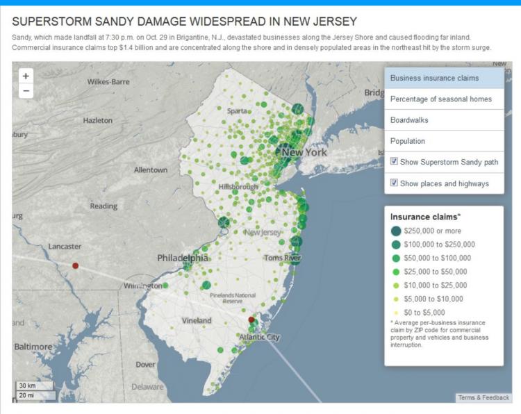
Overview
This week, we will focus on how geospatial approaches and technologies can support the final phase of emergency management - recovery. After response efforts have ended, recovery efforts can begin in earnest. GIS and related geospatial tools can be used to plan near-term infrastructure repairs and to identify candidate organizations and communities to receive long-term aid and assistance through grants and infrastructure projects. Recovery projects frequently involve close interaction with disaster victims who want to rebuild and return to 'life as usual." This poses challenges and opportunities for geospatial practitioners and those who consume information from geospatial analyses. We will discuss these topics and others throughout this lesson.
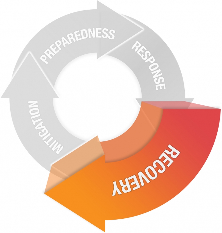
CC BY-NC-SA 4.0 [7]
Recovery
The rebuilding or improvement of disaster-affected areas
- Debris Management
- Return essential services
- Food and water
- Temporary housing
- Economic assistance
- Insurance claims and rebuilding
- Business aid
What You Will Learn
By the successful completion of this lesson, you should be able to:
- explain and compare multiple ways in which geospatial analysis can be applied to disaster recovery efforts;
- identify strengths and weaknesses in current geospatial approaches to disaster recovery;
- evaluate, describe, and discuss trends and advances in cloud and mobile computing and how they are impacting geospatial systems for emergency management;
- develop a solid first draft of your term project.
What You Will Do
Lesson 6 is one week in length. To finish this lesson, you must complete the activities listed below.
| To Read |
|
|---|---|
| To Do |
|
Please refer to the Course Calendar for specific due dates.
Questions?
If you have questions about the content or lesson activities, please post them to the General Questions and Discussion forum in Canvas. While you are there, feel free to post your own responses if you, too, are able to help a classmate. If your question is of a personal nature, please email me directly through Canvas.
Recovering from Disasters
Stages of Disaster Recovery
Recovery is a difficult process and involves the coordination of a range of actors with different levels of decision-making power and resources. This is illustrated by the US Federal Emergency Management Agency’s National Disaster Recovery Framework (NDRF) [156] which seeks to address and find a way to operate given this complexity:
The National Disaster Recovery Framework is a guide that enables effective recovery support to disaster-impacted States, Tribes, Territorial and local jurisdictions. It provides a flexible structure that enables disaster recovery managers to operate in a unified and collaborative manner. It also focuses on how best to restore, redevelop and revitalize the health, social, economic, natural and environmental fabric of the community and build a more resilient Nation.
The framework document includes some nice visualizations of disaster recovery as a process that plays out over time (and space!). Take a moment to consider this diagram and the listed examples of activities in the short, intermediate, and long term. Who are some of the actors responsible for undertaking these activities? Where do spatial data and analysis come in?
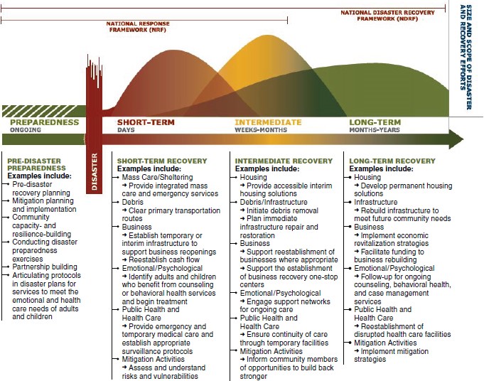
Click here to see a text description.
Stages of Disaster Recovery described in the FEMA
This image shows that Preparedness happens before the disaster. Once the disaster hits, short-term recovery commences, followed by intermediate and long-term recovery. This is not a strictly linear progression as one phase begins before the previous one's end. See the lists below for examples.
Preparedness (Pre-disaster Preparedness) is ongoing. Some examples include:
- Pre-disaster recovery planning
- Mitigation planning and implementation
- Community capacity and resilience building
- Conducting disaster preparedness exercises
- Partnership building
- Articulating protocols in disaster plans for services to meet the emotional and health care needs of adults and children
Short-Term Recovery (days after the disaster)
- Mass Care/Sheltering: Provide accessible interim housing solutions
- Debris: Clear primary transportation routes
- Business
- Establish temporary or interim infrastructure to support business re-openings
- Reestablish cash flow
- Emotional/Psychological: Identify adults and children who benefit from counseling or behavioral health services and begin treatment
- Public Health and Health Care: Provide emergency and temporary medical care and establish appropriate surveillance protocols
- Mitigation Activities: Assess and understand risks and vulnerabilities
Intermediate Recovery (weeks to months after the disaster)
- Housing: Provide accessible interim housing solutions
- Debris/Infrastructure
- Initiate debris removal
- Plan immediate infrastructure repair and restoration
- Business
- Support reestablishment of businesses where appropriate
- Support the establishment of business recovery one-stop centers.
- Emotional/Psychological: Engage support networks for ongoing care
- Public Health and Health Care: Ensure continuity of care through temporary facilities
- Mitigation Activities: Inform community members of opportunities to build back stronger
Long-Term Recovery (months to years after the disaster)
- Housing: Develop permanent housing solutions
- Infrastructure: Rebuild infrastructure to meet future community needs
- Business
- Implement economic revitalization strategies
- Facilitate funding to business rebuilding
- Emotional/Psychological: Follow-up for ongoing counseling, behavioral health, and case management services
- Public Health Care and Health Care: Reestablishment of disrupted health care facilities
- Mitigation Activities: Implement mitigation strategies
The next image, again from FEMA, seeks to illustrate how recovery efforts are related to one another but also play out differently in different contexts. For example, recovery in Puerto Rico from Hurricane Maria has, in many ways, been a slower process than what has happened over the last year in Texas and Florida. Resources can be stretched thin when so many events occur around the same time (Note that in addition to the hurricanes, there were also major wildfires in the Western USA occurring around the same time in 2017). Moreover, some places never fully recover as they are repeatedly subject to disaster events. We will explore the recovery process in the next section on Hurricane Sandy, and you will also consider a few case studies in later lessons on events in Nepal and Indonesia.
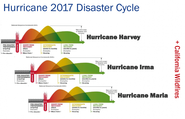
Black Summer in Australia
The 2019-20 Bushfire season was catastrophic for much of Australia and National Bushfire Recovery Agency [159] was created to coordinate the recovery effort. Take some time to look at this site and think about the range of activities underway and who they are targeted for.
Recovery from Hurricane Sandy
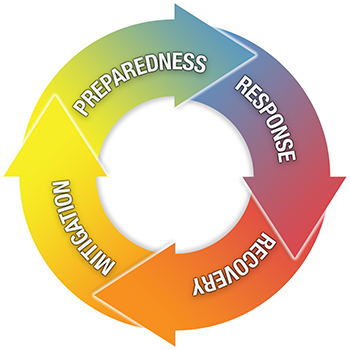
As we have seen, the boundary between response and recovery is a fuzzy one as is that between recovery and mitigation. As we have talked about earlier, it is useful to think of the stages of emergency/crisis management as a circle with each stage blending into the next. The roles of geospatial approaches and technologies can be conceptualized as occupying (often overlapping) positions along this circle.
This overlap in functions was never more apparent than with the 2012 Sandy Hurricane disaster hitting the eastern seaboard. In the midst of efforts to rescue people stranded by floodwaters, politicians and others began discussing how or whether to rebuild--opening what will probably be a long dialogue about the potential to rebuild in a way that is more resistant to similar events in the future and comparing the economic and other costs of this option with suggestions to not rebuild at all or to relocate parts of the city. Similarly, while repairs and rescue efforts continued, work began in some parts of the city to start on recovery – with spatial tasks ranging from figuring out where displaced individuals were, to assessing damage in regions of the city to determine whose insurance claims of disaster relief requests to process first, to re-establishing utilities, fixing roads, and other efforts to establish the infrastructure required to carry out whatever recovery efforts were decided upon.
Background on What Happened During Hurricane Sandy: Optional, but recommended!
This video, Inside the Megastorm (54:38 minutes), produced by PBS NOVA does a nice job of describing the storm and why it was so damaging. It also helps illustrate the many ways that spatial data analysis was used to aid in the response and immediate recovery. Note how different groups used geospatial data and analysis e.g, first responders, search and rescue, utilities, transportation. I know this is a long video, but it is worth a look, especially if you are not very familiar with what happened.
To get a sense for just how complex and challenging recovery can be, have a look at this report from the Guardian, Hurricane Sandy, five years later: 'No one was ready for what happened after' [161] and contrast it with some of the materials on the FEMA site, Sandy Five Years Later [162]. Do you notice a difference in tone and emphasis of these two sources? Unfortunately, there are pretty much always winners and losers during recovery efforts.
Critical Perspectives on Recovery
Finally, here are two critical perspectives on recovery I’d like you to pay close attention to. This essay, A Tale of Two Recoveries: 5 Lessons from Hurricanes Katrina and Sandy [163], is written by geographers Susan Cutter and Christophe Emrich of the Hazards and Vulnerability Research Institute [164] at the University of South Carolina. Susan Cutter is an influential scholar working in this space, and you are likely to come across her research center’s work (in fact, consider having a quick search in Google Scholar and/or visit the HVRI website). The second article, As Storms Keep Coming - FEMA Spends Billions in ‘Cycle’ of Damage and Repair [165], also focuses on some important and difficult issues around recovery, in particular, the back-and-forth between disasters and recovery effort. This echoes some of the messages in the Cutter article, and I’d like you to think about how the 5 Lessons relate to this analysis of FEMA spending. Although the article focuses on FEMA, the story is much the same for other countries trying to manage the complexity of recovery efforts, and we will see this later in the Sulawesi earthquake and tsunami case study.
As we've seen, disasters have a highly variable impact spatially and temporally. There are also strong spatial differences in social, economic, and environmental characteristics that shape both impact and recovery. The map below illustrates this issue by mapping housing damage against median income for part of Long Island in the wake of Hurricane Sandy. This is probably not too surprising given what you learned in Lesson 3 about hazards and social vulnerability. You can really see this play out during a big event like Sandy. This map comes from a piece in The Conversation, Storms hit poorer people harder, from Superstorm Sandy to Hurricane Maria [166], by Professor Chris Sellers at Stony Brook University.
For Further Consideration: Optional
The optional Business of Disaster video (54:47) continues to explore many of the themes around the complexities of disaster recovery. The video was produced by PBS FRONTLINE and NPR in 2017 and focuses specifically on the (ongoing) recovery from Hurricane Sandy.
 [168]
[168]
Click here for a transcript of the Business of Disaster video [169] as posted on the PBS/Frontline website.
Think About It
As you read the course materials and other resources this week, think about strategies that are needed to develop geospatial data and analysis as general capability through which governments and other organizations can address the full range of emergency management challenges. Consider, in particular, what strategies are needed to make the process of using GIS and related technologies to support each stage of emergency management seamless - so that it is practical for emergency management teams to move quickly from the planning to the recovery stage as an event happens and to move among response, recovery, and planning-mitigation tasks as needed.
Also consider one common constraint - quite often the provisioning given to GIS systems to support emergency management is focused on preparedness and response phases. It's a lot harder to convince people to invest in new systems to support long-term recovery efforts. As we continue to face many and nearly simultaneous disasters, investing in recovery this way may become more and more urgent.
Finally, much of what we have considered has focused on events impacting the USA in particular. Moving forward we will explore these issues in other places, including Nepal and Sulawesi, Indonesia. These are places with perhaps more limited resources and geospatial infrastructure and often involve the international community and organizations playing a much stronger role. So think critically about the role of geospatial analysis and what is essential versus what is in development and may roll out eventually. In terms of recovery, how does it play out in these different countries and who is leading recovery efforts?
Reading Assignment
The readings for this week focus on the final component of emergency management, recovery. You will read a chapter in your text and two papers that address different approaches for using spatial analysis to understand patterns of recovery after major disasters. They all touch on the challenges of using geospatial analysis to help communities and organizations cope with events having geographically distributed impacts. Such events can range from relatively localized chemical spills affecting a small drainage basin, through major events impacting hundreds of thousands of people and with substantial financial impacts (such as 9/11, the 2011 Japan Earthquake, or Hurricane Florence).
1. READ
Chapter 8 – Geographic Information Systems and Disaster Recovery from Geographic Information Systems (GIS) for Disaster Management
This chapter from your textbook provides another overview of how GIS is used in disaster recovery. Note how it contrasts how different types of events require different types of geospatial tools. It also provides some good descriptions of where GIS response could be improved and ways that a long-term recovery infrastructure could be promoted.
Think About
As you read this chapter, consider the following: How is the use of geospatial for recovery likely to differ for different kinds of events? What recovery-related geospatial issues does your text not cover that ended up being important in the years subsequent to a disaster like, say, Hurricane Sandy? When is recovery over?
2. READ
Schumann et al. 2020. Wildfire recovery as a “hot moment” for creating fire-adapted communities. Internaional Journal of Disaster Risk Reduction 42:101354. (Available on next page in Canvas)
This paper pulls together many of the topics we have consdiered so far. The authors suggest that "the period following a destructive wildfire may provide a “hot moment” for community adaptation. Drawing from literature on natural hazard vulnerability, disaster recovery, and wildfire ecology, this paper proposes a linked social-ecological model of community recovery and adaptation after disaster".
Respond
Both the journal articles focus on very different ways of using spatial data and GIS analysis to explore longer-term recovery from different types of disasters. What advantages or disadvantages do you see in both approaches? Pick one or two to share with your classmates, and try to link your points to other ideas we have covered so far in the course.
Deliverable
- This week, you will be participating in a "live discussion" with some of your classmates and me! So, no written posts are required! The meeting will last one hour.
- We will focus on the journal articles, so come to the discussion with any points or questions you would like to raise.
- I will send out a Doodle poll so we can fined some times that will work for everyone. We will meet in small(ish) groups so everyone can participate.
- Note: You will also do a short writing assignment that will critique this article as well. This will give you a chance to reflect on what comes out of the live discussion.
Grading Criteria
This discussion will be graded out of 15 points - pretty easy this week! Just show up and share your thoughts.
Emerging Theme: Humanitarian Logistics and Supply Chains
This week’s emerging theme is focused on an age-old problem, how to get things from point A to point B. The importance of logistics and supply chains in emergency management cannot be overstated. It is a topic that intersects all phases of emergency management but is perhaps most important in the preparation stage. In this section, I’ll provide a bit of background, then you will look at a few videos, agency presentations, and short readings. We’ll end with a consideration of cutting-edge trends in the field that are having or have the potential for big impacts. Finally, you will take what you've learned into a discussion forum and bounce ideas off your classmates. I have also provided some links to optional reading if you want to learn more about this topic.
Background on Logistics and Supply Chains
We will begin with some quick background information about disaster and humanitarian logistics. The first video provides an overview description of what humanitarian logistics is all about. Then there are two videos that show what this looks like on the ground during some recent disasters. Finally, a news article explores what can go wrong if one part of the supply chain is disrupted - blue tarps!
Watch: The Logistics Cluster in 2:30 Minutes
Click here for a transcript of the Logistics Cluster video.
[MUSIC PLAYING]
PRESENTER: When an emergency strikes, there are certain items vital for survival, such as food, water, shelter, and medicine, which need to reach the affected population fast. However, this is never as simple as A, B, C.
Despite the challenges, humanitarians are always present when an emergency arises. Coordination is essential in complex environments like these. The Logistics Cluster is a group of organizations working together to improve the logistics response in emergencies.
The World Food Program was chosen as the lead agency for this cluster due to its expertise in the field of humanitarian logistics. Logistics is a basic and fundamental need for any operation, the backbone of any task, big or small. For humanitarians, it's about getting lifesaving supplies from A to B.
Let's take an example. This organization has come to bring medical supplies to these families. These supplies need to be transported now, but local truck drivers have fled the area, remaining vehicles have already been taken, and fuel has run out. To make matters worse, heavy rain and landslides have made the roads inaccessible, borders are closed due to ongoing conflicts, and ships cannot enter the port.
The organization's lifesaving cargo will have to stay here for now, but where will they store it and how can they quickly inform other organizations about these constraints? Where our partners need it, the logistics cluster provides transport of emergency items by road, air, sea, and river. We facilitate storage space for vital cargo. Where fuel is unavailable, we distribute it. We collect and share vital information to help the humanitarian community make informed decisions. And finally, we offer coordination to hundreds of humanitarian actors, for it's only through working together that the humanitarian community can effectively and efficiently respond to need. Through timely and reliable logistics service support, information, and coordination, the Logistics Cluster ensures the humanitarian community has the ability to save lives.
[DRAMATIC MUSIC PLAYING]
For further reading (optional):
- Logistics Cluster Website [170]
- Emergency Supply Chain Training Slides by World Food Programme. You can find the slides in Lesson 4 of Canvas.
Private Sector Response in Puerto Rico
Watch: Crowley and FEMA Accelerate Relief Aid to Puerto Rico (1:18 minutes)
Click here for a transcript of the Crowley and FEMA Accelerate Relief Aid to Puerto Rico video.
KENNETH ORBEN: Well, right now, you're seeing the loading of the barge La Princessa. We started loading this last night at 5:00. So here we are at 8 or 9 o'clock the following morning. We're just finishing it up.
The barge is filled with relief goods. That's containerized cargo, trailers of water, rolling stock, all in support of the relief efforts in Puerto Rico. Crowley's very flexible, and we were able to switch gears right after the hurricane hit and from a primarily commercial operation to supporting the government operation down there and the relief effort.
So we've been working every day since the hurricane hit. Besides the barge you see behind us today, we worked another barge at the JAXPORT terminal. That one will be sailing at noontime today. So we worked two barges simultaneously, and we'll have five more barges working over the next five days, all primarily with relief goods to support the efforts in Puerto Rico.
We all have friends, and there's lots of family in Puerto Rico. So many of our employees here in Jacksonville are putting in the extra effort to support their families in Puerto Rico. So it's really a Herculean effort on the part of everyone here, from the top down. And we really do appreciate everyone's efforts.
Defense Logistics Agency Response to Maria and Sandy
Watch: Logistics On Location: Supporting Hurricane Maria (2:56 minutes)
Click here for a transcript of the Logistics on Location: Supporting Hurrican Maria video.
JOHN CUNNINGHAM: Hurricane Maria was a huge storm, and it came right through the island. FEMA asked the Corps of Engineers to come in and help restore power for the people of Puerto Rico. One of our key partners in that is Defense Logistics Agency. And we're all here for the same purpose, which is to turn the lights on here.
JOHN FINCHEN: The Generator Mission is to lease and/or rent generators. It's a stopgap measure to get people back up and running on their power grid.
TRAVIS MILLER: So the Emergency Power Mission, what we do is we maintain critical facilities. So we keep the infrastructure up, including hospitals, fire departments, police stations, water treatment plants-- lift stations.
LUCIANO SAN VERA: So the biggest challenges, as you can see from the map, number one, is probably the terrain. The other challenge is the aging infrastructure. Parts of it are over 50, 60 years old. It wasn't maintained very well.
TRAVIS MILLER: When you have a mission of this magnitude, DLA comes in and provides us rental generators to help supplement the FEMA-owned generators.
CHRIS DRESEL: FEMA has in its inventory several hundred organically owned generators, specifically slated for disaster response efforts. However, when we cannot meet the needs of the facility, FEMA looks to outside agencies. And we have primarily DLA as our first source to provide those additional generators. DLA has provided over 1,130 generators to support the efforts here on Puerto Rico and the region.
LUCIANO SAN VERA: There's a lot of specialty materials that are only used here in Puerto Rico. They didn't have much of the inventory before the storm actually hit. And with that, we're competing with disasters in Texas, California, and Florida. So everybody's competing for these same materials.
JOHN FINCHEN: So DLA is the primary for the poles, the wires, and all the hardware that goes together to create those circuits so that we can fall back and get rid of the generators and go back to Puerto Rico's main infrastructure. It's all coming across in barges or other means of transportation.
RHONDA MUSTAFAA: So Defense Logistics Agency is a wonderful partner. I can't imagine trying to order $192 million of materials with over 442 lines independently.
NANCY CHURCH: The partnership that we have established prior to this and during this event I think is very instrumental and will be lessons learned that we will be able to carry with us far forward into future response missions.
JOHN FINCHEN: Success for DLA is USACE's success. When USACE can get a circuit energized and see house lights go on or other grid functions operate, we've done our job to help USACE do their job.
TRAVIS MILLER: We all have to work together because no one agency has all the resources to tackle an emergency like this and a disaster like this.
Read: Puerto Rico: urgently needed tarps delayed by failed $30m FEMA Contract [171] from The Guardian
Geospatial Approaches
Next, let's consider some of the ways geospatial approaches are used in humanitarian logistics and supply chains. Start by reviewing what Esri is doing by watching the following short video, visiting and reviewing the Logistics Planning Website [172] and trying out the Logistics Planning App [173]. After you finish looking at these resources, contrast this work with what Google is doing in this space by looking at their Google Maps Platform: Transportation Website [174].
Esri Logistics Planning Tools
Watch: Watch this 3:33 minute demonstration video and then explore the live app on the Esri website
Click here for a transcript of the Logistics Planning video.
PRESENTER: The Logistics Planning application enables emergency response staff to plan logistical operations, manage resource requests, and identify impediments to delivering resources during an incident. This application can be used on its own or in combination with the Situational Awareness Suite and is a configuration of ArcGIS Web App Builder that uses your common operational data to enable you to plan response activities.
When first accessing Logistics Planning, you're presented with staging and points of distribution or pod locations. Commodity staging areas are typically preplanned and located at warehouses that can store lots of supplies and have access for trucks to drop off and pick up.
We can also see our pod locations. These are locations where the public can come to retrieve supplies. Information presented in the pop-up tells us the capacity of this location, including how many cars can be served and what the availability of each type of resource is per day.
Additionally, I have other information that may support me in making decisions regarding the logistics of a response, such as the locations of other established emergency facilities and current information on road closures.
Within the application, I have tools that help me with planning. To get started, I'll click to open the Situation Awareness widget. I have a couple of options for defining my incident boundary. I can either draw on the map using the tools in the widget or select an existing feature and set it as my incident location.
From here, I can use the tabs in the widget to get more information. First, I can determine the impact of the population in this area and therefore, about how many people may need to be supported with these resources.
Next, I can summarize the total capacity for each of the points of distribution. In the distribution capacity tab, I'm presented with the total number of cars that can be serviced each day along with the number of water bottles, meals, ice, and so on.
Lastly, I can identify which staging areas are inside my incident boundary. I do have one staging area and a couple of backups on the outside.
The Logistics Planning application also allows me to evaluate the burn rate of the commodities at each of the pod locations. Using the charts widget, I can visualize the total planned car capacity in blue and the actual cars served in orange. It looks like the King's Grant Elementary School has exceeded its planned capacity, so I know I need to send more supplies.
To assist the drivers, I can use the directions tool to calculate turn by turn instructions that I can then print and send with the truck drivers to help them route between staging areas and pod locations. To do this, I'll simply select my starting location at the staging area and the King's Grant point of distribution location, and the route is calculated for me.
If necessary, I may decide to establish a new pod to help with demand. To do this, I can use the Edit tools to locate a new distribution point. I'll start by using the search tool to find the Larkspur Middle School, then choose the pod template from the Edit tool and create a new pod in the map. Then, I'll populate its attributes. To learn more and configure the Logistics Planning application for your organization, please visit the solution site. Thanks for watching.
What's next with logistics?
We’ll end with a consideration of some of the cutting-edge trends in logistics R&D and practice that are having or have the potential for big impacts on humanitarian and disaster operations.
DHL is one of the major world logistics companies and they produce an annual tech trend assessment for their industry. I'd like you to consider how they characterize the current state of the art and how that is changing rapidly due to developments in technology and operational models. Start with the video and then move on to the report linked below.
Watch: DHL Data Analytics video (1:27 minutes)
This short video and industry report were developed by the commercial logistics company DHL. It provides some useful insights into where the industry is heading and how new technologies are shaking things up. When you watch this, think about what you read and watched previously and consider how these ideas may or may not match up, particularly in the emergency management context.
DHL Data Analytics (click image)
 [176]
[176]
Review: Logistics Trend Radar Industry Report [177] (also found in Lesson 4 of Canvas)
Deliverable
- Post a comment in the Emerging Theme Discussion (L4) forum that addresses the following prompts:
- Comment on a significant way you think commercial and disaster/humanitarian logistics differ.
- How might one of the emerging trends in logistics benefit disaster/humanitarian logistics, e.g., Uberisation of logistics?
- The initial post should be completed during the first 5 days of the lesson.
- Then, I'd like you to offer additional insights, critiques, a counter-example, or something else constructive in response to your colleagues on three of the following 5 days.
- Brownie points for linking to other technology demos, pictures, blog posts, etc., that you've found to enrich your posts.
NOTE: Respond to this assignment in the Emerging Theme Discussion (L4) forum by the date indicated on the course calendar.
Grading Criteria
This discussion will be graded out of 15 points.
Please see the Discussion Expectations and Grading page under the Orientation and Course Resources module for details.
Term Project - First Draft
This week, you need to finish the first draft of your term project. Your goal should be to make the first draft as high quality as possible, with the idea that doing so will mean you have less work to complete the second (and final) draft.
I have designed the timing of this assignment so that I have time to read your full drafts, offer feedback and editing suggestions, and return them to you with enough time left in the course to revise your work before submitting a final version.
Here are my expectations for your first draft:
- It should be clear who you are writing for and the role you are playing in preparing this report.
- Your draft should be complete, and the topics from your abstract and outline should be covered.
- I understand you may still be working on some of the data analysis and visualization, so I will put a greater emphasis on the rest of the draft. That said, the logic of your analysis should be clear and there should be good progress towards completing your analysis.
- It should be well written using correct grammar and spelling.
- Your draft should not exceed the 3000-word limit (citations and figure captions do not count toward the word limit). A more detailed version of your methodology can be provided in an appendix, and this doesn't count towards your word limit.
- The format of your document should be consistent and elegant.
- You should use a common citation format and apply it consistently. If you don't know which one to use, Chicago Author-Date style [154] is a good default.
Submission and Grading Criteria
Submit your assignment to the Lesson 6 Term Project First Draft dropbox. See the Course Calendar for specific due dates.
Rubric
The first draft of your term project is worth 10% of your final course grade and is graded out of 100 points. For this assignment, I will assign grades with the following rubric:
| Criteria | Description | Possible Points |
|---|---|---|
| Introduction | The introduction meaningfully engages the target audience/reader and clearly presents the central argument along with its substantive, technical and applied contexts. | 15 |
|
Background and Supporting Research |
The paper is well researched and contains references to peer-reviewed articles, government documents and industry reports that relate to the arguments in a logical manner. |
30 |
|
Analysis and Interpretations |
The design and implementation of a methodology was appropriately used to address the central arguments of your topic. Critical, relevant and consistent connections are made between evidence and central arguments. Includes appropriate use of maps, graphics, and tables. Analytical insights are sound and show a deep understanding of the issues. Depending on your selected topic, this may involve describing the steps taken for data analysis and mapping (NOTE –step by step instructions can be put into an appendix and will not count against word limits – discuss this with the instructor). |
30 |
|
Conclusion |
Excellent summary of topic and central arguments with concluding statements that impacts the target audience/reader. | 10 |
| Writing | There is evidence of editing and proofreading. Writing is engaging and well-structured with excellent transitions between sentences and paragraphs. Writing is polished and professional. Concepts are integrated in an original manner. | 15 |
Summary and Final Tasks
Summary
This week, we moved to the final phase of emergency management - recovery. Recovery from a disaster can take a very long time (many would argue that we are still working on the aftermath of Sandy, for example), and there are a wide range of roles that geospatial perspectives and technologies can play in the recovery process. For example, GIS and mapping may be called upon to identify areas for redevelopment projects or to recalibrate vulnerability models to help predict future disaster impacts.
Talk of recovery plans may begin quite early following a disaster. We learned that during Sandy there were efforts to begin talking about the rebuilding process during the response phase of the disaster. A key challenge that geospatial systems for emergency management must face will be rapidly changing priorities.
Now that we have identified and discussed all four stages of the emergency management process, we will shift focus in the next lesson toward the use of scenarios to plan geospatial systems for emergency management. You've had a bit of experience with these already in your vulnerability assessment work in Lesson 3. Scenarios can be incredibly useful tools to help predict what technology and capabilities a GIS system will need to have to handle all phases of emergency management.
Reminder - Complete all of the Lesson 6 tasks!
You have reached the end of Lesson 6! Double-check the to-do list on the Lesson 6 Overview page to make sure you have completed all of the activities listed there before you begin Lesson 7.
Lesson 7: Using Scenarios to Plan GIS for Emergency Management
Overview & Checklist

In this lesson, we will rely on our new knowledge of geospatial perspectives and technology as it is used in the four stages of emergency management to develop scenarios that can be used to inform the design of new geospatial systems for emergency management. Scenarios are a key creative mechanism for evaluating system designs against the likely impacts and outcomes from a hypothetical disaster situation. You will learn about scenarios and then develop your own.
What You Will Learn
By the successful completion of this lesson, you should be able to:
- describe the key components of scenario design
- produce compelling scenarios that focus on the use of geospatial applications and technology during a hypothetical emergency event.
- explain and discuss why mapping social media is relevant to geospatial systems for emergency management
What You Will Do
Lesson 7 is one week in length. To finish this lesson, you must complete the activities listed below.
| To Read |
|
|---|---|
| To Do |
|
Please refer to the Course Calendar for specific due dates.
Questions?
If you have questions about the content or lesson activities, please post them to the General Questions and Discussion forum in Canvas. While you are there, feel free to post your own responses if you, too, are able to help a classmate. If your question is of a personal nature, please email me directly through Canvas.
What Are Scenarios?
Besides researching previous disasters and geospatially-enabled emergency management technology, an excellent way to forecast what is needed in a future geospatial system is to develop scenarios. You've already had some experience with this in Lesson 3 where you explored potential disasters for Texas using the InaSAFE plugin for QGIS.
In a disaster management setting, scenarios are realistic stories that describe what would happen to people, infrastructure, and the natural environment with a given set of disaster conditions. Often, scenarios are developed as part of a hazard assessment process where they can be used to predict the possible effects on a place, given different types of hazard situations. Scenarios are also used to create training simulations to test preparedness measures and response plans. This latter purpose is particularly relevant for this class; we need to use scenarios to evaluate the extent to which our geospatial infrastructure and analytical capabilities will actually hold up during a disaster situation.
Note that in geospatial system design activities, scenarios can end up being quite formal in terms of their structure. For further reading on the essence of scenario-based design, check out this section from Geospatial System Analysis and Design: GEOG 583 [179] – NOTE: you don’t have to read all of this! Just have a quick look.
Disaster Scenario Examples
A great way to understand scenarios is to read a few yourself. The US Department of Homeland Security and FEMA have prepared many different scenarios and training materials that you can review. Please click on the "Emergency Planning Exercises For Your Organization" link on Emergency Planning Exercises [180] page to see some examples. In particular, I would like to explore a few of these exercises. Please pay particular attention to the roles that participants play, the rules to follow, the scenario itself, and the prompts used to keep things moving. What are participants expected to do and get out of this? Focus on these (but feel free to explore others):
Critical Power Failure
“Developed by the Office of External Affairs and the FEMA's National Exercise Division, this exercise is based on a combination of U.S. communities experiencing critical power failure during a severe weather event. Designed to help the private sector identify ways to prepare for, respond to, and recover from such a disaster.”
Hurricane
“Prepare to respond to and recover from a Category 5 hurricane. Based on the National Planning Scenario for a major hurricane, this exercise was developed by the Office of External Affairs together with FEMA's National Exercise Division to prepare the private sector for catastrophic damage caused by major flooding, tornado, and other natural disasters.”
Chemical Accident
“Based on the National Planning Scenario for a chlorine tank explosion, this exercise is designed to help the private sector improve Organizational Continuity, Preparedness, and Resiliency in the event of an emergency, to respond to, recover and restore operations.”
Tabletop Exercises
You’ll also note that scenarios often go hand-in-hand with Tabletop exercises. Tabletop exercises are simulated response activities. Usually, these are held in an extremely generic hotel ballroom with stakeholders of all types hunkered down on their laptops. An exercise begins with a scenario description, and then a moderator provides additional information during the response activities to throw things into further chaos and test the limits of what people are prepared for. Some of the FEMA materials include videos to simulate news reporting, although they need to be about forty times more hyperbolic to match the 24/7 news channel intensity these days.
The 2:06 minute video below provides an interesting example of a tabletop exercise conducted by the local government in Waco, Texas in 2017. Pretty low-tech, but you get the idea of what can be accomplished. More focused exercises can subsequently be run with specific stakeholders, e.g., geospatial teams.
Click here for a transcript of the Emergency Operations Hold Table Top Exercise video.
Emergency Operations Hold Table Top Exercise
PRESENTER: Are you prepared for a winter storm? I mean, a really big storm? Well, the Waco-McLennan County Office of Emergency Management, along with Baylor University, held what's known as a tabletop exercise, where city staff from multiple departments, along with other community partners, went through a disaster scenario where most of Texas and especially Waco was hit by a major winter storm that iced all the roads, knocked down power lines, interrupting electricity to a majority of the city, taking down with it all TV and radio stations, and many cell towers over the seven frigid days of the storm.
Now, what would you do? That's some of the things that these city staff members discussed and planned for such an event. A typical ice and severe cold weather event in Waco lasts only about one or two days. But after six or seven days of continued ice and storm, emergency generators run out of fuel, and fuel delivery trucks can't provide the needed resources.
These are the things your city's emergency management team worked with at this emergency preparedness exercise held at McLane Stadium on Wednesday, September the 5th. Coordinated by Frank Patterson and Daniel Scott at Waco's emergency management office and hosted by Baylor University, participants realized that we have good plans already for such an event. But when talking it through across the table, there were new ways to improve and be prepared for a bigger than big event.
DANIEL SCOTT: It's important to bring everybody together at a time, work through some different scenarios, so when something does happen, everybody has gone through the process that we would take in an actual emergency, and we all know each other. We all know what our job is going to be. We all stay in our own lanes. And when it comes down to it, we can get it done without second guessing each other. We've done it before in practice, so we can do it in real life right there on the fly.
PRESENTER: It's exercises like this that help Waco area emergency responders be ready and prepared for all kinds of events that impact the lives of our residents.
Group Scenario Exercise
Introduction
This week we will do something a little different for our writing assignment. I would like you to work in groups (see the Lesson 7 announcement for group assignments) to develop one of three different scenarios that focus on leverage points for the use of geospatial applications and technology. You will have the opportunity to imagine a realistic situation and propose different roles for geospatial approaches during the disaster. Each group will use Esri Story Maps [181] to present the content and analysis you have developed.
For this exercise, you will work in the following groups
Group 1 - TBD
Group 2 - TBD
Group 3 - TBD
Group 4 - TBD
You will be assigned one of three topics.
-
Develop a scenario about a cyber attack that impacts the power grid in the Southeast US. Split your scenario into five 6-hour long time periods, starting with the time period 6 hours prior to the attack.
-
Develop a scenario about a major indiustrial accident (e.g.,chemical spill but you can choose something else) in an industrial site within a major urban area. Split your scenario into five 6-hour long time periods, starting with the time period 6 hours prior to the accident.
Criteria
You will notice that I have not provided detailed specifics on certain aspects of each disaster, such as how fast the wildfires are spreading, or how effective the cyber-attack was at interrupting the power supply. I encourage you to fill in those gaps in your writing and to imagine plausible answers to those sorts of questions.
- For each time period, write two short paragraphs describing what would happen to people, infrastructure, and the natural environment considering the local geography.
- For each time period, identify at least one example of how GIS could be used to prepare, mitigate, respond to, or recover from a specific aspect of the disaster.
- Embed pictures, maps, or other graphics to help tell your story. If you have ideas for geospatial workflows, include them in graphical form.
- Your scenario should be compelling and realistic in a way that would make it easy for an organization to use it as a starting point for developing a disaster preparation plan.
I know group work can be challenging if everyone doesn't do their part. As part of the assessment you will be asked to provide confidential feedback to me about how things went with your team mates. If you are having problems during the week, please let me know as well.
Instructions
For this group exercise, you will be organizing your content into an Esri Story Map. For those of you not familiar with Story Maps, they are a great way of presenting a narrative that includes a mix of text, maps, and other multimedia. They can be a powerful way of conveying a lot of complex material in a “guided tour” format. You can view many examples on the Story Maps homepage [181]. The Story Map related to Hurricane Harvey [182] is particularly nice and you saw one on the 2018 Camp Fire in Lesson 2.
There are a number of ways to get started. You can collaboratively edit in your Story Map directly or you can create a “Storyboard” in a program like PowerPoint or Word and then migrate content. I recommend you develop a storyboard. This will help you organize your content and make sure you have what you need to make the story map. As mentioned in earlier lessons, you can manage your collaboration in the course OneDrive folder.
Here are some resources to get you started.
- ArcGIS Online [183]
- How to make a story map [184]
- What Kind of Story Do You Want to Tell? [185]
- There are also many videos on the Esri site and YouTube for further advice and inspiration.
Before you get started, I recommend that you decide on a division of labor for this work. For example, one person might want to be responsible for developing the overall narrative in consultation with the group, another person might want to take on the analysis/mapping task and another may want to focus on migrating everything into the Story Map.
Collaborating
Since you are working in small groups, collaboration should be fairly straightforward, I suggest the following -
- Get organized - Review the assignment requirements and decide on what you are going to do. Come up with a division of labour e.g., someone might collect content, someone might develop the maps and someone might assemble the Story Map. Make a plan and stick with it, and keep in mind you don't have a lot of time.
- OneDrive and Office 365 Apps - Create a folder in OneDrive and share it with your group. Collect any images or other resources needed for your Story Map. Consider using PowerPoint to create a 'storyboard' to layout your content before moving it to ArcGIS Online.
- ArcGIS Online and Story Maps - Create a group and invite your classmates. You should be able to enable simultaneous editing of the StoryMap. Note that web maps / apps you create can be embedded in Story Maps along with a wide range of other content.
- Ask for help - Get in touch with the instructor if you are having any problems.
Deliverables
For this week's exercise, please submit the following items to the Lesson 7 Group Scenario Exercise Dropbox in Canvas. See our Course Calendar in Canvas for specific due dates.
- Link to the Esri Story Map. Please include the topic number in the naming convention.
Grading Criteria
I'll assign grades by group. This project is worth 4% of your total course grade and will be graded out of 20 points using the following rubric.
| Criteria | Description of Criteria | Possible Points |
|---|---|---|
| Content and Impact | Your group makes strong and logical arguments and provides analytical insights. Ideas are well organized, clearly communicated and relevant. All criteria are accurately addressed. Supporting details are shared, elaborated upon and demonstrate understanding. Examples are provided, and your StoryMap includes geospatial products, images or other multimedia that support content. | 14 |
| Clarity and Mechanics | Your StoryMap shows evidence of editing and careful proofreading. Writing is engaging and well-structured with excellent transitions between sections and visual content. Concepts are integrated in an original manner. | 4 |
| Team member evaluation | Confidential comments are provided on your experience working in your assigned group. | 2 |
| Total Points | - | 20 |
Emerging Theme: Social Media and Crisis Mapping
Informal Use of Social Media During Crisis
We have already talked a lot about volunteered geographic information (VGI) and other types of citizen involvement in emergency management, but here we will consider how social media data, like Twitter, Instagram, and Facebook, are being used informally and more formally through big (spatial) data analytics. These are potentially rich data sources but are still a bit difficult to use and have some specific problems around getting accurate and meaningful location information.
To get this section started, have a look at this NBC Nightly News Story (2:01 minutes) about how search-and-rescue used social media to help locate people needing rescue.
LESTER HOLT: By air and by boat, the rescuers continue to come. Harris County Constable, Alan Rosen, and his deputies are among many answering the urgent pleas of those waiting for aid. We joined them today as his fleet of high water rescue trucks rolled out looking for those in need. And while the size of the trucks are impressive, they can only go so far.
ALAN ROSEN: We did have one get stuck yesterday with some very high water, seven feet. We had to deploy boats.
LESTER HOLT: Rosen is relying on an unlikely source to direct his teams where to go. This is one of the biggest natural disasters of the social media age. How has that affected how you are dispatched?
ALAN ROSEN: Social media has helped us message, find out where people needed to be rescued. People were on their roofs. It helped us deploy assets.
LESTER HOLT: #SOSHarvey has been trending on Twitter since the flooding began-- users tweeting out addresses where people needed to be evacuated. "2 adults 2 children water at waist level 9015 Sandpiper #HarveySOS". Facebook has a safety check where users can alert family members to their whereabouts. Those still in need of help are urged to post their addresses and phone numbers and sit tight. Help will come.
SURVIVOR: We're going to be OK, I think.
ALAN ROSEN: We're still in a search and rescue mode. And we're going to continue to focus on saving lives until the water recedes and everybody is safe to go home and clean up their lives.
LESTER HOLT: And, as you saw, the constable working right alongside with the National Guard and their high water vehicles on that rescue. Just some of the heroism we're seeing here in Texas as a terrible situation brings out an incredible showing of humanity.
Hey NBC News fans, thanks for checking out our YouTube channel. Subscribe by clicking on that button down here. And click on any of the videos over here to watch the latest interviews, show highlights, and digital exclusives. Thanks for watching.
Mapping Social Media in Crises
In the recent past, there have been significant advances in automated tools for extracting place information from news articles and other text media. This led to a wave of map mashups that allowed for news stories to be browsed using a map. Since those earlier efforts, social media data sources have become ubiquitous, and while similar methods can be used to extract and represent places mentioned in social media reports like Tweets, there are also a lot of challenges we have yet to overcome to make these datasets truly useful in a crisis situation. Moreover, as we saw in Lesson 5, the rise of real-time geospatial systems means we need to be able to locate and understand the content of social media in near real-time, and this is still challenging!
The use of social media in disaster response really took off in the mid-2000s with the efforts of digital humanitarians like Patrick Meier, the author of your textbooks (also see Chapter 3 – Crowd Computing Social Media in Digital Humanitarians for more). In the following short video (1:31 minutes), Patrick explains how this works, particularly how we can teach machines to understand and classify tweets into actionable information.
Patrick Meier: How can social media help in disaster response
PATRICK MEIER: I work in a number of different networks and projects in social media and disaster response. One of them is a Digital Humanitarian Network, which is a global network of technology savvy, digital volunteers who basically make sense of the big data that gets generated during disasters on behalf of established, traditional humanitarian organizations because these organizations have no idea how to make sense of this big data. It's a very new world for them.
Typically, well, like the Nepal earthquake-- happening within a few hours of the Nepal earthquake, the Digital Humanitarian Network was activated by the United Nations to carry out a number of different missions. One of them was to look through social media and find urgent messages. So what we did is we used a new platform called micro macros, which crowdsources the filtering of social media information to quickly find those messages that have to do with urgent calls for help.
So what you do is you give the algorithm a lot of examples of what urgent tweets looks like. And the algorithm starts to learn what the similarities are. So if you say, OK, these 100 tweets here are all about urgent needs and you send it to the algorithm, what the algorithm does is it looks at the similarities between all these 100 tweets. And it says, OK, now I understand why all these tweets are similar. I'm going to find more tweets like these 100 tweets. So it's that simple.
A few of the challenges associated with mapping information from social media are:
- disambiguating where a tweet is reported from versus what places it talks about;
- figuring out which locations to use when the place names found could refer to multiple places (Indiana, PA vs. Indiana the state);
- symbolizing massive collections of social media reports on a map (simple overlay just causes a lot of clutter - so what else can we do?).
Here at Penn State, we've been engaged in research to develop new tools for foraging through and visualizing geographic information coming from social media reports.
The SensePlace2 project harvests tweets that include disaster-related keywords. From these tweets, we then extract place names and geocode them (along with other named entities, such as people, organizations, and resources). Please have a look at the following 3 minute video, SensePlace2: Visual Analytics and Big Data for Spatiotemporal Sensemaking.
SensePlace2: Visual Analytics and Big Data for Spatiotemporal Sensemaking
[MUSIC PLAYING]
JOSHUA STEVENS: By the time I finish this sentence, more than 500 million users on Twitter will have sent over 37,000 tweets. By the end of the day, these users will send more than 400 million tweets. There is clearly a lot of conversation happening on social media. But what can it actually tell us?
Hi, I'm Joshua Stevens, a 2nd-year PhD candidate in Geography at Penn State's GeoVISTA Center. As part of the IGERT in Big Data Social Science, I'm working on a project that attempts to make sense out of this torrent of tweets.
Humans are very social, and we are now more connected to each other and various sources of information than ever before. We enjoy talking about the events happening around us, sharing our successes, lamenting our failures, and distributing information in times of crisis. The Internet and social media allow us to do this on a global scale. This means that where people are talking about is just as important as what people are talking about.
Now, you may be thinking, doesn't Twitter already record my location and include it with my tweets? It certainly can. But less than 1% of all tweets include geolocation data. So the more difficult question and the concept we're interested in is, how do we determine the geographic context of the other 99% of tweets? And more importantly, how can we determine the locations people are talking about, not just the locations they're tweeting from?
To do this, we've created a tool called SensePlace2. SensePlace2 works by analyzing tweets to identify topics and locations mentioned in the text. We use sophisticated entity extraction and geolocation algorithms to map the places mentioned in each tweet, pairing mentioned locations with both a tweet and a timestamp. When this is done for hundreds of millions of tweets, there's simply too much information to take in all at once. This is where advanced cartography and interactive features, the key elements of geovisual analytics, come into play.
Let's take a look at SensePlace2 in action to see how this works. We'll run a search using the term "protests." You might reason that some places will mention protests more than others. But where are mentions of protests more common? And which locations tend to get mentioned with protests at the same time? SensePlace2 can help us explore these questions.
The Map View shows all the locations that are mentioned in tweets containing our search term. A Place-tree view and word cloud show the most frequent place mentions in our search results. The dark red areas and the timeline reveal that tweets mentioning protests were more frequent earlier in the year. We'll constrain our search to this time period by adjusting the Temporal Controls. Notice that the top locations are different now.
With SensePlace2, users can explore the geographic landscape of tweets in an intuitive, interactive way. By enabling analysts to understand the what, when, and where of social media, our research demonstrates how geovisual analytics can support spatial understanding and the interpretation of enormous and complex data sets. This enriches our ability to ask important questions about the topics that affect people and places and how these relationships change over time. On behalf of the SensePlace2 Team, thank you for viewing our video.
If you want to learn more, check out this 2017 journal article on the project: SensePlace3: a geovisual framework to analyze place–time–attribute information in social media, Cartography and Geographic Information Science [186]
Because so many social media sources now feature API access to their data feeds, new map mashups are now possible that can integrate multiple forms of social media with other geospatial data. Keep in mind that the quality of these vary considerably. For example, some tools just use the location feature that some (very few, it turns out [187]) enable on their devices when they use Twitter.
OPTIONAL
You may be interested in this study that was published just this year (2022!) on using tweets and retweets to understand information diffusion during disasters. This is just FYI, but it is worth a skim now.
Jinwen Xu & Yi Qiang (2022) Analysing Information Diffusion in Natural Hazards using Retweets - a Case Study of 2018 Winter Storm Diego [188], Annals of GIS, 28:2, 213-227, DOI: 10.1080/19475683.2021.1954086
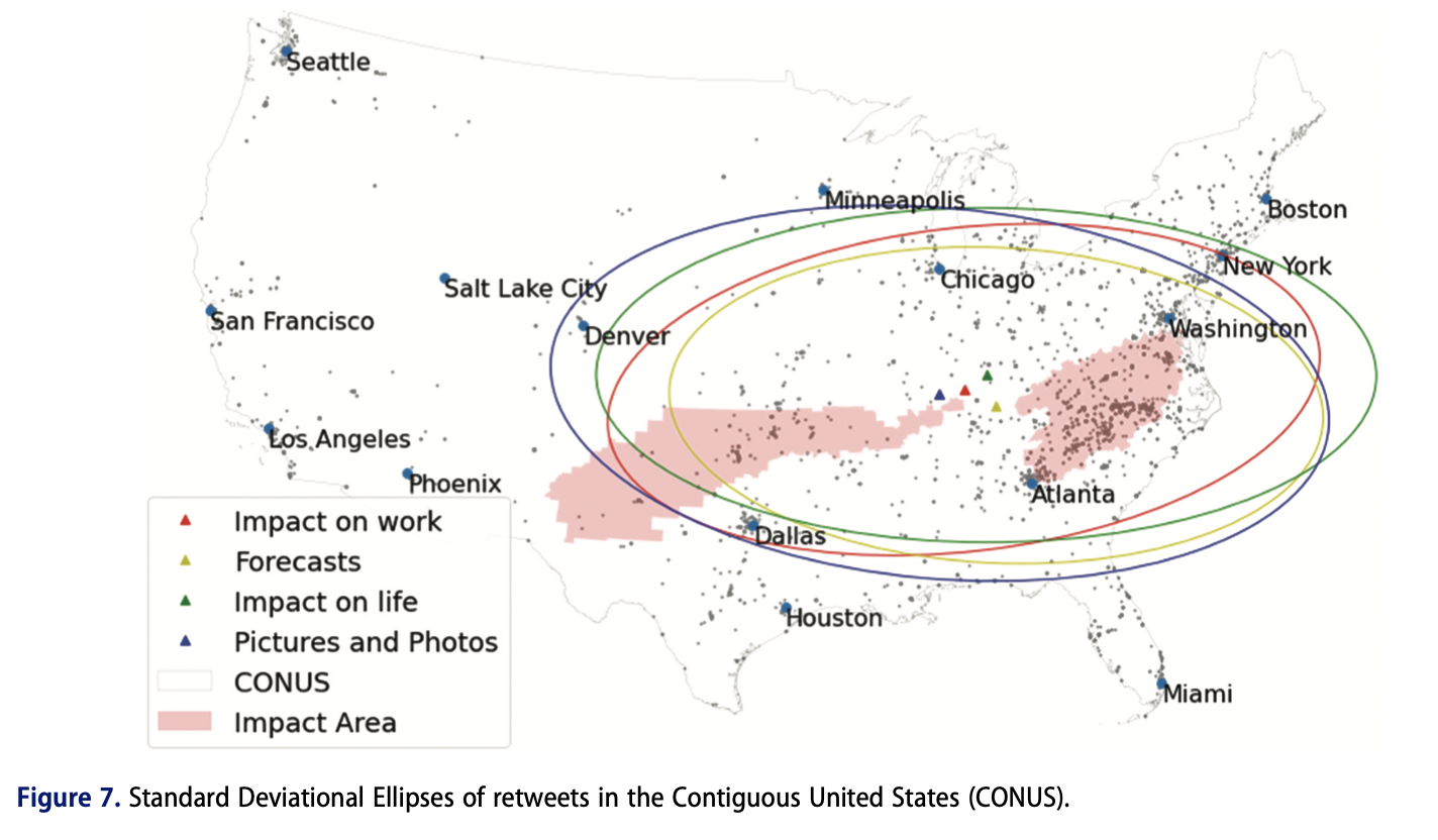
Deliverable
- Post a comment in the Emerging Theme Discussion (L7) forum that describes how you imagine integrating social media mapping into a successful geospatial system for emergency management. How would you deal with the various aspects of uncertainty that these data sources entail? What emergency management phase do you think social media data is most useful for?
- In addition, provide a link and short description to a social media application to emergency management or public safety ‘in the news’ or that you have otherwise come across.
- The initial post should be completed during the first 5 days of the lesson.
- Then, I'd like you to offer additional insights, critiques, a counter-example, or something else constructive in response to your colleagues on two of the following 5 days.
- Brownie points for linking to other technology demos, pictures, blog posts, etc., that you've found to enrich your posts.
NOTE: Respond to this assignment in the Emerging Theme Discussion (L7) forum by the date indicated on the course calendar.
Grading Criteria
This discussion will be graded out of 15 points.
Please see the Discussion Expectations and Grading page under the Orientation and Course Resources module for details.
Term Project - Take a Break

This week, I'll be reading each of your term project drafts and providing my feedback. So, for now, you can relax a little about your project and focus on the rest of this lesson.
Summary and Final Tasks
This week, we have explored how scenarios can be used to predict and plan for how GIS can be used for emergency management situations. Scenarios are stories developed around a hypothetical disaster situation, and they are used quite commonly in planning activities as a way to predict what will happen in a real situation.
You have worked with your classmates in this lesson to develop your own scenarios to see for yourself how scenario-based planning works. I hope you found it valuable to attempt this task with your colleagues. Most people who are charged with the task of planning a GIS for emergency management will not be working on that task alone, so the challenges posed by group work in this situation are quite relevant.
Scenarios are not easy to pin down. There are no universal rules as to what they should or should not include, and there are no automated tools available yet that can generate them. Scenario writing requires the synthesis of multiple types of knowledge, and, ultimately, it demands a fair bit of creativity on behalf of the author(s).
Next, we will apply what we have learned so far about the dimensions of emergency management and ways to plan GIS systems to support emergency management tasks. In the next lesson, we will work together on a case study research project to understand how GIS was used in the mitigation, preparation, response, and recovery from a recent disaster.
Reminder - Complete all of the Lesson 7 tasks!
You have reached the end of Lesson 7! Double-check the to-do list on the Lesson 7 Overview page to make sure you have completed all of the activities listed there before you begin Lesson 8.
Lesson 8: Case Study Collaboration
Overview & Checklist

Case Study Collaborative Project
This week, we will tackle our second collaborative project. This collaborative assignment is designed to pull together what you have learned so far in this class and apply it toward researching and critiquing the use of geospatial approaches and technology in a recent disaster. You will work in teams to gather and condense information to explain and critique how GIS was used in a real crisis situation - the 2021 Haiti Earthquake.
What You Will Learn
By the successful completion of this lesson, you should be able to:
- research and discuss how geospatial approaches can be applied in a real crisis;
- create a Story Map that summarizes what happened and what can be learned from a real crisis;
- critique the use of geospatial approaches and technologies in a crisis situation;
- identify leverage points for the use of geospatial for similar situations in the future;
- describe and discuss the use of geospatial artificial intelligence (geoAI) and its potential impact on geospatial systems for emergency management.
What You Will Do
Lesson 8 is one week in length. To finish this lesson, you must complete the activities listed below.
| To Read |
|
|---|---|
| To Do |
|
Please refer to the Course Calendar for specific due dates.
Questions?
If you have questions about the content or lesson activities, please post them to the General Questions and Discussion forum in Canvas. While you are there, feel free to post your own responses if you, too, are able to help a classmate. If your question is of a personal nature, please email me directly through Canvas.
Lesson 8 Group Haiti Earthquake Analysis
This week, I would like you to work together to research key phases of emergency management, and the use of geospatial analysis to support them for the 2021 Haiti Earthquake. Each group will be assigned to evaluate one or two phases of Emergency Management:
Group 1 - TBD - Topic: Preparedness following the 2010 Earthquake (focus on period from 2016 to 2021)
Group 2 - TBD - Topic: Response / Relief in the immediate aftermath of 2021 Earthquake
Topics not covered this term:
Group # - TBD - Topic: Recovery between 2010 and 2021 Earthquakes
Group # - TBD - Topic: Mitigation/Preparedness for next major earthquake
Assignment Guidelines and Criteria
You will be researching the 2021 Haiti Earthquake, [191] which caused massive loss of life and property. Each group should create a Story Map [181] using ArcGIS Online [183] for their phase of emergency management according to the following criteria:
- One Section describing generally what happened to people and infrastructure.
-
One Section identifying the key stakeholders and their needs.
-
2-3 Sections about how geospatial was used during this phase. At a minimum, answer the following questions. !hat worked and what did not work? Did geospatially-oriented social media play a role? If so, how?
-
Include at least three pictures and/or videos (more = better) and link when appropriate to external sources that back up what you are reporting.
-
Together, I'd like you to create at least one analytical product using one or more of the datasets I've linked to here (or others you find on your own).
-
Maxxar Open Data Program [194]
This analytical product should include a map and supporting graphics/text such that it can stand on its own if it were distributed widely. It's up to your group what you would like to highlight - there are dozens of datasets out there now and a wide range of possible stories you might try to tell using them. Creativity is encouraged!
Collaborating
Since you are working in small groups, collaboration should be fairly straightforward, I suggest the following -
- Get organized - Review the assignment requirements and decide on what you are going to do. Come up with a division of labour e.g., someone might collect content, someone might develop the maps and someone might assemble the Story Map. Make a plan and stick with it, and keep in mind you don't have a lot of time.
- OneDrive and Office 365 Apps - Create a folder in OneDrive and share it with your group. Collect any images or other resources needed for your Story Map. Consider using PowerPoint to create a 'storyboard' to layout your content before moving it to ArcGIS Online.
- ArcGIS Online and Story Maps - Create a group and invite your classmates. You should be able to enable simultaneous editing of the StoryMap. Note that web maps / apps you create can be embedded in Story Maps along with a wide range of other content.
- Ask for help - Get in touch with the instructor if you are having any problems.
Deliverables
For this week's exercise, please submit the following items to the Lesson 8 Group Haiti Earthquake Analysis Dropbox in Canvas. See our Course Calendar in Canvas for specific due dates.
- Link to the Esri Story Map. Please include the topic number in the naming convention.
Grading Criteria
I'll assign grades by group. It is worth 4% of your total course grade and will be graded out of 20 points using the following rubric.
| Criteria | Description of Criteria | Possible Points |
|---|---|---|
| Content and Impact | Your group makes strong and logical arguments and provides analytical insights. Ideas are well organized, clearly communicated and relevant. All criteria are accurately addressed. Supporting details are shared, elaborated upon and demonstrate understanding. Examples are provided, and your StoryMap includes geospatial products, images or other multimedia that support content. | 14 |
| Clarity and Mechanics | Your StoryMap shows evidence of editing and careful proofreading. Writing is engaging and well-structured with excellent transitions between sections and visual content. Concepts are integrated in an original manner. | 4 |
| Team member evaluation | Confidential comments are provided on your experience working in your assigned group. | 2 |
| Total Points | - | 20 |
Emerging Theme: Geospatial Artificial Intelligence (geoAI)
We hear a lot about artificial intelligence (AI) these days, and indeed AI is a rapidly expanding field finding applications in many aspects of our lives. Emergency management and geospatial applications are no exception. So, what is AI and GeoAI and how are they being applied to the phases of emergency management?
Artificial intelligence refers to a range of approaches and applications whereby computers are trained to simulate intelligent human behavior and act in autonomous or semi-autonomous ways. AI systems are also able to process and learn from vast amounts of data that are difficult if not impossible for humans to readily understand.
Optional
If you want to learn more about AI or don’t feel like you have a very good understanding of what it is all about, have a look at these resources (optional):
- Short ‘whiteboard’ video - What is Artificial intelligence? [195] (5:27)
- Online article from IBM - A beginner’s guide to artificial intelligence, machine learning, and cognitive computing [196]
What about geospatial artificial intelligence (geoAI)? I’d like you to have a look at two videos that illustrate some of the current characteristics of geoAI and where it is heading. The first video is a presentation on machine learning and the prediction of road accidents from a recent Esri conference (8:50 minutes). It provides a good overview of geoAI and an interesting application to illustrate what’s currently possible with one of the main GIS software systems.
[MUSIC PLAYING]
OMAR MAHER: Artificial intelligence is all over the news-- deep learning, self-driving cars, robots will take over the world, you name it. But it really boils down to three main categories. AI is the paradigm of computing, to get machines to be as smart as humans. Machine learning is a subfield of AI. It's about learning from data to derive rules and detect patterns instead of being explicitly programmed by humans. And deep learning is a specific machine learning technique using deep neural networks, which is really good, with high dimensional data like voice, image, and videos.
But maybe you're asking yourself what does this have to do with ArcGIS and my work in 2018. Do we have machine learning in ArcGIS today? The answer is yes. We do have machine learning tools in ArcGIS, and we can integrate with deep learning and machine learning engines as well. You can use the existing machine learning tools in ArcGIS for three main things-- predictions, clustering, and classification.
For example, for prediction, you can use geographically weighted regression to predict the impact of global climate change on local temperature. For clustering, you can use space times cubes to analyze the fading and emerging hotspots across space and time for a phenomena like accidents. And you can use support vector machines for classification to classify impervious surfaces from high-resolution imagery to better plan for flood. In addition to that, ArcGIS can integrate with machine learning and deep learning engines as well.
And that what I want to show you today. We are going to use ArcGIS Pro with scikit-learn of Python, a powerful machine learning engine, to predict the accident probability per segment per hour in Utah. And before jumping to machine learning, we asked ourselves, what could cause an accident in the first place? Is it more like weather factors, like snow, rain, and fog? Is it temporal aspects like time of day, day of the week, rush hour maybe? Is it spatial aspects like proximity to intersections or the road width or the road curvature?
There might be tons of variables. And the kind of data that we need to train our model is really large. We're talking about seven years of accidents data-- 400,000 accidents, 500,000 segments. It's nearly impossible for any human to analyze this manually and find the deep correlations and predict. But what about passing all of these data inputs to the machine to let it help us to find the patterns and predict those risk segments?
We're going to do three main things. First, we're going to use ArcGIS Pro to prepare our training data and explore the data. Then we're going to pass it to scikit-learn to train the machine learning model. And finally, we're going to see the predictions visually using ArcGIS online versus the actual accidents. So why don't we just see this in action? So we're bringing all of these data points to ArcGIS Pro. We grab in the road network layer, all of the collisions. We spatially join them with the road network layer. The average daily traffic, as you can see, it differs according to segment, the intersections, whether there are signal lights or not. We get weather feeds from about 27 weather stations at Utah.
And you can notice that many accidents are happening near intersections. And many of them are happening on roads with high curvature. So we extract those spatial features, like road sinuosity and proximity to intersections and speed limit and others. And finally, we add the billboards data set to see if there is a correlation between the location of billboards and accidents. And all of this data processing and preparation could be automated in Jupyter Notebooks using Python.
So we use the arcpy to start creating our GDB database, extract that data from online and offline sources-- the data of accidents, intersections, and others-- and start doing our spatial feature extraction. So for every segment, we want to calculate the proximity to the intersection, the speed limit, the degree of sinuosity, and many other spatial parameters. And finally, we joined the weather feeds and accidents to the road networks.
Now, we have our training data ready. We start passing it to scikit-learn to train our machine learning model. We use the Python API. To do this, we import scikit-learn, and we start loading our training data set. So, as you can see, for every accident in the last seven years, we have about 40 different spatial, weather, and temporal feature-- temporal features, like hour of the day, week of the day, month; spatial features like sinuosity and length and proximity to intersections; and weather features like snow, raining, foggy, and more.
One thing to mention that it would have been extremely challenging to prepare this training data set and extract those features without ArcGIS Pro. We have used lots of Geoprocessing functions to prepare this data set. Now, we are ready to train some models. We're using a powerful machine learning algorithm called gradient boosting. Not only it's good with predictions but also with explaining why those prediction's happening. We split our data into training and test data-- 90% training, 10% testing for validation. We play with some hyperparameters, like the number of trees in that model, the depth of each tree, and some other factors. And we finally start training our machine learning model.
And this is the first outcome of the model. These are the top factors behind accidents based on the data that we have analyzed. You can see that there is lots of weather factors like temperature, visibility, and wind speed; temporal factors like hour of the day or month of the week; spatial factors like sinuosity or average daily traffic or the road being one way or another. Now, we want to see the actual predictions of that model. We want to calculate the risk score for every segment and see if the actual accidents actually did match that.
Today is December 3rd. It's snowy. It's icy, and it's raining. And we want to see the area of Woods Cross. So our model predicts that the interstates, the highways, and some inner roads have some risk. The color reflects the risk. Red being the highest. Green being the lowest. Orange is still risky but not as red. So where did the actual accidents happen? Here we go. We find that nearly all of them are happening on those segments that we have predicted with high score. You can see that they are happening on the interstates, the highways, and some internal roads, like this one here, for example, and that one here, happening on this inner road, which is curvy.
Let's go to the area of South Salt Lake. It's near to downtown, and we expect lots of accidents. So our model predicts that the interstates and highways have higher risk and some inner roads. Notice that this area is a bit greenish. This area here has more risk. And the actual accidents actually happened on the highways and many of the inner roads as well. You can see a pattern here that many of those accidents, especially in the inner roads, are happening near to intersections like this one, that one, and this one here.
Finally, we can see the area of South Valley Regional Airport. These are the predictions, and those are the accidents, again, happening on the highways and some inner roads, this curvy road. We have used machine learning to understand why accidents happen and predict the risk per segment.
And that's one application. We have many other applications. We have used deep learning with satellite imagery to detect objects at scale. And we have used it actually with historical origin, destination data to predict accurately the arrival times of vehicles. And we have used machine learning with GPS traces from vehicles from some oil companies to automatically detect new road segments and automatically register them to the network. Thank you.
The second video is an interview with Nigel Clifford the CEO Ordinance Survey, the UK’s national geospatial agency where he talks about the future of AI and geoAI in particular (4:35 minutes).
[MUSIC PLAYING]
AMIT RAJ SINGH: Joining me right now is Nigel Clifford of Ordnance Survey. How is Ordinance Survey using artificial intelligence and automation?
NIGEL CLIFFORD: We are both researching it and we're using it. And that's the way that you get progress. So it's not just about theory. It's also about practice. So we are investing in academic research. We're are sponsoring some PhDs in local university, looking at deep learning and machine learning. But then we're also bringing that back into the business.
So when we look at aerial imagery, we're looking at auto change detection, where we are taking our aerial imagery, we are classifying the features, we're comparing those features automatically with previous versions of the map, and therefore, we're able to spot the changes which are occurring.
So that is a form of machine learning. It's a form of artificial intelligence. But I would say we're still very much looking at the tip of the iceberg of what can be provided here. So we're very excited about it. We're investing in it, but we're still way, way, way to go, in terms of the full potential.
AMIT RAJ SINGH: How do you see it fundamentally changing the way we work?
NIGEL CLIFFORD: If we allow ourselves to think very freely, then it should help us in terms of decisions, it should take away a lot of the more mundane activities that we're involved in. It should also allow us to come up with more answers because it's going to be able to probe and analyze datasets, which the human mind would just never be able to cope with.
So I think the impact of this on human society is going to be very profound. And one of the aspects that I spoke about during the presentation is, that gives rise to some interesting issues for insurance companies, for governments, for public bodies, for private bodies, when you've got an artificial intelligence, which is making decisions. How far do you need to be able to explain those decisions to the citizen, or the customer, or the buyer of a service? So there's some huge potential there. But also, there are some speed bumps that we're going to have to navigate before we get up to full speed on artificial intelligence.
AMIT RAJ SINGH: And how do you see geospatial fit into this change?
NIGEL CLIFFORD: Geospatial, at one level, it's another huge dataset, which can, therefore, be utilized by machine learning and deep learning to help make its findings more accurate. It's also going to be a huge user of machine learning and artificial intelligence. So as I was saying, talking about change detection, that's one obvious area. But also, talking about things like autonomous vehicles or smart cities, those are going to be geospatial related. So we sometimes call geospatial the golden thread, which links so many different datasets, and so I think geospatial is going to be absolutely at the heart of making sense of these trillions of bits of data which are going to be in the ether and being looked at by big machines.
AMIT RAJ SINGH: Because of artificial intelligence, we might lose plenty of jobs. Some estimate that we will lose 40% of the workforce. How do you see this for a country like India, which is heavily dependent on human labor?
NIGEL CLIFFORD: I think one of the key aspects is it allows further levels of innovation, it allows further levels of capability to be brought to bear to the problems of any country, or company, or institution. So I would be optimistic and say, actually, it's going to provide more answers and provide more freedom for individuals to make a profound impact on their country. So I would be optimistic about it rather than pessimistic.
AMIT RAJ SINGH: How do you see artificial intelligence and deep learning help us in our third industrial revolution that we are talking about?
NIGEL CLIFFORD: One example would be it would help manage risk. So as we go into the next generation of services or the next generation of health issues, I think it will help us come to conclusions more quickly. It will also help us look at more options, more rapidly, and it will also help us paint some of the risks more clearly and more precisely than ever before.
So I think the use of this in predictive modeling is going to be one of the big steps for cities, for individuals, for companies, for governments. So I think that's a really powerful change, that you don't have to go and do something before you begin to understand the implications, you can model it out and model it in fine detail. That's never been able to be done before.
Optional
If you want to learn more about geoAI, have a look at this recent paper by Trang VoPham et al from 2018. At the very least, it will be a good resource if you come back to the topic of geoAI in the future.
Finally, I’d like you to consider a few examples of AI and geoAI applied to recent emergency management problems. The first is a presentation from Robert Munro, CTO Figure Eight, at the recent CogX AI conference (18:47 minutes). While not specifically focused on geoAI, geospatial problems figure through most of his presentation. Contrast this perspective with what we saw from Esri in the earlier video. The second video is a quick recap of the surf rescue video you saw in the UAV exercise in Lesson 2.
DR. ROBERT MUNRO: Thank you. It's great to be here this afternoon and to talk about a topic which is really dear to my heart. How can we make sure that AI can help us respond to people when they're most in need? I'm Robert Munro. I'm the CTO of a company called Figure Eight. Until recently we were known as Crowd Flower. You might be familiar with that as the company name. Recently rebranded. We make the most widely used software for annotated training data and build complete AI systems that go from raw data to deployed models. So if your car parks itself, your music is based on recommendations, your fruit is scanned between farm and table, you're probably using AI that we ship.
But today I'm going to talk about one particular application, AI for disaster response because this was actually my path. My path in artificial intelligence was not a typical one. Out of undergraduate while I'd studied AI, I didn't really expect to have a career in it because there really weren't careers back at that time.
And so I went and worked as an engineer globally, I had this one experience in the mid-2000s. So I was working for the United Nations High Commission for Refugees. I was working in refugee camps in Liberia and in Sierra Leone where I was living at the time, and we were installing solar power systems at schools and clinics supporting refugee camps so that these schools and clinics could be more self-sufficient.
And it was while I was there at one of these very remote clinics in Liberia that I was standing there. We were already kind of late getting in, so I had to build this system, we had just two days, we had to move on to the next place. And someone came up to me in this village and they're like hey, we think some new refugees just came over the border from Cote d'Ivoire into the neighboring valley, but we don't know much about them. And of course, they came up to me because we were the ones there working for the UN Refugee Commission and installing solar power.
But frustratingly, we couldn't find out anything about them. It was just one valley over. We didn't know if there were 10 or 10,000 refugees there. And what was especially frustrating was that I had five bars of cell phone reception. I had perfect cell phone reception and no doubt some of the refugees did as well, and they were probably bouncing their cell phone signals off that same tower that I was.
But even if I could connect with them, they would have spoken one of a half a dozen local languages for which there certainly weren't machine translation systems and other AI that we took for granted even 15 years ago, like search engines and spam filtering, it wouldn't have worked in any of those languages as well. So even if we could connect, there wasn't much we could do.
Ultimately in this use case, we just had to report back to the capital Monrovia that maybe there are refugees there. We don't know how many. We weren't able to find out. So that really motivated me, because I thought, well, you know, I'm not really needed to be on a roof drilling in solar panels, a lot of people can do that. Someone employed locally can do that. But I had studied AI, so I thought, well, how can I help AI be adapted to more languages? And so that's what motivated me at that time to move to Silicon Valley, where I got a Ph.D. focused on natural language processing for health and disaster response at Stanford looking at how we can adapt to low resource languages in this context.
And while I did that I continued to work in disaster response. And so the first time we were able to deploy AI in a disaster response was in 2010. I'm sure a lot of you remember in 2010 a very large earthquake hit Haiti in January of that year. More than 100,000 were people killed immediately, and more than a million people were left homeless, and so working with a number of people in the international response community, we were able to set up a phone number, like a 911, or I guess I should say, I forget, triple one in the UK? The equivalent of 911? 999. All right. Everyone who's visiting, take note in case of emergency later.
So we were able to set up the equivalent of a 999 service in Haiti because most of their cell phone towers were still working. Calls weren't getting through, but text messages were. So on broadcast radio, we could advertise that people could call the service to report their needs or resources if they had any, and we could link them with international responders. But we had this problem in that the majority of text messages were sent in Haitian Creole, the one language that most people spoke there, and the majority of the international response community only spoke English as their common language.
So messages like you could see on the left, which were really important. So a hospital running out of supplies, someone undergoing childbirth, someone needing search and rescue, couldn't be understood by the people coming into the country. So it fell on me to find and manage people who spoke both English and Haitian Creole to do real-time translation, categorization, and mapping of these messages so that a plain text message sent in Haitian Creole could be an English report categorized with the exact longitude and latitude for the international response community.
So in 48 hours I was able to define and ultimately manage about 2,000 members of the Haitian diaspora who were able to join us from 49 countries worldwide and in real time be able to complete this translation and use their local knowledge in a way that just simply wouldn't be possible if you weren't from that region. We're also integrating with AI systems here. So taking a message in Haitian Creole in its English translation, we're able to feed that parallel data to machine translation engines at Microsoft and at Google, and they quickly released the first ever machine translation systems for Haitian Creole and English within a week of the disaster, based in part off the data that we were able to give to them for emergency messages. And as many of you who work in machine learning will know, the fact that these were somewhat messy social messages and they were about the topics of health and disaster response means that the machine translation systems were then also better in messages related to health and disaster response.
One of the big takeaways here was the importance of engaging the local community in this process. So just imagine that we'd already solved the problem of machine translation and you had a message that looked like this. Sacred Heart Hospital in the village of Okap is ready to receive patients. So looking at this map here, who can see Okap on this map? No one? I'm going to zoom in a little. It's up here. Anyone? Okap? No? I'm going to zoom in once more. See it now? No, right? It's difficult to see. So Okap is actually slang for Cap-Haitien. And once you're told that, it kind of makes sense. So Cap-Haitien with a C-A-P in the language becomes K-A-P, the same way a hard C and a K might alternate in English and German. O is a marker for a location, just by coincidence, as it can begin in Gaelic. So these follow linguistically consistent rules, but if you don't know what the slang word is, you could spend a long time looking for this. And Cap-Haitien is the second largest city after Port au Prince in Haiti. This isn't a small city. So your knowledge of the existence of the city might not be enough.
So working with these Haitians worldwide, they were able to use their linguistic knowledge, but also their local knowledge. Because if you're from there, you would actually know that Sacred Heart Hospital was about 15 kilometers south of the city itself in a smaller town called my Maillot. So again, something very important if you're evacuating in this case by helicopter people to a given location.
So to share one example of people collaborating to find this out. So here we have two people collaborating, Delilah in San Francisco, Apo in Montreal to try and geo-locate a message. So, on this online chat with people coordinating, Delilah saying I need Thomassin, Apo, please. So where is Thomassin, and Apo immediately replies, here is the longitude and latitude. It's in this area after Petion-Ville, Google Maps isn't there. And if you look at Google Maps at the time, you can see that yes, like this is just a bend in the road, none of the suburbs or roads are labeled there.
But Apo grew up there, so he can drop a pin exactly which generates a longitude and latitude, which means that the responders can go out and address this issue. In this case, it was a breach birth. It was nice. This was probably going to be a troubled birth regardless. And so for a small period of time following this disaster, they had some of the best physicians in the world able to respond to this particular medical emergency.
I think It's very interesting that you know because I knew this place like my pocket, I know this place like the back of my hand, and Delilah says well, thank God you're here. And it's interesting to think about where here is. I mean, did hear mean the online chat room? Is it San Francisco? Is it Montreal? Or is it with Haiti? It shows how people can collaborate globally in order to work together to solve some of our biggest problems.
So that was my path. Disaster response, Stanford University. I founded a few companies in the AI space in San Francisco. Immediately before joining Figure Eight, I was running product for a natural language processing and translation at AWS, helping convince them to be multilingual in their first ever products, which I think itself helps a lot of people. And the reason this is important is that I wonder what, you know, what's your intuition? So how much of the world's conversations daily is English? On a given day, how many of the world's conversations are in the English language?
So the answer is 5%. Just 5% of the world's conversations are in English, and that's fairly consistent. But about 95% of AI only works in English or only works well in English. And if you speak a minority language, you're disproportionately more likely to be the victim of a man-made or a natural disaster. And also education between men and women will favor men for dominant languages. You get the same divisions across ethnicity.
In fact, race in parts of the Amazon is determined by your language more than your actual ethnicity. So this linguistic bias is also a gender and a racial bias that we have in our AI today. I think this is one of the biggest problems that we're facing, is what AI technologies are available for everybody in the world.
One really interesting and also linguistic use case that I've worked on, again, before I joined the company, but using Figure Eight's technology, is epidemic tracking. So this is the famous map from Jon Snow. Like, not that Jon Snow, but the 1800s Jon Snow, who discovered a cholera outbreak using geographic information mapping just down the road here in London.
And so disease outbreaks are still the largest killer in the world, and no organization is tracking them all. You might have seen movies where people have great big screens and it's a heat map and it flares up every time there is an outbreak. That doesn't exist anywhere. And the budgets for those movies probably exceed the budgets of any one organization actually tracking disease outbreaks globally.
And this is pretty scary, because in the last 75 years, we've only eliminated one human disease, smallpox, and the amount of air travel has increased greatly. And we definitely put a lot of resources into stopping terrorists getting onto flights, but a pathogen is more likely to sneak onto a flight undetected. It's certainly been responsible for many more of the world's deaths. And the reason that this is a linguistic problem is that 90% of the world's pathogens come from this thin band of the tropics. This thin band of the tropics has 90% the world's ecological diversity, including things that can kill us.
By maybe coincidence, maybe not, the same thin band of the tropics has 90% of the world's linguistic diversity. So what that means is that the first time that somebody notices an outbreak, they're speaking about it in one of 6,000 different languages, and chances are that language is not English or Spanish or Mandarin. It's not a dominant language. We can actually go back in time and find reports of disease outbreaks weeks, months, sometimes decades before they're finally put in front of virologists and identified as being a new pathogen that we need to track. Every single transmission is a possibility that these could mutate to become more fatal, and so we want to get ahead of any outbreak as soon as possible.
So in the case of swine flu, we can find cables coming out of southern China weeks ahead of when this was identified as H1N5, as a new strain of the flu that hadn't been identified before. In the case of bird flu, we can find local newspaper reports in Mexico months before it was identified as a new strain of the flu, with telltale symptoms, like all the young people are sick in the village at the moment. So if you're a virologist or an epidemiologist, you're like, oh, right, this is obviously like a new strain of the flu. But in this paper, it was just remarked upon and missed. In the case of something like HIV, we can go back decades to find this kind of information.
So simply finding these reports as early as possible can help prevent epidemics. So epidemicIQ is an initiative that was trying to take millions of reports worldwide and find out which of these are relevant to disease outbreaks so that they're 15 to 20 per day, which really are new disease outbreaks that we care about can be put in front of the right epidemiologist and virologist of just for review. So those of you who speak Russian, Arabic, or what's the third language up there, Mandarin, you'll see that these are disease outbreaks categorized by the type of disease, the location that it's in, the number of people infected.
So we're able to use machine learning to filter that anything that might look like a disease, put this in front of crowdsourced workers, micro taskers for review, have them correct or reject the given machine learning analysis. Finally, put that in front of the domain experts for review. With all of that information from the analysts going back to the machine learning models, so it continually updated, adapting in about 15 different languages, including some here in Europe.
So in 2011, there was no outbreak of E. coli in Germany that had a number of fatalities. And we're able to show using this kind of online tracking of newspaper articles and social media in German, that we can get ahead of the European CDC in identifying the outbreaks and where they occurred.
It's something I've used it in smaller languages as well. So in partnership with UNICEF, using the same human in the loop AI process to adapt to a number of local languages in Nigeria. In this case, it was called the First 1,000 Days program. So from when a woman learns that she is pregnant, for the following 1,000 days through birth and beyond, tracking things like the number of vaccinations, the ongoing weight and changing weight of the child in order to help with maternal care. Again, having language independent AI that local analysts within Nigeria who spoke those languages could encode and then adapt to their given use cases.
And then we're just starting to see more use cases in computer vision in addition to natural language processing. So the company I was at at the time, we hosted aerial imagery analysis following Hurricane Sandy to identify what was not just a marshland but an actually flooded region, which FEMA used to help decide where to deploy their resources. Right through to some interesting use cases on our product today where people are using computer vision in sub-Saharan Africa to track elephants and people who are near elephants in order to identify areas where there might be poachers encroaching on the herds.
Something we're really proud to announce just a few weeks ago now is that we've made eight new open datasets available on our platform, all of which tackle either a social good problem or a particularly hard problem in machine learning. And two of them are particularly related to disaster response. So this is a map of some of the different dedicated workforces that we have on our platform, and as an extension, they speak a number of different languages.
So in this case, this is speakers of Swahili helping is in partnership with the Red Cross create Swahili recordings of a number of health and disaster response related messages in the Swahili language translations to English so that online translation systems, speech recognition systems, can become better across all these languages. So that's a Swahili translation speech and transcription.
And then happy to announce that as of tomorrow we'll have a new dataset available which is a collection of text messages, including the ones in Haiti, across a number of disasters, encoded for a number of common disaster response topics. And again, it's an open data set, so we're really hoping that anyone in the machine learning community can experiment on this data set, tell us trends about what people communicate in disasters that we don't already know, and then also come up with machine learning solutions that can help us automate or semi-automate the disaster response process going forward.
Thank you all for your time. I think I burned all my question time right now. I'm getting a nod back there. But I will be available at the speaker room after this session, immediately following. All right. Thank you all.
Artificial Intelligence Processing at the Edge: The Little Ripper Lifesaver UAV (2:05 minutes)
---> Breaking news: Here is an update on Little Ripper and its cousin CrocSpotter. [198]
[WAVES]
[MUSIC PLAYING]
EDDIE BENNET: Australia has a very long coastline, and that presents us with some unique challenges. Drones provide us with a great opportunity to get a lifesaving service outside of where we traditionally have those services now. In 2015, we used the first drone to fly along a beach and look for people in trouble and to save lives.
We used the drones in three ways. The first is for surveillance. So we're able to get vision and understand situations, understand when people might be getting into trouble. We have warning devices, loudspeakers fitted to the drone so that we can actually warn people that they are about to get into trouble or what to do if they are in trouble. And third thing is that we can intervene and deploy an automatically inflatable rescue device from the drone which can support up to four people. And it keeps them afloat in the surf, in the water until they can be rescued.
Earlier this year, on the Central Coast, a sandbank collapsed and 12 people were washed into deep water. A lifesaving drone was sent to the area and quickly located exactly where they were. Lifesavers responded to the area very quickly and all 12 people were saved.
TONI BURKETT: If we could get that longer flying time, it would be really helpful for our job as lifeguards as well as being able to fly in all weather, such as high winds and rain, because that's when we're going to need that aerial perspective. And if the integration of the lifesaving technology in the drones could be improved, such as the sharks' water, that would be really helpful in our jobs as well.
EDDIE BENNET: So if we can use artificial intelligence to help us detect people and respond to situations, then that is going to be a wonderful opportunity to save lives. Little Ripper Lifesaver have very advanced lifesaving drones. Intel has very advanced artificial intelligence. Imagine a world if we combine those two together. What a great opportunity to save life anywhere in the world.
Optional
Finally, I’d like to refer you back to the Digital Humanitarians textbook. As you know, this book provides a contrasting perspective to many of the government and private sector perspectives we consider. This is also the case with geoAI. If you have the time or want to come back to it later, I recommend Chapter 6: Artificial intelligence in the Sky.
Deliverable
- Post a comment in the Emerging Theme Discussion (L8) forum that describes how you think geospatial artificial intelligence (geoAI) might integrate with geospatial systems for emergency management. What are the big challenges associated with geoAI that we should focus our attention toward solving?
- The initial post should be completed during the first 5 days of the lesson.
- Then, I'd like you to offer additional insights, critiques, a counter-example, or something else constructive in response to your colleagues on two of the following 5 days.
- Brownie points for linking to other technology demos, pictures, blog posts, etc., that you've found to enrich your posts.
NOTE: Respond to this assignment in the Emerging Theme Discussion (L8) forum by the date indicated on the course calendar.
Grading Criteria
This discussion will be graded out of 15 points.
Please see the Discussion Expectations and Grading page under the Orientation and Course Resources module for details.
Term Project -Review Feedback On Your First Draft
By now, you should have received my feedback on the first draft you submitted in Lesson 6. You now have until the end of Lesson 10 to submit your final draft. Please dedicate some time this week toward incorporating some of the suggestions I've provided. If you are unclear about any of my comments or suggestions, get in touch so I can clarify things for you.

Summary and Final Tasks
This week, you took on the task of developing a case study analysis of the 2021 Haiti earthquake, focusing specifically on the role of geospatial analysis during emergency management phases. This was presented via a Story Map that can be shared with others in an interesting and accessible format. We also discussed the AI and how it is being developed in the geospatial realm as geoAI. I like that this class juxtaposes a consideration of the practical needs of emergency management now with cutting edge trends that are changing things very quickly. I didn't ask about this earlier, but can you envisage ways geoAI (or other emerging themes) could be brought to bear if the Nepal event were to happen now? As we have seen, what seemed to be impossible or cutting edge a few years ago are mainstays today.
Next week, you will consider another case study about an event that occurred late in 2018, the Sulawesi earthquake and tsunami. This event has so many interesting dimensions, many of which we have been studying and discussing in this class, including logistics, social vulnerability, multiple hazards, national and international responses, and even civil unrest! For the final Emerging Theme, we will revisit some of the real-time GIS advances covered in Lesson 5 in greater detail by discussing the Internet of Things (IoT).
Reminder - Complete all of the Lesson 8 tasks!
You have reached the end of Lesson 8! Double-check the to-do list on the Lesson 8 Overview page to make sure you have completed all of the activities listed there before you begin Lesson 9.
Lesson 9: Case Study – 2018 Sulawesi Earthquake and Tsunami
Overview & Checklist
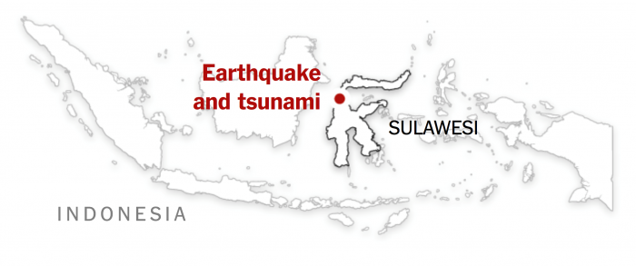
This week, we will learn about how geospatial approaches and technologies were used to respond and recover from the 9.28.2018 Sulawesi [200] Earthquake and Tsunami in Indonesia [201]. This disaster required a large-scale response from many entities including response organizations around the world. The geography of the affected area made it very difficult to reach victims and assess the damage - posing a variety of challenges to geospatial analysts that we will explore this week.
What You Will Learn
By the successful completion of this lesson, you should be able to:
- identify and critique the ways in which GIS was used to respond and recover from the 9.28.18 Sulawesi, Indonesia Earthquake and Tsunami;
- explain the complexity associated with very large disasters that international cooperation;
- revise the final draft of your term project;
- describe and discuss the Internet of Things (IoT) in emergency management situations.
What You Will Do
Lesson 9 is one week in length. To finish this lesson, you must complete the activities listed below.
| To Read |
|
|---|---|
| To Do |
|
Please refer to the Course Calendar for specific due dates.
Questions?
If you have questions about the content or lesson activities, please post them to the General Questions and Discussion forum in Canvas. While you are there, feel free to post your own responses if you, too, are able to help a classmate. If your question is of a personal nature, please email me directly through Canvas.
28 September 2018
Sulawesi, Indonesia Earthquake and Tsunami
On September 28, 2018, at 6:02 PM local time, a 7.5 magnitude earthquake struck in central Sulawesi, Indonesia. The quake triggered a tsunami with a maximum height of 4-7 meters (13-23 feet) causing massive destruction. There was also widespread destruction due to soil liquefaction, landslides, flooding, and aftershocks (see below). There have been over 2,100 confirmed dead, 10,679 injured, and over 5000 still missing. There was mass disruption to transportation links which delayed response and recovery efforts.
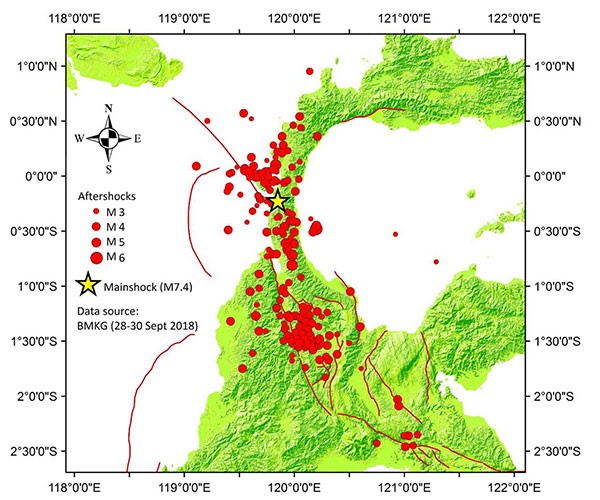
The earthquake occurred in a part of Indonesia that is diverse both in terms of human settlement patterns and environmental factors. It contains relatively large settlements such as Palu (population 335,297 in 2010) as well as small and remote rural settlements. The triple impact of the earthquake, tsunami and land movement made it extremely difficult to locate people in need and deliver food and medical assistance. The recovery effort has also been challenging.
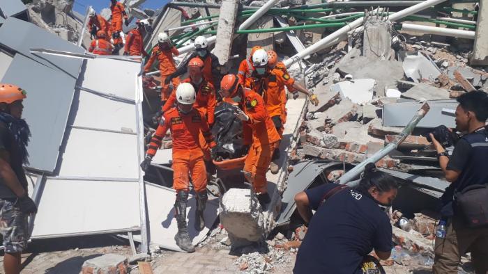
Putting Yourself There
To get a sense for what this all looked like on the ground, please consider the following:
- Review: Catastrophe in Sulawesi [203] – The Straits Times (Oct 2, 2018)
- Visit: BNPB Geospatial [204] (Use Google Translate)
- Listen to the 3:51 minute audio report from NPR or read the transcript [205]
Reading Assignment and Short Project
Now that we have a better understanding of what happened in Sulawesi during and right after the earthquake and tsunami, I'd like you to read about three topics related to Indonesia’s disaster vulnerability and preparedness. These touch on themes we've considered earlier, e.g., social vulnerability, planning and preparedness, and emergency communications.
1. READ
Social vulnerability to natural hazards in Indonesia: driving factors and policy implications (2014) in the Journal of Natural Hazards. You can find this article on the following page in Canvas.
The first reading is a journal article about measuring and mapping social vulnerability in Indonesia and how this can be used to inform policy (you first encountered way back in Lesson 3), As you read this, think about how it fits or contrasts with what you learned about who was impacted the most by the 2018 event.
2. READ
Chapter 9: Spatial Planning, Disaster Risk Reduction, and Climate Change Adaptation Integration in Indonesia: Progress, Challenges, and Approach (2017) in the recent book Disaster Risk Reduction in Indonesia. You can find this book in the Penn State Library [95] and/or on the following page in Canvas.
The second reading focuses on the role of spatial planning in Disaster Risk Reduction (DRR) efforts in the context of current vulnerabilities and changing vulnerability with climate change. There are two key points I'd like you to take from this reading. The first is the concept of Disaster Risk Reduction, and the second is the idea that the current hazard and risk profile of a given area is not fixed and may be exacerbated by factors such as climate change or rapid urbanization.
THINK ABOUT
What is your reaction to these two papers in light of what we have covered in this class? Reducing risk and vulnerability is a complicated task and perhaps a lot less straightforward than Preparedness, Response, and Recovery. How do you think emerging technologies, especially geospatial, can accelerate the process of DRR?3. READ
Finally, have a look at the following online resources about tsunami warning systems.
- What is a tsunami and how are they monitored? [206]
- What Went Wrong With Indonesia’s Tsunami Early Warning System [207]
- Would the U.S. Tsunami Warning System Have Averted Indonesia’s Disaster? [208]
The final readings take a different direction and discuss tsunami warning systems, how they are meant to work and what happen during the 2018 Sulawesi event.
THINK ABOUT
How might you use geospatial technology in new ways to facilitate disaster warnings? These articles deal with tsunami warning systems, but how might this work with other types of emergencies such as other large-scale events or small-scale events like an active attacker incident? Finally, what are some of the issues associated with providing early warning to everyone versus just to first responders and emergency managers?
Emerging Theme: Digital Twin
This week’s emerging theme topic, digital twin, brings together most of the emerging themes (and other content) you have learned about over the last few weeks.
The basic idea behind a digital twin is to build a virtual version of a real world system by integrating a wide range of datasets and models. The twin allows you to examine the way the system works and to see the effects of potential changes. They may also incorporate machine learning are are able to learn and change over time as new information is added.
For example, a digital twin of an aircraft engine allows engineers to understand maintenance needs and performance issues under real world and modelled conditions. For example, Rolls-Royce feeds inflight sensor and instrument data via satellite link its digital twin.

Rolls-Royce UltraFan TurboFan - Source: Rolls-Royce [209]
Read this short article on Rolls-Royce’s IntellgentEngine program: How Digital Twin technology can enhance Aviation [209]
You may hear digital twin talked about in the context of the “multiverse”. This language is a bit trendy, but the basic point is that a digital twin provides a way of creating / testing out new ideas or looking at problems in different (endless??) ways. A basic example might be modelling the potential impact of different road intersection options on pedestrian safety. On a much broader scale, and in an emergency management context, a digital twin may be used to understand the cascading impacts of major flooding in an urban area. Impacts that may not be obvious using traditional GIS or statistical analysis.
What is a Digital Twin?
WATCH
What is a Digital Twin? How does it work? (1:56)
Source: Geospatial World
Digital Twin Sydney (4:24)
Source: L - Touch
TAKE A QUICK LOOK / KEEP FOR REFERENCE
Have a quick look at these two websites that provide some detailed information about Digital Twin from the point of view of two software developers in this space.
- Digital Twins Explained: A Guide for the Built Environment [210] from the New Zealand Company, 12d Synergy. This guide is also available for download.
- Next look at ESRIs (more flashy!) Digital Twin website [211] and go ahead and download a copy of their eBook [212] for future reference.
Take note of how familiar geospatial and data science methods and technologies are used in the context of a Digital Twin.
Digital Twin – Examples
Now, look at this short video and have a play with the New South Wales Digital Twin
New South Wales Digital Twin
Source: New South Wales Digital Twin [213]
Now spend a few minutes exploring the data sets and tools on the New South Wales Digital Twin web portal [214]
End your exploration with this short article about how the NSW Digital Twin to inform emergency planning this bushfire season [215].
Climate Resilience Demonstrator
The following video and interactive app were created as part of The Digital Twin (DT) Hub [216] by the Centre for Digital Britain at the University of Cambridge. It will probably make you think about the scenario development group project you completed a couple of weeks ago. Start by watching the video and then move on to the interactive app.
Tomorrow Today - a CReDo film, and Interactive App (6:21)
Source: Digital Twin (DT) Hub [217]
Now, work through the interactive app [218].
TAKE A QUICK LOOK / KEEP FOR REFERENCE
If you are interested in taking a deeper dive into the topic of Digital Twin, you may want to look at the follow recent journal papers. They provide nice reviews of the history of DT and their applications in disaster and emergency managment. No need to read these carefully - Just skim / have a look at tables and figures. Note PDF versions are on the following page in Canvas.
Disaster City Digital Twin: A vision for integrating artificial and human intelligence for disaster management
Chao Fan, Cheng Zhang, Alex Yahja, Ali Mostafavi 2021. International Journal of Information Management, Volume 56
Abstract: This paper presents a vision for a Disaster City Digital Twin paradigm that can: (i) enable interdisciplinary convergence in the field of crisis informatics and information and communication technology (ICT) in disaster management; (ii) integrate artificial intelligence (AI) algorithms and approaches to improve situation assessment, decision making, and coordination among various stakeholders; and (iii) enable increased visibility into network dynamics of complex disaster management and humanitarian actions. The number of humanitarian relief actions is growing due to the increased frequency of natural and man-made crises. Various streams of research across different disciplines have focused on ICT and AI solutions for enhancing disaster management processes. However, most of the existing research is fragmented without a common vision towards a converging paradigm. Recognizing this, this paper presents the Disaster City Digital Twin as a unifying paradigm. The four main components of the proposed Digital Twin paradigm include: multi-data sensing for data collection, data integration and analytics, multi-actor game-theoretic decision making, and dynamic network analysis. For each component, the current state of the art related to AI methods and approaches are examined and gaps are identified.
Keywords: Digital twin; Machine learning; Information flow; Disaster management
Digital twin-driven intelligence disaster prevention and mitigation for infrastructure: advances, challenges, and opportunities
Yu, D., He, Z. 2022. Nat Hazards 112, 1–36 (2022).
Natural hazards, which have the potential to cause catastrophic damage and loss to infrastructure, have increased significantly in recent decades. Thus, the construction demand for disaster prevention and mitigation for infrastructure (DPMI) systems is increasing. Many studies have applied intelligence technologies to solve key aspects of infrastructure, such as design, construction, disaster prevention and mitigation, and rescue and recovery; however, systematic construction is still lacking. Digital twin (DT) is one of the most promising technologies for multi-stage management which has great potential to solve the above challenges. This paper initially puts forward a scientific concept, in which DT drives the construction of intelligent disaster prevention and mitigation for infrastructure (IDPMI) systematically. To begin with, a scientific review of DT and IDPMI is performed, where the development of DT is summarized and a DT-based life cycle of infrastructures is defined. In addition, the intelligence technologies used in disaster management are key reviewed and their relative merits are illustrated. Furthermore, the development and technical feasibility of DT-driven IDPMI are illustrated by reviewing the relevant practice of DT in infrastructure. In conclusion, a scientific framework of DT-IDPMI is programmed, which not only provides some guidance for the deep integration between DT and IDPMI but also identifies the challenges that inspire the professional community to advance these techniques to address them in future research.
RESPOND
- What stands out to you about the Digital Twin approach?
- Do these examples meet the your expectations or definitions of DT from the previous readings?
- Do you think we can achieve spatial Digital Twins as robust as the Rolls-Royce IntellgentEngine? Does GeoAI help?
- What stages of EM can DT be used to help with? How do DT let you plan for the future? New normals?
- Can DT help us understand/model multi-hazard, compounding, cascading events?
Deliverable
- Post a comment in the Emerging Theme Discussion (L9) forum that describes how IoT may continue to impact the design of systems to support Emergency Management.
- The initial post should be completed during the first 5 days of the lesson.
- Then, I'd like you to offer additional insights, critiques, a counter-example, or something else constructive in response to your colleagues on two of the following 5 days.
- Brownie points for linking to other technology demos, pictures, blog posts, etc., that you've found to enrich your posts.
NOTE: Respond to this assignment in the Emerging Theme Discussion (L9) forum by the date indicated on the course calendar.
Grading Criteria
This discussion will be graded out of 15 points.
Please see the Discussion Expectations and Grading page under the Orientation and Course Resources module for details.
Reading Assignment and Short Project
I'd like you to conducted a quick analysis and write a short report synthesising what you have learned about the Sulawesi Earthquake and Tsunami.
To begin with, you will work with satellite image pairs taken before and immediately following the 2018 Sulawesi event. The imagery is from Palu and the surrounding area. Imagine you are helping assess the damage on critical infrastructure (rather than population issues or housing) for the purposes of early recovery/clean-up.
I would like you to identify three areas demonstrating three different types of disaster impacts, e.g., landslide area. Present these as side by side image pairs. You can identify these areas manually through visual examination, refer to crowdsourcing maps where damage has already been identified, or even conduct your own image classification and change detection analysis.
After you assess the satellite images and have your image pairs, look online for an on-the-ground photo showing what these areas might look like up close, and then provide short captions for each image.
There will be a lot of obvious damage to things like buildings, so, brownie points for having one of your three image deal with more unusual (but significant) impacts.
You will need to:
- Download the image pairs from the course OneDrive folder [219].
- Unzip and then open the images in ArcGIS Pro.
- It might be useful to use ArcGIS base maps or other data such as OSM or other data sources that you are aware of. For example, OSM might help you identify damage to roads.
- Conduct your before and after assessment. Provide short descriptions (1-2 sentences) for each image pair.
- Save your image pairs, either through ArcGIS Pro or as a simple screenshot.
Finally, draw upon your findings and the reading you have done to answer the following questions in a 300-400 report:
- Do you think the types of damage observed in the repeat imagery could have been avoided?
- How do you think emerging technologies, especially geospatial, can accelerate the process of DRR?
- BONUS - What are some of the issues associated with providing early warning to everyone versus just to first responders and emergency managers?
Deliverables
Post the images, short descriptions (1-2 sentences max), and your short repor in the Lesson 9 Research Assignment Dropbox in Canvas.
Grading Criteria
This assignment is worth 5% of your total grade and will be graded out of 10 points.
| Criteria | Description of Criteria | Possible Points |
|---|---|---|
|
Content and Impact |
Three disaster impact areas are identified and before and after images are provided along with a short description of each. This should be from the point of view of responding to the disaster and draw upon what you have learned in the course. For example, damaged bridges might be important to identify because of their importance to humanitarian logistics and tools like payload drones might be needed to help people isolated right after the event. |
8 |
| Clarity and Mechanics | Writing is engaging and well-structured. Concepts are integrated in an original manner. | 2 |
Term Project - Continue Revisions
At this point, you should be well on your way toward finishing your final term project paper. If you have already finished, consider having a colleague at work (or someone else you know who understands geospatial approaches and technology) read your final draft and offer feedback. This is a great way to check for spelling and grammatical errors, and it's also a great way to find out how well you are at communicating your ideas.
As always, if you run into trouble and need some help, please email me.
If I were you, I'd also have a look ahead at the video presentation component of the final project, which you may want to begin preparing now. It's due during Lesson 10.
Summary and Final Tasks
This week, we have explored the 9.28.2018 Sulawesi Earthquake and Tsunami and the many ways in which geospatial approaches were used to respond and recover from this disaster. The magnitude of the disaster means that for the next several years, GIS and related technologies will continue to have a role in the long-term recovery of the region, and we can already see in subsequent disasters (like the many USA storms in 2018) that the expectations for GIS outputs continue to evolve at a rapid pace.
Next, we will begin the final lesson for this course. We will devote our attention to the term projects you have been working on throughout the semester. You will submit your final term project assignment materials and participate in a mini-conference to share your findings with your classmates.
Reminder - Complete all of the Lesson 9 tasks!
You have reached the end of Lesson 9! Double-check the to-do list on the Lesson 9 Overview page to make sure you have completed all of the activities listed there before you begin Lesson 10.
Lesson 10: Term Project
Overview & Checklist

What You Will Learn
At the successful completion of Lesson 10, you should be able to:
- deliver a completed final term project report;
- create a 5-7 minute narrated presentation that describes your term project;
- participate in a mini-conference with your classmates by sharing your presentations.
What You Will Do
Lesson 10 is one week in length. To finish this lesson, you must complete the activities listed below.
| To Read |
|
|---|---|
| To Do |
|
Please refer to the Calendar in Canvas for specific timeframes and due dates.
Questions?
If you have questions about the content or lesson activities, please post them to the General Questions and Discussion forum in Canvas. While you are there, feel free to post your own responses if you, too, are able to help a classmate. If your question is of a personal nature, please email me directly through Canvas.
Term Project - Final Draft
This week provides you with your last opportunity to finish revising your term project. Make sure you have addressed the issues I pointed out in your first draft. If you have questions about your edits, reach out to me quickly so I have time to get back to you before the due date.
Once you have made it through the edits, consider the following ideas for enhancing your final project:
- Include images, links to multimedia, and other content that will help the reader / decision-maker understand the context of your report.
- Include citations to the relevant scientific literature to bolster your arguments and substantiate any claims you have made.
- Make sure that the formatting of your report is consistent and elegant - make it look professional.
- Ask a classmate, colleague at work, or someone else who would be reasonably familiar with the content to read your report and provide feedback.
Deliverables
Please submit your assignment to the "Term Project Final Draft" dropbox in Canvas. See the Course Calendar in Canvas for specific due dates.
Grading Criteria
Your term project should meet the following guidelines:
-
It should be clear who you are writing for and the role you are playing in preparing this report
-
The final text is no longer than 3000 words (not including references or an appendix where you can outline your methodology in greater detail)
-
Includes images and graphics where relevant
-
Cites sources using a consistent citation format
-
Applies consistent formatting across the sections of your paper (hint: use MS word styles)
-
Presents clear and organized arguments to support your project goals
-
Matches the spirit and goals associated with the project option you have chosen
Grading Rubric
Your final term project is worth 15% of your final course grade and will be graded out of 100 points using the following rubric.
| Criteria | Description | Possible Points |
|---|---|---|
| Introduction |
The introduction meaningfully engages the target audience/reader and clearly presents the central argument along with its substantive, technical and applied contexts. |
15 |
|
Background and Supporting Research |
The paper is well researched and contains references to peer-reviewed articles, government documents and industry reports that relate to the arguments in a logical manner. References are correctly cited. |
30 |
| Analysis and Interpretations |
Design and implement a methodology to address the central arguments of your topic. Critical, relevant and consistent connections are made between evidence and central arguments. Includes appropriate use of maps, graphics, and tables. Analytical insights area sound and shows a deep understanding of the issues. Depending on your selected topic, this may involve describing the steps taken for data analysis and mapping (NOTE –step by step instructions can be put into an appendix and now count against word limits – discuss this with the instructor). |
30 |
| Conclusion | Excellent summary of topic and central arguments with concluding statements that impacts target audience/reader. | 10 |
| Writing | There is evidence of editing and proofreading. Writing is engaging and well-structured with excellent transitions between sentences and paragraphs. Writing is polished and professional. Concepts are integrated in an original manner. | 15 |
| Total | -- | 100 |
Term Project Presentation Assignment
The ability to synthesize technical information into a concise package that is appropriate for a broad audience is a skill that is hard to hone and yet highly sought after in the workplace. This assignment provides you an opportunity to do just that. I would like you to create a short (5 - 7 minute) recorded presentation about your term project. The presentation will be shared with your classmates.
Guidelines for your video
- Must be no longer than 5-7 minutes (no exceptions!).
- Outline the topic you chose, brief background, and key contributions of your work.
- Create a slide presentation that includes key points, graphics, photos, etc. to explain the project.
- Avoid lots of text (and reading your slides) if you can make the same points with a graphic. You want the audience to focus on what you are saying and not on reading the slide!
- Do not go into extreme detail in five minutes - the idea here is to provide a quick teaser of your work that will entice someone to read your final report.
- Be creative!
Make your video.
-
You may choose your own screen recording software, or record your screen-cast from within Canvas. Here is a link to instructions on how to use Kaltura Capture [135] to record within Canvas. Note: Kaltura Capture is accessed in Canvas by clicking on My Media in the Canvas menu and "Add new". If you do not use Kaltura Capture, you will need to upload your own video file to My Media [136] using these instructions.
-
Record your screen while you give your five to seven-minute slideshow (make sure the slides are visible and the audio is clear - using a headset microphone is normally the best way to ensure decent audio quality).
-
Need more help? Contact the World Campus Helpdesk [137] for assistance.
Directions for creating, submitting, and sharing your presentation can be found with the dropbox.
Review your peers' presentations
Go to the Media Gallery in Canvas and view your peers' presentations. Please provide comments and feedback to your peers in the "Lesson 10 Term Project Presentation Discussion" forum in Canvas. I will leave the course open for several weeks so you are able to view your classmate's work.
Deliverables
- Submit your assignment to the Term Project Presentation dropbox AND to the Media Gallery following the directions in the dropbox.
- Provide comments and feedback to your peers in the "Lesson 10 Term Project Presentation Discussion" forum in Canvas.
See the Course Calendar in Canvas for specific due dates.
Grading Criteria
The Term Project Presentation is worth 5% of your total course grade and will be graded out of 50 points using the following rubric.
| Criteria | Description | Possible Points |
|---|---|---|
|
Content and Impact |
The recording provides a concise presentation of the term project that is appropriate for a broad audience. You make strong and logical arguments and provide analytical insights. Ideas are well organized, clearly communicated and relevant. | 30 |
|
Flow, Pacing, and organization |
Presentation is well organized. Flow from part to part is seamless. Presentation is well organized and uses media that is appropriate, supportive of content, balanced and well considered. | 10 |
| Clarity and Mechanics |
Slides: show evidence of editing and careful proofreading, graphics are engaging and appropriate, and concepts are integrated in an original manner. Verbal delivery: The audio recording is free of distractions. You are poised, easy to understand (clear articulation, proper volume, steady rate, etc.), exhibit enthusiasm, confidence, and comfort with the topic. Length: Meets requirements. |
10 |
| Total | - | 50 |
Wrapping Up GEOG 858
This week, you have finished work on your term project and shared your findings with your classmates. I hope you have found this experience to be intellectually stimulating. Throughout the course, I have tried to balance multiple learning objectives, and I appreciate your patience with me as I have refined things a little as we progressed through the material. Every class I teach is different from the last instance, as I like to keep things as fresh as possible.
I think it's clear that geospatial approaches and technologies can be shaped in a wide range of ways to fit various types of emergency management tasks. Emerging technology trends like volunteered geographic information and geoAI will allow future GIS systems for emergency management to be flexible and responsive to dynamic and complicated crisis situations. Now that you have completed this course, you should have the ability to plan new GIS systems that take into account the real-world constraints of a disaster scenario and blend together off-the-shelf GIS tools with creative solutions that leverage new technologies and data sources. I wish you the best of luck in your future work! Please stay in touch and let me know how you're doing.
I will work to quickly evaluate your final project materials and post your grades. In the meantime, please complete the course evaluation that you are sent automatically and provide honest, constructive feedback for the material as well as my performance. Your feedback makes it possible for future students in this course to benefit from your experiences.