Lesson 3: Vulnerability Assessment and Hazard Mitigation
Overview & Checklist

This week, we focus on the first of the four phases of emergency management - vulnerability assessment and hazard mitigation. We will read about risk mapping and vulnerability assessment using spatial data and GIS. Building on the background knowledge we've gained from previous lessons, each of you will conduct an analysis of Heatwave vulnerability, impacts, and mitigation strategies using social and environmental data. You will also continue making progress on the term project assignment.
CC BY-NC-SA 4.0 [1]
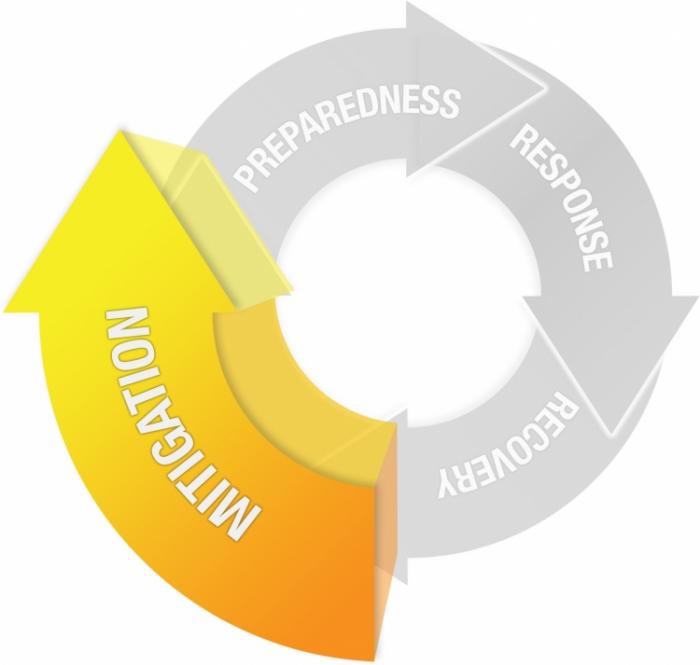
Mitigation
The improvement of the built and social environment in order to reduce, withstand, or prevent disaster impacts.
- Hazard Analysis
- Vulnerability Assessment
- Scenario Development
- Community Engagement and Education
- Planning and Infrastructure Work
What You Will Learn
By the successful completion of Lesson 3, you should be able to:
-
describe the concepts associated with risk mapping and vulnerability assessment,
-
conduct your own vulnerability assessment using social and environmental spatial data and summarize your findings in a short essay,
-
conduct background research for your final project,
-
and discuss the technology trend of volunteered geographic information (VGI).
What You Will Do
Lesson 3 is one week in length. To finish this lesson, you must complete the activities listed below.
| To Read |
|
|---|---|
| To Do |
|
Please refer to the Calendar in Canvas for specific timeframes and due dates.
Questions?
If you have questions about the content or lesson activities, please post them to the General Questions and Discussion forum in Canvas. While you are there, feel free to post your own responses if you, too, are able to help a classmate. If your question is of a personal nature, please email me directly through Canvas.
Mapping Risk
Understanding the Geography of Vulnerability
Developing a clear picture of an area's vulnerability to hazards and disasters is a non-trivial task. It's hard to predict exactly what could happen in a disaster situation. However, even a rough estimate can be a huge help to emergency managers and decision makers who can use that information to develop plans for allocating resources and managing recovery operations. By collecting socio-economic and environmental data sources in a GIS, for instance, we can develop risk maps to highlight the potential impact of disasters on people and infrastructure. In this lesson, we will examine some of the specific analytical methods for doing a vulnerability assessment, and we will reflect on the critical issues associated with planning an emergency management GIS system that includes vulnerability assessment as one of its key functions. Most systems for geospatial and emergency management are designed for reaction, not prediction and mitigation, but that’s changing fast.
There is a wide range of relevant questions to consider when conducting a vulnerability assessment, including answers to the following key questions:
- Who is at risk? How many will be affected?
- What is the spatial and temporal extent of the vulnerability?
- What capacity does the population at risk have for coping with the disaster?
- What is the range of scenarios given different conditions (for example, a Category 2 hurricane vs. a Category 5 hurricane)?
- What happens when multiple disasters occur at the same time (for example, heatwaves during major wild fires; hurricanes during pandemic shutdown)?
- Across all of these is the ‘where’ question, and what roles do spatial relationships play?
Here are a couple of examples of web-based services providing geospatial data on hazards and vulnerability; there are many others!
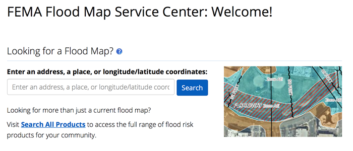
The first example is a map service developed and maintained by the U.S. Federal Emergency Management Agency (FEMA) that coordinates and conducts a great deal of vulnerability assessment work [2], including flood mapping. FEMA flood maps are used to help set flood insurance rates, among other things. The flood mapping tool [3] shows an overview of ongoing FEMA flood mapping, levee repair, and other flood-related risk assessment and mitigation tasks. Contrast this with recent research reported in this interactive New York Times page - New Data Reveals Hidden Flood Risk Across America [4]. Note: you shoudl be able to view the interactive maps without a subscription, but if you are having trouble, you can view a copy of the article on the following page in Canvas.
 [3]
[3]
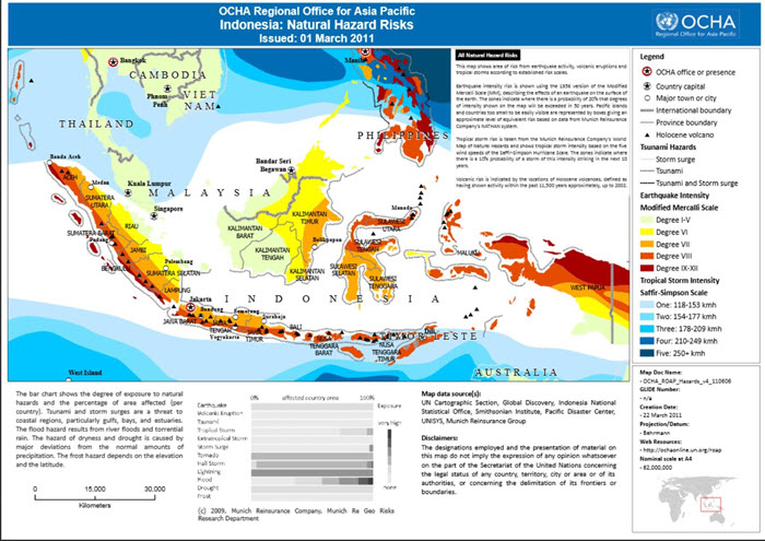
Indonesia: Natural Hazards Risks
The United Nations engages with other entities to develop risk maps for developing countries where they are likely to be involved in future disaster situations. If you check out the map above [5] in greater detail, notice who the collaborators are. They include several NGOs, as well as Munich Re, a major re-insurance player. Interesting, huh?
Keep this Indonesia map in mind, because later in the course you will be considering the 2018 Sulawesi Earthquake and Tsunami in greater detail.
Some private sector firms provide what is known as Address Risk Rating products - in essence, you can look up a specific address and get a report outlining all of the vulnerabilities associated with that location. One of our PSU faculty, Dr. James O'Brien, works for Risk Frontiers [6] in Australia, a firm that works on Address Risk Rating products among others. Here is another example, UNHaRMED [7] model, from the University of Adelaide and the Australian Bushfire and Natural Hazard Cooperative Research Centre.
These examples don't explicitly consider people and the wide range of factors that make some people and places vulnerable while others are not. You will see it is not just a matter of whether you are inside or outside of an impacted area. Geographers have done a lot of work on social vulnerability analysis as part of a rich tradition of Hazards Research.
Vulnerability Assessment
In this week's hands-on exercise, you will be working with some data related to heatwaves in the USA. Through this work, you will gain an understanding of vulnerability assessment approaches using geospatial data and how they can be used to understand some of the priority areas for action leading up to and during a disaster.
Before conducting the analysis and developing the accompanying short report, I would like you to watch a short overview video on Social Vulnerability Indices (SVI), read a chapter from your textbook on GIS and Disaster Mitigation, and read a journal article on Social Vulnerability to Natural Hazards in Brazil. This material will help you gain an understanding of the human dimensions of vulnerability that I mentioned previously.
Watch
Please watch this 3:45 minute video on Social Vulnerability Indices (SVI) from the US Centers for Disease Control and Prevention (CDC).
Click here for a transcript of the Social Vulnerability Index (SVI) video.
Social Vulnerability Index (SVI) - An Overview
PRESENTER: Welcome to our video, Introduction to CDC's Social Vulnerability Index, also known as the SVI. Please visit svi.cdc.gov to explore our website and interactive maps after this presentation.
All communities exhibit varying degrees of physical vulnerability to potential disaster, both natural and human caused. However, it is a community's social vulnerability that may determine how well it responds to and recovers from a disaster.
Studies have shown the socially vulnerable are often less prepared for a disaster event, less likely to recover from it, and more likely to be injured or die. Effectively addressing social vulnerability decreases human suffering and reduces post-disaster cost to society.
Our group at ATSDR, known as GRASP, developed the SVI to help identify socially vulnerable populations before, during, and after hazardous events.
The SVI is a database that ranks the relative social vulnerability of US census tracts. We score and rank each tract in the nation on each of 15 census variables to determine its social vulnerability. The right side column of this graphic shows the variables we use in the SVI. The 15 census variables are further grouped into four themes. Tracts are ranked on these four themes, as well.
Finally, the sums of the scores for the 15 individual variables are ranked for each tract to determine overall vulnerability. So there are three ranking options for each tract, for each variable, for each theme, and overall.
Our rankings were calculated using a percentile ranking method. A percentile rank of 0 means least vulnerable. A percentile rank of 1 means most vulnerable. All census tracts are ranked between 0 and 1. As an additional measure, we flag tracts with any variables ranked at 0.9 or more, to help us easily identify tracts that are particularly vulnerable. We also determined tract rankings within individual states.
Here are SVI maps of Gwinnett County, Georgia, showing each of the four themes, as well as its overall social vulnerability. As you can see, the vulnerability of any given tract may vary by theme. Some tracts are highly vulnerable for all four themes, and will likely have the highest vulnerability overall. Other tracts may be highly vulnerable on one or more themes, or have low vulnerability on all themes.
You can use the interactive mapping application to create a map showing the social vulnerability of your own community, county, or state. And you can examine the detailed social vulnerability and ranking of any tract in the United States, as well as download SVI data and tools. Other data, including such features as hospitals or schools, can be combined with information on impending hazards to assess overall risk to a community. Emergency planners can direct specific attention to areas most in need of funding and physical support over the course of a disaster event.
There are many potential uses for the SVI. Please visit the SVI website at svi.cdc.gov. Learn more about our methods and how to use the interactive map in our other videos. Thank you.
Read
-
GIS for Disaster Management - Chapter 8 "Geographic Information Systems and Disaster Mitigation (pp. 233-250)
In this chapter from your textbook, the author goes into some good detail on assessing and modeling risk and vulnerability using GIS, including where to get data to do your own and a few straightforward analysis steps using GIS. It also includes core concepts associated with evaluating mitigation policies as well as the ways in which people can develop social and environmental variables to model risk and resilience. -
Loyola Hummell, Cutter, Emrich (2016). Social Vulnerability to Natural Hazards in Brazil. International Journal of Disaster Risk Science, volume 7 (issue 2), 111-122 [8]. This final reading will serve as a rough model for what we will work on next in the hands-on portion of this exercise.
-
OPTIONAL / FYI - Georgianna Strode et al. (2020). Exploratory Bivariate and Multivariate Geovisualizations of a Social Vulnerabity Index [9].
Vulnerability Assessment Exercise
Heatwave Vulnerability, Impacts, and Mitigation Options
Introduction
The last year has seen extreme heatwaves affecting much of the world including in China, India, the USA, and Europe. Heatwaves damage infrastructure, overload power grids, reduce work safety and productivity, and have negative impacts on quality of life in general. Moreover, more deaths and illness are due to heatwaves than any other natural disaster, and in the case of the USA and Australia, more than all other natural disasters combined.
Heatwaves can also compound the impacts of other types of disasters. For example, earlier this year Australia experienced extreme flooding followed by a heatwave. This led to a situation where people were outside cleaning up when temperatures were dangerously high.
Heatwave deaths and illness are generally thought of as being entirely preventable. That is, proper mitigation, preparedness and response activities can be undertaken to minimize or eliminate harm e.g., through effective heatwave warning systems and providing the public with “cool places” to get out of the heat.
There is also a strong emphasis on planning and implementing mitigation and adaptation strategies to reduce vulnerability and promote resilience when heatwaves strike. For example:
-
Urban planning might focus on “green and blue infrastructure” to reduce Urban Heat Island (UHI) effects;
-
Social welfare groups (e.g., Red Cross) have “opt-in” systems where vulnerable older people are contacted throughout the heatwave event to make sure they are coping well; and/or
-
Heat-health outreach to help educate the community about the dangers of extreme heat, how to respond to warning messages, and what steps to take.
Heatwave vulnerability and impacts are not spread evenly across populations and geography. This has a lot to do with differences in socioeconomic factors and characteristics of the built environment e.g., low tree cover, poorly designed housing. Just as there is a geography to vulnerability and impacts, there is also a geography to potential solutions. We often think of these as “spatially targeted interventions”.
In this exercise, you will consider these issues in greater detail and use spatial data and analysis to identify patterns of vulnerability and potential impact along with ways of addressing risk and reducing vulnerability.
Learning Goals
- Examine what defines a heatwave and its relationship to weather and microclimate
- Describe trends in heatwave occurrence, duration, and severity both in the past and in the context of global warming
- Develop an understanding of heat impacts on people and infrastructure, particularly regarding key socioeconomic vulnerabilities
- Understand how heatwaves are managed and how they can compound other common natural hazards
- Be able to discuss heatwave vulnerability, impacts, mitigation, and adaptation options in the context of the emergency response cycle
Analysis Steps
- Heatwave trends and impacts
- Vulnerability mapping and assessment
- Spatial analysis of mitigation and adaptation options
- Report to planners and emergency managers
Part 1 - Heatwave trends and impacts
In this section, you will take a close look at key characteristics of heatwaves, trends related to climate change, and some of the direct impacts of heat on people. You will produce a few graphs and maps that will be incorporated into your write-up in Part 4.
A. What are heatwaves?
Understanding Heatwaves (2:05)
Insert transcript here
From the video, take note of these key characteristics of heatwaves:
- Occurrence - How often do heatwaves occur?
- Duration - How long do they last?
- Severity - How severe are the impacts?
- Diurnal cooling - Is there 'cool relief' overnight e.g., are nights hot too?
Source: Australian Bureau of Meteorology Heatwave Forecast Service [11]
Heatwaves are not defined just based on temperature, rather humidity and longer term trends (acclimatization) need to be incorporated. In the map above based on Excess Heat Factor (EHF), heatwaves are classified into three types, based on intensity. Note these mention potential impacts on people, infrastructure and the environment.
- Low-intensity heatwaves are the most common—most people are able to cope with this level of heat
- Severe heatwaves are less frequent and are challenging for vulnerable people such as the elderly—particularly those with pre-existing medical conditions
- Extreme heatwaves are the rarest kind. They affect the reliability of infrastructure, like power and transport, and are dangerous for anyone who does not take precautions to keep cool—even those who are healthy. People who work or exercise outdoors are particularly at risk
Source: Australian Bureau of Meteorology Heatwave Forecast Service [11]
B. How have heatwaves have changed over time, and why?
Heatwave occurrence, duration and severity have all been changing over time. There are several important drivers of heatwaves, including reduction in vegetation cover and more built-up (impervious) surfaces in cities. Climate change is perhaps the strongest factor causing changes in heatwave characteristics (see list above).
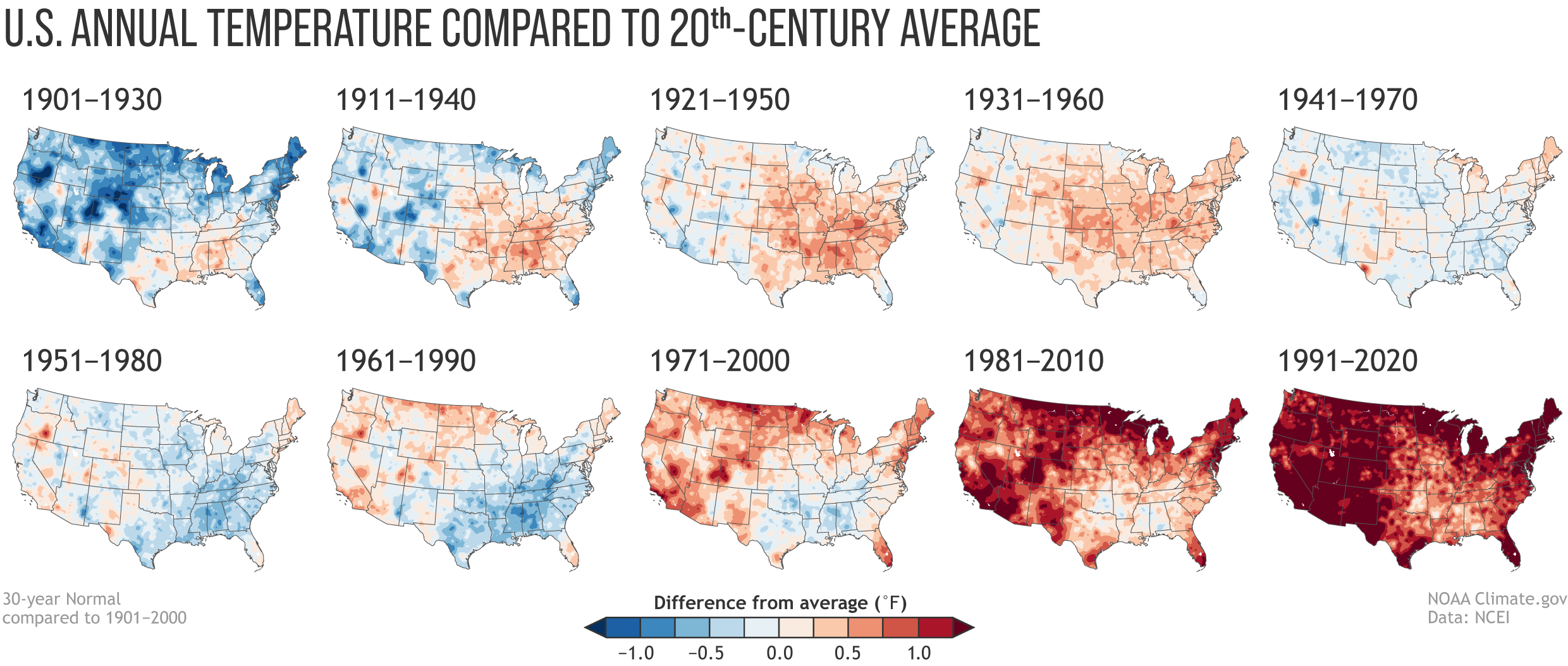
Consider the following series of maps showing annual temperature trends in the USA. These patterns are similar to what we are observing globally.
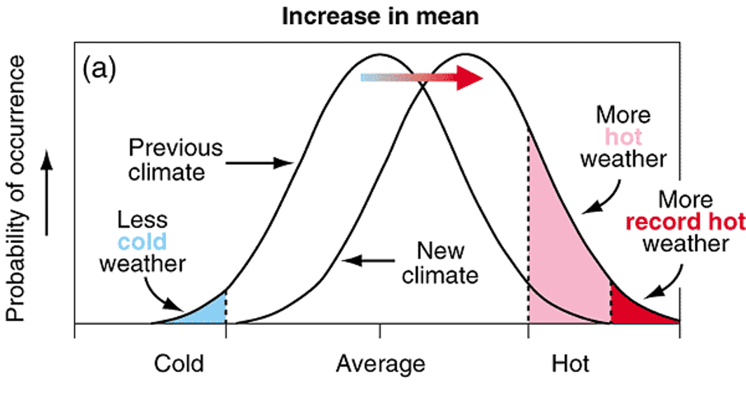
In addition to changes in average temperatures, there have also been changes in the occurrence of extreme events. The following diagram illustrates this, where a shift in mean climate results in more hot and extreme days. As an aside, there is a growing interest in the effects 'chronic heat' on health and wellbeing i.e., hot days but not falling into the 'heatwave' range.
You will finish off this section by conducting some analysis of trends in the key heatwave characteristics (mentioned above) in the USA.
- Create bar charts showing - Heatwave Characteristics in the US by Decade 1961-2021
- Use the "Heatwave characteristics USA - trends.csv" in the GEOG_858_Lesson_3 project folder (download from class OneDrive folder)
- You can use Microsoft Excel. Make sure the charts are easy to understand and have appropriate labels and titles. (A 2 x 2 panel of charts would be a good choice!)
- Create a map - Examine regional differences Heatwave Characteristics in 50 Large US Cities, 1961-2021
- Use the "Heatwaves_USA_cities_trends" table in the GEOG_858_Lesson_3 ArcGIS Pro project (created for you - GEOG_858_Lesson_2.aprx; download from class OneDrive folder)
- You will need to spatially enable this table using the latitude and longitude fields in the table
- Make sure the map is easy to understand and have appropriate symbology and design (graduate circles would be a good choice).
- Summarize the main trends/messages in a couple of sentences? This will feed into your report in Part 4.
Deliverables 1.1
- Create bar charts showing - Heatwave Characteristics in the US by Decade 1961-2021
- Create a map - Examine regional differences Heatwave Characteristics in 50 Large US Cities, 1961-2021
- Summarize the main trends/messages in a couple of sentences? This will feed into your report in Part 4.
C. Heatwave impacts
This section focuses on some of the "direct effects" of heatwaves on people, including deaths and illness.
The following image is a warning poster produced by the SA Health to help people recognize the signs of heat exhaustion and heat stroke. Note this is advice aimed at everyone and not targeted to specific groups or places.
Heat-Related Illness Signs, Symptoms And Treatment
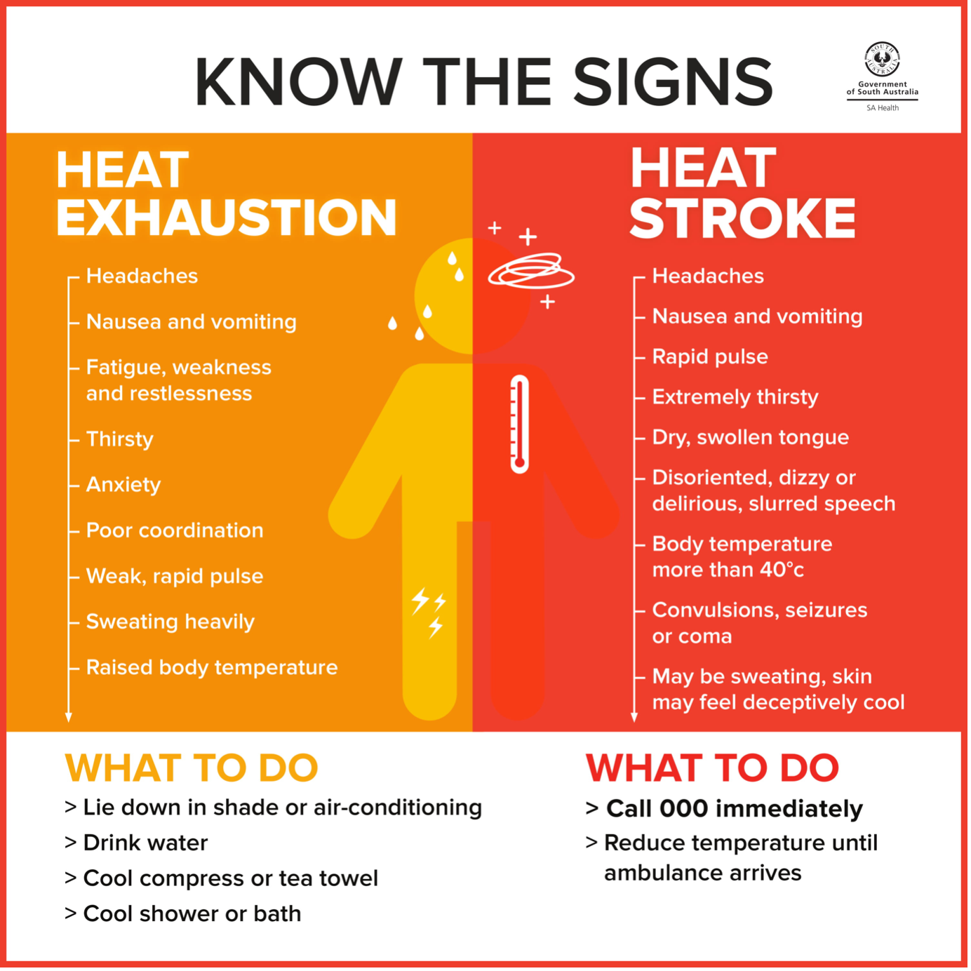
Public warning message, such as this, provide simple and consistent information. These are linked to dedicated websites focused on heat related health. Have a quick look at these two examples, again noting that heatwave illness and deaths are, in theory, entirely preventable.
- Heat-Related Illness Signs, Symptoms And Treatment [15] page from SA Health.
- CDC's Natural Disasters and Severe Weather website [16].
Heatwaves also have significant impacts on critical infrastructure and the environment. We won't go into much detail, but watch this short video from the Today Show, noting the reporting on impacts to critical infrastructure and the environment. If you want to learn more, there is no shortage of news coverage and research literature on these impacts.
Record-Shattering Heat Wave Leads To Deaths Across Britain (2:24)
Insert transcript here
You will finish off this section by looking at some trends in heat related deaths and illness.
- Create a time-series graph showing - Deaths Classified as "Heat-Related" in the United States, 1979-2018
- Use the "Heat related deaths USA 1979 - 2020.csv" file in the GEOG_858_Lesson_3 project folder (download from class OneDrive folder)
- You can use Microsoft Excel. Make sure the charts are easy to understand and have appropriate labels and titles.
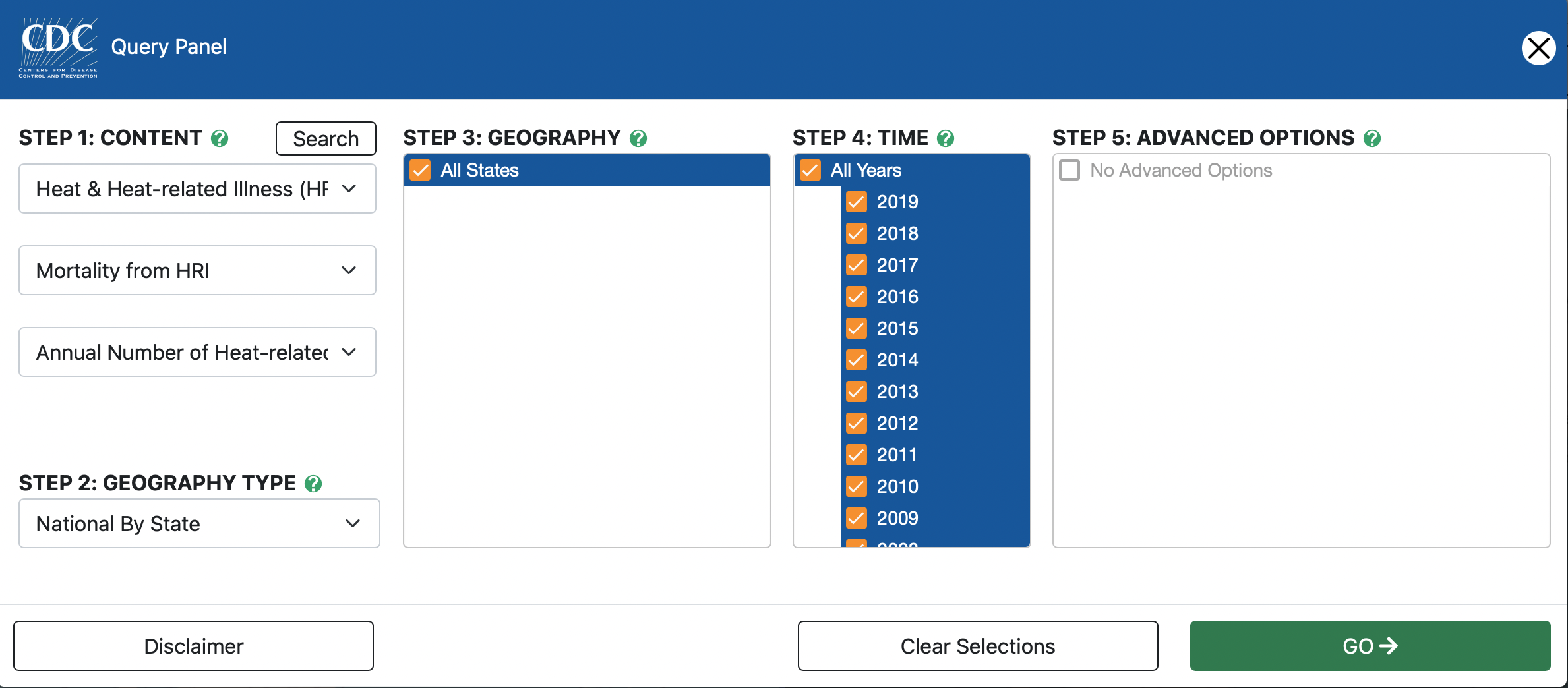
- Use the CDC National Environmental Public Health Tracking Network [17] tool to examine broad patterns in heat related mortality and illness.
- Navigate to the website and have a look at what information is available. Then launch the Data Explorer Tool [18](noting this can be a little slow).
- On the left side map, fill in Steps 1-5 as shown in the image below. On the right side, use the same options but change "Mortality from HRI" to "Emergency Department Visits".
- Look at different years by adjusting the "Year" pull down menu.You can also click on the "Play" and observe how the number of cases vary by year.
- Consider taking a few screenshots to have on hand for Part 4.
- Finally, download the two datasets (Mortality and ED) using the "Export Data" button. Before leaving the site, change one of the maps to heat related Hospitalizations and export that data too.
- Create a time-series graph showing changes in mortality, emergency department admissions, and hospitalizations for California versus the national average.
- Open the Mortality dataset in Microsoft Excel and insert a Pivot Table. Drag "State" to the Filter box, "Years" to the Row box, and "Value" to the Values box (change from Count to Average). In a new worksheet, copy and past the pivot table as values. Rename columns to "Year" and "US_average".
- Go back to pivot table and select California from the State pull down menu, and change Average of value to Sum of value. Cut and paste the Sum of Value column to the sheet with the US_average. Your columns should have these headings - "Year", "US_average", and "California". Delete the Grand Total row.
- Plot the two time series together. Make sure the charts are easy to understand and have appropriate labels and titles.
- Repeat for Emergency Department and Hospitalizations and display the three charts on a single page for easy comparison.
- Summarize the main trends/messages in a couple of sentences? This will feed into your report in Part 4.
- Optional: You looked at counts of events. Would it be better to look at rates on a population basis (e.g., per 100,000)?
Deliverables 1.2
- Create a time-series graph showing - Deaths Classified as ""Heat-Related"" in the United States, 1979-2018.
- Use the CDC National Environmental Public Health Tracking Network tool to examine broad patterns in heat related mortality and illness.
- Create a time-series graph showing changes in mortality, emergency department admissions, and hospitalizations for California versus the national average.
- Summarize the main trends/messages in a couple of sentences? This will feed into your report in Part 4.
Part 2 - Vulnerability mapping and assessment
So far we have considered broad trends in heatwave characteristics and direct impacts on people (e.g., heat stroke) and infrastructure. In this section you will consider some of the factors that make a person or community more vulnerable to adverse heatwave impacts. We will be taking a much more granular look at the problem in this and the following sections.
What are the factors contributing to heatwave vulnerability?
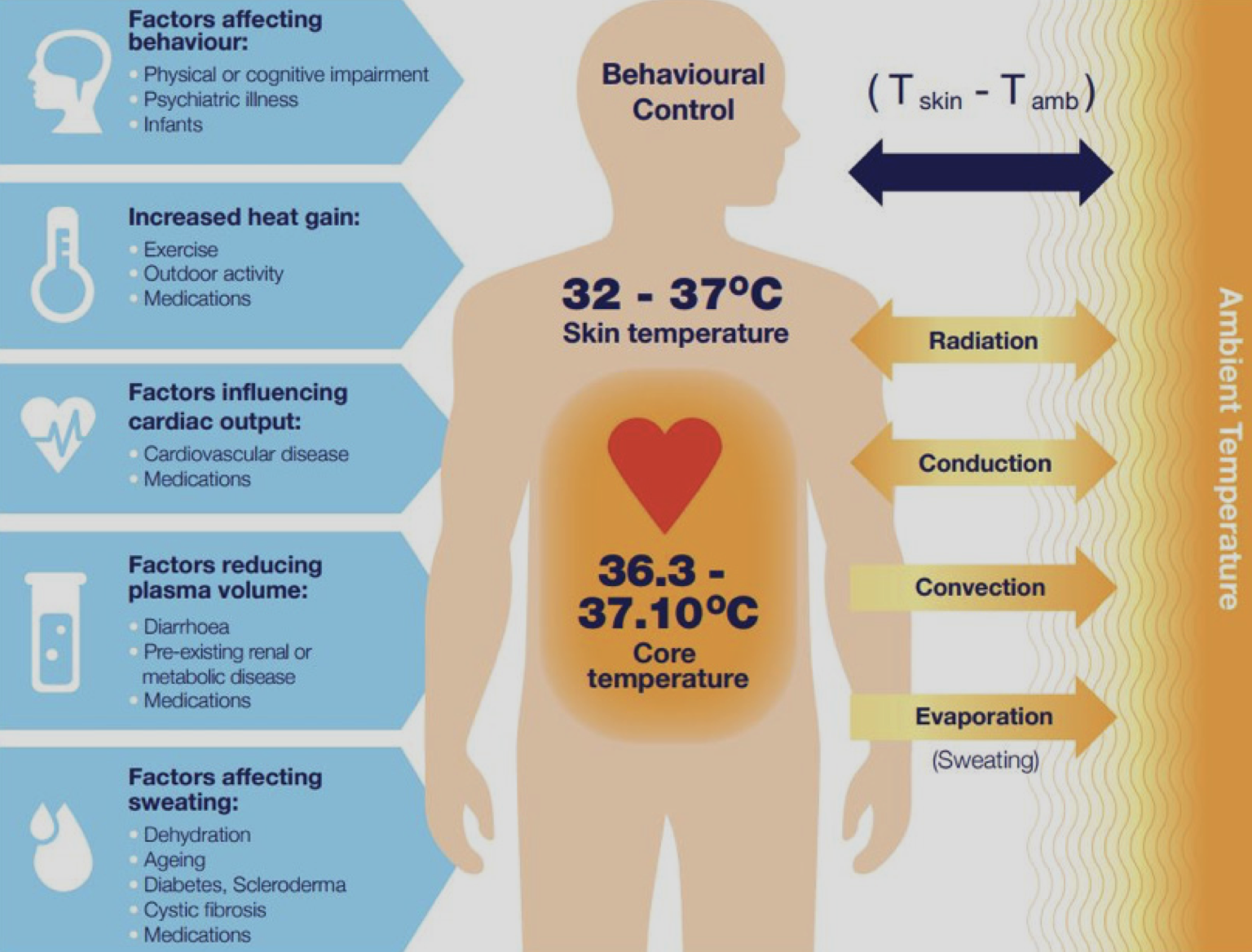
We are going to focus on heatwave vulnerability and impacts from the perspective of human health. This figure illustrates the basic problem - people must maintain their body temperature within a specific range to avoid adverse health outcomes. This is influenced by the ambient environment and characteristics of that person e.g., do they have existing health problems that may compromise their ability to thermo-regulate?
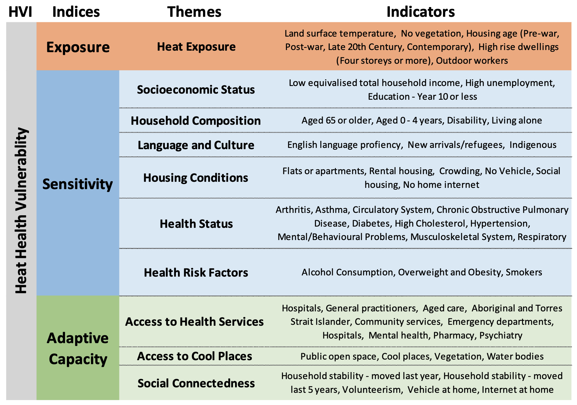
There are also a set of broader factors influencing heat health. The framework illustrated in this figure was used in a recent study to understand heat health vulnerability [21]. This is similar to the CDC Social Vulnerability Index (SVI) you would have seen in one of the previous videos, however the focus here is explicitly on heatwaves.
Vulnerability indices
Generally speaking, indices are designed to help us describe concepts that are not able to be measured directly. For example, "Vulnerability" or "Socioeconomic status" are a multidimensional concept that cannot be measured with a single variable. There are many different indices developed for different purposes. Here you will take a closer look at two of the most widely used approaches.
FEMA's National Risk Index (NRI)
Have a closer look at the FEMA's National Risk Index website [23]. There are three components to the NRI:

Note that the Social Vulnerability component is based on another index called the Social Vulnerability Index, or SoVI. This is one of the first approaches ever developed for emergency management, and it uses principal components analysis PCA) to reduce a set of variables to one index representing low to high vulnerability.
Similarly, Community Resilience is based on another commonly used approach called Baseline Resilience Indices for Communities (BRIC). BRIC also uses a set of indicators to build up the indices, but it does this through a "standardize and rank approach". To learn more, have a look at the NRI website and/or download the NRI manual [24].
When considering index approaches such as these (and any dataset for that matter), it is important to consult available metadata and "data dictionaries" (e.g.,here is the NRI data dictionary [25]), sometimes referred to as the Data Item List (DIL), that goes with a given dataset. You will find the NRI data in the ArcGIS Pro Project accompanying this lesson. I have mapped the SoVI component of the NRI. Have a look at the NRI attribute table, scan the field names, and look up a few variables in the data dictionary.
CDC Social Vulnerability Index (SVI)
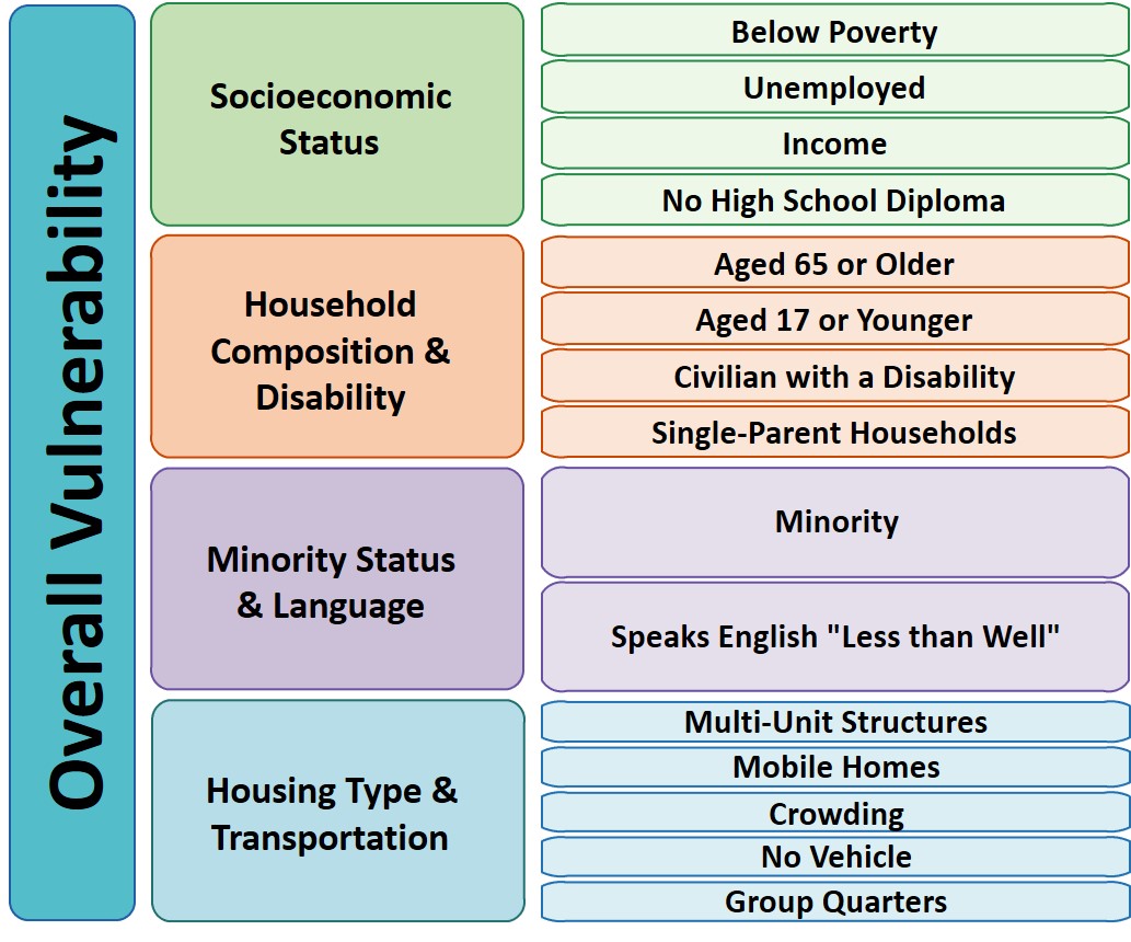
Next, have a closer look at the CDC Social Vulnerability Index (SVI) [26]. The SVI takes an approach that is similar to BRIC, where individual variables are used to calculate sub-indices (Themes) and then the overall index. For example, Socioeconomic Status cannot be measured directly, so "below poverty" line, "Unemployed", "Income", and "No High School Diploma" are combined to get at this construct.
Note the table accompanying the SVI feature class includes the underlying data that is used in the index calculations. If you want to "unpack" a given index, you can look at individual variables. For example, you may observe a "vulnerability hotspot" and wish to know why that is the case. SVI let's you drill down to themes and individual variables. In a particular area, you may find that socioeconomic status is the most important theme and poverty and unemployment may be the most important single indicators. You will take a closer look at the CDC SVI, and, as with NRI, it is important to have any metadata and data item list handy (open a copy with this link SVI data dictionary [28]).
Urban Heat Island and Microclimate
When we hear about heatwaves, we often focus on weather as the main driver. However, heatwaves are experienced differently in different places due to variation in microclimate related to the build and natural environment.
Urban Heat Islands
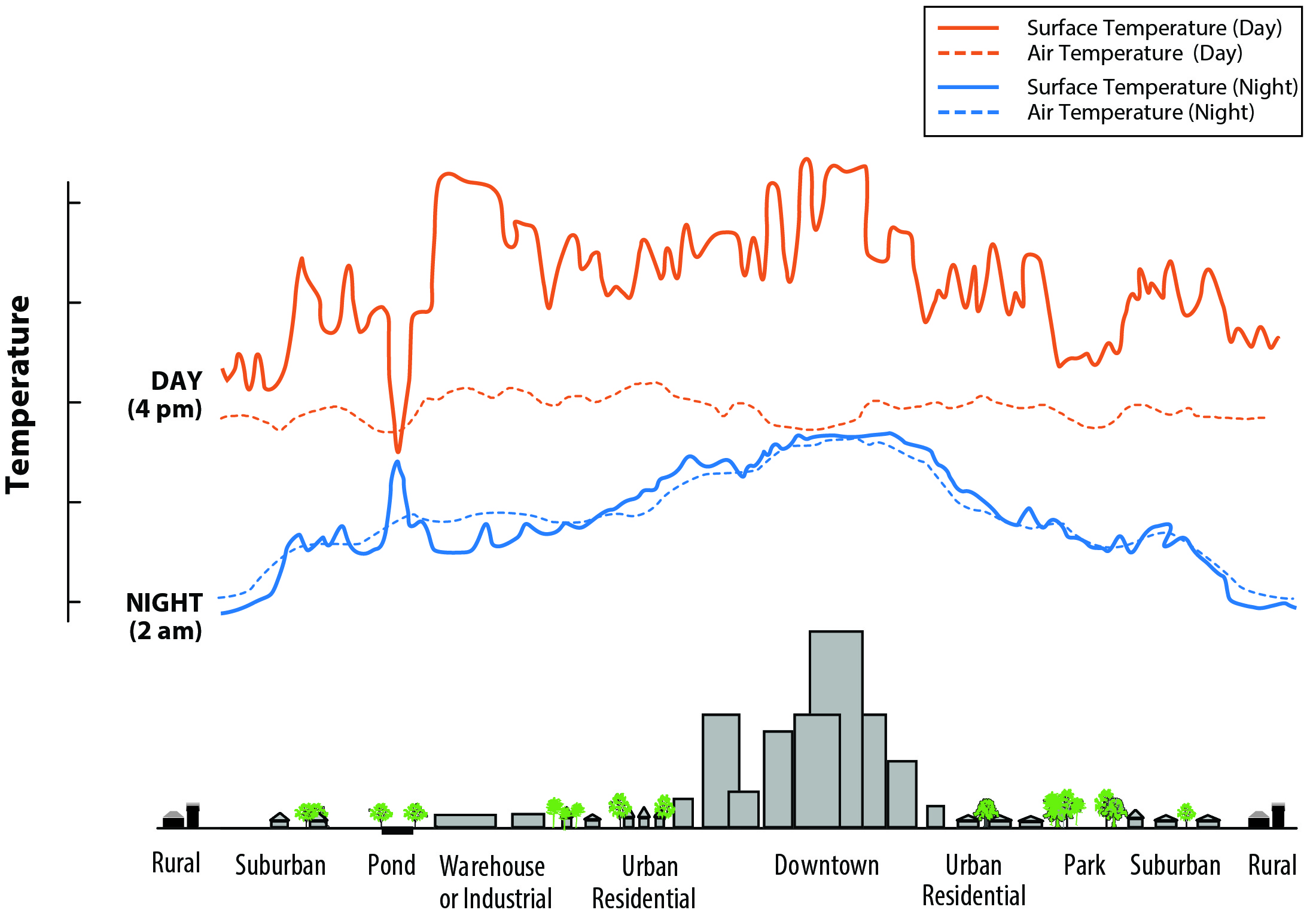
Microclimate
In addition to broader UHI effects, there is considerable variation in microclimate (e.g., local temperature) related to features of the built environment. In the following thermal image from Los Angeles in Summer 2018, you can clearly see higher temperatures in more built up areas. Major roads, downtown LA, and the Port of Long Beach stand out as hot spots while areas such as Beverly Hills and Santa Monica along the coast are cooler. Note how you can actually see the "hot" road network grid in the area around Anaheim. This illustrates very fine variation in land surface temperatures. A key point to takeaway, is that local conditions can enhance or ameliorate heatwaves e.g., think about the simple example of standing in an open parking lot versus standing under a tree during a heatwave!
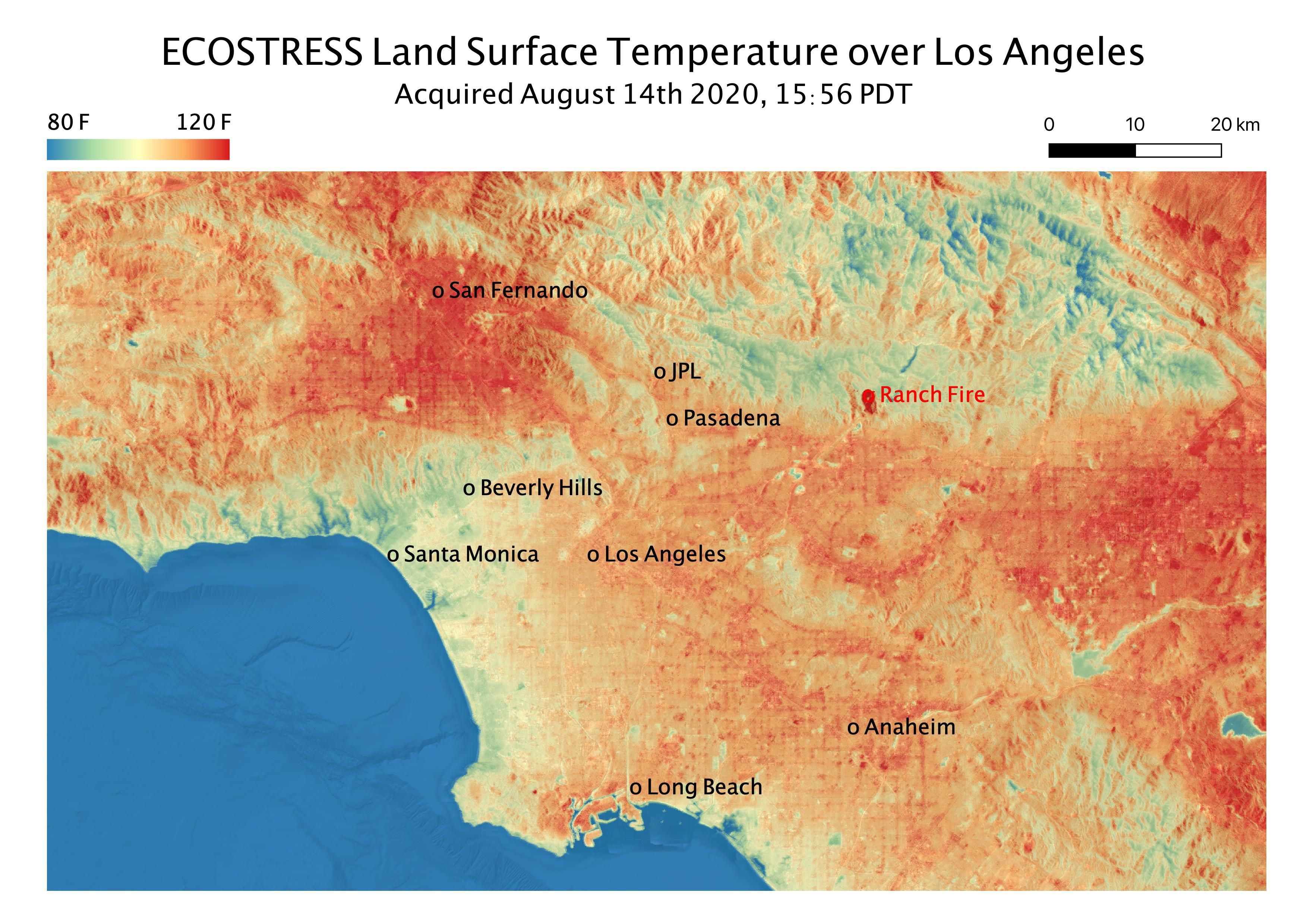
Los Angeles Heat Wave. Source: NASA Jet Propulsion Laboratory [30]
You will finish off this section by continuing to looking heat health vulnerability in Los Angeles County, California. All of the spatial data are provided in the ArcGIS Pro Project, GEOG_858_Lesson_3.aprx.
Mapping social vulnerability
- Take a closer look at the National Risk Index (NRI) by first looking at the attribute tables and data dictionaries.
- The NRI data are in the "NRI_LA_County_tract" feature class. Look at the attribute table and data dictionary to get a general idea of what it contains.
- Create three maps based on these data, and consider putting them together on a single page for easy comparison.
- Overall NRI
- Social Vulnerability
- Community Resilience
- When mapping these data, use the Quintile classification method with five classes. This will put each census tract into groups of 20% each. Also, note you can copy and paste each feature within the Contents Panel as you create new maps i.e., you don't have to load a new feature class every time.
- Create three maps based on these data, and consider putting them together on a single page for easy comparison.
- The CDC SVI data are in the "SVI_LA_County_tract" feature class. Look at the attribute table and data dictionary to get a general idea of what it contains.
- Create four maps based on these data, and consider putting them together on a single page for easy comparison.
- The overall SVI
- Socioeconomic Status theme
- Minority Status and Language Theme
- Choose a single variable to map e.g., Aged over 65, single parent households,... your choice!
- Create four maps based on these data, and consider putting them together on a single page for easy comparison.
- Make sure your maps are easy to understand and have appropriate symbology and design.
- Summarize the main trends/messages in a couple of sentences? This will feed into your report in Part 4.
Urban Heat Island and Microclimate
- Look at the Urban Heat Island Map [31] for Los Angeles County developed by CalEPA (already in the Lesson 3 ArcGIS Pro project). In 2-3 sentences, describe what this map is showing and how it relates to the social vulnerability mapping you did in the last section e.g., how intense is the UHI effect in vulnerable areas of LA County?
- Explore variation in microclimate using the California Heat Assessment Tool [32] dataset in your ArcGIS Pro project. You can also use the online tool. Start by looking at the CHAT metadata and data dictionary [33]. Note that the data in the project have been extracted from the CHAT website and represent historical conditions for June, July, and August and for the general population.
- From the "CHAT_LA_County_historical_JJA_general_population" feature class, map:
- Historical average maximum temperature
- Historical average duration
- Historical average number of events
- These can be single maps, but feel free to be creative e.g., can you visualize some of this data in a single map?
- From the "CHAT_LA_County_vulnerability_indicators", map
- CHAT Heat Health Action Index (heat_health_action_index)
- Percent population experiencing poverty (perc_poverty)
- One other vulnerability indicator of your choosing e.g., Elderly, Asthma Prevalence
- Make sure your maps are easy to understand and have appropriate symbology and design.
- Summarize the main trends/messages in a couple of sentences? This will feed into your report in Part 4.
Deliverables 2
|
Part 3 - Spatial analysis of mitigation and adaptation options
The final part of your analysis will focus on an assessment of a some heatwave mitigation options. The first focuses on "green infrastructure" and the role of tree canopy cover in urban cooling. You will then look at the distribution of "Cooling Centers" in LA County and the populations they serve. For both cases, you will use spatial data to assess the current situation and provide analysis and advice on what could be done in the future.
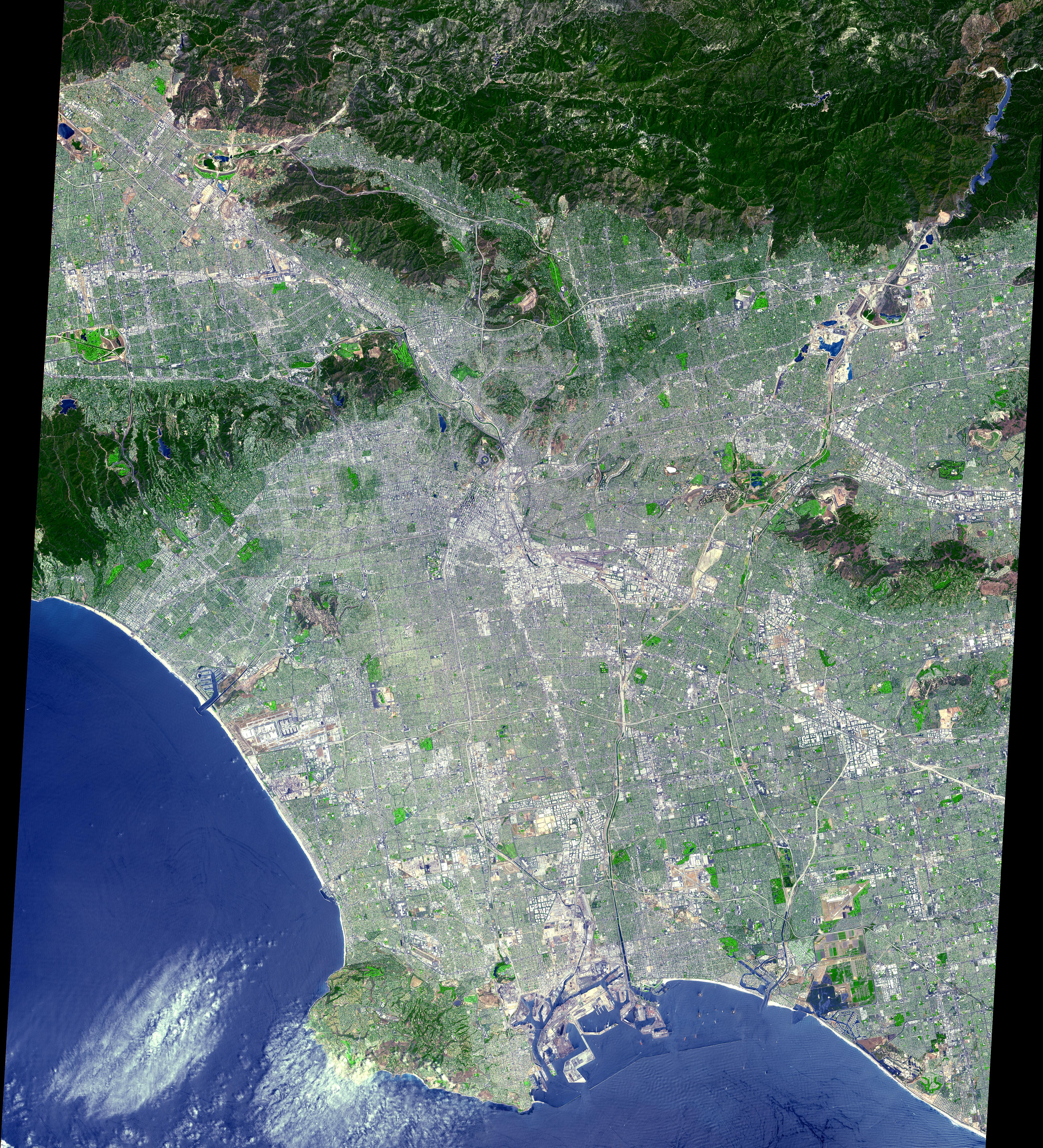
ASTER Los Angeles from Space - Source: NASA JPL [34]
Canopy cover, social vulnerability and mitigation
- In the ArcGIS Pro project, display the Tree Canopy Layer. Note the general patterns across LA County.
- Create a second map showing one of the other land cover types e.g., Grass, Shrub, buildings.
- Use bi-variate maps to look at relationship between canopy cover and social vulnerability
- You will use the "CHAT_LA_County_vulnerability_indicators" layer.
- Take a look at the bi-variate map of the Heat Health Action Index and Percent No Tree Cover I have already created, and note how the bi-variate maps are set up in Symbology.
- What does the map show?
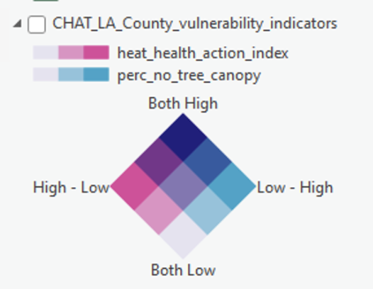 |
| Bi-variate map legend for Heat Health Action Index and Percent No Tree Cover. Note "Both High" indicates areas with low tree cover and high heat health vulnerability |
- Next, replace the Heat Health Action Index variable with another variable in the "CHAT_LA_County_vulnerability_indicators" layer e.g., poverty, race, asthma.
- When choosing think about what you want to investigate regarding the relationship between no canopy cover and social vulnerability.
- Finally, look at the bi-variate map showing existing versus potential tree cover. This has already been produced for you.
- The potential tree cover layer is based on whether there is "physical space" for new trees. What does this suggest about the potential for urban greening in vulnerable communities?
- Make sure your maps are easy to understand and have appropriate symbology and design.
- Summarize the main trends/messages in a couple of sentences? This will feed into your report in Part 4.
Cool place accessibility
Many cities now have designated "cool places" people can go during heatwaves. In this part of the exercise, you will look at whether officially designated cool places in LA County [35] provide good coverage of the city, are easily accessible, and how they may be improved.
- Before getting started, make sure you are connected to the Penn State University Portal. You can check this by looking in the upper right side of ArcGIS Pro. You should see your name followed by the text "Penn State University". This is important because the next steps use Esri credits, and we don't want these deducted from your work account!
- In the Lesson 3 project showing the location of Cooling Centers. Have a look at the distribution and areas supported.
- Use the Generate Drive Time Trade Areas tool [36] in ArcGIS Pro from the Business Analyst Toolbox.
- You will consider two cases
- Cooling centers that are within 15 minute and 30 minute walking times
- Cooling centers that are within 15 minute and 30 minute driving times
- Run these tools and view the mapped results
- You will consider two cases
- Now estimate the proportion of the LA County population that falls within a 15 minute walk of these official cooling centers. Do this by selecting census tracts in the "SVI2018_LA_County_tract" feature class based on the 15 minute walk time areas and summing the population field (E_TOTPOP)
- Summarize the main trends/messages in a couple of sentences? What are the areas of unmet need? Are cooling centers in vulnerable parts of the city? This will feed into your report in Part 4.
Deliverable 3
|
Part 4 - Report to planners and emergency managers
For the final part of this assignment, you will draw upon the analysis and key points developed in Parts 1, 2, and 3 to write a short briefing document (500 words) for planners and emergency managements in Los Angeles County. This should cover:
- Heatwave trends and impacts - Explain how and why heatwaves are an emergency management problem and the major trends and patterns across the USA.
- Vulnerability mapping and assessment - Describe social vulnerability to heat within LA County, and relationships with the Urban Heat Island effect and microclimate variation.
- Spatial analysis of mitigation and adaptation options - Provide an assessment for the potential for urban green in the most vulnerable areas. Share findings and recommendations from your cooling center evaluation.
- Any overall observations and recommendations not already included in report.
Deliverable 4
|
Emerging Theme: Volunteered Geographic Information
For this week's Emerging Theme, you will review the materials below and engage in a Canvas discussion with your classmates - see details below.
Spatial data has traditionally been developed by government agencies and businesses who could afford the technical and financial expenditure necessary to digitize spatial information. Recent advances in web mapping and GPS technology make it possible for tech-savvy volunteers to develop their own spatial datasets. This sort of geographic data is frequently called "Volunteered Geographic Information" or VGI for short. The following short (31 seconds) video below shows the dramatic VGI response to the 2010 Haiti Earthquake through additions and corrections to OpenStreetMap data for the country. Haiti had previously been a poorly-mapped place, and there was an immediate need in the aftermath of the disaster to develop a much better base-map to help recovery efforts. This was a watershed event in VGI for disaster/humanitarian response as discussed by Meier in the first chapter of Digital Humanitarians you read in Lesson 1.
OpenStreetMap - Project Haiti [37] from ItoWorld [38] on Vimeo [39].
One of the most effective VGI efforts can be found at OpenStreetMap.org [40]. OpenStreetMap has the goal of developing a basemap of roads, place names, and other common spatial features for the world, based entirely on volunteered contributions. The OpenStreetMap project aims to provide a completely free worldwide geospatial dataset without any legal or technical restrictions on its use. Most popular web mapping resources like Google Maps or Bing Maps tightly constrain how their data can be manipulated, published, or displayed. Quite a few folks take it for granted that these maps are free, but, in fact, they are only free because those companies are providing access to them right now for free. You are not allowed to re-use and re-purpose those resources or download their data yourself, and if Google decided tomorrow to charge you for access to their maps, you would have no recourse to ensure you kept access for free.
Another important trend in VGI is the use of microtasking or ‘micromapping’ campaigns that split up a big task into small chunks that the VGI community can take on. For example, have a look at the this interesting and useful review of microtasksings role in emergency management from the Australian Institute of Disaster Resilience [41]. In some systems, you are presented with tiles from high-resolution imagery and you are asked to search for and tag features like ‘Trash heaps’, ‘Blocked roads’ and ‘Damaged buildings’. It is worth noting that microtasking like this can also be used to train Machine Learning algorithms to detect these same features with high accuracy. You can read more about this in Chapter 6, ‘Artificial Intelligence in the Sky’, of Digital Humanitarians. This is really cutting-edge stuff that is happening now.
Now, I’d like you to consider VGI with “citizens as sensors”. This is where information relevant to the disaster is collected through devices people are carrying around. I am sure you can think of lots of examples of data you could get from smartphones, but I wanted to highlight a project that started in Japan shortly after the Fukushima Daiichi nuclear disaster. The Safecast [42]team developed small devices for radiation, mapping the results which you can see on the web map here [43]. A very recent example of citizens as sensors is the COVIDSafe App [44] being used in Australia. This is a contract tracing app that records all of the people you come in contact with via Bluetooth on mobile phones. The data are encrypted on your phone and only accessed if someone you came in contact with someone who tested positive for COVID-19.
Finally, for a critical perspective, please look at the recent (2018) paper by Billy Tusker Haworth titled, “Implications of Volunteered Geographic Information for Disaster Management and GIScience: A More Complex World of Volunteered Geography [45]".
Deliverable
- Post a comment in the Emerging Theme Discussion (L3) forum that describes how you think the emergence of new sources of VGI impacts geospatial systems for Emergency Management. Are there future sources of VGI we should be planning for? Are current methods for providing VGI sustainable over the long term? How do you ensure that there will always be volunteers?
- Provide a link and short description to a VGI effort ‘in the news’ or that you have otherwise come across.
- NOTE: Respond to this assignment in the Emerging Theme Discussion (L3) forum by the date indicated on the course calendar.
Grading Criteria
This discussion will be graded out of 15 points.
Please see the Discussion Expectations and Grading page under the Orientation and Course Resources module for details.
Term Project - Research
This week, I will be evaluating the abstracts you developed last week. While I do that, I encourage you to spend some time looking for relevant background information that will help you develop your project. This should include identifying some of the data sources you will need. I am happy to provide suggestions of places to look, but have a go on your own first!
To get started, you could:
- look for background and context information for the topic you have chosen (who has worked in this area before, and what did they accomplish?);
- look for examples you can use to justify your choice of methods;
- look for application examples of the use of geospatial analysis in emergency management;
- identify and compile the data you need for your analysis (and touch base with me if you have any problems – the earlier the better!).
Each project will have quite specific needs, so you will need to think of the additional information you will need to write your report.
Some Suggestions...
- I encourage you to make use of our excellent Penn State library resources [46]. You can skip the overview (but I don't suggest it) and go right to the library search [47] as well. You probably know this, but the search functions include a lot more than books, e,g., reports, journal articles, dissertations, and theses. Many of the references are available in electronic form and can be downloaded. The library also has an "Ask a Librarian" chat that allows you to chat with a librarian in real time.
- Google Scholar [48] is your friend. This is one of the primary ways academics now search for articles. It is also a good way of developing scientific 'social networks' as it is easy to follow links to other works by an author, or who they are working with, etc.
- Finally, have a look at the recent proceedings from the ISCRAM conference [49]. There are tons and tons of good stuff there. Oh, ISCRAM is a professional society for people working in the field of Information Systems for Crisis Response and Management.
NOTE:
You do not need to turn anything in for your Term Project this week, but you really should get cracking on your background research. Don't let this time slide by without making some progress on that effort.
If you have questions about how to proceed - you can ask those in the General Questions Discussion in Canvas. It's great if you're able to help a classmate, too, so don't be shy.
Summary and Final Tasks
Summary
In this lesson, we have learned about the first stage of emergency management - vulnerability assessment and hazard mitigation. We focused attention on how geospatial data and tools can be used to conduct risk mapping analyses to identify places where populations and critical infrastructure are vulnerable to disasters.
An effective vulnerability assessment requires answers to the following questions (among others, of course):
- Who is at risk? How many people will be affected?
- What is the spatial and temporal extent of the vulnerability?
- What capacity does the population at risk have for coping with the disaster?
When developing geospatial system for emergency management, one must consider the analytical tools and data sources necessary to answer these questions. Often, decision makers need information on potential human and financial losses to make their case for resources to mitigate against disasters.
In the next lesson, we will shift focus toward situations in which a disaster is imminent and geospatial analysis is called upon to help prepare for potential impacts. Even in the best case scenarios, there is often very little warning (and sometimes no warning at all) prior to a disaster, so there is a serious need for efficient and effective geospatial systems to evacuate citizens and stage response resources.
Reminder - Complete all of the Lesson 3 tasks!
You have reached the end of Lesson 3! Double-check the to-do list on the Lesson 3 Overview page to make sure you have completed all of the activities listed there before you begin Lesson 4.